RESPONSIVE WEBDESIGN
Created by Vladimir Zhydal
WHAT?Responsive Web Design (RWD) is an approach to web
design aimed at crafting sites to provide an optimal viewingexperience across a wide range of devices.
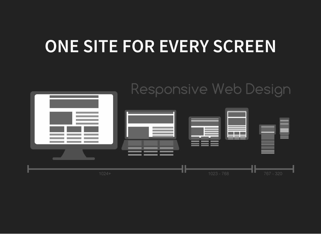
ONE SITE FOR EVERY SCREEN
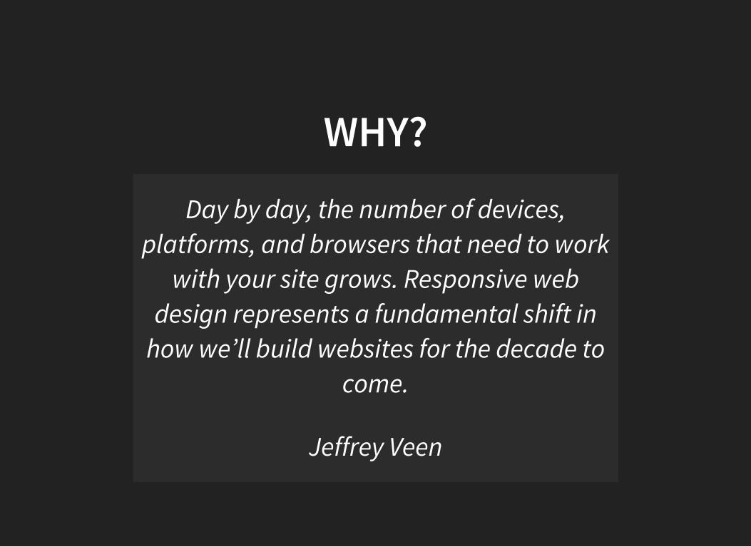
WHY?
Day by day, the number of devices,platforms, and browsers that need to work
with your site grows. Responsive webdesign represents a fundamental shift in
how we’ll build websites for the decade tocome.
Jeffrey Veen
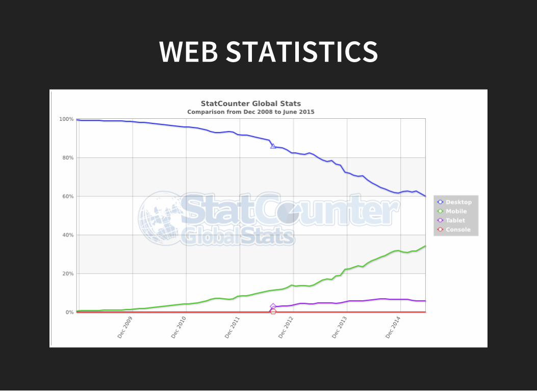
WEB STATISTICS
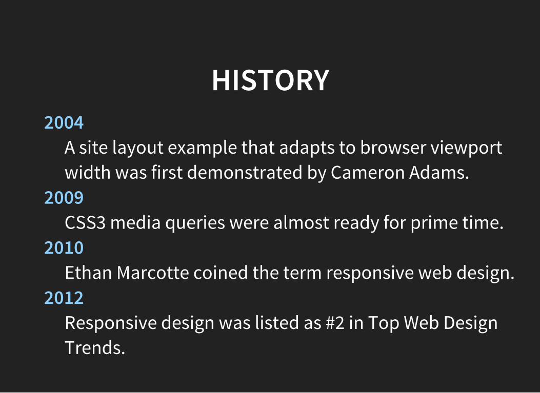
HISTORY2004
A site layout example that adapts to browser viewportwidth was first demonstrated by Cameron Adams.
2009CSS3 media queries were almost ready for prime time.
2010Ethan Marcotte coined the term responsive web design.
2012Responsive design was listed as #2 in Top Web DesignTrends.
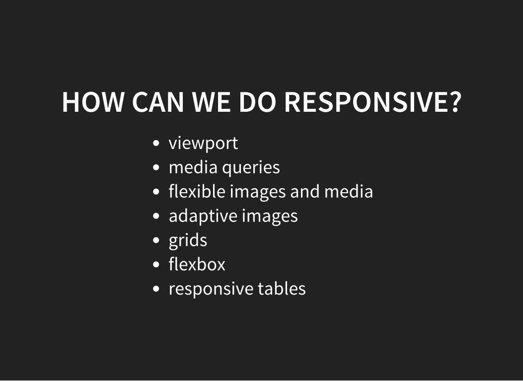
HOW CAN WE DO RESPONSIVE?viewportmedia queriesflexible images and mediaadaptive imagesgridsflexboxresponsive tables
VIEWPORT
VIEWPORT BASICSDEVICE PIXELS AND CSS PIXELS
Device pixels give the formal resolution of whicheverdevice you’re working on.At zoom level 100% one CSS pixel is exactly equal to onedevice pixel.Zooming to 200% makes one CSS pixel grow to four timesthe size of one device pixels.
VIEWPORT BASICSTHE DESKTOP VIEWPORT
The function of the viewport is to constrain the <html>element, which is the uppermost containing block of yoursite.The <html> element takes 100% of the width of thatviewport.The viewport has the width and height of the browserwindow — on desktop.
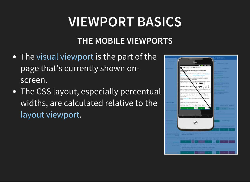
VIEWPORT BASICSTHE MOBILE VIEWPORTS
The visual viewport is the part of thepage that’s currently shown on-screen.The CSS layout, especially percentualwidths, are calculated relative to thelayout viewport.
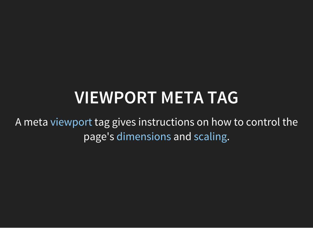
VIEWPORT META TAGA meta viewport tag gives instructions on how to control the
page's dimensions and scaling.
VIEWPORT META TAG HISTORYIt was first implemented by Apple for the Safari/iPhonebrowser, but has since been implemented for most of
mobile browsers.
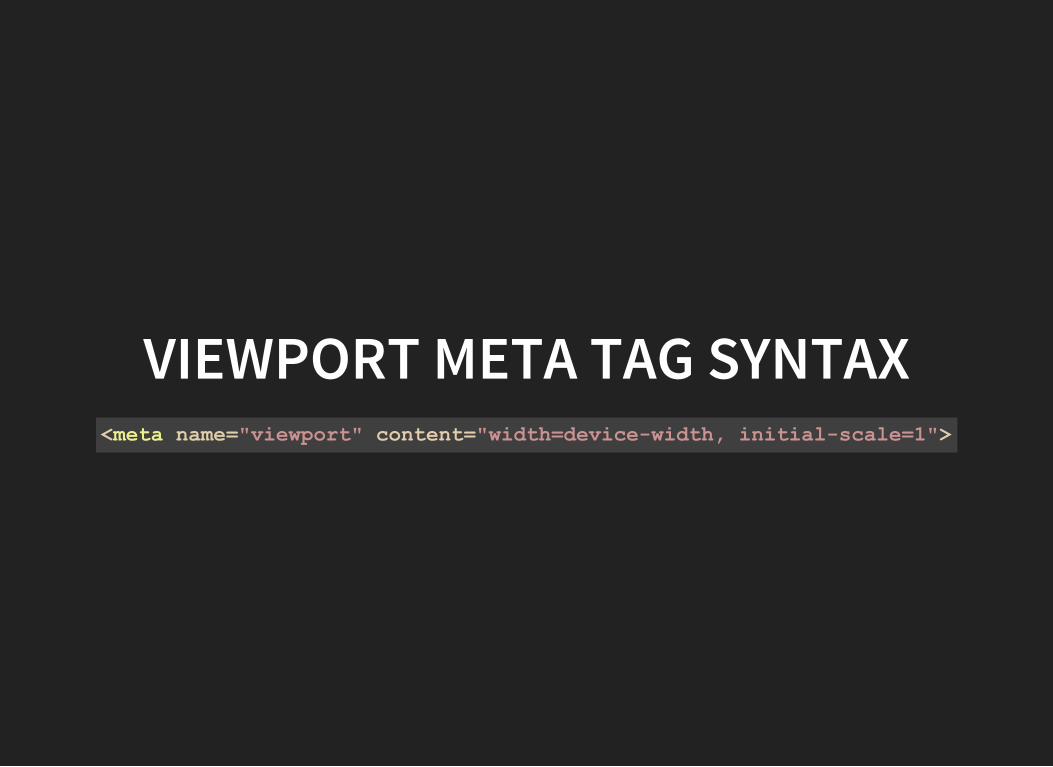
VIEWPORT META TAG SYNTAX<meta name="viewport" content="width=devicewidth, initialscale=1">
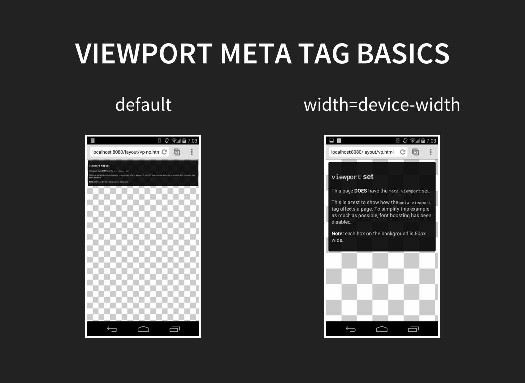
VIEWPORT META TAG BASICSdefault width=device-width
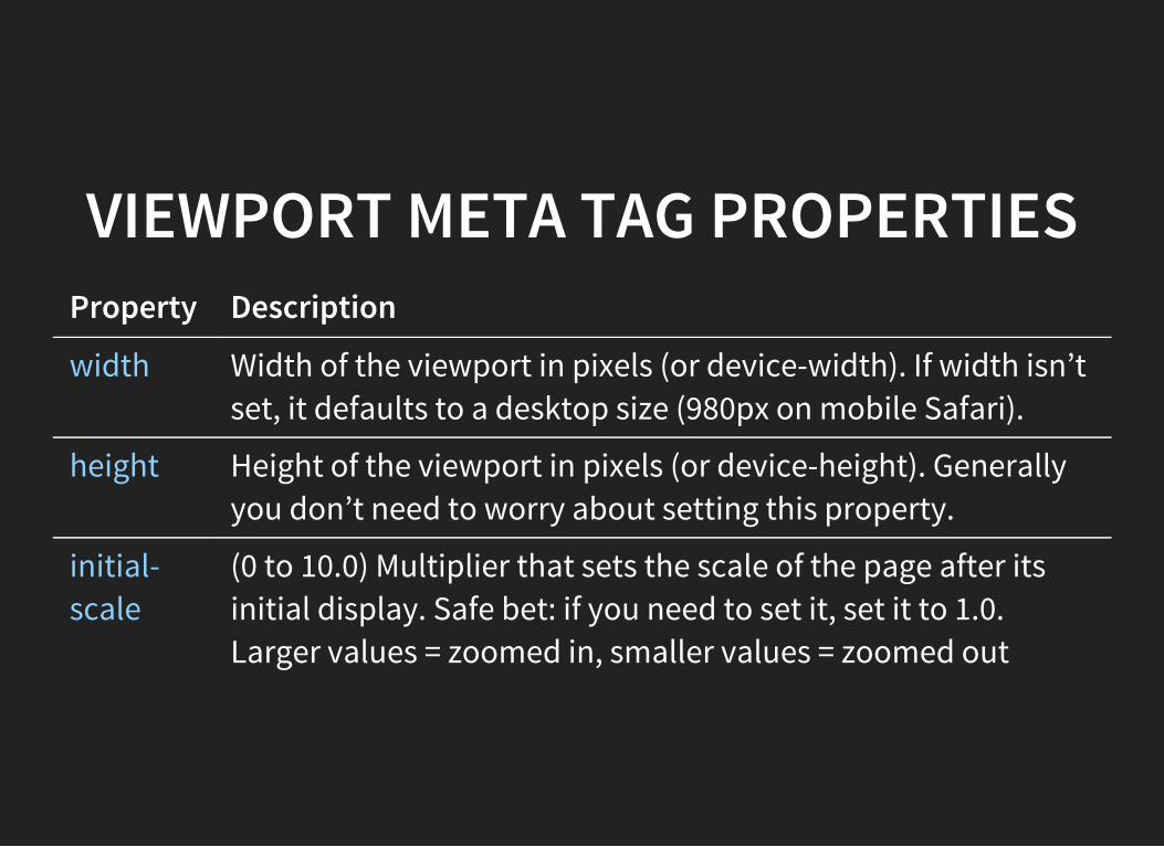
VIEWPORT META TAG PROPERTIESProperty Description
width Width of the viewport in pixels (or device-width). If width isn’tset, it defaults to a desktop size (980px on mobile Safari).
height Height of the viewport in pixels (or device-height). Generallyyou don’t need to worry about setting this property.
initial-scale
(0 to 10.0) Multiplier that sets the scale of the page after itsinitial display. Safe bet: if you need to set it, set it to 1.0.Larger values = zoomed in, smaller values = zoomed out
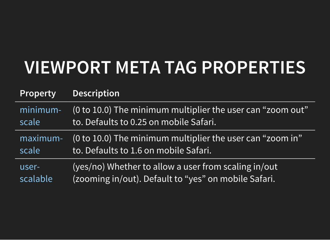
VIEWPORT META TAG PROPERTIESProperty Description
minimum-scale
(0 to 10.0) The minimum multiplier the user can “zoom out”to. Defaults to 0.25 on mobile Safari.
maximum-scale
(0 to 10.0) The minimum multiplier the user can “zoom in”to. Defaults to 1.6 on mobile Safari.
user-scalable
(yes/no) Whether to allow a user from scaling in/out(zooming in/out). Default to “yes” on mobile Safari.
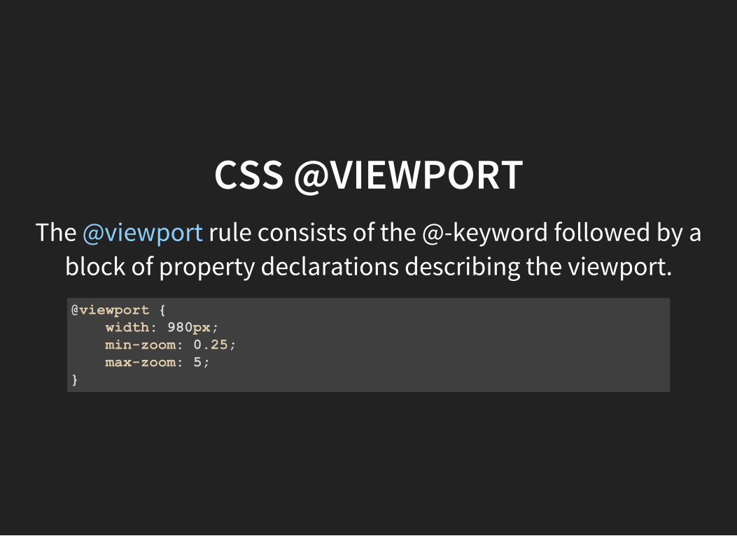
CSS @VIEWPORTThe @viewport rule consists of the @-keyword followed by a
block of property declarations describing the viewport.@viewport width: 980px; minzoom: 0.25; maxzoom: 5;
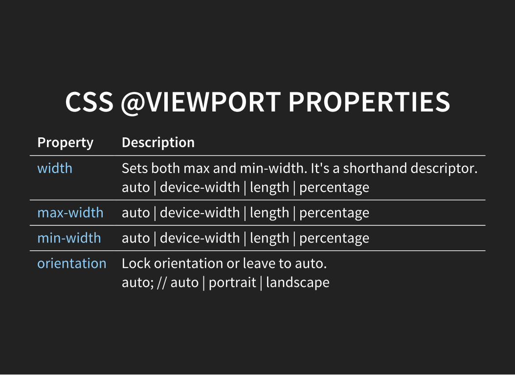
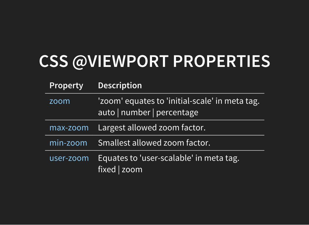
CSS @VIEWPORT PROPERTIESProperty Description
width Sets both max and min-width. It's a shorthand descriptor.auto | device-width | length | percentage
max-width auto | device-width | length | percentage
min-width auto | device-width | length | percentage
orientation Lock orientation or leave to auto.auto; // auto | portrait | landscape
CSS @VIEWPORT PROPERTIESProperty Description
zoom 'zoom' equates to 'initial-scale' in meta tag.auto | number | percentage
max-zoom Largest allowed zoom factor.
min-zoom Smallest allowed zoom factor.
user-zoom Equates to 'user-scalable' in meta tag.fixed | zoom
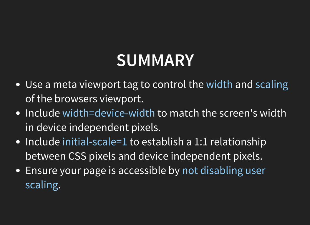
SUMMARYUse a meta viewport tag to control the width and scalingof the browsers viewport.Include width=device-width to match the screen's widthin device independent pixels.Include initial-scale=1 to establish a 1:1 relationshipbetween CSS pixels and device independent pixels.Ensure your page is accessible by not disabling userscaling.

MEDIA QUERIES
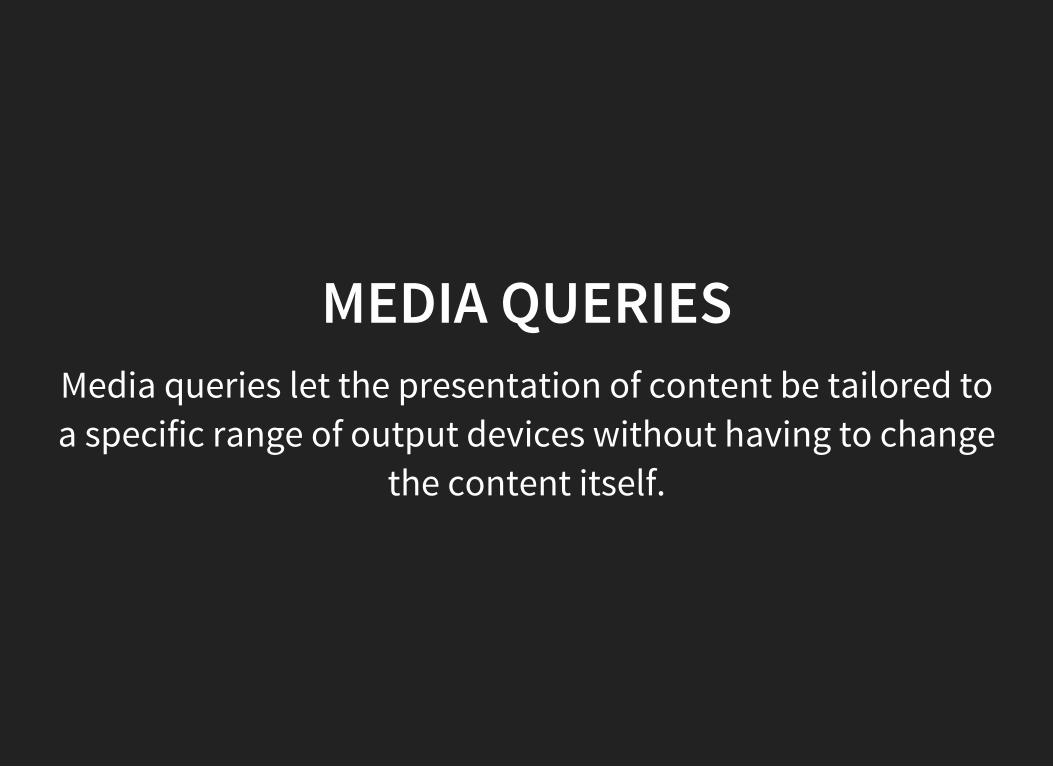
MEDIA QUERIESMedia queries let the presentation of content be tailored toa specific range of output devices without having to change
the content itself.
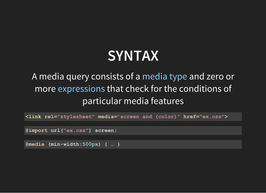
SYNTAXA media query consists of a media type and zero ormore expressions that check for the conditions of
particular media features<link rel="stylesheet" media="screen and (color)" href="ex.css">
@import url("ex.css") screen;
@media (minwidth:500px) …
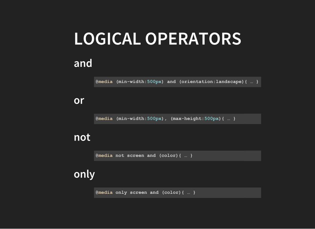
LOGICAL OPERATORSand
or
not
only
@media (minwidth:500px) and (orientation:landscape) …
@media (minwidth:500px), (maxheight:500px) …
@media not screen and (color) …
@media only screen and (color) …
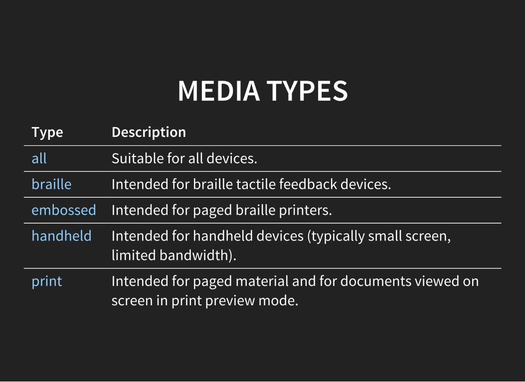
MEDIA TYPESType Description
all Suitable for all devices.
braille Intended for braille tactile feedback devices.
embossed Intended for paged braille printers.
handheld Intended for handheld devices (typically small screen,limited bandwidth).
print Intended for paged material and for documents viewed onscreen in print preview mode.
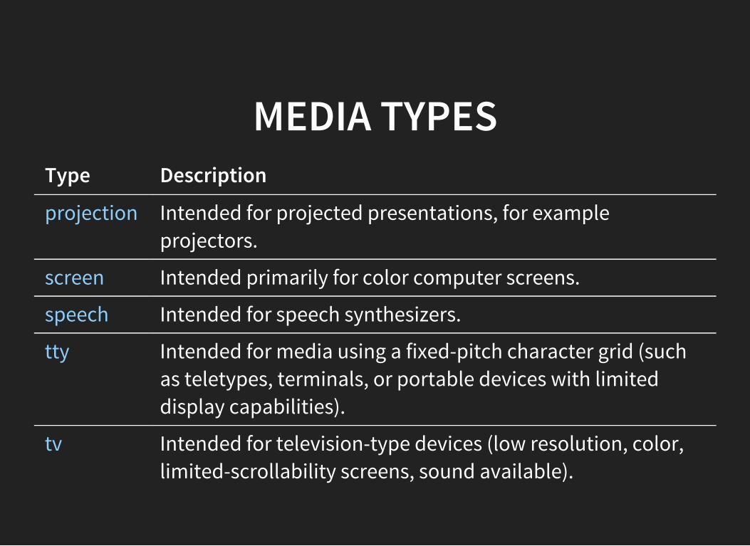
MEDIA TYPESType Description
projection Intended for projected presentations, for exampleprojectors.
screen Intended primarily for color computer screens.
speech Intended for speech synthesizers.
tty Intended for media using a fixed-pitch character grid (suchas teletypes, terminals, or portable devices with limiteddisplay capabilities).
tv Intended for television-type devices (low resolution, color,limited-scrollability screens, sound available).
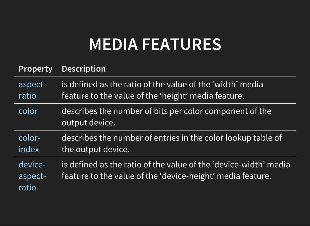
MEDIA FEATURESProperty Description
aspect-ratio
is defined as the ratio of the value of the ‘width’ mediafeature to the value of the ‘height’ media feature.
color describes the number of bits per color component of theoutput device.
color-index
describes the number of entries in the color lookup table ofthe output device.
device-aspect-ratio
is defined as the ratio of the value of the ‘device-width’ mediafeature to the value of the ‘device-height’ media feature.
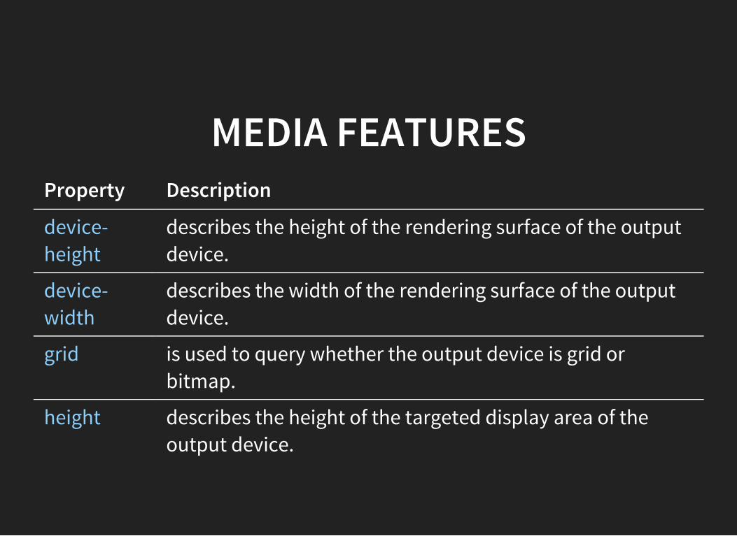
MEDIA FEATURESProperty Description
device-height
describes the height of the rendering surface of the outputdevice.
device-width
describes the width of the rendering surface of the outputdevice.
grid is used to query whether the output device is grid orbitmap.
height describes the height of the targeted display area of theoutput device.
MEDIA FEATURESProperty Description
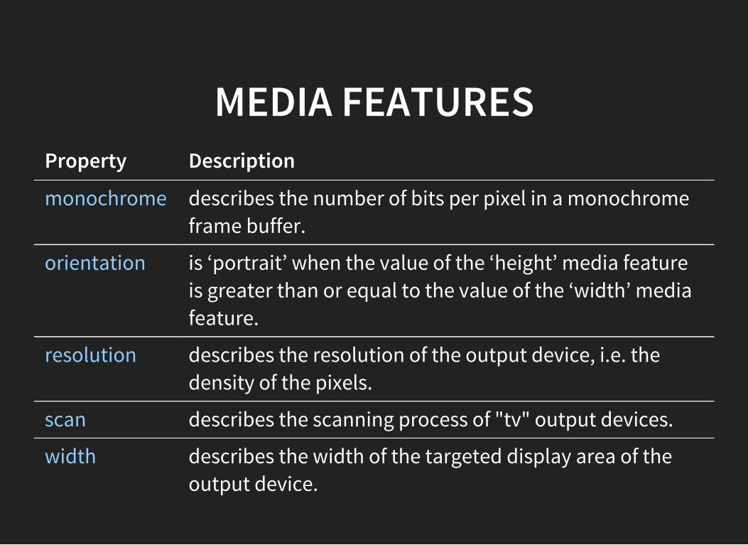
monochrome describes the number of bits per pixel in a monochromeframe buffer.
orientation is ‘portrait’ when the value of the ‘height’ media featureis greater than or equal to the value of the ‘width’ mediafeature.
resolution describes the resolution of the output device, i.e. thedensity of the pixels.
scan describes the scanning process of "tv" output devices.
width describes the width of the targeted display area of theoutput device.
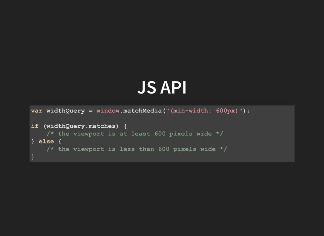
JS APIvar widthQuery = window.matchMedia("(minwidth: 600px)");
if (widthQuery.matches) /* the viewport is at least 600 pixels wide */ else /* the viewport is less than 600 pixels wide */
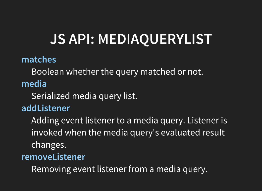
JS API: MEDIAQUERYLISTmatches
Boolean whether the query matched or not.media
Serialized media query list.addListener
Adding event listener to a media query. Listener isinvoked when the media query's evaluated resultchanges.
removeListenerRemoving event listener from a media query.
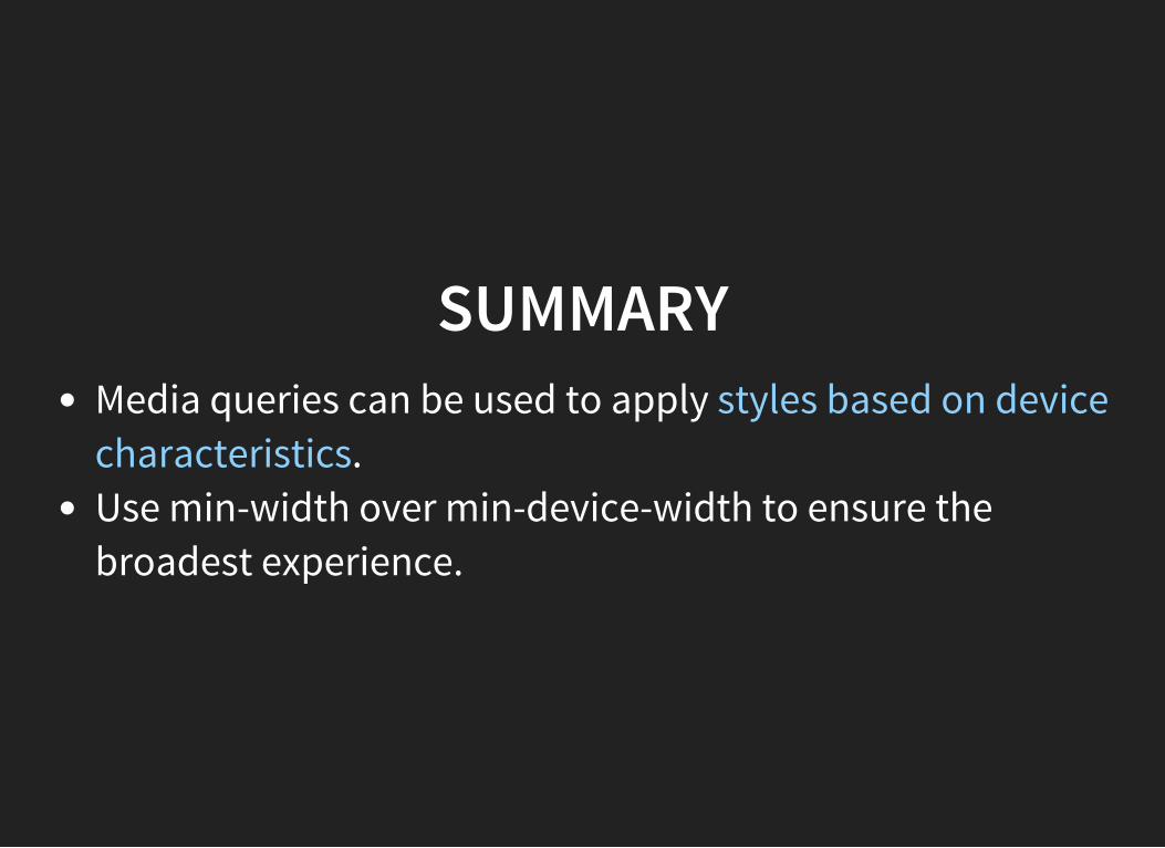
SUMMARYMedia queries can be used to apply styles based on devicecharacteristics.Use min-width over min-device-width to ensure thebroadest experience.

FLEXIBLE IMAGES ANDMEDIA
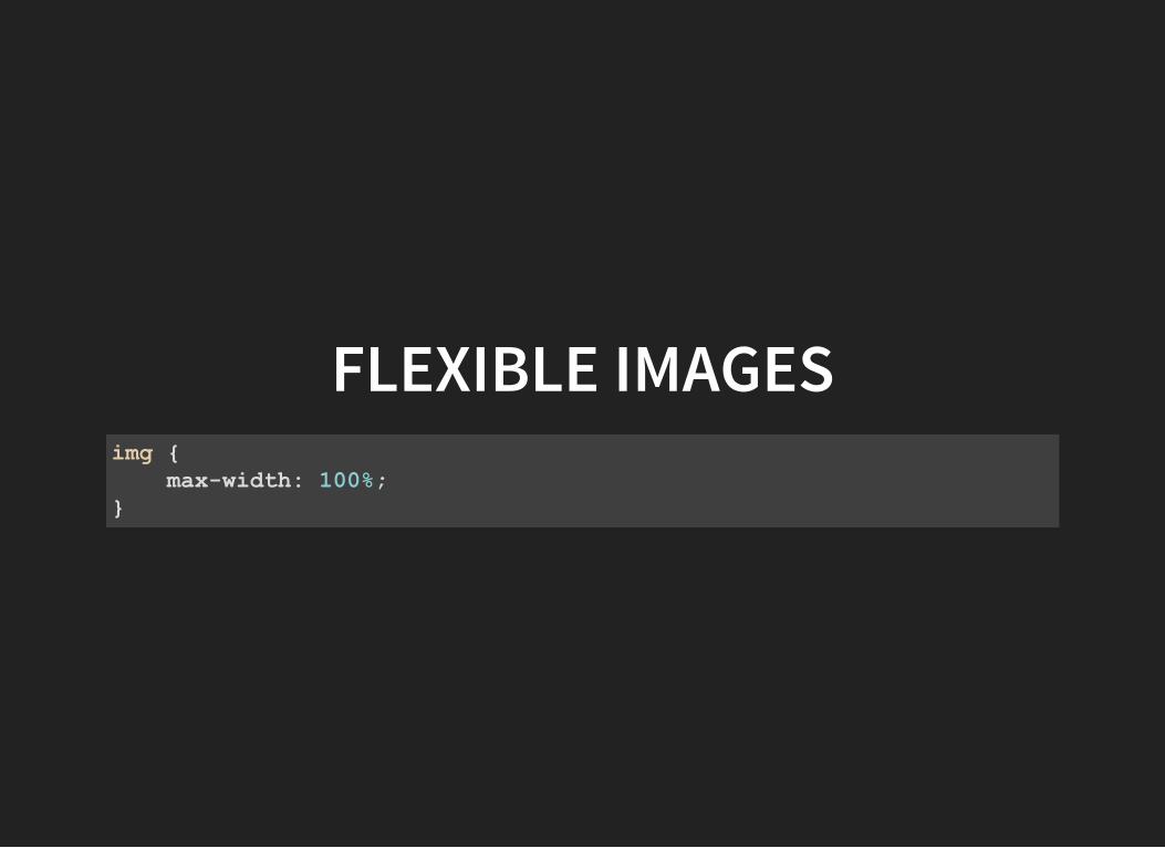
FLEXIBLE IMAGESimg maxwidth: 100%;
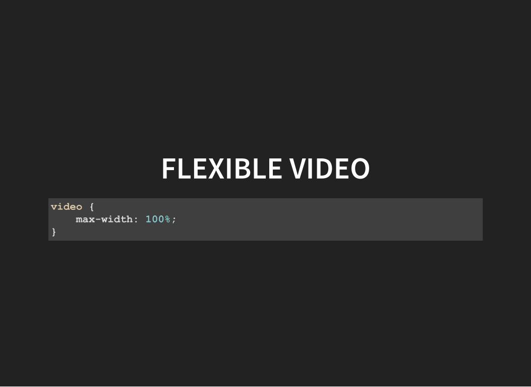
FLEXIBLE VIDEOvideo maxwidth: 100%;
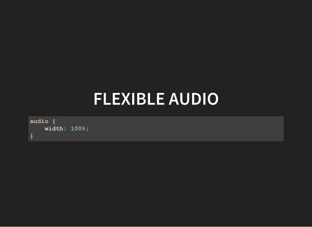
FLEXIBLE AUDIOaudio width: 100%;
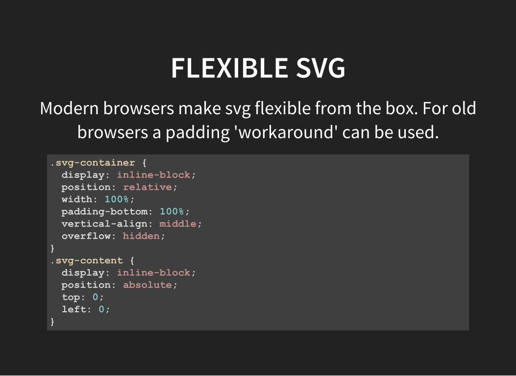
FLEXIBLE SVGModern browsers make svg flexible from the box. For old
browsers a padding 'workaround' can be used..svgcontainer display: inlineblock; position: relative; width: 100%; paddingbottom: 100%; verticalalign: middle; overflow: hidden;.svgcontent display: inlineblock; position: absolute; top: 0; left: 0;
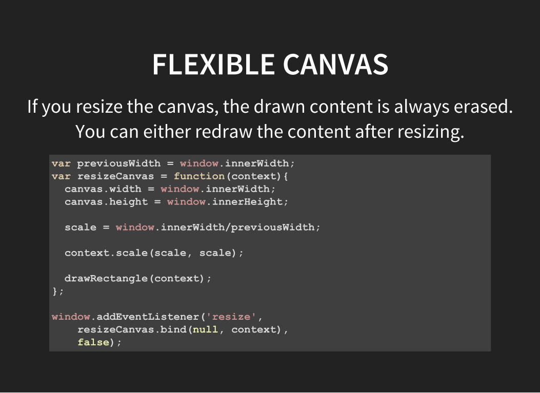
FLEXIBLE CANVASIf you resize the canvas, the drawn content is always erased.
You can either redraw the content after resizing.var previousWidth = window.innerWidth;var resizeCanvas = function(context) canvas.width = window.innerWidth; canvas.height = window.innerHeight;
scale = window.innerWidth/previousWidth;
context.scale(scale, scale);
drawRectangle(context);;
window.addEventListener('resize', resizeCanvas.bind(null, context), false);
ADAPTIVE IMAGES
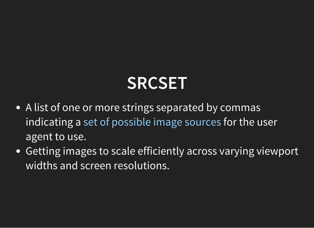
SRCSETA list of one or more strings separated by commasindicating a set of possible image sources for the useragent to use.Getting images to scale efficiently across varying viewportwidths and screen resolutions.
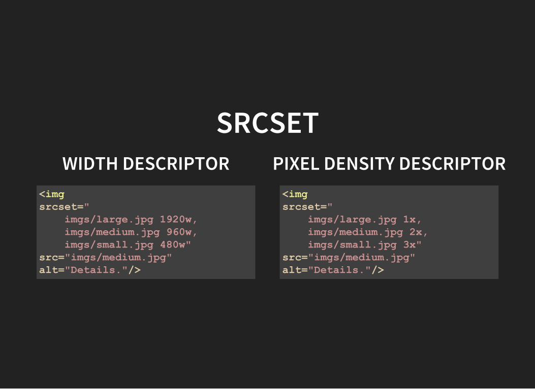
SRCSETWIDTH DESCRIPTOR PIXEL DENSITY DESCRIPTOR
<imgsrcset=" imgs/large.jpg 1920w, imgs/medium.jpg 960w, imgs/small.jpg 480w"src="imgs/medium.jpg"alt="Details."/>
<imgsrcset=" imgs/large.jpg 1x, imgs/medium.jpg 2x, imgs/small.jpg 3x"src="imgs/medium.jpg"alt="Details."/>
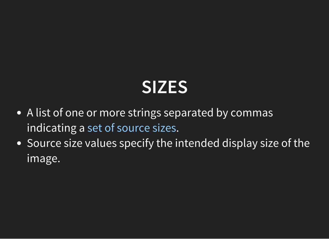
SIZESA list of one or more strings separated by commasindicating a set of source sizes.Source size values specify the intended display size of theimage.
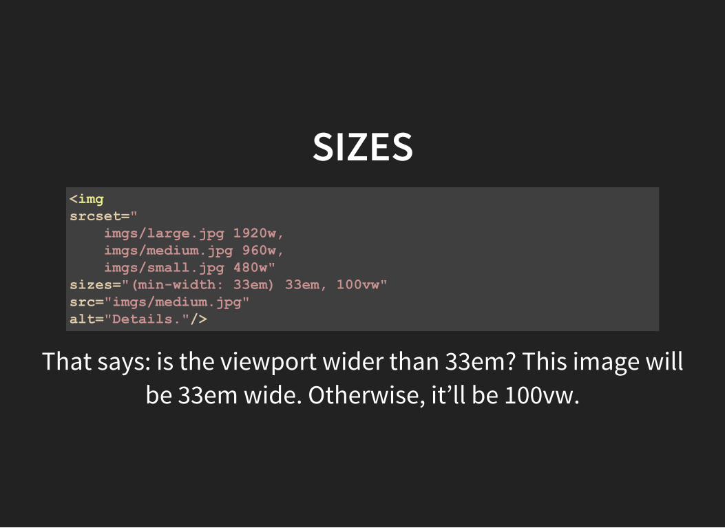
SIZES<imgsrcset=" imgs/large.jpg 1920w, imgs/medium.jpg 960w, imgs/small.jpg 480w"sizes="(minwidth: 33em) 33em, 100vw"src="imgs/medium.jpg"alt="Details."/>
That says: is the viewport wider than 33em? This image willbe 33em wide. Otherwise, it’ll be 100vw.
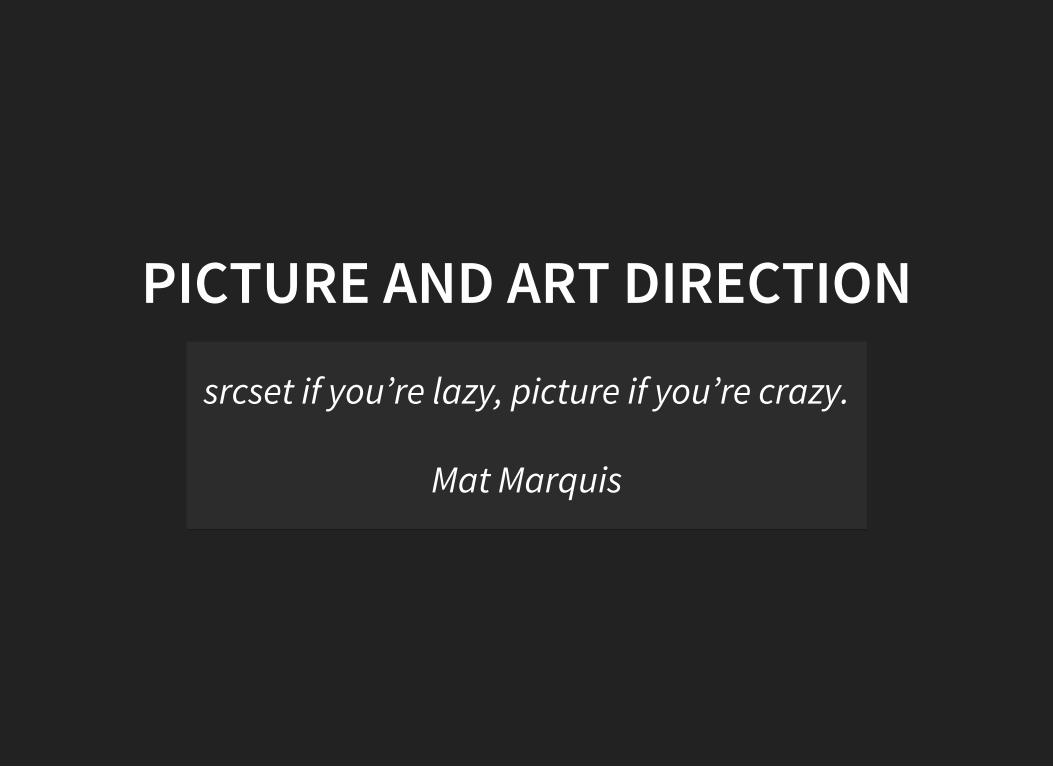
PICTURE AND ART DIRECTION
srcset if you’re lazy, picture if you’re crazy.
Mat Marquis
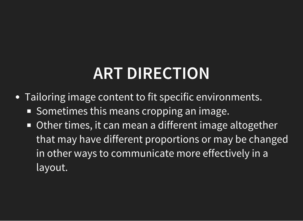
ART DIRECTIONTailoring image content to fit specific environments.
Sometimes this means cropping an image.Other times, it can mean a different image altogetherthat may have different proportions or may be changedin other ways to communicate more effectively in alayout.
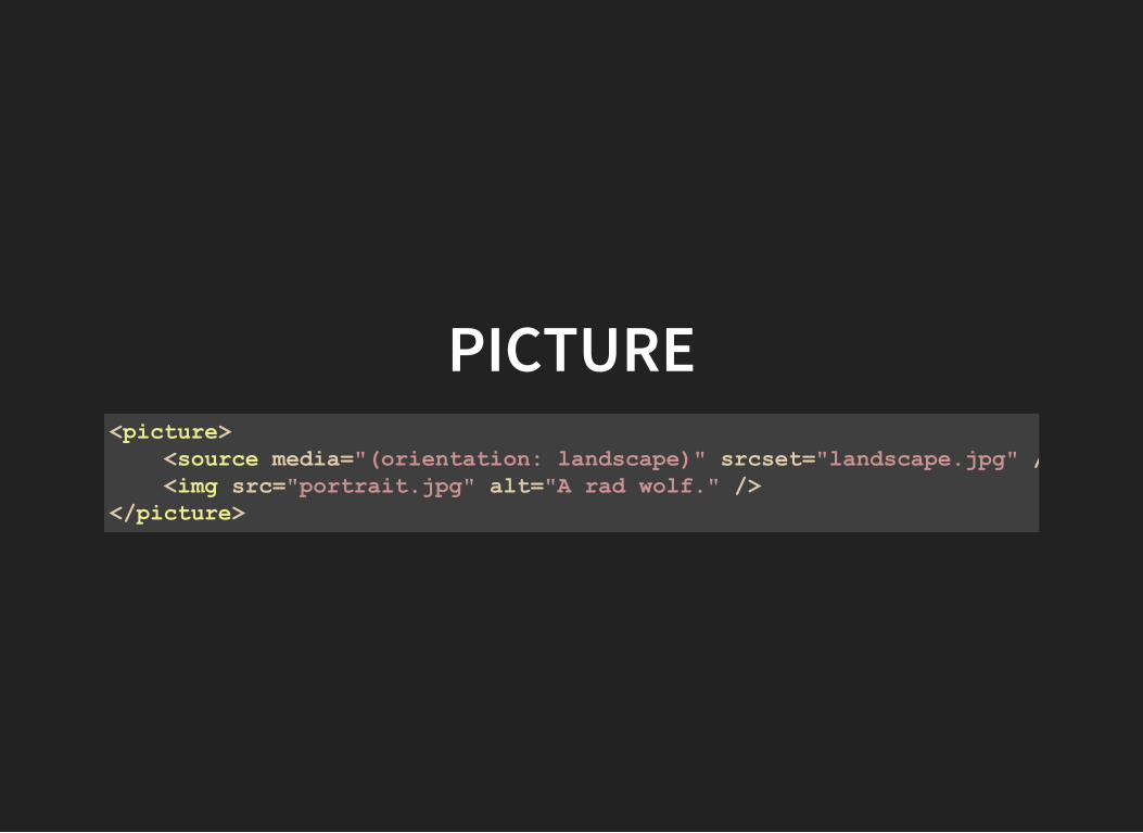
PICTURE<picture> <source media="(orientation: landscape)" srcset="landscape.jpg" /> <img src="portrait.jpg" alt="A rad wolf." /></picture>
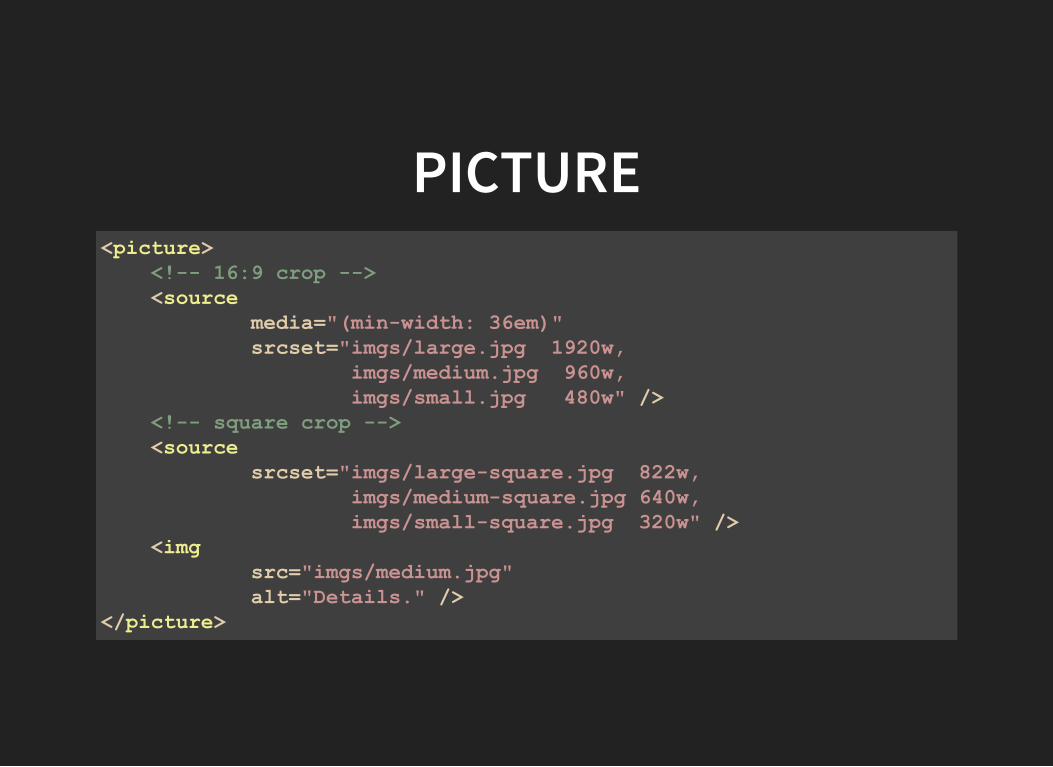
PICTURE<picture> <! 16:9 crop > <source media="(minwidth: 36em)" srcset="imgs/large.jpg 1920w, imgs/medium.jpg 960w, imgs/small.jpg 480w" /> <! square crop > <source srcset="imgs/largesquare.jpg 822w, imgs/mediumsquare.jpg 640w, imgs/smallsquare.jpg 320w" /> <img src="imgs/medium.jpg" alt="Details." /></picture>
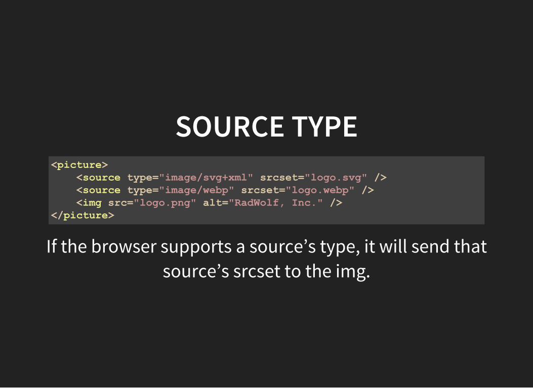
SOURCE TYPE<picture> <source type="image/svg+xml" srcset="logo.svg" /> <source type="image/webp" srcset="logo.webp" /> <img src="logo.png" alt="RadWolf, Inc." /></picture>
If the browser supports a source’s type, it will send thatsource’s srcset to the img.
GRIDS
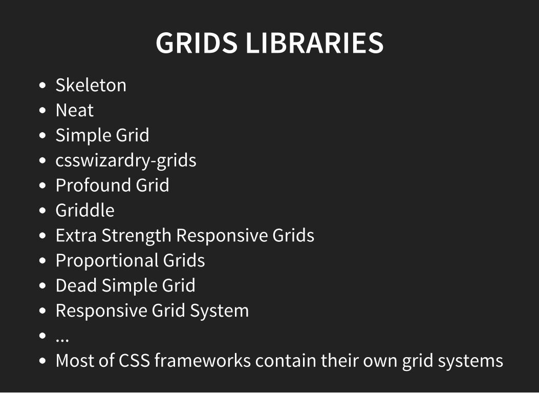
GRIDS LIBRARIESSkeletonNeatSimple Gridcsswizardry-gridsProfound GridGriddleExtra Strength Responsive GridsProportional GridsDead Simple GridResponsive Grid System...Most of CSS frameworks contain their own grid systems
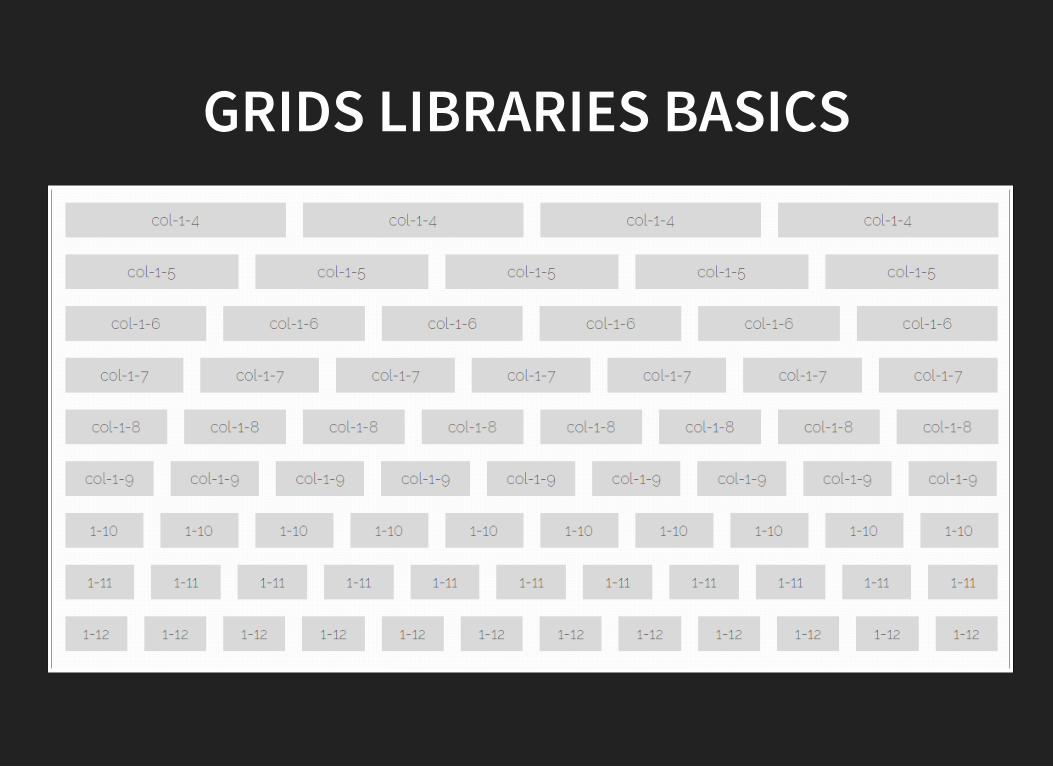
GRIDS LIBRARIES BASICS
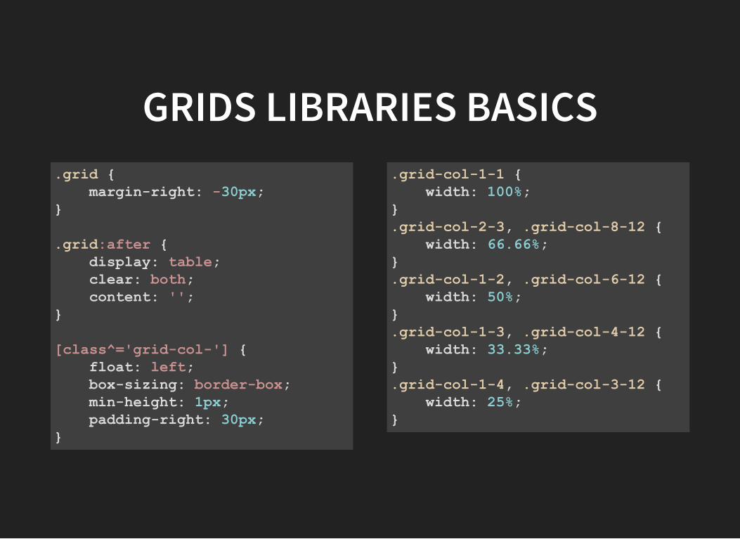
GRIDS LIBRARIES BASICS.grid marginright: 30px;
.grid:after display: table; clear: both; content: '';
[class^='gridcol'] float: left; boxsizing: borderbox; minheight: 1px; paddingright: 30px;
.gridcol11 width: 100%;.gridcol23, .gridcol812 width: 66.66%;.gridcol12, .gridcol612 width: 50%;.gridcol13, .gridcol412 width: 33.33%;.gridcol14, .gridcol312 width: 25%;
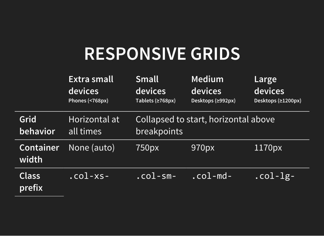
RESPONSIVE GRIDSExtra smalldevicesPhones (<768px)
SmalldevicesTablets (≥768px)
MediumdevicesDesktops (≥992px)
LargedevicesDesktops (≥1200px)
Gridbehavior
Horizontal atall times
Collapsed to start, horizontal abovebreakpoints
Containerwidth
None (auto) 750px 970px 1170px
Classprefix
.col‐xs‐ .col‐sm‐ .col‐md‐ .col‐lg‐
FLEXBOX
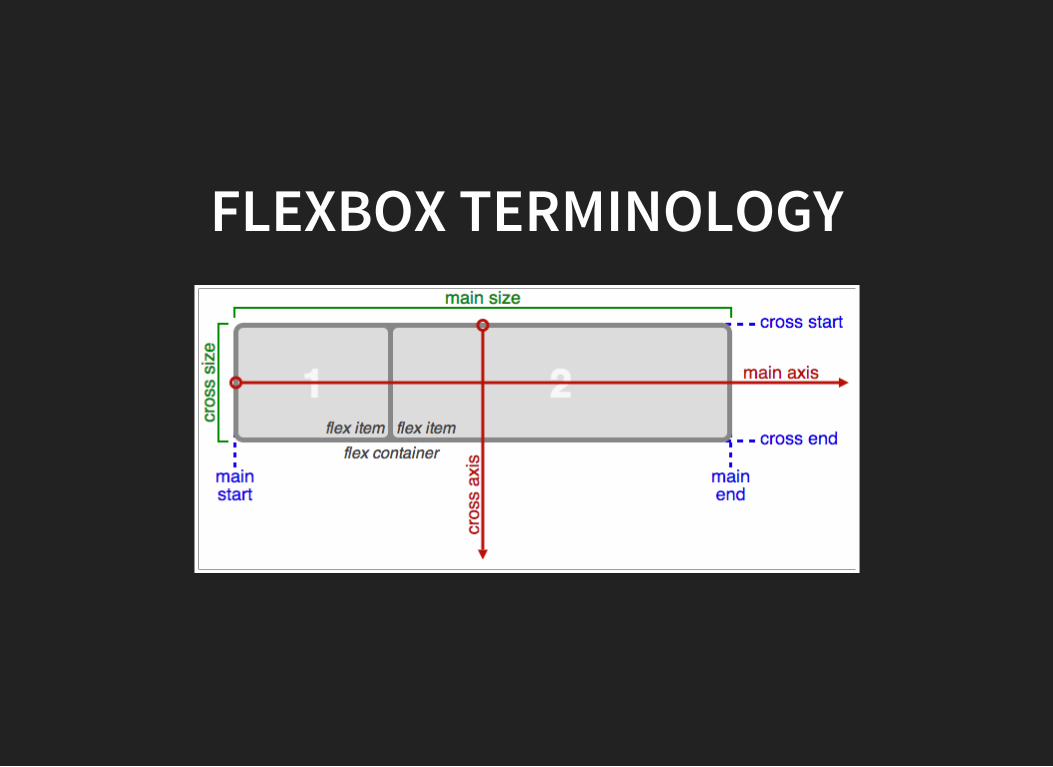
FLEXBOX TERMINOLOGY
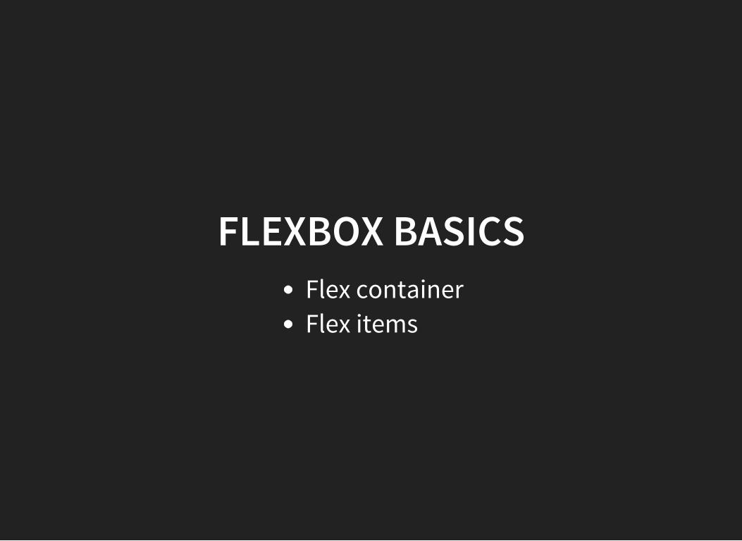
FLEXBOX BASICSFlex containerFlex items
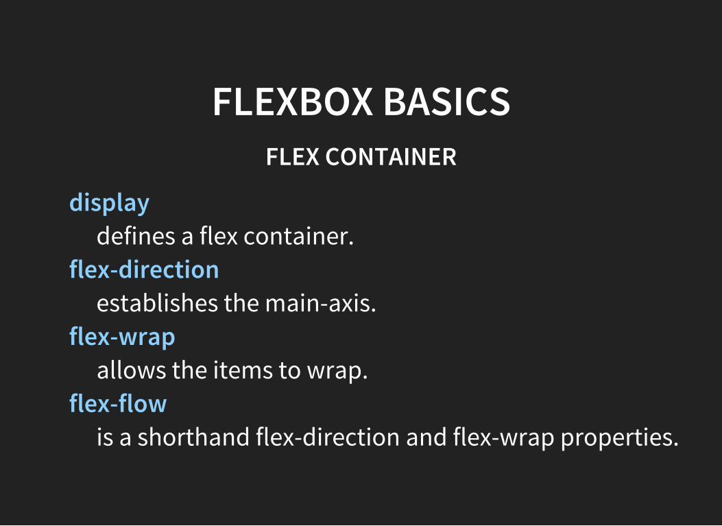
FLEXBOX BASICSFLEX CONTAINER
displaydefines a flex container.
flex-directionestablishes the main-axis.
flex-wrapallows the items to wrap.
flex-flowis a shorthand flex-direction and flex-wrap properties.
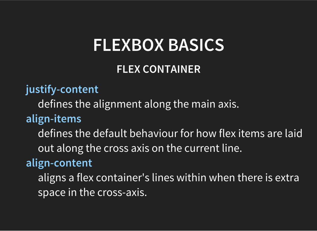
FLEXBOX BASICSFLEX CONTAINER
justify-contentdefines the alignment along the main axis.
align-itemsdefines the default behaviour for how flex items are laidout along the cross axis on the current line.
align-contentaligns a flex container's lines within when there is extraspace in the cross-axis.
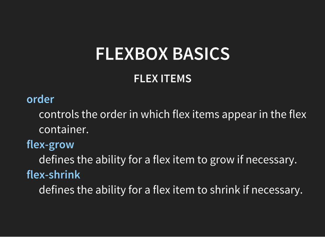
FLEXBOX BASICSFLEX ITEMS
ordercontrols the order in which flex items appear in the flexcontainer.
flex-growdefines the ability for a flex item to grow if necessary.
flex-shrinkdefines the ability for a flex item to shrink if necessary.
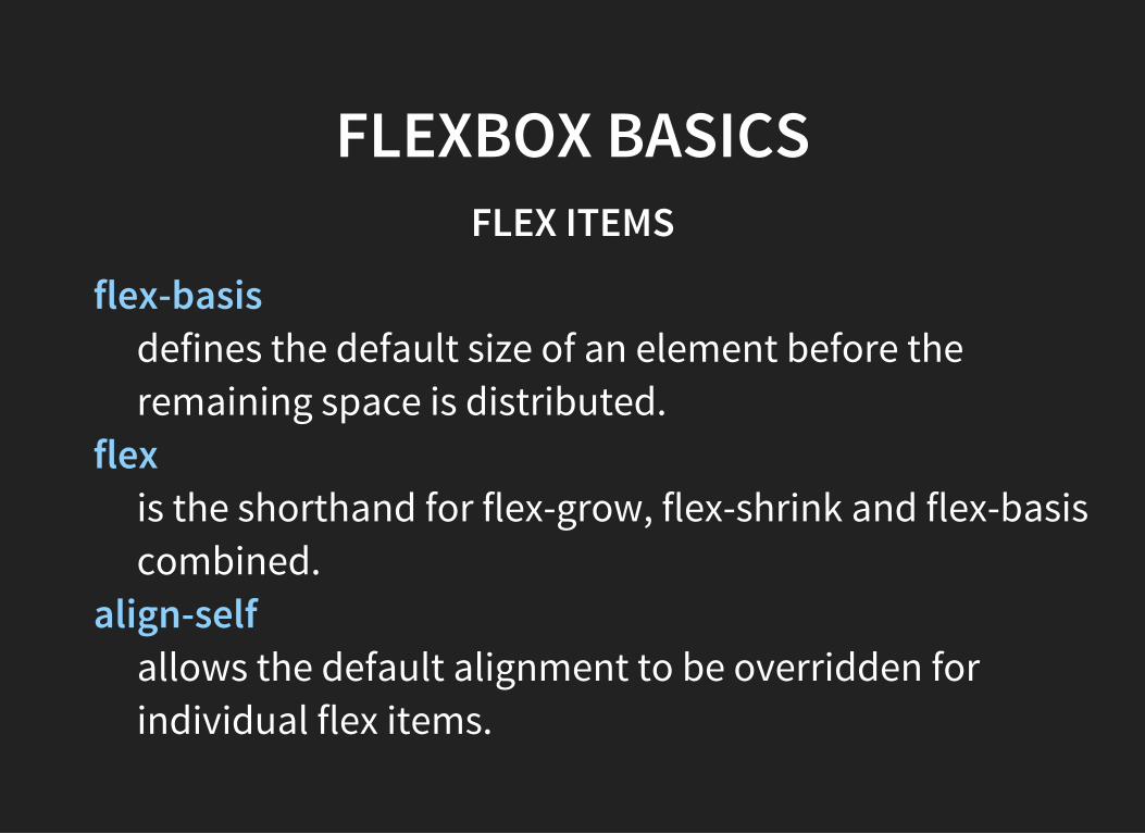
FLEXBOX BASICSFLEX ITEMS
flex-basisdefines the default size of an element before theremaining space is distributed.
flexis the shorthand for flex-grow, flex-shrink and flex-basiscombined.
align-selfallows the default alignment to be overridden forindividual flex items.
RESPONSIVE TABLES
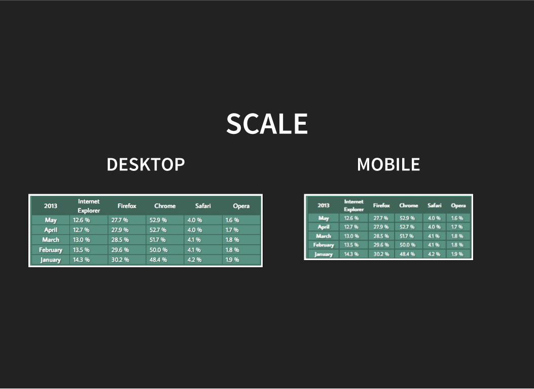
SCALEDESKTOP MOBILE
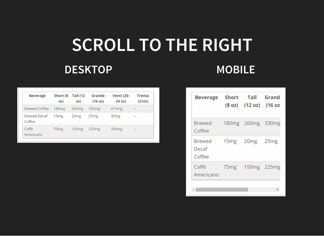
SCROLL TO THE RIGHTDESKTOP MOBILE
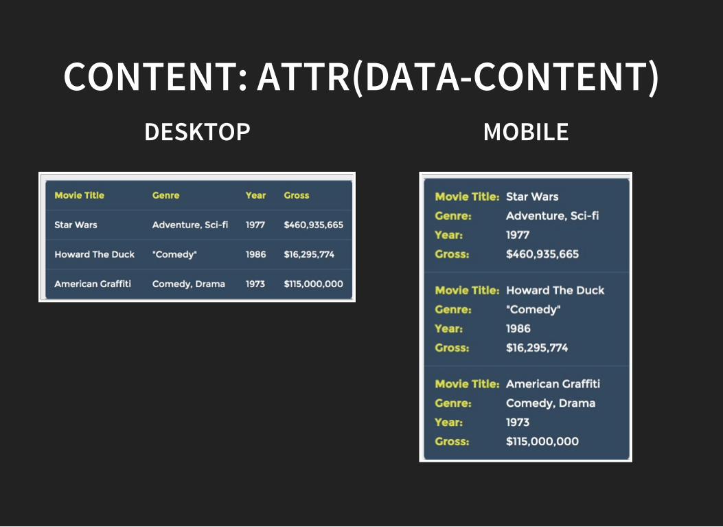
CONTENT: ATTR(DATA-CONTENT)DESKTOP MOBILE

ADVICES
USE RELATIVE UNITSA key concept behind responsive design is fluidity and
proportionality as opposed to fixed width layouts.
DON’T USE RELATIVE UNITSDon’t use relative units everywhere. Ask yourself a question:
Is this property depending on the viewportwidth?
CHOOSE CORRECT BREAKPOINTSDefining breakpoints based on specific devices, products,brand names, or operating systems that are in use todaycan result in a maintenance nightmare. The content itself should determine how the layoutadjusts to its container.
‘MOBILE’ FIRSTUse the simplest layout as a start point.
Forces You to Focus on Core Content and Functionality.In most cases this approach will get less css stylesoverrides.
DON’T USE MIN-DEVICE-WIDTHcreating queries based on *-device-width; is strongly
discouraged.
DON’T USE ABSOLUTE VALUES FORDEFINING VIEWPORT
USE CSS PREPROCESSORSUse CSS preprocessors to define bundles
@phone = ~’320px’

PREVIEWING &TESTING
EXTERNAL RESOURCESResponsinator.com
displays as numerous devicesiOS Simulator
if you have a Mac. (After launching Xcode, go intothe Xcode menu and chooseOpen Developer Tool > iOSSimulator)
Browserstackfor cross browser and device testing.
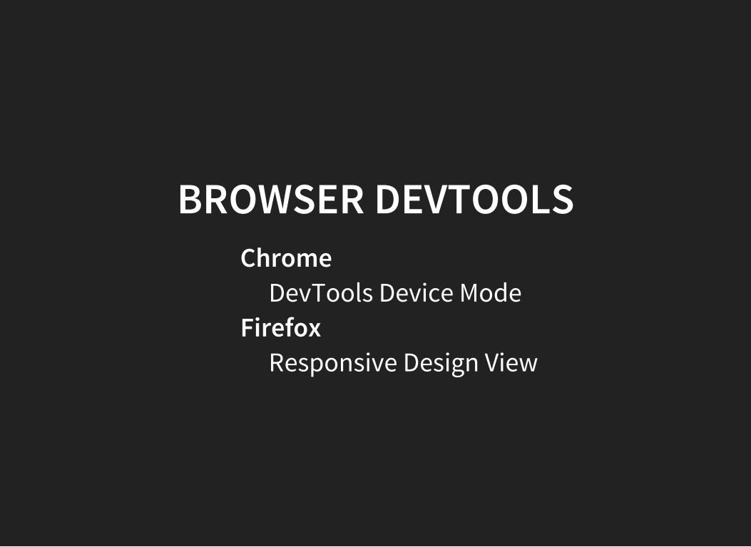
BROWSER DEVTOOLSChrome
DevTools Device ModeFirefox
Responsive Design View
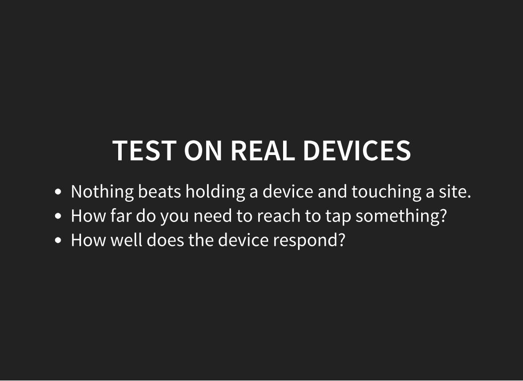
TEST ON REAL DEVICESNothing beats holding a device and touching a site.How far do you need to reach to tap something?How well does the device respond?
RESOURCEShttps://developer.mozilla.org/en-US/docs/Web_Development/Mobile/Responsive_designhttp://alistapart.com/article/responsive-images-in-practicehttps://html.spec.whatwg.org/multipage/embedded-content.html#attr-picture-source-mediahttp://www.quirksmode.org/mobile/viewports.htmlhttps://developers.google.com/web/fundamentals/layouts/index?hl=enhttps://developer.mozilla.org/en-US/docs/Mozilla/Mobile/Viewport_meta_taghttps://css-tricks.com/snippets/css/a-guide-to-flexbox
Recommended