Embed Size (px)
Citation preview
Thursday, December 6, 10:15 a.m.
Hub Tag: #tech12 LK2
Thomas Kugler, John Mi l ls
Being Responsive
to Responsive
Web Design
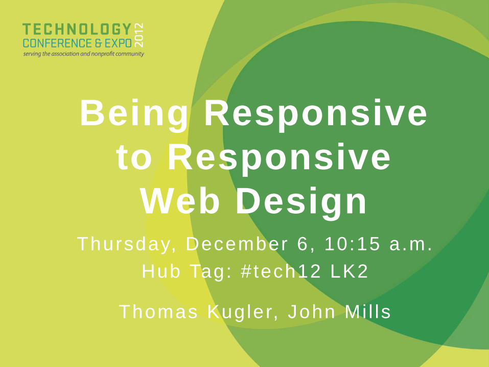
• Thomas Kugler: Website Administrator,
ASAE(1/11–present, with prior contract assignment 9/10–1/11)
• Work with team on Web Strategies, Information
Architecture, Content Planning, Social Media;
Design & Develop; Innovate
• Former ASAE web colleague of John Mills,
co-Technology Idea Labs leader“Good design is problem-solving”
Who We Are#TECH12 LK2
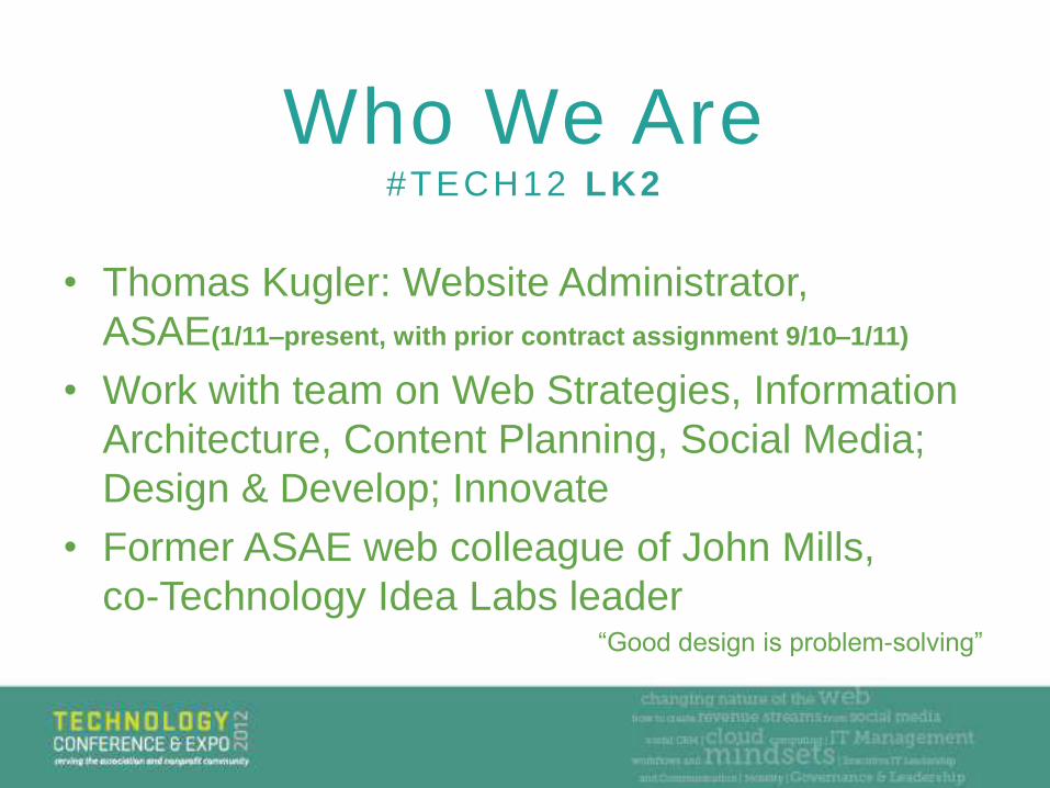
• John Mills: Web Manager for PMMI
– (8 years in the association world overall)
• Design, content, video, narration, social
spaces are how and where I live.
• Off-hours: Occasionally pretending I'm a
Jedi.
Who We Are#TECH12 LK2
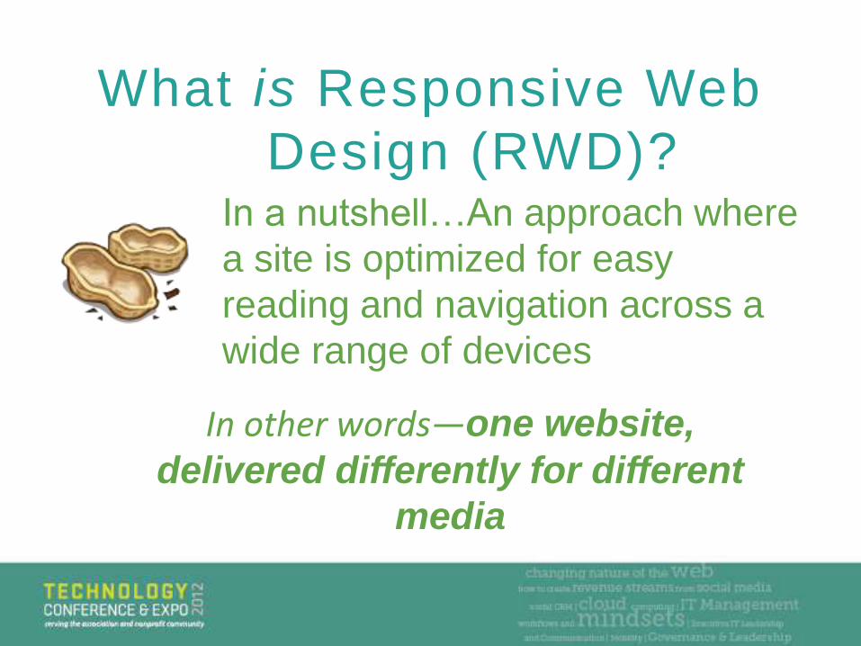
What is Responsive Web
Design (RWD)?In a nutshell…An approach where
a site is optimized for easy
reading and navigation across a
wide range of devices
In other words—one website,
delivered differently for different
media
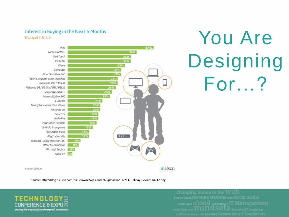
You Are
Designing
For…?
Source: http://blog.nielsen.com/nielsenwire/wp-content/uploads/2012/11/Holiday-Devices-K6-12.png
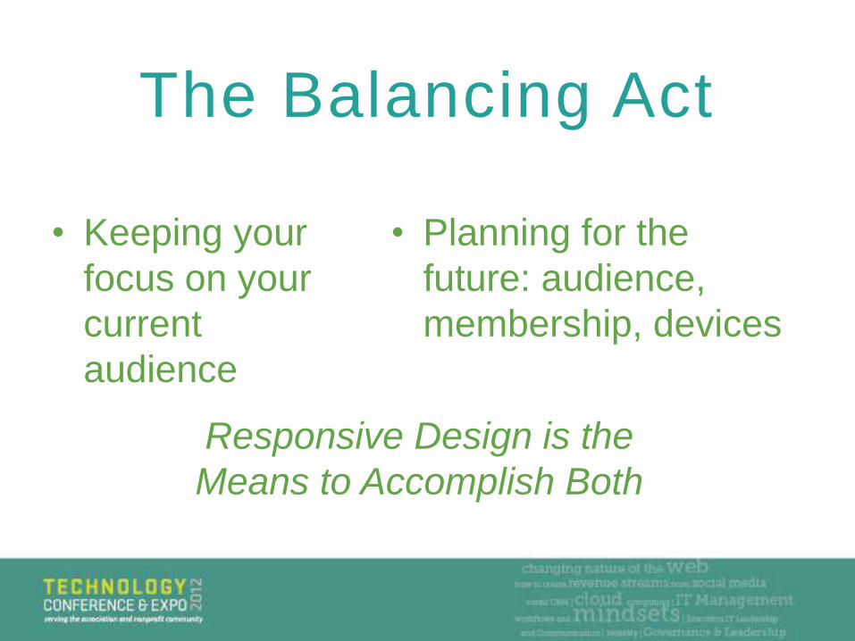
• Keeping your
focus on your
current
audience
The Balancing Act
• Planning for the
future: audience,
membership, devices
Responsive Design is the
Means to Accomplish Both

Apps Do It All !
The Myth of Apps
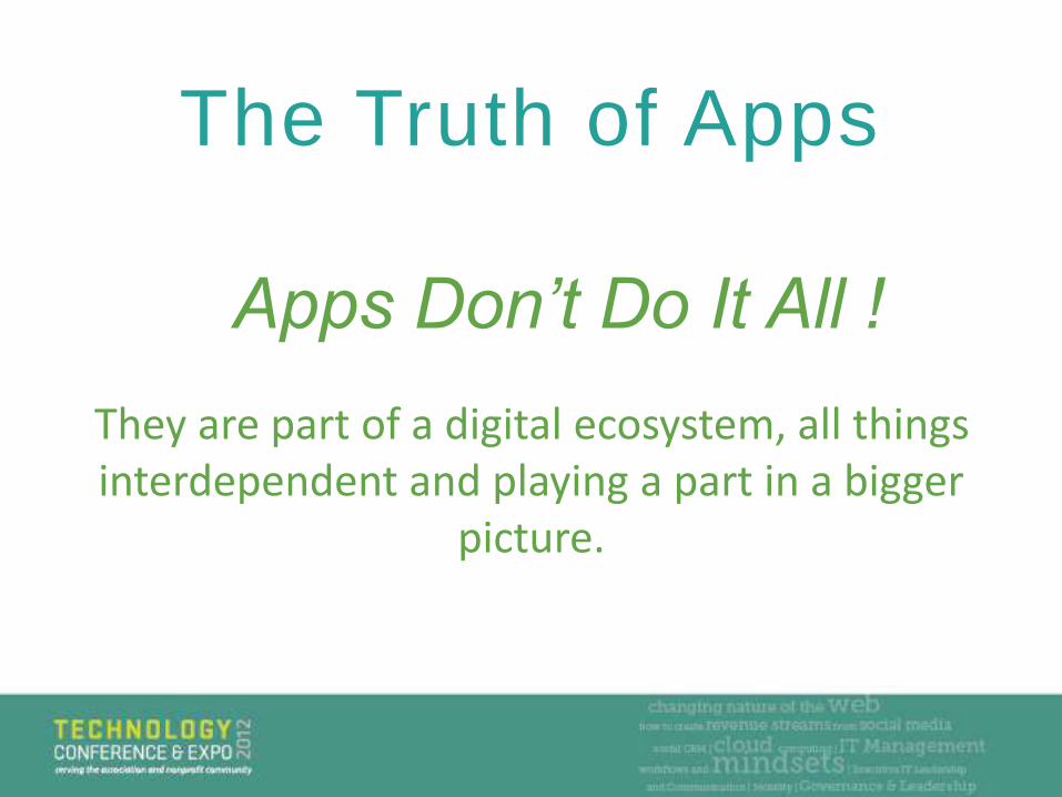
Apps Don’t Do It All !
The Truth of Apps
They are part of a digital ecosystem, all things interdependent and playing a part in a bigger
picture.
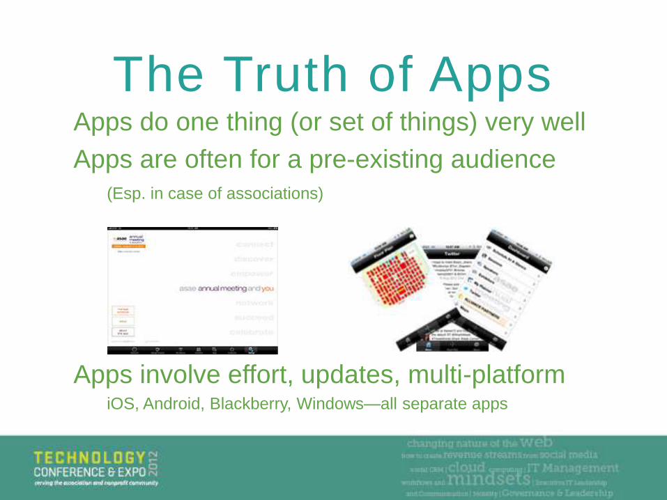
Apps do one thing (or set of things) very well
Apps are often for a pre-existing audience
(Esp. in case of associations)
The Truth of Apps
Apps involve effort, updates, multi-platform iOS, Android, Blackberry, Windows—all separate apps
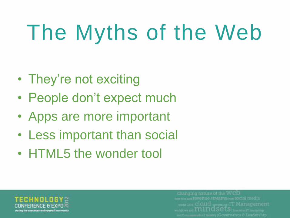
• They’re not exciting
• People don’t expect much
• Apps are more important
• Less important than social
• HTML5 the wonder tool
The Myths of the Web
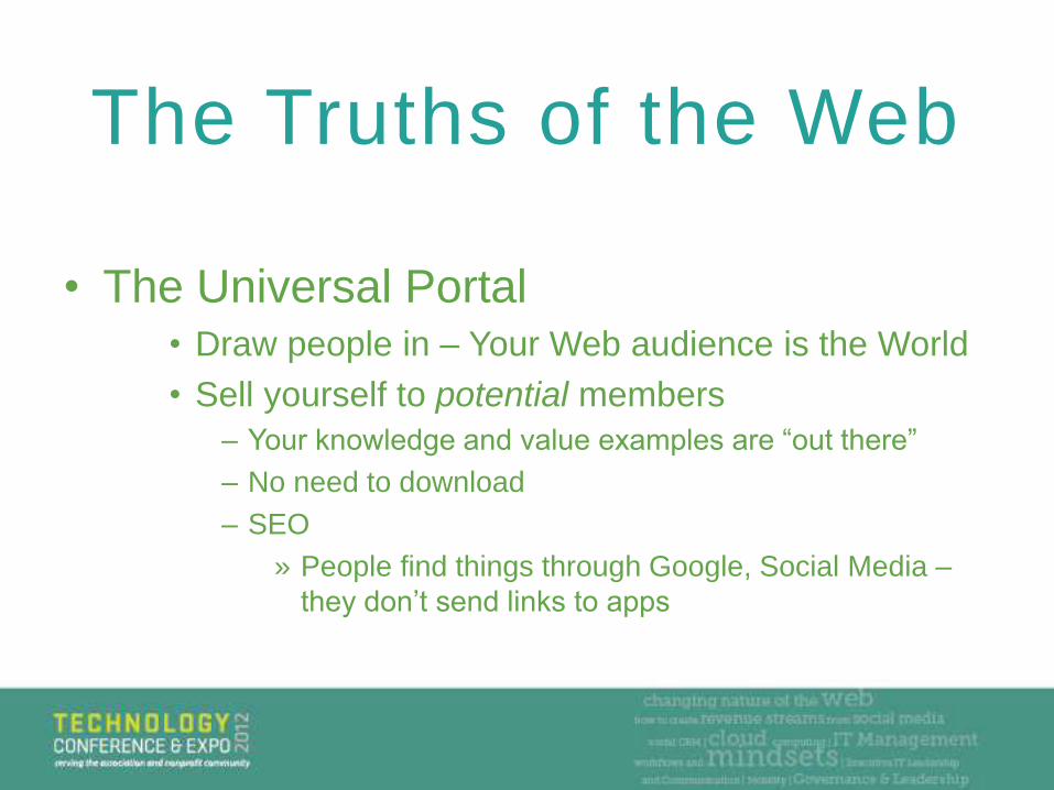
• The Universal Portal• Draw people in – Your Web audience is the World
• Sell yourself to potential members
– Your knowledge and value examples are “out there”
– No need to download
– SEO
» People find things through Google, Social Media –
they don’t send links to apps
The Truths of the Web
The Truths of the Web
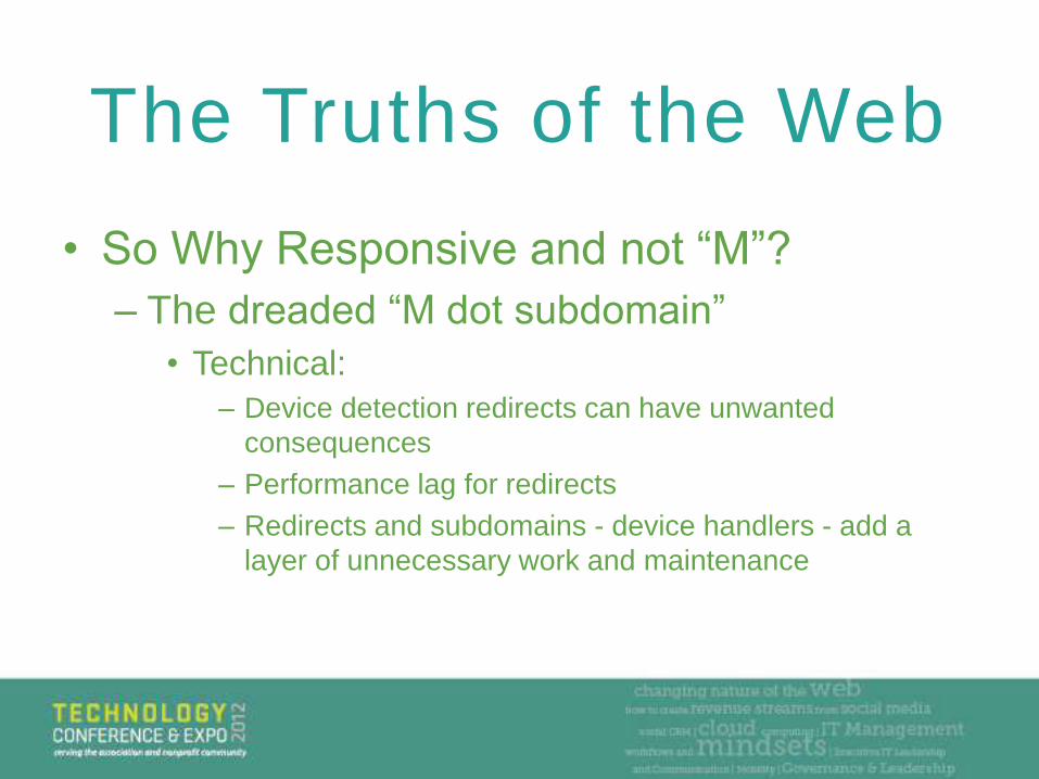
• So Why Responsive and not “M”?
– The dreaded “M dot subdomain”
• Technical:
– Device detection redirects can have unwanted
consequences
– Performance lag for redirects
– Redirects and subdomains - device handlers - add a
layer of unnecessary work and maintenance
• So Why Responsive and not “M”?• Practical:
– A parallel site is not good for SEO
– Give people ONE URL as a resource
– Cost. Why develop twice what you can develop once?
– A funny little story about a big misunderstanding: When
someone left a responsive site directly to a site with
“mobile detect.”
Why Responsive Design
Matters
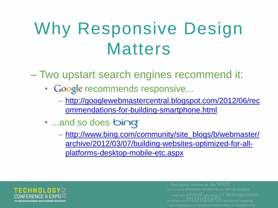
– Two upstart search engines recommend it:
• recommends responsive...
– http://googlewebmastercentral.blogspot.com/2012/06/rec
ommendations-for-building-smartphone.html
• ...and so does
– http://www.bing.com/community/site_blogs/b/webmaster/
archive/2012/03/07/building-websites-optimized-for-all-
platforms-desktop-mobile-etc.aspx
Why Responsive Design
Matters
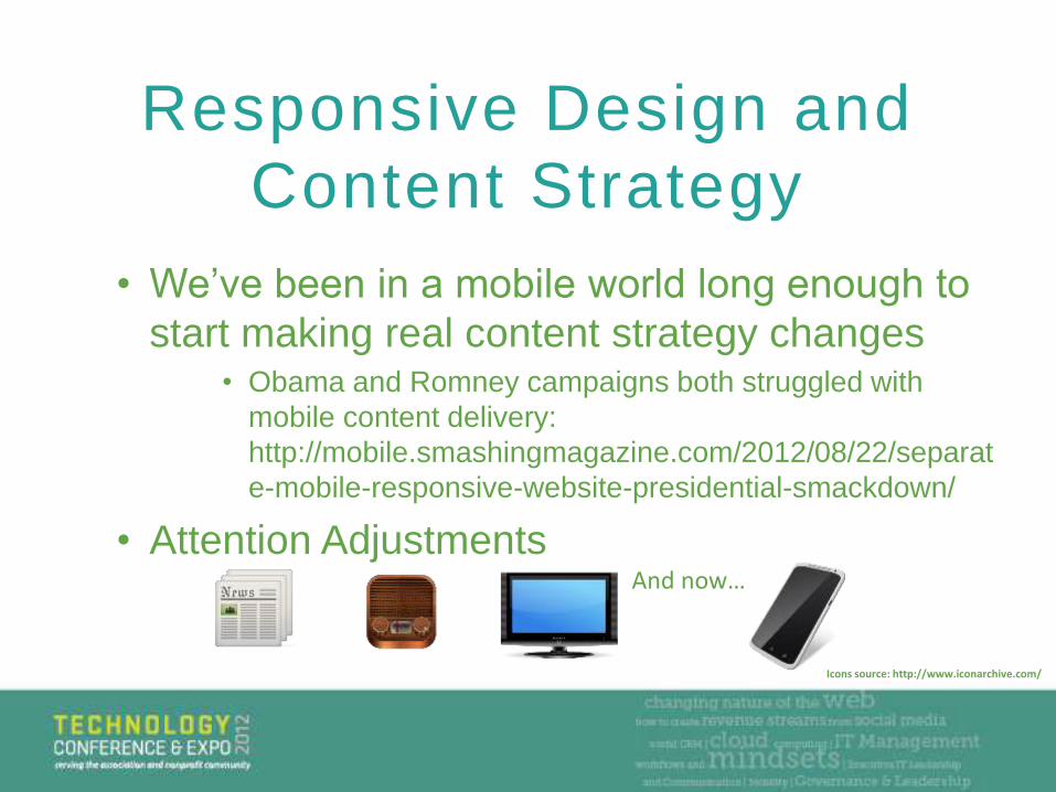
• We’ve been in a mobile world long enough to
start making real content strategy changes • Obama and Romney campaigns both struggled with
mobile content delivery:
http://mobile.smashingmagazine.com/2012/08/22/separat
e-mobile-responsive-website-presidential-smackdown/
• Attention Adjustments
Responsive Design and
Content Strategy
And now…
Icons source: http://www.iconarchive.com/
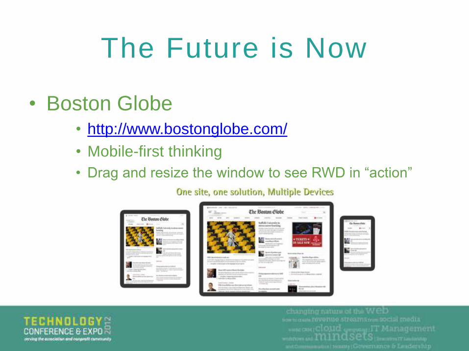
• Boston Globe • http://www.bostonglobe.com/
• Mobile-first thinking
• Drag and resize the window to see RWD in “action”
The Future is Now
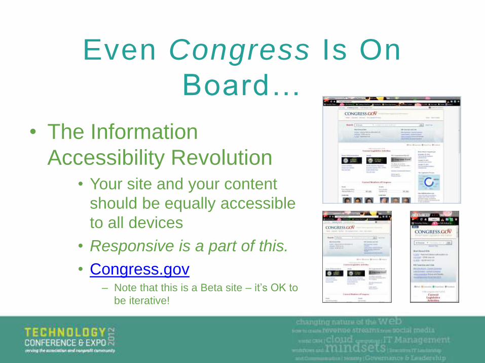
• The Information
Accessibility Revolution• Your site and your content
should be equally accessible
to all devices
• Responsive is a part of this.
• Congress.gov– Note that this is a Beta site – it’s OK to
be iterative!
Even Congress Is On
Board…
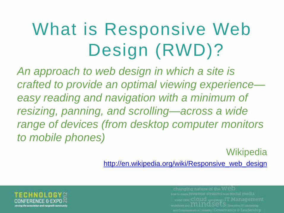
What is Responsive Web
Design (RWD)?An approach to web design in which a site is
crafted to provide an optimal viewing experience—
easy reading and navigation with a minimum of
resizing, panning, and scrolling—across a wide
range of devices (from desktop computer monitors
to mobile phones)
Wikipediahttp://en.wikipedia.org/wiki/Responsive_web_design
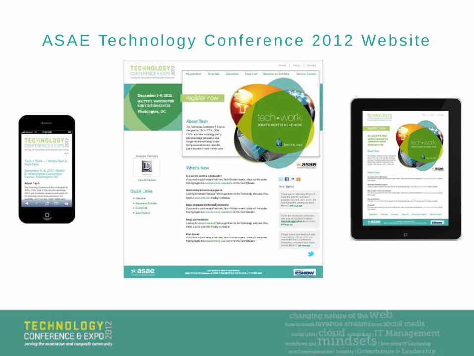
ASAE Techno logy Confe rence 2012 Webs i te
The 3 Building Blocks of
Responsive Web Design
(RWD):
• Fluid Grids
• Flexible Images
• Media Queries
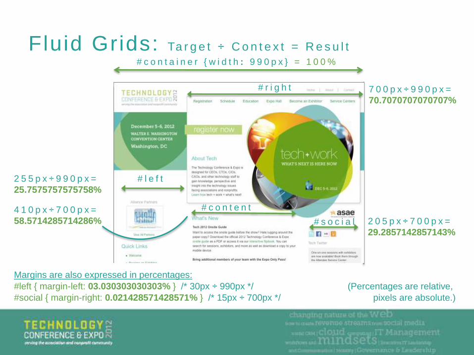
Fluid Grids: Ta r g e t ÷ C o n t e x t = R e s u l t
# c o n t a i n e r { w i d t h : 9 9 0 p x } = 1 0 0 %
# l e f t2 5 5 p x ÷ 9 9 0 p x =
25.7575757575758%
# r i g h t 7 0 0 p x ÷ 9 9 0 p x =
70.7070707070707%
# s o c i a l 2 0 5 p x ÷ 7 0 0 p x =
29.2857142857143%
# c o n t e n t4 1 0 p x ÷ 7 0 0 p x =
58.5714285714286%
Margins are also expressed in percentages:
#left { margin-left: 03.030303030303% } /* 30px ÷ 990px */ (Percentages are relative,
#social { margin-right: 0.021428571428571% } /* 15px ÷ 700px */ pixels are absolute.)
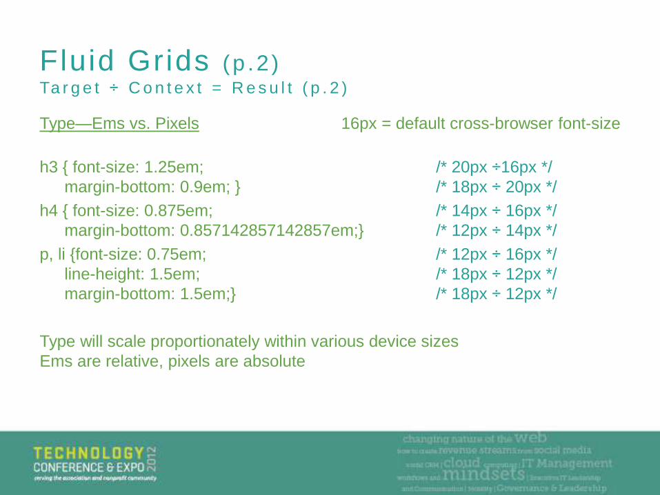
Fluid Grids (p .2 )Ta r g e t ÷ C o n t e x t = R e s u l t ( p . 2 )
Type—Ems vs. Pixels 16px = default cross-browser font-size
h3 { font-size: 1.25em; /* 20px ÷16px */
margin-bottom: 0.9em; } /* 18px ÷ 20px */
h4 { font-size: 0.875em; /* 14px ÷ 16px */
margin-bottom: 0.857142857142857em;} /* 12px ÷ 14px */
p, li {font-size: 0.75em; /* 12px ÷ 16px */
line-height: 1.5em; /* 18px ÷ 12px */
margin-bottom: 1.5em;} /* 18px ÷ 12px */
Type will scale proportionately within various device sizes
Ems are relative, pixels are absolute
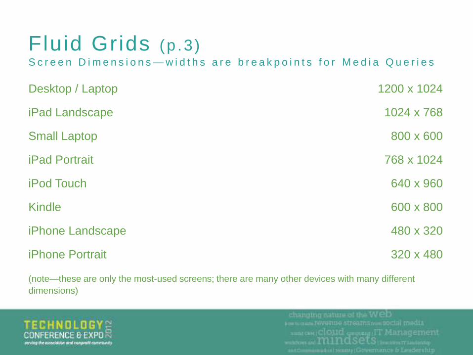
Fluid Grids (p .3 )S c r e e n D i m e n s i o n s — w i d t h s a r e b r e a k p o i n t s f o r M e d i a Q u e r i e s
Desktop / Laptop 1200 x 1024
iPad Landscape 1024 x 768
Small Laptop 800 x 600
iPad Portrait 768 x 1024
iPod Touch 640 x 960
Kindle 600 x 800
iPhone Landscape 480 x 320
iPhone Portrait 320 x 480
(note—these are only the most-used screens; there are many other devices with many different
dimensions)
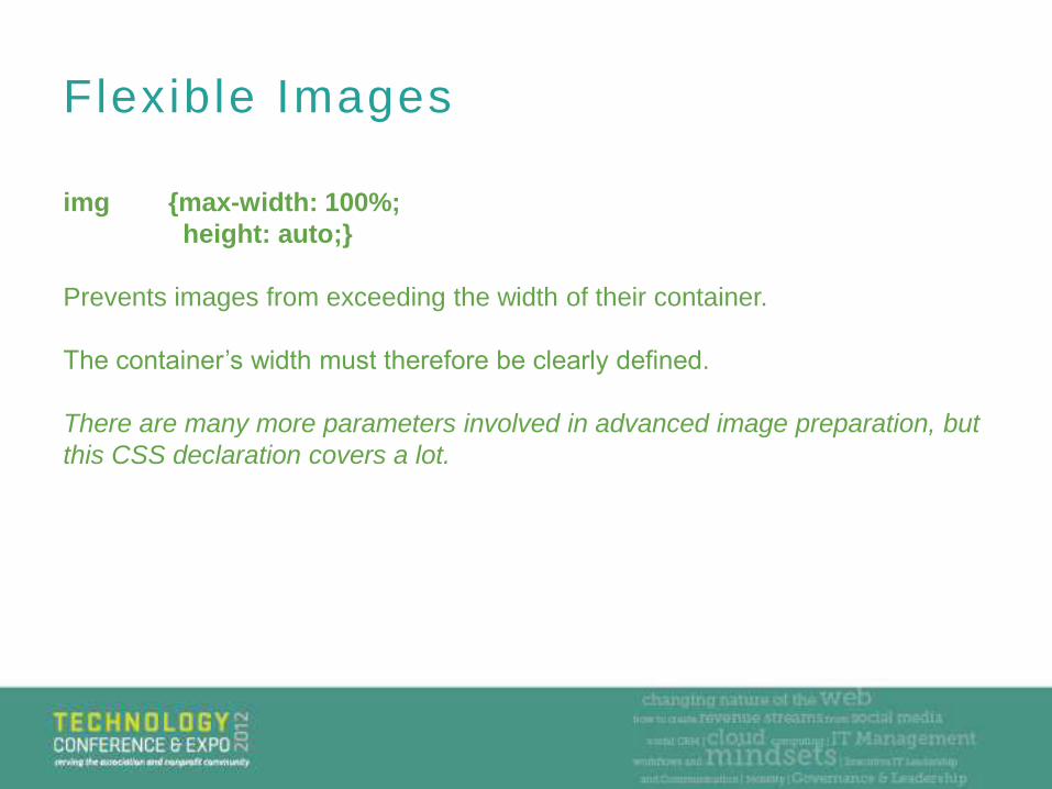
Flexible Images
img {max-width: 100%;
height: auto;}
Prevents images from exceeding the width of their container.
The container’s width must therefore be clearly defined.
There are many more parameters involved in advanced image preparation, but
this CSS declaration covers a lot.
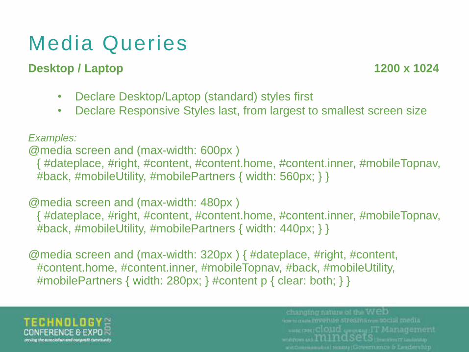
Media QueriesDesktop / Laptop 1200 x 1024
• Declare Desktop/Laptop (standard) styles first
• Declare Responsive Styles last, from largest to smallest screen size
Examples:
@media screen and (max-width: 600px ) { #dateplace, #right, #content, #content.home, #content.inner, #mobileTopnav, #back, #mobileUtility, #mobilePartners { width: 560px; } }
@media screen and (max-width: 480px ) { #dateplace, #right, #content, #content.home, #content.inner, #mobileTopnav, #back, #mobileUtility, #mobilePartners { width: 440px; } }
@media screen and (max-width: 320px ) { #dateplace, #right, #content, #content.home, #content.inner, #mobileTopnav, #back, #mobileUtility, #mobilePartners { width: 280px; } #content p { clear: both; } }
M o b i l e F i r s t & R e s p o n s i v e We b D e s i g n B u n d l e ,
f r o m A B o o k A p a r t
C o n t e n t S t r a t e g y f o r M o b i l e ,
f r o m A B o o k A p a r t
• A Book Apart http://www.abookapart.com/
• Luke Wroblewski (@lukew on Twitter,
http://www.lukew.com)
• Don’t Make Me Think (A “Classic”)
• Revisit your own assumptions
• Treehouse http://teamtreehouse.com/
• Your members
– Site analytics, Feedback, ASK them
Important Resources
What did we miss?
What else do you want to know?
Are you as excited as we are for the future?
Questions
John Mills
@kesseljunkie
Thank You
Thomas Kugler
@tom8gem


![Responsive Design Fundamentals [Read-Only] - … Design Fundame… · Responsive Design Fundamentals Carolyn Yon, PMI-ACP Development Manager ... Responsive Design • web design](https://img.pdfslide.us/doc/110x75/5b7c060b7f8b9adb4c8df8c4/responsive-design-fundamentals-read-only-design-fundame-responsive-design.jpg)