Selected works and projectsInteractive art | Environmental art | Jewelry design | Graphic Design | Photography | Package Design
Liisa Tervinen
2002-2008
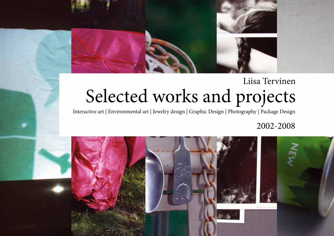
Selected works and projectsLiisa Tervinen
Picture: Wrapped 2003
4 -5 Call - Cause & Eff ect
Rovaniemi
6 - 7 Winter Games With Mary
8 - 9 Aurora Borealis
10 - 15 Screen Labyrinth
16 - 17 Wrapped
18 - 19 Collaboration with the Finnish
Rheumatism Association
20 - 21 Apple Chips
22 - 23 Giza
24 - 25 Green Papaya Brochure
26 - 27 Book Design
28 - 31 Puzzle Pictures
32 - 35 Wedding Portraits
36 - 49 Jewelry Design
Call - Cause & Eff ect RovaniemiInteractve Art - Spring 2006
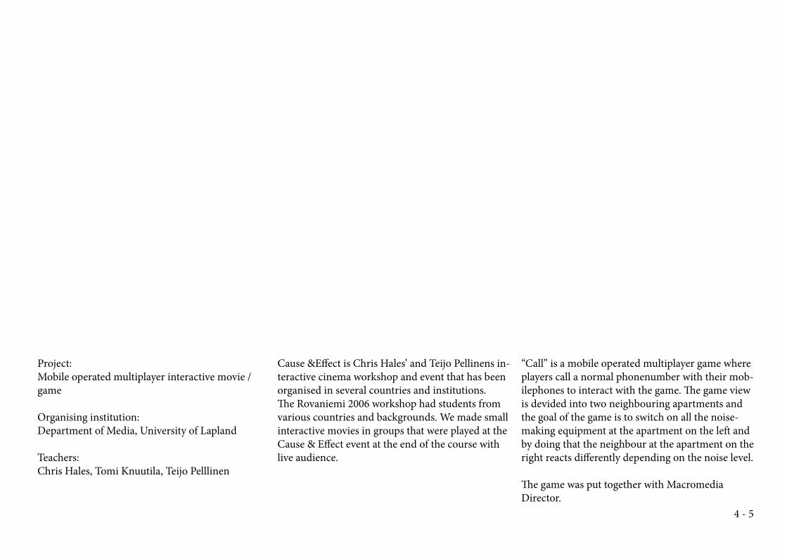
Project:
Mobile operated multiplayer interactive movie /
game
Organising institution:
Department of Media, University of Lapland
Teachers:
Chris Hales, Tomi Knuutila, Teijo Pelllinen
Cause &Eff ect is Chris Hales’ and Teijo Pellinens in-
teractive cinema workshop and event that has been
organised in several countries and institutions.
Th e Rovaniemi 2006 workshop had students from
various countries and backgrounds. We made small
interactive movies in groups that were played at the
Cause & Eff ect event at the end of the course with
live audience.
“Call” is a mobile operated multiplayer game where
players call a normal phonenumber with their mob-
ilephones to interact with the game. Th e game view
is devided into two neighbouring apartments and
the goal of the game is to switch on all the noise-
making equipment at the apartment on the left and
by doing that the neighbour at the apartment on the
right reacts diff erently depending on the noise level.
Th e game was put together with Macromedia
Director.
4 - 5
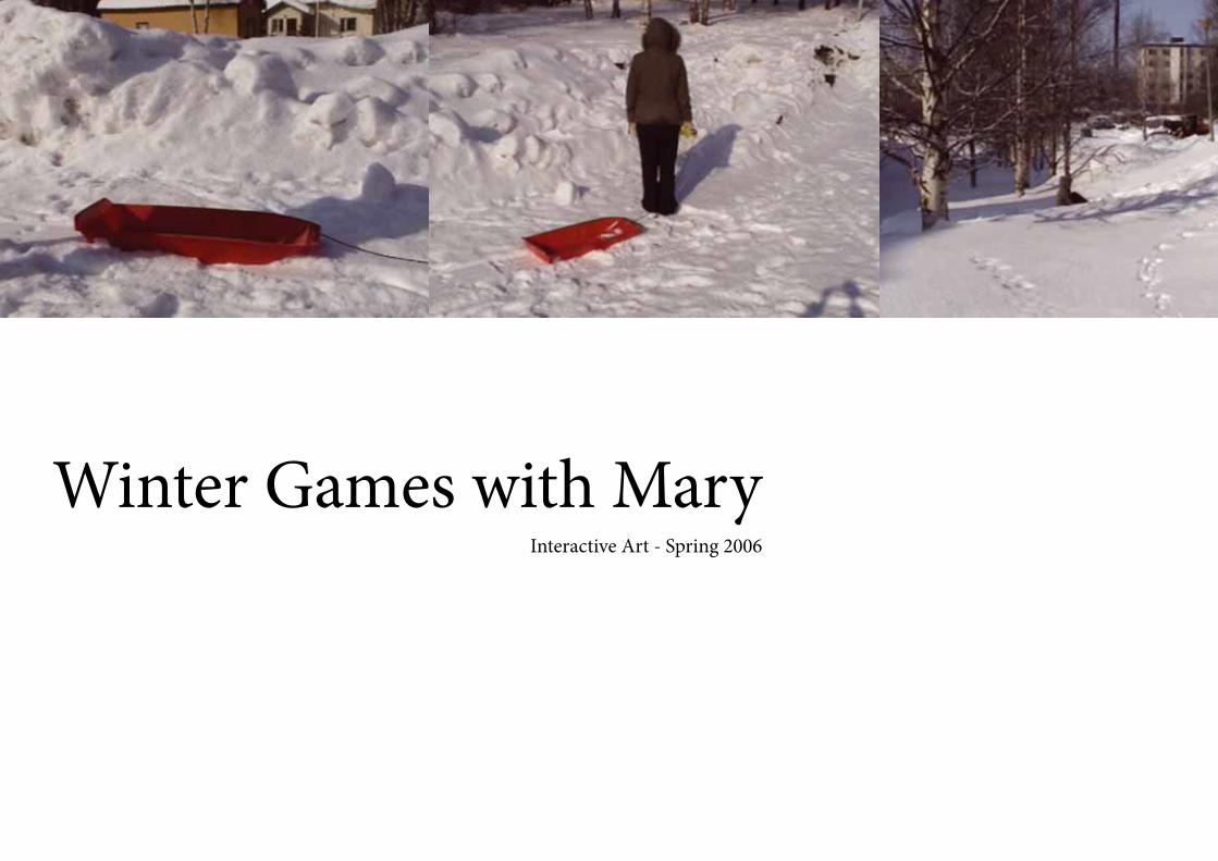
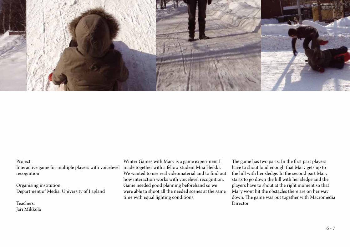
Winter Games with MaryInteractive Art - Spring 2006
Project:
Interactive game for multiple players with voicelevel
recognition
Organising institution:
Department of Media, University of Lapland
Teachers:
Jari Mikkola
Winter Games with Mary is a game experiment I
made together with a fellow student Miia Heikki.
We wanted to use real videomaterial and to fi nd out
how interaction works with voicelevel recognition.
Game needed good planning beforehand so we
were able to shoot all the needed scenes at the same
time with equal lighting conditions.
Th e game has two parts. In the fi rst part players
have to shout loud enough that Mary gets up to
the hill with her sledge. In the second part Mary
starts to go down the hill with her sledge and the
players have to shout at the right moment so that
Mary wont hit the obstacles there are on her way
down. Th e game was put together with Macromedia
Director.
6 - 7
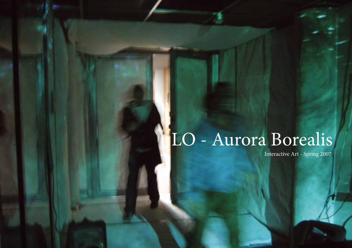
LO - Aurora BorealisInteractive Art - Spring 2007
Project:
Interactive installation
Organising institution:
Department of Media, University of Lapland
Teachers:
Haraldur Karlsson, Tomi Knuutila, Teijo Pellinen,
Bettina Schülke
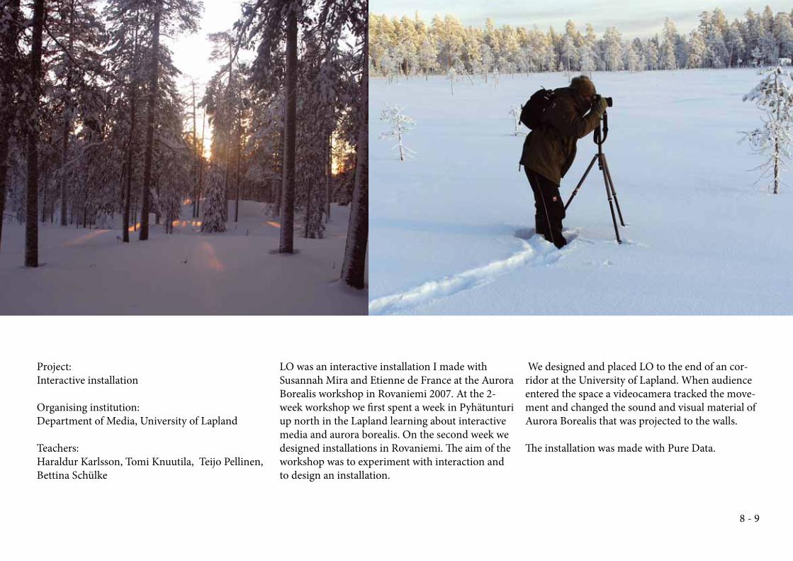
LO was an interactive installation I made with
Susannah Mira and Etienne de France at the Aurora
Borealis workshop in Rovanie mi 2007. At the 2-
week workshop we fi rst spent a week in Pyhätunturi
up north in the Lapland learning about interactive
media and aurora borealis. On the second week we
designed installations in Rovaniemi. Th e aim of the
workshop was to experiment with interaction and
to design an installation.
We designed and placed LO to the end of an cor-
ridor at the University of Lapland. When audience
entered the space a videocamera tracked the move-
ment and changed the sound and visual material of
Aurora Borealis that was projected to the walls.
Th e installation was made with Pure Data.
8 - 9
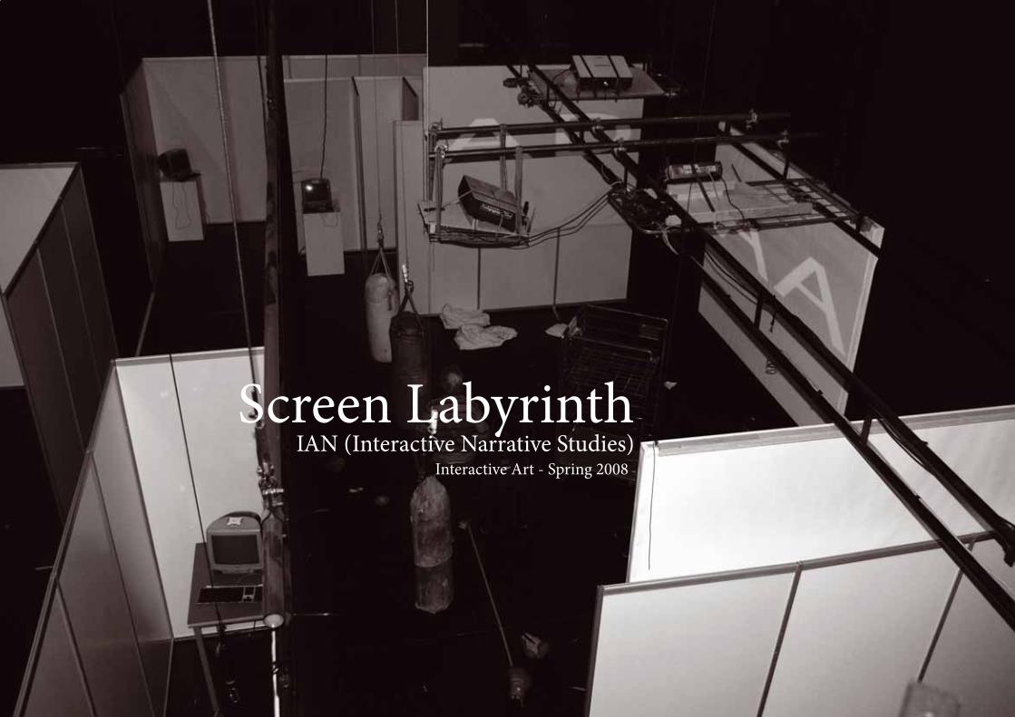
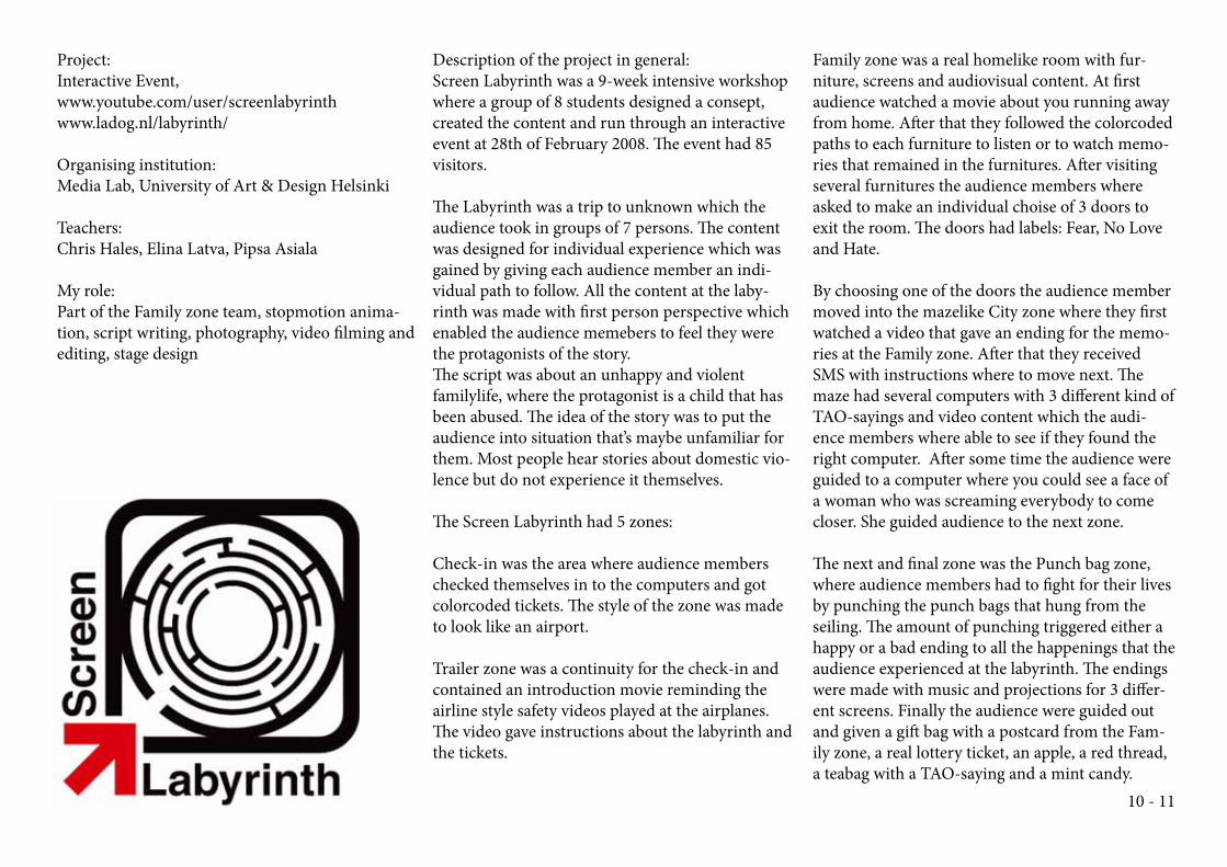
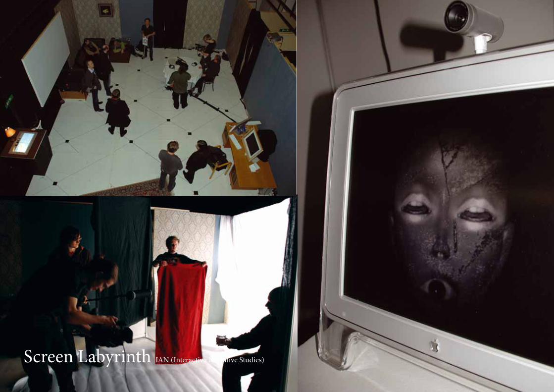
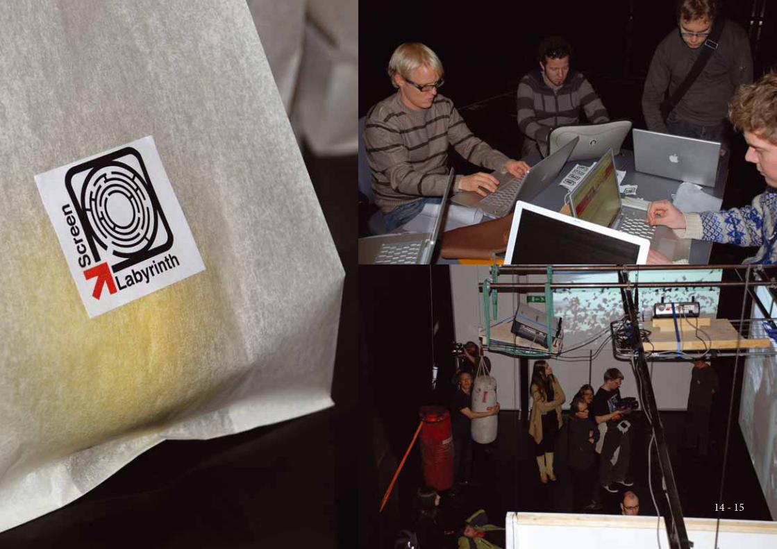
Screen LabyrinthIAN (Interactive Narrative Studies)
Interactive Art - Spring 2008
Project:
Interactive Event,
www.youtube.com/user/screenlabyrinth
www.ladog.nl/labyrinth/
Organising institution:
Media Lab, University of Art & Design Helsinki
Teachers:
Chris Hales, Elina Latva, Pipsa Asiala
My role:
Part of the Family zone team, stopmotion anima-
tion, script writing, photography, video fi lming and
editing, stage design
Description of the project in general:
Screen Labyrinth was a 9-week intensive workshop
where a group of 8 students designed a consept,
created the content and run through an interactive
event at 28th of February 2008. Th e event had 85
visitors.
Th e Labyrinth was a trip to unknown which the
audience took in groups of 7 persons. Th e content
was designed for individual experience which was
gained by giving each audience member an indi-
vidual path to follow. All the content at the laby-
rinth was made with fi rst person perspective which
enabled the audience memebers to feel they were
the protagonists of the story.
Th e script was about an unhappy and violent
familylife, where the protagonist is a child that has
been abused. Th e idea of the story was to put the
audience into situation that’s maybe unfamiliar for
them. Most people hear stories about domestic vio-
lence but do not experience it themselves.
Th e Screen Labyrinth had 5 zones:
Check-in was the area where audience members
checked themselves in to the computers and got
colorcoded tickets. Th e style of the zone was made
to look like an airport.
Trailer zone was a continuity for the check-in and
contained an introduction movie reminding the
airline style safety videos played at the airplanes.
Th e video gave instructions about the labyrinth and
the tickets.
Family zone was a real homelike room with fur-
niture, screens and audiovisual content. At fi rst
audience watched a movie about you running away
from home. Aft er that they followed the colorcoded
paths to each furniture to listen or to watch memo-
ries that remained in the furnitures. Aft er visiting
several furnitures the audience members where
asked to make an individual choise of 3 doors to
exit the room. Th e doors had labels: Fear, No Love
and Hate.
By choosing one of the doors the audience member
moved into the mazelike City zone where they fi rst
watched a video that gave an ending for the memo-
ries at the Family zone. Aft er that they received
SMS with instructions where to move next. Th e
maze had several computers with 3 diff erent kind of
TAO-sayings and video content which the audi-
ence members where able to see if they found the
right computer. Aft er some time the audience were
guided to a computer where you could see a face of
a woman who was screaming everybody to come
closer. She guided audience to the next zone.
Th e next and fi nal zone was the Punch bag zone,
where audience members had to fi ght for their lives
by punching the punch bags that hung from the
seiling. Th e amount of punching triggered either a
happy or a bad ending to all the happenings that the
audience experienced at the labyrinth. Th e endings
were made with music and projections for 3 diff er-
ent screens. Finally the audience were guided out
and given a gift bag with a postcard from the Fam-
ily zone, a real lottery ticket, an apple, a red thread,
a teabag with a TAO-saying and a mint candy.
10 - 11
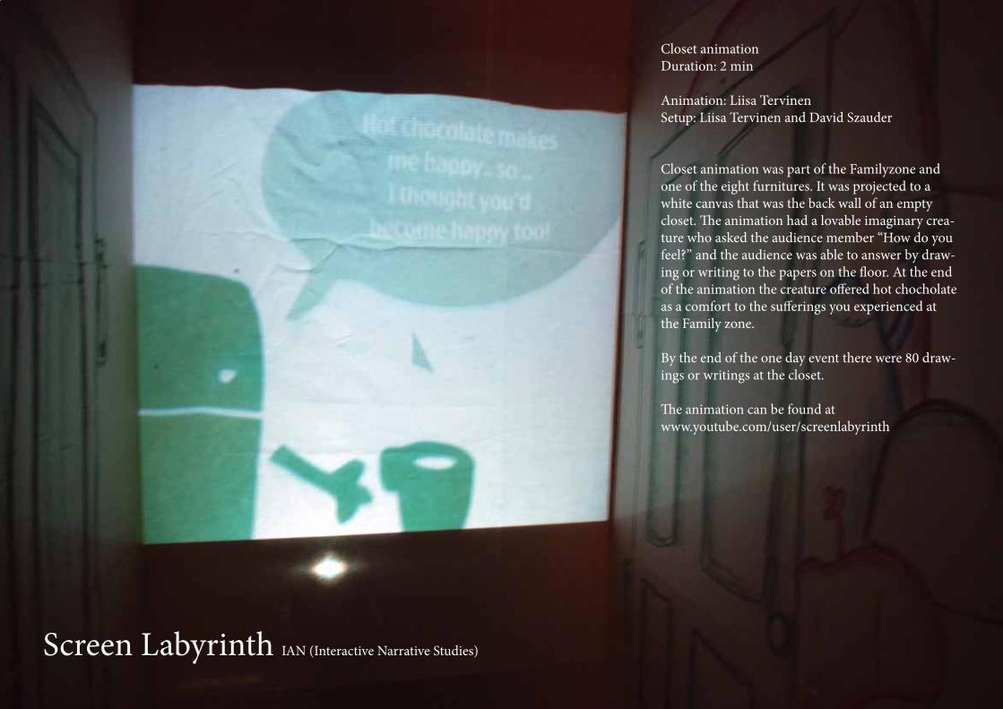
Screen Labyrinth IAN (Interactive Narrative Studies)
Closet animation
Duration: 2 min
Animation: Liisa Tervinen
Setup: Liisa Tervinen and David Szauder
Closet animation was part of the Familyzone and
one of the eight furnitures. It was projected to a
white canvas that was the back wall of an empty
closet. Th e animation had a lovable imaginary crea-
ture who asked the audience member “How do you
feel?” and the audience was able to answer by draw-
ing or writing to the papers on the fl oor. At the end
of the animation the creature off ered hot chocholate
as a comfort to the suff erings you experienced at
the Family zone.
By the end of the one day event there were 80 draw-
ings or writings at the closet.
Th e animation can be found at
www.youtube.com/user/screenlabyrinth
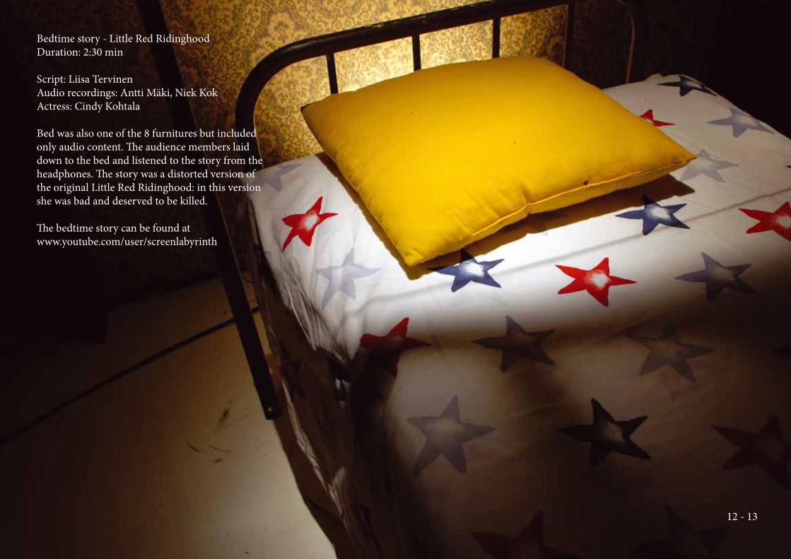
Bedtime story - Little Red Ridinghood
Duration: 2:30 min
Script: Liisa Tervinen
Audio recordings: Antti Mäki, Niek Kok
Actress: Cindy Kohtala
Bed was also one of the 8 furnitures but included
only audio content. Th e audience members laid
down to the bed and listened to the story from the
headphones. Th e story was a distorted version of
the original Little Red Ridinghood: in this version
she was bad and deserved to be killed.
Th e bedtime story can be found at
www.youtube.com/user/screenlabyrinth
12 - 13
Screen Labyrinth IAN (Interactive Narrative Studies)
14 - 15
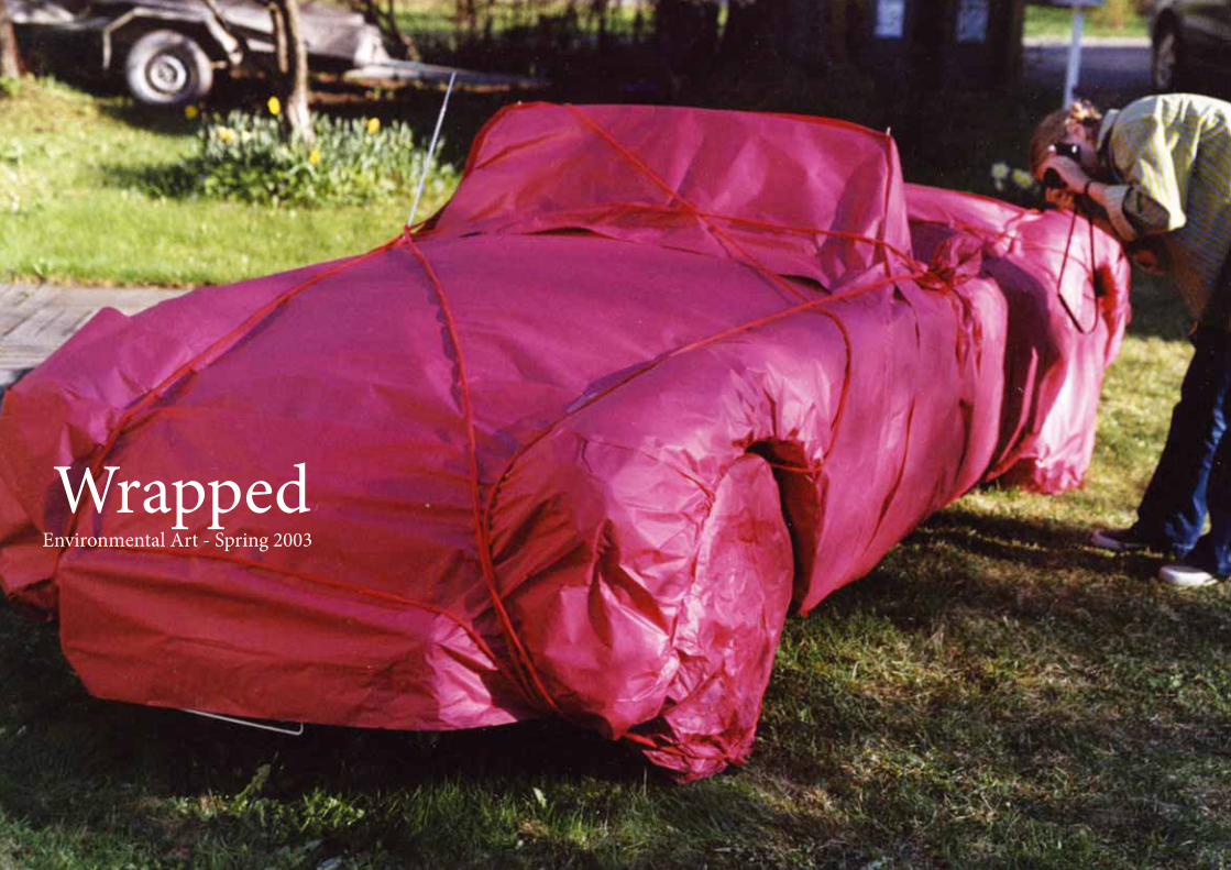
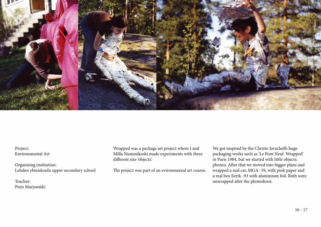
WrappedEnvironmental Art - Spring 2003
Project:
Environmental Art
Organising institution:
Lahden yhteiskoulu upper secondary school
Teacher:
Pirjo Marjomäki
Wrapped was a package art project where I and
Milla Nummikoski made experiments with three
diff erent size ‘objects’.
Th e project was part of an evironmental art course.
We got inspired by the Christo Javacheff s huge
packaging works such as ‘Le Pont Neuf Wrapped’
in Paris 1984, but we started with little objects:
phones. Aft er that we moved into bigger plans and
wrapped a real car, MGA -59, with pink paper and
a real boy Eerik -93 with aluminium foil. Both were
unwrapped aft er the photoshoot.
16 - 17
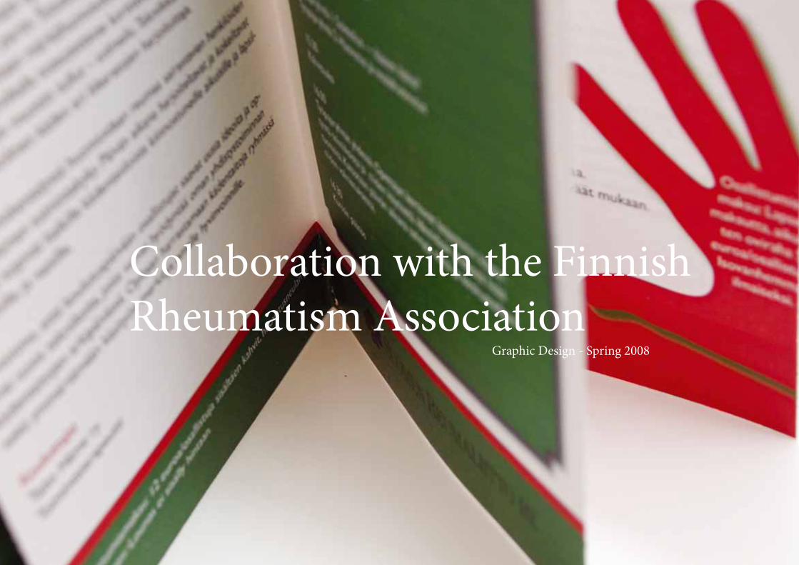
Collaboration with the Finnish
Rheumatism AssociationGraphic Design - Spring 2008
Project:
Graphic Design / Teaching Jewelry Design
Customer:
Reumaliitto (Finnish Rheuma Assosiation)
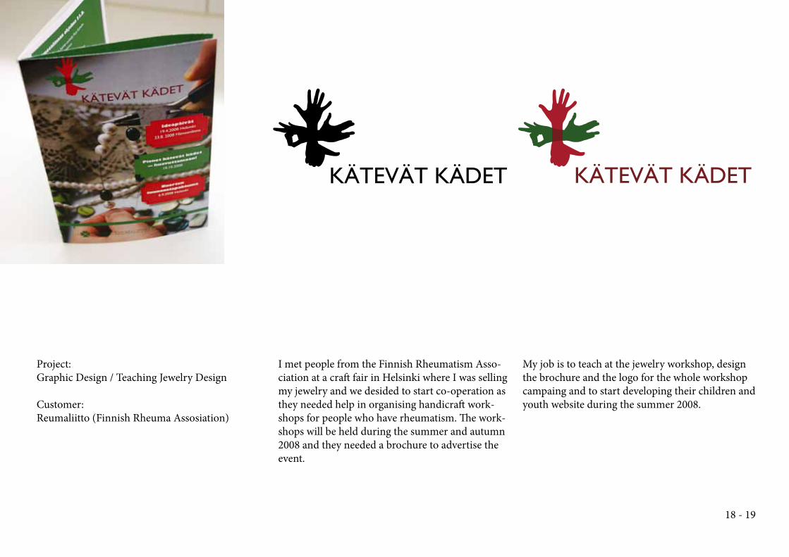
I met people from the Finnish Rheumatism Asso-
ciation at a craft fair in Helsinki where I was selling
my jewelry and we desided to start co-operation as
they needed help in organising handicraft work-
shops for people who have rheumatism. Th e work-
shops will be held during the summer and autumn
2008 and they needed a brochure to advertise the
event.
My job is to teach at the jewelry workshop, design
the brochure and the logo for the whole workshop
campaing and to start developing their children and
youth website during the summer 2008.
18 - 19
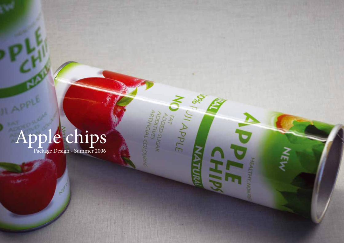
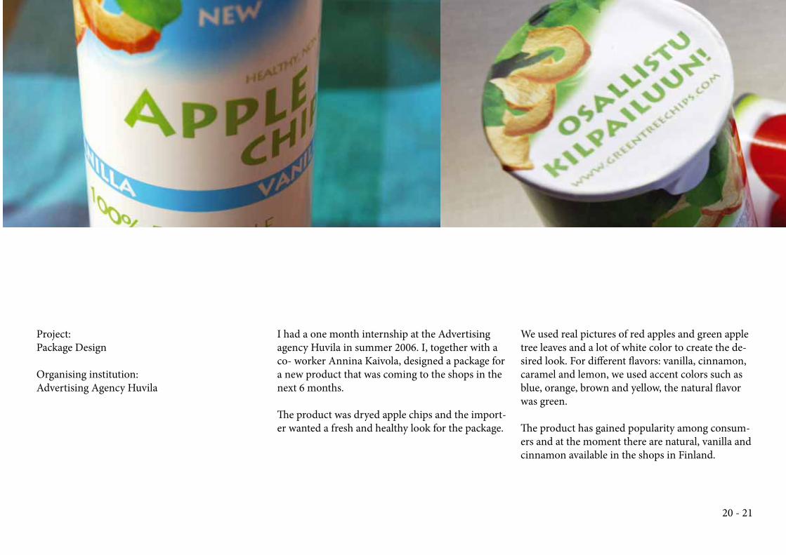
Apple chipsPackage Design - Summer 2006
Project:
Package Design
Organising institution:
Advertising Agency Huvila
I had a one month internship at the Advertising
agency Huvila in summer 2006. I, together with a
co- worker Annina Kaivola, designed a package for
a new product that was coming to the shops in the
next 6 months.
Th e product was dryed apple chips and the import-
er wanted a fresh and healthy look for the package.
We used real pictures of red apples and green apple
tree leaves and a lot of white color to create the de-
sired look. For diff erent fl avors: vanilla, cinnamon,
caramel and lemon, we used accent colors such as
blue, orange, brown and yellow, the natural fl avor
was green.
Th e product has gained popularity among consum-
ers and at the moment there are natural, vanilla and
cinnamon available in the shops in Finland.
20 - 21
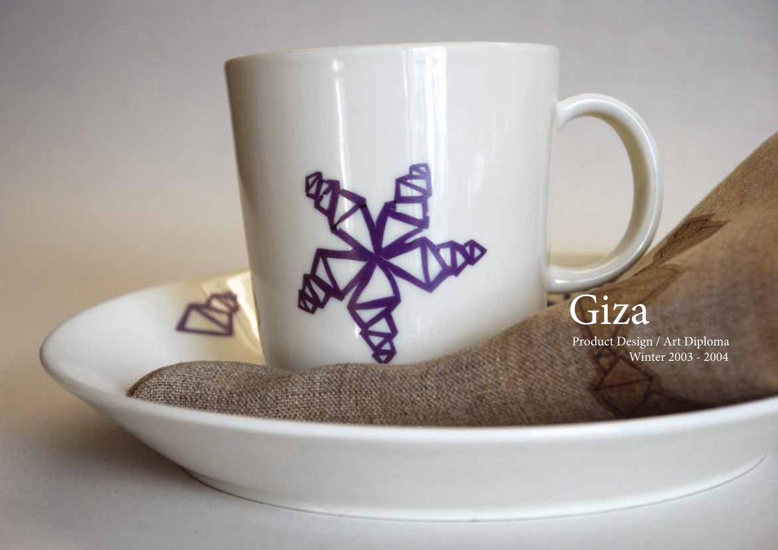
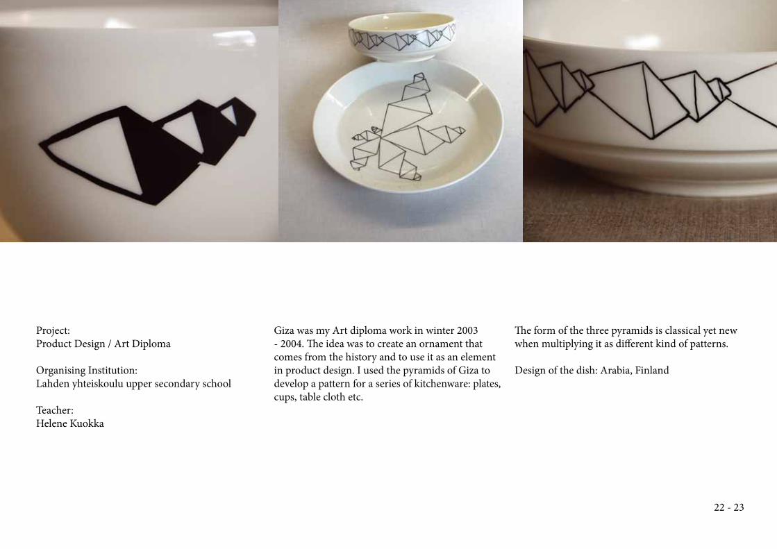
GizaProduct Design / Art Diploma
Winter 2003 - 2004
Project:
Product Design / Art Diploma
Organising Institution:
Lahden yhteiskoulu upper secondary school
Teacher:
Helene Kuokka
Giza was my Art diploma work in winter 2003
- 2004. Th e idea was to create an ornament that
comes from the history and to use it as an element
in product design. I used the pyramids of Giza to
develop a pattern for a series of kitchenware: plates,
cups, table cloth etc.
Th e form of the three pyramids is classical yet new
when multiplying it as diff erent kind of patterns.
Design of the dish: Arabia, Finland
22 - 23
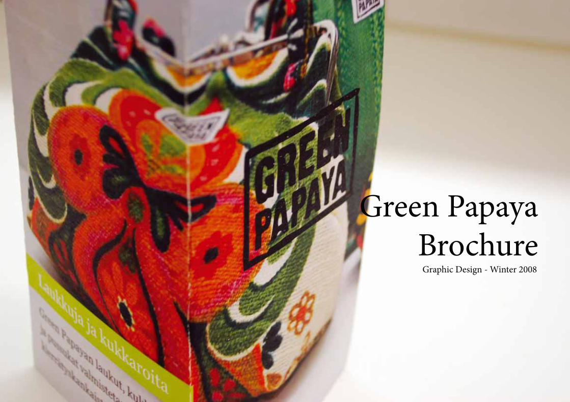
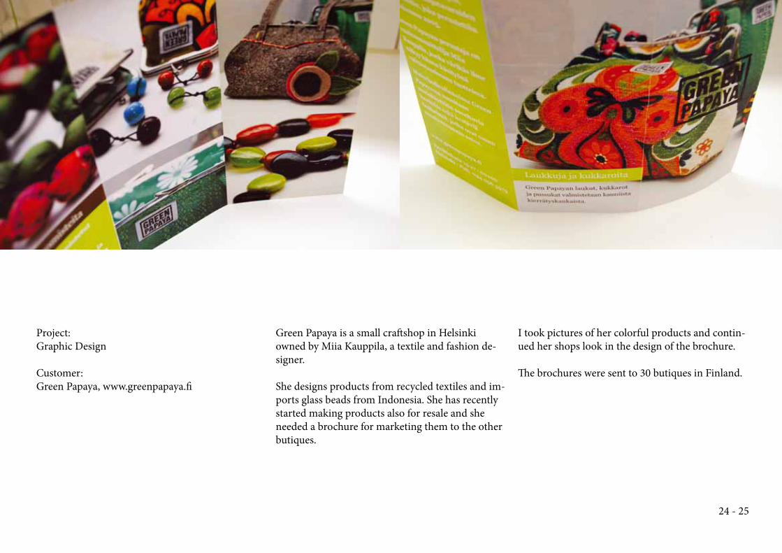
Green Papaya
BrochureGraphic Design - Winter 2008
Project:
Graphic Design
Customer:
Green Papaya, www.greenpapaya.fi
Green Papaya is a small craft shop in Helsinki
owned by Miia Kauppila, a textile and fashion de-
signer.
She designs products from recycled textiles and im-
ports glass beads from Indonesia. She has recently
started making products also for resale and she
needed a brochure for marketing them to the other
butiques.
I took pictures of her colorful products and contin-
ued her shops look in the design of the brochure.
Th e brochures were sent to 30 butiques in Finland.
24 - 25
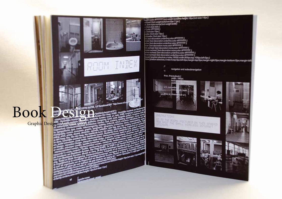
Book DesignGraphic Design - Autumn 2006
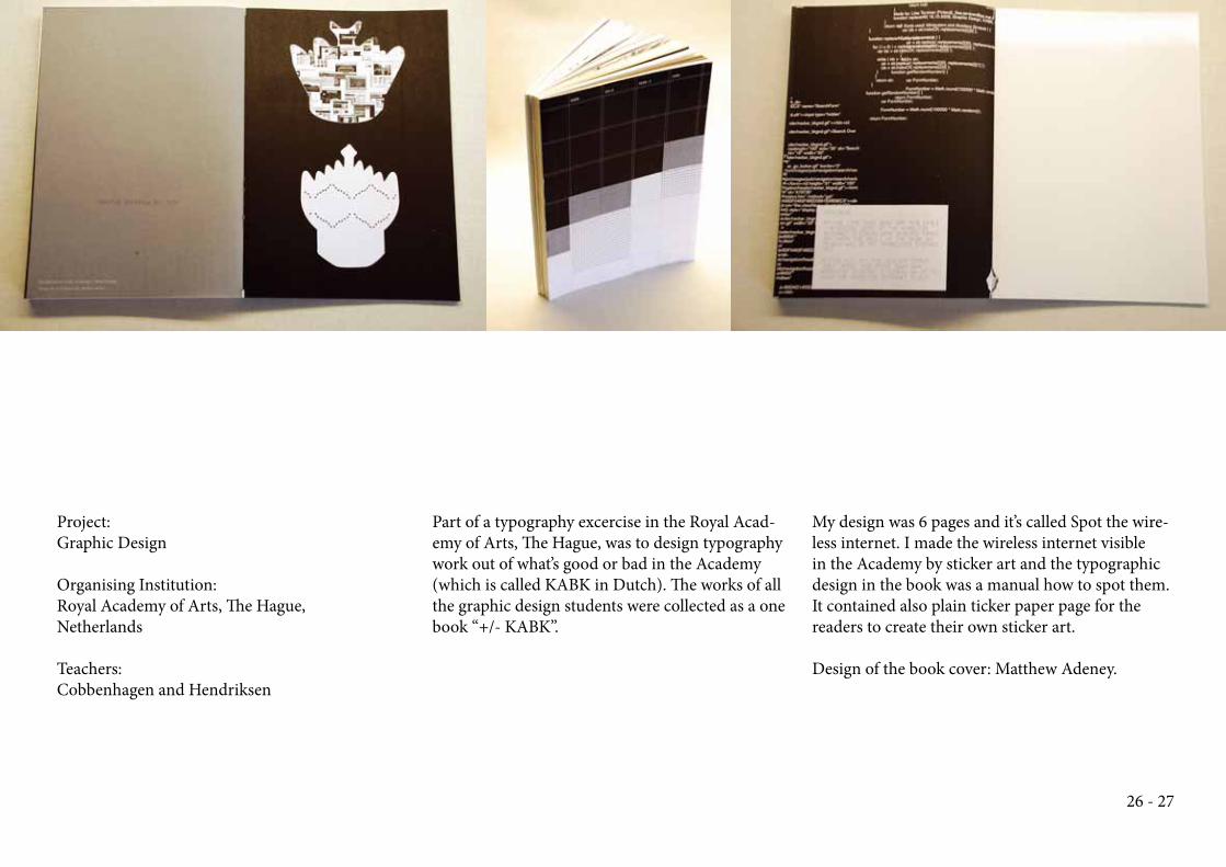
Project:
Graphic Design
Organising Institution:
Royal Academy of Arts, Th e Hague,
Netherlands
Teachers:
Cobbenhagen and Hendriksen
Part of a typography excercise in the Royal Acad-
emy of Arts, Th e Hague, was to design typography
work out of what’s good or bad in the Academy
(which is called KABK in Dutch). Th e works of all
the graphic design students were collected as a one
book “+/- KABK”.
My design was 6 pages and it’s called Spot the wire-
less internet. I made the wireless internet visible
in the Academy by sticker art and the typographic
design in the book was a manual how to spot them.
It contained also plain ticker paper page for the
readers to create their own sticker art.
Design of the book cover: Matthew Adeney.
26 - 27
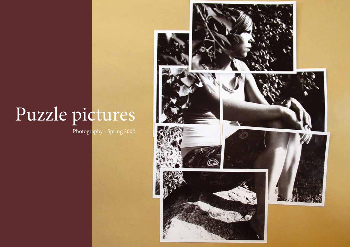
Puzzle picturesPhotography - Spring 2002
Project:
Photography
Organising Institution:
Lahden yhteiskoulu upper
secondary school
Teacher:
Pirjo Marjomäki
28 - 29
Puzzle picturesPhotography Spring 2002
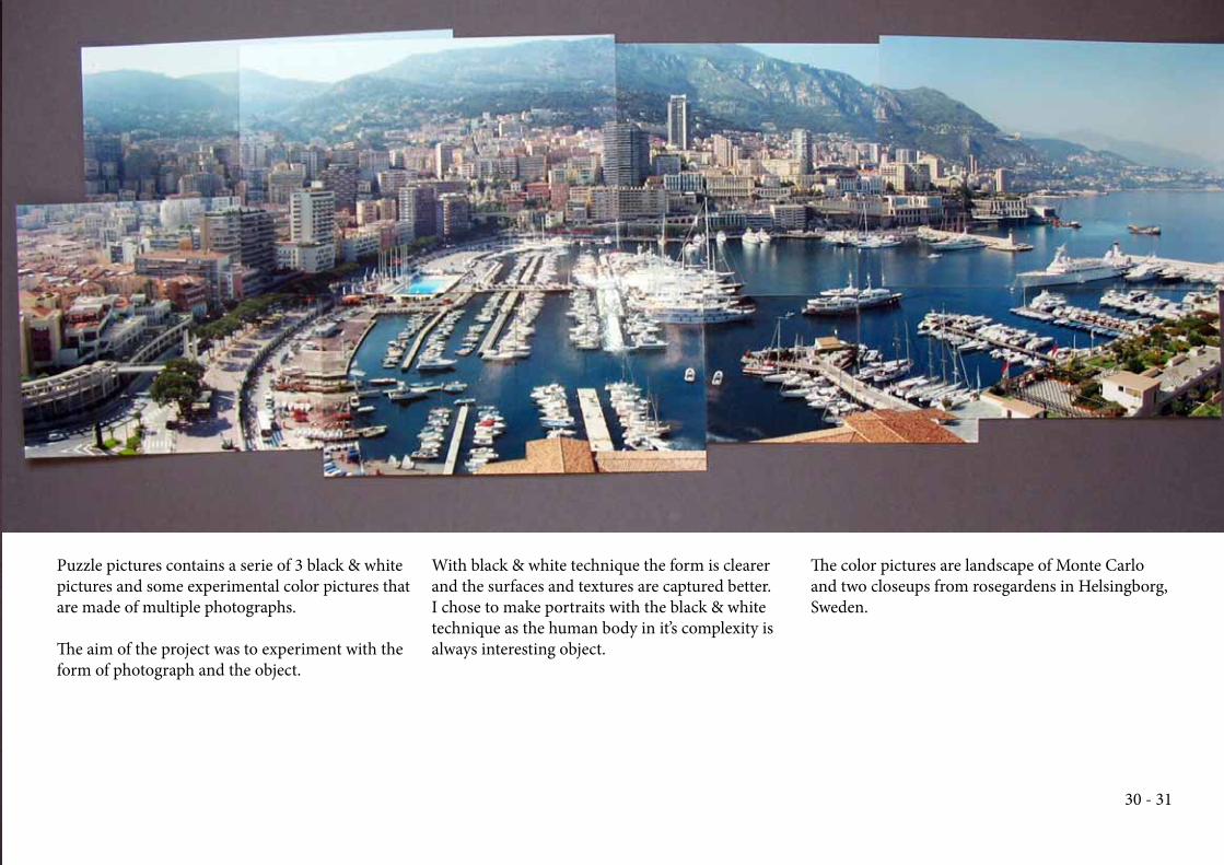
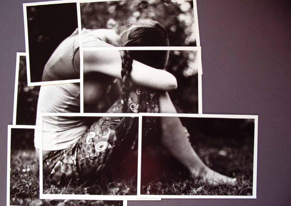
Puzzle pictures contains a serie of 3 black & white
pictures and some experimental color pictures that
are made of multiple photographs.
Th e aim of the project was to experiment with the
form of photograph and the object.
With black & white technique the form is clearer
and the surfaces and textures are captured better.
I chose to make portraits with the black & white
technique as the human body in it’s complexity is
always interesting object.
Th e color pictures are landscape of Monte Carlo
and two closeups from rosegardens in Helsingborg,
Sweden.
30 - 31
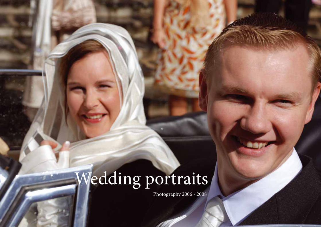
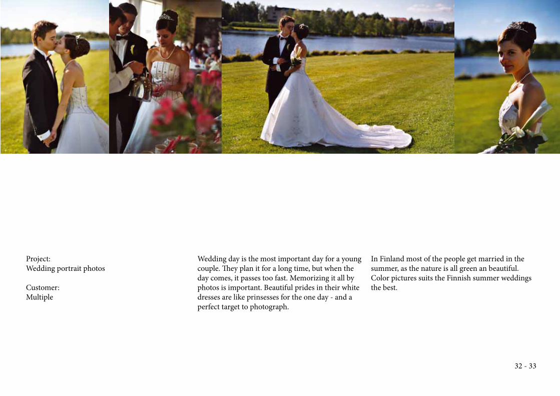
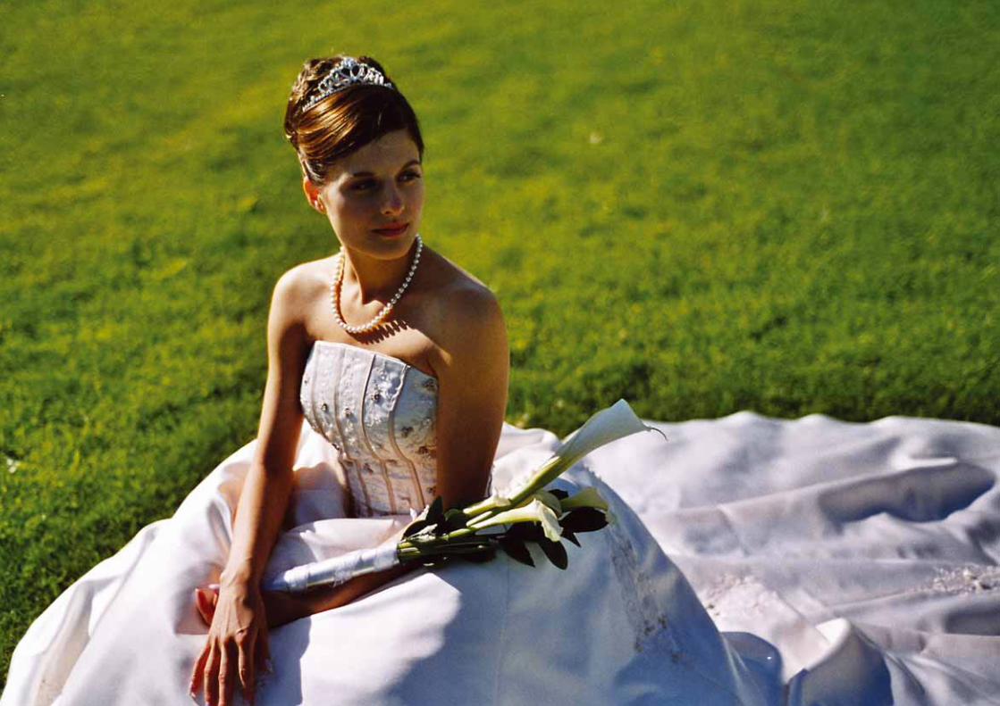
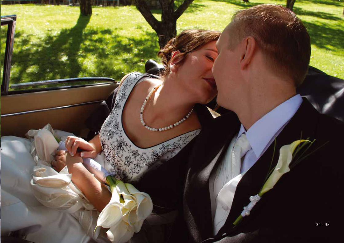
Wedding portraitsPhotography 2006 - 2008
Project:
Wedding portrait photos
Customer:
Multiple
Wedding day is the most important day for a young
couple. Th ey plan it for a long time, but when the
day comes, it passes too fast. Memorizing it all by
photos is important. Beautiful prides in their white
dresses are like prinsesses for the one day - and a
perfect target to photograph.
In Finland most of the people get married in the
summer, as the nature is all green an beautiful.
Color pictures suits the Finnish summer weddings
the best.
32 - 33
34 - 35
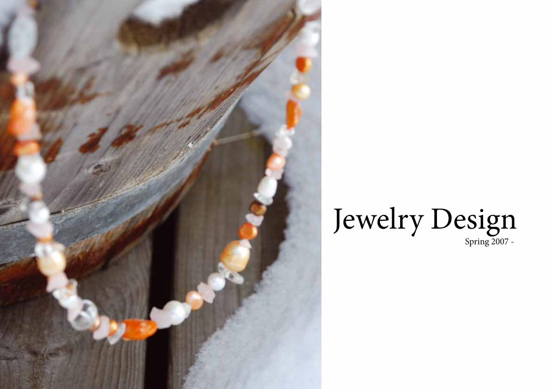
Jewelry DesignSpring 2007 -
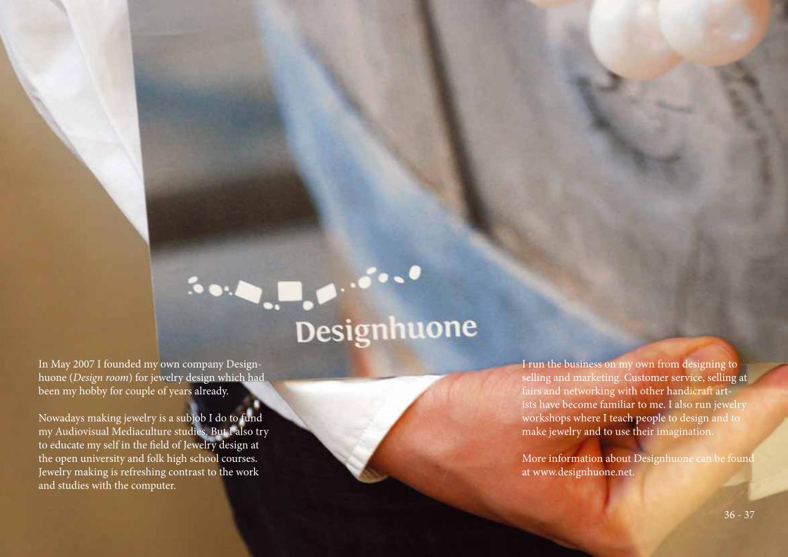
In May 2007 I founded my own company Design-
huone (Design room) for jewelry design which had
been my hobby for couple of years already.
Nowadays making jewelry is a subjob I do to fund
my Audiovisual Mediaculture studies. But I also try
to educate my self in the fi eld of Jewelry design at
the open university and folk high school courses.
Jewelry making is refreshing contrast to the work
and studies with the computer.
I run the business on my own from designing to
selling and marketing. Customer service, selling at
fairs and networking with other handicraft art-
ists have become familiar to me. I also run jewelry
workshops where I teach people to design and to
make jewelry and to use their imagination.
More information about Designhuone can be found
at www.designhuone.net.
36 - 37
Jewelry Design
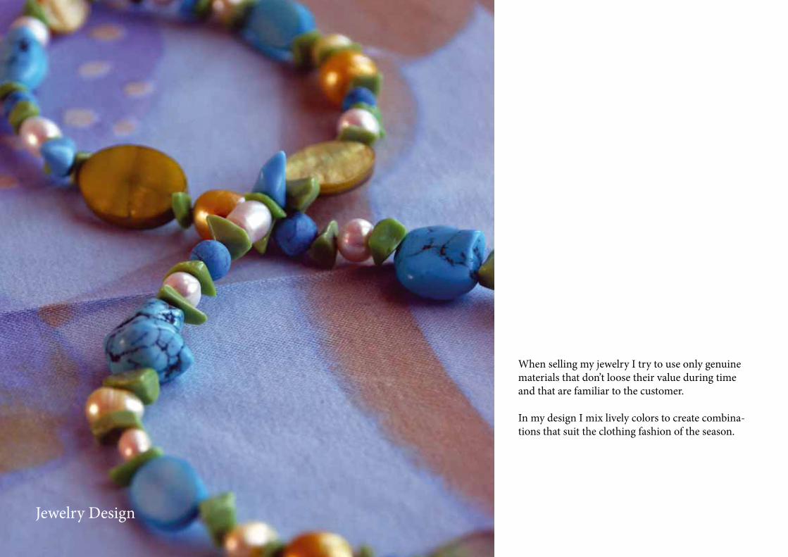
When selling my jewelry I try to use only genuine
materials that don’t loose their value during time
and that are familiar to the customer.
In my design I mix lively colors to create combina-
tions that suit the clothing fashion of the season.
38 - 39
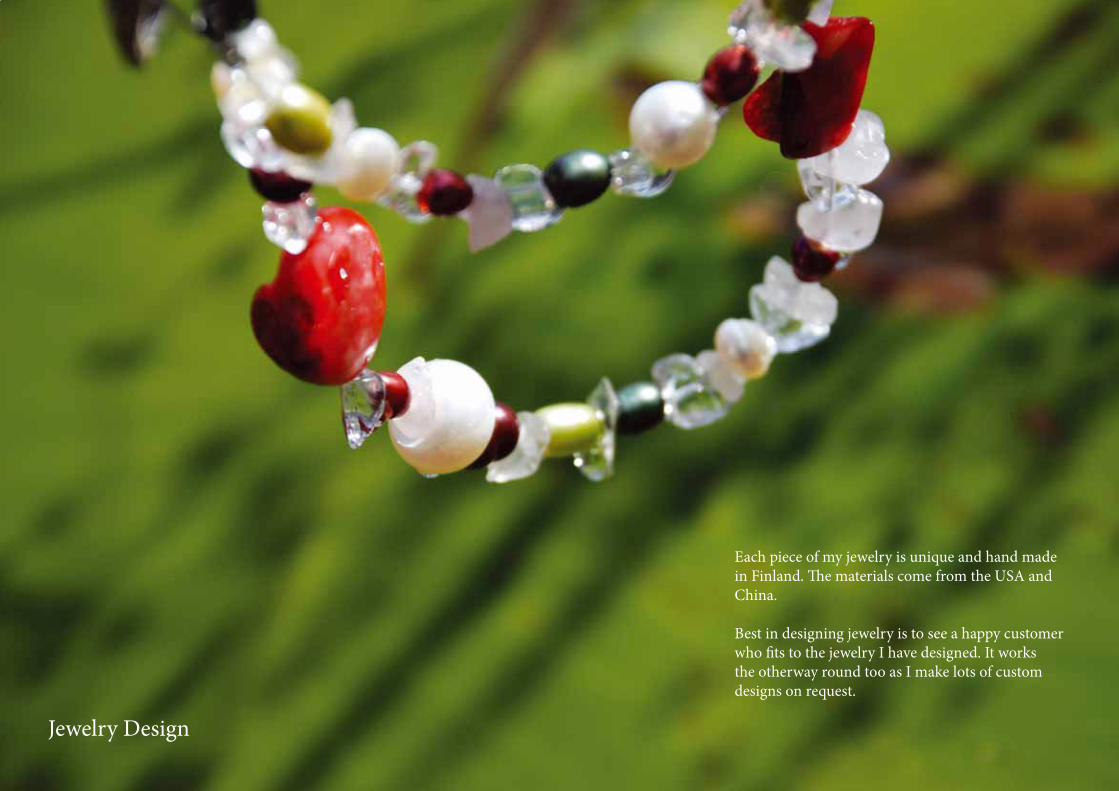
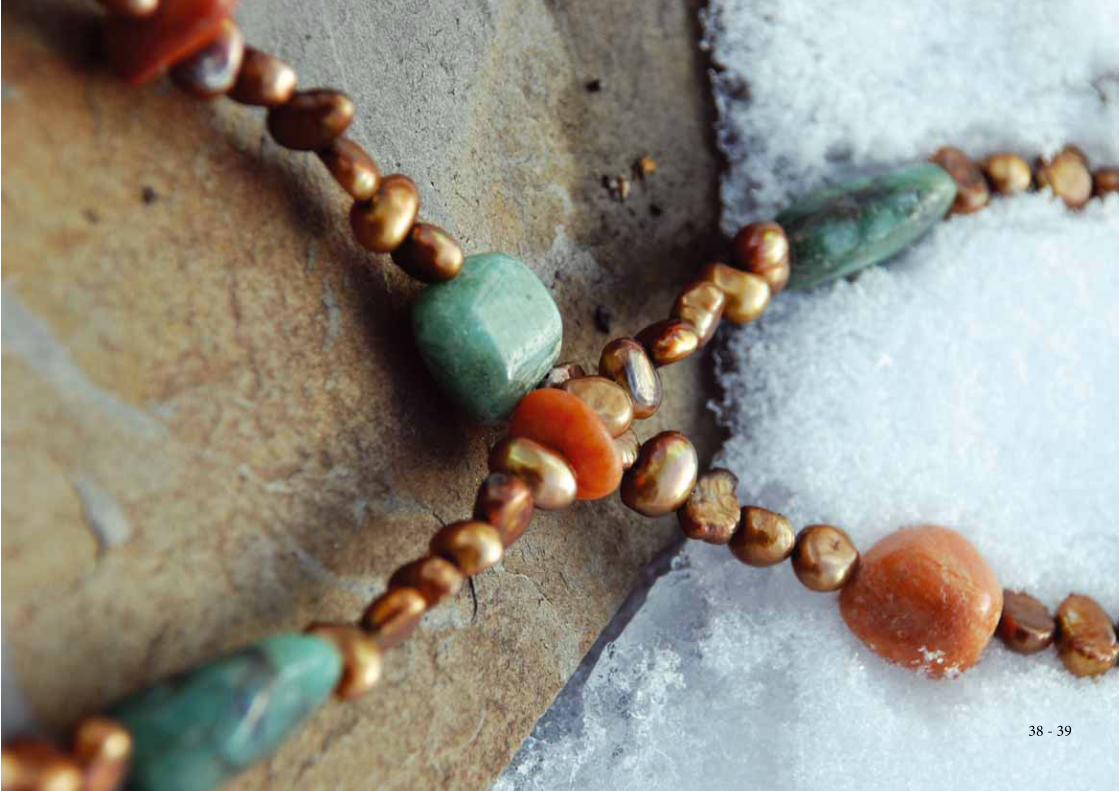
Each piece of my jewelry is unique and hand made
in Finland. Th e materials come from the USA and
China.
Best in designing jewelry is to see a happy customer
who fi ts to the jewelry I have designed. It works
the otherway round too as I make lots of custom
designs on request.
Jewelry Design
40 - 41
Jewelry DesignSpring 2007 -
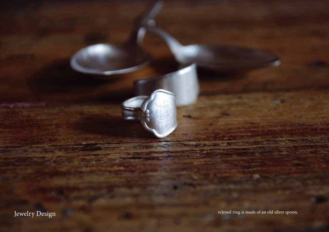
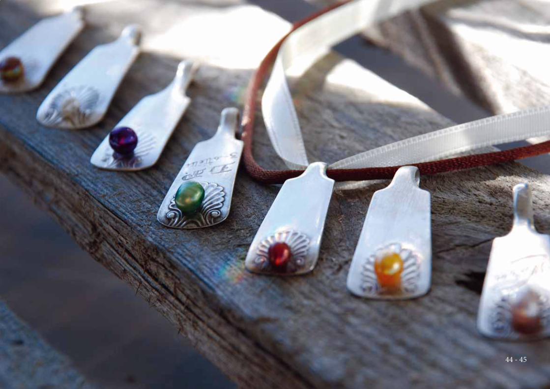
reJewel ring is made of an old silver spoon.Jewelry Design
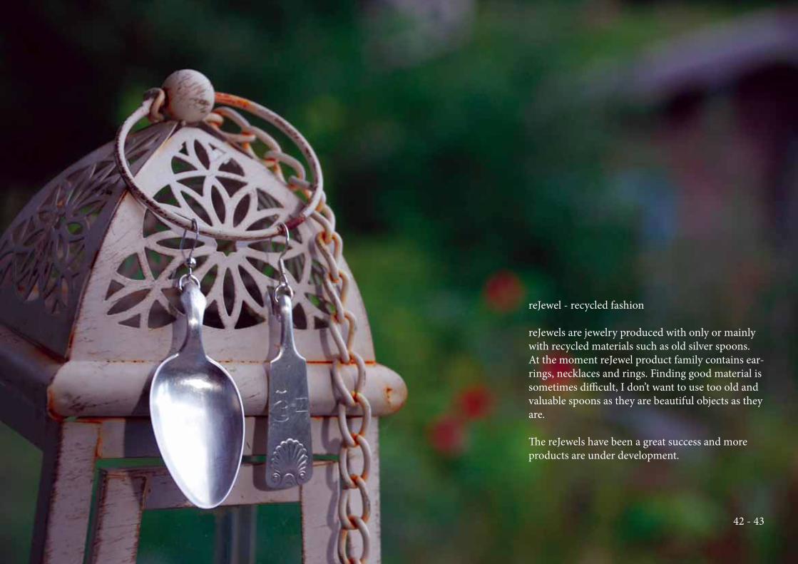
reJewel - recycled fashion
reJewels are jewelry produced with only or mainly
with recycled materials such as old silver spoons.
At the moment reJewel product family contains ear-
rings, necklaces and rings. Finding good material is
sometimes diffi cult, I don’t want to use too old and
valuable spoons as they are beautiful objects as they
are.
Th e reJewels have been a great success and more
products are under development.
42 - 43
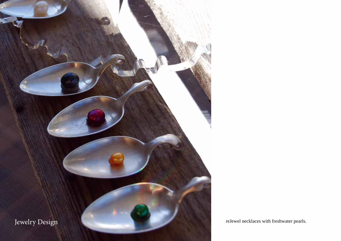
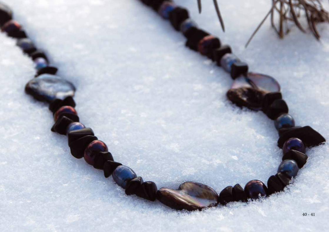
reJewel necklaces with freshwater pearls.Jewelry Design
44 - 45
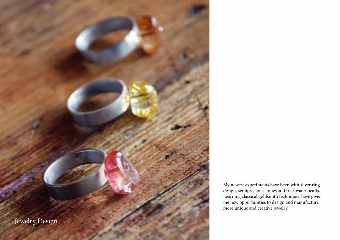
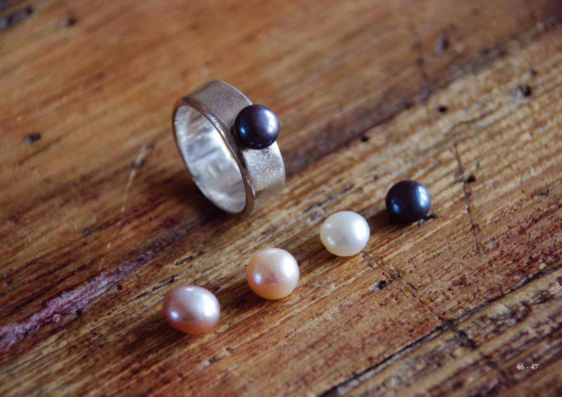
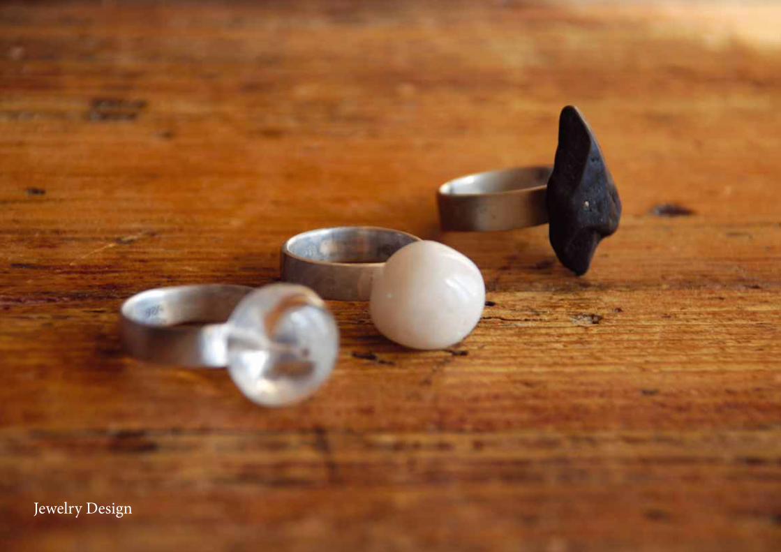
My newest experiments have been with silver ring
design, semiprecious stones and freshwater pearls.
Learning classical goldsmith techniques have given
me new opportunities to design and manufacture
more unique and creative jewelry.
Jewelry Design
46 - 47
reJewel necklaces with freshwater pearls.Jewelry Design
Recommended