Some of these details are tiny. Best viewed in full-screen mode!

Overview
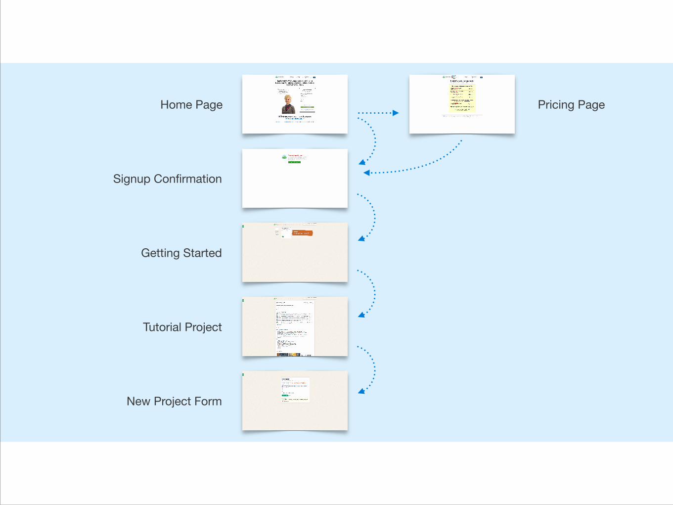
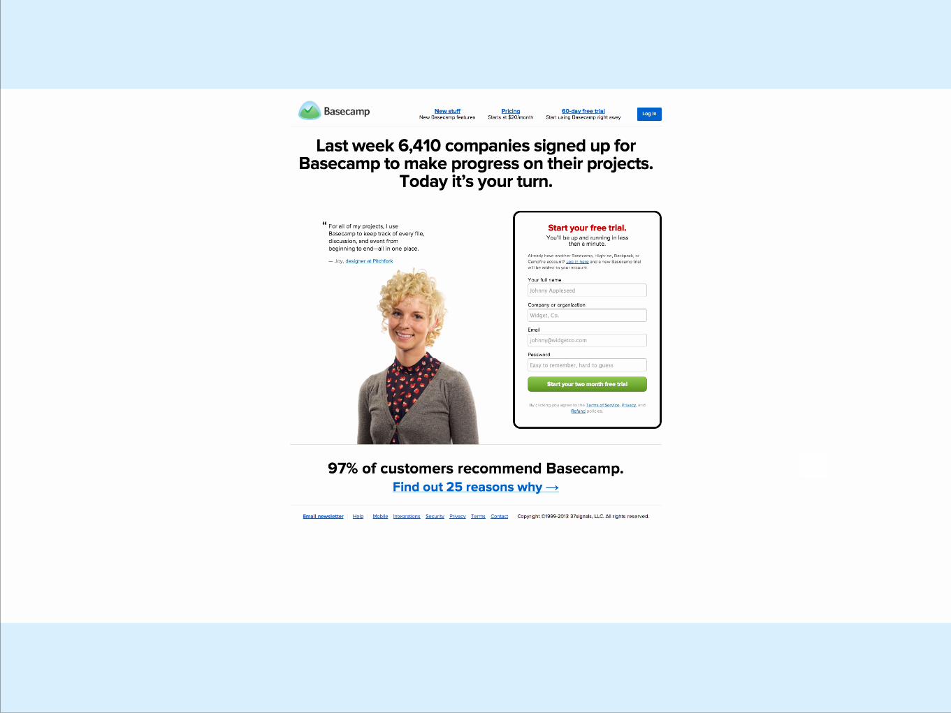
Home Page
Signup Confirmation
Getting Started
New Project Form
Pricing Page
Tutorial Project
1. Home Page
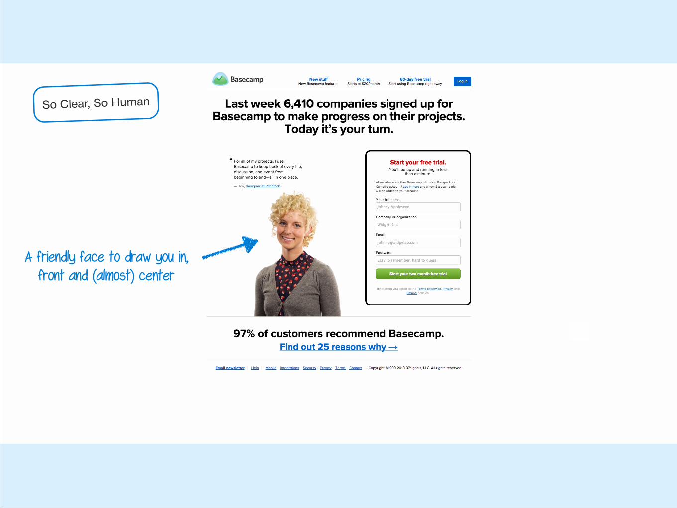
A friendly face to draw you in, front and (almost) center
So Clear, So Human
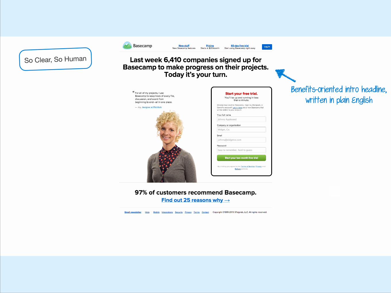
Benefits-oriented intro headline, written in plain English
So Clear, So Human

The screen’s primary purpose is very clear…
So Clear, So Human
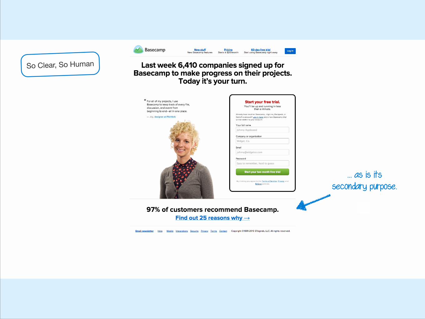
… as is its secondary purpose.
So Clear, So Human
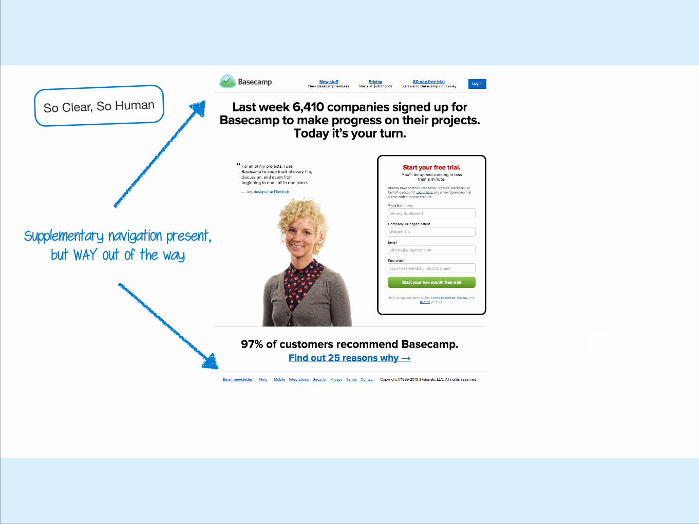
Supplementary navigation present, but WAY out of the way
So Clear, So Human
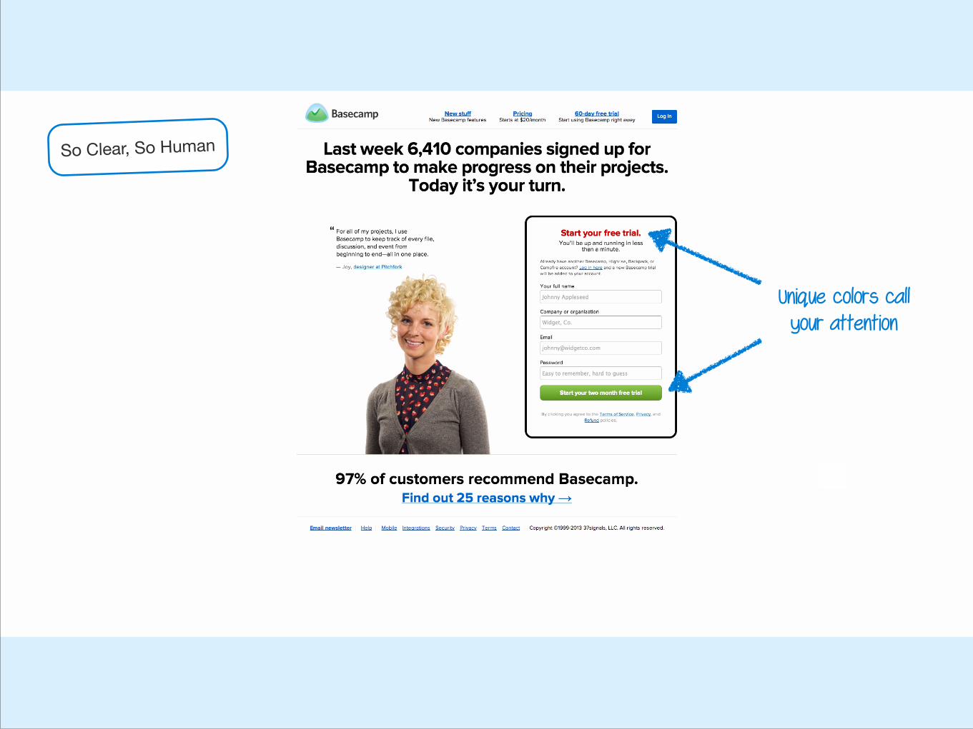
Unique colors call your attention
So Clear, So Human

This is obviously a button
So Clear, So Human
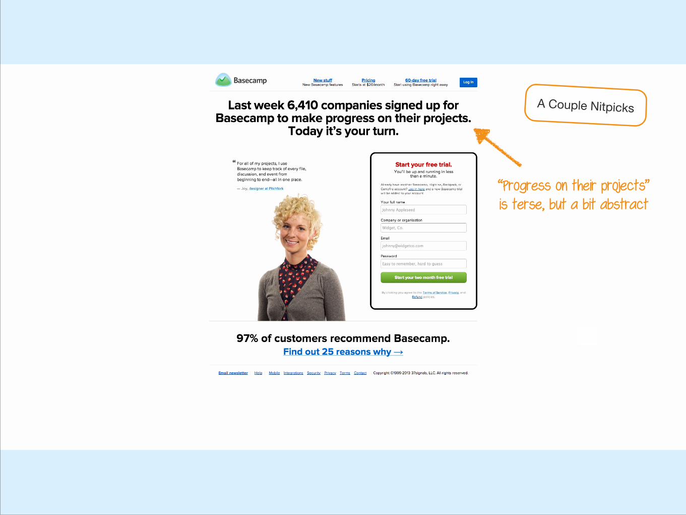
“Progress on their projects” is terse, but a bit abstract
A Couple Nitpicks
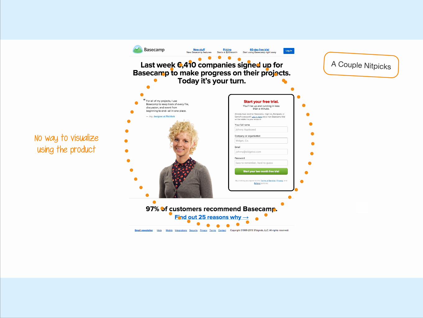
No way to visualize using the product
A Couple Nitpicks
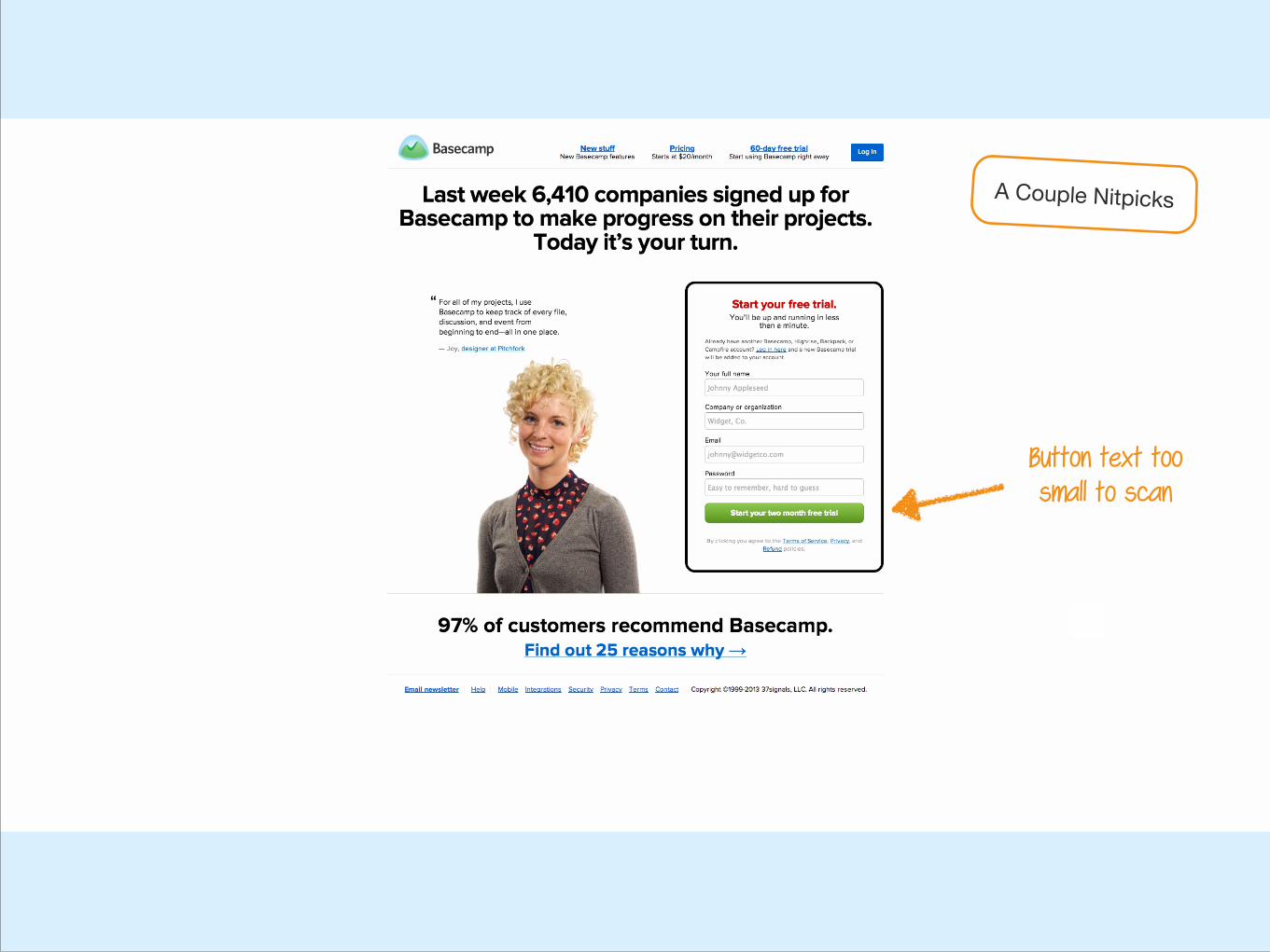
Button text too small to scan
A Couple Nitpicks
1b. Pricing Page
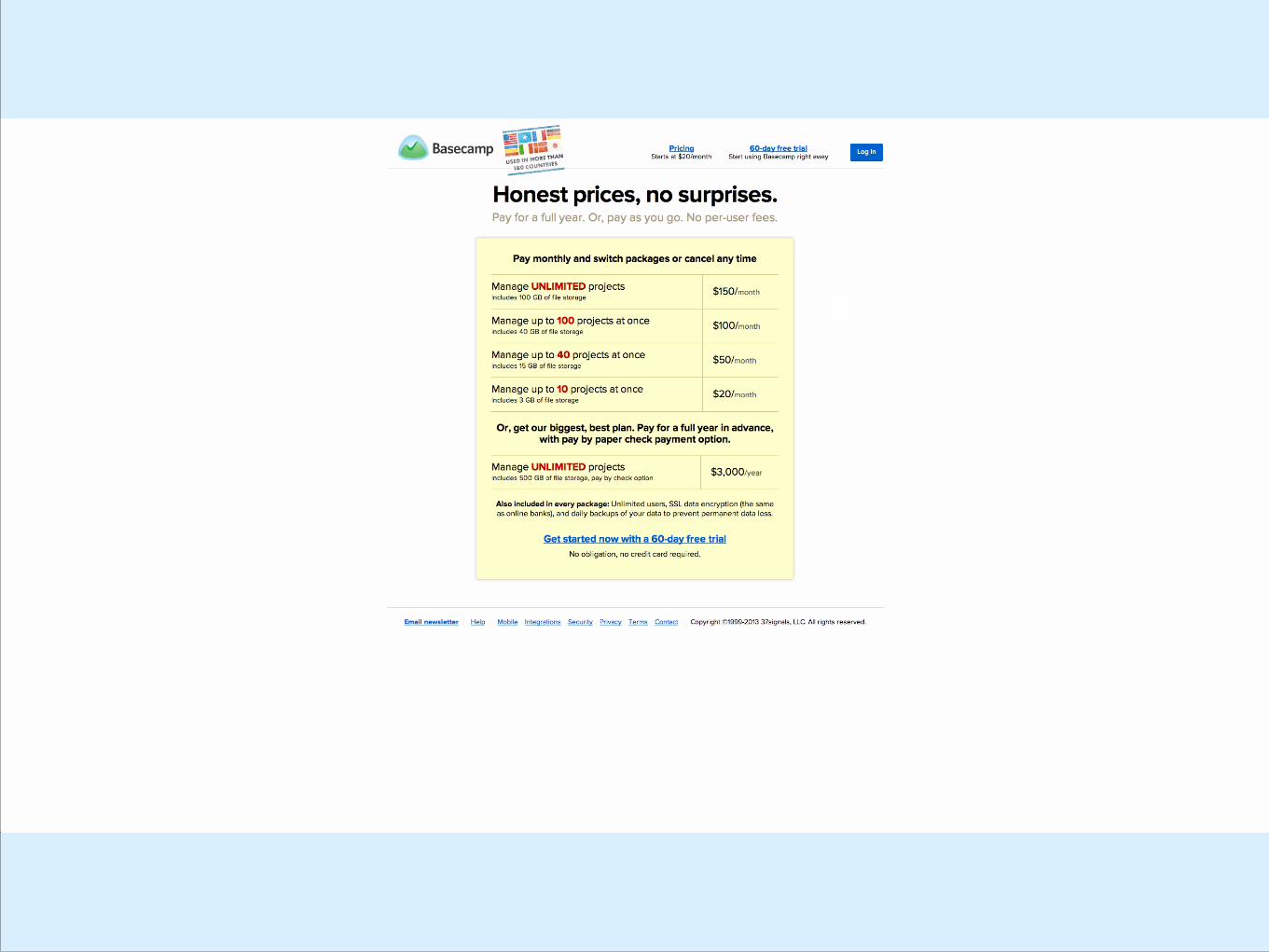
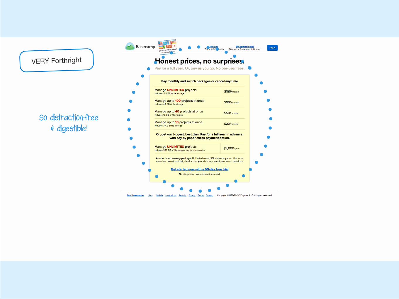
VERY Forthright
So distraction-free & digestible!
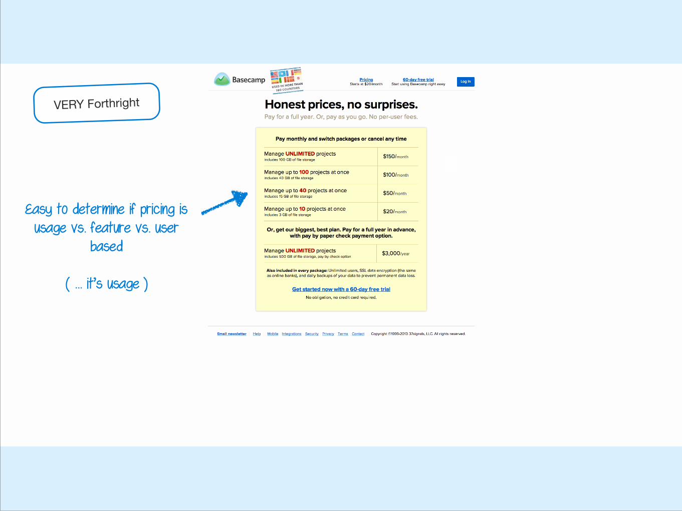
Easy to determine if pricing is usage vs. feature vs. user
based !
( … it’s usage )
VERY Forthright
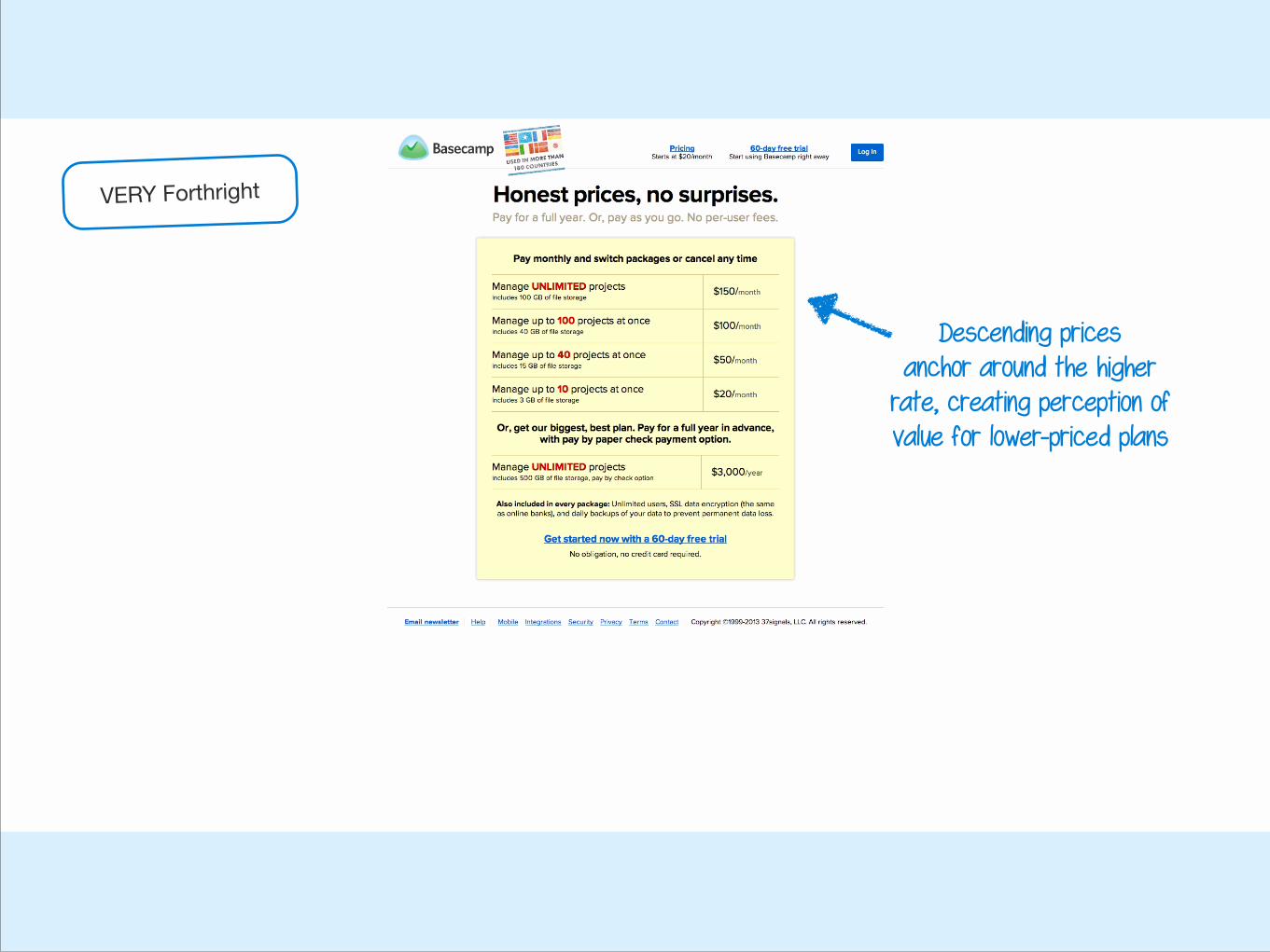
Descending prices anchor around the higher
rate, creating perception of value for lower-priced plans
VERY Forthright
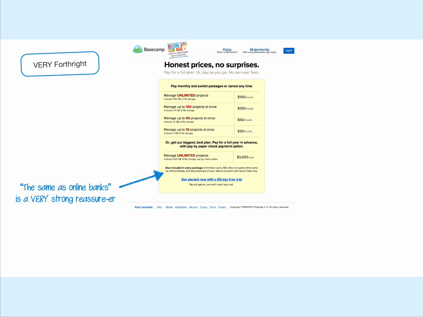
“The same as online banks” is a VERY strong reassure-er
VERY Forthright
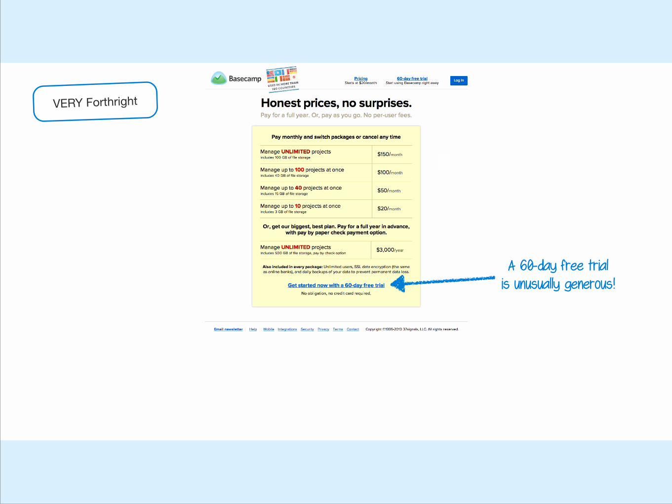
A 60-day free trial is unusually generous!
VERY Forthright
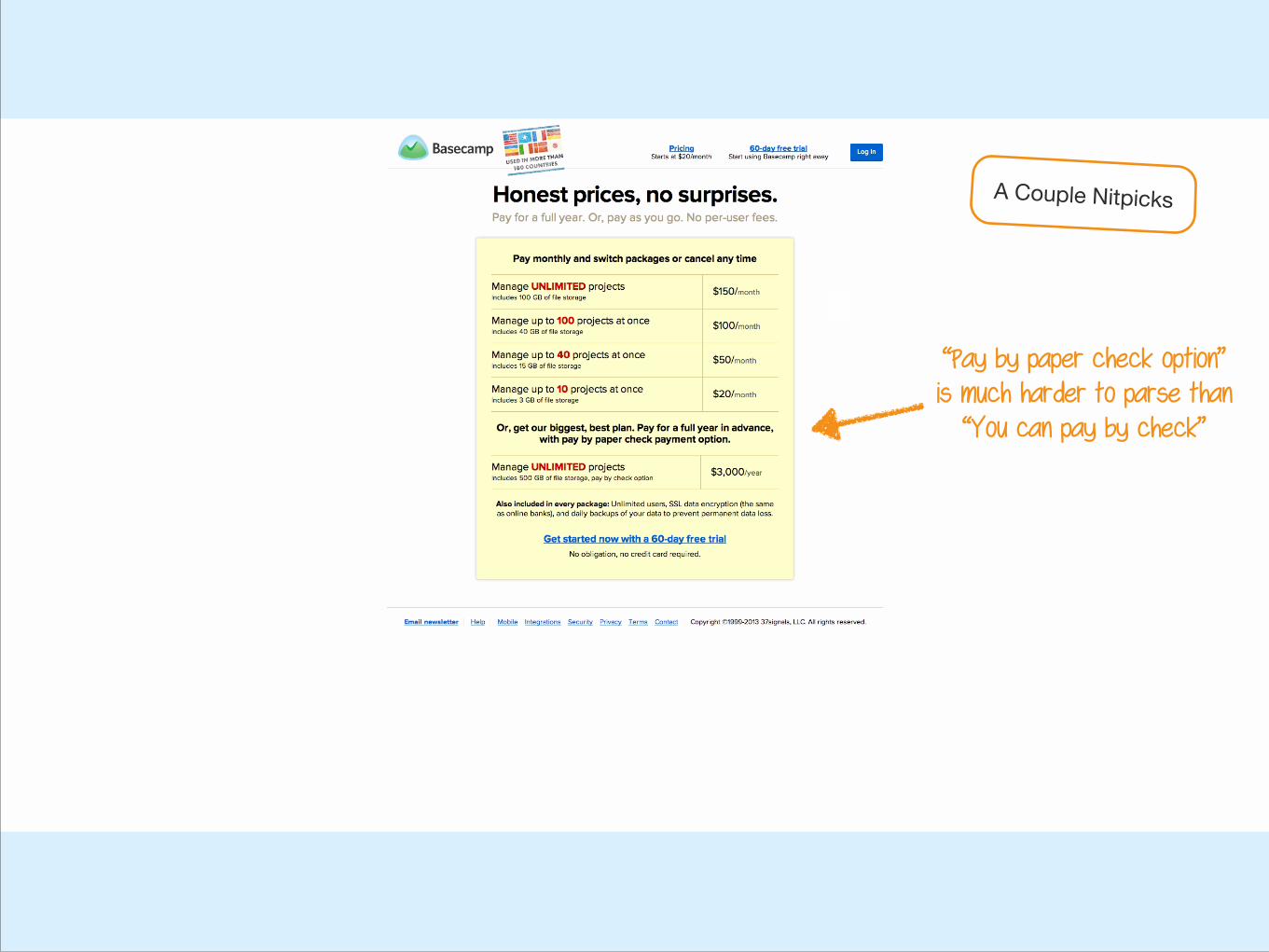
“Pay by paper check option” is much harder to parse than
“You can pay by check”
A Couple Nitpicks
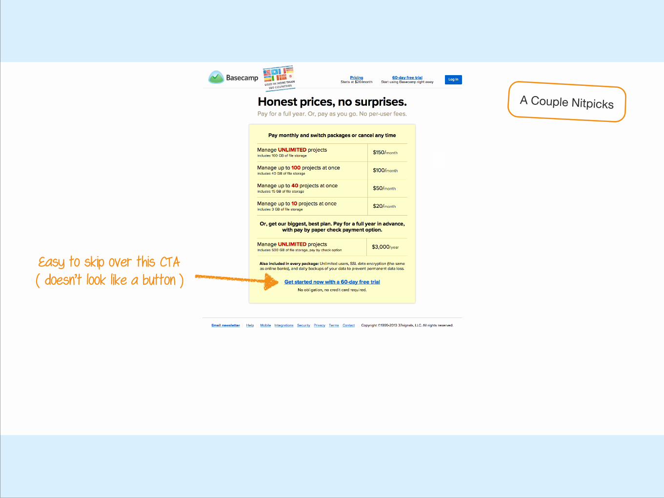
Easy to skip over this CTA ( doesn’t look like a button )
A Couple Nitpicks
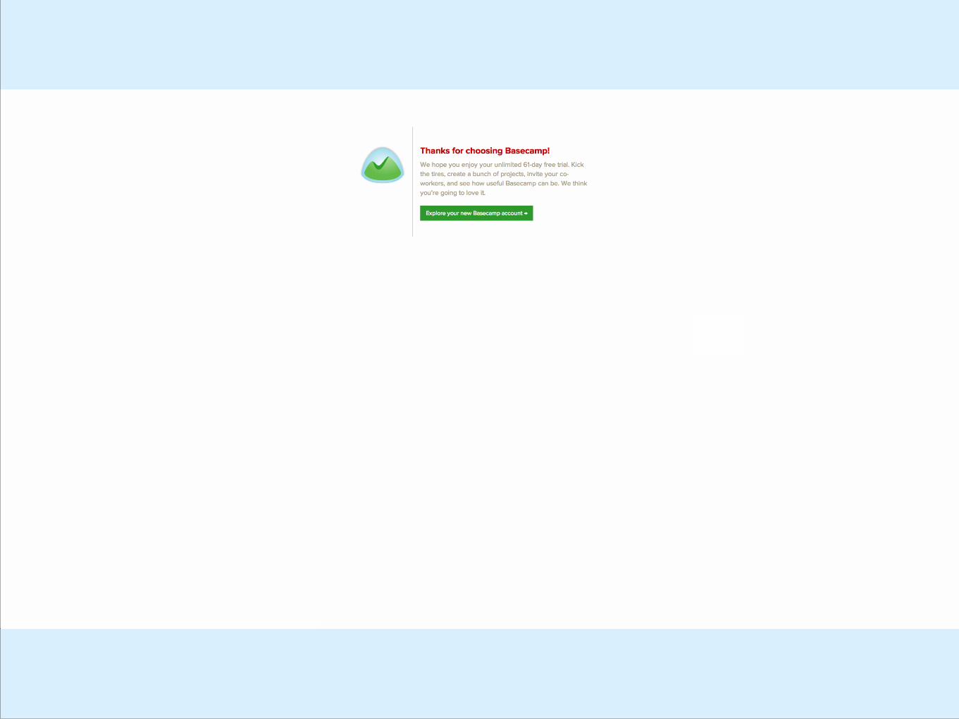
2. Signup Confirmation
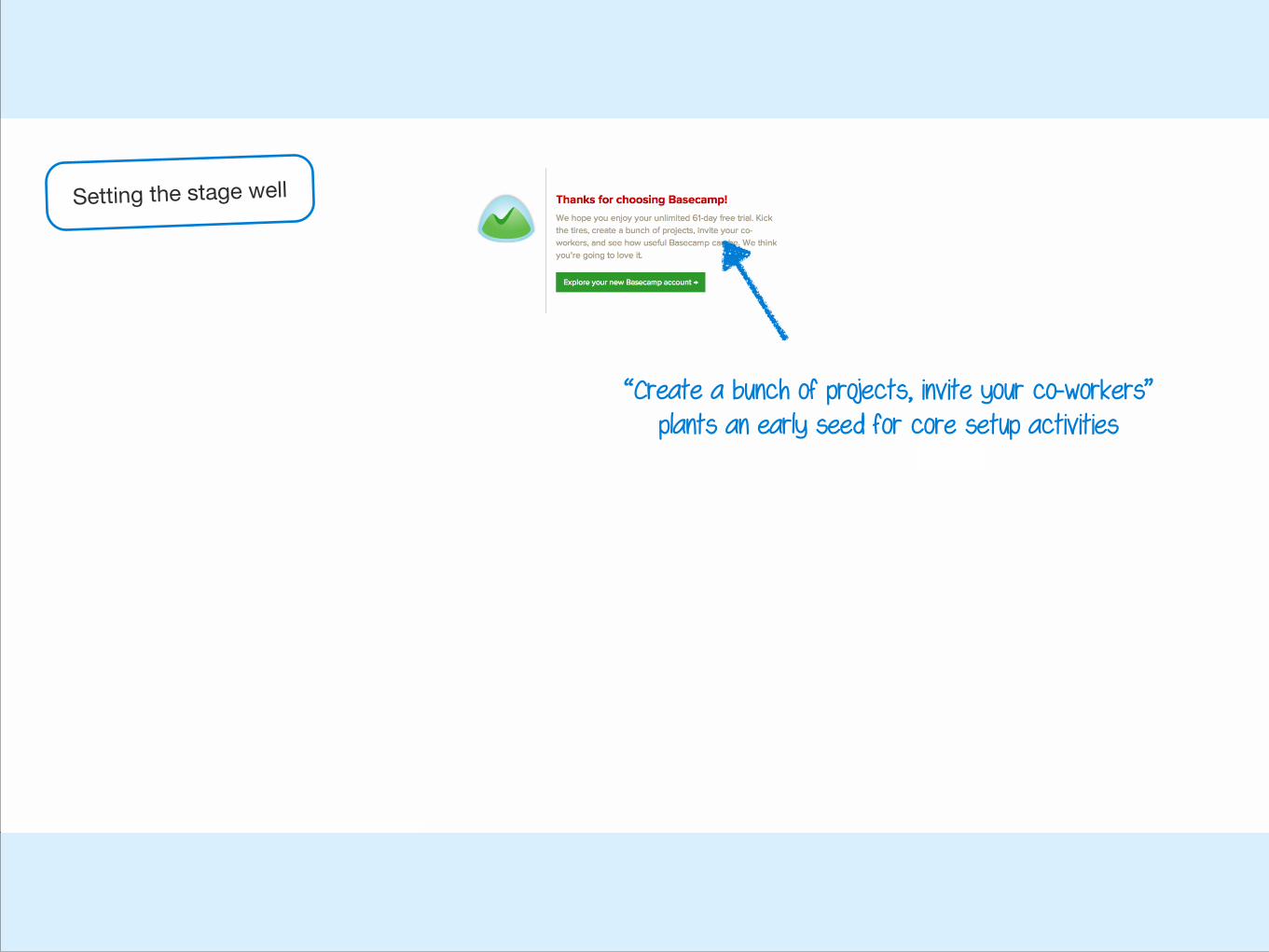
“Create a bunch of projects, invite your co-workers” plants an early seed for core setup activities
Setting the stage well
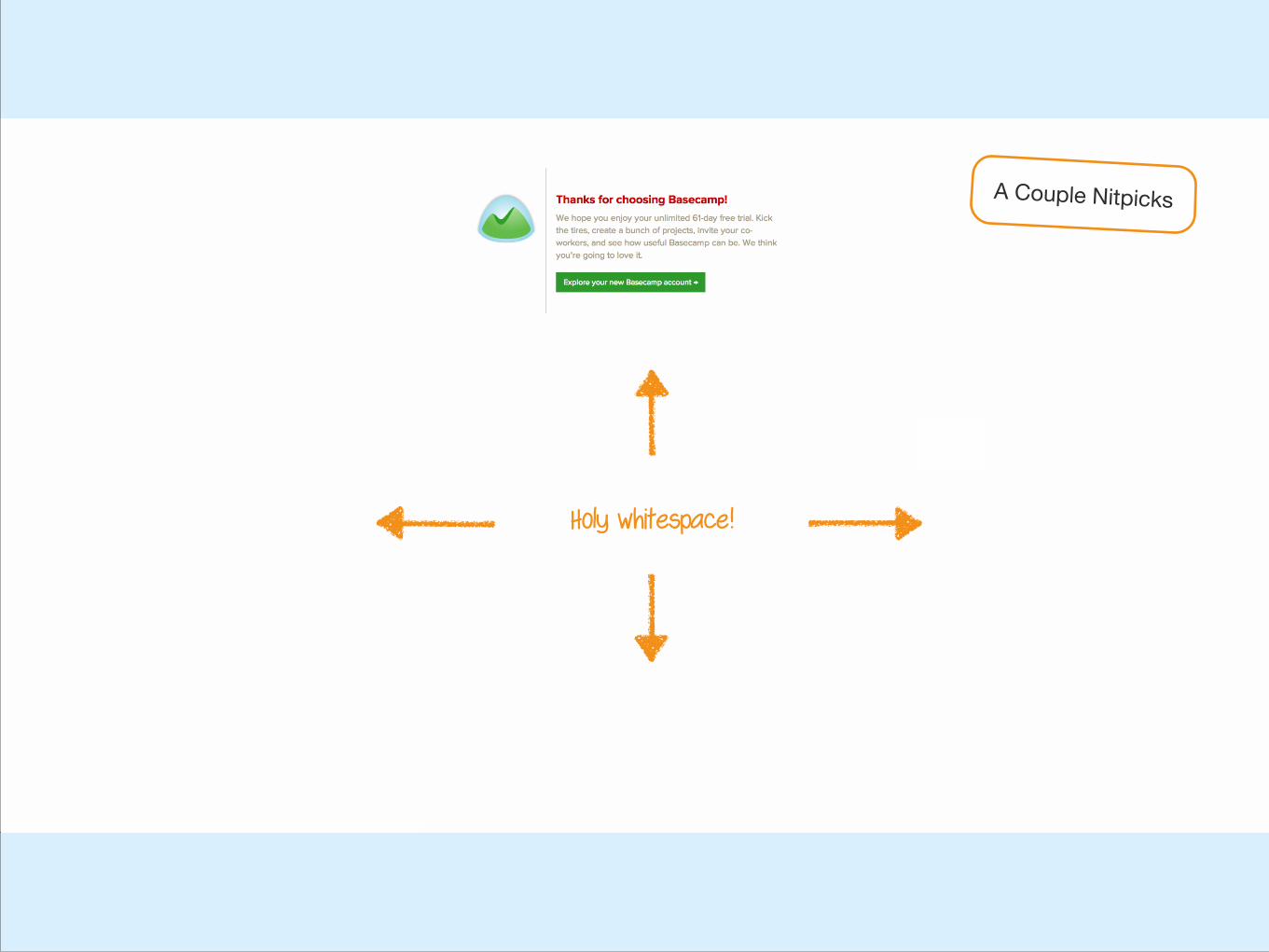
Holy whitespace!
A Couple Nitpicks
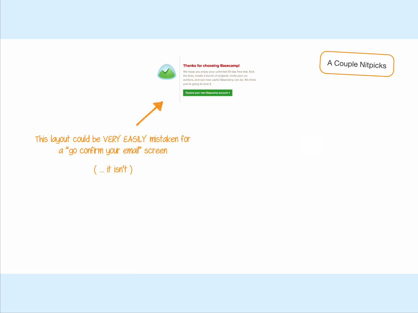
This layout could be VERY EASILY mistaken for a “go confirm your email” screen
A Couple Nitpicks
( … it isn’t )
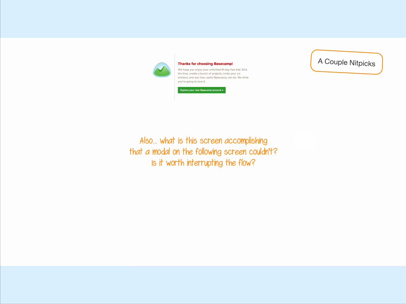
Also… what is this screen accomplishing that a modal on the following screen couldn’t?
Is it worth interrupting the flow?
A Couple Nitpicks
3. Getting Started
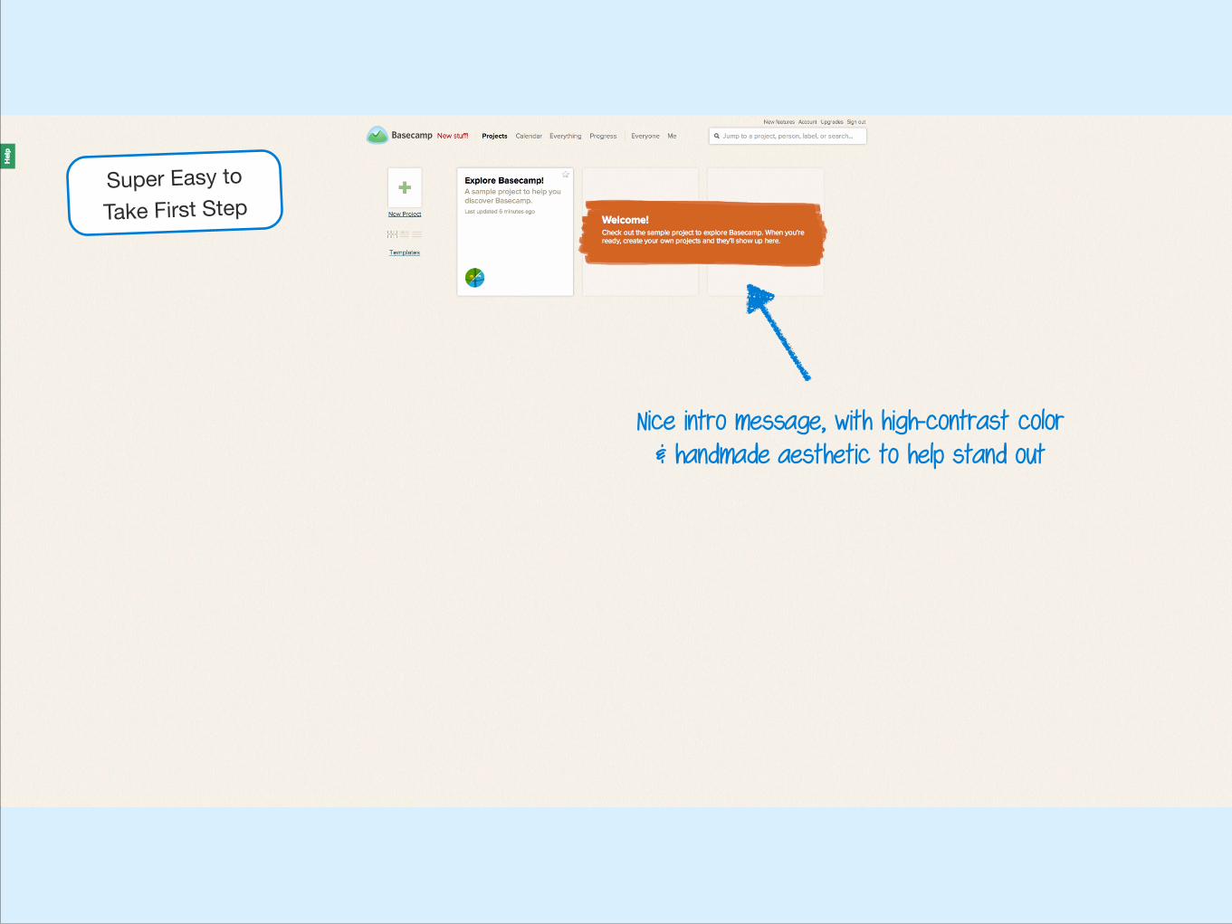
Nice intro message, with high-contrast color & handmade aesthetic to help stand out
Super Easy toTake First Step
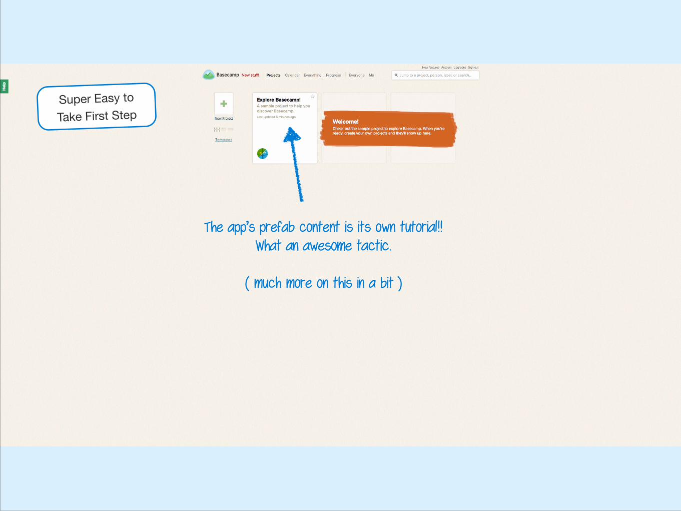
The app’s prefab content is its own tutorial!! What an awesome tactic.
!( much more on this in a bit )
Super Easy toTake First Step
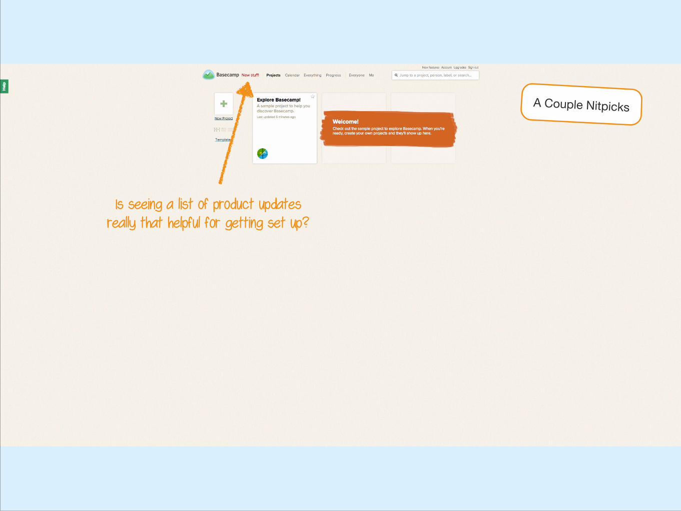
Is seeing a list of product updates really that helpful for getting set up?
A Couple Nitpicks
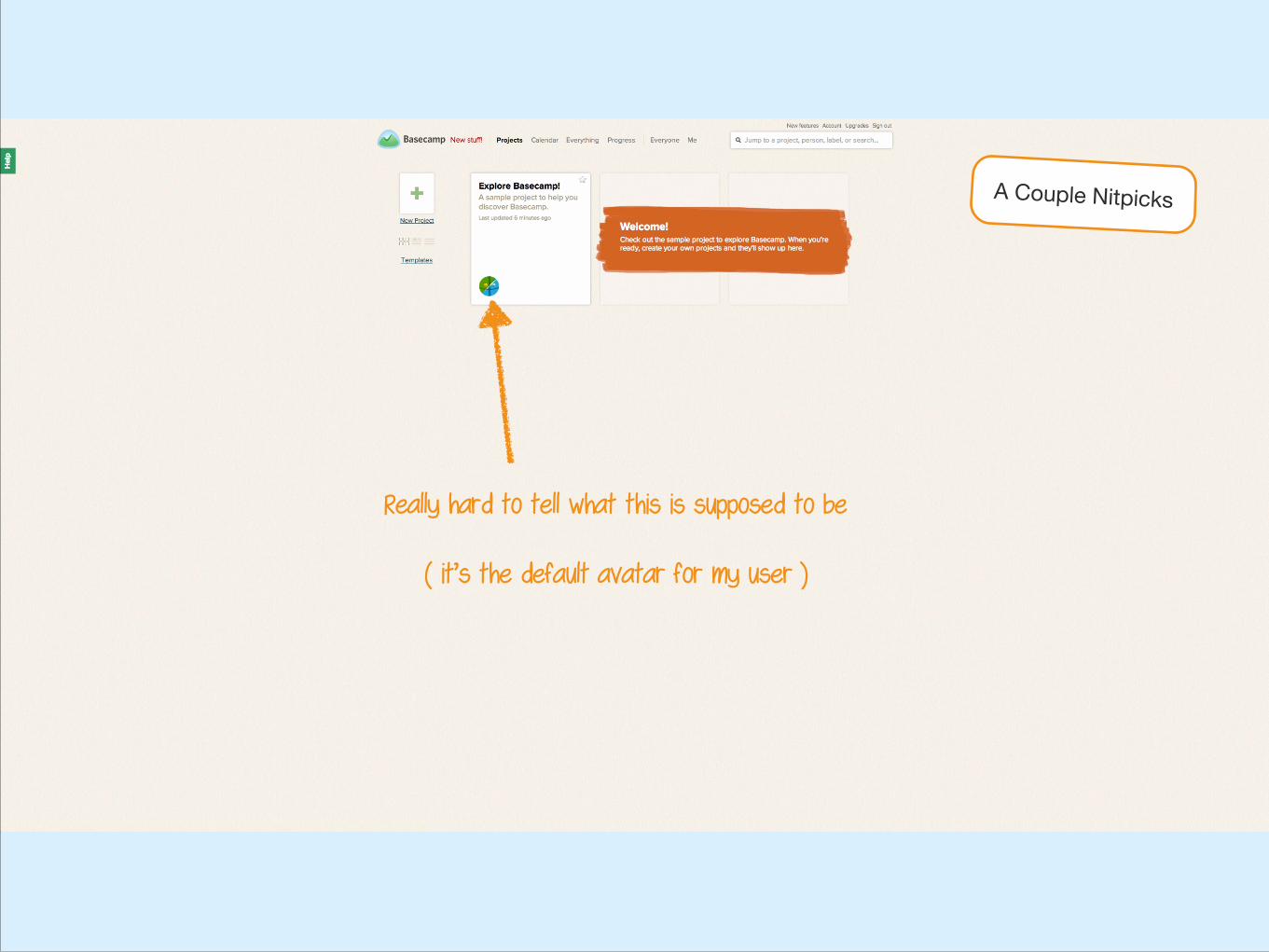
Really hard to tell what this is supposed to be !
( it’s the default avatar for my user )
A Couple Nitpicks

4. Tutorial Project
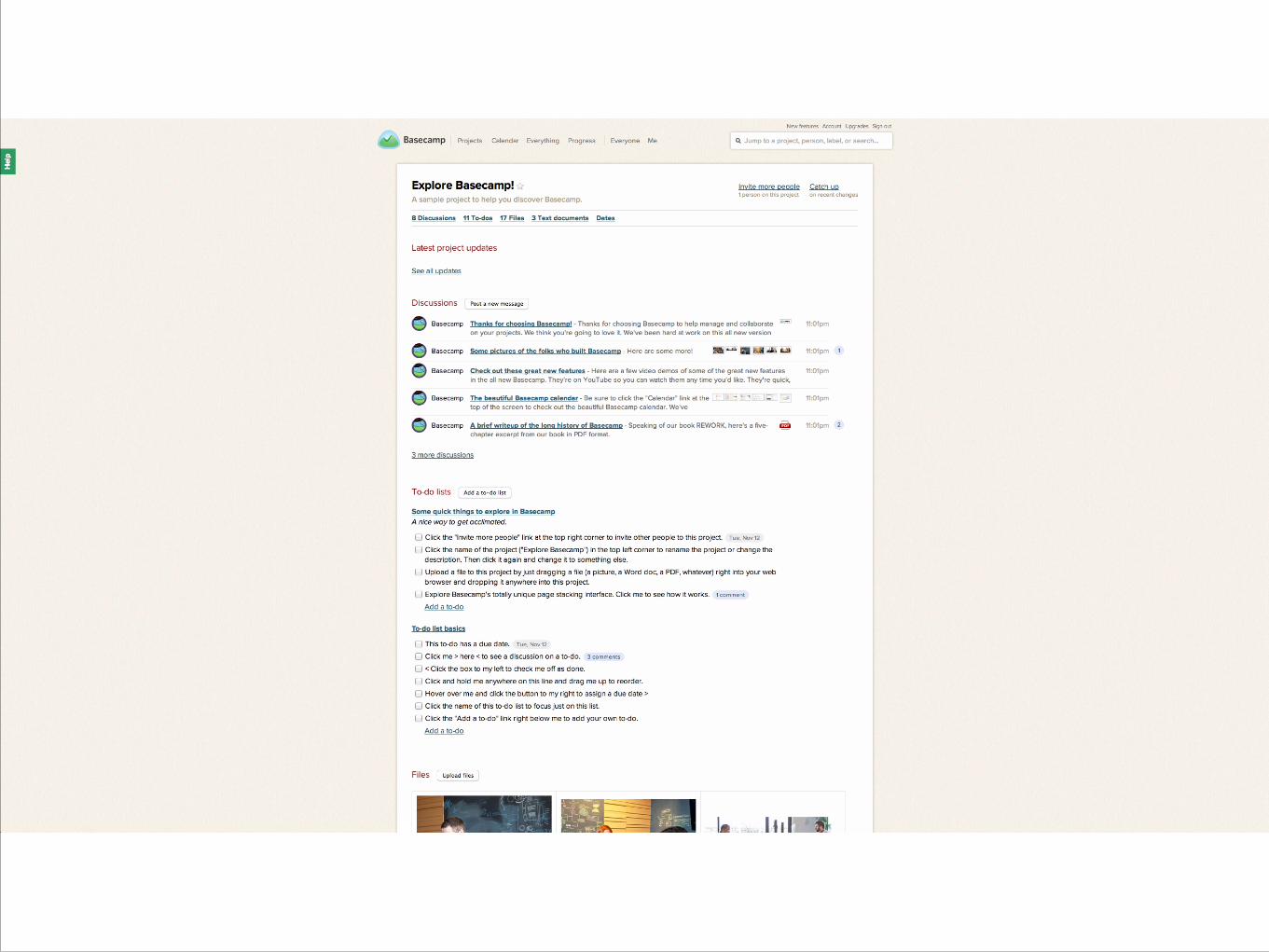
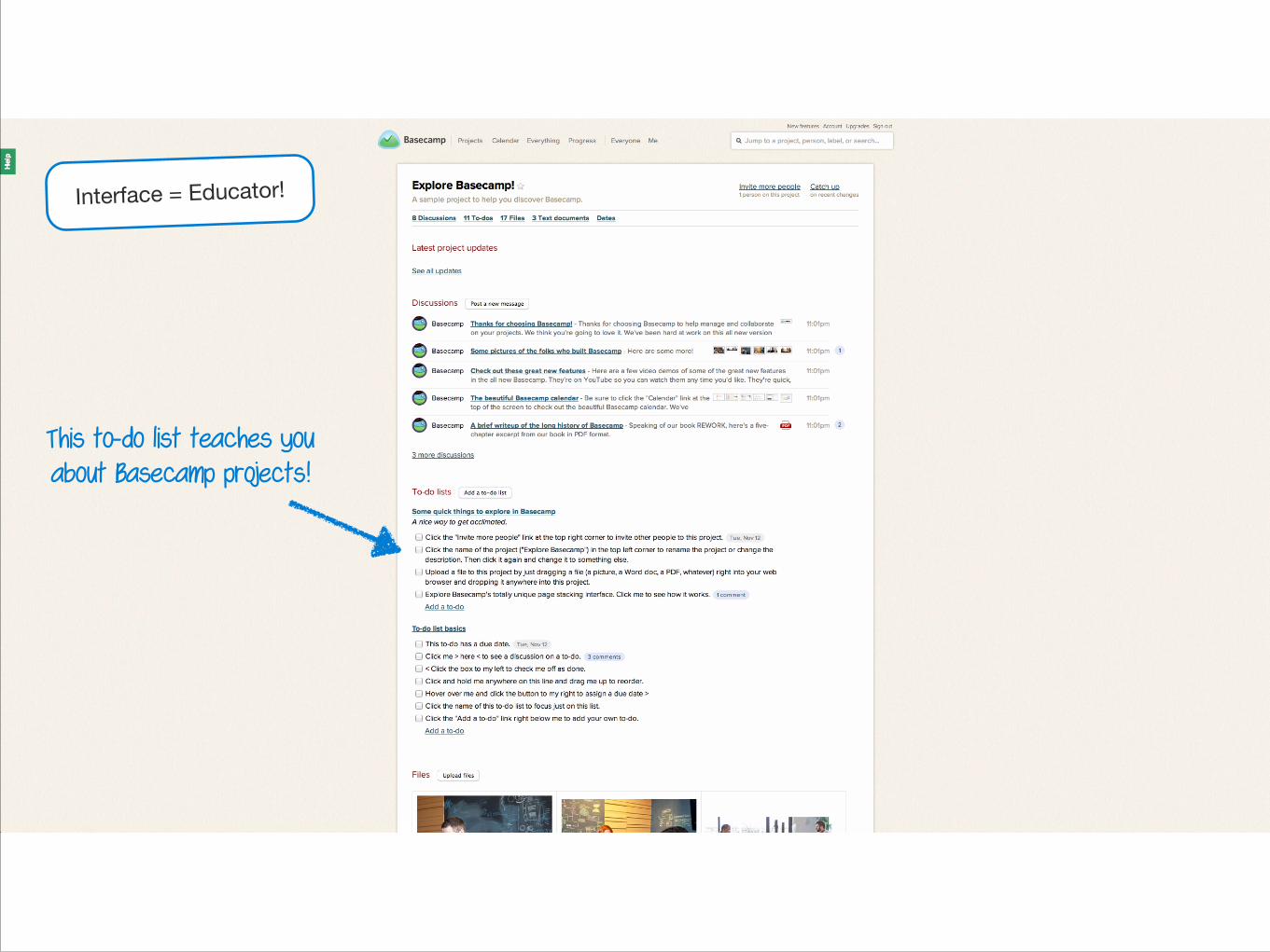
This to-do list teaches you about Basecamp projects!
Interface = Educator!
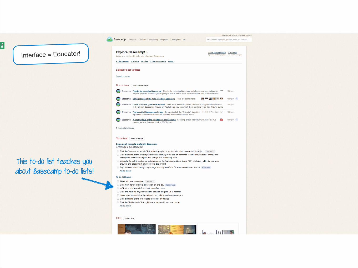
This to-do list teaches you about Basecamp to-do lists!
Interface = Educator!
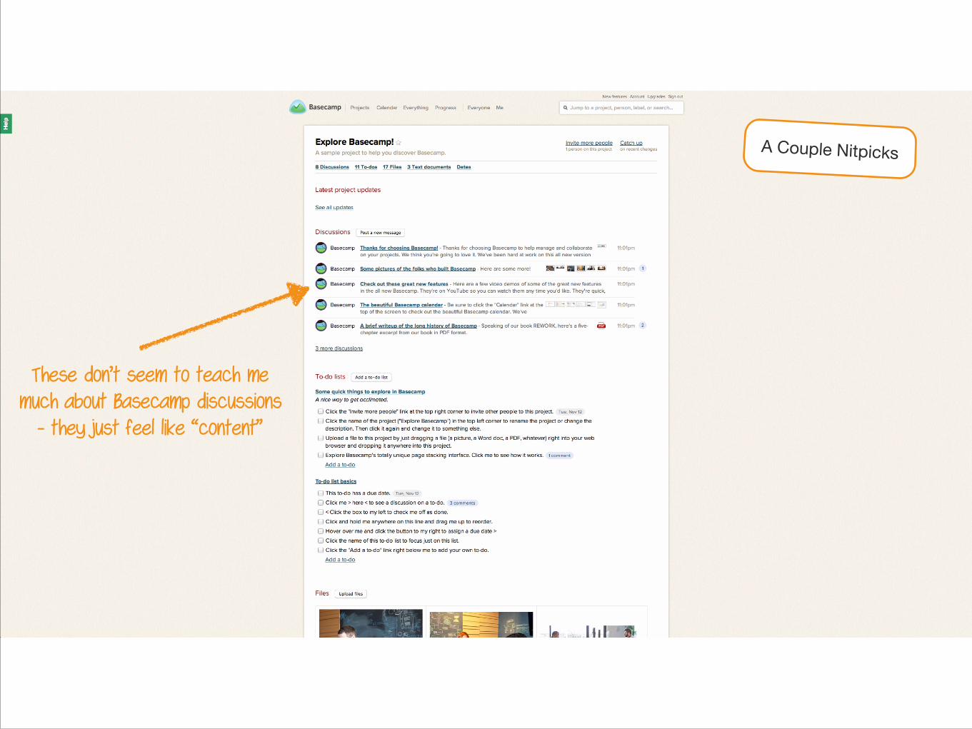
These don’t seem to teach me much about Basecamp discussions
- they just feel like “content”
A Couple Nitpicks
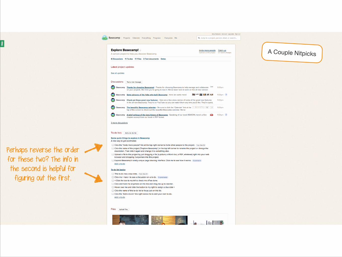
Perhaps reverse the order for these two? The info in the second is helpful for figuring out the first.
A Couple Nitpicks
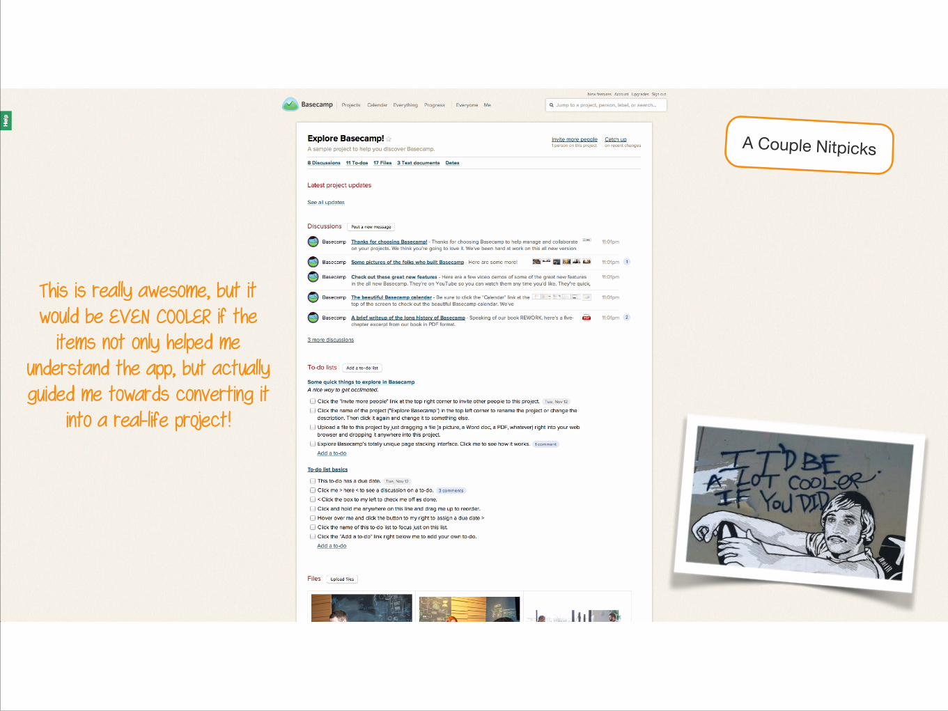
This is really awesome, but it would be EVEN COOLER if the
items not only helped me understand the app, but actually guided me towards converting it
into a real-life project!
A Couple Nitpicks
5. New Project Form
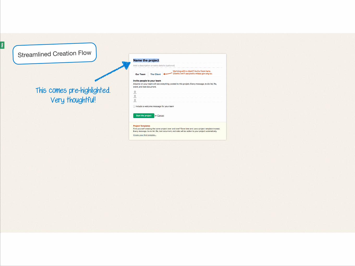
Streamlined Creation Flow
This comes pre-highlighted. Very thoughtful!
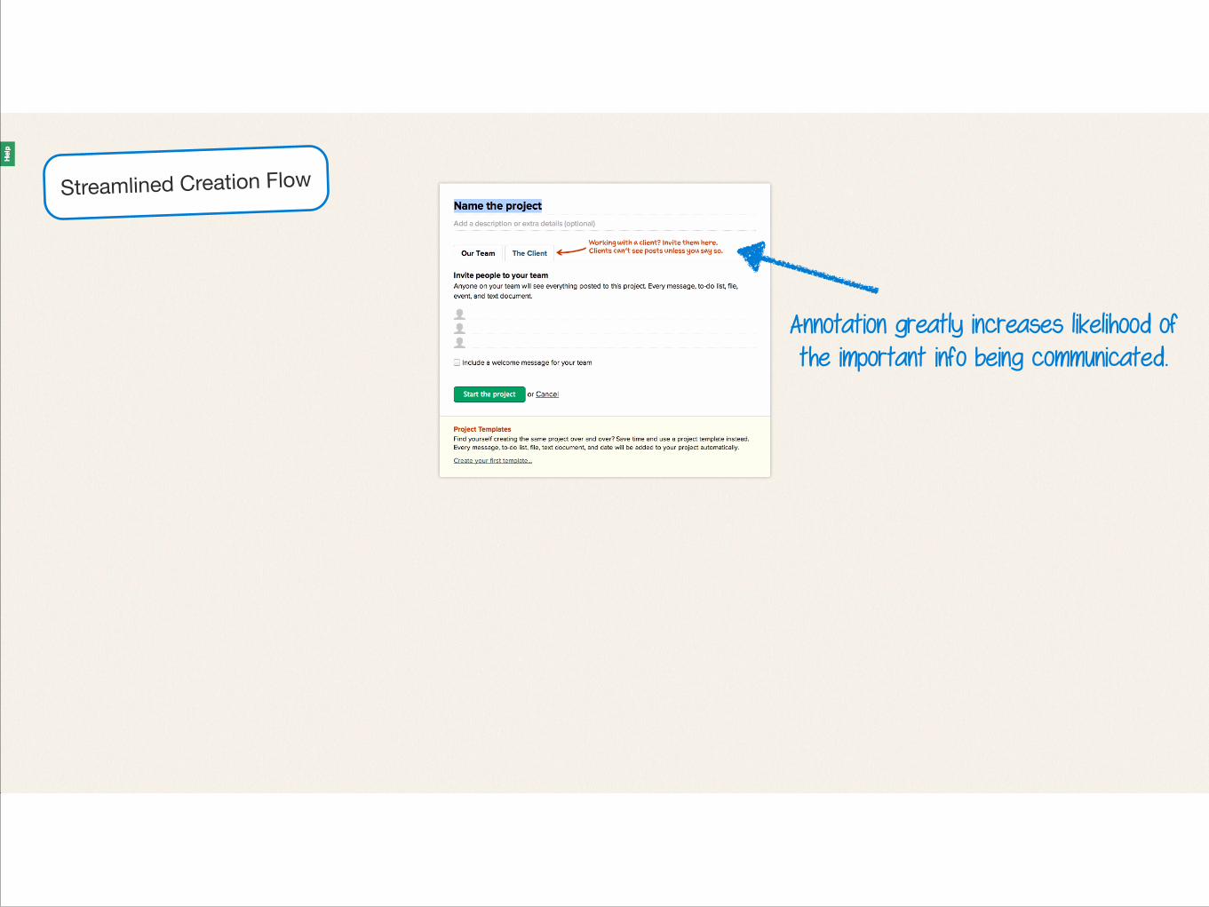
Annotation greatly increases likelihood of the important info being communicated.
Streamlined Creation Flow
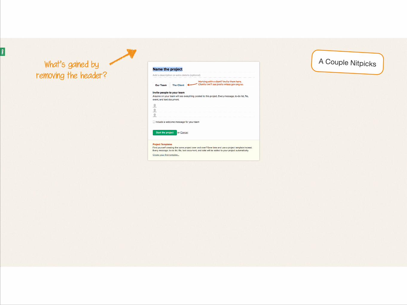
What’s gained by removing the header?
A Couple Nitpicks
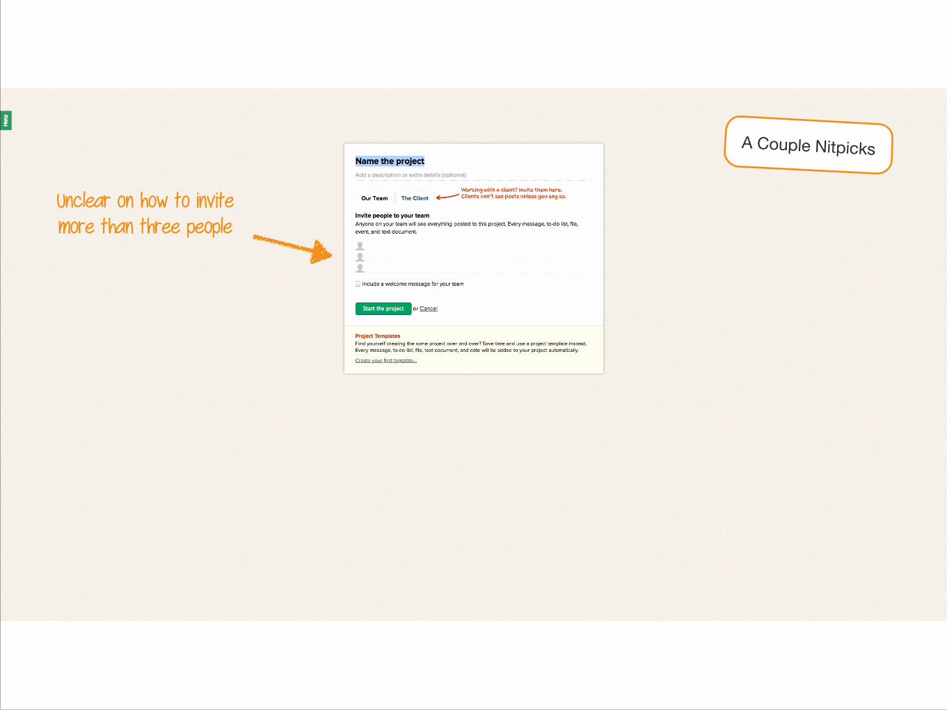
Unclear on how to invite more than three people
A Couple Nitpicks
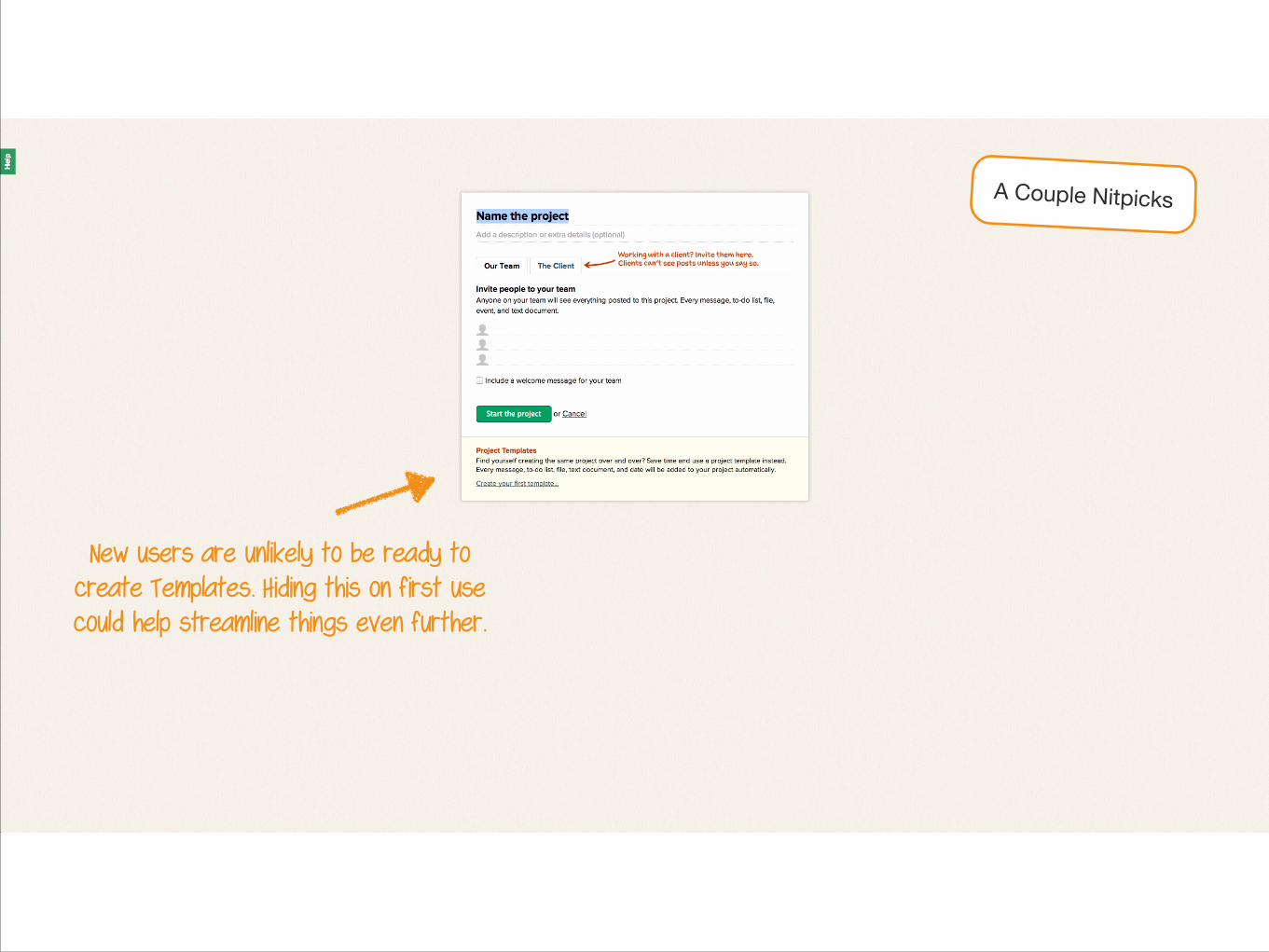
New users are unlikely to be ready to create Templates. Hiding this on first use could help streamline things even further.
A Couple Nitpicks
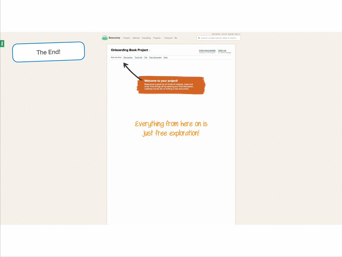
Everything from here on is just free exploration!
The End!
I hope you enjoyed the deep dive!
There’s lots more where it came from - check out samuelhulick.com/user-onboarding for updates!
Recommended