Front Covers

Masthead – the
reader would be
attracted to the title
because its big and
bright red.
Tagline
Secondary image –
gives more
information about
the magazine.
Use of colour – it links
with the main image
of the magazine cover
because it’s the
background of the
image.
Central image –
image has a
direct mode of
address so its
looking straight at
the reader.
He's in control and
that represents that
he is thing.
Other
information
about other
films.
This image could be
from the film
because he looks
like he has been hit
a lot.
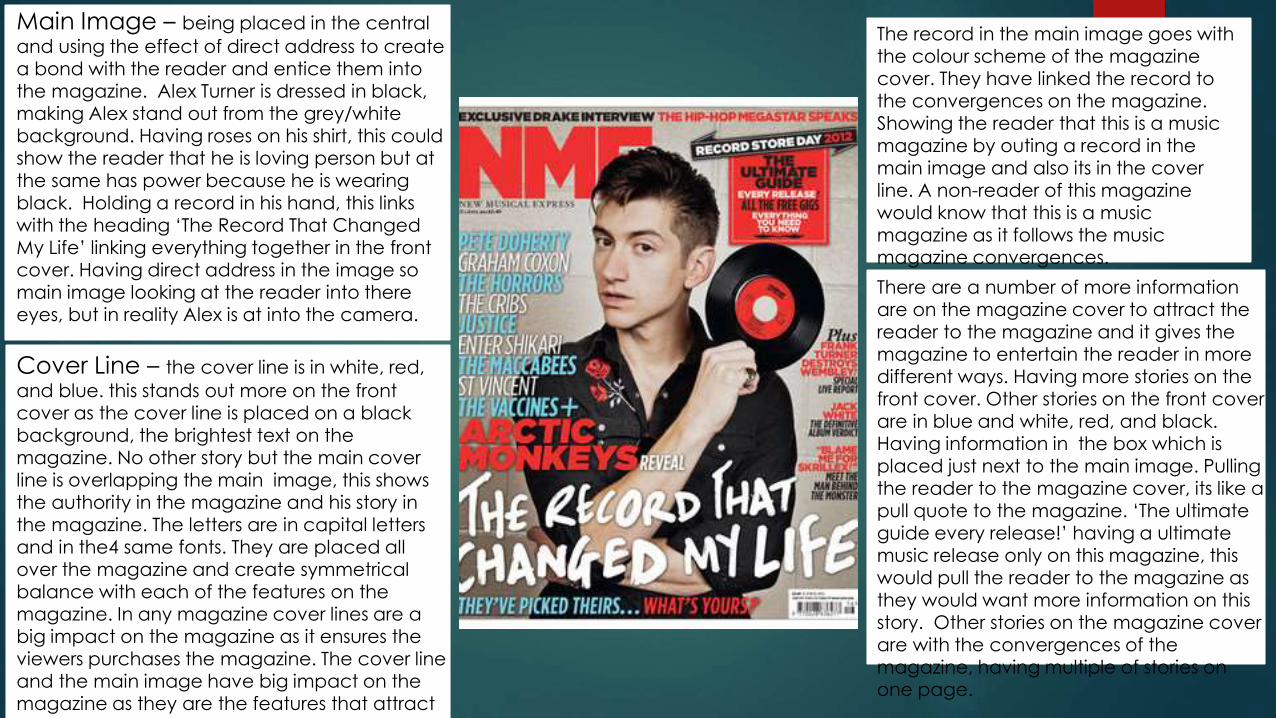
Main Image – being placed in the central
and using the effect of direct address to create a bond with the reader and entice them into the magazine. Alex Turner is dressed in black, making Alex stand out from the grey/white background. Having roses on his shirt, this could show the reader that he is loving person but at
the same has power because he is wearing black. Holding a record in his hand, this links with the heading ‘The Record That Changed My Life’ linking everything together in the front cover. Having direct address in the image so main image looking at the reader into there eyes, but in reality Alex is at into the camera.
Cover Line – the cover line is in white, red,
and blue. this stands out more on the front cover as the cover line is placed on a black background, the brightest text on the magazine. No other story but the main cover line is overlapping the main image, this shows the authority in the magazine and his story in the magazine. The letters are in capital letters and in the4 same fonts. They are placed all over the magazine and create symmetrical balance with each of the features on the magazine. In any magazine cover lines are a big impact on the magazine as it ensures the viewers purchases the magazine. The cover line and the main image have big impact on the magazine as they are the features that attract the reader to the magazine in the first place.
There are a number of more information are on the magazine cover to attract the reader to the magazine and it gives the magazine to entertain the reader in more different ways. Having more stories on the front cover. Other stories on the front cover are in blue and white, red, and black. Having information in the box which is
placed just next to the main image. Pulling the reader to the magazine cover, its like a pull quote to the magazine. ‘The ultimate guide every release!’ having a ultimate music release only on this magazine, this would pull the reader to the magazine as they would want more information on this story. Other stories on the magazine cover are with the convergences of the magazine, having multiple of stories on one page.
The record in the main image goes with the colour scheme of the magazine cover. They have linked the record to the convergences on the magazine. Showing the reader that this is a music magazine by outing a record in the main image and also its in the cover line. A non-reader of this magazine would know that this is a music magazine as it follows the music magazine convergences.
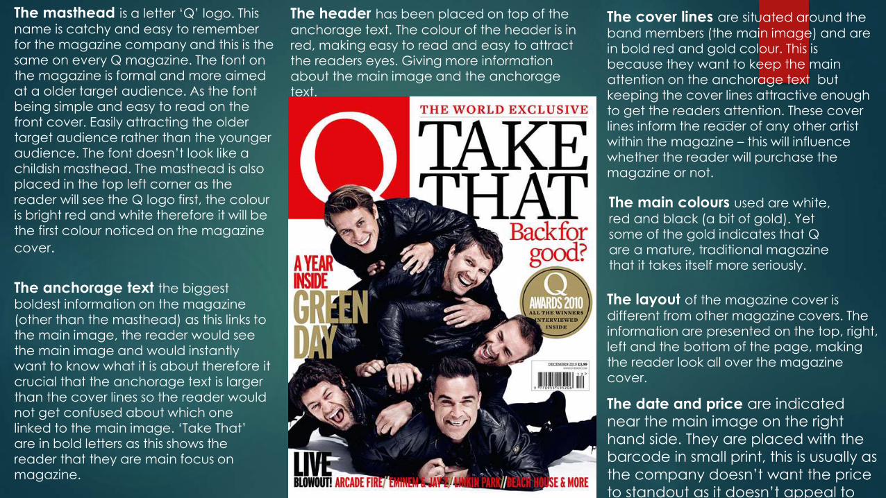
The masthead is a letter ‘Q’ logo. This
name is catchy and easy to remember for the magazine company and this is the same on every Q magazine. The font on the magazine is formal and more aimed at a older target audience. As the font being simple and easy to read on the front cover. Easily attracting the older target audience rather than the younger audience. The font doesn’t look like a childish masthead. The masthead is also placed in the top left corner as the reader will see the Q logo first, the colour is bright red and white therefore it will be the first colour noticed on the magazine
cover.
The anchorage text the biggest
boldest information on the magazine (other than the masthead) as this links to the main image, the reader would see
the main image and would instantly want to know what it is about therefore it crucial that the anchorage text is larger than the cover lines so the reader would not get confused about which one linked to the main image. ‘Take That’ are in bold letters as this shows the reader that they are main focus on magazine.
The date and price are indicated near the main image on the right
hand side. They are placed with the
barcode in small print, this is usually as
the company doesn’t want the price
to standout as it doesn’t appeal to
the reader.
The header has been placed on top of the
anchorage text. The colour of the header is in red, making easy to read and easy to attract the readers eyes. Giving more information about the main image and the anchorage text.
The cover lines are situated around the
band members (the main image) and are in bold red and gold colour. This is because they want to keep the main attention on the anchorage text but keeping the cover lines attractive enough to get the readers attention. These cover lines inform the reader of any other artist within the magazine – this will influence whether the reader will purchase the magazine or not.
The main colours used are white,
red and black (a bit of gold). Yet some of the gold indicates that Q are a mature, traditional magazine that it takes itself more seriously.
The layout of the magazine cover is
different from other magazine covers. The information are presented on the top, right, left and the bottom of the page, making the reader look all over the magazine cover.

Contents Page

Masthead – uses yellow, black and white colour scheme to make the heading stand out. Main image –
images relating to the bands the magazine represents.
Uses image of Kerrang’s previous issue to show new readers what they missed out on last time.
This is what the editor of the magazine wrote about the bands/magazine it self.
Using big bold words to attract the readers attention to the magazine.
Separates different type of sub-heading of the magazine.
The new or old issues of the magazine. Tells the reader what they have missed out on over the week.
Tells the reader that its been wrote by the editor because its been signed by the editor.
Including page numbers next to the images. relating to what’s inside the magazine.

Been signed by the editor –
makes the reader feel like
the editor is talking to them
directly.
Contents coloumntext consists
mainly of band names – it
attracts the readers attention
so they will buy the magazine
and with all of their favourite
bands.
Masthead – the magazine is
breaking the colour scheme
because its got more than
three colours on the contents
page.
the sub-titles have a different
colour scheme than the
masthead. Using different sub-
heading in the magazine – e.g.
‘NEWS’.
The image
tells the
reader that
there is a story
in the
magazine.
Page numbers –
including page
numbers next to
the image so tells
the reader what's
inside the
magazine.
Put in a different
shape so tells the
reader its important.
Images relating to
genre that the
magazine
represents.
One of the band
wrote a book so
tells the reader
‘you should
reader you’re
favourite bands
book’.
Bold sub-heading in
capital letters – its
eye catching

Kerrang’s colour scheme is always the same. Yellow, black and white.
Mainly about the bands names – trying to attract readers attention so they will buy this magazine because of their favourite bands.
Images are relating to genre that the readers like and the magazine represents.
This is the main cover line of the contents page. Tells the reader what the text is about.
The editor of the magazine wrote about the bands that week. This is talking to the reader directly.
Other issues of the Kerrang's magazines. The reader might have missed out on.
Using bold writing because it catch the readers eye.
The text is talking about that band and not other bands in the magazine.

Double Page Spreads


The large ‘T’ at the start of the article shows where the text will be starting from, this gives the double page spread a professional look and makes it more interesting to look at.
KickerThis is used in double page spreads to give the reader information about the celebrity being presented on the page, give background information if the reader does not know who they, this also provides about the main image. The kicker is giving the reader the celebrities name, what music they play and just their background information, this is because the reader might not know what the double page spread is about but are interested in them.
HeaderThe header is being placed at the top of the right hand side of the double page spread, this is because the image is on the left hand side taking the whole of that side place, the next thing the reader will be attracted by is the heading of the double page spread. ‘Beady Eye’ is the heading, presenting in the biggest writing on the page and being the brightest on the double page spread itself. This also makes it simple for the reader to interact around the page.
Main ImageThe main image presented in black and grey, making the main image contrast with the background and the colour convention going in the double page spread. The main image complies with the colour scheme as it flows with it all. All of this suits the style of the artist presented on the double page spread. The main image is contrasting with the page a lot.
Main Image, this takes up the whole left hand side page. As
you can see the main image was planned for this page but the
image doesn’t have direct address to the audience and this is
different to other magazine double page spreads. The image is
not interacting with the audience, the way the image is
portrayed, the reader may think that he could be sharing
something with them but not looking at them. The image is also
in black and white, this doesn’t generate colours to attract the
reader and doesn’t generate that much bright colour and take
the focus away from the magazine or the article.
Main Image looks
relaxed and chilled, and
this is what the reader the
be like, reading this in a
chilled place and being
relaxed at the same time.
The reader would enjoy
this because how the
conventions are just
flowing in the right
places.

StyleThe style of this double spread
page has been aimed at the
higher target audience. The
colour scheme of the double
spread page is pink, white and
grey. The colours are dual
because it has been aimed at
a higher audience than a pop
style magazine. The page has
been aimed at women
because of the colours they
have been using in the
magazine. Using an image to
fell on side of the double
spread page to show the
women and so it has been
aimed at women target
audience.
ImageThe image is the biggest thing
on the spread page. Felling
the hole page and making it
stand out to the target
audience. The image is a
women so it has been aimed
at women's. The image is big
and stands out to the
audience eyes so it will attract
the women to the double
spread page.
TextThe text is an formal
language so aimed at a
higher audience. The text is
simple and easy to read for
the audience and easy to
understand.
Main Image is placed in the
right hand side of the page,
as the image is in black and
white colour, this is not taking
away the focus from the
article in the double page
spread. The image ahs got
direct address to the reader,
this makes the reader feel like
that the artist is look at them
and trying to get there
attention through the
magazine.
LayoutThe layout of the double page spread is simple and
follows the convention of the magazine cover. Putting
the main image on the right hand side and just having
the image on that side. As you can see there is text on
the page, a lot of text so shows the reader likes to read
about the artist, not having a Kicker in this double page
spread, this may represent that everyone should know
who the artist is and the reader should just get into the
information given on the page.
Recommended