
END USER DOCUMENTATION
1
Version 2013.2.611
End-user manual
Last revision: July 08, 2013
END USER DOCUMENTATION
2
1 ABOUT THIS GUIDE ................................................................................................................................................ 6
1.1 PURPOSE .............................................................................................................................................................. 6
1.2 WHO SHOULD USE THIS GUIDE ........................................................................................................................ 6
2 ABOUT RADEDITOR ............................................................................................................................................... 6
3 AUTHORING TOOL ACCESSIBILITY GUIDELINES 1.0 (ATAG) .............................................................. 6
4 RADEDITOR TOOLBARS ....................................................................................................................................... 9
5 SYSTEM MODULES ............................................................................................................................................... 10
5.1 TAG INSPECTOR............................................................................................................................................... 10
5.2 PROPERTIES INSPECTOR ................................................................................................................................ 11
5.3 REAL TIME HTML INSPECTOR .................................................................................................................... 11
5.4 STATISTICS ....................................................................................................................................................... 12
6 TOOLBAR BUTTONS............................................................................................................................................ 13
6.1 FORMATTING TEXT APPEARANCE ............................................................................................................... 13
6.2 FORMATTING PARAGRAPHS & LISTS ........................................................................................................... 15
6.3 WORKING WITH PORTIONS OF TEXT ............................................................................................................ 17
6.4 INSERTING ELEMENTS .................................................................................................................................... 20
6.5 VIEW ................................................................................................................................................................. 26
6.6 MISCELLANEOUS ............................................................................................................................................. 27
6.7 OTHER KEYBOARD SHORTCUTS .................................................................................................................... 29
7 FORMATTING TEXT ............................................................................................................................................ 29
7.1 CHANGING THE TEXT FONT .......................................................................................................................... 29
7.2 CHANGING THE TEXT SIZE ............................................................................................................................ 30
7.3 APPLYING TEXT COLORS ............................................................................................................................... 30
7.4 SETTING TEXT ALIGNMENT .......................................................................................................................... 31
7.5 INDENTATION .................................................................................................................................................. 32
7.6 APPLYING CSS CLASSES................................................................................................................................. 33
END USER DOCUMENTATION
3
7.7 APPLYING PARAGRAPH STYLES .................................................................................................................... 34
7.8 APPLYING FORMATTING TROUGH THE FORMAT SET TOOL ..................................................................... 34
7.9 APPLYING FORMATTING TROUGH THE FORMAT PAINTER TOOL ............................................................ 35
8 COPYING FORMATTED TEXT FROM MICROSOFT WORD AND OTHER APPLICATIONS ........ 36
8.1 PASTE BUTTON OR CTRL+V .......................................................................................................................... 36
8.2 PASTE FROM WORD BUTTON ........................................................................................................................ 37
8.3 PASTE FROM WORD, STRIP FONT BUTTON ................................................................................................ 37
8.4 PASTE PLAIN TEXT .......................................................................................................................................... 37
8.5 PASTE AS HTML ............................................................................................................................................. 37
8.6 PASTE HTML .................................................................................................................................................. 37
8.7 PASTING CONTENT IN NON IE BROWSERS .................................................................................................. 38
8.7 STRIP WORD-FORMATTING AFTER PASTE .................................................................................................. 39
8.8 PASTE MARKDOWN ........................................................................................................................................ 40
9 WORKING WITH HYPERLINKS ....................................................................................................................... 40
9.1 INSERTING A HYPERLINK .............................................................................................................................. 40
9.2 INSERTING A HYPERLINK VIA THE INSERT LINK DIALOG ......................................................................... 41
9.3 MODIFYING A HYPERLINK ............................................................................................................................. 42
9.4 MODIFYING A HYPERLINK VIA THE INSERT LINK DIALOG ....................................................................... 43
9.5 REMOVING A HYPERLINK .............................................................................................................................. 43
9.6 INSERTING ANCHORS ..................................................................................................................................... 44
9.7 INSERTING E-MAIL LINKS .............................................................................................................................. 45
9.8 INSERTING CUSTOM LINKS ............................................................................................................................ 46
10 FIND AND REPLACE ............................................................................................................................................ 47
11 WORKING WITH TABLES .................................................................................................................................. 49
11.1 CREATING A TABLE USING THE TABLE BUILDER ...................................................................................... 49
END USER DOCUMENTATION
4
11.2 CREATING A TABLE USING THE TABLE WIZARD ....................................................................................... 49
11.3 CREATING A TABLE USING THE INSERT TABLE LIGHT DIALOG ............................................................... 51
11.4 INSERTING A TABLE FROM MICROSOFT EXCEL® OR OTHER APPLICATIONS ........................................ 52
11.5 TOGGLE TABLE BORDERS .............................................................................................................................. 52
11.6 FORMATTING TABLES .................................................................................................................................... 53
11.7 TABLE PROPERTIES EXPLAINED .................................................................................................................. 53
11.8 CELL PROPERTIES EXPLAINED ..................................................................................................................... 54
11.9 INSERTING/DELETING ROWS AND COLUMNS ........................................................................................... 56
11.10 MERGING/SPLITTING CELLS ........................................................................................................................ 57
11.11 RESIZING TABLES ........................................................................................................................................... 57
11.12 FORMATTING TABLES WITH CSS CLASSES ................................................................................................. 58
12 CREATING BULLETED/NUMBERED LISTS ................................................................................................ 59
13 INSERTING SPECIAL CHARACTERS (€, ®, ©, ±, Ë, ETC.)..................................................................... 60
14 INSERTING DROPDOWN MENUS (INSERT SELECT DIALOG) ........................................................... 61
15 WORKING WITH IMAGES .................................................................................................................................. 62
15.1 INSERTING AN IMAGE FROM THE WEB-SERVER ........................................................................................ 63
15.2 UPLOADING IMAGES ON THE WEB-SERVER ............................................................................................... 64
15.3 IMAGE EDITOR DIALOG .................................................................................................................................. 65
15.4 EDITING IMAGE PROPERTIES ........................................................................................................................ 66
15.5 EDITING IMAGE PROPERTIES VIA THE INSERT IMAGE DIALOG ............................................................... 68
15.6 ABSOLUTE POSITIONING ............................................................................................................................... 69
16 WORKING WITH FLASH ANIMATIONS ....................................................................................................... 69
16.1 INSERTING A FLASH ANIMATION FROM THE WEB-SERVER .................................................................... 69
16.2 UPLOADING FLASH ANIMATIONS ON THE WEB-SERVER ......................................................................... 71
16.3 SETTING FLASH PROPERTIES........................................................................................................................ 72
17 WORKING WITH SILVERLIGHT ANIMATIONS ......................................................................................... 73
END USER DOCUMENTATION
5
17.1 INSERTING A SILVERLIGHT ANIMATION FROM THE WEB-SERVER ........................................................ 74
17.2 UPLOADING SILVERLIGHT ANIMATIONS ON THE WEB-SERVER ............................................................. 75
17.3 SETTING SILVERLIGHT PROPERTIES ............................................................................................................ 76
18 WORKING WITH WINDOWS MEDIA ............................................................................................................ 77
18.1 INSERTING WINDOWS MEDIA FROM THE WEB-SERVER ......................................................................... 77
18.2 UPLOADING WINDOWS MEDIA ON THE WEB-SERVER ............................................................................ 80
18.3 SETTING WINDOWS MEDIA PROPERTIES ................................................................................................... 81
19 INSERTING YOUTUBE AND VIMEO VIDEOS ............................................................................................. 82
20 WORKING WITH DOCUMENTS ....................................................................................................................... 83
20.1 INSERTING DOCUMENTS ................................................................................................................................ 84
20.2 UPLOADING DOCUMENTS ON THE WEB-SERVER ...................................................................................... 85
21 WORKING WITH TEMPLATES ........................................................................................................................ 86
21.1 INSERTING TEMPLATES ................................................................................................................................. 86
21.2 UPLOADING TEMPLATES ............................................................................................................................... 87
22 USING THE IMAGE MAP EDITOR ................................................................................................................... 89
23 USING THE COMMENTS FEATURE ............................................................................................................... 90
24 USING THE TRACK CHANGES FEATURES .................................................................................................. 90
24.1 USING THE TRACK CHANGES COLLABORATION FEATURE ..................................................... 90
24.2 USING THE TRACK CHANGES DIALOG .............................................................................................. 92
25 USING THE FORMAT CODE BLOCK DIALOG ............................................................................................. 93
26 SPELL-CHECKING ................................................................................................................................................. 94
27 USING CODE SNIPPETS ...................................................................................................................................... 95
27.1 INSERTING CODE SNIPPETS .......................................................................................................................... 95
28 CREATING ACCESSIBLE CONTENT ("SECTION 508"AND WCAG2 COMPLIANT) ..................... 96
28.1 CREATING ACCESSIBLE TABLES ................................................................................................................... 96
28.2 CREATING ACCESSIBLE HYPERLINKS .......................................................................................................... 98
28.3 CREATING ACCESSIBLE IMAGES ................................................................................................................ 100
END USER DOCUMENTATION
6
28.4 USING HEADERS IN CONTENT ................................................................................................................... 101
28.5 PROVIDING GOOD COLOR CONTRASTS FOR CONTENT .......................................................................... 101
28.6 XHTML VALIDATOR DIALOG ..................................................................................................................... 103
29 USING THE HTML MODE ................................................................................................................................ 104
30 THE PREVIEW MODE ....................................................................................................................................... 105
31 PRINTING CONTENT ........................................................................................................................................ 106
1 ABOUT THIS GUIDE
1.1 Purpose
This guide provides comprehensive guidelines and step-by-step instructions for working with the Telerik
RadEditor for ASP.NET AJAX, the high-end WYSIWYG content editor for ASP.NET.
1.2 Who should use this guide
This guide is intended for end-users of RadEditor. For deployment and configuration instructions, please
refer to the "Deployment Manual" shipped with the product distribution.
2 ABOUT RadEditor
RadEditor is a powerful WYSIWYG (What You See Is What You Get) content editor allowing even non-
technical users to author and manage HTML content as easily as writing a document. In its familiar
Word®-like interface users can seamlessly format text, set hyperlinks, build tables and insert images,
Flash, documents, etc.
Note: Some of the features described in this manual may not be available in your specific
application. Please consult your product developer for availability of features and further
instructions.
3 Authoring Tool Accessibility Guidelines 1.0 (ATAG)
END USER DOCUMENTATION
7
Authoring Tool Accessibility Guidelines 1.0 (ATAG) is a guideline, which assists developers in designing
authoring tools that produce accessible Web content and assists developers in creating an accessible
authoring interface. It is just as important that all people be able to author content as it is for all people to
have access to it.
Telerik RadEditor fully satisfies the requirements for Conformance Level "A" of Authoring Tool
Accessibility Guidelines 1.0 (ATAG):
Ensure that the author can produce accessible content in the markup language(s) supported by
the tool: RadEditor offers support for producing and editing XHTML.
RadEditor supports all XHTML and HTML specifications and structural features of these
markup languages.
The editor allows the author to directly edit the source markup (so knowledgeable
authors can ensure accessible content). The author is able to see and edit the produced
content in HTML mode.
The RadEditor’s Image manager and Insert Image dialog allow the addition of equivalent
alternatives for all supported image formats.
The RadEditor’s Accessibility Validation tool dialog can be used to check if the produced
output is not accessible. The dialog uses the HiSoftware Compliance Sheriff Accessibility
Module.
RadEditor preserves all accessibility information during authoring, transformations, and
conversions.
RadEditor generates out-of-the box XHTML compliant markup.
RadEditor does not automatically generate equivalent alternatives and does not reuse previously
authored alternatives without author confirmation. An exception is that the ConvertToXhtml
filter of RadEditor automatically inserts an empty alt tag if the alt tag is not set by the user. The
ALT tag is a requirement for producing XHTML compliant content.
Document all features that promote the production of accessible content – this requirement is
handled in this document.
RadEditor allows the author to change the presentation within editing views without affecting the
document markup
RadEditor offers the ability to zoom the content without affecting the produced XHTML
markup using the Zoom dropdown . In addition, the content appearance could
be changed by external CSS style sheet provided by the developer.
The RadEditor’s HTML view mode displays the source structure of a document using
graphic representations of tags and provides the author with the option of displaying the
text of the elements, instead (i.e., <html> rather than a generic marker image).
END USER DOCUMENTATION
8
RadEditor also offers a "rendered view" of a document, named Design mode , where
the user could edit the content using the tools provided by the editor, without going to
HTML view mode.
RadEditor can be configured to load a local style sheet, which will override the
"published" style of the document in the editing view.
Allow the author to edit all properties of each element and object in an accessible fashion.
RadEditor allows the author to individually edit almost all of the attributes of the
elements in an HTML or XML document using various tools: Properties Inspector Module,
directly modify the markup in HTML view mode, Set Image Properties dialog, Set Table
Properties dialog, Set Cell Properties Dialog.
RadEditor allows the author to specifies Alt Text and Long Description for images using
the Set Image Properties dialog.
RadEditor provides Properties Inspector Module to allow authors to directly modify
properties / attributes of the selected element in Design mode.
RadEditor offers tag specific context menus to access the properties / attributes of the
selected element.
Ensure that the editing view allows navigation via the structure of the document in an accessible
fashion.
Another accessibility feature of RadEditor that allows access to the parent elements of the
selected element in the content area is the Tag Inspector Module.
RadEditor can be configured to use the HTML "accesskey" attribute, which sets the focus
on the content area when the user executes the accesskey shortcut.
RadEditor satisfies some of the requirements for Conformance Level "AA" and Conformance Level
"AAA" of Authoring Tool Accessibility Guidelines 1.0 (ATAG):
RadEditor allows the author to preserve markup not recognized by the browser. The user could
define his or her own custom tags or attribute and the editor will not modify or strip them.
The RadEditor’s Accessibility Validation dialog provides the author with a summary of the
document's accessibility status. The dialog uses the HiSoftware Compliance Sheriff Accessibility
Module.
In CREATING ACCESSIBLE CONTENT ("Section 508"compliant) section of this document, you will
find all features of RadEditor that promote the production of accessible content.
RadEditor partially allow editing of the structure of the document in an accessible fashion. For
example, you can copy an image and / or a table along with its properties and content (still not
supported by Safari and Chrome browsers).
RadEditor allows the author to search within editing views using the Find and Replace tool.
END USER DOCUMENTATION
9
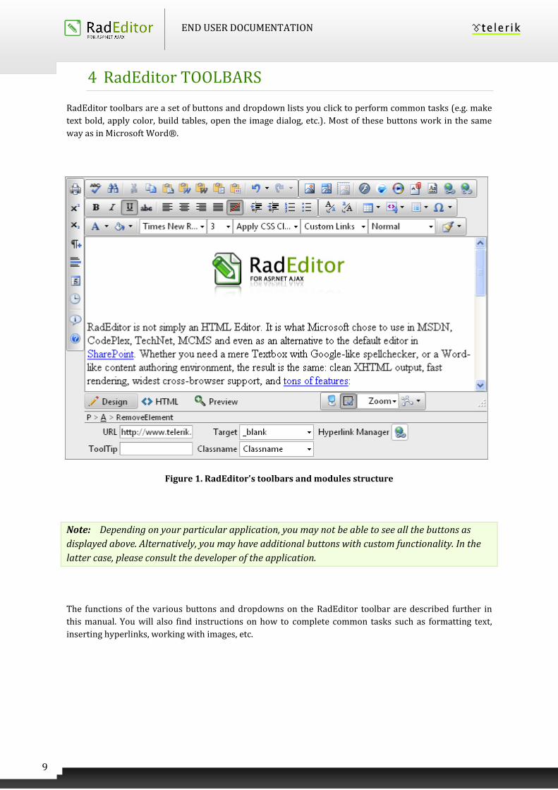
4 RadEditor TOOLBARS
RadEditor toolbars are a set of buttons and dropdown lists you click to perform common tasks (e.g. make
text bold, apply color, build tables, open the image dialog, etc.). Most of these buttons work in the same
way as in Microsoft Word®.
Figure 1. RadEditor's toolbars and modules structure
Note: Depending on your particular application, you may not be able to see all the buttons as
displayed above. Alternatively, you may have additional buttons with custom functionality. In the
latter case, please consult the developer of the application.
The functions of the various buttons and dropdowns on the RadEditor toolbar are described further in
this manual. You will also find instructions on how to complete common tasks such as formatting text,
inserting hyperlinks, working with images, etc.
END USER DOCUMENTATION
10
5 SYSTEM MODULES
The System Modules are special tools used to provide extra information for the users who work with
RadEditor in Edit mode. Currently, there are four modules shipped out-of-the box with the editor:
Tag Inspector
Properties Inspector
Real Time HTML Inspector
Statistics Module
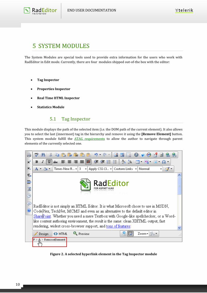
5.1 Tag Inspector
This module displays the path of the selected item (i.e. the DOM path of the current element). It also allows
you to select the last (innermost) tag in the hierarchy and remove it using the [Remove Element] button.
This system module fulfill the ATAG requirements to allow the author to navigate through parent
elements of the currently selected one.
Figure 2. A selected hyperlink element in the Tag Inspector module
END USER DOCUMENTATION
11
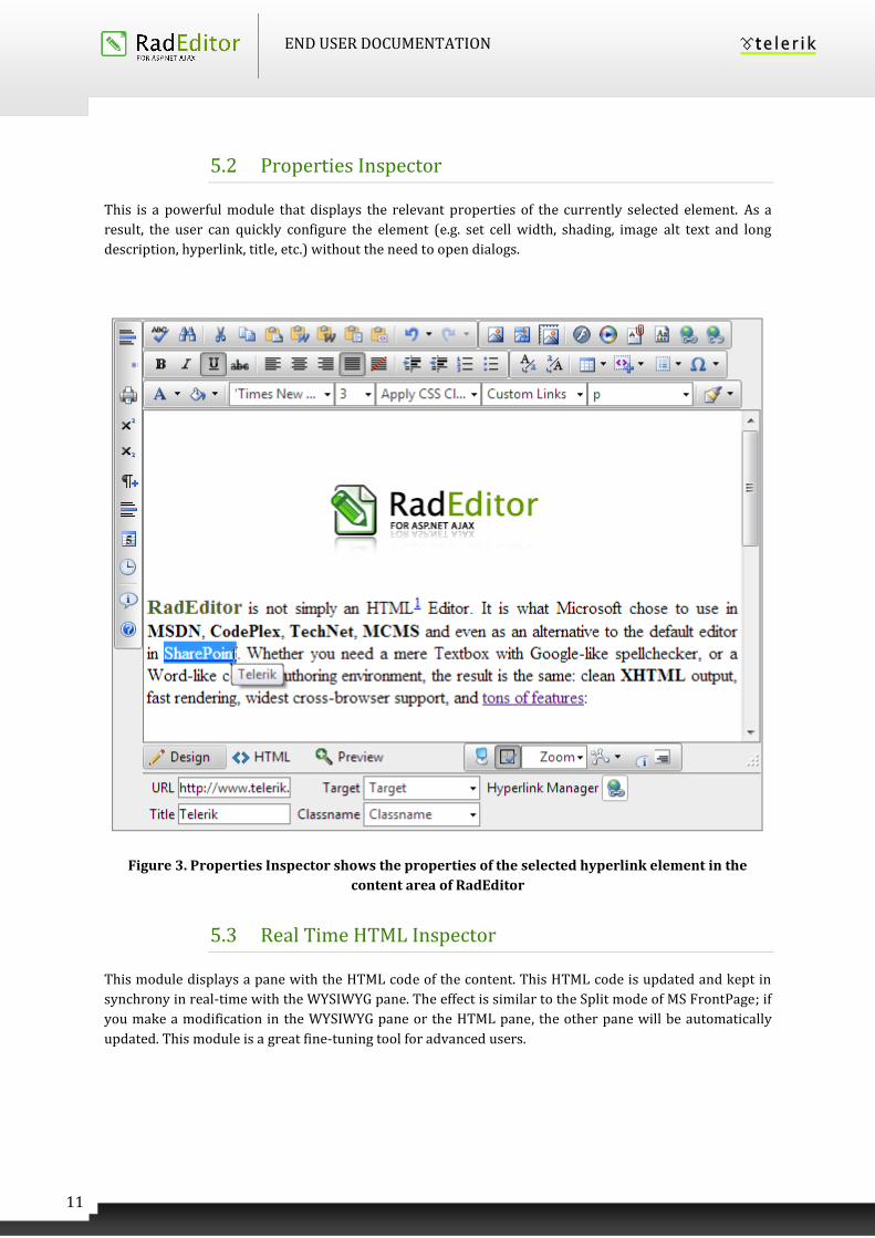
5.2 Properties Inspector
This is a powerful module that displays the relevant properties of the currently selected element. As a
result, the user can quickly configure the element (e.g. set cell width, shading, image alt text and long
description, hyperlink, title, etc.) without the need to open dialogs.
Figure 3. Properties Inspector shows the properties of the selected hyperlink element in the
content area of RadEditor
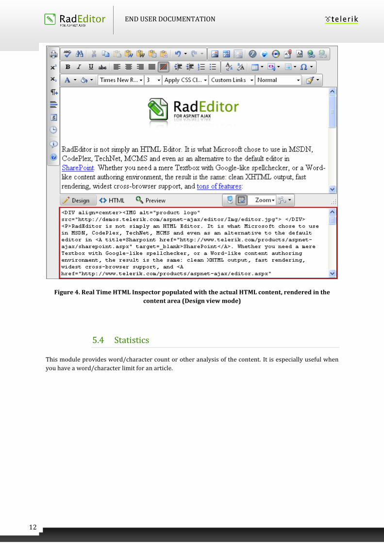
5.3 Real Time HTML Inspector
This module displays a pane with the HTML code of the content. This HTML code is updated and kept in
synchrony in real-time with the WYSIWYG pane. The effect is similar to the Split mode of MS FrontPage; if
you make a modification in the WYSIWYG pane or the HTML pane, the other pane will be automatically
updated. This module is a great fine-tuning tool for advanced users.
END USER DOCUMENTATION
12
Figure 4. Real Time HTML Inspector populated with the actual HTML content, rendered in the
content area (Design view mode)
5.4 Statistics
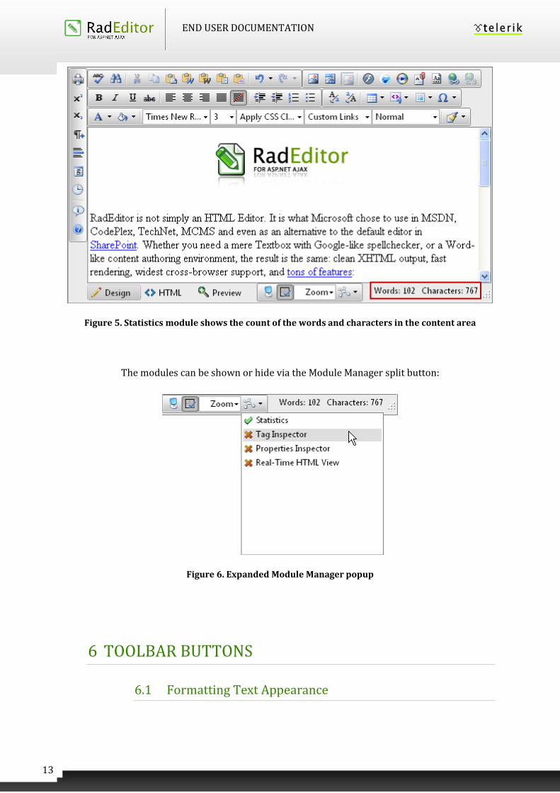
This module provides word/character count or other analysis of the content. It is especially useful when
you have a word/character limit for an article.
END USER DOCUMENTATION
13
Figure 5. Statistics module shows the count of the words and characters in the content area
The modules can be shown or hide via the Module Manager split button:
Figure 6. Expanded Module Manager popup
6 TOOLBAR BUTTONS
6.1 Formatting Text Appearance
END USER DOCUMENTATION
14
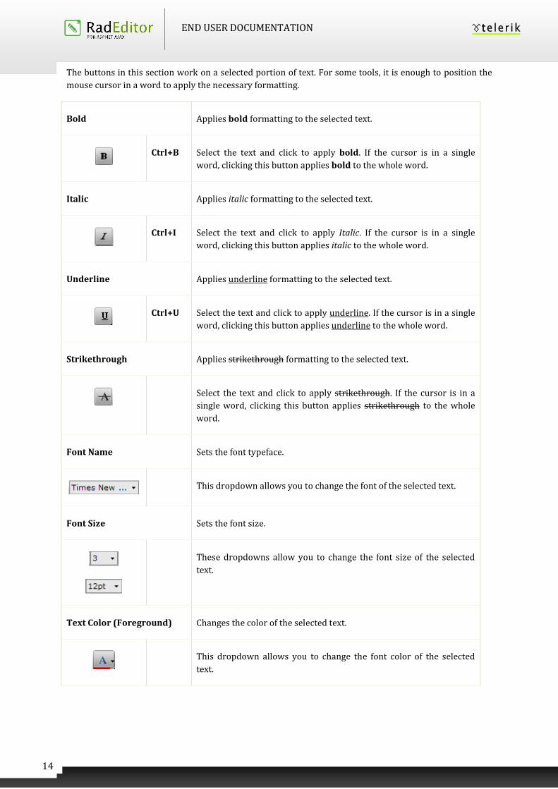
The buttons in this section work on a selected portion of text. For some tools, it is enough to position the
mouse cursor in a word to apply the necessary formatting.
Bold Applies bold formatting to the selected text.
Ctrl+B Select the text and click to apply bold. If the cursor is in a single
word, clicking this button applies bold to the whole word.
Italic Applies italic formatting to the selected text.
Ctrl+I Select the text and click to apply Italic. If the cursor is in a single
word, clicking this button applies italic to the whole word.
Underline Applies underline formatting to the selected text.
Ctrl+U Select the text and click to apply underline. If the cursor is in a single
word, clicking this button applies underline to the whole word.
Strikethrough Applies strikethrough formatting to the selected text.
Select the text and click to apply strikethrough. If the cursor is in a
single word, clicking this button applies strikethrough to the whole
word.
Font Name Sets the font typeface.
This dropdown allows you to change the font of the selected text.
Font Size Sets the font size.
These dropdowns allow you to change the font size of the selected
text.
Text Color (Foreground) Changes the color of the selected text.
This dropdown allows you to change the font color of the selected
text.
END USER DOCUMENTATION
15
Text Color (Background) Changes the background color of the selected text.
This dropdown allows you to change the background color of the
selected text.
CSS Class Applies predefined styles to the selected text.
This dropdown contains predefined text styles that can be applied to
the selected text.
Superscript Makes text or numbers appear as superscript.
When typing text, you can click this button to make the text that
follows superscript. The button also works on selected text. You need to
click the button again to switch to normal text typing.
Subscript Makes text or numbers appear as subscript.
When typing text, you can click this button to make the text that
follows subscript. The button also works on selected text. You need to
click the button again to switch to normal text typing.
Convert To Lower Case Converts selected text to lower case
When typing text and select it, you can click this button to change the
text to lower case.
Convert To Upper Case Converts selected text to upper case
When typing text and select it, you can click this button to change the
text to upper case.
6.2 Formatting Paragraphs & Lists
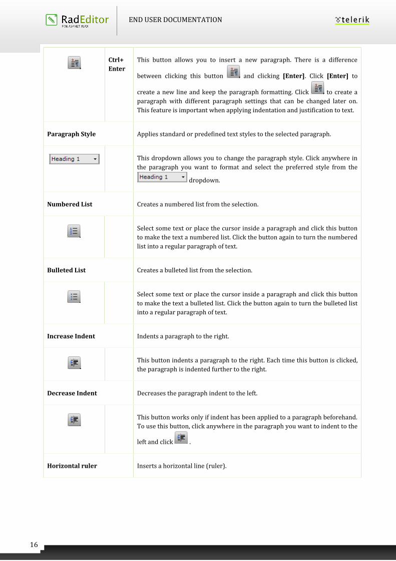
New Paragraph Inserts а new paragraph.
END USER DOCUMENTATION
16
Ctrl+
Enter
This button allows you to insert a new paragraph. There is a difference
between clicking this button and clicking [Enter]. Click [Enter] to
create a new line and keep the paragraph formatting. Click to create a
paragraph with different paragraph settings that can be changed later on.
This feature is important when applying indentation and justification to text.
Paragraph Style Applies standard or predefined text styles to the selected paragraph.
This dropdown allows you to change the paragraph style. Click anywhere in
the paragraph you want to format and select the preferred style from the
dropdown.
Numbered List Creates a numbered list from the selection.
Select some text or place the cursor inside a paragraph and click this button
to make the text a numbered list. Click the button again to turn the numbered
list into a regular paragraph of text.
Bulleted List Creates a bulleted list from the selection.
Select some text or place the cursor inside a paragraph and click this button
to make the text a bulleted list. Click the button again to turn the bulleted list
into a regular paragraph of text.
Increase Indent Indents a paragraph to the right.
This button indents a paragraph to the right. Each time this button is clicked,
the paragraph is indented further to the right.
Decrease Indent Decreases the paragraph indent to the left.
This button works only if indent has been applied to a paragraph beforehand.
To use this button, click anywhere in the paragraph you want to indent to the
left and click .
Horizontal ruler Inserts a horizontal line (ruler).
END USER DOCUMENTATION
17
Click this button to insert a horizontal line below the cursor position.
Align Left Aligns the selected paragraph to the left.
Click this button to align the selected paragraph to the left.
Center Aligns the selected paragraph to the center.
Click this button to center the lines in the selected paragraph.
Align Right Aligns the selected paragraph to the right.
Click this button to align the selected paragraph to the right.
Justify Justifies the selected paragraph to the left and to the right.
Click this button to justify the selected paragraph.
Remove Alignment Removes the alignment of the selected paragraph.
Click this button to removes the alignment of the selected paragraph.
6.3 Working with portions of text
AjaxSpellChecker Launches the inline AjaxSpellChecker
END USER DOCUMENTATION
18
The spellchecker is a tool for checking spelling of the written text.
RadEditor brings the spellchecking experience to a whole new level with
the addition of an inline AJAX spellchecker.
You can now check your spelling asynchronously and all your mistaken
words will be highlighted inline. The context menu on every word gives
you a quick and easy way to Change, Ignore or Add the word to a custom
dictionary.
Spell-checking
Print Prints the contents of the RadEditor or the whole web page.
Ctrl+P Click this button to launch your default printer’s dialog box. Click [OK] or
[Print] to print the current page in your web browser. You can set your
printers’ properties before printing.
Printing web page
Cut Cuts the selected content and copies it to the clipboard.
Ctrl+X This button works on the selected text, image and/or table. Select some
content and click [Cut]. The selected text or image is removed from the
page and is stored in the clipboard for later use. Please note that only the
last cut (or copied) item is stored in the clipboard. This tool is very helpful
when you need to relocate a word/text within the page: just select the
text, click , place the cursor on the new place, and click (see
below).
Copy Copies the selected content to the clipboard.
Ctrl+C This button works on the selected text, image and/or table. Select some
content and click [Copy]. The content is stored in the clipboard for later
use. Note that only the last copied (or cut) item is stored in the clipboard.
This tool is very helpful when you need to type the same text many times:
just select the text, click , place the cursor on the new place and click
(see below). This way you do not have to type the text over and over.
This procedure works for images and/or tables as well.
Paste Pastes copied content from the clipboard into the editor.
END USER DOCUMENTATION
19
Ctrl+V After you have either [Cut] or [Copied] an item (text, image, etc.), you can
[Paste] it using this button. Place the cursor where you want the item to
appear and click .
Paste From Word Pastes copied content from the clipboard into the editor.
After you have either [Cut] or [Copied] an item (text, image, etc.), you can
[Paste] it using this button. RadEditor cleans all unnecessary Microsoft
Office related tags. Place the cursor where you want the item to appear
and click .
In case you try to paste Word content with the regular [Paste] button or
Ctrl+V, a dialog will appear asking whether to clean the Word markup. If
the Clipboard content does not come from Word, the dialog does not
show.
Paste From Word Cleaning
Fonts and Sizes
Pastes copied content from the clipboard into the editor.
After you have either [Cut] or [Copied] an item (text, image, etc.) in
Microsoft Word ®, you can [Paste] it using this button. RadEditor cleans
unnecessary Microsoft Office related tags plus font formatting. Place the
cursor where you want the item to appear and click .
Paste Plain Text Pastes copied content from the clipboard into the editor.
Ctrl+V After you have either [Cut] or [Copied] an item (text, image, etc.), you can
[Paste] it using this button. The [Paste Plain Text] button works
similarly to [Paste from Word], but it removes all HTML formatting
and pastes plain text, preserving the line breaks.
Paste As HTML Pastes copied content from the clipboard into the editor.
Ctrl+V After you have either [Cut] or [Copied] an item (text, image, etc.), you can
[Paste] it using this button. This new tool allows you to paste the
HTML content of the Clipboard as code, which may be quite convenient
END USER DOCUMENTATION
20
for developer-oriented applications (e.g. support systems, forums, etc.)
The pasted text will look something like this:
<img src="Image_example.gif"/><br/><strong>What's new in version
6.0</strong>
Paste HTML Pastes copied content from the clipboard into the editor.
This dialog allows you to paste HTML code in to the editor's current
selection and render it. It is helpful when you need to enter predefined
HTML code such as media embed source.
Paste Markdown Pastes Markdown-formatted text in the editor.
This dialog allows the user to paste content with Markdown syntax in the
editor and render it.
Format Stripper Strips (removes) the formatting from the selected or the whole text.
Removes Word®, custom or all formatting.
Format Painter Copies formatting from one piece of text and applies it to others in the
content area of RadEditor
To save the formatting of a selection, press the Copy Format option inside
the Format Painter dropdown.
To apply the saved formatting, select the text that you want to format and click the Apply Format button.
If needed, you can also reset the saved clipboard formatting by pressing the Clear Format option.
6.4 Inserting elements
Image Manager Opens the image dialog
END USER DOCUMENTATION
21
Ctrl+G The image dialog allows you to insert, upload, create thumbnails and set
image properties.
Working with images…
Set Image Properties
[Properties… dialog]
Edit image properties of an already inserted image
To edit image properties such as Width, Height, Border Color, Border Width,
Alt Text, Long Description, Image Alignment, Image Src, Margins and apply
Css Class to it use the Set Image Properties dialog.
It could be launched either from the image context menu or through the “All
Properties” button of the Insert Image dialog.
Insert Image (Light dialog) Insert and edit images
This dialog is a light version of Set Image Properties and its content is
immediately loaded without delay.
The user could insert images with HREF paths that come from internal or
external domains.
Image Editor
This dialog could be launched via the Image Manager and provides the ability
to resize, flip, rotate, crop the selected image element as well as set its
opacity.
Absolute Positioning Sets an absolute position of an object.
Enables you to move an object (image, table or media) freely into the editor.
Flash Manager Opens the flash dialog
The flash dialog allows you to work with flash files: insert and upload
animations.
Working with flash animation
END USER DOCUMENTATION
22
The Silverlight manager allows you to work with XAP files: insert and upload
animations.
Windows Media Manager Opens the media dialog.
The Windows media dialog allows you to insert/upload media objects (AVI,
MPEG, WAV, etc.) and set their properties.
Working with Windows media…
Insert External Video Opens the Insert External Video dialog.
The Insert External Video provides the ability to easily embed a YouTube or
a Vimeo stream providing just the URL.
Document Manager Opens the document manager dialog
The document manager dialog allows you to insert a predefined document at
the cursor position into the editor.
Working with documents…
Template Manager Opens the template manager dialog.
The template manager dialog allows you to manage templates.
Working with templates…
Image Map Editor Opens the Image Map editor.
The Image Map allows you to create images containing one or more invisible
regions which are linked to other pages, otherwise known as a hotspots.
Working with Image Maps…
Insert Table Inserts a table in the RadEditor.
Inserting a table in the RadEditor is as easy as in Microsoft Word®: just click
the button and select the number of rows and columns you would like to
END USER DOCUMENTATION
23
create. The table is inserted at the cursor position.
Working with tables…
Insert Table Light
Insert Table Light dialog is a light version of Table Wizard. When enabled, its
content is rendered on page load and as a result the content is immediately
loaded when the dialog is shown without any delay.
Insert a Hyperlink
(Hyperlink manager)
Makes the selection a hyperlink.
Ctrl+K This button allows you to create a hyperlink from the selected text, number
or image. In the hyperlink dialog, you need to choose the type of link you
want to insert: Hyperlink, Anchor or E-mail.
Working with hyperlinks…
Insert Link (lite dialog) Makes the selection a hyperlink.
This dialog is a light version of Hyperlink Manager. The dialog’s content is
shown without any delay when loaded.
Remove Hyperlink Removes hyperlink from the selected text, number or image.
Ctrl+
Shift+K
Select an image/text in a hyperlink, anchor or e-mail link and click this
button to remove the link.
Insert Special Character Inserts special character(s).
Click this button to display a dropdown list with the built-in special
characters. Select a character to insert at the cursor position. If the character
you want to insert is not in the list, please contact your developer.
Inserting special character…
Insert Code Snippet Inserts a predefined code snippet.
Select an area in the editor and click to insert a predefined code
snippet. The snippet retains the formatting from the paragraph. For more
information, please contact your developer
END USER DOCUMENTATION
24
Using code snippets…
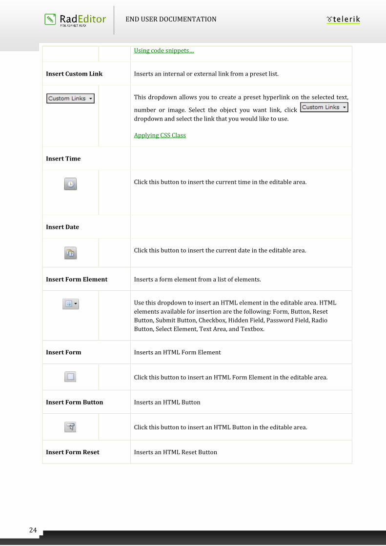
Insert Custom Link Inserts an internal or external link from a preset list.
This dropdown allows you to create a preset hyperlink on the selected text,
number or image. Select the object you want link, click
dropdown and select the link that you would like to use.
Applying CSS Class
Insert Time
Click this button to insert the current time in the editable area.
Insert Date
Click this button to insert the current date in the editable area.
Insert Form Element Inserts a form element from a list of elements.
Use this dropdown to insert an HTML element in the editable area. HTML
elements available for insertion are the following: Form, Button, Reset
Button, Submit Button, Checkbox, Hidden Field, Password Field, Radio
Button, Select Element, Text Area, and Textbox.
Insert Form Inserts an HTML Form Element
Click this button to insert an HTML Form Element in the editable area.
Insert Form Button Inserts an HTML Button
Click this button to insert an HTML Button in the editable area.
Insert Form Reset Inserts an HTML Reset Button
END USER DOCUMENTATION
25
Click this button to insert an HTML Reset Button in the editable area.
Insert Form Submit Inserts an HTML Submit Button
Click this button to insert an HTML Submit Button in the editable area.
Insert Form Checkbox Inserts an HTML Checkbox element
Click this button to insert an HTML Checkbox in the editable area.
Insert Form Hidde Inserts an HTML Hidden Field
Click this button to insert an HTML Hidden Field in the editable area.
Insert Form Password Inserts an HTMLPassword Field
Click this button to insert an HTML Password Field in the editable area.
Insert Form Radio Inserts an HTML Radio Button
Click this button to insert an HTML Radio Button in the editable area.
Insert Form Select Inserts an HTML Select Element
Click this button to insert an HTML Select Element in the editable area.
Insert Form Textarea Inserts an HTML Text area Field
Click this button to insert an HTML Text Area in the editable area.
Insert Form Text Inserts an HTML Text Field
Click this button to insert an HTML Text Box in the editable area.
END USER DOCUMENTATION
26
6.5 View
Show/Hide Table Borders Shows/hides table borders.
Toggles borders of all tables within the editor ON and OFF. The ON function
works on tables with hidden borders.
Design Mode
Click this button to switch the editor WYSIWYG to design mode.
HTML Mode
Click this button to switch the editor to HTML mode.
Preview Mode
Click this button to switch the editor to preview mode to see the result of your
changes.
Full Screen Mode
F11 Click this button to expand the editor to a full screen. When in full screen
mode, click again to return the editor to the previous state.
Modules
Select a module to activate (or deactivate) from the dropdown list. Currently
active modules are marked with a check mark. Inactive modules are marked
with a cross.
Zoom In(Out)
Click here to zoom in (or out) the editable area.
This tool satisfies the requirements of ATAG accessibility guidelines.
END USER DOCUMENTATION
27
6.6 Miscellaneous
Help Shows help on the functionality of buttons.
Click to open a window with a short description of each button, its functions
and a keyboard shortcut if such is available.
Undo Disregards the last action
Ctrl+Z Click to undo your last changes. This includes but is not limited to inserting
tables, moving images and formatting text. Expand the dropdown list to
select multiple actions to undo.
Redo Redoes the last undone action.
Ctrl+
Shift+Z,
Ctrl+Y
Click to redo the last undone action. Expand the dropdown list to select
multiple actions to redo.
Find and Replace
Ctrl + F Opens the Find and Replace dialog.
Find and Replace
Select All
Ctrl + A Selects the whole content of the editor (text, images, tables, etc.).
Insert Groupbox
Inserts a fieldset element in the content area
END USER DOCUMENTATION
28
XHTML Validator
Uses the W3C XHTML Validator Page to perform validation of the current
editor content
Format Code Block
Provides the ability to edit and format code blocks of text whether they be
HTML, CSS, JavaScript as well as C# and VB code
Track Changes Dialog As of Q2 2013, the Track Changes dialog is obsolete. An improved track
changes functionality that offers better interaction and usability has been
introduced (see Enable Track Changes Override below).
Provides a comparison between two contents
Style Builder Dialog
Provides options to define cascading style sheet (CSS) style attributes. A CSS
style combines individual formatting and positioning attributes into an
attribute set that you can apply all at one time.
Accept Track Change
Accepts the last change made.
Reject Track Change
Rejects the selected change.
Accept All Track Changes
Accepts all changes in the document.
END USER DOCUMENTATION
29
Reject All Track Changes
Rejects all changes in the document.
Enable Track Changes
Override
Turns ‘Track Changes’ on or off.
6.7 Other keyboard shortcuts
Some of the general keyboard shortcuts valid for Microsoft Windows® and Internet Explorer® will work
in the RadEditor as well. For your reference, we have included some of them (in addition to the keyboard
shortcuts described above):
Ctrl+A Selects the whole content of the editor (text, images, tables, etc.)
Ctrl+W Closes the active window.
Alt+F4 Closes the active application.
7 FORMATTING TEXT
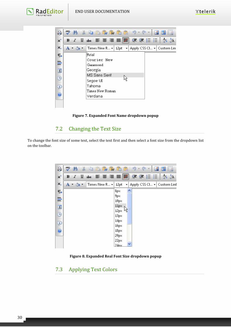
7.1 Changing the Text Font
To change the font of some text, select the text first and then select a font from the dropdown list on the
toolbar.
END USER DOCUMENTATION
30
Figure 7. Expanded Font Name dropdown popup
7.2 Changing the Text Size
To change the font size of some text, select the text first and then select a font size from the dropdown list
on the toolbar.
Figure 8. Expanded Real Font Size dropdown popup
7.3 Applying Text Colors
END USER DOCUMENTATION
31
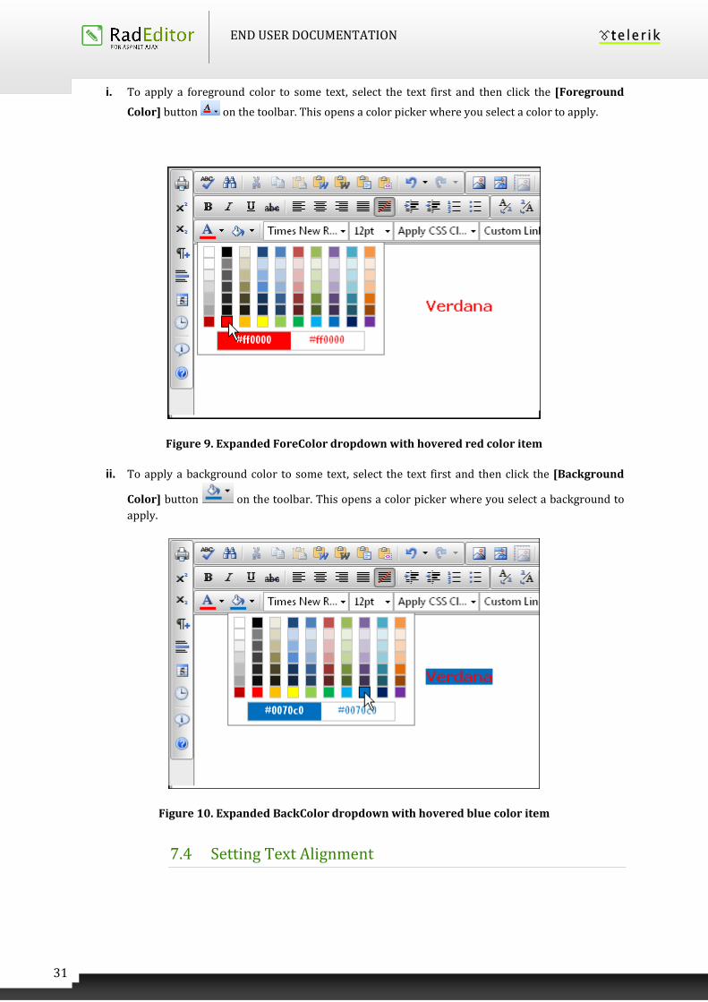
i. To apply a foreground color to some text, select the text first and then click the [Foreground
Color] button on the toolbar. This opens a color picker where you select a color to apply.
Figure 9. Expanded ForeColor dropdown with hovered red color item
ii. To apply a background color to some text, select the text first and then click the [Background
Color] button on the toolbar. This opens a color picker where you select a background to
apply.
Figure 10. Expanded BackColor dropdown with hovered blue color item
7.4 Setting Text Alignment
END USER DOCUMENTATION
32
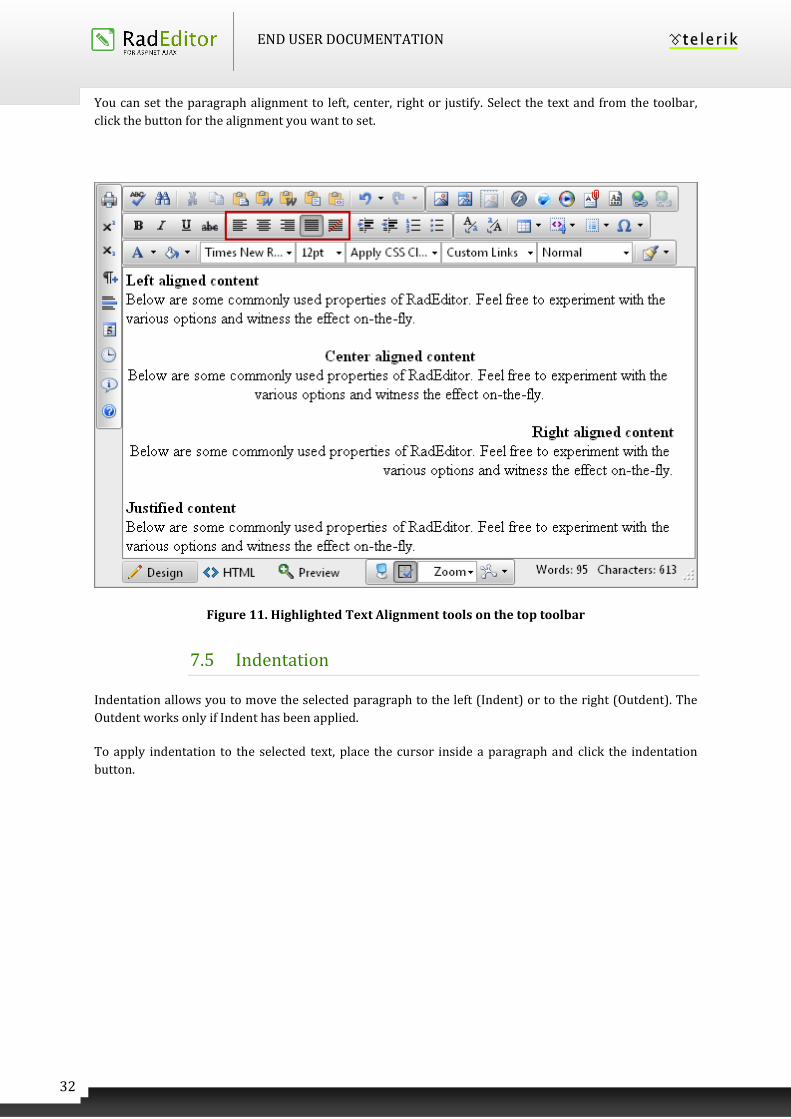
You can set the paragraph alignment to left, center, right or justify. Select the text and from the toolbar,
click the button for the alignment you want to set.
Figure 11. Highlighted Text Alignment tools on the top toolbar
7.5 Indentation
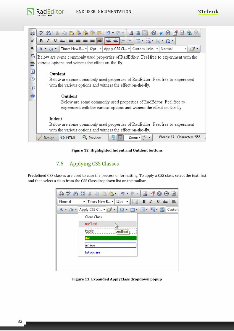
Indentation allows you to move the selected paragraph to the left (Indent) or to the right (Outdent). The
Outdent works only if Indent has been applied.
To apply indentation to the selected text, place the cursor inside a paragraph and click the indentation
button.
END USER DOCUMENTATION
33
Figure 12. Highlighted Indent and Outdent buttons
7.6 Applying CSS Classes
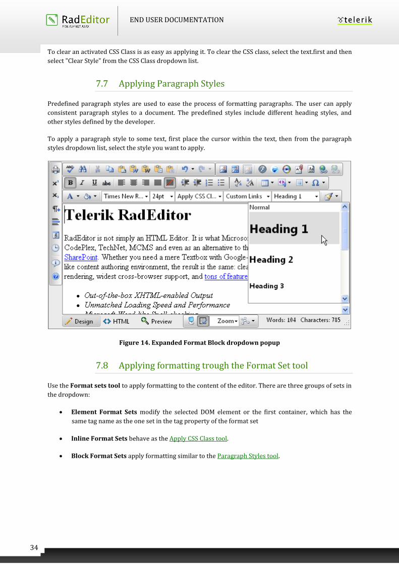
Predefined CSS classes are used to ease the process of formatting. To apply a CSS class, select the text first
and then select a class from the CSS Class dropdown list on the toolbar.
Figure 13. Expanded ApplyClass dropdown popup
END USER DOCUMENTATION
34
To clear an activated CSS Class is as easy as applying it. To clear the CSS class, select the text.first and then
select "Clear Style" from the CSS Class dropdown list.
7.7 Applying Paragraph Styles
Predefined paragraph styles are used to ease the process of formatting paragraphs. The user can apply
consistent paragraph styles to a document. The predefined styles include different heading styles, and
other styles defined by the developer.
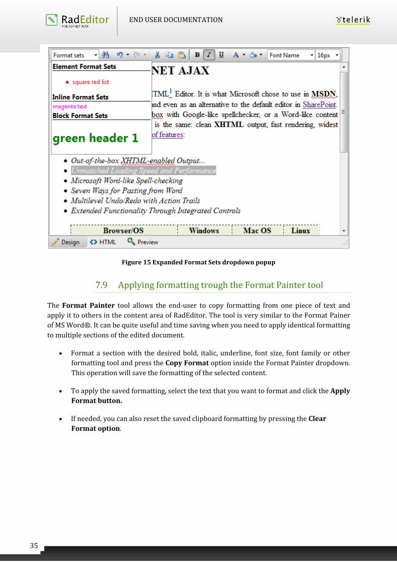
To apply a paragraph style to some text, first place the cursor within the text, then from the paragraph
styles dropdown list, select the style you want to apply.
Figure 14. Expanded Format Block dropdown popup
7.8 Applying formatting trough the Format Set tool
Use the Format sets tool to apply formatting to the content of the editor. There are three groups of sets in
the dropdown:
Element Format Sets modify the selected DOM element or the first container, which has the
same tag name as the one set in the tag property of the format set
Inline Format Sets behave as the Apply CSS Class tool.
Block Format Sets apply formatting similar to the Paragraph Styles tool.
END USER DOCUMENTATION
35
Figure 15 Expanded Format Sets dropdown popup
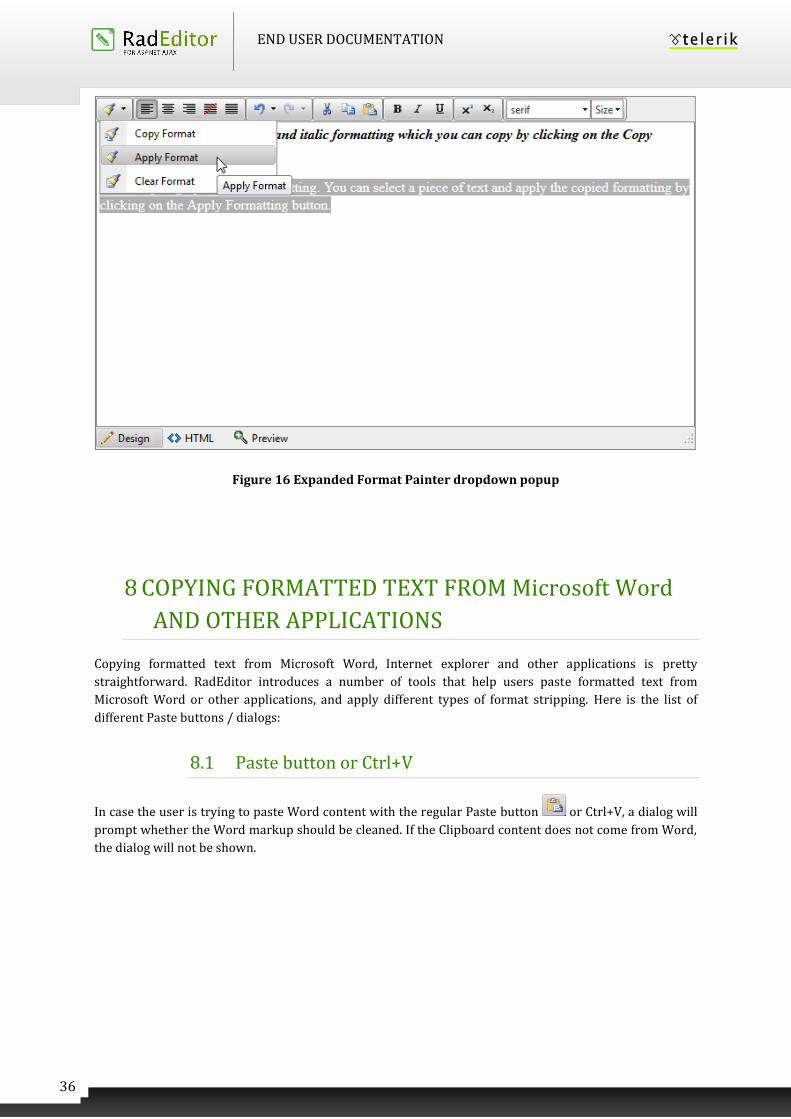
7.9 Applying formatting trough the Format Painter tool
The Format Painter tool allows the end-user to copy formatting from one piece of text and
apply it to others in the content area of RadEditor. The tool is very similar to the Format Painer
of MS Word®. It can be quite useful and time saving when you need to apply identical formatting
to multiple sections of the edited document.
Format a section with the desired bold, italic, underline, font size, font family or other
formatting tool and press the Copy Format option inside the Format Painter dropdown.
This operation will save the formatting of the selected content.
To apply the saved formatting, select the text that you want to format and click the Apply
Format button.
If needed, you can also reset the saved clipboard formatting by pressing the Clear
Format option.
END USER DOCUMENTATION
36
Figure 16 Expanded Format Painter dropdown popup
8 COPYING FORMATTED TEXT FROM Microsoft Word
AND OTHER APPLICATIONS
Copying formatted text from Microsoft Word, Internet explorer and other applications is pretty
straightforward. RadEditor introduces a number of tools that help users paste formatted text from
Microsoft Word or other applications, and apply different types of format stripping. Here is the list of
different Paste buttons / dialogs:
8.1 Paste button or Ctrl+V
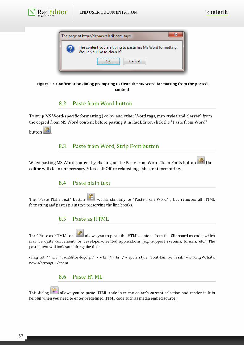
In case the user is trying to paste Word content with the regular Paste button or Ctrl+V, a dialog will
prompt whether the Word markup should be cleaned. If the Clipboard content does not come from Word,
the dialog will not be shown.
END USER DOCUMENTATION
37
Figure 17. Confirmation dialog prompting to clean the MS Word formatting from the pasted
content
8.2 Paste from Word button
To strip MS Word-specific formatting (<o:p> and other Word tags, mso styles and classes) from
the copied from MS Word content before pasting it in RadEditor, click the "Paste from Word"
button .
8.3 Paste from Word, Strip Font button
When pasting MS Word content by clicking on the Paste from Word Clean Fonts button the
editor will clean unnecessary Microsoft Office related tags plus font formatting.
8.4 Paste plain text
The "Paste Plain Text" button works similarly to "Paste from Word" , but removes all HTML
formatting and pastes plain text, preserving the line breaks.
8.5 Paste as HTML
The "Paste as HTML" tool allows you to paste the HTML content from the Clipboard as code, which
may be quite convenient for developer-oriented applications (e.g. support systems, forums, etc.) The
pasted text will look something like this:
<img alt="" src="radEditor-logo.gif" /><br /><br /><span style="font-family: arial;"><strong>What's
new</strong></span>
8.6 Paste HTML
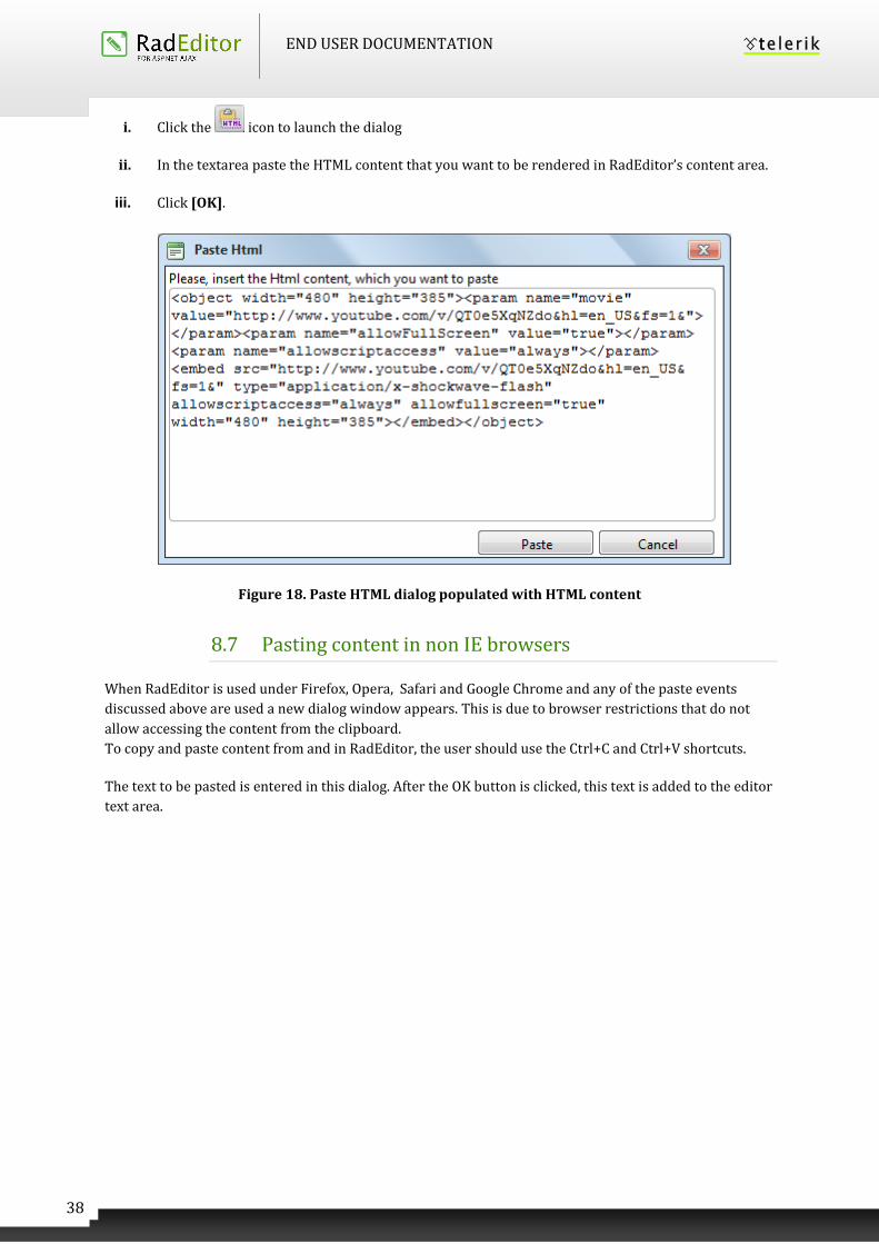
This dialog allows you to paste HTML code in to the editor's current selection and render it. It is
helpful when you need to enter predefined HTML code such as media embed source.
END USER DOCUMENTATION
38
i. Click the icon to launch the dialog
ii. In the textarea paste the HTML content that you want to be rendered in RadEditor’s content area.
iii. Click [OK].
Figure 18. Paste HTML dialog populated with HTML content
8.7 Pasting content in non IE browsers
When RadEditor is used under Firefox, Opera, Safari and Google Chrome and any of the paste events
discussed above are used a new dialog window appears. This is due to browser restrictions that do not
allow accessing the content from the clipboard.
To copy and paste content from and in RadEditor, the user should use the Ctrl+C and Ctrl+V shortcuts.
The text to be pasted is entered in this dialog. After the OK button is clicked, this text is added to the editor
text area.
END USER DOCUMENTATION
39
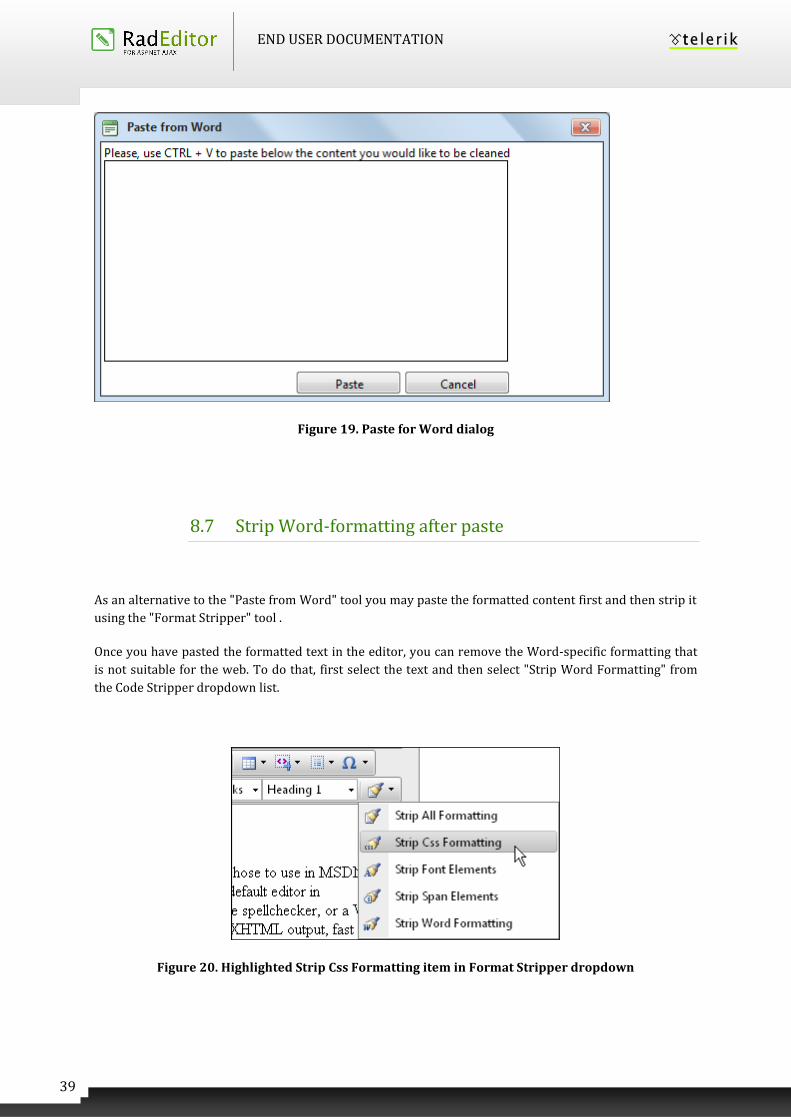
Figure 19. Paste for Word dialog
8.7 Strip Word-formatting after paste
As an alternative to the "Paste from Word" tool you may paste the formatted content first and then strip it
using the "Format Stripper" tool .
Once you have pasted the formatted text in the editor, you can remove the Word-specific formatting that
is not suitable for the web. To do that, first select the text and then select "Strip Word Formatting" from
the Code Stripper dropdown list.
Figure 20. Highlighted Strip Css Formatting item in Format Stripper dropdown
END USER DOCUMENTATION
40
8.8 Paste Markdown
Markdown is a lightweight formatting syntax, which allows people to produce rich text markup by writing
simple plain text, without the use of any XML/HTML tags and styles. The Markdown language was
originally created by John Gruber and you can find detailed information about its syntax and rules at the
official site here.
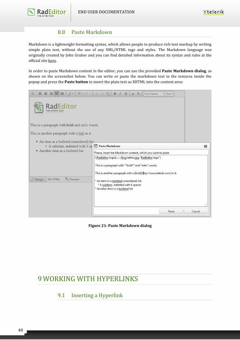
In order to paste Markdown content in the editor, you can use the provided Paste Markdown dialog, as
shown on the screenshot below. You can write or paste the markdown text in the textarea inside the
popup and press the Paste button to insert the plain text as XHTML into the content area:
Figure 21: Paste Markdown dialog
9 WORKING WITH HYPERLINKS
9.1 Inserting a Hyperlink
END USER DOCUMENTATION
41
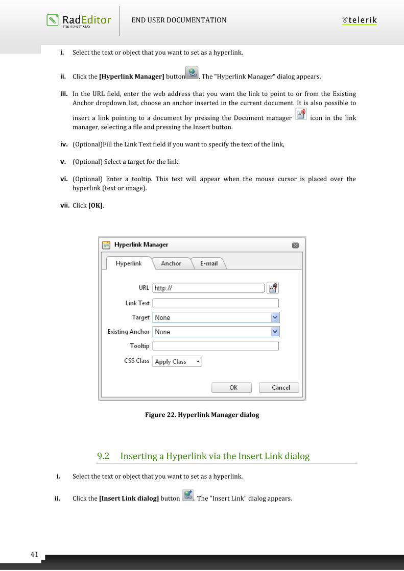
i. Select the text or object that you want to set as a hyperlink.
ii. Click the [Hyperlink Manager] button . The "Hyperlink Manager" dialog appears.
iii. In the URL field, enter the web address that you want the link to point to or from the Existing
Anchor dropdown list, choose an anchor inserted in the current document. It is also possible to
insert a link pointing to a document by pressing the Document manager icon in the link
manager, selecting a file and pressing the Insert button.
iv. (Optional)Fill the Link Text field if you want to specify the text of the link,
v. (Optional) Select a target for the link.
vi. (Optional) Enter a tooltip. This text will appear when the mouse cursor is placed over the
hyperlink (text or image).
vii. Click [OK].
Figure 22. Hyperlink Manager dialog
9.2 Inserting a Hyperlink via the Insert Link dialog
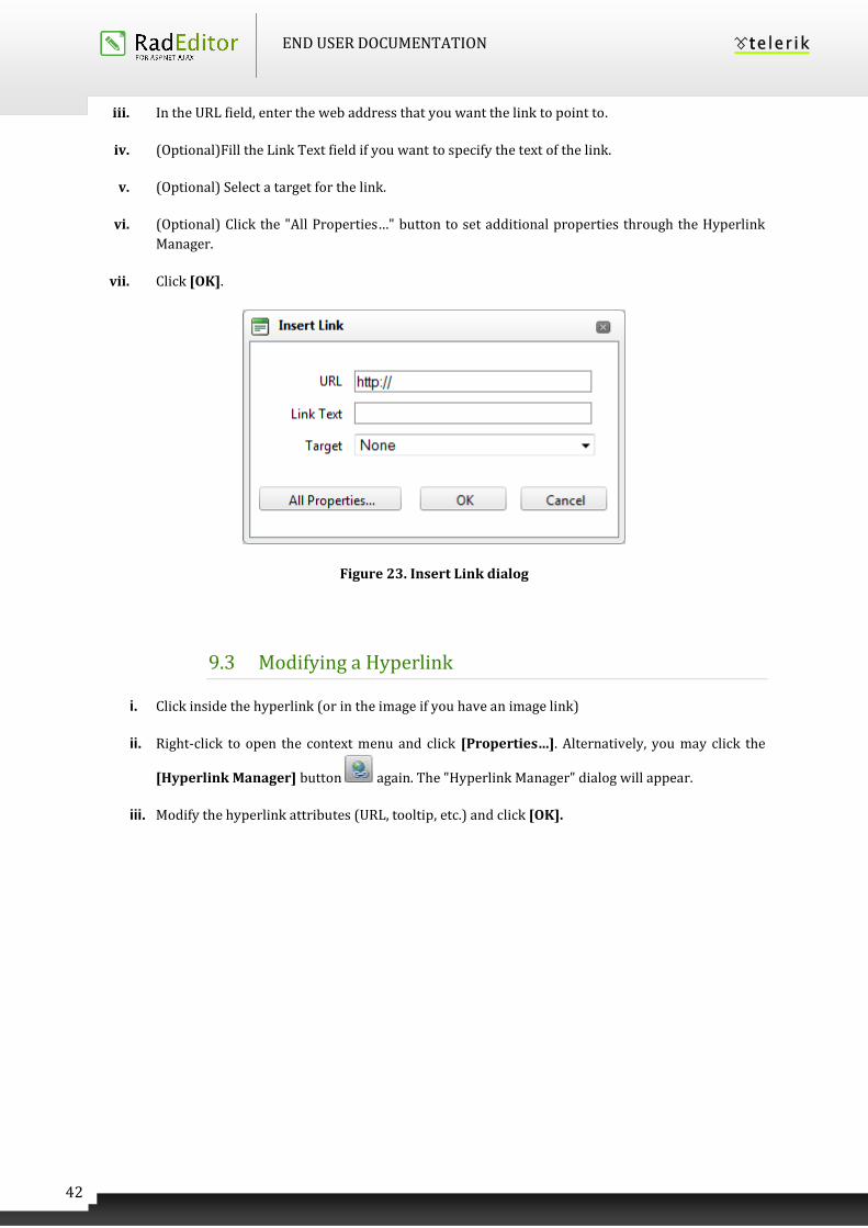
i. Select the text or object that you want to set as a hyperlink.
ii. Click the [Insert Link dialog] button . The "Insert Link" dialog appears.
END USER DOCUMENTATION
42
iii. In the URL field, enter the web address that you want the link to point to.
iv. (Optional)Fill the Link Text field if you want to specify the text of the link.
v. (Optional) Select a target for the link.
vi. (Optional) Click the "All Properties…" button to set additional properties through the Hyperlink
Manager.
vii. Click [OK].
Figure 23. Insert Link dialog
9.3 Modifying a Hyperlink
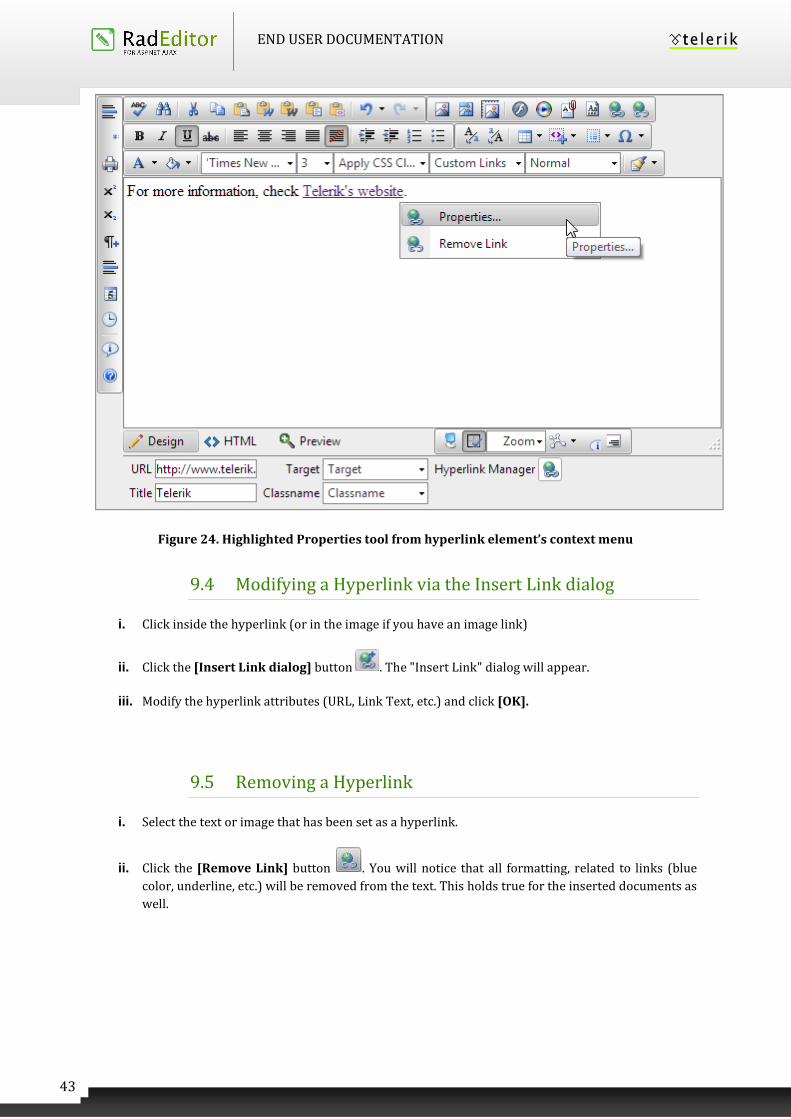
i. Click inside the hyperlink (or in the image if you have an image link)
ii. Right-click to open the context menu and click [Properties…]. Alternatively, you may click the
[Hyperlink Manager] button again. The "Hyperlink Manager" dialog will appear.
iii. Modify the hyperlink attributes (URL, tooltip, etc.) and click [OK].
END USER DOCUMENTATION
43
Figure 24. Highlighted Properties tool from hyperlink element’s context menu
9.4 Modifying a Hyperlink via the Insert Link dialog
i. Click inside the hyperlink (or in the image if you have an image link)
ii. Click the [Insert Link dialog] button . The "Insert Link" dialog will appear.
iii. Modify the hyperlink attributes (URL, Link Text, etc.) and click [OK].
9.5 Removing a Hyperlink
i. Select the text or image that has been set as a hyperlink.
ii. Click the [Remove Link] button . You will notice that all formatting, related to links (blue
color, underline, etc.) will be removed from the text. This holds true for the inserted documents as
well.
END USER DOCUMENTATION
44
9.6 Inserting Anchors
The anchor function is particularly helpful if you have a very long web page. With this function, your
readers will be able to jump from one section of the page to another. In other words, the anchor is used for
hyperlinks that lead to the same page or a particular place in another page. The anchor defines the
destination to which a hyperlink must lead. Then you can create a hyperlink and point it to that anchor.
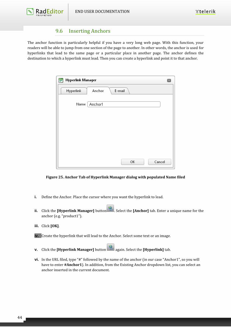
Figure 25. Anchor Tab of Hyperlink Manager dialog with populated Name filed
i. Define the Anchor. Place the cursor where you want the hyperlink to lead.
ii. Click the [Hyperlink Manager] button . Select the [Anchor] tab. Enter a unique name for the
anchor (e.g. “product1”).
iii. Click [OK].
iv. Create the hyperlink that will lead to the Anchor. Select some text or an image.
v. Click the [Hyperlink Manager] button again. Select the [Hyperlink] tab.
vi. In the URL filed, type “#” followed by the name of the anchor (in our case “Anchor1”, so you will
have to enter #Anchor1). In addition, from the Existing Anchor dropdown list, you can select an
anchor inserted in the current document.
END USER DOCUMENTATION
45
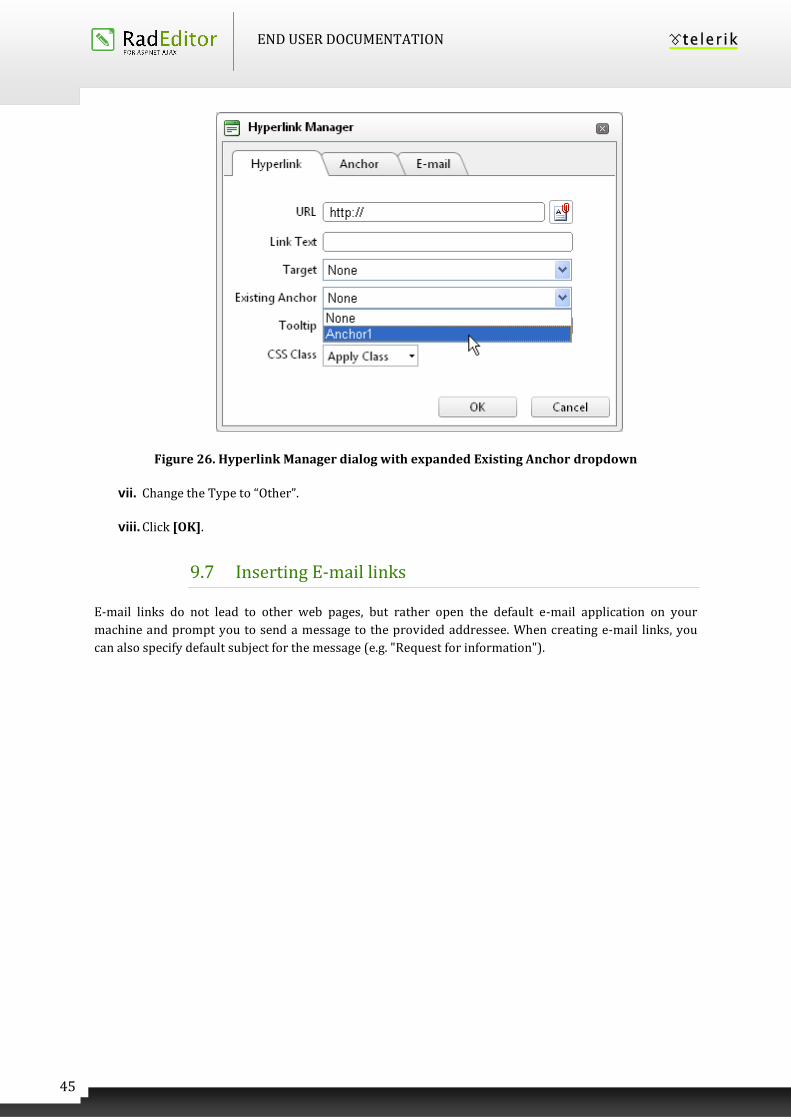
Figure 26. Hyperlink Manager dialog with expanded Existing Anchor dropdown
vii. Change the Type to “Other”.
viii. Click [OK].
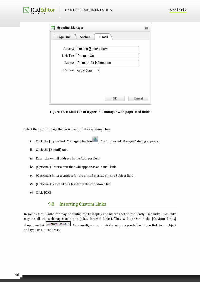
9.7 Inserting E-mail links
E-mail links do not lead to other web pages, but rather open the default e-mail application on your
machine and prompt you to send a message to the provided addressee. When creating e-mail links, you
can also specify default subject for the message (e.g. "Request for information").
END USER DOCUMENTATION
46
Figure 27. E-Mail Tab of Hyperlink Manager with populated fields
Select the text or image that you want to set as an e-mail link.
i. Click the [Hyperlink Manager] button . The "Hyperlink Manager" dialog appears.
ii. Click the [E-mail] tab.
iii. Enter the e-mail address in the Address field.
iv. (Optional) Enter a text that will appear as an e-mail link.
v. (Optional) Enter a subject for the e-mail message in the Subject field.
vi. (Optional) Select a CSS Class from the dropdown list.
vii. Click [OK].
9.8 Inserting Custom Links
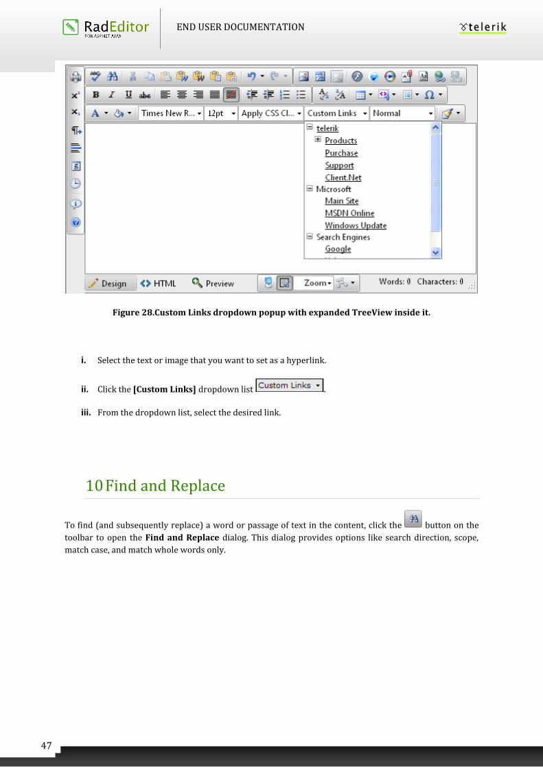
In some cases, RadEditor may be configured to display and insert a set of frequently-used links. Such links
may be all the web pages of a site (a.k.a. Internal Links). They will appear in the [Custom Links]
dropdown list . As a result, you can quickly assign a predefined hyperlink to an object
and type its URL address.
END USER DOCUMENTATION
47
Figure 28.Custom Links dropdown popup with expanded TreeView inside it.
i. Select the text or image that you want to set as a hyperlink.
ii. Click the [Custom Links] dropdown list .
iii. From the dropdown list, select the desired link.
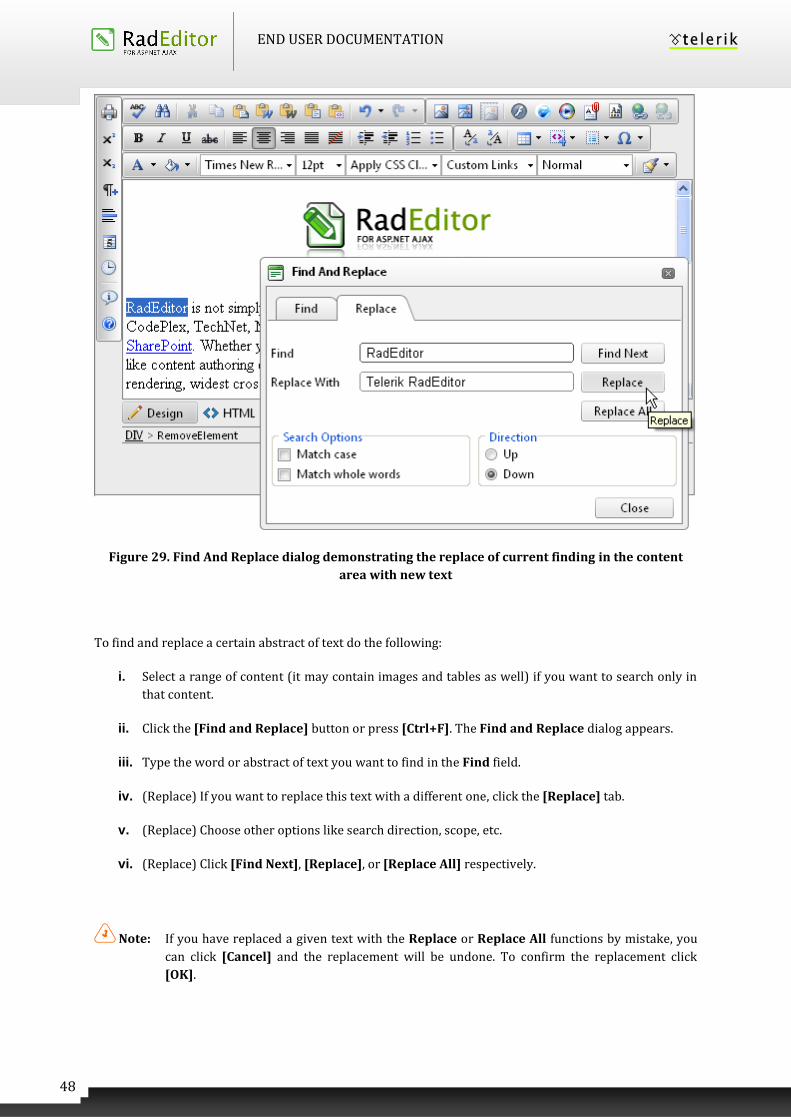
10 Find and Replace
To find (and subsequently replace) a word or passage of text in the content, click the button on the
toolbar to open the Find and Replace dialog. This dialog provides options like search direction, scope,
match case, and match whole words only.
END USER DOCUMENTATION
48
Figure 29. Find And Replace dialog demonstrating the replace of current finding in the content
area with new text
To find and replace a certain abstract of text do the following:
i. Select a range of content (it may contain images and tables as well) if you want to search only in
that content.
ii. Click the [Find and Replace] button or press [Ctrl+F]. The Find and Replace dialog appears.
iii. Type the word or abstract of text you want to find in the Find field.
iv. (Replace) If you want to replace this text with a different one, click the [Replace] tab.
v. (Replace) Choose other options like search direction, scope, etc.
vi. (Replace) Click [Find Next], [Replace], or [Replace All] respectively.
Note: If you have replaced a given text with the Replace or Replace All functions by mistake, you
can click [Cancel] and the replacement will be undone. To confirm the replacement click
[OK].
END USER DOCUMENTATION
49
11 WORKING WITH TABLES
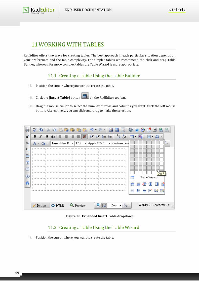
RadEditor offers two ways for creating tables. The best approach in each particular situation depends on
your preferences and the table complexity. For simpler tables we recommend the click-and-drag Table
Builder, whereas, for more complex tables the Table Wizard is more appropriate.
11.1 Creating a Table Using the Table Builder
i. Position the cursor where you want to create the table.
ii. Click the [Insert Table] button on the RadEditor toolbar.
iii. Drag the mouse cursor to select the number of rows and columns you want. Click the left mouse
button. Alternatively, you can click-and-drag to make the selection.
Figure 30. Expanded Insert Table dropdown
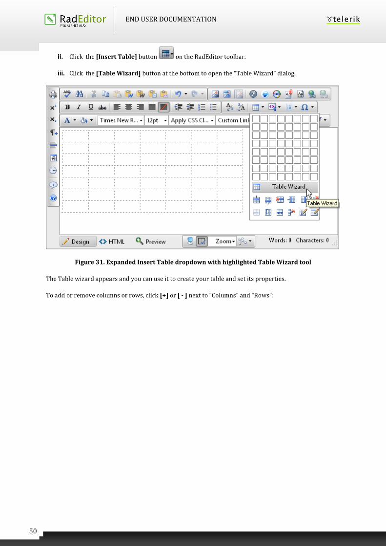
11.2 Creating a Table Using the Table Wizard
i. Position the cursor where you want to create the table.
END USER DOCUMENTATION
50
ii. Click the [Insert Table] button on the RadEditor toolbar.
iii. Click the [Table Wizard] button at the bottom to open the “Table Wizard” dialog.
Figure 31. Expanded Insert Table dropdown with highlighted Table Wizard tool
The Table wizard appears and you can use it to create your table and set its properties.
To add or remove columns or rows, click [+] or [ - ] next to “Columns” and “Rows”:
END USER DOCUMENTATION
51
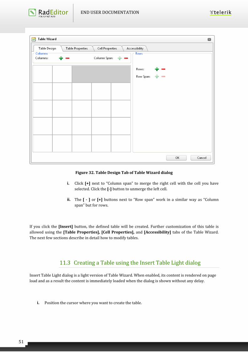
Figure 32. Table Design Tab of Table Wizard dialog
i. Click [+] next to “Column span” to merge the right cell with the cell you have
selected. Click the [-] button to unmerge the left cell.
ii. The [ - ] or [+] buttons next to “Row span” work in a similar way as “Column
span” but for rows.
If you click the [Insert] button, the defined table will be created. Further customization of this table is
allowed using the [Table Properties], [Cell Properties], and [Accessibility] tabs of the Table Wizard.
The next few sections describe in detail how to modify tables.
11.3 Creating a Table using the Insert Table Light dialog
Insert Table Light dialog is a light version of Table Wizard. When enabled, its content is rendered on page
load and as a result the content is immediately loaded when the dialog is shown without any delay.
i. Position the cursor where you want to create the table.
END USER DOCUMENTATION
52
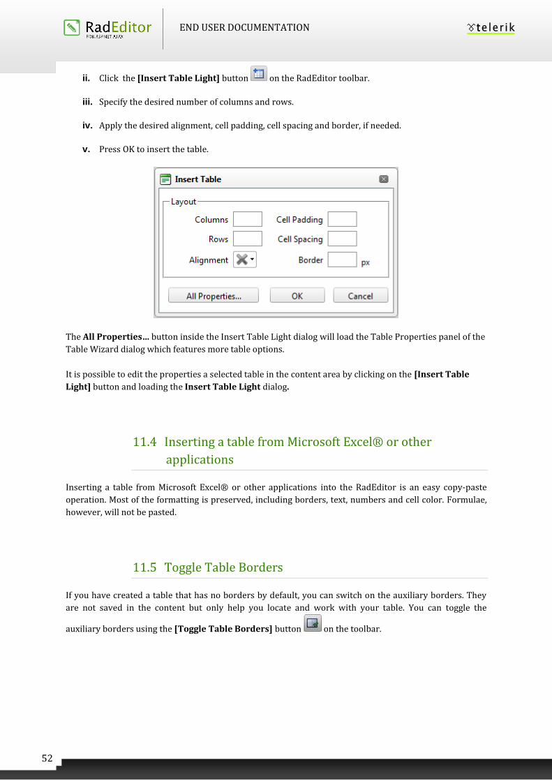
ii. Click the [Insert Table Light] button on the RadEditor toolbar.
iii. Specify the desired number of columns and rows.
iv. Apply the desired alignment, cell padding, cell spacing and border, if needed.
v. Press OK to insert the table.
The All Properties… button inside the Insert Table Light dialog will load the Table Properties panel of the
Table Wizard dialog which features more table options.
It is possible to edit the properties a selected table in the content area by clicking on the [Insert Table
Light] button and loading the Insert Table Light dialog.
11.4 Inserting a table from Microsoft Excel® or other
applications
Inserting a table from Microsoft Excel® or other applications into the RadEditor is an easy copy-paste
operation. Most of the formatting is preserved, including borders, text, numbers and cell color. Formulae,
however, will not be pasted.
11.5 Toggle Table Borders
If you have created a table that has no borders by default, you can switch on the auxiliary borders. They
are not saved in the content but only help you locate and work with your table. You can toggle the
auxiliary borders using the [Toggle Table Borders] button on the toolbar.
END USER DOCUMENTATION
53
11.6 Formatting Tables
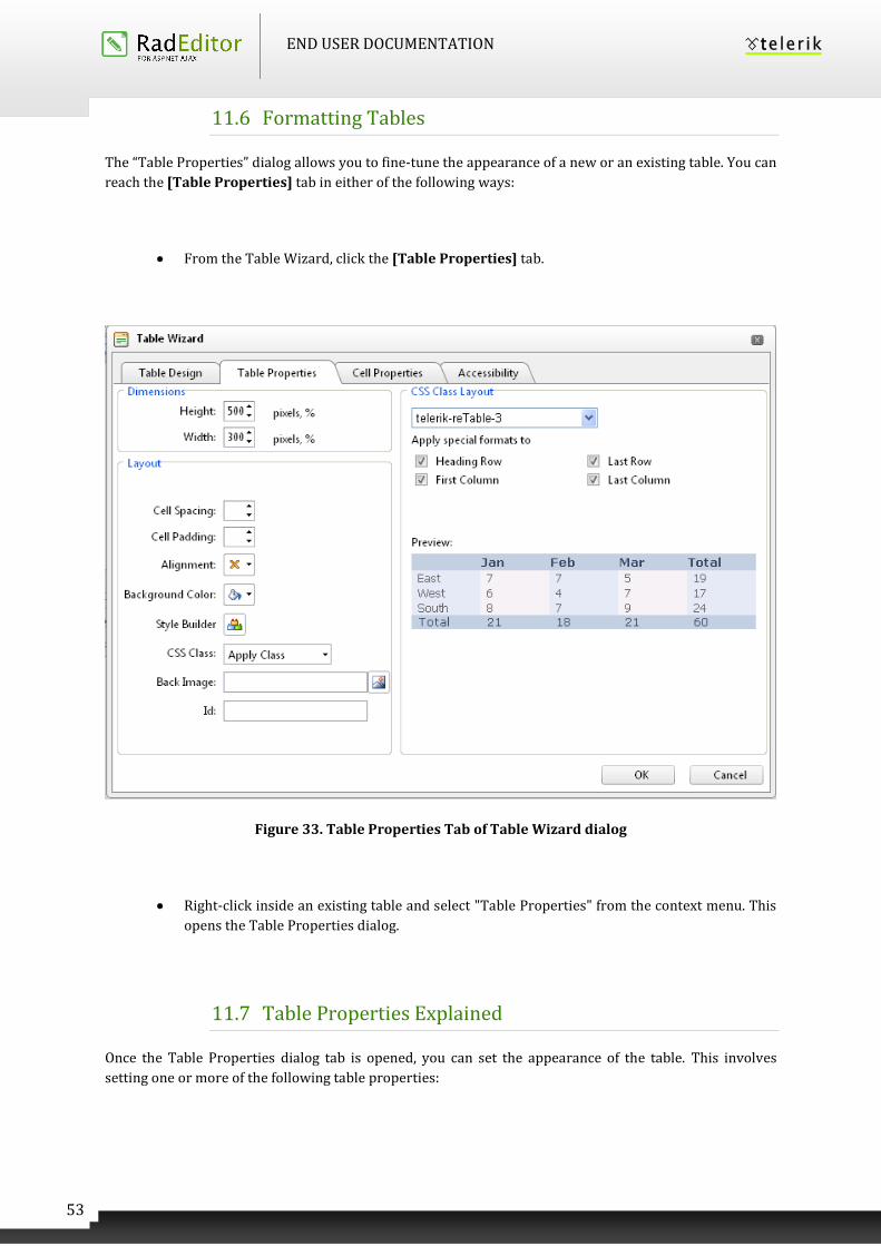
The “Table Properties” dialog allows you to fine-tune the appearance of a new or an existing table. You can
reach the [Table Properties] tab in either of the following ways:
From the Table Wizard, click the [Table Properties] tab.
Figure 33. Table Properties Tab of Table Wizard dialog
Right-click inside an existing table and select "Table Properties" from the context menu. This
opens the Table Properties dialog.
11.7 Table Properties Explained
Once the Table Properties dialog tab is opened, you can set the appearance of the table. This involves
setting one or more of the following table properties:
END USER DOCUMENTATION
54
Width/Height
Specifies the height and the width of the table (in pixels or percent).
Background
Sets the background color of the table.
Alignment
Aligns the table to the left, center or right side of the page.
Cell spacing
Increases or decreases the space between the borders of the cells.
Cell padding
Increases or decreases the space between the content and the border of a cell.
Border
Includes setting border width, color, and layout.
ID
Setting an ID for a table gives some options for advanced table handling.
Background Image
Sets an image as the table background.
CSS Class
Specifies table CSS class and style. This property should be used only by advanced users.
Style Builder
Provides options to define cascading style sheet (CSS) style attributes. A CSS style combines
individual formatting and positioning attributes into an attribute set that you can apply all at
one time.
11.8 Cell Properties Explained
The “Cell Properties“ dialog allows you to fine-tune the appearance of individual cells of a given table.
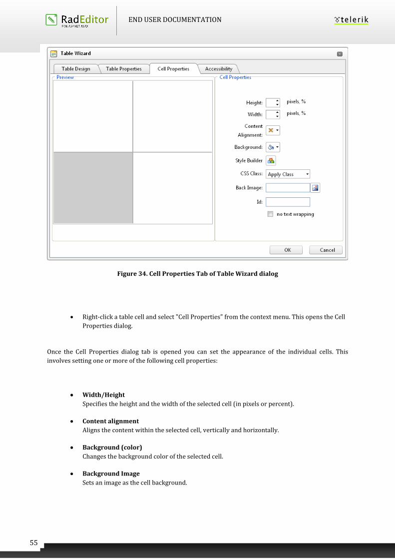
You can reach the [Cell Properties] tab in either of the following ways:
From the Table Wizard, click the [Cell Properties] tab.
END USER DOCUMENTATION
55
Figure 34. Cell Properties Tab of Table Wizard dialog
Right-click a table cell and select "Cell Properties" from the context menu. This opens the Cell
Properties dialog.
Once the Cell Properties dialog tab is opened you can set the appearance of the individual cells. This
involves setting one or more of the following cell properties:
Width/Height
Specifies the height and the width of the selected cell (in pixels or percent).
Content alignment
Aligns the content within the selected cell, vertically and horizontally.
Background (color)
Changes the background color of the selected cell.
Background Image
Sets an image as the cell background.
END USER DOCUMENTATION
56
Style Builder
Provides options to define cascading style sheet (CSS) style attributes. A CSS style combines
individual formatting and positioning attributes into an attribute set that you can apply all at
one time.
ID
Setting an ID for a cell gives options for some better cell handling (for advanced users and
developers)
No Wrapping
Enables/disables text wrapping (i.e. forces a new line when the text reaches the Cell border).
CSS Class
Specifies cell CSS class and style. This property should be used only by advanced users.
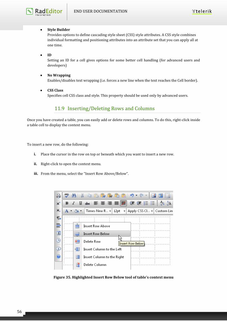
11.9 Inserting/Deleting Rows and Columns
Once you have created a table, you can easily add or delete rows and columns. To do this, right-click inside
a table cell to display the context menu.
To insert a new row, do the following:
i. Place the cursor in the row on top or beneath which you want to insert a new row.
ii. Right-click to open the context menu.
iii. From the menu, select the "Insert Row Above/Below".
Figure 35. Highlighted Insert Row Below tool of table's context menu
END USER DOCUMENTATION
57
You can insert new columns in a similar fashion. To delete rows or columns, simply place the cursor in the
respective row/column and select "Delete Row/Column" from the context menu.
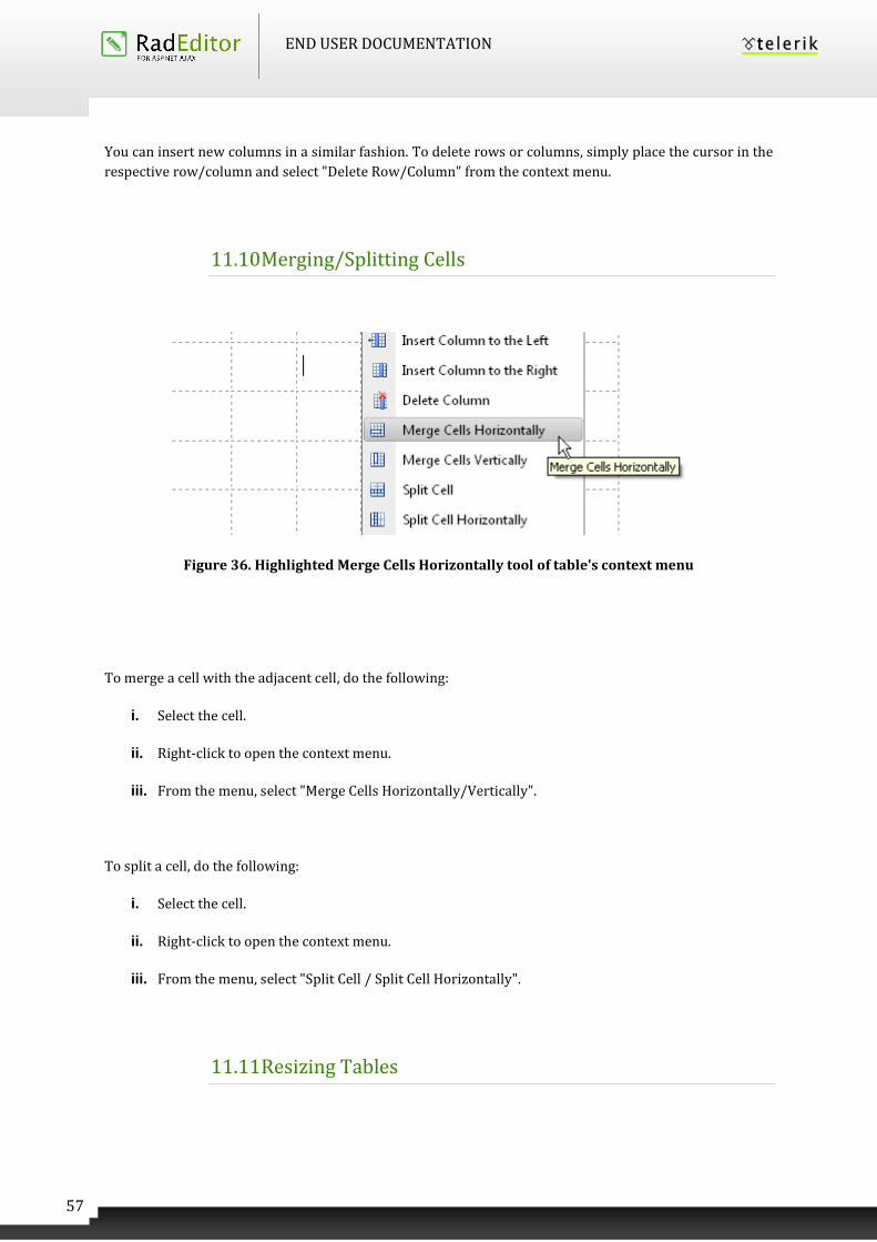
11.10 Merging/Splitting Cells
Figure 36. Highlighted Merge Cells Horizontally tool of table's context menu
To merge a cell with the adjacent cell, do the following:
i. Select the cell.
ii. Right-click to open the context menu.
iii. From the menu, select "Merge Cells Horizontally/Vertically".
To split a cell, do the following:
i. Select the cell.
ii. Right-click to open the context menu.
iii. From the menu, select "Split Cell / Split Cell Horizontally".
11.11 Resizing Tables
END USER DOCUMENTATION
58
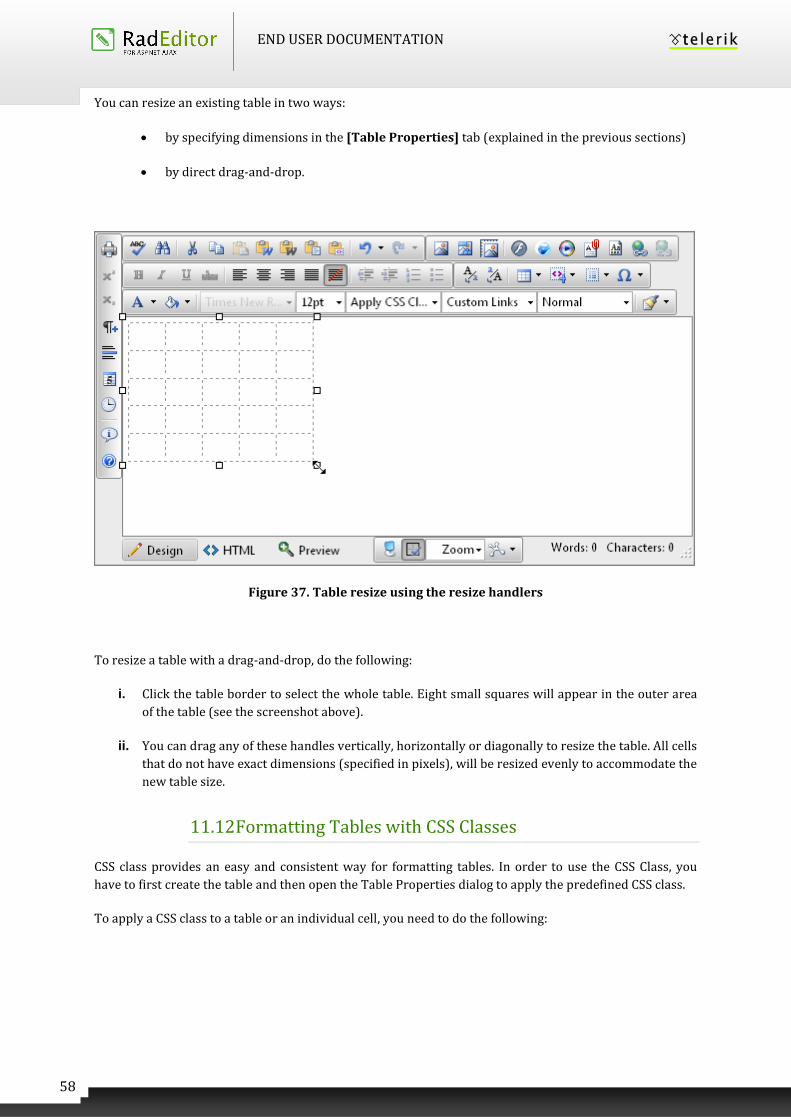
You can resize an existing table in two ways:
by specifying dimensions in the [Table Properties] tab (explained in the previous sections)
by direct drag-and-drop.
Figure 37. Table resize using the resize handlers
To resize a table with a drag-and-drop, do the following:
i. Click the table border to select the whole table. Eight small squares will appear in the outer area
of the table (see the screenshot above).
ii. You can drag any of these handles vertically, horizontally or diagonally to resize the table. All cells
that do not have exact dimensions (specified in pixels), will be resized evenly to accommodate the
new table size.
11.12 Formatting Tables with CSS Classes
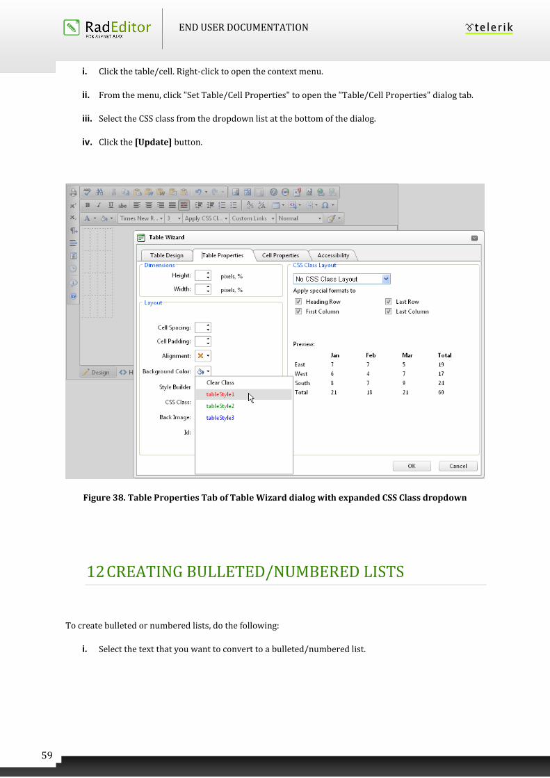
CSS class provides an easy and consistent way for formatting tables. In order to use the CSS Class, you
have to first create the table and then open the Table Properties dialog to apply the predefined CSS class.
To apply a CSS class to a table or an individual cell, you need to do the following:
END USER DOCUMENTATION
59
i. Click the table/cell. Right-click to open the context menu.
ii. From the menu, click "Set Table/Cell Properties" to open the "Table/Cell Properties" dialog tab.
iii. Select the CSS class from the dropdown list at the bottom of the dialog.
iv. Click the [Update] button.
Figure 38. Table Properties Tab of Table Wizard dialog with expanded CSS Class dropdown
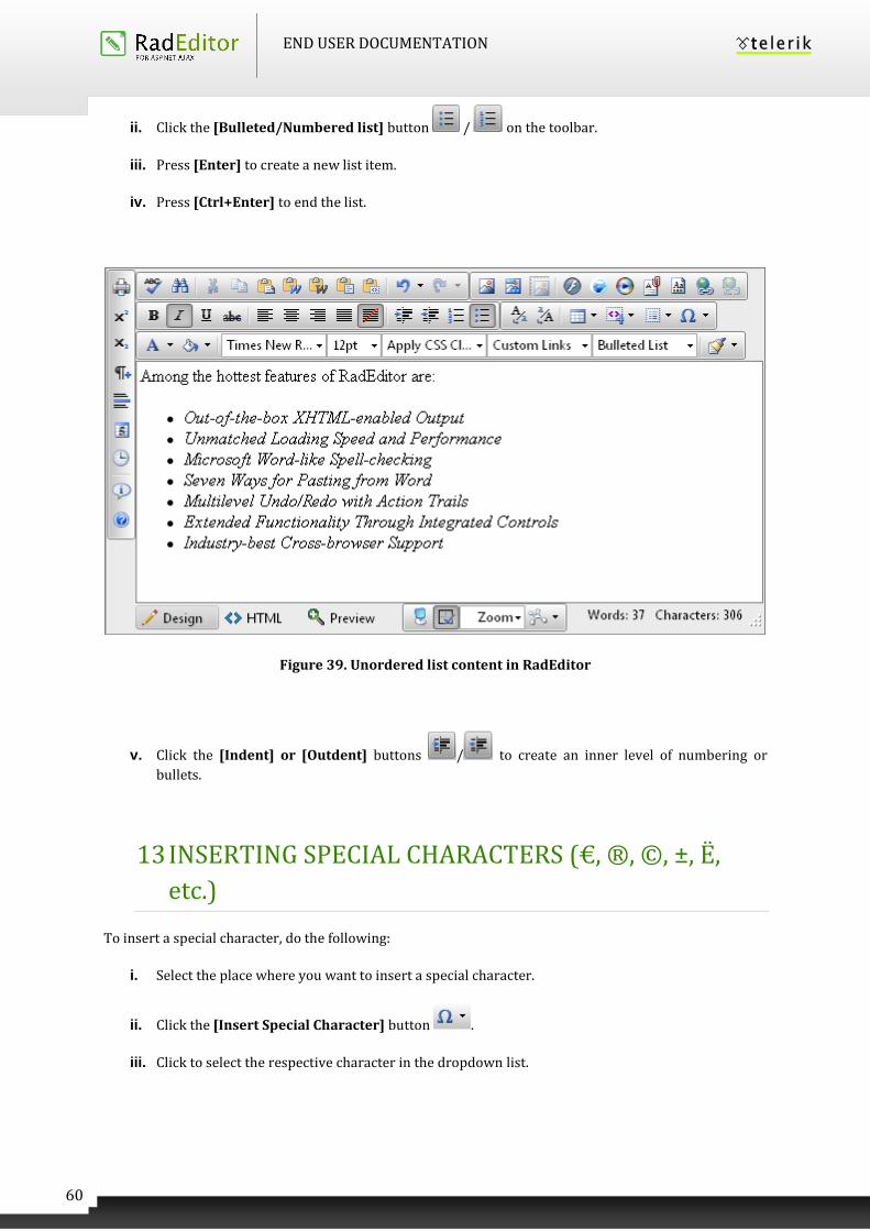
12 CREATING BULLETED/NUMBERED LISTS
To create bulleted or numbered lists, do the following:
i. Select the text that you want to convert to a bulleted/numbered list.
END USER DOCUMENTATION
60
ii. Click the [Bulleted/Numbered list] button / on the toolbar.
iii. Press [Enter] to create a new list item.
iv. Press [Ctrl+Enter] to end the list.
Figure 39. Unordered list content in RadEditor
v. Click the [Indent] or [Outdent] buttons / to create an inner level of numbering or
bullets.
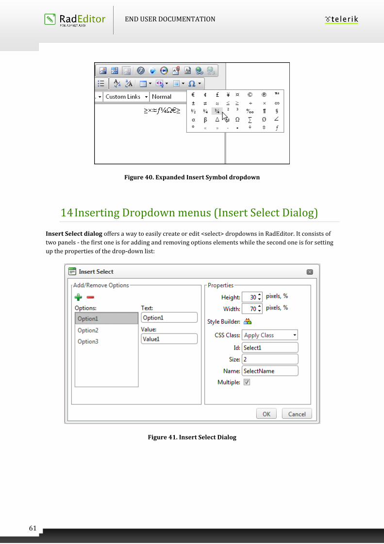
13 INSERTING SPECIAL CHARACTERS (€, ®, ©, ±, Ë,
etc.)
To insert a special character, do the following:
i. Select the place where you want to insert a special character.
ii. Click the [Insert Special Character] button .
iii. Click to select the respective character in the dropdown list.
END USER DOCUMENTATION
61
Figure 40. Expanded Insert Symbol dropdown
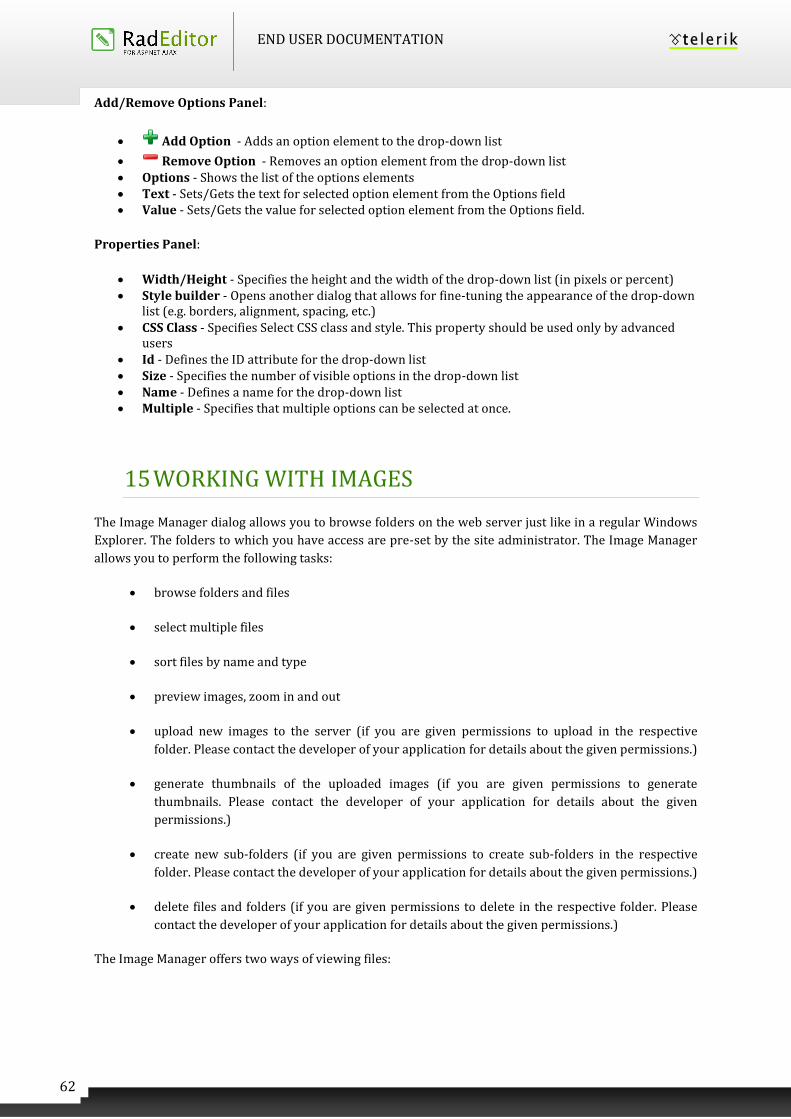
14 Inserting Dropdown menus (Insert Select Dialog)
Insert Select dialog offers a way to easily create or edit <select> dropdowns in RadEditor. It consists of
two panels - the first one is for adding and removing options elements while the second one is for setting
up the properties of the drop-down list:
Figure 41. Insert Select Dialog
END USER DOCUMENTATION
62
Add/Remove Options Panel:
Add Option - Adds an option element to the drop-down list
Remove Option - Removes an option element from the drop-down list Options - Shows the list of the options elements Text - Sets/Gets the text for selected option element from the Options field Value - Sets/Gets the value for selected option element from the Options field.
Properties Panel:
Width/Height - Specifies the height and the width of the drop-down list (in pixels or percent) Style builder - Opens another dialog that allows for fine-tuning the appearance of the drop-down
list (e.g. borders, alignment, spacing, etc.) CSS Class - Specifies Select CSS class and style. This property should be used only by advanced
users Id - Defines the ID attribute for the drop-down list Size - Specifies the number of visible options in the drop-down list Name - Defines a name for the drop-down list Multiple - Specifies that multiple options can be selected at once.
15 WORKING WITH IMAGES
The Image Manager dialog allows you to browse folders on the web server just like in a regular Windows
Explorer. The folders to which you have access are pre-set by the site administrator. The Image Manager
allows you to perform the following tasks:
browse folders and files
select multiple files
sort files by name and type
preview images, zoom in and out
upload new images to the server (if you are given permissions to upload in the respective
folder. Please contact the developer of your application for details about the given permissions.)
generate thumbnails of the uploaded images (if you are given permissions to generate
thumbnails. Please contact the developer of your application for details about the given
permissions.)
create new sub-folders (if you are given permissions to create sub-folders in the respective
folder. Please contact the developer of your application for details about the given permissions.)
delete files and folders (if you are given permissions to delete in the respective folder. Please
contact the developer of your application for details about the given permissions.)
The Image Manager offers two ways of viewing files:
END USER DOCUMENTATION
63
Thumbnails View (Image Manager default)– all files are loaded and displayed as icons in
the central area of the dialog;
Grid View – all files are loaded and displayed as a list in the central area of the dialog.
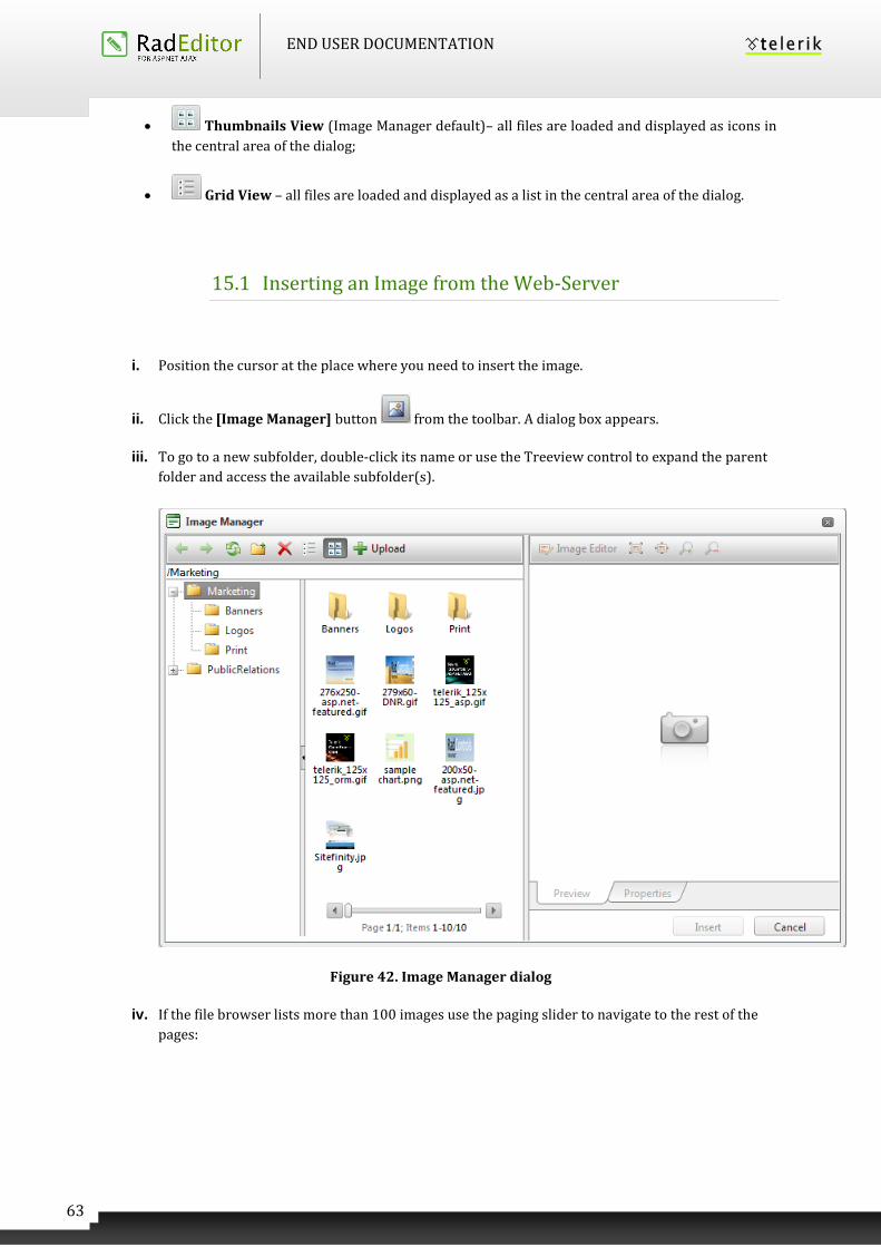
15.1 Inserting an Image from the Web-Server
i. Position the cursor at the place where you need to insert the image.
ii. Click the [Image Manager] button from the toolbar. A dialog box appears.
iii. To go to a new subfolder, double-click its name or use the Treeview control to expand the parent
folder and access the available subfolder(s).
Figure 42. Image Manager dialog
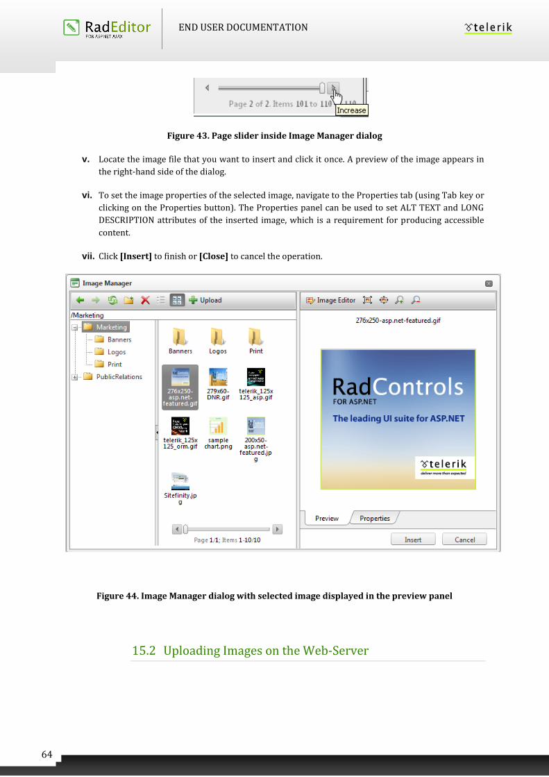
iv. If the file browser lists more than 100 images use the paging slider to navigate to the rest of the
pages:
END USER DOCUMENTATION
64
Figure 43. Page slider inside Image Manager dialog
v. Locate the image file that you want to insert and click it once. A preview of the image appears in
the right-hand side of the dialog.
vi. To set the image properties of the selected image, navigate to the Properties tab (using Tab key or
clicking on the Properties button). The Properties panel can be used to set ALT TEXT and LONG
DESCRIPTION attributes of the inserted image, which is a requirement for producing accessible
content.
vii. Click [Insert] to finish or [Close] to cancel the operation.
Figure 44. Image Manager dialog with selected image displayed in the preview panel
15.2 Uploading Images on the Web-Server
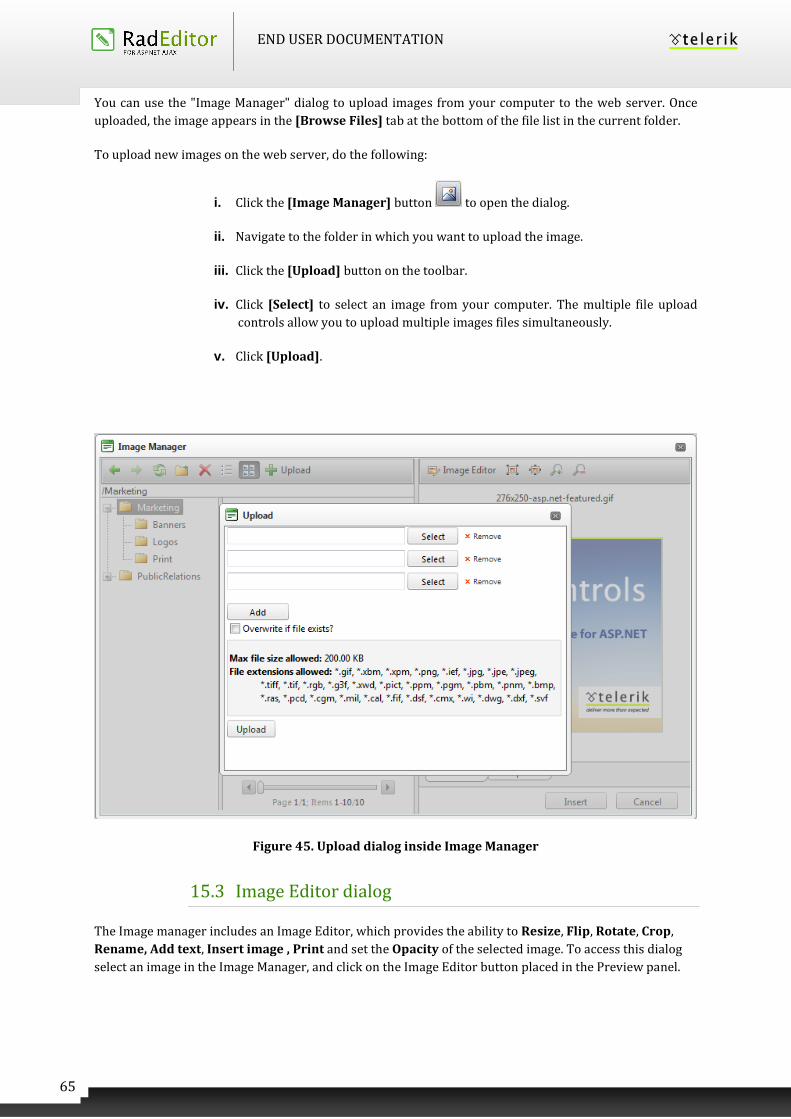
END USER DOCUMENTATION
65
You can use the "Image Manager" dialog to upload images from your computer to the web server. Once
uploaded, the image appears in the [Browse Files] tab at the bottom of the file list in the current folder.
To upload new images on the web server, do the following:
i. Click the [Image Manager] button to open the dialog.
ii. Navigate to the folder in which you want to upload the image.
iii. Click the [Upload] button on the toolbar.
iv. Click [Select] to select an image from your computer. The multiple file upload
controls allow you to upload multiple images files simultaneously.
v. Click [Upload].
Figure 45. Upload dialog inside Image Manager
15.3 Image Editor dialog
The Image manager includes an Image Editor, which provides the ability to Resize, Flip, Rotate, Crop,
Rename, Add text, Insert image , Print and set the Opacity of the selected image. To access this dialog
select an image in the Image Manager, and click on the Image Editor button placed in the Preview panel.
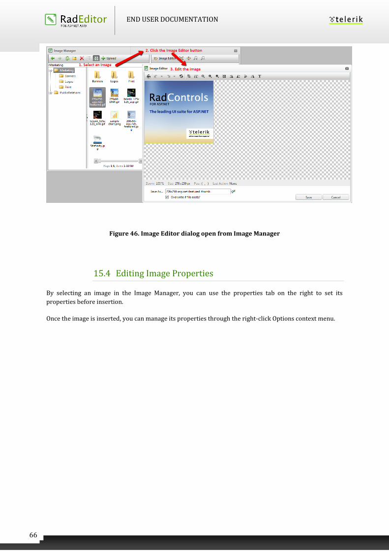
END USER DOCUMENTATION
66
Figure 46. Image Editor dialog open from Image Manager
15.4 Editing Image Properties
By selecting an image in the Image Manager, you can use the properties tab on the right to set its
properties before insertion.
Once the image is inserted, you can manage its properties through the right-click Options context menu.
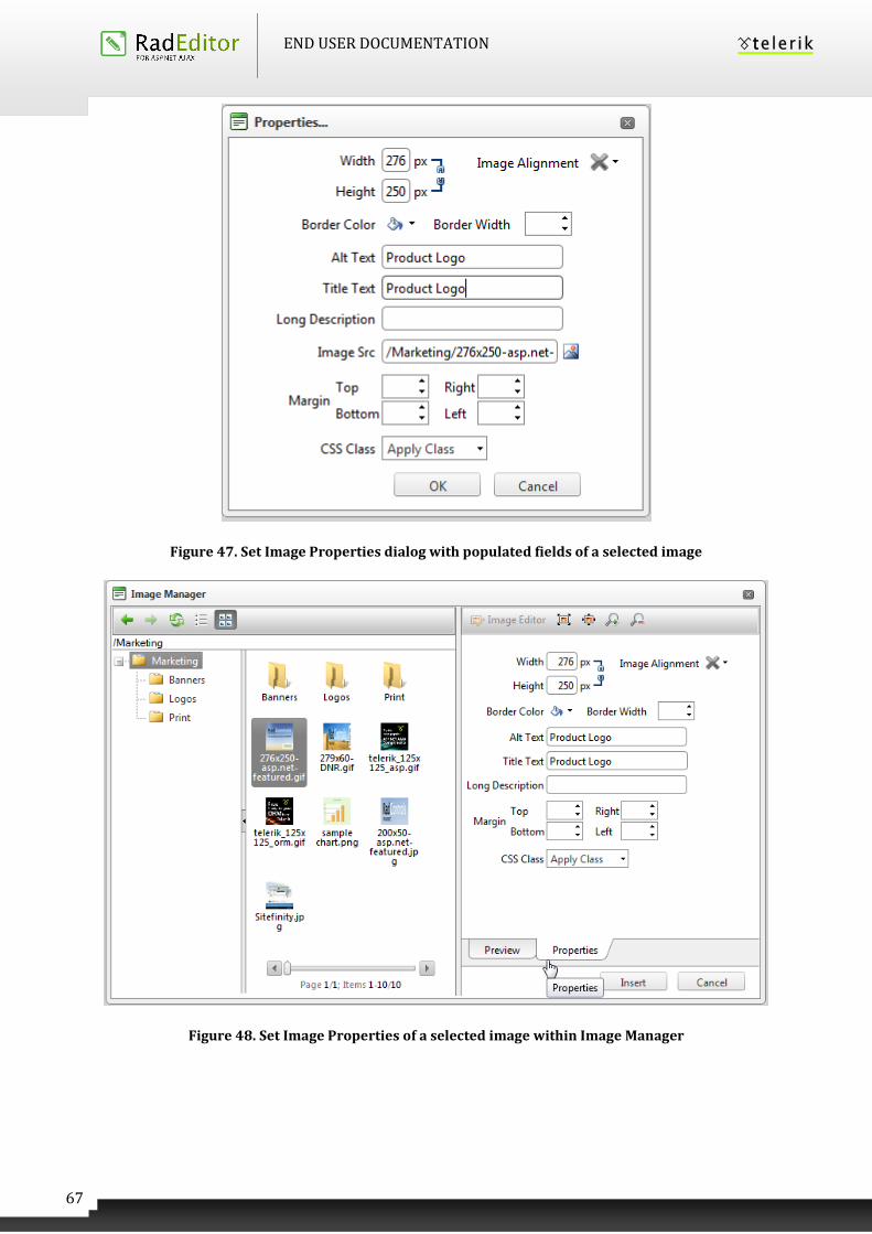
END USER DOCUMENTATION
67
Figure 47. Set Image Properties dialog with populated fields of a selected image
Figure 48. Set Image Properties of a selected image within Image Manager
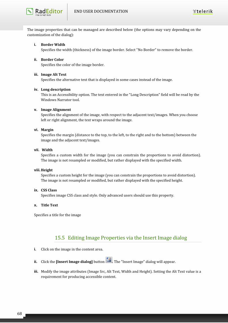
END USER DOCUMENTATION
68
The image properties that can be managed are described below (the options may vary depending on the
customization of the dialog):
i. Border Width
Specifies the width (thickness) of the image border. Select "No Border" to remove the border.
ii. Border Color
Specifies the color of the image border.
iii. Image Alt Text
Specifies the alternative text that is displayed in some cases instead of the image.
iv. Long description
This is an Accessibility option. The text entered in the "Long Description" field will be read by the
Windows Narrator tool.
v. Image Alignment
Specifies the alignment of the image, with respect to the adjacent text/images. When you choose
left or right alignment, the text wraps around the image.
vi. Margin
Specifies the margin (distance to the top, to the left, to the right and to the bottom) between the
image and the adjacent text/images.
vii. Width
Specifies a custom width for the image (you can constrain the proportions to avoid distortion).
The image is not resampled or modified, but rather displayed with the specified width.
viii. Height
Specifies a custom height for the image (you can constrain the proportions to avoid distortion).
The image is not resampled or modified, but rather displayed with the specified height.
ix. CSS Class
Specifies image CSS class and style. Only advanced users should use this property.
x. Title Text
Specifies a title for the image
15.5 Editing Image Properties via the Insert Image dialog
i. Click on the image in the content area.
ii. Click the [Insert Image dialog] button . The "Insert Image" dialog will appear.
iii. Modify the image attributes (Image Src, Alt Text, Width and Height). Setting the Alt Text value is a
requirement for producing accessible content.
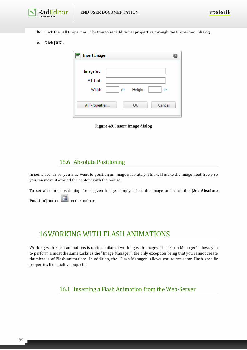
END USER DOCUMENTATION
69
iv. Click the "All Properties…" button to set additional properties through the Properties… dialog.
v. Click [OK].
Figure 49. Insert Image dialog
15.6 Absolute Positioning
In some scenarios, you may want to position an image absolutely. This will make the image float freely so
you can move it around the content with the mouse.
To set absolute positioning for a given image, simply select the image and click the [Set Absolute
Position] button on the toolbar.
16 WORKING WITH FLASH ANIMATIONS
Working with Flash animations is quite similar to working with images. The "Flash Manager" allows you
to perform almost the same tasks as the "Image Manager", the only exception being that you cannot create
thumbnails of Flash animations. In addition, the "Flash Manager" allows you to set some Flash-specific
properties like quality, loop, etc.
16.1 Inserting a Flash Animation from the Web-Server
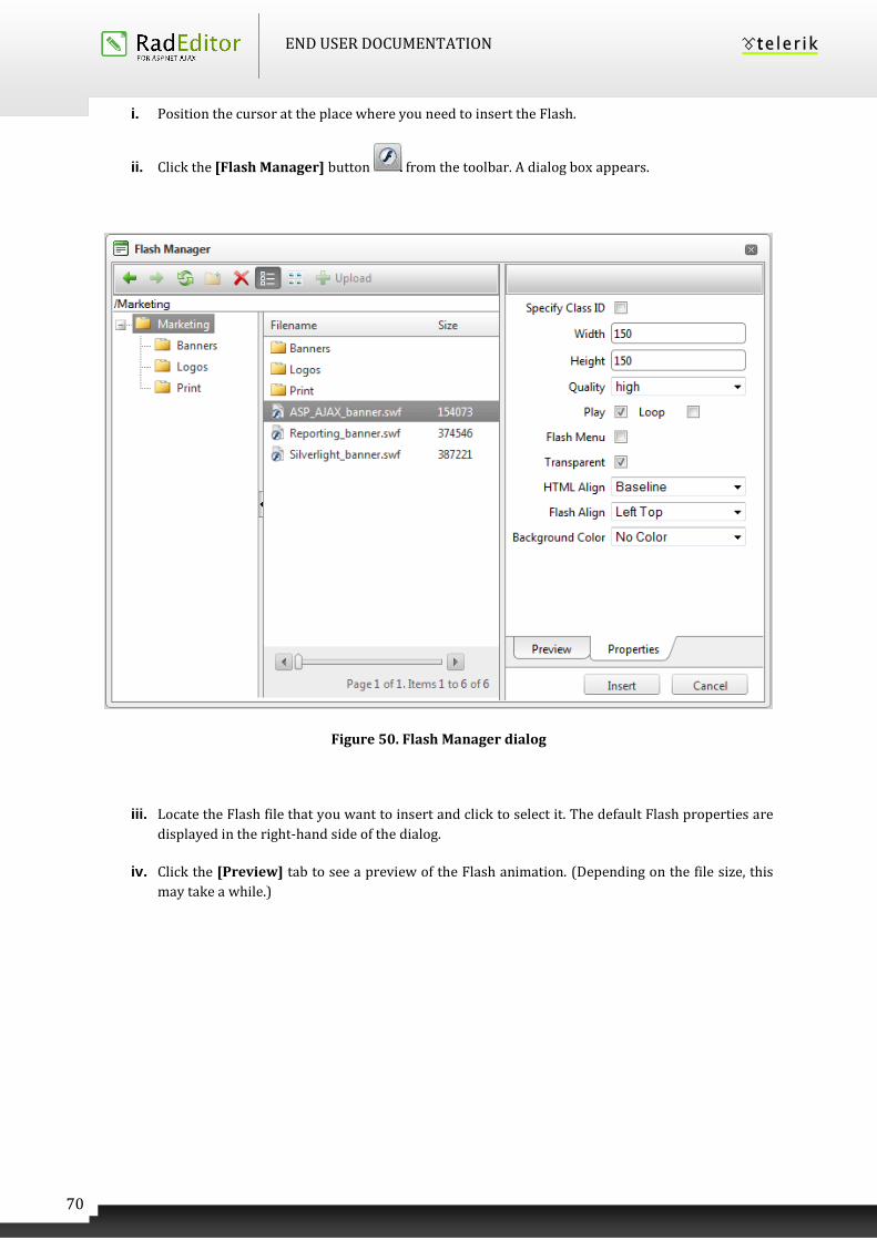
END USER DOCUMENTATION
70
i. Position the cursor at the place where you need to insert the Flash.
ii. Click the [Flash Manager] button from the toolbar. A dialog box appears.
Figure 50. Flash Manager dialog
iii. Locate the Flash file that you want to insert and click to select it. The default Flash properties are
displayed in the right-hand side of the dialog.
iv. Click the [Preview] tab to see a preview of the Flash animation. (Depending on the file size, this
may take a while.)
END USER DOCUMENTATION
71
Figure 51. Flash Manager dialog with selected flash animation shown in the Preview panel
v. Click [Insert] to finish or [Close] to cancel the operation.
16.2 Uploading Flash Animations on the Web-Server
You can use the "Flash Manager" dialog to upload Flash animations from your computer to the
web server. Once uploaded, the Flash appears in the File Browser at the bottom of the file list in
the current folder.
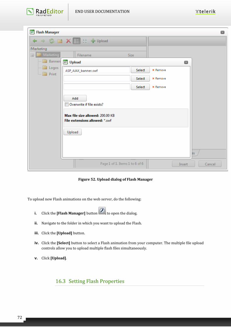
END USER DOCUMENTATION
72
Figure 52. Upload dialog of Flash Manager
To upload new Flash animations on the web server, do the following:
i. Click the [Flash Manager] button to open the dialog.
ii. Navigate to the folder in which you want to upload the Flash.
iii. Click the [Upload] button.
iv. Click the [Select] button to select a Flash animation from your computer. The multiple file upload
controls allow you to upload multiple flash files simultaneously.
v. Click [Upload].
16.3 Setting Flash Properties
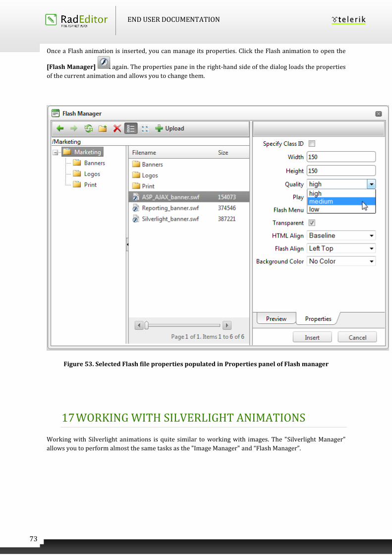
END USER DOCUMENTATION
73
Once a Flash animation is inserted, you can manage its properties. Click the Flash animation to open the
[Flash Manager] again. The properties pane in the right-hand side of the dialog loads the properties
of the current animation and allows you to change them.
Figure 53. Selected Flash file properties populated in Properties panel of Flash manager
17 WORKING WITH SILVERLIGHT ANIMATIONS
Working with Silverlight animations is quite similar to working with images. The "Silverlight Manager"
allows you to perform almost the same tasks as the "Image Manager" and “Flash Manager”.
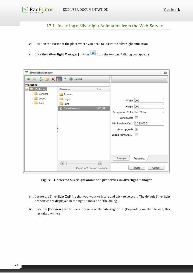
END USER DOCUMENTATION
74
17.1 Inserting a Silverlight Animation from the Web-Server
vi. Position the cursor at the place where you need to insert the Silverlight animation.
vii. Click the [Silverlight Manager] button from the toolbar. A dialog box appears.
Figure 54. Selected Silverlight animation properties in Silverlight manager
viii. Locate the Silverlight XAP file that you want to insert and click to select it. The default Silverlight
properties are displayed in the right-hand side of the dialog.
ix. Click the [Preview] tab to see a preview of the Silverlight file. (Depending on the file size, this
may take a while.)
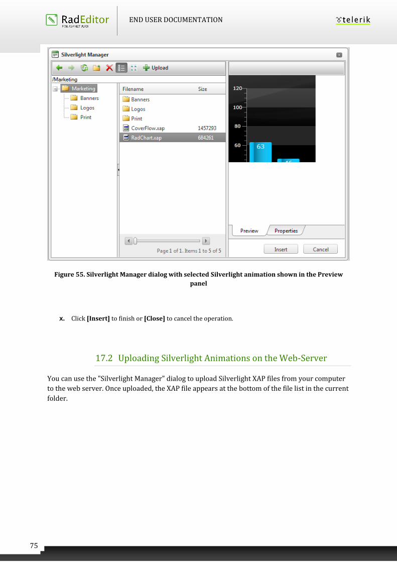
END USER DOCUMENTATION
75
Figure 55. Silverlight Manager dialog with selected Silverlight animation shown in the Preview
panel
x. Click [Insert] to finish or [Close] to cancel the operation.
17.2 Uploading Silverlight Animations on the Web-Server
You can use the "Silverlight Manager" dialog to upload Silverlight XAP files from your computer
to the web server. Once uploaded, the XAP file appears at the bottom of the file list in the current
folder.
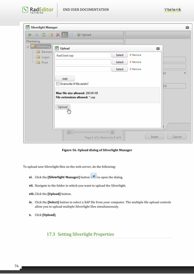
END USER DOCUMENTATION
76
Figure 56. Upload dialog of Silverlight Manager
To upload new Silverlight files on the web server, do the following:
vi. Click the [Silverlight Manager] button to open the dialog.
vii. Navigate to the folder in which you want to upload the Silverlight.
viii. Click the [Upload] button.
ix. Click the [Select] button to select a XAP file from your computer. The multiple file upload controls
allow you to upload multiple Silverlight files simultaneously.
x. Click [Upload].
17.3 Setting Silverlight Properties
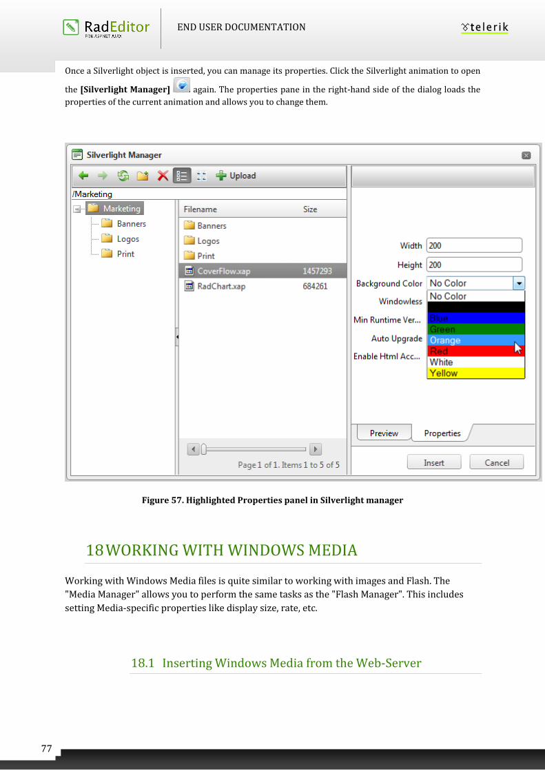
END USER DOCUMENTATION
77
Once a Silverlight object is inserted, you can manage its properties. Click the Silverlight animation to open
the [Silverlight Manager] again. The properties pane in the right-hand side of the dialog loads the
properties of the current animation and allows you to change them.
Figure 57. Highlighted Properties panel in Silverlight manager
18 WORKING WITH WINDOWS MEDIA
Working with Windows Media files is quite similar to working with images and Flash. The
"Media Manager" allows you to perform the same tasks as the "Flash Manager". This includes
setting Media-specific properties like display size, rate, etc.
18.1 Inserting Windows Media from the Web-Server
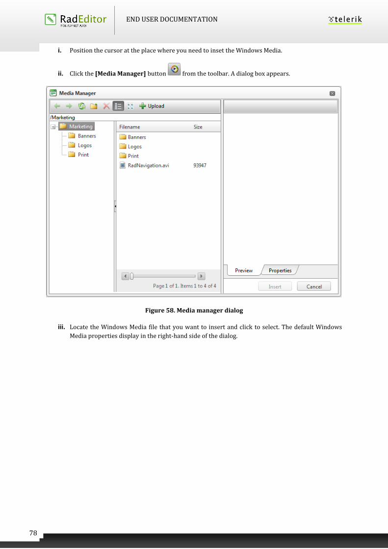
END USER DOCUMENTATION
78
i. Position the cursor at the place where you need to inset the Windows Media.
ii. Click the [Media Manager] button from the toolbar. A dialog box appears.
Figure 58. Media manager dialog
iii. Locate the Windows Media file that you want to insert and click to select. The default Windows
Media properties display in the right-hand side of the dialog.
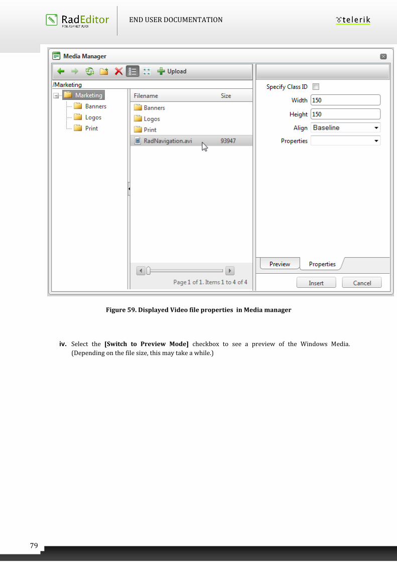
END USER DOCUMENTATION
79
Figure 59. Displayed Video file properties in Media manager
iv. Select the [Switch to Preview Mode] checkbox to see a preview of the Windows Media.
(Depending on the file size, this may take a while.)
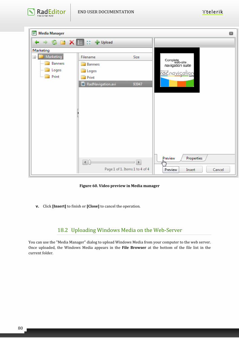
END USER DOCUMENTATION
80
Figure 60. Video preview in Media manager
v. Click [Insert] to finish or [Close] to cancel the operation.
18.2 Uploading Windows Media on the Web-Server
You can use the "Media Manager" dialog to upload Windows Media from your computer to the web server.
Once uploaded, the Windows Media appears in the File Browser at the bottom of the file list in the
current folder.
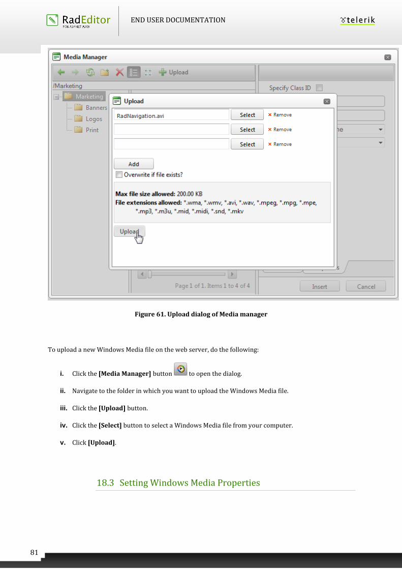
END USER DOCUMENTATION
81
Figure 61. Upload dialog of Media manager
To upload a new Windows Media file on the web server, do the following:
i. Click the [Media Manager] button to open the dialog.
ii. Navigate to the folder in which you want to upload the Windows Media file.
iii. Click the [Upload] button.
iv. Click the [Select] button to select a Windows Media file from your computer.
v. Click [Upload].
18.3 Setting Windows Media Properties
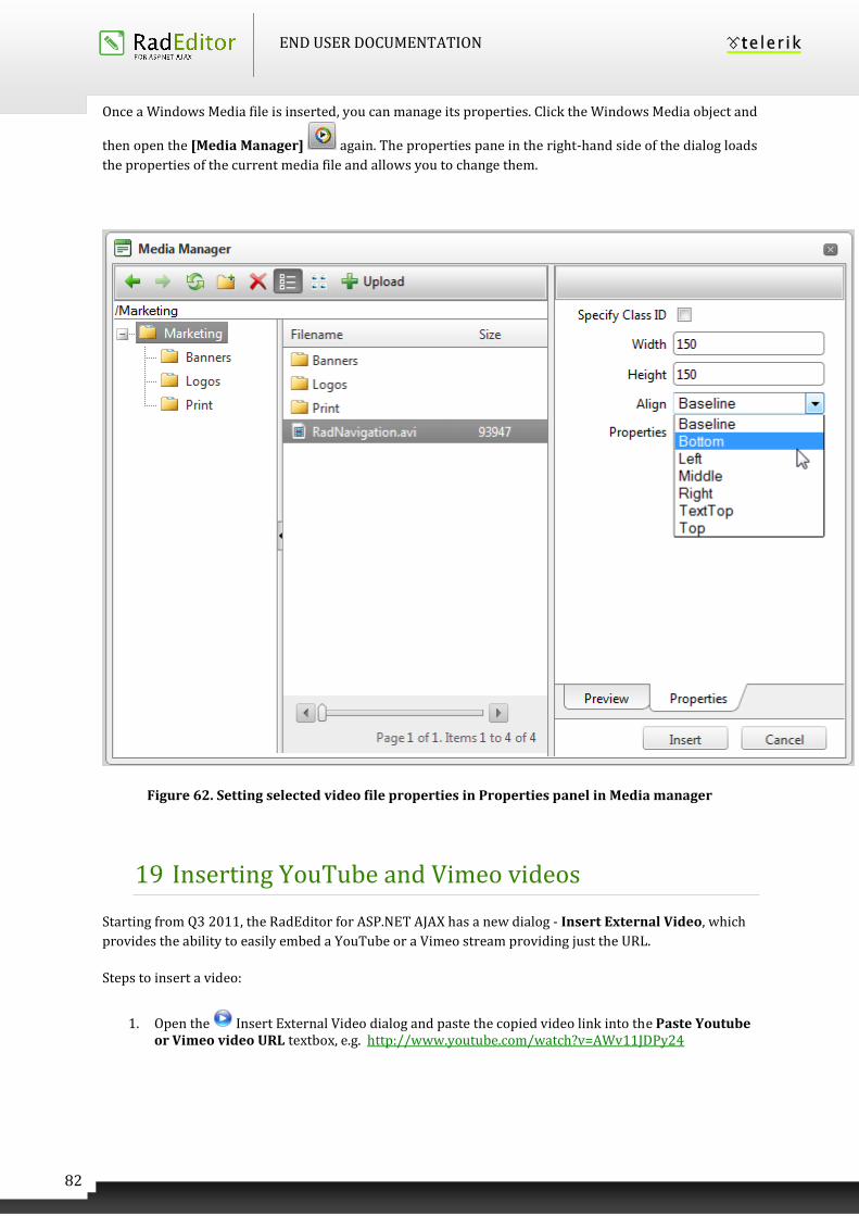
END USER DOCUMENTATION
82
Once a Windows Media file is inserted, you can manage its properties. Click the Windows Media object and
then open the [Media Manager] again. The properties pane in the right-hand side of the dialog loads
the properties of the current media file and allows you to change them.
Figure 62. Setting selected video file properties in Properties panel in Media manager
19 Inserting YouTube and Vimeo videos
Starting from Q3 2011, the RadEditor for ASP.NET AJAX has a new dialog - Insert External Video, which
provides the ability to easily embed a YouTube or a Vimeo stream providing just the URL.
Steps to insert a video:
1. Open the Insert External Video dialog and paste the copied video link into the Paste Youtube or Vimeo video URL textbox, e.g. http://www.youtube.com/watch?v=AWv11JDPy24
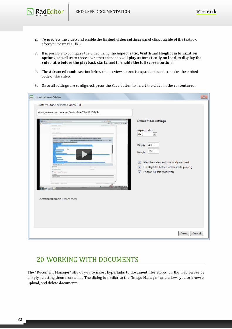
END USER DOCUMENTATION
83
2. To preview the video and enable the Embed video settings panel click outside of the textbox after you paste the URL.
3. It is possible to configure the video using the Aspect ratio, Width and Height customization options, as well as to choose whether the video will play automatically on load, to display the video title before the playback starts, and to enable the full screen button.
4. The Advanced mode section below the preview screen is expandable and contains the embed code of the video.
5. Once all settings are configured, press the Save button to insert the video in the content area.
20 WORKING WITH DOCUMENTS
The "Document Manager" allows you to insert hyperlinks to document files stored on the web server by
simply selecting them from a list. The dialog is similar to the "Image Manager" and allows you to browse,
upload, and delete documents.
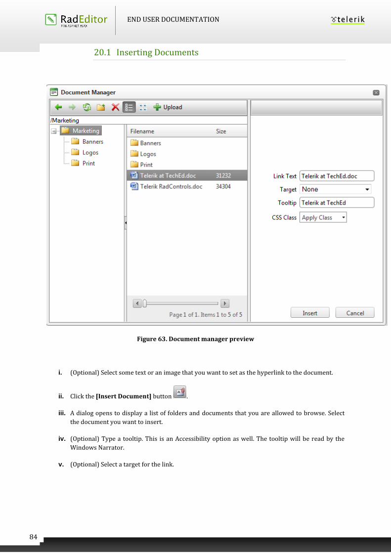
END USER DOCUMENTATION
84
20.1 Inserting Documents
Figure 63. Document manager preview
i. (Optional) Select some text or an image that you want to set as the hyperlink to the document.
ii. Click the [Insert Document] button .
iii. A dialog opens to display a list of folders and documents that you are allowed to browse. Select
the document you want to insert.
iv. (Optional) Type a tooltip. This is an Accessibility option as well. The tooltip will be read by the
Windows Narrator.
v. (Optional) Select a target for the link.
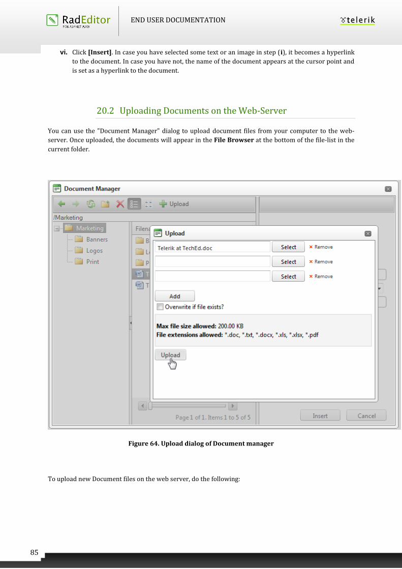
END USER DOCUMENTATION
85
vi. Click [Insert]. In case you have selected some text or an image in step (i), it becomes a hyperlink
to the document. In case you have not, the name of the document appears at the cursor point and
is set as a hyperlink to the document.
20.2 Uploading Documents on the Web-Server
You can use the "Document Manager" dialog to upload document files from your computer to the web-
server. Once uploaded, the documents will appear in the File Browser at the bottom of the file-list in the
current folder.
Figure 64. Upload dialog of Document manager
To upload new Document files on the web server, do the following:
END USER DOCUMENTATION
86
i. Click the [Document Manager] button to open the dialog.
ii. Navigate to the folder in which you want to upload the Document.
iii. Click the [Upload] button.
iv. Click [Select] to select a Document file from your computer.
v. Click [Upload].
21 WORKING WITH TEMPLATES
RadEditor allows you to insert external files (e.g. a file with pre-formatted tables, signatures, etc.) into the
editable area. Those files are called Templates and can be in any format that your server will allow you to
read. Templates are similar to code snippets the only difference being that they are obtained from
individual files the user can browse, upload, delete, etc.
21.1 Inserting Templates
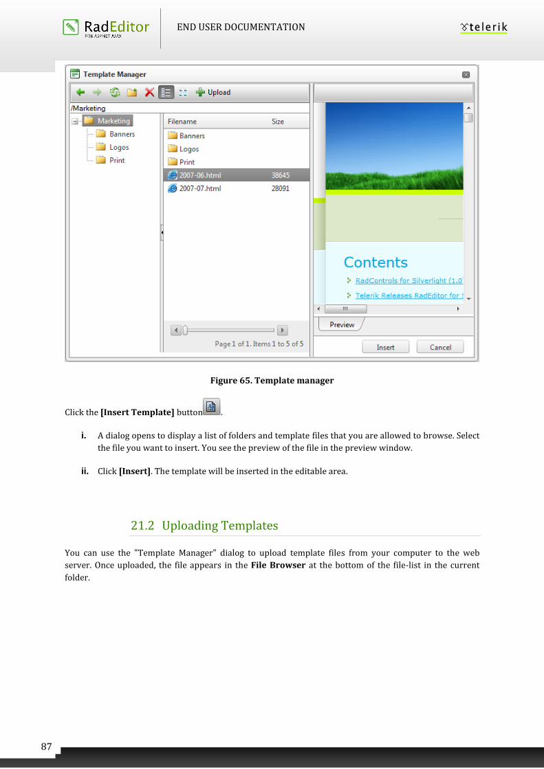
END USER DOCUMENTATION
87
Figure 65. Template manager
Click the [Insert Template] button .
i. A dialog opens to display a list of folders and template files that you are allowed to browse. Select
the file you want to insert. You see the preview of the file in the preview window.
ii. Click [Insert]. The template will be inserted in the editable area.
21.2 Uploading Templates
You can use the "Template Manager" dialog to upload template files from your computer to the web
server. Once uploaded, the file appears in the File Browser at the bottom of the file-list in the current
folder.
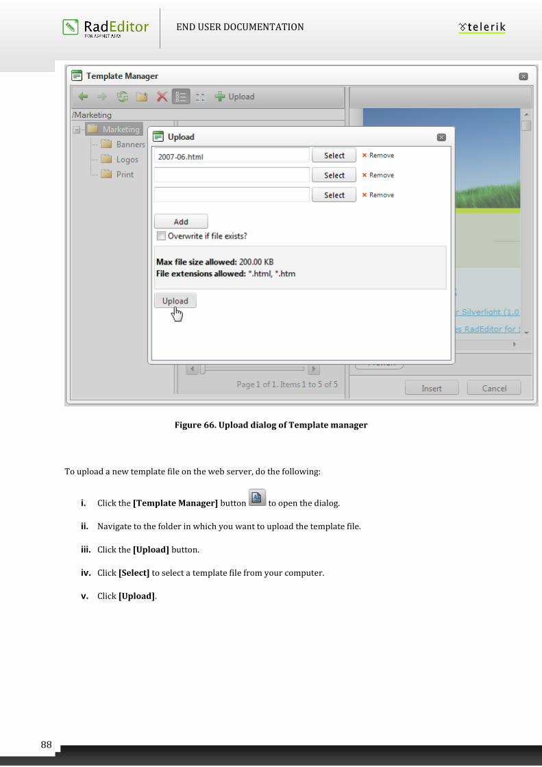
END USER DOCUMENTATION
88
Figure 66. Upload dialog of Template manager
To upload a new template file on the web server, do the following:
i. Click the [Template Manager] button to open the dialog.
ii. Navigate to the folder in which you want to upload the template file.
iii. Click the [Upload] button.
iv. Click [Select] to select a template file from your computer.
v. Click [Upload].
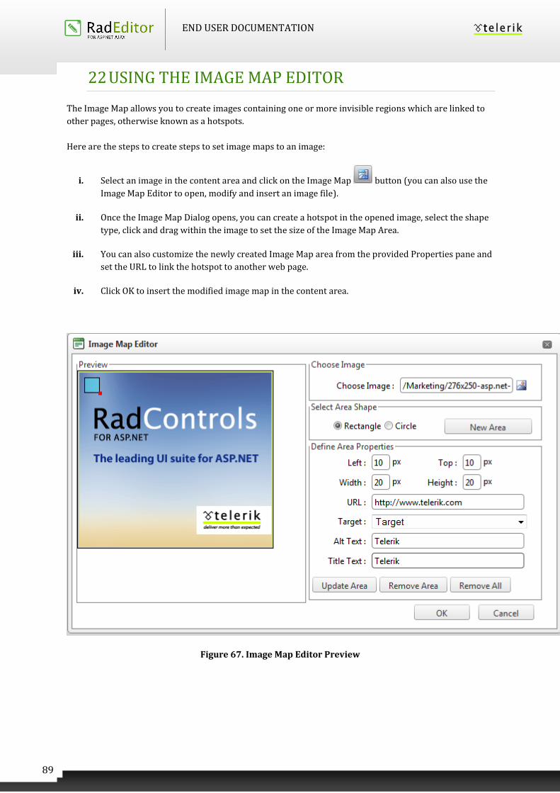
END USER DOCUMENTATION
89
22 USING THE IMAGE MAP EDITOR
The Image Map allows you to create images containing one or more invisible regions which are linked to
other pages, otherwise known as a hotspots.
Here are the steps to create steps to set image maps to an image:
i. Select an image in the content area and click on the Image Map button (you can also use the
Image Map Editor to open, modify and insert an image file).
ii. Once the Image Map Dialog opens, you can create a hotspot in the opened image, select the shape
type, click and drag within the image to set the size of the Image Map Area.
iii. You can also customize the newly created Image Map area from the provided Properties pane and
set the URL to link the hotspot to another web page.
iv. Click OK to insert the modified image map in the content area.
Figure 67. Image Map Editor Preview
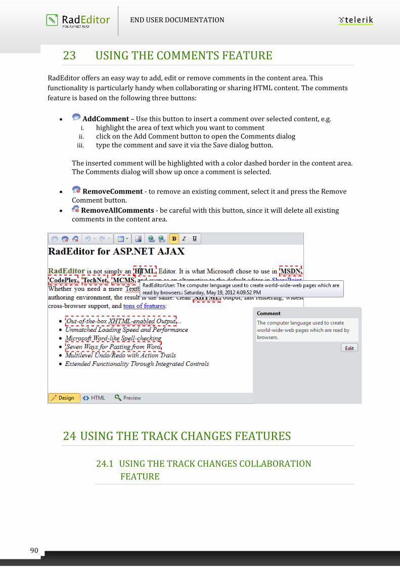
END USER DOCUMENTATION
90
23 USING THE COMMENTS FEATURE
RadEditor offers an easy way to add, edit or remove comments in the content area. This
functionality is particularly handy when collaborating or sharing HTML content. The comments
feature is based on the following three buttons:
AddComment – Use this button to insert a comment over selected content, e.g. i. highlight the area of text which you want to comment
ii. click on the Add Comment button to open the Comments dialog iii. type the comment and save it via the Save dialog button.
The inserted comment will be highlighted with a color dashed border in the content area. The Comments dialog will show up once a comment is selected.
RemoveComment - to remove an existing comment, select it and press the Remove Comment button.
RemoveAllComments - be careful with this button, since it will delete all existing comments in the content area.
24 USING THE TRACK CHANGES FEATURES
24.1 USING THE TRACK CHANGES COLLABORATION
FEATURE
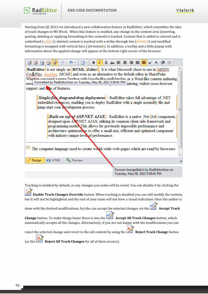
END USER DOCUMENTATION
91
Starting from Q2 2012 we introduced a new collaboration feature in RadEditor, which resembles the idea
of track changes in MS Word. When this feature is enabled, any change in the content area (inserting,
pasting, deleting or applying formatting to the content) is tracked. Content that is added is colored and is
underlined (added); deleted content is marked with a strike-through line (deleted) and modified
formatting is wrapped with vertical bars (|formatted|). In addition, a tooltip and a little popup with
information about the applied change will appear at the bottom right corner of the browser:
Tracking is enabled by default, so any changes you make will be noted. You can disable it by clicking the
Enable Track Changes Override button. When tracking is disabled you can still modify the content,
but it will not be highlighted and the rest of your team will not have a visual indication. Once the author is
done with the desired modifications, he/she can accept the selected changes via the Accept Track
Change button. To make things faster there is also the Accept All Track Changes button, which
automatically accepts all the changes. Alternatively, if you are not happy with the modifications you can
reject the selected change and revert to the old content by using the Reject Track Change button
(or the Reject All Track Changes for all of them at once).
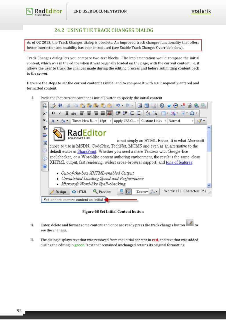
END USER DOCUMENTATION
92
24.2 USING THE TRACK CHANGES DIALOG
As of Q2 2013, the Track Changes dialog is obsolete. An improved track changes functionality that offers
better interaction and usability has been introduced (see Enable Track Changes Override below).
Track Changes dialog lets you compare two text blocks. The implementation would compare the initial
content, which was in the editor when it was originally loaded on the page, with the current content, i.e. it
allows the user to track the changes made during the editing process and before submitting content back
to the server.
Here are the steps to set the current content as initial and to compare it with a subsequently entered and
formatted content:
i. Press the [Set current content as initial] button to specify the initial content
Figure 68 Set Initial Content button
ii. Enter, delete and format some content and once are ready press the track changes button to
see the changes.
iii. The dialog displays text that was removed from the initial content in red, and text that was added
during the editing in green. Text that remained unchanged retains its original formatting.
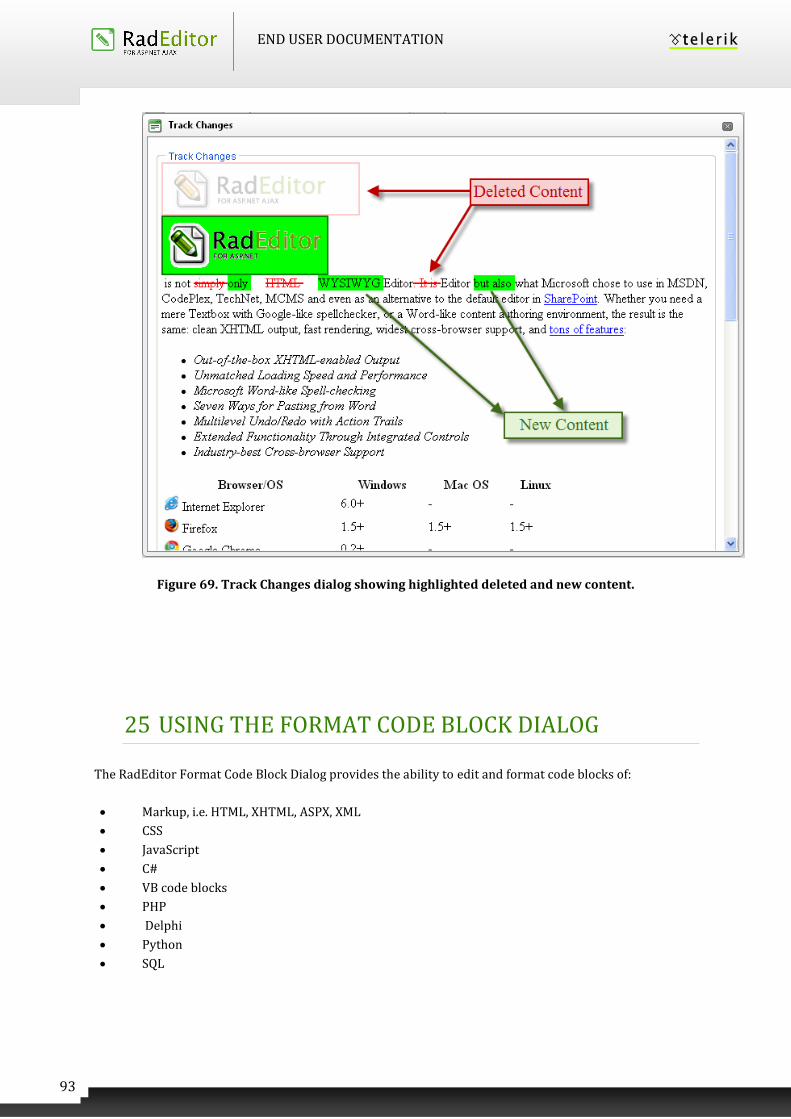
END USER DOCUMENTATION
93
Figure 69. Track Changes dialog showing highlighted deleted and new content.
25 USING THE FORMAT CODE BLOCK DIALOG
The RadEditor Format Code Block Dialog provides the ability to edit and format code blocks of:
Markup, i.e. HTML, XHTML, ASPX, XML
CSS
JavaScript
C#
VB code blocks
PHP
Delphi
Python
SQL
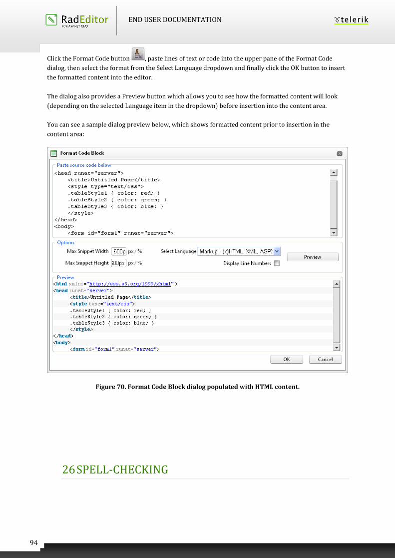
END USER DOCUMENTATION
94
Click the Format Code button , paste lines of text or code into the upper pane of the Format Code
dialog, then select the format from the Select Language dropdown and finally click the OK button to insert
the formatted content into the editor.
The dialog also provides a Preview button which allows you to see how the formatted content will look
(depending on the selected Language item in the dropdown) before insertion into the content area.
You can see a sample dialog preview below, which shows formatted content prior to insertion in the
content area:
Figure 70. Format Code Block dialog populated with HTML content.
26 SPELL-CHECKING
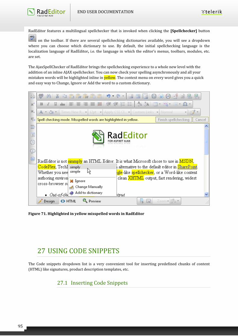
END USER DOCUMENTATION
95
RadEditor features a multilingual spellchecker that is invoked when clicking the [Spellchecker] button
on the toolbar. If there are several spellchecking dictionaries available, you will see a dropdown
where you can choose which dictionary to use. By default, the initial spellchecking language is the
localization language of RadEditor, i.e. the language in which the editor’s menus, toolbars, modules, etc.
are set.
The AjaxSpellChecker of RadEditor brings the spellchecking experience to a whole new level with the
addition of an inline AJAX spellchecker. You can now check your spelling asynchronously and all your
mistaken words will be highlighted inline in yellow. The context menu on every word gives you a quick
and easy way to Change, Ignore or Add the word to a custom dictionary.
Figure 71. Highlighted in yellow misspelled words in RadEditor
27 USING CODE SNIPPETS
The Code snippets dropdown list is a very convenient tool for inserting predefined chunks of content
(HTML) like signatures, product description templates, etc.
27.1 Inserting Code Snippets
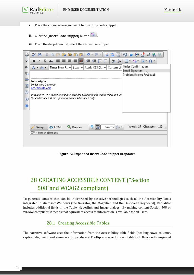
END USER DOCUMENTATION
96
i. Place the cursor where you want to insert the code snippet.
ii. Click the [Insert Code Snippet] button .
iii. From the dropdown list, select the respective snippet.
Figure 72. Expanded Insert Code Snippet dropdown
28 CREATING ACCESSIBLE CONTENT ("Section
508"and WCAG2 compliant)
To generate content that can be interpreted by assistive technologies such as the Accessibility Tools
integrated in Microsoft Windows (the Narrator, the Magnifier, and the On-Screen Keyboard), RadEditor
includes additional fields in the Table, Hyperlink and Image dialogs. By making content Section 508 or
WCAG2 compliant, it means that equivalent access to information is available for all users.
28.1 Creating Accessible Tables
The narrative software uses the information from the Accessibility table fields (heading rows, columns,
caption alignment and summary) to produce a Tooltip message for each table cell. Users with impaired
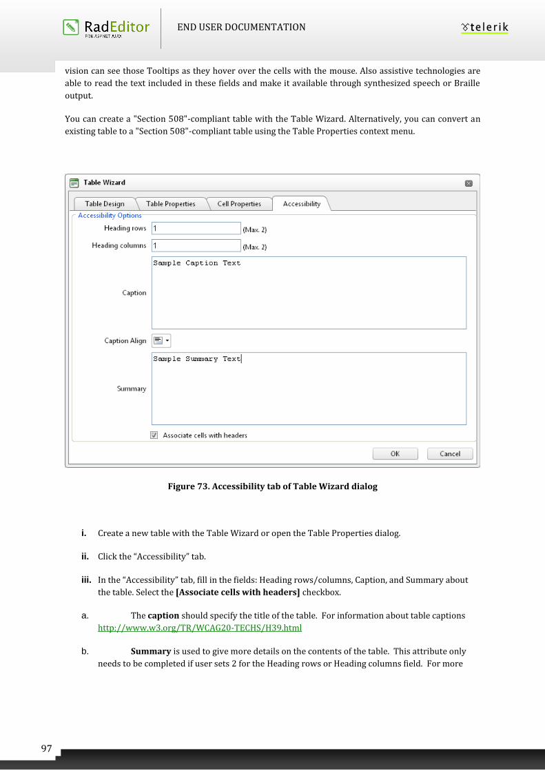
END USER DOCUMENTATION
97
vision can see those Tooltips as they hover over the cells with the mouse. Also assistive technologies are
able to read the text included in these fields and make it available through synthesized speech or Braille
output.
You can create a "Section 508"-compliant table with the Table Wizard. Alternatively, you can convert an
existing table to a "Section 508"-compliant table using the Table Properties context menu.
Figure 73. Accessibility tab of Table Wizard dialog
i. Create a new table with the Table Wizard or open the Table Properties dialog.
ii. Click the “Accessibility” tab.
iii. In the “Accessibility” tab, fill in the fields: Heading rows/columns, Caption, and Summary about
the table. Select the [Associate cells with headers] checkbox.
a. The caption should specify the title of the table. For information about table captions
http://www.w3.org/TR/WCAG20-TECHS/H39.html
b. Summary is used to give more details on the contents of the table. This attribute only
needs to be completed if user sets 2 for the Heading rows or Heading columns field. For more
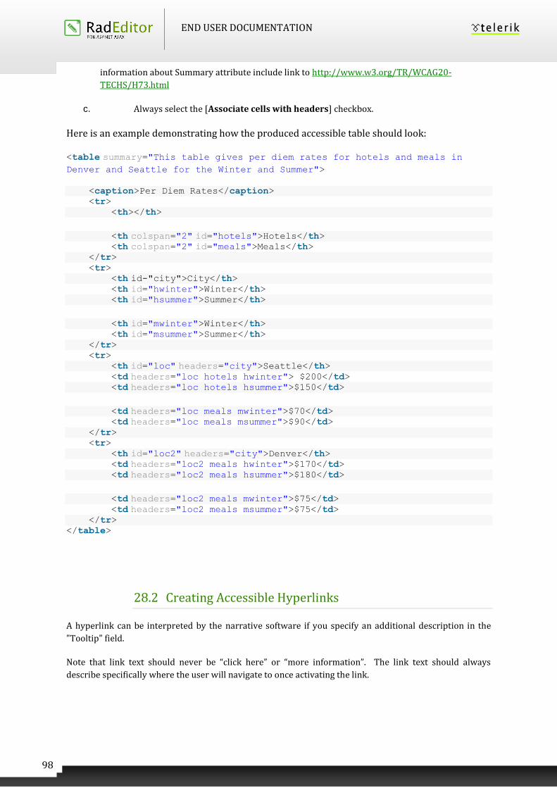
END USER DOCUMENTATION
98
information about Summary attribute include link to http://www.w3.org/TR/WCAG20-
TECHS/H73.html
c. Always select the [Associate cells with headers] checkbox.
Here is an example demonstrating how the produced accessible table should look:
<table summary="This table gives per diem rates for hotels and meals in Denver and Seattle for the Winter and Summer">
<caption>Per Diem Rates</caption> <tr> <th></th>
<th colspan="2" id="hotels">Hotels</th> <th colspan="2" id="meals">Meals</th> </tr> <tr> <th id-"city">City</th> <th id="hwinter">Winter</th> <th id="hsummer">Summer</th>
<th id="mwinter">Winter</th> <th id="msummer">Summer</th> </tr> <tr> <th id="loc" headers="city">Seattle</th> <td headers="loc hotels hwinter"> $200</td> <td headers="loc hotels hsummer">$150</td>
<td headers="loc meals mwinter">$70</td> <td headers="loc meals msummer">$90</td> </tr> <tr> <th id="loc2" headers="city">Denver</th> <td headers="loc2 meals hwinter">$170</td> <td headers="loc2 meals hsummer">$180</td>
<td headers="loc2 meals mwinter">$75</td> <td headers="loc2 meals msummer">$75</td> </tr> </table>
28.2 Creating Accessible Hyperlinks
A hyperlink can be interpreted by the narrative software if you specify an additional description in the
"Tooltip" field.
Note that link text should never be “click here” or “more information”. The link text should always
describe specifically where the user will navigate to once activating the link.
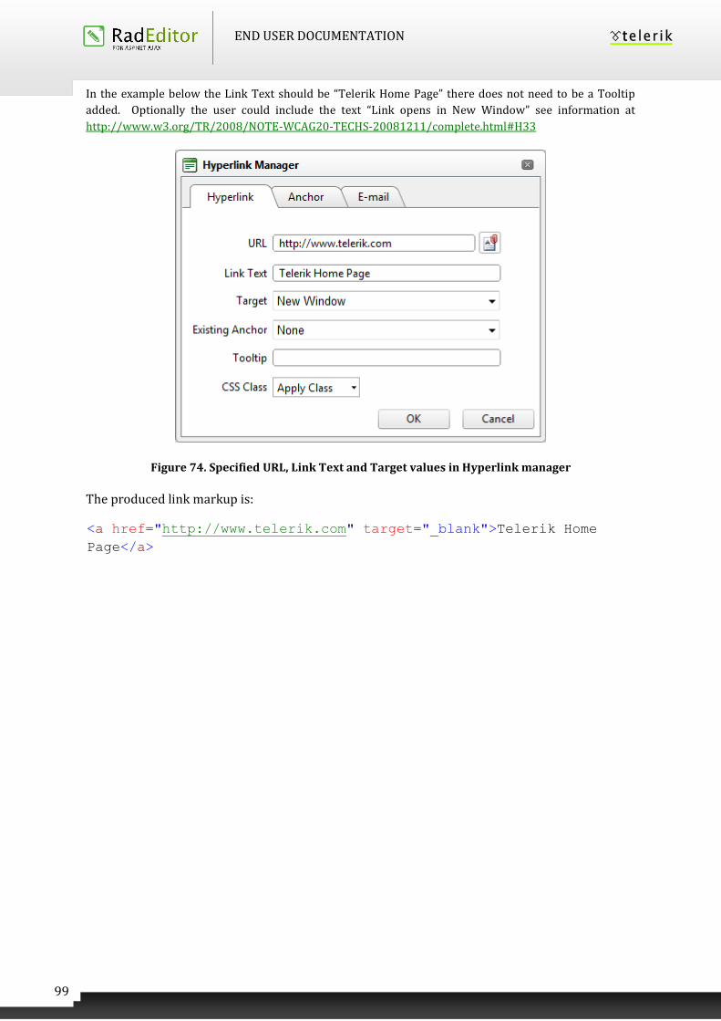
END USER DOCUMENTATION
99
In the example below the Link Text should be “Telerik Home Page” there does not need to be a Tooltip
added. Optionally the user could include the text “Link opens in New Window” see information at
http://www.w3.org/TR/2008/NOTE-WCAG20-TECHS-20081211/complete.html#H33
Figure 74. Specified URL, Link Text and Target values in Hyperlink manager
The produced link markup is:
<a href="http://www.telerik.com" target="_blank">Telerik Home
Page</a>
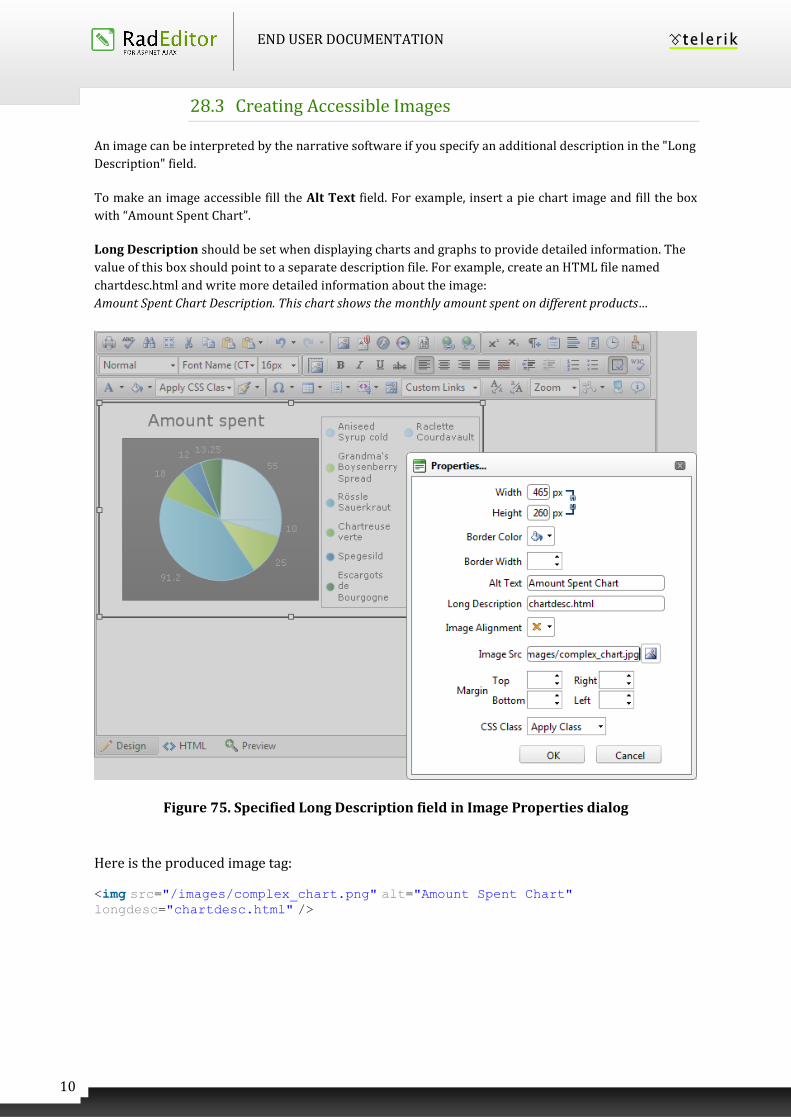
END USER DOCUMENTATION
10
0
28.3 Creating Accessible Images
An image can be interpreted by the narrative software if you specify an additional description in the "Long
Description" field.
To make an image accessible fill the Alt Text field. For example, insert a pie chart image and fill the box
with “Amount Spent Chart”.
Long Description should be set when displaying charts and graphs to provide detailed information. The
value of this box should point to a separate description file. For example, create an HTML file named
chartdesc.html and write more detailed information about the image:
Amount Spent Chart Description. This chart shows the monthly amount spent on different products…
Figure 75. Specified Long Description field in Image Properties dialog
Here is the produced image tag:
<img src="/images/complex_chart.png" alt="Amount Spent Chart" longdesc="chartdesc.html" />
END USER DOCUMENTATION
10
1
Information on Alt Attribute
http://www.w3.org/TR/WCAG20-TECHS/H37.html
Information on LongDesc attribute
http://www.w3.org/TR/WCAG20-TECHS/H45.html
28.4 Using Headers in Content
If there is a large amount of text (over 750 characters) then headers make it much easier for all users to
navigate through the content. You can see how to apply a heading in RadEditor in the Apply Paragraph
Styles section.
http://www.w3.org/TR/WCAG20-TECHS/H42
28.5 Providing Good Color Contrasts for Content
Accessibility is an important part of web design. By choosing the right colors, you can ensure
that all visitors to your site can read your content. The user can change the color appearance of
text in RadEditor’s content area using the ForeColor and BackColor tools.
The W3C recommendations define three levels of conformance to their guidelines. Priority 1, 2
and 3. Their 2.0 color contrast algorithms utilize two of these-- Priority 2 (AA), and Priority 3
(AAA). Whether or not you need to reach an AAA conformance depends on your target audience.
You can find below examples of contents with various contrast ratios.
Content with contrast ratio, which passes at 3:1
Text Color HEX Background color: #000033 Contrast
#C00 Sample 3.40
#C03 Sample 3.45
#C06 Sample 3.59
#C09 Sample 3.84
#C0C Sample 4.24
#C0F Sample 4.78
Content with contrast ratio, which passes at 4.5:1
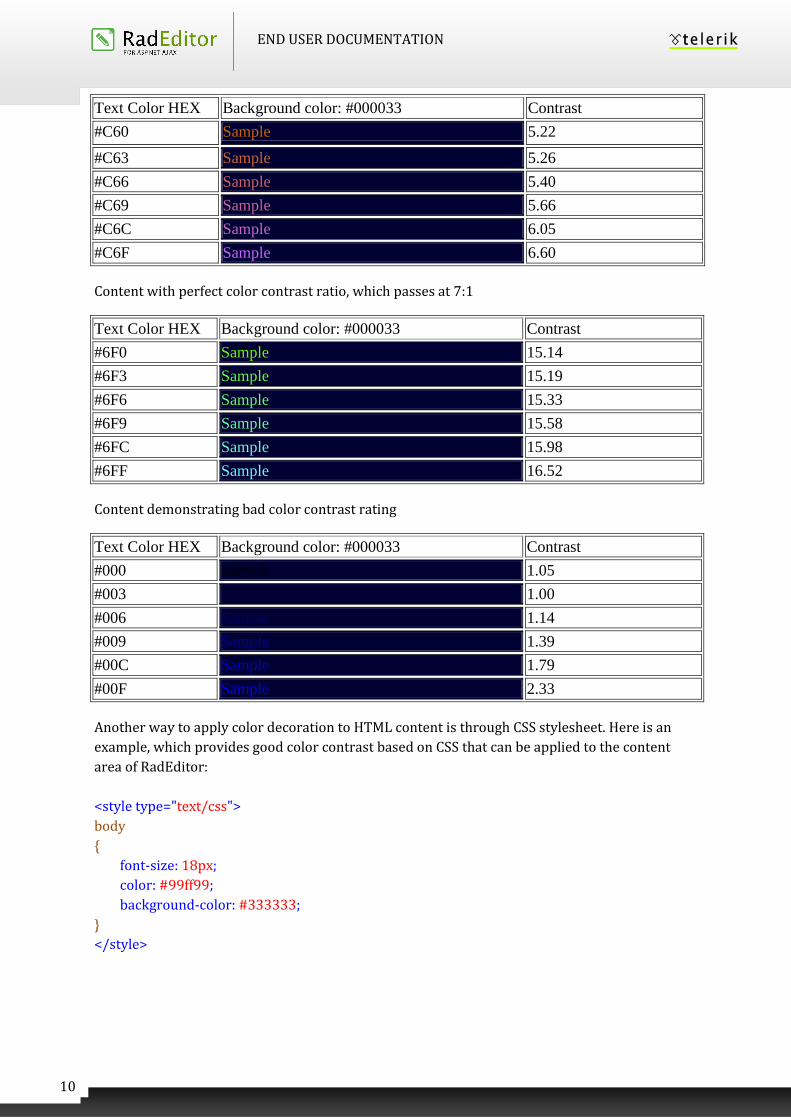
END USER DOCUMENTATION
10
2
Text Color HEX Background color: #000033 Contrast
#C60 Sample 5.22
#C63 Sample 5.26
#C66 Sample 5.40
#C69 Sample 5.66
#C6C Sample 6.05
#C6F Sample 6.60
Content with perfect color contrast ratio, which passes at 7:1
Text Color HEX Background color: #000033 Contrast
#6F0 Sample 15.14
#6F3 Sample 15.19
#6F6 Sample 15.33
#6F9 Sample 15.58
#6FC Sample 15.98
#6FF Sample 16.52
Content demonstrating bad color contrast rating
Text Color HEX Background color: #000033 Contrast
#000 Sample 1.05
#003 Sample 1.00
#006 Sample 1.14
#009 Sample 1.39
#00C Sample 1.79
#00F Sample 2.33
Another way to apply color decoration to HTML content is through CSS stylesheet. Here is an
example, which provides good color contrast based on CSS that can be applied to the content
area of RadEditor:
<style type="text/css">
body
{
font-size: 18px;
color: #99ff99;
background-color: #333333;
}
</style>
END USER DOCUMENTATION
10
3
The tag above should be inserted in HTML view mode of RadEditor.
More information on color contrast
http://www.w3.org/TR/WCAG20-TECHS/G17
http://www.w3.org/TR/WCAG20-TECHS/G18.html
http://www.w3.org/TR/WCAG20-TECHS/G145.html
28.6 XHTML Validator dialog
XHTML Validator is used for real-time validation of XHTML compliance. This dialog uses the W3C XHTML
Validator Page to perform validation of the current editor content. The W3C service returns a compliancy
report right within the editor dialog. This feature eliminates the need for manual copy/pasting of the
HTML and validation in a separate browser window.
You can check the HTML content you are currently working on by clicking the button.
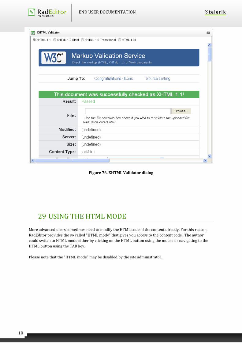
END USER DOCUMENTATION
10
4
Figure 76. XHTML Validator dialog
29 USING THE HTML MODE
More advanced users sometimes need to modify the HTML code of the content directly. For this reason,
RadEditor provides the so called "HTML mode" that gives you access to the content code. The author
could switch to HTML mode either by clicking on the HTML button using the mouse or navigating to the
HTML button using the TAB key.
Please note that the "HTML mode" may be disabled by the site administrator.
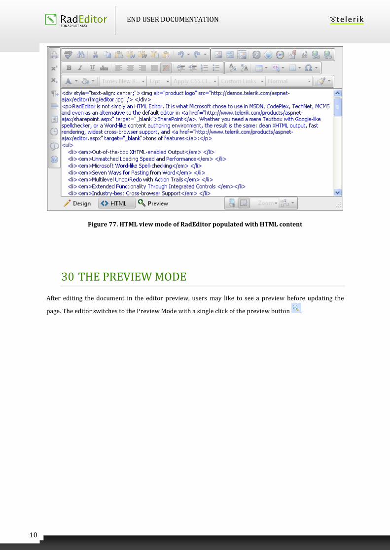
END USER DOCUMENTATION
10
5
Figure 77. HTML view mode of RadEditor populated with HTML content
30 THE PREVIEW MODE
After editing the document in the editor preview, users may like to see a preview before updating the
page. The editor switches to the Preview Mode with a single click of the preview button .
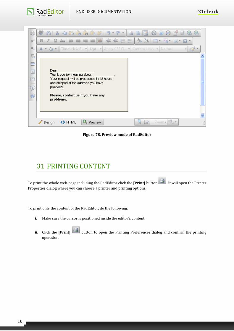
END USER DOCUMENTATION
10
6
Figure 78. Preview mode of RadEditor
31 PRINTING CONTENT
To print the whole web-page including the RadEditor click the [Print] button . It will open the Printer
Properties dialog where you can choose a printer and printing options.
To print only the content of the RadEditor, do the following:
i. Make sure the cursor is positioned inside the editor's content.
ii. Click the [Print] button to open the Printing Preferences dialog and confirm the printing
operation.
END USER DOCUMENTATION
10
7
Index
"Section 508" Compliancy, 96
Hyperlinks, 98
Images, 100, 101, 103
Tables, 96
Alignment, 31
Code Snippet, 23, 95
Insert, 95
Color, 30
CSS, 33
Document Manager, 22, 83
Inserting Documents, 84
Upload Documents, 85
Edit Mode
Design Mode, 26
Find and Replace, 47
Flash, 21
Flash Animation, 69, 73
Insert, 69, 74
Set Properties, 72, 76
Upload, 71, 75
Font, 29
Formatting Paragraphs, 15, 34, 35
Formatting Text, 13
HTML Inspector, 11
HTML Mode, 104
Hyperlink
Accessibility, 98
Anchors, 44
Custom Links, 46
E-mail links, 45
Insert a Hyperlink, 23, 40
Remove Hyperlink, 23, 43
Image, 20, 62
Absolute Positioning, 69
Accessibility, 100, 101, 103
Edit Properties, 66
Insert, 63
Upload, 64
Indentation, 32
Lists, 59
Modifying a Hyperlink
Modifying a Hyperlink, 42, 43
Modules, 10
Paste, 18
Paste As HTML, 19
Paste From Word, 19
Paste From Word Cleaning Fonts and Sizes,
19
Paste Plain Text, 19
Preview mode, 105
Print, 18, 106
END USER DOCUMENTATION
10
8
Properties Inspector, 11
Size, 30
Special Character, 23, 60
Spellcheck, 94
Statistics, 12
Table, 22
Accessibility, 96
Create using the Table Builder, 49
Create using the Table Wizard, 49
Format with CSS classes, 58
Formatting Tables, 53
Insert from Excel® or other applications, 52
Insert/Delete Rows or Columns, 56
Merge/Split Cells, 57
Resize, 57
Show/Hide Table Borders, 26, 52
Tag Inspector, 10
Template Manager, 22, 86
Insert Templates, 86
Upload Templates, 87
Time and Date
Insert Date, 24
Insert Time, 24
Windows Media, 22, 77
Insert, 77
Set Properties, 81
Upload, 80
XHTML Validator, 103
Recommended