Colored Mosaic Matrix: Visualization Technique for High-Dimensional Data
Hiroaki Kobayashi
Department of Computer ScienceUniversity of Tsukuba
Ibaraki, [email protected]
Kazuo Misue
Faculty of Engineering,Information and Systems
University of TsukubaIbaraki, Japan
Jiro Tanaka
Faculty of Engineering,Information and Systems
University of TsukubaIbaraki, Japan
Abstract—Owing to a limited display resolution, it maybe difficult to obtain an overview of high-dimensional datain the display area used for visualization. In this paper, weaimed to obtain an overview of high-dimensional data in alimited screen area. We developed Colored Mosaic Matrix asa method to obtain a data overview. Colored Mosaic Matrixis a visualization method for high-dimensional categorical datathat uses a color representation of the features. By representingquantitative data in category units, the proposed methodenables the visualization of data containing a large numberof records. As a result of an experimental investigation of itsreadability, we found our method to be useful in obtaining adata overview.
Keywords-High-Dimensional Data; Color Representation;Panel Matrix
I. INTRODUCTION
Visualization is a very effective method for extracting
knowledge from data and helping with our understanding
of human intuition. Therefore, data visualization is a useful
analysis tool. Much of the data appearing in various areas are
multi-dimensional data having more than one dimension. To
analyze such multi-dimensional data, various visualization
techniques have been developed. For example, Scatterplot
Matrix [1] is a technique used to display a matrix arranged
scatterplot in pair of all dimensions that can be combined.
The dimensions are aligned regularly so that it is easy to
search for the required dimension during an analysis. On
the other hand, there is a physical limit to the size of the
screen. In visualizing high-dimensional data, obtaining an
overview of all dimensions is therefore difficult.
By increasing the resolution itself using a large-screen
display, it is possible to visualize all dimensions at the same
time. However, the larger the display used for visualization,
the larger the area that must be looked at, and the longer
the distance for the line of sight needed for an analysis. To
conduct a smooth analysis, it is therefore desirable to use a
common desktop display.We aim to display an overview of high-dimensional data
on a full HD-resolution (1920 × 1080) display. In partic-
ular, we target the high-dimensional data of 30 or more
dimensions, which are difficult to treat. To analyze high-
dimensional data from an overview, we intend to maintain a
high readability and increase the number of dimensions that
can be displayed in a limited drawing area.
Our contributions are as follows. First, we developed a
method to browse an overview of high-dimensional data
instantaneously. By using colors, it becomes possible to
read the features of data in a narrower area. Second, in
our experiment, we evaluated the relationship between the
drawing area and the readability quantitatively.
II. RELATED WORK
A. Panel Matrix
Panel Matrix involves two-dimensional pair-wise plots
of adjacent variates. Scatterplot Matrix [1] arranges the
scatter plots of all possible combinations of dimensions
to display all of the multi-dimensional data required. In
addition, SCATTERDICE [2] is a visualization technique
that extends Scatterplot Matrix. By operating interactively,
like the roll of a dice, SCATTERDICE achieves the task
of switching between dimensions in multi-dimensional data.
Intuitive dimensional switching supports an analysis of data
consisting of a large number of dimensions. However, when
using these methods to represent all high-dimensional data
instantaneously, each Scatterplot drawing area becomes nar-
rower. Over-plotting then occurs by increasing the number
of points per unit area. When over-plotting occurs, the data
analysis becomes more difficult.
Mosaic Plot [3] is a technique for a space-filling visual-
ization of multi-dimensional categorical data. The drawing
area is divided into rectangles whose area depends on the
ratio of the category. Mosaic Matrix [4] is a Panel Matrixvisualization technique. Like Scatterplot Matrix, Mosaic
Matrix is displayed in a matrix form of Mosaic Plots.
However, for an increased number of data dimensions, it
becomes difficult to distinguish between each rectangle in a
small Mosaic Plot.
B. Non-Cartesian Displays
Non-Cartesian Displays map data into non-Cartesian axes.
Parallel Coordinates Plot (PCP) [5], [6] is a kind of Non-Cartesian Displays, and is a multi-dimensional data visual-
ization method using parallel coordinates. In a typical PCP,
2013 17th International Conference on Information Visualisation
1550-6037/13 $26.00 © 2013 IEEE
DOI 10.1109/IV.2013.50
375
2013 17th International Conference on Information Visualisation
1550-6037/13 $26.00 © 2013 IEEE
DOI 10.1109/IV.2013.50
375
2013 17th International Conference on Information Visualisation
1550-6037/13 $26.00 © 2013 IEEE
DOI 10.1109/IV.2013.50
375
2013 17th International Conference on Information Visualisation
1550-6037/13 $26.00 © 2013 IEEE
DOI 10.1109/IV.2013.50
378
2013 17th International Conference on Information Visualisation
1550-6037/13 $26.00 © 2013 IEEE
DOI 10.1109/IV.2013.50
378
2013 17th International Conference on Information Visualisation
1550-6037/13 $26.00 © 2013 IEEE
DOI 10.1109/IV.2013.50
378
2013 17th International Conference on Information Visualisation
1550-6037/13 $26.00 © 2013 IEEE
DOI 10.1109/IV.2013.50
378
a direct comparison can be performed only between adjacent
dimensions. Furthermore, the width of the axis becomes nar-
row, which decreases the readability. By arranging multiple
PCP vertically, Heinrich et al. [7] developed a method to
display adjacent pairs of all dimensions. Because dimensions
are not arranged regularly, it is difficult to explore arbitrary
dimensional pairs in this type of visualization.
One countermeasure against over-plotting is to display
only part of the data dimensions. Sips et al. [8] developed a
method using dimensional sorting by distance and entropy
to display only the useful part of an analysis. VisBricks [9]
represents data by allowing the dimension and records that
the user wants to view to be selected. When dealing with
high-dimensional data in these techniques, it is difficult to
determine the part of the data to be visualized. For example,
problems arise, such as how much data should be displayed,
or how to determine the necessary part of the data for
analysis.
RadViz [10], [11] represents high-dimensional data by
placing dimensions on the circumference of a 2D drawing
area. In RadViz, it is difficult to read the numerical values of
each dimension directly. Moreover, the representation itself
may cause the data to be misread.
C. Representation of Density and Distribution Using Colors
As a means to improve the readability in a narrow region,
it is effective to use a color representation. Visualization
techniques using color [12], [13] have been developed to
represent the density of data. However, these techniques are
unsuitable in a narrow area because they represent the data
distribution based on the position of the colors.
Two-Tone Pseudo Coloring [14] is a technique for repre-
senting data of only one-dimensional distribution using col-
ors. While this is not a multi-dimensional data visualization
technique, it is possible to read the data features using a thin
and small rectangular area.
III. VISUAL REPRESENTATION
A. Design Principles of Representation
The basic principle of seeking information can be summa-
rized as follows: Overview first, zoom and filter, then details-on-demand [15]. Even when analyzing high-dimensional
data, it is desirable that the data overview be obtained
first. To obtain the data overview intuitively, we designed a
method to visualize all dimensions at once. When displaying
all high-dimensional data at the same time, the readability is
reduced through over-plotting. Therefore, we use a drawing
method with good space efficiency.
We focused on a space-filling visualization method, and
developed a technique that can obtain an overview of high-
dimensional data. Quantitative data are treated as categorical
data to eliminate over-plotting. Furthermore, to maintain
high readability in a small area, the data features are
represented by the ratio of colors.
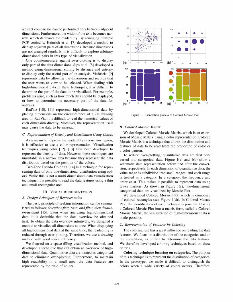
Figure 1. Generation process of Colored Mosaic Plot
B. Colored Mosaic Matrix
We developed Colored Mosaic Matrix, which is an exten-
sion of Mosaic Matrix using a color representation. Colored
Mosaic Matrix is a technique that allows the distribution and
features of data to be read from the proportion of color or
a color pattern.
To reduce over-plotting, quantitative data are first con-
verted into categorical data. Figure 1(a) and 1(b) show a
schematic data representation before and after the conver-
sion, respectively. In each dimension of quantitative data, the
value range is subdivided into small ranges, and each range
is treated as a category. In a category, the frequency and
order exist. This makes it possible to represent data using
fewer markers. As shown in Figure 1(c), two-dimensional
categorical data are visualized by Mosaic Plot.
We developed Colored Mosaic Plot, which is composed
of colored rectangles (see Figure 1(d)). In Colored Mosaic
Plot, the identification of each rectangle is possible. Placing
a Colored Mosaic Plot into a matrix form, called a Colored
Mosaic Matrix, the visualization of high-dimensional data is
made possible.
C. Representation of Features by Coloring
The coloring rule has a great influence on reading the data
features. We focus on a distribution of the categories and on
the correlation, as criteria to determine the data features.
We therefore developed coloring techniques based on these
criteria.
Coloring technique focusing on categories. The purpose
of this technique is to represent the distribution of categories.
In the prototype, we made it difficult to distinguish the
colors when a wide variety of colors occurs. Therefore,
376376376379379379379
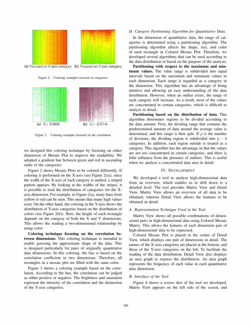
Figure 2. Coloring examples focused on categories
Figure 3. Coloring examples focused on the correlation
we designed this coloring technique by focusing on either
dimension of Mosaic Plot to improve the readability. We
adopted a gradient hue between green and red in ascending
order of the categories.
Figure 2 shows Mosaic Plots to be colored differently. If
coloring is performed on the X-axis (see Figure 2(a)), since
the width of the X-axis of each category is unified, a striped
pattern appears. By looking at the widths of the stripes, it
is possible to read the distribution of categories for the X-
axis dimension. For example, in Figure 2(a), many hues from
yellow to red can be seen. This means that many high values
exist. On the other hand, the coloring in the Y-axis shows the
distribution of Y-axis categories based on the distribution of
colors (see Figure 2(b)). Here, the height of each rectangle
depends on the category of both the X and Y dimensions.
This allows the reading a two-dimensional relationship by
using color.
Coloring technique focusing on the correlation be-tween dimensions. This coloring technique is intended to
enable guessing the approximate shape of the data. This
is designed particularly for pairs of originally quantitative
data dimensions. In this coloring, the hue is based on the
correlation coefficient in two dimensions. Therefore, all
rectangles in a mosaic plot are filled with the same color.
Figure 3 shows a coloring example based on the corre-
lation. According to the hue, the correlation can be judged
as either positive or negative. The brightness and saturation
represent the intensity of the correlation and the distinction
of the Y-axis categories.
D. Category Partitioning Algorithm for Quantitative Data.
In the dimension of quantitative data, the range of cat-
egories is determined using a partitioning algorithm. The
partitioning algorithm affects the shape, size, and color
of each rectangle in Colored Mosaic Plot. Therefore, we
developed several algorithms that can be used according to
the data distribution or based on the purpose of the analysis.
Partitioning with respect to the maximum and min-imum values. The value range is subdivided into equal
intervals based on the maximum and minimum values in
each dimension. Each range is regarded as a category in
the dimension. This algorithm has an advantage of being
intuitive and allowing an easy understanding of the data
distribution. However, when an outlier exists, the range of
each category will increase. As a result, most of the values
are concentrated in certain categories, which is difficult to
analyze in detail.
Partitioning based on the distribution of data. This
algorithm determines regions to be divided according to
the data amount. First, the dividing range that contains the
predetermined amount of data around the average value is
determined, and this range is then split. If p is the number
of divisions, the dividing region is subdivided into p − 2categories. In addition, each region outside is treated as a
category. This algorithm has the advantage in that the values
are not too concentrated in certain categories, and there is
little influence from the presence of outliers. This is useful
when we analyze a concentrated data area in detail.
IV. DEVELOPMENT
We developed a tool to analyze high-dimensional data
from an overview, which enables us to drill down to a
detailed level. The tool provides Matrix View and Detail
View. Matrix View allows an overview of all data to be
obtained, whereas Detail View allows the features to be
obtained in detail.
A. Representation Technique Used in the Tool
Matrix View shows all possible combinations of dimen-
sional pairs in high-dimensional data using Colored Mosaic
Matrix. This allows the features of each dimension pair of
high-dimensional data to be expressed.
Colored Mosaic Plot is placed in the center of Detail
View, which displays one pair of dimensions in detail. The
names of the X-axis categories are placed at the bottom, and
those of the Y-axis categories on the left. To facilitate the
reading of the data distribution, Detail View also displays
an area graph to express the distribution. An area graph
represents the frequency of each value in each quantitative
data dimension.
B. Interface of the Tool
Figure 4 shows a screen shot of the tool we developed.
Matrix View appears on the left side of the screen, and
377377377380380380380
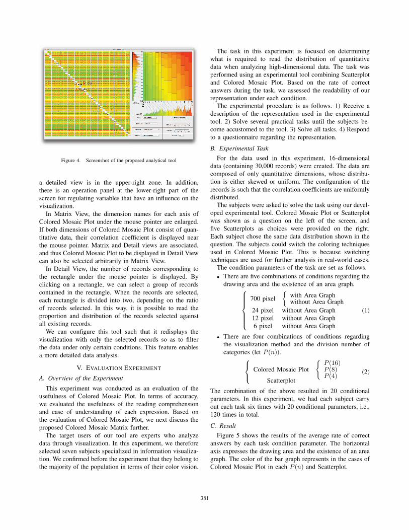
Figure 4. Screenshot of the proposed analytical tool
a detailed view is in the upper-right zone. In addition,
there is an operation panel at the lower-right part of the
screen for regulating variables that have an influence on the
visualization.
In Matrix View, the dimension names for each axis of
Colored Mosaic Plot under the mouse pointer are enlarged.
If both dimensions of Colored Mosaic Plot consist of quan-
titative data, their correlation coefficient is displayed near
the mouse pointer. Matrix and Detail views are associated,
and thus Colored Mosaic Plot to be displayed in Detail View
can also be selected arbitrarily in Matrix View.
In Detail View, the number of records corresponding to
the rectangle under the mouse pointer is displayed. By
clicking on a rectangle, we can select a group of records
contained in the rectangle. When the records are selected,
each rectangle is divided into two, depending on the ratio
of records selected. In this way, it is possible to read the
proportion and distribution of the records selected against
all existing records.
We can configure this tool such that it redisplays the
visualization with only the selected records so as to filter
the data under only certain conditions. This feature enables
a more detailed data analysis.
V. EVALUATION EXPERIMENT
A. Overview of the Experiment
This experiment was conducted as an evaluation of the
usefulness of Colored Mosaic Plot. In terms of accuracy,
we evaluated the usefulness of the reading comprehension
and ease of understanding of each expression. Based on
the evaluation of Colored Mosaic Plot, we next discuss the
proposed Colored Mosaic Matrix further.
The target users of our tool are experts who analyze
data through visualization. In this experiment, we therefore
selected seven subjects specialized in information visualiza-
tion. We confirmed before the experiment that they belong to
the majority of the population in terms of their color vision.
The task in this experiment is focused on determining
what is required to read the distribution of quantitative
data when analyzing high-dimensional data. The task was
performed using an experimental tool combining Scatterplot
and Colored Mosaic Plot. Based on the rate of correct
answers during the task, we assessed the readability of our
representation under each condition.The experimental procedure is as follows. 1) Receive a
description of the representation used in the experimental
tool. 2) Solve several practical tasks until the subjects be-
come accustomed to the tool. 3) Solve all tasks. 4) Respond
to a questionnaire regarding the representation.
B. Experimental TaskFor the data used in this experiment, 16-dimensional
data (containing 30,000 records) were created. The data are
composed of only quantitative dimensions, whose distribu-
tion is either skewed or uniform. The configuration of the
records is such that the correlation coefficients are uniformly
distributed.The subjects were asked to solve the task using our devel-
oped experimental tool. Colored Mosaic Plot or Scatterplot
was shown as a question on the left of the screen, and
five Scatterplots as choices were provided on the right.
Each subject chose the same data distribution shown in the
question. The subjects could switch the coloring techniques
used in Colored Mosaic Plot. This is because switching
techniques are used for further analysis in real-world cases.The condition parameters of the task are set as follows.
• There are five combinations of conditions regarding the
drawing area and the existence of an area graph.⎧⎪⎪⎪⎪⎨⎪⎪⎪⎪⎩
700 pixel
{with Area Graphwithout Area Graph
24 pixel without Area Graph
12 pixel without Area Graph
6 pixel without Area Graph
(1)
• There are four combinations of conditions regarding
the visualization method and the division number of
categories (let P (n)).⎧⎨⎩ Colored Mosaic Plot
{P (16)P (8)P (4)
Scatterplot
(2)
The combination of the above resulted in 20 conditional
parameters. In this experiment, we had each subject carry
out each task six times with 20 conditional parameters, i.e.,
120 times in total.
C. ResultFigure 5 shows the results of the average rate of correct
answers by each task condition parameter. The horizontal
axis expresses the drawing area and the existence of an area
graph. The color of the bar graph represents in the cases of
Colored Mosaic Plot in each P (n) and Scatterplot.
378378378381381381381
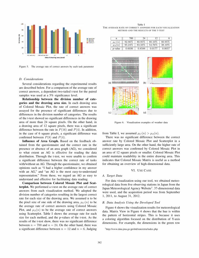
Figure 5. The average rate of correct answers by each task parameter
D. Considerations
Several considerations regarding the experimental results
are described below. For a comparison of the average rate of
correct answers, a dependent two-tailed t-test for the paired
samples was used at a 5% significance level.
Relationship between the division number of cate-gories and the drawing area size. In each drawing area
of Colored Mosaic Plot, the rate of correct answers was
assayed for the presence of significant differences due to
differences in the division number of categories. The results
of the t-test showed no significant differences in the drawing
area of more than 24 square pixels. On the other hand, in
a drawing area of 12 square pixels, there was a significant
difference between the rate in P (16) and P (4). In addition,
in the case of 6 square pixels, a significant difference was
confirmed between P (8) and P (4).Influence of Area Graph. Based on the feedback ob-
tained from the questionnaire and the correct rate in the
presence or absence of an area graph (AG), we considered
to what extent an AG is effective for reading the data
distribution. Through the t-test, we were unable to confirm
a significant difference between the correct rate of tasks
with/without an AG. Through the questionnaire, we obtained
opinions such as “I had a higher confidence in my answer
with an AG,” and “an AG is the most easy-to-understand
representation.” From these, we regard an AG as easy to
understand and effective for facilitating data reading.
Comparison between Colored Mosaic Plot and Scat-terplot. We performed a t-test on the average rate of correct
answers from each visualization method. We adopted the
division number of categories resulting in the largest correct
rate for each size of the drawing area. We assumed n to be
the pixel size of one side of the drawing area, μC(n) to be
the average rate of correct answers using Colored Mosaic
Plot, and μS(n) to be the average rate of correct answers
using Scatterplot. Table I shows the average rate for each
size for each method, and the p-values of the t-test. As the
results of the t-test show, there was no significant difference
between n = 700 and n = 24. On the other hand, there was
a significant difference between n = 12 and n = 6. Judging
Table ITHE AVERAGE RATE OF CORRECT ANSWERS FOR EACH VISUALIZATION
METHOD AND THE RESULTS OF THE T-TEST
n 700 24 12 6
μC(n) 92.86% 80.95% 88.10% 80.95%μS(n) 95.24% 83.33% 54.76% 38.10%
p-value 0.6036 0.8588 0.0177 0.0057
Figure 6. Visualization examples of weather data
from Table I, we assumed μC(n) > μS(n).There was no significant difference between the correct
answer rate by Colored Mosaic Plot and Scatterplot in a
sufficiently large area. On the other hand, the higher rate of
correct answers was confirmed by Colored Mosaic Plot in
an area of 12 square pixels or smaller. Colored Mosaic Plot
could maintain readability in the entire drawing area. This
indicates that Colored Mosaic Matrix is useful as a method
for obtaining an overview of high-dimensional data.
VI. USE CASE
A. Target Data
For data visualization using our tool, we obtained meteo-
rological data from five observing stations in Japan from the
Japan Meteorological Agency Website1. 37-dimensional data
were used, and the acquisition period was from September
1, 2011, to August 31, 2012.
B. Data Analysis Using the Developed Tool
Figure 4 shows the visualization results for meteorological
data. Matrix View in Figure 4 shows that the hue is within
the pattern of horizontal stripes. This is because it uses
a coloring algorithm focused on the distribution of Y-axis
dimensions. For example, the dimensions in the green row
1http://www.data.jma.go.jp/obd/stats/etrn/index.php
379379379382382382382
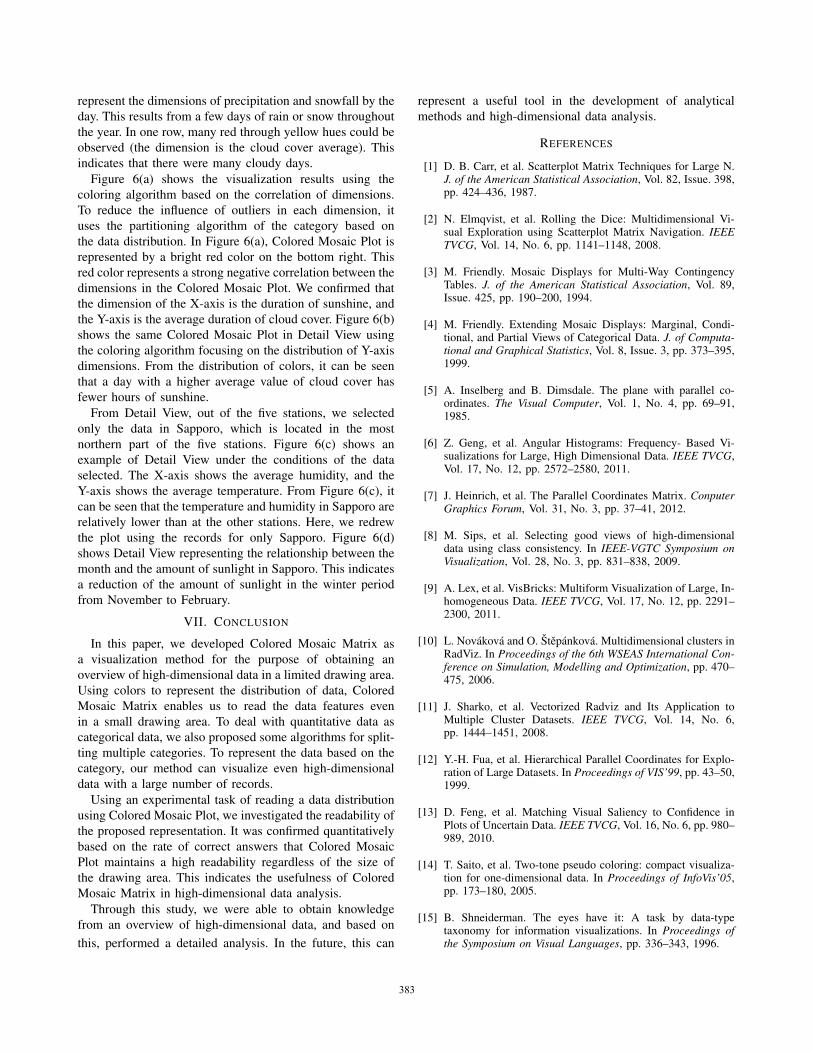
represent the dimensions of precipitation and snowfall by the
day. This results from a few days of rain or snow throughout
the year. In one row, many red through yellow hues could be
observed (the dimension is the cloud cover average). This
indicates that there were many cloudy days.
Figure 6(a) shows the visualization results using the
coloring algorithm based on the correlation of dimensions.
To reduce the influence of outliers in each dimension, it
uses the partitioning algorithm of the category based on
the data distribution. In Figure 6(a), Colored Mosaic Plot is
represented by a bright red color on the bottom right. This
red color represents a strong negative correlation between the
dimensions in the Colored Mosaic Plot. We confirmed that
the dimension of the X-axis is the duration of sunshine, and
the Y-axis is the average duration of cloud cover. Figure 6(b)
shows the same Colored Mosaic Plot in Detail View using
the coloring algorithm focusing on the distribution of Y-axis
dimensions. From the distribution of colors, it can be seen
that a day with a higher average value of cloud cover has
fewer hours of sunshine.
From Detail View, out of the five stations, we selected
only the data in Sapporo, which is located in the most
northern part of the five stations. Figure 6(c) shows an
example of Detail View under the conditions of the data
selected. The X-axis shows the average humidity, and the
Y-axis shows the average temperature. From Figure 6(c), it
can be seen that the temperature and humidity in Sapporo are
relatively lower than at the other stations. Here, we redrew
the plot using the records for only Sapporo. Figure 6(d)
shows Detail View representing the relationship between the
month and the amount of sunlight in Sapporo. This indicates
a reduction of the amount of sunlight in the winter period
from November to February.
VII. CONCLUSION
In this paper, we developed Colored Mosaic Matrix as
a visualization method for the purpose of obtaining an
overview of high-dimensional data in a limited drawing area.
Using colors to represent the distribution of data, Colored
Mosaic Matrix enables us to read the data features even
in a small drawing area. To deal with quantitative data as
categorical data, we also proposed some algorithms for split-
ting multiple categories. To represent the data based on the
category, our method can visualize even high-dimensional
data with a large number of records.
Using an experimental task of reading a data distribution
using Colored Mosaic Plot, we investigated the readability of
the proposed representation. It was confirmed quantitatively
based on the rate of correct answers that Colored Mosaic
Plot maintains a high readability regardless of the size of
the drawing area. This indicates the usefulness of Colored
Mosaic Matrix in high-dimensional data analysis.
Through this study, we were able to obtain knowledge
from an overview of high-dimensional data, and based on
this, performed a detailed analysis. In the future, this can
represent a useful tool in the development of analytical
methods and high-dimensional data analysis.
REFERENCES
[1] D. B. Carr, et al. Scatterplot Matrix Techniques for Large N.J. of the American Statistical Association, Vol. 82, Issue. 398,pp. 424–436, 1987.
[2] N. Elmqvist, et al. Rolling the Dice: Multidimensional Vi-sual Exploration using Scatterplot Matrix Navigation. IEEETVCG, Vol. 14, No. 6, pp. 1141–1148, 2008.
[3] M. Friendly. Mosaic Displays for Multi-Way ContingencyTables. J. of the American Statistical Association, Vol. 89,Issue. 425, pp. 190–200, 1994.
[4] M. Friendly. Extending Mosaic Displays: Marginal, Condi-tional, and Partial Views of Categorical Data. J. of Computa-tional and Graphical Statistics, Vol. 8, Issue. 3, pp. 373–395,1999.
[5] A. Inselberg and B. Dimsdale. The plane with parallel co-ordinates. The Visual Computer, Vol. 1, No. 4, pp. 69–91,1985.
[6] Z. Geng, et al. Angular Histograms: Frequency- Based Vi-sualizations for Large, High Dimensional Data. IEEE TVCG,Vol. 17, No. 12, pp. 2572–2580, 2011.
[7] J. Heinrich, et al. The Parallel Coordinates Matrix. ConputerGraphics Forum, Vol. 31, No. 3, pp. 37–41, 2012.
[8] M. Sips, et al. Selecting good views of high-dimensionaldata using class consistency. In IEEE-VGTC Symposium onVisualization, Vol. 28, No. 3, pp. 831–838, 2009.
[9] A. Lex, et al. VisBricks: Multiform Visualization of Large, In-homogeneous Data. IEEE TVCG, Vol. 17, No. 12, pp. 2291–2300, 2011.
[10] L. Novakova and O. Stepankova. Multidimensional clusters inRadViz. In Proceedings of the 6th WSEAS International Con-ference on Simulation, Modelling and Optimization, pp. 470–475, 2006.
[11] J. Sharko, et al. Vectorized Radviz and Its Application toMultiple Cluster Datasets. IEEE TVCG, Vol. 14, No. 6,pp. 1444–1451, 2008.
[12] Y.-H. Fua, et al. Hierarchical Parallel Coordinates for Explo-ration of Large Datasets. In Proceedings of VIS’99, pp. 43–50,1999.
[13] D. Feng, et al. Matching Visual Saliency to Confidence inPlots of Uncertain Data. IEEE TVCG, Vol. 16, No. 6, pp. 980–989, 2010.
[14] T. Saito, et al. Two-tone pseudo coloring: compact visualiza-tion for one-dimensional data. In Proceedings of InfoVis’05,pp. 173–180, 2005.
[15] B. Shneiderman. The eyes have it: A task by data-typetaxonomy for information visualizations. In Proceedings ofthe Symposium on Visual Languages, pp. 336–343, 1996.
380380380383383383383
Recommended