Embed Size (px)
Citation preview
Page 1balsamiqcomlearnbalsamiqcomlearn
Page 2balsamiqcomlearn
Introduction to User Interface Design ThroughWireframes
This easy-to-follow guide will give you the confidence to talk about review and start designing user interfaces
It teaches foundational UI concepts and shows you how UI profes-sionals create effective wireframes
It is intended for Product Managers Entrepreneurs and other non-designers who want to feel comfortable in the world of UI de-sign
-The Balsamiq Education Team
balsamiqcomlearn
Table of Contents
What is UI Design 1UI design layer 1 Controls 4
UI design layer 2 Patterns 6
UI design layer 3 Design principles 8
UI design layer 4 Templates 10
The cooking analogy 11
Intro to UI Controls 13Button Guidelines 19
Text Input Guidelines 24
Dropdown Menu (Combo Box) Guidelines 29
Radio Button and Checkbox Guidelines 34
Link Guidelines 40
Tab Guidelines 46
Breadcrumb Guidelines 51
Vertical Navigation Guidelines 55
Menu Bar Guidelines 60
Accordion Guidelines 66
Validation Guidelines 72
Tooltip Guidelines 76
Alert Guidelines 81
balsamiqcomlearn
Data Table Guidelines 86
Icon Guidelines 93
Intro to UI Design Patterns 98
Visual Design Principles 109Why use design principles 112
Contrast 112
Hierarchy 117
Proximity 122
Alignment 128
UI Design Templates 135Importing templates 137
Selecting the screens you need 138
Modifying pre-made screens 141
Closing thoughts 143
An Opinionated Guide to Creating Software 145Step 1 Gather requirements 147
Step 2 Sketch out ideas 151
Step 3 Submit your proposals to the core group 154
Step 4 Incorporate feedback into wireframes 156
Step 5 Pitch to the larger group 158
Step 6 Make a high fidelity prototype 159
balsamiqcomlearn
Step 7 Work closely with developers 161
Step 8 Help with testing deployment and marketing 162
Step 9 Monitor how itrsquos received 162
Closing thoughts on process 163
Page 1balsamiqcomlearn
What is UI Design1
Page 2balsamiqcomlearn
1 What is UI Design
What is UI Design
User Interface Design is the craft and process ofdesigning what a user interacts with whencommunicating with software Wersquoll look at common aspects of this process including how to apply design principles and interface conventions
User interface design is surprisingly hard to define The crowd-sourced (ie Wikipedia) definition seems to essentially say ldquouser in-terface design is the design of software user interfacesrdquo which isnrsquot very enlightening
A better way to define it is through the process of deconstructing a user interface into the areas that a UI designer is concerned with
As wersquoll see good UI design doesnrsquot happen by accident
There are actually multiple layers of UI design and multiple lenses that a UI designer looks through when creating a user interface
Page 3balsamiqcomlearn
1 What is UI Design
Here is a typical user interface on a web site There are slightly dif-ferent UI considerations for web mobile desktop and other types of software but generally speaking they are all software and the following concepts apply to all of them
So letrsquos begin by stepping into the shoes of a UI designer to see how they might approach this website UI
Page 4balsamiqcomlearn
1 What is UI Design
UI design layer 1 Controls
Before diving into the Controls layer letrsquos simplify the page above by viewing it as a wireframe
Now letrsquos look at some of the UI Controls that were used to build this page
Page 5balsamiqcomlearn
1 What is UI Design
User interface controls (also known as elements components and ldquowidgetsrdquo) are individual pieces of a user interface that perform a single function Some examples are links buttons and icons Even plain text can be considered a control since its function is to de-scribe or label something within the user interface
Each one of these controls was selected for a specific reasonUI design is concerned with the process and rationale of choosing controls
Read more about controls in Intro to UI Controls
Page 6balsamiqcomlearn
1 What is UI Design
UI design layer 2 Patterns
We can further simplify this page by decreasing the fidelity of our wireframe to abstract away the individual controls like this
Now letrsquos think about the groups of controls and what purpose they serve as units within the page A UI Pattern is a group of controls that function to solve a particular problem Letrsquos look at some of the patterns on this page
Page 7balsamiqcomlearn
1 What is UI Design
It can be useful to consider this layer of UI design even before mov-ing on to the level of controls as each pattern can meet its goals in different ways and using different controls
Read more about patterns in Intro to UI Design Patterns
UI design layer 3 Design principles
The most commonly understood definition of UI design is the visu-al design layer But even this is more purposeful than most people understand Visual design isnrsquot merely ldquomaking it look prettyrdquo A bet-ter way to think of it is as the application of established visual de-sign principles many of which are rooted in scientific psychological neurological or physiological understanding
The specific principles wersquoll cover in this course are Contrast Hier-archy Proximity and Alignment
One way that UI designers evaluate design principles is using the ldquosquint testrdquo which helps to further abstract the design into its vi-sual principles An alternative is to blur the screen
Page 8
1 What is UI Design
Page 9balsamiqcomlearn
1 What is UI Design
Either way the goal is to take your attention away from the content in order to focus on the visual effects and techniques
Read more about design principles in Visual Design Principles
Page 10
1 What is UI Design
UI design layer 4 Templates
Finally looking at this site as a whole we can view this page as an instance of a template that can be reused across the site rather than a single page that was designed for this particular article of clothing For a site or product that can have dozens or even thou-sands of screens it is useful both from the designerdeveloper and the end-user perspectives to have screens that behave predictably and look similar across the entire application
The example wersquove been looking at so far could be described as a ldquoproduct detail viewrdquo template that would look very similar when any other product is viewed
Another UI template is the category template shown here
Page 11balsamiqcomlearn
1 What is UI Design
Other templates for this site might include one for checking out and purchasing and another for search results While every product may use different types of templates all software types can benefit from a template-based approach to design
Read more about templates in UI Design Templates
The cooking analogy
In cooking therersquos a term called mise en place which refers to the practice of putting ldquoeverything in its placerdquo so that when the time comes to cook you can automatically find what you need in the place you expect it to be
The same will be true of the controls and patterns you use once yoursquove familiarized yourself with them In Balsamiq yoursquoll find the ingredients (the controls) in your UI Library You may find the recipes (design patterns) in Wireframes to Go or yoursquoll build your own pat-terns for your ecosystem
Once wersquove learned how to put together the pieces we can create more complete solutions (using design principles and templates) We have some good awareness of ingredients we have an under-standing of our recipes These fast become a toolset for our culinary work
Page 12balsamiqcomlearn
1 What is UI Design
Finally for a restaurant to be successful it must figure out how to prepare food that comes out on time in the right order at the right temperature and that is consistent across visits (the process)
Learn about the UI design process in our Opinionated Guide to Creating Software
Therersquos a lot to learn but wersquore not going to go too deep in this course If successful it will give you just enough to feel comfortable designing or reviewing user interfaces in your own work And hope-fully have a little fun along the way
Ready Letrsquos start with the ingredients (the UI controls)
Page 13balsamiqcomlearn
Intro to UI Controls2
Page 14balsamiqcomlearn
2 Intro to UI Controls
Intro to UI Controls
User interface (UI) controls are the building blocks of any software interface Using them intelligently can guide users through your product as you intend by making it feel familiar and learnable even if they have never used it before
Becoming familiar with them as a user interface designer is essen-tial for a good user experience Many new designers get stuck trying to decide whether to use a checkbox or a radio button on a form for example or how many navigation tabs on a screen is too many Thatrsquos what this section is all about
Fortunately best practices and guidelines for user interface con-trols are well established through years (often decades) of research and practice In the next few articles wersquoll introduce the most com-mon user interface control types describe when and how to use them and show examples and variations that will make you feel comfortable choosing and using them in your own designs
UI controls are like the ingredients in a recipe Learn their unique flavors and characteristics and you can improvise customize and substitute to meet your needs (or those of your specific users) Get to know them well enough and you can start creating your own rec-ipes (design patterns) from scratch
Page 15balsamiqcomlearn
Below is the list of UI controls that wersquoll be learning about Roughly speaking they can be grouped as follows those that accept input such as the controls yoursquod find on a form navigation controls which allow users to move around in your app or site and output controls which communicate information to the user
A button is used to execute an action Designing buttons may seem obvious but they are surprisingly complex and there are a few tricky things to look out for
Text input fields allow keyboard input from the user They are fre-quently used with other types of input controls in a form but can be used on their own
A dropdown menu gives you a list of items to select from Whether you call it a Dropdown menu Combo Box Pull Down menu or Pick-er you use them every day
You can also come back to these later and jump to learning about UI Design Patterns next
Button Guidelines
Text Input Guidelines
Dropdown Menu (Combo Box) Guidelines
2 Intro to UI Controls
Page 16balsamiqcomlearn
Radio button and checkbox controls each allow users to select items from a list but with different uses when only a single selection is valid or zero to more
Breadcrumbs are a compact unobtrusive way to show navigation hierarchy They show users where they are and provide an easy way to navigate up multiple levels
Links are the original way of navigating pages on the web and are so common that not adhering to best practices can break the usability of your site or app
Vertical (aka lsquoSidebarrsquo) navigation is a way of showing a site or app structure along one side of them Very common on the web almost standard on mobile
Tabs can be a smart way to break up content into sections but their use is a double-edged sword because they bury other content mak-ing users guess where it is
Radio Button and Checkbox Guidelines
Breadcrumb Guidelines
Link Guidelines
Vertical Navigation Guidelines
Tab Guidelines
2 Intro to UI Controls
Page 17balsamiqcomlearn
Menu bars allow users to navigate using categories and sub-cate-gories They are persistent unchanging across the app and used exclusively for primary navigation
Tooltips are a common form of contextual help and supplementary information They should not be treated as a primary means of help-ing users understand the system
Accordions are stacked containers with nested items that expand and collapse when clicked or tapped They can be used either for navigation or for content
Any UI control that captures the userrsquos attention can be thought of as an alert They should be used wisely and sparingly so they are not overwhelming
Validation is a great way to present feedback or guidance with lim-ited interruption It provides in-context error messages and sug-gests ideas for improvement
Menu Bar Guidelines
Tooltip Guidelines
Accordion Guidelines
Alert Guidelines
Validation Guidelines
2 Intro to UI Controls
Page 18balsamiqcomlearn
Data tables use columns and rows to display related information in a grid They are best used for numerical data and lists of objects of the same type
With icons the power of an image helps users identify things quick-ly and accurately Useful for internationalization and for concepts hard to describe in words
Data Table Guidelines
Icon Guidelines
2 Intro to UI Controls
Page 19balsamiqcomlearn
Button Guidelines
21 Button Guidelines
A button is a control used to execute an action send-ing an email for example Designing buttons may seem obvious but they are surprisingly complex and there are a few tricky things to look out for
According to the book ldquoDesigning Interfacesrdquo buttons should be ldquobig readable obvious and extremely easy to use for even the most inexperienced computer usersrdquo They are best used for important actions
The challenge with buttons is that the more of them you add the less obvious and easy to use each one becomes So use them wisely and deliberately
Letrsquos look at an example
When to use buttons
Page 20balsamiqcomlearn
21 Button Guidelines
There are many elements on this page including several actions the user can perform But there are only 3 buttons used for the most consequential actions Buy It Now Add to Cart and Sell now
bull Set the button that a user is highly likely to select as the default (primary)1
bull Avoid using a button to mimic the behavior of other controls1
bull Use enough space between buttons so that users can click a specific one easily1
bull Avoid displaying an image in a standard button1
How to use buttons
Page 21balsamiqcomlearn
21 Button Guidelines
bull Use a verb or verb phrase and title-style capitalization for the button text1
bull Add an ellipsis to the title if the button immediately opens an-other window dialog or app to perform its action1
bull Separate destructive buttons from nondestructive controls1
bull Action should be immediate following a button press1
bull When several buttons are placed next to each other ensure that they have the same width This is particularly important for pairs of Cancel and OK buttons2
bull If pressing a button by mistake could cause a loss of data do not set a default button2
bull Keep labels short so they donrsquot cause a button to use too much space It is also important to consider how labels will change length when localized2
References
1 Apple macOS Human Interface Guidelines
2 GNOME Human Interface Guidelines
Page 22balsamiqcomlearn
21 Button Guidelines
Basic usage
States Variations
bull Icon buttons - Buttons that have an icon accompanying or in place of the text
bull Split Menu buttons - Buttons that can be activated by pressing but also offer a secondary menu of options in a drop-down menu
Note The Balsamiq examples shown above are available to im-port or download from Wireframes to Go Read the instructions for using Wireframes to Go
Page 23balsamiqcomlearn
21 Button Guidelines
Related controls
bull Links
bull Designing for Action Best Practices for Effective Buttons
bull ldquoDesigning Interfacesrdquo by Jenifer Tidwell
bull Google Material Design button guidelines
bull Button UX Design Best Practices Types and States (UX Planet)
bull Buttons in Design Systems (EightShapes)
Further reading
Page 24balsamiqcomlearn
Text Input Guidelines
22 Text Input Guidelines
Text input fields allow keyboard input from the user They are not as simple as they seem
Text input fields are used when requesting free-form input from a user such as a username phone number password or comment They are one of the main components in a form They are also fre-quently used for search comments and chat
Here is an example
They are frequently used in combination with other types of input controls in a form but can be used on their own
When to use text input
Page 25balsamiqcomlearn
22 Text Input Guidelines
It is arguably more important to know when not to use them Fol-lowing the usability heuristic ldquorecognition rather than recallrdquo if you know in advance the list of possible valid entries it is better to use a dropdown menu (combo box) control or other constrained input control to reduce errors and facilitate entry When asking for a coun-try name salutation or payment method for example
The US Web Design System suggests using them only when ldquoyou canrsquot reasonably predict a userrsquos answer to a prompt and there might be wide variability in usersrsquo answersrdquo
Page 26balsamiqcomlearn
22 Text Input Guidelines
bull Ensure that the length of a text input field comfortably accom-modates the length of the expected input1
bull Text fields should indicate their state mdash whether enabled or dis-abled empty or filled valid or invalid mdash with a clear label input and assistive text2
bull Label text should be aligned with the input line and always visi-ble2
bull Label text shouldnrsquot take up multiple lines2
bull Placeholder text (also called hint text) can be used inside the in-put field (see the ldquoWebsiterdquo field below) but it shouldnrsquot take the place of a label in a form since it should disappear when the user starts typing (Also see this note about accessibility of place-holder text)
bull Avoid breaking numbers with distinct sections (such as phone numbers Social Security Numbers or credit card numbers) into separate input fields3 (Try using Input masks or flexible inputs instead)
bull For longer text use a text area control (also called multi-line en-try field) rather than a single line control
How to use text input
References
1 macOS Human Interface Guidelines
2 Google Material Design guidelines
3 US Web Design System
Page 27balsamiqcomlearn
22 Text Input Guidelines
Basic usage
States
Variations
Page 28balsamiqcomlearn
22 Text Input Guidelines
Related controls
bull Dropdown Menu (Combo Box)
bull Jakob Nielsenrsquos 10 Usability Heuristics for User Interface Design
bull US Web Design System Form Controls and Form Templates
bull Forgiving Format Design Pattern
bull ldquoWeb Form Design Filling in the Blanksrdquo by Luke Wroblewski
bull Four Simple Rules for Effective Website Forms
Further reading
Page 29balsamiqcomlearn
Dropdown Menu (Combo Box) Guidelines
23 Dropdown MenuGuidelines
The control with many names A dropdown menu gives you a list of items to select from It is versatile and fa-miliar
Dropdown menus are a great way to present a large number of op-tions without taking up much space on the screen
They can also reduce errors when compared to text input fields be-cause the input is constrained to the options available Weliecom writes ldquoThe user may be familiar with the data but may not know the exact required syntaxrdquo
Whether you call it a Dropdown menu Combo Box (or Combobox) Pull Down menu (or Pull-down menu) Picker Select menu or some-thing else you use them every day
Technically a dropdown menu is different from a combo box A com-bo box is a combination of a dropdown menu and text input (con-fined to a set list of values) It is arguably more usable because you can type all or part of the value you want to select without having to scroll through the entire list of values However the dual nature of combo boxes is not obvious so many users donrsquot know that they can type into them
When to use dropdown menus
Page 30balsamiqcomlearn
23 Dropdown MenuGuidelines
According to the US Web Design Standards the optimal number of items in a dropdown menu is between 7 and 15 It suggests using radio buttons or checkboxes for shorter lists
An exception is when the list is familiar so that users can expect to know the contents before opening it such as days or months of the year statesprovinces or countries
Some drawbacks of dropdown menus are that users canrsquot see all the options at once and it can take time and dexterity to scroll If you have a very long list you can use a combo box or autocomplete text input field instead
Page 31balsamiqcomlearn
23 Dropdown MenuGuidelines
The GNOME Human Interface Guidelines use the following example ldquoif you have an option menu labelled lsquoMonthrsquo with the item lsquoJanuaryrsquo selected the user might reasonably infer that the menu contains the 12 months of the year without having to lookrdquo
bull Order the items logically (eg sequential for datesnumbers al-phabetical for countries)
bull Display a meaningful default selection1 (Note Pre-selecting an item can be dangerous however since you canrsquot verify whether the user chose it deliberately When in doubt default to no selec-tion)
bull Provide relevant choices Longer lists require more time to scan so donrsquot add options you donrsquot expect users to select1
bull Avoid making options in one dropdown menu change based on the input to another Users often donrsquot understand how select-ing an item in one impacts another2
bull Allow users to click anywhere on the control to open it rather than only the arrow
bull Use grouping or categorization when it makes sense (see cat-egorized dropdown variation below) Group headings or sepa-rators should not be selectable however (In HTML this can be achieved using the ltoptgroupgt tag)
How to use dropdown menus
Page 32balsamiqcomlearn
Basic usage
States
Variations
23 Dropdown MenuGuidelines
Page 33balsamiqcomlearn
Related controls
bull Text Input
bull Weliecom interaction design pattern library
bull Autocomplete design pattern (UI Patterns)
bull Dropdowns Design Guidelines (Nielsen Norman Group)
bull HTML Element Reference
Further reading
23 Dropdown MenuGuidelines
References
1 macOS Human Interface Guidelines
2 US Web Design System
Page 34balsamiqcomlearn
Radio Button and Checkbox Guidelines
24 Radio Button and Checkbox Guidelines
Radio button and checkbox controls each allow users to select items from a list Despite that they have dif-ferent uses and guidelines
Like dropdown menus radio buttons and checkboxes are appro-priate when there is a predefined range of selection options The difference between them is that radio buttons are for cases where only a single selection is valid (marital status gender etc) whereas checkboxes support zero or more selections (preferred activities or interests for example)
Unlike dropdown menus radio buttons and checkboxes let users see all options at once This can make selection faster Their prima-ry limitation is the amount of space they take up Because of this the GNOME Human Interface Guidelines recommend no more than ldquoabout 8rdquo choices for a single group
Deciding when to use which one can be challenging so this article explains the differences between them and when and how to use each
When to use radio buttons and checkboxes
Page 35balsamiqcomlearn
24 Radio Button and Checkbox Guidelines
The most difficult scenario for choosing between radio buttons and checkboxes is when there is a binary (eg yesno) choice since ei-ther control could be used The deciding factor should be whether the second choice becomes obvious from the first one In the ex-ample above radio buttons are used for Digital vs Analog in the time options These alternatives are familiar but there could still be some doubt if only one were used with a checkbox The alternative to ldquoShow AMPMrdquo when using a checkbox becomes donrsquot show AMPM which is unambiguous
Page 36balsamiqcomlearn
24 Radio Button and Checkbox Guidelines
bull Use a label to describe the group of choices and a label for each option within it unless it is a single checkbox (see examples be-low)
bull Vertical alignment is easier to read and parse Use horizontal or rectangular alignments only if they greatly improve the layout of the window1
bull These controls shouldnrsquot initiate actions on their own2 Use a button instead
bull Users should be able to clicktap the buttoncheckbox or its label to activate it
bull Be considerate when setting the default selection Avoid dark patterns
bull Always use at least 2 radio buttons together It doesnrsquot make sense to use only one
bull Some guidelines state that one option in a radio button group should always be selected by default If unsure which option that should be add an explicit no choice option (such as ldquoUnsurerdquo ldquoNonerdquo ldquoDecline to Staterdquo)
bull Avoid using negative language in labels as they can be counter-intuitive eg ldquoDonrsquot sign me uprdquo3
How to use radio buttons and checkboxes
Guidelines for both
Guidelines for radio buttons
Guidelines for checkboxes
Page 37balsamiqcomlearn
Basic usage
States
24 Radio Button and Checkbox Guidelines
As with most form controls radio buttons and checkboxes can be disabled as needed One state that is unique to radio buttons and checkboxes is the non-binary indeterminate (also called mixed) state (neither on nor off)
The indeterminate mixed state should only be used ldquoto indicate that an option is set for some but not all child objects [It] must not be used to represent a third staterdquo4
The example below shows all states
Page 38balsamiqcomlearn
Variations
24 Radio Button and Checkbox Guidelines
A scrolling checkbox group can be used when the number of items isnrsquot known in advance or can be customized by the user and space is limited
On mobile radio buttons and checkboxes can look different in order to be optimized for touch On iOS for example check marks can be used for mutually exclusive options instead of radio buttons And checkbox functionality may be indicated by a toggle switch instead
Page 39balsamiqcomlearn
24 Radio Button and Checkbox Guidelines
References
1 GNOME Human Interface Guidelines
2 macOS Human Interface Guidelines
3 US Web Design System
4 KDE Human Interface Guidelines
Related controls
bull Dropdown menus
bull Dark Patterns
Further reading
Page 40balsamiqcomlearn
Link Guidelines
25 Link Guidelines
Hyperlinks continue to be central to navigation on the web such that not adhering to best practices can break the usability of your site or app
Links (originally called ldquohypertext linksrdquo then shortened to ldquohyper-linksrdquo and now typically referred to just as ldquolinksrdquo) are the original way of navigating from one page to another on the web They are ubiquitous on the web and common in web applications and web-like desktop apps
Their strength lies in their simplicity They can be embedded with-in blocks of regular text allowing them to be read in context with-out interrupting the userrsquos flow while also indicating that content related to the linked text is available
Additionally as long as they are implemented correctly they offer the advantage that they donrsquot need much decoration to invite ac-tion (like buttons do)
This is because they are so standard that users expect to be able to click on text that has a distinct color andor is underlined
When to use links
Page 41balsamiqcomlearn
25 Link Guidelines
Wikipedia is a showcase for the use of links
Links can be used within chunks of text to indicate the presence of related content but can also stand on their own to attract more attention such as for primary or secondary navigation as in bread-crumbs menu bars or vertical navigation
Hyperlinks when used to navigate between or within pages or screens are familiar and easy to use (with a mouse or keyboard at least) so they can be used liberally Although having too many re-dundant links on a page can reduce usability
Page 42balsamiqcomlearn
25 Link Guidelines
bull Links should be visually distinct from other items on the page (preferably using color and underlining see exceptions to this rule) and donrsquot use that style for non-clickable items1
bull More than one link style on a page is OK but should be done pur-posefully (eg one style for body text another for header or foot-er text)
bull Use the correct link markup for text that links to another page (ie the HTML ltagt tag) Donrsquot use javascript to perform an action on click
bull Use a different color for visited links2
bull Link text should make sense on its own (eg donrsquot write ldquoclick hererdquo)3
bull Link text should be as succinct as possible4
bull Use link titles (via the HTML ldquotitlerdquo attribute) to help users pre-dict where a link will lead before they click it unless itrsquos obvious5 On the web these can function as tooltips
bull Consider using an outgoing (external) link indicator when linking to pages outside of your domain (see variations below for an ex-ample)6
bull Avoid using text links to trigger actions7 They should be primar-ily used for navigation
bull Ensure sufficient contrast between link colors and their back-ground8
How to use links
Page 43balsamiqcomlearn
Basic usage
States
25 Link Guidelines
bull Default - A normal unvisited link
bull Hover - Occurs when the user mouses over it
bull Active - Occurs the moment it is clicked
bull Visited - A link the user has visited
As described above it is important to have a distinct default link style and a separate style for visited links9 The other link states are ldquoactiverdquo and ldquohoverrdquo But note that hover is not available on mobile devices so donrsquot rely on it
Page 44balsamiqcomlearn
Variations
25 Link Guidelines
It can be helpful to indicate links that go to external sites using a small icon such as the one below
References
1 Nielsen Norman Group
2 Nielsen Norman Group
3 Nielsen Norman Group
4 Moz
5 Nielsen Norman Group
6 Weliecom
7 KDE Human Interface Guidelines
8 US Web Design System
9 CSS Link styles
Related controls
bull Buttons
bull Breadcrumbs
bull Tooltips
Page 45balsamiqcomlearn
25 Link Guidelines
bull The Same Link Twice on the Same Page Do Duplicates Help or Hurt (Nielsen Norman Group)
Further reading
Page 46balsamiqcomlearn
Tab Guidelines
26 Tab Guidelines
Tabs can be a smart way to break up content into sec-tions but their use is a double-edged sword
On the one hand it focuses attention on a subset of content to make the page easier to take in On the other hand it buries other content making users guess where it is or if it even exists It is an example of the MasterDetail screen pattern
In ldquoAbout Face 3 The Essentials of Interaction Designrdquo Alan Cooper says ldquonavigation is exciserdquo mdash meaning that any time a user is re-quired to jump from one page to another it adds a cognitive cost to their experience The authors write ldquothe work that users are forced to do to get around in software and on Web sites is seldom aligned with their needs goals and desiresrdquo and urge designers to minimize the amount of navigation required
Tabs are one of the most popular navigation patterns (along with menu bars and vertical navigation) The biggest advantage of tabs is that they are familiar and often persistent so that even when a user has navigated around in a site or application they donrsquot feel lost
When to use tabs
Page 47balsamiqcomlearn
26 Tab Guidelines
There are a few considerations to keep in mind when using tabs however Such as
bull Only use tabs when there is a limited number of navigation op-tions available (up to 5 on mobile1 less than 7 on desktop2)
bull Tab width is usually determined by the text in each tab so con-sider the impact of localization and font size adjustments
bull Only use tabs ldquoto present closely related peer areas of contentrdquo3 Content separated by tabs should be related in some way and exist at the same level in a hierarchy
bull Avoid using tabs for sequential tasks or ldquowizardsrdquo mdash tabs should be able to be used independently from each other4
bull Avoid using multiple sets of tabs
bull If you do make sure to visually distinguish the second set from the first (see variations below)
bull Put the most important content in the first tab
bull Make sure the controls within a pane (the area that the tab ap-plies to) only affect content in the same pane3
How to use tabs
Page 48balsamiqcomlearn
26 Tab Guidelines
bull You should never have only one tab3
bull Donrsquot wrap tabs to a new line If the tabs wonrsquot fit consider using scrolling or drop-down tabs as shown in the variations below
bull Be wary of using icons alone for tabs Adding text above or below is recommended ldquo[F]or most icons text labels are necessary to communicate meaning and reduce ambiguityrdquo1
bull Consider vertical tabs when the number of horizontal tabs would be too many (or use a different kind of navigation entirely)
Basic usage
States
Page 49balsamiqcomlearn
26 Tab Guidelines
Tabs should have 2 primary states selected and non-selected A hover state can also be used to invite action similar to a button As shown above the selected tab should be visually distinct from the non-selected tabs with the selected tab more prominent (higher contrast) than the others Bold text can be used to emphasize the selected tab
Here are some common tab variations
Tabs often have borders around the content area they refer to but they arenrsquot required
Variations
Page 50balsamiqcomlearn
26 Tab Guidelines
Related controls
Further reading
bull Menu Bars
bull Vertical Navigation
bull 12 Standard Screen Patterns
bull ldquoAbout Face 3 The Essentials of Interaction Designrdquo by Alan Cooper
References
1 Smashing Magazine
2 KDE Human Interface Guidelines
3 macOS Human Interface Guidelines
4 Microsoft Windows Desktop Guidelines
Page 51balsamiqcomlearn
Breadcrumb Guidelines
27 BreadcrumbGuidelines
Breadcrumbs are a compact way to show navigation hierarchy They are unobtrusive and not distracting
They not only show users where they are but provide an easy way to allow them to navigate up multiple levels
They only require a small amount of space and are very familiar to most users The Nielsen Norman Group writes that ldquouser testing shows many benefits and no downsides to breadcrumbs for sec-ondary navigationrdquo
As stated above breadcrumbs are considered secondary navigation meaning that they shouldnrsquot be provided as the only way for users to navigate1 This is because they are not as obvious or noticeable as other navigation methods such as Tabs
When to use breadcrumbs
Page 52balsamiqcomlearn
27 BreadcrumbGuidelines
bull Include the name of the current page as the last item in the breadcrumb but donrsquot link it2 It is generally good practice not to include links to the current page
bull Even though the title of the page may be indicated in the bread-crumb it is good practice to repeat it below as the breadcrumb itself is often small
bull Use a single character to separate the links The most common separators for breadcrumbs are the ldquogtrdquo and ldquordquo characters
bull There is some debate about whether breadcrumbs should show the siteapplication hierarchy or the path that the user has taken (ie more akin to the origin of the name ldquobreadcrumbrdquo) However most guidelines recommend the former where the links show the site hierarchy rather than userrsquos path2
You can use breadcrumbs when there is no visible way to navigate back to the parent page Breadcrumbs are not needed for example with hierarchical vertical navigation such as a tree control because the navigation path is always visible
Breadcrumbs can be preferable to other hierarchical navigation controls when space (especially in the horizontal direction) is con-strained such as on mobile They might not be ideal for very deep hierarchies however where they can become very long See the variations below for how they can be condensed in these cases
How to use breadcrumbs
Page 53balsamiqcomlearn
27 BreadcrumbGuidelines
States
Variations
Breadcrumbs should be constructed from standard links and text and should inherit the same states As with standard links bread-crumb links may have normal hover active and visited states
Condensed Breadcrumbs - You may use this pattern when the number of items exceeds about 5 or as space requires Clicking on the ldquordquo can expand the entire list or only the last few items
Dropdown Breadcrumbs - This is a less common pattern that com-bines breadcrumbs with a vertical menu to allow users to navigate non-linearly It is not standard and should be used sparingly See examples and guidelines for this pattern
bull Place breadcrumbs above the content but not above any prima-ry navigation (such as a horizontal or header menu)1
bull Avoid using multiple sets of breadcrumbs on one page
Page 54balsamiqcomlearn
27 BreadcrumbGuidelines
Related controls
Further reading
bull Dropdown Menu (Combo Box)
bull Links
bull ldquoScotch Eggrdquo Navigation
References
1 KDE Human Interface Guidelines
2 Nielsen Norman Group
Page 55balsamiqcomlearn
Vertical Navigation Guidelines
28 Vertical NavigationGuidelines
Vertical (aka ldquoSidebarrdquo) navigation is a way of show-ing a persistent site or application structure along one side of the product
The macOS Human Interface Guidelines define it by saying ldquoa side-bar typically consists of a table view or outline view that lets people navigate and select items to act upon in the main portion of the windowrdquo
Vertical navigation is used extensively on the web and is becoming much more common almost standard on mobile via the slide-out ldquonavigation drawerrdquo pattern
Vertical navigation like tabs is a member of MasterDetail family of patterns which is described as ldquoideal for creating an efficient user experience by allowing the user to stay in the same screen while navigating between itemsrdquo
When to use vertical navigation
Page 56balsamiqcomlearn
28 Vertical NavigationGuidelines
Unlike tabs vertical navigation is appropriate when the number of categories is not small or is user-customizable (such as folders or tags in an email client) It is considered a ldquosaferdquo navigation pattern because it is familiar flexible and doesnrsquot take up much space It is often used when there is no other obvious choice
One primary reason not to use it is when horizontal space is con-strained This is why many websites (including this page) remove the vertical navigation for small screen sizes replacing it with either breadcrumbs or the popular ldquohamburgerrdquo menu navigation pattern The Material Design guidelines differentiate between 4 distinct variants based on screen size and content standard modal per-manently visible and dismissible
Page 57balsamiqcomlearn
28 Vertical NavigationGuidelines
bull Highlight the selected pageitem in the list It should not be styled as clickable like the other items (even if it behaves the same)
bull Use titles to form logical groupings of related items1
bull Clicking or tapping on category labels should expand or collapse that category rather than linking to its own page
bull Keep the navigation link names short They can be shorter deriv-atives of page titles themselves2
bull Order the list according to what is most useful for the users of your application3
bull Having hierarchical data doesnrsquot mean that you must use a tree view Very often a list view is a simpler yet more powerful choice4
bull In general refrain from exposing more than 2 levels of hierarchy within a sidebar1
bull The sidebar can be on the left or right side of the page but it should be consistent across the application
bull Consider what happens when the sidebar content is longer (tall-er) than the page content Ensure that users can still access the entire list (ie scroll beyond the page contents)
bull Consider replacing the navigation panel with a slide-out panel on small screens or breadcrumbs on desktop displays
How to use vertical navigation
Page 58balsamiqcomlearn
28 Vertical NavigationGuidelines
Basic usage
States
Variations
Like tabs vertical navigation should have a clear selected state usu-ally achieved by making the selected item bold andor highlighted A hover state can also be useful
Page 59balsamiqcomlearn
28 Vertical NavigationGuidelines
Related controls
Further reading
bull Tabs
bull Menu Bars
bull 12 Standard Screen Patterns
bull 10 Sites Doing Vertical Navigation Right
References
1 macOS Human Interface Guidelines
2 US Web Design System
3 GNOME Human Interface Guidelines
4 Microsoft Windows Desktop Guidelines
Page 60balsamiqcomlearn
Menu Bar Guidelines
29 Menu BarGuidelines
Menu bars allow users to navigate using categories and sub-categories They are persistent and unchang-ing across the app
In a desktop application menu bars are the items across the top of the application aka the File menu On the web they reside in the headertop of the page In both cases they can support nested menus or work as stand-alone categories (also called ldquomonocline groupingrdquo or flat structure)
Menu bars are used exclusively for primary navigation (unlike verti-cal navigation or tabs which can also be secondary navigation)
They should be used for categories of the application or site that are meaningful across its entire use provided there are not too many categories If there are too many categories to fit across the page consider vertical navigation instead
When to use menu bars
Page 61balsamiqcomlearn
29 Menu BarGuidelines
The main advantage of menu bars is their persistence ie the fact that they are always accessible This is highlighted in ldquoAbout Face The Essentials of Interaction Designrdquo
Menu bars can contain sub-menus (as shown above) but going any deeper than one level should be avoided if possible because it push-es usersrsquo mental models whereas ldquoorganizing things into a single layer of groups is extremely common and can be found everywhere in your home and officerdquo
Well-designed Web sites make careful use of persistent objects that remain constant throughout the shopping experience especially the top-level navigation bar along the top of the page Not only do these areas provide clear navigational options but their consistent presence and layout also help orient customers
Page 62balsamiqcomlearn
29 Menu BarGuidelines
bull Make menu titles as short as possible without sacrificing clarity Ideally they should be limited to one word
bull Use text not icons for menu titles (One exception is that it is generally acceptable to use a logo or graphic in place of ldquohomerdquo text on the web as shown in the variations below)
bull Disable donrsquot hide unavailable menu items
bull Limit the use depth and length of submenus
bull Assign keyboard shortcuts and display them next to their asso-ciated menu items
bull Use separator lines to create visually distinct groups of related menu items
bull In general place the most frequently used items at the top of a menu
bull Group menu items that initiate related actions
bull Use a checkmark to indicate that something is currently active
How to use menu bars
The macOS Human Interface Guidelines1 provide a comprehensive guide to using menus in desktop applications (many of which apply to websites as well) Some highlights
Page 63balsamiqcomlearn
29 Menu BarGuidelines
Other important menu bar guidelines
bull Donrsquot model your navigation after your agencyrsquos org structure (or your applicationrsquos architectural model) Instead structure it according to the tasks and information your users most fre-quently need to access2
bull Include skip navigation links to allow users with screen readers to bypass long navigation lists2
bull Consider using a ldquomega menurdquo if you have more than 6 links or menu items within a menu (See the variations below for more on mega menus)2
bull Use 9 or fewer top-level categories3
bull For mobile sites and applications menu bars can be collapsed to a slide-out or expandable ldquohamburgerrdquo menu
bull Make sure that the menu items look interactive and have enough visual weight They should invite action4
bull Make menu links big enough to be easily tapped or clicked Pro-vide enough padding and spacing around them so that users donrsquot accidentally click the wrong one4
bull Choose consistency over ldquowowrdquo factor4 Deviate from standards at your own risk
Basic usage
Page 64balsamiqcomlearn
29 Menu BarGuidelines
Variations
To keep the header compact other functions can be merged into the menu bar area such as a search box or important actions (eg sign inout) One term for this is ldquoextended headerrdquo
For more complex hierarchies a ldquomega menurdquo overlay can be used showing multiple columns of sub-categories (or even an additional level of nesting) When using them pay close attention to the imple-mentation details especially around the timing of when the menu is triggered and hidden
Like tabs and vertical navigation menu bars should have a clear se-lected state usually indicated by high-contrast text (or inverting the unselected style) and possibly making it bold A hover state should also be used
States
Page 65balsamiqcomlearn
29 Menu BarGuidelines
Related controls
Further reading
bull Tabs
bull Vertical Navigation
bull ldquoAbout Face The Essentials of Interaction Designrdquo
bull Mega Menus Work Well for Site Navigation (Nielsen Norman Group)
References
1 macOS Human Interface Guidelines
2 US Web Design System
3 KDE Human Interface Guidelines
4 Nielsen Norman Group
Page 66balsamiqcomlearn
Accordion Guidelines
210 AccordionGuidelines
Accordions are stacked containers with nested items that expand and collapse when clicked or tapped
Accordions are an attractive control because they allow a lot of links to be shown in a compact space But they can be less familiar or even intuitive so be careful not to overuse them They can be used either for navigation or for content in contrast to vertical naviga-tion
Other names include expansion panel and expandcollapse control
The book ldquoDesigning Web Interfacesrdquo says that accordions are ldquogood for collapsed modules of content However they should be used sparingly as they have a strong visual stylerdquo
Part of that visual style frequently involves animating the panels as they open and close which can seem like a ldquocoolrdquo effect but often adds unnecessary interaction cost that can be avoided by using a simpler control In that way they are similar to carousel controls which have fallen out of favor for that reason
While accordions are often not the best choice for desktop screens they are more likely to be appropriate on mobile1 like this mobile navigation menu from UX Mastery
When to use accordions
Page 67balsamiqcomlearn
210 AccordionGuidelines
A good reason to use accordions for navigation is when the user may want to see the whole as well as the parts of the navigation hierar-chy One use case is where users may want to explore the site con-tent before committing to a particular section or link In that way they are similar to hierarchical vertical navigation
Accordion ( get it) to the site UI Patterns accordions should only be used for navigation when there are
bull More than 2 main sections on a website each with 2 or more sub-sections
bull Less than 10 main sections
bull Only have two levels to show in the main navigation
Page 68balsamiqcomlearn
210 AccordionGuidelines
As for using accordions for in-page content the US Web Design System suggests that if there is not a lot of content or if users will want to see all content at once donrsquot use an accordion control One valid use case example is a FAQ help page However donrsquot use them only because there is a lot of content The idea that desktop users donrsquot like long pages is considered a myth by many2
In all cases avoid horizontal accordions (where panels are ldquostackedrdquo horizontally) They are unfamiliar and almost always inferior to an-other kind of control
The following are general guidelines that apply to most cases
bull When one panel is clicked it is expanded while other panels are collapsed Only one panel should be open at a time3
How to use accordions
Page 69balsamiqcomlearn
210 AccordionGuidelines
bull Donrsquot open accordion containers on hover Use click or touch be-havior instead4
bull Allow users to click anywhere in the header area to expand or col-lapse the content a larger target is easier to manipulate5
bull Start with the first section open Donrsquot default all to closed
bull Highlight the current panel so the user can distinguish open panel headers form closed panel headers6
bull If animating panels ldquothe animation should be subtle which means that it should last no more than 250msrdquo6
bull Do not mix the accordion with other types of navigation on the same level7
bull If the content of a section wonrsquot fit on the page vertically scroll within the panel rather than scrolling the entire control7
Basic usage
Page 70balsamiqcomlearn
210 AccordionGuidelines
Variations
Variations should be minimized in order to keep consistent with standards One common option is the addition of icons The + and - icons are the most identifiable and familiar Pointed triangles or chevrons can also be used
The icon states should tell the user what will happen when they click8 Ie the plus or expand icon should be shown on collapsed panels rather than indicating that an open panel has been expand-ed
States
Accordions should have a clear selected state for the open panel and if applicable for the selected item within A hover state should also be applied to both
Page 71balsamiqcomlearn
210 AccordionGuidelines
Related controls
Further reading
bull Tabs
bull Vertical Navigation
bull ldquoDesigning Web Interfacesrdquo by Bill Scott and Theresa Neil
bull Interaction Cost (Nielsen Norman Group)
bull Accordions Are Not Always the Answer for Complex Content on Desktops (Nielsen Norman Group)
References
1 Nielsen Norman Group
2 Nielsen Norman Group
3 UI Patterns
4 Designing Web Interfaces
5 US Web Design System
6 Weliecom
7 KDE Human Interface Guidelines
8 Smashing Magazine
Page 72balsamiqcomlearn
Validation Guidelines
211 ValidationGuidelines
Validation is often used as a light-weight alternative to alerts It is a great way to present feedback or guid-ance with limited interruption
Validation is sometimes used in place of or in addition to alerts to provide in-context error messages But itrsquos not just for telling users what they have done wrong It can also be used to tell users when they are doing something right or to suggest ideas for improve-ment (such as password strength)
When to use validation
Validation is often used to help users recover from errors But even better than providing good validation is preventing the need for it in the first place Following text input guidelines can minimize the need for validation
Page 73balsamiqcomlearn
211 ValidationGuidelines
bull Only show error validation messages or styles after a user has interacted with a particular field1
bull Try to validate ldquoon-the-flyrdquo before the form is submitted But if you canrsquot consider adding a notification to summarize feedback at the top of the page when it reloads
bull Donrsquot clear invalid input data unless users arenrsquot able to correct errors easily Doing so allows users to correct mistakes without starting over2
bull Provide guidance on how to fix any errors donrsquot just tell users what they did wrong
bull Follow voice and tone guidelines if you have them (If you donrsquot have your own you can take inspiration from these great exam-ples of voice tone and content guides)
How to use validation
Page 74balsamiqcomlearn
211 ValidationGuidelines
States
Variations
There are generally 3 states for validation components (shown above)
1 Success - Tells users that their entry or selection is valid Not re-quired but can be helpful for new or novice users
2 Warning - Usually indicates that an entry or selection is valid but not recommended A weak password for example
3 Error - The most common form of validation Alerts users to an invalid entry and preferably suggests how they can fix it
The primary way in which validation components vary is in their pre-sentation or styling Color is frequently used although in different ways It should not be the only indicator however because it may not be discernible by color blind users An icon andor help text is often used in addition
Basic usage
Page 75balsamiqcomlearn
211 ValidationGuidelines
Related controls
Further reading
bull Alerts
bull Text Input
bull Preventing User Errors Avoiding Unconscious Slips (Nielsen Norman Group)
bull Voice Tone amp Content Guides (by John Moore Williams)
bull ldquoWeb Form Design Filling in the Blanksrdquo by Luke Wroblewski
References
1 US Web Design System
2 KDE Human Interface Guidelines
Page 76balsamiqcomlearn
Tooltip Guidelines
212 Tooltip Guidelines
Tooltips are a common form of contextual help that leverage the ldquodetails on demandrdquo UX pattern
Tooltips are generally under-used so when in doubt use them (ap-propriately of course the implementation details are critical so make sure to read the next section)
The Microsoft UWP Guidelines have a nice rule of thumb for tooltips ldquoif the information is available elsewhere in the same experience you do not need a tooltiprdquo This means that a button that contains an icon and text shouldnrsquot have a tooltip but a button with an icon alone should as in the example below
They are a great way to help novices without disrupting experienced users A classic use case for tooltips is to show keyboard shortcuts when a user hovers over an action button
In ldquoAbout Face The Essentials of Interaction Designrdquo Alan Cooper calls tooltips ldquoone of the cleverest and most effective user-interface idioms wersquove ever seenrdquo
When to use tooltips
Page 77balsamiqcomlearn
212 Tooltip Guidelines
Here is a typical tooltip example
Tooltips are also handy when a longer explanation can be useful but is impractical for space reasons Another simple heuristic for using tooltips is when a control ldquobenefits from a supplemental description or further informationrdquo1 However tooltips should never be used as a fallback for unclear icons or labels Tooltips are supplementary in-formation and should not be treated as a primary means of helping users understand the system
Finally tooltips are often not shown on mobile devices so donrsquot rely on them or assume that your user will read them
Page 78balsamiqcomlearn
212 Tooltip Guidelines
bull Display tooltips only as the result of user interaction never dis-play them on their own2
bull Only show plain text in a tooltip Avoid formatted text or pic-tures3
bull Donrsquot use the HTML ldquoaltrdquo attribute for tooltips This should only be used as alternative text for accessibility purposes Use the ldquoti-tlerdquo attribute instead
bull Focus on the action a control initiates Start with a verb to tell users what will happen when they click4
bull Keep them short The macOS Human Interface Guidelines4 sug-gest a maximum of 60-75 characters
bull Tooltips should be placed near the object being hovered but should never be placed in a way that interferes with what the user is doing by obscuring the object of interest1
bull If you want them to be available on mobile consider adding small informational buttons for touch screen use (see variations be-low)5
bull Timing is critical If you have control over it follow these guidelines
How to use tooltips
Delay the start of the tooltip so that they arenrsquot constantly popping up as the user moves their mouse across the screen Wait until the user has stopped moving their cursor for about a second6
Show the tooltip for about 10 seconds or until the pointer moves away from the control4
Fade tooltips in and out over ~150ms3
Page 79balsamiqcomlearn
212 Tooltip Guidelines
Basic usage
States
Variations
Tooltip states are simple they are either on or off If they transition between those states it should happen quickly (150ms or less)
Tooltip styles vary greatly although functional variations should be limited since users expect them to behave in a standard way
Some simple variations include
bull Adding a directional arrow pointing to the object the tooltip is describing
bull Using light formatting or visual elements for additional informa-tion
bull Adding an explicit tooltip icon or button This can be helpful for complex or novel interfaces where you expect users to need help or for adding touch behavior on mobile
bull Most operating systems and platforms have built-in tooltip con-trols use them rather than defining your own
Page 80balsamiqcomlearn
212 Tooltip Guidelines
Related controls
Further reading
bull Validation
References
1 UX Planet
2 Microsoft UWP Guidelines
3 Google Material Design guidelines
4 macOS Human Interface Guidelines
5 KDE Human Interface Guidelines
6 ldquoAbout Face The Essentials of Interaction Designrdquo
bull HTML ldquoaltrdquo and ldquotitlerdquo attributes
Page 81balsamiqcomlearn
Alert Guidelines
213 Alert Guidelines
Any UI control that captures the userrsquos attention can be thought of as an alert They should be used wisely so they arenrsquot overwhelming
Every alert guideline says to use alerts sparingly Overwhelming us-ers with alerts dilutes their importance and annoys users The Mic-rosoft Windows Application Design Guidelines suggest when to use alerts this way ldquoDonrsquot overwarn Limit warnings to conditions that involve risk and are immediately relevant actionable not obvious and infrequent Otherwise remove or rephrase the messagerdquo
It lists specific reasons for using alerts such as
bull Awareness
bull Error prevention
bull Imminent problem
bull Risky action confirmation
bull Unintended consequence confirmations
bull Clarifications
For the purposes of this guide alerts are characterized by being in-terruptive and requiring action to proceed unlike notifications or validation messages
When to use alerts
Page 82balsamiqcomlearn
213 Alert Guidelines
Here are some examples
The US Web Design System suggests that when designing forms consider using inline validation instead of (or in addition to) alerts
The macOS Human Interface Guidelines are succinct in their guid-ing principle ldquoWhen an alert is necessary your most important job is to explain the situation clearly and give users a way to handle itrdquo
More specifically
bull Create specific actionable user-centered error messages Users should either perform an action or change their behavior as the result of the message1
bull Use pre-defined or system styles when possible Donrsquot deviate from familiar
How to use alerts
Page 83balsamiqcomlearn
213 Alert Guidelines
bull Generally use 2-button alerts (for dialogs overlays)2
bull Express everything in the userrsquos vocabulary Use clear language free from jargon3
bull The default button name should correspond to the action you describe In particular itrsquos a good idea to avoid using OK for the default button3
bull They should be easy to dismiss when appropriate (eg respond-ing to Escape key or the Close button in a dialog in addition to an explicit dismiss button or link)
bull Refer to your existing style and tone guide if you have one (you can find some inspiration in these voice tone and content guides if you donrsquot) As an example the Microsoft Windows Style and Tone guidelines writes this about using ldquopleaserdquo and ldquosorryrdquo
Basic usage
ldquoUse please whenever its absence would be considered curtrdquo
ldquoUse sorry only in error messages that result in serious prob-lems for the userrdquo
Page 84balsamiqcomlearn
213 Alert Guidelines
States
Variations
Similar to validation messages alerts can be used to communicate errors or provide warnings about potentially destructive actions Unlike validation however alerts should generally not be used for success messages unless it is to notify that an important action has completed
As shown above alerts vary by operating system and platform Most software platforms provide built-in alert components It is best to use default system styles for alerts Some operating systems allow for icons andor color to differentiate states or types of alerts
Page 85balsamiqcomlearn
213 Alert Guidelines
Related controls
Further reading
bull Validation
References
1 KDE Human Interface Guidelines
2 iOS Human Interface Guidelines
3 macOS Human Interface Guidelines
bull Voice Tone amp Content Guides (by John Moore Williams)
bull Microsoft Windows Style and Tone guidelines
Page 86balsamiqcomlearn
Data Table Guidelines
214 Data TableGuidelines
Data tables also called table views tables and data grids use columns and rows to display related infor-mation in a grid
Data tables are best used for numerical data and lists of objects of the same type
Tables are readable and familiar when designed appropriately
For very simple tables the guidelines are easy to follow The chal-lenge comes as the data becomes too much to parse at a glance When you start adding ways to filter sort search and act on the data the waters get a lot muddier
When to use data tables
this is a very
basic HTML data table
Page 87balsamiqcomlearn
214 Data TableGuidelines
Here is a typical numerical data table
Tables like the one below with actions links and buttons are com-mon in enterprise CRM and other business applications
Page 88balsamiqcomlearn
214 Data TableGuidelines
The Google Material Design guidelines suggest that tables should only be used when there are 3 or more columns Side-by-side lists or any other text control can be used for a simple 2-column com-parison
Apple mentions that an outline (aka Tree) view should be used in-stead of a table view for hierarchical data One variation for this sce-nario is a tree table (described below)
bull Use a header row with descriptive titles1
bull Let people click column headings to sort a table view if it pro-vides value1
bull Clicking once on a column heading should apply ldquonaturalrdquo sort order (eg alphabetical smallest number first earliest date first checked items first) and show a down arrow Clicking again should reverse the order and show an up arrow2
bull Alternate row colors for large tables1 This is often referred to as ldquozebra stripingrdquo
bull Checkboxes should accompany each row if the user needs to se-lect or manipulate data3
bull For actions that can only be applied to one row at a time (eg edit view details) standard practice is to provide a link or icon in the last column of the table
bull Use the ltTHEADgt and ltTHgt HTML tags for header rows for ac-cessibility and easier visual styling
bull Left-align text and right-align numbers
How to use data tables
Page 89balsamiqcomlearn
214 Data TableGuidelines
bull If you have numeric data keep the level of precision appropriate The fewer decimals the less time it takes to scan and understand the data
bull Show only the information that users really need to see but pro-vide the ability to dig deeper into details if needed Use Inlays Overlays and tooltips for showing details on the same page with the table to maintain userrsquos flow
bull Consider using floating (ie ldquostickyrdquo) header rows for long tables
bull Provide the ability to search within long tables2
bull Pay attention to display density Having the data too close togeth-er makes it hard to read yet using too much spacing means more scrolling (and more time to find what the reader is looking for) You can give users the option to change the display density (as shown here) but donrsquot use this as an excuse not to pick a good default
bull Pagination is useful for large data sets but donrsquot immediately assume that itrsquos needed Studies have shown that users donrsquot mind scrolling4 in many cases and showing all the information on one page means that users can search and sort more easily to find what theyrsquore looking for
bull If you use pagination make sure to show the total number of pages or results The ability to choose how many rows to show on a page is also useful
bull Actions that users can perform on the data should be placed around the edges of the table (as shown in the example below) Pagination is usually placed at the bottom while filtering sort-ing and multi-row actions are often placed in the top-left andor top-right
Page 90balsamiqcomlearn
214 Data TableGuidelines
Basic usage
States
Variations
Tables donrsquot have states like other UI controls but some have cells which can be changed from read-only to editable In the case of ed-itable cells they should be visually distinct through a lowered bevel or thicker border6
One common variation is the expandable hybrid tabletree view This is used to avoid forcing the user to visit a new page and losing context See the further reading section below for more table varia-tion examples
bull If you provide a way to filter or otherwise limit the data make sure to clearly indicate that a subset of the data is being shown
bull Use color and decoration sparingly It can be useful to highlight unexpected data (such as extremeoutlying values or failed ac-tions) but can detract from overall readability5
Page 91balsamiqcomlearn
214 Data TableGuidelines
These details-on-demand variations should be reserved for com-plex data tables It is overkill for cases where the user is primarily browsing A better choice is to carefully consider which information the user needs to see and provide only that data
Page 92balsamiqcomlearn
214 Data TableGuidelines
Further reading
References
1 macOS Human Interface Guidelines
2 GNOME Human Interface Guidelines
3 Google Material Design guidelines
4 UX Myths
5 A List Apart
6 KDE Human Interface Guidelines
bull ltTHEADgt and ltTHgt HTML tags
bull Design better data tables by Andrew Coyle
bull Web Typography Designing Tables to be Read Not Looked At (A List Apart)
bull Table Filter Design Pattern
Page 93balsamiqcomlearn
215 Icon Guidelines
It is rare that icon use is actively discouraged The biggest danger when using icons is the use of ambiguous or unclear icons which can either mislead the user or conflict with their adjacent label re-sulting in a slower andor more frustrating experience with your product In short bad icons are costly
The GNOME developer guidelines state that choosing the correct icon for each purpose is ldquovital to making sure that your application is usablerdquo They go on to encourage their use though calling them ldquoan essential part of any applicationrdquo and ldquoa crucial part of its iden-tityrdquo
Icons are also a great way to provide redundancy especially for im-portant messages
The KDE visual design group say that icons ldquoconvey meaning that users perceive almost instantaneouslyrdquo They can be also useful for internationalization and when concepts are hard to describe in words
When to use icons
Icon Guidelines
Icons are everywhere both in software and outside of it The power of an image helps users identify things quickly and accurately
Page 94balsamiqcomlearn
215 Icon Guidelines
In the following example there are 3 ways that the error state is conveyed the text itself the color and the icon The icon reinforces the severity of the message
When used correctly icons can speed up a userrsquos interaction with your product enhance its usability and reinforce your brand identi-ty
Page 95balsamiqcomlearn
215 Icon Guidelines
How to use icons
Note The Google Material Design Guidelines differentiate be-tween product icons and system icons Product icons are pri-marily for branding and visual identity purposes An example of a product icon is an application icon on the task bar or home screen The guidelines below apply mostly to system icons which are identifiers for actions or commands
bull Adjust the degree of abstractness according to familiarity of the metaphor1
bull Apply metaphors only once (eg do not use a brush twice for dif-ferent options)1
bull Use arrows only if they can easily be related to spatial features such as PreviousNext in a sequence or UpDown in a hierarchy Avoid using arrows metaphorically (such as for ReplyForward or UndoRedo)1
bull Use consistent rules for placing text next to icons1
bull Icons that lose details when shrunk may need a special version that preserves meaning even at smaller sizes Critical details may become unrecognizable when scaled down1
bull Avoid using text in icon designs it may not scale well to smaller sizes1
bull Follow conventions Donrsquot create new metaphors when familiar ones exist2
Page 96balsamiqcomlearn
215 Icon Guidelines
bull Always accompany icons with text labels unless the icon meta-phors are nearly universally recognized (eg home print search) which is rare3
bull Donrsquot use icons that are commonly associated with a different meaning4
bull Establish color and design rules for icons and apply them con-sistently See the Google Material Design guidelines for a good example
bull Apply tooltips for additional information or when labels arenrsquot used
Icons often have ldquoonrdquo and ldquooffrdquo variants that are used to indicate states when used as buttons A common example is switching be-tween ldquolikingrdquo and ldquounlikingrdquo something Badges can also be over-laid on top of icons to indicate a more complex state5
Basic usage
States
Page 97balsamiqcomlearn
215 Icon Guidelines
Variations
Aside from a simpler version of icons called badges5 most varia-tions in icons come from their look and feel Some are monochro-matic and simple others are bright and intricate They can use a ldquofilledrdquo or ldquooutlinehollowrdquo style6 The most important thing is that they are consistently styled and quick to grasp
Related controls
Further reading
References
1 KDE Human Interface Guidelines
2 GNOME Human Interface Guidelines
3 Nielsen Norman Group
4 Nielsen Norman Group
5 Microsoft UWP Guidelines
6 Todd Wolfson
bull Buttons
bull Tooltips
bull Icon Classification Resemblance Reference and Arbitrary Icons (Nielsen Norman Group)
Page 98balsamiqcomlearn
Intro to UI Design Patterns
3
Page 99balsamiqcomlearn
3 Intro to UI DesignPatterns
Intro to UI Design Patterns
A design pattern is a reusable solution to a common-ly occurring problem As a recipe in cooking provides the ingredients and structure that make up a recog-nizable dish so too does a design pattern provide an identifiable and predictable solution to an interface design problem
The idea of design patterns initially came from architecture and programming where the idea was to optimize solutions that are known to work well within given contexts1 Solutions that emerged frequently enough became recognized as a formula that can be re-used
Structural and behavioral features of a pattern are familiar to users Your team can leverage this knowledge rather than reinventing the wheel to provide greater ease and use of their product Itrsquos good to point out however that while design patterns are useful for inform-ing design decisions around your particular problem you may likely need to modify them around your usersrsquo and businessrsquo needs
Wersquore going to start by taking a look at a design pattern look at a few examples of the pattern in use and deconstruct their imple-mentation Then wersquoll list some common patterns for interface de-sign and you may explore them in depth
Page 100balsamiqcomlearn
3 Intro to UI DesignPatterns
The Cooking AnalogyIn cooking we combine ingredients to prepare a dish Letrsquos say for instance wersquore planning to make a fish taco meal If yoursquore familiar with this dish you know that yoursquoll usually prepare it with a flaky fish like Cod perhaps tortillas different seasonings oil salsa and maybe sliced lime for garnish There are different ways to add to this dish to make it yours but the basic combi-nation of ingredients make a fish taco pretty unmistakable
This is very much like using design patterns We have a gen-eral model for how to create this dish to make it recognizable We can add or subtract from those ingredients and how theyrsquore put together to make it unique
bull Pattern Name (and description)
Design patterns are typically written with a common set of attri-butes that looks something like this
Elements of a design pattern
Design pattern model
A label that provides a clear way to communicate and refer-ence this pattern particularly when discussing it with col-leagues
Page 101balsamiqcomlearn
3 Intro to UI DesignPatterns
bull Problem
Describe what problem this solves and why this pattern ex-ists
bull Context
Describe when to use this solution
bull Solution
How it works
Describe the solution in detail
bull Recommendations
Provide further recommendations
bull Examples
Provide further recommendations
Design pattern model
Letrsquos explore writing a design pattern for a website Shopping Cart component into this model This seems like an obvious description of a very familiar component
While yoursquore reading think about how this compares to other pur-chasing experiences like a one-click purchase or how it compares to a similar purchase of a service like a reservation or booking expe-rience Think about how this might be different on a mobile phone for example
Page 102balsamiqcomlearn
3 Intro to UI DesignPatterns
Pattern Name Shopping Cart for E-commerce Site
Description The Shopping Cart component consists of 1) An ldquoAdd to Cartrdquo button to purchase an item and 2) an accompany-ing cart icon used to indicate that the item is held for purchase and provides a link to view the items and begin checkout
Problem Users want to purchase an item in an e-commerce site
Context of Use Use this pattern when an online store allows browsing items has more than a single item to purchase or re-quires review of order before completing purchase
While shopping on an online store the user may select items to purchase but want to continue browsing and may want to re-view and edit what theyrsquove selected before beginning checkout This is similar to holding items in a shopping cart in the physical world
Solution
Page 103balsamiqcomlearn
3 Intro to UI DesignPatterns
1 Present a button with the product to add the item to a shopping cart
1 When the user has selected the Add to Cart action pro-vide feedback that the item has been added Show the item count increase in a numeric indicator next to the cart icon
2 Optionally show a preview of the cart with the item and the selected options displayed
3 Provide feedback about the next steps for example editing the cart viewing the full cart continuing shopping or be-ginning checkout to complete the purchase
1 Provide a separate Shopping Cart View of the items added to cart so that the user may modify or complete their order
2 Provide actions for editing quantities removing items
3 Provide an action for ldquochecking outrdquo or completing their purchase
1 Viewing Product and Adding an Item to Cart
2 Updating and Previewing Cart
3 Displaying the Shopping Cart
Page 104balsamiqcomlearn
3 Intro to UI DesignPatterns
Recommendations
bull Add to Cart may be presented with options for example a se-lector for quantity selectors for style etc Provide conditional logic if the item requires options to be selected for disable the Add to Cart button if style or size has not been selected
bull Consider a one-click option for signed in users or navigate di-rectly to the checkout process if the store offers a single item for purchase
Examples
bull Nike
bull Shopify
bull Crate and Barrel
Examples
Letrsquos look at 2 of the Shopping Cart examples listed above and go a little further to deconstruct how they solved this specific need and how this reflects the pattern
Wersquoll look at the point where a customer decides to purchase a prod-uct using the Shopping Cart metaphor in 2 sites the Nike Store and Tattly a site that uses Shopify
Page 105balsamiqcomlearn
3 Intro to UI DesignPatterns
In both of these examples the design pattern is based on using the shopping cart as a metaphor for temporarily holding things you are going to purchase
Nikecom cart
Tattly cart which uses Shopify for e-commerce
Comparison
Page 106balsamiqcomlearn
3 Intro to UI DesignPatterns
Therersquos a common iconography thatrsquos been established therersquos usually an indicator of the number of items being held and an as-sumption that the next step is to ldquocheck outrdquo as one would do in the physical world at a store
There are only subtle variations between these experiences
1 Nike provides a nice behavior to preview the cart without leav-ing the product page perhaps making it easier for the user to return to shopping In another site with a similar dialog to Nikersquos Crate and Barrel uses this same idea of previewing the Cart but additionally promotes other products the customer might want to purchase based on whatrsquos in their cart Nike promotes other products on the cart view itself
2 Shopify directs the user to the Cart immediately after adding a product to cart
Page 107balsamiqcomlearn
3 Intro to UI DesignPatterns
In both Nike and Tattly (Shopify) therersquos the same general behavior and structure of the experience Instead of re-creating the experi-ence for the most part both of these sites rely on predictable con-ventions which make up the common shopping cart pattern
Using and creating your own patterns
Itrsquos likely that many of the interfaces you see were probably de-signed with a common design pattern in mind The Cart example is one that is copied often because itrsquos based on an understanding leveraging the recognizability of this pattern It puts users at ease because they have expectations for how online shopping works and it satisfies business needs to make the experience as frictionless as possible while also looking for valuable add on sale opportunities
As you begin to use design patterns remember that while they are great for helping you inform your design decisions when solving a common UI problem theyrsquore not meant to be copied without think-ing about your usersrsquo and productrsquos particular needs
Jennifer Tidwell who wrote an excellent interface design book titled Designing Interfaces gave this word of advice about using patterns in the section called ldquoAbout Patternsrdquo
ldquoThey arenrsquot off-the-shelf components each implementation of a pattern is a little different from every other They arenrsquot simple rules or heuristics either And they wonrsquot walk you through an entire set of design decisionsrdquo
Page 108balsamiqcomlearn
3 Intro to UI DesignPatterns
Yoursquoll find many potential solutions for your own design problem in our Design Pattern and User Interface Galleries You can also find pre-built interfaces for many of these patterns in Wireframes to Go
Further reading
References
More about the origins of design patterns A design pattern in architec-
ture and computer science is a formal way of documenting a solution to a
design problem in a particular field of expertise The idea was introduced
by the architect Christopher Alexander in the field of architecture and has
been adapted for various other disciplines including computer science An
organized collection of design patterns that relate to a particular field is
called a pattern language
1
bull ldquoElements of a Design Patternrdquo by Jared Spool
Page 109balsamiqcomlearn
Visual Design Principles
4
Page 110balsamiqcomlearn
4 Visual DesignPrinciples
Visual Design Principles
Design principles are foundational rules that work well for communicating information so that the user can do something with it whether itrsquos making a decision taking action or just making sense of whatrsquos being conveyed Like patterns they emerge because they have proven to be optimal attributes for the purpose they serve in this case for communicating effectively
The design principles wersquoll be covering are
1 Contrast
2 Hierarchy
3 Proximity
4 Alignment
Until you familiarize yourself with them these principles may seem new to you By labeling and understanding what they are they be-come under your control so you can use them With practice using them will be second nature and theyrsquoll be part of the language you use to communicate information in your interfaces You wonrsquot be able to look around without thinking about them
Page 111balsamiqcomlearn
4 Visual DesignPrinciples
The Cooking AnalogyImagine that you ordered a dish of fish tacos But when it ar-rives at your table you get a tortilla soaked in oil your fish is dry overcooked and served on a separate plate and spices come in a separate bowl Sounds like something yoursquod send back
Separate ingredients donrsquot usually make an interesting dish by themselves The selection preparation and arrangement of parts is what gives those parts form as the dish The tech-niques and style of presentation can also make the dish more appetizing mdash this part is what makes the dish really become an experience
In design we have something like that too and itrsquos based on somewhat universal principles that make communication with design effective1
Wersquore going to consider some basic visual design principles that are helpful for designing interfaces
Wersquove selected 4 principles that yoursquoll get the most benefit from as you begin your practice in interface design There are many more beyond this list but these will give you a good foundation for mak-ing your wireframes more effective
Page 112balsamiqcomlearn
4 Visual DesignPrinciples
Why use design principles
The use of design principles may be unnoticeable at first when wersquore looking at screens or pages in the world You may however start to notice when some of these design principles have not been applied The next time you find it hard to make it through a big form or canrsquot find a button among a sea of controls in a cluttered application think about how applying these design principles might have helped
Well-considered design tends to disappear when it serves its pur-pose in optimizing communication or use It gets out of the way and gets users to goals faster
While you may not be doing the ultimate visual design for your prod-uct some familiarity with design principles goes a long way toward communicating your ideas We may deal less with the rendering of the final interface surface but much of the understanding of what we want to communicate comes from what we explore in interac-tion and information in our wireframes
Now letrsquos look at each principle and learn when and how to use them to communicate in our interface wireframes
Contrast refers to the differences between things
Contrast
Page 113balsamiqcomlearn
4 Visual DesignPrinciples
There are various ways to achieve contrast A common way of add-ing contrast is to make things very different in size Another way is to use contrasting colors
In interface design we use contrast to organize information and di-rect the eye
A wall of text with no contrasting elements to break up the flow can be tiresome to read
Contrasting font sizes and styles can indicate a heading that pre-cedes a section of subordinate text It breaks up the flow and gives the reader visual cues to pause and shift their focus and allows them to process the information in chunks
When to use contrast
Page 114balsamiqcomlearn
4 Visual DesignPrinciples
The example below might be a layout for a website homepage No-tice how typography helps add contrast in the headings
Yoursquoll find examples like this in many traditional Newspapers This is also an example of visual hierarchy which wersquoll talk more about below
We also use contrast to indicate important information
Using different typography or colors can alert users when a warning or crucial message demands attention
A red text block for example might make a user pause before a de-structive action This red dialog contrasts highly against the pale gray background
Page 115balsamiqcomlearn
4 Visual DesignPrinciples
Yoursquoll find examples like this in application design as with the warn-ing that the Google Chrome browser shows if you are about to enter a site that contains malware
Note how well the white text works against the red background Thatrsquos because the white also contrasts highly against the red back-ground
There are some caveats when using color These are less of a con-cern when it comes to wireframes but be aware of some of the is-sues below as you move on to visual design
bull Be careful not to use colors that donrsquot contrast enough because they may be difficult to read
bull Be sure to consider cultural norms when it comes to color
bull Colors have different meanings in different cultures
bull Also be aware that users who have experience color deficiency in their eyesight may also have difficulty recognizing certain colors
Page 116balsamiqcomlearn
4 Visual DesignPrinciples
Contrast works best when things are very different from each oth-er
In the form below all of the text is too similar The headings and labels show little contrast and itrsquos subsequently more work for the user to parse the text to determine where one piece of information ends and another begins
We can add more contrast so that the pieces of information con-trasted with each other
By making the title and headings stand out visually using scale and weight they can be read at a glance before continuing to the inputs below This helps the user get through the information more easily
How to use contrast
Page 117balsamiqcomlearn
4 Visual DesignPrinciples
Certain controls may help you to easily use contrasting text In Bal-samiq a Title control is 40px by default and a text block useful for body text takes your default project setting (around 13 - 16px)
Remembering to use controls that are intentionally made for spe-cific contexts like these will get you in the practice of using contrast effectively
Hierarchy refers to a group of things where items are rank ordered by importance
There are various ways to display hierarchy in a system Typical ex-amples may orient information from most important to least im-portant visually as in this top-down display of a hierarchical tree You see this often in Organizational Charts or Site Maps
Hierarchy
Page 118balsamiqcomlearn
4 Visual DesignPrinciples
We use hierarchy to organize information in a system
Site maps like the tree representation below are typical of how we use hierarchy when organizing screens in website or application de-sign
When to use hierarchy
Page 119balsamiqcomlearn
4 Visual DesignPrinciples
There can also be a hierarchy within individual screens
One relevant use of hierarchy is also shown above in our contrast-ing text examples We used size and scale to draw attention to the most important information on the screen and then used smaller scale typography for body text
We also use hierarchy to help users understand the relationship of content in a system
There are various ways of indicating hierarchy
When we create menus with nested flyout sub-menus as in the ex-ample below wersquore showing a hierarchical listing of functions in an application
Wersquore also using hierarchy when wersquore showing expanded lists of categories and their children as in the next example
Page 120balsamiqcomlearn
4 Visual DesignPrinciples
This might be the type of interface you would show in a shopping site for instance and there are various ways of showing hierarchy in menus
Yoursquoll find examples of hierarchy in software controls like the flyout Menus in your Windows or Mac operating system in the collapsible lists in Windows Explorer or the Mac Finder that look like stairs when expanded and in Breadcrumb menus where parent-child relation-ships are indicated Hierarchy is everywhere
The common way to achieve hierarchy is by visually containing or nesting groups of child information within a parent container
Herersquos an example of a set of pages in a website arranged alphabet-ically Therersquos no sense of relationship between the pages They all appear to be equal in this flat hierarchy
How to use hierarchy
Page 121balsamiqcomlearn
4 Visual DesignPrinciples
By grouping the information into parent-child relationships we can create the menu for the web site below
This is the kind of navigator yoursquoll find in applications for nesting child branches in a program like PowerPoint Keynote or even Bal-samiq
Hierarchy helps users make sense of complex systems
Page 122balsamiqcomlearn
4 Visual DesignPrinciples
There are great examples where hierarchy helps in extensive infor-mation systems On large online stores like Amazon for instance hierarchy is used in navigation to help users drill down to content from broad to smaller categories
And as we also saw in our contrast examples above smaller inter-faces such as forms can also benefit from visually displaying hierar-chy within the screen
By establishing a highly contrasting text style for the headings we indicate the most important parts of the screen content This is also an example of how to use hierarchy in the screen
The Proximity principle is about creating relationship between items by putting them near each other
The reverse is also true Objects that are seen as distant from each other are understood to be unrelated
We know how we perceive relatedness from human psychology This is called the Gestalt principle of grouping We can use this to our ad-vantage in interface design
Proximity
Page 123balsamiqcomlearn
4 Visual DesignPrinciples
When you want to use similarity to help the user proximity can be helpful Grouping items that are similar in function for instance can help them find related actions
This example from an application creates groups of buttons in a toolbar This is a wireframe of the Keynote toolbar The first group-ing is for document-level actions like view zoom and adding new slides the second grouping is for presentation functions the third is for inserting content etc Grouping them this way helps the user to recall buttons that are similar in function with repeated use
When to use proximity
Page 124balsamiqcomlearn
4 Visual DesignPrinciples
When we want sections of content to be clear we can move them apart to show that theyrsquore unrelated
In the website wireframe below notice how there is some import-ant information at the top including some buttons for important actions this site wants users to take Then there is some more im-portant but denser information at the bottom of the screen But then notice the smaller text in the middle separated using border lines This is clearly serving a less crucial function so the site decid-ed to separate it from the other bits
Proximity is useful in this case because it gives the user some help In some cases as in the testimonial block of the wireframe above it might help to make something visible at a glance but then guide them towards the more substantial chunks of info
Page 125balsamiqcomlearn
4 Visual DesignPrinciples
Wersquove seen in the examples above how the use of proximity can help organize the information in your interface
To use proximity effectively make sure yoursquore using enough white space between groups Letrsquos bring back a more fleshed out version of our Customer Information form
With the Opt-in checkbox the submit button and the help tip the form is more densely loaded with information
The contrast we added to headings by making them larger or bold worked to help separate the parts of the form But itrsquos still a lot to get through
How to use proximity
Page 126balsamiqcomlearn
4 Visual DesignPrinciples
Forms can be pretty tedious to fill out so we can do a lot better to make it easier on our users
Herersquos where proximity can really help We can move the groups of related form fields close together and add white space to separate the unrelated groups
This is much easier to take in visually and the user has a clear indi-cation of when theyrsquore done filling out a group of fields so they can pause and work on the next
With time yoursquoll be seeing how the proximity principle is used every-where
Page 127balsamiqcomlearn
4 Visual DesignPrinciples
When yoursquore wondering when the proximity of objects is enough or too little try the squint test Move back from the screen and blur your vision by squinting
If you can detect that the clusters of information are separate while doing this yoursquoll know that proximity is working If the space be-tween seems too little to make the groups recognizable try adding more space between groups
Page 128balsamiqcomlearn
4 Visual DesignPrinciples
The alignment principle is about making it easier for users to pro-cess information by guiding their eyes through aligned objects
When users can scan through information that has a clear line or path for their eyes to travel they intuitively know where to look to take the next action Think of how hard it would be to read a book where all of the text is centered Blocks of texts in books are left aligned so that your eyes automatically return to the beginning of the next line effortlessly We can use alignment this way with more than just text in our interfaces
Alignment
Alignment can and should be used whenever you lay out a screen with information to process Using alignment you can ensure that nothing is placed arbitrarily on the screen
When to use alignment
Page 129balsamiqcomlearn
4 Visual DesignPrinciples
Seemingly arbitrary placement and lack of alignment can lead to unintended consequences In the United States Presidential Elec-tion of 2000 a voting ballot in the state of Florida featured a poorly aligned interface that led to many voters voting for the wrong can-didate
This ballot confused a lot of voters Note how the Democratic candi-date Al Gore is the second on the left side It became apparent that the Reform candidate Pat Buchanan on the right side had gotten many more votes than expected and it is believed that the Dem-ocratic voters punched the second hole registering a vote for Bu-chanan
There are quite a few elements that lead to this confusion The lack of alignment and the multiple border lines and arrows are hard to make sense of
When you need to make the path clear to information you can use alignment This redesigned ballot might have made it more obvious to voters which hole to punch for their candidate
Page 130balsamiqcomlearn
4 Visual DesignPrinciples
When you start to think that everything should be aligned to some-thing on your screen information becomes more clear and easier to use and your interfaces will begin to feel more cohesive
To use alignment we look at everything on our interface and think about how each item relates to the related items around it One exercise you can do is to try to see if each object can align with something else
Letrsquos take one last look at our Customer Information Screen We did a good job at adding contrast and using white space to put related items next to each other But take a look at the screen overlaid with blue and red lines below
How to use alignment
Page 131balsamiqcomlearn
4 Visual DesignPrinciples
The blue lines show objects that have a strong left alignment to other objects But the Red lines show how some of the objects donrsquot align to other objects particularly on the right of the form The form inputs are sized so that they create a ragged right edge that makes the eye jump around on the right compared to the strong left align-ment
We can create a more solid feeling layout that directs the eye down through the form by resizing and laying out objects so that each one aligns with something else
Page 132balsamiqcomlearn
4 Visual DesignPrinciples
Notice the blue lines now All of the objects have a strong left align-ment and most of the objects also have an object they align with on the right side Adding a light hairline in our white space between chunks of the form also helps to create this sense of solid alignment
We even reinforced the sense of movement by using the natural di-rection our eyes take when reading (down and to the right with Left To Right languages) by moving the submit button to the bottom right of the layout
Herersquos what our form looks like without the alignment lines
Page 133balsamiqcomlearn
4 Visual DesignPrinciples
There are a lot of different ways you could have aligned objects out on this form that would work just as well The goal here is to just think about how to help users move forward through the interface to completing whatever the intended task or goal is
In this example we showed how to use all of our base principles to improve one interface When yoursquore working on your own products or websites use this step-by-step approach to see if you can apply the principles to each of your screens You might find it useful to take a screenshot of your work before to compare how much easier it is to use your interface after yoursquove applied the principles
Page 134balsamiqcomlearn
4 Visual DesignPrinciples
Further reading
References
Note that this differs from individual and organizational design principles
Dieter Ramsrsquo 10 Principles for Good Design is one example You can find
more about those at the principlesdesign website
1
bull Robin Williamsrsquo ldquoNon-Designerrsquos Design Bookrdquo written for those new to graphic design describes how to use a set of 4 core prin-ciples when communicating with design The idea of beginning to internalize principles in the beginning of this section comes from her
bull ldquoUniversal Principles of Designrdquo by William Lidwell
Page 135balsamiqcomlearn
UI Design Templates5
Page 136balsamiqcomlearn
5 UI DesignTemplates
UI Design Templates
Yoursquove probably used file templates before A common type is an office document template like a cover letter template in a text editing application
Templates can be great because they provide a starting point for a document with some preset attributes They help you go faster by starting your project from ready-made screens that you can edit
There are a few types of templates for interface design that you might use
bull Solution-Specific mdash Templates may be specific to a type of prob-lem yoursquore solving and provide pages (screens) laid out with a library of controls for typical solutions One example might be a template for creating a Search feature or our previously men-tioned E-Commerce Shopping Cart Solution
bull SystemFramework Specific mdash A template may provide stan-dardized screen layout and Symbols for a particular design framework Some example templates may be for the Bootstrap framework or a design system like Material Design
bull CorporateProduct Specific mdash You may find it useful to create templates that are very specific to your use like a template for your product with Symbols for your style guide
Page 137balsamiqcomlearn
5 UI DesignTemplates
Letrsquos start by seeing how to modify a template By the end of this section you should be able to create your own
Importing templates
In Balsamiq a template is simply a starter project file that you im-port If yoursquore using Balsamiq Cloud add a template via the menu Project gt Import Controls From Wireframes to Go Browse for tem-plates and use the import button to add it into your own projects
Page 138balsamiqcomlearn
5 UI DesignTemplates
Selecting the screens you need
Continuing our example of an online shop letrsquos use an E-Commerce template to design more of the shopping experience Obviously wersquoll want to flesh out our shopping cart flow all the way through confirming the transaction
Below is an overview of the screens that come in this template Your solution may not require all of them Yoursquoll likely have unique user expectations to consider and business rules to meet so yoursquoll mod-ify the experience as necessary pick out the ones you need and dis-card the rest
For our example letrsquos say we want to flesh out the pre-purchase ex-perience on screens like the landing pages Letrsquos use the template to create a landing page for a fictional smartphone app
Page 139balsamiqcomlearn
5 UI DesignTemplates
Page 140balsamiqcomlearn
5 UI DesignTemplates
Page 141balsamiqcomlearn
5 UI DesignTemplates
Modifying pre-made screens
For this example wersquoll modify the generic Landing Page template using our own copy and add some elements for our fictional smart-phone app
When you open a template yoursquoll probably see some placeholder copy as in the example on the left below Simply select and edit each of the place holders
In the wireframe on the right wersquove modified the text we added some wireframed elements to illustrate our product and using our new knowledge of design principles we laid out some of the parts to fit better with our new illustrations and copy
Page 142balsamiqcomlearn
5 UI DesignTemplates
Template with startingsuggestions to design a
landing page
Edit placeholdersto customize
the screen
Pretty simple Hopefully editing a template should seem much fast-er than laying out all of the components from scratch Yoursquoll want to tweak it to suit your needs but itrsquos a good way to start the design discussion with your team
Page 143balsamiqcomlearn
5 UI DesignTemplates
Some templates may also contain Symbols Libraries Our E-Com-merce template has Symbols for the components used on the screens above
The idea behind using Symbols is that you can easily drop in these reusable components that are made specifically for this type of proj-ect You can find out more about Symbols in the Balsamiq Docs
Like design patterns templates serve as a starting point and are usually built on an understanding of what typically works well for a common problem Templates differ from design patterns in that they usually propose a plan for solving a broader scope of problem
Interface designers are known for building systems to make their work efficient Templates are one example of that Once yoursquove be-come adept at working with templates you can start to set up your own systems to make your work go faster If you work in-house on a product team create templates that reflect your organizational style If you work in an agency or designdevelopment shop create templates for the repeatable types of client projects you work on
A note about symbols libraries
Closing thoughts
Page 144balsamiqcomlearn
5 UI DesignTemplates
The Cooking AnalogyLetrsquos step back for a moment and put templates under the lens of our cooking analogy In cooking the orchestration of dishes that work well together create a meal mdash a complete culinary experience Templates are like that Pieces of user interface of-ten go well together to create an entire experience
As you explore your users and their problem more deeply yoursquoll begin to see what parts of the template work for your needs and swap out what doesnrsquot just as you would deviate from a recipe to make it your own
Additional Resources
bull Download the template used in this section E-commerce Tem-plate from Wireframes to Go
bull Landing Page Template and Designing a Landing Page tutorial
Page 145balsamiqcomlearn
An Opinionated Guide toCreatingSoftware
6
Page 146balsamiqcomlearn
6 An Opinionated Guide to Creating Software
An Opinionated Guide to Creating Software
The final lesson in our Introduction to User Interface Design Through Wireframes course is about what pro-cess to follow in order to make sure that your ideas end up seeing the light of day in production and delight-ing your end users day after day
The previous lessons discussed how to design user interfaces This one focusing on the design process is the result of many interviews that Balsamiq has done with entrepreneurs product managers UX designers marketers and developers Every organization is a little different but we think that what we describe can serve as a useful starting point for you and your team
The process is a little different if yoursquore not creating something completely new but are instead adding a small feature to an exist-ing software or website Itrsquos also a little different whether yoursquore a product company or a consulting company Wersquoll highlight those differences along the way
Page 147balsamiqcomlearn
6 An Opinionated Guide to Creating Software
The steps in the process are
1 Gather requirements
2 Sketch out ideas
3 Submit your proposals to the core group
4 Incorporate feedback into wireframes
5 Pitch to the larger group
6 Make a high fidelity prototype (optional discouraged)
7 Work closely with developers
8 Help with testing deployment and marketing
9 Monitor how itrsquos received
So it happened an idea for a new product or feature landed on your lap and you have to design a solution for it
Ideas come from all over the place if you work for a product com-pany they often come via the support or sales teams because of customer requests Other times they are deemed strategically im-portant by the powers that be (PMs executives marketing) Some other times the development and design team come up with them If yoursquore a solo founder yoursquore doing all of this idea gathering and prioritizing yourself
Step 1 Gather requirements
Page 148balsamiqcomlearn
6 An Opinionated Guide to Creating Software
If you work for a consulting company these dynamics often happen within your clientsrsquo organizations They just call you when theyrsquore ready to execute on the idea
Regardless of how it happened itrsquos time to start executing
The first step is to understand what people are asking you to do This phase is normally called gathering requirements
Gathering requirements is its own discipline some people make it their whole careers Herersquos a very high-level overview
First of all make sure you shift the conversation from solutions and ideas for solutions back to ldquowhat problem are we trying to solverdquo
Humans have a very strong tendency to automatically jump to solu-tions any time they encounter a problem so itrsquos likely that by the time the request comes to you itrsquos already framed with a solution in mind
For instance you might be asked to ldquoadd search to the site or apprdquo Seems clear enough right Well because the request is framed as a solution you might do all the work to design it but the solution might miss the point entirely Maybe the problem your customers wanted to solve would have been solved much better by improving the onboarding flow or by adding phone support as a support chan-nel You just donrsquot know
Page 149balsamiqcomlearn
6 An Opinionated Guide to Creating Software
So step one is to create a wiki page or Google Doc mdash or whatever tool you use to communicate internally on projects mdash and put the ldquoWhat Problem(s) Are We Trying to Solverdquo title right at the top
Now make sure you assemble the correct group of stakeholders You should include those who asked for this feature leadership from development marketing and ideally someone who will be im-pacted by this change If itrsquos too hard to find an external customer (it shouldnrsquot be too hard) find an internal customer to act as their proxy Someone from tech support for instance
Next go around and ask all the stakeholders what problem are we trying to solve with this change and take notes on the page In some cases you might have to use the 5 Whys technique to get to the root of the problem Look for patterns in the responses and cat-egorize the answers so that you have a clean bullet list of require-ments on your page
Once you get to the bottom of what the problems are and have di-gested it fully (sleep on it) you might want to circulate the page with the stakeholders again to make sure everyone agrees that yes those are the problems we want to solve
At this point you should also have a better understanding on how important or urgent this change is for everyone
Once thatrsquos done (ideally in a day or 2) you can start shifting towards thinking about possible solutions
Page 150balsamiqcomlearn
6 An Opinionated Guide to Creating Software
First up try to avoid the ldquoif all you have is a hammer everything looks like a nailrdquo problem In other words donrsquot jump to whatrsquos easy for you to do Try to think more holistically and really try to put yourself in the end-userrsquos shoes
Donrsquot limit your thinking to a software solution think about the Whole product concept instead Maybe the best solution is better documentation or training or a process change or starting a pod-cast
Spend a day or 2 testing these possible super-high-level ideas with the stakeholders again
If you all agree that a software solution is worth pursuing itrsquos time to move on to the next step
Note that this doesnrsquot necessarily mean that yoursquore committing to implementing whatever solution yoursquore about to design It might well be that what you design cannot be implemented in time and on budget or cannot be supported by your organization at this point yoursquore just committing to exploring a possible software solution to the problem
bull 10 techniques for gathering requirements
bull Software Requirements (3rd Edition)
Further reading
Page 151balsamiqcomlearn
6 An Opinionated Guide to Creating Software
This is the most creative part of the whole process Itrsquos a lot of fun
Some software teams like to do this part together in a meeting room with a whiteboard or by using real-time-collaboration in a wireframing tool like Balsamiq Cloud Other teams like to do an ex-ercise where multiple people come up with solutions on their own and then get together to review them and pick the best elements of each
The vast majority of the time though this phase is done by one per-son alone
So make sure you get a good night sleep block out at least 2 hours in your calendar make sure yoursquore properly caffeinated quit Slack turn off email notifications put your phone to charge in the other room close your door put your headphones on play some relaxing music (Balsamiq Wireframes has it built-in in the View menu) and get yourself ready to get in the flow
bull Stop gathering requirements - How To Be A Good Product Man-ager
bull Product requirements documents downsized
bull Gathering Product Requirements
bull Using Wireframes with Agile User Stories
Step 2 Sketch out ideas
Page 152balsamiqcomlearn
6 An Opinionated Guide to Creating Software
If yoursquore artistically inclined and are not afraid of a white page you might want to start by sketching ideas on paper Just keep it high level boxes and arrows so to speak
If you canrsquot draw a straight line to save your life or find a white page intimidating because it allows you too much freedom (which might make your design too hard to implement) a tool like Balsamiq is perfect for you You can just pick standard elements from the UI Li-brary and assemble them Make sure you use the Sketch skin for this step Switching to the wireframe skin or mdash God forbid mdash using a tool that allows you to design at high fidelity is a terrible mistake at this point Unless you have superhuman self-control yoursquoll find yourself thinking WAY too far ahead fiddling with details like col-ors fonts and pixel-perfect alignments Thatrsquos a huge waste of time right now
If yoursquore just adding a piece of functionality to an existing user inter-face you might find it faster to take a screenshot of the existing UI and tweak it by using the crop image tool
Now itrsquos the time to use all the tips and techniques you learned about in the previous chapters
Most importantly donrsquot be afraid to start over
If you want to see what this process looks like in real life and in real time check out our Wireframing with Balsamiq YouTube playlist
Page 153balsamiqcomlearn
6 An Opinionated Guide to Creating Software
Once yoursquore at a good stopping point go for a walk take a hot show-er or a quick nap mdash the warm and cozy environment away from the computer will help your brain digest what you just did and suggest changes and improvements
Your goal right now is not to come up with ldquothe definite solutionrdquo but rather to come up with some user interfaces to submit to the team as proposals to see how they react to them
Be careful not to fall in the ldquoversion 3rdquo trap Because of how our brains work we usually tend to put way too many details in our wire-frames
So once the initial wireframes are done try to scale them back once (version 2) and then do it again to get to what should be released in version 1
If you want to show the whole vision to the team add some anno-tations that say ldquov2rdquo or ldquothis can come laterrdquo You could use yellow Pointy Buttons controls for those or Vertical Curly Braces
bull Creating Your First Wireframe
bull How to Start a Wireframe Project
bull Sketching User Experiences Getting the Design Right and the Right Design
Further reading
Page 154balsamiqcomlearn
6 An Opinionated Guide to Creating Software
bull UX Sketching
bull Why Itrsquos Important to Sketch Before You Wireframe
bull Quick Useful UI Sketches
bull UI Sketching Conventions
Once you have a few sketches itrsquos time to go back to the stakehold-ers for a quick check-in to see if the direction yoursquove gone in makes sense to everyone
Make sure you call these sketches ldquoearly quick draftsrdquo and you tell everyone that ldquoyoursquore not married to any of these ideasrdquo This way they wonrsquot hold back honest feedback for fear of hurting your feel-ings
DO NOT email your sketches or otherwise ldquosend them over the wallrdquo Theyrsquore too rough to be understood Schedule quick 1-1 chats with each stakeholder and walk them through each sketch
Your goal is to gather as much feedback as possible on where each role would like the design to go This step is important because your sketches mdash even in their roughness mdash are very powerful they allow everyone to visualize the solution in their minds
Step 3 Submit your proposals to the core group
Page 155balsamiqcomlearn
6 An Opinionated Guide to Creating Software
This will in turn trigger thoughts and concerns that they couldnrsquot have thought about during requirement gathering
Note that each person might care about different aspects of the solution Executives or sales people might care more about brand-ing and strategic importance rather than usability Developers care mostly about implementability graphic designers generally care about aesthetics Learning what each stakeholder cares about is an important part of the process The more you do it the better your wireframes will be next time just like in those old cartoons you will feel like you have each little person on your shoulders giving you feedback as you design
Make sure to take good notes as you do this round of feedback mdash put them on your wiki page
If some of the feedback is great ldquoobviousrdquo and non-controversial go ahead and incorporate it in your design right away you donrsquot have to wait until yoursquove spoken to everyone
A word of caution if you get very little feedback or just simple ldquolooks good to merdquo you should view it as a red flag Either people arenrsquot engaged donrsquot understand what yoursquore proposing are the wrong audience or something else Design at this level of fidelity should always elicit feedback
Page 156balsamiqcomlearn
6 An Opinionated Guide to Creating Software
Now itrsquos time to turn your sketches into proper wireframes
Look at your different designs study your feedback list and try to put it all together into a single solution
If you had been using paper sketches before this is a good time to transform those into Balsamiq wireframes as theyrsquore generally eas-ier to understand and share
Once again use everything yoursquove learned in the previous chapters to create wonderfully usable lovable designs
Note that you should still very much keep things at low-fidelity here itrsquos still too early to risk getting people get distracted by pretty colors and icons This is especially true when building a new feature web page or product
We recommend only designing the key screens at this point (prob-ably less than a dozen) Just design the Happy Paths for now There will be time to think about confirmation dialogs and error conditions later
Step 4 Incorporate feedback into wire-frames
Page 157balsamiqcomlearn
6 An Opinionated Guide to Creating Software
You might want to use the Symbols feature for headers and foot-ers and you might want to link screens together to help you walk through them mdash though itrsquos generally not required as long as you sort your wireframes in a way that flows naturally
We believe that itrsquos important at this point to allow others to partic-ipate in the wireframing process Just because their job title says ldquodeveloperrdquo or ldquobusiness personrdquo it doesnrsquot mean that their user in-terface ideas should be discounted Balsamiq for instance was built specifically to allow non-designers to have a seat at the table Donrsquot be too protective of your designs Instead invite others who are in-terested in sharing their user interface ideas to your project In Bal-samiq Cloud for instance you can do this very easily They can work alongside you creating alternate versions for you to review and you can easily comment on their designs so you can iterate together
Make sure you work closely with development at this point They will likely have constraints you donrsquot know about and their green-light mdash even a reluctant one mdash is essential to move forward By the time yoursquore done you should know that what you designed is build-able by X people in roughly Y amount of time
bull What is Wireframing and How It Can Improve Communication
bull What Are Wireframes
bull How Product Managers Build Healthy Relationships with De-signers
Further reading
Page 158balsamiqcomlearn
6 An Opinionated Guide to Creating Software
Once yoursquove worked on your design for a couple of days and maybe circulated it electronically with the core team one more time for fi-nal review itrsquos time to present it to everyone
This will be more of a sales meeting than a brainstorming meeting You will be pitching your design to all the stakeholders confident that it will satisfy the requirements You will still accept feedback but donrsquot expect too much of it
Aside from all of the stakeholders from step 1 make sure you invite the person thatrsquos high up enough to be able to give your design a green light so that development can start mdash usually an executive or the client Thatrsquos your main goal with this meeting
One trick that some of our customers use at this point is to switch to the Wireframe skin Itrsquos still low-fidelity but itrsquos a bit more pol-ished just enough not to elicit the same amount of feedback as the Sketch one
Walk people through each of the screens you designed one by one Try to keep the presentation engaging avoid getting bogged down in too many details If objections occur make a note of them and promise to deal with them 1-on-1 after the meeting (if possible)
If you did your job well involving the core team over and over ahead of the meeting this presentation should be a breeze
Step 5 Pitch to the larger group
Page 159balsamiqcomlearn
6 An Opinionated Guide to Creating Software
See Tips for Presenting Your Wireframes for more about this im-portant milestone
Back in the days of waterfall when 18-month release cycles were the norm building prototypes was a great way to reduce the risk that your solution mdash even if well thought-out and approved by your team mdash would miss the mark with customers
Todayrsquos world is much more agile Developers can turn your wire-frames into something for you to play with in days not weeks or months
High fidelity prototypes take a while to build (you have to design ev-ery single screen in detail link every single element to its destina-tion provide fake data etc) and are done with expensive tools with a high learning curve If you have a UX designer on staff mdash lucky you mdash this would be a job that only they can do
Iterating on prototypes is also painful changing high-fidelity de-signs in Sketch or Photoshop takes time and re-wiring all the piec-es of the prototype is a painful process
Last but not least once yoursquore done with a prototype you throw it away
Step 6 (optional discouraged) Make a high fidelity prototype
Page 160balsamiqcomlearn
6 An Opinionated Guide to Creating Software
For these reasons and more we usually advocate skipping the high fidelity prototyping phase entirely and going straight to code Even if your wireframes missed the mark enough for you to have to change 15 of the UI code yoursquoll still be able to keep the remaining 75
That said creating high fidelity prototypes might make sense some-times mdash say yoursquore building a car or a satellite something not easy to iterate on after itrsquos released
Some usually large companies use high fidelity prototypes to get buy in from executives The idea is that in the enterprise world the suits donrsquot want to see low fidelity sketchy-looking stuff They want to see the real thing in all of its branded glory
Another use of high fidelity prototypes is for self-service user-test-ing Some people think that end-users will not give you meaningful feedback unless they see the whole thing as if it was real It might be but wersquove involved our users at the wireframing stage several times with great results
You should try and see whatrsquos best for you and your company
If you do this step expect to add at least a few weeks to the sched-ule
Page 161balsamiqcomlearn
6 An Opinionated Guide to Creating Software
Alright so you have the green light now itrsquos time to work closely with development to make sure that your designs get built faithfully
You can help in several ways
First off add a lot more details and annotations to your set of wire-frames
Be ready and quick to answer any questions the developers will have
Make time in your schedule to review early implementations on staging or via screen-sharing sessions from the developersrsquo ma-chines
Think of all the possible edge cases and write them down This will help the developers write unit tests it will help manual testers to verify each case and it will allow your support and documentation teams to make sure everything is well documented with the right screenshots
Schedule weekly (or even daily) check-ins with the developers to see how work is progressing
Donrsquot be afraid to go back to wireframing If you notice parts of your design not feeling quite right once theyrsquove been implemented in real code go back to your wireframes and tweak the design to make it work Life is full of compromises after all
Step 7 Work closely with developers
Page 162balsamiqcomlearn
As the feature gets close to being ready yoursquoll be in a great position to help answer questions about the feature from different stake-holders
Marketing will want to know how to highlight the feature the docu-mentation team will have you review their work on it the execs will want a real demo before launch
Yoursquoll be very popular and like a proud parent yoursquoll see your new feature get released to the world Yay
Itrsquos amazing how many people donrsquot do this or donrsquot even consider doing this
In a way itrsquos understandable it was such a struggle to get from idea to production most designers are probably exhausted at this point
But if you donrsquot know if your feature is well received by the end users how will you get better at designing
Step 8 Help with testing deployment and marketing
Step 9 Monitor how itrsquos received
6 An Opinionated Guide to Creating Software
Page 163balsamiqcomlearn
6 An Opinionated Guide to Creating Software
There are many ways to see if a feature was successful you can track usage via metrics you can look for mentions of it on Twitter or mdash our favorite way mdash you can interview your users about it
Thatrsquos it We hope this brief high-level outline helped you in prepar-ing for what the life of a UI designer mdash even a non-professional one mdash is like when taking something from idea to production
We hope it gave you a sense of who the stakeholders are and what each phase entails
As we said before every organization is different the process above is a weird average of what we heard during dozens of user research interviews with Balsamiq customers
If your process is different tell us about it Wersquore always happy to improve these guides
Closing thoughts on process
Page 164balsamiqcomlearn balsamiqcomlearn

Page 2balsamiqcomlearn
Introduction to User Interface Design ThroughWireframes
This easy-to-follow guide will give you the confidence to talk about review and start designing user interfaces
It teaches foundational UI concepts and shows you how UI profes-sionals create effective wireframes
It is intended for Product Managers Entrepreneurs and other non-designers who want to feel comfortable in the world of UI de-sign
-The Balsamiq Education Team
balsamiqcomlearn
Table of Contents
What is UI Design 1UI design layer 1 Controls 4
UI design layer 2 Patterns 6
UI design layer 3 Design principles 8
UI design layer 4 Templates 10
The cooking analogy 11
Intro to UI Controls 13Button Guidelines 19
Text Input Guidelines 24
Dropdown Menu (Combo Box) Guidelines 29
Radio Button and Checkbox Guidelines 34
Link Guidelines 40
Tab Guidelines 46
Breadcrumb Guidelines 51
Vertical Navigation Guidelines 55
Menu Bar Guidelines 60
Accordion Guidelines 66
Validation Guidelines 72
Tooltip Guidelines 76
Alert Guidelines 81
balsamiqcomlearn
Data Table Guidelines 86
Icon Guidelines 93
Intro to UI Design Patterns 98
Visual Design Principles 109Why use design principles 112
Contrast 112
Hierarchy 117
Proximity 122
Alignment 128
UI Design Templates 135Importing templates 137
Selecting the screens you need 138
Modifying pre-made screens 141
Closing thoughts 143
An Opinionated Guide to Creating Software 145Step 1 Gather requirements 147
Step 2 Sketch out ideas 151
Step 3 Submit your proposals to the core group 154
Step 4 Incorporate feedback into wireframes 156
Step 5 Pitch to the larger group 158
Step 6 Make a high fidelity prototype 159
balsamiqcomlearn
Step 7 Work closely with developers 161
Step 8 Help with testing deployment and marketing 162
Step 9 Monitor how itrsquos received 162
Closing thoughts on process 163
Page 1balsamiqcomlearn
What is UI Design1
Page 2balsamiqcomlearn
1 What is UI Design
What is UI Design
User Interface Design is the craft and process ofdesigning what a user interacts with whencommunicating with software Wersquoll look at common aspects of this process including how to apply design principles and interface conventions
User interface design is surprisingly hard to define The crowd-sourced (ie Wikipedia) definition seems to essentially say ldquouser in-terface design is the design of software user interfacesrdquo which isnrsquot very enlightening
A better way to define it is through the process of deconstructing a user interface into the areas that a UI designer is concerned with
As wersquoll see good UI design doesnrsquot happen by accident
There are actually multiple layers of UI design and multiple lenses that a UI designer looks through when creating a user interface
Page 3balsamiqcomlearn
1 What is UI Design
Here is a typical user interface on a web site There are slightly dif-ferent UI considerations for web mobile desktop and other types of software but generally speaking they are all software and the following concepts apply to all of them
So letrsquos begin by stepping into the shoes of a UI designer to see how they might approach this website UI
Page 4balsamiqcomlearn
1 What is UI Design
UI design layer 1 Controls
Before diving into the Controls layer letrsquos simplify the page above by viewing it as a wireframe
Now letrsquos look at some of the UI Controls that were used to build this page
Page 5balsamiqcomlearn
1 What is UI Design
User interface controls (also known as elements components and ldquowidgetsrdquo) are individual pieces of a user interface that perform a single function Some examples are links buttons and icons Even plain text can be considered a control since its function is to de-scribe or label something within the user interface
Each one of these controls was selected for a specific reasonUI design is concerned with the process and rationale of choosing controls
Read more about controls in Intro to UI Controls
Page 6balsamiqcomlearn
1 What is UI Design
UI design layer 2 Patterns
We can further simplify this page by decreasing the fidelity of our wireframe to abstract away the individual controls like this
Now letrsquos think about the groups of controls and what purpose they serve as units within the page A UI Pattern is a group of controls that function to solve a particular problem Letrsquos look at some of the patterns on this page
Page 7balsamiqcomlearn
1 What is UI Design
It can be useful to consider this layer of UI design even before mov-ing on to the level of controls as each pattern can meet its goals in different ways and using different controls
Read more about patterns in Intro to UI Design Patterns
UI design layer 3 Design principles
The most commonly understood definition of UI design is the visu-al design layer But even this is more purposeful than most people understand Visual design isnrsquot merely ldquomaking it look prettyrdquo A bet-ter way to think of it is as the application of established visual de-sign principles many of which are rooted in scientific psychological neurological or physiological understanding
The specific principles wersquoll cover in this course are Contrast Hier-archy Proximity and Alignment
One way that UI designers evaluate design principles is using the ldquosquint testrdquo which helps to further abstract the design into its vi-sual principles An alternative is to blur the screen
Page 8
1 What is UI Design
Page 9balsamiqcomlearn
1 What is UI Design
Either way the goal is to take your attention away from the content in order to focus on the visual effects and techniques
Read more about design principles in Visual Design Principles
Page 10
1 What is UI Design
UI design layer 4 Templates
Finally looking at this site as a whole we can view this page as an instance of a template that can be reused across the site rather than a single page that was designed for this particular article of clothing For a site or product that can have dozens or even thou-sands of screens it is useful both from the designerdeveloper and the end-user perspectives to have screens that behave predictably and look similar across the entire application
The example wersquove been looking at so far could be described as a ldquoproduct detail viewrdquo template that would look very similar when any other product is viewed
Another UI template is the category template shown here
Page 11balsamiqcomlearn
1 What is UI Design
Other templates for this site might include one for checking out and purchasing and another for search results While every product may use different types of templates all software types can benefit from a template-based approach to design
Read more about templates in UI Design Templates
The cooking analogy
In cooking therersquos a term called mise en place which refers to the practice of putting ldquoeverything in its placerdquo so that when the time comes to cook you can automatically find what you need in the place you expect it to be
The same will be true of the controls and patterns you use once yoursquove familiarized yourself with them In Balsamiq yoursquoll find the ingredients (the controls) in your UI Library You may find the recipes (design patterns) in Wireframes to Go or yoursquoll build your own pat-terns for your ecosystem
Once wersquove learned how to put together the pieces we can create more complete solutions (using design principles and templates) We have some good awareness of ingredients we have an under-standing of our recipes These fast become a toolset for our culinary work
Page 12balsamiqcomlearn
1 What is UI Design
Finally for a restaurant to be successful it must figure out how to prepare food that comes out on time in the right order at the right temperature and that is consistent across visits (the process)
Learn about the UI design process in our Opinionated Guide to Creating Software
Therersquos a lot to learn but wersquore not going to go too deep in this course If successful it will give you just enough to feel comfortable designing or reviewing user interfaces in your own work And hope-fully have a little fun along the way
Ready Letrsquos start with the ingredients (the UI controls)
Page 13balsamiqcomlearn
Intro to UI Controls2
Page 14balsamiqcomlearn
2 Intro to UI Controls
Intro to UI Controls
User interface (UI) controls are the building blocks of any software interface Using them intelligently can guide users through your product as you intend by making it feel familiar and learnable even if they have never used it before
Becoming familiar with them as a user interface designer is essen-tial for a good user experience Many new designers get stuck trying to decide whether to use a checkbox or a radio button on a form for example or how many navigation tabs on a screen is too many Thatrsquos what this section is all about
Fortunately best practices and guidelines for user interface con-trols are well established through years (often decades) of research and practice In the next few articles wersquoll introduce the most com-mon user interface control types describe when and how to use them and show examples and variations that will make you feel comfortable choosing and using them in your own designs
UI controls are like the ingredients in a recipe Learn their unique flavors and characteristics and you can improvise customize and substitute to meet your needs (or those of your specific users) Get to know them well enough and you can start creating your own rec-ipes (design patterns) from scratch
Page 15balsamiqcomlearn
Below is the list of UI controls that wersquoll be learning about Roughly speaking they can be grouped as follows those that accept input such as the controls yoursquod find on a form navigation controls which allow users to move around in your app or site and output controls which communicate information to the user
A button is used to execute an action Designing buttons may seem obvious but they are surprisingly complex and there are a few tricky things to look out for
Text input fields allow keyboard input from the user They are fre-quently used with other types of input controls in a form but can be used on their own
A dropdown menu gives you a list of items to select from Whether you call it a Dropdown menu Combo Box Pull Down menu or Pick-er you use them every day
You can also come back to these later and jump to learning about UI Design Patterns next
Button Guidelines
Text Input Guidelines
Dropdown Menu (Combo Box) Guidelines
2 Intro to UI Controls
Page 16balsamiqcomlearn
Radio button and checkbox controls each allow users to select items from a list but with different uses when only a single selection is valid or zero to more
Breadcrumbs are a compact unobtrusive way to show navigation hierarchy They show users where they are and provide an easy way to navigate up multiple levels
Links are the original way of navigating pages on the web and are so common that not adhering to best practices can break the usability of your site or app
Vertical (aka lsquoSidebarrsquo) navigation is a way of showing a site or app structure along one side of them Very common on the web almost standard on mobile
Tabs can be a smart way to break up content into sections but their use is a double-edged sword because they bury other content mak-ing users guess where it is
Radio Button and Checkbox Guidelines
Breadcrumb Guidelines
Link Guidelines
Vertical Navigation Guidelines
Tab Guidelines
2 Intro to UI Controls
Page 17balsamiqcomlearn
Menu bars allow users to navigate using categories and sub-cate-gories They are persistent unchanging across the app and used exclusively for primary navigation
Tooltips are a common form of contextual help and supplementary information They should not be treated as a primary means of help-ing users understand the system
Accordions are stacked containers with nested items that expand and collapse when clicked or tapped They can be used either for navigation or for content
Any UI control that captures the userrsquos attention can be thought of as an alert They should be used wisely and sparingly so they are not overwhelming
Validation is a great way to present feedback or guidance with lim-ited interruption It provides in-context error messages and sug-gests ideas for improvement
Menu Bar Guidelines
Tooltip Guidelines
Accordion Guidelines
Alert Guidelines
Validation Guidelines
2 Intro to UI Controls
Page 18balsamiqcomlearn
Data tables use columns and rows to display related information in a grid They are best used for numerical data and lists of objects of the same type
With icons the power of an image helps users identify things quick-ly and accurately Useful for internationalization and for concepts hard to describe in words
Data Table Guidelines
Icon Guidelines
2 Intro to UI Controls
Page 19balsamiqcomlearn
Button Guidelines
21 Button Guidelines
A button is a control used to execute an action send-ing an email for example Designing buttons may seem obvious but they are surprisingly complex and there are a few tricky things to look out for
According to the book ldquoDesigning Interfacesrdquo buttons should be ldquobig readable obvious and extremely easy to use for even the most inexperienced computer usersrdquo They are best used for important actions
The challenge with buttons is that the more of them you add the less obvious and easy to use each one becomes So use them wisely and deliberately
Letrsquos look at an example
When to use buttons
Page 20balsamiqcomlearn
21 Button Guidelines
There are many elements on this page including several actions the user can perform But there are only 3 buttons used for the most consequential actions Buy It Now Add to Cart and Sell now
bull Set the button that a user is highly likely to select as the default (primary)1
bull Avoid using a button to mimic the behavior of other controls1
bull Use enough space between buttons so that users can click a specific one easily1
bull Avoid displaying an image in a standard button1
How to use buttons
Page 21balsamiqcomlearn
21 Button Guidelines
bull Use a verb or verb phrase and title-style capitalization for the button text1
bull Add an ellipsis to the title if the button immediately opens an-other window dialog or app to perform its action1
bull Separate destructive buttons from nondestructive controls1
bull Action should be immediate following a button press1
bull When several buttons are placed next to each other ensure that they have the same width This is particularly important for pairs of Cancel and OK buttons2
bull If pressing a button by mistake could cause a loss of data do not set a default button2
bull Keep labels short so they donrsquot cause a button to use too much space It is also important to consider how labels will change length when localized2
References
1 Apple macOS Human Interface Guidelines
2 GNOME Human Interface Guidelines
Page 22balsamiqcomlearn
21 Button Guidelines
Basic usage
States Variations
bull Icon buttons - Buttons that have an icon accompanying or in place of the text
bull Split Menu buttons - Buttons that can be activated by pressing but also offer a secondary menu of options in a drop-down menu
Note The Balsamiq examples shown above are available to im-port or download from Wireframes to Go Read the instructions for using Wireframes to Go
Page 23balsamiqcomlearn
21 Button Guidelines
Related controls
bull Links
bull Designing for Action Best Practices for Effective Buttons
bull ldquoDesigning Interfacesrdquo by Jenifer Tidwell
bull Google Material Design button guidelines
bull Button UX Design Best Practices Types and States (UX Planet)
bull Buttons in Design Systems (EightShapes)
Further reading
Page 24balsamiqcomlearn
Text Input Guidelines
22 Text Input Guidelines
Text input fields allow keyboard input from the user They are not as simple as they seem
Text input fields are used when requesting free-form input from a user such as a username phone number password or comment They are one of the main components in a form They are also fre-quently used for search comments and chat
Here is an example
They are frequently used in combination with other types of input controls in a form but can be used on their own
When to use text input
Page 25balsamiqcomlearn
22 Text Input Guidelines
It is arguably more important to know when not to use them Fol-lowing the usability heuristic ldquorecognition rather than recallrdquo if you know in advance the list of possible valid entries it is better to use a dropdown menu (combo box) control or other constrained input control to reduce errors and facilitate entry When asking for a coun-try name salutation or payment method for example
The US Web Design System suggests using them only when ldquoyou canrsquot reasonably predict a userrsquos answer to a prompt and there might be wide variability in usersrsquo answersrdquo
Page 26balsamiqcomlearn
22 Text Input Guidelines
bull Ensure that the length of a text input field comfortably accom-modates the length of the expected input1
bull Text fields should indicate their state mdash whether enabled or dis-abled empty or filled valid or invalid mdash with a clear label input and assistive text2
bull Label text should be aligned with the input line and always visi-ble2
bull Label text shouldnrsquot take up multiple lines2
bull Placeholder text (also called hint text) can be used inside the in-put field (see the ldquoWebsiterdquo field below) but it shouldnrsquot take the place of a label in a form since it should disappear when the user starts typing (Also see this note about accessibility of place-holder text)
bull Avoid breaking numbers with distinct sections (such as phone numbers Social Security Numbers or credit card numbers) into separate input fields3 (Try using Input masks or flexible inputs instead)
bull For longer text use a text area control (also called multi-line en-try field) rather than a single line control
How to use text input
References
1 macOS Human Interface Guidelines
2 Google Material Design guidelines
3 US Web Design System
Page 27balsamiqcomlearn
22 Text Input Guidelines
Basic usage
States
Variations
Page 28balsamiqcomlearn
22 Text Input Guidelines
Related controls
bull Dropdown Menu (Combo Box)
bull Jakob Nielsenrsquos 10 Usability Heuristics for User Interface Design
bull US Web Design System Form Controls and Form Templates
bull Forgiving Format Design Pattern
bull ldquoWeb Form Design Filling in the Blanksrdquo by Luke Wroblewski
bull Four Simple Rules for Effective Website Forms
Further reading
Page 29balsamiqcomlearn
Dropdown Menu (Combo Box) Guidelines
23 Dropdown MenuGuidelines
The control with many names A dropdown menu gives you a list of items to select from It is versatile and fa-miliar
Dropdown menus are a great way to present a large number of op-tions without taking up much space on the screen
They can also reduce errors when compared to text input fields be-cause the input is constrained to the options available Weliecom writes ldquoThe user may be familiar with the data but may not know the exact required syntaxrdquo
Whether you call it a Dropdown menu Combo Box (or Combobox) Pull Down menu (or Pull-down menu) Picker Select menu or some-thing else you use them every day
Technically a dropdown menu is different from a combo box A com-bo box is a combination of a dropdown menu and text input (con-fined to a set list of values) It is arguably more usable because you can type all or part of the value you want to select without having to scroll through the entire list of values However the dual nature of combo boxes is not obvious so many users donrsquot know that they can type into them
When to use dropdown menus
Page 30balsamiqcomlearn
23 Dropdown MenuGuidelines
According to the US Web Design Standards the optimal number of items in a dropdown menu is between 7 and 15 It suggests using radio buttons or checkboxes for shorter lists
An exception is when the list is familiar so that users can expect to know the contents before opening it such as days or months of the year statesprovinces or countries
Some drawbacks of dropdown menus are that users canrsquot see all the options at once and it can take time and dexterity to scroll If you have a very long list you can use a combo box or autocomplete text input field instead
Page 31balsamiqcomlearn
23 Dropdown MenuGuidelines
The GNOME Human Interface Guidelines use the following example ldquoif you have an option menu labelled lsquoMonthrsquo with the item lsquoJanuaryrsquo selected the user might reasonably infer that the menu contains the 12 months of the year without having to lookrdquo
bull Order the items logically (eg sequential for datesnumbers al-phabetical for countries)
bull Display a meaningful default selection1 (Note Pre-selecting an item can be dangerous however since you canrsquot verify whether the user chose it deliberately When in doubt default to no selec-tion)
bull Provide relevant choices Longer lists require more time to scan so donrsquot add options you donrsquot expect users to select1
bull Avoid making options in one dropdown menu change based on the input to another Users often donrsquot understand how select-ing an item in one impacts another2
bull Allow users to click anywhere on the control to open it rather than only the arrow
bull Use grouping or categorization when it makes sense (see cat-egorized dropdown variation below) Group headings or sepa-rators should not be selectable however (In HTML this can be achieved using the ltoptgroupgt tag)
How to use dropdown menus
Page 32balsamiqcomlearn
Basic usage
States
Variations
23 Dropdown MenuGuidelines
Page 33balsamiqcomlearn
Related controls
bull Text Input
bull Weliecom interaction design pattern library
bull Autocomplete design pattern (UI Patterns)
bull Dropdowns Design Guidelines (Nielsen Norman Group)
bull HTML Element Reference
Further reading
23 Dropdown MenuGuidelines
References
1 macOS Human Interface Guidelines
2 US Web Design System
Page 34balsamiqcomlearn
Radio Button and Checkbox Guidelines
24 Radio Button and Checkbox Guidelines
Radio button and checkbox controls each allow users to select items from a list Despite that they have dif-ferent uses and guidelines
Like dropdown menus radio buttons and checkboxes are appro-priate when there is a predefined range of selection options The difference between them is that radio buttons are for cases where only a single selection is valid (marital status gender etc) whereas checkboxes support zero or more selections (preferred activities or interests for example)
Unlike dropdown menus radio buttons and checkboxes let users see all options at once This can make selection faster Their prima-ry limitation is the amount of space they take up Because of this the GNOME Human Interface Guidelines recommend no more than ldquoabout 8rdquo choices for a single group
Deciding when to use which one can be challenging so this article explains the differences between them and when and how to use each
When to use radio buttons and checkboxes
Page 35balsamiqcomlearn
24 Radio Button and Checkbox Guidelines
The most difficult scenario for choosing between radio buttons and checkboxes is when there is a binary (eg yesno) choice since ei-ther control could be used The deciding factor should be whether the second choice becomes obvious from the first one In the ex-ample above radio buttons are used for Digital vs Analog in the time options These alternatives are familiar but there could still be some doubt if only one were used with a checkbox The alternative to ldquoShow AMPMrdquo when using a checkbox becomes donrsquot show AMPM which is unambiguous
Page 36balsamiqcomlearn
24 Radio Button and Checkbox Guidelines
bull Use a label to describe the group of choices and a label for each option within it unless it is a single checkbox (see examples be-low)
bull Vertical alignment is easier to read and parse Use horizontal or rectangular alignments only if they greatly improve the layout of the window1
bull These controls shouldnrsquot initiate actions on their own2 Use a button instead
bull Users should be able to clicktap the buttoncheckbox or its label to activate it
bull Be considerate when setting the default selection Avoid dark patterns
bull Always use at least 2 radio buttons together It doesnrsquot make sense to use only one
bull Some guidelines state that one option in a radio button group should always be selected by default If unsure which option that should be add an explicit no choice option (such as ldquoUnsurerdquo ldquoNonerdquo ldquoDecline to Staterdquo)
bull Avoid using negative language in labels as they can be counter-intuitive eg ldquoDonrsquot sign me uprdquo3
How to use radio buttons and checkboxes
Guidelines for both
Guidelines for radio buttons
Guidelines for checkboxes
Page 37balsamiqcomlearn
Basic usage
States
24 Radio Button and Checkbox Guidelines
As with most form controls radio buttons and checkboxes can be disabled as needed One state that is unique to radio buttons and checkboxes is the non-binary indeterminate (also called mixed) state (neither on nor off)
The indeterminate mixed state should only be used ldquoto indicate that an option is set for some but not all child objects [It] must not be used to represent a third staterdquo4
The example below shows all states
Page 38balsamiqcomlearn
Variations
24 Radio Button and Checkbox Guidelines
A scrolling checkbox group can be used when the number of items isnrsquot known in advance or can be customized by the user and space is limited
On mobile radio buttons and checkboxes can look different in order to be optimized for touch On iOS for example check marks can be used for mutually exclusive options instead of radio buttons And checkbox functionality may be indicated by a toggle switch instead
Page 39balsamiqcomlearn
24 Radio Button and Checkbox Guidelines
References
1 GNOME Human Interface Guidelines
2 macOS Human Interface Guidelines
3 US Web Design System
4 KDE Human Interface Guidelines
Related controls
bull Dropdown menus
bull Dark Patterns
Further reading
Page 40balsamiqcomlearn
Link Guidelines
25 Link Guidelines
Hyperlinks continue to be central to navigation on the web such that not adhering to best practices can break the usability of your site or app
Links (originally called ldquohypertext linksrdquo then shortened to ldquohyper-linksrdquo and now typically referred to just as ldquolinksrdquo) are the original way of navigating from one page to another on the web They are ubiquitous on the web and common in web applications and web-like desktop apps
Their strength lies in their simplicity They can be embedded with-in blocks of regular text allowing them to be read in context with-out interrupting the userrsquos flow while also indicating that content related to the linked text is available
Additionally as long as they are implemented correctly they offer the advantage that they donrsquot need much decoration to invite ac-tion (like buttons do)
This is because they are so standard that users expect to be able to click on text that has a distinct color andor is underlined
When to use links
Page 41balsamiqcomlearn
25 Link Guidelines
Wikipedia is a showcase for the use of links
Links can be used within chunks of text to indicate the presence of related content but can also stand on their own to attract more attention such as for primary or secondary navigation as in bread-crumbs menu bars or vertical navigation
Hyperlinks when used to navigate between or within pages or screens are familiar and easy to use (with a mouse or keyboard at least) so they can be used liberally Although having too many re-dundant links on a page can reduce usability
Page 42balsamiqcomlearn
25 Link Guidelines
bull Links should be visually distinct from other items on the page (preferably using color and underlining see exceptions to this rule) and donrsquot use that style for non-clickable items1
bull More than one link style on a page is OK but should be done pur-posefully (eg one style for body text another for header or foot-er text)
bull Use the correct link markup for text that links to another page (ie the HTML ltagt tag) Donrsquot use javascript to perform an action on click
bull Use a different color for visited links2
bull Link text should make sense on its own (eg donrsquot write ldquoclick hererdquo)3
bull Link text should be as succinct as possible4
bull Use link titles (via the HTML ldquotitlerdquo attribute) to help users pre-dict where a link will lead before they click it unless itrsquos obvious5 On the web these can function as tooltips
bull Consider using an outgoing (external) link indicator when linking to pages outside of your domain (see variations below for an ex-ample)6
bull Avoid using text links to trigger actions7 They should be primar-ily used for navigation
bull Ensure sufficient contrast between link colors and their back-ground8
How to use links
Page 43balsamiqcomlearn
Basic usage
States
25 Link Guidelines
bull Default - A normal unvisited link
bull Hover - Occurs when the user mouses over it
bull Active - Occurs the moment it is clicked
bull Visited - A link the user has visited
As described above it is important to have a distinct default link style and a separate style for visited links9 The other link states are ldquoactiverdquo and ldquohoverrdquo But note that hover is not available on mobile devices so donrsquot rely on it
Page 44balsamiqcomlearn
Variations
25 Link Guidelines
It can be helpful to indicate links that go to external sites using a small icon such as the one below
References
1 Nielsen Norman Group
2 Nielsen Norman Group
3 Nielsen Norman Group
4 Moz
5 Nielsen Norman Group
6 Weliecom
7 KDE Human Interface Guidelines
8 US Web Design System
9 CSS Link styles
Related controls
bull Buttons
bull Breadcrumbs
bull Tooltips
Page 45balsamiqcomlearn
25 Link Guidelines
bull The Same Link Twice on the Same Page Do Duplicates Help or Hurt (Nielsen Norman Group)
Further reading
Page 46balsamiqcomlearn
Tab Guidelines
26 Tab Guidelines
Tabs can be a smart way to break up content into sec-tions but their use is a double-edged sword
On the one hand it focuses attention on a subset of content to make the page easier to take in On the other hand it buries other content making users guess where it is or if it even exists It is an example of the MasterDetail screen pattern
In ldquoAbout Face 3 The Essentials of Interaction Designrdquo Alan Cooper says ldquonavigation is exciserdquo mdash meaning that any time a user is re-quired to jump from one page to another it adds a cognitive cost to their experience The authors write ldquothe work that users are forced to do to get around in software and on Web sites is seldom aligned with their needs goals and desiresrdquo and urge designers to minimize the amount of navigation required
Tabs are one of the most popular navigation patterns (along with menu bars and vertical navigation) The biggest advantage of tabs is that they are familiar and often persistent so that even when a user has navigated around in a site or application they donrsquot feel lost
When to use tabs
Page 47balsamiqcomlearn
26 Tab Guidelines
There are a few considerations to keep in mind when using tabs however Such as
bull Only use tabs when there is a limited number of navigation op-tions available (up to 5 on mobile1 less than 7 on desktop2)
bull Tab width is usually determined by the text in each tab so con-sider the impact of localization and font size adjustments
bull Only use tabs ldquoto present closely related peer areas of contentrdquo3 Content separated by tabs should be related in some way and exist at the same level in a hierarchy
bull Avoid using tabs for sequential tasks or ldquowizardsrdquo mdash tabs should be able to be used independently from each other4
bull Avoid using multiple sets of tabs
bull If you do make sure to visually distinguish the second set from the first (see variations below)
bull Put the most important content in the first tab
bull Make sure the controls within a pane (the area that the tab ap-plies to) only affect content in the same pane3
How to use tabs
Page 48balsamiqcomlearn
26 Tab Guidelines
bull You should never have only one tab3
bull Donrsquot wrap tabs to a new line If the tabs wonrsquot fit consider using scrolling or drop-down tabs as shown in the variations below
bull Be wary of using icons alone for tabs Adding text above or below is recommended ldquo[F]or most icons text labels are necessary to communicate meaning and reduce ambiguityrdquo1
bull Consider vertical tabs when the number of horizontal tabs would be too many (or use a different kind of navigation entirely)
Basic usage
States
Page 49balsamiqcomlearn
26 Tab Guidelines
Tabs should have 2 primary states selected and non-selected A hover state can also be used to invite action similar to a button As shown above the selected tab should be visually distinct from the non-selected tabs with the selected tab more prominent (higher contrast) than the others Bold text can be used to emphasize the selected tab
Here are some common tab variations
Tabs often have borders around the content area they refer to but they arenrsquot required
Variations
Page 50balsamiqcomlearn
26 Tab Guidelines
Related controls
Further reading
bull Menu Bars
bull Vertical Navigation
bull 12 Standard Screen Patterns
bull ldquoAbout Face 3 The Essentials of Interaction Designrdquo by Alan Cooper
References
1 Smashing Magazine
2 KDE Human Interface Guidelines
3 macOS Human Interface Guidelines
4 Microsoft Windows Desktop Guidelines
Page 51balsamiqcomlearn
Breadcrumb Guidelines
27 BreadcrumbGuidelines
Breadcrumbs are a compact way to show navigation hierarchy They are unobtrusive and not distracting
They not only show users where they are but provide an easy way to allow them to navigate up multiple levels
They only require a small amount of space and are very familiar to most users The Nielsen Norman Group writes that ldquouser testing shows many benefits and no downsides to breadcrumbs for sec-ondary navigationrdquo
As stated above breadcrumbs are considered secondary navigation meaning that they shouldnrsquot be provided as the only way for users to navigate1 This is because they are not as obvious or noticeable as other navigation methods such as Tabs
When to use breadcrumbs
Page 52balsamiqcomlearn
27 BreadcrumbGuidelines
bull Include the name of the current page as the last item in the breadcrumb but donrsquot link it2 It is generally good practice not to include links to the current page
bull Even though the title of the page may be indicated in the bread-crumb it is good practice to repeat it below as the breadcrumb itself is often small
bull Use a single character to separate the links The most common separators for breadcrumbs are the ldquogtrdquo and ldquordquo characters
bull There is some debate about whether breadcrumbs should show the siteapplication hierarchy or the path that the user has taken (ie more akin to the origin of the name ldquobreadcrumbrdquo) However most guidelines recommend the former where the links show the site hierarchy rather than userrsquos path2
You can use breadcrumbs when there is no visible way to navigate back to the parent page Breadcrumbs are not needed for example with hierarchical vertical navigation such as a tree control because the navigation path is always visible
Breadcrumbs can be preferable to other hierarchical navigation controls when space (especially in the horizontal direction) is con-strained such as on mobile They might not be ideal for very deep hierarchies however where they can become very long See the variations below for how they can be condensed in these cases
How to use breadcrumbs
Page 53balsamiqcomlearn
27 BreadcrumbGuidelines
States
Variations
Breadcrumbs should be constructed from standard links and text and should inherit the same states As with standard links bread-crumb links may have normal hover active and visited states
Condensed Breadcrumbs - You may use this pattern when the number of items exceeds about 5 or as space requires Clicking on the ldquordquo can expand the entire list or only the last few items
Dropdown Breadcrumbs - This is a less common pattern that com-bines breadcrumbs with a vertical menu to allow users to navigate non-linearly It is not standard and should be used sparingly See examples and guidelines for this pattern
bull Place breadcrumbs above the content but not above any prima-ry navigation (such as a horizontal or header menu)1
bull Avoid using multiple sets of breadcrumbs on one page
Page 54balsamiqcomlearn
27 BreadcrumbGuidelines
Related controls
Further reading
bull Dropdown Menu (Combo Box)
bull Links
bull ldquoScotch Eggrdquo Navigation
References
1 KDE Human Interface Guidelines
2 Nielsen Norman Group
Page 55balsamiqcomlearn
Vertical Navigation Guidelines
28 Vertical NavigationGuidelines
Vertical (aka ldquoSidebarrdquo) navigation is a way of show-ing a persistent site or application structure along one side of the product
The macOS Human Interface Guidelines define it by saying ldquoa side-bar typically consists of a table view or outline view that lets people navigate and select items to act upon in the main portion of the windowrdquo
Vertical navigation is used extensively on the web and is becoming much more common almost standard on mobile via the slide-out ldquonavigation drawerrdquo pattern
Vertical navigation like tabs is a member of MasterDetail family of patterns which is described as ldquoideal for creating an efficient user experience by allowing the user to stay in the same screen while navigating between itemsrdquo
When to use vertical navigation
Page 56balsamiqcomlearn
28 Vertical NavigationGuidelines
Unlike tabs vertical navigation is appropriate when the number of categories is not small or is user-customizable (such as folders or tags in an email client) It is considered a ldquosaferdquo navigation pattern because it is familiar flexible and doesnrsquot take up much space It is often used when there is no other obvious choice
One primary reason not to use it is when horizontal space is con-strained This is why many websites (including this page) remove the vertical navigation for small screen sizes replacing it with either breadcrumbs or the popular ldquohamburgerrdquo menu navigation pattern The Material Design guidelines differentiate between 4 distinct variants based on screen size and content standard modal per-manently visible and dismissible
Page 57balsamiqcomlearn
28 Vertical NavigationGuidelines
bull Highlight the selected pageitem in the list It should not be styled as clickable like the other items (even if it behaves the same)
bull Use titles to form logical groupings of related items1
bull Clicking or tapping on category labels should expand or collapse that category rather than linking to its own page
bull Keep the navigation link names short They can be shorter deriv-atives of page titles themselves2
bull Order the list according to what is most useful for the users of your application3
bull Having hierarchical data doesnrsquot mean that you must use a tree view Very often a list view is a simpler yet more powerful choice4
bull In general refrain from exposing more than 2 levels of hierarchy within a sidebar1
bull The sidebar can be on the left or right side of the page but it should be consistent across the application
bull Consider what happens when the sidebar content is longer (tall-er) than the page content Ensure that users can still access the entire list (ie scroll beyond the page contents)
bull Consider replacing the navigation panel with a slide-out panel on small screens or breadcrumbs on desktop displays
How to use vertical navigation
Page 58balsamiqcomlearn
28 Vertical NavigationGuidelines
Basic usage
States
Variations
Like tabs vertical navigation should have a clear selected state usu-ally achieved by making the selected item bold andor highlighted A hover state can also be useful
Page 59balsamiqcomlearn
28 Vertical NavigationGuidelines
Related controls
Further reading
bull Tabs
bull Menu Bars
bull 12 Standard Screen Patterns
bull 10 Sites Doing Vertical Navigation Right
References
1 macOS Human Interface Guidelines
2 US Web Design System
3 GNOME Human Interface Guidelines
4 Microsoft Windows Desktop Guidelines
Page 60balsamiqcomlearn
Menu Bar Guidelines
29 Menu BarGuidelines
Menu bars allow users to navigate using categories and sub-categories They are persistent and unchang-ing across the app
In a desktop application menu bars are the items across the top of the application aka the File menu On the web they reside in the headertop of the page In both cases they can support nested menus or work as stand-alone categories (also called ldquomonocline groupingrdquo or flat structure)
Menu bars are used exclusively for primary navigation (unlike verti-cal navigation or tabs which can also be secondary navigation)
They should be used for categories of the application or site that are meaningful across its entire use provided there are not too many categories If there are too many categories to fit across the page consider vertical navigation instead
When to use menu bars
Page 61balsamiqcomlearn
29 Menu BarGuidelines
The main advantage of menu bars is their persistence ie the fact that they are always accessible This is highlighted in ldquoAbout Face The Essentials of Interaction Designrdquo
Menu bars can contain sub-menus (as shown above) but going any deeper than one level should be avoided if possible because it push-es usersrsquo mental models whereas ldquoorganizing things into a single layer of groups is extremely common and can be found everywhere in your home and officerdquo
Well-designed Web sites make careful use of persistent objects that remain constant throughout the shopping experience especially the top-level navigation bar along the top of the page Not only do these areas provide clear navigational options but their consistent presence and layout also help orient customers
Page 62balsamiqcomlearn
29 Menu BarGuidelines
bull Make menu titles as short as possible without sacrificing clarity Ideally they should be limited to one word
bull Use text not icons for menu titles (One exception is that it is generally acceptable to use a logo or graphic in place of ldquohomerdquo text on the web as shown in the variations below)
bull Disable donrsquot hide unavailable menu items
bull Limit the use depth and length of submenus
bull Assign keyboard shortcuts and display them next to their asso-ciated menu items
bull Use separator lines to create visually distinct groups of related menu items
bull In general place the most frequently used items at the top of a menu
bull Group menu items that initiate related actions
bull Use a checkmark to indicate that something is currently active
How to use menu bars
The macOS Human Interface Guidelines1 provide a comprehensive guide to using menus in desktop applications (many of which apply to websites as well) Some highlights
Page 63balsamiqcomlearn
29 Menu BarGuidelines
Other important menu bar guidelines
bull Donrsquot model your navigation after your agencyrsquos org structure (or your applicationrsquos architectural model) Instead structure it according to the tasks and information your users most fre-quently need to access2
bull Include skip navigation links to allow users with screen readers to bypass long navigation lists2
bull Consider using a ldquomega menurdquo if you have more than 6 links or menu items within a menu (See the variations below for more on mega menus)2
bull Use 9 or fewer top-level categories3
bull For mobile sites and applications menu bars can be collapsed to a slide-out or expandable ldquohamburgerrdquo menu
bull Make sure that the menu items look interactive and have enough visual weight They should invite action4
bull Make menu links big enough to be easily tapped or clicked Pro-vide enough padding and spacing around them so that users donrsquot accidentally click the wrong one4
bull Choose consistency over ldquowowrdquo factor4 Deviate from standards at your own risk
Basic usage
Page 64balsamiqcomlearn
29 Menu BarGuidelines
Variations
To keep the header compact other functions can be merged into the menu bar area such as a search box or important actions (eg sign inout) One term for this is ldquoextended headerrdquo
For more complex hierarchies a ldquomega menurdquo overlay can be used showing multiple columns of sub-categories (or even an additional level of nesting) When using them pay close attention to the imple-mentation details especially around the timing of when the menu is triggered and hidden
Like tabs and vertical navigation menu bars should have a clear se-lected state usually indicated by high-contrast text (or inverting the unselected style) and possibly making it bold A hover state should also be used
States
Page 65balsamiqcomlearn
29 Menu BarGuidelines
Related controls
Further reading
bull Tabs
bull Vertical Navigation
bull ldquoAbout Face The Essentials of Interaction Designrdquo
bull Mega Menus Work Well for Site Navigation (Nielsen Norman Group)
References
1 macOS Human Interface Guidelines
2 US Web Design System
3 KDE Human Interface Guidelines
4 Nielsen Norman Group
Page 66balsamiqcomlearn
Accordion Guidelines
210 AccordionGuidelines
Accordions are stacked containers with nested items that expand and collapse when clicked or tapped
Accordions are an attractive control because they allow a lot of links to be shown in a compact space But they can be less familiar or even intuitive so be careful not to overuse them They can be used either for navigation or for content in contrast to vertical naviga-tion
Other names include expansion panel and expandcollapse control
The book ldquoDesigning Web Interfacesrdquo says that accordions are ldquogood for collapsed modules of content However they should be used sparingly as they have a strong visual stylerdquo
Part of that visual style frequently involves animating the panels as they open and close which can seem like a ldquocoolrdquo effect but often adds unnecessary interaction cost that can be avoided by using a simpler control In that way they are similar to carousel controls which have fallen out of favor for that reason
While accordions are often not the best choice for desktop screens they are more likely to be appropriate on mobile1 like this mobile navigation menu from UX Mastery
When to use accordions
Page 67balsamiqcomlearn
210 AccordionGuidelines
A good reason to use accordions for navigation is when the user may want to see the whole as well as the parts of the navigation hierar-chy One use case is where users may want to explore the site con-tent before committing to a particular section or link In that way they are similar to hierarchical vertical navigation
Accordion ( get it) to the site UI Patterns accordions should only be used for navigation when there are
bull More than 2 main sections on a website each with 2 or more sub-sections
bull Less than 10 main sections
bull Only have two levels to show in the main navigation
Page 68balsamiqcomlearn
210 AccordionGuidelines
As for using accordions for in-page content the US Web Design System suggests that if there is not a lot of content or if users will want to see all content at once donrsquot use an accordion control One valid use case example is a FAQ help page However donrsquot use them only because there is a lot of content The idea that desktop users donrsquot like long pages is considered a myth by many2
In all cases avoid horizontal accordions (where panels are ldquostackedrdquo horizontally) They are unfamiliar and almost always inferior to an-other kind of control
The following are general guidelines that apply to most cases
bull When one panel is clicked it is expanded while other panels are collapsed Only one panel should be open at a time3
How to use accordions
Page 69balsamiqcomlearn
210 AccordionGuidelines
bull Donrsquot open accordion containers on hover Use click or touch be-havior instead4
bull Allow users to click anywhere in the header area to expand or col-lapse the content a larger target is easier to manipulate5
bull Start with the first section open Donrsquot default all to closed
bull Highlight the current panel so the user can distinguish open panel headers form closed panel headers6
bull If animating panels ldquothe animation should be subtle which means that it should last no more than 250msrdquo6
bull Do not mix the accordion with other types of navigation on the same level7
bull If the content of a section wonrsquot fit on the page vertically scroll within the panel rather than scrolling the entire control7
Basic usage
Page 70balsamiqcomlearn
210 AccordionGuidelines
Variations
Variations should be minimized in order to keep consistent with standards One common option is the addition of icons The + and - icons are the most identifiable and familiar Pointed triangles or chevrons can also be used
The icon states should tell the user what will happen when they click8 Ie the plus or expand icon should be shown on collapsed panels rather than indicating that an open panel has been expand-ed
States
Accordions should have a clear selected state for the open panel and if applicable for the selected item within A hover state should also be applied to both
Page 71balsamiqcomlearn
210 AccordionGuidelines
Related controls
Further reading
bull Tabs
bull Vertical Navigation
bull ldquoDesigning Web Interfacesrdquo by Bill Scott and Theresa Neil
bull Interaction Cost (Nielsen Norman Group)
bull Accordions Are Not Always the Answer for Complex Content on Desktops (Nielsen Norman Group)
References
1 Nielsen Norman Group
2 Nielsen Norman Group
3 UI Patterns
4 Designing Web Interfaces
5 US Web Design System
6 Weliecom
7 KDE Human Interface Guidelines
8 Smashing Magazine
Page 72balsamiqcomlearn
Validation Guidelines
211 ValidationGuidelines
Validation is often used as a light-weight alternative to alerts It is a great way to present feedback or guid-ance with limited interruption
Validation is sometimes used in place of or in addition to alerts to provide in-context error messages But itrsquos not just for telling users what they have done wrong It can also be used to tell users when they are doing something right or to suggest ideas for improve-ment (such as password strength)
When to use validation
Validation is often used to help users recover from errors But even better than providing good validation is preventing the need for it in the first place Following text input guidelines can minimize the need for validation
Page 73balsamiqcomlearn
211 ValidationGuidelines
bull Only show error validation messages or styles after a user has interacted with a particular field1
bull Try to validate ldquoon-the-flyrdquo before the form is submitted But if you canrsquot consider adding a notification to summarize feedback at the top of the page when it reloads
bull Donrsquot clear invalid input data unless users arenrsquot able to correct errors easily Doing so allows users to correct mistakes without starting over2
bull Provide guidance on how to fix any errors donrsquot just tell users what they did wrong
bull Follow voice and tone guidelines if you have them (If you donrsquot have your own you can take inspiration from these great exam-ples of voice tone and content guides)
How to use validation
Page 74balsamiqcomlearn
211 ValidationGuidelines
States
Variations
There are generally 3 states for validation components (shown above)
1 Success - Tells users that their entry or selection is valid Not re-quired but can be helpful for new or novice users
2 Warning - Usually indicates that an entry or selection is valid but not recommended A weak password for example
3 Error - The most common form of validation Alerts users to an invalid entry and preferably suggests how they can fix it
The primary way in which validation components vary is in their pre-sentation or styling Color is frequently used although in different ways It should not be the only indicator however because it may not be discernible by color blind users An icon andor help text is often used in addition
Basic usage
Page 75balsamiqcomlearn
211 ValidationGuidelines
Related controls
Further reading
bull Alerts
bull Text Input
bull Preventing User Errors Avoiding Unconscious Slips (Nielsen Norman Group)
bull Voice Tone amp Content Guides (by John Moore Williams)
bull ldquoWeb Form Design Filling in the Blanksrdquo by Luke Wroblewski
References
1 US Web Design System
2 KDE Human Interface Guidelines
Page 76balsamiqcomlearn
Tooltip Guidelines
212 Tooltip Guidelines
Tooltips are a common form of contextual help that leverage the ldquodetails on demandrdquo UX pattern
Tooltips are generally under-used so when in doubt use them (ap-propriately of course the implementation details are critical so make sure to read the next section)
The Microsoft UWP Guidelines have a nice rule of thumb for tooltips ldquoif the information is available elsewhere in the same experience you do not need a tooltiprdquo This means that a button that contains an icon and text shouldnrsquot have a tooltip but a button with an icon alone should as in the example below
They are a great way to help novices without disrupting experienced users A classic use case for tooltips is to show keyboard shortcuts when a user hovers over an action button
In ldquoAbout Face The Essentials of Interaction Designrdquo Alan Cooper calls tooltips ldquoone of the cleverest and most effective user-interface idioms wersquove ever seenrdquo
When to use tooltips
Page 77balsamiqcomlearn
212 Tooltip Guidelines
Here is a typical tooltip example
Tooltips are also handy when a longer explanation can be useful but is impractical for space reasons Another simple heuristic for using tooltips is when a control ldquobenefits from a supplemental description or further informationrdquo1 However tooltips should never be used as a fallback for unclear icons or labels Tooltips are supplementary in-formation and should not be treated as a primary means of helping users understand the system
Finally tooltips are often not shown on mobile devices so donrsquot rely on them or assume that your user will read them
Page 78balsamiqcomlearn
212 Tooltip Guidelines
bull Display tooltips only as the result of user interaction never dis-play them on their own2
bull Only show plain text in a tooltip Avoid formatted text or pic-tures3
bull Donrsquot use the HTML ldquoaltrdquo attribute for tooltips This should only be used as alternative text for accessibility purposes Use the ldquoti-tlerdquo attribute instead
bull Focus on the action a control initiates Start with a verb to tell users what will happen when they click4
bull Keep them short The macOS Human Interface Guidelines4 sug-gest a maximum of 60-75 characters
bull Tooltips should be placed near the object being hovered but should never be placed in a way that interferes with what the user is doing by obscuring the object of interest1
bull If you want them to be available on mobile consider adding small informational buttons for touch screen use (see variations be-low)5
bull Timing is critical If you have control over it follow these guidelines
How to use tooltips
Delay the start of the tooltip so that they arenrsquot constantly popping up as the user moves their mouse across the screen Wait until the user has stopped moving their cursor for about a second6
Show the tooltip for about 10 seconds or until the pointer moves away from the control4
Fade tooltips in and out over ~150ms3
Page 79balsamiqcomlearn
212 Tooltip Guidelines
Basic usage
States
Variations
Tooltip states are simple they are either on or off If they transition between those states it should happen quickly (150ms or less)
Tooltip styles vary greatly although functional variations should be limited since users expect them to behave in a standard way
Some simple variations include
bull Adding a directional arrow pointing to the object the tooltip is describing
bull Using light formatting or visual elements for additional informa-tion
bull Adding an explicit tooltip icon or button This can be helpful for complex or novel interfaces where you expect users to need help or for adding touch behavior on mobile
bull Most operating systems and platforms have built-in tooltip con-trols use them rather than defining your own
Page 80balsamiqcomlearn
212 Tooltip Guidelines
Related controls
Further reading
bull Validation
References
1 UX Planet
2 Microsoft UWP Guidelines
3 Google Material Design guidelines
4 macOS Human Interface Guidelines
5 KDE Human Interface Guidelines
6 ldquoAbout Face The Essentials of Interaction Designrdquo
bull HTML ldquoaltrdquo and ldquotitlerdquo attributes
Page 81balsamiqcomlearn
Alert Guidelines
213 Alert Guidelines
Any UI control that captures the userrsquos attention can be thought of as an alert They should be used wisely so they arenrsquot overwhelming
Every alert guideline says to use alerts sparingly Overwhelming us-ers with alerts dilutes their importance and annoys users The Mic-rosoft Windows Application Design Guidelines suggest when to use alerts this way ldquoDonrsquot overwarn Limit warnings to conditions that involve risk and are immediately relevant actionable not obvious and infrequent Otherwise remove or rephrase the messagerdquo
It lists specific reasons for using alerts such as
bull Awareness
bull Error prevention
bull Imminent problem
bull Risky action confirmation
bull Unintended consequence confirmations
bull Clarifications
For the purposes of this guide alerts are characterized by being in-terruptive and requiring action to proceed unlike notifications or validation messages
When to use alerts
Page 82balsamiqcomlearn
213 Alert Guidelines
Here are some examples
The US Web Design System suggests that when designing forms consider using inline validation instead of (or in addition to) alerts
The macOS Human Interface Guidelines are succinct in their guid-ing principle ldquoWhen an alert is necessary your most important job is to explain the situation clearly and give users a way to handle itrdquo
More specifically
bull Create specific actionable user-centered error messages Users should either perform an action or change their behavior as the result of the message1
bull Use pre-defined or system styles when possible Donrsquot deviate from familiar
How to use alerts
Page 83balsamiqcomlearn
213 Alert Guidelines
bull Generally use 2-button alerts (for dialogs overlays)2
bull Express everything in the userrsquos vocabulary Use clear language free from jargon3
bull The default button name should correspond to the action you describe In particular itrsquos a good idea to avoid using OK for the default button3
bull They should be easy to dismiss when appropriate (eg respond-ing to Escape key or the Close button in a dialog in addition to an explicit dismiss button or link)
bull Refer to your existing style and tone guide if you have one (you can find some inspiration in these voice tone and content guides if you donrsquot) As an example the Microsoft Windows Style and Tone guidelines writes this about using ldquopleaserdquo and ldquosorryrdquo
Basic usage
ldquoUse please whenever its absence would be considered curtrdquo
ldquoUse sorry only in error messages that result in serious prob-lems for the userrdquo
Page 84balsamiqcomlearn
213 Alert Guidelines
States
Variations
Similar to validation messages alerts can be used to communicate errors or provide warnings about potentially destructive actions Unlike validation however alerts should generally not be used for success messages unless it is to notify that an important action has completed
As shown above alerts vary by operating system and platform Most software platforms provide built-in alert components It is best to use default system styles for alerts Some operating systems allow for icons andor color to differentiate states or types of alerts
Page 85balsamiqcomlearn
213 Alert Guidelines
Related controls
Further reading
bull Validation
References
1 KDE Human Interface Guidelines
2 iOS Human Interface Guidelines
3 macOS Human Interface Guidelines
bull Voice Tone amp Content Guides (by John Moore Williams)
bull Microsoft Windows Style and Tone guidelines
Page 86balsamiqcomlearn
Data Table Guidelines
214 Data TableGuidelines
Data tables also called table views tables and data grids use columns and rows to display related infor-mation in a grid
Data tables are best used for numerical data and lists of objects of the same type
Tables are readable and familiar when designed appropriately
For very simple tables the guidelines are easy to follow The chal-lenge comes as the data becomes too much to parse at a glance When you start adding ways to filter sort search and act on the data the waters get a lot muddier
When to use data tables
this is a very
basic HTML data table
Page 87balsamiqcomlearn
214 Data TableGuidelines
Here is a typical numerical data table
Tables like the one below with actions links and buttons are com-mon in enterprise CRM and other business applications
Page 88balsamiqcomlearn
214 Data TableGuidelines
The Google Material Design guidelines suggest that tables should only be used when there are 3 or more columns Side-by-side lists or any other text control can be used for a simple 2-column com-parison
Apple mentions that an outline (aka Tree) view should be used in-stead of a table view for hierarchical data One variation for this sce-nario is a tree table (described below)
bull Use a header row with descriptive titles1
bull Let people click column headings to sort a table view if it pro-vides value1
bull Clicking once on a column heading should apply ldquonaturalrdquo sort order (eg alphabetical smallest number first earliest date first checked items first) and show a down arrow Clicking again should reverse the order and show an up arrow2
bull Alternate row colors for large tables1 This is often referred to as ldquozebra stripingrdquo
bull Checkboxes should accompany each row if the user needs to se-lect or manipulate data3
bull For actions that can only be applied to one row at a time (eg edit view details) standard practice is to provide a link or icon in the last column of the table
bull Use the ltTHEADgt and ltTHgt HTML tags for header rows for ac-cessibility and easier visual styling
bull Left-align text and right-align numbers
How to use data tables
Page 89balsamiqcomlearn
214 Data TableGuidelines
bull If you have numeric data keep the level of precision appropriate The fewer decimals the less time it takes to scan and understand the data
bull Show only the information that users really need to see but pro-vide the ability to dig deeper into details if needed Use Inlays Overlays and tooltips for showing details on the same page with the table to maintain userrsquos flow
bull Consider using floating (ie ldquostickyrdquo) header rows for long tables
bull Provide the ability to search within long tables2
bull Pay attention to display density Having the data too close togeth-er makes it hard to read yet using too much spacing means more scrolling (and more time to find what the reader is looking for) You can give users the option to change the display density (as shown here) but donrsquot use this as an excuse not to pick a good default
bull Pagination is useful for large data sets but donrsquot immediately assume that itrsquos needed Studies have shown that users donrsquot mind scrolling4 in many cases and showing all the information on one page means that users can search and sort more easily to find what theyrsquore looking for
bull If you use pagination make sure to show the total number of pages or results The ability to choose how many rows to show on a page is also useful
bull Actions that users can perform on the data should be placed around the edges of the table (as shown in the example below) Pagination is usually placed at the bottom while filtering sort-ing and multi-row actions are often placed in the top-left andor top-right
Page 90balsamiqcomlearn
214 Data TableGuidelines
Basic usage
States
Variations
Tables donrsquot have states like other UI controls but some have cells which can be changed from read-only to editable In the case of ed-itable cells they should be visually distinct through a lowered bevel or thicker border6
One common variation is the expandable hybrid tabletree view This is used to avoid forcing the user to visit a new page and losing context See the further reading section below for more table varia-tion examples
bull If you provide a way to filter or otherwise limit the data make sure to clearly indicate that a subset of the data is being shown
bull Use color and decoration sparingly It can be useful to highlight unexpected data (such as extremeoutlying values or failed ac-tions) but can detract from overall readability5
Page 91balsamiqcomlearn
214 Data TableGuidelines
These details-on-demand variations should be reserved for com-plex data tables It is overkill for cases where the user is primarily browsing A better choice is to carefully consider which information the user needs to see and provide only that data
Page 92balsamiqcomlearn
214 Data TableGuidelines
Further reading
References
1 macOS Human Interface Guidelines
2 GNOME Human Interface Guidelines
3 Google Material Design guidelines
4 UX Myths
5 A List Apart
6 KDE Human Interface Guidelines
bull ltTHEADgt and ltTHgt HTML tags
bull Design better data tables by Andrew Coyle
bull Web Typography Designing Tables to be Read Not Looked At (A List Apart)
bull Table Filter Design Pattern
Page 93balsamiqcomlearn
215 Icon Guidelines
It is rare that icon use is actively discouraged The biggest danger when using icons is the use of ambiguous or unclear icons which can either mislead the user or conflict with their adjacent label re-sulting in a slower andor more frustrating experience with your product In short bad icons are costly
The GNOME developer guidelines state that choosing the correct icon for each purpose is ldquovital to making sure that your application is usablerdquo They go on to encourage their use though calling them ldquoan essential part of any applicationrdquo and ldquoa crucial part of its iden-tityrdquo
Icons are also a great way to provide redundancy especially for im-portant messages
The KDE visual design group say that icons ldquoconvey meaning that users perceive almost instantaneouslyrdquo They can be also useful for internationalization and when concepts are hard to describe in words
When to use icons
Icon Guidelines
Icons are everywhere both in software and outside of it The power of an image helps users identify things quickly and accurately
Page 94balsamiqcomlearn
215 Icon Guidelines
In the following example there are 3 ways that the error state is conveyed the text itself the color and the icon The icon reinforces the severity of the message
When used correctly icons can speed up a userrsquos interaction with your product enhance its usability and reinforce your brand identi-ty
Page 95balsamiqcomlearn
215 Icon Guidelines
How to use icons
Note The Google Material Design Guidelines differentiate be-tween product icons and system icons Product icons are pri-marily for branding and visual identity purposes An example of a product icon is an application icon on the task bar or home screen The guidelines below apply mostly to system icons which are identifiers for actions or commands
bull Adjust the degree of abstractness according to familiarity of the metaphor1
bull Apply metaphors only once (eg do not use a brush twice for dif-ferent options)1
bull Use arrows only if they can easily be related to spatial features such as PreviousNext in a sequence or UpDown in a hierarchy Avoid using arrows metaphorically (such as for ReplyForward or UndoRedo)1
bull Use consistent rules for placing text next to icons1
bull Icons that lose details when shrunk may need a special version that preserves meaning even at smaller sizes Critical details may become unrecognizable when scaled down1
bull Avoid using text in icon designs it may not scale well to smaller sizes1
bull Follow conventions Donrsquot create new metaphors when familiar ones exist2
Page 96balsamiqcomlearn
215 Icon Guidelines
bull Always accompany icons with text labels unless the icon meta-phors are nearly universally recognized (eg home print search) which is rare3
bull Donrsquot use icons that are commonly associated with a different meaning4
bull Establish color and design rules for icons and apply them con-sistently See the Google Material Design guidelines for a good example
bull Apply tooltips for additional information or when labels arenrsquot used
Icons often have ldquoonrdquo and ldquooffrdquo variants that are used to indicate states when used as buttons A common example is switching be-tween ldquolikingrdquo and ldquounlikingrdquo something Badges can also be over-laid on top of icons to indicate a more complex state5
Basic usage
States
Page 97balsamiqcomlearn
215 Icon Guidelines
Variations
Aside from a simpler version of icons called badges5 most varia-tions in icons come from their look and feel Some are monochro-matic and simple others are bright and intricate They can use a ldquofilledrdquo or ldquooutlinehollowrdquo style6 The most important thing is that they are consistently styled and quick to grasp
Related controls
Further reading
References
1 KDE Human Interface Guidelines
2 GNOME Human Interface Guidelines
3 Nielsen Norman Group
4 Nielsen Norman Group
5 Microsoft UWP Guidelines
6 Todd Wolfson
bull Buttons
bull Tooltips
bull Icon Classification Resemblance Reference and Arbitrary Icons (Nielsen Norman Group)
Page 98balsamiqcomlearn
Intro to UI Design Patterns
3
Page 99balsamiqcomlearn
3 Intro to UI DesignPatterns
Intro to UI Design Patterns
A design pattern is a reusable solution to a common-ly occurring problem As a recipe in cooking provides the ingredients and structure that make up a recog-nizable dish so too does a design pattern provide an identifiable and predictable solution to an interface design problem
The idea of design patterns initially came from architecture and programming where the idea was to optimize solutions that are known to work well within given contexts1 Solutions that emerged frequently enough became recognized as a formula that can be re-used
Structural and behavioral features of a pattern are familiar to users Your team can leverage this knowledge rather than reinventing the wheel to provide greater ease and use of their product Itrsquos good to point out however that while design patterns are useful for inform-ing design decisions around your particular problem you may likely need to modify them around your usersrsquo and businessrsquo needs
Wersquore going to start by taking a look at a design pattern look at a few examples of the pattern in use and deconstruct their imple-mentation Then wersquoll list some common patterns for interface de-sign and you may explore them in depth
Page 100balsamiqcomlearn
3 Intro to UI DesignPatterns
The Cooking AnalogyIn cooking we combine ingredients to prepare a dish Letrsquos say for instance wersquore planning to make a fish taco meal If yoursquore familiar with this dish you know that yoursquoll usually prepare it with a flaky fish like Cod perhaps tortillas different seasonings oil salsa and maybe sliced lime for garnish There are different ways to add to this dish to make it yours but the basic combi-nation of ingredients make a fish taco pretty unmistakable
This is very much like using design patterns We have a gen-eral model for how to create this dish to make it recognizable We can add or subtract from those ingredients and how theyrsquore put together to make it unique
bull Pattern Name (and description)
Design patterns are typically written with a common set of attri-butes that looks something like this
Elements of a design pattern
Design pattern model
A label that provides a clear way to communicate and refer-ence this pattern particularly when discussing it with col-leagues
Page 101balsamiqcomlearn
3 Intro to UI DesignPatterns
bull Problem
Describe what problem this solves and why this pattern ex-ists
bull Context
Describe when to use this solution
bull Solution
How it works
Describe the solution in detail
bull Recommendations
Provide further recommendations
bull Examples
Provide further recommendations
Design pattern model
Letrsquos explore writing a design pattern for a website Shopping Cart component into this model This seems like an obvious description of a very familiar component
While yoursquore reading think about how this compares to other pur-chasing experiences like a one-click purchase or how it compares to a similar purchase of a service like a reservation or booking expe-rience Think about how this might be different on a mobile phone for example
Page 102balsamiqcomlearn
3 Intro to UI DesignPatterns
Pattern Name Shopping Cart for E-commerce Site
Description The Shopping Cart component consists of 1) An ldquoAdd to Cartrdquo button to purchase an item and 2) an accompany-ing cart icon used to indicate that the item is held for purchase and provides a link to view the items and begin checkout
Problem Users want to purchase an item in an e-commerce site
Context of Use Use this pattern when an online store allows browsing items has more than a single item to purchase or re-quires review of order before completing purchase
While shopping on an online store the user may select items to purchase but want to continue browsing and may want to re-view and edit what theyrsquove selected before beginning checkout This is similar to holding items in a shopping cart in the physical world
Solution
Page 103balsamiqcomlearn
3 Intro to UI DesignPatterns
1 Present a button with the product to add the item to a shopping cart
1 When the user has selected the Add to Cart action pro-vide feedback that the item has been added Show the item count increase in a numeric indicator next to the cart icon
2 Optionally show a preview of the cart with the item and the selected options displayed
3 Provide feedback about the next steps for example editing the cart viewing the full cart continuing shopping or be-ginning checkout to complete the purchase
1 Provide a separate Shopping Cart View of the items added to cart so that the user may modify or complete their order
2 Provide actions for editing quantities removing items
3 Provide an action for ldquochecking outrdquo or completing their purchase
1 Viewing Product and Adding an Item to Cart
2 Updating and Previewing Cart
3 Displaying the Shopping Cart
Page 104balsamiqcomlearn
3 Intro to UI DesignPatterns
Recommendations
bull Add to Cart may be presented with options for example a se-lector for quantity selectors for style etc Provide conditional logic if the item requires options to be selected for disable the Add to Cart button if style or size has not been selected
bull Consider a one-click option for signed in users or navigate di-rectly to the checkout process if the store offers a single item for purchase
Examples
bull Nike
bull Shopify
bull Crate and Barrel
Examples
Letrsquos look at 2 of the Shopping Cart examples listed above and go a little further to deconstruct how they solved this specific need and how this reflects the pattern
Wersquoll look at the point where a customer decides to purchase a prod-uct using the Shopping Cart metaphor in 2 sites the Nike Store and Tattly a site that uses Shopify
Page 105balsamiqcomlearn
3 Intro to UI DesignPatterns
In both of these examples the design pattern is based on using the shopping cart as a metaphor for temporarily holding things you are going to purchase
Nikecom cart
Tattly cart which uses Shopify for e-commerce
Comparison
Page 106balsamiqcomlearn
3 Intro to UI DesignPatterns
Therersquos a common iconography thatrsquos been established therersquos usually an indicator of the number of items being held and an as-sumption that the next step is to ldquocheck outrdquo as one would do in the physical world at a store
There are only subtle variations between these experiences
1 Nike provides a nice behavior to preview the cart without leav-ing the product page perhaps making it easier for the user to return to shopping In another site with a similar dialog to Nikersquos Crate and Barrel uses this same idea of previewing the Cart but additionally promotes other products the customer might want to purchase based on whatrsquos in their cart Nike promotes other products on the cart view itself
2 Shopify directs the user to the Cart immediately after adding a product to cart
Page 107balsamiqcomlearn
3 Intro to UI DesignPatterns
In both Nike and Tattly (Shopify) therersquos the same general behavior and structure of the experience Instead of re-creating the experi-ence for the most part both of these sites rely on predictable con-ventions which make up the common shopping cart pattern
Using and creating your own patterns
Itrsquos likely that many of the interfaces you see were probably de-signed with a common design pattern in mind The Cart example is one that is copied often because itrsquos based on an understanding leveraging the recognizability of this pattern It puts users at ease because they have expectations for how online shopping works and it satisfies business needs to make the experience as frictionless as possible while also looking for valuable add on sale opportunities
As you begin to use design patterns remember that while they are great for helping you inform your design decisions when solving a common UI problem theyrsquore not meant to be copied without think-ing about your usersrsquo and productrsquos particular needs
Jennifer Tidwell who wrote an excellent interface design book titled Designing Interfaces gave this word of advice about using patterns in the section called ldquoAbout Patternsrdquo
ldquoThey arenrsquot off-the-shelf components each implementation of a pattern is a little different from every other They arenrsquot simple rules or heuristics either And they wonrsquot walk you through an entire set of design decisionsrdquo
Page 108balsamiqcomlearn
3 Intro to UI DesignPatterns
Yoursquoll find many potential solutions for your own design problem in our Design Pattern and User Interface Galleries You can also find pre-built interfaces for many of these patterns in Wireframes to Go
Further reading
References
More about the origins of design patterns A design pattern in architec-
ture and computer science is a formal way of documenting a solution to a
design problem in a particular field of expertise The idea was introduced
by the architect Christopher Alexander in the field of architecture and has
been adapted for various other disciplines including computer science An
organized collection of design patterns that relate to a particular field is
called a pattern language
1
bull ldquoElements of a Design Patternrdquo by Jared Spool
Page 109balsamiqcomlearn
Visual Design Principles
4
Page 110balsamiqcomlearn
4 Visual DesignPrinciples
Visual Design Principles
Design principles are foundational rules that work well for communicating information so that the user can do something with it whether itrsquos making a decision taking action or just making sense of whatrsquos being conveyed Like patterns they emerge because they have proven to be optimal attributes for the purpose they serve in this case for communicating effectively
The design principles wersquoll be covering are
1 Contrast
2 Hierarchy
3 Proximity
4 Alignment
Until you familiarize yourself with them these principles may seem new to you By labeling and understanding what they are they be-come under your control so you can use them With practice using them will be second nature and theyrsquoll be part of the language you use to communicate information in your interfaces You wonrsquot be able to look around without thinking about them
Page 111balsamiqcomlearn
4 Visual DesignPrinciples
The Cooking AnalogyImagine that you ordered a dish of fish tacos But when it ar-rives at your table you get a tortilla soaked in oil your fish is dry overcooked and served on a separate plate and spices come in a separate bowl Sounds like something yoursquod send back
Separate ingredients donrsquot usually make an interesting dish by themselves The selection preparation and arrangement of parts is what gives those parts form as the dish The tech-niques and style of presentation can also make the dish more appetizing mdash this part is what makes the dish really become an experience
In design we have something like that too and itrsquos based on somewhat universal principles that make communication with design effective1
Wersquore going to consider some basic visual design principles that are helpful for designing interfaces
Wersquove selected 4 principles that yoursquoll get the most benefit from as you begin your practice in interface design There are many more beyond this list but these will give you a good foundation for mak-ing your wireframes more effective
Page 112balsamiqcomlearn
4 Visual DesignPrinciples
Why use design principles
The use of design principles may be unnoticeable at first when wersquore looking at screens or pages in the world You may however start to notice when some of these design principles have not been applied The next time you find it hard to make it through a big form or canrsquot find a button among a sea of controls in a cluttered application think about how applying these design principles might have helped
Well-considered design tends to disappear when it serves its pur-pose in optimizing communication or use It gets out of the way and gets users to goals faster
While you may not be doing the ultimate visual design for your prod-uct some familiarity with design principles goes a long way toward communicating your ideas We may deal less with the rendering of the final interface surface but much of the understanding of what we want to communicate comes from what we explore in interac-tion and information in our wireframes
Now letrsquos look at each principle and learn when and how to use them to communicate in our interface wireframes
Contrast refers to the differences between things
Contrast
Page 113balsamiqcomlearn
4 Visual DesignPrinciples
There are various ways to achieve contrast A common way of add-ing contrast is to make things very different in size Another way is to use contrasting colors
In interface design we use contrast to organize information and di-rect the eye
A wall of text with no contrasting elements to break up the flow can be tiresome to read
Contrasting font sizes and styles can indicate a heading that pre-cedes a section of subordinate text It breaks up the flow and gives the reader visual cues to pause and shift their focus and allows them to process the information in chunks
When to use contrast
Page 114balsamiqcomlearn
4 Visual DesignPrinciples
The example below might be a layout for a website homepage No-tice how typography helps add contrast in the headings
Yoursquoll find examples like this in many traditional Newspapers This is also an example of visual hierarchy which wersquoll talk more about below
We also use contrast to indicate important information
Using different typography or colors can alert users when a warning or crucial message demands attention
A red text block for example might make a user pause before a de-structive action This red dialog contrasts highly against the pale gray background
Page 115balsamiqcomlearn
4 Visual DesignPrinciples
Yoursquoll find examples like this in application design as with the warn-ing that the Google Chrome browser shows if you are about to enter a site that contains malware
Note how well the white text works against the red background Thatrsquos because the white also contrasts highly against the red back-ground
There are some caveats when using color These are less of a con-cern when it comes to wireframes but be aware of some of the is-sues below as you move on to visual design
bull Be careful not to use colors that donrsquot contrast enough because they may be difficult to read
bull Be sure to consider cultural norms when it comes to color
bull Colors have different meanings in different cultures
bull Also be aware that users who have experience color deficiency in their eyesight may also have difficulty recognizing certain colors
Page 116balsamiqcomlearn
4 Visual DesignPrinciples
Contrast works best when things are very different from each oth-er
In the form below all of the text is too similar The headings and labels show little contrast and itrsquos subsequently more work for the user to parse the text to determine where one piece of information ends and another begins
We can add more contrast so that the pieces of information con-trasted with each other
By making the title and headings stand out visually using scale and weight they can be read at a glance before continuing to the inputs below This helps the user get through the information more easily
How to use contrast
Page 117balsamiqcomlearn
4 Visual DesignPrinciples
Certain controls may help you to easily use contrasting text In Bal-samiq a Title control is 40px by default and a text block useful for body text takes your default project setting (around 13 - 16px)
Remembering to use controls that are intentionally made for spe-cific contexts like these will get you in the practice of using contrast effectively
Hierarchy refers to a group of things where items are rank ordered by importance
There are various ways to display hierarchy in a system Typical ex-amples may orient information from most important to least im-portant visually as in this top-down display of a hierarchical tree You see this often in Organizational Charts or Site Maps
Hierarchy
Page 118balsamiqcomlearn
4 Visual DesignPrinciples
We use hierarchy to organize information in a system
Site maps like the tree representation below are typical of how we use hierarchy when organizing screens in website or application de-sign
When to use hierarchy
Page 119balsamiqcomlearn
4 Visual DesignPrinciples
There can also be a hierarchy within individual screens
One relevant use of hierarchy is also shown above in our contrast-ing text examples We used size and scale to draw attention to the most important information on the screen and then used smaller scale typography for body text
We also use hierarchy to help users understand the relationship of content in a system
There are various ways of indicating hierarchy
When we create menus with nested flyout sub-menus as in the ex-ample below wersquore showing a hierarchical listing of functions in an application
Wersquore also using hierarchy when wersquore showing expanded lists of categories and their children as in the next example
Page 120balsamiqcomlearn
4 Visual DesignPrinciples
This might be the type of interface you would show in a shopping site for instance and there are various ways of showing hierarchy in menus
Yoursquoll find examples of hierarchy in software controls like the flyout Menus in your Windows or Mac operating system in the collapsible lists in Windows Explorer or the Mac Finder that look like stairs when expanded and in Breadcrumb menus where parent-child relation-ships are indicated Hierarchy is everywhere
The common way to achieve hierarchy is by visually containing or nesting groups of child information within a parent container
Herersquos an example of a set of pages in a website arranged alphabet-ically Therersquos no sense of relationship between the pages They all appear to be equal in this flat hierarchy
How to use hierarchy
Page 121balsamiqcomlearn
4 Visual DesignPrinciples
By grouping the information into parent-child relationships we can create the menu for the web site below
This is the kind of navigator yoursquoll find in applications for nesting child branches in a program like PowerPoint Keynote or even Bal-samiq
Hierarchy helps users make sense of complex systems
Page 122balsamiqcomlearn
4 Visual DesignPrinciples
There are great examples where hierarchy helps in extensive infor-mation systems On large online stores like Amazon for instance hierarchy is used in navigation to help users drill down to content from broad to smaller categories
And as we also saw in our contrast examples above smaller inter-faces such as forms can also benefit from visually displaying hierar-chy within the screen
By establishing a highly contrasting text style for the headings we indicate the most important parts of the screen content This is also an example of how to use hierarchy in the screen
The Proximity principle is about creating relationship between items by putting them near each other
The reverse is also true Objects that are seen as distant from each other are understood to be unrelated
We know how we perceive relatedness from human psychology This is called the Gestalt principle of grouping We can use this to our ad-vantage in interface design
Proximity
Page 123balsamiqcomlearn
4 Visual DesignPrinciples
When you want to use similarity to help the user proximity can be helpful Grouping items that are similar in function for instance can help them find related actions
This example from an application creates groups of buttons in a toolbar This is a wireframe of the Keynote toolbar The first group-ing is for document-level actions like view zoom and adding new slides the second grouping is for presentation functions the third is for inserting content etc Grouping them this way helps the user to recall buttons that are similar in function with repeated use
When to use proximity
Page 124balsamiqcomlearn
4 Visual DesignPrinciples
When we want sections of content to be clear we can move them apart to show that theyrsquore unrelated
In the website wireframe below notice how there is some import-ant information at the top including some buttons for important actions this site wants users to take Then there is some more im-portant but denser information at the bottom of the screen But then notice the smaller text in the middle separated using border lines This is clearly serving a less crucial function so the site decid-ed to separate it from the other bits
Proximity is useful in this case because it gives the user some help In some cases as in the testimonial block of the wireframe above it might help to make something visible at a glance but then guide them towards the more substantial chunks of info
Page 125balsamiqcomlearn
4 Visual DesignPrinciples
Wersquove seen in the examples above how the use of proximity can help organize the information in your interface
To use proximity effectively make sure yoursquore using enough white space between groups Letrsquos bring back a more fleshed out version of our Customer Information form
With the Opt-in checkbox the submit button and the help tip the form is more densely loaded with information
The contrast we added to headings by making them larger or bold worked to help separate the parts of the form But itrsquos still a lot to get through
How to use proximity
Page 126balsamiqcomlearn
4 Visual DesignPrinciples
Forms can be pretty tedious to fill out so we can do a lot better to make it easier on our users
Herersquos where proximity can really help We can move the groups of related form fields close together and add white space to separate the unrelated groups
This is much easier to take in visually and the user has a clear indi-cation of when theyrsquore done filling out a group of fields so they can pause and work on the next
With time yoursquoll be seeing how the proximity principle is used every-where
Page 127balsamiqcomlearn
4 Visual DesignPrinciples
When yoursquore wondering when the proximity of objects is enough or too little try the squint test Move back from the screen and blur your vision by squinting
If you can detect that the clusters of information are separate while doing this yoursquoll know that proximity is working If the space be-tween seems too little to make the groups recognizable try adding more space between groups
Page 128balsamiqcomlearn
4 Visual DesignPrinciples
The alignment principle is about making it easier for users to pro-cess information by guiding their eyes through aligned objects
When users can scan through information that has a clear line or path for their eyes to travel they intuitively know where to look to take the next action Think of how hard it would be to read a book where all of the text is centered Blocks of texts in books are left aligned so that your eyes automatically return to the beginning of the next line effortlessly We can use alignment this way with more than just text in our interfaces
Alignment
Alignment can and should be used whenever you lay out a screen with information to process Using alignment you can ensure that nothing is placed arbitrarily on the screen
When to use alignment
Page 129balsamiqcomlearn
4 Visual DesignPrinciples
Seemingly arbitrary placement and lack of alignment can lead to unintended consequences In the United States Presidential Elec-tion of 2000 a voting ballot in the state of Florida featured a poorly aligned interface that led to many voters voting for the wrong can-didate
This ballot confused a lot of voters Note how the Democratic candi-date Al Gore is the second on the left side It became apparent that the Reform candidate Pat Buchanan on the right side had gotten many more votes than expected and it is believed that the Dem-ocratic voters punched the second hole registering a vote for Bu-chanan
There are quite a few elements that lead to this confusion The lack of alignment and the multiple border lines and arrows are hard to make sense of
When you need to make the path clear to information you can use alignment This redesigned ballot might have made it more obvious to voters which hole to punch for their candidate
Page 130balsamiqcomlearn
4 Visual DesignPrinciples
When you start to think that everything should be aligned to some-thing on your screen information becomes more clear and easier to use and your interfaces will begin to feel more cohesive
To use alignment we look at everything on our interface and think about how each item relates to the related items around it One exercise you can do is to try to see if each object can align with something else
Letrsquos take one last look at our Customer Information Screen We did a good job at adding contrast and using white space to put related items next to each other But take a look at the screen overlaid with blue and red lines below
How to use alignment
Page 131balsamiqcomlearn
4 Visual DesignPrinciples
The blue lines show objects that have a strong left alignment to other objects But the Red lines show how some of the objects donrsquot align to other objects particularly on the right of the form The form inputs are sized so that they create a ragged right edge that makes the eye jump around on the right compared to the strong left align-ment
We can create a more solid feeling layout that directs the eye down through the form by resizing and laying out objects so that each one aligns with something else
Page 132balsamiqcomlearn
4 Visual DesignPrinciples
Notice the blue lines now All of the objects have a strong left align-ment and most of the objects also have an object they align with on the right side Adding a light hairline in our white space between chunks of the form also helps to create this sense of solid alignment
We even reinforced the sense of movement by using the natural di-rection our eyes take when reading (down and to the right with Left To Right languages) by moving the submit button to the bottom right of the layout
Herersquos what our form looks like without the alignment lines
Page 133balsamiqcomlearn
4 Visual DesignPrinciples
There are a lot of different ways you could have aligned objects out on this form that would work just as well The goal here is to just think about how to help users move forward through the interface to completing whatever the intended task or goal is
In this example we showed how to use all of our base principles to improve one interface When yoursquore working on your own products or websites use this step-by-step approach to see if you can apply the principles to each of your screens You might find it useful to take a screenshot of your work before to compare how much easier it is to use your interface after yoursquove applied the principles
Page 134balsamiqcomlearn
4 Visual DesignPrinciples
Further reading
References
Note that this differs from individual and organizational design principles
Dieter Ramsrsquo 10 Principles for Good Design is one example You can find
more about those at the principlesdesign website
1
bull Robin Williamsrsquo ldquoNon-Designerrsquos Design Bookrdquo written for those new to graphic design describes how to use a set of 4 core prin-ciples when communicating with design The idea of beginning to internalize principles in the beginning of this section comes from her
bull ldquoUniversal Principles of Designrdquo by William Lidwell
Page 135balsamiqcomlearn
UI Design Templates5
Page 136balsamiqcomlearn
5 UI DesignTemplates
UI Design Templates
Yoursquove probably used file templates before A common type is an office document template like a cover letter template in a text editing application
Templates can be great because they provide a starting point for a document with some preset attributes They help you go faster by starting your project from ready-made screens that you can edit
There are a few types of templates for interface design that you might use
bull Solution-Specific mdash Templates may be specific to a type of prob-lem yoursquore solving and provide pages (screens) laid out with a library of controls for typical solutions One example might be a template for creating a Search feature or our previously men-tioned E-Commerce Shopping Cart Solution
bull SystemFramework Specific mdash A template may provide stan-dardized screen layout and Symbols for a particular design framework Some example templates may be for the Bootstrap framework or a design system like Material Design
bull CorporateProduct Specific mdash You may find it useful to create templates that are very specific to your use like a template for your product with Symbols for your style guide
Page 137balsamiqcomlearn
5 UI DesignTemplates
Letrsquos start by seeing how to modify a template By the end of this section you should be able to create your own
Importing templates
In Balsamiq a template is simply a starter project file that you im-port If yoursquore using Balsamiq Cloud add a template via the menu Project gt Import Controls From Wireframes to Go Browse for tem-plates and use the import button to add it into your own projects
Page 138balsamiqcomlearn
5 UI DesignTemplates
Selecting the screens you need
Continuing our example of an online shop letrsquos use an E-Commerce template to design more of the shopping experience Obviously wersquoll want to flesh out our shopping cart flow all the way through confirming the transaction
Below is an overview of the screens that come in this template Your solution may not require all of them Yoursquoll likely have unique user expectations to consider and business rules to meet so yoursquoll mod-ify the experience as necessary pick out the ones you need and dis-card the rest
For our example letrsquos say we want to flesh out the pre-purchase ex-perience on screens like the landing pages Letrsquos use the template to create a landing page for a fictional smartphone app
Page 139balsamiqcomlearn
5 UI DesignTemplates
Page 140balsamiqcomlearn
5 UI DesignTemplates
Page 141balsamiqcomlearn
5 UI DesignTemplates
Modifying pre-made screens
For this example wersquoll modify the generic Landing Page template using our own copy and add some elements for our fictional smart-phone app
When you open a template yoursquoll probably see some placeholder copy as in the example on the left below Simply select and edit each of the place holders
In the wireframe on the right wersquove modified the text we added some wireframed elements to illustrate our product and using our new knowledge of design principles we laid out some of the parts to fit better with our new illustrations and copy
Page 142balsamiqcomlearn
5 UI DesignTemplates
Template with startingsuggestions to design a
landing page
Edit placeholdersto customize
the screen
Pretty simple Hopefully editing a template should seem much fast-er than laying out all of the components from scratch Yoursquoll want to tweak it to suit your needs but itrsquos a good way to start the design discussion with your team
Page 143balsamiqcomlearn
5 UI DesignTemplates
Some templates may also contain Symbols Libraries Our E-Com-merce template has Symbols for the components used on the screens above
The idea behind using Symbols is that you can easily drop in these reusable components that are made specifically for this type of proj-ect You can find out more about Symbols in the Balsamiq Docs
Like design patterns templates serve as a starting point and are usually built on an understanding of what typically works well for a common problem Templates differ from design patterns in that they usually propose a plan for solving a broader scope of problem
Interface designers are known for building systems to make their work efficient Templates are one example of that Once yoursquove be-come adept at working with templates you can start to set up your own systems to make your work go faster If you work in-house on a product team create templates that reflect your organizational style If you work in an agency or designdevelopment shop create templates for the repeatable types of client projects you work on
A note about symbols libraries
Closing thoughts
Page 144balsamiqcomlearn
5 UI DesignTemplates
The Cooking AnalogyLetrsquos step back for a moment and put templates under the lens of our cooking analogy In cooking the orchestration of dishes that work well together create a meal mdash a complete culinary experience Templates are like that Pieces of user interface of-ten go well together to create an entire experience
As you explore your users and their problem more deeply yoursquoll begin to see what parts of the template work for your needs and swap out what doesnrsquot just as you would deviate from a recipe to make it your own
Additional Resources
bull Download the template used in this section E-commerce Tem-plate from Wireframes to Go
bull Landing Page Template and Designing a Landing Page tutorial
Page 145balsamiqcomlearn
An Opinionated Guide toCreatingSoftware
6
Page 146balsamiqcomlearn
6 An Opinionated Guide to Creating Software
An Opinionated Guide to Creating Software
The final lesson in our Introduction to User Interface Design Through Wireframes course is about what pro-cess to follow in order to make sure that your ideas end up seeing the light of day in production and delight-ing your end users day after day
The previous lessons discussed how to design user interfaces This one focusing on the design process is the result of many interviews that Balsamiq has done with entrepreneurs product managers UX designers marketers and developers Every organization is a little different but we think that what we describe can serve as a useful starting point for you and your team
The process is a little different if yoursquore not creating something completely new but are instead adding a small feature to an exist-ing software or website Itrsquos also a little different whether yoursquore a product company or a consulting company Wersquoll highlight those differences along the way
Page 147balsamiqcomlearn
6 An Opinionated Guide to Creating Software
The steps in the process are
1 Gather requirements
2 Sketch out ideas
3 Submit your proposals to the core group
4 Incorporate feedback into wireframes
5 Pitch to the larger group
6 Make a high fidelity prototype (optional discouraged)
7 Work closely with developers
8 Help with testing deployment and marketing
9 Monitor how itrsquos received
So it happened an idea for a new product or feature landed on your lap and you have to design a solution for it
Ideas come from all over the place if you work for a product com-pany they often come via the support or sales teams because of customer requests Other times they are deemed strategically im-portant by the powers that be (PMs executives marketing) Some other times the development and design team come up with them If yoursquore a solo founder yoursquore doing all of this idea gathering and prioritizing yourself
Step 1 Gather requirements
Page 148balsamiqcomlearn
6 An Opinionated Guide to Creating Software
If you work for a consulting company these dynamics often happen within your clientsrsquo organizations They just call you when theyrsquore ready to execute on the idea
Regardless of how it happened itrsquos time to start executing
The first step is to understand what people are asking you to do This phase is normally called gathering requirements
Gathering requirements is its own discipline some people make it their whole careers Herersquos a very high-level overview
First of all make sure you shift the conversation from solutions and ideas for solutions back to ldquowhat problem are we trying to solverdquo
Humans have a very strong tendency to automatically jump to solu-tions any time they encounter a problem so itrsquos likely that by the time the request comes to you itrsquos already framed with a solution in mind
For instance you might be asked to ldquoadd search to the site or apprdquo Seems clear enough right Well because the request is framed as a solution you might do all the work to design it but the solution might miss the point entirely Maybe the problem your customers wanted to solve would have been solved much better by improving the onboarding flow or by adding phone support as a support chan-nel You just donrsquot know
Page 149balsamiqcomlearn
6 An Opinionated Guide to Creating Software
So step one is to create a wiki page or Google Doc mdash or whatever tool you use to communicate internally on projects mdash and put the ldquoWhat Problem(s) Are We Trying to Solverdquo title right at the top
Now make sure you assemble the correct group of stakeholders You should include those who asked for this feature leadership from development marketing and ideally someone who will be im-pacted by this change If itrsquos too hard to find an external customer (it shouldnrsquot be too hard) find an internal customer to act as their proxy Someone from tech support for instance
Next go around and ask all the stakeholders what problem are we trying to solve with this change and take notes on the page In some cases you might have to use the 5 Whys technique to get to the root of the problem Look for patterns in the responses and cat-egorize the answers so that you have a clean bullet list of require-ments on your page
Once you get to the bottom of what the problems are and have di-gested it fully (sleep on it) you might want to circulate the page with the stakeholders again to make sure everyone agrees that yes those are the problems we want to solve
At this point you should also have a better understanding on how important or urgent this change is for everyone
Once thatrsquos done (ideally in a day or 2) you can start shifting towards thinking about possible solutions
Page 150balsamiqcomlearn
6 An Opinionated Guide to Creating Software
First up try to avoid the ldquoif all you have is a hammer everything looks like a nailrdquo problem In other words donrsquot jump to whatrsquos easy for you to do Try to think more holistically and really try to put yourself in the end-userrsquos shoes
Donrsquot limit your thinking to a software solution think about the Whole product concept instead Maybe the best solution is better documentation or training or a process change or starting a pod-cast
Spend a day or 2 testing these possible super-high-level ideas with the stakeholders again
If you all agree that a software solution is worth pursuing itrsquos time to move on to the next step
Note that this doesnrsquot necessarily mean that yoursquore committing to implementing whatever solution yoursquore about to design It might well be that what you design cannot be implemented in time and on budget or cannot be supported by your organization at this point yoursquore just committing to exploring a possible software solution to the problem
bull 10 techniques for gathering requirements
bull Software Requirements (3rd Edition)
Further reading
Page 151balsamiqcomlearn
6 An Opinionated Guide to Creating Software
This is the most creative part of the whole process Itrsquos a lot of fun
Some software teams like to do this part together in a meeting room with a whiteboard or by using real-time-collaboration in a wireframing tool like Balsamiq Cloud Other teams like to do an ex-ercise where multiple people come up with solutions on their own and then get together to review them and pick the best elements of each
The vast majority of the time though this phase is done by one per-son alone
So make sure you get a good night sleep block out at least 2 hours in your calendar make sure yoursquore properly caffeinated quit Slack turn off email notifications put your phone to charge in the other room close your door put your headphones on play some relaxing music (Balsamiq Wireframes has it built-in in the View menu) and get yourself ready to get in the flow
bull Stop gathering requirements - How To Be A Good Product Man-ager
bull Product requirements documents downsized
bull Gathering Product Requirements
bull Using Wireframes with Agile User Stories
Step 2 Sketch out ideas
Page 152balsamiqcomlearn
6 An Opinionated Guide to Creating Software
If yoursquore artistically inclined and are not afraid of a white page you might want to start by sketching ideas on paper Just keep it high level boxes and arrows so to speak
If you canrsquot draw a straight line to save your life or find a white page intimidating because it allows you too much freedom (which might make your design too hard to implement) a tool like Balsamiq is perfect for you You can just pick standard elements from the UI Li-brary and assemble them Make sure you use the Sketch skin for this step Switching to the wireframe skin or mdash God forbid mdash using a tool that allows you to design at high fidelity is a terrible mistake at this point Unless you have superhuman self-control yoursquoll find yourself thinking WAY too far ahead fiddling with details like col-ors fonts and pixel-perfect alignments Thatrsquos a huge waste of time right now
If yoursquore just adding a piece of functionality to an existing user inter-face you might find it faster to take a screenshot of the existing UI and tweak it by using the crop image tool
Now itrsquos the time to use all the tips and techniques you learned about in the previous chapters
Most importantly donrsquot be afraid to start over
If you want to see what this process looks like in real life and in real time check out our Wireframing with Balsamiq YouTube playlist
Page 153balsamiqcomlearn
6 An Opinionated Guide to Creating Software
Once yoursquore at a good stopping point go for a walk take a hot show-er or a quick nap mdash the warm and cozy environment away from the computer will help your brain digest what you just did and suggest changes and improvements
Your goal right now is not to come up with ldquothe definite solutionrdquo but rather to come up with some user interfaces to submit to the team as proposals to see how they react to them
Be careful not to fall in the ldquoversion 3rdquo trap Because of how our brains work we usually tend to put way too many details in our wire-frames
So once the initial wireframes are done try to scale them back once (version 2) and then do it again to get to what should be released in version 1
If you want to show the whole vision to the team add some anno-tations that say ldquov2rdquo or ldquothis can come laterrdquo You could use yellow Pointy Buttons controls for those or Vertical Curly Braces
bull Creating Your First Wireframe
bull How to Start a Wireframe Project
bull Sketching User Experiences Getting the Design Right and the Right Design
Further reading
Page 154balsamiqcomlearn
6 An Opinionated Guide to Creating Software
bull UX Sketching
bull Why Itrsquos Important to Sketch Before You Wireframe
bull Quick Useful UI Sketches
bull UI Sketching Conventions
Once you have a few sketches itrsquos time to go back to the stakehold-ers for a quick check-in to see if the direction yoursquove gone in makes sense to everyone
Make sure you call these sketches ldquoearly quick draftsrdquo and you tell everyone that ldquoyoursquore not married to any of these ideasrdquo This way they wonrsquot hold back honest feedback for fear of hurting your feel-ings
DO NOT email your sketches or otherwise ldquosend them over the wallrdquo Theyrsquore too rough to be understood Schedule quick 1-1 chats with each stakeholder and walk them through each sketch
Your goal is to gather as much feedback as possible on where each role would like the design to go This step is important because your sketches mdash even in their roughness mdash are very powerful they allow everyone to visualize the solution in their minds
Step 3 Submit your proposals to the core group
Page 155balsamiqcomlearn
6 An Opinionated Guide to Creating Software
This will in turn trigger thoughts and concerns that they couldnrsquot have thought about during requirement gathering
Note that each person might care about different aspects of the solution Executives or sales people might care more about brand-ing and strategic importance rather than usability Developers care mostly about implementability graphic designers generally care about aesthetics Learning what each stakeholder cares about is an important part of the process The more you do it the better your wireframes will be next time just like in those old cartoons you will feel like you have each little person on your shoulders giving you feedback as you design
Make sure to take good notes as you do this round of feedback mdash put them on your wiki page
If some of the feedback is great ldquoobviousrdquo and non-controversial go ahead and incorporate it in your design right away you donrsquot have to wait until yoursquove spoken to everyone
A word of caution if you get very little feedback or just simple ldquolooks good to merdquo you should view it as a red flag Either people arenrsquot engaged donrsquot understand what yoursquore proposing are the wrong audience or something else Design at this level of fidelity should always elicit feedback
Page 156balsamiqcomlearn
6 An Opinionated Guide to Creating Software
Now itrsquos time to turn your sketches into proper wireframes
Look at your different designs study your feedback list and try to put it all together into a single solution
If you had been using paper sketches before this is a good time to transform those into Balsamiq wireframes as theyrsquore generally eas-ier to understand and share
Once again use everything yoursquove learned in the previous chapters to create wonderfully usable lovable designs
Note that you should still very much keep things at low-fidelity here itrsquos still too early to risk getting people get distracted by pretty colors and icons This is especially true when building a new feature web page or product
We recommend only designing the key screens at this point (prob-ably less than a dozen) Just design the Happy Paths for now There will be time to think about confirmation dialogs and error conditions later
Step 4 Incorporate feedback into wire-frames
Page 157balsamiqcomlearn
6 An Opinionated Guide to Creating Software
You might want to use the Symbols feature for headers and foot-ers and you might want to link screens together to help you walk through them mdash though itrsquos generally not required as long as you sort your wireframes in a way that flows naturally
We believe that itrsquos important at this point to allow others to partic-ipate in the wireframing process Just because their job title says ldquodeveloperrdquo or ldquobusiness personrdquo it doesnrsquot mean that their user in-terface ideas should be discounted Balsamiq for instance was built specifically to allow non-designers to have a seat at the table Donrsquot be too protective of your designs Instead invite others who are in-terested in sharing their user interface ideas to your project In Bal-samiq Cloud for instance you can do this very easily They can work alongside you creating alternate versions for you to review and you can easily comment on their designs so you can iterate together
Make sure you work closely with development at this point They will likely have constraints you donrsquot know about and their green-light mdash even a reluctant one mdash is essential to move forward By the time yoursquore done you should know that what you designed is build-able by X people in roughly Y amount of time
bull What is Wireframing and How It Can Improve Communication
bull What Are Wireframes
bull How Product Managers Build Healthy Relationships with De-signers
Further reading
Page 158balsamiqcomlearn
6 An Opinionated Guide to Creating Software
Once yoursquove worked on your design for a couple of days and maybe circulated it electronically with the core team one more time for fi-nal review itrsquos time to present it to everyone
This will be more of a sales meeting than a brainstorming meeting You will be pitching your design to all the stakeholders confident that it will satisfy the requirements You will still accept feedback but donrsquot expect too much of it
Aside from all of the stakeholders from step 1 make sure you invite the person thatrsquos high up enough to be able to give your design a green light so that development can start mdash usually an executive or the client Thatrsquos your main goal with this meeting
One trick that some of our customers use at this point is to switch to the Wireframe skin Itrsquos still low-fidelity but itrsquos a bit more pol-ished just enough not to elicit the same amount of feedback as the Sketch one
Walk people through each of the screens you designed one by one Try to keep the presentation engaging avoid getting bogged down in too many details If objections occur make a note of them and promise to deal with them 1-on-1 after the meeting (if possible)
If you did your job well involving the core team over and over ahead of the meeting this presentation should be a breeze
Step 5 Pitch to the larger group
Page 159balsamiqcomlearn
6 An Opinionated Guide to Creating Software
See Tips for Presenting Your Wireframes for more about this im-portant milestone
Back in the days of waterfall when 18-month release cycles were the norm building prototypes was a great way to reduce the risk that your solution mdash even if well thought-out and approved by your team mdash would miss the mark with customers
Todayrsquos world is much more agile Developers can turn your wire-frames into something for you to play with in days not weeks or months
High fidelity prototypes take a while to build (you have to design ev-ery single screen in detail link every single element to its destina-tion provide fake data etc) and are done with expensive tools with a high learning curve If you have a UX designer on staff mdash lucky you mdash this would be a job that only they can do
Iterating on prototypes is also painful changing high-fidelity de-signs in Sketch or Photoshop takes time and re-wiring all the piec-es of the prototype is a painful process
Last but not least once yoursquore done with a prototype you throw it away
Step 6 (optional discouraged) Make a high fidelity prototype
Page 160balsamiqcomlearn
6 An Opinionated Guide to Creating Software
For these reasons and more we usually advocate skipping the high fidelity prototyping phase entirely and going straight to code Even if your wireframes missed the mark enough for you to have to change 15 of the UI code yoursquoll still be able to keep the remaining 75
That said creating high fidelity prototypes might make sense some-times mdash say yoursquore building a car or a satellite something not easy to iterate on after itrsquos released
Some usually large companies use high fidelity prototypes to get buy in from executives The idea is that in the enterprise world the suits donrsquot want to see low fidelity sketchy-looking stuff They want to see the real thing in all of its branded glory
Another use of high fidelity prototypes is for self-service user-test-ing Some people think that end-users will not give you meaningful feedback unless they see the whole thing as if it was real It might be but wersquove involved our users at the wireframing stage several times with great results
You should try and see whatrsquos best for you and your company
If you do this step expect to add at least a few weeks to the sched-ule
Page 161balsamiqcomlearn
6 An Opinionated Guide to Creating Software
Alright so you have the green light now itrsquos time to work closely with development to make sure that your designs get built faithfully
You can help in several ways
First off add a lot more details and annotations to your set of wire-frames
Be ready and quick to answer any questions the developers will have
Make time in your schedule to review early implementations on staging or via screen-sharing sessions from the developersrsquo ma-chines
Think of all the possible edge cases and write them down This will help the developers write unit tests it will help manual testers to verify each case and it will allow your support and documentation teams to make sure everything is well documented with the right screenshots
Schedule weekly (or even daily) check-ins with the developers to see how work is progressing
Donrsquot be afraid to go back to wireframing If you notice parts of your design not feeling quite right once theyrsquove been implemented in real code go back to your wireframes and tweak the design to make it work Life is full of compromises after all
Step 7 Work closely with developers
Page 162balsamiqcomlearn
As the feature gets close to being ready yoursquoll be in a great position to help answer questions about the feature from different stake-holders
Marketing will want to know how to highlight the feature the docu-mentation team will have you review their work on it the execs will want a real demo before launch
Yoursquoll be very popular and like a proud parent yoursquoll see your new feature get released to the world Yay
Itrsquos amazing how many people donrsquot do this or donrsquot even consider doing this
In a way itrsquos understandable it was such a struggle to get from idea to production most designers are probably exhausted at this point
But if you donrsquot know if your feature is well received by the end users how will you get better at designing
Step 8 Help with testing deployment and marketing
Step 9 Monitor how itrsquos received
6 An Opinionated Guide to Creating Software
Page 163balsamiqcomlearn
6 An Opinionated Guide to Creating Software
There are many ways to see if a feature was successful you can track usage via metrics you can look for mentions of it on Twitter or mdash our favorite way mdash you can interview your users about it
Thatrsquos it We hope this brief high-level outline helped you in prepar-ing for what the life of a UI designer mdash even a non-professional one mdash is like when taking something from idea to production
We hope it gave you a sense of who the stakeholders are and what each phase entails
As we said before every organization is different the process above is a weird average of what we heard during dozens of user research interviews with Balsamiq customers
If your process is different tell us about it Wersquore always happy to improve these guides
Closing thoughts on process
Page 164balsamiqcomlearn balsamiqcomlearn
balsamiqcomlearn
Data Table Guidelines 86
Icon Guidelines 93
Intro to UI Design Patterns 98
Visual Design Principles 109Why use design principles 112
Contrast 112
Hierarchy 117
Proximity 122
Alignment 128
UI Design Templates 135Importing templates 137
Selecting the screens you need 138
Modifying pre-made screens 141
Closing thoughts 143
An Opinionated Guide to Creating Software 145Step 1 Gather requirements 147
Step 2 Sketch out ideas 151
Step 3 Submit your proposals to the core group 154
Step 4 Incorporate feedback into wireframes 156
Step 5 Pitch to the larger group 158
Step 6 Make a high fidelity prototype 159
balsamiqcomlearn
Step 7 Work closely with developers 161
Step 8 Help with testing deployment and marketing 162
Step 9 Monitor how itrsquos received 162
Closing thoughts on process 163
Page 1balsamiqcomlearn
What is UI Design1
Page 2balsamiqcomlearn
1 What is UI Design
What is UI Design
User Interface Design is the craft and process ofdesigning what a user interacts with whencommunicating with software Wersquoll look at common aspects of this process including how to apply design principles and interface conventions
User interface design is surprisingly hard to define The crowd-sourced (ie Wikipedia) definition seems to essentially say ldquouser in-terface design is the design of software user interfacesrdquo which isnrsquot very enlightening
A better way to define it is through the process of deconstructing a user interface into the areas that a UI designer is concerned with
As wersquoll see good UI design doesnrsquot happen by accident
There are actually multiple layers of UI design and multiple lenses that a UI designer looks through when creating a user interface
Page 3balsamiqcomlearn
1 What is UI Design
Here is a typical user interface on a web site There are slightly dif-ferent UI considerations for web mobile desktop and other types of software but generally speaking they are all software and the following concepts apply to all of them
So letrsquos begin by stepping into the shoes of a UI designer to see how they might approach this website UI
Page 4balsamiqcomlearn
1 What is UI Design
UI design layer 1 Controls
Before diving into the Controls layer letrsquos simplify the page above by viewing it as a wireframe
Now letrsquos look at some of the UI Controls that were used to build this page
Page 5balsamiqcomlearn
1 What is UI Design
User interface controls (also known as elements components and ldquowidgetsrdquo) are individual pieces of a user interface that perform a single function Some examples are links buttons and icons Even plain text can be considered a control since its function is to de-scribe or label something within the user interface
Each one of these controls was selected for a specific reasonUI design is concerned with the process and rationale of choosing controls
Read more about controls in Intro to UI Controls
Page 6balsamiqcomlearn
1 What is UI Design
UI design layer 2 Patterns
We can further simplify this page by decreasing the fidelity of our wireframe to abstract away the individual controls like this
Now letrsquos think about the groups of controls and what purpose they serve as units within the page A UI Pattern is a group of controls that function to solve a particular problem Letrsquos look at some of the patterns on this page
Page 7balsamiqcomlearn
1 What is UI Design
It can be useful to consider this layer of UI design even before mov-ing on to the level of controls as each pattern can meet its goals in different ways and using different controls
Read more about patterns in Intro to UI Design Patterns
UI design layer 3 Design principles
The most commonly understood definition of UI design is the visu-al design layer But even this is more purposeful than most people understand Visual design isnrsquot merely ldquomaking it look prettyrdquo A bet-ter way to think of it is as the application of established visual de-sign principles many of which are rooted in scientific psychological neurological or physiological understanding
The specific principles wersquoll cover in this course are Contrast Hier-archy Proximity and Alignment
One way that UI designers evaluate design principles is using the ldquosquint testrdquo which helps to further abstract the design into its vi-sual principles An alternative is to blur the screen
Page 8
1 What is UI Design
Page 9balsamiqcomlearn
1 What is UI Design
Either way the goal is to take your attention away from the content in order to focus on the visual effects and techniques
Read more about design principles in Visual Design Principles
Page 10
1 What is UI Design
UI design layer 4 Templates
Finally looking at this site as a whole we can view this page as an instance of a template that can be reused across the site rather than a single page that was designed for this particular article of clothing For a site or product that can have dozens or even thou-sands of screens it is useful both from the designerdeveloper and the end-user perspectives to have screens that behave predictably and look similar across the entire application
The example wersquove been looking at so far could be described as a ldquoproduct detail viewrdquo template that would look very similar when any other product is viewed
Another UI template is the category template shown here
Page 11balsamiqcomlearn
1 What is UI Design
Other templates for this site might include one for checking out and purchasing and another for search results While every product may use different types of templates all software types can benefit from a template-based approach to design
Read more about templates in UI Design Templates
The cooking analogy
In cooking therersquos a term called mise en place which refers to the practice of putting ldquoeverything in its placerdquo so that when the time comes to cook you can automatically find what you need in the place you expect it to be
The same will be true of the controls and patterns you use once yoursquove familiarized yourself with them In Balsamiq yoursquoll find the ingredients (the controls) in your UI Library You may find the recipes (design patterns) in Wireframes to Go or yoursquoll build your own pat-terns for your ecosystem
Once wersquove learned how to put together the pieces we can create more complete solutions (using design principles and templates) We have some good awareness of ingredients we have an under-standing of our recipes These fast become a toolset for our culinary work
Page 12balsamiqcomlearn
1 What is UI Design
Finally for a restaurant to be successful it must figure out how to prepare food that comes out on time in the right order at the right temperature and that is consistent across visits (the process)
Learn about the UI design process in our Opinionated Guide to Creating Software
Therersquos a lot to learn but wersquore not going to go too deep in this course If successful it will give you just enough to feel comfortable designing or reviewing user interfaces in your own work And hope-fully have a little fun along the way
Ready Letrsquos start with the ingredients (the UI controls)
Page 13balsamiqcomlearn
Intro to UI Controls2
Page 14balsamiqcomlearn
2 Intro to UI Controls
Intro to UI Controls
User interface (UI) controls are the building blocks of any software interface Using them intelligently can guide users through your product as you intend by making it feel familiar and learnable even if they have never used it before
Becoming familiar with them as a user interface designer is essen-tial for a good user experience Many new designers get stuck trying to decide whether to use a checkbox or a radio button on a form for example or how many navigation tabs on a screen is too many Thatrsquos what this section is all about
Fortunately best practices and guidelines for user interface con-trols are well established through years (often decades) of research and practice In the next few articles wersquoll introduce the most com-mon user interface control types describe when and how to use them and show examples and variations that will make you feel comfortable choosing and using them in your own designs
UI controls are like the ingredients in a recipe Learn their unique flavors and characteristics and you can improvise customize and substitute to meet your needs (or those of your specific users) Get to know them well enough and you can start creating your own rec-ipes (design patterns) from scratch
Page 15balsamiqcomlearn
Below is the list of UI controls that wersquoll be learning about Roughly speaking they can be grouped as follows those that accept input such as the controls yoursquod find on a form navigation controls which allow users to move around in your app or site and output controls which communicate information to the user
A button is used to execute an action Designing buttons may seem obvious but they are surprisingly complex and there are a few tricky things to look out for
Text input fields allow keyboard input from the user They are fre-quently used with other types of input controls in a form but can be used on their own
A dropdown menu gives you a list of items to select from Whether you call it a Dropdown menu Combo Box Pull Down menu or Pick-er you use them every day
You can also come back to these later and jump to learning about UI Design Patterns next
Button Guidelines
Text Input Guidelines
Dropdown Menu (Combo Box) Guidelines
2 Intro to UI Controls
Page 16balsamiqcomlearn
Radio button and checkbox controls each allow users to select items from a list but with different uses when only a single selection is valid or zero to more
Breadcrumbs are a compact unobtrusive way to show navigation hierarchy They show users where they are and provide an easy way to navigate up multiple levels
Links are the original way of navigating pages on the web and are so common that not adhering to best practices can break the usability of your site or app
Vertical (aka lsquoSidebarrsquo) navigation is a way of showing a site or app structure along one side of them Very common on the web almost standard on mobile
Tabs can be a smart way to break up content into sections but their use is a double-edged sword because they bury other content mak-ing users guess where it is
Radio Button and Checkbox Guidelines
Breadcrumb Guidelines
Link Guidelines
Vertical Navigation Guidelines
Tab Guidelines
2 Intro to UI Controls
Page 17balsamiqcomlearn
Menu bars allow users to navigate using categories and sub-cate-gories They are persistent unchanging across the app and used exclusively for primary navigation
Tooltips are a common form of contextual help and supplementary information They should not be treated as a primary means of help-ing users understand the system
Accordions are stacked containers with nested items that expand and collapse when clicked or tapped They can be used either for navigation or for content
Any UI control that captures the userrsquos attention can be thought of as an alert They should be used wisely and sparingly so they are not overwhelming
Validation is a great way to present feedback or guidance with lim-ited interruption It provides in-context error messages and sug-gests ideas for improvement
Menu Bar Guidelines
Tooltip Guidelines
Accordion Guidelines
Alert Guidelines
Validation Guidelines
2 Intro to UI Controls
Page 18balsamiqcomlearn
Data tables use columns and rows to display related information in a grid They are best used for numerical data and lists of objects of the same type
With icons the power of an image helps users identify things quick-ly and accurately Useful for internationalization and for concepts hard to describe in words
Data Table Guidelines
Icon Guidelines
2 Intro to UI Controls
Page 19balsamiqcomlearn
Button Guidelines
21 Button Guidelines
A button is a control used to execute an action send-ing an email for example Designing buttons may seem obvious but they are surprisingly complex and there are a few tricky things to look out for
According to the book ldquoDesigning Interfacesrdquo buttons should be ldquobig readable obvious and extremely easy to use for even the most inexperienced computer usersrdquo They are best used for important actions
The challenge with buttons is that the more of them you add the less obvious and easy to use each one becomes So use them wisely and deliberately
Letrsquos look at an example
When to use buttons
Page 20balsamiqcomlearn
21 Button Guidelines
There are many elements on this page including several actions the user can perform But there are only 3 buttons used for the most consequential actions Buy It Now Add to Cart and Sell now
bull Set the button that a user is highly likely to select as the default (primary)1
bull Avoid using a button to mimic the behavior of other controls1
bull Use enough space between buttons so that users can click a specific one easily1
bull Avoid displaying an image in a standard button1
How to use buttons
Page 21balsamiqcomlearn
21 Button Guidelines
bull Use a verb or verb phrase and title-style capitalization for the button text1
bull Add an ellipsis to the title if the button immediately opens an-other window dialog or app to perform its action1
bull Separate destructive buttons from nondestructive controls1
bull Action should be immediate following a button press1
bull When several buttons are placed next to each other ensure that they have the same width This is particularly important for pairs of Cancel and OK buttons2
bull If pressing a button by mistake could cause a loss of data do not set a default button2
bull Keep labels short so they donrsquot cause a button to use too much space It is also important to consider how labels will change length when localized2
References
1 Apple macOS Human Interface Guidelines
2 GNOME Human Interface Guidelines
Page 22balsamiqcomlearn
21 Button Guidelines
Basic usage
States Variations
bull Icon buttons - Buttons that have an icon accompanying or in place of the text
bull Split Menu buttons - Buttons that can be activated by pressing but also offer a secondary menu of options in a drop-down menu
Note The Balsamiq examples shown above are available to im-port or download from Wireframes to Go Read the instructions for using Wireframes to Go
Page 23balsamiqcomlearn
21 Button Guidelines
Related controls
bull Links
bull Designing for Action Best Practices for Effective Buttons
bull ldquoDesigning Interfacesrdquo by Jenifer Tidwell
bull Google Material Design button guidelines
bull Button UX Design Best Practices Types and States (UX Planet)
bull Buttons in Design Systems (EightShapes)
Further reading
Page 24balsamiqcomlearn
Text Input Guidelines
22 Text Input Guidelines
Text input fields allow keyboard input from the user They are not as simple as they seem
Text input fields are used when requesting free-form input from a user such as a username phone number password or comment They are one of the main components in a form They are also fre-quently used for search comments and chat
Here is an example
They are frequently used in combination with other types of input controls in a form but can be used on their own
When to use text input
Page 25balsamiqcomlearn
22 Text Input Guidelines
It is arguably more important to know when not to use them Fol-lowing the usability heuristic ldquorecognition rather than recallrdquo if you know in advance the list of possible valid entries it is better to use a dropdown menu (combo box) control or other constrained input control to reduce errors and facilitate entry When asking for a coun-try name salutation or payment method for example
The US Web Design System suggests using them only when ldquoyou canrsquot reasonably predict a userrsquos answer to a prompt and there might be wide variability in usersrsquo answersrdquo
Page 26balsamiqcomlearn
22 Text Input Guidelines
bull Ensure that the length of a text input field comfortably accom-modates the length of the expected input1
bull Text fields should indicate their state mdash whether enabled or dis-abled empty or filled valid or invalid mdash with a clear label input and assistive text2
bull Label text should be aligned with the input line and always visi-ble2
bull Label text shouldnrsquot take up multiple lines2
bull Placeholder text (also called hint text) can be used inside the in-put field (see the ldquoWebsiterdquo field below) but it shouldnrsquot take the place of a label in a form since it should disappear when the user starts typing (Also see this note about accessibility of place-holder text)
bull Avoid breaking numbers with distinct sections (such as phone numbers Social Security Numbers or credit card numbers) into separate input fields3 (Try using Input masks or flexible inputs instead)
bull For longer text use a text area control (also called multi-line en-try field) rather than a single line control
How to use text input
References
1 macOS Human Interface Guidelines
2 Google Material Design guidelines
3 US Web Design System
Page 27balsamiqcomlearn
22 Text Input Guidelines
Basic usage
States
Variations
Page 28balsamiqcomlearn
22 Text Input Guidelines
Related controls
bull Dropdown Menu (Combo Box)
bull Jakob Nielsenrsquos 10 Usability Heuristics for User Interface Design
bull US Web Design System Form Controls and Form Templates
bull Forgiving Format Design Pattern
bull ldquoWeb Form Design Filling in the Blanksrdquo by Luke Wroblewski
bull Four Simple Rules for Effective Website Forms
Further reading
Page 29balsamiqcomlearn
Dropdown Menu (Combo Box) Guidelines
23 Dropdown MenuGuidelines
The control with many names A dropdown menu gives you a list of items to select from It is versatile and fa-miliar
Dropdown menus are a great way to present a large number of op-tions without taking up much space on the screen
They can also reduce errors when compared to text input fields be-cause the input is constrained to the options available Weliecom writes ldquoThe user may be familiar with the data but may not know the exact required syntaxrdquo
Whether you call it a Dropdown menu Combo Box (or Combobox) Pull Down menu (or Pull-down menu) Picker Select menu or some-thing else you use them every day
Technically a dropdown menu is different from a combo box A com-bo box is a combination of a dropdown menu and text input (con-fined to a set list of values) It is arguably more usable because you can type all or part of the value you want to select without having to scroll through the entire list of values However the dual nature of combo boxes is not obvious so many users donrsquot know that they can type into them
When to use dropdown menus
Page 30balsamiqcomlearn
23 Dropdown MenuGuidelines
According to the US Web Design Standards the optimal number of items in a dropdown menu is between 7 and 15 It suggests using radio buttons or checkboxes for shorter lists
An exception is when the list is familiar so that users can expect to know the contents before opening it such as days or months of the year statesprovinces or countries
Some drawbacks of dropdown menus are that users canrsquot see all the options at once and it can take time and dexterity to scroll If you have a very long list you can use a combo box or autocomplete text input field instead
Page 31balsamiqcomlearn
23 Dropdown MenuGuidelines
The GNOME Human Interface Guidelines use the following example ldquoif you have an option menu labelled lsquoMonthrsquo with the item lsquoJanuaryrsquo selected the user might reasonably infer that the menu contains the 12 months of the year without having to lookrdquo
bull Order the items logically (eg sequential for datesnumbers al-phabetical for countries)
bull Display a meaningful default selection1 (Note Pre-selecting an item can be dangerous however since you canrsquot verify whether the user chose it deliberately When in doubt default to no selec-tion)
bull Provide relevant choices Longer lists require more time to scan so donrsquot add options you donrsquot expect users to select1
bull Avoid making options in one dropdown menu change based on the input to another Users often donrsquot understand how select-ing an item in one impacts another2
bull Allow users to click anywhere on the control to open it rather than only the arrow
bull Use grouping or categorization when it makes sense (see cat-egorized dropdown variation below) Group headings or sepa-rators should not be selectable however (In HTML this can be achieved using the ltoptgroupgt tag)
How to use dropdown menus
Page 32balsamiqcomlearn
Basic usage
States
Variations
23 Dropdown MenuGuidelines
Page 33balsamiqcomlearn
Related controls
bull Text Input
bull Weliecom interaction design pattern library
bull Autocomplete design pattern (UI Patterns)
bull Dropdowns Design Guidelines (Nielsen Norman Group)
bull HTML Element Reference
Further reading
23 Dropdown MenuGuidelines
References
1 macOS Human Interface Guidelines
2 US Web Design System
Page 34balsamiqcomlearn
Radio Button and Checkbox Guidelines
24 Radio Button and Checkbox Guidelines
Radio button and checkbox controls each allow users to select items from a list Despite that they have dif-ferent uses and guidelines
Like dropdown menus radio buttons and checkboxes are appro-priate when there is a predefined range of selection options The difference between them is that radio buttons are for cases where only a single selection is valid (marital status gender etc) whereas checkboxes support zero or more selections (preferred activities or interests for example)
Unlike dropdown menus radio buttons and checkboxes let users see all options at once This can make selection faster Their prima-ry limitation is the amount of space they take up Because of this the GNOME Human Interface Guidelines recommend no more than ldquoabout 8rdquo choices for a single group
Deciding when to use which one can be challenging so this article explains the differences between them and when and how to use each
When to use radio buttons and checkboxes
Page 35balsamiqcomlearn
24 Radio Button and Checkbox Guidelines
The most difficult scenario for choosing between radio buttons and checkboxes is when there is a binary (eg yesno) choice since ei-ther control could be used The deciding factor should be whether the second choice becomes obvious from the first one In the ex-ample above radio buttons are used for Digital vs Analog in the time options These alternatives are familiar but there could still be some doubt if only one were used with a checkbox The alternative to ldquoShow AMPMrdquo when using a checkbox becomes donrsquot show AMPM which is unambiguous
Page 36balsamiqcomlearn
24 Radio Button and Checkbox Guidelines
bull Use a label to describe the group of choices and a label for each option within it unless it is a single checkbox (see examples be-low)
bull Vertical alignment is easier to read and parse Use horizontal or rectangular alignments only if they greatly improve the layout of the window1
bull These controls shouldnrsquot initiate actions on their own2 Use a button instead
bull Users should be able to clicktap the buttoncheckbox or its label to activate it
bull Be considerate when setting the default selection Avoid dark patterns
bull Always use at least 2 radio buttons together It doesnrsquot make sense to use only one
bull Some guidelines state that one option in a radio button group should always be selected by default If unsure which option that should be add an explicit no choice option (such as ldquoUnsurerdquo ldquoNonerdquo ldquoDecline to Staterdquo)
bull Avoid using negative language in labels as they can be counter-intuitive eg ldquoDonrsquot sign me uprdquo3
How to use radio buttons and checkboxes
Guidelines for both
Guidelines for radio buttons
Guidelines for checkboxes
Page 37balsamiqcomlearn
Basic usage
States
24 Radio Button and Checkbox Guidelines
As with most form controls radio buttons and checkboxes can be disabled as needed One state that is unique to radio buttons and checkboxes is the non-binary indeterminate (also called mixed) state (neither on nor off)
The indeterminate mixed state should only be used ldquoto indicate that an option is set for some but not all child objects [It] must not be used to represent a third staterdquo4
The example below shows all states
Page 38balsamiqcomlearn
Variations
24 Radio Button and Checkbox Guidelines
A scrolling checkbox group can be used when the number of items isnrsquot known in advance or can be customized by the user and space is limited
On mobile radio buttons and checkboxes can look different in order to be optimized for touch On iOS for example check marks can be used for mutually exclusive options instead of radio buttons And checkbox functionality may be indicated by a toggle switch instead
Page 39balsamiqcomlearn
24 Radio Button and Checkbox Guidelines
References
1 GNOME Human Interface Guidelines
2 macOS Human Interface Guidelines
3 US Web Design System
4 KDE Human Interface Guidelines
Related controls
bull Dropdown menus
bull Dark Patterns
Further reading
Page 40balsamiqcomlearn
Link Guidelines
25 Link Guidelines
Hyperlinks continue to be central to navigation on the web such that not adhering to best practices can break the usability of your site or app
Links (originally called ldquohypertext linksrdquo then shortened to ldquohyper-linksrdquo and now typically referred to just as ldquolinksrdquo) are the original way of navigating from one page to another on the web They are ubiquitous on the web and common in web applications and web-like desktop apps
Their strength lies in their simplicity They can be embedded with-in blocks of regular text allowing them to be read in context with-out interrupting the userrsquos flow while also indicating that content related to the linked text is available
Additionally as long as they are implemented correctly they offer the advantage that they donrsquot need much decoration to invite ac-tion (like buttons do)
This is because they are so standard that users expect to be able to click on text that has a distinct color andor is underlined
When to use links
Page 41balsamiqcomlearn
25 Link Guidelines
Wikipedia is a showcase for the use of links
Links can be used within chunks of text to indicate the presence of related content but can also stand on their own to attract more attention such as for primary or secondary navigation as in bread-crumbs menu bars or vertical navigation
Hyperlinks when used to navigate between or within pages or screens are familiar and easy to use (with a mouse or keyboard at least) so they can be used liberally Although having too many re-dundant links on a page can reduce usability
Page 42balsamiqcomlearn
25 Link Guidelines
bull Links should be visually distinct from other items on the page (preferably using color and underlining see exceptions to this rule) and donrsquot use that style for non-clickable items1
bull More than one link style on a page is OK but should be done pur-posefully (eg one style for body text another for header or foot-er text)
bull Use the correct link markup for text that links to another page (ie the HTML ltagt tag) Donrsquot use javascript to perform an action on click
bull Use a different color for visited links2
bull Link text should make sense on its own (eg donrsquot write ldquoclick hererdquo)3
bull Link text should be as succinct as possible4
bull Use link titles (via the HTML ldquotitlerdquo attribute) to help users pre-dict where a link will lead before they click it unless itrsquos obvious5 On the web these can function as tooltips
bull Consider using an outgoing (external) link indicator when linking to pages outside of your domain (see variations below for an ex-ample)6
bull Avoid using text links to trigger actions7 They should be primar-ily used for navigation
bull Ensure sufficient contrast between link colors and their back-ground8
How to use links
Page 43balsamiqcomlearn
Basic usage
States
25 Link Guidelines
bull Default - A normal unvisited link
bull Hover - Occurs when the user mouses over it
bull Active - Occurs the moment it is clicked
bull Visited - A link the user has visited
As described above it is important to have a distinct default link style and a separate style for visited links9 The other link states are ldquoactiverdquo and ldquohoverrdquo But note that hover is not available on mobile devices so donrsquot rely on it
Page 44balsamiqcomlearn
Variations
25 Link Guidelines
It can be helpful to indicate links that go to external sites using a small icon such as the one below
References
1 Nielsen Norman Group
2 Nielsen Norman Group
3 Nielsen Norman Group
4 Moz
5 Nielsen Norman Group
6 Weliecom
7 KDE Human Interface Guidelines
8 US Web Design System
9 CSS Link styles
Related controls
bull Buttons
bull Breadcrumbs
bull Tooltips
Page 45balsamiqcomlearn
25 Link Guidelines
bull The Same Link Twice on the Same Page Do Duplicates Help or Hurt (Nielsen Norman Group)
Further reading
Page 46balsamiqcomlearn
Tab Guidelines
26 Tab Guidelines
Tabs can be a smart way to break up content into sec-tions but their use is a double-edged sword
On the one hand it focuses attention on a subset of content to make the page easier to take in On the other hand it buries other content making users guess where it is or if it even exists It is an example of the MasterDetail screen pattern
In ldquoAbout Face 3 The Essentials of Interaction Designrdquo Alan Cooper says ldquonavigation is exciserdquo mdash meaning that any time a user is re-quired to jump from one page to another it adds a cognitive cost to their experience The authors write ldquothe work that users are forced to do to get around in software and on Web sites is seldom aligned with their needs goals and desiresrdquo and urge designers to minimize the amount of navigation required
Tabs are one of the most popular navigation patterns (along with menu bars and vertical navigation) The biggest advantage of tabs is that they are familiar and often persistent so that even when a user has navigated around in a site or application they donrsquot feel lost
When to use tabs
Page 47balsamiqcomlearn
26 Tab Guidelines
There are a few considerations to keep in mind when using tabs however Such as
bull Only use tabs when there is a limited number of navigation op-tions available (up to 5 on mobile1 less than 7 on desktop2)
bull Tab width is usually determined by the text in each tab so con-sider the impact of localization and font size adjustments
bull Only use tabs ldquoto present closely related peer areas of contentrdquo3 Content separated by tabs should be related in some way and exist at the same level in a hierarchy
bull Avoid using tabs for sequential tasks or ldquowizardsrdquo mdash tabs should be able to be used independently from each other4
bull Avoid using multiple sets of tabs
bull If you do make sure to visually distinguish the second set from the first (see variations below)
bull Put the most important content in the first tab
bull Make sure the controls within a pane (the area that the tab ap-plies to) only affect content in the same pane3
How to use tabs
Page 48balsamiqcomlearn
26 Tab Guidelines
bull You should never have only one tab3
bull Donrsquot wrap tabs to a new line If the tabs wonrsquot fit consider using scrolling or drop-down tabs as shown in the variations below
bull Be wary of using icons alone for tabs Adding text above or below is recommended ldquo[F]or most icons text labels are necessary to communicate meaning and reduce ambiguityrdquo1
bull Consider vertical tabs when the number of horizontal tabs would be too many (or use a different kind of navigation entirely)
Basic usage
States
Page 49balsamiqcomlearn
26 Tab Guidelines
Tabs should have 2 primary states selected and non-selected A hover state can also be used to invite action similar to a button As shown above the selected tab should be visually distinct from the non-selected tabs with the selected tab more prominent (higher contrast) than the others Bold text can be used to emphasize the selected tab
Here are some common tab variations
Tabs often have borders around the content area they refer to but they arenrsquot required
Variations
Page 50balsamiqcomlearn
26 Tab Guidelines
Related controls
Further reading
bull Menu Bars
bull Vertical Navigation
bull 12 Standard Screen Patterns
bull ldquoAbout Face 3 The Essentials of Interaction Designrdquo by Alan Cooper
References
1 Smashing Magazine
2 KDE Human Interface Guidelines
3 macOS Human Interface Guidelines
4 Microsoft Windows Desktop Guidelines
Page 51balsamiqcomlearn
Breadcrumb Guidelines
27 BreadcrumbGuidelines
Breadcrumbs are a compact way to show navigation hierarchy They are unobtrusive and not distracting
They not only show users where they are but provide an easy way to allow them to navigate up multiple levels
They only require a small amount of space and are very familiar to most users The Nielsen Norman Group writes that ldquouser testing shows many benefits and no downsides to breadcrumbs for sec-ondary navigationrdquo
As stated above breadcrumbs are considered secondary navigation meaning that they shouldnrsquot be provided as the only way for users to navigate1 This is because they are not as obvious or noticeable as other navigation methods such as Tabs
When to use breadcrumbs
Page 52balsamiqcomlearn
27 BreadcrumbGuidelines
bull Include the name of the current page as the last item in the breadcrumb but donrsquot link it2 It is generally good practice not to include links to the current page
bull Even though the title of the page may be indicated in the bread-crumb it is good practice to repeat it below as the breadcrumb itself is often small
bull Use a single character to separate the links The most common separators for breadcrumbs are the ldquogtrdquo and ldquordquo characters
bull There is some debate about whether breadcrumbs should show the siteapplication hierarchy or the path that the user has taken (ie more akin to the origin of the name ldquobreadcrumbrdquo) However most guidelines recommend the former where the links show the site hierarchy rather than userrsquos path2
You can use breadcrumbs when there is no visible way to navigate back to the parent page Breadcrumbs are not needed for example with hierarchical vertical navigation such as a tree control because the navigation path is always visible
Breadcrumbs can be preferable to other hierarchical navigation controls when space (especially in the horizontal direction) is con-strained such as on mobile They might not be ideal for very deep hierarchies however where they can become very long See the variations below for how they can be condensed in these cases
How to use breadcrumbs
Page 53balsamiqcomlearn
27 BreadcrumbGuidelines
States
Variations
Breadcrumbs should be constructed from standard links and text and should inherit the same states As with standard links bread-crumb links may have normal hover active and visited states
Condensed Breadcrumbs - You may use this pattern when the number of items exceeds about 5 or as space requires Clicking on the ldquordquo can expand the entire list or only the last few items
Dropdown Breadcrumbs - This is a less common pattern that com-bines breadcrumbs with a vertical menu to allow users to navigate non-linearly It is not standard and should be used sparingly See examples and guidelines for this pattern
bull Place breadcrumbs above the content but not above any prima-ry navigation (such as a horizontal or header menu)1
bull Avoid using multiple sets of breadcrumbs on one page
Page 54balsamiqcomlearn
27 BreadcrumbGuidelines
Related controls
Further reading
bull Dropdown Menu (Combo Box)
bull Links
bull ldquoScotch Eggrdquo Navigation
References
1 KDE Human Interface Guidelines
2 Nielsen Norman Group
Page 55balsamiqcomlearn
Vertical Navigation Guidelines
28 Vertical NavigationGuidelines
Vertical (aka ldquoSidebarrdquo) navigation is a way of show-ing a persistent site or application structure along one side of the product
The macOS Human Interface Guidelines define it by saying ldquoa side-bar typically consists of a table view or outline view that lets people navigate and select items to act upon in the main portion of the windowrdquo
Vertical navigation is used extensively on the web and is becoming much more common almost standard on mobile via the slide-out ldquonavigation drawerrdquo pattern
Vertical navigation like tabs is a member of MasterDetail family of patterns which is described as ldquoideal for creating an efficient user experience by allowing the user to stay in the same screen while navigating between itemsrdquo
When to use vertical navigation
Page 56balsamiqcomlearn
28 Vertical NavigationGuidelines
Unlike tabs vertical navigation is appropriate when the number of categories is not small or is user-customizable (such as folders or tags in an email client) It is considered a ldquosaferdquo navigation pattern because it is familiar flexible and doesnrsquot take up much space It is often used when there is no other obvious choice
One primary reason not to use it is when horizontal space is con-strained This is why many websites (including this page) remove the vertical navigation for small screen sizes replacing it with either breadcrumbs or the popular ldquohamburgerrdquo menu navigation pattern The Material Design guidelines differentiate between 4 distinct variants based on screen size and content standard modal per-manently visible and dismissible
Page 57balsamiqcomlearn
28 Vertical NavigationGuidelines
bull Highlight the selected pageitem in the list It should not be styled as clickable like the other items (even if it behaves the same)
bull Use titles to form logical groupings of related items1
bull Clicking or tapping on category labels should expand or collapse that category rather than linking to its own page
bull Keep the navigation link names short They can be shorter deriv-atives of page titles themselves2
bull Order the list according to what is most useful for the users of your application3
bull Having hierarchical data doesnrsquot mean that you must use a tree view Very often a list view is a simpler yet more powerful choice4
bull In general refrain from exposing more than 2 levels of hierarchy within a sidebar1
bull The sidebar can be on the left or right side of the page but it should be consistent across the application
bull Consider what happens when the sidebar content is longer (tall-er) than the page content Ensure that users can still access the entire list (ie scroll beyond the page contents)
bull Consider replacing the navigation panel with a slide-out panel on small screens or breadcrumbs on desktop displays
How to use vertical navigation
Page 58balsamiqcomlearn
28 Vertical NavigationGuidelines
Basic usage
States
Variations
Like tabs vertical navigation should have a clear selected state usu-ally achieved by making the selected item bold andor highlighted A hover state can also be useful
Page 59balsamiqcomlearn
28 Vertical NavigationGuidelines
Related controls
Further reading
bull Tabs
bull Menu Bars
bull 12 Standard Screen Patterns
bull 10 Sites Doing Vertical Navigation Right
References
1 macOS Human Interface Guidelines
2 US Web Design System
3 GNOME Human Interface Guidelines
4 Microsoft Windows Desktop Guidelines
Page 60balsamiqcomlearn
Menu Bar Guidelines
29 Menu BarGuidelines
Menu bars allow users to navigate using categories and sub-categories They are persistent and unchang-ing across the app
In a desktop application menu bars are the items across the top of the application aka the File menu On the web they reside in the headertop of the page In both cases they can support nested menus or work as stand-alone categories (also called ldquomonocline groupingrdquo or flat structure)
Menu bars are used exclusively for primary navigation (unlike verti-cal navigation or tabs which can also be secondary navigation)
They should be used for categories of the application or site that are meaningful across its entire use provided there are not too many categories If there are too many categories to fit across the page consider vertical navigation instead
When to use menu bars
Page 61balsamiqcomlearn
29 Menu BarGuidelines
The main advantage of menu bars is their persistence ie the fact that they are always accessible This is highlighted in ldquoAbout Face The Essentials of Interaction Designrdquo
Menu bars can contain sub-menus (as shown above) but going any deeper than one level should be avoided if possible because it push-es usersrsquo mental models whereas ldquoorganizing things into a single layer of groups is extremely common and can be found everywhere in your home and officerdquo
Well-designed Web sites make careful use of persistent objects that remain constant throughout the shopping experience especially the top-level navigation bar along the top of the page Not only do these areas provide clear navigational options but their consistent presence and layout also help orient customers
Page 62balsamiqcomlearn
29 Menu BarGuidelines
bull Make menu titles as short as possible without sacrificing clarity Ideally they should be limited to one word
bull Use text not icons for menu titles (One exception is that it is generally acceptable to use a logo or graphic in place of ldquohomerdquo text on the web as shown in the variations below)
bull Disable donrsquot hide unavailable menu items
bull Limit the use depth and length of submenus
bull Assign keyboard shortcuts and display them next to their asso-ciated menu items
bull Use separator lines to create visually distinct groups of related menu items
bull In general place the most frequently used items at the top of a menu
bull Group menu items that initiate related actions
bull Use a checkmark to indicate that something is currently active
How to use menu bars
The macOS Human Interface Guidelines1 provide a comprehensive guide to using menus in desktop applications (many of which apply to websites as well) Some highlights
Page 63balsamiqcomlearn
29 Menu BarGuidelines
Other important menu bar guidelines
bull Donrsquot model your navigation after your agencyrsquos org structure (or your applicationrsquos architectural model) Instead structure it according to the tasks and information your users most fre-quently need to access2
bull Include skip navigation links to allow users with screen readers to bypass long navigation lists2
bull Consider using a ldquomega menurdquo if you have more than 6 links or menu items within a menu (See the variations below for more on mega menus)2
bull Use 9 or fewer top-level categories3
bull For mobile sites and applications menu bars can be collapsed to a slide-out or expandable ldquohamburgerrdquo menu
bull Make sure that the menu items look interactive and have enough visual weight They should invite action4
bull Make menu links big enough to be easily tapped or clicked Pro-vide enough padding and spacing around them so that users donrsquot accidentally click the wrong one4
bull Choose consistency over ldquowowrdquo factor4 Deviate from standards at your own risk
Basic usage
Page 64balsamiqcomlearn
29 Menu BarGuidelines
Variations
To keep the header compact other functions can be merged into the menu bar area such as a search box or important actions (eg sign inout) One term for this is ldquoextended headerrdquo
For more complex hierarchies a ldquomega menurdquo overlay can be used showing multiple columns of sub-categories (or even an additional level of nesting) When using them pay close attention to the imple-mentation details especially around the timing of when the menu is triggered and hidden
Like tabs and vertical navigation menu bars should have a clear se-lected state usually indicated by high-contrast text (or inverting the unselected style) and possibly making it bold A hover state should also be used
States
Page 65balsamiqcomlearn
29 Menu BarGuidelines
Related controls
Further reading
bull Tabs
bull Vertical Navigation
bull ldquoAbout Face The Essentials of Interaction Designrdquo
bull Mega Menus Work Well for Site Navigation (Nielsen Norman Group)
References
1 macOS Human Interface Guidelines
2 US Web Design System
3 KDE Human Interface Guidelines
4 Nielsen Norman Group
Page 66balsamiqcomlearn
Accordion Guidelines
210 AccordionGuidelines
Accordions are stacked containers with nested items that expand and collapse when clicked or tapped
Accordions are an attractive control because they allow a lot of links to be shown in a compact space But they can be less familiar or even intuitive so be careful not to overuse them They can be used either for navigation or for content in contrast to vertical naviga-tion
Other names include expansion panel and expandcollapse control
The book ldquoDesigning Web Interfacesrdquo says that accordions are ldquogood for collapsed modules of content However they should be used sparingly as they have a strong visual stylerdquo
Part of that visual style frequently involves animating the panels as they open and close which can seem like a ldquocoolrdquo effect but often adds unnecessary interaction cost that can be avoided by using a simpler control In that way they are similar to carousel controls which have fallen out of favor for that reason
While accordions are often not the best choice for desktop screens they are more likely to be appropriate on mobile1 like this mobile navigation menu from UX Mastery
When to use accordions
Page 67balsamiqcomlearn
210 AccordionGuidelines
A good reason to use accordions for navigation is when the user may want to see the whole as well as the parts of the navigation hierar-chy One use case is where users may want to explore the site con-tent before committing to a particular section or link In that way they are similar to hierarchical vertical navigation
Accordion ( get it) to the site UI Patterns accordions should only be used for navigation when there are
bull More than 2 main sections on a website each with 2 or more sub-sections
bull Less than 10 main sections
bull Only have two levels to show in the main navigation
Page 68balsamiqcomlearn
210 AccordionGuidelines
As for using accordions for in-page content the US Web Design System suggests that if there is not a lot of content or if users will want to see all content at once donrsquot use an accordion control One valid use case example is a FAQ help page However donrsquot use them only because there is a lot of content The idea that desktop users donrsquot like long pages is considered a myth by many2
In all cases avoid horizontal accordions (where panels are ldquostackedrdquo horizontally) They are unfamiliar and almost always inferior to an-other kind of control
The following are general guidelines that apply to most cases
bull When one panel is clicked it is expanded while other panels are collapsed Only one panel should be open at a time3
How to use accordions
Page 69balsamiqcomlearn
210 AccordionGuidelines
bull Donrsquot open accordion containers on hover Use click or touch be-havior instead4
bull Allow users to click anywhere in the header area to expand or col-lapse the content a larger target is easier to manipulate5
bull Start with the first section open Donrsquot default all to closed
bull Highlight the current panel so the user can distinguish open panel headers form closed panel headers6
bull If animating panels ldquothe animation should be subtle which means that it should last no more than 250msrdquo6
bull Do not mix the accordion with other types of navigation on the same level7
bull If the content of a section wonrsquot fit on the page vertically scroll within the panel rather than scrolling the entire control7
Basic usage
Page 70balsamiqcomlearn
210 AccordionGuidelines
Variations
Variations should be minimized in order to keep consistent with standards One common option is the addition of icons The + and - icons are the most identifiable and familiar Pointed triangles or chevrons can also be used
The icon states should tell the user what will happen when they click8 Ie the plus or expand icon should be shown on collapsed panels rather than indicating that an open panel has been expand-ed
States
Accordions should have a clear selected state for the open panel and if applicable for the selected item within A hover state should also be applied to both
Page 71balsamiqcomlearn
210 AccordionGuidelines
Related controls
Further reading
bull Tabs
bull Vertical Navigation
bull ldquoDesigning Web Interfacesrdquo by Bill Scott and Theresa Neil
bull Interaction Cost (Nielsen Norman Group)
bull Accordions Are Not Always the Answer for Complex Content on Desktops (Nielsen Norman Group)
References
1 Nielsen Norman Group
2 Nielsen Norman Group
3 UI Patterns
4 Designing Web Interfaces
5 US Web Design System
6 Weliecom
7 KDE Human Interface Guidelines
8 Smashing Magazine
Page 72balsamiqcomlearn
Validation Guidelines
211 ValidationGuidelines
Validation is often used as a light-weight alternative to alerts It is a great way to present feedback or guid-ance with limited interruption
Validation is sometimes used in place of or in addition to alerts to provide in-context error messages But itrsquos not just for telling users what they have done wrong It can also be used to tell users when they are doing something right or to suggest ideas for improve-ment (such as password strength)
When to use validation
Validation is often used to help users recover from errors But even better than providing good validation is preventing the need for it in the first place Following text input guidelines can minimize the need for validation
Page 73balsamiqcomlearn
211 ValidationGuidelines
bull Only show error validation messages or styles after a user has interacted with a particular field1
bull Try to validate ldquoon-the-flyrdquo before the form is submitted But if you canrsquot consider adding a notification to summarize feedback at the top of the page when it reloads
bull Donrsquot clear invalid input data unless users arenrsquot able to correct errors easily Doing so allows users to correct mistakes without starting over2
bull Provide guidance on how to fix any errors donrsquot just tell users what they did wrong
bull Follow voice and tone guidelines if you have them (If you donrsquot have your own you can take inspiration from these great exam-ples of voice tone and content guides)
How to use validation
Page 74balsamiqcomlearn
211 ValidationGuidelines
States
Variations
There are generally 3 states for validation components (shown above)
1 Success - Tells users that their entry or selection is valid Not re-quired but can be helpful for new or novice users
2 Warning - Usually indicates that an entry or selection is valid but not recommended A weak password for example
3 Error - The most common form of validation Alerts users to an invalid entry and preferably suggests how they can fix it
The primary way in which validation components vary is in their pre-sentation or styling Color is frequently used although in different ways It should not be the only indicator however because it may not be discernible by color blind users An icon andor help text is often used in addition
Basic usage
Page 75balsamiqcomlearn
211 ValidationGuidelines
Related controls
Further reading
bull Alerts
bull Text Input
bull Preventing User Errors Avoiding Unconscious Slips (Nielsen Norman Group)
bull Voice Tone amp Content Guides (by John Moore Williams)
bull ldquoWeb Form Design Filling in the Blanksrdquo by Luke Wroblewski
References
1 US Web Design System
2 KDE Human Interface Guidelines
Page 76balsamiqcomlearn
Tooltip Guidelines
212 Tooltip Guidelines
Tooltips are a common form of contextual help that leverage the ldquodetails on demandrdquo UX pattern
Tooltips are generally under-used so when in doubt use them (ap-propriately of course the implementation details are critical so make sure to read the next section)
The Microsoft UWP Guidelines have a nice rule of thumb for tooltips ldquoif the information is available elsewhere in the same experience you do not need a tooltiprdquo This means that a button that contains an icon and text shouldnrsquot have a tooltip but a button with an icon alone should as in the example below
They are a great way to help novices without disrupting experienced users A classic use case for tooltips is to show keyboard shortcuts when a user hovers over an action button
In ldquoAbout Face The Essentials of Interaction Designrdquo Alan Cooper calls tooltips ldquoone of the cleverest and most effective user-interface idioms wersquove ever seenrdquo
When to use tooltips
Page 77balsamiqcomlearn
212 Tooltip Guidelines
Here is a typical tooltip example
Tooltips are also handy when a longer explanation can be useful but is impractical for space reasons Another simple heuristic for using tooltips is when a control ldquobenefits from a supplemental description or further informationrdquo1 However tooltips should never be used as a fallback for unclear icons or labels Tooltips are supplementary in-formation and should not be treated as a primary means of helping users understand the system
Finally tooltips are often not shown on mobile devices so donrsquot rely on them or assume that your user will read them
Page 78balsamiqcomlearn
212 Tooltip Guidelines
bull Display tooltips only as the result of user interaction never dis-play them on their own2
bull Only show plain text in a tooltip Avoid formatted text or pic-tures3
bull Donrsquot use the HTML ldquoaltrdquo attribute for tooltips This should only be used as alternative text for accessibility purposes Use the ldquoti-tlerdquo attribute instead
bull Focus on the action a control initiates Start with a verb to tell users what will happen when they click4
bull Keep them short The macOS Human Interface Guidelines4 sug-gest a maximum of 60-75 characters
bull Tooltips should be placed near the object being hovered but should never be placed in a way that interferes with what the user is doing by obscuring the object of interest1
bull If you want them to be available on mobile consider adding small informational buttons for touch screen use (see variations be-low)5
bull Timing is critical If you have control over it follow these guidelines
How to use tooltips
Delay the start of the tooltip so that they arenrsquot constantly popping up as the user moves their mouse across the screen Wait until the user has stopped moving their cursor for about a second6
Show the tooltip for about 10 seconds or until the pointer moves away from the control4
Fade tooltips in and out over ~150ms3
Page 79balsamiqcomlearn
212 Tooltip Guidelines
Basic usage
States
Variations
Tooltip states are simple they are either on or off If they transition between those states it should happen quickly (150ms or less)
Tooltip styles vary greatly although functional variations should be limited since users expect them to behave in a standard way
Some simple variations include
bull Adding a directional arrow pointing to the object the tooltip is describing
bull Using light formatting or visual elements for additional informa-tion
bull Adding an explicit tooltip icon or button This can be helpful for complex or novel interfaces where you expect users to need help or for adding touch behavior on mobile
bull Most operating systems and platforms have built-in tooltip con-trols use them rather than defining your own
Page 80balsamiqcomlearn
212 Tooltip Guidelines
Related controls
Further reading
bull Validation
References
1 UX Planet
2 Microsoft UWP Guidelines
3 Google Material Design guidelines
4 macOS Human Interface Guidelines
5 KDE Human Interface Guidelines
6 ldquoAbout Face The Essentials of Interaction Designrdquo
bull HTML ldquoaltrdquo and ldquotitlerdquo attributes
Page 81balsamiqcomlearn
Alert Guidelines
213 Alert Guidelines
Any UI control that captures the userrsquos attention can be thought of as an alert They should be used wisely so they arenrsquot overwhelming
Every alert guideline says to use alerts sparingly Overwhelming us-ers with alerts dilutes their importance and annoys users The Mic-rosoft Windows Application Design Guidelines suggest when to use alerts this way ldquoDonrsquot overwarn Limit warnings to conditions that involve risk and are immediately relevant actionable not obvious and infrequent Otherwise remove or rephrase the messagerdquo
It lists specific reasons for using alerts such as
bull Awareness
bull Error prevention
bull Imminent problem
bull Risky action confirmation
bull Unintended consequence confirmations
bull Clarifications
For the purposes of this guide alerts are characterized by being in-terruptive and requiring action to proceed unlike notifications or validation messages
When to use alerts
Page 82balsamiqcomlearn
213 Alert Guidelines
Here are some examples
The US Web Design System suggests that when designing forms consider using inline validation instead of (or in addition to) alerts
The macOS Human Interface Guidelines are succinct in their guid-ing principle ldquoWhen an alert is necessary your most important job is to explain the situation clearly and give users a way to handle itrdquo
More specifically
bull Create specific actionable user-centered error messages Users should either perform an action or change their behavior as the result of the message1
bull Use pre-defined or system styles when possible Donrsquot deviate from familiar
How to use alerts
Page 83balsamiqcomlearn
213 Alert Guidelines
bull Generally use 2-button alerts (for dialogs overlays)2
bull Express everything in the userrsquos vocabulary Use clear language free from jargon3
bull The default button name should correspond to the action you describe In particular itrsquos a good idea to avoid using OK for the default button3
bull They should be easy to dismiss when appropriate (eg respond-ing to Escape key or the Close button in a dialog in addition to an explicit dismiss button or link)
bull Refer to your existing style and tone guide if you have one (you can find some inspiration in these voice tone and content guides if you donrsquot) As an example the Microsoft Windows Style and Tone guidelines writes this about using ldquopleaserdquo and ldquosorryrdquo
Basic usage
ldquoUse please whenever its absence would be considered curtrdquo
ldquoUse sorry only in error messages that result in serious prob-lems for the userrdquo
Page 84balsamiqcomlearn
213 Alert Guidelines
States
Variations
Similar to validation messages alerts can be used to communicate errors or provide warnings about potentially destructive actions Unlike validation however alerts should generally not be used for success messages unless it is to notify that an important action has completed
As shown above alerts vary by operating system and platform Most software platforms provide built-in alert components It is best to use default system styles for alerts Some operating systems allow for icons andor color to differentiate states or types of alerts
Page 85balsamiqcomlearn
213 Alert Guidelines
Related controls
Further reading
bull Validation
References
1 KDE Human Interface Guidelines
2 iOS Human Interface Guidelines
3 macOS Human Interface Guidelines
bull Voice Tone amp Content Guides (by John Moore Williams)
bull Microsoft Windows Style and Tone guidelines
Page 86balsamiqcomlearn
Data Table Guidelines
214 Data TableGuidelines
Data tables also called table views tables and data grids use columns and rows to display related infor-mation in a grid
Data tables are best used for numerical data and lists of objects of the same type
Tables are readable and familiar when designed appropriately
For very simple tables the guidelines are easy to follow The chal-lenge comes as the data becomes too much to parse at a glance When you start adding ways to filter sort search and act on the data the waters get a lot muddier
When to use data tables
this is a very
basic HTML data table
Page 87balsamiqcomlearn
214 Data TableGuidelines
Here is a typical numerical data table
Tables like the one below with actions links and buttons are com-mon in enterprise CRM and other business applications
Page 88balsamiqcomlearn
214 Data TableGuidelines
The Google Material Design guidelines suggest that tables should only be used when there are 3 or more columns Side-by-side lists or any other text control can be used for a simple 2-column com-parison
Apple mentions that an outline (aka Tree) view should be used in-stead of a table view for hierarchical data One variation for this sce-nario is a tree table (described below)
bull Use a header row with descriptive titles1
bull Let people click column headings to sort a table view if it pro-vides value1
bull Clicking once on a column heading should apply ldquonaturalrdquo sort order (eg alphabetical smallest number first earliest date first checked items first) and show a down arrow Clicking again should reverse the order and show an up arrow2
bull Alternate row colors for large tables1 This is often referred to as ldquozebra stripingrdquo
bull Checkboxes should accompany each row if the user needs to se-lect or manipulate data3
bull For actions that can only be applied to one row at a time (eg edit view details) standard practice is to provide a link or icon in the last column of the table
bull Use the ltTHEADgt and ltTHgt HTML tags for header rows for ac-cessibility and easier visual styling
bull Left-align text and right-align numbers
How to use data tables
Page 89balsamiqcomlearn
214 Data TableGuidelines
bull If you have numeric data keep the level of precision appropriate The fewer decimals the less time it takes to scan and understand the data
bull Show only the information that users really need to see but pro-vide the ability to dig deeper into details if needed Use Inlays Overlays and tooltips for showing details on the same page with the table to maintain userrsquos flow
bull Consider using floating (ie ldquostickyrdquo) header rows for long tables
bull Provide the ability to search within long tables2
bull Pay attention to display density Having the data too close togeth-er makes it hard to read yet using too much spacing means more scrolling (and more time to find what the reader is looking for) You can give users the option to change the display density (as shown here) but donrsquot use this as an excuse not to pick a good default
bull Pagination is useful for large data sets but donrsquot immediately assume that itrsquos needed Studies have shown that users donrsquot mind scrolling4 in many cases and showing all the information on one page means that users can search and sort more easily to find what theyrsquore looking for
bull If you use pagination make sure to show the total number of pages or results The ability to choose how many rows to show on a page is also useful
bull Actions that users can perform on the data should be placed around the edges of the table (as shown in the example below) Pagination is usually placed at the bottom while filtering sort-ing and multi-row actions are often placed in the top-left andor top-right
Page 90balsamiqcomlearn
214 Data TableGuidelines
Basic usage
States
Variations
Tables donrsquot have states like other UI controls but some have cells which can be changed from read-only to editable In the case of ed-itable cells they should be visually distinct through a lowered bevel or thicker border6
One common variation is the expandable hybrid tabletree view This is used to avoid forcing the user to visit a new page and losing context See the further reading section below for more table varia-tion examples
bull If you provide a way to filter or otherwise limit the data make sure to clearly indicate that a subset of the data is being shown
bull Use color and decoration sparingly It can be useful to highlight unexpected data (such as extremeoutlying values or failed ac-tions) but can detract from overall readability5
Page 91balsamiqcomlearn
214 Data TableGuidelines
These details-on-demand variations should be reserved for com-plex data tables It is overkill for cases where the user is primarily browsing A better choice is to carefully consider which information the user needs to see and provide only that data
Page 92balsamiqcomlearn
214 Data TableGuidelines
Further reading
References
1 macOS Human Interface Guidelines
2 GNOME Human Interface Guidelines
3 Google Material Design guidelines
4 UX Myths
5 A List Apart
6 KDE Human Interface Guidelines
bull ltTHEADgt and ltTHgt HTML tags
bull Design better data tables by Andrew Coyle
bull Web Typography Designing Tables to be Read Not Looked At (A List Apart)
bull Table Filter Design Pattern
Page 93balsamiqcomlearn
215 Icon Guidelines
It is rare that icon use is actively discouraged The biggest danger when using icons is the use of ambiguous or unclear icons which can either mislead the user or conflict with their adjacent label re-sulting in a slower andor more frustrating experience with your product In short bad icons are costly
The GNOME developer guidelines state that choosing the correct icon for each purpose is ldquovital to making sure that your application is usablerdquo They go on to encourage their use though calling them ldquoan essential part of any applicationrdquo and ldquoa crucial part of its iden-tityrdquo
Icons are also a great way to provide redundancy especially for im-portant messages
The KDE visual design group say that icons ldquoconvey meaning that users perceive almost instantaneouslyrdquo They can be also useful for internationalization and when concepts are hard to describe in words
When to use icons
Icon Guidelines
Icons are everywhere both in software and outside of it The power of an image helps users identify things quickly and accurately
Page 94balsamiqcomlearn
215 Icon Guidelines
In the following example there are 3 ways that the error state is conveyed the text itself the color and the icon The icon reinforces the severity of the message
When used correctly icons can speed up a userrsquos interaction with your product enhance its usability and reinforce your brand identi-ty
Page 95balsamiqcomlearn
215 Icon Guidelines
How to use icons
Note The Google Material Design Guidelines differentiate be-tween product icons and system icons Product icons are pri-marily for branding and visual identity purposes An example of a product icon is an application icon on the task bar or home screen The guidelines below apply mostly to system icons which are identifiers for actions or commands
bull Adjust the degree of abstractness according to familiarity of the metaphor1
bull Apply metaphors only once (eg do not use a brush twice for dif-ferent options)1
bull Use arrows only if they can easily be related to spatial features such as PreviousNext in a sequence or UpDown in a hierarchy Avoid using arrows metaphorically (such as for ReplyForward or UndoRedo)1
bull Use consistent rules for placing text next to icons1
bull Icons that lose details when shrunk may need a special version that preserves meaning even at smaller sizes Critical details may become unrecognizable when scaled down1
bull Avoid using text in icon designs it may not scale well to smaller sizes1
bull Follow conventions Donrsquot create new metaphors when familiar ones exist2
Page 96balsamiqcomlearn
215 Icon Guidelines
bull Always accompany icons with text labels unless the icon meta-phors are nearly universally recognized (eg home print search) which is rare3
bull Donrsquot use icons that are commonly associated with a different meaning4
bull Establish color and design rules for icons and apply them con-sistently See the Google Material Design guidelines for a good example
bull Apply tooltips for additional information or when labels arenrsquot used
Icons often have ldquoonrdquo and ldquooffrdquo variants that are used to indicate states when used as buttons A common example is switching be-tween ldquolikingrdquo and ldquounlikingrdquo something Badges can also be over-laid on top of icons to indicate a more complex state5
Basic usage
States
Page 97balsamiqcomlearn
215 Icon Guidelines
Variations
Aside from a simpler version of icons called badges5 most varia-tions in icons come from their look and feel Some are monochro-matic and simple others are bright and intricate They can use a ldquofilledrdquo or ldquooutlinehollowrdquo style6 The most important thing is that they are consistently styled and quick to grasp
Related controls
Further reading
References
1 KDE Human Interface Guidelines
2 GNOME Human Interface Guidelines
3 Nielsen Norman Group
4 Nielsen Norman Group
5 Microsoft UWP Guidelines
6 Todd Wolfson
bull Buttons
bull Tooltips
bull Icon Classification Resemblance Reference and Arbitrary Icons (Nielsen Norman Group)
Page 98balsamiqcomlearn
Intro to UI Design Patterns
3
Page 99balsamiqcomlearn
3 Intro to UI DesignPatterns
Intro to UI Design Patterns
A design pattern is a reusable solution to a common-ly occurring problem As a recipe in cooking provides the ingredients and structure that make up a recog-nizable dish so too does a design pattern provide an identifiable and predictable solution to an interface design problem
The idea of design patterns initially came from architecture and programming where the idea was to optimize solutions that are known to work well within given contexts1 Solutions that emerged frequently enough became recognized as a formula that can be re-used
Structural and behavioral features of a pattern are familiar to users Your team can leverage this knowledge rather than reinventing the wheel to provide greater ease and use of their product Itrsquos good to point out however that while design patterns are useful for inform-ing design decisions around your particular problem you may likely need to modify them around your usersrsquo and businessrsquo needs
Wersquore going to start by taking a look at a design pattern look at a few examples of the pattern in use and deconstruct their imple-mentation Then wersquoll list some common patterns for interface de-sign and you may explore them in depth
Page 100balsamiqcomlearn
3 Intro to UI DesignPatterns
The Cooking AnalogyIn cooking we combine ingredients to prepare a dish Letrsquos say for instance wersquore planning to make a fish taco meal If yoursquore familiar with this dish you know that yoursquoll usually prepare it with a flaky fish like Cod perhaps tortillas different seasonings oil salsa and maybe sliced lime for garnish There are different ways to add to this dish to make it yours but the basic combi-nation of ingredients make a fish taco pretty unmistakable
This is very much like using design patterns We have a gen-eral model for how to create this dish to make it recognizable We can add or subtract from those ingredients and how theyrsquore put together to make it unique
bull Pattern Name (and description)
Design patterns are typically written with a common set of attri-butes that looks something like this
Elements of a design pattern
Design pattern model
A label that provides a clear way to communicate and refer-ence this pattern particularly when discussing it with col-leagues
Page 101balsamiqcomlearn
3 Intro to UI DesignPatterns
bull Problem
Describe what problem this solves and why this pattern ex-ists
bull Context
Describe when to use this solution
bull Solution
How it works
Describe the solution in detail
bull Recommendations
Provide further recommendations
bull Examples
Provide further recommendations
Design pattern model
Letrsquos explore writing a design pattern for a website Shopping Cart component into this model This seems like an obvious description of a very familiar component
While yoursquore reading think about how this compares to other pur-chasing experiences like a one-click purchase or how it compares to a similar purchase of a service like a reservation or booking expe-rience Think about how this might be different on a mobile phone for example
Page 102balsamiqcomlearn
3 Intro to UI DesignPatterns
Pattern Name Shopping Cart for E-commerce Site
Description The Shopping Cart component consists of 1) An ldquoAdd to Cartrdquo button to purchase an item and 2) an accompany-ing cart icon used to indicate that the item is held for purchase and provides a link to view the items and begin checkout
Problem Users want to purchase an item in an e-commerce site
Context of Use Use this pattern when an online store allows browsing items has more than a single item to purchase or re-quires review of order before completing purchase
While shopping on an online store the user may select items to purchase but want to continue browsing and may want to re-view and edit what theyrsquove selected before beginning checkout This is similar to holding items in a shopping cart in the physical world
Solution
Page 103balsamiqcomlearn
3 Intro to UI DesignPatterns
1 Present a button with the product to add the item to a shopping cart
1 When the user has selected the Add to Cart action pro-vide feedback that the item has been added Show the item count increase in a numeric indicator next to the cart icon
2 Optionally show a preview of the cart with the item and the selected options displayed
3 Provide feedback about the next steps for example editing the cart viewing the full cart continuing shopping or be-ginning checkout to complete the purchase
1 Provide a separate Shopping Cart View of the items added to cart so that the user may modify or complete their order
2 Provide actions for editing quantities removing items
3 Provide an action for ldquochecking outrdquo or completing their purchase
1 Viewing Product and Adding an Item to Cart
2 Updating and Previewing Cart
3 Displaying the Shopping Cart
Page 104balsamiqcomlearn
3 Intro to UI DesignPatterns
Recommendations
bull Add to Cart may be presented with options for example a se-lector for quantity selectors for style etc Provide conditional logic if the item requires options to be selected for disable the Add to Cart button if style or size has not been selected
bull Consider a one-click option for signed in users or navigate di-rectly to the checkout process if the store offers a single item for purchase
Examples
bull Nike
bull Shopify
bull Crate and Barrel
Examples
Letrsquos look at 2 of the Shopping Cart examples listed above and go a little further to deconstruct how they solved this specific need and how this reflects the pattern
Wersquoll look at the point where a customer decides to purchase a prod-uct using the Shopping Cart metaphor in 2 sites the Nike Store and Tattly a site that uses Shopify
Page 105balsamiqcomlearn
3 Intro to UI DesignPatterns
In both of these examples the design pattern is based on using the shopping cart as a metaphor for temporarily holding things you are going to purchase
Nikecom cart
Tattly cart which uses Shopify for e-commerce
Comparison
Page 106balsamiqcomlearn
3 Intro to UI DesignPatterns
Therersquos a common iconography thatrsquos been established therersquos usually an indicator of the number of items being held and an as-sumption that the next step is to ldquocheck outrdquo as one would do in the physical world at a store
There are only subtle variations between these experiences
1 Nike provides a nice behavior to preview the cart without leav-ing the product page perhaps making it easier for the user to return to shopping In another site with a similar dialog to Nikersquos Crate and Barrel uses this same idea of previewing the Cart but additionally promotes other products the customer might want to purchase based on whatrsquos in their cart Nike promotes other products on the cart view itself
2 Shopify directs the user to the Cart immediately after adding a product to cart
Page 107balsamiqcomlearn
3 Intro to UI DesignPatterns
In both Nike and Tattly (Shopify) therersquos the same general behavior and structure of the experience Instead of re-creating the experi-ence for the most part both of these sites rely on predictable con-ventions which make up the common shopping cart pattern
Using and creating your own patterns
Itrsquos likely that many of the interfaces you see were probably de-signed with a common design pattern in mind The Cart example is one that is copied often because itrsquos based on an understanding leveraging the recognizability of this pattern It puts users at ease because they have expectations for how online shopping works and it satisfies business needs to make the experience as frictionless as possible while also looking for valuable add on sale opportunities
As you begin to use design patterns remember that while they are great for helping you inform your design decisions when solving a common UI problem theyrsquore not meant to be copied without think-ing about your usersrsquo and productrsquos particular needs
Jennifer Tidwell who wrote an excellent interface design book titled Designing Interfaces gave this word of advice about using patterns in the section called ldquoAbout Patternsrdquo
ldquoThey arenrsquot off-the-shelf components each implementation of a pattern is a little different from every other They arenrsquot simple rules or heuristics either And they wonrsquot walk you through an entire set of design decisionsrdquo
Page 108balsamiqcomlearn
3 Intro to UI DesignPatterns
Yoursquoll find many potential solutions for your own design problem in our Design Pattern and User Interface Galleries You can also find pre-built interfaces for many of these patterns in Wireframes to Go
Further reading
References
More about the origins of design patterns A design pattern in architec-
ture and computer science is a formal way of documenting a solution to a
design problem in a particular field of expertise The idea was introduced
by the architect Christopher Alexander in the field of architecture and has
been adapted for various other disciplines including computer science An
organized collection of design patterns that relate to a particular field is
called a pattern language
1
bull ldquoElements of a Design Patternrdquo by Jared Spool
Page 109balsamiqcomlearn
Visual Design Principles
4
Page 110balsamiqcomlearn
4 Visual DesignPrinciples
Visual Design Principles
Design principles are foundational rules that work well for communicating information so that the user can do something with it whether itrsquos making a decision taking action or just making sense of whatrsquos being conveyed Like patterns they emerge because they have proven to be optimal attributes for the purpose they serve in this case for communicating effectively
The design principles wersquoll be covering are
1 Contrast
2 Hierarchy
3 Proximity
4 Alignment
Until you familiarize yourself with them these principles may seem new to you By labeling and understanding what they are they be-come under your control so you can use them With practice using them will be second nature and theyrsquoll be part of the language you use to communicate information in your interfaces You wonrsquot be able to look around without thinking about them
Page 111balsamiqcomlearn
4 Visual DesignPrinciples
The Cooking AnalogyImagine that you ordered a dish of fish tacos But when it ar-rives at your table you get a tortilla soaked in oil your fish is dry overcooked and served on a separate plate and spices come in a separate bowl Sounds like something yoursquod send back
Separate ingredients donrsquot usually make an interesting dish by themselves The selection preparation and arrangement of parts is what gives those parts form as the dish The tech-niques and style of presentation can also make the dish more appetizing mdash this part is what makes the dish really become an experience
In design we have something like that too and itrsquos based on somewhat universal principles that make communication with design effective1
Wersquore going to consider some basic visual design principles that are helpful for designing interfaces
Wersquove selected 4 principles that yoursquoll get the most benefit from as you begin your practice in interface design There are many more beyond this list but these will give you a good foundation for mak-ing your wireframes more effective
Page 112balsamiqcomlearn
4 Visual DesignPrinciples
Why use design principles
The use of design principles may be unnoticeable at first when wersquore looking at screens or pages in the world You may however start to notice when some of these design principles have not been applied The next time you find it hard to make it through a big form or canrsquot find a button among a sea of controls in a cluttered application think about how applying these design principles might have helped
Well-considered design tends to disappear when it serves its pur-pose in optimizing communication or use It gets out of the way and gets users to goals faster
While you may not be doing the ultimate visual design for your prod-uct some familiarity with design principles goes a long way toward communicating your ideas We may deal less with the rendering of the final interface surface but much of the understanding of what we want to communicate comes from what we explore in interac-tion and information in our wireframes
Now letrsquos look at each principle and learn when and how to use them to communicate in our interface wireframes
Contrast refers to the differences between things
Contrast
Page 113balsamiqcomlearn
4 Visual DesignPrinciples
There are various ways to achieve contrast A common way of add-ing contrast is to make things very different in size Another way is to use contrasting colors
In interface design we use contrast to organize information and di-rect the eye
A wall of text with no contrasting elements to break up the flow can be tiresome to read
Contrasting font sizes and styles can indicate a heading that pre-cedes a section of subordinate text It breaks up the flow and gives the reader visual cues to pause and shift their focus and allows them to process the information in chunks
When to use contrast
Page 114balsamiqcomlearn
4 Visual DesignPrinciples
The example below might be a layout for a website homepage No-tice how typography helps add contrast in the headings
Yoursquoll find examples like this in many traditional Newspapers This is also an example of visual hierarchy which wersquoll talk more about below
We also use contrast to indicate important information
Using different typography or colors can alert users when a warning or crucial message demands attention
A red text block for example might make a user pause before a de-structive action This red dialog contrasts highly against the pale gray background
Page 115balsamiqcomlearn
4 Visual DesignPrinciples
Yoursquoll find examples like this in application design as with the warn-ing that the Google Chrome browser shows if you are about to enter a site that contains malware
Note how well the white text works against the red background Thatrsquos because the white also contrasts highly against the red back-ground
There are some caveats when using color These are less of a con-cern when it comes to wireframes but be aware of some of the is-sues below as you move on to visual design
bull Be careful not to use colors that donrsquot contrast enough because they may be difficult to read
bull Be sure to consider cultural norms when it comes to color
bull Colors have different meanings in different cultures
bull Also be aware that users who have experience color deficiency in their eyesight may also have difficulty recognizing certain colors
Page 116balsamiqcomlearn
4 Visual DesignPrinciples
Contrast works best when things are very different from each oth-er
In the form below all of the text is too similar The headings and labels show little contrast and itrsquos subsequently more work for the user to parse the text to determine where one piece of information ends and another begins
We can add more contrast so that the pieces of information con-trasted with each other
By making the title and headings stand out visually using scale and weight they can be read at a glance before continuing to the inputs below This helps the user get through the information more easily
How to use contrast
Page 117balsamiqcomlearn
4 Visual DesignPrinciples
Certain controls may help you to easily use contrasting text In Bal-samiq a Title control is 40px by default and a text block useful for body text takes your default project setting (around 13 - 16px)
Remembering to use controls that are intentionally made for spe-cific contexts like these will get you in the practice of using contrast effectively
Hierarchy refers to a group of things where items are rank ordered by importance
There are various ways to display hierarchy in a system Typical ex-amples may orient information from most important to least im-portant visually as in this top-down display of a hierarchical tree You see this often in Organizational Charts or Site Maps
Hierarchy
Page 118balsamiqcomlearn
4 Visual DesignPrinciples
We use hierarchy to organize information in a system
Site maps like the tree representation below are typical of how we use hierarchy when organizing screens in website or application de-sign
When to use hierarchy
Page 119balsamiqcomlearn
4 Visual DesignPrinciples
There can also be a hierarchy within individual screens
One relevant use of hierarchy is also shown above in our contrast-ing text examples We used size and scale to draw attention to the most important information on the screen and then used smaller scale typography for body text
We also use hierarchy to help users understand the relationship of content in a system
There are various ways of indicating hierarchy
When we create menus with nested flyout sub-menus as in the ex-ample below wersquore showing a hierarchical listing of functions in an application
Wersquore also using hierarchy when wersquore showing expanded lists of categories and their children as in the next example
Page 120balsamiqcomlearn
4 Visual DesignPrinciples
This might be the type of interface you would show in a shopping site for instance and there are various ways of showing hierarchy in menus
Yoursquoll find examples of hierarchy in software controls like the flyout Menus in your Windows or Mac operating system in the collapsible lists in Windows Explorer or the Mac Finder that look like stairs when expanded and in Breadcrumb menus where parent-child relation-ships are indicated Hierarchy is everywhere
The common way to achieve hierarchy is by visually containing or nesting groups of child information within a parent container
Herersquos an example of a set of pages in a website arranged alphabet-ically Therersquos no sense of relationship between the pages They all appear to be equal in this flat hierarchy
How to use hierarchy
Page 121balsamiqcomlearn
4 Visual DesignPrinciples
By grouping the information into parent-child relationships we can create the menu for the web site below
This is the kind of navigator yoursquoll find in applications for nesting child branches in a program like PowerPoint Keynote or even Bal-samiq
Hierarchy helps users make sense of complex systems
Page 122balsamiqcomlearn
4 Visual DesignPrinciples
There are great examples where hierarchy helps in extensive infor-mation systems On large online stores like Amazon for instance hierarchy is used in navigation to help users drill down to content from broad to smaller categories
And as we also saw in our contrast examples above smaller inter-faces such as forms can also benefit from visually displaying hierar-chy within the screen
By establishing a highly contrasting text style for the headings we indicate the most important parts of the screen content This is also an example of how to use hierarchy in the screen
The Proximity principle is about creating relationship between items by putting them near each other
The reverse is also true Objects that are seen as distant from each other are understood to be unrelated
We know how we perceive relatedness from human psychology This is called the Gestalt principle of grouping We can use this to our ad-vantage in interface design
Proximity
Page 123balsamiqcomlearn
4 Visual DesignPrinciples
When you want to use similarity to help the user proximity can be helpful Grouping items that are similar in function for instance can help them find related actions
This example from an application creates groups of buttons in a toolbar This is a wireframe of the Keynote toolbar The first group-ing is for document-level actions like view zoom and adding new slides the second grouping is for presentation functions the third is for inserting content etc Grouping them this way helps the user to recall buttons that are similar in function with repeated use
When to use proximity
Page 124balsamiqcomlearn
4 Visual DesignPrinciples
When we want sections of content to be clear we can move them apart to show that theyrsquore unrelated
In the website wireframe below notice how there is some import-ant information at the top including some buttons for important actions this site wants users to take Then there is some more im-portant but denser information at the bottom of the screen But then notice the smaller text in the middle separated using border lines This is clearly serving a less crucial function so the site decid-ed to separate it from the other bits
Proximity is useful in this case because it gives the user some help In some cases as in the testimonial block of the wireframe above it might help to make something visible at a glance but then guide them towards the more substantial chunks of info
Page 125balsamiqcomlearn
4 Visual DesignPrinciples
Wersquove seen in the examples above how the use of proximity can help organize the information in your interface
To use proximity effectively make sure yoursquore using enough white space between groups Letrsquos bring back a more fleshed out version of our Customer Information form
With the Opt-in checkbox the submit button and the help tip the form is more densely loaded with information
The contrast we added to headings by making them larger or bold worked to help separate the parts of the form But itrsquos still a lot to get through
How to use proximity
Page 126balsamiqcomlearn
4 Visual DesignPrinciples
Forms can be pretty tedious to fill out so we can do a lot better to make it easier on our users
Herersquos where proximity can really help We can move the groups of related form fields close together and add white space to separate the unrelated groups
This is much easier to take in visually and the user has a clear indi-cation of when theyrsquore done filling out a group of fields so they can pause and work on the next
With time yoursquoll be seeing how the proximity principle is used every-where
Page 127balsamiqcomlearn
4 Visual DesignPrinciples
When yoursquore wondering when the proximity of objects is enough or too little try the squint test Move back from the screen and blur your vision by squinting
If you can detect that the clusters of information are separate while doing this yoursquoll know that proximity is working If the space be-tween seems too little to make the groups recognizable try adding more space between groups
Page 128balsamiqcomlearn
4 Visual DesignPrinciples
The alignment principle is about making it easier for users to pro-cess information by guiding their eyes through aligned objects
When users can scan through information that has a clear line or path for their eyes to travel they intuitively know where to look to take the next action Think of how hard it would be to read a book where all of the text is centered Blocks of texts in books are left aligned so that your eyes automatically return to the beginning of the next line effortlessly We can use alignment this way with more than just text in our interfaces
Alignment
Alignment can and should be used whenever you lay out a screen with information to process Using alignment you can ensure that nothing is placed arbitrarily on the screen
When to use alignment
Page 129balsamiqcomlearn
4 Visual DesignPrinciples
Seemingly arbitrary placement and lack of alignment can lead to unintended consequences In the United States Presidential Elec-tion of 2000 a voting ballot in the state of Florida featured a poorly aligned interface that led to many voters voting for the wrong can-didate
This ballot confused a lot of voters Note how the Democratic candi-date Al Gore is the second on the left side It became apparent that the Reform candidate Pat Buchanan on the right side had gotten many more votes than expected and it is believed that the Dem-ocratic voters punched the second hole registering a vote for Bu-chanan
There are quite a few elements that lead to this confusion The lack of alignment and the multiple border lines and arrows are hard to make sense of
When you need to make the path clear to information you can use alignment This redesigned ballot might have made it more obvious to voters which hole to punch for their candidate
Page 130balsamiqcomlearn
4 Visual DesignPrinciples
When you start to think that everything should be aligned to some-thing on your screen information becomes more clear and easier to use and your interfaces will begin to feel more cohesive
To use alignment we look at everything on our interface and think about how each item relates to the related items around it One exercise you can do is to try to see if each object can align with something else
Letrsquos take one last look at our Customer Information Screen We did a good job at adding contrast and using white space to put related items next to each other But take a look at the screen overlaid with blue and red lines below
How to use alignment
Page 131balsamiqcomlearn
4 Visual DesignPrinciples
The blue lines show objects that have a strong left alignment to other objects But the Red lines show how some of the objects donrsquot align to other objects particularly on the right of the form The form inputs are sized so that they create a ragged right edge that makes the eye jump around on the right compared to the strong left align-ment
We can create a more solid feeling layout that directs the eye down through the form by resizing and laying out objects so that each one aligns with something else
Page 132balsamiqcomlearn
4 Visual DesignPrinciples
Notice the blue lines now All of the objects have a strong left align-ment and most of the objects also have an object they align with on the right side Adding a light hairline in our white space between chunks of the form also helps to create this sense of solid alignment
We even reinforced the sense of movement by using the natural di-rection our eyes take when reading (down and to the right with Left To Right languages) by moving the submit button to the bottom right of the layout
Herersquos what our form looks like without the alignment lines
Page 133balsamiqcomlearn
4 Visual DesignPrinciples
There are a lot of different ways you could have aligned objects out on this form that would work just as well The goal here is to just think about how to help users move forward through the interface to completing whatever the intended task or goal is
In this example we showed how to use all of our base principles to improve one interface When yoursquore working on your own products or websites use this step-by-step approach to see if you can apply the principles to each of your screens You might find it useful to take a screenshot of your work before to compare how much easier it is to use your interface after yoursquove applied the principles
Page 134balsamiqcomlearn
4 Visual DesignPrinciples
Further reading
References
Note that this differs from individual and organizational design principles
Dieter Ramsrsquo 10 Principles for Good Design is one example You can find
more about those at the principlesdesign website
1
bull Robin Williamsrsquo ldquoNon-Designerrsquos Design Bookrdquo written for those new to graphic design describes how to use a set of 4 core prin-ciples when communicating with design The idea of beginning to internalize principles in the beginning of this section comes from her
bull ldquoUniversal Principles of Designrdquo by William Lidwell
Page 135balsamiqcomlearn
UI Design Templates5
Page 136balsamiqcomlearn
5 UI DesignTemplates
UI Design Templates
Yoursquove probably used file templates before A common type is an office document template like a cover letter template in a text editing application
Templates can be great because they provide a starting point for a document with some preset attributes They help you go faster by starting your project from ready-made screens that you can edit
There are a few types of templates for interface design that you might use
bull Solution-Specific mdash Templates may be specific to a type of prob-lem yoursquore solving and provide pages (screens) laid out with a library of controls for typical solutions One example might be a template for creating a Search feature or our previously men-tioned E-Commerce Shopping Cart Solution
bull SystemFramework Specific mdash A template may provide stan-dardized screen layout and Symbols for a particular design framework Some example templates may be for the Bootstrap framework or a design system like Material Design
bull CorporateProduct Specific mdash You may find it useful to create templates that are very specific to your use like a template for your product with Symbols for your style guide
Page 137balsamiqcomlearn
5 UI DesignTemplates
Letrsquos start by seeing how to modify a template By the end of this section you should be able to create your own
Importing templates
In Balsamiq a template is simply a starter project file that you im-port If yoursquore using Balsamiq Cloud add a template via the menu Project gt Import Controls From Wireframes to Go Browse for tem-plates and use the import button to add it into your own projects
Page 138balsamiqcomlearn
5 UI DesignTemplates
Selecting the screens you need
Continuing our example of an online shop letrsquos use an E-Commerce template to design more of the shopping experience Obviously wersquoll want to flesh out our shopping cart flow all the way through confirming the transaction
Below is an overview of the screens that come in this template Your solution may not require all of them Yoursquoll likely have unique user expectations to consider and business rules to meet so yoursquoll mod-ify the experience as necessary pick out the ones you need and dis-card the rest
For our example letrsquos say we want to flesh out the pre-purchase ex-perience on screens like the landing pages Letrsquos use the template to create a landing page for a fictional smartphone app
Page 139balsamiqcomlearn
5 UI DesignTemplates
Page 140balsamiqcomlearn
5 UI DesignTemplates
Page 141balsamiqcomlearn
5 UI DesignTemplates
Modifying pre-made screens
For this example wersquoll modify the generic Landing Page template using our own copy and add some elements for our fictional smart-phone app
When you open a template yoursquoll probably see some placeholder copy as in the example on the left below Simply select and edit each of the place holders
In the wireframe on the right wersquove modified the text we added some wireframed elements to illustrate our product and using our new knowledge of design principles we laid out some of the parts to fit better with our new illustrations and copy
Page 142balsamiqcomlearn
5 UI DesignTemplates
Template with startingsuggestions to design a
landing page
Edit placeholdersto customize
the screen
Pretty simple Hopefully editing a template should seem much fast-er than laying out all of the components from scratch Yoursquoll want to tweak it to suit your needs but itrsquos a good way to start the design discussion with your team
Page 143balsamiqcomlearn
5 UI DesignTemplates
Some templates may also contain Symbols Libraries Our E-Com-merce template has Symbols for the components used on the screens above
The idea behind using Symbols is that you can easily drop in these reusable components that are made specifically for this type of proj-ect You can find out more about Symbols in the Balsamiq Docs
Like design patterns templates serve as a starting point and are usually built on an understanding of what typically works well for a common problem Templates differ from design patterns in that they usually propose a plan for solving a broader scope of problem
Interface designers are known for building systems to make their work efficient Templates are one example of that Once yoursquove be-come adept at working with templates you can start to set up your own systems to make your work go faster If you work in-house on a product team create templates that reflect your organizational style If you work in an agency or designdevelopment shop create templates for the repeatable types of client projects you work on
A note about symbols libraries
Closing thoughts
Page 144balsamiqcomlearn
5 UI DesignTemplates
The Cooking AnalogyLetrsquos step back for a moment and put templates under the lens of our cooking analogy In cooking the orchestration of dishes that work well together create a meal mdash a complete culinary experience Templates are like that Pieces of user interface of-ten go well together to create an entire experience
As you explore your users and their problem more deeply yoursquoll begin to see what parts of the template work for your needs and swap out what doesnrsquot just as you would deviate from a recipe to make it your own
Additional Resources
bull Download the template used in this section E-commerce Tem-plate from Wireframes to Go
bull Landing Page Template and Designing a Landing Page tutorial
Page 145balsamiqcomlearn
An Opinionated Guide toCreatingSoftware
6
Page 146balsamiqcomlearn
6 An Opinionated Guide to Creating Software
An Opinionated Guide to Creating Software
The final lesson in our Introduction to User Interface Design Through Wireframes course is about what pro-cess to follow in order to make sure that your ideas end up seeing the light of day in production and delight-ing your end users day after day
The previous lessons discussed how to design user interfaces This one focusing on the design process is the result of many interviews that Balsamiq has done with entrepreneurs product managers UX designers marketers and developers Every organization is a little different but we think that what we describe can serve as a useful starting point for you and your team
The process is a little different if yoursquore not creating something completely new but are instead adding a small feature to an exist-ing software or website Itrsquos also a little different whether yoursquore a product company or a consulting company Wersquoll highlight those differences along the way
Page 147balsamiqcomlearn
6 An Opinionated Guide to Creating Software
The steps in the process are
1 Gather requirements
2 Sketch out ideas
3 Submit your proposals to the core group
4 Incorporate feedback into wireframes
5 Pitch to the larger group
6 Make a high fidelity prototype (optional discouraged)
7 Work closely with developers
8 Help with testing deployment and marketing
9 Monitor how itrsquos received
So it happened an idea for a new product or feature landed on your lap and you have to design a solution for it
Ideas come from all over the place if you work for a product com-pany they often come via the support or sales teams because of customer requests Other times they are deemed strategically im-portant by the powers that be (PMs executives marketing) Some other times the development and design team come up with them If yoursquore a solo founder yoursquore doing all of this idea gathering and prioritizing yourself
Step 1 Gather requirements
Page 148balsamiqcomlearn
6 An Opinionated Guide to Creating Software
If you work for a consulting company these dynamics often happen within your clientsrsquo organizations They just call you when theyrsquore ready to execute on the idea
Regardless of how it happened itrsquos time to start executing
The first step is to understand what people are asking you to do This phase is normally called gathering requirements
Gathering requirements is its own discipline some people make it their whole careers Herersquos a very high-level overview
First of all make sure you shift the conversation from solutions and ideas for solutions back to ldquowhat problem are we trying to solverdquo
Humans have a very strong tendency to automatically jump to solu-tions any time they encounter a problem so itrsquos likely that by the time the request comes to you itrsquos already framed with a solution in mind
For instance you might be asked to ldquoadd search to the site or apprdquo Seems clear enough right Well because the request is framed as a solution you might do all the work to design it but the solution might miss the point entirely Maybe the problem your customers wanted to solve would have been solved much better by improving the onboarding flow or by adding phone support as a support chan-nel You just donrsquot know
Page 149balsamiqcomlearn
6 An Opinionated Guide to Creating Software
So step one is to create a wiki page or Google Doc mdash or whatever tool you use to communicate internally on projects mdash and put the ldquoWhat Problem(s) Are We Trying to Solverdquo title right at the top
Now make sure you assemble the correct group of stakeholders You should include those who asked for this feature leadership from development marketing and ideally someone who will be im-pacted by this change If itrsquos too hard to find an external customer (it shouldnrsquot be too hard) find an internal customer to act as their proxy Someone from tech support for instance
Next go around and ask all the stakeholders what problem are we trying to solve with this change and take notes on the page In some cases you might have to use the 5 Whys technique to get to the root of the problem Look for patterns in the responses and cat-egorize the answers so that you have a clean bullet list of require-ments on your page
Once you get to the bottom of what the problems are and have di-gested it fully (sleep on it) you might want to circulate the page with the stakeholders again to make sure everyone agrees that yes those are the problems we want to solve
At this point you should also have a better understanding on how important or urgent this change is for everyone
Once thatrsquos done (ideally in a day or 2) you can start shifting towards thinking about possible solutions
Page 150balsamiqcomlearn
6 An Opinionated Guide to Creating Software
First up try to avoid the ldquoif all you have is a hammer everything looks like a nailrdquo problem In other words donrsquot jump to whatrsquos easy for you to do Try to think more holistically and really try to put yourself in the end-userrsquos shoes
Donrsquot limit your thinking to a software solution think about the Whole product concept instead Maybe the best solution is better documentation or training or a process change or starting a pod-cast
Spend a day or 2 testing these possible super-high-level ideas with the stakeholders again
If you all agree that a software solution is worth pursuing itrsquos time to move on to the next step
Note that this doesnrsquot necessarily mean that yoursquore committing to implementing whatever solution yoursquore about to design It might well be that what you design cannot be implemented in time and on budget or cannot be supported by your organization at this point yoursquore just committing to exploring a possible software solution to the problem
bull 10 techniques for gathering requirements
bull Software Requirements (3rd Edition)
Further reading
Page 151balsamiqcomlearn
6 An Opinionated Guide to Creating Software
This is the most creative part of the whole process Itrsquos a lot of fun
Some software teams like to do this part together in a meeting room with a whiteboard or by using real-time-collaboration in a wireframing tool like Balsamiq Cloud Other teams like to do an ex-ercise where multiple people come up with solutions on their own and then get together to review them and pick the best elements of each
The vast majority of the time though this phase is done by one per-son alone
So make sure you get a good night sleep block out at least 2 hours in your calendar make sure yoursquore properly caffeinated quit Slack turn off email notifications put your phone to charge in the other room close your door put your headphones on play some relaxing music (Balsamiq Wireframes has it built-in in the View menu) and get yourself ready to get in the flow
bull Stop gathering requirements - How To Be A Good Product Man-ager
bull Product requirements documents downsized
bull Gathering Product Requirements
bull Using Wireframes with Agile User Stories
Step 2 Sketch out ideas
Page 152balsamiqcomlearn
6 An Opinionated Guide to Creating Software
If yoursquore artistically inclined and are not afraid of a white page you might want to start by sketching ideas on paper Just keep it high level boxes and arrows so to speak
If you canrsquot draw a straight line to save your life or find a white page intimidating because it allows you too much freedom (which might make your design too hard to implement) a tool like Balsamiq is perfect for you You can just pick standard elements from the UI Li-brary and assemble them Make sure you use the Sketch skin for this step Switching to the wireframe skin or mdash God forbid mdash using a tool that allows you to design at high fidelity is a terrible mistake at this point Unless you have superhuman self-control yoursquoll find yourself thinking WAY too far ahead fiddling with details like col-ors fonts and pixel-perfect alignments Thatrsquos a huge waste of time right now
If yoursquore just adding a piece of functionality to an existing user inter-face you might find it faster to take a screenshot of the existing UI and tweak it by using the crop image tool
Now itrsquos the time to use all the tips and techniques you learned about in the previous chapters
Most importantly donrsquot be afraid to start over
If you want to see what this process looks like in real life and in real time check out our Wireframing with Balsamiq YouTube playlist
Page 153balsamiqcomlearn
6 An Opinionated Guide to Creating Software
Once yoursquore at a good stopping point go for a walk take a hot show-er or a quick nap mdash the warm and cozy environment away from the computer will help your brain digest what you just did and suggest changes and improvements
Your goal right now is not to come up with ldquothe definite solutionrdquo but rather to come up with some user interfaces to submit to the team as proposals to see how they react to them
Be careful not to fall in the ldquoversion 3rdquo trap Because of how our brains work we usually tend to put way too many details in our wire-frames
So once the initial wireframes are done try to scale them back once (version 2) and then do it again to get to what should be released in version 1
If you want to show the whole vision to the team add some anno-tations that say ldquov2rdquo or ldquothis can come laterrdquo You could use yellow Pointy Buttons controls for those or Vertical Curly Braces
bull Creating Your First Wireframe
bull How to Start a Wireframe Project
bull Sketching User Experiences Getting the Design Right and the Right Design
Further reading
Page 154balsamiqcomlearn
6 An Opinionated Guide to Creating Software
bull UX Sketching
bull Why Itrsquos Important to Sketch Before You Wireframe
bull Quick Useful UI Sketches
bull UI Sketching Conventions
Once you have a few sketches itrsquos time to go back to the stakehold-ers for a quick check-in to see if the direction yoursquove gone in makes sense to everyone
Make sure you call these sketches ldquoearly quick draftsrdquo and you tell everyone that ldquoyoursquore not married to any of these ideasrdquo This way they wonrsquot hold back honest feedback for fear of hurting your feel-ings
DO NOT email your sketches or otherwise ldquosend them over the wallrdquo Theyrsquore too rough to be understood Schedule quick 1-1 chats with each stakeholder and walk them through each sketch
Your goal is to gather as much feedback as possible on where each role would like the design to go This step is important because your sketches mdash even in their roughness mdash are very powerful they allow everyone to visualize the solution in their minds
Step 3 Submit your proposals to the core group
Page 155balsamiqcomlearn
6 An Opinionated Guide to Creating Software
This will in turn trigger thoughts and concerns that they couldnrsquot have thought about during requirement gathering
Note that each person might care about different aspects of the solution Executives or sales people might care more about brand-ing and strategic importance rather than usability Developers care mostly about implementability graphic designers generally care about aesthetics Learning what each stakeholder cares about is an important part of the process The more you do it the better your wireframes will be next time just like in those old cartoons you will feel like you have each little person on your shoulders giving you feedback as you design
Make sure to take good notes as you do this round of feedback mdash put them on your wiki page
If some of the feedback is great ldquoobviousrdquo and non-controversial go ahead and incorporate it in your design right away you donrsquot have to wait until yoursquove spoken to everyone
A word of caution if you get very little feedback or just simple ldquolooks good to merdquo you should view it as a red flag Either people arenrsquot engaged donrsquot understand what yoursquore proposing are the wrong audience or something else Design at this level of fidelity should always elicit feedback
Page 156balsamiqcomlearn
6 An Opinionated Guide to Creating Software
Now itrsquos time to turn your sketches into proper wireframes
Look at your different designs study your feedback list and try to put it all together into a single solution
If you had been using paper sketches before this is a good time to transform those into Balsamiq wireframes as theyrsquore generally eas-ier to understand and share
Once again use everything yoursquove learned in the previous chapters to create wonderfully usable lovable designs
Note that you should still very much keep things at low-fidelity here itrsquos still too early to risk getting people get distracted by pretty colors and icons This is especially true when building a new feature web page or product
We recommend only designing the key screens at this point (prob-ably less than a dozen) Just design the Happy Paths for now There will be time to think about confirmation dialogs and error conditions later
Step 4 Incorporate feedback into wire-frames
Page 157balsamiqcomlearn
6 An Opinionated Guide to Creating Software
You might want to use the Symbols feature for headers and foot-ers and you might want to link screens together to help you walk through them mdash though itrsquos generally not required as long as you sort your wireframes in a way that flows naturally
We believe that itrsquos important at this point to allow others to partic-ipate in the wireframing process Just because their job title says ldquodeveloperrdquo or ldquobusiness personrdquo it doesnrsquot mean that their user in-terface ideas should be discounted Balsamiq for instance was built specifically to allow non-designers to have a seat at the table Donrsquot be too protective of your designs Instead invite others who are in-terested in sharing their user interface ideas to your project In Bal-samiq Cloud for instance you can do this very easily They can work alongside you creating alternate versions for you to review and you can easily comment on their designs so you can iterate together
Make sure you work closely with development at this point They will likely have constraints you donrsquot know about and their green-light mdash even a reluctant one mdash is essential to move forward By the time yoursquore done you should know that what you designed is build-able by X people in roughly Y amount of time
bull What is Wireframing and How It Can Improve Communication
bull What Are Wireframes
bull How Product Managers Build Healthy Relationships with De-signers
Further reading
Page 158balsamiqcomlearn
6 An Opinionated Guide to Creating Software
Once yoursquove worked on your design for a couple of days and maybe circulated it electronically with the core team one more time for fi-nal review itrsquos time to present it to everyone
This will be more of a sales meeting than a brainstorming meeting You will be pitching your design to all the stakeholders confident that it will satisfy the requirements You will still accept feedback but donrsquot expect too much of it
Aside from all of the stakeholders from step 1 make sure you invite the person thatrsquos high up enough to be able to give your design a green light so that development can start mdash usually an executive or the client Thatrsquos your main goal with this meeting
One trick that some of our customers use at this point is to switch to the Wireframe skin Itrsquos still low-fidelity but itrsquos a bit more pol-ished just enough not to elicit the same amount of feedback as the Sketch one
Walk people through each of the screens you designed one by one Try to keep the presentation engaging avoid getting bogged down in too many details If objections occur make a note of them and promise to deal with them 1-on-1 after the meeting (if possible)
If you did your job well involving the core team over and over ahead of the meeting this presentation should be a breeze
Step 5 Pitch to the larger group
Page 159balsamiqcomlearn
6 An Opinionated Guide to Creating Software
See Tips for Presenting Your Wireframes for more about this im-portant milestone
Back in the days of waterfall when 18-month release cycles were the norm building prototypes was a great way to reduce the risk that your solution mdash even if well thought-out and approved by your team mdash would miss the mark with customers
Todayrsquos world is much more agile Developers can turn your wire-frames into something for you to play with in days not weeks or months
High fidelity prototypes take a while to build (you have to design ev-ery single screen in detail link every single element to its destina-tion provide fake data etc) and are done with expensive tools with a high learning curve If you have a UX designer on staff mdash lucky you mdash this would be a job that only they can do
Iterating on prototypes is also painful changing high-fidelity de-signs in Sketch or Photoshop takes time and re-wiring all the piec-es of the prototype is a painful process
Last but not least once yoursquore done with a prototype you throw it away
Step 6 (optional discouraged) Make a high fidelity prototype
Page 160balsamiqcomlearn
6 An Opinionated Guide to Creating Software
For these reasons and more we usually advocate skipping the high fidelity prototyping phase entirely and going straight to code Even if your wireframes missed the mark enough for you to have to change 15 of the UI code yoursquoll still be able to keep the remaining 75
That said creating high fidelity prototypes might make sense some-times mdash say yoursquore building a car or a satellite something not easy to iterate on after itrsquos released
Some usually large companies use high fidelity prototypes to get buy in from executives The idea is that in the enterprise world the suits donrsquot want to see low fidelity sketchy-looking stuff They want to see the real thing in all of its branded glory
Another use of high fidelity prototypes is for self-service user-test-ing Some people think that end-users will not give you meaningful feedback unless they see the whole thing as if it was real It might be but wersquove involved our users at the wireframing stage several times with great results
You should try and see whatrsquos best for you and your company
If you do this step expect to add at least a few weeks to the sched-ule
Page 161balsamiqcomlearn
6 An Opinionated Guide to Creating Software
Alright so you have the green light now itrsquos time to work closely with development to make sure that your designs get built faithfully
You can help in several ways
First off add a lot more details and annotations to your set of wire-frames
Be ready and quick to answer any questions the developers will have
Make time in your schedule to review early implementations on staging or via screen-sharing sessions from the developersrsquo ma-chines
Think of all the possible edge cases and write them down This will help the developers write unit tests it will help manual testers to verify each case and it will allow your support and documentation teams to make sure everything is well documented with the right screenshots
Schedule weekly (or even daily) check-ins with the developers to see how work is progressing
Donrsquot be afraid to go back to wireframing If you notice parts of your design not feeling quite right once theyrsquove been implemented in real code go back to your wireframes and tweak the design to make it work Life is full of compromises after all
Step 7 Work closely with developers
Page 162balsamiqcomlearn
As the feature gets close to being ready yoursquoll be in a great position to help answer questions about the feature from different stake-holders
Marketing will want to know how to highlight the feature the docu-mentation team will have you review their work on it the execs will want a real demo before launch
Yoursquoll be very popular and like a proud parent yoursquoll see your new feature get released to the world Yay
Itrsquos amazing how many people donrsquot do this or donrsquot even consider doing this
In a way itrsquos understandable it was such a struggle to get from idea to production most designers are probably exhausted at this point
But if you donrsquot know if your feature is well received by the end users how will you get better at designing
Step 8 Help with testing deployment and marketing
Step 9 Monitor how itrsquos received
6 An Opinionated Guide to Creating Software
Page 163balsamiqcomlearn
6 An Opinionated Guide to Creating Software
There are many ways to see if a feature was successful you can track usage via metrics you can look for mentions of it on Twitter or mdash our favorite way mdash you can interview your users about it
Thatrsquos it We hope this brief high-level outline helped you in prepar-ing for what the life of a UI designer mdash even a non-professional one mdash is like when taking something from idea to production
We hope it gave you a sense of who the stakeholders are and what each phase entails
As we said before every organization is different the process above is a weird average of what we heard during dozens of user research interviews with Balsamiq customers
If your process is different tell us about it Wersquore always happy to improve these guides
Closing thoughts on process
Page 164balsamiqcomlearn balsamiqcomlearn
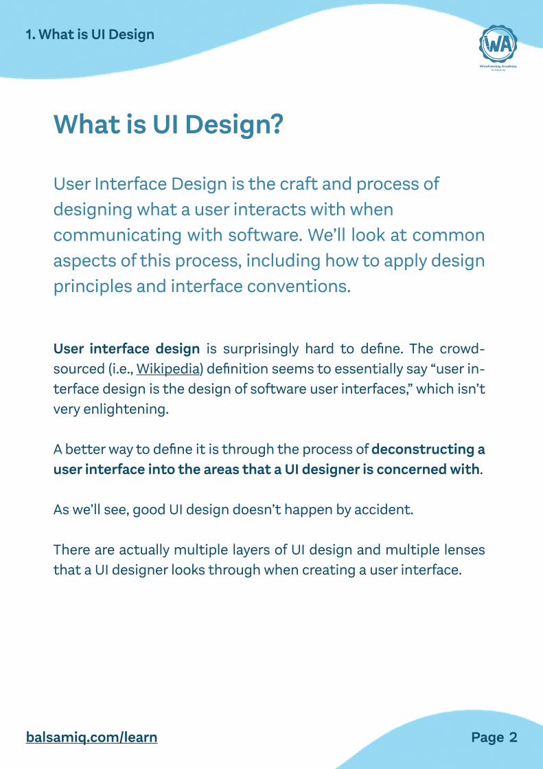
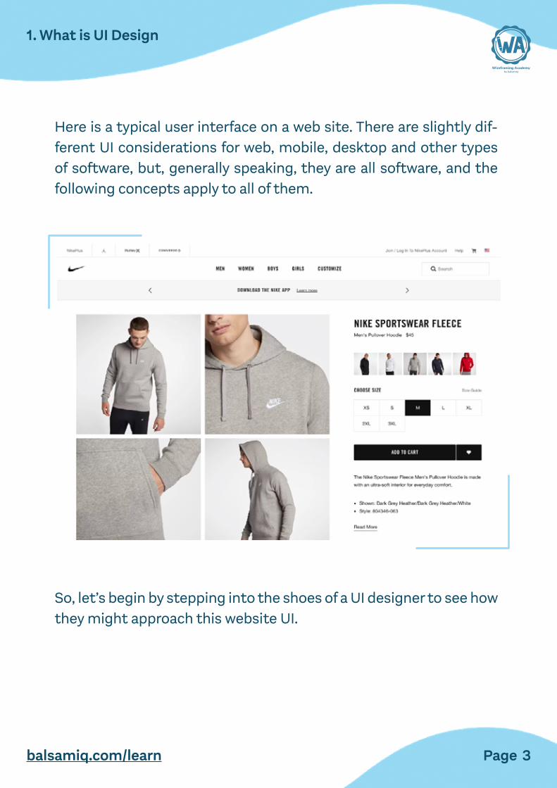
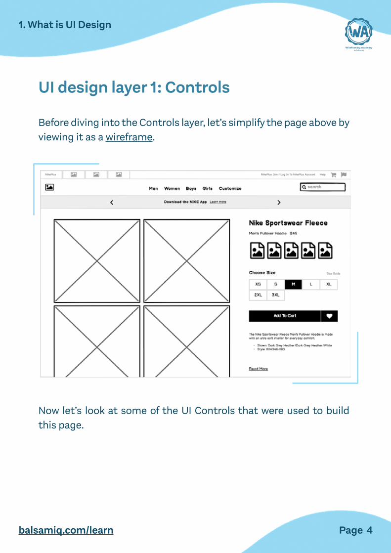
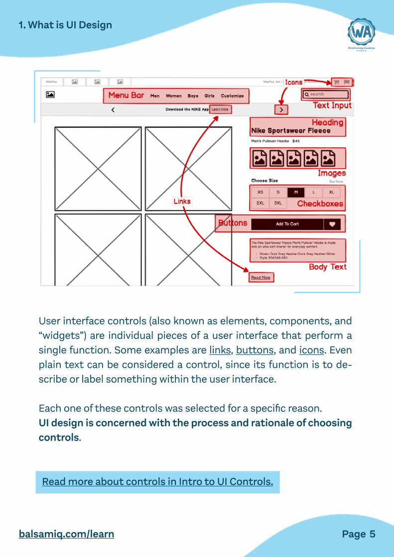
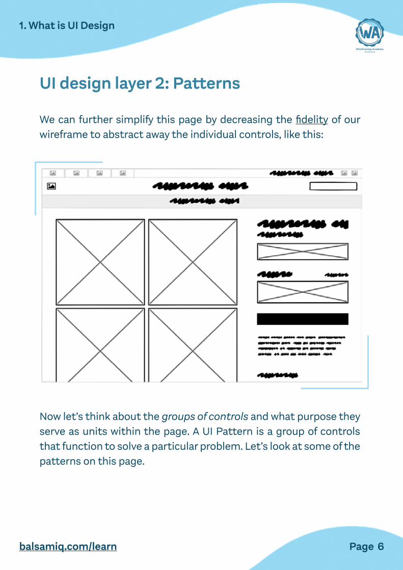
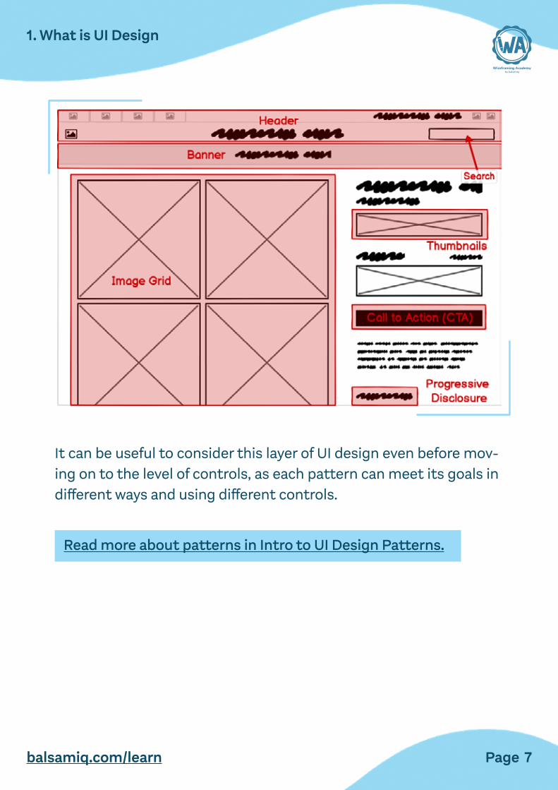
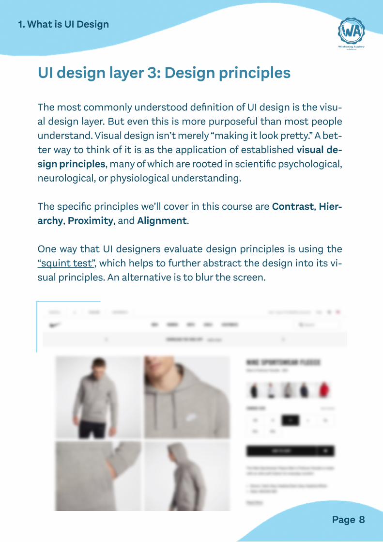
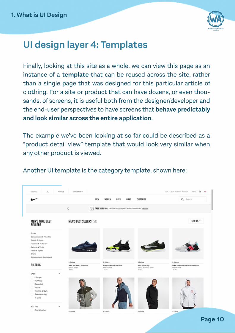
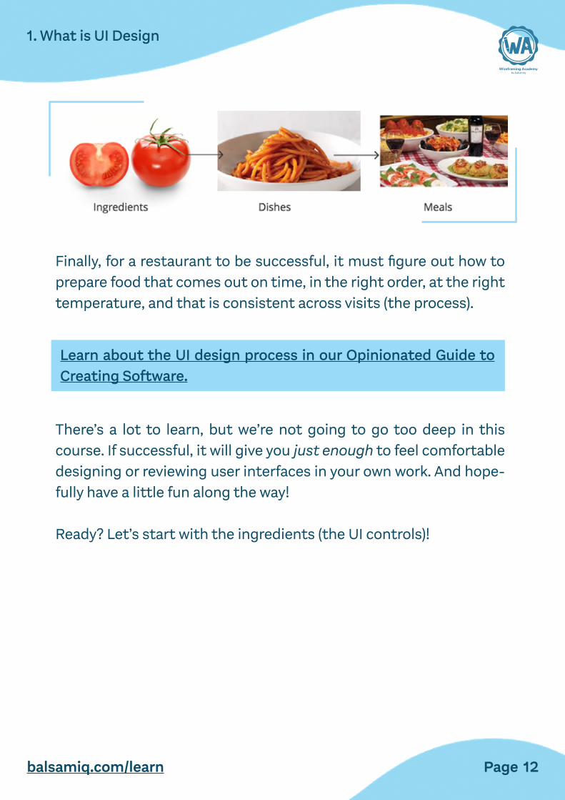
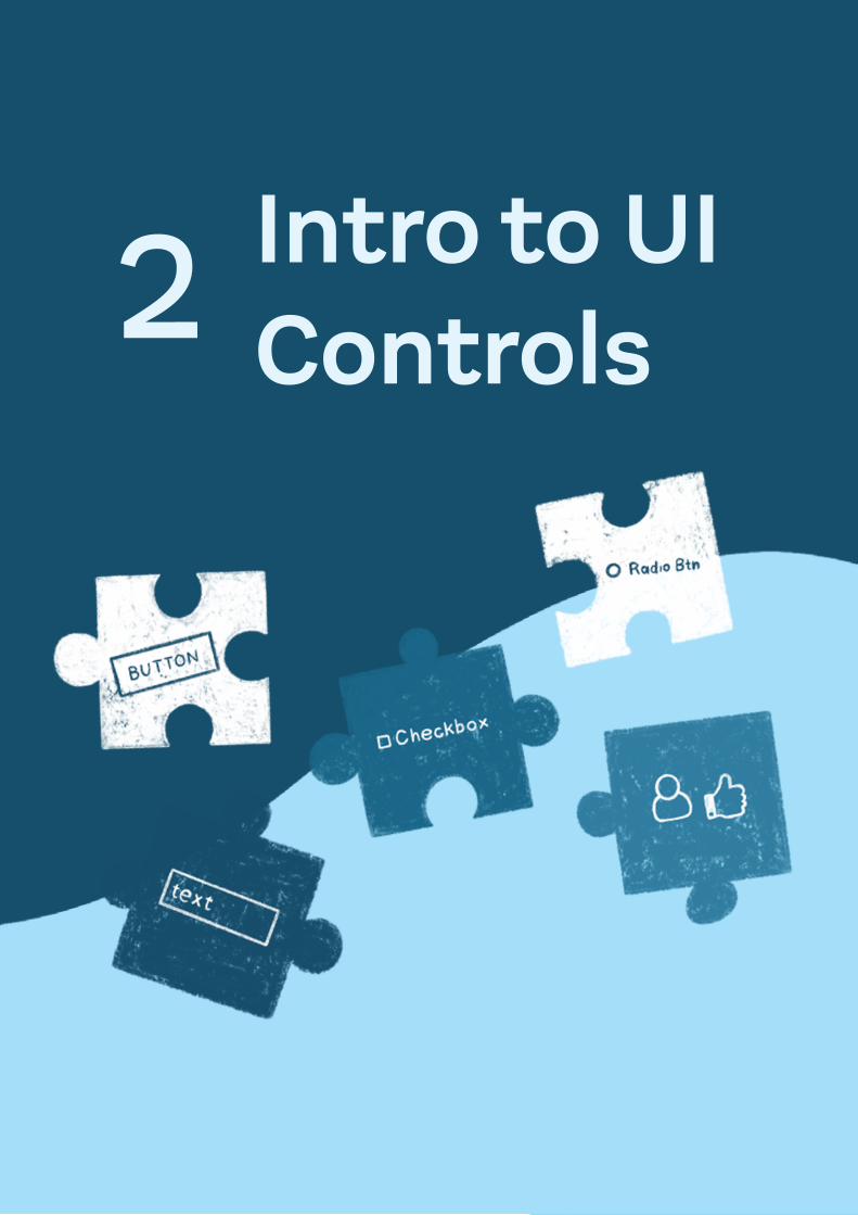
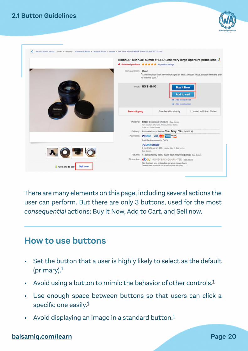
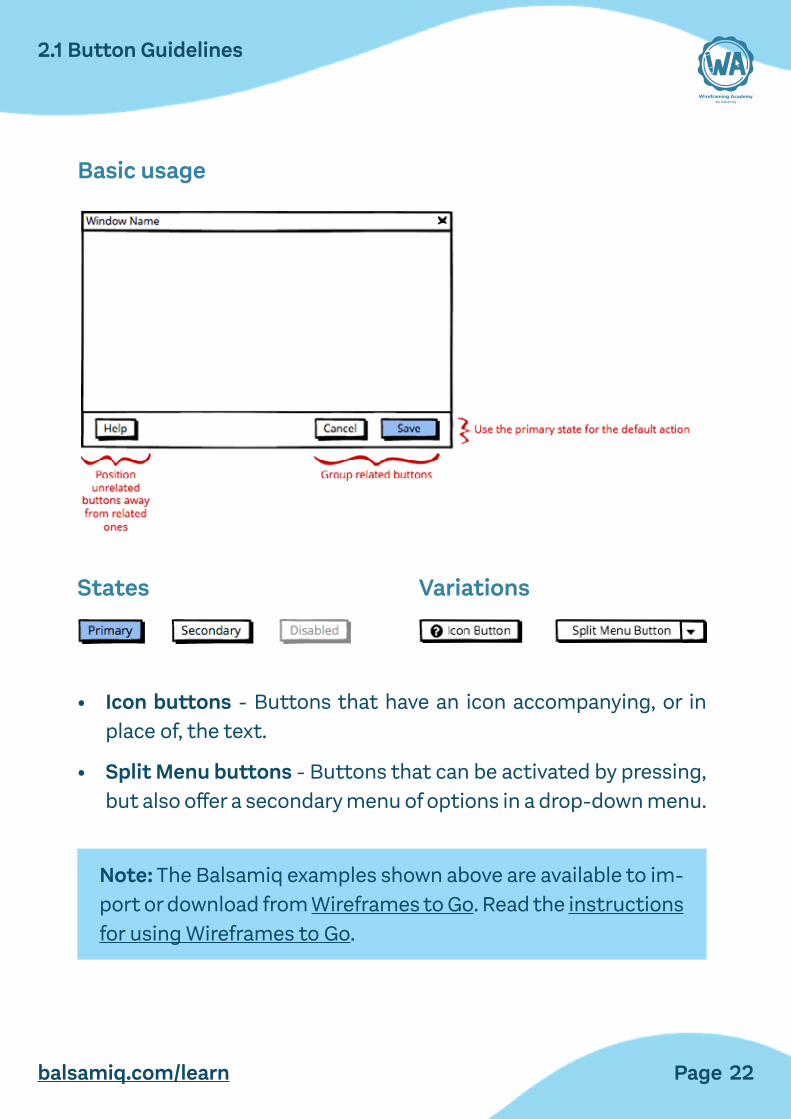
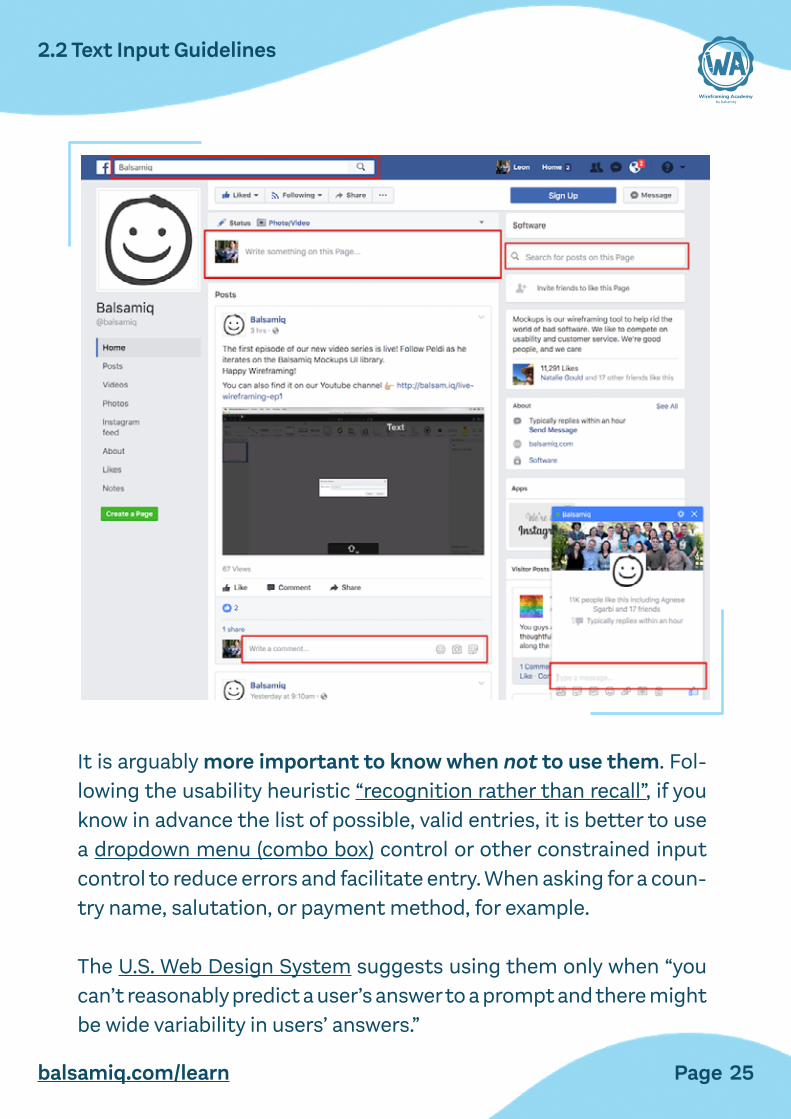
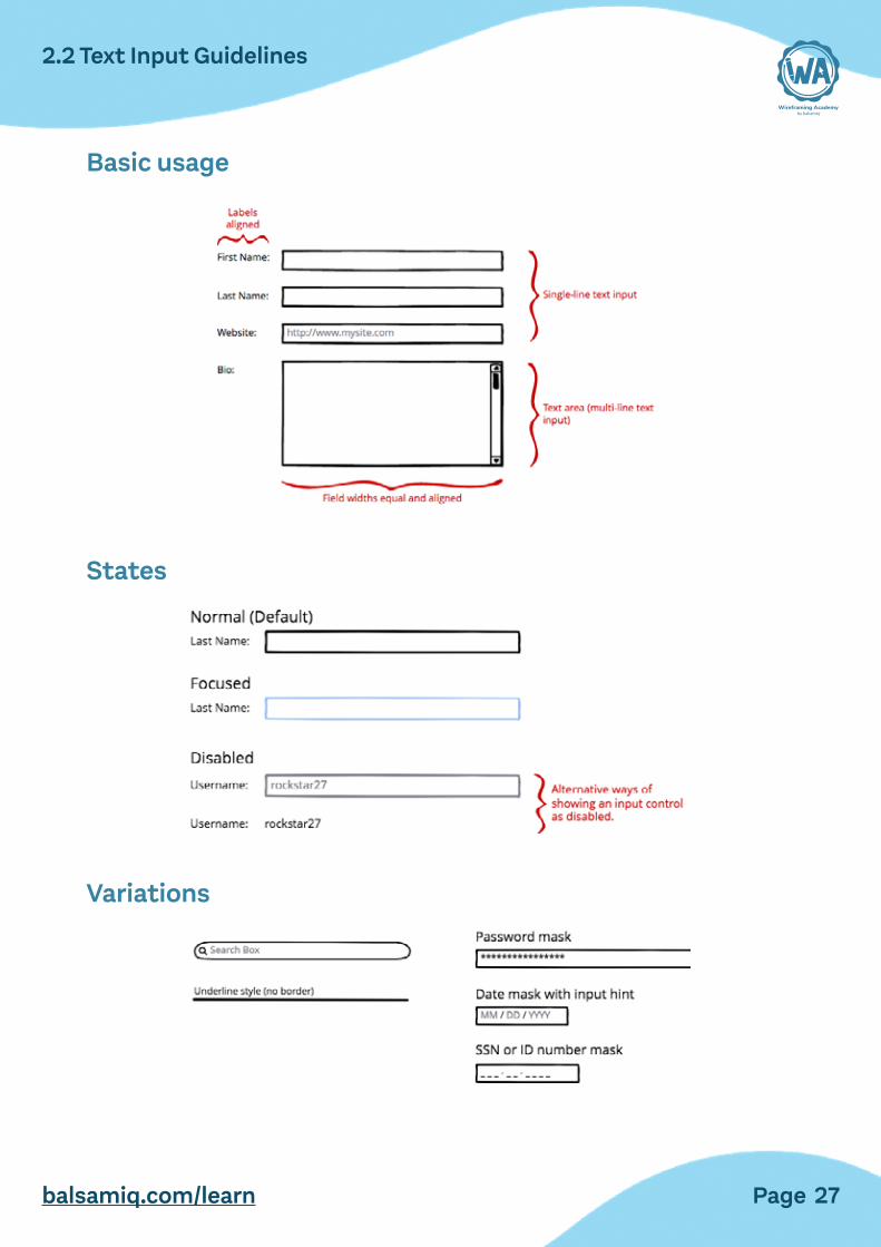
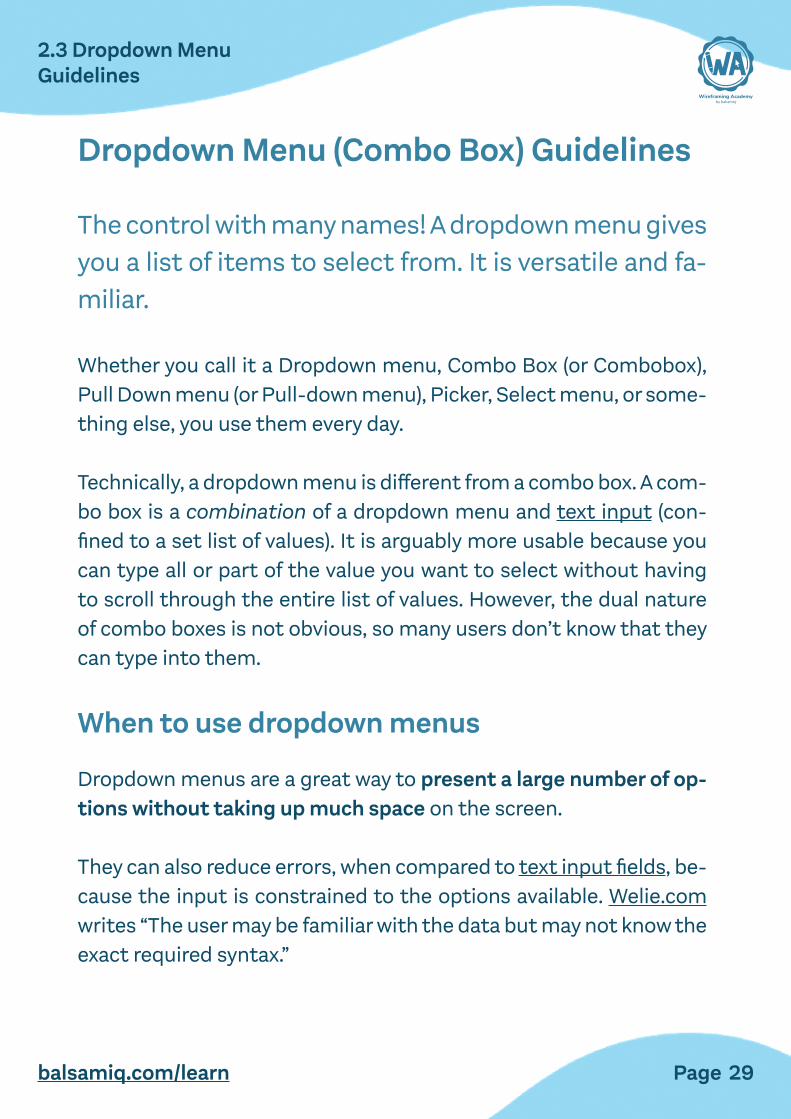
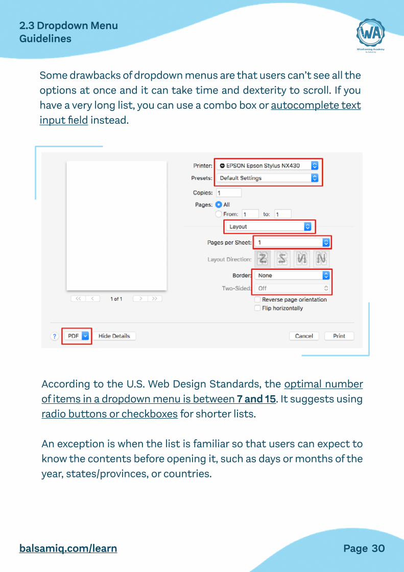
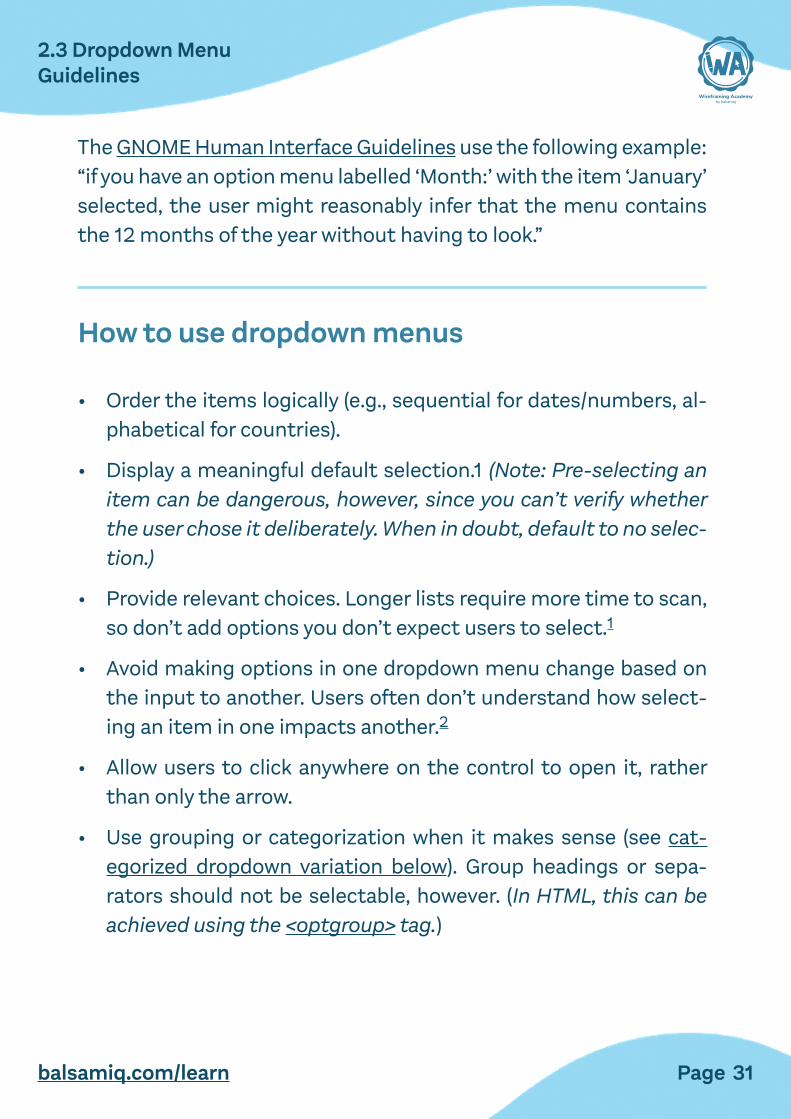
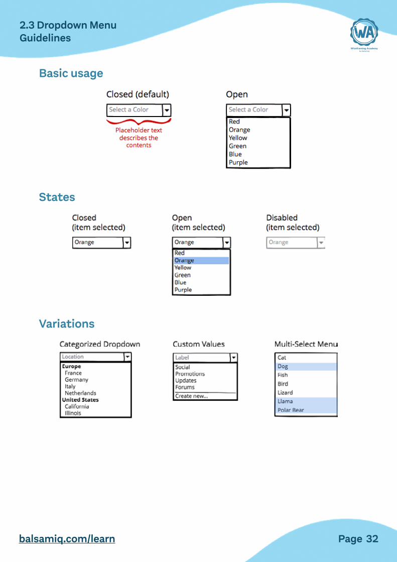
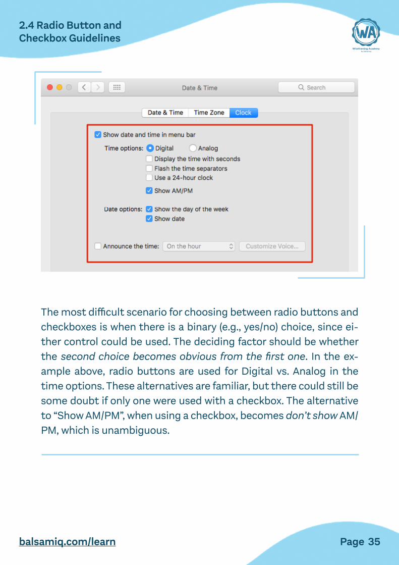
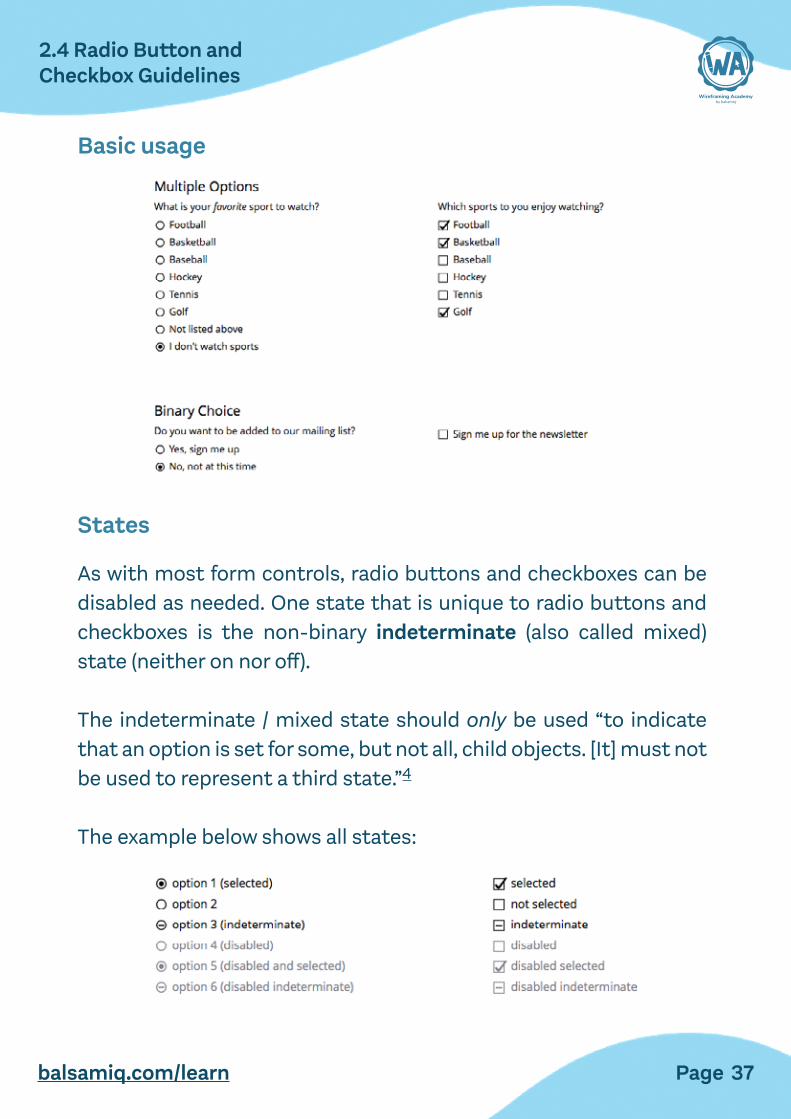
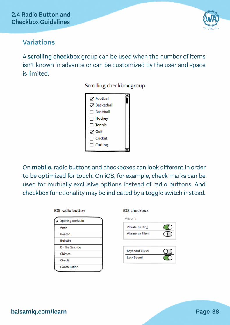
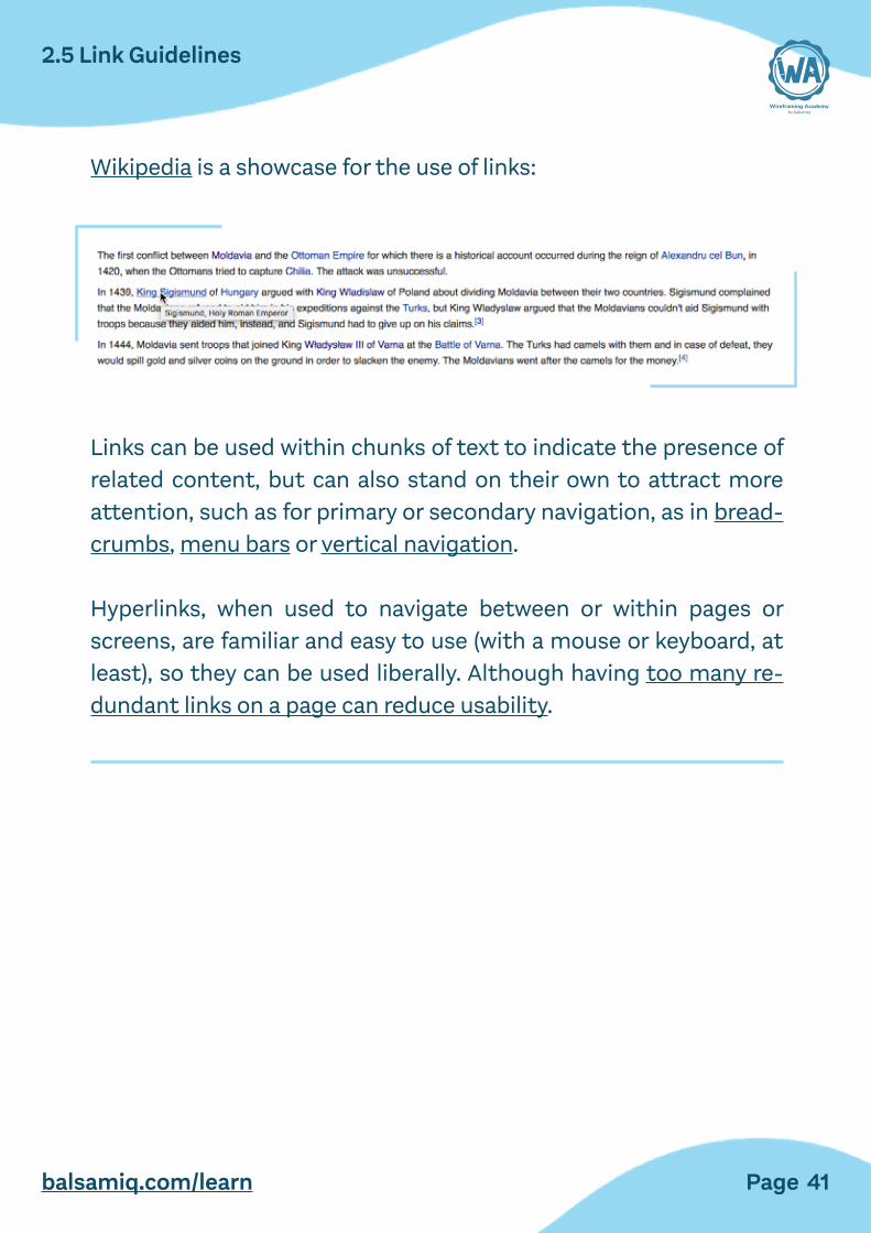
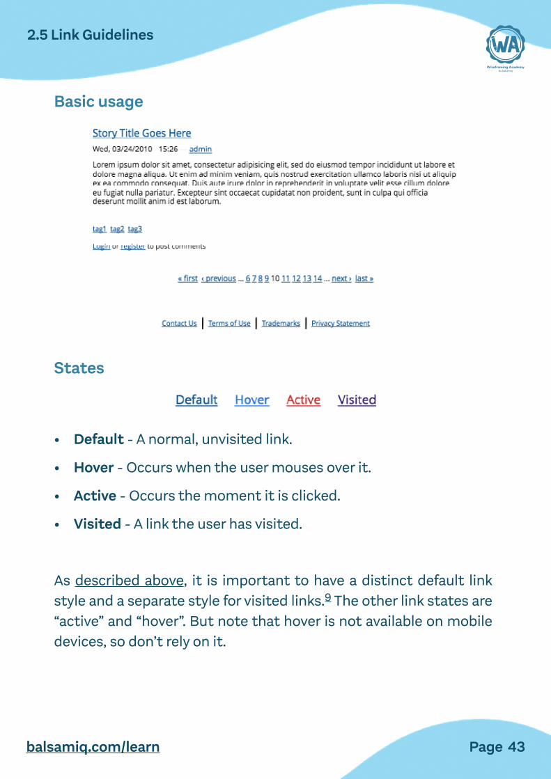
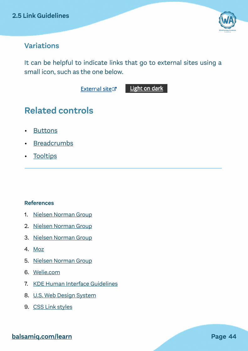
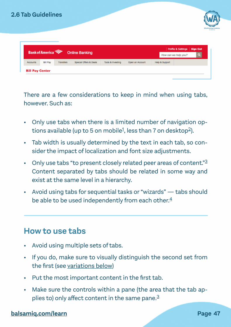
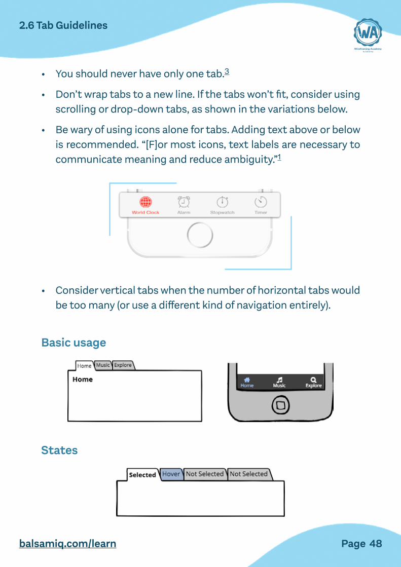
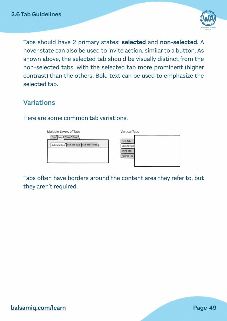
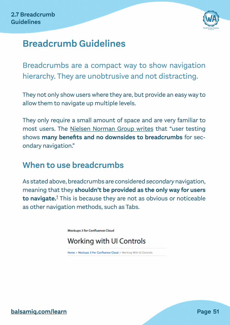
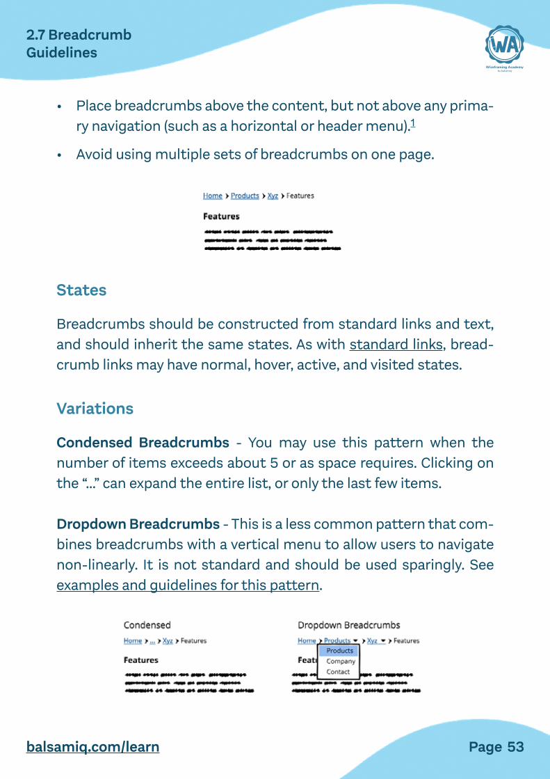
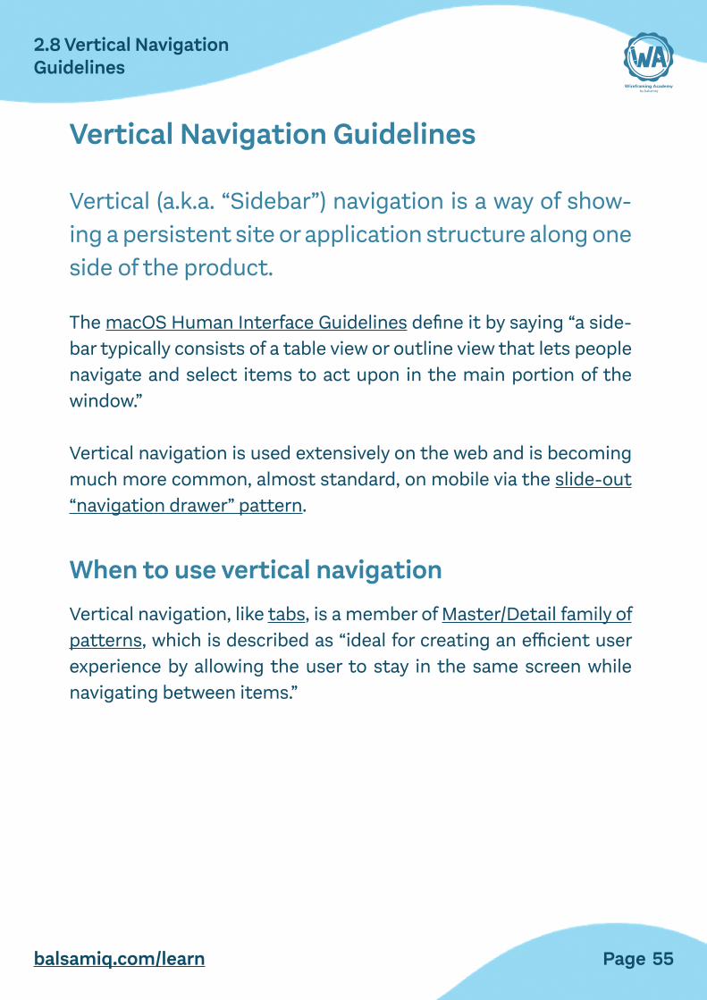
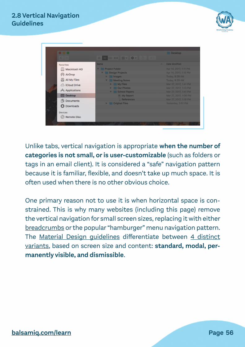
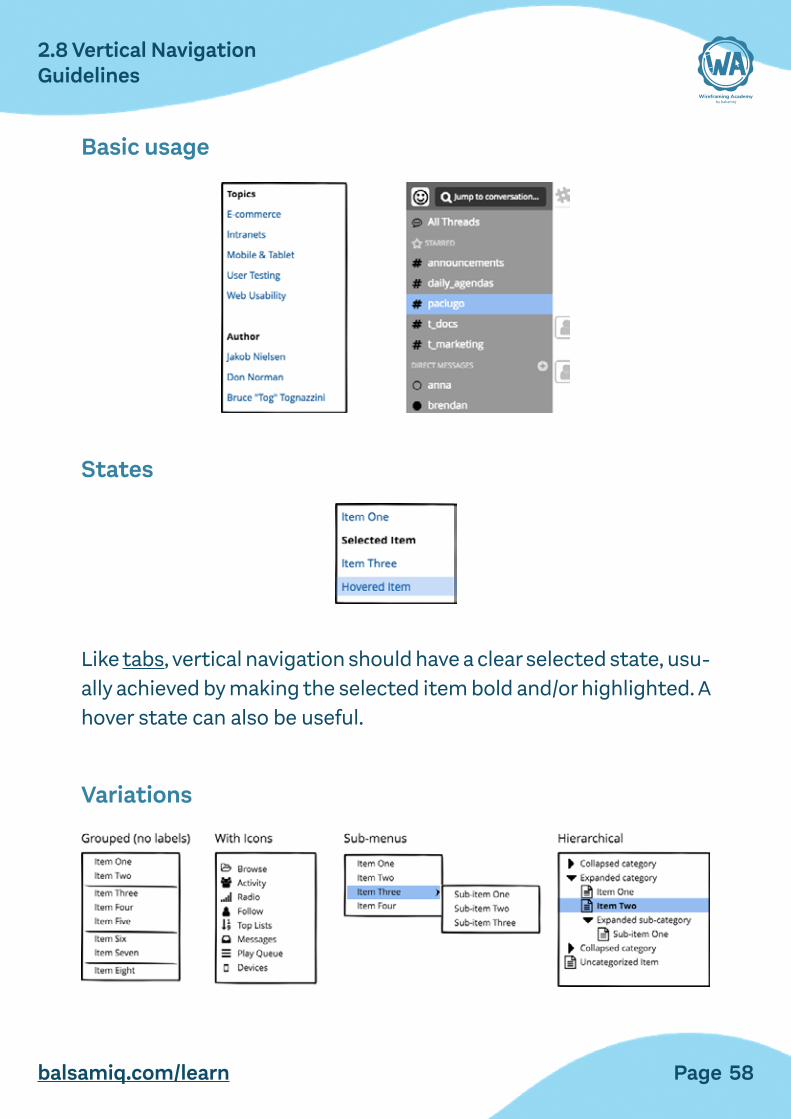
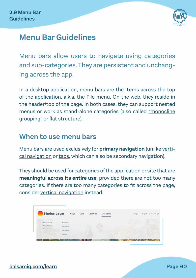
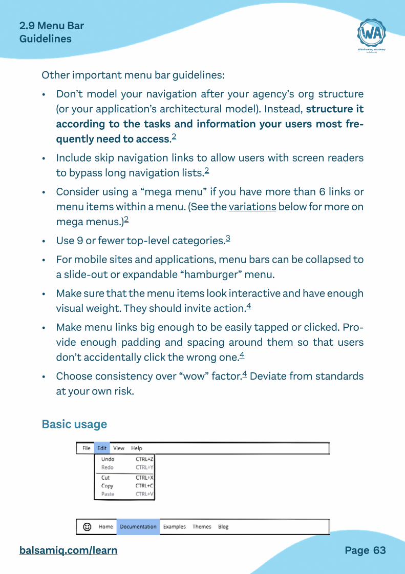
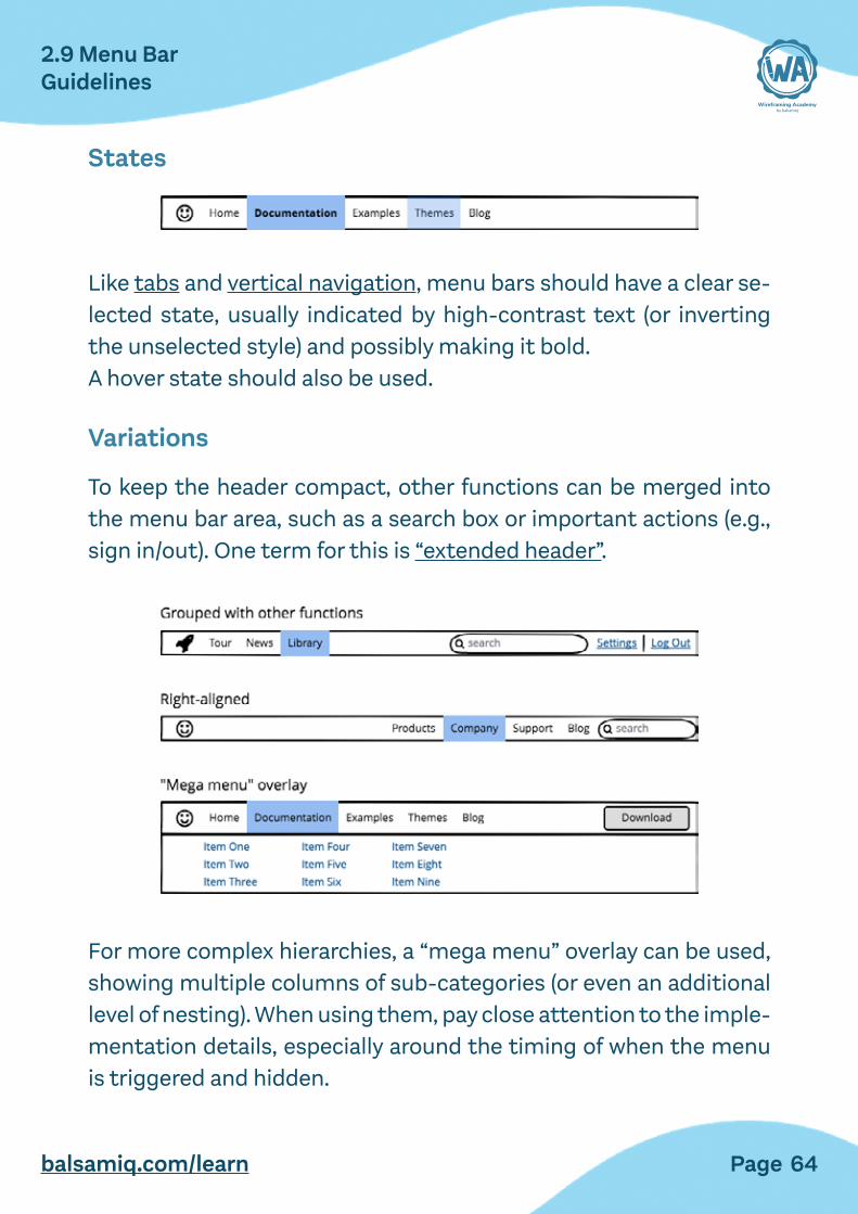
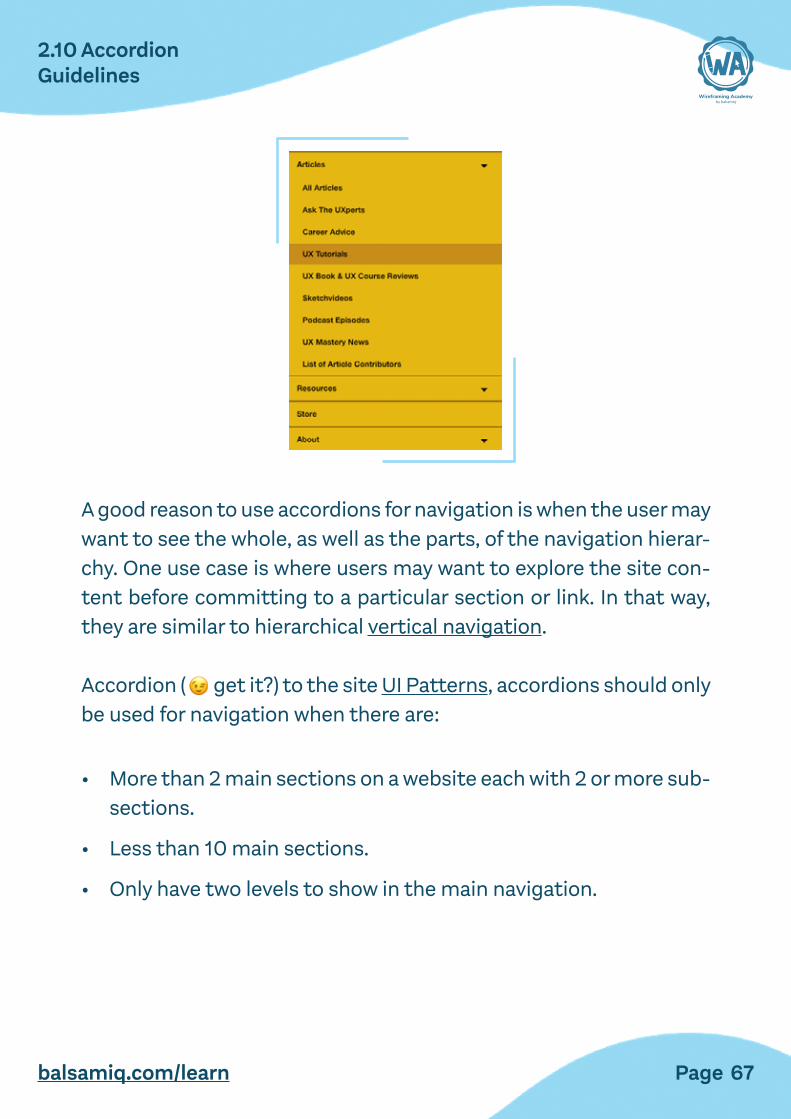
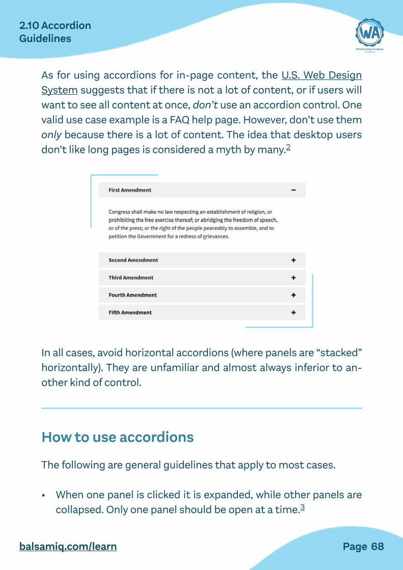
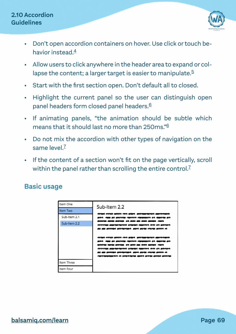
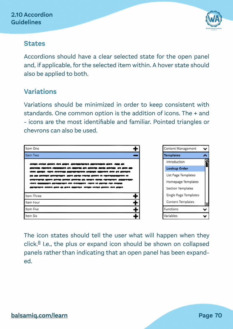
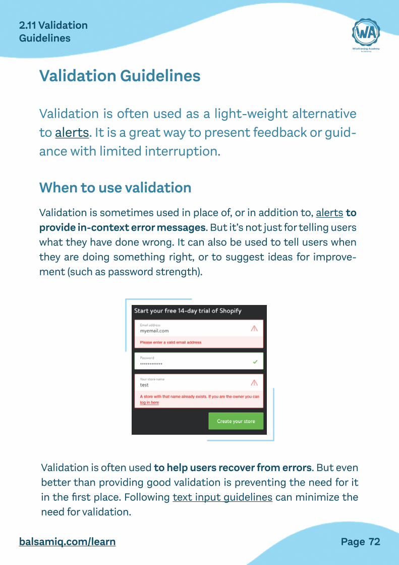
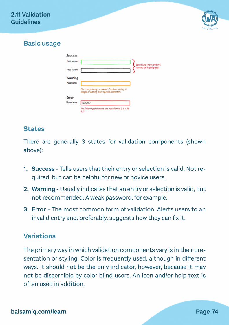
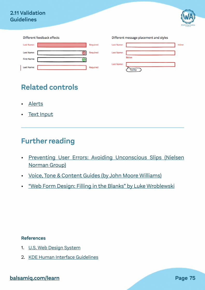
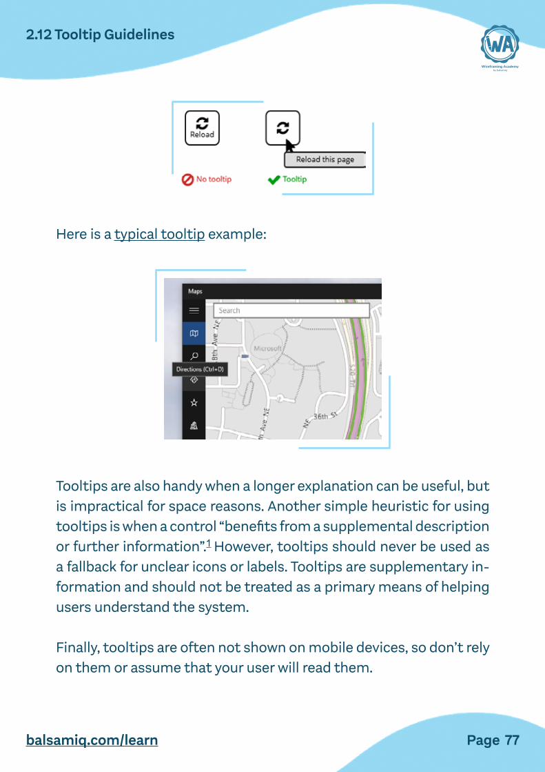
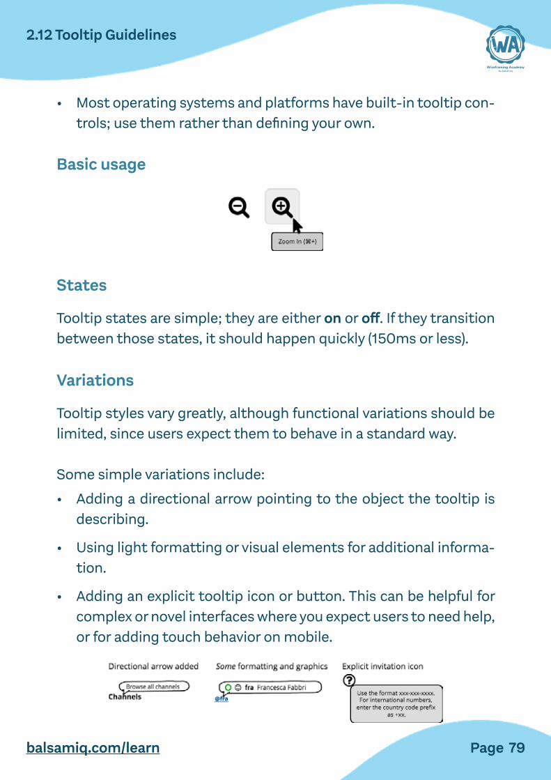
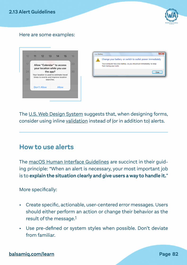
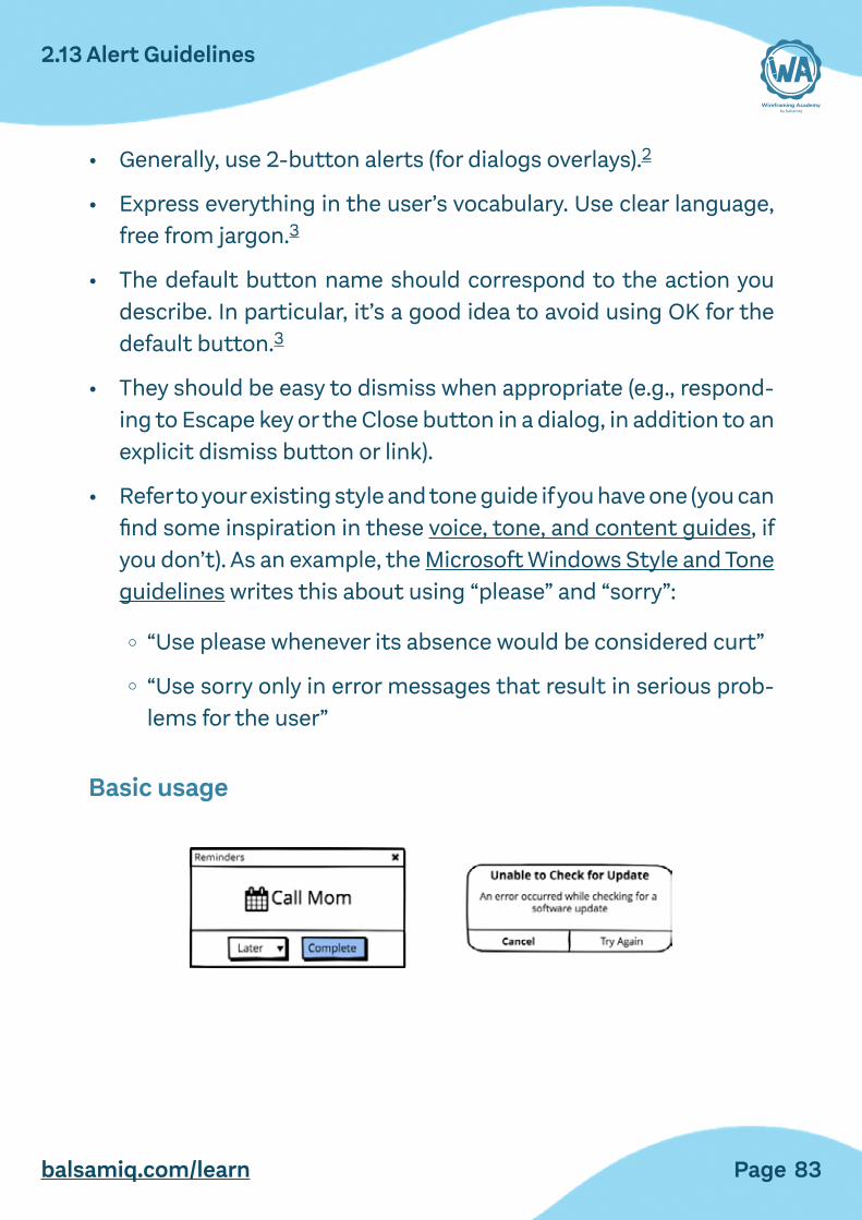
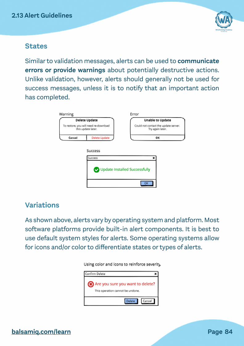
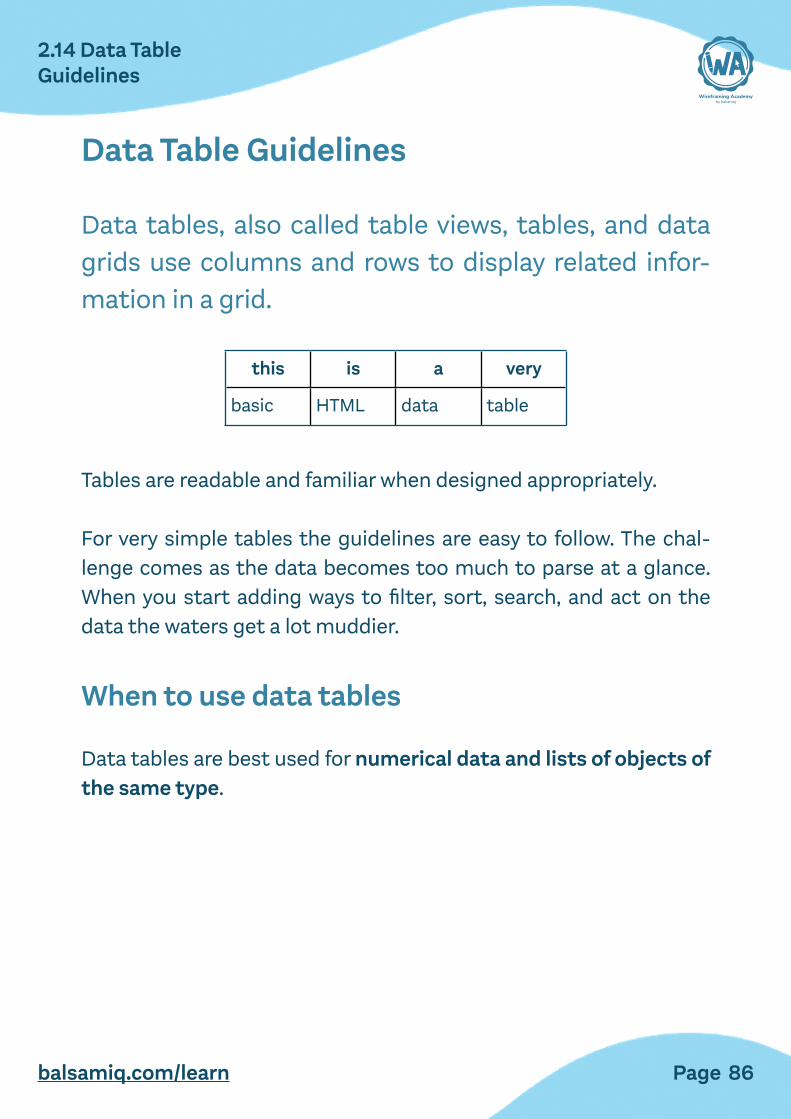
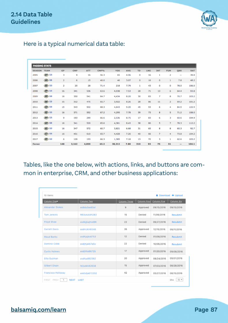
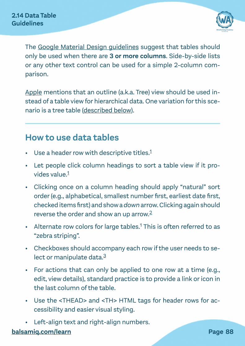
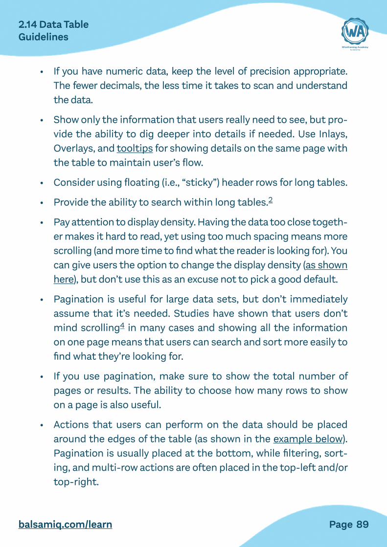
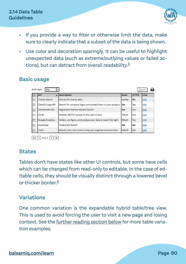
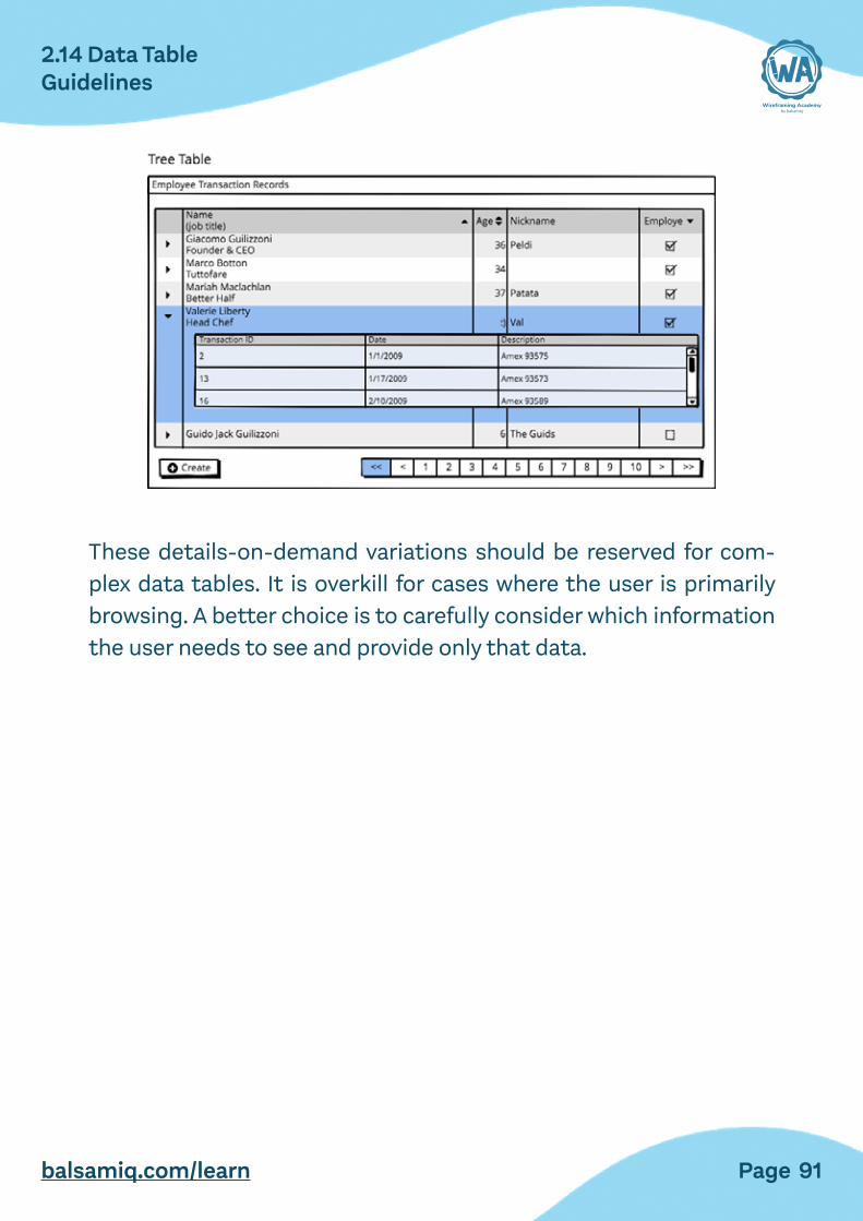
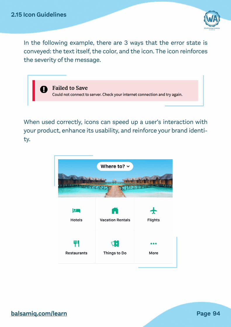
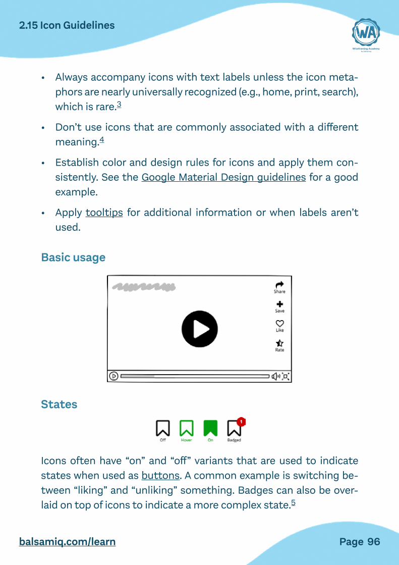
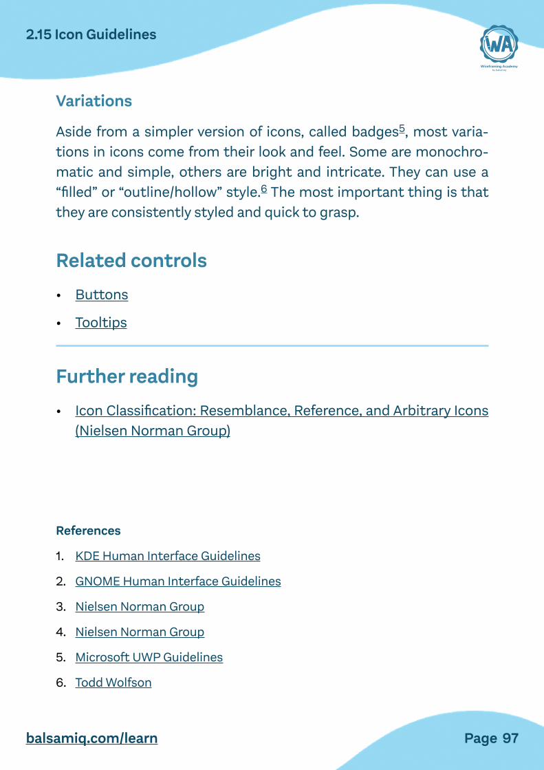

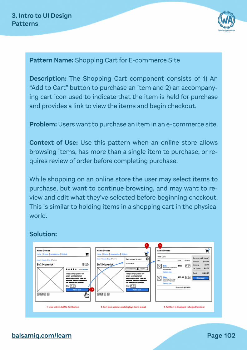
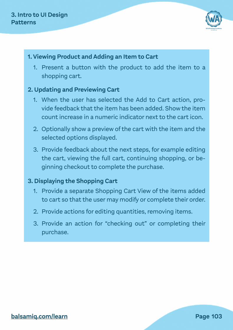
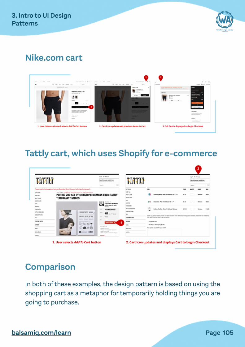
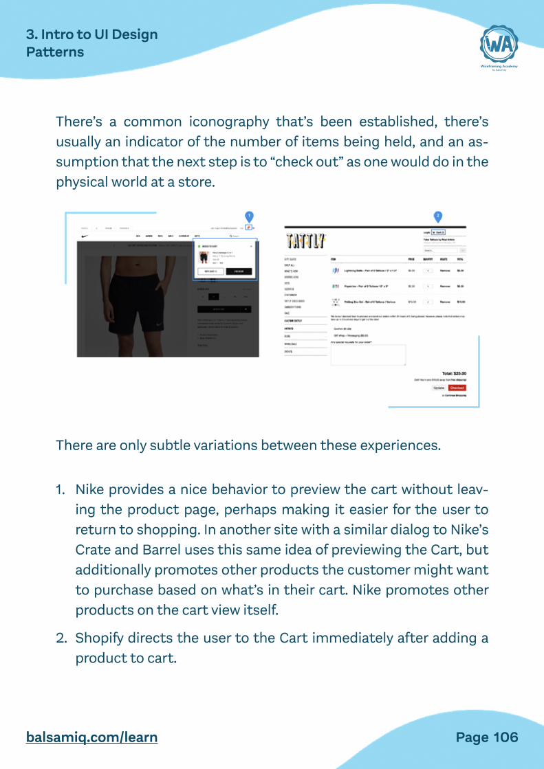
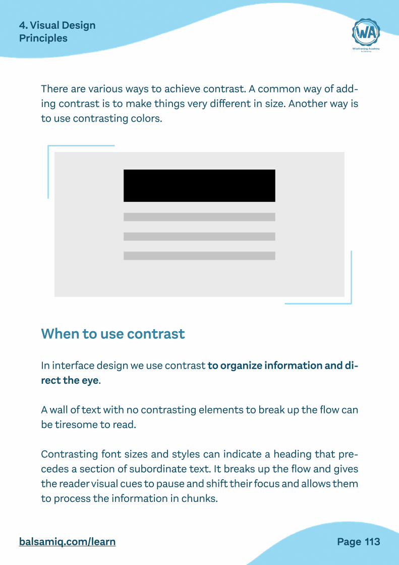
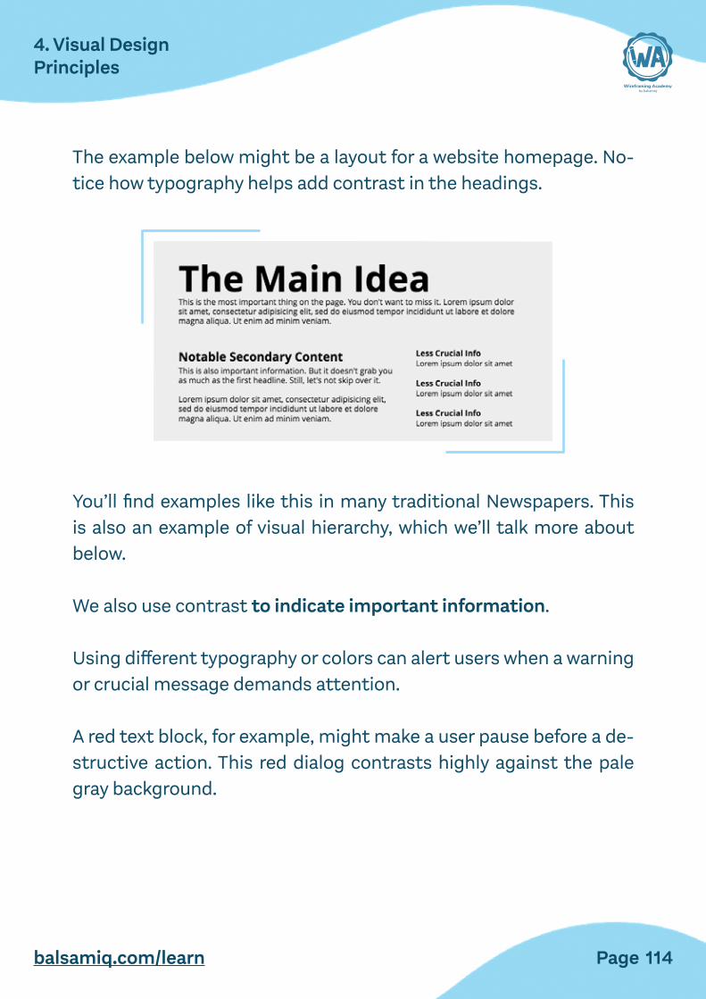
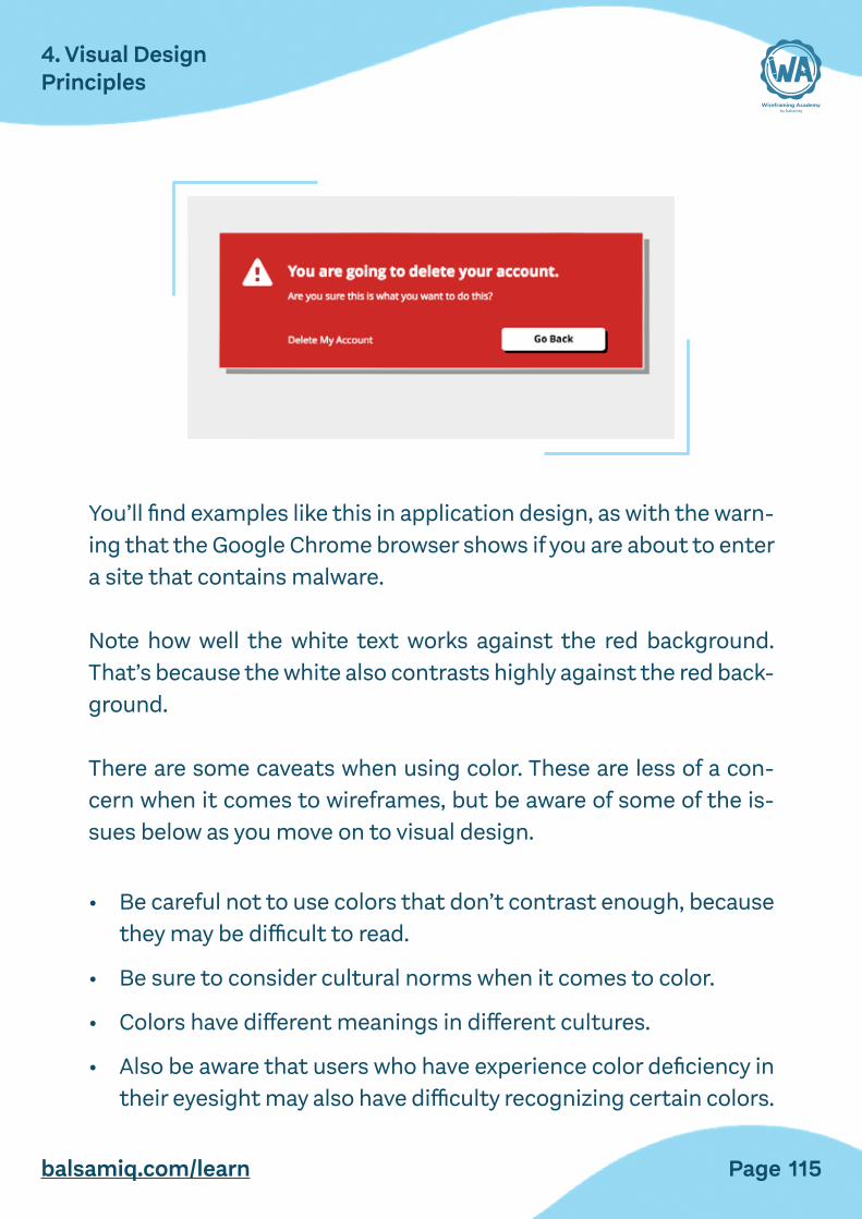
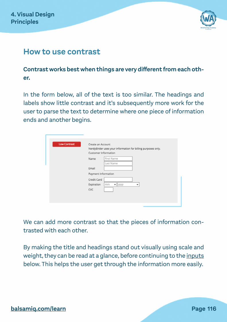
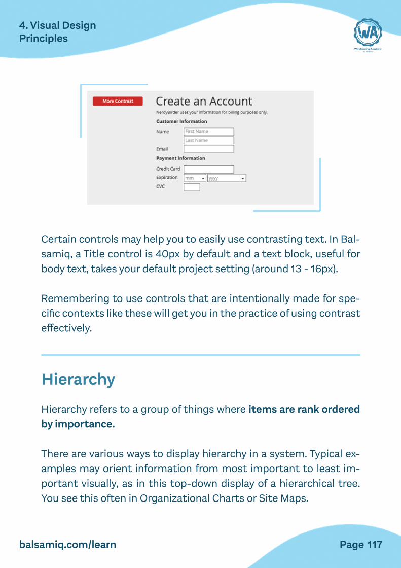
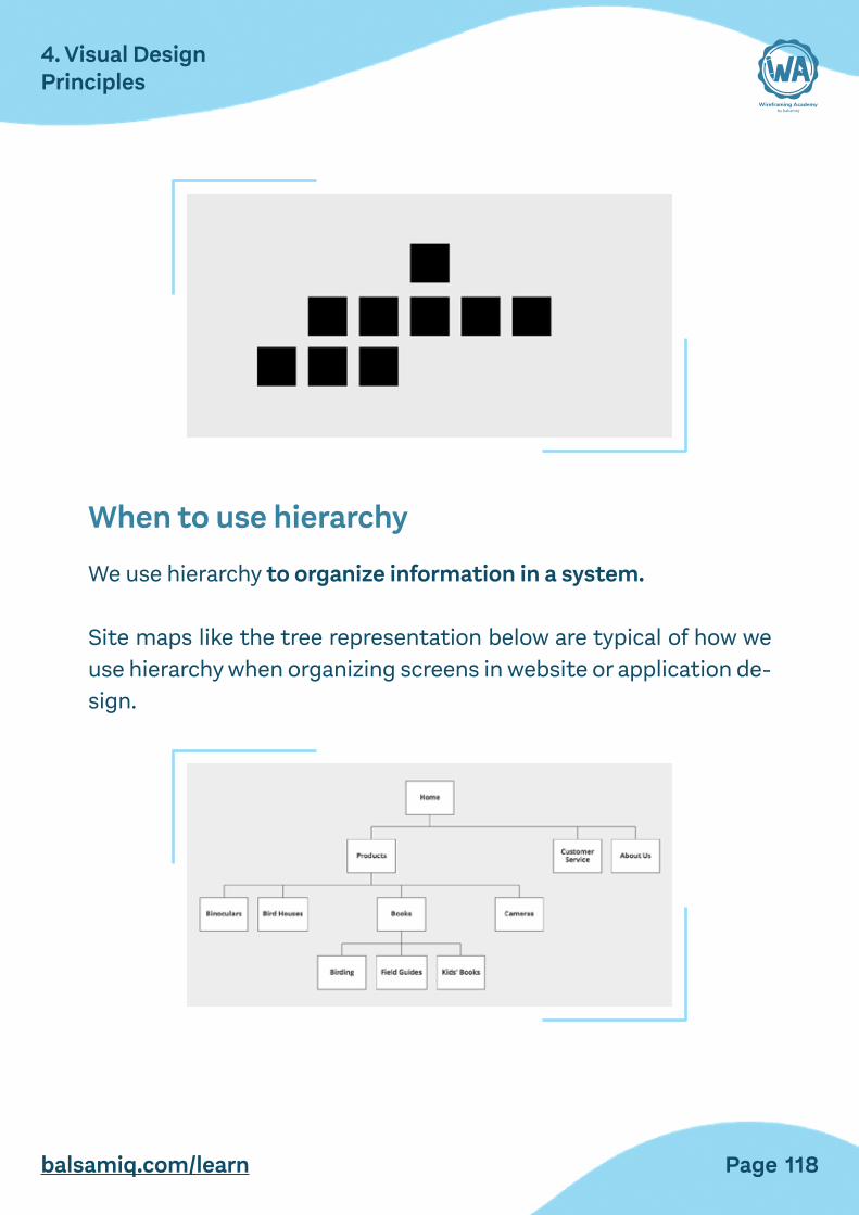
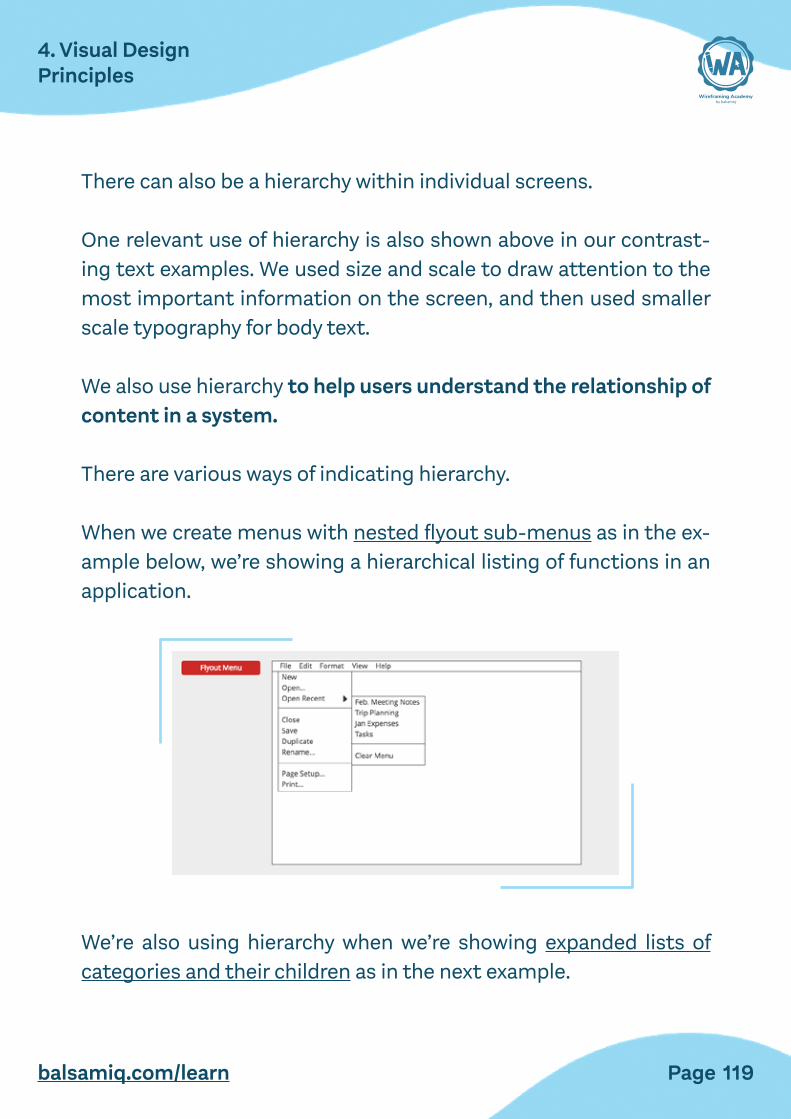
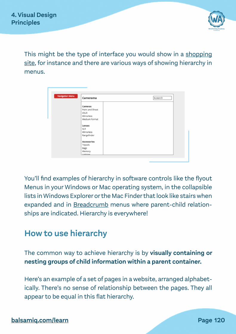
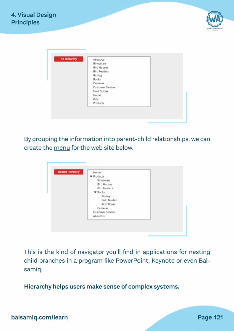
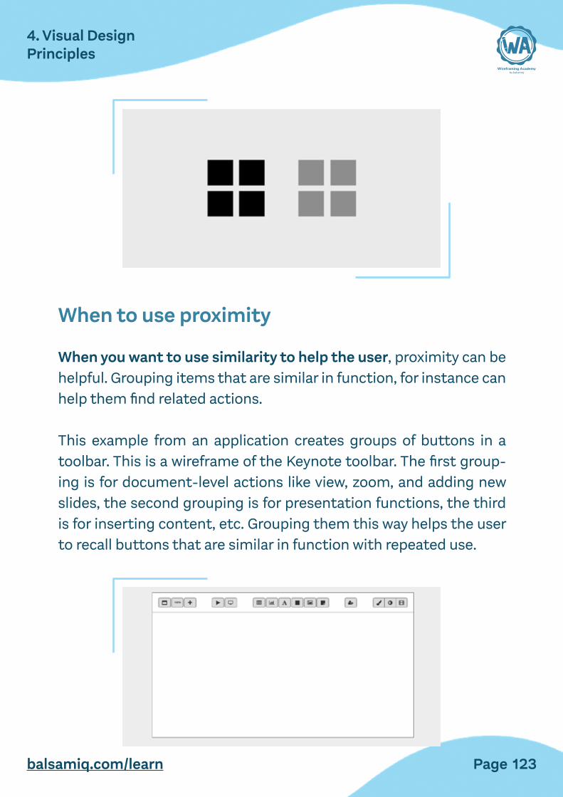
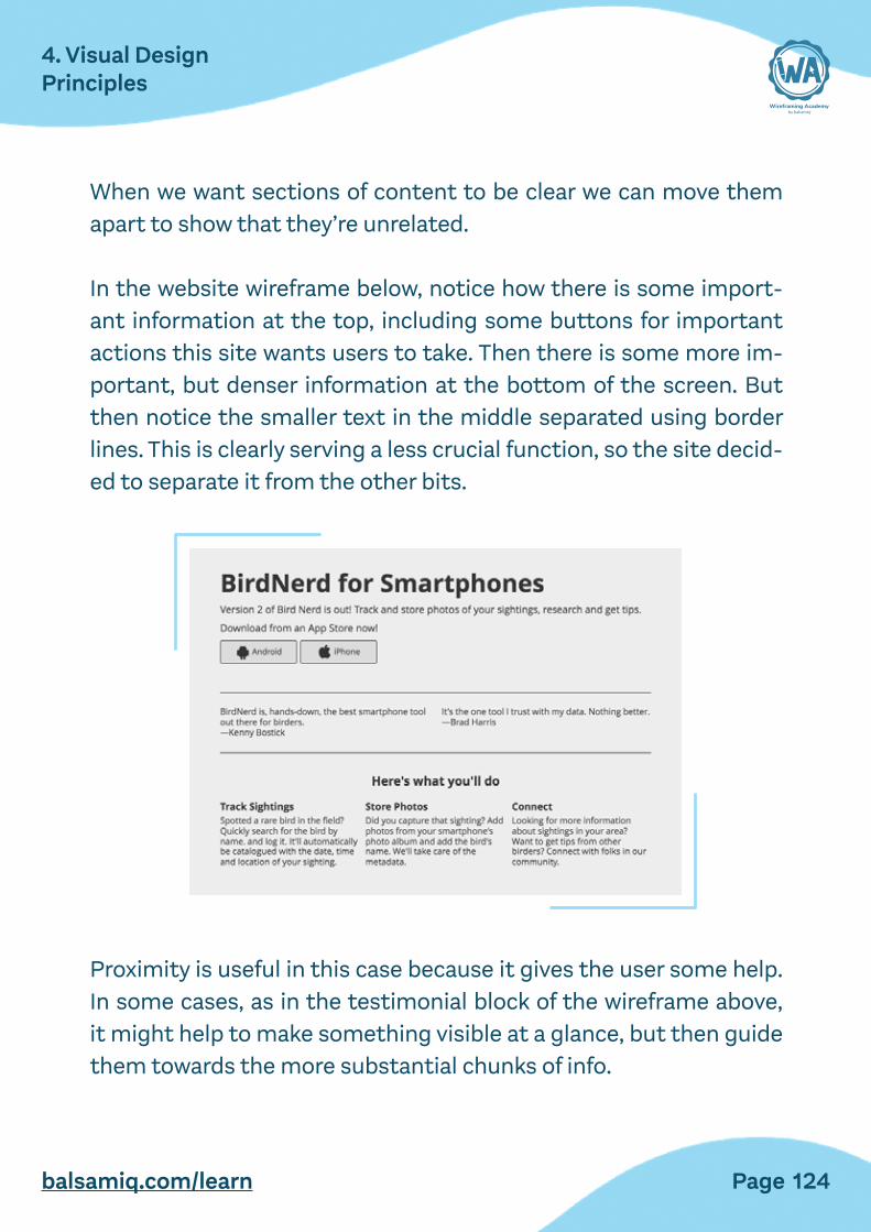
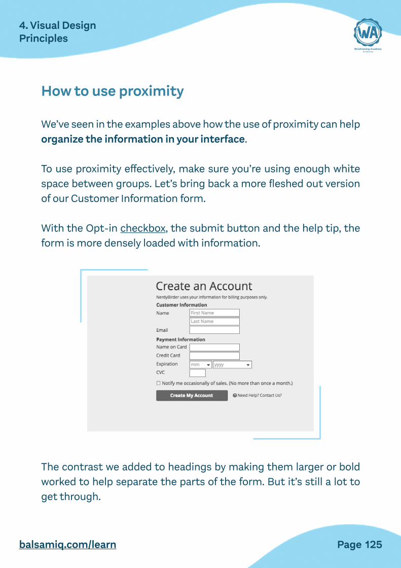
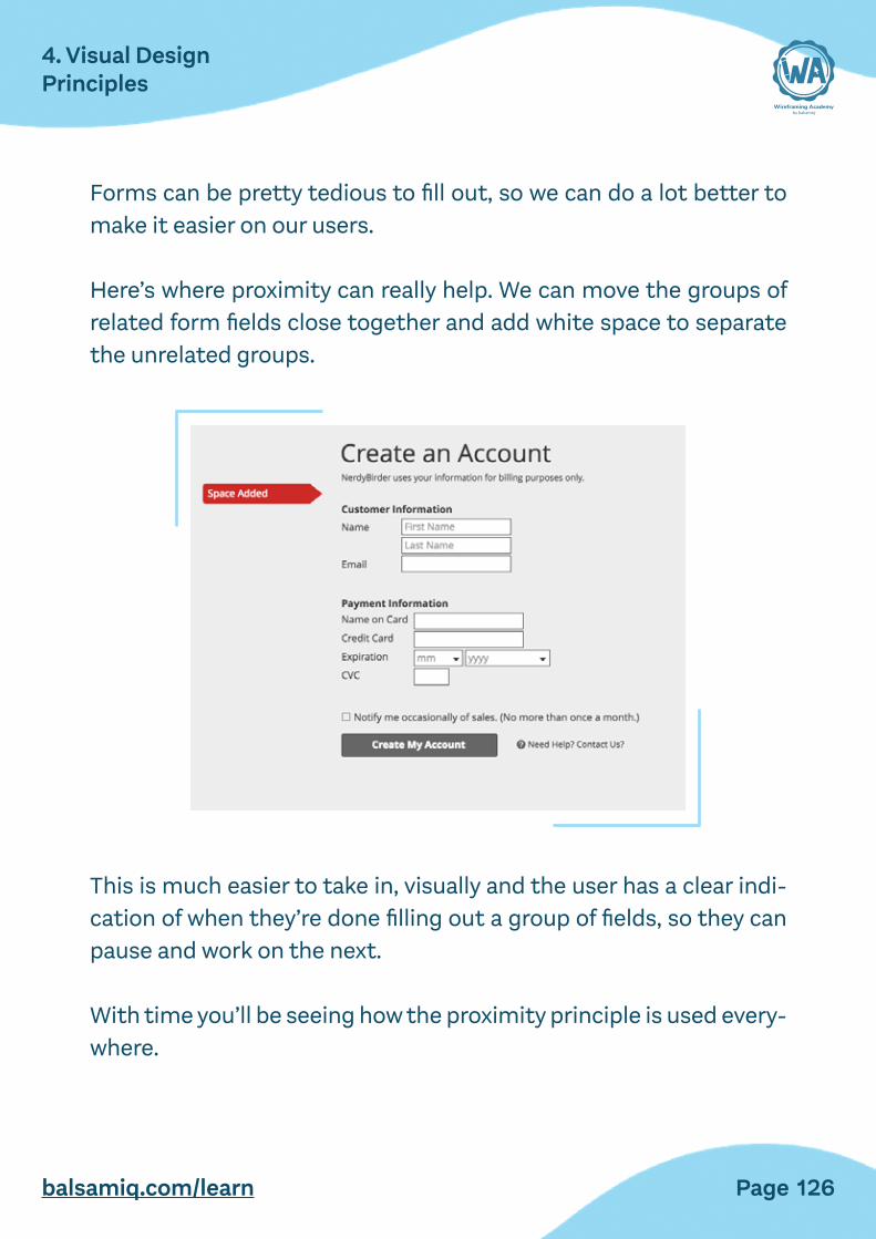
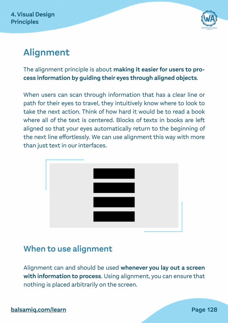
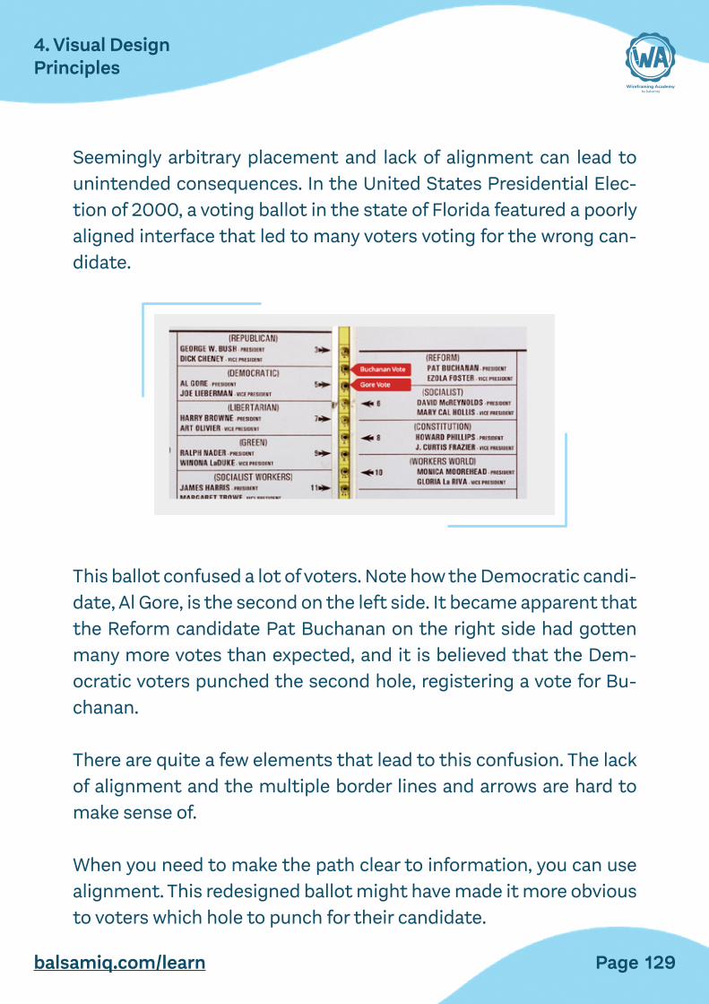
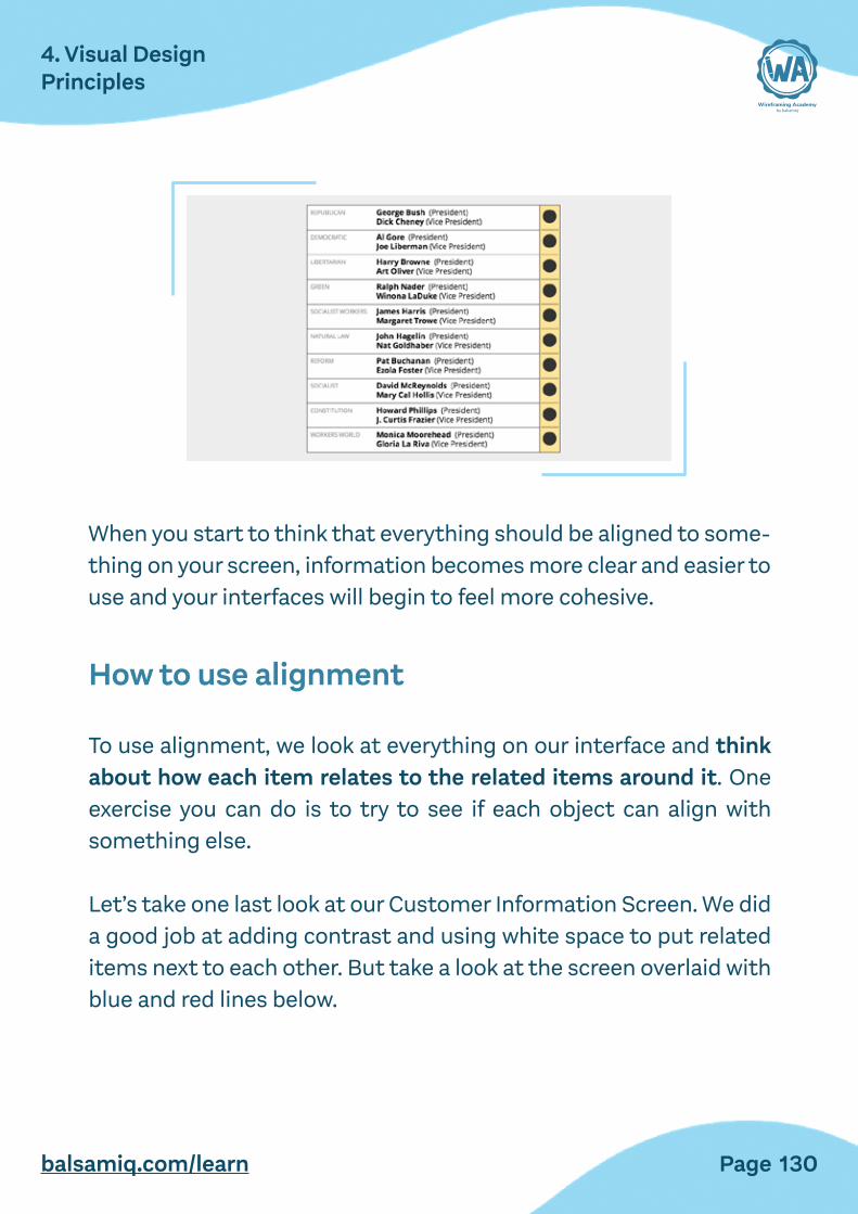
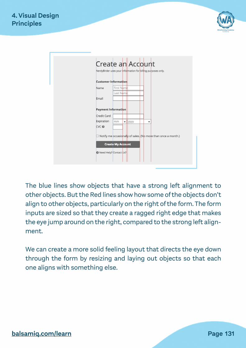
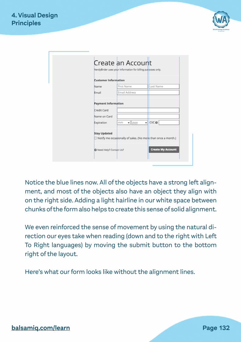
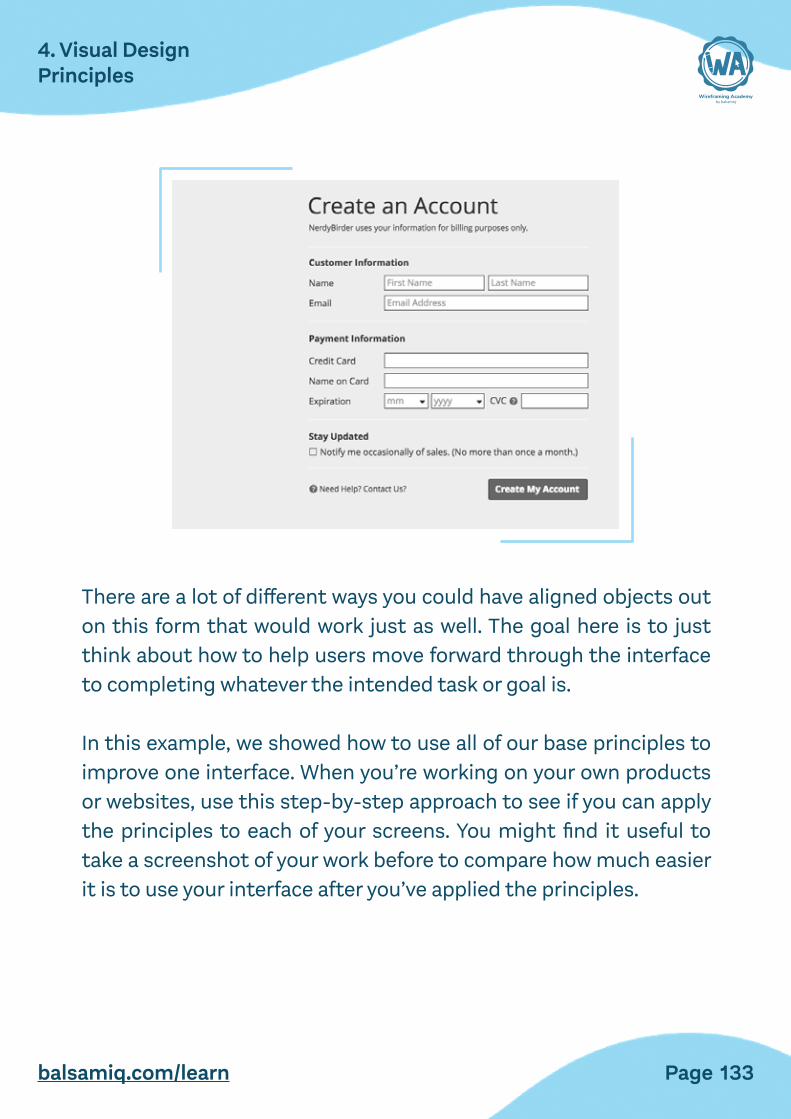
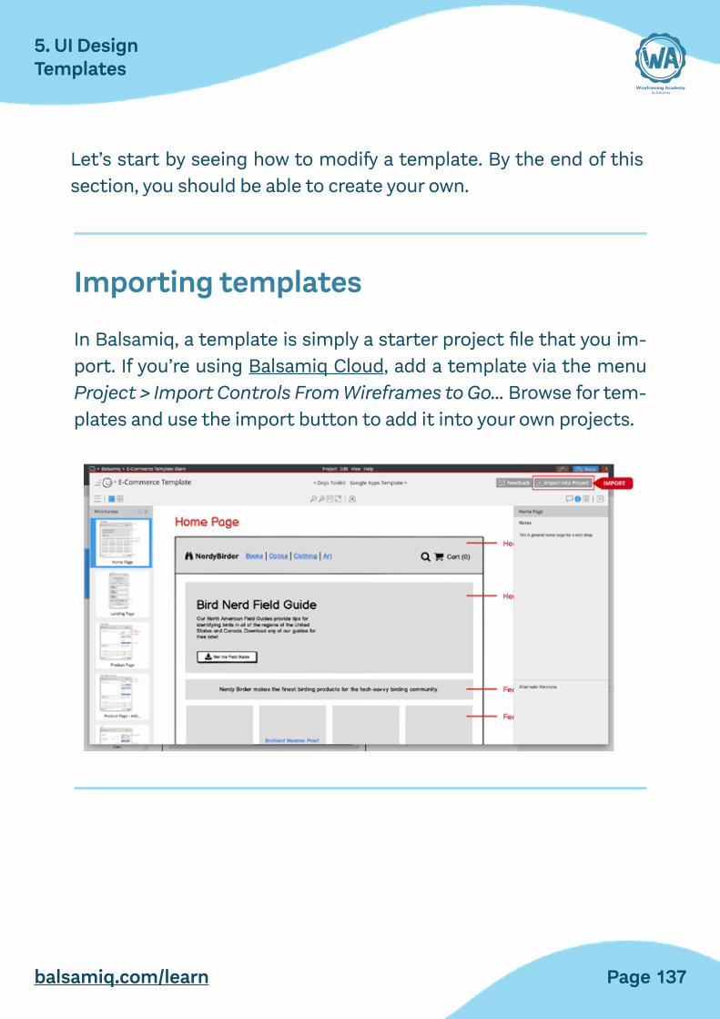
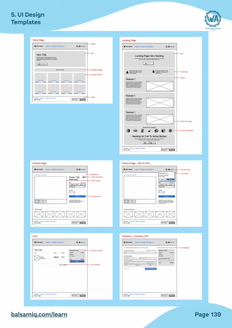
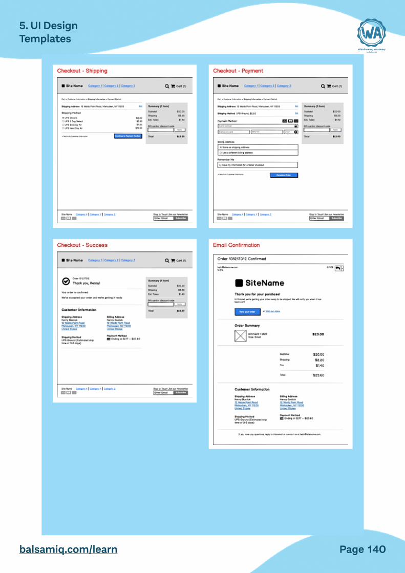
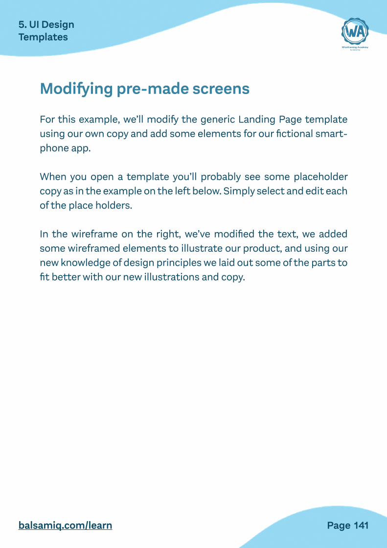
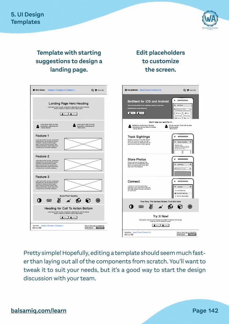
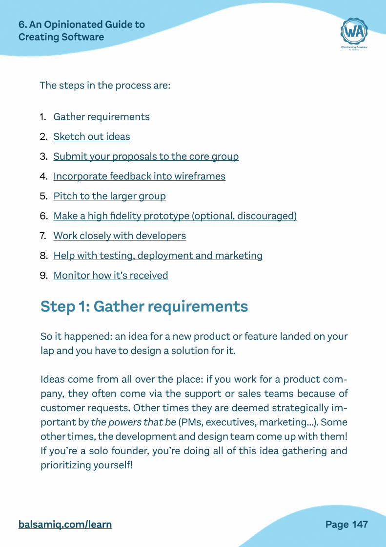


![Balsamiq Cloud Terms of Use and Privacylsamiq Cloud ... · 5/23/2018 Balsamiq Cloud Terms of Use and Privacy Policy [Balsamiq Cloud] - Balsamiq Documentation 1/18 Balsamiq Cloud Terms](https://img.pdfslide.us/doc/110x75/5e76143151b4942b6320ead6/balsamiq-cloud-terms-of-use-and-privacylsamiq-cloud-5232018-balsamiq-cloud.jpg)


![L-I1-'3CIleucine. ;Lsmol/kgdm5migu4zj3pb.cloudfront.net/manuscripts/116000/116477/...[modelMGMII;UtahMedicalProducts, Midvale,UT].Subjectswere given sufficient time to become familiarized](https://img.pdfslide.us/doc/110x75/60aa863f755eb8732f678e4a/l-i1-3cileucine-lsmol-modelmgmiiutahmedicalproducts-midvaleutsubjectswere.jpg)