Embed Size (px)
Citation preview

1
• • •
WHO’RE YOU CALL ING A DUMMY?
“That’ll never sell,” I sneered at the title in the bookstore. “Who
would publicly buy a book that proclaimed to all the world that he’s
a dummy? It’d be like buying condoms labeled ‘extra small.’ ”
We all know how that one turned out, don’t we? DOS for
Dummies and its companion, Windows for Dummies, became the
best-selling computer books of all time. The concept has spread to
fields far beyond computing, with titles as disparate as Wine for
Dummies, Saltwater Aquariums for Dummies, and Breast Cancer for
Dummies. The series has sold more than 100 million copies, accord-
ing to Getting Your Book Published for Dummies, which I bought to
help me find a publisher for the volume you are now reading.1
Computers make users feel dumb. Literate, educated people
can’t make that infuriating beige box do what they want it to do, and
instead of marching on Microsoft with torches and pitchforks and
hanging Bill Gates in effigy, they blame themselves and say, “Gee, I
9
1. Sometimes this approach backfires. In October 2003, the U.S. Consumer
Product Safety Commission recalled the book Candle & Soap Making for
Dummies because incorrect instructions for mixing certain chemicals could create
a burn hazard. I’m not sure what that implies for the publisher’s breast cancer book,
or its stablemate, Prostate Cancer for Dummies.

must be dumb.” In a society where nothing is ever the fault of the
person doing it, where people sue a restaurant when they spill their
own coffee, getting users to blame themselves for anything is a mag-
nificent accomplishment, albeit probably not the main one the soft-
ware vendor intended. Why do programmers design applications
that make people feel this way, and why do people meekly accept
this abuse from their computers?
W H E R E W E C A M E F R O M
The designers of the earliest computer programs didn’t care about
making their products easy to use. Solving the computing problem
at hand—for example, dealing with a printer to make the words
come out properly on paper—was so difficult that no one had time
or money left over for making a user’s life easier. A computer’s think-
ing time was enormously expensive, much more so than the user’s
time. Forcing the human user to memorize complicated com-
mands instead of using computer power to provide a menu listing
them made economic sense. The relative costs are now reversed,
but almost everyone in the industry older than about 30 grew up in
that type of environment. It can’t help but shape our thinking today,
no matter how hard we try to leave it behind. Think of your older
relatives who grew up in the Great Depression of the 1930s, who
even today can’t bear to throw away a sock with only one hole in it.
Like driving a car in the early years of the twentieth century,
early users expected computers to be a pain in the butt, and we were
rarely disappointed. Almost all users were programmers themselves.
Few of them felt the need, or often even the desire, to make things
easier. We accepted the difficulties—the rationed computer time,
the arcane commands, the awful documentation—as those motor-
ing pioneers accepted hand-cranked engines and constant tire
punctures. It was the best anyone had. We were happy to get our
important computing jobs (tabulating the census, cracking enemy
10 • • • W H Y S O F T W A R E S U C K S
codes) done at all, as they were happy to stop shoveling horse
manure out of the barn every day. We liked fiddling with our pro-
grams, using them in ways their designers never intended, as the
early motorists liked tinkering with their engines. If someone had
told Henry Ford that his Model T needed a cup holder, he’d have
laughed in that person’s face.
There was a feeling in those days that making programs easy to
use was just plain wrong. If a program was hard to write, it should be
hard to use so that only those who had proven themselves worthy
through intellectual struggle could benefit from the programmer’s
effort. I remember, with surprising fondness even today, the pride I
felt on discovering that the command to print a document on the
first major computer system I ever used (1975, freshman year in col-
lege) wasn’t Print or P, but rather, the letter Q, since you were plac-
ing the document in a queue to be printed. I had learned a magic
word. I was becoming one of the elect. I was Smart!
But as hardware got cheaper, and computers moved from the
air-conditioned glass rooms attended by high priests to the work-
benches of geeky hobbyists and then to the desktops of individual
employees and the homes of real people, they had to become easier
to use. So the developers of applications had to start putting time
and money into designing a program that users could actually use.
Why hasn’t it worked?
W H Y I T S T I L L S U C K S T O D AY
The piece of a computer program that deals with the human user—
getting commands and input data from him, displaying messages
and output data to him—is known as the user interface. As with
many areas of computing, user interface design is a highly special-
ized skill, of which most programmers know nothing. They became
programmers because they’re good at communicating with a micro-
processor, the silicon chip at the heart of the machine. But the user
W H O ’ R E Y O U C A L L I N G A D U M M Y ? • • • 11
interface, by definition, exists to communicate with an entirely differ-
ent piece of hardware and software: a live human being. It should not
surprise anyone that the skill of talking with the logical, error-free,
stupid chip is completely different from the skill of talking with the
irrational, error-prone, intelligent human. But the guy who’s good at
the former is automatically assumed to be good at the latter. He’s
usually not, and he almost never realizes that he’s not. That’s what
causes programmers’ user interface designs to suck, at least from the
standpoint of the poor schmoe that’s stuck using that piece of junk.
How does this happen? Programmers have to have a certain
level of intelligence in order to program. Most of them are pretty
good at dealing with the silicon chip; otherwise, they get fired very
quickly and encouraged to take up another profession in which they
might possibly benefit society, such as roofing. How can they turn
into lobotomized morons when designing a user interface? For one
simple reason, the same reason behind every communication fail-
ure in the universe: They don’t know their users.
Every programmer thinks he knows exactly what users want.
After all, he uses a computer all day, every day, so he ought to know.
He says to himself, “If I design a user interface that I like, the users
will love it.” Wrong! Unless he’s writing programs for the use of
burned-out computer geeks, his user is not him. I tell my program-
ming students to engrave on their hearts, along with the phrases
“Garbage In, Garbage Out” and “Always Cut the Cards,” Platt’s
First, Last, and Only Law of User Interface Design:
KNOW THY USER, FOR HE IS NOT THEE
To take the simplest example, consider a personal finance pro-
gram, such as Quicken or Microsoft Money. These get used for a
few hours every couple of weeks. A user won’t—can’t—remember
as much of the program’s operation from the previous session as she
would for an application she used every day. She will therefore need
12 • • • W H Y S O F T W A R E S U C K S

more prompting and guidance, which an all-day every-day user
(such as the programmer) finds intrusive and annoying. It’s impossi-
ble for a programmer to put himself into the shoes of such a user.
The programmer knows too much about the program and can’t con-
ceive of anyone who doesn’t.
Because they’re laboring under the misconception that their
users are like them, programmers make two main mistakes when
they design user interfaces. They value control more than ease of
use, concentrating on making complex things possible instead of
making simple things simple. And they expect users to learn and
understand the internal workings of their programs, instead of the
other way around. I’ve done them both, and I now repent the error
of my foolish younger ways.
C O N T R O L V E R S U S E A S E O F U S E
Every time I teach a class at a company, I ask how many of the stu-
dents drive cars with a manual, stick-shift transmission (as I do).
Usually about half the students raise their hands. I then ask how many
more would drive stick shifts if their wives would let them, or if they
came on the minivans that they need to drive because they’re turning
into old-fart curmudgeons like me. Usually about half the remaining
students raise their hands.2 “Now, would you not agree,” I ask, “that a
stick shift takes more work to learn and to use than an automatic, but
gives somewhat better control and performance if you do it right?”
They know they’re being led somewhere they don’t want to go, but
they can’t usually wriggle out at this point, so they agree suspiciously.
“Now, what percentage of cars do you think are sold with stick shifts
in the U.S.?” They squirm uncomfortably and say something like, “I
bet it’s low; 30 percent?” They wish. Sales estimates vary from about
W H O ’ R E Y O U C A L L I N G A D U M M Y ? • • • 13
2. Try this test around your company. It’ll tell you something about your user popu-
lation that you might not have known. Then use this book’s Web site (www.whysoft-
waresucks.com) to tell me the results you get. Thank you.
10 percent to 14 percent. Let’s call it 12.5 percent, or one out of eight,
for easy comparison.
This means that six out of eight programmer geeks value a slight
increase in control and performance so highly that when they spend
$25,000 or more on Motor City iron, they’re willing to do more work
continuously over the life of the product to get it. But only one out of
eight of the general population makes the same decision when offered
the same choice. And it’s actually much lower than that, because all six
of those geeks are in that one out of eight. The percentage of normal
people willing to tolerate the extra effort is almost zero. Programmers
value control. Users value ease of use. Your user is not you.
Here’s an example of doing it wrong. AT&T directory assistance
was once simple and easy. You’d ask for someone’s number and the
automatic voice would say, “The number you requested is 555-1212.
Please make a note of it.” If you stayed on the line, it’d repeat the
number so that you could be sure you’d written it down correctly.
Simple. Easy. Impossible to screw up. Good. Then AT&T added the
capability of automatically dialing the number for you. They’d say,
“The number you requested, 555-1212, can be automatically dialed
for an extra charge of 50 cents. Press 1 to accept and 2 to decline.”
The simple thing was as easy as ever, and the newer, more powerful
feature was available to those who wanted it enough to pay for it.
Anyone who didn’t like the new feature could simply hang up. Then
some idoit [sic, see note3] had an absolutely awful idea. The last time I
tried AT&T directory assistance, it said, “The number you requested
14 • • • W H Y S O F T W A R E S U C K S
3. This word comes from a class I once taught. A particular student didn’t do well
because he didn’t work very hard, and he would write me these long, impassioned
e-mails about how unfair it all was. On the one hand, he was obviously quite upset.
On the other hand, it’s difficult to take someone seriously who is allegedly in the
final year of a college education and has not yet learned the proper spelling of
the word idiot. He would write, “Platt, you’re an idoit. And the grader is an idoit, and
the guy who recommended this class is an idoit, and I’m an idoit for listening to
him.” Ever since then, my staff and I have used the word idoit, pronounced ID-oyt
(or eed-WAH if you’re French), to designate someone so clueless that he doesn’t
even know how to spell idiot.
can be automatically dialed for an extra charge of 50 cents. Press 1 to
accept and 2 to decline.” It wouldn’t give me the number until I
entered my choice. I had to take the phone away from my ear, visually
reacquire the keypad (which gets harder after age 45 or so), put down
the pencil I was holding in my other hand to write down the number,
press the correct button, pick up the pencil again, and put the phone
back to my ear. Only then would it tell me that the number was 555-
1212. The complex, powerful operation is possible, but the simple
operation is no longer simple. The designer of this system clearly val-
ued control over ease of use, but I guarantee that his users don’t.
Whoever inflicted this on the world should be forced to do it 500
times every day. He’d shoot himself by the end of a week.
My cell carrier, Verizon, on the other hand, has taken ease of use
to new heights. Verizon realized that almost everyone calls directory
assistance because she wants to phone someone immediately, so why
not just do it? When I dial directory assistance from my cell phone, the
automated voice says, “The number is 555-1212. I’ll connect you
now.” It happens automatically, without any motion or even thought
on my part. The new number stays on my phone’s recently dialed list
so that I can add it to my contact book if I want to. The few callers who
only want to write the number down can simply hang up, which they’d
be doing then anyway. Simple things are simple. Complex, powerful
things are simple, too. This design is as good as AT&T’s is bad.4
I D O N ’ T C A R E H O W Y O U R P R O G R A M W O R K S
The second mistake programmers make when they design user inter-
faces is to force users to understand the internal workings of their
programs. Instead of the programmer adjusting her user interface to
W H O ’ R E Y O U C A L L I N G A D U M M Y ? • • • 15
4. I just read today that Verizon is planning to offer driving directions to the location
of the phone whose number you ask for, locating your phone by its embedded GPS
chip. I sure hope they do it in a way that doesn’t break the simplicity and power they
already have.
the user’s thought processes she forces the user to adjust to hers.
Furthermore, she’ll usually see nothing wrong with that approach.
“That’s how my program works,” she’ll say, puzzled that anyone
would even ask why her user interface works the way it does.
Here’s an example of what I mean. Open Windows Notepad,
or any other type of editor program, and type in any random text.
Now select File, Exit from the main menu, or click on the X box
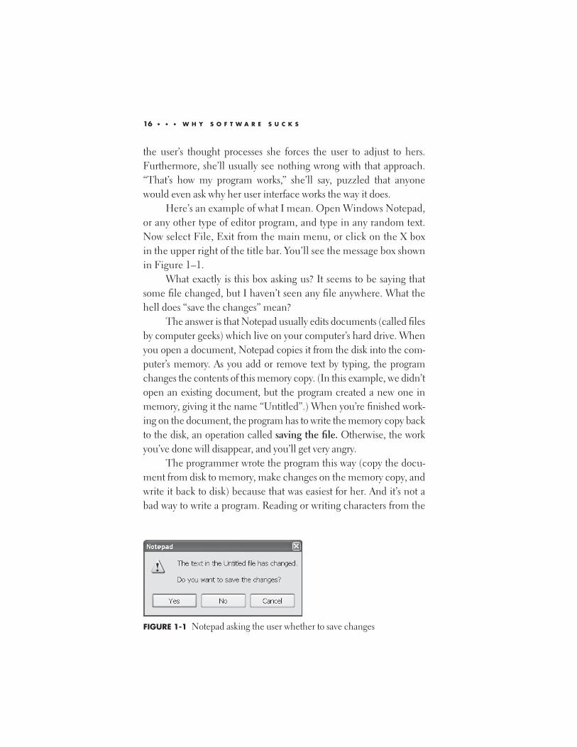
in the upper right of the title bar. You’ll see the message box shown
in Figure 1–1.
What exactly is this box asking us? It seems to be saying that
some file changed, but I haven’t seen any file anywhere. What the
hell does “save the changes” mean?
The answer is that Notepad usually edits documents (called files
by computer geeks) which live on your computer’s hard drive. When
you open a document, Notepad copies it from the disk into the com-
puter’s memory. As you add or remove text by typing, the program
changes the contents of this memory copy. (In this example, we didn’t
open an existing document, but the program created a new one in
memory, giving it the name “Untitled”.) When you’re finished work-
ing on the document, the program has to write the memory copy back
to the disk, an operation called saving the file. Otherwise, the work
you’ve done will disappear, and you’ll get very angry.
The programmer wrote the program this way (copy the docu-
ment from disk to memory, make changes on the memory copy, and
write it back to disk) because that was easiest for her. And it’s not a
bad way to write a program. Reading or writing characters from the
16 • • • W H Y S O F T W A R E S U C K S
FIGURE 1-1 Notepad asking the user whether to save changes
disk (spinning iron platters with moveable parts) is roughly a thou-
sand times slower than doing it in memory (electrons moving at the
speed of light), so this probably is the best way for this simple pro-
gram to work internally.
But the programmer’s user interface exposes these workings
directly. How can that be bad? She’s forcing you to understand that
she’s written the program this way. You shouldn’t have to know or
care about her program’s internal workings to use it successfully, as
you shouldn’t have to know or care whether your car’s engine uses
fuel injection or a carburetor in order to drive it.
You don’t normally think in the way that this program works.
Most people think of editing a computer document as analogous to
the paper-and-pencil (remember those?) method. You make marks
with the pencil and there they are on the paper. You erase the ones
you don’t want. If you don’t want any of them, you crumple up the
paper and throw it away. The work you’ve done is permanent, unless
you expend energy to get rid of it. But that’s not the choice Notepad
gives you. Every single new user of computers gets caught on this—
selecting No, in which case Notepad discards the work you’ve done,
which hopefully isn’t much. Eventually, the user learns to think like
a computer program, or more precisely, like the programmer who
wrote this mess. User interface design guru Alan Cooper defines a
“computer-literate user” as one who has been hurt so many times
that the scar tissue is thick enough so he no longer feels the pain.
The question and its answer would be much clearer if the mes-
sage box asked “Throw away everything you’ve just done?” It’s
exactly the same question, just asked from the user’s point of view
rather than the programmer’s. But the programmer is thinking only
of her program’s operation, writing to the disk, and asks you whether
to do that. She’s requiring you to wear her shoes; she hasn’t even
tried to put herself in yours. If she had, she’d ask the question a dif-
ferent way. She might then see the ridiculousness of asking it at all,
and design a better user interface, even if the underlying program
worked the same way.
W H O ’ R E Y O U C A L L I N G A D U M M Y ? • • • 17
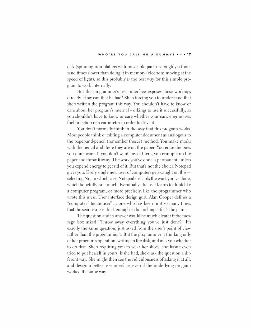
Microsoft Money, the personal finance program, does a better
job. Its designers understand that the user’s mental model is a check-
book, and his screen looks like a checkbook register (Figure 1–2). It
feels familiar and comfortable (well, relatively) to a new user. The
check that you’re currently working on is shown in a different color.
You enter the check’s details and press Enter. The check moves up,
changes color to look like the rest of them, and a new empty check
appears in the work area. If you have sound turned on, you hear a
“ka-ching” cash-register type of sound.5 The program doesn’t ask you
whether to save the check. The act of pressing Enter tells the pro-
gram that you want to keep that information. If you later change your
mind and want to change the data on a check or delete one entirely,
you click on that check in the register and type in the new informa-
tion. When does the program read its data from the disk to memory,
and when does it write it back again? I don’t know and I don’t care.
And I don’t want to and neither do you. The program’s user interface
18 • • • W H Y S O F T W A R E S U C K S
FIGURE 1-2 Microsoft Money user interface, looking like a checkbook
5. The sound itself is an anachronism. When was the last time you actually heard
that sound from a cash register? The registers in modern stores beep and whir like
the computers they are. But we still have the sound, as we still talk about dialing
phone numbers, when most of us haven’t touched a rotary instrument in decades.
follows your mental model, instead of forcing you to learn and deal
with the internal design choices of its programmers.
That’s a much better way of designing a user interface. As a
user, I don’t want to think about the program itself. I want to think
about the job the program is doing for me—for example, do I have
enough money to pay this bill? Another user interface design guru,
Donald Norman, expressed this feeling very well in the title of one
of his books: The Invisible Computer (MIT Press, 1999). Ideally, I
wouldn’t think about the program at all.
That’s one major reason programs are hard to use and make
you feel dumb. You’re being forced to think like a programmer,
even though you’re not one and you don’t want to be one. You
shouldn’t have to. You don’t have to think like a mechanic to drive a
car, you don’t have to think like a doctor to take an aspirin, and you
don’t have to think like a butcher to grill a hamburger. You’re paying
your hard-earned money for this product. It’s the programmer’s job
to adjust to you, not the other way around.
A B A D F E A T U R E A N D A G O O D O N E
Here’s another way programmers screw up user interfaces and make
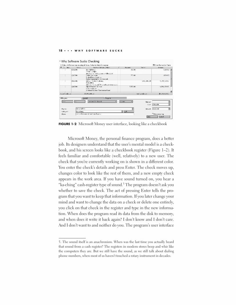
their users feel dumb. On your Windows desktop, select a docu-
ment, any document. Then press the Delete key. Unless you’ve fig-
ured out how to disable that feature, you’ll see a confirmation dialog
box like the one in Figure 1–3, asking whether you really want to
delete the file.
W H O ’ R E Y O U C A L L I N G A D U M M Y ? • • • 19
FIGURE 1-3 Useless confirmation box from Windows Recycle Bin

Have you ever, even once, said, “Whoa! I didn’t want to do
that. Thanks for asking me,” and clicked No? Have you seen anyone
do that, or even heard of that happening? I haven’t. Confirmation
has been so vastly overused that it has, ironically, become com-
pletely useless. Because this box is constantly “crying wolf,” like the
shepherd boy in Aesop’s fable, no one pays attention to it, even
when it’s warning you of a file you really don’t want to delete. You’ve
seen it so often that it doesn’t register. You cruise through it on
autopilot, clicking Yes unconsciously. It provides you with no safety
whatsoever. None. Fortunately, you can turn off this particular con-
firmation dialog.6 Many others exist that you can’t get rid of, and
none of them should exist. At all. Anywhere. Ever.
Other operations in life don’t require confirmation. Your car
does not ask, “Do you really want to start the engine?” when you turn
the key. The supermarket clerk does not ask, “Do you really want to
buy these?” when you place your groceries on the register belt.
Think how many more books you’ve bought from Amazon.com
since you discovered their patented 1-Click ordering capability.7
Why do programmers constantly ask for confirmation? They
do it because they think their users are confused and don’t under-
stand the consequences of what they’ve just told the program to do.
That may well be true, given the awful quality of the rest of the user
interface. But confirmation doesn’t solve this problem. If the user
was confused when he first gave whatever command triggered the
confirmation box, he’ll be even more confused when he sees it.
Since the program seems reluctant to do what he told it to do, he
20 • • • W H Y S O F T W A R E S U C K S
6. Right-click on the Recycle Bin, select Properties from the pop-up menu, and
uncheck the “Display delete confirmation dialog” checkbox.
7. It’s a little-known fact that, in the earliest prototype of this feature, Amazon’s pro-
grammers actually did pop up a confirmation dialog box saying, “Are you sure you
want to order this with one click?” when the user clicked the 1-Click order button,
thus making it a two-click process. They fought viciously to keep this feature, and
required a direct order from Amazon’s president, Jeff Bezos, to remove it and make it
truly a one-click process.
thinks he’s made some kind of mistake. The use of a confirmation
box keeps programmers from having to a) clearly explain to the user
what he’s doing, so he doesn’t try to do stuff he doesn’t want to, and
b) provide a way to recover in the event the user really does do
something that he later regrets.
But what if the user really is making a mistake? If you put, say, a
flashlight on the register belt with a package of the wrong size batter-
ies, wouldn’t an attentive clerk ask, “Are you sure you want these?”
Shouldn’t a good user interface save us from mistakes like that? It
certainly should, and one of the beauties of computer programs is
that it can. But that won’t happen by blindly asking, every single
time, “Are you sure you really want to do whatever the hell it is that
you just told me to do?” Instead, a good user interface would prevent
the problem from ever occurring in the first place. Perhaps the Web
page selling flashlights would contain a checkbox saying, “Include
batteries.” It’d be checked by default, because the flashlight won’t
work without batteries. A buyer who already has lots of batteries in
that size could uncheck it. Or better still, the flashlight would be
shrink-wrapped with batteries already inside it, so it would work the
instant you unwrapped it and no one would ever have to think about
it. A smart user interface designer would have thought of that before
programming even started. If a programmer thinks he needs a confir-
mation box, I guarantee you that he’s screwed up some other part of
the user interface that would prevent the need for it. He probably
hasn’t even tried, and it probably never occurred to him that he
should. Confirmation is a crutch for the lazy or ignorant program-
mer, paid for by every user. And it’s one that doesn’t work.
But wouldn’t you want to confirm destructive acts, such as delet-
ing the file? No, not really. Another reason you aren’t asked to con-
firm starting your car or buying those groceries is that these operations
are easy and cheap to undo if you suddenly realize you’ve made a mis-
take. You just turn off the ignition or return the unwanted item.
Computer programs can very quickly and easily make copies of docu-
ments and pieces of memory. This allows programmers to provide
W H O ’ R E Y O U C A L L I N G A D U M M Y ? • • • 21

users with the ability of reversing actions they’ve performed. This
Undo capability is one of the very best in the user interface designer’s
arsenal. To my mind, it’s the single biggest advance in user interface
design since the mouse.
If you click Yes on the confirmation box in Figure 1–3 (or if
you’ve turned off the box completely), Windows doesn’t actually
wipe the document off your computer. Instead, it moves it to
another area of the disk, called the Recycle Bin, which is analogous
to the famous trash can on the Macintosh. If you change your mind
after doing this and want the document back again, you can retrieve
it from the Recycle Bin as long as you haven’t emptied the bin. You
really do want to move the file almost all of the time. It’s much more
efficient to fix the relatively small number of errors that actually do
occur (for example, a slip of the mouse that caused you to select the
wrong file for deletion; I did that yesterday) than attempt to prevent
them by annoying every user with a confirmation box at every dele-
tion, especially since the latter doesn’t work because of its overuse.
An ounce of cure is not worth five pounds of prevention.
The Undo feature can work not only with file operations, but
also within applications. It’s usually found on the Edit menu, along
with its companion, Redo (which undoes the undo, of course). I
can’t write for five minutes without undoing something; typing a
foolish sentence, perhaps, or moving text to the wrong place. The
programmers who implement this feature are any user’s best friends.
I buy them beer whenever I meet with them, and so should you. It
takes an enormous amount of effort to make this feature work so that
users don’t have to think about it (“Easy is hard,” the saying goes);
just Ctrl-Z (little and ring fingers of the left hand) and back it all
comes. A program should confirm only the operations that it can’t
undo. And it should be able to undo everything.
The real beauty of Undo is that it allows users to explore a pro-
gram. It’s not always easy to understand a new program’s operation
from the short labels on menu items and the tiny pictures on toolbar
buttons. But because Undo exists, a user can experiment by trying
22 • • • W H Y S O F T W A R E S U C K S
different things, knowing that he won’t damage something that can’t
be repaired with a few keystrokes. I can move a paragraph around to
see how I like it somewhere else, and quickly undo the operation if I
don’t. Programmers often regard incorrect user input as the act of
an idoit who should have sat down and read the manual. It isn’t. It is
the primary mechanism by which the human species learns. An
application with Undo capability becomes explorable, not frighten-
ing. It recognizes and enhances the user’s humanity. Failure to
implement it properly is a mortal sin.
If Undo is implemented correctly, there is only one destructive
operation in the entire system, and that’s emptying the Recycle Bin.
Some would say that this operation should have a confirmation dia-
log box, as it currently does. But even here, the confirmation dialog
exists only to guard against another bad design, placing the Explore
context menu item right next to Empty Recycle Bin. One slip of the
mouse, sliding down three spaces on the context menu rather than
two, and you get the latter rather than the former. Bad. Since it’s the
only destructive action in the system, emptying the Recycle Bin
should have a special action used for no other purpose, maybe click-
ing both mouse buttons on it at once (an operation called chord-
ing), or clicking on it while holding down some key. Better still the
Recycle Bin should empty itself automatically, deleting files after
they’ve been inside it for some configurable amount of time, maybe
starting at a month, so that you rarely have to empty it manually.
Don’t you wish your home garbage cans would do that? You should
never see a confirmation dialog anywhere, under any circum-
stances. A programmer who shows one has abdicated responsibility
and should not be in the user interface business.
S T O P P I N G T H E P R O C E E D I N G S W I T H I D I O C Y
Programmer-designed user interfaces are at their absolute worst
when communicating error messages to the user. Just today while
goofing off from writing this chapter, I read CNN.com’s home page
W H O ’ R E Y O U C A L L I N G A D U M M Y ? • • • 23

and wanted to save a copy of it to my disk. I selected File, Save from
my Web browser’s menu. A dialog box appeared showing the
progress of the saving operation—5% complete, 15% complete, and
so on, up to 99% complete. Then that box went away and up
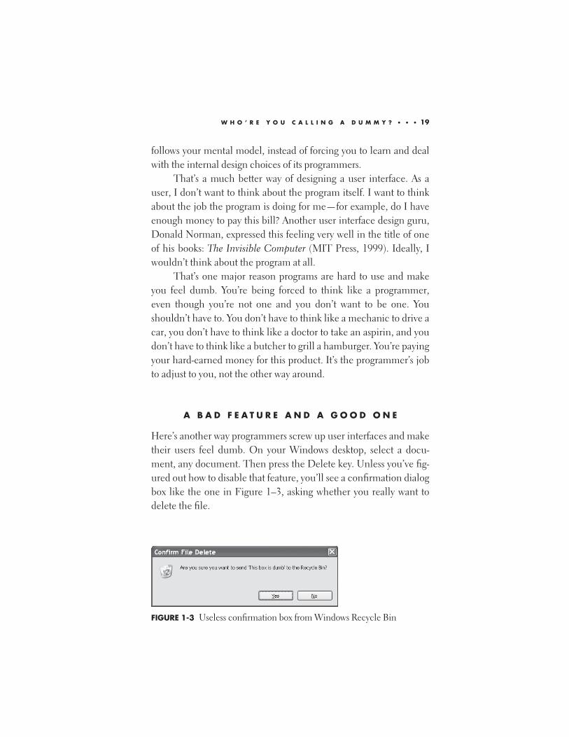
popped the one in Figure 1–4.
This box is the creation of a true idoit. Why couldn’t the Web
page be saved, and is there anything I can do to fix it? Was the page
copy protected somehow, as professional artist sites sometimes try?
Was the server unavailable? Why did the progress bar get up to 99
percent if the operation was failing? Where’s the 99 percent of the
page that it told me it saved? That’s not as good as 100 percent, but
I’d much rather have it than nothing. Why has it disappeared? The
box says the page couldn’t be saved to the selected location; does
that mean it could be saved to some other location? If so, where, and
how would I know? If not, why is it mentioning location? The
browser has already successfully shown me the page, that’s why I
said to save it; why doesn’t it just save the data it’s actually showing?
The box doesn’t tell me how to figure out exactly what the problem
is, or where to go for more information. And for a response, it offers
only the OK button. No, it is not OK with me that this operation
didn’t work and the program can’t explain why. Even the title of the
box, “Error Saving Web Page,” is erroneous. I didn’t make an error. I
did what the program allowed me to do. The program made an
error when it wouldn’t save my page and then made another when it
couldn’t explain why. To cause all this confusion with only 15
words, two of which are the, is the greatest accomplishment of
idoicy I’ve ever seen.
24 • • • W H Y S O F T W A R E S U C K S
FIGURE 1-4 Really stupid dialog box
Alan Cooper, the user interface design guru I mentioned pre-
viously, refers to situations of this type as “stopping the proceedings
with idiocy,” an excellent phrase even if he doesn’t use my spelling
of the last word. If I really can’t save that page, my browser should
know that, prevent me from trying, and somehow explain it to me,
ideally without popping another stupid box into my face. Perhaps
the Save menu should be grayed out when I go to that page, maybe
changed to read “Can’t Save–Protected” so that I’d know what and
why. If it can’t save the entire page, it should save what it can and
inform me about what it missed—again, without making me click
on another stupid dialog box. Perhaps the saved page would include
placeholders in the areas it couldn’t save, showing the little red X
graphic used in the browser display when a requested page element
can’t be found.
By rooting around behind the scenes, I was able to piece
together what happened. I had set my browser to block certain types
of annoying content. The browser displays them as blank areas on
the screen, which I vastly prefer to the stupid dancing advertise-
ments that usually appear there. (I’ll discuss the idoicy of dancing
advertisements in another chapter.) When the saving portion of the
program encountered these portions of the page and found them
blocked, it didn’t ignore them as the display portion of the program
did. Instead, it choked on them, aborted the entire process instead
of keeping what it could, and stopped the proceedings with the
idiocy I just described.
How can anyone not feel like a dummy when someone pops
up an incomprehensible box like that? By knowing that it’s not your
fault at all, but rather that the programmer is failing in his duty. By
realizing that no user should have to understand such a stupid com-
munication. By imagining your hands around that programmer’s
throat and your knee slamming into his crotch like a pile driver. By
following the suggestions at the end of this chapter and in the last
chapter of this book.
W H O ’ R E Y O U C A L L I N G A D U M M Y ? • • • 25
T E S T I N G O N L I V E A N I M A L S
A programmer would never ship a product without testing its inter-
nal operation (OK, she shouldn’t). Why would she think she could
get away without testing a user interface, to find out whether users
really can use it? Because she knows she likes it and finds it usable,
so how could anyone else fail to do so? As we’ve already seen, this
unconscious assumption is almost always wrong. Computers that
users can’t figure out how to use are very expensive paperweights.
Testing the user interface, called usability testing, is difficult and
expensive, but necessary.
She can’t just give users her program and ask them afterward
how they liked it. They often won’t remember what they did, or they
won’t want to tell her about a problem they had because they feel
stupid that they couldn’t figure it out, or they won’t want to insult
her by telling her what a complete pile of crap the product of her
last two years of professional life has turned out to be. (This is a
problem that I do not have, as you’ve probably guessed by now.) To
find out what works, programmers have to observe exactly what
users do in the act of dealing with the user interface. What do they
try to do first? Where do they go next? How many times do they try
something before they actually figure it out? How long does it take
them to notice such-and-such a feature?
And they have to observe in a manner that doesn’t affect the
users’ behavior. This means the users have to be in an isolated room,
having access to only whatever support materials (e.g., online docu-
mentation, or maybe Google) they will have in real life. You have to
watch them through one-way glass, videotaping their reactions, and
have logging software so that you can see exactly which keystrokes
and mouse clicks they used to try to deal with your application.
Some usability labs even have tracking headsets that report which
part of the screen the user is looking at.
When you do this, the light bulb goes on. As Alan Cooper
wrote in his classic book, About Face: The Essentials of User
Interface Design (IDG Books, 1995): “[Usability professionals] drag
26 • • • W H Y S O F T W A R E S U C K S
programmers into dark rooms, where they watch through one-way
mirrors as hapless users struggle with their software. At first, the pro-
grammers suspect that the test subject has brain damage. Finally,
after much painful observation, the programmers are forced to bow
to empirical evidence. They admit that their user interface design
needs work, and they vow to fix it.”
Unfortunately, usability testing often gets left until late in the
development process, just before the product ships. Schedules
invariably slip,8 so usability testing is often omitted completely.
When it actually does turn up useful information, the schedule
often doesn’t allow time for changing the program in response.
Usability testing needs to be done early, ideally before any program-
ming takes place.
Some companies think that vast amounts of testing just before
release will result in a more usable product. For example, Microsoft
does what it calls “dog-fooding,” which is short for “eating our own
dog food.” Just before the company releases a product to the public,
it’ll give it to real users inside the company—for example, switching
the secretaries over to the next edition of Word for Windows. This
does catch some bugs, by which I mean programmer logic errors,
where they forgot to carry the two or something, causing the program
to break. But that’s too late for catching design errors, particularly in
the area of usability. Eating your own dog food before releasing it to
users helps your dog food taste slightly better than it otherwise
would. But it won’t change it into cat food, and the dog food stage is
too late to discover that your users really are cats, or giraffes.
Here’s an example of doing it right. I once consulted at an
insurance company that was writing a Windows program to replace
some expensive IBM terminals. Unusually for an insurance com-
pany, they actually did the usability testing that I just told you about.
And they did it properly, too, with videotape and programmers
W H O ’ R E Y O U C A L L I N G A D U M M Y ? • • • 27
8. In one of my books for programmers, I coined Platt’s Law of Exponential
Estimation Explosion, which simply states: “Every software project takes three times
as long as your best estimate, even if you apply this law to it.”
watching through one-way glass. They found that the users basically
liked the application and found it usable. But the users had the
habit of pressing the Enter key to move from one input field to the
next, as their IBM terminals did, rather than the Tab key, as
Windows applications do. Couldn’t the developers change that,
they asked? After thinking it through carefully, the developers
decided that, although it would be quite easy technically, it wouldn’t
make the users happy, even though the users thought it would.
Sure, they could make this application work the old way. But all the
new commercial Windows applications the users were soon going
to have wouldn’t work that way, and the users would soon go
schizoid switching back and forth many times per day. So the devel-
opers convinced the users to bite the bullet and make the change.
And after the requisite period of squawking, the users calmed down
and swallowed it, helped by the abysmal job market in the area at
that time. My point is not that programmers should cram down
users’ throats the features they think would be good for them. You
usually can’t get away with that; this was a special case. I’m relating
the story to show you how a client of mine did a good job of usability
testing. They did the testing they needed to do. They found what
there was to find. And then they made the right decision based on
what they found. I wish more companies would do that.
W H E R E W E A R E A N D W H A T Y O U C A N D O
Where does that leave us poor users? To summarize my points so far:
1. You are not dumb. User interfaces really do suck, and they
shouldn’t.
2. They suck because they’re designed by programmers, who
don’t realize that their users aren’t like themselves.
3. Because of point 2, their interfaces are intentionally com-
plex, and they expect you to like dealing with that, which
you don’t (see point 1).
28 • • • W H Y S O F T W A R E S U C K S
User interfaces could be made much better by involving
usability specialists from the beginning of every software project.
General programmers are worse than useless in this regard.
Someone has to speak for the silent majority of users who don’t give
a flying fish about the technology for its own sake, who just want to
get their work done so that they can get back to living their lives. I try
to fill this role at every design review I attend. “You’re like the guys
who design the drills that they sell at Home Depot,” I tell the pro-
grammers. “Here you are, arguing over this or that internal detail of
drills, ball bearings versus roller bearings versus air bearings, each of
you claiming that’s what your customer wants more than anything
in the world. Wrong. The customer doesn’t care about your drill for
its own sake, not one tiny bit. Never has, never will. He doesn’t go to
Home Depot because he wants a drill. He goes to Home Depot
because he wants holes. If he could just buy a box of holes to put on
his wall, without having to touch a drill, he’d be much happier.
(Remember Ringo in the movie Yellow Submarine? “I’ve got a hole
in my pocket…”.) Your drill is a necessary evil in your user’s quest
for holes. Now ask yourself, and answer truthfully: “What kind of
hole does your user really want, and how is your program going to
get him better holes, faster, for less money?”
Now that you’ve finished this chapter, you’re as qualified as
anyone to tell software vendors what you like and what you don’t
like. The structure of a program’s user interface was not handed
down as a commandment on Mount Sinai. It’s created by the design
decisions of programmers and other developers, who could just as
easily make other ones. Send them e-mail, lots of it. Tell them what
you like and what you don’t like. Tell them to get that confirmation
thing out of your face and provide better Undo capability.
More than anything else in the world, programmers hate look-
ing dumb. Ugly, impotent, unkind to children and small animals,
they don’t care, but dumb? May the Good Lord have mercy on us.
Their view of themselves prizes intelligence far above everything
W H O ’ R E Y O U C A L L I N G A D U M M Y ? • • • 29
else. If you need to make a programmer do something, ensure that
he’ll look stupid in public if he doesn’t do it.
So the next time you see a badly designed user interface, stop
and look at it. Play for a while; figure out exactly and specifically
why you don’t like it, and what would make you happier. Post a
notice about the bad design on a “Hall of Shame” Web site that
exists for this purpose. This book’s Web site, www.whysoftware-
sucks.com, would be a good place to start. Then send e-mail to the
application company, showing them your public exposé. The more
stupid you’ve caught them being, the more it’ll gall them to see it
publicized. Then they might, might finally get it through their
heads that their users aren’t themselves.
30 • • • W H Y S O F T W A R E S U C K S