Embed Size (px)
Citation preview

Wouter van Vugt
Open XMLThe markup explained
1
The information contained in this document represents the current view of Microsoft Corporation on the issues discussed as of the date of publication. Because Microsoft must respond to changing market conditions, it should not be interpreted to be a commitment on the part of Microsoft, and Microsoft cannot guarantee the accuracy of any information presented after the date of publication.
This White Paper is for informational purposes only. MICROSOFT MAKES NO WARRANTIES, EXPRESS, IMPLIED OR STATUTORY, AS TO THE INFORMATION IN THIS DOCUMENT.
Complying with all applicable copyright laws is the responsibility of the user. Without limiting the rights under copyright, no part of this document may be reproduced, stored in or introduced into a retrieval system, or transmitted in any form or by any means (electronic, mechanical, photocopying, recording, or otherwise), or for any purpose, without the express written permission of Microsoft Corporation.
Microsoft may have patents, patent applications, trademarks, copyrights, or other intellectual property rights covering subject matter in this document. Except as expressly provided in any written license agreement from Microsoft, the furnishing of this document does not give you any license to these patents, trademarks, copyrights, or other intellectual property.
Unless otherwise noted, the companies, organizations, products, domain names, e-mail addresses, logos, people, places, and events depicted in examples herein are fictitious. No association with any real company, organization, product, domain name, e-mail address, logo, person, place, or event is intended or should be inferred.
© 2007 Microsoft Corporation. All rights reserved.
Microsoft, MS-DOS, Vista, Windows, Windows NT, Windows Server, ActiveX, Excel, FrontPage, InfoPath, IntelliSense, JScript, OneNote, Outlook, PivotChart, PivotTable, PowerPoint, SharePoint, ShapeSheet, Visual Basic, Visual C++, Visual C#, Visual Studio, Visual Web Developer, and Visio are either registered trademarks or trademarks of Microsoft Corporation in the United States and/or other countries.
All other trademarks are property of their respective owners.
ii
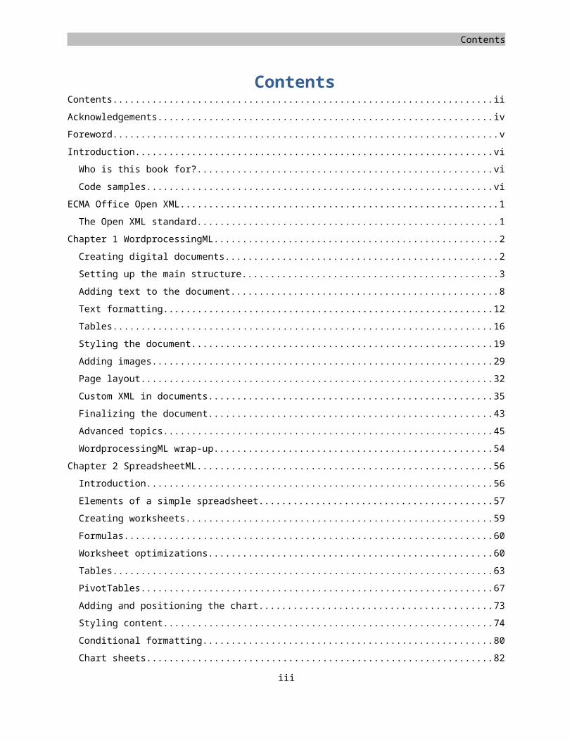
Contents
ContentsContents....................................................................................................................................................................... ii
Acknowledgements..................................................................................................................................................... iv
Foreword......................................................................................................................................................................v
Introduction................................................................................................................................................................ vi
Who is this book for?..............................................................................................................................................vi
Code samples......................................................................................................................................................... vi
ECMA Office Open XML................................................................................................................................................1
The Open XML standard..........................................................................................................................................1
Chapter 1 WordprocessingML.....................................................................................................................................2
Creating digital documents.....................................................................................................................................2
Setting up the main structure..................................................................................................................................3
Adding text to the document..................................................................................................................................8
Text formatting.....................................................................................................................................................12
Tables....................................................................................................................................................................16
Styling the document............................................................................................................................................19
Adding images.......................................................................................................................................................29
Page layout............................................................................................................................................................32
Custom XML in documents...................................................................................................................................35
Finalizing the document........................................................................................................................................43
Advanced topics....................................................................................................................................................45
WordprocessingML wrap-up.................................................................................................................................54
Chapter 2 SpreadsheetML.........................................................................................................................................56
Introduction..........................................................................................................................................................56
Elements of a simple spreadsheet.........................................................................................................................57
Creating worksheets..............................................................................................................................................59
Formulas...............................................................................................................................................................60
Worksheet optimizations......................................................................................................................................60
Tables....................................................................................................................................................................63
PivotTables............................................................................................................................................................67
Adding and positioning the chart..........................................................................................................................73
Styling content......................................................................................................................................................74
Conditional formatting..........................................................................................................................................80
Chart sheets..........................................................................................................................................................82
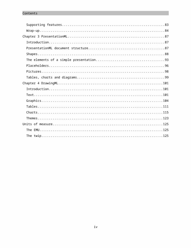
Supporting features...............................................................................................................................................83
Wrap-up................................................................................................................................................................84
Chapter 3 PresentationML.........................................................................................................................................87
iii
Contents
Introduction..........................................................................................................................................................87
PresentationML document structure....................................................................................................................87
Shapes...................................................................................................................................................................88
The elements of a simple presentation.................................................................................................................93
Placeholders..........................................................................................................................................................96
Pictures.................................................................................................................................................................98
Tables, charts and diagrams..................................................................................................................................99
Chapter 4 DrawingML..............................................................................................................................................101
Introduction........................................................................................................................................................101
Text.....................................................................................................................................................................101
Graphics..............................................................................................................................................................104
Tables..................................................................................................................................................................111
Charts..................................................................................................................................................................115
Themes................................................................................................................................................................123
Units of measure......................................................................................................................................................125
The EMU..............................................................................................................................................................125
The twip..............................................................................................................................................................125
iv

Contents
AcknowledgementsBeing used to blogging as my primary outlet of technical content, writing a book was an endeavor I am not accustomed to. To help me achieve readable and technically correct content I have been supported by Doug Mahugh and Mauricio Ordonez, without whom this book would have taken a lot longer to complete. Due to their combined effort, this book has greatly improved. Thanks to both of you for the time you put in.
v
Contents
Foreword
I first noticed the name Wouter Van Vugt in April of 2006, when he started answering questions from developers on the OpenXmlDeveloper.org Web site. Within a few months, Wouter was contributing lots of great content to OpenXmlDeveloper, posting Open XML code samples on his blog, and had created a handy tool for Open XML developers (Package Explorer), which he uploaded to Codeplex as an open-source project.
I started working directly with Wouter in the fall of 2006, when we delivered the first Open XML workshop together in Paris, and each of us later delivered that same workshop many times around the world in early 2007. Wouter’s job was simply to teach the workshops, but he couldn't restrain himself from creating more content, including various code samples and demo documents. I used his demos whenever I delivered the workshop, and also posted one of them on my blog, leading him to comment "Hey Doug, you're stealing my demos!"
True, but consider it a compliment.
Wouter’s eagerness to help developers learn about Open XML has never wavered. Near the end of that first series of workshops, when the CTP of the Microsoft® SDK for Open XML formats was released, I was busy traveling and had not spoken to him for some time. Two days after the release of the CTP, I checked the MSDN support forum, and there was Wouter, answering questions about Open XML development. Wherever developers ask questions about Open XML, Wouter seems to show up and answer them.
In this book, Wouter has distilled his deep experience in Open XML development into a simple book that developers can read and apply quickly and easily. Those who have attended his workshops will recognize his style in every page: opinionated and enthusiastic, with a knack for making complex topics sound simple and obvious.
Open XML is ushering in a new era in document formats. For the first time in the history of computing, the most widely used document-creation software in the world -- Microsoft Office -- uses an open, documented standard as its default file format. This means developers can read and write those documents from any platform, in any language. Just as HTML, HTTP, and other standards moved online services from the proprietary past of CompuServe, AOL, and Prodigy to the open and interoperable world-wide Web, the existence of XML-based document standards is moving business documents from a closed proprietary past to an open and interoperable future.
The move toward this future started in late 2005, when representatives from Apple, Barclays Capital, BP, The British Library, Essilor, Intel, Microsoft, NextPage, Novell, Statoil, Toshiba, and the United States Library of Congress formed Ecma International’s TC45 (Technical Committee 45) working group. This group delivered the Ecma 376 standard a little over a year later, in December of 2006, and that standard is now the official documentation of the Open XML standard.
This book covers only a small portion of the Ecma 376 spec: the specific things that an experienced Open XML developer like Wouter Van Vugt considers important for hands-on Open XML development. With the information in this book, developers can start taking advantage of the new opportunities that Open XML provides, and start breaking down the historical barriers between documents, processes, and data.
If you want to get a head start on Open XML development, this book is all you need. It is also a great source of cool demos to steal -- thanks, Wouter!
- Doug Mahugh
Open XML Technical Evangelist, Microsoft
June 23, 2007
vi
Contents
IntroductionAmongst the many new technologies implemented in the 2007 Microsoft® Office system there is one that you cannot miss. The new Open XML markup languages for documents, spreadsheets and presentations are here to alleviate difficulties experienced with document development and retention using older binary techniques. Open XML provides an open and standardized environment that builds on many existing standards such as XML, ZIP, and Xml-Schema. Since the use of these techniques has found its way to almost every platform in use nowadays, the document is no longer an unknown object containing formatted data. Instead, the document has become the data! It is easy to integrate in your business processes. Open XML provides several new technologies to allow the business data inside the document to be represented outside the main document body, enabling easy access to the important areas of a document and allowing great document reuse.
The purpose of this book is to provide you with the building blocks required to build your own document-centric solution. In this book, you will discover the basics of WordprocessingML, SpreadsheetML and PresentationML as well as the DrawingML supporting language. Learn about the use of custom markup to enable custom solutions using WordprocessingML, the formulas of SpreadsheetML or the great visual effects that can be applied using DrawingML.
Who is this book for?
In this book, you will be provided a detailed overview of the three major markup languages in Open XML. This book is written for those who have a basic understanding of XML or HTML. If you are a software architect or developer who needs to build document-centric solutions you can learn about how to build your value-added solutions based on the Open XML platform. Those new to document markup languages as well as those more experienced in document markup but new to Open XML will benefit from this book.
Code samples
Amongst the text, you will find many XML samples. These samples, and many others, are available on the OpenXMLDeveloper Web site on a page dedicated to the content of this book. Any revisions will also be posted on this page. Head over to OpenXMLDeveloper.org to fill your toolbox with Open XML samples.
http://openxmldeveloper.org/articles/OpenXmlExplained.aspx
vii
ZIP XML + Unicode
Relationships Content Types Digital Signatures
WordprocessingML SpreadsheetML PresentationML
DrawingML Custom XML Bibliography
VML Metadata Equations
Markup languages
Vocabularies
Open Packaging Convention
Core Technologies
ECMA Office Open XML
The Open XML standard
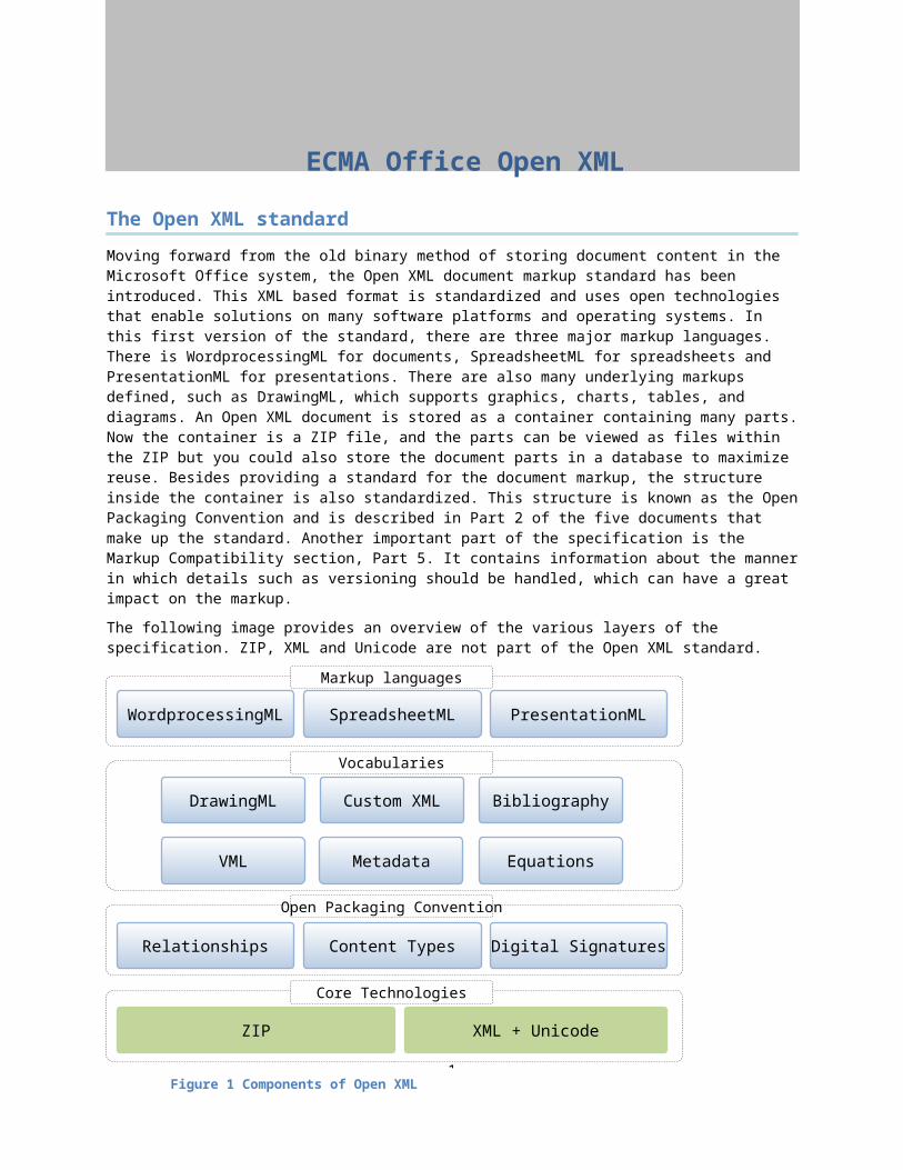
Moving forward from the old binary method of storing document content in the Microsoft Office system, the Open XML document markup standard has been introduced. This XML based format is standardized and uses open technologies that enable solutions on many software platforms and operating systems. In this first version of the standard, there are three major markup languages. There is WordprocessingML for documents, SpreadsheetML for spreadsheets and PresentationML for presentations. There are also many underlying markups defined, such as DrawingML, which supports graphics, charts, tables, and diagrams. An Open XML document is stored as a container containing many parts. Now the container is a ZIP file, and the parts can be viewed as files within the ZIP but you could also store the document parts in a database to maximize reuse. Besides providing a standard for the document markup, the structure inside the container is also standardized. This structure is known as the Open Packaging Convention and is described in Part 2 of the five documents that make up the standard. Another important part of the specification is the Markup Compatibility section, Part 5. It contains information about the manner in which details such as versioning should be handled, which can have a great impact on the markup.
The following image provides an overview of the various layers of the specification. ZIP, XML and Unicode are not part of the Open XML standard.
1
Figure 1 Components of Open XML
Chapter 1
WordprocessingML Learn about the structure of an Open XML document Learn the basics of the WordprocessingML document markup, paragraphs, runs and tables Insert images and graphics using DrawingML markup Integrate business data into a WordprocessingML container Finish a document by removing comments and revisions.
Creating digital documents
Long before we ever thought of having digital spreadsheets and presentations, we were already working with documents. These documents have been created using a variety of tools such as the now obsolete typewriter up to the automatically generated digital documents we are capable of nowadays. The use of the document has also gone through some changes. Documents in digital form allows for many benefits compared to the old paper-based approach. Adding digital signatures, custom embedded content, or tagging of a document to provide business value be now commonplace. One expression that I like to use is that documents are 'a primary vehicle for information exchange', making the way we work with documents hugely important. WordprocessingML and the encompassing technologies enable you to implement these solutions by building on the rich feature-set of the 2007 Microsoft Office System. In this chapter, you will learn about how WordprocessingML documents are structured and how you can format a document using styles. Next, we will look at how to make a document dynamic by providing custom markup for business data in the document, greatly enhancing the usability of the document as a container for information. The chapter will finish with some details on how to finish your document before sending it to a coworker or customer.
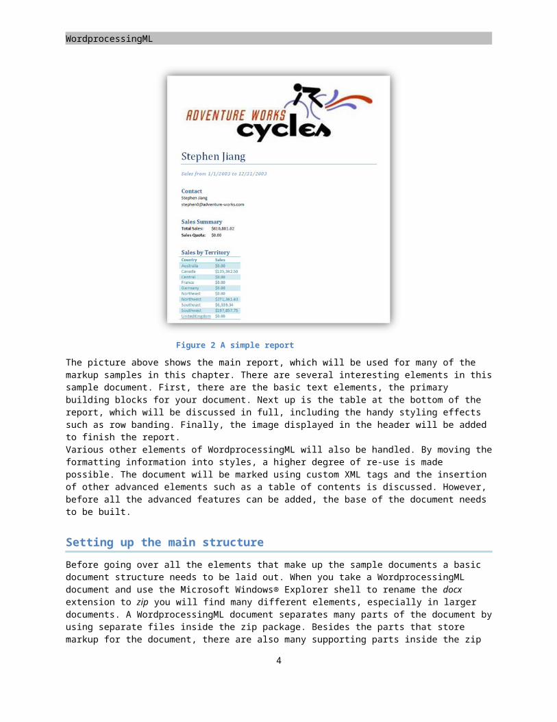
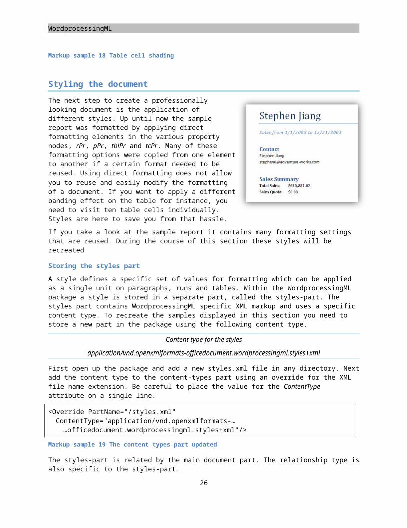
Figure 2 A simple report
2

Placeholders
The picture above shows the main report, which will be used for many of the markup samples in this chapter. There are several interesting elements in this sample document. First, there are the basic text elements, the primary building blocks for your document. Next up is the table at the bottom of the report, which will be discussed in full, including the handy styling effects such as row banding. Finally, the image displayed in the header will be added to finish the report. Various other elements of WordprocessingML will also be handled. By moving the formatting information into styles, a higher degree of re-use is made possible. The document will be marked using custom XML tags and the insertion of other advanced elements such as a table of contents is discussed. However, before all the advanced features can be added, the base of the document needs to be built.
Setting up the main structure
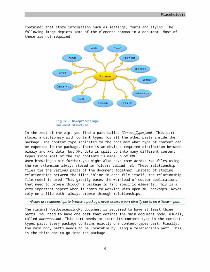
Before going over all the elements that make up the sample documents a basic document structure needs to be laid out. When you take a WordprocessingML document and use the Microsoft Windows® Explorer shell to rename the docx extension to zip you will find many different elements, especially in larger documents. A WordprocessingML document separates many parts of the document by using separate files inside the zip package. Besides the parts that store markup for the document, there are also many supporting parts inside the zip container that store information such as settings, fonts and styles. The following image depicts some of the elements common in a document. Most of these are not required.
In the root of the zip, you find a part called [Content_Types].xml. This part stores a dictionary with content types for all the other parts inside the package. The content type indicates to the consumer what type of content can be expected in the package. There is an obvious required distinction between binary and XML data, but XML data is split up into many different content types since most of the zip contents is made up of XML.When browsing a bit further you might also have come across XML files using the rels extension always stored in folders called _rels. These relationship files tie the various parts of the document together. Instead of storing relationships between the files inline in each file itself, the relationship file model is used. This greatly eases the workload of custom applications that need to browse through a package to find specific elements. This is a very important aspect when it comes to working with Open XML packages. Never rely on a file path, always browse through relationships.
Always use relationships to browse a package, never access a part directly based on a 'known' path
3
Figure 3 WordprocessingML document structure
WordprocessingML
The minimal WordprocessingML document is required to have at least three parts. You need to have one part that defines the main document body, usually called document.xml. This part needs to store its content type in the content-types part. Every package contains exactly one content-types part. Finally, the main body parts needs to be locatable by using a relationship part. This is the third one to go into the package.
To create the initial empty document, first create an empty directory. Inside this empty directory, create a new subdirectory called _rels. Don't forget the underscore, the name is important. In the empty root directory, you store two files, the content-types list, and main document part. In the _rels subfolder, the third relationship part is stored. The main document part can actually be stored in any directory of your liking, as long as the relationship will point to it correctly. The root directory is just used for the ease of it. Microsoft Office Word® 2007 uses the word subfolder. Other applications can freely choose any other directory they see fit.
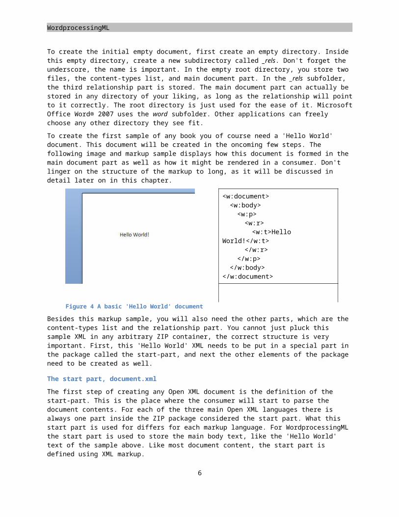
To create the first sample of any book you of course need a 'Hello World' document. This document will be created in the oncoming few steps. The following image and markup sample displays how this document is formed in the main document part as well as how it might be rendered in a consumer. Don't linger on the structure of the markup to long, as it will be discussed in detail later on in this chapter.
<w:document><w:body><w:p><w:r><w:t>Hello
World!</w:t></w:r>
</w:p></w:body>
</w:document>
Figure 4 A basic 'Hello World' document
Besides this markup sample, you will also need the other parts, which are the content-types list and the relationship part. You cannot just pluck this sample XML in any arbitrary ZIP container, the correct structure is very important. First, this 'Hello World' XML needs to be put in a special part in the package called the start-part, and next the other elements of the package need to be created as well.
The start part, document.xml
The first step of creating any Open XML document is the definition of the start-part. This is the place where the consumer will start to parse the document contents. For each of the three main Open XML languages there is always one part inside the ZIP package considered the start part. What this start part is used for differs for each markup language. For WordprocessingML the start part is used to store the main body text, like the 'Hello World' text of the sample above. Like most document content, the start part is defined using XML markup.
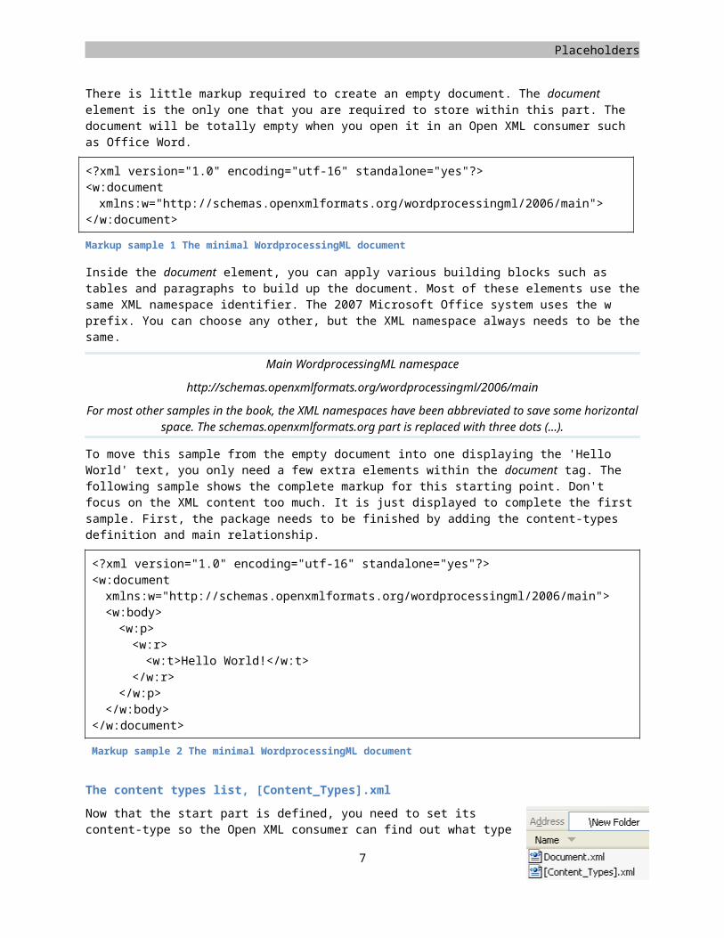
There is little markup required to create an empty document. The document element is the only one that you are required to store within this part. The document will be totally empty when you open it in an Open XML consumer such as Office Word.
<?xml version="1.0" encoding="utf-16" standalone="yes"?><w:document xmlns:w="http://schemas.openxmlformats.org/wordprocessingml/2006/main">
</w:document>
Markup sample 1 The minimal WordprocessingML document
4
Placeholders
Inside the document element, you can apply various building blocks such as tables and paragraphs to build up the document. Most of these elements use the same XML namespace identifier. The 2007 Microsoft Office system uses the w prefix. You can choose any other, but the XML namespace always needs to be the same.
Main WordprocessingML namespace
http://schemas.openxmlformats.org/wordprocessingml/2006/main
For most other samples in the book, the XML namespaces have been abbreviated to save some horizontal space. The schemas.openxmlformats.org part is replaced with three dots (…).
To move this sample from the empty document into one displaying the 'Hello World' text, you only need a few extra elements within the document tag. The following sample shows the complete markup for this starting point. Don't focus on the XML content too much. It is just displayed to complete the first sample. First, the package needs to be finished by adding the content-types definition and main relationship.
<?xml version="1.0" encoding="utf-16" standalone="yes"?><w:document xmlns:w="http://schemas.openxmlformats.org/wordprocessingml/2006/main"><w:body><w:p><w:r><w:t>Hello World!</w:t>
</w:r></w:p>
</w:body></w:document>
Markup sample 2 The minimal WordprocessingML document
The content types list, [Content_Types].xml
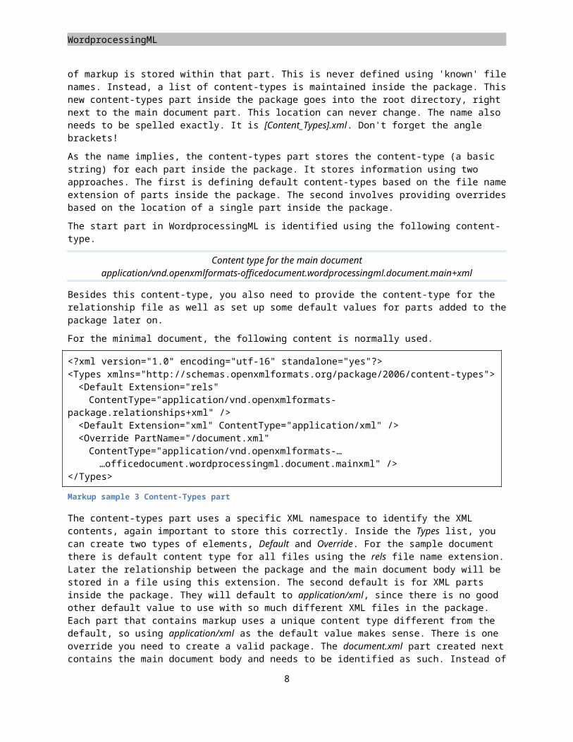
Now that the start part is defined, you need to set its content-type so the Open XML consumer can find out what type of markup is stored within that part. This is never defined using 'known' file names. Instead, a list of content-types is maintained inside the package. This new content-types part inside the package goes into the root directory, right next to the main document part. This location can never change. The name also needs to be spelled exactly. It is [Content_Types].xml. Don't forget the angle brackets!
As the name implies, the content-types part stores the content-type (a basic string) for each part inside the package. It stores information using two approaches. The first is defining default content-types based on the file name extension of parts inside the package. The second involves providing overrides based on the location of a single part inside the package.
The start part in WordprocessingML is identified using the following content-type.
Content type for the main documentapplication/vnd.openxmlformats-officedocument.wordprocessingml.document.main+xml
Besides this content-type, you also need to provide the content-type for the relationship file as well as set up some default values for parts added to the package later on.
For the minimal document, the following content is normally used.
<?xml version="1.0" encoding="utf-16" standalone="yes"?><Types xmlns="http://schemas.openxmlformats.org/package/2006/content-types">
5
WordprocessingML
<Default Extension="rels" ContentType="application/vnd.openxmlformats-
package.relationships+xml" /> <Default Extension="xml" ContentType="application/xml" /> <Override PartName="/document.xml" ContentType="application/vnd.openxmlformats-……officedocument.wordprocessingml.document.mainxml" />
</Types>
Markup sample 3 Content-Types part
The content-types part uses a specific XML namespace to identify the XML contents, again important to store this correctly. Inside the Types list, you can create two types of elements, Default and Override. For the sample document there is default content type for all files using the rels file name extension. Later the relationship between the package and the main document body will be stored in a file using this extension. The second default is for XML parts inside the package. They will default to application/xml, since there is no good other default value to use with so much different XML files in the package. Each part that contains markup uses a unique content type different from the default, so using application/xml as the default value makes sense. There is one override you need to create a valid package. The document.xml part created next contains the main document body and needs to be identified as such. Instead of using the Extension attribute to identify the file name extension for the content-type, the PartName attribute is used to point to a specific part inside the package. The PartName only allows the usage of an absolute path, which is evaluated from the root of the package. The main document part will be named document.xml and is stored in the empty root directory next to the content-types part we are creating in the current step.
Open XML applications must enforce content types by verifying that the contents of the part stream match the expected content type. A document whose parts do not correspond to the content types manifest is considered
corrupt.
One common mistake when hand editing an Open XML document, is adding new parts to the package but forgetting to update the content-types list. When you forget to add a new Override entry to the content-types list
the document will fail to open and a non-descriptive error is displayed.
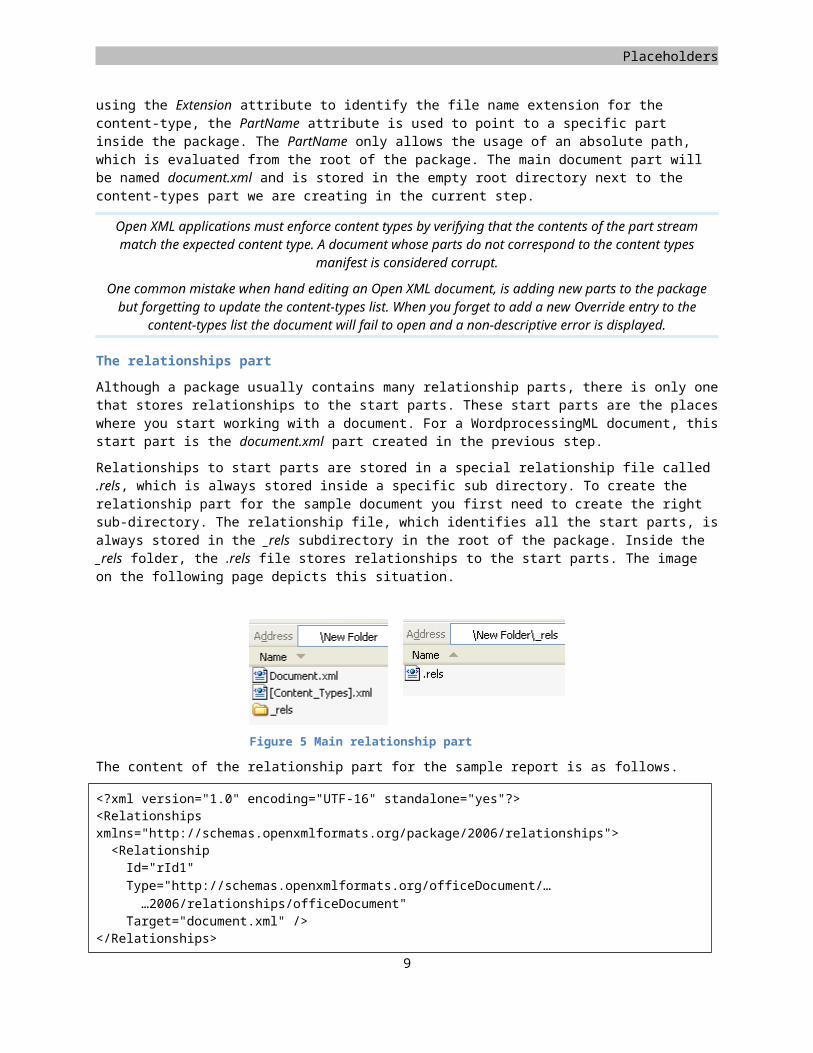
The relationships part
Although a package usually contains many relationship parts, there is only one that stores relationships to the start parts. These start parts are the places where you start working with a document. For a WordprocessingML document, this start part is the document.xml part created in the previous step.
Relationships to start parts are stored in a special relationship file called .rels, which is always stored inside a specific sub directory. To create the relationship part for the sample document you first need to create the right sub-directory. The relationship file, which identifies all the start parts, is always stored in the _rels subdirectory in the root of the package. Inside the _rels folder, the .rels file stores relationships to the start parts. The image on the following page depicts this situation.
Figure 5 Main relationship part
6
Placeholders
The content of the relationship part for the sample report is as follows.
<?xml version="1.0" encoding="UTF-16" standalone="yes"?><Relationships xmlns="http://schemas.openxmlformats.org/package/2006/relationships"><Relationship Id="rId1"Type="http://schemas.openxmlformats.org/officeDocument/……2006/relationships/officeDocument"
Target="document.xml" /></Relationships>
Markup sample 4 The main relationship file
The relationship file stores the relationships by maintaining a list inside the Relationships element. The relationship is formed using three pieces of information. The relationship ID uniquely identifies a single relationship. It needs to be unique within the specific relationship file. The relationship is of a specific type identified using the Type attribute. Finally, the relationship points to the target of the relationship. Note that there is no source information stored inside the relationship file. The source is implied by the relationship part itself. Since this relationship file is called .rels and is stored in the _rels folder the source is the package. The value for the Target attribute is evaluated based on the location of the source. Since the source of the relationship file is the package, the root-symbol / is used to identify the source of the relationship. Combining the / symbol with the specified value for Target value of document.xml results in the path /document.xml, which is the exact location of the main document part. The main document part uses the following relationship type.
Relationship type for the main document
http://schemas.openxmlformats.org/officeDocument/2006/relationships/officeDocument
Later on in the chapter, new relationships will be created as well as new relationship files. Remember that this one is only used to identify the start parts. The other elements are related in a similar, but slightly different way.
The final zipped document
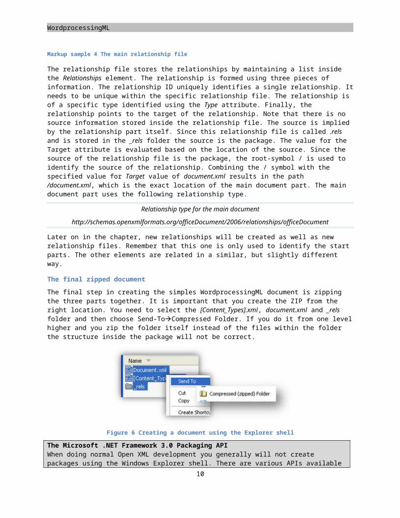
The final step in creating the simples WordprocessingML document is zipping the three parts together. It is important that you create the ZIP from the right location. You need to select the [Content_Types].xml, document.xml and _rels folder and then choose Send-ToCompressed Folder. If you do it from one level higher and you zip the folder itself instead of the files within the folder the structure inside the package will not be correct.
Figure 6 Creating a document using the Explorer shell
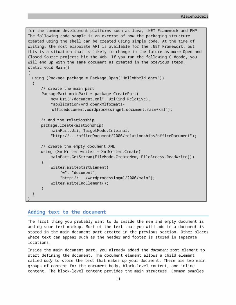
The Microsoft .NET Framework 3.0 Packaging APIWhen doing normal Open XML development you generally will not create packages using the Windows Explorer shell. There are various APIs available for the common development platforms such as Java, .NET Framework and PHP. The following code sample is an excerpt of how the packaging structure created using the shell can be
7
WordprocessingML
created using simple code. At the time of writing, the most elaborate API is available for the .NET Framework, but this is a situation that is likely to change in the future as more Open and Closed Source projects hit the Web. If you run the following C #code, you will end up with the same document as created in the previous steps.static void Main(){using (Package package = Package.Open("HelloWorld.docx")){
// create the main part PackagePart mainPart = package.CreatePart( new Uri("/document.xml", UriKind.Relative), "application/vnd.openxmlformats-
officedocument.wordprocessingml.document.main+xml");
// and the relationshippackage.CreateRelationship(
mainPart.Uri, TargetMode.Internal, "http://.../officeDocument/2006/relationships/officeDocument");
// create the empty document XMLusing (XmlWriter writer = XmlWriter.Create(
mainPart.GetStream(FileMode.CreateNew, FileAccess.ReadWrite))) { writer.WriteStartElement( "w", "document", "http://.../wordprocessingml/2006/main"); writer.WriteEndElement(); }}
}
Adding text to the document
The first thing you probably want to do inside the new and empty document is adding some text markup. Most of the text that you will add to a document is stored in the main document part created in the previous section. Other places where text can appear such as the header and footer is stored in separate locations.
Inside the main document part, you already added the document root element to start defining the document. The document element allows a child element called body to store the text that makes up your document. There are two main groups of content for the document body, block-level content, and inline content. The block-level content provides the main structure. Common samples of block-level content are paragraphs and tables. The block-level content contains inline content. Among the inline elements are runs of text and images.
Figure 7 The WordprocessingML text hierarchy
A paragraph is split up into different runs. The run element is the lowest level element that can have formatting applied. The run is split up again into various text elements. There is a text element to define printable text and also elements to store non-printing characters such as carriage returns or line-breaks. One thing to be careful of here is not to format the document using carriage returns and line-breaks. The paragraph is the basic unit of layout, and by providing the right margins and tab information the document can be formatted much better, especially when re-styling the document.
8
Placeholders
Let's move beyond the sample report to show how to work with paragraphs, runs, and text elements. The following image contains a 'Lorem Ipsum' text. This is default text normally used in the typographical world to generate default document content.
Figure 8 A sample text
You can generate this sample page yourself by opening a new document in the Office Word application and typing =lorem(8,8).
The 'lorem' macro is a special function of Word to allow text to be generated for demo and testing purposes. You can also use 'rand' to generate pseudo random text
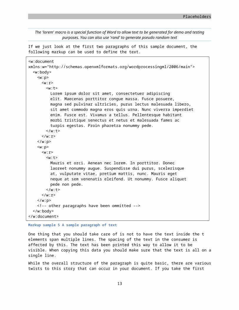
If we just look at the first two paragraphs of this sample document, the following markup can be used to define the text.
<w:document xmlns:w="http://schemas.openxmlformats.org/wordprocessingml/2006/main"><w:body><w:p><w:r><w:t>Lorem ipsum dolor sit amet, consectetuer adipiscing elit. Maecenas porttitor congue massa. Fusce posuere, magna sed pulvinar ultricies, purus lectus malesuada libero, sit amet commodo magna eros quis urna. Nunc viverra imperdiet enim. Fusce est. Vivamus a tellus. Pellentesque habitant morbi tristique senectus et netus et malesuada fames ac turpis egestas. Proin pharetra nonummy pede.
</w:t></w:r>
9
WordprocessingML
</w:p><w:p><w:r><w:t>Mauris et orci. Aenean nec lorem. In porttitor. Donec laoreet nonummy augue. Suspendisse dui purus, scelerisque at, vulputate vitae, pretium mattis, nunc. Mauris eget neque at sem venenatis eleifend. Ut nonummy. Fusce aliquet pede non pede.
</w:t></w:r>
</w:p><!-- other paragraphs have been ommitted -->
</w:body></w:document>
Markup sample 5 A sample paragraph of text
One thing that you should take care of is not to have the text inside the t elements span multiple lines. The spacing of the text in the consumer is affected by this. The text has been printed this way to allow it to be visible. When copying this data you should make sure that the text is all on a single line.
While the overall structure of the paragraph is quite basic, there are various twists to this story that can occur in your document. If you take the first paragraph, you can create the exact same text in the consumer using many different combinations of runs and text elements.
The first thing that you can do is split up the single text element into more text elements. The result would remain exactly the same. The following markup sample shows the paragraph above, but now split into two t elements.
<w:p><w:r><w:t xml:space="preserve">Lorem ipsum dolor sit amet, consectetuer adipiscing elit. Maecenas porttitor congue massa. Fusce posuere, magna sed pulvinar ultricies, purus lectus malesuada libero,
</w:t><w:t>sit amet commodo magna eros quis urna. Nunc viverra imperdiet enim. Fusce est. Vivamus a tellus. Pellentesque habitant morbi tristique senectus et netus et malesuada fames ac turpis egestas. Proin pharetra nonummy pede.
</w:t></w:r>
</w:p>
Markup sample 6 The first paragraph split in two text elements
Since the contents of the first text element ends in a space the xml:space attribute is applied. If you forget this attribute, the trailing space will be trimmed by the consumer.
The next thing that you can do is similar to this. Instead of splitting it up into many t elements, you can also split it up at the run-level. The following markup sample shows how this could look.
<w:p><w:r><w:t xml:space="preserve">
10
Placeholders
Lorem ipsum dolor sit amet, consectetuer adipiscing elit. Maecenas porttitor congue massa. Fusce posuere, magna sed pulvinar ultricies, purus lectus malesuada libero,
</w:t></w:r><w:r><w:t>sit amet commodo magna eros quis urna. Nunc viverra imperdiet enim. Fusce est. Vivamus a tellus. Pellentesque habitant morbi tristique senectus et netus et malesuada fames ac turpis egestas. Proin pharetra nonummy pede.
</w:t></w:r>
</w:p>
Markup sample 7 The paragraph split in two run elements
Both the splitting of run and text elements can be used in conjunction. One reason that this might happen is formatting of text, something that you will learn next. Since the run is the lowest level where you can apply text formatting, making a single word bold inside a single run text will create new run elements under the covers. The reason for allowing runs to be split up into text elements is to allow the run to also store non-printing characters such as a carriage-return or tab-character.
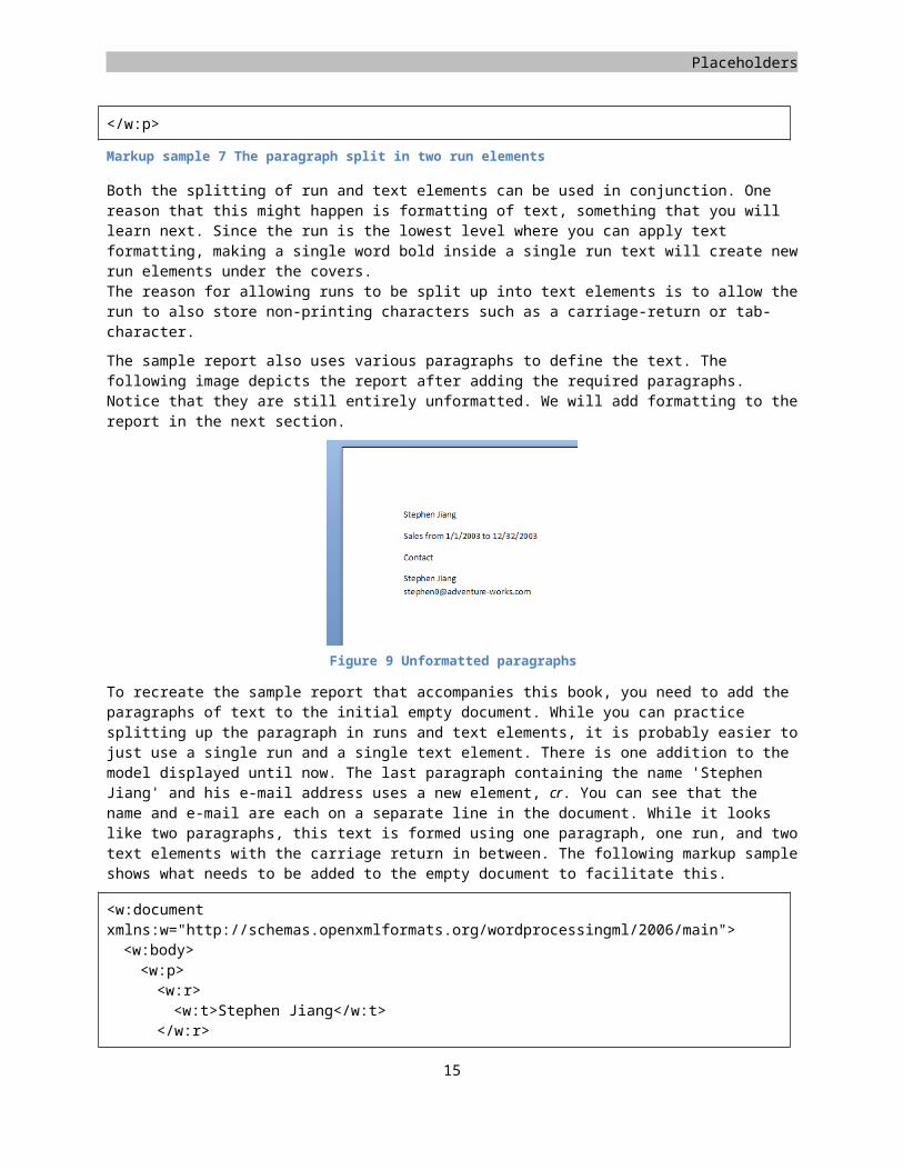
The sample report also uses various paragraphs to define the text. The following image depicts the report after adding the required paragraphs. Notice that they are still entirely unformatted. We will add formatting to the report in the next section.
To recreate the sample report that accompanies this book, you need to add the paragraphs of text to the initial empty document. While you can practice splitting up the paragraph in runs and text elements, it is probably easier to just use a single run and a single text element. There is one addition to the model displayed until now. The last paragraph containing the name 'Stephen Jiang' and his e-mail address uses a new element, cr. You can see that the name and e-mail are each on a separate line in the document. While it looks like two paragraphs, this text is formed using one paragraph, one run, and two text elements with the carriage return in between. The following markup sample shows what needs to be added to the empty document to facilitate this.
<w:document xmlns:w="http://schemas.openxmlformats.org/wordprocessingml/2006/main"><w:body><w:p><w:r>
11
Figure 9 Unformatted paragraphs
WordprocessingML
<w:t>Stephen Jiang</w:t></w:r>
</w:p><w:p><w:r><w:t xml:space="preserve">Sales from 1/1/2003 </w:t><w:t>to 12/32/2003</w:t>
</w:r></w:p><w:p><w:r><w:t>Cont</w:t>
</w:r><w:r><w:t>act</w:t>
</w:r></w:p><w:p><w:r><w:t>Stephen Jiang</w:t><w:cr /><w:t>[email protected]</w:t>
</w:r></w:p>
</w:body></w:document>
Markup sample 8 Paragraphs for the sample report
Text formatting
The logical next step in creating the sample document is adding text formatting. The sample document shows several different formatting options applied. To format a piece of text you can use a few methods. The simplest is applying direct formatting to the paragraph and run elements created in the previous section. To allow for re-use of formatting settings you can also create a style. This will be discussed later in the chapter.
There are two levels of direct formatting which you can apply to the document text: the paragraph and the run level. There are many different settings that can be applied at both levels. For a complete overview, the easiest is to open the Paragraph and Font dialog boxes in Microsoft Office Word 2007. Basically paragraph formatting encompasses details that affect the entire paragraph, such as spacing, margins and paragraph borders. The run-level formatting provides the ability to change how individual characters look. You can change details such as the font or bold and italic text.
The container for paragraph level formatting is also allowed to store run-level formatting options. These will be applied not on all the text in the paragraph, something you might be expecting, but to the paragraph-mark instead.
Run formatting
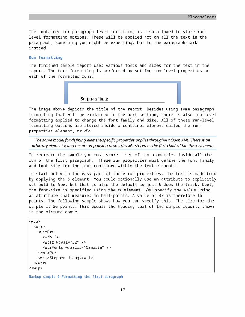
The finished sample report uses various fonts and sizes for the text in the report. The text formatting is performed by setting run-level properties on each of the formatted runs.
12

Placeholders
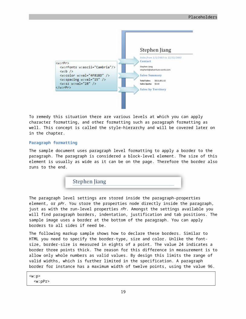
The image above depicts the title of the report. Besides using some paragraph formatting that will be explained in the next section, there is also run-level formatting applied to change the font family and size. All of these run-level formatting options are stored inside a container element called the run-properties element, or rPr.
The same model for defining element-specific properties applies throughout Open XML. There is an arbitrary element x and the accompanying properties xPr stored as the first child within the x element.
To recreate the sample you must store a set of run properties inside all the run of the first paragraph. These run properties must define the font family and font size for the text contained within the text elements.
To start out with the easy part of these run properties, the text is made bold by applying the b element. You could optionally use an attribute to explicitly set bold to true, but that is also the default so just b does the trick. Next, the font-size is specified using the sz element. You specify the value using an attribute that measures in half-points. A value of 32 is therefore 16 points. The following sample shows how you can specify this. The size for the sample is 26 points. This equals the heading text of the sample report, shown in the picture above.
<w:p><w:r><w:rPr><w:b /><w:sz w:val="52" /><w:rFonts w:ascii="Cambria" />
</w:rPr><w:t>Stephen Jiang</w:t>
</w:r></w:p>
Markup sample 9 Formatting the first paragraph
The last interesting setting applied in the sample is font specification using the rFonts element. Notice how the name indicates a plural? It is rFonts. This rFonts element is special because it allows you to set the font-family of all text in the formatted run based on what character range the text is in. See section 2.3.2.24 of Part 4 of the ECMA specification for more information about the available character ranges.
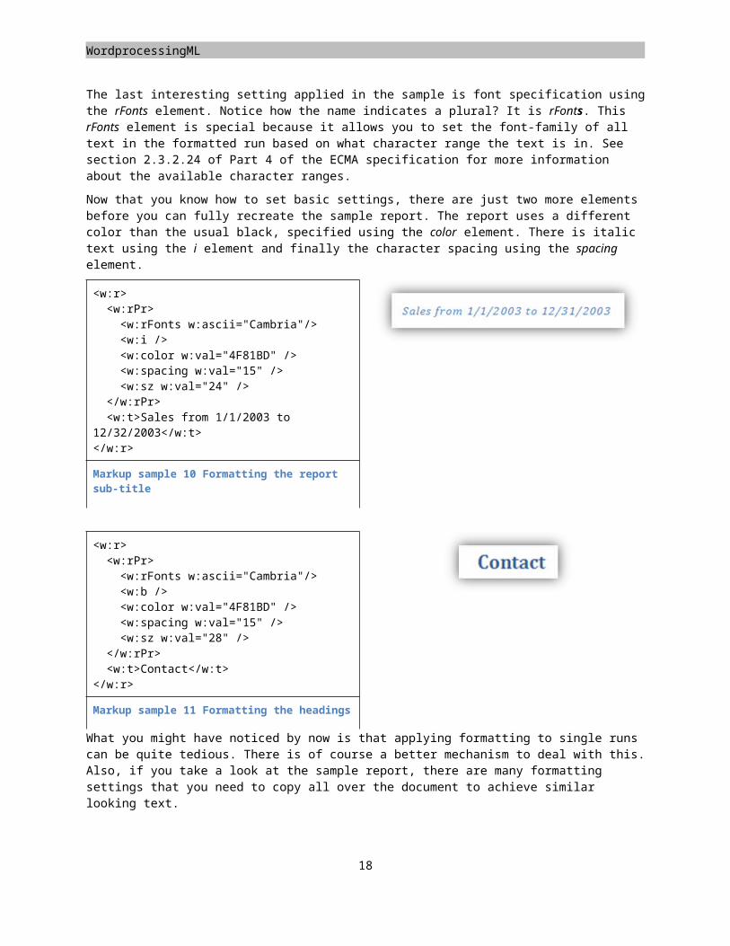
Now that you know how to set basic settings, there are just two more elements before you can fully recreate the sample report. The report uses a different color than the usual black, specified using the color element. There is italic text using the i element and finally the character spacing using the spacing element.
<w:r><w:rPr><w:rFonts w:ascii="Cambria"/><w:i /><w:color w:val="4F81BD" /><w:spacing w:val="15" /><w:sz w:val="24" />
</w:rPr><w:t>Sales from 1/1/2003 to
12/32/2003</w:t></w:r>
Markup sample 10 Formatting the report sub-title
13
WordprocessingML
<w:r><w:rPr><w:rFonts w:ascii="Cambria"/><w:b /><w:color w:val="4F81BD" /><w:spacing w:val="15" /><w:sz w:val="28" />
</w:rPr><w:t>Contact</w:t>
</w:r>
Markup sample 11 Formatting the headings
What you might have noticed by now is that applying formatting to single runs can be quite tedious. There is of course a better mechanism to deal with this. Also, if you take a look at the sample report, there are many formatting settings that you need to copy all over the document to achieve similar looking text.
To remedy this situation there are various levels at which you can apply character formatting, and other formatting such as paragraph formatting as well. This concept is called the style-hierarchy and will be covered later on in the chapter.
Paragraph formatting
The sample document uses paragraph level formatting to apply a border to the paragraph. The paragraph is considered a block-level element. The size of this element is usually as wide as it can be on the page. Therefore the border also runs to the end.
The paragraph level settings are stored inside the paragraph-properties element, or pPr. You store the properties node directly inside the paragraph, just as with the run-level properties rPr. Amongst the settings available you will find paragraph borders, indentation, justification and tab positions. The sample image uses a border at the bottom of the paragraph. You can apply borders to all sides if need be.
14
Placeholders
The following markup sample shows how to declare these borders. Similar to HTML you need to specify the border-type, size and color. Unlike the font-size, border-size is measured in eights of a point. The value 24 indicates a border three points thick. The reason for this difference in measurement is to allow only whole numbers as valid values. By design this limits the range of valid widths, which is further limited in the specification. A paragraph border for instance has a maximum width of twelve points, using the value 96.
<w:p><w:pPr><w:pBdr><w:bottom w:val="single" w:sz="4" w:color="auto" />
</w:pBdr></w:pPr><w:r><w:t>Stephen Jiang</w:t>
</w:r></w:p>
Markup sample 12 Applying properties to a paragraph
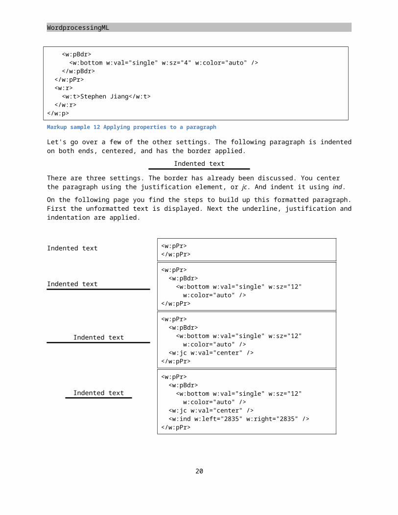
Let's go over a few of the other settings. The following paragraph is indented on both ends, centered, and has the border applied.
Indented text
There are three settings. The border has already been discussed. You center the paragraph using the justification element, or jc. And indent it using ind.
On the following page you find the steps to build up this formatted paragraph. First the unformatted text is displayed. Next the underline, justification and indentation are applied.
Indented text <w:pPr></w:pPr>
Indented text
<w:pPr><w:pBdr> <w:bottom w:val="single" w:sz="12" w:color="auto" />
</w:pPr>
Indented text
<w:pPr><w:pBdr> <w:bottom w:val="single" w:sz="12" w:color="auto" />
<w:jc w:val="center" /></w:pPr>
Indented text
<w:pPr><w:pBdr> <w:bottom w:val="single" w:sz="12" w:color="auto" />
<w:jc w:val="center" /><w:ind w:left="2835" w:right="2835" />
</w:pPr>
15
WordprocessingML
Different break types
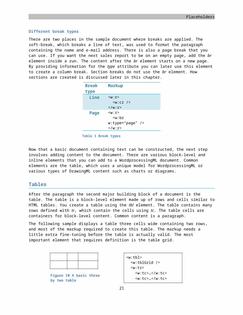
There are two places in the sample document where breaks are applied. The soft-break, which breaks a line of text, was used to format the paragraph containing the name and e-mail address. There is also a page break that you can use. If you want the next sales report to be on an empty page, add the br element inside a run. The content after the br element starts on a new page. By providing information for the type attribute you can later use this element to create a column break. Section breaks do not use the br element. How sections are created is discussed later in this chapter.
Break type
Markup
Line <w:r><w:cr />
</w:r>Page <w:r>
<w:br w:type="page" /></w:r>
Now that a basic document containing text can be constructed, the next step involves adding content to the document. There are various block-level and inline elements that you can add to a WordprocessingML document. Common elements are the table, which uses a unique model for WordprocessingML or various types of DrawingML content such as charts or diagrams.
Tables
After the paragraph the second major building block of a document is the table. The table is a block-level element made up of rows and cells similar to HTML tables. You create a table using the tbl element. The table contains many rows defined with tr, which contain the cells using tc. The table cells are containers for block-level content. Common content is a paragraph.
The following sample displays a table three cells wide containing two rows, and most of the markup required to create this table. The markup needs a little extra fine-tuning before the table is actually valid. The most important element that requires definition is the table grid.
<w:tbl><w:tblGrid /><w:tr><w:tc>…</w:tc><w:tc>…</w:tc><w:tc>…</w:tc>
</w:tr><w:tr><w:tc>…</w:tc><w:tc>…</w:tc><w:tc>…</w:tc>
</w:tr></w:tbl>
Markup sample 13 Structure of a table
16
Figure 10 A basic three by two table
Table 1 Break types
Placeholders
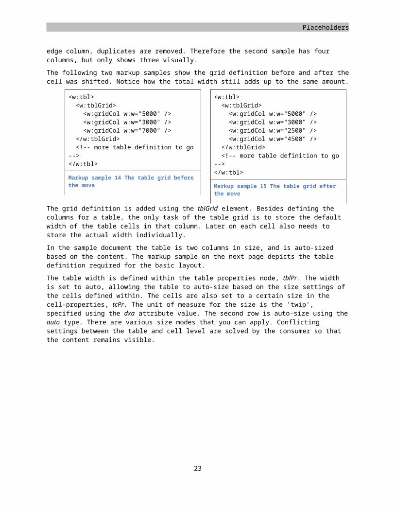
To create a table you first need to create the grid definition. This grid definition contains settings about the columns that make up a table. Each column is defined using an element inside the grid definition. The sample table is obviously made up of three columns:
What might surprise you is what happens when you take two cells of this simple table, and shift their borders. This will create a skewed effect in a column, where not all cells in a column are equally wide. In the following sample the last two cells of the second row are slightly moved.
Instead of the three columns that you might expect, there are now four columns that you will need to define in the grid definition. The grid definition does not conform to 'visible' columns only. To create the grid definition you need to extend the lines of all the cell walls. Each of these lines defines the edge column, duplicates are removed. Therefore the second sample has four columns, but only shows three visually.
The following two markup samples show the grid definition before and after the cell was shifted. Notice how the total width still adds up to the same amount.
<w:tbl><w:tblGrid><w:gridCol w:w="5000" /><w:gridCol w:w="3000" /><w:gridCol w:w="7000" />
</w:tblGrid><!-- more table definition to go
--></w:tbl>
Markup sample 14 The table grid before the move
<w:tbl><w:tblGrid><w:gridCol w:w="5000" /><w:gridCol w:w="3000" /><w:gridCol w:w="2500" /><w:gridCol w:w="4500" />
</w:tblGrid><!-- more table definition to go
--></w:tbl>
Markup sample 15 The table grid after the move
The grid definition is added using the tblGrid element. Besides defining the columns for a table, the only task of the table grid is to store the default width of the table cells in that column. Later on each cell also needs to store the actual width individually.
17
WordprocessingML
In the sample document the table is two columns in size, and is auto-sized based on the content. The markup sample on the next page depicts the table definition required for the basic layout.
The table width is defined within the table properties node, tblPr. The width is set to auto, allowing the table to auto-size based on the size settings of the cells defined within. The cells are also set to a certain size in the cell-properties, tcPr. The unit of measure for the size is the 'twip', specified using the dxa attribute value. The second row is auto-size using the auto type. There are various size modes that you can apply. Conflicting settings between the table and cell level are solved by the consumer so that the content remains visible.
<w:tbl><w:tblPr><w:tblW w:w="0" w:type="auto" />
</w:tblPr><w:tblGrid><w:gridCol w:w="1614" /><w:gridCol w:w="1330" />
</w:tblGrid><w:tr><w:tc><w:tcPr><w:tcW w:w="1614"
w:type="dxa" /></w:tcPr><w:p><w:r><w:t>Country</w:t>
</w:r></w:p>
</w:tc><w:tc><w:tcPr><w:tcW w:w="0" w:type="auto" />
</w:tcPr><w:p><w:r><w:t>Sales</w:t>
</w:r></w:p>
</w:tc></w:tr><w:tr><!-- data rows ommitted -->
</w:tr></w:tbl>
Markup sample 16 Sample table markup
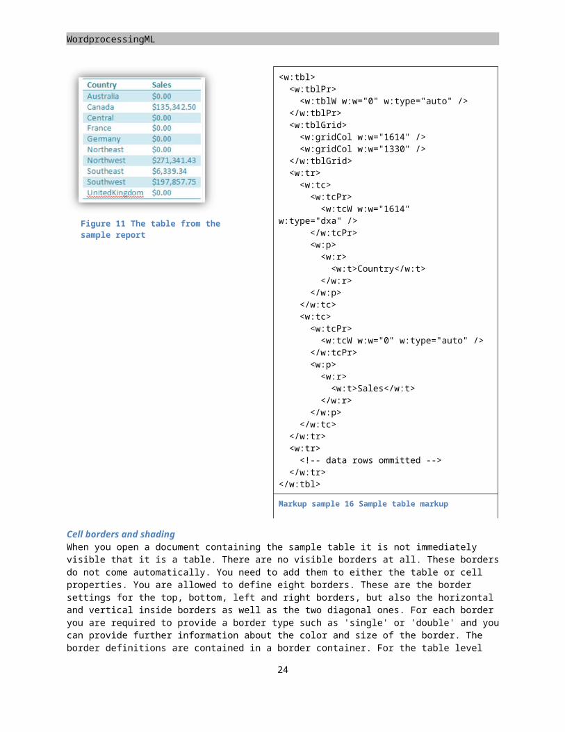
Cell borders and shadingWhen you open a document containing the sample table it is not immediately visible that it is a table. There are no visible borders at all. These borders do not come automatically. You need to add them to either the table or cell properties. You are allowed to define eight borders. These are the border settings for the top, bottom, left and right borders, but also the horizontal and vertical inside borders as well as the two diagonal ones. For each border you are required to provide a border type such as 'single' or 'double' and you can provide further information about the color and size of the border. The border definitions are contained in a border container. For the table level border definition this container is the tblBorders element, tcBorders is used at the cell level. The width of the table borders is measured in 1/8th points. Valid border width values range from 2 to 96.
18
Figure 11 The table from the sample report
Placeholders
The table in the sample document defines a top and bottom border for the entire content. The first row has a border applied as well. Since it is not possible to set borders on a row, the border for the first row is repeated across the two cells. Place the following border definition in the table and cell properties respectively.
<w:tblPr><w:tblBorders><w:top w:val="single" w:sz="8" w:space="0" w:color="4BACC6" /><w:bottom w:val="single" w:sz="8" w:space="0" w:color="4BACC6" />
</w:tblBorders></w:tblPr>
<w:tcPr><w:tcBorders><w:top w:val="single" w:sz="8" w:space="0" w:color="4BACC6" /><w:left w:val="nil" /><w:bottom w:val="single" w:sz="8" w:space="0" w:color="4BACC6" /><w:right w:val="nil" /><w:insideH w:val="nil" /><w:insideV w:val="nil" />
</w:tcBorders></w:tcPr>
Markup sample 17 Table and cell borders
An interesting detail about how these borders are defined is in the tcBorders element. The table level properties might define a border for all the cells by using the insideH and insideV elements. To override the setting the borders of the cell are explicitly set to nil. This type of overriding settings is common in Open XML. You also use it when defining the formatting using styles for instance.
The second requirement for making the table look more like the sample report is applying a banding effect. This effect is achieved through applying shading settings for each odd row, not counting the header. The shading is defined at the cell-level, using the shd element inside the properties. To apply the shading, add the following element to each cell properties for the odd rows only. One obvious thing to note is that this means quite a lot of copy / pasting. Later on this is solved with table styles, which have built-in support for row and column banding effects.
<w:tcPr><w:shd w:val="clear" w:color="auto" w:fill="D2EAF1" />
</w:tcPr>
Markup sample 18 Table cell shading
Styling the document
The next step to create a professionally looking document is the application of different styles. Up until now the sample report was formatted by applying direct formatting elements in the various property nodes, rPr, pPr, tblPr and tcPr. Many of these formatting options were copied from one element to another if a certain format needed to be reused. Using direct formatting does not allow you to reuse and easily modify the formatting of a document. If you want to apply a different banding effect on the table for instance, you need to visit ten table cells individually. Styles are here to save you from that hassle.
19
WordprocessingML
If you take a look at the sample report it contains many formatting settings that are reused. During the course of this section these styles will be recreated
Storing the styles part
A style defines a specific set of values for formatting which can be applied as a single unit on paragraphs, runs and tables. Within the WordprocessingML package a style is stored in a separate part, called the styles-part. The styles part contains WordprocessingML specific XML markup and uses a specific content type. To recreate the samples displayed in this section you need to store a new part in the package using the following content type.
Content type for the styles
application/vnd.openxmlformats-officedocument.wordprocessingml.styles+xml
First open up the package and add a new styles.xml file in any directory. Next add the content type to the content-types part using an override for the XML file name extension. Be careful to place the value for the ContentType attribute on a single line.
<Override PartName="/styles.xml" ContentType="application/vnd.openxmlformats-……officedocument.wordprocessingml.styles+xml"/>
Markup sample 19 The content types part updated
The styles-part is related by the main document part. The relationship type is also specific to the styles-part.
Relationship type for the styles
http://schemas.openxmlformats.org/wordprocessingml/2006/styles
You need to create a relationship between the main document part and the new styles part. You can store relationships, which originate in a specific part using their part-specific relationship file. This file is always stored in a _rels subdirectory from the directory where the part is in. The relationship file has the same file-name as the part itself, using an extra .rels extension. When the main document part is called document.xml and is stored in the root of the package, its relationship file is stored in \_rels\document.xml.rels. Since the Microsoft Office Word application uses the word folder for storing the main document part, the corresponding relationship file is usually located in \word\_rels\document.xml.rels.
<?xml version="1.0" encoding="UTF-8" standalone="yes"?><Relationships xmlns="http://schemas.openxmlformats.org/package/2006/relationships"><Relationship Id="rId1" Type="http://schemas.openxmlformats.org/officeDocument/……2006/relationships/styles" Target="styles.xml" />
</Relationships>
Markup sample 20 The document relationship file
Style types
There are three elements being stored inside the style part, styles, latent-styles and document defaults. All of these three elements can define formatting options for document content. The styles contain formatting information that is currently being used inside the document. Latent-styles are not used or visible in the document and serve as a cache location for style settings, for instance those copied from the document template (Most developers can ignore latent styles). The document defaults are the default style values for document content.
20
Placeholders
Using styles you can provide formatting information for three element types, character runs, paragraphs and tables. A paragraph style can provide formatting options for the paragraph and runs using pPr and rPr elements. The character style is only allowed to provide run level properties using rPr. Table styles use table and cell properties, tblPr and tcPr, as well as paragraph and run level properties.
<w:styles xmlns:w="http://.../wordprocessingml/2006/main"><w:docDefaults /><w:latentStyles /><w:style>...</w:style><w:style>...</w:style><w:style>...</w:style>
</w:styles>
Markup sample 21 Content of the styles part
There is a last important aspect to styles that needs to be discussed before going into the details of the style hierarchy and how the sample report is styled. Some styles can be applied to either a paragraph or to a run of text. You can try this out by opening a new document and entering some text. If you select nothing but place only the cursor inside the text and hover over the Title style in the quick style picker in Microsoft Office Word 2007, the entire line is styled. You can also select a small piece of the text and then select the Title style, only the selected text is styled. Even though you experience one style that can be applied to both a paragraph and a run, under the covers there are separate character and paragraph styles that work together.
To apply a style on an element, the property nodes are used. A paragraph uses pStyle to indicate which style is used. The following paragraph uses the Title style.
<w:p><w:pPr><w:pStyle w:val="Title" />
</w:pPr><w:r><w:t>Stephen Jiang</w:t>
</w:r></w:p>
Markup sample 22 A paragraph using the 'Title' style
The style hierarchy
Since a table style can also include character and paragraph formatting options the complexity increases a bit. Styles can also inherit other styles, forming a style-hierarchy. Each level in the hierarchy forms one part of the final view in the document and is allowed to override settings of previous levels in the hierarchy. The following overview provides some insight in which order certain style settings are applied to tables, character runs, paragraphs and numbered items. The top is applied first (document defaults), the bottom last (direct formatting). Each item can extend and override settings found in the previous level.
21
WordprocessingML
Table Characters Paragraphs List items
Table 2 The style hierarchy for document content
One sample is the second column, how styles are applied to character runs. Take the following sample markup. It does not contain valid WordprocessingML code, but is just there to illustrate how styles are applied.
<tbl style="MyTable><row><cell style="MyCell"><paragraph style="MyParagraph"><run style="MyRun">
Figure 12 A sample run in a styled hierarchy
What needs to be decided by the consumer is how the run is displayed. What will happen is that it first receives the properties defined in the defaults. Since the run is part of a styled table, the consumer looks in the MyTable style to find more run-level properties, similar for the table cell style MyCell. The run sits inside a styled paragraph. The paragraph style can also contain run-level properties that are applied on the run. Finally the run references a style, which also contains run-level properties. The direct formatting is not present in this sample, but would be applied last.
There are two solutions for resolving conflicting settings. Any property defined at the parent level (toward the document defaults) can be redefined at the child level (toward the styled element). The child level either redefines a property, such as a font-size, or leaves it out completely. Leaving it out indicates that the value for that property is inherited from the parent. When the parent also doesn't define it, the hierarchy is searched upward to the root, which is the document-defaults for paragraphs and runs. When a setting is not defined, the consumer uses the default application value.
Styles are also useful for moving the style from one document to another. You can copy many formatting settings completely changing the look of the document. Think of a scenario where you update all the aged corporate
documents to a newer shinier format.To make this easy to do, make sure to use the built-in names for styles and always use a hierarchy using the Normal
style as the root. This ensures that your other documents don't miss styles when you replace their style settings. Custom styles should also inherit from the built-in to ensure portability.
The download page contains a sample of style swapping.22
Document Defaults
Table
Numbering
Paragraph
Character
Direct Formatting
Placeholders
The document defaults
The first obvious thing to do is provide some default settings for the font. The styles part allows you to store two kinds of default values, character and paragraph properties. These default values use the same property elements as direct formatting. There is pPr for paragraph properties and rPr for character properties. They are contained in a specific container, pPrDefault and rPrDefault. The following markup sample can be used to provide the default font settings for the sample report. Remember the rFonts element, which stores four fonts based on the Unicode range, and the font size sz, which was specified in half-points. To fully recreate the sample document there is also some spacing between each paragraph. The paragraph level properties are used to store this information as the spacing affects the entire paragraph. The spacing element stores the necessary information. You can provide spacing above and below a paragraph using the before and after attributes. The height of the empty space is measured in twentieth of a point, known as a twip.
<w:styles xmlns:w="http://.../wordprocessingml/2006/main"><w:docDefaults><w:rPrDefault><w:rPr><w:rFonts w:ascii="Calibri" /><w:sz w:val="22" />
</w:rPr></w:rPrDefault><w:pPrDefault><w:pPr><w:spacing w:after="120" />
</w:pPr></w:pPrDefault>
</w:docDefaults></w:styles>
Markup sample 23 Default style settings
Creating styles
The sample report has several formatting options that are reused by copying them all over the document. To better support the editing experience these formatting options will be moved into specific styles. There are four styles in use in the document, excluding the table style.
There are two things that you need to do when formatting your document with styles: fill the styles part with the styles that you want to use, and then refer to those types from the body of the document. Common styles are the
23
Title
Sub-Title
Heading 1
Emphasis
WordprocessingML
well-known headings like 'Heading 1', 'Heading 2', and so on. Custom styles are also allowed. A benefit of using the built-in names for styles is that it can be used for content such as the table of contents, which is based on certain styled paragraphs in the document.
A style is defined using the style element directly within the root element of the styles part. There are multiple styles that you can store there. Each style is made up of three parts: common style properties, the style type and type specific properties. The common style properties include the style name and the style that it inherits from. Usually the Normal style is used as the hierarchy root.
Paragraph styles
There are three paragraph styles used in the document, one for the title, subtitle and headings. The sample report makes use of built-in style names in order to keep a consistent UI in the consumer and for creating the table of contents later on.
The first style we will create is the title style. The easiest thing to do is open up the styles part and add a global style definition, and next move the paragraph and run level properties from the main document part into the styles part. The title text becomes un-formatted by doing this. The obvious next step is to have the title paragraph make use of the new title style. The following markup sample can be copied into the styles part to create the title style.
<w:style w:type="paragraph" w:styleId="Title"><w:name w:val="Title" /><w:next w:val="Normal" /><w:basedOn w:val="Normal" /><w:qFormat />
</w:style>
Markup sample 24 Basic style properties
The style is indicated to be a paragraph style. The paragraph and run properties will apply to all text in the entire paragraph. The styleId is present for referencing the style. The name element identifies a user-friendly name for the style. Paragraph styles are allowed a specific child element called next. This indicates which style will be used for the paragraph inserted after a paragraph using the title style. The style is further customized by making the title style inherit from the normal style, and adding it to the quick format display in the consumer using the qFormat element.
The paragraph style is allowed to contain paragraph level properties.
<w:pPr><w:pBdr><w:bottom w:val="single" w:sz="4" w:space="1" w:color="auto" />
</w:pBdr><w:spacing w:after="200" /><w:keepNext /><w:keepLines /><w:spacing w:before="480" w:after="0" /><w:outlineLvl w:val="0" />
</w:pPr>
Markup sample 25 Paragraph properties in a paragraph style
Run level properties can also be defined in the paragraph style.
<w:rPr><w:rFonts w:ascii="Cambria" />
24
Placeholders
<w:spacing w:val="5" /><w:sz w:val="52" />
</w:rPr>
Markup sample 26 Run properties in a paragraph style
The full style definition looks like the following markup sample.
<w:style w:type="paragraph" w:styleId="Title"><w:name w:val="Title" /><w:next w:val="Normal" /><w:basedOn w:val="Normal" /><w:qFormat /><w:pPr><w:pBdr><w:bottom w:val="single" w:sz="4" w:space="1" w:color="auto" />
</w:pBdr><w:spacing w:after="200" /><w:keepLines /><w:spacing w:before="480" w:after="0" /><w:outlineLvl w:val="0" />
</w:pPr><w:rPr><w:rFonts w:ascii="Cambria" /><w:spacing w:val="5" /><w:sz w:val="52" />
</w:rPr></w:style>
Markup sample 27 Paragraph style for the title
There are three more paragraph styles to create. The normal paragraph style is defined to allow it to be used in conjunction with the next element from the previous sample. The subtitle and heading 1 style can be copied from the main document.
Character styles
The Sales Summary and the table headers of the sample report are emphasized using bold text. This can be captured in a character style. Different from the paragraph style, a character style only contains run-level properties. The overall setup is the same. The style type and ID are defined, as well as the name. The rest of the content can be copied from the main document part.
<w:style w:type="character" w:styleId="Emphasis"><w:name w:val="Emphasis" /><w:qFormat /><w:rPr><w:b /></w:rPr>
</w:style>
Markup sample 28 Character styles
To apply the character style, a similar approach is used. Inside the run-level properties you use the rStyle element to identify the character style used on the run.
25
WordprocessingML
Only the properties applied directly on a run using the rPr element contains text-formatting settings. The run properties inside the paragraph properties format the paragraph mark.
The following markup sample shows a paragraph with a style applied. The paragraph contains two runs of which the first also has a style applied. Next to the sample one possible outcome to these properties is displayed.
<w:p><w:pPr><w:pStyle w:val="Normal" />
</w:pPr><w:r><w:rPr><w:rStyle
w:val="MyCharacterStyle" /></w:rPr><w:t>Hello</w:t>
</w:r><w:r xml:space="preserve"><w:t> World</w:t>
</w:r></w:p>
Markup sample 29 Applying paragraph and character styles
Table styles
Before going into the details of page layout, the table style requires a little further explanation. The table style is allowed to store more information than just a single set of table and cell properties. Using WordprocessingML you can structure the table into different sections like a top- and bottom-row, first and last column and banded rows. Using row banding you can apply a different style to all the evenly and un-evenly numbered rows giving a banding effect which allows the table to be read better by the user. The following table has this applied.
Price CostItem 1 14,95 5,65Item 2 13,92 3,14Item 3 12,65 9,30Item 4 16,00 10,00
The sample table in the report uses a separate header and row-banding effect. To create the table style the model is mostly similar to the other styles. You create a style element and set the type to 'table'. Inside the table style you are allowed to define table, cell, paragraph, and run level properties.
First let's set up the table style outline. The same elements as the other styles are applied. The qFormat element allows the style to appear in the quick format menu.
<w:style w:type="table" w:styleId="ReportTable"><w:name w:val="My Table Style" /><w:qFormat /><!-- More to go here -->
</w:style>
Markup sample 30 Table style with banding effect
Inside the table style you can start applying styled areas to the table. The sample table displayed in above uses a different set of style settings for the first row, the first column and each even numbered row. The first step is to
26
Placeholders
apply the default settings for the paragraphs and runs inside the table using pPr and rPr. The following picture depicts the result after this first step. The markup sample needs to be placed inside the style element, just as the rest of the oncoming table style samples.
<w:pPr><w:spacing w:after="0" />
</w:pPr><w:rPr><w:color w:val="31849B" />
</w:rPr>
Markup sample 31 Table style with banding effect
Next, comes the table border. Since the border runs across the top and bottom of the table, you can apply the border in the table properties node, tblPr. You could also define this border in the top-row settings created later on.
<w:tblPr><w:tblBorders><w:top w:val="single" w:sz="8"w:color="4BACC6" />
<w:bottom w:val="single" w:sz="8" w:color="4BACC6" />
</w:tblBorders></w:tblPr>
Markup sample 32 Table style with banding effect
The first special styled area is the top row. This row has a border applied at the bottom, and has a different background color. The text is also bold and white. To store these settings you create a new container inside the style definition. This container will store the specific properties for the styled first row using the same pPr, rPr and tcPr nodes as we have been using continuously.
<w:tblStylePr w:type="firstRow"><w:rPr><w:b /><w:color w:val="FFFFFF" />
</w:rPr><w:tcPr><w:tcBorders><w:bottom w:val="single" w:sz="8" w:space="0"w:color="4BACC6" />
</w:tcBorders><w:shd w:val="clear" w:color="auto" w:fill="D2EAF1"/>
</w:tcPr></w:tblStylePr>
Markup sample 33 Table style with banding effect
The container element for the first column is largely the same as the one for the first row. Only the type attribute on the tblStylePr element points to another part of the table and there are no borders to apply. They are inherited from the whole table and the first row settings.
27
WordprocessingML
<w:tblStylePr w:type="firstColumn"><w:rPr><w:b /><w:color w:val="FFFFFF" />
</w:rPr><w:tcPr><w:shd w:val="clear" w:color="auto"
w:fill="D2EAF1"/></w:tcPr>
</w:tblStylePr>
Markup sample 34 First column properties
The last part of the table to have a special style applied is the banding effect of rows. You can provide different settings for the evenly and unevenly numbered rows.
<w:tblStylePr w:type="band1Horz"><w:tcPr><w:shd w:val="clear" w:color="auto" w:fill="D2EAF1"/>
</w:tcPr></w:tblStylePr>
Markup sample 35 Table style with banding effect
The complete table style looks like the following markup sample.
<w:style w:type="table" w:styleId="ReportTable"><w:name w:val="My Table Style" /><w:qFormat /><w:pPr><w:spacing w:after="0" />
</w:pPr><w:rPr><w:color w:val="31849B" />
</w:rPr><w:tblPr><w:tblBorders><w:top w:val="single" w:sz="8" w:color="4BACC6" /><w:bottom w:val="single" w:sz="8" w:color="4BACC6" />
</w:tblBorders></w:tblPr><w:tblStylePr w:type="firstRow"><w:rPr><w:b /><w:color w:val="FFFFFF" />
</w:rPr><w:tcPr><w:tcBorders><w:bottom w:val="single" w:sz="8" w:space="0" w:color="4BACC6" />
28
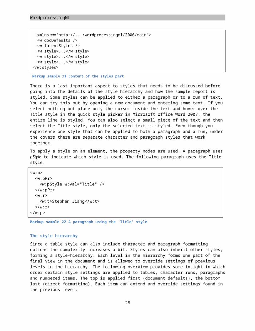
Placeholders
</w:tcBorders><w:shd w:val="clear" w:color="auto" w:fill="D2EAF1"/>
</w:tcPr></w:tblStylePr><w:tblStylePr w:type="firstColumn"><w:rPr><w:b /><w:color w:val="FFFFFF" />
</w:rPr><w:tcPr><w:shd w:val="clear" w:color="auto" w:fill="D2EAF1"/>
</w:tcPr></w:tblStylePr><w:tblStylePr w:type="band1Horz"><w:tcPr><w:shd w:val="clear" w:color="auto" w:fill="D2EAF1"/>
</w:tcPr></w:tblStylePr>
</w:style>
Markup sample 36 The complete table style
To apply a table style on a table you use the tblStyle element, similar to paragraph and run styling. There is one twist to the allowed settings. There is a separation between the defined sections in the table style and the ones actually applied on the table. The table style is free to define any of the allowed section such as banding effects. Next the table needs to instruct the consumer which settings to use. The manner in which this works is through the tblLook element. It defines a hexadecimal bitmask with instructions on which sections to apply. The value 0420 corresponds with activating the header row and row banding. The next page shows the markup sample.
<w:tbl><w:tblPr><w:tblStyle w:val="ReportTable" /><w:tblLook w:val="0420" /><w:tblW w:w="0" w:type="auto" />
</w:tblPr><!-- Remaining table markup omitted -->
</w:tbl>
Markup sample 37 Applying a table style
Adding images
There are several types of content that you can embed in a WordprocessingML document. The document allows you to create pictures and other elements using either DrawingML markup, or legacy Vector Markup Language. The preferred method is DrawingML. It is more powerful and does not rely on Microsoft specific namespaces. You will find both in use in real world documents. The main benefit of VML for you as a developer is the little markup required to store an image in the document. DrawingML markup is far more elaborate and has a dedicated chapter in this book.
29
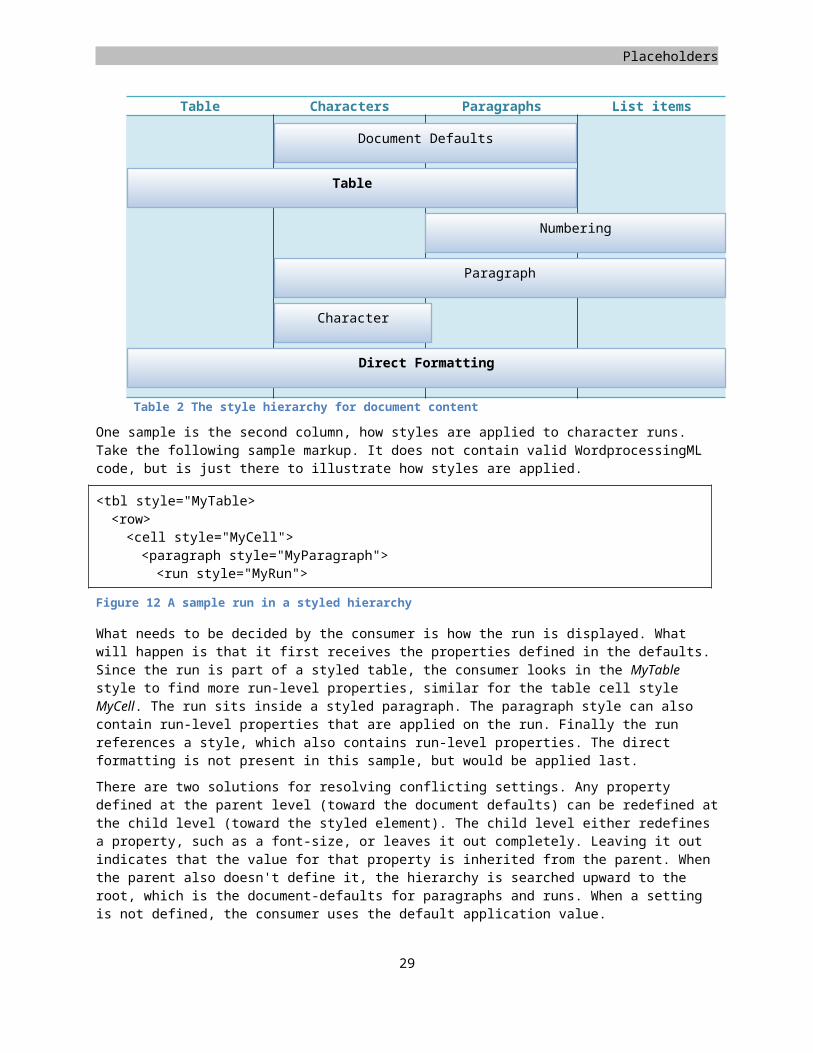
WordprocessingML
Before you can display an image inside the document, the image first needs to be stored inside the package. Similar to storing the styles part, you need to create the file in the package, update the content-types list and create a relationship from the main document part to the image. Find a suitable place for the image and update the content-types part to reflect the image type. The normal MIME types are used for the content type, such as 'image/png'. To display the image in the main document part, the relationship needs to be created a relationship to the image part. The relationship type is specific to images.
Relationship type for images
http://schemas.openxmlformats.org/officeDocument/2006/relationships/image
Inserting a DrawingML picture
When you have inserted a picture into the WordprocessingML document using a consumer such as Microsoft Office Word you will notice that there are several effects that you can apply to the picture. The same can be said for smart-art (diagrams) and charts. Under the covers WordprocessingML is not the one defining this content, DrawingML is. There is a specific WordprocessingML container to allow for this type and other types of content inside the document, the graphic frame.
WordprocessingML uses the drawing element to create a graphic frame. It serves as the positioning element for the drawing inside the document. Inside the inline drawing the graphic element defines the content of the graphic frame. Using the graphicData structure the content of the graphic data is defined. Each Open XML language uses this structure to store various types of content. The uri attribute of the graphicData identifies the type of content. The actual content should of course conform to this type as not to confuse the Open XML consumer.
The specifics of the picture, smart-art and charts are discussed in the chapter on DrawingML later in this book. The following markup sample displays the minimal required markup for creating the same image as found in the sample report.
<w:drawing><wp:inline distT="0" distB="0" distL="0" distR="0"><wp:extent cx="5943600" cy="2003354" /><wp:docPr id="1" name="Picture 1" /><a:graphic
xmlns:a="http://schemas.openxmlformats.org/drawingml/2006/main"><a:graphicData
uri="http://schemas.openxmlformats.org/drawingml/2006/picture"><pic:pic
xmlns:pic="http://schemas.openxmlformats.org/drawingml/2006/picture"><pic:nvPicPr><pic:cNvPr id="0" name="Picture 1" /><pic:cNvPicPr /></pic:nvPicPr><pic:blipFill><a:blip r:embed="rId2" /><a:stretch><a:fillRect /></a:stretch></pic:blipFill><pic:spPr>
30
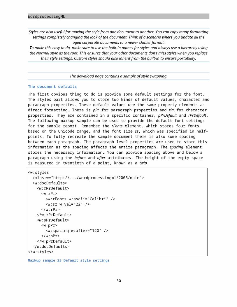
Placeholders
<a:xfrm><a:off x="0" y="0" /><a:ext cx="5943600" cy="2003354" /></a:xfrm><a:prstGeom prst="rect"><a:avLst /></a:prstGeom></pic:spPr>
</pic:pic></a:graphicData>
</a:graphic></wp:inline>
</w:drawing>
Markup sample 38 The report image using DrawingML
While this may seem overly complex for inserting an image, many elements are simple and are just defaults. The great thing about DrawingML is the easy with which you can greatly enhance a picture. If you take a bland picture,
you just apply two elements to make it more interesting, one for a different shape and the other for reflection.
<a:prstGeom prst="star5"><a:avLst />
</a:prstGeom><a:effectLst><a:reflection
blurRad="6350" stA="50000" endA="300" endPos="55000"
dir="5400000" sy="-100000" algn="bl" rotWithShape="0" />
</a:effectLst>
The chapter on DrawingML goes into more details of all the effects that you can apply.
Inserting a VML picture
All though not a part of the Open XML standard, VML pictures are used in WordprocessingML documents as well, as can any other format that an implementer wants. This language is now deprecated but is still sometimes used from inside the Microsoft Office Word application. The feature set is similar, but DrawingML does provide a greater variety of effects. Just like DrawingML you change the shape's geometry. This geometry can then be provided with a shadow, or moved in 3-D space. The geometry has a line- and fill- style applied. The sample uses a picture as the fill type, but you can also specify single colors, gradients and textures. While the available features are not as broad as DrawingML, VML does provide one benefit. The required markup to insert a VML shape into the document is a lot
31
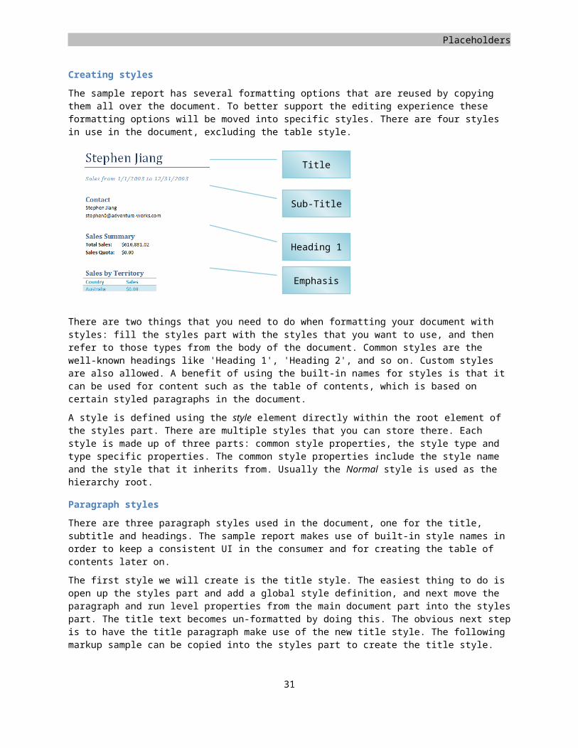
WordprocessingML
less than the equivalent DrawingML shape. Markup sample 39 shows how to insert a shape and make it look like a normal picture in the document. This is done by setting the geometry to be a rectangle using the rect element and provided a fill based on a picture embedded in the package. The relationship ID points to the picture you have embedded in the document earlier.
<w:p><w:r><w:pict><v:rect style="width:16.56cm;height:5.36cm;" stroked="f"><v:fill r:id="rId2" type="frame" />
</v:rect></w:pict>
</w:r></w:p>
Markup sample 39 The report image using VML
You can see from the markup samples that basic VML markup is far less in size than the DrawingML equivalent. Personally I do prefer to use the latter. It has more expressive power, and can be parsed better by applications compared to VML. Getting to the style using program code in VML requires parsing a text string, DrawingML uses pure XML based settings, which is easier to do.
The sample image concludes the creation of the basic report. All the elements are now there, the text, the table and the image. The next step is working with page layout and adding miscellaneous content.
Page layout
Now that we have explored basic formatting of a WordprocessingML document, the next step is to create the proper page layout. There are several settings to learn about, the first of which are sections and page headers. After we have explorer these separate stories, the next item on the list is the use of fields. This will allow you to create headers or footers containing data such as a page number. This section will wrap up with the discussion of several other layout related features such as laying out the text in columns.
Creating sections
Sections are the high-level building blocks of your document. You usually create a separate section for the document cover page, the document body and possible addendums. The reason for this is that a section is the unit to which you apply page numbers or headers and footers. Other details such as the page orientation are also specified using a section.
A section can be created at two levels, inside paragraphs and directly inside the document body. Each time you define a section inside the paragraph properties, that paragraph and all the prior ones before it are part of that section, until you reach another paragraph, which defines a section. The section definition inside the document body contains the section properties for the last section in the document. This should be the last element defined within the document body.
The following markup sample depicts the simplest usage of two sections. Both sections use the default section settings since the sectPr elements contain no children.
<w:body><w:p><w:r><w:t>First</w:t>
</w:r></w:p>
32
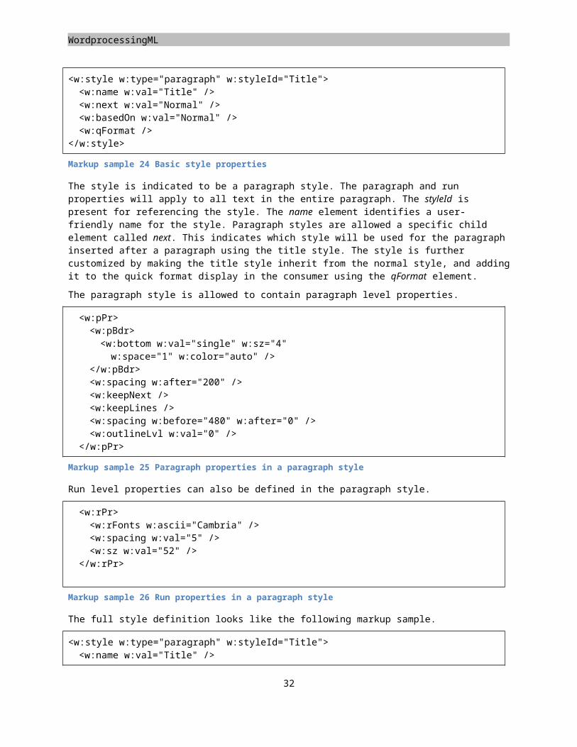
Placeholders
<w:p><w:pPr><w:sectPr />
</w:pPr></w:p><w:p><w:r><w:t>Second</w:t>
</w:r></w:p> <w:sectPr />
</w:body>
Markup sample 40 Two sections
There are several types of section breaks. The default type being used in the Markup sample 40 places a page-break so the next section always starts on an empty page. Besides specifying the section break type, various other properties can be specified from the section properties element. The most common is to have a page oriented in landscape where the other pages are oriented in the normal portrait layout, like in the following sample.
Figure 13 A document with two sections
There are two things that you need to do to achieve this effect, if you do not count applying the sections themselves like in the previous markup sample. The first thing to do is to specify in the second section properties that its pages use landscape orientation. This can be achieved by using the page size element pgSz. Just specifying the orientation is not enough though, you also need to alter the page height and width to the right values for landscape mode pages. The height and width is specified using the twip as the unit of measure. In the following markup sample you will find the properties for setting up the page for normal A4 size, portrait and landscape.
<w:sectPr><w:pgSz w:w="12240" w:h="15840" />
</w:sectPr>
Markup sample 41 Portrait page layout
<w:sectPr><w:pgSz w:w="15840" w:h="12240" w:orient="landscape" />
</w:sectPr>
Markup sample 42 Landscape page layout
Adding headers and footers
Each page within your document maintains a certain margin between the text and side of the page. The top and bottom margins are known as the header and footer of the document. In WordprocessingML you can fill this area
33
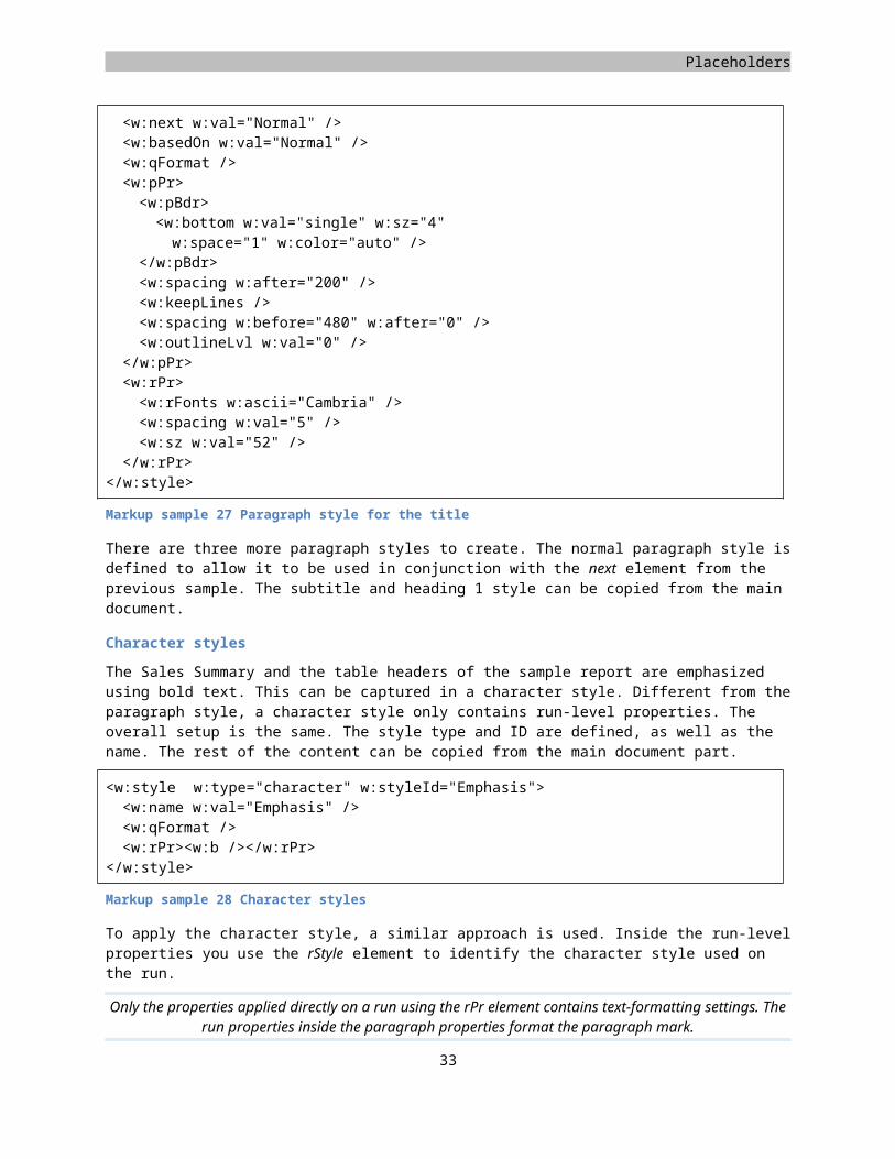
WordprocessingML
with normal content. This content will then be repeated in all the pages that are part of the same section. Usually the headers and footers are used for storing the chapter title, page number or some art.
The section is used to define which header and footer to use on the pages in that section. A header or footer is considered a separate story and is therefore contained in its own part inside the package. To create your own headers and footers you first need to store the XML file in the package and set up the right content type for the new parts. Next you add a relationship from the main document part to the header or footer part. Since your document is allowed to use any number of sections, there can be many header and footer parts. It is also possible to have sections use the same header or footer as the previous section to avoid redefining the same content for each individual section.
To reference this header from inside the section properties, you use the headerReference and footerReference. The following sample shows how to reference a single header and footer for a section. Using the type attribute you can also define different headers or footers for odd and even numbered pages. This allows you to have header content such as a page number appearing at the right side when printing double-sided pages.
<w:sectPr><w:headerReference w:type="default" r:id="rId3" /><w:footerReference w:type="default" r:id="rId4" />
</w:sectPr>
Markup sample 43 Headers and footers
The part identified by the relationship ID needs to use a specific relationship type.
Relationship type for headers and footers
http://schemas.openxmlformats.org/officeDocument/2006/relationships/header
http://schemas.openxmlformats.org/officeDocument/2006/relationships/footer
The content of the header and footer is similar to the document body. The root element is either hdr or ftr depending on what item is being defined. Inside these elements you can create normal block-level content such as paragraphs and tables. Images and other shapes can be included as well.
<?xml version="1.0" encoding="utf-16" standalone="yes"?><w:hdr xmlns:w="http://schemas.openxmlformats.org/wordprocessingml/2006/main"><w:p>
<w:pPr><w:jc w:val="center" />
</w:pPr><w:r><w:t>AdventureWorks Report</w:t>
</w:r></w:p>
</w:hdr>
Markup sample 44 Simple content in a header
34
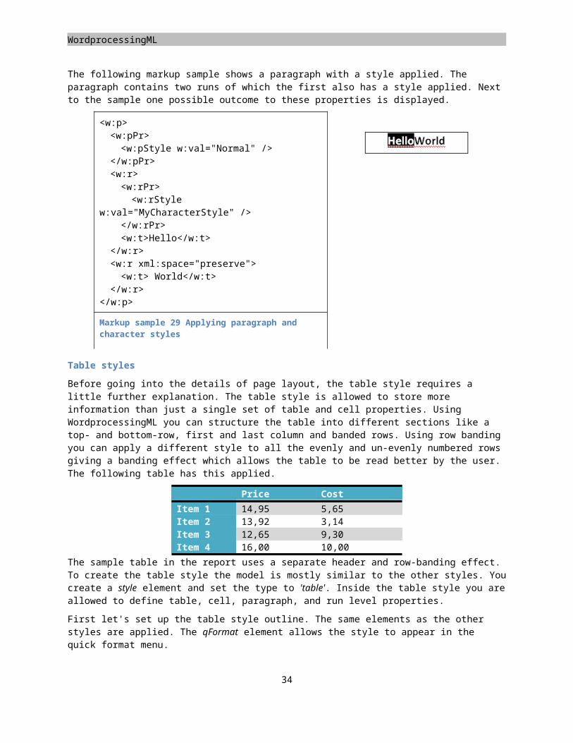
Placeholders
The content type for this part is listed below. The approach of adding new parts to the package and updating the content-types list should be familiar. If not you can revisit the start of the book where the concepts of the ZIP package are explained further.
Content type for headers and footers
application/vnd.openxmlformats-officedocument.wordprocessingml.header+xml
application/vnd.openxmlformats-officedocument.wordprocessingml.footer+xml
Custom XML in documents
If you examine the usage of document throughout the years you will notice that documents are becoming a primary vehicle for exchanging data. They are no longer some rich formatted text slapped together on a few pages. Nowadays, the document is the data. In order for this to happen various technologies have been introduced in WordprocessingML. Let’s examine how a business document like an invoice would be formatted using Open XML. When you examine a typical business document you can find there are two levels of information: how it looks and what it means. The markup that we have seen up to now specifies how the text is to be displayed. But suppose you wanted to preserve the meaning or business context of the information contained in the document. You could attempt to specify a formatting convention for data elements such as “bold means customer,” but this approach would be awkward and error-prone. In order to supply your document with extra semantic information, which cannot be provided by display formatting alone, you have two technologies to choose from. Each has its own usage scenarios, benefits and downsides.
To add custom business semantics to various elements in the markup you can do two things, use custom XML or structured document tags. Structured document tags have been introduced in Open XML and are here to free you of some of difficulties of working with custom XML. Besides having a lot of beneficial features, structured document tags also miss out on some features you might expect to be present. Both systems allow you mark the document with business semantics based on a custom XML message. You can then validate the custom XML message using an XML schema to make sure the document has been created correctly by the user.
Custom XML
The first approach of adding business semantics has been around since the beginning of the XML story for documents. The markup required to use it has been changed slightly to allow better support for XML validation, but the same concepts are applied. To visualize how the custom XML markup can be used, take a look at the report found on the samples Web site. There are many different pieces of data represented in this report. The header contains a name of the salesperson as well as the begin- and end-date for the report. In the body you find the contact information, sales totals, and the list of sales per territory. Most of these data items can be represented by a simple value. The sales per territory table is contains repeating items. You do not know beforehand how many there will be. Custom XML markup allows you to work with this as well. The following image depicts the report and the data items it contains. The data items have been circled. There is one data item that is not circled, the entire report. You could think of the report it is entirety as the container for the data. This will be represented as the root node of your custom XML message being constructed in the document.
35
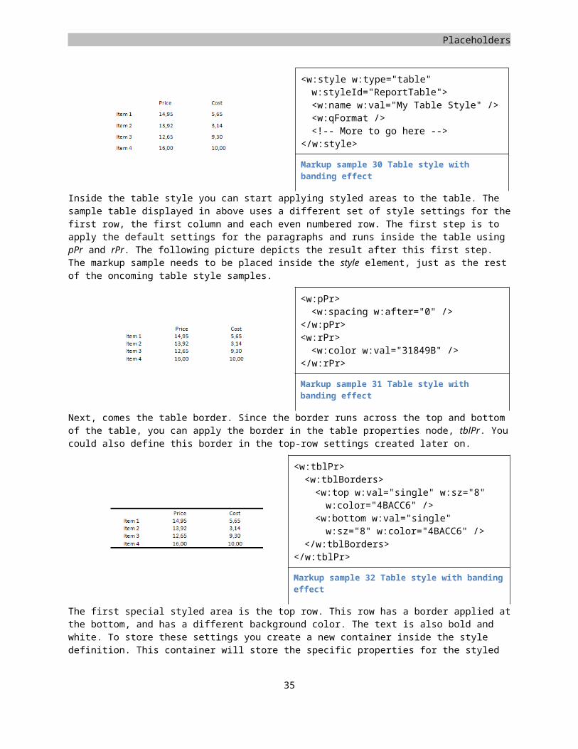
WordprocessingML
The data inside this report can be represented as a simple XML message containing only elements in a non-Open XML related namespace.
<salesReport xmlns="http://adventureworks.com/salesReport"><name>Stephen Jiang</name><salesPeriod><startDate>1-1-2003</startDate><endDate>12-31-2003</endDate>
</salesPeriod><salesPerson><name>Stephen Jiang</name><email>[email protected]</email>
</salesPerson><salesSummary><totalSales>610881.02</totalSales><salesQuota>0.00</salesQuota>
</salesSummary><salesByTerritory><territory><name>Australia</name><sales>0.00</sales>
</territory><territory>
36
Figure 14 Regions of data in the report
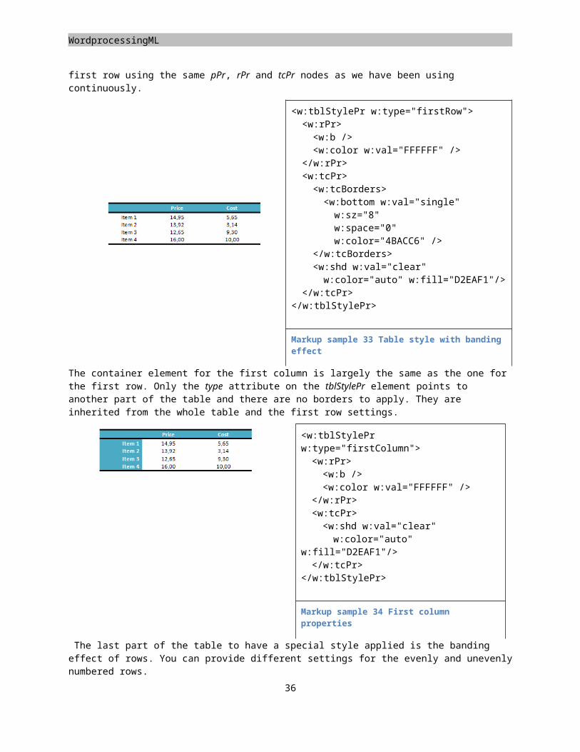
Placeholders
<name>Canada</name><sales>135342.50</sales>
</territory><!-- other territorties omitted-->
</salesByTerritory></salesReport>
Markup sample 45 Custom XML data
To represent this data inside the WordprocessingML markup you intertwine the custom data and the normal document markup. The following image depicts how this can look inside an Open XML consumer. Only the top part of the report is displayed.
Figure 15 Custom XML in the UI
The data in the document is replaced by custom placeholders. These placeholders can be filled by the user to provide the data simply by typing text into the document. The view shown is developer oriented. There is also a more human friendly way of displaying the same elements. These settings can be stored in the document using the settings part.
Figure 16 Placeholders
To represent this custom business data inside the document you need to modify the main document part and apply custom markup elements to the formatted text. There is a special tag called customXml, which you can use to define a node of your custom business message. To identify your node name and namespace, attributes are used. This enables the document to be validated using schema technology. Allowing true arbitrary XML surrounding the WordprocessingML markup this validation would no longer be possible. The following sample shows how the name is surrounded with custom markup. Notice how you can still format the text using the explained techniques.
<w:customXml w:uri="http://adventureworks.com/salesReport" w:element="name"><w:p><w:pPr><w:pStyle w:val="Title" />
</w:pPr><w:r><w:t>Stephen Jiang</w:t>
37
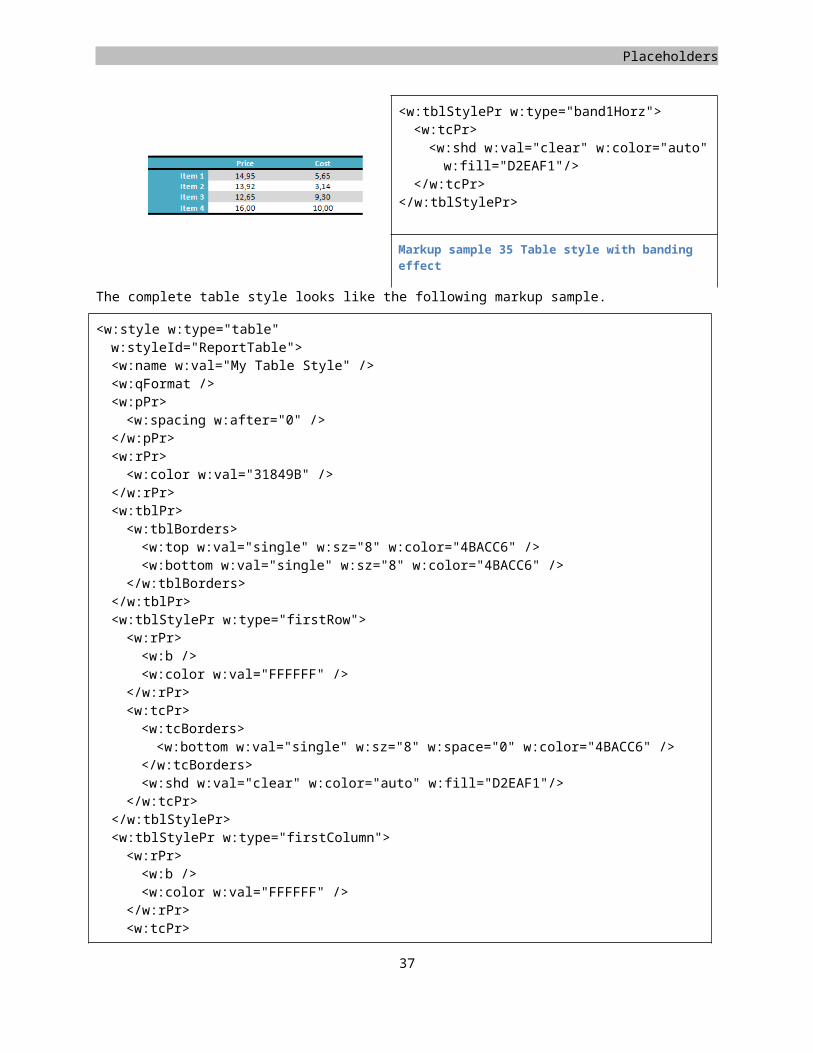
WordprocessingML
</w:r></w:p>
</w:customXml>
One thing that you could note about this sample is that the report name is not the root element of the custom business message. How is this hierarchy being formed? You can nest customXml tags inside other customXml tags to form the XML hierarchy of your document. One sample is to surround a table with a customXml tag identifying the salesByTerritory node and each row with one identifying a territory. There is one element that you usually surround the entire document with, the root node of your business message. This would take the following form.
<w:document><w:body><w:customXml w:uri="http://adventureworks.com/salesReport"
w:element="salesReport"><w:customXml w:uri="http://adventureworks.com/salesReport"
w:element="name"><w:p><w:r><w:t>Stephen Jiang</w:t></w:r>
</w:p></w:customXml>
</w:customXml></w:body>
</w:document>
Markup sample 46 Sample custom XML mapping
Using the customXml element you are allowed to surround the following elements.
Figure 17 Elements capable of Custom XML markup
Working with custom XML on the Microsoft Office system has one great benefit. If you add rows to the table inside the Office Word application the new rows are automatically mapped using new customXml tags. This allows you to
38
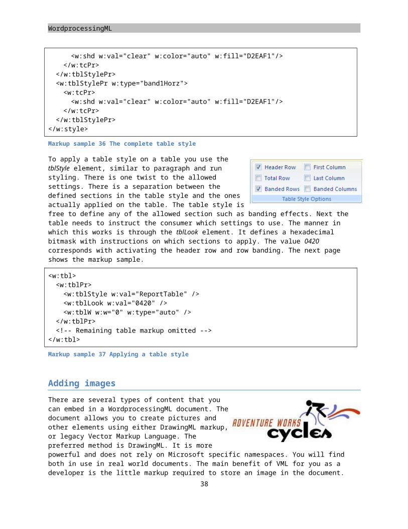
Placeholders
repeat the repeating content of your business message inside the consumer. This is an application feature, which is not available for the next model for storing business semantics, the structured document tag. There are other great benefits to the structured document tag model though which deserve to be inspected a bit more.
Structured document tags
The second model is known under the developer name 'structured document tag', which is also called a 'content control' by Microsoft. This model provides a two-fold use. You can mark a document using content control to demarcate areas in your document. These areas can be simple pieces of data, but also groupings of rich-text. For simple pieces of data certain UI can be shown such as the date picker shown in the sample. Besides marking a document you can then also take the content of the content control and map it to a custom business data file inside the package. This separates the data in a way not possible using custom XML. This custom XML data is stored as a separate part inside the package and allows for two-way data binding. When you edit the content of the SDT in the consumer the custom XML part is updated. When updating the custom XML part through code the document will reflect this change when it is opened. You can provide a schema for the data, but you are not required to.
One of the key benefits of working with structured document tags is the option of locking down editing or deleting the document tag. The custom XML model allowed accidental removal of the mapping. This is something you can easily prevent using structured document tags. Using these tags you can create a document that is truly a placeholder for content and be safe of accidental editing of layout.
Structured document tags can be used as block-level and inline content, depending on the content being tagged. Using a structured document tag you can create the following types of content.
Plain text Rich text List-box Building-block picker
Pictures Combo-box Date-picker Group
Figure 18 Structured document tag types
Most of the structured tags provide simple document content. The special tags are the Group and Building Block. The Group can be used to group content including other document tags. Normally you use it to lock down a specific piece of the document, preventing editing except for in the child document tags. This enables you to create a document containing editable placeholders. The Building Block is another interesting item that allows you to replace its content with a predefined building block defined in the document template.
To create a structured document tag you use the sdt element. The structured document tag uses two distinct sections, properties and content.
39
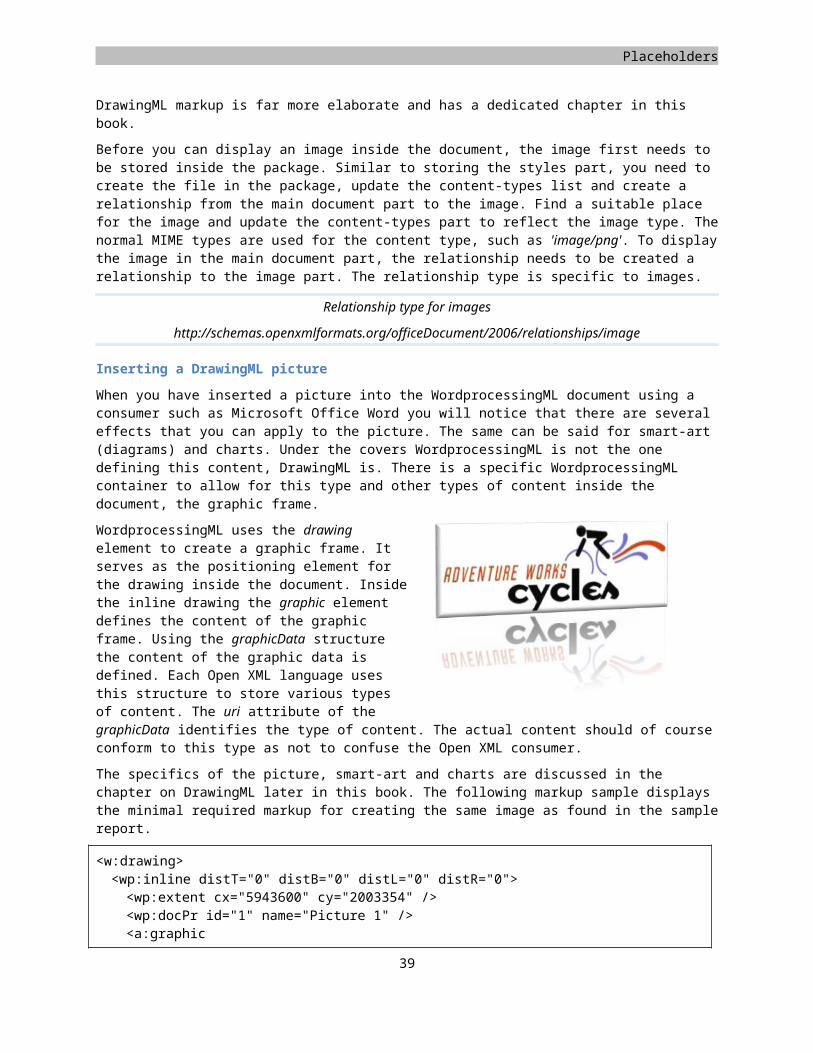
WordprocessingML
Inside the properties you define details such as the type of document tag. The document tag is also using an alias and a tag element. The first is for user reference, the second for programmatic reference. The alias is displayed in the UI header. You can further customize the settings of each document tag inside the element defining the type of document tag. One sample is to store information about the date format for a date tag.
<w:sdt><w:sdtPr><w:alias w:val="Day of birth" /><w:tag w:val="Birthday" /><w:showingPlcHdr /><w:date><w:dateFormat w:val="d-M-yyyy" /><w:calendar w:val="gregorian" />
</w:date></w:sdtPr><w:sdtContent><w:p><w:r><w:t>Click here to enter a date.</w:t>
</w:r></w:p>
</w:sdtContent></w:sdt>
Markup sample 47 Date structured document tag
The content for the document tag is specified using the sdtContent element. This element can reflect one of two pieces of data, the placeholder text for empty elements, or the actual data for the document tag. The showingPlcHdr flag in the properties indicates that the content is now showing placeholder data. When using data binding, this data will not be stored in a custom business part.
Inside the sample report you can utilize text and date placeholders to create all the places of content. The table can be mapped by surrounding rows, but you can also just tag the cell values. The data binding which will be added next is configured per document tag with no notion of hierarchy like custom XML.
Data binding
The great enabler for document tags is the use of data binding. This technique revolves around storing the data inside the document tag separate from the main markup. Since the data is maintained separate it is far easier to reach it through custom applications than when it is stored inline. The data-binding model defined in Open XML allows for two-way binding to occur. When you update the document tag contents as a user through a consumer the data will be stored in the separate container. When you update the container as a developer and open the document, the data appears again inline in the document. This two-way binding approach is highly valuable for creating rich enterprise content.
Data binding of structured document tags involves providing each sdt element with an X-Path expression. This expression is evaluated to retrieve data from a special custom business part inside the package. You can store multiple parts inside a package and reference each one individually. To upgrade the sample report to use data binding you first need to store a custom business part inside the package. The following content-type is used to identify the part as such. The default MIME type for XML is used. Also create a second part inside the package to hold custom properties about the business data. This will
40
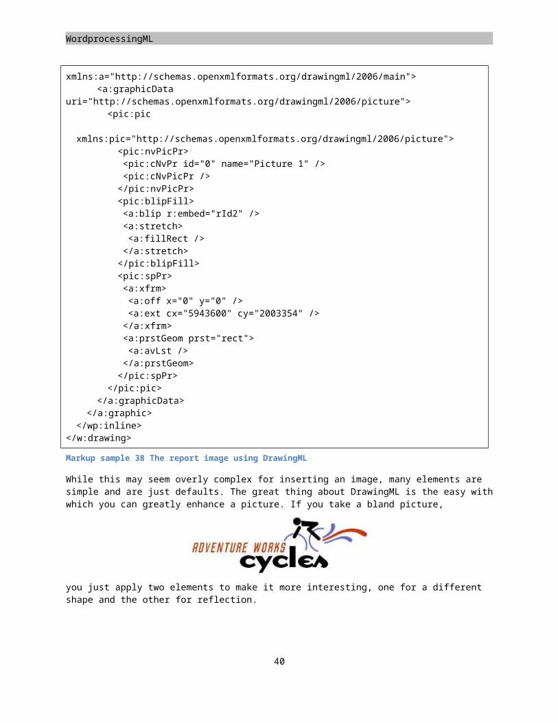
Placeholders
later be used to identify the specific custom data part. The same content type is used. You probably do not need to update the [Content_Types].xml list. The default content type for the XML file name extension is already correct.
Content type for custom XML business data
application/xml
The second step is to relate main document body with the custom business data part and relate the custom part with the properties part. The following two relationship types are used.
Relationship type for custom XML business data
http://schemas.openxmlformats.org/officeDocument/2006/relationships/customXml
Relationship type for custom XML properties
http://schemas.openxmlformats.org/officeDocument/2006/relationships/customXmlProps
Because you are allowed to store multiple custom data files inside a package there can be issues identifying which one to bind the document tag to. The data in different parts might be structured exactly the same. By default the consumer will choose the first custom XML part which maps to the X-Path expression provided by the document tag. If none are found, it will not do anything. To further identify in which part you want to store data you can utilize the store item ID. This identifier is attached to a custom XML part using a custom XML properties part. The properties part defines two pieces of data, the ID value of the custom XML part and the XML schemas for to the custom XML data message.
<ds:datastoreItem xmlns:ds="http://schemas.openxmlformats.org/officedocument/2006/2/customXml"ds:itemID="{C65DD089-1234-4A84-8443-BC4CB07DEB45}"><ds:schemaRefs><ds:schemaRef ds:uri="http://adventureworks.com/sampleReport" />
</ds:schemaRefs></ds:datastoreItem>
Markup sample 48 Custom XML properties part
Now that you can identify your custom business part using the ID value you can add content to the business part. An important thing to note is the absence of Open XML specific namespaces. You can store any arbitrary XML and bind to it.
<a:report xmlns:a="http://adventureworks.com/sampleReport"> <a:salesMan>Stephen Jiang</a:salesMan> <a:contactEmail>[email protected]</a:contactEmail> <a:salesPeriod> <a:start>1-1-2003</a:start> <a:end>31-12-2003</a:end> </a:salesPeriod> <a:salesSummary> <a:totalSales>610,881.02</a:totalSales> <a:salesQuota>0</a:salesQuota> </a:salesSummary></a:report>
Markup sample 49 Custom XML part
To complete the circle the structured document tag now needs to reference data inside the custom XML part. You apply a dataBinding element where you provide the X-Path query which maps to the data. You are allowed to use
41
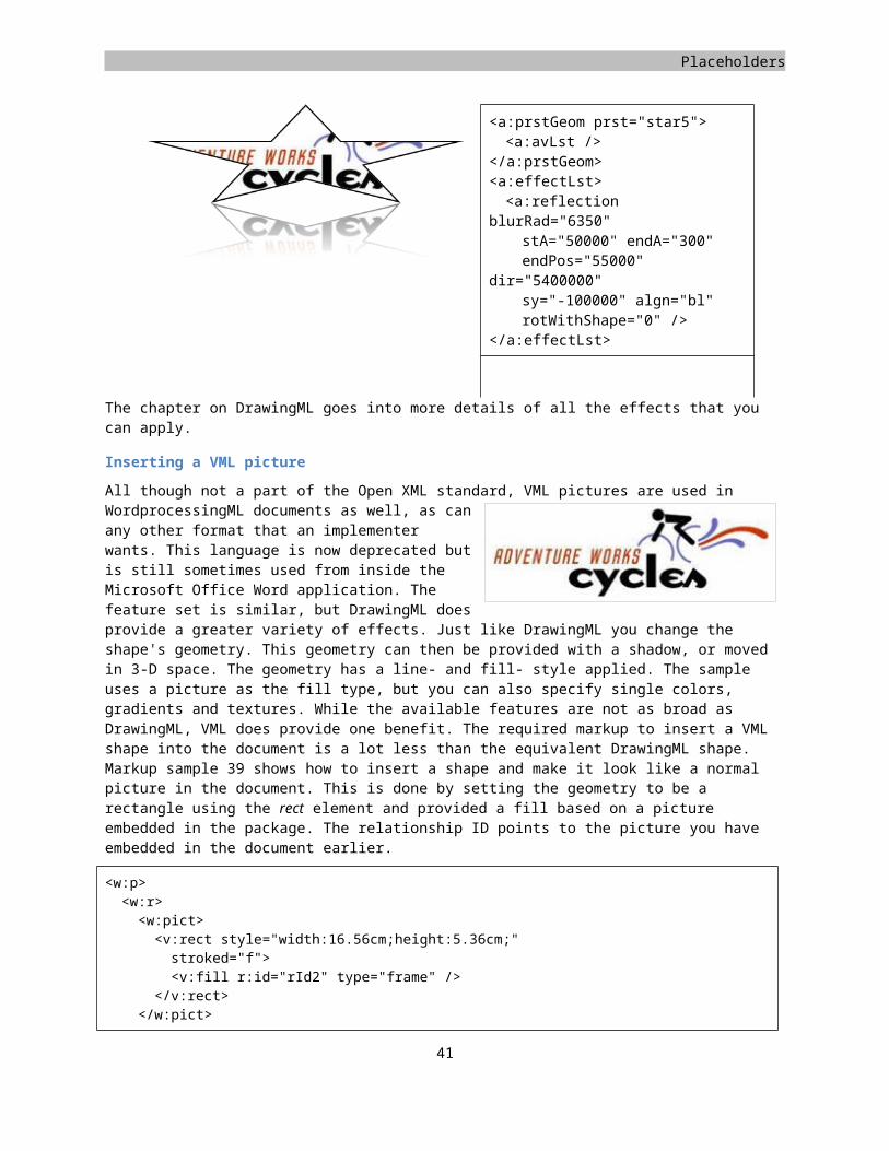
WordprocessingML
XML namespace prefixes by applying separate prefix mappings to the dataBinding element. These are required when you use an XML namespace prefix in your X-Path query. The storeItemID attribute is optional. When you leave it out the consumer will attempt to bind to the first matching custom XML part as discussed earlier in this section.
<w:sdt><w:sdtPr><w:alias w:val="Sales-man" /><w:tag w:val="salesManName" /><w:dataBinding w:prefixMappings="xmlns:a='http://adventureworks.com/sampleReport'" w:xpath="/a:report/a:salesMan" />
<w:text /></w:sdtPr><w:sdtContent><w:r><w:t>Click here to enter text</w:t>
</w:r></w:sdtContent>
</w:sdt>
Markup sample 50 Data bound structured document tag
The content control toolkit
To make the process of binding the structured document tags to a custom XML data file inside the package a bit easier you can make use of the Content Control Toolkit. This open source tool allows you to generate parts, relationships and markup to bind to custom XML.
You can download the toolkit from CodePlex: http://www.codeplex.com/Wiki/View.aspx?ProjectName=dbe
42
Placeholders
Finalizing the document
What has probably happened to some of you during the course of your career is that you have sent a document to a prospect with the reviewing data and comments still embedded in the document. This can be quite an embarrassment if the comments were not meant for viewing by that particular person. WordprocessingML stores various pieces of information about changes in the document. The RSID has been discussed already in the first section of this chapter, but there are other more powerful options available. When you turn on the reviewing option in the document, all changes to the document will be stored by the consumer. For all the changes the original as well as the changed value is maintained. You can also store comments inside a document for reviewing purposes. All of this content can be removed from the document without too much trouble if you know the structure in which this data is stored. To indicate to the user that you have finished the document, perhaps after removing all reviewing data, you can apply a flag on the document signaling it is complete. The consumer is encouraged to open the document in read-only mode.
Removing reviewing data
When you turn on revision tracking inside the settings part all changes to the document will be maintained through specialized markup. Later on a user can choose which content to maintain by accepting the changes or reverting back to the original. It is not uncommon to accidentally leave the reviewing data intact before sending the document to a customer.
The reviewing markup is maintained in specialized elements. Many of these elements can be easily removed from the document along with all the child elements defined within it. Some other elements act as a container for current content and need to be removed with maintaining the child elements. The following overview provides a list of all elements that you need to touch in order to clear the document from all reviewing data.
Element Contains Clean-up actionrPrChange Original run properties Remove ElementpPrChange Original paragraph properties Remove ElementtblPrChange Original table properties Remove ElementtrPrChange Original row properties Remove ElementtcPrChange Original cell properties Remove ElementmoveFrom Container for moved content Remove ElementmoveFromRangeStart Marker for move source location Remove ElementmoveFromRangeEnd Marker for move source location Remove ElementmoveTo Container for moved content Remove Element
Maintain ChildrenmoveToRangeStart Marker for move target location Remove ElementmoveToRangeEnd Marker for move target location Remove Elementins Container for inserted content Remove Element
Maintain Childrendel Marker for deleted elements
Container for deleted contentRemove Element
delText Container for deleted text Remove ElementTable 3 List of reviewing elements
Most of the removal actions are pretty basic. All the elements marked as 'Remove Element' can be removed from the document using simple XML editing. The moveTo and ins elements take an extra step. Since they contain the current content of the tracked revision you need to maintain all the child elements defined within these containers.
43
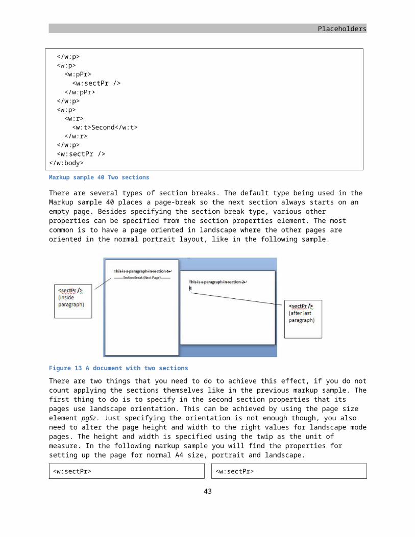
WordprocessingML
Removing comments
A comment is an annotation tied to a specific part of the document. Usually it is not so much the necessity to create, but rather remove comments of a document as part of the finalization process. The structure needs to be known in either case.
There are two parts to comments. The comment text is stored in the package, and it is linked into the document at some location. The comment text is stored in a separate part in the package, tying it to the main document part using a well-known relationship type.
Relationship type for commentshttp://schemas.openxmlformats.org/officeDocument/2006/relationships/comments
Inside the part identified by this relationship you find separate comments. The root node comments will store a comment element for each comment defined in the document. The individual comment is identified using an ID value and stores details about who created the comment. Inside the comment node you are allowed to use normal block-level constructs such as a paragraph or table.
<w:comments xmlns:w="http://schemas.openxmlformats.org/wordprocessingml/2006/main"><w:comment w:id="0" w:author="Wouter van Vugt" w:date="2007-04-28T19:35:00Z" w:initials="WvV"><w:p><w:r><w:t>A comment</w:t>
</w:r></w:p>
</w:comment></w:comments>
To reference this comment inside the document there is a simple approach. You will find a commentReference node at the location where you want the comment to be anchored to. By specifying the ID value of the comment in the comments part this reference is tied to the comment. Since the commentReference is only a single element, it cannot demarcate a comment that wraps around several pieces of content. You only have a single anchor point. To define the area that a comment is commenting about, you can use the commentRangeStart and commentRangeEnd elements in addition to the commentReference.
<w:p><w:commentRangeStart w:id="0" /><w:r><w:t>This text is commented
on</w:t></w:r><w:r><w:commentReference w:id="0" />
</w:r><w:commentRangeEnd w:id="0" />
</w:p>
Markup sample 52 Referencing a comment
The great thing about this setup is that it is remarkably easy to remove comments from the WordprocessingML package. You will need to do two things. First remove the comments part from the package and remove the comment nodes from the markup. Since comments can only appear in the main document body, you only need to
44
Markup sample 51 Comment part
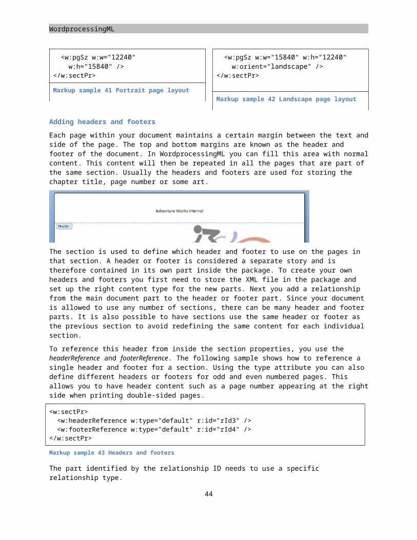
Placeholders
visit one XML document. The structure of the reference nodes also allows for easy removal. Each comment node is void of any child content, so you do not need to move any content around when removing comments.
Marking as final
Marking a document final is a feature targeted to disable editing UI in the consumer. While not a security feature it is a handy addition to allow a user to known what type of document he is dealing with.
The feature of marking a document as final is not defined within the scope of Open XML, but since it is something you will likely be doing it is included here. Marking a document as final involves storing a custom xml part inside the package and storing some specific Open XML markup. The markup used is the Open XML facility for defining custom properties and allow those to be consumed by the consumer.
To mark a document as final, first create a new part inside the package and get the content type correctly set up again. Next you need to run a relationship from the main relationship file. The properties are considered a start part. You will need to add the relationship in the \_rels\.rels file. The following content-type and relationship-type is used.
Content type for custom properties part:application/vnd.openxmlformats-officedocument.custom-properties+xml
Relationship type for custom properties part:http://schemas.openxmlformats.org/officeDocument/2006/relationships/custom-properties
Inside the new custom properties part you need to store specific XML content to allow the Microsoft Office Word application to consider the document as being final.
<?xml version="1.0" encoding="utf-16" standalone="yes"?><Properties xmlns="http://schemas.openxmlformats.org/officeDocument/2006/custom-
properties"
xmlns:vt="http://schemas.openxmlformats.org/officeDocument/2006/docPropsVTypes"><property fmtid="{D5CDD505-2E9C-101B-9397-08002B2CF9AE}" pid="2" name="_MarkAsFinal"><vt:bool>true</vt:bool>
</property></Properties>
Markup sample 53 Properties for marking a document as final
The markup is entirely specific to the Microsoft Office system and shows one of the many ways in which a consumer can enhance the document experience and tune it to its exact needs. You will find that most of the enterprise requirements such as accessibility support do not require the use of custom properties but use pure Open XML markup
Advanced topics
Now that the image has been inserted into the document the report looks like the sample provided with this book. There are several other interesting pieces of content that are not directly in use in the sample report, but are interesting to discuss nonetheless. Common features such as merging table cells and inserting content such as lists and fields will be dealt with.
45
WordprocessingML
Page background
At the document level you are allowed to set a graphic to display in the background of your document. This background fills an entire page and can only be specified at the document level, this is a feature that is not available at the section level. A document background is created within the document tag using the background element. There are two ways in which you can create your document background. A flat color can be represented right within the background tag. More complex types of backgrounds can be defined using VML markup. This enables you to use a gradient fill or a picture as well. The following sample shows how to create a VML gradient effect.
<w:document xmlns:w="http://.../wordprocessingml/2006/main"><w:background w:color="9BBB59"><v:background fillcolor="#9bbb59 [3206]"><v:fill color2="fill darken(118)" method="linear
sigma" focus="100%" type="gradientRadial"><o:fill v:ext="view" type="gradientCenter" />
</v:fill></v:background>
</w:background></w:document>
Markup sample 54 Document background
One thing to know about this background is that it will not show in the default view in the consumer. To view the background, open something like the 'Full-screen Reading' mode for Microsoft Office Word instead. There is a setting that you can apply in the settings part to indicate that you also want to view the background in the print view. You specify this using the displayBackgroundShape property.
Tables with merged cells
One commonly used feature of a table is to merge its cells either horizontally or vertically. WordprocessingML tables are capable of this as well. For each type of merging, horizontal and vertical, there is a separate model in place. Both rely on the properties node of a table cell. One requirement is that you always create rectangular cells, no L shapes are allowed. In practice this means that a table cell can start a horizontal and a vertical merge at the same time, but not start one merge and be part of another.
Each row defined with tr is required to meet the table grid definition, which was defined with tblGrid. You usually do so by creating tc elements for each gridCol element in the table grid definition. There is one thing that overrides this approach. A table cell can have a gridSpan element applied with a value higher than 1. For each value higher than 1, the row needs to store one less table cell. So when the grid definition contains three gridCol elements, you either have three cells, two cells with one using a gridsSpan attribute valued to 2, or one cell with a gridSpan equal to 3. When a row contains two separate horizontal merges, this model is just applied twice.
The following sample displays a two by two table. The top row is merged together.
<w:tbl><w:tblGrid><w:gridCol w:w="4788" /><w:gridCol w:w="4788" />
</w:tblGrid><w:tr><w:tc><w:tcPr><w:gridSpan w:val="2" />
</w:tcPr><w:p />
46
Figure 19 Horizontally merged cells
Placeholders
</w:tc></w:tr><w:tr><w:tc><w:p />
</w:tc><w:tc><w:p />
</w:tc></w:tr>
</w:tbl>
Markup sample 55 Horizontally merged cells
Vertical merges take a different form. The horizontal merge has one less tc element for each cell that was merged. For vertical merges you do not remove cells. There are two values around vertical merges that you can apply to a table cell. Inside the cell properties you can use vMerge to identify the cell as taking part in a vertically merged set of cells. By providing a value of 'restart' you indicate that the cell is the top cell in the vertically merged set. The other cells, which also take part in the same merge, use a value of 'continue'. As soon as a cell in the column does not have a vMerge element applied, the merging stops. So does re-starting the vertical merge using the 'restart' value for a second time.
<w:tbl><w:tblGrid><w:gridCol w:w="4788" /><w:gridCol w:w="4788" />
</w:tblGrid><w:tr><w:tc><w:tcPr><w:vMerge w:val="restart" />
</w:tcPr><w:p />
</w:tc><w:tc><w:p />
</w:tc></w:tr><w:tr><w:tc><w:tcPr><w:vMerge w:val="continue" />
</w:tcPr><w:p />
</w:tc><w:tc><w:p />
</w:tc></w:tr><w:tr><w:tc><w:p />
</w:tc><w:tc><w:p />
</w:tc></w:tr>
47
Figure 20 Vertically merged cells
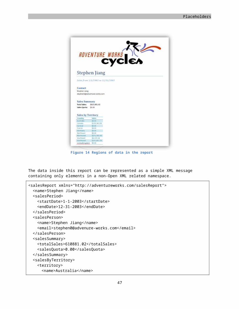
WordprocessingML
</w:tbl>
Markup sample 56 Vertically merged cells
There is one special thing to note about the vertical merge. Since there are no tc elements being removed like in the horizontal merge, you might end up with invisible content. The table cells marked to 'continue' are available for storing content. However, this content cannot be seen by the end-user.
Numbered lists
WordprocessingML allows you to create two types of lists, numbered and bulleted. There is actually a third where you create a hybrid form, one level numbered, the other bulleted. The following overview provides a sample of each of the three numbering styles.
First itemo Second item
Third item
1. First itema. Second item
2. Third item
1) First item Second item
2) Third item
Bulleted lists Numbered lists Hybrid lists
To create lists you use normal paragraphs. Each individual paragraph can form an item in a list. To identify the paragraph as a list item the paragraph properties pPr are filled with two pieces of information, the numbering ID and the level that the paragraph is on. The numPr element inside the paragraph properties tells the consumer what numbering to use on the paragraph. The numId points to a numbering definition. When two paragraphs are part of the same list they have the same value for the numId setting. The ilvl, or indentation level, is used to specify the level of indentation in a multi-level list. A paragraph will never be nested inside another paragraph to identify nesting levels, the properties are used instead.
<w:p><w:pPr><w:numPr><w:ilvl w:val="0" /><w:numId w:val="1" />
</w:numPr></w:pPr><w:r><w:t>First item</w:t>
</w:r></w:p>
Markup sample 57 A numbered paragraph
The paragraph element does not provide any information about the numbering other than the numbering identifier and indentation level. The bulk of the numbering information is stored outside the main document body in a separate numbering part. To find this part a specific relationship type is used.
Relationship type for numbering
http://schemas.openxmlformats.org/officeDocument/2006/relationships/numbering
The part identified with this relationship type is also identified using a specific content type.
Content type for numbering
application/vnd.openxmlformats-officedocument.wordprocessingml.numbering+xml
There is at most one part that may use this relationship inside the package. The numbering part contains many numbering definitions. To start fiddling around with numbering, first create a new part inside the
48
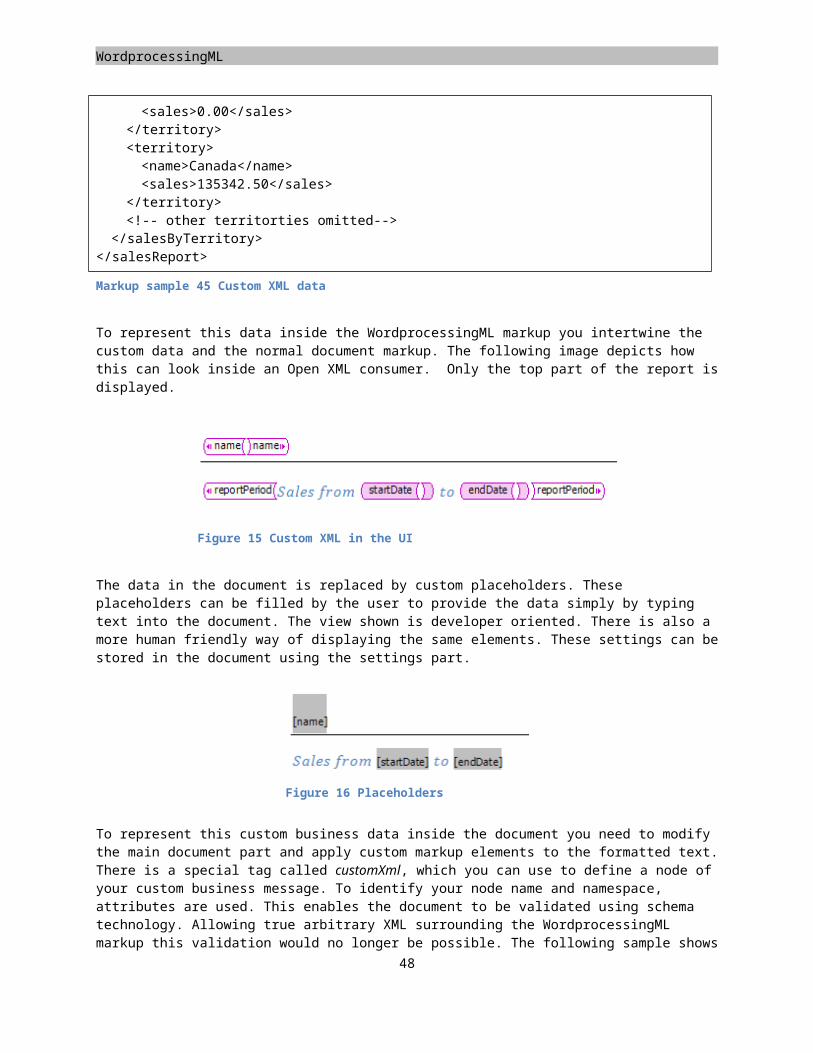
Placeholders
WordprocessingML package, and add the relationship between the main document part and the new numbering part.
The numbering part consists of two pieces, abstract and real numbering definitions. Both the abstract as well as the real numbering definition contain information about the type of list, bulleted, numbered or hybrid and also the settings to apply to each indentation level such as the fonts to use. The abstract numbering definition defines the global settings to apply at each numbering level. Abstract numbering definitions are never referenced by a paragraph directly. Instead the paragraph always points to a real numbering definition, the real numbering definition points to the abstract definition. The reason for this model is reuse of numbering settings. When two lists are exactly equal, but only differ in the font used on a certain indentation level, it would be beneficial to be able to specify only the differences. All the global settings go into the abstract number definition. The differences are stored inside the real numbering definition. The following markup sample shows the initial content of the numbering part. The next step is to add abstract and real number definitions.
<w:numbering xmlns:w="http://.../wordprocessingml/2006/main"> </w:numbering>
What you will usually find when examining the numbering part is that the abstract numbering definition contains the bulk of the settings. The first important setting is the ID of the abstract definition. This ID value is later used by the real number definition. Inside the abstractNum element the multiLevelType element defines what type of numbering is being defined. The three available options identify single level lists, multi-level lists and hybrid lists.
Each level of numbering is formatted using the lvl element. The Markup sample 59 shows the level properties to create a single level bulleted list. The level text stores the bullet character to display, the number format identifies that it is using a normal bullet. These settings will change for numbered lists. A list is usually indented a little bit. This information can be stored inside the paragraph and run level property nodes. The information stored in these nodes will later be combined with the direct formatting on the paragraph and runs themselves to create the final view of the list.
To create a bulleted list like this:
Item 1 Item 2 Item 3
You need the following definition in the numbering part.
<w:abstractNum w:abstractNumId="0"><w:multiLevelType w:val="singleLevel" /><w:lvl w:ilvl="0"><w:numFmt w:val="bullet" /><w:lvlText w:val="•" /><w:pPr /><w:rPr />
</w:lvl></w:abstractNum><w:num><w:abstractNumId w:val="0" />
</w:num>
Markup sample 59 Bulleted list
To create a numbered list a few elements need to be altered to provide for this. The number format identified by the numFmt needs to be changed to reflect the desired number style. The value can be chosen from a preset list of valid values. For basic numbering 'decimal' will do. The second element that requires modification is the numbering text. The lvlText was previously used to specify the bullet character. It now needs to use a specific
49
Markup sample 58 The numbering part
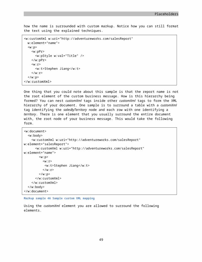
WordprocessingML
format string with a placeholder for the number. The placeholder '%1)' is the placeholder for the first level number. It will result in numbering going '1) 2) 3)...' Creating a placeholder at the second level which looks like '%1.%2' would result in numbering going '1.1, 1.2, 2.1, 2.2, 2.3'. By default the numbering will start at zero. To start counting at another value you apply the start element inside the level definition. There are many other settings that you can apply to modify the style of numbering.
To create a numbered list like this:
101.Item 1102.Item 2103.Item 3
You need the following markup.
<w:abstractNum w:abstractNumId="0"><w:multiLevelType w:val="singleLevel" /><w:lvl w:ilvl="0"><w:numFmt w:val="decimal" /><w:start w:val="101" /><w:lvlText w:val="%1)" />
</w:lvl></w:abstractNum>
Markup sample 60 Numbered list
The minimal real number definition stores a numbering ID and a reference to the abstract definition. It is also allowed to create overrides for all the levels defined by the abstract parent. To override settings, an entire level needs to be re-created. The settings in the abstract definition will not be applied. An override is created using the lvlOverride element. Inside it you create a level definition using the same lvl element as is used in the abstract definition.
<w:num w:numId="1"><w:abstractNumId w:val="0" /><w:lvlOverride w:ilvl="0"><w:lvl w:ilvl="0"><w:numFmt w:val="bullet" /><w:lvlText w:val=">>" />
</w:lvl></w:lvlOverride>
</w:num>
Markup sample 61 Overriding a number level
Bookmarks and hyperlinks
The common approach to linking to content is the hyperlink. Inside WordprocessingML these hyperlinks are used for two types of links, to external content and to locations inside the document. To link to external content you specify the URL to link to using the Open Packaging Convention. The links to internal content make use of bookmarks.
A hyperlink to external content is stored as a package relationship. This relationship uses a specific relationship
type to allow it to be identified as a hyperlink. Since the resource that the hyperlink is pointing to is not stored
50
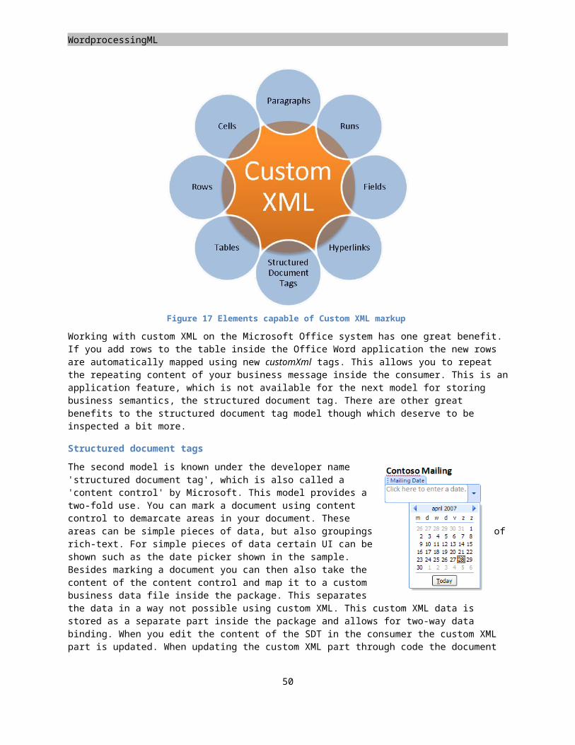
Placeholders
within the package, there is no package part or content type that you need to define. The following relationship type is used.
Relationship type for external hyperlinks
http://schemas.openxmlformats.org/officeDocument/2006/relationships/hyperlink
The relationship needs to be stored in the relationship file for the main document part when the hyperlink is used from within the main document body. Hyperlinks used in a header or footer are stored in their respective relationship files.
<Relationships xmlns="http://.../package/2006/relationships"><Relationship Id="rId2" Type="http://.../officeDocument/2006/relationships/hyperlink"
Target="http://www.openxmldeveloper.org" TargetMode="External"/>
</Relationships>
Markup sample 62 External relationship for a hyperlink
The hyperlink is formed using the hyperlink element. This element surrounds the text-runs that make up the hyperlink text. The relationship ID is used to specify the hyperlink destination.
<w:p><w:hyperlink r:id="rId2"><w:r><w:t>Open XML Developer</w:t>
</w:r></w:hyperlink>
</w:p>
Markup sample 63 External hyperlink
To use a hyperlink to point to internal content, a similar model applies. Since the hyperlink will point to a location inside the document, you first need to create a marker for the hyperlink to point to. This marker is defined using a bookmark. While the hyperlink element surrounds the text it displays, a bookmark uses two separate elements to indicate the start and end location, bookmarkStart and bookmarkEnd. The reason for this model is that a bookmark might start in one paragraph and finish in another. The start and end identifier of the bookmark are identified using an ID value. For user reference the bookmark is given a name as well.
<w:p><w:bookmarkStart w:id="0" w:name="MyMark"
/><w:r><w:t>Bookmarked Text</w:t>
</w:r><w:bookmarkEnd w:id="0" />
</w:p>
Markup sample 64 Bookmarks
<w:p><w:hyperlink
w:anchor="MyMark"><w:r><w:t>Hyperlink Text</w:t>
</w:r></w:hyperlink>
</w:p>
Markup sample 65 Internal hyperlink
The bookmark can be referenced inside the document using the hyperlink element again. Instead of using the relationship ID attribute to point to the content, the anchor attribute is applied. This attribute identifies the bookmark by using the bookmark name.
51
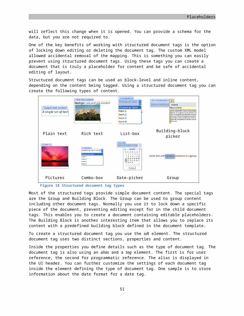
WordprocessingML
Using fields
Fields are dynamic pieces of content in a mostly static document. While most parts of a document should not change due to changes in layout for instance, some areas need to reflect a piece of dynamic content. Think about page numbers, or those nifty headers that display the current chapter on each page. If these would be hard-coded you would have a hard time keeping the document up to date. Fields are here to save you from that trouble. They provide a mechanism for defining placeholders which are populated with data by the consumer opening the document.
There are two types of fields, simple and complex. Simple fields are able to wrap a single run. The run text stores a cached version of the field data from the last time the fields were updated. Complex fields can surround multiple runs, but as the name would suspect, the model is a bit more complex. Both the simple and complex fields use functions to define their dynamic data. The table of contents is a good example of such a complex field. Other examples of using a complex field include places where functions are used within functions, when using an IF statement for instance.
Some of the common functions include:
Function Return valuePAGE The current page numberSTYLEREF "Heading 1" The current heading 1 textTITLE The document titleAUTHOR The document authorSAVEDATE \@ "dddd d MMMM yyyy" The last save date in a specific formatTOC The table of contentsTable 4 Common functions for fields
Simple fields are created using the fldSimple element. It is commonly nested inside a paragraph. The fldSimple element takes a single function and contains the cached value of that function inside a run in the field.
<w:p><w:r><w:t xml:space="preserve">Page </w:t>
</w:r><w:fldSimple w:instr="PAGE"><w:r><w:t>32</w:t>
</w:r></w:fldSimple>
</w:p>
Markup sample 66 Simple fields
To create complex fields a more elaborate approach is followed. Complex fields are allowed to span multiple paragraphs and runs. A good example is the Table of Contents. While there is one single function to create a table of contents, the table itself is made up of many paragraphs, all part of the same complex field. The samples accompanying this book contain a sample of using the complex field in the table of contents.
Table of Contents
Many documents contain a listing of their content in a table like manner, otherwise known as the table of contents. This is a constantly changing part of the document and as such you don’t want to manually update all the entries. WordprocessingML provides a simple mechanism to dynamically create this table of contents. You can use a field to define it.
<w:p><w:fldSimple w:instr="TOC" />
52
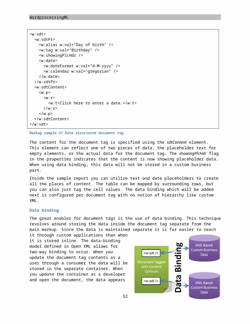
Placeholders
</w:p>
Markup sample 67 Poor mans table of contents
To tell the consumer that the field defines a table of contents the TOC function is used. This field can either use the simple notation discussed earlier, or the complex notation if required. The benefit of the complex notation is that you can add the items that make up the Table of Contents before opening the document. Using the simple notation the user will have to update the Table of Contents manually before the items will show.
To insert the Table of Contents field you use the markup found in Markup sample 67. What the caption might have indicated, this table of contents is rather minimal. You first need to open the document and update the field before any content is shown. A user will probably expect the Table of Contents to be populated when opening the document. To facilitate this you can use the complex field notation and add the items to the Table of Contents using plain WordprocessingML markup. The other approach involves telling the consumer to update all fields when the document is opened.
To create the table of contents using the complex field construct your benefit is that the table of contents is defined and no user-interaction is required when opening the document. The following picture displays a simple table containing the text, page number and the dots between them.
Chapter 1 – My Puppy...................................................................................................................................4
Chapter 2 – My Cat........................................................................................................................................9
There are three parts to the advanced table of content, each contained in a separate paragraph or set of paragraphs. The table is made up of the field-start marker, field-content and field-end marker.
<w:p><w:r><w:fldChar w:fldCharType="begin" />
</w:r><w:r><w:instrText>TOC</w:instrText>
</w:r><w:r><w:fldChar w:fldCharType="separate" />
</w:r></w:p><w:p><w:pPr><w:tabs><w:tab w:val="right" w:leader="dot" w:pos="9350" />
</w:tabs></w:pPr><w:r><w:t> Chapter 1 – My Puppy</w:t>
</w:r><w:r><w:tab />
</w:r><w:hyperlink w:anchor="_TocHeading1"><w:fldSimple w:instr="PAGEREF
_TocHeading1"><w:r><w:t>4</w:t>
</w:r></w:fldSimple>
53
WordprocessingML
</w:hyperlink></w:p><w:p><w:r><w:fldChar w:fldCharType="end" />
</w:r></w:p>
Markup sample 68 Advanced Table of Contents
Usually the table of contents uses hyperlinks to allow a user to click the item in the consumer. To support this normal inner-document hyperlink constructs are used. You surround the chapter text with the bookmark markup displayed in the next sample.
<w:p><w:pPr><w:pStyle w:val="Heading1" />
</w:pPr><w:bookmarkStart w:id="0" w:name="_TocHeading1" /><w:r><w:t>Heading 1</w:t>
</w:r><w:bookmarkEnd w:id="0" />
</w:p>
Markup sample 69 A Heading 1 paragraph
You can automate the updating of fields upon opening of the document by adding an updateFields element to the WordprocessingML settings part and providing a value of 'true'. When a user opens the document in the consumer all the fields in the document will be updated. This will make the table of contents visible. The downside to this approach is that there is still a user action required to fill the Table of Contents.
Captions
When inserting images, tables or other special types of content you usually provide a caption to provide some information about what is being stored. These captions are made up of a label and a sequential number. To create a caption, little markup is required. Again the model revolves around the usage of fields and functions inside the document markup.
There is a special function that is able to count 'labels'. The function is called 'SEQ' and you provide a label name to count. Each time you use the same label name, the count is one higher. Again the field caches the current number for the caption. The following sample uses the label 'Figure'.
<w:p><w:r><w:t xml:space="preserve">Figure </w:t>
</w:r><w:fldSimple w:instr="SEQ Figure"><w:r><w:t>1</w:t>
</w:r></w:fldSimple>
</w:p>
Markup sample 70 Captions
54
Placeholders
WordprocessingML wrap-up
There are many features of WordprocessingML that are still not discussed. The powerful equation engine is a good sample of this, or the use of glossary document to store building blocks. While all of these are great subjects for discussion, there are other Open XML languages that also want to take their turn. There are three Open XML languages waiting for you. The first one on this list is SpreadsheetML.
55
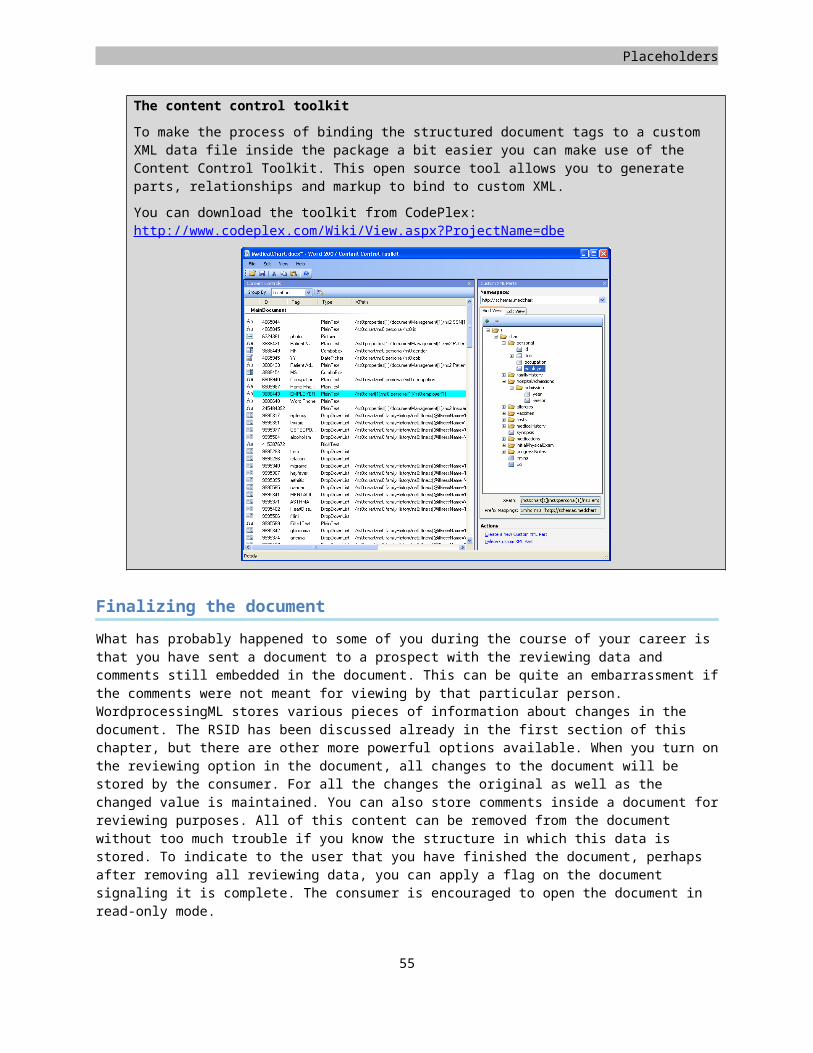
Chapter 2
SpreadsheetML Learn about the elements of a basic spreadsheets Learn how to work with formulas Learn how to create tables and Microsoft PivotTable® dynamic views. Learn how to enrich a spreadsheet with styles and conditional formatting Learn how to display charts
Introduction
Similar to the WordprocessingML chapter, SpreadsheetML will use a sample report that will be constructed during the course of the chapter. The sample spreadsheet contains three mayor elements of SpreadsheetML, data, a pivot-table and an accompanying chart. First the initial workbook will be created using a minimal amount of markup. Next the data will be added to the first worksheet. This data will be structured as a table to allow for better filtering of the data. The table will then become the source of a pivot-table, which in turn will provide data to a chart. Since the chart is created using DrawingML markup, the explanation of charts can be found in the respective chapter.
The following image displays the sample SpreadsheetML document.
56
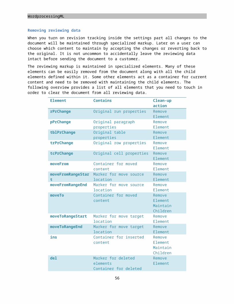
Placeholders
Elements of a simple spreadsheet
The minimal amount of markup used to create a spreadsheet sits somewhere between WordprocessingML and PresentationML in terms of required parts in the package and the required markup inside those parts. A SpreadsheetML document contains a central workbook part and separate parts for each worksheet. To create a valid SpreadsheetML package, you always need the workbook and at least one sheet part. The package contains 5 elements, which you must put together similar to the initial WordprocessingML document. First you create the workbook and sheet part. You can store them in any directory, the sample documents using the root directory of the package. Both the workbook and sheet use a specific content type stored in the content-types part. The content-types part is named [Content_Types].xml again, put it in the package root. The following content types are for the workbook and sheet.
application/vnd.openxmlformats-officedocument.spreadsheetml.sheet.main+xml
application/vnd.openxmlformats-officedocument.spreadsheetml.worksheet+xml
The final step is creating the required relationships between the package and the workbook, as well as the relationship between the workbook and sheet. Since the first relationship runs from the package to the initial part, it needs to go in a file called '.rels' in the _rels folder in the root of the package. If you follow the sample naming than the second relationship goes in the workbook.xml.rels file in the _rels folder. Use the following two relationship types to create the knots in the package.
http://schemas.openxmlformats.org/officeDocument/2006/relationships/officeDocument
http://schemas.openxmlformats.org/officeDocument/2006/relationships/worksheet
The workbook part
The first and foremost task of the workbook part is keeping track of the worksheets, global settings and other shared components of the workbook. The workbook part maintains a list of all the worksheets in the spreadsheet. This list is created to be able to name all the worksheets as well as providing sequencing information for the Open XML application. There are three pieces of data stored inside the workbook part about all the worksheets. Each sheet has a name attached for display in the consumer UI. There is an ID value used for sorting the sheets and finally a relationship ID to point the workbook to the part inside the package where the sheet is being stored. Other information in the workbook part concerns the views, calculations and versioning information as well as other options.
<workbook xmlns="http://schemas.openxmlformats.org/spreadsheetml/2006/main" xmlns:r="http:// schemas.openxmlformats.org
/officeDocument/2006/relationships"><sheets><sheet name="Sheet1" sheetId="1" r:id="rId1" />
</sheets></workbook>
Markup sample 71 A minimal workbook
One thing that you might notice in the markup sample of the workbook is the lack of a XML namespace prefix for the default SpreadsheetML namespace. You will find this throughout SpreadsheetML. The reason for not using a prefix is optimization again. When there are fewer letters in the markup there is less information that needs to be parsed and loaded into memory. For the missing namespace prefix this provides a reduction of at least four characters per XML node. The prefix itself is at least one character, the colon separating the prefix from the node name is again one character, multiplied by two for the start and end node. The downside of this approach is a slight decline in read-ability, but this is really minimal and not a real issue when dealing with a SpreadsheetML file.
57
Figure 21 Minimal spreadsheet parts
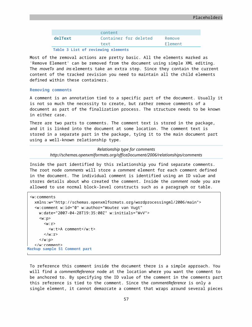
SpreadsheetML
This optimization is not defined within the contours of Open XML. Instead it is an optimization used by the Microsoft Office Excel® application. Other consumers might not use the same strategy.
The worksheet part
The minimal SpreadsheetML document is required to contain at least one sheet. The type of sheet can either be a worksheet, dialog sheet or chart sheet. Usually the spreadsheet will define at least one worksheet. The worksheet is what you normally associate with a spreadsheet. It contains a table like structure for defining data. To create an empty worksheet not many elements need to be defined. As can be seen in the markup sample a data sheet uses the worksheet element as the root element for defining worksheets. Inside a worksheet the data can be split up into three distinct sections. The first section contains sheet properties. The second contains the data, using the required sheetData element. Right after sheetData various supporting features can be found such as sheet protection and filter information. To define an empty worksheet you only have to make sure that you create a worksheet and sheetData element. The sheet data is allowed to be empty.
<worksheet xmlns="http://schemas.openxmlformats.org/spreadsheetml/2006/main" ><sheetData><row><c><v>1234</v>
</c></row>
</sheetData></worksheet>
Markup sample 72 Minimal worksheet containing the value '1234'
The entire structure
There are many more parts that you can put into a SpreadsheetML package. The following image depicts most of the elements that you can find in an enterprise spreadsheet, most of which are used for specific constructs such as the pivot-table or spreadsheet styles.
58
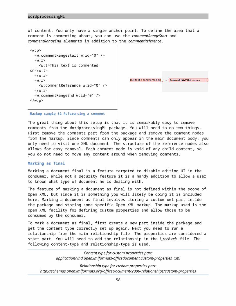
Placeholders
Creating worksheets
The worksheet serves as the workhorse for SpreadsheetML. It contains data in a table like fashion. To create new values for the worksheet you define rows inside the sheetData element. These rows contain cells, which contain values. The manner in which you can define these rows and cells have various optimizations applied to them. Before going into the details of these worksheet optimizations, first the structure of a simple sheet needs further explanation.
The row element defines a new row. Normally the first row in the sheetData is the first row in the visible sheet. There are optimizations that can alter this behavior, which is discussed later on in the chapter. Inside the row you create new cells using the c element. Values for cells can be provided by storing a v element inside the cell. Usually the v element will contain the current value of the worksheet cell. To store a numeric value in the spreadsheet, all you have to do is to include its value in the v element.
<worksheet xmlns="http://.../spreadsheetml/2006/main" ><sheetData><row><c><v>42</v>
</c></row>
</sheetData></worksheet>
Markup sample 73 A simple worksheet
If you create a spreadsheet with Microsoft Office Excel 2007 you will notice that cell text differs from the nline strings example you have just seen. Excel stores text using an optimized variation called shared strings, which are explained later. As with many optimizations in Open XML, both are equally valid but there is a trade-off between size, performance and complexity. To create a cell with text you use the 'is' element, which stands for inline-string. Before you are allowed to store an inline string in a worksheet cell, first the cell needs to be identified as a container for inline strings. You do this by setting the cell element t attribute to “inlineStr”. Within the 'is' element you set the text itself using the t element. Text is not stored directly within the 'is' element itself because there are other places in the markup where text can appear as well. The same t element is reused. The following markup sample shows the second row of the sample data. It uses two inline strings and two direct values. By providing more row elements you can build up the sample spreadsheet data. The documents provided on the samples Web site contain a complete sample. The location of this Web site can be found in the introduction.
<worksheet xmlns="http://schemas.openxmlformats.org/spreadsheetml/2006/main" ><sheetData><row><c t="inlineStr"><is><t>Southeast</t>
</is></c><c t="inlineStr"><is><t>Stephen Jiang</t>
</is></c>
59
SpreadsheetML
<c><v>0</v>
</c><c><v>720315</v>
</c></row>
</sheetData></worksheet>
Markup sample 74 A simple worksheet
If you create a spreadsheet with Microsoft Office Excel you will notice that cell text differs from the inline strings example you have just seen. Excel stores text using an optimized variation called shared strings, which are explained later. As with many optimizations in Open XML, both are equally valid but there is a trade-off between size, performance and complexity.
Formulas
A great deal of the power of spreadsheets derives from the use of formulas to create computational models. Formulas allow for automatic calculation of values based on data inside and outside the spreadsheet or the output of other computed cells in the spreadsheet.
Formulas are stored inside each cell that uses a formula. Using the f element you define the formula text. Formulas can contain mathematical expressions that include a wide range of predefined functions.
<c><f>(A3*B3) * (1-
C3)</f><v>3168</v>
</c>
Markup sample 75 Formulas
The v element, which previously contained the direct value, is now used to store the cached formula value based on the last time the formula was calculated. This allows the consumer to postpone calculation of the formula values when the spreadsheet is opened, which would result in longer waits when opening a worksheet. You do not need to specify the value, and if you omit it, it is the responsibility of the Open XML reader to compute the value based on the formula definition.
The use of functions in a highly internationalized environment such as the document workspace brings interesting questions. When you run Microsoft Office Excel you are allowed to express functions in the native language. The 'SUM()' function in Spanish would become 'SUMA()'. The important bit to consider is the way in which this is stored in Open XML. The function will be saved in its non-localized form. When a Spanish user would use the SUMA() function from within the consumer, the underlying markup would store the SUM() function. Only the user interface is localized, not the markup. This saves you a great deal of program code when working with functions, and let the developers benefit of working with well-known functions. Formulas cannot only appear inside a worksheet cell. Other elements such as table columns are also capable of storing formulas. The same model is used throughout. The formula is always stored as text.
60
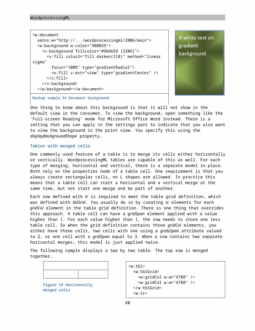
Placeholders
Worksheet optimizations
There are several optimizations to the SpreadsheetML model. There is a special setting that you can apply to rows and cells called sparse table markup. You use it to position cell using only the set the cells that you require. Shared strings and formulas are there to lower to amount of work for the consumer and reduce file size.
Sparse table markup
Up until now the row and cell position starts from the left top of the spreadsheet and runs outward, the first cell being cell A1. Using this model it takes quite a lot of markup if you only want to put a value in cell E5. E is the fifth column, 5 the fifth row, that's 25 cells to just get to cell E5. That is obviously not the most optimal thing to do with regard to the amount of markup and parsing to do. To solve this problem, a row and cell can include a position identifier. To for instance create a spreadsheet with a single row positioned at index 5, you add the r attribute to the row element as seen in Markup sample 76. Cells use a similar model to identify their position. The r attribute is to identify the column and row index. Obviously the row index should be equal to the one defined at the row level.
<worksheet xmlns="http://schemas.openxmlformats.org/spreadsheetml/2006/main"><sheetData><row r="5"><c r="E5"><v>1234</v>
</c></row>
</sheetData></worksheet>
Markup sample 76 Positioning optimizations
The sample spreadsheet does not make use of the row and cell positioning optimizations. The data runs from cell A1 outward, so it is not necessary to include this information. You are free to move the data around in the worksheet, but it takes quite some editing. The sample document for the positioning optimizations only shows a single positioned cell.
Positioning of rows and columns must advance from top to bottom and left to right. You cannot specify row 5 before row 4 and column E before D. Doing so is considered an error in the spreadsheet.
Shared strings
61
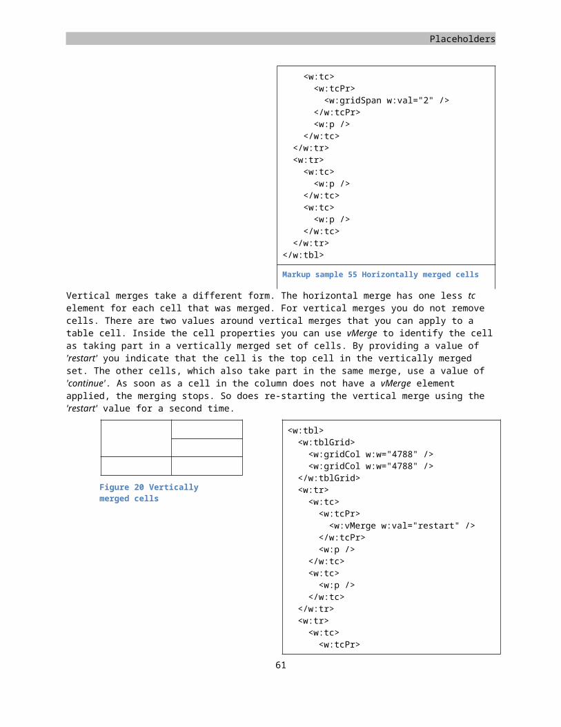
SpreadsheetML
Shared strings optimize space requirements when the spreadsheet contains multiple instances of the same string. When you examine the sample spreadsheet you notice quite a lot of strings being used multiple times. This scenario occurs frequently in modern use of spreadsheets to analyze business or analytical data. If you stored these strings using inline string markup, the same markup would appear over and over in the worksheet. There are several downsides to this approach. First of all the file will take more space on disk because of all the redundancy of content. Moreover, loading and saving will also take longer. To optimize the use of strings in a spreadsheet SpreadsheetML takes the approach of storing a single instance of the string in a table, called the shared strings table. The cells then reference the string by index instead of storing the value inline in the cell value. The shared strings table appears as a separate part inside the package. Each workbook contains only one-shared strings part whether the strings appear multiple times in one sheet or in multiple sheets. You can revisit the steps described in the WordprocessingML chapter on how the package structure works. To move the sample spreadsheet from inline strings to shared strings, you first need to create a separate part to store the shared string data. This part can again be stored anywhere in the package, like all the other package parts can. The content type needs to reflect the content type of the string table. You need the following value:
Content type for shared strings
application/vnd.openxmlformats-officedocument.spreadsheetml.sharedStrings+xml
The second step is relating the shared string table from the workbook part. There can only be one shared string table in the spreadsheet. Since each worksheet uses the same, it is referenced from the workbook instead of from each individual worksheet. The following relationship type is used to create the relationship between the workbook and string table parts.
Relationship type for shared strings
http://schemas.openxmlformats.org/officeDocument/2006/relationships/sharedStrings
Now that the package stores and references the string-table, it needs to be filled with data. The shared string table is defined using the sst element. It uses two attributes to keep track of the content and usage of shared strings. The si element is used to add an item to the shared string. It stands for string-item and is the exact opposite of the inline string element is.
<sst xmlns="http://schemas.openxmlformats.org/spreadsheetml/2006/main"><si><t>Region</t>
</si><si><t>Sales Person</t>
</si><si><t>Sales Quota</t>
</si>...12 more items ...
</sst>
Markup sample 77 The shared string table
62
Placeholders
The last step in the transition to shared strings is updating the worksheet data. The cells used the type quantifier t to identify them as inline string containers. Now they need to use shared strings instead. The type needs to be set to 'shared string', identified using the s value. The value of the cell is used to store the index into the shared string table. A good example is the header row of the sample spreadsheet. It uses the following markup to reference the string table.
<worksheet xmlns="http://schemas.openxmlformats.org/spreadsheetml/2006/main"><sheetData><row r="1" spans="1:4"><c r="A1" t="s"><v>0</v>
</c><c r="B1" t="s"><v>1</v>
</c><c r="C1" t="s"><v>2</v>
</c><c r="D1" t="s"><v>3</v>
</c></row>...24 more rows...
</sheetData></worksheet>
Markup sample 78 Referencing strings in the string table
Shared formulas
Similar to shared strings there is also an optimization for formulas. Like string values, formulas are often repeated over a range of cells, for instance in a calculated column of a table. They only differ in small details such as the row index the formula uses. For the consumer it is easier to load the first formula into memory and base the repeating formulas on that data than it is to load each formula individually. Unlike the optimization to strings using a separate shared-string part, the shared formula model does not rely on a separate part inside the package. It all takes place right within the worksheet data. A normal formula was defined by just adding the formula element f inside the cell. The formula text was stored within the opening and closing tags of the f element. For shared formulas the formula element has an extra attribute applied to identify it as being a shared formula, similar to identifying the cell type. The first cell using the formula stores three values. It stores the formula text like normal and a reference to the cell range using that formula type. The formula itself is identified using the si attribute. The next cell using that formula uses the same value for this attribute. It does not define the formula text, only the first cell has to store that information.
<row><c><v>1</v>
</c><c><f t="shared" ref="C2:C4" si="0">A2 + 1</f><v>2</v>
</c></row><row><c>
63
SpreadsheetML
<v>2</v></c><c><f t="shared" si="0" /><v>3</v>
</c></row>
Markup sample 79 Shared formulas
Tables
A SpreadsheetML table is a logical construct that specifies that a range of data belongs to a single dataset. SpreadsheetML already uses a table like model for specifying values in rows and columns, but you can also label a subset of the sheet as a table and give it certain properties that are useful for ad-hoc analysis. The table in SpreadsheetML allows you to work with the data in ways not possible using the formatting we have seen up until now. Examples of this is filtering, formatting and binding of data. Like other constructs in SpreadsheetML, any table in a worksheet is stored in a separate part inside the package. The table part does not contain any table data. That data is always maintained in the worksheet cells in exactly the same way we have used until now. The worksheet that displays the data is mostly agnostic of the existence of the table. To create a table in SpreadsheetML you create a separate part inside the package. This table part needs to be referenced from the worksheet that displays the table. The following content type and relationship type are used.
Content type for tableapplication/vnd.openxmlformats-officedocument.spreadsheetml.table+xml
Relationship type for tablehttp://schemas.openxmlformats.org/officeDocument/2006/relationships/table
The table part contains the definition of a single table. When there are multiple tables on a worksheet there are multiple table parts. The root element for this part is the table. In its minimal form it only needs information about the table columns which make up the table, but you probably also want to define an empty auto-filter. How auto-filters are defined will be explained a bit further on. Leaving out the auto-filter element disables the filtering buttons on the table columns in the consumer.
<table xmlns="http://schemas.openxmlformats.org/spreadsheetml/2006/main" id="1" name="Table1" displayName="Table1" ref="A1:D25"><autoFilter ref="A1:D25" /><tableColumns count="4"><tableColumn id="1" name="Region" /><tableColumn id="2" name="Sales Person" /><tableColumn id="3" name="Sales Quota" /><tableColumn id="4" name="Sales" />
</tableColumns></table>
Markup sample 80 Simple table
The table element has several attributes applied to identify the table and the data range it covers. The table id attribute needs to be unique across all table parts, the same goes for the name and displayName. The displayName has the further restriction that it must be unique across all defined names in the workbook. Later on we will see that you can define names for many elements, such as cells or formulas. The name value is used for the object
64
Placeholders
model in Microsoft Office Excel. The displayName is used for references in formulas. The ref attribute is used to identify the cell range that the table covers. This includes not only the table data, but also the table header containing column names.
To add columns to your table you add new tableColumn elements to the tableColumns container. Similar to the shared string table the collection keeps a count attribute identifying the number of columns.
Besides the table definition in the table part there is also the need to identify which tables are displayed in the worksheet. The worksheet part has a separate element tableParts to store this information. Each table part is referenced through the relationship ID and again a count of the number of table parts is maintained. The following markup sample is taken from the documents accompanying this book. The sheet data element has been removed to reduce the size of the sample. To reference the table, just add the tableParts element, of course after having created and stored the table part.
<worksheet xmlns="http://schemas.openxmlformats.org/spreadsheetml/2006/main">...<tableParts count="1"><tablePart r:id="rId1" />
</tableParts></worksheet>
Markup sample 81 Referencing the table part in a worksheet
65
SpreadsheetML
Auto filters
When there are a large number of items in a table it might provide a better view if there are only a number of rows displayed based on various criteria. The SpreadsheetML table model uses auto filters to provide this capability. It allows a number of different criteria to be set on the columns like filtering on values, ranges and even cell colors.
There are six types of filters that you can define. Each column in a table can have one of these filters applied. Filter Element Filters byvalue filters A list of cell values color colorFilter A font or fill color of a cell icon iconFilter An icon set and icon within
that settop items top10 The top N percent or number
of itemsdynamic dynamicFilter Some dynamic piece of data
such as 'today' custom customFilters A range of data using
operators such as 'greater than'
Figure 22 Filter types
Auto filters are mostly defined within the table part. The table part defines the filters for each column, but there is also a change that needs to be made to the worksheet data. First let's cover the definition of a simple auto-filter.To create auto filters you first add the autoFilter container to the table element in the table part. This container stores filter settings for all the columns. Each column is allowed one filter, and columns without filters do not need to be defined. The ref attribute is used to identify the cell range to which the filters contained in the autoFilter element apply. Usually this defines the entire table data range, including any possible hidden cells. For each column that has a filter applied you create the filterColumn element, identifying the column using the colId attribute. The first column has an ID of 0, the next of 1 and so on. The last step is to identify which type of filter you want to use on the column, by storing information within the filterColumn element.
<autoFilter ref="A1:D25"><filterColumn colId="0"><filters><filter val="Southeast"
/><filter val="Northeast"
/></filters>
</filterColumn></autoFilter>
Simply providing an auto-filter through the table part is not enough to have a working filter. The worksheet data needs to reflect the filter settings by explicitly hiding the rows that should be hidden due to filtering. The row element provides the hidden attribute to support this. This is an important factor for working with filters through
66
Figure 23 Using a value filter
Placeholders
program code. When modifying the filter settings you need to recalculate which rows should be hidden. Calculation implies the ability to work with complex markup such as formulas.
<row hidden="1">...
</row>Markup sample 82 Hiding filtered rows
If your application generates Open XML from business data sources you’ll most likely enable auto filters and not worry about applying a filter and hiding rows.
The following overview provides a simple implementation of some of the filter types. All the filters are applied to the first column of the table.
<filterColumn colId="0"><top10 percent="1" val="20" filterVal="5"/>
</filterColumn>
The top10 rule can either display the top number or percent of items. The percent attribute is a Boolean switch to determine the mode. The val attribute indicates the number or percentage, such as 'top 20%'. filterval is the value used to perform the comparison.
<filterColumn colId="0"><filters><filter val="3" /><filter val="4" /><filter val="5" />
</filters></filterColumn>
This represents a hard-coded list of values to filter on. Currently only the rows containing a value of 3, 4 or 5 in the first column are displayed.
<filterColumn colId="0"><customFilters and="1"><customFilter operator="greaterThan" val="2" />
<customFilter operator="lessThan" val="4" />
</customFilters></filterColumn>
The custom filter is used to use two operators and join them together. The and attribute can either indicate the 'and' condition', otherwise the 'or' condition is used. The sample displays all rows containing a value greater than 2 and less than 4.
<filterColumn colId="0"><dynamicFilter type="today" val="39206" maxVal="39207"
/></filterColumn>
A dynamic piece of data such as 'today' is represented in the dynamic filter. The type is set to a built-in type, and the values are used as a cache.
Calculated columns
One feature that is in use for a table quite often is calculating the values for the column based on a formula. The sample spreadsheet could contain an extra column in the table to calculate the sales minus the target to see who is below or above target easily. The calculated columns are defined within the table definition, just like a normal column for a table.
To create a column containing a formula, you add the calculatedColumnFormula element inside the column definition. The formula is provided as the text content.
67
SpreadsheetML
<table xmlns="http://schemas.openxmlformats.org/spreadsheetml/2006/main" id="1" name="Table1" displayName="Table1" ref="A1:D25"><autoFilter ref="A1:D25" /><tableColumns count="5"><tableColumn id="1" name="Region" /><tableColumn id="2" name="Sales Person" /><tableColumn id="3" name="Sales Quota" /><tableColumn id="4" name="Sales" /><tableColumn id="5" name="Exceeding Sales"><calculatedColumnFormula>[Sales] - [Sales Quota]</calculatedColumnFormula>
</tableColumn></tableColumns>
</table>
Markup sample 83 A calculated column
PivotTables
Now that the data for the spreadsheet has been defined, the next step is to allow analysis of this data using a PivotTable. The sample document contains a simple PivotTable using the region and sales person as the rows and the sums of all sales and quotas as the column information. The PivotTable is finished with the grand total row. In this section the PivotTable will be disseminated and created from scratch.
The elements of a PivotTable
The PivotTable is one of the more elaborate pieces inside the SpreadsheetML package. In order to create a PivotTable you need to create three parts and relate them together. The workbook also needs an extra relationship. The following image depicts the relationship hierarchy.
This hierarchy is most easily examined starting with the pivot cache definition. This part contains the definitions of all fields in the PivotTable. When you create the PivotTable based on a normal table, each column becomes a field of the pivot cache definition. The pivot cache contains the field definitions and information about the type of
68
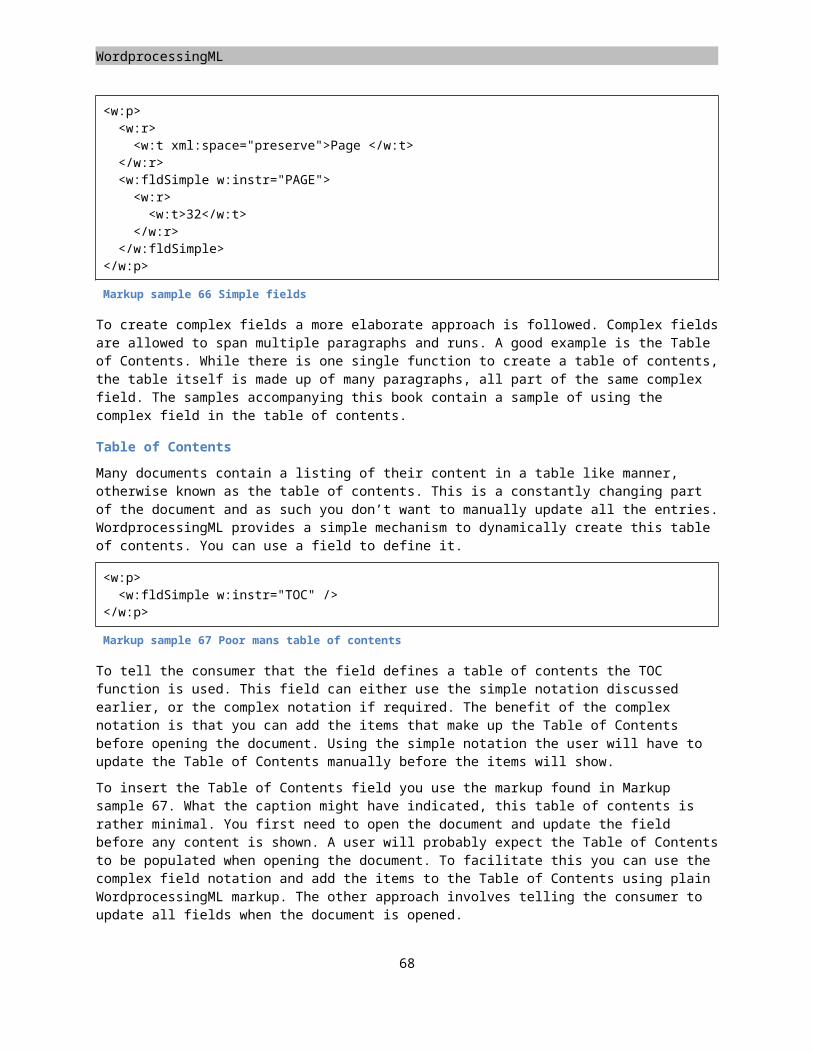
Placeholders
content found in that field. It also maintains a reference to the source data in the cache markup so the pivot cache can be refreshed along with the cached data in the pivot cache records part.
The data being displayed in the PivotTable is stored in two locations. The pivot cache records part maintains the actual data for the PivotTable. The table cells in the worksheet also store a cached version of the data, but that is purely for display purposes. The pivot cache records part stores data in one of two ways. The unique values for the data area of the PivotTable are cached inline. The repeating items that you normally find on the row and column are referenced. This shared data is actually stored in the pivot cache definition. Each record in the pivot cache record part consists of N values where N is equal to the number of fields defined in the pivot cache definition.
The final part to tie it all together is the PivotTable itself. This part contains the information about which field is present in which place of the PivotTable. You can place a field in four areas, row, column, data and filter. The fields are chosen from the cached fields in the pivot cache definition.
To create a real PivotTable that is ready when opened you also need to create the markup for the table cells. The PivotTable is displayed in the normal cells of a worksheet and hence you need to construct this as well. You can also have the consumer update the PivotTable cells when opening the document.
Creating the PivotTable shell
There are many parts that are required to be built to create a simple PivotTable. There are the three new parts defined in the previous section as well as updates to existing parts.
The first step is to create the basic file structure. Store three new parts inside the package, one for the three parts described. The following list provides the content types that you need to set up the structure.
Part Content TypePivotTable
application/vnd.openxmlformats-officedocument.spreadsheetml.pivotTable+xml
Cache Definition
application/vnd.openxmlformats-officedocument.spreadsheetml.pivotCacheDefinition+xml
Cache Records
application/vnd.openxmlformats-officedocument.spreadsheetml.pivotCacheRecords+xml
The next step consists of relating the various parts together, afterward the content can be provided. There are four relationships for you to set up. You need to create the hierarchy depicted above as well as relate the workbook to the pivot cache definition.
From To Relationship TypeWorkbook Cache
Definitionhttp://schemas.openxmlformats.org/officeDocument/2006/...…relationships/pivotCacheDefinition
Worksheet Pivot Table http://schemas.openxmlformats.org/officeDocument/2006/relationships/pivotTablePivot Table Cache
Definitionhttp://schemas.openxmlformats.org/officeDocument/2006/...…relationships/pivotCacheDefinition
Cache Definition
Cache Records
http://schemas.openxmlformats.org/officeDocument/2006/......relationships/pivotCacheRecords
This is one of those times where a picture says more than a few words in a table. The final layout is displayed in the following image.
69
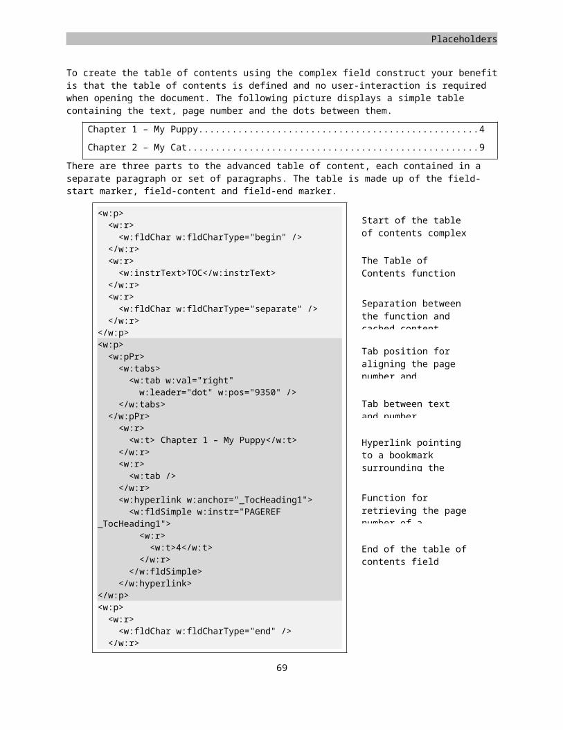
SpreadsheetML
Creating the pivot cache definition
Now that the shell has been created it is time to create a simple pivot cache. There are many elements that you can create here, but to keep it simple we will just be using two. The pivot cache will define the source of the data in the PivotTable to allow it to be updated and it will define the list of fields in that data. The data is already present in the sample spreadsheet. One important note is that the cache defines all fields available to the PivotTable, not the ones actually being used. That second piece of information is later defined in the pivot-table part. In the following few steps the pivot cache definition will be constructed.
When you run through this pivot cache definition the first item of interest is in the root-element. The relationship ID being used in the attributes points to the pivot cache records part.
<pivotCacheDefinition xmlns="http://schemas.openxmlformats.org/spreadsheetml/2006/main"
xmlns:r="http://schemas.openxmlformats.org/officeDocument/2006/relationships" r:id="rId1"><!-- the rest of the cache definition goes in between these tags... -->
</pivotCacheDefinition>Right inside the root-element is the data-source definition. This definition references the data being displayed in the PivotTable. The PivotTable also maintains that information in the cache-records part to allow the table to be updatable when the data-connection is not available. You cannot rely on the cells of the pivot-table to store that data since the data in these cells is transient in nature, it changes when you pivot the table. There are various types of data-sources, worksheets, database, OLAP cube and other PivotTables are amongst the available choices. This simple PivotTable will retrieve data from the first worksheet in the sample spreadsheet. The PivotTable will be stored in a separate sheet.
<cacheSource type="worksheet"><worksheetSource name="Table3" />
</cacheSource>The last part of the cache definition defines the fields of the data-source. Our table contains four columns, which results in four cacheField elements. The cacheField element is used for two purposes. It defines the data-type and formatting of the field. Second it is used as a cache for shared strings. Remember how the shared string table works? The same concept applies here. The pivot values are stored in the pivot-cache records part. When a recurring string is used as a value, the cache-record uses a reference into the cacheField collection of shared items. Since the first and second field are used for the row-labels there are recurring items, hence these two fields use the sharedItems collection. The last two fields are the quota and sales. These values are unique for each cell and using the shared items would provide no benefit.
<cacheFields count="4"><cacheField name="Region"><sharedItems count="5"><s v="Southeast" />
70
Placeholders
<s v="Southwest" /><s v="Central" /><s v="Northeast" /><s v="Canada" />
</sharedItems></cacheField><cacheField name="Sales Person"><sharedItems count="6"><s v="Stephen Jiang" /><s v="Michael Blythe" /><s v="Linda Mitchell" /><s v="Jillian Carson" /><s v="Garrett Vargas" /><s v="Tsvi Reiter" />
</sharedItems></cacheField><cacheField name="Sales Quota"><sharedItems containsSemiMixedTypes="0" containsString="0"containsNumber="1" containsInteger="1" minValue="0" maxValue="300000" />
</cacheField><cacheField name="Sales"><sharedItems containsSemiMixedTypes="0" containsString="0"containsNumber="1" containsInteger="1" minValue="1374" maxValue="1759212" />
</cacheField></cacheFields>It is safe t o say that this is only a very basic PivotTables. You can include many more settings inside the pivot cache definition, which fall outside the scope of this book.
Defining cache records
The second part of the PivotTable is purely used as a data-cache. The cache-records part is allowed to store any number of cached records. Each record has the same number of values defined as there are fields in the cache definition. The cache records take a simple approach. Each record is defined with the r element. This record contains value items as child-elements. You can provide a few 'typed' values, such as a Numeric, Boolean or date-time, or reference into the shared items.
The first cache record uses two references into the shared items using the x child element and two numeric values using v. The values are the same as the first row in the table that serves as the data-source. The rest of the pivot cache records are filled with more of the same type of records, twenty-two records have been stripped to save a little space.
<pivotCacheRecords xmlns="http://schemas.openxmlformats.org/spreadsheetml/2006/main"
xmlns:r="http://schemas.openxmlformats.org/officeDocument/2006/relationships" count="24"><r><x v="0" /><x v="0" /><n v="0" />
71
SpreadsheetML
<n v="720315" /></r><r><x v="1" /><x v="0" /><n v="0" /><n v="1759212" />
</r><!-- 22 more records to go -->
</pivotCacheRecords>
Markup sample 84 Pivot cache records
Referencing the cache from the workbook
Before the PivotTable part can be created which ties all the cached fields together, the pivot cache definition first needs to be referenced inside the workbook part. The markup is simple. There is a relationship ID to identify the part containing the cache and a unique number to identify that cache. In the sample spreadsheet the PivotTable is displayed in a separate worksheet, which is also referenced from the workbook part.
<workbook xmlns="http://schemas.openxmlformats.org/spreadsheetml/2006/main"
xmlns:r="http://schemas.openxmlformats.org/officeDocument/2006/relationships"><sheets><sheet name="Data" sheetId="1" r:id="rId1" /><sheet name="Pivot" sheetId="2" r:id="rId2" />
</sheets><pivotCaches><pivotCache cacheId="1" r:id="rId5" />
</pivotCaches></workbook>
Markup sample 85 The workbook list of pivot caches
Creating the PivotTable
The last step in defining the PivotTable is the creation of the PivotTable part. The part has been added earlier using a specific content and relationship type, referenced from the sheet the PivotTable is displayed on.
The main function of the PivotTable part is storing information about which field is displayed on what axis of the PivotTable and in what order. There are many other settings that can be added to the PivotTable definition but to keep it simple the basic layout is discussed. The following steps are used to build the PivotTable.
Again the construct is not to difficult if you leave out all the optional elements. The root element is the first element of interest. Besides naming the PivotTable so it can be used as a data-source, the root references the pivot cache using the ID added to the workbook part and defines the caption label to display above the data-area of the PivotTable. All these elements are required.
<?xml version="1.0" encoding="utf-16" standalone="yes"?><pivotTableDefinition xmlns="http://schemas.openxmlformats.org/spreadsheetml/2006/main" name="PivotTable1" cacheId="1" dataCaption="Values"><!-- the rest of the PivotTable definition goes in between these tags...
-->72
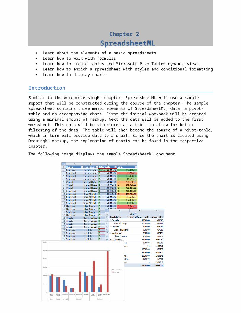
Placeholders
</ pivotTableDefinition >There are three main parts of the pivotTableDefinition, the location of the table, display-information for the cached fields, and finally positioning information of the cached fields.
The positioning of the PivotTable is a two-fold mechanism. The PivotTable is displayed in a specific location of some worksheet. The worksheet, which displays the PivotTable, stores a package relationship to this PivotTable part. The location is then used to identify the cell range that the PivotTable occupies. You need to apply three indexes applied to index which row counting from the top of the table starts the header information and which row / column is the first data element. This information is required for correctly updating the PivotTable. Otherwise the consumer cannot differentiate between the cells of the PivotTable.
<location ref="A1:C17" firstHeaderRow="1" firstDataRow="2" firstDataCol="1" />
Now that the location of the table is known it can be built using the fields in the pivot cache definition. First you need to define the collection of fields that appear on the PivotTable using the pivotFields element. Each field serves as a cache for the data of that field in the data source. You do not need to define that cache. Instead you can use the default item and have the consumer update the table upon opening the document. The showAll attribute is used to hide certain elements for that data dimension. Take for instance a PivotTable pivoting around sales / sales-person / sales-region. What if the salesperson didn't work in a certain region, should it be hidden from view? The showAll attribute defines this setting.
<pivotFields count="4"><pivotField axis="axisRow" showAll="0"><items count="1"><item t="default" />
</items></pivotField><pivotField axis="axisRow" showAll="0"><items count="1"><item t="default" />
</items></pivotField><pivotField dataField="1" numFmtId="164" showAll="0" /><pivotField dataField="1" numFmtId="164" showAll="0" />
</pivotFields>After defining which fields are part of the table, the fields are applied to the four areas of the PivotTable.
<rowFields count="2"><field x="0" /><field x="1" />
</rowFields>
<colFields count="1"><field x="-2" />
</colFields>
<dataFields count="2"><dataField name="Sum of Sales Quota" fld="2" /><dataField name="Sum of Sales" fld="3" />
</dataFields>
Summing up
A more in-depth discussion of the pivot-table features needs to be moved to another time and another book. There are a large amount of settings that you can apply to further enhance the PivotTable. You can use styles, and conditional formatting to further enhance the display of the data. Filter and sort the data using the field definitions and work with hierarchies of data found in sources such as OLAP cubes. The third part of the Open XML
73

SpreadsheetML
specification is a good starting point to learn more, as well as the samples found in the Markup Language Reference.
Adding and positioning the chart
The container part anchors the chart to the sheet and defines the location where the chart will appear as well as how it reacts to resizing of rows and columns. There are three methods of positioning available, absolute, one-cell and two-cell anchors. All the three methods use a value system found inside DrawingML. The positions and offsets are measured in EMUs or English Metric Unit. How to convert between EMU and the better-known units such as inches and centimeters is discussed in the chapter on DrawingML.Absolute anchors are the easiest to use. The anchor allows you to specify the position of the left top of a graphical element such as the chart. Besides the position you also specify the width and height of the graphic frame. Inside the absoluteAnchor element there is a graphicFrame element. The graphic frame contains a reference to the separate part with the chart data.
<xdr:absoluteAnchor><xdr:pos x="2276475" y="1552575" /><xdr:ext cx="1238250"
cy="1238250" /><xdr:graphicFrame>...
</xdr:graphicFrame><xdr:clientData />
</xdr:absoluteAnchor>
Markup sample 86 Absolute anchors
The second anchoring method is the single cell anchor. Using this method you also need to specify the position, size and content of the anchor. The position is defined using a reference to a row and column index. The index is zero-based again. After specifying the row and column you can offset the graphic from that row using a specific amount from the left-top corner of the referenced position. You next specify the size and the graphic frame content. How the content looks is discussed after the last anchoring type, two-cell anchors.
<xdr:oneCellAnchor><xdr:from><xdr:col>3</xdr:col><xdr:colOff>457200</xdr:colOff><xdr:row>7</xdr:row><xdr:rowOff>104775</xdr:rowOff>
</xdr:from><xdr:ext cx="1234567"
cy="1234567" /><xdr:graphicFrame>...
</xdr:graphicFrame><xdr:clientData />
</xdr:oneCellAnchor>
Markup sample 87 One cell anchor
The last anchoring method looks similar to the one-cell anchor. Instead of specifying the size using an absolute measure, you specify the right-bottom cell to which the graphic is also attached. The graphic will be sized according to the left top and right-bottom cell size and position. Similar to the other models you can specify an offset from the corner for further positioning.
74
Placeholders
<xdr:twoCellAnchor><xdr:from><xdr:col>5</xdr:col><xdr:colOff>438150</xdr:colOff><xdr:row>11</xdr:row><xdr:rowOff>9525</xdr:rowOff>
</xdr:from><xdr:to><xdr:col>13</xdr:col><xdr:colOff>133350</xdr:colOff><xdr:row>25</xdr:row><xdr:rowOff>85725</xdr:rowOff>
</xdr:to><xdr:graphicFrame macro="">...
</xdr:graphicFrame><xdr:clientData />
</xdr:twoCellAnchor>
Markup sample 88 Two cell anchor
All the anchor types store the item that they are providing the anchor for inside the element content. The graphicFrame is similar across all the three Open XML markup languages. The bulk of the use of graphic frames is explained in the PresentationML chapter. Here it is suffice to say that you specify the obvious values, identity, size and position. The graphic is a generic container in this case used for storing a chart. The chart element identifies which chart to display using a specific relationship ID. The content of the part referenced inside the graphicFrame is a DrawingML chart. The features supported by a chart are further discussed in that chapter.
<xdr:graphicFrame><xdr:nvGraphicFramePr><xdr:cNvPr id="2" name="Chart 1" /><xdr:cNvGraphicFramePr />
</xdr:nvGraphicFramePr><xdr:xfrm><a:off x="0" y="0" /><a:ext cx="0" cy="0" />
</xdr:xfrm><a:graphic><a:graphicData uri="http://.../drawingml/2006/chart"><c:chart xmlns:c="http://.../drawingml/2006/chart"xmlns:r="http://.../officeDocument/2006/relationships" r:id="rId1" />
</a:graphicData></a:graphic>
</xdr:graphicFrame>
Markup sample 89 The SpreadsheetML graphic frame
Styling content
As in all the other Open XML languages you can use styles to create common formatting settings for the cells. Unlike WordprocessingML you cannot provide direct formatting inside the worksheet markup. The formatting information is always stored separately. Using styles you can format cells and tables.
75
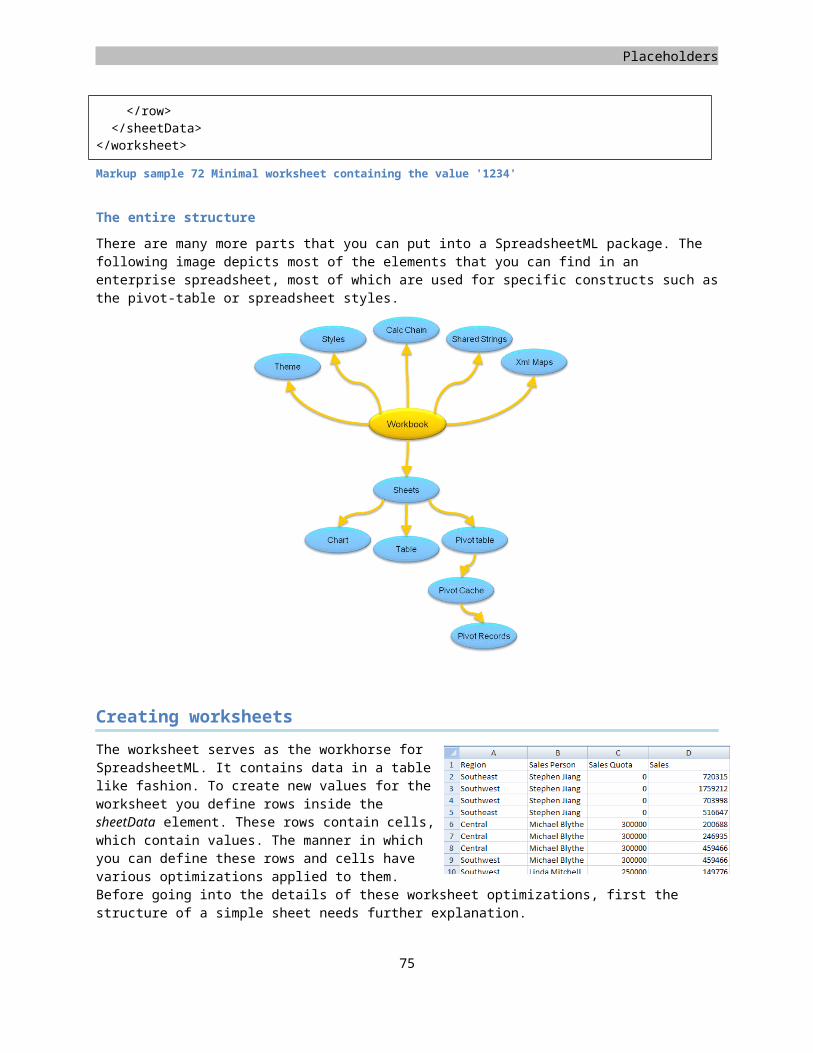
<row><c s="1"><v>0</v></c></row>
s="1" Direct FormattingcellXfs
Cell StylecellStyleXfsxfId="3"
SpreadsheetML
These SpreadsheetML styles are stored in a separate part inside the package. By now, you are probably used to the process of storing new parts inside the package. First create the XML file to hold the styling data. Update the content-types part to reflect the correct content type and finally add a relationship between the workbook and styles part. All the worksheets use the same style settings, there is only one styles part in the entire spreadsheet package.The following content type and relationship type needs to be used:
Content type for the stylesapplication/vnd.openxmlformats-officedocument.spreadsheetml.styles+xml
Relationship type for the styleshttp://schemas.openxmlformats.org/officeDocument/2006/relationships/styles
Elements of the styles part
Inside the styles part you might be a bit overwhelmed with the different sections. The reason for the structure is to allow maximum re-use of various style related settings. When you abbreviate all the elements and just look at the layout, you get something like the following.
<styleSheet xmlns="http://.../spreadsheetml/2006/main"><fonts /><fills /><borders /><numFmts /><cellStyleXfs /><cellXfs /><cellStyles /><dxfs /><tableStyles />
</styleSheet>
Markup sample 90 SpreadsheetML styles part
Four elements inside the styles part styleSheet element define actual style related settings. These are font, fills, borders and numFmts and as the names might have you suspect they contain font, fill, border and numbering settings. Each of them is a container for those properties and may contain multiple definitions.
The top four elements are not referenced by cells and other styled content directly. Instead a various types of formatting records are maintained. When you apply a style on a cell, it references an item in the cellXfs collection. This collection contains formatting applied directly on a cell. The cellXfs collection references an item in the cellStyleXfs collection. This second collection contains the formatting settings for global cell styles such as 'normal'. You can think of the cellStyleXfs as the global definition, the cellXfs as the alterations to that definition. A cell references the alterations and through that also the globally defined settings. Both the cellStyleXfs and cellXfs make use of formatting records to reference items in the fonts, fills, borders and numbering collections.
Applying a cell style
Now that the styles have been created, the easiest part can be done, applying the style on cells. The only thing that you need to do is add an extra attribute inside each cell element in the worksheet part.
Figure 24 Cell style hierarchy
76
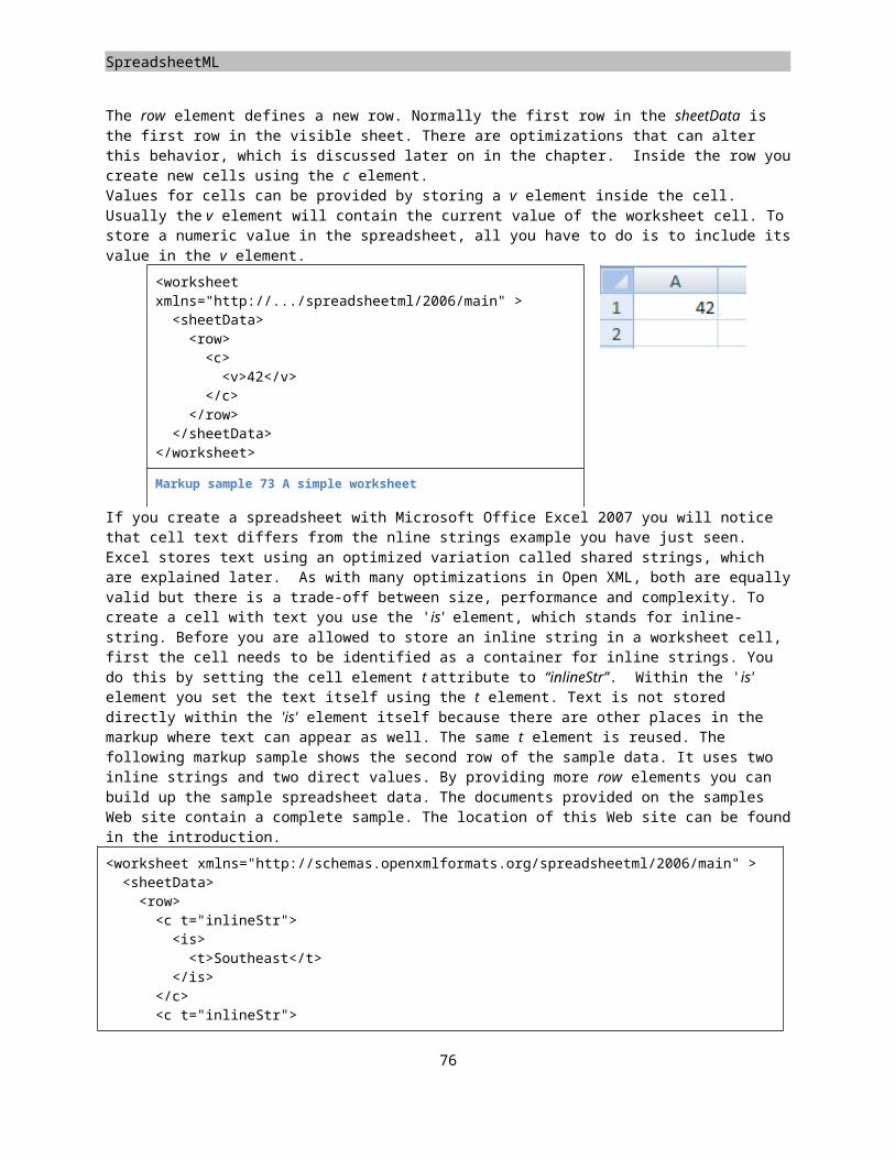
Placeholders
When you use a consumer such as Microsoft Office Excel the user can create new styles to apply on cells. The formatting options chosen by the user are stored in the style collection cellStyleXfs. The naming information is maintained in a separate list called cellStyles. The cellStyles can be seen as the list of the styles available to the user. The collection maintains an index into the global style collection for storing the formatting options. When you apply a style on a cell, it does not reference the cellStyles. Instead it copies the reference to the style into its direct formatting record inside cellXfs.
Fonts, fills, borders and numbering
All the formatting records identified with the …Xfs elements all reference formatting definitions stored globally in the styles part. The fonts, borders and fills are referenced by index, the numbering format by ID.There is an important note about the fonts section. Before the styles part was created the default font settings of the application were applied. As soon as you create the fonts section in the styles part, the first font will be used as the default for the entire workbook. To format the cells of the sample spreadsheet you require two fonts. The first is used for the default settings, the other for the white bold text in the header and footer. There are four fills, the first empty, the three others for the three colors that make up the table. Finally there are three border definitions. Again one empty, the second defines the border for the header row. The last one is used as the border for the entire table.
Border definitions
The borders element maintains a list of border elements. Each border is created using the border element. Inside the border tag you can create six borders using a dedicated tag name such as left or bottom. The border has a list of possible border types such as thin or double. It is not possible to set the exact border width. The type determines the width of the border. The color of the border is determined using an ARGB value, which consists of a red, green, blue and alpha (transparency) component.
77
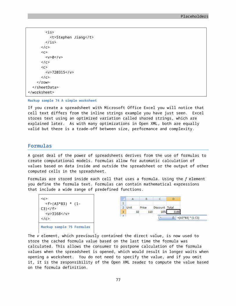
SpreadsheetML
<borders><border><left style="thin"><color rgb="FFFFFFFF" />
</left></border><!-- more borders omitted -->
</borders>
Markup sample 91 Border style definition
Fonts
The fonts are defined using a model similar to WordprocessingML. Each font can set its properties using elements such as sz for size, name for the font-family and color to specify the text color.
<fonts><font><sz val="11" /><name val="Calibri" /><color rgb="00000000" />
</font><!-- more fonts omitted -->
</fonts>
Markup sample 92 Font style definition
Fills
A fill consists of a background-color, foreground color and fill pattern. The colors are again specified in ARGB values. The list of available patterns is in the Open XML spec.
<fills><fill><patternFill patternType="solid"><fgColor rgb="FF4F81BD" /><bgColor rgb="FF1281F3" />
</patternFill></fill><!-- more fills omitted -->
</fills>
Markup sample 93 Fill style definition
Formatting records
The second step in creating a styled cell is creating the formatting records that reference the formats defined above. There are not many formatting records to create due to the simplicity of the sample spreadsheet. In real-life examples you will find many formatting records defined. In the sample we make use of one master formatting record and four direct formatting records. These four are reused across all the cells of the table. The header, and row bands use a separate formatting record, and the fourth is used as an empty default formatting record.
78
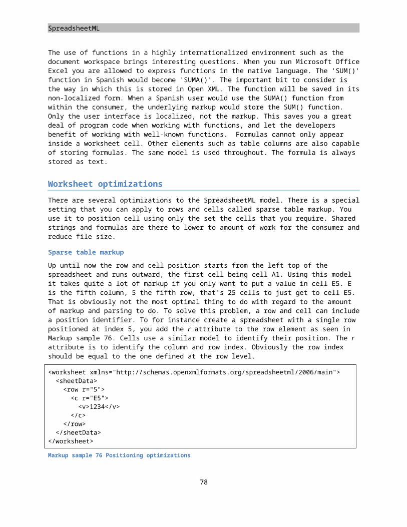
Placeholders
To create the formatting records, the styles part needs to be extended with two new collections. As a recap, the cellStyleXfs collection maintains the formatting you associate with a style. The cellXfs collection contains the differences applied to a cell after it is styled. Do not think that these styles can only be applied within the context of a table. The style is applied directly on a cell,
which has no knowledge it might be part of a table.
The following markup sample displays how these two collections are used. All the values are indexes in the previously discussed formatting collections. The direct formatting record maintained within cellXfs points to the cellStyleXfs collection using the xfId attribute.
<cellStyleXfs count="1"><xf fontId="0" fillId="0" borderId="0" />
</cellStyleXfs><cellXfs count="1"><xf fontId="0" fillId="0" borderId="0" xfId="0" /><xf fontId="1" fillId="4" borderId="1" xfId="0" /><xf fontId="0" fillId="3" borderId="2" xfId="0" /><xf fontId="0" fillId="2" borderId="2" xfId="0" />
</cellXfs>
Markup sample 94 Formatting records
Differential formatting records
The current setup for formatting the cells is not ideal. You need to visit each individual cell to apply the correct style. SpreadsheetML contains a styles optimization construct called the differential formatting record or dxf, which makes styling a table more efficient. Similar to the other formatting records the dxf is used to define a certain format. The main difference is that a differential record is applied in addition to the normal cell style already applied through cell formatting. It also doesn't reference the top 4 format containers, but defines a fill, font, number or border directly inline.
<dxfs count="1"><dxf><fill /><font /> <numFmt /> <border />
</dxf></dxfs>
Markup sample 95 Differential formatting
To create the differential formatting records, you first need to create the container element called dxfs. Next you add a separate dxf record for each of the 3 styled parts of the table. One for the header, the other two for banded rows. Finally you need to copy the correct fonts, fills and borders, grouping them into one of the three dxf records.
79
Header
First row band
Second row band
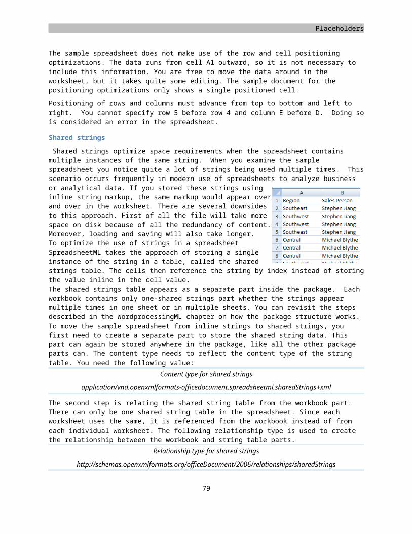
SpreadsheetML
This sets up the differential records to be used by the table style. Using a table style will greatly enhance the way in which you can style a table.
Table styles
There are two things to do to move toward a table style. First you need to create a new style inside the styles part, next you need to update the table part as well to reference the new style. Creating the table styles involves similar steps to the formatting records. There is a collection element tableStyles containing separate tableStyle elements for each table style you define. Similar to WordprocessingML you can provide a different format for certain areas in the table such as the header and footer row, row and column banding and corner cells. The way in which this works is through the differential formatting records. Each area of the table references a separate differential record to provide its formatting. The following markup displays the table style for the sample spreadsheet.
<tableStyles count="1"><tableStyle name="ReportTable" pivot="0" count="5"><tableStyleElement type="wholeTable" dxfId="0" /><tableStyleElement type="headerRow" dxfId="1" /><tableStyleElement type="totalRow" dxfId="2" /><tableStyleElement type="firstRowStripe" dxfId="3" /><tableStyleElement type="secondRowStripe" dxfId="4" />
</tableStyle></tableStyles>
Markup sample 96 Table styles
The second step is to update the table part. The table definition needs to reference the defined table style. It does so through the name of the style. The table part is extended with the tableStyleInfo element, which defines which style to use and in what way. A table using a style does not necessarily need to use the entire definition. If it doesn't want to use a different totals-row style then it is free to do so. There are several Boolean attributes to indicate which sections of a table need special formatting applied. The following markup sample displays the updated table definition.
<table xmlns="http://.../spreadsheetml/2006/main"><tableColumns count="4"><tableColumn id="1" name="Region" /><tableColumn id="2" name="Sales Person" /><tableColumn id="3" name="Sales Quota" /><tableColumn id="4" name="Sales" />
</tableColumns><tableStyleInfo name="My Table Style" showFirstColumn="0" showLastColumn="0" showRowStripes="1" showColumnStripes="0" />
</table>
Markup sample 97 Applying a table style
80
Placeholders
Conditional formatting
Cell based conditional formatting is here to help provide structure to data inside a worksheet. It is easier to distinguish the relative height of values in a table using colors than it is by just showing the value. There are several formatting options you can apply to cells based on their value. You can highlight the top or bottom most items, provide data-bars showing a progress-bar type UI or use color scales to indicate the highs and lows. Conditional formatting is applicable to a cell in a worksheet directly. You do not need it to be in a table, but that is the place where it will be common. Take the sample in Figure 25. It has a color scale format applied. Based on the live cell data the lowest will be filled red, the highest value green. Everything in between is interpolated. All conditional formatting settings are stored at the worksheet level. The worksheet stores one conditionalFormatting element for each format applied to a series of cells. The collection of cells on which the format is applied is defined using the sqref attribute. It specifies a cell range using the 'from:to' notation, like 'A1:A10'. Markup
<worksheet><sheetData>...
</sheetData><conditionalFormatting sqref="A1:A5"><cfRule type="dataBar" priority="1">...
</cfRule><cfRule type="colorScale" priority="2">...
</cfRule></conditionalFormatting>
</worksheet>
Markup sample 98 Conditional formatting rules
Each conditional format applied to a range of cells is allowed to specify various formatting rules. You can apply a color-scale and the data-bars at the same time for instance. Each is represented using a separate cfRule element. To specify their UI priority you can use the priority attribute. Since a conditionalFormatting element can overlap other formatted areas the priority is global for all the conditional formats defined.The cfRule has quite a large amount of formatting types that can be applied. Each different type of formatting uses common elements to define its settings. The follow list are all the different formatting types available. Conditional formatting typesaboveAverage beginsWith cellIs colorScalecontainsBlanks containsErrors containsText dataBarduplicateValues endsWith iconSet notContainsBlanksnotContainsErrors notContainsTex
ttimePeriod top10
uniqueValuesTable 5 Conditional formatting types
Highlighting rules
The first conditional formatting rule is the cellIs rule. There are several effects, which you can achieve using this rule, depending on the operator and provided values. The operator defines the number of formulas that can be used to define the range. Sample operators are 'between', 'greaterThan' or 'notEqual'. The operator used in the markup sample requires two formulas. These formulas can contain hard coded values, but in more advanced
81
Figure 25 Conditional formatting applied
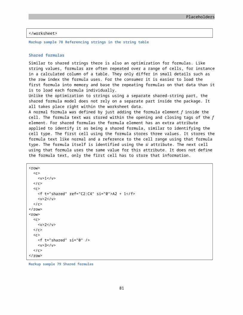
SpreadsheetML
scenarios you can use the full formula syntax and reference cell values etc. The formatting which is applied to values which fall into the defined range are formatted using a differential formatting record, indicated by the dxfId attribute. The formatting used in the sample colors the items in the specified range red.
<cfRule type="cellIs" dxfId="0"
priority="1"operator="between">
<formula>2</formula><formula>4</formula>
</cfRule>
<dxf><fill><patternFill><bgColor
rgb="FFFFC7CE" /></patternFill>
</fill></dxf>
Top and bottom rules
To highlight the highest or lowest N number of cells you apply the top10 rule. The formatting is again identified using a differential formatting record. In the sample the bottom three items are being highlighted. The bottom attribute is a Boolean switch. The rank identifies the number of items. To highlight the top N percent of items, you also apply the percent Boolean attribute. The rank identifies a percentage when this is used.
<cfRule type="top10" dxfId="0" priority="1" bottom="1" rank="3" />
<dxf><fill><patternFill><bgColor
rgb="FFFFC7CE" /></patternFill>
</fill></dxf>
Data bars
To indicate the relative height of items you can make use of data-bars. Data-bars take a single color and display it as a bar. The length of the bar indicates the relative height of the cell value. Color-scales, which will be shown next, is a similar method of showing relative heights but uses various colors instead. The data-bar uses a separate model inside the rule to define its settings. The dataBar element stores all the relevant data. The data-bar requires three settings, the minimum value to compare cell values to, the maximum and a color. The first cfvo element, or conditional format value object, defines the minimum value, the second the maximum. You can use different ways to specify a value, like using a formula or hard-coded value. Another common option is to use the 'min' and 'max' types. These cfvo types specify the minimum and maximum values found in the cell range that have the format applied. This always provides a clean stepped gradient between the lowest and highest items.
<cfRule type="dataBar" priority="1"><dataBar><cfvo type="formula" val="$D$2"
/><cfvo type="number" val="5" /><color rgb="FF638EC6" />
</dataBar></cfRule>
82
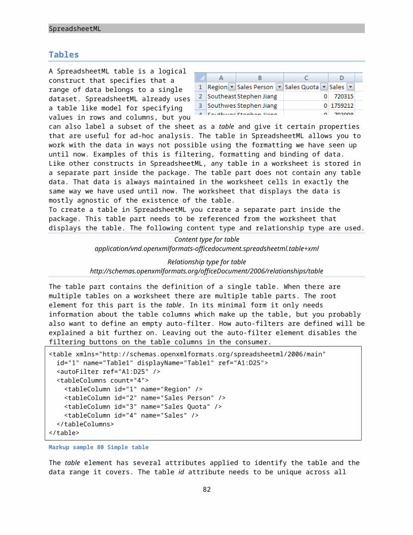
Placeholders
Color scales
The use of color scales is similar to the use of data bars. You use it to provide a feeling for the relative value between all cell items. Like a data-bar the color-scale has a specific child element in the cfRule container. You are allowed to specify three values, one for the start of the scale, one for the middle, one for the end. A two-valued approach is also possible, leaving out the middle value for the scale. In the sample the color scale will run from the minimum value in the cell range. The second point in the color gradient is identified by a percentage, fifty percent. The endpoint is the maximum value of the cell range. Each point has a color attached. The first color element applies to the first cfvo, and so on.
<cfRule type="colorScale" priority="1"><colorScale><cfvo type="min" val="0" /><cfvo type="percentile"
val="50" /><cfvo type="max" val="0" /><color tint="-
0.499984740745262" /><color tint="-
0.249977111117893" /><color />
</colorScale></cfRule>
Icon sets
The last formatting option is the icon set. Using this you can apply different sets of icons to the items. The icon set uses a similar range of values to identify which set of cells to apply the formatting rule to. The first cfvo identifies the lowest value, the second the middle point and the last the highest value. The iconSet identifies which icons to apply. You can choose from various hard-coded icons that can be observed in the Open XML specification.
<cfRule type="iconSet" priority="1"><iconSet iconSet="3Symbols"><cfvo type="percent"
val="0" /><cfvo type="percent" val="33"
/><cfvo type="percent" val="67"
/></iconSet>
</cfRule>
Chart sheets
There are two other types of sheets besides the common worksheet. You can create dialogs using a dialog sheet and display charts on a chart sheet. While the use of dialog sheets is outside the scope of this book, chart sheets will be discussed. Charts make use of DrawingML markup. This enables the same charts to be used across the Open XML spectrum. To allow each markup language to display a chart there are language specific containers in place. For SpreadsheetML this container is in a separate part inside the package and is referenced from by the chart sheet. Similarly you can place a chart on a normal worksheet as well. The worksheet will
83
SpreadsheetML
reference the container in the separate part. The chart itself is also in a separate DrawingML specific part inside the package. This gives a three-level hierarchy, the sheet, the container and the chart.The simplest bit of the hierarchy is the sheet level. The following markup sample shows a minimal chart sheet.
<chartsheet xmlns="http://.../spreadsheetml/2006/main" xmlns:r="http://.../officeDocument/2006/relationships"><sheetViews><sheetView workbookViewId="0" />
</sheetViews><drawing r:id="rId1" />
</chartsheet>
Markup sample 99 The chart sheet
There are two references. The first is to the list of workbookView elements in the workbook part. The value is a zero-based index. The second a reference to the SpreadsheetML container for charts using a relationship ID. If you insert a chart in a normal worksheet instead of a chart sheet then the only thing you need to do is also add the drawing element and reference the separate container part.
Supporting features
Defined names
When referring to elements within a spreadsheet, using a cell reference like '$D$2' doesn't really convey any useful information. When you use this in a formula it would be better when you are able to say 'TotalSales – TotalCost' instead of 'D2 – E5'. To enable this type of syntax you are allowed to define names for cells and other elements. These names can either be scoped at the workbook level or at the individual sheet level. Names defined at the workbook level can be used from all the worksheets, the other obviously not. These names can then be used in formulas to provide better readability.
A defined name is actually just a formula with a name attached. Inside the definedNames element inside the workbook you create names and apply their settings. The text content of the definedName element contains the formula that the name refers to. You can apply settings such as the name displayed in the consumer, comments, menu-text or description. To make the defined name local to a specific sheet you apply the localSheetId attribute, which refers to the sheet index in the sheet list.
<definedNames><definedName name="Formula" comment="A Named Formula" localSheetId="0">SUM(1,2,3)</definedName>
<definedName name="MyFirstCell">Sheet1!$B$1</definedName><definedName name="MySecondCell">Sheet1!$B$2</definedName>
</definedNames>
Markup sample 100 Defining names
Workbook properties
There are several properties that you can apply at the workbook and worksheet level which have not been discussed yet. Some of these properties surround versioning, other about the page and window size.
At the workbook level there are there common properties when saving the document from inside the Microsoft Office Excel application. The fileVersion indicates the consumer that saved the spreadsheet. The appName indicates the application. The lastEdited attribute indicates the application version used for saving the spreadsheet.
84
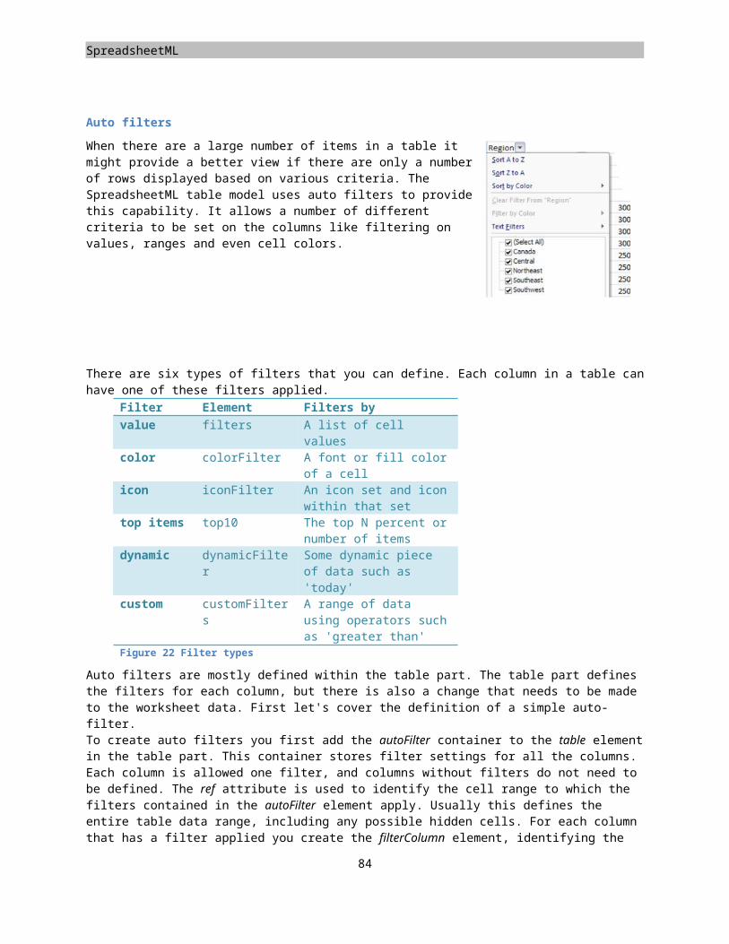
Placeholders
The lowestEdited indicates the earliest application version, which saved the file, and finally rupBuild is used in conjunction with the appName and lastEdited to indicate the build number.
The workbookPr can be used to specify workbook wide settings. One important setting is whether to use the 1900-based or 1904-based date system. SpreadsheetML allows you to use both. SpreadsheetML has been designed for compatibility with billions of documents that have been created on personal computers. One of the early spreadsheet programs, Lotus 123, had a well-known bug that mishandled calculation of the leap year in 1900. This led to development of two date systems in SpreadsheetML. The 1900 date system maintains compatibility with those early spreadsheets. The 1904 date system breaks compatibility but it ensures that leap years are always calculated accurately. There are many other settings including back-up information and the ability to refresh data when opening the spreadsheet.
<workbook><fileVersion appName="xl" lastEdited="4" lowestEdited="4" rupBuild="4505" />
<workbookPr date1904="0" refreshAllConnections="1" updateLinks="always" /><sheets>...
</sheets><calcPr fullCalcOnLoad="1" />
</workbook>
Markup sample 101 Workbook properties
The calcPr element is used to define properties about the calculation engine. One interesting setting is fullCalcOnLoad, which allows the entire workbook to be calculated on opening of the spreadsheet.
Wrap-up
Well over the half way mark there are two more markup languages to go. While it is not the case that SpreadsheetML doesn't deserve any more space, but the attention needs to be spread across all the available options of Open XML in a limited space. There are many things yet to uncover when going through the spec and sample documents. The use of more advanced PivotTables, business data integration using Custom XML markup are amongst the samples not discussed
85
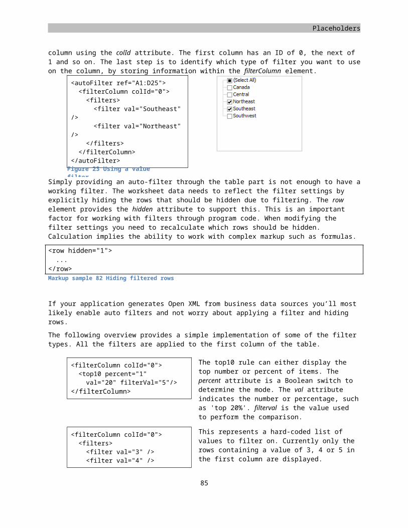
Chapter 3
PresentationML Learn about the elements of a presentation Learn about different shapes Learn how to use placeholders and master slides to create a common look and feel Learn how to insert pictures, tables or charts
Introduction
As one should easily be able to deduce from its name, PresentationML is the markup language to use for creating presentations. The model of PresentationML is formed after the Microsoft Office PowerPoint® application and supports a wide variety of different elements. If one examines PresentationML a bit further you will find that it relies heavily of the capabilities of a supporting language, DrawingML. There is actually quite a bit of confusion, the part on DrawingML pictures in the third part of the specification mentions PresentationML namespaces and vice-versa. Most of the elements referring to properties that have visual impact will use the DrawingML namespace. In itself, DrawingML is discussed in a later chapter. The focus in this chapter will be on how to deal with the PresentationML side of your presentations.
PresentationML document structure
Like the other markup languages defined within the Open XML standard, PresentationML follows the Open Packaging Convention to separate the various elements that make up a slide deck. For PresentationML this results in an elaborate structure. The following image depicts the structure:
Figure 26 Elements of PresentationML
87
As can be observed, the packaging structure contains several circular references and a great variety of elements. The central presentation part acts as the hub of the package and is the start part to begin working with the package. There are several master slide types and other types of content referenced by the presentation. For those unfamiliar, a master is a generic slide-template that is used by the slides itself. For PresentationML the hierarchy is even a bit bigger, where a slide references a specific slide layout, which in turn goes to a slide master. Together these three elements form the final slide on screen. There are several types of master slides for several types of content. A master type is available for slides, note pages and handouts. Each individual master page or master layout and every slide in the presentation is stored in a separate part inside the package, allowing easy access to the individual parts of the presentation. The notes pages follow a similar model. Each note being stored inside a separate part referenced from the slide which it provides notes for.
The next interesting thing to note is the layout of the themes. Just as the other two main Open XML formats, DrawingML theming can be used to create default values for fonts, layouts, and other branding related data and allow it to be separated from the main body of the presentation. A theme is reusable across all the Open XML markup languages. Inside a PresentationML package various themes are in use. By default each individual master, slide-, note- and hand-out masters, references a separate theme part. The presentation itself also references a default theme to be used in the presentation. This default theme shared with the slide masters by referencing the same part inside the package.
The packaging structure contains two circular references, one between the slide master and slide layout parts, the other between the slide and notes-slide parts. The rest of the packaging structure is pretty obvious.
Most of the elements found in a presentation saved from PowerPoint are not required. In the next chapter the layout of a really simple empty slide deck is discussed. This is a good basis to start building up a demo presentation. Next the various elements that can be put on slides will be discussed such as shapes and charts. The chapter on PresentationML finishes with details on providing animations and some details on the supporting slides such as the note pages. But first, the elements of an empty presentation will be discussed, and to do that properly first we need to know about the single-most common element of a presentation; the shape.
Shapes
There are various things you can define using a shape. Using shapes you create the presentation text, the figures it contains and the placeholders at the layout and master level. These shapes are used at all of the three levels, slide, layout and master. You can for instance define a placeholder for text at the master level, style it at the layout level and fill it with content at the slide level.
There are quite a few dependencies on DrawingML in the shape definition. The PresentationML markup of the shape defines specific containers such as the shape properties, style and text-body container. These containers are usually filled with DrawingML properties to provide effects such as filling the shape in a specific form, reflection or rotation and allow text to be added. The differences between a textbox and the no-smoking sign visible in Figure 27 are minimal. One addition is that DrawingML effects cannot only be applied to normal figures but also to text itself, which enable shapes to be great building blocks for creating professional slides.
To create a shape you use the sp element. This element will later be defined within a shape-tree. You can read about this concept later in the chapter. Most of the containers will be further explained in the DrawingML chapter since much of the markup resides in those namespaces.
88
Figure 27 Various shapes
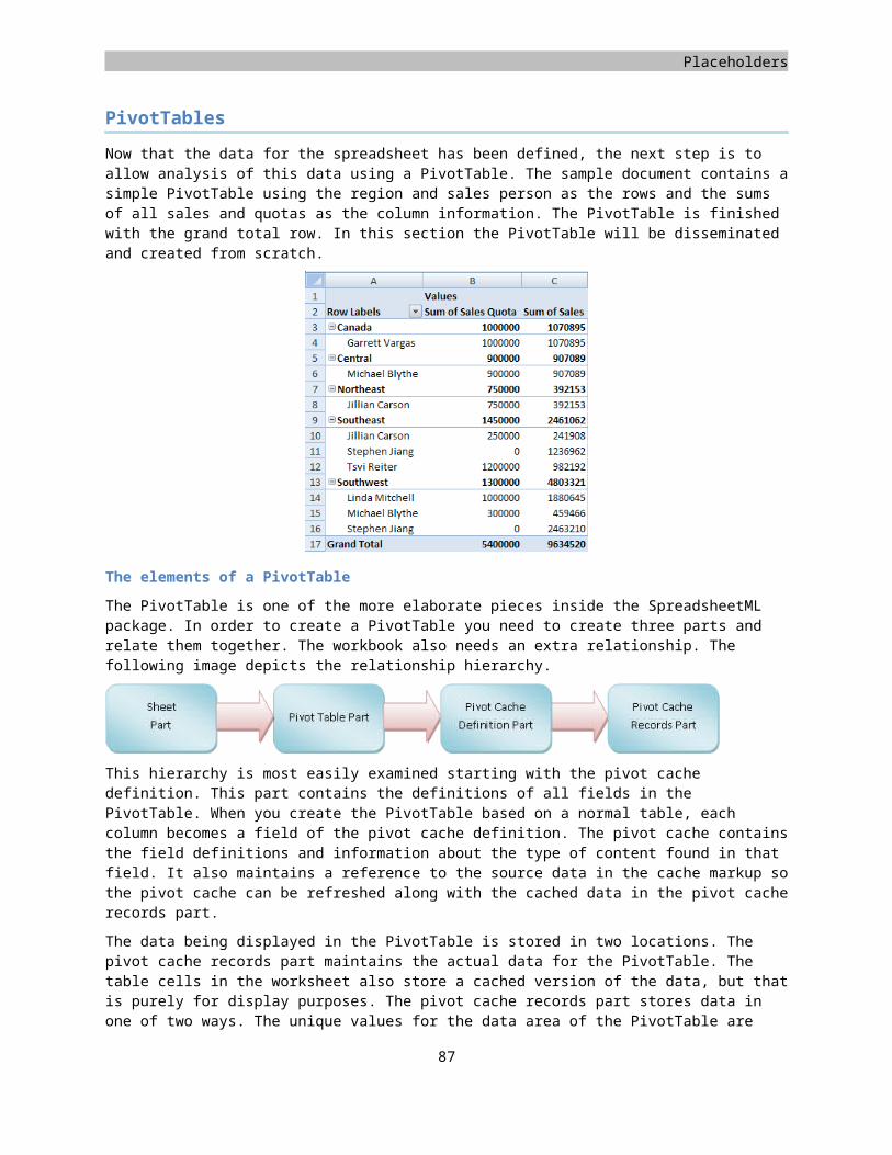
Placeholders
<p:sp><!-- the rest goes in here -->
</p:sp>
Markup sample 102 Overview of shape elements
The first container inside the shape is the non-visual shape properties. As the name implies it stores properties that do not affect the visual appearance of the shape such as shape-locks. The only required elements are the basic outline and the name and id attributes.
...<p:nvSpPr><p:cNvPr id="1" name="TextShape" /><p:cNvSpPr /><p:nvPr />
</p:nvSpPr>...
Markup sample 103 Non-visual shape properties
The obvious follow-up of the non-visual shape properties using nvSpPr are the properties that do affect the visual appearance of the shape. The spPr node stores this information using DrawingML markup. You are not required any content within the spPr node. The sample does show how to set position and size.
...<p:spPr><a:xfrm><a:off x="285720" y="428604" /><a:ext cx="1928826" cy="369332" />
</a:xfrm></p:spPr>...
Markup sample 104 Shape properties
The last part of the shape definition is the text body of the shape. This one is optional, but many shapes define text content so the sample displays how to define a simple run of text. It is similar to WordprocessingML.
<p:txBody><a:bodyPr /><a:p><a:r>
<a:t>Shape Text</a:t></a:r>
</a:p></p:txBody>
Markup sample 105 Shape text
If you combine all the elements you end up with the basic markup displayed on the next page. This markup can be enhanced using custom geometries and DrawingML effects.
89
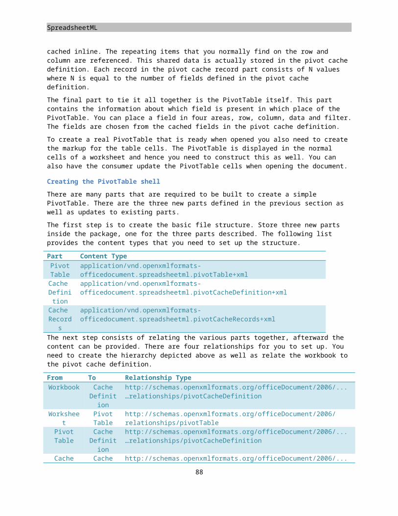
PresentationML
<p:sp><p:nvSpPr><p:cNvPr id="1"
name="TextShape" /><p:cNvSpPr /><p:nvPr />
</p:nvSpPr><p:spPr><a:xfrm><a:off x="285720" y="428604" /><a:ext cx="1928826"
cy="369332" /></a:xfrm>
</p:spPr><p:txBody><a:bodyPr /><a:p><a:r>
<a:t>Shape Text</a:t></a:r>
</a:p></p:txBody>
</p:sp>
Markup sample 106 A text shape
Figure shapes
To turn a normal text shape into a figure, the addition of a few extra properties within the visual property section of a shape is sufficient. By declaring a specific fill type, fill color and line color, the left shape can be turned into the right.
While this is a pretty simple style, later on you can provide 3-D effects to really enhance the image.
All of the following elements need to be declared within the visual shape properties, spPr. Right after the shape size using xfrm.
First you apply a custom geometry. By default the geometry is a rectangle, but there are many presets to choose from. Apply the prstGeom to use one of the presets. You can also create custom geometries.
<a:prstGeom prst="smileyFace"><a:avLst />
</a:prstGeom>
Markup sample 107 Using a different geometry on a shape
Next you need to apply a size and color for the geometry outline. There are many fills and colors to choose from. Gradient fills for instance. The chapter on DrawingML explains the line and line fill in more detail.
90
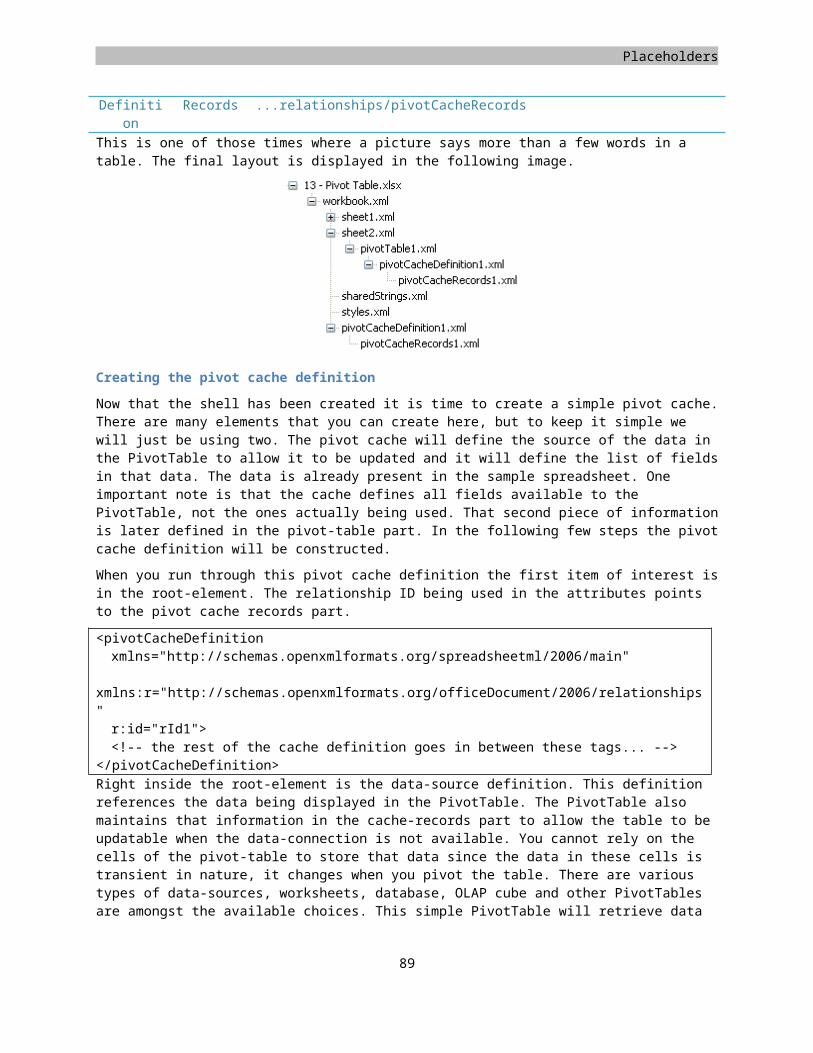
Placeholders
<a:ln><a:solidFill><a:prstClr val="green" />
</a:solidFill></a:ln>
Markup sample 108 Outlining the geometry
And finally you apply the shape fill. The geometry can be filled with a specific color, gradient or image or texture.
<a:solidFill><a:srgbClr val="00B0F0" />
</a:solidFill>
Markup sample 109 Applying a fill
The following visual shape properties form the entire markup for this smiley face shape. The height of the shape has been modified a bit as well to improve the display of the shape.
<p:sp><p:nvSpPr><p:cNvPr id="1"
name="TextShape" /><p:cNvSpPr /><p:nvPr />
</p:nvSpPr><p:spPr><a:xfrm><a:off x="285720" y="428604" /><a:ext cx="1928826" cy="1209332"
/></a:xfrm><a:prstGeom prst="smileyFace"><a:avLst />
</a:prstGeom><a:solidFill><a:srgbClr val="00B0F0" />
</a:solidFill><a:ln><a:solidFill><a:prstClr val="green" />
</a:solidFill></a:ln>
</p:spPr><p:txBody><a:bodyPr /><a:p><a:r><a:t>Shape Text</a:t>
</a:r></a:p>
</p:txBody></p:sp>
Markup sample 110 A basic shape
91
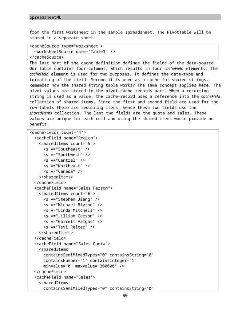
PresentationML
Grouping shapes
The last shape type that will be discussed is the group shape. This concept of grouping shapes might be familiar to you from the Microsoft PowerPoint application. A grouped shape contains several shapes and forms a container for them. You can edit the shapes as a single unit using the group.
The grouping shape does not use the normal sp element to define itself, instead grpSp is used. The rest is largely similar to the normal shape. First you define the container.
<p:grpSp><!-- The other elements go inside this container -->
</p:grpSp>
Markup sample 111 A Group shape
Next the non-visual properties are defined.
<p:nvGrpSpPr><p:cNvPr id="4" name="Group 3" /><p:cNvGrpSpPr /><p:nvPr />
</p:nvGrpSpPr>
Markup sample 112 Non-visual group shape properties
Right after the non-visual properties you define the visual properties. The position and size of the group shape is specified as well as the rectangle encompassing all the child shapes. If you do not define these elements the group will not be displayed properly.
<p:grpSpPr><a:xfrm><a:off x="285720" y="428604" /><a:ext cx="4071966" cy="1209332" /><a:chOff x="285720" y="428604" /><a:chExt cx="4071966" cy="1209332" />
</a:xfrm></p:grpSpPr>
Markup sample 113 Visual group shape properties
The last elements of the group shape are the shapes that sit inside the group. These shapes take the exact same form as you have seen in the first part on shapes. A group is also allowed to contain other groups, forming a tree of shapes.
<p:grpSp><p:nvGrpSpPr>…</p:nvGrpSpPr><p:grpSpPr>…</a:xfrm></p:grpSpPr><p:sp><!-- markup omitted --></p:sp><p:sp><!-- markup omitted --></p:sp>
</p:grpSp>
Markup sample 114 A group shape (abbreviated)
92
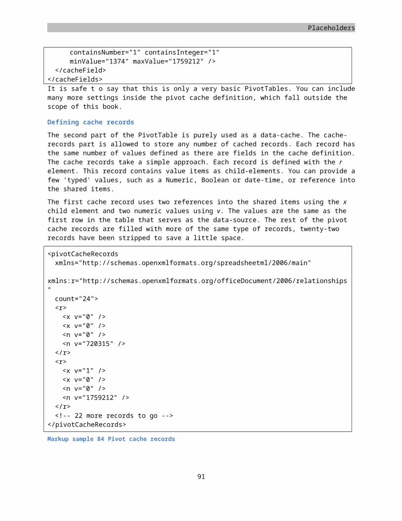
Placeholders
The elements of a simple presentation
Now that the main element of a presentation has been discussed we can start putting shapes together to form a presentation. A basic presentation is made up of five different parts, the main presentation part, a slide master and layout, a slide and a theme. The theme is a required element and is referenced from both the presentation part as well as the slide master.
At each of the three levels of layout for a slide you create a tree of shapes. This shape tree is formed using the spTree element and is present at each of the slide levels. You can think of the spTree element as the group that all the shapes on a slide, layout or mater are part of.
The slide part
The leaf-level of the hierarchy is the slide. Inside a slide you create shapes using a shape tree. There are specific types of shapes that you are allowed to create. One example is that placeholder shapes, which will be discussed later on, are not allowed at the slide level.
To create a slide in the PresentationML package you use the following content type and relationship type.
Content type for slideapplication/vnd.openxmlformats-officedocument.presentationml.slide+xml
Relationship type for slidehttp://schemas.openxmlformats.org/officeDocument/2006/relationships/slide
The slide content is started with the sld element. There are not that many things that you are required to store. First you create the shape tree inside the common slide data, or cSld. The shape tree element uses the same two property nodes, visual and non-visual, as the group shape. The shapes inside the tree have been abbreviated.
<p:sld> <p:cSld> <p:spTree> <p:nvGrpSpPr>
<p:cNvPr id="1" name="" /><p:cNvGrpSpPr /><p:nvPr />
</p:nvGrpSpPr> <p:grpSpPr />
<p:sp><!-- The first shape in the slide --></p:sp>'<p:sp><!-- The second shape in the slide --></p:sp>
</p:spTree> </p:cSld></p:sld>Markup sample 115 Slide
The slide layout part
Similar to the slide part the slide layout part defines a shape tree containing slide elements. The on-screen result is a combination of these elements together with those defined at the slide and master level. Since you define an entirely new tree of shapes you cannot access the shapes at the other levels. You cannot group shapes on the slide and layout level together for instance. There is one thing that you can do to relate shapes. You can create a placeholder at the layout or master level and relate a shape at the slide level to that placeholder.
The following markup sample depicts a simple empty slide layout. The placeholders will be discussed later on the chapter.
93
Figure 28 A simple presentation
PresentationML
Similar to the master, you can define various settings such as background or add elements to the shape tree. Unlike the master slide, a layout slide is allowed to have custom placeholders to define regions of content for the slide. How this shape tree is formed from the master placeholders down to the slide content is discussed in the next chapter.
<p:sldLayout xmlns:a="http://.../drawingml/2006/main" xmlns:r="http://.../officeDocument/2006/relationships" xmlns:p="http://.../presentationml/2006/main">
<p:cSld name="Title Slide"> <p:spTree> <p:nvGrpSpPr> <p:cNvPr id="1" name="" /> <p:cNvGrpSpPr /> <p:nvPr /> </p:nvGrpSpPr> <p:grpSpPr /> </p:spTree> </p:cSld></p:sldLayout>Markup sample 116 Slide layout
The slide master part
The slide master forms the root of the elements that make up a slide. It also contains a shape tree. Besides the shape tree element you need to define a few other pieces of content to make for a correct master.
The shape tree is again exactly the same as the previous shape trees. The common slide data needs no other children so the content has been abbreviated to allow focus on the other content of the master.
The first difference is the use of the clrMap element to map colors used in the slide to colors in the theme part. The values reference the names of theme colors.
The second difference is that addition of a list of slides layouts. This list is maintained in the slide master to allow the layouts to be sorted. The ID value needs to be unique and the relationship ID points to the slide layout part.
<p:sldMaster xmlns:a="http://.../drawingml/2006/main" xmlns:r="http://.../officeDocument/2006/relationships" xmlns:p="http://.../presentationml/2006/main">
<p:cSld><!-- The shape tree has been omitted --></p:cSld> <p:clrMap
bg1="lt1" tx1="dk1" bg2="lt2" tx2="dk2" accent1="accent1" accent2="accent2" accent3="accent3" accent4="accent4" accent5="accent5" accent6="accent6" hlink="hlink" folHlink="folHlink" /> <p:sldLayoutIdLst> <p:sldLayoutId id="2147483649" r:id="rId1" /> </p:sldLayoutIdLst></p:sldMaster>Markup sample 117 Slide master
The theme part
The theme part referenced by the master slide part and the main presentation part, which is discussed next. The content of the part is further explained in Chapter 4. The content displayed below is a shortened version of a theme part’s content.
94
Figure 29 Slide to master hierarchy
Placeholders
<a:theme xmlns:a="http://.../drawingml/2006/main" name="Office Theme">
<a:themeElements> <a:clrScheme/> <a:fontScheme/> <a:fmtScheme/> </a:themeElements> <a:objectDefaults /> <a:extraClrSchemeLst /></a:theme>
Markup sample 118 Overview of theme elements
The presentation part
The final part to stitch the presentation together is the main presentation part. This part is the start part of the document. The root element is the presentation element.
<?xml version="1.0" encoding="utf-16" standalone="yes"?><p:presentation xmlns:a="http://schemas.openxmlformats.org/drawingml/2006/main" xmlns:r="http://schemas.openxmlformats.org/officeDocument/2006/relationships" xmlns:p="http://schemas.openxmlformats.org/presentationml/2006/main"></p:presentation>
Markup sample 119 Presentation part root element
The presentation element contains two lists, one for slide masters and the other for slides, which is used for sorting these presentation elements in the consumer.
<p:sldMasterIdLst> <p:sldMasterId id="2147483648" r:id="rId1" /> </p:sldMasterIdLst>
Markup sample 120 Slide master ID list
Besides owning the masters, the presentation part is also the owner of all the slides in the presentation. A list of all slides is maintained in the presentation part.
<p:sldIdLst> <p:sldId id="256" r:id="rId2" /> <p:sldId id="257" r:id="rId3" /> <p:sldId id="258" r:id="rId4" /> </p:sldIdLst>
The final part of the presentation part is formed with the slide size. You also need to specify the size of notes-slides. The notes-slides are used to provide notes for each individual slide. The size is measured in EMU, or English Metric Unit. This unit of measure is discussed in the first annex.
<p:sldSz cx="9144000" cy="6858000" /> <p:notesSz cx="6858000" cy="9144000" />
Markup sample 122 Slide sizes
The full presentation part takes the following markup.
95
Markup sample 121 Slide ID list
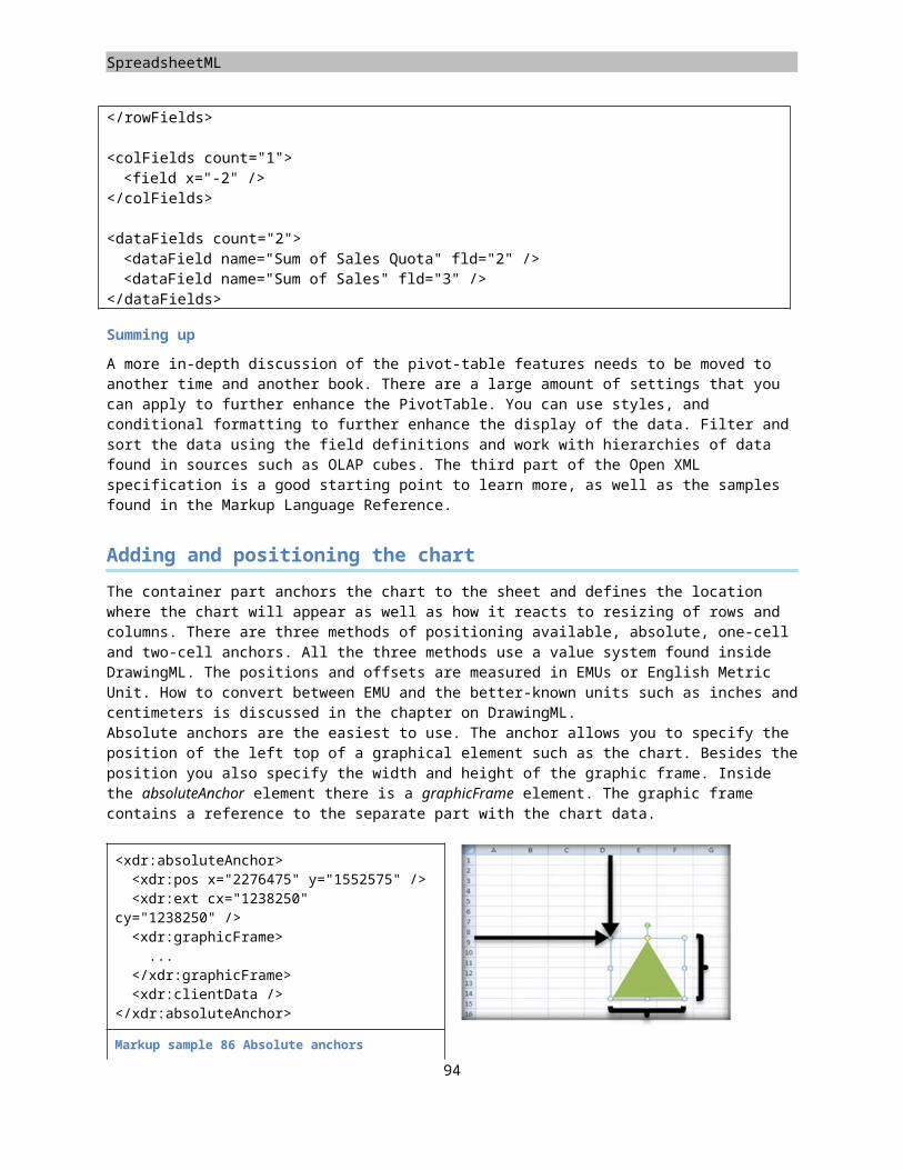
PresentationML
<?xml version="1.0" encoding="utf-16" standalone="yes"?><p:presentation xmlns:a="http://schemas.openxmlformats.org/drawingml/2006/main" xmlns:r="http://schemas.openxmlformats.org/officeDocument/2006/relationships" xmlns:p="http://schemas.openxmlformats.org/presentationml/2006/main"> <p:sldMasterIdLst> <p:sldMasterId id="2147483648" r:id="rId1" /> </p:sldMasterIdLst> <p:sldIdLst> <p:sldId id="256" r:id="rId2" /> <p:sldId id="257" r:id="rId3" /> <p:sldId id="258" r:id="rId4" /> </p:sldIdLst> <p:sldSz cx="9144000" cy="6858000" /> <p:notesSz cx="6858000" cy="9144000" /></p:presentation>
Markup sample 123 The presentation part
Placeholders
Up until now only a few shapes have been added to the shape tree at the slide level. While this allows you to create a simple slide-deck, a normal deck consists of areas of content defined at the master and layout level, which is filled in at the slide level. This is achieved using placeholders, and every normal shape, sp, can be a placeholder or provide content for one. A placeholder is either identified by using a built-in type such as the title placeholder, or using a custom ID value. Using built-in types allows the presentation elements to be portable across different slide-decks. The table on the next page shows the placeholder types and where you are allowed to use them.
A placeholder is created at either the layout or master level. A placeholder at the master level can be filled with content at the layout level. Slides cannot access placeholders on the master directly. The slide uses the placeholders defined in the layout part. A placeholder in the layout part can be tied to a similar placeholder at the master part. This gives a three level hierarchy for the shape definition. A placeholder can be defined without formatting in the slide master, formatted with a border at the layout level, and filled with text at the slide level. This would involve three shape elements, one at each level.
Master Layout Slide
Place holder
Slide Maste
r
Notes Maste
r
Handout
Master
Slide Layout
SlideNotesSlide
body x x x x x
chart x x
clip art x x
centered title
x x
diagram x x
96
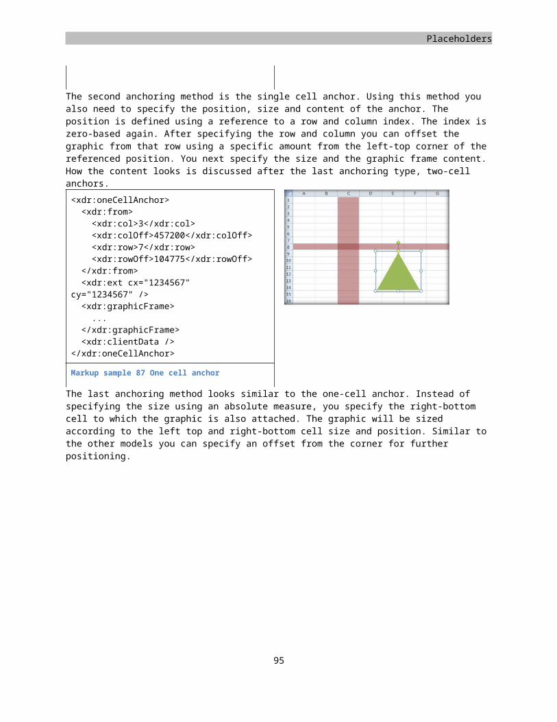
Placeholders
date time x x x x x x
footer x x x x x x
header x x x
media x x
object x x
picture x x
slide image
x x
slide number
x x x x x x
subtitle x x
table x x
title x x x
To create this hierarchy you use normal shape elements with an added property. Each shape element contained the non-visual property section described earlier. It is depicted in the following sample. The shape is trimmed down to the bare minimum to allow focus on the property section. There is no text-body or visual property defined.
<p:sp><p:nvSpPr><p:cNvPr id="1" name="TextShape" /><p:cNvSpPr /><p:nvPr />
</p:nvSpPr><p:spPr />
</p:sp>
Markup sample 124 Shape structure
The nvPr element is empty, but that will change when using placeholders. Inside this element you use the ph element to identify the shape as a placeholder. The effect of applying this element differs per level in the hierarchy.
When you use the placeholder property on a shape at the slide level, the property identifies the placeholder shape at the layout level that it is tied to. You cannot define new placeholders at the slide level since it is the last level of the hierarchy. The layout level placeholder shape is referenced by ID or type. The following markup sample shows how to reference a placeholder in the slide level using an ID value. The type does need to be specified so the generic body type is used.
Layout Slide
<p:sp><p:nvSpPr><p:cNvPr id="1" name="MyTitleShape"
/>
<p:sp><p:nvSpPr><p:cNvPr id="1" name="MyTitleShape"
/>
97
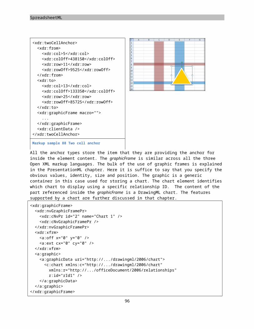
PresentationML
<p:cNvSpPr /><p:nvPr><p:ph type="body" idx="1" />
</p:nvPr></p:nvSpPr><p:spPr />
</p:sp>
<p:cNvSpPr /><p:nvPr><p:ph type="body" idx="1" />
</p:nvPr></p:nvSpPr><p:spPr />
</p:sp>Table 6 Attaching a slide level shape to a layout level placeholder
At the layout level you use the ph element to define new placeholders. These placeholders can be new or tied to placeholders at the master level, creating the three-leveled hierarchy.
Master Layout
<p:sp><p:nvSpPr><p:cNvPr id="1" name="MyShape" /><p:cNvSpPr /><p:nvPr><p:ph type="body" idx="1" />
</p:nvPr></p:nvSpPr><p:spPr />
</p:sp>
<p:sp><p:nvSpPr><p:cNvPr id="1" name="MyShape" /><p:cNvSpPr /><p:nvPr><p:ph type="body" idx="1" />
</p:nvPr></p:nvSpPr><p:spPr />
</p:sp>Table 7 Attaching a layout level shape to a master level placeholder
Pictures
While it is possible to create an image in a slide using the shape element and a binary-large object fill, there is also a separate element available for declaring pictures. Similar to the shape you are allowed to set various borders and DrawingML effects, but added to that there are several picture specific settings that can be applied. A picture allows for modification of contrast and brightness, as well as allowing you to specify an extra colored layer to modify the final picture output on screen. A picture also provides extra picture related commands in the PowerPoint user interface.
There is actually very little difference between a picture and a shape containing a picture based fill. The main difference lies in the fact that the consumer will most likely lock aspect ratio changes by default on pictures, while it doesn’t when using shapes.
<p:pic><p:nvPicPr>...</p:nvPicPr><p:blipFill><a:blip r:embed="rId2" />
</p:blipFill><p:spPr><a:xfrm><a:off x="762000" y="571500" /><a:ext cx="7620000" cy="5715000" />
</a:xfrm><a:prstGeom prst="rect" />
</p:spPr></p:pic>
Markup sample 125 Picture
98
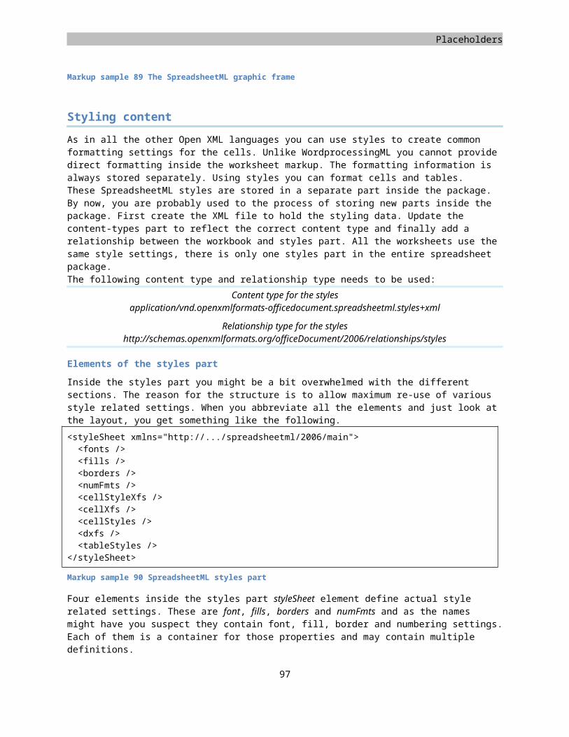
Placeholders
To create a picture you add a pic node to the shape tree. The picture element mandates the addition of the usual visual and non-visual property elements, an optional style, and the required reference to the picture to display. The image itself is stored separately in the package using a relationship. The ID value of this relationship is used to refer to the image. There are two ways to refer to the image. It can either be stored internally or externally, outside the package. The embed attribute indicates an internally stored image. The link attribute is used for external references. Both use the relationship ID as the data for reference. More details on how to style this image can be found in the chapter on DrawingML.
Tables, charts and diagrams
Besides the shapes and pictures we have seen so far, the shape tree is allowed to contain various other types of elements such as tables and charts and diagrams (also known as smart-art). The manner in which this works is a bit different than the approach taken for shapes and pictures. The markup for these three elements is not defined within the PresentationML namespaces but uses DrawingML instead, something which is also used for parts of the shapes and pictures. There details on the structure of the table, chart and diagram are discussed in Chapter 4, which discusses DrawingML. The manner in which it is inserted into the shape tree takes a generic form for all elements, specific to PresentationML, but similar to how the other languages insert DrawingML markup. They use a generic container element.
The cool thing about using DrawingML markup for the implementation of charts and diagrams is that they can be re-used across the markup languages. You can embed a DrawingML chart or diagram into the language of your choice, using the exact same markup to define the content. Using DrawingML also enables the use of rich effects such as reflection on a table, or 3-D views of a chart.
<p:graphicFrame><p:nvGraphicFramePr /><p:xfrm /><a:graphic><a:graphicData uri=”http://.../drawingml/2006/table”><!-- elements of the table -->
</a:graphicData></a:graphic>
</p:graphicFrame>
Markup sample 126 Table graphic frame
The generic container for PresentationML follows the model visible in Markup sample 126. Instead of defining content such as a table directly in the shape tree, there is a generic container called the graphicFrame. This graphic frame can be used to define arbitrary content, such as the DrawingML elements discussed in this chapter. The ECMA schemas allow any type of XML content in a graphicFrame, but the application does need to understand the content in order to successfully open the document. To identify this content the graphic frame uses an attribute on the inner graphicData. Using this uri attribute you point to the type of content stored within the graphicData element. Each Open XML capable editor might define their own platform-specific content types. The 2007 Microsoft Office System supports a specific list of valid uri values, all of which reference a DrawingML namespace.
99
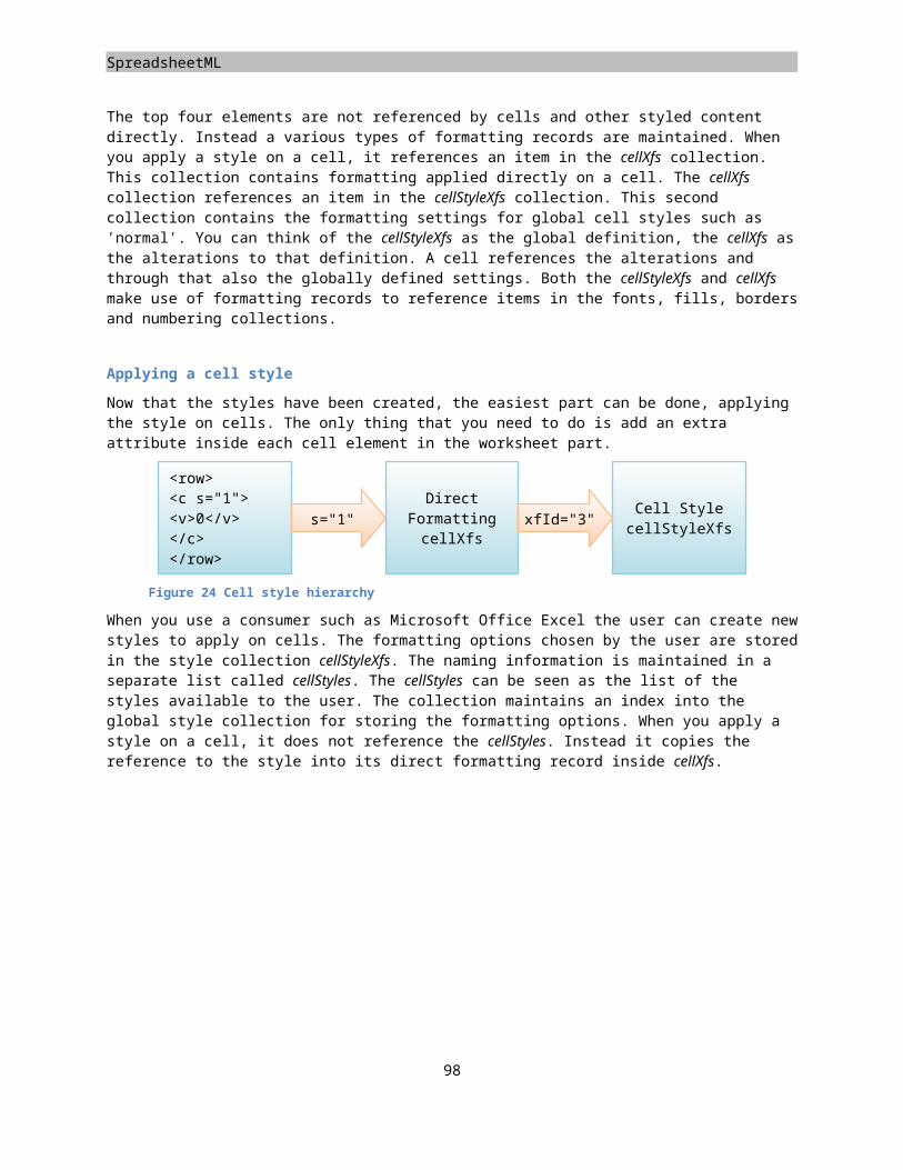
PresentationML
Figure 30 Available content identifying URI values
The only actual content being defined directly within the graphic frame are details such as the identifier and name of the frame, the size of the frame and information about whether it is tied to a placeholder in the layout part. Markup sample 127 shows the properties of a graphic frame utilized to tie the frame to an indexed placeholder, and disallowing the grouping and sizing of the frame inside the editor. The placeholder is of type ‘table’.
<p:nvGraphicFramePr><p:cNvPr id="6" name="Content Placeholder 5" /><p:cNvGraphicFramePr><a:graphicFrameLocks noGrp="1" noResize="1" />
</p:cNvGraphicFramePr><p:nvPr><p:ph idx="1" />
</p:nvPr></p:nvGraphicFramePr>
Markup sample 127. Setting graphic frame properties
In the next chapter on DrawingML the various types of content for the graphic frame is discussed further.
100
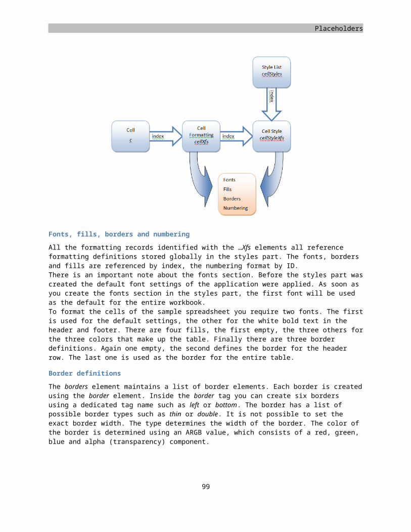
Chapter 4
DrawingML Learn about creating text and lists Learn about graphic outlines, geometry and fills Learn about two-dimensional (2-D) and three-dimensional (3-D) effects Learn about DrawingML tables and charts Learn about theme definitions
Introduction
DrawingML is the language for defining graphic content in Open XML. Although some parts of the spec reference the legacy Vector Markup Language, DrawingML provides the same feature set with a lot of extras. DrawingML allows the use of a 3-D environment to display graphics, providing you with the ability to take a picture as seen in Figure 31, and enrich it by adding custom borders, reflecting it on a virtual surface, and moving it sideways to give it the appearance that it is standing. All these effects can be applied to graphics, and many also to text, allowing great flexibility. Underneath, a DirectX engine is being using in Microsoft Office to make this rendering possible for all the custom graphics. Most effects are actually not that strange compared to the impressive set of features of game related 3-D engines.
.
Figure 31 Some of the DrawingML capabilities
There are several elements in DrawingML that require some discussion. First of all the DrawingML capabilities for handling text will be discussed. The next item in the list is the application of graphics, and finally the addition of effects as can be seen in the image above. These effects can then be applied to the DrawingML primitives discussed in the following three sections on tables and charts and diagrams.
Text
The manner in which you create text using DrawingML markup is similar to WordprocessingML. There is an element to declare a paragraph, which is made up of runs, which in turn contain text and other formatting characters. The paragraph itself is used by various other language elements that store paragraphs in their language specific container. One example is the PresentationML text-shape, discussed in an earlier chapter. It uses the txBody element as the language specific container for storing DrawingML text.
101
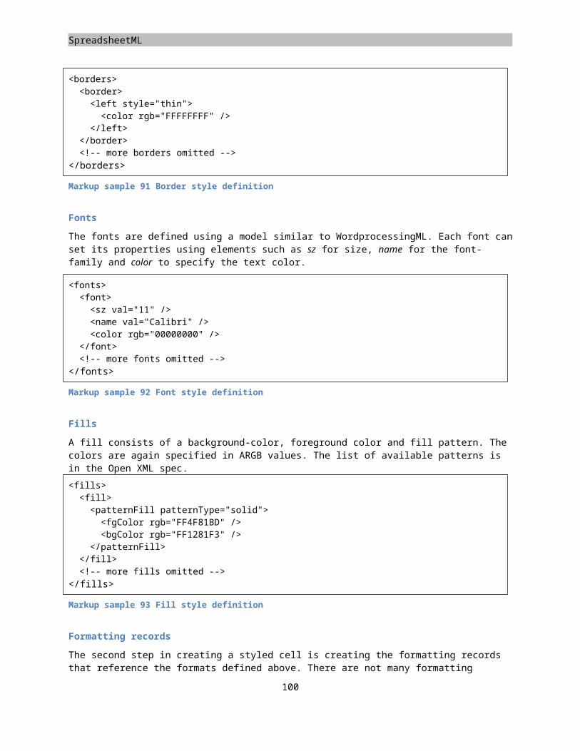
DrawingML
<p:txBody><a:bodyPr /><a:p> <a:r><a:t>Your text here!</a:t>
</a:r></a:p>
</p:txBody>
Markup sample 128 PresentationML container for DrawingML text
Inside the container various DrawingML settings are used to define the text layout. You can apply these settings at the container, paragraph and run level. At the container level you can create settings such as the 3-D settings discussed later in this chapter. Word-Art type effects, which are now made obsolete by DrawingML, can also be applied at this level. The paragraph level properties store information such as margins or alignment of the text in the paragraph. Finally the run properties are used for storing settings such as bold or italic text. The run is the lowest level item to apply formatting to. To create a single paragraph where one word in the middle is bold, you will need at least three runs.
Formatting text
The formatting of text allows for pretty intricate designs. Besides the normal formatting options such as bold and italic, you are allowed to use DrawingML rendering extensions such as 3-D transformations, reflection and glow. To illustrate the power of the DrawingML text model, Figure 32 shows the normal letter A, using the ‘Brush Script MT’ font (just a random font), filled with a gradient, outlined and reflected. The right image is the same letter 'A' with a 3-D warp applied, and slightly rotated. The basics of filling a text uses the same principals as discussed in the next part on graphics. The 3-D transformations are discussed later in this chapter.
The final thing to mention about DrawingML based text is the use of normal formatting options like bold and italic text. The model is a bit different from WordprocessingML, attributes instead of elements.
<a:p><a:r><a:rPr b="1" /><a:t>a</a:t>
</a:r><a:r><a:rPr sz="2800" i="1"><a:latin typeface="Arial" />
</a:rPr><a:t>b</a:t>
</a:r><a:r><a:rPr u="sng" /><a:t>c</a:t>
</a:r><a:endParaRPr />
</a:p>
Markup sample 129 Direct formatting of text
102
Figure 32 DrawingML based text
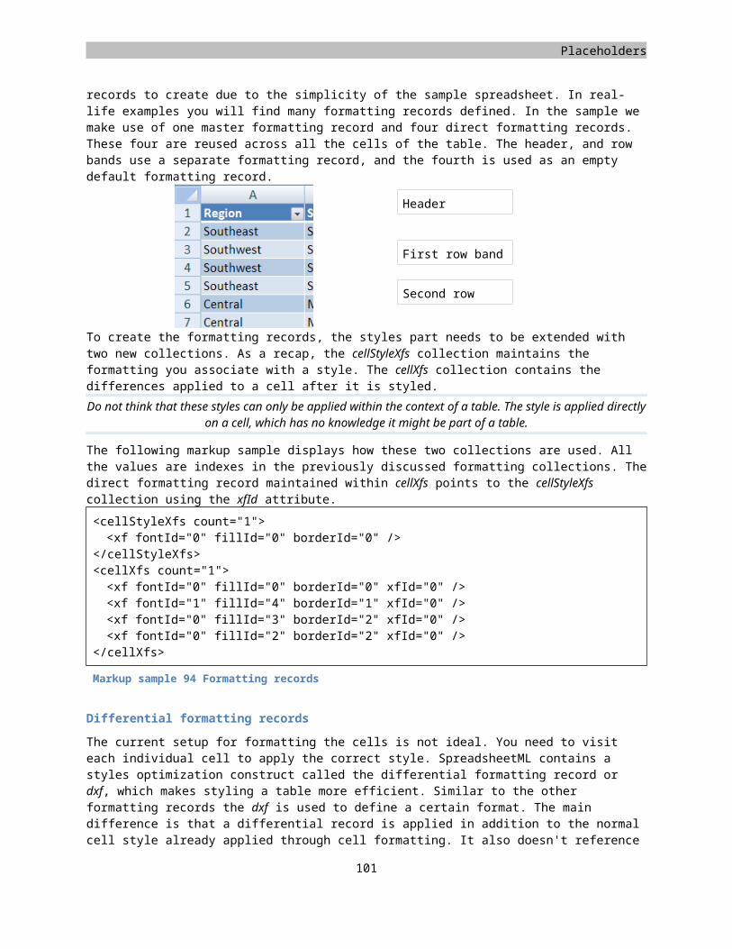
Placeholders
Bulleted Lists
To create a bulleted list of items instead of simple text, the addition of an extra property to the paragraph is sufficient. Just like WordprocessingML the pPr element is used to define that the paragraph is part of a list. Each item within a bulleted list is defined using a paragraph. Where WordprocessingML uses a separate part to store the numbering information, in PresentationML this information is stored within the container element itself. There are several ways in which to specify the type of list to use. Markup sample 130 shows how to use basic direct formatting. The buChar element defines the character to use for the bullet. Other direct formatting options include setting the bullet font, bullet size and the spacing around the bullet.
<p:txBody><a:bodyPr /><a:p><a:pPr lvl="0"><a:buChar char="•" />
</a:pPr> <a:r><a:t>Level 0 text</a:t>
</a:r></a:p><a:p><a:pPr lvl="1"><a:buChar char="•" />
</a:pPr> <a:r><a:t>Level 1 text</a:t>
</a:r><a:endParaRPr />
</a:p></p:txBody>
Markup sample 130 Bulleted lists
There are several ways in which you can define the type of bullet to use. The sample shows how to use the character bullet using the buChar element. The picture bullet is created with the buBlip element, and finally the numbered list created with buAutoNum. How to store and use a BLIP is discussed in the section on DrawingML graphics.
Numbered lists
For auto numbered lists you need to add the buAutoNum element and specify the type of numbering to use. You can choose from various built-in numbering styles like a...z or 1...9 numbering, but other formats from throughout the world are available as well. The way in which numbering works is that all paragraphs that have the same numbering style applied and that follow each other are part of the same numbering group. The numbering group will make sure that each paragraph it contains has a unique and sequential number applied. When one of these paragraphs is empty, it does not raise the count number, but it is still part of the numbering group. A paragraph without any numbering style applied breaks the numbering group, so does changing the numbering style. The next time that an already used numbering style is used again, it will restart counting at one.
The markup displayed in Markup sample 131 is used to create a list. To create the gap between the numbered items there is a paragraph without any runs, but which has the same numbering type applied as its predecessor. The last paragraph uses a different number type and has restarted numbering from the first value onward.
103
DrawingML
<a:p><a:pPr><a:buAutoNum
type="arabicPeriod" /></a:pPr><a:r>...</a:r><a:endParaRPr />
</a:p><a:p><a:pPr><a:buAutoNum
type="arabicPeriod" /></a:pPr><a:r>...</a:r>
</a:p><a:p><a:pPr><a:buAutoNum
type="arabicPeriod" /></a:pPr> <!-- EMPTY --><a:endParaRPr />
</a:p><a:p><a:pPr><a:buAutoNum
type="arabicPeriod" /></a:pPr><a:r>...</a:r><a:endParaRPr />
</a:p><a:p><a:pPr><a:buAutoNum
type="romanLcPeriod" /></a:pPr><a:r>...</a:r><a:endParaRPr />
</a:p>
Markup sample 131 Numbered lists with a gap in the numbering
To create the different levels of numbering, you define the level using the lvl attribute on the paragraph properties as can be seen in Markup sample 130. Each new level of numbering restarts counting at 1, and the rest of the rule apply at each sublevel as well. It is possible to create numbered levels within unnumbered levels and vice-versa. Using the lvl attribute you can also move the settings for the paragraph into the list style, or lstStyle, element. This element is stored inside the container element. Using the list style, you can apply the settings for each of the nine available nesting levels using named elements such as lvl1pPr and lvl2pPr. When there is a conflict between the properties defined within the list style element and the direct properties applied to a paragraph, the direct properties take precedent. The Open XML specification speaks of it ‘being closer to the actual text content’.
Graphics
Besides text DrawingML is highly adept at creating custom vector-based shapes. These shapes can have various effects applied to enrich the final view in the
104
Figure 33 Sample shape
Placeholders
consumer. These effects include moving the shape in 3-D space, or applying a shadow and reflection to the shape. One of the cool things is that all effects can be applied to most types of content defined using DrawingML markup, such as shapes, tables and charts.
DrawingML provides an extremely elaborate range of markup that cannot be explained entirely. In this book the focus will be on how to apply the default effects to various shapes such as a table, perhaps that a book on DrawingML specifically will follow later.
There are various elements of DrawingML that require further discussion. The first things to take a look at are the geometry of a DrawingML graphic and the various properties that surround the geometry such as the line and fill style. Later on in this section the layout of a shape in the DrawingML 3-D space is discussed further along with the effects applicable to this 3-D environment. All of the sample shapes displayed in this section derive from the shape visible in the top right corner of this section.
The graphic geometry
The first thing that you might notice about the sample shape is the rounded corners. When resizing this shape the corners will remain just as rounded as they are now. Under the covers vector markup is being used to define the geometry of this shape. The sample shapes uses the 'roundRect' preset geometry. There are two types of geometries you can create using DrawingML, preset geometries and custom geometries. A custom geometry allows you to exactly define the outline of your shape using vector markup, preset geometries are there to save you from this hassle. While custom geometries will not be covered in this book, the preset geometry markup will be explained. Since the geometries are preset, they require little markup for defining them.
<a:prstGeom prst="noSmoking"><a:avLst />
</a:prstGeom>
Markup sample 132 Changing the preset geometry
Figure 34 Changing the preset geometry
To alter the geometry of a shape into a preset form, you apply the prstGeom element. There are two main places where this is used, in PresentationML shapes and Open XML pictures. The preset geometry is specified using a single name, for which the complete list of available values can be found in the spec. This list includes the basics such as 'rect' for rectangle, but also more elaborate geometries such as a 'no' symbol displayed in Figure 34. To create this 'no' symbol, the XML markup seen in Markup sample 132 is used. In the same markup sample the use of the avLst element is displayed. The avLst element defines a list of adjust-values. These values can later be used to adjust some properties of the shape. Under the covers the actual geometry is being calculated on the fly by using the default settings and applying the adjust-values together. One sample on what the avLst is used for can be seen in Figure 35. Here the original sample shape (the rounded rectangle), uses the adjust-value list to provide a new value for the amount of rounding to do on the rectangles edges.
<a:prstGeom prst="roundRect"><a:avLst><a:gd name="adj" fmla="val
50000" /></a:avLst>
</a:prstGeom>
Markup sample 133 Adjust values for a geometry Figure 35 Geometry with adjusted values
105
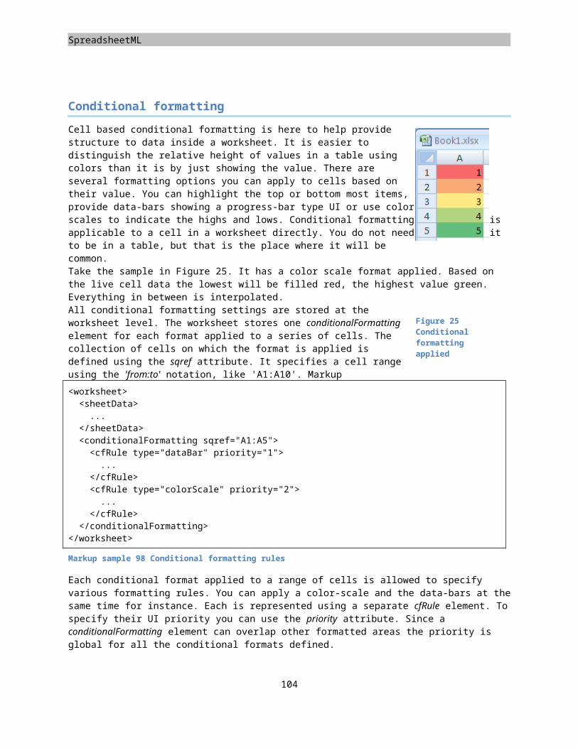
DrawingML
The coordinate system
A DrawingML graphic is placed on a surface. To place the graphic on the surface the position and size of the graphic need to be specified. You do this using the xfrm, or transform, element. The left top area of the graphic surface is the origin spreading the surface out to the right bottom. Both the position and the size are specified using the English Metric Unit, or EMU. The chapter on PresentationML contains more details on this unit of measure. Another detail that you are allowed to specify using the xfrm element is a vertical and horizontal flip of the shape and the rotation of the graphic on the graphic surface.
Figure 36 Rotated and flipped shape
<a:xfrm flipV="1" rot="-2700000"><a:off x="571472" y="1214422" /><a:ext cx="1428760" cy="714380" />
</a:xfrm>
Markup sample 134 Setting shape size, location and rotation
Specifying DrawingML colors
The geometry of a graphic encompasses a certain area on the graphic surface (a slide, a spreadsheet…). This space that the graphic takes up can be further customized using a variety of settings relating to the coloring and filling of this graphic. There are various coloring and fill options available to DrawingML graphics as well as various line styles. Since the fill-style and line-style both make use of colors, it is only logical to first discuss how a color can be specified in DrawingML.
In DrawingML there are several ways in which you can specify the value of a color. The coloring provisions from DrawingML include some well-known notations for colors such as RGB and HSL. Besides these industry standards, DrawingML also includes some specific named colors as well as the possibility to reference a color in a theme.
For RGB values, there are two ways in which you can set the red, green and blue components. You either specify a range from 0 to 255 for all three the components using hexadecimal notation, or use a relative percentage based algorithm. When using a value range, the value 0A141E would mean that the final color is made up of ten red units, twenty green and thirty blue. The same color could be expressed using the percentage-based notation. Just divide the values for red, green and blue by 255 and multiply by one thousand. The values for the percentage based notation store the data in separate fields, using a precision of 1/1000 th percent. The absolute value notation utilizes the srgbClr element while the percentage based uses scrgbClr.
The use of RGB values was made popular by the use of CRT monitors, which display the three main colors inside each pixel on your screen. Another way to express colors is the use of HSL, or hue, saturation and lightness. The use of HSL is more intuitive to humans because we normally don’t identify a color as being made up of three components but instead see a variation of a color and its brightness. The hue identifies a color. The saturation identifies the color depth. A saturation of 0 creates gray-scale images. The lightness moves between 0 (dark and black) to 100 (white and bright). HSL is convertible into RGB. When using HSL, the hue is specified in 1/60000 th degrees and the saturation and lightness in 1/1000th percent. So a hue of 250 degrees would actually be referred to as the value 15,000,000 (15 million). The hslClr element enables the use of HSL based coloring.
<!-- Percentage based RGB --><a:scrgbClr r="10000" g="20000" b="30000" /><!-- Absolute RGB --><a:srgbClr val="597C95" /><!-- Absolute HSL --><a:hslClr hue="12300000" sat="23500" lum="46700" /><!-- System Colors --><a:sysClr val="windowText" /><!-- Preset Colors -->
106
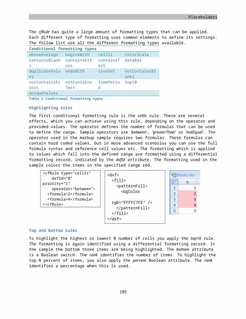
Placeholders
<a:prstClr val="black" /><!-- Scheme Colors --><a:schemeClr val="accent1" />
Markup sample 135 Color modes
Inside many operating systems there are several predefined names for colors such as 'WindowText'. These colors can be used through the sysClr element. The prstClr element can be used for preset colors values such as 'black', or 'slateGray'. The values for these names can be found in the Open XML specification.
In order to provide easy styling and style updating you can make use of themes. These themes are portable across the Open XML languages and define fonts and colors. The last type of color you can use for drawing things such as text or shapes uses these theme colors. The schemeClr element is used for identifying a named theme color. There are several built-in theme color names and you are not allowed to add new names to this set.
In the Markup sample 135 the top three colors, RGB and HSL, represent the same color in the consumer. The bottom three examples use random settings. Colors allow various extra settings to be applied, the details of which will not be further discussed in this book.
Shape effects
One of the uses of the coloring information is to provide a filling color for a shape. DrawingML provides capabilities for filling shapes using a specific color or color gradient, but also using a specific image. Especially the fill with an image allows for nice effects. There is also the backward compatibility fill type of using a specific pattern. This has been available in Microsoft Office to indicate different regions when advanced coloring was not yet available.
The first fill to examine is the solid fill. This one takes a single color and fills the entire area defined by a shape with a single color. All the different color models seen earlier can be applied to provide the fill color. The solidFill element being used to define this fill type takes no extra settings other than this.
<a:solidFill><a:scrgbClr r="10000" g="20000"
b="30000" /></a:solidFill>
What is often being used to provide a less 'flat' look is a gradient fill. The gradient fill flows from one direction of a graphic to the exact opposite, from left top to right bottom for instance. To create the gradient you need to declare the gradient positions and colors to use in the gradient. The gradient positions lie somewhere between 0 and 100%. You specify this value in 1/1000th percentage points. The value 100,000 represents the last possible position for a gradient stop. There are various other settings that you can apply to a gradient. One common used option is to provide information about how the gradient should rotate when the shape is rotated. The gradient fill is created using the gradFill element.
<a:gradFill flip="none" rotWithShape="1"><a:gsLst><a:gs pos="0"><a:prstClr val="white"
/></a:gs><a:gs pos="100000"><a:prstClr val="black"
107
Figure 37 Different shape fills
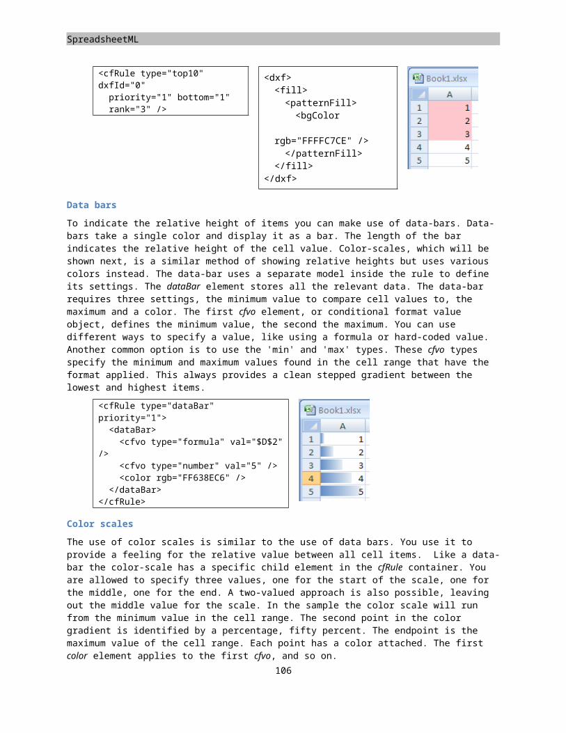
DrawingML
/></a:gs>
</a:gsLst><a:lin ang="0"
scaled="1" /><a:tileRect />
</a:gradFill>The last type of fill, which requires discussion, is the BLIP fill, or Binary Large Image or Picture fill. You use this fill type to fill a graphic using an image. This image can be stored inside or outside the package, determined by a package relationship. To create the blip fill, you specify a blipFill element. The content is pretty basic, just a reference to the image using the relationship ID. For images that are not embedded, the link attribute is used instead.
<a:blipFill><a:blip r:embed="rId1"
/></a:blipFill>
Besides the fills which have been discussed so far, there are two important other types. First of all you are allowed to specify a noFill for shapes that are not filled. You will be able to see through the unfilled areas to the shapes that sit behind it. The grpFill indicates that the shape is inheriting its fill type from a group shape when it is stored in one.
After filling the graphic with a specific fill, the outline of the geometry can be enhanced as well. Many shapes that make use of DrawingML allow the use of an ln element in the visual properties to store information about this outline. Using the line element you can specify the thickness, fill style and dash style for the outline. You are allowed all the different fill styles that have been discussed. The dash style used for the line can be altered as well. There are several built-in named dash styles, like the one in use in the following figure. You are also allowed to create custom patterns by specifying the length of each dash and space.
<a:ln><a:solidFill><a:prstClr val="green"
/></a:solidFill><a:prstDash
val="dash" /></a:ln>
3-D scenes
The flat drawing surface we were working on to create DrawingML graphics is actually placed inside a 3-D environment. This allows various cool effects to be applied to shapes, such as the 3-D view for DrawingML charts. To render a 3-D scene correctly using any 3-D engine environment there are extra settings to apply before final picture can be seen.
What you see when using DrawingML in a consumer is a certain view of this 3-D world taken from a certain position in 3-D space. This position is defined using a camera, which is pointing to a certain spot inside the scene. The end picture is taken from this camera and displayed as a flat image on screen. Just like real life there needs to be some light before anything can be seen. Without lighting you would just see a dark and black environment. So the first things to apply are the camera position and the light direction. You do not need to point the camera anywhere, DrawingML does this for you.
108
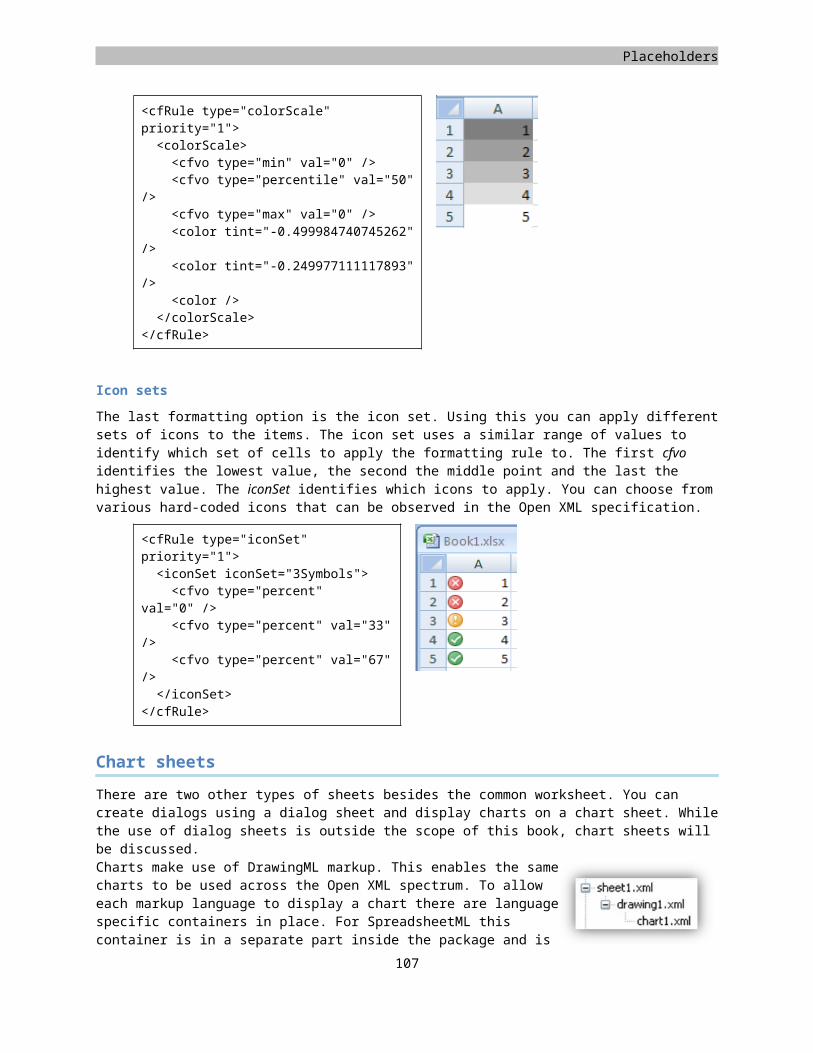
Placeholders
<a:scene3d><a:camera
prst="isometricOffAxis2Right" /><a:lightRig rig="threePt" dir="t" />
</a:scene3d>
Markup sample 136 Moving a camera in 3-D space
To set up the camera and lighting for the 3-D scene, you use the scene3D element. The effect of applying this element on a normal shape filled with some text can be seen in the next image. The camera can be moved using two modes, either a default preset such as ‘isometricOffAxis2Right', or by manually specifying the camera position using the latitude and longitude values. One extra thing you are allowed to set on a camera is the use of the field of view and zoom factor. The field of view is the angle at which the camera is able to see. A normal human as a field of view of about 80 degrees, but only the first 5 degrees define the area where we can see sharp. Just as important as the camera position is the lighting setup. There are a number of built in types of lighting, think of them as the setup of a photo-booth. You cannot add new types of light (like creating a light which shines using a red color), or provide the precise position of the lights in the 3-D scene. Instead you can choose from the presets described in the ECMA specification.
There is a third aspect to the 3-D scene definition in DrawingML. You are allowed to specify how the backdrop is created. This backdrop is used as the layer on which 2-D effects such as shadows are projected. One effect that can be used for visualizing how this works can be seen in Figure 38. Here the picture seems to peel away from the surface because the backdrop has been slightly tilted. For this effect the backdrop is not actually used, but it does illustrate what the backdrop does in the scene.
3-D effects
Now that a graphic is actually placed inside 3-D space, we had better make use of the features provided by the 3-D rendering engine. Various effects, which are commonplace in 3-D games, for instance can also be applied to a graphic created using DrawingML. Graphic settings include changing the material the graphic is made of. The material works with the lighting settings, reflecting it just as in real life. You can create different types of surfaces that all reflect light in a different manner, a shiny surface or a very diffuse one. Another problem with a flat graphic placed in a 3-D world is that is has no depth. To overcome this issue you can apply a custom depth to a graphic or use beveled borders to simulate depth.
The graphic's 3-D settings, defined with the sp3D element, are utilized to specify the graphic specific 3-D settings. The material is applied here as well as the beveled borders.
The following three sample images show the use of an extrusion to simulate depth for the graphic. How to use the contour to outline the shape with something that can perhaps be best described as a rubber band being pulled around the graphic, and the use of a beveled border. All the samples use the same starting graphic displayed at the start of this chapter. They have a rotation applied to make the effects better visible.
109
Figure 38 Changing the 3D backdrop
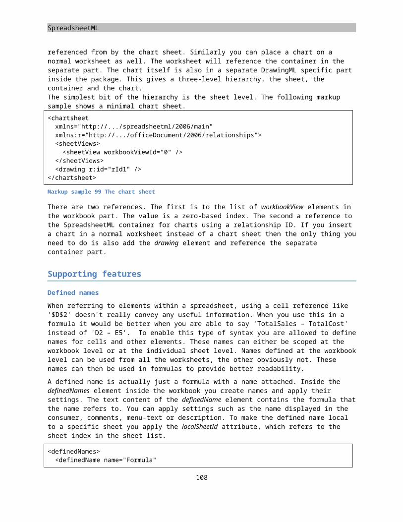
DrawingML
Figure 39 Shape 3-D settings applied
You can also combine all these effects. The following markup shows what needs to be applied to the shape 3-D properties.
<a:sp3d prstMaterial="softEdge" extrusionH="412750"
contourW="82550" ><a:bevelT /><a:extrusionClr><a:srgbClr val="FF0000" />
</a:extrusionClr><a:contourClr><a:srgbClr val="92D050" />
</a:contourClr></a:sp3d>
Markup sample 137 Shape specific 3-D settings
The second element, which stores 3-D related data, is used to provide effects to the shapes. To apply a 3-D effect on your shapes you make use of an effect list. This list is available on elements such as shapes, pictures, tables and charts. There are a fixed number of effect primitives in this list that can all be customized in some sense to create a larger set of final effects. This book details the use of the glow, shadow, reflection and soft-edge effects. All these effects are defined within a container element similar to sp3d, the effectLst element.
<a:effectLst><a:outerShdw blurRad="76200" dir="18900000" sy="23000" kx="-1200000" algn="bl"rotWithShape="0"><a:prstClr val="black"><a:alpha val="20000" />
</a:prstClr></a:outerShdw>
</a:effectLst>
<a:effectLst><a:reflection blurRad="6350" stA="52000"
endA="300" endPos="35000" dir="5400000" sy="-100000" algn="bl"rotWithShape="0" />
</a:effectLst>
110
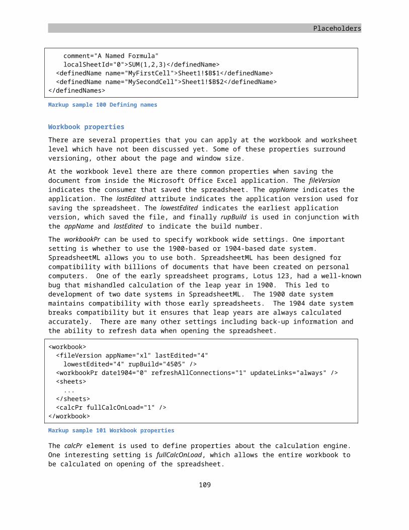
Placeholders
<a:effectLst><a:softEdge rad="63500" />
</a:effectLst>
<a:effectLst><a:glow rad="101600"><a:srgbClr val="FF0000"><a:alpha val="60000" />
</a:srgbClr></a:glow>
</a:effectLst>
The following table shows which effects can be applied to components of PresentationML.
Shapesp
Picturepic
TexttxBod
y
Tabletbl
Chartchart
2-D Rotation x x
Text Transformation
x
Shadow x x x x
Reflection x x x x
Glow x x x
Soft edge x x
Bevel x x x x
3-D Rotation x x x
Tables
One of the cool things that you can define using DrawingML is a table. The reason why this is pretty neat is that you are allowed to apply some of the DrawingML shape effects on tables as a whole or on individual table cells. This table model is mainly used by PresentationML to facilitate the use of rich tables. There are actually three table models defined within the context of Open XML. The first table model was discussed in the chapter on WordprocessingML. It is a model optimized for storing document tables, without the rich type of 3-D effects provided by DrawingML. The SpreadsheetML table model is optimized for handling large sets of data, since a spreadsheet could potentially contain a lot of rows. The DrawingML table model is optimized for great looking graphics.
Table elements
The table itself is created using the tbl element, which resides in a DrawingML namespace. The model for declaring the table structure is similar to WordprocessingML. The table element contains a grid definition and a set of rows. The grid definition defines all of the ‘virtual’ columns inside the table. Take for instance the following table:
111
DrawingML
Even though each row contains only two cells, each vertical line needs to be counted as a column inside the grid definition. That would result in four grid columns for this sample table since there are four vertical lines, minus the first column since the starting column does not need to be defined. This result is a grid definition defining three columns
a:tbl><a:tblPr firstRow="1" bandRow="1" /><a:tblGrid><a:gridCol w="1325565" /><a:gridCol w="1325565" /><a:gridCol w="1325565" />
</a:tblGrid><a:tr h="463019"><a:tc><a:txBody />
</a:tc><a:tc /><a:tc />
</a:tr><a:tr h="463019"><a:tc /><a:tc /><a:tc />
</a:tr></a:tbl>
Markup sample 138 Table markup
After declaring the grid definition of the table, next a series of rows is added. You are required to define at least one row. Otherwise there would be no visible table for display in the editor. The rows, tr, contain individual cells, tc. This model is exactly the same as WordprocessingML or even HTML. Compared to WordprocessingML, a table in DrawingML is allowed less content defined within the table cells. You can only add text to a cell. The way in which this works is that the txBodx container is used for storing DrawingML based text. This allows every individual character inside the table to be styled using effects such as reflection. For more information on defining DrawingML based text, read the section on page 101. In the Markup sample 138 a basic table is displayed using three columns and two rows. The table grid stores the width of each column. It is not possible to specify this on a cell-by-cell basis.
Similar to WordprocessingML a table allows the merging of cells horizontally and vertically. Also similar is that each table cell can only be part of at most one merge, you cannot merge a cell horizontally with its neighbor and vertically with the cell under it at the same time. The model used for merging cells is quite similar to the WordprocessingML based merges. Unlike WordprocessingML, the merging of cells does not reduce the total number of defined cells within the tr element. A PresentationML row always has the same number of cells defined as there are grid columns defined within the table.
Merging cells
Merging table cells takes a slight variation on the model in use in WordprocessingML. In WordprocessingML for each horizontally merged set of cells, one less tc element is defined within the markup of the row. In DrawingML tables this reduction in the total number of cells does not occur. The first cell in the merged set has an attribute applied defining that it starts a horizontal merge. The other cells in the same merged set contain an attribute defining their ‘sibling’ state. Vertical merges work in a similar fashion, but use different attributes to define how the vertical merge is performed. It is not allowed to merge a cell horizontally and vertically at the same time. Markup sample 139 displays the properties required for merging the cells horizontally and vertically. One extra thing to note is that the consumer will only display the content of the first cell in the merged set. The other cells
112
Placeholders
are allowed to store content, but it will just not be shown to the user. One funny thing is that this hidden content does allow itself to be searched by the user.
Horizontal merges Vertical merges<a:tr><a:tc gridSpan=”2” /><a:tc hmerge=”true” />
</a:tr>
<a:tr><a:tc rowSpan=”2” />
</a:tr><a:tr><a:tc vmerge=”true” />
</a:tr>Markup sample 139 Horizontal and vertical merged table cells
Formatting tables
In order to make the table look great for a professional presentation, the DrawingML table model provides you with various settings that apply to the table as a whole or individual rows and cells. Each row and cell element use DrawingML visual properties node to define details such as the fill of the cell, a gradient fill for instance. The table element supports the addition of table wide settings such as DrawingML reflection. One great addition to the styling options of a table allows the re-use of table styles across the various tables in a slide deck. The DrawingML table model allows table styles to be separated from the main table definition. The same style can then be applied to all tables in a presentation to create a common look and feel for all slides within the slide deck.
To apply direct formatting to a table row or cell, the property node for the element (tcPr for table cells) can be used to store DrawingML based settings. These settings are further described in the section on DrawingML graphic effects. The same goes for the addition of effects to the table. The tblPr node serves as the container element for storing the DrawingML shape effects. One extra thing that can be defined within the table-level properties is the use of a separate table style.
The separated table style contains information about the type of line, fill, font and color to use on specific elements in the table. Using a table style you are allowed to specify various settings for the rows and columns that make up a table. There are different settings applicable to the header and footer rows as well as the first and last column. For even more variation the rows and columns can have ‘banding’ applied. Banding of rows or columns entails giving the evenly and un-evenly numbered rows a different style. By setting a different background to the even- and un-even elements, the visual feedback on what cells make up a row or column can be enhanced.
A separate part inside the package is used to store the custom style information. There is, at most, one table style part that is allowed to contain many different table styles. Each table style is referenced by the table using the style
113
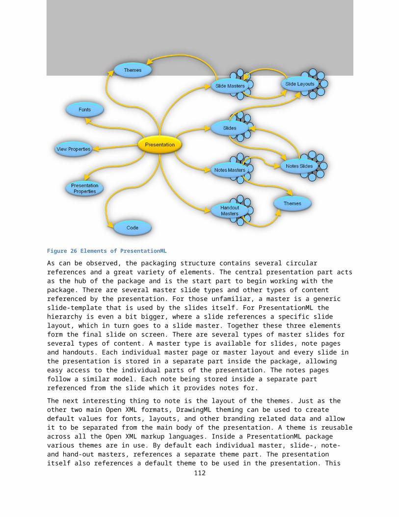
DrawingML
ID. This ID value is a GUID (globally unique identifier), different from other ID values which are usually a normal integer.
<a:tbl> <a:tblPr firstRow="1" bandRow="1"> <a:tableStyleId> {37CE84F3-28C3-443E-9E96-99CF82512B78} </a:tableStyleId> </a:tblPr></a:tbl>
Markup sample 140 Referencing a table style
Inside the table properties you specify the various first/last elements and banding options to apply on the table. The style information itself is stored separately in the table style part. If firstRow is true in the table’s properties, the consumer will apply the first row style from the style identified by the GUID on the first row of your table. The bandRow property indicates to the consumer to apply the band1H style on the first row, the band2H style on the second, and then continue with the band1H style on the third row again. Table styles can be combined with direct formatting. The direct formatting applied takes precedent over the applied style, allowing you to further modify the way in which a table looks.
Table styles are stored in a separate table style part. This table style part is referenced from the presentation part using the following well-known relationship type.
http://schemas.openxmlformats.org/officeDocument/2006/relationships/tableStyles
This relationship points to a part containing a list of table styles. This list stores unique styles identifiable using a GUID id value. There is one table style that is considered the default style. This style can be used for new tables that are inserted into the presentation by the user. A table style is defined using two pieces of content. The identifying information, which are an ID and a human-readable name visible in the UI, and a set of styling information for all the components which make up the table such as the header row and last column.
<a:tblStyleLst xmlns:a="http://schemas.openxmlformats.org/drawingml/2006/main" def="{5C22544A-7EE6-4342-B048-85BDC9FD1C3A}">
<a:tblStyle styleId="{5C22544A-7EE6-4342-B048-85BDC9FD1C3A}" styleName="Medium Style 2 - Accent 1">
<!-- style content --> </a:tblStyle></a:tblStyleLst>
Markup sample 141 Table styles
In total there are thirteen styles that can be applied on a table.
114
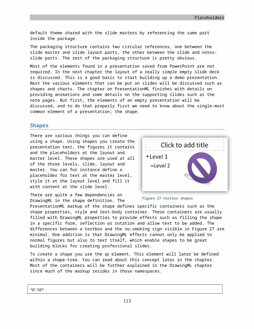
Placeholders
Style element Used for Required table propertieswholeTbl Formatting the entire table alwaysband1H 1st, 3rd, 5th… row bandRow="1"band2H 2nd, 4th, 6th… row bandRow="1"band1V 1st, 3rd, 5th… column bandCol="1"band2V 2nd, 4th, 6th… column bandCol="1"firstCol first column firstCol="1"lastCol last column lastCol="1"firstRow first row firstRow="1"lastRow last row lastRow="1"seCell south-east corner lastRow="1", lastCol="1"swCell south-west corner lastRow="1", firstCol="1"neCell north-east corner firstRow="1", lastCol="1"nwCell north-west corner firstRow="1", firstCol="1"
Each of these table style elements is allowed to define two pieces of data, the cell style and the cell text style.
<a:tblStyle styleId="{5C22544A-7EE6-4342-B048-85BDC9FD1C3A}"styleName="Medium Style 2 - Accent 1"><a:wholeTbl><a:tcTxStyle><a:fontRef /><a:schemeClr />
</a:tcTxStyle><a:tcStyle><a:cell3D /><a:fill /><a:tcBdr />
</a:tcStyle></a:wholeTbl>
</a:tblStyle>
Markup sample 142 Sample style for the whole table
The table cell style defines settings for the entire cells, the table cell text style for the text within the cell. There are just a few allowed formatting options. The text style defines the font and color and the cell style defines some 3-D settings, borders and the cell fill. All in all these options provide the artists with the means to great rich tables with markup that allows easy migration between various looks.
Charts
Charts provide the means to visualize information using a familiar layout such as a pie or bar chart. The data that is being visualized can be re-used throughout Open XML. The same chart can be added to a WordprocessingML, SpreadsheetML and PresentationML document by just specifying a language specific container element for storing the chart markup. The markup that makes up the chart is only referenced from the language specific container. The chart itself is stored in a separate part inside the package. Since a chart is quite a large structure by itself, it will be discussed in a few sections. First the content of a basic chart is discussed, next various extras to the chart layout will be handled.
Elements of a simple chart
There are several types of charts which can be created using DrawingML markup. There are various 2-D and 3-D chart-types
115
Table 8 Allowed table style types
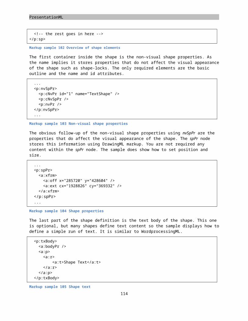
DrawingML
available, as well as pivot charts which are mainly used in SpreadsheetML. All of these chart types allow the addition of various chart related elements such as labeling on the columns and rows, or titles and legends. You are also allowed to add custom shapes to a chart to further modify the look of the chart in the presentation. Figure 40 displays the elements that make a basic 2-D bar chart. Since many of the elements used for all types of charts, 2-D and 3-D, are similar, first this simple chart with hard-coded data is discussed after which extra features are added to enrich the look and feel of the chart.
To create a simple chart, a separate part needs to be added to the package to store the chart markup. The root element of this markup is the chartSpace element defining the chart and various other settings such as styling information for the chart. Here you can also specify that the data needs to be bound to a data source such as a SpreadsheetML package embedded in the presentation. Later on in this section the steps required to attach the chart to a data source is discussed further. Inside the chartSpace the chart is the only required element. The chart defines all of the elements that make up the chart such as the title, the plot area and the data that defines the chart. The only element, which requires definition, is the plotArea element. Figure 40 displays a simple chart. The plot-area is the area with the gradient background. The plot-area defines the type of chart being displayed and whether it is a 2-D or 3-D chart. The way in which this works is rather simple. For each type of chart, there is a separate XML element defining that type. You can find a barChart or a pieChart element, but also a barChart3D element. You are only allowed to define one of these as a child of plotArea.
<c:chartSpace xmlns:c="http://.../drawingml/2006/chart" xmlns:a="http://.../drawingml/2006/main" <c:chart><c:plotArea><c:layout /><c:barChart /><c:catAx /><c:valAx /><c:spPr /></c:plotArea>
</c:chart></c:chartSpace>
Markup sample 143. Basic chart content
In the sample a bar chart is being used. To create a proper bar chart you add a barChart child element to the plot area. The set of allowed chart types is restricted in this fashion. Besides the required specification of the chart type, you are allowed various other settings. The layout element is used across the chart markup to specify things such as position of labels or the legend. You can also move the entire chart on the plot area’s surface by using it at this location. The sample chart showed on the previous page uses two axis, a horizontal for categories and the vertical for values. You create axis inside the plot area by using the catAx and valAx elements. You are allowed to create one of these elements per type inside the plot area. There is always only one category axis, one value axis, one date axis and one series axis.
<c:catAx><c:axId val="70435584" /><c:scaling><c:orientation val="minMax" />
</c:scaling><c:axPos val="b" /><c:tickLblPos val="nextTo" /><c:crossAx val="70437120" /><c:crosses val="autoZero" /><c:auto val="1" /><c:lblAlgn val="ctr" />
116
Figure 40 A simple chart
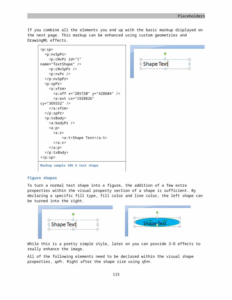
Placeholders
<c:lblOffset val="100" /></c:catAx>
Markup sample 144 Category axis definition
Since the category and value axis elements are references from inside the bar chart definition, these two elements require discussion before going into the details of a bar chart.
Figure 41 Changing the chart axis definitions Figure 42 Changing the bar chart settings
The axis elements define how the axis of the chart look, where they intersect and what data they display. Each axis definition has an ID value attached, which is later used for referencing the axis inside the chart element. Markup sample 144 displays the definition of the category axis of the sample chart. The ID is just a randomly chosen large number, and is used to reference the axis from various locations. The scaling element defines the data range for the axis, if this is left unspecified as in the sample, the data range determined using the actual data. The orientation defines whether the axis flows from minimum to maximum value or the other way around. The axis defines other axis that it crosses by using their ID value. The point where the two axis cross each other can be defined to be at an exact place, here the axis will cross at the zero value. The rest of the axis definition is filled with information on where to place the axis labels, the tick-marks to use but also whether these tick marks are extended to form a grid on the chart surface. This makes it easier for a user to read back the chart on screen, but it does have quite a large visual impact. The exact same chart as seen earlier is depicted in Figure 41. Only this time the value and category axis use the ‘maxMin’ approach, and the value axis is being intersected at the ‘10’ value, hiding all the columns which are lower than that value.
The next element on the discussion list is the barChart definition. The bar chart contains various elements such as formatting options for the bars, references to the axis to display next to the bars and more importantly the data to visualize. Some of the elements are specific to a bar chart, such as the direction of the bars, others such as the definition of the data or the attachment of axis is generic throughout all chart types. Without modifying the data, the sample chart can be formatted to look like the sample shown in Figure 42.
<c:barChart><c:barDir val="col" /><c:grouping val="stacked" /><c:ser>...</c:ser><c:ser>...</c:ser><c:ser>...</c:ser><c:gapWidth val="100" /><c:overlap val="100" /><c:axId val="70435584" /><c:axId val="70437120" />
</c:barChart>
Markup sample 145 Bar chart definition
117
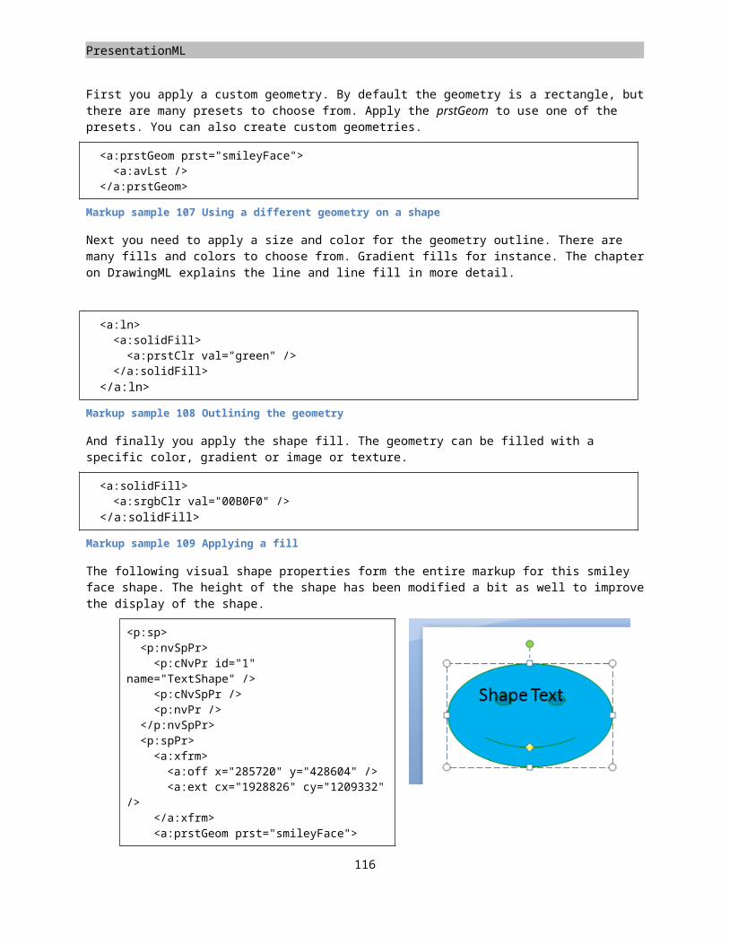
DrawingML
The data which makes up the chart is defined using a set of data series, defined using the ser element. Inside each of the data series you define data to use for the category and value. In the sample chart there are two data series. Each one is displayed using a specific color inside the chart. In both of the series there are two pieces of data defined, resulting in the two-bar display found in the samples above.
<c:ser><c:idx val="1" /><c:order val="1" /><c:cat><c:strLit><c:ptCount val="2" /><c:pt idx="0"><c:v>Col 1</c:v>
</c:pt><c:pt idx="1"><c:v>Col 2</c:v>
</c:pt></c:strLit>
</c:cat><c:val><c:numLit><c:ptCount val="2" /><c:pt idx="0"><c:v>5</c:v>
</c:pt><c:pt idx="1"><c:v>10</c:v>
</c:pt> </c:numLit>
</c:val></c:ser>
Markup sample 146 Chart data series
A sample data series is displayed in the Markup sample 146. There is a unique ID and ordering information provided in the element header. Next it contains a category and a value element. Inside both elements a list of values is defined. The strLit element defines a literal (hard-coded) string, in the same way that the numLit defines a hard-coded value. Instead of using this hard coding, the strRef and numRef elements can be used to reference data in a separate data source when this is in use in the chart. The data that is stored is visualized as a more familiar table in the header of this paragraph.
Through the use of categories and values several mistakes can be made. Whether these mistakes are breaking is different for each consumer. PowerPoint does allow you to have more values than categories for instance, and will show an empty label to make up for it. Also errors in the index values for the string and number literals are allowed, but cause the chart to be rendered in a funny way.
Data binding a chart
While providing data in a hard-coded fashion does allow you to create charts, it is probably better to store this data separately from the chart definition. There are two types of data sources that can be used to provide data to charts; SpreadsheetML data and PivotTables. The SpreadsheetML data source is discussed in this section.
To provide a chart with data coming from a SpreadsheetML package, the chart uses a package relationship to define the data source. This SpreadsheetML data source can be embedded into the package or stored separately on disc allowing maximum flexibility of the place where the data is stored. To allow the consumer to access the data even when network connections are unavailable, the data from the spreadsheet is cached in the chart markup. You can specify a setting to have the consumer retrieve the data on opening of the document.
118
Placeholders
The first step to achieve an external data source is to create a new package relationship using the chart part as the source. The relationship type needs to be the ‘officeDocument’, there is no separate relationship type to identify the data source. To attach the spreadsheet to the chart, a simple element is attached to the chartSpace root element.
<c:chartSpace xmlns:c="http://.../drawingml/2006/chart" xmlns:a="http://.../drawingml/2006/main" xmlns:r="http://.../officeDocument/2006/relationships"><!-- other chart content --><c:externalData r:id="rId1" />
</c:chartSpace>
Markup sample 147 External chart data source
This sets up the chart to retrieve the data from the external spreadsheet. Up to this point the data in the spreadsheet is not utilized. To set up the chart to actually use the data source, the data series need to be modified to use referenced strings and numbers instead of hard-coded ones. The ser element defining a data series still uses the cat and val elements to define categories and values for this data series. Only this time these elements contain the strRef and numRef nodes to reference data from the external data source. Both the string and number reference store the SpreadsheetML function required to retrieve the data from the data source as a range of cells containing the data. Next they use their element specific cache node such as the strCache element to cache the values corresponding to the function, which is stored based on the last time it was calculated.
<c:ser><c:cat><c:strRef><c:f>Sheet1!$A$1:$B$1</c:f><c:strCache><c:ptCount val="2" /><c:pt idx="0"><c:v></c:v>
</c:pt><c:pt idx="1"><c:v>Sales</c:v>
</c:pt></c:strCache>
</c:strRef></c:cat>
</c:ser>
Markup sample 148 External data series
Adding extra chart labels
One of the easier steps when defining charts is the addition of extra chart labels such as the title or legend. It is also possible to display a copy of the data in tabular form underneath the chart.
For each of the three extra labels that you can add to a chart there is a separate element defining the content. In addition to this you can add shapes to the chart, but doing so takes a more elaborate model than applying the default chart labels.
The title of a chart is defined directly within the chart element, the legend is within this chart element as well. There are two ways in
119 Figure 43 Extra chart labels
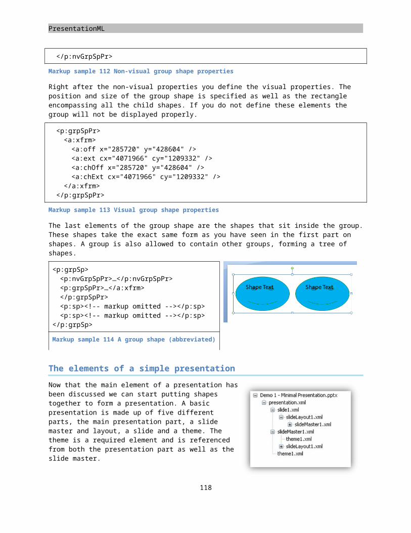
DrawingML
which you can define the chart title. Similar to the chart data you can either hard-code it using a block of rich text, or reference a string in the data source using the strRef element discussed earlier. The rich-text block uses DrawingML text, which is discussed separately in this chapter. The legend of a chart is also within the chart element itself. There are little settings that require a value. Just setting the position of the legend to be on the right hand side of the chart is sufficient. You can format both the title and legend using a shape properties node, similar to defining the properties of a custom shape.
The addition of the data table below the chart is also a built-in behavior. Only this time the element is part of the plot area of the chart. Similar to just specifying the existence of the data table, you only need to specify what you want to see in the data table, not how to display it exactly. You can further format the area that the data table takes up using shape properties, but it is for instance impossible to add new elements to the table or format how the labels are displayed outside the preset values.
<c:chart><c:title><c:tx><c:rich><!-- rich text -->
</c:rich></c:tx><c:layout />
</c:title><c:legend><c:legendPos val="r" /><c:layout />
</c:legend><c:plotVisOnly val="1" />
</c:chart>
Markup sample 149 Chart title and legend
<c:plotArea><c:layout /><c:dTable><c:showHorzBorder val="1" /><c:showVertBorder val="1" /><c:showOutline val="1" /><c:showKeys val="1" />
</c:dTable></c:plotArea>
Markup sample 150 Chart data table label
Adding custom shapes
When creating charts you might want to do things like draw attention to a certain area. For this purpose you are allowed to create shapes within the chart’s surface. The manner in which this works takes a similar approach as specifying the external data source.
<c:chartSpace><c:userShapes r:id="rId1" />
</c:chartSpace>
Markup sample 151 Referencing the chart drawings
The part containing chart shapes is referenced using a specific relationship type:
http://schemas.openxmlformats.org/officeDocument/2006/relationships/chartUserShapes
Inside this part a list of shapes and group shapes is kept inside DrawingML specific namespaces. The manner in which it works is similar to shapes in PresentationML. The main difference is that each shape element, or sp, is surrounded with a specific type of anchor for placing the element on the chart surface. These anchors allow the shapes that are tied to a chart to resize and move when the chart is resized or moved.
120
Placeholders
<c:userShapes xmlns:c="http://.../drawingml/2006/chart"xmlns:a="http://.../drawingml/2006/main"xmlns:cdr="http://.../drawingml/2006/chartDrawing"><cdr:absSizeAnchor><cdr:from><cdr:x>0.03516</cdr:x><cdr:y>0.35156</cdr:y>
</cdr:from><cdr:ext cx="600000" cy="600000" /><cdr:sp macro="" textlink=""><!-- shape content -->
</cdr:sp></cdr:absSizeAnchor>
</c:userShapes>
Markup sample 152 Absolute positioned user shape
Markup sample 152 shows the use of the absolute anchor. Using this anchor the shape will not resize when the chart is resized. An anchor can contain exactly one shape, which could be a group shape containing child shapes. The userShapes elements can contain multiple anchors to store multiple shapes. The shape markup itself is similar to shapes in PresentationML but they take a different namespace specific to DrawingML. There are items such as the visual and non-visual properties to identify and style the shapes inside the chart. For the absolute anchor, the location and size need to be specified. To change this absolute positioned shape into a relative one, which does resize with its chart parent, the absSizeAnchor element needs to be modified into a relSizeAnchor, the rest of the markup is the same, except for the extent. The absolute anchor defines the height and width, while the relative anchor defines the percentage of the total size of the chart to define the shape’s size. The from element is accompanied by a to element to define the relative size for the shape.
<cdr:relSizeAnchor><cdr:to><cdr:x>0.94923</cdr:x><cdr:y>0.98438</cdr:y>
</cdr:to></cdr:relSizeAnchor>
Markup sample 153 Relative size anchors
Creating 3-D charts
Besides the flat 2-D charts like the ones we have seen up until now, it is also possible to create 3-D charts using the same basic principles. There are various extra things you can style on a 3-D chart such as the angle of view and other 3-D related settings. The chart will be displayed in a half-open box. You can provide styling information for the visible sides.
There are three things to change to the current setup to move from flat 2-D to rich 3-D views. The first step is to change the chart identifier inside the plotArea node to now identify a 3-D chart. The bar3DChart element is used in this sample. The bar3DChart element actually allows the exact same content as its 2-D equivalent except for the addition of an extra reference to the third axis being displayed. By referring to the axis with an ID value of 0, you can refer to a ‘default’ empty axis. This allows any easy change between the 2-D and 3-D views.
121
DrawingML
The next information to provide is about styling the visible walls of the virtual 3-D box in which the chart is being drawn. This information is provided within chart element directly. You can specify the styling details of the sidewall, back-wall and floor of the virtual box. The approach is that each of the three elements defining the styles for the box contain a shape properties node defining DrawingML transformations to apply to the wall in question.
<c:plotArea><c:layout /><c:bar3DChart><!-- same data as the barChart -->
</c:bar3DChart></c:plotArea>
Markup sample 154 Defining a 3-D bar chart
The last element that needs to be set is the position of the camera, which is displaying the chart. The DrawingML engine in Microsoft Office actually renders the charts in a 3-D environment. The camera is the place from where the chart is being viewed, allowing for professional looking views of the charted data, or not so professional views when the calculation of the camera angle falters slightly. The camera is set up using the view3D element. Here you can specify camera rotation and the type of camera to use. You can either choose the perspective or right angle camera. The perspective camera gives a more human feel since it resembles what we see ourselves more closely.
<c:chart><c:view3D><c:perspective val="30" />
</c:view3D><c:sideWall><c:spPr />
</c:sideWall><c:floor><c:spPr />
</c:floor></c:chart>
Markup sample 155 Setting 3-D properties
Themes
To allow you to easily style a document, spreadsheet or presentation, using similar coloring across the entire Open XML language stack you make use of themes. A theme is a separate part inside the package and contains definitions for fonts, colors and the various DrawingML shape effects observed so far. There are several types of coloring options and fill options that allow you to attach the style of a shape to a theme. By altering the theme, all shapes based on that theme will be altered as well.
<a:theme xmlns:a="http://.../drawingml/2006/main" name="My Scheme"><a:themeElements><a:clrScheme name="My Scheme" /><a:fontScheme name="My Scheme" /><a:fmtScheme name="My Scheme" />
</a:themeElements><a:objectDefaults /><a:extraClrSchemeLst />
</a:theme>
122Markup sample 156 Theme elements
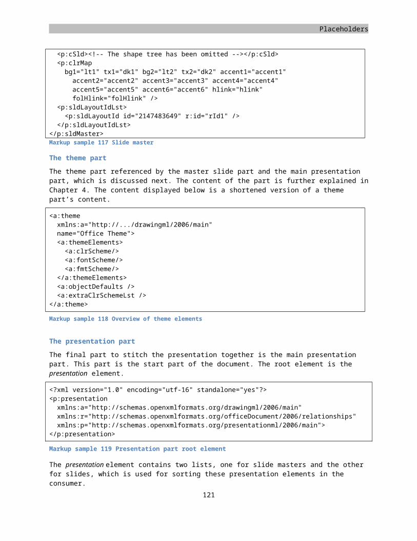
Placeholders
A theme is defined using the similarly named element theme. Inside the theme element you are required to create a themeElements node that holds all the theme's data. At this level you can also apply extra information or overrides on the existing information inside the theme elements. Theme elements are built up using a set of child nodes, each node identifying a specific data item such as the fonts or colors. The clrScheme element defines a list of colors. The list of themed colors is limited to items such as 'accent1', or 'visited link'. Each of these theme colors uses a separate XML element, where the node name identifies the theme color. Inside this element you make use of the coloring mechanism discussed earlier on coloring shapes using DrawingML. In the Markup sample 157 there are two theme colors defined, the 'dark-1' and 'accent-1' colors. The markup sample is not complete. You are required to define value for all the twelve theme colors.
<a:clrScheme name="My Scheme"><a:dk1><a:sysClr val="windowText" lastClr="000000" />
</a:dk1><a:accent1><a:srgbClr val="4F81BD" />
</a:accent1></a:clrScheme>
Markup sample 157 Themed colors
The font scheme uses as similar mechanism as the color scheme settings. You define two fonts to be used in the Open XML document, a major and minor font. Both the major and the minor fonts are further divided into language specific fonts. Per human language you can specify a major and a minor font. The font that is used in the document is dependent on the user's regional settings in his operating system.
<a:fontScheme name="Office"><a:majorFont><a:latin typeface="Calibri" /><a:font script="Jpan" typeface="MS Pゴシック" />
</a:majorFont><a:minorFont><a:latin typeface="Calibri" /><a:font script="Jpan" typeface="MS Pゴシック" />
</a:minorFont></a:fontScheme>
Markup sample 158 Themed fonts
The last element that a theme is allowed to define is shape-formatting settings. These format settings are made up of four sections, fills, lines, effects and background-fills. All these sections are required. Inside each of these sections you can make use of the fill- and line-style plus the formatting options discussed throughout this section.
<a:fmtScheme name="Office"><a:fillStyleLst /><a:lnStyleLst /><a:effectStyleLst /><a:bgFillStyleLst />
</a:fmtScheme>
Markup sample 159 Themed shape formatting
After having various theme settings stored inside your package you will need to apply them to elements inside the document as well. There are two sides to this story. DrawingML provides a few elements that are able to reference the theme settings. These elements need to be stored in a language specific container. The Markup sample 160 shows the container element used for PresentationML shapes. The elements inside it are DrawingML based elements. To refer to a certain line style in the theme the lnRef element is used. References to fills and effects use
123
DrawingML
the fillRef and effectRef elements respectively. All three of these reference elements refer to their counterpart based on the element index inside the theme definition. The fontRef does not require an index based reference since there are only two fonts that you can define, the major and minor font. To provide coloring information and attach that to the theme as well the schemeClr element is used. You can use this element in any place where you want to apply a color inside your document. The val attribute is allowed a certain limited set of theme color names. Values for these colors are stored inside the theme definition using named nodes. The manner in which this happens can be found earlier in this section.
<p:style><a:lnRef idx="2"><a:schemeClr val="accent1"><a:shade val="50000" />
</a:schemeClr></a:lnRef><a:fillRef idx="1"><a:schemeClr val="accent1" />
</a:fillRef><a:effectRef idx="0"><a:schemeClr val="accent1" />
</a:effectRef><a:fontRef idx="minor"><a:schemeClr val="lt1" />
</a:fontRef></p:style>
Markup sample 160 Applying themes on shapes
124
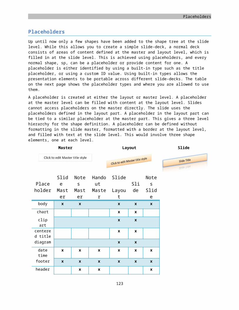
Units of measure
The EMU
The English Metric Unit, or EMU, is used throughout DrawingML for specifying details such as position or size. The EMU allows for precise conversion between well-known units of measure such as the centimeter and inch, without requiring floating point numbers.
Unit EMUs
Inch 914400
Centimeter 360000
Point 12700
The twip
The twip is a screen-independent unit of measure. It ensures that the proportion of elements is the same on all display systems. A twip is defined as being 1/1440th of an inch.
Unit TWIPs
Inch 1440
Centimeter 567
125