Embed Size (px)
Citation preview

What’s New
Essential Studio User Interface Edition

What’s New for 2010 Volume 4: Essential Studio User Interface Edition
2 | P a g e
Table of Contents Essential Grid ................................................................................................................................................ 3
ASP.NET MVC ............................................................................................................................................ 3
WPF ........................................................................................................................................................... 8
Essential Tools ............................................................................................................................................. 12
ASP.NET MVC .......................................................................................................................................... 12
WPF & Silverlight..................................................................................................................................... 19
Silverlight ................................................................................................................................................ 42
Essential Chart ............................................................................................................................................ 46
WPF & Silverlight..................................................................................................................................... 46
Silverlight ................................................................................................................................................ 49
Essential Diagram ........................................................................................................................................ 50
WPF & Silverlight..................................................................................................................................... 50
Silverlight ................................................................................................................................................ 51
Essential Schedule ....................................................................................................................................... 57
WPF & Silverlight..................................................................................................................................... 57
ASP.NET MVC: Common to All Products ..................................................................................................... 58

What’s New for 2010 Volume 4: Essential Studio User Interface Edition
3 | P a g e
Essential Grid
ASP.NET MVC
Localization
Localization allows you to tailor a control to the language of a particular region. It is a key factor
in readying an application for global use, making your product viable to a greater number of
international markets.
Key Features
Auto-detection of current culture details from page directive or CurrentThread.
Ability to easily switch from one language to another using the Localize() method.
Customizable resource (.resx) location path.
Ability to localize all pre-built text—such as that found in prompt strings, message
strings, filter dialogs, and toolbars.
Grid Localized to French
Cell editing
A CellEditType feature has been implemented, which creates a delegated control for a specific
data type, easing usability and improving client-side validation. The control that will be used to
edit a particular column can be specified with the CellEditType property.
The following controls are supported for editing or inserting records in a grid:
1. NumericTextbox (default for Numeric types)
2. PercentTextbox
3. MaskEditTextbox
4. DatePicker (default for DateTime type)
5. Checkbox (default for Boolean type)
6. Textbox (default for String type)

What’s New for 2010 Volume 4: Essential Studio User Interface Edition
4 | P a g e
In-Line Row Inserting
In-Line Row Editing
MultiColumnDropDown revamp
The MultiColumnDropDown control has been revamped, with significant improvements to
appearance, column mapping, and sorting.

What’s New for 2010 Volume 4: Essential Studio User Interface Edition
5 | P a g e
Appearance
New built-in skins provide a very easy way to modify the control’s visual style, just by setting a
single property. Fourteen professional-looking skins can be applied to a drop-down column,
enhancing readability and producing a contemporary look.
Office 2007 Blue
Office 2007 Black
Office 2007 Silver
Vista
Almond
Blend
Blueberry
Marble
Midnight
Monochrome
Olive
Sandune
Turquoise
MultiColumnDropDown Control Skins

What’s New for 2010 Volume 4: Essential Studio User Interface Edition
6 | P a g e
Column mapping
The MultiColumnDropDown control also supports column mapping, allowing you to filter
columns in a bound table so you can choose which ones to display. This mapping also allows you
to customize column styles and content.
With new properties, you can set header text, control the visibility of a column, set column
width, disable or enable sorting for a particular column, format text, and specify whether a
column is bound or not.
Column Mapping with 4 Columns Mapped
Sorting
Sorting is best defined as the process of arranging items or records in an ordered sequence. The
MultiColumnDropDown control supports sorting columns in ascending or descending order,
based on which column header is clicked. As you click a column header, sorting order switches
between ascending and descending.
Column Sorted in Descending Order

What’s New for 2010 Volume 4: Essential Studio User Interface Edition
7 | P a g e
Filtering improvements in UI
Essential Grid now provides an enhanced filter bar very similar to Excel. The new filter bar
contains a checked list box for selecting values, a search box for easy filtering, and a
DateTimePicker control for selecting date-time values.
Case-sensitive options are available for filtering, and options have been expanded to include
more date-time and integer filters. Enhanced custom filters also give the control a great deal of
flexibility.
Check Box Filters
Custom Filter Dialog

What’s New for 2010 Volume 4: Essential Studio User Interface Edition
8 | P a g e
Text Filters
Keyboard interface
Essential Grid now provides extensive support for keyboard handling. The following keyboard
shortcuts for all operations can be customized through KeyConfigurator.
Arrow – Navigates the selection.
Ctrl + Home/End – Moves to the first or last row or column.
Ctrl + A – Selects all the records.
Delete – Deletes a record.
Insert – Inserts a new record.
F2 – Edits a record.
PageUp/PageDown – Scrolls a grid by page.
Ctrl + PageUp/PageDown – Moves to the first or last page.
Alt + X – Exports a grid to Excel.
Alt + Arrow – Expands or collapses grouped records.
WPF
Expression Blend support
With Expression Blend support for the GridDataControl, now you can create an application using
Essential Grid, open it in Blend, and edit the application’s styles, while automatically generating
XAML code.
QTP support
Essential Grid for WPF now supports QuickTest Professional (QTP) automated testing, which has
been implemented for GridControl, GridDataControl, and GridTreeControl.

What’s New for 2010 Volume 4: Essential Studio User Interface Edition
9 | P a g e
WPF & Silverlight
Serialization support
Serialization can be implemented for applications that need to save data, style, and structure
after being closed. All can be saved in an XML file, which can be loaded at any time.
FilterBar control
The FilterBar control can be used to filter records with different expressions, depending upon
column type. By enabling the ShowFilterBar property to “true” in the GridDataControl class, a
filter bar will be displayed at the top of the grid, below the header row. By enabling the
ShowFilterStatusMessage property, a filter status message will be displayed at the bottom of
the grid.
Silverlight Filter Bar with ShowFilterStatusMessage set to “true”

What’s New for 2010 Volume 4: Essential Studio User Interface Edition
10 | P a g e
WPF Filter Bar with ShowFilterStatusMessage set to “true”
Excel-like resizing
Excel-like resizing is useful when you need to hide rows or columns to simplify the view of a grid.
This resizing can be performed at run-time or in code. HiddenBorderBrush and
HiddenBorderThickness can also be assigned by the user.
Hidden Rows and Columns in WPF
Hidden Rows and Columns in Silverlight
Localization
Localization is the process of making your application multi-lingual by formatting content for a
variety of cultures, such as configuring an application for a specific language. Essential Grid
allows you implement localization by setting a custom resource through the Resx file. You can
simply give string values in the resource file for a specific culture and set the culture in an
application. The given string values will be set to the grid, which does not affect the grid’s code
block.

What’s New for 2010 Volume 4: Essential Studio User Interface Edition
11 | P a g e
Localization in WPF Grid
Localization in Silverlight Grid

What’s New for 2010 Volume 4: Essential Studio User Interface Edition
12 | P a g e
Essential Tools
ASP.NET MVC
Localization
Localization in a control provides flexible support for displaying data in a language specific to a
particular country or region. The following controls now include enhanced localization support.
RichTextEditor localization features
Auto-detection of current culture details from page directive or CurrentThread.
Ability to easily switch from one language to another using the Localize() method.
Customizable resource (.resx) location path using the LocalizationPath() method.
Ability to localize all pre-built text—such as ToolTip strings and tab captions.
RichTextEditor Control Set to French
DatePicker localization features
Built-in support for languages.
Ability to easily switch from one language to another using the Localize() method.
All pre-built text can be localized—such as day, month, and year strings.
DatePicker supported languages that are contained in the languages enum collection.

What’s New for 2010 Volume 4: Essential Studio User Interface Edition
13 | P a g e
DatePicker Control Set
to French
Button controls
The Button control allows you to create buttons that perform specific actions when clicked. It
can display both text and images, simulating an actual button being pushed and released.
The following types of buttons are available in Essential Tools:
Normal button – The default command button.
Toggle button – A button with two sates: on and off.
Split button – A Normal button that can also act as a drop-down button.
Key Features
Customizing button content using the ContentType() method.
Customizing button appearance with built-in themes using the Skin() method.
Displaying and aligning images with the ImageUrl() and ImagePosition() methods.
Customizing arrow position in a split button with the ArrowPosition() method.
Applying 14 built-in themes.
Controlling behavior with a set of client-side methods.
Handling client-side events.
Normal Button
Split Button
Toggle Button
What’s New for 2010 Volume 4: Essential Studio User Interface Edition
14 | P a g e
GenericDropDown control data binding
The GenericDropDown control provides extensive data-binding support for mapping table
columns to GenericDropDown properties (Id, Text, ImageUrl, SpriteCss, ImageAttributes, and
HtmlAttributes), which are used to populate the control items. The GenericDropDown control
can be bound to any collection that derives from IList.
It offers varied data binding options for any kind of IEnumerable data source contained in LINQ
or SQL, the ADO.NET Entity Model, or generic collections
It is designed to support various data and handle large data sets. With only a few lines of code, it
can be populated from a database, and user-defined fields can be easily mapped with
GenericDropDown fields. Automatically, the control creates UL and LI tags for item collections.
GenericDropDown Using Data Binding
Menu control data binding
The Menu control provides extensive data-binding support so columns can be mapped in order
to populate a menu with items. It can be bound to any collection that derives from IList, and
once the list collection is populated with list items, the menu renders the items using a parent-
child relationship.
The control offers varied data binding options for any kind of IEnumerable data source
contained in LINQ or SQL, the ADO.NET Entity Model, or generic collections.

What’s New for 2010 Volume 4: Essential Studio User Interface Edition
15 | P a g e
It is designed to support various data and handle large data sets. With only a few lines of code, it
can be populated from a database, and user-defined fields can be easily mapped with
GenericDropDown fields. Automatically, the control creates UL and LI tags for item collections.
Menu with Data Binding
RichTextEditor tool set enhancements
With the RichTextEditor (RTE) control, you can format text easier than ever before and convert
selected text to lowercase or uppercase letters. A function for inserting paragraphs has also
been included.
In the RTE control, the following toolbar items have been added:
Subscript – Drops text below the baseline.
Example: H2O
Superscript – Extends text above the ascender line.
Example: 12th
Lowercase – Converts selected text to lowercase letters.
Uppercase – Converts selected text to uppercase letters.
Insert Paragraph – Inserts a paragraph element at the current position.
RichTextEditor with Formatting,
Casing, and Insert Paragraph Tools

What’s New for 2010 Volume 4: Essential Studio User Interface Edition
16 | P a g e
Removing items
In the RichTextEditor control, toolbar items can be removed, allowing you to customize the
control to a greater degree.
RTE with Removed Toolbar Items (Cut, Copy, and Paste)
Toolbar data binding
The Toolbar control provides extensive data-binding support so columns can be mapped to
toolbar properties (Id, Text, ImageUrl, SpriteCss, ImageAttributes, and HtmlAttributes) to
populate the toolbar with items. The toolbar control can be bound to any collection that derives
from IList. Once the list collection is populated with list items, the toolbar creates the items
using a parent-child relationship.
The control offers varied data binding options for any kind of IEnumerable data source
contained in LINQ or SQL, the ADO.NET Entity Model, or generic collections
It is designed to support various data and handle large data sets. With only a few lines of code, it
can be populated from a database, and user-defined fields can be easily mapped with toolbar
fields. Automatically, the control creates UL and LI tags for item collections.
Toolbar with Data Binding
Loading TreeView items on demand
TreeView nodes can be loaded on demand, through AJAX callbacks, as a user needs them,
helping to reduce the roundtrip time.

What’s New for 2010 Volume 4: Essential Studio User Interface Edition
17 | P a g e
This load-on-demand feature allows data to be retrieved only when a user action warrants it,
considerably reducing downtime by avoiding post-backs, making it ideal for large trees
TreeView with
Load-On-Demand
Client-side methods
The TreeView control provides flexible client-side methods, so you can easily interact with a tree
view and control its behavior. Now you can add or delete, select or unselect, and enable or
disable nodes on the client side.
The TreeView control supports the following dedicated methods on the client side:
SelectNode(nodeId) – Selects the tree-view node of a specified ID.
UnSelectNode(nodeId) – Unselects the tree-view node of a specified ID.
EnableNode(nodeId) – Enables the tree-view node of a specified ID.
DisableNode(nodeId) – Disables the tree-view node of a specified ID.
AddNode(nodeText) – Creates a new tree-view node with a specified node text.
RemoveNode() – Removes a selected node.
What’s New for 2010 Volume 4: Essential Studio User Interface Edition
18 | P a g e
TreeView with Added Node
TreeView with Disabled Node
TreeView with Selected Node
TreeView data binding
The TreeView control provides extensive data-binding support so columns can be mapped to
TreeView properties (Id, ParentId, Text, ImageUrl, SpriteCss, ImageAttributes, and
HtmlAttributes) to populate the tree view with items. The tree view can be bound to any
collection that derives from IList. Once the list collection is populated with list items, the toolbar
creates the items using a parent-child relationship.

What’s New for 2010 Volume 4: Essential Studio User Interface Edition
19 | P a g e
The control offers varied data binding options for any kind of IEnumerable data source
contained in LINQ or SQL, the ADO.NET Entity Model, or generic collections
It is designed to support various data and handle large data sets. With only a few lines of code, it
can be populated from a database, and user-defined fields can be easily mapped with TreeView
fields. Automatically, the control creates UL and LI tags for item collections.
TreeView with Data Binding
WPF & Silverlight
AutoComplete revamp
Data binding
Data binding support in the AutoComplete control allows you to bind business objects to the
control so it can set values to be displayed in a drop-down list.
Multiple selections
The AutoComplete control allows you to select more than one item by using a separator
character to separate selected items. It supports two selection modes: Single and Multiple.

What’s New for 2010 Volume 4: Essential Studio User Interface Edition
20 | P a g e
Multiple Selections in Silverlight
Multiple Selections in WPF
Drop-down list resizing
The AutoComplete control lets you resize the drop-down list by using the thumb provided in the
bottom-right of the list. By using the thumb, you can adjust both height and width.
Resizing in Silverlight
Resizing in WPF
MenuAdv control revamp
Command binding
The MenuAdv control supports command binding. When clicking or pressing Enter to select an
item, the command will be triggered.

What’s New for 2010 Volume 4: Essential Studio User Interface Edition
21 | P a g e
Radio button support
The MenuAdv control allows you to use radio buttons so that only one item in a menu group can
be selected.
Radio Button Support in Silverlight and WPF
Input-gesture text
The MenuAdv control allows you to display input gesture text along with the header of an item.
Input Gesture Text in
Silverlight and WPF
Boundary detection
The MenuAdv control supports boundary detection, when opening a submenu will cause it to
cross a boundary.

What’s New for 2010 Volume 4: Essential Studio User Interface Edition
22 | P a g e
Boundary Detection for Silverlight
Boundary Detection for WPF
Scrolling support
The MenuAdv control allows you to scroll submenu items.

What’s New for 2010 Volume 4: Essential Studio User Interface Edition
23 | P a g e
Scrolling Submenu Items in Silverlight
Animation support
The MenuAdv control allows you to animate the way a pop-up window opens.
Keyboard navigation
The MenuAdv control supports keyboard navigation, allowing you to open a submenu, close a
submenu, and select a submenu item with the keyboard.
Expression Blend support
The MenuAdv control allows you to customize its look and feel by editing a template in
Expression Blend—specifically, items, scroll buttons, check boxes, and radio buttons can be
modified.

What’s New for 2010 Volume 4: Essential Studio User Interface Edition
24 | P a g e
Customization through Blend
Maximizing the Window control
Now you can maximize the Window control just by double-clicking on the window title bar,
similar to the default behavior found in Windows.
Boundary Detection for DropDownButtonAdv and SplitButtonAdv
The boundary detection support in the DropDownButtonAdv and SplitButtonAdv controls allows
them to automatically detect browser boundaries and display drop-down lists appropriately, so
the lists will not be hidden or clipped.
ColorPickerPalette revamp
Panel visibility
The ColorPickerPalette control includes three panels: Theme, Standard Color, and Recently
Used. You can control the visibility of these panels by using the ThemePanelVisibility,
StandardPanelVisibility, and RecentlyUsedPanelVisibility properties.
ThemePanelVisibility
Set to “False”

What’s New for 2010 Volume 4: Essential Studio User Interface Edition
25 | P a g e
StandardPanelVisibility
Set to “False”
RecentlyUsedPanelVisibility
Set to “False”

What’s New for 2010 Volume 4: Essential Studio User Interface Edition
26 | P a g e
Color themes
The ColorPickerPalette control includes a list of predefined themes. Based on a selected theme,
a combination of colors will be displayed in the Theme Color panel. You can also set the visibility
of the theme panel through the ThemePanelVisibility property.
ColorPickerPalette with
Themes set to Apex
More color options
In addition to the colors found in themes and standard colors, the More Colors feature offers a
wider range of color options—including custom colors.
Standard colors include 140 colors clustered in the shape of a hexagon. A color chosen from this
cluster will also be added to the Recently Used panel. The visibility of the More Colors feature
can be set by using the MoreColorOptionVisibility property.

What’s New for 2010 Volume 4: Essential Studio User Interface Edition
27 | P a g e
ColorPickerPalette Featuring Standard Colors
ColorPickerPalette Featuring Custom Colors

What’s New for 2010 Volume 4: Essential Studio User Interface Edition
28 | P a g e
ToolTip support
ToolTips can be used to display information in the palette such as color name or other details—
like the color’s percentage difference from base colors.
ColorPickerPalette
with ToolTip Support
Expanded mode
Colors can be picked the from ColorPickerPalette control while it is in expanded mode by setting
the IsExpanded property to “True.”

What’s New for 2010 Volume 4: Essential Studio User Interface Edition
29 | P a g e
ColorPickerPalette
in Expanded Mode
New UI support
An additional user interface is now available for the color picker, providing two more UIs for the
control, both with the same functionality.
The ColorPicker and ColorEdit controls can be displayed in four different modes: HSV, Classic
HSV, RGB, and Classic RGB. The VisualizationStyle property is used to switch between these
modes, and all modes are user friendly, more attractive, and look highly professional.
HSV User Interface

What’s New for 2010 Volume 4: Essential Studio User Interface Edition
30 | P a g e
RGB User Interface
Carousel control
The Carousel control provides a 3-D interface for interactive navigation with data binding and
plan projection support.
Carousel Control in Silverlight
Data-binding
The Carousel control can be bound to different data sources, such as IList, XML, or Observable
Collection sources as well as WCF Services.
Path support
The carousel panel arranges its children in a path; you can specify any path you want and
arrange items in any order—and newly added support allows you to do this in Expression Blend.
Carousel Path Support

What’s New for 2010 Volume 4: Essential Studio User Interface Edition
31 | P a g e
Plan projection
The GlobalOffsetX, GlobalOffsetY, and GlobalOffsetZ properties direct an object along axes
relative to the screen. They control where an object is positioned along the x-, y-, and z-axes,
respectively, allowing you to customize the 3-D view of the Carousel control.
Expression Blend
The Carousel control can be easily edited in Expression Blend, allowing you to change templates
for the control as well as carousel items.
Carousel Control
PropertyGrid control
The PropertyGrid control provides an interface, with sorting and grouping support, which can be
used to browse the properties of an object in Expression Blend, a custom editor, or a category
editor. It provides features of the WinodwsForms PropertyGrid with support for many
component model attributes, such as Browsable, Category, and Readonly. The PropertyGrid
control supports several built-in editors, and custom or category editors can be added for a
customized appearance.
Custom editor
The PropertyGrid control supports several built-in editors, allowing you to control the look and
feel of an application. The custom editor lets you set custom value editors for particular
properties, instead of the default editors.

What’s New for 2010 Volume 4: Essential Studio User Interface Edition
32 | P a g e
PropertyGrid with Category Editor
Sorting and grouping
The PropertyGrid control can group properties based on property category attribute, allowing
you to sort properties in both ascending and descending order. Sorting is performed based on
the SortDirection property.
TreeView Advanced Features
AutoSearch
The TreeViewAdv control supports AutoSearch, a feature similar to that of File Explorer, which
allows you to perform a search within a tree view. Based on keyboard input, it will
automatically navigate to a particular item and select the appropriate one.
You can enable or disable this feature by setting the AutoSearchEnabled property. If the
TreeViewAdv control is bound with business objects, then the search will be based on the
DisplayMemberPath property.
Multiple selection
With multiple-selection support, you can select multiple nodes at the same time. The
TreeViewAdv control supports the following selection modes:
1. Single – Selects one node at a time.
2. MultiSelectSameLevel – Selects nodes of the same level.
3. MultiSelectAll – Selects multiple nodes.
You can change the selection behavior by using the SelectionMode property.

What’s New for 2010 Volume 4: Essential Studio User Interface Edition
33 | P a g e
FileUpload customization features
The FileUpload control can be easily edited in Expression Blend, where you can provide a better
look and feel for the control by editing its template.
FileUpload Control with Default Style
FileUpload Control with Custom Style

What’s New for 2010 Volume 4: Essential Studio User Interface Edition
34 | P a g e
Ribbon state persistence
The state persistence feature allows a state, before a ribbon is closed, to persist when the
ribbon reopens. It allows you to save and load states at any time with a programmatic API when
an application exits or starts. The state persistence feature is supported separately for the quick-
access toolbar, ribbons, and ribbon windows.
Navigating ribbon tabs by scrolling
Tab scrolling in the Ribbon control provides flexible navigation of a ribbon’s tabs. You can
navigate ribbon tabs using the mouse wheel by scrolling down to navigate to tabs on the right of
the currently selected tab, and scrolling up to navigate to tabs on the left.
CheckedListBox control revamp
CheckedListBox mode
The mode of the CheckedListBox control can be changed by using the Mode property. This is an
enumeration property that holds three modes: Normal, Check, and RadioGroup. Setting a value
for the mode changes the item in the CheckedListBox control. The default value for the property
is Check.
CheckedListBox in
Checked Mode
CheckedListBox in
Normal Mode
CheckedListBox in RadioGroup Mode
Data binding
The CheckedListBox control provides rich data binding support, allowing you to fill
CheckedListBox items with collections.
CheckedListBox with Data Binding

What’s New for 2010 Volume 4: Essential Studio User Interface Edition
35 | P a g e
Selecting items
The CheckedListBox control provides support for selecting items with a single click. This can be
achieved by enabling the CheckOnClick property. The default value for this property is “false.”
CheckedListBox with
Checking Items On
TileView control usability
Minimized/maximized item template
The minimized and maximized item templates in the TileView control enable you to set different
data templates for maximized and minimized items. The ItemTemplate property will be
displayed in the TileViewItem Normal state. If you set MinimizedItemTemplate and do not set
MaximizedItemTemplate, then the value in the ItemTemplate property will be displayed in a
maximized state, and vice versa.
TileView Control with Minimized and Maximized Items

What’s New for 2010 Volume 4: Essential Studio User Interface Edition
36 | P a g e
Minimized/maximized content
TileView items can be set with different types of content when in a maximized or minimized
state. The Content property is used to set the content for the TileViewItem Normal state. If you
set MinimizedItemContent and do not set MaximizedItemContent, then the value in the content
property will be displayed in a maximized state, and vice versa.
TileView Control with Minimized and Maximized Item Content
Minimized/maximized header template
The TileView control allows you to set different templates for headers in maximized and
minimized items. The HeaderTemplate property sets the template for headers in the
TileViewItem Normal state. If you set MinimizedHeaderTemplate and do not set
MaximizedHeaderTemplate, then the value in the HeaderTemplate property will be displayed in
a maximized state, and vice versa.

What’s New for 2010 Volume 4: Essential Studio User Interface Edition
37 | P a g e
TileView Control with Minimized and Maximized Headers
Close button feature
TileView items can now include a Close button along with a Min/Max button, enabling items to
be closed. Also, an item can include two Close modes: Hide and Delete.
If you click the Close button in Hide mode, the item will be hidden; if you click the Close button
in Delete mode, the item will be removed from the application.
What’s New for 2010 Volume 4: Essential Studio User Interface Edition
38 | P a g e
CloseButton in TileViewControl.
Scrollbar support
A scrollbar appears at the bottom of the TileView control when the width of a minimized item
increases if MinimizedItemsOrientation of TileViewControl is set to “Top” or “Bottom.” The
scrollbar will be visible in the right side of the control when the height of a minimized item
increases if MinimizedItemsOrientation of TileViewControl is set to “Right” or “Left.”
TileView Control with Horizontal Scrollbar

What’s New for 2010 Volume 4: Essential Studio User Interface Edition
39 | P a g e
TileView Control with Vertical Scrollbar
Ribbon modal tabs
Modal tabs in the Ribbon control can be used to temporarily display a collection of commands
other than those found in the core tabs. A modal tab can be displayed in a ribbon only when
needed, while all other core tabs will be invisible while it is shown.
Windows 7 default window behavior
The Windows 7 operating system’s default window behavior has been added for ribbon
windows. Now you can drag a ribbon window when it is in a maximized state.
Office 2010 UI
You can achieve an Office 2010 appearance in an application by implementing Office 2010-style
menus and toolbars. This feature provides a BackStage user interface, which you can customize
with your own commands.
TreeViewAdv control
AutoSearch
The TreeViewAdv control supports auto-searching, similar to Windows File Explorer. The control
can automatically navigate to a particular item when any character is pressed and select the
relevant item.
You can enable or disable this feature by setting the AutoSearchEnabled property. If the
TreeViewAdv control is bound with business objects, then the search will be based on the
DisplayMemberPath property.
What’s New for 2010 Volume 4: Essential Studio User Interface Edition
40 | P a g e
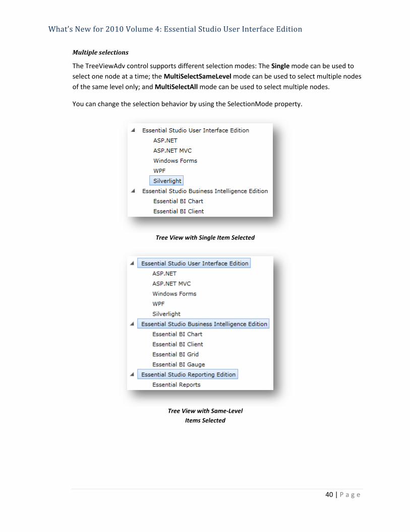
Multiple selections
The TreeViewAdv control supports different selection modes: The Single mode can be used to
select one node at a time; the MultiSelectSameLevel mode can be used to select multiple nodes
of the same level only; and MultiSelectAll mode can be used to select multiple nodes.
You can change the selection behavior by using the SelectionMode property.
Tree View with Single Item Selected
Tree View with Same-Level
Items Selected

What’s New for 2010 Volume 4: Essential Studio User Interface Edition
41 | P a g e
Tree View with All Items Selected
Ribbon modal tabs
Modal tabs in the Ribbon control are used to temporarily display a collection of commands
other than those found in the core tabs. They are displayed as the user needs access to a
particular set of commands, at which time commands in the core tabs will not be visible.
Silverlight Ribbons with Modal Tabs

What’s New for 2010 Volume 4: Essential Studio User Interface Edition
42 | P a g e
WPF Ribbons with Modal Tabs
Silverlight
Drag-and-drop manager
Various elements in a Silverlight application can be dragged easily and effectively with the help
of a drag-and-drop manager. This feature includes various options that allow visual effects and
customizing for the drag-and-drop operation.
Rich set of events
The drag-and-drop manager contains a rich set of events to handle all possible situations in a
drag operation. The available events are listed below:

What’s New for 2010 Volume 4: Essential Studio User Interface Edition
43 | P a g e
DragStarted – Triggers once an object is dragged beyond the drag threshold value.
Drag – Triggers continuously when dragging an object to any point in the browser.
DropEnter – Triggers when a dragged object enters into the drop target boundary.
Drop – Triggers when a dragged object is dropped into the drop target boundary.
DropLeave – Triggers when a dragged object moves out of the drop target boundary
without dropping it.
DropCancelled – Triggers when a dragged object is dropped into an unsupported drop
target.
QueryContinueDrag – Triggers when any key in the keyboard is pressed while dragging
an object.
Keyboard interaction
The keyboard can be used to interact with the drag-and-drop operation with the help of the
QueryContinueDrag event. This event is triggered when any key in the keyboard is pressed. The
pressed key value will be available in its argument.
Drag arrow
The drag arrow shows the path from a source to the current position of a dragged object, clearly
depicting an object’s movement. The drag arrow can be customized.
AutoScrolling
When dropping a dragged object onto its target, if the visual area for the target exceeds the
window, scrolling is automatically enabled. This is useful for dropping a dragged object into a
specific position in the drop target.

What’s New for 2010 Volume 4: Essential Studio User Interface Edition
44 | P a g e
Return animation
Return animation shows when a dragged object is not dropped successfully. The animation plays
when a drag-and-drop operation is cancelled, making it clear what happened to the dragged
object.
Custom drag icon
The type of drag icon that is displayed can be customized with the help of the DragIcon
property.
Custom drop description
A drop description can be set to show the status of a drag-and-drop operation or the details of a
dragged object.

What’s New for 2010 Volume 4: Essential Studio User Interface Edition
45 | P a g e
Drag threshold
The drag threshold is used to avoid accidently dragging an object. The drag-and-drop operation
starts only after dragging an object beyond the drag threshold value.

What’s New for 2010 Volume 4: Essential Studio User Interface Edition
46 | P a g e
Essential Chart
WPF & Silverlight
Performance improvements for charts
Fast column and fast scatter charts are similar to normal column and scatter charts, as column
charts use vertical bars and scattered charts use ellipses to display different values for one or
more items.
The difference is that fast charts are rendered by drawing visuals and they load faster than the
other charts, ensuring high performance for displaying data. They can also be used as real-time
charts to render a large number of data points.
Fast Scatter Chart

What’s New for 2010 Volume 4: Essential Studio User Interface Edition
47 | P a g e
Fast Column Chart

What’s New for 2010 Volume 4: Essential Studio User Interface Edition
48 | P a g e
Data-binding engine
Support has been added for all collection objects in the common data-binding engine that are
used to generate chart data. The data-binding engine generates a view that can be used to bind
a source collection object and initialize the event. It also generates and updates points based on
an updated source.
Data Binding in Chart

What’s New for 2010 Volume 4: Essential Studio User Interface Edition
49 | P a g e
Silverlight
Inversed axes
Essential Chart provides support for inverting values on an axis. Data on an inverted axis will be
plotted in the opposite direction—top to bottom for the y-axis, and right to left for the x-axis.
Inversed Axis

What’s New for 2010 Volume 4: Essential Studio User Interface Edition
50 | P a g e
Essential Diagram
WPF & Silverlight
Snap to grid
The snap-to-grid feature is useful when dragging objects in multiples of offset values, so objects
can be easily aligned at run time. For example, if SnapOffsetX is set to 25, and a node is dragged,
its OffsetX value will be changed in multiples of 25.
Node before Snapping
Node after Snapping
Localization
Localization is the process of customizing a user interface (UI) in a language and culture specific
to a particular country or region. Localization is the key feature that provides solutions to global
customers with the help of localized resource files provided by the control.
Localization in Japanese

What’s New for 2010 Volume 4: Essential Studio User Interface Edition
51 | P a g e
Silverlight
Undo/redo support
The Undo command reverses the last performed action. For example, some basic operations can
be reversed—like translation, rotation, resizing, grouping, ungrouping, changing z-order,
addition, and deletion, which are performed on diagram objects (nodes and line connectors).
The Redo command reverses the last Undo action. Alternatively, these commands can be
executed using keyboard shortcuts: Ctrl+Z for the Undo command and Ctrl+Y for the Redo
command.
Gridlines
The drawing area of the Diagram control can be rendered with horizontal and vertical gridlines,
enhancing the relative positioning and sizing of diagram objects. Gridlines are used as reference
lines, which are helpful for viewing the relative distance between nodes and lines at run time.
Gridlines
Command mechanisms
Command mechanisms enable you to easily perform commonly used operations related to
aligning, nudging, sizing, spacing, and z-order.

What’s New for 2010 Volume 4: Essential Studio User Interface Edition
52 | P a g e
Alignment commands
Alignment commands allow you to align selected objects (nodes and connectors) on a page with
respect to a reference object—the first object in a selection. These commnds are useful for
organizing the layout of objects on a page and creating a professional appearance.
The following alignment commands have been included:
• AlignLeft – Aligns all selected objects to the left of the reference object.
• AlignCenter – Aligns all selected objects to the center of the reference object relative to
the horozontal axis.
• AlignRight – Aligns all selected objects to the right of reference object.
• AlignTop – Aligns all selected objects to the top of the reference object.
• AlignMiddle – Aligns all selected objects to the center of the reference object relative to
the vertical axis.
• AlignBottom – Aligns all selected objects to the bottom of the reference object.
Align Left
Align Right
Align Top
Align Middle
Align Bottom

What’s New for 2010 Volume 4: Essential Studio User Interface Edition
53 | P a g e
Nudge commands
Nudge commands allow selected objects to be moved on a page one pixel at a time. These
commands are particularly useful for accurately placing objects by allowimg the object to move
in any direction.
Nudging can be performed by using the nudge commands or arrow keys.
Using Nudge Commands
• MoveUp – Moves the selected object to the top by one pixel.
• MoveDown – Moves the selected object to the bottom by one pixel.
• MoveLeft – Moves the selected object to the left by one pixel.
• MoveRight – Moves the selected object to the right by one pixel.
Using the Arrow keys
The corresponding arrow keys can be used to move selected objects to the top, bottom, left,
or right.
Sizing commands
Sizing commands allow you to make selected objects (nodes and connectors) equal in size.
Objects will be resized with respect to the first object in the selection list.
The following sizing commands have been included:
• SameWidth – Resizes objects to the same width as the first object.
• SameHeight – Resizes objects to the same height as the first object.
• SameSize – Resizes objects to the same width and height as the first object.
Same Width
Same Size
Same Height

What’s New for 2010 Volume 4: Essential Studio User Interface Edition
54 | P a g e
Spacing commands
Spacing commands allow you to place selected objects on a page at equal intervals from each
other. The objects will be spaced from each other within the bounds of the first and last objects
in the selection list.
The following spacing commands have been included:
• SpaceAcross – Spaces selected objects an equal horizontal distance from each other.
• SpaceDown – Spaces selected objects an equal vertical distance from each other.
Space Across
Space Down
Undo and redo commands
The Undo command reverses the last performed action. For example, some basic operations can
be reversed—like translation, rotation, resizing, grouping, ungrouping, changing z-order,
addition, and deletion, which are performed on diagram objects (nodes and line connectors).
The Redo command reverses the last Undo action. Alternatively, these commands can be
executed using keyboard shortcuts: Ctrl+Z for the Undo command and Ctrl+Y for the Redo
command.
Z-order commands
Ordering commands allow you to change the z-index value of selected objects (nodes and
connectors) on a page. The objects can be moved backward or forward, so they are displayed
over other objects when two or more objects overlap.
Z-order commands are useful for adjusting the visibility of objects that tend to overlap when
many are placed on the same page.
The following z-order commands have been included:
• BringToFront – Moves a selected object over other objects by increasing the z-index to
"maximum."

What’s New for 2010 Volume 4: Essential Studio User Interface Edition
55 | P a g e
• SendToBack – Moves a selected object behind all other objects by setting the z-index to
zero.
• MoveForward – Increases the z-index value of a selected object by 1.
• SendBackward – Decreases the z-index value of a selected object by 1.
Bring to Front
Send to Back
Move Forward
Send Backward
Context menu
Essential Diagram for Silverlight provides support for displaying context menus for nodes and
connectors when they are right-clicked. The context menu contains these default commands:
BringToFront, SendToBack, MoveForward, SendBackward, Group, Ungroup, and Delete.
The menu can be customized by adding options through the ContextMenu property of the
nodes and line connectors.
Custom Context Menu
Events
The Diagram control has several events that respond to actions performed on nodes and
connections. These events are useful for notifying the user of changes in states, properties, etc.

What’s New for 2010 Volume 4: Essential Studio User Interface Edition
56 | P a g e
Measurement units
Because different industries and geographies require different units of measure, several units
have been provided for the Diagram control. All basic properties can be specified in the selected
measurement unit, which can be dynamically changed at run time.
Inch Measurement Units Shown by Ruler Label Values

What’s New for 2010 Volume 4: Essential Studio User Interface Edition
57 | P a g e
Essential Schedule
WPF & Silverlight
Localization support
Localization is the process of customizing a user interface in a language and culture specific to a
particular country or region. Essential Schedule now supports localization so solutions can be
provided to global customers with the help of localized resource files.

What’s New for 2010 Volume 4: Essential Studio User Interface Edition
58 | P a g e
ASP.NET MVC: Common to All Products
Syncfusion ASP.NET MVC project templates
The configuration steps needed to start using ASP.NET MVC controls constitute a great deal of
overhead. Therefore, predefined project templates have been created for the following ASP.NET
MVC controls: Grid, Tools, Gauge, Schedule, and Chart. These predefined project templates will
take care of all the configuration steps required to start using a particular control, allowing you
to focus on the design.
Syncfusion MVC Project Templates
Custom Syncfusion T4 templates
T4 (Text Template Transformation Toolkit) is a code generator built right into Visual Studio. It is
used in ASP.NET MVC, Entity Framework, and many parts of .NET.
Customized T4 templates for grids and editors are now provided. With these templates, it is
easier to create Syncfusion controls that are applicable to strongly-typed models, speeding up
development by simply adding controls from the Add View dialog.

What’s New for 2010 Volume 4: Essential Studio User Interface Edition
59 | P a g e
T4 Template Created for Editors