Embed Size (px)
DESCRIPTION
Blah Blah, design porfolio
Citation preview

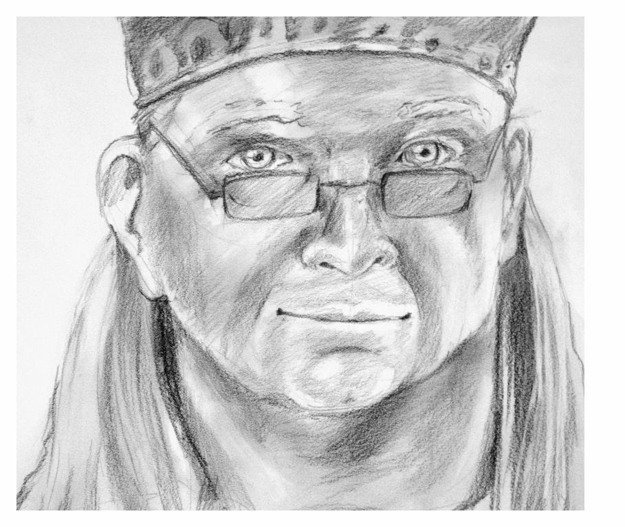
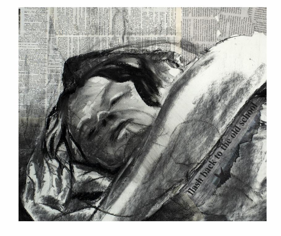
I have always been someone who spends more time drawing in the margins of books than
reading their words. This life-long tendency highlights my natural prof iciency in transcrib-
ing the language of words into the language of the visual. Design provides me with the
perfect outlet to explore and develop this talent. Nothing excites me more than when I am
approached with ideas and words, and an opportunity to craft them into a visual expression.


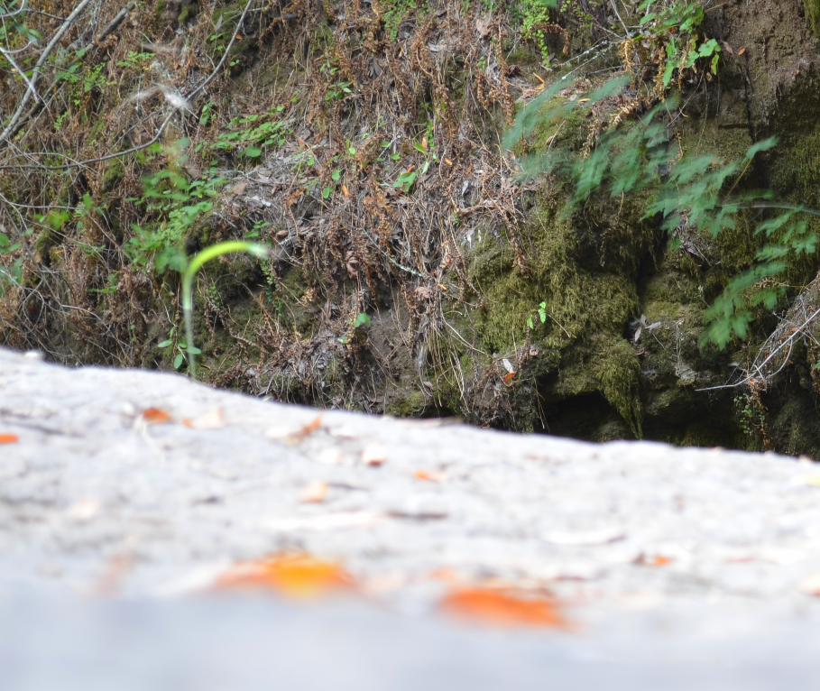
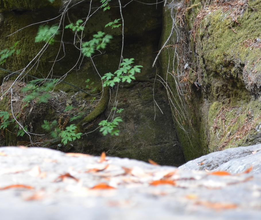
design is where science and art break even.
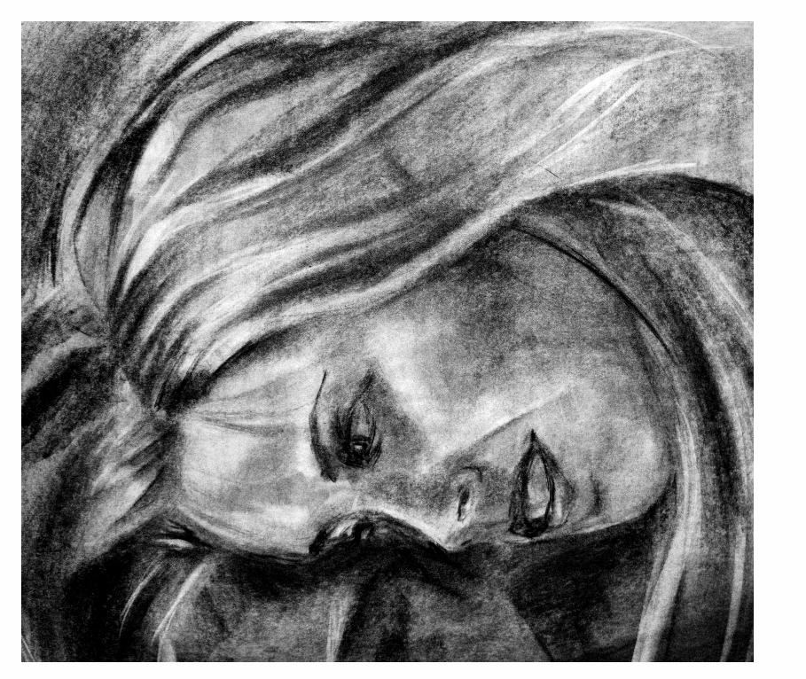
I have always been someone who spends more time drawing in the margins of books than
reading their words. This life-long tendency highlights my natural prof iciency in transcrib-
ing the language of words into the language of the visual. Design provides me with the
perfect outlet to explore and develop this talent. Nothing excites me more than when I am
approached with ideas and words, and an opportunity to craft them into a visual expression.

8 PM
MAY 18, 19, 25, 26, 29, 30
9:30 PM
MAY 21, 28
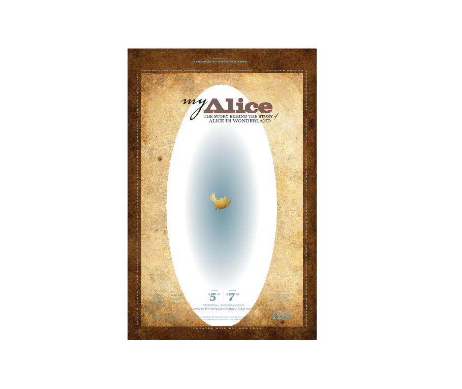
My Alice. This innovative theater production explored the relationship between the
f ictional characters of Alice in Wonderland and the real-life personalities that inspired the
story. My art explored the patterns and layers within that complex production.
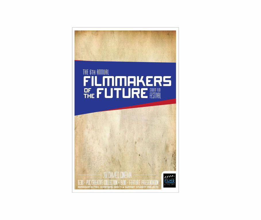
Student Film Festival. PUC’s annual student f ilm festival showcases great future
f ilmmakers, so I played with a heroic, Art Deco-inspired, retro-futuristic concept. The
poster evokes Hollywood grandeur and unlimited possibilities.
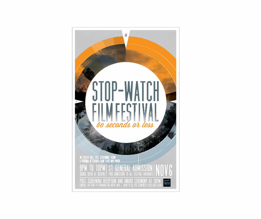
Stop-Watch Film Festival. The event is an experimental festival that makes
f ilmmakers squeeze a story into a single minute—so I experimented with an idea that
combined elements of time, a pre-f ilm countdown, and a compact jumble of
abstracted imagery.
april 14 - may 5pacific union college • rasmussen art gallery
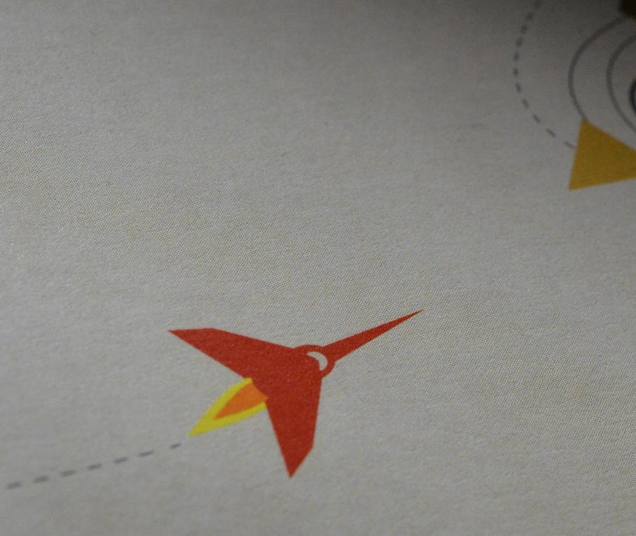
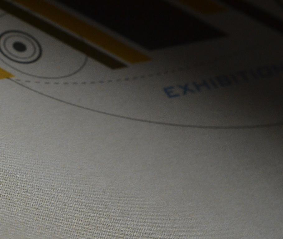
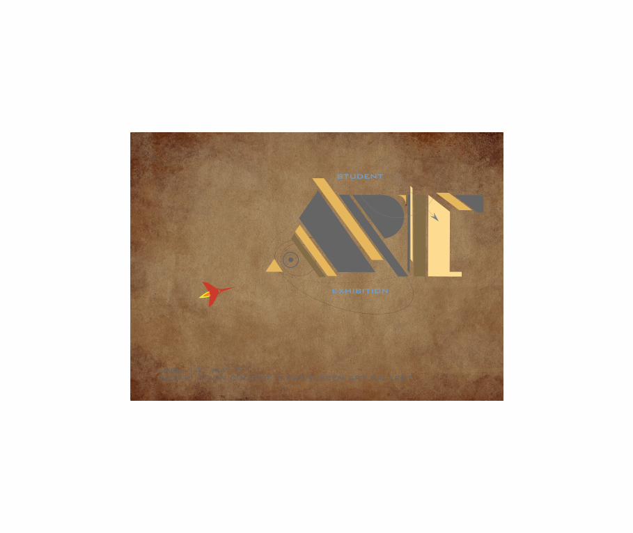
Student Art Exhibition. Every year PUC’s art students submit a broad variety of work for
this exhibition. Rather than try to encompass the whole range in my promotion for the event,
I approached the project as my own unique work—the one piece that attendees would see
before they even set foot in the gallery.
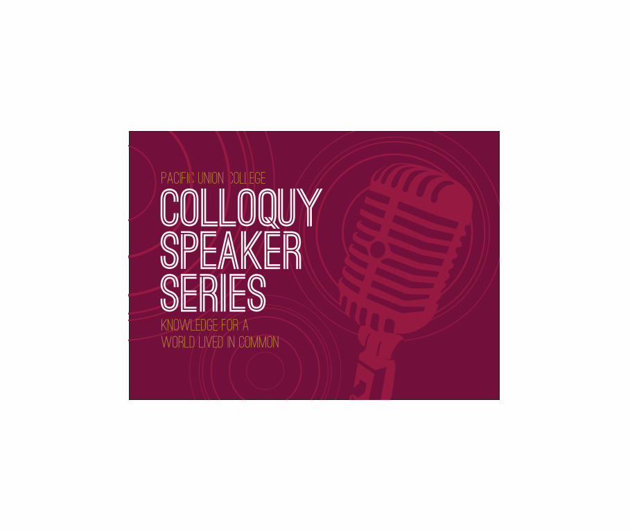
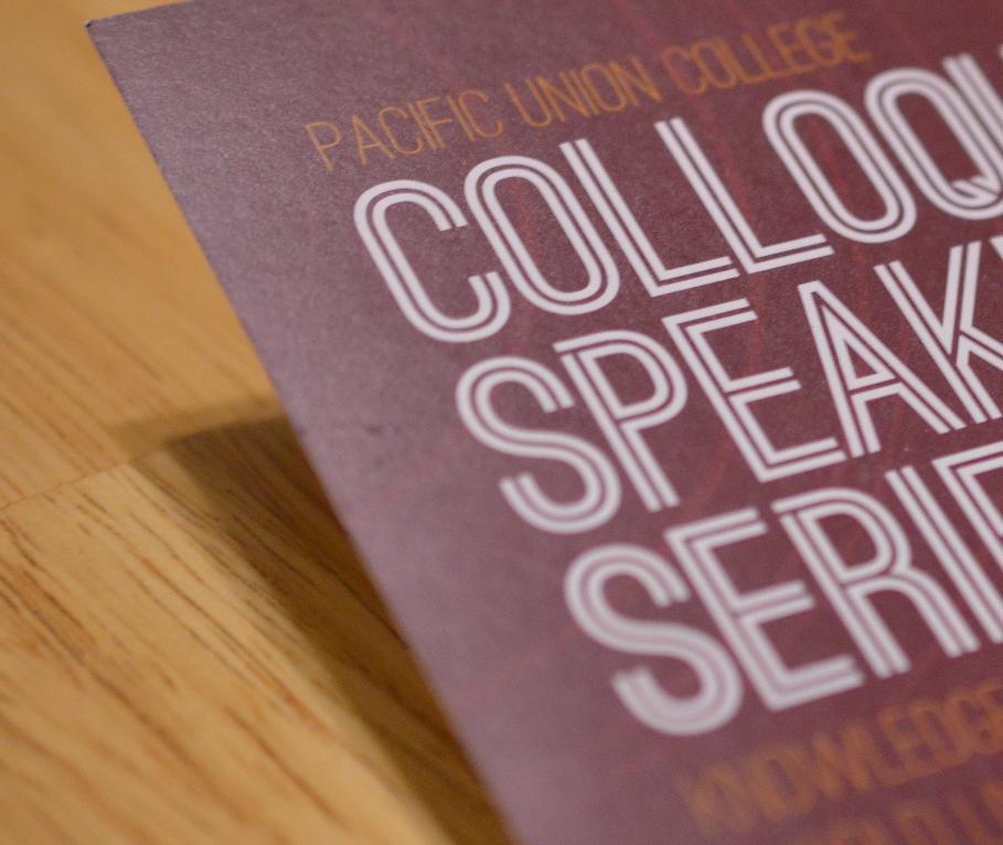
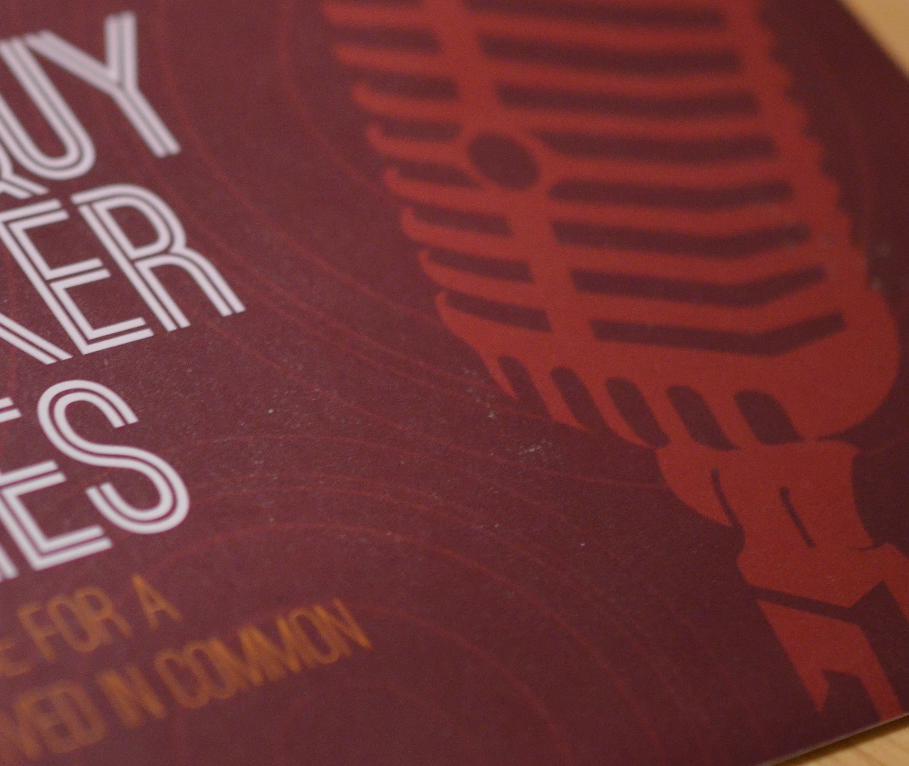
Pacific Union College
Knowledge for a
World Lived in Common
Colloquy Speaker Series
Colloquy Speaker Series. To advertise Pacif ic Union College’s regular series of various
guest speakers, I wanted to take an academic event and present it in a way that would
appeal to college students. The challenge was to f ind a balance between hip and intelligent.
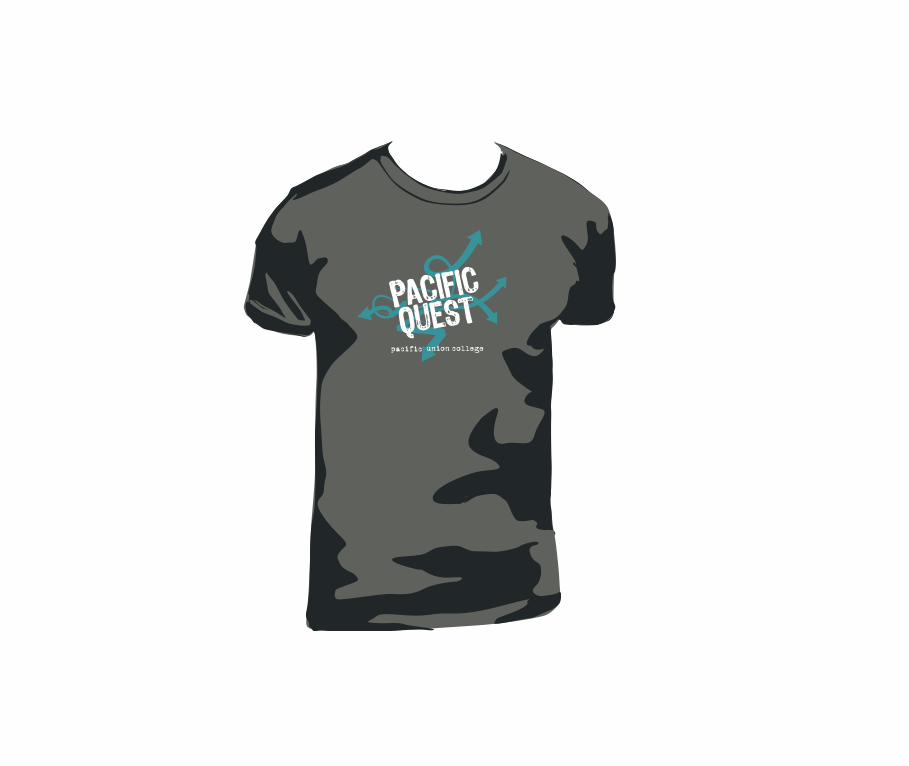
Pacific Quest. This annual program gives middle school students a chance to get a jump-
start on college with a week of preview classes. I emphasized all the new directions an
education will provide these young kids.
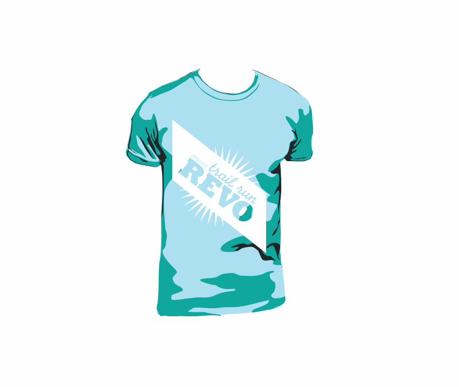
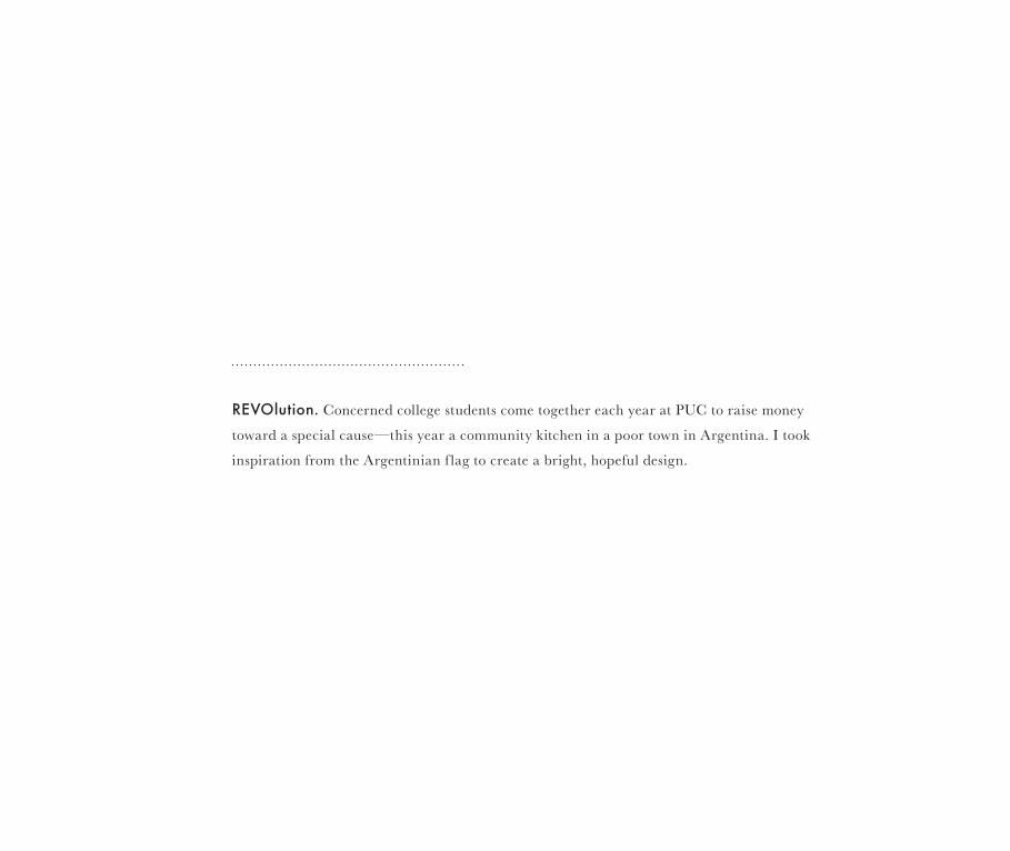
REVOlution. Concerned college students come together each year at PUC to raise money
toward a special cause—this year a community kitchen in a poor town in Argentina. I took
inspiration from the Argentinian f lag to create a bright, hopeful design.
THROUGHOUT THE WORLD, HARLEY-DAVIDSON UNITES PEOPLE DEEPLY, PASSIONATELY AND AUTHENTICALLY.
AND IN THIS UNITY THERE IS A RICH AND UNENDING VARIETY OF PERSONAL EXPERIENCES. FROM TOWN TO TOWN
AND COUNTRY TO COUNTRY, HARLEY-DAVIDSON TRANSCENDS CULTURES IN WAYS THAT RESONATE LOCALLY.
WITH BOTH GLOBAL SIGNIFICANCE AND LOCAL RELEVANCE, IT’S NO SURPRISE THAT HARLEY-DAVIDSON RANKS
AS ONE OF THE STRONGEST BRANDS IN THE WORLD. SUCH ACCOLADES ARE GRATIFYING OF COURSE. BUT
IGNITING THE FIRE WITHIN PEOPLE ALL OVER THE WORLD IS MUCH MORE IMPORTANT.
The classic Harley-Davidson engines are two-cylinder, V-twin engines with the pistons mounted in a 45° “V”.
In 1983, the Motor Company formed a club for owners of its product by turning “hog” into the acronym HOG., for Harley Owners Group.
THE HARLEY OWNERS GROUP (HOG) is a sponsored community marketing club, operated by Harley-Davidson
for enthusiasts of that brand’s motorcycles. The HOG is “the grandaddy of all community-building efforts,” serving to promote not just a consumer product, but a lifestyle. The HOG has also served to open new revenue streams for the company, with the production of tie-in merchandise offered to club members, numbering over one million strong,[1] making it the largest factory-sponsored riding club in the world.[2] The Harley-Davidson community was the prototype for the ethnographic term subculture of consumption, defined as “a distinctive subgroup of society that self-selects on the basis of a shared commitment to a particular product class.
Brand, or consumption activity.”[3] The Harley Owners Group was created in 1983 as
way to build longer-lasting and stronger relationships with Harley-Davidson’s customers, by making ties between the company, its employees, and consumers.[4] HOG members typically spend 30% more than other Harley owners, on such items as clothing and Harley-Davidson-sponsored events.[5] Much of the intent of this branding effort is presenting Harley-Davidson as an American icon, with the focus on authenticity and pride in being American-made. All of this is credited with turning flagging sales around, and allowing the Harley-Davidson company to grow again.
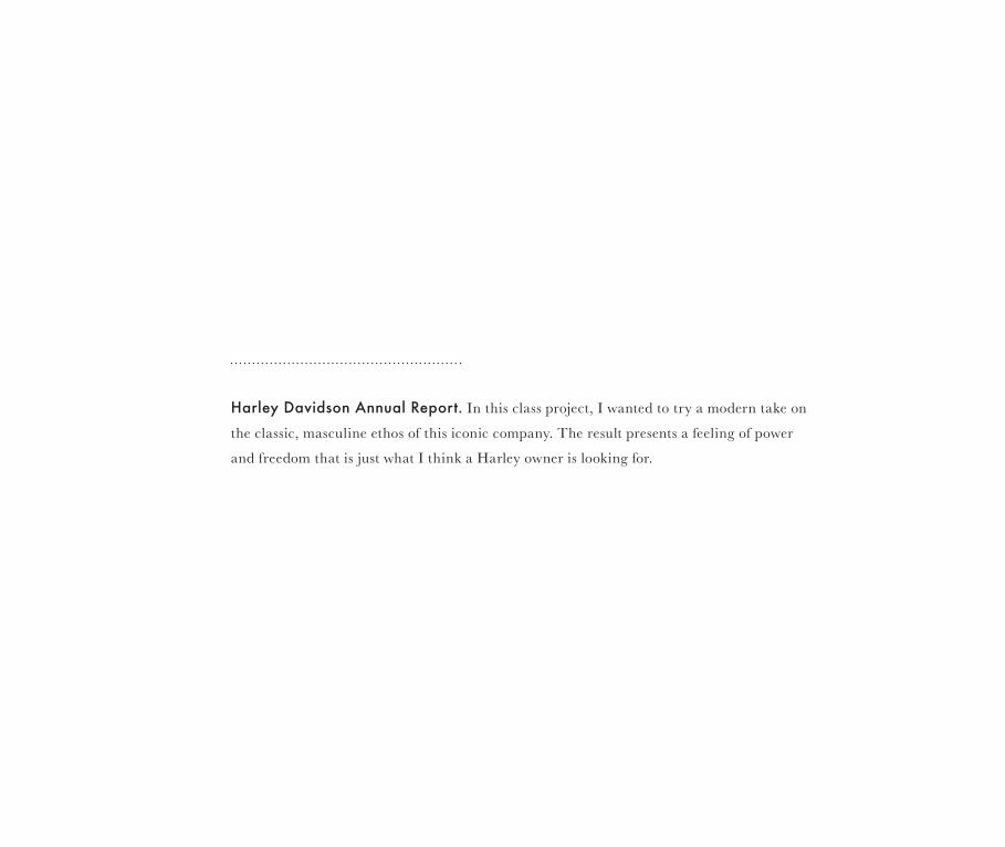
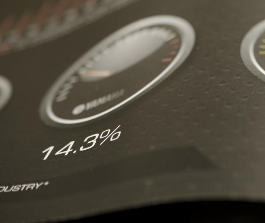
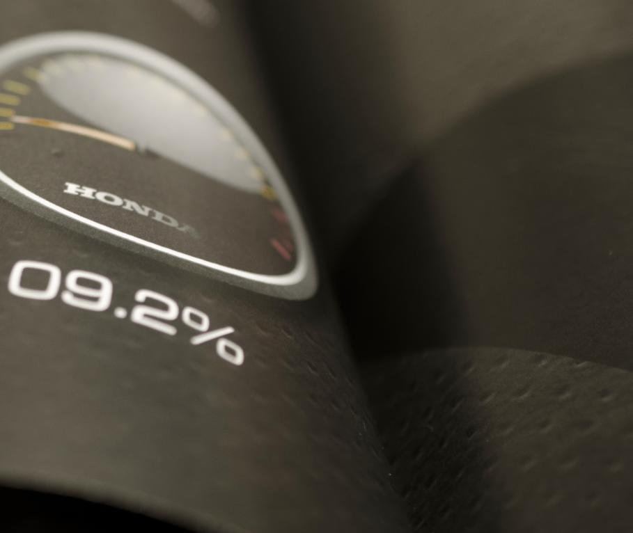
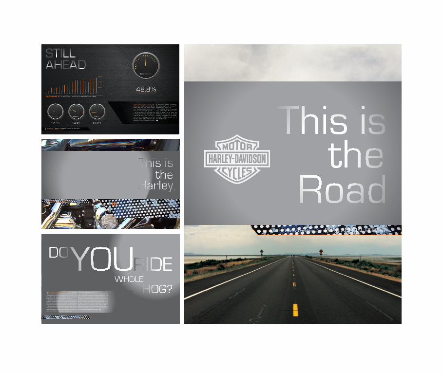
Harley Davidson Annual Report. In this class project, I wanted to try a modern take on
the classic, masculine ethos of this iconic company. The result presents a feeling of power
and freedom that is just what I think a Harley owner is looking for.
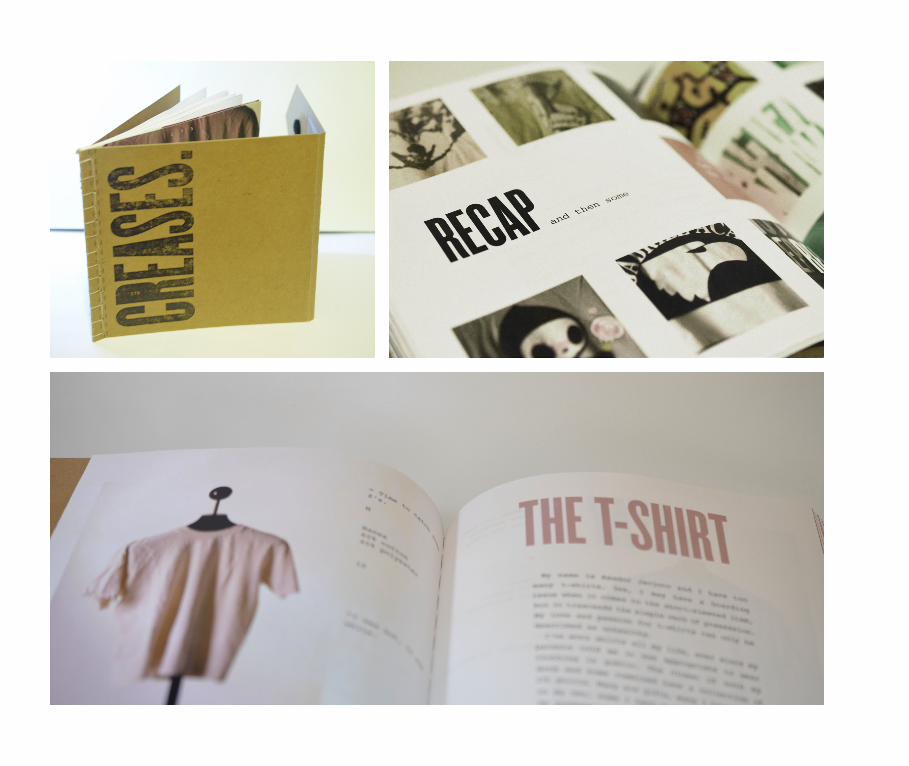
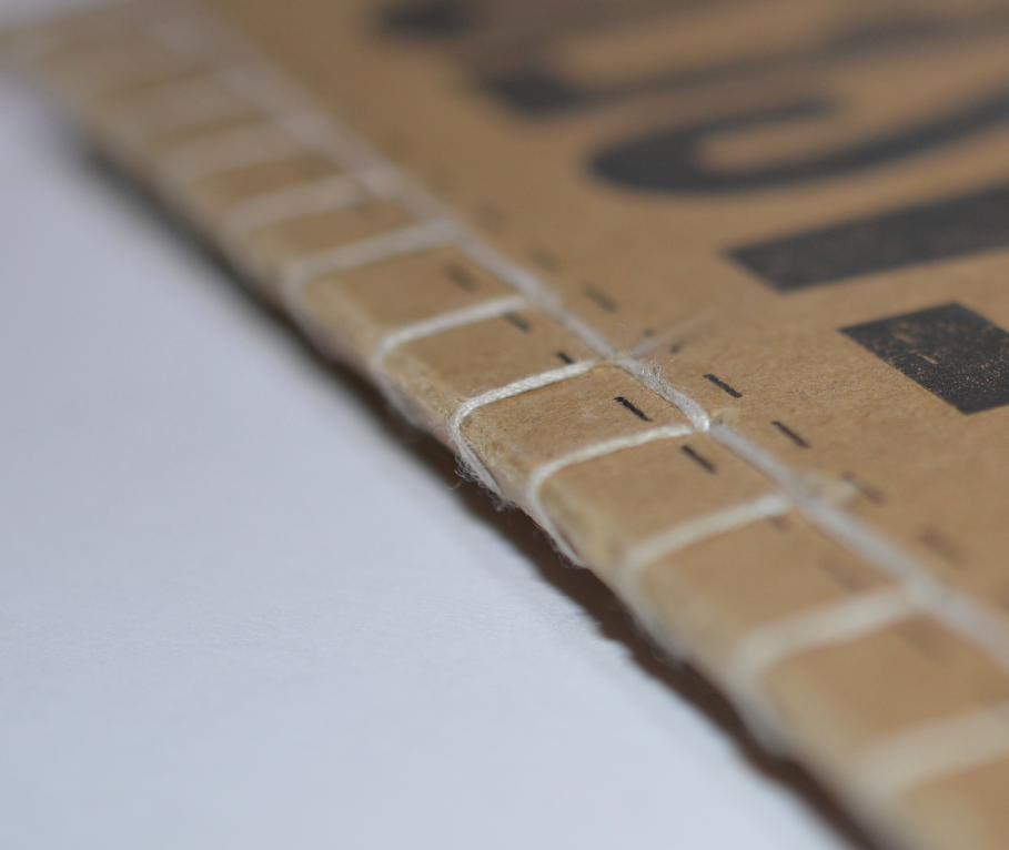
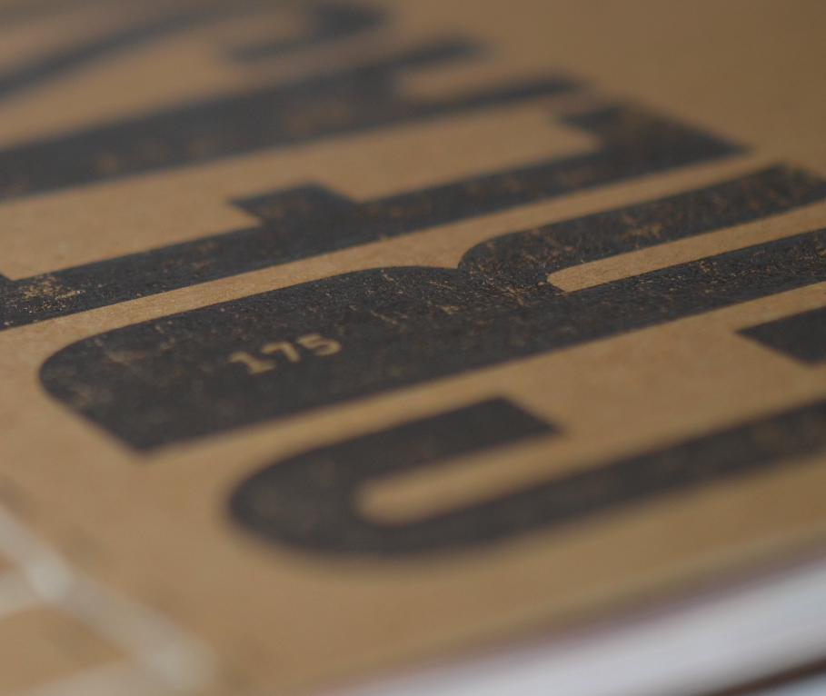
175 Creases. In this assignment for my Visual Identity Systems class, I was called to
develop a catalog based on something close to me personally. I presented a book on my
beloved collection of 175 T-shirts, featuring 30 particularly special specimens.
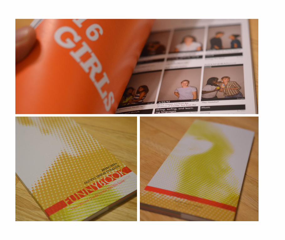
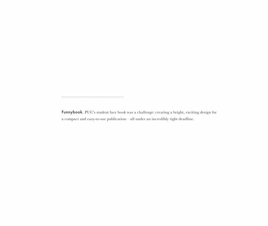
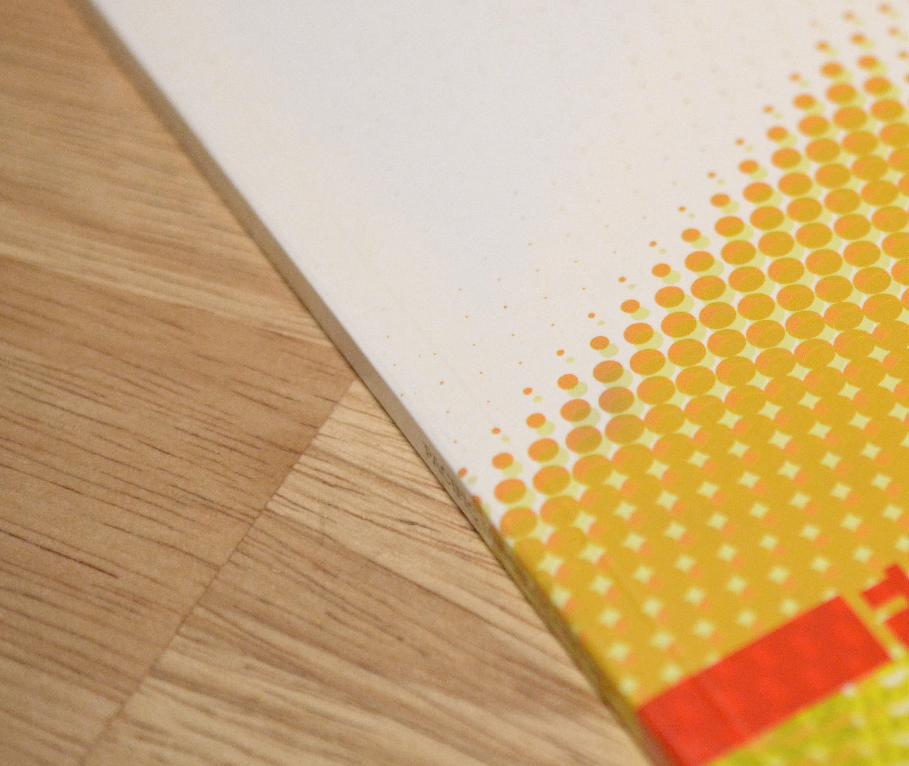
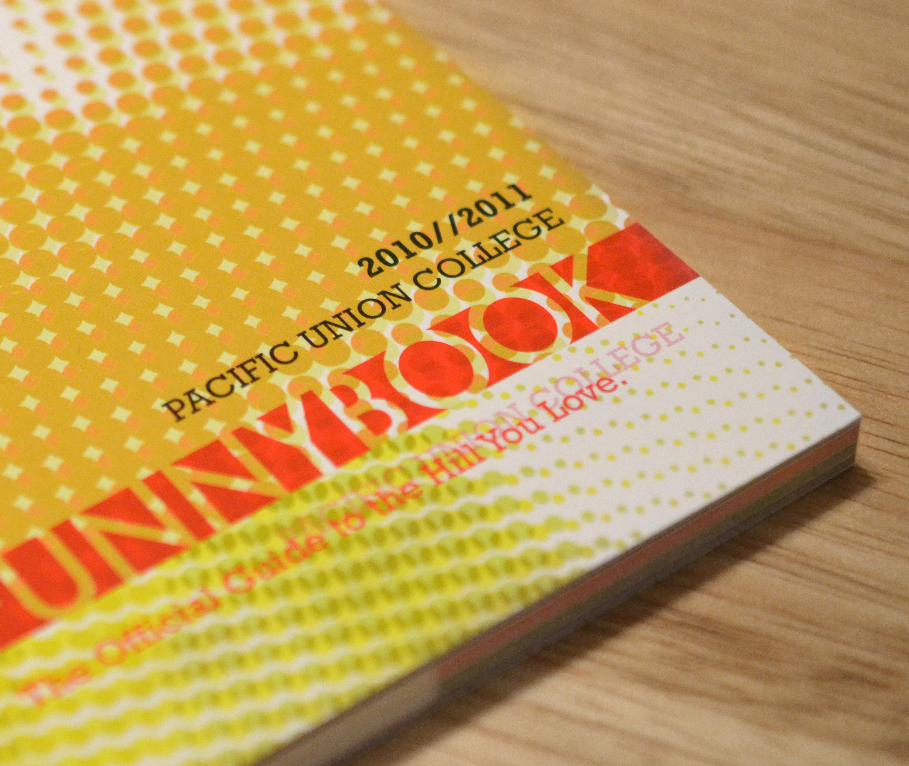
Funnybook. PUC’s student face book was a challenge: creating a bright, exciting design for
a compact and easy-to-use publication—all under an incredibly tight deadline.
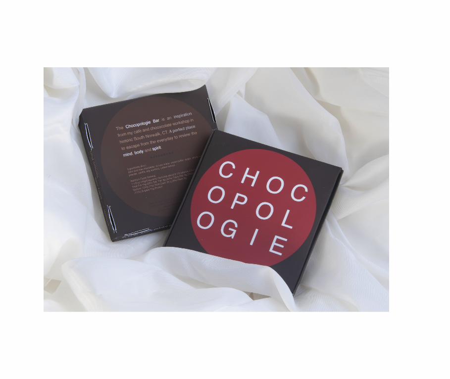
Chocopologie. My assignment: to create a new and innovative packaging design for a
high-end brand. At $10 a bar, my biggest motivation on this project was to make
Chocopologie chocolate look like it was worth the price.
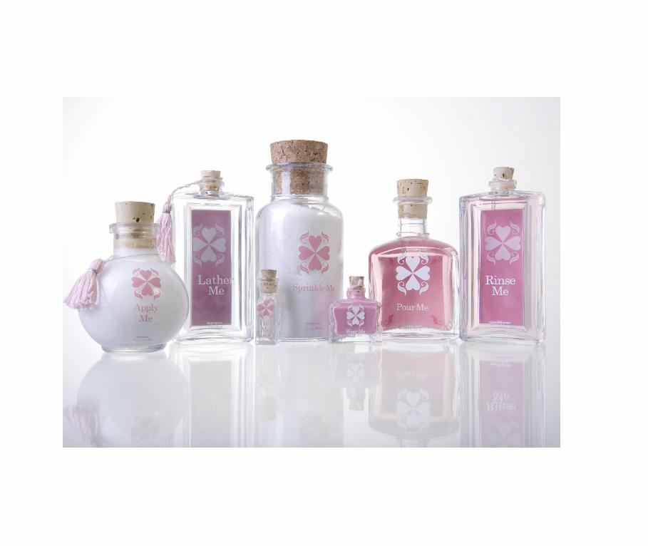
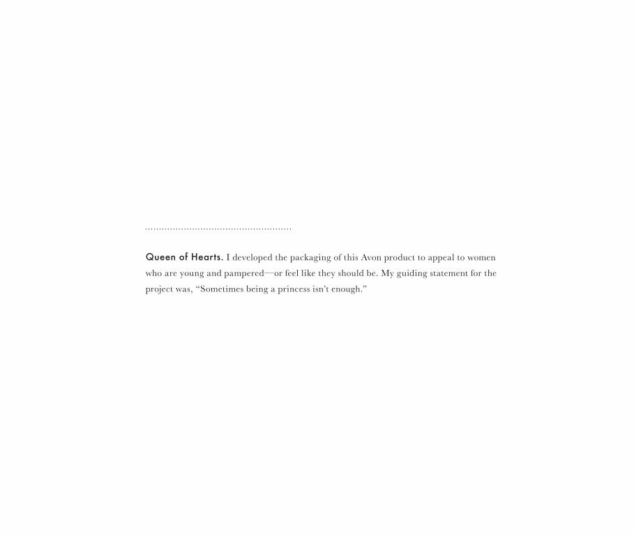
Queen of Hearts. I developed the packaging of this Avon product to appeal to women
who are young and pampered—or feel like they should be. My guiding statement for the
project was, “Sometimes being a princess isn’t enough.”

relationship advice | dating tips | being a gentleman

relationship advice | dating tips | being a gentleman

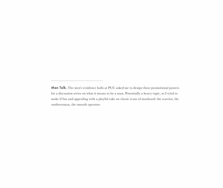
Man Talk. The men’s residence halls at PUC asked me to design these promotional posters
for a discussion series on what it means to be a man. Potentially a heavy topic, so I tried to
make if fun and appealing with a playful take on classic icons of manhood: the warrior, the
outdoorsman, the smooth operator.
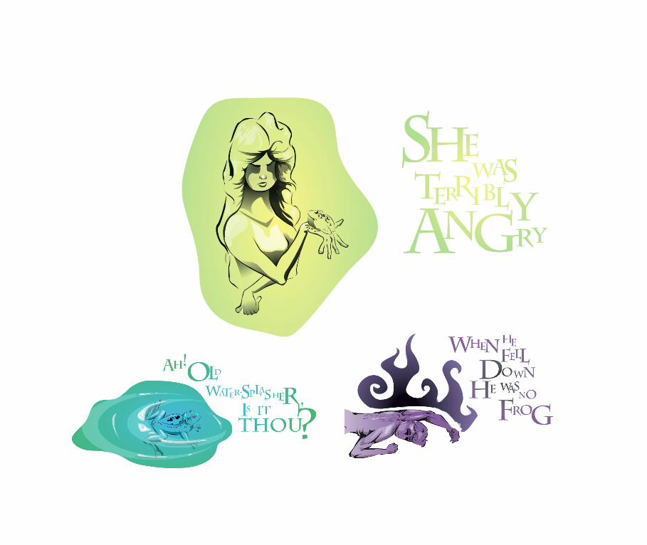
The Frog Prince. This assignment in an Illustration class called for me to illustrate a clas-
sic story. I challenged myself to use bright, lively colors to create dark and ominous imagery.
naturally beautiful yarns & fiber s
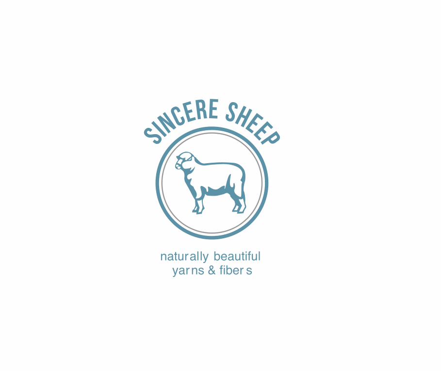
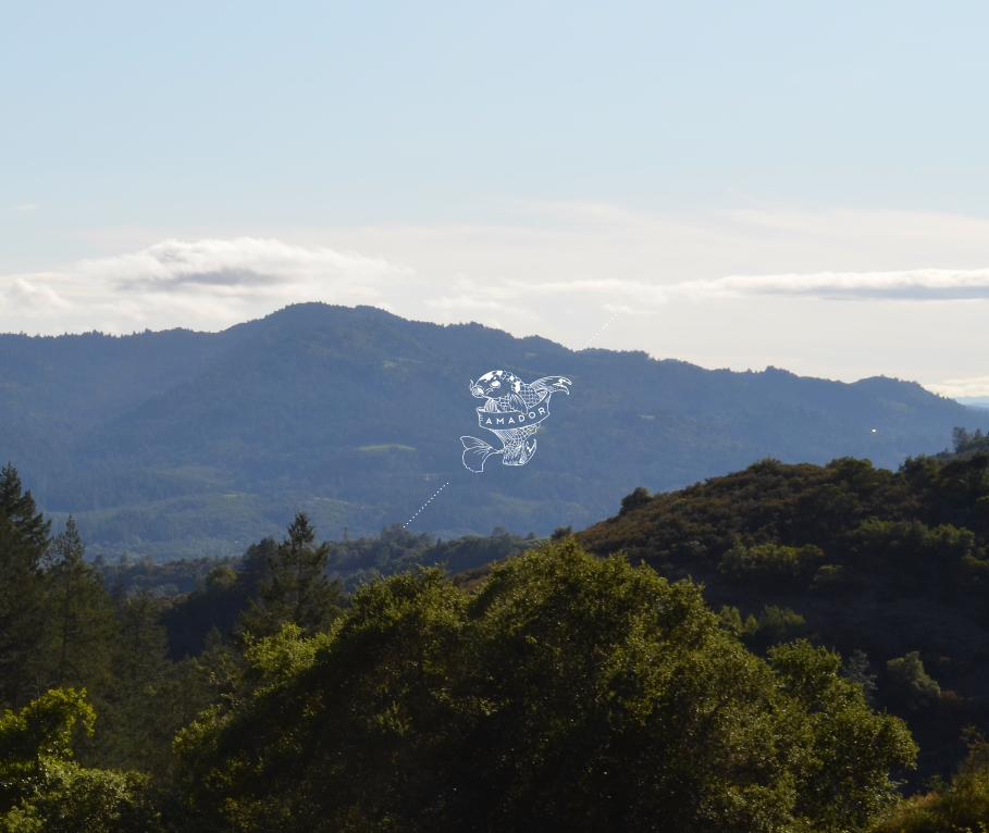
Sincere Sheep.Client Brooke Sinnes, owner of this unique Napa Valley wool company,
was inspired by the ultra-clean Scandinavian aesthetic. I warmed it up a bit with a touch
of American nostalgia. This project resulted in a logo, as well as packaging labels and a
website.
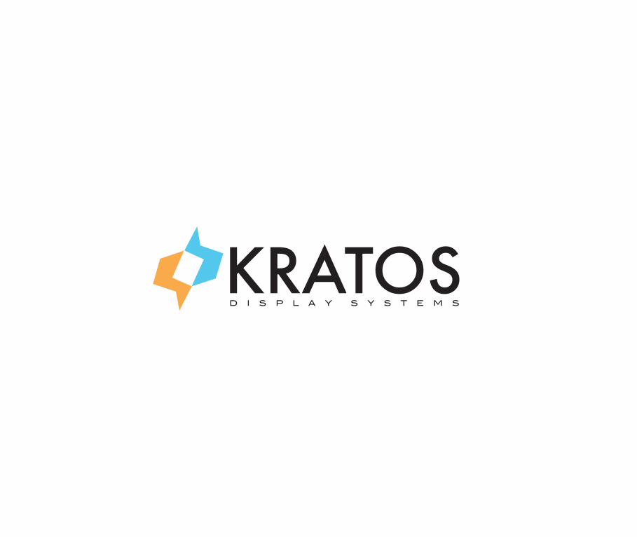
Kratos Display Systems. As a class project, I developed this logo for a company that
manufactures scientif ic measurement equipment. Although I didn’t actually work with the
company, I imagined their client as the hip, young, up-and-coming scientist on the town.
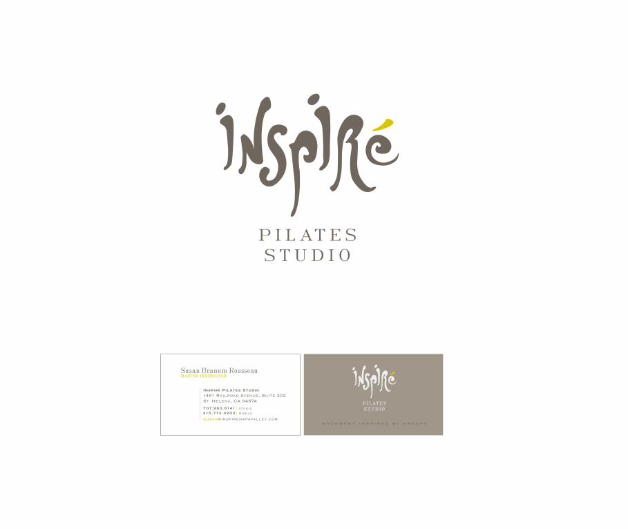
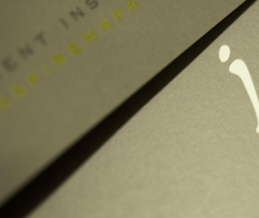
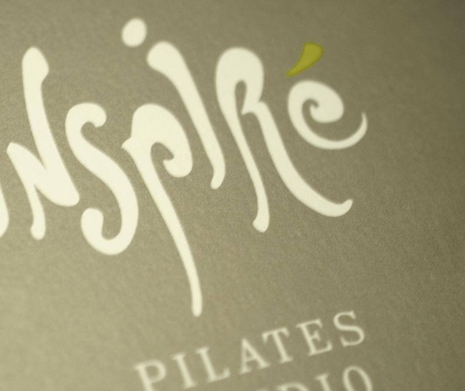
Inspiré. Client Susan Branum’s St. Helena pilates studio has been in need of a new identity
for decades. The name of her studio comes from the French for “to breathe,” so she asked
me to evoke movement, freedom, and air. The additional challenge was to avoid the clichéd
human-body-as-design element utilized by every other pilates studio in the world. Good
design isn’t enough—you have to stand out.

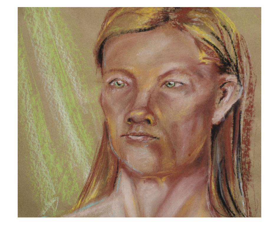
design is where science and art break even.

I have always been someone who spends more time drawing in the margins of books than
reading their words. This life-long tendency highlights my natural prof iciency in transcrib-
ing the language of words into the language of the visual. Design provides me with the
perfect outlet to explore and develop this talent. Nothing excites me more than when I am
approached with ideas and words, and an opportunity to craft them into a visual expression.