Embed Size (px)
Citation preview

Welfare Shifts in the Post-Apartheid South Africa: A Comprehensive Measurement of Changes
Haroon Bhorat
Carlene van der Westhuizen
Sumayya Goga
Development Policy Research Unit
DPRU Working Paper 07/128
October 2007
ISBN Number: 978-1-920055-54-7

Abstract
The objective of this study is to provide a comprehensive measure of shifts in welfare in post-
apartheid South Africa by examining changes in both income and non-income welfare between
1993 and 2005. Previous research using expenditure or consumption-based measures of
income has shown that, depending on the data sources, household income poverty in South
Africa either remained static or increased slightly between 1995 and 2000 or between 1996
and 2001. Research considering the changes in non-income welfare in the post-apartheid
South Africa has found significant increases in the levels of non-income welfare, driven to a
large extend by the increased delivery of basic services by government since 1994.
Using factor analysis, we construct a comprehensive household welfare index that includes
public assets (government provided services), private assets (including education) and wage
and grant income. In addition, a public asset index and a private asset index are constructed
that allow us to analyse welfare as captured by access to government provided services
and privately owned assets respectively. Given the availability of data for 1999 we are able
to provide mid-period estimates for all three indices. When standard poverty measures are
applied to our derived indices, we find that total household welfare increased between 1993
and 2005. We also find that total welfare increased at a faster pace between 1993 and 1999
than between 1999 and 2005. The evidence suggests that in the first period the increase was
driven largely by increased government service delivery, while in the second period it was
driven by the growth in private asset ownership.
Acknowledgement
Funding was contributed by the Conflict and Governance Facility, a project of National
Treasury, which is funded by the European Union under the European Programme for
Reconstruction and Development.
Development Policy Research Unit Tel: +27 21 650 5705Fax: +27 21 650 5711
Information about our Working Papers and other published titles are available on our website at:http://www.commerce.uct.ac.za/dpru/
Asset Index 66
Table of Contents
1. Introduction.......................................................................................................1
2. Data....................................................................................................................3
3. A Descriptive Overview of Shifts in Welfare Indicators: 1993 to 2005..........5
3.1 Aggregate Changes in Access to Public Assets.....................................5
3.1.1 Public Asset Access by Decile............................................................................7
3.1.2 Measures of Contrasting Delivery Rates for Poor HousHolds...........................11
3.2 Changes in Private Asset Ownership and Income................................12
4. Derivation of the Welfare Indices..................................................................17
4.1 Factor Analysis Methodology................................................................17
4.2 Factor Analysis Results........................................................................19
5. An Application of Welfare Indices to Assets and Services..........................27
5.1 Measures of Poverty.............................................................................27
5.2 Changes in Welfare Without Poverty Lines..........................................40
6. Conclusion......................................................................................................50
7. References......................................................................................................52
Appendix A: Access to Services, All Households: 1993-2005.................................54
Appendix B: Access to Formal Dwelling, Decile 1 to 4: 1993-2005.........................55
Appendix C: Access to Electricity for Lighting, Decile 1 to 4: 1993-2005..............56
Appendix D: Access to Piped Water, Decile 1 to 4: 1993-2005.................................57
Appendix E: Access to Flush Toilet, Decile 1 to 4: 1993-2005.................................58
Appendix F: Access to Assets, Decile 1 to 4: 1993-2005..........................................59
Appendix G: Testing the Reliability of the Derived Indices......................................60
Appendix H: Measures of Poverty by Province: Comprehensive Welfare Index....64
Appendix I: Measures of Poverty by Province: Public Asset Index......................65
Appendix J: Measures of Poverty by Province: Private.........................................66
Welfare Shifts in the Post-apartheid South Africa: A Comprehensive Measurement of Changes
1
1. Introduction
Previous research using expenditure or consumption-based measures of income has shown
that, depending on the datasets used, household income poverty in South Africa remained
static or increased slightly between 1995 and 2000 or 1996 and 2001, while income inequality
increased marginally.1 This work, however, does not cover the complete post-apartheid period
and focuses on only one dimension of poverty and inequality, namely income. Research,
considering the changes in non-income welfare (as measured by household access to services
and assets) in post-apartheid South Africa, has found significant increases in the levels of non-
income welfare.2 These studies, however, reflect to a very large extent, the increased delivery
of basic services by government since 1994. In addition, they ignore changing levels of regular
income (such as wages and transfers), as well as the contribution of additional critical assets
such as education, to overall welfare.
Given the above, the purpose of this study is to provide a more comprehensive measure of
shifts in welfare in post-apartheid South Africa by examining changes in both income and non-
income welfare. The paper will, in essence, attempt to measure the overall progress that has
been made since the advent of democracy in South Africa.
We will, therefore, attempt to build a measure of welfare that includes all elements of a
household’s welfare. Using factor analysis we will construct a comprehensive household
welfare index that will include components of private assets, public assets (government
services), wage and non-wage income and educational levels – together all of these impart
relevant information regarding the household’s welfare status. This household welfare index
will thus be the first truly representative and exhaustive measure of progress in South Africa, in
the post-apartheid period. We will also proceed to construct two additional measures, a public
asset index, and a private asset index, which will allow us to analyse welfare as captured by
access to government provided services and privately owned assets respectively.
Section 2 of the paper discusses the sources of data used in our analysis. Section 3 provides a
descriptive overview of the shifts in all the welfare indicators between 1993 and 2005. The first
1 See for example Hoogeveen, J. & Ozler, B. 2006. Not Separate, Not Equal: Poverty and Inequality in Post-apartheid South Africa. In Bhorat, H. & Kanbur, R. (Eds.) Poverty and Policy in Post-apartheid South Africa. Pretoria: HSRC Press.; Leibbrandt, M., Levinsohn, J. & McCrary, J. 2005. Incomes in South Africa since the fall of apartheid. NBER Working Paper. No. 11384. National Bureau for Economic Research: Cambridge.
2 See Bhorat, H., Naidoo, P. & Van der Westhuizen, C. 2006. Shifts in Non-income Welfare in South Africa: 1993-2004. Development Policy Research Unit Working Paper No 06/108. May 2006. Cape Town: University of Cape Town; Policy Coordination and Advisory Services (PCAS). 2006. A Nation in the Making: A Discussion Document on Macro-Social Trend in South Africa. Social Sector. The Presidency. p 13.

DPRU WP 07/128 Haroon Bhorat, Carlene van der Westhuizen & Sumayya Goga
2
part of Section 4 describes the factor analysis methodology while the second part presents the
results of the application. Section 5 presents the results of the derived poverty measures for all
three indices, while Section 6 concludes.
Welfare Shifts in the Post-apartheid South Africa: A Comprehensive Measurement of Changes
3
2. Data
Three sources of data were used in our analysis of welfare changes between 1993 and
2005. The choice of surveys was guided by the period under analysis as well as the type of
information contained in the available datasets. We used the 1993 South African Integrated
Household Survey from the Project for Living Standards and Development (PSLSD), the 1999
October Household Survey (OHS) and the 2005 General Household Survey (GHS).
The 1993 PSLSD, conducted by the South African Labour and Development Research Unit
(SALDRU) based at the University of Cape Town, was the first nationally representative
household survey for South Africa. A sample of 9 000 households were surveyed, and a
wide range of information was collected, including information on demographics, household
services, detailed household expenditure, land access and use, and employment and income.
This data was re-weighted with weights from the 1991 Census weights and corrected for
enumeration difficulties.3
Between 1994 and 1999, Statistics South Africa conducted the October Household Surveys
on an annual basis. This nationally representative household survey collected data on among
other things, poverty and development indicators. Our second source of data is the 1999
OHS which collected information on people living in 30 000 households across South Africa
(StatsSA, 2000: i). The 1999 OHS has been weighted using the 1996 Census weights.
Our most recent data source is the 2005 General Household Survey (GHS). The GHS is
a nationally representative household survey conducted annually since 2002 by Statistics
South Africa. The aim of this survey is to capture information on living conditions of South
African households in order to evaluate government programmes and projects. The survey
covers education, health, the labour market, housing and household access to services and
facilities, as well as household assets. In the 2005 survey, approximately 28 129 households
were interviewed, and the dataset has been benchmarked to mid-year population estimates
released in 2005 (StatsSA, 2006: ii).
The three datasets used for our analysis were cleaned and aligned in order to allow
comparison across the datasets. In addition all variables not used in our analysis were
removed from the datasets and the three “clean” datasets used in our analysis only contain
household level information. The constructed datasets contain information on a range of
household welfare indicators. The public services variables include type and characteristics
of dwelling, source of water, type of sanitation and source of electricity for lighting. The private
assets variables are ownership of a vehicle, radio, television and telecommunications (both
cellular phones and landlines). The datasets also include information on the average years of
education of adults in each household as well as household expenditure and income.
3 For more information on the 1993 SALDRU survey see http://www.cssr.uct.ac.za/saldru_pslsd.html
DPRU WP 07/128 Haroon Bhorat, Carlene van der Westhuizen & Sumayya Goga
4
For the purposes of our analysis and in order to be able to compare changes in income
over the period, a “regular income” variable was derived. This variable was constructed from
reported wage income and income from social grants.4 In the 1999 OHS and 2005 GHS
surveys, wage income was reported either as a point estimate or in income brackets. Where
income was reported in brackets, the mid-point value was assigned. In both surveys, the
number of social grants received was recorded for each household. The monetary values of
the different grants are known for each year, so it was possible to calculate the total grant
income for every household in both years.5
Constructing the regular income variable for 1993 was more difficult. In this dataset,
employment was recorded as regular wage employment, casual wage employment and self-
employment activities. In both 1999 and 2005 we only used the wage income from what
was indicated as the worker’s main job. As far as possible we applied the same rule in the
1993 dataset. While it was simple to calculate the wage income from regular and casual
employment, it was more difficult to calculate individual wage income from the self employment
activities as total turnover6 was recorded for the household engaged in the activity. In order to
assign values to individual workers, total turnover was divided by the number of household
members who indicated in an earlier question that they were self-employed. During the time
the 1993 survey was conducted there were fewer numbers of social grants as well as grant
recipients. In the questionnaire the respondents were asked to indicate the type of grant they
receive as well as the monetary value of the grant. This was the information used to construct
the variable reflecting total grant income for each household.
� In all years, but specifically in 1999, there were a number of outliers associated with the monthly wage income variable. Closer inspection of these outliers revealed that they indicated implausibly high monthly wage incomes for often unskilled or semi-skilled workers. Instead of making decisions about dropping specific wage earners from the dataset it was decided to set the monthly wage of the top 0,5 percent of wage earners in each dataset to missing. By doing this, outliers in each year were eliminated.
5 Missing values were treated in the following way: if every employed person in a household did not report a wage income, the total income from wages for that household was treated as missing. In addition, if a household with missing income from wages for all employed people did not receive any grants, the total regular income (the sum of the wage and grant income) for that household was treated as missing.
6 Total turnover was used because in both the 1999 OHS and the 2005 GHS wage income of the self-employed was recorded as total income before deductions.

Welfare Shifts in the Post-apartheid South Africa: A Comprehensive Measurement of Changes
5
3. Descriptive Overview of Shifts in Welfare Indicators: 1993 to 2005
Household welfare is manifest and possibly measured, of course, through a number of
alternative indicators. We attempt, in what follows below, an analysis of a possible range
of indicators for the South African economy. Based on the data at our disposal, a subset of
household welfare is represented by three measures namely the access to public assets
(government-provided services); access to private assets and finally per capita household
income. Taking public assets, private assets, and household income into account allows us
to identify welfare changes comprehensively. In the first of these – access to public assets
– we have a proxy for state delivery of specific services to households. In our (albeit) limited
list of private assets, we view these as representative of private asset accumulation amongst
households in the society.
Included in the public assets is access to formal dwelling, piped water, electricity for lighting,
as well as access to a flush/chemical toilet. The private asset ownership that we analyse over
the period is of telecommunications, vehicles, radios, and televisions. As a separate class of
assets, falling under human capital, the average years of education of adults in the households
is considered. A descriptive overview of income over the period is then provided.
3.1 Aggregate Changes in Access to Public Assets
From the datasets containing information on access to public assets, we analysed the access
to piped water, electricity used for lighting, sanitation and dwelling, between 1993 and 2005,
and included 1999 in the analysis. In addition to analysing the aggregate change in access to
public assets, we also analysed access to public assets for those households at the bottom of
the expenditure distribution – that is for those households that fell in the bottom four deciles of
the household expenditure distribution.7
Figure 1 shows an aggregate measure of the access to the four basic public assets mentioned
above. The number of households with access to each of the public assets has increased
from 1993 to 2005, and has increased in both the sub period from 1993 to 1999, and 1999
to 2005. Of all the public assets, the number of households with access to formal dwelling
was highest in 1993, followed by piped water, flush and chemical toilets and electricity for
lighting. By 2005, however, the number of households with access to electricity was the
highest, followed by access to formal dwelling, piped water, and lastly flush/chemical toilets.
Thus, government appears to have done particularly well as far as provision of electricity
to households is concerned. It is also clear from the graph that the increase in the absolute
7 The expenditure distribution was calculated using the total household monthly expenditure in per capita terms for each household.

DPRU WP 07/128 Haroon Bhorat, Carlene van der Westhuizen & Sumayya Goga
6
number of households with access to each of the public assets was higher in the 1993-1999
period than in the 1999-2005 period, indicating that government service delivery performed
better in the 1993-1999 period than the 1999-2005 period.
Figure 1: Access to Services, all Households: 1993-2005
Source: PSLSD 1993 (SALDRU), OHS 1999 (Statistics SA), GHS 2005 (Statistics SA); Own Calculations.Note: Numbers and proportions can be found in Appendix A.
While the number of households with access to each of the public assets has increased, the
access rates differ, that is, the proportion of households with access to each of the public
assets does not necessarily increase from year to year, because of the increase in the number
of households from one period to the next. We find that the proportion of households with
access increased between 1993 and 2005, but particularly between 1993 and 1999 (the actual
number of household with access to a specific public asset as well as the access rates can be
found in Appendix A). By 2005, about 70 percent of households had access to formal dwelling
and piped water, while about 80 percent of households had access to electricity for lighting
and about 60 percent of households had access to a flush/chemical toilet. Therefore, as far
as access rates are concerned, as with the absolute number, it would appear that government
has fared the best as far as provision of electricity for lighting is concerned.
Access to formal dwelling stands out in terms of the decline in the access rate from 74 percent
in 1999 to 70 percent in 2005. This decreasing access rate can be seen within the context of
a slowing down of the access rates of all the public assets above. That is, the growth in the
proportion of households with access to all of the public assets has slowed down in the period
between 1999 and 2005.
Welfare Shifts in the Post-apartheid South Africa: A Comprehensive Measurement of Changes
7
The slowing down of the access rate of households to all public assets between 1999 and
2005 has to be understood within the context of a changing South African landscape. With
the scrapping of restrictions in post-apartheid South Africa has come greater urbanisation,
as well as an increase in informal dwellings as people move out of rural areas in search of
employment. Associated with this has been changing household structures, with a clear trend
towards smaller household sizes as well as an increase in the number of households in the
economy. Particularly in the case of housing delivery, government has not been able to reduce
the backlog in the face of increased demand for housing. In addition, government still faces the
challenge of providing services to those in the deepest rural areas.
Thus, in summary, it is clear that there has been a slowing down in the delivery of public assets
in the 1999 to 2005 period. This is true for all of the public assets, including electricity for which
the access has increased most over the 1993 to 2005 period. Only in the case of formal
dwelling has there been a reversal, with a decreasing access rate between 1999 and 2005.
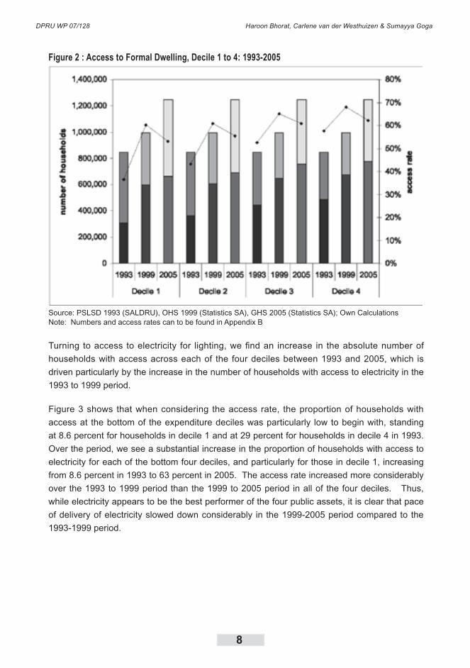
3.1.1 Public Asset Access by Decile
While the access to public assets for all households is important, it is particularly important to
note how the poorest households have performed over the period. Figure 2 illustrates access
of households in the bottom four deciles of the expenditure distribution to each of the public
assets.
Looking firstly at access to formal dwellings, as with the aggregate, there has been an increase
in the absolute number of households with access to formal dwellings in each of the bottom
four deciles. The number of households with access has increased faster over the 1993 to
1999 period than the 1999 to 2005 period. In addition, the number of households with access
increased at a faster rate for those in the bottom deciles in the 1993-1999 period.
However, when considering the proportion of households with access to formal dwelling, it
is clear that although the overall access rate increased in each of the deciles, it was driven
mainly by the increase in the access rate between 1993 and 1999, since the access rate
decreased between 1999 and 2005 for all of the bottom four deciles. In addition, we see that
the increase in the access rate between 1993 and 1999 was pro-poor in the sense that it was
higher as we move down the deciles, but we see the opposite for the 1999-2005 period, that is,
the decrease in the access rate was higher for households as we move down the expenditure
deciles. Thus, while the 1993-1999 period showed a clear trend of pro-poor access to formal
dwelling, in the 1999-2005 period the decreasing proportion of households with access to
formal dwelling in the lower deciles points to a slowing down of delivery of formal housing for
poorer households.
DPRU WP 07/128 Haroon Bhorat, Carlene van der Westhuizen & Sumayya Goga
8
Figure 2 : Access to Formal Dwelling, Decile 1 to 4: 1993-2005
Source: PSLSD 1993 (SALDRU), OHS 1999 (Statistics SA), GHS 2005 (Statistics SA); Own CalculationsNote: Numbers and access rates can to be found in Appendix B
Turning to access to electricity for lighting, we find an increase in the absolute number of
households with access across each of the four deciles between 1993 and 2005, which is
driven particularly by the increase in the number of households with access to electricity in the
1993 to 1999 period.
Figure 3 shows that when considering the access rate, the proportion of households with
access at the bottom of the expenditure deciles was particularly low to begin with, standing
at 8.6 percent for households in decile 1 and at 29 percent for households in decile 4 in 1993.
Over the period, we see a substantial increase in the proportion of households with access to
electricity for each of the bottom four deciles, and particularly for those in decile 1, increasing
from 8.6 percent in 1993 to 63 percent in 2005. The access rate increased more considerably
over the 1993 to 1999 period than the 1999 to 2005 period in all of the four deciles. Thus,
while electricity appears to be the best performer of the four public assets, it is clear that pace
of delivery of electricity slowed down considerably in the 1999-2005 period compared to the
1993-1999 period.

Welfare Shifts in the Post-apartheid South Africa: A Comprehensive Measurement of Changes
9
Figure 3: Access to Electricity for Lighting, Decile 1 to 4: 1993-2005
Source: PSLSD 1993 (SALDRU), OHS 1999 (Statistics SA), GHS 2005 (Statistics SA); Own CalculationsNote: Numbers and proportions are to be found in Appendix C
Looking at access to piped water, and to flush/chemical toilets in Figures � and 5, we see a
steady increase in the absolute number of households with access to these in each of the
bottom four expenditure deciles, particularly in the 1993-1999 period, and particularly for those
in decile 1 and decile 2.
While the absolute numbers have increased across the board, it can be seen that for both
piped water and flush/chemical toilet, the proportion of households with access to these public
assets has actually decreased in decile 1 and 2 between 1999 and 2005. Thus, for the poorest
households, that is households in decile 1 and 2, access to piped water and flush/chemical
toilets decreased between 1999 and 2005, compared to a slowing down in the increase of the
access rates for those in decile 3 and �. The slowdown in the delivery of piped water and flush/
chemical toilets between 1999 and 2005 has, therefore, impacted the most on the poorest
households.

DPRU WP 07/128 Haroon Bhorat, Carlene van der Westhuizen & Sumayya Goga
10
Figure 4: Access to Piped Water, Decile 1 to 4: 1993-2005
Source: PSLSD 1993 (SALDRU), OHS 1999 (Statistics SA), GHS 2005 (Statistics SA); Own CalculationsNote: Numbers and proportions are to be found in Appendix D
Figure 5: Access to Flush Toilet, Decile 1 to 4: 193-2005
Source: PSLSD 1993 (SALDRU), OHS 1999 (Statistics SA), GHS 2005 (Statistics SA); Own CalculationsNote: Numbers and proportions are to be found in Appendix E
Welfare Shifts in the Post-apartheid South Africa: A Comprehensive Measurement of Changes
11
The decile data, therefore, shows a step-change in the delivery of services to poor households
in the 1999-2005 period. Hence, the data reveals decreasing access rates for formal housing
for households in each of the bottom four deciles, and for water and flush/chemical toilets
for those in the bottom two deciles. At the same time, there has been a slowing down in the
increase of the access rates to electricity for all households in the bottom four deciles.
3.1.2 Measures of Contrasting Delivery Rates for Poor Households
Having considered how access to each of the services has changed both at the aggregate
level and for the bottom four deciles of the expenditure distribution, we now consider the
difference in access to each of the services for households in decile 1 and decile 4 for each of
the years, as well as how this gap has changed over time.8
Table 1: Difference in Proportion of Households with Access in Decile 1 and Decile 4
(in Percentage Points)
Source: PSLSD 1993 (SALDRU), OHS 1999 (Statistics SA), GHS 2005 (Statistics SA); Own Calculations
Table 1 shows the difference in access rates between decile 1 and 4 in each year for each of
the services. For all of the services, the gap between households with access in decile 1 and
decile 4 was high in 1993, ranging from 29 percentage points for piped water to 21 percentage
points for formal housing and electricity, with flush / chemical toilets standing at 23 percentage
points. Overall, the gap decreased between 1993 and 2005 for all of the services, with the
narrowing of the gap the fastest for formal housing. However, it is clear from Table 1 that
although this difference decreased overall for all of the services, there was a small increase
in the gap between 1999 and 2005. Thus, the overall decrease is attributed to the decrease
in the gap between 1993 and 1999. By 2005, the gap in access between decile 1 and decile
4 was lowest for formal housing standing at 9 percentage points, and highest for piped water
standing at 13 percentage points, indicating that the delivery of public assets was more pro-
poor for formal housing than for the other services.
Looking at each of the services more closely, we can see that the difference between the
proportion of households with access to formal dwelling in the 1st and 4th deciles decreased
between 1993 and 1999 from 21 percent to 8 percent, and then increased slightly between
1999 and 2005 to 9 percent. The intermediate data provided suggests marginal rises in
this gap in the 1999-2005 period, as discussed above. For electricity, the difference in the
proportion of households with access in decile 1 and decile 4 decreased over the period from
8 We are looking at the difference in the access rate E for each time period t, over each service k, between the fourth and first deciles, d� and d1, i.e. 4
,dktE - 1
,dktE
DPRU WP 07/128 Haroon Bhorat, Carlene van der Westhuizen & Sumayya Goga
12
20 percentage points in 1993 to about 11 percent in 1999 and 2005. Electricity showed almost
no increase in the gap between 1999 and 2005, suggesting that households in deciles 1 and
� benefited equally from the provision of electricity over the period. Looking at piped water
and flush/chemical toilets, we see that the proportion of households with access in the bottom
decile compared to the 4th decile was lowest in 1993 for these two assets. Over time, the gap
between the 1st and 4th deciles decreased substantially, but remains highest for piped water in
2005.
The delivery of public assets was pro-poor in the sense that the gap between households with
access in deciles 1 and 4 narrowed over the period between 1993 and 2005 for all of the public
assets, even though it increased slightly in the second half of the period for each of the assets.
3.2 Changes in Private Asset Ownership and Income
While the above discussion considered access of households to different government services,
we now turn to household ownership of private assets. We consider ownership of four different
assets,that is, telecommunications, vehicle, radio and television ownership.9 Ownership of
these personal assets is usually well correlated with income of households. These assets
are also different from the public services discussed above in that they represent private
household consumption expenditure.
Looking firstly at telecommunication, there is a very clear upward trend in the number of
households with access to telecommunication, particularly between 1999 and 2005.
Correspondingly, the proportion of households with access increased from 27.2 percent in
1993 to 33.7 percent in 1999, and then quite substantially to 64.6 percent in 2005. It is clear
that most of the increase in access to telecommunications that occurred over the whole 12-
year period can be attributed to increased access in the 1999 to 2005 period. The trend is
mainly a reflection of the large increase in cellular phone ownership between 1999 and 2005.
9 These assets were used for our analysis because they are common across the datasets.

Welfare Shifts in the Post-apartheid South Africa: A Comprehensive Measurement of Changes
13
Figure 6: Access to Assets, Decile 1 to 4: 1993-2005
Source: PSLSD 1993 (SALDRU), OHS 1999 (Statistics SA), GHS 2005 (Statistics SA); Own CalculationsNote: Numbers and proportions can be found in Appendix F
Vehicle ownership was low in the base year, and increased slightly in absolute numbers over
the period. However, the access rate decreased slightly between 1993 and 1999, and between
1999 and 2005. Of the four assets, vehicle ownership is the lowest, and is the only asset that
displays a decreasing access rate over the period.10 While the access rate of the other assets
stood at between 60 and 80 percent by 2005, the vehicle access rate stood at only about 24
percent.
The ownership of radios was already very high in 1993, and increased slightly in absolute
numbers over the period. Just fewer than 80 percent of households owned a radio in 1993
and this increased marginally to about 82 percent by 2005. It must be noted that the ownership
of a radio does not give any specific indicator of the quality of the asset, which can vary
considerably. Access to televisions increased in both absolute terms and in proportion from 48
percent to 60 percent over the period, increasing slightly slower over the second half of the 12-
year period. Not surprisingly, substantially fewer households own televisions than radios.
While the above considers access to physical assets, we also consider the human capital
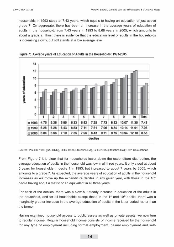
stock of households by looking at the average years of education of adults in the household,
as presented in Figure 7. The poor access to education of those disadvantaged by apartheid
is evident in the low level of this indicator, i.e. the average years of education of adults in
10 Indeed, this result is tentative and partial evidence in support of the view that our growth recovery in the post-1994 period has not been pro-poor in nature (see Bhorat et al, 2007).
DPRU WP 07/128 Haroon Bhorat, Carlene van der Westhuizen & Sumayya Goga
14
households in 1993 stood at 7.43 years, which equals to having an education of just above
grade 7. On aggregate, there has been an increase in the average years of education of
adults in the household, from 7.43 years in 1993 to 8.68 years in 2005, which amounts to
about a grade 9. Thus, there is evidence that the education level of adults in the households
is increasing slowly, but still stands at a low average level.
Figure 7: Average years of Education of Adults in the Households: 1993-2005
Source: PSLSD 1993 (SALDRU), OHS 1999 (Statistics SA), GHS 2005 (Statistics SA); Own Calculations
From Figure 7 it is clear that for households lower down the expenditure distribution, the
average education of adults in the household was low in all three years. It only stood at about
5 years for households in decile 1 in 1993, but increased to about 7 years by 2005, which
amounts to a grade 7. As expected, the average years of education of adults in the household
increases as we move up the expenditure deciles in any given year, with those in the 10th
decile having about a matric or an equivalent in all three years.
For each of the deciles, there was a slow but steady increase in education of the adults in
the household, and for all households except those in the 1st and 10th decile, there was a
marginally greater increase in the average education of adults in the latter period rather than
the former.
Having examined household access to public assets as well as private assets, we now turn
to regular income. Regular household income consists of income received by the household
for any type of employment including formal employment, casual employment and self-

Welfare Shifts in the Post-apartheid South Africa: A Comprehensive Measurement of Changes
15
employment. To this we added the total grant income received by the household.
Figure 8 shows the Cumulative Distribution Functions (CDFs) for real per capita (regular)
income for the three years.11 The cumulative proportion of households with a per capita
income of less than R3000 per month in real terms was at every point of the distribution higher
in 1999 than in 2005, but the CDFs for 1993 and 2005 lie quite close together. This implies that
real incomes at the bottom end decreased between 1993 and 1999, and increased once more
between 1999 and 2005.
Importantly, it is evident from Figure 8 that the proportion of households at the bottom end of
the distribution reporting zero per capita income decreased from about 20 percent in 1999 to
about 10 percent in 2005, and this can be attributed to the rapid expansion of the social grant
system.
Figure 8: Cumulative Distribution Function of Regular Income, 1993, 1999, 2005
Source: PSLSD 1993 (SALDRU), OHS 1999 (Statistics SA), GHS 2005 (Statistics SA); Own Calculations
In 1993, 80 percent of all households had a real per capita monthly income of R1679 or less.
11 In order to visually capture the changes for households at the bottom of the income distribution, we only show the distribution up to a value of R3000 a month (in real terms) in the figure. It is also clear from the CDFs that in all three years almost 90 percent of households had a total regular income of R3000 or less. All values were converted to real values in 2005 prices using the Consumer Price Index (CPI).

DPRU WP 07/128 Haroon Bhorat, Carlene van der Westhuizen & Sumayya Goga
16
The positions of the 1999 CDF and the 2005 CDF show that at that level of income, there was
almost no change in poverty between 1993, 1999 and 2005. It is further evident that for any
range of real household per capita regular income level above R76�, first order dominance
does not hold, that is, it is difficult to say whether poverty has increased or decreased above
this level. However, below this approximate level, it would appear that income poverty has
increased between 1993 and 1999, but decreased between 1999 and 2005, with the 2005
levels below that of 1993.
To summarise, the descriptive data indicates an increase between 1993 and 2005 in the
absolute number of households with access to each of the public assets analysed. The
delivery of services, however, slowed down in the second half of the period, with the access
rate for formal housing actually declining between 1999 and 2005. The data by household
expenditure decile confirms that the delivery of public services was pro-poor for the period as
a whole, in the sense that the gap between the access rates of the 1st and 4th deciles narrowed
for all services between 1993 and 2005. Despite this result, services delivery did slow down for
the poorest households between 1999 and 2005.
As far as private assets are concerned, there has been an increase in the absolute number of
households owning each of the four private assets analysed, with a particularly strong increase
in access to telecommunications in the second half of the period as measured by ownership
of either a cellular phone or a land line. Vehicle ownership remains at particularly low levels,
with the access rate declining between 1993 and 2005. The average years of education of
adults in the household increased over the 1993 to 2005 period at the aggregate level and
within each household expenditure decile. However, this indicator still stands at relatively low
levels in 2005, with the average years of education of adults in a household about 9 years
which represents a level of grade 9. Real income appears to have decreased over the 1993-
1999 period, and then increased slightly between 1999 and 2005, specifically for those at the
very bottom of the income distribution. Importantly, there has been a decline in the number of
households reporting zero income between 1999 and 2005 from over 20 percent to below 10
percent which is probably due to the expansion of the social security system.

Welfare Shifts in the Post-apartheid South Africa: A Comprehensive Measurement of Changes
17
4. Derivation of the Welfare Indices
The analysis of income poverty and inequality offers one significant advantage, in that
measures of its variability (over time and over sub-groups), are undertaken with a common unit
of measurement. The latter, as is common practice, are often consumption- or expenditure-
based measures of household income. In contrast, however, attempts to measure non-
income poverty and inequality – typically through the assets owned and services received by
households – do not offer this advantage. Households’ access to water and sanitation, the
quality of their dwelling and so on, while all reflections of non-income welfare, are not easily
amenable to a common metric. A methodology called factor analysis have been utilised by
a number of researchers to provide some concentrated metric of non-income poverty and
inequality.12
In our analysis we proceed to extent this methodology to include the variable that captures
household income, or in our case regular income (as the total income from employment and
social grants). Our aim is therefore to construct a Comprehensive Welfare Index that provides
a measure of shifts in total household welfare, which includes the non-income aspect such
as services and assets, as well as household income. We also proceed to construct two
additional measures, a Public Asset Index, and a Private Asset Index, which will allow us to
analyse welfare as captured by access to government provided services and private owned
assets respectively. Section 4.1 provides a brief methodological overview, before we report a
series of relevant estimates derived from our factor analysis.
4.1 Factor Analysis Methodology
We assume that our underlying model takes the following form, following Sahn & Stifel (2000):
ikikik uca += β (1)
where the ith household’s ownership (represented by the variable aik)
of asset or service, k, is
linearly related to a common factor, ci which we term household welfare. The strength of the
relationship is thus represented by the estimated value of β. The difficulty with the above, is
that the dependent variable (aik) and its coefficient (β) are unobservable. However, the use of
12 We list here some examples of researchers utilising this or a similar approach. Sahn & Stifel (2000) employed factor analysis to construct an asset index as an alternative measure of welfare/poverty and used it to compare poverty in 11 African countries over time and across countries, using data from the Demographic and Health Surveys. Filmer and Pritchett (2001) used a very similar approach, principal component analysis, to construct an asset index as proxy for household wealth. The World Bank (2000, 2004) uses the Filmer and Pritchett methodology to calculate household wealth in their Country Reports on Health, Nutrition and Population Conditions among Poor and Better-off Countries. The methodology has also been utilised by Booysen (2002) and Booysen et al (2004) as well as McKenzie (2003). It is important to note that the asset indices constructed by these researchers include household durables as well as household characteristics/services.

DPRU WP 07/128 Haroon Bhorat, Carlene van der Westhuizen & Sumayya Goga
18
factor analysis allows us to directly estimate this relationship, and then to construct the
appropriate weights for the three indices
Specifically, factor analysis proceeds from the assumption that the relationships between the
variables under consideration (in our conception here, assets and services) are reducible to
a square correlation matrix. In vector form, therefore, and drawing on the notation of equation
(1), the correlation matrix takes the form aik which effectively represents the unique correlations
between the k assets and services across the i households. Factor analysis involves trying to
distil these correlations into (in our case here) one unique, common factor, which we can term
f1i. The values contained in this matrix are commonly referred to as factor loadings for the
first (and in our case here, only) common factor. Technically, deriving these factor loadings on
the unique factor are achieved through extracting the maximum possible variance that exists
across the assets and service variables. This involves estimating both the unit roots of the
correlation matrix (known as eigen values) and their eigen vectors (Child, 1969; Cattell, 1965).
More importantly, though, these factor loadings serve as the starting point for constructing
or effectively, imputing, our indices. Put differently, given that we cannot impose a weighting
structure on the different variables, in their contribution to overall household welfare, we
estimate these weights. Through the process of factor analysis, therefore, we are able to
impute an appropriate and acceptable weighting structure for each specific asset or service,
as well a regular income, available to households. Hence, we utilise the information from the
unique factor loadings to derive:
ikki afafafc +++= .......222111 (2)
where the values f1,….f
k represent the weights being projected onto the observed assets
owned and services received by households (Sahn & Stifel, 2000). These values are often
referred to as scoring coefficients in the applied literature. These scoring coefficients are then
applied to the normalised score on each variable for each household, in order to derive an
index for each household. The normalisation is around the mean and standard deviation for
each variable. Hence, our index is constructed as follows:
−++
−=
k
kikk
ii s
uaf
s
uafA ........
1
111 (3)
were μ and s represent the mean and standard deviation for each given variable respectively.
Households that have low index scores will be deemed to be poor in terms of the set of
variables included in the index and those with high index values will generally be relatively well
off in terms of our indices. On the basis of equation (3), we have the core information required
to understand the nature and extent of shifts in the different dimensions in the post-apartheid
period.

Welfare Shifts in the Post-apartheid South Africa: A Comprehensive Measurement of Changes
19
4.2 Factor Analysis Results
Factor analysis was performed on three different sets of variables in order to construct three
different indices.
In the first case, weights were derived for a Comprehensive Welfare Index. Three categories
of variables were used in the construction of the Comprehensive Welfare Index, namely
household characteristics (or public assets), private household assets and household income.
The household services variables are type of dwelling (formal, informal or traditional); type
of roof (brick, thatch, corrugated, tile, asbestos or other); type of wall material (low or high
quality); source of water (piped, public, surface and borehole); source of energy for lighting
(electricity, paraffin, or candle) and type of toilet ( flush/chemical, pit, pit-VIP, bucket or none).
The household assets included in the factor analysis are telecommunications (cellular as
well as land line), vehicle, radio, television and the mean level of education of all adults in
the household. The variable reflecting household income is real per capita household income
from wages and social grants. With the exception of household income and mean level of
education, which are continuous variables, all other household services and assets variables
are binary with a value of 1 (if the household has access to it) or 0 (if the household does not
have access to it).
The second index is a Public Assets Index, with weights derived only for the variables
pertaining to household services. The variables used in the construction of the index are
therefore type of dwelling, type of roof, source of water, source of energy for lighting and type
of toilet. The resulting Public Assets Index not only provides us with a measure of household
access to these services, but also enables us to comment on the progress of government in
the delivery of basic services between 1993 and 2005.
The third index is a Private Assets Index. Weights were derived for the variables reflecting
household ownership of telecommunications, vehicle, radio and television, as well as the
average years of education of all adults in the household. This index will, therefore, reflect
the assets purchased by households as well as their “ownership” of the critical human capital
asset, education.
In order to calculate the weights for the indices, the data from 1993, 1999 and 2005 were
pooled.13 Factor analysis were performed on the pooled dataset three separate times to obtain
13 A set of weights was derived for the pooled sample to enable us to compare the values of the three indices across the three years. The weights on the variables which explain most of the variation among households in 1993 may differ from the weights on the variables which explain most of the variation among households in the other two years. For example, if relatively few households owned a phone in 1993 compared to 1999 and 2004, factor analysis performed on the 1993 data will put relatively more weight on ownership of a phone, compared to the weights when factor analysis is performed on the other two years. When factor analysis is performed on the pooled dataset, the weights will reflect the variation across all three years (See McKenzie, 2003: 7; Sahn & Stifel, 2000: 2125, 2126, 2153).

DPRU WP 07/128 Haroon Bhorat, Carlene van der Westhuizen & Sumayya Goga
20
the weights for the three different indices
In the remainder of this section we briefly discuss the results from the factor analysis before
moving on to the derivation of poverty measures.
Table 2 presents the scoring coefficients (weights) produced by our factor analysis of the full
set of variables and based on equation (2) above. In other words, these are the weights for our
Comprehensive Welfare Index, which includes public assets, and private assets as well as real
per capita income.
Table 2: Scoring Coefficients (Weights) for the Welfare Index
Source: PSLSD 1993 (SALDRU), OHS 1999 (Statistics SA), GHS 2005 (Statistics SA); Own CalculationsNotes: Referent variables are traditional dwelling, asbestos roof, high quality wall, borehole water, paraffin for lighting, and pit toilet
The signs of the coefficients are as expected, with positive signs for variables (such as formal
dwelling, brick or tile roof, piped water, electricity for lighting and flush/chemical toilet) which
are associated with higher levels of welfare relative to the referent variables. This is also
the case for the private assets, with telecommunications, vehicle, radio and television all
associated with higher levels of welfare. The positive sign for the coefficient of the variable
reflecting average years of adult education in the household confirms that higher average
levels of education are associated with higher levels of overall welfare. Not surprisingly, the
sign of the coefficient for real per capita income is positive. At the same time coefficients of
variables indicating lower levels of welfare relative to the referent variables are all negative.
Relatively large positive weights were derived for access to piped water, use of electricity for
lighting and flush/chemical toilet.
The scoring coefficients for the Public Assets Index are presented in Table 3. Similar to the
results for the comprehensive welfare index, the signs of the weights are as expected. Positive
signs are again associated with variables which indicate higher levels of welfare, relative to
the referent variables. Again, large positive weights are associated with the use of electricity
as source for lighting, and particularly for access to piped water and access to flush/chemical
toilet.

Welfare Shifts in the Post-apartheid South Africa: A Comprehensive Measurement of Changes
21
Table 3: Scoring Coefficients (Weights) for Public Assets Index
Source: PSLSD 1993 (SALDRU), OHS 1999 (Statistics SA), GHS 2005 (Statistics SA); Own CalculationsNotes: Referent variables are traditional dwelling, asbestos roof, high quality wall, borehole water, paraffin for lighting, and pit toilet,
Table 4 shows the weights derived for the Private Assets Index. All signs are positive, indicating
that these assets are all associated with high levels of private welfare.
Table 4: Scoring Coefficients (Weights) for Private Assets Index
Source: PSLSD 1993 (SALDRU), OHS 1999 (Statistics SA), GHS 2005 (Statistics SA); Own calculations
The derived weights were used to calculate index values for all households in each year. In
other words, for each household in 1993, 1999 and 2005, a Comprehensive Welfare Index,
a Public Asset Index and a Private Asset Index were calculated. The actual values of the
indices are meaningless, in the sense that it does not, for example, reflect any monetary
value. However, for all three indices, a higher index value is associated with higher levels of
household welfare.
Tables 5 to 7 present the mean value for each index for the three years. The mean value of
the household Comprehensive Welfare Index increased from -0.235 in 1993 to -0.034 in 1999,
with further increase to 0.028 in 2005. Both these increases are statistically significant. This
means that the average household became less poor, or experienced an increase in their
welfare, over the 12-year period when all aspects of welfare (public services, private assets
as well as regular income) are considered. In addition, it appears as if the bulk of the average
increase in total welfare took place in the first half of the period.

DPRU WP 07/128 Haroon Bhorat, Carlene van der Westhuizen & Sumayya Goga
22
Table 5: Mean Values for the Welfare Index: 1993, 1999, 2005
Source: PSLSD 1993 (SALDRU), OHS 1999 (Statistics SA), GHS 2005 (Statistics SA); Own CalculationsNotes: *Significant at the 5 percent level
The mean value of the Public Asset Index increased from -0.210 in 1993 to 0.008 in 1999, with
the change being statistically significant. The increase between 1999 and 2005, however, is
not statistically significant. This means that the average household’s access to government
provided services increased between 1993 and 1999. Over the next six years, however, there
were no significant changes in the household ownership of public assets. As we have already
seen in the descriptive overview in Section 3, access rates to government provided services
such as formal housing, piped water, electricity and flush/chemical toilet either declined
between 1999 and 2005 or increased at a slower rate than over the first half of the 12-year
period. The lack of significant change in the mean values of the Public Asset Index between
1999 and 2005 therefore reflects this slowdown in government provided services.
Table 6: Mean Values for the Public Asset Index: 1993, 1999, 2005
Source: PSLSD 1993 (SALDRU), OHS 1999 (Statistics SA), GHS 2005 (Statistics SA); Own CalculationsNotes: *Significant at the 5 percent level
Finally, Table 7 shows that the average South African household increased their ownership
of private assets such as telecommunications, television, radio and motor vehicle as well as
the average years of adult education between 1993 and 2005, with the increases over both
periods statistically significant. While the mean value of the Private Asset Index increased by
about 0.1 over the first six years, it increased by almost 0.2 between 1999 and 2005, indicating
a much faster increase in private asset welfare between 1999 and 2005.
Table 7: Mean Values for the Private Asset Index: 1993, 1999, 2005
Source: PSLSD 1993 (SALDRU), OHS 1999 (Statistics SA), GHS 2005 (Statistics SA); Own CalculationsNotes: *Significant at the 5 percent level
Figures 9 to 11 compare the kernel density estimates of the three index values for the three
years across all households in the sample. Looking first at the distribution of households
according to the Comprehensive Welfare Index values, there is some clustering of households

Welfare Shifts in the Post-apartheid South Africa: A Comprehensive Measurement of Changes
23
at the bottom as well as the top of the distribution in 1993. This indicates a concentration of
households with relatively low overall welfare as well as a concentration of households with
relatively high levels of overall welfare.
Figure 9: Distribution of Households According to Welfare Index Value, 1993, 1999, 2005
Source: PSLSD 1993 (SALDRU), OHS 1999 (Statistics SA), GHS 2005 (Statistics SA); Own Calculations
The distribution of the Welfare Index values changes dramatically over the period. It flattens
considerably at the bottom of the distribution, with increase in clustering at the top end. This
means that the proportion of households with a relatively low Welfare Index value declined
over the period, while the share of households with an index value reflecting relatively high
levels of total welfare increased over the 12 years.
Turning to the distribution of households according to their Public Asset Index values, there
is again some clustering of households at the bottom of the distribution in 1993, with a
rather large concentration of households at the top. In comparison with the distribution of the
Comprehensive Welfare Index, the concentration of households at the bottom is much lower,
with a larger clumping at the top. At the bottom end the curve flattens between 1993 and 1999
and further between 1999 and 2005, indicating a decline in the proportion of households with
relatively lower Public Asset Index Values. In both 1999 and 2005 there is some clumping
around the middle and between the middle and top of the distribution. This may indicate that
some households received some of the government provided services over the period, but
not the full basket of services which would have moved them to the top of the distribution. The
clustering at the upper end increased over both periods. Overall, the change in the distribution

DPRU WP 07/128 Haroon Bhorat, Carlene van der Westhuizen & Sumayya Goga
24
of households over the period is illustrative of government’s success in providing services
across the whole distribution.
Figure 10: Distribution of Households According to Public Asset Index Value, 1993, 1999, 2005
Source: PSLSD 1993 (SALDRU), OHS 1999 (Statistics SA), GHS 2005 (Statistics SA); Own Calculations
In all three years, the distribution of households according to their Private Asset Index values
looks quite different from the distributions according to the Welfare and Public Asset Indices.
In 1993, there is significant clustering at the bottom of the distribution, reflecting the large
proportion of the households with a very low Private Asset Index value, or put differently,
with relatively modest ownership of household assets. There is some clustering at the top,
indicating a concentration of households with relatively large private asset values. This also
strongly reflects the fact that a large share of households in 1993 did not have the income that
would have allowed them to purchase household assets.

Welfare Shifts in the Post-apartheid South Africa: A Comprehensive Measurement of Changes
25
Figure 11: Distribution of Households According to Private Asset Index Value, 1993, 1999, 2005
Source: PSLSD 1993 (SALDRU), OHS 1999 (Statistics SA), GHS 2005 (Statistics SA); Own Calculations
The distribution changes drastically between 1993 and 1999 and again between 1999 and
2005. The share of households with a relatively low Private Asset Index value declined
considerably between 1993 and 1999 and even more in the second period. Over both periods,
the clustering increases at the top end of the distribution, indicating that households increased
their ownership of private assets between 1993 and 2005. In all three years, but particularly in
1999 and 2005, very clear peaks can be seen in the distribution. This can partly be explained
by the fact that the Private Asset Index was constructed using only a small number of variables,
with four of them binary (taking a value of 1 or 0), and the average years of adult education
variable continuous. This means that in comparison with the other two indices (which were
constructed using a much larger number of variables), the Private Asset Index can take on a
limited number of values and as a result, a large proportion of households can have the same
Private Asset Index value in each year.
The three indices above can be evaluated according to a number of tests in order to determine
if the factor analysis methodology produced reasonable results. We applied the three tests
identified by Filmer and Pritchett (2001: 117-119) to the three indices to determine how reliable
they are. A brief description of these tests as well as the results when they were applied to our
indices can be found in Appendix G.
DPRU WP 07/128 Haroon Bhorat, Carlene van der Westhuizen & Sumayya Goga
26
Overall, the evidence presented above suggests that total household welfare increased
between 1993 and 2005, with the increase in the first period driven largely by increased
government service delivery. In the second half of the period, overall welfare increased at a
slower pace, and was driven almost exclusively by the growth in private asset ownership.

Welfare Shifts in the Post-apartheid South Africa: A Comprehensive Measurement of Changes
27
5. An Application of Welfare Indices to Assets and Services
In this section we present the results derived when applying standard poverty measures14 to
the values of our three indices in 1993, 1999 and 2005. In the first instance, this allows us to
evaluate how total household welfare has changed between 1993 and 2005, at the aggregate
level as well as according to a range of covariates. In the second instance, it also allows us
to look at changes in welfare as measured by household access to services and household
ownership of assets separately.
5.1 Measures of Poverty
Poverty lines were calculated for each of the three indices using the distribution of the relevant
index in the first survey (1993).15 Because the weights are constant across the three years,
the poverty lines derived from the first year were then applied to the second and third surveys
(Sahn & Stifel, 2000: 2126).
For each of the three indices we derived two different poverty lines, the value at the 20th
percentile of the index distribution in 1993 and the value of the 40th percentile of the index
distribution in 1993. On their own these poverty lines do not mean much, but rather serve as
reference points to compare the 1999 and 2005 index distributions against.
To measure the changes in welfare as presented by our three indices, we utilised the general
class of poverty measures first proposed by Foster, Greer and Thorbecke (198�), widely known
as the FGT measures of poverty.16 Table 8 presents the changes in comprehensive welfare at
14 In our analysis we concentrate on measures of poverty and not inequality. The nature of the variables included yielded very low Gini coefficients. The limited number of assets also renders it impossible to derive a useful analysis of asset inequality.
15 In order to calculate measures of poverty, all the values of the asset index have to be positive. Shifting all of the distributions of asset indices by the same constant does not change any of the information we are interested in (see Sahn & Stifel, 2000: 2126). We added a constant value of 3 to each Comprehensive Welfare Index value to ensure that all the index values in the three years were positive. In the case of the Public Asset Index and the Private Asset Index, a value of 3 was added to each index value to transform all the index values to positive.
16 The FGT index of poverty measures can be represented in general form as:
( )zyz
yz
nP i
n
i
i ≤
−
= ∑=
α
α
1
1
Where n is the total sample size, z the chosen poverty line and y
i is the standard of living indicator of agent
i. The parameter α measures how sensitive the index is to transfers between the poor units. The index is conditional on the agent’s income, y
i , being below the poverty line, z. The headcount index is generated
when α =0, and then the above equation is simply the share of agents below the poverty line.

DPRU WP 07/128 Haroon Bhorat, Carlene van der Westhuizen & Sumayya Goga
28
a national level as measured by the headcount index (HC) and the poverty gap (PG).
The values at the 20th percentile and 40th percentile of the distribution of the Comprehensive
Welfare Index in 1993 were used to calculate the “reference’ poverty lines. Following from that,
the values of the headcount ratios in 1993 are 20 percent and 40 percent respectively.
Table 8: Measures of Poverty: Comprehensive Welfare Index
Source: PSLSD 1993 (SALDRU), OHS 1999 (Statistics SA), GHS 2005 (Statistics SA); Own CalculationsNotes: * Change in the headcount poverty rate between 1993 and 1999 is statistically significant at the 5 percent level. t-statistics were calculated using the method developed by Ravallion (1994: 57,58).
** Change in the headcount poverty rate between 1999 and 2005 is statistically significant at the 5 percent level. t-statistics were calculated using the method developed by Ravallion (1994: 57,58).
According to the 40th percentile headcount ratio, poverty as measured by our Comprehensive
Welfare Index almost halved from 40 percent in 1993 to 22 percent in 2005. The bulk of the
decline took place over the first six years, with the headcount rate dropping by just over eleven
percentage points.
When the 20th percentile headcount ratio is considered, there was an even larger decline
in poverty, with the rate dropping from 20 percent in 1993 to about nine percent in 2005.
Again the largest share of the decline took place between 1993 and 1999. All changes in the
headcount ratios are statistically significant.
The poverty gap indicates the depth of poverty among the poor, by measuring the average
distance a household is from a poverty line. Over both periods and according to both lines, the
severity of poverty as measured by the poverty gap ratios declined. At the 40th percentile, most
of the decline took place over the first period, while at the 20th percentile the bulk of the decline
took place between 1999 and 2005.
The poverty gap measure (PG) is generated when α =1, and therefore the given poverty line z is presented as
( )zyz
yz
nP i
n
i
i ≤
−
= ∑=1
1α
The PG represents a direct measure of agents’ income (or in our case assets) relative to the poverty line
(Bhorat & Shaikh, 2004: 14).

Welfare Shifts in the Post-apartheid South Africa: A Comprehensive Measurement of Changes
29
Similar to the Welfare Index, the values at the 20th and 40th percentiles of the distribution of the
Public Asset Index in 1993 were used to calculate the 20th and 40th percentile reference lines.
Again the values of the Public Asset headcount rates are simply 20 percent and 40 percent in
1993.
The changes in household welfare as measured by the Public Asset Index follow a similar
pattern to when the Comprehensive Welfare Index is used. There was a slightly smaller
decline in poverty between 1993 and 2005, with the headcount rate according to the 40th
percentile dropping to 23 percent, while the headcount rate according to the 20th percentile
halved to 10 percent in 2005. All changes are statistically significant.
Table 9: Measures of Poverty: Public Asset Index (Aggregate)
Source: PSLSD 1993 (SALDRU), OHS 1999 (Statistics SA), GHS 2005 (Statistics SA); Own CalculationsNotes: * Change in the headcount poverty rate between 1993 and 1999 is statistically significant at the 5 percent level. t-statistics were calculated using the method developed by Ravallion (1994: 57,58).
** Change in the headcount poverty rate between 1999 and 2005 is statistically significant at the 5 percent level. t-statistics were calculated using the method developed by Ravallion (1994: 57,58).
Again, the largest share of the decline in both the 20th percentile and the 40th percentile Public
Asset poverty rates took place over the first half of the 12 year period. As this index captures
household access to government provided services, these results also suggest a slowdown in
government service delivery over the second period. For both the 20th percentile and the 40th
percentile Public Asset poverty line, the poverty gap declined over the period, suggesting that
the severity of poverty in terms of access to services declined over the period.
Table 10 presents the changes in poverty when the Private Asset Index is considered. The
Private Asset headcount rates declined at a faster rate over the period, in comparison with the
changes in the headcount ratios when the Comprehensive Index and the Public Asset Index
are considered. The headcount rate according to the 40th percentile more than halved from 40
percent in 1993 to 17 percent in 2005. The headcount ratio according to the 20th percentile
declined from 20 percent in 1993 to eight percent in 2005.

DPRU WP 07/128 Haroon Bhorat, Carlene van der Westhuizen & Sumayya Goga
30
Table 10: Measures of Poverty: Private Asset Index (Aggregate)
Source: PSLSD 1993 (SALDRU), OHS 1999 (Statistics SA), GHS 2005 (Statistics SA); Own CalculationsNotes: * Change in the headcount poverty rate between 1993 and 1999 is statistically significant at the 5 percent level. t-statistics were calculated using the method developed by Ravallion (1994: 57,58).
** Change in the headcount poverty rate between 1999 and 2005 is statistically significant at the 5 percent level. t-statistics were calculated using the method developed by Ravallion (1994: 57,58).
The most striking contrast with the headcount ratios derived from the first two indices is the
fact that the bulk of the decline in private asset poverty, both at the 20th and the 40th percentile,
took place between 1999 and 2005. In other words welfare, as measured by ownership of
household assets, increased at a faster rate in the second half of our 12 year period. Given the
generally strong correlation between these assets and income, this increase in private asset
welfare can be attributed to a combination of faster economic growth since 1999 as well as
increased household spending power due to the expansion of the social grant system.
Race, location and gender can all be considered as makers of vulnerability in the South
African context. Tables 11 to 13 compare the changes in poverty levels for African and White
Households between 1993 and 2005, as measured according to our three indices. For all
three indices, and in each case according to both reference lines, the poverty levels of White
households are negligible.
Turning to the Comprehensive Welfare Index first, African poverty levels were higher than
the national rates for all three years and according to both poverty lines. African households,
however, did experience large increases in their total welfare over the period. The headcount
ratio according to the 40th percentile halved from 54 percent to 27 percent between 1993 and
2005. Two-thirds of the decline took place over the first half of the period. The headcount
rate according to the 20th percentile decreased from 27 to 11 percent – a decline of almost 60
percent. Again the bulk of the decline took place between 1993 and 1999.

Welfare Shifts in the Post-apartheid South Africa: A Comprehensive Measurement of Changes
31
Table 11: Measures of Poverty by Race: Comprehensive Welfare Index
Source: PSLSD 1993 (SALDRU), OHS 1999 (Statistics SA), GHS 2005 (Statistics SA); Own CalculationsNotes: * Change in the headcount poverty rate between 1993 and 1999 is statistically significant at the 5 percent level. t-statistics were calculated using the method developed by Ravallion (1994: 57,58).
** Change in the headcount poverty rate between 1999 and 2005 is statistically significant at the 5 percent level. t-statistics were calculated using the method developed by Ravallion (1994: 57,58).
The poverty gap, according to the 40th percentile, halved between 1993 and 2005. The average
shortfall according to the 20th percentile poverty line decreased from 4 percent to just below 2
percent. This means that according to both poverty lines, the average African household
experienced a decline in the severity of poverty.
The changes in African household poverty levels in terms of the Public Asset Index look very
similar to those in terms of the Comprehensive Welfare Index. Again the poverty levels of
African households were above the national levels for all three years and according to both
poverty lines. The headcount ratio at the 40th percentile Public Asset poverty line decreased
from just over 55 percent to 29 percent – an almost 50 percent decline. At the 20th percentile
poverty line the decrease was larger, with the rate dropping from 27 percent to 12 percent. All
changes are statistically significant. Similar to the Comprehensive Welfare Index measures,
the bulk of the decline took place in the first half of the 12-year period. The poverty gap
improved at both reference lines.

DPRU WP 07/128 Haroon Bhorat, Carlene van der Westhuizen & Sumayya Goga
32
Table 12: Measures of Poverty by Race: Public Asset Index
Source: PSLSD 1993 (SALDRU), OHS 1999 (Statistics SA), GHS 2005 (Statistics SA); Own CalculationsNotes: * Change in the headcount poverty rate between 1993 and 1999 is statistically significant at the 5 percent level. t-statistics were calculated using the method developed by Ravallion (1994: 57,58).
** Change in the headcount poverty rate between 1999 and 2005 is statistically significant at the 5 percent level. t-statistics were calculated using the method developed by Ravallion (1994: 57,58).
Turning to the Private Asset Index, it comes as no surprise that both the headcount ratios
and poverty gap ratios of African households were considerably higher than the national
average in all three years. These households, however, experienced massive improvements
in their ownership of private assets as captured by the Private Asset Index. The headcount
ratio according to the 40th percentile poverty line improved by 60 percent between 1993 and
2005. In 1993 the headcount rate of 54 percent was much higher than the aggregate rate of
40 percent. By 1999, the headcount rate of 21 percent was only four percentage points higher
than the national rate of 17 percent. In contrast to the other indices, more than half of the
decline took place between 1999 and 2005.
Table 13: Measures of Poverty by Race: Private Asset Index
Source: PSLSD 1993 (SALDRU), OHS 1999 (Statistics SA), GHS 2005 (Statistics SA); Own CalculationsNotes: * Change in the headcount poverty rate between 1993 and 1999 is statistically significant at the 5 percent level. t-statistics were calculated using the method developed by Ravallion (1994: 57,58).
** Change in the headcount poverty rate between 1999 and 2005 is statistically significant at the 5 percent level. t-statistics were calculated using the method developed by Ravallion (1994: 57,58).
The headcount ratio according to the 20th percentile also decreased by more than 60 percent
over the period, with the largest share of decline taking place between 1999 and 2005. The

Welfare Shifts in the Post-apartheid South Africa: A Comprehensive Measurement of Changes
33
poverty gaps according to both lines more than halved between 1993 and 2005, indicating
that the average African household experienced improvements in their positions relative to the
poverty lines.
Statistics South Africa no longer records information in the General Household Survey
according to urban and rural classification. This means that we cannot present poverty
measures by urban and rural location for 2005. Instead we focus on two provinces, Gauteng
which is predominantly urban and also generally considered the richest province in South
Africa, and on Limpopo, which is not only one of the poorest provinces in the country (see
Leibbrandt, Poswell, Naidoo, Welch & Woolard, 2005: 15-19) but also has a largely rural
population. Table 14 presents the results for the two provinces for all three indices. (The
complete results for all nine provinces can be found in Appendix H to Appendix J).
In terms of the Comprehensive Welfare Index, the poverty levels of households living in
Gauteng were substantially lower that those of households living in Limpopo. In 1993,
Limpopo’s headcount ratio at the 40th percentile of 71 percent was more than five times that
of Gauteng who had a headcount rate of only 13 percent. The difference in the headcount
ratios at the 20th percentile were of similar magnitudes in 1993, with Limpopo’s rate of 29
percent almost six times that of Gauteng. While poverty levels in Gauteng did decline between
1993 and 1999, it increased between 1999 and 2005, with all the gains of the first period
eroded. As a result there was not much change in the total welfare of Gauteng households
over the period as a whole. Households in Limpopo, on the other hand, experienced massive
decreases in their poverty levels over the 12 years. The headcount ratio at the 40th percentile
decreased by almost 70 percent between 1993 and 2005. The biggest share of the decline
took place between 1993 and 1999 when the headcount rate dropped from 71 percent to 42
percent, followed by a further decline to 22 percent in 2005. Poverty levels according to the
20th percentile followed a similar pattern. Gauteng households experienced a slight decline
between 1993 and 1999, with the headcount rate reverting back to the 1993 level in 2005.
Limpopo experienced an even larger decline in poverty at the 20th percentile than at the 40th
percentile with the headcount rate declining from 29 percent to 5 percent in 2005. Again the
bulk of the decline took place over the first period. With the exception of the Public Asset Index
for Gauteng in 1999 (both poverty lines) and the Private Asset Index for Gauteng in 1999 at
the 20th percentile, all changes in the headcount ratios are statistically significant.
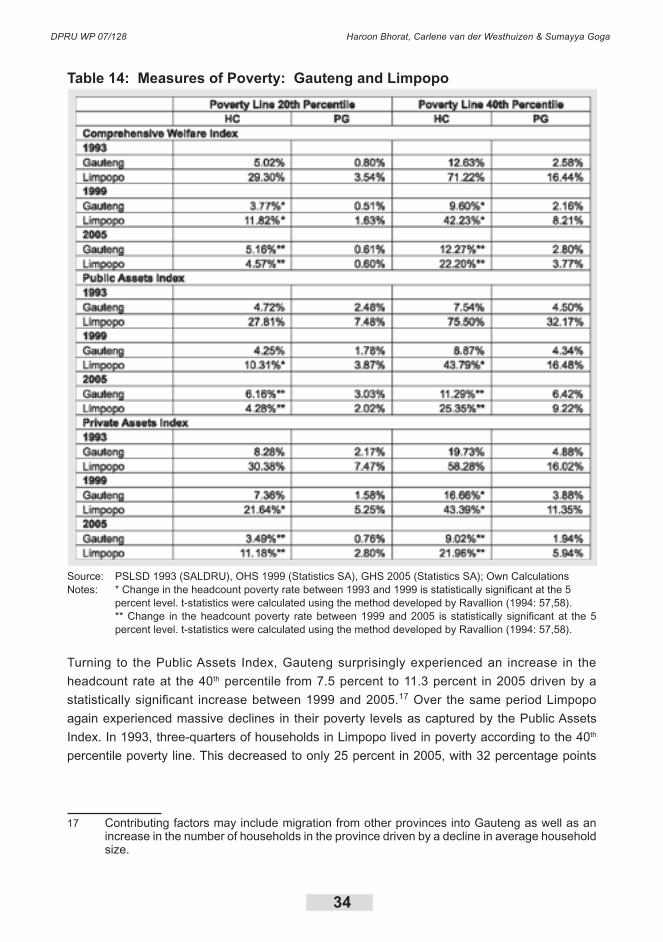
DPRU WP 07/128 Haroon Bhorat, Carlene van der Westhuizen & Sumayya Goga
34
Table 14: Measures of Poverty: Gauteng and Limpopo
Source: PSLSD 1993 (SALDRU), OHS 1999 (Statistics SA), GHS 2005 (Statistics SA); Own CalculationsNotes: * Change in the headcount poverty rate between 1993 and 1999 is statistically significant at the 5 percent level. t-statistics were calculated using the method developed by Ravallion (1994: 57,58).
** Change in the headcount poverty rate between 1999 and 2005 is statistically significant at the 5 percent level. t-statistics were calculated using the method developed by Ravallion (1994: 57,58).
Turning to the Public Assets Index, Gauteng surprisingly experienced an increase in the
headcount rate at the 40th percentile from 7.5 percent to 11.3 percent in 2005 driven by a
statistically significant increase between 1999 and 2005.17 Over the same period Limpopo
again experienced massive declines in their poverty levels as captured by the Public Assets
Index. In 1993, three-quarters of households in Limpopo lived in poverty according to the 40th
percentile poverty line. This decreased to only 25 percent in 2005, with 32 percentage points
17 Contributing factors may include migration from other provinces into Gauteng as well as an increase in the number of households in the province driven by a decline in average household size.

Welfare Shifts in the Post-apartheid South Africa: A Comprehensive Measurement of Changes
35
of the decline taking place over the first six years. Again, the same trend can be observed
when considering the 20th percentile poverty line. Poverty levels in Gauteng increased over the
period, while there was a large decline in Limpopo.
In terms of household ownership of private assets poverty levels were much higher in Gauteng
in 1993 and 1999 than when the Public Assets Index and the Comprehensive Welfare Index
are considered. The headcount ratios more than halved from 1993 to 2005 according to
both poverty lines. At the 40th percentile the headcount rate dropped from 20 percent to nine
percent, while at the 20th percentile it decreased from 8 percent to 3 percent. The bulk of
the decrease in the headcount ratios took place in the second half of the period. Headcount
ratios in Limpopo also more than halved over the period. The 40th percentile headcount rate
decline from 58 percent in 1993 to 22 percent in 2005. At the 20th percentile the headcount
ratio decreased from 30 percent in 1993 to 11 percent in 2005. Again, the largest share of the
decreases took place between 1999 and 2005.
The results indicated in Table 15 shows that in all three years, according to all three indices
and by both poverty lines, households headed by females experienced higher levels of poverty
than households headed by males. In 1993 almost 50 percent of female-headed households
were poor at the 40th percentile poverty line in terms of the Comprehensive Welfare Index.
In the same year, about 32 percent of male-headed households were considered poor as
measured by the 40th percentile poverty line, which is in fact lower than the national headcount
rate for this index. Both female- and male-headed households experienced a decline of around
40 percent in their headcount rates at the 40th percentile between 1993 and 2005, with female-
headed households seeing a slightly larger decline. Again the headcount rates dropped at a
faster rate between 1993 and 1999. All changes are statistically significant. The decreases in
the poverty gap ratios also indicate that the average household saw its position relative to the
poverty line improve over the period.
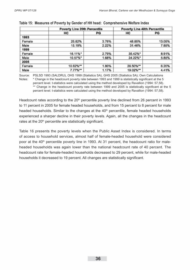
DPRU WP 07/128 Haroon Bhorat, Carlene van der Westhuizen & Sumayya Goga
36
Table 15: Measures of Poverty by Gender of HH head: Comprehensive Welfare Index
Source: PSLSD 1993 (SALDRU), OHS 1999 (Statistics SA), GHS 2005 (Statistics SA); Own CalculationsNotes: * Change in the headcount poverty rate between 1993 and 1999 is statistically significant at the 5 percent level. t-statistics were calculated using the method developed by Ravallion (1994: 57,58).
** Change in the headcount poverty rate between 1999 and 2005 is statistically significant at the 5 percent level. t-statistics were calculated using the method developed by Ravallion (1994: 57,58).
Headcount rates according to the 20th percentile poverty line declined from 26 percent in 1993
to 11 percent in 2005 for female headed households, and from 15 percent to 8 percent for male
headed households. Similar to the changes at the 40th percentile, female headed households
experienced a sharper decline in their poverty levels. Again, all the changes in the headcount
rates at the 20th percentile are statistically significant.
Table 16 presents the poverty levels when the Public Asset Index is considered. In terms
of access to household services, almost half of female-headed household were considered
poor at the 40th percentile poverty line in 1993. At 31 percent, the headcount ratio for male-
headed households was again lower than the national headcount rate of 40 percent. The
headcount rate for female-headed households decreased to 29 percent, while for male-headed
households it decreased to 19 percent. All changes are statistically significant.

Welfare Shifts in the Post-apartheid South Africa: A Comprehensive Measurement of Changes
37
Table 16: Measures of Poverty by Gender of HH Head: Public Asset Index
Source: PSLSD 1993 (SALDRU), OHS 1999 (Statistics SA), GHS 2005 (Statistics SA); Own CalculationsNotes: * Change in the headcount poverty rate between 1993 and 1999 is statistically significant at the 5 percent level. t-statistics were calculated using the method developed by Ravallion (1994: 57,58).
** Change in the headcount poverty rate between 1999 and 2005 is statistically significant at the 5 percent level. t-statistics were calculated using the method developed by Ravallion (1994: 57,58).
The trend is similar when poverty measures are calculated at the 20th percentile. Female
headed households saw their headcount rate halve from 24 percent in 1993 to 12 percent
in 2005. Over the same period, households headed by males experienced a decline from 15
percent to 8.5 percent. Again the biggest share of the decrease in the headcount ratios took
place between 1993 and 1999. All changes are statistically significant. At both lines and for
all households the poverty gap declined over the period, indicating that the severity of poverty
also decreased over the period. This means that irrespective of the gender of the head of the
household, all households benefited from increased government service delivery, particularly
between 1993 and 1999.
When the Private Asset Index is considered, there are much larger decreases in the poverty
levels. For female- and male-headed households and by both the 20th and the 40th percentile
poverty lines, the headcount rates more than halved over the period, with all changes
statistically significant. At the �0th percentile, the headcount rate for female-headed households
decreased from 49 percent in 1993 to 20 percent in 2005. Over the same period, the
headcount rate for households headed by males decreased from 35 percent to 16 percent. In
both cases the largest share of the decreases took place in the second half of the period. The
decline in the poverty gaps also confirms that the severity of poverty as measured by access
to private assets declined over the period.

DPRU WP 07/128 Haroon Bhorat, Carlene van der Westhuizen & Sumayya Goga
38
Table 17: Measures of Poverty by Gender of HH Head: Private Asset Index
Source: PSLSD 1993 (SALDRU), OHS 1999 (Statistics SA), GHS 2005 (Statistics SA); Own CalculationsNotes: * Change in the headcount poverty rate between 1993 and 1999 is statistically significant at the 5 percent level. t-statistics were calculated using the method developed by Ravallion (1994: 57,58).
** Change in the headcount poverty rate between 1999 and 2005 is statistically significant at the 5 percent level. t-statistics were calculated using the method developed by Ravallion (1994: 57,58).
At the 20th percentile poverty line, the trends are similar. The headcount rate for female-
headed households decreased from 23 percent to 10 percent, while the ratio for male-headed
households declined from 18 percent to 7 percent. Again, a larger share of the decline took
place between 1999 and 2005. This suggests that all households benefited from increased
economic growth over the period in a way that enabled them to acquire more household
assets.
The analysis above suggest that African and female-headed households remain relatively
worse off in terms of all three indices. In Table 18 we show the poverty levels of households
that belonged to both these categories, namely African female-headed households. We
compare the poverty levels for all three years and according to all three indices.

Welfare Shifts in the Post-apartheid South Africa: A Comprehensive Measurement of Changes
39
Table 18: Measures of Poverty: African Female-headed Households
Source: PSLSD 1993 (SALDRU), OHS 1999 (Statistics SA), GHS 2005 (Statistics SA); Own CalculationsNotes: * Change in the headcount poverty rate between 1993 and 1999 is statistically significant at the 5 percent level. t-statistics were calculated using the method developed by Ravallion (1994: 57,58).
** Change in the headcount poverty rate between 1999 and 2005 is statistically significant at the 5 percent level. t-statistics were calculated using the method developed by Ravallion (1994: 57,58).
In terms of the Comprehensive Welfare Index, the headcount ratio declined between 1993
and 2005 for African female-headed households according to both the 20th and 40th percentile
poverty line. In 1993, thirty one percent of African female-headed households lived in poverty
according to the 20th percentile poverty line, while 59 percent of African female-headed
households were poor according to the 40th percentile poverty line. This rate is higher than the
poverty rate for either African or female-headed households in 1993. By 2005, poverty levels
for African female-headed household declined to 12,5 percent and 30,5 percent respectively.
These levels, however, remain higher than the headcount rates for either African or female-
headed households in 2005. Again, poverty declined at a faster rate between 1993 and 1999
than between 1999 and 2005 for African female-headed households.
Turning to the Public Asset Index, headcount poverty was again higher in 1993 for this group
than for either African or female-headed households, with the 20th percentile headcount rate at
29 percent ant the 40th percentile headcount rate almost 60 percent. Although poverty levels
for households headed by African females did almost half between 1993 and 2005, both the
20th and 40th percentile headcount rates remain higher than the aggregate and the African and
female-headed household headcount rates for 2005.
Poverty as measured by the Private Asset Index also shows that according to both poverty
lines and for all three years, African female-headed households remained worse off than any
other household. They did enjoy significant decreases in private asset poverty, with the bulk
of the decline according to both poverty lines taking place between 1999 and 2005. By 2005,
DPRU WP 07/128 Haroon Bhorat, Carlene van der Westhuizen & Sumayya Goga
40
the 20th percentile headcount rate had declined to 11 percent, while the 40th percentile rate had
decreased to 22 percent.
To summarise then, household welfare increased for all covariates between 1993 and 2005.
This is true of overall welfare, as well as when considering government provided services
or household assets in isolation. The overall increase in welfare was driven by government
service delivery between 1993 and 1999. In contrast, increases in household welfare between
1999 and 2005 were driven by increased household ownership of assets as well as higher
levels of education and income from work and grants. Although both African households and
households headed by females experienced large decreases in their poverty rates in terms of
all three welfare measures, their headcount rates remain higher than the national averages
in 2005, confirming that they remain in a relatively worse off position. When households who
belong to both these groups were considered, it became clear that households headed by
African women continue to have lower levels of welfare according to all three indices.
5.2 Changes in Welfare Without Poverty Lines
Graphing cumulative distribution functions (CDFs) is an alternative way of examining the
changing patterns of poverty. The vertical axis of the CDF shows the percentage of total
households with an index value that is less than or equal to the index value on the horizontal
axis. As the asset index value rises, the corresponding cumulative proportion of households
will also rise. The strength of this approach is that it allows one to compare the changes in
poverty from one period to the next independent of any single poverty line. If the CDF for a
given period lies below the CDF for the previous period on the horizontal axis, this means that
poverty has decreased, since the cumulative proportion of households with a certain asset
index or less has decreased. This is true irrespective of any given poverty line.
Figure 12 shows the CDF for the Comprehensive Welfare Index for all households in the
sample. With the exception of approximately the bottom 5 percent of households, the CDF
for 1999 lies below that of 1993, and the 2005 CDF graph lies below the 1999 graph. We
can, therefore, state that first-order dominance holds. Thus, poverty has generally decreased
between 1993 and 1999, and further between 1999 and 2005, irrespective of the poverty line
chosen.

Welfare Shifts in the Post-apartheid South Africa: A Comprehensive Measurement of Changes
41
Figure 12: Cumulative Distribution Functions (National), Comprehensive
Welfare Index: 1993, 1999, 2005
Source: PSLSD 1993 (SALDRU), OHS 1999 (Statistics SA), GHS 2005 (Statistics SA); Own Calculations
The fact that the gap between the 1993 and 1999 CDFs is relatively wider than the gap
between the 1999 and the 2005 CDFs, visually confirms that poverty declined at a faster
rate between 1993 and 1999 than between 1999 and 2005. Put differently, overall household
welfare increased at a faster rate between 1993 and 1999 than in the second period. For the
bottom five percent of households, poverty does not seem to have changed between 1993 and
1999, but there appears to be slight decrease between 1999 and 2005 which may be partly
due to the expansion of the social grant system post-2000 benefiting the poorest of the poor.
This decline was, however, relatively small in comparison to the decline in poverty according to
the 20th and 40th percentile poverty lines (as presented by the lines at -1.29 and -0.68 on the x-
axis respectively). The position of these two lines in relation to the CDFs allow us to read from
the graphs that at the 40th percentile, the headcount rate decreased from 40 percent in 1993,
to about 30 percent in 1999 and further to just above 20 percent in 2005. Similarly, we can see
how the headcount rate at the 20th percentile declined from 20 percent in 1993, to around 13
percent in 1999, and further to less than 10 percent in 2005.

DPRU WP 07/128 Haroon Bhorat, Carlene van der Westhuizen & Sumayya Goga
42
Figure 13: Cumulative Distribution Functions (National), Public and Private Assets:
1993, 1999, 2005
Source: PSLSD 1993 (SALDRU), OHS 1999 (Statistics SA), GHS 2005 (Statistics SA); Own Calculations
Figure 13 compares the CDFs of the Public and Private Asset Indices. It is clear that the
increase in overall household welfare was driven by both a decrease in public asset and in
private asset poverty. With the exception of the bottom five percent of households, the Public
Asset CDF graph for 2005 lies below the 1999 graph, while the 1999 CDF lies below the 1993
graph, confirming the decline in public asset poverty over the period irrespective of any chosen
poverty line. With the exception of the very top of the distribution the 2005 CDF for the Private
Asset Index lies below the 1999 graph. The 1999 CDF lies below the 1993 CDF for most of the
distribution, but with the exception of the very top and the very bottom. It is also clear from the
graphs that Public Asset Poverty declined at a faster rate over the first period, while poverty
in terms of private asset ownership declined faster over the second half of the total 12 year
period. Another important difference is that while the bottom five percent of households did not
appear to experience any improvement in their position with regard to access to government
provided services, the bottom five percent of household did experience an increase in asset
ownership, particularly in the second period.
The positions of the poverty lines also allow us to visually confirm the decreases in the
headcount rates for the two indices. For the Public Assets Index, the line at -1.34 on the x-
axis represents the 20th percentile poverty line. We can therefore see how the headcount rate
decreased from 20 percent in 1993 to about 12 percent in 1999 to just below 10 percent in
2005. The line at -0.6 on the x-axis denotes the 40th percentile poverty line. In this case it is
clear that the headcount ratio decreased from 40 percent in 1993 to just below 30 percent in
1999 and then to about 23 percent in 2005.
For the Private Asset Index, the value of the 20th percentile poverty line is -0.99, with the line
in the figure lying just to the right of the -1 label on the x-axis. The �0th percentile poverty line
is represented by the line at -0.69 on the x-axis. Again, we can see from where the lines cross
the CDFs that the 20th percentile headcount rate declined from 20 percent in 1993 to about 16
percent in 1999 and then to around eight percent in 2005. At the 40th percentile the headcount
rate shifted from 40 percent in 1993, to 30 percent in 1999 and then to about 17 percent in
2005.

Welfare Shifts in the Post-apartheid South Africa: A Comprehensive Measurement of Changes
43
Figure 14 compares the CDFs for the Comprehensive Welfare Index for Whites and Africans.
This confirms visually that White households experienced virtually no poverty as measured
by the Comprehensive Welfare Index over the period, in stark contrast to African households
where more than half of household were below the 40th percentile poverty line in 1993. The
majority of White households were concentrated at the levels of higher total welfare for all
three years. While the African CDF for 2005 still lies above the White CDF for 2005, the shifts
in the African CDFs confirm the increase in total welfare experienced by Africans over the
period. It is also evident from the figure that there was a sharper decline in poverty over the
1993-1999 period than over the 1999-2005 period. At the 40th percentile poverty line, it is
clear from the figure how the headcount ratios for African households decreased from about
55 percent, to 37 percent and finally to 27 percent in 2005. The changes at the 20th percentile
line was from 27 percent to about 16 percent between 1993 and 1999 and then to 11 percent
in 2005.
Figure 14: Cumulative Distribution Functions by Race, Comprehensive
Welfare Index: 1993, 1999, 2005
Source: PSLSD 1993 (SALDRU), OHS 1999 (Statistics SA), GHS 2005 (Statistics SA); Own Calculations
Figure 15 and Figure 16 compare the CDFs for the Public and Private Asset Indices for the two
population groups. Again it is clear that White households enjoyed significantly higher levels of
welfare, both in terms of their access to public services and their ownership of private assets.
In addition, they experienced an increase in their levels of private asset ownership over the
two periods.

DPRU WP 07/128 Haroon Bhorat, Carlene van der Westhuizen & Sumayya Goga
44
Figure 15: Cumulative Distribution Functions, by Race, Public Asset Index, 1993, 1999, 2005
Source: PSLSD 1993 (SALDRU), OHS 1999 (Statistics SA), GHS 2005 (Statistics SA); Own Calculations
The higher levels of both public and private asset poverty of African households are striking
and it is clear that even in 2005, the African CDFs lie far above the White CDF. The shifts in the
African CDFs also confirm the large decreases in poverty experienced by African households.
In both cases, the 1999 graphs are lying below the 1993 CDFs, while the 2005 CDFs are lying
below the 1999 graphs. For the Public Asset Index the position of the poverty lines in relation
to the CDFs visually confirms the decrease at the �0th percentile from almost 60 percent in
1993 to 30 percent in 2005 and at the 20th percentile from almost 30 percent in 1993 to about
12 percent in 2005. For the Private Asset Index, the decline at the 40th percentile was from 54
percent in 1993 to about 21 percent in 2005, while at the 20th percentile the headcount ratio
decreased from 27 percent to 10 percent.
Figure 16: Cumulative Distribution Functions, by Race, Private Asset Index1993, 1999 and 2005
Source: PSLSD 1993 (SALDRU), OHS 1999 (Statistics SA), GHS 2005 (Statistics SA); Own Calculations
Figures 15 and 16 also confirm that the increase in the overall welfare of African households
was driven by both a decline in public and private asset poverty, with public asset poverty
declining faster in the first period, and private asset poverty declining faster in the second
period. In comparison, the increase in total welfare for White households was driven by an
increase in private asset ownership, mainly in the second period.

Welfare Shifts in the Post-apartheid South Africa: A Comprehensive Measurement of Changes
45
Figure 17 below compares the CDFs for the two provinces Gauteng and Limpopo, as derived
from the Comprehensive Welfare Index. There was almost no change in the overall welfare
of households living in Gauteng over the period. The CDF graphs for Limpopo confirm that
poverty, as measured by the Comprehensive Welfare Index, decreased substantially over the
period. The 2005 graph, however, suggests that households in this province are still worse off
than their counterparts in Gauteng. The position of the 40th percentile poverty line also clearly
allows us to see the massive decline in the headcount ratio from more than 70 percent in 1993
to just over 20 percent in 2005.
Figure 17: Cumulative Distribution Functions, by Province, Comprehensive Welfare Index, 1993,
1999, 2005
Source: PSLSD 1993 (SALDRU), OHS 1999 (Statistics SA), GHS 2005 (Statistics SA); Own Calculations
Figure 18 and Figure 19 shows the provincial CDF graphs for the Public and Private Asset
Indices. The Gauteng CDFs for the Public Asset Index suggest that there was a slight increase
in Public Asset poverty levels in the province between 1999 and 2004. In contrast, the CDFs
for Limpopo show that households in this province experienced large increases in access to
services between 1993 and 2005, while the relatively larger gap between the 1993 and the
1999 graphs illustrates that the bulk of the increased service delivery took place in that period.
While about 70 percent of households fell below the higher poverty line for the Public Asset
index in 1993, this improved considerably to less than 30 percent of households by 2005.
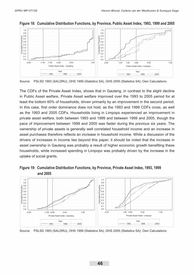
DPRU WP 07/128 Haroon Bhorat, Carlene van der Westhuizen & Sumayya Goga
46
Figure 18: Cumulative Distribution Functions, by Province, Public Asset Index, 1993, 1999 and 2005
Source: PSLSD 1993 (SALDRU), OHS 1999 (Statistics SA), GHS 2005 (Statistics SA); Own Calculations
The CDFs of the Private Asset Index, shows that in Gauteng, in contrast to the slight decline
in Public Asset welfare, Private Asset welfare improved over the 1993 to 2005 period for at
least the bottom 60% of households, driven primarily by an improvement in the second period.
In this case, first order dominance does not hold, as the 1993 and 1999 CDFs cross, as well
as the 1993 and 2005 CDFs. Households living in Limpopo experienced an improvement in
private asset welfare, both between 1993 and 1999 and between 1999 and 2005, though the
pace of improvement between 1999 and 2005 was faster during the previous six years. The
ownership of private assets is generally well correlated household income and an increase in
asset purchases therefore reflects an increase in household income. While a discussion of the
drivers of increases in income lies beyond this paper, it should be noted that the increase in
asset ownership in Gauteng was probably a result of higher economic growth benefiting these
households, while increased spending in Limpopo was probably driven by the increase in the
uptake of social grants.
Figure 19: Cumulative Distribution Functions, by Province, Private Asset Index, 1993, 1999
and 2005
Source: PSLSD 1993 (SALDRU), OHS 1999 (Statistics SA), GHS 2005 (Statistics SA); Own Calculations
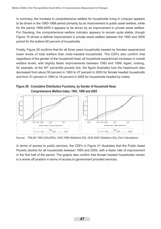
Welfare Shifts in the Post-apartheid South Africa: A Comprehensive Measurement of Changes
47
In summary, the increase in comprehensive welfare for households living in Limpopo appears
to be driven in the 1993-1999 period primarily by an improvement in public asset welfare, while
for the period 1999-2005 it appears to be driven by an improvement in private asset welfare.
For Gauteng, the comprehensive welfare indicator appears to remain quite stable, though
Figure 19 shows a definite improvement in private asset welfare between the 1993 and 2005
period for the bottom 60 percent of households.
Finally, Figure 20 confirms that for all three years households headed by females experienced
lower levels of total welfare than male-headed households. The CDFs also confirm that
regardless of the gender of the household head, all household experienced increases in overall
welfare levels, with slightly faster improvements between 1993 and 1999. Again, looking,
for example, at the 40th percentile poverty line, the figure illustrates how the headcount ratio
decreased from about 50 percent in 1993 to 27 percent in 2005 for female headed households
and from 31 percent in 1993 to 19 percent in 2005 for households headed by males.
Figure 20: Cumulative Distribution Functions, by Gender of Household Head,
Comprehensive Welfare Index, 1993, 1999 and 2005
Source: PSLSD 1993 (SALDRU), OHS 1999 (Statistics SA), GHS 2005 (Statistics SA); Own Calculations
In terms of access to public services, the CDFs in Figure 21 illustrates that the Public Asset
Poverty decline for all households between 1993 and 2005, with a faster rate of improvement
in the first half of the period. The graphs also confirm that female headed households remain
in a worse off position in terms of access to government provided services.
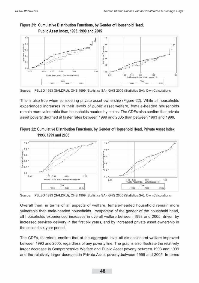
DPRU WP 07/128 Haroon Bhorat, Carlene van der Westhuizen & Sumayya Goga
48
Figure 21: Cumulative Distribution Functions, by Gender of Household Head,
Public Asset Index, 1993, 1999 and 2005
Source: PSLSD 1993 (SALDRU), OHS 1999 (Statistics SA), GHS 2005 (Statistics SA); Own Calculations
This is also true when considering private asset ownership (Figure 22). While all households
experienced increases in their levels of public asset welfare, female-headed households
remain more vulnerable than households headed by males. The CDFs also confirm that private
asset poverty declined at faster rates between 1999 and 2005 than between 1993 and 1999.
Figure 22: Cumulative Distribution Functions, by Gender of Household Head, Private Asset Index,
1993, 1999 and 2005
Source: PSLSD 1993 (SALDRU), OHS 1999 (Statistics SA), GHS 2005 (Statistics SA); Own Calculations
Overall then, in terms of all aspects of welfare, female-headed household remain more
vulnerable than male-headed households. Irrespective of the gender of the household head,
all households experienced increases in overall welfare between 1993 and 2005, driven by
increased services delivery in the first six years, and by increased private asset ownership in
the second six-year period.
The CDFs, therefore, confirm that at the aggregate level all dimensions of welfare improved
between 1993 and 2005, regardless of any poverty line. The graphs also illustrate the relatively
larger decrease in Comprehensive Welfare and Public Asset poverty between 1993 and 1999
and the relatively larger decrease in Private Asset poverty between 1999 and 2005. In terms

Welfare Shifts in the Post-apartheid South Africa: A Comprehensive Measurement of Changes
49
of the population groups, the CDFs also visually confirm that although the African CDFs mirror
the trends at national level, overall African households still lag behind their White counterparts
in terms of all the dimensions of welfare. The same is true of female headed households, who
still display larger levels of deprivation than households headed by males.
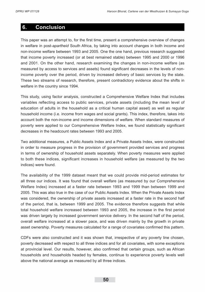
DPRU WP 07/128 Haroon Bhorat, Carlene van der Westhuizen & Sumayya Goga
50
6. Conclusion
This paper was an attempt to, for the first time, present a comprehensive overview of changes
in welfare in post-apartheid South Africa, by taking into account changes in both income and
non-income welfare between 1993 and 2005. One the one hand, previous research suggested
that income poverty increased (or at best remained stable) between 1995 and 2000 or 1996
and 2001. On the other hand, research examining the changes in non-income welfare (as
measured by access to services and assets) found significant decreases in the levels of non-
income poverty over the period, driven by increased delivery of basic services by the state.
These two streams of research, therefore, present contradictory evidence about the shifts in
welfare in the country since 1994.
This study, using factor analysis, constructed a Comprehensive Welfare Index that includes
variables reflecting access to public services, private assets (including the mean level of
education of adults in the household as a critical human capital asset) as well as regular
household income (i.e. income from wages and social grants). This index, therefore, takes into
account both the non-income and income dimensions of welfare. When standard measures of
poverty were applied to our Comprehensive Welfare Index, we found statistically significant
decreases in the headcount rates between 1993 and 2005.
Two additional measures, a Public Assets Index and a Private Assets Index, were constructed
in order to measure progress in the provision of government provided services and progress
in terms of ownership of household assets separately. When poverty measures were applied
to both these indices, significant increases in household welfare (as measured by the two
indices) were found.
The availability of the 1999 dataset meant that we could provide mid-period estimates for
all three our indices. It was found that overall welfare (as measured by our Comprehensive
Welfare Index) increased at a faster rate between 1993 and 1999 than between 1999 and
2005. This was also true in the case of our Public Assets Index. When the Private Assets Index
was considered, the ownership of private assets increased at a faster rate in the second half
of the period, that is, between 1999 and 2005. The evidence therefore suggests that while
total household welfare increased between 1993 and 2005, the increase in the first period
was driven largely by increased government service delivery. In the second half of the period,
overall welfare increased at a slower pace, and was driven mainly by the growth in private
asset ownership. Poverty measures calculated for a range of covariates confirmed this pattern.
CDFs were also constructed and it was shown that, irrespective of any poverty line chosen,
poverty decreased with respect to all three indices and for all covariates, with some exceptions
at provincial level. Our results, however, also confirmed that certain groups, such as African
households and households headed by females, continue to experience poverty levels well
above the national average as measured by all three indices.

Welfare Shifts in the Post-apartheid South Africa: A Comprehensive Measurement of Changes
51
Ultimately, the study has shown that total household welfare increased between 1993 and
2005. In the construction of the Comprehensive Welfare Index we were able to deal with
the opposing evidence found when examining changes in income and non-income welfare
separately. The study does, however, suffer from drawbacks, particularly with regard to the
measurement of household income. In the analysis only income from two sources, namely
wages and social grants, were considered. The impact of other sources of income, specifically
remittances, was ignored. In addition, the drivers of the increased ownership of private assets
were only alluded to. It is still unclear how much of the increased household ownership of
assets can be ascribed to the fruits of higher economic growth and how much is the result of
the expansion of the government’s social grant system.

DPRU WP 07/128 Haroon Bhorat, Carlene van der Westhuizen & Sumayya Goga
52
7. References
Bhorat, H. & Shaikh, N. 2004. Poverty and Labour Markers of HIV+ Households: An Exploratory Methodological Analysis. Development Policy Research Unit Working Paper No 04/83. February 2004. Cape Town: University of Cape Town.
Bhorat, H., van der Westhuizen, C. & Goga, S. 2007. Growth, Poverty and Inequality in Post-Apartheid South Africa: Exploring the Interactions. Paper Presented at the SANPAD Conference, Durban 2007.
Bhorat, H., van der Westhuizen, C. & Naidoo, P. 2006. Shifts in Non-Income Welfare in South Africa: 1993 -2004. Development Policy Research Unit Working Paper No 06/108. May 2006. Cape Town: University of Cape Town.
Booysen, F le R. 2002. Using Demographic and Health Surveys to Measure Poverty – An Application to South Africa, Journal for Studies in Economics and Econometrics, Vol. 26. No. 3, pp. 53-70.
Booysen, F le R. et al. 2004. Poverty and Inequality Analysis for Seven African Countries, using Asset Indices Constructed from DHS data. Interim report for PEP-PMMA Meeting. 16-20 June 2004. Dakar, Senegal.
Filmer, D. & Pritchett, L.H. 2001. Estimating Wealth Effects without Expenditure Data or Tears: An Application to Educational Enrollments in States in India, Demography, Vol. 38, No. 1, February 2001, pp. 115-132.
Foster, J.E., Greer, J. & Thorbecke, E. 1984. A Class of Decomposable Poverty Measures, Econometrics, Vol. 52
Hoogeveen , J. & Özler, B. 2006. Not Separate, Not Equal: Poverty and Inequality in Post-Apartheid South Africa. In Bhorat, H. & Kanbur, R. (eds.) Poverty and Policy in Post-Apartheid South Africa. Cape Town: HSRC Press
Leibbrandt, M., Levinsohn, J. & McCrary, J. 2005. Incomes in South Africa since the fall of Apartheid. NBER Working Paper. No. 11384. National Bureau for Economic Research: Cambridge.
Leibbrandt, M., Poswell, L., Naidoo, P., Welch, M. & Woolard, I. 2005. Measuring Recent Changes in South African Inequality and Poverty using 1996 and 2001 Census Data. Development Policy Research Unit Working Paper No 05/94. June 2005. Cape Town; University of Cape Town
McKenzie, D.J. 2003. Measuring Inequality with Asset Indicators. BREAD Working Paper No 042. August 2003.
Policy Coordination and Advisory Services (PCAS). 2006. A Nation in the Making: A Discussion Document on Macro-Social Trend in South Africa. Social Sector. The Presidency.

Welfare Shifts in the Post-apartheid South Africa: A Comprehensive Measurement of Changes
53
Ravallion, M. 1994. Poverty Comparisons. Chur: Harwood Academic Publishers.
Southern Africa Labour and Development Research Unit (SALDRU). 1993. Project for Statistics on Living Standards and Development (PSLSD). The South African Integrated Household Survey. Cape Town. Overview and background information available from http: //www.cssr.uct.ac.za/saldru_pslsd.html
Southern Africa Labour and Development Research Unit (SALDRU). 1993. Project for Statistics on Living Standards and Development (PSLSD). The South African Integrated Household Survey. Cape Town. Dataset.
Sahn, D.E. & Stifel, D.C. 2000. Poverty Comparisons over Time and Across Countries in Africa, World Development, Vol. 28 No. 12, pp. 2123-2155.
Statistics South Africa. 2000. October Household Survey 1999. Statistical Release P0317. Pretoria: Own publication.
Statistics South Africa. 2006. General Household Survey July 2005. Statistical Release P0318. Pretoria: Own Publication.
StatisticsSouthAfrica.2006.CPI History: Metropolitan Areas - All Items. P0141.1. Availableat
http://www. statssa.gov.za/keyindicators/CPI/CPIHistory.pdf
World Bank. 2000. Round I Country Reports on Health, Nutrition, Population Conditions among Poor and Better-off Countries. Available from
http://web.worldbank.org/WBSITE/EXTERNAL/TOPICS/EXTHEALTHNUTRITIONANDPOPULATION/EXTPAH/0,,menuPK:400482~pagePK:149018~piPK:149093~theSitePK:400476,00.html
World Bank. 2004. Round II Country Reports on Health, Nutrition, Population Conditions among Poor and Better-off Countries. Available from
http://web.worldbank.org/WBSITE/EXTERNAL/TOPICS/EXTHEALTHNUTRITIONANDPOPULATION/EXTPAH/0,,menuPK:400482~pagePK:149018~piPK: 149093~theSitePK: 400476,00.html

DPRU WP 07/128 Haroon Bhorat, Carlene van der Westhuizen & Sumayya Goga
54
Appendix A: Access to Services, All Households: 1993-2005
Source: PSLSD 1993 (SALDRU), OHS 1999 (Statistics SA), GHS 2005 (Statistics SA); Own Calculations
Welfare Shifts in the Post-apartheid South Africa: A Comprehensive Measurement of Changes
55
Appendix B: Access to Formal Dwelling, Decile 1 to 4: 1993-2005
Source: PSLSD 1993 (SALDRU), OHS 1999 (Statistics SA), GHS 2005 (Statistics SA); Own Calculations

DPRU WP 07/128 Haroon Bhorat, Carlene van der Westhuizen & Sumayya Goga
56
Appendix C: Access to Electricity for Lighting, Decile 1 to 4: 1993-2005
Source: PSLSD 1993 (SALDRU), OHS 1999 (Statistics SA), GHS 2005 (Statistics SA); Own Calculations

Welfare Shifts in the Post-apartheid South Africa: A Comprehensive Measurement of Changes
57
Appendix D : Access to Piped Water, Decile 1 to 4: 1993-2005
Source: PSLSD 1993 (SALDRU), OHS 1999 (Statistics SA), GHS 2005 (Statistics SA); Own Calculations
DPRU WP 07/128 Haroon Bhorat, Carlene van der Westhuizen & Sumayya Goga
58
Appendix E: Access to Flush Toilet, Decile 1 to 4: 1993-2005
Source: PSLSD 1993 (SALDRU), OHS 1999 (Statistics SA), GHS 2005 (Statistics SA); Own Calculations
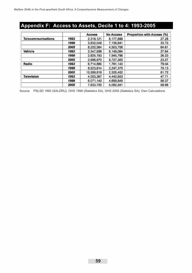
Welfare Shifts in the Post-apartheid South Africa: A Comprehensive Measurement of Changes
59
Appendix F: Access to Assets, Decile 1 to 4: 1993-2005
Source: PSLSD 1993 (SALDRU), OHS 1999 (Statistics SA), GHS 2005 (Statistics SA); Own Calculations

DPRU WP 07/128 Haroon Bhorat, Carlene van der Westhuizen & Sumayya Goga
60
Appendix G: Testing the Reliability of the Derived Indices
Internal Coherence
The internal coherence of an index can be evaluated by comparing the mean value of each
of the variables included in the index across poor, middle-income and rich households. We
would expect the average ownership of an asset/service to differ across these categories of
households. We divided the households in each year into quartiles based on their index value.
In other words, households were divided into the poorest 25 percent, the second poorest 25
percent, the next 25 percent and the richest 25 percent according to the distribution of the
derived index. We then evaluated the mean ownership of public assets, private assets as well
as mean income across the quartiles for each of the three years.
The table below shows the results for the three indices. The household quartiles for the public
assets were derived from the Public Asset Index, the quartiles for the private assets were
derived from the Private Asset Index, and income is classified according to quartiles derived
from the Comprehensive Welfare Index. Looking at the results for the Public Assets Index first,
in 1993 only 18 percent of households in the bottom quartile had access to formal dwelling, 61
percent of households in the second quartile had access to a formal dwelling, 97 percent of
households in the third quartile had access to a formal dwelling and finally, all households in
the top 25 percent of the Public Asset Index distribution had access to a formal dwelling. Thus,
there is an increase in access to a formal dwelling as we move up the quartiles. The pattern
is similar for access to formal dwelling in both 1999 and 2005. In fact, this pattern can be
observed for all variables that contribute to relative asset wealth, and is true for all public and
private assets, as well as income. The average years of education of adults in the household
also increase as we move up the quartiles of the Private Assets Index for any given year.
We can see the opposite trend as far as variables that reflect relative poverty are concerned.
For example, the proportion of households using candles for lighting decreases as we move
up the Public Asset Index quartiles.
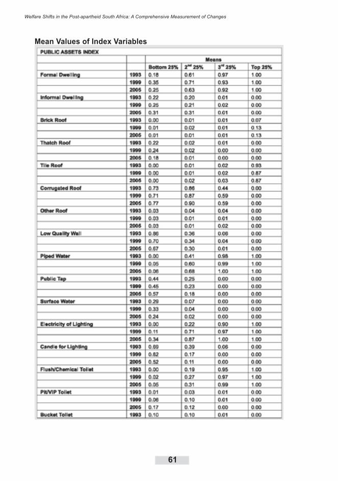
Welfare Shifts in the Post-apartheid South Africa: A Comprehensive Measurement of Changes
61
Mean Values of Index Variables
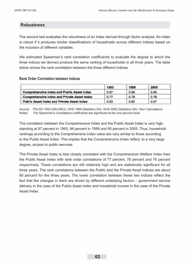
DPRU WP 07/128 Haroon Bhorat, Carlene van der Westhuizen & Sumayya Goga
62
Robustness
The second test evaluates the robustness of an index derived through factor analysis. An index
is robust if it produces similar classifications of households across different indices based on
the inclusion of different variables.
We estimated Spearman’s rank correlation coefficients to evaluate the degree to which the
three indices we derived produce the same ranking of households in all three years. The table
below shows the rank correlation between the three different indices.
Rank Order Correlation between Indices
Source: PSLSD 1993 (SALDRU), OHS 1999 (Statistics SA), GHS 2005 (Statistics SA); Own CalculationsNotes: The Spearmen’s correlations coefficients are significant at the one percent level.
The correlation between the Comprehensive Index and the Public Asset Index is very high,
standing at 97 percent in 1993, 96 percent in 1999 and 95 percent in 2005. Thus, household
rankings according to the Comprehensive Index value are very similar to those according
to the Public Asset Index. This implies that the Comprehensive Index reflect, to a very large
degree, access to public services.
The Private Asset Index is less closely correlated with the Comprehensive Welfare Index than
the Public Asset Index with rank order correlations of 77 percent, 78 percent and 76 percent
respectively. These correlations are still relatively high and are statistically significant for all
three years. The rank correlations between the Public and the Private Asset Indices are about
60 percent for the three years. The lower correlation between these two indices reflect the
fact that the changes in them are driven by different underlying factors – government service
delivery in the case of the Public Asset Index and household income in the case of the Private
Asset Index.
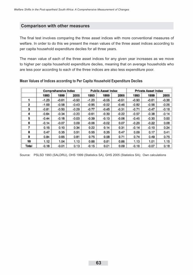
Welfare Shifts in the Post-apartheid South Africa: A Comprehensive Measurement of Changes
63
Comparison with other measures
The final test involves comparing the three asset indices with more conventional measures of
welfare. In order to do this we present the mean values of the three asset indices according to
per capita household expenditure deciles for all three years.
The mean value of each of the three asset indices for any given year increases as we move
to higher per capita household expenditure deciles, meaning that on average households who
are less poor according to each of the three indices are also less expenditure poor.
Mean Values of Indices according to Per Capita Household Expenditure Deciles
Source: PSLSD 1993 (SALDRU), OHS 1999 (Statistics SA), GHS 2005 (Statistics SA); Own calculations
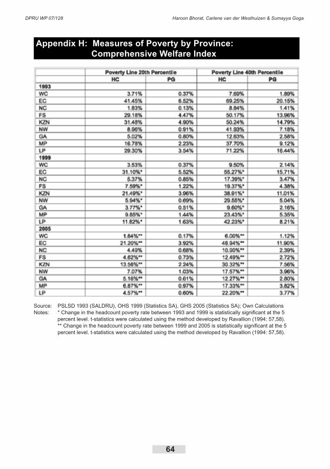
DPRU WP 07/128 Haroon Bhorat, Carlene van der Westhuizen & Sumayya Goga
64
Appendix H: Measures of Poverty by Province: Comprehensive Welfare Index
Source: PSLSD 1993 (SALDRU), OHS 1999 (Statistics SA), GHS 2005 (Statistics SA); Own CalculationsNotes: * Change in the headcount poverty rate between 1993 and 1999 is statistically significant at the 5 percent level. t-statistics were calculated using the method developed by Ravallion (1994: 57,58). ** Change in the headcount poverty rate between 1999 and 2005 is statistically significant at the 5 percent level. t-statistics were calculated using the method developed by Ravallion (1994: 57,58).
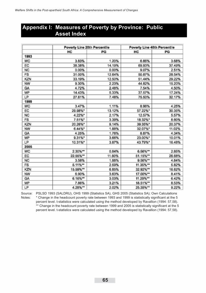
Welfare Shifts in the Post-apartheid South Africa: A Comprehensive Measurement of Changes
65
Appendix I: Measures of Poverty by Province: Public Asset Index
Source: PSLSD 1993 (SALDRU), OHS 1999 (Statistics SA), GHS 2005 (Statistics SA); Own CalculationsNotes: * Change in the headcount poverty rate between 1993 and 1999 is statistically significant at the 5 percent level. t-statistics were calculated using the method developed by Ravallion (1994: 57,58). ** Change in the headcount poverty rate between 1999 and 2005 is statistically significant at the 5 percent level. t-statistics were calculated using the method developed by Ravallion (1994: 57,58).
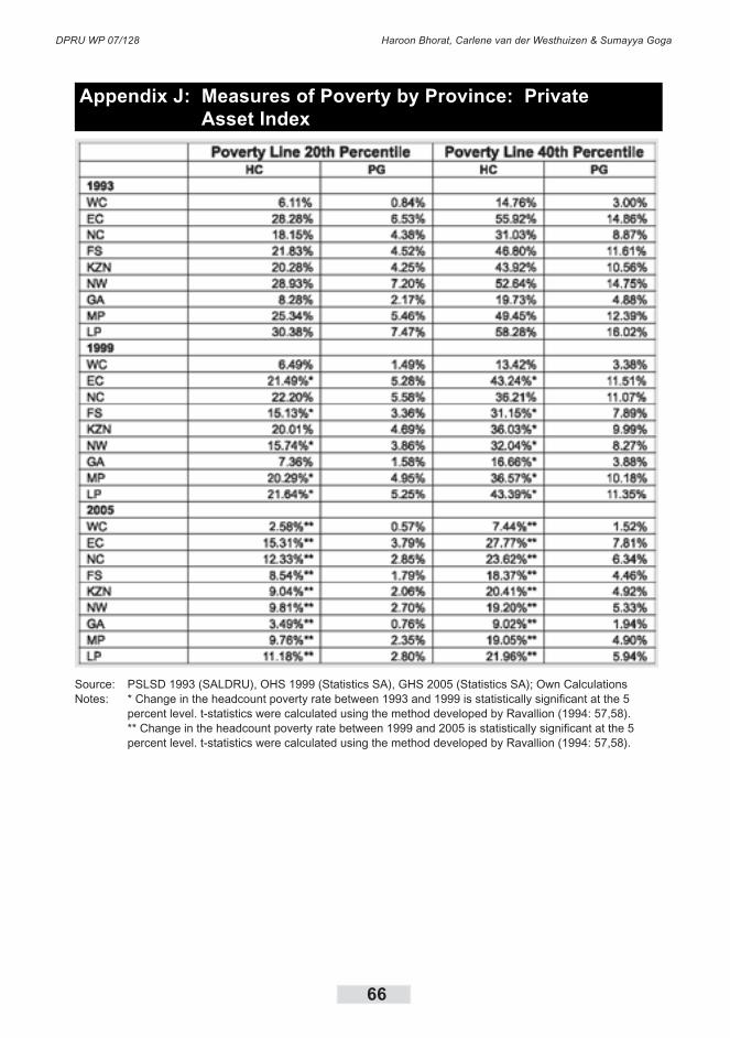
DPRU WP 07/128 Haroon Bhorat, Carlene van der Westhuizen & Sumayya Goga
66
Appendix J: Measures of Poverty by Province: Private Asset Index
Source: PSLSD 1993 (SALDRU), OHS 1999 (Statistics SA), GHS 2005 (Statistics SA); Own CalculationsNotes: * Change in the headcount poverty rate between 1993 and 1999 is statistically significant at the 5 percent level. t-statistics were calculated using the method developed by Ravallion (1994: 57,58). ** Change in the headcount poverty rate between 1999 and 2005 is statistically significant at the 5 percent level. t-statistics were calculated using the method developed by Ravallion (1994: 57,58).