Embed Size (px)
Citation preview
Web-Based Portal Computer-Human Interface Guidelines
Vicki Ahlstrom, NAS Human Factors Group Kenneth Allendoerfer, NAS Human Factors Group
June 2004
DOT/FAA/CT-TN04/23
ote
tech
nica
l not
ete
chn
Document is available to the publicthrough the National Technical InformationService, Springfield, Virginia 22161
U.S. Department of TransportationFederal Aviation Administration
William J. Hughes Technical CenterAtlantic City International Airport, NJ 08405
ote
tech
nica
l not
ete
chn
Document is available to the publicthrough the National Technical InformationService, Springfield, Virginia 22161
U.S. Department of TransportationFederal Aviation Administration
William J. Hughes Technical CenterAtlantic City International Airport, NJ 08405
ote
tech
nica
l not
ete
chn
Document is available to the publicthrough the National Technical InformationService, Springfield, Virginia 22161
U.S. Department of TransportationFederal Aviation Administration
William J. Hughes Technical CenterAtlantic City International Airport, NJ 08405
ote
tech
nica
l not
ete
chn
Document is available to the publicthrough the National Technical InformationService, Springfield, Virginia 22161
U.S. Department of TransportationFederal Aviation Administration
William J. Hughes Technical CenterAtlantic City International Airport, NJ 08405
ote
tech
nica
l not
ete
chn
Document is available to the publicthrough the National Technical InformationService, Springfield, Virginia 22161
U.S. Department of TransportationFederal Aviation Administration
William J. Hughes Technical CenterAtlantic City International Airport, NJ 08405
ote
tech
nica
l not
ete
chn
Document is available to the publicthrough the National Technical InformationService, Springfield, Virginia 22161
U.S. Department of TransportationFederal Aviation Administration
William J. Hughes Technical CenterAtlantic City International Airport, NJ 08405
ote
tech
nica
l not
ete
chn
Document is available to the publicthrough the National Technical InformationService, Springfield, Virginia 22161
U.S. Department of TransportationFederal Aviation Administration
William J. Hughes Technical CenterAtlantic City International Airport, NJ 08405
ote
tech
nica
l not
ete
chn
Document is available to the publicthrough the National Technical InformationService, Springfield, Virginia 22161
U.S. Department of TransportationFederal Aviation Administration
William J. Hughes Technical CenterAtlantic City International Airport, NJ 08405
NOTICE
This document is disseminated under the sponsorship of the U.S. Department of Transportation in the interest of information exchange. The United States Government assumes no liability for the contents or use thereof. The United States Government does not endorse products or manufacturers. Trade or manufacturer's names appear herein solely because they are considered essential to the objective of this report. This document does not constitute FAA certification policy.
This report is available at the Federal Aviation Administration, William J. Hughes Technical Center’s full text, technical reports web site: http://actlibrary.tc.faa.gov in Adobe Acrobat portable document format (PDF).
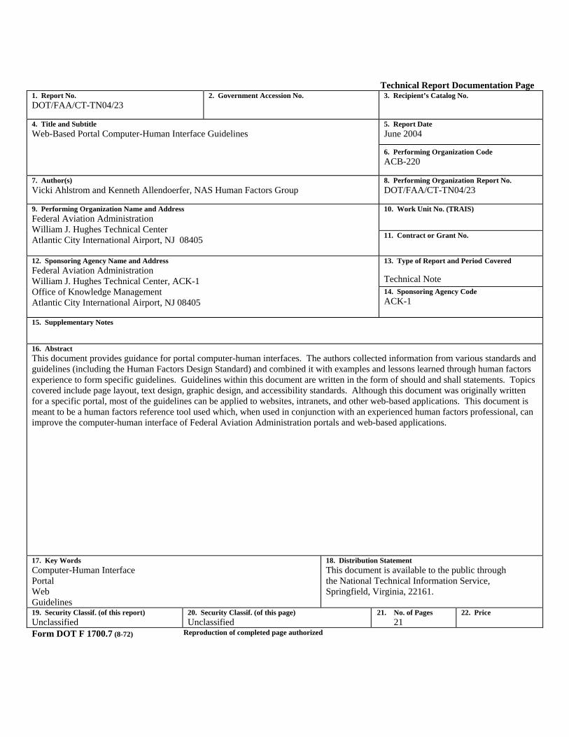
Technical Report Documentation Page 1. Report No. DOT/FAA/CT-TN04/23
2. Government Accession No. 3. Recipient’s Catalog No.
4. Title and Subtitle Web-Based Portal Computer-Human Interface Guidelines
5. Report Date June 2004 6. Performing Organization Code ACB-220
7. Author(s) Vicki Ahlstrom and Kenneth Allendoerfer, NAS Human Factors Group
8. Performing Organization Report No. DOT/FAA/CT-TN04/23
10. Work Unit No. (TRAIS)
9. Performing Organization Name and Address Federal Aviation Administration William J. Hughes Technical Center Atlantic City International Airport, NJ 08405
11. Contract or Grant No.
13. Type of Report and Period Covered Technical Note
12. Sponsoring Agency Name and Address Federal Aviation Administration William J. Hughes Technical Center, ACK-1 Office of Knowledge Management Atlantic City International Airport, NJ 08405
14. Sponsoring Agency Code ACK-1
15. Supplementary Notes 16. Abstract This document provides guidance for portal computer-human interfaces. The authors collected information from various standards and guidelines (including the Human Factors Design Standard) and combined it with examples and lessons learned through human factors experience to form specific guidelines. Guidelines within this document are written in the form of should and shall statements. Topics covered include page layout, text design, graphic design, and accessibility standards. Although this document was originally written for a specific portal, most of the guidelines can be applied to websites, intranets, and other web-based applications. This document is meant to be a human factors reference tool used which, when used in conjunction with an experienced human factors professional, can improve the computer-human interface of Federal Aviation Administration portals and web-based applications.
17. Key Words Computer-Human Interface Portal Web Guidelines
18. Distribution Statement This document is available to the public through the National Technical Information Service, Springfield, Virginia, 22161.
19. Security Classif. (of this report) Unclassified
20. Security Classif. (of this page) Unclassified
21. No. of Pages 21
22. Price
Form DOT F 1700.7 (8-72) Reproduction of completed page authorized
iii
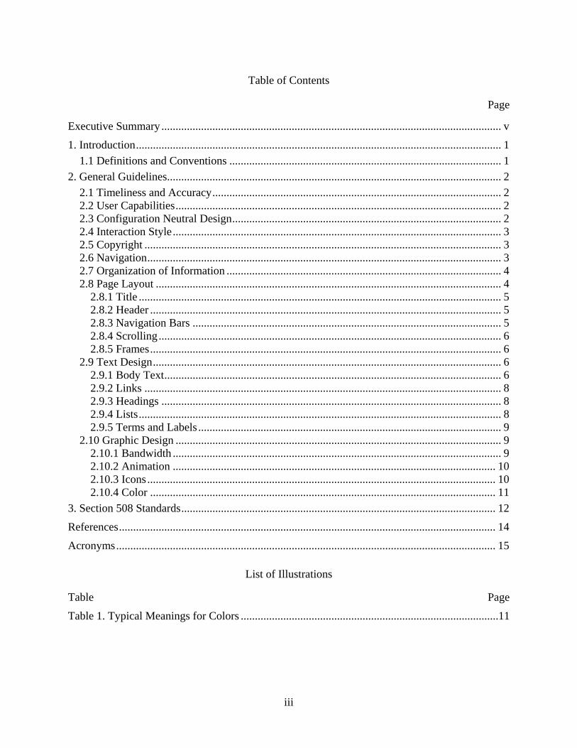
Table of Contents
Page
Executive Summary ........................................................................................................................ v
1. Introduction................................................................................................................................. 1 1.1 Definitions and Conventions ................................................................................................ 1
2. General Guidelines...................................................................................................................... 2 2.1 Timeliness and Accuracy...................................................................................................... 2 2.2 User Capabilities................................................................................................................... 2 2.3 Configuration Neutral Design............................................................................................... 2 2.4 Interaction Style.................................................................................................................... 3 2.5 Copyright .............................................................................................................................. 3 2.6 Navigation............................................................................................................................. 3 2.7 Organization of Information ................................................................................................. 4 2.8 Page Layout .......................................................................................................................... 4
2.8.1 Title ................................................................................................................................ 5 2.8.2 Header ............................................................................................................................ 5 2.8.3 Navigation Bars ............................................................................................................. 5 2.8.4 Scrolling ......................................................................................................................... 6 2.8.5 Frames............................................................................................................................ 6
2.9 Text Design........................................................................................................................... 6 2.9.1 Body Text....................................................................................................................... 6 2.9.2 Links .............................................................................................................................. 8 2.9.3 Headings ........................................................................................................................ 8 2.9.4 Lists................................................................................................................................ 8 2.9.5 Terms and Labels ........................................................................................................... 9
2.10 Graphic Design ................................................................................................................... 9 2.10.1 Bandwidth .................................................................................................................... 9 2.10.2 Animation .................................................................................................................. 10 2.10.3 Icons........................................................................................................................... 10 2.10.4 Color .......................................................................................................................... 11
3. Section 508 Standards............................................................................................................... 12
References..................................................................................................................................... 14
Acronyms...................................................................................................................................... 15
List of Illustrations
Table Page
Table 1. Typical Meanings for Colors ...........................................................................................11

iv

v
Executive Summary
This document provides computer-human interface (CHI) guidelines for web-based portals. These guidelines can also be applied to public websites, company intranets, and other similar web-based applications. This document complements the existing Human Factors Design Standard (HFDS) (Ahlstrom & Longo, 2003).
This document provides definitions and conventions specific to portal systems. Major topic areas contained in this document include general guidelines, page layout, text design, graphic design, and accessibility standards. The guidelines are in the form of should and shall statements and are appropriate for insertion into requirements documents. Additionally, the document provides examples and explanations for how and why guidelines should be used.
As with any set of CHI guidelines, these guidelines are meant to be applied with the help of a human factors professional and adapted to the system being designed. The guidelines contained here are not intended to stand alone but rather should be a part of a human factors program.

1
1. INTRODUCTION
This document provides computer-human interface (CHI) guidelines for a web-based portal. The guidelines were originally developed for a portal at the Federal Aviation Administration (FAA) William J. Hughes Technical Center. Because portals use browser technology to present the CHI, most of these guidelines can be applied to public websites, company intranets, and other similar web-based applications. This document draws heavily from the Human Factors Design Standard (HFDS) (Ahlstrom & Longo, 2003) but also provides additional information that is specific to portals and web-based applications. Therefore, this document can be seen as a complement to the existing HFDS.
1.1 Definitions and Conventions
We use the following definitions and conventions throughout the document.
• Portal: An online space that allows users to access information in a consolidated location, to search and retrieve documents, and to collaborate with each other. Users access portals with web browser software such as Microsoft® Internet Explorer or Netscape® Navigator. Portals are frequently built for use by members of an organization (e.g., as an intranet) to provide internal communication and knowledge management functions. Portals also often provide employee services such as human resources and directories.
• Page: A file or combination of files in the portal that are designed to be viewed simultaneously. In most cases, a page is rendered in Hypertext Markup Language (HTML) code, but it may also contain elements written in Java, Javascript, or another development language. Pages also may incorporate graphical elements, such as Graphical Interchange Format (GIF) files, that are maintained separately from the page code itself.
• Homepage: The first page most users see when accessing the portal. A homepage is typically the highest level of a portal hierarchy.
• Portal Developer: The organization responsible for building a portal.
• Portal Maintainer: The organization responsible for operating a portal once deployed. The maintainer is responsible for responding to feedback about the portal, correcting errors, and adding new information as it becomes available.
• In this document, we present elements of code in the Lucida Console typeface to set them apart from the main text. Items such as <TITLE> are examples of pieces of HTML code called tags that indicate specific information types.
2
• We provide examples to illustrate concepts, but these are not specific design recommendations. We designed these examples to apply to a wide range of portals, and should be refined to fit an individual portal project.
2. GENERAL GUIDELINES
The following guidelines apply to all pages within the portal.
2.1 Timeliness and Accuracy
The portal maintainer shall institute a formal process of periodic portal audits and updates. These audits shall
• check that all portal information is current and accurate, • make new information available in the portal, • ensure that the new information follows CHI guidelines, and • check that links to sites outside the portal are still operational.
The portal developer shall provide mechanisms and tools for the maintainer to accomplish these functions quickly and accurately (Detweiler & Omanson, 1996).
The portal shall provide a method for users to voluntarily report errors to the maintainer. The maintainer should respond to all credible feedback and provide users with the status of any resolution in a timely manner. Good portal maintenance is time consuming, but it ultimately makes the portal worth visiting (Nielsen, 2000a).
Links to other websites or portals should be included only if they serve a specific purpose. Although it is sometimes useful to provide links from the portal to other portals or websites, linking to other sites can cause problems for maintainability (e.g., a process must be instituted to ensure that the external links are still working). In addition, once a user goes to the external site, they may not have an easy way to return to the portal (Detweiler & Omanson, 1996).
2.2 User Capabilities
Members of any large organization will vary widely in their knowledge and abilities. Because of this, a portal CHI must account for both experienced users and novices. All pages shall include a link to “Help.” The homepage shall include links to “About” or “Frequently Asked Questions (FAQs)” pages. These contain general information about the portal, contact information, and so on (Lynch & Horton, 2004). Navigation bars shall provide direct links to popular areas of the portal. This will help experienced users skip quickly to those popular areas without navigating the entire portal hierarchy (Nielsen, 2000b).
2.3 Configuration Neutral Design
We can only roughly predict the configurations all portal users will have. To ensure that a wide range of configurations are accommodated, developers should address the following items:

3
• Platform: All pages shall be viewable on the Microsoft Windows, Macintosh, UNIX, and Linux platforms without the page layout or functionality changing significantly (Lynch & Horton, 2004).
• Browser: All pages on the portal shall be viewable by the current versions of both the Netscape Navigator and Internet Explorer browsers. As of this writing, this is Netscape 7.1 and Internet Explorer 6. As new browser versions become available, the portal shall continue to maintain backward-compatibility with at least one older version of both browsers. The portal shall maintain compatibility with text-only browsers used by vision-impaired people. Chapter 6 of Nielsen (2000a) provides a thorough discussion of this topic. Alternately, a portal can provide both graphical and text-only versions of its pages (General Services Administration, 2004).
2.4 Interaction Style
Each time a function is available, the portal shall allow users to access and complete the function in the same manner (Ahlstrom & Longo, 2003). That is, the function should not appear on some pages as a pull down menu and on other pages as a push button. This is confusing and creates an inconsistent look and feel. The developers should select one interaction style for each function and will use that style throughout the portal.
2.5 Copyright
The portal shall use copyrighted materials, including copyrighted graphics, only with permission of the copyright holders.
2.6 Navigation
The portal shall be organized so that users can locate information quickly and accurately.
The portal shall minimize the number of steps and screens that a user must view before obtaining the desired information. Once the user is logged in, most information should be accessible in no more than three steps.
Each page shall indicate its relative location in the overall portal hierarchy. A common way to accomplish this is by using “breadcrumbs” near the top of each page showing levels of the hierarchy above the current page (Nielsen, 2000a).
The URL of each page shall be interpretable by users. This will assist users in understanding where they are in the hierarchy and in providing addresses to others (Nielsen, 2000a).
Example:
Poor: http://portal.tc.faa.gov/wmc/v/wm/5dab?cmd=List&no=1&sid=c0
Better: http://portal.tc.faa.gov/clubs/littleflyers.html
4
2.7 Organization of Information
A portal will normally contain several categories of information (e.g., Travel, Human Resources) that contain links to documents, services, and other functions. Categories are frequently nested, depending on the amount of information within the category. In many portals, categories are represented on pages as boxes with headings. When building categories, developers should follow the guidelines below.
• Categories shall be distinct and well known to users. The portal shall not use catch-all categories like “Other” or “Miscellaneous.” A category titled “Miscellaneous” can decrease performance by 45% (Ahlstrom & Muldoon, 2002).
• The minimum number of items in a category shall be three. Otherwise, the categorization forces the users to use two clicks when one would do. This requirement may be violated if a de facto standard exists that certain items belong together under a specific heading (Ahlstrom & Muldoon, 2002).
• The maximum number of items in a category shall be 10. This requirement can be violated if a de facto standard exists that certain items belong together under a specific heading. Categories with a more items than 10 shall contain subcategories or items grouped with dividers (Ahlstrom & Longo, 2003).
• Breadth is better than depth. Each user action is a decision point that requires time and creates the opportunity to make an error. The portal should emphasize more options per level rather than more levels. Emphasizing breadth can create some space constraints and clutter within a category. When screen real estate for a category is limited, the portal shall show the most likely options by default and provide a link to display all the options in the category (Ahlstrom & Longo, 2003).
• Items in a category shall be ordered alphabetically or according to their use. For example, if two items are often used together, it is helpful to the user if those items are located near each other. Search time is reduced by 50% if items are alphabetized and the first word is not arbitrary. Search time increases when items are presented randomly (Ahlstrom & Longo, 2003).
• Items that are of greatest importance shall be easy to see and clearly distinguished from other items (Detweiler & Omanson, 1996). Importance or perceptual prominence can be achieved through increasing size, bolding, or using color in conjunction with the guidance provided later in this document.
2.8 Page Layout
This section provides guidelines about where and how to display information on a page. Developers should strive to make the layout simple, clear, and consistent. A logical and consistent page layout makes it easy for viewers to access, understand, and remember information.
5
Pages shall maintain consistency in overall structure and appearance to the homepage.
Recurring elements (e.g., buttons, logos, contact information) shall appear in a consistent location across the pages (Detweiler & Omanson, 1996).
The most important information should be placed in the center area of the page. Pages shall be structured to be read top to bottom and left to right. This is to maintain consistency with how users in North America read information (Detweiler & Omanson, 1996).
2.8.1 Title
The <TITLE> tag specifies the title of a page that appears in the title bar of the browser, next to the browser name. This title will become the name of the bookmark if users bookmark the page. The <TITLE> of each page shall be clear, concise, and descriptive of the contents of the page (Detweiler & Omanson, 1996).
2.8.2 Header
To give a sense of continuity, every page in the portal shall include the same overall header. The header shall indicate the title of the page and other identifying information. The header provides a common appearance to the pages and increases portal identity (Lynch & Horton, 2004).
2.8.3 Navigation Bars
• All pages on the portal shall contain a main navigation bar that provides links to the major sections of the portal. The main navigation bar shall be located in the same location on every page. The main navigation bar may be incorporated into the header. Navigation bars may be located at the top or left side of a page.
• If the navigation bar uses graphic links, redundant text also shall be provided. This will allow the pages to be used by text-only browsers. The redundant text shall appear as ALT parameters in the <IMG> tag or as text links located elsewhere on the page (Lynch & Horton, 2004).
• A search field shall be included in either the top or left navigation bar.
• The main navigation bar shall contain a link to the portal homepage (Detweiler & Omanson, 1996).
• Sections of the portal may add section-specific navigation bars. However, these navigation bars shall follow the general design of the main navigation bar, shall allow the main navigation bar to be seen, and shall provide information not already provided by the main navigation bar. The section-specific navigation bars shall appear in the same location on every page in the section.
6
2.8.4 Scrolling
No page shall require horizontal scrolling when the width of the browser window is set to 800 pixels or wider. Note that the browser window is often reduced by the “Favorites” menu used in browsers and so the browser window may not be the same as the full application window or the screen resolution (Lynch & Horton, 2004).
Scrolling can cause the users to lose the context of the page and become disoriented. If a page is longer than two vertical screens, it shall contain buttons or links that allow the user to return to the top of the page (Lynch & Horton, 2004).
2.8.5 Frames
The portal shall not use HTML frames because they can create serious usability problems. Examples of these problems follow (Nielsen, 2000a).
• A frame may link to another page while a frame from the original page inadvertently remains visible.
• Multiple scroll bars on a page are confusing for users.
• Frames make printing pages confusing.
• Frames make the “Back” button behave differently than it does on non-frame pages. This is undesirable, particularly for novice users.
• Frames can make the page difficult to navigate for users with a text-reading device.
• Frames make pages difficult to add to Bookmarks or Favorites. Usually only the top level page of a hierarchy can be made into a bookmark because when a new page is loaded into the “main” frame, the URL does not change. Users must first remove all the frames and then make the bookmark. Even with this approach, when the user returns to the bookmarked page, the “navbar” frame will not load.
2.9 Text Design
Text shall be well organized, carefully formatted, and concisely written. Text on a web page should follow most of the rules for text on a printed page. For a summary of good text design, consult the Human Factors Technical Writer’s Guide (Snyder, Bryant, Dunn, & Stein, 1998).
In some cases, however, guidelines for printed pages do not fully correspond to portal pages. In particular, users are less likely to read long passages of text on-line than they are in print. If the on-line information covers many screens, users will usually print the pages rather than read it on-line. In these cases, developers should consider presenting this information as an Adobe Acrobat (.pdf) file (Detweiler & Omanson, 1996).
2.9.1 Body Text
Because users can specify the body text parameters in their browser preferences, developers have only partial control over how body text appears. However, developers should follow these guidelines:
7
• One and only one typeface shall be used for body text. Pages may use serif (e.g., Times New Roman) or sans serif (e.g., Verdana) typefaces, provided the typefaces is simple, easy to read, and widely installed. Pages that are intended to be printed should use a serif typeface as body text. Small text, such as in labels or captions, should use sans serif typefaces (Ahlstrom & Longo, 2003; Nielsen, 2000a).
• Avoid using many different fonts on a page or across related pages. Preferably, limit the number of different fonts on a single page to two (Ahlstrom & Longo, 2003). Using a single family of font styles can help to create a consistent look and feel.
• The font shall be easy to read at the expected viewing angles and distances (Detweiler & Omanson,1996).
• When specifying a typeface, the portal shall provide alternative, similar typefaces to allow users with different fonts installed to view pages correctly.
Examples:
<FONT FACE=“Arial, Helvetica”>
or
<STYLE TYPE="text/css">
BODY {font-family: "times new roman", serif}
</STYLE>
• The body text size shall be no smaller than 10 point.
• The body text color shall provide high contrast with the background color (Ahlstrom & Longo, 2003). If the background color is white, the body text color should be black.
• Bold, italics, and underline should be used in body text only for emphasis (Ahlstrom & Longo, 2003).
• Body text shall be flush left relative to its column. Body text shall use a jagged right. Body text should not be centered or full justified on a portal page because these make the text more difficult to read.
• Body text shall be sentence case. That is, the first letter of the sentence is uppercase, all others lowercase except for proper nouns, acronyms, or other special words (Ahlstrom & Longo, 2003).
• Because modern monitors are far wider than a printed page, body text shall fill only a portion of the full screen width. Using the full screen width on a large monitor can cause difficulty reading or printing. The width of a line of body text should be 10-12 words per line (Lynch & Horton, 2004). Text shall be organized in columns with consistent spacing between columns and sets of columns.
• Long passages of body text shall be divided into sections using headings and links.
• The body text shall not contain spelling or grammatical errors.
8
2.9.2 Links
Text links shall use concise and meaningful words or phrases. Text links shall be underlined. Text links shall be dark blue. Graphical links shall be redundant with text, as either ALT tags or separate text links (Nielsen, 2000a).
2.9.3 Headings
Headings enable users to quickly scan for the information they want. As with body text, the designer does not have full control over these aspects because users can specify text parameters in their browsers. The portal developer should design the headings to follow these guidelines.
• Headings shall clearly and concisely communicate the contents of the section or category.
• Headings shall appear in the same locations and formats within a page and across pages.
• At least one blank line shall separate a heading from subheadings or body text.
• Heading text does not need to follow all the guidelines for body text. Heading text may use different typefaces, sizes, bold, underlining, italics, and so on. However, the portal shall limit the number of different heading styles to three.
• Heading text shall be sentence case (i.e., first word and proper names are capitalized, all other words are lowercase).
2.9.4 Lists
Lists organize text and allow users to compare similar information in a concise, easy-to-use way.
The portal developer should follow these guidelines when creating lists.
• Bullets should highlight items in a list, categorize items, or reinforce content.
• The list hierarchy shall be, at most, three levels deep.
• No more than three bullet symbols shall be used.
• Lists often describe the contents of a category or section, and users typically expect these to be links. If a list item names or describes a link to another element of the portal, the list item shall be a link.
Example: Innovations & Solutions Division
• ACB-100: Innovations
• ACB-200: System Engineering
• ACB-300: System Analysis
9
2.9.5 Terms and Labels
Each section, category, and function shall have only one name. The outcome of a function should be intuitive to users. For example, a function that returns users to the top of a page could be called “Top,” “Return to Top,” “Top of Page,” and so on. The portal developers should choose one term and use it throughout the portal. Appendix C of the Human Factors Design Standard (Ahlstrom & Longo, 2003) provides a list of recommended labels for push buttons.
The use of acronyms and abbreviations in the portal should be minimized (Ahlstrom & Longo, 2003). Unfortunately, the FAA uses acronyms for many systems, organizations, processes, and some acronyms are better known than the actual terms. In addition, the spelled out versions of acronyms may make a sentence or heading unmanageably long, especially when there are multiple acronyms together.
Acronyms shall only be used if they are familiar to the targeted users (Ahlstrom & Longo, 2003). Acronyms shall appear in all uppercase letters (Ahlstrom & Longo, 2003). A link to an acronym list shall be provided. The <ABBR> or <ACRONYM> tags can be used to display spelled out acronyms or abbreviations when hovered over with the cursor.
2.10 Graphic Design
Text and graphics are complementary elements in page design. Graphics, when used correctly, communicate information effectively and can increase the appeal of the portal. However, many graphics are unnecessary and can reduce interest in the portal if the graphics slow it down or provide no additional information. The portal developers should follow these general guidelines.
• Graphics shall be used only when they add significantly to the content of a page.
• The resolution and color depth of graphics should be kept to the minimum level that provides acceptable image quality. The Yale C/AIM Web Style Guide (Lynch & Horton, 2004) provides an extensive discussion on this topic.
• Background graphics shall not make foreground text difficult to read.
• Graphics appearing on web pages shall not be larger than 535 pixels wide and 320 pixels high. Larger graphics may be provided but only as separate downloads (Lynch & Horton).
• All <IMG> tags shall include the HEIGHT and WIDTH parameters to improve browser performance (Lynch & Horton).
• If graphics are used in conjunction with text, they should appear adjacent to the text (Detweiler & Omanson, 1996).
2.10.1 Bandwidth
The portal developers should keep in mind the speed of user connections and the general level of traffic on the web. Users will not tolerate long download times without warning. The portal shall use compressed graphics formats, such as GIF and JPEG, to reduce download time (Lynch & Horton, 2004).
10
For large files, the portal shall provide information about the size of the file and allow the user to choose whether to download the file (Nielsen, 2000a).
Example: technote98-6.pdf (101 Kb)
actlogo.gif (210 Kb) artslab.jpg (1.3 Mb)
Large graphics shall provide a small, low-resolution thumbnail version that allows users to preview graphics before downloading larger, high-resolution versions (Nielsen, 1996a).
2.10.2 Animation
Animation can be distracting and can prevent users who do not have the proper software, such as Shockwave Flash, from viewing the page. In most cases, animations should be provided only as separate downloads.
• Animation shall be used only when it adds significantly to the content or functionality of a page (Lynch & Horton, 2004).
• Users shall be informed when an animation requires an external viewer or plug-in. A link shall be provided to a site where users can download the necessary viewer or plug-in.
• The portal shall allow users to choose beforehand whether or not to view an animation. The portal shall inform users about the content and size of an animation before the download begins.
• The portal shall use only text that does not scroll. Scrolling text creates serious readability problems, distracts users, and makes it difficult for users to click on links (Nielsen, 1996b).
2.10.3 Icons
The use of icons is a design concept that originated in application and operating system software but is sometimes also used on web pages. Several guidelines for successful use of icons follow.
• Icons shall be easy to discriminate from one another (Ahlstrom & Longo, 2003).
• Icons should be an analog of the object it represents, suggesting a physical object or action, or following well established conventional associations (Ahlstrom & Longo, 2003).
• Icons shall maintain consistent meanings throughout the portal (Ahlstrom & Longo, 2003).
• The graphical style of icons shall be consistent within and across pages. For example, if one icon uses a photorealistic picture, other icons in the set should also use photorealistic
11
pictures not cartoons or other styles of artwork. Using mixtures of styles make the portal appear inconsistent and unprofessional.
2.10.4 Color
Color is an effective tool to attract the eye, emphasize display elements, and improve the aesthetics and appeal of a page. However, it is easy to overuse color and to create undesirable effects. Developers should consider the following topics when using color on pages:
• Contrast: All foreground and background combinations shall provide a high contrast ratio to ensure that text can be read under regular office lighting conditions. The following color combinations should be avoided (Ahlstrom & Longo, 2003):
o Yellow text on white background,
o Red text on a black background,
o Blue text on black background,
o Green text on a white background,
o Saturated yellow and green,
o Saturated red and green,
o Magenta text on a black background,
o Magenta text on a green background,
o Yellow text on a green background,
o Yellow text on a purple background,
o Saturated blue and green, and
o Saturated red and blue.
• Consistency: If a color is assigned a specific meaning and not simply for stylistic reasons, it shall have only that meaning throughout the portal (Ahlstrom & Longo, 2003).
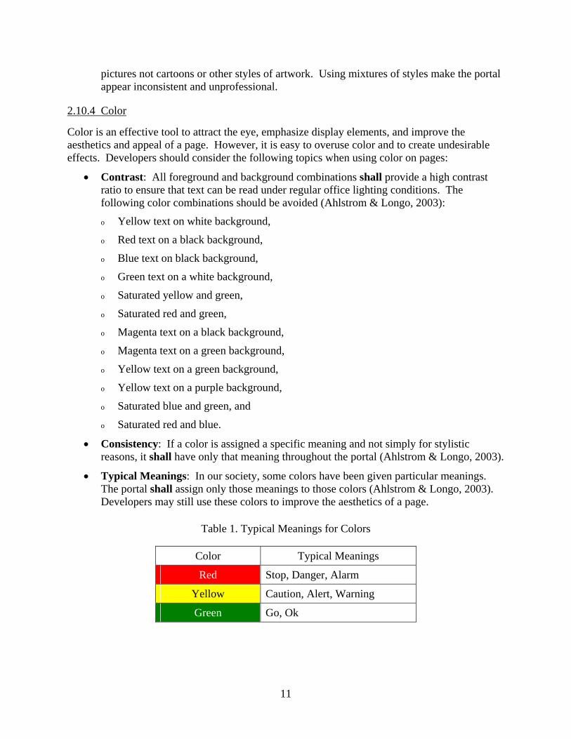
• Typical Meanings: In our society, some colors have been given particular meanings. The portal shall assign only those meanings to those colors (Ahlstrom & Longo, 2003). Developers may still use these colors to improve the aesthetics of a page.
Table 1. Typical Meanings for Colors
Color Typical Meanings
Red Stop, Danger, Alarm
Yellow Caution, Alert, Warning
Green Go, Ok
12
• Red shall indicate negative conditions such as stop, error, failure, danger, malfunction, or something requiring immediate user action to avert personnel injury or equipment damage (Ahlstrom & Longo, 2003).
• Yellow shall be used only to indicate marginal or caution conditions, alert users to situations where caution or rechecking is necessary, or notify users of an unexpected delay (Ahlstrom & Longo, 2003).
• Flashing shall be used only for items requiring immediate user action or attention (Ahlstrom & Longo, 2003).
• Data or text that the user must read shall not flash (Ahlstrom & Longo, 2003).
• The rate of flashing should be in the range of 2-5 Hz (Ahlstrom & Longo).
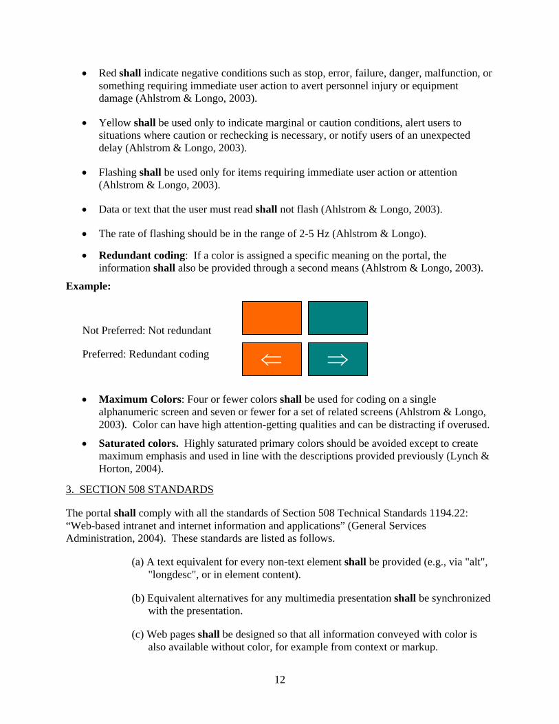
• Redundant coding: If a color is assigned a specific meaning on the portal, the information shall also be provided through a second means (Ahlstrom & Longo, 2003).
Example:
Not Preferred: Not redundant
Preferred: Redundant coding
• Maximum Colors: Four or fewer colors shall be used for coding on a single alphanumeric screen and seven or fewer for a set of related screens (Ahlstrom & Longo, 2003). Color can have high attention-getting qualities and can be distracting if overused.
• Saturated colors. Highly saturated primary colors should be avoided except to create maximum emphasis and used in line with the descriptions provided previously (Lynch & Horton, 2004).
3. SECTION 508 STANDARDS
The portal shall comply with all the standards of Section 508 Technical Standards 1194.22: “Web-based intranet and internet information and applications” (General Services Administration, 2004). These standards are listed as follows.
(a) A text equivalent for every non-text element shall be provided (e.g., via "alt", "longdesc", or in element content).
(b) Equivalent alternatives for any multimedia presentation shall be synchronized with the presentation.
(c) Web pages shall be designed so that all information conveyed with color is also available without color, for example from context or markup.
⇐ ⇒
13
(d) Documents shall be organized so they are readable without requiring an associated style sheet.
(e) Redundant text links shall be provided for each active region of a server-side image map.
(f) Client-side image maps shall be provided instead of server-side image maps except where the regions cannot be defined with an available geometric shape.
(g) Row and column headers shall be identified for data tables.
(h) Markup shall be used to associate data cells and header cells for data tables that have two or more logical levels of row or column headers.
(i) Frames shall be titled with text that facilitates frame identification and navigation.
(j) Pages shall be designed to avoid causing the screen to flicker with a frequency greater than 2 Hz and lower than 55 Hz.
(k) A text-only page, with equivalent information or functionality, shall be provided to make a web site comply with the provisions of this part, when compliance cannot be accomplished in any other way. The content of the text-only page shall be updated whenever the primary page changes.
(l) When pages utilize scripting languages to display content, or to create interface elements, the information provided by the script shall be identified with functional text that can be read by assistive technology.
(m) When a web page requires that an applet, plug-in or other application be present on the client system to interpret page content, the page must provide a link to a plug-in or applet that complies with §1194.21(a) through (l).
(n) When electronic forms are designed to be completed on-line, the form shall allow people using assistive technology to access the information, field elements, and functionality required for completion and submission of the form, including all directions and cues.
(o) A method shall be provided that permits users to skip repetitive navigation links.
(p) When a timed response is required, the user shall be alerted and given sufficient time to indicate more time is required.
14
References
Ahlstrom, V. & Longo, K. (2003). Human factors design standard: For the acquisition of commercial-off-the-shelf subsystems, non-developmental items, and developmental items (HF-STD-001). Atlantic City International Airport: Federal Aviation Administration, William J. Hughes Technical Center.
Ahlstrom, V. & Muldoon, R. (2002). Menus and mnemonics in Airway Facilities. (DOT/FAA/CT-TN03/12). Atlantic City International Airport: Federal Aviation Administration, William J. Hughes Technical Center
Detweiler, M., & Omanson, R. (1996). Ameritech web based user interface standards and design guidelines. (on-line) Available at http://www.Ameritech.com.
General Services Administration. (2004). Section 508 Technical Standards 1194.22 Web-based intranet and internet information and applications. Available on the World Wide Web: http://www.section508.gov
Lynch, P. J. & Horton, S. (2004). Yale C/AIM Web Style Guide. Available on the World Wide Web: http://www.webstyleguide.com/index.html?/
Nielsen, J. (1996a). Marginalia of web design. Retrieved April 30, 2004 from http://www.useit.com/alertbox/9611.html.
Nielsen, J. (1996b). "Top Ten Mistakes" Revisited Three Years Later. Retrieved April 30, 2004 from http://www.useit.com/alertbox/990502.html.
Nielsen, J. (2000a). Designing web usability: The practice of simplicity. Indianapolis, Indiana: New Riders Publishing,
Nielsen, J. (2000b). Novice vs. expert users. Retrieved April 30, 2004 from http://www.useit.com/alertbox/20000206.html.
Snyder, M. D., Bryant, D. J., Dunn, J., & Stein, E. S. (1998). Human factors technical writer’s guide. (DOT/FAA/CT-TN98/2). Atlantic City International Airport, NJ: Federal Aviation Administration, William J. Hughes Technical Center.

15
Acronyms
CHI Computer-Human Interface FAA Federal Aviation Administration FAQ Frequently Asked Questions GIF Graphical Interchange Format HFDS Human Factors Design Standard HTML Hypertext Markup Language


![Untitled-2 [contents.iptime.co.kr]contents.iptime.co.kr/~contents/link/NAS-II.pdf · 2018-10-01 · Windows 192.1680250 admin ipTIME NAS NAS ëë..l admin ipTIME NAS](https://img.pdfslide.us/doc/110x75/5ec53605e2d46f7ca85b5c6b/untitled-2-contentslinknas-iipdf-2018-10-01-windows-1921680250-admin.jpg)
![Untitled-2 [contents.iptime.co.kr]contents.iptime.co.kr/~contents/link/NAS-I.pdf · 2018-10-01 · Windows 192.1680250 admin ipTIME NAS NAS ëë..l admin ipTIME NAS](https://img.pdfslide.us/doc/110x75/5f0814dc7e708231d4203dfa/untitled-2-contentslinknas-ipdf-2018-10-01-windows-1921680250-admin.jpg)