Embed Size (px)
Citation preview
Assignment 40: Font and Title planning
By Will, Tom, Josh And Ollie
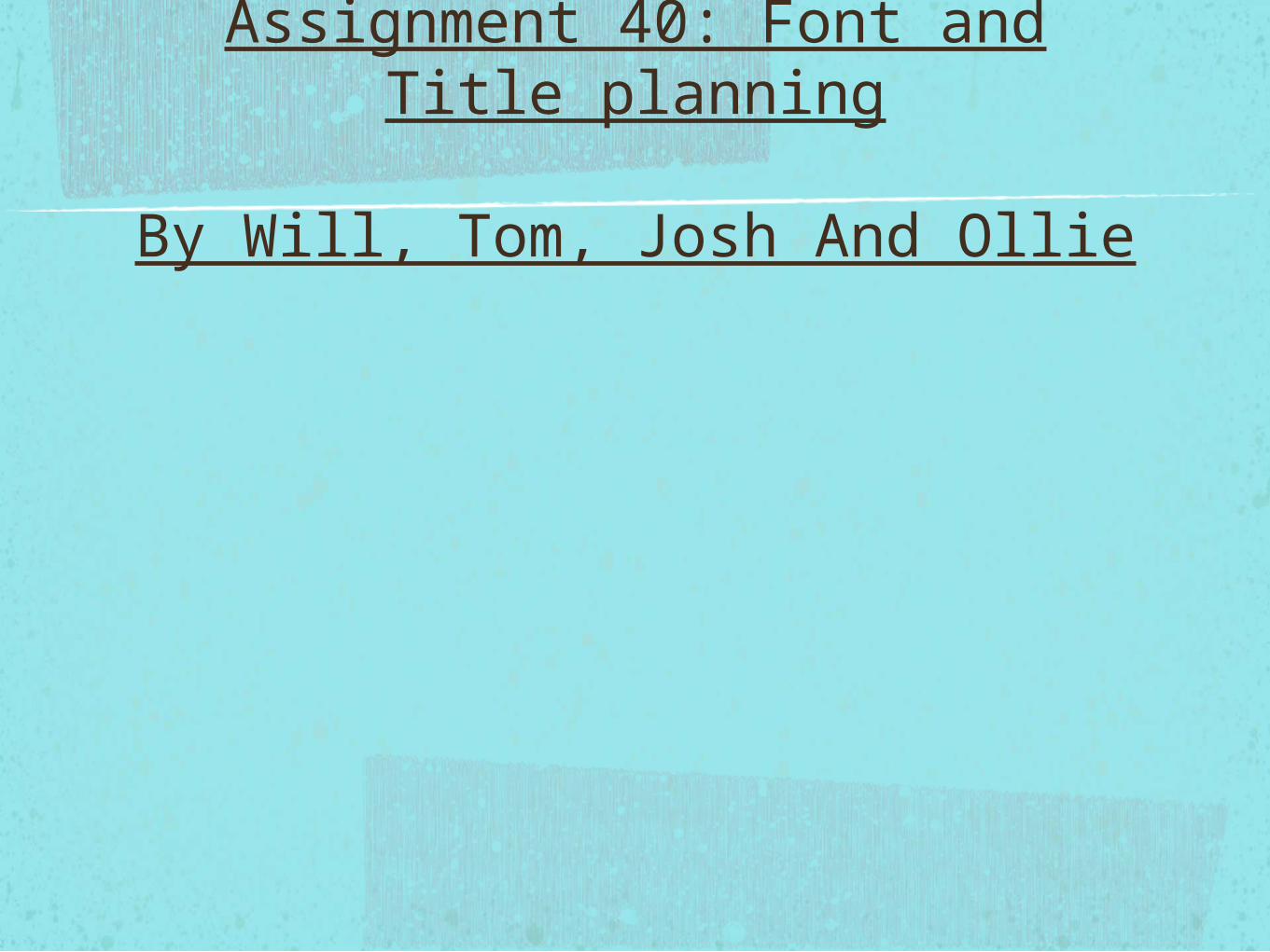
Which font we will use for out OTS?
•As a group we have decided to use the park avenue typestyle. This is because it is because it’s quite fancy and it’s appealing for the viewers to see whilst the OTS is playing.
What colour and text we will use?
• The colour we will use in the OTS is a mix of red and black colours. This is because it will relate it back to the sub genre which is slasher due to the amount of blood there os.We will use this when necessary to make it stand out against the OTS to grab the attention of the audience.
The size of the text in our OTS will be quite small, but not too small so its hard to read. The reason it will be sized quite small is so it doesn’t distract the audience from what is going on in our OTS.
Animation
• The animation we will use in our OTS will either be left to right or right to left transitions
• OR
• Fade in/out animations which seems more dramatic than the left to right transition.
Text
• The text will start before the first shot is shown this will be the production company and then the credits will continue during the OTS.