Embed Size (px)
Citation preview
8/13/2019 Smith Assignment 1
http://slidepdf.com/reader/full/smith-assignment-1 1/12
Website assessment of AstroDienst’s
website, www.astro.com Abigail Smith
February, 2014
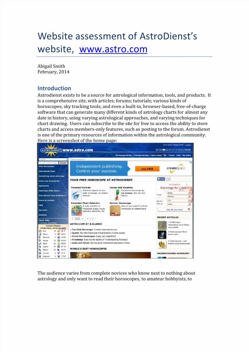
IntroductionAstrodienst exists to be a source for astrological information, tools, and products. It
is a comprehensive site, with articles; forums; tutorials; various kinds of
horoscopes; sky tracking tools; and even a built-in, browser-based, free-of-charge
software that can generate many different kinds of astrology charts for almost any
date in history, using varying astrological approaches, and varying techniques for
chart drawing. Users can subscribe to the site for free to access the ability to storecharts and access members-only features, such as posting to the forum. Astrodienst
is one of the primary resources of information within the astrological community.
Here is a screenshot of the home page:
The audience varies from complete novices who know next to nothing about
astrology and only want to read their horoscopes, to amateur hobbyists, to
8/13/2019 Smith Assignment 1
http://slidepdf.com/reader/full/smith-assignment-1 2/12
professional astrologers who have spent many years studying the topic. Users come
in from all over the world.
There are many reasons that people would visit the site. I do not have access to
market research, but I imagine that the top three reasons that people visit the site
are to:1. Read their horoscopes,
2. Generate a chart
3. Participate in the forums.
Keeping in mind the audience and the purpose for this site, I shall evaluate it based
on its usability and its accessibility. Under the usability idea, I shall evaluate
whether it passes Krug’s (2013) seven usability criteria, which are as follows:
1. Make things self-evident
2. Use conventions
3. Create visual hierarchies
4. Clearly define the areas of the page5. Make obvious what’s clickable
6. Eliminate distractions
7. Format content to support scanning
Under the accessibility idea, I shall evaluate the site using the relevant items from
the checklist provided by WebAIM’s distillation of Section 508 (2014), as follows:
1. Text equivalents are provided
2. Multimedia alternatives are provided
3. Color non-reliance
4. Readable without stylesheets
5. No potentially dangerous screen flicker rates are used6. Forms are accessible
7. A “Skip Navigation” link is provided
8. Links are descriptive
Usability
Make things self-evident
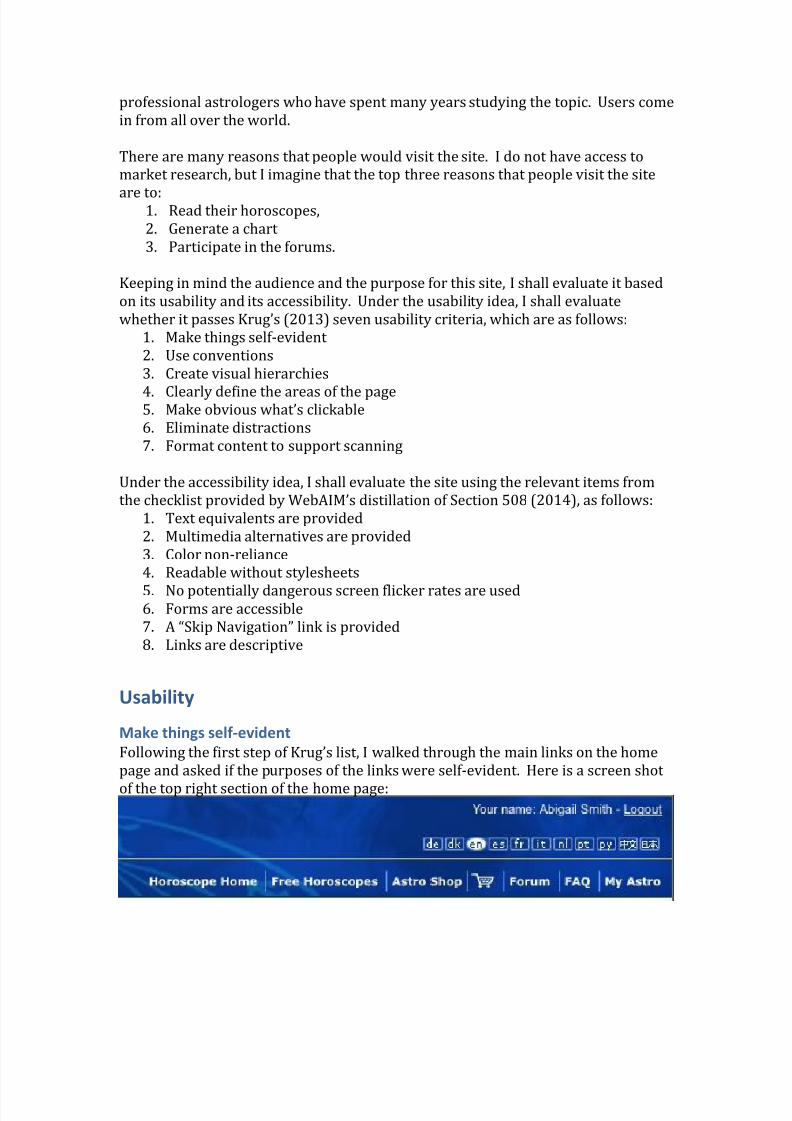
Following the f irst step of Krug’s list, I walked through the main links on the home
page and asked if the purposes of the links were self-evident. Here is a screen shot
of the top right section of the home page:
8/13/2019 Smith Assignment 1
http://slidepdf.com/reader/full/smith-assignment-1 3/12
In this section, the language-choice section is pretty clear, as are the “Forum” and
“FAQ” links. It also doesn’t take too much time for users to figure out that “My
Astro” must lead to a members-only side of the site. But there are a few problems in
this section. Users have to pause and ask themselves what the difference is between
“Horoscope Home” and “Free Horoscopes.” They also wonder what the difference is
between “Astro Shop” and the shopping cart icon.
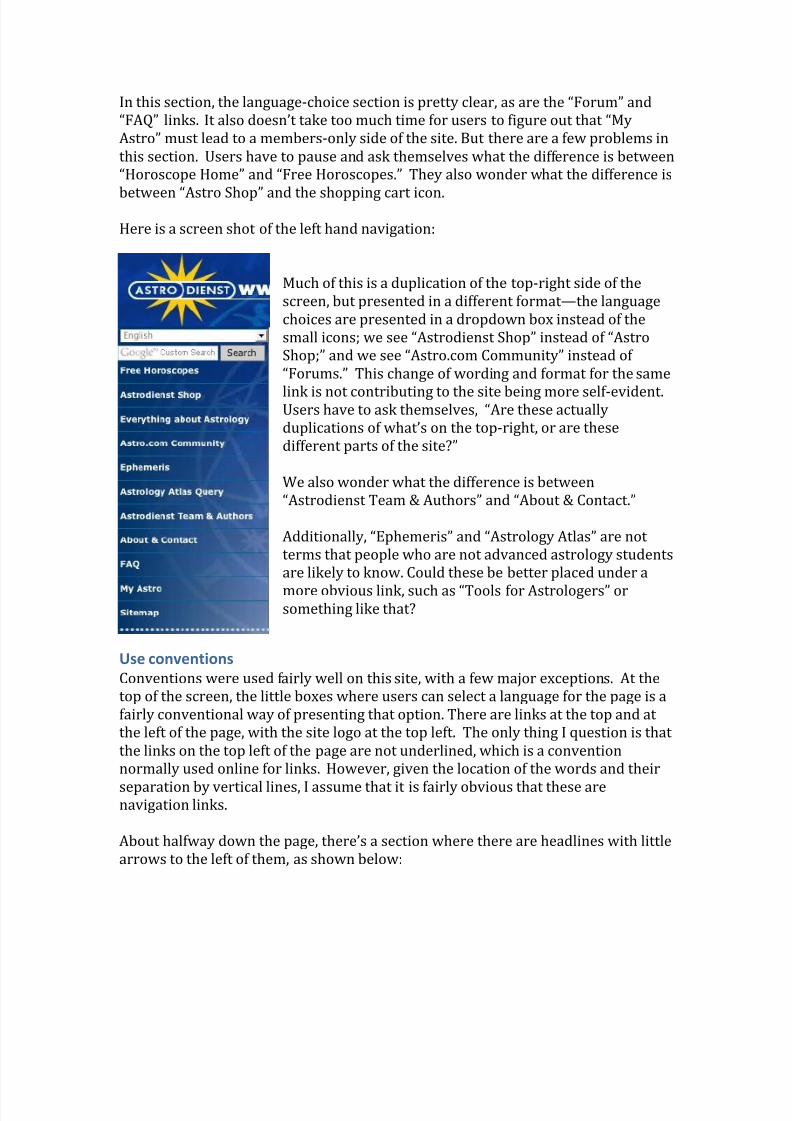
Here is a screen shot of the left hand navigation:
Much of this is a duplication of the top-right side of the
screen, but presented in a different format —the language
choices are presented in a dropdown box instead of the
small icons; we see “Astrodienst Shop” instead of “Astro
Shop;” and we see “Astro.com Community” instead of
“Forums.” This change of wording and format for the same
link is not contributing to the site being more self-evident.Users have to ask themselves, “Are these actually
duplications of what’s on the top-right, or are these
different parts of the site?”
We also wonder what the difference is between
“Astrodienst Team & Authors” and “About & Contact.”
Additionally, “Ephemeris” and “Astrology Atlas” are not
terms that people who are not advanced astrology students
are likely to know. Could these be better placed under a
more obvious link, such as “Tools for Astrologers” orsomething like that?
Use conventions
Conventions were used fairly well on this site, with a few major exceptions. At the
top of the screen, the little boxes where users can select a language for the page is a
fairly conventional way of presenting that option. There are links at the top and at
the left of the page, with the site logo at the top left. The only thing I question is that
the links on the top left of the page are not underlined, which is a convention
normally used online for links. However, given the location of the words and their
separation by vertical lines, I assume that it is fairly obvious that these arenavigation links.
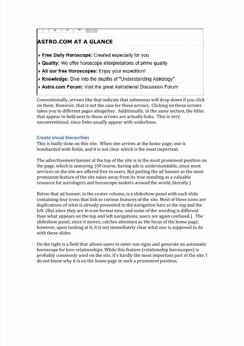
About halfway down the page, there’s a section where there are headlines with little
arrows to the left of them, as shown below:
8/13/2019 Smith Assignment 1
http://slidepdf.com/reader/full/smith-assignment-1 4/12
Conventionally, arrows like that indicate that submenus will drop down if you click
on them. However, that is not the case for these arrows. Clicking on these arrows
takes you to different pages altogether. Additionally, in the same section, the titles
that appear in bold next to these arrows are actually links. This is very
unconventional, since links usually appear with underlines.
Create visual hierarchies
This is badly done on this site. When one arrives at the home page, one is
bombarded with fields, and it is not clear which is the most important.
The advertisement banner at the top of the site is in the most prominent position on
the page, which is annoying. (Of course, having ads is understandable, since most
services on the site are offered free to users. But putting the ad banner as the most
prominent feature of the site takes away from its true standing as a valuable
resource for astrologers and horoscope-seekers around the world, literally.)
Below that ad banner, in the center column, is a slideshow panel with each slide
containing four icons that link to various features of the site. Most of these icons are
duplications of what is already presented in the navigation bars at the top and the
left. (But since they are in icon format now, and some of the wording is different
than what appears on the top and left navigations, users are again confused.) The
slideshow panel, since it moves, catches attention as the focus of the home page;
however, upon looking at it, it is not immediately clear what one is supposed to do
with these slides
On the right is a field that allows users to enter sun signs and generate an automatichoroscope for love relationships. While this feature (relationship horoscopes) is
probably commonly used on the site, it’s hardly the most important part of the site. I
do not know why it is on the home page in such a prominent position.
8/13/2019 Smith Assignment 1
http://slidepdf.com/reader/full/smith-assignment-1 5/12
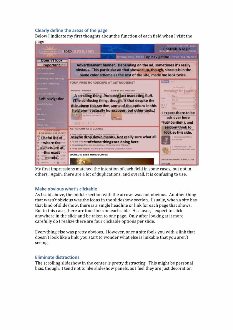
Clearly define the areas of the page
Below I indicate my first thoughts about the function of each field when I visit the
page:
My first impressions matched the intention of each field in some cases, but not in
others. Again, there are a lot of duplications, and overall, it is confusing to use.
Make obvious what’s clickable
As I said above, the middle section with the arrows was not obvious. Another thing
that wasn’t obvious was the icons in the slideshow section. Usually, when a site has
that kind of slideshow, there is a single headline or link for each page that shows.
But in this case, there are four links on each slide. As a user, I expect to click
anywhere in the slide and be taken to one page. Only after looking at it more
carefully do I realize there are four clickable options per slide.
Everything else was pretty obvious. However, once a site fools you with a link thatdoesn’t look like a link, you start to wonder what else is linkable that you aren’t
seeing.
Eliminate distractions
The scrolling slideshow in the center is pretty distracting. This might be personal
bias, though. I tend not to like slideshow panels, as I feel they are just decoration
8/13/2019 Smith Assignment 1
http://slidepdf.com/reader/full/smith-assignment-1 6/12
meant to grab your attention, but seldom contain anything of substance, or anything
that meets the purpose that I visited the site for.
The ads are distracting, too, but, as I said, the site needs ads to stay afloat.
Overall, the most distracting thing about this home page is that every link ispresented in at least two or three different ways. This creates a lot of clutter, and
until you visit the site several times and learn the paths to where you want to go, the
clutter is overwhelming.
Format content to support scanning
Because everything is presented in several different ways, it does not make it
conducive to scanning the page. As I mentioned above, the home page is an
overwhelming wash of clutter that makes it difficult to know where to look or what
to click on. My suggestion would be to have three major sections of the page
correlating with the three types of users who are likely to visit: curious beginners,amateur hobbyists, and professionals. Each user can scan the column that pertains
to them and quickly locate what they are looking for. Each link that deserves to be
on the homepage should be presented only once, and labeled clearly. There should
be more “negative space” on the page as well, to make it easier to scan.
Accessibility
Text equivalents—FAIL
When I ran my mouse over the various images on the site, I did not get alt tagshovering, as is usually the case when there are alt tags. Since some of these images
are presented in the slider, I figured maybe there was some kind of Javascript code
that prevented alt tags from showing. So I investigated the source code. Sure
enough, the images were part of some kind of code that I don’t understand, not sure
if it’s Javascript or what. I did not see alt tags in the code, but I don’t know if it’s
required in sliders or not. I don’t know.
In other parts of the site, for example, on the right hand side where it lists some
articles with an icon next to each article, the alt tags were present in the source code
on some images, and not present on other images. However, the alt tags that were
present were neither descriptive of the image itself, nor of the function of the icon.For example, in this section, all three icons did have alt tags:
(Notice those deceptive arrows again, too!)
8/13/2019 Smith Assignment 1
http://slidepdf.com/reader/full/smith-assignment-1 7/12
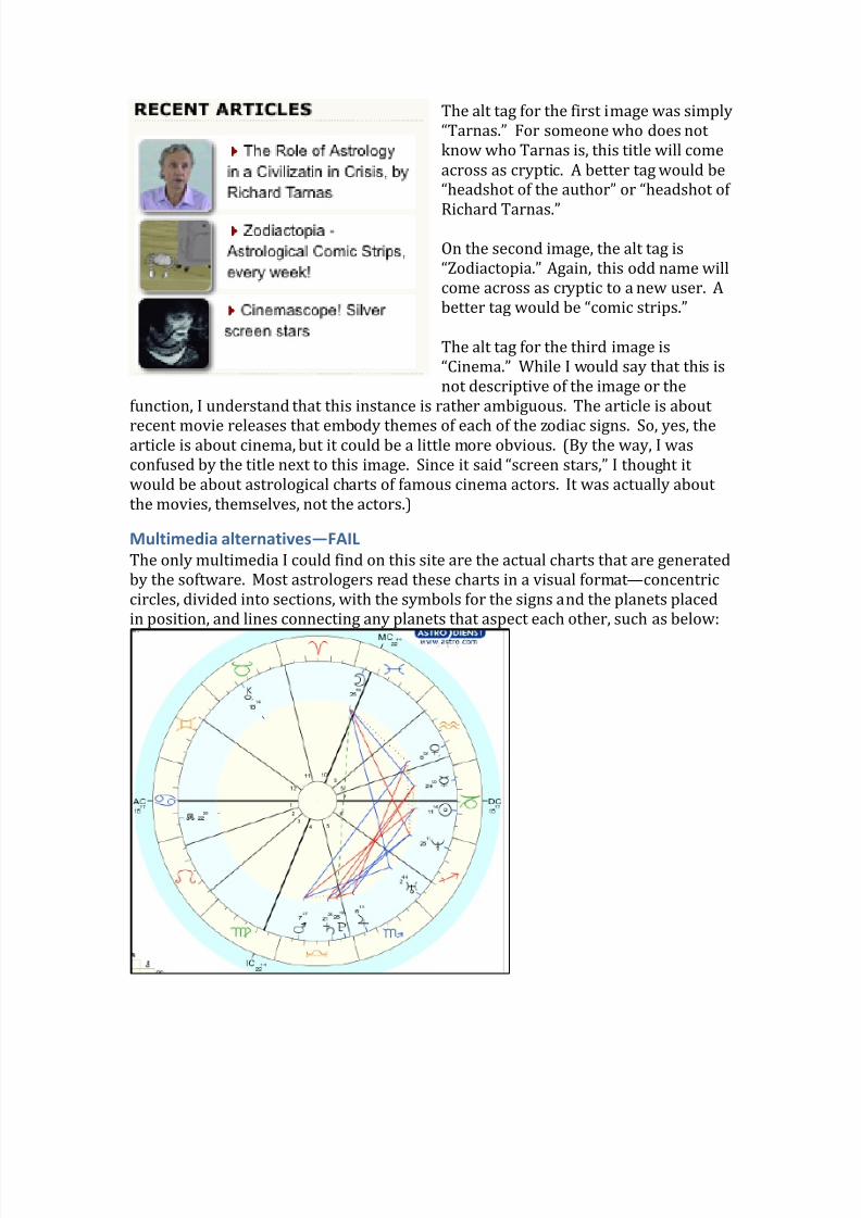
The alt tag for the first image was simply
“Tarnas.” For someone who does not
know who Tarnas is, this title will come
across as cryptic. A better tag would be
“headshot of the author” or “headshot of
Richard Tarnas.”
On the second image, the alt tag is
“Zodiactopia.” Again, this odd name will
come across as cryptic to a new user. A
better tag would be “comic strips.”
The alt tag for the third image is
“Cinema.” While I would say that this is
not descriptive of the image or the
function, I understand that this instance is rather ambiguous. The article is about
recent movie releases that embody themes of each of the zodiac signs. So, yes, thearticle is about cinema, but it could be a little more obvious. (By the way, I was
confused by the title next to this image. Since it said “screen stars,” I thought it
would be about astrological charts of famous cinema actors. It was actually about
the movies, themselves, not the actors.)
Multimedia alternatives—FAIL
The only multimedia I could find on this site are the actual charts that are generated
by the software. Most astrologers read these charts in a visual format —concentric
circles, divided into sections, with the symbols for the signs and the planets placed
in position, and lines connecting any planets that aspect each other, such as below:
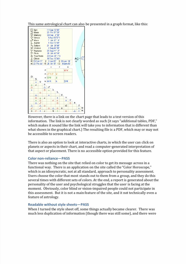
8/13/2019 Smith Assignment 1
http://slidepdf.com/reader/full/smith-assignment-1 8/12
This same astrological chart can also be presented in a graph format, like this:
However, there is a link on the chart page that leads to a text version of this
information. The link is not clearly worded as such (it says “additional tables, PDF,”
which makes it sound like the link will take you to information that is different than
what shows in the graphical chart.) The resulting file is a PDF, which may or may not
be accessible to screen readers.
There is also an option to look at interactive charts, in which the user can click on
planets or aspects in their chart, and read a computer-generated interpretation of
that aspect or placement. There is no accessible option provided for this feature.
Color non-reliance—PASS
There was nothing on the site that relied on color to get its message across in a
functional way. There is an application on the site called the “Color Horoscope,”
which is an idiosyncratic, not at all standard, approach to personality assessment.
Users choose the color that most stands out to them from a group, and they do this
several times with different sets of colors. At the end, a report is generated about the
personality of the user and psychological struggles that the user is facing at themoment. Obviously, color blind or vision-impaired people could not participate in
this assessment. But it is not a main feature of the site, and it not technically even a
feature of astrology.
Readable without style sheets—PASS
When I turned the style sheet off, some things actually became clearer. There was
much less duplication of information (though there was still some), and there were
8/13/2019 Smith Assignment 1
http://slidepdf.com/reader/full/smith-assignment-1 9/12
no longer columns to make things messy and difficult to figure out what to focus on.
The plugins, such as the FaceBook “like” button, no longer work, f or some reason,
but overall the site is still readable, and no information goes missing without the
style sheet.
Screen flicker rate—PASSThere is nothing I could find on the site that produces a screen flicker.
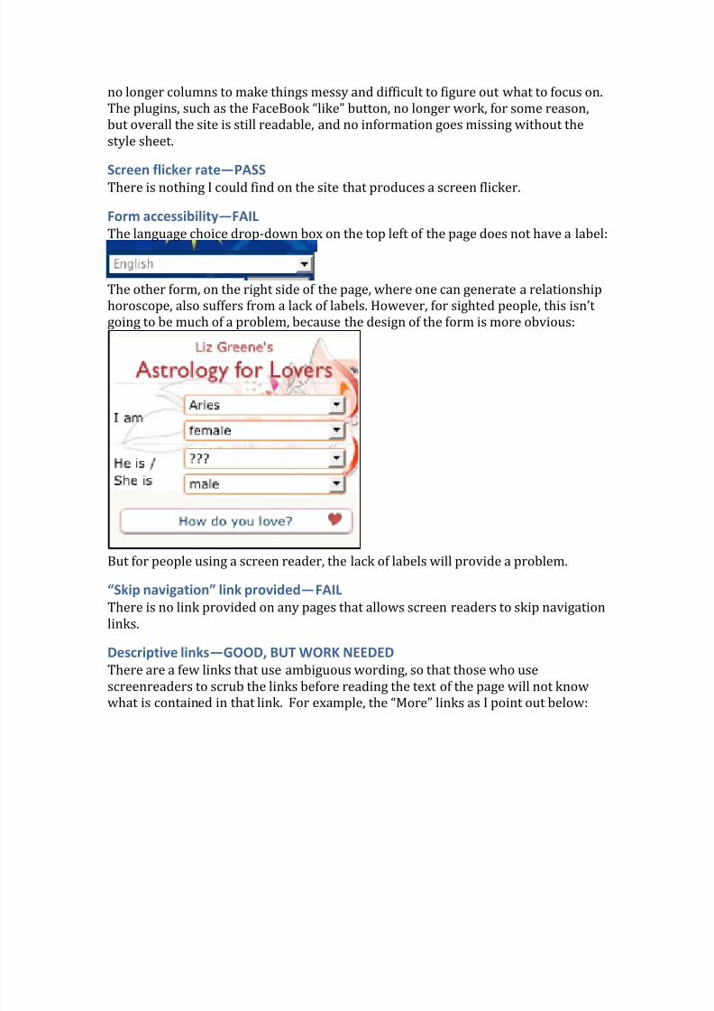
Form accessibility—FAIL
The language choice drop-down box on the top left of the page does not have a label:
The other form, on the right side of the page, where one can generate a relationship
horoscope, also suffers from a lack of labels. However, for sighted people, this isn’t
going to be much of a problem, because the design of the form is more obvious:
But for people using a screen reader, the lack of labels will provide a problem.
“Skip navigation” link provided—FAIL
There is no link provided on any pages that allows screen readers to skip navigation
links.
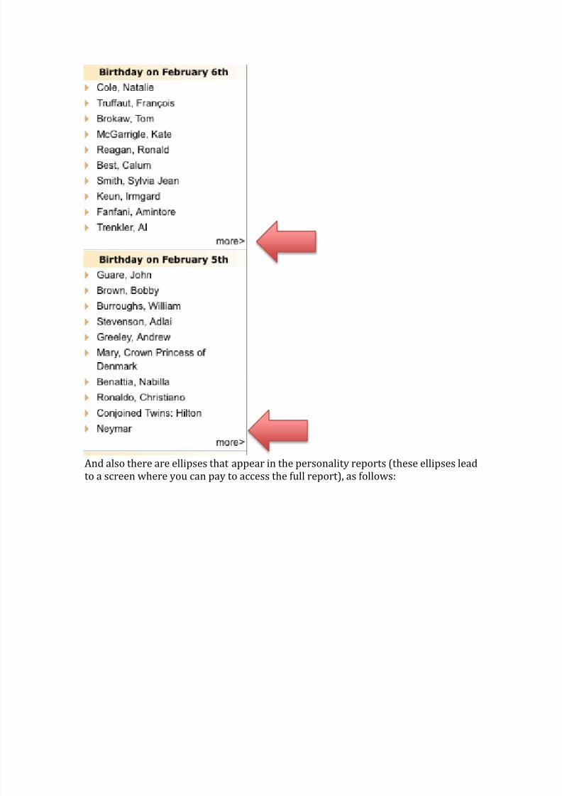
Descriptive links—GOOD, BUT WORK NEEDED
There are a few links that use ambiguous wording, so that those who use
screenreaders to scrub the links before reading the text of the page will not know
what is contained in that link. For example, the “More” links as I point out below:
8/13/2019 Smith Assignment 1
http://slidepdf.com/reader/full/smith-assignment-1 10/12
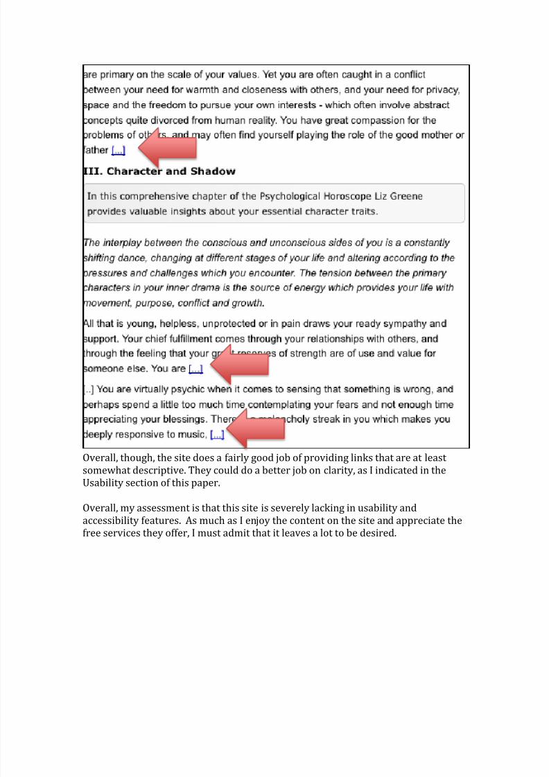
And also there are ellipses that appear in the personality reports (these ellipses lead
to a screen where you can pay to access the full report), as follows:
8/13/2019 Smith Assignment 1
http://slidepdf.com/reader/full/smith-assignment-1 11/12
Overall, though, the site does a fairly good job of providing links that are at least
somewhat descriptive. They could do a better job on clarity, as I indicated in the
Usability section of this paper.
Overall, my assessment is that this site is severely lacking in usability and
accessibility features. As much as I enjoy the content on the site and appreciate the
free services they offer, I must admit that it leaves a lot to be desired.
8/13/2019 Smith Assignment 1
http://slidepdf.com/reader/full/smith-assignment-1 12/12
References
Krug, S. (2013). Don’ t make me think!: a common sense approach to Web usability
(3rd ed.). Berkley: New Riders.
WebAIM: Section 508 Checklist. (2014). WebAIM . checklist. Retrieved February 6,
2014, from http://webaim.org/standards/508/checklist