Embed Size (px)
Citation preview

1
Visualization and PCA with
Gene Expression Data
Utah State University – Spring 2014
STAT 5570: Statistical Bioinformatics
Notes 2.4

2
References
Chapter 10 of Bioconductor Monograph
(course text)
Ringner (2008). “What is principal
component analysis?” Nature Biotechnology
26:303-304.

3
Visualization and efficiency# Recall MA-plot: M = Y – X ; A = (X + Y ) / 2
library(affydata); data(Dilution)
eset <- log2(exprs(Dilution))
X <- eset[,1]; Y <- eset[,2]
M <- Y - X; A <- (Y+X)/2
plot(A,M,main='default M-A plot',pch=16,cex=0.1); abline(h=0)
Interpretation:
M-direction shows differential expression
A-direction shows average expression
Look for:
systematic changes
outliers
patterns quality / normalization
(larger M-variability, curvature)
Problems: 1. loss of information
(overlayed points)
2. file size
Note: Dilution is an AffyBatch object, only used for illustration here.

4
Alternative: show density by colorlibrary(geneplotter); library(RColorBrewer)
blues.ramp <- colorRampPalette(brewer.pal(9,"Blues")[-1])
dc <- densCols(A,M,colramp=blues.ramp)
plot(A,M,col=dc,pch=16,cex=0.1,main='color density M-A plot')
abline(h=0)
Interpretation:
color represents density
around corresponding point
How is this better?
visualize - overlayed points
What problem(s) remain?
file size (one point per probe)
5
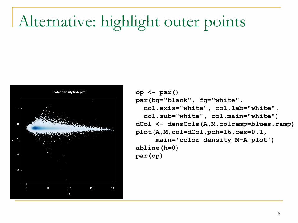
op <- par()
par(bg="black", fg="white",
col.axis="white", col.lab="white",
col.sub="white", col.main="white")
dCol <- densCols(A,M,colramp=blues.ramp)
plot(A,M,col=dCol,pch=16,cex=0.1,
main='color density M-A plot')
abline(h=0)
par(op)
Alternative: highlight outer points

6
Alternative: smooth density
smoothScatter(A,M,nbin=250,nrpoints=50,colramp=blues.ramp,
main='smooth scatter M-A plot'); abline(h=0)
What does this do?
1. smooth the local density
using a kernel density estimator
2. black points represent
isolated data points
- But it can be a bit blurry
(creates visual artifacts)

7
Alternative: hexagonal binninglibrary(hexbin)
hb <- hexbin(cbind(A,M),xbins=40)
plot(hb, colramp = blues.ramp,
main='hexagonal binning M-A plot')
What does this do?
essentially discretizes density
- Maybe a little clunky,
and adding reference lines
can be tricky
- But – probably the “safest” plot

8
Image file types and sizes (slide 4 ex.)
dCol <- densCols(A,M,colramp=blues.ramp)
pdf("C:\\folder\\f1.pdf")
plot(A,M,col=dCol,pch=16,cex=0.1,main='M-A plot'); abline(h=0)
dev.off() # 3,643 KB
postscript("C:\\folder\\f1.ps")
plot(A,M,col=dCol,pch=16,cex=0.1,main='M-A plot'); abline(h=0)
dev.off() # 25,315 KB
jpeg("C:\\folder\\f1.jpg")
plot(A,M,col=dCol,pch=16,cex=0.1,main='M-A plot'); abline(h=0)
dev.off() # 14 KB
png("C:\\folder\\f1.png")
plot(A,M,col=dCol,pch=16,cex=0.1,main='M-A plot'); abline(h=0)
dev.off() # 9 KB
(Note other options for these functions to control size and quality.)

9
# See image alignment features:
temp.abatch <- Dilution[,1]
pm(temp.abatch) <- NA
mm(temp.abatch) <- NA
image(temp.abatch)

Principal Components Analysis
A common approach in high-dimensional data:
reduce dimensionality
Notation:
Xlj = [log-scale] expression / abundance level for
“variable” (gene / protein / metabolite / substance) j
in “observation” (sample) l of the data
[so XT ≈ expression set matrix]
Define ith principal component
(like a new variable or column):
𝑃𝐶𝑖 =
𝑗
𝑎𝑖𝑗𝑋𝑗
(where Xj is the jth column of X)10

Principal Components Analysis
11
In the ith principal component:
the coefficients 𝑎𝑖𝑗 are chosen (automatically)
so that:
PC1, PC2, … each have the most variation
possible
PC1, PC2, … are independent (uncorrelated)
PC1 has most variation, followed by PC2, then
PC3, …
𝑖(𝑎𝑖𝑗)2 = 1 for each i
𝑃𝐶𝑖 =
𝑗
𝑎𝑖𝑗𝑋𝑗

PCA: Interpretation
Size of 𝑎𝑖𝑗’s indicates importance in variability
Example:
Suppose 𝑎1𝑗 ’s are large for a certain class of gene
/ protein / metabolite, but small for other classes.
Then PC1 can be interpreted as representing that
class
Problem: such clean interpretation not
guaranteed
12

PCA: Visualization with the Biplot
Several tools exist, but the “biplot” is fairly
common
Represent both observations / samples (rows of X)
and variables [genes / proteins / etc.] (columns of X)
Observations usually plotted as text labels at
coordinates determined by first two PC’s
Greater interest: Variables plotted as labeled
arrows, to coordinate (on arbitrary scale of top and
right axes) “weight” in the first two PC’s
13

PCA Implementation and Example
Problem with high-dimensional “wide” data
If have many more “variables” than “observations”
Solution: transpose X and convert back to original
space [princomp2 function in msProcess package]
Example here: ALL data (subset of 30 arrays)
Focus on B vs. T differentiation
Just use previously-selected set of 10 genes for
now
14

15
Arrows show how
certain variables
“put” observations
in certain parts of
the plot.
From slide 20 of
Notes 2.3:
38319_at (T>B)
36117_at (B>T)

16
“Scree plot” shows
variance of the first
few PC’s
Best to have majority
of variance
accounted for by the
first two (or so) PC’s

17
## Get subset of data (same as in Notes 2.3, slide 21)
library(affy); library(ALL); data(ALL)
gn <- featureNames(ALL)
gn.list <- c("37039_at","41609_at","33238_at","37344_at",
"33039_at","41723_s_at","38949_at","35016_at",
"38319_at","36117_at")
t <- is.element(gn,gn.list)
small.eset <- exprs(ALL)[t,c(81:110)]
# Assign column names (and row names if desired)
cell <- c(rep('B',15),rep('T',15))
colnames(small.eset) <- cell
# Run PCA and visualize result
source("http://www.stat.usu.edu/jrstevens/stat5570/pc2.R")
pc <- pc2(t(small.eset), scale = TRUE)
biplot(pc, cex=1.5, xlim=c(-.6,0.4))
screeplot(pc)

Side note: archived package
http://cran.r-project.org/web/packages/msProcess/
“Package ‘msProcess’ was removed from the CRAN repository.”
“Formerly available versions can be obtained from the archive.”
(But only there as source, not compiled package)
We may return to this package later, but for now, we only
need the princomp2 function:
“This function performs principal component analysis (PCA) for wide
data x, i.e. dim(x)[1] < dim(x)[2]. This kind of data can be handled by
princomp in S-PLUS but not in R. The trick is to do PCA for t(x) first
and then convert back to the original space. It might be more efficient
than princomp for high dimensional data.”
The pc2 function sourced in (previous slide) is a modified (but fully
functional) version
18

19
# Try a 3-d biplot
library(BiplotGUI)
Biplots(Data=t(small.eset))
# lower-left: External --> In 3D

20
Summary
Visualization efficiency
Avoid overlaying points
Conserve file size (note file type)
Choose meaningful color palette
Feature location
Quality checks
Aside – could incorporate spatial orientation on array
into preprocessing / other analyses?
Principal Components
Emphasize major sources of variability
No guaranteed interpretability (no accounting for bio.)

21
Warnings – why end unit with this? What can be gained from clustering?
general ideas, possible structures; NOT - statistical inference
Be wary of:
elaborate pictures
non-normalized data
unjustifiable decisions
clustering method
distance function
color scheme
claims of - “proof” (maybe “support”)
arbitrary decisions
What is clustering best for?
exploratory data analysis and summary NOT statistical inference


![Visualization and PCA with Gene Expression Data · Visualization and PCA with Gene Expression Data ... l of the data [so XT ≈ expression set matrix] ... exploratory data analysis](https://img.pdfslide.us/doc/110x75/5b054c587f8b9ad5548b4b5c/visualization-and-pca-with-gene-expression-and-pca-with-gene-expression-data-.jpg)