Embed Size (px)
Citation preview
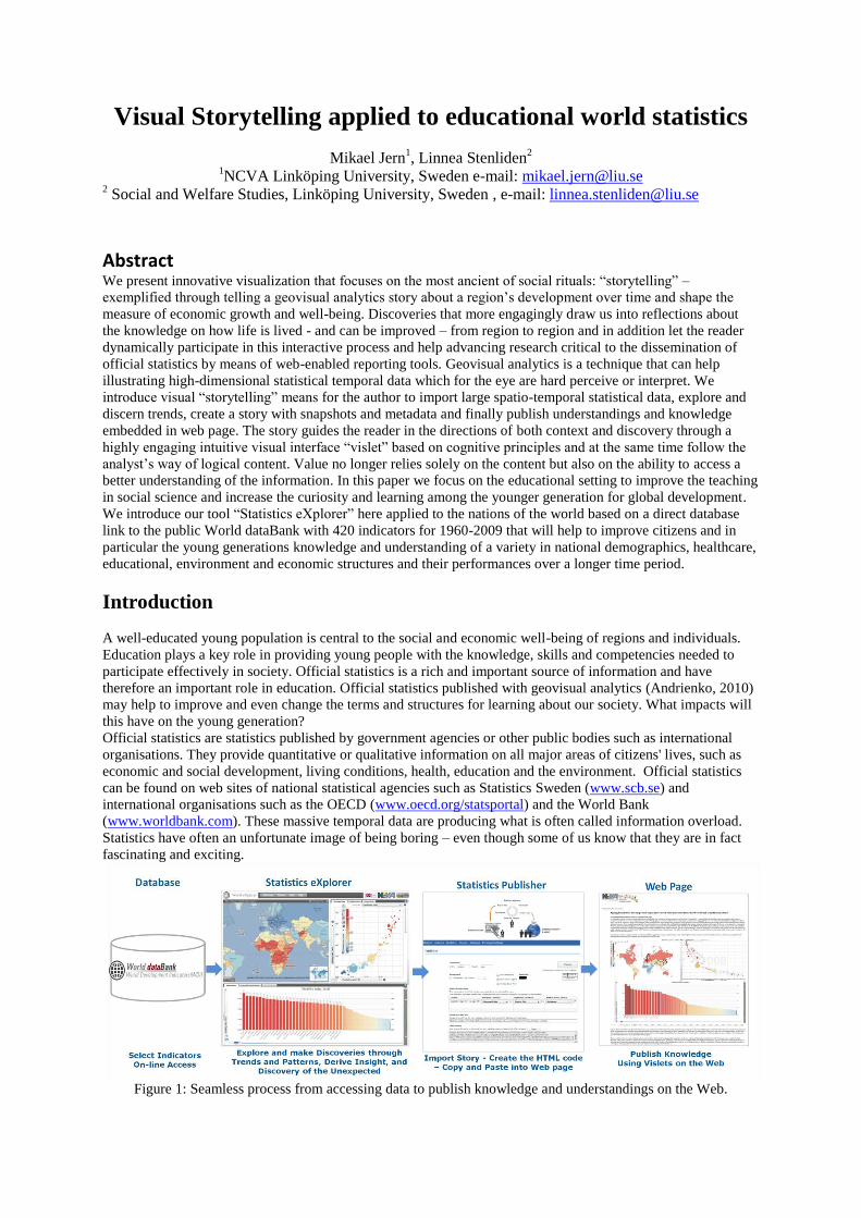
Visual Storytelling applied to educational world statistics
Mikael Jern1, Linnea Stenliden
2
1NCVA Linköping University, Sweden e-mail: [email protected]
2 Social and Welfare Studies, Linköping University, Sweden , e-mail: [email protected]
Abstract We present innovative visualization that focuses on the most ancient of social rituals: “storytelling” –
exemplified through telling a geovisual analytics story about a region’s development over time and shape the
measure of economic growth and well-being. Discoveries that more engagingly draw us into reflections about
the knowledge on how life is lived - and can be improved – from region to region and in addition let the reader
dynamically participate in this interactive process and help advancing research critical to the dissemination of
official statistics by means of web-enabled reporting tools. Geovisual analytics is a technique that can help
illustrating high-dimensional statistical temporal data which for the eye are hard perceive or interpret. We
introduce visual “storytelling” means for the author to import large spatio-temporal statistical data, explore and
discern trends, create a story with snapshots and metadata and finally publish understandings and knowledge
embedded in web page. The story guides the reader in the directions of both context and discovery through a
highly engaging intuitive visual interface “vislet” based on cognitive principles and at the same time follow the
analyst’s way of logical content. Value no longer relies solely on the content but also on the ability to access a
better understanding of the information. In this paper we focus on the educational setting to improve the teaching
in social science and increase the curiosity and learning among the younger generation for global development.
We introduce our tool “Statistics eXplorer” here applied to the nations of the world based on a direct database
link to the public World dataBank with 420 indicators for 1960-2009 that will help to improve citizens and in
particular the young generations knowledge and understanding of a variety in national demographics, healthcare,
educational, environment and economic structures and their performances over a longer time period.
Introduction
A well-educated young population is central to the social and economic well-being of regions and individuals.
Education plays a key role in providing young people with the knowledge, skills and competencies needed to
participate effectively in society. Official statistics is a rich and important source of information and have
therefore an important role in education. Official statistics published with geovisual analytics (Andrienko, 2010)
may help to improve and even change the terms and structures for learning about our society. What impacts will
this have on the young generation?
Official statistics are statistics published by government agencies or other public bodies such as international
organisations. They provide quantitative or qualitative information on all major areas of citizens' lives, such as
economic and social development, living conditions, health, education and the environment. Official statistics
can be found on web sites of national statistical agencies such as Statistics Sweden (www.scb.se) and
international organisations such as the OECD (www.oecd.org/statsportal) and the World Bank
(www.worldbank.com). These massive temporal data are producing what is often called information overload.
Statistics have often an unfortunate image of being boring – even though some of us know that they are in fact
fascinating and exciting.
Figure 1: Seamless process from accessing data to publish knowledge and understandings on the Web.
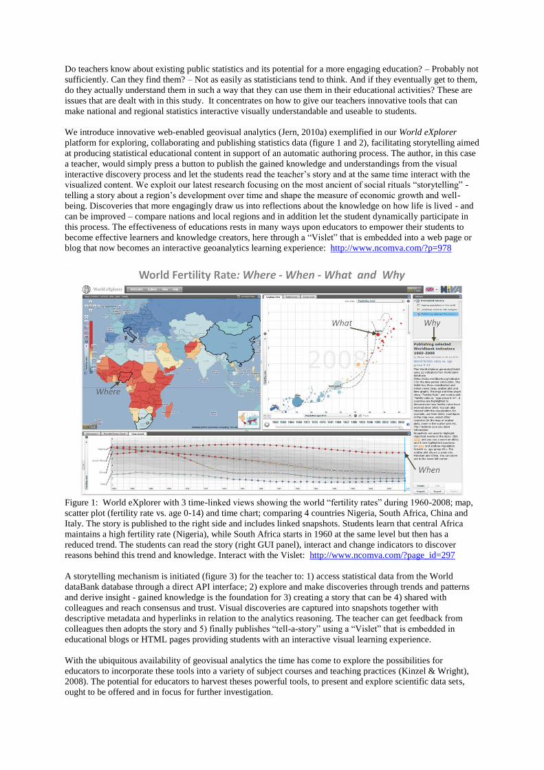
Do teachers know about existing public statistics and its potential for a more engaging education? – Probably not
sufficiently. Can they find them? – Not as easily as statisticians tend to think. And if they eventually get to them,
do they actually understand them in such a way that they can use them in their educational activities? These are
issues that are dealt with in this study. It concentrates on how to give our teachers innovative tools that can
make national and regional statistics interactive visually understandable and useable to students.
We introduce innovative web-enabled geovisual analytics (Jern, 2010a) exemplified in our World eXplorer
platform for exploring, collaborating and publishing statistics data (figure 1 and 2), facilitating storytelling aimed
at producing statistical educational content in support of an automatic authoring process. The author, in this case
a teacher, would simply press a button to publish the gained knowledge and understandings from the visual
interactive discovery process and let the students read the teacher’s story and at the same time interact with the
visualized content. We exploit our latest research focusing on the most ancient of social rituals “storytelling” -
telling a story about a region’s development over time and shape the measure of economic growth and well-
being. Discoveries that more engagingly draw us into reflections about the knowledge on how life is lived - and
can be improved – compare nations and local regions and in addition let the student dynamically participate in
this process. The effectiveness of educations rests in many ways upon educators to empower their students to
become effective learners and knowledge creators, here through a “Vislet” that is embedded into a web page or
blog that now becomes an interactive geoanalytics learning experience: http://www.ncomva.com/?p=978
Figure 1: World eXplorer with 3 time-linked views showing the world “fertility rates” during 1960-2008; map,
scatter plot (fertility rate vs. age 0-14) and time chart; comparing 4 countries Nigeria, South Africa, China and
Italy. The story is published to the right side and includes linked snapshots. Students learn that central Africa
maintains a high fertility rate (Nigeria), while South Africa starts in 1960 at the same level but then has a
reduced trend. The students can read the story (right GUI panel), interact and change indicators to discover
reasons behind this trend and knowledge. Interact with the Vislet: http://www.ncomva.com/?page_id=297
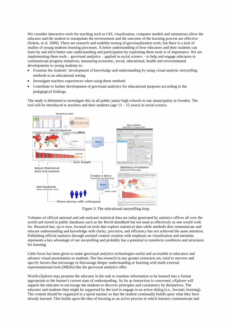
A storytelling mechanism is initiated (figure 3) for the teacher to: 1) access statistical data from the World
dataBank database through a direct API interface; 2) explore and make discoveries through trends and patterns
and derive insight - gained knowledge is the foundation for 3) creating a story that can be 4) shared with
colleagues and reach consensus and trust. Visual discoveries are captured into snapshots together with
descriptive metadata and hyperlinks in relation to the analytics reasoning. The teacher can get feedback from
colleagues then adopts the story and 5) finally publishes “tell-a-story” using a “Vislet” that is embedded in
educational blogs or HTML pages providing students with an interactive visual learning experience.
With the ubiquitous availability of geovisual analytics the time has come to explore the possibilities for
educators to incorporate these tools into a variety of subject courses and teaching practices (Kinzel & Wright),
2008). The potential for educators to harvest theses powerful tools, to present and explore scientific data sets,
ought to be offered and in focus for further investigation.
We consider interactive tools for teaching such as GIS, visualization, computer models and animations allow the
educator and the student to manipulate the environment and the outcome of the learning process are effective
(Solem, et al. 2009). There are research and usability testing of geovisualization tools, but there is a lack of
studies of young students learning processes. A better understanding of how educators and their students can
learn by and elicit better user understanding and participation by exploiting these tools is of importance. We are
implementing these tools – geovisual analytics – applied in social science – to help and engage educators to
communicate progress initiatives, measuring economic, social, educational, health and environmental
developments to young students to:
Examine the students’ development of knowledge and understanding by using visual analytic storytelling
methods in an educational setting
Investigate teachers experiences when using those methods
Contribute to further development of geovisual analytics for educational purposes according to the
pedagogical findings.
The study is delimited to investigate this in all public junior high schools in one municipality in Sweden. The
tool will be introduced to teachers and their students (age 13 – 15 years) in social science.
Figure 3: The educational storytelling loop.
Volumes of official national and sub-national statistical data are today generated by statistics offices all over the
world and stored in public databases such as the World dataBank but not used as effectively as one would wish
for. Research has, up to now, focused on tools that explore statistical data while methods that communicate and
educate understanding and knowledge with clarity, precision, and efficiency has not achieved the same attention.
Publishing official statistics through assisted content creation with emphasis on visualization and metadata
represents a key advantage of our storytelling and probably has a potential to transform conditions and structures
for learning.
Little focus has been given to make geovisual analytics technologies useful and accessible to educators and
advance visual presentation to students. Nor has research in any greater extension yet, tried to uncover and
specify factors that encourage or discourage deeper understanding or learning with multi external
representational tools (MERs) like the geovisual analytics offer.
World eXplorer may promote the educator in the task to translate information to be learned into a format
appropriate to the learner's current state of understanding. As far as instruction is concerned, eXplorer will
support the educator to encourage the students to discover principles and consistency by themselves. The
educator and students then might be supported by the tool to engage in an active dialog (i.e., Socratic learning).
The content should be organized in a spiral manner so that the student continually builds upon what they have
already learned. This builds upon the idea of learning as an active process in which learners communicate and
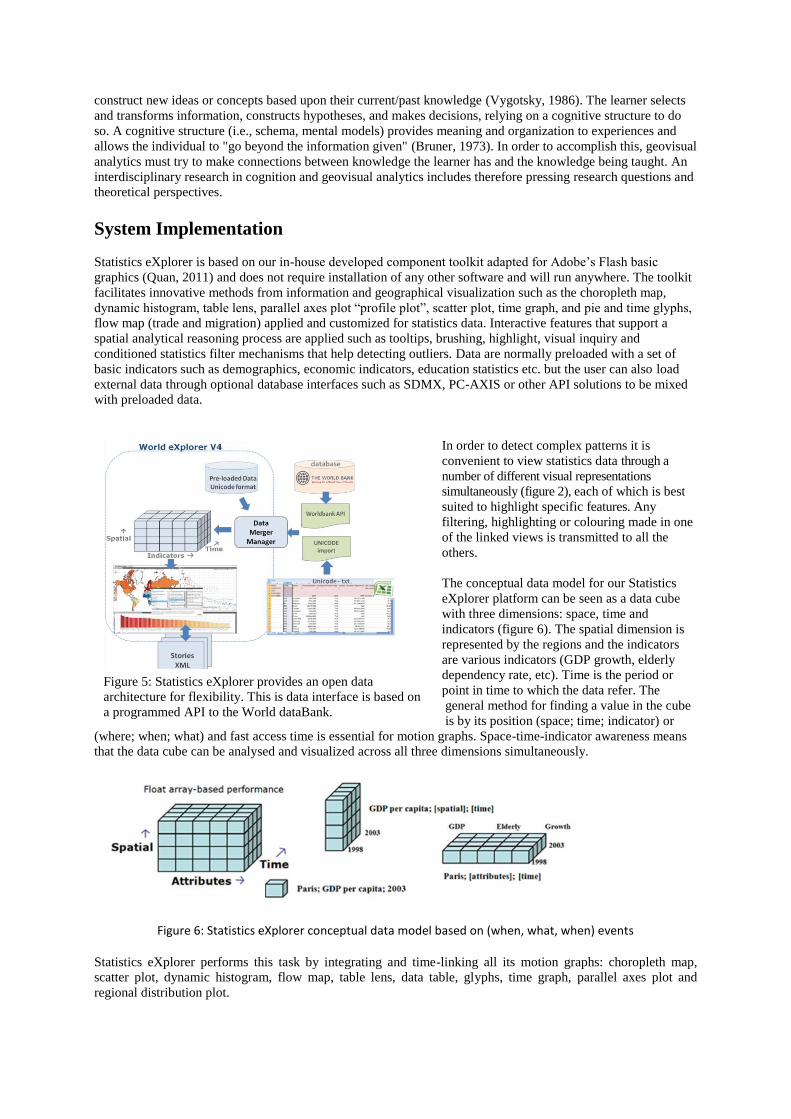
Figure 5: Statistics eXplorer provides an open data
architecture for flexibility. This is data interface is based on
a programmed API to the World dataBank.
construct new ideas or concepts based upon their current/past knowledge (Vygotsky, 1986). The learner selects
and transforms information, constructs hypotheses, and makes decisions, relying on a cognitive structure to do
so. A cognitive structure (i.e., schema, mental models) provides meaning and organization to experiences and
allows the individual to "go beyond the information given" (Bruner, 1973). In order to accomplish this, geovisual
analytics must try to make connections between knowledge the learner has and the knowledge being taught. An
interdisciplinary research in cognition and geovisual analytics includes therefore pressing research questions and
theoretical perspectives.
System Implementation
Statistics eXplorer is based on our in-house developed component toolkit adapted for Adobe’s Flash basic
graphics (Quan, 2011) and does not require installation of any other software and will run anywhere. The toolkit
facilitates innovative methods from information and geographical visualization such as the choropleth map,
dynamic histogram, table lens, parallel axes plot “profile plot”, scatter plot, time graph, and pie and time glyphs,
flow map (trade and migration) applied and customized for statistics data. Interactive features that support a
spatial analytical reasoning process are applied such as tooltips, brushing, highlight, visual inquiry and
conditioned statistics filter mechanisms that help detecting outliers. Data are normally preloaded with a set of
basic indicators such as demographics, economic indicators, education statistics etc. but the user can also load
external data through optional database interfaces such as SDMX, PC-AXIS or other API solutions to be mixed
with preloaded data.
In order to detect complex patterns it is
convenient to view statistics data through a
number of different visual representations
simultaneously (figure 2), each of which is best
suited to highlight specific features. Any
filtering, highlighting or colouring made in one
of the linked views is transmitted to all the
others.
The conceptual data model for our Statistics
eXplorer platform can be seen as a data cube
with three dimensions: space, time and
indicators (figure 6). The spatial dimension is
represented by the regions and the indicators
are various indicators (GDP growth, elderly
dependency rate, etc). Time is the period or
point in time to which the data refer. The
general method for finding a value in the cube
is by its position (space; time; indicator) or
(where; when; what) and fast access time is essential for motion graphs. Space-time-indicator awareness means
that the data cube can be analysed and visualized across all three dimensions simultaneously.
Figure 6: Statistics eXplorer conceptual data model based on (when, what, when) events
Statistics eXplorer performs this task by integrating and time-linking all its motion graphs: choropleth map,
scatter plot, dynamic histogram, flow map, table lens, data table, glyphs, time graph, parallel axes plot and
regional distribution plot.
World eXplorer applied in Education
The use of geovisual analytics (Andrienko, 2010) have in many ways revolutionized the way we are able to
experience and explore our world. A primary target group for our storytelling is the educators and their students.
By introducing the use of this tool in their process of learning and knowledge construction they got the
opportunity to discover and take advantage of what this technology offer. Our geovisual analytics supplies
possibilities for the educator to orchestrate the educational planning and teaching. The World eXplorer platform
(World eXplorer, 2011) is customized from our Web-enabled GAV Flash class library (Quan, 2011),
programmed in Adobe’s object-oriented language ActionScript and includes a collection of innovative
geographic and information visualizations adapted to statistics data handling.
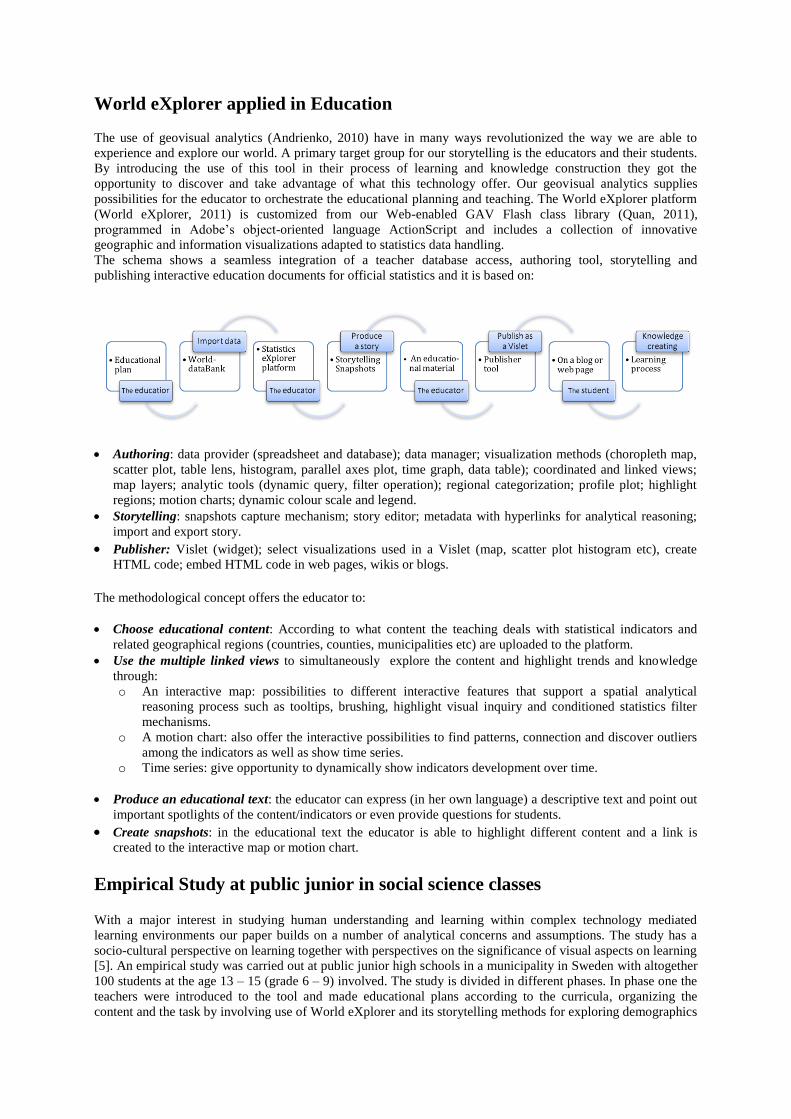
The schema shows a seamless integration of a teacher database access, authoring tool, storytelling and
publishing interactive education documents for official statistics and it is based on:
Authoring: data provider (spreadsheet and database); data manager; visualization methods (choropleth map,
scatter plot, table lens, histogram, parallel axes plot, time graph, data table); coordinated and linked views;
map layers; analytic tools (dynamic query, filter operation); regional categorization; profile plot; highlight
regions; motion charts; dynamic colour scale and legend.
Storytelling: snapshots capture mechanism; story editor; metadata with hyperlinks for analytical reasoning;
import and export story.
Publisher: Vislet (widget); select visualizations used in a Vislet (map, scatter plot histogram etc), create
HTML code; embed HTML code in web pages, wikis or blogs.
The methodological concept offers the educator to:
Choose educational content: According to what content the teaching deals with statistical indicators and
related geographical regions (countries, counties, municipalities etc) are uploaded to the platform.
Use the multiple linked views to simultaneously explore the content and highlight trends and knowledge
through:
o An interactive map: possibilities to different interactive features that support a spatial analytical
reasoning process such as tooltips, brushing, highlight visual inquiry and conditioned statistics filter
mechanisms.
o A motion chart: also offer the interactive possibilities to find patterns, connection and discover outliers
among the indicators as well as show time series.
o Time series: give opportunity to dynamically show indicators development over time.
Produce an educational text: the educator can express (in her own language) a descriptive text and point out
important spotlights of the content/indicators or even provide questions for students.
Create snapshots: in the educational text the educator is able to highlight different content and a link is
created to the interactive map or motion chart.
Empirical Study at public junior in social science classes With a major interest in studying human understanding and learning within complex technology mediated
learning environments our paper builds on a number of analytical concerns and assumptions. The study has a
socio-cultural perspective on learning together with perspectives on the significance of visual aspects on learning
[5]. An empirical study was carried out at public junior high schools in a municipality in Sweden with altogether
100 students at the age 13 – 15 (grade 6 – 9) involved. The study is divided in different phases. In phase one the
teachers were introduced to the tool and made educational plans according to the curricula, organizing the
content and the task by involving use of World eXplorer and its storytelling methods for exploring demographics
indicators during 1960-2009. This means that educational Vislets were produced based on indicators from the
World dataBank and published in their own educational blogs on the internet. In phase two the students worked
with the interactive Vislets reading the stories and interacted with a map and scatter plot (figure 2). The teachers
were first introduced to the tool; they made educational plans according to the curricula, organized the content
and the tasks by involving use of the World eXplorer platform.
Our case study is interdisciplinary and builds upon two different main research areas “technological
development of the geovisual analytics tool” and the “educational context of students learning process” when
using this tool. Within the later context a Usability Study was carried out to examine the effectiveness, efficiency
and user satisfaction. The results show that the storytelling methods are usable within the school. The tool seems
to be exiting, understandable and useful even for young students. It is efficient to students, it support their
searching and the apprehension of connections between different kinds of statistical indicators. The user
satisfaction among students was extensive at least used as brand new tool – the long lasting effects are however
unknown (Stenliden & Jern, 2010). The following tasks were investigated:
How do conceptual and perceptual factors interact in learning with different representations?
How does learning differ with presented or constructed representations?
What are the costs and benefits of learning with interactive or dynamic representations?
What are the conditions under which learning is enhanced by combining textual and graphical
representations?
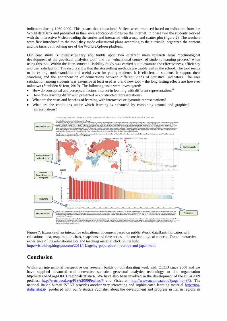
Figure 7: Example of an interactive educational document based on public World dataBank indicators with
educational text, map, motion chart, snapshots and time series – the methodological concept. For an interactive
experience of the educational tool and teaching material click on the link;
http://visletblog.blogspot.com/2011/01/ageing-population-in-europe-and-japan.html.
Conclusion Within an international perspective our research builds on collaborating work with OECD since 2008 and we
have supplied advanced and innovative statistics geovisual analytics technology to this organization
http://stats.oecd.org/OECDregionalstatistics/. We have also been involved in the development of the PISA2009
profiles: http://stats.oecd.org/PISA2009Profiles/# and Vislet at: http://www.ncomva.com/?page_id=873. The
national Italian bureau ISTAT provides another very interesting and sophisticated learning material http://noi-
italia.istat.it/ produced with our Statistics Publisher about the development and progress in Italian regions in
Another user is the European Commission that have used Europe eXplorer for internal analysis of data from
Eurostat. The research concerning the learning perspective as presented in this study is highly requested from the
international research field of learning and instruction (for example European Association Research of Learning
and Instruction). The special interest group (SIG2) of comprehension of text and graphics inside this research
field, focuses on how learning is influenced by the form of representation that learners study. Focus has
historically been on text and picture comprehension but given the explosion of representations made available
since the introduction of graphical interfaces, the field now considers all forms of representation including but
not limited to, text, pictures, graphs, diagrams, concept maps, animations, equations, virtual reality, information
and scientific visualization, haptics, multimedia, hypermedia, and simulations. Research on learning, when using
these aids, is essential. There is research of learning with multimedia environments in different experimental
studies but there is hardly any research done of this in real school contexts i.e. in a socio cultural perspective. In
Sweden there are hardly any studies considering didactic within social science education in schools.
All together the results of this study will give valuable contributions to the development of these research fields.
The geovisual analytics technique introduced in this paper allows the teacher to communicate with student
through interesting and important discoveries captured into snapshots together with descriptive text. Selected
indicators and visual representations can be published together with their metadata, thus facilitating the
comprehension of statistical information for educational purpose. We believe that this innovative storytelling
technology can be useful for a next-generation educational dynamic book for learning about different
phenomena in the world, as examples demonstrated in this paper. At the same time, the Vislet technique help
developing agile on-line educational publications, which draw the attention on recent trends and inequalities.
The educational World eXplorer presented in this paper can be evaluated at:
http://www.ncomva.se/flash/explorer/wbapi/# .
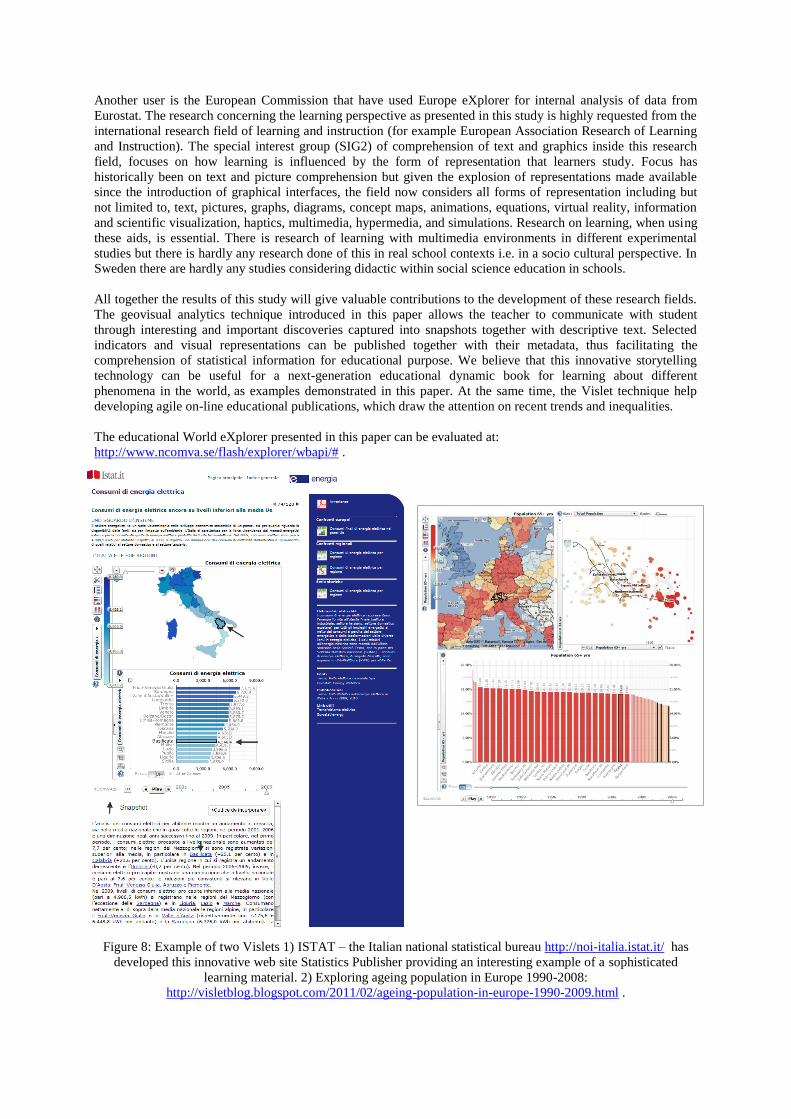
Figure 8: Example of two Vislets 1) ISTAT – the Italian national statistical bureau http://noi-italia.istat.it/ has
developed this innovative web site Statistics Publisher providing an interesting example of a sophisticated
learning material. 2) Exploring ageing population in Europe 1990-2008:
http://visletblog.blogspot.com/2011/02/ageing-population-in-europe-1990-2009.html .
Acknowledgements
This research and case studies were carried out by NCVA in close collaboration with OECD and Statistics
Sweden who supplied data and comprehensive evaluation of the statistical storytelling system. The research is in
part supported by funding from the Swedish Agency for Innovation Systems (VINNOVA), the “Visualization
Program” and the “National Graduate School of Childhood, Learning and Didactics” both coordinated by the
Swedish Knowledge Foundation. The authors thank the entire research team at NCVA, Linkoping University for
valuable contributions, but also to the teachers contributing and the students participating in this study.
References
Ainsworth, S., 2006. DeFT: A Conceptual Framework For Considering Learning with Multiple Representations, Learning
and Instruction. 16(3), , pp. 183-198.
Andrienko G., Andrienko N., Demsar U., Dransch D., Dykes J., Fabrikant S., Jern M., Kraak M., Schumann H., Tominski C.
2010. ”Space, time and visual analytics”, International Journal of geographical information science, 24(10):1577-1600.
Bruner, J., 1973. Going Beyond the Information Given, New York: Norton.
Gibson, J., 1969. Våra sinnen som perceptuella system, Stockholm, Beckman, Stockholm.
Goldman, S. R., Mertz. D. L., & Pellegrino. J. W., 1989. Individual differences in extended practice functions and solution
strategies for basic addition facts. Journal of Educational Psychology, 81(4), pp. 481-496.
Jern, M., 2010a. “Educating students in official statistics using embedded geovisual analytics storytelling methods”,
Reviewed Proceedings in Eurographics 2010, Norrköping.
Jern, M., 2010b. “Explore, Collaborate and Publish Official Statistics for Measuring Regional Progress”, Cooperative
Design, Visualization, and Engineering 7th International Conference, CDVE 2010, Mallorca, Spain, September 19-22, 2010.
Lecture Notes in Computer Science, pp 189-198, ISBN-10 3-642-16065-4 Springer Berlin Heidelberg New York
Jordan, B., & Henderson, A., 1995. Interaction analysis: Foundation and practice, The Journal of the Learning Sciences 4 (I),
pp. 39 – 103.
Kinzel, M., Wright, D., 2008. Using Geovisualizations in the Curriculum: Do Multimedia Tools Enhance Geography
Education? Paper Number 1290, Environmental Systems Research Institute Education User’s Conference.
Quan, H., Lundblad, P., Åström, T., and Jern, M., 2011. A Web-Enabled Visualization Toolkit for Geovisual Analytics
Visualization and Data Analysis, Awarded best paper, SPIE: Electronic Imaging Science and Technology, Visualization and
Data Analysis, Proceedings of SPIE, San Francisco.
Stenliden, L., Jern, M., 2010. Educating official statistics using geovisual analytics storytelling methods, Reviewed
proceedings, International Technology, Education and Development Conference INTED, Valencia.
Solem, M., Foote, K., Monk, J., 2009. Aspiring Academics: A Resource Book for Graduate Students an Early Career
Faculty. Prentice Hall.
Vygotsky, L., 1986. Thougt and language. Edited by Kozulin, A., MIT Press, Cambridge.
World eXplorer: http://ncomva.com 2011

![Entity Skeletons for Visual Storytelling · 2020-06-21 · Visual Storytelling [1] [1] Huang, Ting-Hao Kenneth, et al. "Visual storytelling." Proceedings of the 2016 Conference of](https://img.pdfslide.us/doc/110x75/5f0dd3c97e708231d43c4894/entity-skeletons-for-visual-storytelling-2020-06-21-visual-storytelling-1-1.jpg)