Embed Size (px)
Citation preview
Brand communications guidelinesVersion 1.0January 2012

Contents
Contents Introduction
1 Brand1.1 TV Licensing now 1.2 Our philosophy 1.3 Brand strategy 1.4 Brand world1.5 TV Licensing and the BBC
2 Key brand elements Design
Trademark2.1 Primary logo2.2 Using the logo2.3 Positioning the logo2.4 Alternative logo colourways2.5 Logo alignment2.6 Logo as an endframe
Colour 2.7 Colour palette2.8 Tints
Typography2.9 Typeface2.10 Using type2.11 Word clouds
Graphic elements2.12 Icons2.13 Sizing icons2.14 Watermark
Imagery2.15 Illustrations2.16 Photography Copy
TOV2.17 Tone of voice2.18 Messaging guidelines2.19 A note on simplicity2.20 Writing up our identity
3 Cutomer experiences3.1 Overview3.2 Customer service3.3 Collections3.4 Enforcement
4 Applications Offline
Base stationery
4.1 Envelopes4.2 Alignment on envelopes 4.3 Letters4.4 Letter specifications – front4.5 Letter specifications – reverse4.6 Inserts
Online
4.7 Website 4.8.1 Banner ads4.8.2 Banner ads4.8.3 Banner ads4.9 Pre-rolls4.10 Emails 4.11 SMS/MMS4.12 TV trails
5 Other audiences5.1 Students5.2 MOD5.3 Welsh5.4 Welsh logo5.5 Welsh logo colourways5.6 Foreign nationals5.7 Blind/sight impaired
Introduction Introduction
IntroductionThese guidelines explain how our brand is expressed offline and on-screen when communicating with the public, employees and suppliers. This should be used as a practical guide for designing, writing and producing all communications collateral for the TV Licensing brand to optimise effectiveness, provide creative flexibility yet also ensure consistency. You’ll start by discovering how and why the TV Licensing brand evolved from an ‘Enforcement’ positioning to an ‘Enabling’ one.
You’ll then find an outline of the core brand design and copy elements.
Next there’s an explanation of the three customer experiences, which are Customer Service, Collections and Enforcement. With each is a comprehensive guide to how you can bring that experience to life through TV Licensing communications.
You can see it all in action with practical examples of both offline and online collateral.
And finally, you can take a closer look at campaigns especially developed for Other audiences – for example, Ministry of Defence and Welsh segments.
It’s important to remember, however, that TV Licensing is a living brand that will continue to evolve. These guidelines are designed to be developed so that they are useful, relevant and capture our most innovative applications.
If you have any questions or recommendations, please contact [email protected].
1 Brand 1.1 TV Licensing now 1.2 Our philosophy 1.3 Brand strategy 1.4 Brand world1.5 TV Licensing and the BBC
Brand
One of the most important milestones in TV Licensing history happened in 2009 when we evolved from an Enforcement brand to an Enabling brand.
We repositioned TV Licensing to shift our focus from simply ‘how to pay’ to also explain ‘what the customer is paying for’ – “a year’s worth of television, radio and online programmes and services”.
To create a nation of willing payers by using the carrot rather than stick.
To achieve mass compliance by making it easier and quicker to get, and stay, licensed.
To be fairer to those who buy a TV Licence so we can be firmer with those who avoid doing so.
Brand1.1 TV Licensing now

Brand
Why? Because we’re a public service organisation. And because more than 95% of households across the UK are our customers. They love TV, radio and online content. They abide by the law that created the TV Licence. And even in the hardest times, most find a way to pay 39p a day toward that world of information, entertainment and conversation that enriches our lives.
Which is why when we talk to them, we remember we’re talking to the people we’re here to serve.
So we’re polite, respectful and open. We do not seek to persuade but to inform and enable.
We do not obfuscate, omit or spin. We make even complex things – like the law – simple. We take pride in being helpful to those looking for a way to pay their TV Licence.
We are not aggressive or threatening. Rather we’re clear, conversational and considered.
We do not shout. We tell people what they need to know so they can choose their own actions and the consequences of them.
We never assume guilt. Instead we trust that most people will do the right thing. We also believe that to be fair to those who do we need to be firm with those who should, but don’t.
We didn’t create the law. But we were created by it as much to enable it as to enforce it. With as much transparency as sense of responsibility.
While we give everyone every opportunity to comply with the law, we are unwavering in bringing to account those who persist in breaking it. Appropriately. Proportionately. And efficiently.
Why? It’s just as rewarding for us, as to the public we serve, to see fewer of the pennies go towards collecting the TV Licence fee and enforcing TV Licensing law, and more of the pounds go towards the TV, radio and online content we all love and live by.
After all, our ambition is to be a modern self-serve digital brand in a fast-changing media world.
1.2 Our philosophy
TV Licensing puts the public at the heart of everything we do.
Brand
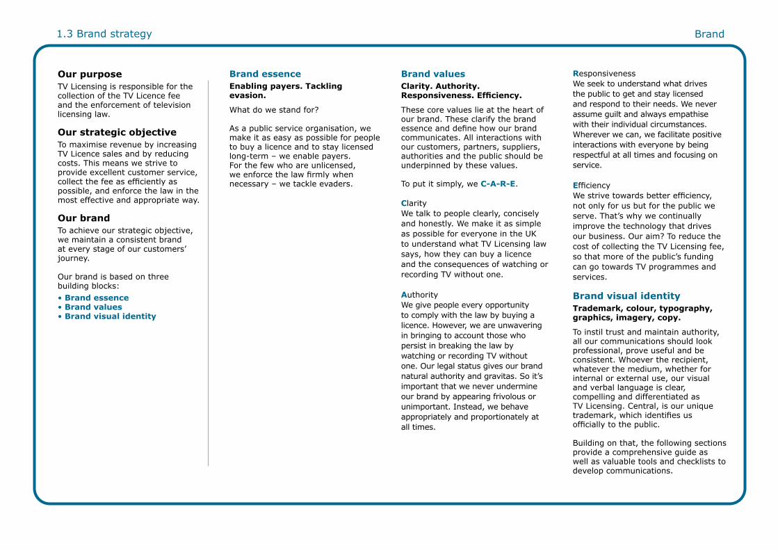
Our purpose TV Licensing is responsible for the collection of the TV Licence fee and the enforcement of television licensing law.
Our strategic objectiveTo maximise revenue by increasing TV Licence sales and by reducing costs. This means we strive to provide excellent customer service, collect the fee as efficiently as possible, and enforce the law in the most effective and appropriate way.
Our brandTo achieve our strategic objective, we maintain a consistent brand at every stage of our customers’ journey.
Our brand is based on three building blocks:• Brand essence • Brand values • Brand visual identity
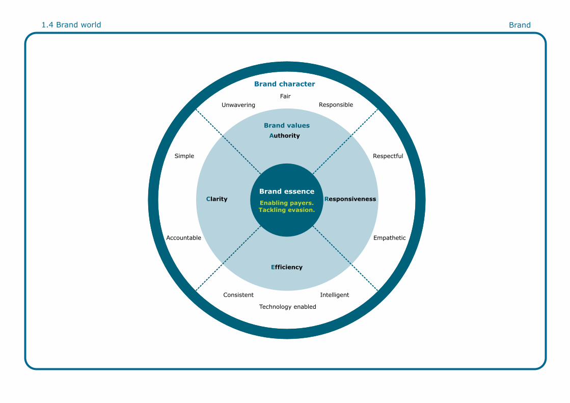
Brand values Clarity. Authority. Responsiveness. Efficiency.
These core values lie at the heart of our brand. These clarify the brand essence and define how our brand communicates. All interactions with our customers, partners, suppliers, authorities and the public should be underpinned by these values.
To put it simply, we C-A-R-E.
ClarityWe talk to people clearly, concisely and honestly. We make it as simple as possible for everyone in the UK to understand what TV Licensing law says, how they can buy a licence and the consequences of watching or recording TV without one.
AuthorityWe give people every opportunity to comply with the law by buying a licence. However, we are unwavering in bringing to account those who persist in breaking the law by watching or recording TV without one. Our legal status gives our brand natural authority and gravitas. So it’s important that we never undermine our brand by appearing frivolous or unimportant. Instead, we behave appropriately and proportionately at all times.
Brand essence Enabling payers. Tackling evasion.
What do we stand for? As a public service organisation, we make it as easy as possible for people to buy a licence and to stay licensed long-term – we enable payers. For the few who are unlicensed, we enforce the law firmly when necessary – we tackle evaders.
ResponsivenessWe seek to understand what drives the public to get and stay licensed and respond to their needs. We never assume guilt and always empathise with their individual circumstances. Wherever we can, we facilitate positive interactions with everyone by being respectful at all times and focusing on service.
EfficiencyWe strive towards better efficiency, not only for us but for the public we serve. That’s why we continually improve the technology that drives our business. Our aim? To reduce the cost of collecting the TV Licensing fee, so that more of the public’s funding can go towards TV programmes and services.
Brand visual identityTrademark, colour, typography, graphics, imagery, copy.
To instil trust and maintain authority, all our communications should look professional, prove useful and be consistent. Whoever the recipient, whatever the medium, whether for internal or external use, our visual and verbal language is clear, compelling and differentiated as TV Licensing. Central, is our unique trademark, which identifies us officially to the public.
Building on that, the following sections provide a comprehensive guide as well as valuable tools and checklists to develop communications.
1.3 Brand strategy
1.4 Brand world Brand
Authority
Efficiency
Technology enabled
Consistent Intelligent
UnwaveringFair
Responsible
Respectful
Accountable
Simple
Empathetic
Clarity ResponsivenessEnabling payers.Tackling evasion.
Brand essence
Brand values
Brand character

1.5 TV Licensing and the BBC Brand
What is the relationship between the BBC Trademark and the TV Licensing Trademark?The TV Licensing brand is separate from the BBC brand. No link between the two brands should be made in customer facing communications, in particular, use of the BBC name and logo.
However, the BBC name and logo can be used on internal communications and in communication with suppliers. The name BBC TV Licensing may also be used within department names or job titles for BBC employees.
Suppliers and partners should always get written consent from the BBC before using the BBC trademark.

2 Key brand elements Design
Trademark2.1 Primary logo2.2 Using the logo2.3 Positioning the logo2.4 Alternative logo colourways2.5 Logo alignment2.6 Logo as an endframe
Colour 2.7 Colour palette2.8 Tints
Typography2.9 Typeface2.10 Using type2.11 Word clouds
Graphic elements2.12 Icons2.13 Sizing icons2.14 Watermark
Imagery2.15 Illustrations2.16 Photography
Copy
TOV2.17 Tone of voice2.18 Messaging guidelines2.19 A note on simplicity 2.20 Writing up our identity
Trademark
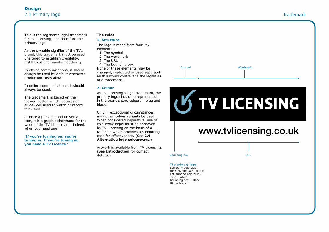
This is the registered legal trademark for TV Licensing, and therefore the primary logo.
As the ownable signifier of the TVL brand, this trademark must be used unaltered to establish credibility, instill trust and maintain authority.
In offline communications, it should always be used by default whenever production costs allow.
In online communications, it should always be used.
The trademark is based on the ‘power’ button which features on all devices used to watch or record television.
At once a personal and universal icon, it is a graphic shorthand for the value of the TV Licence and, indeed, when you need one:
’If you’re turning on, you’re tuning in. If you’re tuning in, you need a TV Licence.’
The rules1. StructureThe logo is made from four key elements: 1. The symbol 2. The wordmark 3. The URL 4. The bounding boxNone of these elements may be changed, replicated or used separately as this would contravene the legalities of a trademark.
2. ColourAs TV Licensing’s legal trademark, the primary logo should be represented in the brand’s core colours – blue and black.
Only in exceptional circumstances may other colour variants be used. When considered imperative, use of colourway logos must be approved by TV Licensing on the basis of a rationale which provides a supporting case for effectiveness. (See 2.4 Alternative logo colourways.)
Artwork is available from TV Licensing. (See Introduction for contact details.)
Symbol
URLBounding box
Wordmark
Design2.1 Primary logo
The primary logo Symbol – pale blue (or 50% tint Dark blue if not printing Pale blue)Type – whiteBounding box – blackURL – black
2.2 Using the logo Trademark
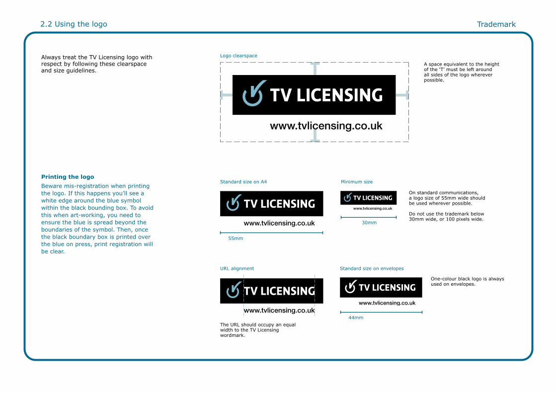
Always treat the TV Licensing logo with respect by following these clearspace and size guidelines.
Printing the logoBeware mis-registration when printing the logo. If this happens you’ll see a white edge around the blue symbol within the black bounding box. To avoid this when art-working, you need to ensure the blue is spread beyond the boundaries of the symbol. Then, once the black boundary box is printed over the blue on press, print registration will be clear.
On standard communications, a logo size of 55mm wide should be used wherever possible.
Do not use the trademark below 30mm wide, or 100 pixels wide.
Standard size on A4 Minimum size
Logo clearspace
A space equivalent to the height of the ‘T’ must be left around all sides of the logo wherever possible.
One-colour black logo is always used on envelopes.
55mm
44mm
30mm
URL alignment Standard size on envelopes
The URL should occupy an equal width to the TV Licensing wordmark.

Trademark
For consistency, both online and offline, always follow these guidelines for positioning the logo.
2.3 Positioning of the logo
me soon?
Position logo top right.
Position logo top right.
9mm
9mm
22 p
ixel
s
22 pixels
Position logo in centre.
4.5 pixels
12 pixels
Letters
Emails
Banners
Position logo bottom right.
9mm
9mm
EnvelopesPosition logo bottom right.Leaflets
9mm
7mm
Elements on this page are actual size.
Position logo top right.
12mm
Enforcement letter
13m
m

2.4 Alternative logo colourways Trademark
These three colour variants may only be used in offline communications: 1. When production budgets only allow one-colour printing; or 2. When exceptional circumstances require creative flexibility to optimise effectiveness.
Use of these logos needs to be approved by TV Licensing on the basis of a rationale which providesa supporting case.
They should never be used for online communications.
1. One-colour logo – dark blue 2. One-colour logo – black 3. One-colour logo – red
Symbol and type – whiteBounding box – dark blue URL – dark blue
This is the standard TV Licensing logo reversed out. This should be used if the logo is applied to a black background.
Symbol – pale blue(or 50% tint dark blue if not printing pale blue)Type – black
This one-colour logo is to be used when printing black.
Symbol and type – whiteBounding box – dark blue URL – black
This one-colour logo should be reversed out when printing dark blue.
Symbol and type – dark blueBounding box – white URL – white
Symbol and type – whiteBounding box – dark blue URL – black
Symbol and type – whiteBounding box – redURL – red
This logo should only be on Enforcement communications.
4. Standard logo – reversed on black 5. One-colour logo – black reversed 6. One-colour logo – dark blue reversed

Trademark
Vertical alignmentAlign an element with the right edge of the logo’s bounding box.
As a general rule, this applies if type or element is spaced far away from the logo or if the type is much larger than the URL.
Horizontal alignmentWhen aligning the logo with an element horizontally, align with the top of the bounding box.
2.5 Logo alignment

2.6 Logo as an endframe Trademark
The symbolThe symbol always has a ‘glow’ effect and is animated to show the symbol ‘switching on’.
ClearspaceWhatever the background colour, it is important to protect the logo on endframes. Always follow the same clearspace guidelines detailed in 2.2 Using the logo. TV trail endframe
Logo clearspaceA space equivalent to the height of the ‘T’ must be left around all sides of the logo whenever possible.

Colour
Core coloursThese colours comprise TV Licensing’s core palette: dark and pale blue; with the addition of black. They are used to brand the organisation at the highest level in communications with all stakeholders.
Secondary coloursThese colours give flexibility to the palette: bright, pale and mid green; with the addition of red.
They are used to create different customer experiences which reflect the role of the brand, whether Customer service, Collections or Enforcement. (See 3 Customer experiences for details.)
Colour2.7 Colour palette
Coated: Pantone 7470CUncoated: Pantone 634U CMYK: 95, 19, 25, 52RGB: 0, 94, 110
Coated: Pantone 550CUncoated: Pantone 550U CMYK: 45, 07, 08, 08RGB: 140, 184, 198
Coated: Pantone 630CUncoated: Pantone 630UCMYK: 48, 00, 10, 00RGB: 133, 205, 219
Dark blue
Coated: Pantone Black CUncoated: Pantone Black U CMYK: 00, 00, 00, 100RGB: 30, 30, 30
Pale blue Bright blue
Black
Coated: Pantone 382CUncoated: Pantone 381U CMYK: 34, 00, 100, 00RGB: 193, 216, 47
Coated: Pantone 7492CUncoated: Pantone 7492UCMYK: 17, 01, 45, 03RGB: 199, 210, 138
Coated: Pantone 7489CUncoated: Pantone 376U CMYK: 56, 02, 75, 05RGB: 115, 175, 85
Coated: Pantone 7417CUncoated: Pantone 7417UCMYK: 01, 84, 83, 00RGB: 220, 80, 52
Bright green Pale green Mid green
Red

2.8 Tints Colour
Colour tintsAny colour in the palette, except red, can be applied in tint increments of 10%. Red should be used at 100% whenever possible, as more transparent tints appear pink once printed.
Tints allow design flexibility. They should be used as a device to organise content into easily navigable architectures, for example, in information leaflets, and prompt behavioural responses in a desired sequence, for example, on the website.
A combination of tints is also used in the design of word clouds to prioritise messaging.
100% 90% 80% 70% 60% 50% 40% 30% ‘
Dark blue
Pale blue
Bright blue
Black
Bright green
Pale green
Mid green
Red

Typography
TV Licensing’s core typeface is Verdana. Classic and clear, it is suitable for both offline and online communications.
In general, it can be used in two weights, Verdana Bold and Verdana Regular.
A third weight, Verdana Italic, is currently only used in copy which communicates a foreign language call-to-action, which is usually placed at the bottom of a page. (See 5 Other audiences for details.)
Verdana Bold
Verdana Regular
Verdana Italic
Typography2.9 Typeface

2.10 Using type Typography
1. Offline communications Headlines and subheadsUse Verdana Bold. Body copyUse Verdana Regular.
2. Online communicationsHeadlines and subheadsUse Verdana Bold. Body copyUse Verdana Regular.
For both offline and online communications, type should be clear and legible: • Avoid small type sizes and long line lengths. • Avoid large amounts of reversed out, capitalised or italicised text. • Do not use bright or pale green, bright or pale blue for body copy.
For information on accessible design for people with sight problems, please read the RNIB Clear Print Guidelines. (See 5 Other audiences for details.)
Ref/Licence number
Licence status
URL Headlines on colour
Sub headings
Body copy
Verdana Bold
Verdana Bold
Verdana Bold Verdana Bold in black
Verdana Bold
Verdana Regular

2.11 Word clouds Typography
Word cloudsA word cloud is a visual representation of the contents of a communication and can be used as a creative device to optimise effectiveness.
This format is useful for quickly perceiving the most important messages or benefits contained within copy.
It may be used as a navigation aid in online communications, for example, on a website, or as an attention-grabbing device in offline communications, for example, on envelopes or as a headline.
Colour and type size may be used to drive the eyeline from the most important word to the least, prioritising and sequencing the message. Having become part of a familiar visual language in the digital world, use of the word cloud where relevant and valuable reinforces the perception of TV Licensing as a modern, digital brand.
On envelopesVerdana Bold, upper and lower case. Tints of black and one other colour.
Colour reflects the key call-to-action and optimal response channel.
Different type sizes deliver benefit of response in order of value perceived by customer.
On lettersVerdana Bold, upper case. Tints of black and one other colour.
Colour reflects the primary ‘value’ benefit of responding to the letter.
Visit
to move your licence
tvlicensing.co.uk
Dear [sample],
It’s nearly time for the big move – out of halls and into your new home. With all the packing and boxing ahead, we’ve made it easy to move one thing before you go – your TV Licence.
You see, you won’t be legally covered in your new home until you tell us your new address. So take
Moving into a new home soon? We’ll make it easy to stay licensed
On emailsVerdana Bold, upper and lower case. Centered.Tints of black and one other colour.
XX/XX-XXXXXX/XXXXXX:XXX-XXXXXXMr A B Sample1 Sample RoadSampletownSampleshireAB1 2CD

Graphic elements2.12 Icons Graphic elements
Icon paletteThese icons comprise TV Licensing’s core icon palette. Inspired by the symbol in the brand logo, each icon consists of a roundel and a symbol. Designed using a simple, universal visual language, icons cross verbal language barriers and communicate at every level of literacy.
As our communications are often information-rich, they are a simple, functional and direct way of sign-posting messaging, simplifying the customer’s scan path and drawing attention to calls-to-action.
Icons can be used at a large scale, for example, highlighting ‘information’ on the cover of a leaflet; or at a smaller scale, for example, when prioritising ‘ways to pay’ on the website.
Each icon may be used to signpost different messages in different communications. However, in any one communication, the icon must be consistently used to signpost the same message.
For example, if in a letter, you use the question mark icon to signpost ‘Any questions?’, any further use of that icon should refer to questions.
Meanwhile, on the website, if you use the question mark icon to signpost ‘Check if you need a licence’, it must be used consistently to support that action.
Borrowed from digital enabling brands in the mobile and media sectors, icons suggest choice, action and control. So, it’s not surprising that they are used most effectively in online communications. In digital advertising, the website or even in pre-rolls, they can be activated as a live link which when clicked can take the customer to the next relevant page in their user journey.
An important note on third party logosDue to trademark restrictions, the Direct Debit and PayPoint logos should only be used as shown. They should never be placed in a roundel. They should be reproduced in black or reversed out of a colour in white. (For more information on using the Direct Debit and PayPoint logos or identity, please refer to the relevant brand guidelines.)
Developing new iconsAs TV Licensing’s communications are developed, new icons can be professionally designed by the lead creative agency. You should apply to the agency to create new icons, which will be approved by the BBC.
Icons are not provided by the BBC as brand assets. Instead, the lead creative agency can provide you with the existing icons.
Roundel: The thickness is equivalent to the thickness of the TV Licensing’s logo symbol.
Use solid blocks of colour.
Keep simple with comprehension-critical detail.
Find out more information
Buy or renew Get help Update your contact details
Media and community
Calls to action
Online Post Call
Ways to payWays to pay
An icon
Direct Debit PayPoint

Visit our website at www.tvlicensing.co.uk
Call us on 0300 790 6086
Write to us at Customer Services, TV Licensing, Bristol BS98 1TL
If you’re deaf, hard of hearing or speech impaired, you can use our textphone facility by calling 0300 790 6050. Please have your TV Licence number handy when you call.
How to get in touch.
2.13 Sizing icons Graphic elements
Icon sizeIcons can be used at different scales: 1. Large scale For example, to highlight ‘Information’ on the cover of a leaflet. 2. Small scale For example, when prioritising ‘Ways to pay’ on the website or print.
Icons should maintain the same proportions at every scale – never stretch the dimensions of an icon.
Maximum size
Minimum size
45mm
7mm

2.14 Watermark Graphic elements
The watermark is derived from TV Licensing’s logo symbol, which is inspired by the ‘power’ button on all devices used to watch or record television.
Its power lies in its use as a mnemonic for the premise on which the TV Licence is based:
’If you’re turning on, you’re tuning in. If you’re tuning in, you need a TV Licence.’
The TV Licensing watermark should only be used as a tint in the background of offline communications to: • Reinforce the relationship with a customer through the recognition of it on regular customer communications, for example, on the envelope of direct mail. • Reinforce the impression of an authentic official document by using it as a background, for example, on the TV Licence.
The watermark can be used in any colour from the TV Licensing colour palette. The tint values described on this page provide a suitable balance of contrast.
Never use the watermark in online communications.
Watermark on white50% tint of solid colour.
Payments due*:3 Nov 2011 = £12.12
3 Dec 2011 = £12.12
3 Jan 2011 = £12.12
3 Feb 2011 = £12.12
3 Mar 2011 = £12.12
3 Apr 2011 = £12.12
3 May 2011= £12.12
Payments in the
Watermark on tint50% tint of solid colour.
Backround tint 30% of solid colour.
Maximum size of watermark is:67mm.
e entitles you to:s television receivers to be installed and used at thce conditions (to find out more, turn over).
behalf of the BBC by TV Licensing.
and white receivers
Your over 75 TV Li
ocument for the three year period from
67 m
m 28 m
m
Watermark on envelope30% tint of black.Maximum height on envelope is 28mm.
Elements on this page are actual size.
DD long term payment plan
DD long term letter

Imagery
As a public service organisation, TV Licensing needs to be inclusive of everyone. So it uses illustrative and photographic imagery with relevance, meaning and appeal to different age groups, genders, regions, income levels, literacylevels and cultures.
Illustrations are inspired by TV Licensing’s icons to create an ownable illustrative style. They should be clean and functional, suggesting simplicity and ease. The content of each should visualise the message. They should always show objects not people.
Illustrations are most often used as line drawings in flat colour. They may be circumscribed within a roundel and may even be animated as messaging unfolds in story form, for example, in online pre-rolls. They should always be created by a professional illustrator.
On rare occasions, 3D illustration may be used, for example, to create a scene which is inclusive and engaging, without depicting any specific demographics.
Imagery2.15 Illustrations

Imagery
Photography can be used to: • Highlight key messages in the copy. • Reinforce the brand’s focus on the customer. • Evidence the inevitability of enforcement divisions ‘in your area’.
Photography should put the customer in the picture by being shot from their point of view. At once personal and involving, they should never show people but rather the objects or scenes that bring to life the proposition of the communication.
Photographs are most often used as cut outs, cropped to work effectively within the layout. Cropping adds interest and focus. Photographs, on rare occasion, can also be used as full bleed situational shots.
For greater usability, photography can be mixed with illustration. In online communications, illustrations can even be activated as a live link, which when clicked can take the customer to the next relevant page in their user journey.
2.16 Photography
Click here for student information

Copy2.17 Tone of voice Copy
Our tone of voice is the embodiment of our brand values:
• Clarity • Authority • Responsiveness • Efficiency
ClarityOur brand communicates with the entire British public – people with different levels of literacy, with different media preferences and with varying relationships with the ‘law’. For some, English is a second, even third, language. And for some, £145.50 is difficult to pay.
So when communicating any message, whether the benefits of buying a TV Licence or the legal consequences of watching or recording TV without one, we need to:
• Speak clearly. Always choose the simplest word and use short sentences.
• Avoid jargon. Don’t use marketing, media, legal, transactional or TV Licensing buzzwords. Use plain English.
• Break up messaging. Use headings, bullet points, icons and bold text for easy navigation and at-a-glance reading.
• Drive to the call-to-action. Quickly and simply, tell the customer what they need to do, what the benefits are and how to do it.
AuthorityOur primary role is to give people the information they need to decide whether to comply with TV Licensing law or not and act on their decision. While being approachable and understanding, we need at all times to speak with the surefootedness that comes from being empowered by the law to help people do the right thing. So we need to:
• Be professional rather than friendly in our approach. As we move through the customer journey, our need to be seen as an authoritative brand increases.
• Avoid being seen as aggressive, threatening, lecturing or authoritarian. Instead, be considered, responsible, fair and instil trust in the public.
• Ensure we never assume guilt. Instead we assume that most people will decide on the side of the law. So we are always to be fair to those who do buy their licence – just as we are firm with those who should, but don’t.
• Be unwavering in our commitment to dealing with those who break the law. We do have the weight of the law behind us and have a duty to help enforce the law. But we always assert this authority in an appropriate and proportionate way.
ResponsivenessBeing a public service brand, our aim is to talk to people not properties. We make every effort to use data to listen before we talk, then we use every asset we have to respond to their individual circumstances.
• We make a licence easy to afford. We respect customers and empathise with their needs.
• We make it easy to get in touch. Whenever a customer needs to interact with TV Licensing, whether to sort out a payment issue or to change their details, we make it as easy as possible for them to get it sorted quickly and easily – whether online, by phone, by email or by post.
EfficiencyCustomers need to feel that buying a licence is easy, so we need to make the process sound simple. Key to this is putting technology at the heart of our operation:
• We are a modern brand. We offer all the technology that customers would expect today, including online payment and an interactive voice recognition (IVR) telephone system.
• We encourage self service. The more customers interact with us through self-serve channels, the lower the cost of collection.
We need to encourage customers to manage all their licence requirements themselves via our website and IVR system.
• We offer choice. We let customers know all their options, rather than persuade. They need to feel empowered to do what suits them best.
• We have a powerful database. Our expertise in storing and managing data enables us to enforce the law effectively and efficiently.

2.18 Messaging guidelines Copy
Messaging guidelines
Messaging guidelines to be added once BBC have reviewed and agreed content.

2.19 A note on simplicity Copy
The advice on this page is designed to help copywriters write simply. You’ll find technical guidance and examples on how to get the right response, first time.
1. Use no more than 12 lexical items in a sentence. A lexical item is a technical term for a word (or words) that convey a single meaning. The following are all examples of lexical items: “cat”, “traffic light”, “take care of” “by the way”.
2. Make one point per sentence. Don’t use commas to add related points into the same sentence.
For example, do not write: “You can view your licence, which covers you to watch or record television programmes as they’re being shown on TV, at any time online.”
Instead, write: “Your licence covers you to watch or record television programmes as they’re being shown on TV. You can view it at any time online.”
3. Make language active. Avoid the abstract and indirect passive voice. For example, do not write: “Licences cover the watching or recording of television programmes as they’re being shown on TV.”
Instead, ensure copy is in the ‘active voice’: “Your TV Licence covers you to watch or record TV programmes as they’re being shown on TV.”
4. Look out for words that have more than one meaning. Don’t assume it’s obvious which meaning you are using.
For example, in a piece of student communication, do not write: “Thinking of watching live TV without a TV Licence? Think fine.”
5. Be specific and definite. Avoid using lots of ‘conditional sentences’. These are sentences that usually start with ‘If’. Use the concrete not the abstract.
For example, do not write: “If you’ve turned 75, your licence is about to expire, and you want to continue watching TV, you can apply for a free over 75 licence online or call us if you prefer.”
Instead, write: “If you’ve turned 75, you are eligible for a free over 75 TV Licence. You can apply online at www.tvlicensing.co.uk or call us on 0800 000 000.”
6. Avoid shifting tenses, subjects or styles. Don’t confuse past, present and future tenses.
For example, do not write: “We wrote to you a few weeks ago to remind you that your property will not be covered by a TV Licence in the next year unless you renew now.”
Don’t change feet between writing from the perspective of the customer then the law then TV Licensing.
For example, do not write: “If you watch television without a licence, the law states you are breaking TV licensing law.”
Also, avoid switching styles from enabling to enforcing as this can undermine trust.
For example, do not write: “It’s easy to renew your licence online at tvlicensing.co.uk. Failure to do so can result in a court appearance and a hefty fine.”

2.20 Writing up our identity Copy
To maintain a cohesive brand personality, it’s important to ensure TV Licensing is talked about in a consistent way. How to use the TV Licensing trademark in writing‘TV Licence’ The letters ‘TV’ and the ‘L’ of ‘Licence’ should always be capitalised. There should always be two ‘c’s’. ‘License’ can be spelled with an ‘s’ if it’s being used as a verb – “you need to license your address”. How to refer to the law‘the law’ • You may simply refer to the law regarding TV Licensing as ‘the law’. • Never ‘TV licence law’ or ‘TV licensing law’ as the law relates to the licensing of receiving TV, and not to the TV Licence itself, or TV as a product.
How to use the URL in writing‘www.tvlicensing.co.uk’ • The URL should always be made bold. • You can write it in full (with www) or in short (without the www). • If the URL comes at the end of a sentence, always include a full stop that is not made bold after it.
How to refer to different types of TV LicenceWhen naming a type of licence, the prefix or suffix describing it is not a product name or trademark. That means you don’t need to capitalise any of them, for example:
• colour TV Licence
• black and white TV Licence
• short term TV Licence
• over 75 TV Licence
• hotel and mobile units TV Licence
• company group TV Licence
• TV Licence by email
These should only be capitalised if they are the first letter in a sentence.
How and when to use phone numbersIn letter copy:
• As our communications encourage customers to self serve online, it’s generally better not to include phone numbers in the letter copy. • If a phone number is necessary for enforcement communications, or for a special audience, they are not made bold.
In stationery:Telephone numbers are always included here, not made bold.

3 Customer experiences3.1 Overview3.2 Customer service3.3 Collections3.4 Enforcement

Customer experiences3.1 Overview Customer experiences
OverviewTo help us talk to the right people in the right way and get the right response, we have identified three ‘customer experiences’ and how we can use our communications tools to create each.
1. Customer service – Enable the payer to buy or renew their TV Licence in the way that suits them best and continue to watch TV legally.
2. Collections – Enable the lapsed payer to overcome the barriers they face and pay as quickly as possible.
3. Enforcement – Enable the evader to stop the investigation by buying a TV Licence or prepare to face the consequences of watching or recording TV without one.
Here’s how we can use our communications tools and assets to create each of these experiences, facilitate the desired behaviour and create value for our brand:
Customer service
Collections
Enforcement

3.2 Customer service Customer experiences
Customer serviceCustomer service is the brand experience we create for customers who are currently licensed, unknowingly unlicensed or who don’t need a licence. Any interaction with TV Licensing at this stage is service-based.
Our role is to highlight the benefits of owning a TV Licence; enable them to buy, renew or move their licence in the way that suits them best; and demonstrate that as an organisation we’re committed to our customers.
Some of the brand assets which help us deliver a Customer service experience are:
• Trademark: Use primary logo wherever media allows.
• Tone of voice: Focus is on what customers get for buying a TV Licence: a year’s worth of TV, radio and online programming and services. Be professional, personable and emphasise our brand values of Clarity, Responsiveness and Efficiency.
• Messaging: Use data to deliver the most personalised messaging we can. Make information about payment methods, frequently asked questions and legalities simple. Make calls to action direct, compelling and quick to respond to. Use title in top right hand corner of letter to flag expiry date.
• Colour: Use our secondary colours of bright, pale and mid green as they have associations of warmth, personable, high-energy, service and contemporary.
Icons
Roundel
Signatory
Word clouds
Legal information, simply
Use in green but only with good reason, whether to sign post messaging, simplify the customer’s scan path or draw attention to calls-to-action.
Use in green to draw attention to key licensing information or primary call-to-action.
Always sign off from a genuine TV Licensing representative with the appropriate customer service title.
Use in green as a navigation in offline and online communications. For example, envelopes and letter headlines. Use shades to prioritise messaging.
Make it easy for people to understand the legalities of a TV Licence by avoiding jargon. Write clearly, concisely and honestly.
£145.50

3.3 Collections Customer experiences
CollectionsCollections is the brand experience we create for those customers whose TV Licence has expired and whom TV Licensing wants to motivate to renew.
Our role is to remind them that it is a legal requirement to have a licence to watch or record television programmes as they’re being shown on TV; and help them overcome the barriers they face to buying a licence; and get properly licensed immediately. It may also be necessary to remind them about the consequences of watching or recording TV unlicensed.
Some of the brand assets which help us deliver a Collections experience are:• Trademark: Use primary logo wherever media allows.
• Tone of voice: Focus is on helping customers pay for their licence in the way that’s quickest and easiest for them so they stay on the right side of the law. Be professional but shift emphasis onto our brand value of Authoritative. Strike a balance between colloquial and empathetic and firm and urgent.
• Messaging: Give priority to ‘How to pay’ copy which empathises with problems and outlines clear options to help the customer choose their payment channel and method, and pay immediately. Use title in top right hand corner of letter to flag ‘Renewal overdue’.
• Colour: Use our core colours of bright, pale and dark blue as they have associations of official, authoritative, fair, cool and systematic.
Word cloudsUse in blue and grey as a navigation aide in offline communications, for example, envelopes and letter headlines. Use shades to prioritise messaging.
Icons
How to pay
Roundel
Use in blue but only with good reason, whether to signpost messaging, simplify the customer’s scan path or draw attention to calls-to-action.
Always encourage customers to self serve online by setting up a Direct Debit, whilst offering them other quick and easy ways to get in touch too.
Use in blue, black or red depending on urgency of the communication and imminence of the consequences.
SignatoryAlways sign off from a genuine TV Licensing representative with the appropriate collections title.
£145.50

3.4 Enforcement Customer experiences
EnforcementEnforcement is the brand experience we create for those who have been unlicensed for more than xxxxxxxx. Our role is to enable them to either:– Tell us they don’t need a licence so we can update our records; or– If they do need a licence, buy one and stop any further investigation or prepare to face the consequences of breaking the law.
Some of the brand assets which help us deliver an Enforcement experience are:
• Trademark: Use primary logo wherever media allows.
• Tone of voice: Focus is on helping people get back on the right side of the law and stop any investigation underway by buying a TV Licence immediately. Emphasising our brand value of Authoritative, use the brand’s authority in a way that’s appropriate and proportionate. Don’t be aggressive, threatening or assume guilt. Instead be firm but fair, giving them the information they need to do the right thing.
• Messaging: Give priority to ‘The consequences of watching or recording TV illegally’ copy. Outline clearly how the customer can act in accordance with the law and get properly licensed. Use title in top right hand corner of letter to flag stage of enforcement process.
• Colour: Use our core colour black and secondary colour red as they have associations of being important, urgent, official and requiring immediate action.
Banding
Double-window envelope
You can use red or black banding to show that the letter has become more official, legal and urgent.
An example of creative problem solving is the double-window envelope. The design creates an immediate sense of legality and importance. However, its use costs more than the standard TV Licensing ‘Undersized DL’ envelopes and needs BBC approval.
Production tips: • The headline should never reveal personal information or suggest the person’s broken the law. • ‘The tap test’: Tap the envelope on a table to make sure the headline is still visible through the window as the letter shifts around inside the envelope.
SignatoryAlways sign off from a genuine TV Licensing representative with the appropriate enforcement title.
RoundelUse in red to signal clear escalation.
YOU ARE HEREBY GIVEN OFFICIAL NOTICE:
5mm
£145.50

4 ApplicationsThe following pages feature examples which showcase how the brand guidelines have been applied to create our brand collateral. As TV Licensing is an evolving brand, however, these are not presented as rules. Rather, they offer guidance on how to express the brand with useful keys and annotations.
Offline
Base stationery
4.1 Envelopes4.2 Alignment on envelopes 4.3 Letters4.4 Letter specifications – front4.5 Letter specifications – reverse4.6 Inserts
Online
4.7 Website 4.8.1 Banner ads4.8.2 Banner ads4.8.3 Banner ads4.9 Pre-rolls4.10 Emails 4.11 SMS/MMS4.12 TV trails

Base stationery 4.1 Envelopes Offline
Elements key:Customer service• Use the black one-colour logo. • Use a word cloud or a headline.• Use the ‘Home mover’ message in the window in Pantone 382C green.• Use the ‘Home mover’ message in window – Pantone 382C green.• Choose a white or manilla envelope.
Collections• Use the black one-colour logo. • Use a word cloud or a headline.• Choose either ‘Home mover’ or ‘Reminder’ message in window in Pantone 7417C red or black.• Choose a white or manilla envelope.
Enforcement• Use the black one-colour logo. • Use a headline, never a word cloud.• Choose either ‘Home mover’ or ‘Reminder’ message in window in Pantone 7417C red or black.• Choose a white or manilla envelope.
Collections: Churn 1 Enforcement: Home mover 3
Customer service: Reminder 1
XX/XX-XXXXXX/XXXXXX:XXX-XXXXXXMr A B Sample1 Sample RoadSampletownSampleshireAB1 2CD
Your
TV Licence has expired.Please renew it at
www.tvlicensing.co.uk/renew
Reminder

XX/XX-XXXXXX/XXXXXX:XXX-XXXXXXMr A B Sample1 Sample RoadSampletownSampleshireAB1 2CD
4.2 Alignment on envelopes Offline
Customer service: Reminder 1
Collections: Churn 1
Bottom of word cloud is aligned with bottom of logo’s bounding box.
Bottom of call-to-action is aligned with bottom of logo’s bounding box.
Logo is aligned with right edge ofmail logo.
For consistency, always follow these guidelines for aligning elements on envelopes.
Your
TV Licence has expired.Please renew it at
www.tvlicensing.co.uk/renew
Reminder
Offline4.3 Letters
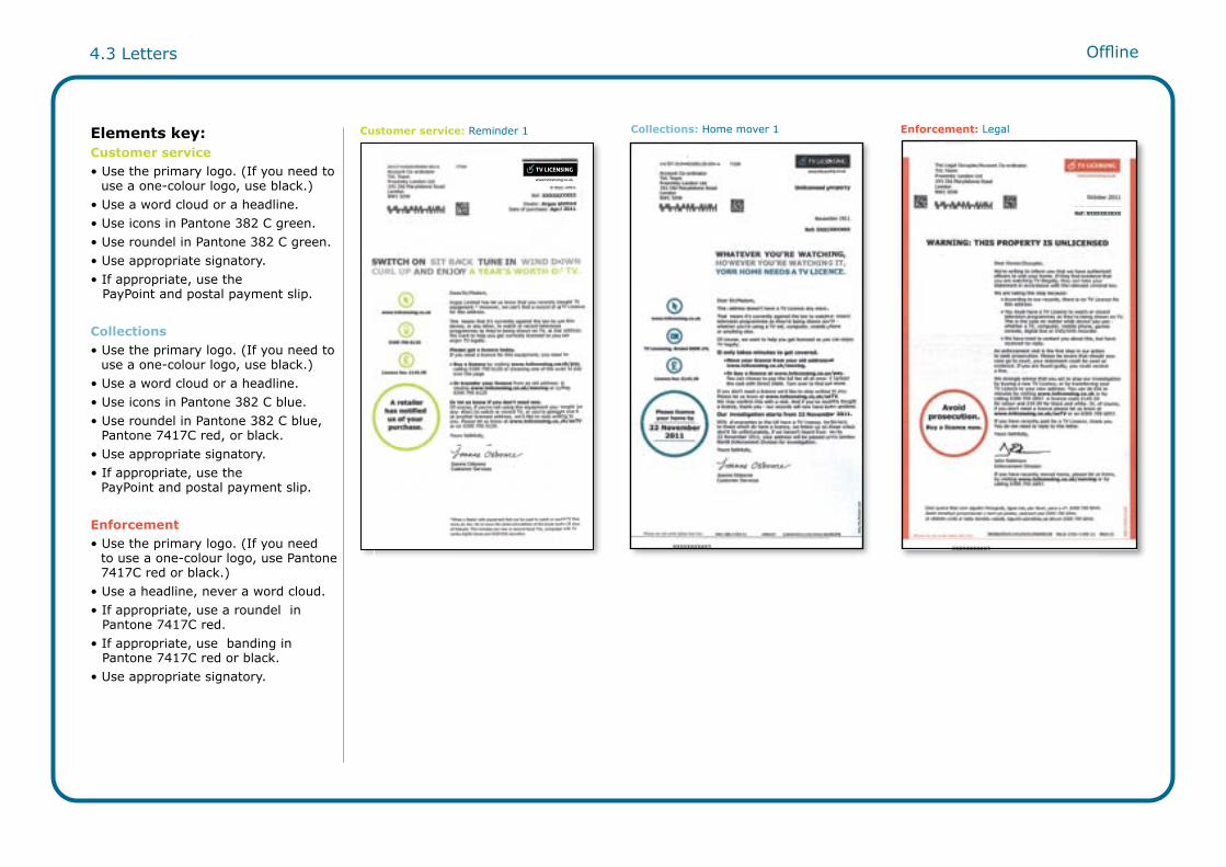
Customer service: Reminder 1 Collections: Home mover 1 Enforcement: LegalElements key:Customer service• Use the primary logo. (If you need to use a one-colour logo, use black.)• Use a word cloud or a headline.• Use icons in Pantone 382 C green. • Use roundel in Pantone 382 C green.• Use appropriate signatory.• If appropriate, use the PayPoint and postal payment slip.
Collections• Use the primary logo. (If you need to use a one-colour logo, use black.)• Use a word cloud or a headline.• Use icons in Pantone 382 C blue.• Use roundel in Pantone 382 C blue, Pantone 7417C red, or black.• Use appropriate signatory.• If appropriate, use the PayPoint and postal payment slip.
Enforcement• Use the primary logo. (If you need to use a one-colour logo, use Pantone 7417C red or black.)• Use a headline, never a word cloud.• If appropriate, use a roundel in Pantone 7417C red.• If appropriate, use banding in Pantone 7417C red or black.• Use appropriate signatory.

Offline4.4 Letter specifications – front
To make branding consistent on all letters, art-workers should always follow these design specifications.
(See 4.3 Letters for Elements key.)
Body copy text box vertically aligns with right hand side of logo bounding box.
Body copy text text is 9pt on 10pt leading.
Sub head text is 10pt on 11pt leading.
Address text is 9pton 10pt leading.
Headline is max 14pt, min 12pt and centered.
Roundel text is max 12pt, min 10pt.
Copy must never fall on fold line.
Icon text is 8pt, and should be consistent in spacing from base of icon to top of text on all icons.
Design specifications

Offline4.5 Letter specifications – reverse
To make branding consistent on all letters, art-workers should always follow these design specifications.
Elements key:Customer service• Use two-colour headlines in Pantone 382 C green and black.• Use icons in Pantone 382 C green. • Choose a form to fit purpose of letter if needed.
Collections• Use two-colour headlines in Pantone 382 C blue and black.• Use icons in Pantone 382 C blue. • Choose a form to fit purpose of letter if needed.
Enforcement• Use two-colour headlines in Pantone 7417C red and black.• Use icons in Pantone 7417C red.• Choose a form to fit purpose of letter if needed.
Body copy text is 8.5pt on 11pt leading.
Visually impaired text is 13pt on 14pt leading. Min 12pt on 13pt leading.
Box is 0.75pt with a corner radius of 2mm.
Headline text. Black is 13pt,green is 17pt.
Form text is 7.5pt on 9pt leading.
Tint is 30% ofPantone 382 C.
Reverse of letter

4.6 Inserts Offline
Front cover
Fold 1
Fold 2
Full layout of reverse
Inserts are currently used within the Reminder and Long-term DD mailings to give customers extra information. For example, ‘Ways to pay’, ‘Spread the cost’ and concessionary information.
Elements key:Customer service and collections• Use two-colour headlines in Pantone 382 C green and black.• Use icons in Pantone 382 C green. • Use roundel in Pantone 382 C green.• If appropriate, use background tints of Pantone 382 C green.
Reminder insert

4.7 Website Online
Our website is an online destination where people can pay for a licence, update their details, check if they need a licence, find information, or contact us.
As a public service organisation, it’s important to us that everyone in the UK can use the website. So, for people who speak English as a second language, the website has been translated into 16 different languages.
Elements key:Customer service• Use the primary logo.• Use headlines, never word clouds.• If appropriate, use the following in RGB:193, 216, 47 green: - Icons - Roundels • If appropriate, use: - An illustration (in RGB: 193, 216, 47 green); or - An animation; or - Photography.• Static or rich media display ads may be included.
Homepage
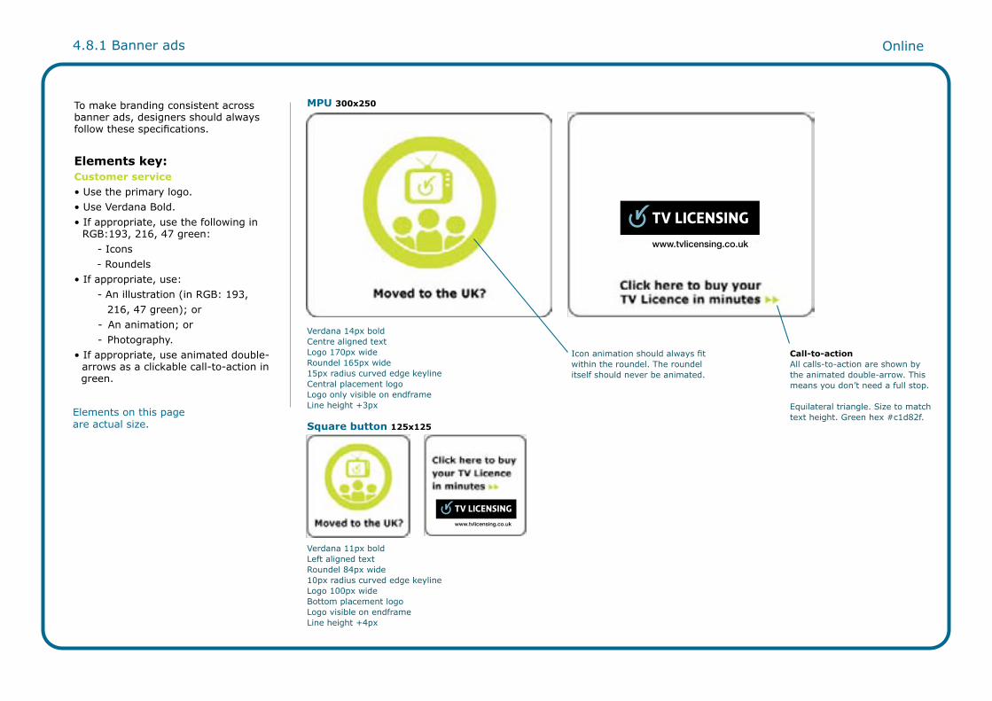
4.8.1 Banner ads Online
MPU 300x250
Square button 125x125
Verdana 14px boldCentre aligned textLogo 170px wideRoundel 165px wide15px radius curved edge keylineCentral placement logoLogo only visible on endframeLine height +3px
Verdana 11px boldLeft aligned textRoundel 84px wide10px radius curved edge keylineLogo 100px wideBottom placement logoLogo visible on endframeLine height +4px
300x250 – MPU (Mid Page Unit/Medium Rectangle)
Verdana 14px bold Centre aligned text
Call-to-actionAll calls-to-action are shown by the animated double-arrow. This means you don’t need a full stop.
Equilateral triangle. Size to match text height. Green hex #c1d82f.
Icon animation should always fit within the roundel. The roundel itself should never be animated.
To make branding consistent across banner ads, designers should always follow these specifications.
Elements key:Customer service• Use the primary logo.• Use Verdana Bold.• If appropriate, use the following in RGB:193, 216, 47 green: - Icons - Roundels • If appropriate, use: - An illustration (in RGB: 193, 216, 47 green); or - An animation; or - Photography.• If appropriate, use animated double- arrows as a clickable call-to-action in green.
Elements on this page are actual size.

4.8.2 Banner ads Online
Leaderboard 728x90
Full banner 468x60
Verdana 17px boldLeft aligned textRoundel 78px wide15px radius curved edge keylineLogo 170px wideRight-hand placement logoLogo only visible on endframeLine height +6px
Verdana 13px boldLeft aligned textRoundel 50px wide10px radius curved edge keylineLogo 118px wideRight-hand placement logoLogo only visible on endframeLine height +5px
Half banner 234x60 Verdana 13px boldLeft aligned textNo roundel10px radius curved edge keylineLine height +5pxLogo 150px wideCentral placement logoLogo visible on endframe
Elements key:Customer service• Use the primary logo.• Use Verdana Bold.• If appropriate, use the following in RGB:193, 216, 47 green: - Icons - Roundels • If appropriate, use: - An illustration (in RGB: 193, 216, 47 green); or - An animation; or - Photography.• Use animated double-arrows as a clickable call-to-action in green.
Elements on this page are actual size.

4.8.3 Banner ads Online
Super skyscraper 160x600 Skyscraper 120x600
Verdana 14px boldLeft aligned textRoundel 142px wide15px radius curved edge keylineLogo 144px wideBottom placement logoLogo visible on each frameLine height +4px
Verdana 14px boldLeft aligned textRoundel 108px wide15px radius curved edge keylineLogo 108px wideBottom placement logoLogo visible on each frameLine height +4px
Elements key:Customer service• Use the primary logo.• Use Verdana Bold.• If appropriate, use the following in RGB:193, 216, 47 green: - Icons - Roundels • If appropriate, use: - An illustration (in RGB: 193, 216, 47 green); or - An animation; or - Photography.• Use animated double-arrows as a clickable call-to-action in green.
Elements on this page are actual size.

4.9 Pre-rolls Online
Background tint is introduced on branding frame.
To make branding consistent on pre-rolls, designers should always follow these specifications.
Elements key:Customer service• Use the primary logo. • Use a headline.• Use Verdana Bold.• If appropriate, use the following in RGB:193, 216, 47 green: - Icons - Roundels • If appropriate, use animation. • Use animated double-arrows as a clickable call-to-action in green.
Elements on this page are actual size.

4.10 Emails Online
Roundel text is max 13pt, auto-leading.
Detail text is Arial bold 12pt.
Icon text is 11pt Pantone 424Cunderlined but not touching text.
Headline text is 20pt max, centered.
Body copy text is 12pt on 16 leading,aligned vertically with right hand side of logo’s bounding box.
Sub head text is 13pt bold.
Footer text is 10pt, auto leading.
Click through is Pantone 7470C blue, underlined, bold.
TV Licensing [mailto:[email protected]]Tuesday, 22th August 2011 11.59 Jenny JonesThank you for getting in touch
Please let us know if your
circumstances change
Your record is now up to date.
22 pixels
34 pixels
To make branding consistent across different media channels, the design of emails should closely mirror how letters are designed. However, there are some differences:
• DesignThe roundel should be positioned above the icons instead of below. Importantly, this means the call-to-action within the roundel can be seen straight away (rather than being hidden until a person scrolls down the page).
• CopyThe privacy policy, unsubscribe message and legal information should be positioned at the bottom of the email.
Elements key:Customer service• Use the primary logo. • Use a word cloud or a headline (no full stop).• If appropriate, use the following in RGB:193, 216, 47 green: - Icons - Roundels • Use appropriate signatory.
Collections• Use the primary logo. • Use a word cloud or a headline (no full stop).• Use icons in RGB: 140, 184, 198 blue.• Use roundel in RGB: 140, 184, 198 blue, RGB: 220, 80, 52 red, or black.• Use appropriate signatory.
Customer service email
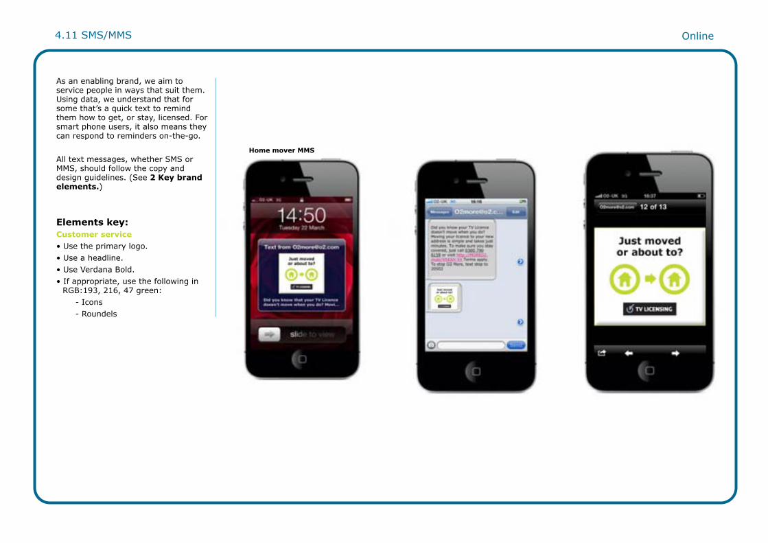
Online4.11 SMS/MMS
As an enabling brand, we aim to service people in ways that suit them. Using data, we understand that for some that’s a quick text to remind them how to get, or stay, licensed. For smart phone users, it also means they can respond to reminders on-the-go.
All text messages, whether SMS or MMS, should follow the copy and design guidelines. (See 2 Key brand elements.)
Elements key:Customer service• Use the primary logo. • Use a headline.• Use Verdana Bold.• If appropriate, use the following in RGB:193, 216, 47 green: - Icons - Roundels
Home mover MMS

Online4.12 TV trails
As a public service organisation, we communicate with every household in the UK. TV trails are created to communicate key brand messages to the public, for example, to encourage self-serve behaviours online, or to let people know about the different ways they can pay for their TV Licence.
Elements key:Customer service• Use the primary logo. • Use a headline.• Use Verdana Bold.
TV trail

5 Other audiences5.1 Students5.2 MOD5.3 Welsh5.4 Welsh logo5.5 Alternative Welsh logo colourways5.6 Foreign nationals5.7 Blind/sight impaired

Other audiences
Students are at a particular life stage between childhood, when their parents’ TV Licence covers them, and adulthood, when they move out of their parents’ home and need their own licence. To introduce them to this new legal responsibility, we have always created a bespoke Student campaign. Tone of voice is appropriate for a younger audience, for example, comparing a licence to watch TV with the licence to drive a car.
Messaging refers to the wide range of devices on which they may be used to watching or recording TV programmes, for example, laptops, mobiles and games consoles.
Design uses brand elements like word clouds and icons to create a responsive campaign which highlights students’ choice, control and urgency. Media choice targets digital viewing, emphasising emails, banner ads, mobile texts and pre-rolls.
ColourThe Students’ campaign uses a colour palette developed from the brand’s core and secondary colours. This ensures each element cuts through the overload of bright, bold student media both online and offline.
Other audiences5.1 Students
Direct mail envelope Email
Screensaver

Other audiences
Young military recruits living in barracks for the first time may not realise that they need to buy their own TV Licence.
To introduce them to this new legal responsibility, we have always created a bespoke MOD campaign.
Tone of voice and messaging have the clarity of the Students’ campaign, but with language familiar to a military culture.
Design and media choices resonate with their institutional environment, for example, branded camouflage ticket holder with a TV Licence reminder.
5.2 MOD
Poster
Leaflet

Other audiences
Welsh is the UK’s second national language. So, following the Welsh Language Act 1993, we create bilingual versions of our English-language communications.
This makes it easy for Welsh-only speakers to understand what a TV Licence is, when they need one, or how to buy one.
CopyThe supplier we use to translate communications understands TV Licensing’s tone of voice and simplicity standards. Importantly, this means they can brief their translators to recreate English copy in Welsh as closely as possible.
DesignWelsh communications should always match the English design. However, once translated into Welsh, copy is usually longer. This means you may need to reduce the point size of the typography by one point to fit within the parameters of the layout.
5.3 Welsh
Bilingual letter

Other audiences
Primary Welsh logoAs a trademark of TV Licensing, the Welsh logo is based on the primary TV Licensing logo and should be treated with the same respect.
In online communications, the Welsh logo should always be used. In offline communications, the Welsh logo should always be used by default whenever production costs allow.
Only in exceptional circumstances may other colour variants be used. When considered imperative, use of colourway logos must be approved by TV Licensing on the basis of a rationale which provides a supporting case for effectiveness. (See 5.5 Alternative Welsh logo colourways.)
Always follow these clear space and size guidelines.
5.4 Welsh logo
On standard communications, a logo size of 55mm wide should be maintained wherever possible.
Do not use the logo below 30mm wide, or 100 pixels wide.
Standard size on A4 Minimum size
Logo clearspace
A space equivalent to the height of the ‘T’ must be left around all sides of the logo wherever possible.
55mm
30mm
URL alignment
The URL is to occupy an equal width to the TV Licensing wordmark.
Symbol – pale blue(or 50% tint dark blue if not printing pale blue)Type – whiteBounding box – black + 50% tint black

Other audiences
These two colour variants may only be used in offline communications:1. When production budgets only allow one-colour printing; or2. When exceptional circumstances require creative flexibility to optimise effectiveness.
Use of these logos needs to be approved by TV Licensing on the basis of a rationale which provides a supporting case.
They should never be used for online communications.
5.5 Alternative Welsh logo colourways
Welsh one-colour logo – black
Welsh one-colour logo – red
This one-colour logo should be used when printing black.Symbol and type – whiteBounding box – black + 50% tint blackURL – black
This one-colour logo should only be used on enforcement communications.Symbol and type – whiteBounding box – red + 50% tint redURL – red
Welsh one-colour logo – dark blue
This one-colour logo is to be used when printing dark blue.Symbol and type – whiteBounding box – dark blue + 50% tint Dark blueURL – dark blue

Other audiences
Foreign nationals living in the UK may not understand what a TV Licence is, when they need one or how to buy one.
To introduce them to their legal responsibility, we create bespoke communications for them.
We are talking to people from diverse cultural backgrounds, for whom English may be a second or even third language. So the emphasis should be on the brand values of Clarity and Authority.
As copy is translated into lots of different languages, copy should follow the guidelines in A note on simplicity (see 2.19) with messaging being short, succinct and easily actionable.
Tone of voice should be empathetic to different financial circumstances, helping people overcome barriers to paying with step-by-step payment options.
Here, the brand’s icons palette is critical in conveying information visually and crossing the language divides.
5.6 Foreign nationals
Hindi Polish Urdu

Other audiences
TV Licensing is committed to making our communications accessible to all, including those with visual impairments.
We constantly review relevant communications to ensure they are compliant with the Disability and Discrimination Act.
So when developing communications where a high proportion of those reading are likely to be elderly or visually impaired, the guidance given here from the RNIB should be followed. Or to find out more, visit www.rnib.org.uk.
TypeAvoid small type sizes – a point size of at least 12 should be used. Avoid large amounts of capitalised text.
ColourFor emails, the correct green to use is: Bright green Pantone 382C green.
5.7 Blind/sight impaired
Leaflet
Letter

For further information please contact:
Rob CannonMarketing Communications and Operations ManagerBBC TV LicensingRoom 4436White City Building201 Wood LaneLondon W12 7TQ Telephone – 020 875 24268Email – [email protected]