Embed Size (px)
Citation preview
User Interface Design
Yonsei University2nd Semester, 2013
Sanghyun Park
Topics Covered Design Issues UI Design Process Interface Evaluation
User Interface User interfaces should be designed to match the skills,
experience and expectations of its anticipated users
System users often judge a system by its interface rather than its functionality
A poorly designed interface can cause a user to make catastrophic errors
Poor user interface design is the reason why so many software systems are never used
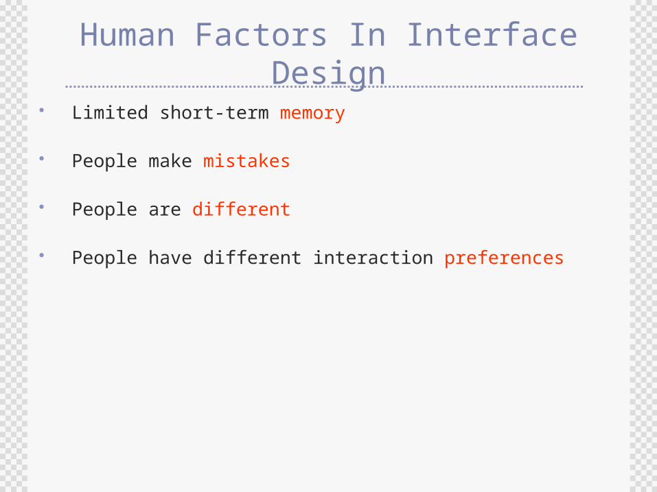
Human Factors In Interface Design
Limited short-term memory
People make mistakes
People are different
People have different interaction preferences
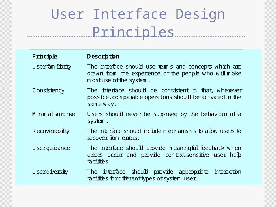
User Interface Design Principles
Principle Description
User familiarity The interface should use terms and concepts which are drawn from the experience of the people who will make most use of the system.
Consistency The interface should be consistent in that, wherever possible, comparable operations should be activated in the same way.
Minimal surprise Users should never be surprised by the behaviour of a system.
Recoverability The interface should include mechanisms to allow users to recover from errors.
User guidance The interface should provide meaningful feedback when errors occur and provide context-sensitive user help facilities.
User diversity The interface should provide appropriate interaction facilities for different types of system user.
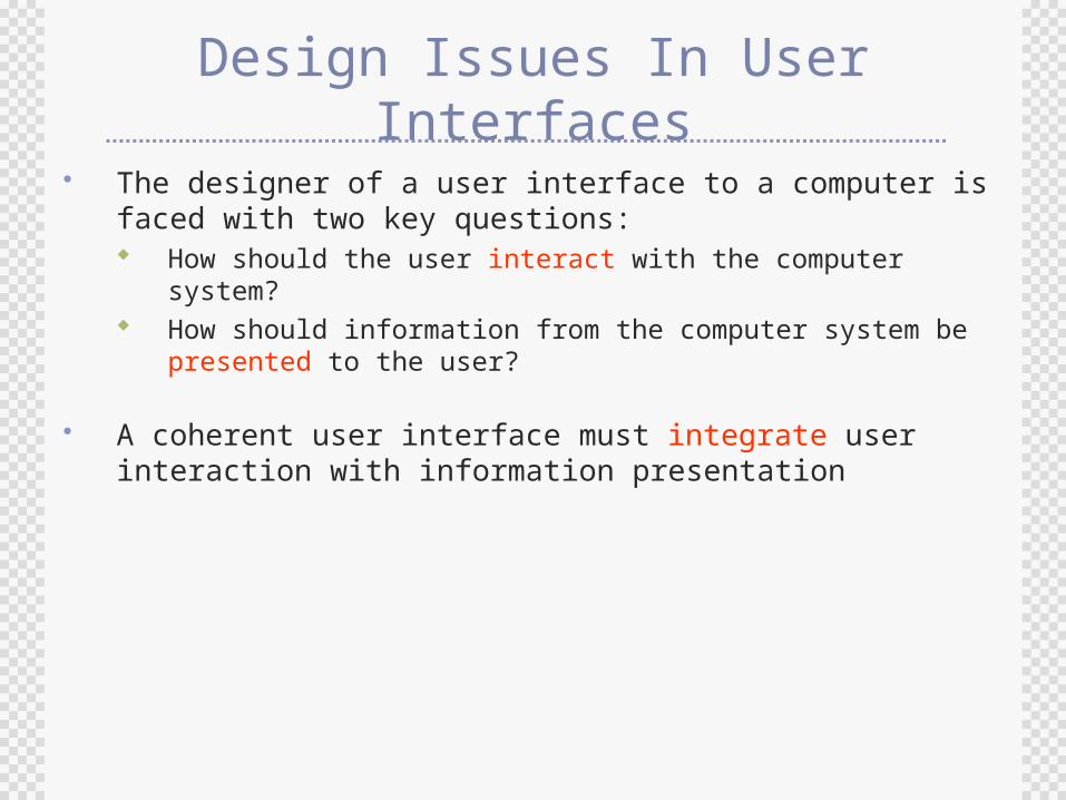
Design Issues In User Interfaces
The designer of a user interface to a computer is faced with two key questions: How should the user interact with the computer system? How should information from the computer system be
presented to the user?
A coherent user interface must integrate user interaction with information presentation
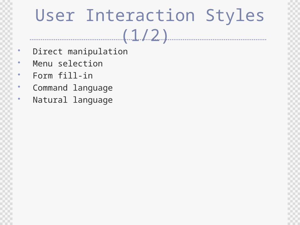
User Interaction Styles (1/2) Direct manipulation Menu selection Form fill-in Command language Natural language
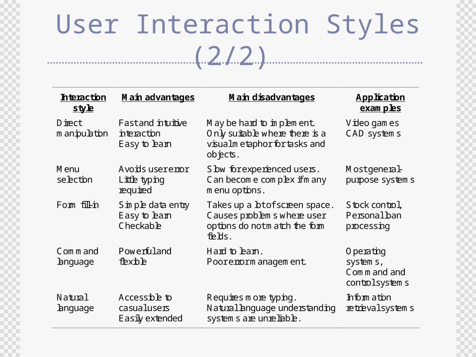
User Interaction Styles (2/2)
Interaction style
Main advantages Main disadvantages Application examples
Direct manipulation
Fast and intuitive interaction Easy to learn
May be hard to implement. Only suitable where there is a visual metaphor for tasks and objects.
Video games CAD systems
Menu selection
Avoids user error Little typing required
Slow for experienced users. Can become complex if many menu options.
Most general-purpose systems
Form fill-in Simple data entry Easy to learn Checkable
Takes up a lot of screen space. Causes problems where user options do not match the form fields.
Stock control, Personal loan processing
Command language
Powerful and flexible
Hard to learn. Poor error management.
Operating systems, Command and control systems
Natural language
Accessible to casual users Easily extended
Requires more typing. Natural language understanding systems are unreliable.
Information retrieval systems
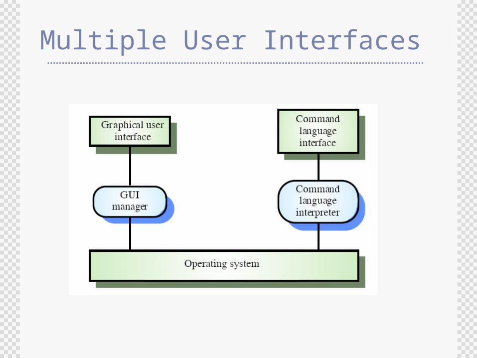
Multiple User Interfaces
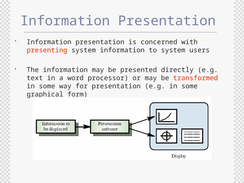
Information Presentation Information presentation is concerned with presenting
system information to system users
The information may be presented directly (e.g. text in a word processor) or may be transformed in some way for presentation (e.g. in some graphical form)
Information Presentation Factors
Is the information textual or numeric?
Is the user interested in precise information or the relationships between different data values?
How quickly do information values change? Must the change be indicated immediately?
Must the user take some action in response to a change?
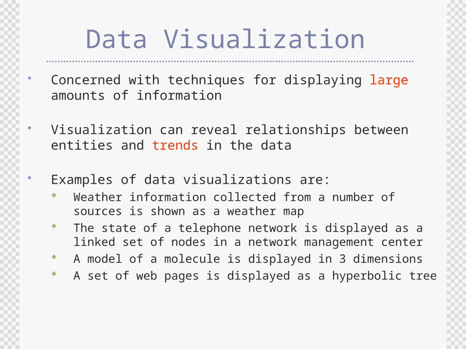
Data Visualization Concerned with techniques for displaying large amounts of
information
Visualization can reveal relationships between entities and trends in the data
Examples of data visualizations are: Weather information collected from a number of sources is
shown as a weather map The state of a telephone network is displayed as a linked set
of nodes in a network management center A model of a molecule is displayed in 3 dimensions A set of web pages is displayed as a hyperbolic tree
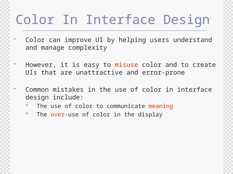
Color In Interface Design Color can improve UI by helping users understand and
manage complexity
However, it is easy to misuse color and to create UIs that are unattractive and error-prone
Common mistakes in the use of color in interface design include: The use of color to communicate meaning The over-use of color in the display
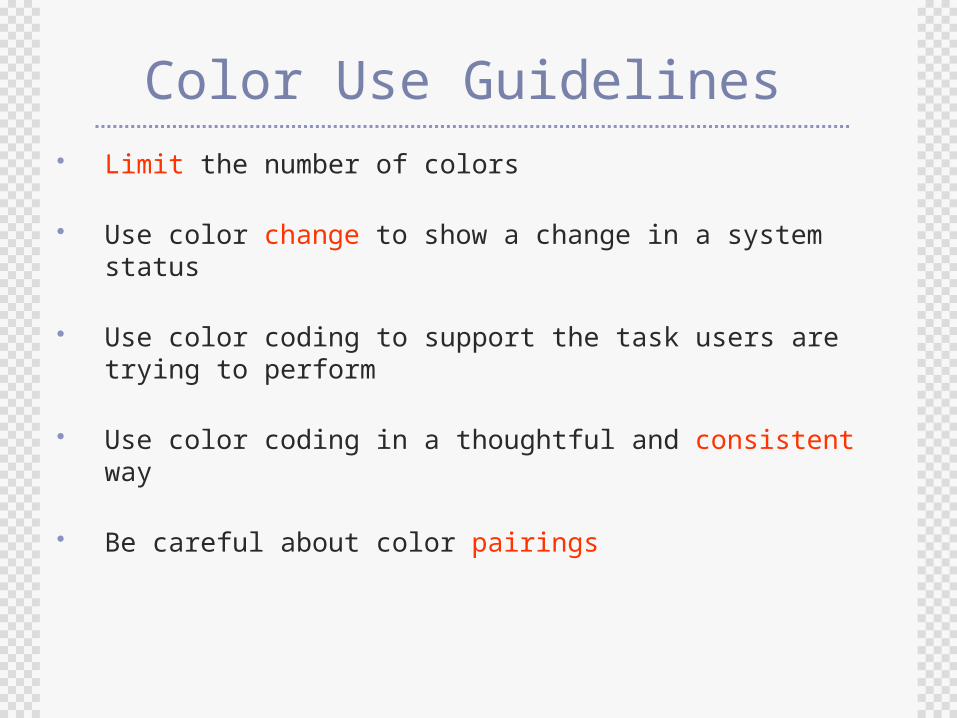
Color Use Guidelines Limit the number of colors
Use color change to show a change in a system status
Use color coding to support the task users are trying to perform
Use color coding in a thoughtful and consistent way
Be careful about color pairings
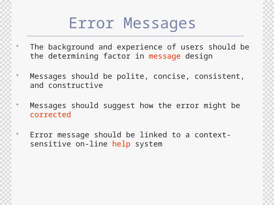
Error Messages The background and experience of users should be the
determining factor in message design
Messages should be polite, concise, consistent, and constructive
Messages should suggest how the error might be corrected
Error message should be linked to a context-sensitive on-line help system
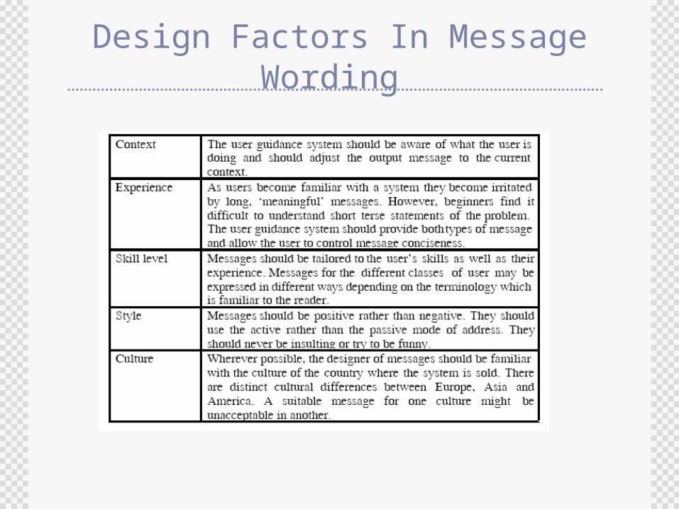
Design Factors In Message Wording
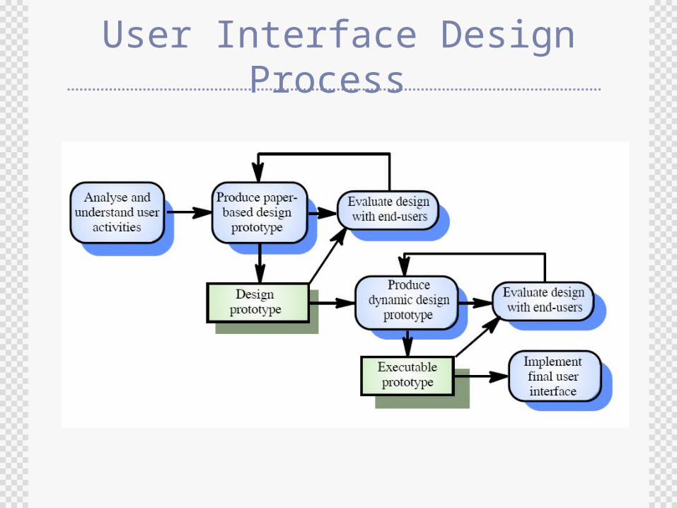
User Interface Design Process
Interface Evaluation Interface evaluation is the process of assessing the
usability of an interface and checking that it meets user requirements
Full scale evaluation is very expensive and impractical for most systems
Ideally, an interface should be evaluated against a usability specification based on usability attributes. However, it is rare for such specification to be produced
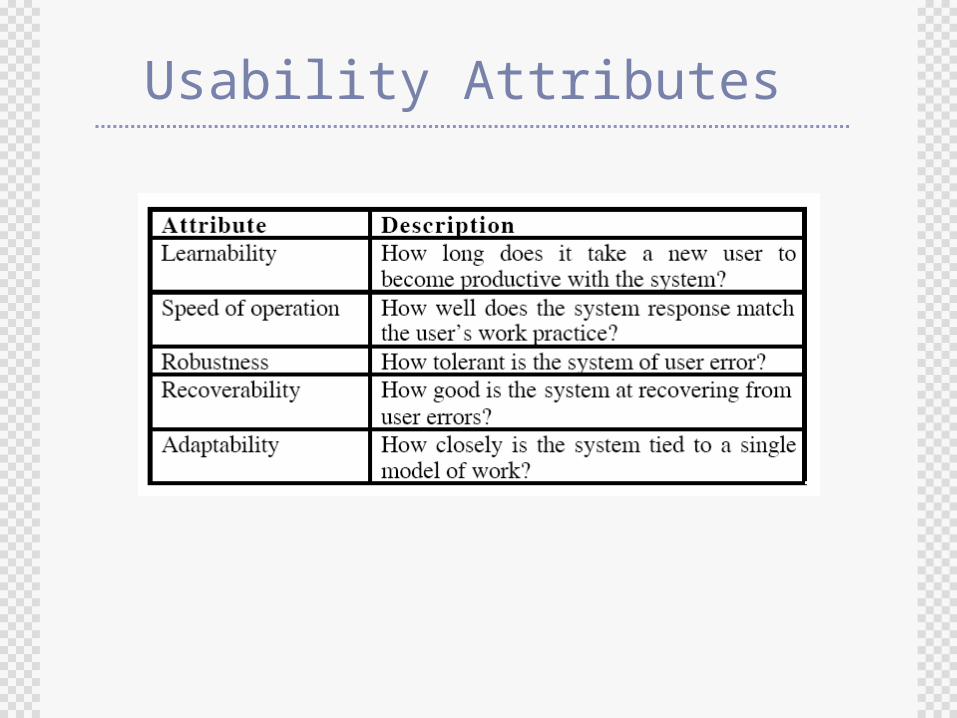
Usability Attributes
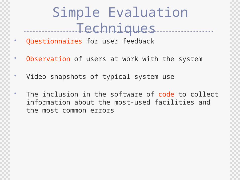
Simple Evaluation Techniques Questionnaires for user feedback
Observation of users at work with the system
Video snapshots of typical system use
The inclusion in the software of code to collect information about the most-used facilities and the most common errors