Embed Size (px)
Citation preview
Unit QUAN – Session 2
Some problem solving techniques
and statistical ideas


Quantitative Methods - Unit QUAN
MSc SQMSc\QUAN Page 3 of 67 Session 2 © University of Portsmouth
MSc Strategic Quality Management
Quantitative Methods - QUAN
SOME PROBLEM SOLVING TECHNIQUES AND
STATISTICAL IDEAS
Aims of Session
� To understand the role of statistical process control (SPC) and the problem solving
techniques (tools) used in order to improve products or processes.
� To understand the concept of variation and be able to distinguish between random and
assignable causes.
Content
� Variation: Common (Random) and Special (assignable) causes.
� SPC; Statistical tools and methods:
Section 1: Pareto analysis, fishbone diagrams, scatter diagrams.
Section 2: Frequency distributions; histograms; distributions for measured data.
Learning Approach
Study Notes, Tutorial Examples, Self-Appraisal Exercise, Video Conferencing (or Tutorial
Contact for UK programmes).
Reading
Besterfield (2004), pages 75-90.
or some of the general introductory statistics texts in mentioned in the Preamble will cover
some of the material in this chapter.

Quantitative Methods – Unit QUAN
Page 4 of 67 MSc SQM\QUAN
©University of Portsmouth Session 2
INTRODUCTION TO STATISTICAL PROCESS CONTROL
Introduction
No two products or characteristics are ever exactly alike. The differences may be large, or
they may be almost immeasurably small, but they are always present. The dimensions of a
machined part, for instance, would be affected by the:
- machine (clearance, bearing wear)
- tool (strength, rate of wear)
- material (size, hardness)
- operator (setting, accuracy of location)
- maintenance (lubrication, replacement of worn parts)
- environment (temperature, constancy of power supply)
The many differences resulting from the combined effect of these influences are known as
variation. Ideally there would be zero variation in production and processes. This however is
unrealistic, so emphasising the need to minimize variation. This introduces the concept of
variance reduction and role of ‘Statistical Process Control’.
Statistical Process Control (SPC)
defined:
‘comprises a set of techniques for monitoring and controlling process variability to
determine if a process is stable over time and capable of producing quality products’
…. in short it may be viewed as the,
‘application of statistics to the control of process variability’
A process is any activity that takes inputs and transforms them into outputs. For example,
the manufacture of the machine part mentioned above or the production of ready-made-meals
from fresh produce. Transforming a student into a graduate and measuring progression rates
is another example of a process and its measurement.
Each of these activities relate to a sequence of steps that transform inputs into outputs. On
the basis that process conditions will not remain the same all the time there will be variability
in the output (process variability). Thus understanding the process and monitoring the
variability is essential for quality improvement and provides the basis for SPC. To control
variability, one must first identify the causes of variation.

Quantitative Methods - Unit QUAN
MSc SQMSc\QUAN Page 5 of 67 Session 2 © University of Portsmouth
Types of variation: Common (Random) and Special (Assignable) Causes
To manage any process and reduce variation, the variation must be traced back to its source.
The first step is to make the distinction between common and special causes of variation.
Common (random) causes refer to the many sources of chance variation that are always
present in varying degrees in different processes. The output of a process which contains
only common causes of variation forms a pattern which is stable over time and is predictable
and, therefore, provides the basis for subsequent process improvement. This process is
considered stable and thus IN-CONTROL.
These causes define the basic randomness of the situation; machined parts may vary slightly
in colour; ready-meals may vary marginally in weight; call-centre response times will vary
from day-to-day. There is an inevitability of some process variation.
Special (assignable) causes refer to any assignable factors which are often irregular and
unstable and, hence, unpredictable. A particular source may continue to reappear
intermittently unless positive action is taken to eliminate it. This process is considered
unstable and unpredictable and thus OUT-OF-CONTROL.
These causes reflect unusual/incorrect influences on the process: machined parts may vary in
size because of incorrect machine settings; ready-meals may vary in content because of a
breakdown in the machinery; call-centre response times may be particularly high because of
staff absence.
• A process is said to be in statistical control if only common causes of variation
are present.
• SPC comprises of a set of statistical tools that: measure variation; identify the
point at which variation becomes unacceptable; identify and prioritise the causes
of variation
• Some specific tools used within SPC are known as the ‘7 Management Tools’.
The ‘7 Management Tools’
These are commonly described as the ‘seven quality control tools that support quality
improvement problem solving’. They are: flowcharts, checksheets, pareto diagrams, cause-
and-effect diagrams (Ishikawa), scatter diagrams, histograms and control charts. Pareto,
Ishikawa diagrams, scatter diagrams and lastly histograms are described in the following
sections, with control charts covered Sessions 3 and 4. A number of these tools are also
discussed in Session 3 of the ‘TQM’ unit.
Quantitative Methods – Unit QUAN
Page 6 of 67 MSc SQM/QUAN
©University of Portsmouth Session 2
Section 1: Pareto, Ishikawa and Scatter diagrams
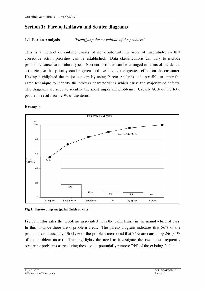
1.1 Pareto Analysis ‘identifying the magnitude of the problem’
This is a method of ranking causes of non-conformity in order of magnitude, so that
corrective action priorities can be established. Data classifications can vary to include
problems, causes and failure types. Non-conformities can be arranged in terms of incidence,
cost, etc., so that priority can be given to those having the greatest effect on the customer.
Having highlighted the major concern by using Pareto Analysis, it is possible to apply the
same technique to identify the process characteristics which cause the majority of defects.
The diagrams are used to identify the most important problems. Usually 80% of the total
problems result from 20% of the items.
Example
Fig 1: Pareto diagram (paint finish on cars)
Figure 1 illustrates the problems associated with the paint finish in the manufacture of cars.
In this instance there are 6 problem areas. The pareto diagram indicates that 56% of the
problems are causes by 1/6 (17% of the problem areas) and that 74% are caused by 2/6 (34%
of the problem areas). This highlights the need to investigate the two most frequently
occurring problems as resolving these could potentially remove 74% of the existing faults.
Dirt in paint Sags & Runs Scratches Dull Dry Spray Others
0
20
40
60
80
100
%
56%
18%
10%8% 7% 1%
CUMULATIVE %
%OFFAULTS
PARETO ANALYSIS
Quantitative Methods – Unit QUAN
MSc SQM/QUAN Page 7 of 67
Session 2 ©University of Portsmouth
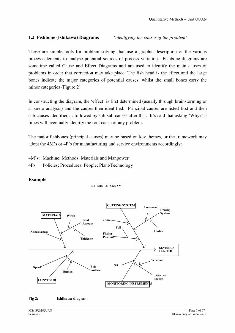
1.2 Fishbone (Ishikawa) Diagrams ‘identifying the causes of the problem’
These are simple tools for problem solving that use a graphic description of the various
process elements to analyse potential sources of process variation. Fishbone diagrams are
sometime called Cause and Effect Diagrams and are used to identify the main causes of
problems in order that correction may take place. The fish head is the effect and the large
bones indicate the major categories of potential causes, whilst the small bones carry the
minor categories (Figure 2)
In constructing the diagram, the ‘effect’ is first determined (usually through brainstorming or
a pareto analysis) and the causes then identified. Principal causes are listed first and then
sub-causes identified….followed by sub-sub-causes after that. It’s said that asking ‘Why?’ 5
times will eventually identify the root cause of any problem.
The major fishbones (principal causes) may be based on key themes, or the framework may
adopt the 4M’s or 4P’s for manufacturing and service environments accordingly:
4M’s: Machine; Methods; Materials and Manpower
4Ps: Policies; Procedures; People; Plant/Technology
Example
MATERIALS
Adhesiveness
Speed
CONVEYOR
FeedAmount
Width
Thickness
Bumps
BeltSurface
SEVEREDLENGTH
CUTTING SYSTEM
MONITORING INSTRUMENTS
Detectionsection
Set
Terminal
DrivingSystem
Looseness
Cutter
FittingPosition
Pull
Clutch
FISHBONE DIAGRAM
Fig 2: Ishikawa diagram

Quantitative Methods – Unit QUAN
Page 8 of 67 MSc SQM/QUAN
©University of Portsmouth Session 2
Fig 2 indicates that there is a problem with the severed length of (for example) ‘cut pipes’.
Four possible main causes have been identified of which the ‘conveyor’ has been identified
as a key principal cause. The ‘speed’ at which the conveyor operates is proposed as a sub-
cause. Asking ‘why?’ again might highlight ‘incorrect setting’ as a sub-sub-cause. Asking
‘why?’ further may highlight the need for operator training. Thus, a possible solution to the
problem as been identified.
Quantitative Methods – Unit QUAN
MSc SQM/QUAN Page 9 of 67
Session 2 ©University of Portsmouth
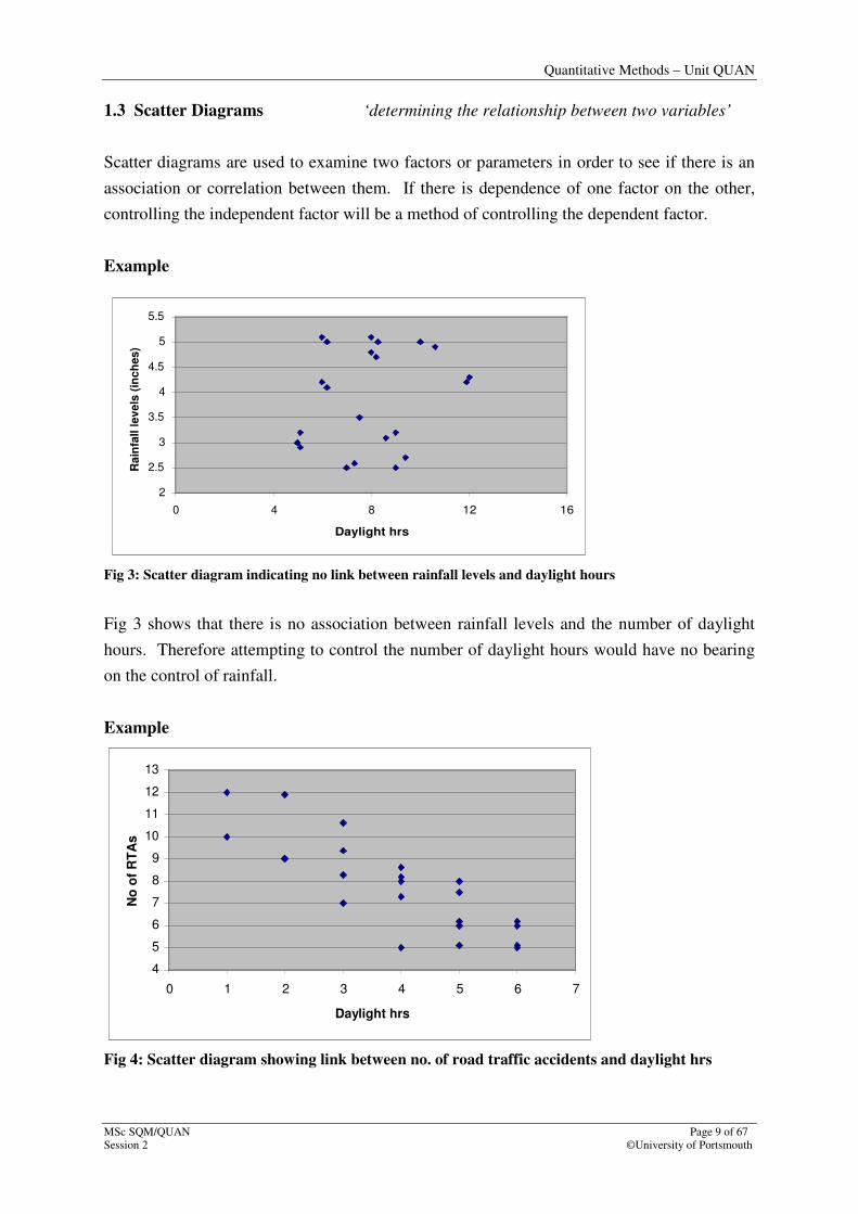
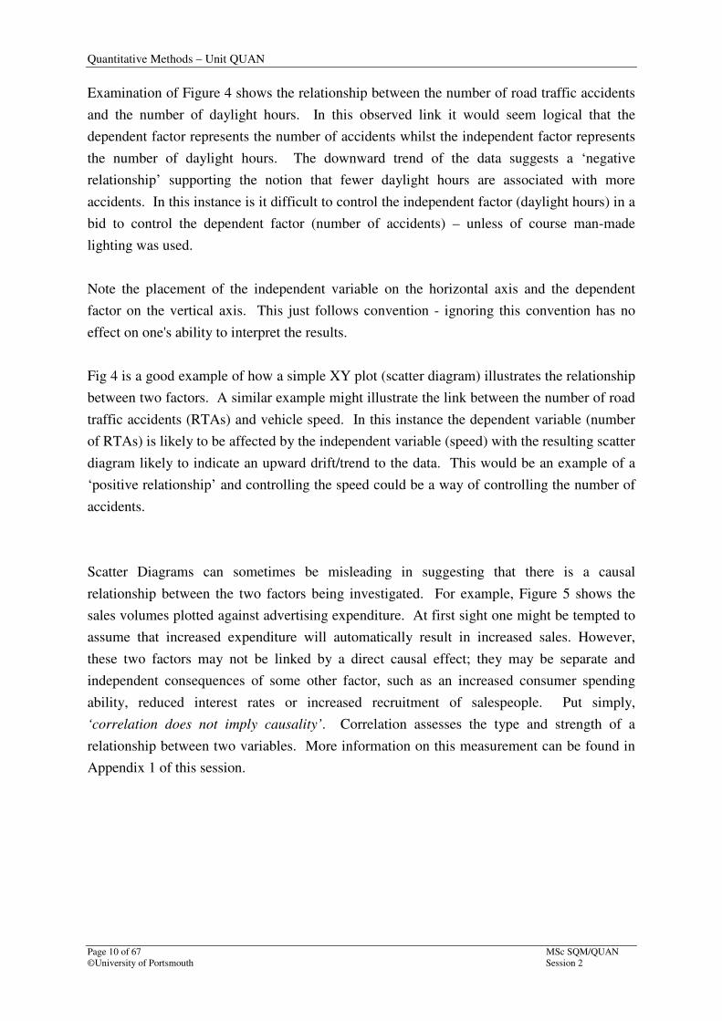
1.3 Scatter Diagrams ‘determining the relationship between two variables’
Scatter diagrams are used to examine two factors or parameters in order to see if there is an
association or correlation between them. If there is dependence of one factor on the other,
controlling the independent factor will be a method of controlling the dependent factor.
Example
Fig 3: Scatter diagram indicating no link between rainfall levels and daylight hours
Fig 3 shows that there is no association between rainfall levels and the number of daylight
hours. Therefore attempting to control the number of daylight hours would have no bearing
on the control of rainfall.
Example
4
5
6
7
8
9
10
11
12
13
0 1 2 3 4 5 6 7
Daylight hrs
No
of
RT
As
Fig 4: Scatter diagram showing link between no. of road traffic accidents and daylight hrs
2
2.5
3
3.5
4
4.5
5
5.5
0 4 8 12 16
Daylight hrs
Ra
infa
ll l
ev
els
(in
ch
es
)
Quantitative Methods – Unit QUAN
Page 10 of 67 MSc SQM/QUAN
©University of Portsmouth Session 2
Examination of Figure 4 shows the relationship between the number of road traffic accidents
and the number of daylight hours. In this observed link it would seem logical that the
dependent factor represents the number of accidents whilst the independent factor represents
the number of daylight hours. The downward trend of the data suggests a ‘negative
relationship’ supporting the notion that fewer daylight hours are associated with more
accidents. In this instance is it difficult to control the independent factor (daylight hours) in a
bid to control the dependent factor (number of accidents) – unless of course man-made
lighting was used.
Note the placement of the independent variable on the horizontal axis and the dependent
factor on the vertical axis. This just follows convention - ignoring this convention has no
effect on one's ability to interpret the results.
Fig 4 is a good example of how a simple XY plot (scatter diagram) illustrates the relationship
between two factors. A similar example might illustrate the link between the number of road
traffic accidents (RTAs) and vehicle speed. In this instance the dependent variable (number
of RTAs) is likely to be affected by the independent variable (speed) with the resulting scatter
diagram likely to indicate an upward drift/trend to the data. This would be an example of a
‘positive relationship’ and controlling the speed could be a way of controlling the number of
accidents.
Scatter Diagrams can sometimes be misleading in suggesting that there is a causal
relationship between the two factors being investigated. For example, Figure 5 shows the
sales volumes plotted against advertising expenditure. At first sight one might be tempted to
assume that increased expenditure will automatically result in increased sales. However,
these two factors may not be linked by a direct causal effect; they may be separate and
independent consequences of some other factor, such as an increased consumer spending
ability, reduced interest rates or increased recruitment of salespeople. Put simply,
‘correlation does not imply causality’. Correlation assesses the type and strength of a
relationship between two variables. More information on this measurement can be found in
Appendix 1 of this session.

Quantitative Methods – Unit QUAN
MSc SQM/QUAN Page 11 of 67
Session 2 ©University of Portsmouth
Fig 5: Scatter diagram: sales volume and advertising expenditure (£000)
To summarise, remember that when reading scatter diagrams, a relationship may exist but not
be directly causal and when an association does exist it may sometimes not be apparent
because other, and greater, causal or random factors are interfering with the ability to detect
it.
‘When does an ‘association’ become an ‘association’?’
The use of scatter diagrams is a useful means of illustrating the nature of the relationship
between two variables. The actual strength of a straight-line association may be found by
calculating a correlation coefficient. This is covered in the section below. The validity
(statistical significance) of the calculated coefficient can be tested with an appropriate
hypothesis test and an example of this (and a general explanation to hypothesis testing) is
included in Session 5 (at the end of the section titled, ‘Full Factorial Experiments’). Further
detail still on hypothesis testing can be found on the following web link:
http://userweb.port.ac.uk/~woodm/stats/StatNotes3.pdf
3
3.5
4
4.5
5
5.5
0 50 100 150 200 250 300 350
Advertising expenditure (£000)
Sa
les v
olu
me
(£
00
0)

Quantitative Methods – Unit QUAN
Page 12 of 67 MSc SQM/QUAN
©University of Portsmouth Session 2
Measuring correlation
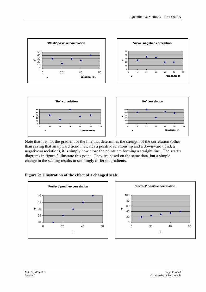
Correlation simply measures the strength of a straight line relationship of two variables. The
scatter diagrams below illustrate the types of correlation that exist: positive; negative and
‘no’ correlation. The diagrams in Figure 1 are reminders that the closer the plots are to
forming a straight line, the closer you are to ‘perfect correlation’. Likewise, the more loosely
grouped the plots, the weaker the association between variables.
Figure 1: scatter diagrams indicating the different types of correlation
Quantitative Methods – Unit QUAN
MSc SQM/QUAN Page 13 of 67
Session 2 ©University of Portsmouth
Note that it is not the gradient of the line that determines the strength of the correlation (other
than saying that an upward trend indicates a positive relationship and a downward trend, a
negative association), it is simply how close the points are forming a straight line. The scatter
diagrams in figure 2 illustrate this point. They are based on the same data, but a simple
change in the scaling results in seemingly different gradients.
Figure 2: illustration of the effect of a changed scale
Quantitative Methods – Unit QUAN
Page 14 of 67 MSc SQM/QUAN
©University of Portsmouth Session 2
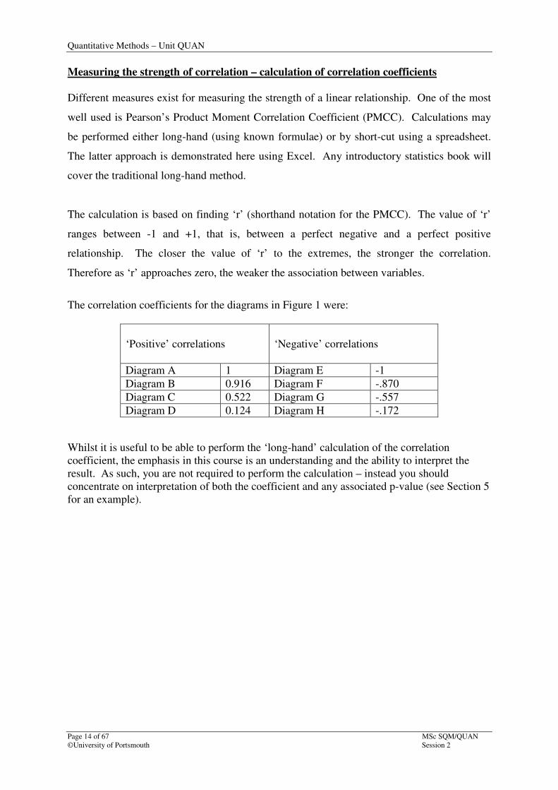
Measuring the strength of correlation – calculation of correlation coefficients
Different measures exist for measuring the strength of a linear relationship. One of the most
well used is Pearson’s Product Moment Correlation Coefficient (PMCC). Calculations may
be performed either long-hand (using known formulae) or by short-cut using a spreadsheet.
The latter approach is demonstrated here using Excel. Any introductory statistics book will
cover the traditional long-hand method.
The calculation is based on finding ‘r’ (shorthand notation for the PMCC). The value of ‘r’
ranges between -1 and +1, that is, between a perfect negative and a perfect positive
relationship. The closer the value of ‘r’ to the extremes, the stronger the correlation.
Therefore as ‘r’ approaches zero, the weaker the association between variables.
The correlation coefficients for the diagrams in Figure 1 were:
Whilst it is useful to be able to perform the ‘long-hand’ calculation of the correlation
coefficient, the emphasis in this course is an understanding and the ability to interpret the
result. As such, you are not required to perform the calculation – instead you should
concentrate on interpretation of both the coefficient and any associated p-value (see Section 5
for an example).
‘Positive’ correlations
‘Negative’ correlations
Diagram A 1 Diagram E -1
Diagram B 0.916 Diagram F -.870
Diagram C 0.522 Diagram G -.557
Diagram D 0.124 Diagram H -.172
Quantitative Methods – Unit QUAN
MSc SQM/QUAN Page 15 of 67
Session 2 ©University of Portsmouth
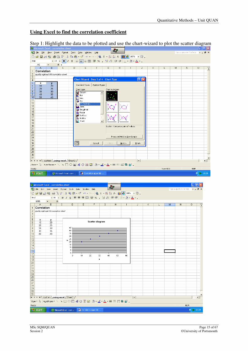
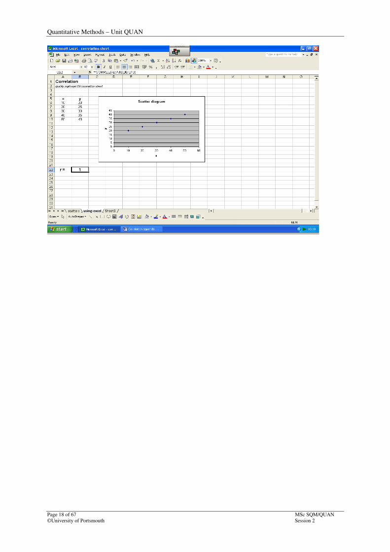
Using Excel to find the correlation coefficient
Step 1: Highlight the data to be plotted and use the chart-wizard to plot the scatter diagram

Quantitative Methods – Unit QUAN
Page 16 of 67 MSc SQM/QUAN
©University of Portsmouth Session 2
Step 2: The diagram above suggests a perfect positive relationship; confirm this by using the
‘correl’ instruction using the ‘More functions’ option on the ‘Autosum’ button. Note
that the cursor is positioned in B22. This is where the result will eventually be placed.
The ‘correl’ function falls under the ‘statistics’ category, but you’ll see that I’ve simply
typed in ‘correlation coefficient’ into the ‘search’ instruction (and pressed ‘Go’ to access the
correct function. Of the three choices, either ‘CORREL’ or ‘PEARSON’ may be used to
perform the calculation. Both will return the same result.

Quantitative Methods – Unit QUAN
MSc SQM/QUAN Page 17 of 67
Session 2 ©University of Portsmouth
Step 3:Using the correl function: array 1 covers the ‘x’ values whilst array 2 covers the ‘y’
values.
Step 4: Check that the result is logical to the original diagram. In this case the points form a
straight line, so one would expect a coefficient of ‘+1’.
Quantitative Methods – Unit QUAN
Page 18 of 67 MSc SQM/QUAN
©University of Portsmouth Session 2
Quantitative Methods – Unit QUAN
MSc SQM/QUAN Page 19 of 67
Session 2 ©University of Portsmouth
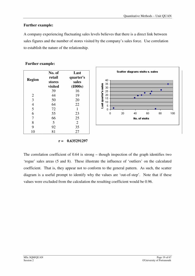
Further example:
A company experiencing fluctuating sales levels believes that there is a direct link between
sales figures and the number of stores visited by the company’s sales force. Use correlation
to establish the nature of the relationship.
Further example:
Region
No. of
retail
stores
visited
Last
quarter's
sales
(£000s)
39 16
2 44 19
3 50 20
4 64 22
5 72 1
6 55 23
7 66 25
8 5 2
9 92 35
10 81 27
r = 0.635291297
The correlation coefficient of 0.64 is strong – though inspection of the graph identifies two
‘rogue’ sales areas (5 and 8). These illustrate the influence of ‘outliers’ on the calculated
coefficient. That is, they appear not to conform to the general pattern. As such, the scatter
diagram is a useful prompt to identify why the values are ‘out-of-step’. Note that if these
values were excluded from the calculation the resulting coefficient would be 0.96.

Quantitative Methods – Unit QUAN
Page 20 of 67 MSc SQM/QUAN
©University of Portsmouth Session 2
Quantitative Methods – Unit QUAN
MSc SQM/QUAN Page 21 of 67
Session 2 ©University of Portsmouth
Section 2: Measuring variation
Variation was discussed in the introduction,. In order to have a starting point for
improvement, it is necessary to be able to measure variation. Assessing every product of the
process would be the only way to obtain absolute precision, but it is impractical and too
expensive. It is more economic to assess a sample of the product and use the results to
predict the properties of the whole. Statistics is the tool used to make these predictions.
With all predictions there are varying degrees of precision. Generally, the precision is greater
with larger sample sizes. It is possible to assess the confidence we have in any given set of
predictions, based on the sample size and the method used. In the case of very small sample
sizes, this level of confidence can become so low that the prediction will be worthless.
The following sections illustrate the use of frequency distributions and histograms as means
of describing patterns of variation. They are particularly important as they provide the
underpinning for one of the most used SPC tools – control charts. These are covered in the
next session.
2.1 Structuring Measured Data: construction of a frequency distribution and tally chart
Any machine or process has an inherent pattern of variation. Simple statistical methods can
identify this pattern and then use it to control and improve dimensional performance. Two
simple methods of describing a pattern of variation are the tally chart and frequency
distribution. These are simply groupings of data into sets (cells, class intervals or values).
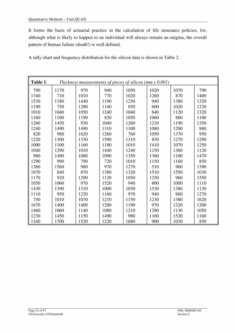
Example: measuring the variation in thickness of manufactured pieces of silicon
The thickness measurements of manufactured pieces of silicon vary in size. Let us consider a
sample of 200 pieces from one delivered batch, as illustrated in Table 1. Raw data such as
this has little form and cannot be readily taken in by the eye. It is necessary to have a simple
method of describing the pattern of variation, as values will not be expected to be distributed
evenly. Often, the bulk of the readings cluster around the mean (or nominal) with
progressively fewer readings as the values get further from the nominal.
Whilst it is virtually impossible to predict the thickness value of any single piece, the
application of statistical methods to a number of pieces can reveal much about the process as
a whole. The idea of focussing on the whole rather than on the individual is not a new one.
Quantitative Methods – Unit QUAN
Page 22 of 67 MSc SQM/QUAN
©University of Portsmouth Session 2
It forms the basis of actuarial practice in the calculation of life insurance policies, for,
although what is likely to happen to an individual will always remain an enigma, the overall
pattern of human failure (death!) is well defined.
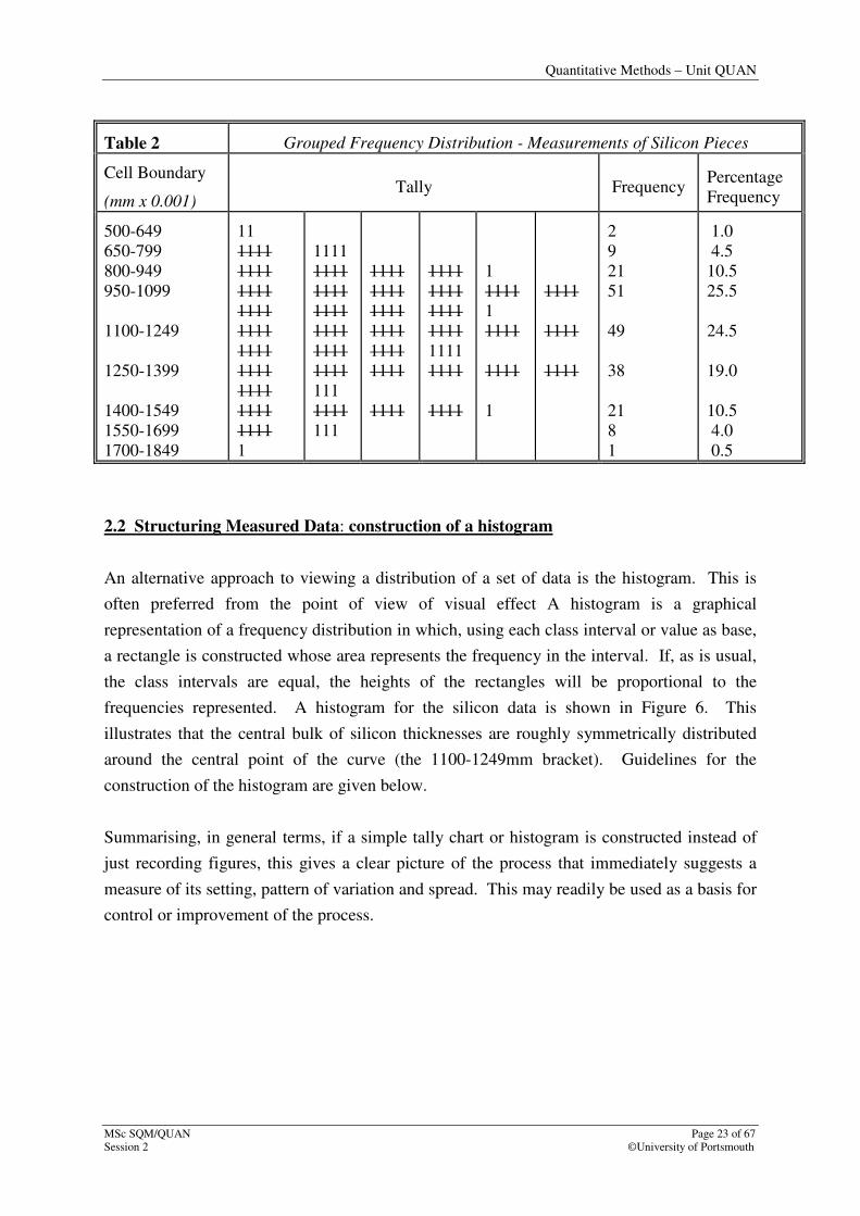
A tally chart and frequency distribution for the silicon data is shown in Table 2.
Table 1: Thickness measurements of pieces of silicon (mm x 0.001)
790
1340
1530
1190
1010
1160
1260
1240
820
1220
1000
1040
980
1290
1360
1070
1170
1050
1430
1110
750
1670
1460
1230
1160
1170
710
1180
750
1040
1100
1450
1490
980
1300
1100
1290
1490
990
1560
840
920
1060
1390
950
1010
1400
1060
1450
1700
970
1010
1440
1280
1050
1190
930
1490
1620
1330
1160
1010
1080
790
980
870
1290
970
1310
1220
1070
1400
1140
1150
1520
940
770
1190
1140
1240
820
1040
1310
1260
1590
1180
1440
1090
720
970
1380
1120
1520
1000
1160
1210
1200
1080
1490
1220
1050
1020
1250
850
1040
1050
1260
1100
760
1310
1010
1240
1350
1010
1270
1320
1050
940
1030
970
1150
1190
1210
980
1680
1020
1260
940
600
840
1060
1210
1080
1050
830
1410
1150
1360
1150
510
1510
1250
800
1530
940
1230
970
1290
1160
900
1070
870
1380
1020
1120
880
1190
1200
1370
1270
1070
1360
1100
1160
960
1550
960
1000
1380
880
1380
1320
1130
1520
1030
790
1400
1320
1230
1320
1100
1350
880
950
1290
1250
1120
1470
850
1390
1030
1550
1110
1130
1270
1620
1200
1050
1160
850
Quantitative Methods – Unit QUAN
MSc SQM/QUAN Page 23 of 67
Session 2 ©University of Portsmouth
Table 2 Grouped Frequency Distribution - Measurements of Silicon Pieces
Cell Boundary
(mm x 0.001) Tally Frequency
Percentage
Frequency
500-649
650-799
800-949
950-1099
1100-1249
1250-1399
1400-1549
1550-1699
1700-1849
11
1111
1111
1111
1111
1111
1111
1111
1111
1111
1111
1
1111
1111
1111
1111
1111
1111
1111
111
1111
111
1111
1111
1111
1111
1111
1111
1111
1111
1111
1111
1111
1111
1111
1111
1
1111
1
1111
1111
1
1111
1111
1111
2
9
21
51
49
38
21
8
1
1.0
4.5
10.5
25.5
24.5
19.0
10.5
4.0
0.5
2.2 Structuring Measured Data: construction of a histogram
An alternative approach to viewing a distribution of a set of data is the histogram. This is
often preferred from the point of view of visual effect A histogram is a graphical
representation of a frequency distribution in which, using each class interval or value as base,
a rectangle is constructed whose area represents the frequency in the interval. If, as is usual,
the class intervals are equal, the heights of the rectangles will be proportional to the
frequencies represented. A histogram for the silicon data is shown in Figure 6. This
illustrates that the central bulk of silicon thicknesses are roughly symmetrically distributed
around the central point of the curve (the 1100-1249mm bracket). Guidelines for the
construction of the histogram are given below.
Summarising, in general terms, if a simple tally chart or histogram is constructed instead of
just recording figures, this gives a clear picture of the process that immediately suggests a
measure of its setting, pattern of variation and spread. This may readily be used as a basis for
control or improvement of the process.
Quantitative Methods – Unit QUAN
Page 24 of 67 MSc SQM/QUAN
©University of Portsmouth Session 2
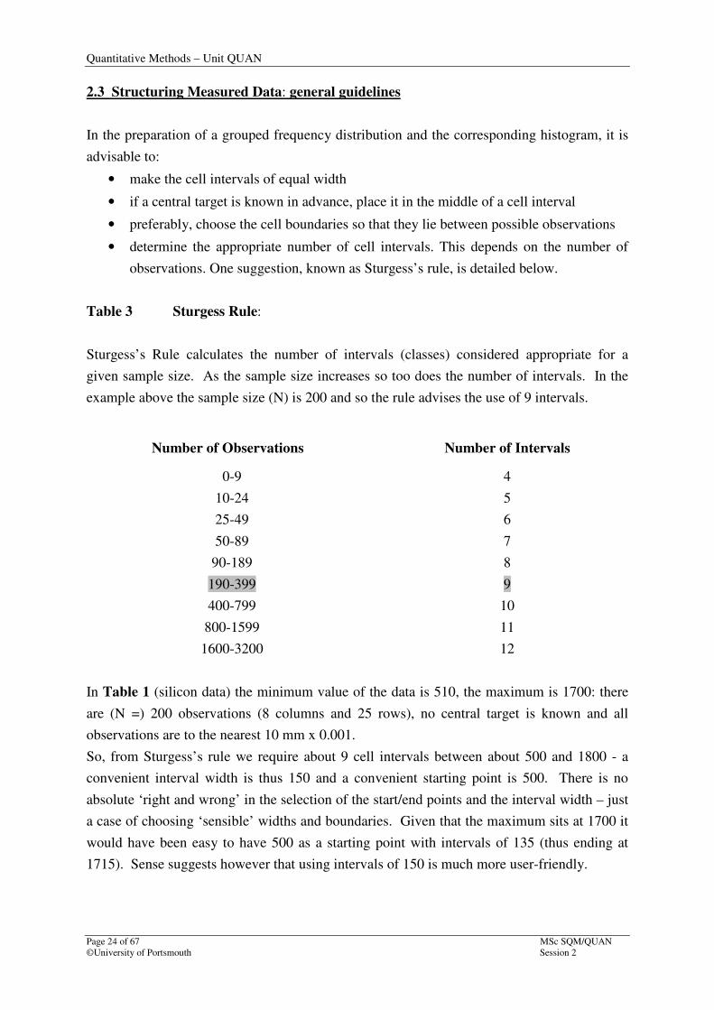
2.3 Structuring Measured Data: general guidelines
In the preparation of a grouped frequency distribution and the corresponding histogram, it is
advisable to:
• make the cell intervals of equal width
• if a central target is known in advance, place it in the middle of a cell interval
• preferably, choose the cell boundaries so that they lie between possible observations
• determine the appropriate number of cell intervals. This depends on the number of
observations. One suggestion, known as Sturgess’s rule, is detailed below.
Table 3 Sturgess Rule:
Sturgess’s Rule calculates the number of intervals (classes) considered appropriate for a
given sample size. As the sample size increases so too does the number of intervals. In the
example above the sample size (N) is 200 and so the rule advises the use of 9 intervals.
Number of Observations Number of Intervals
0-9
10-24
25-49
50-89
90-189
190-399
400-799
800-1599
1600-3200
4
5
6
7
8
9
10
11
12
In Table 1 (silicon data) the minimum value of the data is 510, the maximum is 1700: there
are (N =) 200 observations (8 columns and 25 rows), no central target is known and all
observations are to the nearest 10 mm x 0.001.
So, from Sturgess’s rule we require about 9 cell intervals between about 500 and 1800 - a
convenient interval width is thus 150 and a convenient starting point is 500. There is no
absolute ‘right and wrong’ in the selection of the start/end points and the interval width – just
a case of choosing ‘sensible’ widths and boundaries. Given that the maximum sits at 1700 it
would have been easy to have 500 as a starting point with intervals of 135 (thus ending at
1715). Sense suggests however that using intervals of 150 is much more user-friendly.

Quantitative Methods – Unit QUAN
MSc SQM/QUAN Page 25 of 67
Session 2 ©University of Portsmouth
The application of the above rules then enables the data to be presented as in Table 2.
The histogram derived from the data in Table 2 is shown in Figure 6. The somewhat
confusing data, as originally presented in Table 1, is now in the form of a picture which
shows the central tendency, the spread and the form of the distribution.
The horizontal axis measures the thickness
measurements of pieces of silicon (mm x 0.001)
Figure 6: Measurements on pieces of silicon. Histogram of data in Table 1
Histograms are fairly easily constructed with a spreadsheet as there are particular functions
that will both perform a frequency count (of a raw set of data) and construct a graph. These
should however be used with caution because whilst they are good for data allocated to ‘equal
class widths’ (i.e., equal width intervals on the horizontal axis), histograms are not constructed
correctly when the class widths are ‘unequal’. This course requires you to understand the
construction and purpose of histograms, but does not require you get to grips either with the
finer detail of ‘unequal’ class widths, or with the workings of Excel in constructing a
histogram.
50
45
40
35
30
25
20
15
10
5
0
Fre
quen
cy
50
0-6
49
65
0-7
99
80
0-9
49
95
0-1
099
11
00
-124
9
12
50
-139
9
14
00
-154
9
15
50
-169
9
17
00
-184
9
Quantitative Methods – Unit QUAN
Page 26 of 67 MSc SQM/QUAN
©University of Portsmouth Session 2
SELF-APPRAISAL EXERCISE – Part 1
You will have gone through the first part of this session and absorbed the material.
Here follow some tasks to give you the chance to apply what you have learnt. Use
the previous Tutorial Examples to help you through these tasks.
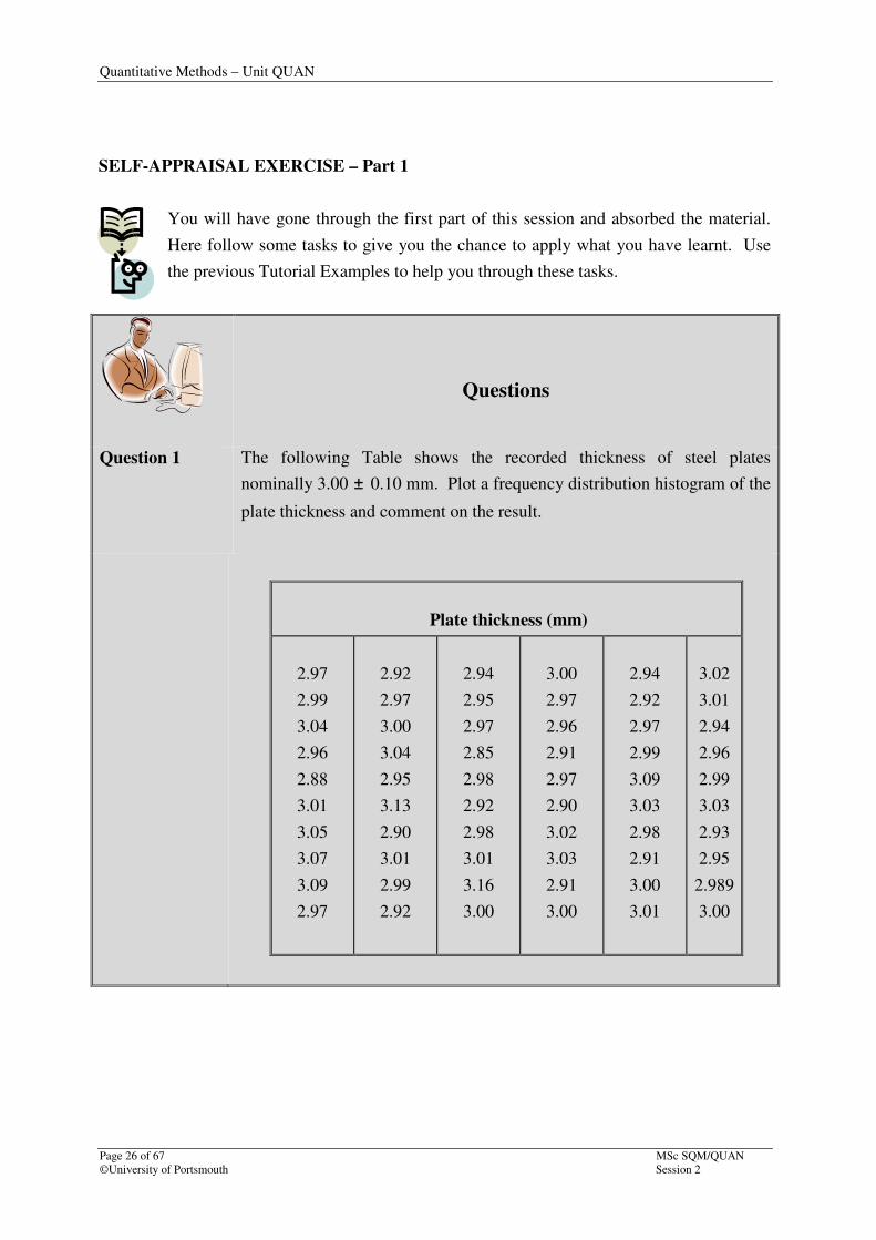
Questions
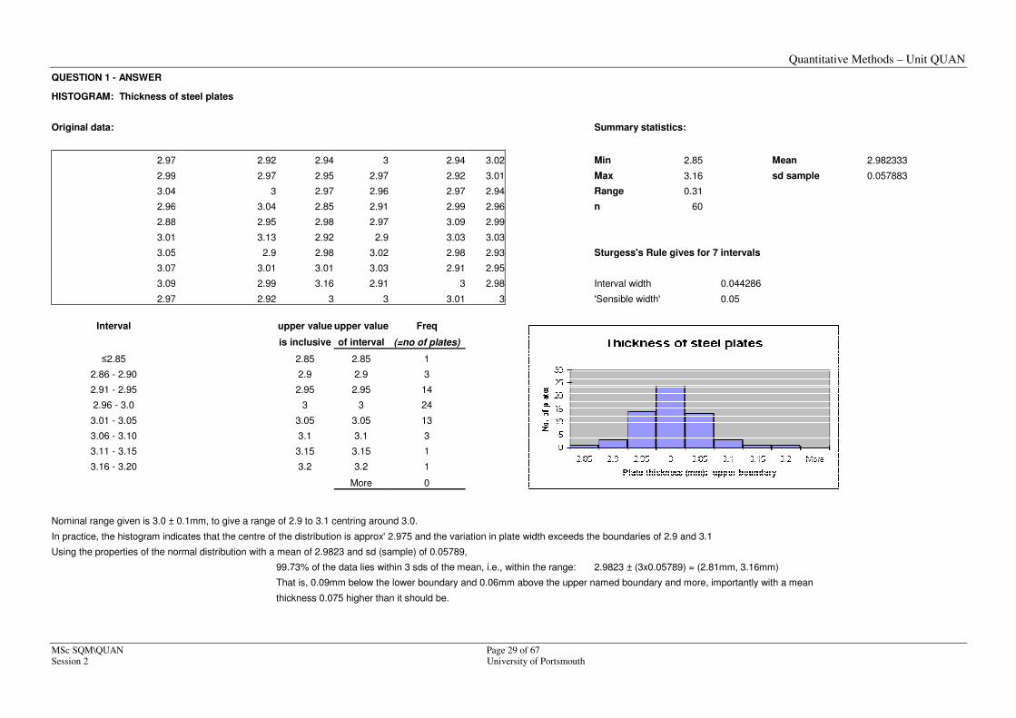
Question 1 The following Table shows the recorded thickness of steel plates
nominally 3.00 ± 0.10 mm. Plot a frequency distribution histogram of the
plate thickness and comment on the result.
Plate thickness (mm)
2.97
2.99
3.04
2.96
2.88
3.01
3.05
3.07
3.09
2.97
2.92
2.97
3.00
3.04
2.95
3.13
2.90
3.01
2.99
2.92
2.94
2.95
2.97
2.85
2.98
2.92
2.98
3.01
3.16
3.00
3.00
2.97
2.96
2.91
2.97
2.90
3.02
3.03
2.91
3.00
2.94
2.92
2.97
2.99
3.09
3.03
2.98
2.91
3.00
3.01
3.02
3.01
2.94
2.96
2.99
3.03
2.93
2.95
2.989
3.00
Quantitative Methods – Unit QUAN
MSc SQM/QUAN Page 27 of 67
Session 2 ©University of Portsmouth
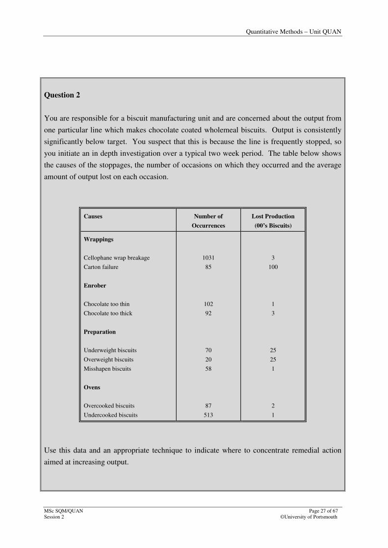
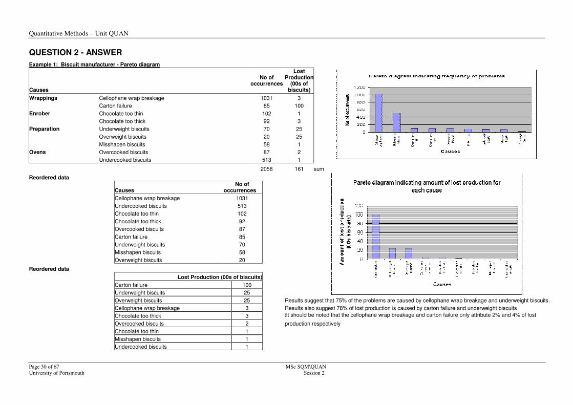
Question 2
You are responsible for a biscuit manufacturing unit and are concerned about the output from
one particular line which makes chocolate coated wholemeal biscuits. Output is consistently
significantly below target. You suspect that this is because the line is frequently stopped, so
you initiate an in depth investigation over a typical two week period. The table below shows
the causes of the stoppages, the number of occasions on which they occurred and the average
amount of output lost on each occasion.
Causes Number of
Occurrences
Lost Production
(00’s Biscuits)
Wrappings
Cellophane wrap breakage
Carton failure
Enrober
Chocolate too thin
Chocolate too thick
Preparation
Underweight biscuits
Overweight biscuits
Misshapen biscuits
Ovens
Overcooked biscuits
Undercooked biscuits
1031
85
102
92
70
20
58
87
513
3
100
1
3
25
25
1
2
1
Use this data and an appropriate technique to indicate where to concentrate remedial action
aimed at increasing output.
Quantitative Methods – Unit QUAN
Page 28 of 67 MSc SQM/QUAN
©University of Portsmouth Session 2
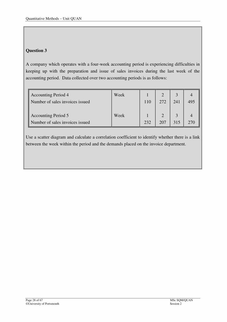
Question 3
A company which operates with a four-week accounting period is experiencing difficulties in
keeping up with the preparation and issue of sales invoices during the last week of the
accounting period. Data collected over two accounting periods is as follows:
Accounting Period 4
Number of sales invoices issued
Accounting Period 5
Number of sales invoices issued
Week
Week
1
110
1
232
2
272
2
207
3
241
3
315
4
495
4
270
Use a scatter diagram and calculate a correlation coefficient to identify whether there is a link
between the week within the period and the demands placed on the invoice department.
Quantitative Methods – Unit QUAN
MSc SQM\QUAN Page 29 of 67
Session 2 University of Portsmouth
QUESTION 1 - ANSWER
HISTOGRAM: Thickness of steel plates
Original data: Summary statistics:
2.97 2.92 2.94 3 2.94 3.02 Min 2.85 Mean 2.982333
2.99 2.97 2.95 2.97 2.92 3.01 Max 3.16 sd sample 0.057883
3.04 3 2.97 2.96 2.97 2.94 Range 0.31
2.96 3.04 2.85 2.91 2.99 2.96 n 60
2.88 2.95 2.98 2.97 3.09 2.99
3.01 3.13 2.92 2.9 3.03 3.03
3.05 2.9 2.98 3.02 2.98 2.93 Sturgess's Rule gives for 7 intervals
3.07 3.01 3.01 3.03 2.91 2.95
3.09 2.99 3.16 2.91 3 2.98 Interval width 0.044286
2.97 2.92 3 3 3.01 3 'Sensible width' 0.05
Interval upper value upper value Freq
is inclusive of interval (=no of plates)
≤2.85 2.85 2.85 1
2.86 - 2.90 2.9 2.9 3
2.91 - 2.95 2.95 2.95 14
2.96 - 3.0 3 3 24
3.01 - 3.05 3.05 3.05 13
3.06 - 3.10 3.1 3.1 3
3.11 - 3.15 3.15 3.15 1
3.16 - 3.20 3.2 3.2 1
More 0
Nominal range given is 3.0 ± 0.1mm, to give a range of 2.9 to 3.1 centring around 3.0.
In practice, the histogram indicates that the centre of the distribution is approx' 2.975 and the variation in plate width exceeds the boundaries of 2.9 and 3.1
Using the properties of the normal distribution with a mean of 2.9823 and sd (sample) of 0.05789,
99.73% of the data lies within 3 sds of the mean, i.e., within the range: 2.9823 ± (3x0.05789) = (2.81mm, 3.16mm)
That is, 0.09mm below the lower boundary and 0.06mm above the upper named boundary and more, importantly with a mean
thickness 0.075 higher than it should be.
Quantitative Methods – Unit QUAN
Page 30 of 67 MSc SQM\QUAN
University of Portsmouth Session 2
QUESTION 2 - ANSWER
Example 1: Biscuit manufacturer - Pareto diagram
Causes
No of occurrences
Lost Production
(00s of biscuits)
Wrappings Cellophane wrap breakage 1031 3
Carton failure 85 100
Enrober Chocolate too thin 102 1
Chocolate too thick 92 3
Preparation Underweight biscuits 70 25
Overweight biscuits 20 25
Misshapen biscuits 58 1
Ovens Overcooked biscuits 87 2
Undercooked biscuits 513 1
2058 161 sum
Reordered data
Causes No of
occurrences
Results suggest that 75% of the problems are caused by cellophane wrap breakage and underweight biscuits.
Cellophane wrap breakage 1031 Undercooked biscuits 513 Chocolate too thin 102 Chocolate too thick 92 Overcooked biscuits 87 Carton failure 85 Underweight biscuits 70 Misshapen biscuits 58 Overweight biscuits 20
Reordered data
Lost Production (00s of biscuits)
Carton failure 100
Underweight biscuits 25
Overweight biscuits 25
Cellophane wrap breakage 3 Results also suggest 78% of lost production is caused by carton failure and underweight biscuits
Chocolate too thick 3 It shItIt should be noted that the cellophane wrap breakage and carton failure only attribute 2% and 4% of lost
Overcooked biscuits 2 production respectively
Chocolate too thin 1
Misshapen biscuits 1
Undercooked biscuits 1
Quantitative Methods – Unit QUAN
MSc SQM\QUAN Page 31 of 67
Session 2 University of Portsmouth
Results expressed as a percentage
Causes
No of occurrences
Lost Production
(00s of biscuits)
Wrappings Cellophane wrap breakage 1031 3
Carton failure 85 100
Enrober Chocolate too thin 102 1
Chocolate too thick 92 3
Preparation Underweight biscuits 70 25
Overweight biscuits 20 25
Misshapen biscuits 58 1
Ovens Overcooked biscuits 87 2
Undercooked biscuits 513 1
2058 161 sum
Causes
% of occurrences
Lost Production
(00s of biscuits)
Wrappings Cellophane wrap breakage 50% 2%
Carton failure 4% 62%
Enrober Chocolate too thin 5% 1%
Chocolate too thick 4% 2%
Preparation Underweight biscuits 3% 16%
Overweight biscuits 1% 16%
Misshapen biscuits 3% 1%
Ovens Overcooked biscuits 4% 1% Undercooked biscuits 25% 1%
100.00% 100.00% sum
Quantitative Methods – Unit QUAN
Page 32 of 67 MSc SQM\QUAN
University of Portsmouth Session 2
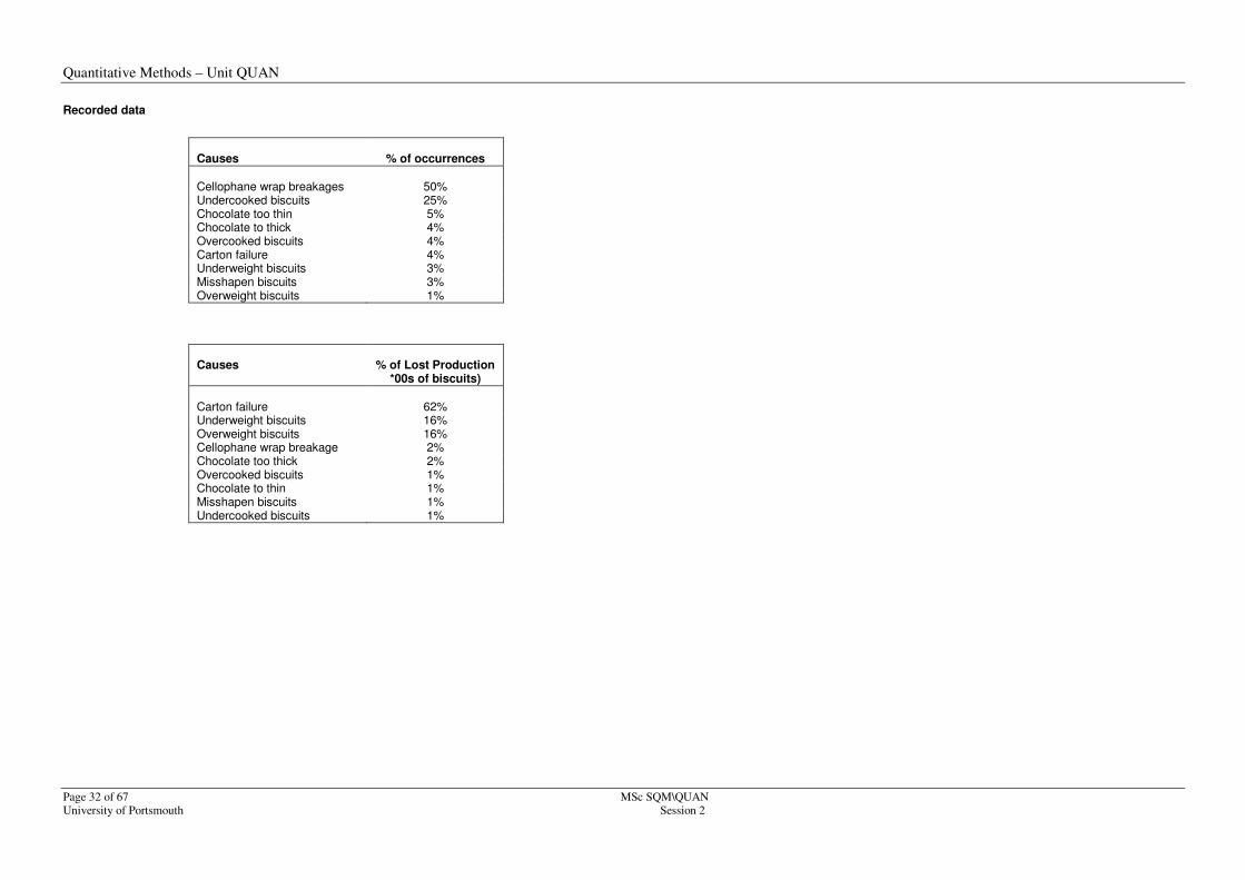
Recorded data
Causes
% of occurrences
Cellophane wrap breakages
50%
Undercooked biscuits 25% Chocolate too thin 5% Chocolate to thick 4% Overcooked biscuits 4% Carton failure 4% Underweight biscuits 3% Misshapen biscuits 3% Overweight biscuits 1%
Causes
% of Lost Production
*00s of biscuits)
Carton failure
62%
Underweight biscuits 16% Overweight biscuits 16% Cellophane wrap breakage 2% Chocolate too thick 2% Overcooked biscuits 1% Chocolate to thin 1% Misshapen biscuits 1% Undercooked biscuits 1%
Quantitative Methods – Unit QUAN
MSc SQM\QUAN Page 33 of 67
Session 2 University of Portsmouth
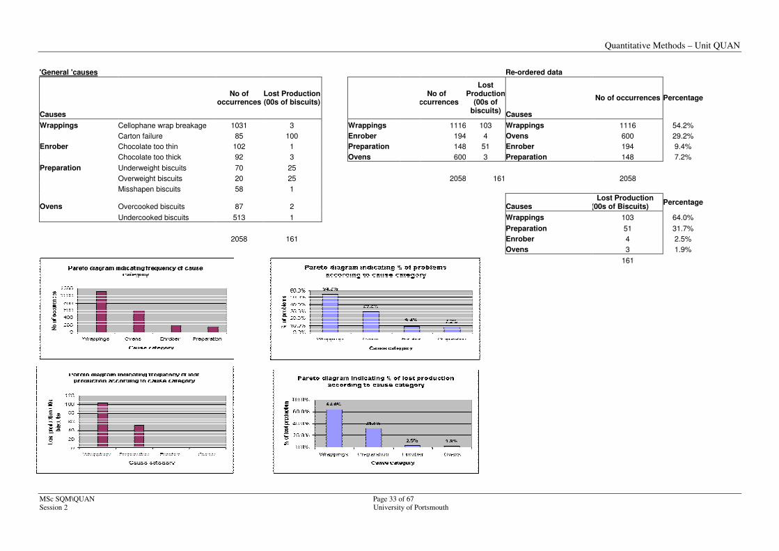
'General 'causes Re-ordered data
Causes
No of occurrences
Lost Production (00s of biscuits)
No of occurrences
Lost Production
(00s of biscuits)
Causes
No of occurrences Percentage
Wrappings Cellophane wrap breakage 1031 3 Wrappings 1116 103 Wrappings 1116 54.2%
Carton failure 85 100 Enrober 194 4 Ovens 600 29.2%
Enrober Chocolate too thin 102 1 Preparation 148 51 Enrober 194 9.4%
Chocolate too thick 92 3 Ovens 600 3 Preparation 148 7.2%
Preparation Underweight biscuits 70 25
Overweight biscuits 20 25 2058 161 2058
Misshapen biscuits 58 1
Ovens Overcooked biscuits 87 2 Causes Lost Production
(00s of Biscuits) Percentage
Undercooked biscuits 513 1 Wrappings 103 64.0%
Preparation 51 31.7%
2058 161 Enrober 4 2.5%
Ovens 3 1.9%
161

Quantitative Methods – Unit QUAN
Page 34 of 67 MSc SQM\QUAN
University of Portsmouth Session 2
Results indicate that 83% of problems are caused by 'wrappings' and the 'oven'.
Results also indicate that 96% of lost production is caused by 'wrappings' and preparation.
Note also that it is important to consider the applying the Pareto technique from more than one angle if suitable data is available, e.g., frequency of occurrence and cost of rectification. Each of the most frequently occurring problems may cost pennies to rectify whereas a problem which occurs once or twice may cost thousands of pounds to put right. Although both approaches identify areas for improvement, the analysis may enable priorities to be based on an assessment of the risks
.
Quantitative Methods – Unit QUAN
MSc SQM\QUAN Page 35 of 67
Session 2 University of Portsmouth
QUESTION 3 - ANSWER
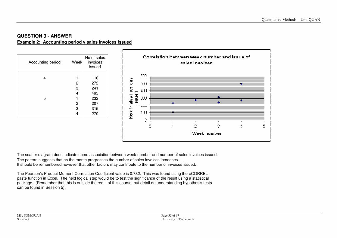
Example 2: Accounting period v sales invoices issued
Accounting period Week No of sales
invoices issued
4 1 110
2 272
3 241
4 495
5 1 232
2 207
3 315
4 270
The scatter diagram does indicate some association between week number and number of sales invoices issued.
The pattern suggests that as the month progresses the number of sales invoices increases. It should be remembered however that other factors may contribute to the number of invoices issued. The Pearson’s Product Moment Correlation Coefficient value is 0.732. This was found using the =CORREL paste function in Excel. The next logical step would be to test the significance of the result using a statistical package. (Remember that this is outside the remit of this course, but detail on understanding hypothesis tests can be found in Session 5).

Quantitative Methods – Unit QUAN
Page 36 of 67 MSc SQM\QUAN
University of Portsmouth Session 2
Quantitative Methods – Unit QUAN
MSc SQM\QUAN Page 37 of 67
Session 2 University of Portsmouth
2.4 Structuring Measured data: shapes of distributions
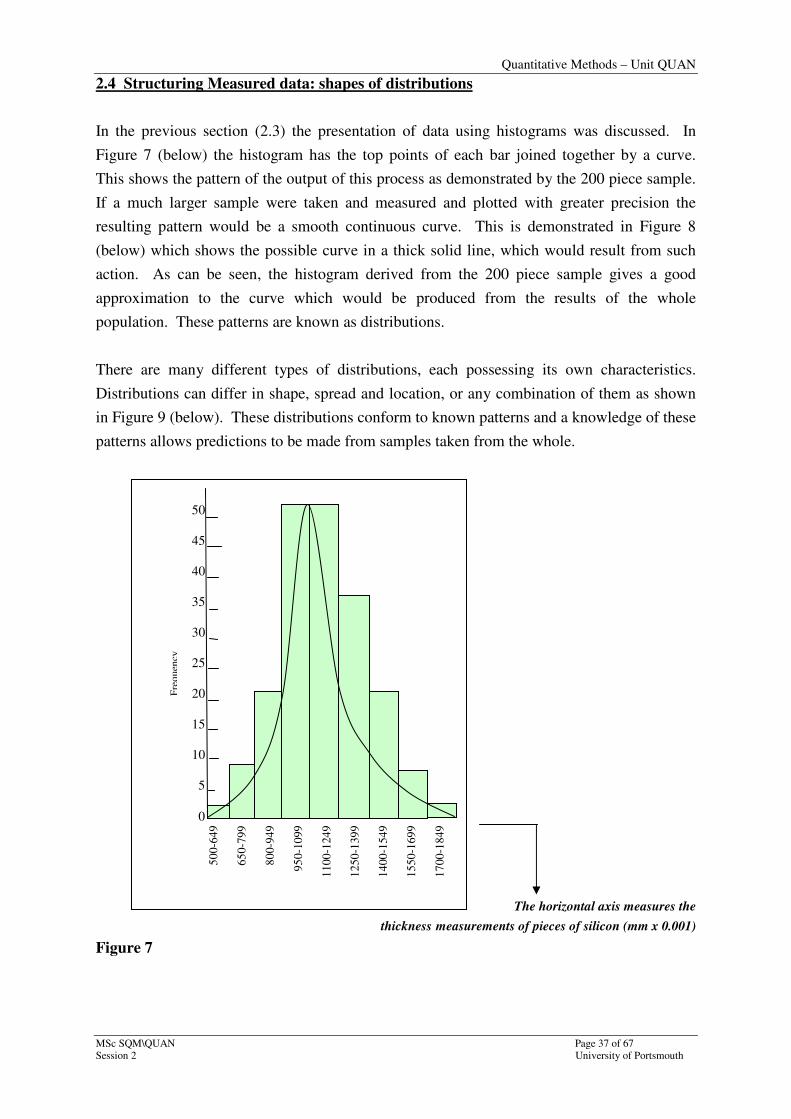
In the previous section (2.3) the presentation of data using histograms was discussed. In
Figure 7 (below) the histogram has the top points of each bar joined together by a curve.
This shows the pattern of the output of this process as demonstrated by the 200 piece sample.
If a much larger sample were taken and measured and plotted with greater precision the
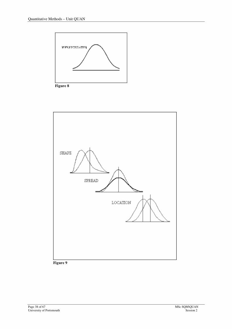
resulting pattern would be a smooth continuous curve. This is demonstrated in Figure 8
(below) which shows the possible curve in a thick solid line, which would result from such
action. As can be seen, the histogram derived from the 200 piece sample gives a good
approximation to the curve which would be produced from the results of the whole
population. These patterns are known as distributions.
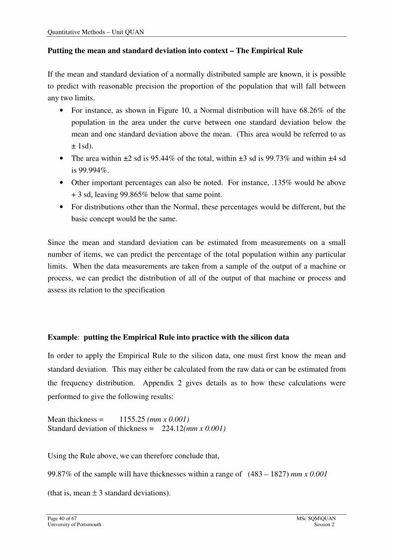
There are many different types of distributions, each possessing its own characteristics.
Distributions can differ in shape, spread and location, or any combination of them as shown
in Figure 9 (below). These distributions conform to known patterns and a knowledge of these
patterns allows predictions to be made from samples taken from the whole.
The horizontal axis measures the
thickness measurements of pieces of silicon (mm x 0.001)
Figure 7
50
45
40
35
30
25
20
15
10
5
0
Fre
quen
cy
50
0-6
49
65
0-7
99
80
0-9
49
95
0-1
099
11
00
-124
9
12
50
-139
9
14
00
-154
9
15
50
-169
9
17
00
-184
9
Quantitative Methods – Unit QUAN
Page 38 of 67 MSc SQM\QUAN
University of Portsmouth Session 2
Figure 8
Figure 9

Quantitative Methods – Unit QUAN
MSc SQM\QUAN Page 39 of 67
Session 2 University of Portsmouth
Shapes of distributions: The ‘Normal Distribution’
The distribution most frequently encountered in manufacturing processes and in nature is the
Normal (or Gaussian) distribution. This is the shape shown in Figure 10. It is important
because knowledge of the properties of the Normal distribution enable us to make predictions
about machine and process dimensional performance. A Normal distribution appears
graphically as a symmetrical, bell shaped curve. For a sample it is characterised by two
parameters:
• The mean, or setting, X (x-bar); a measure of central tendency.
• The sample standard deviation (s); a measure of the spread, or variability of the
machine or process. The greater the variability, the larger the standard deviation.
Appendix 2 provides background information on measures of average (central tendency) and
measures of spread (dispersion). Whilst it is important that you get to grips with both
measures and know how to calculate a mean, there is no requirement in this course for you to
be able to calculate a standard deviation.
Section 2.5 provides further detail on probability and the Normal distribution. There are a
number of exercises at the end of the particular section you should complete. Before this
however, a quick line on the Empirical Rule puts the mean and standard deviation into
context.
Figure 10
Quantitative Methods – Unit QUAN
Page 40 of 67 MSc SQM\QUAN
University of Portsmouth Session 2
Putting the mean and standard deviation into context – The Empirical Rule
If the mean and standard deviation of a normally distributed sample are known, it is possible
to predict with reasonable precision the proportion of the population that will fall between
any two limits.
• For instance, as shown in Figure 10, a Normal distribution will have 68.26% of the
population in the area under the curve between one standard deviation below the
mean and one standard deviation above the mean. (This area would be referred to as
± 1sd).
• The area within ±2 sd is 95.44% of the total, within ±3 sd is 99.73% and within ±4 sd
is 99.994%.
• Other important percentages can also be noted. For instance, .135% would be above
+ 3 sd, leaving 99.865% below that same point.
• For distributions other than the Normal, these percentages would be different, but the
basic concept would be the same.
Since the mean and standard deviation can be estimated from measurements on a small
number of items, we can predict the percentage of the total population within any particular
limits. When the data measurements are taken from a sample of the output of a machine or
process, we can predict the distribution of all of the output of that machine or process and
assess its relation to the specification
Example: putting the Empirical Rule into practice with the silicon data
In order to apply the Empirical Rule to the silicon data, one must first know the mean and
standard deviation. This may either be calculated from the raw data or can be estimated from
the frequency distribution. Appendix 2 gives details as to how these calculations were
performed to give the following results:
Mean thickness = 1155.25 (mm x 0.001)
Standard deviation of thickness = 224.12(mm x 0.001)
Using the Rule above, we can therefore conclude that,
99.87% of the sample will have thicknesses within a range of (483 – 1827) mm x 0.001
(that is, mean ± 3 standard deviations).
Quantitative Methods – Unit QUAN
MSc SQM\QUAN Page 41 of 67
Session 2 University of Portsmouth
2.5 Probability and the Normal Distribution
We know that ‘probability’ is the chance that something will happen with a probability of
zero suggesting that the event will never happen and a probability of ‘1’ suggesting it will
always happen.
Sometimes we are interested not just in a single probability, but in the probability of each of a
range of possibilities. We may want to know how the probability is distributed between these
possibilities. There are a number of standard probability distributions, each of which gives us
an answer for a particular type of situation. Three of these standard probability distributions
will be looked at in this module: the binomial, poisson and normal distributions. Each is
useful in a very wide range of different contexts and they are all used in later chapters.
While the Binomial and Poisson distributions enable us to deal with the occurrence of distinct
events such as the number of defective items in a sample of a given size, or the number of
accidents occurring in a factory during the working day, the Normal distribution enables us
to deal with quantities whose magnitude is continuously variable. The Binomial and Poisson
distributions are explained in Session 4.
Example 1
Suppose we make a certain trip 50 times and the frequency of the time taken is shown in the
following histogram, with the time taken to the nearest minute. Note that the frequency
represents the number of times the trip is made.
Figure 1: histogram of duration of trip
Quantitative Methods – Unit QUAN
Page 42 of 67 MSc SQM\QUAN
University of Portsmouth Session 2
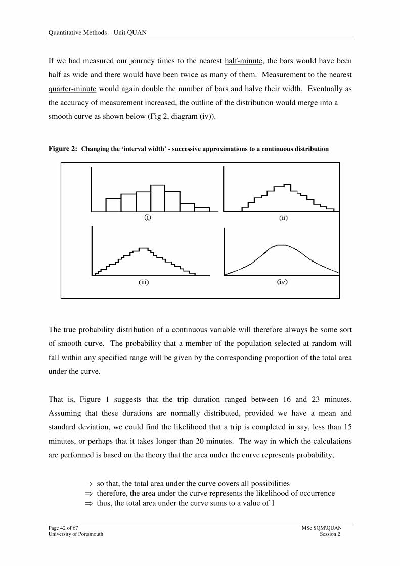
If we had measured our journey times to the nearest half-minute, the bars would have been
half as wide and there would have been twice as many of them. Measurement to the nearest
quarter-minute would again double the number of bars and halve their width. Eventually as
the accuracy of measurement increased, the outline of the distribution would merge into a
smooth curve as shown below (Fig 2, diagram (iv)).
Figure 2: Changing the ‘interval width’ - successive approximations to a continuous distribution
The true probability distribution of a continuous variable will therefore always be some sort
of smooth curve. The probability that a member of the population selected at random will
fall within any specified range will be given by the corresponding proportion of the total area
under the curve.
That is, Figure 1 suggests that the trip duration ranged between 16 and 23 minutes.
Assuming that these durations are normally distributed, provided we have a mean and
standard deviation, we could find the likelihood that a trip is completed in say, less than 15
minutes, or perhaps that it takes longer than 20 minutes. The way in which the calculations
are performed is based on the theory that the area under the curve represents probability,
⇒ so that, the total area under the curve covers all possibilities
⇒ therefore, the area under the curve represents the likelihood of occurrence
⇒ thus, the total area under the curve sums to a value of 1
Quantitative Methods – Unit QUAN
MSc SQM\QUAN Page 43 of 67
Session 2 University of Portsmouth
This last point is illustrated well with logic that,
the prob’ that a trip takes less than (or =) 20 mins + the prob’ that a trip takes more than 20 mins = 1
in view that it covers all possibilities.
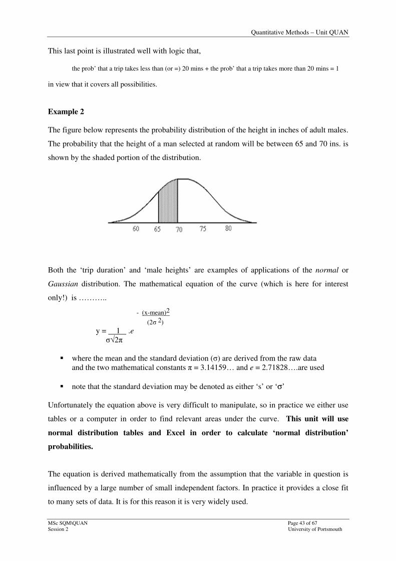
Example 2
The figure below represents the probability distribution of the height in inches of adult males.
The probability that the height of a man selected at random will be between 65 and 70 ins. is
shown by the shaded portion of the distribution.
Both the ‘trip duration’ and ‘male heights’ are examples of applications of the normal or
Gaussian distribution. The mathematical equation of the curve (which is here for interest
only!) is ………..
- (x-mean)2
(2σ 2) y = 1 .e
σ√2π
� where the mean and the standard deviation (σ) are derived from the raw data
and the two mathematical constants π = 3.14159… and e = 2.71828….are used
� note that the standard deviation may be denoted as either ‘s’ or ‘σ’
Unfortunately the equation above is very difficult to manipulate, so in practice we either use
tables or a computer in order to find relevant areas under the curve. This unit will use
normal distribution tables and Excel in order to calculate ‘normal distribution’
probabilities.
The equation is derived mathematically from the assumption that the variable in question is
influenced by a large number of small independent factors. In practice it provides a close fit
to many sets of data. It is for this reason it is very widely used.
Quantitative Methods – Unit QUAN
Page 44 of 67 MSc SQM\QUAN
University of Portsmouth Session 2
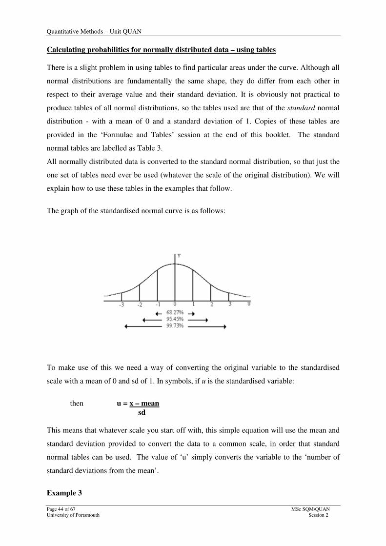
Calculating probabilities for normally distributed data – using tables
There is a slight problem in using tables to find particular areas under the curve. Although all
normal distributions are fundamentally the same shape, they do differ from each other in
respect to their average value and their standard deviation. It is obviously not practical to
produce tables of all normal distributions, so the tables used are that of the standard normal
distribution - with a mean of 0 and a standard deviation of 1. Copies of these tables are
provided in the ‘Formulae and Tables’ session at the end of this booklet. The standard
normal tables are labelled as Table 3.
All normally distributed data is converted to the standard normal distribution, so that just the
one set of tables need ever be used (whatever the scale of the original distribution). We will
explain how to use these tables in the examples that follow.
The graph of the standardised normal curve is as follows:
To make use of this we need a way of converting the original variable to the standardised
scale with a mean of 0 and sd of 1. In symbols, if u is the standardised variable:
then u = x – mean
sd
This means that whatever scale you start off with, this simple equation will use the mean and
standard deviation provided to convert the data to a common scale, in order that standard
normal tables can be used. The value of ‘u’ simply converts the variable to the ‘number of
standard deviations from the mean’.
Example 3
Quantitative Methods – Unit QUAN
MSc SQM\QUAN Page 45 of 67
Session 2 University of Portsmouth
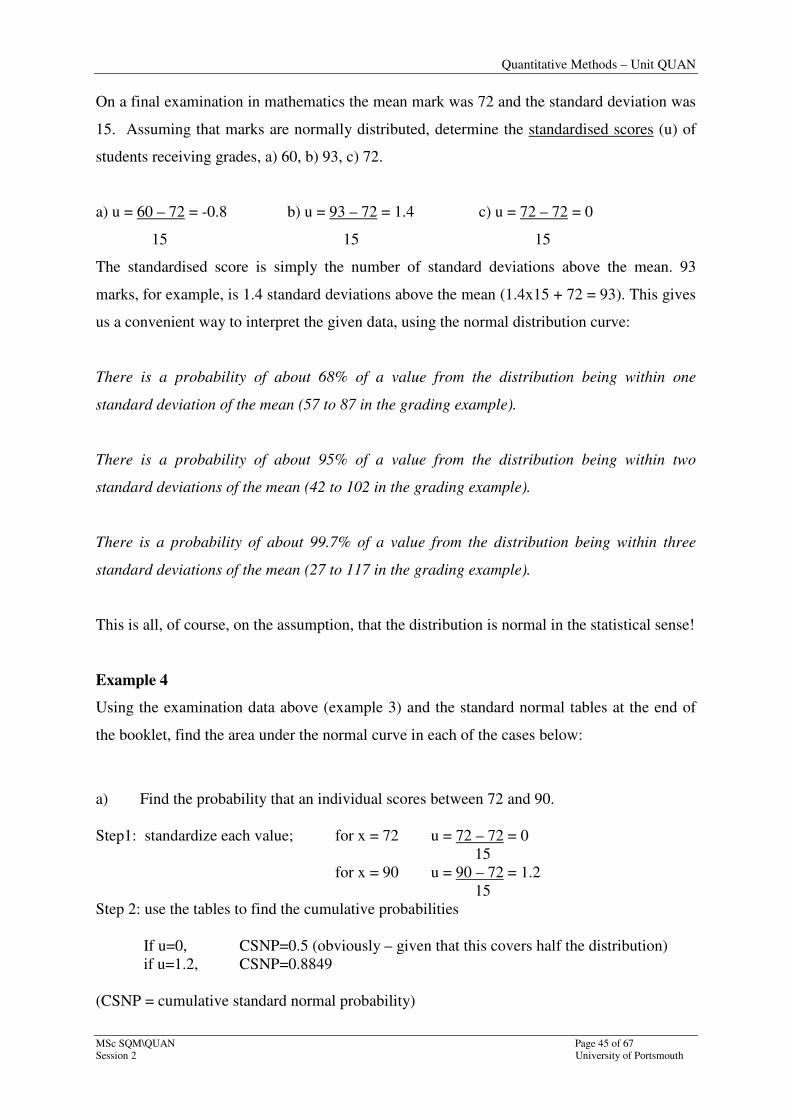
On a final examination in mathematics the mean mark was 72 and the standard deviation was
15. Assuming that marks are normally distributed, determine the standardised scores (u) of
students receiving grades, a) 60, b) 93, c) 72.
a) u = 60 – 72 = -0.8 b) u = 93 – 72 = 1.4 c) u = 72 – 72 = 0
15 15 15
The standardised score is simply the number of standard deviations above the mean. 93
marks, for example, is 1.4 standard deviations above the mean (1.4x15 + 72 = 93). This gives
us a convenient way to interpret the given data, using the normal distribution curve:
There is a probability of about 68% of a value from the distribution being within one
standard deviation of the mean (57 to 87 in the grading example).
There is a probability of about 95% of a value from the distribution being within two
standard deviations of the mean (42 to 102 in the grading example).
There is a probability of about 99.7% of a value from the distribution being within three
standard deviations of the mean (27 to 117 in the grading example).
This is all, of course, on the assumption, that the distribution is normal in the statistical sense!
Example 4
Using the examination data above (example 3) and the standard normal tables at the end of
the booklet, find the area under the normal curve in each of the cases below:
a) Find the probability that an individual scores between 72 and 90.
Step1: standardize each value; for x = 72 u = 72 – 72 = 0
15
for x = 90 u = 90 – 72 = 1.2
15
Step 2: use the tables to find the cumulative probabilities
If u=0, CSNP=0.5 (obviously – given that this covers half the distribution)
if u=1.2, CSNP=0.8849
(CSNP = cumulative standard normal probability)
Quantitative Methods – Unit QUAN
Page 46 of 67 MSc SQM\QUAN
University of Portsmouth Session 2
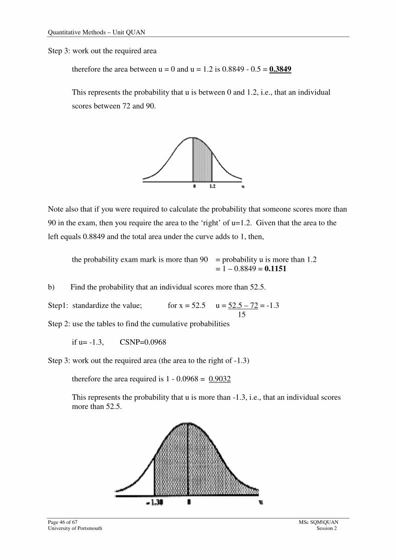
Step 3: work out the required area
therefore the area between u = 0 and u = 1.2 is 0.8849 - 0.5 = 0.3849
This represents the probability that u is between 0 and 1.2, i.e., that an individual
scores between 72 and 90.
Note also that if you were required to calculate the probability that someone scores more than
90 in the exam, then you require the area to the ‘right’ of u=1.2. Given that the area to the
left equals 0.8849 and the total area under the curve adds to 1, then,
the probability exam mark is more than 90 = probability u is more than 1.2
= 1 – 0.8849 = 0.1151
b) Find the probability that an individual scores more than 52.5.
Step1: standardize the value; for x = 52.5 u = 52.5 – 72 = -1.3
15
Step 2: use the tables to find the cumulative probabilities
if u= -1.3, CSNP=0.0968
Step 3: work out the required area (the area to the right of -1.3)
therefore the area required is 1 - 0.0968 = 0.9032
This represents the probability that u is more than -1.3, i.e., that an individual scores
more than 52.5.

Quantitative Methods – Unit QUAN
MSc SQM\QUAN Page 47 of 67
Session 2 University of Portsmouth
Calculating probabilities for normally distributed data – using Excel
Excel is particularly useful when it is required to calculate a standardised value (the u-value).
It will also, with a separate instruction, work out the cumulative probability.
The functions are:
=STANDARDIZE(X, mean, sd) and =NORMDIST(X, mean, sd, ‘cumulative’)
Note the final input required using the =NORMDIST instruction requires you to give a true
or false statement:
=NORMDIST(X, mean, sd, FALSE) returns the individual normal probability
=NORMDIST(X, mean, sd, TRUE) returns the cumulative normal probability
…….(therefore use the ‘true’ instruction to duplicate the approach taken here)
These instructions can either be typed in to the formula toolbar, or can be accessed using the
arrow to the right of the autosum button (see printout below).

Quantitative Methods – Unit QUAN
Page 48 of 67 MSc SQM\QUAN
University of Portsmouth Session 2
Note that in this particular example I have typed in ‘standardise’ in the search box in order to
access the correct instruction.
Note also that these have appeared in the formula toolbar, as expected, in the form of:
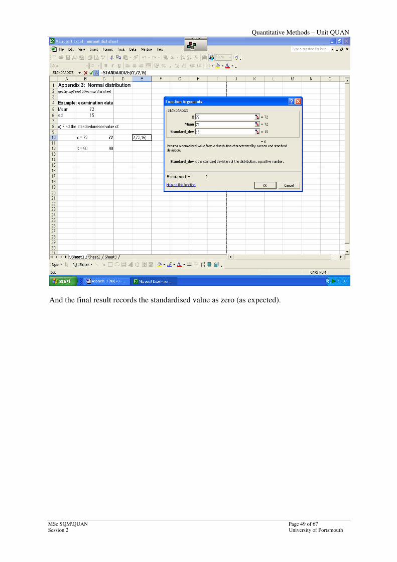
=STANDARDIZE(72,72,15).
Note also that I have input the values (72, 72,15); equally I could have given cell addresses.
Quantitative Methods – Unit QUAN
MSc SQM\QUAN Page 49 of 67
Session 2 University of Portsmouth
And the final result records the standardised value as zero (as expected).
Quantitative Methods – Unit QUAN
Page 50 of 67 MSc SQM\QUAN
University of Portsmouth Session 2
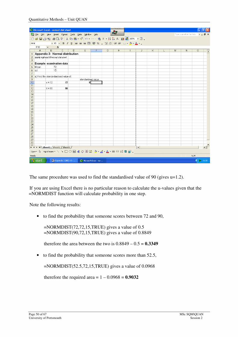
The same procedure was used to find the standardised value of 90 (gives u=1.2).
If you are using Excel there is no particular reason to calculate the u-values given that the
=NORMDIST function will calculate probability in one step.
Note the following results:
• to find the probability that someone scores between 72 and 90,
=NORMDIST(72,72,15,TRUE) gives a value of 0.5
=NORMDIST(90,72,15,TRUE) gives a value of 0.8849
therefore the area between the two is 0.8849 – 0.5 = 0.3349
• to find the probability that someone scores more than 52.5,
=NORMDIST(52.5,72,15,TRUE) gives a value of 0.0968
therefore the required area = 1 – 0.0968 = 0.9032
Quantitative Methods – Unit QUAN
MSc SQM\QUAN Page 51 of 67
Session 2 University of Portsmouth
SELF-APPRAISAL EXERCISE – Part 2
You will now have gone through the last part of this session and absorbed the
material. Here follow some tasks to give you the chance to apply what you have
learnt. Use the previous Tutorial Examples to help you through these tasks.
Questions
Question 1
Question 2
Question 3
Find the area under the normal curve:
a) to the left of u = -1.78
b) to the left of u = 0.56
c) to the right of u = -1.78
d) to the right of u = 0.56
e) between u = -1.78 and u = 0.56
In a statistics examination, the mean mark was 78% and the standard
deviation was 10%.
i) Use this information to determine the standard scores of
students whose grades were 93 and 62 respectively
ii) Find the probability that a student scored
a) less than 93%
b) more than 93%
c) less than 62%
d) more than 62%
e) between 62% and 93%
iii) What is the range of marks the majority of students (99.73%)
attained?
(Remember that the maximum score possible is 100%)
A survey carried out on behalf of an electricity company to investigate
the quarterly bills paid by business customers found that the average
bill was £20 000 with a standard deviation of £1500.
i) What is the probability that a customer’s bill is,
a) less than £18 000?
b) more than £18 000?
c) less than £23 000?
d) more than £ 23 000?
e) between £18 000 and £23 000?

Quantitative Methods – Unit QUAN
Page 52 of 67 MSc SQM\QUAN
University of Portsmouth Session 2
Question 4
f) between £18 000 and £20 000?
ii) The majority of customers (99.73%) pay bills of between what
amounts?
The life of an electrical component used in product X is normally
distributed with a mean of 5000 hours and a standard deviation of
1000 hours.
a) Calculate the probability that the component will last,
i) for less than 3000 hours
ii) for longer than 6000 hours
iii)between 3000 and 6000 hours
b) If average annual usage of the component is 1500 hours, what
is the probability that the component will last longer than 5
years?
Quantitative Methods – Unit QUAN
MSc SQM\QUAN Page 53 of 67
Session 2 University of Portsmouth
�
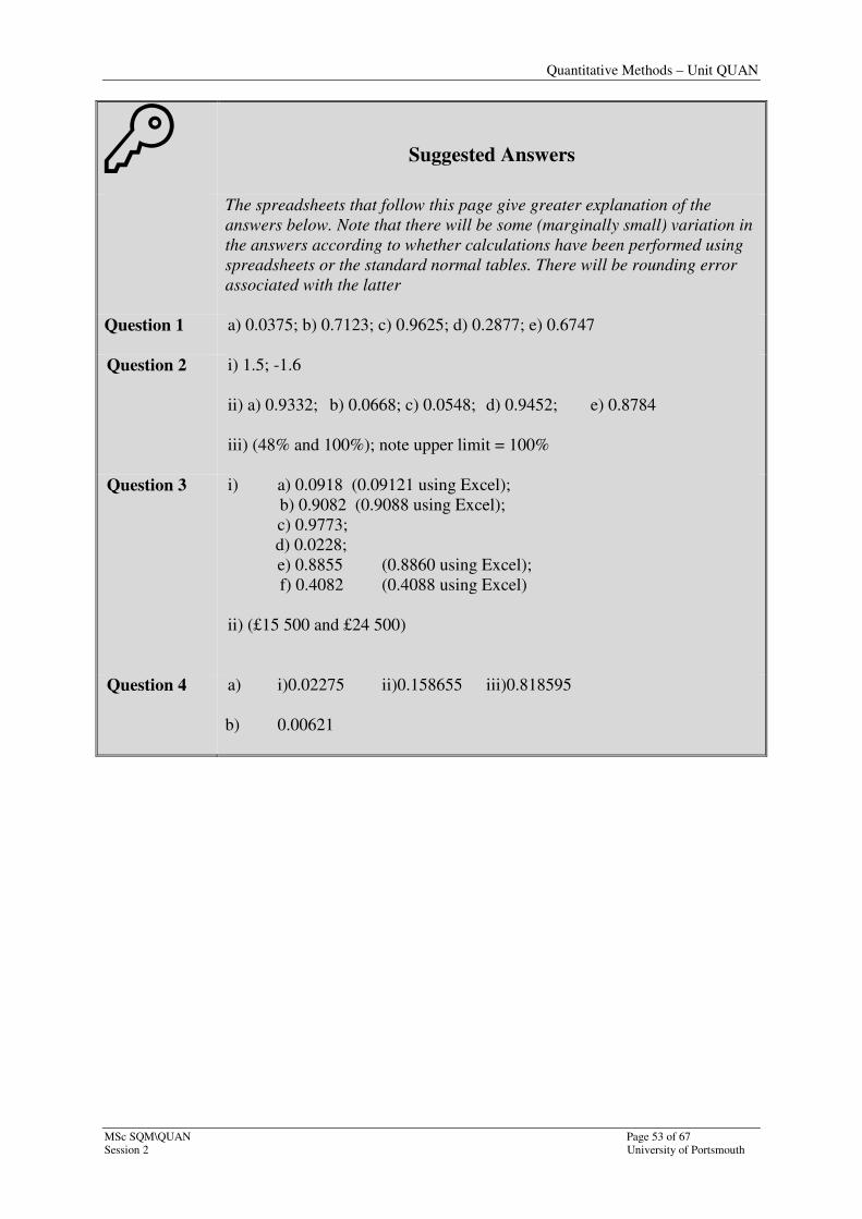
Suggested Answers
The spreadsheets that follow this page give greater explanation of the
answers below. Note that there will be some (marginally small) variation in
the answers according to whether calculations have been performed using
spreadsheets or the standard normal tables. There will be rounding error
associated with the latter
Question 1 a) 0.0375; b) 0.7123; c) 0.9625; d) 0.2877; e) 0.6747
Question 2
i) 1.5; -1.6
ii) a) 0.9332; b) 0.0668; c) 0.0548; d) 0.9452; e) 0.8784
iii) (48% and 100%); note upper limit = 100%
Question 3
i) a) 0.0918 (0.09121 using Excel);
b) 0.9082 (0.9088 using Excel);
c) 0.9773;
d) 0.0228;
e) 0.8855 (0.8860 using Excel);
f) 0.4082 (0.4088 using Excel)
ii) (£15 500 and £24 500)
Question 4
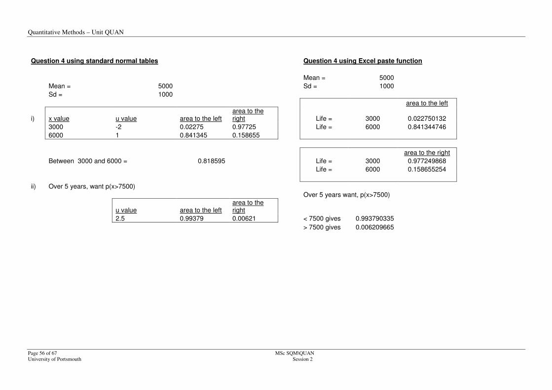
a) i)0.02275 ii)0.158655 iii)0.818595
b) 0.00621

Quantitative Methods – Unit QUAN
Page 54 of 67 MSc SQM\QUAN
University of Portsmouth Session 2
Expanded spreadsheet answers:
Using the normal distribution 'fx' functions on Excel
quality mgt/sept 05/ND functions - answers Question 1 using standard normal tables
Question 1 using Excel paste function
u value area to the left area to the
right u
value area to the
left = =NORMDIST(X, 0,1,TRUE)
-1.78 0.037538 0.962462 -1.78 0.03753798
0.56 0.71226 0.28774 0.56 0.712260281
between -1.78 and 0.56 = 0.674722 Question 2 using standard normal tables
Question 2 using Excel paste function
Mean = 78 Mean = 78
Sd = 10 Sd = 10
Standard score = =STANDARDIZE
i) Score = 93 Standard score = 1.5 i) Score = 93 1.5 (X, mean, sd)
Score = 62 Standard score = -1.6 Score = 62 -1.6
ii) x value u value area to the left area to the right
93 1.5 0.933193 0.066807
62 -1.6 0.054799 0.945201 area to the left =NORMDIST
ii) Score = 93 0.933192799 (X,78,10,TRUE)
between 62 and 93 = 0.878394 Score = 62 0.054799292
Extra: 78 +/- 3(10) = (48, 108) area to the right
Score = 93 0.066807201
Score = 62 0.945200708
Between 62 and 93 = 0.878393507
Range of probs: (48, 108)

Quantitative Methods – Unit QUAN
MSc SQM\QUAN Page 55 of 67
Session 2 University of Portsmouth
Question 3 using standard normal tables Question 3 using Excel paste function
Mean = 20000 Mean = 20000
Sd = 1500 Sd = 1500
Standard score = =STANDARDIZE
i) x value u value area to the left area to the right i) Score = 18000
-1.333333333 (X, mean, sd)
18000 -1.333333333 0.091759 0.908241 Score = 23000 2
23000 2 0.97725 0.02275 Score = 20000 0
20000 0 0.5 0.5
Between 18 000 and 23 000 = 0.885491 area to the
left =NORMDIST
ii) Score = 18000 0.09121122 (X,20000,1500,TRUE)
Between 18 000 and 20 000 = 0.408241 Score = 23000 0.977249868
Score = 20000 0.5
ii) 20 000+/- 3(1500) = (15 500, 24 500)
area to the
right
Score = 18000 0.90878878
Score = 23000 0.022750132
Score = 20000 0.5
Between 18 000 and 23 000 = 0.886039
Between 18 000 and 20 000 = 0.408789
ii) 20 000+/- 3(1500) = (15 500, 24 500)
Quantitative Methods – Unit QUAN
Page 56 of 67 MSc SQM\QUAN
University of Portsmouth Session 2
Question 4 using standard normal tables Question 4 using Excel paste function
Mean = 5000
Mean = 5000 Sd = 1000
Sd = 1000
area to the left
i) x value u value area to the left area to the right Life = 3000 0.022750132
3000 -2 0.02275 0.97725 Life = 6000 0.841344746
6000 1 0.841345 0.158655
area to the right
Between 3000 and 6000 = 0.818595 Life = 3000 0.977249868
Life = 6000 0.158655254
ii) Over 5 years, want p(x>7500)
Over 5 years want, p(x>7500)
u value area to the left area to the right
2.5 0.99379 0.00621 < 7500 gives 0.993790335
> 7500 gives 0.006209665

Quantitative Methods – Unit QUAN
MSc SQM\QUAN Page 57 of 67
Session 2 University of Portsmouth
Appendices
Appendix 1: Measures of average and dispersion

Quantitative Methods – Unit QUAN
Page 58 of 67 MSc SQM\QUAN
University of Portsmouth Session 2
Appendix 1
Measures of average and dispersion (specifically the ‘mean’ and ‘standard deviation’)
• Please note that whilst you would be expected to know how to calculate an
arithmetic mean ‘long-hand’, the same is not true of the standard deviation. The
explanation below is included only to help you in understanding ‘what it is and where
it comes from’. The key outcome is that you are able to understand the interpretation
of the standard deviation.
Data can be summarised not only by diagrams, but also by numerical measures of location
and dispersion. Measures of Central Tendency (location) identify where the ‘centre’ of a
distribution lies, whereas Measures of Dispersion indicate the ‘spread’ of the data. There are
a number of different measures of both average and dispersion and the particular measure
chosen will depend both upon the form of the data (the shape of the distribution) and the
message to be conveyed.
Distribution data tends to be summarised with two measures in particular: the mean and the
standard deviation. The following section illustrates the importance of using these measures.
Examples are based on the use of ‘raw data’ (that is, individual values) with spreadsheet
instructions accompanying ‘long-hand’ calculations. These latter calculations are only
included to aid understanding. For the purpose of this course students will be given means
and standards to work with (or would alternatively be expected to use the spreadsheet
instruction to perform the calculation).
Both the mean and the standard deviation are important: firstly because they are widely used
and quoted and secondly because they link in with much of the theory of mathematical
statistics used in SPC.
Quantitative Methods – Unit QUAN
MSc SQM\QUAN Page 59 of 67
Session 2 University of Portsmouth
Example:
Three bags of apples are pulled of a production line. There are 5 apples in each bag, with the
weights of each apple recorded below.
Example: apple samples (bag weight in grams)
Table 1 Sample 1 Sample 2 Sample 3
125 120 120
128 122 122
130 130 123
132 138 125
135 140 140
650 650 630 sum
130 130 126 mean
3.41 8.10 7.18 sd (pop)
The (arithmetic) mean
The data shows that mean is simply the ‘ordinary average’ weight. This is the answer you get
when you add all the numbers up and divide by the number of numbers.
In the case of sample 1 this equated to 650/5 = 130g.
So the data suggests that on average, apples from the first 2 bags weigh the same, whilst on
average tend to weigh less in the third bag.
The standard deviation
Further inspection of samples 1 and 2 indicates that although the mean weight is the same,
there is actually greater variety in the weights of apples in the 2nd
bag, in comparison to the
1st. That is, the data is more widely dispersed; there is greater spread.
The spread of the data can be crudely calculated using the ‘range’ (range = highest value –
lowest value), so in this instance = 10g, for sample 1 and 20 for sample 2.
An alternative measure of dispersion is the standard deviation. This indicates how much the
data values vary from the central point, the mean. Table 1 illustrates that there is least
variation in apple weight in the 1st sample and greatest variation in the 2
nd sample.
Quantitative Methods – Unit QUAN
Page 60 of 67 MSc SQM\QUAN
University of Portsmouth Session 2
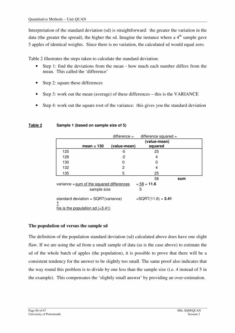
Interpretation of the standard deviation (sd) is straightforward: the greater the variation in the
data (the greater the spread), the higher the sd. Imagine the instance where a 4th
sample gave
5 apples of identical weights. Since there is no variation, the calculated sd would equal zero.
Table 2 illustrates the steps taken to calculate the standard deviation:
• Step 1: find the deviations from the mean - how much each number differs from the
mean. This called the ‘difference’
• Step 2: square these differences
• Step 3: work out the mean (average) of these differences – this is the VARIANCE
• Step 4: work out the square root of the variance: this gives you the standard deviation
Table 2 Sample 1 (based on sample size of 5)
difference = difference squared =
mean = 130 (value-mean) (value-mean)
squared
125 -5 25
128 -2 4
130 0 0
132 2 4
135 5 25
58 sum
variance = sum of the squared differences = 58 = 11.6
sample size 5
standard deviation = SQRT(variance) =SQRT(11.6) = 3.41
T his is the population sd (=3.41)
The population sd versus the sample sd
The definition of the population standard deviation (sd) calculated above does have one slight
flaw. If we are using the sd from a small sample of data (as is the case above) to estimate the
sd of the whole batch of apples (the population), it is possible to prove that there will be a
consistent tendency for the answer to be slightly too small. The same proof also indicates that
the way round this problem is to divide by one less than the sample size (i.e. 4 instead of 5 in
the example). This compensates the ‘slightly small answer’ by providing an over-estimation.
Quantitative Methods – Unit QUAN
MSc SQM\QUAN Page 61 of 67
Session 2 University of Portsmouth
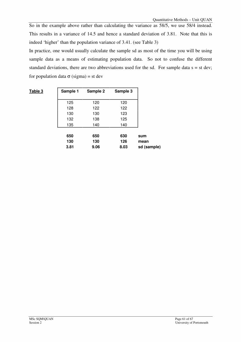
So in the example above rather than calculating the variance as 58/5, we use 58/4 instead.
This results in a variance of 14.5 and hence a standard deviation of 3.81. Note that this is
indeed ‘higher’ than the population variance of 3.41. (see Table 3)
In practice, one would usually calculate the sample sd as most of the time you will be using
sample data as a means of estimating population data. So not to confuse the different
standard deviations, there are two abbreviations used for the sd. For sample data s = st dev;
for population data σ (sigma) = st dev
Table 3 Sample 1 Sample 2 Sample 3
125 120 120
128 122 122
130 130 123
132 138 125
135 140 140
650 650 630 sum
130 130 126 mean
3.81 9.06 8.03 sd (sample)

Quantitative Methods – Unit QUAN
Page 62 of 67 MSc SQM\QUAN
University of Portsmouth Session 2
Alternative methods of finding the mean and standard deviation
The approach used above can be used with raw data. The formulae are modified if data is
presented as a frequency distribution.
Method 1: using the autosum menu (finding the mean)
The arrow to the right of the autosum button (Σ) on the standard toolbar allows the quick
calculation of selected summary statistics. In particular, the ‘average’ command will
calculate the mean of a set of numbers. This is illustrated below:
Step 1: Place the cursor in the cell in which you want the result recorded (c17). Access the
arrow to the right of the autosum button and select the ‘average’ option.
Quantitative Methods – Unit QUAN
MSc SQM\QUAN Page 63 of 67
Session 2 University of Portsmouth
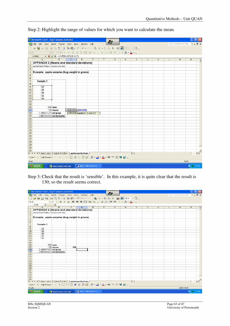
Step 2: Highlight the range of values for which you want to calculate the mean.
Step 3: Check that the result is ‘sensible’. In this example, it is quite clear that the result is
130; so the result seems correct.

Quantitative Methods – Unit QUAN
Page 64 of 67 MSc SQM\QUAN
University of Portsmouth Session 2
Method 1: using the autosum menu (finding the standard deviation)
The absence of a short-cut instruction for the calculation of the standard deviation deems it
necessary simply to use the ‘More functions’ option at the bottom of autosum list. The
resulting window gives a couple of options; the easiest way of finding the relevant function is
to use the ‘search’ box; the alternative is to look up the function under the ‘statistical’
category. The former method is illustrated below.
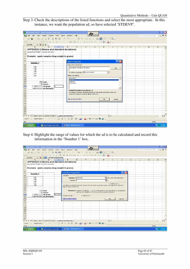
Step 1: Place the cursor in the cell in which the result is to be recorded (c18); access the
‘more functions’ menu on the autosum button.
Step 2: Type in ‘population standard deviation’ into the search box and press return.
Quantitative Methods – Unit QUAN
MSc SQM\QUAN Page 65 of 67
Session 2 University of Portsmouth
Step 3: Check the descriptions of the listed functions and select the most appropriate. In this
instance, we want the population sd, so have selected ‘STDEVP’.
Step 4: Highlight the range of values for which the sd is to be calculated and record this
information in the ‘Number 1’ box.
Quantitative Methods – Unit QUAN
Page 66 of 67 MSc SQM\QUAN
University of Portsmouth Session 2
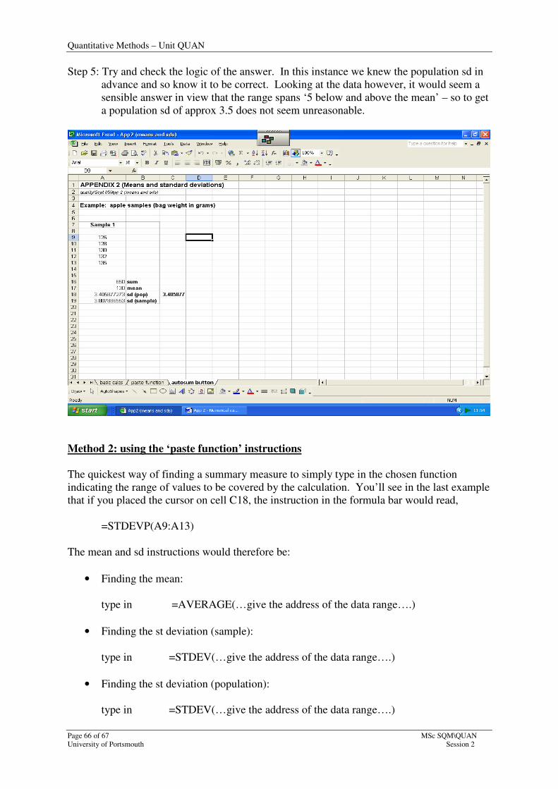
Step 5: Try and check the logic of the answer. In this instance we knew the population sd in
advance and so know it to be correct. Looking at the data however, it would seem a
sensible answer in view that the range spans ‘5 below and above the mean’ – so to get
a population sd of approx 3.5 does not seem unreasonable.
Method 2: using the ‘paste function’ instructions
The quickest way of finding a summary measure to simply type in the chosen function
indicating the range of values to be covered by the calculation. You’ll see in the last example
that if you placed the cursor on cell C18, the instruction in the formula bar would read,
=STDEVP(A9:A13)
The mean and sd instructions would therefore be:
• Finding the mean:
type in =AVERAGE(…give the address of the data range….)
• Finding the st deviation (sample):
type in =STDEV(…give the address of the data range….)
• Finding the st deviation (population):
type in =STDEV(…give the address of the data range….)
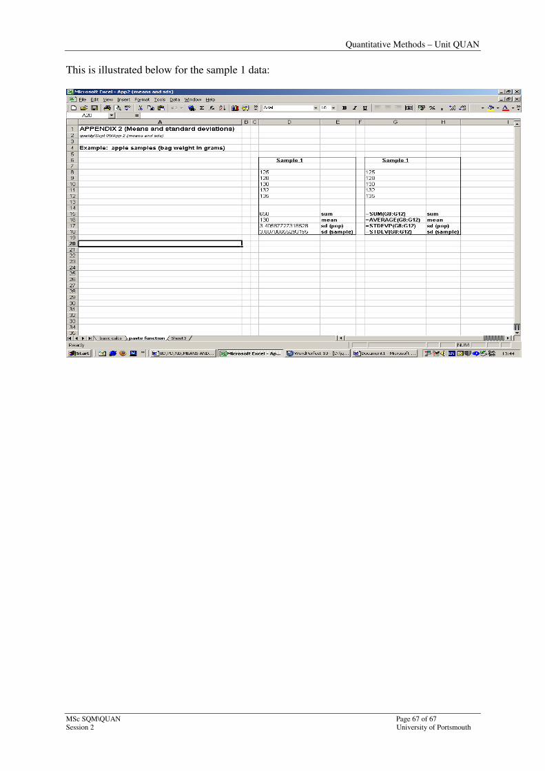
Quantitative Methods – Unit QUAN
MSc SQM\QUAN Page 67 of 67
Session 2 University of Portsmouth
This is illustrated below for the sample 1 data: