Embed Size (px)
Citation preview
Unit 7: Advanced Image Manipulation Techniques Lesson 4: Principles of Visual Message Design Using Infographic
Contents
Engage 1 Introduction 1 Objectives 3
Explore 3
Explain and Elaborate 4 Principles of Graphic Design 5
Extend 10 Activity 1 10 Activity 2 11
Evaluate 12
Wrap Up 15
Photo Credits 15
Bibliography 16
Unit 7: Advanced Image Manipulation Techniques
Engage
Introduction
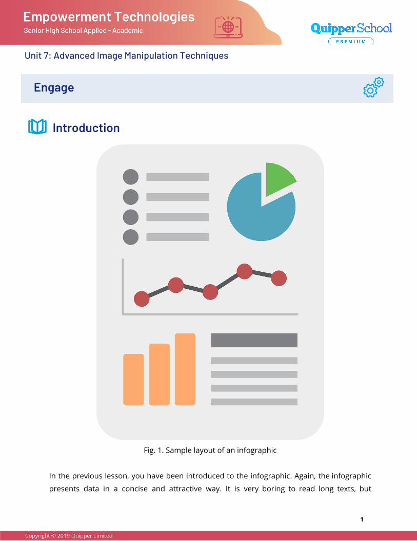
Fig. 1. Sample layout of an infographic
In the previous lesson, you have been introduced to the infographic. Again, the infographic
presents data in a concise and attractive way. It is very boring to read long texts, but
1
Unit 7: Advanced Image Manipulation Techniques
students must do it in order to understand their lessons and keep up with the discussion in
class. If you were given a choice, would you rather read a long text or study an infographic?
Infographics are fun, engaging, and easy to share. You can share it with just one click.
Students can use infographics to break down complex ideas or to explain difficult concepts
in simpler terms. Non-profit organizations use it to spread awareness about social issues or
causes. Can you create your own infographic? What would be your topic? Be sure that other
people will be interested in your topic. After all, infographics are supposed to inform people.
Before you can create an infographic, you need to start with the basics. Look at the picture
of the infographic layout on the previous page. What fundamentals of design are evident in
the infographic? Why are they arranged in such a way? What principles of graphic design
should be followed? How can you combine text and images properly?
Objectives
In this lesson, you should be able to do the following
● Understand the principles of graphic design.
● Sketch an infographic using the principles of design.
● Combine text and graphics properly.
DepEd Competency
Evaluate existing websites and online resources based on the principles of layout,
graphic, and visual message design. (CS_ICT11/12-ICTPT-Ie-f-6)
2
Unit 7: Advanced Image Manipulation Techniques
Explore
15 minutes Your mother asked you to calculate your expenses this school year so that she can give you
enough allowance everyday. Sketch an infographic about your weekly allowance as a
student. When you are done drawing your infographic, show it to your partner. Answer the
following questions based on your partner’s infographic.
Guide Questions
1. What do you like about your partner’s infographic?
2. What fundamentals of design did your partner use? Were the fundamentals used
properly? Why or why not?
3. How can your partner’s infographic be improved?
3
Unit 7: Advanced Image Manipulation Techniques
Explain and Elaborate Principles of Graphic Design Designs are most attractive and most effective in conveying the desired message when the
principles of graphic design are followed. It has been mentioned before that infographics
can be easily shared. As it is, you probably do not want an ineffective and unattractive
infographic to be credited to your name. After all, netizens can be harsh. When you follow
the principles of graphic design, your skills in designing will improve greatly and it is
expected that you will create an effective and attractive product.
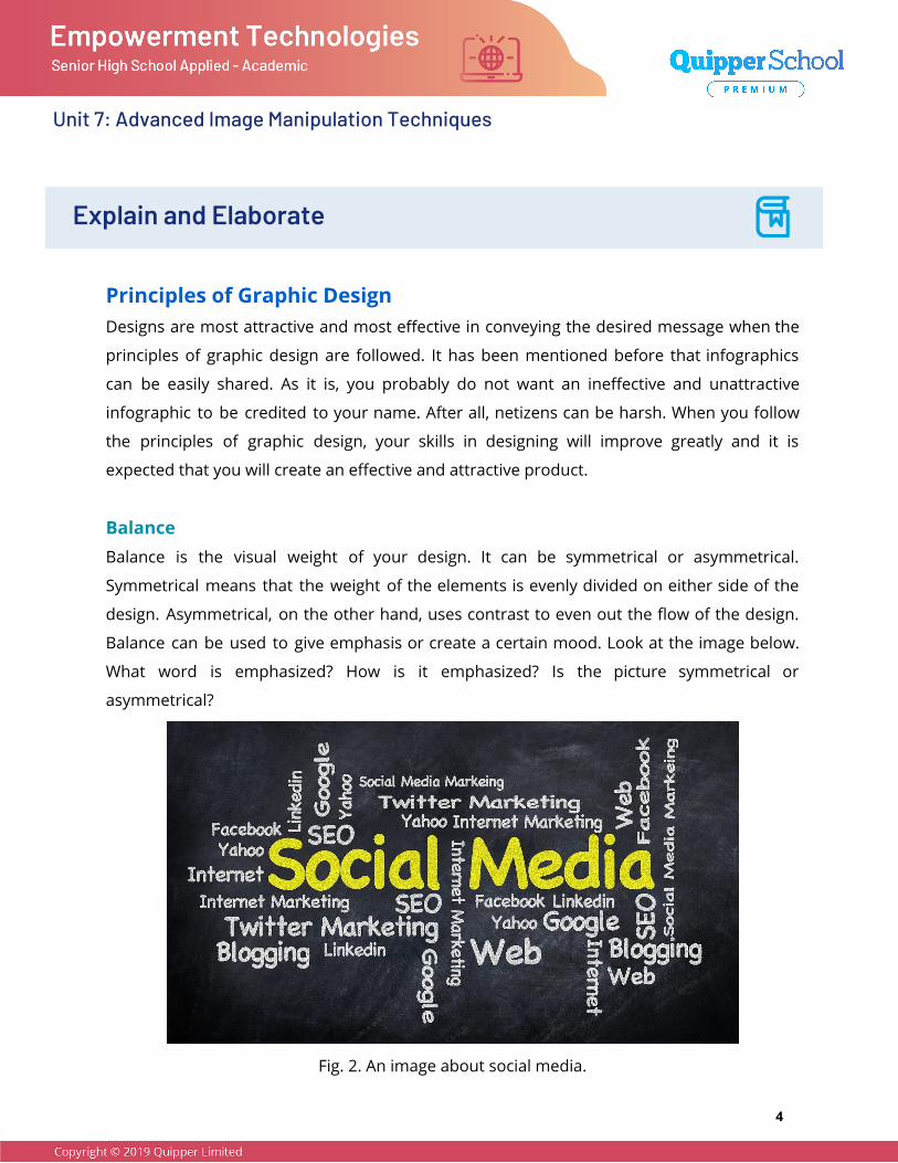
Balance Balance is the visual weight of your design. It can be symmetrical or asymmetrical.
Symmetrical means that the weight of the elements is evenly divided on either side of the
design. Asymmetrical, on the other hand, uses contrast to even out the flow of the design.
Balance can be used to give emphasis or create a certain mood. Look at the image below.
What word is emphasized? How is it emphasized? Is the picture symmetrical or
asymmetrical?
Fig. 2. An image about social media.
4
Unit 7: Advanced Image Manipulation Techniques
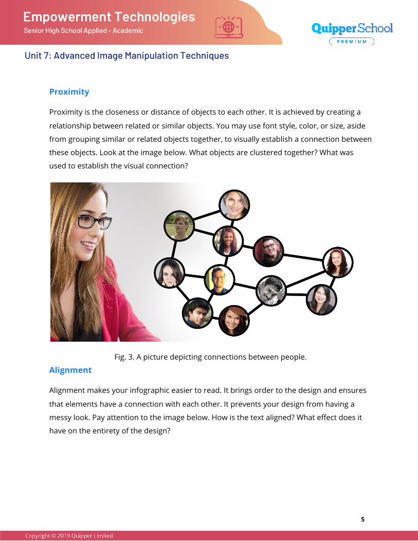
Proximity
Proximity is the closeness or distance of objects to each other. It is achieved by creating a
relationship between related or similar objects. You may use font style, color, or size, aside
from grouping similar or related objects together, to visually establish a connection between
these objects. Look at the image below. What objects are clustered together? What was
used to establish the visual connection?
Fig. 3. A picture depicting connections between people.
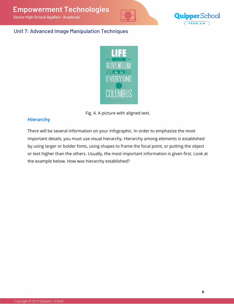
Alignment
Alignment makes your infographic easier to read. It brings order to the design and ensures
that elements have a connection with each other. It prevents your design from having a
messy look. Pay attention to the image below. How is the text aligned? What effect does it
have on the entirety of the design?
5
Unit 7: Advanced Image Manipulation Techniques
Fig. 4. A picture with aligned text. Hierarchy
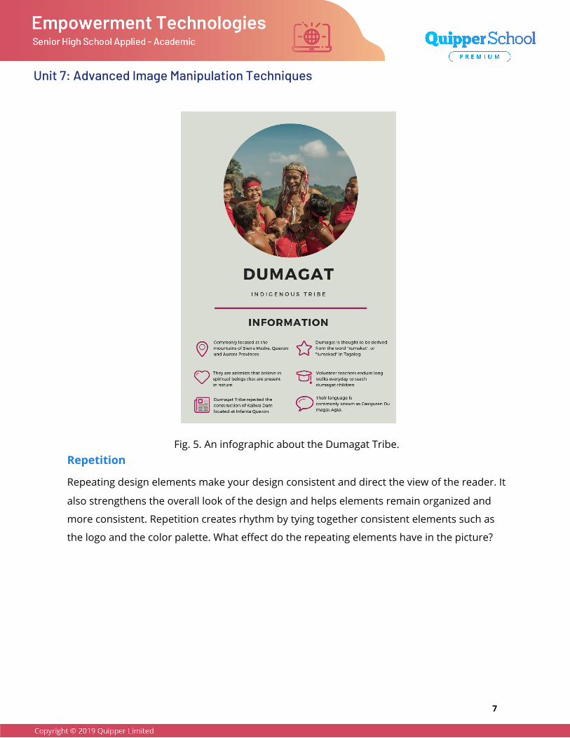
There will be several information on your infographic. In order to emphasize the most
important details, you must use visual hierarchy. Hierarchy among elements is established
by using larger or bolder fonts, using shapes to frame the focal point, or putting the object
or text higher than the others. Usually, the most important information is given first. Look at
the example below. How was hierarchy established?
6
Unit 7: Advanced Image Manipulation Techniques
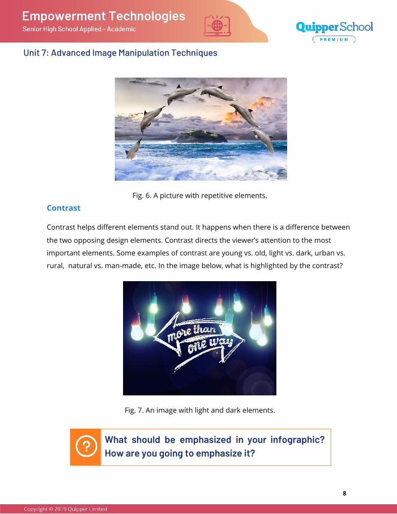
Fig. 5. An infographic about the Dumagat Tribe. Repetition
Repeating design elements make your design consistent and direct the view of the reader. It
also strengthens the overall look of the design and helps elements remain organized and
more consistent. Repetition creates rhythm by tying together consistent elements such as
the logo and the color palette. What effect do the repeating elements have in the picture?
7
Unit 7: Advanced Image Manipulation Techniques
Fig. 6. A picture with repetitive elements.
Contrast
Contrast helps different elements stand out. It happens when there is a difference between
the two opposing design elements. Contrast directs the viewer’s attention to the most
important elements. Some examples of contrast are young vs. old, light vs. dark, urban vs.
rural, natural vs. man-made, etc. In the image below, what is highlighted by the contrast?
Fig. 7. An image with light and dark elements.
What should be emphasized in your infographic? How are you going to emphasize it?
8
Unit 7: Advanced Image Manipulation Techniques
Extend
Activity 1 Based on the feedback of your partner, revise the sketch of your infographic. Draw your
new infographic in the box below.
Guide
Remember the principles of graphic design and apply it to your revised infographic
to make it appealing and easy to understand.
9
Unit 7: Advanced Image Manipulation Techniques
Activity 2 In your opinion, what is the most important principle that designers should take into
consideration when making an infographic? Is it applicable to other professions such as web
designer or photographer? Why? Why not? Explain your answer.
Guide
Balance is the visual weight of your design.
Proximity is the closeness or distance of objects to each other.
Alignment ensures that elements have a connection with each other.
Hierarchy emphasizes the most important details through visual organization.
Repetition creates rhythm by tying together consistent elements.
Contrast helps different elements stand out.
10
Unit 7: Advanced Image Manipulation Techniques
Evaluate
A. Answer the following completely in your own words.
1. Give one principle of graphic design. How did you use this principle in your
infographic?
2. How can you direct the viewer’s attention using the principles of design?
3. What is the difference between the fundamentals of design and the principles of
design?
11
Unit 7: Advanced Image Manipulation Techniques
4. What are the advantages of using an infographic?
5. Why is alignment important?
B. Answer the following comprehensively.
1. Why should you use the principles of design in making your infographic?
2. Look at the picture below. What principles are evident in the picture? Write your
answer on the box below the picture.
12
Unit 7: Advanced Image Manipulation Techniques
3. Give one principle evident in the picture in number two and explain how that
principle was used.
4. What effect did using the principle have on the image?
13
Unit 7: Advanced Image Manipulation Techniques
5. Read the statement below.
You don’t need to be a pro-designer to create highly shareable content (Copperman,
2016).
Do you agree or disagree with the statement? Explain your answer.
Wrap Up ___________________________________________________________________________________________
● The principles of design can direct the viewer’s attention to the most important
data.
● Infographics present data in a concise and attractive manner.
● Different principles can create different effects on the layout of your infographics.
___________________________________________________________________________________________
Photo Credits
Infographic Design by UnboxScience from Pixabay via Pixabay.
Social Media by Kevin King from Pixabay via Pixabay.
Woman Face Photomontage by Gerd Altmann from Pixabay via Pixabay.
Inspirational Quotes by EJF_Design from Pixabay via Pixabay.
Dolphin Marine Mammals by Gerhard Gellinger from Pixabay via Pixabay.
14
Unit 7: Advanced Image Manipulation Techniques
Arrow Directory Signposts by Gerd Altmann from Pixabay via Pixabay.
Home Virus Covid-19 by hurufa from Pixabay via Pixabay.
Bibliography
Rawal, Anahat. “10 Basic Principles of Graphic Design.” Medium, July 12, 2018.
https://medium.com/@anahatrawal/10-basic-principles-of-graphic-design-b74be0db
db58
Burrage, Kim. “The Six Main Principles for Graphic Design.” trident, September 3, 2016.
https://www.wearetrident.co.uk/six-main-principles-graphic-design/
Copperman, Amy. “8 Basic Principles of Design to Help You Create Awesome Graphics.”
Adobe Spark, July 27, 2016.
https://blog.adobespark.com/2016/07/27/8-basic-design-principles-to-help-you-creat
e-better-graphics/
Sheikh, Mahnoor. “What is an Infographic? (Examples, Tips and Templates).” visme. Accessed
May 18, 2020. https://visme.co/blog/what-is-an-infographic/
15


![[BL] Spinal Manipulation Made Simple A Manual of Soft Tissue Techniques#2.pdf](https://img.pdfslide.us/doc/110x75/577ca70b1a28abea748c2a9c/bl-spinal-manipulation-made-simple-a-manual-of-soft-tissue-techniques2pdf.jpg)


