Embed Size (px)
Citation preview

60
UNIT 3 Relationships
Topics Covered in this Unit Include: Interpreting Graphs, Scatter Plot Graphs, Line of Best Fit, First Differences, Linear and Non-Linear Evaluations Given this Unit (Record Your Marks Here) Assignment - Sunflowers Unit Test
61
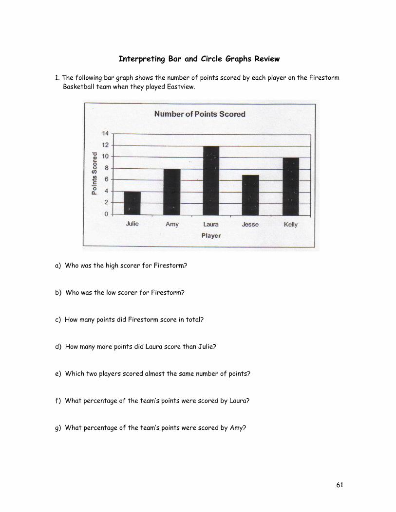
Interpreting Bar and Circle Graphs Review
1. The following bar graph shows the number of points scored by each player on the Firestorm Basketball team when they played Eastview.
a) Who was the high scorer for Firestorm? b) Who was the low scorer for Firestorm? c) How many points did Firestorm score in total? d) How many more points did Laura score than Julie? e) Which two players scored almost the same number of points? f) What percentage of the team’s points were scored by Laura? g) What percentage of the team’s points were scored by Amy?
62
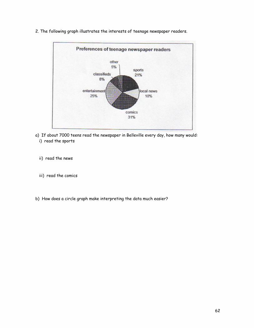
2. The following graph illustrates the interests of teenage newspaper readers. a) If about 7000 teens read the newspaper in Belleville every day, how many would: i) read the sports ii) read the news iii) read the comics b) How does a circle graph make interpreting the data much easier?
63
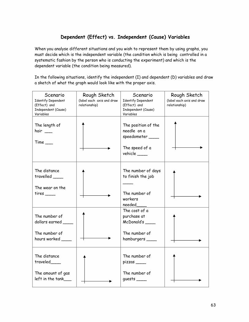
Dependent (Effect) vs. Independent (Cause) Variables
When you analyse different situations and you wish to represent them by using graphs, you must decide which is the independent variable (the condition which is being controlled in a systematic fashion by the person who is conducting the experiment) and which is the dependent variable (the condition being measured). In the following situations, identify the independent (I) and dependent (D) variables and draw a sketch of what the graph would look like with the proper axis.
Scenario Identify Dependent (Effect) and Independent (Cause) Variables
Rough Sketch (label each axis and draw relationship)
Scenario Identify Dependent (Effect) and Independent (Cause) Variables
Rough Sketch (label each axis and draw relationship)
The length of hair ___ Time ___
The position of the needle on a speedometer ____ The speed of a vehicle ____
The distance travelled ____ The wear on the tires ____
The number of days to finish the job ____ The number of workers needed____
The number of dollars earned ____ The number of hours worked ____
The cost of a purchase at McDonald’s ____ The number of hamburgers ____
The distance traveled____ The amount of gas left in the tank___
The number of pizzas ____ The number of guests ____
64
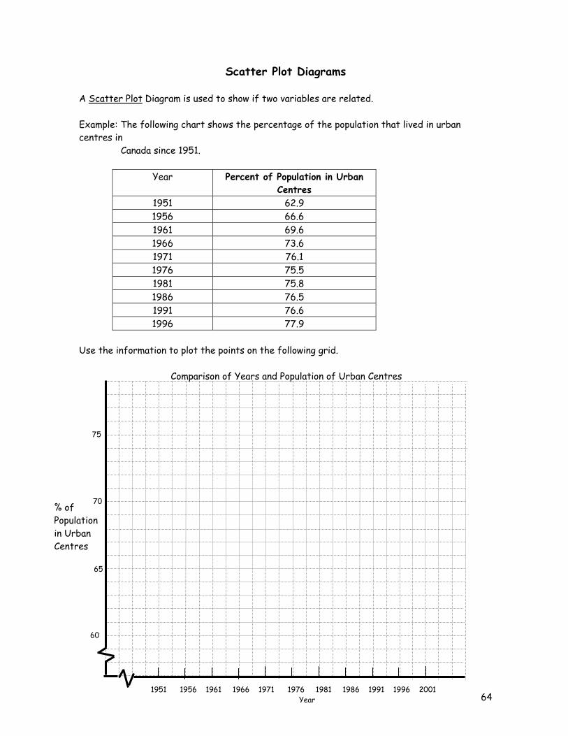
Scatter Plot Diagrams A Scatter Plot Diagram is used to show if two variables are related. Example: The following chart shows the percentage of the population that lived in urban centres in Canada since 1951.
Year Percent of Population in Urban Centres
1951 62.9 1956 66.6 1961 69.6 1966 73.6 1971 76.1 1976 75.5 1981 75.8 1986 76.5 1991 76.6 1996 77.9
Use the information to plot the points on the following grid. Comparison of Years and Population of Urban Centres
1951 1956 1961 1966 1971 1976 1981 1986 1991 1996 2001 Year
60
65
70
75
% of Population in Urban Centres
65
Things to Note: 1) The break in the line to show the portion of the graph that contains the data. 2) Always give the graph a title and label the axes. 3) When graphing the independent variable is placed on the horizontal axis. Based on what you see in the graph, is there a relationship between the year and the percentage of the population that lives in urban centres? Explain your answer. ________________________________________________________________________________________________________________________________________________________________________________________________________________________________________________________________________________________________________________________________________________________________________________________________________________________________________________________________________________________________________________________________________________________________________________________________________________________________________ How could you use a scatter plot diagram and a survey in your class to determine if there is a relationship between height and foot size in the general student population. ________________________________________________________________________________________________________________________________________________________________________________________________________________________________________________________________________________________________________________________________________________________________________________________________________________________________________________________________________________________________________________________________________________________________________________________________________________________________________________________________________________________________________________________________________________________________________________________________________________________
66
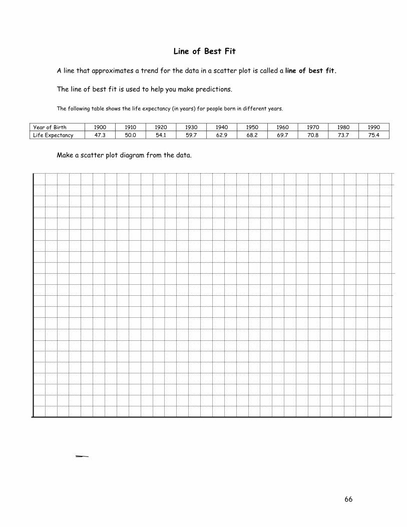
Line of Best Fit A line that approximates a trend for the data in a scatter plot is called a line of best fit. The line of best fit is used to help you make predictions. The following table shows the life expectancy (in years) for people born in different years.
Year of Birth 1900 1910 1920 1930 1940 1950 1960 1970 1980 1990 Life Expectancy 47.3 50.0 54.1 59.7 62.9 68.2 69.7 70.8 73.7 75.4
Make a scatter plot diagram from the data.

67
A line of best fit shows the pattern and direction of the points on a scatter plot. A line of best fit passes through as many points as possible, with the remaining points grouped equally above and below the line. Draw a line of best fit on the scatter plot that you created. A line of best fit can be used to make predictions for values not actually recorded in the data. When the prediction involves a point within the range of values of the independent variable, this is called interpolating. When the value of the independent variable falls outside the range of recorded data, it is called extrapolating. Use your scatter plot and line of best fit to predict the life expectancy for people born in.... a) 1978 is this interpolating or extrapolating? b) 1994 is this interpolating or extrapolating?
68
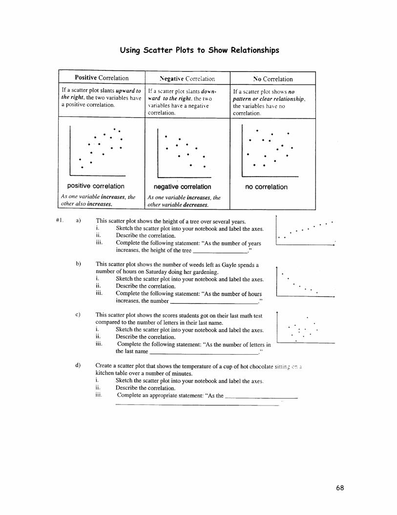
Using Scatter Plots to Show Relationships
69
70
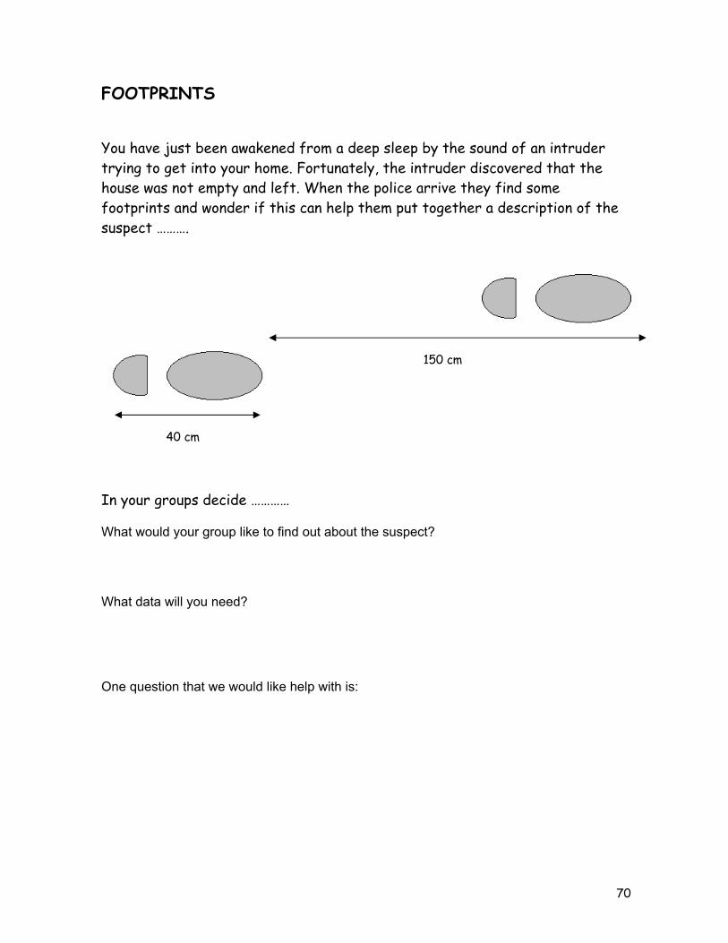
FOOTPRINTS You have just been awakened from a deep sleep by the sound of an intruder trying to get into your home. Fortunately, the intruder discovered that the house was not empty and left. When the police arrive they find some footprints and wonder if this can help them put together a description of the suspect ………. In your groups decide ………… What would your group like to find out about the suspect?
What data will you need?
One question that we would like help with is:
40 cm
150 cm
71
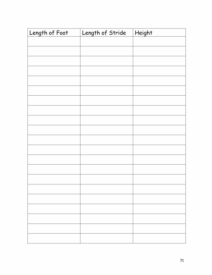
Length of Foot Length of Stride Height

72
Suspect Profile Report A. Evidence for the case Foot length: Stride length: B. Focus of the investigation Our team investigated C. Results of the investigation The results of our investigation determined that the suspect D. Process of the inquiry Describe what you did to solve this problem. Note: All information to support your conclusions must be submitted with this report.

73
Forensic Analysis Scatter Plot Anthropologists and forensic scientists use data to help them determine information about people. Often only a few bones are available or the evidence is in inconclusive. In spite of these difficulties, by accessing the information in large databases and investigating relationships between data scientists can determine information about the height, age, and sex of the person they are examining. 1. Use the table below to construct a graph. 2. Circle the point on the graph that represents the data for a radius that is 21.9 cm long.
How long is the humerus? _____________. 3. Put a box around the point on the graph that represents the data for a humerus that is
27.1 cm long. How long is the radius? ______________. 4. Underline the statement that describes the direction of the plotted points in the graph?
• The plotted points rise upward to the right. • The plotted points fall downward to the right. • The plotted points are scattered across the graph. • The plotted points lie flat along the horizontal.
5. As the length of the radius gets longer, what happens to the length of the humerus? 6. Do you think that you can use the length of the radius to predict the length of the humerus? Explain. 7. Do you think that you can use the length of the humerus to predict the length of the radius? Explain.
Radius (cm)
Humerus (cm)
25 29.7 22 26.5
23.5 27.1 22.5 26 23 28
22.6 25.2 21.4 24 21.9 23.8 23.5 26.7 24.3 29 24 27
74
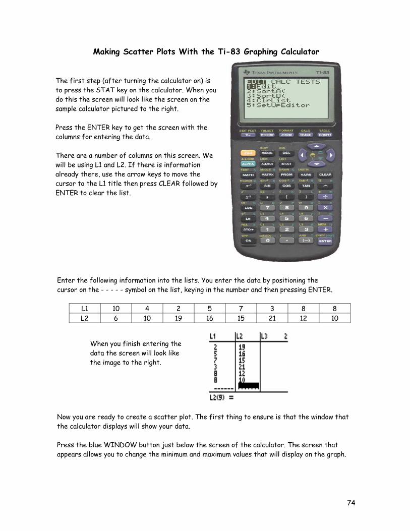
Making Scatter Plots With the Ti-83 Graphing Calculator
Enter the following information into the lists. You enter the data by positioning the cursor on the - - - - - symbol on the list, keying in the number and then pressing ENTER.
L1 10 4 2 5 7 3 8 8 L2 6 10 19 16 15 21 12 10
Now you are ready to create a scatter plot. The first thing to ensure is that the window that the calculator displays will show your data. Press the blue WINDOW button just below the screen of the calculator. The screen that appears allows you to change the minimum and maximum values that will display on the graph.
The first step (after turning the calculator on) is to press the STAT key on the calculator. When you do this the screen will look like the screen on the sample calculator pictured to the right. Press the ENTER key to get the screen with the columns for entering the data. There are a number of columns on this screen. We will be using L1 and L2. If there is information already there, use the arrow keys to move the cursor to the L1 title then press CLEAR followed by ENTER to clear the list.
When you finish entering the data the screen will look like the image to the right.
75
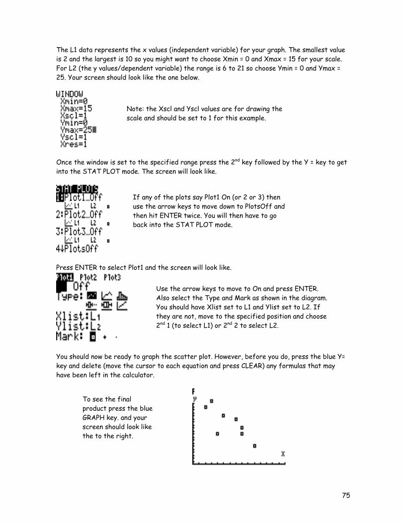
The L1 data represents the x values (independent variable) for your graph. The smallest value is 2 and the largest is 10 so you might want to choose Xmin = 0 and Xmax = 15 for your scale. For L2 (the y values/dependent variable) the range is 6 to 21 so choose Ymin = 0 and Ymax = 25. Your screen should look like the one below.
Once the window is set to the specified range press the 2nd key followed by the Y = key to get into the STAT PLOT mode. The screen will look like.
Press ENTER to select Plot1 and the screen will look like.
You should now be ready to graph the scatter plot. However, before you do, press the blue Y= key and delete (move the cursor to each equation and press CLEAR) any formulas that may have been left in the calculator.
Note: the Xscl and Yscl values are for drawing the scale and should be set to 1 for this example.
If any of the plots say Plot1 On (or 2 or 3) then use the arrow keys to move down to PlotsOff and then hit ENTER twice. You will then have to go back into the STAT PLOT mode.
Use the arrow keys to move to On and press ENTER. Also select the Type and Mark as shown in the diagram. You should have Xlist set to L1 and Ylist set to L2. If they are not, move to the specified position and choose 2nd 1 (to select L1) or 2nd 2 to select L2.
To see the final product press the blue GRAPH key. and your screen should look like the to the right.
76
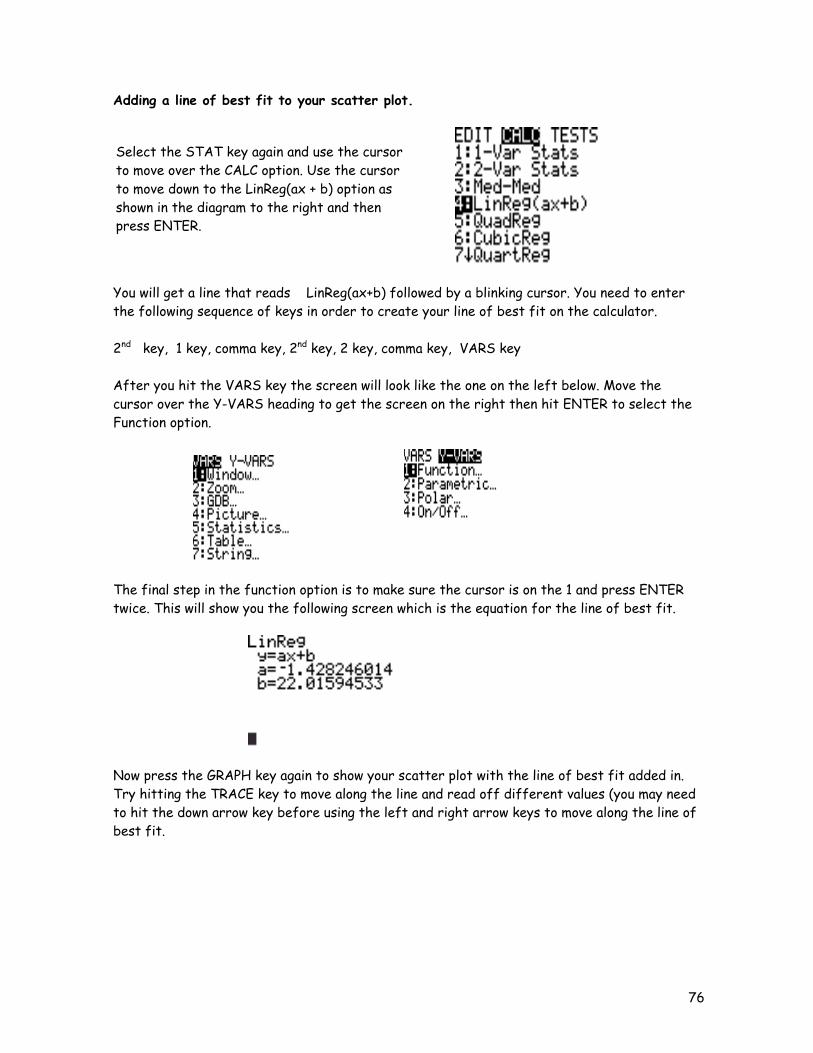
Adding a line of best fit to your scatter plot.
You will get a line that reads LinReg(ax+b) followed by a blinking cursor. You need to enter the following sequence of keys in order to create your line of best fit on the calculator. 2nd key, 1 key, comma key, 2nd key, 2 key, comma key, VARS key After you hit the VARS key the screen will look like the one on the left below. Move the cursor over the Y-VARS heading to get the screen on the right then hit ENTER to select the Function option.
The final step in the function option is to make sure the cursor is on the 1 and press ENTER twice. This will show you the following screen which is the equation for the line of best fit.
Now press the GRAPH key again to show your scatter plot with the line of best fit added in. Try hitting the TRACE key to move along the line and read off different values (you may need to hit the down arrow key before using the left and right arrow keys to move along the line of best fit.
Select the STAT key again and use the cursor to move over the CALC option. Use the cursor to move down to the LinReg(ax + b) option as shown in the diagram to the right and then press ENTER.
77
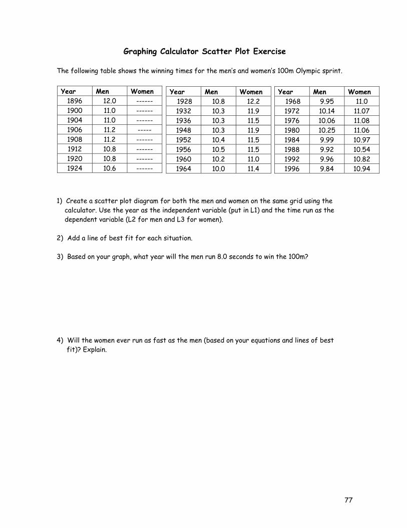
Graphing Calculator Scatter Plot Exercise The following table shows the winning times for the men’s and women’s 100m Olympic sprint. 1) Create a scatter plot diagram for both the men and women on the same grid using the calculator. Use the year as the independent variable (put in L1) and the time run as the dependent variable (L2 for men and L3 for women). 2) Add a line of best fit for each situation. 3) Based on your graph, what year will the men run 8.0 seconds to win the 100m? 4) Will the women ever run as fast as the men (based on your equations and lines of best fit)? Explain.
Year Men Women 1896 12.0 ------ 1900 11.0 ------ 1904 11.0 ------ 1906 11.2 ----- 1908 11.2 ------ 1912 10.8 ------ 1920 10.8 ------ 1924 10.6 ------
Year Men Women 1928 10.8 12.2 1932 10.3 11.9 1936 10.3 11.5 1948 10.3 11.9 1952 10.4 11.5 1956 10.5 11.5 1960 10.2 11.0 1964 10.0 11.4
Year Men Women 1968 9.95 11.0 1972 10.14 11.07 1976 10.06 11.08 1980 10.25 11.06 1984 9.99 10.97 1988 9.92 10.54 1992 9.96 10.82 1996 9.84 10.94

78
First Differences Problem 1 – Part A Jody works at a factory that produces square tiles for bathrooms and kitchens. She helps determine shipping costs by calculating the perimeter of each tile. Calculate the perimeter (remember perimeter is the distance around the tile) and record your observations in column 2.
Side Length
(cm)
Perimeter (cm) First Differences
1
2 3 4 5
Describe what happens to the perimeter of each tile when the side length increases by one centimetre. Construct a graph of the perimeter of a tile vs. the side length of the tile. a) Which variable is the independent variable? b) Which variable is the dependent variable? c) Use the graph to describe the relationship between the perimeter and side length of a tile. d) Describe the shape of the graph. Calculate the first differences in column 3 of the table. What do you notice about the first differences? Summarize your observations. a) When the side length increases by one centimetre, the perimeter increases by b) The plotted points suggest a c) The first differences are
79
First Differences (continued)
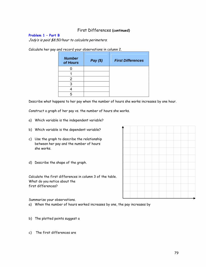
Problem 1 – Part B Jody’s is paid $8.50/hour to calculate perimeters. Calculate her pay and record your observations in column 2.
Number of Hours Pay ($) First Differences
0 1 2 3 4 5
Describe what happens to her pay when the number of hours she works increases by one hour. Construct a graph of her pay vs. the number of hours she works. a) Which variable is the independent variable? b) Which variable is the dependent variable? c) Use the graph to describe the relationship between her pay and the number of hours she works. d) Describe the shape of the graph. Calculate the first differences in column 3 of the table. What do you notice about the first differences? Summarize your observations. a) When the number of hours worked increases by one, the pay increases by b) The plotted points suggest a c) The first differences are

80
First Differences (continued) Problem 1 – Part C Raj, another employee at the factory, also works with the tiles. He helps to determine the shipping costs by calculating the area of each tile and recording his calculations in the table. Calculate the area (remember area = length x width) and record your observations in column 2.
Length of sides (cm) Area (cm2) First Differences
1 2 3 4 5
Describe what happens to the area of each tile when the side length of a tile is increases by one centimetre. Construct a graph of area vs. the length of the sides of the tiles. a) Which variable is the independent variable? b) Which variable is the dependent variable? c) Use the graph to describe the relationship between the area and the side length of the tile. d) Describe the shape of the graph. Calculate the first differences in column 3 of the table. What do you notice about the
first differences? Summarize your observations. a) When the side length increases by one centimetre, the area increases by b) The plotted points suggest a c) The first differences are
81
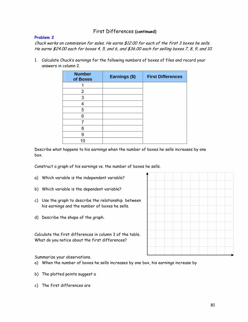
First Differences (continued) Problem 2 Chuck works on commission for sales. He earns $12.00 for each of the first 3 boxes he sells. He earns $24.00 each for boxes 4, 5, and 6, and $36.00 each for selling boxes 7, 8, 9, and 10. 1. Calculate Chuck’s earnings for the following numbers of boxes of files and record your
answers in column 2.
Number of Boxes Earnings ($) First Differences
1 2 3 4 5 6 7 8 9
10
Describe what happens to his earnings when the number of boxes he sells increases by one box. Construct a graph of his earnings vs. the number of boxes he sells. a) Which variable is the independent variable? b) Which variable is the dependent variable? c) Use the graph to describe the relationship between
his earnings and the number of boxes he sells. d) Describe the shape of the graph. Calculate the first differences in column 3 of the table. What do you notice about the first differences? Summarize your observations. a) When the number of boxes he sells increases by one box, his earnings increase by b) The plotted points suggest a c) The first differences are
82
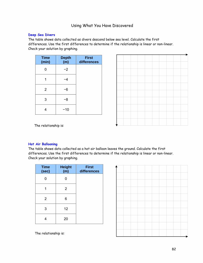
Using What You Have Discovered Deep Sea Divers The table shows data collected as divers descend below sea level. Calculate the first differences. Use the first differences to determine if the relationship is linear or non-linear. Check your solution by graphing.
Time (min)
Depth (m)
First differences
0 −2
1 −4
2 −6
3 −8
4 −10
The relationship is: Hot Air Ballooning The table shows data collected as a hot air balloon leaves the ground. Calculate the first differences. Use the first differences to determine if the relationship is linear or non-linear. Check your solution by graphing.
Time (sec)
Height (m)
First differences
0 0
1 2
2 6
3 12
4 20
The relationship is:
83
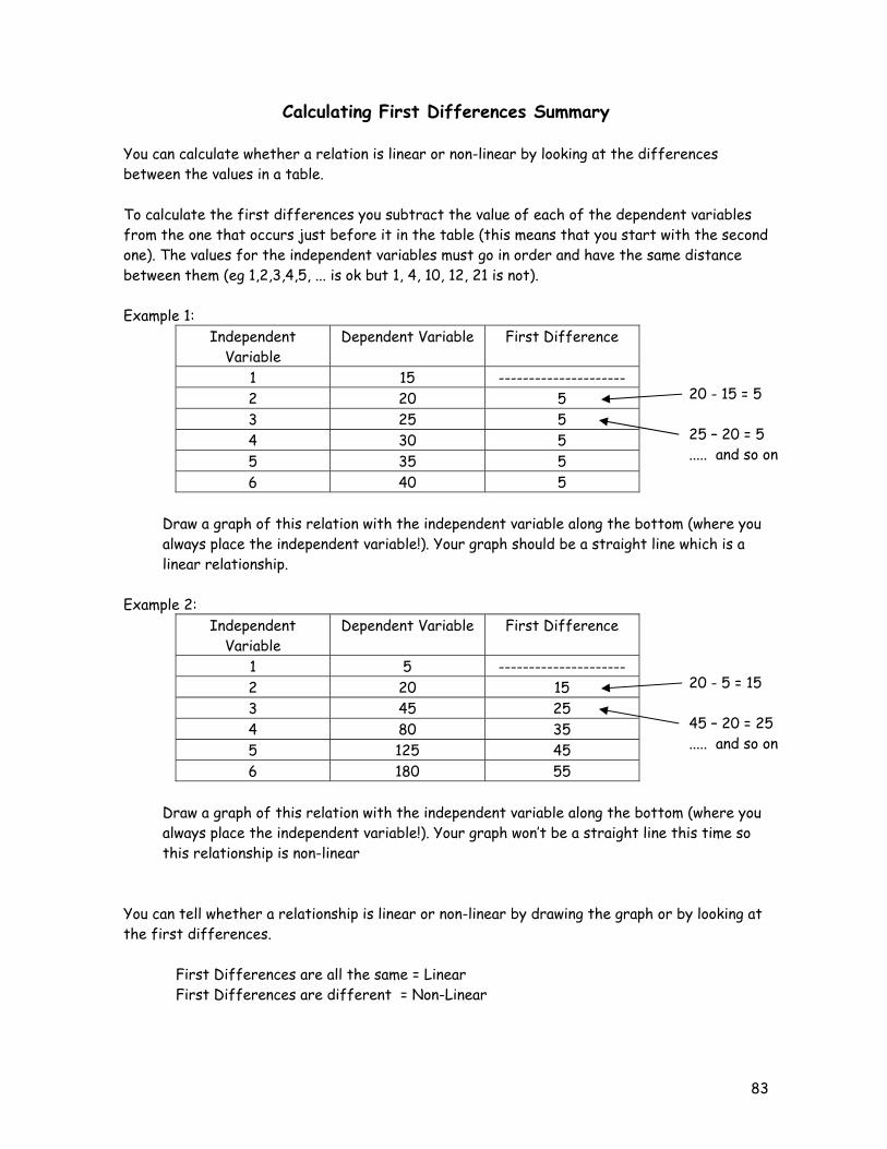
Calculating First Differences Summary You can calculate whether a relation is linear or non-linear by looking at the differences between the values in a table. To calculate the first differences you subtract the value of each of the dependent variables from the one that occurs just before it in the table (this means that you start with the second one). The values for the independent variables must go in order and have the same distance between them (eg 1,2,3,4,5, ... is ok but 1, 4, 10, 12, 21 is not). Example 1:
Independent Variable
Dependent Variable First Difference
1 15 --------------------- 2 20 5 3 25 5 4 30 5 5 35 5 6 40 5
Draw a graph of this relation with the independent variable along the bottom (where you always place the independent variable!). Your graph should be a straight line which is a linear relationship. Example 2:
Independent Variable
Dependent Variable First Difference
1 5 --------------------- 2 20 15 3 45 25 4 80 35 5 125 45 6 180 55
Draw a graph of this relation with the independent variable along the bottom (where you always place the independent variable!). Your graph won’t be a straight line this time so this relationship is non-linear You can tell whether a relationship is linear or non-linear by drawing the graph or by looking at the first differences. First Differences are all the same = Linear First Differences are different = Non-Linear
20 - 15 = 5 25 – 20 = 5 ..... and so on
20 - 5 = 15 45 – 20 = 25 ..... and so on
84
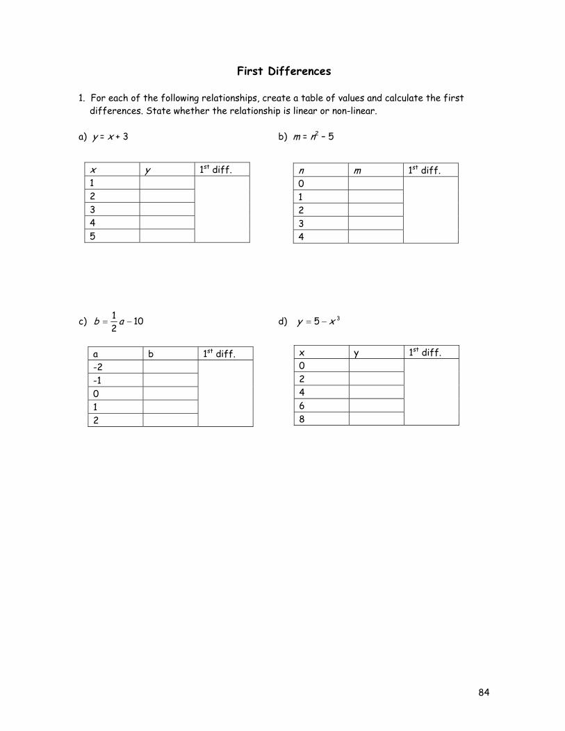
First Differences 1. For each of the following relationships, create a table of values and calculate the first differences. State whether the relationship is linear or non-linear. a) y = x + 3 b) m = n2 – 5
c) 1021
−= ab d) 35 xy −=
x y 1st diff. 1 2 3 4 5
n m 1st diff. 0 1 2 3 4
a b 1st diff. -2 -1 0 1 2
x y 1st diff. 0 2 4 6 8
85
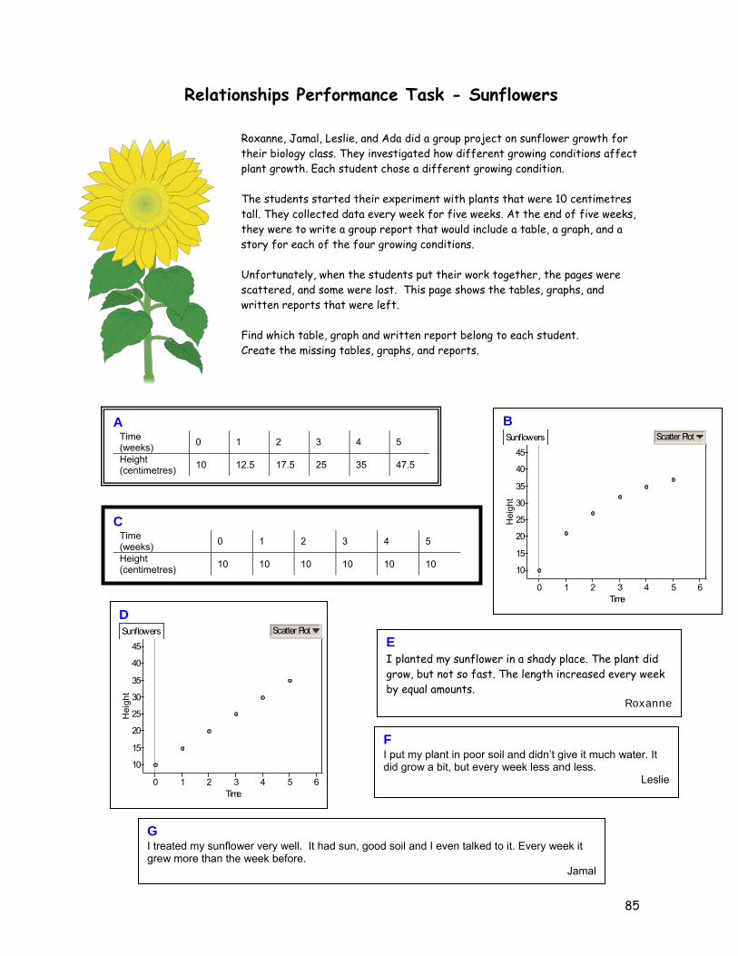
Relationships Performance Task - Sunflowers
Roxanne, Jamal, Leslie, and Ada did a group project on sunflower growth for their biology class. They investigated how different growing conditions affect plant growth. Each student chose a different growing condition. The students started their experiment with plants that were 10 centimetres tall. They collected data every week for five weeks. At the end of five weeks, they were to write a group report that would include a table, a graph, and a story for each of the four growing conditions. Unfortunately, when the students put their work together, the pages were scattered, and some were lost. This page shows the tables, graphs, and written reports that were left. Find which table, graph and written report belong to each student. Create the missing tables, graphs, and reports.
C Time (weeks) 0 1 2 3 4 5
Height (centimetres) 10 10 10 10 10 10
G I treated my sunflower very well. It had sun, good soil and I even talked to it. Every week it grew more than the week before.
Jamal
D
Hei
ght
10
15
20
25
30
35
40
45
Time0 1 2 3 4 5 6
Sunflowers Scatter Plot
A Time (weeks) 0 1 2 3 4 5
Height (centimetres) 10 12.5 17.5 25 35 47.5
E I planted my sunflower in a shady place. The plant did grow, but not so fast. The length increased every week by equal amounts.
Roxanne
B
Hei
ght
10
15
20
25
30
35
40
45
Time0 1 2 3 4 5 6
Sunflowers Scatter Plot
F I put my plant in poor soil and didn’t give it much water. It did grow a bit, but every week less and less.
Leslie
86
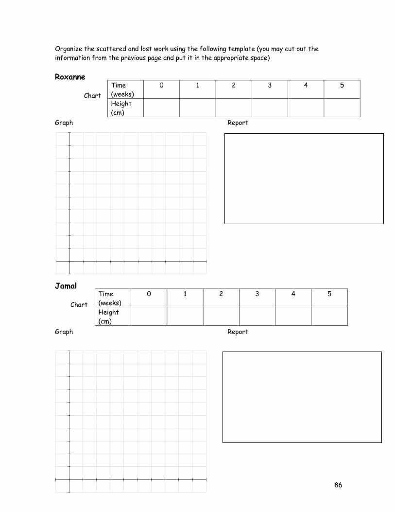
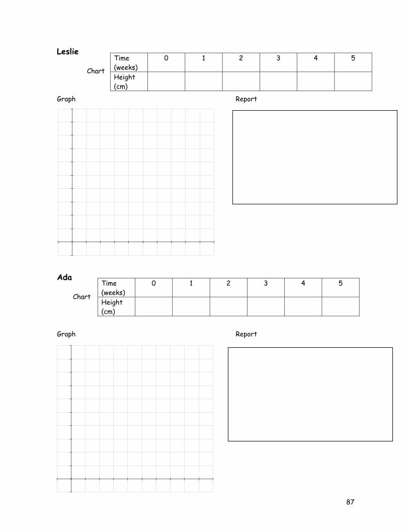
Organize the scattered and lost work using the following template (you may cut out the information from the previous page and put it in the appropriate space) Roxanne Chart Graph Report Jamal Chart Graph Report
Time (weeks)
0 1 2 3 4 5
Height (cm)
Time (weeks)
0 1 2 3 4 5
Height (cm)
87
Leslie Chart Graph Report Ada Chart Graph Report
Time (weeks)
0 1 2 3 4 5
Height (cm)
Time (weeks)
0 1 2 3 4 5
Height (cm)
88
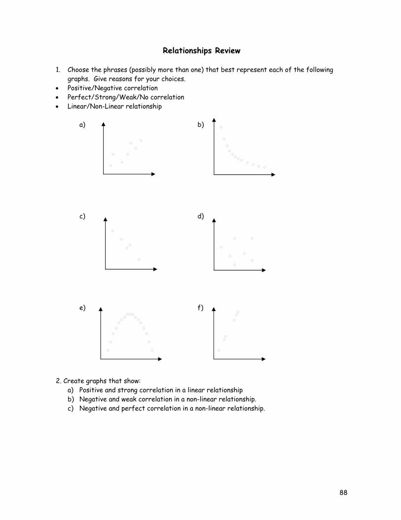
Relationships Review 1. Choose the phrases (possibly more than one) that best represent each of the following
graphs. Give reasons for your choices. • Positive/Negative correlation • Perfect/Strong/Weak/No correlation • Linear/Non-Linear relationship
a) b) c) d) e) f) 2. Create graphs that show:
a) Positive and strong correlation in a linear relationship b) Negative and weak correlation in a non-linear relationship. c) Negative and perfect correlation in a non-linear relationship.
89
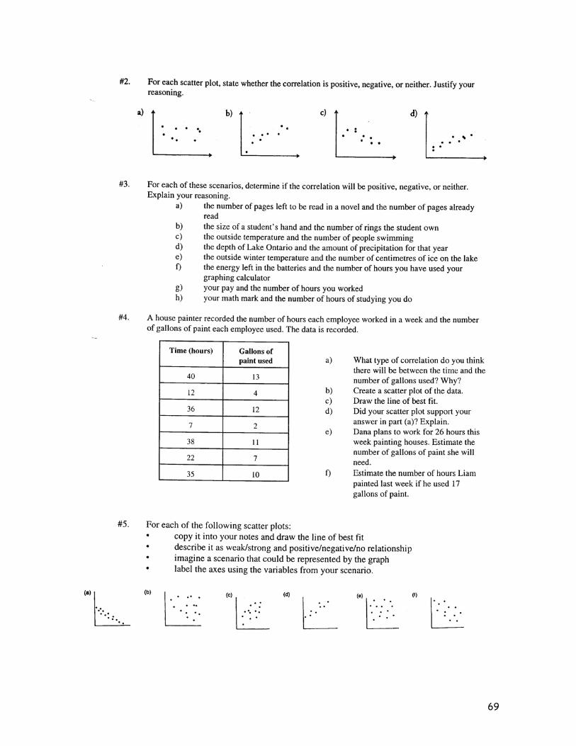
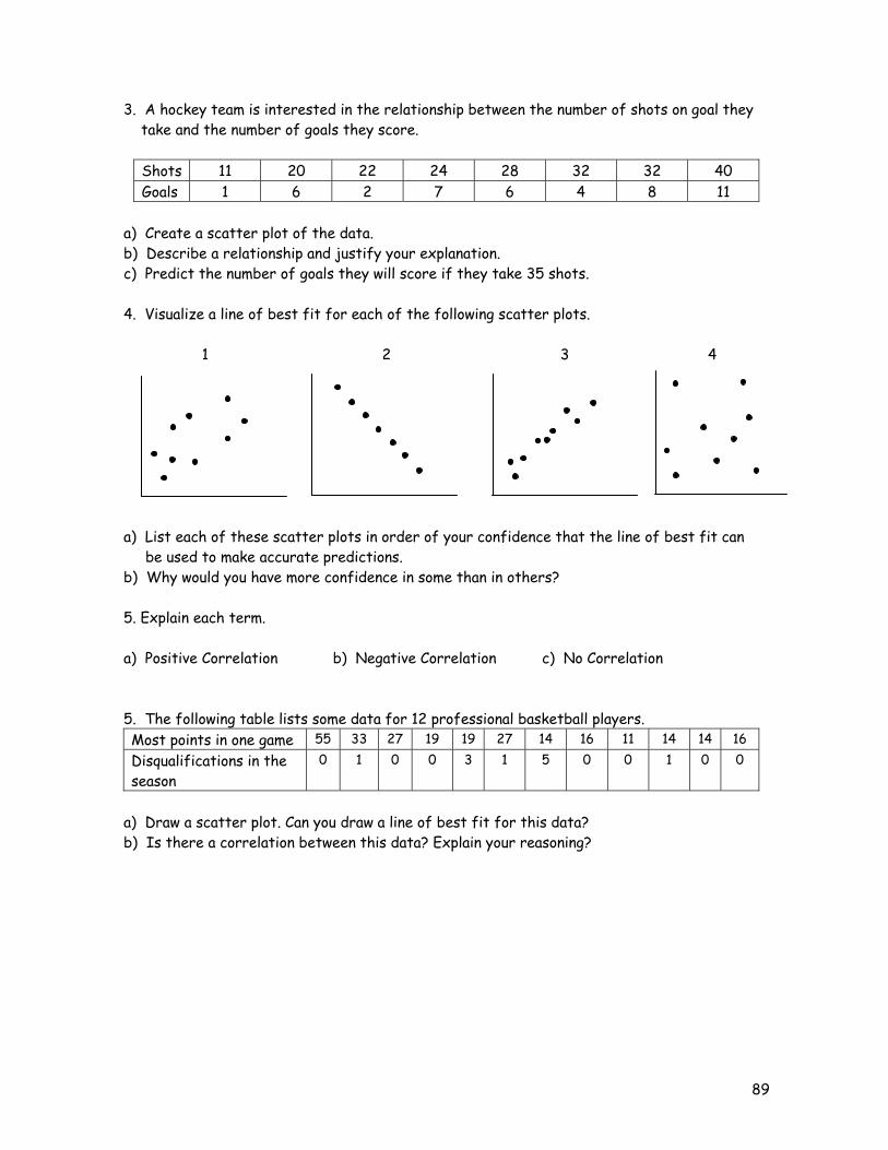
3. A hockey team is interested in the relationship between the number of shots on goal they take and the number of goals they score.
Shots 11 20 22 24 28 32 32 40 Goals 1 6 2 7 6 4 8 11
a) Create a scatter plot of the data. b) Describe a relationship and justify your explanation. c) Predict the number of goals they will score if they take 35 shots. 4. Visualize a line of best fit for each of the following scatter plots. 1 2 3 4 a) List each of these scatter plots in order of your confidence that the line of best fit can be used to make accurate predictions. b) Why would you have more confidence in some than in others? 5. Explain each term. a) Positive Correlation b) Negative Correlation c) No Correlation 5. The following table lists some data for 12 professional basketball players. Most points in one game 55 33 27 19 19 27 14 16 11 14 14 16 Disqualifications in the season
0 1 0 0 3 1 5 0 0 1 0 0
a) Draw a scatter plot. Can you draw a line of best fit for this data? b) Is there a correlation between this data? Explain your reasoning?
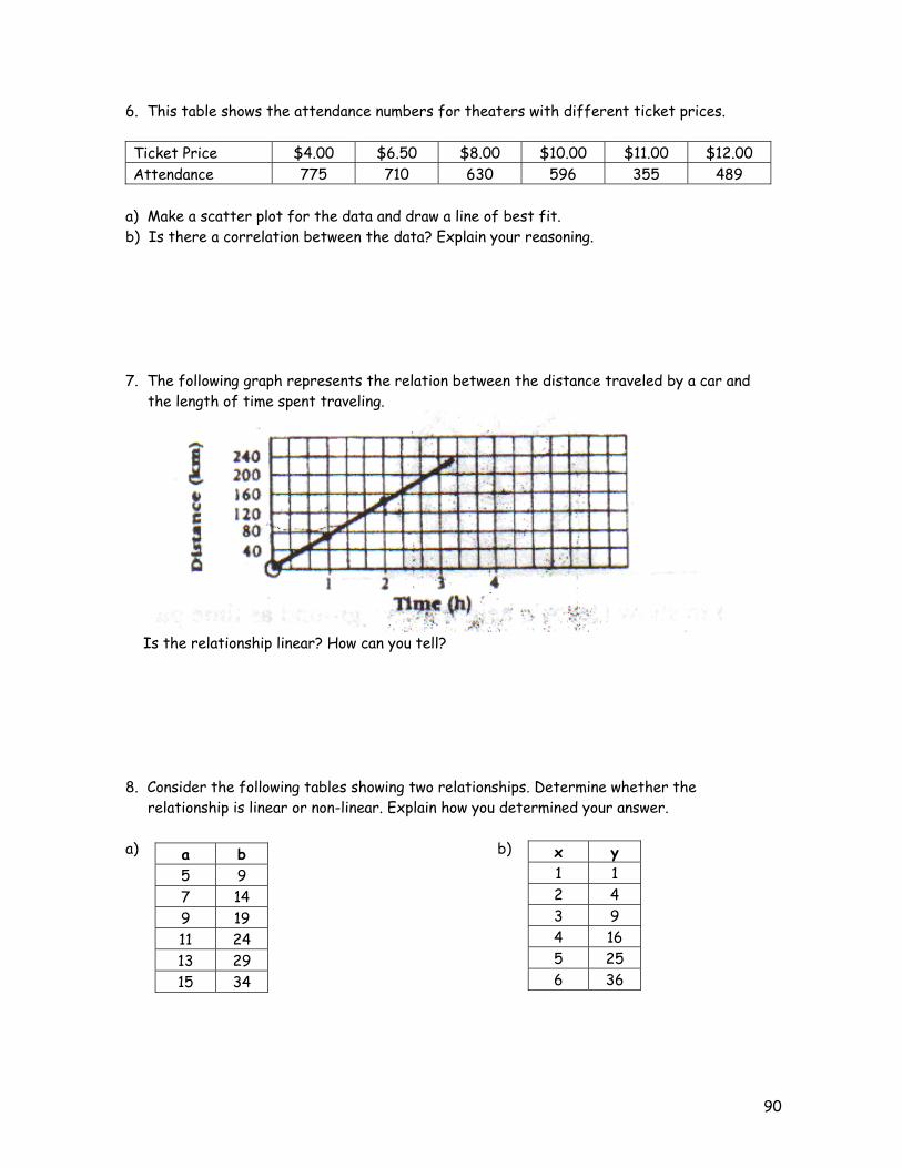
90
6. This table shows the attendance numbers for theaters with different ticket prices. Ticket Price $4.00 $6.50 $8.00 $10.00 $11.00 $12.00 Attendance 775 710 630 596 355 489
a) Make a scatter plot for the data and draw a line of best fit. b) Is there a correlation between the data? Explain your reasoning. 7. The following graph represents the relation between the distance traveled by a car and the length of time spent traveling.
Is the relationship linear? How can you tell? 8. Consider the following tables showing two relationships. Determine whether the relationship is linear or non-linear. Explain how you determined your answer. a) b)
a b 5 9 7 14 9 19 11 24 13 29 15 34
x y 1 1 2 4 3 9 4 16 5 25 6 36