Embed Size (px)
Citation preview
TweetProbe: A Real-Time Microblog Stream VisualizationFramework
Byungkyu Kang, George Legrady and Tobias Hollerer
Abstract—As the importance of social media increases in our daily life, most adopters witness its significant impact on numerouspractices in different areas such as business marketing, journalism, entertainment, and social sciences. However, the enormousamount of data makes the overall content difficult to assess and comprehend for both users and information analysts, raising scalabilityissues. Furthermore, timely understanding of trending topics is a crucial element due to the short life characteristic of most topicsin microblogs. In this paper, we present a novel data visualization approach for real-time social data stream analytics using Twitterstreaming data. The visual and architectural design of the system has been implemented as a real-time visualization framework,showing the most trendy tweets, hashtags and sentiment of individual messages. The framework proposed in this paper showcasesvisualization of real-time message streams through different presentation methods with animation effects highlighting the nature oflive information streams. Several scenarios are provided as examples of possible application of this system, including deployment asan information canvas that provides an overview of currently trending topics as a wall-sized interactive media arts installation.
Index Terms—Microblog, Twitter, Trending topic, Real-time visualization
1 INTRODUCTION
As user-centric social media such as Facebook and Twitter becomemore popular, user-generated contents serve as major informationsources across various fields. For instance, recent marketing strategiesgive significant attention to social ‘big data’ and try to find meaningfulpatterns therein, in order to analyze consumer preferences or marketdynamics. Moreover, information scientists have been conducting nu-merous research projects on social networks, applying state-of-the-artstatistical models to extract topic-specific information, detect socialevents or extract sentiment on a specific topic.
In this work, we present a real-time algorithmic visualization thatshows trending topics, messages and their sentiments. Our visual-ization framework, named TweetProbe (Tweet Stream Probe Frame-work)1, reveals live voices of microblog users and, by highlightingmajority trends, we can easily sense current hot-button issues, socialevents and gossip. Our goal is to provide a novel efficient visualiza-tion technique for information consumers, scientists, and media artsaudiences to help them easily understand and reflect real-time infor-mation from microblogging services. In this sense, the immediacyaspect and small time window used in this framework is the key com-ponent, since it enables users of this framework to detect real-timetrends, local events, natural disasters and spikes of social signals at amicroscopic level in a short time frame.
The objective of this research is a novel visualization design and itsimplementation based on real-time social media streams which pro-vides
• identification of emerging (fastest growing) topics in real-time,
• identification of the most influential nodes in a long retweetchain,
• Byungkyu Kang is with University of California, Santa Barbara. E-mail:[email protected].
• George Legrady is with University of California, Santa Barbara. E-mail:[email protected].
• Tobias Hollerer is with University of California, Santa Barbara. E-mail:[email protected].
Manuscript received 31 March 2013; accepted 1 August 2013; posted online13 October 2013; mailed on 27 September 2013.For information on obtaining reprints of this article, please sende-mail to: [email protected].
1Sample video clip of TweetProbe is shown at http://youtu.be/-MlPi1opnIk
• sentiment extraction from a topic of interest,
• event detection on a specific location,
• efficient algorithms which cope with massive amount of stream-ing data, and
• aesthetic visualization with intuitive visual components, suitablefor media arts installations.
The main contribution of this paper is the proposition and designof novel microblog visualizations which are carefully designed forreal-time data streams from services such as Twitter. Our visualiza-tion framework is designed to detect instant updates in topic-specificdiscussions in the Twitter space and convey them to users throughanimated visualizations using time-window binning and sentimentextraction algorithms.
The remainder of this paper is organized as follows: We begin witha discussion of related work in Section 2. We provide our design con-siderations from the system, usability, and art media perspectives inSection 3. The streaming data format and overall system architectureis described in Section 4, followed by a discussion of our proposedvisualization with a description of each component in Section 5. Sec-tion 6 reflects on various application scenarios and reports the recep-tion from a showing as a media arts installation. We conclude in Sec-tion 7 with a brief summary of this work and an outlook on futurework.
2 RELATED WORK
Several visualization frameworks have been designed and imple-mented for the purpose of analyzing social media information. How-ever, most visualization tools provide visual information based onpost-hoc data analysis, in particular, statistics or rankings on off-linedatasets, previously collected by another process. In this section, weintroduce relevant works from the literature in order to compare themwith our proposed visualization and the “TweetProbe” system. Sinceour framework has two main components: “Back-End Data Process-ing Layer” and “Front-End Visualization Layer”, we have studied theliterature from two different perspectives: Social Stream Filtering andAnalysis on the one hand, and Real-time Visualization on the other.
2.1 Social Stream Filtering and AnalysisAs our visualization technique is based on the real-time social datastream, similar approaches to ours have been proposed by a few re-searchers. For instance, [8] develop a framework which collects mi-croposts that contain media items, shared on social platforms like
Twitter, Facebook or Instagram. As a result of a query, this frame-work returns the resulting images or video clips that are relevant tothe query in various ways such as timeline, graph and narrative visu-alizations. Particularly, they take a storyboard approach which auto-matically curates shared information about a specific social event. Aninteractive visualization based on Twitter streaming data was also pro-posed by [7]. They present a system called TwitterMonitor which per-forms trend detection over the Twitter stream using the Twitter Stream-ing API. This is a web-based framework which heavily relies on userinteraction such as manual ranking or user-provided description foreach trend. However, they only provide a simple chart showing topicpopularity over time for each trend and it is mainly targeted as a text-based search framework. Another example of Twitter stream filteringis [3] which apply a user profiling approach based on a user’s postedURLs using topical categorization. The topics obtained from this algo-rithm are then used to filter tweet streams for extracting more relevantinformation from their followers. Social stream filtering can also beperformed on a collaborative environment. For instance, [4] proposean intranet system that shows the results of faceted search tasks inreal-time. Their system takes the enterprise activity stream as inputdata and returns relevant results via a small visualization module onthe web page. In this work, both sentiment and topical visualizationapproaches are also used along with tag clouds.
2.2 Real-time Visualization
Most of the real-time visualization techniques in the literature havebeen focusing on network intrusion detection (IDS) [11, 10, 1] or in-frastructure monitoring 2. IDS is one of the representative systems inthe field of Cyber-Security Situational Awareness. Since timely alertsare a crucial factor in an intrusion detection system, real-time visu-alization is an essential feature in this application. However, all ofthese visualizations lack of aesthetic factor, simply visualize the en-tire topology of a network in real-time. Although none of the systemsemploy major design consideration on visual components of their vi-sualization, simple interactive interfaces are supported in general.
Another work “We Feel fine” [5] should be noted here although thiswork is not fully based on real-time data streams. This work showsvarious emotions emerging through an emotional search engine, whichcan be seen as web-based artwork. The authors categorize each webcontent crawled from various information sources such as blogs andweb sites into pre-defined emotion classes and combine them with cor-responding metadata (location, demographic information etc.). Eachcontent element is mapped to a color-coded particle and users can fil-ter them through an interactive web interface. The authors carefullyconsidered aesthetic factors in their visualization.
3 DESIGN CONSIDERATIONS
The main goal of our visualization is to help users easily monitortrending messages, relevant topics and sentiment distribution of thegiven topic in real-time by supporting intuitive as well as thought-provoking visualization. Responding to user interest in staying on topof the information flow, numerous microblogging applications pro-vide trendy topic ranking services to their users. However, it is stillchallenging to detect emerging topics on time, particularly if the topicis based on an emergent (new) event. For example, if a plane hascrash landed a few minutes ago, it takes at least a half hour to be-come a trendy topic on microblogging sites and, thus, the originalposts about the accident will not receive wide attention until theyreach a sufficiently high number of retweet or favorites counts. Bythat time, network structures surrounding the author and retweeters(i.e. their followers) play a key role in this dissemination process.Since retweet count or favorites count are the key metrics for mea-suring popularity of messages in Twitter, these metrics can be used asimportant metadata in information analytics. To detect the most re-cent and emerging messages, we use a binning technique to find themessages predominantly shared by users in a given time window. The
2http://www.francastillo.net/
term “emerging topic” used in this paper is considered as “the fastest-growing topic or message” in microblogging space. By consideringthe real-time message dissemination process, we decided to employ ananimation-based design in our TweetProbe visualization framework.Our reasoning was that this design concept is most effective to con-vey real-time information flow in detail and reveal the overall dynam-ics of emerging topics in social network (from their birth and growthto their decline and disappearance). The animated visualization re-veals ranking transitions and the development of single topics acrossthe entire network. A captured video of TweetProbe can be seen athttp://youtu.be/-MlPi1opnIk. We will discuss the archi-tecture of our framework in detail in Section 4. In this section, wediscuss the primary principles of our design decisions.
3.1 Real-time Message Filtering
When a user applies filtering keywords to the system, they are sent as aparameter to the Twitter streaming server through the Twitter Stream-ing API. After this filtering phase, the system continuously receivestweet entities (a micro message and its metadata) in JSON3 data for-mat. Each arrival of information through the streaming connectioninvokes a back-end data processing thread which in turn triggers itemcomparison, binning, ranking and sentiment extraction tasks. Betweenthe comparison and ranking tasks, memory cache (bucket) is used tofilter out irrelevant messages. This is a critical process in our systemsince it resolves scalability issues arising from the huge influx of datafrom the stream.
3.2 Time-window based Ranking
Trending messages in general in microblogs are ranked based on thetotal amount of sharing or occurrence in messages (retweet or hashtagin Twitter, respectively), which is the number of these events over afixed period of time. However, monitoring a transient topic in real-time is still a challenging task since we need to collect a sufficientamount of messages during a reasonable time frame. In TweetProbe,we take a different approach to deal with the same problem. We as-sume that a burst of retweet action within a small time window can beconsidered a trendy topic in real-time. While there is a default rate setup (50 tweets per time window), the system enables each user to set apreferred rate as a threshold to detect trendy topics. Once a message’sretweet count updates exceed the given threshold, the message is high-lighted with a visual symbol for an emerging topic. The list of highlyranked messages or hashtags is being updated as new messages arrivein the system. The time window is initially set as 10 minutes, howeverit as well can be reconfigured by the user.
3.3 Color-coded Visualization
Each item in the timeline frame and the message frame are correspond-ing to each other in color. The color-coding scheme in our visual-ization is carefully designed to enhance readability of our system. Itshows the scale in message ranking and aims to help users understandmultiple facets of a single entity simultaneously.
3.4 Sentiment with Rain Drops
Aesthetic considerations are obviously crucial in the creation of artis-tic narratives and for provoking thought processes in audiences ex-periencing media arts installations, but they also have a big impacton visualization usability [2]. Interest in usability and influencing theaudience’s mood overlap when it comes to depicting results from sen-timent analysis. Since sentiment scores express polarity in its scale(negative, neutral and positive), the sentiment of each message canbe expressed as a color gradient, e.g. between red and blue. As thename implies, the ’stream of information’ can be imagined as a flowin a continuous medium such as a current or stream. However, wecan also think of each message as a discontinuous element in a flowof continuity. This abstract metaphor is the major motivation for our
3JavaScript Object Notation (http://json.org)
sentiment visualization which describes the message stream as a col-lection of rain drops. Detailed description of the raindrop visualizationis available in Section 5.1.
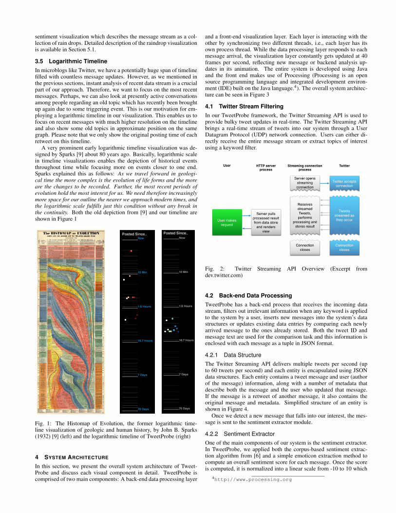
3.5 Logarithmic TimelineIn microblogs like Twitter, we have a potentially huge span of timelinefilled with countless message updates. However, as we mentioned inthe previous sections, instant analysis of recent data stream is a crucialpart of our approach. Therefore, we want to focus on the most recentmessages. Perhaps, we can also look at presently active conversationsamong people regarding an old topic which has recently been broughtup again due to some triggering event. This is our motivation for em-ploying a logarithmic timeline in our visualization. This enables us tofocus on recent messages with much higher resolution on the timelineand also show some old topics in approximate position on the samegraph. Please note that we only show the original posting time of eachretweet on this timeline.
A very prominent early logarithmic timeline visualization was de-signed by Sparks [9] about 80 years ago. Basically, logarithmic scalein timeline visualizations enables the depiction of historical eventsthroughout time while focusing more on events closer to one end.Sparks explained this as follows: As we travel forward in geologi-cal time the more complex is the evolution of life forms and the moreare the changes to be recorded. Further, the most recent periods ofevolution hold the most interest for us. We need therefore increasinglymore space for our outline the nearer we approach modern times, andthe logarithmic scale fulfills just this condition without any break inthe continuity. Both the old depiction from [9] and our timeline areshown in Figure 1
Fig. 1: The Histomap of Evolution, the former logarithmic time-line visualization of geologic and human history, by John B. Sparks(1932) [9] (left) and the logarithmic timeline of TweetProbe (right)
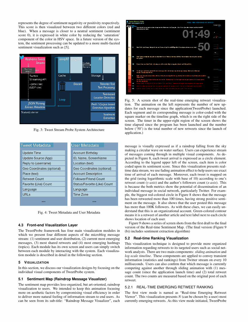
4 SYSTEM ARCHITECTURE
In this section, we present the overall system architecture of Tweet-Probe and discuss each visual component in detail. TweetProbe iscomprised of two main components: A back-end data processing layer
and a front-end visualization layer. Each layer is interacting with theother by synchronizing two different threads, i.e., each layer has itsown process thread. While the data processing layer responds to eachmessage arrival, the visualization layer constantly gets updated at 40frames per second, reflecting new message or backend analysis up-dates in its animation. The entire system is developed using Javaand the front end makes use of Processing (Processing is an opensource programming language and integrated development environ-ment (IDE) built on the Java language.4). The overall system architec-ture can be seen in Figure 3
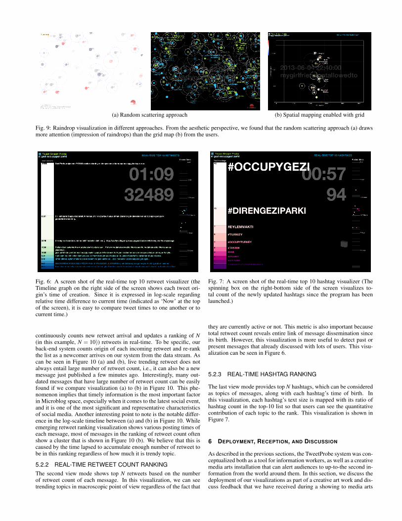
4.1 Twitter Stream FilteringIn our TweetProbe framework, the Twitter Streaming API is used toprovide bulky tweet updates in real-time. The Twitter Streaming APIbrings a real-time stream of tweets into our system through a UserDatagram Protocol (UDP) network connection. Users can either di-rectly receive the entire message stream or extract topics of interestusing a keyword filter.
Fig. 2: Twitter Streaming API Overview (Excerpt fromdev.twitter.com)
4.2 Back-end Data ProcessingTweetProbe has a back-end process that receives the incoming datastream, filters out irrelevant information when any keyword is appliedto the system by a user, inserts new messages into the system’s datastructures or updates existing data entries by comparing each newlyarrived message to the ones already stored. Both the tweet ID andmessage text are used for the comparison task and this information isenclosed with each message as a tuple in JSON format.
4.2.1 Data StructureThe Twitter Streaming API delivers multiple tweets per second (upto 60 tweets per second) and each entity is encapsulated using JSONdata structures. Each entity contains a tweet message and user (authorof the message) information, along with a number of metadata thatdescribe both the message and the user who updated that message.If the message is a retweet of another message, it also contains theoriginal message and metadata. Simplified structure of an entity isshown in Figure 4.
Once we detect a new message that falls into our interest, the mes-sage is sent to the sentiment extractor module.
4.2.2 Sentiment ExtractorOne of the main components of our system is the sentiment extractor.In TweetProbe, we applied both the corpus-based sentiment extrac-tion algorithm from [6] and a simple emoticon extraction method tocompute an overall sentiment score for each message. Once the scoreis computed, it is normalized into a linear scale from -10 to 10 which
4http://www.processing.org
represents the degree of sentiment negativity or positivity respectively.This score is then visualized between two different colors (red andblue). When a message is closer to a neutral sentiment (sentimentscore 0), it is expressed in white color by reducing the ‘saturation’component of the color in HSV space. In a future version of the sys-tem, the sentiment processing can be updated to a more multi-facetedsentiment visualization such as [5].
Fig. 3: Tweet Stream Probe System Architecture
Fig. 4: Tweet Metadata and User Metadata
4.3 Front-end Visualization LayerThe TweetProbe framework has four main visualization modules inwhich we present four different aspects of the microblog messagestream: (1) sentiment and user distribution, (2) current most emergingmessages, (3) most shared retweets and (4) most emerging hashtags(topics). Each module has its own screen and users can simply switchbetween each module by interacting with the system. Each visualiza-tion module is described in detail in the following section.
5 VISUALIZATION
In this section, we discuss our visualization designs by focusing on theindividual visual components of TweetProbe system.
5.1 Sentiment Map (Raindrop Message Visualizer)The sentiment map provides less-organized, but art-oriented, raindropvisualization to users. We intended to keep this animation focusingmore on aesthetic factors by compromising visual efficiency in orderto deliver more natural feeling of information stream to end users. Ascan be seen from its sub-title: “Raindrop Message Visualizer”, each
Fig. 5: A screen shot of the real-time emerging retweet visualiza-tion. The animation on the left represents the number of new up-dates for each message since the application(TweetProbe) launched.Each segment and its corresponding message is color-coded with thesquare marker on the timeline graph, which is on the right side of thescreen. The timer in the upper-right region of the screen shows thetime elapsed since the program has been launched and the numberbelow (‘50’) is the total number of new retweets since the launch ofapplication.)
message is visually expressed as if a raindrop falling from the skymaking a circular wave on water surface. Users can experience streamof messages coming through in multiple visual components. As de-picted in Figure 8, each tweet arrival is expressed as a circle element.According to the legend upper left of the screen, each item is colorcoded upon its sentiment score. Since this visualization presents real-time data stream, we use fading animation effect to help users see exacttime of arrival of each message. Moreover, each tweet is mapped onthe grid (using logarithmic scale with base of 10) according to one’sretweet count (y-axis) and the author’s followers count (x-axis). Thisis because the both metrics show the potential of dissemination of anindividual message in social network, particularly Twitter. For exam-ple, the biggest red-colored circle in Figure 8 shows that the messagehas been retweeted more than 100 times, having strong positive senti-ment on the message. It also shows that the user posted this messagehas more than 100K followers. As with these clues, we can easily un-derstand that this is an organizational account. Green-colored contourmeans it is a retweet of another article and text label next to each circleshows location of each user.
Figure 9 shows a series of screen shots from the first draft to the finalversion of the Real-time Sentiment Map. (The final version (Figure 9(b)) includes sentiment extraction algorithm)
5.2 Real-time Ranking VisualizationThis visualization technique is designed to provide more organizedinformation regarding retweets to its targeted users such as social net-work analysts. There are two main components: sliding animation andlog-scale timeline. These components are applied to convey transientinformation (statistics and rankings) from Twitter stream on every 10milliseconds. Users can also confirm that which message is currentlycompeting against another through sliding animation with (1) mes-sage count (since the application launch time) and (2) total retweetcount. The two counts are measured based on the original post of eachretweet.
5.2.1 REAL-TIME EMERGING RETWEET RANKINGThe first view mode is named as “Real-time Emerging RetweetViewer”. This visualization presents N (can be chosen by a user) mostcurrently emerging retweets. As this view mode initiated, TweetProbe
(a) Random scattering approach (b) Spatial mapping enabled with grid
Fig. 9: Raindrop visualization in different approaches. From the aesthetic perspective, we found that the random scattering approach (a) drawsmore attention (impression of raindrops) than the grid map (b) from the users.
Fig. 6: A screen shot of the real-time top 10 retweet visualizer (theTimeline graph on the right side of the screen shows each tweet ori-gin’s time of creation. Since it is expressed in log-scale regardingrelative time difference to current time (indicated as ‘Now’ at the topof the screen), it is easy to compare tweet times to one another or tocurrent time.)
continuously counts new retweet arrival and updates a ranking of N(in this example, N = 10)) retweets in real-time. To be specific, ourback-end system counts origin of each incoming retweet and re-rankthe list as a newcomer arrives on our system from the data stream. Ascan be seen in Figure 10 (a) and (b), live trending retweet does notalways entail large number of retweet count, i.e., it can also be a newmessage just published a few minutes ago. Interestingly, many out-dated messages that have large number of retweet count can be easilyfound if we compare visualization (a) to (b) in Figure 10. This phe-nomenon implies that timely information is the most important factorin Microblog space, especially when it comes to the latest social event,and it is one of the most significant and representative characteristicsof social media. Another interesting point to note is the notable differ-ence in the log-scale timeline between (a) and (b) in Figure 10. Whileemerging retweet ranking visualization shows various posting times ofeach message, most of messages in the ranking of retweet count oftenshow a cluster that is shown in Figure 10 (b). We believe that this iscaused by the time lapsed to accumulate enough number of retweet tobe in this ranking regardless of how much it is trendy topic.
5.2.2 REAL-TIME RETWEET COUNT RANKINGThe second view mode shows top N retweets based on the numberof retweet count of each message. In this visualization, we can seetrending topics in macroscopic point of view regardless of the fact that
Fig. 7: A screen shot of the real-time top 10 hashtag visualizer (Thespinning box on the right-bottom side of the screen visualizes to-tal count of the newly updated hashtags since the program has beenlaunched.)
they are currently active or not. This metric is also important becausetotal retweet count reveals entire link of message dissemination sinceits birth. However, this visualization is more useful to detect past orpresent messages that already discussed with lots of users. This visu-alization can be seen in Figure 6.
5.2.3 REAL-TIME HASHTAG RANKING
The last view mode provides top N hashtags, which can be consideredas topics of messages, along with each hashtag’s time of birth. Inthis visualization, each hashtag’s text size is mapped with its ratio ofhashtag count in the top-10 list so that users can see the quantitativecontribution of each topic to the rank. This visualization is shown inFigure 7.
6 DEPLOYMENT, RECEPTION, AND DISCUSSION
As described in the previous sections, the TweetProbe system was con-ceptualized both as a tool for information workers, as well as a creativemedia arts installation that can alert audiences to up-to-the second in-formation from the world around them. In this section, we discuss thedeployment of our visualizations as part of a creative art work and dis-cuss feedback that we have received during a showing to media arts
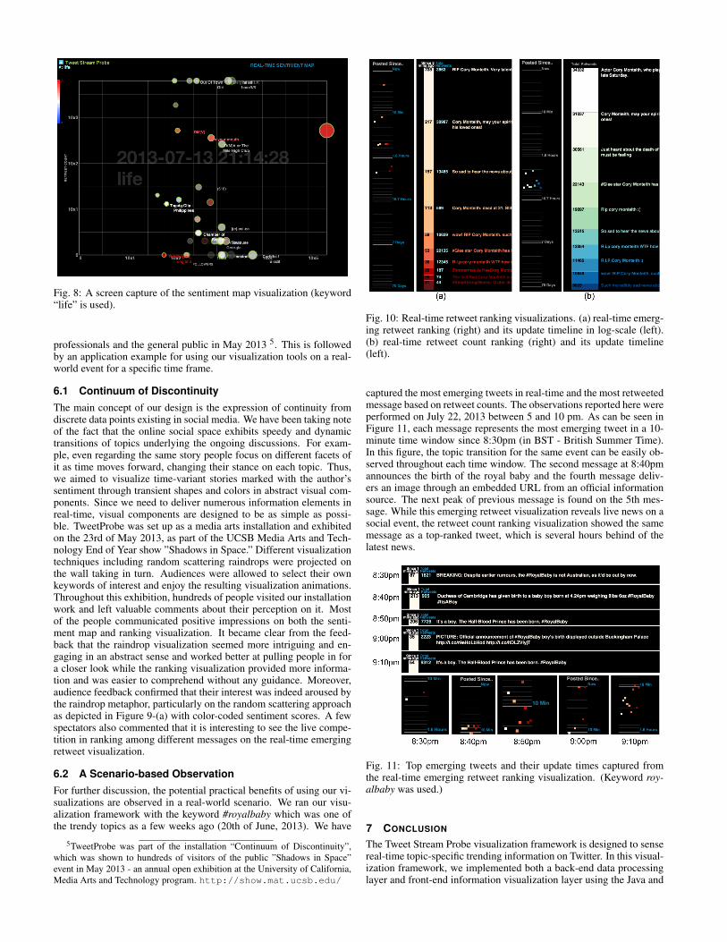
Fig. 8: A screen capture of the sentiment map visualization (keyword“life” is used).
professionals and the general public in May 2013 5. This is followedby an application example for using our visualization tools on a real-world event for a specific time frame.
6.1 Continuum of DiscontinuityThe main concept of our design is the expression of continuity fromdiscrete data points existing in social media. We have been taking noteof the fact that the online social space exhibits speedy and dynamictransitions of topics underlying the ongoing discussions. For exam-ple, even regarding the same story people focus on different facets ofit as time moves forward, changing their stance on each topic. Thus,we aimed to visualize time-variant stories marked with the author’ssentiment through transient shapes and colors in abstract visual com-ponents. Since we need to deliver numerous information elements inreal-time, visual components are designed to be as simple as possi-ble. TweetProbe was set up as a media arts installation and exhibitedon the 23rd of May 2013, as part of the UCSB Media Arts and Tech-nology End of Year show ”Shadows in Space.” Different visualizationtechniques including random scattering raindrops were projected onthe wall taking in turn. Audiences were allowed to select their ownkeywords of interest and enjoy the resulting visualization animations.Throughout this exhibition, hundreds of people visited our installationwork and left valuable comments about their perception on it. Mostof the people communicated positive impressions on both the senti-ment map and ranking visualization. It became clear from the feed-back that the raindrop visualization seemed more intriguing and en-gaging in an abstract sense and worked better at pulling people in fora closer look while the ranking visualization provided more informa-tion and was easier to comprehend without any guidance. Moreover,audience feedback confirmed that their interest was indeed aroused bythe raindrop metaphor, particularly on the random scattering approachas depicted in Figure 9-(a) with color-coded sentiment scores. A fewspectators also commented that it is interesting to see the live compe-tition in ranking among different messages on the real-time emergingretweet visualization.
6.2 A Scenario-based ObservationFor further discussion, the potential practical benefits of using our vi-sualizations are observed in a real-world scenario. We ran our visu-alization framework with the keyword #royalbaby which was one ofthe trendy topics as a few weeks ago (20th of June, 2013). We have
5TweetProbe was part of the installation “Continuum of Discontinuity”,which was shown to hundreds of visitors of the public ”Shadows in Space”event in May 2013 - an annual open exhibition at the University of California,Media Arts and Technology program. http://show.mat.ucsb.edu/
Fig. 10: Real-time retweet ranking visualizations. (a) real-time emerg-ing retweet ranking (right) and its update timeline in log-scale (left).(b) real-time retweet count ranking (right) and its update timeline(left).
captured the most emerging tweets in real-time and the most retweetedmessage based on retweet counts. The observations reported here wereperformed on July 22, 2013 between 5 and 10 pm. As can be seen inFigure 11, each message represents the most emerging tweet in a 10-minute time window since 8:30pm (in BST - British Summer Time).In this figure, the topic transition for the same event can be easily ob-served throughout each time window. The second message at 8:40pmannounces the birth of the royal baby and the fourth message deliv-ers an image through an embedded URL from an official informationsource. The next peak of previous message is found on the 5th mes-sage. While this emerging retweet visualization reveals live news on asocial event, the retweet count ranking visualization showed the samemessage as a top-ranked tweet, which is several hours behind of thelatest news.
Fig. 11: Top emerging tweets and their update times captured fromthe real-time emerging retweet ranking visualization. (Keyword roy-albaby was used.)
7 CONCLUSION
The Tweet Stream Probe visualization framework is designed to sensereal-time topic-specific trending information on Twitter. In this visual-ization framework, we implemented both a back-end data processinglayer and front-end information visualization layer using the Java and
Processing programming languages. The first data processing layerfilters out unnecessary information from the connected tweet stream,updates trending tweets, extracts underlying metadata and sorts tweets,retweets and hashtags. All of these tasks are performed multiple timeseach second. We believe that this system can serve social media an-alysts well for finding useful information or interesting patterns. Atthe same time, the real-time depiction of social media information canbe the basis for engaging and intriguing public art installations, as itreflect the current state of the world from a specific medium’s perspec-tive. Our work presented some steps in this direction.
For the future work of TweetProbe, we plan to enhance the existingsentiment extraction algorithm, add additional features such as net-work analysis, community detection algorithm and a richer user inter-face. Ultimately, we aim to implement our visualization technique onthe web using the D3.js library, in order to reach the very audiencesthat originate the data underlying our sensemaking and visualizationefforts in the first place.
ACKNOWLEDGMENTS
This work was partially supported by NSF grant IIS-1058132 and bythe U.S. Army Research Laboratory under Cooperative AgreementsNo. W911NF-09-2-0053 and W911NF-09-1-0553; The views andconclusions contained in this document are those of the authors andshould not be interpreted as representing the official policies, eitherexpressed or implied, of NSF, ARL, or the U.S. Government. The U.S.Government is authorized to reproduce and distribute reprints for Gov-ernment purposes notwithstanding any copyright notation here on.
REFERENCES
[1] K. Abdullah, C. Lee, G. Conti, J. A. Copeland, and J. Stasko. Ids rain-storm: Visualizing ids alarms. In Proceedings of the IEEE Workshops onVisualization for Computer Security, VIZSEC ’05, pages 1–, Washington,DC, USA, 2005. IEEE Computer Society.
[2] N. Cawthon and A. Moere. The effect of aesthetic on the usability of datavisualization. In Information Visualization, 2007. IV ’07. 11th Interna-tional Conference, pages 637–648, 2007.
[3] S. Garcia Esparza, M. P. O’Mahony, and B. Smyth. Catstream: cate-gorising tweets for user profiling and stream filtering. In Proceedings ofthe 2013 international conference on Intelligent user interfaces, IUI ’13,pages 25–36, New York, NY, USA, 2013. ACM.
[4] I. Guy, T. Steier, M. Barnea, I. Ronen, and T. Daniel. Swimming againstthe streamz: search and analytics over the enterprise activity stream. InProceedings of the 21st ACM international conference on Informationand knowledge management, CIKM ’12, pages 1587–1591, New York,NY, USA, 2012. ACM.
[5] S. D. Kamvar and J. Harris. We feel fine and searching the emotionalweb. In Proceedings of the fourth ACM international conference on Websearch and data mining, WSDM ’11, pages 117–126, New York, NY,USA, 2011. ACM.
[6] B. Kang, J. O’Donovan, and T. Hollerer. Modeling topic specific credibil-ity on twitter. In Proceedings of the 2012 ACM international conferenceon Intelligent User Interfaces, IUI ’12, pages 179–188, New York, NY,USA, 2012. ACM.
[7] M. Mathioudakis and N. Koudas. Twittermonitor: trend detection overthe twitter stream. In Proceedings of the 2010 ACM SIGMOD Interna-tional Conference on Management of data, SIGMOD ’10, pages 1155–1158, New York, NY, USA, 2010. ACM.
[8] V. Milicic, G. Rizzo, J. L. Redondo Garcia, R. Troncy, and T. Steiner.Live topic generation from event streams. In Proceedings of the 22nd in-ternational conference on World Wide Web companion, WWW ’13 Com-panion, pages 285–288, Republic and Canton of Geneva, Switzerland,2013. International World Wide Web Conferences Steering Committee.
[9] J. Sparks. The Histomap of Evolution. [A Chart. With ”Foreword, Bibli-ography and Recommended Books.” ]. Histomap, 1932.
[10] X. Yin, W. Yurcik, M. Treaster, Y. Li, and K. Lakkaraju. Visflowconnect:netflow visualizations of link relationships for security situational aware-ness. In Proceedings of the 2004 ACM workshop on Visualization anddata mining for computer security, VizSEC/DMSEC ’04, pages 26–34,New York, NY, USA, 2004. ACM.
[11] Y. Zhao, F. Zhou, X. Fan, X. Liang, and Y. Liu. Idsradar: a real-time visu-alization framework for ids alerts. Science China Information Sciences,pages 1–12, 2013.