Embed Size (px)
Citation preview
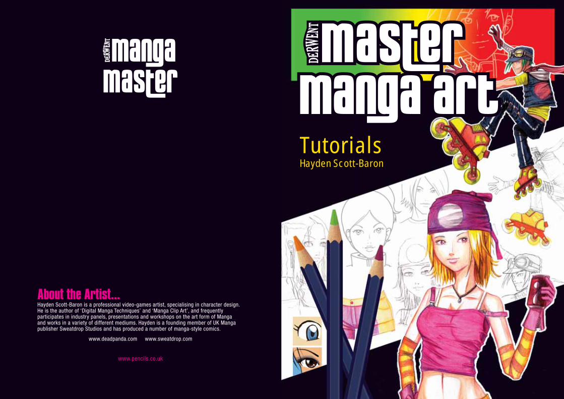
TutorialsHayden Scott-Baron
About the Artist...Hayden Scott-Baron is a professional video-games artist, specialising in character design. He is the author of ‘Digital Manga Techniques’ and ‘Manga Clip Art’, and frequently participates in industry panels, presentations and workshops on the art form of Manga and works in a variety of different mediums. Hayden is a founding member of UK Manga publisher Sweatdrop Studios and has produced a number of manga-style comics.
www.deadpanda.com www.sweatdrop.com
www.pencils.co.uk
Manga’s massive appeal today is often credited to the sheer vastness of its content. Modern Manga shows stories of the fantastical, the futuristic, the romantic, and the humdrum. The wealth and variety of the stories and styles on offer means that Manga can provide something for everyone. Whatever your age or interest, there is a Manga style out there for you.
Let’s move from the history of Manga to the present day. You know a little about where Manga came from, but what you’re really here for is to create your own! By applying methods and styles common in Manga illustration you can soon be drawing fun and exciting Manga-style characters that are ready to leap off the page.
2 3
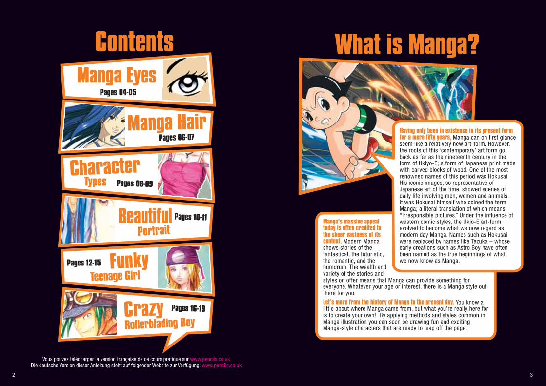
ContentsManga Eyes
Pages 04-05
Pages 06-07
Character
Beautiful
Pages 08-09
FunkyPages 12-15
Pages 10-11
Portrait
Crazy Pages 16-19
Rollerblading Boy
Teenage Girl
Manga Hair Having only been in existence in its present form for a mere fifty years, Manga can on first glance seem like a relatively new art-form. However, the roots of this ‘contemporary’ art form go back as far as the nineteenth century in the form of Ukiyo-E; a form of Japanese print made with carved blocks of wood. One of the most renowned names of this period was Hokusai. His iconic images, so representative of Japanese art of the time, showed scenes of daily life involving men, women and animals. It was Hokusai himself who coined the term Manga; a literal translation of which means “irresponsible pictures.” Under the influence of western comic styles, the Ukio-E art-form evolved to become what we now regard as modern day Manga. Names such as Hokusai were replaced by names like Tezuka – whose early creations such as Astro Boy have often been named as the true beginnings of what we now know as Manga.
What is Manga?
Types
Vous pouvez télécharger la version française de ce cours pratique sur www.pencils.co.ukDie deutsche Version dieser Anleitung steht auf folgender Website zur Verfügung: www.pencils.co.uk
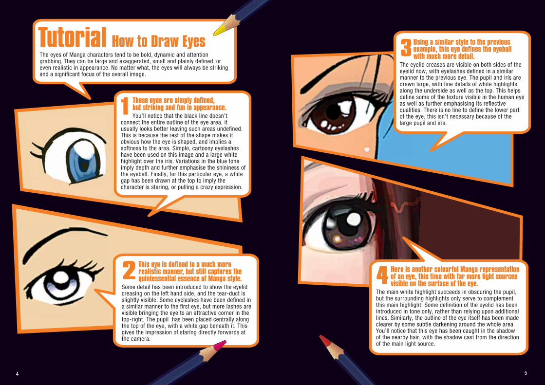
TutorialThe eyes of Manga characters tend to be bold, dynamic and attention grabbing. They can be large and exaggerated, small and plainly defined, or even realistic in appearance. No matter what, the eyes will always be striking and a significant focus of the overall image.
4 5
1 These eyes are simply defined, but striking and fun in appearance. You’ll notice that the black line doesn’t
connect the entire outline of the eye area, it usually looks better leaving such areas undefined. This is because the rest of the shape makes it obvious how the eye is shaped, and implies a softness to the area. Simple, cartoony eyelashes have been used on this image and a large white highlight over the iris. Variations in the blue tone imply depth and further emphasise the shininess of the eyeball. Finally, for this particular eye, a white gap has been drawn at the top to imply the character is staring, or pulling a crazy expression.
2 This eye is defined in a much more realistic manner, but still captures the quintessential essence of Manga style.
Some detail has been introduced to show the eyelid creasing on the left hand side, and the tear-duct is slightly visible. Some eyelashes have been defined in a similar manner to the first eye, but more lashes are visible bringing the eye to an attractive corner in the top-right. The pupil has been placed centrally along the top of the eye, with a white gap beneath it. This gives the impression of staring directly forwards at the camera.
Using a similar style to the previous example, this eye defines the eyeball with much more detail.
The eyelid creases are visible on both sides of the eyelid now, with eyelashes defined in a similar manner to the previous eye. The pupil and iris are drawn large, with fine details of white highlights along the underside as well as the top. This helps define some of the texture visible in the human eye as well as further emphasising its reflective qualities. There is no line to define the lower part of the eye, this isn’t necessary because of the large pupil and iris.
3
4 Here is another colourful Manga representation of an eye, this time with far more light sources visible on the surface of the eye.
The main white highlight succeeds in obscuring the pupil, but the surrounding highlights only serve to complement this main highlight. Some definition of the eyelid has been introduced in tone only, rather than relying upon additional lines. Similarly, the outline of the eye itself has been made clearer by some subtle darkening around the whole area. You’ll notice that this eye has been caught in the shadow of the nearby hair, with the shadow cast from the direction of the main light source.
How to Draw Eyes
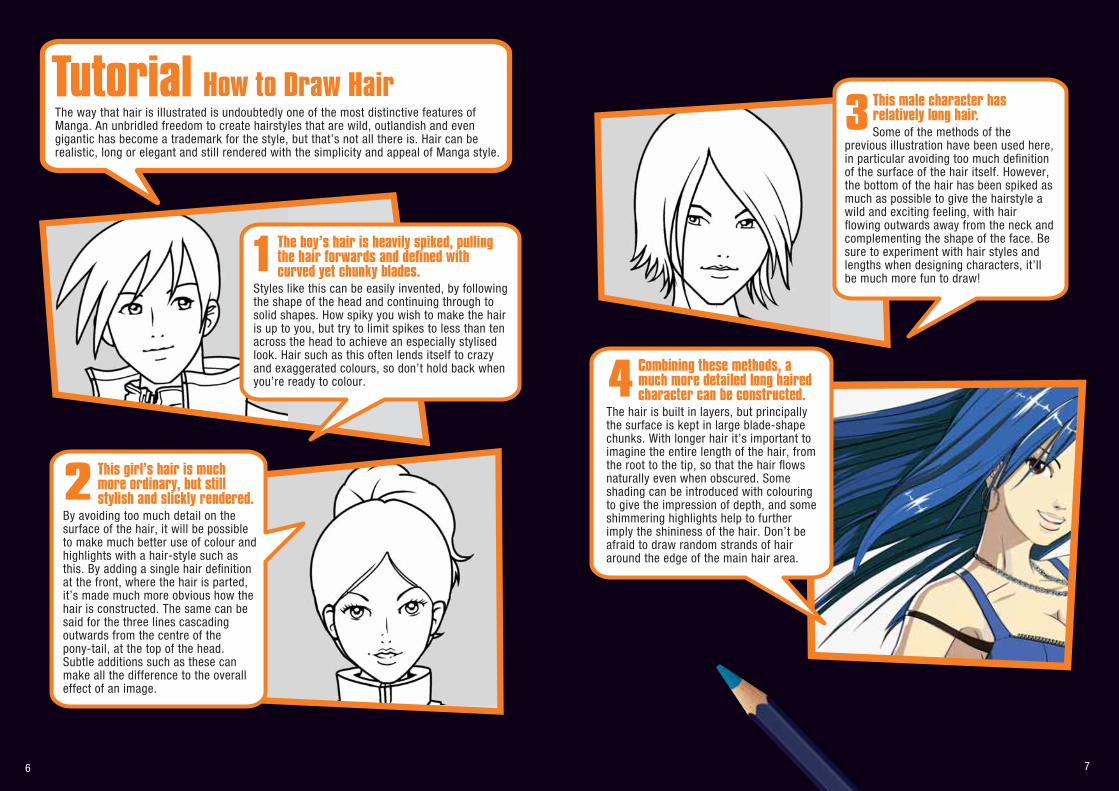
2 This girl’s hair is much more ordinary, but still stylish and slickly rendered.
By avoiding too much detail on the surface of the hair, it will be possible to make much better use of colour and highlights with a hair-style such as this. By adding a single hair definition at the front, where the hair is parted, it’s made much more obvious how the hair is constructed. The same can be said for the three lines cascading outwards from the centre of the pony-tail, at the top of the head. Subtle additions such as these can make all the difference to the overall effect of an image.
6 7
1 The boy’s hair is heavily spiked, pulling the hair forwards and defined with curved yet chunky blades.
Styles like this can be easily invented, by following the shape of the head and continuing through to solid shapes. How spiky you wish to make the hair is up to you, but try to limit spikes to less than ten across the head to achieve an especially stylised look. Hair such as this often lends itself to crazy and exaggerated colours, so don’t hold back when you’re ready to colour.
This male character has relatively long hair. Some of the methods of the
previous illustration have been used here, in particular avoiding too much definition of the surface of the hair itself. However, the bottom of the hair has been spiked as much as possible to give the hairstyle a wild and exciting feeling, with hair flowing outwards away from the neck and complementing the shape of the face. Be sure to experiment with hair styles and lengths when designing characters, it’ll be much more fun to draw!
3
4 Combining these methods, a much more detailed long haired character can be constructed.
The hair is built in layers, but principally the surface is kept in large blade-shape chunks. With longer hair it’s important to imagine the entire length of the hair, from the root to the tip, so that the hair flows naturally even when obscured. Some shading can be introduced with colouring to give the impression of depth, and some shimmering highlights help to further imply the shininess of the hair. Don’t be afraid to draw random strands of hair around the edge of the main hair area.
TutorialThe way that hair is illustrated is undoubtedly one of the most distinctive features of Manga. An unbridled freedom to create hairstyles that are wild, outlandish and even gigantic has become a trademark for the style, but that’s not all there is. Hair can be realistic, long or elegant and still rendered with the simplicity and appeal of Manga style.
How to Draw Hair
8 9
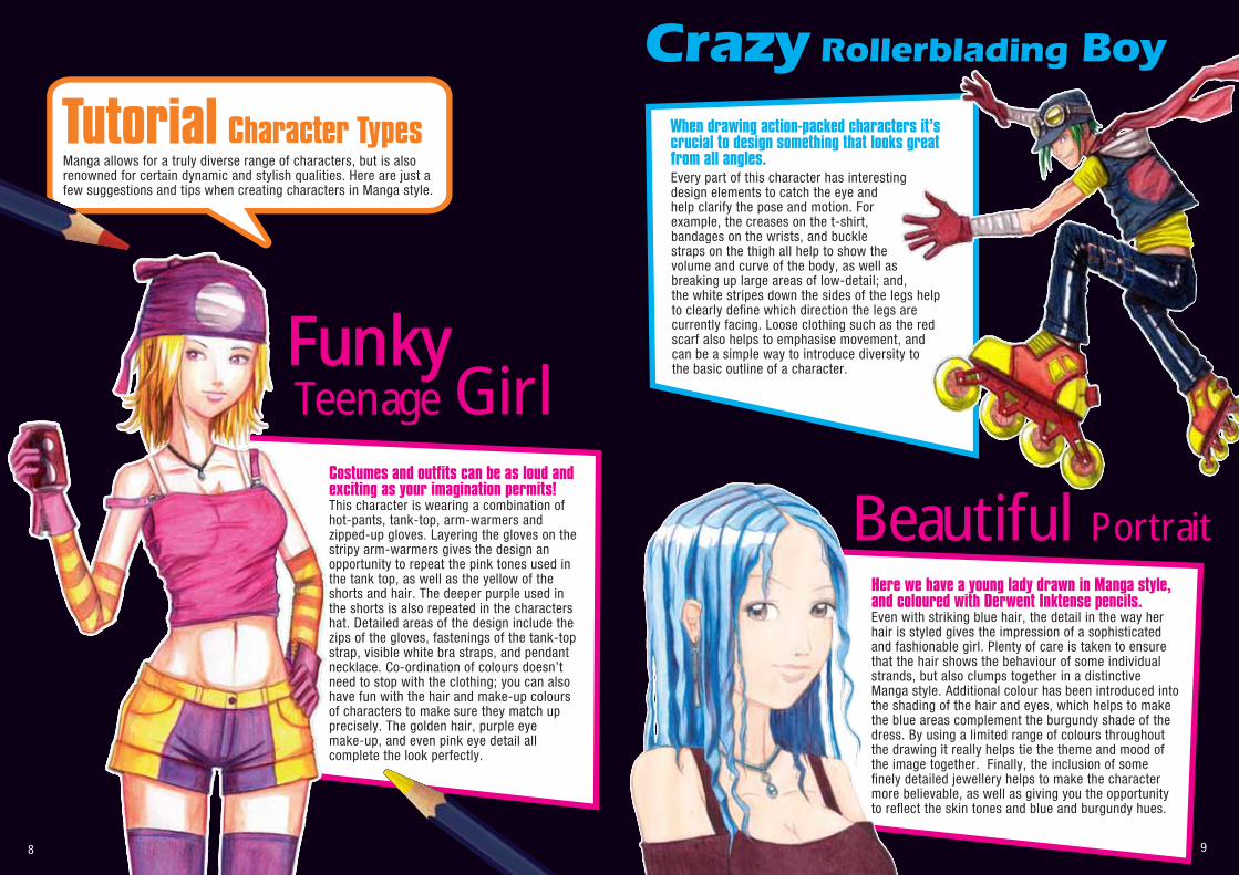
Manga allows for a truly diverse range of characters, but is also renowned for certain dynamic and stylish qualities. Here are just a few suggestions and tips when creating characters in Manga style.
Crazy Rollerblading Boy
Teenage GirlFununky
Beautiful Portrait
When drawing action-packed characters it’s crucial to design something that looks great from all angles. Every part of this character has interesting design elements to catch the eye and help clarify the pose and motion. For example, the creases on the t-shirt, bandages on the wrists, and buckle straps on the thigh all help to show the volume and curve of the body, as well as breaking up large areas of low-detail; and, the white stripes down the sides of the legs help to clearly define which direction the legs are currently facing. Loose clothing such as the red scarf also helps to emphasise movement, and can be a simple way to introduce diversity tothe basic outline of a character.
Costumes and outfits can be as loud and exciting as your imagination permits! This character is wearing a combination of hot-pants, tank-top, arm-warmers and zipped-up gloves. Layering the gloves on the stripy arm-warmers gives the design an opportunity to repeat the pink tones used in the tank top, as well as the yellow of the shorts and hair. The deeper purple used in the shorts is also repeated in the characters hat. Detailed areas of the design include the zips of the gloves, fastenings of the tank-top strap, visible white bra straps, and pendant necklace. Co-ordination of colours doesn’t need to stop with the clothing; you can also have fun with the hair and make-up colours of characters to make sure they match up precisely. The golden hair, purple eye make-up, and even pink eye detail all complete the look perfectly.
Here we have a young lady drawn in Manga style, and coloured with Derwent Inktense pencils. Even with striking blue hair, the detail in the way her hair is styled gives the impression of a sophisticated and fashionable girl. Plenty of care is taken to ensure that the hair shows the behaviour of some individual strands, but also clumps together in a distinctive Manga style. Additional colour has been introduced into the shading of the hair and eyes, which helps to make the blue areas complement the burgundy shade of the dress. By using a limited range of colours throughout the drawing it really helps tie the theme and mood of the image together. Finally, the inclusion of some finely detailed jewellery helps to make the character more believable, as well as giving you the opportunity to reflect the skin tones and blue and burgundy hues.
Character TypesTutorial
11
Step by Step
Tutorial
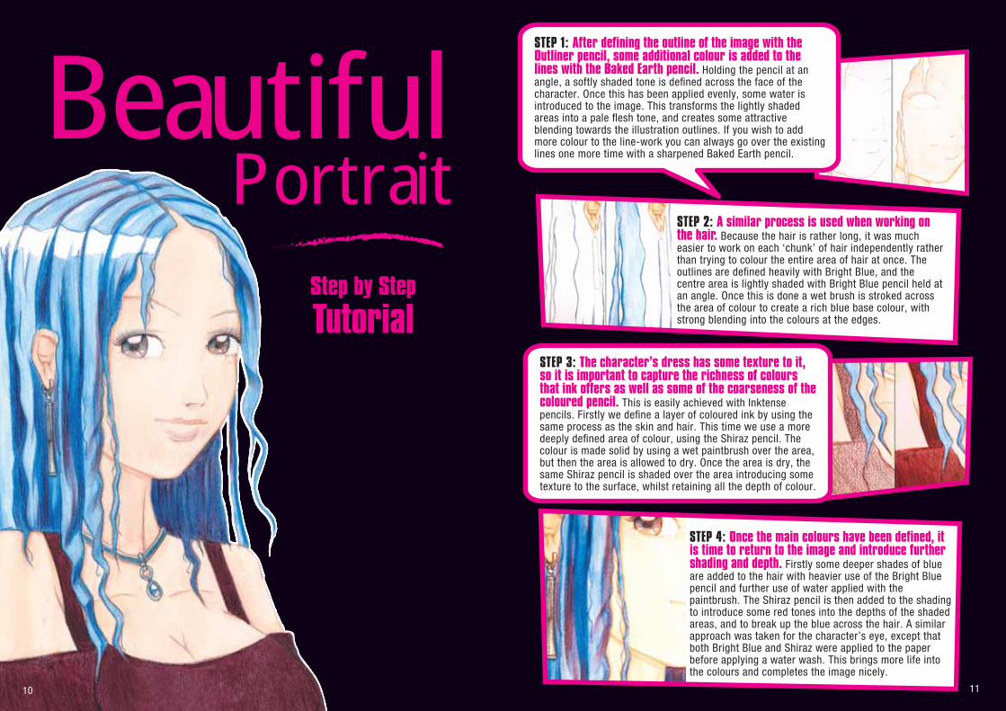
PortraitBeautiful
STEP 2: A similar process is used when working on the hair. Because the hair is rather long, it was much easier to work on each ‘chunk’ of hair independently rather than trying to colour the entire area of hair at once. The outlines are defined heavily with Bright Blue, and the centre area is lightly shaded with Bright Blue pencil held at an angle. Once this is done a wet brush is stroked across the area of colour to create a rich blue base colour, with strong blending into the colours at the edges.
STEP 1: After defining the outline of the image with the Outliner pencil, some additional colour is added to the lines with the Baked Earth pencil. Holding the pencil at an angle, a softly shaded tone is defined across the face of the character. Once this has been applied evenly, some water is introduced to the image. This transforms the lightly shaded areas into a pale flesh tone, and creates some attractive blending towards the illustration outlines. If you wish to add more colour to the line-work you can always go over the existing lines one more time with a sharpened Baked Earth pencil.
STEP 4: Once the main colours have been defined, it is time to return to the image and introduce further shading and depth. Firstly some deeper shades of blue are added to the hair with heavier use of the Bright Blue pencil and further use of water applied with the paintbrush. The Shiraz pencil is then added to the shading to introduce some red tones into the depths of the shaded areas, and to break up the blue across the hair. A similar approach was taken for the character’s eye, except that both Bright Blue and Shiraz were applied to the paper before applying a water wash. This brings more life into the colours and completes the image nicely.
STEP 3: The character’s dress has some texture to it, so it is important to capture the richness of colours that ink offers as well as some of the coarseness of the coloured pencil. This is easily achieved with Inktense pencils. Firstly we define a layer of coloured ink by using the same process as the skin and hair. This time we use a more deeply defined area of colour, using the Shiraz pencil. The colour is made solid by using a wet paintbrush over the area, but then the area is allowed to dry. Once the area is dry, the same Shiraz pencil is shaded over the area introducing some texture to the surface, whilst retaining all the depth of colour.
10
12 13
TeenageGirl
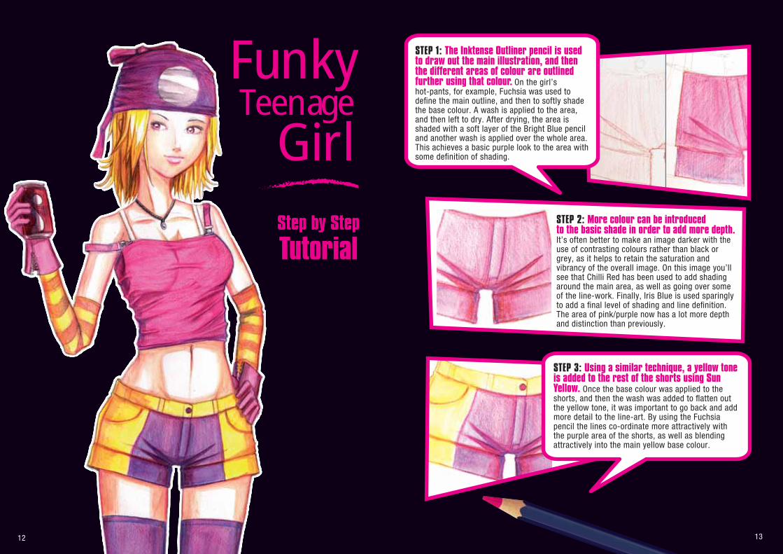
Funky STEP 1: The Inktense Outliner pencil is used to draw out the main illustration, and then the different areas of colour are outlined further using that colour. On the girl’s hot-pants, for example, Fuchsia was used to define the main outline, and then to softly shade the base colour. A wash is applied to the area, and then left to dry. After drying, the area is shaded with a soft layer of the Bright Blue pencil and another wash is applied over the whole area. This achieves a basic purple look to the area with some definition of shading.
STEP 3: Using a similar technique, a yellow tone is added to the rest of the shorts using Sun Yellow. Once the base colour was applied to the shorts, and then the wash was added to flatten out the yellow tone, it was important to go back and add more detail to the line-art. By using the Fuchsia pencil the lines co-ordinate more attractively with the purple area of the shorts, as well as blending attractively into the main yellow base colour.
STEP 2: More colour can be introduced to the basic shade in order to add more depth. It’s often better to make an image darker with the use of contrasting colours rather than black or grey, as it helps to retain the saturation and vibrancy of the overall image. On this image you’ll see that Chilli Red has been used to add shading around the main area, as well as going over some of the line-work. Finally, Iris Blue is used sparingly to add a final level of shading and line definition. The area of pink/purple now has a lot more depth and distinction than previously.
Step by Step
Tutorial
14 15
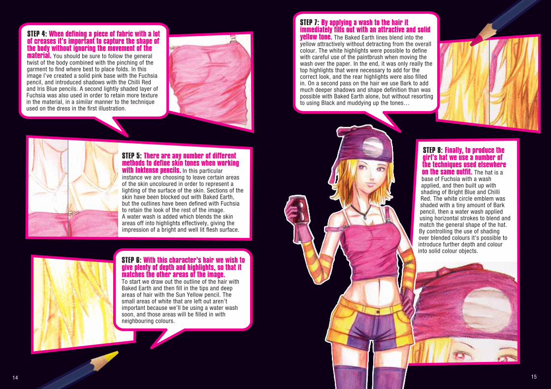
STEP 5: There are any number of different methods to define skin tones when working with Inktense pencils. In this particular instance we are choosing to leave certain areas of the skin uncoloured in order to represent a lighting of the surface of the skin. Sections of the skin have been blocked out with Baked Earth, but the outlines have been defined with Fuchsia to retain the look of the rest of the image. A water wash is added which blends the skin areas off into highlights effectively, giving the impression of a bright and well lit flesh surface.
STEP 4: When defining a piece of fabric with a lot of creases it’s important to capture the shape of the body without ignoring the movement of the material. You should be sure to follow the general twist of the body combined with the pinching of the garment to find where best to place folds. In this image I’ve created a solid pink base with the Fuchsia pencil, and introduced shadows with the Chilli Red and Iris Blue pencils. A second lightly shaded layer of Fuchsia was also used in order to retain more texture in the material, in a similar manner to the technique used on the dress in the first illustration.
STEP 6: With this character’s hair we wish to give plenty of depth and highlights, so that it matches the other areas of the image. To start we draw out the outline of the hair with Baked Earth and then fill in the tips and deep areas of hair with the Sun Yellow pencil. The small areas of white that are left out aren’t important because we’ll be using a water wash soon, and those areas will be filled in with neighbouring colours.
STEP 8: Finally, to produce the girl’s hat we use a number of the techniques used elsewhere on the same outfit. The hat is a base of Fuchsia with a wash applied, and then built up with shading of Bright Blue and Chilli Red. The white circle emblem was shaded with a tiny amount of Bark pencil, then a water wash applied using horizontal strokes to blend and match the general shape of the hat. By controlling the use of shading over blended colours it's possible to introduce further depth and colour into solid colour objects.
STEP 7: By applying a wash to the hair it immediately fills out with an attractive and solid yellow tone. The Baked Earth lines blend into the yellow attractively without detracting from the overall colour. The white highlights were possible to define with careful use of the paintbrush when moving the wash over the paper. In the end, it was only really the top highlights that were necessary to add for the correct look, and the rear highlights were also filled in. On a second pass on the hair we use Bark to add much deeper shadows and shape definition than was possible with Baked Earth alone, but without resorting to using Black and muddying up the tones…
16 17
TutorialStep by Step
RollerbladingBoy
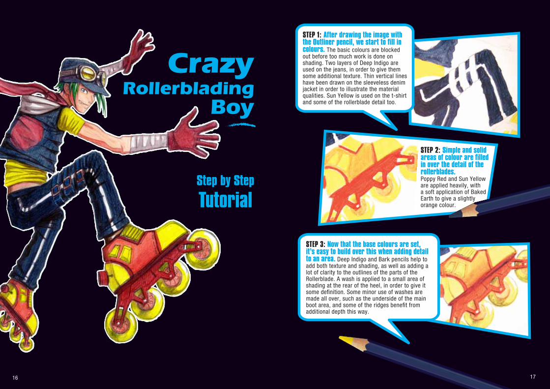
CrazySTEP 1: After drawing the image with the Outliner pencil, we start to fill in colours. The basic colours are blocked out before too much work is done on shading. Two layers of Deep Indigo are used on the jeans, in order to give them some additional texture. Thin vertical lines have been drawn on the sleeveless denim jacket in order to illustrate the material qualities. Sun Yellow is used on the t-shirt and some of the rollerblade detail too.
STEP 3: Now that the base colours are set, it’s easy to build over this when adding detail to an area. Deep Indigo and Bark pencils help to add both texture and shading, as well as adding a lot of clarity to the outlines of the parts of the Rollerblade. A wash is applied to a small area of shading at the rear of the heel, in order to give it some definition. Some minor use of washes are made all over, such as the underside of the main boot area, and some of the ridges benefit from additional depth this way.
STEP 2: Simple and solid areas of colour are filled in over the detail of the rollerblades. Poppy Red and Sun Yellow are applied heavily, with a soft application of Baked Earth to give a slightly orange colour.
18 19
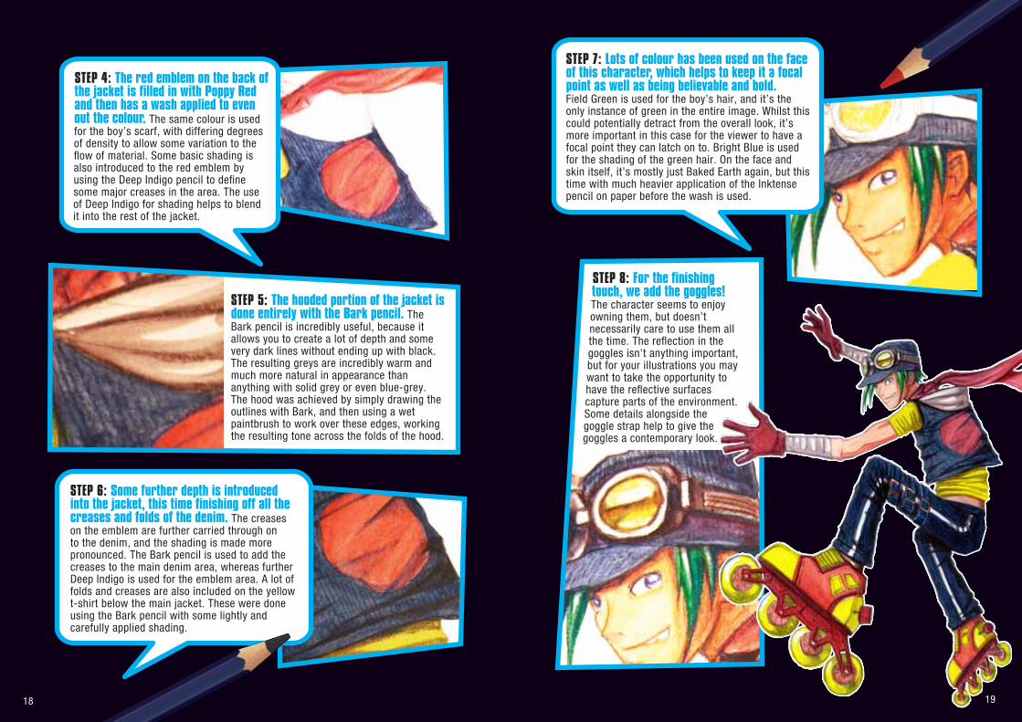
STEP 5: The hooded portion of the jacket is done entirely with the Bark pencil. The Bark pencil is incredibly useful, because it allows you to create a lot of depth and some very dark lines without ending up with black. The resulting greys are incredibly warm and much more natural in appearance than anything with solid grey or even blue-grey. The hood was achieved by simply drawing the outlines with Bark, and then using a wet paintbrush to work over these edges, working the resulting tone across the folds of the hood.
STEP 4: The red emblem on the back of the jacket is filled in with Poppy Red and then has a wash applied to even out the colour. The same colour is used for the boy’s scarf, with differing degrees of density to allow some variation to the flow of material. Some basic shading is also introduced to the red emblem by using the Deep Indigo pencil to define some major creases in the area. The use of Deep Indigo for shading helps to blend it into the rest of the jacket.
STEP 6: Some further depth is introduced into the jacket, this time finishing off all the creases and folds of the denim. The creases on the emblem are further carried through on to the denim, and the shading is made more pronounced. The Bark pencil is used to add the creases to the main denim area, whereas further Deep Indigo is used for the emblem area. A lot of folds and creases are also included on the yellow t-shirt below the main jacket. These were done using the Bark pencil with some lightly and carefully applied shading.
STEP 8: For the finishing touch, we add the goggles! The character seems to enjoy owning them, but doesn’t necessarily care to use them all the time. The reflection in the goggles isn’t anything important, but for your illustrations you may want to take the opportunity to have the reflective surfaces capture parts of the environment. Some details alongside the goggle strap help to give the goggles a contemporary look.
STEP 7: Lots of colour has been used on the face of this character, which helps to keep it a focal point as well as being believable and bold. Field Green is used for the boy’s hair, and it’s the only instance of green in the entire image. Whilst this could potentially detract from the overall look, it’s more important in this case for the viewer to have a focal point they can latch on to. Bright Blue is used for the shading of the green hair. On the face and skin itself, it’s mostly just Baked Earth again, but this time with much heavier application of the Inktense pencil on paper before the wash is used.