Embed Size (px)
DESCRIPTION
the creative arts celebrated
Citation preview
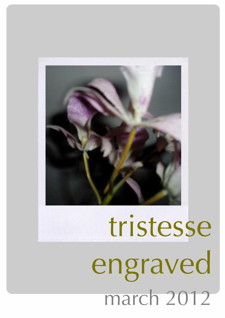
tristesse engraved
march 2012
contents
page 3-14: joseph zaritsky
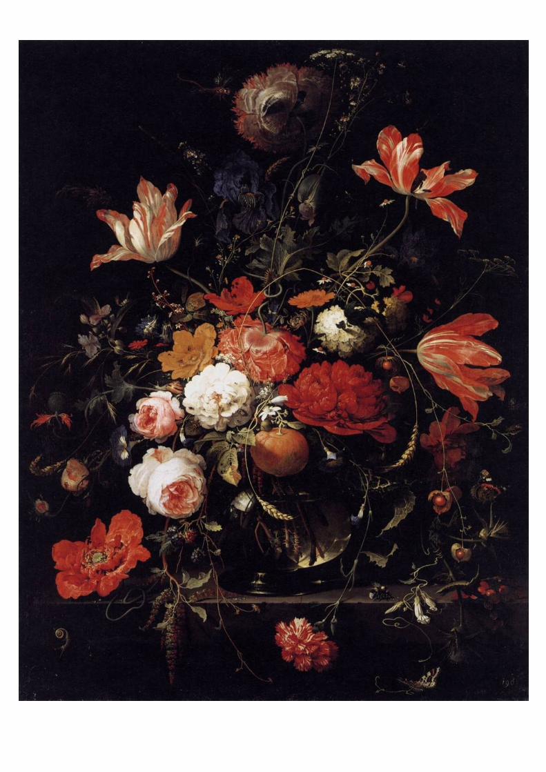
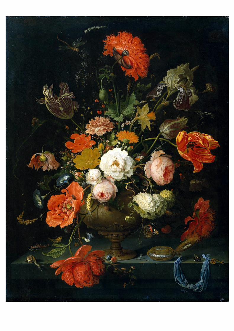
page 15-19: abraham mignon
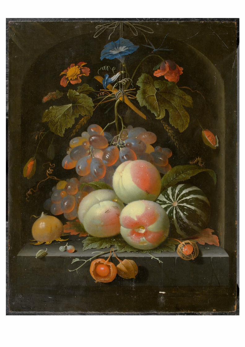
page 20-24: osias beert
page 25-29: johann wilhelm preyer
page 30-34: balthasar van der ast
page 35-39: georg flegel
page 40-45: alex steinweiss
page 46-64: lucienne day
page 65-71: etienne morel
page 72-79: stef mitchell
page 80-90: wilma vissers
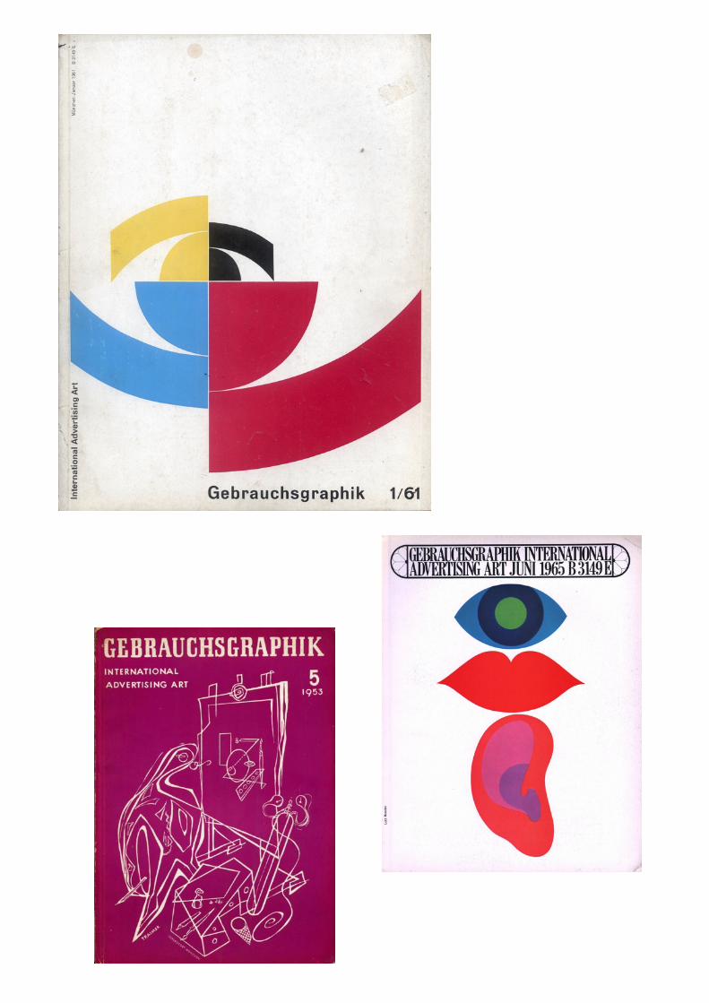
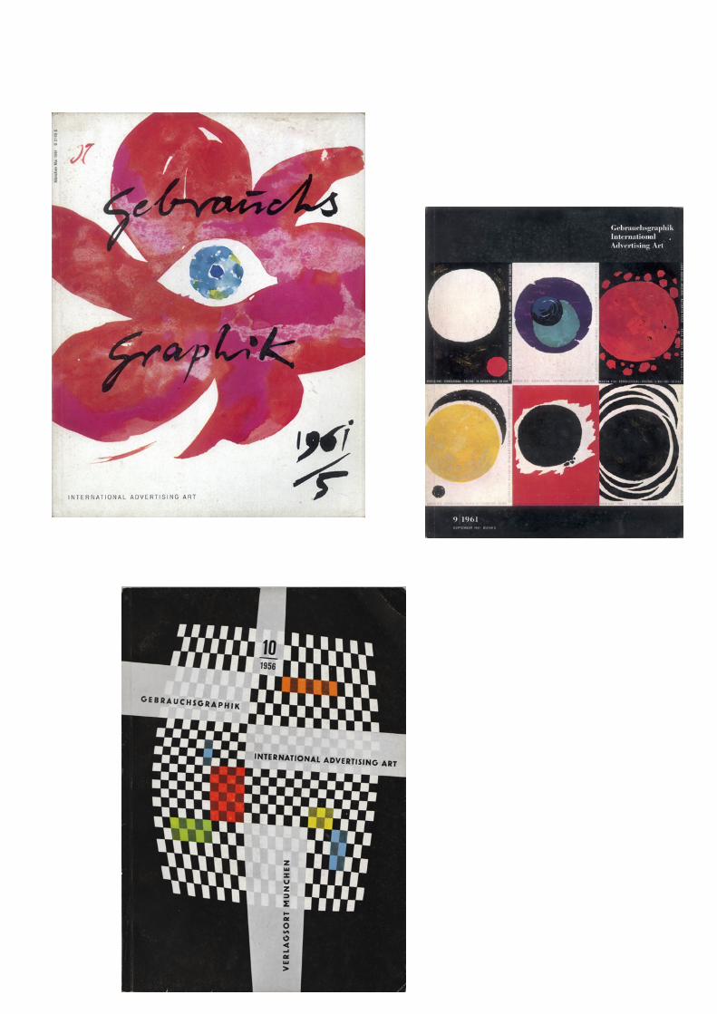
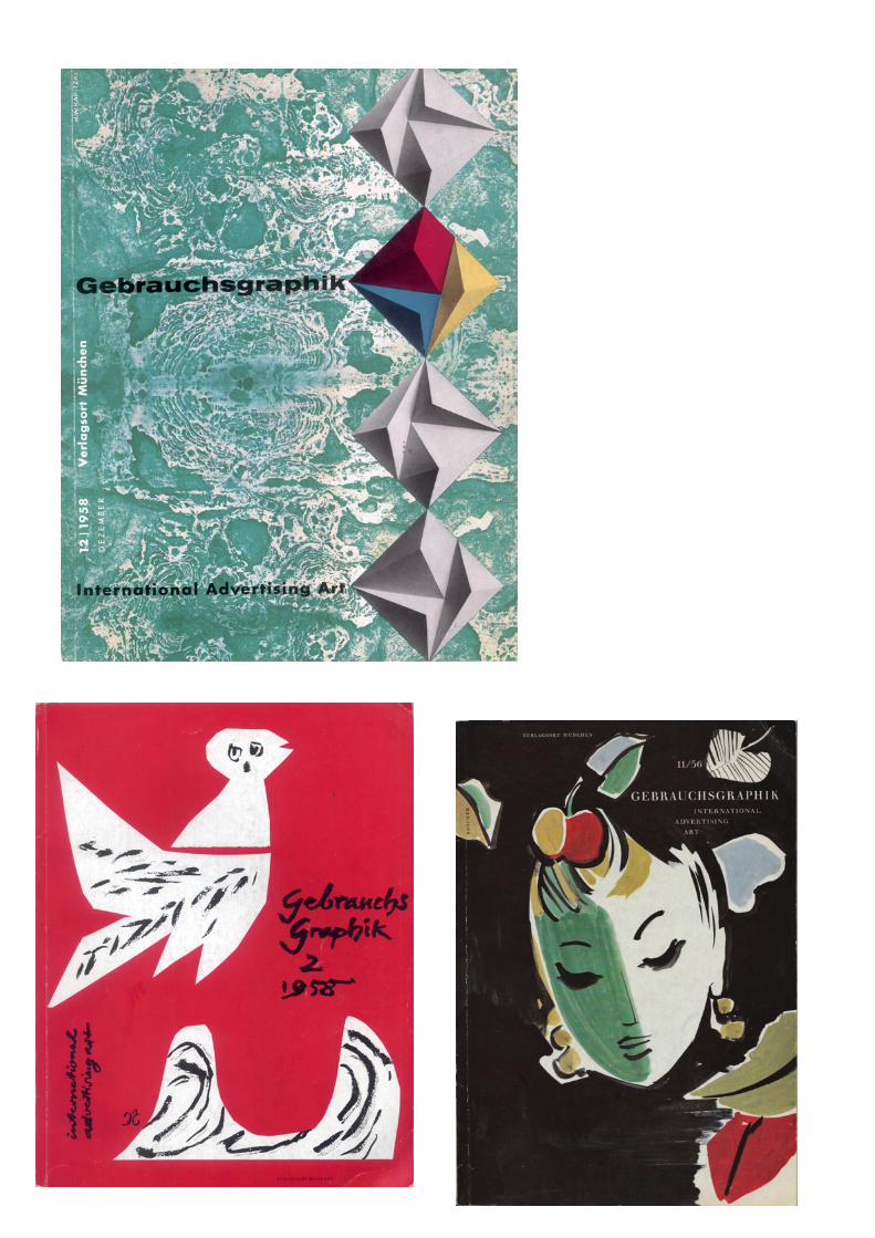
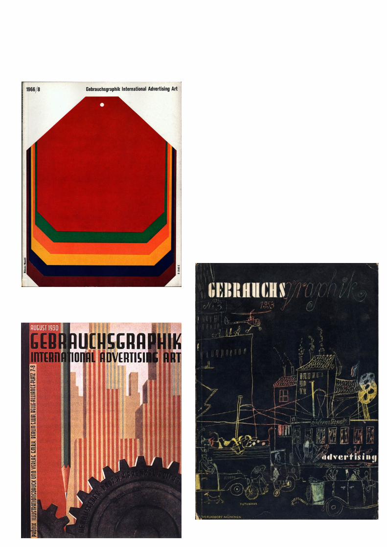
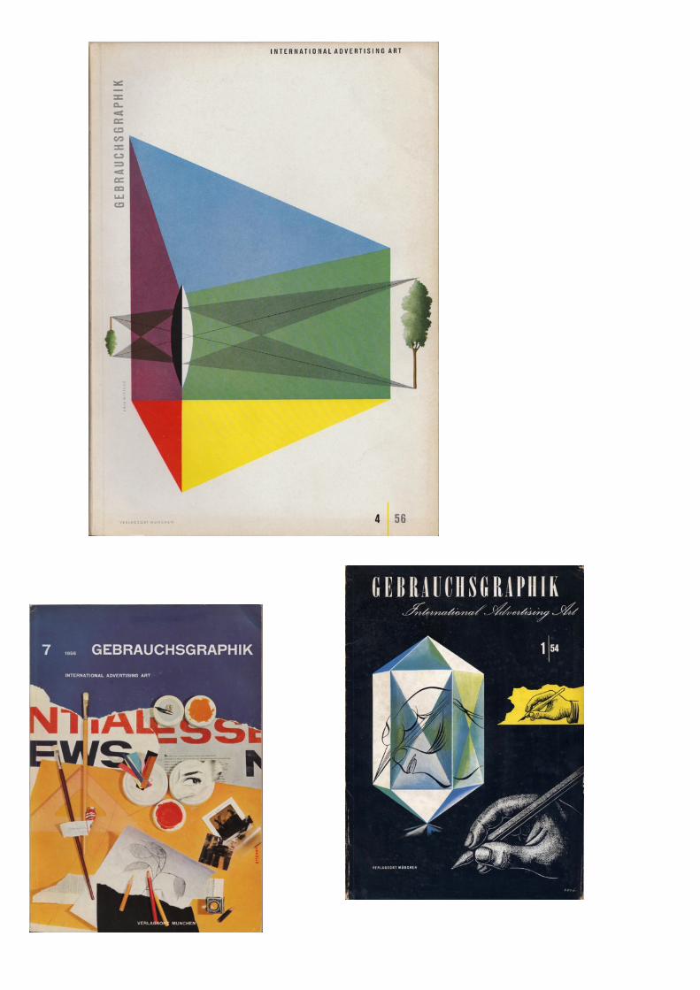
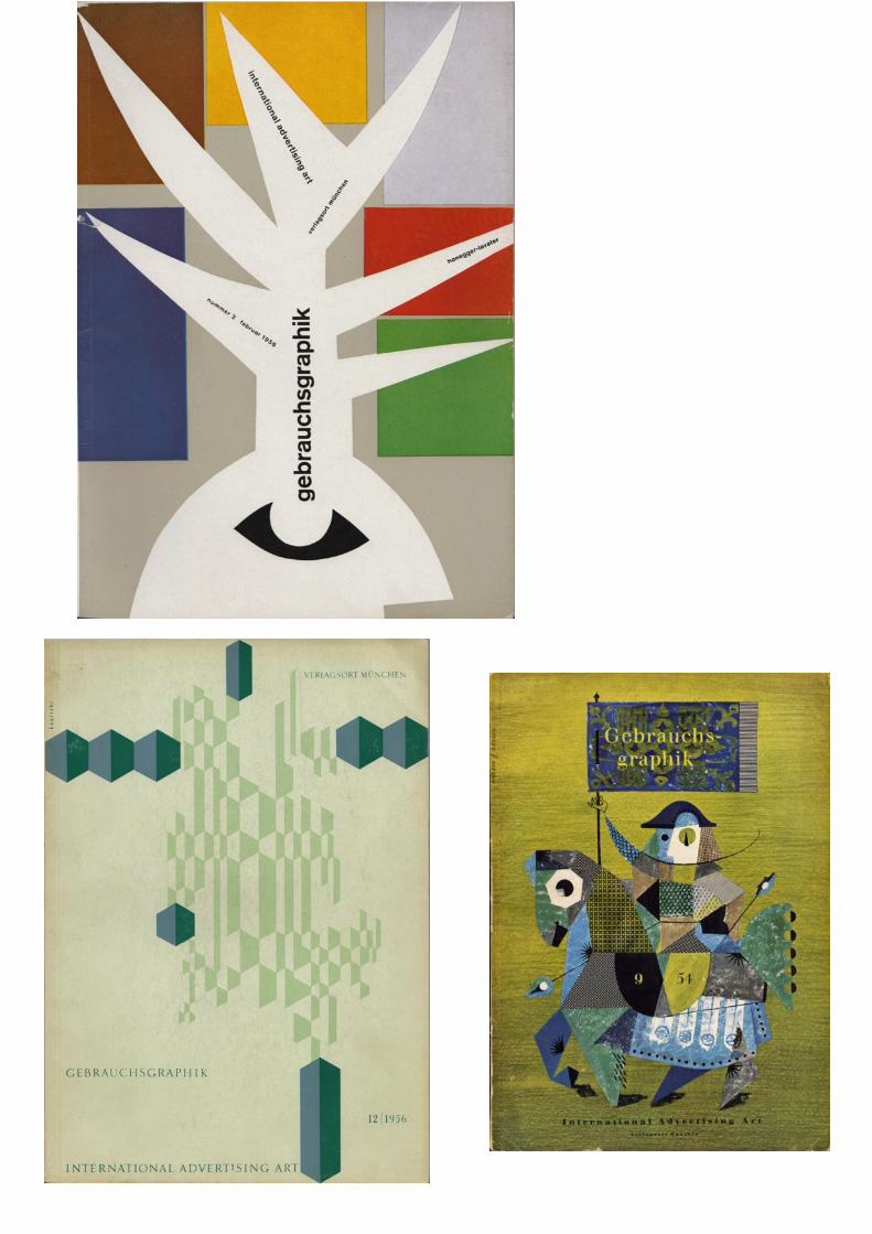
page 91-98: gebrauchsgraphik
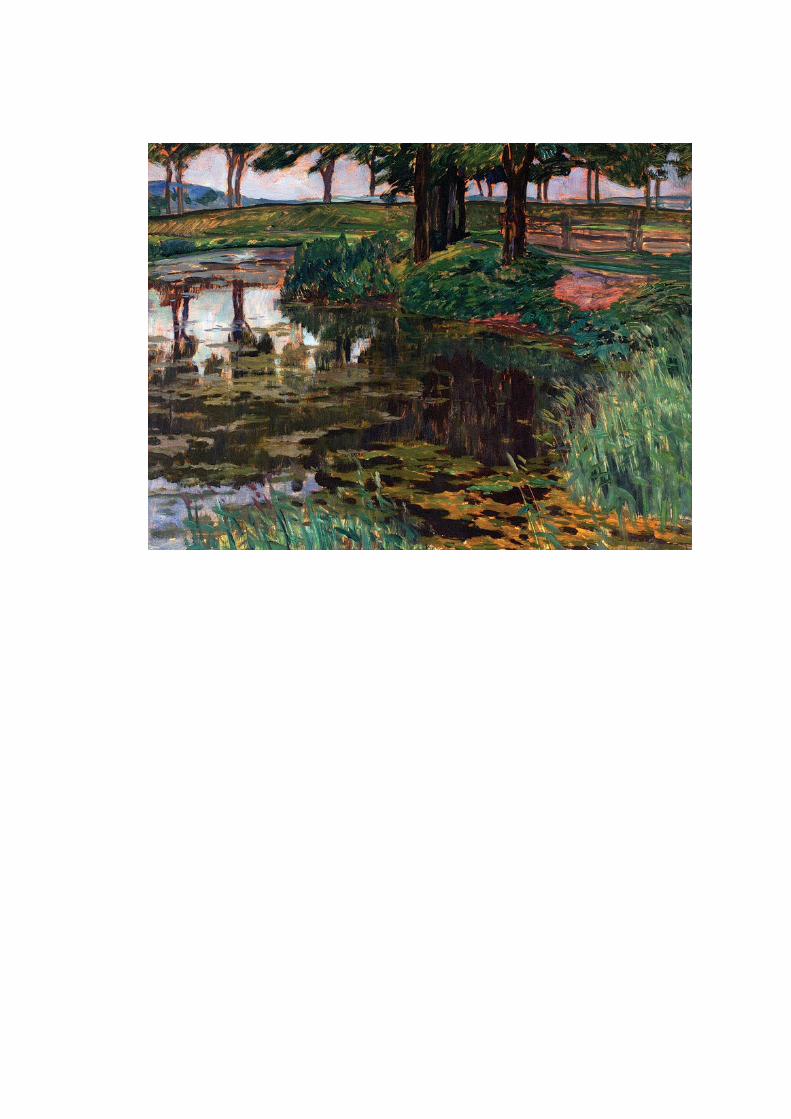
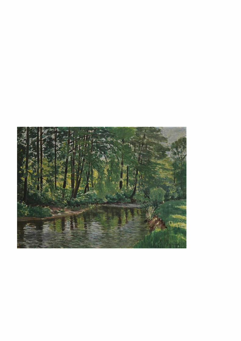
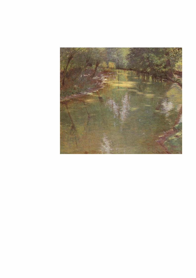
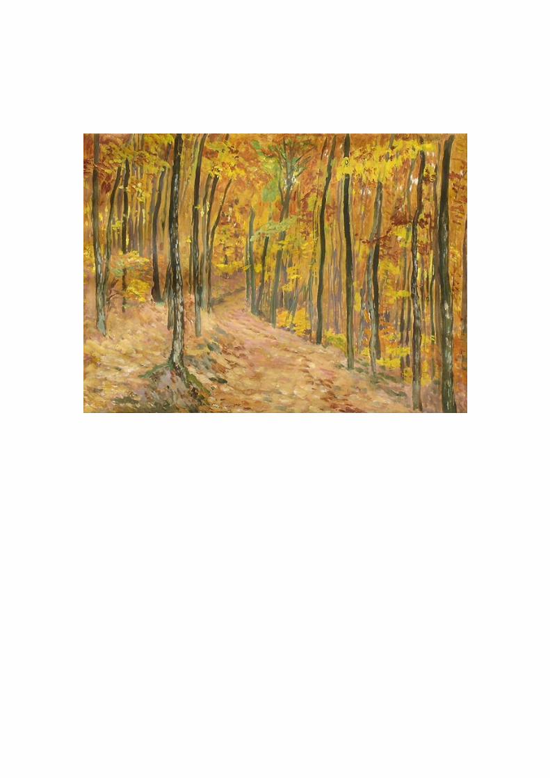
page 99-105: antonin hudecek
page 106-117: corita kent
page 118-130: sandra juto
page 131-132: by an unknown photographer
page 133-143: an archive # 6
j
joseph zaritsky
Zaritsky was born in 1891 in Ukraine, then part of the Russian Empire. He lived in Amsterdam, Paris and Brussels, but mostly he lived in Jerusalem. He studied at the art
academy in Kiev before emigrating to Mandate Palestine in 1923. In 1929, he relocated from Jerusalem to Tel Aviv, where he became involved in the city's cultural
life while documenting its scenes in his paintings.[1] Between the years 1944–47 lived in Zikhron Ya'akov. In 1948, he was Chairman of the Association of Painters and
Scuptors. For over 20 years he worked in watercolours, which he first exhibited at an exhibition jointly with the sculptor Avraham Milkov, at the Tower of David in
Jerusalem in 1923, making a notable impact and evoking great interest.[2]
After his arrival in Palestine in 1923, it did not take long for Yossef Zaritsky to become one of the country's leading artists and critics, earning acclaim for his singular
interpretation of the watercolors of Paul Cezanne and the Russian symbolist Vroubel. Between 1932–33 he opened a studio in the cellar of his home in Rehov Mapu, Tel
Aviv. Standard bearer of the Universalists in their conflict with the Orientalists, he led the "New Horizons" group which grew out of the confrontation. In this perspective, his watercolors were seen as a milestone on the road to modernism. His watercolor
portraits and still lifes of the late 1920s and the 1930s reflect the influence of the French Intimists, and sometimes of Matisse.
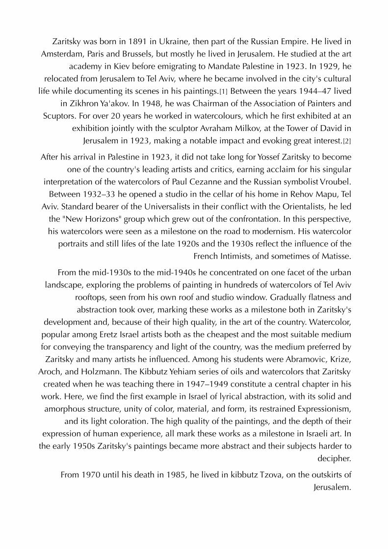
From the mid-1930s to the mid-1940s he concentrated on one facet of the urban landscape, exploring the problems of painting in hundreds of watercolors of Tel Aviv
rooftops, seen from his own roof and studio window. Gradually flatness and abstraction took over, marking these works as a milestone both in Zaritsky's
development and, because of their high quality, in the art of the country. Watercolor, popular among Eretz Israel artists both as the cheapest and the most suitable medium for conveying the transparency and light of the country, was the medium preferred by Zaritsky and many artists he influenced. Among his students were Abramovic, Krize,
Aroch, and Holzmann. The Kibbutz Yehiam series of oils and watercolors that Zaritsky created when he was teaching there in 1947–1949 constitute a central chapter in his work. Here, we find the first example in Israel of lyrical abstraction, with its solid and amorphous structure, unity of color, material, and form, its restrained Expressionism,
and its light coloration. The high quality of the paintings, and the depth of their expression of human experience, all mark these works as a milestone in Israeli art. In
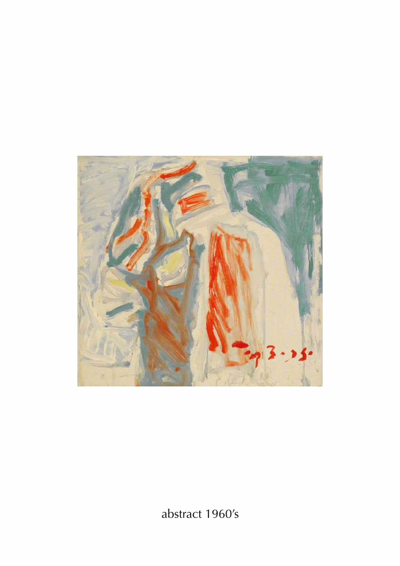
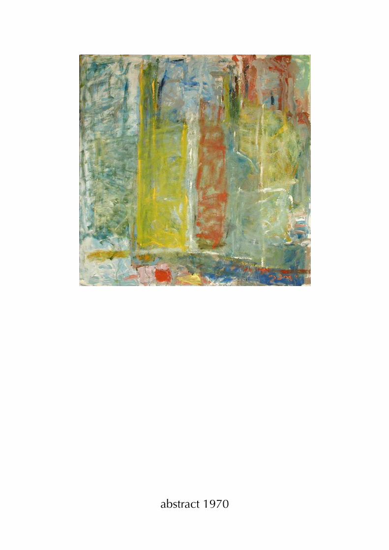
the early 1950s Zaritsky's paintings became more abstract and their subjects harder to decipher.
From 1970 until his death in 1985, he lived in kibbutz Tzova, on the outskirts of Jerusalem.
abstract 1960’s
abstract 1970
untitled
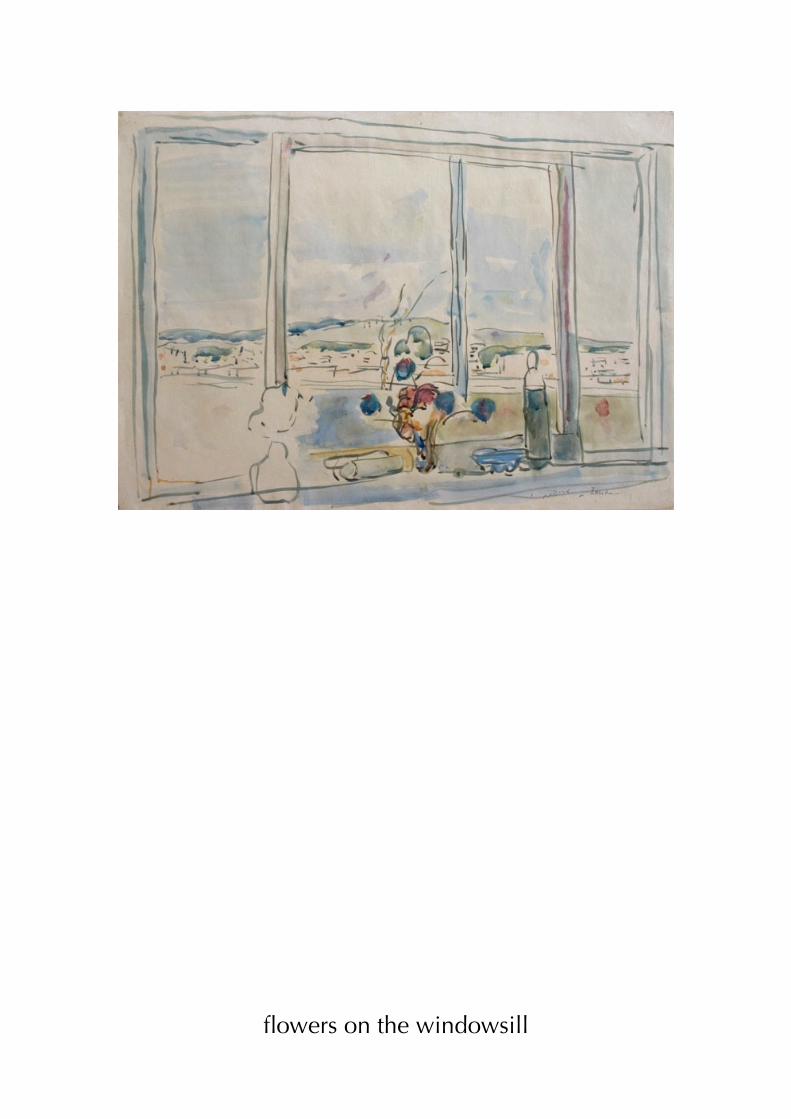
flowers on the windowsill
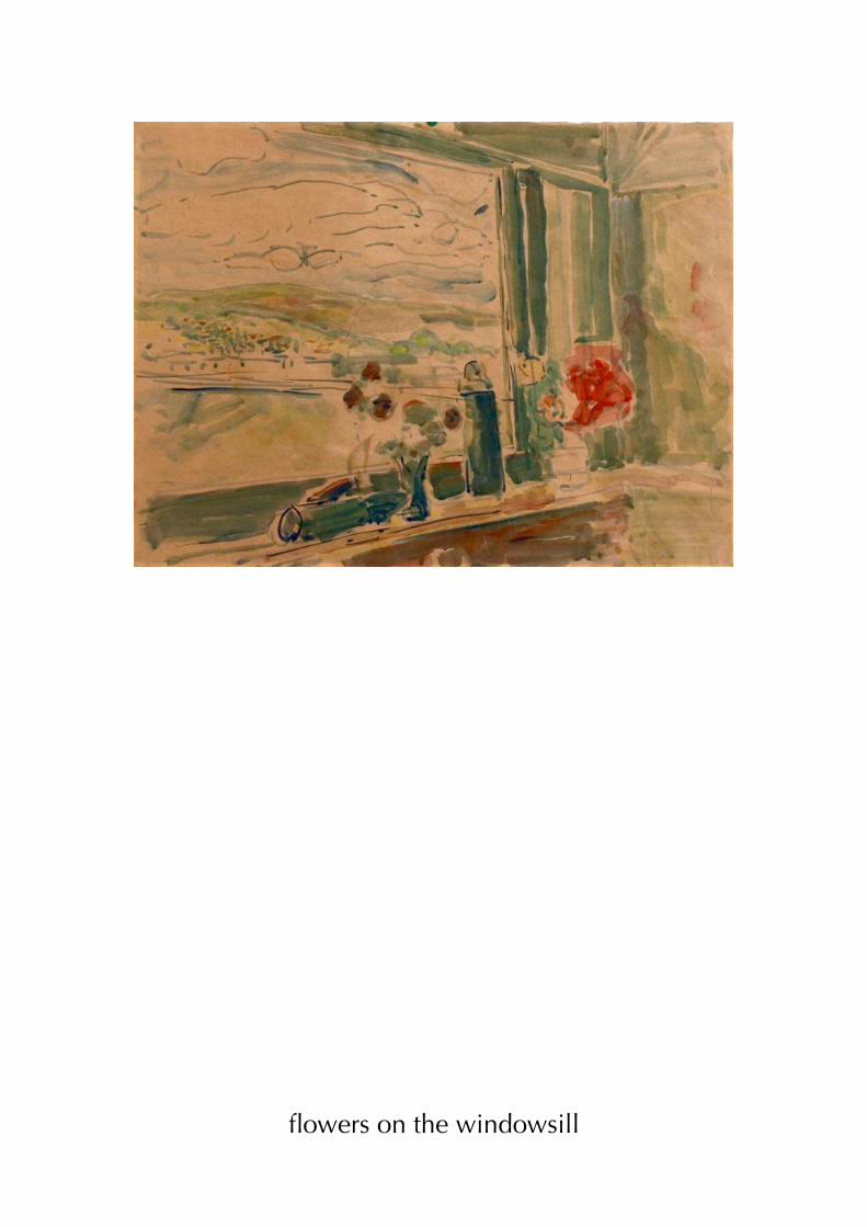
flowers on the windowsill
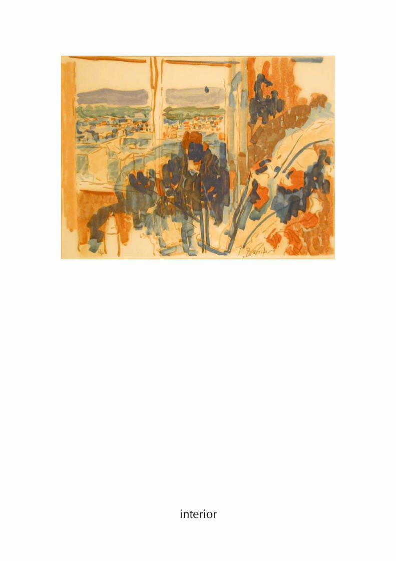
interior
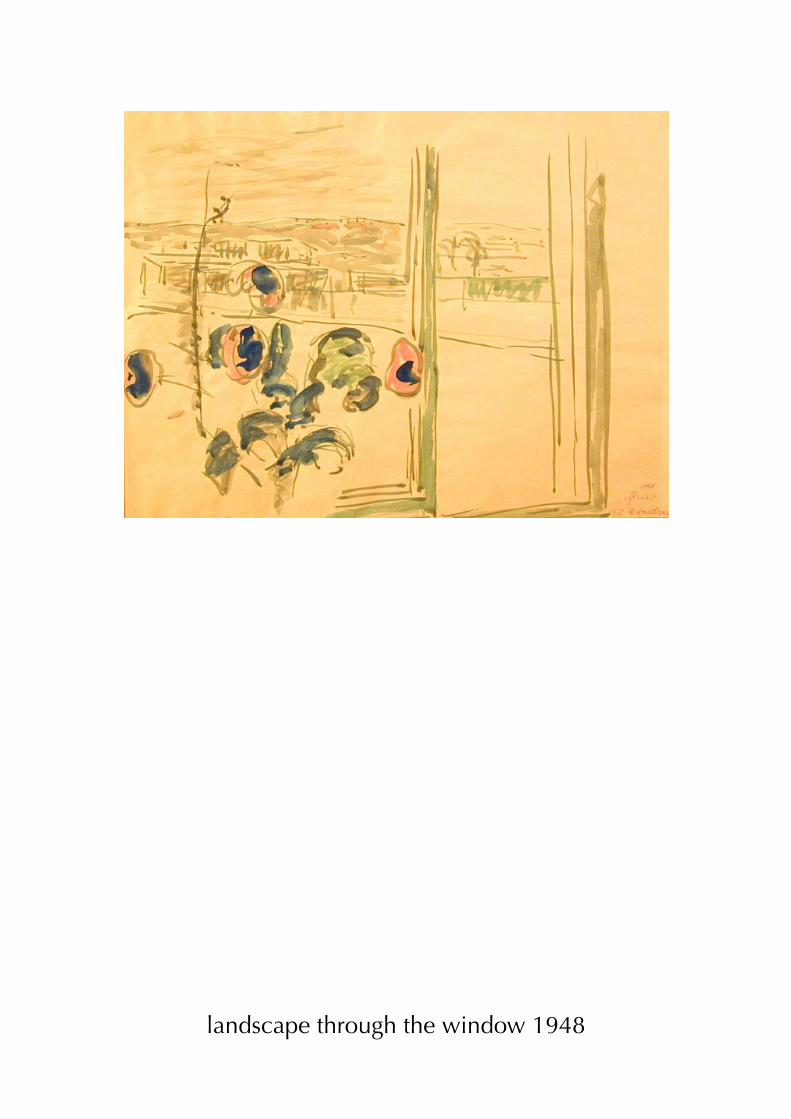
landscape through the window 1948
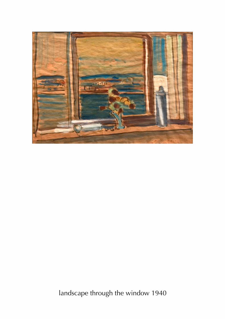
landscape through the window 1940
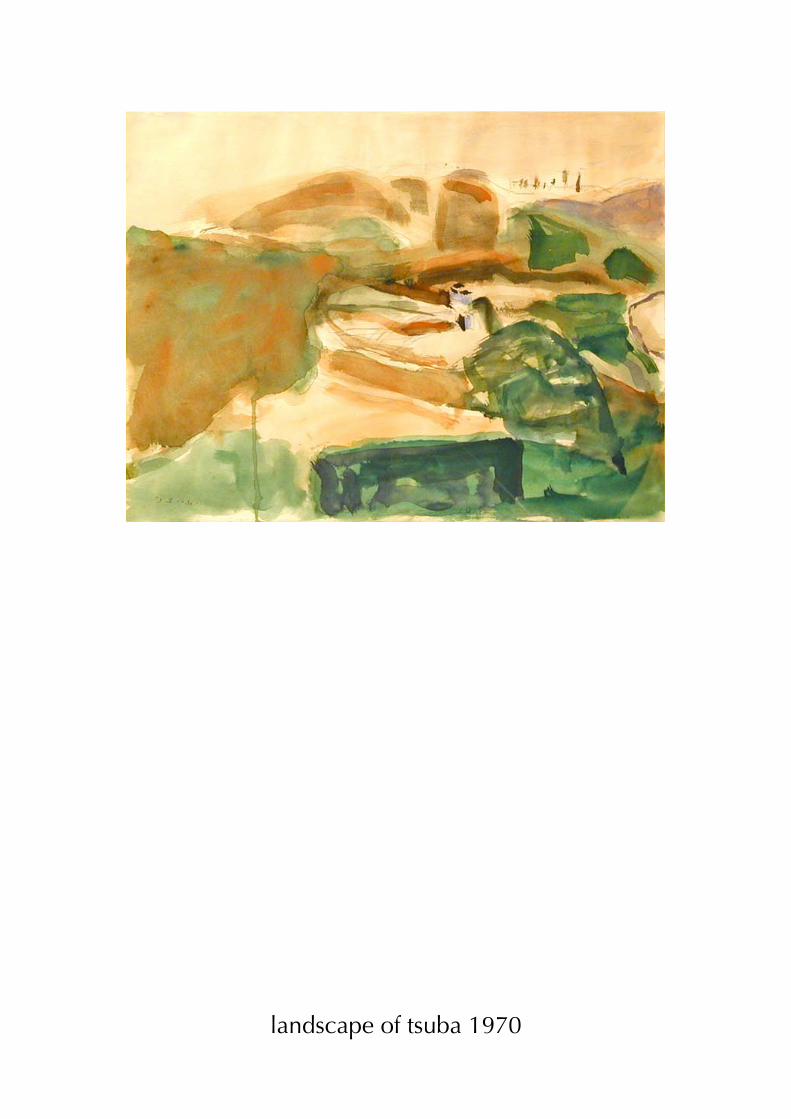
landscape of tsuba 1970
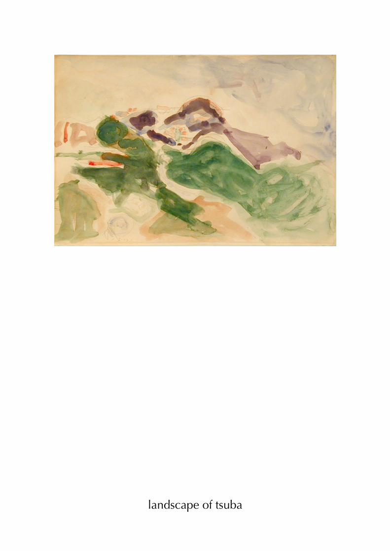
landscape of tsuba
m
abraham mignon
mignon was born at Frankfurt. His father, a merchant, placed him under the care of the still-
life painter Jacob Marrel, when he was only seven years old. Marrel specialized in flower
painting, and found him to be his best pupil. He accompanied Mignon when he moved to
the Netherlands about 1660 to work under Jan Davidszoon de Heem at Utrecht. In 1675 he
settled there permanently and married the daughter of the painter Cornelis Willaerts
(granddaughter of Adam Willaerts).

b
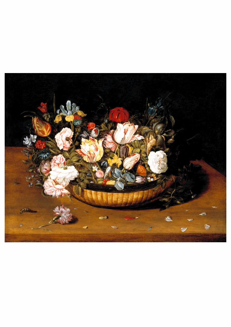
osias beert
Osias Beert (Antwerp, c. 1580 – 1624) was a Flemish Baroque painter who specialized in
flower and "breakfast"-type still lifes. He joined the city's Guild of St. Luke in 1608, and
trained Frans van der Borch, Frans IJkens, Paulus Pontius and Jan Willemssen. Beerts's floral
paintings, often showing a vase of flowers in a shallow niche, are similar to the works of
Ambrosius Bosschaert. His breakfast pieces, frequently known by their Dutch name ontbijtjes
("little breakfasts"), are seen from a high angle with forced perspective, as was common in
both Flemish and Dutch still life painting in the early years of the seventeenth century.
p
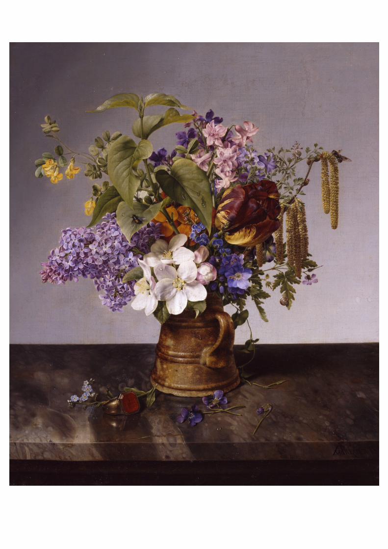
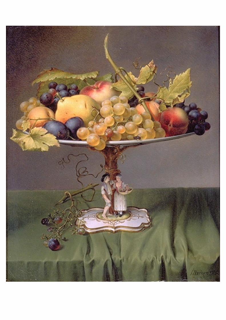
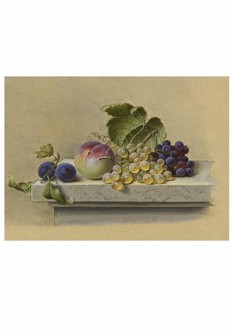
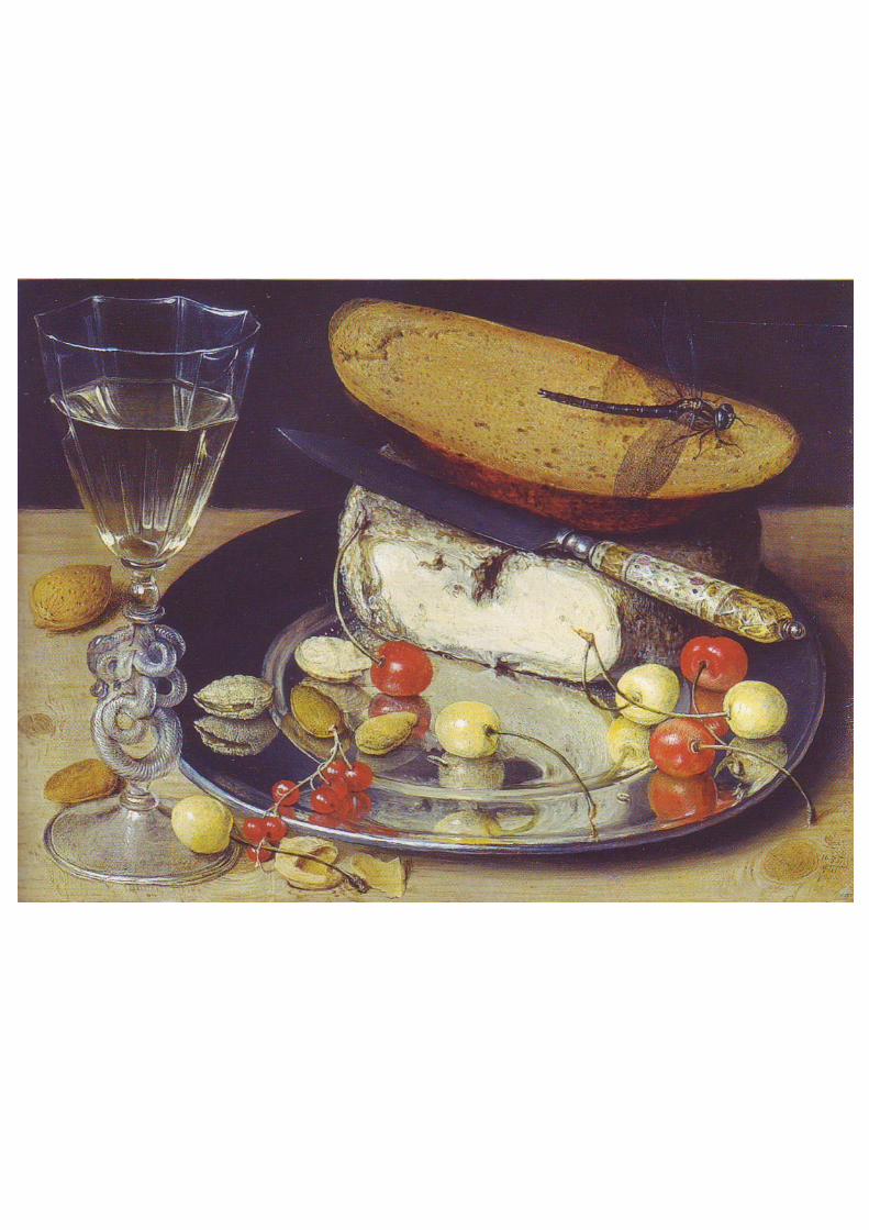
johann wilhelm preyer
johann Wilhelm Preyer, a distinguished exponent of the Düsseldorf School of
painting, was one of the few of that school to specialise in still lifes. From 1822
Preyer studied at the renowned Düsseldorf Academy, at first under Peter von
Cornelius and later under Wilhelm von Schadow until 1931.
Johann showed work at Berlin Academy exhibitions from 1830 and went to the
Netherlands in 1935. Preyer went to Munich in 1837, accompanied by his brother
Gustav and his friends Johann Peter Hasenclever and Theodor Janssen. There
Johann Wilhelm Preyer did several of his best still lifes and was so successful that
King Ludwig I of Bavaria bought one of his paintings. From Munich Johann
Wilhelm Preyer and his two friends travelled frequently to Italy and Switzerland.
In 1848 Preyer founded the "Malkasten" Artists' Association in Düsseldorf, where
he stayed for the rest of his life
a
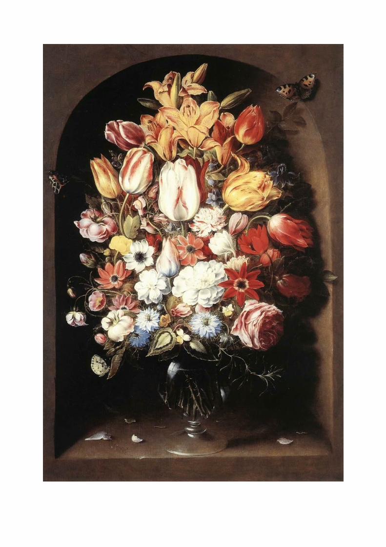
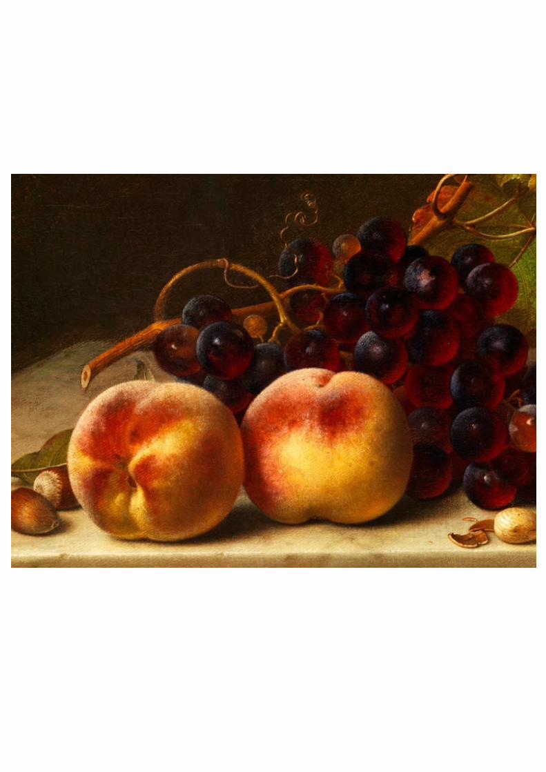
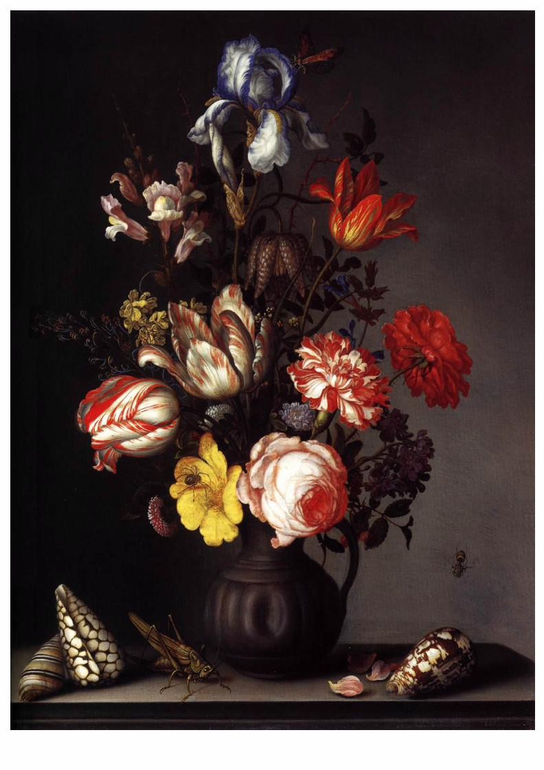
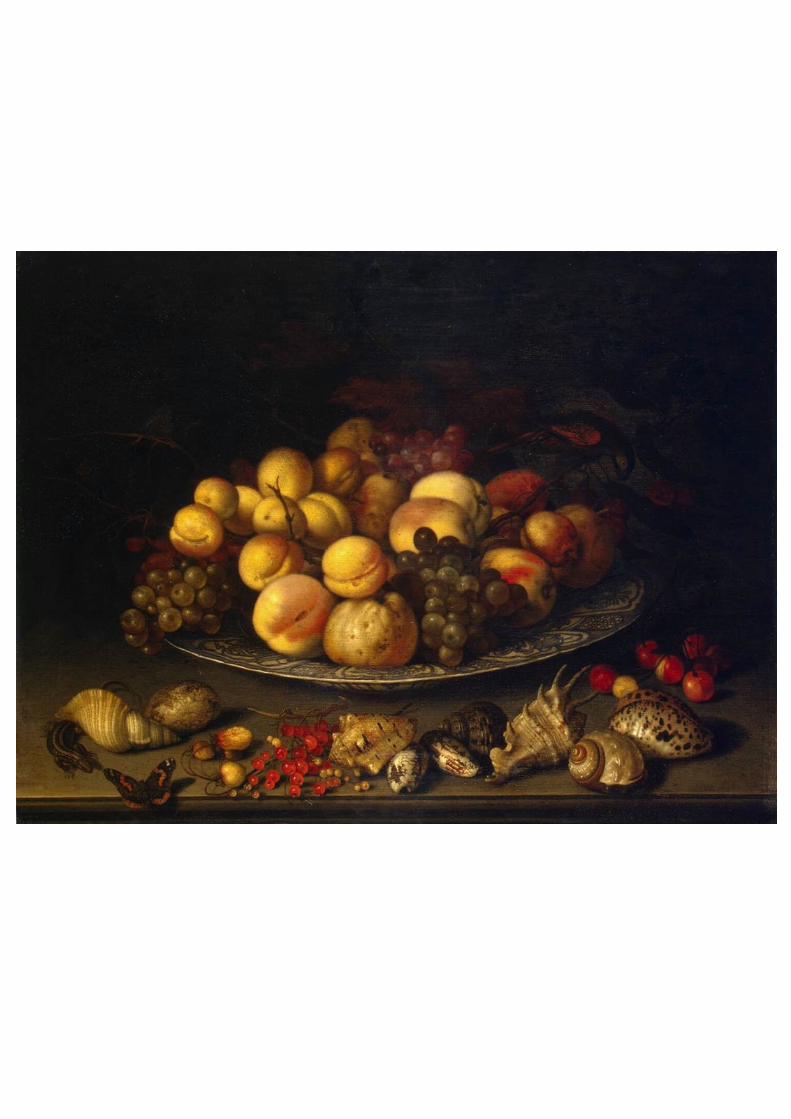
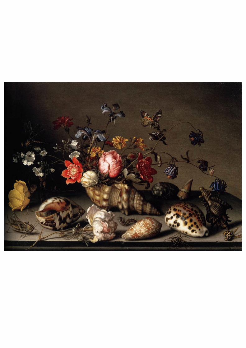
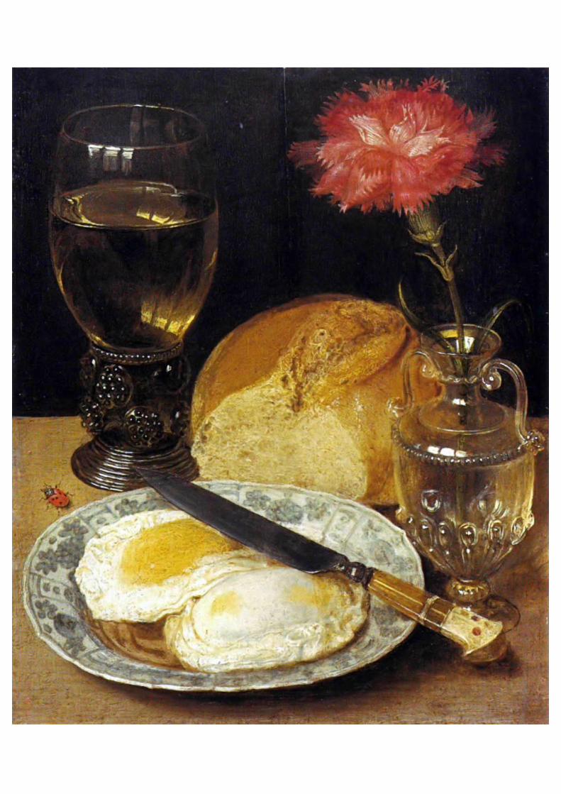
balthasar van der ast
balthasar van der Ast (1593/94–1657) was a Dutch Golden Age painter who specialized in
still lifes of flowers and fruit, as well as painting a number of remarkable shell still lifes; he is
considered to be a pioneer in the genre of shell painting. His still lifes often contain insects
and lizards.
f
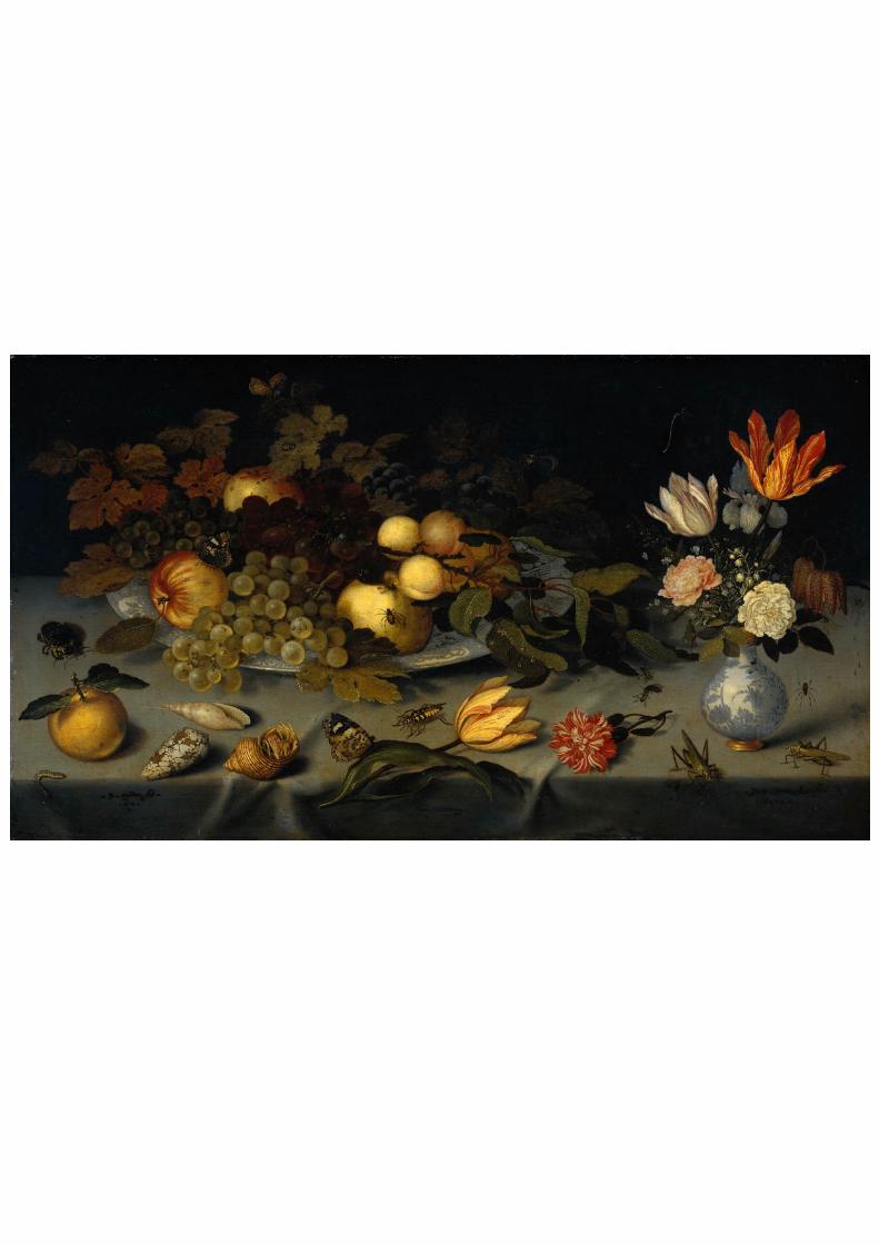
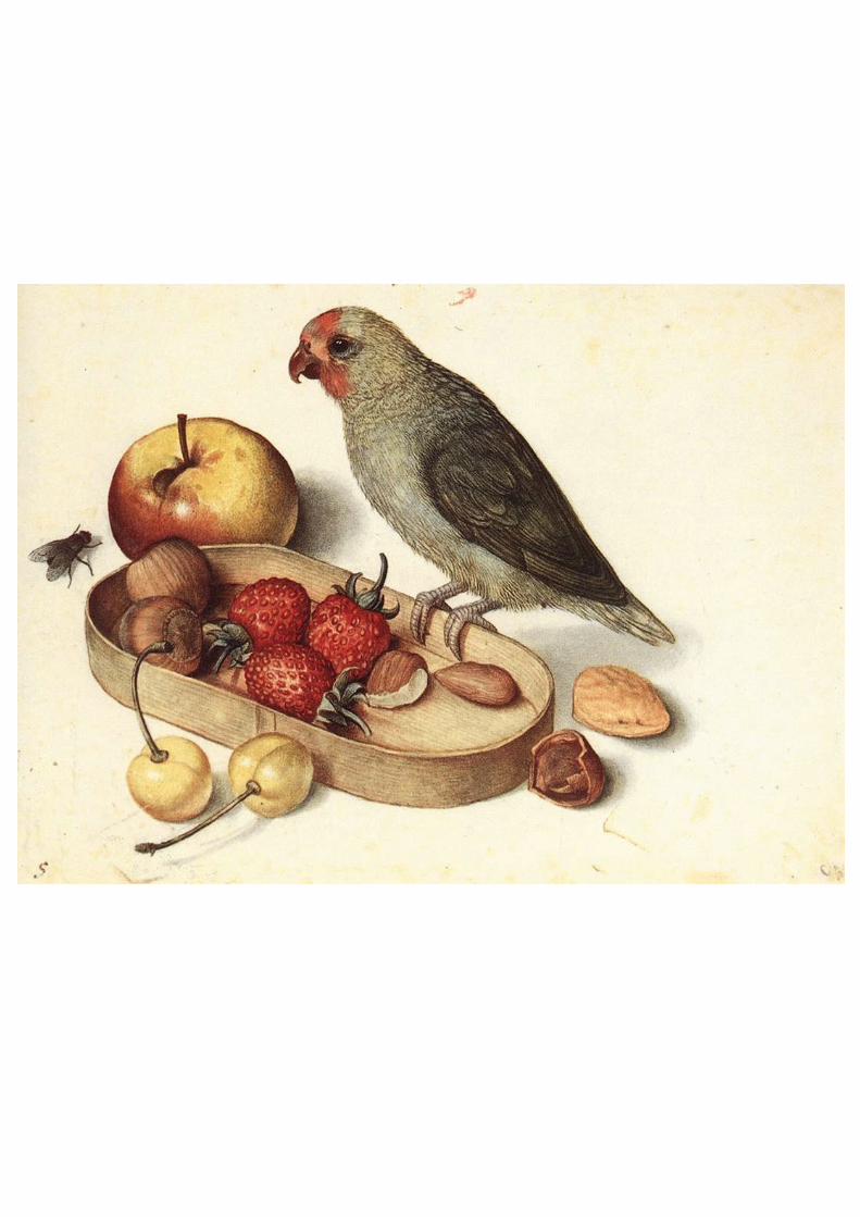
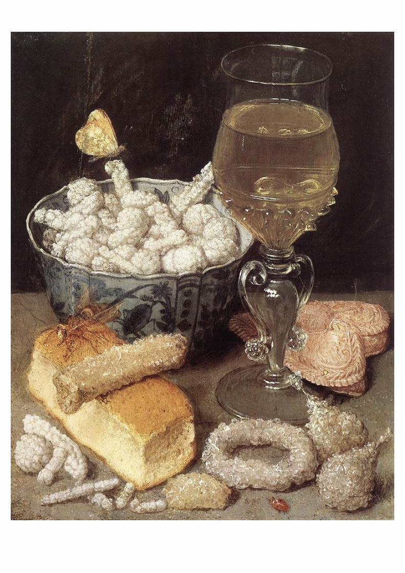
georg flegel
Flegel was born in Olmütz (Olomouc), Moravia. Around 1580 he moved to Vienna, where he
became an assistant to Lucas van Valckenborch I, a painter and draughtsman. Flegel and his
employer later moved to Frankfurt, which at the time was an important art-dealing city. As an
assistant, he inserted items such as fruit, flowers, and table utensils into Valckenborch's
works.
In a period of about 30 years (c. 1600-1630), he produced 110 watercolor pictures, mostly
still life images which often depicted tables set for meals and covered with food, flowers, and
the occasional animal. Among his students were his own two sons, Friedrich
(1596/1597-1616) and Jacob (probably Leonhard, 1602-1623), as well as the artist Jacob
Marrel.
s
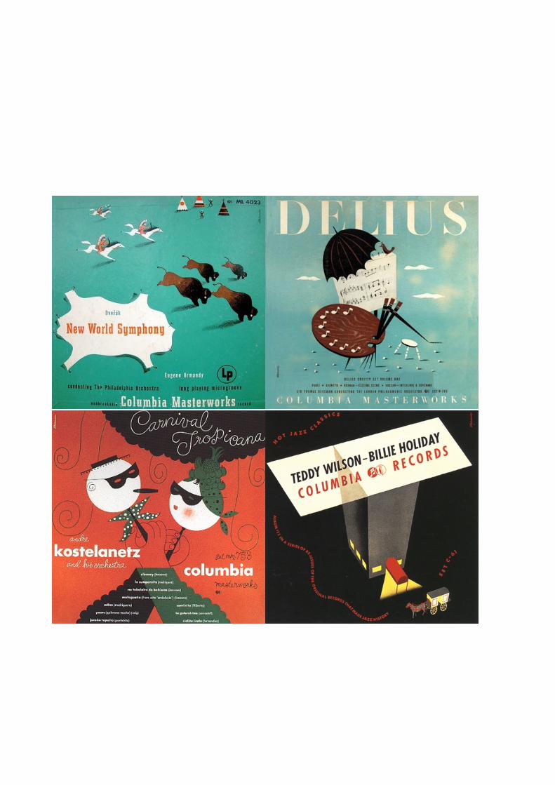
alex steinweiss
Alex Steinweiss, art director for Columbia Records during the 1940s, revolutionized
the way records were packaged and marketed. His genre-defining work in the visual
expression of music transformed both the design and the music industries.
Steinweiss was born in 1917 into a music-loving home in Brooklyn, New York. In
1930, Steinweiss entered Abraham Lincoln High School. His skills in art brought him
to the attention of the visual arts teacher Leon Friend. Friend encouraged the talents of
a select group of students known as the “Art Squad” that included, among others,
Gene Federico, Seymour Chwast, and William Taubin. They designed school
publications, posters and signs, and were encouraged to submit their work to as many
publications and competitions as possible. Steinweiss's work was showcased in PM
Magazine when he was just 17. Steinweiss won a scholarship to Parsons School of
Design in 1934, became an assistant to the newly arrived Austrian designer Joseph
Binder in 1937 and, in 1939, at the age of 23, he became the first art director of the
recently formed Columbia Records.
At this time, 78-r.p.m. shellac-coated records were packaged as sets of three or four
records in separate sleeves bound between plain pasteboard covers. They were
stamped only with the title of the work and the name of the recording artist and
displayed on shelves with just the spines showing. Steinweiss recognized an
opportunity to use the packaging in more creative ways to reflect the music it
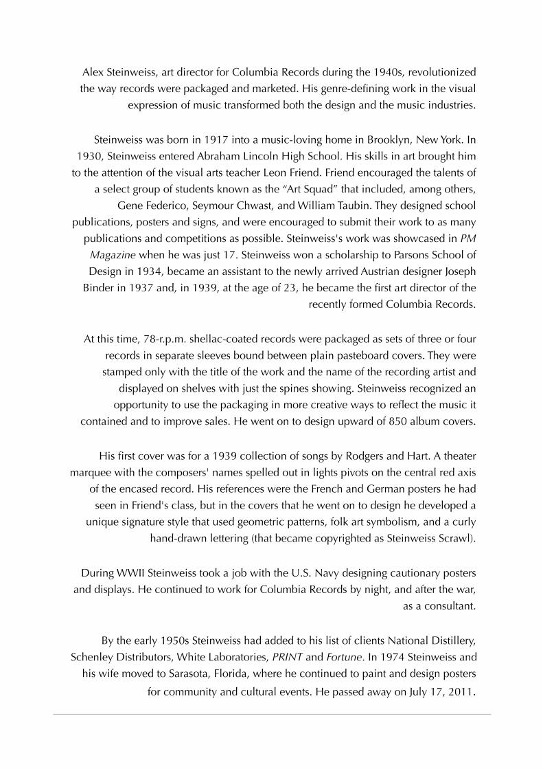
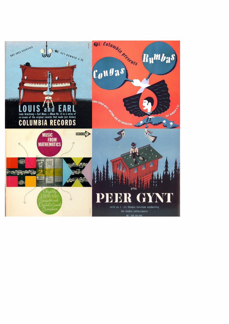
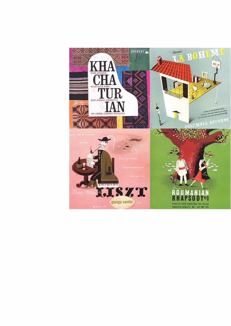
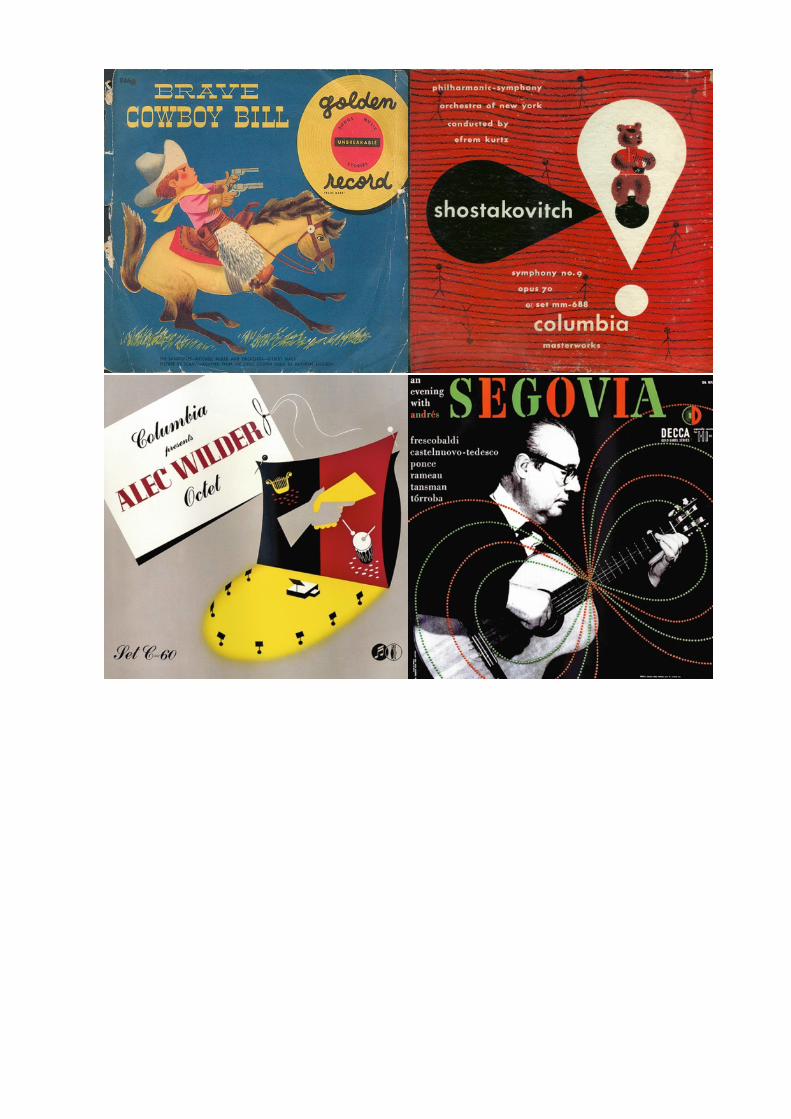
contained and to improve sales. He went on to design upward of 850 album covers.
His first cover was for a 1939 collection of songs by Rodgers and Hart. A theater
marquee with the composers' names spelled out in lights pivots on the central red axis
of the encased record. His references were the French and German posters he had
seen in Friend's class, but in the covers that he went on to design he developed a
unique signature style that used geometric patterns, folk art symbolism, and a curly
hand-drawn lettering (that became copyrighted as Steinweiss Scrawl).
During WWII Steinweiss took a job with the U.S. Navy designing cautionary posters
and displays. He continued to work for Columbia Records by night, and after the war,
as a consultant.
By the early 1950s Steinweiss had added to his list of clients National Distillery,
Schenley Distributors, White Laboratories, PRINT and Fortune. In 1974 Steinweiss and
his wife moved to Sarasota, Florida, where he continued to paint and design posters
for community and cultural events. He passed away on July 17, 2011.
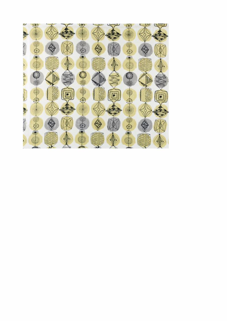
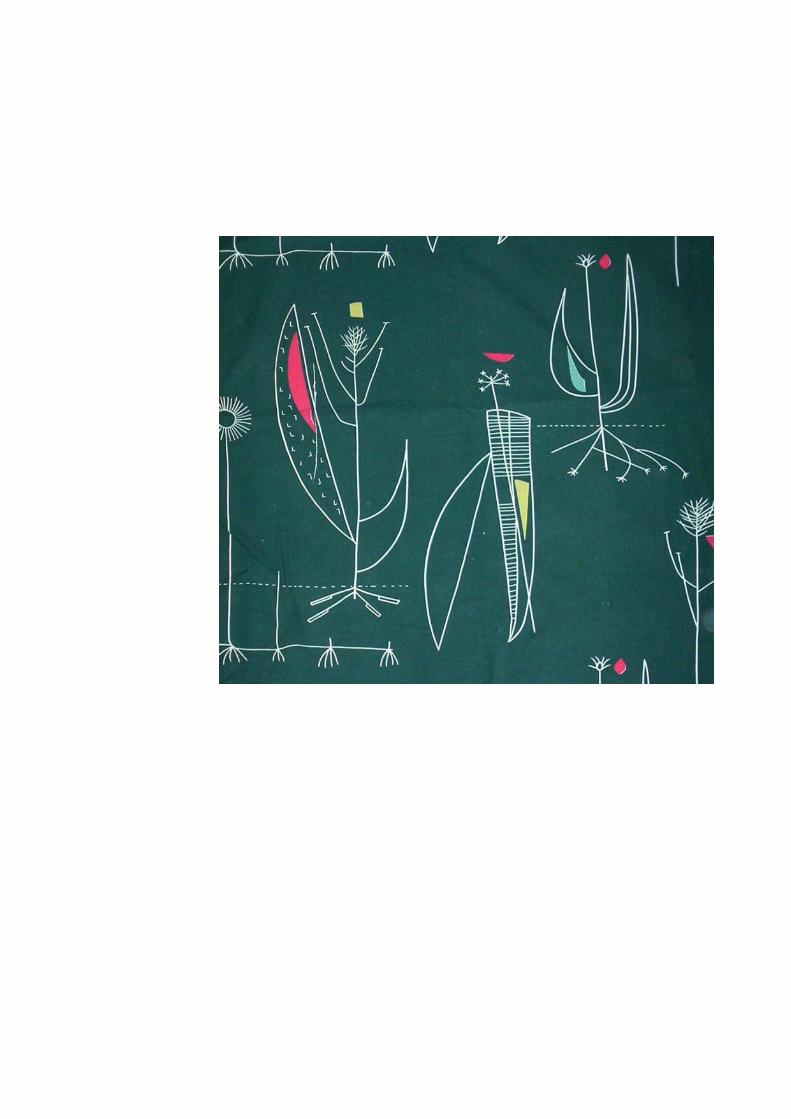
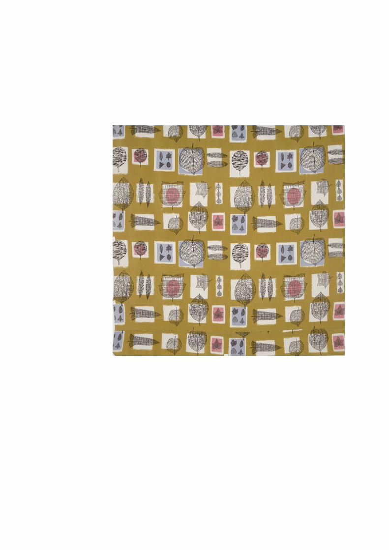
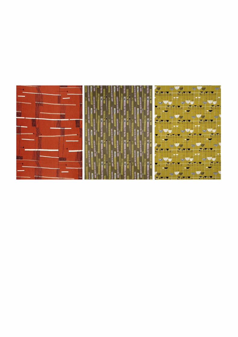
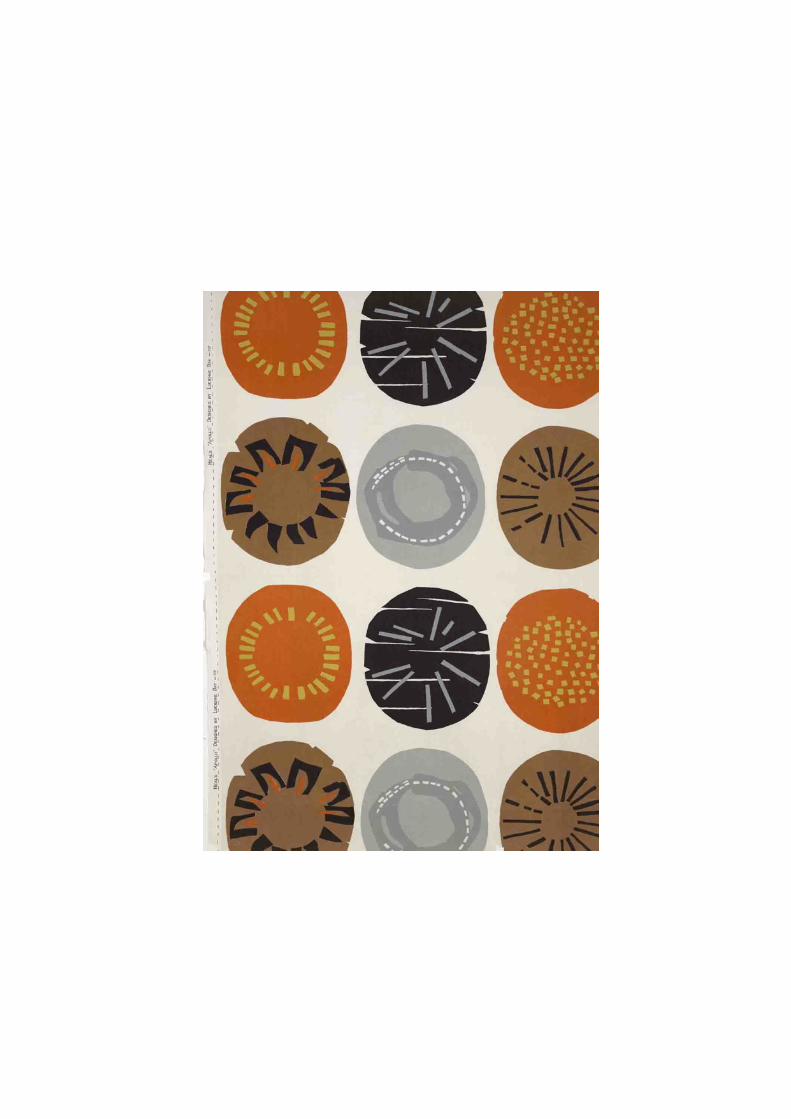
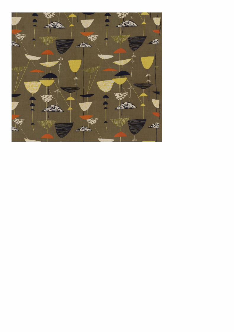
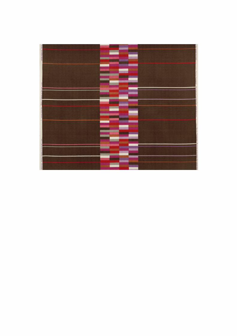
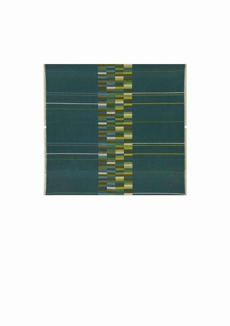
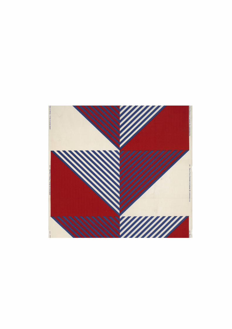
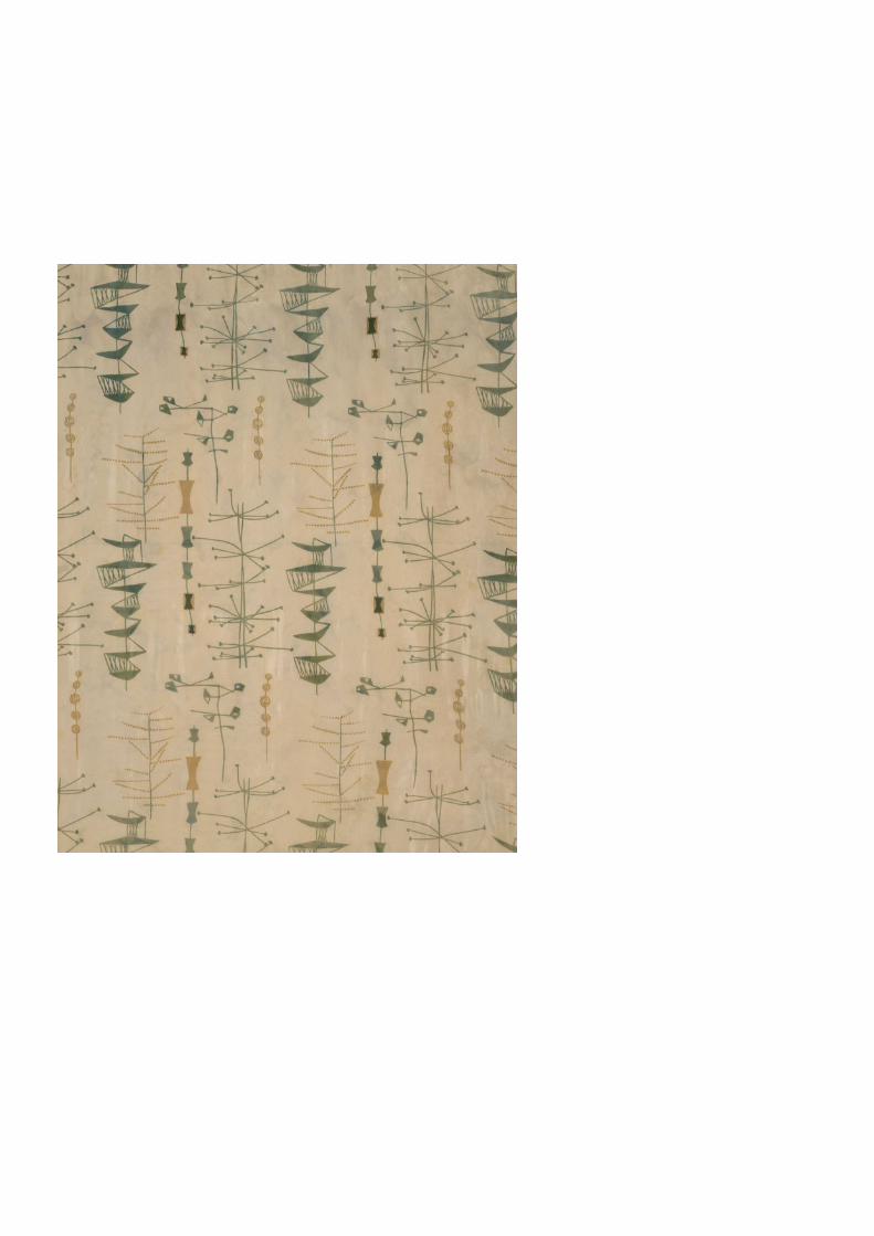
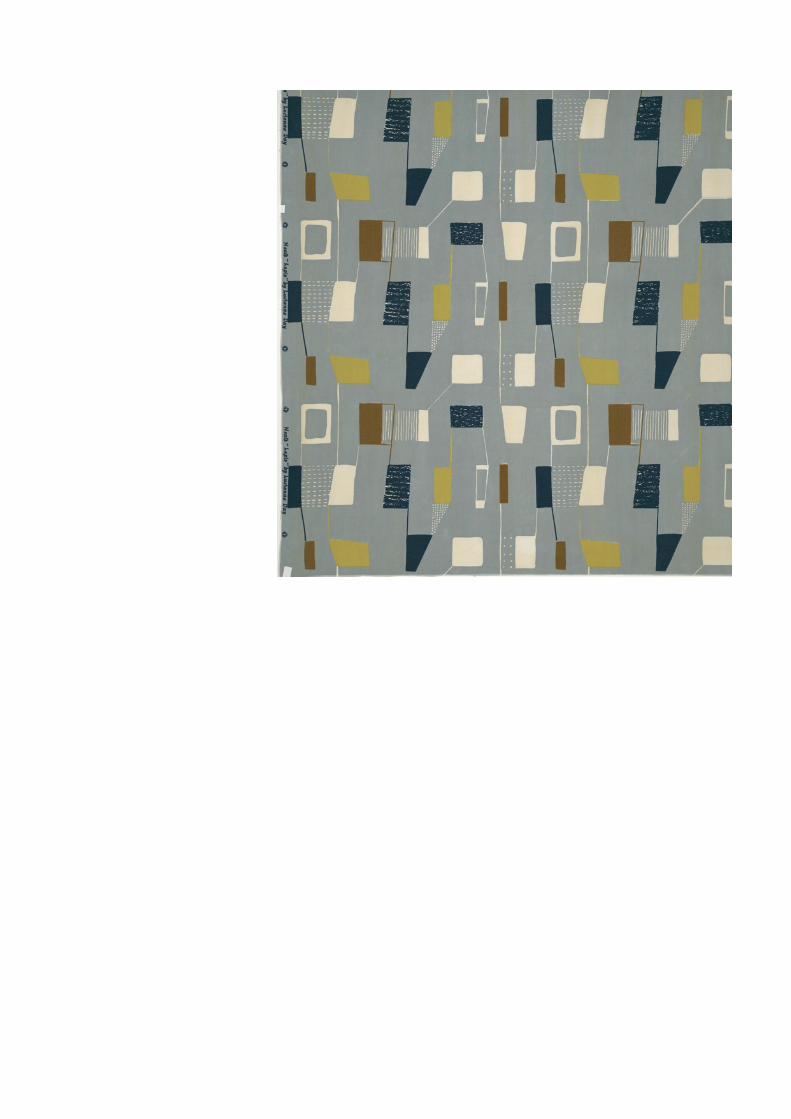
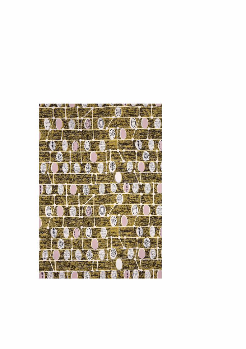
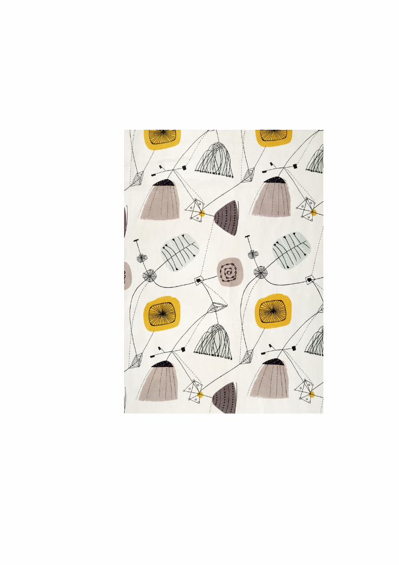
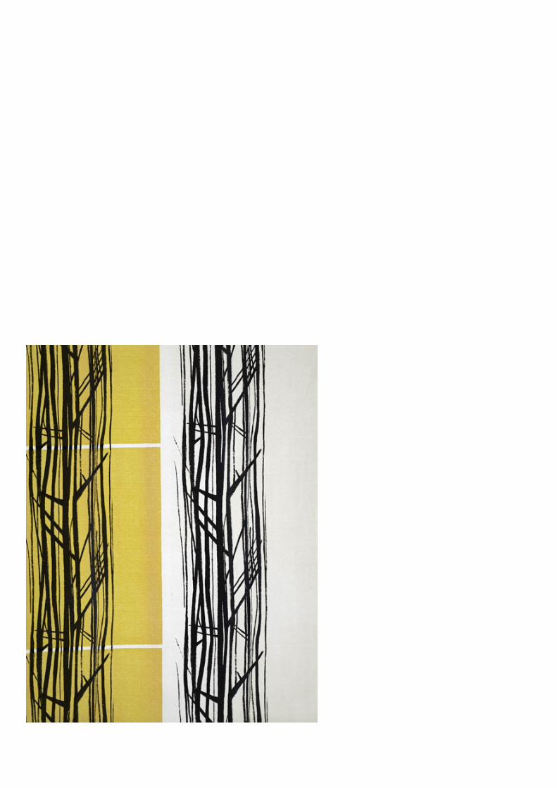
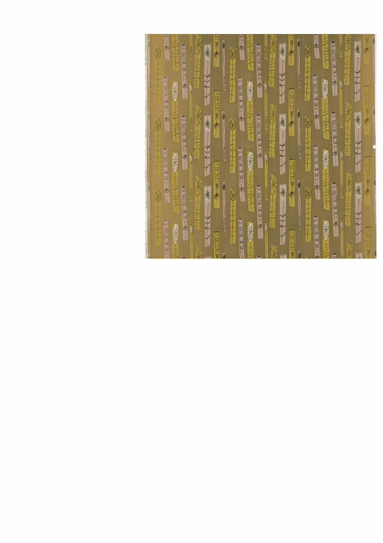
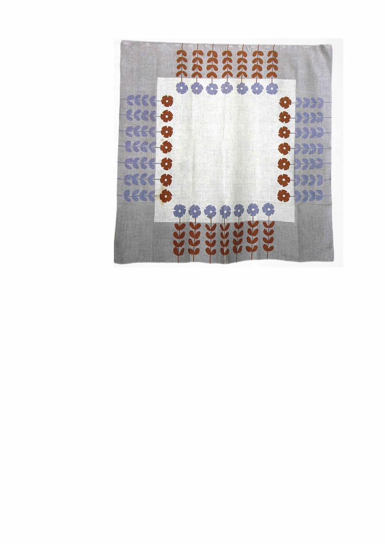
dlucienne day
Désirée Lucienne Day RDI (née Conradi; 5 January 1917 – 30 January 2010) was a British
textile designer. Inspired by abstract art, she pioneered the use of bright, optimistic, abstract
patterns in post-war England, and was eventually celebrated worldwide.
Born in Coulsdon, Surrey, England, Day was daughter of an English mother and a Belgian
father who worked as an insurance broker. She attended convent school in Worthing, and at
17 enrolled in the Croydon School of Art, where she discovered a love of printed textiles.
Later she attended the Royal College of Art, where she was a top student.
Through her career, Day won many awards, including the International Design Award of the
American Institute of Decorators in 1952, and the Gran Premio prize at the Milan Triennale
in 1954. In 1962, she was made a Royal Designer for Industry (RDI), an award which
honours designers who have achieved "sustained excellence in aesthetic and efficient design
for industry." She was the fifth woman to be made an RDI.
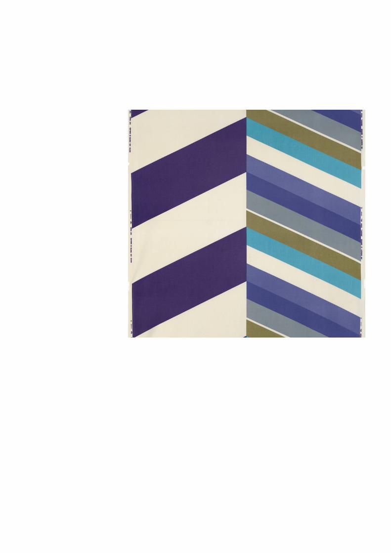
Day's work combined organic shapes with bright patterns inspired by contemporary abstract
painters such as Wassily Kandinsky and Joan Miró. She believed that good design should be
affordable, and in 2003 told the Scotsman newspaper that she had been "very interested in
modern painting although I didn’t want to be a painter. I put my inspiration from painting
into my textiles, partly, because I suppose I was very practical. I still am. I wanted the work I
was doing to be seen by people and be used by people. They had been starved of interesting
things for their homes in the war years, either textiles or furniture."
Her breakthrough print was 'Calyx', a brightly coloured textile that she created for the
Festival of Britain in 1951. She originated hundreds of colourful abstract prints for industry
clients such as Heal's.
In the 1970s, Day ceased to design mass production fabrics, turning instead to creating what
she called “mosaics”: large tapestries made of thousands of pieces of Thai and Indian silk.
They currently hang in the Victoria and Albert Museum, the Queen Elizabeth II Conference
Centre, and the coffee shop of a John Lewis store in Kingston upon Thames.
Through a career spanning more than five decades, she stood out not just because she was a
highly successful working woman during a time in which many women didn't work, but also
due to her creative partnership with her husband, furniture designer Robin Day. For 50 years
they worked, together but independently, in a shared studio, and their house grew to be
considered the epitome of 1950s sophistication.
The development of their styles can be traced in Lesley Jackson's book Robin and Lucienne
Day: Pioneers in Modern Design, published in 2001. An exhibition of Lucienne Day's textiles
and Robin Day's furniture, "Robin and Lucienne Day: Design and the Modern Interior", will
be held in Spring 2011 at Pallant House Gallery in Chichester — the city where the Days
retired in 2000, in order to be closer to their Sussex cottage, where Day spent much of her
time in the garden.
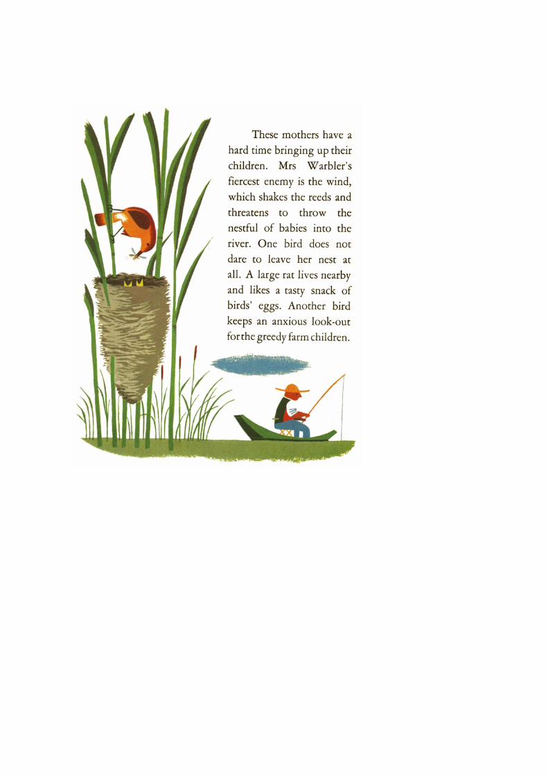
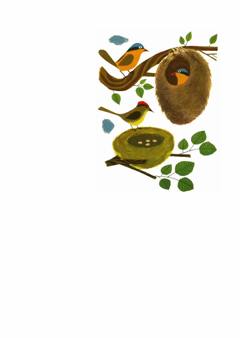
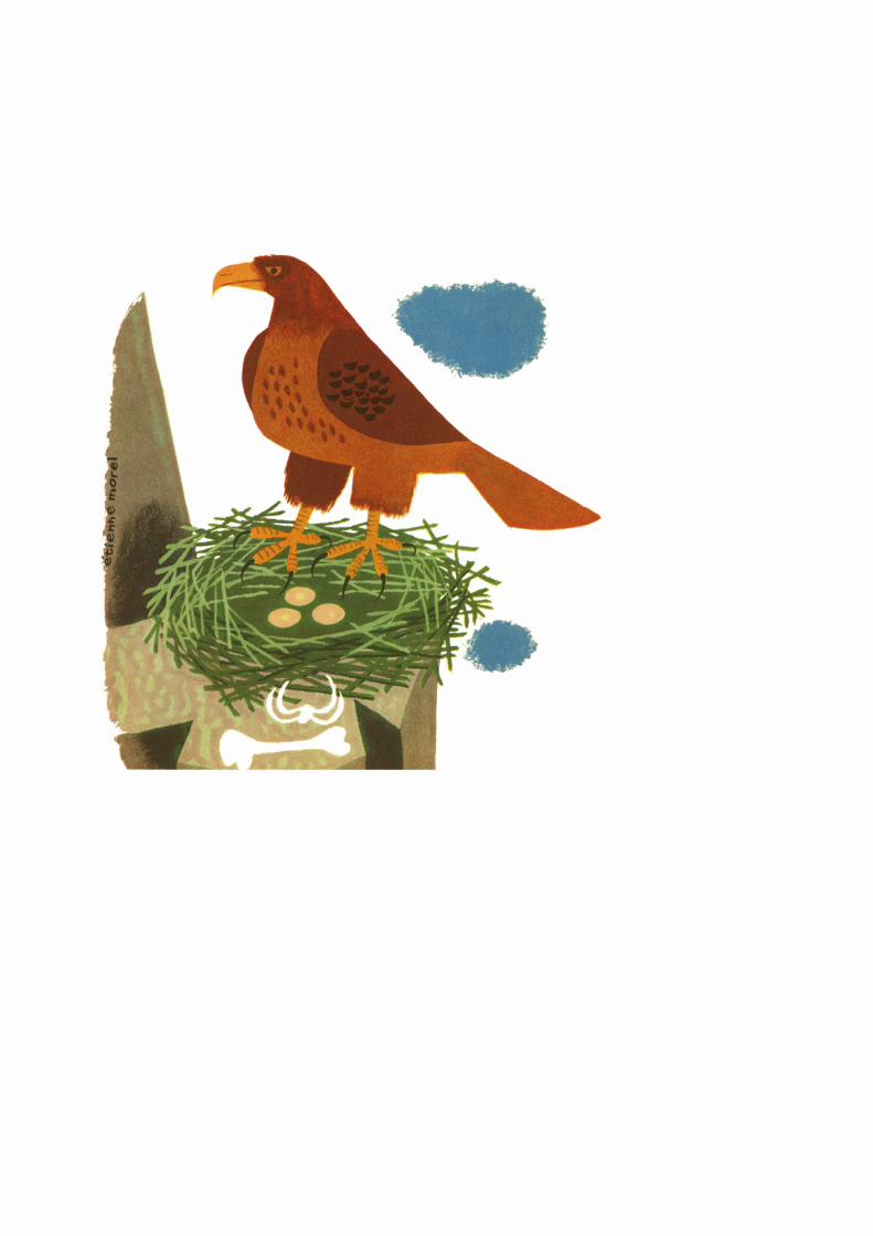
metienne morel

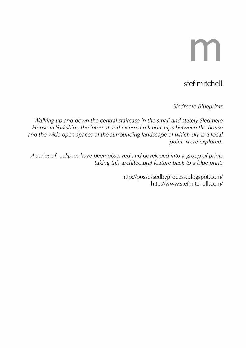
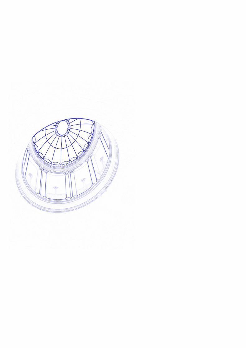
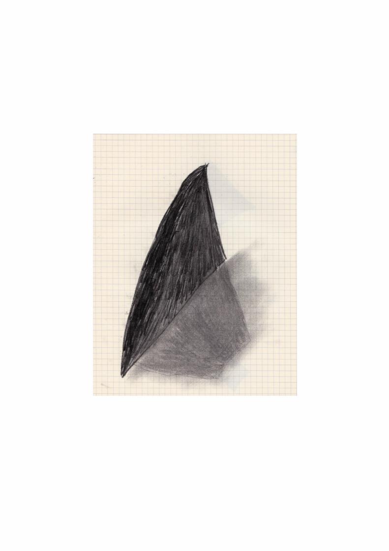
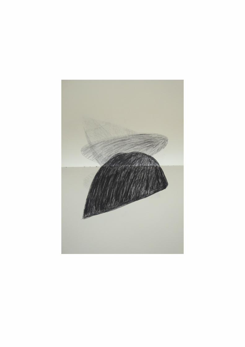
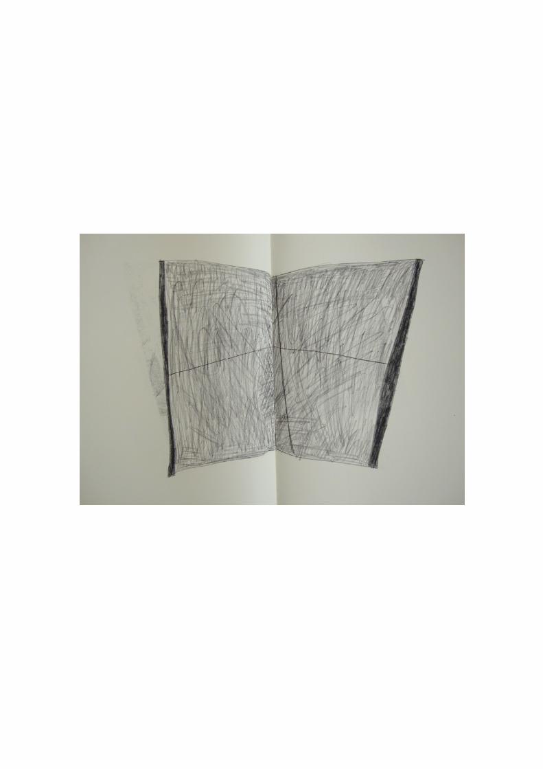
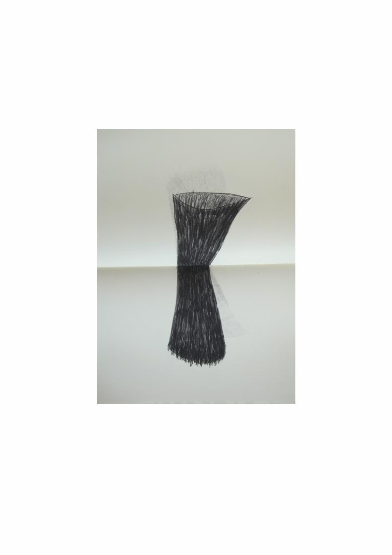
mstef mitchell
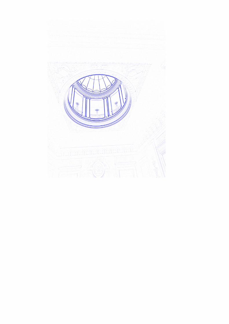
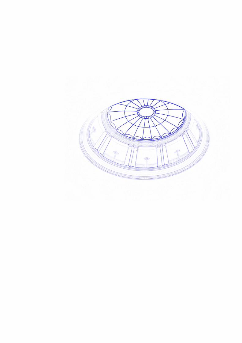
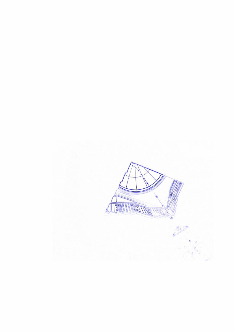
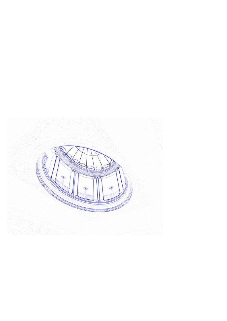
Sledmere Blueprints
Walking up and down the central staircase in the small and stately Sledmere House in Yorkshire, the internal and external relationships between the house
and the wide open spaces of the surrounding landscape of which sky is a focal point. were explored.
A series of eclipses have been observed and developed into a group of prints taking this architectural feature back to a blue print.
http://possessedbyprocess.blogspot.com/http://www.stefmitchell.com/


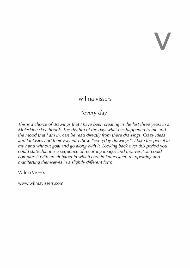
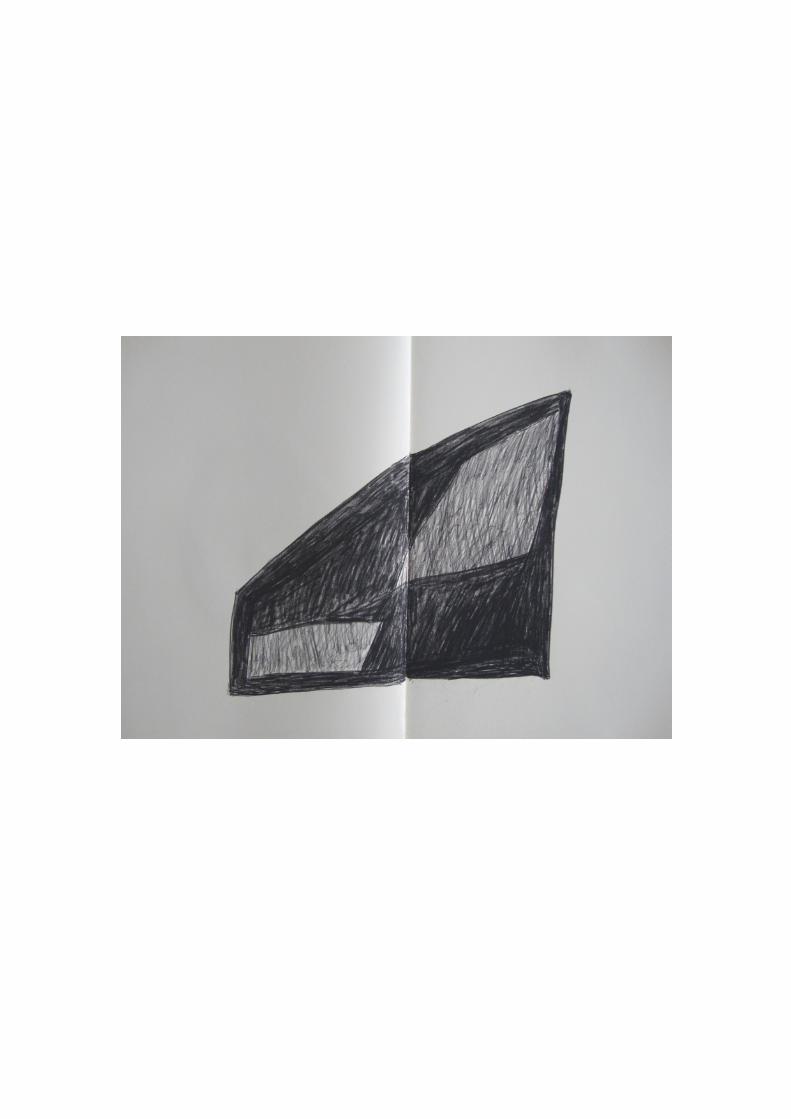
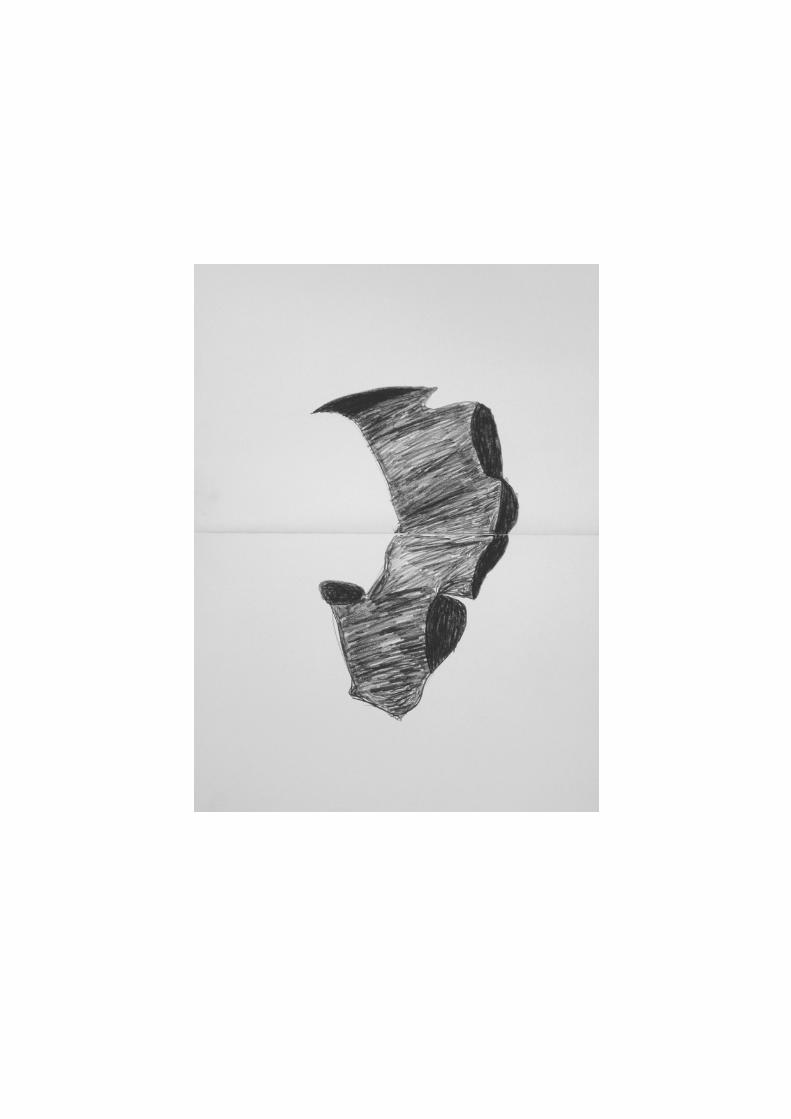
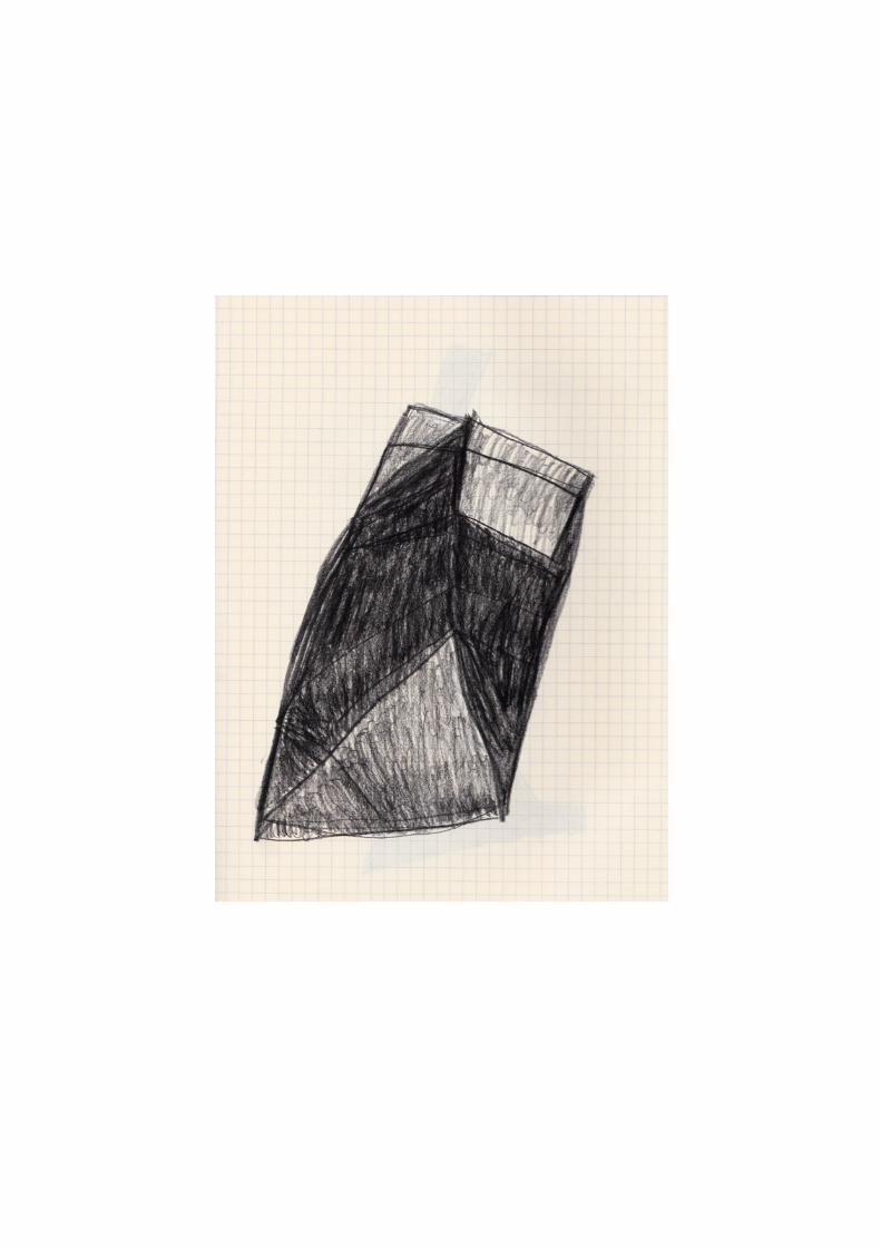
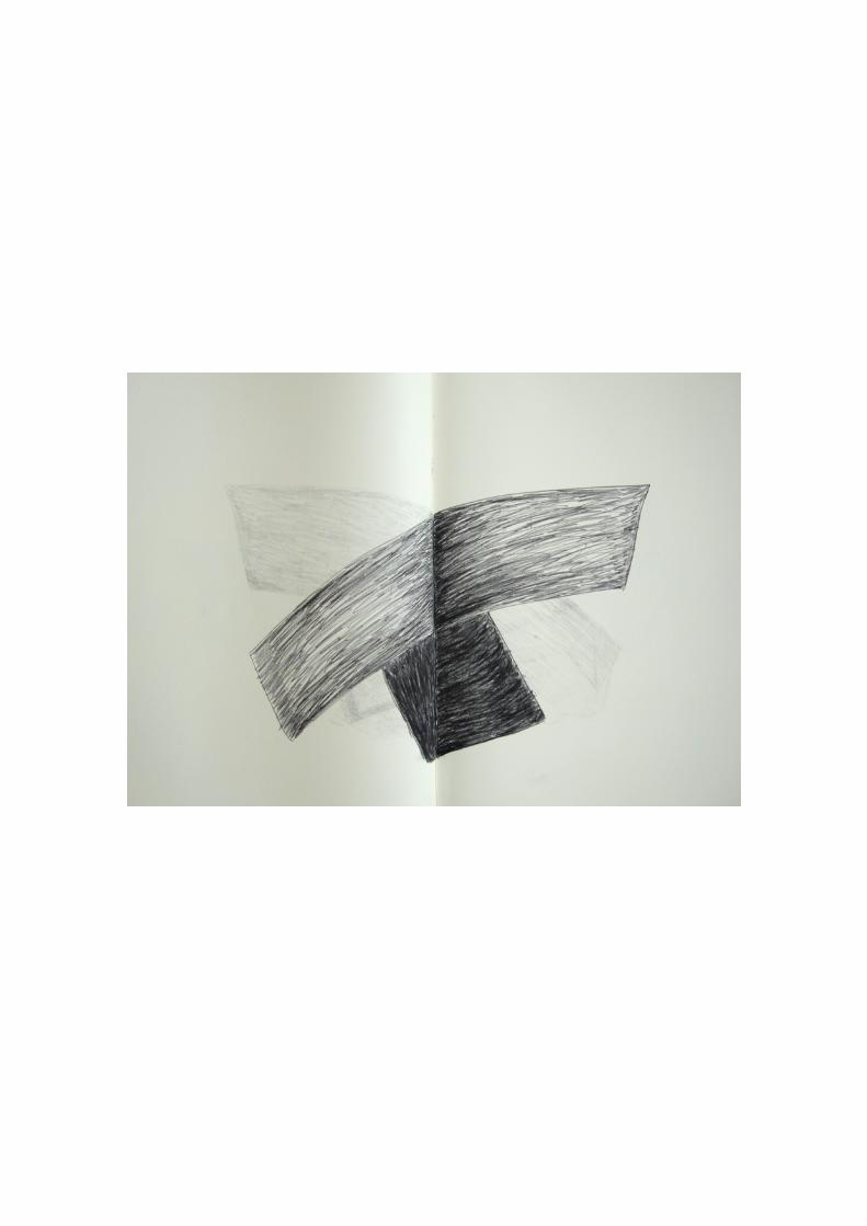
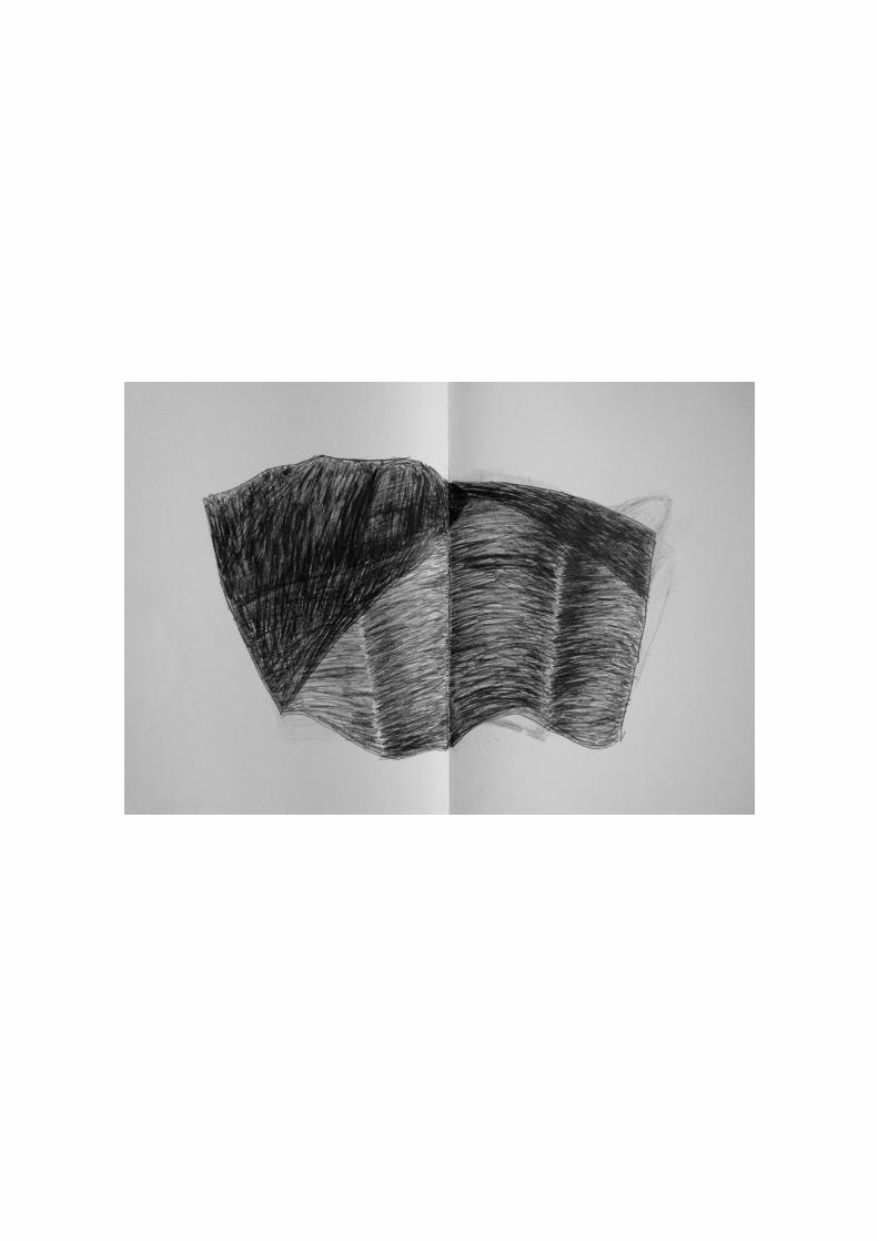
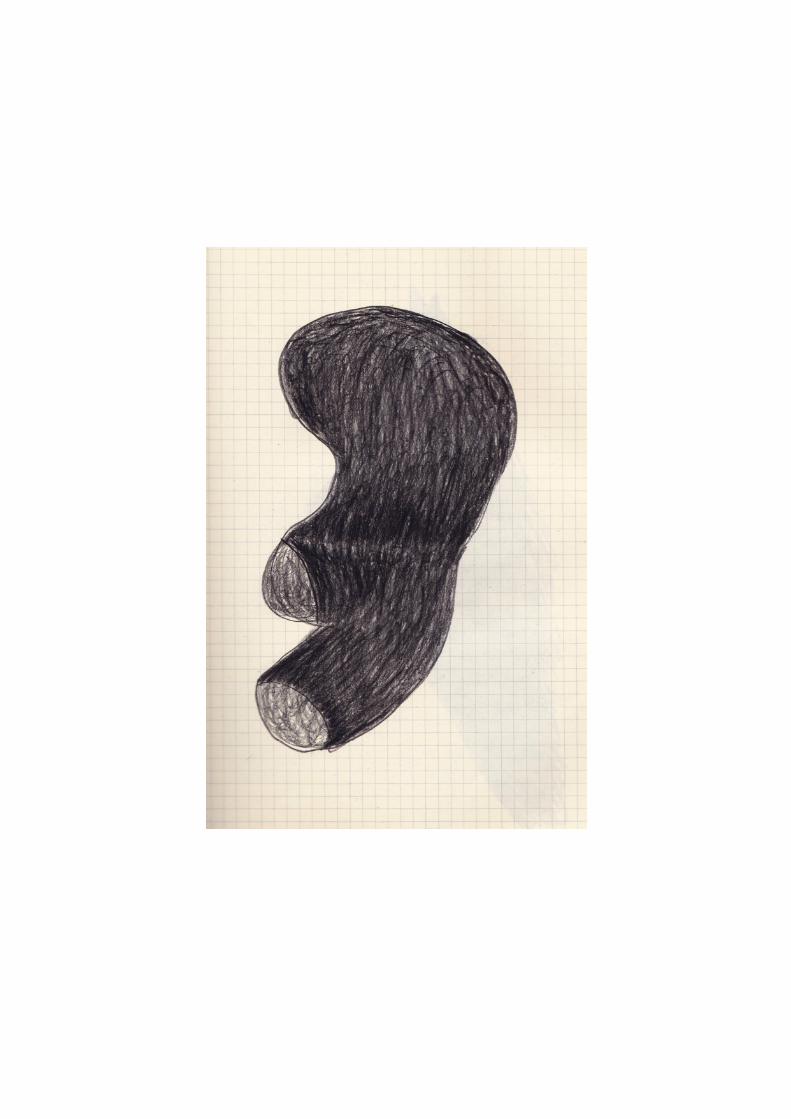
vwilma vissers
‘every day’
This is a choice of drawings that I have been creating in the last three years in a Moleskine sketchbook. The rhythm of the day, what has happened to me and the mood that I am in, can be read directly from these drawings. Crazy ideas and fantasies find their way into these “everyday drawings”. I take the pencil in my hand without goal and go along with it. Looking back over this period you could state that it is a sequence of recurring images and motives. You could compare it with an alphabet in which certain letters keep reappearing and manifesting themselves in a slightly different form
Wilma Vissers
www.wilmavissers.com

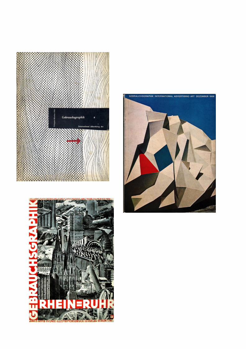
ggebrauchsgraphik
h
antonin hudecek
bohemian painter. he studied at the academy of fine arts, prague, in 1887–91 under
maximilián pirner, in munich in 1891–3 under anton azbé and otto seitz (1846–1912) and
again in prague until 1894 under václav brozík. he spent some time studying in italy (1902
and 1909) and had numerous one-man exhibitions from 1900 onwards. his early work
concentrated on the figure, inspired by lyrical plein-air painting, and for a while he was
influenced by art nouveau and symbolism (e.g. spring fairy-tale , 1898; prague, n.g.). having
come into contact with the school of julius marák in 1897, hudecek devoted himself to
landscapes, producing a large group of paintings of the village of okor. the works of this
period approach the lyricism of the glasgow school (exhibited prague, 1903) and the
sensuous impressionism of his friend antonín slavícek. hudecek gradually renounced
melancholy, symbolic colour harmonies and refined techniques, using his brush with greater
flourish and accenting light with more striking colours (e.g. cottages by the water , 1906;
cheb, gal. f.a.). the end of this period coincides with hudecek’s experience of siracusa and
capri and his use of marine motives with reminiscences of art nouveau decorativism and
symbolism.
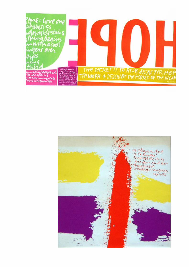
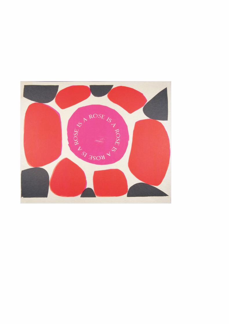
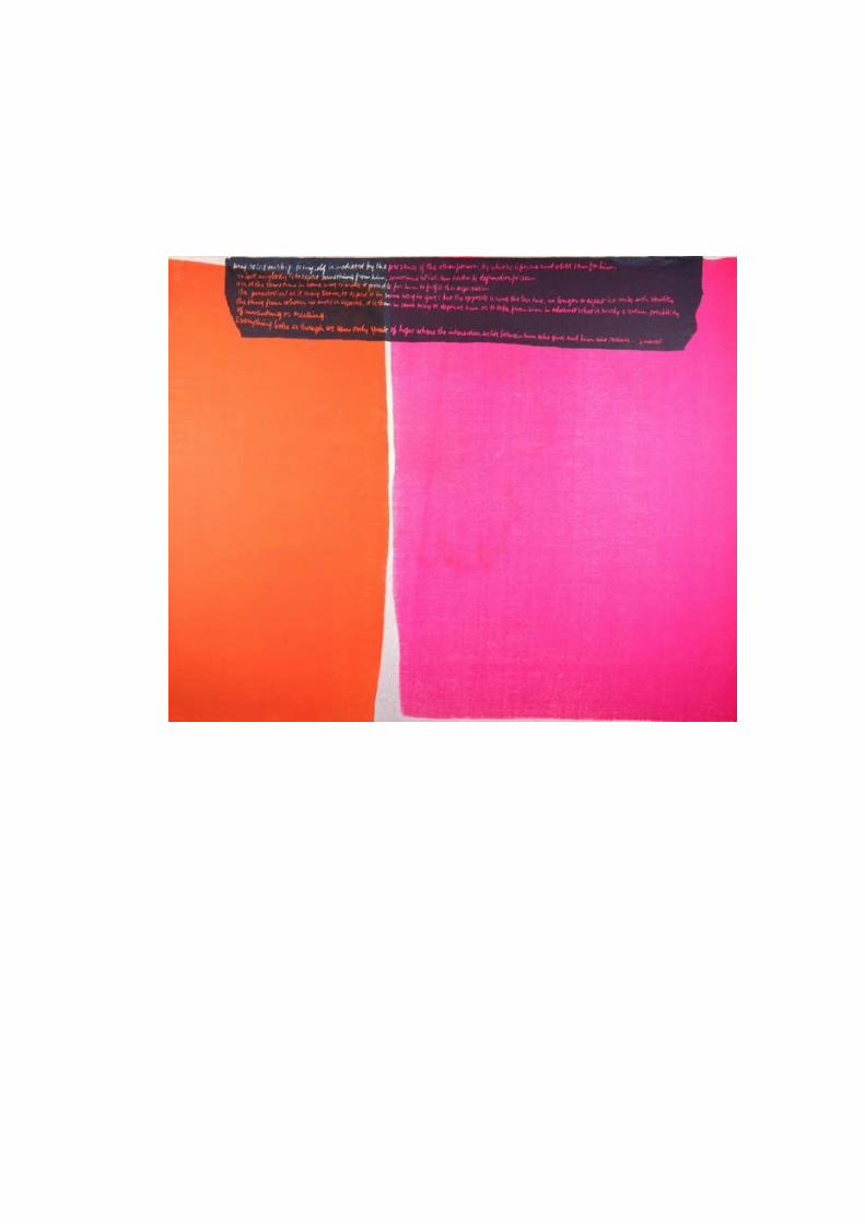
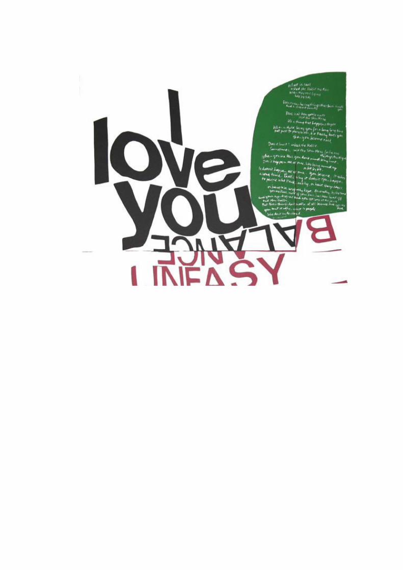
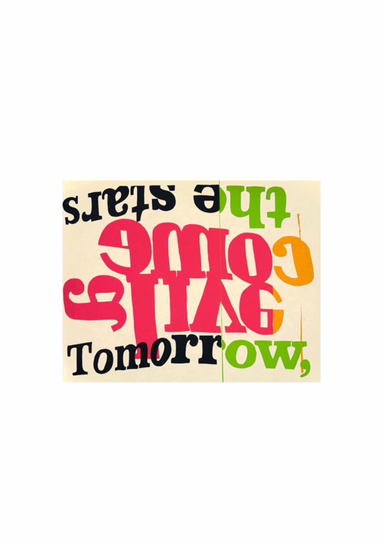
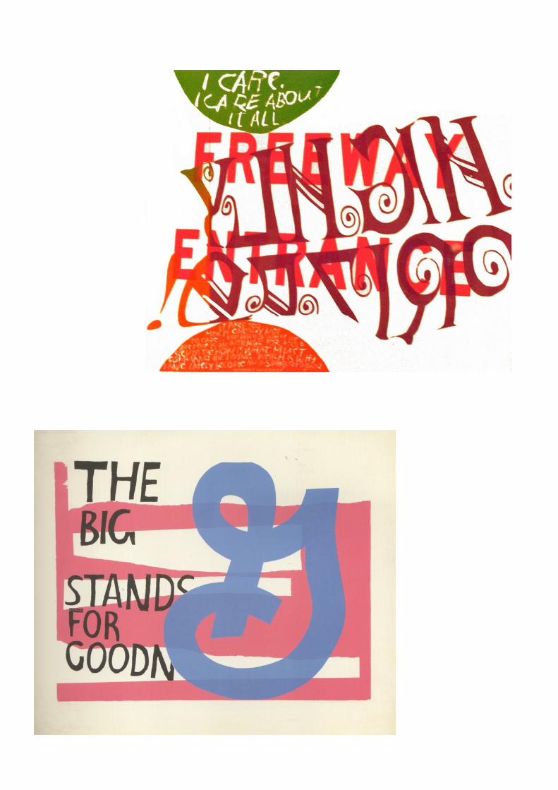
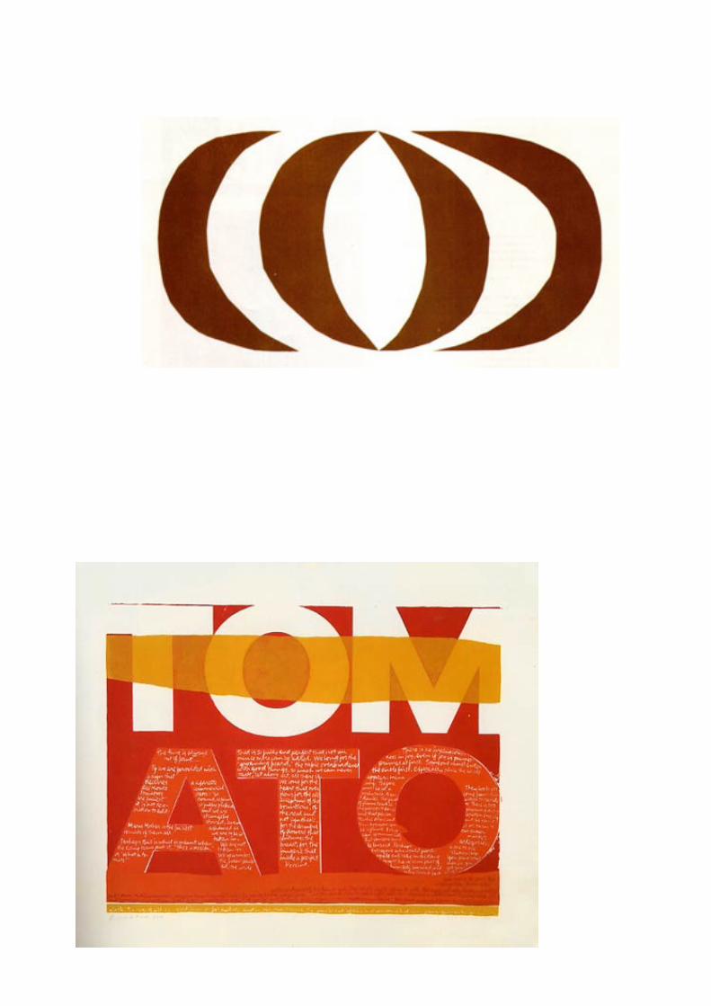
kcorita kent
Corita Kent (November 20, 1918 – September 18, 1986), aka Sister Mary Corita Kent, was born Frances Elizabeth Kent in Fort Dodge, Iowa.[1] Kent was an artist
and an educator who worked in Los Angeles and Boston. She worked almost exclusively with silkscreen and serigraphy, helping to establish it as a fine art
medium. Her artwork, with its messages of love and peace, was particularly popular during the social upheavals of the 1960s and 1970s.[2] Kent designed the 1985
annual "love" stamp.[3]
After high school, Kent entered the Roman Catholic order of Sisters of the Immaculate Heart of Mary in Los Angeles. She took classes at Otis (now Otis
College of Art and Design) and Chouinard Art Institute and earned her BA from Immaculate Heart College in 1941. [4] She earned her MA at the University of
Southern California in Art History in 1951.[5] Between 1938 and 1968 Kent lived and worked in the Immaculate Heart Community.[6] She taught in the Immaculate Heart College and was the chairman of its art department. She left the order in 1968 and
moved to Boston, where she devoted herself to making art. She died of cancer in 1986.
She was friends with Alfred Hitchcock, John Cage, Saul Bass, Buckminster Fuller and Charles and Ray Eames.[citation needed]
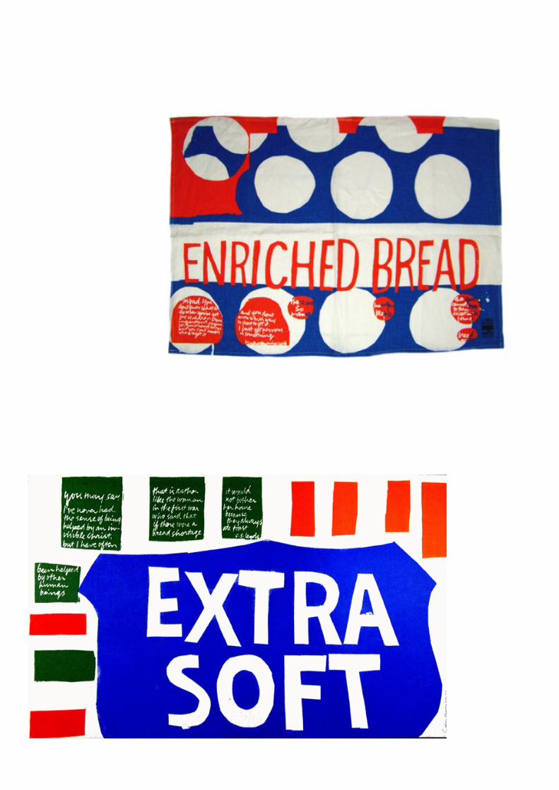
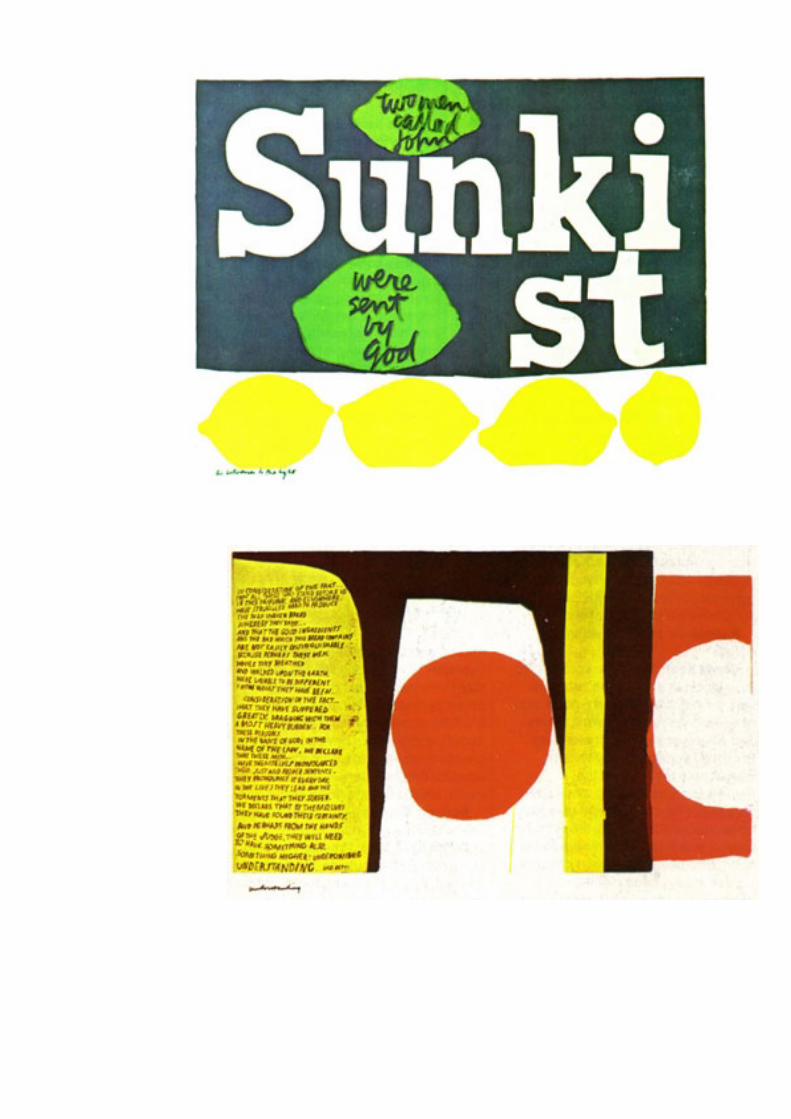
Kent created several hundred serigraph designs, for posters, book covers, and murals. Her work includes the 1985 Love Stamp and Rainbow Swash (1971), the 150-foot (46 m)-high natural gas tank in the Dorchester neighborhood of Boston.


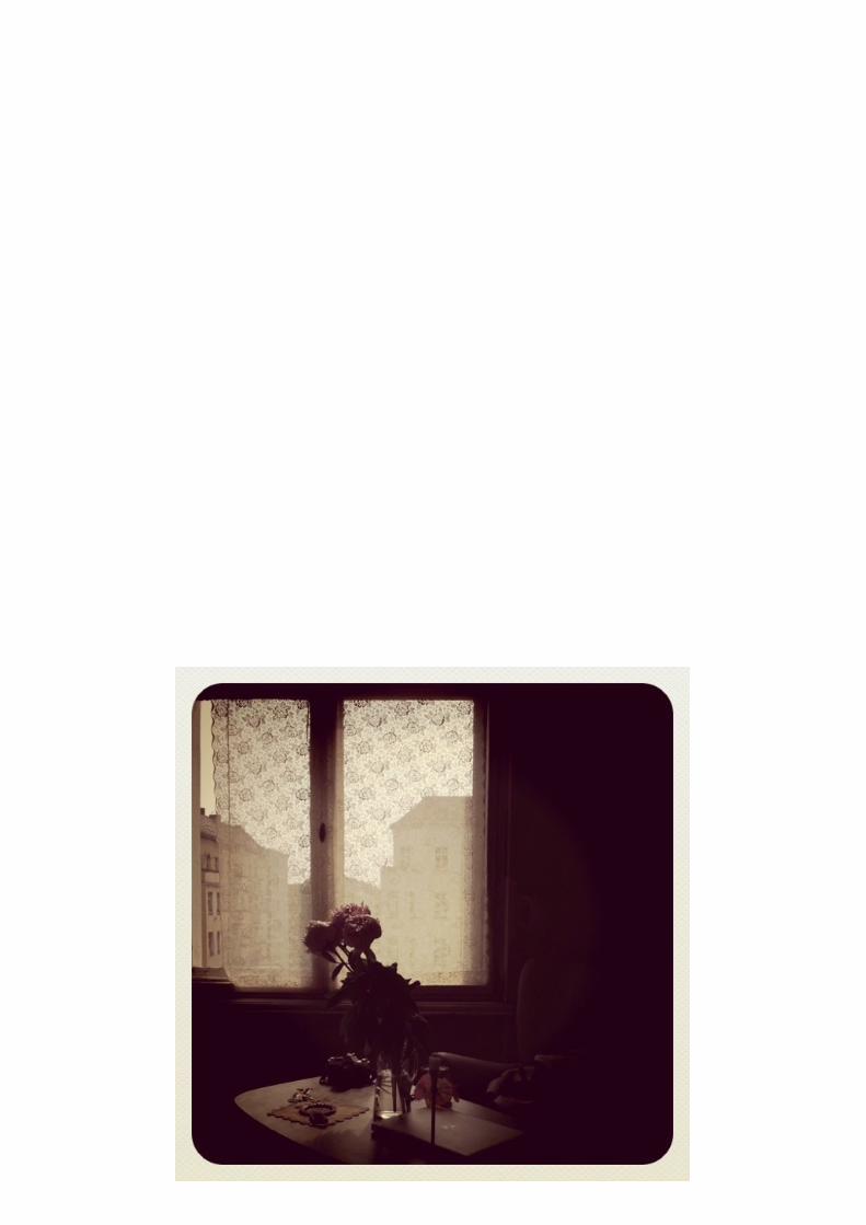
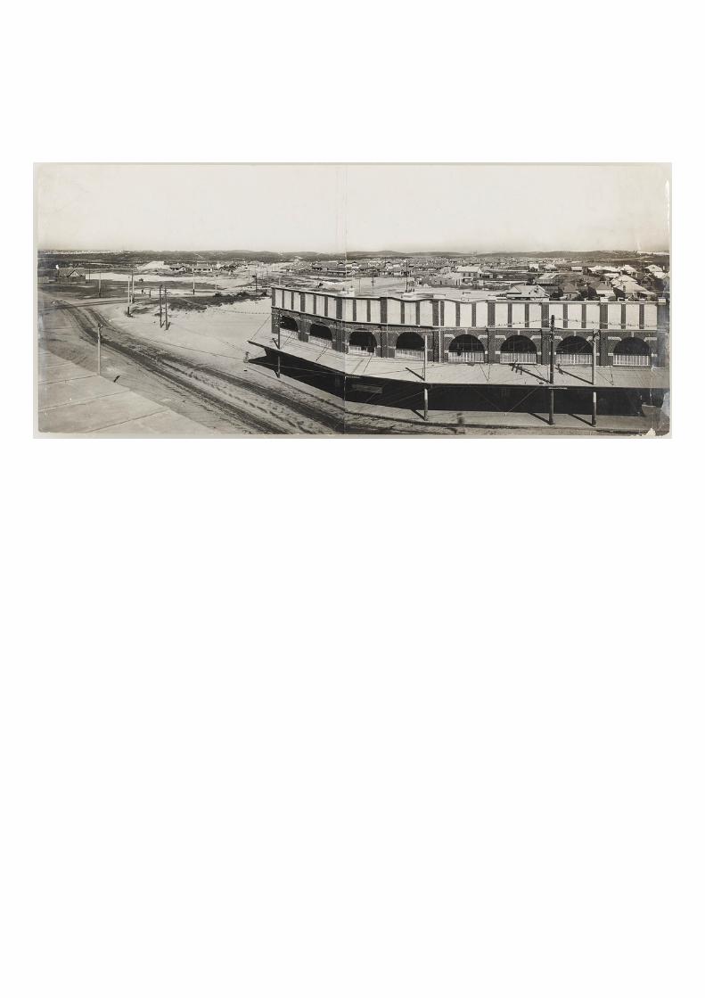
by an unknown photographer
street scene
date and location unknown
exploring an archive # 6
autochromes
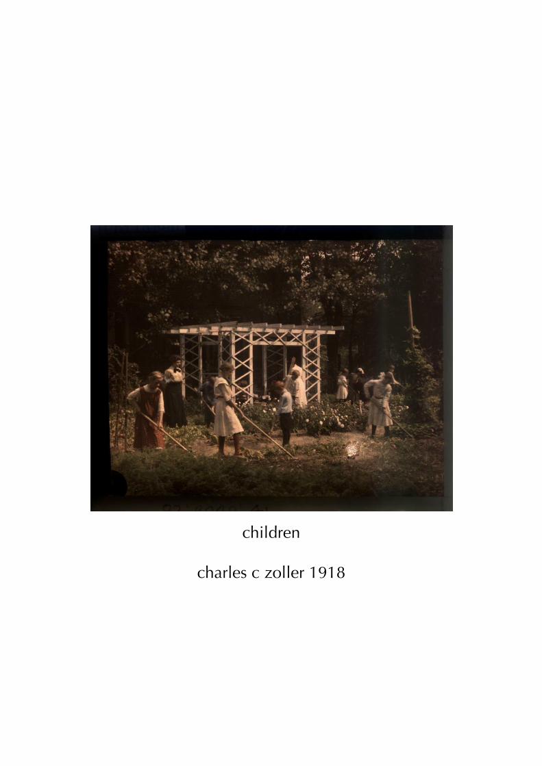
children
charles c zoller 1918
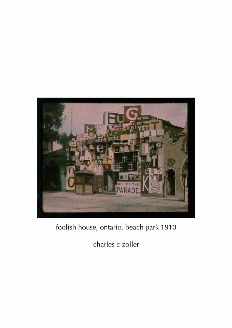
foolish house, ontario, beach park 1910
charles c zoller
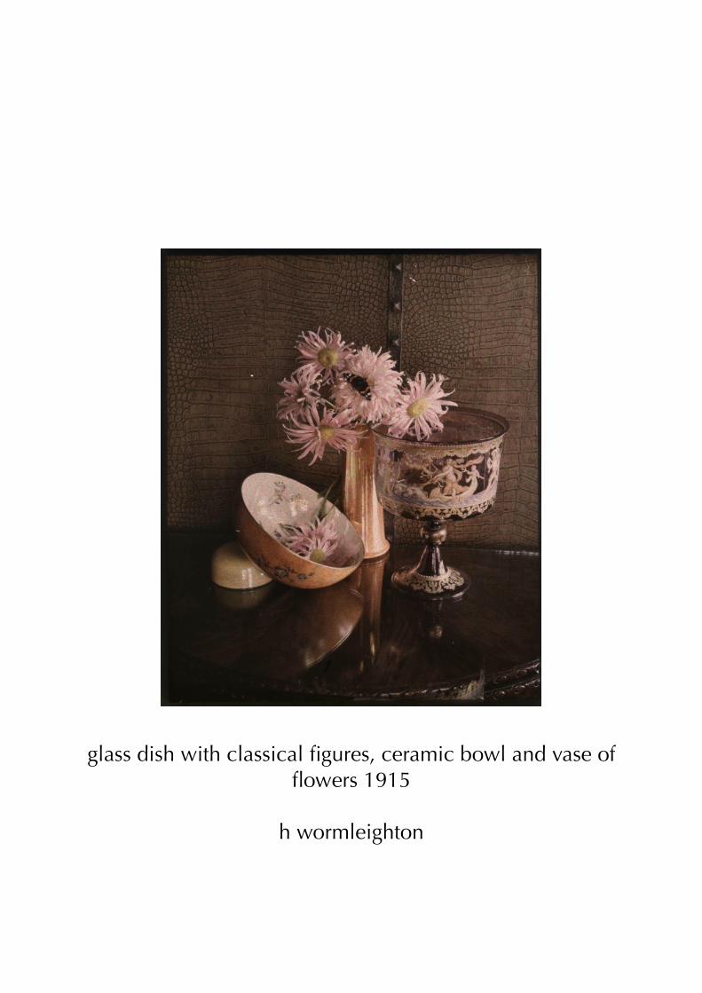
glass dish with classical figures, ceramic bowl and vase of flowers 1915
h wormleighton
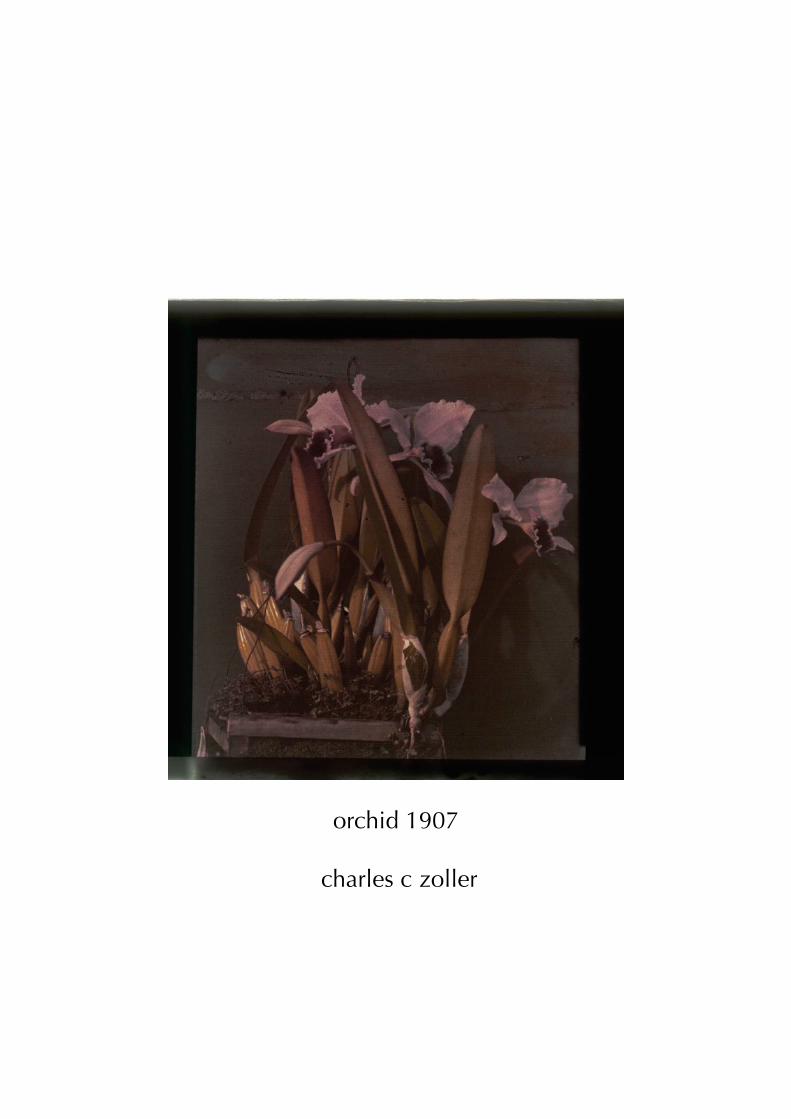
orchid 1907
charles c zoller
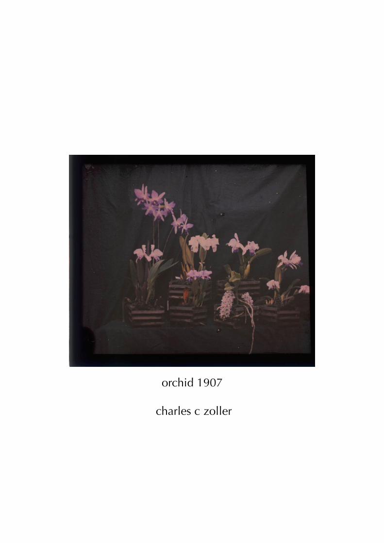
orchid 1907
charles c zoller
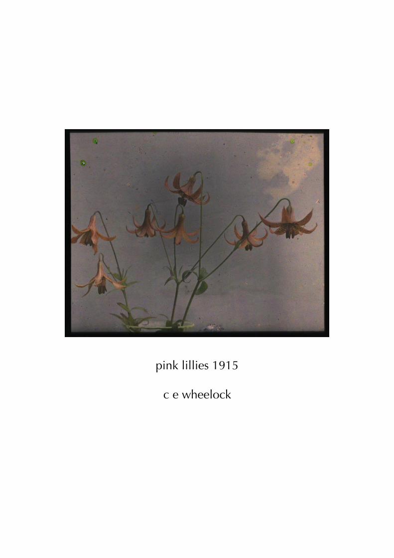
pink lillies 1915
c e wheelock
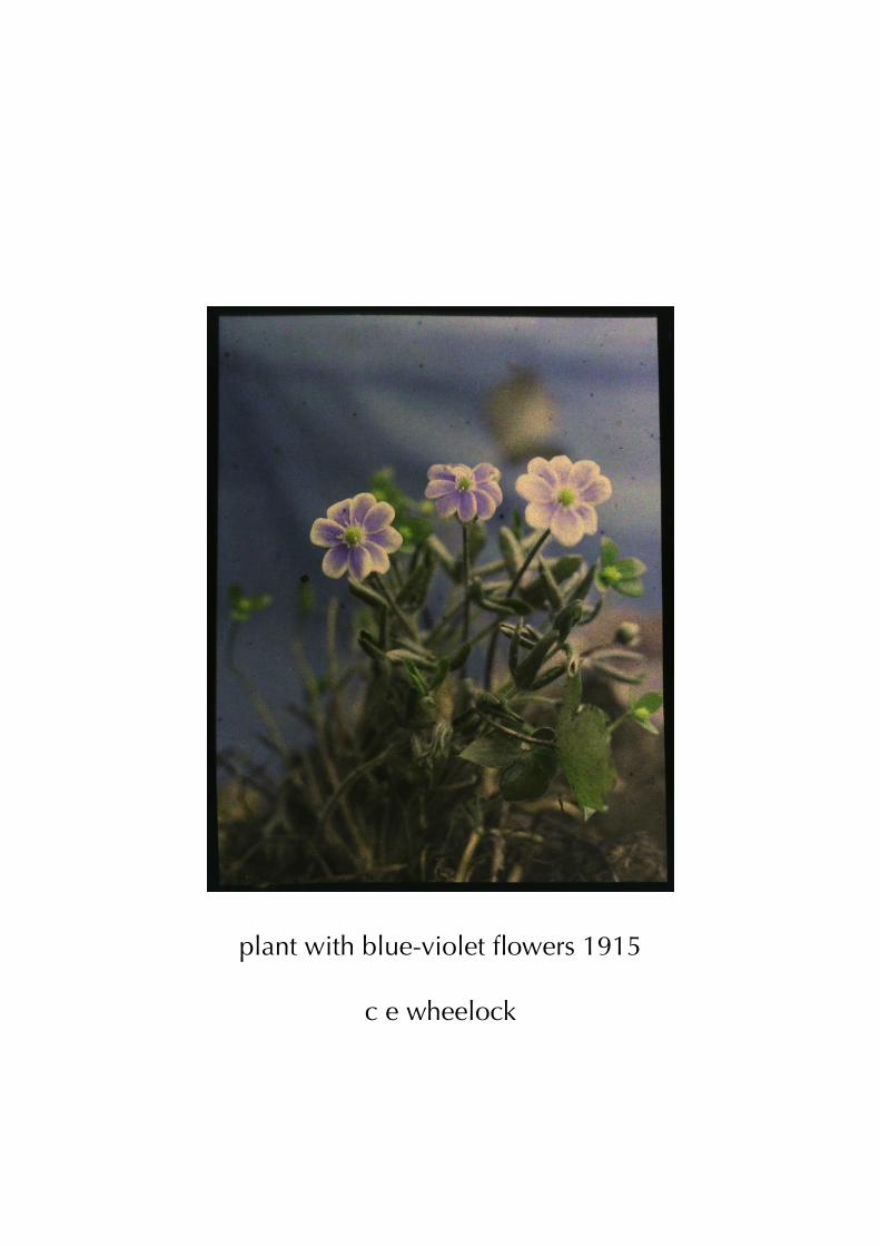
plant with blue-violet flowers 1915
c e wheelock
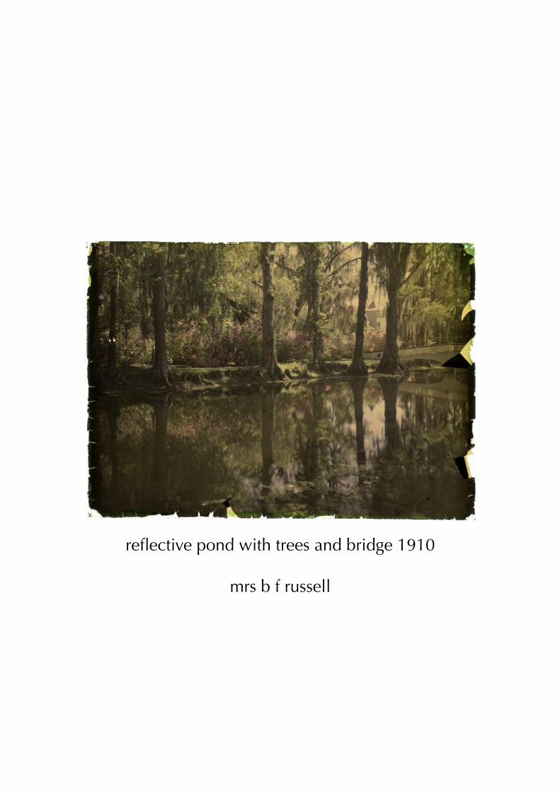
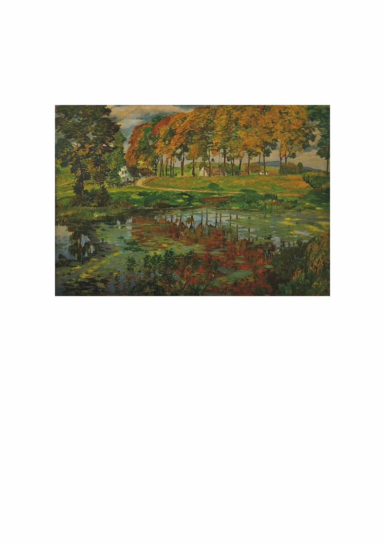
reflective pond with trees and bridge 1910
mrs b f russell
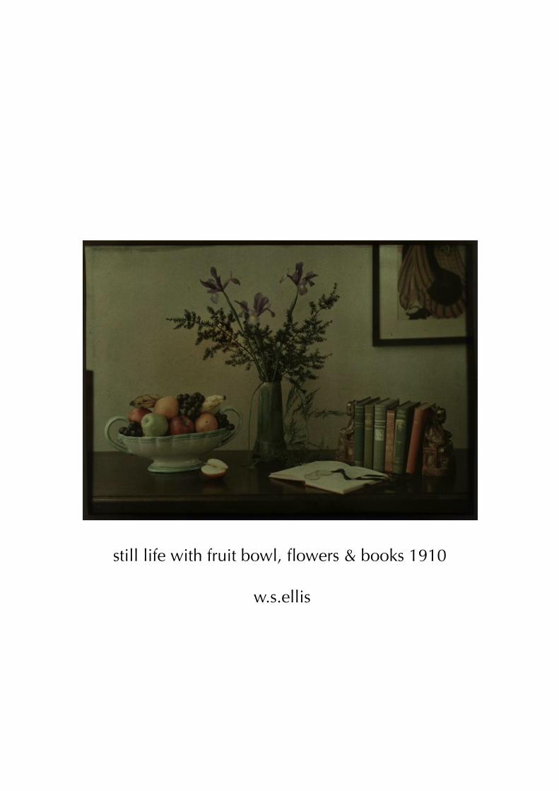
still life with fruit bowl, flowers & books 1910
w.s.ellis
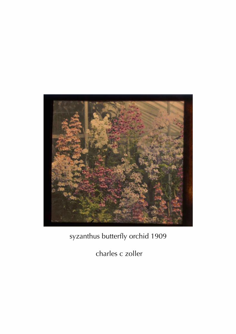
syzanthus butterfly orchid 1909
charles c zoller

tristesse-engraved.blogspot.comengravedglass.blogspot.com
*
to submit or suggest material, to be added to the email list for future issue or for any comments, please contact by emailing:
*
published by engraved glass / jrf
*all content is p&c by the artists involved
*