Embed Size (px)
Citation preview
Appendix F
T R A N S P O R T A T I O N E Q U I T Y A N A L Y S I S
Throughout outreach conducted for the SFTP, we heard a concern that some transportation access and performance issues are not geographically or socioeconomically equitable. In response, the San Francisco County Transportation Authority completed an equity analysis of the baseline transportation system. The results helped shape the investment scenarios and informed capital project prioritization for the SFTP. First, we prioritized funding that would address the geographic and socioeconomic inequities found in the transportation system. In addition, when identifying major efficiency and expansion projects for funding, we considered whether a project would address inequitable conditions identified in the equity analysis. See SFTP Appendix A for more detail on capital project prioritization. A memorandum documenting the equity analysis results is attached.
O:\Active Studies\CWTP Update\Document\Other\Equity\SFTP.Equity.Memo.051013-Final.docx
Page 1of 31
Memorandum
Monday, May 13, 2013
San Francisco Transportation Plan (SFTP) Technical Advisory Committee
Joshua Karlin-Resnick
Rachel Hiatt – Principal Transportation Planner
Equity analysis of existing and future transportation system performance
In response to Board and Community Advisory Committee (CAC) request, the San Francisco Transportation Plan (SFTP) team has drafted a geographic and socioeconomic equity1 analysis of existing and Future Baseline transportation conditions. The analysis considers whether and how certain transportation conditions disproportionately affect certain areas of the city and/or socioeconomically disadvantaged communities. The Future Baseline conditions assume that no additional transportation investments are made beyond those in the SFTP Baseline Policy.
The equity analysis considered three types of transportation measures: safety, network quality, and system performance. The draft analysis finds that socioeconomically disadvantaged communities in San Francisco tend to experience greater transportation safety risks than San Francisco in general. The analysis also found that all transportation system performance measures considered tend to cluster geographically, with the worst conditions concentrated tin certain parts of the city and the best conditions in other parts. However, some system conditions correlate geographically with density levels and topography, and are therefore expected and do not necessarily indicate inequities.
Safety: The analysis finds the city’s disadvantaged communities, whether they are situated in dense central areas or the more outlying parts of the city, see significantly higher incidences or rates of pedestrian injuries, bike injuries, and crime committed on the street or in the transit system than do other parts of the city.
Transportation network quality: This analysis finds that the quality of the transportation network clusters geographically, with the best network quality in the denser, more central parts of San Francisco and the least network quality in the less dense, outlying, and hilly parts of the city. However, this correlation between network quality, density, and topography is expected, and does not necessarily indicate an inequity. Transportation-quality metrics that conform to this pattern include access to the rapid and regional transit networks and transfer rates.
1 The SFTP Equity Analysis is not a federal Title VI analysis. Federal Title VI analysis uses methodologies and metrics different from those
discussed here. The SFTP Equity Analysis methodology and metrics are designed to specifically address the considerations of the Board, SFTP
CAC, and SFTP analysis team.

O:\Active Studies\CWTP Update\Document\Other\Equity\SFTP.Equity.Memo.051013-Final.docx
Page 2of 31
Transportation system performance: This analysis finds that some system performance issues do cluster geographically in patterns that are unrelated to land use density or topography. The metrics with the biggest such disparities are transit speeds, reliability, and crowding.
In analyzing these metrics, the team looked at existing conditions and, where possible, 2040 Baseline conditions. The Baseline scenario includes a small set of committed transportation investments,2 and therefore this analysis does not reflect the contribution of potential SFTP investments such as the Transit Effectiveness Project or the SFMTA Pedestrian and Bicycle Strategies on equity issues.
The analysis uses the Metropolitan Transportation Commission’s Communities of Concern to identify areas with the highest concentrations of disadvantaged communities. CoCs are those that exceed thresholds on four of eight “degrees of disadvantage,” criteria that include the percent of the population that is low-income, a racial/ethnic minority, or disabled, among others. The criteria were chosen and thresholds defined through a year-long process led by MTC. The study uses the Authority’s 12-neighborhood system to identify geographic disparities.
For each transportation system metric, conditions throughout the city were divided into quintiles or other using appropriate thresholds. To identify socioeconomic disparities, the analysis looked at whether communities of concern contained a significantly higher percentage of zones in the low- or high-performing quintiles/performance groups than the citywide average. To understand geographic equity, the analysis used a similar approach, with the 12 neighborhoods as the unit of analysis.
This analysis was developed for SFTP purposes, and is not a Title VI analysis. The methodology and metrics used here were developed to inform long-range planning on issues of interest to the Authority Board and in response to stakeholder input. The findings of this analysis will be considered in the development of the SFTP financially constrained and vision scenarios; for instance, the SFTP may recommend increased levels of funding for areas of the city that experience disproportionately worse system performance conditions than average.
2 See SFTP Baseline Memorandum, 2012.
O:\Active Studies\CWTP Update\Document\Other\Equity\SFTP.Equity.Memo.051013-Final.docx
Page 3of 31
The San Francisco Transportation Plan (SFTP) team analyzed San Francisco’s existing and 2040 Baseline future transportation system through the lenses of both geographic and socio-economic equity.
To understand geographic equity, the SFTP team analyzed whether system performance problems cluster geographically, disproportionately affecting certain parts of San Francisco in ways that are not associated with topography or broad land-use patterns.
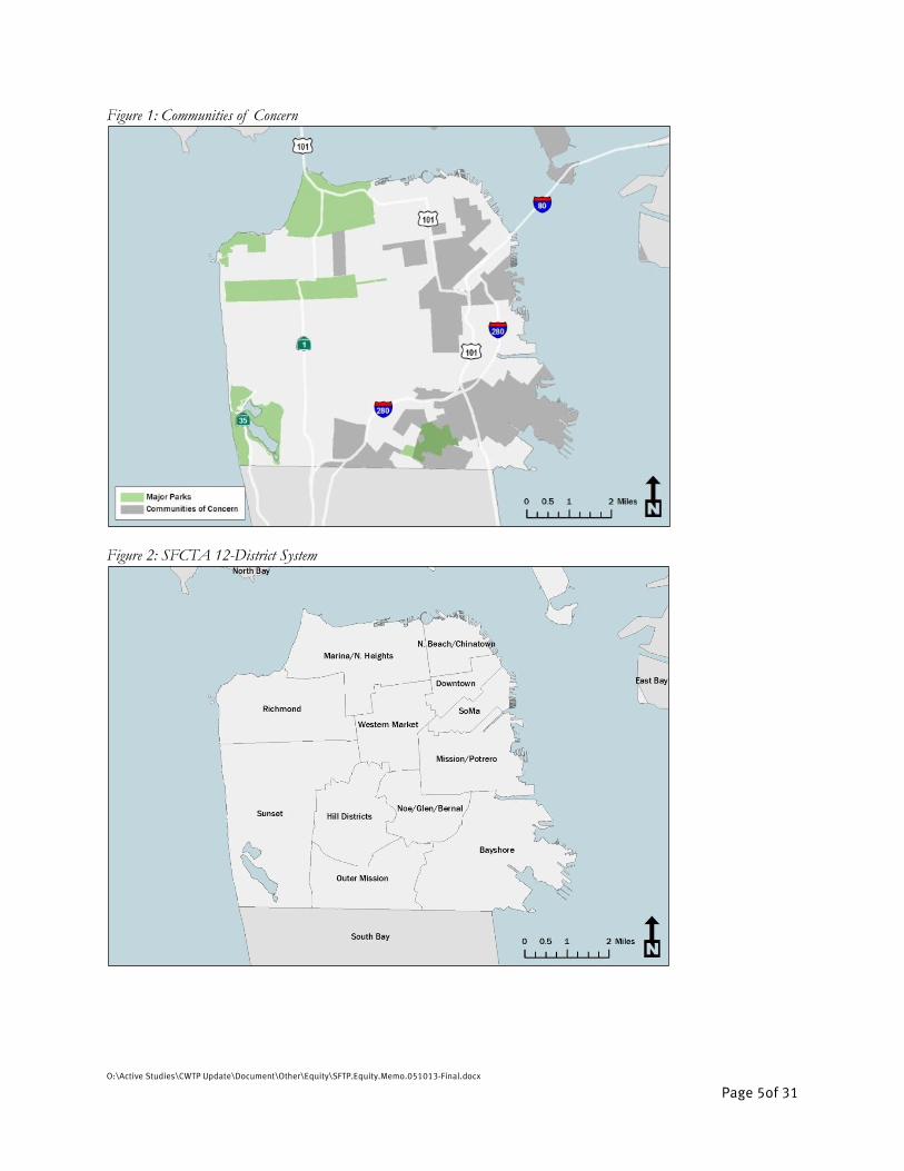
To understand socioeconomic equity, the team analyzed whether “communities of concern” disproportionately experience the worst system safety, quality, or performance issues. The Metropolitan Transportation Commission (MTC) has defined communities of concern (CoCs) as those census tracts with populations that have a disproportionate percentage of four of the following eight groups: individuals from a racial or ethnic minority group, residents with incomes lower than 200 percent of the poverty line, residents with limited English proficiency, households with zero-vehicles, residents over 75 years old, people with a disability, single-parent families, and cost-burdened renters.3 Tracts with concentrations of low-income or minority individuals alone also qualify. The MTC used data from the 2011 American Community Survey to define the geography. See Figure 1: Communities of Concern
for a map of CoCs.
The MTC’s CoC geography misses some small areas that city departments have previously identified as having large socioeconomically disadvantaged populations. As such, the Authority’s draft Priority Development Area (PDA) Growth and Investment Strategy recommends that the SF Planning Department lead an effort to create a locally specific CoC definition. However, given that the MTC geography captures most zones with high concentrations of disadvantaged populations and given the extensive public process the MTC’s methodology underwent in 2011 and 2012, the SFTP team believes the MTC geography works well for this analysis, in lieu of a customized local alternative.
Below are the metrics through which the SFTP analyzed geographic and socioeconomic equity:
Safety
o Pedestrian safety
o Bike safety
o Street/Transit Crime
o Transportation-Related Air-Quality Impacts
Transportation Network Quality4
o Access to Muni Rapid Network
o Access to the Regional Transit Network
3 Metropolitan Transportation Commission. “Plan Bay Area: Technical Summary of Preferred Scenario Equity Analysis Methodology.” May 4, 2012.
Page 2.
4 The Authority is in the process of trying to assess affordability as a measure of network quality as well. The team was limited by the MTC’s analysis,
which took transit fares at published values for a region-wide analysis. For a San Francisco-specific analysis, the team would want to take into account
the large population that takes advantage of programs that heavily discount fares.

O:\Active Studies\CWTP Update\Document\Other\Equity\SFTP.Equity.Memo.051013-Final.docx
Page 4of 31
o Transfer Rate to Popular Destinations
o Pavement Quality
Transportation System Performance
o Transit Speeds
o Transit Reliability
o AM-Peak Transit Crowding
o Travel Time to Popular Destinations
o Vehicle Miles Traveled
For each metric, the team calculated the performance distribution of San Francisco transportation analysis zones (zones), including those that experience the best conditions (either the top quintile or other appropriate threshold), the worst conditions (bottom quintile or other appropriate threshold), and average performance for each metric. The team identified metrics for which CoCs are overrepresented in either the top or bottom category. The team also identified metrics for which top or bottom quintiles are geographically clustered in certain neighborhoods, regardless of CoC status.
The analysis was only able to analyze projected future conditions for transfer rate, transit crowding, travel time, and vehicle miles traveled.
The tables on pages six through nine summarize the high-level findings. Table I-1 summarizes this study’s socioeconomic findings: That the greatest disparities for CoCs are in the safety metrics. Table I-2 summarizes geographic equity findings. The table identifies a subset of system metrics that, though performance is clustered geographically, do not indicate an inequitable condition because performance is correlated with density and/or topography or is otherwise expected.
O:\Active Studies\CWTP Update\Document\Other\Equity\SFTP.Equity.Memo.051013-Final.docx
Page 5of 31
Figure 1: Communities of Concern
Figure 2: SFCTA 12-District System

O:\Active Studies\CWTP Update\Document\Other\Equity\SFTP.Equity.Memo.051013-Final.docx
Page 6of 31
Table I-1: Socioeconomic Findings
Metric Socioeconomic
Disparities? Notes
Safety
Pedestrian Injuries YES Injuries concentrated in highest density neighborhoods, many of which are communities of concern
Bike Injuries YES Injuries concentrated in highest density neighborhoods, many of which are communities of concern
Street- and Transit-Related Crime
YES High-crime zones concentrated in communities of concern
Transportation-Related Air Quality Impacts
NO Most particulate exposure around elevated freeways and high-volume northeastern streets
Transportation Network Quality
High-Quality Transit: Access to the Rapid Network
NO Lower-density southern and western areas have least access
High-Quality Transit: Access to Regional Transit
NO Major gaps in access in Sunset, Richmond, and southeast/ southwest edges of the city
Transfer Rate to Popular Destinations
NO Zones in southern and western parts of the city need to transfer most
Pavement Quality NO On average, best pavement conditions in northeast districts, worst conditions in downtown-adjacent dense districts.
Transportation System Performance
Transit Operating Speeds YES Slowest speeds in downtown core, fastest speeds along freeways and arterials.
Transit Reliability NO Links with most reliable speeds concentrated downtown (reliably slow), high variability on arterials.
Morning Peak Transit Crowding
NO Passengers from the outer neighborhoods, Western Market area experience the most crowding
Travel Time to Popular Destinations
NO Southern and western parts of the city see longest travel times
Vehicle Miles Traveled NO Higher VMT in the city’s lower-density southern and western zones

O:\Active Studies\CWTP Update\Document\Other\Equity\SFTP.Equity.Memo.051013-Final.docx
Page 7of 31
Table I-2: Geographic Findings
Metric Geographic Disparities?
Notes
Safety
Pedestrian Injuries YES Injuries concentrated in highest density neighborhoods, many of which are communities of concern
Bike Injuries YES Injuries concentrated in highest density neighborhoods, many of which are communities of concern
Street- and Transit-Related Crime
YES High-crime zones concentrated in communities of concern
Transportation-Related Air Quality Impacts
NO Most particulate exposure around elevated freeways and high-volume northeastern streets
Transportation Network Quality
High-Quality Transit: Access to the Rapid Network
YES*
Access to the Rapid Network is correlated with density and topography. Lower-density and hilly southern and western areas have least access.
High-Quality Transit: Access to Regional Transit
YES*
Access to Regional transit is correlated with density and topography. Least access in Sunset, Richmond, and southeast/ southwest edges of the city.
Transfer Rate to Popular Destinations
YES* Transfer needs are correlated with density and topography. Zones in southern and western parts of the city need to transfer most.
Pavement Quality NO On average, best pavement conditions in northeast districts, worst conditions in downtown-adjacent dense districts.
Transportation System Performance
Transit Operating Speeds YES Slowest speeds in downtown core, fastest speeds along freeways and arterials.
Transit Reliability YES Links with most reliable speeds concentrated downtown (reliably slow), high variability on arterials.
Morning Peak Transit Crowding
YES Passengers from outer neighborhoods, Western Market area experience the most crowding
Travel Time to Popular Destinations
YES* Transit travel times are correlated with density and topography. Southern and western parts of the city see longest travel times.
Vehicle Miles Traveled YES Higher VMT in the city’s lower-density southern and western zones
*These characteristics of the transportation network are related to density and topography, and so some
degree of geographic disparity may be expected.
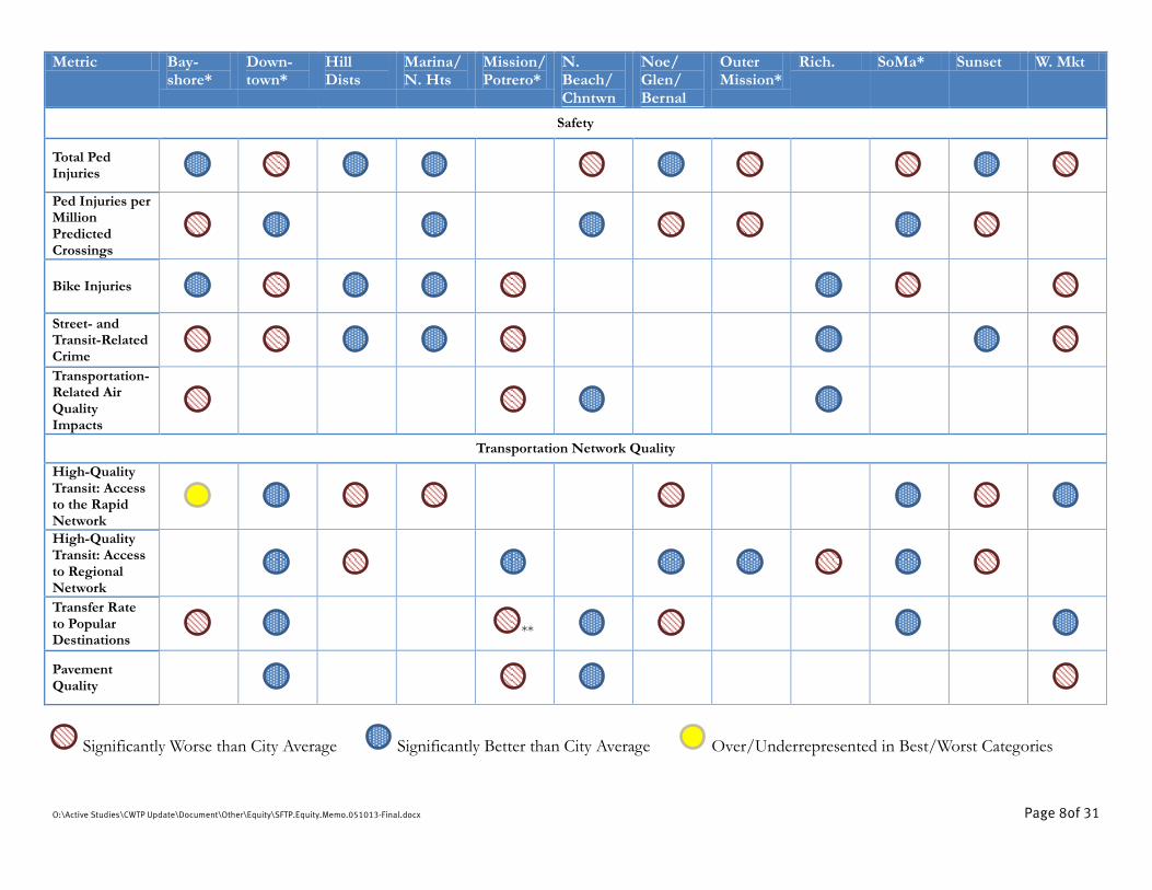
O:\Active Studies\CWTP Update\Document\Other\Equity\SFTP.Equity.Memo.051013-Final.docx Page 8of 31
Metric Bay-shore*
Down-town*
Hill Dists
Marina/ N. Hts
Mission/ Potrero*
N. Beach/ Chntwn
Noe/ Glen/ Bernal
Outer Mission*
Rich. SoMa* Sunset W. Mkt
Safety
Total Ped Injuries
Ped Injuries per Million Predicted Crossings
Bike Injuries
Street- and Transit-Related Crime
Transportation-Related Air Quality Impacts
Transportation Network Quality
High-Quality Transit: Access to the Rapid Network
High-Quality Transit: Access to Regional Network
Transfer Rate to Popular Destinations
**
Pavement Quality
Significantly Worse than City Average Significantly Better than City Average Over/Underrepresented in Best/Worst Categories

O:\Active Studies\CWTP Update\Document\Other\Equity\SFTP.Equity.Memo.051013-Final.docx Page 9of 31
Metric Bay-shore*
Down-town*
Hill Dists
Marina/ N. Hts
Mission/ Potrero*
N. Beach/ Chntwn
Noe/ Glen/ Bernal
Outer Mission*
Rich. SoMa* Sunset W. Mkt
Transportation System Performance
Transit Operating Speeds
Transit Speed Reliability
Morning Peak Transit Crowding
Travel Time to Popular Destinations
VMT
Significantly Worse than City Average Significantly Better than City Average Over/Underrepresented in Best/Worst Categories * Districts that have a disproportionate share of TAZs identified as Communities of Concern. ** Mission/Potrero trips still involve disproportionately more transfers in 2040, but the district is predicted to have 33% more zones in the top quintile vs. the citywide average, down from 74% more in 2012.
O:\Active Studies\CWTP Update\Document\Other\Equity\SFTP.Equity.Memo.051013-Final.docx
Page 10of 31
Community-based Neighborhood Transportation Plans (NTPs), developed in response to the MTC’s Lifeline Transportation Program and as a recommendation of the 2004 Countywide Transportation Plan, identify the transportation needs and priorities of residents and workers in areas that include Communities of Concern. To date, four NTPs have been completed: in the Western SoMa, Bayview Hunters Point, Mission/Geneva, and Tenderloin/Little Saigon. Each one of these neighborhoods encompasses one or more CoCs. Where the metrics defined in the preceding tables have been identified as concerns in these NTPs, they are discussed below. Some useful performance metrics are not included in this analysis because data is not available:
Transit affordability: San Francisco has many programs that help make transit more affordable for certain groups of people, like young people and seniors, but there is no currently available spatial data on who takes advantage of such programs.
Pedestrian infrastructure provision: Citywide data is unavailable for measures of the quality of the pedestrian environment, including factors like sidewalk widths and the location of bulb-outs.
Bike network: While we do have spatial data defining the city’s current bike network, we are still working on a methodology for estimating geographic and socioeconomic access to the network.
Access to the Muni owl network, Congestion, and Access to Regional Job Centers: We are still working on a methodology for analyzing these metrics.
Reliability: We were unable to obtain spatial data from SFMTA on switchbacks, on-time pull-outs, or other measures of reliability. The closest metric with spatial data available is transit speed differential.
The Authority will use the findings of this analysis to inform the SFTP’s investment scenarios and to help determine whether and how discretionary transportation revenues should be targeted to address equity issues. The SFTP team will seek agency and public input on the Investment Scenario response to the equity findings in summer 2013.
O:\Active Studies\CWTP Update\Document\Other\Equity\SFTP.Equity.Memo.051013-Final.docx
Page 11of 31
This equity analysis looks at pedestrian safety in two ways using 2007-2011 data from the Statewide Integrated Traffic Reporting System (SWITRS). The analysis looks at both total incidents over the time period within each analysis zone and the rate of pedestrian injuries, relative to predicted street-crossing volumes from the city’s Pedestrian Volume Model.5
Total pedestrian injuries were not distributed in a geographically equitable way within San Francisco during the data period. Certain neighborhoods in the city disproportionately experienced the greatest number of pedestrian injuries. Pedestrian injuries are concentrated in the city’s densest districts: Downtown, North Beach/Chinatown, SoMa, the Mission, and Western Market (see Figure
3). These are areas with the highest levels of population and employment, and thus the most daily pedestrian activity. Pedestrian injury hot spots are scattered throughout the rest of the city, including an area with wide arterials near I-280 in the Outer Mission and in the center of Golden Gate Park, near 19th Avenue and Crossover Drive.
These patterns change when the data is normalized by predicted total crossing volume to show where pedestrian collision rates are the greatest. With this approach, zones in outlying districts show the worst conditions, with large concentrations of zones in the Bayshore, Noe/Glen/Bernal, Outer Mission, and Sunset neighborhoods falling in the worst 40 percent of zones citywide (see Figure 4). Areas of the city with the highest total pedestrian injuries also tend to have the highest overall crossing volumes, and thus they have relatively lower rates of injury.
The distinction between total injuries and injury rate is important for understanding the socioeconomic equity of pedestrian safety. By total pedestrian injuries, CoC zones are far overrepresented in the worst two quintiles and far underrepresented among the zones with zero injuries (see Figure 5). By collision rate, the city is more equitable. CoC zones are about on par with the rest of the city in the top quintile and are in fact underrepresented in the next quintile. However, CoCs are still underrepresented among the zones with injury rates close or equal to zero.
All four Neighborhood Transportation Plans identify pedestrian safety as an issue in their communities. In Western SoMa, strong community support for mid-block crossings at alleys, concerns about personal safety, and interest in traffic calming measures reflect the area’s high levels of pedestrian activity. The Mission/Geneva and Tenderloin/Little Saigon NTPs also identified pedestrian safety as issues in these areas where high numbers of pedestrians exist alongside heavy vehicle traffic. The Mission/Geneva NTP specifically recommended specific intersection improvements that include better crossings and wider sidewalks for pedestrians. Similar changes to pedestrian infrastructure, including corner bulbs, traffic calming, and improved crosswalks, were recommended in the Tenderloin NTP. While the Bay View Hunters Point NTP identified parking issues as a main concern, the top issue was cars parked on sidewalks, which present hazards to pedestrians.
5 SFMTA and SFCTA (2011). San Francisco Pedestrian Volume Model.

O:\Active Studies\CWTP Update\Document\Other\Equity\SFTP.Equity.Memo.051013-Final.docx
Page 12of 31
Figure 3: Pedestrian Collisions (2007-2011)
Figure 4: Pedestrian Collision Rates by Predicted Crossing Volume6
6 Injury data source: Statewide Integrated Traffic Reporting System (2007-2011). Predicted crossing volume: Pedestrian Volume Model (2012).

O:\Active Studies\CWTP Update\Document\Other\Equity\SFTP.Equity.Memo.051013-Final.docx
Page 13of 31
Figure 5: Distribution of Zones by Socioeconomic Status
The analysis also used 2007-2011 SWITRS data to analyze bike injury patterns.
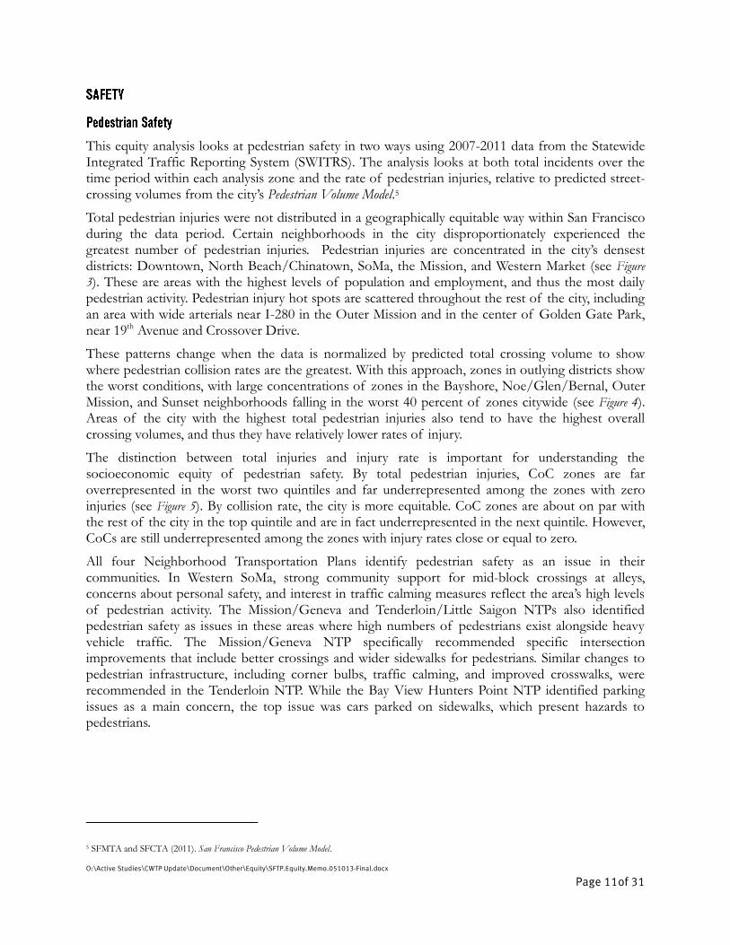
Bike injuries are concentrated in the city’s densest districts and in areas that likely attract the highest rates of bike ridership because they have high quality bike facilities (see Figure 6). As with pedestrian injuries, high-injury areas include Downtown, SoMa, the Mission, Western Market, and parts of the city’s major recreational facilities. All zones along the Panhandle and the major east-west bike route in Golden Gate Park (along John F. Kennedy Drive and bike paths that continue the route west of Crossover Drive) had more than 7 bike collisions between 2007 and 2011 (the highest category), as did the zone that covers Lake Merced Park.
Communities of concern are again over-represented in the worst category of zones (with more than 7 bike collisions in the four years): 20 percent of community-of-concern zones fall in this category, versus 8 percent citywide (see Figure 7). Fewer CoC zones also had zero bike collisions – a full 40 percent of zones citywide fell in this category, while only 26 percent of CoC zones were collision-free.
31%
56%
15%
9%
33%
25%
0%
10%
20%
30%
40%
50%
60%
Worst 20% of Zones Worst 40% of Zones Zero Injuries
Total Pedestrian Injuries
In COC
Outside COC
16%
32%
16% 15%
44%
26%
0%
10%
20%
30%
40%
50%
60%
Worst 20% of Zones Worst 40% of Zones Rate lower than .01
Pedestrian Injury Rate (by Crossing Volume)
In COC
Outside COC
O:\Active Studies\CWTP Update\Document\Other\Equity\SFTP.Equity.Memo.051013-Final.docx
Page 14of 31
In the NTP process, the Bayview Hunters Point neighbors specifically addressed bicycle safety, recommending improved infrastructure to support bicycling as an alternative mode of transportation. Figure 6: Bike Incidents by Nearest Intersection (2007-2011) and 2013 Bike Network7
Figure 7: Bike Incidents (2007-2011) and Socioeconomic Status
The analysis used crimes reported in San Francisco Police Department records as “robbery on the street” and “crimes against transit” as a proxy for the larger universe of crimes that take place in public spaces and might discourage transit ridership, pedestrian activity, and bike riding because of general personal security concerns. Unfortunately, only these two crime categorizations specify whether incidents happen in the public realm – all others are simply recorded by the block on which
7 Injury data source: Statewide Integrated Traffic Reporting System (2007-2011).
20%
26%
8%
40%
0%
5%
10%
15%
20%
25%
30%
35%
40%
45%
Zones with 7 or more Injuries Zones with No Injuries
In COC
Outside COC
O:\Active Studies\CWTP Update\Document\Other\Equity\SFTP.Equity.Memo.051013-Final.docx
Page 15of 31
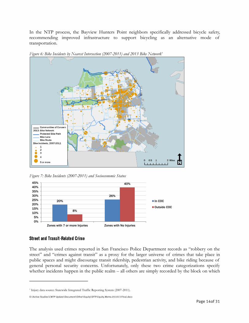
they took place, whether they took place in a public space or not. The SFPD records cover the period from January 1, 2003 through mid-February 2013.
Zones with high rates of street and transit-related crime are concentrated in the city’s dense downtown, but numerous zones in the Mission/Potrero, Bayshore and Western Market planning neighborhoods joined the top category (see Figure 8).
Most of the top 10 zones in total applicable crimes during the period fall in the Tenderloin, and all but one of the top 10 are categorized as communities of concern. When normalizing for the number of jobs and residents in each zone, CoCs fare worse. A full 41 percent of CoC zones fell in the top fifth of zones for street- and transit-crime rate, while just 13 percent fall in the bottom fifth.
Zones that are not categorized as communities of concern, meanwhile, are very underrepresented in the top fifth of zones by street- and transit-crime rate. Most of the Hill Districts, Sunset, Richmond, and Marina/Northern Heights are spared concentrations of such high rates.
Two of the Neighborhood Transportation Plans specifically addressed street and transit-related crime. Western SoMa community members expressed concern about vandalism and personal safety. The Tenderloin/Little Saigon NTP identified personal security on the street as a concern for participants in the planning process. Figure 8: Street- and Transit-Related Crime8
8 Crime data source: San Francisco Police Department (2003-2013). Retrieved from data.sfgov.org/Public-Safety/SFPD-Reported-Incidents-2003-to-
Present/dyj4-n68b on 2/16/13.
O:\Active Studies\CWTP Update\Document\Other\Equity\SFTP.Equity.Memo.051013-Final.docx
Page 16of 31
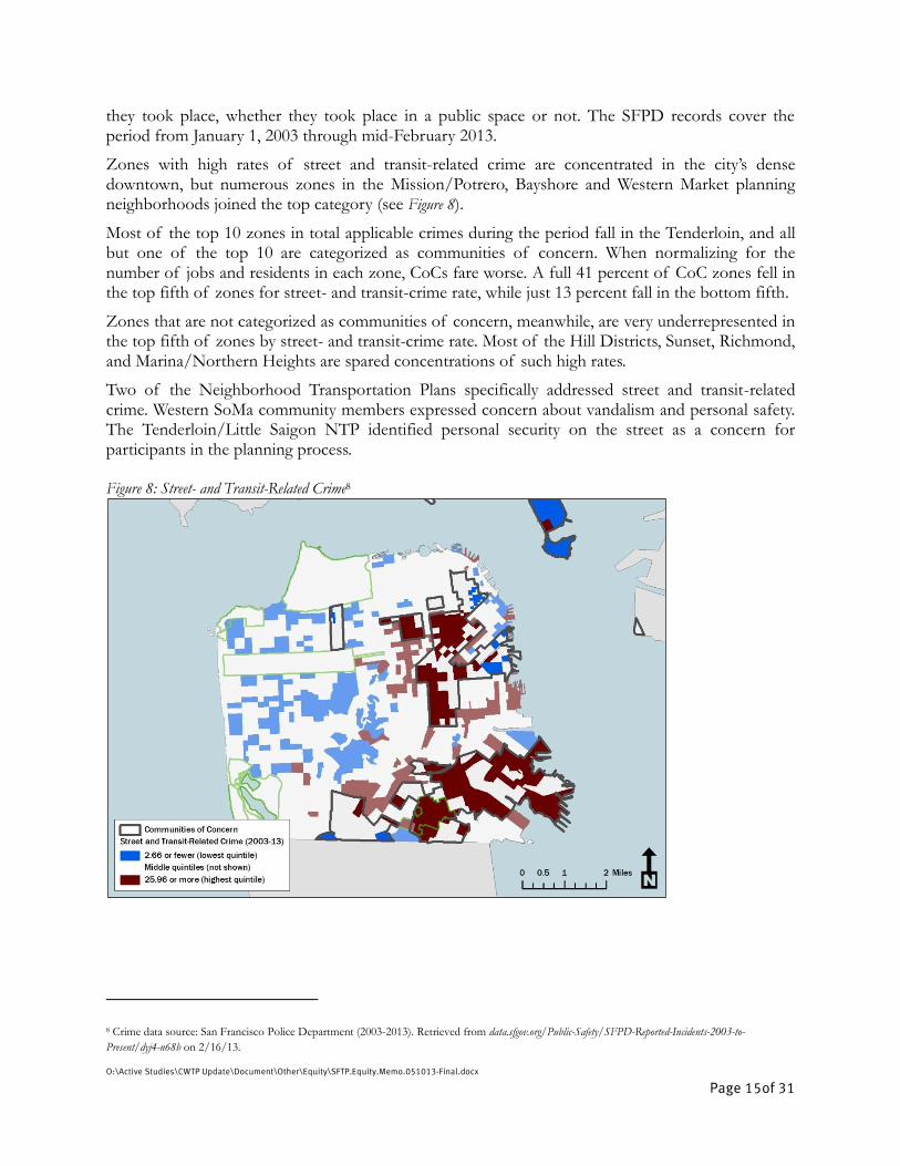
The analysis used data for transportation-related particulate exposure by parcel from 2008, calculated by the SF Department of Public Health.
Transportation-related particulate exposure concentrates around the city’s high-volume arteries and near elevated freeways. The widest swaths of particulate exposure follow I-80, I-280, and Highway 101, which are elevated for large portions within the city. This mostly affects zones in the southern and eastern areas of the city (see Figure 9). The city’s western districts see little particulate exposure, given lower traffic volumes, though the parcels around 19th Avenue, Geary Boulevard, Fulton Street, and Lincoln Way are important exceptions.
Despite the way freeways crisscross communities of concern in the southern portion of San Francisco, CoCs’ particulate exposure rates are slightly low relative to the rest of the city. While 22 percent of non-CoC land area sees high particulate exposure rates, just 16 percent of CoC land does. An earlier version of MTC community-of-concern geography, which incorporated broader swaths of the SoMa, Bayshore, and Outer Mission districts into CoCs, showed a much larger proportion of particulate exposure within CoCs (24 percent of exposed land within COCs vs. 17 percent outside).
None of the NTPs addressed air pollution as a concern, although that may be seen as an issue that lies outside the control of a neighborhood transportation plan. Figure 9: Particulate Exposure by Socioeconomic Status9
9 Source: San Francisco Department of Public Health (2008).
O:\Active Studies\CWTP Update\Document\Other\Equity\SFTP.Equity.Memo.051013-Final.docx
Page 17of 31
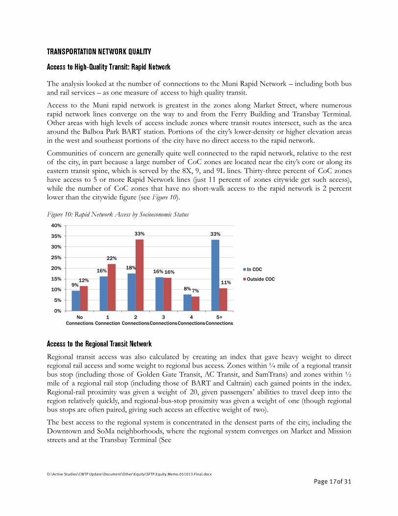
The analysis looked at the number of connections to the Muni Rapid Network – including both bus and rail services – as one measure of access to high quality transit.
Access to the Muni rapid network is greatest in the zones along Market Street, where numerous rapid network lines converge on the way to and from the Ferry Building and Transbay Terminal. Other areas with high levels of access include zones where transit routes intersect, such as the area around the Balboa Park BART station. Portions of the city’s lower-density or higher elevation areas in the west and southeast portions of the city have no direct access to the rapid network.
Communities of concern are generally quite well connected to the rapid network, relative to the rest of the city, in part because a large number of CoC zones are located near the city’s core or along its eastern transit spine, which is served by the 8X, 9, and 9L lines. Thirty-three percent of CoC zones have access to 5 or more Rapid Network lines (just 11 percent of zones citywide get such access), while the number of CoC zones that have no short-walk access to the rapid network is 2 percent lower than the citywide figure (see Figure 10). Figure 10: Rapid Network Access by Socioeconomic Status
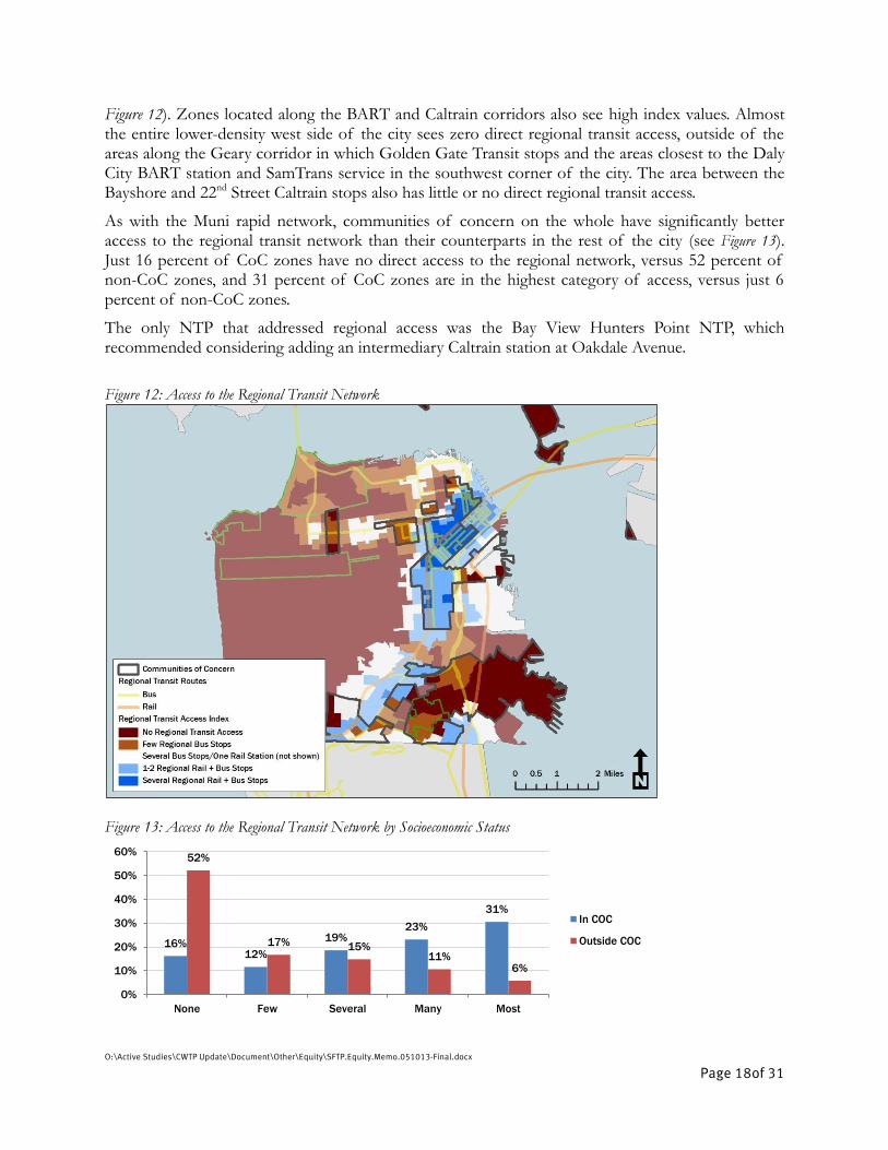
Regional transit access was also calculated by creating an index that gave heavy weight to direct regional rail access and some weight to regional bus access. Zones within ¼ mile of a regional transit bus stop (including those of Golden Gate Transit, AC Transit, and SamTrans) and zones within ½ mile of a regional rail stop (including those of BART and Caltrain) each gained points in the index. Regional-rail proximity was given a weight of 20, given passengers’ abilities to travel deep into the region relatively quickly, and regional-bus-stop proximity was given a weight of one (though regional bus stops are often paired, giving such access an effective weight of two).
The best access to the regional system is concentrated in the densest parts of the city, including the Downtown and SoMa neighborhoods, where the regional system converges on Market and Mission streets and at the Transbay Terminal (See
9%
16% 18%
16%
8%
33%
12%
22%
33%
16%
7%
11%
0%
5%
10%
15%
20%
25%
30%
35%
40%
No
Connections
1
Connection
2
Connections
3
Connections
4
Connections
5+
Connections
In COC
Outside COC
O:\Active Studies\CWTP Update\Document\Other\Equity\SFTP.Equity.Memo.051013-Final.docx
Page 18of 31
Figure 12). Zones located along the BART and Caltrain corridors also see high index values. Almost the entire lower-density west side of the city sees zero direct regional transit access, outside of the areas along the Geary corridor in which Golden Gate Transit stops and the areas closest to the Daly City BART station and SamTrans service in the southwest corner of the city. The area between the Bayshore and 22nd Street Caltrain stops also has little or no direct regional transit access.
As with the Muni rapid network, communities of concern on the whole have significantly better access to the regional transit network than their counterparts in the rest of the city (see Figure 13). Just 16 percent of CoC zones have no direct access to the regional network, versus 52 percent of non-CoC zones, and 31 percent of CoC zones are in the highest category of access, versus just 6 percent of non-CoC zones.
The only NTP that addressed regional access was the Bay View Hunters Point NTP, which recommended considering adding an intermediary Caltrain station at Oakdale Avenue.
Figure 12: Access to the Regional Transit Network
Figure 13: Access to the Regional Transit Network by Socioeconomic Status
16% 12%
19% 23%
31%
52%
17% 15% 11%
6%
0%
10%
20%
30%
40%
50%
60%
None Few Several Many Most
In COC
Outside COC
O:\Active Studies\CWTP Update\Document\Other\Equity\SFTP.Equity.Memo.051013-Final.docx
Page 19of 31
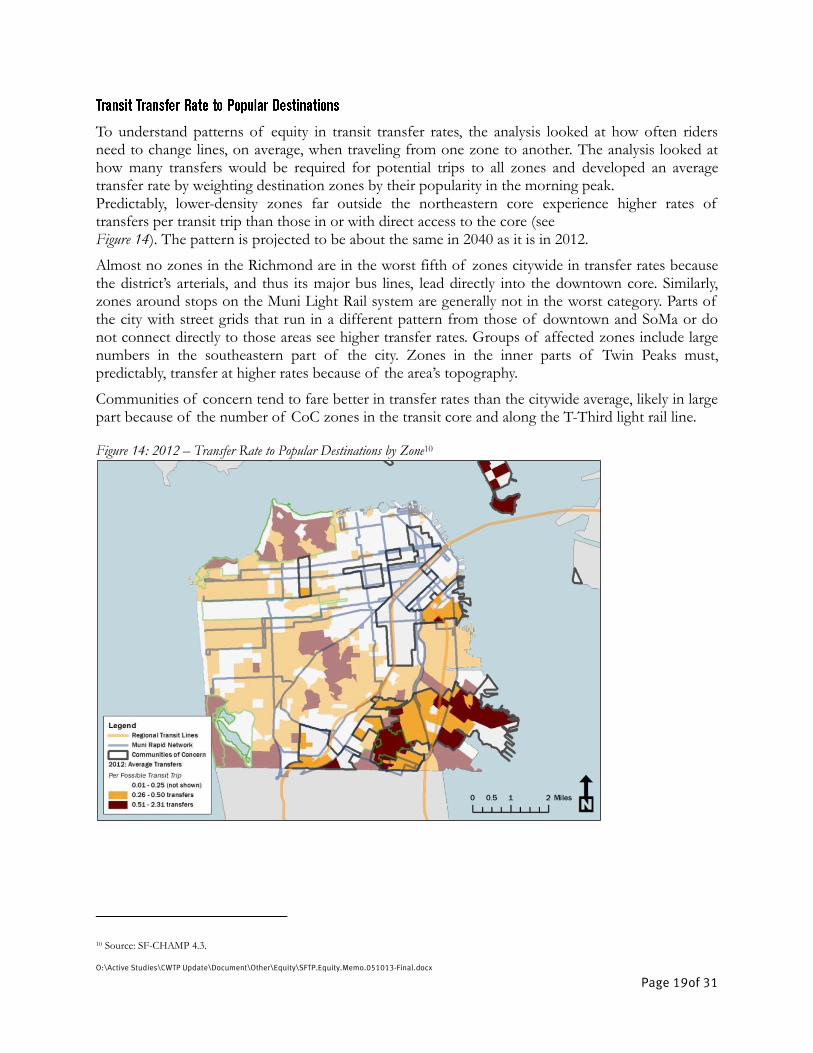
To understand patterns of equity in transit transfer rates, the analysis looked at how often riders need to change lines, on average, when traveling from one zone to another. The analysis looked at how many transfers would be required for potential trips to all zones and developed an average transfer rate by weighting destination zones by their popularity in the morning peak. Predictably, lower-density zones far outside the northeastern core experience higher rates of transfers per transit trip than those in or with direct access to the core (see Figure 14). The pattern is projected to be about the same in 2040 as it is in 2012.
Almost no zones in the Richmond are in the worst fifth of zones citywide in transfer rates because the district’s arterials, and thus its major bus lines, lead directly into the downtown core. Similarly, zones around stops on the Muni Light Rail system are generally not in the worst category. Parts of the city with street grids that run in a different pattern from those of downtown and SoMa or do not connect directly to those areas see higher transfer rates. Groups of affected zones include large numbers in the southeastern part of the city. Zones in the inner parts of Twin Peaks must, predictably, transfer at higher rates because of the area’s topography.
Communities of concern tend to fare better in transfer rates than the citywide average, likely in large part because of the number of CoC zones in the transit core and along the T-Third light rail line. Figure 14: 2012 – Transfer Rate to Popular Destinations by Zone10
10 Source: SF-CHAMP 4.3.
O:\Active Studies\CWTP Update\Document\Other\Equity\SFTP.Equity.Memo.051013-Final.docx
Page 20of 31
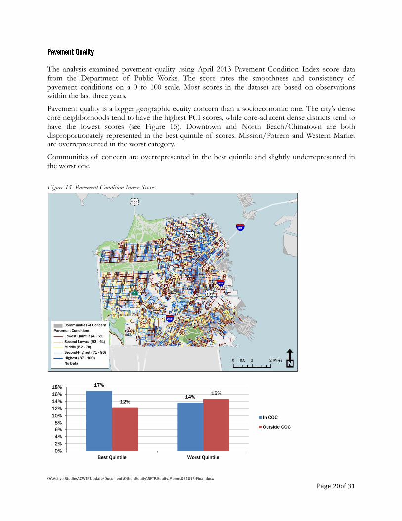
The analysis examined pavement quality using April 2013 Pavement Condition Index score data from the Department of Public Works. The score rates the smoothness and consistency of pavement conditions on a 0 to 100 scale. Most scores in the dataset are based on observations within the last three years.
Pavement quality is a bigger geographic equity concern than a socioeconomic one. The city’s dense core neighborhoods tend to have the highest PCI scores, while core-adjacent dense districts tend to have the lowest scores (see Figure 15). Downtown and North Beach/Chinatown are both disproportionately represented in the best quintile of scores. Mission/Potrero and Western Market are overrepresented in the worst category.
Communities of concern are overrepresented in the best quintile and slightly underrepresented in the worst one.
Figure 15: Pavement Condition Index Scores
17%
14% 12%
15%
0%
2%
4%
6%
8%
10%
12%
14%
16%
18%
Best Quintile Worst Quintile
In COC
Outside COC
O:\Active Studies\CWTP Update\Document\Other\Equity\SFTP.Equity.Memo.051013-Final.docx
Page 21of 31
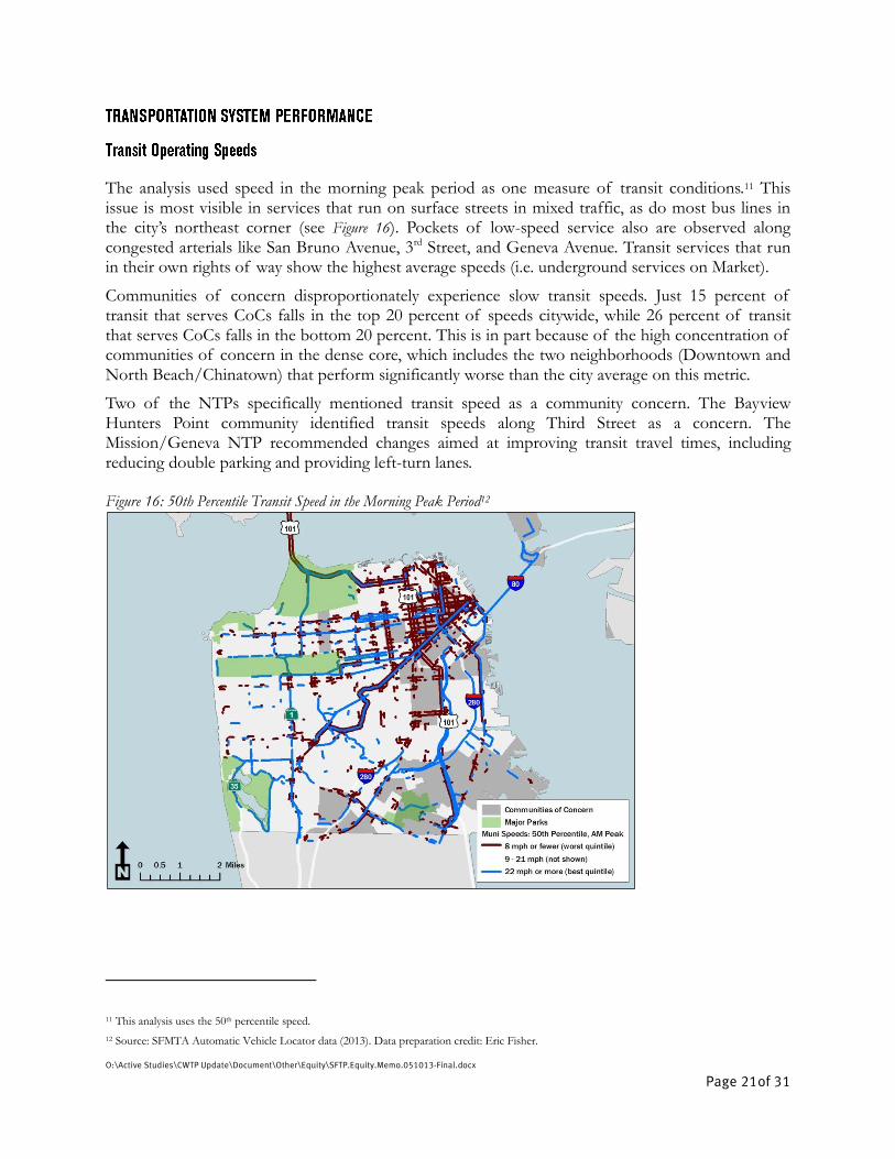
The analysis used speed in the morning peak period as one measure of transit conditions.11 This issue is most visible in services that run on surface streets in mixed traffic, as do most bus lines in the city’s northeast corner (see Figure 16). Pockets of low-speed service also are observed along congested arterials like San Bruno Avenue, 3rd Street, and Geneva Avenue. Transit services that run in their own rights of way show the highest average speeds (i.e. underground services on Market).
Communities of concern disproportionately experience slow transit speeds. Just 15 percent of transit that serves CoCs falls in the top 20 percent of speeds citywide, while 26 percent of transit that serves CoCs falls in the bottom 20 percent. This is in part because of the high concentration of communities of concern in the dense core, which includes the two neighborhoods (Downtown and North Beach/Chinatown) that perform significantly worse than the city average on this metric.
Two of the NTPs specifically mentioned transit speed as a community concern. The Bayview Hunters Point community identified transit speeds along Third Street as a concern. The Mission/Geneva NTP recommended changes aimed at improving transit travel times, including reducing double parking and providing left-turn lanes. Figure 16: 50th Percentile Transit Speed in the Morning Peak Period12
11 This analysis uses the 50th percentile speed.
12 Source: SFMTA Automatic Vehicle Locator data (2013). Data preparation credit: Eric Fisher.

O:\Active Studies\CWTP Update\Document\Other\Equity\SFTP.Equity.Memo.051013-Final.docx
Page 22of 31
Figure 16 Continued: 50th Percentile Transit Speed in the Morning Peak Period
The analysis compared 5th and 50th percentile speeds in the morning peak period as a measure of transit reliability. There are more direct ways to measure transit reliability, but data was unavailable on metrics like turn-backs, bus bunching, or other more tangible signs of reliability.
Geographically, the transit-speed variability map is almost the inverse of the transit speed map: The most consistent transit speeds cluster on high-volume downtown streets, while the most variable links are on the city’s major arterials and freeways (See
15%
26%
22%
17%
0%
5%
10%
15%
20%
25%
30%
22 mph or faster
(best quintile)
8 mph or slower
(worst quintile)
Transit Speeds by Socioeconomic Status
In COC
Outside COC
O:\Active Studies\CWTP Update\Document\Other\Equity\SFTP.Equity.Memo.051013-Final.docx
Page 23of 31
Figure 17). This is in part because speeds are universally slow downtown, limiting the potential for variability. Speeds can get much faster on freeways and major arterials, but with congestion or sporadic delays, speeds can get much slower.
The links with the highest variability are about evenly distributed between communities of concern and other zones, as are those with the lowest variability.
Three NTPs addressed the issue of transit reliability in their final reports. Bay View Hunters Point experienced transit service cuts as a major disruption. Mission/Geneva community members identified transit reliability as a concern, and made several recommendations aimed at improving transit service. In the Tenderloin NTP, reliability was one of the transit issues the plan addresses, recommending transit-only lanes, consolidating some routes, installing NextBus signs information signs, and reassessing the location of loading zones in relation to bus stops.

O:\Active Studies\CWTP Update\Document\Other\Equity\SFTP.Equity.Memo.051013-Final.docx
Page 24of 31
Figure 17: Transit Speed Variability
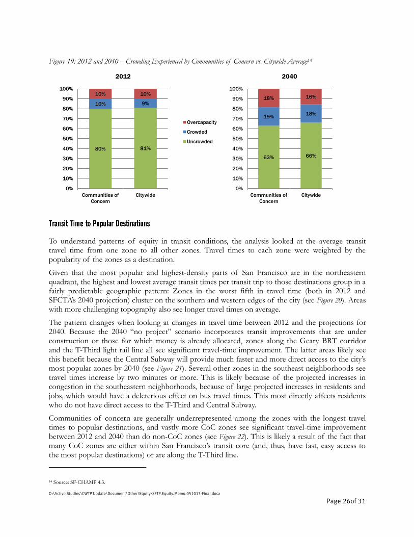
The analysis measured the impact of transit crowding on travelers to and from different parts of the city in two ways. For geographic equity, the analysis used SF-CHAMP model data and looked at which of the 12 San Francisco neighborhoods transit riders on crowded or overcapacity Muni lines were going to and coming from, and generated a percentage of person-hours traveled in each condition based on how long such riders were on that line. For socioeconomic equity, the analysis calculated a similar breakdown by the traveler’s origin-district CoC status. A portion of a transit line is considered “crowded” if it is more than 85 percent full and “overcapacity” if it is more than 100 percent full.
In 2012, transit riders who began their trip in the Western Market neighborhood (generally covering the Western Addition, Hayes Valley, the Castro, and the Lower/Upper Haight) spent the most PHT spent in crowded or overcapacity conditions. Other travelers that experienced high proportions of such conditions began their trips in outlying districts in the western and southern portions of the city. Riders who got on transit in the core districts – Downtown, SoMa, and Chinatown/North Beach – each experienced the lowest proportion of crowded conditions. This is likely because many people traveling from these areas in the morning peak are using transit in a reverse-commute direction. A portion of such people may also simply walk or bike to work – those whose destinations are the same as riders of crowded transit vehicles downtown may live close enough to avoid crowded transit vehicles altogether. The 2012 pattern is projected to be roughly the same in 2040, though all districts experience significantly more PHT in crowded/overcapacity conditions (see Figure 18). One notable exception is that those with Bayshore neighborhood origins see a dramatic increase in overcapacity person-hours travelled.

O:\Active Studies\CWTP Update\Document\Other\Equity\SFTP.Equity.Memo.051013-Final.docx
Page 25of 31
The high rates of crowding experienced by riders from the Western Market neighborhood run counter to the general density and topography-related transit-crowding patterns.
Communities of concern were not disproportionately burdened by crowded or overcapacity conditions in 2012, but they are projected to be slightly worse off in this regard in 2040 (see Figure
19). In 2012, about 20 percent of total PHT from CoCs were in crowded or overcapacity conditions, versus 19 percent citywide. By 2040, a projected 37 percent of CoC-rider PHT are expected to be in such conditions, versus 34 percent citywide. Figure 18: 2012 and 2040 – Crowding Experienced by Transit Riders, by Origin District in the Morning Peak13
13 Source: SF-CHAMP 4.3.
73% 75% 78% 78% 80% 84% 87% 91% 92% 93% 97% 98%
81%
20% 19% 20% 20% 19% 13% 11% 9% 6%
3% 2% 1%
9%
7% 6%
2% 1% 1% 3% 1% 1% 2% 4% 1% 1%
10%
0%
10%
20%
30%
40%
50%
60%
70%
80%
90%
100%
Pe
rce
nt
of
Pe
rso
n-H
ou
rs T
rave
lle
d
2012
Overcapacity
Crowded
Uncrowded
55% 64% 62% 63% 62%
70% 71% 83%
75% 87%
75% 78%
66%
30% 20% 23% 21%
11%
15% 16%
11% 17%
6%
5%
14%
18%
14% 16% 14% 17% 28%
15% 13% 6% 8% 7%
19% 8%
16%
0%
10%
20%
30%
40%
50%
60%
70%
80%
90%
100%
Pe
rce
nt
of
Pe
rso
n-H
ou
rs T
rave
lle
d
2040
Overcapacity
Crowded
Uncrowded
O:\Active Studies\CWTP Update\Document\Other\Equity\SFTP.Equity.Memo.051013-Final.docx
Page 26of 31
Figure 19: 2012 and 2040 – Crowding Experienced by Communities of Concern vs. Citywide Average14
To understand patterns of equity in transit conditions, the analysis looked at the average transit travel time from one zone to all other zones. Travel times to each zone were weighted by the popularity of the zones as a destination.
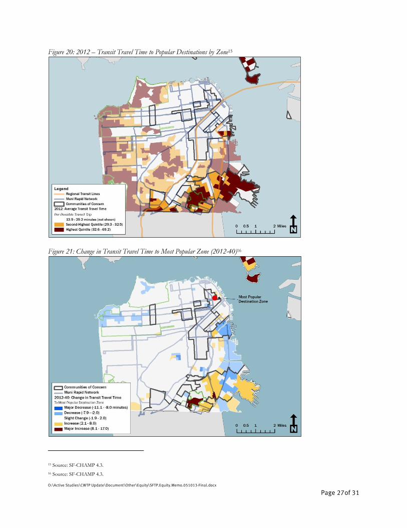
Given that the most popular and highest-density parts of San Francisco are in the northeastern quadrant, the highest and lowest average transit times per transit trip to those destinations group in a fairly predictable geographic pattern: Zones in the worst fifth in travel time (both in 2012 and SFCTA’s 2040 projection) cluster on the southern and western edges of the city (see Figure 20). Areas with more challenging topography also see longer travel times on average.
The pattern changes when looking at changes in travel time between 2012 and the projections for 2040. Because the 2040 “no project” scenario incorporates transit improvements that are under construction or those for which money is already allocated, zones along the Geary BRT corridor and the T-Third light rail line all see significant travel-time improvement. The latter areas likely see this benefit because the Central Subway will provide much faster and more direct access to the city’s most popular zones by 2040 (see Figure 21). Several other zones in the southeast neighborhoods see travel times increase by two minutes or more. This is likely because of the projected increases in congestion in the southeastern neighborhoods, because of large projected increases in residents and jobs, which would have a deleterious effect on bus travel times. This most directly affects residents who do not have direct access to the T-Third and Central Subway.
Communities of concern are generally underrepresented among the zones with the longest travel times to popular destinations, and vastly more CoC zones see significant travel-time improvement between 2012 and 2040 than do non-CoC zones (see Figure 22). This is likely a result of the fact that many CoC zones are either within San Francisco’s transit core (and, thus, have fast, easy access to the most popular destinations) or are along the T-Third line.
14 Source: SF-CHAMP 4.3.
63% 66%
19% 18%
18% 16%
0%
10%
20%
30%
40%
50%
60%
70%
80%
90%
100%
Communities of
Concern
Citywide
2040
80% 81%
10% 9%
10% 10%
0%
10%
20%
30%
40%
50%
60%
70%
80%
90%
100%
Communities of
Concern
Citywide
2012
Overcapacity
Crowded
Uncrowded
O:\Active Studies\CWTP Update\Document\Other\Equity\SFTP.Equity.Memo.051013-Final.docx
Page 27of 31
Figure 20: 2012 – Transit Travel Time to Popular Destinations by Zone15
Figure 21: Change in Transit Travel Time to Most Popular Zone (2012-40)16
15 Source: SF-CHAMP 4.3.
16 Source: SF-CHAMP 4.3.

O:\Active Studies\CWTP Update\Document\Other\Equity\SFTP.Equity.Memo.051013-Final.docx
Page 28of 31
Figure 22: Change in Travel Time to Popular Destinations by Socioeconomic Status (2012-40)
The analysis used the SF-CHAMP model to estimate current and future vehicle-miles traveled. VMT can be an indicator of the quality of alternatives to private vehicles as well as the levels of emissions and of wear-and-tear on local roads.
VMT patterns are more strongly geographic, rather than socioeconomic, in nature but the patterns are well correlated with patterns of density and topography. High rates of VMT cluster along the lower-density southern and western edges of the city, while lower rates of VMT cluster in the downtown core (and in zones with no residential development, such as those in the city’s major parks and, as of today, little-used former industrial areas like the Hunters Point Naval Shipyard in the Bayshore neighborhood) (See Figure 23). The same basic pattern continues in 2040, though VMT generally goes up across the city (see Figure 24).
The range in density and transit availability among CoCs potentially masks some significant socioeconomic equity concerns evident in the city’s lower-density communities of concern. On the whole, communities of concern are overrepresented among both the best and worst quintiles of zones by VMT, but CoCs in the Outer Mission and Bayshore neighborhoods have large clusters of high-VMT zones, while CoCs in the downtown area have large clusters of low-VMT zones.
5%
13%
5%
7%
0%
2%
4%
6%
8%
10%
12%
14%
+2 mins or worse -2 mins or better
In COC
Outside COC

O:\Active Studies\CWTP Update\Document\Other\Equity\SFTP.Equity.Memo.051013-Final.docx
Page 29of 31
Figure 23: 2012 – Vehicle Miles Traveled
Figure 24: 2040 – Vehicle Miles Traveled

O:\Active Studies\CWTP Update\Document\Other\Equity\SFTP.Equity.Memo.051013-Final.docx
Page 30of 31
Neighborhood Transportation Plans (NTPs) are the result of a community-based planning effort to identify high-priority transportation needs and develop conceptual designs for transportation improvements in neighborhoods throughout San Francisco. Each Neighborhood Transportation Plan (NTP) seeks both to address community concerns regarding local transportation conditions and to engage community members in the transportation planning process. NTPs have been developed for several areas of the city, and each plan encompasses some of San Francisco’s identified Communities of Concern. These plans are a valuable source of information from the people who live and work in the areas under study, as they can help identify trends in these areas.
The neighborhoods that have already developed NTPs are: Western South of Market, Bay View Hunters Point, Mission/Geneva, and Tenderloin/Little Saigon. The findings of each NTP are summarized in the following section. Because these neighborhoods include communities of concern, the work already completed in this public process can help inform considerations in this equity analysis.
Pedestrian safety and street crime were among the biggest concerns identified in the Western SoMa NTP. The study identified strong community support for mid-block crossings at alleys and the community’s desire to balance pedestrian improvements with parking supply. Community members expressed concerns about vandalism, personal safety, and the need to retain the currently available amount of loading space.
The NTP made several recommendations and developed preliminary designs for signalized mid-block crossings on Minna (at 7th) and Natoma (at 8th), traffic calming measures, landscaping and seating, pedestrian-scale lighting, some modest reductions in on-street parking, the installation of public art highlighting local cultural heritages, and a designed “shared street” on Ringold.
Numerous issues that are part of this analysis also came up in the Bayview Hunters Point NTP process. Specifically, community members voiced concerns about pedestrian and bike safety, access to the fastest and most reliable Muni lines, and transit travel times.
The community also identified parking issues (especially cars parking on sidewalks, which affects pedestrian conditions) and obstacles to coordination and resource-sharing as areas of concern.
Community discussions produced a plan to create pilot programs for community-based transportation programs to improve mobility, such as coordinated shuttles and car-sharing. Other areas of need include improved infrastructure to support walking, bicycling, and transit, reversing cuts in transit service, pursuing the possibility of construction a Caltrain station at Oakdale Avenue, and better managing parking to support local businesses and keep cars off sidewalks. Third Street in particular was identified as a place where the walking environment needs to be improved while minimizing effects on transit.
Mission/Geneva community members identified transit reliability, pedestrian safety problems at unsignaled and complex intersections, and narrow sidewalks as concerns, aligning with several parts of this analysis. The plan made recommendations for specific intersections, including a redesign of

O:\Active Studies\CWTP Update\Document\Other\Equity\SFTP.Equity.Memo.051013-Final.docx
Page 31of 31
the San Juan Avenue/Persia Avenue/Ocean Avenue intersection (the “Persia Triangle”), and made suggestions for bus bulbs, corner curb extensions, and widened sidewalks along Mission.
The study also identified needs specific to the two corridors within the study area (Mission and Geneva). Recommended changes along Mission are meant to improve transit travel times, recognizing that transit delays are caused by double parking and the lack of left turn lanes. The plan’s recommendations along Geneva aim at reducing traffic speeds and creating a more comfortable walking environment with landscaped buffers, bus bulbs and corner extensions, and high-visibility crosswalks.
The Tenderloin/Little Saigon community outreach process found that pedestrian safety, transit reliability and accessibility for low-income people, traffic speed, security, and the community experience were all concerns they wanted to address in any potential transportation improvements. Most of these issues are explored in this analysis. The discussions produced recommendations for improving existing crosswalks, installing pedestrian countdown signals and corner bulbs, and some traffic calming, as well as improving transit service by creating transit-only lanes, consolidating routes on two-way streets, and installing NextBus at bus stops. Other recommendations include improving bus shelters, reassessing the location of loading zones in relation to bus stops, constructing bus bulbs, adding trees, and repairing sidewalks.
The equity analysis may inform the SFTP Update in two key ways.
First, equity may be one of several criteria used to determine which projects and programs should be included in the SFTP’s financially constrained and vision investment scenarios. Other criteria may include cost-effectiveness, support for Priority Development Areas, and public input. The team could give potential projects and programs credit for improving equity if they address a socioeconomic or geographic disparity identified in this analysis.
The SFTP investment scenarios could also set aside some discretionary revenues for projects and programs that would improve equity issues as identified in this study. Such funds could be programmed to specific projects through the Prop K Five-Year Prioritization Programs (5YPPs).
This analysis of the spatial distribution of transportation system conditions reveals some trends in both socioeconomic and geographic equity issues in San Francisco, as well as some geographic trends that may be expected due to topography or density, and unrelated to equity. For safety metrics in particular, the city’s communities of concern tend to experience disproportionately worse conditions, experiencing more pedestrian and bike injuries and higher rates of street crime. While communities of concern as a whole do not fare significantly worse than the rest of the city on most other metrics explored in this analysis, poor system performance / condition does cluster geographically in some ways that are not predicted by historic development patterns or the city’s hilly topography, in particular: transit speeds, reliability, and crowding. The SFTP investment scenarios could potentially call for direct greater resources to be directed towards these areas.


![WELCOME [dot.nebraska.gov] · Prioritization Selection. Project Prioritization Process 11. Prioritizing Transportation Investments 12. The Build Nebraska Act Projects have been selected](https://img.pdfslide.us/doc/110x75/5f7c9fe96f8ee0681617bed7/welcome-dot-prioritization-selection-project-prioritization-process-11-prioritizing.jpg)