Embed Size (px)
DESCRIPTION
tourweaver 3.0 manual
Citation preview
- 1 -
Welcome to Tourweaver 3.00
This document explains the installation and operation of Easypano Tourweaver 3.00. It is
intended for both novices and professionals who engage in online virtual tour building and
for real estate exhibitioners. Readers of this document should:
Have prior knowledge of panorama photography
Know something about JavaScripting, API's or setting parameters
A basic knowledge of HTML would be better
Conventions and Definitions
We use the following typographical conventions and definitions in this document:
Typeface or Icons Purpose
Italic Used to emphasize new terms and concepts at the point where
they are introduced. Also used to designate the quoted terms or
menus of the software
Note Used to arouse the readers' attention towards certain operations or
things they should consider
Tips Used to offer some extra techniques on how to use Tourweaver 2.0
Copyright Announcement
This manual, as well as the software described in it, is furnished under license and may be
used or copied only in accordance with the terms of such license. The content of this manual
is furnished for informational use only, is subject to change without notice. Easypano
assumes no responsibility or liability for any errors or inaccuracies that may appear in this
documentation. Except as permitted by such license, no part of this publication may be
reproduced, stored in a retrieval system, or transmitted, in any form or by any means,
electronic, mechanical, recording, or otherwise, without the prior written permission of
Easypano.
Tourweaver 3.00 and Easypano are trademarks of Easypano, Inc. Microsoft, Windows and
Internet Explorer are registered trademarks of Microsoft Corporation. About more on
license information please refer to the license agreement included in the applications. Other
products mentioned in this manual have rights and marks held by their respective owners.
- 2 -
Feedback
We welcome your comments and feedback on this manual. Please send your comments to
us by the following email:
Email: [email protected]
Introduction
What Can You Do With Tourweaver 3.00
As the industry-leading virtual tour presentation software, Tourweaver is professional and
outstanding. You may create a wonderful virtual tour in both flash and Java applet formats
with multiple spherical, cylindrical and still images. What’s more, with the features of map,
hotspots and sound, you will have an immersive experience as if you’re in the scene. Virtual
tours from Tourweaver can be widely used in many areas like real estate business, webpage
designing, multimedia designing, advertisement designing and panoramic photography.
With a friendly interface, it’s very easy to learn and to use. Either novices or professionals
can build a charming virtual tour with Tourweaver.
What’s New in Tourweaver 3.00
Added features:
Publish tour in flash viewer
Support swf format for popup image
Support swf format for waiting image
Display map at up right corner when in full screen
Add zoom in/zoom out effect to Popup image window
Improved features:
Full screen toolbar customization
Fixed features:
The Java viewer no longer flickers if the preloading image is gif format.
Java viewer becomes more stable in the new version.
The problem of hotspot irregular movement is resolved.
Toggle button works better.
The walkthrough effect for flat image is corrected.
The problem of combobox is resolved.
- 3 -
Installation and Purchase of Tourweaver 3.00
Tourweaver Installation and Activation
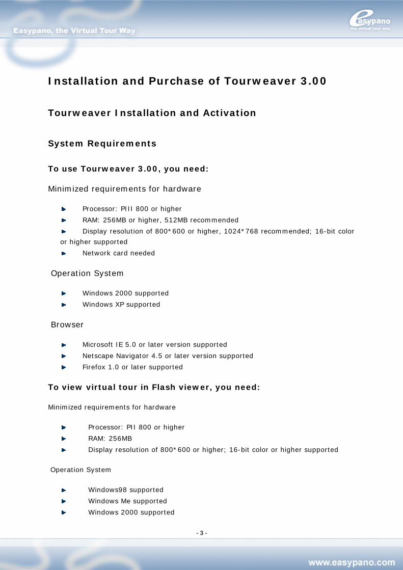
System Requirements
To use Tourweaver 3.00, you need:
Minimized requirements for hardware
Processor: PIII 800 or higher
RAM: 256MB or higher, 512MB recommended
Display resolution of 800*600 or higher, 1024*768 recommended; 16-bit color
or higher supported
Network card needed
Operation System
Windows 2000 supported
Windows XP supported
Browser
Microsoft IE 5.0 or later version supported
Netscape Navigator 4.5 or later version supported
Firefox 1.0 or later supported
To view virtual tour in Flash viewer, you need:
Minimized requirements for hardware
Processor: PII 800 or higher
RAM: 256MB
Display resolution of 800*600 or higher; 16-bit color or higher supported
Operation System
Windows98 supported
Windows Me supported
Windows 2000 supported
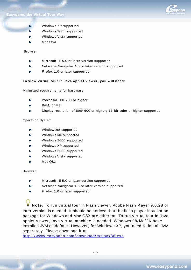
- 4 -
Windows XP supported
Windows 2003 supported
Windows Vista supported
Mac OSX
Browser
Microsoft IE 5.0 or later version supported
Netscape Navigator 4.5 or later version supported
Firefox 1.0 or later supported
To view virtual tour in Java applet viewer, you will need:
Minimized requirements for hardware
Processor: PII 200 or higher
RAM: 64MB
Display resolution of 800*600 or higher; 16-bit color or higher supported
Operation System
Windows98 supported
Windows Me supported
Windows 2000 supported
Windows XP supported
Windows 2003 supported
Windows Vista supported
Mac OSX
Browser
Microsoft IE 5.0 or later version supported
Netscape Navigator 4.5 or later version supported
Firefox 1.0 or later supported
Note: To run virtual tour in Flash viewer, Adobe Flash Player 9.0.28 or later version is needed. It should be noticed that the flash player installation package for Windows and Mac OSX are different. To run virtual tour in Java applet viewer, java virtual machine is needed. Windows 98/Me/2K have installed JVM as default. However, for Windows XP, you need to install JVM separately. Please download it at http://www.easypano.com/download/msjavx86.exe.
- 5 -
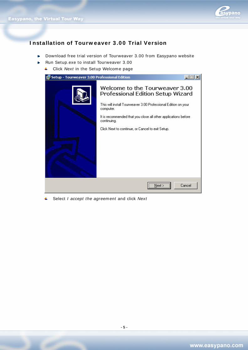
Installation of Tourweaver 3.00 Trial Version
Download free trial version of Tourweaver 3.00 from Easypano website
Run Setup.exe to install Tourweaver 3.00
Click Next in the Setup Welcome page
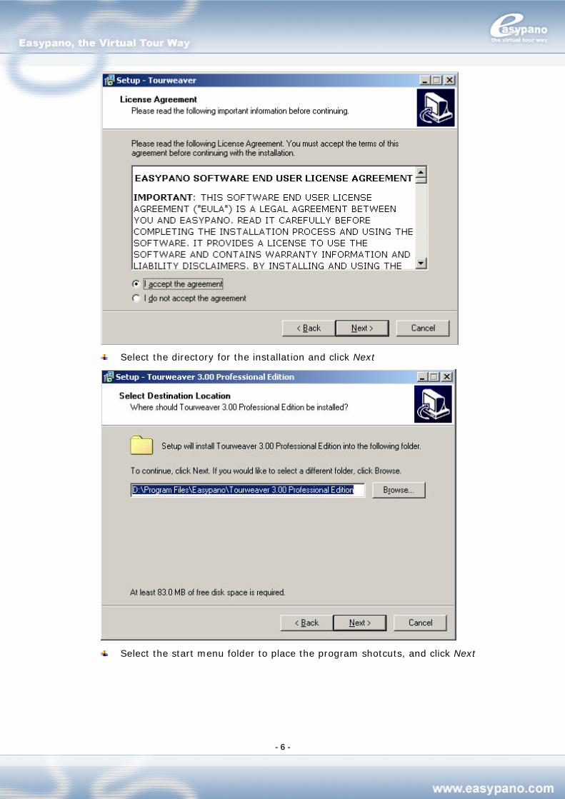
Select I accept the agreement and click Next
- 6 -
Select the directory for the installation and click Next
Select the start menu folder to place the program shotcuts, and click Next
- 7 -
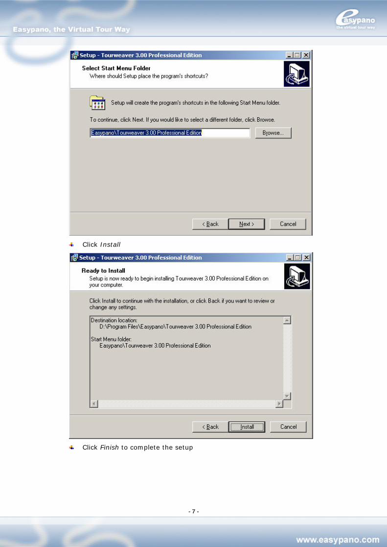
Click Install
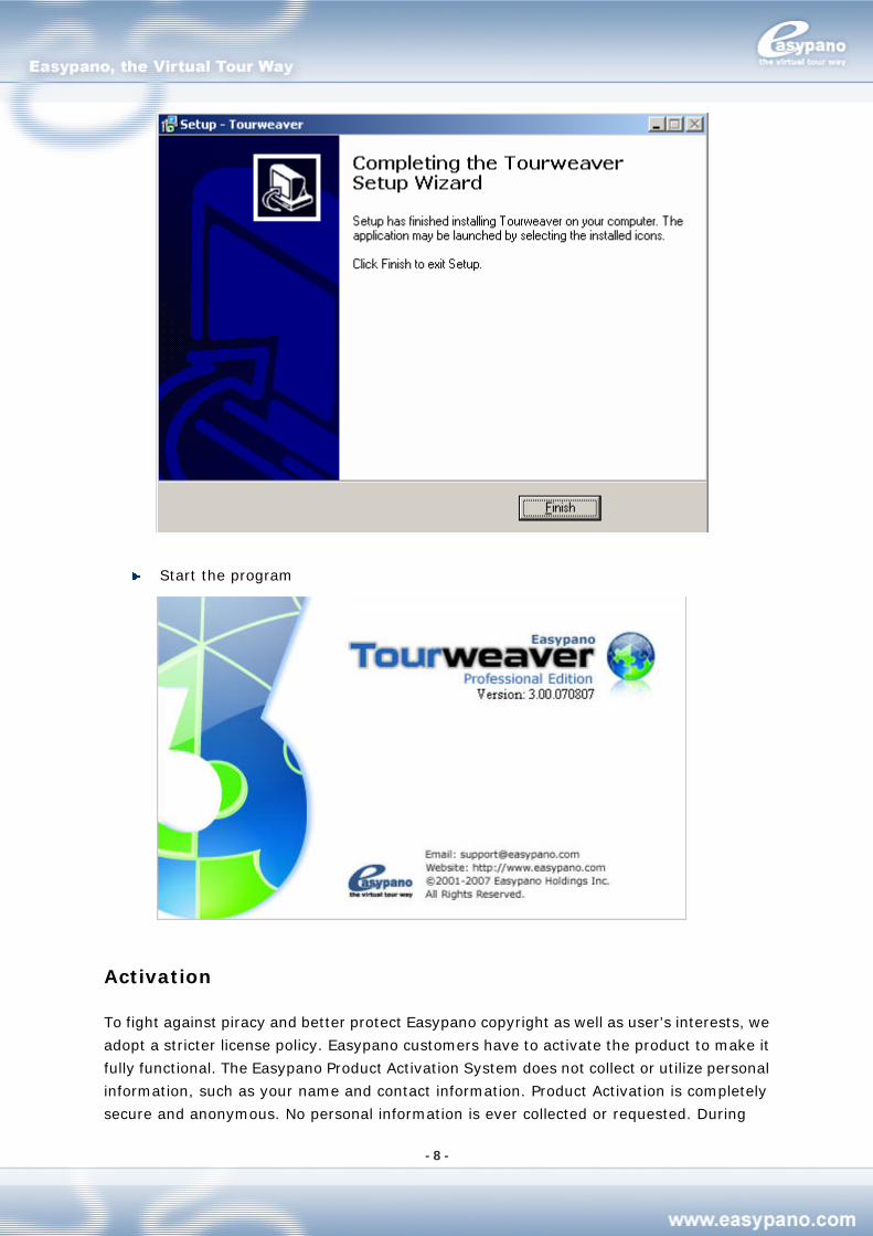
Click Finish to complete the setup
- 8 -
Start the program
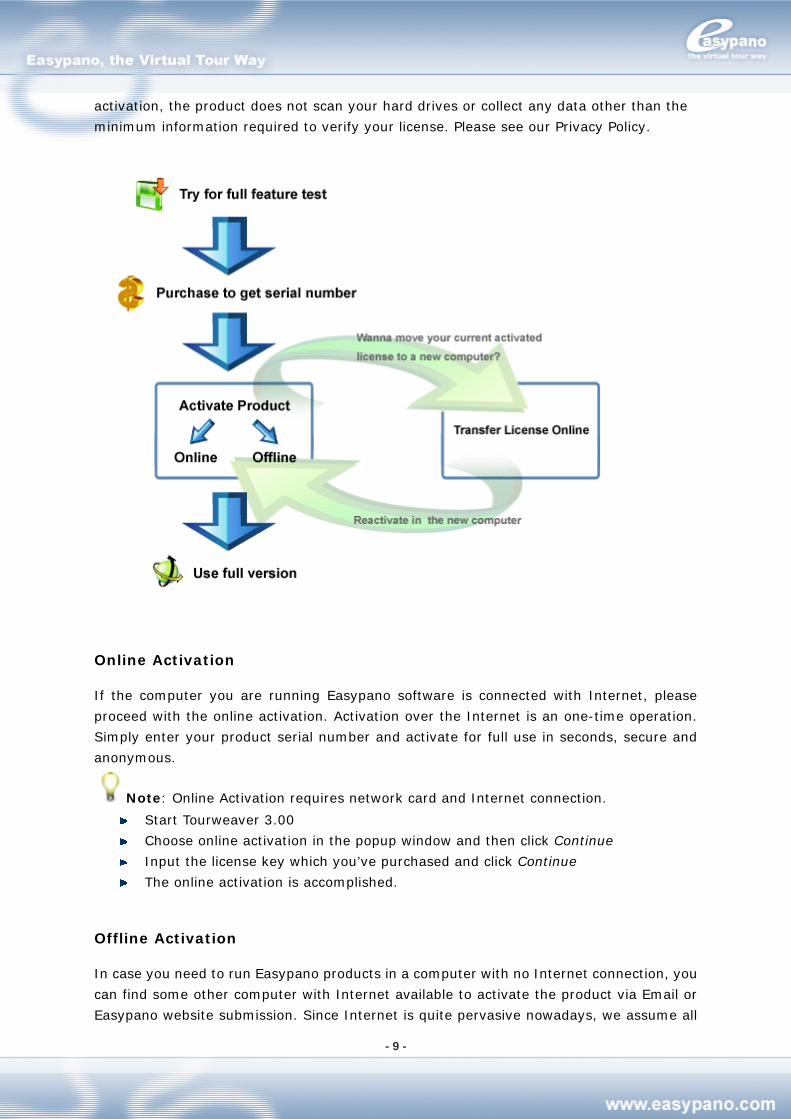
Activation
To fight against piracy and better protect Easypano copyright as well as user's interests, we
adopt a stricter license policy. Easypano customers have to activate the product to make it
fully functional. The Easypano Product Activation System does not collect or utilize personal
information, such as your name and contact information. Product Activation is completely
secure and anonymous. No personal information is ever collected or requested. During
- 9 -
activation, the product does not scan your hard drives or collect any data other than the
minimum information required to verify your license. Please see our Privacy Policy.
Online Activation
If the computer you are running Easypano software is connected with Internet, please
proceed with the online activation. Activation over the Internet is an one-time operation.
Simply enter your product serial number and activate for full use in seconds, secure and
anonymous.
Note: Online Activation requires network card and Internet connection.
Start Tourweaver 3.00
Choose online activation in the popup window and then click Continue
Input the license key which you’ve purchased and click Continue
The online activation is accomplished.
Offline Activation
In case you need to run Easypano products in a computer with no Internet connection, you
can find some other computer with Internet available to activate the product via Email or
Easypano website submission. Since Internet is quite pervasive nowadays, we assume all
- 10 -
the customers can access the Internet by certain means, either in a net cafe, or another
computer.
Basically offline activation still requires internet connectivity, however not necessarily in the
computer running the software.
A general procedure for offline activation:
Start Tourweaver 3.00
Choose offline activation in the popup window and then click Continue
Choose step 1 to create an ARF file and click Continue
Input the license key you’ve purchased and select the right directory to save this
ARF; and click Continue
An ARF file is created and saved in the relative path
Click the link http://www.easypano.com/activation.html to open the registration
html page. Fill out one or two available Email and upload this ARF
An ALF file is created and sent to the relevant Email
Login your email-box and save this ALF to your local
Restart the activation procedure from Help menu.
Choose offline activation; and click Continue
Choose step 3 and click Continue
Import ALF to activate the software and click Continue
Offline activation is accomplished
Note: Offline Activation requires network interface card installed.
Please make sure the computer in which you install Tourweaver 3.00 and create Activate
Request File, meet the following requirements.
1. Network card is installed.
2. TCP/IP protocol is installed.
3. Network card is not disabled.
Transfer License
If you want to move your software from current computer to a new one or plan to upgrade
your hardware, transferring license should be done in in advance. This feature deactivates
the product on your current machine so it can be reactivated on the new or upgraded
computer.
Transfer License Mechanism:
1. Run Transfer License
2. Activation ID and Serial Number are uploaded to Easypano Activation Server
3. Activation Server checks the Activation ID
4. Activation Server deactivates the current product and gives feedback to you.
Please click Help>Transfer License, it can be finished in a moment.
Note: Internet connection is required to transfer license. In case you need transfer
license offline, say the original computer can not be accessed or crashed, please directly
contact [email protected]. An inclusion of your serial number in the email will be
- 11 -
more helpful. Easypano support will transfer your license in original computer so that you
can reactivate in another one.
Only when the product was activated, can user proceed to transfer license.
Uninstall Tourweaver 3.00
Select Start>Programs>Easypano>Tourweaver 3.00>Uninstall Tourweaver 3.00
Delete the program via Add/Remove programs under Control Panel
Purchase Tourweaver 3.00
If you’re interested in our products, please make purchase via the following two ways:
1. Purchase from resellers:
For the moment, we have agents in the following countries: USA, United Kingdom, Italia,
France, Romania, Australia and Greece. To contact these agents, please go to this webpage
for more details: http://www.easypano.com/resellers.html
2. Purchase online:
If you choose to purchase online, please go to this page:
http://www.easypano.com/onlinestore.html
Note: In version 3.00, one license can be activated on both desktop and laptop.
General Information of Tourweaver 3.00
Tourweaver Project File
The project file from Tourweaver is in XML format with the extension .tw. It records all the
information of the whole project including window, scene, sound, map and output.
Note: The extension of project file from Tourweaver 1.30 is vtp. Tourweaver 2.00 and
3.00 can also recognize and open vtp file, but it will convert this file to tw first.
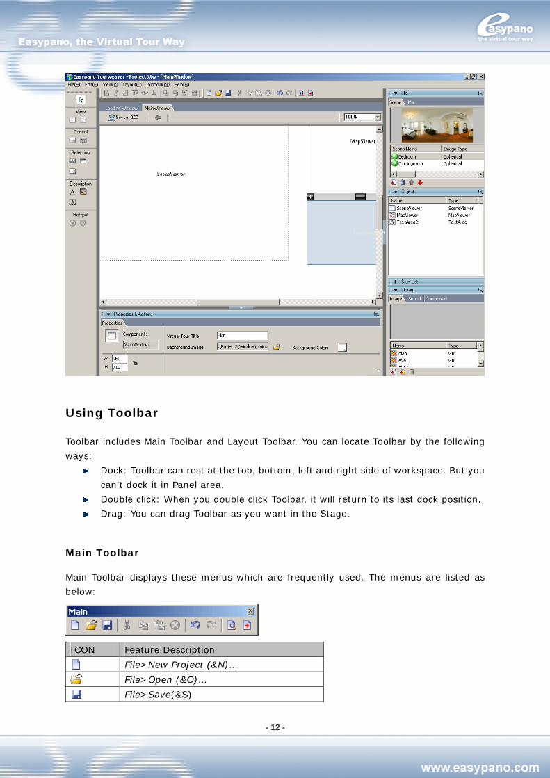
Learn Tourweaver Workspace
In Tourweaver 3.00, the workspace consists of Title bar, Menu bar, Toolbar, Stage and Panel,
and it’s shown as below:
- 12 -
Using Toolbar
Toolbar includes Main Toolbar and Layout Toolbar. You can locate Toolbar by the following
ways:
Dock: Toolbar can rest at the top, bottom, left and right side of workspace. But you
can’t dock it in Panel area.
Double click: When you double click Toolbar, it will return to its last dock position.
Drag: You can drag Toolbar as you want in the Stage.
Main Toolbar
Main Toolbar displays these menus which are frequently used. The menus are listed as
below:
ICON Feature Description
File>New Project (&N)…
File>Open (&O)…
File>Save(&S)
- 13 -
-
Edit>Cut(&T)
Edit>Copy(&C)
Edit>Paste(&P)
Edit>Del(&A)
-
Edit>Undo(&U)
Edit>Redo(&R)
-
File>Preview(&R)>Default(&D)
File>Publish(&B)
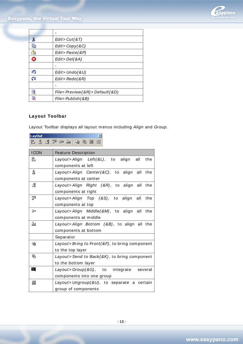
Layout Toolbar
Layout Toolbar displays all layout menus including Align and Group.
ICON Feature Description
Layout>Align Left(&L), to align all the
components at left
Layout>Align Center(&C), to align all the
components at center
Layout>Align Right (&R), to align all the
components at right
Layout>Align Top (&S), to align all the
components at top
Layout>Align Middle(&M), to align all the
components at middle
Layout>Align Bottom (&B), to align all the
components at bottom
Separator
Layout>Bring to Front(&F), to bring component
to the top layer
Layout>Send to Back(&K), to bring component
to the bottom layer
Layout>Group(&G), to integrate several
components into one group
Layout>Ungroup(&U), to separate a certain
group of components
- 14 -
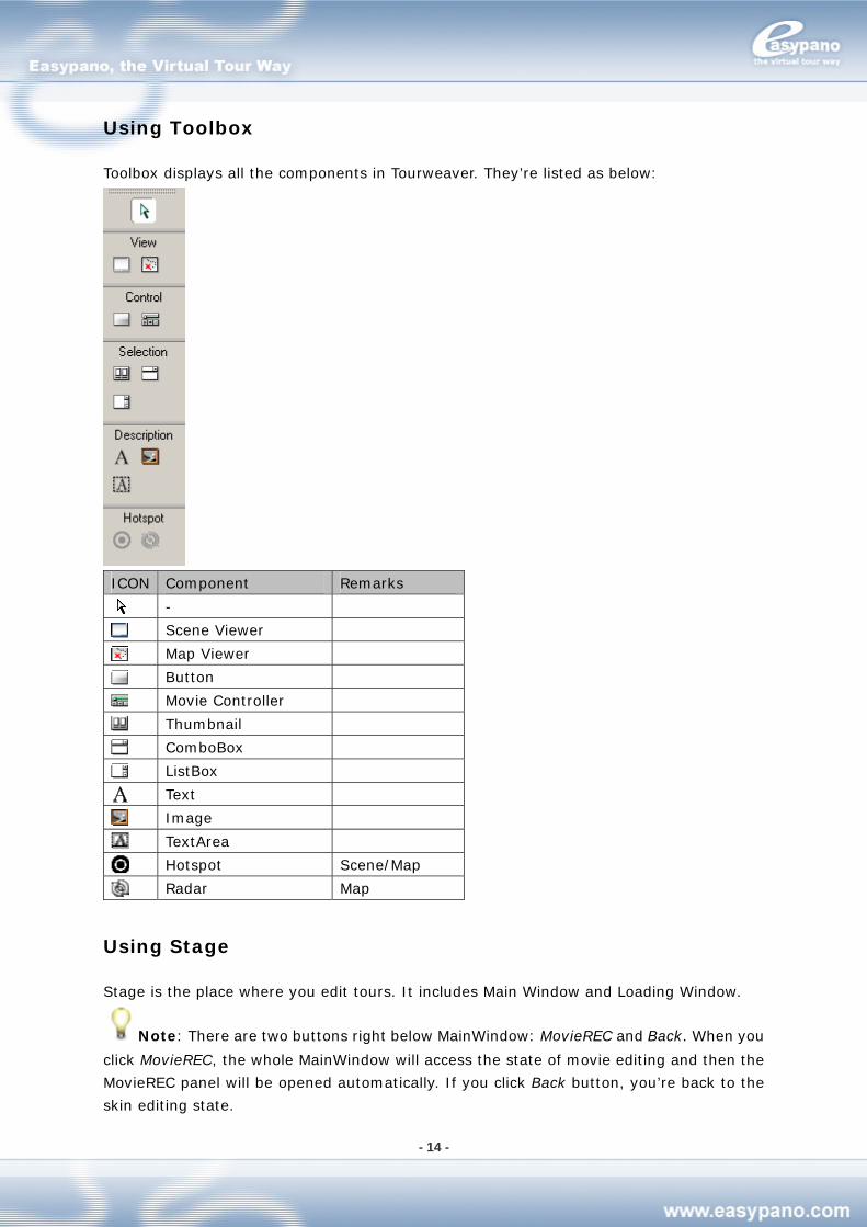
Using Toolbox
Toolbox displays all the components in Tourweaver. They’re listed as below:
ICON Component Remarks
-
Scene Viewer
Map Viewer
Button
Movie Controller
Thumbnail
ComboBox
ListBox
Text
Image
TextArea
Hotspot Scene/Map
Radar Map
Using Stage
Stage is the place where you edit tours. It includes Main Window and Loading Window.
Note: There are two buttons right below MainWindow: MovieREC and Back. When you
click MovieREC, the whole MainWindow will access the state of movie editing and then the
MovieREC panel will be opened automatically. If you click Back button, you’re back to the
skin editing state.
- 15 -
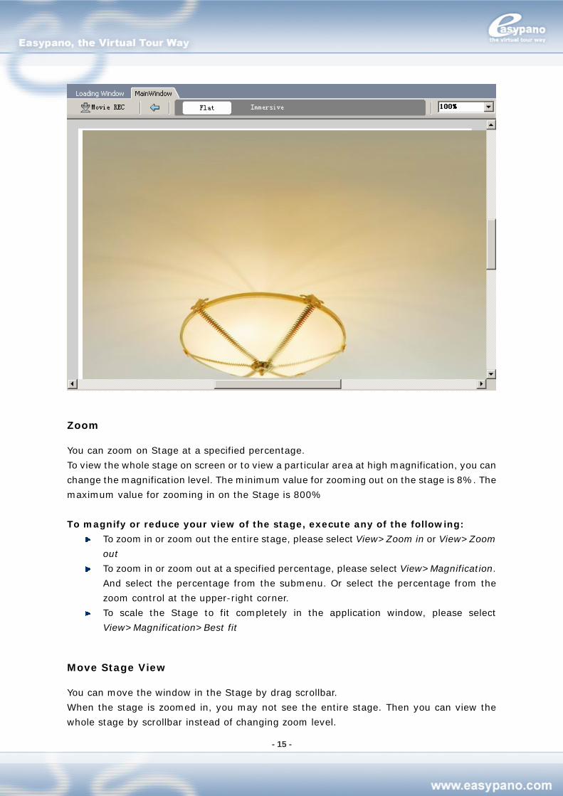
Zoom
You can zoom on Stage at a specified percentage.
To view the whole stage on screen or to view a particular area at high magnification, you can
change the magnification level. The minimum value for zooming out on the stage is 8%. The
maximum value for zooming in on the Stage is 800%
To magnify or reduce your view of the stage, execute any of the following:
To zoom in or zoom out the entire stage, please select View>Zoom in or View>Zoom
out
To zoom in or zoom out at a specified percentage, please select View>Magnification.
And select the percentage from the submenu. Or select the percentage from the
zoom control at the upper-right corner.
To scale the Stage to fit completely in the application window, please select
View>Magnification>Best fit
Move Stage View
You can move the window in the Stage by drag scrollbar.
When the stage is zoomed in, you may not see the entire stage. Then you can view the
whole stage by scrollbar instead of changing zoom level.
- 16 -
Using Panel
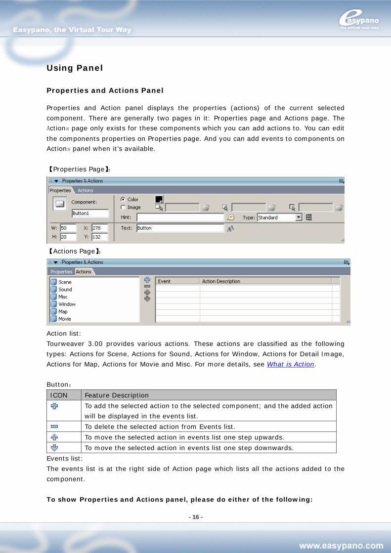
Properties and Actions Panel
Properties and Action panel displays the properties (actions) of the current selected
component. There are generally two pages in it: Properties page and Actions page. The
Actions page only exists for these components which you can add actions to. You can edit
the components properties on Properties page. And you can add events to components on
Actions panel when it’s available.
【Properties Page】:
【Actions Page】:
Action list:
Tourweaver 3.00 provides various actions. These actions are classified as the following
types: Actions for Scene, Actions for Sound, Actions for Window, Actions for Detail Image,
Actions for Map, Actions for Movie and Misc. For more details, see What is Action.
Button:
ICON Feature Description
To add the selected action to the selected component; and the added action
will be displayed in the events list.
To delete the selected action from Events list.
To move the selected action in events list one step upwards.
To move the selected action in events list one step downwards.
Events list:
The events list is at the right side of Action page which lists all the actions added to the
component.
To show Properties and Actions panel, please do either of the following:
- 17 -
Select Window>Properties and Actions panel
Press Ctrl+P
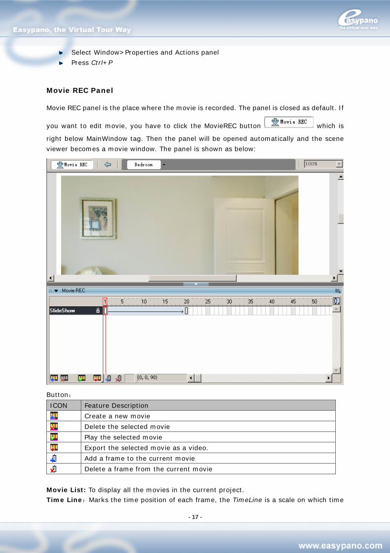
Movie REC Panel
Movie REC panel is the place where the movie is recorded. The panel is closed as default. If
you want to edit movie, you have to click the MovieREC button which is
right below MainWindow tag. Then the panel will be opened automatically and the scene
viewer becomes a movie window. The panel is shown as below:
Button:
ICON Feature Description
Create a new movie
Delete the selected movie
Play the selected movie
Export the selected movie as a video.
Add a frame to the current movie
Delete a frame from the current movie
Movie List: To display all the movies in the current project.
Time Line:Marks the time position of each frame, the TimeLine is a scale on which time
- 18 -
point is shown every 5 seconds. Each small scale stands for 1 second。
TimePoint:It is used to coordinate the timing between the frames。
Frame Area: To show all the frames in the current movie.
Condition Display way between the two
frames
Illustrati
on
Time
space>=1
The two frames are
connected with an arrowhead
line
The two frames
are in the same
scene
No time space The two frames are
connected with a single line
Time
space>=1
The two frames are
connected with an arrowhead
line and the background color
is blue
At a certain
movie
The two frames
are in different
scene
No time space The two frames are
connected with a single line
Frame Preview Button:
Display mode for frame including Normal and Preview.
Button Hint Dropdown List Illustration
Normal Frame
Preview Preview
To display Movie REC panel, please do the following:
1. Place the Scene Viewer on Main Window
2. Import scenes under scene panel
3. Click the MovieREC button which is right below MainWindow
To close MovieREC panel, please do any of the following:
1. Click the Back button which is right below MainWindow
2. Or double click any places on MainWindow except scene viewer
List Panel
List panel manages scenes and maps in the current project. It includes Scene tag and Map
tag.
To display List panel, do the any of the following:
Select Window>List panel
Press Ctrl+S
Scene Tag
Scene tag manages all scene images in the current project. You can add scene to the project
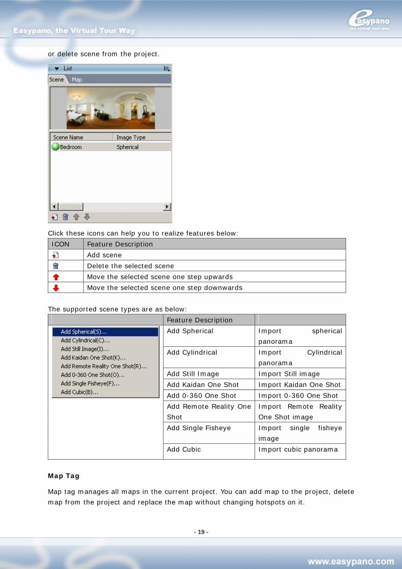
- 19 -
or delete scene from the project.
Click these icons can help you to realize features below:
ICON Feature Description
Add scene
Delete the selected scene
Move the selected scene one step upwards
Move the selected scene one step downwards
The supported scene types are as below:
Feature Description
Add Spherical Import spherical
panorama
Add Cylindrical Import Cylindrical
panorama
Add Still Image Import Still image
Add Kaidan One Shot Import Kaidan One Shot
Add 0-360 One Shot Import 0-360 One Shot
Add Remote Reality One
Shot
Import Remote Reality
One Shot image
Add Single Fisheye Import single fisheye
image
Add Cubic Import cubic panorama
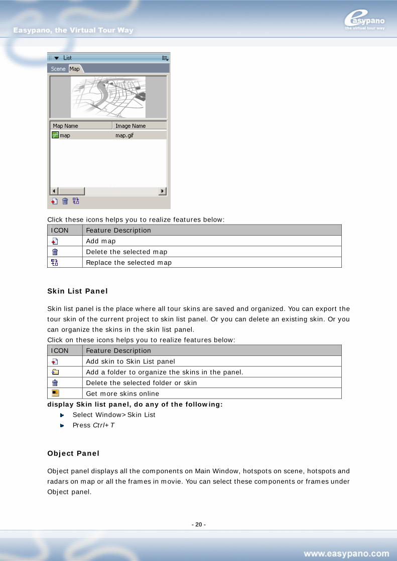
Map Tag
Map tag manages all maps in the current project. You can add map to the project, delete
map from the project and replace the map without changing hotspots on it.
- 20 -
Click these icons helps you to realize features below:
ICON Feature Description
Add map
Delete the selected map
Replace the selected map
Skin List Panel
Skin list panel is the place where all tour skins are saved and organized. You can export the
tour skin of the current project to skin list panel. Or you can delete an existing skin. Or you
can organize the skins in the skin list panel.
Click on these icons helps you to realize features below:
ICON Feature Description
Add skin to Skin List panel
Add a folder to organize the skins in the panel.
Delete the selected folder or skin
Get more skins online
display Skin list panel, do any of the following:
Select Window>Skin List
Press Ctrl+T
Object Panel
Object panel displays all the components on Main Window, hotspots on scene, hotspots and
radars on map or all the frames in movie. You can select these components or frames under
Object panel.
- 21 -
Tips: When you select any in the object list from Object panel, this selected object will be
high-lighted and centered on the Main Window. For example, when you’re editing tour
movie, all the frames of the selected movie will be listed in the object panel. You can also
see which scene this frame is related. Things would go easy when you want to edit different
frames.
To display Object panel, do any of the following:
Select Window>Object
Press Ctrl+O
Library Panel
Library panel saves and organizes the resources which are frequently used in virtual tour
like images, sounds and components. Hence, Library panel contains Image library, sound
library and component library.
To display Library panel, do any of the following:
Select Window>Library
Press Ctrl+L
Image Library
Image Library manages all the images in the current project. You can add new image to the
image library or delete image from it.
Click on these icons helps you to realize features below:
ICON Feature Description
Add image to Image Library.
Add a folder to organize these images in library.
Delete the selected folder or image from Image Library.
Sound Library
Sound Library manages all the sounds in the current project. You can add sound to the
sound library or delete sound from it.
Click these icons helps you to realize features below:
ICON Feature Description
Add sound to sound library
Add a folder to organize the sounds in the library
Delete the selected folder or sound
Component Library
Component Library manages all the components in the current project. You can add
component to the component library or delete component from it.
Click on these icons helps you to realize features below:
ICON Function
- 22 -
Add component to component library
Create a new folder to organize the components in library.
Delete the selected folder or component.
Using Panel
The panels in Tourweaver can help you view, organize and edit elements in the current
project. You can customize your own workspace by showing certain panels and hiding
others. To view all the panels in Tourweaver, please go to the Window menu.
Most panels possess a popup menu with some general commands. The popup menu is
indicated by the control button at the right end of panel title bar. (If the button is invisible,
then the panel doesn’t have a popup menu)
Panels appear in group at the bottom or the two sides of workspace as default.
General Operations on Panel
To open a panel, do the following:
Select the desired panel from Window menu
To close a panel, do the following:
Select the desired panel from Window menu
Right-click (Windows) or Control-click the panel's title bar and select Close Panel
Group from the context menu.
Note: For MovieREC panel, you have to open it by clicking button right
below MainWindow; and close it by clicking the Back button there.
Using popup menu:
1. Click the control button at the right side of panel title bar to view the popup menu
2. Select one of the menus
To adjust panel size, do the following:
Drag the panel's border (Windows) or drag the size box at the panel's lower-right
corner
To open or close panel, do the following:
Click the control arrow which is at menu bar to open or close the panel.
To close all the panels:
Select Window>Hide panels
Arranging Panels
In Tourweaver, you can organize panels into groups. You can rearrange the order in which
panels appear within panel groups. You can also create new panel groups and dock panels
to existing panel groups. If you want a panel to appear on its own, separated from other
panel groups, you can float the panel. This is particularly useful for panels that you want
access all the time.
- 23 -
To move a panel:
Drag the panel by its gripper (on the left side of title bar)
To add a panel to an existing panel group
Drag the panel by its gripper to another panel. A black line appears next to the
target panel to show where the panel will be placed.
To float a panel:
Drag the panel by its gripper and move it away from other panels.
Using Panel Settings
You can create custom panel arrangements, and save these as custom panel sets. You can
switch the panel display to the default layout or to a custom layout that you have saved
previously.
To save a custom panel sets:
1. Select Window>Save panel layout
2. Input the name for the layout and click OK
To select a panel layout:
1. Select Window>Panel sets
2. From the submenu, select the default layout to reset panels to default layout, or select
a custom layout that you’ve saved previously.
To delete custom layouts:
1. Select Window>Workspace layout>management
2. Select the panel sets which you’re going to delete from manage workspace layout
dialog box
3. Click Delete
4. Click Yes to confirm
5. Click OK
Using Tourweaver 3.00
Build TW Project
Create a New Project
To make virtual tour with Tourweaver, you should create a new project in Tourweaver first.
There are two ways to create new project:
Create project from skin template
Create project from blank skin
- 24 -
From skin template
To create project from skin template is to create a project with an existed skin template. The
steps are as below:
1. Select File>New Project
2. Input project name and the directory to save that project
3. To select a skin template from the template list
4. Click OK
From blank skin
To create project from blank skin is to design a tour skin from scratch. The steps are as
below:
1. Select File>New Project
2. Input project name and the directory to save that project
3. Select Blank from template list
4. Click OK
Save Project
If you want to stop the work and quit Tourweaver 3.00 during making virtual tour, you can
save the operations and settings as a .tw file which is a project file. Therefore you can
continue the work instead of doing from scratch next time. That will save large amount of
your time.
Open a Project
To open an existed project in Tourweaver 3.00, please go to File>Open and select relative
file in the popup window.
Support Project Files from Old Version
Tourweaver 3.00 supports the vtp project files from Tourweaver 1.25 and Tourweaver 1.30.
Nevertheless some contents of the projects will be converted. The changes are concluded as
below:
Components in old project file To be converted or deleted in new project file
SceneDescription Tour Components TextArea Component
TextLink and Label Tour Components Text Component
CompanyInfo Tour Components deleted
Statusbar Tour Components deleted
- 25 -
Make Virtual Tour Skin
You can customize your own virtual tour skin to get a unique virtual tour. Virtual tour skin
includes Main Window and Loading Window.
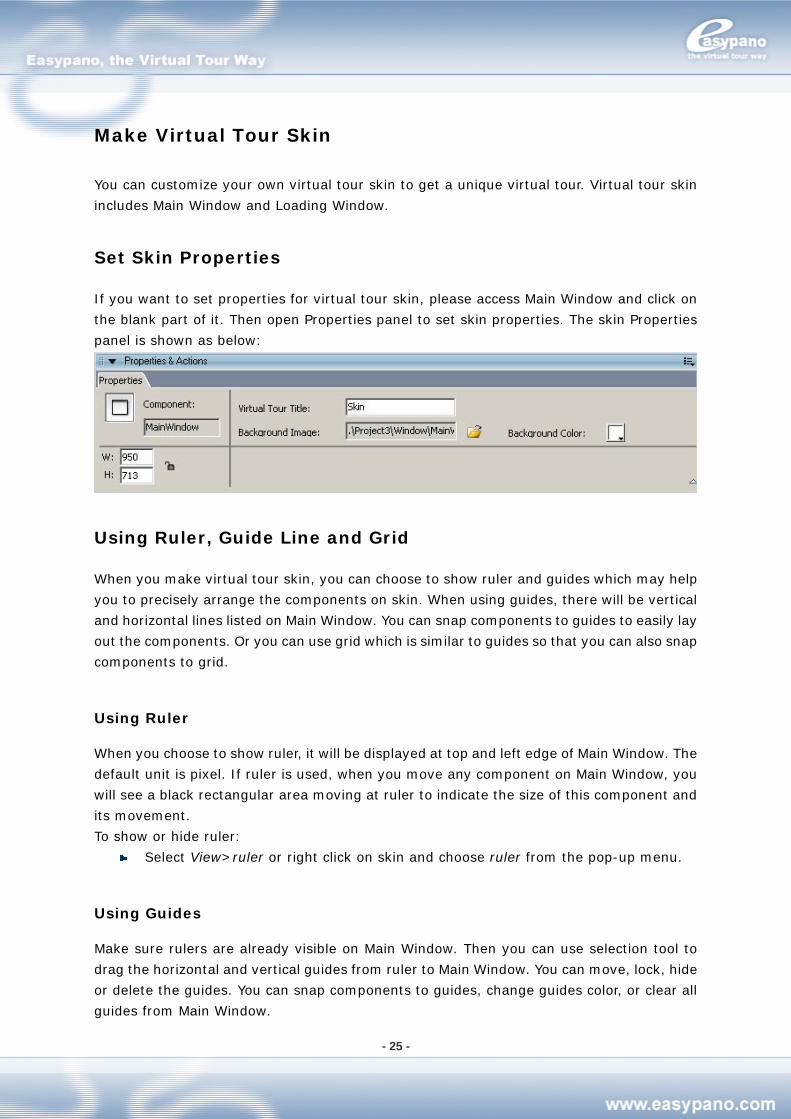
Set Skin Properties
If you want to set properties for virtual tour skin, please access Main Window and click on
the blank part of it. Then open Properties panel to set skin properties. The skin Properties
panel is shown as below:
Using Ruler, Guide Line and Grid
When you make virtual tour skin, you can choose to show ruler and guides which may help
you to precisely arrange the components on skin. When using guides, there will be vertical
and horizontal lines listed on Main Window. You can snap components to guides to easily lay
out the components. Or you can use grid which is similar to guides so that you can also snap
components to grid.
Using Ruler
When you choose to show ruler, it will be displayed at top and left edge of Main Window. The
default unit is pixel. If ruler is used, when you move any component on Main Window, you
will see a black rectangular area moving at ruler to indicate the size of this component and
its movement.
To show or hide ruler:
Select View>ruler or right click on skin and choose ruler from the pop-up menu.
Using Guides
Make sure rulers are already visible on Main Window. Then you can use selection tool to
drag the horizontal and vertical guides from ruler to Main Window. You can move, lock, hide
or delete the guides. You can snap components to guides, change guides color, or clear all
guides from Main Window.
- 26 -
Show or hide guides:
Select View>Guides>Show guides
Note: If the Grid is shown and snap to grid is selected, then when you drag a new
guide it will be aligned to grid.
Open or close Snap to Grid:
Select View>Grid>Snap to Grid
Note: If guide line falls between two grid lines, then Snap to guides has precedence
over snap to grid
Move Guides:
1. Select View>Ruler to ensure the ruler is shown
2. Use selection tool to click anywhere on ruler and drag guides to the desired position of
Main Window.
Delete guides:
If the guides are unlocked, then use selection tool to drag it back to rulers. For more
details about lock and unlock of guides, please refer to the following steps.
Lock guides:
Select View>Guides>Lock guides
Note: You can also use Lock guides from Editing guides window (View>Guides>Edit
Guides). For more details, please refer to the following steps:
Set guides preferences
1. Select View>Guides>Edit guides and then do any of the following steps:
To set guides color, please click the triangle from the color window and select the
proper color from palette. The default color is green.
Select or cancel Show Guides to show or hide guides
Select or cancel Snap to Guides to open or close this feature
Select or cancel Lock Guides to lock or unlock guides
As to snap accuracy, please choose one option from the popup menu
If you want to remove all guides, please click Clear All
If you want to save the current settings, please click Save as default
2. Click OK
Clear Guides:
Select View>Guides>Clear guides
- 27 -
Using Grid
If Grid is shown, you will see a series of lines appearing in the background. You can align
components with grid. You can also customize the size and color of Grid.
Show or hide Grid:
Select View>Grid>Show Grid
Press Ctrl+G
Open or close Snap to Grid
Select View>Grid>Snap to Grid
Set Grid preferences:
Select View>Grid>Edit Grid
To modify grid color, click triangle in color window and choose the right color from
palette
The default grid color is set to gray
Select or cancel Show Grid
Select or cancel Snap to Grid to open or close this function
Enter the proper value in the textbox of horizontal space and vertical space to set
the grid space
As to align accuracy, please select an option from the popup menu
Click Save default value to set the current settings as default
Component
Skin is composed of multiple components. For more details about the components that
make up skin, please refer to the chapter Toolbox.
Add and Delete
When building a tour skin, you can add the needed components from Toolbox to Main
Window. Or you can delete the components which you no longer want from Main Window.
Add:
1. Move your mouse onto Toolbox
2. Click the component you want to add
3. Then move your mouse onto Main Window
4. Click the blank part of Main Window to place this component
Delete:
1. Select the component which you’re going to delete from Main Window
2. Press Delete key or Backspace key to delete the component
- 28 -
Copy and Paste
You can create a new component in a fast way by copy and paste.
Follow the steps below to copy and paste:
1. Select the component you want to duplicate
2. Right click your mouse to open the popup menu and choose Copy. Or press Ctrl+C to
copy the component.
3. Go to Main Window and right click your mouse and choose Paste. Or press Ctrl+V to
paste the component.
Tips: Select the component and meanwhile press Ctrl. Then use your mouse to drag the
component to another position and release. Then another component is duplicated.
Move and Lock
You can move component to a proper position by moue or keyboard. After you adjust a
component, you can then lock it so that it can’t change any more.
Move:
1. Select component
2. Use mouse to drag the component or use arrow keys to adjust the component to the
proper place.
Lock:
1. Select the component you’re going to lock
2. Right click your mouse and choose Lock from the popup menu to lock that component.
If you want unlock it, just click Lock again.
Layout
You can draw and lay out component by the layout tools in Toolbar. For more information,
see chapter Layout Toolbar.
Group
You can set several components into a group so that they’re like one component when you
operate them. For example, there are a series of buttons created on Main Window. If you
want to select and move them at the same time, you can set them into a group.
When select a group, you can see its x, y, W and H on Properties panel. You can also edit
these values. But you’re not able to edit any single component in this group. So if you want
to edit a certain component in a group, you have to ungroup them first.
You can’t add another component to a group. But you can ungroup them and then make a
new group.
- 29 -
Create a Group:
1. Select all the components you’re going to group like hotspots, radars, etc.
2. Select Layout>Group or press Ctrl+G.
Ungroup:
1. Select the group you’re going to ungroup
2. Select Layout>Ungroup or press Ctrl+Shift+G.
Import Skin from Skin List into Current Project
When making virtual tour, you can use an existed skin template by importing a skin file to
save your time.
To import tour skin, please do the following:
1. Select the desired skin from Skin List
2. Double click the skin
3. Click OK from the popup window. Then the selected skin is applied to the current
project.
Note: When the skin is applied by the current project, some parameters may need to
be reset like Listbox value.
Add Skin to Skin List from Current Project or Local
You can not only export the tour skin in current project as a skin template but also add the
existed skin files from local to Skin List for future use.
Note: Some values will be lost during exporting like text area, combobox, listbox, etc.
To export tour skin, please do the following:
1. Select File>Export Skin
2. Type the name for the skin and select the folder for saving the skin in the popup
window
3. Click OK and the skin in the current project is saved into Skin List.
To add skins outside the current project, do the following:
1. Open Skin List panel
2. Click under the panel 3. Select the desired skin file which you’re going to add into Skin list in the popup
window
4. Click OK and the selected skin is added into the Skin List
You can create folders to organize these skins in the Skin List.
- 30 -
Steps:
1. Open Skin List panel
2. Click to create a folder and name the folder like Real Estate
3. Select all the relative skins and press the left key of mouse. Drag mouse to the Real
Estate folder and release. Then all these skins are moved into Real Estate folder.
Add Scene Viewer
Scene viewer is the component to play scenes or movies. After you place scene viewer onto
Main Window, you can edit scene and record movie by it visually. In one virtual tour, there
is only one scene viewer. Only you add scene viewer to tour, you can then see multiple
scenes and movies when running tour.
How to add scene viewer:
1. Click Scene Viewer in Toolbox
2. Click the blank part of Main Window to place the component
Note: On Main Window, you can only add one scene viewer.
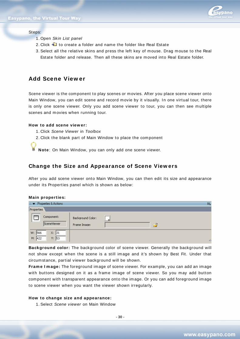
Change the Size and Appearance of Scene Viewers
After you add scene viewer onto Main Window, you can then edit its size and appearance
under its Properties panel which is shown as below:
Main properties:
Background color: The background color of scene viewer. Generally the background will
not show except when the scene is a still image and it’s shown by Best Fit. Under that
circumstance, partial viewer background will be shown.
Frame Image: The foreground image of scene viewer. For example, you can add an image
with buttons designed on it as a frame image of scene viewer. So you may add button
component with transparent appearance onto the image. Or you can add foreground image
to scene viewer when you want the viewer shown irregularly.
How to change size and appearance:
1. Select Scene viewer on Main Window
- 31 -
2. Modify the relative properties under the Properties panel of viewer
Add/Delete Scene
The supported formats include JPG, BMP and GIF.
Add scene:
1. Go to List panel>Scene tag and click 2. Select the scene type from scene list like Add Spherical.
3. Choose the right file from the file choosing window
4. Click OK
Delete scene:
1. Go to List panel>Scene tag and click on the scene you want to remove
2. Click or press Delete key to remove the scene
Change the Sequence of Scenes
How to change the sequence of scenes
1. Go to List panel>Scene tag and click the scene you want to adjust
2. Click and the scene will move one step upwards; click and the scene will move one step downwards.
Tips: You can also select the scene and keep pressing your mouse and drag the scene to
the place where you want it to be.
Note: The change of scene sequence will affect SlideShow.
Set Scene Properties
How to set scene properties:
1. Go to Lise panel>Map tag and click the scene you’re going to edit
2. Open Properties panel and edit the relative properties of that scene
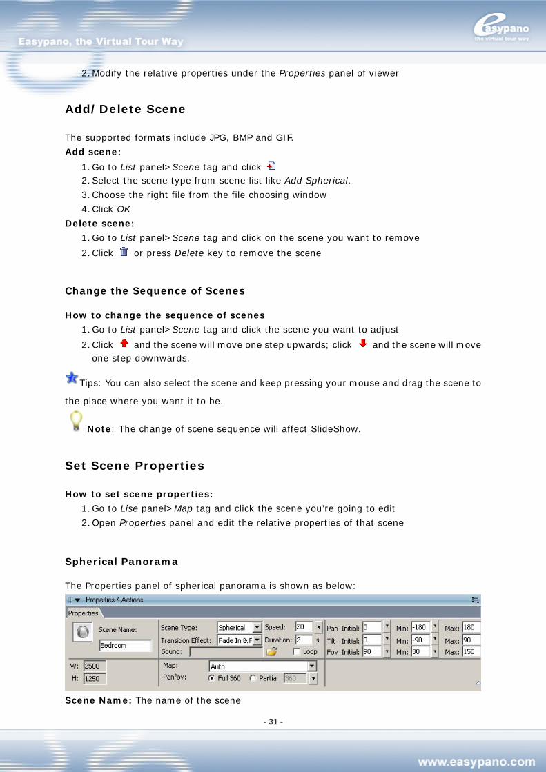
Spherical Panorama
The Properties panel of spherical panorama is shown as below:
Scene Name: The name of the scene
- 32 -
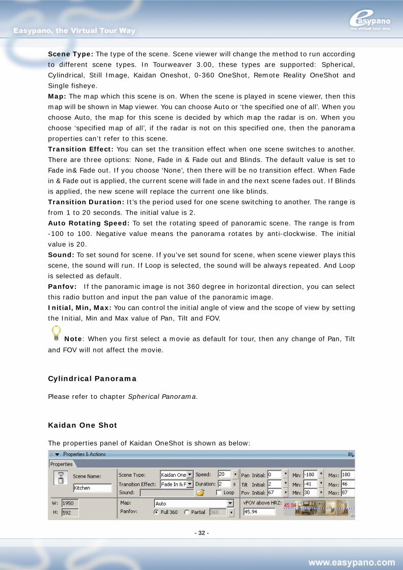
Scene Type: The type of the scene. Scene viewer will change the method to run according
to different scene types. In Tourweaver 3.00, these types are supported: Spherical,
Cylindrical, Still Image, Kaidan Oneshot, 0-360 OneShot, Remote Reality OneShot and
Single fisheye.
Map: The map which this scene is on. When the scene is played in scene viewer, then this
map will be shown in Map viewer. You can choose Auto or ‘the specified one of all’. When you
choose Auto, the map for this scene is decided by which map the radar is on. When you
choose ‘specified map of all’, if the radar is not on this specified one, then the panorama
properties can’t refer to this scene.
Transition Effect: You can set the transition effect when one scene switches to another.
There are three options: None, Fade in & Fade out and Blinds. The default value is set to
Fade in& Fade out. If you choose ‘None’, then there will be no transition effect. When Fade
in & Fade out is applied, the current scene will fade in and the next scene fades out. If Blinds
is applied, the new scene will replace the current one like blinds.
Transition Duration: It’s the period used for one scene switching to another. The range is
from 1 to 20 seconds. The initial value is 2.
Auto Rotating Speed: To set the rotating speed of panoramic scene. The range is from
-100 to 100. Negative value means the panorama rotates by anti-clockwise. The initial
value is 20.
Sound: To set sound for scene. If you’ve set sound for scene, when scene viewer plays this
scene, the sound will run. If Loop is selected, the sound will be always repeated. And Loop
is selected as default.
Panfov: If the panoramic image is not 360 degree in horizontal direction, you can select
this radio button and input the pan value of the panoramic image.
Initial, Min, Max: You can control the initial angle of view and the scope of view by setting
the Initial, Min and Max value of Pan, Tilt and FOV.
Note: When you first select a movie as default for tour, then any change of Pan, Tilt
and FOV will not affect the movie.
Cylindrical Panorama
Please refer to chapter Spherical Panorama.
Kaidan One Shot
The properties panel of Kaidan OneShot is shown as below:
- 33 -
vFOV above HRZ: The FOV above the horizontal line.
0-360 One Shot
Please refer to chapter Kaidan One Shot
Remote Reality One Shot
Please refer to chapter Kaidan One Shot
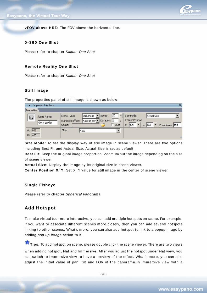
Still Image
The properties panel of still image is shown as below:
Size Mode: To set the display way of still image in scene viewer. There are two options
including Best Fit and Actual Size. Actual Size is set as default.
Best Fit: Keep the original image proportion. Zoom in/out the image depending on the size
of scene viewer.
Actual Size: Display the image by its original size in scene viewer.
Center Position X/Y: Set X, Y value for still image in the center of scene viewer.
Single Fisheye
Please refer to chapter Spherical Panorama
Add Hotspot
To make virtual tour more interactive, you can add multiple hotspots on scene. For example,
if you want to associate different scenes more closely, then you can add several hotspots
linking to other scenes. What’s more, you can also add hotspot to link to a popup image by
adding pop up image action to it.
Tips: To add hotspot on scene, please double click the scene viewer. There are two views
when adding hotspot, Flat and Immersive. After you adjust the hotspot under Flat view, you
can switch to Immersive view to have a preview of the effect. What’s more, you can also
adjust the initial value of pan, tilt and FOV of the panorama in immersive view with a
- 34 -
WYSIWYG effect.
Add Map Viewer
Map viewer is the component to play maps.
How to add Map viewer:
1. Click Map Viewer in Toolbox
2. Click the blank part of Main Window to place the component
Note: On MainWindow, you can only add one map viewer.
Change Size and Appearance of Map Viewer
You can customize the size and appearance of Map viewer under its properties panel.
How to change size and appearance:
1. Select Map viewer on Main Window
2. Modify the relative properties under its properties panel. For more details, please
refer to Change Size and Appearance of Scene Viewer.
Add or Delete Map
The supported formats include JPG, BMP and GIF.
Add map
1. Go to List panel>Map tag and click 2. Choose the right image you want to add as a map from image choosing window
3. Click OK
Delete map
1. Go to List panel>Map tag and click the map which you want to remove from map list
2. Then click or press the Delete key to remove that map
Replace Map
How to replace map
1. Go to List panel>Map tag and click the map you want to replace
2. Right click your mouse and choose Replace from popup menu
3. Choose the right image you want to use to replace the original one from the dialogue
box
4. Click OK. Then the original image is replaced with the new one. But the map name will
remain.
Note: In case the old map and the new one are not in the same size, then the location
of hotspots and radar on it may change. Hence, you should have some tiny adjustment.
- 35 -
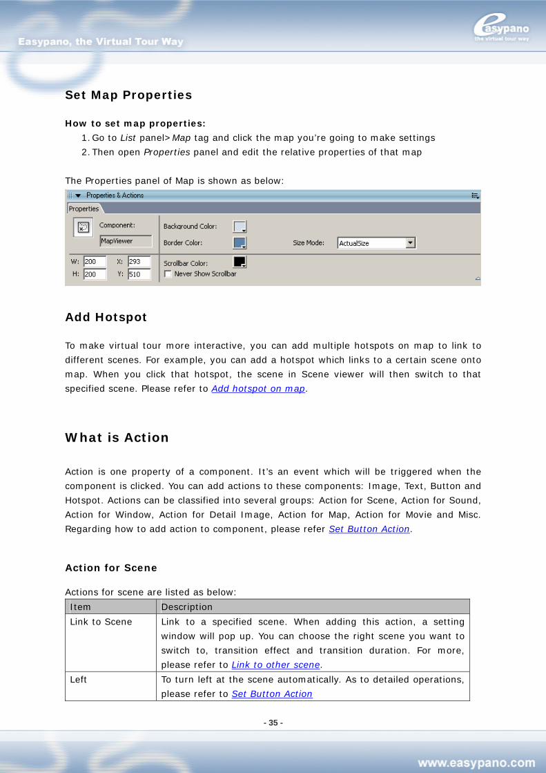
Set Map Properties
How to set map properties:
1. Go to List panel>Map tag and click the map you’re going to make settings
2. Then open Properties panel and edit the relative properties of that map
The Properties panel of Map is shown as below:
Add Hotspot
To make virtual tour more interactive, you can add multiple hotspots on map to link to
different scenes. For example, you can add a hotspot which links to a certain scene onto
map. When you click that hotspot, the scene in Scene viewer will then switch to that
specified scene. Please refer to Add hotspot on map.
What is Action
Action is one property of a component. It’s an event which will be triggered when the
component is clicked. You can add actions to these components: Image, Text, Button and
Hotspot. Actions can be classified into several groups: Action for Scene, Action for Sound,
Action for Window, Action for Detail Image, Action for Map, Action for Movie and Misc.
Regarding how to add action to component, please refer Set Button Action.
Action for Scene
Actions for scene are listed as below:
Item Description
Link to Scene Link to a specified scene. When adding this action, a setting
window will pop up. You can choose the right scene you want to
switch to, transition effect and transition duration. For more,
please refer to Link to other scene.
Left To turn left at the scene automatically. As to detailed operations,
please refer to Set Button Action
- 36 -
Right To turn right at the scene automatically. Operations ditto.
Up To move upwards at the scene automatically. Operations ditto.
Down To move downwards at the scene automatically. Operations ditto.
Zoom in To zoom in the scene. Operations ditto.
Zoom out To zoom out the scene. Operations ditto.
Forward Go to the next route of the current scene. Operations ditto.
Backward Go to the previous route of the current scene. Operations ditto.
Previous Scene Go to the previous scene. Operations ditto.
Next Scene Go to the next scene. Operations ditto.
Stop To stop the auto-rotation.
Reset Reset the scene to its initial position.
Action for Sound
Actions for sound are listed as below:
Item Description
Mute/Sound This action features a toggle property.
Stop or play sound. If the sound is running, then when this action
is triggered, the sound will be stopped. Otherwise, the sound will
be continued.
Play Sound When this action is triggered, the specified sound will be run.
Action for Map
Actions for Map are listed as below:
Item Description
Link to Map To link to the specified map in Map viewer. For example, if you’re
using two different maps in one tour, you can add two tab buttons
above the map viewer. For each button, add link to map action to
it so that the two buttons can refer to the two maps.
Left To turn left at the map
Right To turn right at the map
Up To move upwards at the map
Down To move downwards at the map
Zoom in To zoom in the map in map viewer.
Zoom out To zoom out the map in map viewer.
Action for Window
Actions for window are listed as below:
Item Description
Full screen To switch from full screen or the original size. It works to Scene
- 37 -
Viewer and Map Viewer.
Close Window To close window
Action for Movie
Actions for movie are listed as below:
Item Description
Play/Pause Movie This is a toggle action. When it’s triggered, it will switch between
full screen and revert. For example, you add this action to a
button. If the viewer is running tour, after you click this button, the
tour movie will be paused; again click the button, the tour movie
continues.
Stop Movie To stop running movie.
Misc
Actions for misc are listed as below:
Item Description
Pop up Image To link to a specified image in a popup window. For more, please
refer to link to other image.
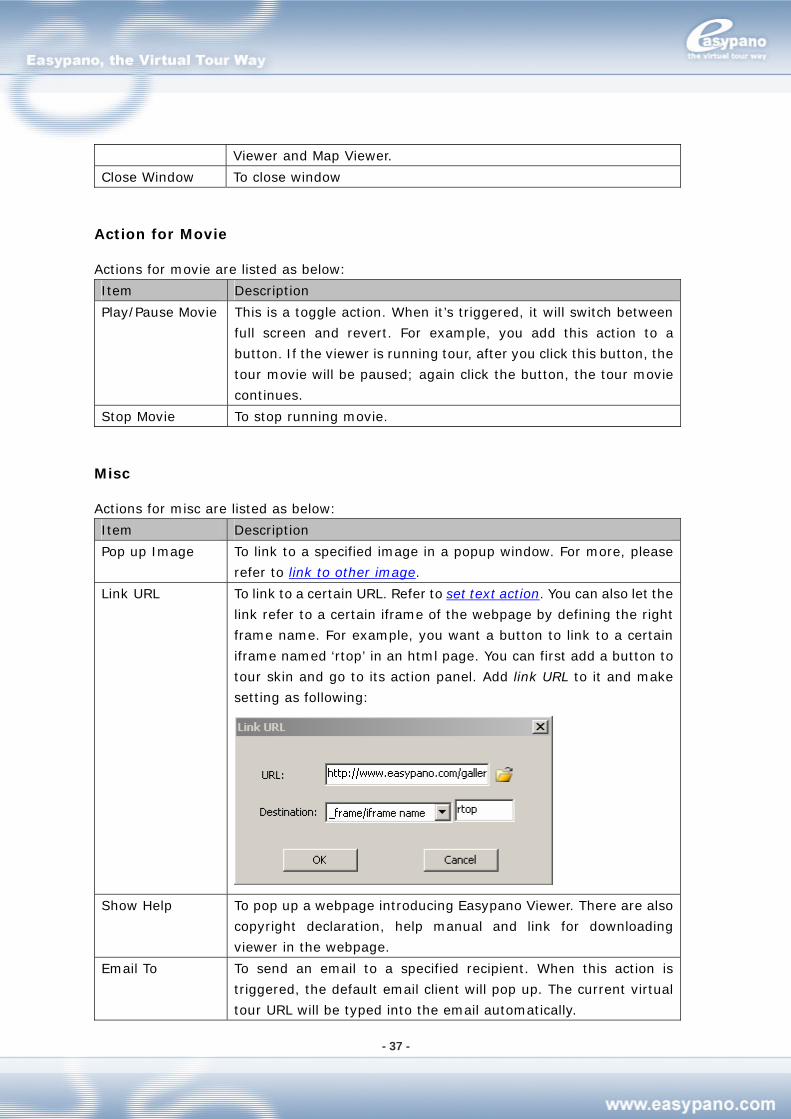
Link URL To link to a certain URL. Refer to set text action. You can also let the
link refer to a certain iframe of the webpage by defining the right
frame name. For example, you want a button to link to a certain
iframe named ‘rtop’ in an html page. You can first add a button to
tour skin and go to its action panel. Add link URL to it and make
setting as following:
Show Help To pop up a webpage introducing Easypano Viewer. There are also
copyright declaration, help manual and link for downloading
viewer in the webpage.
Email To To send an email to a specified recipient. When this action is
triggered, the default email client will pop up. The current virtual
tour URL will be typed into the email automatically.
- 38 -
Print Page To print the current scene. When triggered, the system print
setting window pops up.
Show/Hide
Hotspot
To show or hide a certain type of hotspots. This is an action with
toggle effect. For example, you add this action to a button. If a
certain type of hotspots is shown, then after you click this button,
these hotspots will be hidden; another click on the button will
again show these hotspots then.
Execute Script To execute JavaScript. For example, add a button to the tour skin.
Then go to its action panel and add the action execute script. Then
type the following code: javascript:
window.open(“http://www.easypano.com”). When running the
tour, click this button. The html referring to www.easypano.com
will be opened.
Note: only standard JavaScript functions can be recognized.
Add Button
Button is the component to control running of scene and map. For example, you can use a
button to control the left turning or right turning of scene.
How to add button:
1. Click Button from Toolbox
2. Click the blank part of Main Window to place the button
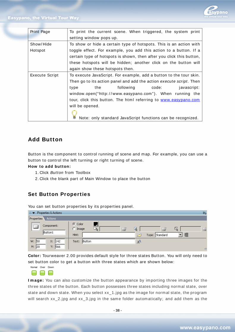
Set Button Properties
You can set button properties by its properties panel.
Color: Tourweaver 2.00 provides default style for three states Button. You will only need to
set button color to get a button with three states which are shown below:
Image: You can also customize the button appearance by importing three images for the
three states of the button. Each button possesses three states including normal state, over
state and down state. When you select xx_1.jpg as the image for normal state, the program
will search xx_2.jpg and xx_3.jpg in the same folder automatically; and add them as the
- 39 -
images of over state and down state. Therefore you may use the same prename for the
three state images like xx_1.jpg, xx_2.jpg and xx_3.jpg to save your time when importing
them.
Note: If you only want to show a button area, please don’t import any images.
Text: If you only want to show text on Button, please input the text you want to show. You
can also customize button by font, size, align, etc which is shown as below:
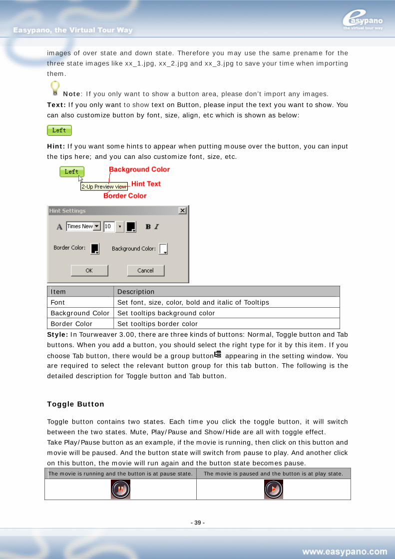
Hint: If you want some hints to appear when putting mouse over the button, you can input
the tips here; and you can also customize font, size, etc.
Item Description
Font Set font, size, color, bold and italic of Tooltips
Background Color Set tooltips background color
Border Color Set tooltips border color
Style: In Tourweaver 3.00, there are three kinds of buttons: Normal, Toggle button and Tab
buttons. When you add a button, you should select the right type for it by this item. If you
choose Tab button, there would be a group button appearing in the setting window. You are required to select the relevant button group for this tab button. The following is the
detailed description for Toggle button and Tab button.
Toggle Button
Toggle button contains two states. Each time you click the toggle button, it will switch
between the two states. Mute, Play/Pause and Show/Hide are all with toggle effect.
Take Play/Pause button as an example, if the movie is running, then click on this button and
movie will be paused. And the button state will switch from pause to play. And another click
on this button, the movie will run again and the button state becomes pause.
The movie is running and the button is at pause state. The movie is paused and the button is at play state.
- 40 -
Tab Button
Tab buttons are a group of buttons which feature tab effect. In one tab button group, only
one tab button can be selected and this selected button will be high-lighted. The other
buttons in the group are in Normal state. For example, you can use a group of tab buttons
to link to multiple maps. When you click one of the maps, the relative tab button which is
corresponding to the map will be high-lighted. Then your clients can easily know which map
is now running in the Map viewer.
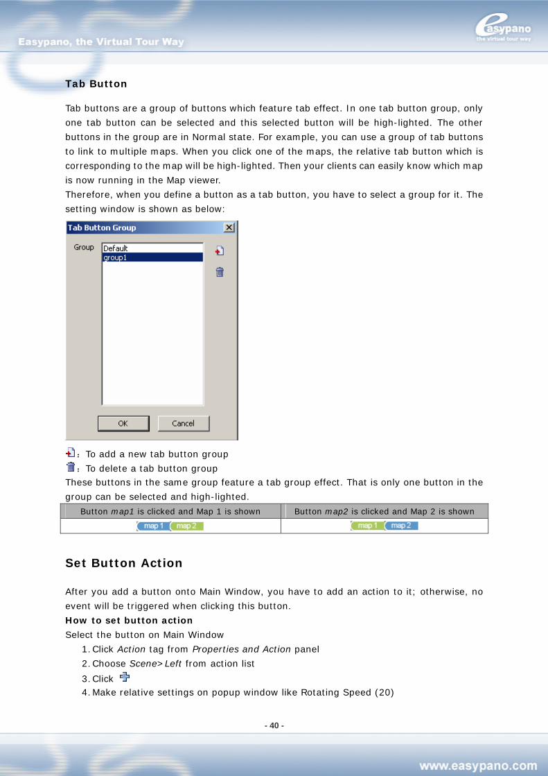
Therefore, when you define a button as a tab button, you have to select a group for it. The
setting window is shown as below:
:To add a new tab button group
:To delete a tab button group These buttons in the same group feature a tab group effect. That is only one button in the
group can be selected and high-lighted.
Button map1 is clicked and Map 1 is shown Button map2 is clicked and Map 2 is shown
Set Button Action
After you add a button onto Main Window, you have to add an action to it; otherwise, no
event will be triggered when clicking this button.
How to set button action
Select the button on Main Window
1. Click Action tag from Properties and Action panel
2. Choose Scene>Left from action list
3. Click 4. Make relative settings on popup window like Rotating Speed (20)
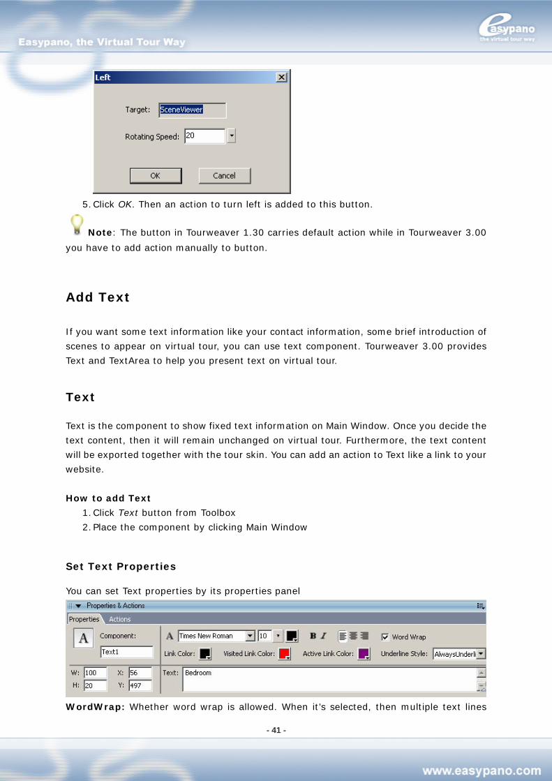
- 41 -
5. Click OK. Then an action to turn left is added to this button.
Note: The button in Tourweaver 1.30 carries default action while in Tourweaver 3.00
you have to add action manually to button.
Add Text
If you want some text information like your contact information, some brief introduction of
scenes to appear on virtual tour, you can use text component. Tourweaver 3.00 provides
Text and TextArea to help you present text on virtual tour.
Text
Text is the component to show fixed text information on Main Window. Once you decide the
text content, then it will remain unchanged on virtual tour. Furthermore, the text content
will be exported together with the tour skin. You can add an action to Text like a link to your
website.
How to add Text
1. Click Text button from Toolbox
2. Place the component by clicking Main Window
Set Text Properties
You can set Text properties by its properties panel
WordWrap: Whether word wrap is allowed. When it’s selected, then multiple text lines
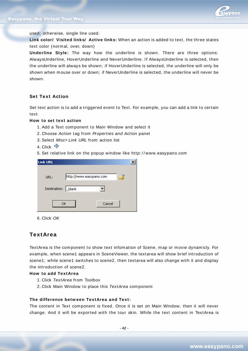
- 42 -
used; otherwise, single line used.
Link color/ Visited links/ Active links: When an action is added to text, the three states
text color (normal, over, down)
Underline Style: The way how the underline is shown. There are three options:
AlwaysUnderline, HoverUnderline and NeverUnderline. If AlwaysUnderline is selected, then
the underline will always be shown; if HoverUnderline is selected, the underline will only be
shown when mouse over or down; if NeverUnderline is selected, the underline will never be
shown.
Set Text Action
Set text action is to add a triggered event to Text. For example, you can add a link to certain
text.
How to set text action
1. Add a Text component to Main Window and select it
2. Choose Action tag from Properties and Action panel
3. Select Misc>Link URL from action list
4. Click 5. Set relative link on the popup window like http://www.easypano.com
6. Click OK
TextArea
TextArea is the component to show text infomation of Scene, map or movie dynamicly. For
example, when scene1 appears in SceneViewer, the textarea will show brief introduction of
scene1; while scene1 switches to scene2, then textarea will also change with it and display
the introduction of scene2.
How to add TextArea
1. Click TextArea from Toolbox
2. Click Main Window to place this TextArea component
The difference between TextArea and Text:
The content in Text component is fixed. Once it is set on Main Window, then it will never
change. And it will be exported with the tour skin. While the text content in TextArea is
- 43 -
dynamic. It will change with the change of scene, map and movie. It can’t be exported with
tour skin.
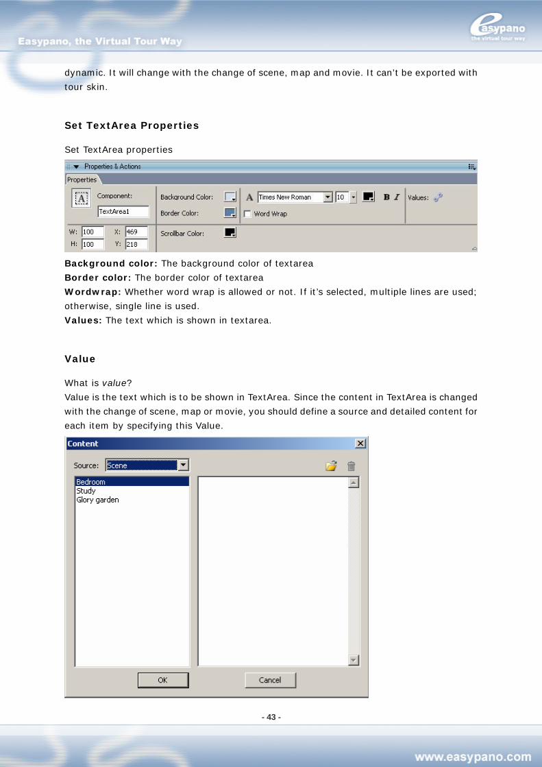
Set TextArea Properties
Set TextArea properties
Background color: The background color of textarea
Border color: The border color of textarea
Wordwrap: Whether word wrap is allowed or not. If it’s selected, multiple lines are used;
otherwise, single line is used.
Values: The text which is shown in textarea.
Value
What is value?
Value is the text which is to be shown in TextArea. Since the content in TextArea is changed
with the change of scene, map or movie, you should define a source and detailed content for
each item by specifying this Value.
- 44 -
Source: To select the source, for which the Textarea will display the relative conent. There
are three sources: Scene, Map and Movie.
Item Description
Scene The content in TextArea will differ with different scenes.
Map The content in TextArea will differ with different maps.
Movie The content in TextArea will differ with different movies.
How to set value
1. Select TextArea on Main Window
2. Click from properties panel 3. Choose relative source like Scene from Source list
4. Select a certain scene image from the list at right side
5. Input description directly or click to imported text file or image from the right
side editing window
6. Repeat step 4 and step 5 to add description for multiple scenes
7. Click OK
Note: If you have already imported images, then you can’t input any text; or if you’ve
input or imported text, then if you import other images, the text will be replaced.
Add Image
Image is the component to show image information on Main Window and contain
customized action. For example, you can put your company logo in virtual tour by the image
component. You can also add an action to this image to link to your website; or you may add
a thumbnail on Main Window and specify an action to link to this scene.
How to add image:
1. Click Image component from Toolbox
2. Click Main Window to place this image component
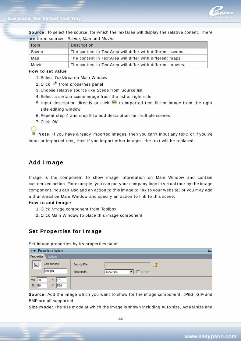
Set Properties for Image
Set image properties by its properties panel
Source: Add the image which you want to show for the image component. JPEG, GIF and
BMP are all supported.
Size mode: The size mode at which the image is shown including Auto size, Actual size and
- 45 -
Best fit
Auto Size: The image is shown at its original size
Actual size: The image is shown with its original size. If Center is selected, the image will
be shown in the center of the component; otherwise, the image will be shown at the top left
of the component
Best fit: The image is shown with the size of the component
Set Action for Image
When you add an image component on Main Window, you can also add an action to the
component.
How to set action for image
1. Select the image component which you’re going to set on Main Window
2. Choose Action tag under Properties and Action panel
3. Select Scene>Link to Scene from action list
4. Click 5. Make relative settings in the popup setting window like choosing scene1 for Scene as
shown below
6. Click OK. The action Link to Scene is added to the image component.
Add Hotspot
Hotspot is the area defined in an image possessing an acting link. You can add hotspot to
scene or map, and add hyperlink or multiple actions to it. When this hotspot is clicked, these
actions on it will be run automatically like switching to other images, running sound, linking
to certain URL, or executing other operations provided in the software.
Radar is actually a hotspot which contains a specified action to indicate the position and
direction of the panorama in map. You can add hotspot to scene; or add hotspot and radar
to map.
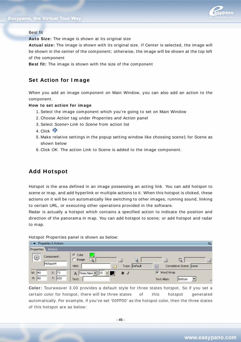
Hotspot Properties panel is shown as below:
Color: Tourweaver 3.00 provides a default style for three states hotspot. So if you set a
certain color for hotspot, there will be three states of this hotspot generated
automatically. For example, if you’ve set ‘00FF00’ as the hotspot color, then the three states
of this hotspot are as below:
- 46 -
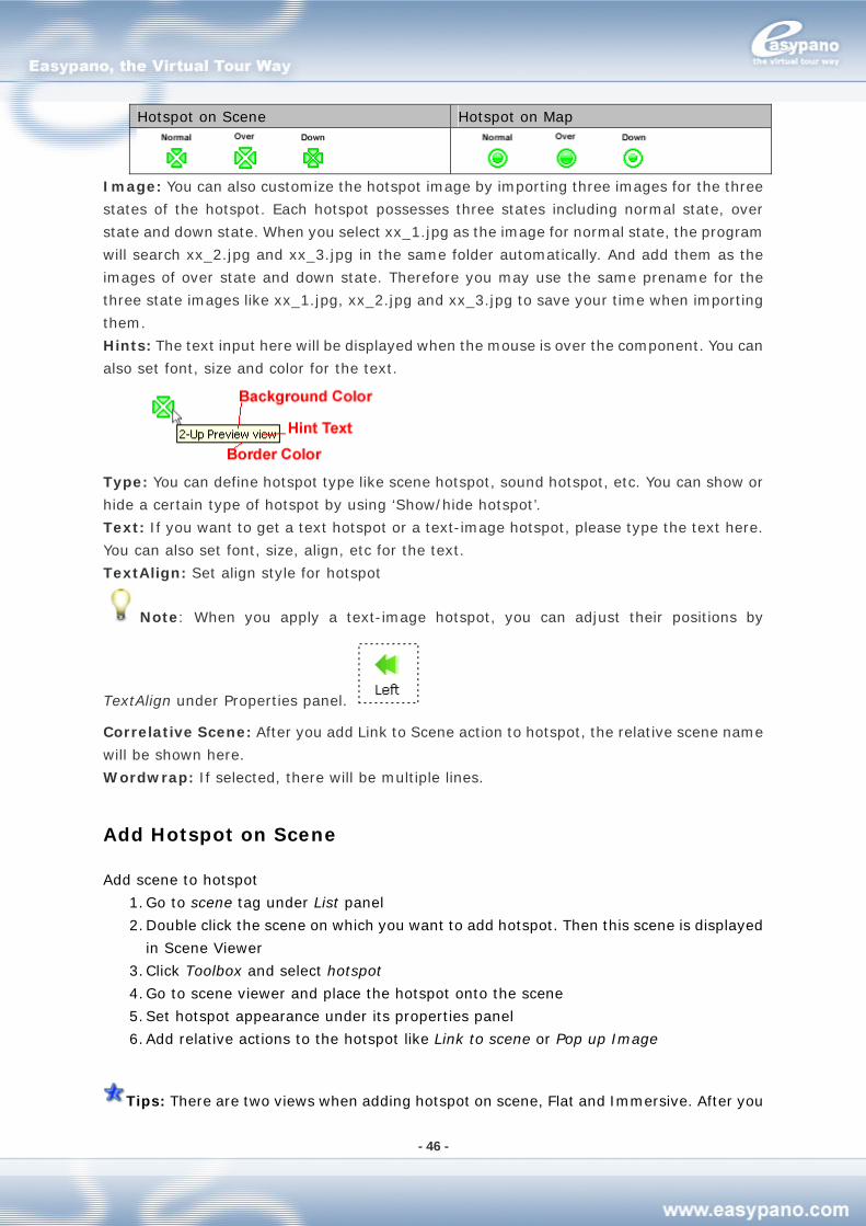
Hotspot on Scene Hotspot on Map
Image: You can also customize the hotspot image by importing three images for the three
states of the hotspot. Each hotspot possesses three states including normal state, over
state and down state. When you select xx_1.jpg as the image for normal state, the program
will search xx_2.jpg and xx_3.jpg in the same folder automatically. And add them as the
images of over state and down state. Therefore you may use the same prename for the
three state images like xx_1.jpg, xx_2.jpg and xx_3.jpg to save your time when importing
them.
Hints: The text input here will be displayed when the mouse is over the component. You can
also set font, size and color for the text.
Type: You can define hotspot type like scene hotspot, sound hotspot, etc. You can show or
hide a certain type of hotspot by using ‘Show/hide hotspot’.
Text: If you want to get a text hotspot or a text-image hotspot, please type the text here.
You can also set font, size, align, etc for the text.
TextAlign: Set align style for hotspot
Note: When you apply a text-image hotspot, you can adjust their positions by
TextAlign under Properties panel.
Correlative Scene: After you add Link to Scene action to hotspot, the relative scene name
will be shown here.
Wordwrap: If selected, there will be multiple lines.
Add Hotspot on Scene
Add scene to hotspot
1. Go to scene tag under List panel
2. Double click the scene on which you want to add hotspot. Then this scene is displayed
in Scene Viewer
3. Click Toolbox and select hotspot
4. Go to scene viewer and place the hotspot onto the scene
5. Set hotspot appearance under its properties panel
6. Add relative actions to the hotspot like Link to scene or Pop up Image
Tips: There are two views when adding hotspot on scene, Flat and Immersive. After you
- 47 -
adjust the hotspot in Flat view, you can switch to Immersive view to have a preview of the
effect. What’s more, you can also adjust the initial value of pan, tilt and FOV of the
panorama in immersive view with a WYSIWYG effect.
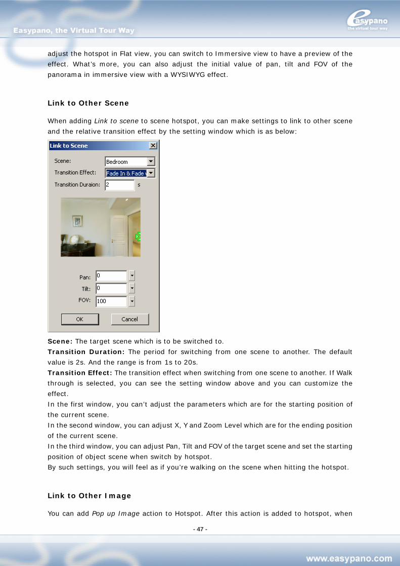
Link to Other Scene
When adding Link to scene to scene hotspot, you can make settings to link to other scene
and the relative transition effect by the setting window which is as below:
Scene: The target scene which is to be switched to.
Transition Duration: The period for switching from one scene to another. The default
value is 2s. And the range is from 1s to 20s.
Transition Effect: The transition effect when switching from one scene to another. If Walk
through is selected, you can see the setting window above and you can customize the
effect.
In the first window, you can’t adjust the parameters which are for the starting position of
the current scene.
In the second window, you can adjust X, Y and Zoom Level which are for the ending position
of the current scene.
In the third window, you can adjust Pan, Tilt and FOV of the target scene and set the starting
position of object scene when switch by hotspot.
By such settings, you will feel as if you’re walking on the scene when hitting the hotspot.
Link to Other Image
You can add Pop up Image action to Hotspot. After this action is added to hotspot, when
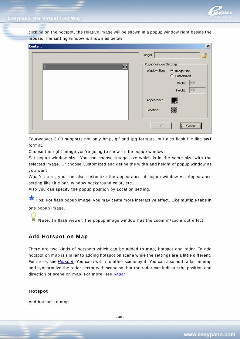
- 48 -
clicking on the hotspot, the relative image will be shown in a popup window right beside the
mouse. The setting window is shown as below:
Tourweaver 3.00 supports not only bmp, gif and jpg formats, but also flash file like swf
format.
Choose the right image you're going to show in the popup window.
Set popup window size. You can choose Image size which is in the same size with the
selected image. Or choose Customized and define the width and height of popup window as
you want.
What's more, you can also customize the appearance of popup window via Appearance
setting like title bar, window background color, etc.
Also you can specify the popup position by Location setting.
Tips: For flash popup image, you may ceate more interactive effect. Like multiple tabs in
one popup image.
Note: In flash viewer, the popup image window has the zoom in/zoom out effect.
Add Hotspot on Map
There are two kinds of hotspots which can be added to map, hotspot and radar. To add
hotspot on map is similar to adding hotspot on scene while the settings are a little different.
For more, see Hotspot. You can switch to other scene by it. You can also add radar on map
and synchronize the radar sector with scene so that the radar can indicate the position and
direction of scene on map. For more, see Radar.
Hotspot
Add hotspot to map
- 49 -
1. Double click the map to which you’re going to add hotspot from Map tag under List
panel
2. Click hotspot from Toolbox
3. Move the mouse to map viewer and click the map to place that hotspot
4. Set hotspot appearance under its properties panel
5. Add actions to hotspot like Link to scene and Pop up Image
Radar
You can also add radar on map to synchronize with a certain scene. Please refer to Add
Radar.
Add Radar
The radar in Tourweaver 3.00 is similar to the compass in Tourweaver 1.30. But radar is
more powerful. It can not only synchronize with panorama, but also with still image. What’s
more, you can also customize the shape, area and angle of radar by yourself.
To add radar on map, please follow the steps below:
1. Double click the map which you’re going to add radar from Map tag under List panel.
2. Then this map will be shown in Map Viewer where you can edit the map.
3. Click radar from Toolbox and click the map to place that radar component.
4. Set its appearance or make other settings under radar properties panel.
5. Synchronize the radar with a certain scene and set the scanning angle and initial values.
Note: In Tourweaver 3.00, the scan area of radar can be hidden by setting background
color as transparent.
Appearance Setting
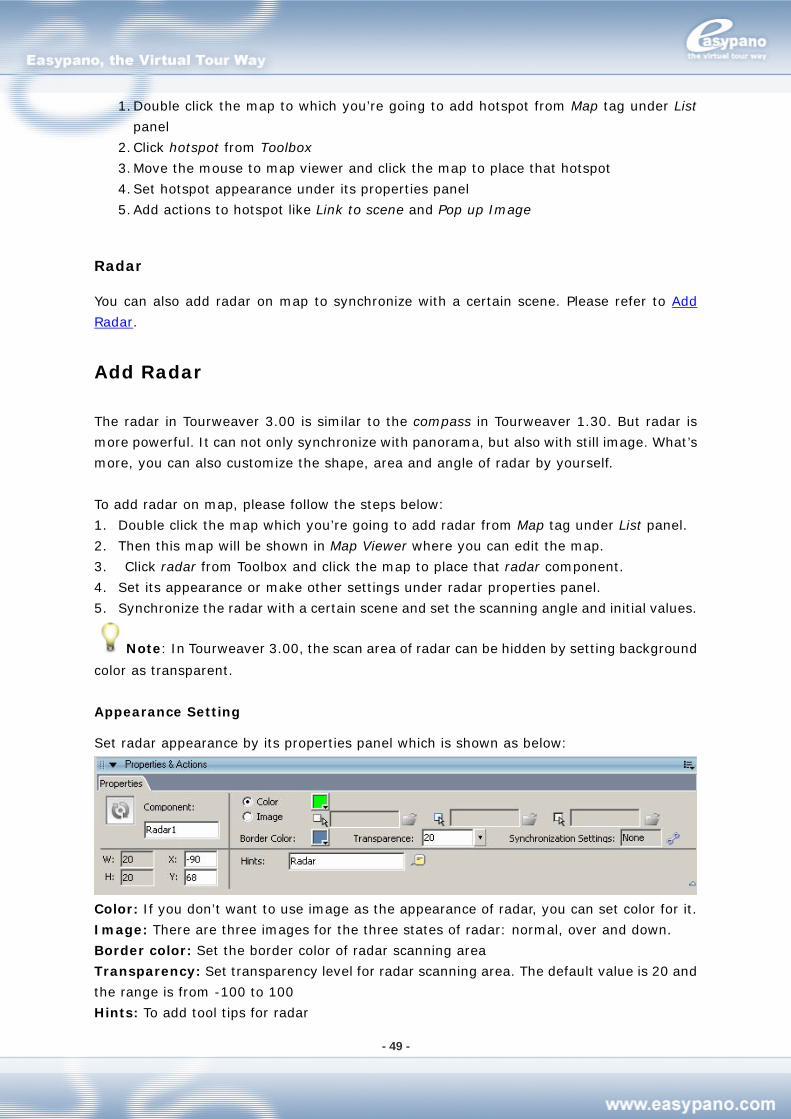
Set radar appearance by its properties panel which is shown as below:
Color: If you don’t want to use image as the appearance of radar, you can set color for it.
Image: There are three images for the three states of radar: normal, over and down.
Border color: Set the border color of radar scanning area
Transparency: Set transparency level for radar scanning area. The default value is 20 and
the range is from -100 to 100
Hints: To add tool tips for radar
- 50 -
Synchronize Settings: Set radar to synchronize with scene, position of radar, size of
hotspot area, shape and size of scanning area, etc.
Synchronization Setting
By clicking the synchronization setting button from properties panel, you can make radar
synchronize with scene. You can also make other settings like the size of hotspot area, the
shape and size of scanning area. This synchronization contains synchronization with
panorama and synchronization with still image.
Note: In old version of Tourweaver, only synchronization with panorama is supported
while in Tourweaver 3.00, synchronization with still image is featured.
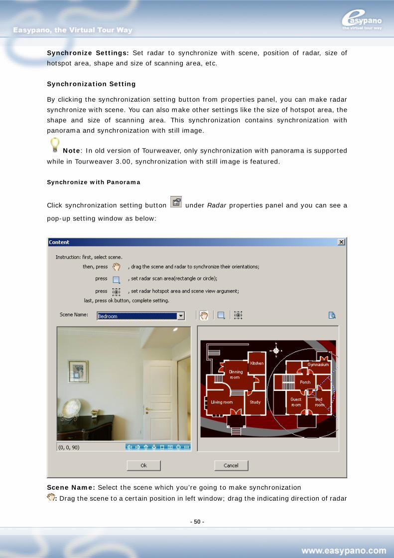
Synchronize with Panorama
Click synchronization setting button under Radar properties panel and you can see a
pop-up setting window as below:
Scene Name: Select the scene which you’re going to make synchronization
: Drag the scene to a certain position in left window; drag the indicating direction of radar
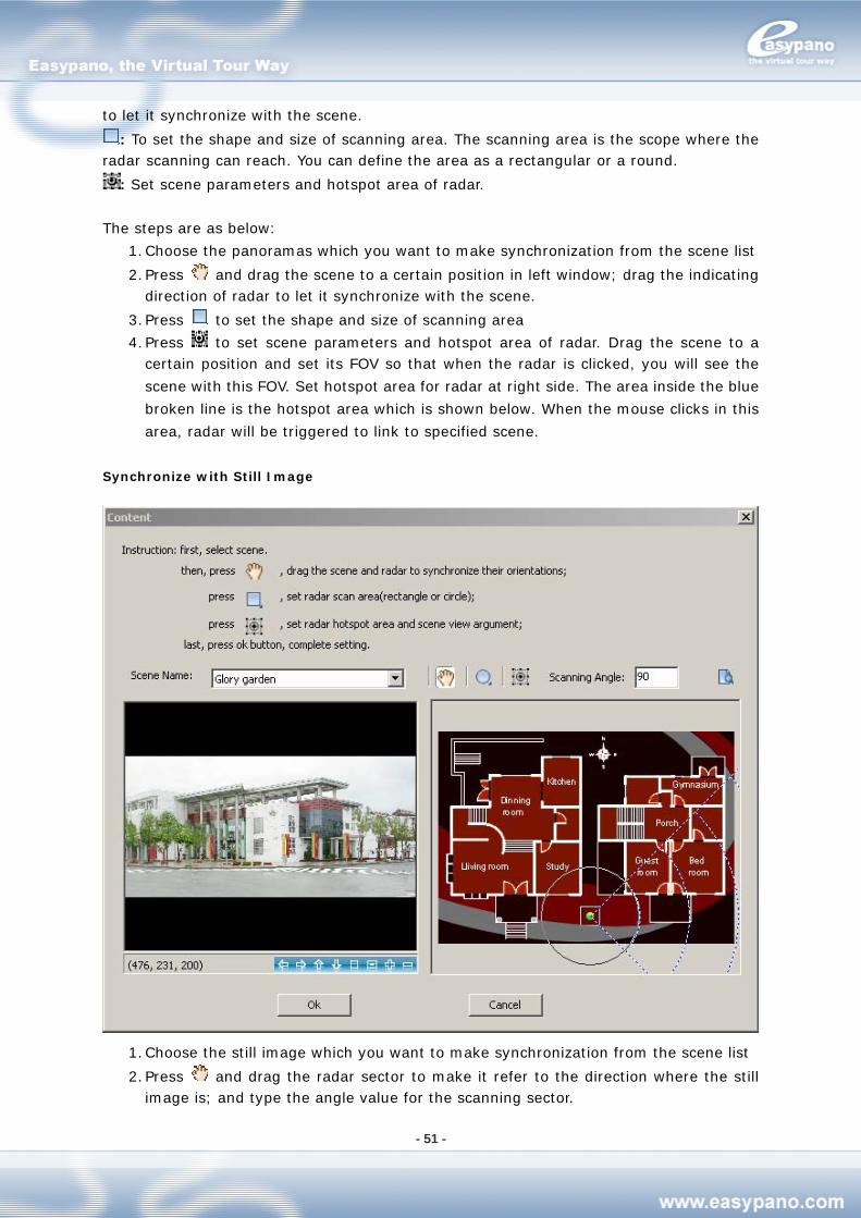
- 51 -
to let it synchronize with the scene.
: To set the shape and size of scanning area. The scanning area is the scope where the radar scanning can reach. You can define the area as a rectangular or a round.
: Set scene parameters and hotspot area of radar.
The steps are as below:
1. Choose the panoramas which you want to make synchronization from the scene list
2. Press and drag the scene to a certain position in left window; drag the indicating direction of radar to let it synchronize with the scene.
3. Press to set the shape and size of scanning area
4. Press to set scene parameters and hotspot area of radar. Drag the scene to a certain position and set its FOV so that when the radar is clicked, you will see the
scene with this FOV. Set hotspot area for radar at right side. The area inside the blue
broken line is the hotspot area which is shown below. When the mouse clicks in this
area, radar will be triggered to link to specified scene.
Synchronize with Still Image
1. Choose the still image which you want to make synchronization from the scene list
2. Press and drag the radar sector to make it refer to the direction where the still image is; and type the angle value for the scanning sector.
- 52 -
3. Press to set the shape and size of scanning area
4. Press to set the hotspot area for radar 5. Type the right value of Scanning Angle
Preview
You can preview the result of synchronization setting by clicking . After preview, click OK to finish the synchronization settings.
Add Thumbnail
Thumbnail is the component that lists the small image of scene, map or movie on Main
Window. When running virtual tour, you can switch to different scene, map or movie by
clicking different items in thumbnail. In the previous versions, thumbnail only lists all the
scenes in tour. But in Tourweaver 3.00, you can not only list several or all the scenes by
thumbnail, but also list several or all the images of map, movie or detail image. What’s more,
you can also choose to use your own images instead of the ones generated automatically.
Click the blank part of Main Window to
How to add thumbnail
1. Click Thumbnail from Toolbox
2. place it onto Main Window
Set Properties for Thumbnail
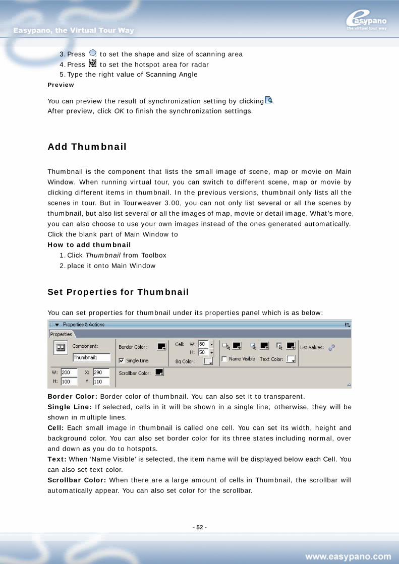
You can set properties for thumbnail under its properties panel which is as below:
Border Color: Border color of thumbnail. You can also set it to transparent.
Single Line: If selected, cells in it will be shown in a single line; otherwise, they will be
shown in multiple lines.
Cell: Each small image in thumbnail is called one cell. You can set its width, height and
background color. You can also set border color for its three states including normal, over
and down as you do to hotspots.
Text: When ‘Name Visible’ is selected, the item name will be displayed below each Cell. You
can also set text color.
Scrollbar Color: When there are a large amount of cells in Thumbnail, the scrollbar will
automatically appear. You can also set color for the scrollbar.
- 53 -
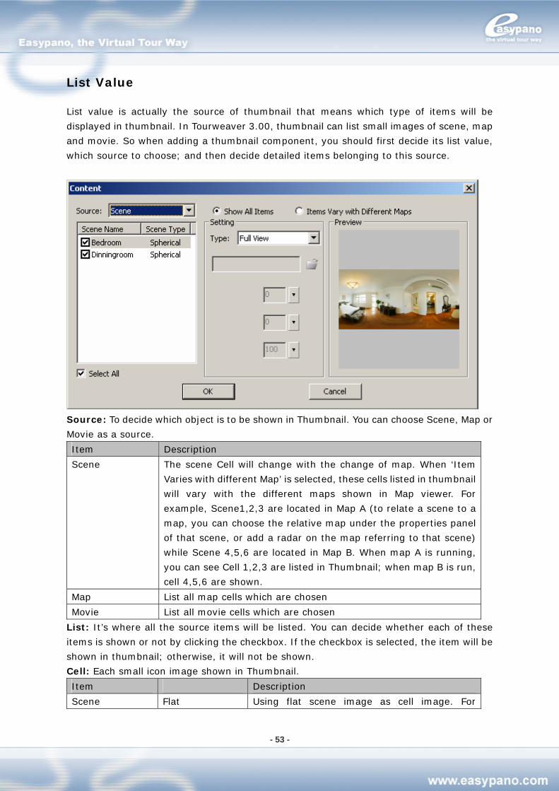
List Value
List value is actually the source of thumbnail that means which type of items will be
displayed in thumbnail. In Tourweaver 3.00, thumbnail can list small images of scene, map
and movie. So when adding a thumbnail component, you should first decide its list value,
which source to choose; and then decide detailed items belonging to this source.
Source: To decide which object is to be shown in Thumbnail. You can choose Scene, Map or
Movie as a source.
Item Description
Scene The scene Cell will change with the change of map. When ‘Item
Varies with different Map’ is selected, these cells listed in thumbnail
will vary with the different maps shown in Map viewer. For
example, Scene1,2,3 are located in Map A (to relate a scene to a
map, you can choose the relative map under the properties panel
of that scene, or add a radar on the map referring to that scene)
while Scene 4,5,6 are located in Map B. When map A is running,
you can see Cell 1,2,3 are listed in Thumbnail; when map B is run,
cell 4,5,6 are shown.
Map List all map cells which are chosen
Movie List all movie cells which are chosen
List: It’s where all the source items will be listed. You can decide whether each of these
items is shown or not by clicking the checkbox. If the checkbox is selected, the item will be
shown in thumbnail; otherwise, it will not be shown.
Cell: Each small icon image shown in Thumbnail.
Item Description
Scene Flat Using flat scene image as cell image. For
- 54 -
spherical scene, the cell is shown as a small flat
in 2:1 ratio; for cylindrical scene, the cell is
shown as a small rectangle flat; for still image,
the image is directly shown in a small size.
Angle Shot Show the screenshot of scene in the viewer as a
thumbnail cell. You can set the pan, tilt and FOV
for each scene to show the desired angle of
each scene.
Customized Using other images to shown in cell. Export the
images from relative directory.
Flat Using a small sized map image. Map
Customized Using other images to shown in cell. Export the
images from relative directory.
Movie Customized Using other images to shown in cell. Export the
images from relative directory.
How to set Thumbnail for Scene
1. Select thumbnail from Main Window
2. Click from its Properties Panel 3. Choose Scene as the Source
4. Choose the scene which you’re going to show in thumbnail from the list at left side
5. Select the image type for this scene cell at right side
6. Repeat step4,5 to add cells for multiple scenes
7. You can also select Show All Items or Items Varies with Different Map
8. Click OK
How to set Thumbnail for Map
1. Select thumbnail from Main Window
2. Click from its Properties Panel 3. Choose Map as the Source
4. Choose the map which you’re going to display in thumbnail from the list at left side
5. Select the image type for this map cell at right side
6. Repeat step4,5 to add cells for multiple maps
7. Click OK
How to set Thumbnail for Movie
You can add a symbolized thumbnail for Movie. The steps are same with add thumbnail for
scene. But the cell images should be customized.
- 55 -
Add Combobox
Combox is the component which shows scene name (map name or movie name) in a single
item list box. When running virtual tour, you can choose a certain scene (map or movie)
from the Combox. In previous versions, Combox can only list all tour scenes. But in
Tourweaver 3.00, you can not only list several or all the scenes but also list map or movie.
How to add Combobox:
1. Click Combobox from Toolbox
2. Click the blank part of Main Window to place the Combobox
Set Properties for Combobox
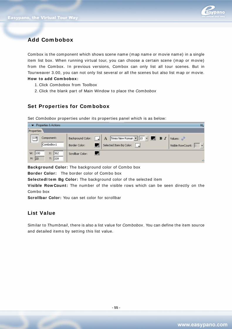
Set Combobox properties under its properties panel which is as below:
Background Color: The background color of Combo box
Border Color: The border color of Combo box
SelectedItem Bg Color: The background color of the selected item
Visible RowCount: The number of the visible rows which can be seen directly on the
Combo box
Scrollbar Color: You can set color for scrollbar
List Value
Similar to Thumbnail, there is also a list value for Combobox. You can define the item source
and detailed items by setting this list value.
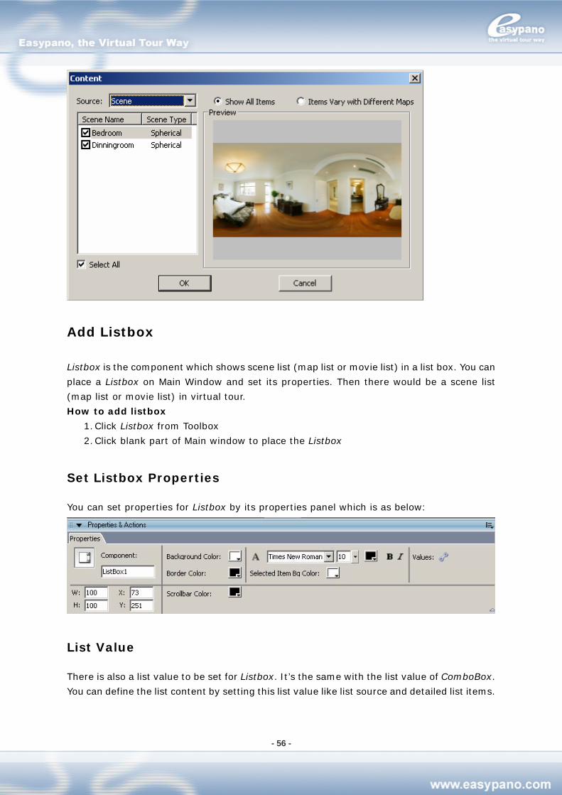
- 56 -
Add Listbox
Listbox is the component which shows scene list (map list or movie list) in a list box. You can
place a Listbox on Main Window and set its properties. Then there would be a scene list
(map list or movie list) in virtual tour.
How to add listbox
1. Click Listbox from Toolbox
2. Click blank part of Main window to place the Listbox
Set Listbox Properties
You can set properties for Listbox by its properties panel which is as below:
List Value
There is also a list value to be set for Listbox. It’s the same with the list value of ComboBox.
You can define the list content by setting this list value like list source and detailed list items.
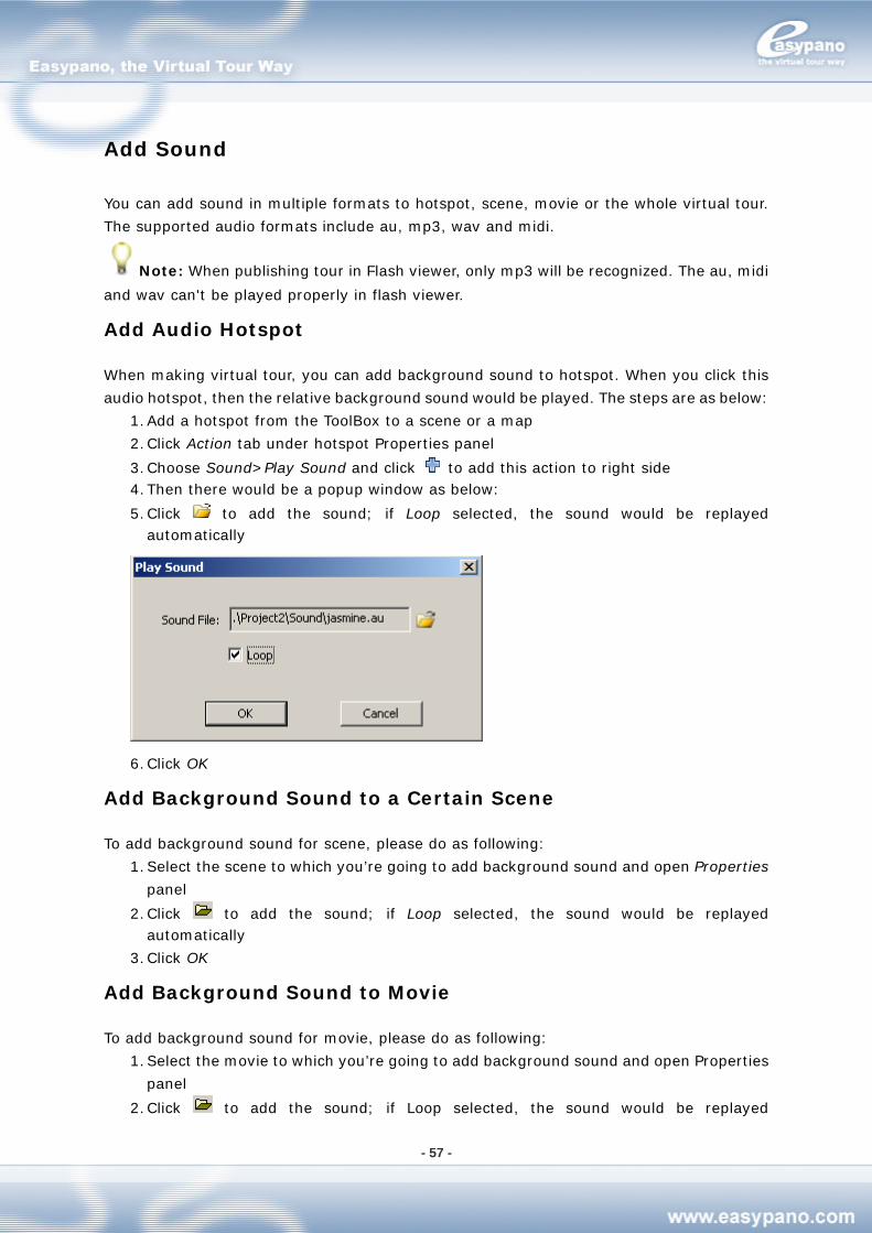
- 57 -
Add Sound
You can add sound in multiple formats to hotspot, scene, movie or the whole virtual tour.
The supported audio formats include au, mp3, wav and midi.
Note: When publishing tour in Flash viewer, only mp3 will be recognized. The au, midi
and wav can't be played properly in flash viewer.
Add Audio Hotspot
When making virtual tour, you can add background sound to hotspot. When you click this
audio hotspot, then the relative background sound would be played. The steps are as below:
1. Add a hotspot from the ToolBox to a scene or a map
2. Click Action tab under hotspot Properties panel
3. Choose Sound>Play Sound and click to add this action to right side 4. Then there would be a popup window as below:
5. Click to add the sound; if Loop selected, the sound would be replayed automatically
6. Click OK
Add Background Sound to a Certain Scene
To add background sound for scene, please do as following:
1. Select the scene to which you’re going to add background sound and open Properties
panel
2. Click to add the sound; if Loop selected, the sound would be replayed automatically
3. Click OK
Add Background Sound to Movie
To add background sound for movie, please do as following:
1. Select the movie to which you’re going to add background sound and open Properties
panel
2. Click to add the sound; if Loop selected, the sound would be replayed
- 58 -
automatically
3. Click OK
Add Background Sound to Virtual Tour
Besides adding sound to hotspot, scene and movie, you can also add a background sound
for the whole virtual tour. This sound would be played during running the tour. The steps are
as below:
1. Choose File>Publish Settings>Html
2. Click at Background Sound File to add the sound. If Loop is selected, the sound would be replayed automatically.
Mute
You can set a Mute button to stop the sound. Mute is an action which can be added to
hotspot, text, image or button. Please refer to Action for sound.
Note: If you add sound to hotspot, scene, movie and virtual tour at the same time, all
these sounds would be played. When you use Mute action, these sounds will all be stopped.
How to Edit Movie
You can choose several or all the scenes in the current project and organize them in a
certain sequence, view them from a certain position and run each of them in a certain period.
At last you get a movie which runs those scenes with several rules. Thus movies in
Tourweaver are referring to a series of frames which form a walkthrough at the Timeline.
These frames record the time points, the scenes on the relative time points and the view
position including Pan, Tilt and Fov of each scene.
Slideshow
After you import one or several scene images in Scene tag under List panel, you can find a
SlideShow on Movie tag. It’s generated automatically according to the scenes you’ve
imported. The SlideShow organizes the scenes due to the sequence as the same in Scene
List on Scene tag and the pan, tilt, Fov and rotating speed as you’ve set. Therefore, when
you add or delete scene from scene list or change the rotating speed of any scene, this
Slideshow will be updated automatically. This SlideShow is not allowed to be modified by
customers. If you want to make your own movie, you can create a new movie by copy and
paste this SlideShow.
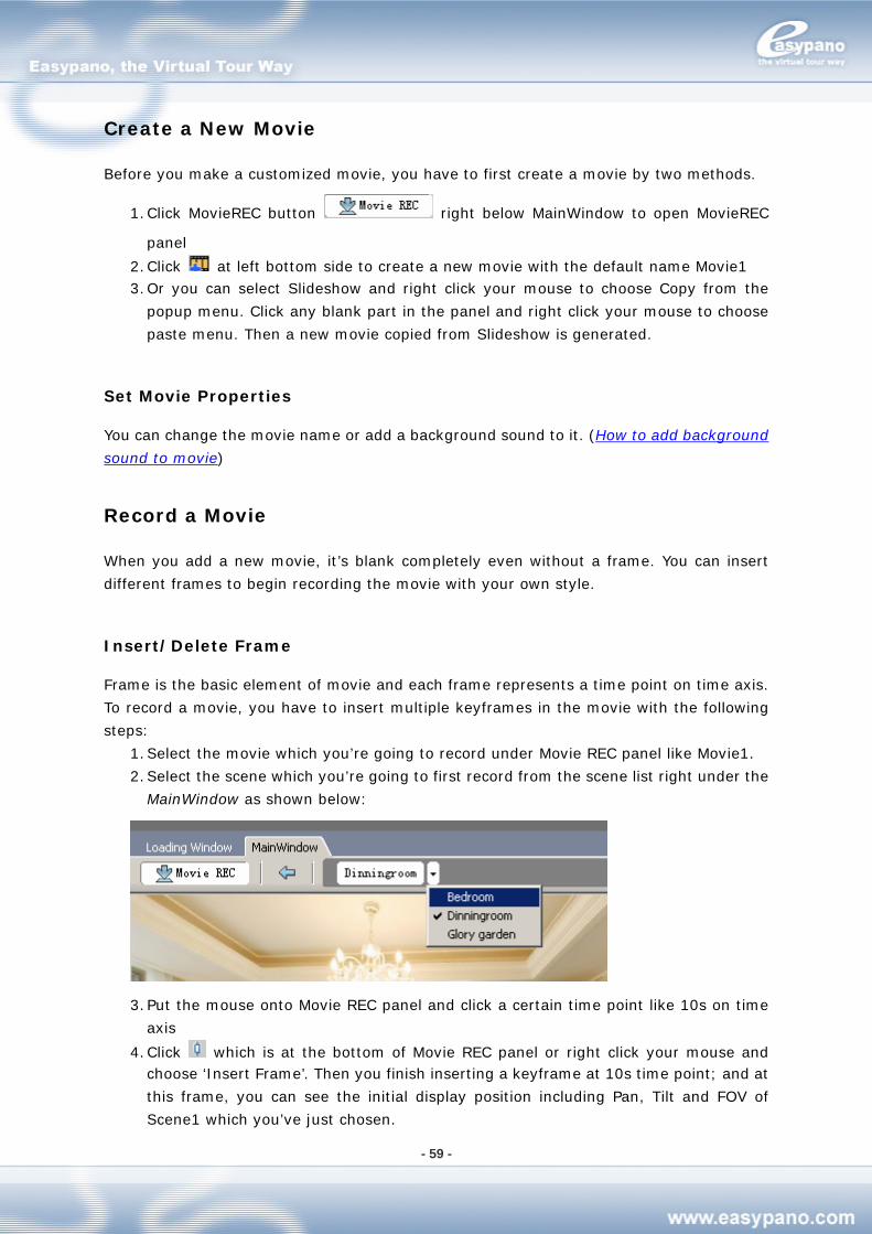
- 59 -
Create a New Movie
Before you make a customized movie, you have to first create a movie by two methods.
1. Click MovieREC button right below MainWindow to open MovieREC
panel
2. Click at left bottom side to create a new movie with the default name Movie1 3. Or you can select Slideshow and right click your mouse to choose Copy from the
popup menu. Click any blank part in the panel and right click your mouse to choose
paste menu. Then a new movie copied from Slideshow is generated.
Set Movie Properties
You can change the movie name or add a background sound to it. (How to add background
sound to movie)
Record a Movie
When you add a new movie, it’s blank completely even without a frame. You can insert
different frames to begin recording the movie with your own style.
Insert/Delete Frame
Frame is the basic element of movie and each frame represents a time point on time axis.
To record a movie, you have to insert multiple keyframes in the movie with the following
steps:
1. Select the movie which you’re going to record under Movie REC panel like Movie1.
2. Select the scene which you’re going to first record from the scene list right under the
MainWindow as shown below:
3. Put the mouse onto Movie REC panel and click a certain time point like 10s on time
axis
4. Click which is at the bottom of Movie REC panel or right click your mouse and choose ‘Insert Frame’. Then you finish inserting a keyframe at 10s time point; and at
this frame, you can see the initial display position including Pan, Tilt and FOV of
Scene1 which you’ve just chosen.
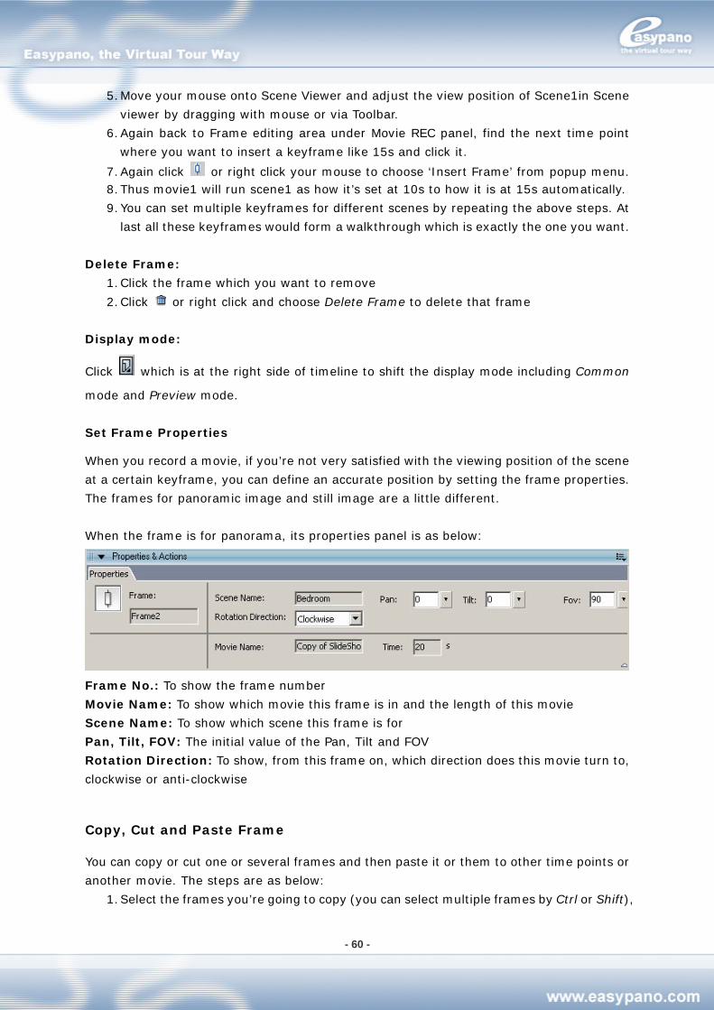
- 60 -
5. Move your mouse onto Scene Viewer and adjust the view position of Scene1in Scene
viewer by dragging with mouse or via Toolbar.
6. Again back to Frame editing area under Movie REC panel, find the next time point
where you want to insert a keyframe like 15s and click it.
7. Again click or right click your mouse to choose ‘Insert Frame’ from popup menu. 8. Thus movie1 will run scene1 as how it’s set at 10s to how it is at 15s automatically.
9. You can set multiple keyframes for different scenes by repeating the above steps. At
last all these keyframes would form a walkthrough which is exactly the one you want.
Delete Frame:
1. Click the frame which you want to remove
2. Click or right click and choose Delete Frame to delete that frame
Display mode:
Click which is at the right side of timeline to shift the display mode including Common
mode and Preview mode.
Set Frame Properties
When you record a movie, if you’re not very satisfied with the viewing position of the scene
at a certain keyframe, you can define an accurate position by setting the frame properties.
The frames for panoramic image and still image are a little different.
When the frame is for panorama, its properties panel is as below:
Frame No.: To show the frame number
Movie Name: To show which movie this frame is in and the length of this movie
Scene Name: To show which scene this frame is for
Pan, Tilt, FOV: The initial value of the Pan, Tilt and FOV
Rotation Direction: To show, from this frame on, which direction does this movie turn to,
clockwise or anti-clockwise
Copy, Cut and Paste Frame
You can copy or cut one or several frames and then paste it or them to other time points or
another movie. The steps are as below:
1. Select the frames you’re going to copy (you can select multiple frames by Ctrl or Shift),
- 61 -
right click and select copy frame or press Ctrl+C
2. Right click where you want to paste the frames and choose paste frame or press
Ctrl+V
Drag Frame at Time Line
You can modify walkthrough of movie by dragging a certain frame to change its time point.
1. Click a certain frame
2. Press the mouse and drag the frame leftwards or rightwards until a certain point. And
the frames after this one would also move synchronously.
Preview Movie
You can preview movie by two ways
1. Select the movie which you want to preview and click to preview the movie in Scene Viewer
2. Select the movie which you want to preview and press Enter
Copy and Paste Movie
You can copy the movie which you’ve edited.
1. Select the movie you want to copy and right click to choose copy movie
2. On movie editing area, right click and choose paste movie
Although the SlideShow can’t be edited, you can copy and paste it as a new one to make
customization.
Delete Movie
You can also delete the movie which you’ve edited.
1. Select the movie you’re going to remove
2. Right click and choose Delete movie
Set Movie to Default
Default movie is the one which will be auto run when virtual tour starts.
1. Go to File>Publish Settings
2. Go to Html Page
3. Select the right movie as the default one at Default Movie
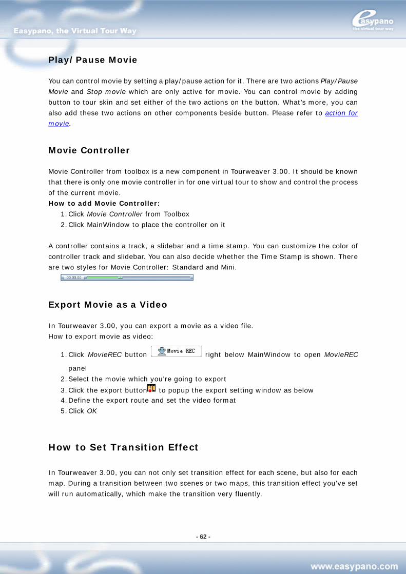
- 62 -
Play/Pause Movie
You can control movie by setting a play/pause action for it. There are two actions Play/Pause
Movie and Stop movie which are only active for movie. You can control movie by adding
button to tour skin and set either of the two actions on the button. What’s more, you can
also add these two actions on other components beside button. Please refer to action for
movie.
Movie Controller
Movie Controller from toolbox is a new component in Tourweaver 3.00. It should be known
that there is only one movie controller in for one virtual tour to show and control the process
of the current movie.
How to add Movie Controller:
1. Click Movie Controller from Toolbox
2. Click MainWindow to place the controller on it
A controller contains a track, a slidebar and a time stamp. You can customize the color of
controller track and slidebar. You can also decide whether the Time Stamp is shown. There
are two styles for Movie Controller: Standard and Mini.
Export Movie as a Video
In Tourweaver 3.00, you can export a movie as a video file.
How to export movie as video:
1. Click MovieREC button right below MainWindow to open MovieREC
panel
2. Select the movie which you’re going to export
3. Click the export button to popup the export setting window as below 4. Define the export route and set the video format
5. Click OK
How to Set Transition Effect
In Tourweaver 3.00, you can not only set transition effect for each scene, but also for each
map. During a transition between two scenes or two maps, this transition effect you’ve set
will run automatically, which make the transition very fluently.
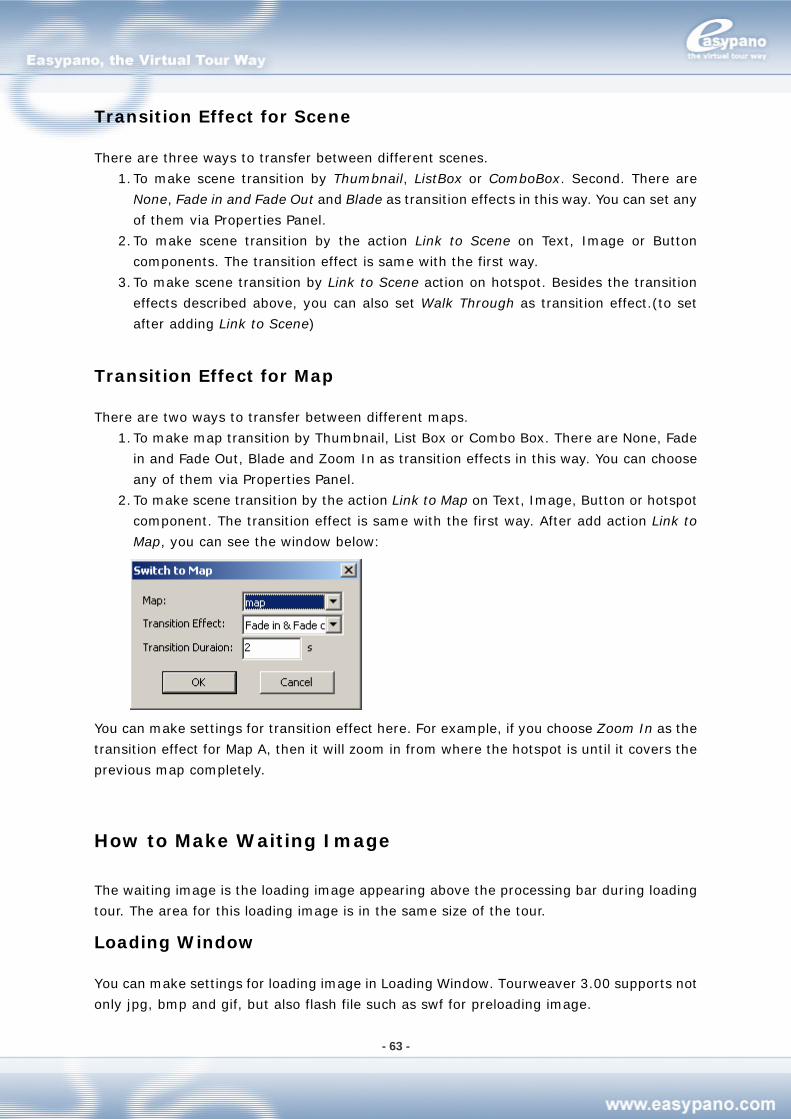
- 63 -
Transition Effect for Scene
There are three ways to transfer between different scenes.
1. To make scene transition by Thumbnail, ListBox or ComboBox. Second. There are
None, Fade in and Fade Out and Blade as transition effects in this way. You can set any
of them via Properties Panel.
2. To make scene transition by the action Link to Scene on Text, Image or Button
components. The transition effect is same with the first way.
3. To make scene transition by Link to Scene action on hotspot. Besides the transition
effects described above, you can also set Walk Through as transition effect.(to set
after adding Link to Scene)
Transition Effect for Map
There are two ways to transfer between different maps.
1. To make map transition by Thumbnail, List Box or Combo Box. There are None, Fade
in and Fade Out, Blade and Zoom In as transition effects in this way. You can choose
any of them via Properties Panel.
2. To make scene transition by the action Link to Map on Text, Image, Button or hotspot
component. The transition effect is same with the first way. After add action Link to
Map, you can see the window below:
You can make settings for transition effect here. For example, if you choose Zoom In as the
transition effect for Map A, then it will zoom in from where the hotspot is until it covers the
previous map completely.
How to Make Waiting Image
The waiting image is the loading image appearing above the processing bar during loading
tour. The area for this loading image is in the same size of the tour.
Loading Window
You can make settings for loading image in Loading Window. Tourweaver 3.00 supports not
only jpg, bmp and gif, but also flash file such as swf for preloading image.
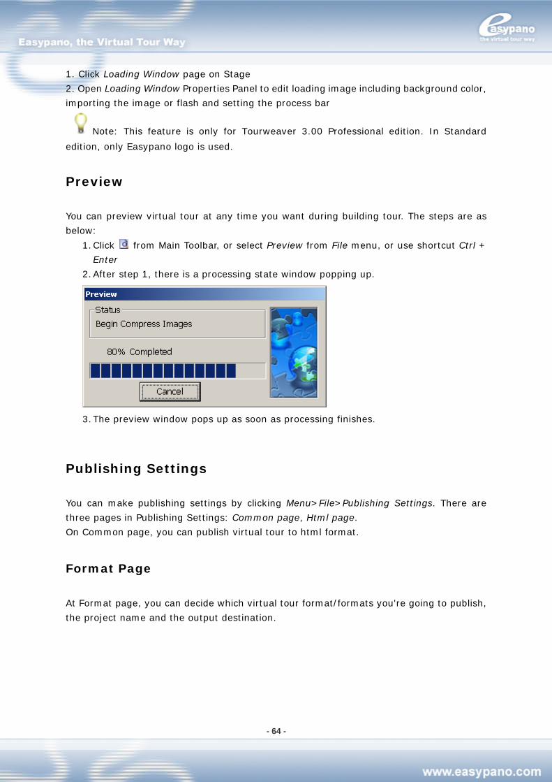
- 64 -
1. Click Loading Window page on Stage
2. Open Loading Window Properties Panel to edit loading image including background color,
importing the image or flash and setting the process bar
Note: This feature is only for Tourweaver 3.00 Professional edition. In Standard
edition, only Easypano logo is used.
Preview
You can preview virtual tour at any time you want during building tour. The steps are as
below:
1. Click from Main Toolbar, or select Preview from File menu, or use shortcut Ctrl +
Enter
2. After step 1, there is a processing state window popping up.
3. The preview window pops up as soon as processing finishes.
Publishing Settings
You can make publishing settings by clicking Menu>File>Publishing Settings. There are
three pages in Publishing Settings: Common page, Html page.
On Common page, you can publish virtual tour to html format.
Format Page
At Format page, you can decide which virtual tour format/formats you're going to publish,
the project name and the output destination.
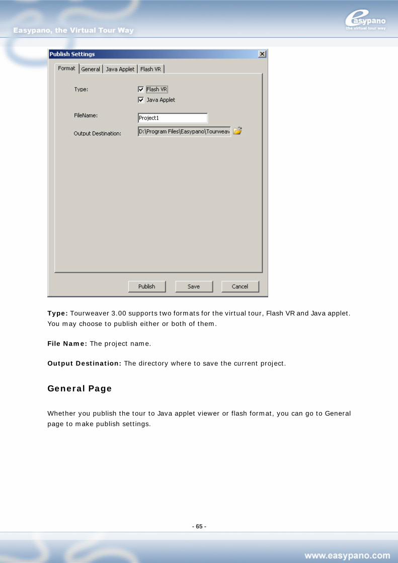
- 65 -
Type: Tourweaver 3.00 supports two formats for the virtual tour, Flash VR and Java applet.
You may choose to publish either or both of them.
File Name: The project name.
Output Destination: The directory where to save the current project.
General Page
Whether you publish the tour to Java applet viewer or flash format, you can go to General
page to make publish settings.
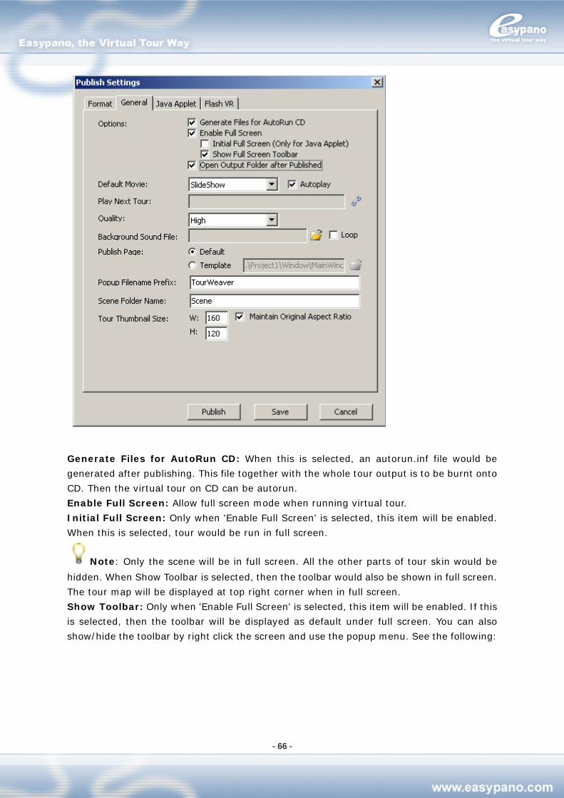
- 66 -
Generate Files for AutoRun CD: When this is selected, an autorun.inf file would be
generated after publishing. This file together with the whole tour output is to be burnt onto
CD. Then the virtual tour on CD can be autorun.
Enable Full Screen: Allow full screen mode when running virtual tour.
Initial Full Screen: Only when 'Enable Full Screen' is selected, this item will be enabled.
When this is selected, tour would be run in full screen.
Note: Only the scene will be in full screen. All the other parts of tour skin would be
hidden. When Show Toolbar is selected, then the toolbar would also be shown in full screen.
The tour map will be displayed at top right corner when in full screen.
Show Toolbar: Only when 'Enable Full Screen' is selected, this item will be enabled. If this
is selected, then the toolbar will be displayed as default under full screen. You can also
show/hide the toolbar by right click the screen and use the popup menu. See the following:
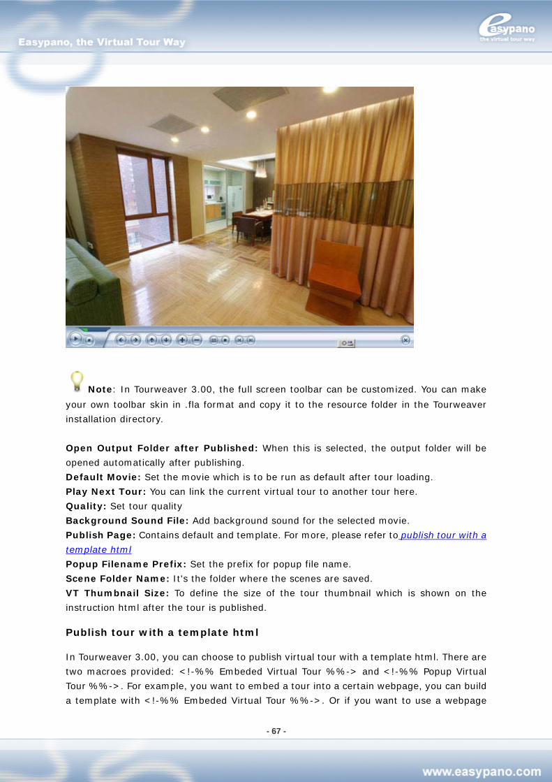
- 67 -
Note: In Tourweaver 3.00, the full screen toolbar can be customized. You can make
your own toolbar skin in .fla format and copy it to the resource folder in the Tourweaver
installation directory.
Open Output Folder after Published: When this is selected, the output folder will be
opened automatically after publishing.
Default Movie: Set the movie which is to be run as default after tour loading.
Play Next Tour: You can link the current virtual tour to another tour here.
Quality: Set tour quality
Background Sound File: Add background sound for the selected movie.
Publish Page: Contains default and template. For more, please refer to publish tour with a
template html
Popup Filename Prefix: Set the prefix for popup file name.
Scene Folder Name: It's the folder where the scenes are saved.
VT Thumbnail Size: To define the size of the tour thumbnail which is shown on the
instruction html after the tour is published.
Publish tour with a template html
In Tourweaver 3.00, you can choose to publish virtual tour with a template html. There are
two macroes provided: <!-%% Embeded Virtual Tour %%-> and <!-%% Popup Virtual
Tour %%->. For example, you want to embed a tour into a certain webpage, you can build
a template with <!-%% Embeded Virtual Tour %%->. Or if you want to use a webpage
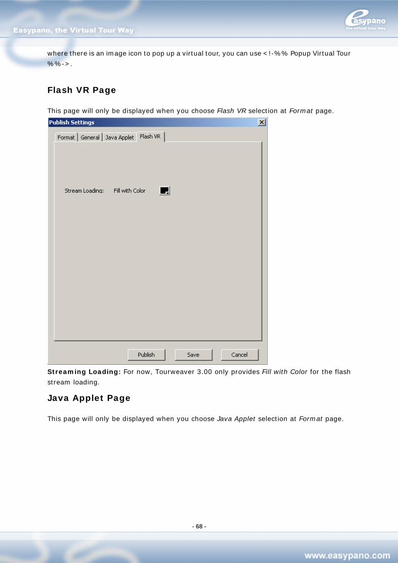
- 68 -
where there is an image icon to pop up a virtual tour, you can use <!-%% Popup Virtual Tour
%%->.
Flash VR Page
This page will only be displayed when you choose Flash VR selection at Format page.
Streaming Loading: For now, Tourweaver 3.00 only provides Fill with Color for the flash
stream loading.
Java Applet Page
This page will only be displayed when you choose Java Applet selection at Format page.
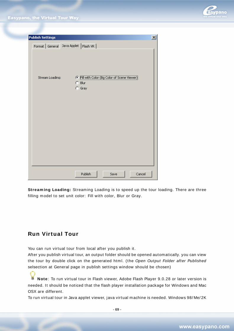
- 69 -
Streaming Loading: Streaming Loading is to speed up the tour loading. There are three
filling model to set unit color: Fill with color, Blur or Gray.
Run Virtual Tour
You can run virtual tour from local after you publish it.
After you publish virtual tour, an output folder should be opened automatically. you can view
the tour by double click on the generated html. (the Open Output Folder after Published
selsection at General page in publish settings window should be chosen)
Note: To run virtual tour in Flash viewer, Adobe Flash Player 9.0.28 or later version is
needed. It should be noticed that the flash player installation package for Windows and Mac
OSX are different.
To run virtual tour in Java applet viewer, java virtual machine is needed. Windows 98/Me/2K
- 70 -
have installed JVM as default. However, for Windows XP, you need to install JVM separately.
Please download it at http://www.easypano.com/download/msjavx86.exe.
How to Run Virtual Tour in Full Screen
The two viewers including Scene viewer, Map viewer can be changed to run full screen.
Open virtual tour and put your mouse on any of the viewers and double click. Then you can
see that viewer by full screen. Another double click can bring full screen back to original
size.
What’s more, you can also add a button with full screen action to tour skin. When you want
to change to full screen, you only need to press that button.
Note: In Tourweaver 3.00, the map will be displayed at top right corner when in full
screen. The new feature enables you to use the map while the tour is in full screen.
Preference Settings
Tourweaver 3.00 also provides Preference settings. You can make preference settings on
your own. Please click Edit>Preferences to access the Preferences settings.
Note: Preference settings only become effective to the operations after the settings.
Common Page
You can define undo levels and startup style under Common page
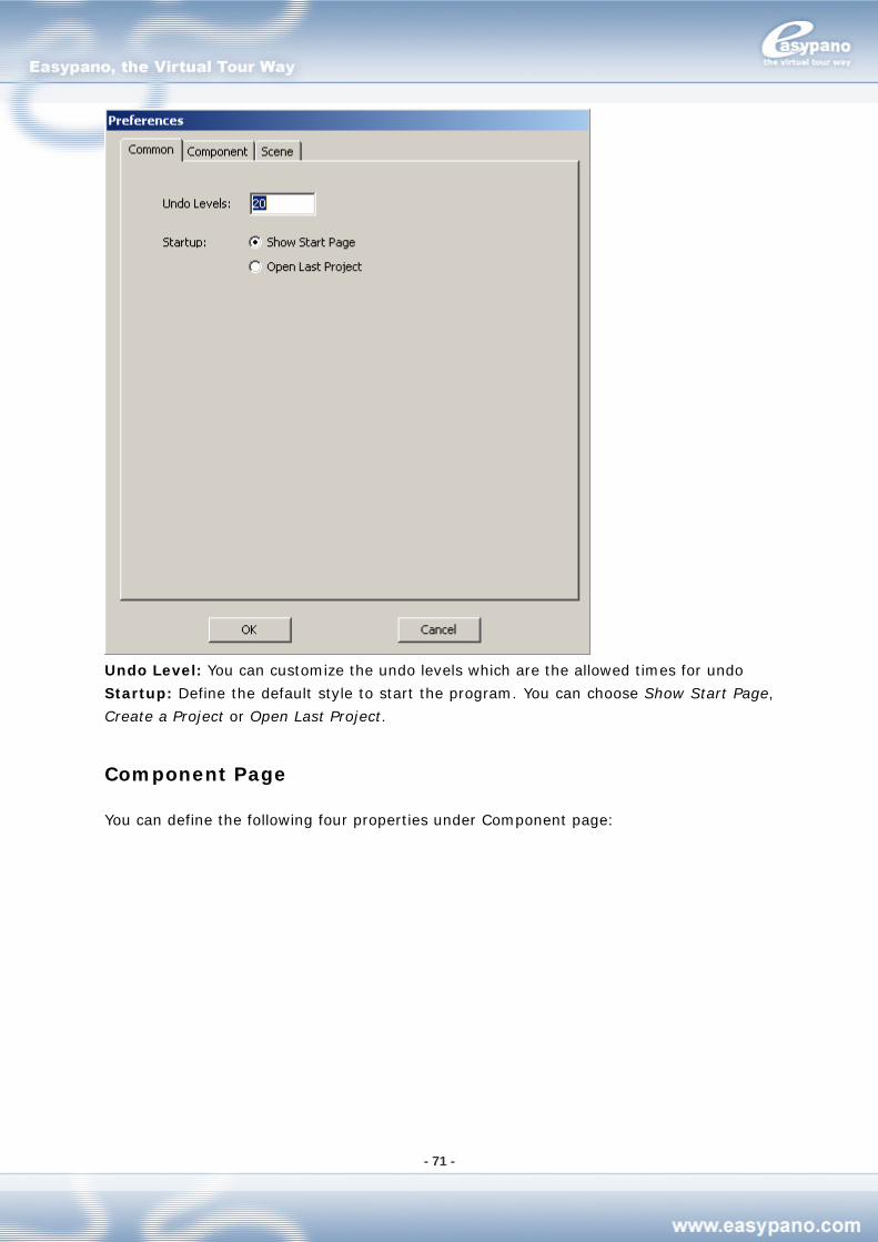
- 71 -
Undo Level: You can customize the undo levels which are the allowed times for undo
Startup: Define the default style to start the program. You can choose Show Start Page,
Create a Project or Open Last Project.
Component Page
You can define the following four properties under Component page:
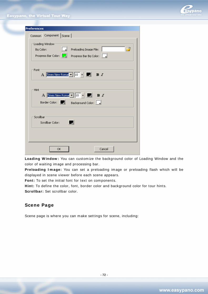
- 72 -
Loading Window: You can customize the background color of Loading Window and the
color of waiting image and processing bar.
Preloading Image: You can set a preloading image or preloading flash which will be
displayed in scene viewer before each scene appears.
Font: To set the initial font for text on components.
Hint: To define the color, font, border color and background color for tour hints.
Scrollbar: Set scrollbar color.
Scene Page
Scene page is where you can make settings for scene, including:
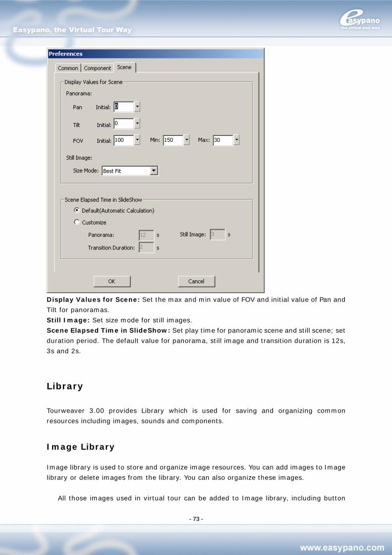
- 73 -
Display Values for Scene: Set the max and min value of FOV and initial value of Pan and
Tilt for panoramas.
Still Image: Set size mode for still images.
Scene Elapsed Time in SlideShow: Set play time for panoramic scene and still scene; set
duration period. The default value for panorama, still image and transition duration is 12s,
3s and 2s.
Library
Tourweaver 3.00 provides Library which is used for saving and organizing common
resources including images, sounds and components.
Image Library
Image library is used to store and organize image resources. You can add images to Image
library or delete images from the library. You can also organize these images.
All those images used in virtual tour can be added to Image library, including button
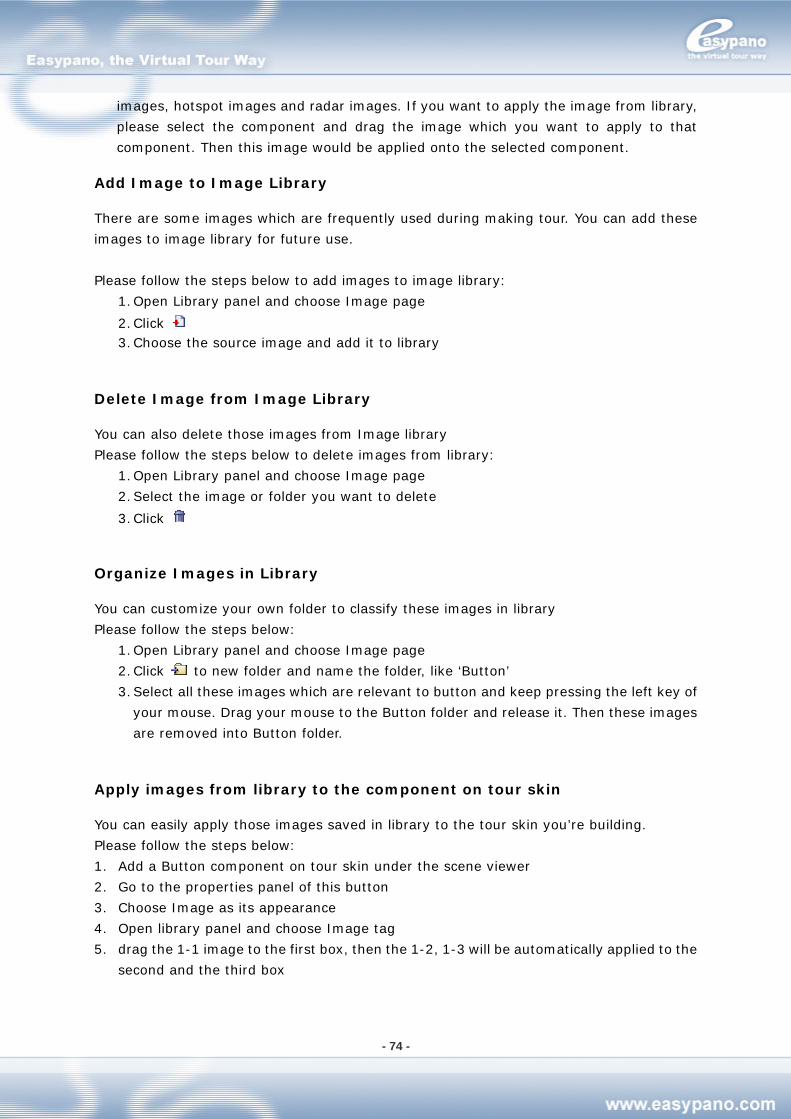
- 74 -
images, hotspot images and radar images. If you want to apply the image from library,
please select the component and drag the image which you want to apply to that
component. Then this image would be applied onto the selected component.
Add Image to Image Library
There are some images which are frequently used during making tour. You can add these
images to image library for future use.
Please follow the steps below to add images to image library:
1. Open Library panel and choose Image page
2. Click 3. Choose the source image and add it to library
Delete Image from Image Library
You can also delete those images from Image library
Please follow the steps below to delete images from library:
1. Open Library panel and choose Image page
2. Select the image or folder you want to delete
3. Click
Organize Images in Library
You can customize your own folder to classify these images in library
Please follow the steps below:
1. Open Library panel and choose Image page
2. Click to new folder and name the folder, like ‘Button’
3. Select all these images which are relevant to button and keep pressing the left key of
your mouse. Drag your mouse to the Button folder and release it. Then these images
are removed into Button folder.
Apply images from library to the component on tour skin
You can easily apply those images saved in library to the tour skin you’re building.
Please follow the steps below:
1. Add a Button component on tour skin under the scene viewer
2. Go to the properties panel of this button
3. Choose Image as its appearance
4. Open library panel and choose Image tag
5. drag the 1-1 image to the first box, then the 1-2, 1-3 will be automatically applied to the
second and the third box
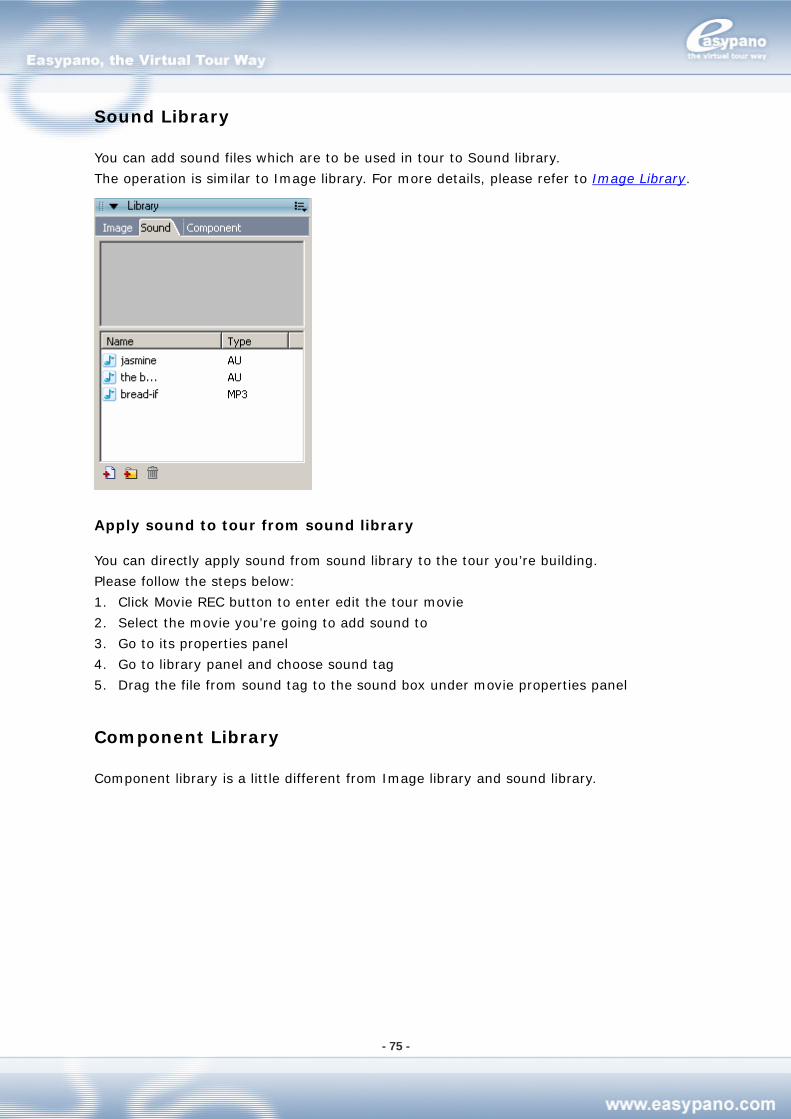
- 75 -
Sound Library
You can add sound files which are to be used in tour to Sound library.
The operation is similar to Image library. For more details, please refer to Image Library.
Apply sound to tour from sound library
You can directly apply sound from sound library to the tour you’re building.
Please follow the steps below:
1. Click Movie REC button to enter edit the tour movie
2. Select the movie you’re going to add sound to
3. Go to its properties panel
4. Go to library panel and choose sound tag
5. Drag the file from sound tag to the sound box under movie properties panel
Component Library
Component library is a little different from Image library and sound library.
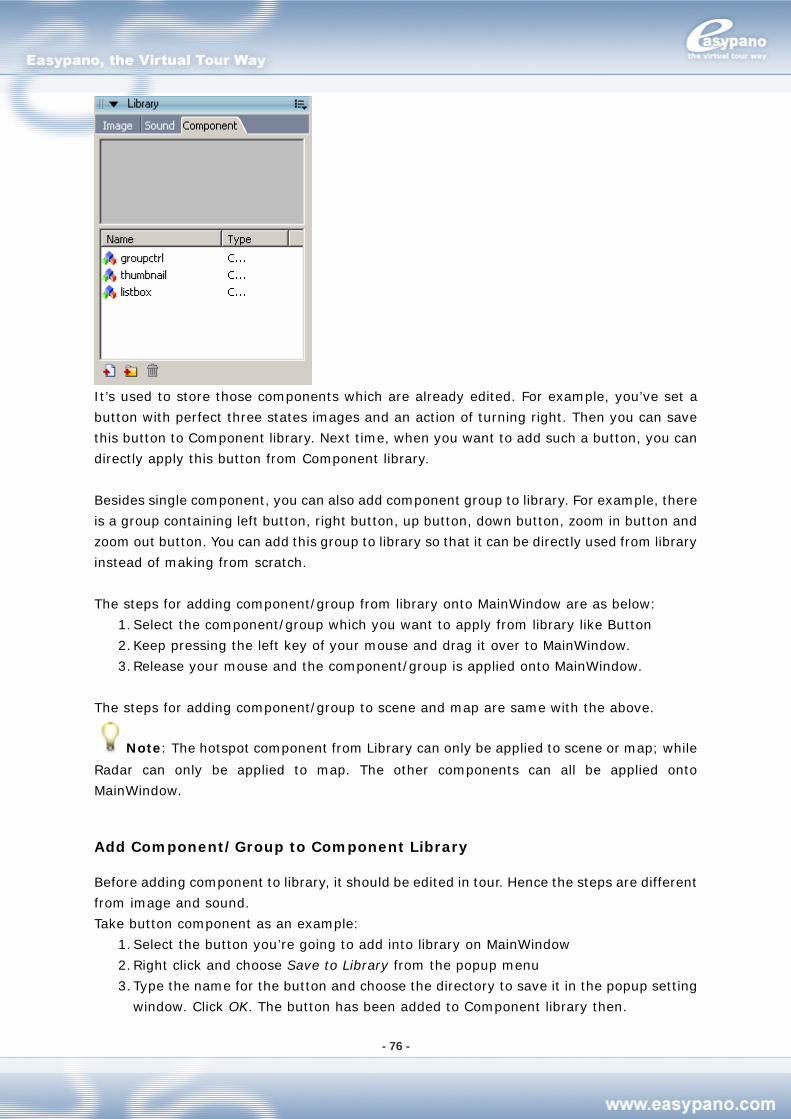
- 76 -
It’s used to store those components which are already edited. For example, you’ve set a
button with perfect three states images and an action of turning right. Then you can save
this button to Component library. Next time, when you want to add such a button, you can
directly apply this button from Component library.
Besides single component, you can also add component group to library. For example, there
is a group containing left button, right button, up button, down button, zoom in button and
zoom out button. You can add this group to library so that it can be directly used from library
instead of making from scratch.
The steps for adding component/group from library onto MainWindow are as below:
1. Select the component/group which you want to apply from library like Button
2. Keep pressing the left key of your mouse and drag it over to MainWindow.
3. Release your mouse and the component/group is applied onto MainWindow.
The steps for adding component/group to scene and map are same with the above.
Note: The hotspot component from Library can only be applied to scene or map; while
Radar can only be applied to map. The other components can all be applied onto
MainWindow.
Add Component/Group to Component Library
Before adding component to library, it should be edited in tour. Hence the steps are different
from image and sound.
Take button component as an example:
1. Select the button you’re going to add into library on MainWindow
2. Right click and choose Save to Library from the popup menu
3. Type the name for the button and choose the directory to save it in the popup setting
window. Click OK. The button has been added to Component library then.
- 77 -
Note: After you add the component to library, all these connections to scene, map or
movie will be lost then. For example, there is an action of linking to scene A in a hotspot.
After you add this hotspot to library, the action will be lost.
Delete Component from Library
You can delete component from Component library. As to how, see Delete image from
library
Organize Component in library
You can organize these components in library. As to how, see Organize images in library.
Apply component from component library
You can directly apply component from component library to the tour you’re building.
Please follow the steps below:
1. Go to library and choose component tag
2. Select the m_button_group component and drag it to the tour skin
Javascript API
The API (Application Program Interface) allows you to control your panoramas and virtual
tours from outside the viewer applet. For example, you can offer the user viewer controls
when presenting panoramas without a skin. Users can control the panoramas by clicking on
text links, images or HTML form elements such as a buttons or drop-down lists. If you are
familiar with image mapping, you can map an image - floor plan or aerial photograph -
linking different part of the image to different panoramas in your tour. The API also allows
you to create you own 'controls skin', remote and completely separate from the viewer skin.
The parameters set in the applet code are static values - they are applied when the applet
is first loaded. Their functions are to instruct the applet to "do this…" when it first loads. For
example, the parameters tell the browser which panorama to load and where to find it, what
the frame rate should be, whether to pan left or right, etc. The API, on the other hand,
allows you to override these parameters. It offers you and the user dynamic values that can
be changed from within a web page.
This manual does not assume the reader has prior knowledge of JavaScripting, API's or
setting parameters. A basic knowledge of HTML would be useful.
- 78 -
Tips on Using the Codes
If you have little or no experience of using JavaScript there are a few points you should be
aware of before using the codes:
JavaScript is case sensitive - "A" and "a" are not the same.
Copy the code exactly as showed in Chapter JavaScript API Methods and only
change the values as stated below.
It is usual to place JavaScript "Functions" in the "Head" part of your web page code
- that is, between the <head> and </head> tags. So the "Head code" shown in
Chapter JavaScript API Methods should be pasted into your web page head section.
The body code can be pasted in any position within the "Body" section of your web
page - that is, between the <body> and </body> tags.
Replace "AppletName" with whatever name you choose to give to your applet. You
can leave the code as "AppletName" if you wish, however, you must then remember
to name your applet "AppletName".
You may also wish to replace "FormName" and "SelectName" with your own choice
of name. If you do, be sure to replace every instance of the name in both the head
and body codes shown for that method.
JavaScript API Methods
The following is a complete list of the available methods that can be called through the API,
by using JavaScript. A description for each method, example JavaScipts for calling a method
and instructions on how to implement the scripts for your own use are also included. You
can quickly make use of and experiment with the codes by using the templates.
To use them, just copy and paste any of the example codes into the web page containing
your applet.
For more details regarding JavaScript API, please refer the same chapter in Help Topics
under Help menu of the Tourweaver 2.00.
How to Implement JavaScript API
Our installation package includes API templates which contain most of the example codes
detailed in the previous chapter. It may help you understand how the various scripts and
codes can be used collectively within a web page.
To understand how to implement JavaScript API, please refer to the following steps:
Step1: Navigate to Sample 2 and open the HTML applet page. Then right click your mouse
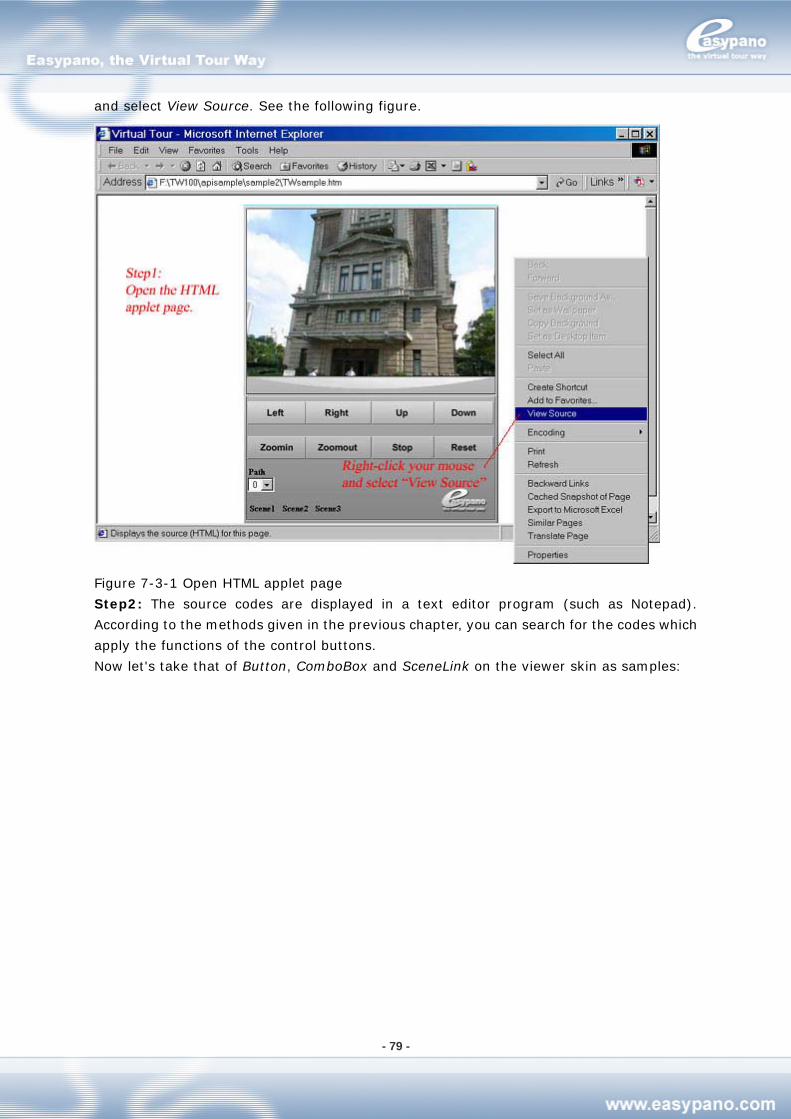
- 79 -
and select View Source. See the following figure.
Figure 7-3-1 Open HTML applet page
Step2: The source codes are displayed in a text editor program (such as Notepad).
According to the methods given in the previous chapter, you can search for the codes which
apply the functions of the control buttons.
Now let's take that of Button, ComboBox and SceneLink on the viewer skin as samples:
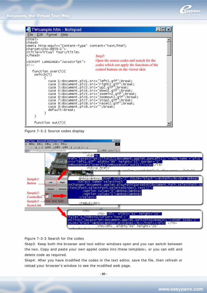
- 80 -
Figure 7-3-2 Source codes display
Figure 7-3-3 Search for the codes
Step3: Keep both the browser and text editor windows open and you can switch between
the two. Copy and paste your own applet codes into these templates, or you can edit and
delete code as required.
Step4: After you have modified the codes in the text editor, save the file, then refresh or
reload your browser's window to see the modified web page.
- 81 -
Step5: Save your HTML template using a suitable file name. The HTML page can now be
viewed in a browser window - MS Internet Explorer, Netscape or similar.
FAQ
General Concerns
Tourweaver: Tourweaver is a virtual tour producer. It provides an easy way to create
a rich and vivid immersive virtual tour.
Easypano Tourweaver Viewer: It is a simple and humanized viewer to view the
standalone virtual tour created by Tourweaver. The user may customize viewer's
skin by themselves.
Virtual Tour: A virtual tour is a series of scenes, i.e. panorama images, linked
together, in which the viewer can "walk" from place to place in an environment as if
you were really there. Most of the scenes allow a 360° viewpoint. You can also zoom
in to get a closer look in detail.
VTP File: The virtual tour project file created in Tourweaver 1.30 and previous
versions.
TW File: The virtual tour project file created in Tourweaver 2.00.
Frame: Frame is the set of all picture elements that represent one complete scene
image. One scene contains at least two frames which are the basic components of
the tour path.
Scene: As part of the virtual tour, a scene is a relatively short and continuous set of
frames. By linking the scenes to each other, virtual tour is produced.
Movie: Movie can be comprehended as directed guided walkthroughs of the frames.
In a movie there are various frames that can be set at arbitrary position on the
TimeLine. When the movie is being played, the frames will be presented in time
sequence.
Hotspot: Hotspots are clickable link areas within a panorama or a map, you can
assign an action to a Hotspot. So when being clicked, depending on the action you
assign to it, it will open a new panorama, slideshow, virtual tour, play an audio or
video, open a web page or send an email.
Skin: Skin refers to the appearance of the viewer. It consists of the background,
button images and other features that you see around the viewer. The Skin allows
the user who is viewing a presentation to interact with and control the media that is
played inside the skin.
FOV: FOV stands for the field of view which the camera lens can capture.
Pan: Pan refers to the view in horizontal direction of panorama window.
Tilt: Tilt refers to the view in vertical direction of panorama window.
API: An application program interface (sometimes spelled application programming
- 82 -
interface) is the specific method prescribed by a computer operating system or by
an application program by which a programmer writing an application program can
make requests of the operating system or another application.
Downloading and Purchasing
1. Where can I get the free trial version of Tourweaver?
To download a trial version, please visit http://www.easypano.com/download.htm.
2. What's the difference between trial version and registered version? How to get the
registered version?
The software you have downloaded is just a trial version, and you need order and register
to change it into a full version. Now our trial version allows the published virtual tours to be
viewed on the web. In Tourweaver 3.00, the restriction has been changed from the
watermark limitation in Tourweaver 1.30, to a popping-up dialogue box which warns user to
register. This box pops up every 40 seconds until the whole virtual tour is closed. There are
no such restrictions in the registered version.
Using Tourweaver 3.00
1. The tour doesn't work properly in Flash viewer. Why?
In Tourweaver 3.00, you can publish tour to flash viewer. But to run the flash tour, you
should first ensure Adobe Flash Player 9.0.28 or later version is already installed. It's
because the full screen feature is not supported in the Flash Player previous version like
Flash Player 9.0.16.
2. The sound doesn't play when running flash tour. Why?
If you publish tour to flash, then only mp3 format is supported. The other formats like midi,
au and wav aren't supported in flash.
3. Can I use GIF as preloading image or other component face?
Yes, you can. But only the first frame of the gif will be shown. Tourweaver 3.00 doen't
support dynamic gif.
4. Can I import swf file as a preloading image?
Yes. Tourweaver 3.00 support swf for preloading image and also popup image.
5. Why there is no stream loading for flash tour?
For now, Tourweaver 3.00 can't realize stream loading in Flash viewer.
- 83 -
6. Can I use Tourweaver in Macintosh?
No. We are sorry that Tourweaver can be merely used in Windows OS for now.
7. Why can't I delete the frames on SlideShow?
As introduced in Chapter SlideShow, SlideShow is the default path and can not be deleted.
You can only copy the frames on it to other paths.
8. What's Action?
In Tourweaver 3.00, some components don't carry a default action. Besides Properties
panel, they have Action panel. In Action panel, you can add different kinds of actions to the
component. When the component is clickedss or triggered, this action will be executed.
9. What kind of components can actions be applied on?
In Tourweaver 3.00, those components including Button, Image, Text and Hotspot have an
Action panel where you can add a relative action to it to realize a certain function when the
component is clicked.
10. Why can't I add hotspots when I'm in Immersive state?
When adding hotspot on Scene, there are two states: Flat and Immersive. After you add
hotspots in Flat state, then you can switch to Immersive state and view the result. But you
can't add or change the hotspot under Immersive state. If you want to modify the position,
please return to Flat state.
11. When adding hotspots on scene, if I want to switch to another scene, how do I do?
Please choose the relative scene from the scene list under List panel.
12. When editing tour movie, how to change the current scene?
You can find a scene list right below Main Window. Just select the right scene from this list.
Remember not to choose the scene from scene list under List panel.
13. I have changed the image order in the List Panel. Will this operation affect the frame
sequences in the movies?
Move the image files up or down may bring about sequence changes of the frames on
SlideShow. Hence this default virtual tour movie may have a different presentation. But this
operation does not affect other movies you've created by yourself.
14. I am a newbie, what is center position of the view of still images and Pan, Tilt, FOV of
panoramas?
Center position of the view refers to the position of initial viewer center.
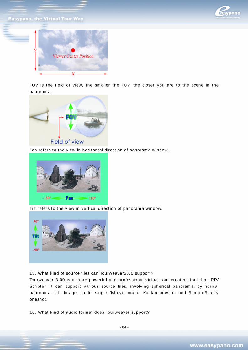
- 84 -
FOV is the field of view, the smaller the FOV, the closer you are to the scene in the
panorama.
Pan refers to the view in horizontal direction of panorama window.
Tilt refers to the view in vertical direction of panorama window.
15. What kind of source files can Tourweaver2.00 support?
Tourweaver 3.00 is a more powerful and professional virtual tour creating tool than PTV
Scripter. It can support various source files, involving spherical panorama, cylindrical
panorama, still image, cubic, single fisheye image, Kaidan oneshot and RemoteReality
oneshot.
16. What kind of audio format does Tourweaver support?
- 85 -
Tourweaver 3.00 can not only support the sound files in the format of .au, but also support
midi, wav and mp3.
Also the au file should meet the following settings:
1) Adjust Sample Rate as 8000
2) Click the Options button to choose "mu-Law 8-bit" when saving as au format
3) Choose moto as its channel
17. Can I copy the .jar file of Tourweaver 1.00 or 1.30 to the output folder of Tourweaver
3.00?
No. They apply different viewer and algorithm. Therefore, do not copy the .jar file generated
by the former versions to the output folder of Tourweaver 3.00 and vice versa.
18. Is it possible to put component on the viewer in Tourweaver 3.00?
In this new version, only button can be put on the scene viewer. You can set up them by the
layout toolbar.
19. I am using one shot solution, but neither Kaidan One Shot nor Remote Reality One Shot.
Tourweaver image type does not list it. Which image type should I choose when adding my
one shot panoramic image?
Please import your image as cylindrical panorama first. Tourweaver should display it
normally. In case there is any distortion, please try again to switch its image type to
spherical panorama and test the result. If you have any more problems, please contact
20. If I replace tour skin with a new one, can I save the content of the old Textarea and
Thumbnail and apply them to the new ones on new skin?
Yes, in Tourweaver 3.00, the content of Textarea, Thumbnail, Combobox and Listbox can all
be applied to the relative new ones on new skin. But if there is no corresponding component
on new skin, then after replacing the old one, the content of these components will be lost.
What's more, if there are several Textarea components on old skin, while only one Textarea
on new one, then it's random that which Textarea can be remained to new skin. The same
to Thumbnail, Combobox and Listbox.
Technical Support
Before you contact technical support, have you:
Read and followed the instructions provided in the users manual at
http://www.easypano.com/download/tw_manual.pdf
Visited the support column in http://www.easypano.com for updated
troubleshooting information You can get technical support by one of the following methods:
Email: [email protected]
- 86 -
Web: http://www.easypano.com