Embed Size (px)
Citation preview
Tkinter reference: A GUI forPython
Contents
Part I: The face of your application . . . . . . . . . . . . . . . . . . . . . . . . . 3
1. A minimal application . . . . . . . . . . . . . . . . . . . . . . . . . . . . . 32. Layout management . . . . . . . . . . . . . . . . . . . . . . . . . . . . . . 3
2.1 The .grid() method . . . . . . . . . . . . . . . . . . . . . . . . . . 42.2 Other grid management methods . . . . . . . . . . . . . . . . . . . . . 5
3. Standard attributes . . . . . . . . . . . . . . . . . . . . . . . . . . . . . . . 63.1 Dimensions . . . . . . . . . . . . . . . . . . . . . . . . . . . . . . 63.2 Coordinate system . . . . . . . . . . . . . . . . . . . . . . . . . . . 63.3 Colors . . . . . . . . . . . . . . . . . . . . . . . . . . . . . . . . . 73.4 Fonts . . . . . . . . . . . . . . . . . . . . . . . . . . . . . . . . . 73.5 Bitmaps . . . . . . . . . . . . . . . . . . . . . . . . . . . . . . . . 83.6 Cursors . . . . . . . . . . . . . . . . . . . . . . . . . . . . . . . . 93.7 Images . . . . . . . . . . . . . . . . . . . . . . . . . . . . . . . . . 9
4. The Button widget . . . . . . . . . . . . . . . . . . . . . . . . . . . . . . . 105. The Canvas widget . . . . . . . . . . . . . . . . . . . . . . . . . . . . . . . 11
5.1 The canvas arc object . . . . . . . . . . . . . . . . . . . . . . . . . . 175.2 The canvas bitmap object . . . . . . . . . . . . . . . . . . . . . . . . . 185.3 The canvas image object . . . . . . . . . . . . . . . . . . . . . . . . . 185.4 The canvas line object . . . . . . . . . . . . . . . . . . . . . . . . . . 195.5 The canvas oval object . . . . . . . . . . . . . . . . . . . . . . . . . . 195.6 The canvas polygon object . . . . . . . . . . . . . . . . . . . . . . . . 205.7 The canvas rectangle object . . . . . . . . . . . . . . . . . . . . . . . . 215.8 The canvas text object . . . . . . . . . . . . . . . . . . . . . . . . . . 225.9 The canvas window object . . . . . . . . . . . . . . . . . . . . . . . . 22
6. The Checkbutton widget . . . . . . . . . . . . . . . . . . . . . . . . . . . . 237. The Entry widget . . . . . . . . . . . . . . . . . . . . . . . . . . . . . . . 26
7.1 Scrolling an Entry widget . . . . . . . . . . . . . . . . . . . . . . . . 288. The Frame widget . . . . . . . . . . . . . . . . . . . . . . . . . . . . . . . 289. The Label widget . . . . . . . . . . . . . . . . . . . . . . . . . . . . . . . 2910. The Listbox widget . . . . . . . . . . . . . . . . . . . . . . . . . . . . . . 31
10.1 Scrolling a Listbox widget . . . . . . . . . . . . . . . . . . . . . . . 3411. The Menu widget . . . . . . . . . . . . . . . . . . . . . . . . . . . . . . . 3412. The Menubutton widget . . . . . . . . . . . . . . . . . . . . . . . . . . . . 3813. The Radiobutton widget . . . . . . . . . . . . . . . . . . . . . . . . . . . 4014. The Scale widget . . . . . . . . . . . . . . . . . . . . . . . . . . . . . . . 4315. The Scrollbar widget . . . . . . . . . . . . . . . . . . . . . . . . . . . . . 46
15.1 The scrollbar command callback . . . . . . . . . . . . . . . . . . . . . 4815.2 Connecting scrollbars to other widgets . . . . . . . . . . . . . . . . . . 49
16. The Text widget . . . . . . . . . . . . . . . . . . . . . . . . . . . . . . . 4916.1 Indices in text widgets . . . . . . . . . . . . . . . . . . . . . . . . . 50
New Mexico Tech Computer Center Tkinter reference: A GUI for Python Page 1

16.2 Marks in text widgets . . . . . . . . . . . . . . . . . . . . . . . . . . 5016.3 Images in text widgets . . . . . . . . . . . . . . . . . . . . . . . . . 5116.4 Windows in text widgets . . . . . . . . . . . . . . . . . . . . . . . . 5116.5 Tags in text widgets . . . . . . . . . . . . . . . . . . . . . . . . . . 5116.6 Methods on text widgets . . . . . . . . . . . . . . . . . . . . . . . . 52
17. Toplevel: Top-level window methods . . . . . . . . . . . . . . . . . . . . . . 6018. Universal widget methods . . . . . . . . . . . . . . . . . . . . . . . . . . . 6119. Standardizing appearance and the option database . . . . . . . . . . . . . . . . 69
19.1 How to name a widget class . . . . . . . . . . . . . . . . . . . . . . . 7019.2 How to name a widget instance . . . . . . . . . . . . . . . . . . . . . 7019.3 Resource specification lines . . . . . . . . . . . . . . . . . . . . . . . 7019.4 Rules for resource matching . . . . . . . . . . . . . . . . . . . . . . . 72
Part II: Connecting the interface to the rest of your program . . . . . . . . . . . . . . 73
20. Control variables: the values behind the widgets . . . . . . . . . . . . . . . . . 7321. Focus: routing keyboard input . . . . . . . . . . . . . . . . . . . . . . . . . 7522. Events: responding to stimuli . . . . . . . . . . . . . . . . . . . . . . . . . . 76
22.1 Levels of binding . . . . . . . . . . . . . . . . . . . . . . . . . . . . 7722.2 Event sequences . . . . . . . . . . . . . . . . . . . . . . . . . . . . 7822.3 Event types . . . . . . . . . . . . . . . . . . . . . . . . . . . . . . 7822.4 Event modifiers . . . . . . . . . . . . . . . . . . . . . . . . . . . . 7922.5 Key names . . . . . . . . . . . . . . . . . . . . . . . . . . . . . . 8022.6 Writing an event handler . . . . . . . . . . . . . . . . . . . . . . . . 8222.7 The extra arguments trick . . . . . . . . . . . . . . . . . . . . . . . . 8322.8 Virtual events . . . . . . . . . . . . . . . . . . . . . . . . . . . . . 84
Tkinter is a GUI widget set for Python. This document contains only the commonerfeatures. For complete documentation, see:
http://www.pythonware.com/library.htm
or the book Python and Tkinter Programming by John Grayson (Manning, 2000, ISBN1-884777-81-3).
This document applies to Python 1.5 and Tkinter 8.0.4 running in the X Window systemunder Linux. Your version may vary.
Refer to the author’s companion publication, Python language quick reference, or to Website http://www.python.org/, for general information about the Python language.
New Mexico Tech Computer Center Tkinter reference: A GUI for Python Page 2

Part I: The face of your application
We’ll start by looking at the visible part of Tkinter: creating the widgets and arrangingthem on the screen. In Part II, below, we will talk about how to connect the face—the“front panel”—of the application to the logic behind it.
1. A minimal application
Here is a trivial Tkinter program containing only a Quit button:
#!/usr/local/bin/pythonfrom Tkinter import * # Interface to Tk widgets
class Application(Frame):def __init__(self, master=None):
Frame.__init__(self, master)self.grid()self.createWidgets()
def createWidgets(self):self.quitButton = Button ( self, text="Quit",
command=self.quit )self.quitButton.grid()
app = Application() # Instantiate the application classapp.master.title("Sample application")app.mainloop() # Wait for events
2. Layout management
Later we will discuss the widgets, the building blocks of your GUI application. How dowidgets get arranged in a window?
Although there are three different “geometry managers” in Tkinter, the author stronglyprefers the Grid geometry manager for pretty much everything. This manager treatsevery window or frame as a table—a gridwork of rows and columns.
� A cell is the area at the intersection of one row and one column.
� The width of each column is the width of the widest cell in that column.
� The height of each row is the height of the largest cell in that row.
� For widgets that do not fill the entire cell, you can specify what happens to the extraspace. You can either leave the extra space outside the widget, or stretch the widgetto fit it, in either the horizontal or vertical dimension.
� You can combine multiple cells into one larger area, a process called spanning.
New Mexico Tech Computer Center Tkinter reference: Layout management Page 3
When you create a widget, it does not appear until you register it with a geometrymanager. Hence, construction and placing of a widget is a two-step process that goessomething like this:
thing = Constructor(master, ...)thing.grid(...)
where Constructor is one of the widget classes like Button, Frame, and so on. Allwidgets have a .grid() method that you can use to tell the geometry manager where toput it.
2.1 The .grid() method
w.grid ( *options )
This method registers a widget w with the Grid geometry manager—if you don’t do this,the widget will exist but it will not be visible on the screen.
Here are the options to the .grid() geometry management method:
column The column number where you want the widgetgridded, counting from zero. The default value iszero.
columnspan Normally a widget occupies only one cell in thegrid. However, you can grab multiple cells ofa row and merge them into one larger cell bysetting the columnspan option to the number ofcells. For example, w.grid(row=0, column=2,columnspan=3) would place widget w in a cellthat spans columns 2, 3, and 4 of row 0.
ipadx Internal x padding. This dimension is added insidethe widget inside its left and right sides.
ipady Internal y padding. This dimension is added insidethe widget inside its top and bottom borders.
padx External x padding. This dimension is added to theleft and right outside the widget.
pady External y padding. This dimension is added aboveand below the widget.
row The row number into which you want to insert thewidget, counting from 0. The default is the nexthigher-numbered unoccupied row.
rowspan Normally a widget occupies only one cell in thegrid. You can grab multiple adjacent cells of a col-umn, however, by setting the rowspan option to thenumber of cells to grab. This option can be used incombination with the columnspan option to graba block of cells. For example, w.grid(row=3,column=2, rowspan=4, columnspan=5) wouldplace widget w in an area formed by merging 20cells, with row numbers 3–6 and column numbers2–6.
sticky This option determines how to distribute any extraspace within the cell that is not taken up by the wid-get at its natural size. See below for a discussion.
New Mexico Tech Computer Center Tkinter reference: Layout management Page 4

� If you do not provide a sticky attribute, the default behavior is to center the widgetin the cell.
� You can position the widget in a corner of the cell by setting sticky to NE (top right),SE (bottom right), SW (bottom left), or NW (top left).
� You can position the widget against one side of the cell by setting sticky to N (topcenter), E (right center), S (bottom center), or W (left center).
� Set sticky to N+S to stretch the widget vertically but leave it centered horizontally.
� Set sticky to E+W to stretch it horizontally but leave it centered vertically.
� Set sticky=N+E+S+W to stretch the widget both horizontally and vertically to fillthe cell.
2.2 Other grid management methods
w.grid_forget()
This method makes widget w disappear from the screen. It still exists, it just isn’t visible.You can .grid() it to make it appear again, but it won’t remember its grid options.
w.grid_propagate()
Normally, all widgets “propagate” their dimensions, meaning that they adjust to fit thecontents. However, sometimes you want to force a widget to be a certain size, regardlessof the size of its contents. To do this, call w.grid_propagate(0) where w is the widgetwhose size you want to force.
w.grid_remove()
This method is like .grid_forget(), but its grid options are remembered, so if you.grid() it again, it will use the same grid configuration options.
New Mexico Tech Computer Center Tkinter reference: Layout management Page 5

3. Standard attributes
Before we look at the widgets, let’s take a look at how some of their common attributes—such as sizes, colors and fonts—are specified.
� Each widget has a set of options that affect its appearance and behavior—attributessuch as fonts, colors, sizes, text labels, and such.
� You can specify options when calling the widget’s constructor using keyword argu-ments such as “text="PANIC!"” or “height=20”.
� After you have created a widget, you can later change any option by using thewidget’s .config()method, and retrieve the current setting of any option by usingthe widget’s .cget() method. See Universal widget methods, below, for more onthese methods.
3.1 Dimensions
Various lengths, widths, and other dimensions of widgets can be described in variousunits.
� If you set a dimension to an integer, it is assumed to be in pixels.
� You can specify units by setting a dimension to a string containing a number followedby:
c centimetersi inchesm millimetersp printer’s points ( 1
72.27
′′)
3.2 Coordinate system
As in most contemporary display systems, the origin of each coordinate system is at itsupper left corner, with the x coordinate increasing toward the right, and the y coordinateincreasing toward the bottom:
The base unit is the pixel, with the top left pixel having coordinates (0; 0). Coordinatesthat you specify as integers are always expressed in pixels, but any coordinate may bespecified as a dimensioned quantity; see Dimensions, above.
New Mexico Tech Computer Center Tkinter reference: Standard attributes Page 6

3.3 Colors
There are two general ways to specify colors in Tkinter.
� You can use a string specifying the proportion of red, green, and blue in hexadecimaldigits:
#rgb Four bits per color#rrggbb Eight bits per color#rrrgggbbb Twelve bits per color#rrrrggggbbbb Sixteen bits per color
For example, "#fff" is white, "#000000" is black, "#000fff000" is pure green,and "#00ffff" is pure cyan (green plus blue).
� You can also use any locally defined standard color name. The strings "white","black", "red", "green", "blue", "cyan", "yellow", and "magenta" will alsobe available. Others depending on your local installation.
3.4 Fonts
Depending on your platform, there may be up to three ways to specify type style.
� As a tuple whose first element is the font family, followed by a size in points,optionally followed by a string containing one or more of the style modifiers bold,italic, underline, and overstrike.
Examples:
("Helvetica", "16") 16-point Helvetica regular("Times", "24", "bold italic") 24-pt Times bold italic
� You can create a “font object” by importing the tkFont module and using its Fontclass constructor:import tkFont
font = tkFont.Font ( *options )
where the options include:
family The font family as a string.size The font height as an integer in points. To get a font n
pixels high, use -n.weight "bold" for boldface, "normal" for regular weight.slant "italic" for italic, "roman" for unslanted.underline 1 for underlined text, 0 for normal.overstrike 1 for overstruck text, 0 for normal.
For example, to get a 36-point bold Helvetica italic face:
helv36 = tkFont.Font ( family="Helvetica", size=36,weight="bold" )
� If you are running under the X Window System, you can use any of the X fontnames. For example, this font
"-*-lucidatypewriter-medium-r-*-*-*-140-*-*-*-*-*-*"
New Mexico Tech Computer Center Tkinter reference: Standard attributes Page 7

is the author’s favorite fixed-width font for use in X windows. Use the xfontselprogram to help you select pleasing fonts.
To get a list of all the families of fonts available on your platform, call this function:
tkFont.families()
The return value is a list of strings. Note: You must create your root window beforecalling this function.
These methods are defined on font objects:
.actual ( option=None )
If you pass no arguments, you get back a dictionary of the font’s actual attributes, whichmay differ from the ones you requested. To get back the value of an attribute, pass itsname as an argument.
.cget ( option )
Returns the value of the given option.
.configure ( **options )
Use this method to change one or more options on a font. For example, if you have aFont object called titleFont, if can call titleFont.configure ( family="times",size=18 ), that font will change to 18pt Times and any widgets that use that font willchange too.
.copy()
Returns a copy of a Font object.
.measure ( text )
Pass this method a string, and it will return the number of pixels of width that string willtake in the font. Warning: some slanted characters may extend outside this area.
.metrics ( *options )
If you call this method with no arguments, it returns a dictionary of all the font metrics.You can retrieve the value of just one metric by passing its name as an argument. Metricsinclude:
ascent Number of pixels of height between the baselineand the top of the highest ascender.
descent Number of pixels of height between the baselineand the bottom of the lowest ascender.
fixed This value is 0 for a variable-width font and 1 for amonospaced font.
linespace Number of pixels of height total. This is the leadingof type set solid in the given font.
3.5 BitmapsFor bitmap options in widgets, these bitmaps are guaranteed to be available:
The graphic above shows Button widgets with the standard bitmaps. From left to right,they are "error", "gray75", "gray50", "gray25", "gray12", "hourglass", "info","questhead", "question", and "warning".
New Mexico Tech Computer Center Tkinter reference: Standard attributes Page 8

3.6 Cursors
There are quite a number of different mouse cursors available. These are their names:
X_cursor gobbler sb_h_double_arrowarrow gumby sb_left_arrowbased_arrow_down hand1 sb_right_arrowbased_arrow_up hand2 sb_up_arrowboat heart sb_v_double_arrowbogosity icon shuttlebottom_left_corner iron_cross sizingbottom_right_corner left_ptr spiderbottom_side left_side spraycanbottom_tee left_tee starbox_spiral leftbutton targetcenter_ptr ll_angle tcrosscircle lr_angle top_left_arrowclock man top_left_cornercoffee_mug middlebutton top_right_cornercross mouse top_sidecross_reverse pencil top_teecrosshair pirate trekdiamond_cross plus ul_angledot question_arrow umbrelladotbox right_ptr ur_angledouble_arrow right_side watchdraft_large right_tee xtermdraft_small rightbuttondraped_box rtl_logoexchange sailboatfleur sb_down_arrow
3.7 Images
To use graphic images in a Tkinter application, Tkinter must be configured to include thePython Imaging Library (PIL).
Refer to the author’s companion document, Python Imaging Library (PIL) quick reference,for PIL documentation. Objects of the ImageTk class can be used in Tkinter applications.
New Mexico Tech Computer Center Tkinter reference: Standard attributes Page 9

4. The Button widget
To create a pushbutton in a top-level window or frame named master:
w = Button ( master, option=value, ... )
The constructor returns the new button object. Its options include:
activebackground Background color when the button is under thecursor.
activeforeground Background color when the button is under thecursor.
anchor Where the text is positioned on the button: oneof CENTER (the default), N (centered along the topedge), NE (top right corner), E, SE, S, SW, W, or NW.
bd Border width in pixels. Also borderwidth.bg Normal background color. Also background.bitmap Name of one of the standard bitmaps to display on
the button (instead of text).command Function or method called when the button is
clicked.cursor Cursor used over the button.default NORMAL is the default; use DISABLED if the button
is to be initially disabled.disabledforeground Foreground color used when the button is disabled.fg Normal foreground (text) color. Also foreground.font Text font.height Height of the button in text lines (for textual but-
tons) or pixels (for images).highlightbackground Color of the focus highlight when the widget does
not have focus.highlightcolor Color shown in the focus highlight.highlightthickness Thickness of the focus highlight.image Image to be displayed on the button (instead of
text).justify How to show multiple text lines: LEFT, CENTER (the
default), or RIGHT.padx Additional padding left and right of the text.pady Additional padding above and below the text.relief Default is RAISED, changing to SUNKEN when
pressed. May also be GROOVE, RIDGE, or FLAT.state Default is NORMAL. Set to DISABLED to gray out the
button and make it unresponsive. Has the valueACTIVE when the mouse is over it.
takefocus Normally, keyboard focus does visit buttons (seethe section on Focus, below, for an overview of key-board focus), and a SPACE character acts as the sameas a mouse click, “pushing” the button. You can setthe takefocus option to zero to disable focus fromvisiting the button.
text Text displayed on the button. Use internal newlinesto display multiple text lines.
New Mexico Tech Computer Center Tkinter reference: The Button widget Page 10

textvariable An instance of StringVar() that is associated withthe text on this button. If the variable is changed,the new value will be displayed on the button.
underline Default is -1, meaning that no character of the textis underlined. If nonnegative, the correspondingtext character will be underlined.
width Width of the button in letters (if displaying text) orpixels (if displaying an image).
wraplength If this value is set to a positive number, the text lineswill be wrapped to fit within this length.
Methods on Button objects:
.flash()
Causes the button to flash several times between active and normal colors. Leaves thebutton in the state it was in originally. Ignored if the button is disabled.
.invoke()
Calls the button’s callback, and returns what that function returns. Has no effect if thebutton is disabled or there is not callback.
5. The Canvas widget
Creates a canvas in the given master window. See the following sections for the objectsthat can be created on canvases:
.create_arc() A slice out of an ellipse.
.create_bitmap() An image as a bitmap.
.create_image() A general image.
.create_line() A line.
.create_oval() An ellipse.
.create_polygon() A polygon.
.create_rectangle() A rectangle.
.create_text() Text annotation.
.create_window() A rectangular window.
Because the canvas may be larger than the window, and equipped with scrollbars tomove the overall canvas around in the window, there are two coordinate systems foreach canvas. The “window coordinates” of a point are relative to the top left corner ofthe area on the display where the canvas appears. The “canvas coordinates” of a pointare relative to the top left corner of the total canvas.
w = Canvas ( master, option=value, ... )
The constructor returns the new canvas widget. Supported options:
bd Border width in pixels. Also borderwidth.bg Background color of the canvas. Also background.closeenough A float that specifies how close the mouse must be
to an item to be considered inside it. Default is 1.0.confine If true (the default), the canvas cannot be scrolled
outside of the scrollregion.
New Mexico Tech Computer Center Tkinter reference: The Canvas widget Page 11

cursor Cursor used in the canvas.height Size of the canvas in the Y dimension.highlightbackground Color of the focus highlight when the widget does
not have focus.highlightcolor Color shown in the focus highlight.highlightthickness Thickness of the focus highlight.relief Default is RAISED, changing to SUNKEN when
pressed. May also be GROOVE, RIDGE, or FLAT.scrollregion A tuple (w, n, e, s) that defines over how large an
area the canvas can be scrolled, where w is the leftside, n the top, e the right side, and s the bottom.
selectbackground The background color to use displaying selecteditems.
selectborderwidth The width of the border to use around selecteditems.
selectforeground The foreground color to use displaying selecteditems.
takefocus Normally, focus will cycle through this widget withthe tab key only if there are keyboard bindings setfor it (see Events, below, for an overview of key-board bindings). If you set this option to 1, focuswill always visit this widget. Set it to "" to get thedefault behavior.
width Size of the canvas in the X dimension.xscrollincrement Normally, canvases can be scrolled horizontally to
any position. You can get this behavior by settingxscrollincrement to zero. If you set it some dis-tance, the canvas can be positioned only on multi-ples of that distance, and the value will be used forscrolling by “units,” such as when the user clickson the arrows at the ends of a scrollbar.
xscrollcommand If the canvas is scrollable, this attribute should bethe .set method of the horizontal scrollbar.
yscrollincrement Works like xscrollincrement, but governs verti-cal movement.
yscrollcommand If the canvas is scrollable, this attribute should bethe .set method of the vertical scrollbar.
Before we discuss the methods, some definitions:
� The display list is an ordering of the objects on the canvas from back (background)to front (foreground). If two objects overlap, the one above the other in the displaylist means the one closer to the foreground, which will appear in the area of overlapand obscure the one below. By default, new objects are always created at the topof the display list (and hence in front of all other objects), but you can re-order thedisplay list.
� The object ID of an object on the canvas is the value returned by the constructor forthat object.
� A tag is a string that you can associate with any object or any number of objects onthe canvas.
New Mexico Tech Computer Center Tkinter reference: The Canvas widget Page 12

� A tagOrId argument specifies one or more objects on the canvas. If a tag (string),it specifies all the objects with that tag. If an Id (integer), it specifies the object thathas that ID number.
Methods on Canvas objects:
.addtag_above ( newTag, tagOrId )
Attaches a new tag to the object just above the one specified by tagOrId in the displaylist. The newTag argument is a tag string.
.addtag_all ( newTag )
Attaches the given tag newTag to all the objects on the canvas.
.addtag_below ( newTag, tagOrID )
Attaches a new tag to the object just below the one specified by tagOrId in the displaylist. The newTag argument is a tag string.
.addtag_closest ( newTag, x, y, halo=None, start=None )
Adds a tag to the object closest to screen coordinate (x; y). If there are two or more objectsat the same distance, the one higher in the display list is selected.
Use the halo argument to increase the effective size of the point. For example, a value of5 would treat any object within 5 pixels of (x; y) as overlapping.
If an object ID is passed in the start argument, this method tags the highest qualifyingobject that is below start in the display list.
.addtag_enclosed ( newTag, x1, y1, x2, y2)
Tag all objects that occur completely within the rectangle whose top left corner is (x1; y1)and bottom right corner is (x2; y2).
.addtag_overlapping(newTag, x1, y1, x2, y2)
Like the previous method, but affects all objects that share at least one point with thegiven rectangle.
.addtag_withtag ( newTag, tagOrId )
Adds tag newTag to the object or objects specified by tagOrId.
.bbox ( tagOrId=None )
Returns a tuple (x1; y1; x2; y2) describing a rectangle that encloses all the objects specifiedby tagOrId. If the argument is omitted, returns a rectangle enclosing all objects on thecanvas. The top left corner of the rectangle is (x1; y1) and the bottom right corner is(x2; y2).
.canvasx ( screenx, gridspacing=None )
Translates a window x coordinate screenx to a canvas coordinate. If gridspacing issupplied, the canvas coordinate is rounded to the nearest multiple of that value.
.canvasy ( screenx, gridspacing=None )
Translates a window y coordinate screeny to a canvas coordinate. If gridspacing issupplied, the canvas coordinate is rounded to the nearest multiple of that value.
New Mexico Tech Computer Center Tkinter reference: The Canvas widget Page 13
.coords ( tagOrId, x0, y0, x1, y1, ..., xn, yn )
If you pass only the tagOrId argument, returns a tuple of the coordinates of the lowestor only object specified by that argument. The number of coordinates depends on thetype of object. In most cases it will be a 4-tuple (x1; y1; x2; y2) describing the boundingbox of the object.
You can move an object by passing in new coordinates.
.dchars ( tagOrId, first=0, last=first )
Deletes characters from a text item or items. Characters between first and last aredeleted, where those values can be integer indices or the string "end" to mean the endof the text.
.delete ( tagOrId )
Deletes the specified object or objects.
.dtag ( tagOrId, tagToDelete )
Removes the tag specified by tagToDelete from the object or objects specified bytagOrId.
.find_above ( tagOrId )
Returns the ID number of the object just above the specified object. If multiple objectsmatch tagOrId, uses the highest one.
.find_all()
Returns a list of the ID numbers for all objects on the canvas, from lowest to highest.
.find_below ( tagOrId )
Returns the ID number of the object just below the specified object. If multiple objectsmatch tagOrId, uses the lowest one.
.find_closest ( x, y, halo=None, start=None )
Returns the ID number of the object closest to point (x; y).
Use the halo argument to increase the effective size of the point. For example, a value of5 would treat any object within 5 pixels of (x; y) as overlapping.
If an object ID is passed in thestart argument, this method returns the highest qualifyingobject that is below start in the display list.
.find_enclosed ( x1, y1, x2, y2 )
Returns a list of the ID numbers of all objects that occur completely within the rectanglewhose top left corner is (x1; y1) and bottom right corner is (x2; y2).
.find_overlapping ( x1, y1, x2, y2 )
Like the previous method, but returns a list of the ID numbers of all objects that share atleast one point with the given rectangle.
.find_withtag ( tagOrId )
Returns a list of the ID numbers of the object or objects specified by tagOrId.
New Mexico Tech Computer Center Tkinter reference: The Canvas widget Page 14

.focus ( tagOrId=None )
Moves the focus to the object specified by tagOrId. If there are multiple such objects,moves the focus to the first one in the display list that allows an insertion cursor. If thereare no qualifying items, or the canvas does not have focus, focus does not move.
If the argument is omitted, returns the ID of the object that has focus, or "" if none ofthem do.
.gettags ( tagOrId )
If tagOrId is an object ID, returns a list of all the tags associated with that object. If theargument is a tag, returns all the tags for the lowest object that has that tag.
.icursor ( tagOrId, index )
Assuming that the selected item allows text insertion and has the focus, sets the insertioncursor to index, which may be either an integer index or the string "end". Has no effectotherwise.
.index ( tagOrId, index )
Returns the integer index of the given index in the object specified by tagOrId (thelowest one that allows text insertion, if tagOrId specifies multiple objects). The indexargument is an integer or the string "end".
.insert ( tagOrId, beforeThis, string )
Inserts the given string in the object or objects specified by tagOrId, before indexbeforethis (which can be an integer or the string "end").
.itemcget ( tagOrId, option )
Returns the value of the given configuration option in the selected object (or the lowestobject if tagOrId specifies more than one). This is similar to the .cget() method forTkinter objects.
.itemconfigure ( tagOrId, options=None )
If the options argument is omitted, returns a dictionary whose keys are the options ofthe object specified by tagOrId (the lowest one, if tagOrId specifies multiple objects).
To change the configuration option of the specified item, supply one or more keywordarguments of the form option=value.
.move ( tagOrId, xAmount, yAmount )
Moves the items specified by tagOrId by adding xAmount to their x coordinates andyAmount to their y coordinates.
.postscript ( options )
Generates an Encapsulated PostScript representation of the canvas’s current contents.The options include:
colormode Use "color" for color output, "gray" forgrayscale, or "mono" for black and white.
file If supplied, names a file where the PostScript willbe written. If this option is not given, the PostScriptis returned as a string.
height How much of the Y size of the canvas to print.Default is all.
New Mexico Tech Computer Center Tkinter reference: The Canvas widget Page 15

rotate If false, the page will be rendered in portrait orien-tation; if true, in landscape.
x Leftmost canvas coordinate of the area to print.y Topmost canvas coordinate of the area to print.width How much of the X size of the canvas to print.
Default is all.
.scale ( tagOrId, xOrigin, yOrigin, xScale, yScale )
Scale all objects according to their distance from a point P = (xOrigin; yOrigin). Thescale factors xScale and yScale are based on a value of 1.0 meaning no scaling. Everypoint in the objects selected by tagOrId is moved so that its x distance from P ismultiplied by xScale and its y distance is multiplied by yScale.
.tag_bind ( tagOrId, sequence=None, function=None, add=None )
Binds events to objects on the canvas. For the object or objects selected by tagOrId,associates the handler function with the event sequence. If the add argument is astring starting with "+", the new binding is added to existing bindings for the givensequence, otherwise the new binding replaces that for the given sequence.
.tag_lower ( tagOrId, belowThis )
Moves the object or objects selected by tagOrId within the display list to a position justbelow the first or only object specied by the tag or ID belowThis.
.tag_raise ( tagOrId, aboveThis )
Moves the object or objects selected by tagOrId within the display list to a position justabove the last or only object specied by the tag or ID aboveThis.
.tag_unbind ( tagOrId, sequence, funcId=None )
Removes bindings for handler funcId and event sequence from the canvas object orobjects specified by tagOrId.
.type ( tagOrId )
Returns the type of the first or only object specified by tagOrId. The return valuewill be one of the strings "arc", "bitmap", "image", "line", "oval", "polygon","rectangle", "text", or "window".
.xview ( MOVETO, fraction )
.xview ( SCROLL, n, what )
This method scrolls the canvas relative to its image, and is intended for binding to thecommand option of a related scrollbar.
This method can be called in two different ways. The first call positions the canvas x-coordinate at a value given by offset, where 0.0 moves the canvas to its leftmost positionand 1.0 to its rightmost position. The second call moves the canvas left or right: the whatargument specifies how much to move and can be either UNITS or PAGES, and n tellshow many units to move the canvas to the right relative to its image (or left, if negative).The size of the move for UNITS is given by the value of the canvas’s xscrollincrementoption (q.v.). Moves by page units use nine-tenths of the width of the canvas.
.xview_moveto ( fraction )
This method scrolls the canvas in the same way as .xview(MOVETO, fraction).
New Mexico Tech Computer Center Tkinter reference: The Canvas widget Page 16

.xview_scroll ( n, what )
Same as .xview(SCROLL, n, what).
.yview ( MOVETO, fraction )
.yview ( SCROLL, n, what )
.yview_moveto ( fraction )
.yview_scroll ( n, what )
These are the same as the .xview() and related methods, only for vertical scrolling.
5.1 The canvas arc object
An “arc object” on a canvas, in its most general form, is a wedge-shaped slice taken outof an ellipse. This includes whole ellipses and circles as special cases. See The canvas ovalobject, below, for more on the geometry of the ellipse drawn.
To create an arc object on a canvas C, use:
id = C.create_arc ( x0, y0, x1, y1, *options )
The constructor returns the integer ID number of the new arc object on canvas C.
Point (x0; y0) is the top left corner and (x1; y1) the lower right corner of a rectangle intowhich the ellipse is fit. If this rectangle is square, you get a circle.
The options include:
extent Width of the slice in degrees. The slice starts atthe angle given by the start option and extendscounterclockwise for extent degrees.
fill The default appearance of an arc is that the interioris transparent, and a value of "" will select thisbehavior. You can also set this option to any colorand the interior of the arc will be filled with thatcolor.
outline The color of the border around the outside of theslice. Default is black.
outlinestipple If the outline option is used, this option specifies abitmap used to stipple the border. Default is black,and that default can be specified by setting thisoption to "".
start Starting angle for the slice, in degrees, measuredfrom the +x direction. If omitted, you get the entireellipse (or circle).
stipple A bitmap indicating how the interior fill of the arcwill be stippled. Default is"" (solid). Typical value:"gray25". Has no effect unless fill has been setto some color.
style The default is to draw the whole arc; use valuePIESLICE for this style. Set it to ARC to draw onlythe circular arc at the edge of the slice. Set it toCHORD to draw the circular arc and the chord (astraight line connecting the endpoints of the arc).
New Mexico Tech Computer Center Tkinter reference: The Canvas widget Page 17

width Width of the border around the outside of the arc.Default is 1 pixel.
5.2 The canvas bitmap objectA bitmap object on a canvas is shown as two colors, the background color (wherever datavalues are 0) and the foreground color (1).
The bitmap is positioned relative to point (x; y). See the anchor option, below, forpositioning options.
To create a bitmap object on a canvas C, use:
id = C.create_bitmap ( x, y, *options )
which returns the integer ID number of the image object for that canvas.
Options include:
anchor The default is CENTER, meaning that the bitmap iscentered on the (x; y) position. Other possible val-ues are N, NE, E, SE, S, SW, W, and NW. For example,if you specify anchor=NE, the bitmap will be posi-tioned so that point (x; y) is located at the northeast(top right) corner of the bitmap.
background The color that will appear where there are 0 val-ues in the bitmap. The default is "", meaningtransparent.
bitmap The bitmap to be displayed.foreground The color that will appear where there are 1 values
in the bitmap. The default is "black".tags The tags to be associated with the object, as a se-
quence of strings.
5.3 The canvas image objectTo display a graphics image on a canvas C, use:
id = C.create_image ( x, y, *options )
This constructor returns the integer ID number of the image object for that canvas.
The image is positioned relative to point (x; y). See the anchor option, below, forpositioning options. Options include:
anchor The default is CENTER, meaning that the image iscentered on the (x; y) position. Other possible val-ues are N, NE, E, SE, S, SW, W, and NW. For example,if you specify anchor=NE, the image will be posi-tioned so that point (x; y) is located at the northeast(top right) corner of the bitmap.
image The image to be displayed. See Images, above, forinformation about how to create images that can beloaded onto canvases.
tags The tags to be associated with the object, as a se-quence of strings.
New Mexico Tech Computer Center Tkinter reference: The Canvas widget Page 18
5.4 The canvas line object
In general, a line can consist of any number of segments connected end to end, and eachsegment can be straight or curved. To create a canvas line object on a canvas C, use:
C.create_line ( x0, y0, x1, y1, ..., xn, yn, *options )
The line goes through the series of points (x0; y0); (x1; y1); : : : ; (xn; yn). Options include:
arrow The default is for the line to have no arrowheads.Set this option to FIRST to get an arrowhead atthe (x0; y0) end of the line; set it to "last" to getan arrowhead at the far end; set it to "both" forarrowheads at both ends.
arrowshape A tuple (d1, d2, d3) that describes the shape ofthe arrowheads added by the arrow option. De-fault is (8,10,3).
fill The color to use in drawing the line. Default is"black".
smooth If true, the line is drawn as a series of parabolicsplines fitting the point set. Default is false, whichrenders the line as a set of straight segments.
splinesteps If the smooth option is true, each spline is ren-dered as a number of straight line segments. Thesplinesteps option specifies the number of seg-ments used to approximate each section of the line;the default is 12.
stipple To draw a stippled line, set this option to abitmap that specifies the stippling pattern, such as"gray25".
tags The tags to be associated with the object, as a se-quence of strings.
width The line’s width. Default is 1 pixel.
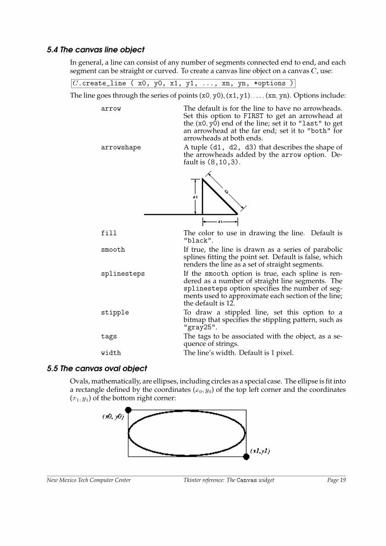
5.5 The canvas oval object
Ovals, mathematically, are ellipses, including circles as a special case. The ellipse is fit intoa rectangle defined by the coordinates (x0; y0) of the top left corner and the coordinates(x1; y1) of the bottom right corner:
New Mexico Tech Computer Center Tkinter reference: The Canvas widget Page 19

The oval will coincide with the top and left-hand lines of this box, but will fit just insidethe bottom and right-hand sides.
To create an ellipse on a canvas C, use:
id = C.create_oval ( x0, y0, x1, y1, *options )
which returns the integer ID number of the new oval object on canvas C.
The options for ovals:
fill The default appearance of ellipse is transparent,and a value of "" will select this behavior. You canalso set this option to any color and the interior ofthe ellipse will be filled with that color.
outline The color of the border around the outside of theellipse. Default is black.
stipple A bitmap indicating how the interior of the ellipsewill be stippled. Default is"" (solid). Typical value:"gray25". Has no effect unless fill has been setto some color.
tags The tags to be associated with the object, as a se-quence of strings.
width Width of the border around the outside of the el-lipse. Default is 1 pixel. If you set this to zero,the border will not appear. If you set this to zeroand the fill transparent, you can make it disappearaltogether.
5.6 The canvas polygon object
As displayed, a polygon has two parts: its outline and its interior. Its geometry is specifiedas a series of vertices [(x0; y0); (x1; y1); : : : ; (xn; yn)], but the actual perimeter includes onemore segment from (xn; yn) back to (x0; y0). In this example, there are five vertices:
To create a new polygon object on a canvas C:
id = C.create_polygon ( x0, y0, x1, y1, ..., *options )
which returns an integer ID number for that object on canvas C. Options:
fill You can color the interior by setting this option toa color. The default appearance for the interior ofa polygon is transparent, and you can set the filloption to "" to get this behavior.
outline Color of the outline; defaults to "black". Settingthis option to "" makes the outline transparent.
New Mexico Tech Computer Center Tkinter reference: The Canvas widget Page 20

smooth The default outline uses straight lines to connectthe vertices, and you can set this option to 0 to getthat behavior. If you set it to 1, you get a continuousspline curve. Moreover, if you set smooth to 1, youcan make any segment straight by duplicating thecoordinates at each end of that segment.
splinesteps If the smooth option is true, each spline is ren-dered as a number of straight line segments. Thesplinesteps option specifies the number of seg-ments used to approximate each section of the line;the default is 12.
stipple To render the fill color as a stippled pattern, setthis option to a bitmap that specifies the stipplingpattern, such as "gray25".
tags The tags to be associated with the object, as a se-quence of strings.
width Width of the outline; defaults to 1.
5.7 The canvas rectangle object
Each rectangle is specified as two points: (x0; y0) is the top left corner, and (x1; y1) is thebottom right corner.
Rectangles are drawn in two parts:
� The outline lies outside the canvas on its top and left sides, but inside the canvas onits bottom and right side. The default appearance is a 1-pixel-wide black outline.
� The fill is the area inside the outline. Its default appearance is transparent.
To create a rectangle object on canvas C:
id = C.create_rectangle ( x0, y0, x1, y1, *options )
This constructor returns the integer ID number of the rectangle on that canvas. Optionsinclude:
fill By default, the interior of a rectangle is empty, andyou can get this behavior by setting fill to "". Youcan also set the option to a color.
outline The color of the border. Default is black.stipple If fill is set to a color, the default pattern is solid.
Set stipple to a bitmap (such as "gray20") to geta stippled pattern.
tags The tags to be associated with the object, as a se-quence of strings.
width Width of the border. Default is 1 pixel.
New Mexico Tech Computer Center Tkinter reference: The Canvas widget Page 21
5.8 The canvas text object
You can display one or more lines of text on a canvas C by creating a text object:
id = C.create_text ( x, y, *options )
This returns the unique integer ID of the text object on canvas C. Options include:
anchor The default is CENTER, meaning that the text is cen-tered on the (x; y) position. Other possible valuesare N, NE, E, SE, S, SW, W, and NW. For example, ifyou specify anchor=W, the text will be positionedso that point (x; y) is located at the center of the leftedge of the rectangle containing the text.
fill The default text color is black, but you can render itin any color by setting the fill option to that color.
font If you don’t like the default font, set this option toany font value. See the section on Fonts above.
justify For multi-line textual displays, this option controlshow the lines are justified: LEFT (the default), CEN-TER, or RIGHT.
stipple If fill is set to a color, the default pattern is solid.Set stipple to a bitmap (such as "gray20") to geta stippled text pattern.
tags The tags to be associated with the object, as a se-quence of strings.
text The text to be displayed in the object, as a string.Use newline characters ("\n") to force line breaks.
width If you don’t specify a width option, the text willbe set inside a rectangle as long as the longest line.However, you can also set the width option to adimension, and each line of the text will be bro-ken into shorter lines, if necessary, or even brokenwithin words, to fit within the specified width.
5.9 The canvas window object
You can place any Tkinter widget onto a canvas by using a “canvas window” object. Awindow is a rectangular area that can hold one Tkinter widget. The widget must be thechild of the same top-level window as the canvas, or the child of some widget located inthe same top-level window.
To create a new canvas window object on a canvas C:
id = C.create_window ( x, y, *options )
This returns the unique integer ID for the window object. Options include:
anchor The default is CENTER, meaning that the window iscentered on the (x; y) position. Other possible val-ues are N, NE, E, SE, S, SW, W, and NW. For example,if you specify anchor=S, the window will be posi-tioned so that point (x; y) is located at the center ofthe bottom edge of the window.
height The height of the area reserved for the window. Ifomitted, the window will be sized to fit the heightof the contained widget.
New Mexico Tech Computer Center Tkinter reference: The Canvas widget Page 22

tags The tags to be associated with the object, as a se-quence of strings.
width The width of the area reserved for the window. Ifomitted, the window will be sized to fit the widthof the contained widget.
window Use window=w where w is the widget you want toplace onto the canvas. If this is omitted initially, youcan later call C.itemconfigure(id, window=w)to place the widget w onto the canvas.
6. The Checkbutton widget
The purpose of a checkbutton widget is to allow the user to read and set a two-waychoice. The graphic above shows how checkbuttons look in the off (0) and on (1) state inone implementation: this is a screen shot of two checkbuttons using 24-point Times font.
The indicator is the part of the checkbutton that shows its state, and the label is the textthat appears beside it.
� You will need to create a control variable, an instance of thee IntVar class, so yourprogram can query and set the state of the checkbutton; see Control variables, below.
� You can also use event bindings to react to user actions on the checkbutton; seeEvents, below.
� You can disable a checkbutton. This changes its appearance to “grayed out” andmakes it unresponsive to the mouse.
� You can get rid of the checkbutton indicator and make the whole widget a “push-push” button that looks recessed when it is set and raised when it is cleared.
To create a checkbutton in an existing parent window or frame master:
w = Checkbutton ( master, *options )
The constructor returns a new Checkbutton object. Options include:
activebackground Background color when the checkbutton is underthe cursor.
activeforeground Foreground color when the checkbutton is underthe cursor.
anchor If the widget inhabits a space larger than it needs,this option specifies where the checkbutton will sitin that space. The default is CENTER, but you canspecify any of N, NE, E, SE, S, SW, W, or NW.
background The normal background color. May be abbreviatedbg.
bitmap To display a monochrome image on a button, setthis option to a bitmap; see Bitmaps, above.
borderwidth The size of the border around the indicator. Defaultis 2 pixels.
New Mexico Tech Computer Center Tkinter reference: The Checkbutton widget Page 23

command A procedure to be called every time the userchanges the state of this checkbutton.
cursor If you set this option to a cursor name (see Cursors,above), the mouse cursor will change to that patternwhen it is over the checkbutton.
disabledforeground The foreground color used to render the text of adisabled checkbutton. The default is a stippled ver-sion of the default foreground color.
font The font used for the text.foreground The color used to render the text. Can be abbrevi-
ated fg.height The number of lines of text on the checkbutton.
Default is 1.highlightbackground The color of the focus highlight when the checkbut-
ton does not have focus. See Focus, below.highlightcolor The color of the focus highlight when the checkbut-
ton has the focus. See Focus, below.highlightthickness The thickness of the focus highlight. Default is 1.
Set to 0 to suppress display of the focus highlight.See Focus, below.
image To display a graphic image on the button, set thisoption to an image object. See Images, above.
indicatoron Normally a checkbutton displays an “indicator”—a box that shows whether the checkbutton is set ornot. You can get this behavior by setting indica-toron to 1. However, if you set it to zero, the in-dicator disappears, and the entire widget becomesa “push-push” button that looks raised when it iscleared and sunken when it is set. You may want toincrease the borderwidth value to make it easierto see the state of such a control.
justify If the text contains multiple lines, this option con-trols how the text is justified: CENTER, LEFT, orRIGHT.
offvalue Normally, a checkbutton’s associated control vari-able will be set to 0 when it is cleared (off). You cansupply an alternate value for the off state by settingoffvalue to that value.
onvalue Normally, a checkbutton’s associated control vari-able will be set to 1 when it is set (on). You cansupply an alternate value for the on state by settingonvalue to that value.
padx How much space to leave to the left and right of thecheckbutton and text. Default is 1.
pady How much space to leave above and below thecheckbutton and text. Default is 1.
relief With the default relief, FLAT, the checkbutton doesnot stand out from its background. You may setthis option to RAISED, SUNKEN, RIDGE, GROOVE, orSOLID (which gives you a solid black frame aroundit).
selectcolor The color of the checkbutton when it is set. Defaultis red.
New Mexico Tech Computer Center Tkinter reference: The Checkbutton widget Page 24

selectimage If you set this option to an image (see Images, above)that image will appear in the checkbutton when itis set.
state The default is NORMAL, but you can set it to DIS-ABLED to gray out the control and make it unrespon-sive. If the cursor is currently over the checkbutton,the state is ACTIVE.
takefocus The default is that the input focus (see Focus, below)will pass through a checkbutton. If you set thisoption to 0, focus will not pass through.
text The label displayed next to the checkbutton. Usenewlines ("\n") to display multiple lines of text.
textvariable If you need to change the label on a checkbuttonduring execution, create a StringVar (see Controlvariables, below) to manage the current value, andset this option to that control variable. Wheneverthe control variable’s value changes, the checkbut-ton’s annotation will automatically change as well.
underline With the default value of -1, none of the charactersof the text label are underlined. Set this option tothe index of a character in the text (counting fromzero) to underline that character.
variable The control variable that tracks the current stateof the checkbutton; see Control variables, below.Normally this variable is an IntVar, and 0 meanscleared and 1 means set, but see the offvalue andonvalue options above.
width The default width of a checkbutton is determinedby the size of the displayed image or text. You canset this option to a number of characters and thecheckbutton will always have room for that manycharacters.
wraplength Normally, lines are not wrapped. You can set thisoption to a number of characters and all lines willbe broken into pieces no longer than that number.
Methods on checkbutton include:
.deselect()
Clears (turns off) the checkbutton.
.flash()
Flashes the checkbutton a few times between its active and normal colors, but leaves itthe way it started.
.invoke()
You can call this method to get the same actions that would occur if the user clicked onthe checkbutton to change its state.
.select()
Sets (turns on) the checkbutton.
.toggle()
Clears the checkbutton if set, sets it if cleared.
New Mexico Tech Computer Center Tkinter reference: The Checkbutton widget Page 25

7. The Entry widget
The purpose of an Entry widget is to let the user see and modify a single line of text.
� If you want to display multiple lines of text that can be edited, see the Text widget,below.
� If you want to display a single line of text that cannot be modified, see the Labelwidget, below.
� For multiple-line displays that can’t be modified, see the Message widget, below.
To create a new Entry widget in a root window or frame master:
w = Entry ( master, *options )
This constructor returns the entry widget object. Options include:
background The background color inside the entry area. Maybe abbreviated bg.
borderwidth The width of the border around the entry area. De-fault is 2.
cursor The cursor used when the mouse is within the entrywidget; see Cursors, above.
font The font used for the text in the window; see Fonts,above.
foreground The color used to render the text. Default is black.May be abbreviated as fg.
highlightbackground Color of the focus highlight when the widget doesnot have focus.
highlightcolor Color shown in the focus highlight when the widgethas the focus.
highlightthickness Thickness of the focus highlight.justify This option controls where the text is located when
the text doesn’t fill the widget: LEFT (the default),CENTER, or RIGHT.
relief Selects three-dimensional shading effects. The de-fault is SUNKEN. May also be RAISED, GROOVE,RIDGE, or FLAT.
selectbackground The background color to use displaying selectedtext.
selectborderwidth The width of the border to use around selected text.selectforeground The foreground color to use displaying selected
text.show Normally, the characters that the user types ap-
pear in the entry. To make a “password” entry thatechoes each character as an asterisk, set this optionto "*".
state The default is NORMAL, but you can set it to DIS-ABLED to make the control unresponsive to userevents. If the cursor is currently over the entry, thestate is ACTIVE.
takefocus By default, the focus will tab through entry widgets.Set this option to 0 to take the widget out of thesequence. See Focus, below.
New Mexico Tech Computer Center Tkinter reference: The Entry widget Page 26

textvariable In order to be able to retrieve the current text fromyour entry widget, you must set this option to an in-stance of the StringVar class; see Control variables,below. You can then retrieve the text using v.get()and set it using v.set(), where v is the associatedcontrol variable.
width The size of the entry in characters. For propor-tional fonts, the physical length of the widget willbe based on the average width of a character timesthe value of the width option. The default is 20.
xscrollcommand If you expect that users will often enter more textthan the onscreen size of the widget, you can linkyour entry widget to a scrollbar. Set this option tothe .set method of the scrollbar. See below formore on scrollable entry widgets.
Methods on Entry objects include:
.delete ( first, last=None )
Deletes characters from the entry. The first argument is the index of the first characterto be deleted. The last argument can be:
� Omitted: the single character at position first is deleted.
� Set to an integer: characters up to but not including the one at position last aredeleted.
� Set to the string "end": Characters are deleted up to the end.
.get()
Returns the entry’s current text as a string.
.icursor ( index )
Set the insertion cursor just before position index.
.index ( index )
Shift the contents of the entry so that the character at position index is the leftmost visiblecharacter. Has no effect if the text fits entirely within the entry.
.insert ( index, s )
Inserts string s before the character at position index.
.xview ( index )
Same as .index().
.xview_moveto ( � )
Positions the text in the entry so that the character at position �, relative to the entire text,is positioned at the left edge of the window. The � argument must be in the range [0; 1],where 0 means the left end of the text and 1 the right end.
.xview_scroll ( number, what )
Used to scroll the entry horizontally. The what argument must be either "units", toscroll by character widths, or "pages", to scroll by chunks the size of the entry widget.The number is positive to scroll left to right, negative to scroll right to left. Examples:
entry.xview_scroll(-1, "pages") # 1 page to the rightentry.xview_scroll(4, "units") # 4 chars to the left
New Mexico Tech Computer Center Tkinter reference: The Entry widget Page 27

7.1 Scrolling an Entry widget
Making an Entry widget scrollable requires a little extra code on your part to adapt theScrollbar widget’s callback to the methods available on the Entry widget. Here aresome code fragments illustrating the setup. First, the creation and linking of the Entryand Scrollbar widgets:
self.entry = Entry ( self, width=10 )self.entry.grid(row=0, sticky=E+W)
self.entryScroll = Scrollbar ( self, orient=HORIZONTAL,command=self.__scrollHandler )
self.entryScroll.grid(row=1, sticky=E+W)self.entry["xscrollcommand"] = self.entryScroll.set
Here’s the adapter function referred to above:
def __scrollHandler(self, *L):op, howMany = L[0], L[1]
if op == "scroll":units = L[2]self.entry.xview_scroll ( howMany, units )
elif op == "moveto":self.entry.xview_moveto ( howMany )
8. The Frame widget
A frame is basically just a container for other widgets.
� Your application’s root window is basically a frame.
� Each frame has its own grid layout, so the gridding of widgets within each frameworks independently.
� Frame widgets are a valuable tool in making your application modular. You cangroup related widgets into a compound widget and pack them into a frame. Betteryet, you can declare a new class that inherits from Frame, adding your own interfaceto it. This is a good way to hide the interactions between a group of related widgets.
To create a new frame widget in a root window or frame named master:
w = Frame ( master, *options )
The constructor returns the new frame widget. Options:
background The frame’s background color. May be abbreviatedbg.
borderwidth Width of the frame’s border in pixels. The defaultis 0 (no border).
cursor The cursor used when the mouse is within theframe widget; see Cursors, above.
height The vertical dimension of the new frame.This will be ignored unless you also call.grid_propagate(0) on the frame.
New Mexico Tech Computer Center Tkinter reference: The Frame widget Page 28

highlightbackground Color of the focus highlight when the frame doesnot have focus.
highlightcolor Color shown in the focus highlight when the framehas the focus.
highlightthickness Thickness of the focus highlight.relief The default relief for a frame is FLAT, which means
the frame will blend in with its surroundings. Toput a border around a frame, set its borderwidthto a positive value and set its relief to one ofRAISED, SUNKEN, GROOVE, or RIDGE.
takefocus Normally, frame widgets are not visited by inputfocus (see Focus, below, for an overview of thistopic). However, you can set this option to 1 ifyou want the frame to receive keyboard input. Tohandle such input, you will need to create bindingsfor keyboard events; see Events, below, for more onevents and bindings.
width The horizontal dimension of the new frame.This will be ignored unless you also call.grid_propagate(0) on the frame.
9. The Label widget
Label widgets can display one or more lines of text in the same style, or a bitmap orimage. To create a label widget in a root window or frame master:
w = Label ( master, *options )
The constructor returns the label widget. Options include:
anchor This options controls where the text is positionedif the widget has more space than the text needs.The default is CENTER, which centers the text in theavailable space. Suppose the width is set to 10 andthe height is set to 5, and the text occupies onlya 4�2 area: the anchor option tells Tkinter wherein the full area to place that text. Setting it to SWwould put it in the lower left corner, and a value ofE centers it on the right side. Other values includeW, NW, N, NE, and SE. We apologize in advance to ourreaders in the Southern Hemisphere who object tothe assumption that north is up.
background The background color of the label area. See thesection on Colors, above. May be abbreviated as"bg".
bitmap Set this option equal to a bitmap or image object andthe label will display that graphic. See the sectionson Bitmaps and Images, above.
borderwidth Width of the border around the label. Default is 2.cursor Cursor that appears over this label. See Cursors,
above.
New Mexico Tech Computer Center Tkinter reference: The Label widget Page 29

font If you are displaying text in this label (with thetextor textvariable option, the font option specifiesin what font that text will be displayed. See Fonts,above.
foreground If you are displaying text or a bitmap in this label,the foreground option specifies the color of thetext, or of the 1-bits in the bitmap. See Colors, above.May be abbreviated as fg.
height Height of the label in lines (not pixels!). If this optionis not set, the label will be sized to fit its contents.
image To display a static image in the label widget, set thisoption to an image object. See Images, above.
justify Specifies how multiple lines of text will be alignedwith respect to each other: LEFT, CENTER (the de-fault), or RIGHT.
padx Extra space added to the left and right of the textwithin the widget. Default is 1.
pady Extra space added above and below the text withinthe widget. Default is 1.
relief Specifies the appearance of a decorative borderaround the label. The default is FLAT; may alsobe RIDGE, GROOVE, RAISED, or SUNKEN.
takefocus The default is that focus will not visit a label widget;set this option to 1 if you want this widget to bevisited by focus. See Focus, below.
text To display one or more lines of text in a label wid-get, set this option to a string containing the text.Internal newlines ("\n") will force a line break.
textvariable To slave the text displayed in a label widget to acontrol variable of class StringVar, set this optionto that variable. See Control variables, below.
underline You can display an underline (_) below the nthletter of the text, counting from 0, by setting thisoption to n. The default is -1, which means nounderlining.
width Width of the label in characters (not pixels!). If thisoption is not set, the label will be sized to fit itscontents.
wraplength You can limit the number of characters in each lineby setting this option to the length limit. The de-fault value, 0, means that lines will be broken onlyat newlines.
There are no special methods for label widgets other than the common ones (see Universalwidget methods, above).
New Mexico Tech Computer Center Tkinter reference: The Label widget Page 30

10. The Listbox widget
The purpose of a listbox widget is to display a set of lines of text. Generally they areintended to allow the user to select one or more of a list of items. If you need somethingmore like a text editor, see the Text widget, below.
To create a new listbox widget inside a root window or frame master:
w = Listbox ( master, *options )
This constructor returns the new listbox widget. Options:
background The background color in the listbox. May be abbre-viated as bg.
borderwidth The width of the border around the listbox. Defaultis 2. May be abbreviated as bd.
cursor The cursor that appears when the mouse is over thelistbox.
font The font used for the text in the listbox. See Fonts,above.
foreground The color used for the text in the listbox. See Colors,above. May be abbreviated fg.
height Number of lines (not pixels!) shown in the listbox.Default is 10.
highlightbackground Color of the focus highlight when the widget doesnot have focus.
highlightcolor Color shown in the focus highlight when the widgethas the focus.
highlightthickness Thickness of the focus highlight.relief Selects three-dimensional shading effects. The de-
fault is SUNKEN. May also be RAISED, GROOVE,RIDGE, or FLAT.
selectbackground The background color to use displaying selectedtext.
selectborderwidth The width of the border to use around selected text.selectforeground The foreground color to use displaying selected
text.selectmode Determines how many items can be selected, and
how mouse drags affect the selection:BROWSE: Normally, you can only select one line outof a listbox. If you click on an item and then drag toa different line, the selection will follow the mouse.This is the default.SINGLE: You can only select one line, and you can’tdrag the mouse—wherever you click button 1, thatline is selected.MULTIPLE: You can select any number of lines atonce. Clicking on any line toggles whether it isselected.EXTENDED: You can select any adjacent group oflines at once by clicking on the first line and drag-ging to the last line.
New Mexico Tech Computer Center Tkinter reference: The Listbox widget Page 31

takefocus By default, the focus will tab through listbox wid-gets. Set this option to 0 to take the widget out ofthe sequence. See Focus, below.
width The width of the widget in characters (not pixels!).The width is based on an average character, so somestrings of this length in proportional fonts may notfit. The default is 20.
xscrollcommand If you want to allow the user to scroll the listboxhorizontally, you can link your listbox widget toa horizontal scrollbar. Set this option to the .setmethod of the scrollbar. See below for more onscrollable listbox widgets.
yscrollcommand If you want to allow the user to scroll the listboxvertically, you can link your listbox widget to a ver-tical scrollbar. Set this option to the .set methodof the scrollbar. See below for more on scrollablelistbox widgets.
A special set of index forms is used for many of the methods on listbox objects (below):
� If you specify an index as an integer, it refers to the line in the listbox with that index,counting from 0.
� Index END refers to the last line in the listbox.
� Index ACTIVE refers to the selected line. If the listbox allows multiple selections, itrefers to the line that was last selected.
� An index of the form "@x,y" refers to the line closest to coordinate (x; y) relative tothe widget’s upper left corner.
Methods on listbox objects include:
.activate ( index )
Selects the line specifies by the given index.
.curselection()
Returns a tuple containing the line numbers of the selected element or elements, countingfrom 0. If nothing is selected, returns an empty tuple.
.delete ( first, last=none )
Deletes the lines whose indices are in the range [first; last], inclusive (contrary to theusual Python idiom, where deletion stops short of the last index), counting from 0. If thesecond argument is omitted, the single line with index first is deleted.
.get ( first, last=None )
Returns a tuple containing the text of the lines with indices from first to last, inclusive.If the second argument is omitted, returns the text of the line closest to first.
.index ( i )
If possible, positions the visible part of the listbox so that the line containing index i is atthe top of the widget.
.insert ( index, *elements )
New Mexico Tech Computer Center Tkinter reference: The Listbox widget Page 32

Insert one or more new lines into the listbox before the line specified by index. Use ENDas the first argument if you want to add new lines to the end of the listbox.
.nearest ( y )
Return the index of the visible line closest to the y-coordinate y relative to the listboxwidget.
.see ( index )
Adjust the position of the listbox so that the line referred to by index is visible.
.selection_clear ( first, last=None )
Unselects all of the lines between indices first and last, inclusive. If the secondargument is omitted, unselects the line with index first.
.selection_includes ( index )
Returns 1 if the line with the given index is selected, else returns 0.
.selection_set ( first, last=None )
Selects all of the lines between indices first and last, inclusive. If the second argumentis omitted, selects the line with index first.
.size()
Returns the number of lines in the listbox.
.xview()
To make the listbox horizontally scrollable, set the command option of the associatedhorizontal scrollbar to this method. See Scrolling a Listbox widget, below.
.xview_moveto ( fraction )
Scroll the listbox so that the leftmost fraction of the width of its longest line is outsidethe left side of the listbox. Fraction is in the range [0; 1].
.xview_scroll ( number, what )
Scrolls the listbox horizontally. For the what argument, use either "units" to scroll bycharacters, or "pages" to scroll by pages, that is, by the width of the listbox. The numberargument tells how many to scroll; negative values move the listbox leftward relative tothe text, positive values rightward.
.yview()
To make the listbox vertically scrollable, set the command option of the associated verticalscrollbar to this method. See Scrolling a Listbox widget, below.
.yview_moveto ( fraction )
Scroll the listbox so that the top fraction of the width of its longest line is outside theleft side of the listbox. Fraction is in the range [0; 1].
.yview_scroll ( number, what )
Scrolls the listbox vertically. For the what argument, use either "units" to scroll by lines,or "pages" to scroll by pages, that is, by the height of the listbox. The number argumenttells how many to scroll; negative values move the listbox upward relative to the text,positive values downward.
New Mexico Tech Computer Center Tkinter reference: The Listbox widget Page 33

10.1 Scrolling a Listbox widget
Here is a code fragment illustrating the creation and linking of a listbox to both a hori-zontal and a vertical scrollbar.
self.yScroll = Scrollbar ( self, orient=VERTICAL )self.yScroll.grid ( row=0, column=1, sticky=N+S )
self.xScroll = Scrollbar ( self, orient=HORIZONTAL )self.xScroll.grid ( row=1, column=0, sticky=E+W )
self.listbox = Listbox ( self,xscrollcommand=self.xScroll.set,yscrollcommand=self.yScroll.set )
self.listbox.grid ( row=0, column=0, sticky=N+S+E+W )self.xScroll["command"] = self.listbox.xviewself.yScroll["command"] = self.listbox.yview
11. The Menu widget
“Drop-down” menus are a very popular way to present the user with a number of choices,yet take up minimal space on the face of the application the rest of the time.
Definitions:
� A menubutton is the part that always appears on the application.
� A menu is the list of choices that appears only after the user clicks on the menubutton.
� To select a choice, the user can drag the mouse from the menubutton down onto oneof the choices. Alternatively, they can click and release the menubutton: the choiceswill appear and stay until they click on one of them.
� The Unix version of Tkinter (at least) supports “tear-off menus.” If you as thedesigner wish it, a dotted line will appear above the choices. The user can click onthis line to “tear off” the menu: a new, separate window appears containing thechoices.
Refer to the section on the Menubuttonwidget, below, to see how to create a menubuttonand connect it to a Menu widget. First let’s look at the Menu widget, which displays thelist of choices.
The choices displayed on a menu may be any of these things:
� A simple command: a text string (or image) that the user can select to perform someoperation.
� A cascade: a text string or image that the user can select to show another whole menuof choices.
� A checkbox.
� A group of radiobuttons.
New Mexico Tech Computer Center Tkinter reference: The Menu widget Page 34

To create a menu widget, you must first have created a Menubutton which we will callmb:
w = Menu ( mb, *option )
This constructor returns a new menu widget. Options include:
activebackground The background color that will appear on a choicewhen it is under the mouse.
activeborderwidth Specifies the width of a border drawn around achoice when it is under the mouse. Default is 1pixel.
activeforeground The foreground color that will appear on a choicewhen it is under the mouse.
background The background color for choices not under themouse. May be abbreviated bg.
borderwidth The width of the border around all the choices. De-fault is 1. May be abbreviated as bd.
cursor The cursor that appears when the mouse is over thechoices, but only when the menu has been torn off.
disabledforeground The color of the text for items whose state isDISABLED.
font The default font for textual choices.foreground The foreground color used for choices not under
the mouse. May be abbreviated fg.postcommand You can set this option to a procedure, and that
procedure will be called every time someone bringsup this menu.
relief The default 3-D effect for menus is RAISED. You canset it to FLAT, SUNKEN, RIDGE, or GROOVE.
selectcolor Specifies the color displayed in checkbuttons andradiobuttons when they are selected.
tearoff Normally, a menu can be torn off, the first position(position 0) in the list of choices is occupied bythe tear-off element, and the additional choices areadded starting at position 1. If you set this optionto 0, the menu will not have a tear-off feature, andchoices will be added starting at position 0.
title Normally, the title of a tear-off menu window willbe the same as the text of the menubutton or cascadethat lead to this menu. If you want to change thetitle of that window, set the title option to thatstring.
New Mexico Tech Computer Center Tkinter reference: The Menu widget Page 35

These methods are available on Menu objects. The ones that create choices on the menuhave their own particular options, discussed below under coption.
.add_cascade ( *coption )
Add a new cascade element as the next available choice in self. Use the menu option inthis call to connect the cascade to the next level’s menu, an object of type Menu.
.add_checkbutton ( *coption )
Add a new checkbutton as the next available choice in self. The options allow you toset up the checkbutton much the same way as you would set up a Checkbutton object(described above).
.add_command ( *coption )
Add a new command as the next available choice in self. Use the label, bitmap, orimage option to place text or an image on the menu; use the command option to connectthis choice to a procedure that will be called when this choice is picked.
.add_radiobutton ( *coption )
Add a new radiobutton as the next available choice in self. The options allow you toset up the radiobutton much the same way as you would set up a Radiobutton object(described below).
.add_separator()
Add a separator after the last currently defined option. This is just a ruled horizontalline you can use to set off groups of choices. Separators are counted as choices, so if youalready have three choices, and you add a separator, the separator will occupy position3 (counting from 0).
.delete ( index1, index2=None )
This method deletes the choices numbered from index1 through index2, inclusive. Todelete one choice, omit the index2 argument. You can’t use this method to delete atear-off choice, but you can do that by setting the menu object’s tearoff option to 0.
.entrycget ( index, option )
To retrieve the current value of some coption for a choice, call this method with indexset to the index of that choice and option set to the name of that option.
.entryconfigure ( index, *option )
To change the current value of some coption for a choice, call this method with indexset to the index of that choice and one or more option=value arguments.
.index ( index )
Returns the position of the choice specified by index. For example, you can use .in-dex(END) to find the index of the last choice (or None if there are no choices).
.insert_cascade ( index, *coptions )
Inserts a new cascade at the position given by index, counting from 0. Any choices afterthat position move down one. The options are the same as for .add_cascade(), above.
New Mexico Tech Computer Center Tkinter reference: The Menu widget Page 36

.insert_checkbutton ( index, *coptions )
Insert a new checkbutton at position index. Options are the same as for.add_checkbutton().
.insert_command ( index, *coptions )
Insert a new command at position index. Options are the same as for .add_command().
.insert_radiobutton ( index, *coptions )
Insert a new radiobutton at position index. Options are the same as for.add_radiobutton().
.insert_separator ( index )
Insert a new separator at position index.
.invoke ( index )
Calls the command callback associated with the choice at position index. If a checkbutton,its state is toggled; if a radiobutton, that choice is set.
.type ( index )
Returns the type of the choice specified by index: one of "cascade", "checkbutton","command", "radiobutton", "separator", or "tearoff".
These are the possible values of the coption choice options used in the methods above:
activebackground The background color used for choices when theyare under the mouse.
activeforeground The foreground color used for choices when theyare under the mouse.
background The background color used for choices when theyare not under the mouse. Note that this cannot beabbreviated as bg.
bitmap Display a bitmap for this choice; see Bitmaps, above.columnbreak Normally all the choices are displayed in one long
column. If you can set this option to 1, this choicewill start a new column to the right of the one con-taining the previous choice.
command A procedure to be called when this choice isactivated.
font The font used to render the label text.foreground The foreground color used for choices when they
are not under the mouse. Note that this cannot beabbreviated as bg.
image Display an image for this choice; see Images, above.label Display this string as the text for this choice.menu This option is used only for cascade choices. Set
it to a Menu object that displays the next level ofchoices.
offvalue Normally, the control variable for a checkbutton is0 when the checkbutton is off. You can change theoff value by setting this option to that value.
New Mexico Tech Computer Center Tkinter reference: The Menu widget Page 37

onvalue Normally, the control variable for a checkbutton is1 when the checkbutton is on. You can change theon value by setting this option to that value.
selectcolor Normally, the color displayed in a set checkbuttonor radiobutton is red. Change that color by settingthis option to the color you want.
state Normally all choices react to mouse clicks, but youcan set this option to DISABLED to gray it out andmake it unresponsive.
underline Normally none of the letters in the label are un-derlined. Set this option to the index of a letter tounderline that letter.
value Specifies the value of the associated control vari-able (see Control variables, below) for a radiobut-ton. This can be an integer if the control variableis an IntVar, or a string if the control variable is aStringVar.
variable For checkbuttons or radiobuttons, this optionshould be set to the control variable associated withthe checkbutton or group of radiobuttons. See Con-trol variables, below.
12. The Menubutton widget
A menubutton is the part of a drop-down menu that stays on the screen all the time.Every menubutton is associated with a Menu widget (see above) that can display thechoices for that menubutton when the user clicks on it.
To create a menubutton within a root window or frame master:
w = Menubutton ( master, *options )
The constructor returns the new menubutton widget. Options:
activebackground The background color when the mouse is over themenubutton.
activeforeground The foreground color when the mouse is over themenubutton.
anchor This options controls where the text is positionedif the widget has more space than the text needs.The default is CENTER, which centers the text; othervalues include E, SE, S, SW, W, NW, N, and NE.
background The background color when the mouse is not overthe menubutton. May be abbreviated as bg.
bitmap To display a bitmap on the menubutton, set thisoption to a bitmap name; see Bitmaps, above.
borderwidth Width of the border around the menubutton. De-fault is 2 pixels. May be abbreviated as bd.
cursor The cursor that appears when the mouse is overthis menubutton.
New Mexico Tech Computer Center Tkinter reference: The Menubutton widget Page 38

direction Normally, the menu will appear below themenubutton. Set this option to "left", "right",or "above" to change where menu appears relativeto the menubutton.
disabledforeground The foreground color shown on this menubuttonwhen it is disabled.
font The font used to display text on the button. SeeFonts, above.
foreground The foreground color when the mouse is not overthe menubutton. May be abbreviated as fg.
height The height of the menubutton in lines of text (notpixels!).a The default is to fit the menubutton’s sizeto its contents.
highlightbackground Color of the focus highlight when the widget doesnot have focus.
highlightcolor Color shown in the focus highlight when the widgethas the focus.
highlightthickness Thickness of the focus highlight.image To make an image appear on this menubutton, set
this option to the image object. See Images, above.justify This option controls where the text is located when
the text doesn’t fill the menubutton: LEFT (the de-fault), CENTER, or RIGHT.
menu To associate the menubutton with a set of choices,set this option to the Menu object containing thosechoices. That menu object must have been createdby passing the associated menubutton to the con-structor as its first argument. See below for anexample showing how to associate a menubuttonand menu.
padx How much space to leave to the left and right of thetext of the menubutton. Default is 1.
pady How much space to leave above and below the textof the menubutton. Default is 1.
relief Normally, menubuttons will have RAISED appear-ance, but you can set this option to FLAT, SUNKEN,RIDGE, or GROOVE relief.
state Normally, menubuttons respond to the mouse. Setthis option toDISABLED to gray out the menubuttonand make it unresponsive.
text To display text on the menubutton, set this optionto the string containing the desired text. Newlines(\n) within the string will cause line breaks.
textvariable You can associate a control variable of classStringVarwith this menubutton. Setting that con-trol variable will change the displayed text. SeeControl variables, below.
underline Normally, no underline appears under the text onthe menubutton. To underline one of the charac-ters, set this option to the index of that character.
New Mexico Tech Computer Center Tkinter reference: The Menubutton widget Page 39

width Width of the menubutton in characters (not pixels!).If this option is not set, the label will be sized to fitits contents.
wraplength Normally, lines are not wrapped. You can set thisoption to a number of characters and all lines willbe broken into pieces no longer than that number.
Here is a brief example showing the creation of a menubutton and its associated menuwith three checkboxes:
self.mb = Menubutton ( self, text="condiments",relief=RAISED )
self.mb.grid()
self.mb.menu = Menu ( self.mb, tearoff=0 )self.mb["menu"] = self.mb.menu
self.mayoVar = IntVar()self.ketchVar = IntVar()self.mb.menu.add_checkbutton ( label="mayo",
variable=self.mayoVar )self.mb.menu.add_checkbutton ( label="ketchup",
variable=self.ketchVar )
This example creates a menubutton labeled condiments. When clicked, two checkbut-tons labeled mayo and ketchup will drop down.
13. The Radiobutton widget
Radiobuttons are sets of related widgets usually used to allow the user to select only oneof a set of choices. Each radiobutton consists of two parts, the indicator and the label:
� The indicator is the diamond-shaped part that turns red in the selected item.
� The label is the text, although you can use an image or bitmap as the label.
� If you prefer, you can dispense with the indicator. This makes the radiobuttons looklike “push-push” buttons, with the selected entry appearing sunken and the restappearing araised.
� To form several radiobuttons into functional groups, create a single control variable(see Control variables, below), and set the variable option of each radiobutton tothat variable. The control variable can be either an IntVar or a StringVar. If twoor more radiobuttons share the same control variable, setting any of them will clearthe others.
New Mexico Tech Computer Center Tkinter reference: The Radiobutton widget Page 40

� Each radiobutton in a group must have a unique value option of the same typeas the control variable. For example, a group of three radiobuttons might share anIntVar and have values of 0, 1, and 99. Or you can use a StringVar control variableand give the radiobuttons value options like "too hot", "too cold", and "justright".
To create a new radiobutton widget as the child of a root window or frame named master:
w = Radiobutton ( master, *options )
This constructor returns the new radiobutton widget. Options:
activebackground The background color when the mouse is over theradiobutton.
activeforeground The foreground color when the mouse is over theradiobutton.
anchor If the widget inhabits a space larger than it needs,this option specifies where the radiobutton will sitin that space. The default is CENTER, but you canspecify any of N, NE, E, SE, S, SW, W, or NW.
background The normal background color. May be abbreviatedbg.
bitmap To display a monochrome image on a radiobutton,set this option to a bitmap; see Bitmaps, above.
borderwidth The size of the border around the indicator partitself. Default is 2 pixels.
command A procedure to be called every time the userchanges the state of this radiobutton.
cursor If you set this option to a cursor name (see Cursors,above), the mouse cursor will change to that patternwhen it is over the radiobutton.
disabledforeground The foreground color used to render the text of adisabled radiobutton. The default is a stippled ver-sion of the default foreground color.
font The font used for the text.foreground The color used to render the text. Can be abbrevi-
ated fg.height The number of lines of text on the radiobutton. De-
fault is 1.highlightbackground The color of the focus highlight when the radiobut-
ton does not have focus. See Focus, below.highlightcolor The color of the focus highlight when the radiobut-
ton has the focus. See Focus, below.highlightthickness The thickness of the focus highlight. Default is 1.
Set to 0 to suppress display of the focus highlight.See Focus, below.
image To display a graphic image instead of text for thisradiobutton, set this option to an image object. SeeImages, above. The image appears when the ra-diobutton is not selected; compare selectimage,below.
New Mexico Tech Computer Center Tkinter reference: The Radiobutton widget Page 41

indicatoron Normally a radiobutton displays its indicator. Ifyou set this option to zero, the indicator disappears,and the entire widget becomes a “push-push” but-ton that looks raised when it is cleared and sunkenwhen it is set. You may want to increase the bor-derwidth value to make it easier to see the state ofsuch a control.
justify If the text contains multiple lines, this option con-trols how the text is justified: CENTER, LEFT, orRIGHT.
padx How much space to leave to the left and right of theradiobutton and text. Default is 1.
pady How much space to leave above and below theradiobutton and text. Default is 1.
relief With the default relief, FLAT, the radiobutton doesnot stand out from its background. You may setthis option to RAISED, SUNKEN, RIDGE, GROOVE, orSOLID (which gives you a solid black frame aroundit).
selectcolor The color of the radiobutton when it is set. Defaultis red.
selectimage If you are using the image option to display agraphic instead of text when the radiobutton iscleared, you can set the selectimage option toa different image that will be displayed when theradiobutton is set.
state The default is NORMAL, but you can set it to DIS-ABLED to gray out the control and make it unrespon-sive. If the cursor is currently over the radiobutton,the state is ACTIVE.
takefocus The default is that the input focus (see Focus, below)will pass through a radiobutton. If you set thisoption to 0, focus will not pass through.
text The label displayed next to the radiobutton. Usenewlines ("\n") to display multiple lines of text.
textvariable If you need to change the label on a radiobuttonduring execution, create a StringVar (see Controlvariables, below) to manage the current value, andset this option to that control variable. Wheneverthe control variable’s value changes, the radiobut-ton’s annotation will automatically change as well.
underline With the default value of -1, none of the charactersof the text label are underlined. Set this option tothe index of a character in the text (counting fromzero) to underline that character.
value When a radiobutton is turned on by the user, itscontrol variable is set to its current value option.If the control variable is an IntVar, give each ra-diobutton in the group a different integer valueoption. If the control variable is a StringVar, giveeach radiobutton a different string value option.
New Mexico Tech Computer Center Tkinter reference: The Radiobutton widget Page 42

variable The control variable that this radiobutton shareswith the other radiobuttons in the group. This canbe either an IntVar or a StringVar.
width The default width of a radiobutton is determinedby the size of the displayed image or text. You canset this option to a number of characters and theradiobutton will always have room for that manycharacters.
wraplength Normally, lines are not wrapped. You can set thisoption to a number of characters and all lines willbe broken into pieces no longer than that number.
Methods on radiobutton objects include:
.deselect()
Clears (turns off) the radiobutton.
.flash()
Flashes the radiobutton a few times between its active and normal colors, but leaves itthe way it started.
.invoke()
You can call this method to get the same actions that would occur if the user clicked onthe radiobutton to change its state.
.select()
Sets (turns on) the radiobutton.
14. The Scale widget
The purpose of a scale widget is to allow the user to set some integer or float value withina specified range. Here are two scale widgets, one horizontal and one vertical:
Each scale displays a slider that the user can drag along a trough to change the value. Inthe figure, the first slider is currently at -0.38 and the second at 7.
� You can drag the slider to a new value with mouse button 1.
� If you click button 1 in the trough, the slider will move one increment in thatdirection per click. Holding down button 1 in the trough will, after a delay, start toauto-repeat its function.
New Mexico Tech Computer Center Tkinter reference: The Scale widget Page 43

� If the scale has keyboard focus, left arrow and up arrow keystrokes will move theslider up (for vertical scales) or left (for horizontal scales). Right arrow and downarrow keystrokes will move the slider down or to the right.
To create a new scale widget as the child of a root window or frame named master:
w = Scale ( master, *options )
The constructor returns the new scale widget. Options:
activebackground The color of the slider when the mouse is over it.background The background color of the parts of the widget that
are outside the trough. May be abbreviated bg.borderwidth Width of the 3-d border around the trough and
slider. Default is 2. May be abbreviated bd.command A procedure to be called every time the slider is
moved.cursor The cursor that appears when the mouse is over the
scale. See Cursors, above.digits The control variable for a scale can be an IntVar,
a DoubleVar (float), or a StringVar. If it is astring variable, the digits option controls howmany digits to use when the numeric scale valueis converted to a string.
font The font used for the label and annotations.foreground The color of the text used for the label and annota-
tions. May be abbreviated as fg.from_ A float or integer value that defines one end of the
scale’s range. For vertical scales, this is the top end;for horizontal scales, the left end. The underbaris not a typo: because from is a reserved word inPython, this option is spelled from_. Default is 0.See the to option, below, for the other end of therange.
highlightbackground The color of the focus highlight when the scale doesnot have focus. See Focus, below.
highlightcolor The color of the focus highlight when the scale hasthe focus. See Focus, below.
highlightthickness The thickness of the focus highlight. Default is 1.Set to 0 to suppress display of the focus highlight.See Focus, below.
label You can display a label within the scale widget bysetting this option to the label’s text. The label ap-pears in the top left corner if the scale is horizontal,or the top right corner if vertical. The default is nolabel.
length The length of the scale widget. This is the x dimen-sion if the scale is horizontal, or the y dimension ifvertical. The default is 100 pixels.
orient Set this option to HORIZONTAL if you want the scaleto run along the x dimension, or VERTICAL to runalong y. Default is horizontal.
New Mexico Tech Computer Center Tkinter reference: The Scale widget Page 44

relief With the default relief, FLAT, the scale does notstand out from its background. You may set this op-tion to RAISED, SUNKEN, RIDGE, GROOVE, or SOLID(which gives you a solid black frame around it).
repeatdelay This option controls how long button 1 has to beheld down in the trough before the slider startsmoving in that direction repeatedly. Default is 300,and the units are milliseconds.
repeatinterval This option controls how often slider movementwill repeat when button 1 is held down inthe trough. Default is 100, and the units aremilleseconds.
resolution Normally, the user will only be able to change thescale in whole units. Set this option to some othervalue to change the smallest increment of the scale’svalue. For example, if from_=-1.0 and to=1.0,and you set resolution=0.5, the scale will have5 possible values: -1.0, -0.5, 0.0, +0.5, and +1.0. Allsmaller movements will be ignored.
showvalue Normally, the current value of the scale is displayedin text form by the slider (above it for horizontalscales, to the left for vertical scales). Set this optionto 0 to suppress that label.
sliderlength Normally the slider is 30 pixels along the length ofthe scale. You can change that length by setting thesliderlength option to your desired length.
state Normally, scale widgets respond to mouse events,and when they have the focus, also keyboardevents. Set this option to DISABLED to make thewidget unresponsive.
takefocus Normally, the focus will cycle through scale wid-gets. Set this option to 0 if you don’t want thisbehavior. See Focus, below.
tickinterval Normally, there are no “ticks” displayed along thescale. To display periodic scale values, set this op-tion to a number, and ticks will be displayed onmultiples of that value. For example, if from_=0.0,to=1.0, and tickinterval=0.25, labels will bedisplayed along the scale at values 0.0, 0.25, 0.50,0.75, and 1.00. These labels appear below the scaleif horizontal, to its left if vertical. Default is 0, whichsuppresses display of ticks.
to A float or integer value that defines one end ofthe scale’s range; the other end is defined by thefrom_ option, discussed above. The to value canbe either greater than or less than the from_ value.For vertical scales, the to value defines the bottomof the scale; for horizontal scales, the right end.
troughcolor The color of the trough.
New Mexico Tech Computer Center Tkinter reference: The Scale widget Page 45

variable The control variable for this scale, if any. See Con-trol variables, below. Control variables may be fromclass IntVar, DoubleVar (float), or StringVar. Inthe latter case, the numerical value will be con-verted to a string. See the digits option, above,for more information on this conversion.
width The width of the trough part of the widget. This isthe x dimension for vertical scales and the y dimen-sion if the scale has horizontal orientation. Defaultis 15 pixels.
Scale objects have these methods:
.get()
This method returns the current value of the scale.
.set(value)
Sets the scale’s value.
15. The Scrollbar widget
A number of widgets, such as listboxes and canvases, can act like sliding windows intoa larger virtual area. You can connect scrollbar widgets to them to give the user a wayto slide the view around relative to the contents. Here’s a screen shot of an entry widgetwith an associated scrollbar widget:
� The slider, or scroll thumb, is the raised-looking rectangle that shows the currentscroll position.
� The two triangular arrowheads at each end are used for moving the position by smallsteps.
� The trough is the sunken-looking area visible behind the arrowheads and slider.
� Scrollbars can be horizontal, like the one shown above, or vertical. A widget that hastwo scrollable dimensions, like a canvas, can have both a horizontal and a verticalscrollbar.
� The slider’s size and position, relative to the length of the entire widget, show the sizeand position of the view relative to its total size. For example, if a vertical scrollbaris associated with a listbox, and its slider extends from 50% to 75% of the height ofthe scrollbar, that means that the visible part of the listbox shows that portion of theoverall list starting at the halfway mark and ending at the three-quarter mark.
� In a horizontal scrollbar, clicking B1 (button 1) on the left arrowhead moves theview by a small amount to the left. Clicking B1 on the right arrowhead moves theview by that amount to the right. For a vertical scrollbar, clicking the upward- anddownward-pointing arrowheads moves the view small amounts up or down. Refer
New Mexico Tech Computer Center Tkinter reference: The Scrollbar widget Page 46

to the discussion of the associated widget to find out the exact amount that theseactions move the view.
� The user can drag the slider with B1 or B2 (the middle button) to move the view.
� For a horizontal scrollbar, clicking B1 in the trough to the left of the slider moves theview left by a page, and clicking B1 in the trough to the right of the slider moves theview a page to the right. For a vertical scrollbar, the corresponding actions movethe view a page up or down.
� Clicking B2 anywhere along the trough moves the slider so that its left or top end isat the mouse, or as close to it as possible.
To create a new scrollbar widget as the child of a root window or frame master:
w = Scrollbar ( master, *options )
The constructor returns the new scrollbar widget. Options for scrollbars include:
activebackground The color of the slider and arrowheads when themouse is over them.
background The color of the slider and arrowheads when themouse is not over them. May be abbreviated as bg.
borderwidth The width of the 3-d borders around the entireperimeter of the trough, and also the width of the3-d effects on the arrowheads and slider. Default isno border around the trough, and a 2-pixel borderaround the arrowheads and slider. May be abbre-viated as bd.
command A procedure to be called whenever the scrollbar ismoved. See below for a discussion of the callingsequence.
cursor The cursor that appears when the mouse is over thescrollbar. See Cursors, above.
elementborderwidth The width of the borders around the arrowheadsand slider. The default is -1, which means to usethe value of the borderwidth option.
highlightbackground The color of the focus highlight when the scrollbardoes not have focus. See Focus, below.
highlightcolor The color of the focus highlight when the scrollbarhas the focus. See Focus, below.
highlightthickness The thickness of the focus highlight. Default is 1.Set to 0 to suppress display of the focus highlight.See Focus, below.
jump This option controls what happens when a userdrags the slider. Normally (jump=0), every smalldrag of the slider causes the command callback to becalled. If you set this option to 1, the callback isn’tcalled until the user releases the mouse button.
orient Set this option to HORIZONTAL for a horizontalscrollbar, VERTICAL for a vertical one.
repeatdelay This option controls how long button 1 has to beheld down in the trough before the slider startsmoving in that direction repeatedly. Default is 300,and the units are milliseconds.
New Mexico Tech Computer Center Tkinter reference: The Scrollbar widget Page 47

repeatinterval This option controls how often slider movementwill repeat when button 1 is held down inthe trough. Default is 100, and the units aremilleseconds.
takefocus Normally, you can tab the focus through a scrollbarwidget. Set this option to 0 if you don’t want thisbehavior. The default key bindings for scrollbarsallow the user to use the left and right arrow keysto move horizontal scrollbars and up and downarrow keys to move vertical scrollbars.
troughcolor The color of the trough.width Width of the scrollbar (its y dimension if horizontal,
and its x dimension if vertical). Default is 16.
Methods on scrollbar objects include:
.set ( first, last )
To connect a scrollbar to another widget w, set w’s xscrollcommand or yscrollcommandto the scrollbar’s .set method. The first and last arguments tell the scrollbar whereand how big to make the slider. For example, .set(0.5, 0.75) would make the sliderextend from halfway along the trough to three-quarters of the way.
15.1 The scrollbar command callback
When the user manipulates a scrollbar, the scrollbar calls its command callback. Thearguments to this call depend on what the user does:
� When the user requests a movement of one “unit” left or up, for example by clickingbutton B1 on the left or top arrowhead, the arguments to the callback look like:
command("scroll", -1, "units")
� When the user requests a movement of one unit right or down, the arguments are:
command("scroll", 1, "units")
� When the user requests a movement of one page left or up:
command("scroll", -1, "pages")
� When the user requests a movement of one page right or down:
command("scroll", 1, "pages")
� When the user drags the slider to a value of � in the range [0; 1], where 0 means allthe way left or up and 1 means all the way right or down, the call is:
command("moveto", �)
These calling sequences match the arguments expected by the .xview() and .yview()methods of canvases, listboxes, and text widgets. However, for some reason, the entrywidget does not have an .xview() method. See the section Scrolling an Entry widget,above.
New Mexico Tech Computer Center Tkinter reference: The Scrollbar widget Page 48

15.2 Connecting scrollbars to other widgetsHere is a code fragment showing the creation of a canvas with horizontal and verticalscrollbars. In this fragment, self is assumed to be a Frame widget.
self.canv = Canvas ( self, width=600, height=400,scrollregion=(0, 0, 1200, 800) )
self.canv.grid ( row=0, column=0 )
self.scrollY = Scrollbar ( self, orient=VERTICAL,command=self.canv.yview )
self.scrollY.grid ( row=0, column=1, sticky=N+S )
self.scrollX = Scrollbar ( self, orient=HORIZONTAL,command=self.canv.xview )
self.scrollX.grid ( row=1, column=0, sticky=E+W )
self.canv["xscrollcommand"] = self.scrollX.setself.canv["yscrollcommand"] = self.scrollY.set
Notes:
� The connection goes both ways. The canvas’s xscrollcommand option has to beconnected to the horizontal scrollbar’s .set method, and the scrollbar’s commandoption has to be connected to the canvas’s .xview method. The vertical scrollbarand canvas must have the same mutual connection.
� The sticky options on the .grid() method calls for the scrollbars force them tostretch just enough to fit the corresponding dimension of the canvas.
16. The Text widget
Text widgets are a much more generalized method for handling multiple lines of textthan the Labelwidget. Text widgets are pretty much a complete text editor in a window:
� You can mix text in different fonts, colors, and backgrounds.
� You can intersperse embedded images with text. An image is treated as a singlecharacter.
� You can even embed in it a “window” containing any Tkinter widget—even a framewidget containing other widgets. A window is also treated as a single character.
� A text widget may contain invisible mark objects between character positions.
To use a text widget, there are two other concepts you will need to understand:
� An index is a way of describing a specific position between two characters of a textwidget.
� Text widgets allow you to define names for regions of the text called tags. Youcan change the appearance of a tagged region, changing its font, foreground andbackground colors, and other attributes.
Refer to the separate sections below for more on the theory and practice of indices, marks,images, windows, and tags.
New Mexico Tech Computer Center Tkinter reference: The Text widget Page 49

16.1 Indices in text widgetsAn index is a general method of specifying a position in the content of a text widget. Anindex is a string with one of these forms:
line.column The position just before the given column (counting fromzero) on the given line (counting from one). Examples:"1.0" is the position of the beginning of the text; "2.3" isthe position before the fourth character of the second line.
line.end The position just before the newline at the end of the givenline (counting from one). So, for example, index "10.end"is the position at the end of the tenth line.
INSERT The position of the insertion cursor in the text widget.CURRENT The position of the character closest to the mouse pointer.END The position after the last character of the text.SEL_FIRST If some of the text in the widget is currently selection (as
by dragging the mouse over it), this is the position beforethe start of the selection. If you try to use this index andnothing is selected, a TclError exception will be raised.
SEL_LAST The position after the end of the selection, if any. As withSEL_FIRST, you’ll get a TclError exception if you usesuch an index and there is no selection.
markname You can use a mark as an index; just pass its name wherean index is expected. See Marks in text widgets, below.
tag.first The position before the first character of the region taggedwith name tag; see Tags in text widgets, below.
tag.last The position after the last character of a tagged region."@x,y" The position before the character closest to the coordinate
(x; y).embedded-object If you have an image or widget embedded in the text wid-
get, you can use the PhotoImage, BitmapImage, or em-bedded widget as an index.
16.2 Marks in text widgetsA mark represents a floating position somewhere in the contents of a text widget.
� You handle each mark by giving it a name. This name can be any string that doesn’tinclude whitespace or periods.
� There are two special marks. INSERT is the current position of the insertion cursor,and CURRENT is the position closest to the mouse cursor.
� Marks floating along with the adjacent content. If you modify text somewhere awayfrom a mark, the mark stays at the same position relative to its immediate neighbors.
� Marks have a property called gravity that controls what happens when you inserttext at a mark. The default gravity is RIGHT, which means that when new text isinserted at that mark, the mark stays after the end of the new text. If you set thegravity of a mark to LEFT (using the text widget’s .mark_gravity() method), themark will stay at a position just before text newly inserted at that mark.
� Deleting the text all around a mark does not remove the mark. If you want to removea mark, use the .mark_unset() method on the text widget.
Refer to Methods on text widgets, below, to see how to use marks.
New Mexico Tech Computer Center Tkinter reference: The Text widget Page 50

16.3 Images in text widgets
You can put an image or bitmap into a text widget. It is treated as a single characterwhose size is the natural size of the object. See Images and Bitmaps, above.
Images are placed into the text widget by calling that widget’s .image_create()method. See below for the calling sequence and other methods for image manipula-tion.
Images are manipulated by passing their name to methods on the text widget. You cangive Tkinter a name for an image, or you can just let Tkinter generate a default name forthat image.
16.4 Windows in text widgets
You can put any Tkinter widget—even a frame containing other widgets—into a textwidget. For example, you can put a fully functional button or a set of radiobuttons intoa text widget.
Use the .window_create() method on the text widget to add the embedded widget.Refer to Methods on text widgets, below, for the calling sequence and related methods.
16.5 Tags in text widgets
There are lots of ways to change both the appearance and functionality of the items in atext widget. For text, you can change the font, size, and color. Also, you can make text,widgets, or embedded images respond to keyboard or mouse actions.
To control these appearance and functional features, you associate each feature with atag. You can then associate a tag with any number of pieces of text in the widget.
� The name of a tag can be any string that does not contain white space or periods.
� There is one special predefined tag called SEL. This is the region currently selected,if any.
� Since any character may be part of more than one tag, there is a tag stack that ordersall the tags. Entries are added at the end of the tag list, and later entries have priorityover earlier entries. So, for example, if there is a character c that is part of two taggedregions t1 and t2, and t1 is deeper in the tag stack than t2, and t1 wants the text to begreen and t2 wants it to be blue, c will be rendered in blue because t2 has precedenceover t1.
� You can change the ordering of tags in the tag stack.
Tags are created by using the .tag_add() method on the text widget. See Methods ontext widgets, below, for information on this and related methods.
New Mexico Tech Computer Center Tkinter reference: The Text widget Page 51

16.6 Methods on text widgets
To create a text widget as the child of a root window or frame named master:
w = Text ( master, *options )
The constructor returns the new text widget. Options include:
background The default background color of the text widget.May be abbreviated as bg.
borderwidth The width of the border around the text widget.Default is 2 pixels.
cursor The cursor that will appear when the mouse is overthe text widget. See Cursors, above.
exportselection Normally, text selected within a text widget is ex-ported to be the selection in the window manager.Set this option to 0 if you don’t want that behavior.
font The default font for text inserted into the widget.Note that you can have multiple fonts in the wid-gets by using tags to change the properties of sometext. See Fonts, above.
foreground The color used for text (and bitmaps) within thewidget. You can change the color for tagged re-gions; this option is just the default. May be abbre-viated as fg.
height The height of the widget in lines (not pixels!), mea-sured according to the current font size.
highlightbackground The color of the focus highlight when the text wid-get does not have focus. See Focus, below.
highlightcolor The color of the focus highlight when the text wid-get has the focus. See Focus, below.
highlightthickness The thickness of the focus highlight. Default is 1.Set to 0 to suppress display of the focus highlight.See Focus, below.
insertbackground The color of the insertion cursor. Default is black.insertborderwidth Size of the 3-D border around the insertion cursor.
Default is 0.insertofftime The number of milliseconds the insertion cursor is
off during its blink cycle. Set this option to zero tosuppress blinking. Default is 300.
insertontime The number of milliseconds the insertion cursor ison during its blink cycle. Default is 600.
insertwidth Width of the insertion cursor (its height is deter-mined by the tallest in its line). Default is 2 pixels.
padx The size of the internal padding added to the leftand right of the text area. Default is one pixel.
pady The size of the internal padding added above andbelow the text area. Default is one pixel.
relief The 3-D appearance of the text widget. Default isSUNKEN.
selectbackground The background color to use displaying selectedtext.
selectborderwidth The width of the border to use around selected text.
New Mexico Tech Computer Center Tkinter reference: The Text widget Page 52

selectforeground The foreground color to use displaying selectedtext.
spacing1 This option specifies how much extra vertical spaceis put above each line of text. If a line wraps, thisspace is added only before the first line it occupieson the display. Default is 0.
spacing2 This option specifies how much extra vertical spaceto add between displayed lines of text when a log-ical line wraps. Default is 0.
spacing3 This option specifies how much extra vertical spaceis added below each line of text. If a line wraps, thisspace is added only after the last line it occupies onthe display. Default is 0.
state Normally, text widgets respond to keyboard andmouse events; set this option to NORMAL to get thisbehavior. If you set state to DISABLED, the textwidget will not respond, but you won’t be able tomodify its contents programmatically either.
tabs This option controls how tab characters positiontext. The default is to place tabs every eight char-acters. To set specific tab stops, set this option to asequence of one or more distances.For example, settingtabs to("3c", "5c", "12c")would put tab stops 3, 5, and 12cm from the leftside. Tabs past the last one you set have the samewidth as the distance between the last two existingtab stops.Normally, text after a tab character is aligned withits left edge on the tab stop, but you can include anyof the keywords LEFT, RIGHT, CENTER, or NUMERICin the list after a distance, and that will change thepositioning of the text after each tab.A LEFT tab stop has the default behavior. A RIGHTtab stop will position the text so its right edge is onthe stop, and a CENTER tab will center the followingtext on the tab stop. A NUMERIC tab stop will placefollowing text to the left of the stop up until the firstperiod (.) in the text—after that, the period will becentered on the stop, and the rest of the text willpositioned to its right.For example, setting tabs to the sequence("0.5i", "0.8i", RIGHT, "1.2i", CENTER,"2i", NUMERIC) would set four tab stops: a left-aligned tab stop half an inch from the left side,a right-aligned tab stop 0.8′′ from the left side, acenter-aligned tab stop 1.2′′ from the left, and anumeric-aligned tab stop 2′′ from the left.
takefocus Normally, focus will visit a text widget (see Focus,below). Set takefocus to 0 if you do not wantfocus in the widget.
width The width of the widget in characters (not pixels!),measured according to the current font size.
New Mexico Tech Computer Center Tkinter reference: The Text widget Page 53

wrap This option controls the display of lines that aretoo wide. With the default behavior, value CHAR,any line that gets too long will be broken at anycharacter. Set the option to WORD and it will breakthe line after the last word that will fit. If you wantto be able to create lines that are too long to fit inthe window, set this option to NONE and provide ahorizontal scrollbar.
xscrollcommand To make the text widget horizontally scrollable, setthis option to the .set method of the horizontalscrollbar.
yscrollcommand To make the text widget vertically scrollable, set thisoption to the .set method of the vertical scrollbar.
Methods on text widgets:
.compare ( index1, op, index2 )
Compares the positions of two indices in the text widget, and returns true if the relationalop holds between index1 and index2. The op specifies what comparison to use, one of<, <=, ==, !=, >=, or >. For example, for a text widget t,
t.compare("2.0", "<=", END)
returns true if the beginning of the second line is before or at the end of the text in t.
.delete ( index1, index2=None )
Deletes text starting just after index1. If the second argument is omitted, only onecharacter is deleted. If a second index is given, deletion proceeds up to, but not including,the character after index2. Recall that indices sit between characters.
.get ( index1, index2=None )
Use this method to retrieve the current text from the widget. Retrieval starts at indexindex1. If the second argument is omitted, you get the character after index1. If youprovide a second index, you get the text between those two indices. Embedded imagesand windows (widgets) are ignored.
.image_cget ( index, option )
To retrieve the current value of an option set on an embedded image, call this methodwith an index pointing to the image and the name of the option.
.image_configure ( index, *options )
To set one or more options on an embedded image, call this method with an indexpointing to the image as the first argument, and one or more option=value pairs.
If you specify no options, you will get back a dictionary defining all the options on theimage, and the corresponding values.
.image_names()
This method returns a tuple of the names of all the text widget’s embedded images.
.index ( i )
For an index i, this method returns the equivalent position in the form "line.char".
New Mexico Tech Computer Center Tkinter reference: The Text widget Page 54

.insert ( index, text, tags=None )
Inserts the given text at the given index.
If you omit the tags argument, the newly inserted text will be tagged with any tags thatapply to the characters both before and after the insertion point.
If you want to apply one or more tags to the text you are inserting, provide as a thirdargument a sequence of tag strings. Any tags that apply to existing characters aroundthe insertion point are ignored.
.mark_gravity ( mark, gravity=None )
Changes or queries the gravity of an existing mark; seeMarks in text widgets, above,for an explanation of gravity. To set the gravity, pass in the name of the mark, followed byeither LEFT or RIGHT. To find the gravity of an existing mark, omit the second argumentand the method returns LEFT or RIGHT.
.mark_names()
Returns a sequence of the names of all the marks in the window, including INSERT andCURRENT.
.mark_set ( mark, index )
If no mark with name mark exists, one is created with RIGHT gravity and placed whereindex points. If the mark already exists, it is moved to the new location.
.mark_unset ( mark )
Removes the named mark.
.search ( pattern, index, *options )
Searches for pattern (which can be either a string or a regular expression) in the bufferstarting at the given index. If it succeeds, it returns an index of the "line.char" form; ifit fails, it returns an empty string.
The allowable options for this method are:
backwards Set this option to 1 to search backwards from the index. Defaultis forwards.
count If you set this option to an IntVar control variable, when thereis a match you can retrieve the length of the text that matchedby using the .get() method on that variable after the methodreturns.
regexp Set this option to 1 to interpret the pattern as a Tcl-styleregular expression. The default is to look for an exact matchto pattern. Tcl regular expressions are a subset of Pythonregular expressions, supporting these features: . ^ $ [c1 : : :](: : :) * + ? e1|e2
nocase Set this option to 1 to ignore case. The default is a case-sensitivesearch.
stopindex To limit the search, set this option to the index beyond whichthe search should not go.
.see ( index )
If the text containing the given index is not visible, scroll the text until it is.
New Mexico Tech Computer Center Tkinter reference: The Text widget Page 55

.tag_add ( tagName, index1, index2=None )
This method associates the tag named tagName with a region of the contents startingjust after index index1 and extending up to index index2. If you omit index2, only thecharacter after index1 is tagged.
.tag_bind ( tagName, sequence, func, add=None )
This method binds an event to all the text tagged with tagName. See Events, below, formore information on event bindings.
To create a new binding for tagged text, use the first three arguments: sequence identifiesthe event, and func is the function you want it to call when that event happens.
To add another binding to an existing tag, pass the same first three arguments and "+"as the fourth argument.
To find out what bindings exist for a given sequence on a tag, pass only the first twoarguments; the method returns the associated function.
To find all the bindings for a given tag, pass only the first argument; the method returnsa list of all the tag’s sequence arguments.
.tag_cget ( tagName, option )
Use this method to retrieve the value of the given option for the given tagName.
.tag_config ( tagName, *options )
To change the value of options for the tag named tagName, pass in one or more op-tion=value pairs.
If you pass only one argument, you will get back a dictionary defining all the optionsand their values currently in force for the named tag.
Here are the options for tag configuration:
background The background color for text with this tag. Notethat you can’t use bg as an abbreviation.
bgstipple To make the background appear grayish, set thisoption to one of the standard bitmap names"gray12", "gray25", "gray50", or "gray75"(from lighter to darker). This has no effect unlessyou also specify a background.
borderwidth Width of the border around text with this tag.Default is 0. Note that you can’t use bd as anabbreviation.
fgstipple To make the text appear grayish, set this option toone of the standard bitmap names specified aboveunder bgstipple.
font The font used to display text with this tag.foreground The color used for text with this tag. Note that you
can’t use the fg abbreviation here.justify Thejustifyoption set on the first character of each
line determines how that line is justified: LEFT (thedefault), CENTER, or RIGHT.
lmargin1 How much to indent the first line of a chunk of textthat has this tag. The default is 0.
New Mexico Tech Computer Center Tkinter reference: The Text widget Page 56

lmargin2 How much to indent successive lines of a chunk oftext that has this tag. The default is 0.
offset How much to raise (positive values) or lower (neg-ative values) text with this tag relative to the base-line. Use this to get superscripts or subscripts, forexample.
overstrike Set this option to 1 to draw a horizontal line throughthe center of text with this tag.
relief Which 3-D effect to use for text with this tag: oneof FLAT (the default), SUNKEN, RAISED, GROOVE, orRIDGE.
rmargin Size of the right margin for chunks of text with thistag. Default is 0.
spacing1 This option specifies how much extra vertical spaceis put above each line of text with this tag. If a linewraps, this space is added only before the first lineit occupies on the display. Default is 0.
spacing2 This option specifies how much extra vertical spaceto add between displayed lines of text with this tagwhen a logical line wraps. Default is 0.
spacing3 This option specifies how much extra vertical spaceis added below each line of text with this tag. If aline wraps, this space is added only after the lastline it occupies on the display. Default is 0.
tabs How tabs are expanded on lines with this tag. Seethe description of the tabs option for text widgets,above.
underline Set this option to 1 to underline text with this tag.wrap How long lines are wrapped in text with this tag.
See the description of the wrap option for text wid-gets, above.
.tag_delete ( *tagName )
To delete one or more tags, pass their names to this method. Their options and bindingsgo away, and the tags are removed from all regions of text.
.tag_lower ( tagName, belowThis=None )
Use this method to change the order of tags in the tag stack (see Tags in text widgets,above, for an explanation of the tag stack). If you pass two arguments, the tag with nametagName is moved to a position just below the tag with name belowThis. If you passonly one argument, that tag is moved to the bottom of the tag stack.
.tag_names ( index=None )
If you pass an index argument, this method returns a sequence of all the tag names thatare associated with the character after that index. If you pass no argument, you get asequence of all the tag names defined in the text widget.
.tag_nextrange ( tagName, index1, index2=None )
This method searches a given region for places where a tag named tagName starts. Theregion searched starts at index index1 and ends at index index2. If the index2 argumentis omitted, the search goes all the way to the end of the text.
New Mexico Tech Computer Center Tkinter reference: The Text widget Page 57

If there is a place in the given region where that tag starts, the method returns a sequence[i0, i1], where i0 is the index of the first tagged character and i1 is the index of theposition just after the last tagged character.
If no tag starts are found in the region, the method returns an empty string.
.tag_prevrange ( tagName, index1, index2=None )
This method searches a given region for places where a tag named tagName starts. Theregion searched starts before index index1 and ends at index index2. If the index2argument is omitted, the search goes all the way to the end of the text.
The return values are as in .tag_nextrange().
.tag_raise ( tagName, aboveThis=None )
Use this method to change the order of tags in the tag stack (see Tags in text widgets,above, for an explanation of the tag stack). If you pass two arguments, the tag with nametagName is moved to a position just above the tag with name aboveThis. If you passonly one argument, that tag is moved to the top of the tag stack.
.tag_ranges ( tagName )
This method finds all the ranges of text in the widget that are tagged with name tagName,and returns a sequence [s0, e0, s1, e1, : : :], where each si is the index just before thefirst character of the range and ei is the index just after the last character of the range.
.tag_remove ( tagName, index1, index2=None )
Removes the tag named tagName from all characters between index1 and index2. Ifindex2 is omitted, the tag is removed from the single character after index1.
.tag_unbind ( tagName, sequence, funcid=None )
Remove the event binding for the given sequence from the tag named tagName. If thereare multiple handlers for this sequence and tag, you can remove only one handler bypassing it as the third argument.
.window_cget ( index, option )
Returns the value of the given option for the embedded widget at the given index.
.window_configure ( index, option )
To change the value of options for embedded widget at the given index, pass in one ormore option=value pairs.
If you pass only one argument, you will get back a dictionary defining all the optionsand their values currently in force for the given widget.
.window_create ( index, *options )
This method creates a window where a widget can be embedded within a text widget.There are two ways to provide the embedded widget:
� you can use pass the widget to the window option in this method, or
� you can define a procedure that will create the widget and pass that procedure as acallback to the create option.
Options for .window_create() are:
New Mexico Tech Computer Center Tkinter reference: The Text widget Page 58

align Specifies how to position the embedded widget vertically in itsline, if it isn’t as tall as the text on the line. Values include:CENTER (the default), which centers the widget vertically withinthe line; TOP, which places the top of the image at the top ofthe line; BOTTOM, which places the bottom of the image at thebottom of the line; and BASELINE, which aligns the bottom ofthe image with the text baseline.
create A procedure that will create the embedded widget on demand.This procedure takes no arguments and must create the widgetas a child of the text widget and return the widget as its result.
padx Extra space added to the left and right of the widget within thetext line. Default is 0.
pady Extra space added above and below the widget within the textline. Default is 0.
stretch This option controls what happens when the line is higher thanthe embedded widget. Normally this option is 0, meaning thatthe embedded widget is left at its natural size. If you setstretchto 1, the widget is stretched vertically to fill the height of the line,and the align option is ignored.
window The widget to be embedded. This widget must be a child of thetext widget.
.window_names()
Returns a sequence containing the names of all embedded widgets.
.xview ( MOVETO, fraction )
.xview ( SCROLL, n, what )
This method scrolls the text widget horizontally, and is intended for binding to thecommand option of a related horizontal scrollbar.
This method can be called in two different ways. The first call positions the text at a valuegiven by offset, where 0.0 moves the text to its leftmost position and 1.0 to its rightmostposition. The second call moves the text left or right: the what argument specifies howmuch to move and can be either UNITS or PAGES, and n tells how many characters orpages to move the text to the right relative to its image (or left, if negative).
.xview_moveto ( fraction )
This method scrolls the text in the same way as .xview(MOVETO, fraction).
.xview_scroll ( n, what )
Same as .xview(SCROLL, n, what).
.yview(MOVETO, fraction)
.yview(SCROLL, n, what)
.yview_moveto(fraction)
.yview_scroll(n, what)
These are the same as the .xview() and related methods, only for vertical scrolling.When scrolling verticallly by UNITS, the units are lines.
New Mexico Tech Computer Center Tkinter reference: The Text widget Page 59

17. Toplevel: Top-level window methods
You can get the top-level widget from any widget w using w.wm_toplevel().
Toplevel ( options )
Options include:
background The background color of the window. May be ab-breviated as bg.
borderwidth Border width in pixels. May be abbreviated as bd.class_ You can give a Toplevel window a “class”
name. Such names are matched against the op-tion database, so your application can pick up theuser’s configuration preferences (such as colors) byclass name. For example, you might design a se-ries of popups called “screamers,” and set them allup with class_="Screamer". Then you can put aline in your option database like this:
*Screamer*background: red
and then, if you use the .option_readfile()method to read your option database, all widgetswith that class name will default to a red back-ground. This option is named class_ because inPython class is a reserved word.
cursor The cursor that appears when the mouse is in thiswindow.
height Window height in pixels.relief One of: FLAT (the default), SUNKEN, RAISED,
GROOVE, or RIDGE.width Window width in pixels.
These methods are available for top-level windows:
.aspect ( nmin, dmin, nmax, dmax )
Constrain the root window’s width:length ratio to the range [nmin=dmin; nmax=dmax].
.deiconify()
If iconified, expand.
.geometry ( newGeometry=None )
Set the window geometry. The argument has the form "wxh � x � y"; if omitted, thecurrent geometry string is returned.
.iconify()
Iconify the window.
.lift ( aboveThis=None )
To raise this window to the top of the stacking order in the window manager, call thismethod with no arguments. You can also raise it to a position in the stacking order justabove another Toplevel window by passing that window as an argument.
New Mexico Tech Computer Center Tkinter reference: Top-level window methods Page 60

.lower ( belowThis=None )
If the argument is omitted, moves the window to the bottom of the stacking order in thewindow manager. You can also move the window to a position just under some othertop-level window by passing that Toplevel widget as an argument.
.maxsize ( width=None, height=None )
Set the maximum window size. If the arguments are omitted, returns the current(width,height).
.minsize ( width=None, height=None )
Set the minimum window size. If the arguments are omitted, returns the current minimaas a 2-tuple.
.resizable ( width=None, height=None )
If width is true, allow horizontal resizing. If height is true, allow vertical resizing. Ifthe arguments are omitted, returns the current size as a 2-tuple.
.title ( string=None )
Set the window title. If the argument is omitted, returns the current title.
.withdraw()
Hide the window. Restore it with .deiconify() or .iconify().
18. Universal widget methods
The methods are defined below on all widgets. In the descriptions, w can be any widget—a frame, a top-level window, whatever.
w.after ( ms, func=None, *args )
Requests Tkinter to call function func with arguments args after a delay of at least msmilliseconds. There is no upper limit to how long it will actually take, but your callbackwon’t be called sooner than ms, and it will be called only once.
This method returns an integer “after identifier” that can be passed to the.after_cancel() method if you want to cancel the callback.
w.after_cancel ( id )
Cancels a request for callback set up earlier .after(). The id argument is the resultreturned by the original .after() call.
w.after_idle ( func, *args )
Requests that Tkinter call function func with arguments args next time the system isidle, that is, next time there are no events to be processed. The callback will be calledonly once.
w.bell()
Makes a noise, usually a beep.
New Mexico Tech Computer Center Tkinter reference: Universal widget methods Page 61

w.bind ( sequence=None, func=None, add=None )
This method is used to attach an event binding to a widget. See Events, below, for theoverview of event bindings.
The sequence argument describes what event we expect, and the func argument is afunction to be called when that event happens to the widget. If there was already abinding for that event for this widget, normally the old callback is replaced with func,but you can keep them both by passing add="+".
w.bind_all ( sequence=None, func=None, add=None )
Like .bind(), but applies to all widgets in the entire application.
w.bind_class ( className, sequence=None, func=None, add=None )
Like .bind(), but applies to all widgets named className (e.g., "Button").
w.bindtags ( tagList=None )
If you call this method, it will return the “binding tags” for the widget as a sequence ofstrings. A binding tag is the name of a window (starting with ".") or the name of a class(e.g., "Listbox").
You can change the order in which binding levels are called by passing as an argumentthe sequence of binding tags you want the widget to use.
See Events, below, for a discussion of binding levels and their relationship to tags.
w.cget ( option )
Returns the current value of option as a string. You can also get the value of an optionfor widget w as w[option].
w.clipboard_append ( string )
Appends the given string to the display’s clipboard, where cut and pasted strings arestored for all that display’s applications.
w.clipboard_clear()
Clears the display’s clipboard (see .clipboard_append(), above).
.config ( option=value, ... )
.configure ( option=value, ... )
Set the values of one or more options. For the options whose names are Python reservedwords (class, tt from, in), use a trailing underbar: class_, tt from_, in_).
You can also set the value of an option for widget w with the statement
w[option] = value
If you call the .config() method on a widget with no arguments, you’ll get a dictionaryof all the widget’s current options. The keys are the option names (including aliases likebd for borderwidth). The value for each key is:
� for most entries, a five-tuple: (option name, option database key, option databaseclass, default value, current value); or,
� for alias names (like “fg”), a two-tuple: (alias name, equivalent standard name).
You can use either .config() or .configure(); the two names are equivalent.
New Mexico Tech Computer Center Tkinter reference: Universal widget methods Page 62

w.destroy()
Calling w.destroy() on a widget w destroys w and all its children.
w.event_add ( virtual, *sequences )
This method creates a virtual event whose name is given by the virtual string argument.Each additional argument describes one sequence, that is, the description of a physicalevent. When that event occurs, the new virtual event is triggered.
See Events, below, for a general description of virtual events.
w.event_delete ( virtual, *sequences )
Deletes physical events from the virtual event whose name is given by the stringvirtual.If all the physical events are removed from a given virtual event, that virtual event won’thappen anymore.
w.event_generate ( sequence, **kw )
This method causes an event to trigger without any external stimulus. The handling ofthe event is the same as if it had been triggered by an external stimulus. The sequenceargument describes the event to be triggered. You can set values for selected fields inthe Event object by providing keyword=value arguments, where the keyword specifies thename of a field in the Event object.
See Events, below, for a full discussion of events.
w.event_info ( virtual=None )
If you call this method without an argument, you’ll get back a sequence of all the currentlydefined virtual event names.
To retrieve the physical events associated with a virtual event, pass this method the nameof the virtual event and you will get back a sequence of the physical sequence names,or None if the given virtual event has never been defined.
w.focus_displayof()
Returns the name of the window that currently has input focus on the same display asthe widget. If no such window has input focus, returns None.
See Focus, below, for a general description of input focus.
w.focus_force()
Force the input focus to the widget. This is impolite. Better to wait for the windowmanager to give you the focus.
w.focus_get()
Get the name of the widget that has focus in this application, if any—otherwise returnNone.
w.focus_lastfor()
This method retrieves the name of the widget that last had the input focus in the top-levelwindow that contains w. If none of this top-level’s widgets have ever had input focus,it returns the name of the top-level widget. If this application doesn’t have the inputfocus, the .focus_lastfor() method will return the name of the widget that will getthe focus next time it comes back to this application.
New Mexico Tech Computer Center Tkinter reference: Universal widget methods Page 63
w.focus_set()
If w’s application has the input focus, the focus will jump to w. If w’s application doesn’thave focus, Tk will remember to give it to w next the application gets focus.
w.grab_current()
If there is a grab in force for w’s display, return its identifier, otherwise return None. Referto Events, below, for a discussion of grabs.
w.grab_release()
If w has a grab in force, release it.
w.grab_set()
Widget w grabs all events for w’s application. If there was another grab in force, it goesaway. See Events, below, for a discussion of grabs.
w.grab_set_global()
Widget w grabs all events for the entire screen. This is considered impolite and shouldbe used only in great need. Any other grab in force goes away.
w.grab_status()
If there is a local grab in force (set by .grab_set()), this method returns the string"local". If there is a global grab in force (from .grab_set_global()), it returns"global". If no grab is in force, it returns None.
w.image_names()
Returns the names of all the images in w’s application as a sequence of strings.
w.keys()
Returns the option names for the widget as a sequence of strings.
w.mainloop()
This method must be called, generally after all the static widgets are created, to startprocessing events. You can leave the main loop with the .quit() method (below). Youcan also call this method inside an event handler to resume the main loop.
w.nametowidget ( name )
This method returns the actual widget whose path name is name. The path name for anywidget x is str(x); see also the .winfo_pathname() method, below.
w.option_add ( pattern, value, priority=None )
This method adds default option values to the Tkinter option database. The pattern isa string that specifies a default value for options of one or more widgets. The priorityvalues are one of:
widgetDefault Level 20, for global default properties of widgets.startupFile Level 40, for default properties of specific
applications.userDefault Level 60, for options that come from user files such
as their .Xdefaults file.interactive Level 80, for options that are set after the applica-
tion starts up. This is the default priority level.
New Mexico Tech Computer Center Tkinter reference: Universal widget methods Page 64

Higher-level priorities take precedence over lower-level ones.
See Standardizing appearance and the option database, below, for an overview of the optiondatabase. The syntax of the pattern argument to .option_add() is the same as theoption-pattern part of the resource specification line.
For example, to get the effect of this resource specification line:
*Button*font: times 24 bold
your application (self in this example) might include these lines:
self.bigFont = tkFont.Font ( family="times", size=24,weight="bold" )
self.option_add ( "*Button*font", self.bigFont )
Any Button widgets created after executing these lines would default to bold Times 24font (unless overriden by a font option to the Button constructor).
w.option_clear()
This method removes all options from the Tkinter option database. This has the effect ofgoing back to all the default values.
w.option_get ( name, className )
Use this method to retrieve the current value of an option from the Tkinter optiondatabase. The first argument is the instance key and the second argument is the classkey. If there are any matches, it returns the value of the option that best matches. If thereare no matches, it returns "".
Refer to the section on Standardizing appearance, below, for more on matching keys tooptions.
w.option_readfile ( fileName, priority=None )
As a convenience for user configuration, you can designate a named file where users canput their preferred options, using the same format as the .Xdefaults file. Then, whenyour application is initializing, you can pass that file’s name to this method, and theoptions from that file will be added to the database. If the file doesn’t exist, or its formatis invalid, this method will raise TclError.
Refer to the section on Standardizing appearance, below, for an introduction to the optionsdatabase and the format of option files.
w.quit()
This method exits the main loop. See .mainloop(), above, for a discussion of mainloops.
w.selection_clear()
If w currently has a selection (such as a highlighted segment of text in an entry widget),clear that selection.
w.selection_get()
If w currently has a selection, this method returns the selected text. If there is no selection,it raises TclError.
New Mexico Tech Computer Center Tkinter reference: Universal widget methods Page 65

w.selection_own()
Make w the owner of the selection in w’s display, stealing it from the previous owner, ifany.
w.selection_own_get()
Returns the widget that currently owns the selection in w’s display. Raises TclError ifthere is no such selection.
w.tk_focusFollowsMouse()
Normally, the input focus cycles through a sequence of widgets determined by theirhierarchy and creation order; see the section on Focus, below. You can, instead, tellTkinter to force the focus to be wherever the mouse is; just call this method. There is noeasy way to undo it, however.
w.unbind ( sequence, funcid=None )
This method deletes bindings on w for the event described by sequence. If the secondargument is a callback bound to that sequence, that callback is removed and the rest, ifany, are left in place. If the second argument is omitted, all bindings are deleted.
See Events, below, for a general discussion of event bindings.
w.unbind_all ( sequence )
Deletes all event bindings throughout the application for the event described by the givensequence.
w.unbind_class ( className, sequence )
Like .unbind(), but applies to all widgets named className (e.g., "Entry" or "List-box").
w.update()
This method forces the updating of the display. It should be used only if you know whatyou’re doing, since it can lead to unpredictable behavior or looping. It should never becalled from an event callback or a function that is called from an event callback.
w.update_idletasks()
Some tasks in updating the display, such as resizing and redrawing widgets, are called“idle tasks” because they are usually deferred until the application has finished handlingevents and has gone back to the main loop to wait for new events.
If you want to force the display to be updated before the application next idles, call thew.update_idletasks() method on any widget.
w.winfo_children()
Returns a list of all w’s children, in their stacking order from lowest (bottom) to highest(top).
w.winfo_class()
Returns w’s class name (e.g., "Button").
w.winfo_colormapfull()
Returns true if w’s window’s color map is full, that is, if the last attempt to add a color toit failed and no colors have been removed since then.
New Mexico Tech Computer Center Tkinter reference: Universal widget methods Page 66

w.winfo_containing ( rootX, rootY, displayof=0 )
This method is used to find the window that contains point (rootX; rootY). If thedisplayof option is false, the coordinates are relative to the application’s root window;if true, the coordinates are treated as relative to the top-level window that contains w. Ifthe specified point is in one of the application’s top-level window, this method returnsthat window; otherwise it returns None.
w.winfo_depth()Returns the number of bits per pixel in w’s display.
w.winfo_fpixels ( number )
For any dimension number (see Dimensions, above), this method returns that distance inpixels on w’s display, as a floating-point number.
w.winfo_geometry()Returns the geometry string describing the size and on-screen location of w as a string"wxh+x+y", where w is the width, h is the height, and the upper left corner of the widgetis at (x, y) relative to the upper left corner of its top-level window. Warning: the geometryis not accurate until the application has updated its idle tasks. In particular, all geometriesare initially "1x1+0+0" until the widgets and geometry manager have negotiated theirsizes and positions. See the .update_idletasks() method, above, in this section to seehow to insure that the widget’s geometry is up to date.
w.winfo_height()Returns the current height of w in pixels. See the remarks on geometry updating under.winfo_geometry(), above.
w.winfo_id()Returns an integer that uniquely identifies w within its top-level window. You will needthis for the .winfo_pathname() method, below.
w.winfo_ismapped()This method returns true if w is mapped, false otherwise. A widget is mapped if it hasbeen gridded (or placed or packed, if you are using one of the other geometry managers)into its parent, and if its parent is mapped, and so on up to the top-level window.
w.winfo_manager()If w has not been gridded (or placed via one of the other
geometry managers), this method returns an empty string. If w has been gridded orotherwise placed, it returns a string naming the geometry manager, such as "grid".
w.winfo_name()This method returns w’s name relative to its parent. Widget names have a hierarchical“path name” structure somewhat like path names in a file system. A widget that is thechild of a top-level window has a name of the form ".n", where n is the widget’s nameas returned by .winfo_name(). Any other widget has a name of the form pp.n, wherepp is the path name of its parent and n is its own name. See .winfo_pathname(), below,to find out how to obtain a widget’s path name.
w.winfo_parent()Returns w’s parent’s path name, or an empty string if w is a top-level window. See.winfo_name(), above, for more on widget path names.
New Mexico Tech Computer Center Tkinter reference: Universal widget methods Page 67
w.winfo_pathname ( id, displayof=0 )
If the displayof argument is false, returns the “widget path name” of the widget withunique identifier id in the application’s main window. If displayof is true, the idnumber specifies a widget in the same top-level window as w. Under .winfo_id(),above, you will see how to obtain a widget’s identifier; under .winfo_name(), above, isan explanation of widget path names.
w.winfo_pixels ( number )
For any dimension number (see Dimensions, above), this method returns that distance inpixels on w’s display, as an integer.
w.winfo_pointerx()w.winfo_pointery()w.winfo_pointerxy()
The first two methods return the x and y coordinates, respectively, of the mouse pointerrelative to w’s root window. If the mouse pointer isn’t on the same screen, each willreturn -1. The third method returns a tuple (x, y), or (-1, -1).
w.winfo_reqheight()w.winfo_reqwidth()
These methods return the requested height and width, respectively, of widget w. Thesedimensions are the ones necessary so that all of w’s contents have the room they need.The actual height and width may be different due to negotiations with the geometrymanager.
w.winfo_rgb ( color )
For any given color (see Colors, above, for the various ways of specifying colors), thismethod returns the equivalent red-green-blue color specification as a 3-tuple (r, g, b),where each number is an integer in the range [0; 65536]. For example, if the color is"green", this method returns the 3-tuple (0, 65535, 0).
w.winfo_rootx()w.winfo_rooty()
Returns the x and y coordinates, respectively, of the upper left-hand corner of w’s rootwindow relative to w’s parent. If w has a border, this is the outer corner of the border.
w.winfo_screenheight()w.winfo_screenwidth()w.winfo_screenmmheigh()w.winfo_screenmmwidth()
These methods retrieve the size of the screen. The first two return the height and width,respectively, in pixels. The latter two return the screen size in millimeters, as an integer.
w.winfo_screenvisual()
Returns a string that describes the display’s method of color rendition. This is usually"truecolor" for 16- or 24-bit displays, "pseudocolor" for 256-color displays.
w.winfo_toplevel()
Returns the top-level window containing w. That window supports all the methods onToplevel widgets; see the section on Toplevel, above.
New Mexico Tech Computer Center Tkinter reference: Universal widget methods Page 68
w.winfo_x()w.winfo_y()
These methods return the x and y coordinates, respectively, of the top left corner of wrelative to its parent. If w has a border, this is the outer corner of the border.
19. Standardizing appearance and the option database
It’s easy to apply colors, fonts, and other options to the widgets when you create them.However,
� if you want a lot of widgets to have the same background color or font, it’s tediousto specify each option each time, and
� it’s nice to let the user override your choices with their favorite color schemes, fonts,and other choices.
Accordingly, we use the idea of an option database to set up default option values.
� Your application can specify a file (such as the standard .Xdefaults file used bythe X Window System) that contains the user’s preferences. You can set up yourapplication to read the file and tell Tkinter to use those defaults. See the on the.option_readfile() method, above, in the section on Universal widget methods.See the section on Resource specification lines, below, for the structure of this file.
� Your application can directly specify defaults for one or many types of widgets byusing the .option_add() method; see this method in the section Universal widgetmethods, above.
Before we discuss how options are set, consider the problem of customizing the appear-ance of GUIs in general. We could give every widget in the application a name, andthen ask the user to specify every property of every name. But this is cumbersome, andwould also make the application hard to reconfigure—if the designer adds new widgets,the user would have to describe every property of every new widget.
So, the option database allows the programmer and the user to specify general patternsdescribing which widgets to configure.
These patterns operate on the names of the widgets, but widgets are named using twoparallel naming schemes:
� Every widget has a class name. By default, the class name is the same as the classconstructor: "Button" for buttons, "Frame" for a frame, and so on. However, youcan create new classes of widgets, usually inheriting from the Frame class, and givethem new names of your own creation. See the section How to name a widget class,below, for details.
� You can also give any widget an instance name. The default name of a widget isusually a meaningless number (e.g., "135147872" is a value that might come up inthe X implementation). However, as with widget classes, you can assign a name toany widget. See the section How to name a widget instance, below, for details.
Every widget in every application therefore has two hierarchies of names—the class namehierarchy and the instance name hierarchy. For example, a button embedded in a textwidget which is itself embedded in a frame would have the class hierarchy
New Mexico Tech Computer Center Tkinter reference: Standardizing appearance Page 69

Frame.Text.Button
It might also have an instance hierarchy something like
.mainFrame.messageText.panicButton
if you so named all the instances. The initial dot stands for the root window; see the.winfo_pathname() method in the section on universal widget methods, above, formore information on pathnames.
The option database mechanism can make use of either class names or instance names indefining options, so you can make options apply to whole classes (e.g., all buttons havea blue background) or to specific instances (e.g., the panic button has red letters on it).After we look at how to name classes and instances, in the section on Resource specificationlines, below, we’ll discuss how the options database really works.
19.1 How to name a widget classFor example, suppose that Jukebox is a new widget class that you have created. It’sprobably best to have new widget classes inherit from the Frame class, so to Tkinter itacts like a frame, and you can arrange other widgets such as labels, entries, and buttonsinside it.
You set the new widget’s class name by passing the name as the class_= attribute to theparent constructor in your new class’s constructor. Here is a fragment of the code thatdefines the new class:
class Jukebox(Frame):def __init__(self, master):
"""Constructor for the Jukebox class"""Frame.__init__ ( self, master, class_="Jukebox" )self.__createWidgets()...
19.2 How to name a widget instanceTo give an instance name to a specific widget in your application, set that widget’s nameoption to a string containing the name.
Here’s an example of an instance name. Suppose you are creating several buttons in anapplication, and you want one of the buttons to have an instance name of panicButton.Your call to the constructor might look like this:
self.panic = Button ( self, name="panicButton", text="Panic", ...)
19.3 Resource specification linesEach line in an option file specifies the value of one or more options in one or moreapplications and has one of these formats:
app option-pattern: valueoption-pattern: value
The first form sets options only when the name of the application matches app; the secondform sets options for all applications.
For example, if your application is called xparrot, a line of the form
xparrot*background: LimeGreen
New Mexico Tech Computer Center Tkinter reference: Standardizing appearance Page 70

sets all background options in the xparrot application to lime green. (Use the -nameoption on the command line when launching your application to set the name to xpar-rot.)
The option-pattern part has this syntax:
{{*|.} name}: : :option
That is, each option-pattern is a list of zero or more names, each of which is preceded by anasterisk or period. The last name in the series is the name of the option you are setting.Each of the rest of the names can be either:
� the name of a widget class (capitalized), or
� the name of an instance (lowercased).
The way the option patterns work is a little complicated. Let’s start with a simpleexample:
*font: times 24
This line says that all font options should default to 24-point Times. The * is calledthe loose binding symbol, and means that this option pattern applies to any font optionanywhere in any application. Compare this example:
*Listbox.font: lucidatypewriter 14
The period between Listbox and font is called the tight binding symbol, and it meansthat this rule applies only to font options for widgets in class Listbox.
As another example, suppose your xparrot application has instances of widgets of classJukebox. In order to set up a default background color for all widgets of that classJukebox, you could put a line in your options file like this:
xparrot*Jukebox*background: PapayaWhip
The loose-binding (*) symbol between Jukebox and background makes this rule applyto any background attribute of any widget anywhere inside a Jukebox. Compare thisoption line:
xparrot*Jukebox.background: NavajoWhite
This rule will apply to the frame constituting the Jukebox widget itself, but because ofthe tight-binding symbol it will not apply to widgets that are inside the Jukebox widget.
In the next section we’ll talk about how Tkinter figures out exactly which option value touse if there are multiple resource specification lines that apply.
New Mexico Tech Computer Center Tkinter reference: Standardizing appearance Page 71

19.4 Rules for resource matching
When you are creating a widget, and you don’t specify a value for some option, and twoor more resource specifications apply to that option, the most specific one applies.
For example, suppose your options file has these two lines:
*background: LimeGreen*Listbox*background: FloralWhite
Both specifications apply to the background option in a Listbox widget, but the secondone is more specific, so it will win.
In general, the names in a resource specification are a sequence n1; n2; n3; :::; o where eachni is a class or instance name. The class names are ordered from the highest to the lowestlevel, and o is the name of an option. However, when Tkinter is creating a widget, all ithas is the class name and the instance name of that widget.
Here are the precedence rules for resource specifications:
1. The name of the option must match the o part of the option-pattern. For example, ifthe rule is
xparrot*indicatoron: 0
this will match only options named indicatoron.
2. The tight-binding operator (.) is more specific than the loose-binding operator (*).For example, a line for *Button.font is more specific than a line for *Button*font.
3. References to instances are more specific than references to classes. For example,if you have a button whose instance name is panicButton, a rule for *panicBut-ton*font is more specific than a rule for *Button*font.
4. A rule with more levels is more specific. For example, a rule for *Button*font ismore specific than a rule for *font.
5. If two rules have same number of levels, names earlier in the list are more specificthan later names. For example, a rule for xparrot*font is more specific than a rulefor *Button*font.
New Mexico Tech Computer Center Tkinter reference: Standardizing appearance Page 72

Part II: Connecting the interface to the rest of your program
The preceding sections talked about how to arrange and configure the widgets—the frontpanel of the application.
Next, we’ll talk about how to connect up the widgets to the logic that carries out theactions that the user requests.
20. Control variables: the values behind the widgets
A Tkinter control variable is a special object that acts like a regular Python variable in thatit is a container for a value, such as a number or string.
One special quality of a control variable is that it can be shared by a number of differentwidgets, and the control variable can remember all the widgets that are currently sharingit. This means, in particular, that if your program stores a value v into a control variablec with its c.set(v) method, any widgets that are linked to that control variable areautomatically updated on the screen.
Tkinter uses control variables for a number of important functions, for example:
� Checkbuttons use a control variable to hold the current state of the checkbutton (onor off).
� A single control variable is shared by a group of radiobuttons and can be used totell which one of them is currently set. When the user clicks on one radiobutton in agroup, the sharing of this control variable is the mechanism by which Tkinter groupsradiobuttons so that when you set one, any other set radiobutton in the group iscleared.
� Control variables hold text string for several applications. Normally the text dis-played in an Entry widgets is linked to a control variable. In several other controls,it is possible to use a string-valued control variable to hold text such as the labels ofcheckbuttons and radiobuttons and the content of Label widgets.
For example, you could link an Entry widget to a Label widget so that when theuser changes the text in the entry and presses the Enter key, the label is automaticallyupdated to show that same text.
To get a control variable, use one of these four class constructors, depending on whattype of values you want to store in it:
v = DoubleVar() # Holds a float; default value 0.0v = IntVar() # Holds an integer; default value 0v = StringVar() # Holds a string; default value ""
All control variables have these two methods:
.get()
Returns the current value of the variable.
.set ( value )
Changes the current value of the variable. If any widget options are slaved to this variable,those widgets will be updated when the main loop next idles; see.update_idletasks()
New Mexico Tech Computer Center Tkinter reference: Control variables Page 73

in the section on Universal widget methods, above, for more information on controlling thisupdate cycle.
Here are some comments on how control variables are used with specific widgets:
� Button: You can set its textvariable to a StringVar. Anytime that variable ischanged, the text on the button will be updated to display the new value. This is notnecessary unless the button’s text is actually going to change: use the text attributeif the button’s label is static.
� Checkbutton: Normally, you will set the widget’s variable option to an IntVar,and that variable will be set to 1 when the checkbutton is turned on and to 0 whenit is turned off. However, you can pick different values for those two states with theonvalue and offvalue options, respectively. You can even use a StringVar as thecheckbutton’s variable, and supply string values for the offvalue and onvalue.Here’s an example:
self.spamVar = StringVar()self.spamCB = Checkbutton ( self, text="Spam?",
variable=self.spamVar, onvalue="yes", offvalue="no" )
If this checkbutton is on, self.spamVar.get() will return the string "yes"; if thecheckbutton is off, that same call will return the string "no". Furthermore, yourprogram can turn the checkbutton on by calling .set("yes").
You can also the textvariable option of a checkbutton to a StringVar. Thenyou can change the text label on that checkbutton using the .set() method on thatvariable.
� Entry: Set its textvariable option to a StringVar. Use that variable’s .get()method to retrieve the text currently displayed in the widget. You can also thevariable’s .set() method to change the text displayed in the widget.
� Label: You can set its textvariable option to a StringVar. Then any call tothe variable’s .set() method will change the text displayed on the label. This isnot necessary if the label’s text is static; use the text attribute for labels that don’tchange while the application is running.
� Menubutton: If you want to be able to change the text displayed on the menubutton, set its textvariable option to a StringVar() and use that variable’s.set() method to change the displayed text.
� Radiobutton: The variable option must be set to a control variable, either anIntVar or a StringVar. All the radiobuttons in a functional group must share thesame control variable. Set the value option of each radiobutton in the group to adifferent value. Whenever the user sets a radiobutton, the variable will be set tothe value option of that radiobutton, and all the other radiobuttons that share thegroup will be cleared.
You might wonder, what state is a group of radiobuttons in when the control variablehas never been set and the user has never clicked on them? Each control variablehas a default value: 0 for an IntVar, 0.0 for a DoubleVar, and "" for a StringVar.If one of the radiobuttons has that value, that radiobutton will be set initially. If noradiobutton’s value option matches the value of the variable, the radiobuttons willall appear to be cleared.
New Mexico Tech Computer Center Tkinter reference: Control variables Page 74
If you want to change the text label on a radiobutton during the execution of yourapplication, set its textvariable option to a StringVar. Then your program canchange the text label by passing the new label text to the variable’s .set() method.
� Scale: For a scale widget, set its variable option to a control variable of any class,and set its from_ and to options to the limiting values for the opposite ends ofthe scale. For example, you could use an IntVar and set the scale’s from_=0 andto=100. Then every user change to the widget would change the variable’s value tosome value between 0 and 100 inclusive. Your program can also move the slider byusing the .set() method on the control variable. To continue the above example,.set(75) would move the slider to a position three-fourths of the way along itstrough.
To set up a Scale widget for floating values, use a DoubleVar.
You can use a StringVar as the control variable of a Scale widget. You will stillneed to provide numeric from_ and to values, but the numeric value of the widgetwill be converted to a string for storage in the StringVar. Use the scale’s digitsoption to control the precision of this conversion.
21. Focus: routing keyboard input
To say a widget has focus means that keyboard input is currently directed to that widget.
� By focus traversal, we mean the sequence of widgets that will be visited as the usermoves from widget to widget with the TAB key. See below for the rules for thissequence.
� You can traverse backwards using SHIFT-TAB.
� The Entry and Text widgets are intended to accept keyboard input, and if an entryor text widget currently has the focus, any characters you type into it will be addedto its text.
� Because Text widgets can contain tab characters, you must use the special keysequence CONTROL-TAB to move the focus past a text widget.
� Most of the other types of widgets will normally be visited by focus traversal, andwhen they have focus:
� Button widgets can be “pressed” by pressing the spacebar.
� Checkbutton widgets can be toggled using the spacebar.
� In Listbox widgets, the up- and down-arrows scroll up or down one line;the PAGEUP and PAGEDOWN keys scroll by pages; and the spacebar selects thecurrent line, or de-selects it if it was already selected.
� You can set a Radiobutton widget by pressing the spacebar.
� Horizontal Scale widgets respond to the left- and right-arrow keys, and ver-tical ones respond to the up- and down-arrow.
� In a Scrollbar widget, the PAGEUP and PAGEDOWN keys move the scrollbarby pageloads. The up- and down-arrows will move vertical scrollbars by units,and the left- and right-arrow keys will move horizontal scrollbars by units.
New Mexico Tech Computer Center Tkinter reference: Focus Page 75

� Many widgets are provided with an outline called the focus highlight that shows theuser which widget has the highlight. This is normally a thin black frame locatedjust outside the widget’s border (if any). For widgets that don’t normally have afocus highlight (specifically, frames, labels, and menus), you can set its highlight-thickness option to a nonzero value to make the focus highlight visible.
� You can also change the color of the focus highlight using the highlightcoloroption.
� Widgets of class Frame, Label, and Menu are not normally visited by the focus.However, you can set their takefocus options to 1 to get them included in fo-cus traversal. You can also take any widget out of focus traversal by setting itstakefocus option to 0.
The order in which the TAB key traverses the widgets is:
� For widgets that are children of the same parent, focus goes in the same order thewidgets were created.
� For parent widgets that contain other widgets (such as frames), focus visits theparent widget first (unless its takefocus option is 0), then it visits the child widgets,recursively, in the order they were created.
To sum up: to set up the focus traversal order of your widgets, create them in that order.Remove widgets from the traversal order by setting their takefocus options to 0, andfor those whose default takefocus option is 0, set it to 1 if you want to add them to theorder.
The above describes the default functioning of input focus in Tkinter. There is another,completely different way to handle it—let the focus go wherever the mouse goes. UnderUniversal widget methods, above, refer to the .tk_focusFollowsMouse() method.
You can also add, change or delete the way any key on the keyboard functions inside anywidget by using event bindings. See Events, below, for the details.
22. Events: responding to stimuli
An event is something that happens to your application—for example, the user presses akey or clicks or drags the mouse—to which the application needs to react.
The widgets normally have a lot of built-in behaviors. For example, a button will reactto a mouse click by calling its command callback. For another example, if you move thefocus to an entry widget and press a letter, that letter gets added to the content of thewidget.
However, the event binding capability of Tkinter allows you to add, change, or deletebehaviors.
First, some definitions:
� An event is some occurrence that your application needs to know about.
� An event handler is a function in your application that gets called when an eventoccurs.
� We call it binding when your application sets up an event handler that gets calledwhen an event happens to a widget.
New Mexico Tech Computer Center Tkinter reference: Events Page 76
22.1 Levels of binding
You can bind a handler to an event at any of three levels:
1. Instance binding: You can bind an event to one specific widget. For example, youmight bind the PAGEUP key in a canvas widget to a handler that makes the canvasscroll up one page. To bind an event of a widget, call the .bind() method on thatwidget (see Universal methods, above).
For example, suppose you have a canvas widget named self.canv and you wantto draw an orange blob on the canvas whenever the user clicks the mouse button 2(the middle button). To implement this behavior:
self.canv.bind ( "<Button-2>", self.__drawOrangeBlob )
The first argument is a sequence descriptor that tells Tkinter that wheneverthe middle mouse button goes down, it is to call the event handler namedself.__drawOrangeBlob. (See the section Writing an event handler, below, foran overview of how to write handlers such as .__drawOrangeBlob()). Note thatyou omit the parentheses after the handler name, so that Python will pass in areference the handler instead of trying to call it right away.
2. Class binding: You can bind an event to all widgets of a class. For example, youmight set up all Button widgets to respond to middle mouse button clicks bychanging back and forth between English and Japanese labels. To bind an event toall widgets of a class, call the .bind_class() method on any widget (see Universalmethods, above).
For example, suppose you have several canvases, and you want to set up mousebutton 2 to draw an orange blob in any of them. Rather than having to call .bind()for every one of them, you can set them all up with one call something like:
self.bind_class ( "Canvas", "<Button-2>",self.__drawOrangeBlob )
3. Application binding: You can set up a binding so that a certain event calls a handlerno matter what widget has the focus or is under the mouse. For example, you mightbind the PRINTSCRN key to all the widgets of an application, so that it prints thescreen no matter what widget gets that key. To bind an event at the applicationlevel, call the .bind_all() method on any widget (see Universal methods, above).
Here’s how you might bind the sc PrintScrn key, whose “key name” is "Print":
self.bind_all ( "<Key-Print>", self.__printScreen )
New Mexico Tech Computer Center Tkinter reference: Events Page 77
22.2 Event sequences
Tkinter has a powerful and general method for allowing you to define exactly whichevents, both specific and general, you want to bind to handlers.
In general, an event sequence is a string containing one or more event patterns. Each eventpattern describes one thing that can happen. If there is more than one event pattern ina sequence, the handler will be called only when all the patterns happen in that samesequence.
The general form of an event pattern is:
<[modifier-]...type[-detail]>
� The entire pattern is enclosed inside <: : :>.
� The type describes the general kind of event, such as a key press or mouse click.
� You can add optional modifier items before the type to specify combinations suchas the SHIFT or CONTROL keys being depressed during other key presses or mouseclicks.
� You can add optional detail items to describe what key or mouse button you’relooking for. For mouse buttons, this is 1 for button 1, 2 for button 2, or 3 for button3.
� The usual setup has button 1 on the left and button 3 on the right, but left-handers can swap these positions.
� For keys on the keyboard, this is either the key’s character (for single-characterkeys like the A or * key) or the key’s name; see below for a list of all key names.
Here are some examples to give you the flavor of event patterns:
<Button-1>: The user pressed the first mouse button.<KeyPress-H>: The user pressed the H key.<Control-Shift-KeyPress-H>: The user pressed CONTROL-SHIFT-H.
22.3 Event types
The full set of event types is rather large, but a lot of them are not commonly used. Hereare most of the ones you’ll need:
Activate A widget is changing from being inactive to beingactive. This refers to changes in the state optionof a widget such as a button changing from inactive(grayed out) to active.
Button The user pressed one of the mouse buttons. Thedetail part specifies which button.
ButtonRelease The user let up on a mouse button.Configure The user changed the size of a widget, for example
by dragging a corner or side of the window.Deactivate A widget is changing from being active to being
inactive. This refers to changes in the state optionof a widget such as a radiobutton changing fromactive to inactive (grayed out).
Destroy A widget is being destroyed.
New Mexico Tech Computer Center Tkinter reference: Events Page 78

Enter The user moved the mouse pointer into a visiblepart of a widget. (This is different than the ENTERkey, which is a KeyPress event for a key whosename is actually "return".)
Expose This event occurs whenever at least some part ofyour application or widget becomes visible afterhaving been covered up by another window.
FocusIn A widget got the input focus. (See Focus, above,for a general introduction to input focus.) Thiscan happen either in response to a user event (likeusing the TAB key to move focus between widgets)or programmatically (for example, your programcalls the .focus_set() on a widget).
FocusOut The input focus was moved out of a widget. Again,the user can cause this event, or your program cancause it.
KeyPress The user pressed a key on the keyboard. The detailpart specifies which key. This keyword may beabbreviated Key.
KeyRelease The user let up on a key.Leave The user moved the mouse pointer out of a widget.Map A widget is being mapped, that is, made visible
in the application. This will happen, for example,when you call the widget’s .grid() method.
Motion The user moved the mouse pointer entirely withina widget.
Unmap A widget is being unmapped and is no longer vis-ible. This happens, for example, when you use thewidget’s .grid_remove() method.
Visibility Happens when at least some part of the applicationwindow becomes visible on the screen.
22.4 Event modifiers
The modifier names that you can use in event sequences include:
Alt The user is holding the ALT key down.Any This modifier generalizes an event type. For exam-
ple, the event pattern <Any-KeyPress> applies tothe pressing of any key.
Control The user is holding the CONTROL key down.Double Specifies two events happening close together in
time. For example, <Double-Button-1> describestwo presses of button 1 in rapid succesion.
Lock The user has pressed SHIFT LOCK.Shift The user is holding the SHIFT key down.Triple Like Double, but specifies three events in rapid
succession.
You can use shorter forms of the events. Here are some examples:
<1> is the same as <Button-1>.x is the same as <KeyPress-x>.
New Mexico Tech Computer Center Tkinter reference: Events Page 79

Note that you can leave out the enclosing <: : :> for most single-character keypresses, butyou can’t do that for the space character (whose name is <space>) or the less-than (<)character (whose name is <less>).
22.5 Key namesThe detail part of an event pattern for a KeyPress or KeyRelease event specifies whichkey you’re binding. (See the Any modifier, above, if you want to get all keypresses or keyreleases).
The table below shows several different ways to name keys. See Writing your handler,below, for more information on Event objects, whose members will describe keys inthese same ways.
� The .keysym column shows the “key symbol”, a string name for the key. Thiscorresponds to the .keysym member of the Event object.
� The .keycode column is the “key code.” This identifies which key was pressed,but the code does not reflect the state of various modifiers like the shift and controlkeys and the NUMLOCK key. So, for example, both a and A have the same key code.
� The .keysym_num column shows a numeric code equivalent to the key symbol.Unlike .keycode, these codes are different for different modifiers. For example,the digit 2 on the numeric keypad (key symbol KP_2) and the down arrow on thenumeric keypad (key symbol KP_Down) have the same key code (88), but different.keysym_num values (65433 and 65458, respectively).
� The “Key” column shows the text you will usually find on the physical key, such asTAB.
There are many more key names for international character sets. This table shows onlythe “Latin-1” set for the usual USA-type 101-key keyboard.
.keysym .keycode .keysym_num KeyAlt_L 64 65513 The left-hand ALT keyAlt_R 113 65514 The right-hand ALT keyBackSpace 22 65288 BACKSPACECancel 110 65387 BREAKCaps_Lock 66 65549 CAPSLOCKControl_L 37 65507 The left-hand CONTROL keyControl_R 109 65508 The right-hand CONTROL keyDelete 107 65535 DELETEDown 104 65364 #End 103 65367 ENDEscape 9 65307 ESCExecute 111 65378 SYSREQF1 67 65470 Function key F1F2 68 65471 Function key F2Fi 66+i 65469+i Function key Fi: : :F12 96 65481 Function key F12Home 97 65360 HOMEInsert 106 65379 INSERTLeft 100 65361
New Mexico Tech Computer Center Tkinter reference: Events Page 80
Linefeed 54 106 Linefeed (CONTROL-J)KP_0 90 65456 0 on the keypadKP_1 91 65457 1 on the keypadKP_i 90+i 65456+i Digit i on the keypad: : :KP_9 81 65465 9 on the keypadKP_Add 86 65451 + on the keypadKP_Begin 84 65437 The center key (same key as 5) on the
keypad)KP_Decimal 91 65454 . on the keypadKP_Delete 91 65439 DELETE on the keypadKP_Divide 112 65455 / on the keypadKP_Down 88 65433 # on the keypadKP_End 87 65436 END on the keypadKP_Enter 108 65421 ENTER on the keypadKP_Home 79 65429 HOME on the keypadKP_Insert 90 65438 INSERT on the keypadKP_Left 83 65430 on the keypadKP_Multiply 63 65450 � on the keypadKP_Next 89 65435 PAGEDOWN on the keypadKP_Prior 81 65434 PAGEUP on the keypadKP_Right 85 65432 ! on the keypadKP_Subtract 82 65453 � on the keypadKP_Up 80 65431 " on the keypadNext 105 65366 PAGEDOWNNum_Lock 77 65407 NUMLOCKPause 110 65299 PAUSEPrint 111 65377 PRINTSCRNPrior 99 65365 PAGEUPReturn 36 65293 The ENTER key (CONTROL-M). The name
Enter refers to an enter event; see Eventtypes, above
Right 102 65363 !Scroll_Lock 78 65300 SCROLLLOCKShift_L 50 65505 The left-hand SHIFT keyShift_R 62 65506 The right-hand SHIFT keyTab 23 65289 The TAB keyUp 98 65362 "
New Mexico Tech Computer Center Tkinter reference: Events Page 81

22.6 Writing your handler
The sections above tell you how to describe what events you want to handle, and howto bind them. Now let us turn to the writing of the handler that will be called when theevent actually happens.
The handler will be passed an Event object that describes what happened. The handlercan be either a function or a method. Here is the calling sequence for a regular function:
def handlerName ( event ):
And as a method:
def handlerName ( self, event ):
The members of the Event object passed to the handler are described below. Some ofthese members are always set, but some members are set only for certain types of events.
.char If the event was related to a KeyPress or KeyRelease for akey that produces a regular ASCII character, this string willbe set to that character. (For special keys like DELETE, see the.keysym member, below.)
.height If the event was a Configure, this member is set to thewidget’s new height in pixels.
.keysym For KeyPress or KeyRelease events involving a special key,this member is set to the key’s string name, e.g., "Prior"for the PAGEUP key. See the Key names table, above, for acomplete list of .keysym names.
.keysym_num For KeyPress or KeyRelease events, this is set to a numericversion of the .keysym field. For regular keys that producea single character, this field is set to the integer value of thekey’s ASCII code. For special keys, refer to the Key namestable, above.
.num If the event was related to a mouse button, this member isset to the button number (1, 2, or 3).
.time This member is set to an integer which has no absolute mean-ing, but is incremented every millisecond. This allows yourapplication to determine, for example, the length of timebetween two mouse clicks.
.widget Always set to the widget that caused the event. For example,if the event was a mouse click that happened on a canvas,this member will be the actual Canvas widget.
.width If the event was a Configure, this member is set to thewidget’s new width in pixels.
.x The x coordinate of the mouse at the time of the event, rela-tive to the upper left corner of the widget.
.y The y coordinate of the mouse at the time of the event, rela-tive to the upper left corner of the widget.
.x_root The x coordinate of the mouse at the time of the event, rela-tive to the upper left corner of the screen.
.y_root The y coordinate of the mouse at the time of the event, rela-tive to the upper left corner of the screen.
Here’s an example of an event handler. Under Levels of binding, above, there is an exampleshowing how to bind mouse button 2 clicks on a canvas named self.canv to a handlercalled self.__drawOrangeBlob(). Here is that handler:
New Mexico Tech Computer Center Tkinter reference: Events Page 82

def __drawOrangeBlob ( self, event ):"""Draws an orange blob in self.canv where the mouse is."""r = 5 # Blob radiusself.canv.create_oval ( event.x-r, event.y-r,
event.x+r, event.y+r, fill="orange" )
When this handler is called, the current mouse position is (event:x; event:y). The.create_oval() method draws a circle whose bounding box is square and centered onthat position and has sides of length 2*r.
22.7 The extra arguments trickSometimes you would like to pass more arguments to a handler than just the event.Here is an example. Suppose your application has an array of ten checkbuttons whosewidgets are stored in an array self.cbList, indexed by the checkbutton number in therange [0, 9].Suppose further that you want to write one handler named .__cbHandler for <Button-1> events in all ten of these checkbuttons. The handler can get the actual Checkbuttonwidget that triggered it by referring to the .widget member of the Event object that getspassed in, but how does it find out that checkbutton’s index in the self.cbList array?
It would be nice to write our handler with an extra argument for the checkbutton number,something like this:
def __cbHandler ( self, event, cbNumber ):
But the handler callback mechanism says handlers get only one argument, the Eventobject. So the above sequence would get an error because of a mismatch in the numberof arguments.Fortunately, slight abuse of Python’s lambda construct gives us a way out. Have a lookat this code:
1def __createWidgets ( self ):2 : : :3 self.cbList = [] # Create the checkbutton list4 for i in range(10):5 handler = lambda s=self, e, cbNo=i:6 s.__cbHandler ( s, e, cbNo )7 self.cbList.append ( Checkbutton ( self, : : :,8 command=handler )9 : : :
10def __cbHandler ( self, event, cbNumber ):
Normally the command option of a checkbutton refers to a named handler function, butwith the lambda construct, we can build a nameless function that does everything weneed. Line 5 above builds a nameless function that takes three arguments. The firstargument will have a default value of self. The second argument will receive the Eventobject that always gets passed to event handlers. And the third argument defaults to thevalue of i, which is the current checkbutton number.So, although Tkinter will pass only two arguments to this handler, the third value issupplied from the default third argument value, the checkbutton number, i.This technique can be extended to supply any number of additional arguments to han-dlers.
New Mexico Tech Computer Center Tkinter reference: Events Page 83

22.8 Virtual events
You can create your own new kinds of events called virtual events. You can give themany name you want so long as it is enclosed in double pairs of <<: : :>>.
For example, suppose you want to create a new event called <<panic>>, that is triggeredeither by mouse button 3 or by the PAUSE key. To create this event, call this method onany widget w:
w.event_add ( "<<panic>>", "<Button-3>","<KeyPress-Pause>" )
You can then use "<<panic>>" in any event sequence. For example, if you use this call
w.bind ( "<<panic>>", h )
any mouse button 3 or PAUSE keypress in widget w will trigger the handler h.
See .event_add(), .event_delete(), and .event_info() under Universal widgetmethods, above, for more information about creating and managing virtual events.
Written by John W. Shipman ([email protected]). This version printed 2001-12-20. Copyright c© 2001 by the NewMexico Institute of Mining and Technology.
New Mexico Tech Computer Center Tkinter reference: Events Page 84