Embed Size (px)
Citation preview
Tips and Tricks II: Getting the most from your SAS/Graph Maps Darrell Massengill
Every organization has location-based data. The difficulty is in effectively transforming that data into useful information or intelligence. SAS/Graph has powerful mapping capabilities that can be used for visualizing your location data as geographic and non-geographic maps. This handout presents techniques for creating these maps and highlights additional resources. This presentation gives an overview of the basic building blocks that can be used to create unusual and outstanding maps. Working examples illustrate these techniques. The examples cannot be examined in detail during the presentation due to the limited time; however, you are encouraged to download and use these examples to better understand the ideas introduced. Note that this presentation extends and builds on the ideas and concepts introduced in the SUGI 28 presentation SAS Mapping: Technologies, Techniques, Tips and Tricks. (See the Resources at the end of this document for the download location of the handout and examples). The techniques highlighted in this presentation include the use of Map Data, Annotate, and the SAS/Graph output mechanism. In addition, we highlight methods for doing simple zipcode geocoding (location lookup), techniques for manipulating response and location data, and mechanisms for creating interactive maps. Eleven map examples using these techniques are examined. The examples were built with SAS 9, but many techniques will work with SAS 8.2. The building blocks There are 6 primary building blocks used to create the maps in the examples. The examples use all of these building blocks, but we do not review the details of. Map Data, Annotate and the SAS/Graph output mechanism which were introduced in the SUGI 28 presentation. This presentation focuses on Geocoding, manipulating your response data locations and creating dynamic/interactive maps. Map Data Having the right map data is an important key for transforming your data into useful information. Below are several tools for creating and manipulating your map data. • Procs GREDUCE, GREMOVE and GPROJECT.
These procedures are used to reduce the number of points, remove shared line segments and project spherical coordinates into Cartesian coordinates for your map data. (These are used in many of the examples.)
• Proc MAPIMPORT (new in SAS 9).
This procedure allows you to import ESRI Shapefile data into a SAS Map data set. (see gismap.sas)
• Maps OnLine Website. SAS Maps Online shows maps for various regions around the world. These maps make it easy to locate and identify world regions by each of the following categories: world maps, continents, countries, and political groups. The map data can be downloaded from the link below. Example programs and other map data information are also available. This site continues to evolve and grow, so check it periodically for changes. See http://support.sas.com/mapsonline
• Other sources of map data. You may find map data on the web in ‘shapefile’ format. Proc MAPIMPORT, mentioned above, will read this data and create a SAS Map data set. Some sources are free and others charge fees for the data. Government web sites are one possible source: http://lnweb02.co.wake.nc.us/gis/gismaps.nsf or http://www.census.gov. A commercial source is http://www.geographynetwork.com. (see gismap.sas)
• Creating your own maps. For non-geographic maps, you may want to create your own data with SAS DATA step code. The online documentation for Proc GMAP contains information about creating a map data set. (See microarray.sas and perception.sas.)
Annotate The annotate facility enables you to generate a special data set of graphics commands from which you can create additional graphics output. The annotate output can be combined with PROC GMAP output to create custom maps that meet your needs. Many of the examples included with this presentation rely heavily on annotate. SAS/GRAPH Output The choice of how you deliver your map output can influence how your map appears and what you can do with it. The Output Delivery System (ODS) is one powerful and flexible choice for delivering the output. Not all devices work with ODS, so we will discuss non-ODS devices separately. • Output Delivery System (ODS)
The Output Delivery System gives you greater flexibility in generating SAS/GRAPH output with a wide range of formatting options. The examples focus on creating HTML output with GIF, JAVA, JAVAIMG, ACTIVEX, ACTXIMG and JAVAMETA devices. (ODS is used in most examples.)
• Non-ODS devices
Some devices work outside of ODS. Two examples illustrate the use of animation with the GIFANIM device. (See animate1.sas and animate2.sas.)
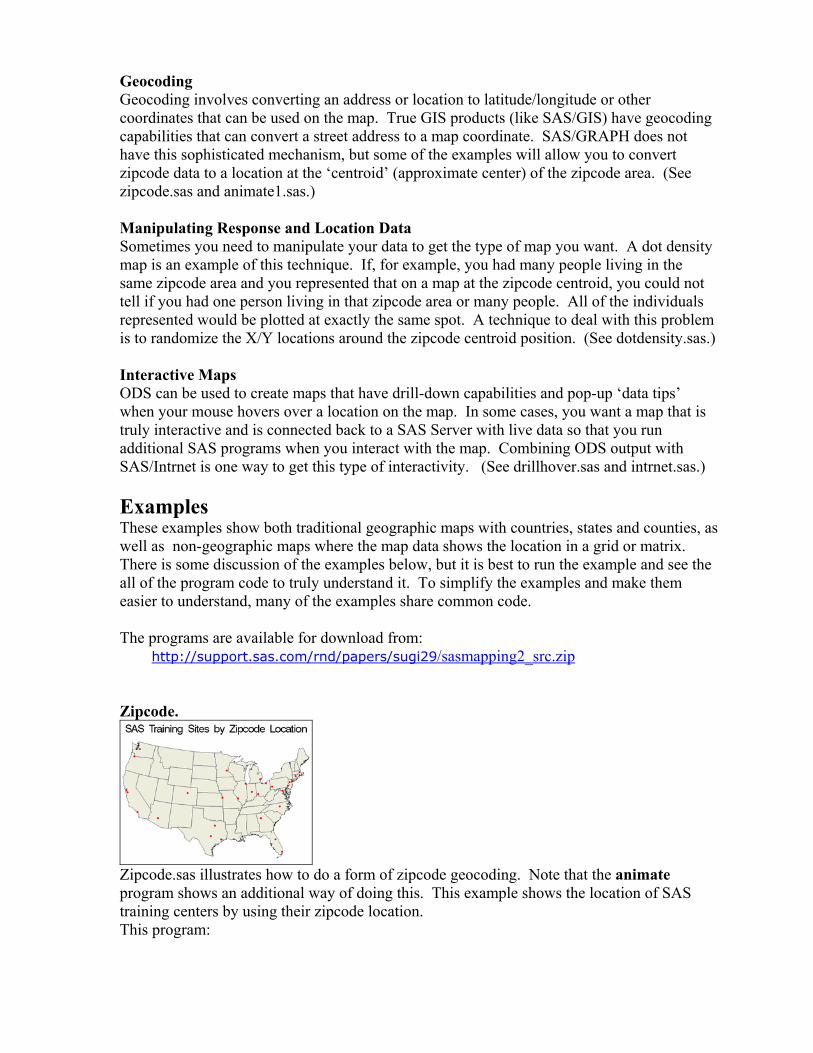
Geocoding Geocoding involves converting an address or location to latitude/longitude or other coordinates that can be used on the map. True GIS products (like SAS/GIS) have geocoding capabilities that can convert a street address to a map coordinate. SAS/GRAPH does not have this sophisticated mechanism, but some of the examples will allow you to convert zipcode data to a location at the ‘centroid’ (approximate center) of the zipcode area. (See zipcode.sas and animate1.sas.) Manipulating Response and Location Data Sometimes you need to manipulate your data to get the type of map you want. A dot density map is an example of this technique. If, for example, you had many people living in the same zipcode area and you represented that on a map at the zipcode centroid, you could not tell if you had one person living in that zipcode area or many people. All of the individuals represented would be plotted at exactly the same spot. A technique to deal with this problem is to randomize the X/Y locations around the zipcode centroid position. (See dotdensity.sas.) Interactive Maps ODS can be used to create maps that have drill-down capabilities and pop-up ‘data tips’ when your mouse hovers over a location on the map. In some cases, you want a map that is truly interactive and is connected back to a SAS Server with live data so that you run additional SAS programs when you interact with the map. Combining ODS output with SAS/Intrnet is one way to get this type of interactivity. (See drillhover.sas and intrnet.sas.) Examples These examples show both traditional geographic maps with countries, states and counties, as well as non-geographic maps where the map data shows the location in a grid or matrix. There is some discussion of the examples below, but it is best to run the example and see the all of the program code to truly understand it. To simplify the examples and make them easier to understand, many of the examples share common code. The programs are available for download from: http://support.sas.com/rnd/papers/sugi29/sasmapping2_src.zip Zipcode.
Zipcode.sas illustrates how to do a form of zipcode geocoding. Note that the animate program shows an additional way of doing this. This example shows the location of SAS training centers by using their zipcode location. This program:

1) Inputs the information about each SAS Training center, including the zipcode and phone number.
2) Merges the training center information with the sashelp.zipcode data set to get the x,y location of the zipcode.
proc sort data=trainzip; by zip; run; /*The resulting data set will have x,y locations for all of the */ /*items in trainzip. In addition, all entries in the zipcode */ /*data set are included (to be dropped below) */ data temp(keep= zip locationcode phone x y city); merge trainzip sashelp.zipcode; by zip; run;
3) Drops any observations that are not part of the training center data and adjusts the x,y
values for this map. /* Locationcode is set only on the items from trainzip */ data trainzipxy; set temp; if (locationcode ^='' and x NE . AND y NE .) then do; /*adjust the Lat/long values to match the map*/ x=atan(1)/45 * x *-1; y=atan(1)/45 * y; output; end; /* put out a message for bad/missing zipcodes */ else if (locationcode ^='' and x=.) then do; put "WARNING: Zipcode " zip " wasn't located."; end; run;
4) Creates an annotate data set with a ‘dot’ for each x,y zipcode location. 5) Reduces the map data and eliminates Alaska and Hawaii. 6) Combines the map and annotate data and then GPROJECT it together. Splits it apart
afterwards. 7) Draws the map.
The animate1.sas program uses the following code to do a zipcode lookup by using the KEY= option on the set statement:
… /*get the from zipcode x and y values*/ zip = fromzip; link look_it_up; function='MOVE'; output; /*get the to zipcode x and y values*/ zip = tozip; link look_it_up; function='DRAW'; output;
return; /* do a data set lookup according to the provided zipcode with Key=*/ look_it_up:; set sashelp.zipcode key=zip/unique; /*correct x,y values for this map*/ x=atan(1)/45 * x *-1; y=atan(1)/45 * y; return;
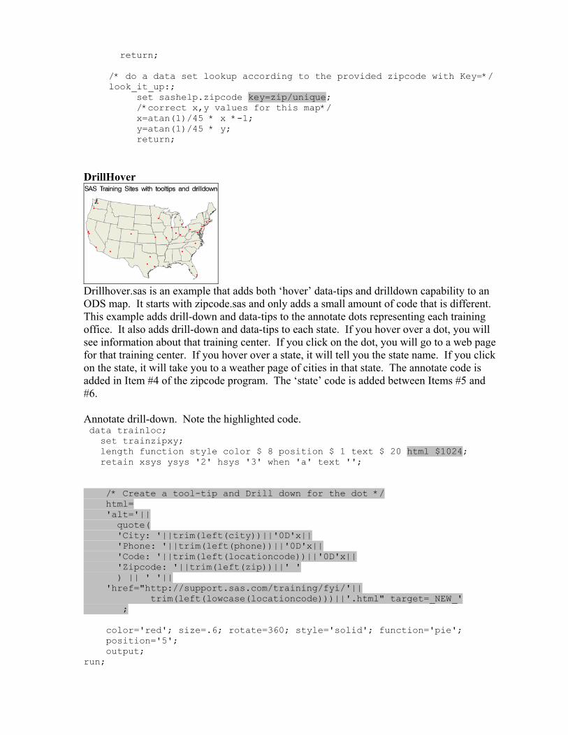
DrillHover
Drillhover.sas is an example that adds both ‘hover’ data-tips and drilldown capability to an ODS map. It starts with zipcode.sas and only adds a small amount of code that is different. This example adds drill-down and data-tips to the annotate dots representing each training office. It also adds drill-down and data-tips to each state. If you hover over a dot, you will see information about that training center. If you click on the dot, you will go to a web page for that training center. If you hover over a state, it will tell you the state name. If you click on the state, it will take you to a weather page of cities in that state. The annotate code is added in Item #4 of the zipcode program. The ‘state’ code is added between Items #5 and #6. Annotate drill-down. Note the highlighted code. data trainloc; set trainzipxy; length function style color $ 8 position $ 1 text $ 20 html $1024; retain xsys ysys '2' hsys '3' when 'a' text ''; /* Create a tool-tip and Drill down for the dot */ html= 'alt='|| quote( 'City: '||trim(left(city))||'0D'x|| 'Phone: '||trim(left(phone))||'0D'x|| 'Code: '||trim(left(locationcode))||'0D'x|| 'Zipcode: '||trim(left(zip))||' ' ) || ' '|| 'href="http://support.sas.com/training/fyi/'|| trim(left(lowcase(locationcode)))||'.html" target=_NEW_' ; color='red'; size=.6; rotate=360; style='solid'; function='pie'; position='5'; output; run;
State drill-down. data responsedata; /* add to the response data set. Faked in this case*/ length htmlvar $1024; /* Make sure it is long enough */ do state = 1 to 56;/* just loop thru and create one for each state */ statename=fipstate(state); /*take only valid states*/ if statename ^= '' then do; htmlvar= 'alt='||quote( trim(left('State: '|| trim(left(fipnamel(state))) ))) || 'href='||quote('http://www.wunderground.com/US/'|| trim(left(statename))) || 'target=_new_' ; output; end; end; run; Changes to GMAP statement. proc gmap map=work.states data=work.responsedata anno=work.trainloc; id state; choro state / coutline=black name="&name" html=htmlvar nolegend; run; quit; DotDensity
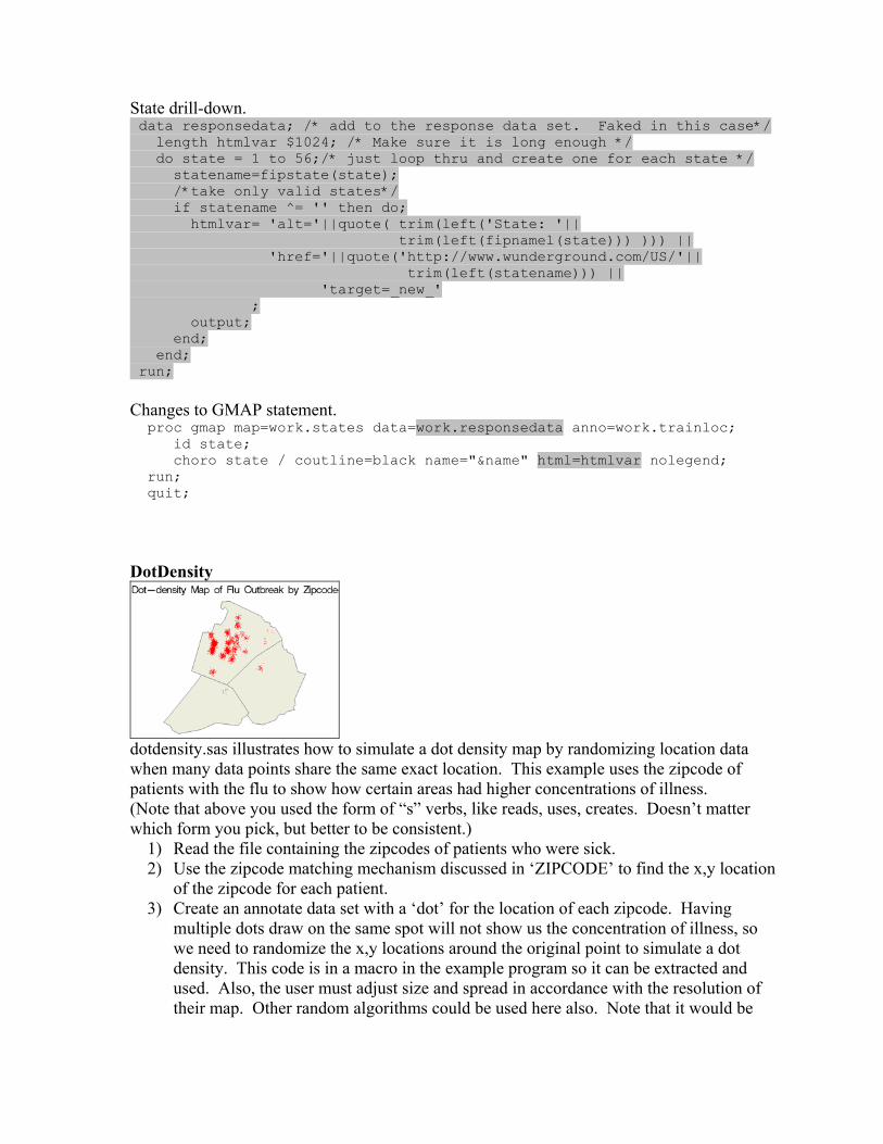
dotdensity.sas illustrates how to simulate a dot density map by randomizing location data when many data points share the same exact location. This example uses the zipcode of patients with the flu to show how certain areas had higher concentrations of illness. (Note that above you used the form of “s” verbs, like reads, uses, creates. Doesn’t matter which form you pick, but better to be consistent.)
1) Read the file containing the zipcodes of patients who were sick. 2) Use the zipcode matching mechanism discussed in ‘ZIPCODE’ to find the x,y location
of the zipcode for each patient. 3) Create an annotate data set with a ‘dot’ for the location of each zipcode. Having
multiple dots draw on the same spot will not show us the concentration of illness, so we need to randomize the x,y locations around the original point to simulate a dot density. This code is in a macro in the example program so it can be extracted and used. Also, the user must adjust size and spread in accordance with the resolution of their map. Other random algorithms could be used here also. Note that it would be
more accurate to geocode the street addresses and plot those, but you need a package with geocoding capability like SAS/GIS.
%macro dot_density(indata,outdata,spread,dotsize,color,idvar); /*----------------------------------------------------------------*/ /* Create an annotate data set with a randomized 'dot' a each */ /* location. This simulates a dot-density map so that all dots */ /* the same location do not appear directly on top of each other. */ /* The user must adjust spread and dotsize for their map needs. */ /* */ /* Arguments: */ /* indata= input data set; outdata= output data set; */ /* spread= offset from center point in any direction. */ /* dotsize= size of dot for each value */ /* color= color of dot; idvar= variable to use in tooltip */ /* Notes: Dotsize and spread must change depending on the scale */ /* of the Map, whether you are using degrees or radians */ /* and the number of items you are showing. The dot size */ /* may also vary between different types of output */ /* (eg, Gif, Java, actx) */ /* Warning: Dot-density maps (or dot maps) are not 'accurate' */ /* because of the random nature of the map and only show patterns.*/ /* Accuracy is better when you are showing a smaller area and */ /* fewer items. */ /*----------------------------------------------------------------*/ data &outdata; set &indata; length function style color $ 8 position $ 1 text $ 20 ; retain xsys ysys '2' hsys '3' when 'a' text '' ; retain rotate 360 style 'solid' function 'pie' position '5'; anno_flag=1; /*so we can separate the datasets later*/ color=&color; size=&dotsize; spread=&spread; /* create randomness around centroid so you can see */ /* more than one dot */ x=x- spread + (spread*2)*rannor(0); y=y- spread + (spread*2)*rannor(0); output; run; %mend;
4) Reduce the map and only keep the counties you are interested in. 5) Combine the map data and annotate map and GPROJECT them together. Then split
them apart. 6) Display the map.
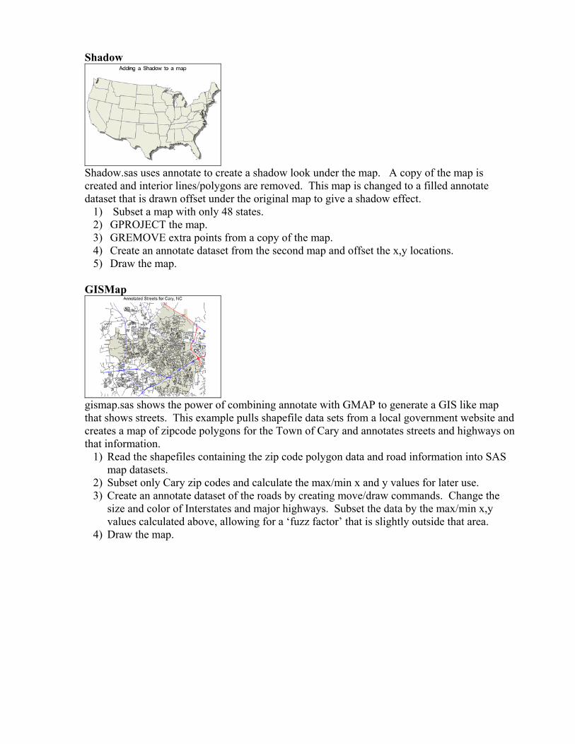
Shadow
Shadow.sas uses annotate to create a shadow look under the map. A copy of the map is created and interior lines/polygons are removed. This map is changed to a filled annotate dataset that is drawn offset under the original map to give a shadow effect.
1) Subset a map with only 48 states. 2) GPROJECT the map. 3) GREMOVE extra points from a copy of the map. 4) Create an annotate dataset from the second map and offset the x,y locations. 5) Draw the map.
GISMap
gismap.sas shows the power of combining annotate with GMAP to generate a GIS like map that shows streets. This example pulls shapefile data sets from a local government website and creates a map of zipcode polygons for the Town of Cary and annotates streets and highways on that information.
1) Read the shapefiles containing the zip code polygon data and road information into SAS map datasets.
2) Subset only Cary zip codes and calculate the max/min x and y values for later use. 3) Create an annotate dataset of the roads by creating move/draw commands. Change the
size and color of Interstates and major highways. Subset the data by the max/min x,y values calculated above, allowing for a ‘fuzz factor’ that is slightly outside that area.
4) Draw the map.
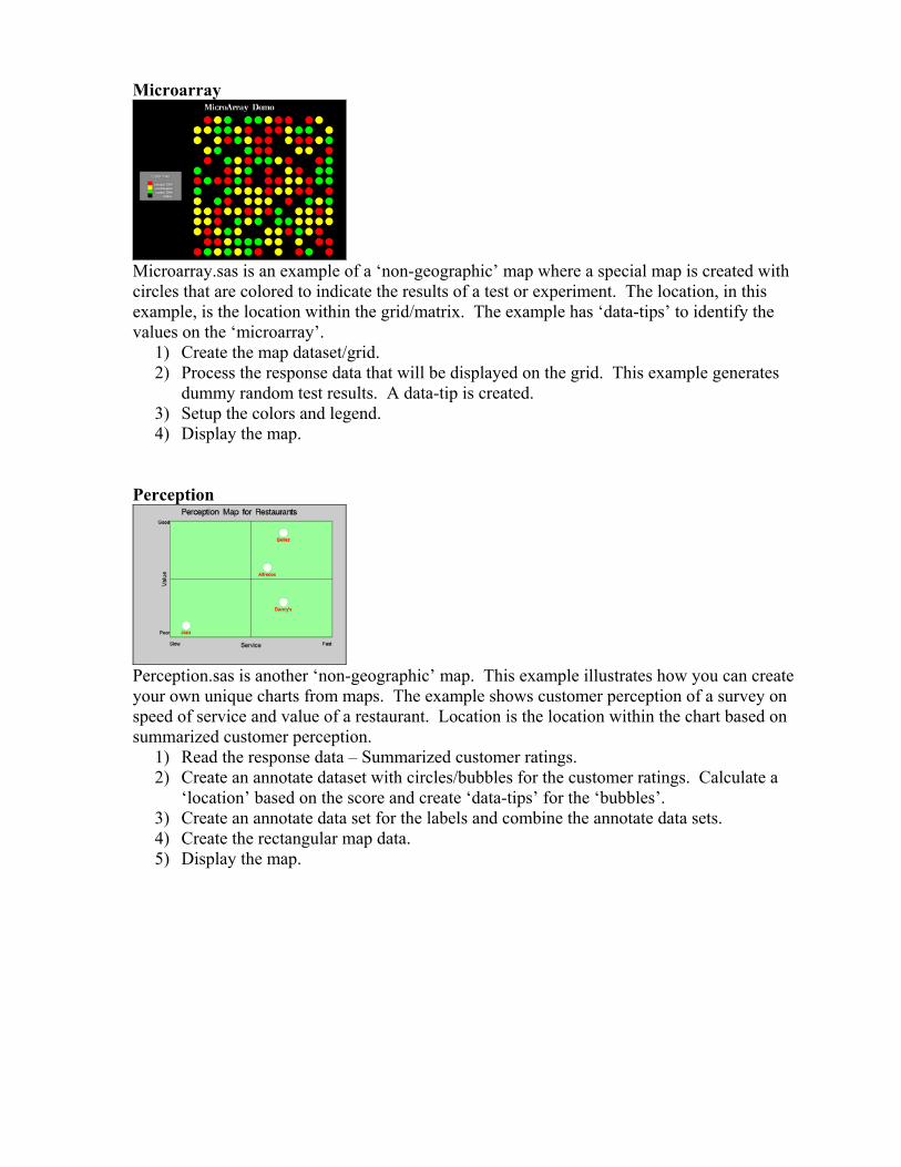
Microarray
Microarray.sas is an example of a ‘non-geographic’ map where a special map is created with circles that are colored to indicate the results of a test or experiment. The location, in this example, is the location within the grid/matrix. The example has ‘data-tips’ to identify the values on the ‘microarray’.
1) Create the map dataset/grid. 2) Process the response data that will be displayed on the grid. This example generates
dummy random test results. A data-tip is created. 3) Setup the colors and legend. 4) Display the map.
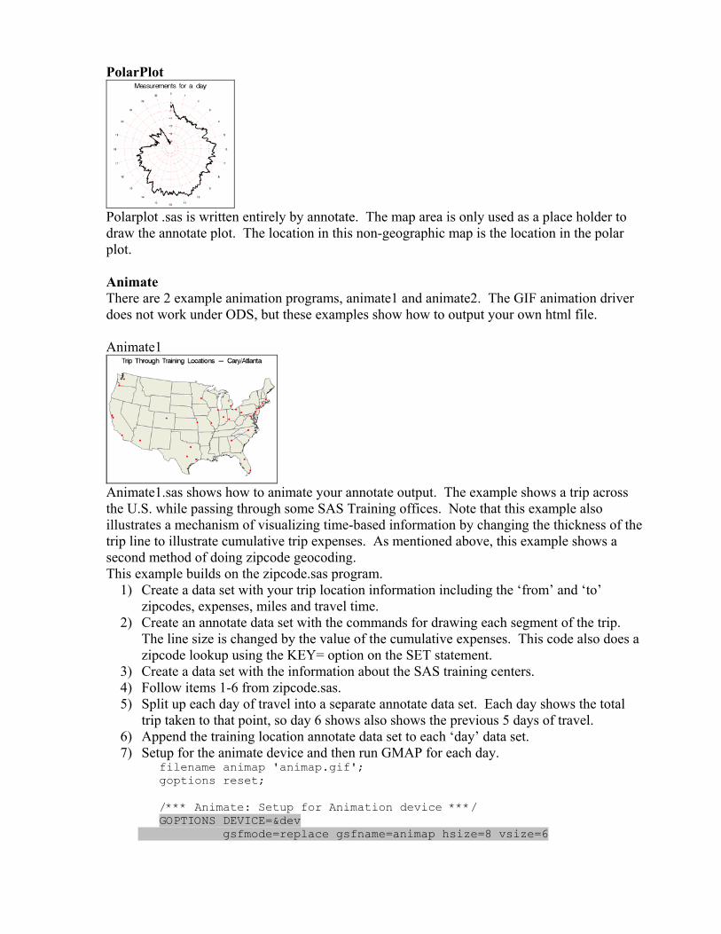
Perception
Perception.sas is another ‘non-geographic’ map. This example illustrates how you can create your own unique charts from maps. The example shows customer perception of a survey on speed of service and value of a restaurant. Location is the location within the chart based on summarized customer perception.
1) Read the response data – Summarized customer ratings. 2) Create an annotate dataset with circles/bubbles for the customer ratings. Calculate a
‘location’ based on the score and create ‘data-tips’ for the ‘bubbles’. 3) Create an annotate data set for the labels and combine the annotate data sets. 4) Create the rectangular map data. 5) Display the map.
PolarPlot
Polarplot .sas is written entirely by annotate. The map area is only used as a place holder to draw the annotate plot. The location in this non-geographic map is the location in the polar plot. Animate There are 2 example animation programs, animate1 and animate2. The GIF animation driver does not work under ODS, but these examples show how to output your own html file. Animate1
Animate1.sas shows how to animate your annotate output. The example shows a trip across the U.S. while passing through some SAS Training offices. Note that this example also illustrates a mechanism of visualizing time-based information by changing the thickness of the trip line to illustrate cumulative trip expenses. As mentioned above, this example shows a second method of doing zipcode geocoding. This example builds on the zipcode.sas program.
1) Create a data set with your trip location information including the ‘from’ and ‘to’ zipcodes, expenses, miles and travel time.
2) Create an annotate data set with the commands for drawing each segment of the trip. The line size is changed by the value of the cumulative expenses. This code also does a zipcode lookup using the KEY= option on the SET statement.
3) Create a data set with the information about the SAS training centers. 4) Follow items 1-6 from zipcode.sas. 5) Split up each day of travel into a separate annotate data set. Each day shows the total
trip taken to that point, so day 6 shows also shows the previous 5 days of travel. 6) Append the training location annotate data set to each ‘day’ data set. 7) Setup for the animate device and then run GMAP for each day.
filename animap 'animap.gif'; goptions reset; /*** Animate: Setup for Animation device ***/ GOPTIONS DEVICE=&dev gsfmode=replace gsfname=animap hsize=8 vsize=6
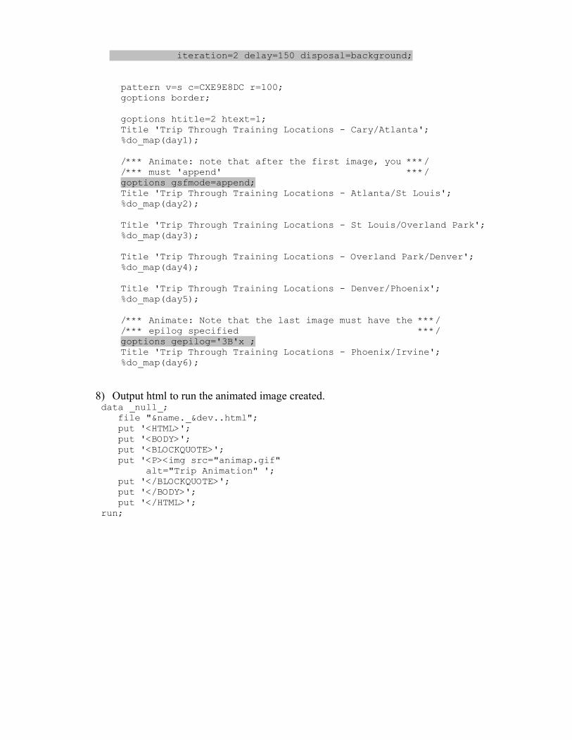
iteration=2 delay=150 disposal=background; pattern v=s c=CXE9E8DC r=100; goptions border; goptions htitle=2 htext=1; Title 'Trip Through Training Locations - Cary/Atlanta'; %do_map(day1); /*** Animate: note that after the first image, you ***/ /*** must 'append' ***/ goptions gsfmode=append; Title 'Trip Through Training Locations - Atlanta/St Louis'; %do_map(day2); Title 'Trip Through Training Locations - St Louis/Overland Park'; %do_map(day3); Title 'Trip Through Training Locations - Overland Park/Denver'; %do_map(day4); Title 'Trip Through Training Locations - Denver/Phoenix'; %do_map(day5); /*** Animate: Note that the last image must have the ***/ /*** epilog specified ***/ goptions gepilog='3B'x ; Title 'Trip Through Training Locations - Phoenix/Irvine'; %do_map(day6);
8) Output html to run the animated image created. data _null_; file "&name._&dev..html"; put '<HTML>'; put '<BODY>'; put '<BLOCKQUOTE>'; put '<P><img src="animap.gif" alt="Trip Animation" '; put '</BLOCKQUOTE>'; put '</BODY>'; put '</HTML>'; run;
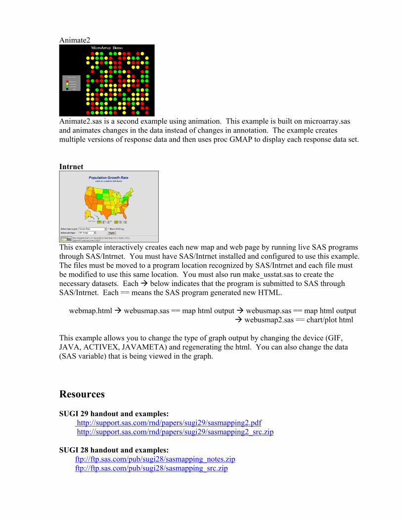
Animate2
Animate2.sas is a second example using animation. This example is built on microarray.sas and animates changes in the data instead of changes in annotation. The example creates multiple versions of response data and then uses proc GMAP to display each response data set. Intrnet
This example interactively creates each new map and web page by running live SAS programs through SAS/Intrnet. You must have SAS/Intrnet installed and configured to use this example. The files must be moved to a program location recognized by SAS/Intrnet and each file must be modified to use this same location. You must also run make_usstat.sas to create the necessary datasets. Each below indicates that the program is submitted to SAS through SAS/Intrnet. Each == means the SAS program generated new HTML. webmap.html webusmap.sas == map html output webusmap.sas == map html output webusmap2.sas == chart/plot html This example allows you to change the type of graph output by changing the device (GIF, JAVA, ACTIVEX, JAVAMETA) and regenerating the html. You can also change the data (SAS variable) that is being viewed in the graph. Resources SUGI 29 handout and examples: http://support.sas.com/rnd/papers/sugi29/sasmapping2.pdf http://support.sas.com/rnd/papers/sugi29/sasmapping2_src.zip SUGI 28 handout and examples: ftp://ftp.sas.com/pub/sugi28/sasmapping_notes.zip ftp://ftp.sas.com/pub/sugi28/sasmapping_src.zip

SUGI Proceedings: http://support.sas.com/usergroups/sugi/proceedings/index.html SAS/GRAPH Mapping Product information, downloads, FAQs: http://www.sas.com/technologies/bi/visualization/index.html http://support.sas.com - Support web site http://support.sas.com/download - download examples http://support.sas.com/techsup/ftp/download.html - Tech Support downloads http://ftp.sas.com/techsup/download/public/graph - New annotate Macros. http://support.sas.com/mapsonline – MapsOnLine website. See SAS Online Help. Email: [email protected] 4/13/04