Embed Size (px)
Citation preview

The UK productivity puzzle is a TFP puzzle: current data and future
predictions
Peter Goodridge, Jonathan Haskel, Gavin Wallis
Discussion Paper 2014/9
November 2014

The UK productivity puzzle is a TFP puzzle: current data and future
predictions
Peter Goodridge, Jonathan Haskel, Gavin Wallis
Discussion Paper 2014/9
November 2014

The UK Productivity Puzzle is a TFP Puzzle: Current Data and
Future Predictions*
Peter Goodridge
Imperial College Business School
Jonathan Haskel
Imperial College Business School; CEPR and IZA
Gavin Wallis
Bank of England
Keywords: innovation, productivity growth
JEL reference: O47, E22, E01
October 2014
Abstract
This paper revisits the UK productivity puzzle using a new set of data on outputs and inputs and
clarifying the role of output mismeasurement, input growth and industry effects. Our data indicates
an implied productivity gap of 12.6% in 2011 relative to the productivity level on pre-recession
trends. We find (a) the labour productivity puzzle is a TFP puzzle, since it is not explained by the
contributions of labour or capital services (b) the re-allocation of labour between industries deepens
rather than explains the puzzle (i.e. there has been actually been a re-allocation of hours away from
low-productivity industries and toward high productivity industries (c) capitalisation of R&D does not
explain the puzzle (d) assuming extremely (unrealistically) high increased scrapping rates since the
recession (a 50% growth) can potentially explain 33% of the puzzle and (e) industry data shows 33%
of the TFP puzzle can be explained weak TFP growth in the oil and gas and financial services sectors.
Continued weakness in finance would suggest a future lowering of TFP growth from 1.2% to 1%, but
historical data does not show a long period of zero or negative TFP growth.
*Contacts: Jonathan Haskel and Peter Goodridge, Imperial College Business School, Imperial College, London
SW7 2AZ, [email protected], [email protected]; Gavin Wallis,
[email protected]. We are very grateful for financial support from NESTA and UKIRC. This
work contains statistical data from ONS which is crown copyright and reproduced with the permission of the
controller HMSO and Queen's Printer for Scotland. The use of the ONS statistical data in this work does not
imply the endorsement of the ONS in relation to the interpretation or analysis of the statistical data. The views
expressed in this paper are those of the authors and do not necessarily reflect those of affiliated institutions.
2
1. Introduction
This paper revisits the UK productivity puzzle by using a new set of data on outputs and inputs and
clarifying the role of output mismeasurement, input growth and industry effects. We shall argue that
the productivity puzzle is a TFP puzzle and use this observation to try to make some predictions about
the longer range prospects for UK productivity.1
The UK productivity puzzle is well known. Before the 2008 financial crisis, value added per hour
worked grew in the UK relatively quickly, at around 2.5%pa (2000-07). Since the crisis, it has hardly
grown at all. This can be expressed in terms of a productivity gap: the level of UK productivity is
12.6 percentage points below what it would have been had had value added per hour continued at a
2.5%pa rate. This is the gap we seek to account for using growth accounting techniques2.
Firstly, at the time of writing, the ONS are in the process of capitalising R&D into the National
Accounts. We update our datasets to incorporate this development. The capitalisation of R&D
changes both GDP, since value added changes, and TFP, since inputs change. Existing datasets do
not capitalise R&D and so cannot examine the impact of capitalisation on productivity. This is of
interest in at least two regards. First, it is widely alleged that the UK has had falling R&D relative to
competitors and so it is of interest to see how R&D capitalisation affects TFP growth. Second, in
recent years, R&D investment has held up relative to other forms of investment (Goodridge et al,
2013) and so it is of interest to see if this explains part of the productivity puzzle (if R&D output is
not included in GDP then measured output growth is too low in periods of relatively fast growth in
R&D investment, which shows up as low measured productivity growth). We shall argue this does
not actually explain any of the puzzle.
Second, it has been argued that labour composition has played a role in the puzzle, with growth in
employment since the recession being in low-skilled, less productive, labour (Martin and Rowthorn,
2012). We examine the data on labour composition, both the skills within industries and the
reallocation of labour between industries. We find that this deepens rather than explains the puzzle:
1 Predictions of future productivity have been debated for the US in, for example, Gordon (2012), Mokyr (2013)
and Brynjolfsson and McAfee (2014). Gordon (2012) is commonly represented as predicting a slowdown in
technological progress but as noted particularly in Gordon (2014) it is other headwinds, such as demographics,
education and public debt, which leads to Gordon’s prediction of weak per capita growth of which technical
progress is but one part. 2 We consider the scale of the productivity puzzle in relation to TFP growth between 2000 and 2007 rather than
the more common assumption to include the 1990s. We do this because TFP growth in the 1990s was high by
historical standards. Had we used 1990-2007, the implied TFP gap would be 13.3 percentage points as opposed
to 12.9.
3
since 2008, upskilling has gained in pace and labour has been allocated towards high-productivity
industries.3
Third, a number of authors (e.g. Pessoa and Van Reenen (2013)) have argued that the recent fall in
UK productivity has been due to labour-capital substitution (capital shallowing) as real wages have
fallen in the recession. Proponents of the view that the UK has lost output permanently are often
challenged as to where the output capacity in the economy has gone: falls in capital seem like an
obvious hypothesis to be investigated. Pessoa and Van Reenen (2013) calculate new UK capital
stocks under the assumption of premature scrapping and substitution away from capital and towards
labour. Oulton (2013) criticises their calculations and suggests that capital services would be a more
appropriate concept for productivity analysis (capital services data were not available to him). We set
out new capital services data, including R&D capital, and growth accounting results that allow for
premature scrapping over the recent crisis: to the best of our knowledge we are the first to do this.
Our new capital services data reject the capital shallowing view. Using conventional depreciation
rates, there has been no capital shallowing (that is, growth in capital services per hour has continued
to rise). We therefore look at increased depreciation rates. We show that if deprecation has risen by
25% (50%) since 2008 then there has been capital capital shallowing and this can account for 16%
(33%) of the TFP gap. Thus even with these raised depreciation rates, the labour productivity puzzle
is a TFP puzzle (a conclusion robust to utilisation measures too).
Fourth, since the labour productivity puzzle is a TFP puzzle, what explains TFP growth? Some have
argued it is due to the slowdown in particular industries such as a maturing oil and gas sector or an
increasingly regulated financial services sector. To examine this we use an industry data set, with
consistent measures of labour and capital services to look at productivity and TFP growth at industry
level and its contributions to the total. We find 33% of the TFP productivity puzzle can be explained
by the weakness of TFP growth in the oil and gas; and financial services sectors.
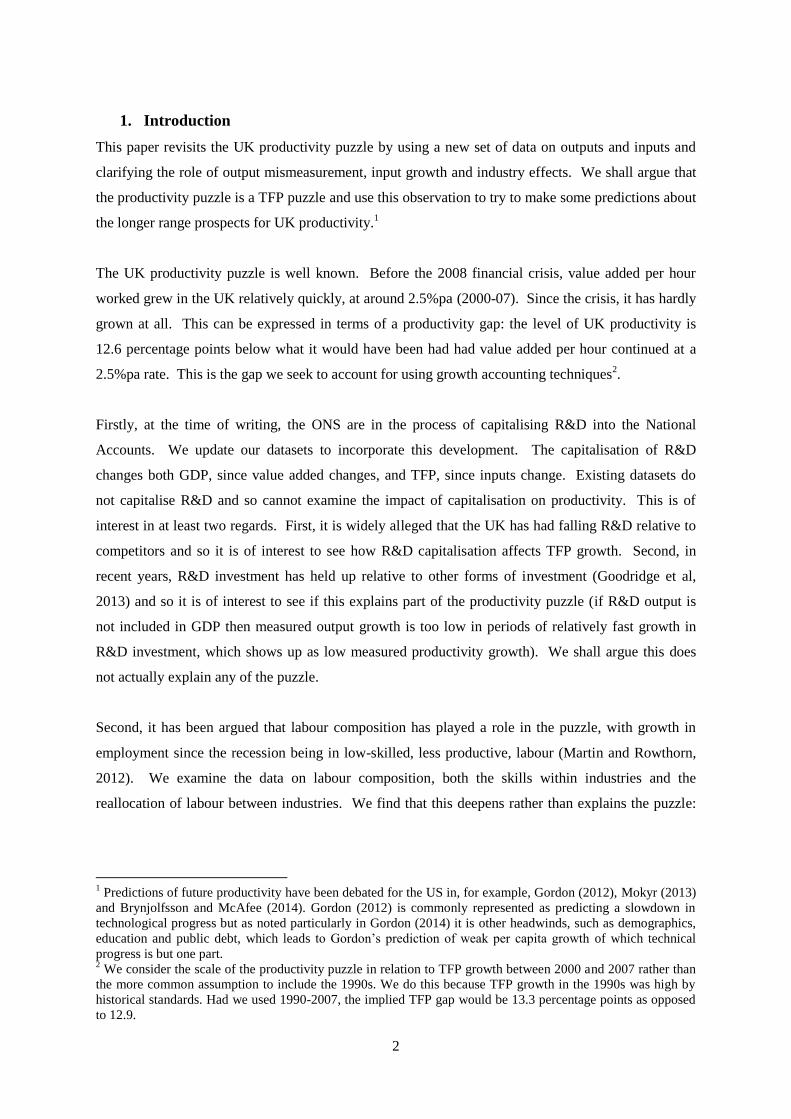
Readers wishing to skip to our main findings will find them summarised in Table 1. Row 1 shows
labour productivity growth (market sector value added per hour, DlnV/H) pre- and post recession, at
2.54%pa and -0.47%pa, the deceleration giving an implied gap of 12.6% in 2011 relative to the
productivity level on pre-recession trends. The other rows show the components of DlnV/H: in row 2
and 3 for example, the contribution of labour services per hour and capital services per hour
accelerated and decelerated. Our finding are then
3 The allocation of labour between industries depends of course upon the definition of industries: due to data
availability, we have nine industries. Thus we cannot rule out allocation of labour within our broad industries as
a driver of productivity growth.
4
(a) labour services per hour accelerated and so are not an explanatory part of the productivity
puzzle, rather they add another 1.7 points to the puzzle (row 2)
(b) capital services per hour account for 0.6 out of the gap (row 3)
(c) therefore the labour productivity puzzle is a TFP puzzle (row 4)
(d) re-allocation of labour between industries deepens rather than explains the puzzle (i.e.
there has been actually been a re-allocation of hours away from low-productivity
industries and toward high productivity industries (row 5),
(e) capitalisation of R&D does not explain the puzzle (row 6)
(f) 16% (33%) of the TFP puzzle could be explained by increased scrapping of 25% (50%)
(row 7 and 8).
(g) 33% of the TFP productivity puzzle can be explained by the weakness of TFP growth in
the oil and gas and financial services sectors.
Thus an aggressive assumption on premature scrapping and a “structural” weakness in TFP can
account for 66% of the productivity gap.
Table 1: The productivity puzzle^ (growth rates pre- and post-crisis and implied gaps relative to pre-
crisis growth)
Before (00-07) After (07-11) Implied gap
% of gap
explained
1 DlnV/H* 2.54% -0.47% 12.6
Components
2 Labour 0.22% 0.63% -1.7
3 Capital 1.13% 0.99% 0.6
4 TFP 1.19% -2.09% 12.9 0%
5 Labour re-allocation -0.26% 0.23% -1.9
R&D
6 TFP: without R&D capitalised 1.21% -2.10% 13.0 -1%
Capital: premature scrapping
7 TFP: raise dep rates by 1.25 after 2009 1.19% -1.53% 10.8 16%
8 TFP: raise dep rates by 1.5 after 2009 1.19% -0.95% 8.6 33%
Structural
9 TFP without Ag/Min/Utils & Financial Services** 1.11% -1.05% 8.7 33%
Notes to table: Sources of growth decomposition for UK Market Sector, comparing the period before the
recession (2000-07) to the period since (2007-11). Columns 1 and 2 are per annum log differences rates. The
implied gap, column 3 is the level predicted by the three year growth rate in the post-crisis second column, as a
proportion of the level predicted by a three year growth rate in the pre-crisis column. Decomposition carried out
at the market sector level. In row 5, the term for the re-allocation of labour is that from a decomposition carried
out at industry-level and aggregated up to the market sector and shows the implied growth rate due to the actual
reallocation of labour between sectors of differing productivity. . In row 1, * signifies that R&D has been
capitalised. ^ All rows except 2, 3 and 5 are TFP growth rates. ** Here we take the share of TFP accounted for
by Agriculture, Mining and Utilities (Ag/Min/Utils) and Financial Services, and use those shares to adjust
market sector TFP.
Source: authors’ calculations.
What of the longer term? We start with the 1.2%pa growth rate of TFP 2000-07. This already
includes the drag from the oil and gas sector, which we expect to continue. Suppose that TFP growth
5
will be half what it was pre-crisis due to increased regulation.4 The pre-crisis contribution to total TFP
from the financial sector (i.e. its share in value added times it TFP growth rate) was around a third of
aggregate TFP and so this assumption would reduce TFP growth by 1/6th i.e. to 1% (assuming that all
other sectors restore their TFP growth to the pre-crisis rates and the value-added structure of the
economy does not vary too much).
The 1% prediction assumes no catch-up of the productivity gap due to the uncertainty around the
extent of any catch-up. Of course, if there is a catch up then there will be a temporary rise in the
growth rate. At most, assuming full catch-up, this could add around 1 percentage point per annum to
TFP growth and this would leave TFP growth close to its average growth rate in the decade after the
1990s recession. Oulton and Sebastia-Barriel (2013) find that banking crises reduce short short-term
productivity growth such that the long-term level is lower than it would have been had the crisis not
occurred. In other words, the level of labour productivity does not fully ‘catch-up’. Although they do
not work with TFP, their results suggest a permanent reduction in the level of UK TFP following the
crisis.
2. Our data
Our dataset is that from Goodridge, Haskel and Wallis (2014), without additional intangibles not
capitalised in the National Accounts but including R&D, and consistent with 2013 Blue Book. More
details are available in that paper, but are briefly summarised here. Our output data are built bottom-
up using ONS industry data, to a market sector definition comprising of SIC07 sections A-K, MN and
R-T, thus excluding real estate5, public administration & defence, health and education services. Data
on capital services are from Oulton and Wallis (2014), built using ONS data on nominal investment
and asset prices. We also incorporate a full set of tax adjustment factors (based on Wallis (2012)) for
each (tangible and intangible, including R&D) asset to better estimate rental prices, income shares and
capital deepening contributions. Data on labour input are taken from the ONS release on quality-
adjusted labour input (QALI) (Franklin and Mistry, 2013). For National Accounts intangibles we use
ONS GFCF and for R&D, we build our own estimates using the Business Enterprise R&D (BERD)
release.67
All nominal data is aggregated by simple addition. Real variables are aggregated as share-
weighted superlative indices. We work with nine disaggregated industries, with data for the period
1997 to 2011. For our market sector analysis, we extend our aggregates back using data from
4 Although note, increased spreads could strengthen measured output and TFP growth in financial services.
5 We exclude real estate as dwellings are not productive capital from the perspective of productivity analysis and
so we must also exclude the output associated with them (actual and imputed rents). 6 Our R&D data therefore pre-dates the latest ONS data on R&D investment and so is not 100% consistent with
that. Any differences will however be minimal. 7 In doing so we correctly convert capital expenditure to user costs, and we also use shares implied by the Input-
Output tables to allocate R&D that takes place in the R&D industry to the purchasing industries.

6
Goodridge, Haskel and Wallis (2012), which are also built bottom-up but using data from the previous
Standard Industrial Classification (SIC03).
In what follows, we analyse the gap set out in Table 1 in more detail.
3. Choice of baseline
To understand the gap, we must however establish a baseline. To do this, Table 2 sets out
productivity since 1990. It does so by decomposing productivity growth into the contributions of
various inputs and assigning the residual to TFP growth. We set out below some industry data, but
using market sector data, the underlying accounting behind Table 2 is
, ,mln( / ) ln( / ) ln( / ) ln
K n n L m
n m
n mV V
P K P LV H K H L H TFP
P V P V
(1)
Where V is real value added, H hours, there are n types of capital asset Kn with rental rate PKn, and m
types of labour Lm with wage (rental) price PLm and lnTFP is calculated residually.
Table 2: UK growth in market sector value added (lnV), labour productivity (lnV/H) and the
capitalisation of R&D, 1990-2011
1 2 3 4 5 6 7 8
DlnV/H sDln(L/H)
sDln(K/H)
cmp
sDln(K/H)
othtan
sDln(K/H)
NA intan
sDln(K/H)
rd DlnTFP
Memo:
sLAB
1990-00 2.95% 0.22% 0.31% 0.82% 0.24% 0.00% 1.36% 0.63
2000-07 2.55% 0.23% 0.12% 0.76% 0.24% 0.00% 1.21% 0.66
2007-11 -0.50% 0.64% 0.01% 0.91% 0.05% 0.00% -2.10% 0.65
1990-00 2.94% 0.21% 0.31% 0.80% 0.23% 0.04% 1.34% 0.62
2000-07 2.54% 0.22% 0.12% 0.74% 0.23% 0.04% 1.19% 0.65
2007-11 -0.47% 0.63% 0.01% 0.88% 0.05% 0.05% -2.09% 0.64
DlnV sDlnL sDlnK cmp
sDlnK
othtan sDlnK intan sDlnK rd DlnTFP
Memo:
DlnH
1990-00 2.69% 0.02% 0.31% 0.76% 0.24% 0.00% 1.36% -0.26%
2000-07 2.80% 0.38% 0.12% 0.84% 0.25% 0.00% 1.21% 0.25%
2007-11 -1.54% -0.03% 0.00% 0.59% 0.00% 0.00% -2.10% -1.04%
1990-00 2.68% 0.02% 0.31% 0.74% 0.23% 0.04% 1.34% -0.26%
2000-07 2.79% 0.38% 0.12% 0.81% 0.24% 0.05% 1.19% 0.25%
2007-11 -1.51% -0.03% 0.00% 0.57% 0.00% 0.03% -2.09% -1.04%
b) With National Accounts Intangibles plus R&D
a) With National Accounts Intangibles: software, mineral exploration and artistic originals
Panel 1: Δln(V/H)
Panel 2: Δln(V)
a) With National Accounts Intangibles: software, mineral exploration and artistic originals
b) With National Accounts Intangibles plus R&D
Notes to table. Data are average growth rates per year for intervals shown, calculated as changes in natural logs.
Contributions are Tornqvist indices. In panel 1, data are a decomposition of labour productivity in per hour
terms. In panel 2, data are a decomposition of growth in value-added. First column is growth in value-added (in
7
per hour terms in panel 1). Column 2 is the contribution of labour services (per hour in panel 1), namely growth
in labour services (per hour) times share of labour in MSGVA. Column 3 is growth in computer capital services
(per hour) times share in MSGVA. Column 4 is growth in other tangible capital services (buildings, plant,
vehicles) (per hour) times share in MSGVA. Column 5 is growth in intangible capital services (per hour) times
share in MSGVA, where intangibles are those already capitalised in the national accounts, namely software,
mineral exploration and artistic originals. Column 6 is R&D capital services (per hour) times share in MSGVA,
with R&D due to be capitalised in the UK accounts in 2014. The price index used for R&D is the implied
market sector GVA deflator. Column 7 is TFP, namely column 1 minus the sum of columns 2 to 6. Column 8
presents memo items, in the first panel we show the share of labour payments in MSGVA, and in the second
panel we show average changes in market sector hours.
Source: authors’ calculations
The top rows in panels (a) and (b), without and with R&D capitalisation, show ln(V/H) was 2.94%pa
1990-2000, and 2.54%pa 2000-07. In Table 1 we took this latter figure for our baseline and so
already assumes a productivity growth deceleration relative to 1990-2000 (had we chosen the full
period of 1990-2007 with average labour productivity growth of 2.77% pa for our baseline then the
gap would be 13.3 percentage points).
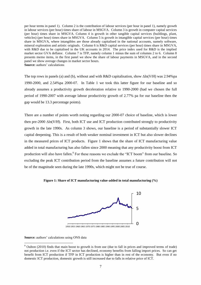
There are a number of points worth noting regarding our 2000-07 choice of baseline, which is lower
then pre-2000 ln(V/H). First, both ICT use and ICT production contributed strongly to productivity
growth in the late 1990s. As column 3 shows, our baseline is a period of substantially slower ICT
capital deepening. This is a result of both weaker nominal investment in ICT but also slower declines
in the measured prices of ICT products. Figure 1 shows that the share of ICT manufacturing value
added in total manufacturing has also fallen since 2000 meaning that any productivity boost from ICT
production will also have fallen.8 For these reasons we exclude the “ICT boom” from our baseline. So
excluding the peak ICT contribution period from the baseline assumes a future contribution will not
be of the magnitude seen during the late 1990s, which might not be true of course.
Figure 1: Share of ICT manufacturing value-added in total manufacturing (%)
Source: authors’ calculations using ONS data
8 Oulton (2010) finds that main boost to growth is from use (due to fall in prices and improved terms of trade)
not production i.e. even if the ICT sector has declined, economy benefits from falling import prices. So can get
benefit from ICT production if TFP in ICT production is higher than in rest of the economy. But even if no
domestic ICT production, domestic growth is still increased due to falls in relative price of ICT.
0
5
10
1950 1955 1960 1965 1970 1975 1980 1985 1990 1995 2000 2005 2010

8
4. Impact of the capitalisation of R&D and R&D spillovers
The 2014 ONS National Accounts Blue Book treated R&D as investment for the first time. As shown
in Table 1 above, if we do not capitalise R&D the TFP gap is 13.0%, so for the purposes of this paper,
it will not explain the TFP gap. The Appendix explores the robustness of this finding to a relatively
neglected issue, namely the choice of R&D deflator. As Table 2 shows, the contribution of R&D is
around 0.04%pa, an estimate that assumes that R&D prices grow at the GDP deflator, as in
conventional.9 But one might assume that the process of R&D has changed with the introduction of
the ICT: computers have made simulations quicker and easier and the internet has made research
collaboration and information gathering cheaper. In this case, the price of performing R&D might
have fallen, possibly dramatically and so the Appendix looks at the case where that price falls in line
with MFP in high-productivity industries and in line with packaged software. In the software case,
the contribution of R&D rises very substantially, to 0.14%pa, but for our purposes the productivity
puzzle is not explained. The reason is that lnV/H is slightly larger with R&D captilisation and by
about the same amount as the increase in contribution from lnKR&D
so that lnTFP remains the
same.
R&D may however help understand the productivity slowdown in the following sense. lnTFP was
relatively fast in the 1990s (1.34%pa, 1990-2000) but this is a considerable slowdown from the 1980s
(2.00%, 1980-1990). As is well-documented, R&D spending has slowed very considerably as well
over this long period (lnKR&D
grew at 4.6% pa in 1980-90, 2.1%pa 1990-2000, 2.2%pa 2000-10).
Such a fall in lnKR&D
might help explain a fall in lnTFP if lnKR&D
is associated with spillovers, for
which there is some evidence ((see e.g. surveys by Hall, Mairesse and Mohnen (2009) and Griliches
(1973)). If spillovers take a very long time, then the fall in lnKR&D
between the 1980s to 1990s
might lead to some fall in the 2000s. If the lag operates within the decade, then the fall in lnKR&D
between the 1980s to 1990s would have contributed to the fall in lnTFP between the 1980s to
1990s. This then would be another reason to benchmark the underlying lnTFP rate to the 2000s.10
9 Ker (2014) explains that the UK R&D deflator is derived from a price index of UK R&D costs (mostly
labour). Following Eurostat recommondations, this is not adjusted for productivity and so the price index rises,
as labour costs do, around 2pppa slightly faster than the GDP deflator. The US adjust their price index by
average US TFP growth, which at around 2%pa means their index is roughly in line with the GDP deflator. The
pre-packaged software deflator falls at around 5%pa. 10
Using industry data, Goodridge, Haskel and Wallis (2014) estimate an elasticity of lnTFP to lnKR&D
of
0.31 (which includes within-industry spillovers and spillovers derived from knowledge external to the industry,
and excludes the private contribution already accounted for in the estimation of TFP). Thus, using that estimate,
we may expect TFP growth in the post-1990 period to be lowered by around (0.31*(4.6-2.1))=0.78% pa,
remarkably close to the actual slowdown of 2.00%-1.34%=0.66%pa.
9
5. Labour composition
As we can see from the tables above, the inclusion of labour quality (composition) deepens the
productivity puzzle. As Table 2, panel 1)b, column 3, shows, its contribution sped up from an
average of 0.22% pa in 2000-07, to an historically very large 0.63% pa in 2007-11. Thus it is not the
case in the recession that, for example, there was a move to low skilled workers, either in terms of
quantity or price, that lowered the composition of labour and so slowed productivity growth. Rather,
the opposite occurred.
Why? Labour composition is a wage-bill weighted share of changes in the hours per worker and
number of workers of different skills, ages and gender. Thus it can change for a number of different
reasons. In the Appendix, using newly released data from ONS, we document that the faster growth
in labour composition since the recession is due to the fall in quantity of low-skilled workers
employed, as opposed to changes in income weights (relative wages) or changes in hours per worker.
6. Labour reallocation
Having looked at changes in the characteristics of labour within industries (labour composition) we
turn to the effect of labour reallocation, that is, the movement of labour from low to high productivity
industries that might raise the overall average. As Appendix 1 shows, total output per hour is a value-
added-weighted average of output per hour in each industry. Thus total productivity can rise if (a)
industry productivity rises and (b) hours are reallocated to above-average productivity industries.
We can measure this term using industry data, which we describe in the appendix. One observation is
that the extent of reallocation depends upon the industries one has, since there can always be
reallocation between firms in the same industry. Figure 2 shows the reallocation term in our data.
As Figure 2 shows, with the exception of 2005, the re-allocation term was negative in every year from
2001 to 2008. Then in 2009 it turned, and has remained positive. Positive values mean that labour
has been re-allocated toward high-productivity industries. Therefore, as with labour composition, the
data on labour reallocation deepen rather than explain the productivity puzzle.

10
Figure 2: Labour re-allocation term
-0.8
-0.6
-0.4
-0.2
0
0.2
0.4
0.6
2001 2002 2003 2004 2005 2006 2007 2008 2009 2010 2011
Note to figure: Labour re-allocation term (R
H) as set out in Appendix 1. A positive term implies movement of
labour toward high-productivity industries.
Source: authors’ calculations, see Appendix
7. Labour-capital substitution and premature scrapping
Another suggested explanation for the puzzle, as argued by Pessoa and Van Reenen (2013) is a
possible fall in the capital-labour (K/L) ratio. As equation (1) shows, a fall in DlnK/H would account
for lower DlnV/H. As we have seen, at conventional depreciation rates, and measuring capital
services, this is not enough to account for the productivity puzzle. Is this conclusion robust however
to increased depreciation rates? Such rates might be a way of modelling increased disposals of assets
after the 2008 recession. The effect of this on capital services is not clear however. Capital stocks
will fall since for each asset n, Kn is built using a perpetual inventory model (Kn,t=In,t+(1-n)Kn,.t-1) .
Capital services weights this by rental prices, PK,n however where , , , , ,( )K n k n k n k n I nP r P 11
and a rise in therefore raises the weight on that asset. The overall effect on lnK is therefore an
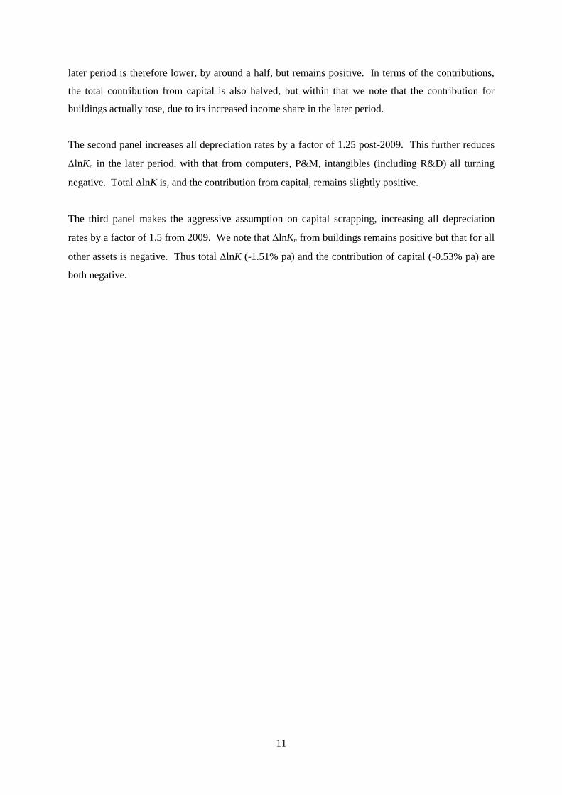
empirical matter and so we calculate lnK using different capital scrapping assumptions. Table 3 sets
out details.
Table 3 suggests the following. Consider first the income shares in the first column for each asset.
Note that these are shares of value-added and so sum to the market sector share for capital
compensation (0.36 in 2000-07). Around one-third of this is from buildings, which also accounts for
over 40% of the total capital contribution in 2000-07 due to strong growth in the stock of buildings
throughout the commercial property boom in the 2000s. Non-computer plant & machinery (P&M)
has a similarly high share but a smaller contribution as the growth in the stock of P&M is lower.
Looking at the first panel, our baseline estimates with no additional assumption for premature
scrapping, we notice is that, for each asset, lnKn has declined since the recession. Total lnK in the
11
Where k is an asset-specific tax-adjustment factor, k is a capital gains term and ,I kP is the investment
price.
11
later period is therefore lower, by around a half, but remains positive. In terms of the contributions,
the total contribution from capital is also halved, but within that we note that the contribution for
buildings actually rose, due to its increased income share in the later period.
The second panel increases all depreciation rates by a factor of 1.25 post-2009. This further reduces
lnKn in the later period, with that from computers, P&M, intangibles (including R&D) all turning
negative. Total lnK is, and the contribution from capital, remains slightly positive.
The third panel makes the aggressive assumption on capital scrapping, increasing all depreciation
rates by a factor of 1.5 from 2009. We note that lnKn from buildings remains positive but that for all
other assets is negative. Thus total lnK (-1.51% pa) and the contribution of capital (-0.53% pa) are
both negative.
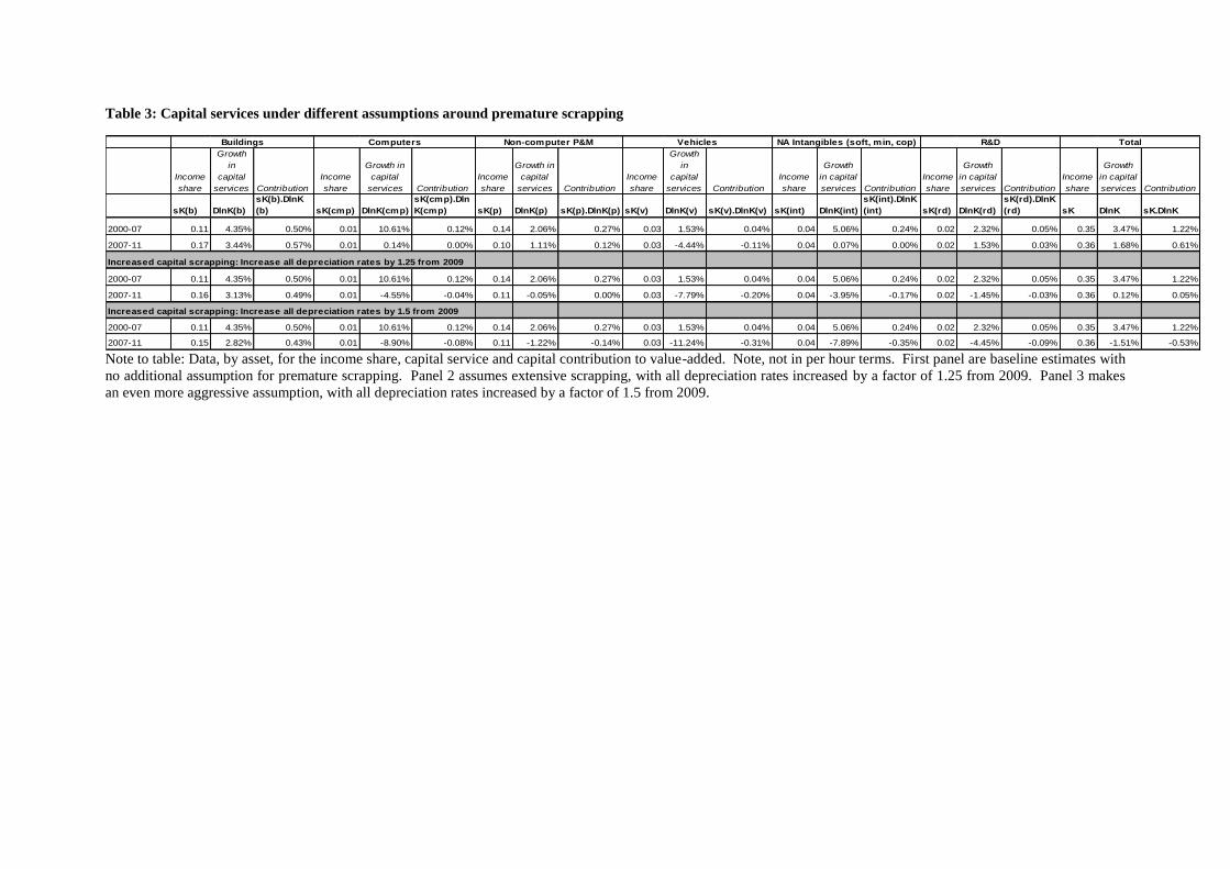
Table 3: Capital services under different assumptions around premature scrapping
Income
share
Growth
in
capital
services Contribution
Income
share
Growth in
capital
services Contribution
Income
share
Growth in
capital
services Contribution
Income
share
Growth
in
capital
services Contribution
Income
share
Growth
in capital
services Contribution
Income
share
Growth
in capital
services Contribution
Income
share
Growth
in capital
services Contribution
sK(b) DlnK(b)
sK(b).DlnK
(b) sK(cmp) DlnK(cmp)
sK(cmp).Dln
K(cmp) sK(p) DlnK(p) sK(p).DlnK(p) sK(v) DlnK(v) sK(v).DlnK(v) sK(int) DlnK(int)
sK(int).DlnK
(int) sK(rd) DlnK(rd)
sK(rd).DlnK
(rd) sK DlnK sK.DlnK
2000-07 0.11 4.35% 0.50% 0.01 10.61% 0.12% 0.14 2.06% 0.27% 0.03 1.53% 0.04% 0.04 5.06% 0.24% 0.02 2.32% 0.05% 0.35 3.47% 1.22%
2007-11 0.17 3.44% 0.57% 0.01 0.14% 0.00% 0.10 1.11% 0.12% 0.03 -4.44% -0.11% 0.04 0.07% 0.00% 0.02 1.53% 0.03% 0.36 1.68% 0.61%
Increased capital scrapping: Increase all depreciation rates by 1.25 from 2009
2000-07 0.11 4.35% 0.50% 0.01 10.61% 0.12% 0.14 2.06% 0.27% 0.03 1.53% 0.04% 0.04 5.06% 0.24% 0.02 2.32% 0.05% 0.35 3.47% 1.22%
2007-11 0.16 3.13% 0.49% 0.01 -4.55% -0.04% 0.11 -0.05% 0.00% 0.03 -7.79% -0.20% 0.04 -3.95% -0.17% 0.02 -1.45% -0.03% 0.36 0.12% 0.05%
Increased capital scrapping: Increase all depreciation rates by 1.5 from 2009
2000-07 0.11 4.35% 0.50% 0.01 10.61% 0.12% 0.14 2.06% 0.27% 0.03 1.53% 0.04% 0.04 5.06% 0.24% 0.02 2.32% 0.05% 0.35 3.47% 1.22%
2007-11 0.15 2.82% 0.43% 0.01 -8.90% -0.08% 0.11 -1.22% -0.14% 0.03 -11.24% -0.31% 0.04 -7.89% -0.35% 0.02 -4.45% -0.09% 0.36 -1.51% -0.53%
TotalBuildings Computers Non-computer P&M Vehicles NA Intangibles (soft, min, cop) R&D
Note to table: Data, by asset, for the income share, capital service and capital contribution to value-added. Note, not in per hour terms. First panel are baseline estimates with
no additional assumption for premature scrapping. Panel 2 assumes extensive scrapping, with all depreciation rates increased by a factor of 1.25 from 2009. Panel 3 makes
an even more aggressive assumption, with all depreciation rates increased by a factor of 1.5 from 2009.

1
Empirical evidence on scrapping rates is limited, particularly recent evidence. Harris and Drinkwater
(2000) estimate that adjusting the manufacturing capital stock for plant closures over the period 1970
to 1993 leaves the capital stock 44% lower in 1993 compared with making no allowance for plant
closures. Their estimated annual rate of premature scrapping is consistent with scaling up depreciation
rates by a factor of 1.5 over post-2009. But their scrapping rate is estimated for an industry that was in
secular decline over their estimation period with manufacturing’s share of the net capital stock falling
from 32% to 23%, suggesting that it may be an overestimate.
Thus even with strong assumptions on capital scrapping, capital shallowing does not appear to explain
the puzzle. What Table 3 emphasises however is the dominance of buildings in the measurement of
lnK and thus the contribution of capital. As shown in the third panel, even when we increase
depreciation rates by a factor of 1.5 post-2009, lnKn from buildings still grow on average at 2.82%
pa in the 2007-11 period, and the contribution from buildings capital deepening to labour productivity
is still 0.43% pa. But what if there is an excess supply of buildings capital following the commercial
property boom earlier in the 2000s, such that buildings are less utilised than in earlier periods?
According to the Berndt-Fuss-Hulten theorem, utilisation is captured in the rental price, via a reduced
rate of return (r) and the asset price (PI). However, if that is not the case, the contribution of buildings
may be over-estimated. Therefore it is of interest to look at some data on the utilisation of buildings.
Figure 3 presents data on UK commercial property vacancies.
Figure 3: Commercial property vacancies (as % of total commercial property)
0.0
2.0
4.0
6.0
8.0
10.0
12.0
14.0
16.0
18.0
Notes to figure: Data on IPD annual void rates.
Source: IPD UK Annual Property Index.
The data show vacancy rates increasing from 11% in 2006 to 16% in 2009, and remaining at a similar
level before increasing to 17% in 2012. If such a series accounts for the utilisation of buildings then
the “true” contribution of buildings is: (1 ) lnB Bv s K where v is the vacancy rate. In 2012, (1-
v)=83%. Therefore, TFP may be over-estimated by (0.17*0.43=)0.07% pa due to overestimation of
2
the utilisation of buildings. Therefore even if under-utilisation is not captured in the rental price, this
also does not appear to provide a significant explanation of the TFP puzzle.
With these capital service data in mind, we turn to the impact on labour productivity. To look at the
impact of capital scrapping, we start with the data we have calculated using standard depreciation
assumptions. Those results are shown in the top panel of Table 4. The table is set out as follows.
Panel 1 are our baseline estimates with no assumption for capital scrapping. Panel 2 presents results
when we increase all depreciation rates by a factor of 1.25 from 2009. As shown in columns 3 to 6,
this reduces the contribution of lnK/H for all assets, such that those for computers, national accounts
intangibles and also R&D turn negative, and that for other tangibles is reduced by around a third.
TFP thus increases by around a quarter to -1.53% pa. Note 1.25 is considered to proxy for the upper
bound of potential capital scrapping. Panel 3 takes this further, increasing all depreciation rates by a
factor of 1.5 post-2009, an assumption far stronger than available evidence would suggest. Here, the
contributions of lnK/H are reduced further, and TFP increases to -0.95% pa.
Note that the rise of depreciation rates is consistent with both increased scrapping in a physical sense,
but also higher obsolescence. That might be due to, say a fall in demand, rendering some goods,
particularly intangibles like software etc useless.
Table 4: Estimates of potential impact of capital scrapping
1 2 3 4 5 6 7 8
DlnV/H sDln(L/H)
sDln(K/H)
cmp
sDln(K/H)
othtan
sDln(K/H)
NA intan
sDln(K/H)
rd DlnTFP
Memo:
sLAB
1990-00 2.94% 0.21% 0.31% 0.80% 0.23% 0.04% 1.34% 0.62
2000-07 2.54% 0.22% 0.12% 0.74% 0.23% 0.04% 1.19% 0.65
2007-11 -0.47% 0.63% 0.01% 0.88% 0.05% 0.05% -2.09% 0.64
1990-00 2.94% 0.21% 0.31% 0.80% 0.23% 0.04% 1.34% 0.62
2000-07 2.54% 0.22% 0.12% 0.74% 0.23% 0.04% 1.19% 0.65
2007-11 -0.47% 0.63% -0.03% 0.59% -0.13% -0.01% -1.53% 0.64
1990-00 2.94% 0.21% 0.31% 0.80% 0.23% 0.04% 1.34% 0.62
2000-07 2.54% 0.22% 0.12% 0.74% 0.23% 0.04% 1.19% 0.65
2007-11 -0.47% 0.63% -0.07% 0.29% -0.30% -0.07% -0.95% 0.64
Δln(V/H): With National Accounts Intangibles plus R&D
a) Baseline (no scrapping)
b) Increase depreciation rates by 1.25 from 2009
c) Increase depreciation rates by 1.5 from 2009
Notes to table. Data are average growth rates per year for intervals shown, calculated as changes in natural logs.
Contributions are Tornqvist indices. In panel 1, data are a decomposition of labour productivity in per hour
terms, with no assumption on premature scrapping. In panel 2, depreciation rates are increased by a factor of
1.25 from 2009. In panel 3, depreciation rates are increased by a factor of 1.5 from 2009. First column is
growth in value-added per hour. Column 2 is the contribution of labour services per hour, namely growth in
labour services per hour times share of labour in MSGVA. Column 3 is growth in computer capital services per
hour times share in MSGVA. Column 4 is growth in other tangible capital services (buildings, plant, vehicles)
per hour times share in MSGVA. Column 5 is growth in intangible capital services per hour times share in
MSGVA, where intangibles are those already capitalised in the national accounts, namely software, mineral

3
exploration and artistic originals. Column 6 is R&D capital services per hour times share in MSGVA, with
R&D due to be capitalised in the UK accounts at the time of writing. The price index used for R&D is the
implied MSGVA deflator. Column 7 is TFP, namely column 1 minus the sum of columns 2 to 6. Column 8
presents the share of labour payments in MSGVA.
Do we have any independent evidence for premature scrapping? An indicator that is commonly used
as a proxy for premature scrapping is the corporate insolvency rate. Indeed, the ONS adjust their
capital stock estimates for firm bankruptcy using data on corporate insolvency. They assume that 50%
of a bankrupt firm’s capital stock is lost from the aggregate measure. But this only captures capital
stock lost due to firm bankruptcy and not premature scrapping by continuing firms. The corporate
insolvency rate has remained very low by historical standards during the crisis.
Disposals are not a direct measure of premature scrapping because a disposal is a sale to another firm
or household. However, they are an indicator of firms actively disposing of assets and trying to reduce
their capital stock. Disposals have remained very low since 2009 and the fall in business investment
during the crisis reflects a sharp fall in acquisitions rather than an increase in disposals. This could be
regarded as evidence of limited premature scrapping although it could just be a result of a very limited
market for used capital goods.
A failure to account for premature scrapping would lead to lnK/H being too high. But there are also
reasons to believe lnK/H may be too low. During recessions, when firms are credit constrained or
because uncertainty has risen, they may choose not to replace older assets at the same rate as usual.
To examine this, Figure 4 shows new evidence on life lengthening. Our capital stock data shows a
sharp fall in the net stock of vehicles over the crisis but SMMT data shows that the number of
commercial vehicles on the road has stayed the same. This tells us nothing about the efficiency of
those vehicles on road but it does suggest that firms have been holding on to assets (vehicles at least)
for longer. This is consistent with the lack of any increase in secondary capital markets (low
disposals).
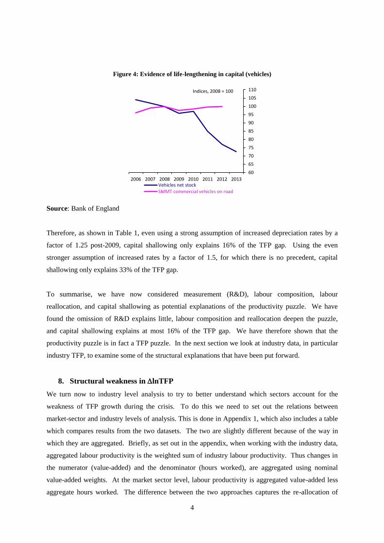
4
Figure 4: Evidence of life-lengthening in capital (vehicles)
Source: Bank of England
Therefore, as shown in Table 1, even using a strong assumption of increased depreciation rates by a
factor of 1.25 post-2009, capital shallowing only explains 16% of the TFP gap. Using the even
stronger assumption of increased rates by a factor of 1.5, for which there is no precedent, capital
shallowing only explains 33% of the TFP gap.
To summarise, we have now considered measurement (R&D), labour composition, labour
reallocation, and capital shallowing as potential explanations of the productivity puzzle. We have
found the omission of R&D explains little, labour composition and reallocation deepen the puzzle,
and capital shallowing explains at most 16% of the TFP gap. We have therefore shown that the
productivity puzzle is in fact a TFP puzzle. In the next section we look at industry data, in particular
industry TFP, to examine some of the structural explanations that have been put forward.
8. Structural weakness in lnTFP
We turn now to industry level analysis to try to better understand which sectors account for the
weakness of TFP growth during the crisis. To do this we need to set out the relations between
market-sector and industry levels of analysis. This is done in Appendix 1, which also includes a table
which compares results from the two datasets. The two are slightly different because of the way in
which they are aggregated. Briefly, as set out in the appendix, when working with the industry data,
aggregated labour productivity is the weighted sum of industry labour productivity. Thus changes in
the numerator (value-added) and the denominator (hours worked), are aggregated using nominal
value-added weights. At the market sector level, labour productivity is aggregated value-added less
aggregate hours worked. The difference between the two approaches captures the re-allocation of
60
65
70
75
80
85
90
95
100
105
110
2006 2007 2008 2009 2010 2011 2012 2013Vehicles net stockSMMT commercial vehicles on road
Indices, 2008 = 100

5
labour between industries with different levels of labour productivity. Similar differences occur in the
contributions of labour composition and capital deepening. In some years this re-allocation term is
quite large causing differences between the two datasets.12
Figure 5 sets out our industry results. The top histogram is for the whole market sector using our
industry data and, in the top two bars shows the slowdown in lnV/H=(lnV/H) and in lnTFP (that
is (lnV/H)=lnV/H 00-07
- lnV/H07-11
). On these data, (lnV/H)= 3.58%, most of which was
explained by (lnTFP)=3.15, which is (3.15/3.58=)88% of the productivity slowdown. This is
slightly less than on the market sector data for reasons set out immediately above. The rest of the bars
in the top part of Figure 5 confirm that slowdowns lnK/H and lnL/H do not explain lnV/H.
Figure 5: Industry productivity slowdowns (top panel = market sector; following panels = nine
underlying industries)
Note to table: data show slowdowns for each industry, where each bar is is (lnX)=lnX 00-07
-
lnX07-11
). Note these slowdowns do not add up to the overall slowdown since they have to be
weighted to do so: these are unweighted data.
Source: authors’ calculations, see text.
12
For instance, consider capital deepening. At the aggregate level, capital deepening is: (ΔlnK – ΔlnH), where
H is a simple addition of hours worked i.e. H=ΣHi. Similarly at the industry-level, industry capital deepening is:
(ΔlnKi – ΔlnHi). However, when we aggregate industry capital deepening to the market sector, that is: sV
i sK
i
(ΔlnKi – ΔlnHi), the estimates are different as ln lnV
i i is H H . The same is true for the aggregation
of labour composition. There is a further slight differences between the datasets, as explained in the appendix.
-1 0 1 2 3 4
Agriculture, Mining and Utilities
Manufacturing
Construction
Wholesale and Retail Trade,Accomodation and Food
Transportation and Storage
Information and Communication
Financial Services
Professional and AdministrativeServices
Recreational and PersonalServices
Market Sector
Δln(V/H): Slowdown
ΔlnTFP: Slowdown
sK.Δln(K/H) othtan: Slowdown
sK.Δln(K/H) intang: Slowdown
sL.Δln(L/H)
6
The data for each industry (note these are the actual slowdown data; the contributions of the sectors to
the whole require these data to be multiplied by value added shares of each sector which we set out
below). The red (TFP) and blue (labour productivity) lines are the highest in each case, again
stressing that the DlnV/H slowdown is accounted for in each industry mostly by a DlnTFP slowdown.
The only exception to this is in Agriculture, Mining and Utilities, where the slowdown in tangible
capital (the blue line) accounts for 32% of the DlnV/H slowdown.
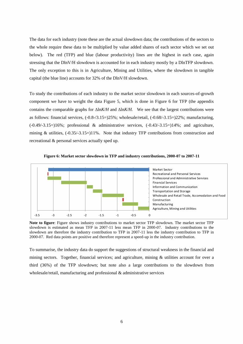
To study the contributions of each industry to the market sector slowdown in each sources-of-growth
component we have to weight the data Figure 5, which is done in Figure 6 for TFP (the appendix
contains the comparable graphs for lnK/H and lnK/H. We see that the largest contributions were
as follows: financial services, (-0.8-/3.15=)25%; wholesale/retail, (-0.68/-3.15=)22%; manufacturing,
(-0.49/-3.15=)16%; professional & administrative services, (-0.43/-3.15=)14%; and agriculture,
mining & utilities, (-0.35/-3.15=)11%. Note that industry TFP contributions from construction and
recreational & personal services actually sped up.
Figure 6: Market sector slowdown in TFP and industry contributions, 2000-07 to 2007-11
-3.5 -3 -2.5 -2 -1.5 -1 -0.5 0
Agriculture, Mining and Utilities
Manufacturing
Construction
Wholesale and Retail Trade, Accomodation and Food
Transportation and Storage
Information and Communication
Financial Services
Professional and Administrative Services
Recreational and Personal Services
Market Sector
Note to figure: Figure shows industry contributions to market sector TFP slowdown. The market sector TFP
slowdown is estimated as mean TFP in 2007-11 less mean TFP in 2000-07. Industry contributions to the
slowdown are therefore the industry contribution to TFP in 2007-11 less the industry contribution to TFP in
2000-07. Red data points are positive and therefore represent a speed-up in the industry contribution.
To summarise, the industry data do support the suggestions of structural weakness in the financial and
mining sectors. Together, financial services; and agriculture, mining & utilities account for over a
third (36%) of the TFP slowdown; but note also a large contributions to the slowdown from
wholesale/retail, manufacturing and professional & administrative services
7
9. The outlook for TFP growth
McCafferty (2014) suggests possible productivity declines due to declining fecundity of North Sea Oil
as well as minimum staffing requirements in what is a very capital-intensive industry. In finance, he
notes the move away from riskier types of activity, the necessity of maintaining a minimum operating
scale, and increased staffing required to meet stricter regulation and maintain a greater focus on risk
management. In transportation and storage, he argues that continuing tightening of security regulation
might harm future productivity.
If we consider the future path of lnTFP, starting from 1.2%pa 2000-07 period, this already includes
the drag from the oil and gas sector, which we might expect to continue. Suppose that TFP growth in
the financial sector will be lower than it was pre-crisis due to increased regulation. According to our
industry data, contribution to total TFP of the financial sector was 26% of aggregate TFP, 2000-07. If
this contribution drops by one-half to 13%, then future lnTFP slows to 1.0%pa (1.2%pa*(1-0.13)).
This could of course be higher in the short run if there was a catch-up effect.
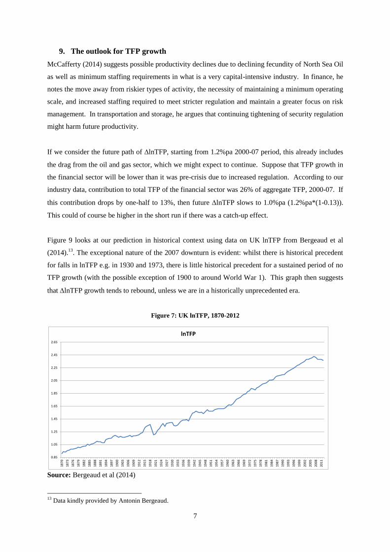
Figure 9 looks at our prediction in historical context using data on UK lnTFP from Bergeaud et al
(2014).13
. The exceptional nature of the 2007 downturn is evident: whilst there is historical precedent
for falls in lnTFP e.g. in 1930 and 1973, there is little historical precedent for a sustained period of no
TFP growth (with the possible exception of 1900 to around World War 1). This graph then suggests
that lnTFP growth tends to rebound, unless we are in a historically unprecedented era.
Figure 7: UK lnTFP, 1870-2012
0.85
1.05
1.25
1.45
1.65
1.85
2.05
2.25
2.45
2.65
18
70
18
73
18
76
18
79
18
82
18
85
18
88
18
91
18
94
18
97
19
00
19
03
19
06
19
09
19
12
19
15
19
18
19
21
19
24
19
27
19
30
19
33
19
36
19
39
19
42
19
45
19
48
19
51
19
54
19
57
19
60
19
63
19
66
19
69
19
72
19
75
19
78
19
81
19
84
19
87
19
90
19
93
19
96
19
99
20
02
20
05
20
08
20
11
lnTFP
Source: Bergeaud et al (2014)
13
Data kindly provided by Antonin Bergeaud.
8
10. Summary and the outlook for TFP growth
We have revisited the UK productivity puzzle using a new set of data on outputs and inputs and
clarifying the role of output mismeasurement, input growth and industry effects. The productivity
puzzle is a TFP puzzle: the productivity slowdown cannot plausibly be explained by slowdowns in
labour and capital services, conventionally measured. So the TFP puzzle is a 12.9% gap with respect
to pre-crisis TFP levels. The inclusion of R&D makes very little difference, and labour composition
and labour reallocation only serve to deepen the puzzle. We find that 34% of the TFP productivity
puzzle can be explained by arguably structural weakness in the oil and gas and financial sectors. A
further 16% could be explained by premature scrapping. Finally, continued weakness in finance
would suggest a future lowering of TFP growth from 1.2% to 1%, but historical data does not show a
long period of zero or negative TFP growth.
9
References
Bergeaud et al (2014) Productivity Trends from 1890 to 2012 in Advanced Countries
David M. Byrne, Stephen D. Oliner, and Daniel E. Sichel (2013). “Is the Information Technology
Revolution Over?”. www.federalreserve.gov/pubs/feds/2013/201336/201336pap.pdf
Brynjolfsson, Erik and McAfee, Andrew (2014). The Second Machine Age. New York: Norton.
Franklin, M. and Mistry, P. (2013), “Quality-adjusted Labour Input: Estimates to 2011 and First
Estimates to 2012”, ONS, available at http://www.ons.gov.uk/ons/dcp171766_317119.pdf
Goodridge, P., J. Haskel, and Wallis, G. (2012). "UK Innovation Index: productivity and growth in
UK industries", Nesta Working paper No.12/09, available at
http://www.nesta.org.uk/sites/default/files/uk_innovation_index_productivity_and_growth_in_uk_ind
ustries.pdf
Goodridge, P., J. Haskel, and Wallis, G. (2013). "Can intangible investment explain the UK
productivity puzzle?", National Institute Economic Review 224(1): R48-R58.
Goodridge, P., J. Haskel, and Wallis, G. (2014). "UK Innovation Index 2014", Nesta Working paper
No.14/07, available at http://www.nesta.org.uk/sites/default/files/1407_innovation_index_2014.pdf
Goodridge, P., J. Haskel, and Wallis, G. (2014). "Spillovers from R&D and Other Intangible
Investment: Evidence from UK Industries", Review of Income and Wealth, forthcoming.
Hall, B., Mairesse, J. and Mohnen, P. (2009),“Measuring the Returns to R&D”, NBER Working
Paper, No. 15622.
Haskel, J., Goodridge, P., Pesole, A., Awano, G., Franklin, M. and Kastrinaki, Z (2011), “Driving
economic growth: innovation, knowledge spending and productivity growth in the UK”, NESTA
Innovation Index Report, January 2011, available at
http://www.nesta.org.uk/sites/default/files/driving_economic_growth.pdf
Gordon, Robert J. (2012). “Is U. S. Economic Growth Over? Faltering Innovation Confronts the Six
Headwinds,” NBER Working Paper 18315, August.
Gordon, Robert J. (2014). “The Demise of U.S. Economic Growth: Restatement, Rebuttal, and
Reflections” NBER Working Paper 19895, February.
Griliches, Z. (1973) “Research Expenditures and Growth Accounting” , in B. Williams (eds.),
Science and Technology in Economic Growth, Cambridge, NY: Macmillian.
Martin, B. and Rowthorn, R. (2012) “Is the British economy supply constrained? A renewed critique
of productivity pessimism”.
McCafferty, I. (2014), The UK productivity puzzle – a sectoral perspective, Speech given by External
Member of the Monetary Policy Committee, Market News, London. 19 June 2014.
Mokyr, Joel (2013). “Is Technological Progress a Thing of the Past?” EU-Vox essay posted
September 8, downloaded from: http://www.voxeu.org/article/technological-progress-thing-
past
Oulton, N. (2010), “Long Term Implications of the ICT Revolution: Applying the Lessons of Growth
Theory and Growth Accounting”, CEP Discussion Paper No. 1027
Oulton, N. (2013), “Medium and long run prospects for UK growth in the aftermath of the financial
crisis”. CFM discussion paper series, CFM-DP2013-7. Centre For Macroeconomics, London, UK.
Oulton, N. and Sebastia-Barriel, M. (2013), “Long and short-term effects of the financial crisis on
labour productivity, capital and output”, Bank of England Working paper No. 470

10
Oulton, N. and Wallis, G. (2014). “Integrated Estimates of Capital Stocks and Services for the United
Kingdom: 1950-2013”. Paper for the 33rd General Conference of the International Association for
Research in Income and Wealth.
Pessoa and Van Reenen (2013). “The UK Productivity and Jobs Puzzle: Does the Answer Lie in
Labour Market Flexibility?”
Wallis, G. (2012), “Essays in Understanding Investment”, available at
http://discovery.ucl.ac.uk/1369637/1/GW_Thesis.pdf
11
Appendix 1: Relations between industry and aggregate labour productivity
1a. Industry and aggregate labour productivity
Following Stiroh (2012), Jorgenson et al (2003), define labour productivity as value-added per hour
where unsubscripted variables are aggregates and subscript j refers to industry
/
/
V
V
j j j
ALP V H
ALP V H
(2)
Define changes in aggregate real value added as a weighted sum of changes in industry real value
added:
,
, , 1
,
ln ln , , 0.5( )( )
V j j
j j j j j t j t
j V j j
j
P VV w V w w w w
P V
(3)
Aggregate labour hours aggregate as a simple sum of industry hours since they are in natural units
j
j
H H (4)
Rewriting (2) in terms of growth rates gives the relation between lnALP and lnALPj as
ln ln ln ln
ln
j j j j
j j
H
j j
j
ALP w ALP w H H
w ALP R
(5)
Where RH arises because total value added per hour can grow via growth in all industry value added
per hour but also with a reallocation of hours towards high-productivity industries (to see this, note
that the final term in (5), lnH can be written as an hours weighted sum of lnHj so RH>0 if the value
added weight, wj, is above the hours weight i.e. that industry is above average productivity).
1b. industry and market-sector total factor productivity growth
Consider labour and capital of types l and k. Define a labour and capital services as a share-weighted
aggregate, where the shares are averages over adjacent years as follows:
, , , , , ,
1
ln ln ,
ln ln ,
/ ( ), / , , ,
0.5( )
k k
k
l l
l
k K k k K k k l L l l L l l j k j j l j
k l j j
t t t
K w K capital type k
L w L labour type l
w P K P K w P L P L K K k L L l
w w w
(6)
Suppose that for industry j capital and labour (respectively Kj and Lj) produce (value-added) output
Vj. That capital asset might or might not include intangible capital. Thus for each industry, we have
the following value-added defined ΔlnTFPj
12
, ,ln ln ln lnj j K j j L j jTFP V v K v L (7)
Where the terms in “v” are shares of factor costs in industry nominal value-added, averaged over two
periods and Kj and Lj refer to aggregates of capital and labour types for that industry according to (6).
For the economy as a whole, the definition of economy wide ΔlnTFP based on value added is the
same, that is:
ln ln ln lnK LTFP V v K v L (8)
Where the “v” terms here, that are not subscripted by “j”, are shares of K and L payments in economy
wide nominal value added.
We are now in position to write down our desired relationship, that is the relation between economy-
wide real value added growth and its industry contributions
, ,ln ln ln ln lnj j j K j j j L j j j j
j j j j
V w V w v K w v L w TFP
(9)
Which says that the contributions of Kj and Lj to whole-economy value added growth depend upon
the share of Vj in total V (wj) and the shares of Kj and Lj in Vj (vK,j and vL,j) (which multiply out to be
the shares of each capital and labour payment into market sector value added). Thus, if we perform
industry level growth accounting, we can see the contributions of lnLj and lnKj to industry value
added (vL,jlnLj and vK,jlnKj). but their contributions to total value added have then to be multiplied
by wj, namely the share of that industry in total value added.
Turning finally to labour productivity we may write
, ,
ln( / ) ln ln
ln( / ) ln( / ) ln
j j
j
H
j K j j j L j j j j
j j j
V H w V H
w v K H w v L H w TFP R
(10)
Finally, we build a real capital stock via the perpetual inventory method whereby for any capital asset
n, the stock of that assets evolves according to
n, , , , 1(1 )t n t n t n tK I K (11)
Where I is real investment over the relevant period and the geometric rate of depreciation. Real
investment comes from nominal tangible investment deflated by an investment price index. Second,
that investment price is converted into a rental price using the Hall-Jorgenson relation, where we
assume an economy-wide net rate of return such that the capital rental price times the capital stock
equals the total economy-wide operating surplus (on all of this, see for example, Oulton and
Srinivasan, (2003).
As set out above, the different methods to aggregate hours in the two datasets (value-added weighted
sum in the industry file versus a pure aggregation in the market sector file) produce labour re-
allocation terms that mean estimates of labour productivity and the sources of growth differ between
the two datasets.
However, as well as the re-allocation term(s), there are also other differences between our industry
dataset and that for the market sector. First, value-added growth in the two datasets is very slightly
13
different, but differences are very small. The reason is that in the industry file, R&D is capitalised at
the industry-level, thus changing real-industry output growth. The nominal weights also change as
nominal industry value-added changes. In contrast, in the market sector file we aggregate measured
real industry growth using measured nominal value-added as weights. The measured data are based
on Blue Book 2013 and so R&D is not already capitalised. Then we capitalise R&D after the
aggregation. The two methods give slightly different results. Second, the capital data differs slightly.
In the industry-file, the capital data are constructed using industry and asset-specific depreciation
rates. In the market sector file, depreciation rates are asset specific but are implicitly the same across
industries.
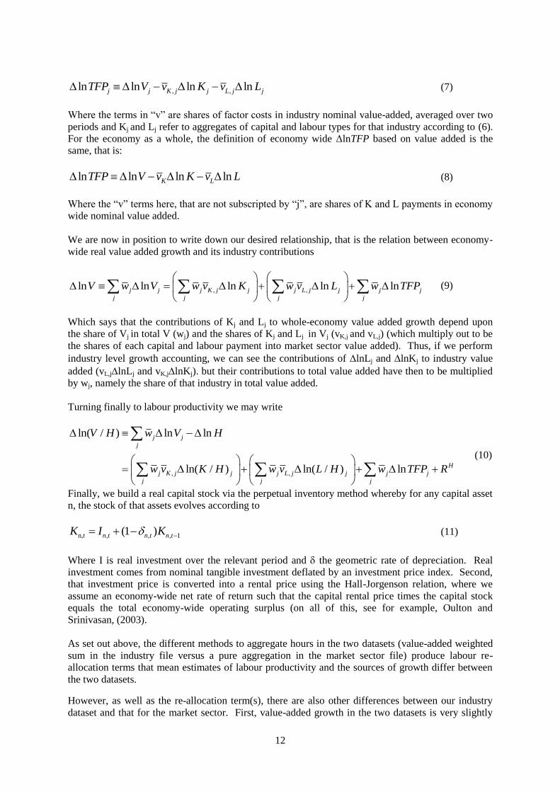
Table A1.1: Growth-accounting decomposition, 2000-11, Aggregate market sector vs industry
aggregation
1 2 3 4 5 6 7
2000-2011
ALPG Total Computers Other tang Intangibles Labour Composition
DlnV/H sDln(K/H) sDln(K/H) cmp sDln(K/H) othtan sDln(K/H) intan sDln(L/H) DlnTFP
Market Sector data, with R&D 1.45% 1.08% 0.08% 0.79% 0.21% 0.37% 0.00%
Aggregated Industry data, with R&D 1.58% 1.31% 0.09% 0.97% 0.24% 0.46% -0.18%
Capital deepening contributions:
Notes to table: All figures are average annual percentages. The contribution of an output or input is the growth
rate weighted by the corresponding average share. Columns are annual average change in natural logs of:
column 1, real value added per hour, column 2, contribution of total capital (which is the sum of the next three
columns), column 3, contribution of IT hardware capital, column 4, contribution of other non-IT tangible
capital, column 5, contribution of intangibles, column 6, contribution of labour services per person hour, column
7, TFP, being column 1 less the sum of columns 2 to 6. Row 1 is based on ONS data for the market sector, with
R&D capitalised. Row 2 is ONS industry data, with R&D capitalised in each industry, 2000-11, aggregated to
the market sector. In each the market sector is defined using our definition of SIC(2007) A-K, MN, R-T.
Source: authors’ calculations
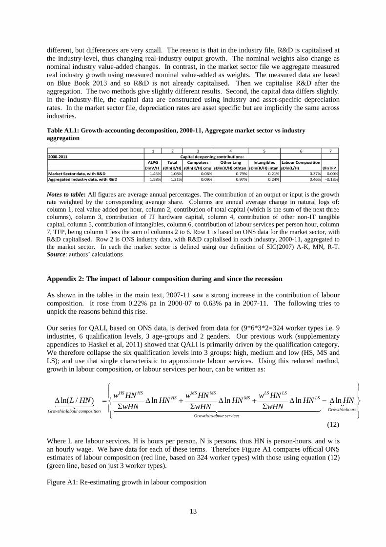
Appendix 2: The impact of labour composition during and since the recession
As shown in the tables in the main text, 2007-11 saw a strong increase in the contribution of labour
composition. It rose from 0.22% pa in 2000-07 to 0.63% pa in 2007-11. The following tries to
unpick the reasons behind this rise.
Our series for QALI, based on ONS data, is derived from data for (9*6*3*2=324 worker types i.e. 9
industries, 6 qualification levels, 3 age-groups and 2 genders. Our previous work (supplementary
appendices to Haskel et al, 2011) showed that QALI is primarily driven by the qualification category.
We therefore collapse the six qualification levels into 3 groups: high, medium and low (HS, MS and
LS); and use that single characteristic to approximate labour services. Using this reduced method,
growth in labour composition, or labour services per hour, can be written as:
ln( / ) ln ln ln lnHS HS MS MS LS LS
HS MS LS
GrowthinhoursGrowthinlabour compositionGrowthinlabour services
w HN w HN w HNL HN HN HN HN HN
wHN wHN wHN
(12)
Where L are labour services, H is hours per person, N is persons, thus HN is person-hours, and w is
an hourly wage. We have data for each of these terms. Therefore Figure A1 compares official ONS
estimates of labour composition (red line, based on 324 worker types) with those using equation (12)
(green line, based on just 3 worker types).
Figure A1: Re-estimating growth in labour composition

14
Note to figure: Red line is official data on growth in labour composition. Green line is an approximation based
on equation (12).
We now look in detail at the terms in equation (12) to understand what has changed and what drives
the growth in labour composition from 2008. The following table presents averages for each term.
Table A1: Period averages for terms in equation (12)
Growth in
labour
composition
Income
weight: High
skilled
Growth in
Hours: High
skilled
Income
weight:
medium
skilled
Growth in
Hours:
Medium
skilled
Income
weight:
Low
skilled
Growth in
Hours: Low
skilled
Growth in
aggregate
hours
Memo:
contribution of
labour composition
2000-07 0.35% 0.27 4.16% 0.35 -0.88% 0.37 -0.50% 0.25% 0.22%
2007-11 1.00% 0.33 3.50% 0.33 -0.79% 0.34 -3.76% -0.37% 0.63%
HS HSw HN
wHNln( / )L HN ln HSHN
MS MSw HN
wHNln MSHN
LS LSw HN
wHN ln LSHN ln HN ln( / )Ls L HN
Note to table: period averages (before and after recession) for all terms in equation (12)
Source: ONS data
What has changed according to Table A1? First, we see that the income share for the high-skilled has
increased, at the expense of both the medium-skilled and low-skilled. Second, there is a strong fall in
the growth of low-skilled hours, falling from -0.5% pa to -3.76% pa.
Let us first consider the change in the income shares. In principle, this change could be driven by
either: (a) changes in relative wages; or (b) changes in employment shares. Table A2 compares
annual income and employment shares for each of our three worker types over the period in question.
Table A2: Income and employment shares: HS, MS, LS
(1)
Employment
share: High
skilled
(2) Income
share: High
skilled
(3)
Difference:
High skilled
(4)
Employment
share: Medium
skilled
(5) Income
share:
Medium
skilled
(6) Difference:
Medium skilled
(7)
Employment
share: Low
skilled
(8) Income
share: Low
skilled
(9)
Difference:
Low skilled
year =(1)-(2) =(4)-(5) =(7)-(8)
2001 0.17 0.26 0.09 0.35 0.36 0.01 0.48 0.38 -0.09
2002 0.17 0.26 0.09 0.36 0.36 0.00 0.47 0.38 -0.09
2003 0.18 0.27 0.09 0.35 0.35 0.00 0.47 0.38 -0.09
2004 0.18 0.27 0.09 0.35 0.35 0.00 0.46 0.37 -0.09
2005 0.19 0.28 0.09 0.35 0.35 0.00 0.46 0.37 -0.09
2006 0.20 0.29 0.08 0.34 0.35 0.01 0.46 0.36 -0.09
2007 0.22 0.30 0.08 0.33 0.34 0.01 0.45 0.36 -0.09
2008 0.22 0.31 0.09 0.33 0.33 0.00 0.45 0.36 -0.09
2009 0.23 0.32 0.09 0.33 0.32 -0.01 0.44 0.35 -0.09
2010 0.24 0.33 0.09 0.34 0.33 -0.01 0.42 0.34 -0.08
2011 0.26 0.35 0.09 0.34 0.33 -0.01 0.40 0.32 -0.08
HS HSw HN
wHN
MS MSw HN
wHN
LS LSw HN
wHN
HSHN
HN
MSHN
HN
LSHN
HN
-0.60%
-0.40%
-0.20%
0.00%
0.20%
0.40%
0.60%
0.80%
1.00%
1.20%
1.40%
20
01
20
02
20
03
20
04
20
05
20
06
20
07
20
08
20
09
20
10
20
11
20
12
Δln(L/H) [ONS]
Δln(L/H) [Approximation]
15
Source: ONS data
The first thing to note is that the employment share of the high-skilled has increased significantly over
the period, and that of the low-skilled has decreased. Second, the income shares have changed
similarly, such that the difference between the income and employment shares is very stable over the
whole period. Any changes in relative wages have therefore been small.
Therefore, relating this to Table A1, increased growth in labour composition is driven by (a) an
increased employment share for the high-skilled, and (b) strong falls in hours worked of the low-
skilled. Of course, these two things are related, with employment consisting of more hours worked by
the former at the expense of the latter.
Growth in labour composition is therefore driven by the fall in low-skilled hours worked, first through
the fall in ΔlnHLS
, and second through the reduced employment (and hence income) income share for
the low-skilled, and the higher employment (and hence income) share for the high-skilled. In
principle, the fall in low-skilled hours could come from two sources. The first is reduced hours-per-
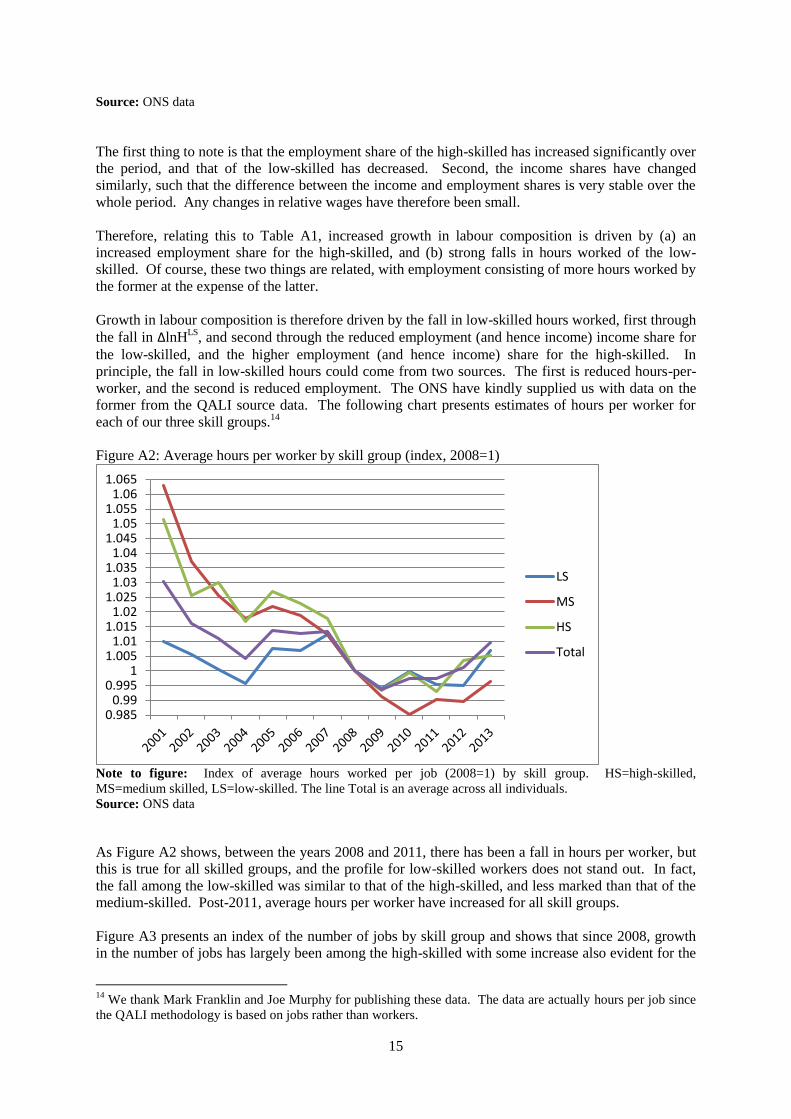
worker, and the second is reduced employment. The ONS have kindly supplied us with data on the
former from the QALI source data. The following chart presents estimates of hours per worker for
each of our three skill groups.14
Figure A2: Average hours per worker by skill group (index, 2008=1)
Note to figure: Index of average hours worked per job (2008=1) by skill group. HS=high-skilled,
MS=medium skilled, LS=low-skilled. The line Total is an average across all individuals.
Source: ONS data
As Figure A2 shows, between the years 2008 and 2011, there has been a fall in hours per worker, but
this is true for all skilled groups, and the profile for low-skilled workers does not stand out. In fact,
the fall among the low-skilled was similar to that of the high-skilled, and less marked than that of the
medium-skilled. Post-2011, average hours per worker have increased for all skill groups.
Figure A3 presents an index of the number of jobs by skill group and shows that since 2008, growth
in the number of jobs has largely been among the high-skilled with some increase also evident for the
14
We thank Mark Franklin and Joe Murphy for publishing these data. The data are actually hours per job since
the QALI methodology is based on jobs rather than workers.
0.9850.99
0.9951
1.0051.01
1.0151.02
1.0251.03
1.0351.04
1.0451.05
1.0551.06
1.065
LS
MS
HS
Total

16
medium-skilled. In the case of the high-skilled, this is part of a long-term trend, hence the similarity in
growth in high skilled hours in both 2000-07 and 2007-11, shown in Table A1.
Figure A3: Number of jobs by skill group (index, 2008=1)
0.7
0.75
0.8
0.85
0.9
0.95
1
1.05
1.1
1.15
1.2
1.25
1.3
LS
MS
HS
Total
Note to figure: Index of number of jobs (2008=1) by skill group. HS=high-skilled, MS=medium-skilled,
LS=low-skilled. The line Total is an average across all individuals.
Thus we conclude that increased growth in labour composition in the 2007-11 period reflects reduced
employment of low-skilled workers.
Appendix 3: The impact of labour re-allocation during and since the recession
It has also been suggested that one of the reasons behind the productivity puzzle is the re-allocation of
labour from high- to low-productivity industries. In the context of an argument around labour
hoarding, Martin and Rowthorn (2012) argue that increased employment since the recession is
derived from increases in low-skilled labour in low-productivity industries. Our study of the data on
labour composition (see Appendix 2) shows however that this is not the case. Appendix 1 also shows
another term we can examine to look specifically at the effect of reallocation of labour between
industries. Table 2 was based on a decomposition of aggregate market sector value-added. However,
we also work with an industry dataset. As shown in Appendix 1, aggregation of industry productivity
produces a reallocation term, showing the effect on aggregated labour productivity of the changing
distribution of hours worked across industries.
Figure A3.1 presents a comparison of changes in aggregate person-hours worked (ΔlnHN) with
changes in a value-added weighted aggregate across industries (ΣvjΔlnHNj). The difference between
the two is the labour reallocation term shown in Appendix 1 (RH).
Figure A3.1: Aggregate hours worked and a weighted industry total: Labour re-allocation

17
-5
-4
-3
-2
-1
0
1
2
2001 2002 2003 2004 2005 2006 2007 2008 2009 2010 2011ΣvjΔlnHNj
ΔlnHN
REALL
Note to figure: ΔlnHN are changes in aggregate hours worked in the UK market sector. ΣvjΔlnHNj is
a value-added weighted aggregate of industry changes. The difference between them is the labour
reallocation term set out in Appendix 1.
Source: authors’ calculations
Appendix 4: Impact of capitalisation of R&D
Table 2 provides some more details. Comparing panel 1 to panel 2, capitalisation of R&D means
DlnV/H is hardly affected. But R&D generates a new asset thus adding to the share of DlnV/H
accounted for by capital inputs, and the table shows it accounts for around 0.04%pa. There is rise in
this contribution since 2007, but only to 0.05%pa and hence TFP growth is similar.
How robust is this finding? Of course capitalisation of R&D requires some estimate of the price of
R&D. In Table 2 we assumed that the price of R&D can be approximated using the implied market
sector GVA (MSGVA) deflator. In the official measurement the current plan is to employ a share-
weighed input price index for R&D, which is likely well approximated by the MSGVA deflator.
Three observations suggest that using the MSGVA deflator overstates the price deflator for R&D, and
so understates the impact of R&D on the economy. First, many knowledge-intensive prices have been
falling relative to wider GVA. Second, the advent of the internet and computers would seem to be a
potential large rise in the capability of innovators to innovate, which would again suggest a lowering
of the price of knowledge, in contrast to the rise in prices implied by the MSGVA deflator. Third, this
second effect may have been enhanced by the emergence of (big) data and increased use of data
analytics, which may also have positive effects on productivity in R&D production. Thus use of the
MSGVA deflator almost certainly understates the importance of knowledge assets.
Therefore in Table 5 we experiment with alternative deflators. In panel 1 we use the MSGVA
deflator. In panel 2 we use the R&D deflator developed by the US BEA, which is a share-weighted
input price index but with an adjustment for assumed productivity growth in R&D production. In
panel 3 we use a deflator that implies even stronger productivity growth in R&D production than is
implicitly assumed in the BEA R&D price index. One knowledge intensive output with fast-falling
prices is pre-packaged software. We therefore use the BEA deflator for pre-packaged software to test
just how much that effects the estimated contribution of R&D.
Table 5: Alternative deflators for R&D, 1990-2011
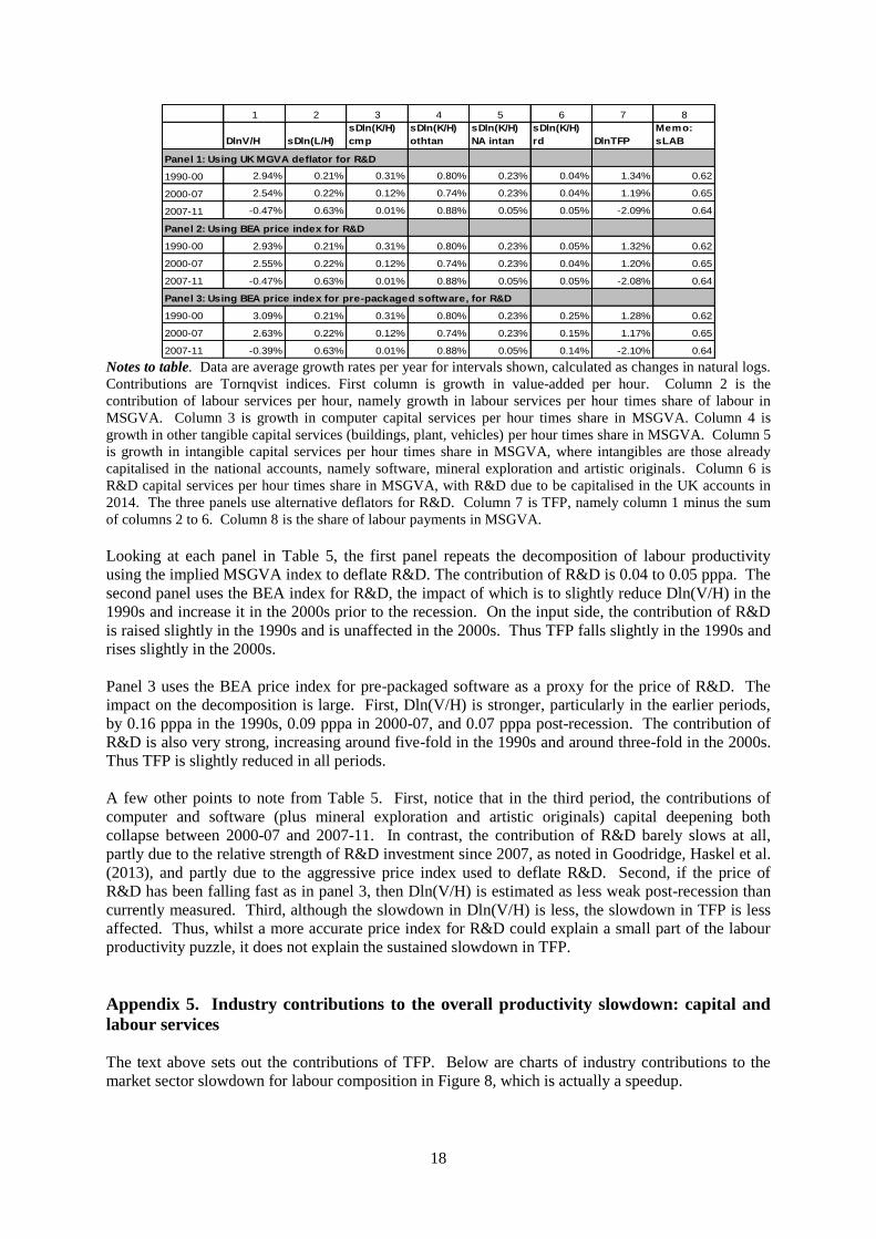
18
1 2 3 4 5 6 7 8
DlnV/H sDln(L/H)
sDln(K/H)
cmp
sDln(K/H)
othtan
sDln(K/H)
NA intan
sDln(K/H)
rd DlnTFP
Memo:
sLAB
Panel 1: Using UK MGVA deflator for R&D
1990-00 2.94% 0.21% 0.31% 0.80% 0.23% 0.04% 1.34% 0.62
2000-07 2.54% 0.22% 0.12% 0.74% 0.23% 0.04% 1.19% 0.65
2007-11 -0.47% 0.63% 0.01% 0.88% 0.05% 0.05% -2.09% 0.64
Panel 2: Using BEA price index for R&D
1990-00 2.93% 0.21% 0.31% 0.80% 0.23% 0.05% 1.32% 0.62
2000-07 2.55% 0.22% 0.12% 0.74% 0.23% 0.04% 1.20% 0.65
2007-11 -0.47% 0.63% 0.01% 0.88% 0.05% 0.05% -2.08% 0.64
Panel 3: Using BEA price index for pre-packaged software, for R&D
1990-00 3.09% 0.21% 0.31% 0.80% 0.23% 0.25% 1.28% 0.62
2000-07 2.63% 0.22% 0.12% 0.74% 0.23% 0.15% 1.17% 0.65
2007-11 -0.39% 0.63% 0.01% 0.88% 0.05% 0.14% -2.10% 0.64 Notes to table. Data are average growth rates per year for intervals shown, calculated as changes in natural logs.
Contributions are Tornqvist indices. First column is growth in value-added per hour. Column 2 is the
contribution of labour services per hour, namely growth in labour services per hour times share of labour in
MSGVA. Column 3 is growth in computer capital services per hour times share in MSGVA. Column 4 is
growth in other tangible capital services (buildings, plant, vehicles) per hour times share in MSGVA. Column 5
is growth in intangible capital services per hour times share in MSGVA, where intangibles are those already
capitalised in the national accounts, namely software, mineral exploration and artistic originals. Column 6 is
R&D capital services per hour times share in MSGVA, with R&D due to be capitalised in the UK accounts in
2014. The three panels use alternative deflators for R&D. Column 7 is TFP, namely column 1 minus the sum
of columns 2 to 6. Column 8 is the share of labour payments in MSGVA.
Looking at each panel in Table 5, the first panel repeats the decomposition of labour productivity
using the implied MSGVA index to deflate R&D. The contribution of R&D is 0.04 to 0.05 pppa. The
second panel uses the BEA index for R&D, the impact of which is to slightly reduce Dln(V/H) in the
1990s and increase it in the 2000s prior to the recession. On the input side, the contribution of R&D
is raised slightly in the 1990s and is unaffected in the 2000s. Thus TFP falls slightly in the 1990s and
rises slightly in the 2000s.
Panel 3 uses the BEA price index for pre-packaged software as a proxy for the price of R&D. The
impact on the decomposition is large. First, Dln(V/H) is stronger, particularly in the earlier periods,
by 0.16 pppa in the 1990s, 0.09 pppa in 2000-07, and 0.07 pppa post-recession. The contribution of
R&D is also very strong, increasing around five-fold in the 1990s and around three-fold in the 2000s.
Thus TFP is slightly reduced in all periods.
A few other points to note from Table 5. First, notice that in the third period, the contributions of
computer and software (plus mineral exploration and artistic originals) capital deepening both
collapse between 2000-07 and 2007-11. In contrast, the contribution of R&D barely slows at all,
partly due to the relative strength of R&D investment since 2007, as noted in Goodridge, Haskel et al.
(2013), and partly due to the aggressive price index used to deflate R&D. Second, if the price of
R&D has been falling fast as in panel 3, then Dln(V/H) is estimated as less weak post-recession than
currently measured. Third, although the slowdown in Dln(V/H) is less, the slowdown in TFP is less
affected. Thus, whilst a more accurate price index for R&D could explain a small part of the labour
productivity puzzle, it does not explain the sustained slowdown in TFP.
Appendix 5. Industry contributions to the overall productivity slowdown: capital and
labour services
The text above sets out the contributions of TFP. Below are charts of industry contributions to the
market sector slowdown for labour composition in Figure 8, which is actually a speedup.

19
Figure 8: Market sector speed-up in the contribution of labour composition (sLDln(L/H)), 2000-07 to
2007-11
Note to figure: Figure shows industry contributions to the speed-up in the contribution of market sector labour
composition. The market sector labour composition speed-up is estimated as the mean contribution of labour
composition in 2007-11 less the mean contribution in 2000-07. Industry contributions to the speed-up are
therefore the industry contribution in 2007-11 less the industry contribution in 2000-07. Red data points are
negative and therefore represent a slowdown in the industry contribution (the estimate for Agriculture, Mining
and Utilities is marginally negative).
The data show that industry contributions to the speedup in labour composition are dispersed across a
number of sectors. In particular, professional & administrative services contributed (0.07/0.29=)23%
of the speedup. Wholesale/retail, transportation & storage, information & communication, financial
services and recreational & personal services each contributed (0.04/0.29)=13.5% of the speedup.
Next, Figure 9 looks at the industry contributions to the slowdown in the contribution of capital
deepening. It shows that Agriculture, Mining & Utilities accounts for (-0.21/-0.72=)29% of the total
capital deepening contribution slowdown. Information & communication and wholesale/retail also
contribute (-0.12/-0.72=)17% and (-0.1/-0.72=)14% respectively. The contribution of capital
deepening in construction actually speeds up.
Figure 9: Market sector slowdown in the contribution of capital deepening (s
KDln(K/H)), 2000-07 to 2007-
11
-0.8 -0.7 -0.6 -0.5 -0.4 -0.3 -0.2 -0.1 0
Agriculture, Mining and Utilities
Manufacturing
Construction
Wholesale and Retail Trade, Accomodation and Food
Transportation and Storage
Information and Communication
Financial Services
Professional and Administrative Services
Recreational and Personal Services
Market Sector
Note to figure: Figure shows industry contributions to the slowdown in the contribution of market sector capital
deepening. The market sector capital deepening slowdown is estimated as the mean contribution of capital
deepening in 2007-11 less the mean contribution in 2000-07. Industry contributions to the slowdown are
therefore the industry contribution in 2007-11 less the industry contribution in 2000-07. Red data points are
positive and therefore represent a speed-up in the industry contribution.
0 0.05 0.1 0.15 0.2 0.25 0.3
Agriculture, Mining and Utilities
Manufacturing
Construction
Wholesale and Retail Trade, Accomodation and Food
Transportation and Storage
Information and Communication
Financial Services
Professional and Administrative Services
Recreational and Personal Services
Market Sector

This paper has been produced by the Department of Management at Imperial College Business School
Copyright © the authors 2014 All rights reserved
ISSN: 1744-6783
Imperial College Business School Tanaka Building South Kensington Campus London SW7 2AZ United Kingdom
T: +44 (0)20 7589 5111 F: +44 (0)20 7594 9184
www.imperial.ac.uk/business-school