Embed Size (px)
DESCRIPTION
MakeUseOf guide/manual about The Easy Getting Started Guide To Adobe Illustrator
Citation preview


This manual is the intellectual property of MakeUseOf. It must only be published in its original form. Using parts or republishing altered parts of this guide is prohibited without permission from MakeUseOf.com
Think you’ve got what it takes to write a manual for MakeUseOf.com? We’re always willing to hear a pitch! Send your ideas to [email protected]; you might earn up to $400.
By Azamat “Bohed” E. http://truekolor.net
Edited by Justin Pot

GETTING STARTED WITH ILLUSTRATOR
3HTTP://MAKEUSEOF.COMHTTP://TRUEKOLOR.NET, AZAMAT “BOHED” E. share:
Table Of Contents
1. Introduction 5
2. The Illustrator Workspace 6
2.1 Tools Panel 6
3. Creating a Logo in Illustrator 8
3.1 Using Pen Tool 8
3.2 Making Round Corners 10
3.3 Adding Photoshop Effects 11
3.4 Copying Objects 11
3.5 Expand Appearance 13
3.6 Live Trace 14
3.7 Expand 14
3.8 Blur Effect 16
3.9 Grouping objects 16
3.10 Using Rotate tool 16
3.11 A little trick 17
3.12 Drawing a Circle 18
3.13 Arranging Objects 19
3.14 Adding Text 21
3.15 Aligning Objects 22
3.16 Saving and Exporting 24
4. Creating a 3D Text in Illustrator 25
4.1 Adding a Grungy Background 25
4.2 Creating a Rectangle 26
4.3 Adding Inner Glow Effect 27
4.4 Using Transparency Panel 27
4.5 Working with Type tool 28
4.6 Creating Outlines 28
4.7 Adding 3D Effects 29
4.8 Using Unite from Pathfinder panel 30
4.9 Adding Gradient Style 31

GETTING STARTED WITH ILLUSTRATOR
4HTTP://MAKEUSEOF.COMHTTP://TRUEKOLOR.NET, AZAMAT “BOHED” E. share:
4.10 Adding Shadow 32
4.11 Applying Gaussian Blur 33
5. Some useful tips 34
6. Conclusion 34

GETTING STARTED WITH ILLUSTRATOR
5HTTP://MAKEUSEOF.COMHTTP://TRUEKOLOR.NET, AZAMAT “BOHED” E. share:
1. Introduction If you have decided to learn Illustrator, then you need to start with the basics. It’s a really powerful program, but also a complex one. Once you get familiar with the interface, basic tools, palettes and workspace, you will save a lot of time and nerves and your workflow will seem smooth and pleasant.
Adobe Illustrator is a vector drawing program. It is often used to create logos, icons, illustrations, charts, infographics, t-shirts, business cards, stationeries, envelopes, packaging design – you name it. All in all, it is mostly used to create high resolution graphics, which can later be printed as well.
Unlike Photoshop, which stores image information in dots, Illustrator uses mathematical equations when you draw shapes. What’s that about?
It means that vector graphics (like an Illustrator drawing) can be scaled or zoomed to any size without losing quality, while raster images (like an image edited in Photoshop) will pixelate as you scale:
Basically, vector drawings can be scaled to fit skyscraper-size banners; raster images cannot. So if you plan to use your work for various sizes, use a vector based program like Illustrator.
Advantages of Vector Graphics:
• Highresolutionatanysize;
• Smallfilesize;
• Highqualityprint;
• Noresolutionlosswhileediting.
Disadvantages:
• Hardtoproducerealisticdrawings(butstillpossible).
Okay, so you are still reading this guide. That tells me that you really want to get closer with Illustrator, so I am here to share my knowledge with you. In this guide, I will introduce you to the workspace, basic tools, shapes and we’ll create our first logo using this awesome software.
Please note that I am using Illustrator CS5 on Windows, so Mac users will have to use slightly different key combina-tions: Command key instead of Ctrl and Option instead of Alt.

GETTING STARTED WITH ILLUSTRATOR
6HTTP://MAKEUSEOF.COMHTTP://TRUEKOLOR.NET, AZAMAT “BOHED” E. share:
2. The Illustrator Workspace If you are familiar with Photoshop, then the Illustrator workspace won’t surprise you much, since the main parts of it are basically the same:
You will primarily use the Tools panel, since all of the tools that you need are there. To configure an active tool, you will use the Control panel, where all options for the current tool are kept. And, of course, the panel docking area – it keeps such important palettes as Color Swatches, Layers, Stroke options, Appearance, Gradient settings, etc. (all palettes can be switched on or off in Windows menu).
Let’s check out the Tools panel first.
2.1 Tools PanelThere are many tools available in the toolbox, but you don’t have to memorize everything. Just a few of them will do the job.
Here’s a reference table (some tools, like Rectangle, contain more tools inside, which can be selected by holding the tool icon):

GETTING STARTED WITH ILLUSTRATOR
7HTTP://MAKEUSEOF.COMHTTP://TRUEKOLOR.NET, AZAMAT “BOHED” E. share:
I always say that the best way of learning is practicing. So, let’s learn the basic tools by actually using them.

GETTING STARTED WITH ILLUSTRATOR
8HTTP://MAKEUSEOF.COMHTTP://TRUEKOLOR.NET, AZAMAT “BOHED” E. share:
3. Creating a Logo in Illustrator
I usually use Adobe Illustrator to create logos for my clients. Why don’t we try one?
Let’s call our awesome company “LimeWorks”. We’ll need to create a lime and put the name under it. Like this:
Keep in mind though, that we will create a simple logo, just so you get familiar with some tools and methods.
Let’s start with drawing lime segments.
3.1 Using Pen ToolWe’ll use the Pen tool, which is one of the most used tools in Illustrator. It is used to create all kinds of shapes and objects. Select it by clicking on its icon from the toolbox or use the P key.
Using the Pen tool, create your first triangle by clicking three times where you want the edges to be:

GETTING STARTED WITH ILLUSTRATOR
9HTTP://MAKEUSEOF.COMHTTP://TRUEKOLOR.NET, AZAMAT “BOHED” E. share:
Note:asyousee,IuseGrid(Ctrl+”)tobemoreprecise.
To close the path, click on the first point:
Now it is ready to be filled with a color. Make sure the triangle is selected (click on it with Selectiontool, V) and choose a yellow tone:

GETTING STARTED WITH ILLUSTRATOR
10HTTP://MAKEUSEOF.COMHTTP://TRUEKOLOR.NET, AZAMAT “BOHED” E. share:
3.2 Making Round CornersWe need round corners in order to make our lime segment (triangle) look smoother. We’ll use the RoundCorners ef-fect:
In the RoundCorners dialog box, put something like 4mm (I use millimeters as units) and click OK to apply changes:

GETTING STARTED WITH ILLUSTRATOR
11HTTP://MAKEUSEOF.COMHTTP://TRUEKOLOR.NET, AZAMAT “BOHED” E. share:
Looks good. Now let’s add some texture, so it looks more realistic.
3.3 Adding Photoshop EffectsIn Illustrator, when you go to the Effects menu, you will see that there are Illustrator Effects and Photoshop Effects:
We will use StainedGlass (Effects->Texture->StainedGlass).
But before that, we need a copy of our triangle above the original layer.
3.4 Copying ObjectsI’ll show you some quick tips on how to easily copy and paste objects above the current layer and below, while keep-ing the exact position.
To paste a copy of a selected object above the original one in the exact position, first copy it (Ctrl+C) and then paste it using Ctrl+F (if you use Ctrl+V it will paste it in the middle of the screen). To paste it below the original object use Ctrl+B:

GETTING STARTED WITH ILLUSTRATOR
12HTTP://MAKEUSEOF.COMHTTP://TRUEKOLOR.NET, AZAMAT “BOHED” E. share:
OK, so now you know the copy/paste tricks.
Copy and paste our triangle right in front of itself (Ctrl+F), and fill the pasted object with white color:
Open the StainedGlass dialog box and set as mine (Cellsize=17;Borderthickness=2;Lightintensity=0):

GETTING STARTED WITH ILLUSTRATOR
13HTTP://MAKEUSEOF.COMHTTP://TRUEKOLOR.NET, AZAMAT “BOHED” E. share:
3.5 Expand AppearanceExpandAppearance is located in the Object menu and is one of the most important tools in Illustrator. It may require a separate guide to describe in detail, but today we are only learning the basics.
So, in simple terms, ExpandAppearance is used to divide an object into separate paths or images after an effect is applied to it. Well, that sounds a bit confusing. Let’s just use it and see it in action.
Make sure you have selected your white triangle with the StainedGlass effect on it and go to Object->ExpandAppear-ance.Now our object is an image:

GETTING STARTED WITH ILLUSTRATOR
14HTTP://MAKEUSEOF.COMHTTP://TRUEKOLOR.NET, AZAMAT “BOHED” E. share:
3.6 Live TraceAnother cool feature of Illustrator, Livetrace is used to convert raster images into tracing objects. There are some default tracing presets already, but we’ll use Custom settings.
Go to Object->LiveTrace->TracingOptions and set values as below:
3.7 ExpandExpand is used to convert tracing objects into editable paths (vector). After tracing a raster image, you should use Expand.
As our textured object is now traced and ready to be returned to paths, we will use Expand:
GETTING STARTED WITH ILLUSTRATOR
15HTTP://MAKEUSEOF.COMHTTP://TRUEKOLOR.NET, AZAMAT “BOHED” E. share:
As you see, our texture is now a set of paths, but we need to change its color from black to white. This time we will use Stroke (since the texture is a set of strokes):
OK. But it’s now a bit too sharp. Let’s blur it a bit.

GETTING STARTED WITH ILLUSTRATOR
16HTTP://MAKEUSEOF.COMHTTP://TRUEKOLOR.NET, AZAMAT “BOHED” E. share:
3.8 Blur EffectGo to Effects->Blur->GaussianBlur, set radius to 2,8 pixels and you should have this:
At this point, we are done with our lime slice. The rest is easier.
3.9 Grouping objectsAt this point our wedge of lime is ready, and we need to duplicate it. But it is composed of multiple layers (objects), so to make things easier while duplicating, let’s Group them.
To group a set of objects, select them all by dragging your mouse around them and clicking Ctrl+G. Another conve-nient way of selecting multiple objects is holding Shift and clicking on objects.
But since we don’t have any other objects on our artboard you can instead select all objects (Ctrl+A)and group them (Ctrl+G):
3.10 Using Rotate toolRotatetool(R) is used for … guess what? Yes, to rotate objects or shapes.

GETTING STARTED WITH ILLUSTRATOR
17HTTP://MAKEUSEOF.COMHTTP://TRUEKOLOR.NET, AZAMAT “BOHED” E. share:
Select the Rotate tool and Alt+click at the top of the triangle to set our center of rotation. In the pop-up box set as fol-lows and click Copy:
You should have this now:
3.11 A little trickThere’s a little trick (one of many) that will make your Illustrator experience easier in future projects. The trick is just a keyboard shortcut (Ctrl+D). It repeats or applies the latest transformation to the selected object.
It’s handy for our practice as well. Select the new slice and use Ctrl+D 6 times:

GETTING STARTED WITH ILLUSTRATOR
18HTTP://MAKEUSEOF.COMHTTP://TRUEKOLOR.NET, AZAMAT “BOHED” E. share:
Voila! We have a tasty lemon. Now for some details.
First of all, group all the slices together to keep things in order. Then make sure nothing is selected by clicking some-where else on the artboard.
3.12 Drawing a CircleSelect a light green color for Fill and none for Stroke:
Select the Ellipse tool (a sub-tool under Rectangle or hit L):

GETTING STARTED WITH ILLUSTRATOR
19HTTP://MAKEUSEOF.COMHTTP://TRUEKOLOR.NET, AZAMAT “BOHED” E. share:
Hold Shift+Alt, point your mouse to the center of the lime and drag the mouse until you get a circle which covers the whole lime:
Note:youdon’thavetofindtheexactcentertostartwith–wewillalignobjectslater.
3.13 Arranging ObjectsAs you see now, the green circle is infrontof or above our lime. To send it back or below, select it and hit Ctrl+[ (Ctrl+] to bring it above current layer):

GETTING STARTED WITH ILLUSTRATOR
20HTTP://MAKEUSEOF.COMHTTP://TRUEKOLOR.NET, AZAMAT “BOHED” E. share:
Good. Select that circle and duplicate it below itself (as we did in 3.4.) with Ctrl+C and then Ctrl+B:
Change its fill color to a darker green and make it a little bigger than the first circle by holding Shift+Alt and dragging one of its reference points:
GETTING STARTED WITH ILLUSTRATOR
21HTTP://MAKEUSEOF.COMHTTP://TRUEKOLOR.NET, AZAMAT “BOHED” E. share:
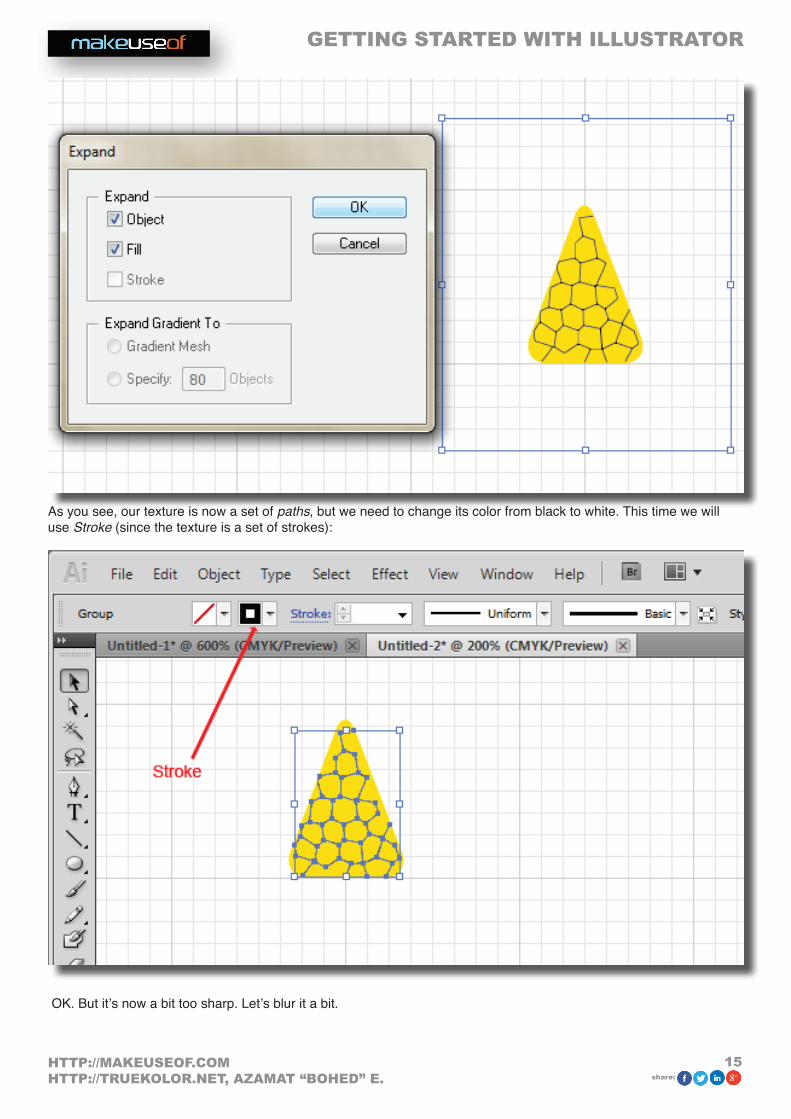
That looks pretty good. Even better: we’re done with the hard part.
3.14 Adding TextLet’s add our company name below the lime. Select Type tool (T), click under the lime and type “LimeWorks”:
Now let’s align everything to center.

GETTING STARTED WITH ILLUSTRATOR
22HTTP://MAKEUSEOF.COMHTTP://TRUEKOLOR.NET, AZAMAT “BOHED” E. share:
3.15 Aligning ObjectsTo align objects perfectly, use the Alignment tools. Those tools are located in the Control Panel, when the Selection Tool is active. See below to understand various alignments:
Note that these examples are true for AligntoArtboard:

GETTING STARTED WITH ILLUSTRATOR
23HTTP://MAKEUSEOF.COMHTTP://TRUEKOLOR.NET, AZAMAT “BOHED” E. share:
If you choose AligntoSelection, then objects will be aligned with respect to the outer boundaries of the selection.
OK. Select all objects (Ctrl+A) and from the control panel, click on HorizontalAlignCenter (number 2):
That’s it. Now you can play with sizes and colors if you want.
If you make the lime smaller and change the text colors it will look much better:
Alright, congratulations with your first logo!
Let’s get to Saving and Exporting.

GETTING STARTED WITH ILLUSTRATOR
24HTTP://MAKEUSEOF.COMHTTP://TRUEKOLOR.NET, AZAMAT “BOHED” E. share:
3.16 Saving and ExportingTo save your Illustrator files, just hit Ctrl+S (as always) and it will save it in .ai format.
If you want to save your logo in .png, then you can make use of one of two ways: File->Export or File->SaveForWebandDevices.
While the second way exports the whole Artboard, the first way lets you export only your object(s).
Here’s an example:
Note: you can always change the size of your Artboard (File->DocumentSetup and click on EditArtboards). After that, when you use SaveForWebandDevices you will see that the image size is the new size of your Artboard.
Also note: you can check Transparency when saving for web and you will have your logo with a transparent back-ground.
Let’s go through another tutorial to learn other basic tools. We’ll create a 3D text with a grungy background.
GETTING STARTED WITH ILLUSTRATOR
25HTTP://MAKEUSEOF.COMHTTP://TRUEKOLOR.NET, AZAMAT “BOHED” E. share:
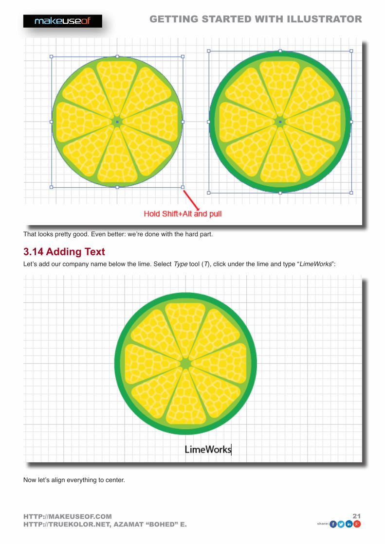
4. Creating a 3D Text in Illustrator While vector graphics are typically two-dimensions you can create nice-looking 3D objects as well. In this tutorial we will create a simple 3D text with a grungy background like below:
As I said, we are now learning the basics, so that you get more familiar with the interface and some useful tools. Once you are, you will see that there are no limits to what you can do with Illustrator.
4.1 Adding a Grungy BackgroundLet’s start with a cool background.
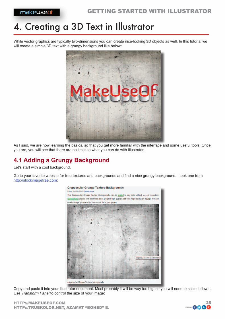
Go to your favorite website for free textures and backgrounds and find a nice grungy background. I took one from http://stockimagefree.com:
Copy and paste it into your Illustrator document. Most probably it will be way too big, so you will need to scale it down. Use TransformPanel to control the size of your image:

GETTING STARTED WITH ILLUSTRATOR
26HTTP://MAKEUSEOF.COMHTTP://TRUEKOLOR.NET, AZAMAT “BOHED” E. share:
Note:youcanuseyourownvalues,justmakesureitfitsthedocument.
Now we have our background image ready, but let’s add some more effects to it. First, we’ll create a rectangle and then we’ll add Inner Glow effect and use the Transparency panel to change blending between the image and the rect-angle.
4.2 Creating a RectangleSelect Rectangle from Tools (M), draw a rectangle, same size as your background image (you may want to use the Transform panel to set exact values) and set the Fill color to light brown and no stroke:

GETTING STARTED WITH ILLUSTRATOR
27HTTP://MAKEUSEOF.COMHTTP://TRUEKOLOR.NET, AZAMAT “BOHED” E. share:
4.3 Adding Inner Glow EffectGo to Effect->Stylize->InnerGlow and set values as shown:
Here’s what you should have:
4.4 Using Transparency PanelYou can always use Transparencypanel to change the way an object or a layer blends with layers below.
First off, let’s send our rectangle behind the image. Select the rectangle by clicking on it and use Ctrl+[.
Now select the image layer by clicking on the image and open TransparencyPanel(Window->Transparency) and choose Multiply as the blending mode:

GETTING STARTED WITH ILLUSTRATOR
28HTTP://MAKEUSEOF.COMHTTP://TRUEKOLOR.NET, AZAMAT “BOHED” E. share:
Nice. We’re done with the background. Let’s get to the 3D text itself.
4.5 Working with Type toolUsing the Typetool(T) write “MakeUseOf” with some nice font (I chose DiavloBold, which can be downloaded at http://www.exljbris.com/diavlo.html). Make it big enough like 65pt, set tracking to -20 and choose the White color:
4.6 Creating OutlinesUse CreateOutlines - right-click on the text and choose CreateOutlines, to convert text into vector paths:

GETTING STARTED WITH ILLUSTRATOR
29HTTP://MAKEUSEOF.COMHTTP://TRUEKOLOR.NET, AZAMAT “BOHED” E. share:
4.7 Adding 3D Effects 3D effects can be applied to any objects as well as text. Select the text, go to Effect->3D->Extrude&Beveland apply as following:

GETTING STARTED WITH ILLUSTRATOR
30HTTP://MAKEUSEOF.COMHTTP://TRUEKOLOR.NET, AZAMAT “BOHED” E. share:
This is what you should have this far:
Now we need to separate the faces of the text and our 3D effect from each other. Use ExpandAppearance to do that (Object->ExpandAppearance).
With DirectSelectionTool(A), select onlythefaces of the text (hold Shift to select multiple objects):
Tip: while selecting, make sure that the anchors are blue and none of them white. To do that, zoom in a little bit and click somewhere in the middle of the objects (here – text faces).
4.8 Using Unite from Pathfinder panelNow copy and paste your selection and use Unite from Pathfinder panel to join all selected faces into one grouped path:

GETTING STARTED WITH ILLUSTRATOR
31HTTP://MAKEUSEOF.COMHTTP://TRUEKOLOR.NET, AZAMAT “BOHED” E. share:
Place the new layer on top of the old one and set its StrokeColor to white and StrokeWeight to 1pt:
We’re almost there.
4.9 Adding Gradient StyleAdding the gradient is pretty easy – just select the object, click on the Gradient panel on the right and set up your colors. Moreover, you can always make use of pre-defined Libraries from Window->SwatchLibraries->Gradients. But this time, let’s set it up manually.
In the Gradient panel, set Type to Linear, set first color at 0% location to dark red, second color at 80% location to orange and the final color at 100% to bright red, Angle to -90°:

GETTING STARTED WITH ILLUSTRATOR
32HTTP://MAKEUSEOF.COMHTTP://TRUEKOLOR.NET, AZAMAT “BOHED” E. share:
Tip: use the upper slider to control the color range of the gradient.
4.10 Adding ShadowTo give our text some depth, let’s add some shadow to it. We’ll use the GaussianBlur effect.
First, copy (Ctrl+C) our new layer and paste it in-front (Ctrl+F). Then, change its color to black and set stroke to none, send it behind the 3D effect layer with Ctrl+[ (make sure it is above the background layers):
Move it down by using arrow keys (you can also change Y coordinates from the Transform panel to be more precise):

GETTING STARTED WITH ILLUSTRATOR
33HTTP://MAKEUSEOF.COMHTTP://TRUEKOLOR.NET, AZAMAT “BOHED” E. share:
4.11 Applying Gaussian BlurOur shadow doesn’t look realistic now; we need to blur it a bit. Go to Effect->Blur->GaussianBlur and set Radius to 9 pixels:
We are done!

GETTING STARTED WITH ILLUSTRATOR
34HTTP://MAKEUSEOF.COMHTTP://TRUEKOLOR.NET, AZAMAT “BOHED” E. share:
5. Some useful tips Tips and tricks are endless, but I will show you some of them:
• Locklayers–whenyouwanttoselectsomesmallobjectswhichareinfrontofotherobjects(likeabackground),insteadofShift+clickingoneachoneyoucansimplylockthebackgroundwithCtrl+2,orputalocksignintheLayerspanel.
• AlwayschecktheLayerspalette–whenworkingwithmanyobjectsandlayers,itisreallyusefultonameyourlayersandcheckhowyourlayersarealigned(whetheralayerisaboveorbelowtheotherone,isitlocked,etc.);
• Re-editlayerstylesanytimeyouneed–yes,youcanalwayschangestyleoreffectsettingsthatyouhavealreadyappliedtoanobjectoralayerbeforethroughtheAppearancepanel(Window->Appearance);
• UseLibraries–therearesomenicepre-definedLibrariestomakeuseofinyourworks.GotoWindow->LibrariesandselectfromBrushLibraries,SwatchLibraries,GraphicStyleLibrariesorSymbolLibraries.Therearelotsofthem.
6. Conclusion I hope everything was clear enough for you to start loving Adobe Illustrator. What I’ve covered in this guide is just the basics. Next time I will show more complex usages of other amazing tools and tricks. Until then – practice.

Did you like this PDF Guide? Then why not visit MakeUseOf.com for daily posts on cool websites, free software and internet tips?
If you want more great guides like this, why not subscribe to MakeUseOf and receive instant access to 50+ PDF Guides like this one covering wide range of topics. More-over, you will be able to download free Cheat Sheets, Free Giveaways and other cool things.
Home: http://www.makeuseof.com
MakeUseOf Directory: http://www.makeuseof.com/dir
MakeUseOf Answers: http://www.makeuseof.com/answers
Geeky Fun: http://www.makeuseof.com/tech-fun
PDF Guides: http://www.makeuseof.com/pages/
Tech Deals: http://www.makeuseof.com/pages/hot-tech-deals
Follow MakeUseOf:
RSS Feed: http://feedproxy.google.com/Makeuseof
Newsletter: http://www.makeuseof.com/join
Facebook: http://www.facebook.com/makeuseof
Twitter: http://www.twitter.com/Makeuseof
Think you’ve got what it takes to write a manual for MakeUseOf.com? We’re always willing to hear a pitch! Send your ideas to [email protected]; you might earn up to $400.

Download Other MakeUseOf PDF Guides!
http://makeuseof.com/pages