Embed Size (px)
Citation preview
Remington et al. Population Health Metrics (2015) 13:11 DOI 10.1186/s12963-015-0044-2
RESEARCH Open Access
The County Health Rankings: rationale andmethodsPatrick L Remington1, Bridget B Catlin2 and Keith P Gennuso3*
Abstract
Background: Annually since 2010, the University of Wisconsin Population Health Institute and the Robert WoodJohnson Foundation have produced the County Health Rankings—a “population health checkup” for the nation’sover 3,000 counties. The purpose of this paper is to review the background and rationale for the Rankings, explainin detail the methods we use to create the health rankings in each state, and discuss the strengths and limitationsassociated with ranking the health of communities.
Methods: We base the Rankings on a conceptual model of population health that includes both health outcomes(mortality and morbidity) and health factors (health behaviors, clinical care, social and economic factors, and thephysical environment). Data for over 30 measures available at the county level are assembled from a number ofnational sources. Z-scores are calculated for each measure, multiplied by their assigned weights, and summed tocreate composite measure scores. Composite scores are then ordered and counties are ranked from best to worsthealth within each state.
Results: Health outcomes and related health factors vary significantly within states, with over two-fold differencesbetween the least healthy counties versus the healthiest counties for measures such as premature mortality, teenbirth rates, and percent of children living in poverty. Ranking within each state depicts disparities that are notapparent when counties are ranked across the entire nation.
Discussion: The County Health Rankings can be used to clearly demonstrate differences in health by place, raiseawareness of the many factors that influence health, and stimulate community health improvement efforts. TheRankings draws upon the human instinct to compete by facilitating comparisons between neighboring or peercounties within states. Since no population health model, or rankings based off such models, will ever perfectlydescribe the health of its population, we encourage users to look to local sources of data to understand moreabout the health of their community.
Keywords: Health rankings, Population health, Public health surveillance
IntroductionAnnually since 2010, the University of Wisconsin Popula-tion Health Institute and the Robert Wood Johnson Foun-dation have produced the County Health Rankings, a“population health checkup” for the nation’s over 3,000counties (www.countyhealthrankings.org). The health ofeach county is ranked within each state – from the healthi-est to the least healthy – using a model that summarizesthe overall health outcomes of each county, as well as the
* Correspondence: [email protected] of Wisconsin Population Health Institute, University ofWisconsin-Madison, 575C WARF Office Building, 610 Walnut St., Madison, WI53726, USAFull list of author information is available at the end of the article
© 2015 Remington et al.; licensee BioMed CenCommons Attribution License (http://creativecreproduction in any medium, provided the orDedication waiver (http://creativecommons.orunless otherwise stated.
factors that contribute to health [1]. The primary goalof the Rankings is to mobilize action toward commu-nity health by stimulating interest among the mediaand policymakers. The Rankings, in their current form,are an extension of the 2003 to 2008 annual WisconsinCounty Health Rankings to the entire United States. Inthis paper, we review the background and rationale forthe expanded Rankings, explain in detail the methodswe use to create the health rankings in each state, anddiscuss the strengths and limitations associated withranking the health of communities.
tral. This is an Open Access article distributed under the terms of the Creativeommons.org/licenses/by/4.0), which permits unrestricted use, distribution, andiginal work is properly credited. The Creative Commons Public Domaing/publicdomain/zero/1.0/) applies to the data made available in this article,
Remington et al. Population Health Metrics (2015) 13:11 Page 2 of 12
Why do we rank?Ranking is an effective, yet sometimes controversial ap-proach to call attention to differences in a wide varietyof areas in society—from the oft-cited US News andWorld Report rankings to international rankings of econ-omy, education, or technology. Rankings, in general, aredesirable because they have the ability to summarizecomplex information about a topic in a manner that isinterpretable to everyone. Oliver suggests that populationhealth rankings can be used to help set agendas — stimu-lating awareness, motivation, and debate over means toimproved health outcomes, and to help establish broad re-sponsibility for population health and the need for multi-sectorial collaboration to improve outcomes [2]. On theother hand, rankings are often criticized for a variety ofreasons, including the arbitrariness of the measures used,inappropriate emphasis of insignificant differences, andthe tendency of institutions to focus only on the elementsincluded in the ranks [3,4]. Despite different views aboutthe benefits of rankings, the public and media seems tohave an insatiable appetite for them.Population health rankings, such as the America’s
Health Rankings and the County Health Rankings, areoften used as a catalyst for the improvement of healthby drawing attention to the areas that need improvementthrough an easily interpretable synthesis of objectivelymeasured community health data [5]. Once the media andcommunity leaders are made aware of problem areas,communities can be engaged to enact evidence-informedhealth policies and programs to improve health outcomes.Fundamentally, these health rankings are a tool to com-municate with health professionals, local communityleaders, and the general public, so that they make in-formed decisions about the health of their communities.
Population health ranking historyThe practice of population health ranking likely beganas soon as health statistics began to be collected, com-piled, and reported publicly. Since the 1960s, the CDC’sMorbidity and Mortality Weekly Report (MMWR) hasreported health statistics for the leading causes of deathand disability, often by geographic regions like states andmetropolitan areas [6]. For example, in 1987, an MMWRpublication ranked the rates of health risk behaviors bystate, showing that the prevalence of overweight andsmoking varied almost two-fold and alcohol-related be-haviors varied up to six-fold by state [7]. This report ledto a front-page story in the Atlanta Journal-Constitutionthat showed state ranks for each risk factor [8] followedby media interviews from around the nation. In 1988,one of the authors (PLR) published an article in theMMWR that ranked state-specific death rates due to is-chemic heart disease [9], leading to an Associate Pressheadline that stated, “Midwest, Northeast city life hard
on hearts” [10]. This report and the subsequent mediaattention led to calls to the CDC from health officialsand legislators from the states with the highest deathrates, insisting that the CDC refrain from publishingrankings in the MMWR.In 1990, Northwestern National Life Insurance Com-
pany sponsored the publication of a report that summa-rized the health of the 50 states in the US and rankedthem from healthiest to least healthy. These reports wereunique as they measured the overall health of an entirestate. The reports garnered attention in the media, leadingto discussions about why health varied dramatically fromone state to another [5]. Following this positive experi-ence, Arundel Street Consulting recruited and conducteda Delphi panel that developed a method to compare thehealthiness of the general population of each state withother states [11]. This report has been published annuallysince 1990, now produced by the United Health Founda-tion as “America’s Health Rankings”.
County Health Rankings historyBased on the media interest from health rankings pub-lished in the MMWR and with the state health rank-ings, county health rankings were first proposed in1994 by one of the authors (PLR), when he was a ChiefMedical Officer at the Wisconsin Division of PublicHealth. However, efforts to produce these rankingsthrough the state health department were not success-ful, due in part to concerns about potential backlashfrom local and statewide policy makers. A comment bya reviewer of an unsuccessful grant proposal submittedto the CDC stated that the release of the rankings “maybe quite counterproductive. These often incite greatresistance”.In 2002, the Population Health Institute was established
at the University of Wisconsin, with the mission of trans-lating research into policy and practice. One of the first ef-forts of the Institute was to develop county healthrankings for Wisconsin using a model similar to the modelused to rank the health of states [12]. Our first report wasreleased that year at a conference of Wisconsin local pub-lic health officials and included a press release for the localmedia. Although the use of ranks was considered, the re-port instead used a modification of the Consumer Reports-style circles to characterize quartiles from healthiest (Q1)to least healthy (Q4) [13]. This method was found to bedifficult to interpret with little interest shown by the localmedia in reporting the results. Because of this experience,the report was revised and the quartiles were replacedwith standard ranking from healthiest (#1) to least healthy(#72). Although this report used the same data as the earl-ier report, the use of ranking resulted in significant inter-est among the media and, as a result, more engagement oflocal health officials [14]. This report became the first in
Remington et al. Population Health Metrics (2015) 13:11 Page 3 of 12
an annual series of “Wisconsin County Health Rankings”published annually thereafter through 2008.We conducted an evaluation following the release of the
2006 Wisconsin County Health Rankings by searchingnewspaper, television, and radio coverage and by surveyinglocal public health officials throughout the state [15].More than 15 newspapers across the state covered theRankings with headlines such as “Dane County’s residentsamong state’s healthiest;” “Rock County up, slightly, inhealth rankings;” “Florence County the healthiest in thestate;” and “Washington county ranks 7th healthiestcounty in state.” Newspaper articles often focused on spe-cific strengths and weaknesses of their local area, such as:“Wealthy and healthy: Waukesha County fares well in newsurvey;” “Report: County fitter but smoking, drinking toomuch;” and “County’s health stats in decline: Poor air,smoking, lack of diplomas cause concern”. Nearly all(94%) of the 52 county health officers and regional epi-demiologists who responded to our survey reportedusing the Wisconsin County Health Rankings in theirwork, primarily for educating policymakers and commu-nity partners, performing needs assessments, and identify-ing program targets.During the six years that we produced the Wisconsin
County Health Rankings, we were contacted by publichealth institutes in other states interested in using ourmodel to rank counties in their state. Reports publishedin Tennessee, Kansas, and New Mexico received similarattention among policymakers and the media in eachstate [16,17]. Following a presentation about the Wiscon-sin County Health Rankings at a national public healthconference [18], we began discussions with the RobertWood Johnson Foundation about using our methods torank every county in every state in the nation. In late2008, the University of Wisconsin Population Health Insti-tute received a grant from the Robert Wood JohnsonFoundation to use the model and experience from theWisconsin County Health Rankings to develop reports forcounties in each of the 50 states. This project, entitled“Mobilizing Action Toward Community Health”, sup-ported the development of the current Rankings for all 50states.In 2009, we convened a panel of national experts on
population health and commissioned a series of publica-tions examining population health metrics and incentivesand partnerships for improvement [19-21]. Specifically,these publications examined measures in the five domainsused in the Wisconsin County Health Rankings: healthoutcomes [22], health behaviors [23], health care [24], so-cioeconomic status [25], and environmental health [26].Based on these reviews, we sought existing national datasources to determine availability and cost of data at thecounty level for each of the nation’s more than 3,000counties.
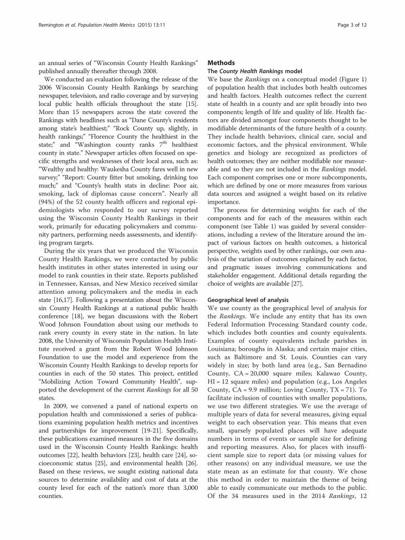
MethodsThe County Health Rankings modelWe base the Rankings on a conceptual model (Figure 1)of population health that includes both health outcomesand health factors. Health outcomes reflect the currentstate of health in a county and are split broadly into twocomponents; length of life and quality of life. Health fac-tors are divided amongst four components thought to bemodifiable determinants of the future health of a county.They include health behaviors, clinical care, social andeconomic factors, and the physical environment. Whilegenetics and biology are recognized as predictors ofhealth outcomes; they are neither modifiable nor measur-able and so they are not included in the Rankings model.Each component comprises one or more subcomponents,which are defined by one or more measures from variousdata sources and assigned a weight based on its relativeimportance.The process for determining weights for each of the
components and for each of the measures within eachcomponent (see Table 1) was guided by several consider-ations, including a review of the literature around the im-pact of various factors on health outcomes, a historicalperspective, weights used by other rankings, our own ana-lysis of the variation of outcomes explained by each factor,and pragmatic issues involving communications andstakeholder engagement. Additional details regarding thechoice of weights are available [27].
Geographical level of analysisWe use county as the geographical level of analysis forthe Rankings. We include any entity that has its ownFederal Information Processing Standard county code,which includes both counties and county equivalents.Examples of county equivalents include parishes inLouisiana; boroughs in Alaska; and certain major cities,such as Baltimore and St. Louis. Counties can varywidely in size; by both land area (e.g., San BernadinoCounty, CA = 20,000 square miles; Kalawao County,HI = 12 square miles) and population (e.g., Los AngelesCounty, CA = 9.9 million; Loving County, TX = 71). Tofacilitate inclusion of counties with smaller populations,we use two different strategies. We use the average ofmultiple years of data for several measures, giving equalweight to each observation year. This means that evensmall, sparsely populated places will have adequatenumbers in terms of events or sample size for definingand reporting measures. Also, for places with insuffi-cient sample size to report data (or missing values forother reasons) on any individual measure, we use thestate mean as an estimate for that county. We chosethis method in order to maintain the theme of beingable to easily communicate our methods to the public.Of the 34 measures used in the 2014 Rankings, 12
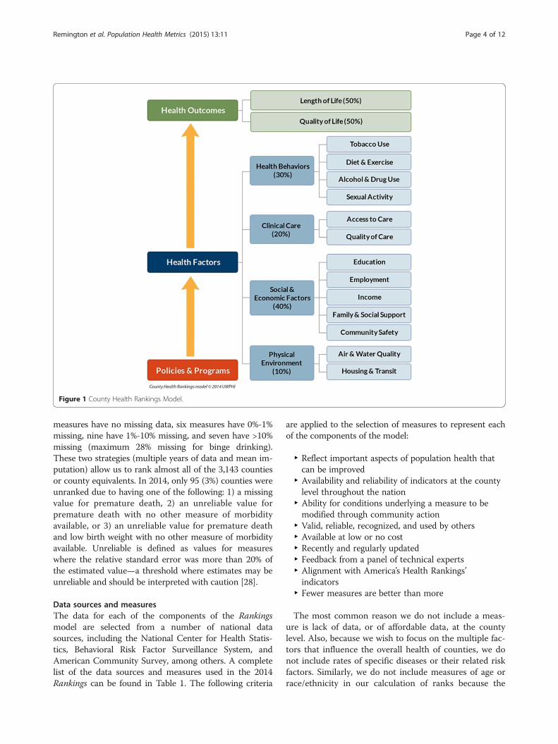
Figure 1 County Health Rankings Model.
Remington et al. Population Health Metrics (2015) 13:11 Page 4 of 12
measures have no missing data, six measures have 0%-1%missing, nine have 1%-10% missing, and seven have >10%missing (maximum 28% missing for binge drinking).These two strategies (multiple years of data and mean im-putation) allow us to rank almost all of the 3,143 countiesor county equivalents. In 2014, only 95 (3%) counties wereunranked due to having one of the following: 1) a missingvalue for premature death, 2) an unreliable value forpremature death with no other measure of morbidityavailable, or 3) an unreliable value for premature deathand low birth weight with no other measure of morbidityavailable. Unreliable is defined as values for measureswhere the relative standard error was more than 20% ofthe estimated value—a threshold where estimates may beunreliable and should be interpreted with caution [28].
Data sources and measuresThe data for each of the components of the Rankingsmodel are selected from a number of national datasources, including the National Center for Health Statis-tics, Behavioral Risk Factor Surveillance System, andAmerican Community Survey, among others. A completelist of the data sources and measures used in the 2014Rankings can be found in Table 1. The following criteria
are applied to the selection of measures to represent eachof the components of the model:
‣ Reflect important aspects of population health thatcan be improved
‣ Availability and reliability of indicators at the countylevel throughout the nation
‣ Ability for conditions underlying a measure to bemodified through community action
‣ Valid, reliable, recognized, and used by others‣ Available at low or no cost‣ Recently and regularly updated‣ Feedback from a panel of technical experts‣ Alignment with America’s Health Rankings’indicators
‣ Fewer measures are better than more
The most common reason we do not include a meas-ure is lack of data, or of affordable data, at the countylevel. Also, because we wish to focus on the multiple fac-tors that influence the overall health of counties, we donot include rates of specific diseases or their related riskfactors. Similarly, we do not include measures of age orrace/ethnicity in our calculation of ranks because the
Table 1 2014 County Health Rankings: measures, data sources, and years of data
Measure Weight Data source Years of data
HEALTH OUTCOMES
Length of life Premature death 50% National Center for Health Statistics 2008-2010
Quality of life Poor or fair health 10% Behavioral Risk Factor Surveillance System 2006-2012
Poor physical health days 10% Behavioral Risk Factor Surveillance System 2006-2012
Poor mental health days 10% Behavioral Risk Factor Surveillance System 2006-2012
Low birthweight 20% National Center for Health Statistics 2005-2011
HEALTH FACTORS
Health Behaviors
Tobacco use Adult smoking 10% Behavioral Risk Factor Surveillance System 2006-2012
Diet and exercise Adult obesity 5% National Center for Chronic Disease Preventionand Health Promotion (NCCDPHP)
2010
Food environment indexa 2% USDA Food Environment Atlas, Map the Meal Gap 2010-2011
Physical inactivity 2% NCCDPHP 2010
Access to exercise opportunitiesa 1% OneSource Global Business Browser, Delorme mapdata, Esri, & US Census Tigerline Files
2010 & 2012
Alcohol and drug use Excessive drinking 2.5% Behavioral Risk Factor Surveillance System 2006-2012
Alcohol-impaired driving deaths 2.5% Fatality Analysis Reporting System 2008-2012
Sexual activity Sexually transmitted infections 2.5% National Center for HIV/AIDS, Viral Hepatitis, STD,and TB prevention
2011
Teen births 2.5% National Center for Health Statistics 2005-2011
Clinical Care
Access to care Uninsured 5% Small Area Health Insurance Estimates 2011
Primary care physicians 3% HRSA Area Resource File 2011
Dentists 1% HRSA Area Resource File 2012
Mental health providers 1% CMS, National Provider Identification 2013
Quality of care Preventable hospital stays 5% Medicare/Dartmouth Institute 2011
Diabetic screeninga 2.5% Medicare/Dartmouth Institute 2011
Mammography screeninga 2.5% Medicare/Dartmouth Institute 2011
Social and Economic Factors
Education High school graduationa 5% data.gov, supplemented w/ National Center forEducation Statistics
2010-2011
Some collegea 5% American Community Survey 2008-2012
Employment Unemployment 10% Bureau of Labor Statistics 2012
Income Children in poverty 10% Small Area Income and Poverty Estimates 2012
Family and social support Inadequate social support 2.5% Behavioral Risk Factor Surveillance System 2005-2010
Children in single-parent households 2.5% American Community Survey 2008-2012
Community safety Violent crime 2.5% Uniform Crime Reporting - FBI 2009-2011
Injury deaths 2.5% CDC WONDER 2006-2010
Physical Environment
Air and water quality Air pollution - particulate matterb 2.5% CDC WONDER 2011
Drinking water violations 2.5% Safe Drinking Water Information System FY 2012 -2013
Remington et al. Population Health Metrics (2015) 13:11 Page 5 of 12
Table 1 2014 County Health Rankings: measures, data sources, and years of data (Continued)
Housing and transit Severe housing problems 2% HUD, Comprehensive Housing Affordability Strategy 2006-2010
Driving alone to work 2% American Community Survey 2008-2012
Long commute – driving alone 1% American Community Survey 2008-2012
CDC WONDER: Centers for Disease Control and Prevention Wide-ranging Online Data for Epidemiologic Research; CMS: Centers for Medicare & Medicaid Services;ESRI: FBI: Federal Bureau of Investigation; HIV: human immunodeficiency virus; HRSA: Health Resources and Services Administration; HUD: Housing and UrbanDevelopment; STD: sexually transmitted disease; TB: tuberculosis; USDA: United States Department of Agriculture.aReverse coded measures.bNot available for AK and HI.
Remington et al. Population Health Metrics (2015) 13:11 Page 6 of 12
focus of the Rankings is on modifiable determinants ofhealth, though all of the health outcomes measures ex-cept low birth weight are age-adjusted according to the2000 US standard population.
Calculating summary scores and ranksData for each of the measures are assembled, cleaned,and calculated by the Rankings staff, with two excep-tions. Measures based on vital statistics data, sexuallytransmitted disease rates, and Behavioral Risk FactorSurveillance System survey data are calculated for theRankings by staff at the National Center for Health Sta-tistics and other units of the Centers for Disease Controland Prevention, and health care quality measures arecalculated by the authors of the Dartmouth Atlas ofHealthcare. Since the measures are based on differentscales (percentages, rates, and averages of survey re-sponses or other metrics), we standardize each measurewithin each state to the average of counties in that state.Standardizing each of these measures transforms themto the same metric, with a mean value of 0 and a stand-ard deviation of 1. We refer to these as Z-scores where:
Z ¼ County Valueð Þ− Average of Counties in Stateð ÞStandard Deviation of Counties in Stateð Þ
Each Z-score is relative to the other counties in thatstate (i.e., not compared to an absolute standard) and re-ported in the metric of standard deviations. A positiveZ-score indicates a value higher than the average ofcounties in that state, and a negative Z-score indicates avalue for that county lower than the average of countiesin that state. For example, if a county has a Z-score on ameasure of 1.2, that means the county is 1.2 standarddeviations above the state average of counties for thatmeasure. For counties with a population of 20,000 orless, we truncate any Z-score that is < −3.0 or > 3.0 to−3.0 or 3.0, respectively, to reduce the impact of outliersdue to small area variations. For most of the measures, ahigher Z-score score indicates poorer health (e.g., yearsof potential life lost before age 75). However, for some ofour measures (e.g., high school graduation) a higherscore indicates better health or a more desirable value.We take this into account before computing summary
scores by multiplying them by −1, so that higher scoresindicate poorer health.After Z-scores are calculated, they are multiplied by
their assigned weight and summed to create eight sum-mary composite scores: overall health outcomes (includingmortality and morbidity separately) and overall health fac-tors (including health behaviors, clinical care, social andeconomic factors, and physical environment separately).Composite scores are then sorted from lowest to highestwithin each state. The lowest score (best health) gets arank of #1 for that state and the highest score (worsthealth) gets whatever rank corresponds to the number ofplaces we rank in that state.
ResultsThe following includes a sample of 2014 Rankings find-ings to highlight several key points. Figure 2 shows thetop five and bottom five counties within each state (with10 or more counties) based on their within-state healthoutcome ranks. The map shows that in some states thehealthiest and unhealthiest counties are located acrossthe state, while in other states the healthiest and un-healthiest counties are adjacent to each other. Table 2shows differences between the healthiest and unhealthi-est counties (based on the health outcomes summarymeasure score) by individual measure. The five leasthealthy counties in each state have premature deathrates that are more than twice the rates of the fivehealthiest counties. These counties with poorer healthoutcomes also have the highest rates of smoking, teenbirths, physical inactivity, preventable hospital stays, andchildren living in poverty.Figure 3 shows the 250 counties with the lowest pre-
mature death rates and the 250 counties with the highestpremature death rates. Since premature death makes up50% of the health outcomes composite score, this mapshows a picture similar to what would be portrayed if wehad chosen to rank counties nationally, rather thanwithin-state. Rather than highlight the significant differ-ences in health that exist within each state, this mapshows distinct regional differences with clusters of highrates of premature death in the southern and Appalachianstates and in the Plains states in counties where Indianreservations are located [29].
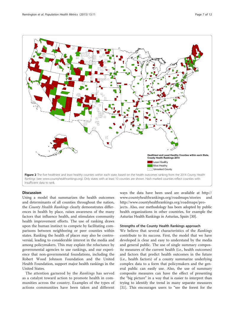
Figure 2 The five healthiest and least healthy counties within each state, based on the health outcomes ranking from the 2014 County HealthRankings (see: www.countyhealthrankings.org). Only states with at least 10 counties are shown. Hash marked counties reflect counties withinsufficient data to rank.
Remington et al. Population Health Metrics (2015) 13:11 Page 7 of 12
DiscussionUsing a model that summarizes the health outcomesand determinants of all counties throughout the nation,the County Health Rankings clearly demonstrates differ-ences in health by place, raises awareness of the manyfactors that influence health, and stimulates communityhealth improvement efforts. The use of ranking drawsupon the human instinct to compete by facilitating com-parisons between neighboring or peer counties withinstates. Ranking the health of places may also be contro-versial, leading to considerable interest in the media andamong policymakers. This may explain the reluctance bygovernmental agencies to use rankings, and our experi-ence that non-governmental foundations, including theRobert Wood Johnson Foundation and the UnitedHealth Foundation, support major health rankings in theUnited States.The attention garnered by the Rankings has served
as a catalyst toward action to promote health in com-munities across the country. Examples of the types ofactions communities have been taken and different
ways the data have been used are available at http://www.countyhealthrankings.org/roadmaps/stories andhttp://www.countyhealthrankings.org/roadmaps/pro-jects. Also, our methodology has been adopted by publichealth organizations in other countries, for example theAsturias Health Rankings in Asturias, Spain [30].
Strengths of the County Health Rankings approachWe believe that several characteristics of the Rankingscontribute to its success. First, the model that we havedeveloped is clear and easy to understand by the mediaand general public. The use of single summary compos-ite measures of the current health (i.e., health outcomes)and factors that predict health outcomes in the future(i.e., health factors) of a county summarize underlyingcomplex data to a form that policymakers and the gen-eral public can easily use. Also, the use of summarycomposite measures can have the effect of presentingthe “big picture” in a way that is easier to interpret thantrying to identify the trend in many separate measures[31]. This encourages users to “see the forest for the
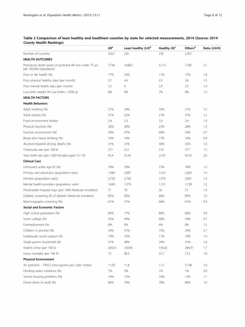
Table 2 Comparison of least healthy and healthiest counties by state for selected measurements, 2014 (Source: 2014County Health Rankings)
Alla Least healthy (LH)b Healthy (H)c Othersd Ratio (LH/H)
Number of counties 3,027 230 230 2,567
HEALTH OUTCOMES
Premature death (years of potential life lost under 75 yrsper 100,000 population)
7,746 10,862 5,113 7,785 2.1
Poor or fair health (%) 17% 20% 11% 17% 1.8
Poor physical healthy days (per month) 3.7 4.4 2.9 3.8 1.5
Poor mental health days (per month) 3.5 4 2.9 3.5 1.4
Low birth weight (% Live births <2500 g) 8% 9% 7% 8% 1.3
HEALTH FACTORS
Health Behaviors
Adult smoking (%) 21% 24% 16% 21% 1.5
Adult obesity (%) 31% 32% 27% 31% 1.2
Food environment (Index) 2.4 3.3 1.8 2.4 1.9
Physical inactivity (%) 28% 30% 23% 28% 1.3
Exercise environment (%) 54% 47% 69% 53% 0.7
Binge plus heavy drinking (%) 16% 16% 17% 16% 0.9
Alcohol-impaired driving deaths (%) 31% 31% 30% 32% 1.0
Chlamydia rate (per 100 k) 271 312 214 277 1.5
Teen birth rate (per 1,000 females aged 15–19) 42.4 55.43 21.61 43.53 2.6
Clinical Care
Uninsured under age 65 (%) 18% 18% 15% 18% 1.2
Primary care physicians (population ratio) 1,980 2,087 1,472 2,003 1.4
Dentists (population ratio) 2,730 2,740 1,973 2,841 1.4
Mental health providers (population ratio) 1,640 1,379 1,131 1,728 1.2
Preventable hospital stays (per 1000 Medicare enrollees) 71 78 56 73 1.4
Diabetic screening (% of diabetic Medicare enrollees) 85% 83% 86% 85% 1.0
Mammography screening (%) 61% 57% 66% 61% 0.9
Social and Economic Factors
High school graduation (%) 83% 77% 86% 83% 0.9
Some college (%) 55% 49% 68% 54% 0.7
Unemployment (%) 8% 9% 6% 8% 1.5
Children in poverty (%) 24% 31% 15% 24% 2.1
Inadequate social support (%) 19% 23% 17% 19% 1.4
Single-parent household (%) 31% 38% 24% 31% 1.6
Violent crime (per 100 k) 204.55 258.95 156.02 206.97 1.7
Injury mortality (per 100 K) 73 98.3 53.7 73.2 1.8
Physical Environment
Air pollution – PM2.5 (micrograms per cubic meter) 11.93 11.8 11.5 11.98 1.0
Drinking water violations (%) 1% 3% 1% 1% 3.0
Severe housing problems (%) 14% 15% 14% 13% 1.1
Drives alone to work (%) 80% 78% 78% 80% 1.0
Remington et al. Population Health Metrics (2015) 13:11 Page 8 of 12
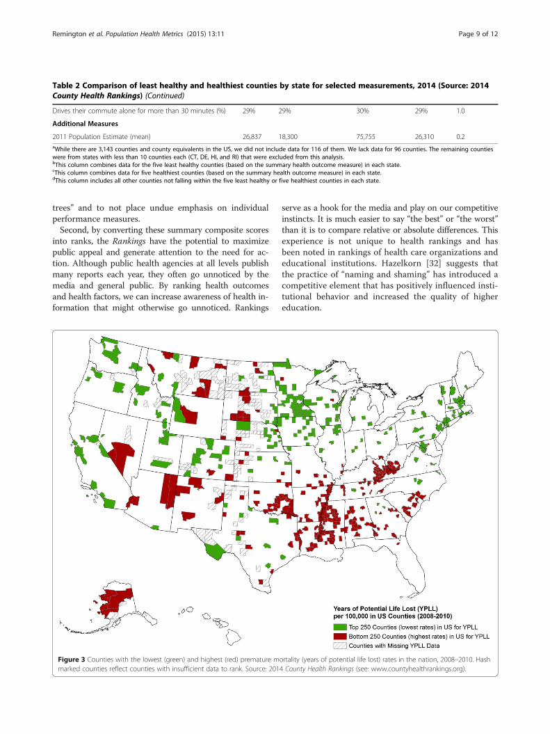
Table 2 Comparison of least healthy and healthiest counties by state for selected measurements, 2014 (Source: 2014County Health Rankings) (Continued)
Drives their commute alone for more than 30 minutes (%) 29% 29% 30% 29% 1.0
Additional Measures
2011 Population Estimate (mean) 26,837 18,300 75,755 26,310 0.2aWhile there are 3,143 counties and county equivalents in the US, we did not include data for 116 of them. We lack data for 96 counties. The remaining countieswere from states with less than 10 counties each (CT, DE, HI, and RI) that were excluded from this analysis.bThis column combines data for the five least healthy counties (based on the summary health outcome measure) in each state.cThis column combines data for five healthiest counties (based on the summary health outcome measure) in each state.dThis column includes all other counties not falling within the five least healthy or five healthiest counties in each state.
Remington et al. Population Health Metrics (2015) 13:11 Page 9 of 12
trees” and to not place undue emphasis on individualperformance measures.Second, by converting these summary composite scores
into ranks, the Rankings have the potential to maximizepublic appeal and generate attention to the need for ac-tion. Although public health agencies at all levels publishmany reports each year, they often go unnoticed by themedia and general public. By ranking health outcomesand health factors, we can increase awareness of health in-formation that might otherwise go unnoticed. Rankings
Figure 3 Counties with the lowest (green) and highest (red) premature mmarked counties reflect counties with insufficient data to rank. Source: 201
serve as a hook for the media and play on our competitiveinstincts. It is much easier to say “the best” or “the worst”than it is to compare relative or absolute differences. Thisexperience is not unique to health rankings and hasbeen noted in rankings of health care organizations andeducational institutions. Hazelkorn [32] suggests thatthe practice of “naming and shaming” has introduced acompetitive element that has positively influenced insti-tutional behavior and increased the quality of highereducation.
ortality (years of potential life lost) rates in the nation, 2008–2010. Hash4 County Health Rankings (see: www.countyhealthrankings.org).
Remington et al. Population Health Metrics (2015) 13:11 Page 10 of 12
It is important to note that the Rankings, reported an-nually at www.countyhealthrankings.org, rank countieswithin states rather than across state borders or acrossthe nation (e.g., as shown in Figure 3). This approach isnecessary as a number of the measures are not compar-able across states because the models used to constructthem emphasize state rates and are, therefore, state spe-cific. More importantly, not providing national rankingscompels counties to compare the health of where theylive to their neighboring counties or other counties intheir state. We believe this is more likely to inspirechange and is more in line with the overall goal of theRankings – to mobilize action toward community health.For instance, the knowledge that a county is ranked lastin their state for an outcome should be more informativeand motivating to take action than the knowledge of be-ing ranked 500th or 2,500th in the nation. However, wedo provide a national benchmark representing the best10% for each measure so that counties can have a senseof how their health outcomes or factors compare to thetop counties in the nation. In addition, we direct usersof the Rankings to other resources, such as the Commu-nity Health Status Indicators Project (available at: http://wwwn.cdc.gov/CommunityHealth/homepage.aspx), whichpermit counties to compare their health indicators withpeer counties across the nation [33].
Limitations of the County Health RankingsDespite these advantages, several limitations exist in theRankings and in health rankings in general. First, it istrue of all health rankings that there is no perfect modelto summarize the health of an entire population [34].Value judgments are inherent in selecting measures tobe included in the model, as well as the weights used forcombining these measures into a summary index. A re-cent study by Hendryx et al. [35] examined the correla-tions between the 4 categories of health factors with thehealth outcomes for the 2012 Rankings and found thatthe measures of social and economic conditions andhealth behaviors were more closely related to the healthoutcomes measure than measures of health care and theenvironment. We chose not to adjust health behaviormeasures by social and economic factors, since thecrude measures better reflect actual burden in thecounty, and interventions may be designed to addressboth behaviors directly and their underlying social andeconomic determinants.Second, rankings are on an ordinal scale, which means
close ranks are not necessarily statistically significantlydifferent from each other. For example in the Rankings,the top-ranked county in a state (#1) is not necessarilysignificantly healthier than the second-ranked county(#2) [3]. To complement the individual county ranks, wegroup counties into quartiles according to their health
outcomes and health factors ranks and provide color-coded quartile maps for each state of ranks to facilitateunderstanding of the distribution of health within eachstate. Lastly, we also acknowledge that ranks may not beuseful for measuring changes over time. Assuming thesame measures are used each year, improvements in acounty’s rank from year to year may be due to real im-provement in health in that county or could possibly bedue to declines in health in other counties. Our decisionto update the Rankings annually likely exacerbates thisissue, but we believe this is offset by the benefits of con-tinuing to maintain momentum around communityhealth improvement.Another concern involves the reliability of estimates,
particularly for counties with smaller populations; werecognize that the reliability of our measures does vary.Mortality data, which are reported almost 100% of thetime, are extremely reliable as counts of death, whileother measures (e.g., excessive drinking) are missing formany counties, and still other measures (e.g., air qualityand obesity rates) are based on modeling methods. Asensitivity analysis showed that using different strategiesfor missing/unreliable data and outlier values led to onlysmall changes in rank when compared to the referencemodel [36]. We try to provide supporting information tohelp users understand the quality of those measures. Forexample, within each of our county snapshots we pro-vide the margin of errors (95% confidence intervals) forthe data that comprise our indicators. We also make itclear that data from the Rankings should be used as astarting point, not an end point, and we encourage usersto look to local sources of data to understand moreabout the health of their community. For example, inNew England counties do not necessarily reflect thestructure of local government. In large urban countiessuch as Los Angeles County, county-level statistics maynot be especially useful, whereas in sparsely populatedareas, counties are too small as units of analysis sincemany services are delivered by groups of counties. Finally,combining data from low-income urban neighborhoodswith wealthier suburbs in the same metropolitan countymasks these health disparities.
Future opportunities for the County Health RankingsSeveral opportunities exist that could improve the qualityand usefulness of the County Health Rankings. Future ef-forts could build upon our model and experience, to gobeyond within-state county rankings, to draw attention tohealth differences across state boundaries (e.g., regionalrankings) or within counties, such as large metropolitanareas. Many communities have already started to “connectthe dots” by linking individual- and community-wide datato produce estimates of health outcomes and health fac-tors at subcounty and even census track levels [37]. Future
Remington et al. Population Health Metrics (2015) 13:11 Page 11 of 12
efforts could leverage the publicity of County Health Rank-ings to guide media and stakeholder groups to further ex-plore place-based disparities at a more micro level. Forexample, Denver Health uses electronic health record datato track obesity (and other risk factors) on a census tractlevel [38] and Public Health – Seattle & King County inWashington State is using small area estimation to rankcensus tracts on health and social well-being measures [39].Since the measures with the highest percent missing
come from the Behavioral Risk Factor Surveillance System,we are working with the Centers for Disease Controland Prevention to obtain modeled estimates for thesemeasures. In addition, as more years of data are available,analyses of trends in health outcomes or a number of thehealth factors will be possible—especially for those mea-sures that are reported using single-year or up to three-year averages. Future analyses could be done to comparethose counties that have improved in rank with their statescompared to counties whose rank has declined. Theseanalyses must account for variance in rank estimates toassure that changes are due to real differences in trends,rather than variation in the underlying data. With fundingfrom the Robert Wood Johnson Foundation, the Univer-sity of Wisconsin Population Health Institute will be pro-viding small grants to organizations interested in pursuingthese and other potential studies.
ConclusionsIn conclusion, the County Health Rankings can be used toclearly demonstrate differences in health by place, raiseawareness of the many factors that influence health, andstimulate community health improvement efforts. TheRankings draws upon the human instinct to compete byfacilitating comparisons between neighboring or peercounties within states. Since no population health model,or rankings based off such models, will ever perfectly de-scribe the health of its population, we encourage users tolook to local sources of data to understand more aboutthe health of their community.
Competing interestsThe authors declare that they have no competing interests.
Authors’ contributionsAll authors made substantial contributions to the conception and drafting ofthe manuscript. All authors read and approved the final manuscript.
AcknowledgmentsThe County Health Rankings are supported by a grant from the Robert WoodJohnson Foundation (ID 71865). We gratefully acknowledge conceptualcontributions, data collection and analysis efforts of current and former staffand graduate students at the University of Wisconsin Population HealthInstitute including David Kindig, Paul Peppard, Elizabeth Dranger, Peter Vila,Angela Rohan, Jessica Athens, Amanda Jovaag, Hyojun Park, MatthewRodock, and Anne Roubal.
Author details1Department of Population Health Sciences, University of Wisconsin-Madison,4263 Health Sciences Learning Center, 750 Highland Ave, Madison, WI 53705,
USA. 2University of Wisconsin Population Health Institute, University ofWisconsin-Madison, 505 WARF Office Building, 610 Walnut St., Madison, WI53726, USA. 3University of Wisconsin Population Health Institute, University ofWisconsin-Madison, 575C WARF Office Building, 610 Walnut St., Madison, WI53726, USA.
Received: 5 November 2014 Accepted: 27 March 2015
References1. Remington PL, Booske BC. Measuring the health of communities–how and
why? J Public Health Manag Pract. 2011;17:397–400.2. Oliver TR. Population health rankings as policy indicators and performance
measures. Prev Chronic Dis. 2010;7:A101.3. Arndt S, Acion L, Caspers K, Blood P. How reliable are county and regional
health rankings? Prev Sci. 2013;14:497–502.4. Kanarek N, Tsai HL, Stanley J. Health ranking of the largest US counties
using the Community Health Status Indicators peer strata and database.J Public Health Manag Pract. 2011;17:401–5.
5. Erwin PC, Myers CR, Myers GM, Daugherty LM. State responses to America’sHealth Rankings: the search for meaning, utility, and value. J Public HealthManag Pract. 2011;17:406–12.
6. Shaw FE, Goodman RA, Lindegren ML, Ward JW, Centers for Disease Controland Prevention (CDC). A history of MMWR. MMWR Surveill Summ. 2011;60Suppl 4:7–14.
7. Centers for Disease Control and Prevention (CDC). Behavioral risk factorsurveillance – selected states, 1986. MMWR Morb Mortal Wkly Rep.1987;36:252–4.
8. Seabrook C. How we live tells much about how we die. Data may helpstates target, fight their specific health risks. The Atlanta Journal and TheAtlanta Constitution; 1987. p. C4.
9. Centers for Disease Control and Prevention (CDC). State- and sex-specificpremature mortality due to ischemic heart disease–1985. MMWR MorbMortal Wkly Rep. 1988;37:313–4. 320–313.
10. Byrd R. Midwest, Northeast City Life Hard on Hearts. Atlanta: AssociatedPress; 1988.
11. Arundel Street Consulting, Inc. How healthy is your state? St. Paul, MN.[http://www.arundelstreet.com/case_2.htm].
12. Peppard PE, Kindig D, Jovaag A, Dranger E, Remington PL. An initialattempt at ranking population health outcomes and determinants. WMJ.2004;103:52–6.
13. Wisconsin Public Health and Health Policy Institute. Wisconsin communityhealth report cards 2003 - working paper. [https://uwphi.pophealth.wis-c.edu/programs/match/wchr/2003/reportCards.pdf].
14. Peppard PE, Kindig DA, Dranger E, Jovaag A, Remington PL. Rankingcommunity health status to stimulate discussion of local public healthissues: the Wisconsin County Health Rankings. Am J Public Health.2008;98:209–12.
15. Rohan AM, Booske BC, Remington PL. Using the Wisconsin County HealthRankings to catalyze community health improvement. J Public HealthManag Pract. 2009;15:24–32.
16. Kansas Health Institute. Kansas County Health rankings 2009. [http://media.khi.org/news/documents/2009/09/03/KansasCountyHealthRankings2009.pdf].
17. Arujo S. New Mexico County Health Rankings. [http://hsc.unm.edu/community/iph/docs/NM%20County%20Health%20Rankings%202008.pdf].
18. Remington P. The Wisconsin County Health Rankings. National Network ofPublic Health Institutes Annual Meeting. New Orleans, LA; 2007.
19. Kindig DA, Booske BC, Remington PL. Mobilizing Action Toward CommunityHealth (MATCH): metrics, incentives, and partnerships for population health.Prev Chronic Dis. 2010;7:A68.
20. Bilheimer LT. Evaluating metrics to improve population health. Prev ChronicDis. 2010;7:A69.
21. Pestronk RM. Using metrics to improve population health. Prev Chronic Dis.2010;7:A70.
22. Parrish RG. Measuring population health outcomes. Prev Chronic Dis.2010;7:A71.
23. Mokdad AH, Remington PL. Measuring health behaviors in populations.Prev Chronic Dis. 2010;7:A75.
24. Kottke TE, Isham GJ. Measuring health care access and quality to improvehealth in populations. Prev Chronic Dis. 2010;7:A73.
Remington et al. Population Health Metrics (2015) 13:11 Page 12 of 12
25. Lantz PM, Pritchard A. Socioeconomic indicators that matter for populationhealth. Prev Chronic Dis. 2010;7:A74.
26. Jakubowski B, Frumkin H. Environmental metrics for community healthimprovement. Prev Chronic Dis. 2010;7:A76.
27. Bookse BC, Athens JK, Kindig DA, Park H, Remington PL. Differentperspectives for assigning weights to determinants of health. County HealthRankings Working Paper [http://uwphi.pophealth.wisc.edu/publications/other/different-perspectives-for-assigning-weights-to-determinants-of-health.pdf].
28. Ervin RB. Prevalence of metabolic syndrome among adults 20 years of ageand over, by sex, age, race and ethnicity, and body mass index: UnitedStates, 2003–2006. Natl Health Stat Rep. 2009;13:1–7.
29. United States Geographical Service. National Atlas of the United States.[http://nationalmap.gov/small_scale/].
30. Cofiño R, Prieto M, Suárez O, Malecki K. The art of drawing numbers andstories in the air: epidemiology, information, emotion and action. J EpidemiolCommunity Health. 2014;68:1109–11.
31. Jacobs R, Goddard M, Smith PC. Composite performance measures in thepublic sector. Center for Health Economics Research Paper 16, University ofYork [http://www.york.ac.uk/media/che/documents/policybriefing/Policy%20brief_final.pdf].
32. Hazelkorn E. Impact of global rankings on higher education research andthe production of knowledge. Unesco Forum on Higher Education,Research and Knowledge, Occasional Paper No 18. 2009.
33. Kanarek N, Bialek R, Stanley J. Use of peer groupings to assess county publichealth status. Prev Chronic Dis. 2008;5:A93.
34. Gold MR, Stevenson D, Fryback DG. HALYS and QALYS and DALYS, Oh My:similarities and differences in summary measures of population Health.Annu Rev Public Health. 2002;23:115–34.
35. Hendryx M, Ahern MM, Zullig KJ. Improving the environmental qualitycomponent of the County Health Rankings model. Am J Public Health.2013;103:727–32.
36. Park H, Athens JK, Bookse BC. Sensitivity Analysis of the 2010 County HealthRankings. County Health Rankings Working Paper [http://uwphi.pophealth.wisc.edu/publications/other/sensitivity-analysis-of-the-2010-county-health-rankings-20110630.pdf].
37. Remington PL, Wadland WC. Connecting the dots: bridging patient andpopulation health data systems. Am J Prev Med. 2015;48:213–4.
38. Tabano D, Barrow J, McCormick E, Bol K, Anthamatten P, Thomas D, et al.Obesity mapping in Colorado: a novel system for monitoring and trackingBMI. Clin Med Res. 2014;12:83.
39. King County Equity and Social Justice Annual Report. 2014.[http://www.kingcounty.gov/exec/HHStransformation.aspx].
Submit your next manuscript to BioMed Centraland take full advantage of:
• Convenient online submission
• Thorough peer review
• No space constraints or color figure charges
• Immediate publication on acceptance
• Inclusion in PubMed, CAS, Scopus and Google Scholar
• Research which is freely available for redistribution
Submit your manuscript at www.biomedcentral.com/submit