Embed Size (px)
DESCRIPTION
And in depth analysis and discussion of an investigation into the use of colour in video game art, how it varies between development and final product, and how the use of colour effects our understanding towards environments.
Citation preview
The Colour of Concept Art
Kirsten McIntosh
University of Abertay DundeeInstitute of Arts, Media and Computer Games
May 2012
Kirsten McIntosh - 08051219 1
Abstract
The role of colour is undoubtedly one of the most important factors in art creation, particularly in the creation of concept art, where art styles for entire games are initially founded. For such an important part of games art development, should it not be considered that colour should be used to it’s fullest ability? The aspects of colour, which effect our perception of the world around us, also effect our perception of painted and digitally created environments, and therefore, we must ensure we use it properly to create environments and artworks that evoke and convey the right mood and atmosphere for the intended subject. This study investigates the aspects of colour theory, using case studies detailing the use of colour, and differences in colour use from concept to final development, and the analysis of other existing work separately in order to establish a set of guidelines in order to help create more atmospheric and emotionally engaging artwork and environments. A range of media testing is used to justify and ensure the validity of the guidelines produced, culminating in the creation of final paintings that validate the guidelines developed, and show that the importance of colour theory and harmonisation in concept art is one of, if not the most important aspects of art creation.
Kirsten McIntosh - 08051219 2
Table of Contents
Chapter 1 – Introduction …………………………………………………… 4
Chapter 2 – Literature Review …………………………………………….. 5
Chapter 3 – Methodology ………………………………………………….. 11
3.1 – Critical Framework ……………………………………………... 113.2 – Sampling .………………………………………………………… 123.3 – Case Studies …………………………………………………….. 133.4 – Practical Project ………………………………………………… 13
3.4.1 – Visualisation and Observation …………………….. 143.4.2 – Sketchbooking ……………………………………….. 143.4.3 – Media Tests ………………………………………….. 143.4.4 – Practice ………………………………………………. 15
Chapter 4 – Case Studies…………………………………………………… 16
4.1 – Gears of War 3…………………………………………………… 164.2 – The Elder Scrolls V: Skyrim…………………………………..… 22
Chapter 5 – Findings and Analysis ……………………………………….... 26
Chapter 6 – Conclusion ……………………………………………………… 29
List of Figures …………………………………………………………… 30Appendices ………………………………………………………………. 31References ……………………………………………………………….. 43
Kirsten McIntosh - 08051219 3
Chapter 1Introduction
“Colour is the first revelation of the world”(Batchelor, 2008)
As the games industry continues to strive to create more realistic graphics in games, so too must concept artists create more realistic digitally painted images of characters, creatures and environments to influence and help create an overall visual style. For realistic colour and lighting to be brought forward into the later stages of a project, it must be well communicated in the initial stages, primarily through the concept art. In order to achieve believable imagery, both lighting and colour must be handled in a realistic manner, even more so for sci-fi and fantasy environments where colours might be wilder than in reality. The theory of colour is often argued, as the bodies of scientific knowledge and subjective artistic techniques and opinion differ massively. Many artists argue that the use of colour in art shouldn’t be defined by a set of rules, and should instead be used in an emotional manner, whereas others depend on the theories of complementary and harmonious colour to create a properly coloured artwork.
The Purpose of this study is to investigate the importance of colour theory in artwork (specifically 2D environmental concept art for games and film) and to examine how the use of colour theory can be used to enhance atmosphere and mood and create more appealing visualisations. The importance of concept art in film and game production is often overlooked, with later production and the final piece always receiving the most attention. However, concept art is a vital stage in media creation, as it is used to ‘sell’ a visual style for further development into a final product, as well as promotional material to engage the market. As the games become more widely played by consumers, the popularity of art books containing concept art also increases, with people paying hundreds of pounds to own and enjoy concept paintings and sketches not only for their design value, but also as art in itself. Due to the important role concept art plays in the progress of visual production, it is paramount that concept art is engaging and appealing, as well as detailed and visually descriptive.
For hundreds of years, it has been understood that colour plays a huge role in art, for conveying not only creative representations of what the artist sees, but also what the artist feels. In design, colour is constantly used to sway the opinion and reaction of the viewer. As this is the case, are game developers creating games with specific palettes to create a particular mood, or are they doing so purely for aesthetics? Can colour be used in concept art (and therefore, final games) to manipulate the viewers emotions, and create a more engaging artworks? These are the ideas that this study will explore.
Kirsten McIntosh - 08051219 4
Chapter 2Literature Review
The complex matter of colour theory has been argued for hundreds of years, with theories of colour harmony discussed and documented by artists all over the world. In the 17th century however, science stepped into the debate, offering new insight and excitement to the theory of colour. As Newton offered his theory of colour in the form of his publication ‘Optiks’, which discussed the refraction of light, more artists became intrigued and involved in colour theory, interested in the suggestion of complimentary contrasts in colour, as well as harmonisation. As contrasts are a subjective effect, “it was one of the greatest achievements of Newton to have shown that all colour is intrinsically subjective.” (Gage 1999, pp.45-46)
As Gage (1999) mentions, following the work of Newton, the most interesting aspects of colour theory to artists have been (as well as theories of harmony), the creation of colour systems and the investigation of colour perception and the emotional effect of colour upon the spectator. In his article on the fundamentals of colour theory for digital artists, Straub (2006, p.82) says that “when used effectively, colour helps describe mood and evoke an emotional response from the viewer.” He goes on to state that “there’s an incredible amount of scientific documentation available; however, much of it’s not applicable to artists.” Although science has undoubtedly contributed to the theory of colour, artists have gradually relied less heavily on strict theory and rules as dictated by scientific observation, and more on the subjective matter of emotional reaction. Many artists believe good use of colour is less about following a specific set of colour theory rules, and more about accurate expression of emotional states. One artist, who particularly spoke in favour of basing colour on feelings rather than scientific theory, was Henri Matisse:
“My choice of colours does not rest on any scientific theory; it is based on observation, on sensitivity, on felt experiences. Inspired by certain pages of Delacroix, an artist like Signac is preoccupied with complimentary colours, and the theoretical knowledge of them will lead him to use a certain tone in a certain place.” (Matisse 1908, p.53)
Matisse suggests that by relying on colour theory too heavily leads to a lack of freedom in the creation of an artwork, and may lessen the emotional response created. Matisse also suggests that basic colour theory is not fully complete, and that by solely using colour theory as guidance when colouring, without including emotional, natural use of colour, new ‘laws’ of colour theory may be missed:
“In reality, I think that the very theory of complimentary colours is not absolute. In studying the paintings of artists whose knowledge of colours depends on instinct and feeling, and on a constant analogy with their sensations, one could define certain laws of colour and so broaden the limits of colour theory as it is now defined […]” (Matisse 1908, p.53)
Kirsten McIntosh - 08051219 5
Many other artists have discouraged the sole use of colour theory as guidance for using colour in painting, as they too feel it is incomplete in terms of possible ‘laws’. Albers (1920, pp.128-130) discusses how the use of colour systems and theory tends to discount possible positive outcomes that are not previously defined:
“Colour systems lead to the conclusion that certain constellations within a system provide colour harmony. They indicate that this is mainly the aim and the end of colour combination, of colour juxtaposition.” (Albers 1920, p ?)
Albers then continues to explain that in the realm of art, where there are more variables, certain colour theory may be redundant:
“Colour, when practically applied not only appears in uncountable shades and tints, but is additionally characterised by shape and size, by recurrence and placement, and so on…” (Albers 1920, p ?)
Albers closes his discussion of colour theory in art by creating an analogy about how one must deviate from the rules (in colour theory and elsewhere) in order to use them best for the individual project:
“Good painting, good colouring, is comparable to good cooking. Even a good cooking recipe demands tasting and repeated tasting while it is being followed.”(Albers 1920, p ?)
The message held in this analogy is reflected in the writing of Ruskin (1857, p29) as he considers the fact that as one paints, it’s difficult to maintain a close bond to colour theory and keeping colours harmonious or complementary without having to constantly consider it:
“Every hue throughout your work is altered by every touch that you add in other places; so that what was warm, a minute ago, becomes cold when you have put a hotter colour in another place, and what was in harmony when you left it, discordant as you set other colours beside it…”(Ruskin 1857, p29)
As concept art plays a major role in the production of games, as well as the promotion of a game, it is important that it is used to its fullest potential. This is achieved by ensuring that the piece of work is as believable and engaging as possible. As Tonge (2008) writes, “It is impossible to overstate just how important colour and light are to producing strong, believable imagery.” He adds that “Subconsciously, [the viewers belief of a scene] is controlled by how well the lighting and colour are represented.”
Colour is undoubtedly the most important tool for creating believable and engaging artwork. Therefore colour, and colour theory, needs to be embraced, understood and applied to concept art in order to create the best possible visuals. Colour not only distinguishes different objects and materials, but also the atmosphere of an illustrated
Kirsten McIntosh - 08051219 6
environment. Whenever strong colour is used in a painting, there has to be a balance between the warm and cold hues used, as the choices of colour will heavily influence the feel of an image. Tonges’ relationship with colour, and how it affects mood, is shared by Dashow, in his article on colour and composition:
“Colour is one of the most essential tools an artist has for setting mood and conveying emotion. Every colour choice you make affects how a viewer interprets your work. In fact, you could render the same illustration with a new palette and get a painting that feels utterly different.” (Dashow 2007, p.88)
As well as understanding the importance of colour from an artistic viewpoint, it is important to also acknowledge its effects psychologically and emotionally. In several studies, it has been shown that different colours evoke different emotional responses, and that even subtle changes in lightness and saturation of a colour can completely change the emotional response. In one such study, “three different color samples of yellow were associated with six different emotions” (Manav, 2006). Of course, these studies are concerned with single colours rather than a whole palette, which raises the questions; do emotional responses to colour change when integrated into a varied palette, or does that reaction form a part of an overall response to an artwork? Does the reaction change depending on context? Does it change when used in the context of a painted environment? It could be argued that this kind of psychological research holds no bearing on the use of colour in art, however it is still important to investigate any possible connection, especially when it is mentioned in many other publications.
In this example, Kandinsky (1911, p.57) acknowledges that there is still uncertainty in where our relationships with colour are founded, but suggests how we might instinctively relate to colour from how it manifests in nature:
“…whether the psychic effect of colour is a direct one […] or whether it is the outcome of association, is perhaps open to question… For example red may cause a sensation analogous to that caused by flame, because red is the colour of flame. A warm red will prove exciting, another shade of red will cause pain or disgust through association with running blood. In these cases colour awakens a corresponding physical sensation…” (Kandinsky 1911, p.57)
It is important, however, to take into account that colours can still mean different things to different people, as Roeoesli suggests:
“In many cases, your own interpretations and preferences will determine which colours you use or which elements you include. The eye of the beholder is a significant factor in this respect: the colour blue, for example, can represent depression to one person and serenity to another. The important thing is to be aware of your own ideas of colour and mood and how they relate to your audience.” (Roeoesli 2006, p.80)
Kirsten McIntosh - 08051219 7
It is also important to note that these psychological studies are investigating colour in the real world, whereas the majority of concept art deals with fantasy and science fiction worlds. As Tonge (2008) suggests:
“It is perfectly legitimate to conjure a wild and fantastic scene filled with exciting colour and light, as long as there is enough within it for the viewer to understand how it works and buy into the concept”(Tonge 2008)
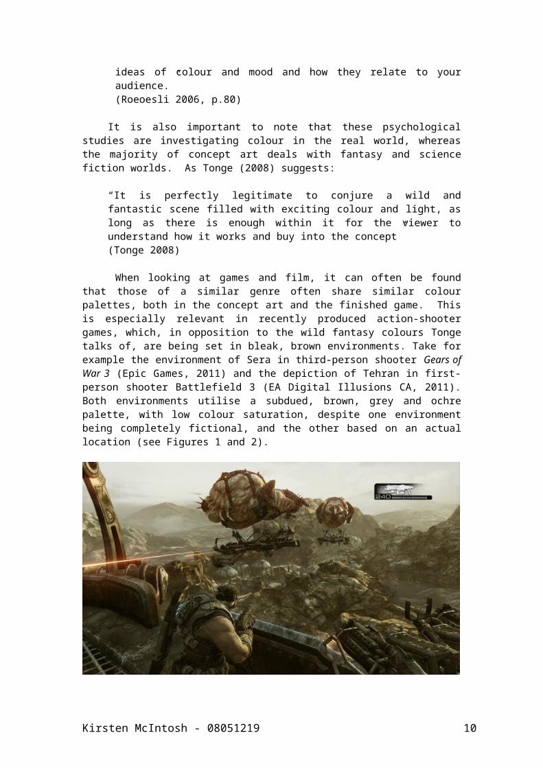
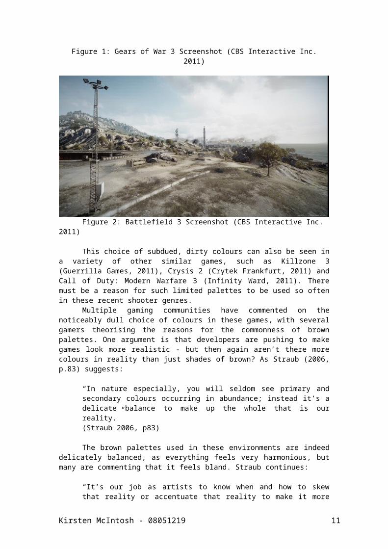
When looking at games and film, it can often be found that those of a similar genre often share similar colour palettes, both in the concept art and the finished game. This is especially relevant in recently produced action-shooter games, which, in opposition to the wild fantasy colours Tonge talks of, are being set in bleak, brown environments. Take for example the environment of Sera in third-person shooter Gears of War 3 (Epic Games, 2011) and the depiction of Tehran in first-person shooter Battlefield 3 (EA Digital Illusions CA, 2011). Both environments utilise a subdued, brown, grey and ochre palette, with low colour saturation, despite one environment being completely fictional, and the other based on an actual location (see Figures 1 and 2).
Figure 1: Gears of War 3 Screenshot (CBS Interactive Inc. 2011)
Kirsten McIntosh - 08051219 8
Figure 2: Battlefield 3 Screenshot (CBS Interactive Inc. 2011)
This choice of subdued, dirty colours can also be seen in a variety of other similar games, such as Killzone 3 (Guerrilla Games, 2011), Crysis 2 (Crytek Frankfurt, 2011) and Call of Duty: Modern Warfare 3 (Infinity Ward, 2011). There must be a reason for such limited palettes to be used so often in these recent shooter genres.
Multiple gaming communities have commented on the noticeably dull choice of colours in these games, with several gamers theorising the reasons for the commonness of brown palettes. One argument is that developers are pushing to make games look more realistic - but then again aren’t there more colours in reality than just shades of brown? As Straub (2006, p.83) suggests:
“In nature especially, you will seldom see primary and secondary colours occurring in abundance; instead it’s a delicate balance to make up the whole that is our reality.” (Straub 2006, p83)
The brown palettes used in these environments are indeed delicately balanced, as everything feels very harmonious, but many are commenting that it feels bland. Straub continues:
“It’s our job as artists to know when and how to skew that reality or accentuate that reality to make it more beautiful, more dramatic or more frightening, whatever the assignment may be.”(Straub 2006, p83)
Are these brown palettes meant to be creating a dull feeling in these environments, in order to make the player focus primarily on the action? Are the environments an afterthought, or deliberate to accentuate the often-hopeless attitudes of the characters within the storyline? Straub (2006, p.85) states:
“Colour is very much like a bank account. If you dip into it too much, soon you have none. It’s said that some of the most beautiful paintings ever produced have a restricted colour palette… You can’t
Kirsten McIntosh - 08051219 9
simply make an object or subject in your painting colourful by using one or all of the primary colours” (Straub 2006, p.85)
Could this same logic apply to the dusty brown landscapes of these recently developed combat games? Is less indeed, more in this context? By researching colour from different views, it will be possible to determine how it should be approached in the context of painting fantasy and science fiction environments, and how colour can be used in this context to manipulate the response to a piece of artwork. By determining if colour itself causes a specific reaction to a painting, or if it is the painting as a whole that provokes an emotional reaction, it can be understood how to create better, more engaging concept artworks.
Kirsten McIntosh - 08051219 10
Chapter 3Methodology
As art, and colour itself are both highly subjective topics, the project focused primarily on the use of practise based methods to develop and produce relevant materials and data for analysis. This practice-based methodology involved the implementation of a basic design pipeline, allowing a thorough and well-planned framework within which relevant visuals could be developed and produced, then analysed suitably using a framework created specifically for the project. Materials were produced/recorded through a combination of; photography, sketchbook work, media tests and digital paintings. Written records explaining and evaluating the visuals accompany these visuals.
3.1 Critical Framework Before the creation of visual materials for the project, it was
important for a critical framework to be developed, allowing for structured analysis, evaluation and comparison of both previous examples of concept art, and the artwork generated during the research project. Creating a strong analytical framework was also important in ensuring that the visual research would be evaluated in not only a subjective, artistic critique, but also from an objective and practical angle, as well as from social and cultural perspectives.
The framework used in this study was based on the basic elements and principles of art, as well as several critical structures used frequently for the analysis of art, as many of the features these frameworks investigate are applicable and relevant to the project. In particular, the subjective, structural and cultural analytical frames of art were referred to for the construction of a suitable framework for this study.
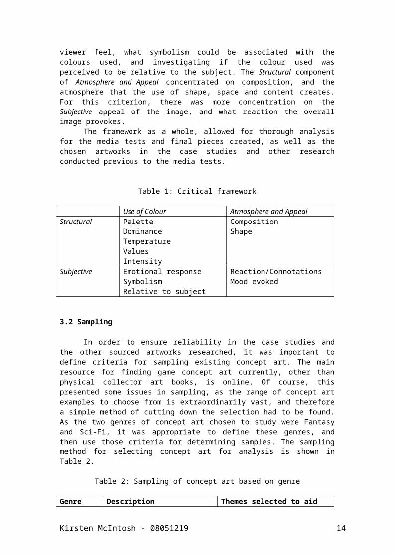
As the critical framework was developed for the analysis of concept artwork in terms of use of colour to effect atmosphere and emotional response, the criteria were split into two sections; Use of Colour and Atmosphere and Appeal, which were themselves spilt into two categories; Subjective and Structural (see Table 1). The Use of Colour criterion was used to consider the multiple Structural facets of colour in art, investigating; palette, dominance, temperature, values, and intensity, as well as investigating Subjective emotional responses to the colour used, by determining how the palette used made the viewer feel, what symbolism could be associated with the colours used, and investigating if the colour used was perceived to be relative to the subject. The Structural component of Atmosphere and Appeal concentrated on composition, and the atmosphere that the use of shape, space and content creates. For this criterion, there was more concentration on the Subjective appeal of the image, and what reaction the overall image provokes.
The framework as a whole, allowed for thorough analysis for the media tests and final pieces created, as well as the chosen artworks in the case studies and other research conducted previous to the media tests.
Table 1: Critical framework
Use of Colour Atmosphere and Appeal
Kirsten McIntosh - 08051219 11
Structural PaletteDominanceTemperatureValuesIntensity
CompositionShape
Subjective Emotional responseSymbolismRelative to subject
Reaction/ConnotationsMood evoked
3.2 Sampling
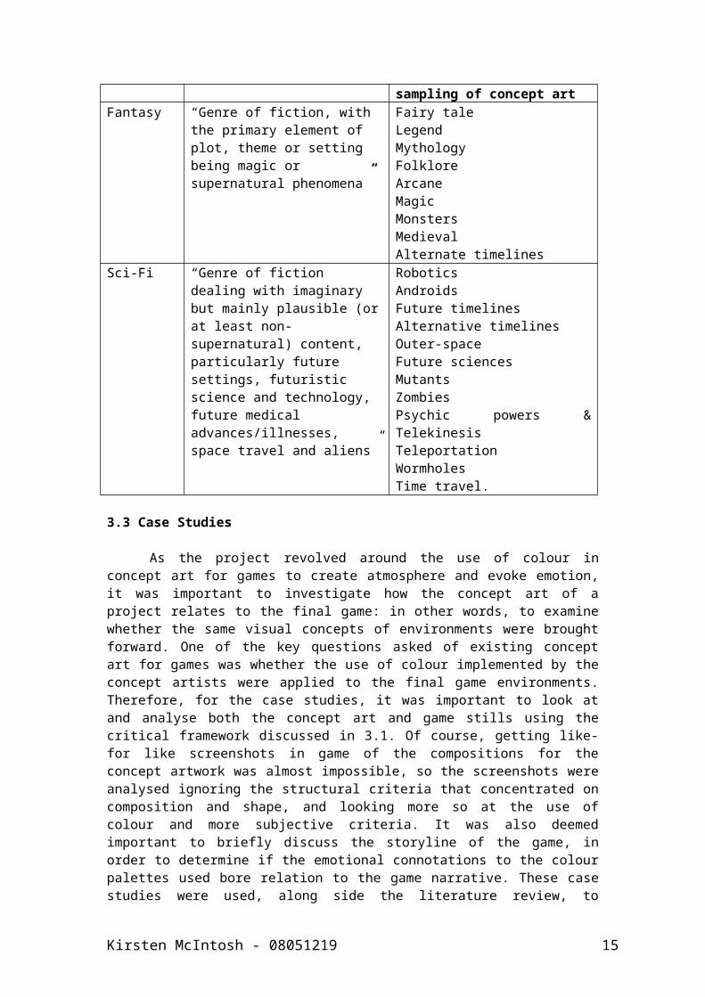
In order to ensure reliability in the case studies and the other sourced artworks researched, it was important to define criteria for sampling existing concept art. The main resource for finding game concept art currently, other than physical collector art books, is online. Of course, this presented some issues in sampling, as the range of concept art examples to choose from is extraordinarily vast, and therefore a simple method of cutting down the selection had to be found. As the two genres of concept art chosen to study were Fantasy and Sci-Fi, it was appropriate to define these genres, and then use those criteria for determining samples. The sampling method for selecting concept art for analysis is shown in Table 2.
Table 2: Sampling of concept art based on genre
Genre Description Themes selected to aid sampling of concept art
Fantasy “Genre of fiction, with the primary element of plot, theme or setting being magic or supernatural phenomena”
Fairy taleLegendMythologyFolkloreArcaneMagicMonstersMedievalAlternate timelines
Sci-Fi “Genre of fiction dealing with imaginary but mainly plausible (or at least non-supernatural) content, particularly future settings, futuristic science and technology, future medical advances/illnesses, space travel and aliens”
RoboticsAndroidsFuture timelinesAlternative timelinesOuter-spaceFuture sciencesMutantsZombiesPsychic powers & TelekinesisTeleportationWormholesTime travel.
3.3 Case Studies
As the project revolved around the use of colour in concept art for games to create atmosphere and evoke emotion, it was important to
Kirsten McIntosh - 08051219 12
investigate how the concept art of a project relates to the final game: in other words, to examine whether the same visual concepts of environments were brought forward. One of the key questions asked of existing concept art for games was whether the use of colour implemented by the concept artists were applied to the final game environments. Therefore, for the case studies, it was important to look at and analyse both the concept art and game stills using the critical framework discussed in 3.1. Of course, getting like-for like screenshots in game of the compositions for the concept artwork was almost impossible, so the screenshots were analysed ignoring the structural criteria that concentrated on composition and shape, and looking more so at the use of colour and more subjective criteria. It was also deemed important to briefly discuss the storyline of the game, in order to determine if the emotional connotations to the colour palettes used bore relation to the game narrative. These case studies were used, along side the literature review, to develop a set of guidelines for colour use to be tested in later development, in order to determine if the use of colour in current artwork is the best method of creating atmosphere and evoking specific mood.
3.4 Practical Project
The practice-based nature of this investigation meant that the majority of research was formed in the creation of visual data, involving photography, sketching, media tests and digital painting. In order for these methods to make sense as research, it was important to implement a pipeline along which the practical work could be scheduled in a sensible chronology. Whilst conducting the literature review, a basic pipeline for designing environmental concept art was found, that was suitable for use as an overall pipeline, not only to progress to a final outcome, but also to create substantial development research that could be analysed. In accompaniment to the practical visual research, a project diary log was maintained, allowing for written notes contextualising the research conducted, as well as ensuring transparency by logging when and how the work was conducted. During the practice led research, many different methods were employed along the pipeline, the first of which was a mix of Visualisation and Observation.
3.4.1 Visualisation and Observation
In order for appropriate research to be created, it was greatly important to investigate and evaluate existing concept artwork, to examine the use of colour and ascertain any distinguishing characteristics in terms of colour usage and palette choice. In order to do this, moodboards were created, allowing for the grouping together of concept art that featured a particular colour, and were then investigated to determine any correlation between content, genre, and colour choice. In total, six colour moodboards of existing concept artwork were created, allowing a more general overview of the use of red, purple, green, blue, yellow and greys as the dominant colour. This small investigation allowed for a basic theory to be formed, which could be further built upon or disproved throughout the project. In conjunction with this research, it was important for development towards the final outcomes to begin, and as a first step, some observation methods were undertaken, primarily photography of the local area in order to have photographic evidence of
Kirsten McIntosh - 08051219 13
colour, form and composition of the real world with which to work from. Photography studies investigating architecture, natural landscape, flora and natural colour were undertaken, followed by the addition of older relevant photography and studies created from collected existing photography sourced online to create a more varied base of images to develop from.
3.4.2 Sketchbooking
Sketchbooking formed a major component of the practice led research. The method of illustration was used in a composition concentrated sketchbook, where pencil sketched thumbnails of compositions for possible development into later paintings. These thumbnails were then developed digitally as a part of the media tests. Along side this composition and form based sketchbook, a digital sketchbook concentrating on colour was also maintained, investigating and developing individual colour palettes, and further developing and building upon the moodboard research created previously.
3.4.3 Media Tests
The next step in the development pipeline was the generation of media tests, again focusing primarily on the use of colour. Using the information and materials gathered and created from the sketchbooking stage of development, several black and white thumbnail compositions were painted digitally using Adobe Photoshop, expressing different uses of tone, mass and negative space as were first investigated in the composition sketchbook. These paintings were then used as a basis for colour studies using the colour palettes created previously, as by using layers and layer effects in Photoshop, colour could be applied without compromising the initial tonal balance of the image. With this digital method, the same composition could be treated with several different palettes in a less time consuming manner than repainting traditionally, and it could be ensured that only one variable was being manipulated – the colour used. From these studies, the most appropriate and effective palettes were selected for use with the final pieces.
3.4.4 Practice
The final step in the developmental pipeline was the creation of the final pieces - four digital paintings created in Photoshop, using the determined theories established from the prior research conducted as a guide for using colour to create established atmosphere. Two paintings for each genre were created, each genre using a single composition and two different colour palettes to allow comparison. Using similar painting methods as the media tests, sample paintings of the compositions were also created showing the use of other palettes, allowing additional analysis. The analytical criterion developed was applied to the final pieces, as it was to the previous research, in order to determine if the theories for use of colour created during the previous methods were suitable, and/or relevant.
Kirsten McIntosh - 08051219 14
Kirsten McIntosh - 08051219 15
Chapter 4Case Studies
One of the major methods for this research project was the investigation of current concept art the equivalent in-game environments, utilising the established critical framework to create comprehensive evaluations of colour use and implied atmosphere using case studies. Alongside smaller studies conducted in digital sketchbooks, these two main studies formed a large portion of the final model for colour use created near the end of the investigation.
4.1 Gears of War 3(Epic Games, 2011)
This study will focus on the analysis and comparison of concept artwork and the relevant in game screenshot counterparts, investigating changes in use of colour, evaluating the atmosphere created by the artwork and in-game environments, and making a conclusion on why (if any), changes in colour have been made.
Gears of War 3 (GoW3) is the third instalment in the popular third-person shooter series developed by Epic Games, available exclusively for Xbox360. The game continues the sci-fi story arc from the previous games and accompanying novel series, based on the fictional planet of ‘Sera’. Following the sinking of the city Jacinto 2 years prior in the previous game, the plot of GoW3 is set in an almost post apocalyptic world, with a fragmented military (or ‘COGS’) and civilian survivors battling against the evolving Locust enemy to hold and regain territory in various settlements across the land. The main chapters of the game are set primarily in the cities and settlements of Mercy, Char, Hannover, and finally Azura, however several other terrains are encountered throughout gameplay, from barren deserts, run down cities, and old towns, to lush costal island settings. Throughout the game, there is a heavy tone of hopelessness, loss and grief, not only brought forward from the previous games, but also established during the story mode gameplay, with the loss of vital main characters, as well as haunting flashbacks and glimpses of other COGs pasts, from more happy times. These important emotional factors of plot are reflected in both the concept art, and finished game visuals, despite some very interesting differences in colour use. For the purposes of this case study, the concept and screenshots for the first act, ‘Anchorage’, will be discussed.
Kirsten McIntosh - 08051219 16
Act 1, Chapter 1: Anchorage Concept
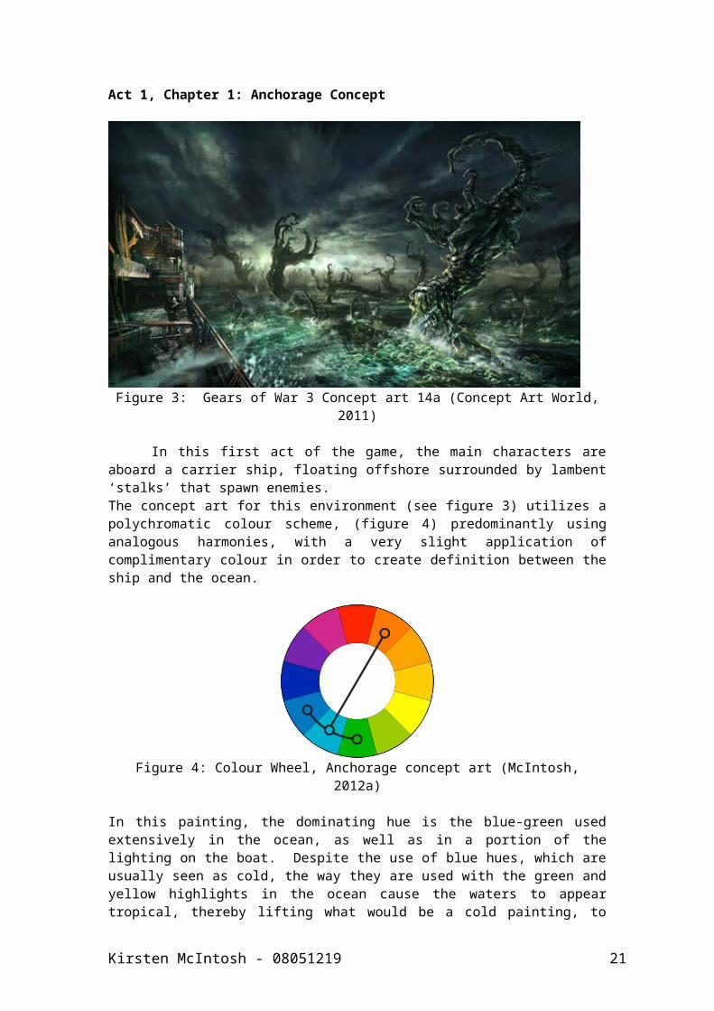
Figure 3: Gears of War 3 Concept art 14a (Concept Art World, 2011)
In this first act of the game, the main characters are aboard a carrier ship, floating offshore surrounded by lambent ‘stalks’ that spawn enemies.The concept art for this environment (see figure 3) utilizes a polychromatic colour scheme, (figure 4) predominantly using analogous harmonies, with a very slight application of complimentary colour in order to create definition between the ship and the ocean.
Figure 4: Colour Wheel, Anchorage concept art (McIntosh, 2012a)
In this painting, the dominating hue is the blue-green used extensively in the ocean, as well as in a portion of the lighting on the boat. Despite the use of blue hues, which are usually seen as cold, the way they are used with the green and yellow highlights in the ocean cause the waters to appear tropical, thereby lifting what would be a cold painting, to one with a more neutral temperature. Overall, the value of the painting is balanced, as it contains both extremes of light and dark, and very little middle ground. The darkest hues are the blues in the sky and in parts of the water, and the lightest are the yellow lighting on the horizon, and the greens and blue greens highlighting the water and lighting the ship. Despite having many dark areas, the intensity of colour saturation overall is high, creating an engaging and interesting aesthetic. The most saturated colours in the artwork are the blue and green blue hues,
Kirsten McIntosh - 08051219 17
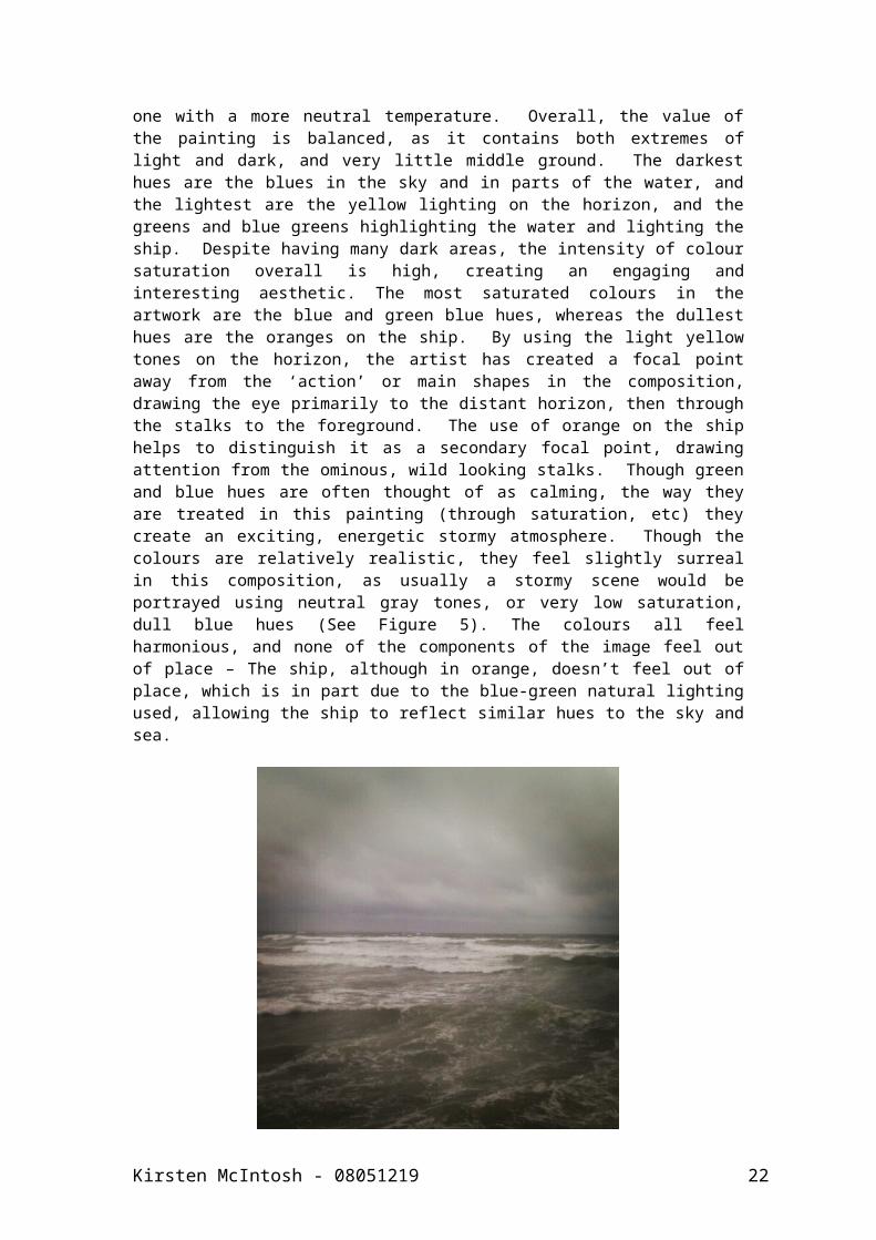
whereas the dullest hues are the oranges on the ship. By using the light yellow tones on the horizon, the artist has created a focal point away from the ‘action’ or main shapes in the composition, drawing the eye primarily to the distant horizon, then through the stalks to the foreground. The use of orange on the ship helps to distinguish it as a secondary focal point, drawing attention from the ominous, wild looking stalks. Though green and blue hues are often thought of as calming, the way they are treated in this painting (through saturation, etc) they create an exciting, energetic stormy atmosphere. Though the colours are relatively realistic, they feel slightly surreal in this composition, as usually a stormy scene would be portrayed using neutral gray tones, or very low saturation, dull blue hues (See Figure 5). The colours all feel harmonious, and none of the components of the image feel out of place – The ship, although in orange, doesn’t feel out of place, which is in part due to the blue-green natural lighting used, allowing the ship to reflect similar hues to the sky and sea.
Figure 5: Storm - St.Andrews (McIntosh, 2012b)
Despite the piece being densely populated by large, dark shapes, the composition still holds a sense of openness and feels expansive, this may well be down to the use of colour being unusual in a stormy scene. The composition, concentrating primarily on the dark sky and wild sea suggests those, and the stalks occupying them are more important than the ship and the cog upon it in this moment.
Overall, the painting suggests an uncomfortable atmosphere, in terms of generating feelings of unease, turmoil, uncertainty, hopelessness and a sense of impending doom. I believe that this is the artists’ intended emotional effect, portraying an uneasy atmosphere, using colour to promote a feeling of fear and incoming danger, without the need to actually portray the enemy. The use of shape and colour creates a great feeling of energy and movement, visually explaining how the game will be in future development, without the need for animation.
Act 1, Chapter 1: Anchorage Gameplay
Kirsten McIntosh - 08051219 18
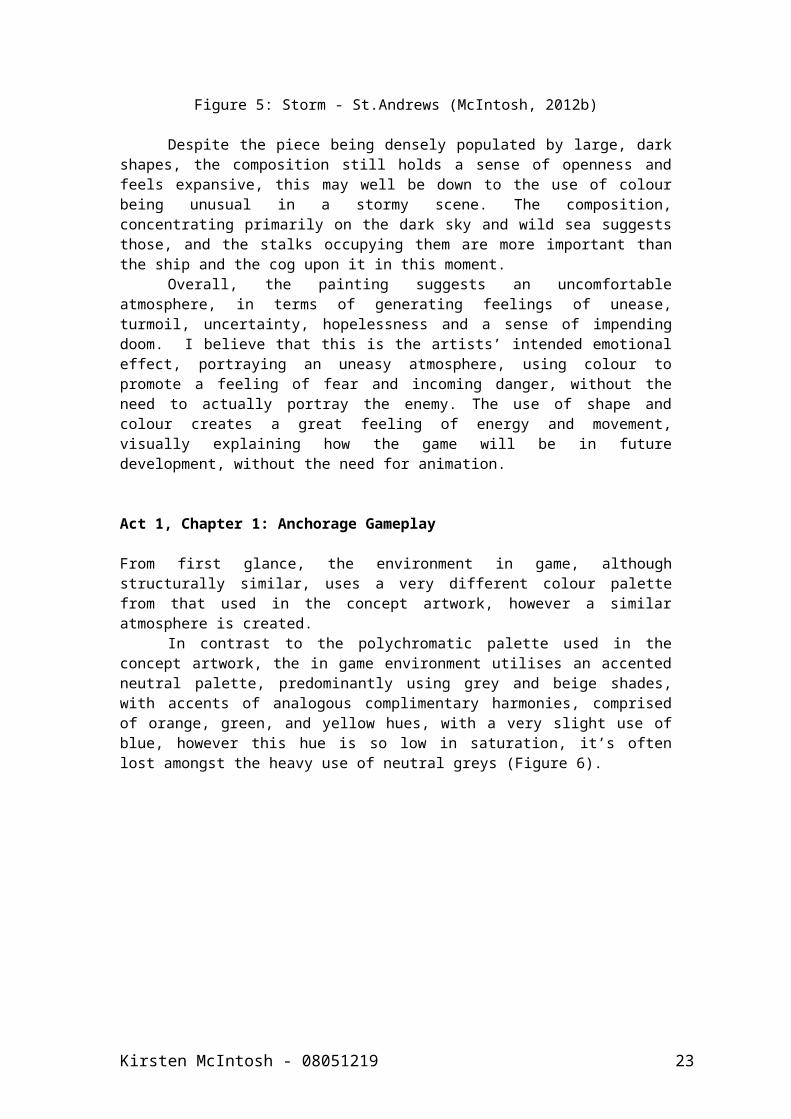
From first glance, the environment in game, although structurally similar, uses a very different colour palette from that used in the concept artwork, however a similar atmosphere is created.
In contrast to the polychromatic palette used in the concept artwork, the in game environment utilises an accented neutral palette, predominantly using grey and beige shades, with accents of analogous complimentary harmonies, comprised of orange, green, and yellow hues, with a very slight use of blue, however this hue is so low in saturation, it’s often lost amongst the heavy use of neutral greys (Figure 6).
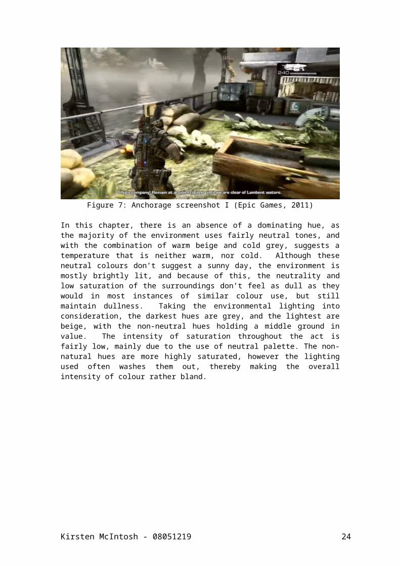
Figure 7: Anchorage screenshot I (Epic Games, 2011)
In this chapter, there is an absence of a dominating hue, as the majority of the environment uses fairly neutral tones, and with the combination of warm beige and cold grey, suggests a temperature that is neither warm, nor cold. Although these neutral colours don’t suggest a sunny day, the environment is mostly brightly lit, and because of this, the neutrality and low saturation of the surroundings don’t feel as dull as they would in most instances of similar colour use, but still maintain dullness. Taking the environmental lighting into consideration, the darkest hues are grey, and the lightest are beige, with the non-neutral hues holding a middle ground in value. The intensity of saturation throughout the act is fairly low, mainly due to the use of neutral palette. The non-natural hues are more highly saturated, however the lighting used often washes them out, thereby making the overall intensity of colour rather bland.
Kirsten McIntosh - 08051219 19
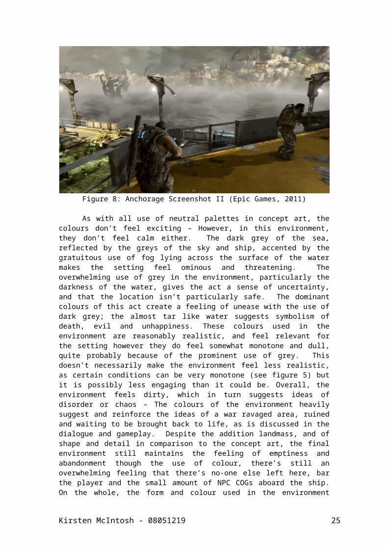
Figure 8: Anchorage Screenshot II (Epic Games, 2011)
As with all use of neutral palettes in concept art, the colours don’t feel exciting – However, in this environment, they don’t feel calm either. The dark grey of the sea, reflected by the greys of the sky and ship, accented by the gratuitous use of fog lying across the surface of the water makes the setting feel ominous and threatening. The overwhelming use of grey in the environment, particularly the darkness of the water, gives the act a sense of uncertainty, and that the location isn’t particularly safe. The dominant colours of this act create a feeling of unease with the use of dark grey; the almost tar like water suggests symbolism of death, evil and unhappiness. These colours used in the environment are reasonably realistic, and feel relevant for the setting however they do feel somewhat monotone and dull, quite probably because of the prominent use of grey. This doesn’t necessarily make the environment feel less realistic, as certain conditions can be very monotone (see figure 5) but it is possibly less engaging than it could be. Overall, the environment feels dirty, which in turn suggests ideas of disorder or chaos – The colours of the environment heavily suggest and reinforce the ideas of a war ravaged area, ruined and waiting to be brought back to life, as is discussed in the dialogue and gameplay. Despite the addition landmass, and of shape and detail in comparison to the concept art, the final environment still maintains the feeling of emptiness and abandonment though the use of colour, there’s still an overwhelming feeling that there’s no-one else left here, bar the player and the small amount of NPC COGs aboard the ship. On the whole, the form and colour used in the environment provides a negative, rather than positive emotional reaction, with connotations to ideas such as destruction, loneliness, abandonment, mystery, fear, and danger.
In general, the environment feels plausible despite the lack of colour for the most part, and this is I believe, to ensure that the action of the game (the violence) is most prominent, and to add some form of challenge, by making the enemy blend into the scenery better. Despite this, I feel that a more colourful palette could be used in game, without taking away from the action, the addition of other hues, even in subdued
Kirsten McIntosh - 08051219 20
intensity could give an added depth to parts of the environment, without drastically effecting the achieved atmosphere.
In conclusion, the atmosphere evoked by the colour used in this portion of the game evokes a feeling of pending warfare and action, a calm before the storm, as it were. There is a sense of unknown danger and events to come, with the buildings on the horizon suggesting adventure and discovery in newly changed areas. Despite the player being on a huge, strong metal warship, the dark and gloomy water that surrounds it creates a sense of fragility, with the ominous seas hinting at hidden dangers to come.
In comparison to the concept art, the in-game use of colour does vary a lot, however, the artists have managed to maintain a similar atmosphere and emotional reaction despite the change in format and delivery of the environment, by using a different approach to colour.
Kirsten McIntosh - 08051219 21
4.2 The Elder Scrolls V: Skyrim(Bethesda Game Studios, 2011)
This study will focus on the analysis and comparison of concept artwork and the relevant in game screenshot counterparts, investigating changes in use of colour, evaluating the atmosphere created by the artwork and in-game environments, and making a conclusion on why (if any) changes in colour have been made.
The Elder Scrolls V: Skyrim (Skyrim) is, as the name suggests, the fifth game in the Elder Scrolls series of action based fantasy role-playing adventure games, developed by Bethesda Game Studios for release on Xbox360, PlayStation 3 and Windows OS in late 2011. The long and complex storyline is based around the player’s character being tasked with defeating a dragon god, believed to have returned to the realm of Skyrim to destroy the world. The sandbox nature of the gameplay allows the player to postpone completing the main storyline indefinitely, free to investigate the huge and detailed lands of Skyrim, filled with mythical creatures, rogue bandits, and a brewing civil war, set in an expansive collection of towering mountain ranges, luscious plains and blisteringly cold tundra. The in-game environment boasts a large number of unique burrows and dungeons to explore, as well as several cities and townships from which hundreds of side quests can be attained. With such a vast and varied environment, there’s a large collection of concept work to investigate, and finding the exact equivalent in such a massive game world is very difficult, and as the player experiences the game world as one would a 24 hour day, there’s a change in lighting throughout gameplay, meaning at different times, the environment would have a different colour, making basic comparisons to the concept art more difficult. Therefore, for the purposes of this study, to make as relevant and accurate a comparison as possible, an example of concept art in daytime lighting was compared with a landscape-similar area at midday game time.
Kirsten McIntosh - 08051219 22
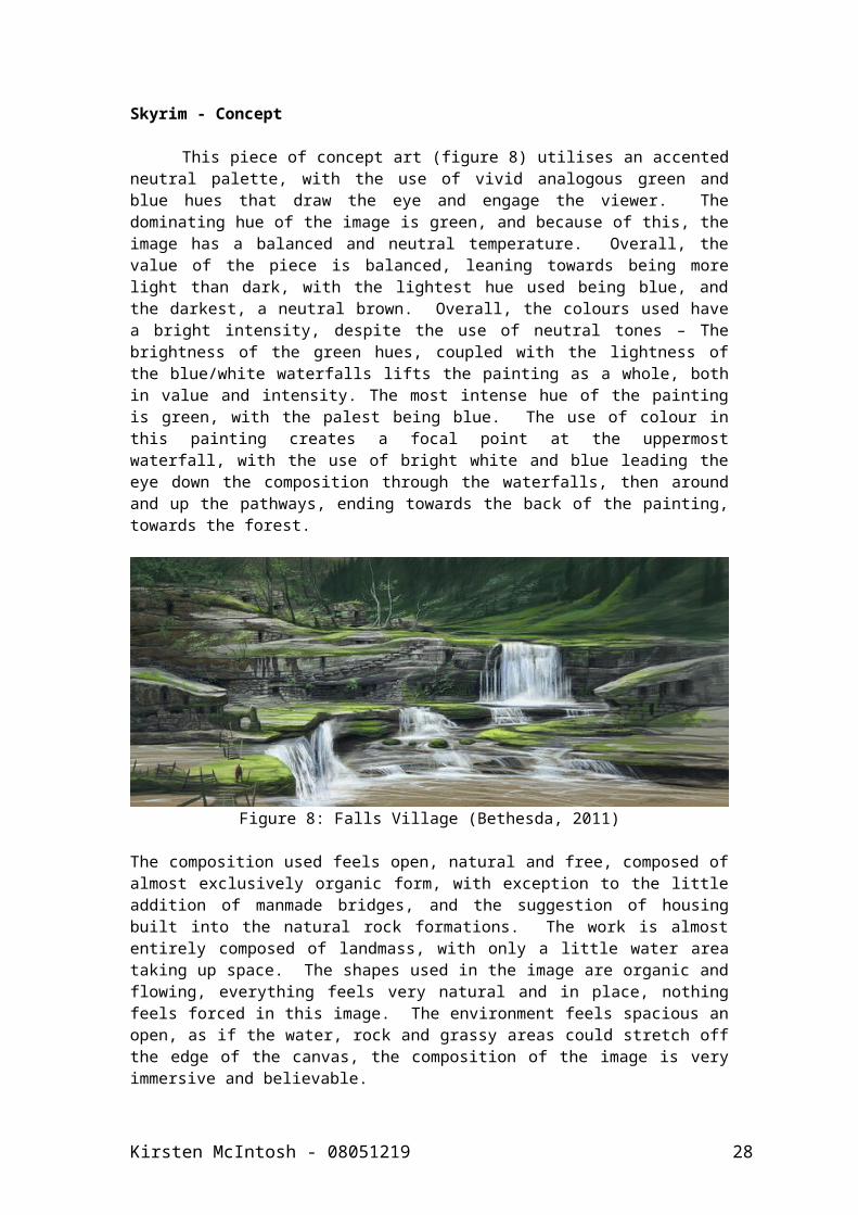
Skyrim - Concept
This piece of concept art (figure 8) utilises an accented neutral palette, with the use of vivid analogous green and blue hues that draw the eye and engage the viewer. The dominating hue of the image is green, and because of this, the image has a balanced and neutral temperature. Overall, the value of the piece is balanced, leaning towards being more light than dark, with the lightest hue used being blue, and the darkest, a neutral brown. Overall, the colours used have a bright intensity, despite the use of neutral tones – The brightness of the green hues, coupled with the lightness of the blue/white waterfalls lifts the painting as a whole, both in value and intensity. The most intense hue of the painting is green, with the palest being blue. The use of colour in this painting creates a focal point at the uppermost waterfall, with the use of bright white and blue leading the eye down the composition through the waterfalls, then around and up the pathways, ending towards the back of the painting, towards the forest.
Figure 8: Falls Village (Bethesda, 2011)
The composition used feels open, natural and free, composed of almost exclusively organic form, with exception to the little addition of manmade bridges, and the suggestion of housing built into the natural rock formations. The work is almost entirely composed of landmass, with only a little water area taking up space. The shapes used in the image are organic and flowing, everything feels very natural and in place, nothing feels forced in this image. The environment feels spacious an open, as if the water, rock and grassy areas could stretch off the edge of the canvas, the composition of the image is very immersive and believable.
The colours used throughout the painting are calming and natural, and nothing seems unrealistic used, presumably because the palette used here is one found commonly in nature, and is therefore such that the viewer can relate to it very easily, and it can make them at ease. It is also because of the realistic and naturally occurring nature of the palette, that it feels harmonious and welcoming. The palette chosen reflects the content accurately, nothing feel wrong or out of place in the palette, as there are no unusual colour choices that would be uncommon to find in the real world. These colours would probably work for most compositions as they lack complexity, and are easy to relate to. The brightness of the green hues used make you want to get in and explore the environment, as they suggest positive ideas such as life, cleanness, nature, and a feeling of
Kirsten McIntosh - 08051219 23
freshness. These luscious green hues suggest ideas of an abundance of life, yet lacks of human interaction, making the environment seem almost untouched, virgin and waiting to be discovered and explored. The colours, although bright are happy and relevant to the content, which is simple and easy on the eye in itself.
In summary, the environment, although containing suggestions of humans living in the locale, feels empty of such, yet not abandoned or desolate – The bright, fresh hues instead suggest that the environment is full of wildlife. The atmosphere created in this image is positive, creating a sense of curiosity, a need to see what is round the corner further into the forest, a need to explore. The setting is fresh, bright, welcoming and safe. I believe that the atmosphere, or mood of the images was not at the forefront of the artists mind, and rather, they were more interested in detailing and visually describing the environment. However, the way in which the image has been painted, and the colour chosen has indeed created a need in the viewer to explore the game – selling the idea of a sandbox adventure RPG in a snapshot.
Skyrim – Screenshot
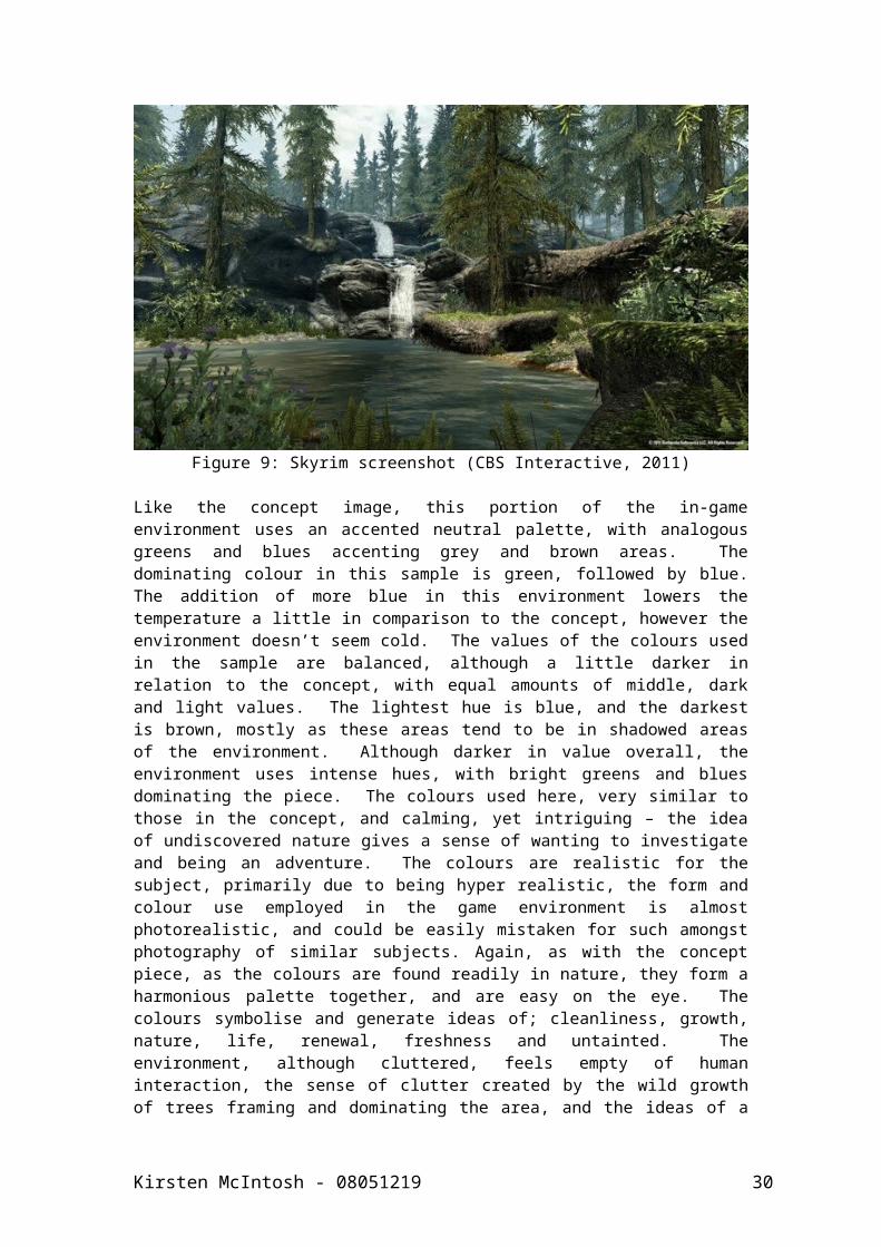
Figure 9: Skyrim screenshot (CBS Interactive, 2011)
Like the concept image, this portion of the in-game environment uses an accented neutral palette, with analogous greens and blues accenting grey and brown areas. The dominating colour in this sample is green, followed by blue. The addition of more blue in this environment lowers the temperature a little in comparison to the concept, however the environment doesn’t seem cold. The values of the colours used in the sample are balanced, although a little darker in relation to the concept, with equal amounts of middle, dark and light values. The lightest hue is blue, and the darkest is brown, mostly as these areas tend to be in shadowed areas of the environment. Although darker in value overall, the environment uses intense hues, with bright greens and blues dominating the piece. The colours used here, very similar to those in the concept, and calming, yet intriguing – the idea of undiscovered nature gives a sense of wanting to investigate and being an adventure. The colours are realistic
Kirsten McIntosh - 08051219 24
for the subject, primarily due to being hyper realistic, the form and colour use employed in the game environment is almost photorealistic, and could be easily mistaken for such amongst photography of similar subjects. Again, as with the concept piece, as the colours are found readily in nature, they form a harmonious palette together, and are easy on the eye. The colours symbolise and generate ideas of; cleanliness, growth, nature, life, renewal, freshness and untainted. The environment, although cluttered, feels empty of human interaction, the sense of clutter created by the wild growth of trees framing and dominating the area, and the ideas of a freely existing untamed patch of nature give off a positive feeling, and there seems to be no sense of something untoward or dangerous suggested by the colour use. I think that the environment, particularly this sample area, was created to evoke a sense of adventure into the unknown, as it make sense to do so in a game where the environments are made to be investigated, thoroughly explored, and enjoyed. The environment feels very real and plausible, making it extremely immersive for the player, giving a suggestion of a pleasant mood, of adventure and of a need to discover more.
Kirsten McIntosh - 08051219 25
Chapter 5Findings
5.1 Literature Review and Analysis of existing work
From the literature review, much was defined and determined, in terms of how colour theory would be approached in the later stages of development. Better understanding of colour harmony and balancing a composition in terms of colour use, saturation and contrast was gained, and proved useful in later development. From this point, a set of analytical criteria were created, allowing detailed evaluation and analysis of existing work, helping to gather evidence and information to develop a suitable set of guidelines for the treatment of colour when used in sci-fi or fantasy environmental concept art. The criteria covered both structural and subjective questions, investigating colour theory fundamentals such as palette choice, use of harmonies, value and intensity, as well as the evaluation of colour symbolism, relativity of colour use for the content of an image. It also covered emotional responses, such as feelings evoked when viewing the pieces, overall mood felt when viewing the piece, and connotations made by the viewer in relation to the artwork.
Now, armed with criteria for analysis, existing concept artwork could be examined and analysed, to determine how colour is used in different game genres. The initial analysis was conducted using moodboards, collating examples of concept art by dominating colour, and making an analysis of symbolism and connotations to colour in general, as well as making observations of content, to help determine which colours were most prominent in each genre. With this, matrices of genre specific samples were also evaluated, giving a more detailed understanding of colour use for a specific genre. From these, it was determined that Sci-Fi palettes used neutral palettes most commonly, often for city scenes, and indoor environments. It was noted that Sci-Fi palettes tended to use either neutral, neutral accented palettes, utilising either analogous or, in few cases, triadic harmonies. It was also noted at this point that no example of Sci-Fi art using a tetradic colour harmony was gathered for analysis, suggesting that this harmony is either very rarely used, or not used at all in these instances. Fantasy colour use, on the other hand, tended to involve more varied palettes, with more saturated and vivid use of hues. They too had a tendency to use analogous, complimentary or triadic harmonies, however they tend to use far more polychromatic palettes than Sci-Fi examples. Like the Sci-Fi examples, the fantasy examples also made use of monochromatic palettes, however they used more vivid and saturated hues, which suggested a less depressed atmosphere, and the brighter, more saturated hues tended to make for more engaging and eye catching pieces. At this point, more detailed case studies into colour use in concept and in-game environmental equivalents were made, and the majority of the information gathered was in agreement with that gathered from the other investigations, only more detailed. It was noted here, however, that it was uncommon for the colour use in game concepts to be carried through and used in the final game, bar two examples: The Elder Scrolls V: Skyrim, and Prototype, both of which used environments heavily based on real landscapes, which was deemed to be a reasonable reason for the colour to be so similar, if the concepts were based from existing real life situations.
Kirsten McIntosh - 08051219 26

From this point, a set of guidelines was created, suggesting some rules for the treatment of colour for environmental concepts. The guidelines were simple and fairly open, as a strict set of colour rules, or palette choices was deemed to be too forceful, and would result in images that all looked the same. The guidelines suggested appropriate harmonies and types of palette for each genre, as well as a short discussion of colour symbolism and connotation, and how colour can add to, or create atmosphere. With these guidelines defined, the project could move forward and concentrate on testing these guidelines practically, and determine if they were appropriate.
5.2 Media Testing
The media testing began with the simultaneous development of both compositions and palettes. The composition development started with photographic research, investigating the form and composition found in real life, with investigations into both architecture and organic landscapes. From here, a sketchbook was created, where thumbnail illustrations were developed, ready to be painted digitally in black and white, for further investigation. Once a set of 10 compositions had been achieved digitally (5 per genre), they were whittled down to two concepts per genre (one darker, one lighter) for colour application. Whilst this development was conducted, palette sourcing was also underway, from various sources, including coloured ‘barcodes’ of films, photographic research, and existing artwork. A vast amount of palettes were created, and in order to reduce the number, the guidelines were applied, and those palettes not conforming to the suggested harmonies were disregarded. Eventually, through elimination, 5 palettes for each genre were produced, and these were then applied to the four compositions as simple colour tests, and analysed using the analytical criteria used to evaluate the existing works before.
As was expected, the guideline based palettes all made for visually appealing colour combinations, and only some palettes were deemed inappropriate, mostly due to the colours not being suitable for the content of the images. One of each genre specific compositions from these tests were taken forward for final paintings, and two of each palette were taken forward to be applied to them.
5.3 The Final Outcome
The final outcome of the project culminated in the creation of two final pieces, one of a Sci-Fi genre, and one Fantasy. These paintings were created in photoshop, using black and white to create tonal images upon which colours could be applied, allowing for colour comparison to be made without unnecessary amounts of added painting hours. Once created, the analytical criteria were applied to each, and the paintings were evaluated for atmosphere and colour use. The results were again, as expected, positive, once more enforcing that the basic guidelines for colour developed were effective for guiding good colour use in these environments. The reason for the guidelines being successful may well be down to the fact that they are based on sound colour theory, and extensive research into professional concept art for highly selling games, and that they way colour is used already in this field, is often done in such a way that good atmosphere is already evoked.
Kirsten McIntosh - 08051219 27
The conclusion drawn from this, is that if basic colour theory is followed for concept art creation, good, atmospheric and emotionally evocative artwork can be produced.
Kirsten McIntosh - 08051219 28
Chapter 6Conclusion
In conclusion to this study, much has been learned and a new understanding of colour use and colour theory has be realised by the researcher. On the whole, the guidelines produced from the primary research are sound, with the occasional acceptation, when ensuring that the palette is relevant to the content of the painting, but this of course is something for the artist themselves to determine. It’s impossible to create a flawless formula for creating compelling, mood evoking and atmospheric concept art, as first of all, these concepts are all subjective, and may well vary from person to person, and secondly, it’s down to the artist themselves to create the work – if they don’t understand what they want to convey to the viewer, it’s nearly impossible to create something tangible and understandable. The basic guideline developed from this research, is that colour must work in conjunction with content – Colour alone can’t mean something to the viewer, it needs a context with which to work with to develop a narrative, be that visually descriptive or emotionally engaging. It must be remembered that colour in different situations can mean different things, and create different connotations and ideas when used in different contexts. As was mentioned previously in the literature review, the most important part of creating an environment, is using lighting that is realistic enough for us to comprehend objects and shapes that we can recall from real life, if we light environments correctly, we can integrate unusual colours into a painting successfully, allowing the creation of vivid, yet believable alien worlds, or magical realms.
Colour can and should be considered as an important aspect for helping to express ideas, mood and atmosphere in concept art, lifting regular ideas from black and white concepts, into believable and engrossing worlds. And this use of colour shouldn’t be confined to concept stage work, but brought forward and embraced in final game development, allowing for more visually engaging environments.
Kirsten McIntosh - 08051219 29
List of Figures
Figure 1: Screenshot from Gears of War 3Figure 2: Screenshot from Battlefield 3Figure 3: Concept art 14a, Gears of War 3Figure 4: Colour Wheel, Concept art 14aFigure 5: Storm - St.AndrewsFigure 6: Anchorage screenshot I, Gears of War 3Figure 7: Anchorage screenshot II, Gears of War 3Figure 8: Falls Villiage concept art, SkyrimFigure 9: Screenshot from Skyrim
Kirsten McIntosh - 08051219 30
Appendices
Appendix A – Case Study Criteria Tables
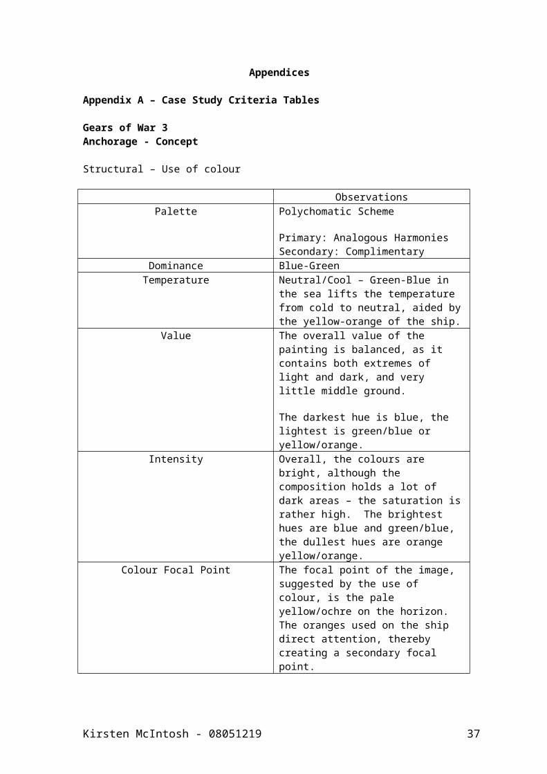
Gears of War 3Anchorage - Concept
Structural – Use of colour
ObservationsPalette Polychomatic Scheme
Primary: Analogous HarmoniesSecondary: Complimentary
Dominance Blue-GreenTemperature Neutral/Cool – Green-Blue in the sea
lifts the temperature from cold to neutral, aided by the yellow-orange of the ship.
Value The overall value of the painting is balanced, as it contains both extremes of light and dark, and very little middle ground.
The darkest hue is blue, the lightest is green/blue or yellow/orange.
Intensity Overall, the colours are bright, although the composition holds a lot of dark areas – the saturation is rather high. The brightest hues are blue and green/blue, the dullest hues are orange yellow/orange.
Colour Focal Point The focal point of the image, suggested by the use of colour, is the pale yellow/ochre on the horizon.The oranges used on the ship direct attention, thereby creating a secondary focal point.
Kirsten McIntosh - 08051219 31
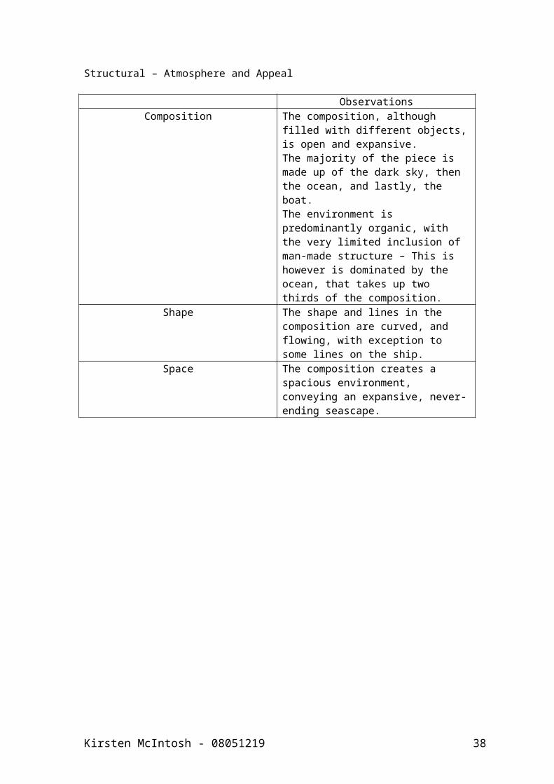
Structural – Atmosphere and Appeal
ObservationsComposition The composition, although filled
with different objects, is open and expansive.The majority of the piece is made up of the dark sky, then the ocean, and lastly, the boat.The environment is predominantly organic, with the very limited inclusion of man-made structure – This is however is dominated by the ocean, that takes up two thirds of the composition.
Shape The shape and lines in the composition are curved, and flowing, with exception to some lines on the ship.
Space The composition creates a spacious environment, conveying an expansive, never-ending seascape.
Kirsten McIntosh - 08051219 32
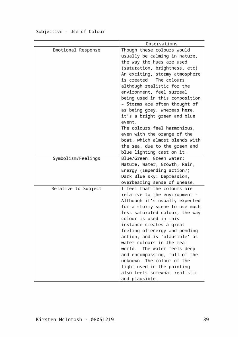
Subjective – Use of Colour
ObservationsEmotional Response Though these colours would usually
be calming in nature, the way the hues are used (saturation, brightness, etc) An exciting, stormy atmosphere is created. The colours, although realistic for the environment, feel surreal being used in this composition – Storms are often thought of as being grey, whereas here, it’s a bright green and blue event.The colours feel harmonious, even with the orange of the boat, which almost blends with the sea, due to the green and blue lighting cast on it.
Symbolism/Feelings Blue/Green, Green water: Nature, Water, Growth, Rain, Energy (Impending action?)Dark Blue sky: Depression, overbearing sense of unease.
Relative to Subject I feel that the colours are relative to the environment – Although it’s usually expected for a stormy scene to use much less saturated colour, the way colour is used in this instance creates a great feeling of energy and pending action, and is ‘plausible’ as water colours in the real world. The water feels deep and encompassing, full of the unknown. The colour of the light used in the painting also feels somewhat realistic and plausible.
Kirsten McIntosh - 08051219 33

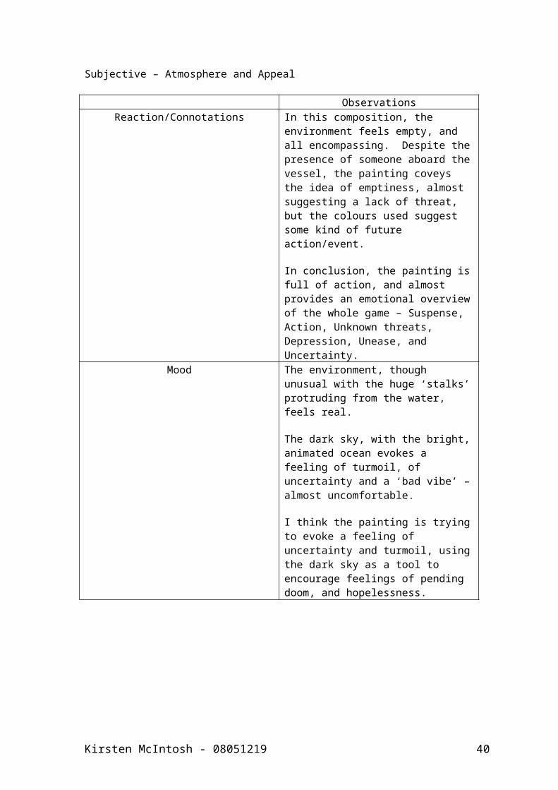
Subjective – Atmosphere and Appeal
ObservationsReaction/Connotations In this composition, the
environment feels empty, and all encompassing. Despite the presence of someone aboard the vessel, the painting coveys the idea of emptiness, almost suggesting a lack of threat, but the colours used suggest some kind of future action/event.
In conclusion, the painting is full of action, and almost provides an emotional overview of the whole game – Suspense, Action, Unknown threats, Depression, Unease, and Uncertainty.
Mood The environment, though unusual with the huge ‘stalks’ protruding from the water, feels real.
The dark sky, with the bright, animated ocean evokes a feeling of turmoil, of uncertainty and a ‘bad vibe’ – almost uncomfortable.
I think the painting is trying to evoke a feeling of uncertainty and turmoil, using the dark sky as a tool to encourage feelings of pending doom, and hopelessness.
Kirsten McIntosh - 08051219 34
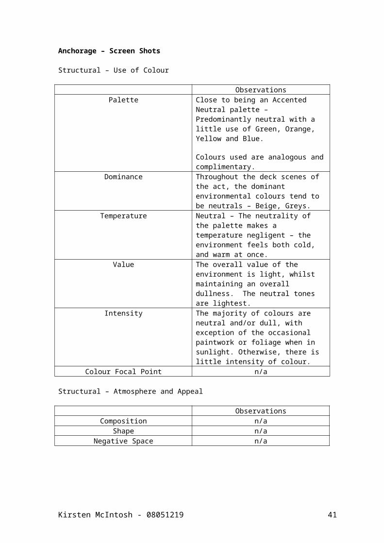
Anchorage – Screen Shots
Structural – Use of Colour
ObservationsPalette Close to being an Accented Neutral
palette – Predominantly neutral with a little use of Green, Orange, Yellow and Blue.
Colours used are analogous and complimentary.
Dominance Throughout the deck scenes of the act, the dominant environmental colours tend to be neutrals – Beige, Greys.
Temperature Neutral – The neutrality of the palette makes a temperature negligent – the environment feels both cold, and warm at once.
Value The overall value of the environment is light, whilst maintaining an overall dullness. The neutral tones are lightest.
Intensity The majority of colours are neutral and/or dull, with exception of the occasional paintwork or foliage when in sunlight. Otherwise, there is little intensity of colour.
Colour Focal Point n/a
Structural – Atmosphere and Appeal
ObservationsComposition n/a
Shape n/aNegative Space n/a
Kirsten McIntosh - 08051219 35

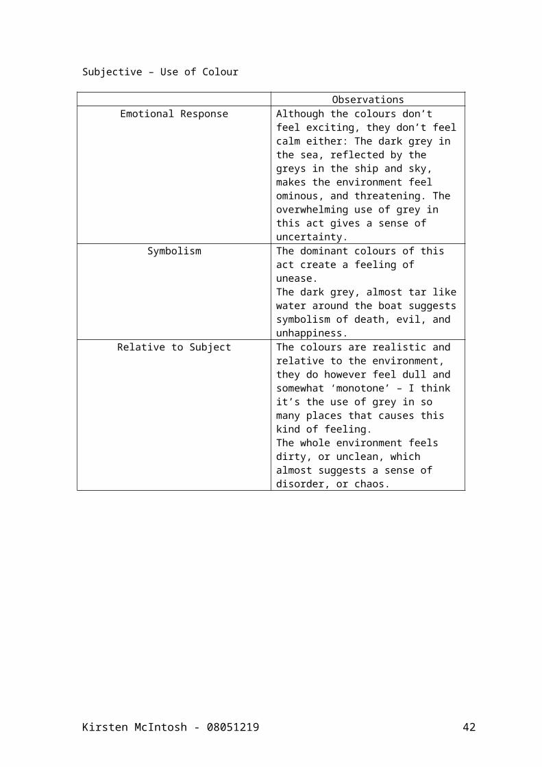
Subjective – Use of Colour
ObservationsEmotional Response Although the colours don’t feel
exciting, they don’t feel calm either: The dark grey in the sea, reflected by the greys in the ship and sky, makes the environment feel ominous, and threatening. The overwhelming use of grey in this act gives a sense of uncertainty.
Symbolism The dominant colours of this act create a feeling of unease.The dark grey, almost tar like water around the boat suggests symbolism of death, evil, and unhappiness.
Relative to Subject The colours are realistic and relative to the environment, they do however feel dull and somewhat ‘monotone’ – I think it’s the use of grey in so many places that causes this kind of feeling.The whole environment feels dirty, or unclean, which almost suggests a sense of disorder, or chaos.
Kirsten McIntosh - 08051219 36
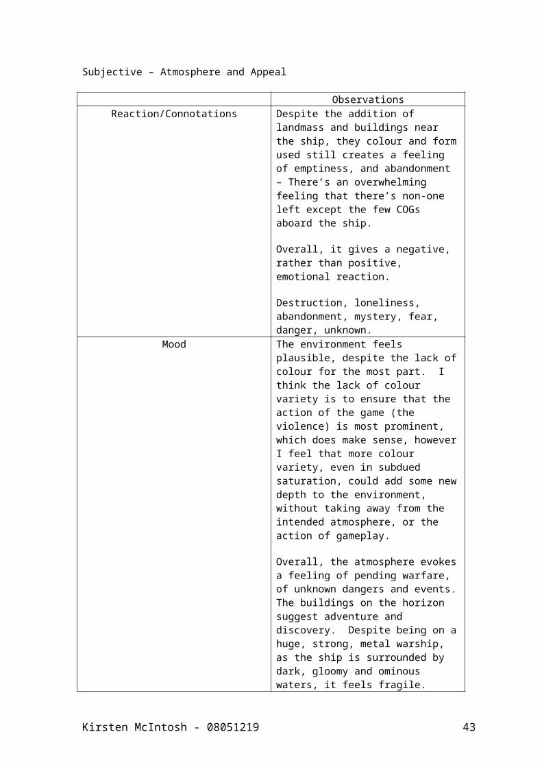
Subjective – Atmosphere and Appeal
ObservationsReaction/Connotations Despite the addition of landmass
and buildings near the ship, they colour and form used still creates a feeling of emptiness, and abandonment – There’s an overwhelming feeling that there’s non-one left except the few COGs aboard the ship.
Overall, it gives a negative, rather than positive, emotional reaction.
Destruction, loneliness, abandonment, mystery, fear, danger, unknown.
Mood The environment feels plausible, despite the lack of colour for the most part. I think the lack of colour variety is to ensure that the action of the game (the violence) is most prominent, which does make sense, however I feel that more colour variety, even in subdued saturation, could add some new depth to the environment, without taking away from the intended atmosphere, or the action of gameplay.
Overall, the atmosphere evokes a feeling of pending warfare, of unknown dangers and events. The buildings on the horizon suggest adventure and discovery. Despite being on a huge, strong, metal warship, as the ship is surrounded by dark, gloomy and ominous waters, it feels fragile.
Kirsten McIntosh - 08051219 37
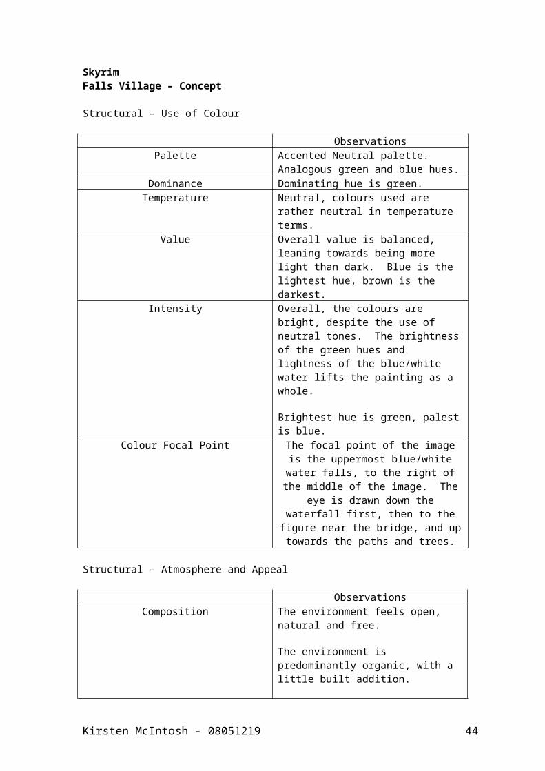
SkyrimFalls Village – Concept
Structural – Use of Colour
ObservationsPalette Accented Neutral palette.
Analogous green and blue hues.Dominance Dominating hue is green.
Temperature Neutral, colours used are rather neutral in temperature terms.
Value Overall value is balanced, leaning towards being more light than dark. Blue is the lightest hue, brown is the darkest.
Intensity Overall, the colours are bright, despite the use of neutral tones. The brightness of the green hues and lightness of the blue/white water lifts the painting as a whole.
Brightest hue is green, palest is blue.
Colour Focal Point The focal point of the image is the uppermost blue/white water falls, to the right of the middle of the image. The eye is drawn down the waterfall
first, then to the figure near the bridge, and up towards the paths
and trees.
Structural – Atmosphere and Appeal
ObservationsComposition The environment feels open, natural
and free.
The environment is predominantly organic, with a little built addition.
Pretty much the whole image is landmass, with a little amount of water.
Shape The lines and shapes are organic and flowing, it all feels very natural, even the man-made areas feel rustic and as if they belong there.
Space The environment feels spacious and open, as if the water, rocks and grassy areas stretch off for miles outwith the image edges.
Subjective – Use of Colour
Kirsten McIntosh - 08051219 38
ObservationsEmotional Response The colours used here are calming
and natural, and nothing seems unrealistic about the colours used here, this environment feels very plausible and very realistic. As the colours are very natural and can be seen in nature, the palette feels harmonious and welcoming.
The palette reflects the content accurately, noting feels out of place.The use of colour in this instance is all relative to the content, with no strange colour choices that would be unusual in real life.
Symbolism The palette feels safe and welcoming, normal and easy to comprehend. The colours would probably work for most compositions, as they aren’t complex. The colours make you want to explore this environment.
The colours create feelings of clean, fresh, and natural things, the running water and lushious greens hues create connotations towards an abundance of life, and a lack of human interaction with nature
Relative to Subject The colours are realistic, bright and happy, and relevant to the content, which is simple and comfortable.
Subjective – Atmosphere and Appeal
ObservationsReaction/Connotations The environment, although with
suggestions of humans living there, feels empty, but not abandoned. If lacking in humans, the area is certainly full of wildlife.
The atmosphere created in this image is positive, creating a sense of curiosity, wanting to see what is in the distance, wanting to explore. The setting feels fresh, bright, welcoming and safe.
Nature, clean, life, adventure, simple.
The mood felt when viewing this
Kirsten McIntosh - 08051219 39
painting, is happy and positive.
I think the mood trying to be evoked is negligible, and that the artist was more interested in detailing and visually describing the environment.
Mood Overall, the mood evoked is pleasant, non-threatening and interesting.
Kirsten McIntosh - 08051219 40
Skyrim – Screen Shot
ObservationsPalette Like the concept image, this portion
of the environment uses an accented neutral palette, with analogous green and blue accents.
Dominance The dominance of this sample is green, then blue.
Temperature The addition of more blues in this palette cools the temperature of the palette down somewhat, but it doesn’t feel cold.
Value The value of the piece is balanced, with equal amounts of middle value, light and dark. The lightest hue is blue, and the darkest is brown.
Intensity The colours are bright, the brightest hue being green, and the darkest being brown.
Colour Focal Point n/a
Structural – Atmosphere and Appeal
ObservationsComposition n/a
Shape n/aNegative Space n/a
Subjective – Use of Colour
ObservationsEmotional Response The colours are calming yet
intriguing; the idea of undiscovered nature gives a sense of wanting to adventure.
The colours are realistic for the subject, and the environment of the game is almost photorealistic in form, and colour use.
As the colours are found in reality together, they form a harmonious palette together, and are easy on the eye.
Symbolism Clean, growth, nature, life, renewing, fresh, untainted.
Relative to Subject The colours are relative to the content.
Kirsten McIntosh - 08051219 41
Subjective – Atmosphere and Appeal
ObservationsReaction/Connotations The environment, although
cluttered, feels empty of human life.
This sample of environment gives off a positive feeling, there seems to be nothing untoward, or anything suggesting such.
I think the environment, particularly in this sample, is trying to evoke a sense of adventure into the unknown, as it is a sandbox game that was made to be thoroughly explored and enjoyed.
The environment feels very real, and plausible, and could easily be mistakes for a real place
Mood Pleasant, gives a want to explore more, to discover things.
Kirsten McIntosh - 08051219 42
References
Albers, J. 1920. Interaction of colour. In: Batchelor, D. ed. 2008. Colour. London, Whitechapel.
Batchelor, D. ed. 2008. Colour. London, Whitechapel.
Bethesda Game Studios. 2011. The elder scrolls v: skyrim. [disk]. Xbox360. Bethesda Softworks.
Bethesda Game Studios. 2011. Fallsvillage01. [image online]. Available at: <http://www.flickr.com/photos/47857688@N08/6877508999/in/set-72157629321466509> [Accessed 12 April 2012]
CBS Interactive. 2011. Gears of war 3 (X360). [image online]. Available at: < http://uk.gamespot.com/gears-of-war-3/images/1549406/>
CBS Interactive. 2011. Battlefield 3. [image online]. Available at: < http://uk.gamespot.com/battlefield-3/images/1571998/>
CBS Interactive. 2011. The elder scrolls v: skyrim. [image online]. Available at: < http://uk.gamespot.com/the-elder-scrolls-v-skyrim/images/1426691/>
Concept Art World. 2011. Gears of war 3 concept art 14a. [image online]. Available at: < http://conceptartworld.com/wp-content/uploads/2011/03/Gears_of_War_3_Concept_Art_14a.jpg> [Accessed: 12 April 2012]
Crytek Frankfurt. 2001. Crysis 2. [disk]. Xbox360. Electronic Arts.
Dashow, M. 2007. 'Colour composition', ImagineFX, Dec, pp. 88-91
EA Digital Illusions CE. 2011. Battlefield 3. [disk]. Xbox360. Electronic Arts.
Epic Games. 2011. Gears of war 3. [disk]. Xbox360. Microsoft Studios.
Gage, J. 1999. Colour and meaning: art, science and symbolism. London, Thames & Hudson.
Guerrilla Games. 2001. Killzone 3. Playstation 3. Sony Computer Entertainment.
Infinity Ward. 2011. Call of duty: modern warfare 3. Xbox360. Activision.
Kandinsky, W. 1911. Concerning the spiritual in art. In: Batchelor, D. ed. 2008. Colour. London, Whitechapel. pp.57-62
Ludvigsen, H. 2008. ‘Artist insight: henning’s 101: colour’, ImagineFX, June, pp. 78-82
Manav, B. 2006. Color-Emotion Associations and Color Preferences: A Case Study for Residences. COLOUR research and application, 32(2) pp. 144-151
Kirsten McIntosh - 08051219 43
Matisse, H. 1908. Notes of a painter. In: Batchelor, D. ed. 2008. Colour. London, Whitechapel. p.53
McIntosh, K. 2012. Storm – St.Andrews. [image online]. Available at: < http://instagr.am/p/J20E7yiI2b/> [Accessed: 7 May 2012]
Pham, B. 2007. ‘Photoshop & painter: liberate your colours’ ImagineFX, Nov, pp. 79-81
Roeoesli, N, 2006. 'Artist insight: creating the right mood', ImagineFX, Nov, pp. 80-83
Ruskin, J. 1857. The elements of drawing. In: Batchelor, D. ed. 2008. Colour. London, Whitechapel. pp.27-29
Straub, P. 2006. 'Artist insight: colour theory simplified', ImagineFX, Oct, pp. 82-86
Tonge, G. 2008. Bold visions: the digital painting bible. Cincinnati, OH. David & Charles.
Kirsten McIntosh - 08051219 44