Embed Size (px)
Citation preview
The Basics of Photoshop
The basics of
PHOTOSHOP
Works with: • Photoshop 7.0 (and above) • Photoshop 8 (CS) • Photoshop 9 (CS2) • Photoshop 10 (CS3)
YOU CAN ALSO READ THIS COMPENDIUM ON THE NET:
http://distans.svefi.net/compendium-english.pdf THE EXERCISES ARE AT:
http://distans.svefi.net/exercises Some terms from the text: • Click: A single click with the left mouse button. • Doubleclick: Two fast clicks with the left mouse button.
Try not to move the mouse between the clicks or nothing will happen....
• Click-and-pull or Click-and-drag: Place the mouse pointer over your target. Press the left mouse button. Move the mouse with the button pressed. When the pointer is where you want it, release the mouse button.
• Right Click: A single click with the right mouse button. You only use the right mouse button when it says ”right click” in the text.
Menu paths are described in a certain way. If I want you to enter the menu File and click on Open, in the text it'll say
”Enter File > Open”.
After every new term or menu path the Swedish names will follow. As an example the menu File is called ”Arkiv” in Swedish, and in it Open is called ”Öppna”. So in the text it'll say: ”Enter File > Open (Arkiv > Öppna).” This way you will be able to use these instructions in Swedish as well as in English versions of Photoshop.

The Basics of Photoshop
2
The Basics of Photoshop
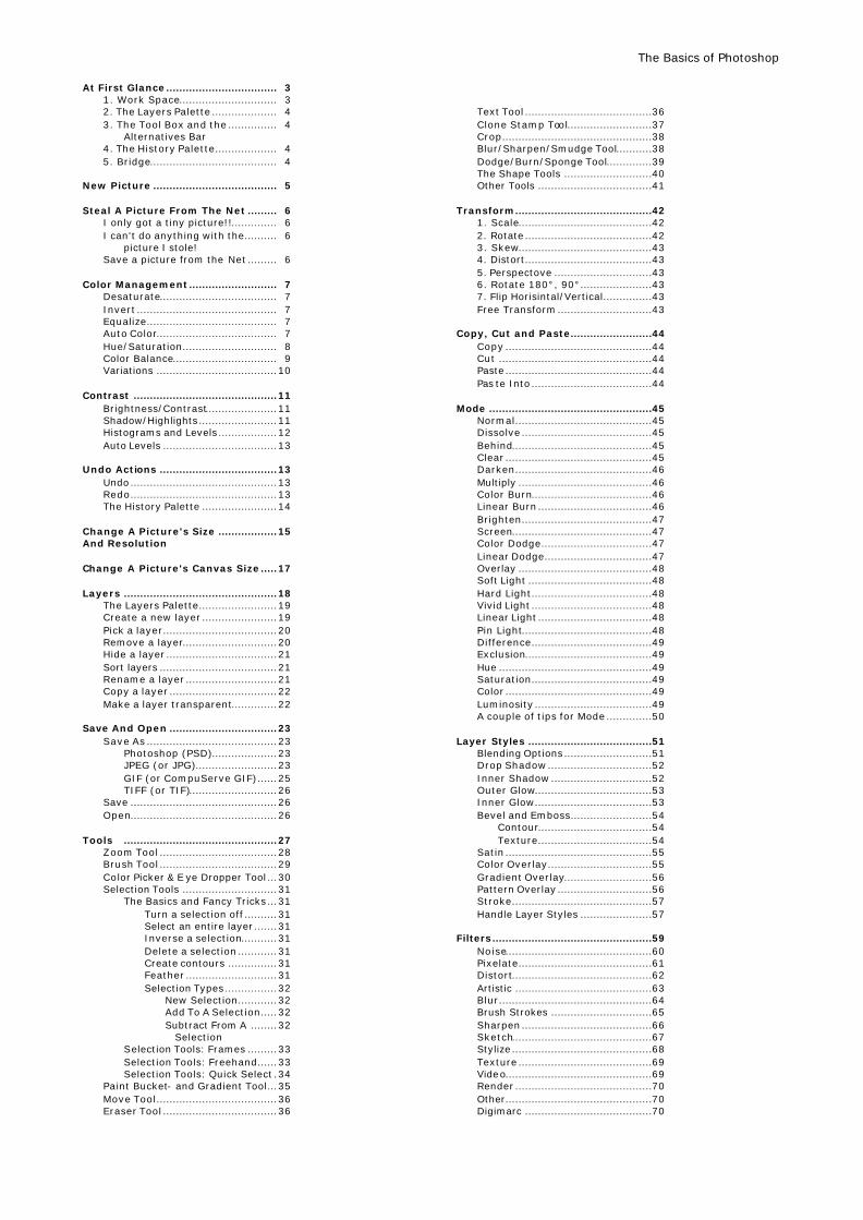
At First Glance.................................. 3 1. Work Space.............................. 3 2. The Layers Palette .................... 4 3. The Tool Box and the ............... 4 Alternatives Bar 4. The History Palette................... 4 5. Bridge....................................... 4 New Picture ...................................... 5 Steal A Picture From The Net ......... 6 I only got a tiny picture!!.............. 6 I can't do anything with the.......... 6 picture I stole! Save a picture from the Net ......... 6 Color Management........................... 7 Desaturate.................................... 7 Invert ........................................... 7 Equalize........................................ 7 Auto Color..................................... 7 Hue/Saturation............................. 8 Color Balance................................ 9 Variations .....................................10 Contrast ............................................11 Brightness/Contrast......................11 Shadow/Highlights........................11 Histograms and Levels ..................12 Auto Levels ...................................13 Undo Actions ....................................13 Undo.............................................13 Redo.............................................13 The History Palette .......................14 Change A Picture's Size ..................15 And Resolution Change A Picture's Canvas Size.....17 Layers ...............................................18 The Layers Palette........................19 Create a new layer .......................19 Pick a layer...................................20 Remove a layer.............................20 Hide a layer ..................................21 Sort layers ....................................21 Rename a layer ............................21 Copy a layer .................................22 Make a layer transparent..............22 Save And Open .................................23 Save As ........................................23 Photoshop (PSD)....................23 JPEG (or JPG).........................23 GIF (or CompuServe GIF)......25 TIFF (or TIF)...........................26 Save .............................................26 Open.............................................26 Tools ...............................................27 Zoom Tool ....................................28 Brush Tool ....................................29 Color Picker & E ye Dropper Tool ...30 Selection Tools .............................31 The Basics and Fancy Tricks ...31 Turn a selection off ..........31 Select an entire layer .......31 Inverse a selection...........31 Delete a selection ............31 Create contours ...............31 Feather ............................31 Selection Types................32 New Selection............32 Add To A Selection.....32 Subtract From A ........32 Selection Selection Tools: Frames .........33 Selection Tools: Freehand......33 Selection Tools: Quick Select .34 Paint Bucket- and Gradient Tool...35 Move Tool.....................................36 Eraser Tool ...................................36
Text Tool .......................................36 Clone Stamp Tool..........................37 Crop..............................................38 Blur/Sharpen/Smudge Tool...........38 Dodge/Burn/Sponge Tool..............39 The Shape Tools ...........................40 Other Tools ...................................41 Transform..........................................42 1. Scale.........................................42 2. Rotate.......................................42 3. Skew.........................................43 4. Distort.......................................43 5. Perspectove ..............................43 6. Rotate 180°, 90°......................43 7. Flip Horisintal/Vertical...............43 Free Transform.............................43 Copy, Cut and Paste.........................44 Copy .............................................44 Cut ...............................................44 Paste.............................................44 Pas te Into .....................................44 Mode ..................................................45 Normal..........................................45 Dissolve ........................................45 Behind...........................................45 Clear .............................................45 Darken..........................................46 Multiply .........................................46 Color Burn.....................................46 Linear Burn ...................................46 Brighten........................................47 Screen...........................................47 Color Dodge..................................47 Linear Dodge.................................47 Overlay .........................................48 Soft Light ......................................48 Hard Light.....................................48 Vivid Light .....................................48 Linear Light ...................................48 Pin Light........................................48 Difference.....................................49 Exclusion.......................................49 Hue ...............................................49 Saturation.....................................49 Color .............................................49 Luminosity ....................................49 A couple of tips for Mode ..............50 Layer Styles ......................................51 Blending Options...........................51 Drop Shadow................................52 Inner Shadow ...............................52 Outer Glow....................................53 Inner Glow....................................53 Bevel and Emboss.........................54 Contour...................................54 Texture...................................54 Satin .............................................55 Color Overlay................................55 Gradient Overlay...........................56 Pattern Overlay .............................56 Stroke...........................................57 Handle Layer Styles ......................57 Filters.................................................59 Noise.............................................60 Pixelate.........................................61 Distort...........................................62 Artistic ..........................................63 Blur...............................................64 Brush Strokes ...............................65 Sharpen ........................................66 Sketch...........................................67 Stylize...........................................68 Texture .........................................69 Video.............................................69 Render ..........................................70 Other.............................................70 Digimarc .......................................70

The Basics of Photoshop
2
The Basics of Photoshop
3
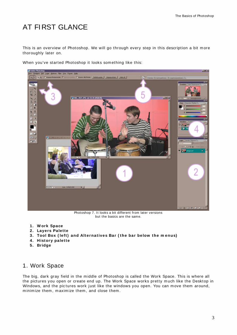
AT FIRST GLANCE This is an overview of Photoshop. We will go through every step in this description a bit more thoroughly later on. When you've started Photoshop it looks something like this:
Photoshop 7. It looks a bit different from later versions
but the basics are the same.
1. Work Space 2. Layers Palette 3. Tool Box (left) and Alternatives Bar (the bar below the menus) 4. History palette 5. Bridge
1. Work Space The big, dark gray field in the middle of Photoshop is called the Work Space. This is where all the pictures you open or create end up. The Work Space works pretty much like the Desktop in Windows, and the pic tures work just like the windows you open. You can move them around, minimize them, maximize them, and close them.
The Basics of Photoshop
4
2. The Layers Palette Layers are a large and important part of Photoshop. Here you'll see a list of all the layers a picture includes. Here you can also create new layers, delete layers, sort them, and more.
3. The Tool Box and the Alternatives Bar Here are all the tools, everything from basic tools like the Brush Tool and the Text Tool to more advanced tools like the Clone Stamp Tool. We won't look at every tool in this text, but we will at least touch upon all the tools the normal user might want to know more about. The Alternatives Bar is the thick gray bar just below the menus. The Alternatives Bar changes how it looks completely depending on what tool you've chosen. It is in the Alternatives Bar that you decide exactly how a certain tool should work.
4. History Palette Photoshop is a very complex program, but it's also very forgiving. Here most of the actions you do are listed. By clicking on actions you made earlier you can ”jump back in time” and undo the mistakes you made later on.
5. Bridge Bridge does not exist in Photoshop 7. Bridge is a new part of Photoshop. It's a so-called ”appendix program”. It sorts and gives you a quick and comprehensive view of all the pictures that are avilable to you. However, we won't deal with Bridge in this text.
The Basics of Photoshop
5
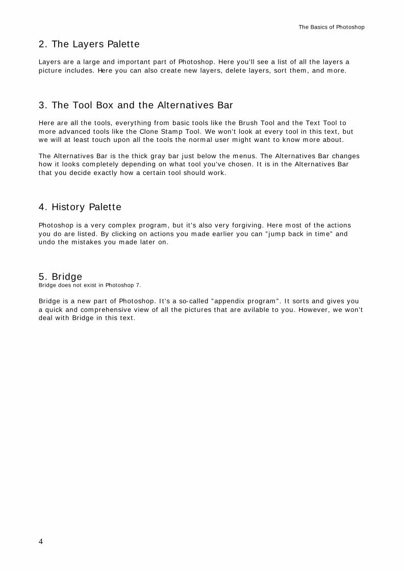
NEW PICTURE If you want to create a new picture completely from scratch you enter File > New (Arkiv > Nytt). Then you'll get a window that looks like this:
Name (Namn). Here you can name the picture. It's nothing you have to do. Preset Sizes (Förinställda storlekar) decides the format of your new picture. Here is everything from A4 to the American Letter standard Letter. The most common choice is to not choose anything, but rather give the picture a size of your own. To do that you have to use the boxes Width and Height. Width and Height (Bredd and Höjd) .
Here you decide how wide and high your new picture should be. You also get to choose what measure your numbers should be in in the boxes to the right. When you give a picture a width and height of your own you'll notice that Preset Sizes (Förinställda storlekar) will be set to Custom (Egen). That happens automatically when you type in your own measurements. Resolution (Upplösning). This one often messes things up. Always use pixels/inch (pixlar/tum) in the box to the right, since that's the standard. The usual value for a norma picture is 72. If you're going to print the picture you can give it a resolution of 150 or 300. If you give a new, empty picture a high resolution it can be difficult to work with, since it gets a lot bigger than usual, but it'll look better when you print it too. Or you can ”cheat” by giving it a resolution of 72 pixels per inch even if you do want to print it. Then, when you're done with the picture, you can change its resolution in the function Image Size (Bildstorlek), and can deal with all the ugly spots that will show up with some suitable tools, usually the Smudge Tool (Smeta ut). (It often happens that when you raise a picture's resolutin the edges and contours get a bit ”jagged”. Mode (Läge). Here you get to choose if the picture should be in black/white. If you want it in color you choose RGB Color (RGB-färg). If it's supposed to be black/white you choose Greyscale (Gråskala). You can safely ignore all the other options. It's always easiest to let the picture be in the RGB mode. It's easy to make the picture black/white once you've started working on it. Contents (Innehåll). And finally you get to choose the picture's background color. You usually leave it white; it's very simple to change it once you've started to create the picture, for example by choosing a color and using the Paint Bucket Tool (Färgpytsen) on it. Once you've made all your selections you click on OK. Then your new, empty picture will be created in Photoshop's Work Space. And you can start working on it.
The Basics of Photoshop
6
STEAL A PICTURE FROM THE NET This is useful if you want to steal a picture from the net (which is allowed if it is for educational purposes!). First find the picture you want. Right click on it and choose Copy Image (Kopiera bild). Now the picture will be saved into the computer's memory. Now go back to Photoshop and click on File > New (Arkiv > Nytt). Then click on OK. Now a new, empty picture of the same size as the one you just copied is created. Enter Edit > Paste (Redigera > Klistra in) and the picture you copied will show up in your new, empty one! I only got a tiny picture! The picture you copy from the Net will look exactly the way it looks on the screen, so if you copy a tiny picture you'll end up with a tiny picture in Photoshop as well. I can't do anything with the picture I stole! The picture is probably in a file format that doesn't like being tampered with. Enter Image > Mode (Bild > Läge). If Mode is set on anything that isn't RGB the picture is probably of such a format. Click on RGB. Now you should be allowed to change things in the picture. Sometimes you'll get questions like ”are you really sure?” and so on. Just click on ”Yes” and similar choices. Save a picture from the net. You can save a picture you find on the net. Right click on the picture and choose Save Image As (Spara bild som) in the meny thta pops up. Then you can save it as usual. Sometimes it'll say Save Background As (Spara bakgrund som) in the menu. That's web stuff, but it works in exactly the same way as a picture.
The Basics of Photoshop
7
COLOR MANAGEMENT There are plenty of ways to change a picture's colors in Photoshop. You can make them black/white, or make them strong and clear, or just turn them into a few certain color tones. In short, when it comes to changing colors you can do almost anything. Here we will go through the following functions: l Desaturate (Tunna ut) l Invert (Invertera) l Equalize (Utjämna) l Auto Color (Automatisk färg) l Hue/Saturation (Nyans/Mättnad) l Color Balance (Färgbalans) l Variations (Variationer)
Desaturate (Tunna ut) Desaturate removes all the colors from a picture. This makes the picture black/white. You'll find it on Image > Adjustments > Desaturate (Bild > Justeringar > Tunna ut).
Invert (Invertera) Invert reverses all the colors so that black turns to white, red to blue, and so on. It's more artistic than functional, but it can come up with many fun results. You find this at Image > Adjustments > Invert (Bild > Justeringar > Invertera).
Equalize (Utjämna) Equalize evens out a picture's colors so that the brightest color gets to represent white, the darkest color represents black, and everything between them is distributed evenly across the intensity levels. It sounds like gibberish, but try using this function on a picture that is ”too dark” and you'll see how it works. You'll find Equalize at Image > Adjustments > Equalize (Bild > Justeringar > Utjämna).
Auto Color (Automatisk färg) Auto Color sets the picture's colors and contrasts automatically. It decides how the picture should look depending on how deep the picture's shadows are, and how bright its light colors are. However, keep in mind that just because the computer technically might be right it doesn't mean the picture will look perfect. This function is at Image > Adjustments > Auto Color (Bild > Justeringar > Automatisk färg).
The Basics of Photoshop
8
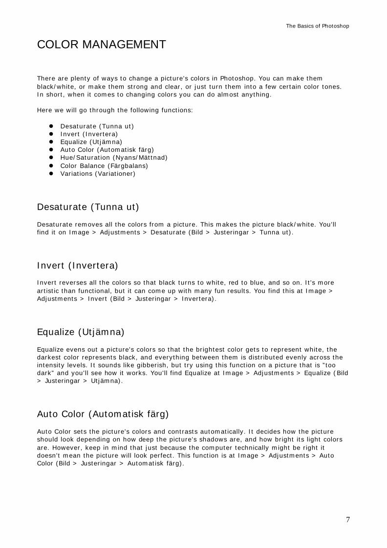
Hue/Saturation (Nyans/mättnad) This function will let you change the picture's nuances and saturation (strength of color), and how bright or dark the picture should be. You'll find this function by entering Image > Adjustments > Hue/Saturation (Bild > Justeringar > Nyans/mättnad). Then you'll get a window that looks like this:
Hue/Saturation. Here you can change the picture's colors, how strong they should be, and the darkness (or
brightness) of the picture. Edit (Ändra). If you click in the box Edit you can choose exactly what color you want to change. Master affects all colors and is the most common option here. Hue (Nyans). Click-and-pull this button to the left or to the right to change the picture's colors. Saturation (Mättnad). Click-and-pull the button for Saturation to the left to make the picture's colors weaker. Pull the button to the right to increase their strength. Brightness (Ljushet). Pull this button to the left to add more black into the picture. If you pull to the right you'll add more white. This won't deepen any shadows or brighten any lights; it'll just add more black or white. Colorize (Färga). Check this box if you want the picture to be colored with one single tone instead of getting a lot of different colors. Preview (Förhandsvisa). If you let this box remain checked all the changes you do here will show up immediately in the picture you're working on. Save (Spara). Click this button if you want to save a certain change you've done here. It's not very common unless you've found an extremely good color setting that you do not want to risk losing, or if you want to change the colors of a lot of pictures in exactly the same way. When you click this button you can save the color setting you've just made as an ordinary file. Load (Läs in). Click here to load a certain color setting you've saved. Click OK when you're done and your changes will take effect. Click Cancel to turn it off.
The Basics of Photoshop
9
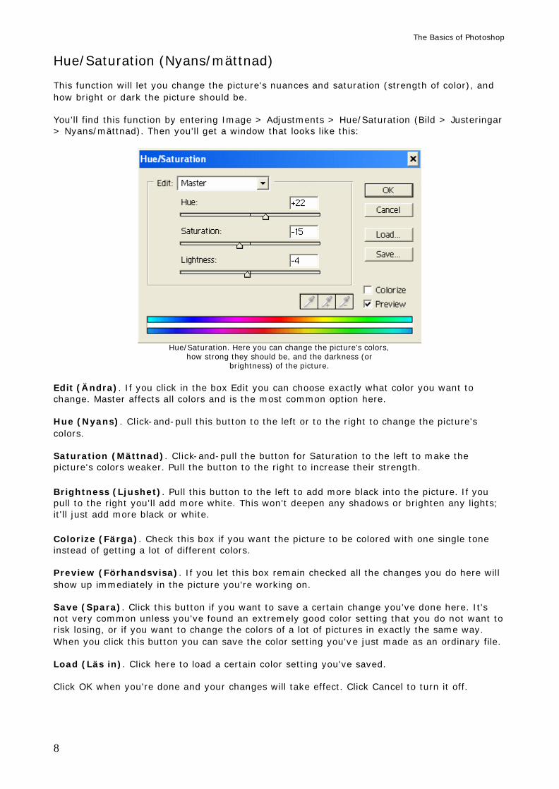
Color Balance (Färgbalans) Color Balance takes you a little deeper into the color changes than Hue/Saturation did. Here you can specify exactly which color you want to add to your picture, and which color you want to remove, and exactly how much. You'll find his function at Image > Adjustments > Color balance (Bild > Justeringar > Färgbalans). Then you'll see a window that looks like this:
Color Balance. Color Levels (Färgnivåer). These three boxes shows what value each of the three buttons are set on. If you know exactly what values you want here you can type them in yourself. If you don't, it's always easier to use the buttons below. Cyan – Red (Cyan – Röd). Click-and-pull this button to the left to add more cyan (bright green/blue). Pull to the right to add more red. Magenta – Green (Magenta – Grön). Pull this button to the left to add more magenta (purple). Drag to the right to add more green. Yellow – Blue (Gul – Blå). Pull this button to the left to add more yellow, pull to the right to add more blue. Shadows (Skuggor). Click this button and your changes will only affect the picture's darker tones. Midtones (Mellantoner). This button lets you change all the ”ordinary” colors in the pictures – the colors that are beneath all the light and all the shadows. This is the most common option here. Highlights (Högdagrar). Click this button to make your color changes only affect the light in your picture. Preserve Luminosity (Bevara luminiscens). By letting this box remain checked your color changes won't affect the depth or brightness of the picture's shadows and light.
The Basics of Photoshop
10
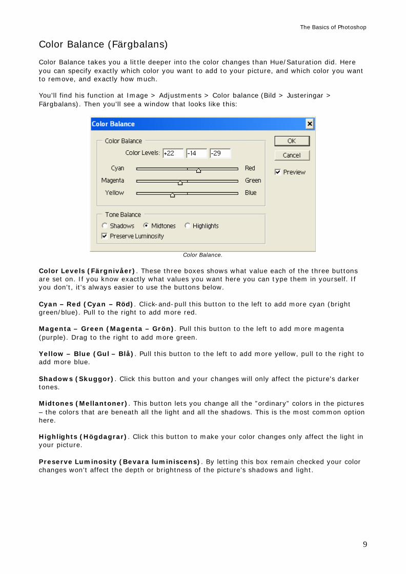
Variations (Variationer) Variations is an easier way to change a picture's colors, shadows and light. You can find this function at Image > Adjustments > Variations (Bild > Justeringar > Variationer).
Variations.
Click on any of the boxes to add (or subtract) more color, light, or darkness. Original (Original). This is how the picture looked before you started changing it here. Click on this picture to remove all the changes you've done in Variations. Current Pick (Aktuellt val). This is how the picture is going to look once you click OK. Shadows, Midtones, Highlights and Saturation (Skuggor, mellantoner, högdagrar and mättnad). Choose which of the picture's tones that will be affected by your changes: the shadows, the midtones (the ”normal” colors), the highlights (the light) or the saturation (the color ”strength”). The most common option is to let the button for Midtones be pressed in. Fine – Coarse (Fint – Grovt). Use this to decide how much you will add or subtract with every click. Fine makes each click add or subtract less color, highlights, shadows or saturation. Coarse makes each click add or subtract more. Click OK when you're done, or Cancel if you don't want your changes to take effect.
The Basics of Photoshop
11
CONTRASTS These functions will let you change a picture's light and shadows. We will look at the following functions:
• Brightness/Contrast (Intensitet/kontrast) • Shadows/Highlights (Skugga/högdager) (Does not exist in Photoshop 7) • Levels (Nivåer) • Auto Levels (Autonivåer)
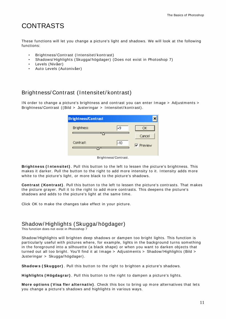
Brightness/Contrast (Intensitet/kontrast) IN order to change a picture's brightness and contrast you can enter Image > Adjustments > Brightness/Contrast ((Bild > Justeringar > Intensitet/kontrast).
Brightness/Contrast. Brightness (Intensitet). Pull this button to the left to lessen the picture's brightness. This makes it darker. Pull the button to the right to add more intensity to it. Intensity adds more white to the picture's light, or more black to the picture's shadows. Contrast (Kontrast). Pull this button to the left to lessen the picture's contrasts. That makes the picture grayer. Pull it to the right to add more contrasts. This deepens the picture's shadows and adds to the picture's light at the same time. Click OK to make the changes take effect in your picture. Shadow/Highlights (Skugga/högdager) This function does not exist in Photoshop 7 Shadow/Highlights will brighten deep shadows or dampen too bright lights. This function is particularly useful with pictures where, for example, lights in the background turns something in the foreground into a silhouette (a black shape) or when you want to darken objects that turned out all too bright. You'll find it at Image > Adjustments > Shadow/Highlights (Bild > Justeringar > Skugga/högdager).
Shadows (Skuggor). Pull this button to the right to brighten a picture's shadows. Highlights (Högdagrar). Pull this button to the right to dampen a picture's lights. More options (Visa fler alternativ). Check this box to bring up more alternatives that lets you change a picture's shadows and highlights in various ways.
The Basics of Photoshop
12
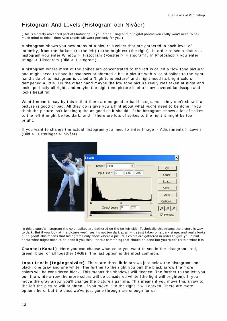
Histogram And Levels (Histogram och Nivåer) (This is a pretty advanced part of Photoshop. If you aren't using a lot of digital photos you really won't need to pay much mind ot this – then Auto Levels will work perfectly for you.) A histogram shows you how many of a picture's colors that are gathered in each level of intensity, from the darkest (to the left) to the brightest (the right). In order to see a picture's histogram you enter Window > Histogram (Fönster > Histogram). In Photoshop 7 you enter Image > Histogram (Bild > Histogram). A histogram where most of the spikes are concentrated to the left is called a ”low tone picture” and might need to have its shadows brightened a bit. A picture with a lot of spikes to the right hand side of its histogram is called a ”high tone picture” and might need its bright colors dampened a little. On the other hand maybe the low tone picture really was taken at night and looks perfectly all right, and maybe the high tone picture is of a snow covered landscape and looks beautiful! What I mean to say by this is that there are no good or bad histograms – they don't show if a picture is good or bad. All they do is give you a hint about what might need to be done if you think the picture isn't looking quite as good as it should: if the histogram shows a lot of spikes to the left it might be too dark, and if there are lots of spikes to the right it might be too bright. If you want to change the actual histogram you need to enter Image > Adjustments > Levels (Bild > Justeringar > Nivåer).
In this picture's histogram the color spikes are gathered on the far left side. Technically this means the picture is way to dark. But if you look at the picture you'll see it's not too dark at all – it's just taken on a dark stage, and really looks quite good! This means that histograms only show where a picture's colors are gathered in order to give you a hint about what might need to be done if you think there's something that should be done but you're not certain what it is. Channel (Kanal ). Here you can choose what color you want to see in the histogram: red, green, blue, or all together (RGB). The last option is the most common. Input Levels (Ingångsnivåer). There are three little arrows just below the histogram: one black, one gray and one white. The further to the right you pull the black arrow the more colors will be considered black. This means the shadows will deepen. The farther to the left you pull the white arrow the more colors will be considered white (the light will brighten). If you move the gray arrow you'll change the picture's gamma. This means if you move this arrow to the left the picture will brighten; if you move it to the right it will darken. There are more options here, but the ones we've just gone through are enough for us.
The Basics of Photoshop
13
Auto Levels (Autonivåer) This function lets the program change the picture's Levels all by itself. It will attempt to make them as good as they can get. However, this is all technical – you still have the last word on whether it looks good or not. You can use Auto Levels on a picture by entering Image > Adjustments > Auto Levels (Bild > Justeringar > Autonivåer).
UNDO ACTIONS Photoshop is a very forgiving program: there are very few actions that you can't undo. There are three ways to undo something you've done. They're called Undo (Ångra), Redo (Gör om) and History (Händelsepaletten).
Undo (Ångra) Let's say you happened to give a picture a much too strong contrast by using the Brightness/Contrast function, and now you wish you really haden't. Well, it's easy to make it undone! Just enter Edit > Undo (Redigera > Ångra). Undo is usually followed by the action you want to remove. In this case it would've said Undo Brightness/Contrast. When you click here whatever you did last on your picture will vanish! If you try to click Undo again you'll notice that the option has changed names. Now it's called Redo (Gör om) insted. When you click here whatever you just undid will be remade.
Redo (Gör om) This is an Undo function for Undo! You just removed what you did, but now you realize that maybe you should've kept it anyway. Then you can always click on Edit > Redo (Redigera > Gör om). Then you'll undo what you just undid....
The Basics of Photoshop
14
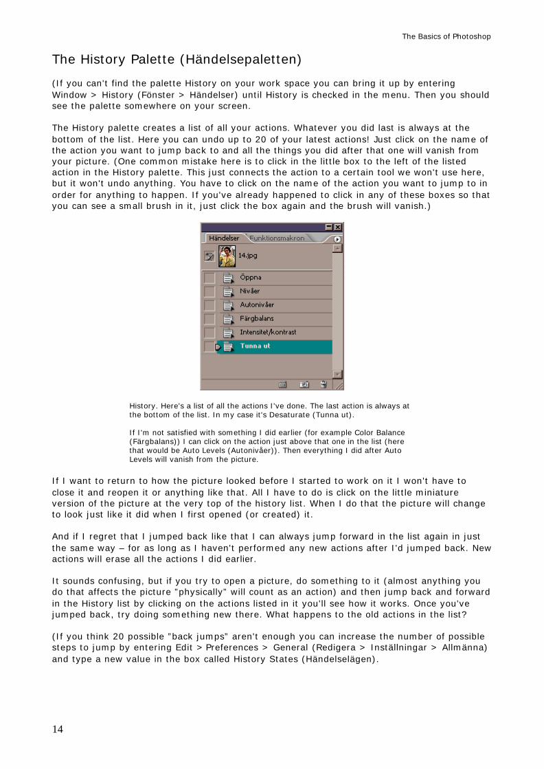
The History Palette (Händelsepaletten) (If you can't find the palette History on your work space you can bring it up by entering Window > History (Fönster > Händelser) until History is checked in the menu. Then you should see the palette somewhere on your screen. The History palette creates a list of all your actions. Whatever you did last is always at the bottom of the list. Here you can undo up to 20 of your latest actions! Just click on the name of the action you want to jump back to and all the things you did after that one will vanish from your picture. (One common mistake here is to click in the little box to the left of the listed action in the History palette. This just connects the action to a certain tool we won't use here, but it won't undo anything. You have to click on the name of the action you want to jump to in order for anything to happen. If you've already happened to click in any of these boxes so that you can see a small brush in it, just click the box again and the brush will vanish.)
History. Here's a list of all the actions I've done. The last action is always at the bottom of the list. In my case it's Desaturate (Tunna ut). If I'm not satisfied with something I did earlier (for example Color Balance (Färgbalans)) I can click on the action just above that one in the list (here that would be Auto Levels (Autonivåer)). Then everything I did after Auto Levels will vanish from the picture.
If I want to return to how the picture looked before I started to work on it I won't have to close it and reopen it or anything like that. All I have to do is click on the little miniature version of the picture at the very top of the history list. When I do that the picture will change to look just like it did when I first opened (or created) it. And if I regret that I jumped back like that I can always jump forward in the list again in just the same way – for as long as I haven't performed any new actions after I'd jumped back. New actions will erase all the actions I did earlier. It sounds confusing, but if you try to open a picture, do something to it (almost anything you do that affects the picture ”physically” will count as an action) and then jump back and forward in the History list by clicking on the actions listed in it you'll see how it works. Once you've jumped back, try doing something new there. What happens to the old actions in the list? (If you think 20 possible ”back jumps” aren't enough you can increase the number of possible steps to jump by entering Edit > Preferences > General (Redigera > Inställningar > Allmänna) and type a new value in the box called History States (Händelselägen).
The Basics of Photoshop
15
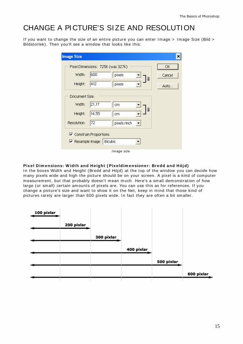
CHANGE A PICTURE’S SIZE AND RESOLUTION If you want to change the size of an entire picture you can enter Image > Image Size (Bild > Bildstorlek). Then you'll see a window that looks like this:
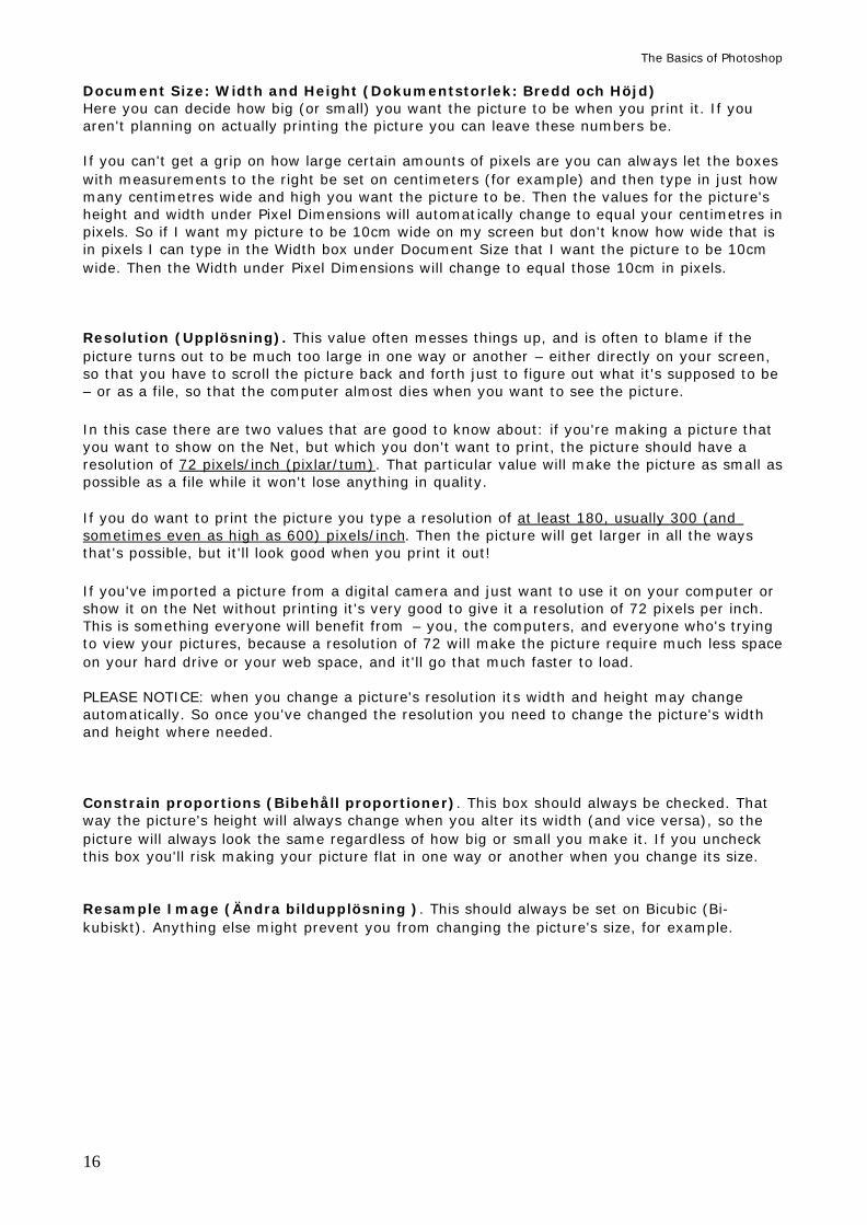
Image size. Pixel Dimensions: Width and Height (Pixeldimensioner: Bredd and Höjd) In the boxes Width and Height (Bredd and Höjd) at the top of the window you can decide how many pixels wide and high the picture should be on your screen. A pixel is a kind of computer measurement, but that probably doesn't mean much. Here's a small demonstration of how large (or small) certain amounts of pixels are. You can use this as for references. If you change a picture's size and want to show it on the Net, keep in mind that those kind of pictures rarely are larger than 600 pixels wide. In fact they are often a bit smaller.
The Basics of Photoshop
16
Document Size: Width and Height (Dokumentstorlek: Bredd och Höjd) Here you can decide how big (or small) you want the picture to be when you print it. If you aren't planning on actually printing the picture you can leave these numbers be. If you can't get a grip on how large certain amounts of pixels are you can always let the boxes with measurements to the right be set on centimeters (for example) and then type in just how many centimetres wide and high you want the picture to be. Then the values for the picture's height and width under Pixel Dimensions will automatically change to equal your centimetres in pixels. So if I want my picture to be 10cm wide on my screen but don't know how wide that is in pixels I can type in the Width box under Document Size that I want the picture to be 10cm wide. Then the Width under Pixel Dimensions will change to equal those 10cm in pixels. Resolution (Upplösning). This value often messes things up, and is often to blame if the picture turns out to be much too large in one way or another – either directly on your screen, so that you have to scroll the picture back and forth just to figure out what it's supposed to be – or as a file, so that the computer almost dies when you want to see the picture. In this case there are two values that are good to know about: if you're making a picture that you want to show on the Net, but which you don't want to print, the picture should have a resolution of 72 pixels/inch (pixlar/tum). That particular value will make the picture as small as possible as a file while it won't lose anything in quality. If you do want to print the picture you type a resolution of at least 180, usually 300 (and sometimes even as high as 600) pixels/inch. Then the picture will get larger in all the ways that's possible, but it'll look good when you print it out! If you've imported a picture from a digital camera and just want to use it on your computer or show it on the Net without printing it's very good to give it a resolution of 72 pixels per inch. This is something everyone will benefit from – you, the computers, and everyone who's trying to view your pictures, because a resolution of 72 will make the picture require much less space on your hard drive or your web space, and it'll go that much faster to load. PLEASE NOTICE: when you change a picture's resolution its width and height may change automatically. So once you've changed the resolution you need to change the picture's width and height where needed. Constrain proportions (Bibehåll proportioner). This box should always be checked. That way the picture's height will always change when you alter its width (and vice versa), so the picture will always look the same regardless of how big or small you make it. If you uncheck this box you'll risk making your picture flat in one way or another when you change its size. Resample Image (Ändra bildupplösning ). This should always be set on Bicubic (Bi-kubiskt). Anything else might prevent you from changing the picture's size, for example.
The Basics of Photoshop
17
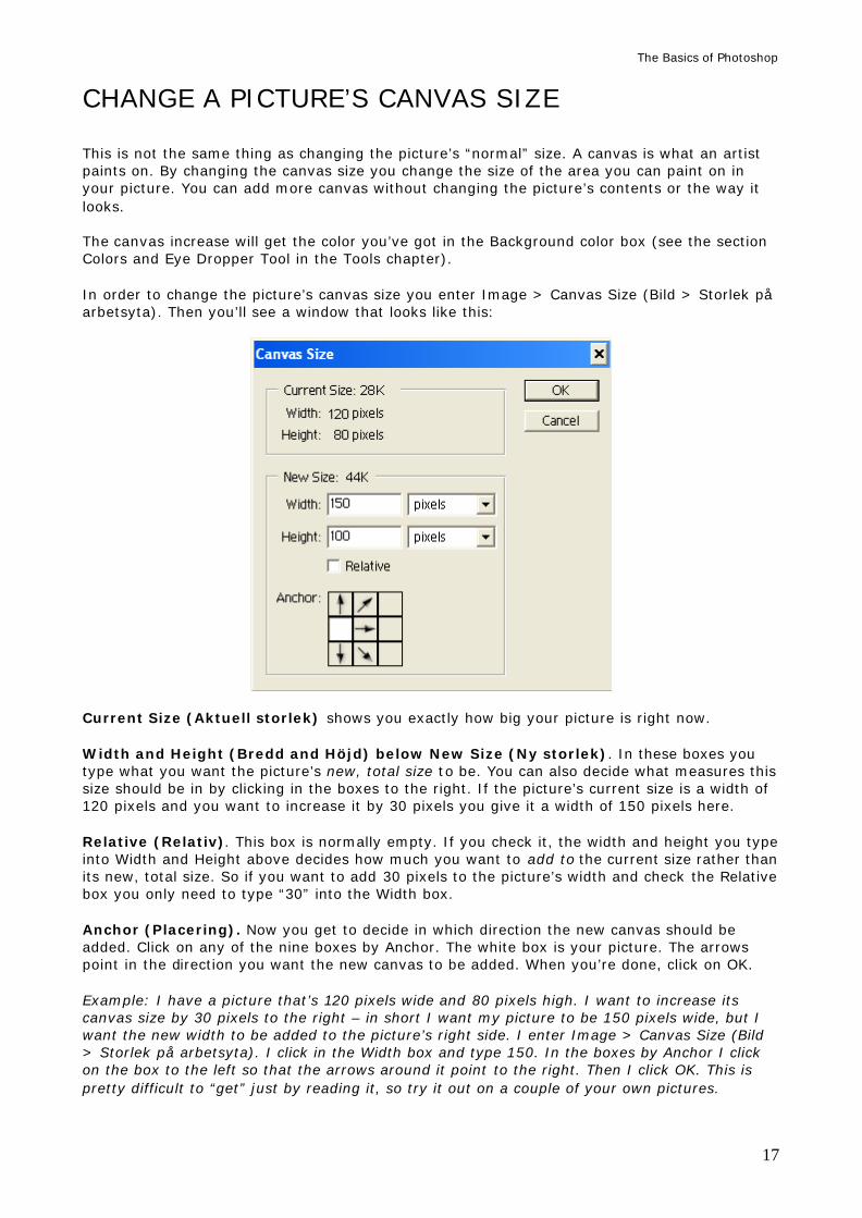
CHANGE A PICTURE’S CANVAS SIZE This is not the same thing as changing the picture’s “normal” size. A canvas is what an artist paints on. By changing the canvas size you change the size of the area you can paint on in your picture. You can add more canvas without changing the picture’s contents or the way it looks. The canvas increase will get the color you’ve got in the Background color box (see the section Colors and Eye Dropper Tool in the Tools chapter). In order to change the picture’s canvas size you enter Image > Canvas Size (Bild > Storlek på arbetsyta). Then you’ll see a window that looks like this:
Current Size (Aktuell storlek) shows you exactly how big your picture is right now. Width and Height (Bredd and Höjd) below New Size (Ny storlek). In these boxes you type what you want the picture’s new, total size to be. You can also decide what measures this size should be in by clicking in the boxes to the right. If the picture’s current size is a width of 120 pixels and you want to increase it by 30 pixels you give it a width of 150 pixels here. Relative (Relativ). This box is normally empty. If you check it, the width and height you type into Width and Height above decides how much you want to add to the current size rather than its new, total size. So if you want to add 30 pixels to the picture’s width and check the Relative box you only need to type “30” into the Width box. Anchor (Placering). Now you get to decide in which direction the new canvas should be added. Click on any of the nine boxes by Anchor. The white box is your picture. The arrows point in the direction you want the new canvas to be added. When you’re done, click on OK. Example: I have a picture that’s 120 pixels wide and 80 pixels high. I want to increase its canvas size by 30 pixels to the right – in short I want my picture to be 150 pixels wide, but I want the new width to be added to the picture’s right side. I enter Image > Canvas Size (Bild > Storlek på arbetsyta). I click in the Width box and type 150. In the boxes by Anchor I click on the box to the left so that the arrows around it point to the right. Then I click OK. This is pretty difficult to “get” just by reading it, so try it out on a couple of your own pictures.
The Basics of Photoshop
18
LAYERS Layers are a large and very important part of Photoshop. The Layer functions can be difficult to wrap your head around in the beginning; you have to think a bit extra about what you’re doing. So what is a layer? Let’s say you have a picture of a nice sunset, and you want to paint a bird somewhere in it – but you don’t want to risk ruining the picture, so you put a transparent “paper” over the picture and paint the bird on that instead. By painting the bird on the transparent paper you can move the paper around and place the bird wherever you want it without doing anything to the actual sunset picture under it. You can remove the bird entirely, smudge it, erase it, and change it in any way you like without it ever affecting the sunset. And if you mess up and want to throw the bird away you can do that too. You can even add more papers on top of the picture and paint new things on each and every one of them, and change them just as you like. As you probably realize by now layers in Photoshop work exactly like the transparent papers in the strange example I just used: if you open a picture and use a tool on it – the brush tool for example (and we’ll look at the tools soon) and do something wrong you’ve got a problem. You need to start Undoing actions and repaint things. If you really mess up you’ll have to start all over again. But if you first create a layer on the picture, and then use the brush on the layer instead of on the picture itself, you can paint as much as you want and not have to worry: you can easily move, erase, smudge, and change whatever you painted on the layer and it’ll never affect the picture under it. Everything you can do with layers – creating new layers, removing layers, hiding layers – is done in the Layer palette. We will look closely at the following things:
• The Layers Palette (Paletten Lager) • Create a new layer (Skapa nytt lager) • Pick a layer (Välj ett lager) • Remove a layer (Ta bort lager) • Hide a layer (Göm lager) • Sort layers (Sortera lager) • Rename a layer (Döp om ett lager) • Copy a layer (Kopiera lager) • Make a layer transparent (Gör ett lager genomskinligt)
The Basics of Photoshop
19
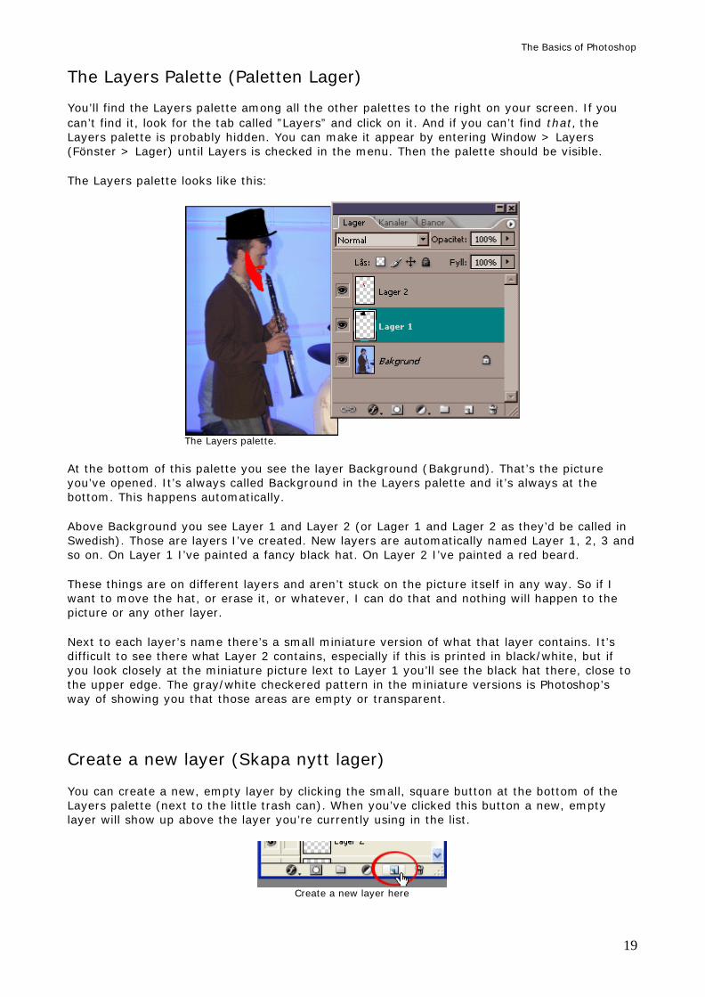
The Layers Palette (Paletten Lager) You’ll find the Layers palette among all the other palettes to the right on your screen. If you can’t find it, look for the tab called ”Layers” and click on it. And if you can’t find that, the Layers palette is probably hidden. You can make it appear by entering Window > Layers (Fönster > Lager) until Layers is checked in the menu. Then the palette should be visible. The Layers palette looks like this:
The Layers palette.
At the bottom of this palette you see the layer Background (Bakgrund). That’s the picture you’ve opened. It’s always called Background in the Layers palette and it’s always at the bottom. This happens automatically. Above Background you see Layer 1 and Layer 2 (or Lager 1 and Lager 2 as they’d be called in Swedish). Those are layers I’ve created. New layers are automatically named Layer 1, 2, 3 and so on. On Layer 1 I’ve painted a fancy black hat. On Layer 2 I’ve painted a red beard. These things are on different layers and aren’t stuck on the picture itself in any way. So if I want to move the hat, or erase it, or whatever, I can do that and nothing will happen to the picture or any other layer. Next to each layer’s name there’s a small miniature version of what that layer contains. It’s difficult to see there what Layer 2 contains, especially if this is printed in black/white, but if you look closely at the miniature picture lext to Layer 1 you’ll see the black hat there, close to the upper edge. The gray/white checkered pattern in the miniature versions is Photoshop’s way of showing you that those areas are empty or transparent.
Create a new layer (Skapa nytt lager) You can create a new, empty layer by clicking the small, square button at the bottom of the Layers palette (next to the little trash can). When you’ve clicked this button a new, empty layer will show up above the layer you’re currently using in the list.
Create a new layer here
The Basics of Photoshop
20
Pick a layer (Välj ett lager) The most common problem you’ll run into when you’re working with several layers in a picture is that you forget to pick what layer you want to use. Then you either change the wrong layer, or you get an annoying error message. So you should always remember to pick the layer you want to change before you start doing anything. You pick a layer by clicking on it in the Layers palette. When you’ve picked a layer it will turn dark (in the picture above I’ve picked Layer 1; you can see that it’s darker than Layer 2 and Background). This means it’s only that layer which will be affected once you begin working on the picture. So if I want to use, say, the function Color Balance (Färgbalans) on the beard in the picture above I first have to click on the layer where the beard is (in this case Layer 2). Then I can start up Color Balance and change it. If I then want to do something with the hat I first need to click on Layer 1, since that’s where the hat is, and so on.
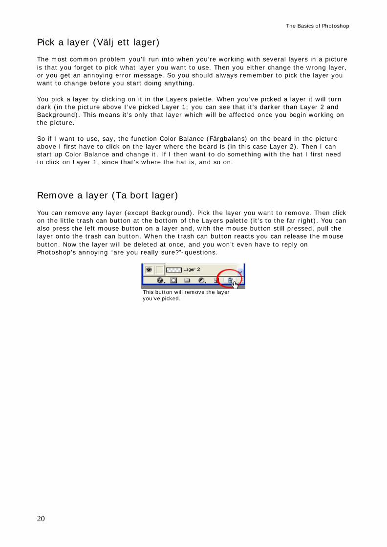
Remove a layer (Ta bort lager) You can remove any layer (except Background). Pick the layer you want to remove. Then click on the little trash can button at the bottom of the Layers palette (it’s to the far right). You can also press the left mouse button on a layer and, with the mouse button still pressed, pull the layer onto the trash can button. When the trash can button reacts you can release the mouse button. Now the layer will be deleted at once, and you won’t even have to reply on Photoshop’s annoying “are you really sure?”-questions.
This button will remove the layer you’ve picked.
The Basics of Photoshop
21
Hide a layer (Göm lager)
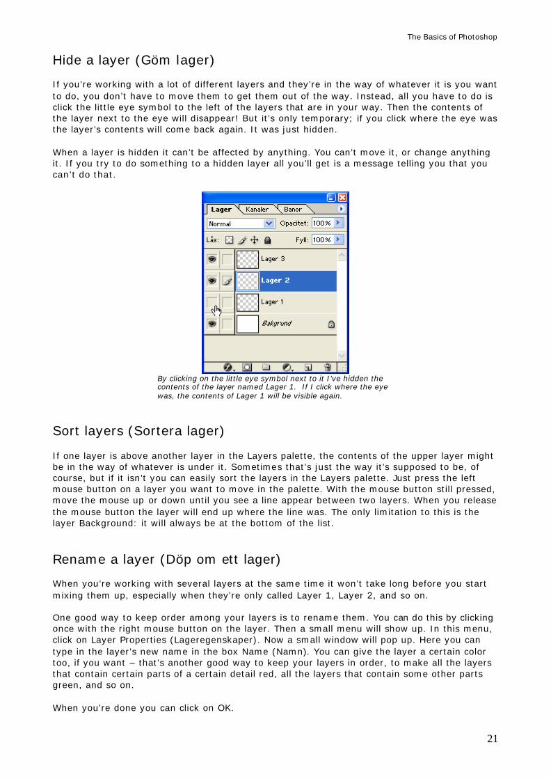
If you’re working with a lot of different layers and they’re in the way of whatever it is you want to do, you don’t have to move them to get them out of the way. Instead, all you have to do is click the little eye symbol to the left of the layers that are in your way. Then the contents of the layer next to the eye will disappear! But it’s only temporary; if you click where the eye was the layer’s contents will come back again. It was just hidden. When a layer is hidden it can’t be affected by anything. You can’t move it, or change anything it. If you try to do something to a hidden layer all you’ll get is a message telling you that you can’t do that.
By clicking on the little eye symbol next to it I’ve hidden the contents of the layer named Lager 1. If I click where the eye was, the contents of Lager 1 will be visible again.
Sort layers (Sortera lager)
If one layer is above another layer in the Layers palette, the contents of the upper layer might be in the way of whatever is under it. Sometimes that’s just the way it’s supposed to be, of course, but if it isn’t you can easily sort the layers in the Layers palette. Just press the left mouse button on a layer you want to move in the palette. With the mouse button still pressed, move the mouse up or down until you see a line appear between two layers. When you release the mouse button the layer will end up where the line was. The only limitation to this is the layer Background: it will always be at the bottom of the list.
Rename a layer (Döp om ett lager)
When you’re working with several layers at the same time it won’t take long before you start mixing them up, especially when they’re only called Layer 1, Layer 2, and so on. One good way to keep order among your layers is to rename them. You can do this by clicking once with the right mouse button on the layer. Then a small menu will show up. In this menu, click on Layer Properties (Lageregenskaper). Now a small window will pop up. Here you can type in the layer’s new name in the box Name (Namn). You can give the layer a certain color too, if you want – that’s another good way to keep your layers in order, to make all the layers that contain certain parts of a certain detail red, all the layers that contain some other parts green, and so on. When you’re done you can click on OK.
The Basics of Photoshop
22
Copy a layer (Kopiera lager) It’s quick and easy to copy a layer. It’s something you’ll always find a use for, especially if you’re very pleased with how a certain layer turned out but you still have to work on it. Then you can (and should) copy that layer, hide the original (if needed) and keep working on the copy. This is also very useful if you want to change something in the picture beneath all the layers (the Background layer). Then you can copy it and change whatever it is on the copy. So how do you copy a layer? Just right click on the layer you want to copy and a little menu will pop up. There you can click on Duplicate Layer (Duplicera lager). Then a copy of the layer you just clicked on will appear in the Layers palette.
Make a layer transparent (Gör ett lager genomskinligt) You can make any layer (except for Background) more or less transparent. You do this by using a box in the Layers palette called Opacity (Opacitet). Click on the little arrow next to the box and you’ll see a small button you can pull. Click and pull the button to the sides to decide just how transparent you want the layer to be. 100% means completely solid, and 0% is so transparent that the layer won’t be seen at all.
The Basics of Photoshop
23
SAVE AND OPEN (SPARA OCH ÖPPNA) There are two ways to save a picture. One is called Save As (Spara som), the other’s called just Save (Spara). If you’re saving your picture for the first time you should choose Save As. Then you get to choose where you want to save the picture, what it should be called, and what format it should be saved in. If you’ve already decided all of that once you can choose Save instead. Then the new version of your picture will be saved over the old one. Save As (Spara som) Enter File > Save As (Arkiv > Spara som) if you want to give the picture a certain name. You also get to choose exactly where the picture will be saved and what file format it will be saved in. There are four formats we’re interested in: Photoshop, JPEG, GIF and TIFF. I’ll often write “JPEG-picture” (or some other format) in this text. That just means a picture that’s been saved in the file format JPEG. Photoshop (PSD). This format is used when you want to save a picture with layers, and be
able to work on the layers later. Then the picture will be saved exactly the way it looks now, with layers and everything. The drawbacks with the PSD file format is that the pictures you save in it quickly will get very large in file size and that they can’t be shown on the Net. So if you want to make your picture smaller and Net friendly you need to save it in another format once you’re done working on the picture. If you send a PSD-picture to a friend he or she also needs to have Photoshop or he or she might not be able to open your picture (although there are a couple of programs that can open it without Photoshop too).
JPEG (or JPG). JPEG is the most common file format of all, so I’ll have a lot to say about it here. You won’t need to remember all this, of course, but when you want to save your picture and you’re wondering about JPEG chances are you’ll find something written about that here. The short story: when you’re done working on a picture and want to be able to do more than just open it in Photoshop – you might want to email it to a friend or show it on the Net – you should save it in the file format JPEG. When you’ve clicked OK you’ll get to choose Quality (Kvalitet). 0 is the worst, 12 is the best. Give it a value of about 7 to 10 in the Quality box and the picture will look reasonably good as well as have a reasonably small file size. Next, click OK. Done! Now you can read about the other file formats! Yay! However, if you want to know a lot more about the JPEG file format, keep reading. The long story: This format is used when you want to save a picture that contains a lot of colors (like a photo), and you want the picture to have a reasonably small file size as well, and/or you want to be able to show it on the Net. One big drawback is that JPEG can’t contain layers, so if you save a PSD-picture in the JPEG format all the picture’s layers will be merged (flattened), and all the hidden layers will be deleted (but not from the PSD picture though!). But there’s another drawback as well, and that’s what most of this section is about: Unlike all the other formats I mentioned above JPEG is a so-called “destroying format”. This means that every time you save a JPEG-picture its quality will decrease. This is bad, of course, but nothing to be paranoid about: if you still have the picture in the PSD
The Basics of Photoshop
24
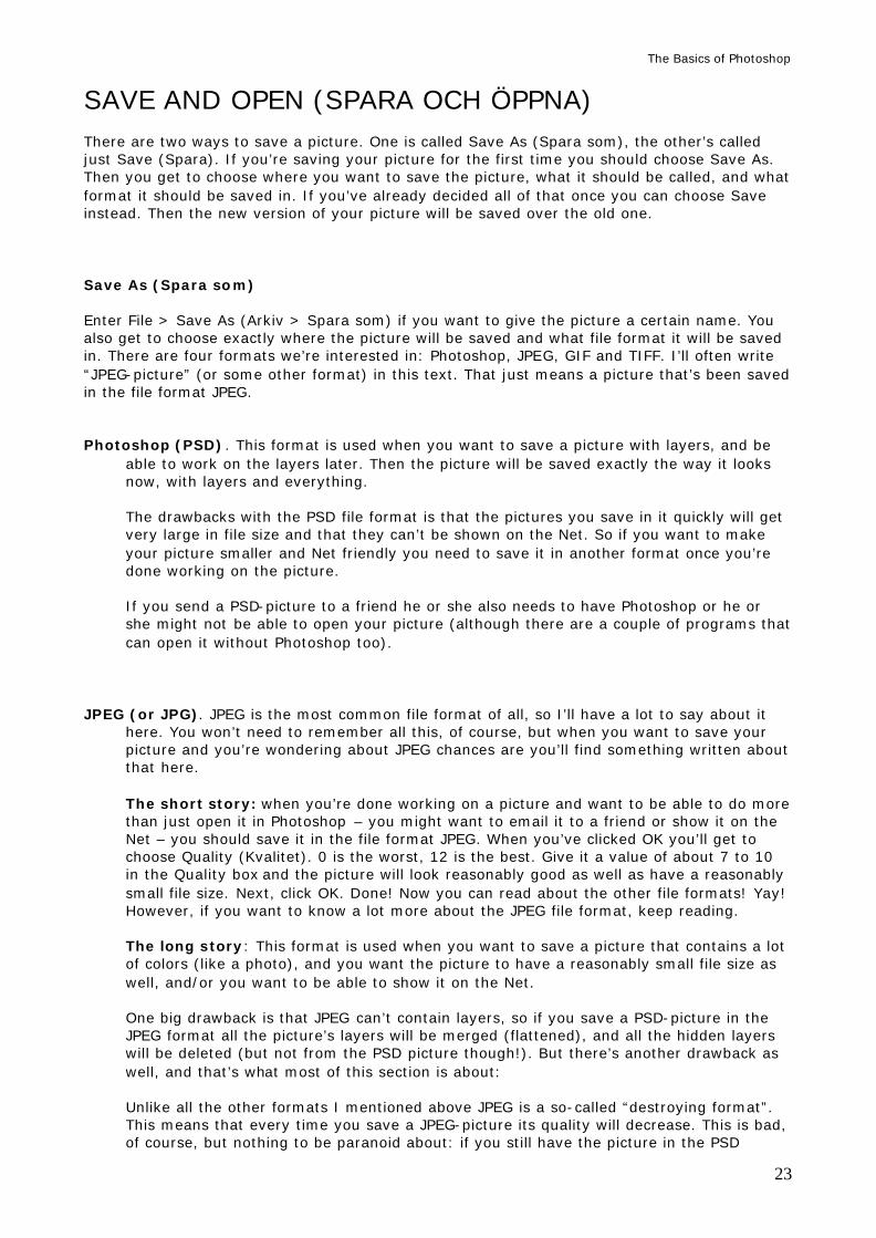
format you can always re-save that one as a JPEG whenever you want. But all of that aside: you should always try to only save a JPEG picture once. If you open it and save it again, it’ll look slightly worse. That’s why you usually save a picture in the JPEG format only when you know it is finished. When you’ve chosen to save your picture in the JPEG-format and clicked OK a window will pop up. It’s called JPEG Alternatives (JPEG-alternativ). Here you can decide the picture’s Quality (Kvalitet).
When you save a picture in the JPEG format you get to choose its Quality.
Quality is a compromise between how good the picture should look and how small its file size should be. The bigger file size a picture has the more space it will need on your hard drive or on your web site, and the longer your friend will have to wait for his or her computer to download the picture you sent as an email. You can decide what Quality a picture should have by clicking-and-dragging the little button in the middle of the window. The Quality as shown as a value between 0 and 12 where 12 is the best quality but also the largest file size, and 0 is really ugly but also really small. The most common value for Quality that usually makes everybody happy is 8. You can not improve the way a picture looks by increasing its quality. The best a JPEG picture will ever look is the way it looks right now. If a picture looks like garbage and you save it with a Quality of 12 the picture will still look like garbage, and it will have a large file size too. What does “bad quality” look like? Look at these two pictures (although, if this is printed, the picture will look pretty much the same).
The Basics of Photoshop
25
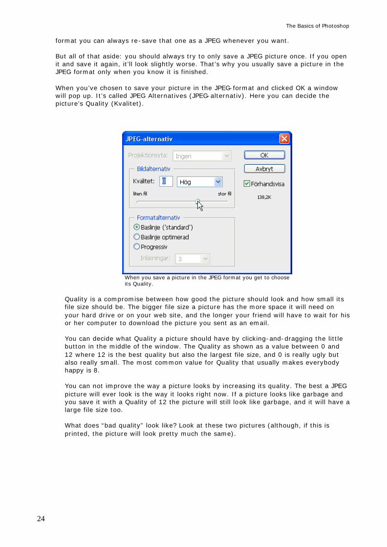
Two JPEG-pictures. They are Zoomed in, that’s why their edges are so jagged. The left one is of a decent Quality (about 7). The right one has a Quality of 2. When a JPEG-picture is of bad Quality you’ll see “flame patterns” in its colors, especially around contrasts. Compare the faces and edges and you might see the difference between decent and bad Qualities.
You can see the picture’s file size in the window (exactly where in the window differs between versions). Usually it’s in the lower left-hand corner or near the right-hand edge. The value for a picture’s file size ends with a letter. Look at the picture of the window JPEG Alternatives above. There the file size is 138,2K and you’ll see it along the right-hand edge of the window. For as long as the file size is below 100-150K the picture can be used on the Net or emailed without problems (not that it really matters if the picture turns out bigger than that, especially not now when so many have fast Internet connections, but 100-150K is a good limit to stick to anyway). K means Kilobyte and is the most common measurement of a file size. If the file size ends with an M you’ve got a problem. M means Megabyte, and one M equals 1000 K. So if you still want to show your picture on the Net you have to resize it dramatically (see the chapter Image Size and Resolution). If the file size ends with the letter B it’s really, really small: one K equals 1000 B. You’ll only see B’s when you’re working with super tiny GIF-pictures. You can of course email the picture even if it is absolutely huge, but maybe you should warn whoever you’re sending it to that it’s coming first.
GIF (or CompuServe GIF). This format is used almost exclusively when you’re creating graphics for a web page, so if you aren’t interested in any of that you can skip this format. A GIF-picture consists of a low amount of colors. This gives the picture a very small file size. Sizes below 1K aren’t unusual if the picture’s small enough on your screen and consists of very few colors. So this is a good format for fancy logos and things that you create in Photoshop and later use on your web page, since they won’t take long for anyone’s computer to load. When you save a picture in the GIF format you’ll get to decide exactly how many colors it should have. If the picture already has fewer than 256 colors the computer will let you know that it’s found an exact amount of colors. All you have to do then is click OK, and the picture will be saved exactly the way it looks right now.
The Basics of Photoshop
26
However, if the computer can’t tell you how many colors the picture has you’ll get to decide how many colors it should have yourself, usually by picking one of the three Local (something) choices in the box called Palette. It doesn’t matter which one of the three choices you pick. When you’ve picked one you get to choose how many colors the picture should have in the box called Colors (Färger). A GIF-picture must contain at least 3 colors, but can’t contain more than 256. When you type in a new number of colors in the box you’ll see the changes directly on your picture. The goal here is usually to pick a number of colors that makes the picture look reasonably good. Unlike JPEG-pictures the GIF-picture’s colors will always look the same: GIF-pictures never get that annoying “flame pattern” or get blurry. When you click OK the picture will be saved looking exactly the way it looks right now. One good thing about GIF-pictures is that they can be transparent! This is only of any interest to those working with web pages). If there are transparent parts in a picture you’re saving in the GIF-format, and you let the box Transparency (Genomskinlighet) stay checked, the transparent parts will remain transparent even on the Net. That way, if you place a GIF-picture with transparent parts in front of a background on your web page, the background will be visible where the GIF-picture is transparent. You can easily create transparent parts in your GIF-picture. Just open it in Photoshop and use the Eraser Tool (Suddgummit) on it. Whatever you erase will turn transparent, and when you save it those places will remain transparent.
TIFF (or TIF). You save in this format when you want to print the picture. TIFF is made for printing and won’t affect your picture in any way. The downside is that the file size of your picture usually will get very large. But that doesn’t matter for as long as you’ve got room enough for it! Some, especially those with a high resolution, can be over 100M big. Before you turn a PSD-picture into a TIFF you should merge all its layers. To do this you enter Layers > Flatten Image (Lager > Gör till ett lager). When you save a picture in the TIFF-format you’ll get to choose how the picture should be compressed. The easiest choice here is to pick No compression and click on OK. This will make the picture very large, but you won’t have to rely on other programs to use it. When you’re printing a picture you should remember to make sure that the resolution is as high (or low) as you want it – see the chapter Image Size and Resolution for more on that. If you’re printing something the resolution should be at least 180 pixels/inch.
Save (Spara) If you don’t want to give the picture a new name, place, or format just enter File> Save (Arkiv > Spara). However, if you’re saving your picture for the first time the program will automatically choose Save as for you. Open (Öppna) You open a picture in Photoshop in exactly the same way you open things in any other program. You enter File > Open (Arkiv > Öppna), look for the file there, and click the button Öppna (Open, but this window is probably in Swedish). Then the picture will open in Photoshop and you can start working on it.
The Basics of Photoshop
27
TOOLS (VERKTYG) There are a lot of different tools that you can use in Photoshop. The tools let you paint on your pictures, add text, smudge colors, add shadows and light, move stuff, and a whole lot more. You choose a tool by clicking on it once in the Tool Box (if you don’t know what the Tool Box is, see the chapter At First Glance in the beginning). When you’ve clicked on a tool you can change its settings, the way it works, in the Alternatives Bar (that’s the gray field just below the menus). We’ll look at the most common tools below. There’s a picture of each tool button in its description so you’ll know which button to click. The tools we’re going to look at are:
• Zoom Tool (Zooma) Zooms in on a picture to let you work with details
• Brush Tool (Pensel)
Paints on a picture
• Eye Dropper Tool (Färgval och Pipett) Choose what color you want to use
• Selection Tools (Markeringsverktygen)
The basics and fancy tric ks Selection Tools: frames Selection Tools: freehand Selection Tools: Quick Select (Snabbval) Use these to point out exactly what you want to paint, what you want to change, or what you want to copy.
• Paint Bucket Tool and Gradient Tool (Färgpyts och Övertoning)
Fill a selected area with colors
• Move Tool (Flytta) Moves layers or selected areas
• Eraser Tool (Suddgummi) Erase things on a layer
• Text Tool (Text)
Add text to a picture • Clone Stamp Tool (Klonstämpel)
Repair scratchy photos, copy details and use them as paint!
• Crop Tool (Beskär) Cut a picture down to size
• Blur/Sharpen/Smudge Tool (Oskärpa/Skärpa/Smeta ut)
A collection of tools that lets you blur, sharpen, and smudge things in a picture
• Dodge/Burn/Sponge Tool (Skugga/Efterbelys/Svamp) A collection of tools that lets you paint light, shadows, and change the strength of a picture’s colors
• Shape Tools (Formverktygen)
Create shapes and figures in your picture
• Other tools Some a bit more special tools that you don’t have to use but which can be fun to know about
The Basics of Photoshop
28
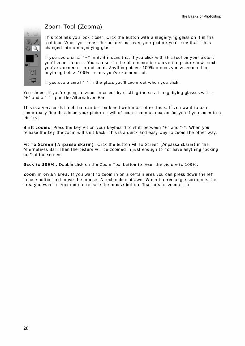
Zoom Tool (Zooma) This tool lets you look closer. Click the button with a magnifying glass on it in the tool box. When you move the pointer out over your picture you’ll see that it has changed into a magnifying glass. If you see a small “+” in it, it means that if you click with this tool on your picture you’ll zoom in on it. You can see in the blue name bar above the picture how much you’ve zoomed in or out on it. Anything above 100% means you’ve zoomed in, anything below 100% means you’ve zoomed out. If you see a small “-“ in the glass you’ll zoom out when you click.
You choose if you’re going to zoom in or out by clicking the small magnifying glasses with a ”+” and a ”-” up in the Alternatives Bar. This is a very useful tool that can be combined with most other tools. If you want to paint some really fine details on your picture it will of course be much easier for you if you zoom in a bit first. Shift zooms. Press the key Alt on your keyboard to shift between ”+” and ”-”. When you release the key the zoom will shift back. This is a quick and easy way to zoom the other way.
Fit To Screen (Anpassa skärm). Click the button Fit To Screen (Anpassa skärm) in the Alternatives Bar. Then the picture will be zoomed in just enough to not have anything “poking out” of the screen. Back to 100%. Double click on the Zoom Tool button to reset the picture to 100%. Zoom in on an area. If you want to zoom in on a certain area you can press down the left mouse button and move the mouse. A rectangle is drawn. When the rectangle surrounds the area you want to zoom in on, release the mouse button. That area is zoomed in.
The Basics of Photoshop
29
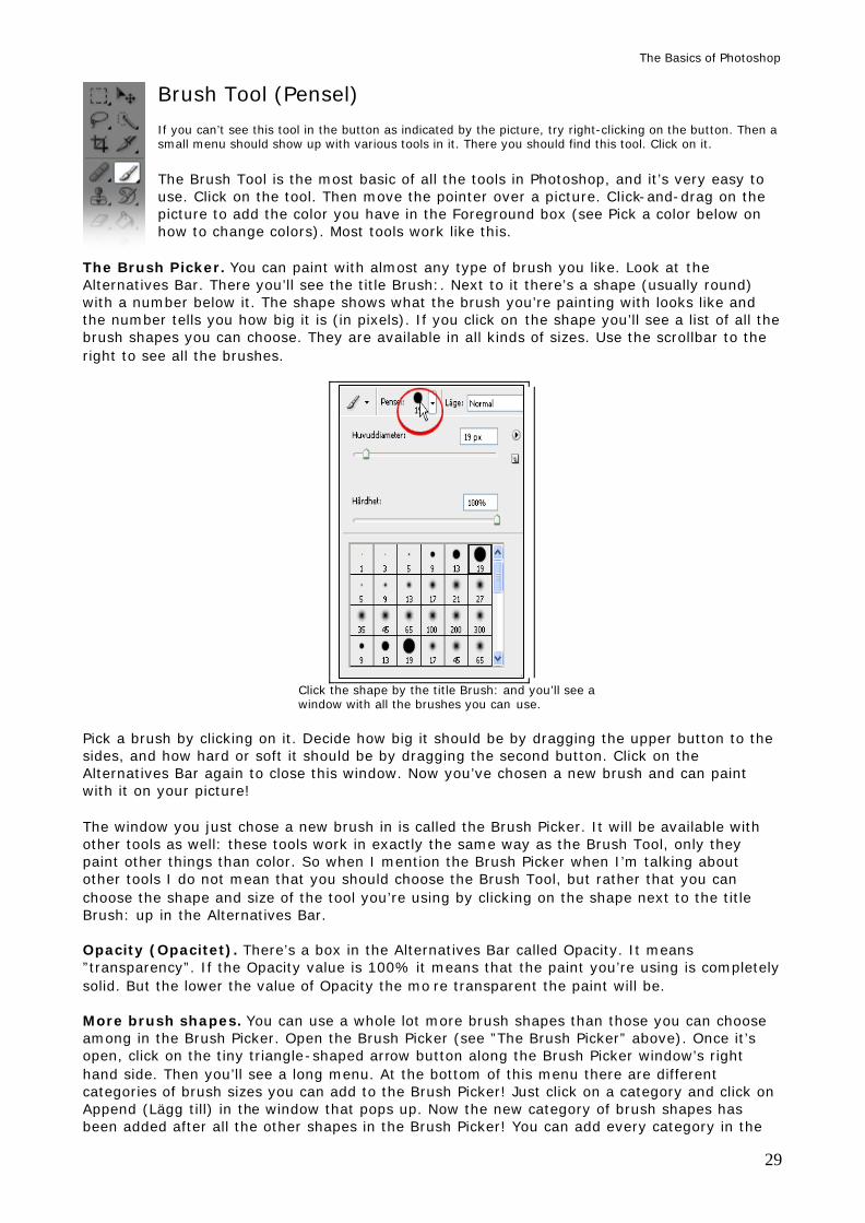
Brush Tool (Pensel) If you can’t see this tool in the button as indicated by the picture, try right-clicking on the button. Then a small menu should show up with various tools in it. There you should find this tool. Click on it.
The Brush Tool is the most basic of all the tools in Photoshop, and it’s very easy to use. Click on the tool. Then move the pointer over a picture. Click-and-drag on the picture to add the color you have in the Foreground box (see Pick a color below on how to change colors). Most tools work like this.
The Brush Picker. You can paint with almost any type of brush you like. Look at the Alternatives Bar. There you’ll see the title Brush:. Next to it there’s a shape (usually round) with a number below it. The shape shows what the brush you’re painting with looks like and the number tells you how big it is (in pixels). If you click on the shape you’ll see a list of all the brush shapes you can choose. They are available in all kinds of sizes. Use the scrollbar to the right to see all the brushes.
Click the shape by the title Brush: and you’ll see a window with all the brushes you can use.
Pick a brush by clicking on it. Decide how big it should be by dragging the upper button to the sides, and how hard or soft it should be by dragging the second button. Click on the Alternatives Bar again to close this window. Now you’ve chosen a new brush and can paint with it on your picture! The window you just chose a new brush in is called the Brush Picker. It will be available with other tools as well: these tools work in exactly the same way as the Brush Tool, only they paint other things than color. So when I mention the Brush Picker when I’m talking about other tools I do not mean that you should choose the Brush Tool, but rather that you can choose the shape and size of the tool you’re using by clicking on the shape next to the title Brush: up in the Alternatives Bar. Opacity (Opacitet). There’s a box in the Alternatives Bar called Opacity. It means ”transparency”. If the Opacity value is 100% it means that the paint you’re using is completely solid. But the lower the value of Opacity the mo re transparent the paint will be. More brush shapes. You can use a whole lot more brush shapes than those you can choose among in the Brush Picker. Open the Brush Picker (see ”The Brush Picker” above). Once it’s open, click on the tiny triangle-shaped arrow button along the Brush Picker window’s right hand side. Then you’ll see a long menu. At the bottom of this menu there are different categories of brush sizes you can add to the Brush Picker! Just click on a category and click on Append (Lägg till) in the window that pops up. Now the new category of brush shapes has been added after all the other shapes in the Brush Picker! You can add every category in the
The Basics of Photoshop
30
menu if you want to. If you want to reset the Brush Picker to the way it looked before you got to it, bring up the menu again and click on Reset Brushes (Återställ penslar) and click OK. Paint a straight line. Click with the Brush Tool where you want the line to start. Press the Shift key on your keyboard. With the Shift key still pressed, click where you want your line to end. Done! If you want to keep painting straight lines, just keep the Shift key pressed and keep clicking. Each click will be connected with a straight line. Release the Shift key to paint as normal again.
Color Picker and Eye Dropper Tool (Färgval och Pipett) We’ll start with how to pick a color by yourself. The Color Picker consists of two boxes: Foreground (the upper box, it’s black in the picture to the left) and Background (the lower box, which is white). You almost only use the Foreground color when you paint with tools or write text, but the Background color has its uses too from time to time. You can pick a color just by clicking on any of the boxes. Then you’ll see a window with a big box of nuances to the left and a staple of colors in the middle. Click on the staple to pick the color you want. Then click on the nuance you want to use in the big box to the left. When you’ve picked the nuance you can click on OK.
The color box is filled with the color you chose. There are a lot of different buttons here, each with letters next to them. If you click on them the colors will be presented to you differently. It might help you find the exact color you want to use. Normally the button “H” is pressed here. Eye Dropper Tool (Verktyget Pipett). Click with this tool on a color in your picture. That color will be copied into the Foreground box. This is a quick and easy way to use colors that already exist in the picture. That way you won’t have to start guessing what nuance might fit. Return to black/white. If you want your color boxes to return to black/white there’s a small button down and to the left of the color boxes. It looks like a tiny version of a black foreground box and a white background box. Click on it and the Foreground- and Blackground boxes will turn black and white. Reverse the colors. If you want to reverse the Fore- and Background colors you can click on the little two-headed arrow button up and to the right of the color boxes. Then the colors will switch boxes.
The Basics of Photoshop
31
Selection Tools (Markeringsverktygen): The basics and fancy tricks (Selection tools are also called “Marquee tools”.) The selection tools are a big part of Photoshop, so it is important that you get to know them. There are many different ways to select something in a picture, but most of these tools work in almost exactly the same way. The only thing that separates them is what kind of shape they let you select. Read more about how to use specific selection tools in the section below this. You use selections to point out exactly what area you want to change in a picture. Once you’ve selected an area everything you do will affect only that area. This includes tools like the Brush Tool and functions like Color Balance. No matter what you do, everything outside the selection will remain untouched until you turn your selection off. Then you can do things to all the other areas as well. You cannot select an empty area, so you have to be careful about picking the right layer in the Layers palette before you start selecting things. We’ll look closer at the selection tools called Frames, Freehand and Quick Select. Turn a selection off. In order to turn a selection off you enter Select > Deselect (Markera > Avmarkera). Then the selection will disappear. You can do this by holding down the Ctrl key on your keyboard and pressing the letter “D”. Select an entire layer. You can select the contents of an entire layer with just a simple mouse click! Just hold down the Ctrl key on your keyboard and click once on the miniature picture just to the left of the layer. Now everything in that layer is selected! Inverse a selection. Sometimes you’ll want to inverse a selection, turn it ”inside out”, so that everything you’ve selected becomes deselected, and everything else becomes selected! To do that you enter Select > Inverse (Markera > Omvänd). Of course, you have to create a selection before you can inverse it. Delete a selection. If you want to delete everything in a selection you just press the key Delete on your keyboard. Just make sure to pick the right layer first or you might get a nasty surprise. If you delete anything on the Background layer the selection will just get filled with whatever color is in your Background color box. Create contours. If you want to create a line along your selection – a good way to create, say, a rectangle or a circle – you enter Edit > Stroke (Redigera > Ramlinje). There you get to choose how thick the line should be, what color it should have, how transparent it should be (that’s Opacity, where 100% means solid and everything else means more or less transparent), and whether it should be drawn outside, on, or inside your selection. Feather (Ludd) decides how much your selection will ”bleed”. A Feather value of 0, meaning no bleeding at all, is the most common choice. The higher the value, the more your next selection’s borders will bleed. What do I mean by bleed? Try giving Feather a value of about 10 or 15, create a selection, and do something to it – paint inside it, change colors, whatever. Now look closely at the selection’s borders, and you’ll see what I mean by “bleeding”: whatever you did has bled outside the borders a bit. Keep in mind that if you give Feather a value that’s very high and you make your selection too small, you’ll get an error message that tells you that no pixels were selected. This is because Feather made your small selection so soft that it can’t even be created. You’ll have to make the selection bigger.
The Basics of Photoshop
32
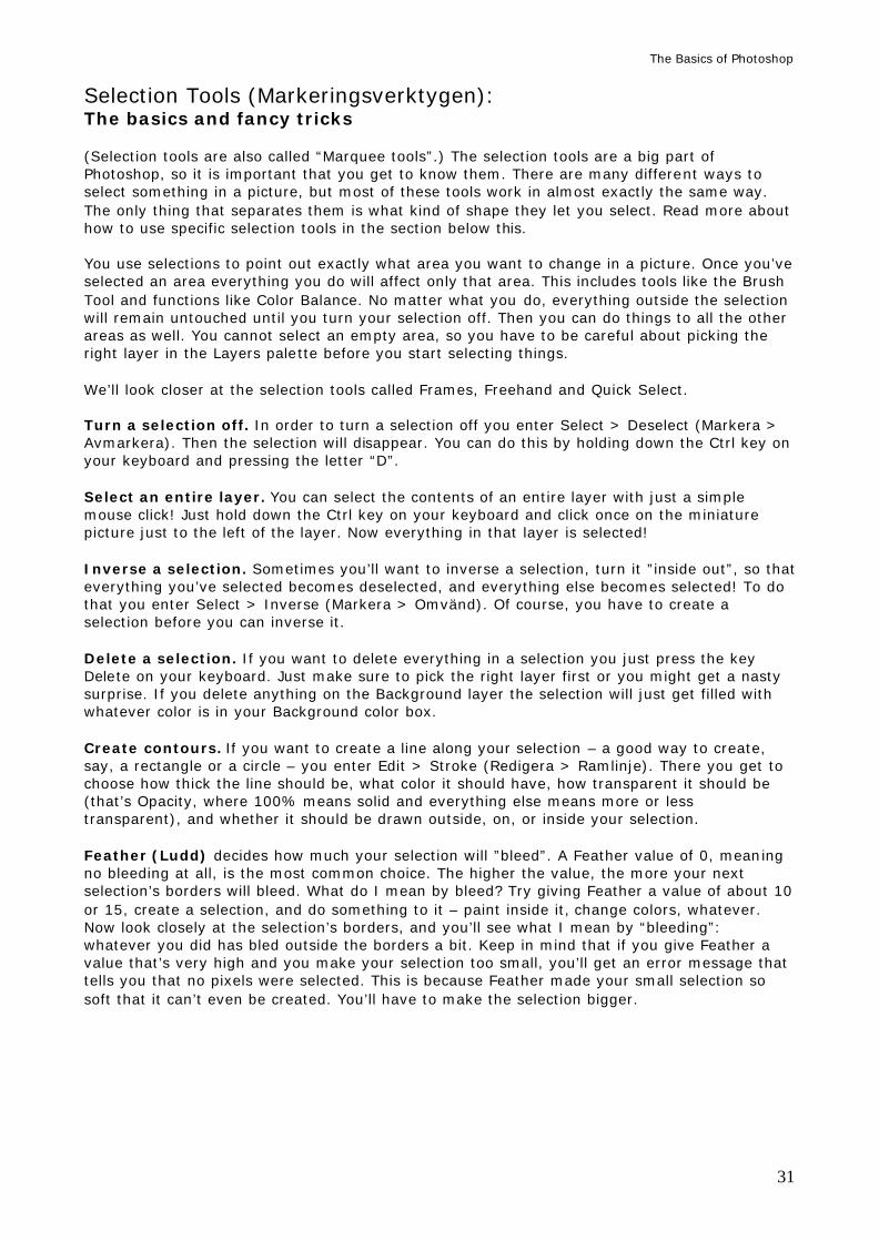
Selection types. When you’ve chosen a Selection Tool you’ll see four buttons up in the Alternatives Bar. These decide what will happen when you create a selection. They are called, in order, New Selection (Ny markering), Add To Selection (Lägg till i markering), Subtract From Selection (Subtrahera från markering) and finally Intersect With Selection (Överlappa med markering) – although we won’t look at that one because it’s useless.
The four selection types. You’ll find these in the
Alternatives Bar when you’ve picked a selection tool. New Selection (Ny markering). This is the most common choice. When this button is pressed (which it is from the start), each new selection will turn off all the old ones. Add To Selection (Lägg till i markering). If you click Add To Selection your old selection won’t disappear when you create a new one. Instead, all your new selections will be added to the old ones, and they’ll all count as part of the “same” selection. This is very useful if you want to, say, change the colors on a lot of different places at the same time, or if you missed parts with your old selection that you want to include. Then you just choose Add To Selection and create a selection that covers those missing parts too. Subtract From Selection (Subtrahera från markering). If you click on the Subtract From Selection-button every new selection you create will “cut away” from your old selection wherever they overlap. So if you create a selection, click on Subtract From Selection, and then create a new selection on top of the old one, the new selection will create a hole in the old one. This function is particularly useful with the Freehand selection tools (read about them below) if you’ve done something wrong with your selection. Then you can use Subtract From Selection and remove whatever went wrong with the old one. Press and hold the Alt key on your keyboard while you’re using a Selection Tool to temporarily make it Subtract. When you release the Alt key the selection type will go back to what it was before. The fourth selection type makes it so that when two selections overlap, all that will be left is the area where they cut into each other. The rest of the selections disappears. This is useless.
New Selection (Ny marke- Add To Selection (Lägg till Subtract From Selection ring). This button makes i markering) adds every (Subtrahera från markering) your selections work like new selection you create to removes the part where two normal. those that are already selections cut into each other. active.
The Basics of Photoshop
33
Selection Tools (Markeringsverktygen): Frames
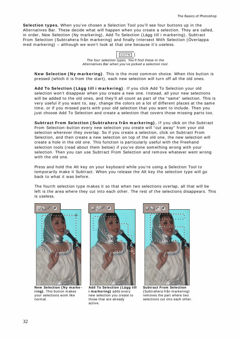
Right click on the tool button (see the picture to the right) to bring up a small menu of all the tools you can use to create selections of a certain frame. Click on the one you want to use. As you can see there are four different frames, but we’re just going to use two: the Rectangular (which is square) and the Elliptical (which is round).
Pick one of the two and place your mouse pointer over your picture. Press down the left mouse button and move the mouse. Now you’re creating a selection! When you release the mouse button your selection will be finished and ready to use. Create an exact square or a perfect circle. If you want to create an exact square or a perfectly round circle, start creating your selection. While you’re creating it, press down the Shift key on your keyboard. For as long as you keep Shift pressed, your selection will be forced into the shape of a square or a circle. Release Shift to “loosen” the selection again. Start from the middle. If you want your selection to start from the middle and expand outward instead of starting in a corner you can press the key Alt on your keyboard while you’re creating the selection.
Selection Tools (Markeringsverktygen): Freehand
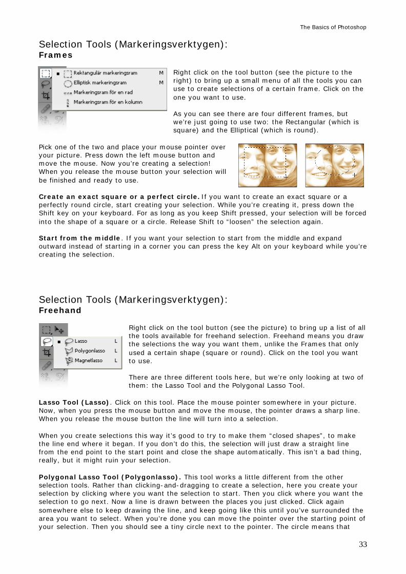
Right click on the tool button (see the picture) to bring up a list of all the tools available for freehand selection. Freehand means you draw the selections the way you want them, unlike the Frames that only used a certain shape (square or round). Click on the tool you want to use. There are three different tools here, but we’re only looking at two of them: the Lasso Tool and the Polygonal Lasso Tool.
Lasso Tool (Lasso). Click on this tool. Place the mouse pointer somewhere in your picture. Now, when you press the mouse button and move the mouse, the pointer draws a sharp line. When you release the mouse button the line will turn into a selection. When you create selections this way it’s good to try to make them “closed shapes”, to make the line end where it began. If you don’t do this, the selection will just draw a straight line from the end point to the start point and close the shape automatically. This isn’t a bad thing, really, but it might ruin your selection. Polygonal Lasso Tool (Polygonlasso). This tool works a little different from the other selection tools. Rather than clicking-and-dragging to create a selection, here you create your selection by clicking where you want the selection to start. Then you click where you want the selection to go next. Now a line is drawn between the places you just clicked. Click again somewhere else to keep drawing the line, and keep going like this until you’ve surrounded the area you want to select. When you’re done you can move the pointer over the starting point of your selection. Then you should see a tiny circle next to the pointer. The circle means that
The Basics of Photoshop
34
when you click, the line will turn into a selection. You can also turn it into a selection just by double-clicking or by pressing the Enter key on your keyboard.
The Lasso Tool and the Polygonal Lasso Tool in action
Scroll the picture while you’re selecting. Let’s say you’ve Zoomed in on a picture and you’re using the Lasso Tool on a detail. You reach the edge of the picture window. You need to scroll the picture to keep drawing your selection. Now: if you touch the edges of the window while you’re drawing your selection the picture will indeed scroll, but for some reason it will go so fast that your selection will be ruined. That’s not good. There are two ways to stop this from happening. You can either use the Polygonal Lasso Tool instead of the ordinary Lasso Tool. That way you’ll have more control. Or, while drawing your selection and without releasing the mouse button you can press the Space bar on your keyboard. That’s the long, thin button closest to you, the one you use to make spaces between words when you type. By pressing the Space bar you activate the Hand Tool. Now, when you move your mouse (still with the Space bar and mouse button pressed) you’ll scroll the picture instead of drawing your selection. Release the Space bar to keep drawing your selection. It takes a little bit of practice just to see how it works, but it will save your selection many times over. Cancel a selection in progress. If you’re creating a selection with the Polygonal Lasso Tool and you mess it up so bad that you just want to turn it off, you can cancel the entire thing either by just double-clicking so that your lines turn into a selection and then entering Select > Deselect (Markera > Avmarkera). A faster way is to press the Escape (Esc) key. You’ll find it in the upper left corner on your keyboard. Selection Tools (Markeringsverktygen): Quick Select (Snabbval) This tool does not exist in Photoshop 7.
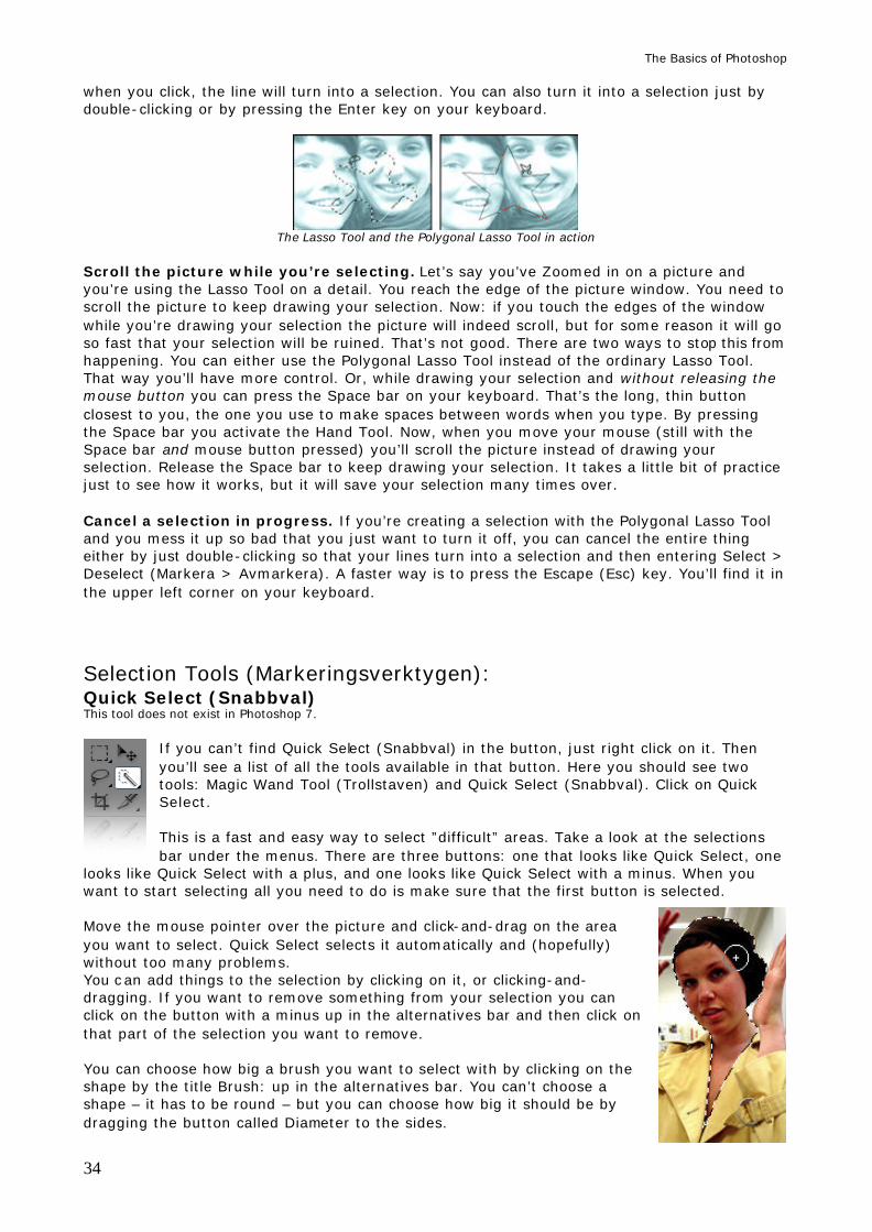
If you can’t find Quick Select (Snabbval) in the button, just right click on it. Then you’ll see a list of all the tools available in that button. Here you should see two tools: Magic Wand Tool (Trollstaven) and Quick Select (Snabbval). Click on Quick Select. This is a fast and easy way to select ”difficult” areas. Take a look at the selections bar under the menus. There are three buttons: one that looks like Quick Select, one
looks like Quick Select with a plus, and one looks like Quick Select with a minus. When you want to start selecting all you need to do is make sure that the first button is selected. Move the mouse pointer over the picture and click-and-drag on the area you want to select. Quick Select selects it automatically and (hopefully) without too many problems. You can add things to the selection by clicking on it, or clicking-and-dragging. If you want to remove something from your selection you can click on the button with a minus up in the alternatives bar and then click on that part of the selection you want to remove. You can choose how big a brush you want to select with by clicking on the shape by the title Brush: up in the alternatives bar. You can’t choose a shape – it has to be round – but you can choose how big it should be by dragging the button called Diameter to the sides.
The Basics of Photoshop
35
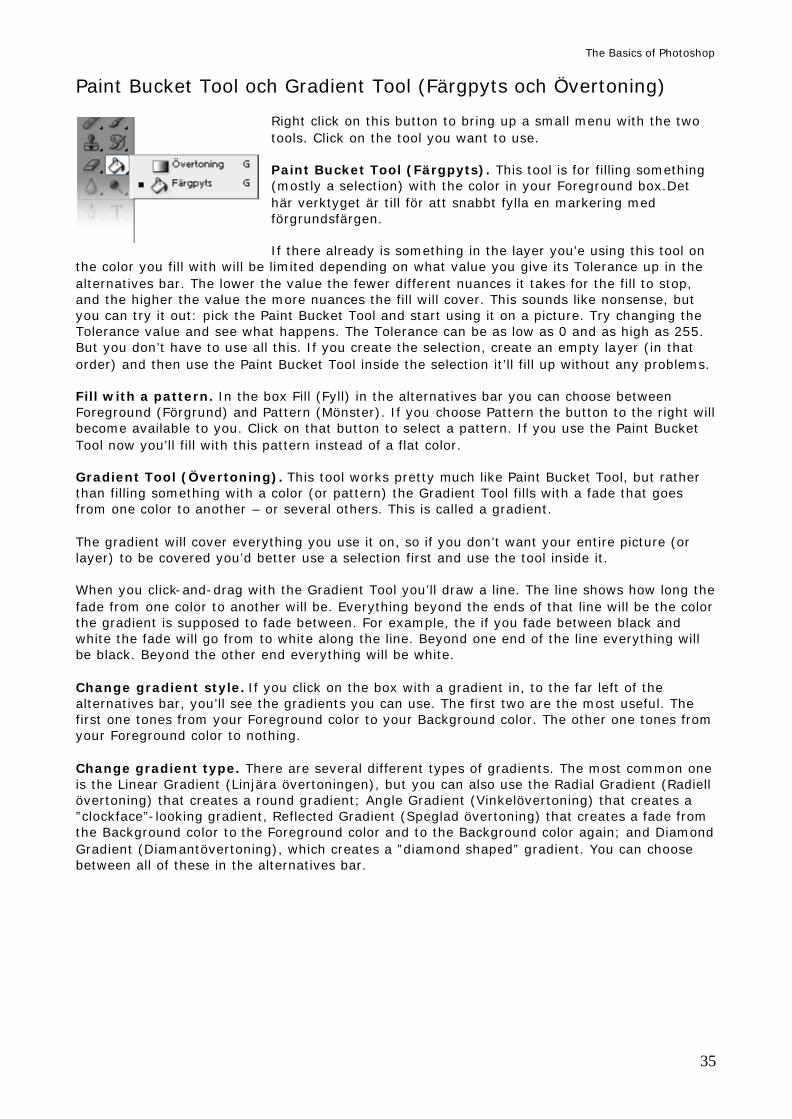
Paint Bucket Tool och Gradient Tool (Färgpyts och Övertoning)
Right click on this button to bring up a small menu with the two tools. Click on the tool you want to use. Paint Bucket Tool (Färgpyts). This tool is for filling something (mostly a selection) with the color in your Foreground box.Det här verktyget är till för att snabbt fylla en markering med förgrundsfärgen. If there already is something in the layer you’e using this tool on
the color you fill with will be limited depending on what value you give its Tolerance up in the alternatives bar. The lower the value the fewer different nuances it takes for the fill to stop, and the higher the value the more nuances the fill will cover. This sounds like nonsense, but you can try it out: pick the Paint Bucket Tool and start using it on a picture. Try changing the Tolerance value and see what happens. The Tolerance can be as low as 0 and as high as 255. But you don’t have to use all this. If you create the selection, create an empty layer (in that order) and then use the Paint Bucket Tool inside the selection it’ll fill up without any problems. Fill with a pattern. In the box Fill (Fyll) in the alternatives bar you can choose between Foreground (Förgrund) and Pattern (Mönster). If you choose Pattern the button to the right will become available to you. Click on that button to select a pattern. If you use the Paint Bucket Tool now you’ll fill with this pattern instead of a flat color. Gradient Tool (Övertoning). This tool works pretty much like Paint Bucket Tool, but rather than filling something with a color (or pattern) the Gradient Tool fills with a fade that goes from one color to another – or several others. This is called a gradient. The gradient will cover everything you use it on, so if you don’t want your entire picture (or layer) to be covered you’d better use a selection first and use the tool inside it. When you click-and-drag with the Gradient Tool you’ll draw a line. The line shows how long the fade from one color to another will be. Everything beyond the ends of that line will be the color the gradient is supposed to fade between. For example, the if you fade between black and white the fade will go from to white along the line. Beyond one end of the line everything will be black. Beyond the other end everything will be white. Change gradient style. If you click on the box with a gradient in, to the far left of the alternatives bar, you’ll see the gradients you can use. The first two are the most useful. The first one tones from your Foreground color to your Background color. The other one tones from your Foreground color to nothing. Change gradient type. There are several different types of gradients. The most common one is the Linear Gradient (Linjära övertoningen), but you can also use the Radial Gradient (Radiell övertoning) that creates a round gradient; Angle Gradient (Vinkelövertoning) that creates a ”clockface”-looking gradient, Reflected Gradient (Speglad övertoning) that creates a fade from the Background color to the Foreground color and to the Background color again; and Diamond Gradient (Diamantövertoning), which creates a ”diamond shaped” gradient. You can choose between all of these in the alternatives bar.
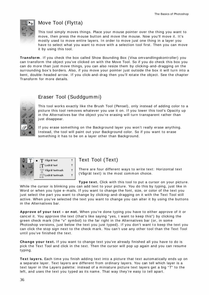
The Basics of Photoshop
36
Move Tool (Flytta) This tool simply moves things. Place your mouse pointer over the thing you want to move, then press the mouse button and move the mouse. Now you’ll move it. It’s mostly used to move entire layers. In order to move just one thing in a layer you have to select what you want to move with a selection tool first. Then you can move it by using this tool.
Transform. If you check the box called Show Bounding Box (Visa omvandlingskontroller) you can transform the object you’ve clicked on with the Move Tool. So if you do check this box you can do more than just move things, you can also resize them by clicking-and-dragging on the surrounding box’s borders. Also, if you move your pointer just outside the box it will turn into a bent, double-headed arrow. If you click-and-drag then you’ll rotate the object. See the chapter Transform for more details.
Eraser Tool (Suddgummi) This tool works exactly like the Brush Tool (Pensel), only instead of adding color to a picture this tool removes whatever you use it on. If you lower this tool’s Opacity up in the Alternatives bar the object you’re erasing will turn transparent rather than just disappear. If you erase something on the Background layer you won’t really erase anything. Instead, the tool will paint out your Background color. So if you want to erase something it has to be on a layer other than Background.
Text Tool (Text) There are four different ways to write text: Horizontal text (Vågrät text) is the most common choice. Type text. Click with this tool to put a cursor on your picture.
While the cursor is blinking you can add text to your picture. You do this by typing, just like in Word or when you type e-mails. If you want to change the font, size, or color of the text you just select the part you want to change by clicking-and-dragging on it with the Text Tool still active. When you’ve selected the text you want to change you can alter it by using the buttons in the Alternatives bar. Approve of your text – or not. When you’re done typing you have to either approve of it or cancel it. You approve the text (that's like saying “yes, I want to keep this”) by clicking the green check mark (the “v” symbol) to the far right in the Alternatives bar (or, in some Photoshop versions, just below the text you just typed). If you don't want to keep the text you can click the stop sign next to the check mark. You can’t use any other tool than the Text Tool until you’ve finished the text. Change your text. If you want to change text you’ve already finished all you have to do is pick the Text Tool and click in the text. Then the cursor will pop up again and you can resume typing. Text layers. Each time you finish adding text into a picture that text automatically ends up on a separate layer. Text layers are different from ordinary layers. You can tell which layer is a text layer in the Layers palette: instead of a miniature picture text layers get a big “T” to the left, and uses the text you typed as its name. That way they’re easy to tell apart.
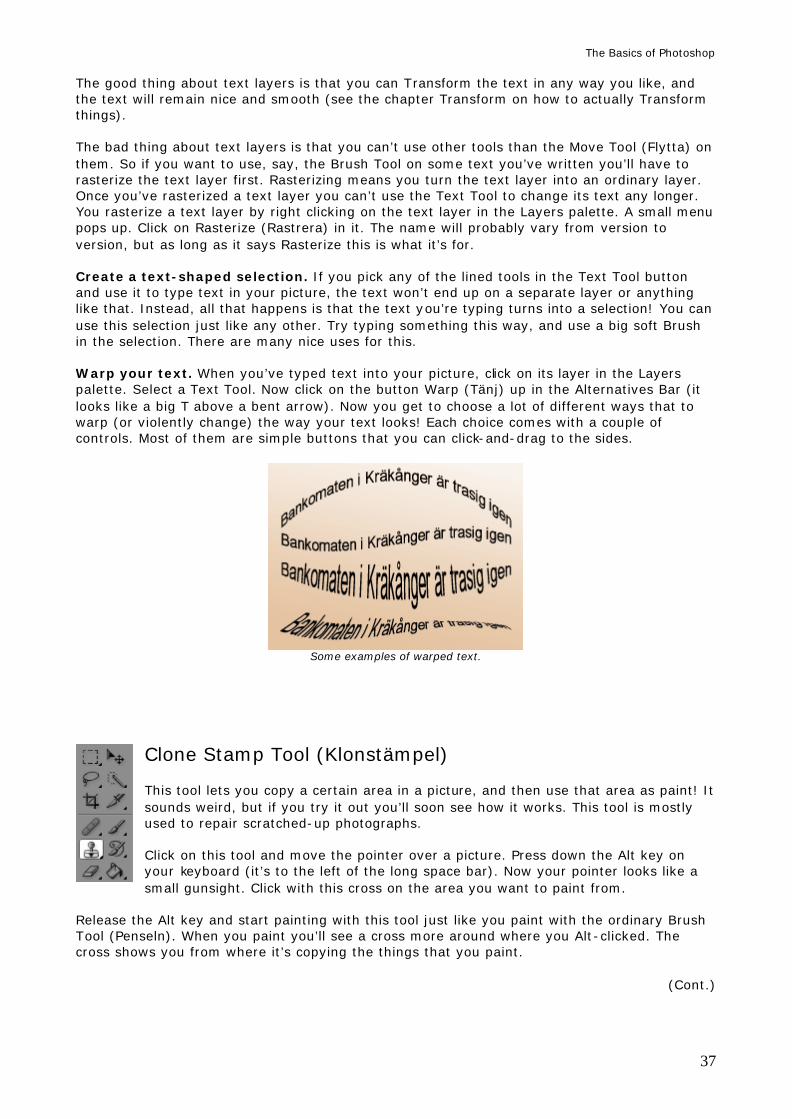
The Basics of Photoshop
37
The good thing about text layers is that you can Transform the text in any way you like, and the text will remain nice and smooth (see the chapter Transform on how to actually Transform things). The bad thing about text layers is that you can’t use other tools than the Move Tool (Flytta) on them. So if you want to use, say, the Brush Tool on some text you’ve written you’ll have to rasterize the text layer first. Rasterizing means you turn the text layer into an ordinary layer. Once you’ve rasterized a text layer you can’t use the Text Tool to change its text any longer. You rasterize a text layer by right clicking on the text layer in the Layers palette. A small menu pops up. Click on Rasterize (Rastrera) in it. The name will probably vary from version to version, but as long as it says Rasterize this is what it’s for. Create a text-shaped selection. If you pick any of the lined tools in the Text Tool button and use it to type text in your picture, the text won’t end up on a separate layer or anything like that. Instead, all that happens is that the text you’re typing turns into a selection! You can use this selection just like any other. Try typing something this way, and use a big soft Brush in the selection. There are many nice uses for this. Warp your text. When you’ve typed text into your picture, click on its layer in the Layers palette. Select a Text Tool. Now click on the button Warp (Tänj) up in the Alternatives Bar (it looks like a big T above a bent arrow). Now you get to choose a lot of different ways that to warp (or violently change) the way your text looks! Each choice comes with a couple of controls. Most of them are simple buttons that you can click-and-drag to the sides.
Some examples of warped text.
Clone Stamp Tool (Klonstämpel) This tool lets you copy a certain area in a picture, and then use that area as paint! It sounds weird, but if you try it out you’ll soon see how it works. This tool is mostly used to repair scratched-up photographs. Click on this tool and move the pointer over a picture. Press down the Alt key on your keyboard (it’s to the left of the long space bar). Now your pointer looks like a small gunsight. Click with this cross on the area you want to paint from.
Release the Alt key and start painting with this tool just like you paint with the ordinary Brush Tool (Penseln). When you paint you’ll see a cross more around where you Alt-clicked. The cross shows you from where it’s copying the things that you paint.
(Cont.)
The Basics of Photoshop
38
This is a quick way to copy pieces in a picture and use them to “paint away” scratches and mistakes. It’s important that you Alt-click on an area that’s similar to the area you want to paint on. If I Alt-click on the sky and start to paint with this tool on a leaf, all I’m ending up with is a leaf with a bit of sky on it. If I Alt-click on a piece of wood and use this tool to paint on another piece of wood, it’ll probably look ok.
I want to copy the face on the big ball and paste it onto the small one. I select the Clone Stamp Tool (Klonverktyget) and move the pointer over the big ball’s face. I press the Alt key on my keyboard. The pointer looks like a gunsight. I click once on the ball’s face. I then release the Alt key and paint with this same tool on the small ball, just as I would with the Brush Tool. Now I’m copying-and-pasting the face!
Crop (Beskär) Use this tool to cut a picture the way you want it. Click and drag with this tool on a picture and you’ll see a striped rectangle. Everything outside this rectangle will turn dark – that means it’ll be cut away when you finish the cropping! You can move the rectangle by clicking-and-dragging inside it, and you can change its edges by clicking-and-dragging on them.
You finish your cropping by clicking on the green check symbol (the ”v”-looking thing) in the Alternatives Box (or, in some Photoshop versions, just below the rectangle), by double-clicking inside the rectangle, or just by pressing the Enter key on your keyboard.
Blur/Sharpen/Smudge Tool (Oskärpa / Skärpa / Smeta ut) Right click on the button to choose between the three tools. All of them use the Brush Picker, which we looked at when we learned about the
Brush Tool earlier. As you probably remember, the Brush Picker will let you pick a shape and size for these tools in exactly the same way as you did with the Brush. Blur Tool (Oskärpa). This tool makes whatever you use it on blurry – unsharp. Set its Strength (Styrka) up in the Alternatives Bar to decide just how blurry the thing you’re painting on should be. Sharpen Tool (Skärpa) sharpens the contrasts in whatever you use this tool on. This tool is hard to use well because it works so quickly: it doesn’t take long before the detail you’re sharpening turns spotty and ugly, and then you might have to start over. You should stick to a really low Strength (Styrka) in the Alternatives Bar – about 5-10% – if you want to use this tool, and paint several times on the same spot until you think it looks sharp enough.
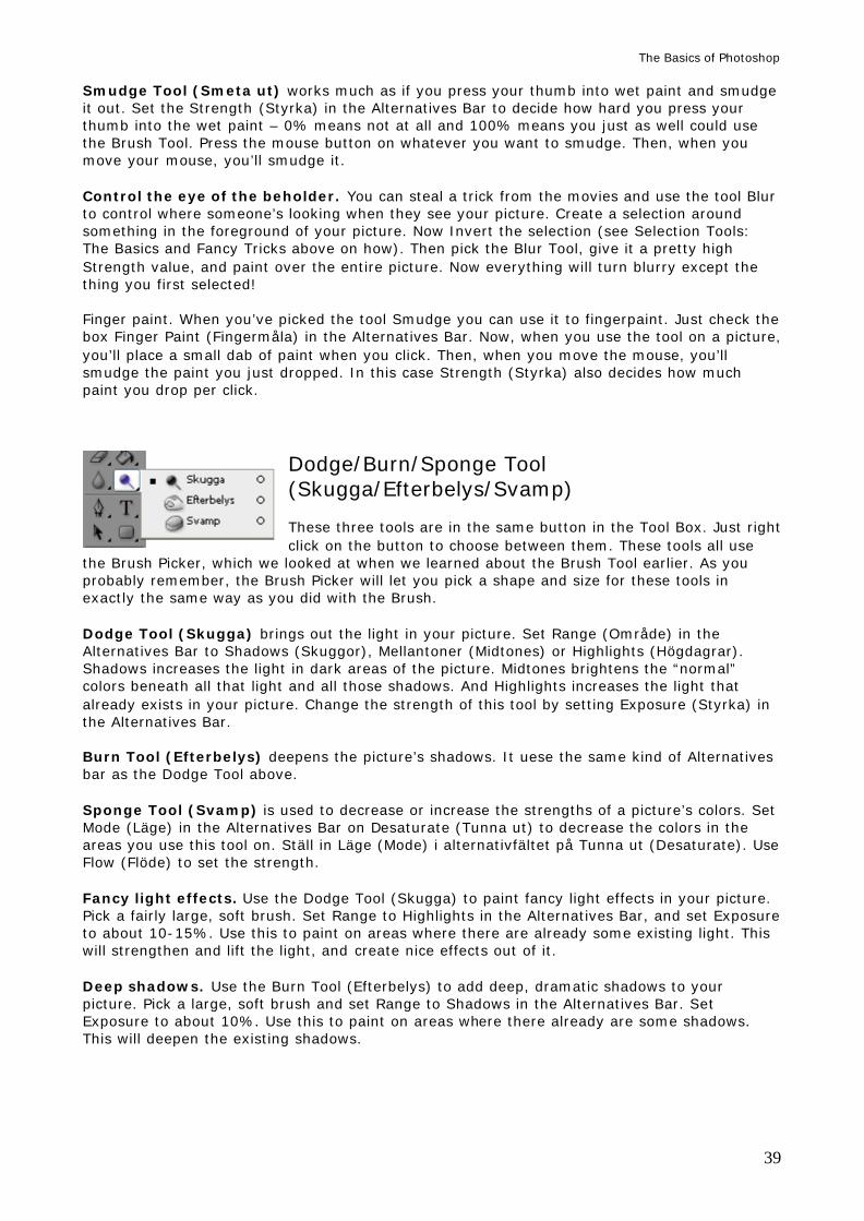
The Basics of Photoshop
39
Smudge Tool (Smeta ut) works much as if you press your thumb into wet paint and smudge it out. Set the Strength (Styrka) in the Alternatives Bar to decide how hard you press your thumb into the wet paint – 0% means not at all and 100% means you just as well could use the Brush Tool. Press the mouse button on whatever you want to smudge. Then, when you move your mouse, you’ll smudge it. Control the eye of the beholder. You can steal a trick from the movies and use the tool Blur to control where someone’s looking when they see your picture. Create a selection around something in the foreground of your picture. Now Invert the selection (see Selection Tools: The Basics and Fancy Tricks above on how). Then pick the Blur Tool, give it a pretty high Strength value, and paint over the entire picture. Now everything will turn blurry except the thing you first selected! Finger paint. When you’ve picked the tool Smudge you can use it to fingerpaint. Just check the box Finger Paint (Fingermåla) in the Alternatives Bar. Now, when you use the tool on a picture, you’ll place a small dab of paint when you click. Then, when you move the mouse, you’ll smudge the paint you just dropped. In this case Strength (Styrka) also decides how much paint you drop per click.
Dodge/Burn/Sponge Tool (Skugga/Efterbelys/Svamp) These three tools are in the same button in the Tool Box. Just right click on the button to choose between them. These tools all use
the Brush Picker, which we looked at when we learned about the Brush Tool earlier. As you probably remember, the Brush Picker will let you pick a shape and size for these tools in exactly the same way as you did with the Brush. Dodge Tool (Skugga) brings out the light in your picture. Set Range (Område) in the Alternatives Bar to Shadows (Skuggor), Mellantoner (Midtones) or Highlights (Högdagrar). Shadows increases the light in dark areas of the picture. Midtones brightens the “normal” colors beneath all that light and all those shadows. And Highlights increases the light that already exists in your picture. Change the strength of this tool by setting Exposure (Styrka) in the Alternatives Bar. Burn Tool (Efterbelys) deepens the picture’s shadows. It uese the same kind of Alternatives bar as the Dodge Tool above. Sponge Tool (Svamp) is used to decrease or increase the strengths of a picture’s colors. Set Mode (Läge) in the Alternatives Bar on Desaturate (Tunna ut) to decrease the colors in the areas you use this tool on. Ställ in Läge (Mode) i alternativfältet på Tunna ut (Desaturate). Use Flow (Flöde) to set the strength. Fancy light effects. Use the Dodge Tool (Skugga) to paint fancy light effects in your picture. Pick a fairly large, soft brush. Set Range to Highlights in the Alternatives Bar, and set Exposure to about 10-15%. Use this to paint on areas where there are already some existing light. This will strengthen and lift the light, and create nice effects out of it. Deep shadows. Use the Burn Tool (Efterbelys) to add deep, dramatic shadows to your picture. Pick a large, soft brush and set Range to Shadows in the Alternatives Bar. Set Exposure to about 10%. Use this to paint on areas where there already are some shadows. This will deepen the existing shadows.
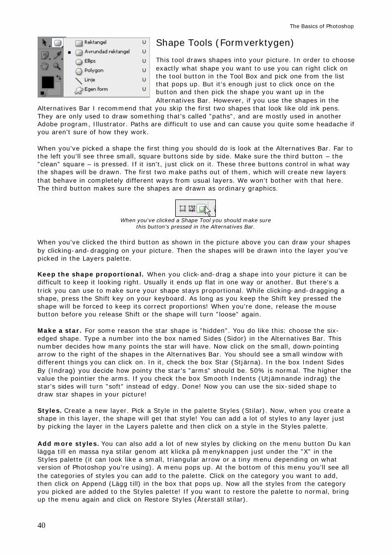
The Basics of Photoshop
40
Shape Tools (Formverktygen) This tool draws shapes into your picture. In order to choose exactly what shape you want to use you can right click on the tool button in the Tool Box and pick one from the list that pops up. But it's enough just to click once on the button and then pick the shape you want up in the Alternatives Bar. However, if you use the shapes in the
Alternatives Bar I recommend that you skip the first two shapes that look like old ink pens. They are only used to draw something that's called ”paths”, and are mostly used in another Adobe program, Illustrator. Paths are difficult to use and can cause you quite some headache if you aren't sure of how they work. When you've picked a shape the first thing you should do is look at the Alternatives Bar. Far to the left you'll see three small, square buttons side by side. Make sure the third button – the ”clean” square – is pressed. If it isn't, just click on it. These three buttons control in what way the shapes will be drawn. The first two make paths out of them, which will create new layers that behave in completely different ways from usual layers. We won't bother with that here. The third button makes sure the shapes are drawn as ordinary graphics.
When you've clicked a Shape Tool you should make sure this button's pressed in the Alternatives Bar.
When you've clicked the third button as shown in the picture above you can draw your shapes by clicking-and-dragging on your picture. Then the shapes will be drawn into the layer you've picked in the Layers palette. Keep the shape proportional. When you click-and-drag a shape into your picture it can be difficult to keep it looking right. Usually it ends up flat in one way or another. But there's a trick you can use to make sure your shape stays proportional. While clicking-and-dragging a shape, press the Shift key on your keyboard. As long as you keep the Shift key pressed the shape will be forced to keep its correct proportions! When you're done, release the mouse button before you release Shift or the shape will turn ”loose” again. Make a star. For some reason the star shape is ”hidden”. You do like this: choose the six-edged shape. Type a number into the box named Sides (Sidor) in the Alternatives Bar. This number decides how many points the star will have. Now click on the small, down-pointing arrow to the right of the shapes in the Alternatives Bar. You should see a small window with different things you can click on. In it, check the box Star (Stjärna). In the box Indent Sides By (Indrag) you decide how pointy the star's ”arms” should be. 50% is normal. The higher the value the pointier the arms. If you check the box Smooth Indents (Utjämnande indrag) the star's sides will turn ”soft” instead of edgy. Done! Now you can use the six-sided shape to draw star shapes in your picture! Styles. Create a new layer. Pick a Style in the palette Styles (Stilar). Now, when you create a shape in this layer, the shape will get that style! You can add a lot of styles to any layer just by picking the layer in the Layers palette and then click on a style in the Styles palette. Add more styles. You can also add a lot of new styles by clicking on the menu button Du kan lägga till en massa nya stilar genom att klicka på menyknappen just under the ”X” in the Styles palette (it can look like a small, triangular arrow or a tiny menu depending on what version of Photoshop you're using). A menu pops up. At the bottom of this menu you'll see all the categories of styles you can add to the palette. Click on the category you want to add, then click on Append (Lägg till) in the box that pops up. Now all the styles from the category you picked are added to the Styles palette! If you want to restore the palette to normal, bring up the menu again and click on Restore Styles (Återställ stilar).
The Basics of Photoshop
41
Pick a figure. You can draw a bunch of different figures, not just boring old squares. Pick a Shape Tool. Now pick the shapeless blob to the far right in the row of shapes up in the Alternatives Bar. The button to the right, called Shape, becomes clickable. Click on it. Now you see a window called the Shape Picker. Here you'll find a lot of different figures you can draw into your picture, just like you can choose brushes in the Brush Picker. Add more figures. And just like you can do with the Brush Picker you can add a lot of new, different figures to the Shape Picker. Bring up the Shape Picker and click on the tiny, triangle shaped arrow in its upper right-hand corner. Now you'll see a long menu. At the bottom of this menu you'll see all the categories of shapes you can add. Click on the category you want to add, then click on Append (Lägg till) in the box that pops up. Now all the shapes from the category you picked are added to the Shape Picker! If you want to restore the Shape Picker to normal, bring up the menu again and click on Restore Shapes (Återställ former).
Other tools Now we've gone through the tools you should know how to use, or at least have tried, in Photoshop. But there are a lot more tools we haven't touched. Here are a brief description of some of the more interesting ones.
Art History Brush (Konsthändelsepenseln) This tool is pretty hard to wrap your mind around, but you can ”cheat” with it and just use it halfway – to paint patters that warps your picture. Open a picture. Pick the Art Brush Tool. Pick what kind of pattern you want to paint
into your picture by using the Style (Stil) box in the Alternatives Bar. You can set Opacity (Opacitet) and some other things as well. Now, when you use this tool, it will cover the areas you paint with a pattern, but it'll mix the Foreground color with what's already in the picture.
Healing Brush Tool (Lagningspenseln) This tool works just like the Clone Stamp Tool (Klonverktyget), but in a way that makes it a lot more interesting, at least artistically. This tool copies and paints the shadow and light from the area you've Alt-clicked on. You can use this to paint the ”look” or the texture from an area, but keep most of the colors that are already
there. This way you can, for example, give someone's skin the pattern of leaves, and things of that kind.
Pencil Tool (Pennan) You use the Pencil Tool only to draw exact lines and single pixels. When you paint with the Brush Tool everything you paint comes out a little soft around the edges, no matter how hard you say the brush should be. However, if you're using the Pencil Tool, there's no such thing as soft. If you pick a brush size of 1 with the Brush Tool
and click on a picture with it, you'll place out a dot that's maybe 3 pixels in diameter – because it's soft around the edges. If you pick a brush size of 1 with the Pencil Tool and click in a picture, you'll get a dot that's 1 pixel big. No mo re, no less. It isn't pretty but it's exact.
The Basics of Photoshop
42
TRANSFORM (OMVANDLA) Transform is a function that lets you change the shape of almost anything. You can transform something you've selected or the contents of an entire layer. Create a selection or pick the layer whose contents you want to transform. Then enter Edit > Transform (Redigera > Omvandla). Move your mouse pointer over Transform (Omvandla) and an under menu will show. There you'll see every way you can transform something in. These choices are: 1. Scale (Skala) 2. Rotate (Rotera) 3. Skew (Skeva) 4. Distort (Förvrängning) 5. Perspective (Perspektiv) 6. Rotate 180°, Rotate 90° CW and Rotate 90° CCW (Rotera 180°, Rotera 90° medsols and Rotera 90 motsols°) 7. Flip Horizontal and Flip Verticla (Vänd horisontellt and Vänd vertikalt) When you're done transforming. Always when you've finished a transformation you have to ”approve” it. You approve a transformation just like you approved text you've typed in: click on the green check mark (the ”V” shape) to the far right in the Alternatives Bar (or, in some versions of Photoshop, just below the transformation you just made), or by pressing the Enter key on your keyboard. If you don't want to approve of your transformation you can click the stop sign next to the check mark, or you can press the key Escape (Esc) in the upper left-hand corner on your keyboard. 1. Scale (Skala) When you pick Scale (Skala) you'll see a rectangle around the thing you can transform. Along the sides of this rectangle there are eight tiny boxes. Click-and-pull one of these boxes to change the transformation's size in any way you see fit.
Keep the transformation's proportions. It's hard to scale something and keep it from becoming too high or too wide, but you can let the computer worry about that. Click-and-drag one of your transformation's corner boxes. Now, while you're transforming, press the Shift key on your computer. As long as you keep it pressed the transformation will be forced to stick to its old proportions! When you're pleased with how it looks, first release the mouse button, then release the Shift key, or the transformation will return to its ”loose” shape. Start from the middle. Press the Alt key on your keyboard (to the left of the Space bar). While pressing this key, click-and-drag on one of the transformation's boxes. Now the transformation will be anchored in the middle instead of on one of the corners. 2. Rotate (Rotera) Rotate (Rotera) simply rotates the transformation. Click-and-drag on one of the transformation's boxes to rotate the transformation. Rotate in snaps. Press the Shift key while you're rotating. Now the rotation will occur only in snaps of 15°. This way it's easy to rotate something exactly 45° or 90°.
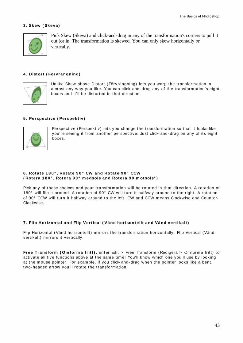
The Basics of Photoshop
43
3. Skew (Skeva) Pick Skew (Skeva) and click-and-drag in any of the transformation's corners to pull it out (or in. The transformation is skewed. You can only skew horizontally or vertically.
4. Distort (Förvrängning)
Unlike Skew above Distort (Förvrängning) lets you warp the transformation in almost any way you like. You can click-and-drag any of the transformation's eight boxes and it'll be distorted in that direction.
5. Perspective (Perspektiv)
Perspective (Perspektiv) lets you change the transformation so that it looks like you're seeing it from another perspective. Just click-and-drag on any of its eight boxes.
6. Rotate 180°, Rotate 90° CW and Rotate 90° CCW (Rotera 180°, Rotera 90° medsols and Rotera 90 motsols°) Pick any of these choices and your transformation will be rotated in that direction. A rotation of 180° will flip it around. A rotation of 90° CW will turn it halfway around to the right. A rotation of 90° CCW will turn it halfway around to the left. CW and CCW means Clockwise and Counter-Clockwise. 7. Flip Horizontal and Flip Vertical (Vänd horisontellt and Vänd vertikalt) Flip Horizontal (Vänd horisontellt) mirrors the transformation horizontally; Flip Vertical (Vänd vertikalt) mirrors it vertically. Free Transform (Omforma fritt). Enter Edit > Free Transform (Redigera > Omforma fritt) to activate all five functions above at the same time! You'll know which one you'll use by looking at the mouse pointer. For example, if you click-and-drag when the pointer looks like a bent, two-headed arrow you'll rotate the transformation.
The Basics of Photoshop
44
COPY, CUT AND PASTE (KOPIERA, KLIPP UT OCH KLISTRA IN) These three functions are of course part of the very basics of Photoshop – and in every other program you use to create things.
Copy (Kopiera) Create a selection to point out exactly what you want to copy. (Be sure to pick the correct layer in the Layers palette first!) Then enter Edit > Copy (Redigera > Kopiera) or press the Ctrl key on your keyboard and, with Ctrl still pressed, press ”C”. Unlike Cut (Klipp ut) below Copy simply copies your selection into the computer's memory.
Cut (Klipp ut) Create a selection around the thing you want to cut out. (Be sure to pick the correct layer in the Layers palette first!) Then enter Edit > Cut (Redigera > Klipp ut) or press the Ctrl key on your keyboard and, with Ctrl still pressed, press ”X”. This cuts out the thing you've selected. That means the thing will disappear from your picture and be stored in the computer's memory. If you cut out something that's in the Background layer it'll leave a Background colored mark. If you cut out something that's on a ”normal” layer it'll just leave a hole.
Paste (Klistra in
This function pastes whatever you've copied or cut out. Just enter Edit > Paste (Redigera > Klistra in) or press the Ctrl key on your keyboard and, with Ctrl still pressed, press ”V”. Once you've copied or cut out something you can paste as many copies of it as you like. Note that each time you paste something it'll end up on a layer of its own. You do not have to paste the thing into the same picture: once you've copied or cut out something you can paste it into any picture you want.
Paste Into (Klistra in i)
This function isn't used nearly as often as the ordinary Paste, but it has its uses here and there. When you've copied or cut something out you can create a selection where you want to paste it. The selection can look any way you want. When the selection's done, enter Edit > Paste Into (Redigera > Klistra in i). Now the thing you copied or cut out is pasted into your selection. The selection works as a ”peep hole” through which you can see the thing you pasted; everything that ends up outside the selection's borders is hidden from view. You can use the Move tool (Flytta) to move the thing you just pasted, but it'll remain constrained by the selection. Try it out!
The Basics of Photoshop
45
MODE (LÄGE) Mode (Läge) is a pretty advanced function even if it is everywhere in Photoshop and is easy to use. The hard part is figuring out what the Mode does. It's also called Blending Mode (Blandningsläge). But regardless of what it's called it'll change the way the color works, and how it'll affect whatever's under it. Using Mode you can make the color you paint, or entire layers, to work as different sorts of filters that, for example, brings out all the bright parts in everything seen through it, or deepens the shadows, or something else entirely. You can use Mode to paint with colored light, or reverse the colors of the area you cover, or whatever. There are a lot of options, and we'll look at them now. Note: When you paint with a certain Mode you almost always have to paint directly on the picture (or layer) that contains the parts you want to affect. If you create an empty layer and paint on it, regardless of Mode you'll just end up painting with your Foreground color as normal instead. See the Layers chapter on how to quickly make copies of layers; that's a good way to make sure you won't accidentally ruin anything: just copy the layer you want to paint on and hide the original. At the end of this section there'll be a couple of tips on how you can use Mode. Try them and you'll quickly realize how you can use Mode in your own pictures! Almost everywhere where you can use Mode it works the same way: you click the box called Mode to bring up a long list of different Modes for you to choose between. The number of Modes can differ depending on what you're using for the moment – some Modes are only available with the Brush Tool while others are only available in layers, etc. The Modes are: Normal (Normal) Lighten (Ljusare) Difference (Differens) Dissolve (Lös upp) Screen (Raster) Exclusion (Uteslutning) Behind (Lägg bakom) Color Dodge (Färgskugga) Clear (Radera) Linear Dodge (Linjär skugga) Hue (Nyans) Saturation (Mättnad) Darken (Mörkare) Overlay (Täcka över) Color (Färg) Multiply (Multiplicera) Soft Light (Mjukt ljus) Luminosity (Luminescens) Color Burn (Efterbelys färg) Hard Light (Skarpt ljus) Linear Burn (Linjär efterbelysning) Linear Light (Linjärt ljus) Pin Light (Strålljus) Normal (Normal)
This is the ”ordinary” Mode. It simply shows the colors normally.
Dissolve (Lös upp) Turns the color you paint with (or the entire layer) into a cluster of dots. It also changes the way Opacity works: instead of making the color more or less transparent Opacity just makes the cluster consist of more or fewer dots. One of the strangest Modes.
Behind (Lägg bakom)
This Mode only works when you're painting on a layer. Set the brush's Mode on Behind and everything you paint on the layer will end up behind the layer's contents!
Clear (Radera)
Basically works just like the Eraser Tool (Suddgummi): it removes whatever you paint on, as long as it is on a layer. If you paint with this Mode on the Background layer you'll just paint your Background color instead of erasing anything.
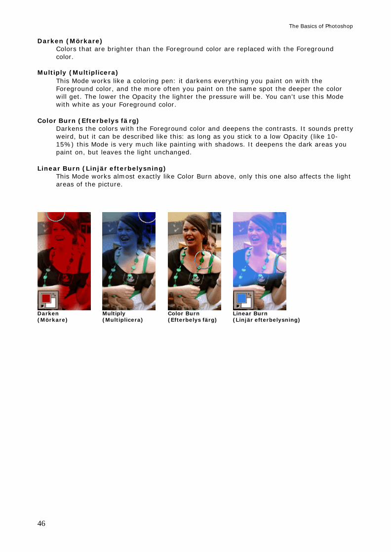
The Basics of Photoshop
46
Darken (Mörkare) Colors that are brighter than the Foreground color are replaced with the Foreground color.
Multiply (Multiplicera)
This Mode works like a coloring pen: it darkens everything you paint on with the Foreground color, and the more often you paint on the same spot the deeper the color will get. The lower the Opacity the lighter the pressure will be. You can't use this Mode with white as your Foreground color.
Color Burn (Efterbelys fä rg)
Darkens the colors with the Foreground color and deepens the contrasts. It sounds pretty weird, but it can be described like this: as long as you stick to a low Opacity (like 10-15%) this Mode is very much like painting with shadows. It deepens the dark areas you paint on, but leaves the light unchanged.
Linear Burn (Linjär efterbelysning) This Mode works almost exactly like Color Burn above, only this one also affects the light areas of the picture.
Darken Multiply Color Burn Linear Burn (Mörkare) (Multiplicera) (Efterbelys färg) (Linjär efterbelysning)
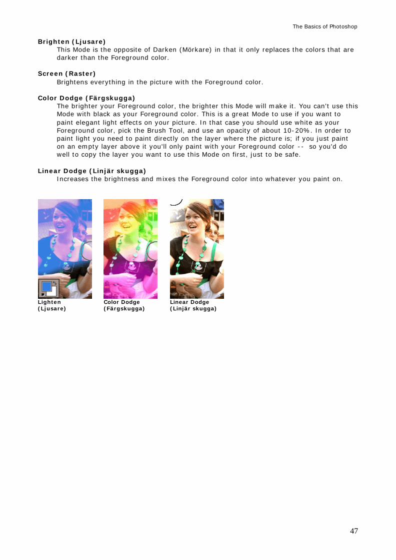
The Basics of Photoshop
47
Brighten (Ljusare) This Mode is the opposite of Darken (Mörkare) in that it only replaces the colors that are darker than the Foreground color.
Screen (Raster)
Brightens everything in the picture with the Foreground color. Color Dodge (Färgskugga)
The brighter your Foreground color, the brighter this Mode will make it. You can't use this Mode with black as your Foreground color. This is a great Mode to use if you want to paint elegant light effects on your picture. In that case you should use white as your Foreground color, pick the Brush Tool, and use an opacity of about 10-20%. In order to paint light you need to paint directly on the layer where the picture is; if you just paint on an empty layer above it you'll only paint with your Foreground color -- so you'd do well to copy the layer you want to use this Mode on first, just to be safe.
Linear Dodge (Linjär skugga)
Increases the brightness and mixes the Foreground color into whatever you paint on.
Lighten Color Dodge Linear Dodge (Ljusare) (Färgskugga) (Linjär skugga)
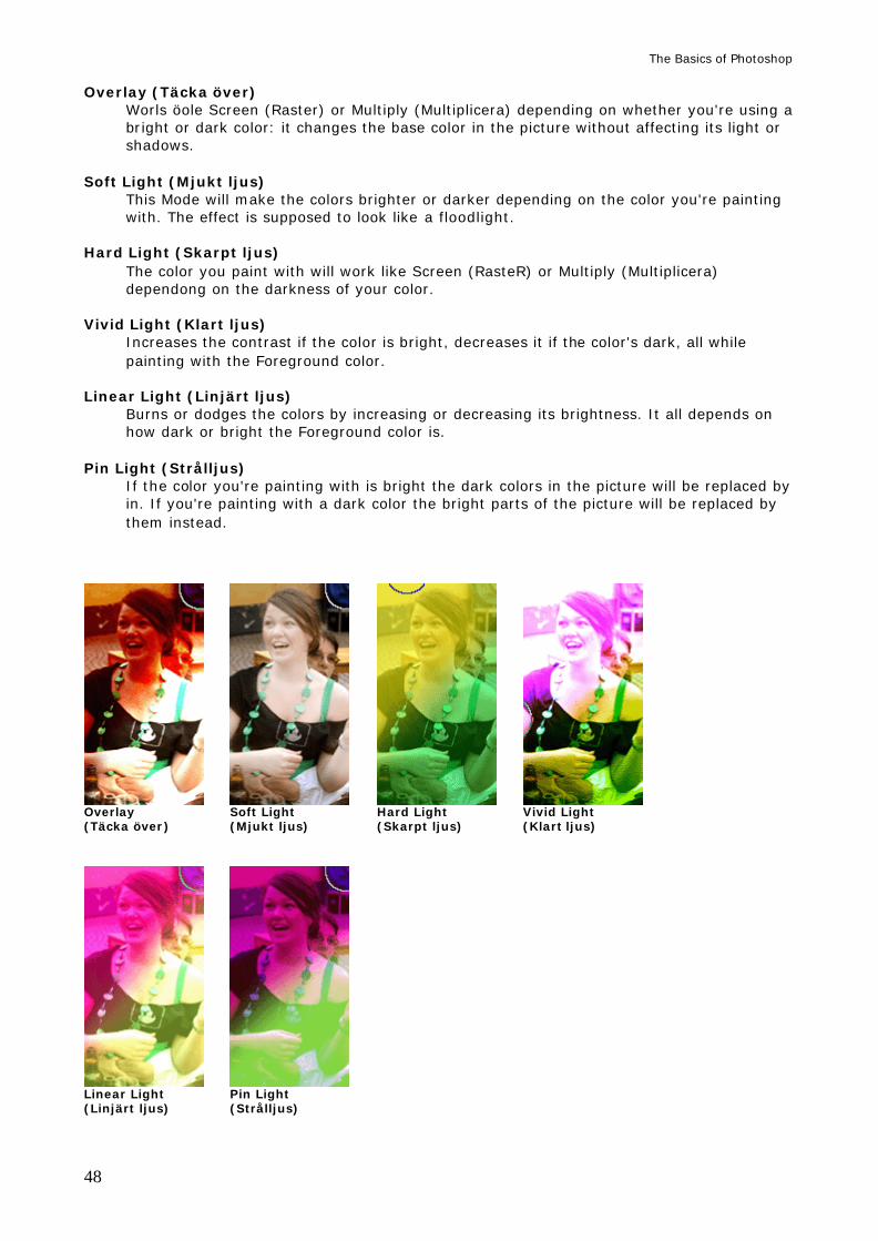
The Basics of Photoshop
48
Overlay (Täcka över) Worls öole Screen (Raster) or Multiply (Multiplicera) depending on whether you're using a bright or dark color: it changes the base color in the picture without affecting its light or shadows.
Soft Light (Mjukt ljus)
This Mode will make the colors brighter or darker depending on the color you're painting with. The effect is supposed to look like a floodlight.
Hard Light (Skarpt ljus)
The color you paint with will work like Screen (RasteR) or Multiply (Multiplicera) dependong on the darkness of your color.
Vivid Light (Klart ljus)
Increases the contrast if the color is bright, decreases it if the color's dark, all while painting with the Foreground color.
Linear Light (Linjärt ljus)
Burns or dodges the colors by increasing or decreasing its brightness. It all depends on how dark or bright the Foreground color is.
Pin Light (Strålljus)
If the color you're painting with is bright the dark colors in the picture will be replaced by in. If you're painting with a dark color the bright parts of the picture will be replaced by them instead.
Overlay Soft Light Hard Light Vivid Light (Täcka över) (Mjukt ljus) (Skarpt ljus) (Klart ljus)
Linear Light Pin Light (Linjärt ljus) (Strålljus)
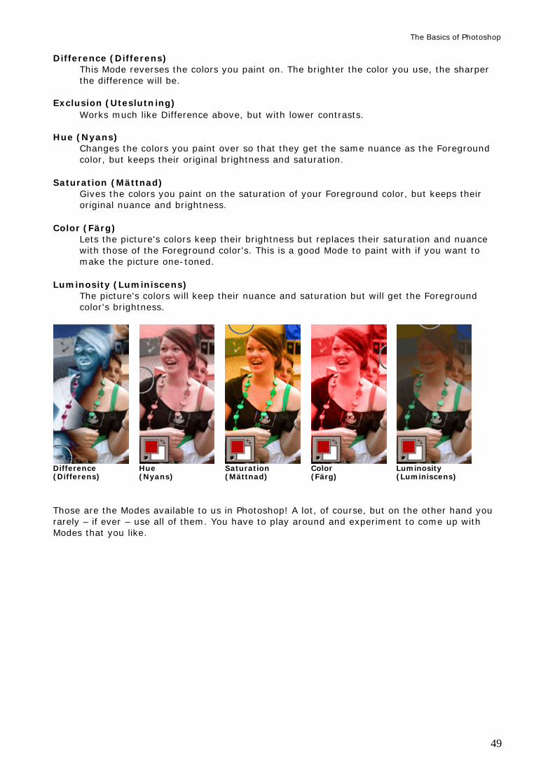
The Basics of Photoshop
49
Difference (Differens) This Mode reverses the colors you paint on. The brighter the color you use, the sharper the difference will be.
Exclusion (Uteslutning)
Works much like Difference above, but with lower contrasts. Hue (Nyans)
Changes the colors you paint over so that they get the same nuance as the Foreground color, but keeps their original brightness and saturation.
Saturation (Mättnad)
Gives the colors you paint on the saturation of your Foreground color, but keeps their original nuance and brightness.
Color (Färg)
Lets the picture's colors keep their brightness but replaces their saturation and nuance with those of the Foreground color's. This is a good Mode to paint with if you want to make the picture one-toned.
Luminosity (Luminiscens)
The picture's colors will keep their nuance and saturation but will get the Foreground color's brightness.
Difference Hue Saturation Color Luminosity (Differens) (Nyans) (Mättnad) (Färg) (Luminiscens) Those are the Modes available to us in Photoshop! A lot, of course, but on the other hand you rarely – if ever – use all of them. You have to play around and experiment to come up with Modes that you like.
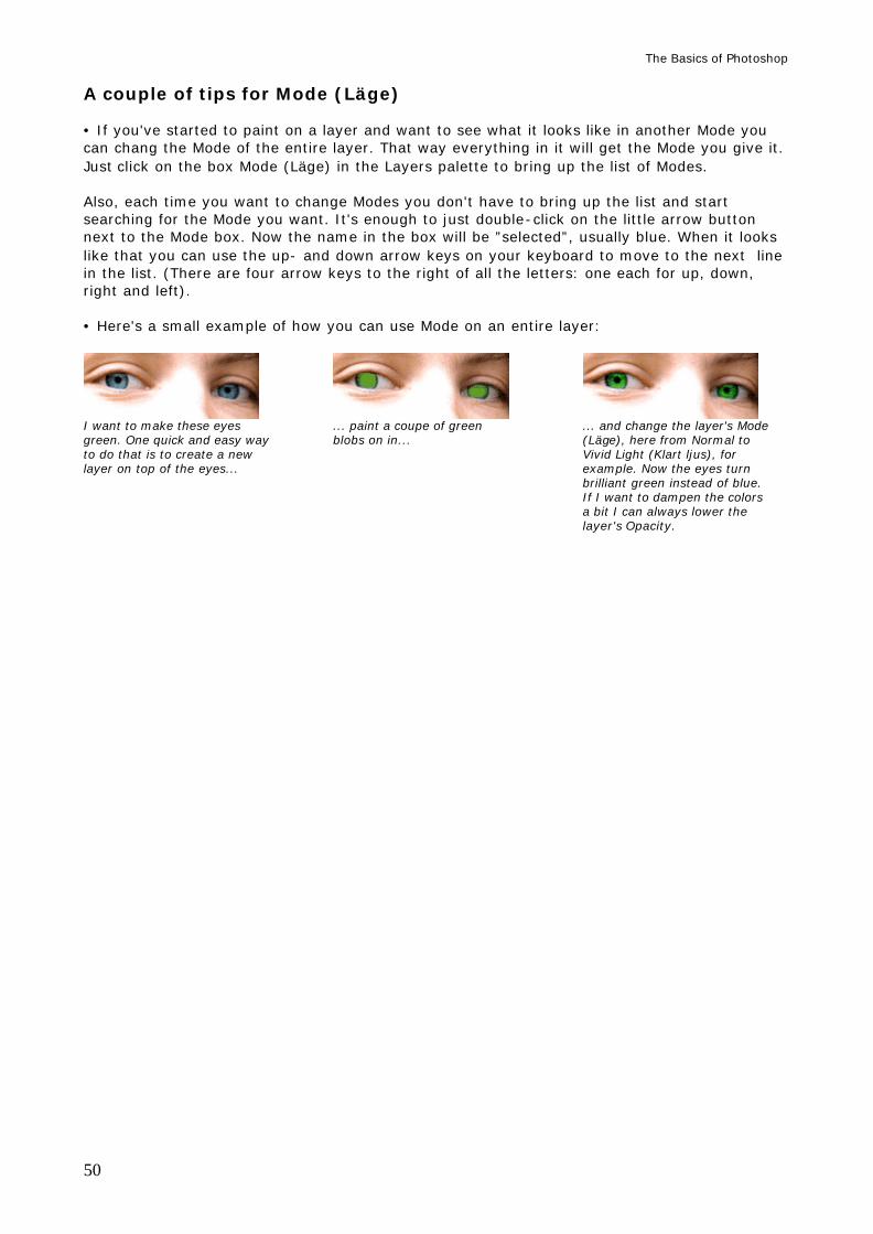
The Basics of Photoshop
50
A couple of tips for Mode (Läge) • If you've started to paint on a layer and want to see what it looks like in another Mode you can chang the Mode of the entire layer. That way everything in it will get the Mode you give it. Just click on the box Mode (Läge) in the Layers palette to bring up the list of Modes. Also, each time you want to change Modes you don't have to bring up the list and start searching for the Mode you want. It's enough to just double-click on the little arrow button next to the Mode box. Now the name in the box will be ”selected”, usually blue. When it looks like that you can use the up- and down arrow keys on your keyboard to move to the next line in the list. (There are four arrow keys to the right of all the letters: one each for up, down, right and left). • Here's a small example of how you can use Mode on an entire layer:
I want to make these eyes ... paint a coupe of green ... and change the layer's Mode green. One quick and easy way blobs on in... (Läge), here from Normal to to do that is to create a new Vivid Light (Klart ljus), for layer on top of the eyes... example. Now the eyes turn brilliant green instead of blue. If I want to dampen the colors a bit I can always lower the layer's Opacity.
The Basics of Photoshop
51
LAYER STYLES (LAGERSTILAR) I'm sure you've seen text with a shadow behind it, or maybe something in a picture that seems to glow. Effects like these are easy to do with Layer Styles. If have something on a layer you can add new Layer Styles on it. You do this by picking the layer you want to add the styles onto and then clicking the little black button with an ”f” on at the bottom of the Layers palette (in Photoshop 7), or the button that says ”fx” (in Photoshop CS, CS2 or CS3), also at the bottom of the Layers palette. Now a list of styles will pop up. Click on the one you want your layer to have. Now the window Layer Style (Lagerstil) is shown. You can also enter Layer > Layer Styles (Lager > Lagerstil) and pick a style right out of the list. You can add as many styles as you want on any layer. All you have to do is click on them in the list, or check their boxes in the window Layer Styles. These are: • Blending Options (Blandningsalternativ) • Drop Shadow (Skugga) • Inner Shadow (Innerskugga) • Outer Glow (Ytterglöd) • Inner Glow (Innerglöd) • Bevel and Emboss (Avfasning och relief) Concour (Kontur) Texture (Struktur) • Satin (Satäng) • Color Overlay (Färgövertäckning) • Gradient Overlay (Övertäckning för övertoning) • Pattern Overlay (Mönsterövertäckning) • Stroke (Linje) At the end of this section there's a couple of points on how to handle layers that has some styles on them. Blending Options (Blandningsalternativ)
This is basically the same as changing a layer's Mode (Läge), only with a lot more options. The only option you have to care about here is the box Blending Options (Blandningsläge), which lets you choose what Mode the layer should have, and the button for Opacity (Opacitet), which lets you set the layer's transparency.
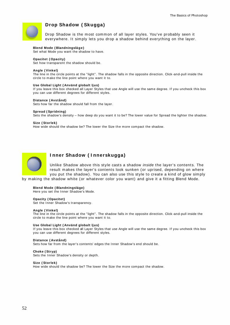
The Basics of Photoshop
52
Drop Shadow (Skugga) Drop Shadow is the most common of all layer styles. You've probably seen it everywhere. It simply lets you drop a shadow behind everything on the layer.
Blend Mode (Blandningsläge) Set what Mode you want the shadow to have. Opacitet (Opacity) Set how transparent the shadow should be. Angle (Vinkel) The line in the circle points at the ”light”. The shadow falls in the opposite direction. Click-and-pull inside the circle to make the line point where you want it to. Use Global Light (Använd globalt ljus) If you leave this box checked all Layer Styles that use Angle will use the same degree. If you uncheck this box you can use different degrees for different styles. Distance (Avstånd) Sets how far the shadow should fall from the layer. Spread (Spridning) Sets the shadow's density – how deep do you want it to be? The lower value for Spread the lighter the shadow. Size (Storlek) How wide should the shadow be? The lower the Size the more compact the shadow.
Inner Shadow (Innerskugga) Unlike Shadow above this style casts a shadow inside the layer's contents. The result makes the layer's contents look sunken (or uprised, depending on where you put the shadow). You can also use this style to create a kind of glow simply
by making the shadow white (or whatever color you want) and give it a fitting Blend Mode.
Blend Mode (Blandningsläge) Here you set the Inner Shadow's Mode. Opacity (Opacitet) Set the Inner Shadow's transparency. Angle (Vinkel) The line in the circle points at the ”light”. The shadow falls in the opposite direction. Click-and-pull inside the circle to make the line point where you want it to. Use Global Light (Använd globalt ljus) If you leave this box checked all Layer Styles that use Angle will use the same degree. If you uncheck this box you can use different degrees for different styles. Distance (Avstånd) Sets how far from the layer's contents' edges the Inner Shadow's end should be. Choke (Stryp) Sets the Inner Shadow's density or depth. Size (Storlek) How wide should the shadow be? The lower the Size the more compact the shadow.
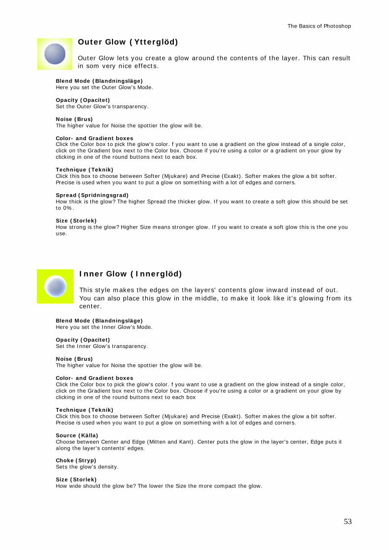
The Basics of Photoshop
53
Outer Glow (Ytterglöd) Outer Glow lets you create a glow around the contents of the layer. This can result in som very nice effects.
Blend Mode (Blandningsläge) Here you set the Outer Glow's Mode. Opacity (Opacitet) Set the Outer Glow's transparency. Noise (Brus) The higher value for Noise the spottier the glow will be. Color- and Gradient boxes Click the Color box to pick the glow's color. f you want to use a gradient on the glow instead of a single color, click on the Gradient box next to the Color box. Choose if you're using a color or a gradient on your glow by clicking in one of the round buttons next to each box. Technique (Teknik) Click this box to choose between Softer (Mjukare) and Precise (Exakt). Softer makes the glow a bit softer. Precise is used when you want to put a glow on something with a lot of edges and corners. Spread (Spridningsgrad) How thick is the glow? The higher Spread the thicker glow. If you want to create a soft glow this should be set to 0%. Size (Storlek) How strong is the glow? Higher Size means stronger glow. If you want to create a soft glow this is the one you use.
Inner Glow (Innerglöd) This style makes the edges on the layers' contents glow inward instead of out. You can also place this glow in the middle, to make it look like it's glowing from its center.
Blend Mode (Blandningsläge) Here you set the Inner Glow's Mode. Opacity (Opacitet) Set the Inner Glow's transparency. Noise (Brus) The higher value for Noise the spottier the glow will be. Color- and Gradient boxes Click the Color box to pick the glow's color. f you want to use a gradient on the glow instead of a single color, click on the Gradient box next to the Color box. Choose if you're using a color or a gradient on your glow by clicking in one of the round buttons next to each box Technique (Teknik) Click this box to choose between Softer (Mjukare) and Precise (Exakt). Softer makes the glow a bit softer. Precise is used when you want to put a glow on something with a lot of edges and corners. Source (Källa) Choose between Center and Edge (Mitten and Kant). Center puts the glow in the layer's center, Edge puts it along the layer's contents' edges. Choke (Stryp) Sets the glow's density. Size (Storlek) How wide should the glow be? The lower the Size the more compact the glow.
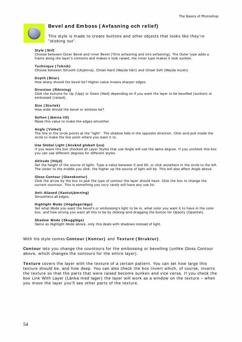
The Basics of Photoshop
54
Bevel and Emboss (Avfasning och relief) This style is made to create buttons and other objects that looks like they're ”sticking out”.
Style (Stil) Choose between Outer Bevel and Inner Bevel (Yttre avfasning and inre avfasning). The Outer type adds a frame along the layer's contents and makes it look raised, the Inner type makes it look sunken. Technique (Teknik) Choose between Smooth (Utjämna), Chisel Hard (Mejsla hårt) and Chisel Soft (Mejsla mjukt). Depth (Bitar) How sharp should the bevel be? Higher value means sharper edges. Direction (Riktning) Click the buttons for Up (Upp) or Down (Ned) depending on if you want the layer to be bevelled (sunken) or embossed (raised). Size (Storlek) How wide should the bevel or emboss be? Soften (Jämna till) Raise this value to make the edges smoother. Angle (Vinkel) The line in the circle points at the ”light”. The shadow falls in the opposite direction. Click-and-pull inside the circle to make the line point where you want it to. Use Global Light (Använd globalt ljus) If you leave this box checked all Layer Styles that use Angle will use the same degree. If you uncheck this box you can use different degrees for different styles. Altitude (Höjd) Set the height of the source of ligiht. Type a value between 0 and 90, or click anywhere in the circle to the left. The closer to the middle you click, the higher up the source of light will be. This will also affect Angle above. Gloss Contour (Glanskontur) Click the arrow by the box to pick the type of contour the layer should have. Click the box to change the current countour. This is something you very rarely will have any use for. Anti-Aliased (Kantutjämning) Smoothens all edges. Highlight Mode (Högdagerläge) Set what Mode you want the bevel's or embossing's light to be in, what color you want it to have in the color box, and how strong you want all this to be by clicking-and-dragging the button for Opacity (Opacitet). Shadow Mode (Skuggläge) Same as Highlight Mode above, only this deals with shadows instead of light.
With his style comes Contour (Kontur) and Texture (Struktur). Contour lets you change the countours for the embossing or bevelling (unlike Gloss Contour above, which changes the contours for the entire layer). Texture covers the layer with the texture of a certain pattern. You can set how large this texture should be, and how deep. You can also check the box Invert which, of course, inverts the texture so that the parts that were raised become sunken and vice versa. If you check the box Link With Layer (Länka med lager) the layer will work as a window on the texture – when you move the layer you'll see other parts of the texture.
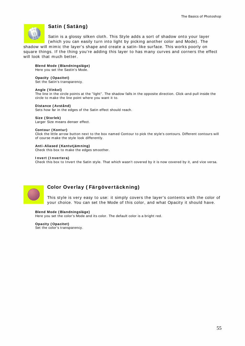
The Basics of Photoshop
55
Satin (Satäng) Satin is a glossy silken cloth. This Style adds a sort of shadow onto your layer (which you can easily turn into light by picking another color and Mode). The
shadow will mimic the layer's shape and create a satin-like surface. This works poorly on square things. If the thing you're adding this layer to has many curves and corners the effect will look that much better.
Blend Mode (Blandningsläge) Here you set the Sastin's Mode. Opacity (Opacitet) Set the Satin's transparency. Angle (Vinkel) The line in the circle points at the ”light”. The shadow falls in the opposite direction. Click-and-pull inside the circle to make the line point where you want it to. Distance (Avstånd) Sets how far in the edges of the Satin effect should reach. Size (Storlek) Larger Size means denser effect. Contour (Kontur) Click the little arrow button next to the box named Contour to pick the style's contours. Different contours will of course make the style look differently. Anti-Aliased (Kantutjämning) Check this box to make the edges smoother. Invert (Invertera) Check this box to Invert the Satin style. That which wasn't covered by it is now covered by it, and vice versa.
Color Overlay (Färgövertäckning) This style is very easy to use: it simply covers the layer's contents with the color of your choice. You can set the Mode of this color, and what Opacity it should have.
Blend Mode (Blandningsläge) Here you set the color's Mode and its color. The default color is a bright red. Opacity (Opacitet) Set the color's transparency.
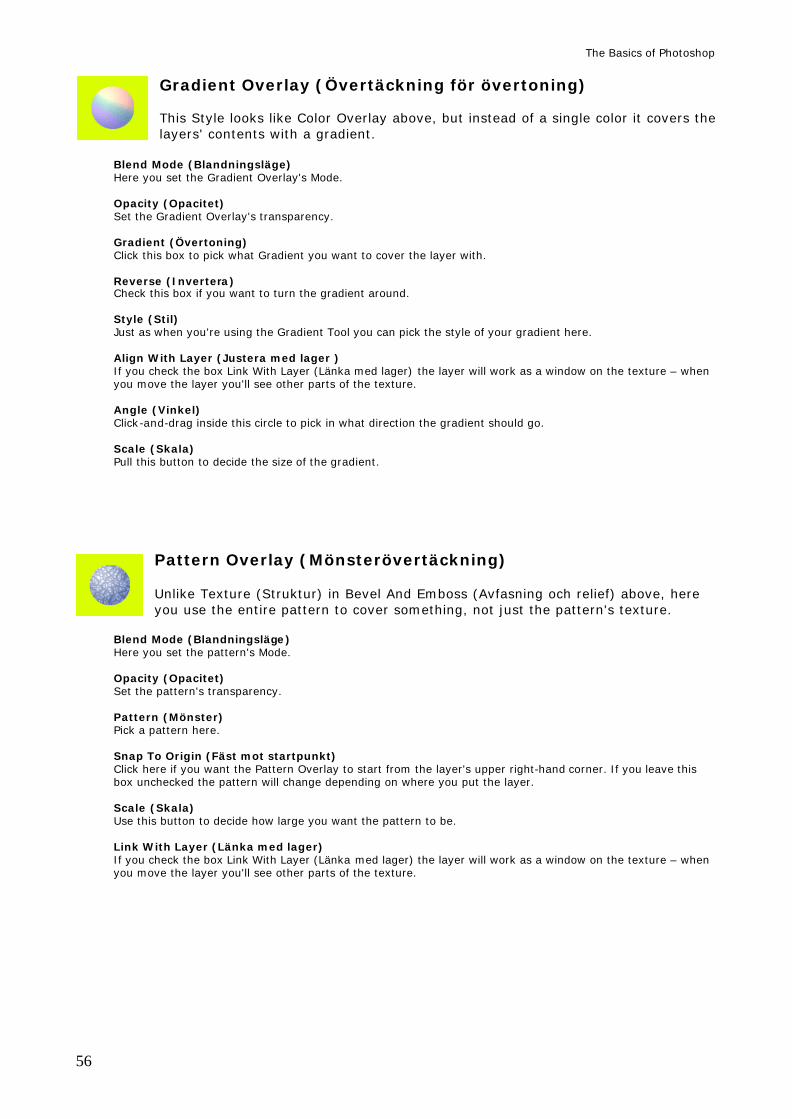
The Basics of Photoshop
56
Gradient Overlay (Övertäckning för övertoning) This Style looks like Color Overlay above, but instead of a single color it covers the layers' contents with a gradient.
Blend Mode (Blandningsläge) Here you set the Gradient Overlay's Mode. Opacity (Opacitet) Set the Gradient Overlay's transparency. Gradient (Övertoning) Click this box to pick what Gradient you want to cover the layer with. Reverse (Invertera) Check this box if you want to turn the gradient around. Style (Stil) Just as when you're using the Gradient Tool you can pick the style of your gradient here. Align With Layer (Justera med lager ) If you check the box Link With Layer (Länka med lager) the layer will work as a window on the texture – when you move the layer you'll see other parts of the texture. Angle (Vinkel) Click-and-drag inside this circle to pick in what direction the gradient should go. Scale (Skala) Pull this button to decide the size of the gradient.
Pattern Overlay (Mönsterövertäckning) Unlike Texture (Struktur) in Bevel And Emboss (Avfasning och relief) above, here you use the entire pattern to cover something, not just the pattern's texture.
Blend Mode (Blandningsläge) Here you set the pattern's Mode. Opacity (Opacitet) Set the pattern's transparency. Pattern (Mönster) Pick a pattern here. Snap To Origin (Fäst mot startpunkt) Click here if you want the Pattern Overlay to start from the layer's upper right-hand corner. If you leave this box unchecked the pattern will change depending on where you put the layer. Scale (Skala) Use this button to decide how large you want the pattern to be. Link With Layer (Länka med lager) If you check the box Link With Layer (Länka med lager) the layer will work as a window on the texture – when you move the layer you'll see other parts of the texture.
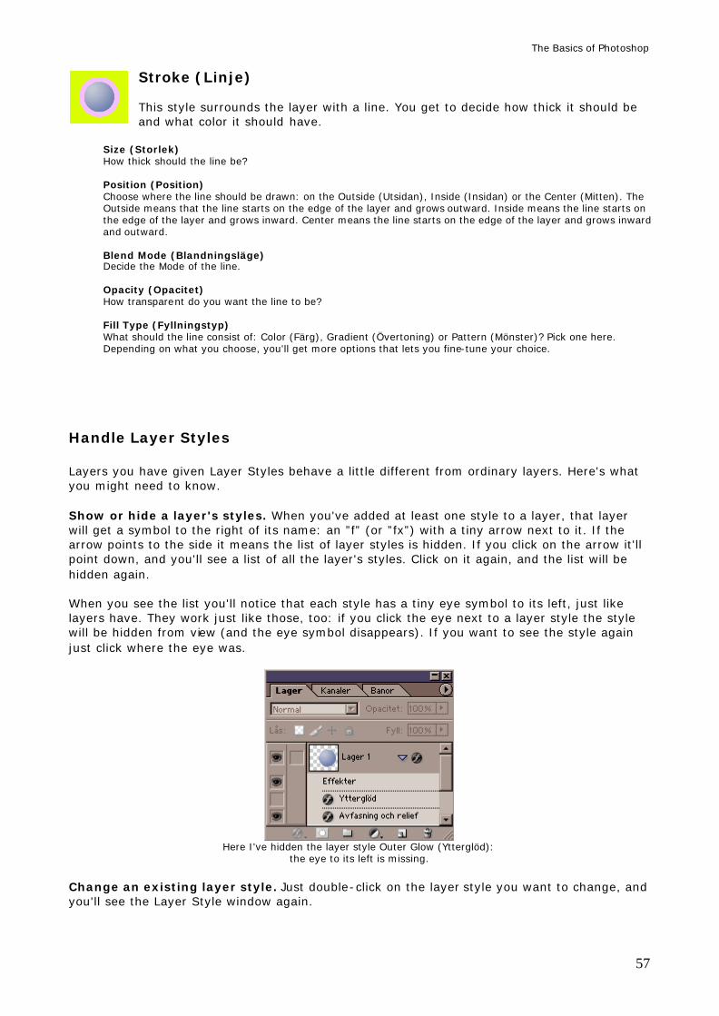
The Basics of Photoshop
57
Stroke (Linje) This style surrounds the layer with a line. You get to decide how thick it should be and what color it should have.
Size (Storlek) How thick should the line be? Position (Position) Choose where the line should be drawn: on the Outside (Utsidan), Inside (Insidan) or the Center (Mitten). The Outside means that the line starts on the edge of the layer and grows outward. Inside means the line starts on the edge of the layer and grows inward. Center means the line starts on the edge of the layer and grows inward and outward. Blend Mode (Blandningsläge) Decide the Mode of the line. Opacity (Opacitet) How transparent do you want the line to be? Fill Type (Fyllningstyp) What should the line consist of: Color (Färg), Gradient (Övertoning) or Pattern (Mönster)? Pick one here. Depending on what you choose, you'll get more options that lets you fine-tune your choice.
Handle Layer Styles Layers you have given Layer Styles behave a little different from ordinary layers. Here's what you might need to know. Show or hide a layer's styles. When you've added at least one style to a layer, that layer will get a symbol to the right of its name: an ”f” (or ”fx”) with a tiny arrow next to it. If the arrow points to the side it means the list of layer styles is hidden. If you click on the arrow it'll point down, and you'll see a list of all the layer's styles. Click on it again, and the list will be hidden again. When you see the list you'll notice that each style has a tiny eye symbol to its left, just like layers have. They work just like those, too: if you click the eye next to a layer style the style will be hidden from view (and the eye symbol disappears). If you want to see the style again just click where the eye was.
Here I've hidden the layer style Outer Glow (Ytterglöd):
the eye to its left is missing. Change an existing layer style. Just double-click on the layer style you want to change, and you'll see the Layer Style window again.
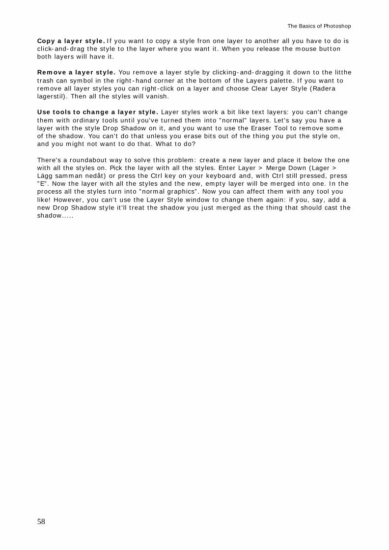
The Basics of Photoshop
58
Copy a layer style. If you want to copy a style fron one layer to another all you have to do is click-and-drag the style to the layer where you want it. When you release the mouse button both layers will have it. Remove a layer style. You remove a layer style by clicking-and-dragging it down to the litthe trash can symbol in the right-hand corner at the bottom of the Layers palette. If you want to remove all layer styles you can right-click on a layer and choose Clear Layer Style (Radera lagerstil). Then all the styles will vanish. Use tools to change a layer style. Layer styles work a bit like text layers: you can't change them with ordinary tools until you've turned them into ”normal” layers. Let's say you have a layer with the style Drop Shadow on it, and you want to use the Eraser Tool to remove some of the shadow. You can't do that unless you erase bits out of the thing you put the style on, and you might not want to do that. What to do? There's a roundabout way to solve this problem: create a new layer and place it below the one with all the styles on. Pick the layer with all the styles. Enter Layer > Merge Down (Lager > Lägg samman nedåt) or press the Ctrl key on your keyboard and, with Ctrl still pressed, press ”E”. Now the layer with all the styles and the new, empty layer will be merged into one. In the process all the styles turn into ”normal graphics”. Now you can affect them with any tool you like! However, you can't use the Layer Style window to change them again: if you, say, add a new Drop Shadow style it'll treat the shadow you just merged as the thing that should cast the shadow.....
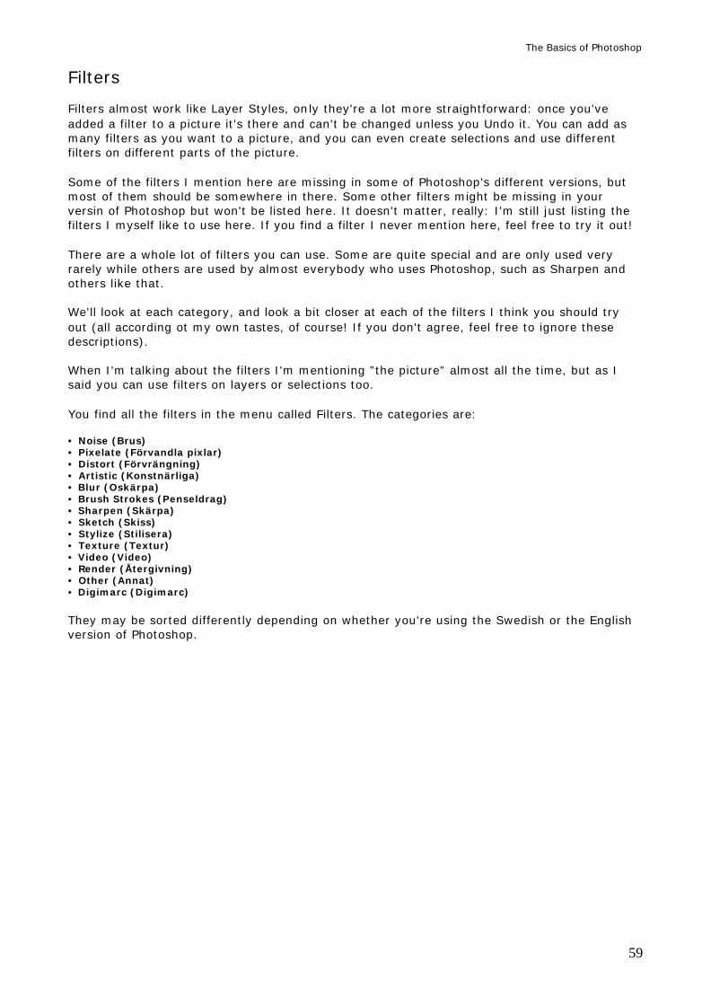
The Basics of Photoshop
59
Filters Filters almost work like Layer Styles, only they're a lot more straightforward: once you've added a filter to a picture it's there and can't be changed unless you Undo it. You can add as many filters as you want to a picture, and you can even create selections and use different filters on different parts of the picture. Some of the filters I mention here are missing in some of Photoshop's different versions, but most of them should be somewhere in there. Some other filters might be missing in your versin of Photoshop but won't be listed here. It doesn't matter, really: I'm still just listing the filters I myself like to use here. If you find a filter I never mention here, feel free to try it out! There are a whole lot of filters you can use. Some are quite special and are only used very rarely while others are used by almost everybody who uses Photoshop, such as Sharpen and others like that. We'll look at each category, and look a bit closer at each of the filters I think you should try out (all according ot my own tastes, of course! If you don't agree, feel free to ignore these descriptions). When I'm talking about the filters I'm mentioning ”the picture” almost all the time, but as I said you can use filters on layers or selections too. You find all the filters in the menu called Filters. The categories are: • Noise (Brus) • Pixelate (Förvandla pixlar) • Distort (Förvrängning) • Artistic (Konstnärliga) • Blur (Oskärpa) • Brush Strokes (Penseldrag) • Sharpen (Skärpa) • Sketch (Skiss) • Stylize (Stilisera) • Texture (Textur) • Video (Video) • Render (Återgivning) • Other (Annat) • Digimarc (Digimarc) They may be sorted differently depending on whether you're using the Swedish or the English version of Photoshop.
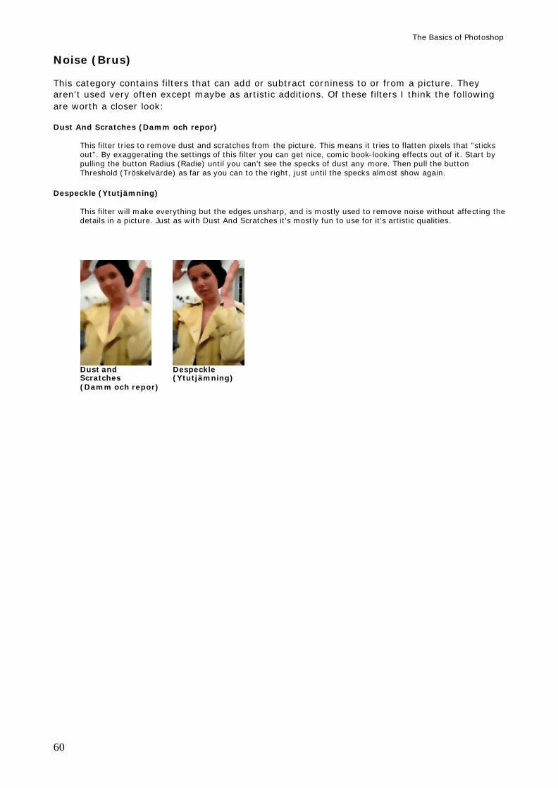
The Basics of Photoshop
60
Noise (Brus) This category contains filters that can add or subtract corniness to or from a picture. They aren't used very often except maybe as artistic additions. Of these filters I think the following are worth a closer look: Dust And Scratches (Damm och repor)
This filter tries to remove dust and scratches from the picture. This means it tries to flatten pixels that ”sticks out”. By exaggerating the settings of this filter you can get nice, comic book-looking effects out of it. Start by pulling the button Radius (Radie) until you can't see the specks of dust any more. Then pull the button Threshold (Tröskelvärde) as far as you can to the right, just until the specks almost show again.
Despeckle (Ytutjämning) This filter will make everything but the edges unsharp, and is mostly used to remove noise without affecting the details in a picture. Just as with Dust And Scratches it's mostly fun to use for it's artistic qualities.
Dust and Despeckle Scratches (Ytutjämning) (Damm och repor)
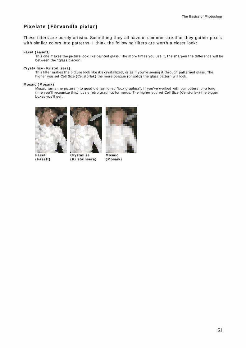
The Basics of Photoshop
61
Pixelate (Förvandla pixlar) These filters are purely artistic. Something they all have in common are that they gather pixels with similar colors into patterns. I think the following filters are worth a closer look: Facet (Fasett)
This one makes the picture look like painted glass. The more times you use it, the sharpen the difference will be between the ”glass pieces”.
Crystallize (Kristallisera) This filter makes the picture look like it's crystallized, or as if you're seeing it through patterned glass. The higher you set Cell Size (Cellstorlek) the more opaque (or solid) the glass pattern will look.
Mosaic (Mosaik) Mosaic turns the picture into good old fashioned ”box graphics”. If you've worked with computers for a long time you'll recognize this: lovely retro graphics for nerds. The higher you set Cell Size (Cellstorlek) the bigger boxes you'll get.
Facet Crystallize Mosaic (Fasett) (Kristallisera) (Mosaik)
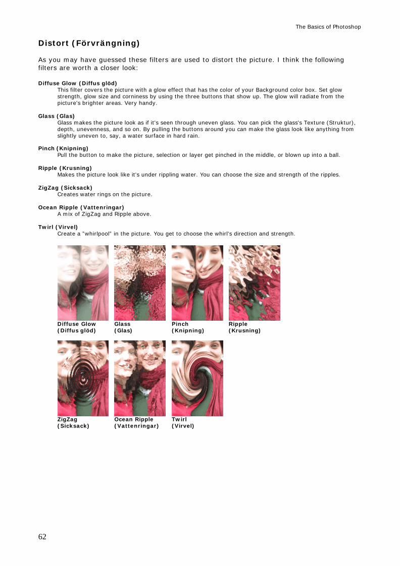
The Basics of Photoshop
62
Distort (Förvrängning) As you may have guessed these filters are used to distort the picture. I think the following filters are worth a closer look: Diffuse Glow (Diffus glöd)
This filter covers the picture with a glow effect that has the color of your Background color box. Set glow strength, glow size and corniness by using the three buttons that show up. The glow will radiate from the picture's brighter areas. Very handy.
Glass (Glas)
Glass makes the picture look as if it's seen through uneven glass. You can pick the glass's Texture (Struktur), depth, unevenness, and so on. By pulling the buttons around you can make the glass look like anything from slightly uneven to, say, a water surface in hard rain.
Pinch (Knipning)
Pull the button to make the picture, selection or layer get pinched in the middle, or blown up into a ball.
Ripple (Krusning) Makes the picture look like it's under rippling water. You can choose the size and strength of the ripples.
ZigZag (Sicksack)
Creates water rings on the picture. Ocean Ripple (Vattenringar)
A mix of ZigZag and Ripple above. Twirl (Virvel)
Create a ”whirlpool” in the picture. You get to choose the whirl's direction and strength.
Diffuse Glow Glass Pinch Ripple (Diffus glöd) (Glas) (Knipning) (Krusning)
ZigZag Ocean Ripple Twirl (Sicksack) (Vattenringar) (Virvel)
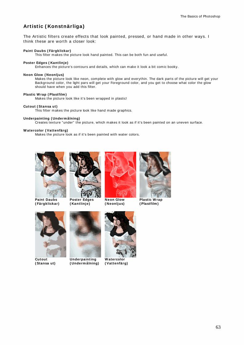
The Basics of Photoshop
63
Artistic (Konstnärliga) The Artistic filters create effects that look painted, pressed, or hand made in other ways. I think these are worth a closer look: Paint Daubs (Färgklickar)
This filter makes the picture look hand painted. This can be both fun and useful. Poster Edges (Kantlinje)
Enhances the picture's contours and details, which can make it look a bit comic booky. Neon Glow (Neonljus)
Makes the picture look like neon, complete with glow and everythin. The dark parts of the picture will get your Background color, the light pars will get your Foreground color, and you get to choose what color the glow should have when you add this filter.
Plastic Wrap (Plastfilm)
Makes the picture look like it's been wrapped in plastic! Cutout (Stansa ut)
This filter makes the picture look like hand made graphics. Underpainting (Undermålning)
Creates texture ”under” the picture, which makes it look as if it's been painted on an uneven surface. Watercolor (Vattenfärg)
Makes the picture look as if it's been painted with water colors.
Paint Daubs Poster Edges Neon Glow Plastic Wrap (Färgklickar) (Kantlinje) (Neonljus) (Plastfilm)
Cutout Underpainting Watercolor (Stansa ut) (Undermålning) (Vattenfärg)
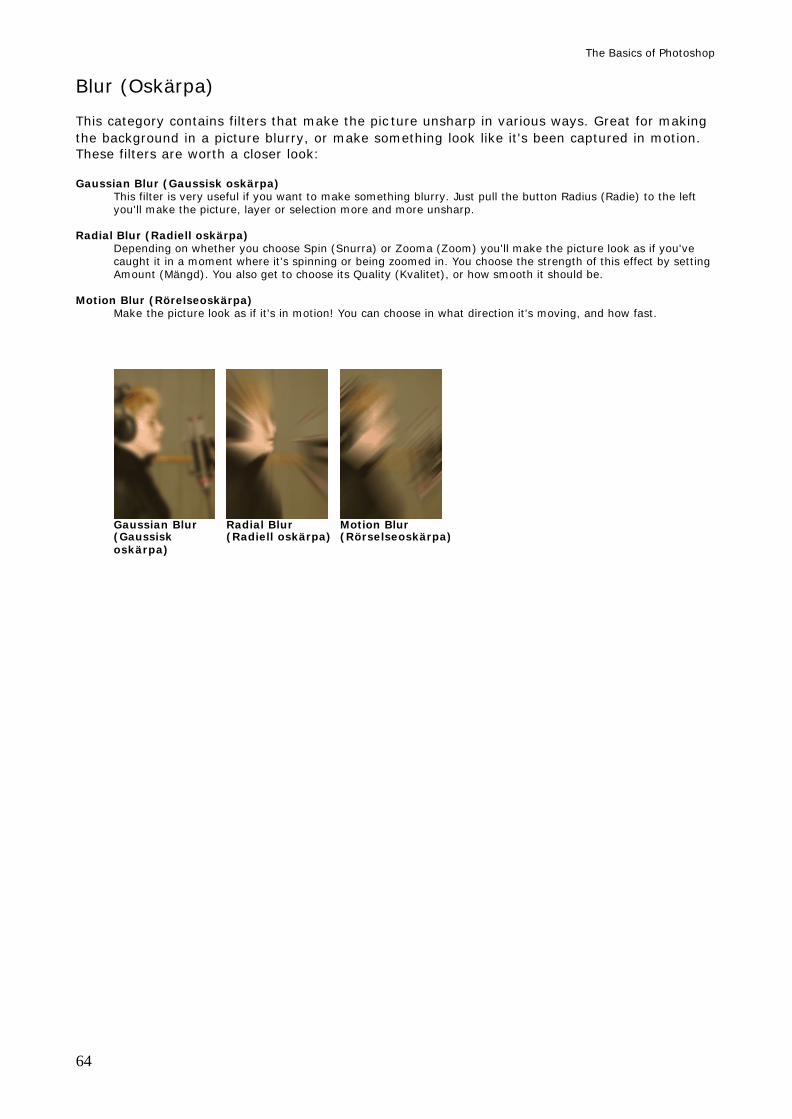
The Basics of Photoshop
64
Blur (Oskärpa) This category contains filters that make the pic ture unsharp in various ways. Great for making the background in a picture blurry, or make something look like it's been captured in motion. These filters are worth a closer look: Gaussian Blur (Gaussisk oskärpa)
This filter is very useful if you want to make something blurry. Just pull the button Radius (Radie) to the left you'll make the picture, layer or selection more and more unsharp.
Radial Blur (Radiell oskärpa)
Depending on whether you choose Spin (Snurra) or Zooma (Zoom) you'll make the picture look as if you've caught it in a moment where it's spinning or being zoomed in. You choose the strength of this effect by setting Amount (Mängd). You also get to choose its Quality (Kvalitet), or how smooth it should be.
Motion Blur (Rörelseoskärpa)
Make the picture look as if it's in motion! You can choose in what direction it's moving, and how fast.
Gaussian Blur Radial Blur Motion Blur (Gaussisk (Radiell oskärpa) (Rörselseoskärpa) oskärpa)
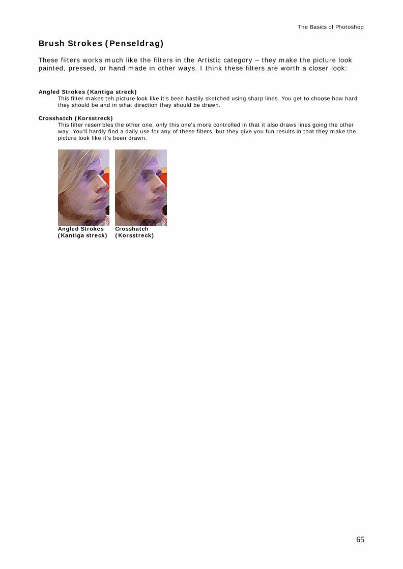
The Basics of Photoshop
65
Brush Strokes (Penseldrag) These filters works much like the filters in the Artistic category – they make the picture look painted, pressed, or hand made in other ways. I think these filters are worth a closer look: Angled Strokes (Kantiga streck)
This filter makes teh picture look like it's been hastily sketched using sharp lines. You get to choose how hard they should be and in what direction they should be drawn.
Crosshatch (Korsstreck)
This filter resembles the other one, only this one's more controlled in that it also draws lines going the other way. You'll hardly find a daily use for any of these filters, but they give you fun results in that they make the picture look like it's been drawn.
Angled Strokes Crosshatch (Kantiga streck) (Korsstreck)
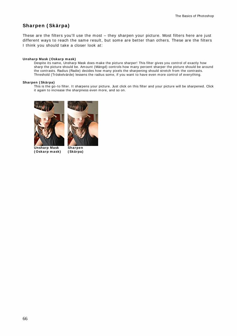
The Basics of Photoshop
66
Sharpen (Skärpa) These are the filters you'll use the most – they sharpen your picture. Most filters here are just different ways to reach the same result, but some are better than others. These are the filters I think you should take a closer look at: Unsharp Mask (Oskarp mask)
Despite its name, Unsharp Mask does make the picture sharper! This filter gives you control of exactly how sharp the picture should be. Amount (Mängd) controls how many percent sharper the picture should be around the contrasts. Radius (Radie) decides how many pixels the sharpening should stretch from the contrasts. Threshold (Tröskelvärde) lessens the radius some, if you want to have even more control of everything.
Sharpen (Skärpa)
This is the go-to filter. It sharpens your picture. Just click on this filter and your picture will be sharpened. Click it again to increase the sharpness even more, and so on.
Unsharp Mask Sharpen (Oskarp mask) (Skärpa)
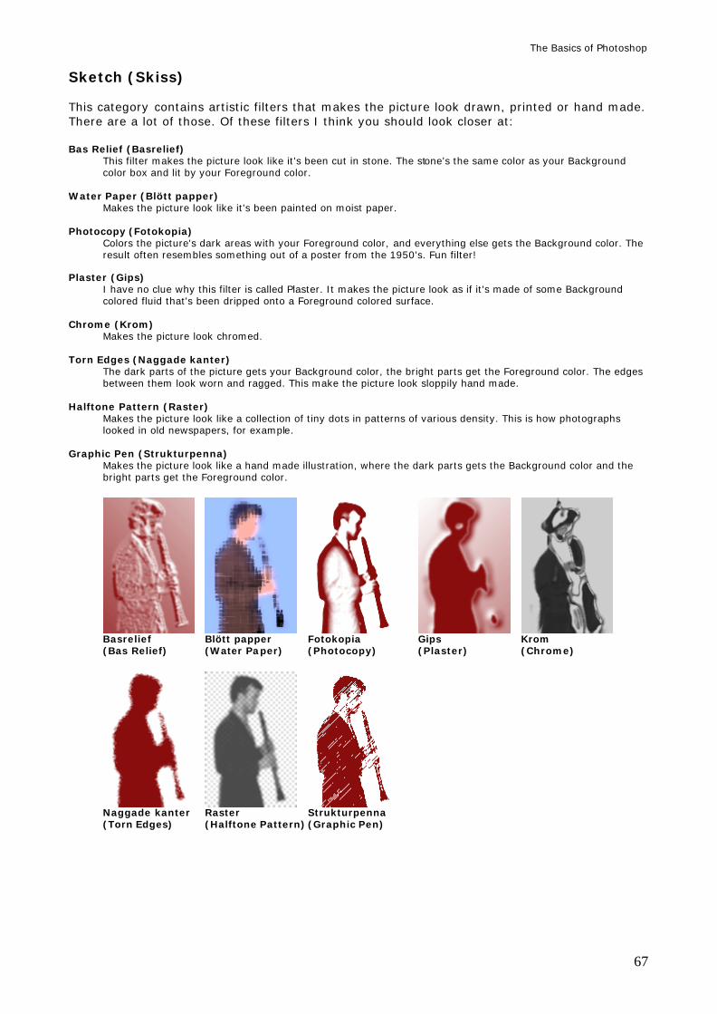
The Basics of Photoshop
67
Sketch (Skiss) This category contains artistic filters that makes the picture look drawn, printed or hand made. There are a lot of those. Of these filters I think you should look closer at: Bas Relief (Basrelief)
This filter makes the picture look like it's been cut in stone. The stone's the same color as your Background color box and lit by your Foreground color.
Water Paper (Blött papper)
Makes the picture look like it's been painted on moist paper. Photocopy (Fotokopia)
Colors the picture's dark areas with your Foreground color, and everything else gets the Background color. The result often resembles something out of a poster from the 1950's. Fun filter!
Plaster (Gips) I have no clue why this filter is called Plaster. It makes the picture look as if it's made of some Background colored fluid that's been dripped onto a Foreground colored surface.
Chrome (Krom)
Makes the picture look chromed. Torn Edges (Naggade kanter)
The dark parts of the picture gets your Background color, the bright parts get the Foreground color. The edges between them look worn and ragged. This make the picture look sloppily hand made.
Halftone Pattern (Raster)
Makes the picture look like a collection of tiny dots in patterns of various density. This is how photographs looked in old newspapers, for example.
Graphic Pen (Strukturpenna)
Makes the picture look like a hand made illustration, where the dark parts gets the Background color and the bright parts get the Foreground color.
Basrelief Blött papper Fotokopia Gips Krom (Bas Relief) (Water Paper) (Photocopy) (Plaster) (Chrome)
Naggade kanter Raster Strukturpenna (Torn Edges) (Halftone Pattern) (Graphic Pen)
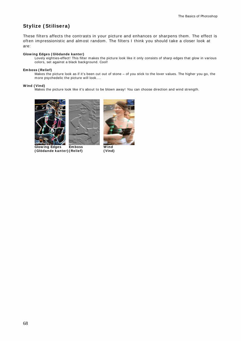
The Basics of Photoshop
68
Stylize (Stilisera) These filters affects the contrasts in your picture and enhances or sharpens them. The effect is often impressionistic and almost random. The filters I think you should take a closer look at are: Glowing Edges (Glödande kanter)
Lovely eighties-effect! This filter makes the picture look like it only consists of sharp edges that glow in various colors, set against a black background. Cool!
Emboss (Relief)
Makes the picture look as if it's been cut out of stone – of you stick to the lover values. The higher you go, the more psychedelic the picture will look....
Wind (Vind) Makes the picture look like it's about to be blown away! You can choose direction and wind strength.
Glowing Edges Emboss Wind (Glödande kanter) (Relief) (Vind)
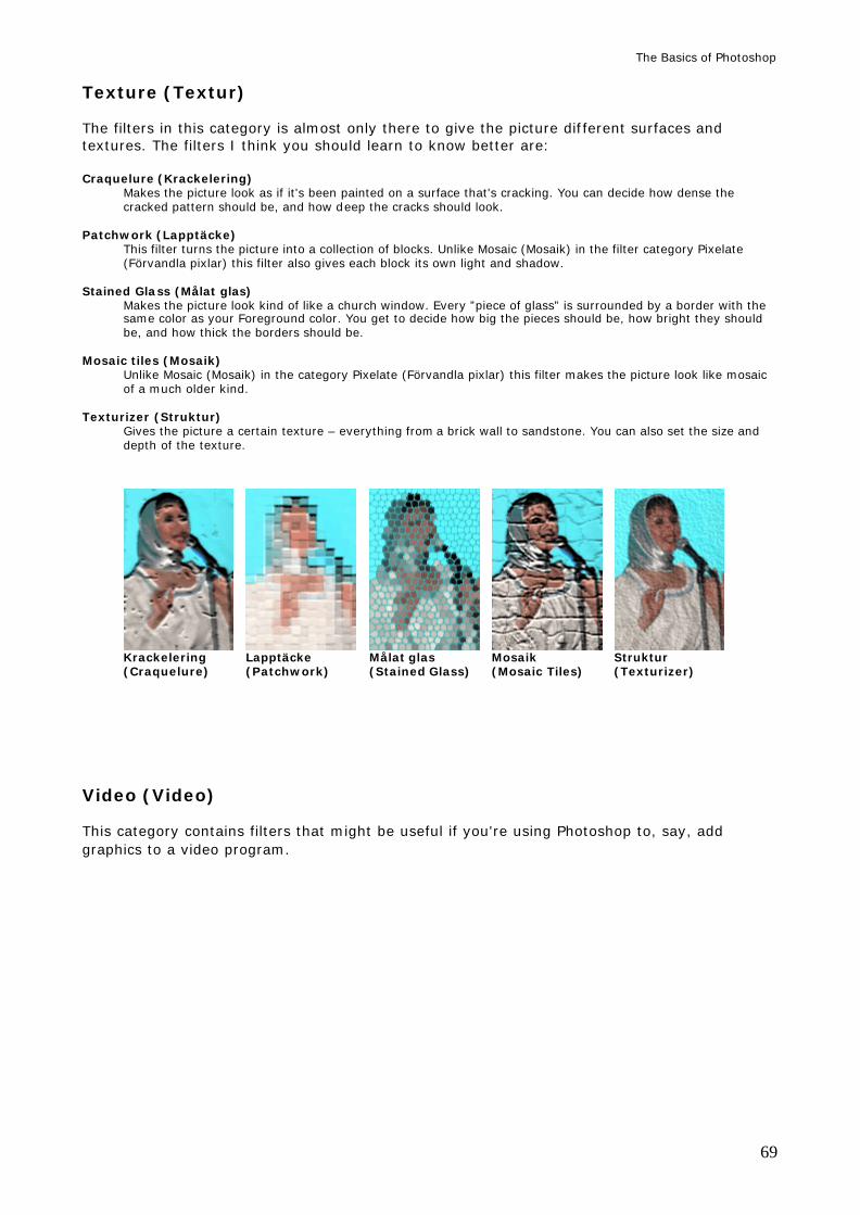
The Basics of Photoshop
69
Texture (Textur) The filters in this category is almost only there to give the picture different surfaces and textures. The filters I think you should learn to know better are: Craquelure (Krackelering)
Makes the picture look as if it's been painted on a surface that's cracking. You can decide how dense the cracked pattern should be, and how deep the cracks should look.
Patchwork (Lapptäcke)
This filter turns the picture into a collection of blocks. Unlike Mosaic (Mosaik) in the filter category Pixelate (Förvandla pixlar) this filter also gives each block its own light and shadow.
Stained Glass (Målat glas)
Makes the picture look kind of like a church window. Every ”piece of glass” is surrounded by a border with the same color as your Foreground color. You get to decide how big the pieces should be, how bright they should be, and how thick the borders should be.
Mosaic tiles (Mosaik) Unlike Mosaic (Mosaik) in the category Pixelate (Förvandla pixlar) this filter makes the picture look like mosaic of a much older kind.
Texturizer (Struktur) Gives the picture a certain texture – everything from a brick wall to sandstone. You can also set the size and depth of the texture.
Krackelering Lapptäcke Målat glas Mosaik Struktur (Craquelure) (Patchwork) (Stained Glass) (Mosaic Tiles) (Texturizer)
Video (Video) This category contains filters that might be useful if you're using Photoshop to, say, add graphics to a video program.
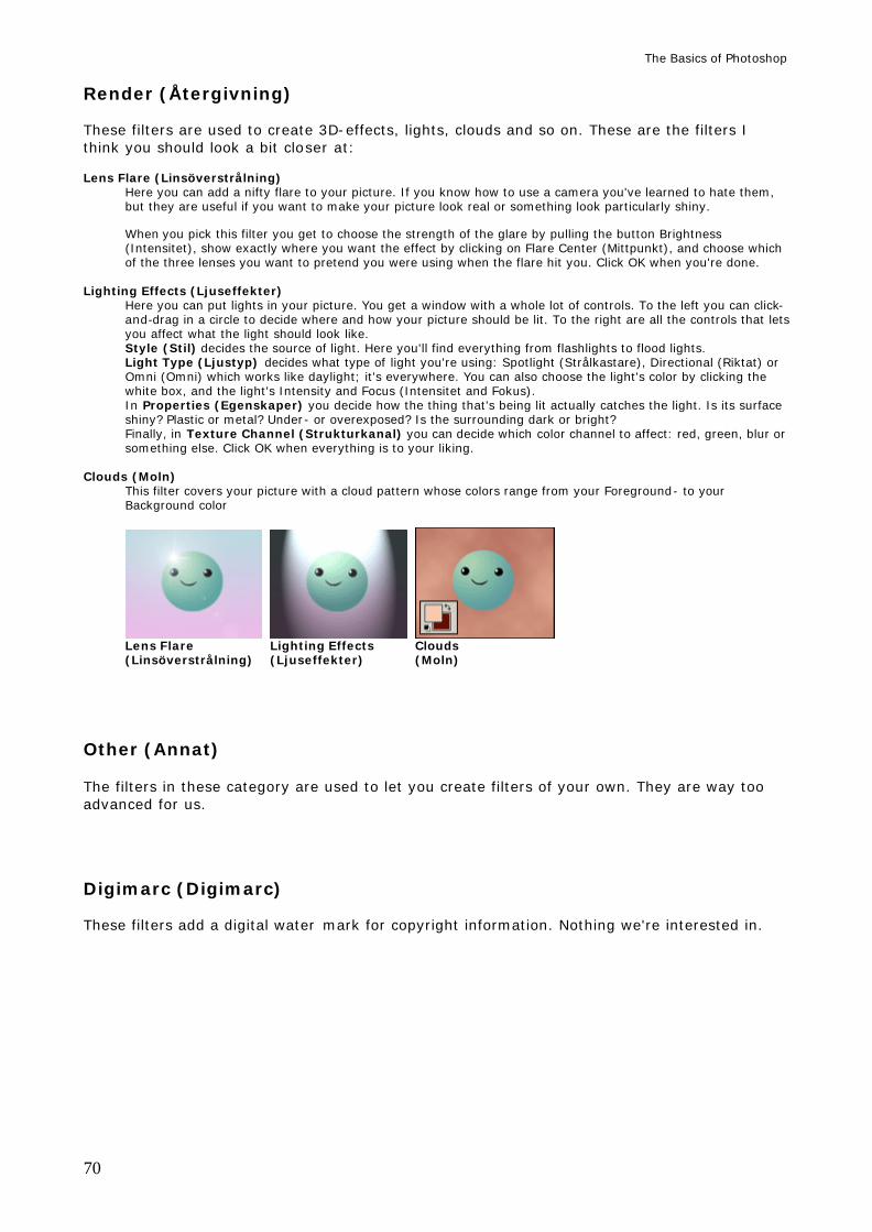
The Basics of Photoshop
70
Render (Återgivning) These filters are used to create 3D-effects, lights, clouds and so on. These are the filters I think you should look a bit closer at: Lens Flare (Linsöverstrålning)
Here you can add a nifty flare to your picture. If you know how to use a camera you've learned to hate them, but they are useful if you want to make your picture look real or something look particularly shiny. When you pick this filter you get to choose the strength of the glare by pulling the button Brightness (Intensitet), show exactly where you want the effect by clicking on Flare Center (Mittpunkt), and choose which of the three lenses you want to pretend you were using when the flare hit you. Click OK when you're done.
Lighting Effects (Ljuseffekter)
Here you can put lights in your picture. You get a window with a whole lot of controls. To the left you can click-and-drag in a circle to decide where and how your picture should be lit. To the right are all the controls that lets you affect what the light should look like. Style (Stil) decides the source of light. Here you'll find everything from flashlights to flood lights. Light Type (Ljustyp) decides what type of light you're using: Spotlight (Strålkastare), Directional (Riktat) or Omni (Omni) which works like daylight; it's everywhere. You can also choose the light's color by clicking the white box, and the light's Intensity and Focus (Intensitet and Fokus). In Properties (Egenskaper) you decide how the thing that's being lit actually catches the light. Is its surface shiny? Plastic or metal? Under- or overexposed? Is the surrounding dark or bright? Finally, in Texture Channel (Strukturkanal) you can decide which color channel to affect: red, green, blur or something else. Click OK when everything is to your liking.
Clouds (Moln) This filter covers your picture with a cloud pattern whose colors range from your Foreground- to your Background color
Lens Flare Lighting Effects Clouds (Linsöverstrålning) (Ljuseffekter) (Moln)
Other (Annat) The filters in these category are used to let you create filters of your own. They are way too advanced for us.
Digimarc (Digimarc) These filters add a digital water mark for copyright information. Nothing we're interested in.