Embed Size (px)
Citation preview

TESTING & OPTIMIZATION
FOR MOBILE DEVICES
A quick guide by the very fine folks at
Visual Website Optimizer

This guide contains
1. Introduction
2. Mobile and Tablet eCommerce Statistics
3. Tips & Tricks for Mobile and Tablet web design
4. Overview of the new Mobile Testing Functionality in Visual Website Optimizer
5. Mobile eCommerce Resources

Introduction
Here at Visual Website Optimizer, we’ve been hard at work for the past few months on rolling out A/B and Multivariate testing for mobile websites. The feature is now complete and with mobile eCommerce on an unabated rise, you can optimize your landing pages and websites to generate more sales and conversions from mobile and tablet users too. This guide covers a few insights into the growing mobile eCommerce market, best practices on designing mobile pages and an overview of this new Visual Website Optimizer feature.

Mobile and Tablet
eCommerce Statistics
Why you should be paying attention to Mobiles and Tablets as
marketing and customer acquisition channels

Mobile eCommerce Statistics
6.7
11.6
17.2
23.7
31
0
5
10
15
20
25
30
35
2011 2012 2013 2014 2015
Mobile Commerce Growth
USD billion
Source: eMarketer
The numbers are clear. Mobile commerce will increase in the coming years and you should be prepared to take
advantage of it.
360%

Mobile eCommerce Statistics (continued)
2011 Shipment (million)
Share (%) Annual Growth (Q4 ‘11 / Q4 ‘10)
Android 237.8 48.40% 244.10%
iOS 93.1 19.10% 96.00%
Blackberry 51.4 10.50% 5.00%
Smartphone Usage Growth
Android and iPhone make up 67.5% of the smartphone market. Coupled with their growth rates, these two are the ones to
focus on when creating your mobile website.
Source: Canalys

Mobile eCommerce Statistics (continued)
Shopping activities by US Smartphone Owners
0%
10%
20%
30%
40%
50%
60%
70%
80%
Used storelocator
CheckingPrice
Researchbefore
purchase
Readreviews
postpurchase
Usingmobilecoupon
Purchasingitem ondevice
Usingdevice forpayment
Smartphone
Tablets
Source: Nielsen
Smartphones and Tablets are primarily used for pre-sale activities. Tablet users
have a higher propensity to buy.

Why is the consumer shifting to mobile?
The number one reason why smartphone
owners use mobiles/tablets for shopping
related activities?
LAZINESS
Therefore, the primary aim of your mobile
website for the next year should be to aid couch
commerce.
Do this by
1. providing all pre-sale information on your
mobile website, and
2. incentivizing buying behavior through
various means.
Source: InternetRetailer
Image Source: Mr. Thomas @ Flickr

Tips & Tricks for
Mobile and Tablet Web Design
Quick tips you need to keep in mind when creating web and landing pages for
Mobiles and Tablets to ensure they convert well

Mobile eCommerce Tips and Tricks
How to see mobile data for your website on Google Analytics
In the “Standard Reporting” see Audience > Mobile > Overview
In “Advanced Segments” select Mobile Traffic and Tablet Traffic

Mobile eCommerce Tips and Tricks
Mobile website and an app are not the same thing
If your customers come to your mobile website only occasionally, it makes sense to not invest in an app. Create an app when you see a regular stream of visitors on your mobile website and you have figured out a way to meaningfully engage with them. An app that enables visitors to do more than just “searching-and-shopping” has a lot better chance of adoption.

Mobile eCommerce Tips and Tricks
Due to a lack of space, mobile customers don’t want to spend their time scrolling and clicking. Instead, provide a large, easily clickable search bar that quickly delivers what they are looking for.
Provide a big, easily clickable search bar
Image Source: MobileAwesomeness.com

Mobile eCommerce Tips and Tricks
Research done by Nielsen shows that almost 25% of mobile and tablet shoppers use social media to comment on their purchases and another significant number go on to write reviews. This is pure “word-of-mouth” publicity that can have significant benefits for brand awareness increased conversions.
Include social media on your mobile pages
Image Source: MobileAwesomeness.com
Mobile eCommerce Tips and Tricks
Understand the needs of customers who look up your brand or related keywords on Google using a mobile device and serve ads with a “Click-to-Call” link. For example, someone searching for “indian food delivery” places is likely to appreciate seeing the call button in this ad.
Match mobile ads to customer intent

Mobile eCommerce Tips and Tricks
Setup the mobile version of your website so that users don’t have to scroll horizontally. Also try to ensure that all information is easily viewable without the need for zooming. Dixie gets it right with their mobile website.
Avoid the need for horizontal scrolling and zooming
Image Source: MobileAwesomeness.com
Dixie normal website Dixie mobile website

Mobile eCommerce Tips and Tricks
Space on a mobile phone is constrained so you should look to prioritize content and strip your mobile pages of any clutter. This also helps because most phones are on 2G or 3G, instead of other high speed networks. Good size for a mobile page is about 75KB.
Clean up the clutter
KIA web KIA mobile

Mobile eCommerce Tips and Tricks
Between iPhone, iPad, Android and Blackberry smartphones and tablets, there are more than 500 screen sizes out there. You can’t create a website for all, but you should invest in responsive design that scales across all.
Don’t let your mobile website break across screen sizes

Mobile eCommerce Tips and Tricks
Like we’ve always said, best practices are simply generalized insights that don’t always work. What is important is to understand your visitors/customers and start testing.
Chuck all these tips and tricks and just test it

Overview of the
Mobile Testing Functionality
in Visual Website Optimizer
A quick walkthrough that’ll show you just how easy it is to create A/B, Multivariate
and behavioral targeting campaigns for mobile websites in Visual Website Optimizer

Mobile Testing Walkthrough
Click on “Create Test” in the Visual Website Optimizer
Dashboard and enter a URL as usual.

Mobile Testing Walkthrough
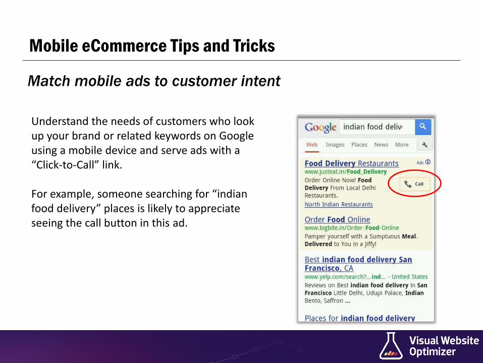
There’s a menu in the Visual Editor which allows you to choose the device you want to create a test for. Default is
“Desktop” and VWO currently supports iPhone, iPad, Android and Windows Phone devices.

Mobile Testing Walkthrough
Test URL and Segmentation settings are automatically
updated
Mobile version of website (if any) corresponding to that
device will open in the Visual Editor
“Rotate” button

Mobile Testing Walkthrough
Create Variation(s) as you would do on a non-mobile
website.
Mobile Testing Walkthrough

Mobile Testing Walkthrough
Setup goals as usual

Mobile Testing Walkthrough
Test URL and Segmentation automatically reflect device
information
Heatmaps only show “Finger Taps” and not Dragging lines
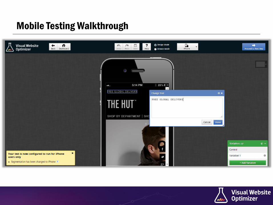
Finally, include code snippet in the Head section of your mobile/responsive website and click “Start Test”
Mobile Testing Walkthrough
And your test is live!

Mobile eCommerce
Resources
Free resources you can use right now to gain a better understanding of your target
market and mobile eCommerce usability

Mobile eCommerce Resources
The Mobile Playbook by Google
A free, interactive web-guide by Google on how to best leverage your mobile presence for the different kinds of customers out there. This is a must read.

Mobile eCommerce Resources
Designing Usable Mobile Websites by PeakUsability
A free PDF by PeakUsability on designing usable mobile websites. Filled with a plethora of best practices.

Mobile eCommerce Resources
Our Mobile Planet by Google
Explore & export data on mobile shopping, advertising, usage and behavior in your country using Google’s Our Mobile Planet.

Get started with Mobile A/B testing!
Sign up for a FREE 30 day trial
To schedule a demo, send an email to [email protected] All trial accounts have Mobile A/B testing enabled!