Embed Size (px)
Citation preview
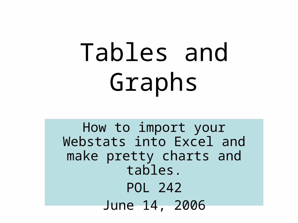
Tables and Graphs
How to import your Webstats into Excel and make pretty charts and
tables.POL 242
June 14, 2006
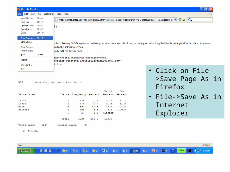
• Click on File->Save Page As in Firefox
• File->Save As in Internet Explorer
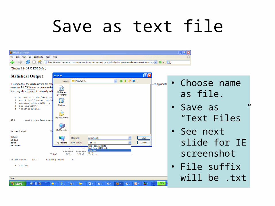
Save as text file
• Choose name as file.
• Save as “Text Files”
• See next slide for IE screenshot
• File suffix will be .txt
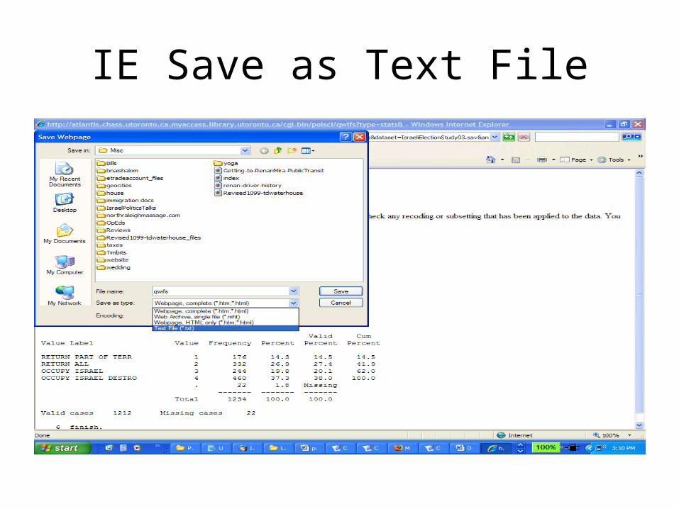
IE Save as Text File
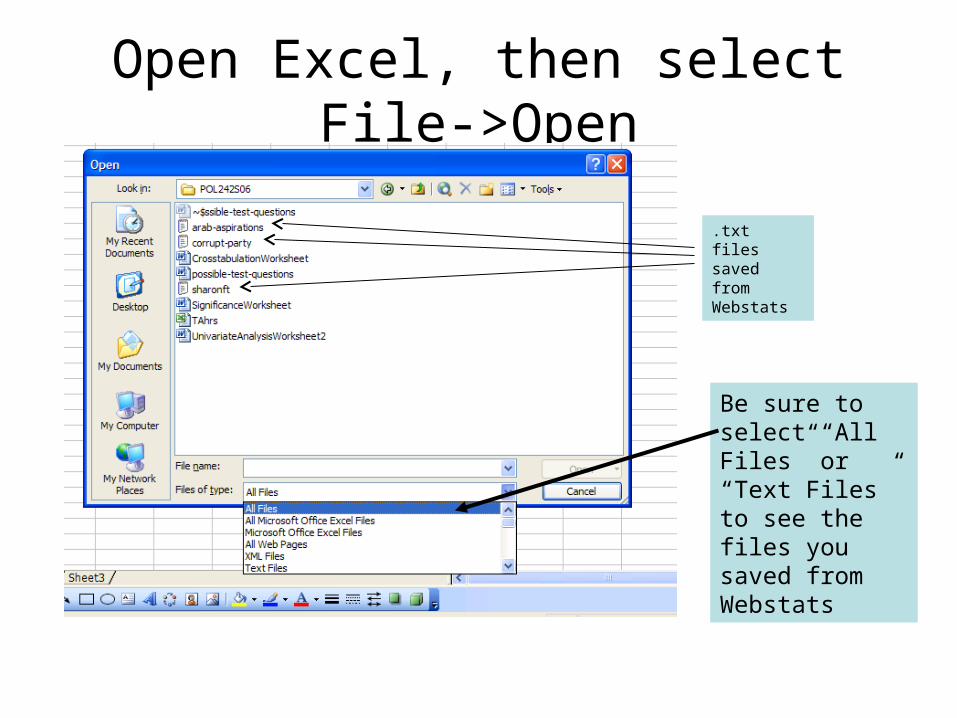
Open Excel, then select File->Open
Be sure to select “All Files” or “Text Files” to see the files you saved from Webstats
.txt files saved from Webstats
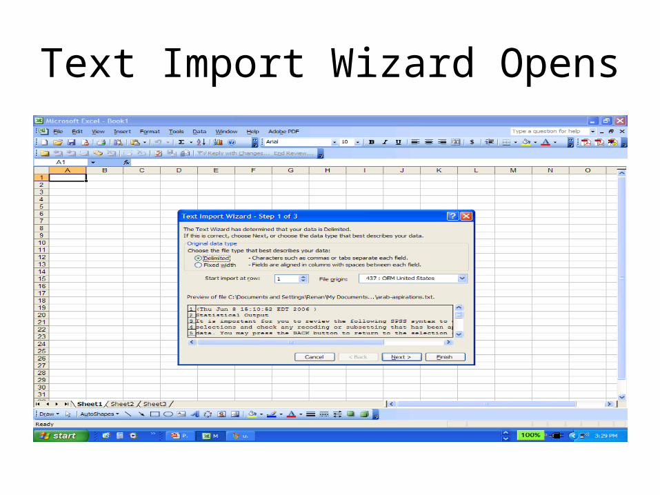
Text Import Wizard Opens
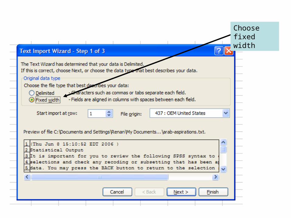
Choose fixed width
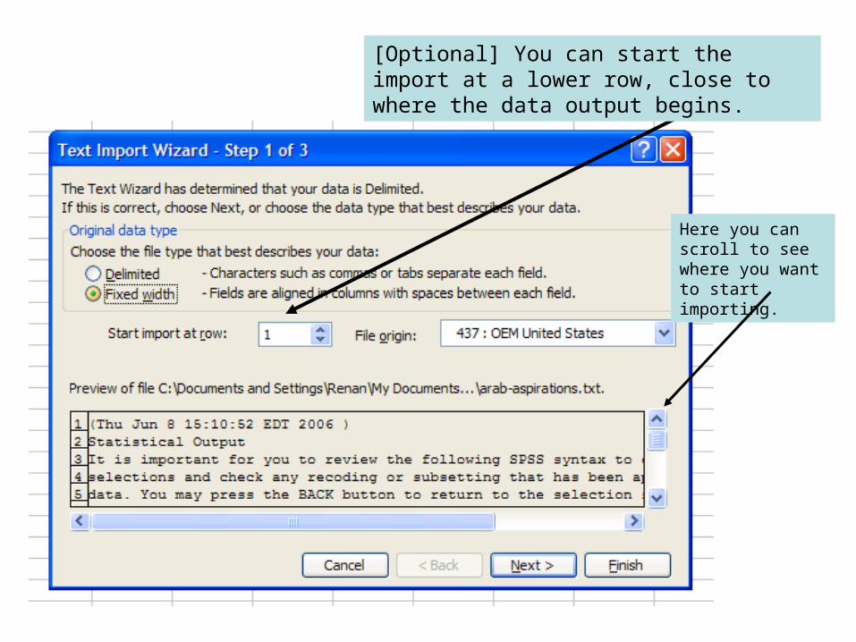
[Optional] You can start the import at a lower row, close to where the data output begins.
Here you can scroll to see where you want to start importing.
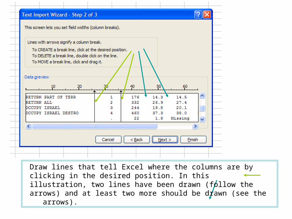
Draw lines that tell Excel where the columns are by clicking in the desired position. In this illustration, two lines have been drawn (follow the arrows) and at least two more should be drawn (see the arrows).
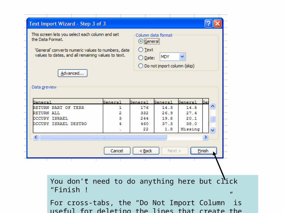
You don’t need to do anything here but click “Finish”!
For cross-tabs, the “Do Not Import Column” is useful for deleting the lines that create the columns on Webstats.
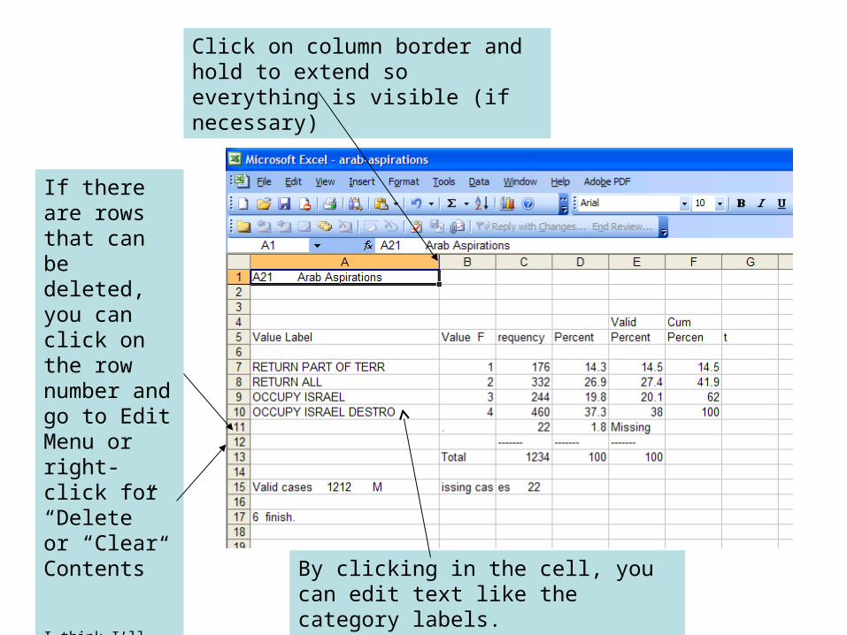
Click on column border and hold to extend so everything is visible (if necessary)
If there are rows that can be deleted, you can click on the row number and go to Edit Menu or right-click for “Delete” or “Clear Contents”
I think I’ll delete Row #11 and Row #12
By clicking in the cell, you can edit text like the category labels.
Making a nice table• You can delete rows, or columns that are not
important. You can also make some rows or columns taller or wider to accommodate larger text or add white space that lets your table be more readable.
• You can cut and paste cells into a table in Word.• Just like in Word, you can make the text bold or italic. You can change the size of the text, or put in an underline.
• One of the best things you can do is add borders and/or shading. After selecting the relevant cells, go to Format->Cell or look for the icon:
• Format->Cell also lets you merge cells and wrap text.
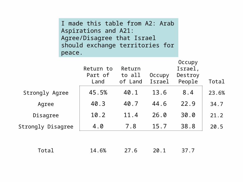
Return to Part of Land
Return to all of Land
Occupy Israel
Occupy Israel,
Destroy People Total
Strongly Agree 45.5% 40.1 13.6 8.4 23.6%
Agree 40.3 40.7 44.6 22.9 34.7
Disagree 10.2 11.4 26.0 30.0 21.2
Strongly Disagree 4.0 7.8 15.7 38.8 20.5
Total 14.6% 27.6 20.1 37.7
I made this table from A2: Arab Aspirations and A21: Agree/Disagree that Israel should exchange territories for peace.
Charts & Graphs
Using A21: Arab Aspirations
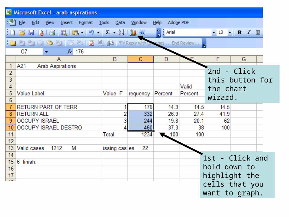
1st - Click and hold down to highlight the cells that you want to graph.
2nd - Click this button for the chart wizard.
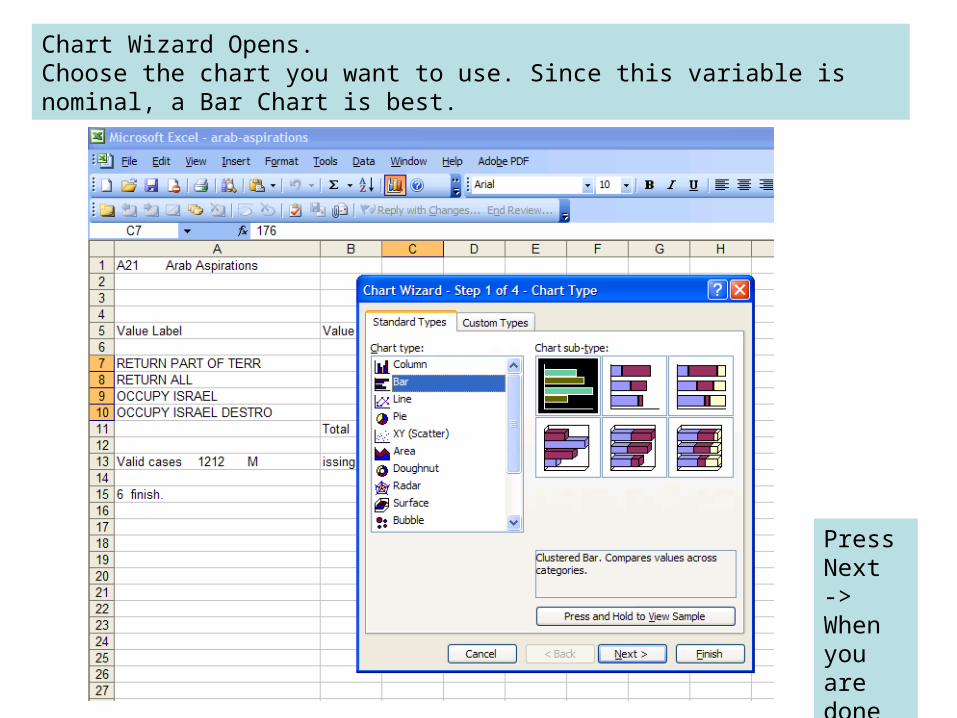
Chart Wizard Opens.Choose the chart you want to use. Since this variable is nominal, a Bar Chart is best.
Press Next -> When you are done
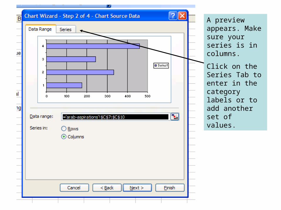
A preview appears. Make sure your series is in columns.
Click on the Series Tab to enter in the category labels or to add another set of values.
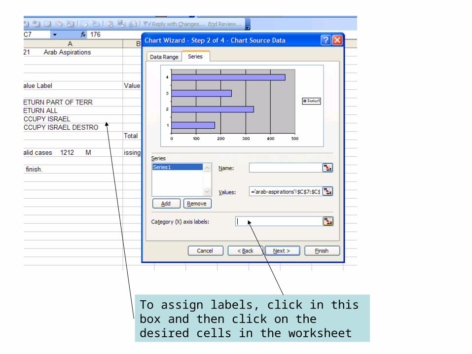
To assign labels, click in this box and then click on the desired cells in the worksheet
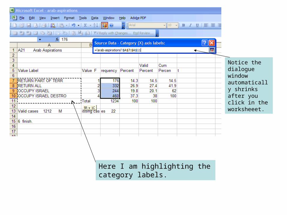
Here I am highlighting the category labels.
Notice the dialogue window automatically shrinks after you click in the worksheeet.
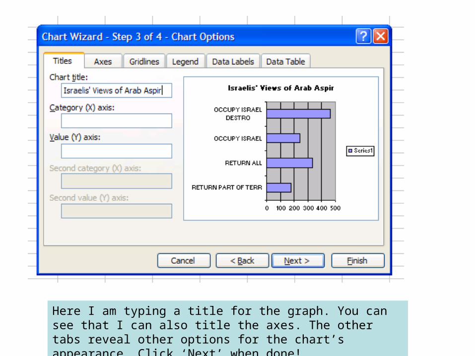
Here I am typing a title for the graph. You can see that I can also title the axes. The other tabs reveal other options for the chart’s appearance. Click ‘Next’ when done!
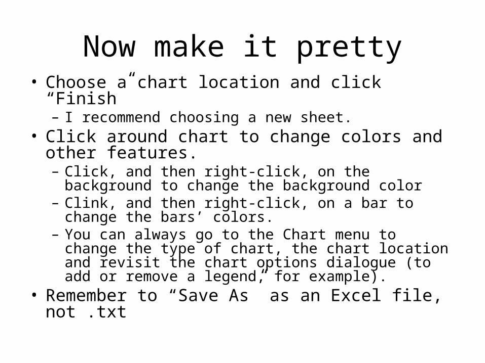
Now make it pretty• Choose a chart location and click “Finish”
– I recommend choosing a new sheet.• Click around chart to change colors and other
features.– Click, and then right-click, on the background to
change the background color– Clink, and then right-click, on a bar to change the
bars’ colors.– You can always go to the Chart menu to change the
type of chart, the chart location and revisit the chart options dialogue (to add or remove a legend, for example).
• Remember to “Save As” as an Excel file, not .txt
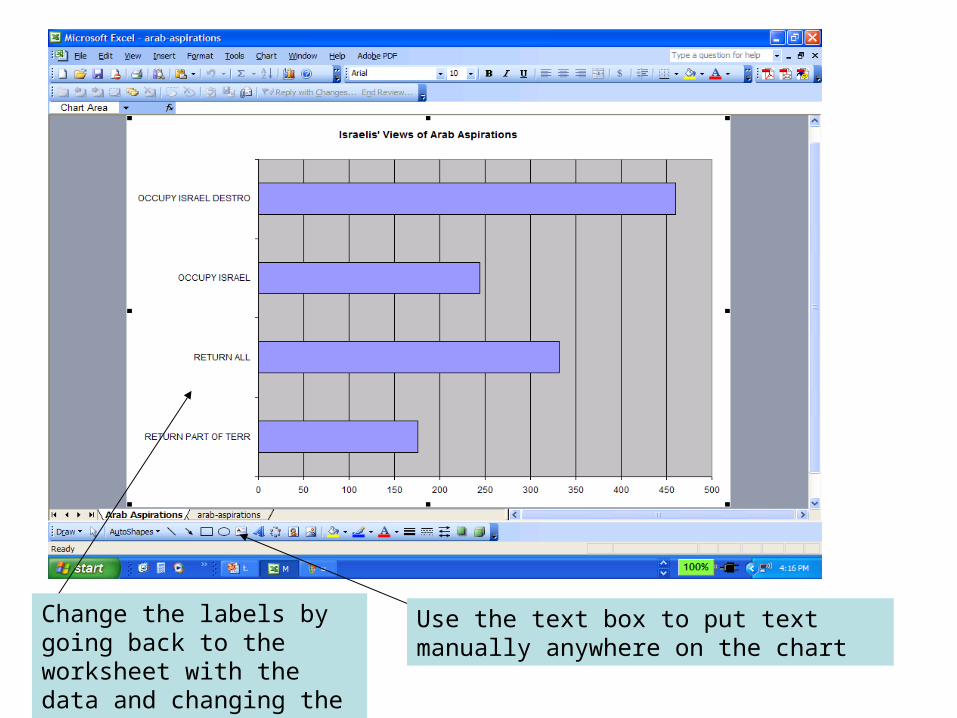
Use the text box to put text manually anywhere on the chart
Change the labels by going back to the worksheet with the data and changing the text in the cells.
KISS
• Keep It Simple, Students!• Good design focuses attention to data. Do not
let art get in way of visual’s effectiveness.– What’s the point of 3-D?
• Limit the data you present to that which is pertinent to your point(s).– But include necessary parameters on visual.
Visuals: Causal Explanation
• Display data that presents causal explanation.– Display what people need to think about.– Not necessarily descriptive narration.
• Visual clarity should match explanatory clarity.– Colors or shading should match ordering of
data.
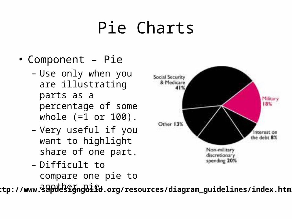
Pie Charts
• Component – Pie– Use only when you are
illustrating parts as a percentage of some whole (=1 or 100).
– Very useful if you want to highlight share of one part.
– Difficult to compare one pie to another pie.
http://www.sapdesignguild.org/resources/diagram_guidelines/index.html
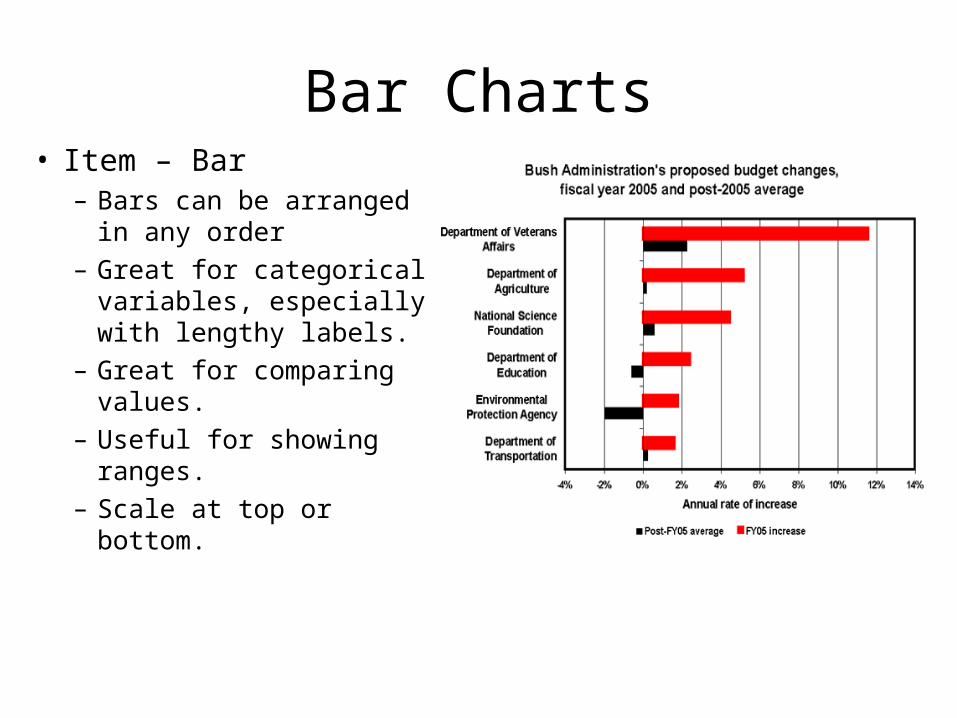
Bar Charts• Item – Bar
– Bars can be arranged in any order
– Great for categorical variables, especially with lengthy labels.
– Great for comparing values.
– Useful for showing ranges.
– Scale at top or bottom.
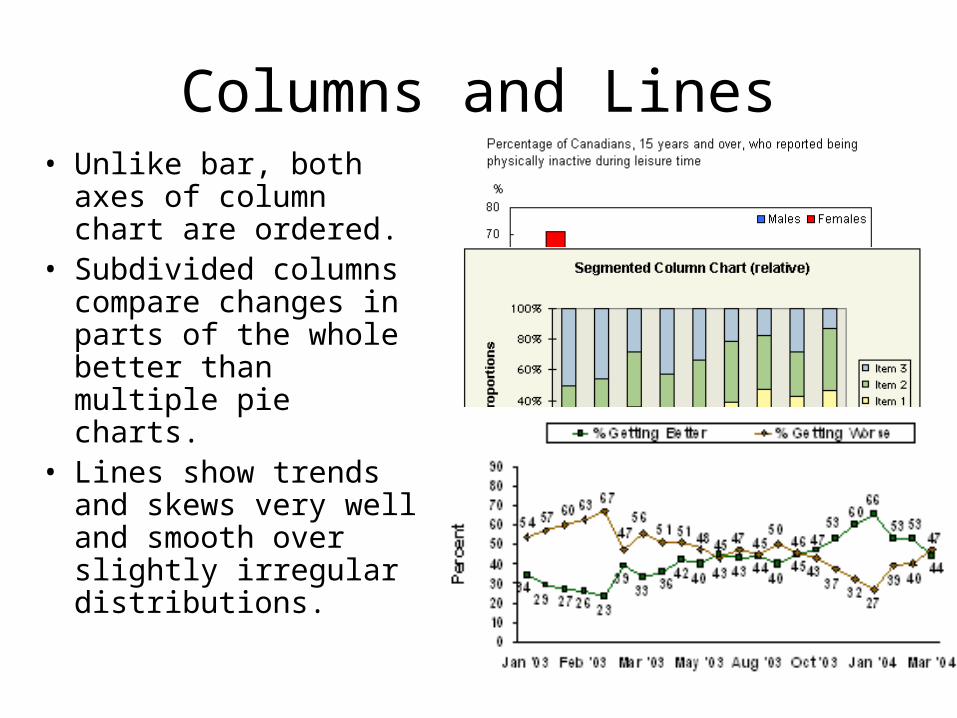
Columns and Lines• Unlike bar, both axes
of column chart are ordered.
• Subdivided columns compare changes in parts of the whole better than multiple pie charts.
• Lines show trends and skews very well and smooth over slightly irregular distributions.
![mlit.go.jp · 2019. 2. 1. · [235] [235) 123 [24.2] [240] [240] [24.3] [242 [242 [242] [242) [245 43] [242 (242 [242] [24.2] [ú.2] [242] [242 [240] [242] 27 087 087 [24.6] [24.6]](https://img.pdfslide.us/doc/110x75/613019b41ecc51586943e0fb/mlitgojp-2019-2-1-235-235-123-242-240-240-243-242-242-242.jpg)