Embed Size (px)
Citation preview

SWIFT INSTITUTE
SWIFT INSTITUTE WORKING PAPER NO. 2012-006
THE GLOBAL NETWORK OF PAYMENT FLOWS
SAMANTHA COOK KIMMO SORAMÄKI
PUBLICATION DATE: 23 SEPTEMBER 2014
The Global Network of Payment Flows
⇤
Samantha Cook and Kimmo Soramaki
Financial Network Analytics, Ltd.
September 19, 2014
Abstract
SWIFT (Society for Worldwide Interbank Financial Telecommunication) provides a network forfinancial institutions to send and receive information about financial transactions in the form of se-cure standardized messages. Here we analyze the global network created by flows of a particular typeof SWIFT message, MT103, which represents a single customer credit transfer. MT103 is the mostcommonly-sent SWIFT message type and therefore may be a useful measure of global economic activ-ity. We find that certain aspects of the MT103 networks are notably a↵ected by global political andeconomic events; for example, we see a large reduction in links beginning in 2007 likely due to increasedfinancial regulation, and we see a lasting e↵ect of the financial crisis of 2007-2009 demonstrated by areduction in the number of messages sent. At the same time, however, the underlying structure of theMT103 networks remains quite stable during the period of study. The networks are well-described by atiered model also seen in many payment system networks, with a stable core of densely connected coun-tries. In addition, the networks exhibit a strong community structure, the largest communities roughlycorresponding to Europe, the former Soviet Union, and the United States plus much of Latin Americanand Asia. The United States is consistently the most important country in the networks according tovarious metrics. The empirical analysis conducted here not only increases our understanding of theSWIFT MT103 network in particular, but also may lead to improved modeling of financial systems ingeneral.
1 Introduction
This paper describes and categorizes the global SWIFT interbank network defined by MT103 messageexchanges. SWIFT (Society for Worldwide Interbank Financial Telecommunication) provides a networkfor financial institutions to send and receive information about financial transactions in the form ofsecure standardized messages. There are over 100 di↵erent types of SWIFT messages, correspondingto di↵erent types of financial transactions. MT103 (Single Customer Credit Transfer), is the mostcommonly-sent message type and instructs a funds transfer between clients of financial institutions.
Aggregated SWIFT MT103 messages have already been shown to be a good proxy for economicactivity: The SWIFT Index (SWIFT, 2012) uses country-level message counts to nowcast and forecastGDP aggregated worldwide and for OECD countries and the European Union, as well as for the UnitedStates, United Kingdom, and Germany. Here we move beyond focusing on individual countries or groupsof countries to study the entire MT103 network of transactions between countries. (For the remainder ofthis paper we will refer to the networks created by MT103 message flows simply as payment networks.)Several previous studies have applied network analysis to the payment systems of individual countries(e.g., Soramaki, Bech, Arnold, Glass, and Beyeler (2007) for payment flows in the US Fedwire system;
⇤The authors thank Peter Ware and Ali Imatouchan for acquiring, explaining and pre-processing the SWIFT data and fortheir many helpful comments to the paper, and the SWIFT Institute for financial support.
2

Becher, Millard, and Soramaki (2008) for the UK interbank payment system; Propper, van Levyfeld,and Heijmans (2009) for the Dutch interbank payment system; and Embree and Roberts (2009) forthe Canadian interbank payment system). To the best of our knowledge, this paper is the first networkanalysis of global payment flows. We apply methods from network theory to summarize and visualize thenetworks, as well as describe various aspects of their structure and identify the most important countries.In particular, we use the network measures size, order, connectivity, reciprocity, and clustering coe�cientto describe the networks’ overall structure; we use arc survival to measure the stability of networkstructure over time; we use strong components, core-periphery modeling (Craig and von Peter, 2014),and the community detection methods proposed by Clauset, Newman, and Moore (2004) and Newman(2006) to classify the countries into meaningful subgroups; and we use degree, strength, and SinkRank(Soramaki and Cook, 2013) to identify important countries. The rest of this paper is organized as follows:Section 2 describes the network data and Sections 3 and 4 analyze complete and filtered versions of thenetworks, respectively, with analysis of network size and order, link values, messages sent, connectivity,reciprocity, arc survival, core-periphery structure and community detection, and various measures ofthe importance of individual countries in the networks. Section 5 concludes, and an Annex providesadditional network visualizations of the most recent data.
2 Data
The data analyzed here consist of monthly counts of SWIFT MT103 messages sent between 1 January2003 and 31 July 2013, aggregated at the country level. In total, the underlying data consist of nearlythree billion messages exchanged among banks in a total of 231 countries. We analyze the number, ratherthan value, of messages sent because message counts have a longer time series available for analysis andalso are more stable, in the sense that they do not depend on inflation or exchange rates. Moreover,counts are less a↵ected by errors or anomalies than are values – a single high-value missing messagecould have a large e↵ect on a value-based analysis, but is unlikely to have a meaningful e↵ect on acount-based analysis. Only live tra�c is included; all intra-institutional tra�c is excluded; and dataare corrected to account for infrastructure changes such as the introduction of new settlement systemsor changes in the use of SWIFT messages. Because our interest is in the network created by transfersbetween countries, all within-country tra�c is left out of all analysis.
The MT103 data form a directed network, with countries as nodes and messages sent betweenfinancial institutions as links: a link from country A to country B means that a financial institutionoperating in country A sent a SWIFT MT103 message to a financial institution operating in B. Thenumber of messages sent is stored as a link property. Because di↵erent months have di↵erent numbers ofworking days, which a↵ects the number of messages sent, monthly counts are divided by the number ofworking days to give an average message count per day. Di↵erent countries may have di↵erent holidaysand therefore a di↵erent number of working days; for simplicity the average working days per month isused for all countries. We analyze each month as a distinct network, so that results form a time series.
3 Complete Networks
3.1 Basic Network Summary
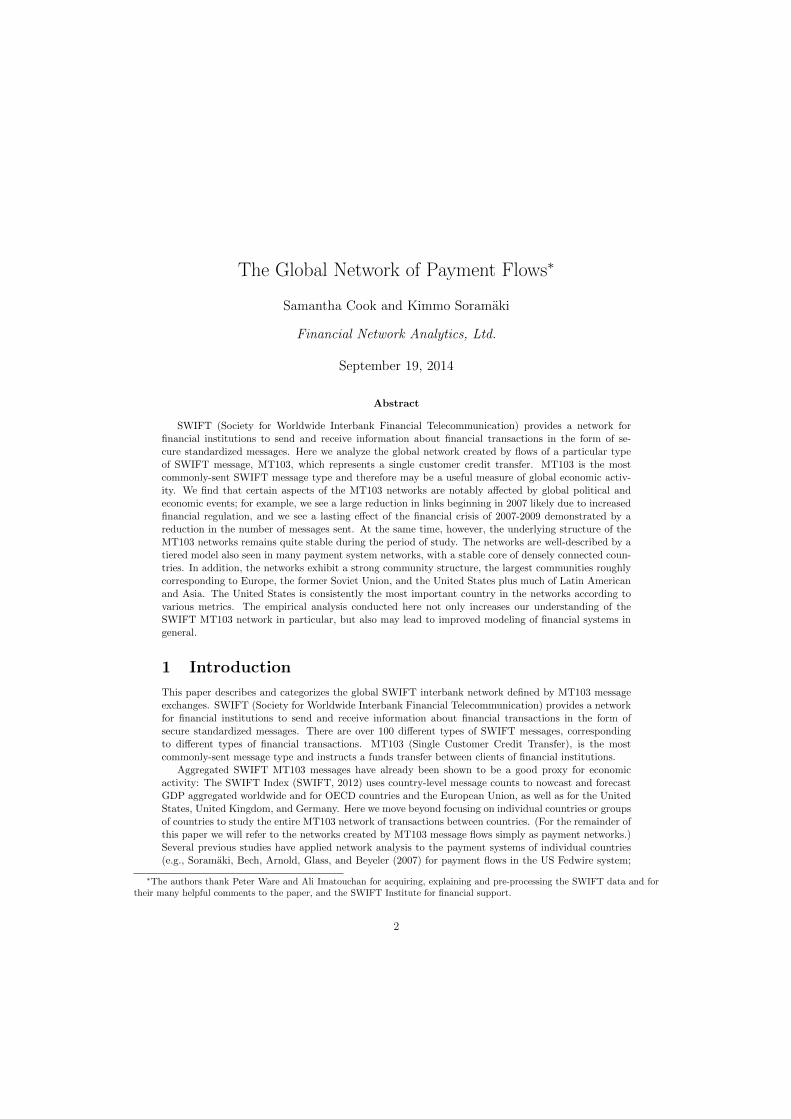
We start by summarizing and comparing the size and order of the networks. A network’s order is equalto the number of nodes (i.e., number of countries), and size is equal to the number of links. The plotbelow shows the time series of number of nodes and number of links. The dashed line shows that thenumber of countries in the networks has been fairly steadily increasing, from 208 countries in January,2003, to 224 countries by the beginning of 20121. The solid line shows that the number of links rises andfalls with an overall trend that was increasing until 2007 (reaching a maximum of 11048 links in March,2007) and then began to decrease, with 2013 having a similar number of links as was seen in 2003.The minimum number of links was 9921, in February, 2003; thus the di↵erence between the minimum
3
and maximum number of links is 1127, or 11%. The number of links tends to be higher in March andDecember and lower in January, February, and August. However, this pattern is not entirely regular.For example, there was a large peak in October, 2007 and a large dip in April, 2006. The decline in linksstarting in April, 2007 corresponds to the beginning of the financial crisis; for example, on April 2, 2007,the subprime lender New Century Financial Corporation filed for Chapter 11 bankruptcy protection.
Figure 1: Size and order in complete payment networks.
To further investigate the change in number of links, we consider in detail three distinct periods:March, 2003, at the beginning of the series when number of links was low; March, 2007, when thenumber of links was at its peak; and March, 2013, when the number of links had decreased to nearstarting levels. Because of seasonal patterns in number of messages and number of links, we keep thecalendar month constant for these periods. An analysis of links in these three periods suggests twoseparate processes may explain the shape of the link distribution. When comparing March, 2003 withMarch, 2007, growth came mainly from the addition of new countries to the networks and the expansionof developing countries such as Chad, Congo, and Tajikistan. Of the 1054 links gained during thisperiod, in 74% one (or both) of the countries was either not present in March, 2003 or rated as mediumor low on the United Nations Human Development Index (Watkins, 2007). When comparing the linkspresent in March, 2007 with those present in March, 2013, many of the links lost involved o↵shorebanking centers such as the Bahamas, Cook Islands, and Andorra. Of the 990 links lost during thisperiod, 80% involved at least one country listed as an o↵shore financial center by at least one of theIMF, FSI (Financial Secrecy Index), or OECD2. The decline in links, and in particular links to o↵shorecenters, was likely due to increased banking regulation, driven largely by the United States and knownas “derisking” (The Economist, 2014). The French bank BNP Paribas recently agreed to pay an 8.9billion USD fine for violating United States sanctions against Sudan, Cuba, and Iran (Ax, Viswanatha,and Nikolaeva, 2014); the average degrees of Sudan, Cuba, and Iran decreased by 10%, 11%, and 38%,respectively, following the peak period. A white paper by SWIFT (2011) discusses the financial impactof increased regulation on the banking industry and having “Fewer but deeper relationships.”
4

3.2 Messages per Link
The distribution of link values in the payment networks, as in many financial networks, is highly skewed.Most links have less than 3 messages, while the largest links typically exchange between 150000 and250000 messages. Soramaki et al. (2007) found that the number of payments per link in the FedwireFunds Service, the United States interbank payment network, followed an approximate power law dis-tribution. However, in our case none of the common long-tailed distributions for continuous variablesconsistently fit the link values well: The plots below show fitted power law, lognormal, and exponentialdistributions for three networks: the black curves are the empirical distribution of link values and thered lines the fitted distribution. Parameters were estimated using maximum likelihood, with a lowerbound estimated using a Kolmogorov-Smirnov test Clauset, Shalizi, and Newman (2009); that is, theestimated distribution is fit only for values larger than the lower bound. The tail of the link distributionin February, 2003, does closely follow an exponential distribution, but in the other months the tails arefatter than those of an exponential. On the other hand, the tails are consistently more narrow than apower law or lognormal distribution.
Figure 2: Distribution of messages per link for three months of complete paymentnetworks: empirical and fitted parametric distributions.
In addition to categorizing their marginal distribution, we are also interested in exploring the eco-nomic and demographic factors that drive the number of payments exchanged between two countries.Using linear regression models, we found that the GDP of the sending and receiving countries and various
5

demographic information relating the sending and receiving countries is related to number of messagessent, and that these factors explain a large portion of the variability in number of messages sent. Forsimplicity, we only modeled data from the most recent network (July, 2013). For that network, we fit alinear regression model with log link value as the outcome and predictors as the 2013 log GDP of thesending country, 2013 log GDP of the receiving country, the distance between the sending and receivingcountries’ capital cities, and indicators for whether the sending and receiving countries share a commono�cial language, a colonial past3, or were once in the same country4. The results are summarized in thetable below.
Estimated Standard Testcoe�cient error statistic p-value
Intercept -5.142 0.106 -48.4 <2e-16log(sender GDP) 0.705 0.012 57.9 <2e-16log(receiver GDP) 0.711 0.012 60.4 <2e-16Distance between capital cities -1.759e-04 6.068e-06 -29.0 <2e-16Common o�cial language 1.119 0.067 16.6 <2e-16Colonial past 1.608 0.127 12.7 <2e-16Once same country 1.750 0.170 10.3 <2e-16
Table 1: Summary of regression model using economic and demographic variables topredict link values.
We find that all the above coe�cients are statistically significant at the 5% level. The estimatedcoe�cients on the GDP of the sending and receiving countries are quite similar and can be interpretedas elasticities, indicating that a 1% increase in the sending or receiving country’s GDP is associated witha 0.7% increase in the number of messages sent. That is, countries with higher GDP tend to send andreceive more messages than countries with lower GDP. Notably, a 1% increase in both the sending andreceiving countries’ GDP is associated with a greater than 1% increase in the number of messages sent.An interaction term between sender GDP and receiver GDP, which would indicate that links betweentwo countries both with high GDP are even higher than would be predicted by the two countries’individual GDPs, was not statistically significant. The negative coe�cient on the distance betweencapital cities indicates that countries that are physically closer tend to exchange more messages. Thepositive coe�cients on the remaining predictors indicate that countries that share a common languageor a colonial past or were once part of the same country are all more likely to exchange more messages.Taken together, we see that the richer and the “closer” (in several di↵erent senses) two countries are, themore messages they tend to exchange. The adjusted R2 for this model is 0.42, meaning that 42% of thevariability in link value is explained by its relationship with these explanatory variables. Although thismodel is unlikely to be useful for providing accurate forecasts, it does explain nearly half the variability inlink values with only a few predictors, and sheds light on how wealth and demographics relate to paymenttra�c. Considered alone, the sending and receiving countries’ GDPs explain 30% of the variability inlink value. Considering only the demographic factors, we can see from the estimated coe�cients that ashared colonial past or having belonged to the same country each contributes about 50% more to thelink value than a shared o�cial language.
3.3 Total Messages Sent
Total messages sent refers to the average daily message count summed over all countries in each month.The average number of daily messages sent (per month) is 1,151,282, and its trend is steadily increasing,as shown in the plot below. The number of messages per month shows strong seasonal variation, withregular peaks in December and troughs in August, and an average annual growth rate of 7.1%.
6

Figure 3: Total messages sent in complete payment networks.
To further analyze the seasonal component in the monthly message counts, we perform a seasonal-trend decomposition analysis (Cleveland, Cleveland, McRae, and Terpenning, 1990). This analysis usesloess (Cleveland, 1979; Cleveland and Devlin, 1988), a form of nonparametric smoothing, to decomposea time series into a seasonal component, an overall trend, and an error component. The figure belowshows all of these components, as well as the data series itself. We can see that the seasonal trendconsists of a large peak in December and a smaller peak in April, as well as a large dip in August and asmaller dip in January and February. The overall trend is increasing, bar for the period of the financialcrisis in 2008. We found similar trends and seasonal patterns when limiting to the number of messagessent by certain groups of countries, in particular the larger communities detected in Section 4.3.
7

Figure 4: Total messages sent in complete payment networks, seasonal-trend decom-position analysis.
To investigate the impact of the financial crisis, we consider the monthly message counts in twodisjoint periods: before the financial crisis (January, 2003 - May, 2008) and after the financial crisis(July, 2009 - July, 2013). In each of these periods we fit a linear model with log message count asthe outcome and time (in months since January, 2003) and dummy variables for calendar months aspredictors. With the pre-crisis data, the model explains 98% of the variability in monthly messagecounts and the coe�cient on time is equal to 0.0074 and statistically significantly di↵erent from zero (p< 2e-16). With post-crisis data, the model explains 97% of the variability in monthly message countsand the coe�cient on time is equal to 0.0048 and also significantly di↵erent from zero (p < 2e-16).Although the coe�cient is lower after the financial crisis than it was before, testing for equality of thecoe�cient on time in the two models yields a t-test statistic is equal to 0.54 and the two coe�cientsare not significantly di↵erent from each other (p > 0.5). Therefore we cannot conclude that messagegrowth is significantly slower after the crisis than it was before. With that in mind, we include bothpre- and post-crisis data into a single model, again with log message count as the outcome and time andmonth as predictors, as well as an additional predictor indicating whether each observation was pre- orpost-crisis. The combined model explains 99% of the variability in monthly message counts, and theestimated coe�cient on the indicator for post-crisis observations is equal to -0.057 and is statisticallysignificant (p < 0.00001). The interpretation of this result is that message counts are on average 5.5%lower (1 � e�0.057 = 0.055) post-crisis than they would have been had the pre-crisis trend continuedunabated throughout the entire period.
4 Filtered Networks
For the rest of this paper, we will analyze two filtered versions of the networks that are more suitableto time series analysis and uncovering large-scale structure. The first consists of all countries that existin all networks; that is, we drop those countries that are missing from any of the networks. There are203 countries present in all networks; dropping the other 28 countries that are only present in some ofthe networks leaves 96% of the links and 99% of the value from the complete data. We refer to thisnetwork of 203 countries as the 99% network. In the second network, we filter out the smallest countries
8

(in terms of total messages sent and received) so that 95% of the messages are retained. We refer tothis network as the 95% network. Because of the highly skewed distribution of link values, dropping 5%of the value amounts to dropping 50% of the links themselves. The 95% network has 95 countries, allpresent in each network.
4.1 Basic Network Summary
Size and Connectivity
A network’s connectivity is equal to size / order(order - 1), and measures how densely connected thenodes are. The maximum possible connectivity is one, which corresponds to a complete network, i.e.,a network in which each node is linked to every other node. Because order (number of countries) isthe same for all filtered networks, size and connectivity di↵er only by a scale constant and so can bevisualized with a single line chart. The plots below shows the time series of size and connectivity in thefiltered networks, with the left axis indicating size and the right axis indicating connectivity. The trendfor the 99% network is similar to that seen in the complete data, increasing until early 2007 and thendecreasing. However, in the 99% network size levels o↵ at a lower value than was seen at the beginningof the series; whereas with complete data the size at the beginning and end of the series is similar. Sizein the 95% networks is about 50% lower than in the 99% networks. The 95% networks follow a similartrend, although size begins to decrease slightly earlier in the 95% networks, and a large drop in size atthe end of 2008 is more prominent in the 95% networks. The 99% networks are much sparser than the95% networks, with average connectivity equal to 0.242 (range: 0.229 - 0.256) in the 99% networks and0.608 (range: 0.582 - 0.634) in the 95% networks.
9

Figure 5: Size (left axis) and connectivity (right axis) in filtered payment networks.Note that size and connectivity di↵er by a scale constant, and so can be displayed asa single line chart with two vertical axes.
Reciprocity
A node’s reciprocity is the proportion of its outgoing links that have the corresponding incoming link,optionally weighted by any numeric node property. Here we calculate each node’s reciprocity weightedby messages sent. Reciprocity is extremely high in both filtered networks, with mean equal to 98% inthe 99% networks and 99% in the 95% networks. Reciprocity close to one means that there are veryfew outgoing links without the corresponding incoming links. In other words, there are few one-wayrelationships between countries: If a country sends messages to another country it usually also receivesmessages from that country.
10

4.2 Network Structure
Arc Survival
First we examine the stability of the networks in terms of their links. Arc survival is the proportionof links from the previous network that exist in the current network, for example, the proportion ofJanuary, 2003 links that exist in the February, 2003 network. If all networks in the series had all thesame links, arc survival would be equal to one for all networks. The plot below shows that arc survivalis quite high in both networks (96.2% on average in the 95% networks and 93.6% on average in the 99%networks), and increasing slightly over time. The slight increase in arc survival is especially interestinggiven the fact that the number of links in both networks is decreasing during most of this period, andsuggests that as the networks contract their structure gets more stable. Moreover, in random networksof fixed size, arc survival is on average equal to connectivity; in the payment networks arc survival issignificantly higher than connectivity (see Size and Connectivity in Section 4.1).
Figure 6: Arc survival in filtered payment networks.
Link Distribution
In both the 95% and 99% networks, the link distribution is highly right-skewed. The histograms belowshow that even on the log scale the link distribution remains skewed to the right.
11

Figure 7: Link distribution for one month of filtered payment networks, log scale.
As with the complete data networks (see Section 3.2), the link distributions of the filtered networksare not well-approximated by any of the common long-tailed distributions. In most networks the linkdistribution has narrower tails than a power law or log normal distribution, but fatter tails than exponen-tial. The plots below show these three distributions fitted to the most recent network’s link distributionfor both the 95% and 99% network.
12

Figure 8: Distribution of messages per link for most recent filtered payment networks:empirical and fitted parametric distributions.
Core-Periphery Structure
Craig and von Peter (2014) introduced the idea of a core-periphery or tiered structure in banking systems.A perfect core-periphery system has the following features.
• Core nodes are linked to all other core nodes.• All core nodes are linked to at least one periphery node.• Periphery nodes are not linked to any other periphery nodes.
In practice, financial systems rarely follow a perfect core-periphery structure; however, the classificationof institutions as core and periphery has proved a useful generalization. Both the 99% and the 95%networks follow an approximate core-periphery structure, with an average error rate of 10.8% (range:10.2% - 11.6%) for the 99% networks and 6.8% (range 6.3% - 7.4%) for the 95% networks. These errorrates are in fact lower than that reported by Craig and von Peter (2014) for the German banking network(12.2%) in the original Core-Periphery paper, and also lower than the average 17.1% error rate reportedfor the Korean banking system Baek, Soramaki, and Yoon (2014). Thus the core-periphery model fitsboth filtered payment networks quite well.
In the 99% networks there are on average 60 countries (30% of total) in the core (range: 57 - 63, or28% - 31%). In the 95% networks there are on average 54 countries (57% of total) in the core (range: 51
13

- 57, or 54% - 60%). Moreover, the core is quite stable in both series of networks. Of the 69 countriesthat are ever classified as core in the 99% networks, 50 are classified as core in every single network5, andanother 11 are classified as core in over half the networks6. Of the 64 countries that are ever classified ascore in the 95% networks, 44 are classified as core in every single network7 and another 10 are classifiedas core in over half the networks8. The 44 countries that are always classified as core in the 95% networksare also always classified as core in the 99% networks. The plot below shows the number of nodes inthe core over time. We see that both types of networks have the same basic trend: The core slightlyincreases in size at the beginning of the series, briefly levels o↵ and then starts to decrease at the end of2008, with fewer core nodes at the end of the series than at the beginning.
Figure 9: Number of countries classified as core, filtered payment networks.
The map below shows the July, 2013, classification of countries as core or periphery in the 99%network, with core countries colored blue and periphery countries colored green. The core consists ofmost European countries along with the United States, Canada, Australia, China, Japan, Hong Kong,South Africa, Morocco, Saudi Arabia, Israel, India, and several southeast Asian countries.
14

Figure 10: July, 2013 core-periphery classification, 99% network. Core countries arecolored blue and periphery countries are colored green.
The map below shows the July, 2013 core-periphery classification for the 95% network, with notablyfewer countries. All countries classified as core in the 95% network are also classified as core in the99% network. Countries classified as core in the 99% network but not the 95% network are Bulgaria,Gibraltar, Isle of Man, Mauritius, and the Philippines. In both the 95% and 99% networks, nearly allLatin American and African countries are classified as periphery.
Figure 11: July, 2013 core-periphery classification, 95% network. Core countries arecolored blue and periphery countries are colored green.
Because there are so many links between countries, it is impossible to show them all in a single visu-alization of moderate size. In order to show a smaller number of the most meaningful links, we computethe maximum-spanning tree, analogous to the minimum-spanning tree (West, 1996) commonly used ingraph theory. A network’s maximum-spanning tree (maxST) is the spanning tree (i.e., a subnetwork
15

that contains all the nodes of the original network and is a tree) and whose sum of link weights is greaterthan for any other spanning tree within the network. We first symmetrize the network, by replacingany bi-directional links between countries with a single link whose weight is equal to the sum of thetra�c between them in both directions. We then calculate the maxST using number of messages as thelink weight. The visualizations below show the maxST links superimposed on the map, with countriesagain colored by their core-periphery classification. We also see that, as expected with a core-peripherynetwork, most periphery countries are primarily linked with core countries, while core countries tendto have more links and be linked to both core and periphery countries. In addition, maxSTs have theproperty that each node is linked to its strongest connection; i.e., the strongest link associated with eachnode is in the maxST. Therefore any node with more than one link in the maxST is the strongest linkfor some other node in the network. The countries with more than one link in the maxST tend to beregional “hubs;” for example, New Zealand’s strongest link is with the United States, and it is also aSouth Pacific hub with links to the Cook Islands and Western Samoa. The hub countries in the 99%network are Australia, Belgium, Canada, China, Denmark, France, Germany, Hong Kong, India, Mau-ritius, Norway, New Zealand, Russia, Saudi Arabia,Senegal, South Africa, Spain, Sweden, United ArabEmirates, the United Kingdom, and the United States. Of these hubs, the United States and Germanyare clearly the most central, with Germany linking to most European countries and the United Stateslinking to most of the rest of the world. Also interesting is Senegal, which acts as a strong African hubwith links to Burkina Faso, Benin, Ivory Coast, Mali, Niger, and Togo, as well as France. In addition,Saudi Arabia acts as a hub to the Indian subcontinent, with links to India, Bangladesh, and Sri Lanka.The map below shows the 99% network with maximum spanning tree links.
Figure 12: July, 2013 core-periphery classification plus maximum spanning tree, 99%network.
The map below shows the 95% network with maximum spanning tree links. The hub countries in the95% network are Belgium, France, Germany, India, Russia, Saudi Arabia, Spain, Sweden, the UnitedKingdom, and the United States.
16

Figure 13: July, 2013 core-periphery classification plus maximum spanning tree, 95%network.
Strong Components
A network is strongly connected if there is a directed path from each node to every other node. All ofthe 95% networks are strongly connected, while only 16 of the 99% networks are. Networks that are notstrongly connected can be divided into components, each of which is strongly connected; these so-calledstrong components are typically ordered by decreasing number of nodes. Although the 99% networksare mostly not strongly connected, the largest strong component makes up the vast majority of eachnetwork. In all networks at least 200 (98.5%) of the 203 nodes are in the largest strong component; thenodes not in the largest strong component are always alone in their own component. The figure belowshows that that the number of nodes in the largest strong component (99% networks) has been slightlydecreasing over time. None of the nodes classified as core in the core-periphery classification are evernot in the largest strong component.
17

Figure 14: Number of nodes in largest strong component, 99% networks.
4.3 Substructures
Clustering Coe�cient
Another way to characterize the structure of a network is with the clustering coe�cient. At the networklevel the clustering coe�cient measures the proportion of node pairs sharing a common neighbor that arethemselves linked. In a random network, the clustering coe�cient is on average equal to the connectivity.The figures below shows that both the 99% and 95% networks’ clustering coe�cients have been mostlydecreasing over time, and that both both networks’ clustering coe�cients follow a similar trajectory. Inboth types of network the clustering coe�cient is higher than would be expected in a random network(as connectivity ranges from 0.229 to 0.256 in the 99% networks and from 0.582 to 0.634 in the 95%networks; see Size and Connectivity in Section 4.1.
18

Figure 15: Clustering coe�cient, filtered payment networks.
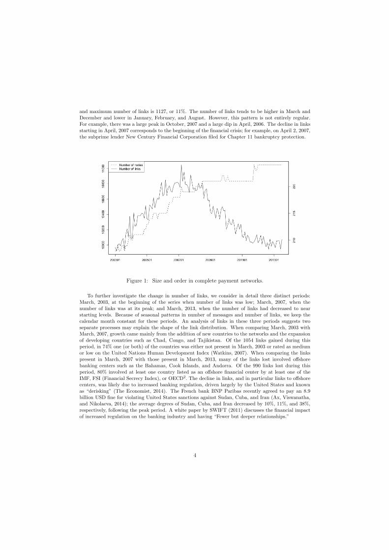
The clustering coe�cient can also be calculated at the node level, in which case it is equal to theratio of the number of observed links between the node’s neighbors to the number of possible arcsbetween neighbors. In both the 99% and 95% networks, the node level clustering coe�cient has a strongrelationship with node degree; that is, the number of links the node has. The plot below shows therelationship between out-degree (number of outgoing links) and node level clustering coe�cient in themost recent network, July 2013. The relationship is similar for the other networks. The relationship seenhere between clustering coe�cient and degree, where nodes with higher degree have a lower clusteringcoe�cient, is typical for a core-periphery network. The nodes with low degree tend to be on theperiphery, and are thus linked mostly to core nodes who are strongly linked among themselves. Thenodes with high degree tend to be in the core, and are thus linked to both core and periphery nodes;there are typically more periphery nodes than core nodes and periphery nodes are rarely linked amongthemselves, thus the lower clustering coe�cient.
19
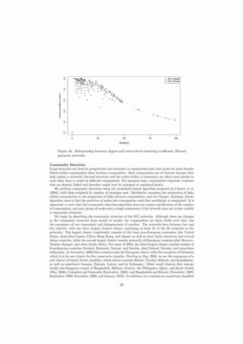
Figure 16: Relationship between degree and vertex-level clustering coe�cient, filteredpayment networks.
Community Detection
Large networks can often be grouped into sub-networks or communities such that nodes are more denselylinked within communities than between communities. Such communities are of interest because theyhelp explain a network’s internal structure and the nodes within a community are often more similar toeach other than to nodes in di↵erent communities. For payment data, communities represent countriesthat are densely linked and therefore might best be managed or regulated jointly.
We perform community detection using the modularity-based algorithm proposed by Clauset et al.(2004), with links weighted by number of messages sent. Modularity compares the proportion of linkswithin communities to the proportion of links between communities, and the Clauset, Newman, Moorealgorithm aims to find the partition of nodes into communities such that modularity is maximized. It isimportant to note that this community detection algorithm does not require specification of the numberof communities, and may group all nodes into a single community if the network does not in fact exhibita community structure.
We begin by describing the community structure of the 95% networks. Although there are changesin the community structure from month to month, the communities are fairly stable over time, barthe emergence of one community and disappearance of another. The networks have between two andfive clusters, with the three largest clusters always containing at least 91 of the 95 countries in thenetworks. The largest cluster consistently consists of the large non-European economies (the UnitedStates, Australia,Canada, China, Hong Kong, and Japan) as well as most Latin American and severalAsian countries, while the second largest cluster consists primarily of European countries plus Morocco,Tunisia, Senegal, and often South Africa. For most of 2003, the third largest cluster consists mainly ofScandinavian countries (Iceland, Denmark, Norway, and Sweden, plus Finland, Estonia, and sometimesLithuania). In November, 2003 these countries join the European cluster, with the exception of Lithuaniawhich is in its own cluster for five consecutive months. Starting in May, 2004, we see the emergence of anew cluster of former Soviet republics, which always contains Russia, Ukraine, Belarus, and Kazakhstan,as well as sometimes Georgia, Estonia, Latvia, and/or Lithuania. Other small clusters that emergebriefly and disappear consist of Bangladesh, Bahrain, Kuwait, the Philippines, Qatar, and Saudi Arabia(May, 2006); Colombia and Venezuela (September, 2008); and Bangladesh and Kuwait (November, 2008;September, 2009; November, 2009; and January, 2010). In addition, six countries are sometimes classified
20

into communities of only a single country. These countries are Angola (classified in a community byitself in 27 networks), Cyprus (1 network), Lithuania (7 networks), Mauritius (7 networks), Nigeria (10networks), and Venezuela (19 networks). Countries tend to be classified in communities by themselveswhen they exchange messages nearly equally with two of the larger clusters, typically the Europeancluster and the United States cluster. The map below shows the countries colored by their communityassignment in the most recent (95%) network.
Figure 17: Clauset-Newman-Moore community detection results, 95% network, July,2013.
The 99% networks have many more clusters than the 95% networks, sometimes as many as 20.However, the large number of clusters is due mainly to more countries being classified in clusters bythemselves. The number of clusters with more than two countries in the 99% networks ranges fromfour to seven. As with the 95% networks, the largest two clusters comprise most of the countries in the99% networks and consist generally of a European cluster and a United States-centered non-Europeancluster. The 99% networks also have a Scandinavian cluster that disappears during the first year anda former Soviet cluster that appears shortly after. The primary di↵erence between the 99% and 95%clusters is the existence of several African clusters; these African countries were either not present inthe 95% networks or usually in the large non-European cluster. One African cluster (colored pink in themap below) is present in every network and always contains Burkina Faso, Benin, Ivory Coast, Mali,Niger, and Togo; this cluster also contains Cameroon, Equatorial Guinea, Gabon, Guinea, Senegal, andChad in more than half of the networks. In addition, early in the series was a stable southern Africancluster, which began to decay starting in August, 2005. In 2006 South Africa was classified with theEuropean countries, and starting in 2007 was typically classified in the large non-European cluster.March, 2007 was the last appearance of this southern African cluster; since then these countries havebeen in the large non-European cluster. The map below shows clustering results from the 99% July 2013network. In addition to the appearance of the African cluster, the former Soviet cluster now containsadditional former Soviet republics that were not present in the 95% network (Armenia, Azerbaijan,Kyrgyzstan, Moldova, Tajikistan, and Uzbekistan), as well as North Korea. Not easily visible on themap is the Caribbean cluster of Saint Lucia and Montserrat. In addition, seven countries (Burundi,Guinea, Guadeloupe, St Pierre and Miquel, Sierra Leone, Suriname, and Turkmenistan) were classifiedas solo clusters and are colored white.
21

Figure 18: Clauset-Newman-Moore community detection results, 99% network, July,2013.
Another popular method for community detection is the algorithm proposed by Newman (2006).Newman clustering also aims to find the community partition that maximizes modularity, using a slightlydi↵erent algorithm. Newman clustering tends to find coarser versions of the communities found byClauset-Newman-Moore clustering. In 53 of the 95% networks and in 41 of the 99% networks, theNewman algorithm finds only two communities, which roughly correspond to the European communityfound by Clauset-Newman-Moore clustering and all other countries together in a single community. Inaddition, in both the 95% and 99% networks, the Newman algorithm often finds a cluster of MiddleEastern countries plus often India, Pakistan, Bangladesh, and Sri Lanka, and sometimes Indonesia andthe Philippines, that was rarely present in the Clauset-Newman-Moore results.
4.4 Flow and Centrality
There are many ways to measure the centrality or importance of nodes in a network. Here we considersimple local measures, degree and strength, as well as the SinkRank (Soramaki and Cook, 2013) metric,which is based on modeling the flows of messages through the entire system.
Degree and Strength
A node’s degree is equal to the number of links it has; in-degree refers to the number of incoming linksand out-degree the number of outgoing links. In terms of the payment networks, a country’s out-degreeis the number of countries it sent messages to, and its in-degree is the number of countries it receivedmessages from. In the filtered payment networks, degree is not a particularly useful metric for measuringthe importance of di↵erent countries because it does not distinguish very well among them. For example,in the 95% networks at least seven countries have the highest possible out-degree in every network.
A more useful measure of countries’ importance in the payment networks is strength, which refersto degree weighted by some link property. Here we calculate strength weighting links by number ofmessages; that is, out-strength is a country’s total number of outgoing messages and in-strength isthe total number of incoming messages. Strength is extremely right-skewed in both the 99% and 95%networks, with the top 5 countries comprising approximately 50% of volume for both in- and out-strength.
The countries with highest strength are quite similar in the 99% and 95% networks. The UnitedStates is always the most important country measured by strength, with the highest in- and out-strength
22

in every network. The top three countries by out-strength are always the United States, United Kingdom,and Germany; by in-strength the top two countries are always Germany and the United States, andthe 3rd largest country is always either China or the United Kingdom. Other countries ever in the topfive for out-strength are Switzerland, France, Hong Kong, the Netherlands, and Saudi Arabia. Othercountries ever in the top five for in-strength are France and Italy.
SinkRank
Unlike degree or strength, which measure centrality using only a node’s immediate neighbors, theSinkRank metric bases centrality on the entire network structure. SinkRank was originally developedto measure the importance of banks in payment systems and is based on the idea of absorbing nodes orsinks. SinkRank measures the speed at which a unit of funds anywhere in the network reaches the sinknode. The faster the unit can reach it, the more important the node is and the higher its SinkRank. Inparticular, a node’s SinkRank is the inverse of the expected number of steps made in a random walk onthe network before reaching the node. In the context of SWIFT networks, a country’s SinkRank canbe interpreted as a measure of how vulnerable the global system is to a disruption within that country.Countries with higher SinkRank are more central, because they have greater potential to disturb theentire system.
Like degree and strength, SinkRank is highly right-skewed with a few large values and many muchsmaller values. The plot below shows the histogram of SinkRank values from the 99% network of July,2013. The four largest values correspond to the United States, Germany, the United Kingdom, andChina.
Figure 19: SinkRank, July, 2013, 99% network.
As with strength, SinkRank results are similar for the 99% and 95% networks and the United Statesis always the most central country measured by SinkRank. In all networks Germany has the secondhighest SinkRank, and either the United Kingdom or China has the third highest. Other countries thatare ever in the top five are France, Hong Kong, and Italy, with France tending to be ranked higher in the99% networks, and Hong Kong and Italy ranked higher in the 95% networks. The figure below showshow SinkRank has changed over time for the seven countries whose SinkRank is ever in the top 5. Inaddition to the extreme importance of the United States, we see that SinkRank has been in slight butsteady decline for France and Italy and has been increasing for China and Hong Kong.
23

Figure 20: Time series of top countries’ SinkRank, 99% networks.
In addition to the most central countries, it can be of interest to monitor the countries whose centralitychanged the most during this eleven-year period. The five countries whose relative importance, measuredby SinkRank, was most variable were Venezuela, Iran, Palestine, Sudan, and the Democratic Republicof the Congo. The plot below shows the ranking of these five countries by SinkRank over time inthe 99% network; countries are ranked in decreasing order, so that a rank of 1 means that country’sSinkRank was the lowest in the network. We see that the relative importance of Venezuela, Sudan, andIran decreased notably over time, with Iran and Sudan decreasing steadily and Venezuela experiencinga huge drop in December, 2006 (corresponding with the re-election of Hugo Chavez to a second termas president), followed by a more gradual decrease. The Democratic Republic of the Congo steadilyincreased in importance throughout the series, whereas the relative importance of Palestine was lowand fairly stable except during the period between August, 2006, and June, 2008, when it became quitevolatile. Palestine’s in-strength exhibits similar volatility during this period, with monthly changes inmessages received as large as 1000%. The beginning of this volatile period corresponds roughly with thebeginning of the Fatah-Hamas conflict, and the end of the period corresponds with the 2008 Israel-Hamasceasefire.
24
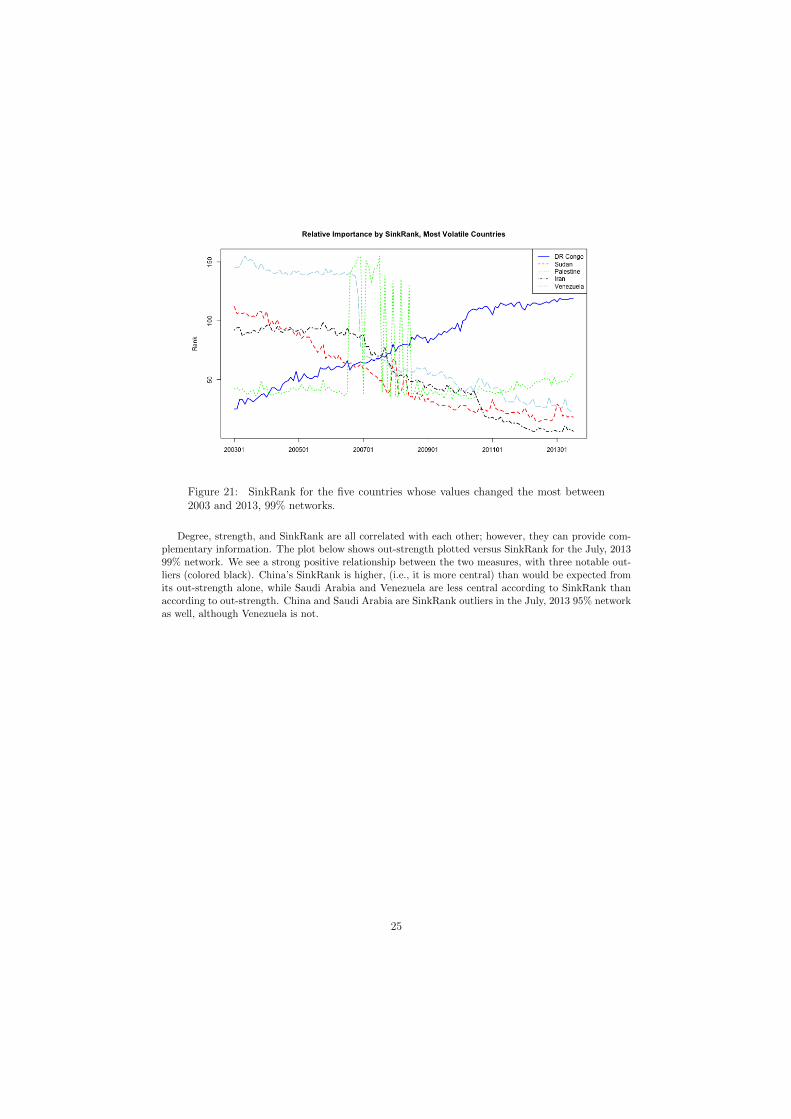
Figure 21: SinkRank for the five countries whose values changed the most between2003 and 2013, 99% networks.
Degree, strength, and SinkRank are all correlated with each other; however, they can provide com-plementary information. The plot below shows out-strength plotted versus SinkRank for the July, 201399% network. We see a strong positive relationship between the two measures, with three notable out-liers (colored black). China’s SinkRank is higher, (i.e., it is more central) than would be expected fromits out-strength alone, while Saudi Arabia and Venezuela are less central according to SinkRank thanaccording to out-strength. China and Saudi Arabia are SinkRank outliers in the July, 2013 95% networkas well, although Venezuela is not.
25

Figure 22: SinkRank vs. out-strength, July, 2013, 99% network.
The plot below shows in-strength plotted versus SinkRank for the July, 2013 99% network. Therelationship is much stronger than between SinkRank and out-strength, and again we see some pointsthat deviate notably from the general pattern of the relationship: Senegal has much higher SinkRankthan would be expected from its in-strength, and Bangladesh has much lower than expected SinkRank.Bangladesh is a positive outlier in the 95% network as well; Senegal is not.
Figure 23: SinkRank vs. in-strength, July, 2013, 99% network.
26

5 Conclusions
The SWIFT MT103 data form a rich network with myriad possibilities for data analysis. In this generaloverview, we have considered the networks in their entirety, as well as two filtered versions which providea fixed set of countries for analysis and, in the case of the 95% filtered network, maintain nearly all thenetwork volume while cutting the number of links in half. Focusing on the complete networks, we haveshown that the number of countries sending messages and the total number of messages sent has beensteadily increasing over time, with total messages sent following a regular seasonal pattern with peaks inDecember and April and troughs in January, February, and August. Although the numbers of countriesand messages have been increasing, the number of links in the networks has been declining steadily sinceearly 2007. This decline may be due to regulatory measures imposed in the wake of the financial crisis,and suggests the e↵ect that regulatory policy can have on such networks. We have also shown thatnearly half the variability in the number of messages sent between pairs of countries can be explainedwith a simple linear regression model using the sender and receiver countries’ GDP and some basicdemographic factors as predictors.
In the filtered networks, which are more suitable for time series analysis, we have shown that thepayment networks follow a core-periphery structure with a low error rate and stable core, and exhibitmuch more clustering than would be expected in random networks of the same size. We have also shownthat the networks exhibit a meaningful community structure, with the three largest and most stablecommunities corresponding generally to Europe, the former Soviet Union, and the United States withthe rest of the world. Because networks with a strong community structure by definition have relativelymany more links within communities than between them, intra-community relationships (for example,between European countries and former Soviet countries) represent a potential area for future networkgrowth.
Using the number of messages sent and received as well as the network-based metric SinkRank, wehave shown that the United States is consistently the biggest player in the payment networks, and thattherefore the system is most vulnerable to any disturbance in United States-based banks’ abilities tosend or receive payments. After the United States, the most important countries in the networks areconsistently Germany, the United Kingdom, and China. Although the countries that are most centralhave remained quite stable, there have been interesting changes in the less-central countries. Also notableis the small role played by most African countries: the 95% filtered networks contain only nine Africancountries (see Figures 11, 13, and 17). Africa therefore represents another potential area for futuregrowth.
Various results of our analysis have illustrated the sensitivity of the payment networks to globalpolitical and financial changes; for example, the decrease in number of links due to regulation, the dipin total messages sent corresponding to the financial crisis, and also country-level results such as thelarge changes in the relative importance of countries such as Venezuela and Palestine. In spite of thissensitivity, however, the overall structure of the networks is remarkably quite stable: not only is arcsurvival consistently high, but the core-periphery and community classification are also stable over time.
We hope that this overview of SWIFT MT103 networks sparks additional research. One possibleextension of the work begun here is a parallel analysis of other types of SWIFT messages to see if thenetwork structure is “robust” to transaction type. We believe that MT103, as the most widely-sent typeof SWIFT message, does provide a strong characterization of the global network; however, an analysisbased on all types of SWIFT message could provide an even more complete picture. A more thoroughstatistical analysis could involve migration and trade data or other economic indicators, for example tobuild a more complex model for the number of messages sent between countries; such a model could alsouse the entire time series of data to investigate how relationships have changed over time. In addition, amore in-depth investigation into the decline in links after the financial crisis could serve as a complementto our network analysis. A more in-depth geopolitical analysis of changes in the network over time couldalso be very interesting and suggest directions for policy research. Finally, future work should involveongoing network analysis as more recent data become available.
The fast-growing financial networks literature has thus far focused almost exclusively on national orlocal networks. We believe that analysis of global networks is the logical next step in understanding
27

the ever-more-connected financial landscape, and we hope that the work presented here encouragesadditional research on global financial networks.
Annex: Visualizing the Current State
Here we present two additional visualizations of the most recent data, from July, 2013, to give a moredetailed view of the current payment network. Because there are too many countries to show them allin a single visualization, we limit to the 18 countries whose links make up 50% of the messages in July,2013. These 18 countries form a nearly complete network: Each country sends and receives messagesfrom each other country, with the single exception that India did not send any messages to Turkey.Figure 24 below shows these countries arranged alphabetically around a circle, with node size scaledby total messages sent and received and link width and darkness scaled by total messages sent betweenthe two countries. In addition, countries are colored by their community classification as in Figures 17and 18. From this visualization it is clear that the strongest bilateral relationship is between the UnitedStates and China; the United States is also strongly linked to Hong Kong and the United Kingdom.We also see that Germany, the second largest country by both strength and SinkRank, has its strongestlinks to other European countries.
Figure 24: Countries comprising 50% of message tra�c in July, 2013.
For the same network of 18 countries, we calculate the maximum-spanning tree on their symmetrizedlinks (see Core-Periphery Structure in Section 4.2). The maximum-spanning tree network is shown inFigure 25 below, again with node size scaled by total messages sent and received, link width anddarkness scaled by bilateral messages sent and received, and nodes colored by community. We see thatthe maximum-spanning tree, whose branches can be considered as a simple clustering method, providessimilar yet complementary information to the community detection results. The tree has two branches,which coincide with the European community and the United States-centered community (with the
28
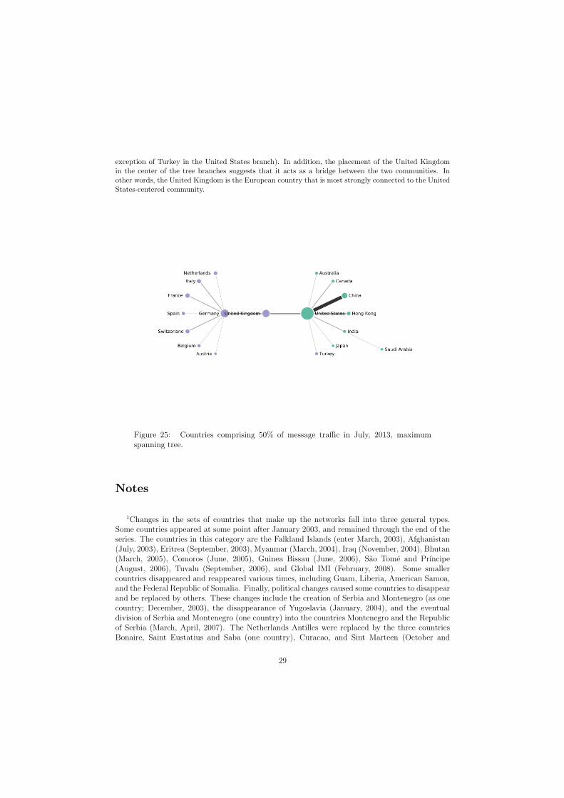
exception of Turkey in the United States branch). In addition, the placement of the United Kingdomin the center of the tree branches suggests that it acts as a bridge between the two communities. Inother words, the United Kingdom is the European country that is most strongly connected to the UnitedStates-centered community.
Figure 25: Countries comprising 50% of message tra�c in July, 2013, maximumspanning tree.
Notes
1Changes in the sets of countries that make up the networks fall into three general types.Some countries appeared at some point after January 2003, and remained through the end of theseries. The countries in this category are the Falkland Islands (enter March, 2003), Afghanistan(July, 2003), Eritrea (September, 2003), Myanmar (March, 2004), Iraq (November, 2004), Bhutan(March, 2005), Comoros (June, 2005), Guinea Bissau (June, 2006), Sao Tome and Prıncipe(August, 2006), Tuvalu (September, 2006), and Global IMI (February, 2008). Some smallercountries disappeared and reappeared various times, including Guam, Liberia, American Samoa,and the Federal Republic of Somalia. Finally, political changes caused some countries to disappearand be replaced by others. These changes include the creation of Serbia and Montenegro (as onecountry; December, 2003), the disappearance of Yugoslavia (January, 2004), and the eventualdivision of Serbia and Montenegro (one country) into the countries Montenegro and the Republicof Serbia (March, April, 2007). The Netherlands Antilles were replaced by the three countriesBonaire, Saint Eustatius and Saba (one country), Curacao, and Sint Marteen (October and
29

November, 2011). In addition, the new state of South Sudan appeared in January, 2012.
2Lists obtained from http://en.wikipedia.org/wiki/List_of_offshore_financial_
centres
3For example, (parts of) the United States were once colonies of Great Britain, France, andSpain; and the Philippines was once a colony of the United States. All demographic infor-mation was obtained from CEPII’s (Centre d’Etudes Prospectives et d’Informations Interna-tionales) GeoDist data set, available at http://www.cepii.fr/CEPII/en/bdd_modele/presentation.asp?id=6.
4For example, the Czech Republic and Slovakia were both part of Czechoslovakia.
5These countries are Australia, Austria, Belgium, Canada, China, Cyprus, Czech Republic,Denmark, Finland, France, Germany, Greece, Hong Kong, Hungary, India, Indonesia, Ireland,Israel, Italy, Japan, Jersey, Republic of Korea, Kuwait, Liechtenstein, Luxembourg, Malaysia,Malta, Morocco, Netherlands, New Zealand, Norway, Philippines, Poland, Portugal, Romania,Russia, Saudi Arabia, Singapore, Slovakia, Slovenia, South Africa, Spain, Sweden, Switzerland,Taiwan, Thailand, Turkey, United Arab Emirates, the United Kingdom, and the United States.
6These countries are Bulgaria, Brazil, Egypt, Croatia, Isle of Man, Lebanon, Sri Lanka, Lithua-nia, Latvia, Monaco, and Mauritius.
7These countries are Australia, Austria, Belgium, Canada, China, Cyprus, Czech Republic,Denmark, Finland, France, Germany, Greece, Hong Kong, Hungary, Ireland, Israel, Italy, Japan,Jersey, Republic of Korea, Kuwait, Liechtenstein, Luxembourg, Netherlands, New Zealand, Nor-way, Poland, Portugal, Romania, Russia, Saudi Arabia, Singapore, Slovakia, Slovenia, SouthAfrica, Spain, Sweden, Switzerland, Taiwan, Thailand, Turkey, United Arab Emirates, the UnitedKingdom, and the United States.
8These countries are Bulgaria, Brazil, Croatia, Indonesia, India, Lebanon, Lithuania, Morocco,Malta, and Malaysia.
References
Ax, J., Viswanatha, A., and Nikolaeva, M. (2014). U.S. imposes record fine on BNP in sanctions warningto banks. Reuters. Retrieved from http://reuters.com.
Baek, S., Soramaki, K., and Yoon, J. (2014). Network indicators for monitoring intraday liquidity inBOK-Wire+. Journal of Financial Market Infrastructures , 2.
Becher, C., Millard, S., and Soramaki, K. (2008). The network topology of CHAPS Sterling. WorkingPaper 355, Bank of England.
Clauset, A., Newman, M., and Moore, C. (2004). Finding community structure in very large networks.Physical Review E , 70(6).
Clauset, A., Shalizi, C., and Newman, M. (2009). Power-law distributions in empirical data. SIAMReview , 51(4), 661–703.
Cleveland, R., Cleveland, W., McRae, J., and Terpenning, I. (1990). STL: A seasonal-trend decompo-sition procedure based on loess. Journal of O�cial Statistics, 6, 3–73.
Cleveland, W. (1979). Robust locally weighted regression and smoothing scatterplots. Journal of theAmerican Statistical Association, 74(368), 829–836.
30

Cleveland, W. and Devlin, S. (1988). Locally-weighted regression: An approach to regression analysisby local fitting. Journal of the American Statistical Association, 83(403), 596–610.
Craig, B. and von Peter, G. (2014). Interbank tiering and money center banks. Journal of FinancialIntermediation, 23, 322–347.
Embree, L. and Roberts, T. (2009). Network analysis and Canada’s large value transfer system. Dis-cussion paper, Bank of Canada.
Newman, M. (2006). Modularity and community structure in networks. Proceedings of the NationalAcademy of Sciences of the United States of America, 103(23), 8577–8582.
Propper, M., van Levyfeld, I., and Heijmans, R. (2009). Towards a network description of interbankpayment flows. Working Paper 177, De Nederlandsche Bank.
Soramaki, K. and Cook, S. (2013). SinkRank: An algorithm for identifying systemically importantbanks in payment systems. Economics:The Open-Access, Open-Assessment E-Journal , 7.
Soramaki, K., Bech, M., Arnold, J., Glass, R., and Beyeler, W. (2007). The topology of interbankpayment flows. Physica A, 379, 317–333.
SWIFT (2011). Correspondent banking 3.0. White paper. Available online at http:
//www.swift.com/assets/swift_com/documents/about_swift/SWIFT_white_paper_
correspondent_banking.pdf.
SWIFT (2012). The SWIFT Index, technical description. Available online at http:
//www.swift.com/assets/swift_com/documents/products_services/SWIFTIndex_
technical_doc.pdf.
The Economist (2014). International banking: Poor correspondents. The Economist .
Watkins, K. (2007). Human development report 2007/08. Technical report, United Nations DevelopmentProgramme.
West, D. (1996). Introduction to Graph Theory . Prentice-Hall, Englewood Cli↵s, NJ.
31