Embed Size (px)
Citation preview

Superheat: An R package for creatingbeautiful and extendable heatmaps
for visualizing complex data
Rebecca L. BarterDepartment of Statistics, University of California, Berkeley
andBin Yu
Department of Statistics, University of California, Berkeley
January 30, 2017
AbstractThe technological advancements of the modern era have enabled the collection of huge
amounts of data in science and beyond. Extracting useful information from such massivedatasets is an ongoing challenge as traditional data visualization tools typically do not scalewell in high-dimensional settings. An existing visualization technique that is particularlywell suited to visualizing large datasets is the heatmap. Although heatmaps are extremelypopular in fields such as bioinformatics for visualizing large gene expression datasets, theyremain a severely underutilized visualization tool in modern data analysis. In this paperwe introduce superheat, a new R package that provides an extremely flexible and customiz-able platform for visualizing large datasets using extendable heatmaps. Superheat enhancesthe traditional heatmap by providing a platform to visualize a wide range of data typessimultaneously, adding to the heatmap a response variable as a scatterplot, model results asboxplots, correlation information as barplots, text information, and more. Superheat allowsthe user to explore their data to greater depths and to take advantage of the heterogeneitypresent in the data to inform analysis decisions. The goal of this paper is two-fold: (1)to demonstrate the potential of the heatmap as a default visualization method for a widerange of data types using reproducible examples, and (2) to highlight the customizability andease of implementation of the superheat package in R for creating beautiful and extendableheatmaps. The capabilities and fundamental applicability of the superheat package will beexplored via three case studies, each based on publicly available data sources and accom-panied by a file outlining the step-by-step analytic pipeline (with code). The case studiesinvolve (1) combining multiple sources of data to explore global organ transplantation trendsand its relationship to the Human Development Index, (2) highlighting word clusters in writ-ten language using Word2Vec data, and (3) evaluating heterogeneity in the performance ofa model for predicting the brain’s response (as measured by fMRI) to visual stimuli.
Keywords: Data Visualization, Exploratory Data Analysis, Heatmap, Multivariate Data
1
arX
iv:1
512.
0152
4v2
[st
at.A
P] 2
6 Ja
n 20
17

1 Introduction
The rapid technological advancements of the past few decades have enabled us to collect vast
amounts of data with the goal of finding answers to increasingly complex questions both in sci-
ence and beyond. Although visualization has the capacity to be a powerful tool in the information
extraction process of large multivariate datasets, the majority of commonly used graphical ex-
ploratory techniques such as traditional scatterplots, boxplots and histograms are embedded in
spaces of 2 dimensions and rarely extend satisfactorily into higher dimensions. Basic extensions
of these traditional techniques into 3 dimensions are not uncommon, but tend to be inadequately
represented when compressed to a 2-dimensional format. Even graphical techniques designed for
2-dimensional visualization of multivariate data, such as the scatterplot matrix (Cleveland, 1993;
Andrews, 1972) and parallel coordinates (Inselberg, 1985, 1998; Inselberg and Dimsdale, 1987)
become incomprehensible in the presence of too many data points or variables. These techniques
suffer from a lack of scalability. Effective approaches to the visualization of high-dimensional data
must subsequently satisfy a tradeoff between simplicity and complexity. A graph that is overly
complex impedes comprehension, while a graph that is too simple conceals important information.
The heatmap for matrix visualization
An existing visualization technique that is particularly well suited to the visualization of high-
dimensional multivariate data is the heatmap. At present, heatmaps are widely used in areas
such as bioinformatics (often to visualize large gene expression datasets), yet are significantly
underemployed in other domains (Wilkinson and Friendly, 2009).
A heatmap can be used to visualize a data matrix by representing each matrix entry by a
color corresponding to its magnitude, enabling the user to visually process large datasets with
thousands of rows and/or columns. For larger matrices it is common to use clustering as a tool
to group together similar observations for the purpose of revealing structure in the data and to
increase the clarity of information provided by the visualization (Eisen et al., 1998).
Inspired by a desire to visualize a design matrix in a manner that is supervised by some response
variable, we developed an R package, superheat, for producing “supervised” heatmaps that extend
the traditional heatmap via the incorporation of additional information. The goal of this paper is
two-fold: (1) to demonstrate the potential of the heatmap as a default visualization method for
2

data in high dimensions, and (2) to highlight the customizability and ease of implementation of
the superheat package in R for creating beautiful and extendable heatmaps.
2 Superheat
There currently exist a number of packages in R for generating heatmaps to visualize data. The
inbuilt heatmap function in R (heatmap) offers very little flexibility and is difficult to use to produce
publication quality images. The popular visualization R package, ggplot2, contains functions for
producing visually appealing heatmaps, however ggplot2 requires the user to convert the data
matrix to a long-form data frame consisting of three columns: the row index, the column index,
and the corresponding fill value. Although this data structure is intuitive for other types of plots,
it can be somewhat cumbersome for producing heatmaps. Some of the more recent heatmap
functions, which have a focus on aesthetics are those from the pheatmap package and its extension,
aheatmap, which allows for sample annotation.
Our R package, superheat, builds upon the infrastructure provided by ggplot2 to develop an
intuitive heatmap function that possesses the aesthetics of ggplot2 with the simple implementation
of the inbuilt heatmap functions. However it is in its customizability that superheat far surpasses
all existing heatmap software. Superheat offers a number of novel features, such as smoothing of
the heatmap within clusters to facilitate extremely large matrices with thousands of dimensions;
overlaying the heatmap with text or numbers to increase the clarity of the data provided or to
aid annotation; and most notably, the addition of scatterplots, barplots, boxplots or line plots
adjacent to the rows and columns of the heatmap, allowing the user to add an entirely new layer
of information. These features of superheat allow the user to explore their data to greater depths,
and to take advantage of the heterogeneity present in the data to inform analysis decisions.
Although there are a vast number of potential use cases of superheat for data exploration,
in this paper we will present three case studies that highlight the features of superheat for (1)
combining multiple sources of data together, (2) uncovering correlational structure in data, and
(3) evaluating heterogeneity in the performance of data models.
3
3 Case study I: combining data sources to explore global
organ transplantation trends
The demand worldwide for organ transplantation has drastically increased over the past decade,
leading to a gross imbalance of supply and demand. For example, in the United States, there
are currently over 100,000 people waiting on the national transplant list but there simply aren’t
enough donors to meet this demand (Abouna, 2008). Unfortunately this problem is worse in some
countries than others as organ donation rates vary hugely from country to country, and it has been
suggested that organ donation and transplantation rates are correlated with country development
(Garcia et al., 2012). This case study will explore combining multiple sources of data in order to
examine the recent trends in organ donation worldwide as well as the relationship between organ
donation and the Human Development Index (HDI).
The organ donation data was collected from the WHO-ONT Global Observatory on Donation
and Transplantation, which represents the most comprehensive source to date of worldwide data
concerning activities in organ donation and transplantation derived from official sources. The
database (available at http://www.transplant-observatory.org/export-database/) contains
information from a questionnaire annually distributed to health authorities from the 194 Member
States in the six World Health Organization (WHO) regions: Africa, The Americas, Eastern
Mediterranean, Europe, South-East Asia and Western Pacific.
Meanwhile, the HDI was created to emphasize that people and their capabilities (rather than
economic growth) should be the ultimate criteria for assessing the development of a country. The
HDI is calculated based on life expectancy, education and per capita indicators and is hosted
by the United Nations Development Program’s Human Development Reports (available at http:
//hdr.undp.org/en/data#).
3.1 Exploration
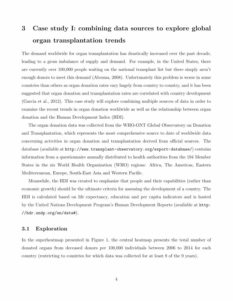
In the superheatmap presented in Figure 1, the central heatmap presents the total number of
donated organs from deceased donors per 100,000 individuals between 2006 to 2014 for each
country (restricting to countries for which data was collected for at least 8 of the 9 years).
4
Figure 1: A superheatmap examining organ donations per country and its relation to HDI. The bar
plot to the right of the heatmap displays the HDI ranking (a lower ranking is better). Each cell in
the heatmap is colored based on the number of organ donations from deceased donors per 100,000
individuals for the corresponding country and year. White cells correspond to missing values. The
rows (countries) are ordered by the average number of transplants per 100,000 (averaging across
years). The country labels and HDI bar plot are colored based on which region the country belongs
to: Europe (green), Eastern Mediterranean (purple), Western Pacific (yellow), America (orange),
South East Asia (pink) and Africa (light green). The line plot above the heatmap displays the
aggregate total number of organs donated per year.
5
Above the heatmap, a line plot displays the overall number of donated organs over time,
aggregated across all 58 countries represented in the figure. We see that overall, the organ donation
rate is increasing, with approximately 5,000 more recorded organ donations occurring in 2014
relative to 2006. To the right of the heatmap, next to each row, a bar displays the country’s HDI
ranking. Each country is colored based on which global region it belongs to: Europe (green),
Eastern Mediterranean (purple), Western Pacific (yellow), America (orange), South East Asia
(pink) and Africa (light green).
From Figure 1, we see that Spain is the clear leader in global organ donation, however there
has been a rapid increase in donation rates in Croatia, which had one of the lower rates of
organ donation in 2006 but has a rate equaling that of Spain in 2014. However, in contrast to
the growth experienced by Croatia, the rate of organ donation appears to be slowing in several
countries including as Germany, Slovakia and Cuba. For some unexplained reason, Iceland had
no organ donations recorded from deceased donors in 2007.
The countries with the most organ donations are predominantly European and American.
In addition, there appears to be a general correlation between organ donations and HDI ranking:
countries with lower (better) HDI rankings tend to have higher organ donation rates. Subsequently,
countries with higher (worse) HDI rankings tend to have lower organ donation rates, with the
exception of a few Western Pacific countries such as Japan, Singapore and Korea, which have
fairly good HDI rankings but relatively low organ donation rates.
In this case study, superheat allowed us to visualize multiple trends simultaneously without
resorting to mass overplotting. In particular, we were able to examine the organ donation over
time and for each country and compare these trends to the country’s HDI ranking while visually
grouping countries from the same region together. No other 2-dimensional graph would be able
to provide such an in-depth, yet uncluttered, summary of the trends contained in these data.
The code used to produce Figure 1 is provided in Appendix A, and a summary of the entire
analytic pipeline is provided in the supplementary materials as well as at: https://rlbarter.
github.io/superheat-examples/.
6

4 Case study II: uncovering clusters in language using
Word2Vec
Word2Vec is an extremely popular group of algorithms for embedding words into high-dimensional
spaces such that their relative distances to one another convey semantic meaning (Mikolov et al.,
2013). The canonical example highlighting the impressiveness of these word embeddings is
−−→man−−−→king +−−−−→woman = −−−→queen.
That is, that if you take the word vector for “man”, subtract the word vector for “king”
and add the word vector for “woman”, you approximately arrive at the word vector for “queen”.
These algorithms are quite remarkable and represent an exciting step towards teaching machines
to understand language.
In 2013, Google published pre-trained vectors trained on part of the Google News corpus,
which consists of around 100 billion words. Their algorithm produced 300-dimensional vectors
for 3 million words and phrases (the data is hosted at https://code.google.com/archive/p/
word2vec/).
The majority of existing visualization methods for word vectors focus on projecting the 300-
dimensional space to a low-dimensional representation using methods such as t-distributed stochas-
tic neighbor embedding (t-SNE) (Maaten and Hinton, 2008).
4.1 Visualizing cosine similarity
In this superheat case study we present an alternative approach to visualizing word vectors, which
highlights contextual similarity. Figure 2 presents the cosine similarity matrix for the Google-
News word vectors of the 35 most common words from the NY Times headlines dataset (from
the RTextTools package). The rows and columns are ordered based on a hierarchical clustering
and are accompanied by dendrograms describing this hierarchical cluster structure. From this
superheatmap we observe that words appearing in global conflict contexts, such as “terror” and
“war”, have high cosine similarity (implying that these words appear in similar contexts). Words
that are used in legal contexts, such as “court” and “case”, as well as words with political context
such as “Democrats” and “GOP” also have high pairwise cosine similarity.
7

The code used to present Figure 2 is provided in Appendix A.
Figure 2: The cosine similarity matrix for the 35 most common words from the NY Times head-
lines that also appear in the Google News corpus. The rows and columns are ordered based on
hierarchical clustering. This hierarchical clustering is displayed via dendrograms.
8
Although the example presented in Figure 2 displays relatively few words (we are presenting
only the 35 most frequent words) and we have reached our capacity to be able to visualize each word
individually on a single page, it is possible to use superheat to represent hundreds or thousands
of words simultaneously by aggregating over word clusters.
4.2 Visualizing word clusters
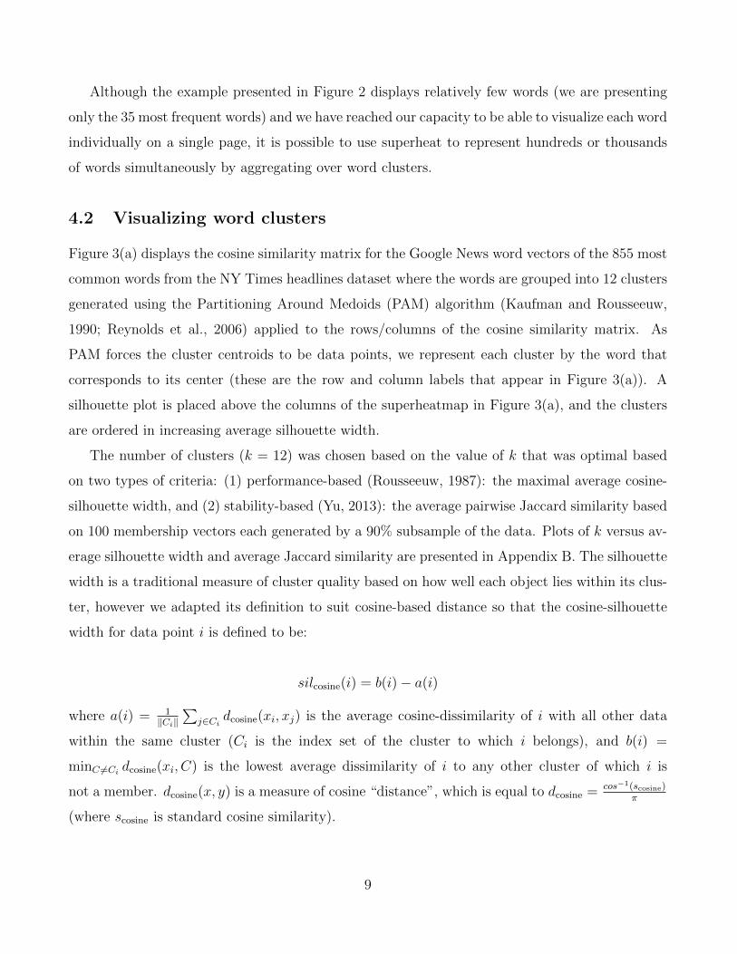
Figure 3(a) displays the cosine similarity matrix for the Google News word vectors of the 855 most
common words from the NY Times headlines dataset where the words are grouped into 12 clusters
generated using the Partitioning Around Medoids (PAM) algorithm (Kaufman and Rousseeuw,
1990; Reynolds et al., 2006) applied to the rows/columns of the cosine similarity matrix. As
PAM forces the cluster centroids to be data points, we represent each cluster by the word that
corresponds to its center (these are the row and column labels that appear in Figure 3(a)). A
silhouette plot is placed above the columns of the superheatmap in Figure 3(a), and the clusters
are ordered in increasing average silhouette width.
The number of clusters (k = 12) was chosen based on the value of k that was optimal based
on two types of criteria: (1) performance-based (Rousseeuw, 1987): the maximal average cosine-
silhouette width, and (2) stability-based (Yu, 2013): the average pairwise Jaccard similarity based
on 100 membership vectors each generated by a 90% subsample of the data. Plots of k versus av-
erage silhouette width and average Jaccard similarity are presented in Appendix B. The silhouette
width is a traditional measure of cluster quality based on how well each object lies within its clus-
ter, however we adapted its definition to suit cosine-based distance so that the cosine-silhouette
width for data point i is defined to be:
silcosine(i) = b(i)− a(i)
where a(i) = 1‖Ci‖
∑j∈Ci
dcosine(xi, xj) is the average cosine-dissimilarity of i with all other data
within the same cluster (Ci is the index set of the cluster to which i belongs), and b(i) =
minC 6=Cidcosine(xi, C) is the lowest average dissimilarity of i to any other cluster of which i is
not a member. dcosine(x, y) is a measure of cosine “distance”, which is equal to dcosine = cos−1(scosine)π
(where scosine is standard cosine similarity).
9

Figure 3: A clustered cosine similarity matrix for the 855 most common words from the NY
Times headlines that also appear in the Google News corpus. The clusters were generated using
PAM and the cluster label is given by the medoid word of the cluster. Panel (a) displays the raw
clustered 855× 855 cosine similarity matrix, while panel (b) displays a “smoothed” version where
the cells in the cluster are aggregated by taking the median of the values within the cluster.
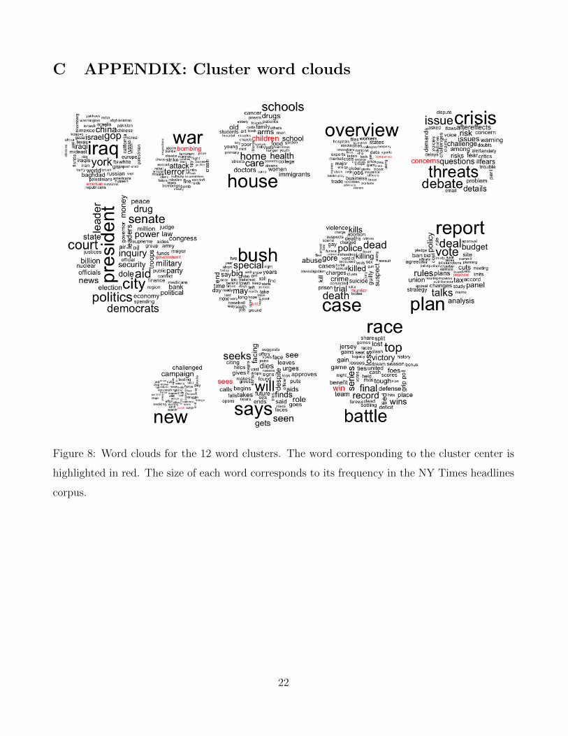
Word clouds displaying the words that are members of each of the 12 word clusters are presented
in Appendix C. For example, the “government” cluster contains words that typically appear in
political contexts such as “president”, “leader”, and “senate”, whereas the “children” cluster
contains words such as “schools”, “home”, and “family”.
Figure 3(b) presents a “smoothed” version of the cosine similarity matrix in panel (a), wherein
the smoothed cluster-aggregated value corresponds to the median of the original values in the
original “un-smoothed” matrix. The smoothing provides an aggregated representation of Figure
3(a) that allows the viewer to focus on the overall differences between the clusters. Note that the
color range is slightly different between panels (a) and (b) due to the extreme values present in
panel (a) being removed when we take the median in panel (b).
10

What we find is that the words in the “American” cluster have high silhouette widths, and
thus is a “tight” cluster. This is reflected in the high cosine similarity within the cluster and
low similarity between the words in the “American” cluster and words from other clusters. How-
ever, the words in the “murder” cluster have relatively high cosine similarity with words in the
“government”, “children”, “bombing“ and “concerns” clusters. The clusters whose centers are
not topic-specific such as “just”, “push”, and “sees” tend to consist of common words that are
context agnostic (see their word clouds in Appendix C), and these clusters have fairly high average
similarity with one another.
The information presented by Figure 3 far surpasses that of a standard silhouette plot: it
allows the quality of the clusters to be evaluated relative to one another. For example, when a
cluster exhibits low between-cluster separability, we can clearly see which clusters it is close to.
The code used to produce Figure 3 is provided in Appendix A, and a summary of the entire
analytic pipeline is provided in the supplementary materials as well as at: https://rlbarter.
github.io/superheat-examples/.
5 Case study III: evaluation of heterogeneity in the per-
formance of predictive models for fMRI brain signals
from image inputs
Our final case study evaluates the performance of a number of models of the brain’s response
to visual stimuli. This study is based on data collected from a functional Magnetic Resonance
Imaging (fMRI) experiment performed on a single individual by the Gallant neuroscience lab at
UC Berkeley (Vu et al., 2009, 2011). fMRI measures oxygenated blood flow in the brain, which can
be considered as an indirect measure of neural activity (the two processes are highly correlated).
The measurements obtained from an fMRI experiment correspond to the aggregated response of
hundreds of thousands of neurons within cube-like voxels of the brain, where the segmentation of
the brain into 3D voxels is analogous to the segmentation of an image into 2D pixels.
The data contains the fMRI measurements (averaged over 10 runs of the experiment) for each
of 1,294 voxels located in the V1 region of the visual cortex of a single individual in response to
viewings of 1,750 different images (such as a picture of a baby, a house or a horse).
11
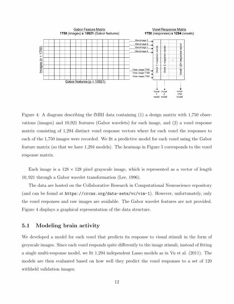
Figure 4: A diagram describing the fMRI data containing (1) a design matrix with 1,750 obser-
vations (images) and 10,921 features (Gabor wavelets) for each image, and (2) a voxel response
matrix consisting of 1,294 distinct voxel response vectors where for each voxel the responses to
each of the 1,750 images were recorded. We fit a predictive model for each voxel using the Gabor
feature matrix (so that we have 1,294 models). The heatmap in Figure 5 corresponds to the voxel
response matrix.
Each image is a 128 × 128 pixel grayscale image, which is represented as a vector of length
10, 921 through a Gabor wavelet transformation (Lee, 1996).
The data are hosted on the Collaborative Research in Computational Neuroscience repository
(and can be found at https://crcns.org/data-sets/vc/vim-1). However, unfortunately, only
the voxel responses and raw images are available. The Gabor wavelet features are not provided.
Figure 4 displays a graphical representation of the data structure.
5.1 Modeling brain activity
We developed a model for each voxel that predicts its response to visual stimuli in the form of
greyscale images. Since each voxel responds quite differently to the image stimuli, instead of fitting
a single multi-response model, we fit 1,294 independent Lasso models as in Vu et al. (2011). The
models are then evaluated based on how well they predict the voxel responses to a set of 120
withheld validation images.
12

Figure 5: A superheatmap displaying the validation set voxel response matrix (Panel (a) displays
the raw matrix, while Panel (b) displays a smoothed version). The images (rows) and voxels
(columns) are each clustered into two groups (using K-means). The left cluster of voxels are more
“sensitive” wherein their response is different for each group of images (higher than the average
response for top cluster images, and lower than the average response for bottom cluster images),
while the right cluster of voxels are more “neutral” wherein their response is similar for both image
clusters. Voxel-specific Lasso model performance is plotted as correlations above the columns of
the heatmap (as a scatterplot in (a) and cluster-aggregated boxplots in (b)).
13
5.2 Simultaneous performance evaluation of all 1,294 voxel-models
The voxel response matrix is displayed in Figure 5(a). The rows of the heatmap correspond to
the 120 images from the validation set, while the columns correspond to the 1,294 voxels. Each
cell displays to the voxel’s response to the image. The rows and columns are clustered into two
groups using K-means. As in Figure 3(a), the heatmap is extremely grainy. Figure 5(b) displays
the same heatmap with the cell values smoothed within each cluster (by taking the median value).
Appendix D displays four randomly selected images from each of the two image clusters. We
find that the bottom image cluster consists of images for which the subject is easily identifiable
(e.g. Princess Diana and Prince Charles riding in a carriage, a bird, or an insect), whereas the
contents of images from the top cluster of images are less easy to identify (e.g. rocks, a bunch of
apples, or an abstract painting). Further, from Figure 5, it is clear that the brain is much more
active in response to the images from the top cluster (whose contents were less easily identifiable)
than to images from the bottom cluster.
Furthermore, there are two distinct groups of voxels:
1. Sensitive voxels that respond very differently to the two groups of images (for the top
image cluster, their response is significantly lower than the average response, while for the
bottom image cluster, their response is significantly higher than the average response).
2. Neutral voxels that respond similarly to both clusters of images.
In addition, above each voxel (column) in the heatmap, the correlation of that voxel-model’s
predicted responses with the voxel’s true response is presented (as a scatterplot in Panel (a) and
as aggregate boxplots in Panel (b)). It is clear that the models for the voxels in the first (sensitive)
cluster perform significantly better than the models for the voxels in the second (neutral) cluster.
That is, the responses of the voxels that are sensitive to the image stimuli are much easier to
predict (the average correlation between the predicted and true responses was greater than 0.5)
than the responses of the voxels whose responses are neutral (the average correlation between the
predicted and true responses was close to zero).
Further examination revealed that the neutral voxels were primarily located on the periphery
of the V1 region of the visual cortex, whereas the sensitive voxels tended to be more centrally
located.
14

Although a standard histogram of the predicted and observed response correlations would
have revealed that there were two groups of voxels (those whose responses we can predict well,
and those whose responses we cannot), superheat allowed us to examine this finding in context.
In particular, it allowed us to take advantage of the heterogeneity present in the data: we were
able to identify that the voxels whose response we were able to predict well were exactly the voxels
whose response was sensitive to the two clusters of images.
Note that we also ran Random Forest models for predicting the voxel responses and found the
same results, however, the overall correlation was approximately 0.05 higher on average.
The code used to produce Figure 5 is provided in Appendix A, and a summary of the entire
analytic pipeline is provided in the supplementary materials as well as at: https://rlbarter.
github.io/superheat-examples/.
6 Implementation of supervised heatmaps
As evident from the examples presented above, superheatmaps are flexible, customizable and very
useful. Such plots would be difficult and time-consuming to produce without the existence of soft-
ware that can automatically generate the plots given the user’s preferences. The superheat software
package written by the authors implements superheatmaps in the R programming language. The
package makes use of the popular ggplot2 package, but does not utilize the ggplot2 grammar of
graphics (Wickham, 2010). In particular, superheat exists as a stand-alone function with the sole
purpose of producing customizable supervised heatmaps. The development page for superheat is
hosted openly at https://github.com/rlbarter/superheat, where the user can also find a de-
tailed Vignette (https://rlbarter.github.io/superheat/) describing further information on
the specific usage of the plot in R as well as a host of options for customizability. Details of the
analytic pipeline for the case studies presented in this paper can be found in the supplementary
materials as well as at https://rlbarter.github.io/superheat-examples/. See Appendix A
for the example code that produced the superheatmaps appearing in this paper.
There are two main types of clustering customization for the superheat package. The user
has the option of providing their own clustering algorithm as a predefined membership vector, or
the user can simply specify how many clusters they would like. The default clustering algorithm
is K-means. To select the number of clusters, it is recommended that the user does so prior
15

to the implementation of the supervised heatmaps using standard methods such as Silhouette
plots (Rousseeuw, 1987).
A vast number of aesthetic options exist for the supervised heatmaps. For instance, each of
the figures presented in this paper exhibited unique color schemes. Customizability of the color
scheme is possible, not only for the color scale in the the heatmap, but also for the adjacent
plots, row and column labels, grid lines, and more. The default color scheme of superheat is the
perceptually uniform viridis colormap (this was the color scheme used for the Word2Vec Case
Study II).
Moreover, there are several options for adjacent plots: they can be scatterplots (the default),
scatterplots with a smoothed curve, an isolated smoothed curve, barplots, line plots, scatterplots
with points connected by lines, and dendrograms. These options, and more, are demonstrated in
the Vignette that can be found at https://rlbarter.github.io/superheat/.
7 Conclusion
In this paper, we have proposed the superheatmap that aguments traditional heatmaps primarily
via the inclusion of extra information such as a response variable as a scatterplot, model results as
boxplots, correlation information as barplots, text information, and more. These augmentations
provide the user with an additional avenue for information extraction, and allow for exploration
of heterogeneity within the data. The superheatmap, as implemented by the superheat package
written by the authors, is highly customizable and can be used effectively in a wide range of
situations in exploratory data analysis and model assessment. The usefulness of the supervised
heatmap was highlighted in three case studies. The first combined multiple sources of data to
assess the relationship between organ donation and country development worldwide. The second
explored the structure of the english language by visualizing word clusters from Word2Vec data,
while highlighting the hierarchical nature of these word groupings. Finally, the third case study
evaluated heterogeneity in the performance of Lasso models designed to predict fMRI brain signals
in response to visual stimuli in the form of image viewings. We hope that we have demonstrated
clearly that the heatmap is an extremely useful data visualization tool, particularly for high-
dimensional datasets.
16

A APPENDIX: IMPLEMENTATION IN R
The superheat package introduces a new function, conveniently also named superheat. The use
of this function to generates the superheat Figures in this paper is shown below. The code for the
complete analysis pipeline for these case studies can be found in the supplementary materials as
well as at https://rlbarter.github.io/superheat-examples/.
Below we display the code for Figure 1 (global organ donation and human development).
superheat(donor.matrix,
# set heatmap color map
heat.pal = brewer.pal(5, "BuPu"),
heat.na.col = "white",
# order rows in increasing order of donations
order.rows = order(organs.by.country),
# grid line colors
grid.vline.col = "white",
# right plot: HDI
yr = hdi.match.2014$rank,
yr.plot.type = "bar",
yr.axis.name = "Human Development Ranking",
yr.bar.col = region.col.dark,
yr.obs.col = region.col,
# top plot: donations by year
yt = organs.by.year,
yt.plot.type = "scatterline",
yt.axis.name = "Total number of transplants per year",
# left labels
left.label.col = adjustcolor(region.col, alpha.f = 0.3),
# bottom labels
bottom.label.col = "white",
bottom.label.text.angle = 90,
bottom.label.text.alignment = "right")
17
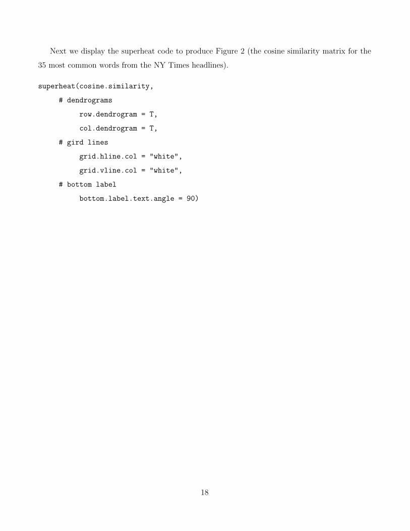
Next we display the superheat code to produce Figure 2 (the cosine similarity matrix for the
35 most common words from the NY Times headlines).
superheat(cosine.similarity,
# dendrograms
row.dendrogram = T,
col.dendrogram = T,
# gird lines
grid.hline.col = "white",
grid.vline.col = "white",
# bottom label
bottom.label.text.angle = 90)
18

The following displays the code to produce Figure 3 (the clustered cosine similarity matrix for
the 855 most common words from the NY Times headlines). To produce the smoothed version of
the superheatmap, Panel (b), we use the argument smooth.heat = TRUE.
superheat(cosine.similarity.full,
# cluster membership for words
membership.rows = word.membership,
membership.cols = word.membership,
# silhouette plot
yt = cosine.silhouette.width,
yt.axis.name = "Cosine silhouette width",
yt.plot.type = "bar",
yt.bar.col = "grey35",
# row/col order
order.rows = order(cosine.silhouette.width),
order.cols = order(cosine.silhouette.width),
# labels
bottom.label.text.angle = 90,
bottom.label.text.alignment = "right",
left.label.text.alignment = "right",
# smoothing option
smooth.heat = TRUE)
19
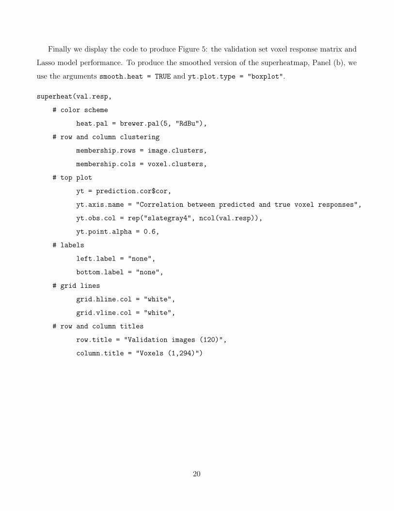
Finally we display the code to produce Figure 5: the validation set voxel response matrix and
Lasso model performance. To produce the smoothed version of the superheatmap, Panel (b), we
use the arguments smooth.heat = TRUE and yt.plot.type = "boxplot".
superheat(val.resp,
# color scheme
heat.pal = brewer.pal(5, "RdBu"),
# row and column clustering
membership.rows = image.clusters,
membership.cols = voxel.clusters,
# top plot
yt = prediction.cor$cor,
yt.axis.name = "Correlation between predicted and true voxel responses",
yt.obs.col = rep("slategray4", ncol(val.resp)),
yt.point.alpha = 0.6,
# labels
left.label = "none",
bottom.label = "none",
# grid lines
grid.hline.col = "white",
grid.vline.col = "white",
# row and column titles
row.title = "Validation images (120)",
column.title = "Voxels (1,294)")
20

B APPENDIX: Selecting the number of word clusters
Figure 6: Average pairwise Jaccard Similarity between 100 90% subsamples of the set of word
vectors.
Figure 7: Average Silhouette width based on 100 90% subsamples of the set of word vectors.
21
C APPENDIX: Cluster word clouds
Figure 8: Word clouds for the 12 word clusters. The word corresponding to the cluster center is
highlighted in red. The size of each word corresponds to its frequency in the NY Times headlines
corpus.
22

D APPENDIX: Examples of images
Figure 9: Four randomly selected examples of validation images from the top cluster of images in
Figure 5.
Figure 10: Four randomly selected examples of validation images from the bottom cluster of
images in Figure 5.
23
SUPPLEMENTARY MATERIAL
R Markdown html documents: organ.html, word.html, fMRI.html: html documents gener-
ated by R Markdown that present the entire analysis pipeline for each of the three case
studies.
ACKNOWLEDGMENTS
The authors would like to thank the Gallant Lab at UC Berkeley for providing the fMRI data.
This research is partially supported by NSF grants DMS-1107000, CDS&E-MSS 1228246, DMS-
1160319 (FRG), NHGRI grant 1U01HG007031-01 (ENCODE), AFOSR grant FA9550-14-1-0016,
and the Center for Science of Information (CSoI), an USNSF Science and Technology Center,
under grant agreement CCF-0939370.
References
Abouna, G. M. (2008). Organ Shortage Crisis: Problems and Possible Solutions. Transplantation
Proceedings 40 (1), 34–38.
Andrews, D. F. (1972). Plots of High-Dimensional Data. Biometrics 28 (1), 125–136.
Cleveland, W. S. (1993). Visualizing Data. At&T Bell Laboratories.
Eisen, M. B., P. T. Spellman, P. O. Brown, and D. Botstein (1998). Cluster analysis and display
of genome-wide expression patterns. PNAS 95 (25), 14863–14868.
Garcia, G. G., P. N. Harden, and J. R. Chapman (2012). The global role of kidney transplantation.
Kidney International 81 (5), 425–427.
Inselberg, A. (1985). The plane with parallel coordinates. The Visual Computer 1 (2), 69–91.
Inselberg, A. (1998). Visual Data Mining with Parallel Coordinates. SSRN Scholarly Paper ID
85868, Social Science Research Network, Rochester, NY.
24

Inselberg, A. and B. Dimsdale (1987). Parallel Coordinates for Visualizing Multi-Dimensional
Geometry. In D. T. L. Kunii (Ed.), Computer Graphics 1987, pp. 25–44. Springer Japan.
Kaufman, L. and P. J. Rousseeuw (1990). Partitioning Around Medoids (Program PAM). In
Finding Groups in Data, pp. 68–125. John Wiley & Sons, Inc.
Lee, T. S. (1996). Image representation using 2d Gabor wavelets. IEE Transactions on Pattern
Analysis and Machine Intelligence 18 (10), 959–971.
Maaten, L. v. d. and G. Hinton (2008). Visualizing Data using t-SNE. Journal of Machine
Learning Research 9 (Nov), 2579–2605.
Mikolov, T., K. Chen, G. Corrado, and J. Dean (2013). Efficient Estimation of Word Representa-
tions in Vector Space. arXiv:1301.3781 [cs] . arXiv: 1301.3781.
Reynolds, A. P., G. Richards, B. d. l. Iglesia, and V. J. Rayward-Smith (2006). Clustering Rules:
A Comparison of Partitioning and Hierarchical Clustering Algorithms. Journal of Mathematical
Modelling and Algorithms 5 (4), 475–504.
Rousseeuw, P. J. (1987). Silhouettes: A graphical aid to the interpretation and validation of
cluster analysis. Journal of Computational and Applied Mathematics 20, 53–65.
Vu, V. Q., P. Ravikumar, T. Naselaris, K. N. Kay, J. L. Gallant, and B. Yu (2011). Encoding and
decoding V1 fMRI responses to natural images with sparse nonparametric models. Annals of
Applied Statistics 5 (2), 1159–1182.
Vu, V. Q., B. Yu, T. Naselaris, K. Kay, J. Gallant, and P. K. Ravikumar (2009). Nonparametric
sparse hierarchical models describe V1 fMRI responses to natural images. In D. Koller, D. Schu-
urmans, Y. Bengio, and L. Bottou (Eds.), Advances in Neural Information Processing Systems
21, pp. 1337–1344. Curran Associates, Inc.
Wickham, H. (2010). A Layered Grammar of Graphics. Journal of Computational and Graphical
Statistics 19 (1).
Wilkinson, L. and M. Friendly (2009). The History of the Cluster Heat Map. The American
Statistician 63 (2), 179–184.
25

Yu, B. (2013). Stability. Bernoulli 19 (4), 1484–1500.
26


![Quick Help Acrylic WiFi HeatMaps-V2.0 [ENG]](https://img.pdfslide.us/doc/110x75/5695d2a01a28ab9b029b2646/quick-help-acrylic-wifi-heatmaps-v20-eng.jpg)