Embed Size (px)
Citation preview

STYLE GUIDE & GRAPHIC USAGE STANDARDSNOVEMBER 2018
COPYRIGHT 2018 | MEMBER VERSION


M E A L S O N W H E E L S A M E R I C A • STYLE GUIDE & GRAPHIC USAGE STANDARDS 2
TABLE OF CONTENTS
1 • INTRODUCTION 3
2 • BRAND IDENTITY 5–24
PRIMARY IDENTITY 6
LOCAL PROGRAM IDENTITY 7–14
STATE ASSOCIATION IDENTITY 15–20
SUB-BRAND IDENTITY 21-22
TAGLINE + IDENTITY SIZE 23-24
3 • COLORS 25-26
4 • TYPOGRAPHY 27–29
TYPEFACES 28
TYPE HIERARCHY 29
5 • GRAPHIC ELEMENTS 30–41
CIRCLES 31
STRIPED PATTERN 32
ROUNDED CORNER FRAMES 33
CONTENT CONTAINERS 34–37
GRAPHS & CHARTS 38
ICONOGRAPHY 39-40
PHOTOGRAPHY STYLE 41
6 • BRANDING 42-44
COBRANDING 43
SOCIAL MEDIA 44
7 • CONTACT US 45

3
1 INTRODUCTION

M E A L S O N W H E E L S A M E R I C A • STYLE GUIDE & GRAPHIC USAGE STANDARDS 4
Igniting a movement means empowering you with the creativity and passion that lives at the heart of our new brand expression. This Style Guide & Graphic Usage Standards are intended to complement the Brand Identity & Messaging Guide and to introduce you to the visual components of our identity. Specifically, it demonstrates how each element, when applied properly, brings the promise of our brand to life. These visual elements let us speak as a unified movement by providing a framework for consistency.
The branding system was created with all Member programs in mind, providing distinct levels of visual brand participation that include: adopting our new logo for your local program, as well as providing a custom-made State Association logo. We will create all the logo files you need, don’t worry about making your own.
NOTE: This Guide is intended to be used in conjunction with the Brand Identity & Messaging Guide which details the story and language of our brand. The Brand Identity & Messaging Guide can be found in Member Central under brand resources. For more information, please contact [email protected].
INTRODUCTION

5
BRAND IDENTITY2

M E A L S O N W H E E L S A M E R I C A • STYLE GUIDE & GRAPHIC USAGE STANDARDS 6
The primary identity is used for the national
organization only. It symbolizes the power found in people coming together in forward movement – where the wheels of urgency generate an energy that is central to the very essence of our organization just as our initials, the M and W, are essential to our most recognizable name.
This logo is not permitted for use by local programs or members. To show your affiliation we encourage Brand Adoption or displaying the official Meals on Wheels America Member Badge.
Reach out to [email protected] for more information.
PRIMARY IDENTITY

M E A L S O N W H E E L S A M E R I C A • STYLE GUIDE & GRAPHIC USAGE STANDARDS 7
Member programs have their own version of the brand logo. In order to create a distinct level of hierarchy and differentiation between the National Organization, the State Associations and the local Member programs, the color of the “on” circle was changed. A green “on” circle indicates State Associations or local programs that are a part of the Meals on Wheels network, but are NOT the National Organization.
The local program identity is related to the State Association identity but removes the green container to allow for further distinction between the State Association and local programs AND to accommodate the varied lengths of local program names (i.e: Meals on Wheels JOHNSON AND ELLIS COUNTY vs. Meals on Wheels TULSA).
The size, color and placement of the local program name are critical to maintaining consistency within the system of hierarchy that was developed for Meals on Wheels America and its Members.
Maintaining the hierarchical structure of the local program name through the use of size, color and placement (as indicated here) relative to the Meals on Wheels America logo ensures that the power of our brand supports the efforts of local Member programs.
LOCAL PROGRAM IDENTITY

M E A L S O N W H E E L S A M E R I C A • STYLE GUIDE & GRAPHIC USAGE STANDARDS 8
TERMS DIAGRAM
This Guide refers to different parts of the primary identity and the terms used. To ensure proper use of each part, please use this diagram as a guide.
ICON
MEMBER IDENTITY,LOGO OR LOGO LOCKUP
WORDMARKOR LOGOTYPE
LOCAL PROGRAM NAME
“ON” CIRCLE

M E A L S O N W H E E L S A M E R I C A • STYLE GUIDE & GRAPHIC USAGE STANDARDS 9
Maintaining clear space around the logo and logotype keeps the brand presence strong, clear and uncluttered.
This diagram shows how the logo lockup was created based on size relationships between brand elements.
Keep various design elements away from the logo
using the spacing guidelines shown here.
LOCAL PROGRAM EXCLUSION ZONE & CONSTRUCTION
=
=

M E A L S O N W H E E L S A M E R I C A • STYLE GUIDE & GRAPHIC USAGE STANDARDS 10
Use of the Meals on Wheels tagline with a local program identity is recommended only when using the logo configuration shown here.
Never create alternate variations or presentations of the tagline when it is in lock up with the logo.
The tagline can be used in conjunction with the Meals on Wheels State Association and Member program logo versions only. It must be done so in accordance with these guidelines. We will provide you with your logo alone, and one with the tagline included to help you comply.
The tagline cannot be used in conjunction with any other logo.
The only time the tagline doesn’t need the ® is when it’s paired with the logo.
LOCAL PROGRAM IDENTITY WITH TAGLINE

M E A L S O N W H E E L S A M E R I C A • STYLE GUIDE & GRAPHIC USAGE STANDARDS 11
Maintaining clear space around the logo and logotype keeps the brand presence strong, clear and uncluttered. The exclusion zone is very important when using the tagline to maximize legibility, especially at small sizes.
This diagram shows how the logo lockup was created based on size relationships between brand elements.
Keep various design elements away from the logo using the spacing guidelines shown here.
LOCAL PROGRAM IDENTITY WITH TAGLINE EXCLUSION ZONE & CONSTRUCTION
=
=
M E A L S O N W H E E L S A M E R I C A • STYLE GUIDE & GRAPHIC USAGE STANDARDS 12
While the preferred local program identity is the version shown on page 6, alternate logo compositions may be necessary as size or space constraints require.
Programs with unusually long names will be handled on a case-by-case basis.
LOCAL PROGRAM IDENTITY VARIATIONS

M E A L S O N W H E E L S A M E R I C A • STYLE GUIDE & GRAPHIC USAGE STANDARDS 13
Some applications will require the wordmark only. In such cases, use these compositions of the Meals on Wheels logotype with the local program descriptor.
LOCAL PROGRAM WORDMARK ONLY

M E A L S O N W H E E L S A M E R I C A • STYLE GUIDE & GRAPHIC USAGE STANDARDS 14
ADDITIONAL LOCAL PROGRAM IDENTITY VIOLATIONS
Do not use a container around the local program name.Do not change the size of placement of local program name.Do not change the color of the local program name.
Do not use a light blue “on” circle for local program identity. Do not substitute fonts for local program name. Do not create a pattern with the logo or animate the logo in any way.
NOTE: Using the logo with a ™ is a violation.

M E A L S O N W H E E L S A M E R I C A • STYLE GUIDE & GRAPHIC USAGE STANDARDS 15
An additional identity was created for the State Associations affiliated with Meals on Wheels America. In order to create a distinct level of hierarchy and differentiation between the National Organization and the State Associations, the color of the “on” circle was changed. A green “on” circle indicates State Associations or local Member programs that are a part of Meals of Wheels, but are NOT the National Organization.
A fixed-width green container houses the state names (the single size of the container can accommodate the longest state name as well as the shortest state name). The size, color and placement of the state name are critical to maintaining consistency within the system of hierarchy that was developed for Meals on Wheels America and its Member programs.
STATE ASSOCIATION IDENTITY

M E A L S O N W H E E L S A M E R I C A • STYLE GUIDE & GRAPHIC USAGE STANDARDS 16
Maintaining clear space around the State Association logo and logotype keeps the brand presence strong, clear and uncluttered.
This diagram shows how the logo lockup was created based on size relationships between brand elements.
Keep various design elements away from the logo using the spacing guidelines shown here.
STATE ASSOCIATION IDENTITY EXCLUSION ZONE & CONSTRUCTION
=
=

M E A L S O N W H E E L S A M E R I C A • STYLE GUIDE & GRAPHIC USAGE STANDARDS 17
Use of the Meals on Wheels tagline with State Association identity is recommended only when using the logo configuration shown here.
Never create alternate variations or presentations of the tagline when it is in lock up with the logo.
The tagline can be used in conjunction with the Meals on Wheels State Association and Member program logo versions only. It must be done so in accordance with these guidelines. We will provide you with your logo alone, and one with the tagline included to help you comply.
The tagline cannot be used in conjunction with any other logo.
STATE ASSOCIATION WITH TAGLINE

M E A L S O N W H E E L S A M E R I C A • STYLE GUIDE & GRAPHIC USAGE STANDARDS 18
Maintaining clear space around the State Association logo and logotype keeps the brand presence strong, clear and uncluttered. The exclusion zone is very important when using the tagline to maximize legibility, especially at small sizes.
This diagram shows how the logo lockup was created based on size relationships between brand elements.
Keep various design elements away from the logo using the spacing guidelines shown here.
STATE ASSOCIATION IDENTITY EXCLUSION ZONE & CONSTRUCTION
=
=
M E A L S O N W H E E L S A M E R I C A • STYLE GUIDE & GRAPHIC USAGE STANDARDS 19
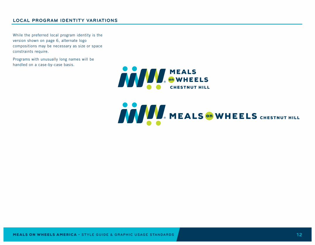
While the preferred State Association primary identity is the version shown on page 14, alternate logo compositions may be necessary as size or space constraints require.
ALTERNATE STATE ASSOCIATION IDENTITY COMPOSITIONS

M E A L S O N W H E E L S A M E R I C A • STYLE GUIDE & GRAPHIC USAGE STANDARDS 20
ADDITIONAL STATE ASSOCIATION IDENTITY VIOLATIONS
Do not use unspecified color combinations.Do not change the size or placement of the state name.Do not change the size of the green container.
Do not use a light blue “on” circle for State Association ID. Do not change the shape of the green container.
NOTE: The State Association identity violations are in addition to identity violations mentioned on page 14.

M E A L S O N W H E E L S A M E R I C A • STYLE GUIDE & GRAPHIC USAGE STANDARDS 21
LOCAL PROGRAM SUBSIDIARY SUB-BRANDING
Many Member programs offer services beyond meal delivery that they want brought into their Meals on Wheels national branding visual format. When a Member program is using the national branding and logo to identify their organizational name and look, they can use this sub-brand logo format to identify other services they offer.
Sub-brand logos should be created by Meals on Wheels America and can be requested by contacting [email protected]

M E A L S O N W H E E L S A M E R I C A • STYLE GUIDE & GRAPHIC USAGE STANDARDS 22
Maintaining clear space around the Local Program logo and logotype keeps the brand presence strong, clear and uncluttered.
This diagram shows how the logo lockup was created based on size relationships between brand elements.
Keep various design elements away from the logo using the spacing guidelines shown here.
SUB-BRAND IDENTITY EXCLUSION ZONE & CONSTRUCTION
=

M E A L S O N W H E E L S A M E R I C A • STYLE GUIDE & GRAPHIC USAGE STANDARDS 23
TAGLINE USE SEPARATE FROM THE LOGO
While the tagline is meant to be used in conjunction with the logo – where it can’t be changed in any way – its central idea may be woven through any communications. See the Brand Identity & Messaging Guide for ways to do that. Much of our new messaging references how we stand together, what we do together and what we believe in together.
When the tagline is used in ways other than as a part of your national brand logo, then it must be used in accordance with the guidelines in this guide. The tagline must also have a clear separation from other copy if there is additional text surrounding it. Therefore, when used as a heading, it will be in all capital letters and if used in text or body copy/paragraph, the tagline should be in all italics.
TAGLINE USED AS A HEADING:
TAGLINE USED IN BODY COPY:
Together, We Can Deliver® so Jack’s inability to drive to the grocery store doesnt mean he will go hungry.

M E A L S O N W H E E L S A M E R I C A • STYLE GUIDE & GRAPHIC USAGE STANDARDS 24
The minimum size for the identity without the tagline is 1.57 inches wide.
Minimum size for the identity with the tagline is 2 inches wide. The type size should never be smaller than 6.65 pt. to maintain legibility.
For State Associations and local Member programs, the minimum size is 1.57 inches (so the type size never goes below 6.65 pt.).
MINIMUM IDENTITY SIZE
TYPE SIZE: 6.65 pt.
MINIMUM SIZE: 1.57 inches
TYPE SIZE: 6.65 pt.
MINIMUM SIZE: 2 inches
MINIMUM SIZE: 1.57 inches
TYPE SIZE: 6.65 pt.

25
COLORS3

M E A L S O N W H E E L S A M E R I C A • STYLE GUIDE & GRAPHIC USAGE STANDARDS 26
Our color palette was chosen to reflect the character and spirit of our brand. The primary palette asserts our energy, our sense of urgency and the optimism found in the goodness of our services. While we are optimistic, we are also serious and require a broad palette of colors to highlight and emphasize unique messaging to certain audiences. In instances where content is heavy, gray is used to organize information to be easily read and retained.
CMYK = Print applications
RGB = Web and TV applications
NOTE: There are different pantone colors when printing on coated and uncoated stock when using the primary color palette.
COLOR PALETTE
PANTONE® (COATED) 302C PANTONE® (UNCOATED) 302U CMYK: 100/48/12/58 RGB: 0/57/82
PANTONE® (COATED) 3115C PANTONE® (UNCOATED) 3115U CMYK: 80/0/18/0 RGB: 0/183/196
PANTONE® (COATED) 382C PANTONE® (UNCOATED) 388U CMYK: 28/0/100/0 RGB: 171/208/55
PANTONE® 7406C CMYK: 8/18/100/0 RGB: 238/200/25
PANTONE® 7597C CMYK: 0/87/98/0 RGB: 240/73/37
PANTONE® 2415C CMYK: 28/93/23/0 RGB: 186/55/124
PANTONE® 7550C CMYK:15/50/90/0 RGB: 216/141/58
PANTONE® COOL GRAY 2C CMYK: 0/0/0/10 RGB: 230/231/232
PANTONE® COOL GRAY 6C CMYK: 0/0/0/30 RGB: 188/190/192
PRIMARY PALETTE
SECONDARY PALETTE
27
TYPOGRAPHY4

M E A L S O N W H E E L S A M E R I C A • STYLE GUIDE & GRAPHIC USAGE STANDARDS 28
Bryant is a rounded, geometric sans-serif typeface. It is well-suited for a variety of applications but is used for headlines and taglines in the Meals on Wheels America brand language. Bryant is always used in all caps with generous tracking (+80-100). The rounded nature of the letterforms allow for all caps use without coming across as too strong. Bryant sends the message of lighthearted, serious, approachable and straight-forward, warm and modern.
Trade Gothic is a hard-working, semi-condensed sans-serif font family that is used for all Meals on Wheels body copy and detailed information. This font is great for legibility at small sizes and in content-heavy areas. The oblique version of this font is used for quotations, descriptors or whenever body copy needs additional emphasis.
These fonts will be provided to you. Please contact us at [email protected] if you have any questions.
TYPOGRAPHY
BRYANT BOLD
A B C D E F G H I J K L M N O P Q R S T U V W X Y Z0123456789
TRADE GOTHIC LT REGULAR
A B C D E F G H I J K L M N O P Q R S T U V W X Y Zabcdefghijklmnopqrstuvwxyz0123456789
TRADE GOTHIC LT OBLIQUE
A B C D E F G H I J K L M N O P Q R S T U V W X Y Zabcdefghijklmnopqrstuvwxyz0123456789
HEADLINES AND SUB-HEADS
COPY

M E A L S O N W H E E L S A M E R I C A • STYLE GUIDE & GRAPHIC USAGE STANDARDS 29
This page shows an example of the type hierarchy using multiple typefaces to distinguish between different types of information.
Type sizes are for example only, as headline and body copy sizes will vary based on application.
Body copy should never be smaller than 8 pt.
Headlines on web should not exceed 36 pt.
Sub-heads have similar treatment to headlines. For further differentiation, change the size of the type or the color (or both) to maintain hierarchy.
When possible, headlines should be centered over body copy and written in all caps.
When type is placed in ribbon container, it must be right-aligned and the text box should follow the angle of the right side of the container.
The type should always provide the highest level of contrast. Never use green type on a light blue background (or vice versa). Ideally use white type on a navy background or navy type on a white background to obtain the best legibility.
When the tagline is used without the logo, any accompanying text or descriptors should be italicized to provide a clear distinction from the tagline.
The trademark must be included in the top right corner of the tagline.
TYPOGRAPHIC HIERARCHY
HEADLINE: Bryant BoldSIZE: 14 PT.KERNING: OPTICALTRACKING: +80
HEADLINE: Bryant BoldKERNING: OPTICALTRACKING: +80
BODY COPY: Trade Gothic LT RegularSIZE: 12 PT.KERNING: OPTICALTRACKING: +25
DESCRIPTOR: Trade Gothic LT ObliqueKERNING: OPTICALTRACKING: +100
LINK: Bryant BoldKERNING: OPTICALTRACKING: +100
CALLOUT OR SUB-HEAD: Bryant BoldSIZE: 10 PT.KERNING: OPTICALTRACKING: +80
DESCRIPTOR: Trade Gothic LT ObliqueSIZE: 12 PT.KERNING: OPTICALTRACKING: +25
Hosted by Meals on Wheels Leadership Academy

30
GRAPHIC ELEMENTS5
M E A L S O N W H E E L S A M E R I C A • STYLE GUIDE & GRAPHIC USAGE STANDARDS 31
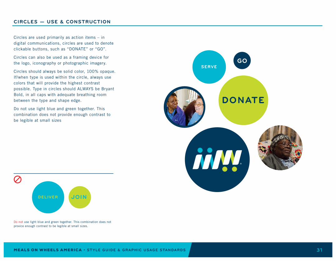
Circles are used primarily as action items – in digital communications, circles are used to denote clickable buttons, such as “DONATE” or “GO”.
Circles can also be used as a framing device for the logo, iconography or photographic imagery.
Circles should always be solid color, 100% opaque. If/when type is used within the circle, always use colors that will provide the highest contrast possible. Type in circles should ALWAYS be Bryant Bold, in all caps with adequate breathing room between the type and shape edge.
Do not use light blue and green together. This combination does not provide enough contrast to be legible at small sizes
CIRCLES — USE & CONSTRUCTION
Do not use light blue and green together. This combination does not provice enough contrast to be legible at small sizes.

M E A L S O N W H E E L S A M E R I C A • STYLE GUIDE & GRAPHIC USAGE STANDARDS 32
The striped pattern should always be proportionally scaled from the master pattern to maintain consistency. The angle of the pattern is derived from shapes within the Meals on Wheels logo.
This pattern should be used sparingly. Most often, it should be used to give more depth to flat areas of color. In these instances, the pattern should be tone on tone color, never a combination of two colors (with the exception of a color + white).
A combination of tone on tone pattern and color + white can be used for graphs (see page 58).
NOTE: The light blue striped pattern is constructed using a reduced opacity navy blue pattern overlay.
STRIPED PATTERN — USE & CONSTRUCTION
Navy background, navy pattern overlay (100% multiply)
Green background, green pattern overlay (75% multiply)
Light blue background, 20% opacity navy* pattern overlay (100% multiply)
Navy background, navy pattern overlay (50% multiply)
Green background, green pattern overlay (35% multiply)
Light blue background, 10 % opacity navy* pattern overlay (100% multiply)
White background, navy pattern overlay (100% opaque)
White background, green pattern overlay (100% opaque)
White background, light blue pattern overlay (100% opaque)
*Do not use light blue pattern overlay multiplied on light blue background.
Do not use a combination of colors to create the striped pattern.

M E A L S O N W H E E L S A M E R I C A • STYLE GUIDE & GRAPHIC USAGE STANDARDS 33
Whenever images are depicted in printed or digital applications, they should be contained within a rounded corner frame. Rounded corner frames can be used to house a variety of information such as images, videos, quotations, call-outs, clickable action items, etc.
Photo mask should have rounded corners that are proportionate to the outer frame. The inner frame (photo or video) should be centered in the outer frame with the same amount of border on all sides.
Using the following frames as a starting point, you can create a variety of rounded corner frames that will proportionally fit the content you need to contain.
If not using these frames from art files, you can use Adobe Illustrator to create rounded corner frames. Start by creating a 1.5 x 1.5 inch square and applying “rounded corners” under the appearance palette. Enter a radius of .065 and use this setting as a basis for the creation of your frame. Scaling the square proportionally to the size frame you need will give you the correct proportion of rounded edge.
Use the following examples as a guide when creating frames and image masks.
ROUNDED CORNER FRAMES

M E A L S O N W H E E L S A M E R I C A • STYLE GUIDE & GRAPHIC USAGE STANDARDS 34
The dynamic shape of text/headline/content containers is based on the forward leaning shapes in the Meals on Wheels logo.
Containers can expand to accommodate varying lengths of content. See page 34 for how to create this shape.
These containers are always placed on the left side of the page and bleed off the edge.
Text should be right-aligned and follow the same angle as the container shape (approximately 75º). Allow for adequate breathing space around the text and captions should appear visually centered and balanced within the container.
A secondary container (light blue) should never be longer than the primary container. The secondary container is for additional relevant information, usually related to links. The triangle arrow icon must be included to indicate link.
CONTENT CONTAINER
Text container shown in context:

M E A L S O N W H E E L S A M E R I C A • STYLE GUIDE & GRAPHIC USAGE STANDARDS 35
CONTENT CONTAINER CONFIGURATIONS
Content containers can be used to house a wide variety of information and there are several ways they can be configured.
Container shape can be used for names/titles following the same system of type hierarchy.
If absolutely necessary, the secondary container may be expanded vertically, although this is not preferred.
The primary container shape may be used without a secondary container shape.
The secondary container shape may change to any color specified in this Guide, depending on the background imagery.
Color changes should be used to allow for the greatest contrast between containers and background imagery and/or to differentiate categories as an organizational device. Primary content containers can be navy blue, light blue, green or white. Navy blue should be the most prominent and most widely used for consistency. Other colors may be necessary to call out new information or provide navigational cues.
NAME & TITLE
EXPANDED SECONDARY CONTAINER
NO SECONDARY CONTAINER
COLOR CHANGE

M E A L S O N W H E E L S A M E R I C A • STYLE GUIDE & GRAPHIC USAGE STANDARDS 36
CONTENT CONTAINER CONSTRUCTION
Using the angled shape from the Meals on Wheels logo, proportionally scale the shape to fit the height of the content it will contain. From there, direct select the right or left side of the shape to expand the container horizontally to fit the content. When the width is the correct size, create a clipping mask to cut off the left side of the shape.
Creating a container this way ensures that the angles, corners and curves are consistent with the shape of the icon.
The secondary container is created using the same guidelines as the primary container but slightly smaller with a different shaped clipping mask. Start with the same shape as the primary container, scale to 80%, expand horizontally and create clipping mask.
The primary container should always include transparency. This is created by using two shapes* overlaying each other with a combination of a multiplied appearance and a reduced opacity.
The secondary container does NOT have transparency.
It is preferred that the primary content containers are navy blue (especially on the homepage of the website). In other (web) applications, it may be necessary to use other colors within the specified palette.
NOTE: Different colors can be used for Member signed in pages but color should be consistent on homepage.
Feel free to create these shapes yourself, or
contact [email protected] for help.
Starting shape, from Meals on Wheels icon, scaled vertically to fit content height.
Star ting shape 80% size
TO CONSTRUCT TEXT CONTAINER:
TO CONSTRUCT SECONDARY CONTAINER:
TRANSPARENCY:
Expanded horizontallyto fit content.
Expanded horizontallyto fit content.
Clipping mask applied to cut off left side.
Clipping mask applied to cut off excess.
UNDERLAY: WHITE, reduced opacity*
*The opacity of the white shape differs based on the color of the overlay.NAVY: 85% WHITE; LIGHT BLUE: 95% WHITE; GREEN: 95% WHITE
When a WHITE container is used, simply reduce the opacity to 95% to obtain transparency.
OVERLAY: 100% Multiply

M E A L S O N W H E E L S A M E R I C A • STYLE GUIDE & GRAPHIC USAGE STANDARDS 37
CONTENT CONTAINER VIOLATIONS
Do not scale the shape disproportionally.Do not use left- or center-aligned text.Do not reflect or reverse the angled shape.
Do not use a content container overlaying an image without a white underlay.
Do not alter the tagline in any way.
Do not show the entire container shape/use the content container without a clipping mask.
Do not unspecified color combinations or colors outside the approved palette.
TO SOLVE HUNGER

M E A L S O N W H E E L S A M E R I C A • STYLE GUIDE & GRAPHIC USAGE STANDARDS 38
Graphs and charts can appear in a variety of ways.
Use these examples as a base for creating bar graphs and pie charts within the Meals on Wheels America brand language.
Graph titles and descriptors should always be written in all caps Bryant Bold with any additional explanation in Trade Gothic LT Regular.
Numbers should be most prominent and should be a larger type size than the titles.
GRAPHS & CHARTS
*Inner white circle is 60% of the size of the outer circle.

M E A L S O N W H E E L S A M E R I C A • STYLE GUIDE & GRAPHIC USAGE STANDARDS 39
Three original icons were created to represent the three main services Meals on Wheels provides: a nutritious meal, a friendly visit and a safety check.
Other iconography that is yet to be developed should fit inside circular containers and match the same tone as the examples shown here.
ICONOGRAPHY

M E A L S O N W H E E L S A M E R I C A • STYLE GUIDE & GRAPHIC USAGE STANDARDS 40
Social media icons should always be housed in circles and be simplified to 1 color + white.
Social media icons should NOT appear in green or any other unspecified color.
SOCIAL ICONS

M E A L S O N W H E E L S A M E R I C A • STYLE GUIDE & GRAPHIC USAGE STANDARDS 41
Photographs of those we serve represent the heart of our brand. We exist to serve physical and emotional needs. Accordingly, our photography should depict the engaging nature of our movement with subjects looking into the camera just as they would look into the eyes of our Members for help and comfort.
Symbolic of our reaching out to others are the hands delivering meals, giving a warm embrace and the security found in the touch of human connection. In the composition of a photograph, keep the good work of our hands evident.
Photographs should have shallow depth of field with the central subject being the focus. This treatment, with blurred a blurred background, adds warmth and highlights simple acts of kindness.
Lighting should be natural and indirect, supporting the idea of capturing a moment versus capturing a pose.
Food and our meals should be styled simply to support the nutrition we deliver. The camera’s point-of-view showing the depth of the environment (table and kitchen) provides a depth to the experience.
NOTE: Member programs that officially adopt the Meals on Wheels brand, will receive free access to our Brand Photo Gallery.
Contact [email protected] for more information.
PHOTOGRAPHY STYLE
42
4 BRANDING

M E A L S O N W H E E L S A M E R I C A • STYLE GUIDE & GRAPHIC USAGE STANDARDS 43
When partners or sponsors want to use their Meals on Wheels logo with their own brand identity, the individual logos should be proportional to each other.
The same treatment can be applied to Umbrella Organizations.
Contact [email protected] if you have any questions.
CO-BRANDING YOUR LOGO
EXAMPLE: CO-BRANDED BANNER WITH SPONSOR OR PARTNER
EXAMPLE: CO-BRANDED BANNER WITH UMBRELLA ORGANIZATION

M E A L S O N W H E E L S A M E R I C A • STYLE GUIDE & GRAPHIC USAGE STANDARDS 44
For Facebook, be sure to save your file at the size of 360 x 360 pixels. If you wish to add a cover photo, please save your file at 828 x 465 pixels.*
For Twitter, profile picture size is reccomended at 400 x 400 pixels, and cover photo is 1,500 x 500 pixels.*
Because of the small size of profile pictures, it is recommended to use only the icon and State Association or local Member program name to provide the best legibility.
NOTES: For profile photos with your logo, you may get a better result by using a PNG file.**
Facebook and Twitter are the only places that
the logo mark can be separated from the Meals
on Wheels name. This is to ensure that the mark is always “labeled” as ours. In social media, the name of your program will always be displayed next to the profile picture, which will be the mark, so this exception does not compromise the intent of the guidelines.**
*As of November 2018; these numbers change frequently.
**If you have any questions, feel free to contact [email protected].
SOCIAL MEDIA DISPLAY
EXAMPLE: FACEBOOK PROFILE PICTURE
EXAMPLE: TWITTER AVATAR

M E A L S O N W H E E L S A M E R I C A • STYLE GUIDE & GRAPHIC USAGE STANDARDS 45
CONTACT US
Thanks again for your enthusiasm in joining our brand! If you have any questions, feel free to contact [email protected].
NOTE: This Guide is subject to change.


