Embed Size (px)
Citation preview

Students’ Misconceptions in Interpreting Center and Variability of Data Represented via Histograms and Stem-and-leaf Plots Linda L. Cooper and Felice S. Shore Towson University
Journal of Statistics Education Volume 16, Number 2 (2008), www.amstat.org/publications/jse/v16n2/cooper.html
Copyright © 2008 by Linda L. Cooper and Felice S. Shore all rights reserved. This text may be freely shared among individuals, but it may not be republished in any medium without express written consent from the authors and advance notification of the editor.
Key Words: Descriptive statistics; Mean; Median; Variation; Undergraduate statistics.
Abstract This paper identifies and discusses misconceptions that students have in making judgments of center and variability when data are presented graphically. An assessment addressing interpreting center and variability in histograms and stem-and-leaf plots was administered to, and follow-up interviews were conducted with, undergraduates enrolled in introductory statistics courses. Assessment items focused upon comparing the variability of two data sets of common range represented by bell-shaped histograms on a common scale, computing measures of center from data extracted from graphs, and in comparing the relative location of the mean and median on a histogram from skewed data. Students’misconceptions often stemmed from their difficulty in maintaining understanding of the data that are being represented graphically.
1. Introduction Are students in introductory college statistics courses able to make connections between the graphical representation of quantitative data and the corresponding center and variability for that data set? Graphical representations and measures of center and variability are all powerful tools of data analysis used to summarize data. Computational methods to find these summary measures and basic methods of graph construction, in some form, are usually included, or assumed, in introductory college statistics courses. However, it is not clear that sufficient attention is given to higher-order tasks that would promote flexibility between numerical and graphical representations of a data set. Given graphs of quantitative data sets, students should be able to make comparisons of the mean and median of a data set, and in some cases make comparisons of the magnitude of variability among multiple data sets. Additionally, when provided with the mean and median of a data set, students should be able to visualize potential basic forms of the corresponding graph of the data.
These skills are implicated in recommendations from national organizations. For example, in the Principles and Standards for School Mathematics, the National Council of Teachers of Mathematics (2000) states that for univariate data students in grades 9 through 12 should "be able to display the distribution, describe its shape, and select and calculate summary statistics…Students should also recognize that the sample mean and median can differ greatly for a skewed distribution" (p.324-326). The Guidelines for Assessment and Instruction in Statistics Education (GAISE) Report (Franklin, et al., 2007) maintains that an understanding of variability in data is the single most important foundational concept in all of statistical thinking. To that end, they suggest that K-12 students with an advanced developmental level of statistical literacy engage in tasks that require them to integrate a deep understanding of graphical representation along with measures of center and spread as would be evident in those graphs.
Page 1 of 13Journal of Statistics Education, v16n2: Linda L. Cooper and Felice S. Shore
8/20/2008http://www.amstat.org/publications/jse/v16n2/cooperpdf.html
Perhaps, the presumption for some undergraduate statistics courses is that the groundwork has been laid. However, research on primary and secondary students has already documented difficulties in reasoning about quantitative data when it is provided in the aggregate, as in histograms, line plots or other frequency graphs (Friel & Bright, 1995; McClain, 1999; Watson, et al., 2003). Results from the Sixth Mathematics Assessment of the National Assessment of Educational Progress (NAEP) indicate that more than three-fourths of 8th graders and more than two-thirds of 12th graders were unable to correctly identify the median value for one of the variables shown in a scatter plot (Zawojewski & Heckman, 1997), though the authors were unable to conclude whether the difficulty stemmed from the graphical representation or a misunderstanding of median.
The research that links graph interpretation with statistical reasoning, in particular, summary measures, appears to be based primarily on K-12 students, though misconceptions or superficial understanding of measures of center have been cited at all levels of education. Mokros and Russell (1995) as well as Friel (1998) documented elementary and middle school students’ understandings and difficulties surrounding the concept of "average." Cai (1998) identified ways sixth grade students made sense of the algorithm for the mean, noting the limited ways in which they were able to use the underlying concept to solve various types of problems. Watson and Moritz (2000) looked at how elementary through high school students’ understanding of average changes over time. Undergraduate college students have also been shown to have tenuous understanding of the mean: Pollatsek, Lima, and Well (1981) documented undergraduates’ difficulties in determining weighted means, and Mevarech’s (1983) study cited their dilemmas in identifying situations in which the mean algorithm had been incorrectly applied. A recent study of pre-service elementary school teachers rated nearly half of them as having an understanding of mean and median that was limited to computational procedures (Groth & Bergner, 2006).
Taken together, the existing body of research indicates that students entering college may have only a superficial understanding of center and variability, and are likely to have particular difficulty extracting information about those features when data are presented in graphical form. Our concern is that as students in introductory college courses move beyond descriptive statistics, collectively little attention from precollege and college courses has been focused upon making connections between measures of center and variability and graphical representations. Nevertheless, a certain degree of understanding is presumed as the summary measures of mean and standard deviation quickly become central to more complex concepts and formulas in inferential statistics. An implication, for example, is that the conceptual groundwork for student understanding of the Central Limit Theorem may be compromised by the inappropriate presumption that students can extract meaning from a histogram with regard to mean and variation.
In the present study, we examined college students’ ways of reasoning about center and variability when data were presented in histograms and stem-and-leaf plots. We report on their methods of computing measures of center and making judgments about variability from those graphs, as identified from written assessments and interviews, and thus add a missing link in the literature on the statistical literacy of undergraduates.
2. Methods The sample consisted of 186 undergraduate students from ten sections at a large public university: Two upper-level calculus-based statistics courses within the Mathematics Department provided 40 students. Another 25 students were elementary education majors enrolled in a lower-level statistics and functions course, the second in a sequence of three required mathematics content courses for prospective elementary teachers. The remaining 121 students were enrolled in a lower-level statistics course within either the Mathematics or Psychology Departments. Table 1 displays the partitioning of the sample into three groups, providing the number of sections, instructors, students and interviewees from each group. Though the content and pace varied among the three groups, all courses were considered to be a "first" statistics course.
Table 1. Distribution of Subjects and Interviewees
Course Type # Sections # Instructors # Students # IntervieweesElementary Education 1 1 25 0
Lower Level 6 4 121 5Upper Level 3 3 40 4Total 10 8 186 9
Page 2 of 13Journal of Statistics Education, v16n2: Linda L. Cooper and Felice S. Shore
8/20/2008http://www.amstat.org/publications/jse/v16n2/cooperpdf.html

We developed a four-item assessment based upon previous pilot research. Items were chosen for their indicated potential to reveal student thinking about topics of interest. Items 1 and 2 were originally explored in the dissertation research of one of the authors (Cooper, 2002). Both are multiple choice and require students to interpret histograms of grouped data. Items 3 and 4 ask students to compute the mean and median from graphs with accessible raw data. Instructors were recruited from various statistics courses and agreed to provide fifteen minutes of one class period in order for the assessment to be administered. The assessment was administered after the descriptive statistics course material was completed. Students were not told ahead of time about the assessment. In all cases, the researcher administered the assessment at the beginning of a class period, prefacing it with a short explanation to the students. Students were told that the short assessment was being used to collect data as part of a study on students’understandings of statistical ideas; that the assessment was anonymous, and results would not (in fact, could not) be tied to their course grade in any way; that they should answer questions to the best of their ability, and could use a calculator. Students were also asked to voluntarily provide their contact information, to leave open the possibility that they be included in a future sample of in-depth interviews. Students were informed that they would receive a gift card, should they come in for this interview. Of the 186 students, 48 provided their contact information. Thirty-three were contacted, nine of whom were ultimately interviewed.
Once all data were collected, multiple-choice responses to items 1 and 2 were entered into a database, as were numerical responses to items 3 and 4. In addition to recording responses, for items 3 and 4, the two researchers coded student methods of reasoning based on work shown. Method codes were used only when the student work clearly implied that a particular method or reasoning was used or a particular way of interpreting the graph was employed. If no work was shown, the method was coded as such, with a method code included in a separate "comments" column when the solution method or reasoning could be surmised from either minimal markings on the assessment or the numerical answer reported.
Once all student responses and codes were entered in the database, the 48 students who had given their contact information were considered for interview invitations. Invitations were prioritized based on the responses given. Students with one or more typical incorrect responses were given the highest priority. Students who responded correctly to all problems were not invited for interviews. The purpose of these interviews was to a) corroborate our interpretations of their written responses and b) to further understand how students think about graphical representations in ways that are not possible to deduce from the written record. Discussions of the interview data below use pseudonyms to protect confidentiality of the respondents.
3. Results The first item (Figure 1) assessed students’ ability to compare the variability of two sets of data sharing the same mean, median, range, and bell-shape distribution, represented by histograms of common scale.
Page 3 of 13Journal of Statistics Education, v16n2: Linda L. Cooper and Felice S. Shore
8/20/2008http://www.amstat.org/publications/jse/v16n2/cooperpdf.html

Figure 1. Assessment Item 1
The authors of this study acknowledge that this assessment item actually presents a dilemma: Although the histograms indicate that Class 2 probably has greater variability than Class 1, because the data are grouped, it is possible to contrive data sets corresponding to those very same histograms such that variability in Class 1 is actually greater. Hence, whereas we wrote the item with the expectation that Class 2 would be considered to have greater variability, an extremely discerning respondent would choose the de facto correct response, "I don’t know." In fact, very few students (n=5) answered this way. Additionally, interviews indicated that students’ difficulties with this item stemmed from basic misunderstanding of the graph unrelated to the ambiguity described.
Although 94% of the students indicated that they were familiar with histograms, only 27% responded that exam scores of Class 2 had greater variability than exam scores of Class 1. Roughly half of the students responded that exam scores of Class 1 had greater variability than those of Class 2. These results are consistent with Cooper (2002) where 25% (n=32) of pre-service secondary mathematics teachers responded that Class 2 had greater variability; 56% responded that Class 1 had greater variability. Furthermore, follow-up interviews indicated that students who responded that Class 1 had greater variability typically expressed the misconception that the histogram with greater variability in the heights of the bars indicated greater variability of the data set. Monique explained why she reasoned that Class 1 had greater variability: "These [heights of bars in Class 2] were basically flat, while there was a peak here and small tails [in Class 1]." In no case did an interviewee raise an exceptional case to justify Class 1 having greater variability.
Table 2. Distribution of Responses by Level for Item 1a
NOTE: vari = variability of class i
A less common, but still notable misconception was that the variability of the two data sets could be judged solely upon the range of the data. The twenty percent who expressed this reasoning believed Class 1 and Class 2 had equal variability. The earlier study by Cooper (2002) reported that 13% of subjects indicated equal variability on this item. Later items corroborated students’ tendency to overly focus on the horizontal scale. The tendency to use the range for a measure of variability, ignoring the significance of the frequencies, is exacerbated when students view data in a histogram; that is, without seeing the raw data in list form, they tend to focus only on the numbers they see – those along the x-axis. Thus, the range of the data is easily gleaned from the horizontal axis, and then, crude and unsophisticated as it may be, used for comparison purposes as a measure of variability.
On item 2 (Figure 2), students were given a positively skewed histogram and asked to compare the likely relative positions of the mean and median. We use the word "likely" purposely: In the grouped histogram shown, it is possible to contrive a data set in which the mean is less than the median – just the opposite of what one would expect from data that appears to be right-skewed.
We included item 2 so that during interviews we could discuss with students how they reasoned about the positions of the mean and median. Item 2 necessitated that students make sense of the graph, and not simply extract raw data to perform calculations. We acknowledge that for some students, such a response would merely require the memorized fact that in a right-skewed distribution, the mean is to the right of the median. Alternatively, they might come to the same conclusion by reasoning about the effect that a single tail should have on the mean. In general, these are valid
Item 1A i.
var1 > var2
ii.
var2 > var1
iii.
var1 = var2
iv.
I don’t know other total %
Elementary Education 11 (44.0%) 6 (24.0%) 6 (24.0%) 1 (4.0%) 1 (4.0%) 25 100%
Lower Level 68 (56.2%) 25 (20.7%) 24 (19.8%) 4 (3.3%) 0 (0.0%) 121 100%
Upper Level 13 (32.5%) 20 (50.0%) 7 (17.5%) 0 (0.0%) 0 (0.0%) 40 100% Overall 92 (49.5%) 51 (27.4%) 37 (19.9%) 5 (2.7%) 1 (0.5%) 186 100%
Page 4 of 13Journal of Statistics Education, v16n2: Linda L. Cooper and Felice S. Shore
8/20/2008http://www.amstat.org/publications/jse/v16n2/cooperpdf.html

methods; however, we again acknowledge that given a grouped histogram, the degree of skewness can be masked or exaggerated. In presenting the results from this item, we focus on the interview data that reveals students’ misunderstandings.
Figure 2. Assessment Item 2
Interviews indicated that students had substantial difficulties approximating the values of the mean and median from data represented by a positively skewed histogram. A key interview question for this item was whether they visually estimated the locations of mean and median to determine the relative positions, or calculated the mean and/or median. Two of the interviewed students, Monique and Claudia, estimated that the mean was lower than the median. As they attempted to determine the values, they incorrectly interpreted the median to be the middle of the horizontal axis, and without calculating, estimated the mean to be much lower. Monique, found the value of the median by crossing off high and low values on the horizontal axis to find the middle tick value of 110,000 which she reported as the median. When asked, "What does the shape of this graph tell you?" Monique replied that the shape had no significant meaning with regard to measures of center. However, it seems that Monique later did take shape into account as she tried to locate the mean: Monique concluded that the "mean is actually going to be lower [than the median]… [There are a] higher frequency of lower numbers than of higher numbers." Thus, her statement about frequencies reveals that she has some intuitive notion about weightedness. Her initial downfall was in ignoring any meaning in the bars when identifying the median.
Like Monique, Claudia crossed out low and high values on the horizontal axis to find the middle tick value which she believed to be the median. Furthermore Claudia added all the tick values on the horizontal axis and divided by the number of values 11 (a miscount of 9 values) to find the mean. Unlike Monique, Claudia used the horizontal scale numbers for both mean and median, indicating no awareness of the significance of the bars. Claudia was asked "If I changed the highest income from $190,000 to $390,000, would it affect the mean, the median?" Claudia gave the correct response that the mean value would change, though the median value would remain the same. The interviewer attempted to confront her incorrect method of finding the measures of center by asking "So if I changed the 190 to 390 [showing the physical location of 390 to the far right on axis], how would you find the median?" Claudia responded that she "would find the middle number [on the axis]." When probed, "But doesn’t that change the median?" Claudia responded "I thought you meant to change the 190 [tick-mark] to 390, not add the values 210, 230, 250 [,...390]." If you just change the 190 to 390 [last tick mark on the horizontal axis], it doesn’t change the median. But, if you add all the other values, it would change the median." Claudia was correct about the median being unaffected by changing the
Page 5 of 13Journal of Statistics Education, v16n2: Linda L. Cooper and Felice S. Shore
8/20/2008http://www.amstat.org/publications/jse/v16n2/cooperpdf.html
value of the upper extreme as she envisions a list of data values; however, she was not recognizing how the data are represented on a graph with bars over a scale. Instead, she perceived the markings of the horizontal axis to be the data values themselves.
In their analysis of an item for eighth and twelfth graders on the sixth National Assessment of Education Progress (NAEP), Zawojewski and Heckman (1997) similarly noted this flawed approach to finding measures of center by using the tick-mark labels on the horizontal axis. Zawojewski and Shaughnessy (2000) further discussed this NAEP data and point out that if indeed this was the students’ method of reasoning, they "are not only confused about the median and the mean but also unable to use and interpret information given in graphical form" (p. 438). Our data show that a notable portion of college students may continue to demonstrate these difficulties, even after exposure to the descriptive statistics portion of their introductory course.
Returning to our discussion of item 2, while Claudia misinterpreted the histogram entirely, paying no attention to the meaning of the bars, and Monique through interview questioning came to intuitively acknowledge the significance of the bars, other students readily interpreted the bars as frequencies, and realized the mean would be estimated by weighting the incomes on the horizontal axis by the frequencies. Still, three of these students said the mean was lower than the median because, as one student Howard said, "With all the lower incomes being distributed below, so the mean is in the left side between 20 and 110." He recognized the "weightiness" of lower incomes, but considered the midrange of 110 to be the median. Another student, Aaron, had initially visually determined that the mean was lower than the median by noting exactly what Howard had noted – that "more numbers are lower, dragging the mean down." We presumed by his comment that he was situating the data with respect to the midrange. To confirm his thinking, he began calculating the median, now correctly taking into account the frequencies. He then concluded that the "mean income is greater than the median income [because] the high incomes are eliminated as you [count in] to find the median, but [those high incomes are] factored in the mean."
The episode above with Aaron revealed another finding during the interviews. In some cases, students simply needed to talk out their understanding of the graph in order to glean more information from it and interpret it more appropriately. Returning to an exchange about item 1, Laurel had initially looked at the variation in bar heights to determine that Class 1 was more variable, but during the interview, in explaining her choice, realized her misinterpretation: "75 has a much higher frequency than others [Class 1]. They vary more because most students had an exam score of 75, so…wait, [Class 2] makes more sense. It’s spread out…Neither varies more…they are both within the same range." Laurel was now focused on variability of the data, rather than variability of frequencies associated with the data. Still, she was conflicted. Although she recognized the meaning of the bars as frequencies of the data values, she was confused as to how to factor that in to determine variability. She said, "I didn’t think so hard about this problem at the time. I’m thinking much harder now."
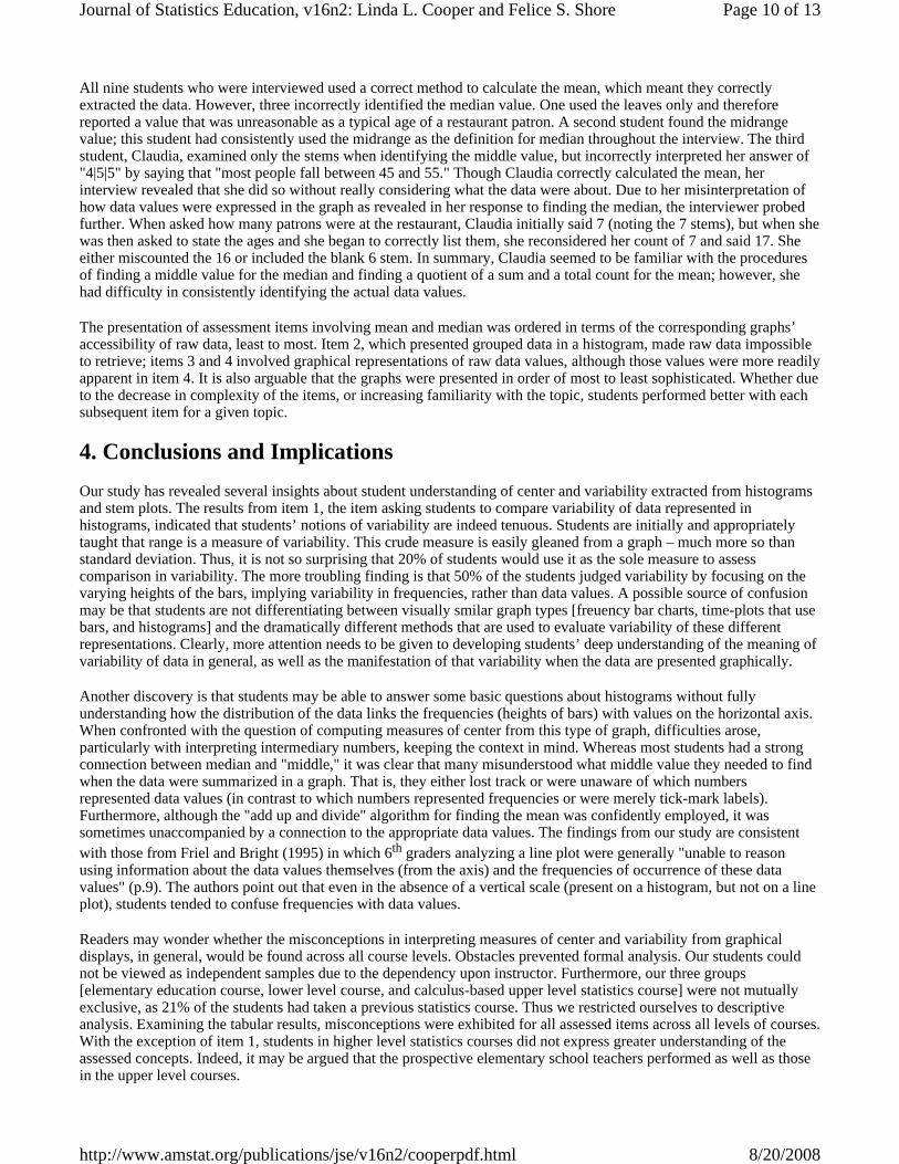
In anticipation of the aforementioned misconceptions, item 3 (Figure 3) had been included in the written assessment to pointedly determine whether or not students could determine the values of the mean and median from data represented via a histogram. In contrast to the grouped-data histogram of item 2, the histogram in item 3 represents ungrouped data. Thus, the raw data are completely available from the graph.
Figure 3. Assessment Item 3
Page 6 of 13Journal of Statistics Education, v16n2: Linda L. Cooper and Felice S. Shore
8/20/2008http://www.amstat.org/publications/jse/v16n2/cooperpdf.html

As Tables 3 and 4 show, overall, 46% of the students were able to correctly determine the median value to be 1, and 44% correctly found the mean to be approximately 2.04.
Patterns of errors emerged from the written supporting material that many students included to support or explain their reasoning. Most notably was the failure to maintain the link between the values on the horizontal axis and their corresponding bar height or frequency. On item 3a, 36% of the students (n=66) found the median value to be either 3.5, 4, or 4.5. Though most students provided no written work to lend insight to their reasoning, of the twenty students who did, fifteen demonstrated efforts to determine the median by finding the midpoint of the values on the horizontal axis. There were several variations of this theme. Thirteen students either a) listed the values 0 through 8, b) listed the values 0 through 8, omitting the value 6 because its frequency was 0, or c) used the existing values on the axis and then crossed off values to find the middle value, arriving at an answer of 4 or 3.5, depending on whether they excluded the 6. Two students mistakenly indicated that since there were nine values, the median would occur at 4.5. These students confused the position of the median (4.5) with the value of the median (3.5) from the data set 0, 1, 2, …, 8. Two other students calculated the midrange of 0 to 8 to be 4 by showing the expression for summing 0 and 8 and dividing by 2. Finally, the three remaining students that showed written work constructed a frequency table, with no additional written work that could justify their response.
Table 3. Distribution of Percentage of Responses by Course for Item 3a
Approximately 7% (n=13) of the full sample found the median to be 2 or 2.5. The predominant error was that students (n=8) listed the values of the height of the bars in order and found the median of this list of values.
Parallel misconceptions were found on item 3b seen in Table 4. Just as the most common misconceptions on item 3a were to find the median of the values on the horizontal axis or median value of the heights of the bars, the most common misconceptions on item 3b were to find the mean of the values on the horizontal axis (19%) and mean of the frequencies (13%). Responses were grouped by method, disregarding slight variations. For example, responses for the mean value of the horizontal axis varied depending upon inclusion of "6" whose frequency was 0, and division by either 8 or 9 [36/9=4, 36/8=4.5, 30/8=3.75, 30/9=3.3]. Responses for the mean value of the bar heights varied depending upon whether the student included the value of 6 as a potential bar [26/9=2.89, 26/8=3.25].
Item 3a 1
[correct median]
2 or 2.5
[median height of bars]
3.5, 4, or 4.5
[median of values on horizontal axis]
other
total %
Elementary Education 16 (64.0%) 2 (8.0%) 4 (16.0%) 3 (12%) 25 (100%)
Lower Level 47 (63.5%) 9 (7.4%) 50 (41.3%) 15 (12.4%) 121 (100%)
Upper Level 22 (55.0%) 2 (5.0%) 12 (30.0%) 4 (10.0%) 40 (100%)
Overall 85 (45.7%) 13 (7.0%) 66 (35.5%) 22 (11.8%) 186 (100%)
Page 7 of 13Journal of Statistics Education, v16n2: Linda L. Cooper and Felice S. Shore
8/20/2008http://www.amstat.org/publications/jse/v16n2/cooperpdf.html

Table 4. Distribution of Percentage of Responses by Course for Item 3b
In summary, consistent patterns of errors emerged as students calculated the mean and median from the histogram of ungrouped data. The most frequent responses for both 3a and 3b were the correct response [46% and 44% respectively]. The most frequent misconception in finding the median / mean of data represented via a histogram was to find the median / mean of the values on the horizontal axis without regard to the height of the bars above [36% / 19%] followed by finding the median / mean of the frequencies of the data values [7% / 13%].
Of the nine students interviewed, for both mean and median, six students used a correct method. They either first listed all the data values by correctly extracting them from the histogram, or in some cases, used the bar heights correctly to weight the mean.
Two students, Claudia and Monique, incorrectly calculated both mean and median, and did so in a way consistent with their responses to item 2. As with item 2, Claudia ignored the bars entirely and therefore calculated the median by finding the middle of the values along the horizontal axis; for the mean, she averaged those same values. Monique stated that the median number of children was 4 because "it’s the middle number here [on the horizontal axis]." Monique failed to see the connection between the heights of the bars and the values on the horizontal axis. Again, as in item 2, she took the bars into consideration only for the mean; and yet, she did so incorrectly because she found the average bar height, or average frequency instead of the mean data value.
Jason was one of the six students who correctly found the median, which he did by using the frequencies of the bins (heights of bars) to count in from the ends toward the middle data value. For the mean, he essentially found the average bar height, but upon questioning him, his reasons for doing so revealed more a lack of persistence in thinking about the context of the variables than an actual lack of understanding. The interviewer was pushing him to make sense of the numbers that he wrote on his paper during the assessment, which showed "26/8." He said, "I think [during the assessment] I was just trying to find a reasonable-looking ratio of numbers." He was able to correctly interpret an individual bar, for example, "6 people had 0 kids." But, he added the bar heights to get 26 and interpreted this as the number of children, rather than the number of faculty. He explained that he wanted a ratio that would give a reasonable number of children, so he divided by 8 because "8 was a number of possible children." Jason incorrectly spread his 26 children over 8 groups, rather than determining a total of 53 children spread over 26 faculty.
Both Jason’s and Monique’s confusions were well represented in the full sample when we looked at how students incorrectly computed the measures of center. The fact that the range on both axes was the same likely added to students’already tenuous ability to attach meaning to the numbers on the axes within context. Once they began computing with the numbers, it became even more difficult for them to decipher whether computed numbers were children or faculty.
Finally, we conjectured that a greater percentage of students would be able to find the mean and median of a data set represented by a stem-and-leaf plot than for a similarly shaped data set represented by a histogram. Figure 4 presents assessment item 4, a positively skewed stem-and-leaf plot showing the ages of patrons in a restaurant at a particular time. Students familiar with a stem-and-leaf plot are aware that the raw data values are easily retrievable. Though this was also the case with the ungrouped data in the histogram of item 3, it is not the case with histograms using grouped data. Though fewer students (74%) were familiar with stem-and-leaf plots as compared to histograms (94%), more were successful at finding the mean and median values.
Item 3b
2 to 2.04
(correct mean or method with
arithmetic errors)
2.8 to 3.25
[mean height of bars]
3.3 to 4.5
[mean of values on horizontal axis]
other
total %
Elementary Education 15 (60.0%) 2 (8.0%) 2 (8.0%) 6 (24.0%) 25 (100%)
Lower Level 40 (33.1%) 17 (14.0%) 28 (23.1%) 36 (29.8%) 121 (100%)
Upper Level 26 (65.0%) 6 (15.0%) 5 (12.5%) 3 (7.5%) 40 (100%)
Overall 81 (43.5%) 25 (13.4%) 35 (18.8%) 45 (24.2%) 186 (100%)
Page 8 of 13Journal of Statistics Education, v16n2: Linda L. Cooper and Felice S. Shore
8/20/2008http://www.amstat.org/publications/jse/v16n2/cooperpdf.html

Table 5 presents the results for item 4, but only includes percentages of correct responses because there was no clear pattern of misconceptions. Overall, 52% successfully found the median and 62% successfully found the mean. Far fewer students showed their work for item 4 and in fact more students left this item blank than any other.
Figure 4. Assessment Item 4
Table 5. Distribution of Percentage of Responses by Course for Item 4
Many of the responses for the mean were actually close in value to the correct answer and quite likely were found using the correct method with arithmetic errors; still, in the absence of work showing a correct method, these were counted as incorrect. There were more explicable errors in finding the median than the mean. One noted error was ignoring the meaning of the stems and reporting a single-digit leaf value near the median position. Another error was identifying the middle stem and either reporting that stem value (4) or using the only age for that stem (45).
Item 4a
correct median:
29
correct mean:
33.625 [33-34]
% familiar
w stemplot
Elementary Education 21 (84.0%) 20 (80.0%) 25 (100%)
Lower Level 51 (42.1%) 64 (52.9%) 84 (69.4%)
Upper Level 24 (60.0%) 31 (77.5%) 29 (72.5%)
Overall 96 (51.6%) 115 (61.8%) 138 (74.2%)
Page 9 of 13Journal of Statistics Education, v16n2: Linda L. Cooper and Felice S. Shore
8/20/2008http://www.amstat.org/publications/jse/v16n2/cooperpdf.html
All nine students who were interviewed used a correct method to calculate the mean, which meant they correctly extracted the data. However, three incorrectly identified the median value. One used the leaves only and therefore reported a value that was unreasonable as a typical age of a restaurant patron. A second student found the midrange value; this student had consistently used the midrange as the definition for median throughout the interview. The third student, Claudia, examined only the stems when identifying the middle value, but incorrectly interpreted her answer of "4|5|5" by saying that "most people fall between 45 and 55." Though Claudia correctly calculated the mean, her interview revealed that she did so without really considering what the data were about. Due to her misinterpretation of how data values were expressed in the graph as revealed in her response to finding the median, the interviewer probed further. When asked how many patrons were at the restaurant, Claudia initially said 7 (noting the 7 stems), but when she was then asked to state the ages and she began to correctly list them, she reconsidered her count of 7 and said 17. She either miscounted the 16 or included the blank 6 stem. In summary, Claudia seemed to be familiar with the procedures of finding a middle value for the median and finding a quotient of a sum and a total count for the mean; however, she had difficulty in consistently identifying the actual data values.
The presentation of assessment items involving mean and median was ordered in terms of the corresponding graphs’ accessibility of raw data, least to most. Item 2, which presented grouped data in a histogram, made raw data impossible to retrieve; items 3 and 4 involved graphical representations of raw data values, although those values were more readily apparent in item 4. It is also arguable that the graphs were presented in order of most to least sophisticated. Whether due to the decrease in complexity of the items, or increasing familiarity with the topic, students performed better with each subsequent item for a given topic.
4. Conclusions and Implications Our study has revealed several insights about student understanding of center and variability extracted from histograms and stem plots. The results from item 1, the item asking students to compare variability of data represented in histograms, indicated that students’ notions of variability are indeed tenuous. Students are initially and appropriately taught that range is a measure of variability. This crude measure is easily gleaned from a graph – much more so than standard deviation. Thus, it is not so surprising that 20% of students would use it as the sole measure to assess comparison in variability. The more troubling finding is that 50% of the students judged variability by focusing on the varying heights of the bars, implying variability in frequencies, rather than data values. A possible source of confusion may be that students are not differentiating between visually smilar graph types [freuency bar charts, time-plots that use bars, and histograms] and the dramatically different methods that are used to evaluate variability of these different representations. Clearly, more attention needs to be given to developing students’ deep understanding of the meaning of variability of data in general, as well as the manifestation of that variability when the data are presented graphically.
Another discovery is that students may be able to answer some basic questions about histograms without fully understanding how the distribution of the data links the frequencies (heights of bars) with values on the horizontal axis. When confronted with the question of computing measures of center from this type of graph, difficulties arose, particularly with interpreting intermediary numbers, keeping the context in mind. Whereas most students had a strong connection between median and "middle," it was clear that many misunderstood what middle value they needed to find when the data were summarized in a graph. That is, they either lost track or were unaware of which numbers represented data values (in contrast to which numbers represented frequencies or were merely tick-mark labels). Furthermore, although the "add up and divide" algorithm for finding the mean was confidently employed, it was sometimes unaccompanied by a connection to the appropriate data values. The findings from our study are consistent with those from Friel and Bright (1995) in which 6th graders analyzing a line plot were generally "unable to reason using information about the data values themselves (from the axis) and the frequencies of occurrence of these data values" (p.9). The authors point out that even in the absence of a vertical scale (present on a histogram, but not on a line plot), students tended to confuse frequencies with data values.
Readers may wonder whether the misconceptions in interpreting measures of center and variability from graphical displays, in general, would be found across all course levels. Obstacles prevented formal analysis. Our students could not be viewed as independent samples due to the dependency upon instructor. Furthermore, our three groups [elementary education course, lower level course, and calculus-based upper level statistics course] were not mutually exclusive, as 21% of the students had taken a previous statistics course. Thus we restricted ourselves to descriptive analysis. Examining the tabular results, misconceptions were exhibited for all assessed items across all levels of courses. With the exception of item 1, students in higher level statistics courses did not express greater understanding of the assessed concepts. Indeed, it may be argued that the prospective elementary school teachers performed as well as those in the upper level courses.
Page 10 of 13Journal of Statistics Education, v16n2: Linda L. Cooper and Felice S. Shore
8/20/2008http://www.amstat.org/publications/jse/v16n2/cooperpdf.html

In order to put the significance of our findings in perspective, we consider a problem given in the GAISE report (Franklin, et al., 2007) that is illustrative of an appropriate problem for students entering the advanced developmental level of statistical thinking. In this problem, students are given excerpts from a newspaper article in which statistics regarding obesity levels of Americans over different time periods are reported. Students are then asked:
"Sketch a histogram showing what you think a distribution of weights of American adults might have looked like in 1991. Adjust the sketch to show what the distribution of weights might have looked like in 2002, the year of the reported study. Before making your sketches, think about the shape, center, and spread of your distributions. Will the distribution be skewed or symmetric? Will the median be smaller than, larger than, or about the same size as the mean? Will the spread increase as you move from the 1991 distribution to the 2002 distribution?" [pp. 62-33]
We include the excerpt from GAISE for two reasons: First, the report, endorsed by the American Statistical Association, is the most recent and comprehensive document describing expectations for primary and secondary statistics education. Second, that particular problem, of which the actual version in the report is much richer, makes apparent the expectation that students be able to thoroughly integrate their knowledge of graphical representation of data with concepts of variability and measures of center. Our research would indicate that this is no small task even in introductory college courses.
Our research suggests several implications for instruction:
1. Instructors should explicitly discuss the concept of variability of data in general and not limit the focus to quantifying variability through common measures such as range, interquartile range, and standard deviation. Students should have a sense of what is meant by variability of data. It is important to acknowledge that the concept of variability is inherently more abstract than that of center. Whereas one can estimate and interpret a measure of center, it is not as easy, nor necessarily desirable, to approximate a measure of variability other than range. More time needs to be spent developing the concept of variability and making comparisons of variability within the context of data presented in different kinds of graphs.
2. To gain a better understanding of how variability is represented in histograms of quantitative data, students should examine histograms of little and great variation. One possibility is to have students start with a "discrete uniform" distribution where all bars have the same height. A discussion would follow that focuses on how distributions with the same mean and median could differ in variability. Either they could differ in range (still uniform) or shape. Differently spread bell-shaped histograms of common mean, median, and range are natural fodder for investigation. Students can manipulate the data so that a peak in the middle is achieved while the tails become narrow. The goal of such an activity would be for students to be able to make valid comparisons between shape and relative variability. This is an assumed skill for understanding graphs typically presented when the Central Limit Theorem is introduced.
3. To facilitate understanding the connection between shape of a distribution and likely relative positions of center, instructors might consider first having students find measures of center from graphs where the raw data are completely accessible. Through skillfully layered and appropriate questioning, instructors would deliberately focus attention toward the goal of students discovering the connections regarding the relative positions of measures of center with respect to shape. Following that, they could make generalizations to similar types of more abstract graphs such as histograms of ungrouped and finally grouped data.
4. Finally, a theme found throughout this study was students’ lack of attention to the context of the data. When extracting data from graphs, students should be asked to identify the data values. Otherwise, when finding summary measures, students may revert to using memorized algorithms, perhaps without correctly identifying the data and without regard to the reasonableness of their responses. "What are the data?" is often all that needs to be asked to either redirect or jumpstart students’ thinking.
The suggestions above ask instructors to be aware of and then attend to students’ vague understanding of connecting a graphical display of data with summary measures for the data set. Far greater emphasis needs to be placed on integrating topics of graphical displays and summary measures. Furthermore, the final recommendation, also communicated in the GAISE report, points to the need to use data sets that interest students. As students consider data represented graphically they need to remain connected to the values and reason about those values, making judgments about variability and measures of center by incorporating the significance of, but distinguishing them from, frequency or scale values. Improving statistical literacy, an obvious if only implied goal of undergraduate statistics, depends on it.
Page 11 of 13Journal of Statistics Education, v16n2: Linda L. Cooper and Felice S. Shore
8/20/2008http://www.amstat.org/publications/jse/v16n2/cooperpdf.html

References Cai, J. (1998), "Exploring Students’ Conceptual Understanding of the Averaging Algorithm," School Science and Mathematics, 98, 93-98.
Cooper, L. (2002), An Assessment of Prospective Secondary Mathematics Teachers’ Preparedness to Teach Statistics," Dissertation Abstracts International, 64 (01), 89A. (University Microfilms No. 3078386).
Franklin, C., Kader, G., Mewborn, D., Moreno, J., Peck, R., Perry, M., & Scheaffer, R. (2007), Guidelines for Assessment and Instruction in Statistics Education (GAISE) Report. Alexandria, VA: American Statistical Association.
Friel, S. (1998), "Teaching Statistics: What’s Average?" In L. J. Morrow (Ed.) The Teaching and Learning of Algorithms in School Mathematics (pp. 208-217). Reston, VA: National Council of Teachers of Mathematics.
Friel, S. & Bright, G. (1995), "Graph Knowledge: Understanding How Students Interpret Data Using Graphs," Columbus, OH: Paper presented at the Annual Meeting of the North American Chapter of the International Group for the Psychology of Mathematics Education.
Groth, R. & Bergner, J. (2006), "Preservice Elementary Teachers’ Conceptual and Procedural Knowledge of Mean, Median, and Mode," Mathematical Thinking and Learning, 8(1), 37-63.
McClain, K. (1999), "Reflecting on Students’ Understanding of Data," Mathematics Teaching in the Middle School, 4 (6), 374-380.
Mevarech, Z. (1983), "A Deep Structure Model of Students’ Statistical Misconceptions," Educational Studies in Mathematics, 14, 415 – 429.
Mokros, J. & Russell, S. (1995), "Children’s Concepts of Average and Representativeness," Journal for Research in Mathematics Education, 26 (1), 20-39.
National Council of Teachers of Mathematics (2000), Principles and Standards for School Mathematics, Reston, VA: NCTM.
Pollatsek, A., Lima, S., & Well, A. (1981), "Concept or Computation: Students’ Understanding of The Mean," Educational Studies in Mathematics, 12, 191-204.
Watson, J., Kelly, B., Callingham, R., and Shaughnessy, J. (2003), "The Measurement of School Students’ Understanding of Statistical Variation," International Journal of Mathematical Education in Science and Technology, 34 (1), 1-29.
Watson, J. & Moritz, J. (2000), "The Longitudinal Development of Understanding of Average," Mathematical Thinking and Learning, 2 (1), 11-50.
Zawojewski, J. & Heckman, D. (1997), "What Do Students Know about Data Analysis, Statistics, and Probability?" In P. A. Kenney & E. A. Silver (Eds.) Results from the Sixth Mathematics Assessment of the National Assessment of Educational Progress (pp.195-224). Reston, VA: NCTM.
Zawojewski, J. & Shaughnessy, J. (2000), "Mean and Median: Are They Really So Easy?" Mathematics Teaching in the Middle School, 5 (7), 436-440.
Page 12 of 13Journal of Statistics Education, v16n2: Linda L. Cooper and Felice S. Shore
8/20/2008http://www.amstat.org/publications/jse/v16n2/cooperpdf.html

Linda L. Cooper Mathematics Department Towson University Towson, Maryland 21252 U.S.A. [email protected]
Felice S. Shore Mathematics Department Towson University Towson, Maryland 21252 U.S.A. [email protected]
Volume 16 (2008) | Archive | Index | Data Archive | Resources | Editorial Board | Guidelines for Authors | Guidelines for Data Contributors | Home Page | Contact JSE | ASA Publications
Page 13 of 13Journal of Statistics Education, v16n2: Linda L. Cooper and Felice S. Shore
8/20/2008http://www.amstat.org/publications/jse/v16n2/cooperpdf.html