Embed Size (px)
Citation preview

Statistical Methods 5. Charts in Excel
Based on materials provided by Coventry University and Loughborough University under a Na9onal HE STEM
Programme Prac9ce Transfer Adopters grant
Peter Samuels Birmingham City University
Reviewer: Ellen Marshall University of Sheffield
community project encouraging academics to share statistics support resources
All stcp resources are released under a Creative Commons licence
www.statstutor.ac.uk
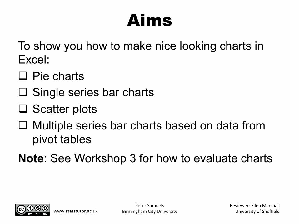
Aims To show you how to make nice looking charts in Excel: q Pie charts q Single series bar charts q Scatter plots q Multiple series bar charts based on data from
pivot tables Note: See Workshop 3 for how to evaluate charts
Peter Samuels Birmingham City University
Reviewer: Ellen Marshall University of Sheffield www.statstutor.ac.uk
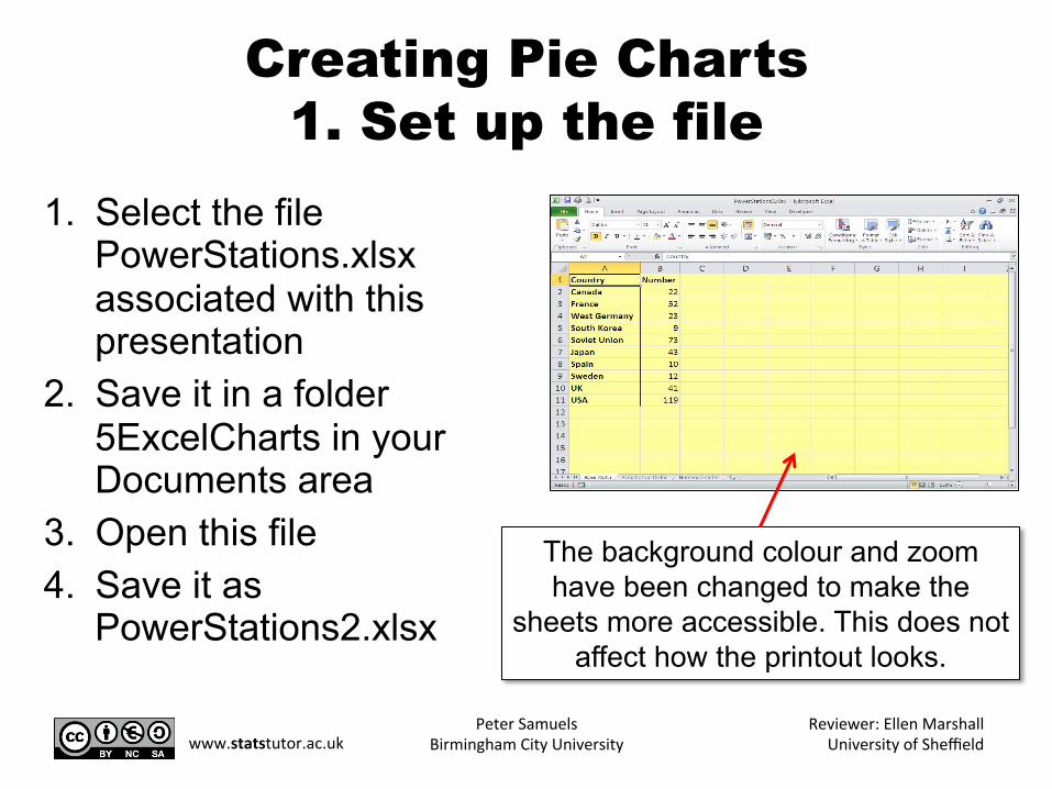
Creating Pie Charts 1. Set up the file
1. Select the file PowerStations.xlsx associated with this presentation
2. Save it in a folder 5ExcelCharts in your Documents area
3. Open this file 4. Save it as
PowerStations2.xlsx
The background colour and zoom have been changed to make the
sheets more accessible. This does not affect how the printout looks.
Peter Samuels Birmingham City University
Reviewer: Ellen Marshall University of Sheffield www.statstutor.ac.uk
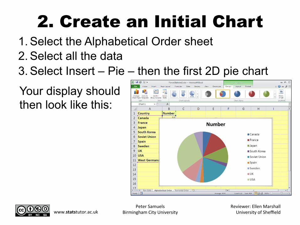
1. Select the Alphabetical Order sheet 2. Select all the data 3. Select Insert – Pie – then the first 2D pie chart
Your display should then look like this:
2. Create an Initial Chart
Peter Samuels Birmingham City University
Reviewer: Ellen Marshall University of Sheffield www.statstutor.ac.uk
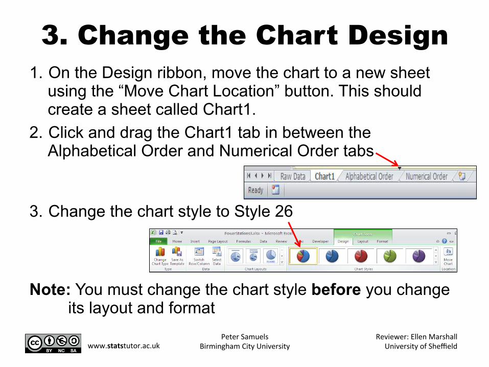
3. Change the Chart Design 1. On the Design ribbon, move the chart to a new sheet
using the “Move Chart Location” button. This should create a sheet called Chart1.
2. Click and drag the Chart1 tab in between the Alphabetical Order and Numerical Order tabs
3. Change the chart style to Style 26
Note: You must change the chart style before you change
its layout and format Peter Samuels
Birmingham City University Reviewer: Ellen Marshall
University of Sheffield www.statstutor.ac.uk
4. Change the Chart Layout and Format
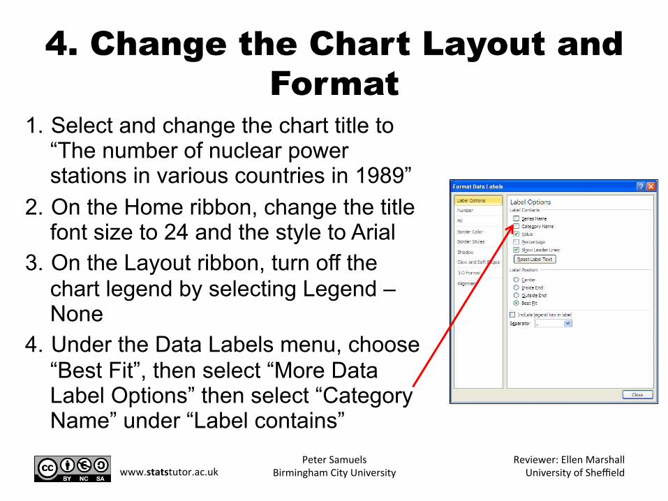
1. Select and change the chart title to “The number of nuclear power stations in various countries in 1989”
2. On the Home ribbon, change the title font size to 24 and the style to Arial
3. On the Layout ribbon, turn off the chart legend by selecting Legend – None
4. Under the Data Labels menu, choose “Best Fit”, then select “More Data Label Options” then select “Category Name” under “Label contains”
Peter Samuels Birmingham City University
Reviewer: Ellen Marshall University of Sheffield www.statstutor.ac.uk
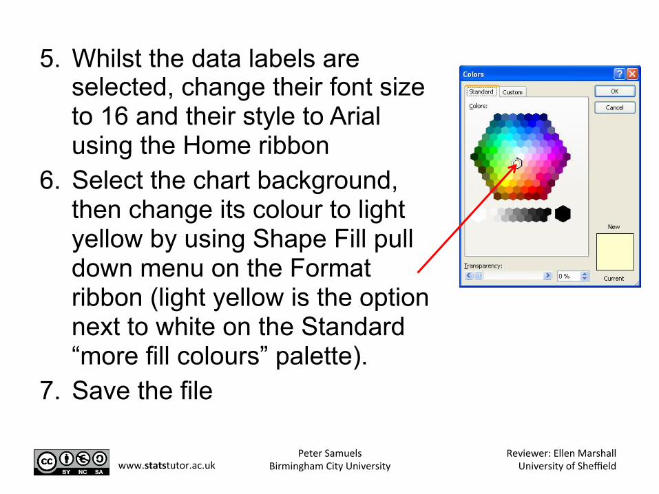
5. Whilst the data labels are selected, change their font size to 16 and their style to Arial using the Home ribbon
6. Select the chart background, then change its colour to light yellow by using Shape Fill pull down menu on the Format ribbon (light yellow is the option next to white on the Standard “more fill colours” palette).
7. Save the file
Peter Samuels Birmingham City University
Reviewer: Ellen Marshall University of Sheffield www.statstutor.ac.uk
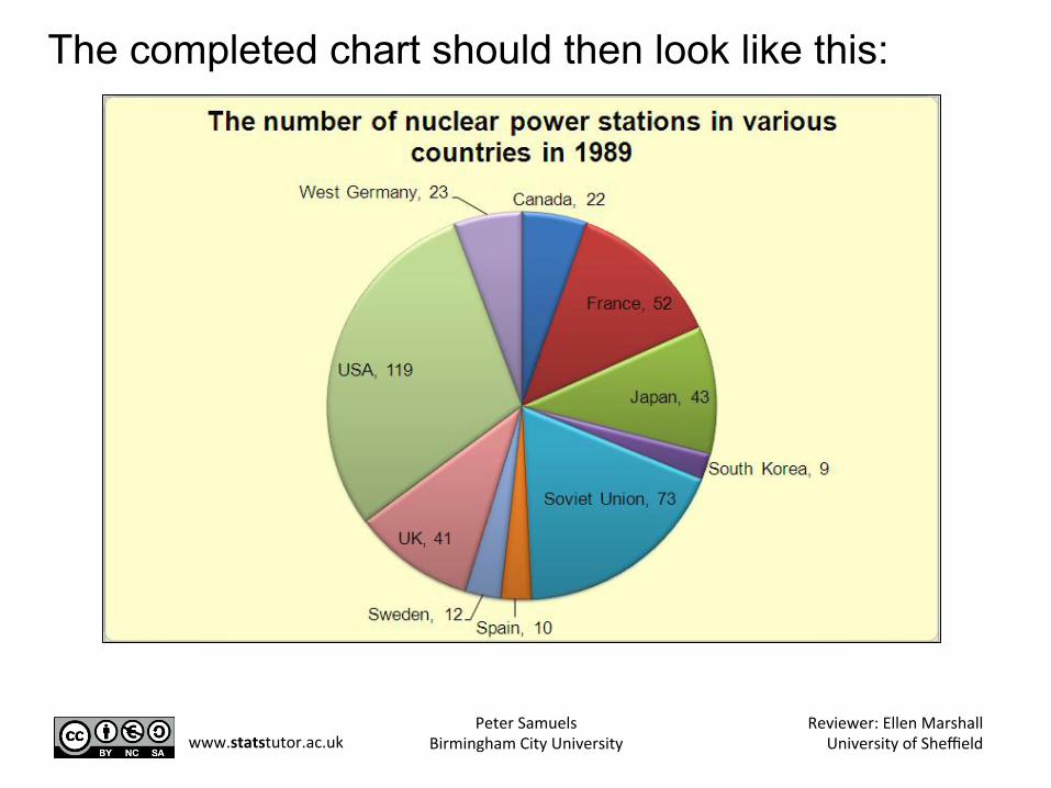
The completed chart should then look like this:
Peter Samuels Birmingham City University
Reviewer: Ellen Marshall University of Sheffield www.statstutor.ac.uk
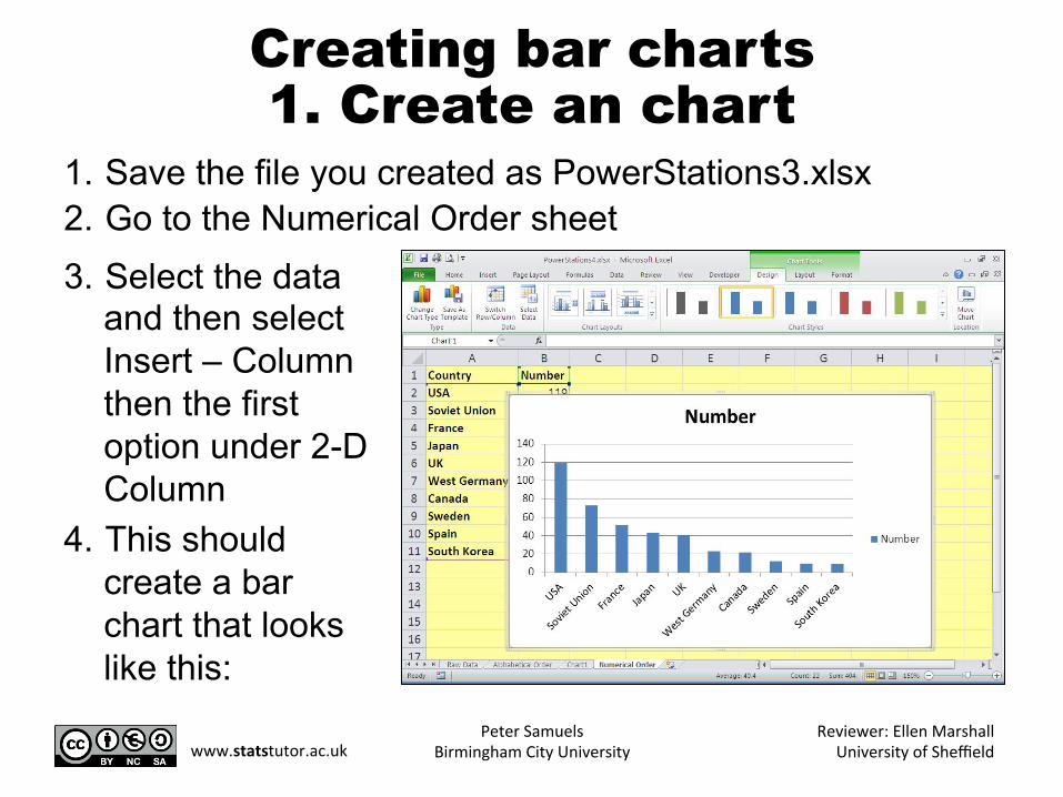
Creating bar charts 1. Create an chart
1. Save the file you created as PowerStations3.xlsx 2. Go to the Numerical Order sheet 3. Select the data
and then select Insert – Column then the first option under 2-D Column
4. This should create a bar chart that looks like this:
Peter Samuels Birmingham City University
Reviewer: Ellen Marshall University of Sheffield www.statstutor.ac.uk
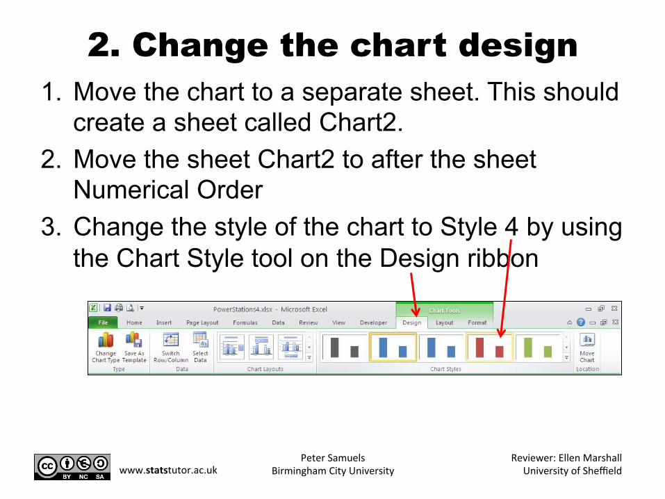
2. Change the chart design 1. Move the chart to a separate sheet. This should
create a sheet called Chart2. 2. Move the sheet Chart2 to after the sheet
Numerical Order 3. Change the style of the chart to Style 4 by using
the Chart Style tool on the Design ribbon
Peter Samuels Birmingham City University
Reviewer: Ellen Marshall University of Sheffield www.statstutor.ac.uk
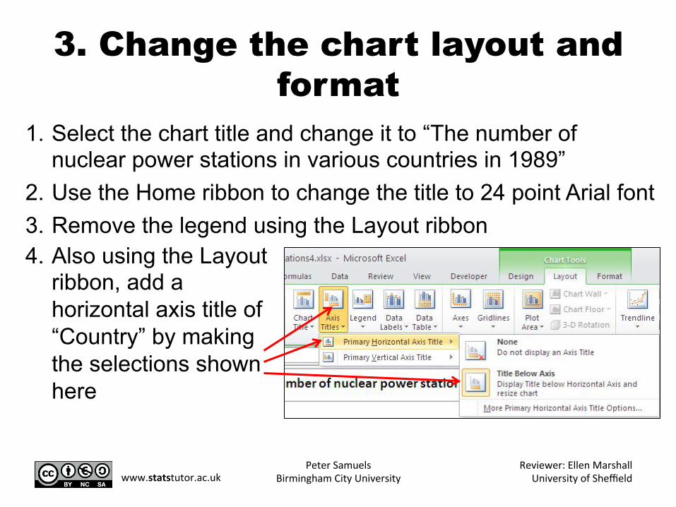
3. Change the chart layout and format
1. Select the chart title and change it to “The number of nuclear power stations in various countries in 1989”
2. Use the Home ribbon to change the title to 24 point Arial font 3. Remove the legend using the Layout ribbon 4. Also using the Layout
ribbon, add a horizontal axis title of “Country” by making the selections shown here
Peter Samuels Birmingham City University
Reviewer: Ellen Marshall University of Sheffield www.statstutor.ac.uk
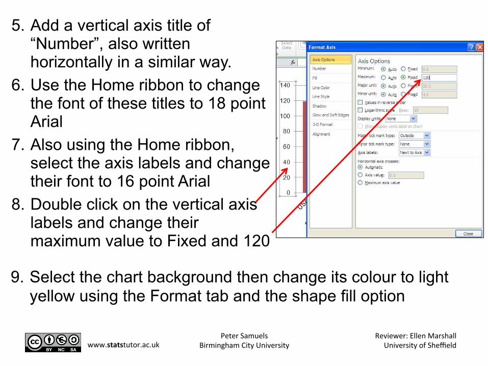
5. Add a vertical axis title of “Number”, also written horizontally in a similar way.
6. Use the Home ribbon to change the font of these titles to 18 point Arial
7. Also using the Home ribbon, select the axis labels and change their font to 16 point Arial
8. Double click on the vertical axis labels and change their maximum value to Fixed and 120
9. Select the chart background then change its colour to light yellow using the Format tab and the shape fill option
Peter Samuels Birmingham City University
Reviewer: Ellen Marshall University of Sheffield www.statstutor.ac.uk
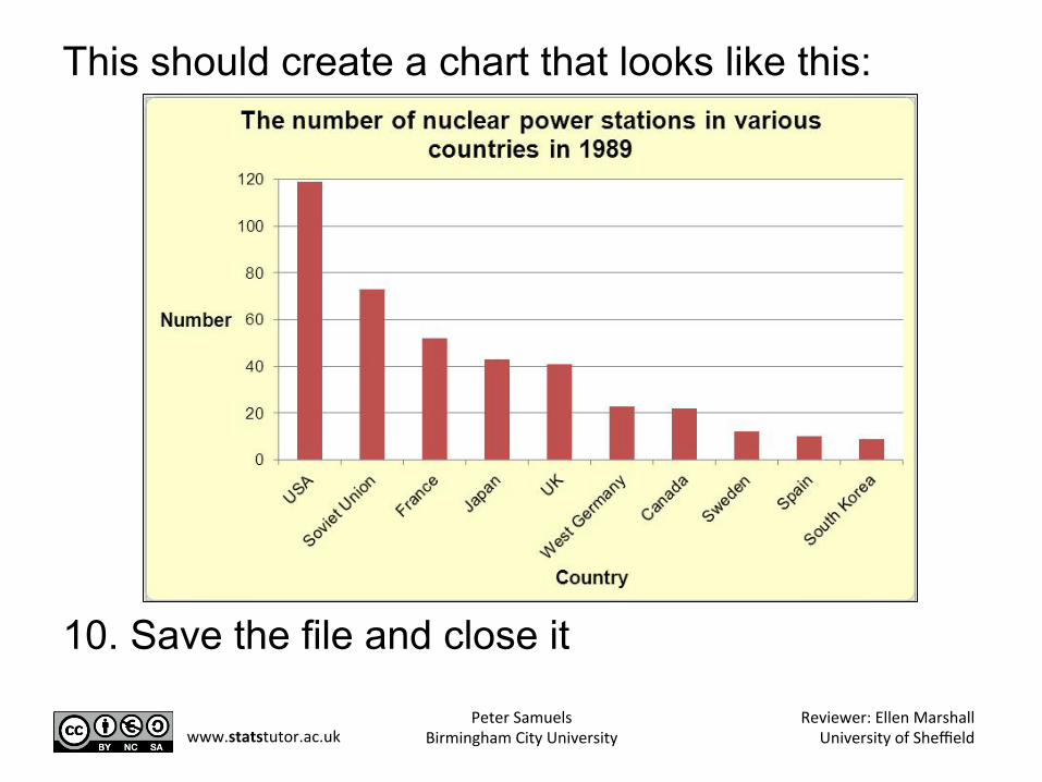
This should create a chart that looks like this: 10. Save the file and close it
Peter Samuels Birmingham City University
Reviewer: Ellen Marshall University of Sheffield www.statstutor.ac.uk
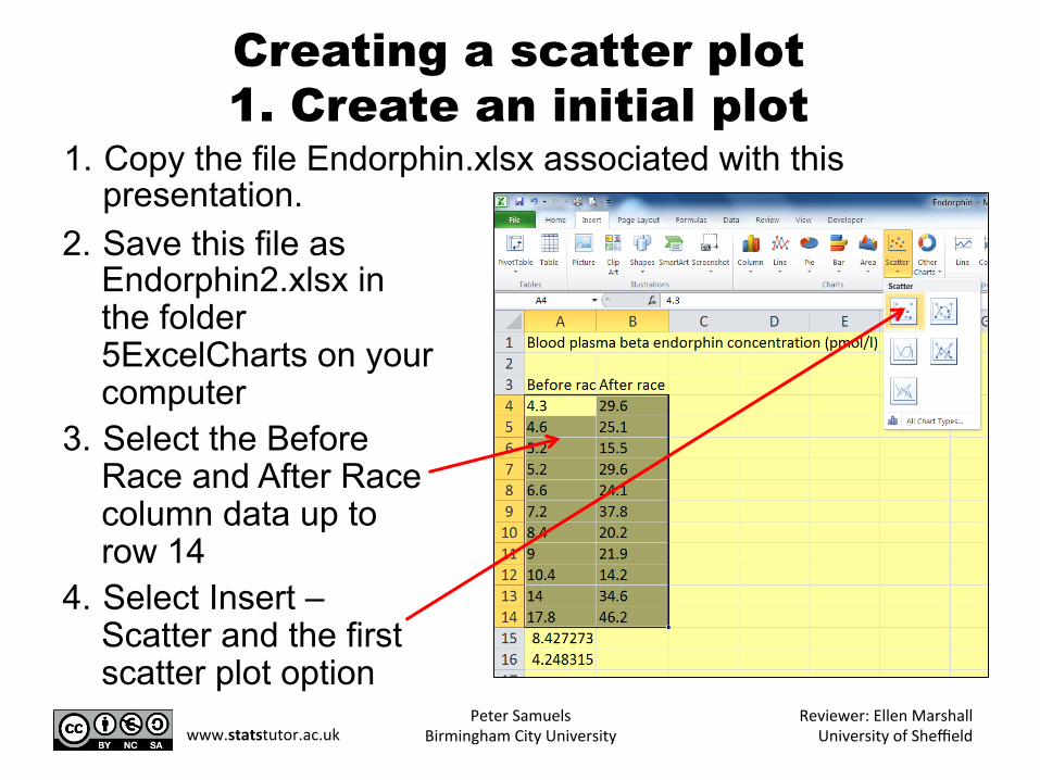
Creating a scatter plot 1. Create an initial plot
2. Save this file as Endorphin2.xlsx in the folder 5ExcelCharts on your computer
3. Select the Before Race and After Race column data up to row 14
4. Select Insert – Scatter and the first scatter plot option
1. Copy the file Endorphin.xlsx associated with this presentation.
Peter Samuels Birmingham City University
Reviewer: Ellen Marshall University of Sheffield www.statstutor.ac.uk
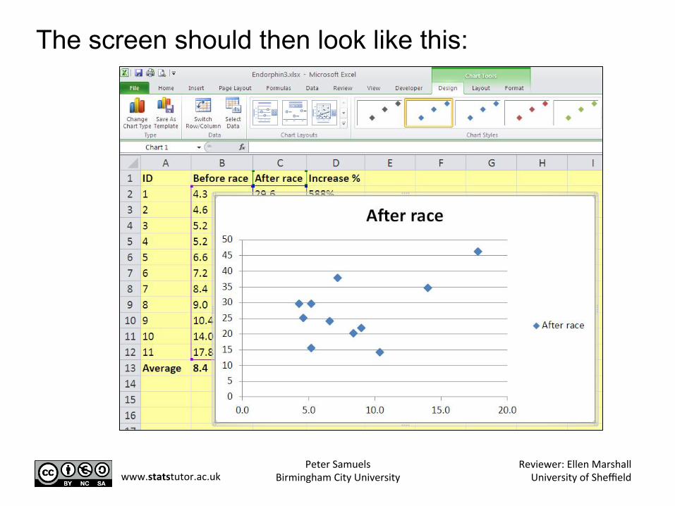
The screen should then look like this:
Peter Samuels Birmingham City University
Reviewer: Ellen Marshall University of Sheffield www.statstutor.ac.uk
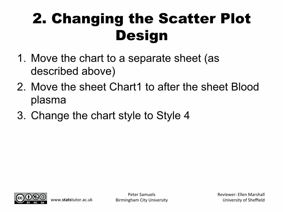
2. Changing the Scatter Plot Design
1. Move the chart to a separate sheet (as described above)
2. Move the sheet Chart1 to after the sheet Blood plasma
3. Change the chart style to Style 4
Peter Samuels Birmingham City University
Reviewer: Ellen Marshall University of Sheffield www.statstutor.ac.uk
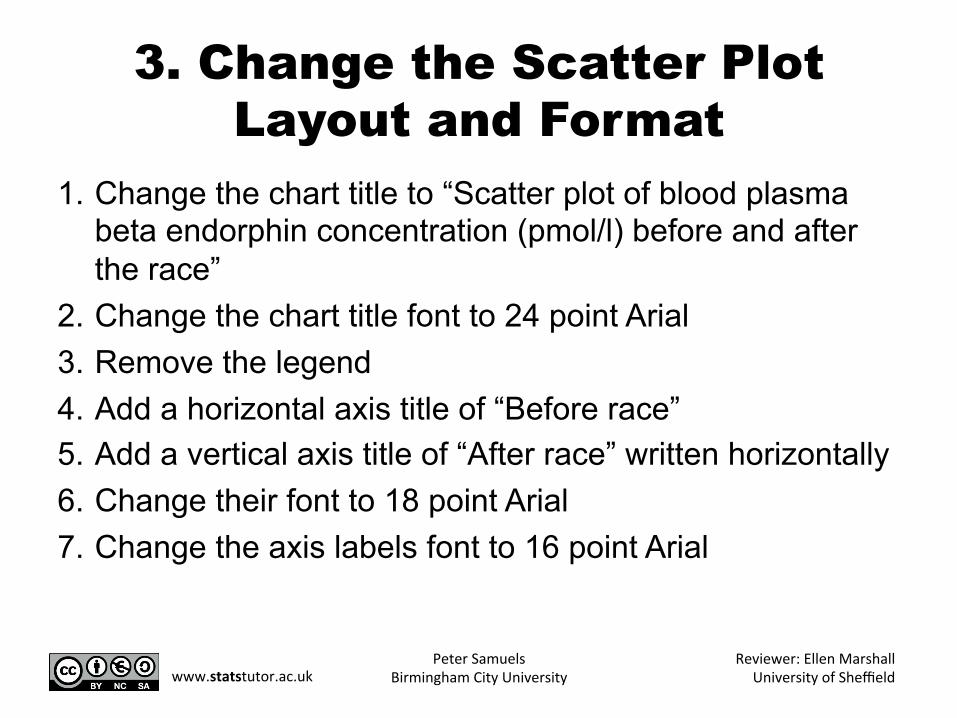
3. Change the Scatter Plot Layout and Format
1. Change the chart title to “Scatter plot of blood plasma beta endorphin concentration (pmol/l) before and after the race”
2. Change the chart title font to 24 point Arial 3. Remove the legend 4. Add a horizontal axis title of “Before race” 5. Add a vertical axis title of “After race” written horizontally 6. Change their font to 18 point Arial 7. Change the axis labels font to 16 point Arial
Peter Samuels Birmingham City University
Reviewer: Ellen Marshall University of Sheffield www.statstutor.ac.uk
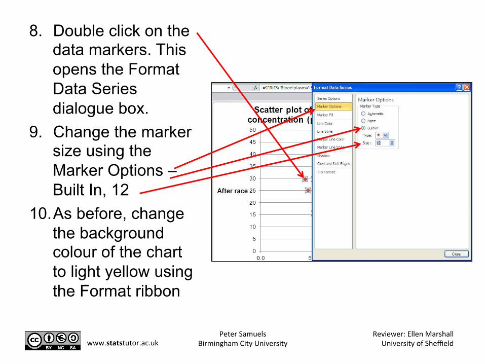
8. Double click on the data markers. This opens the Format Data Series dialogue box.
9. Change the marker size using the Marker Options – Built In, 12
10. As before, change the background colour of the chart to light yellow using the Format ribbon
Peter Samuels Birmingham City University
Reviewer: Ellen Marshall University of Sheffield www.statstutor.ac.uk
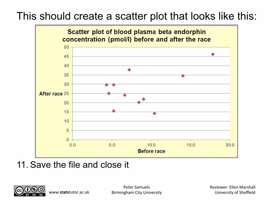
This should create a scatter plot that looks like this:
11. Save the file and close it
Peter Samuels Birmingham City University
Reviewer: Ellen Marshall University of Sheffield www.statstutor.ac.uk
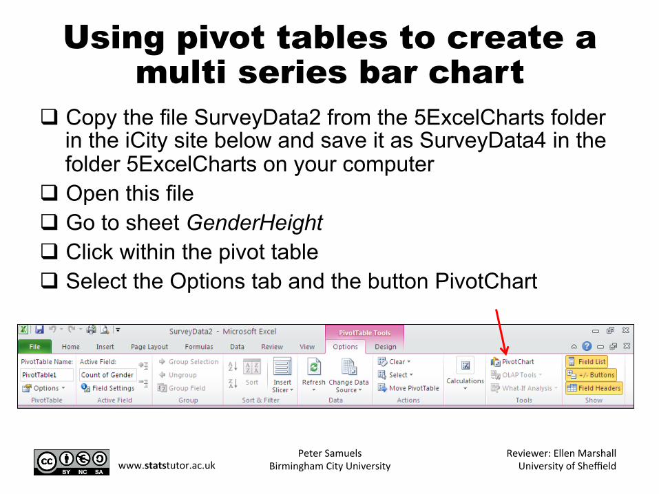
Using pivot tables to create a multi series bar chart
q Copy the file SurveyData2 from the 5ExcelCharts folder in the iCity site below and save it as SurveyData4 in the folder 5ExcelCharts on your computer
q Open this file q Go to sheet GenderHeight q Click within the pivot table q Select the Options tab and the button PivotChart
Peter Samuels Birmingham City University
Reviewer: Ellen Marshall University of Sheffield www.statstutor.ac.uk
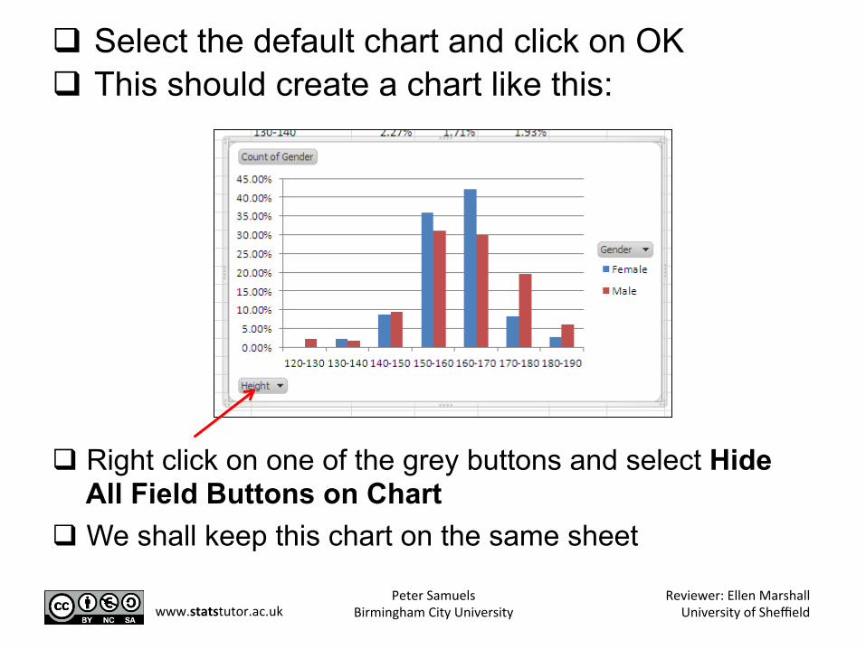
q Select the default chart and click on OK q This should create a chart like this:
q Right click on one of the grey buttons and select Hide All Field Buttons on Chart
q We shall keep this chart on the same sheet
Peter Samuels Birmingham City University
Reviewer: Ellen Marshall University of Sheffield www.statstutor.ac.uk

q Add a title above the chart “Height Percentage Frequency Distribution against Gender”
q Change the number of decimal places of the vertical axis to 0
q Add a rotated title to the vertical axis of “Percentage frequency”
q Add a title to the horizontal axis of “Height (cm)” q Change the colour of the Female data series to
pink and the Male data series to Blue q Change the background colour of the chart to
light yellow
Peter Samuels Birmingham City University
Reviewer: Ellen Marshall University of Sheffield www.statstutor.ac.uk
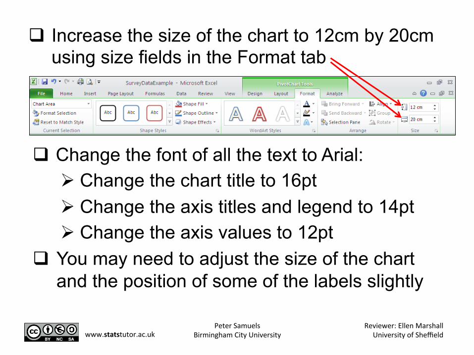
q Increase the size of the chart to 12cm by 20cm using size fields in the Format tab
q Change the font of all the text to Arial: Ø Change the chart title to 16pt Ø Change the axis titles and legend to 14pt Ø Change the axis values to 12pt
q You may need to adjust the size of the chart and the position of some of the labels slightly
Peter Samuels Birmingham City University
Reviewer: Ellen Marshall University of Sheffield www.statstutor.ac.uk
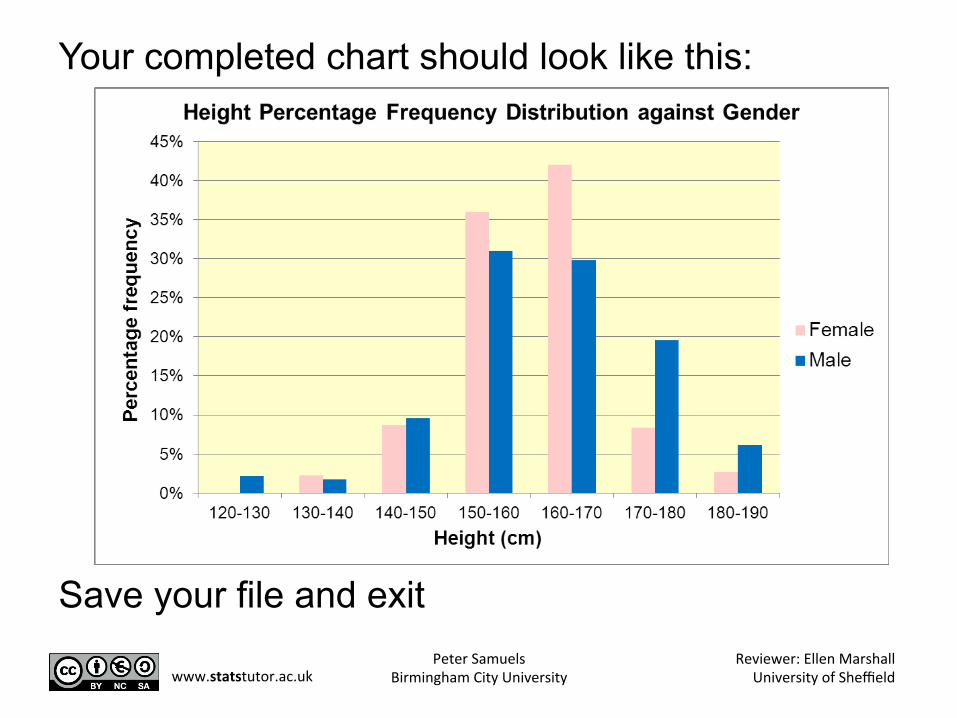
Your completed chart should look like this:
Save your file and exit Peter Samuels
Birmingham City University Reviewer: Ellen Marshall
University of Sheffield www.statstutor.ac.uk
Recap We have looked at creating: q Pie charts q Single series bar charts q Scatter plots q Multiple series bar charts from pivot tables
Peter Samuels Birmingham City University
Reviewer: Ellen Marshall University of Sheffield www.statstutor.ac.uk