Embed Size (px)
Citation preview
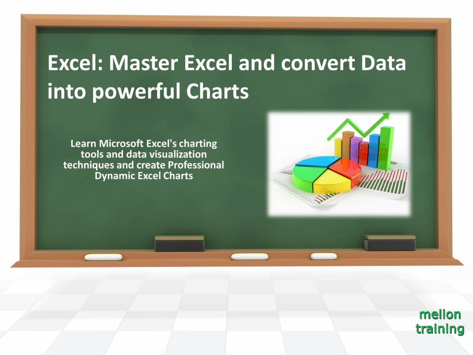
Excel: Master Excel and convert Data into powerful Charts
Learn Microsoft Excel's charting tools and data visualization
techniques and create Professional Dynamic Excel Charts

First of all Thank you
For taking my course!
And don’t forget:
I answer all student's
questions
I’ll update the course and add
new material as often as I
could.
Honest reviews are always
greatly appreciated

SECTION 1 : Welcome to Excel Charts
What is a chart? A chart is a visual representation of numeric values.
Charts offers you at-a-glance views that allows you to specify relationships
between data values.
With a chart you can easily spot trends and patterns
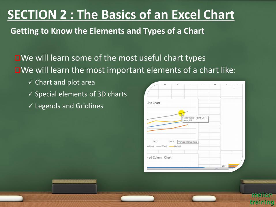
We will learn some of the most useful chart types
We will learn the most important elements of a chart like:
Chart and plot area
Special elements of 3D charts
Legends and Gridlines
Getting to Know the Elements and Types of a Chart
SECTION 2 : The Basics of an Excel Chart
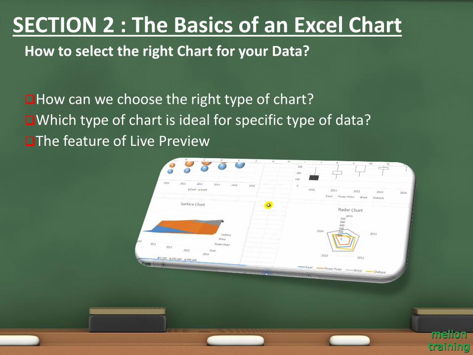
How can we choose the right type of chart?
Which type of chart is ideal for specific type of data?
The feature of Live Preview
How to select the right Chart for your Data?
SECTION 2 : The Basics of an Excel Chart
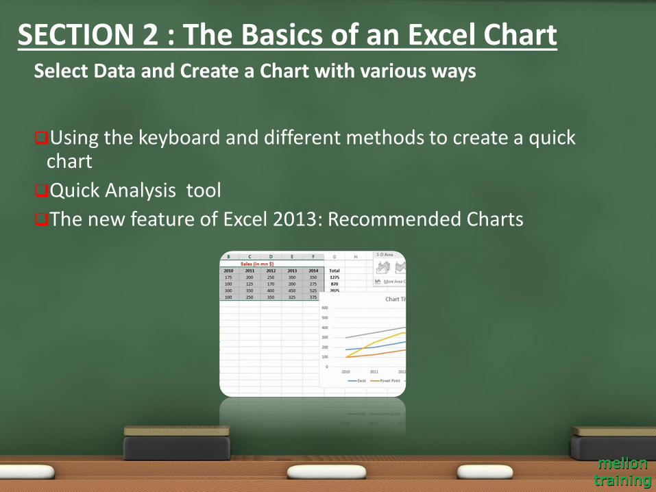
Using the keyboard and different methods to create a quick chart
Quick Analysis tool
The new feature of Excel 2013: Recommended Charts
Select Data and Create a Chart with various ways
SECTION 2 : The Basics of an Excel Chart
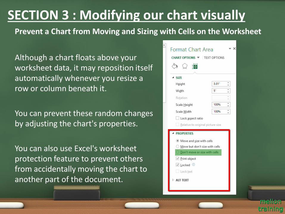
Although a chart floats above your worksheet data, it may reposition itself automatically whenever you resize a row or column beneath it.
You can prevent these random changes by adjusting the chart's properties.
You can also use Excel's worksheet protection feature to prevent others from accidentally moving the chart to another part of the document.
Prevent a Chart from Moving and Sizing with Cells on the Worksheet
SECTION 3 : Modifying our chart visually
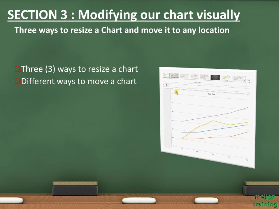
Three (3) ways to resize a chart
Different ways to move a chart
Three ways to resize a Chart and move it to any location
SECTION 3 : Modifying our chart visually
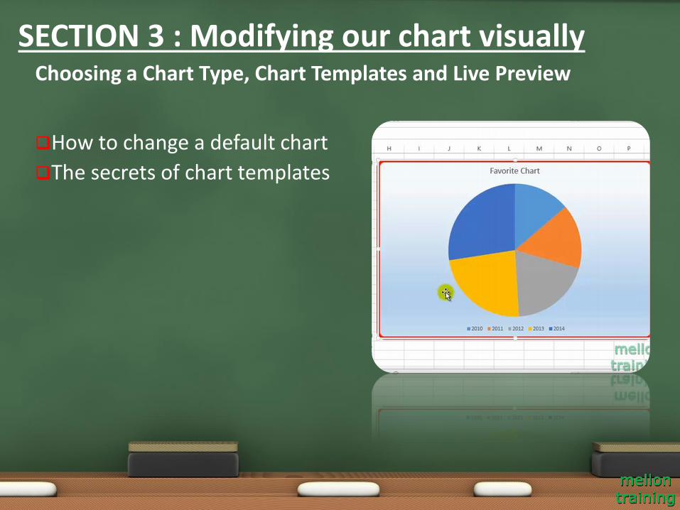
How to change a default chart
The secrets of chart templates
Choosing a Chart Type, Chart Templates and Live Preview
SECTION 3 : Modifying our chart visually
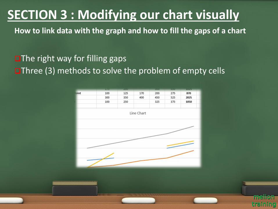
The right way for filling gaps
Three (3) methods to solve the problem of empty cells
How to link data with the graph and how to fill the gaps of a chart
SECTION 3 : Modifying our chart visually
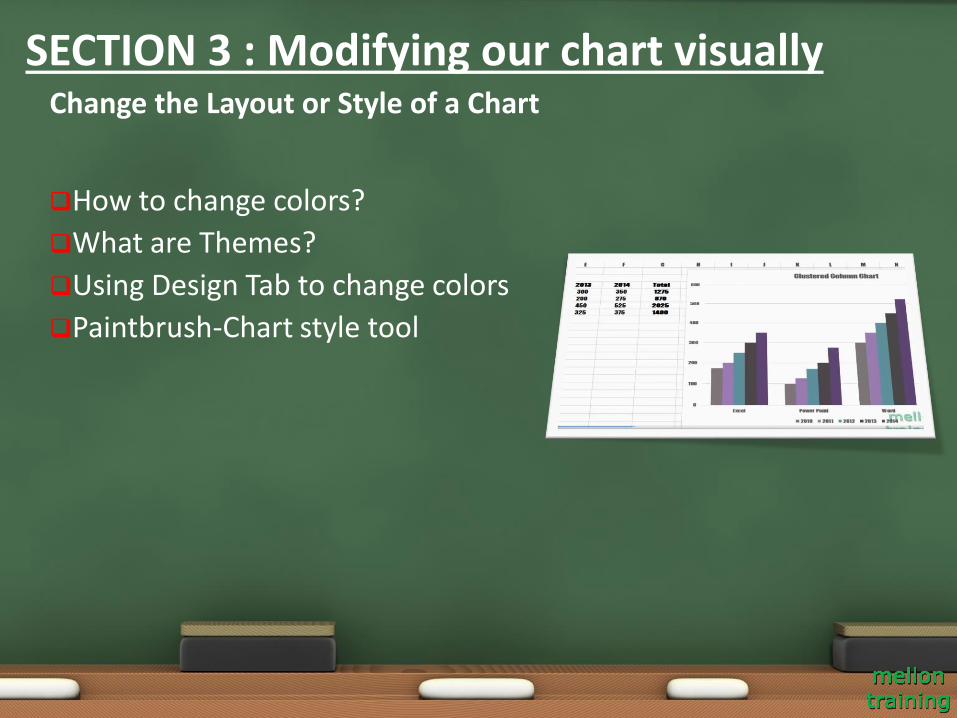
How to change colors?
What are Themes?
Using Design Tab to change colors
Paintbrush-Chart style tool
Change the Layout or Style of a Chart
SECTION 3 : Modifying our chart visually
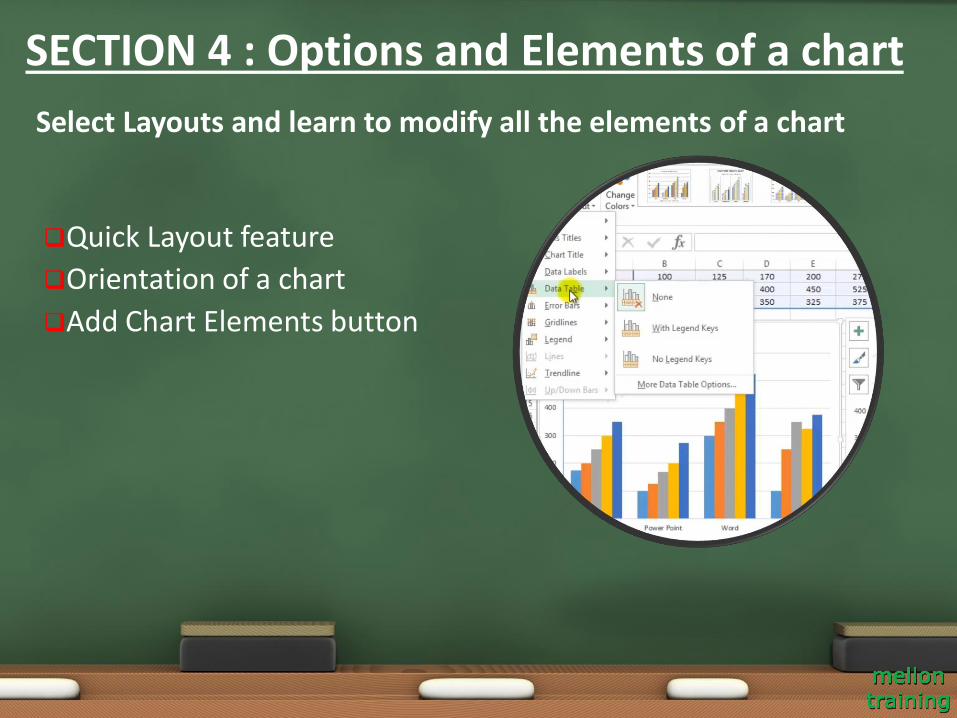
Quick Layout feature
Orientation of a chart
Add Chart Elements button
Select Layouts and learn to modify all the elements of a chart
SECTION 4 : Options and Elements of a chart
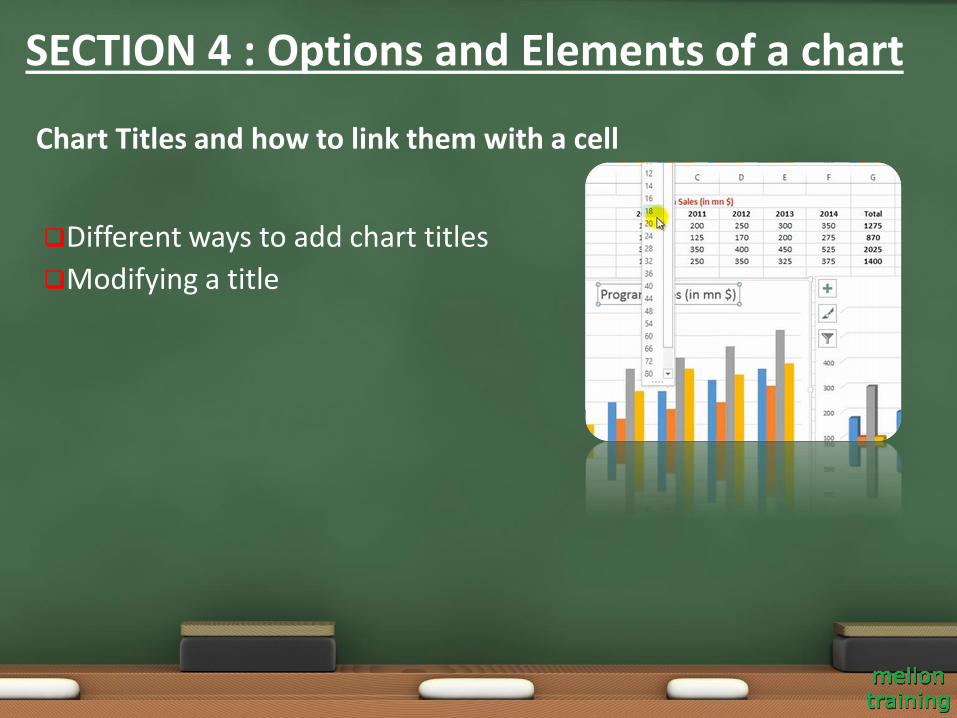
Different ways to add chart titles
Modifying a title
Chart Titles and how to link them with a cell
SECTION 4 : Options and Elements of a chart
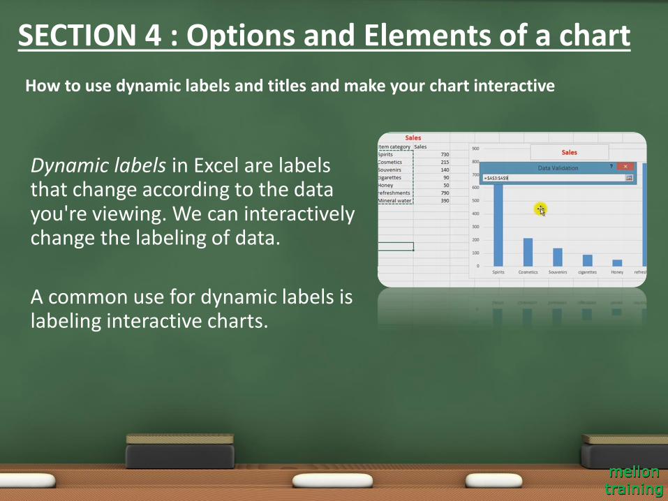
Dynamic labels in Excel are labels that change according to the data you're viewing. We can interactively change the labeling of data.
A common use for dynamic labels is labeling interactive charts.
How to use dynamic labels and titles and make your chart interactive
SECTION 4 : Options and Elements of a chart
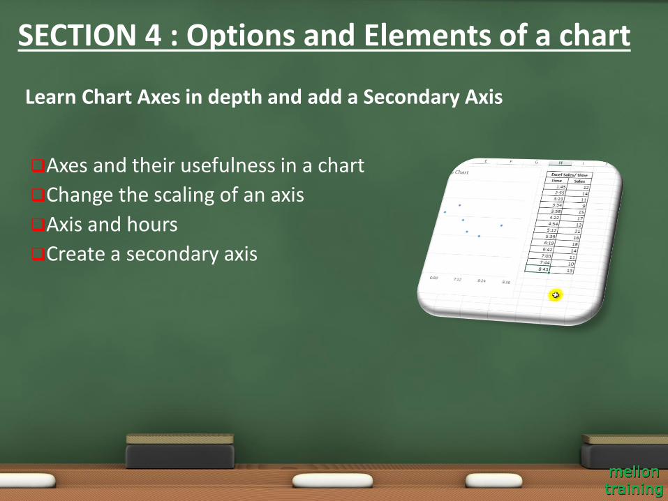
Axes and their usefulness in a chart
Change the scaling of an axis
Axis and hours
Create a secondary axis
Learn Chart Axes in depth and add a Secondary Axis
SECTION 4 : Options and Elements of a chart
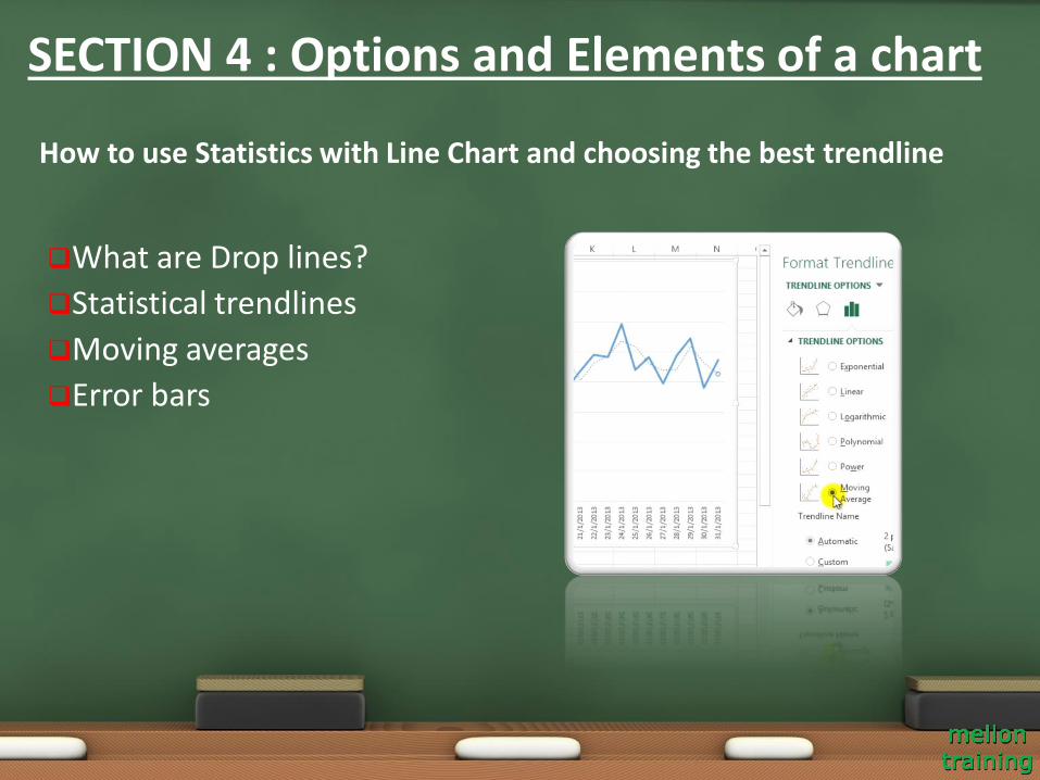
What are Drop lines?
Statistical trendlines
Moving averages
Error bars
How to use Statistics with Line Chart and choosing the best trendline
SECTION 4 : Options and Elements of a chart
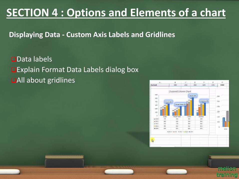
Data labels
Explain Format Data Labels dialog box
All about gridlines
Displaying Data - Custom Axis Labels and Gridlines
SECTION 4 : Options and Elements of a chart
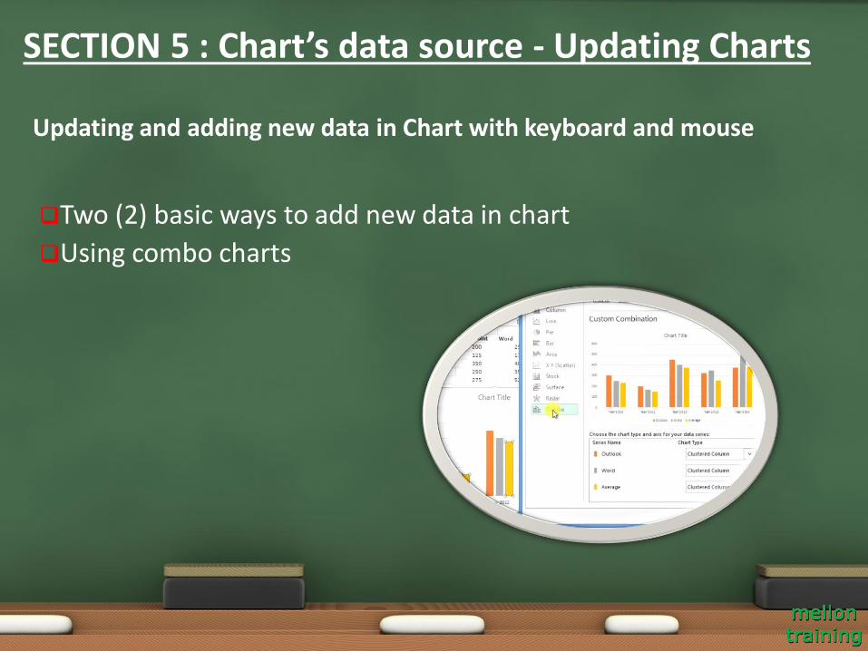
Two (2) basic ways to add new data in chart
Using combo charts
Updating and adding new data in Chart with keyboard and mouse
SECTION 5 : Chart’s data source - Updating Charts
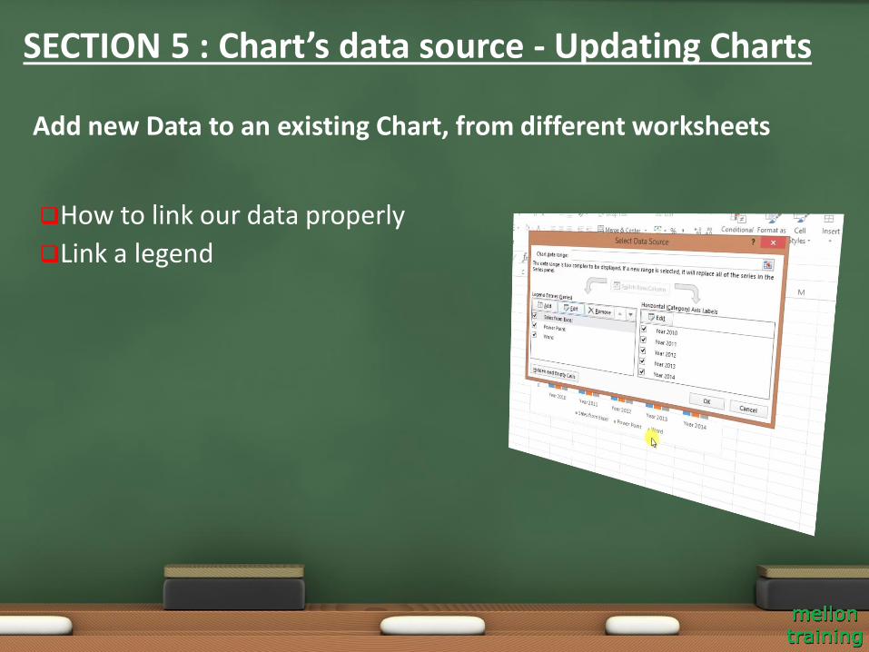
How to link our data properly
Link a legend
Add new Data to an existing Chart, from different worksheets
SECTION 5 : Chart’s data source - Updating Charts
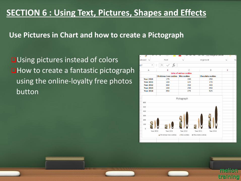
Using pictures instead of colors
How to create a fantastic pictograph
using the online-loyalty free photos
button
Use Pictures in Chart and how to create a Pictograph
SECTION 6 : Using Text, Pictures, Shapes and Effects
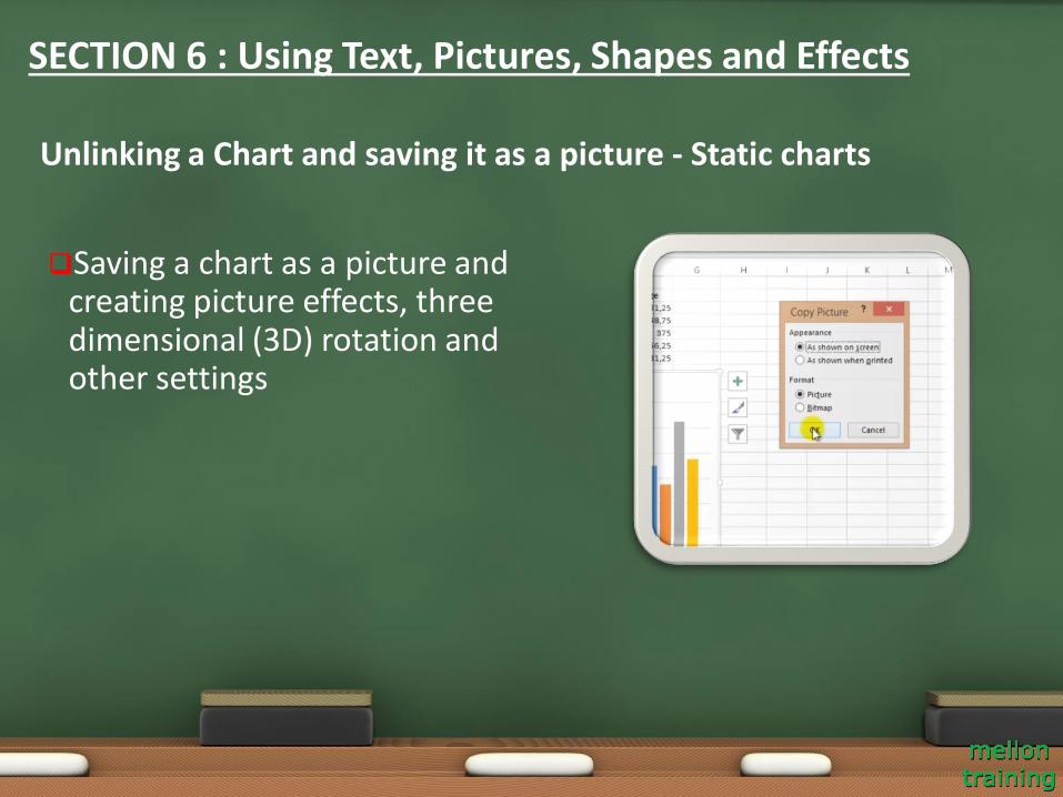
Saving a chart as a picture and creating picture effects, three dimensional (3D) rotation and other settings
Unlinking a Chart and saving it as a picture - Static charts
SECTION 6 : Using Text, Pictures, Shapes and Effects
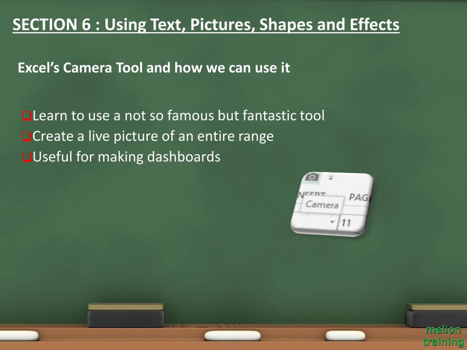
Learn to use a not so famous but fantastic tool
Create a live picture of an entire range
Useful for making dashboards
Excel’s Camera Tool and how we can use it
SECTION 6 : Using Text, Pictures, Shapes and Effects
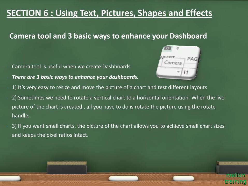
• Camera tool is useful when we create Dashboards
• There are 3 basic ways to enhance your dashboards.
• 1) It’s very easy to resize and move the picture of a chart and test different layouts
• 2) Sometimes we need to rotate a vertical chart to a horizontal orientation. When the live
picture of the chart is created , all you have to do is rotate the picture using the rotate
handle.
• 3) If you want small charts, the picture of the chart allows you to achieve small chart sizes
and keeps the pixel ratios intact.
Camera tool and 3 basic ways to enhance your Dashboard
SECTION 6 : Using Text, Pictures, Shapes and Effects

Various ways to add shapes to a chart
How to use shape effects (like shadow, glow and 3D rotation)
Using Shapes and Effects to make prettier Charts
SECTION 6 : Using Text, Pictures, Shapes and Effects
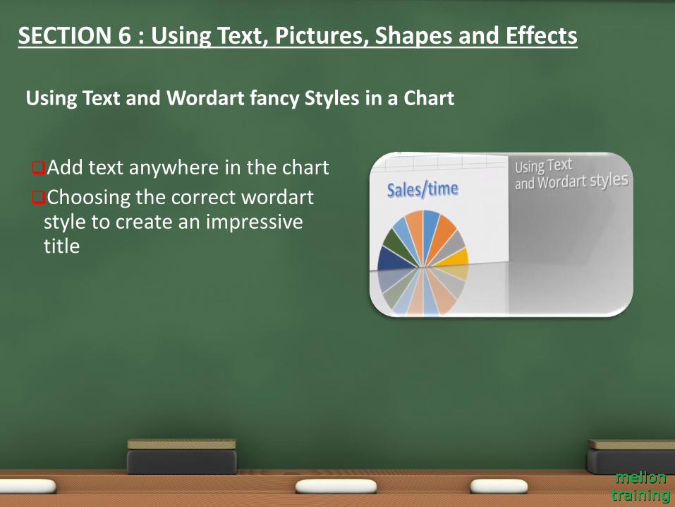
Add text anywhere in the chart
Choosing the correct wordart style to create an impressive title
Using Text and Wordart fancy Styles in a Chart
SECTION 6 : Using Text, Pictures, Shapes and Effects
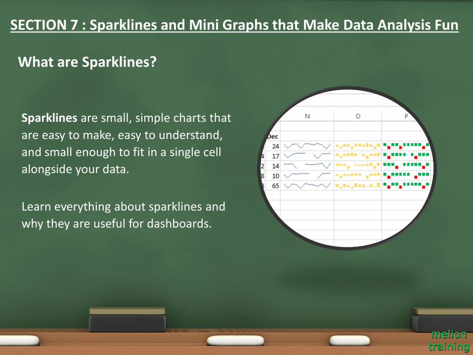
Sparklines are small, simple charts that
are easy to make, easy to understand,
and small enough to fit in a single cell
alongside your data.
Learn everything about sparklines and
why they are useful for dashboards.
What are Sparklines?
SECTION 7 : Sparklines and Mini Graphs that Make Data Analysis Fun
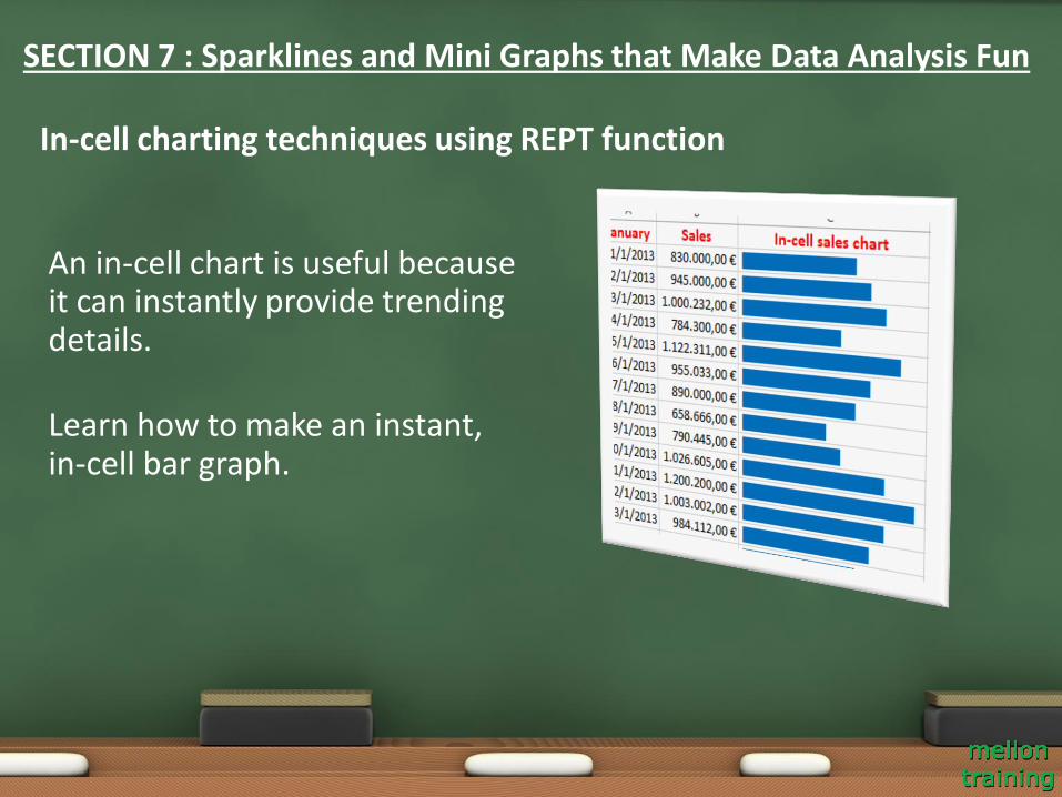
An in-cell chart is useful because it can instantly provide trending details.
Learn how to make an instant, in-cell bar graph.
In-cell charting techniques using REPT function
SECTION 7 : Sparklines and Mini Graphs that Make Data Analysis Fun
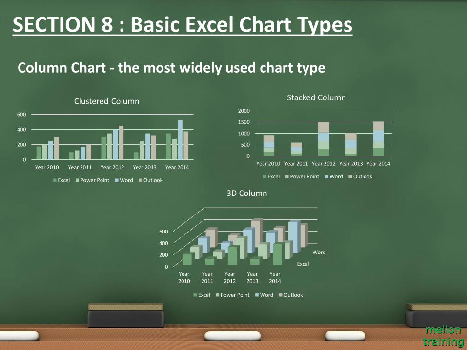
Column Chart - the most widely used chart type
SECTION 8 : Basic Excel Chart Types
0
200
400
600
Year 2010 Year 2011 Year 2012 Year 2013 Year 2014
Clustered Column
Excel Power Point Word Outlook
0
500
1000
1500
2000
Year 2010 Year 2011 Year 2012 Year 2013 Year 2014
Stacked Column
Excel Power Point Word Outlook
Excel
Word
0
200
400
600
Year2010
Year2011
Year2012
Year2013
Year2014
3D Column
Excel Power Point Word Outlook
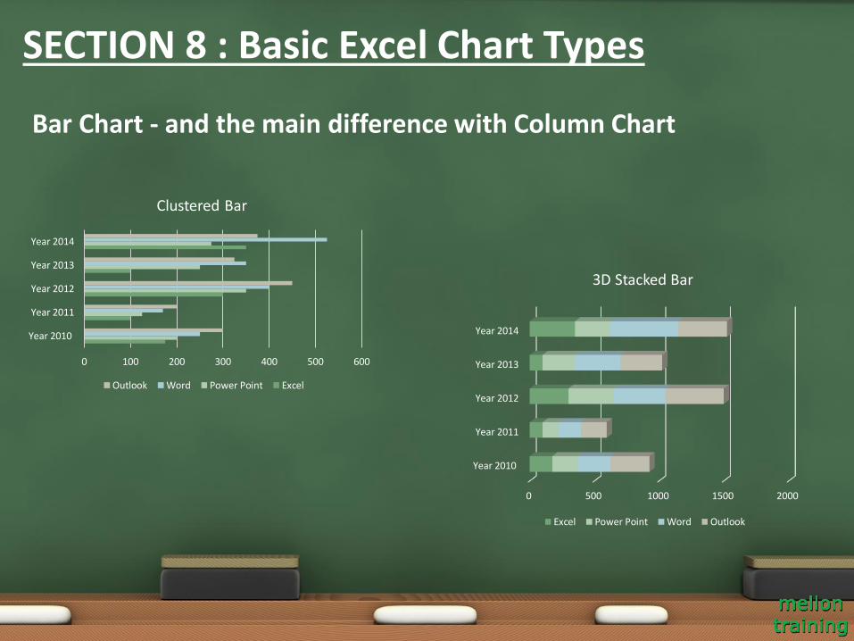
Bar Chart - and the main difference with Column Chart
0 100 200 300 400 500 600
Year 2010
Year 2011
Year 2012
Year 2013
Year 2014
Clustered Bar
Outlook Word Power Point Excel
0 500 1000 1500 2000
Year 2010
Year 2011
Year 2012
Year 2013
Year 2014
3D Stacked Bar
Excel Power Point Word Outlook
SECTION 8 : Basic Excel Chart Types
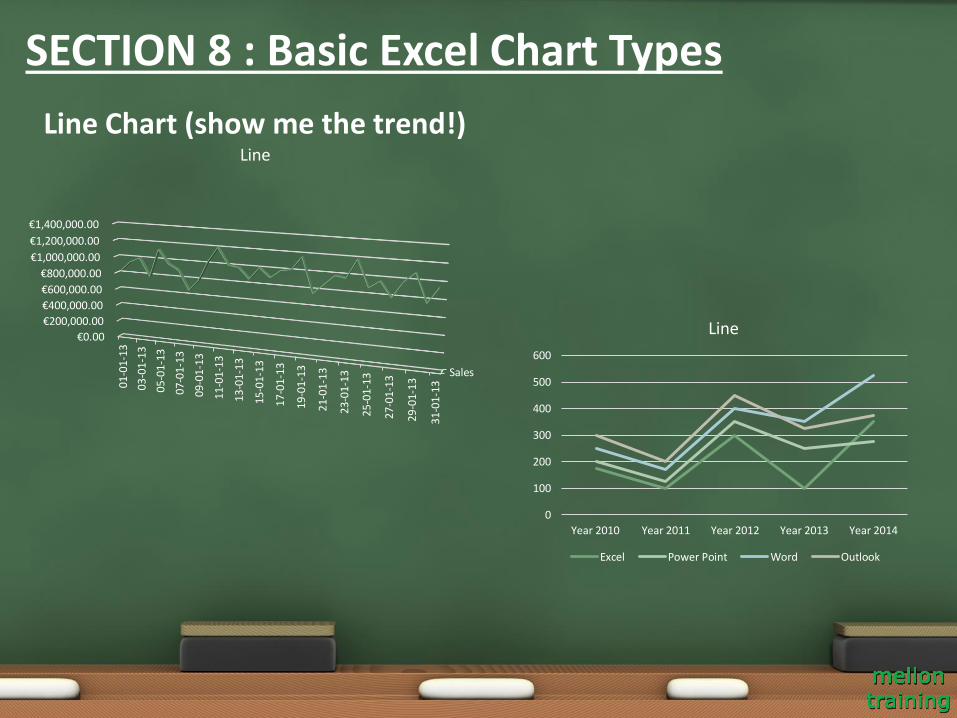
Line Chart (show me the trend!)
0
100
200
300
400
500
600
Year 2010 Year 2011 Year 2012 Year 2013 Year 2014
Line
Excel Power Point Word Outlook
Sales
€0.00
€200,000.00
€400,000.00
€600,000.00
€800,000.00
€1,000,000.00
€1,200,000.00
€1,400,000.00
01-0
1-13
03
-01
-13
05-0
1-13
07-0
1-13
09-0
1-13
11-0
1-13
13-0
1-13
15-0
1-13
17-0
1-13
19-0
1-13
21-0
1-13
23-0
1-13
25-0
1-13
27-0
1-13
29-0
1-13
31-0
1-13
Line
SECTION 8 : Basic Excel Chart Types
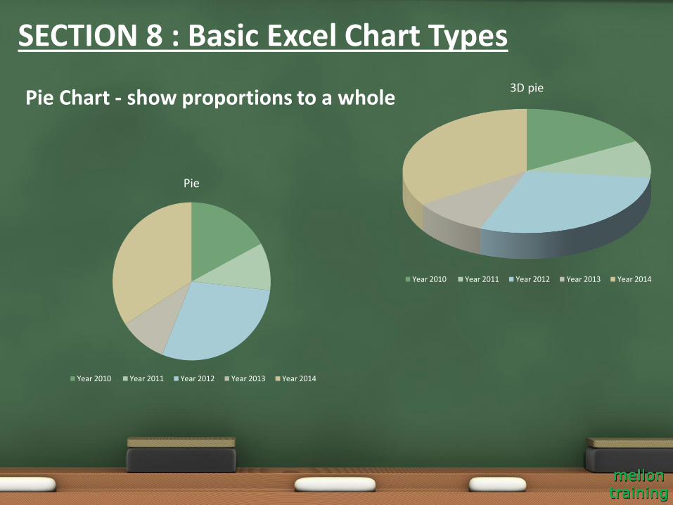
Pie Chart - show proportions to a whole3D pie
Year 2010 Year 2011 Year 2012 Year 2013 Year 2014
Pie
Year 2010 Year 2011 Year 2012 Year 2013 Year 2014
SECTION 8 : Basic Excel Chart Types
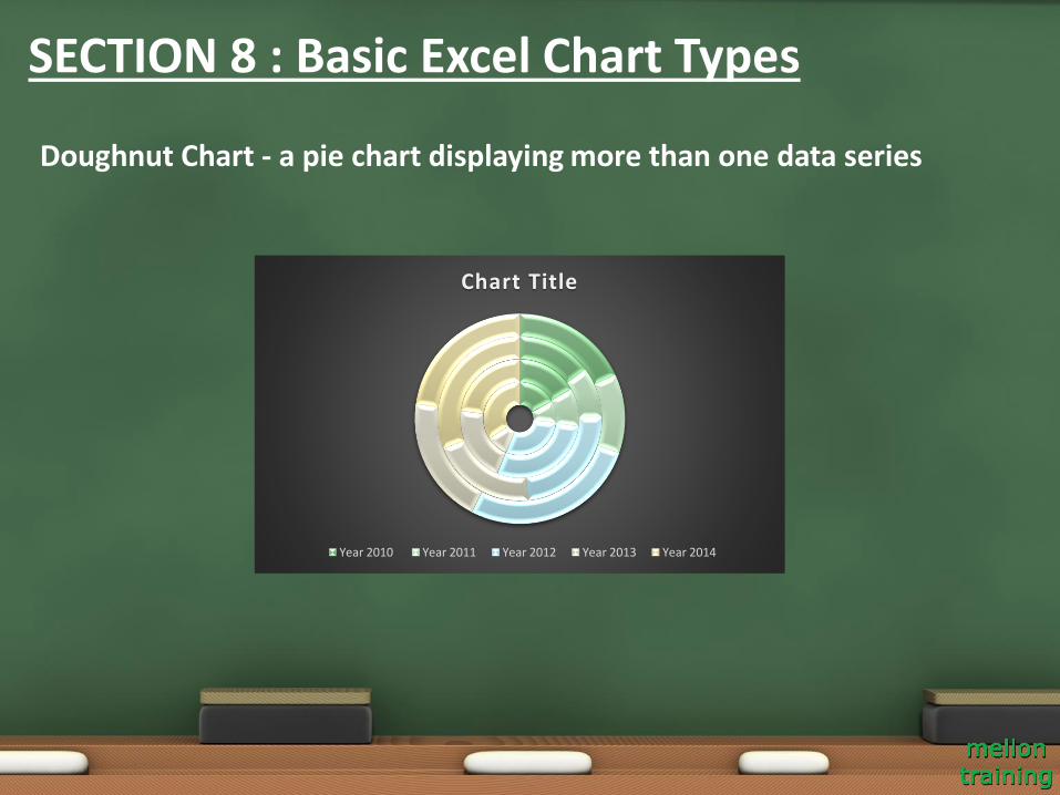
Doughnut Chart - a pie chart displaying more than one data series
Chart Title
Year 2010 Year 2011 Year 2012 Year 2013 Year 2014
SECTION 8 : Basic Excel Chart Types
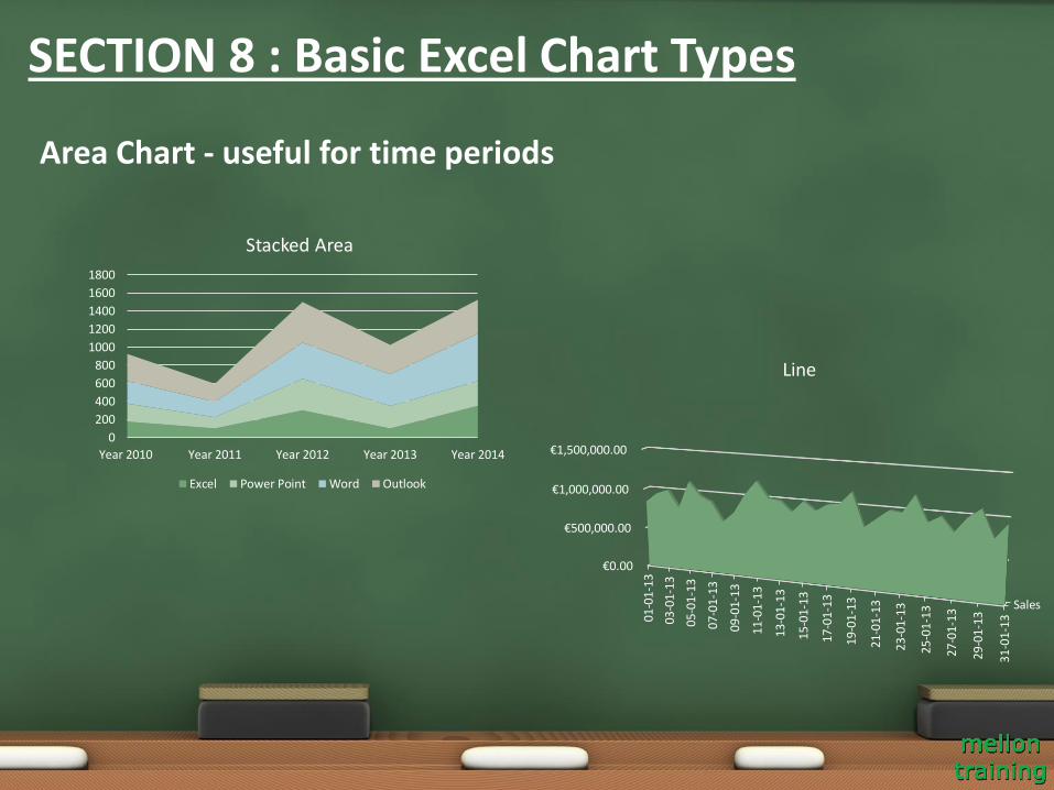
Area Chart - useful for time periods
0
200
400
600
800
1000
1200
1400
1600
1800
Year 2010 Year 2011 Year 2012 Year 2013 Year 2014
Stacked Area
Excel Power Point Word Outlook
Sales
€0.00
€500,000.00
€1,000,000.00
€1,500,000.00
01-0
1-13
03-0
1-13
05-0
1-13
07-0
1-13
09-0
1-13
11-0
1-13
13-0
1-13
15-0
1-13
17-0
1-13
19-0
1-13
21-0
1-13
23-0
1-13
25
-01
-13
27-0
1-13
29-0
1-13
31-0
1-13
Line
SECTION 8 : Basic Excel Chart Types
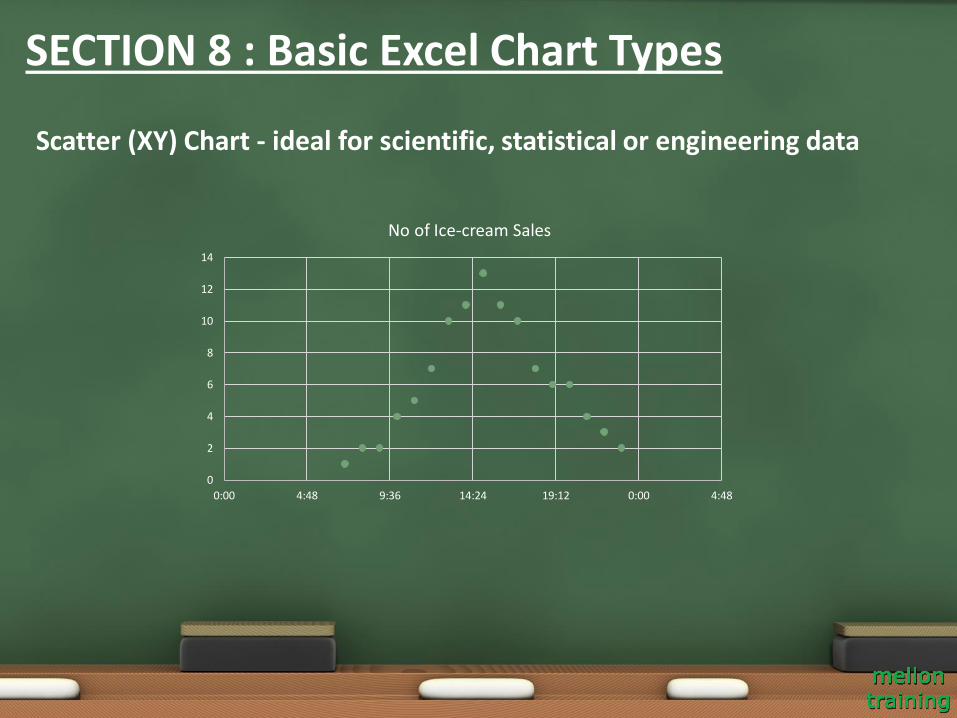
Scatter (XY) Chart - ideal for scientific, statistical or engineering data
0
2
4
6
8
10
12
14
0:00 4:48 9:36 14:24 19:12 0:00 4:48
No of Ice-cream Sales
SECTION 8 : Basic Excel Chart Types
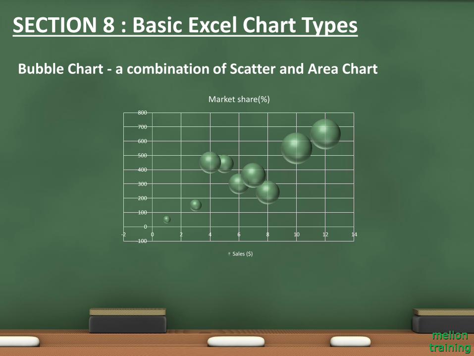
Bubble Chart - a combination of Scatter and Area Chart
-100
0
100
200
300
400
500
600
700
800
-2 0 2 4 6 8 10 12 14
Market share(%)
Sales ($)
SECTION 8 : Basic Excel Chart Types
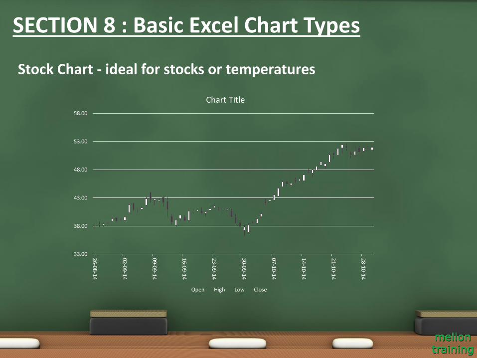
Stock Chart - ideal for stocks or temperatures
33.00
38.00
43.00
48.00
53.00
58.00
26-08-14
02-09-14
09-09-14
16-09-14
23-09-14
30-09-14
07-10-14
14-10-14
21-10-14
28-10-14
Chart Title
Open High Low Close
SECTION 8 : Basic Excel Chart Types
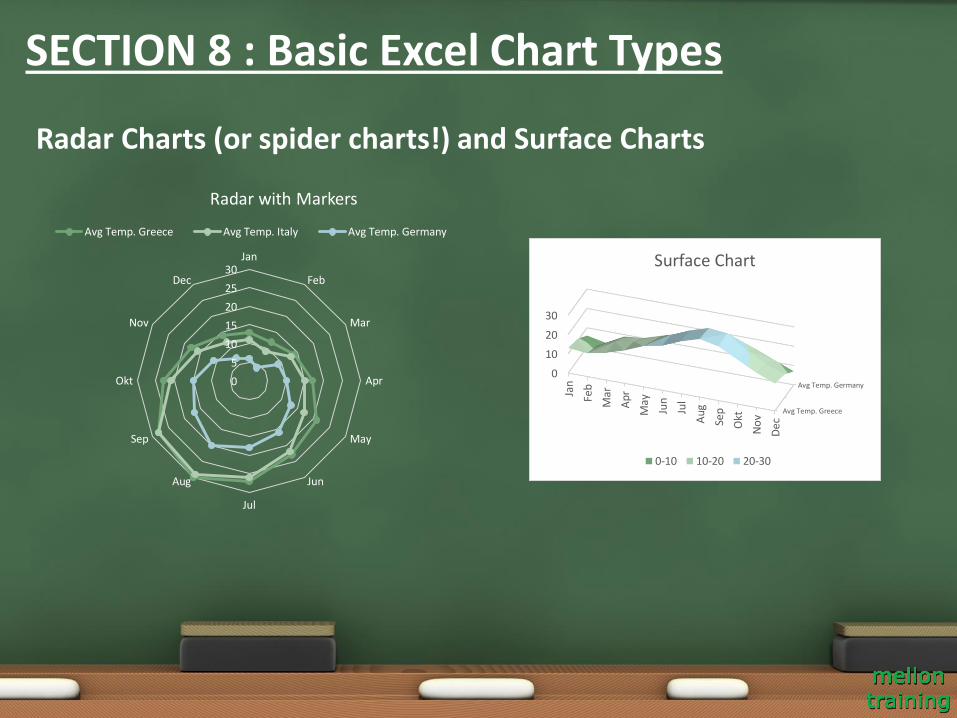
Radar Charts (or spider charts!) and Surface Charts
0
5
10
15
20
25
30Jan
Feb
Mar
Apr
May
Jun
Jul
Aug
Sep
Okt
Nov
Dec
Radar with Markers
Avg Temp. Greece Avg Temp. Italy Avg Temp. Germany
Avg Temp. Greece
Avg Temp. Germany
0
10
20
30
Jan
Feb
Mar
Apr
May
Jun
Jul
Aug
Sep
Okt
No
v
Dec
Surface Chart
0-10 10-20 20-30
SECTION 8 : Basic Excel Chart Types
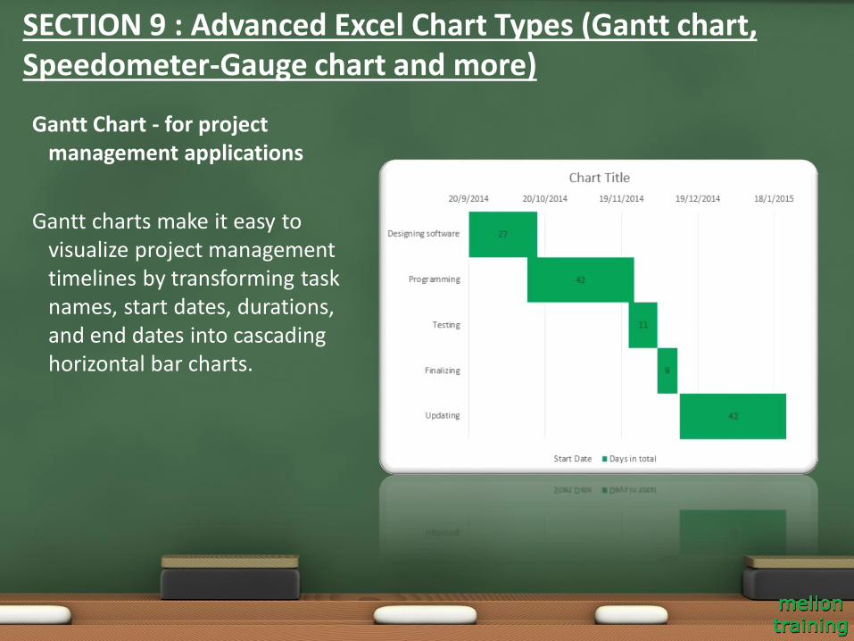
Gantt Chart - for project management applications
Gantt charts make it easy to visualize project management timelines by transforming task names, start dates, durations, and end dates into cascading horizontal bar charts.
SECTION 9 : Advanced Excel Chart Types (Gantt chart, Speedometer-Gauge chart and more)
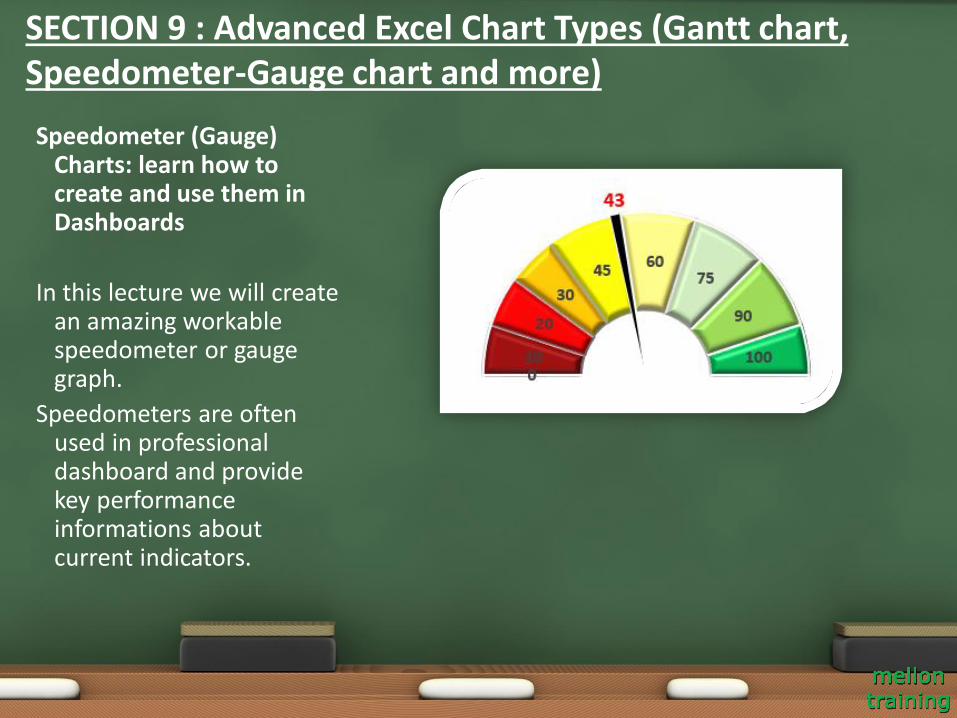
Speedometer (Gauge) Charts: learn how to create and use them in Dashboards
In this lecture we will create an amazing workable speedometer or gauge graph.
Speedometers are often used in professional dashboard and provide key performance informations about current indicators.
SECTION 9 : Advanced Excel Chart Types (Gantt chart, Speedometer-Gauge chart and more)

Pareto Chart or the 80-20 chart - for business analysis
A Pareto chart combines a column chart and a line graph. The Pareto principle states that, for many events, roughly 80% of the effects come from 20% of the causes.
SECTION 9 : Advanced Excel Chart Types (Gantt chart, Speedometer-Gauge chart and more)
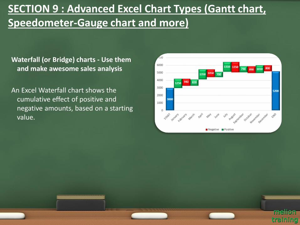
Waterfall (or Bridge) charts - Use them and make awesome sales analysis
An Excel Waterfall chart shows the cumulative effect of positive and negative amounts, based on a starting value.
SECTION 9 : Advanced Excel Chart Types (Gantt chart, Speedometer-Gauge chart and more)
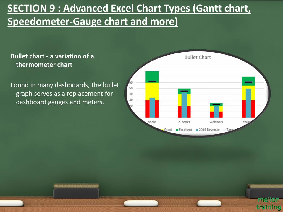
Bullet chart - a variation of a thermometer chart
Found in many dashboards, the bullet graph serves as a replacement for dashboard gauges and meters.
SECTION 9 : Advanced Excel Chart Types (Gantt chart, Speedometer-Gauge chart and more)
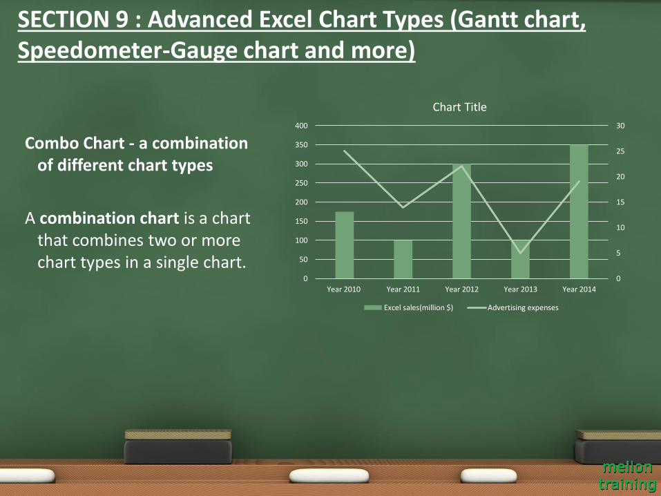
Combo Chart - a combination of different chart types
A combination chart is a chart that combines two or more chart types in a single chart.
SECTION 9 : Advanced Excel Chart Types (Gantt chart, Speedometer-Gauge chart and more)
0
5
10
15
20
25
30
0
50
100
150
200
250
300
350
400
Year 2010 Year 2011 Year 2012 Year 2013 Year 2014
Chart Title
Excel sales(million $) Advertising expenses
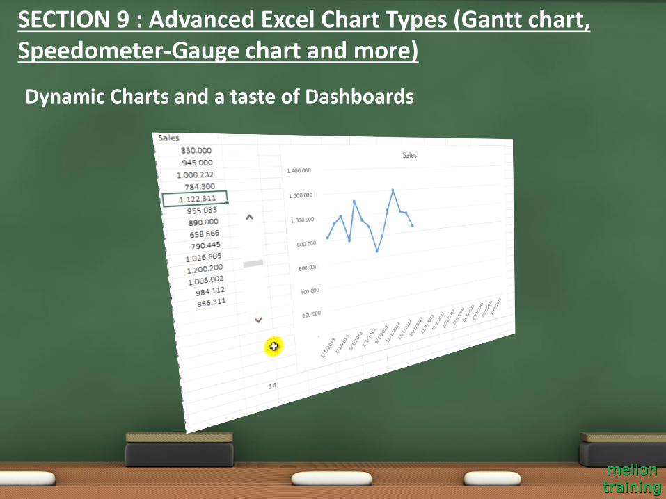
Dynamic Charts and a taste of Dashboards
SECTION 9 : Advanced Excel Chart Types (Gantt chart, Speedometer-Gauge chart and more)
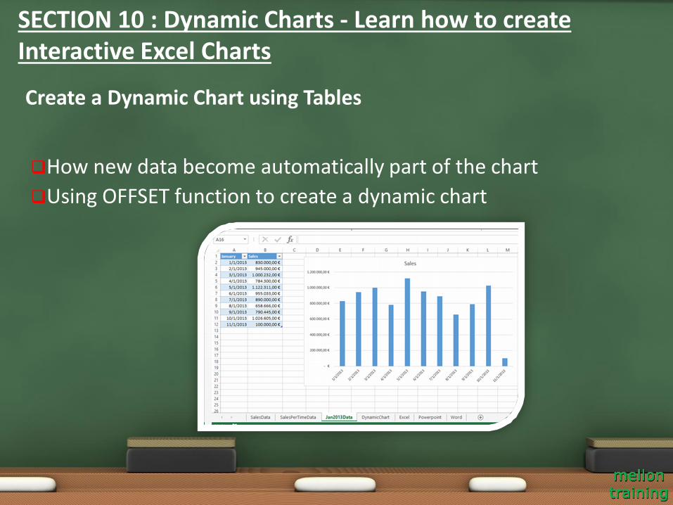
How new data become automatically part of the chart
Using OFFSET function to create a dynamic chart
Create a Dynamic Chart using Tables
SECTION 10 : Dynamic Charts - Learn how to create Interactive Excel Charts
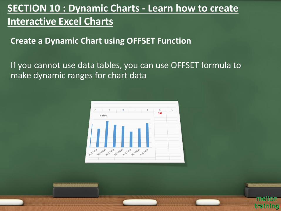
If you cannot use data tables, you can use OFFSET formula to make dynamic ranges for chart data
Create a Dynamic Chart using OFFSET Function
SECTION 10 : Dynamic Charts - Learn how to create Interactive Excel Charts
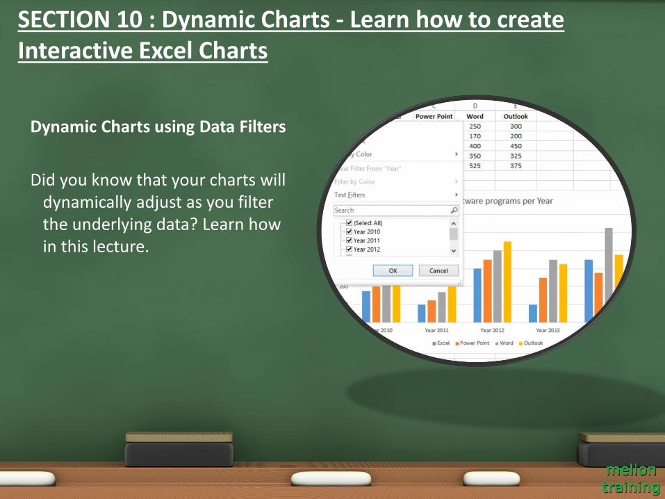
Dynamic Charts using Data Filters
Did you know that your charts will dynamically adjust as you filter the underlying data? Learn how in this lecture.
SECTION 10 : Dynamic Charts - Learn how to create Interactive Excel Charts
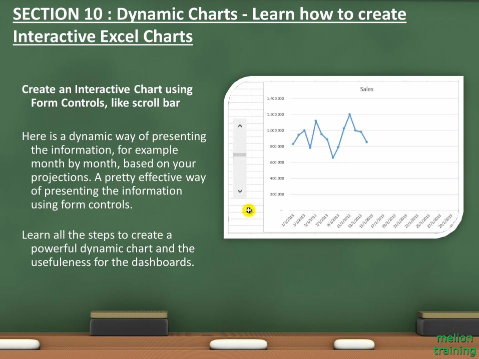
Create an Interactive Chart using Form Controls, like scroll bar
Here is a dynamic way of presenting the information, for example month by month, based on your projections. A pretty effective way of presenting the information using form controls.
Learn all the steps to create a powerful dynamic chart and the usefuleness for the dashboards.
SECTION 10 : Dynamic Charts - Learn how to create Interactive Excel Charts
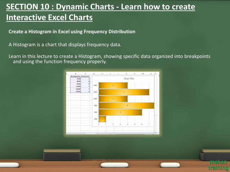
Create a Histogram in Excel using Frequency Distribution
A Histogram is a chart that displays frequency data.
Learn in this lecture to create a Histogram, showing specific data organized into breakpoints and using the function frequency properly.
SECTION 10 : Dynamic Charts - Learn how to create Interactive Excel Charts
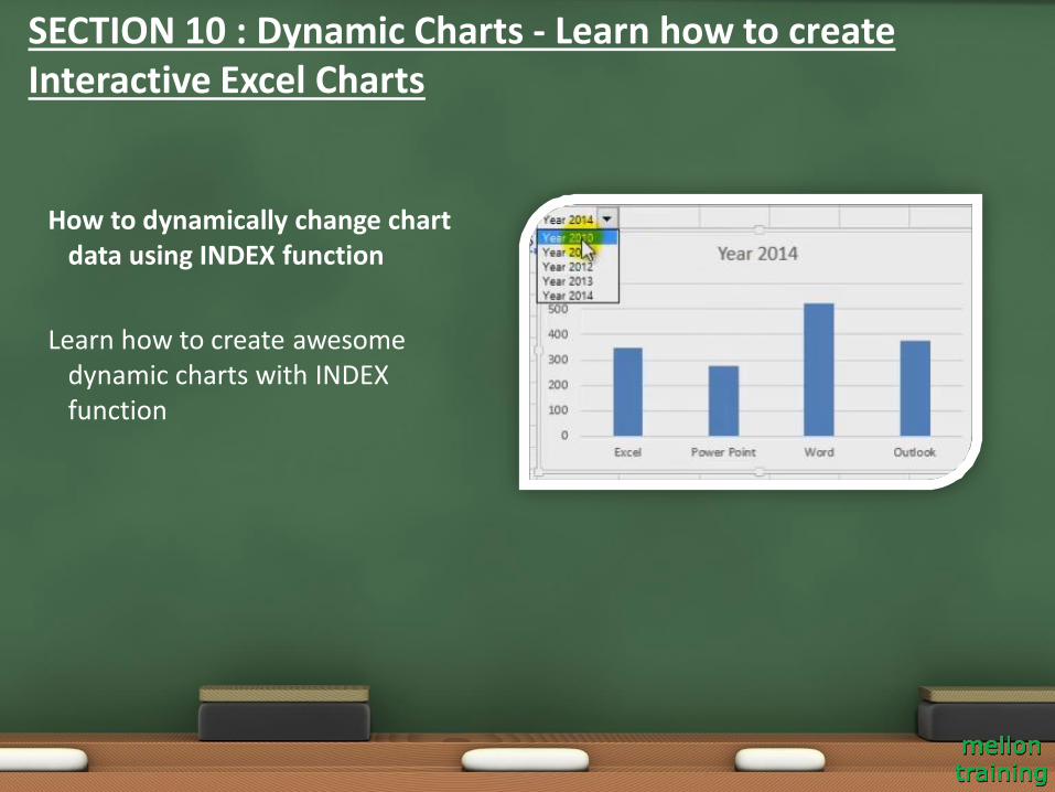
How to dynamically change chart data using INDEX function
Learn how to create awesome dynamic charts with INDEX function
SECTION 10 : Dynamic Charts - Learn how to create Interactive Excel Charts
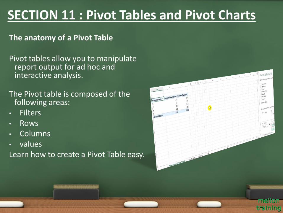
The anatomy of a Pivot Table
Pivot tables allow you to manipulate report output for ad hoc and interactive analysis.
The Pivot table is composed of the following areas:
• Filters• Rows• Columns• valuesLearn how to create a Pivot Table easy.
SECTION 11 : Pivot Tables and Pivot Charts
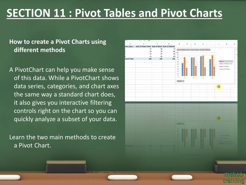
How to create a Pivot Charts using different methods
A PivotChart can help you make sense of this data. While a PivotChart shows data series, categories, and chart axes the same way a standard chart does, it also gives you interactive filtering controls right on the chart so you can quickly analyze a subset of your data.
Learn the two main methods to create a Pivot Chart.
SECTION 11 : Pivot Tables and Pivot Charts
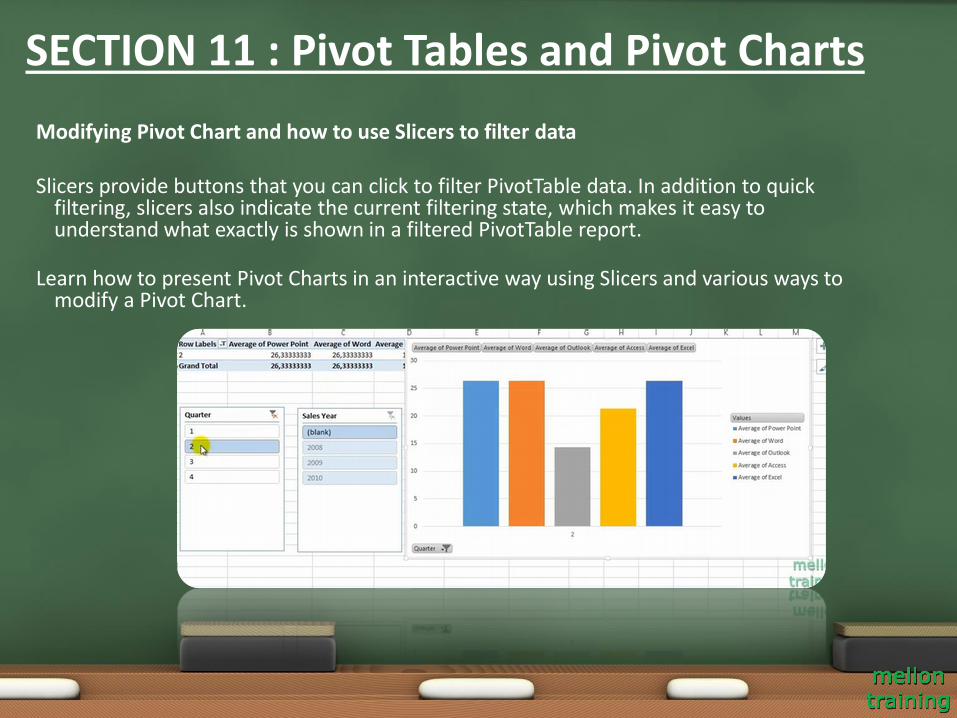
Modifying Pivot Chart and how to use Slicers to filter data
Slicers provide buttons that you can click to filter PivotTable data. In addition to quick filtering, slicers also indicate the current filtering state, which makes it easy to understand what exactly is shown in a filtered PivotTable report.
Learn how to present Pivot Charts in an interactive way using Slicers and various ways to modify a Pivot Chart.
SECTION 11 : Pivot Tables and Pivot Charts
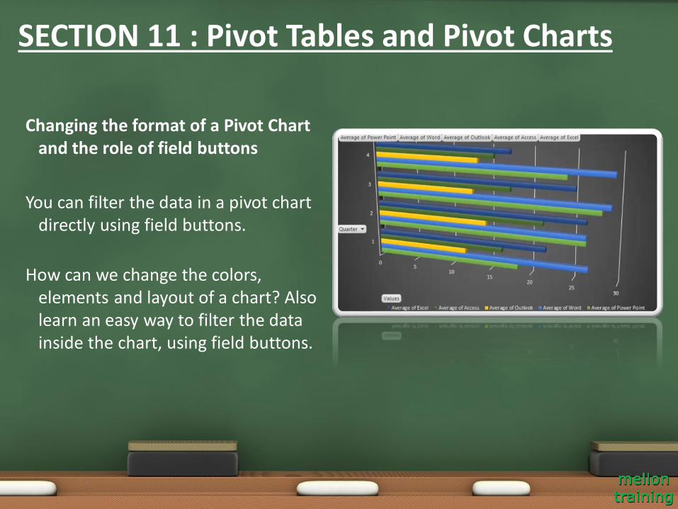
Changing the format of a Pivot Chart and the role of field buttons
You can filter the data in a pivot chart directly using field buttons.
How can we change the colors, elements and layout of a chart? Also learn an easy way to filter the data inside the chart, using field buttons.
SECTION 11 : Pivot Tables and Pivot Charts
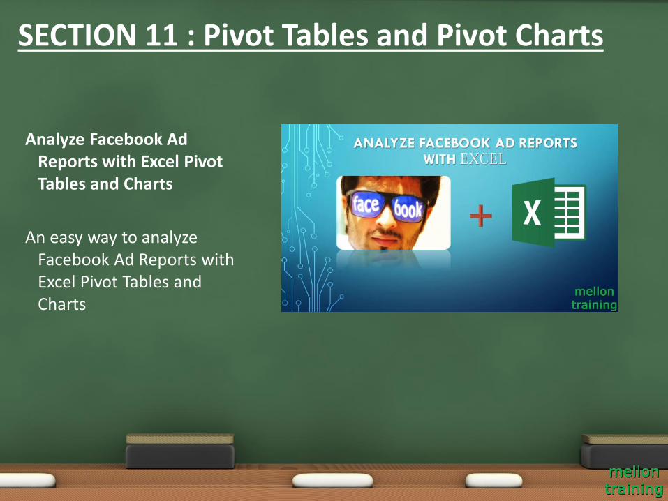
Analyze Facebook Ad Reports with Excel Pivot Tables and Charts
An easy way to analyze Facebook Ad Reports with Excel Pivot Tables and Charts
SECTION 11 : Pivot Tables and Pivot Charts
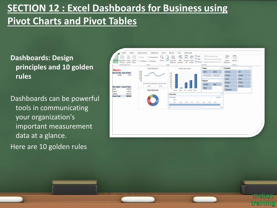
Dashboards: Design principles and 10 golden rules
Dashboards can be powerful tools in communicating your organization's important measurement data at a glance.
Here are 10 golden rules
SECTION 12 : Excel Dashboards for Business using Pivot Charts and Pivot Tables
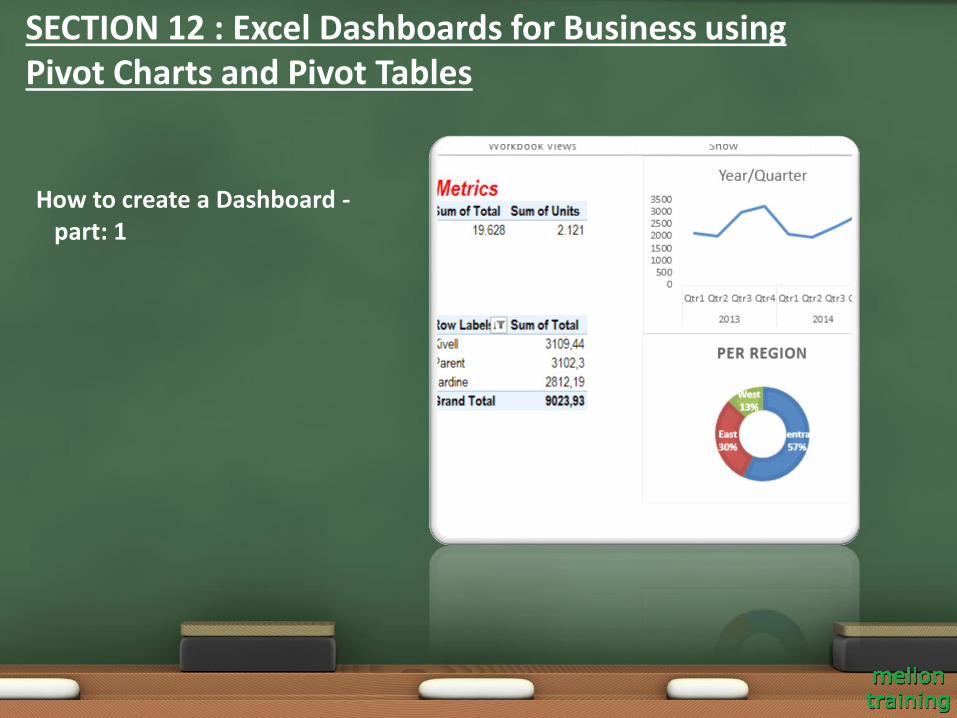
How to create a Dashboard -part: 1
SECTION 12 : Excel Dashboards for Business using Pivot Charts and Pivot Tables

How to create a Dashboard -part: 2
SECTION 12 : Excel Dashboards for Business using Pivot Charts and Pivot Tables
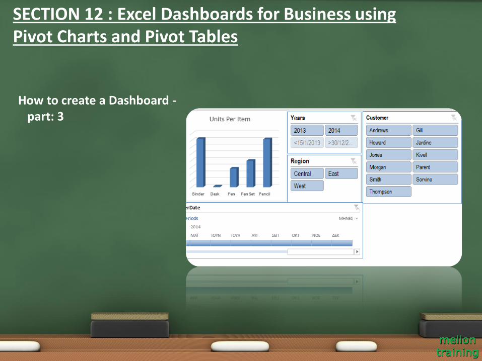
How to create a Dashboard -part: 3
SECTION 12 : Excel Dashboards for Business using Pivot Charts and Pivot Tables
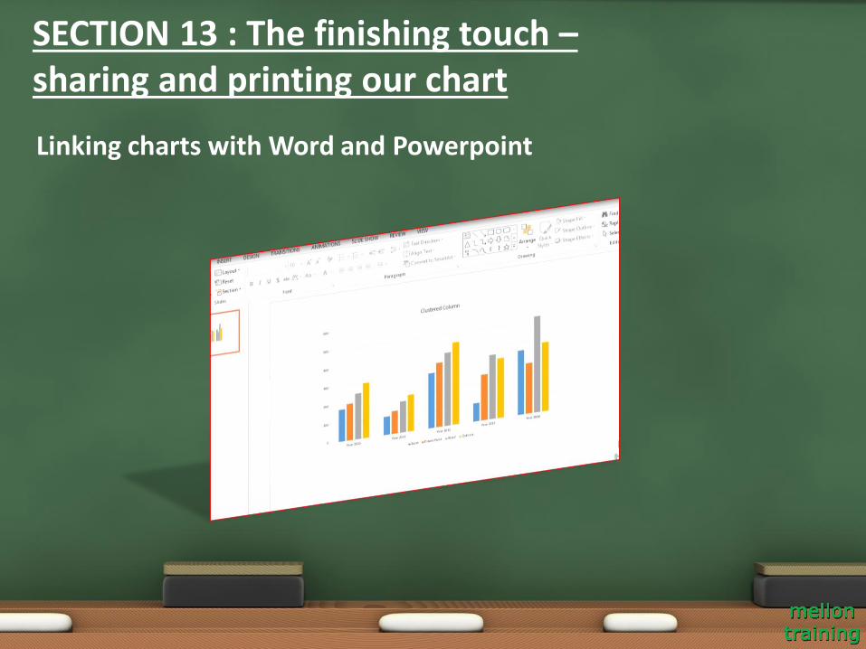
Linking charts with Word and Powerpoint
SECTION 13 : The finishing touch –sharing and printing our chart
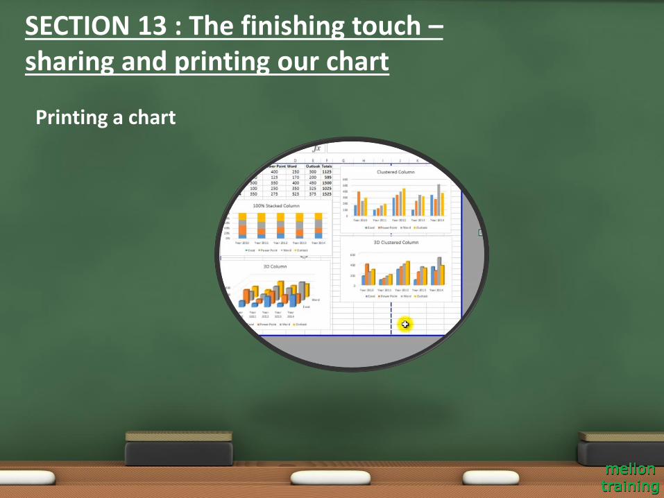
Printing a chart
SECTION 13 : The finishing touch –sharing and printing our chart

Thank you!