Embed Size (px)
Citation preview
Statistical Applications
Using Minitab May 14, 2014 Larry Bartkus
Los Angeles Section ASQ
The Statistician
The Statistician is a person who poses as an exacting expert
on the basis of being able to turn out with prolific fortitude
infinite strings of incomprehensible formulae calculated
with micrometric precision from vague assumptions which
are based upon debatable figures taken from inconclusive
experiments carried out with instruments of problematical
accuracy by persons of doubtful reliability and questionable
mentality.
Key Take-Aways
• Minitab is a Simple and Powerful Tool in Data Analysis and Display
• Always try to Graphically Display your data
• Easier to understand
• Draws picture of what is really happening
• Check for Patterns
• Is it Normal?
• Time Series for trends, changes, effects
• Organize and Plan you Data Collection first
• Analyze the results and recheck any assumptions
• Have Fun. Software has made data analysis easier, faster, and funner!
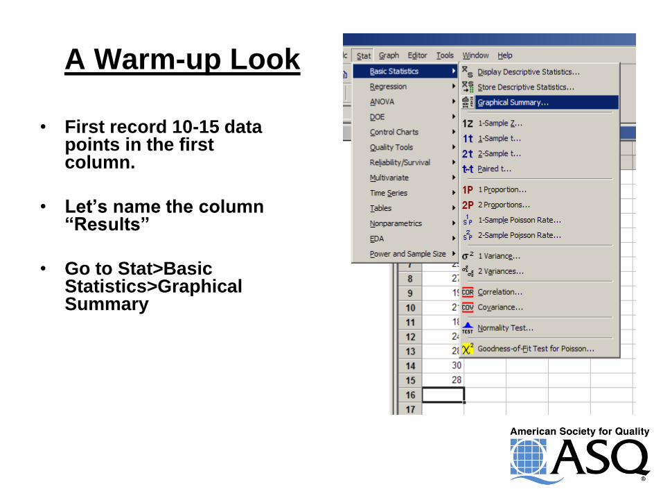
A Warm-up Look
• First record 10-15 data points in the first column.
• Let’s name the column “Results”
• Go to Stat>Basic Statistics>Graphical Summary
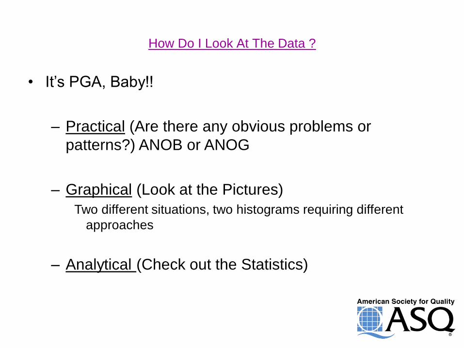
How Do I Look At The Data ?
• It’s PGA, Baby!!
– Practical (Are there any obvious problems or
patterns?) ANOB or ANOG
– Graphical (Look at the Pictures)
Two different situations, two histograms requiring different
approaches
– Analytical (Check out the Statistics)
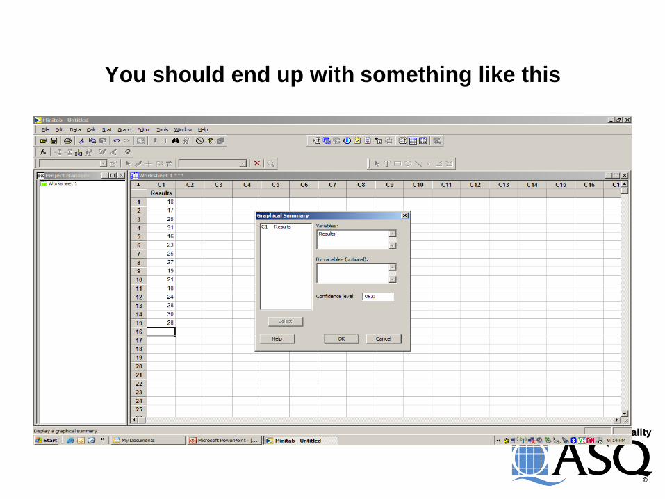
You should end up with something like this
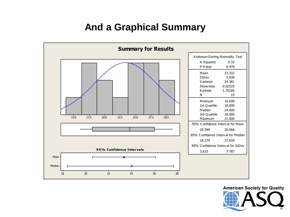
And a Graphical Summary
30.027.525.022.520.017.515.0
Median
Mean
282624222018
1st Q uartile 18.000
Median 24.000
3rd Q uartile 28.000
Maximum 31.000
20.599 26.068
18.374 27.626
3.615 7.787
A -Squared 0.33
P-V alue 0.470
Mean 23.333
StDev 4.938
V ariance 24.381
Skewness -0.02525
Kurtosis -1.35184
N 15
Minimum 16.000
A nderson-Darling Normality Test
95% C onfidence Interv al for Mean
95% C onfidence Interv al for Median
95% C onfidence Interv al for StDev
95% Confidence Intervals
Summary for Results
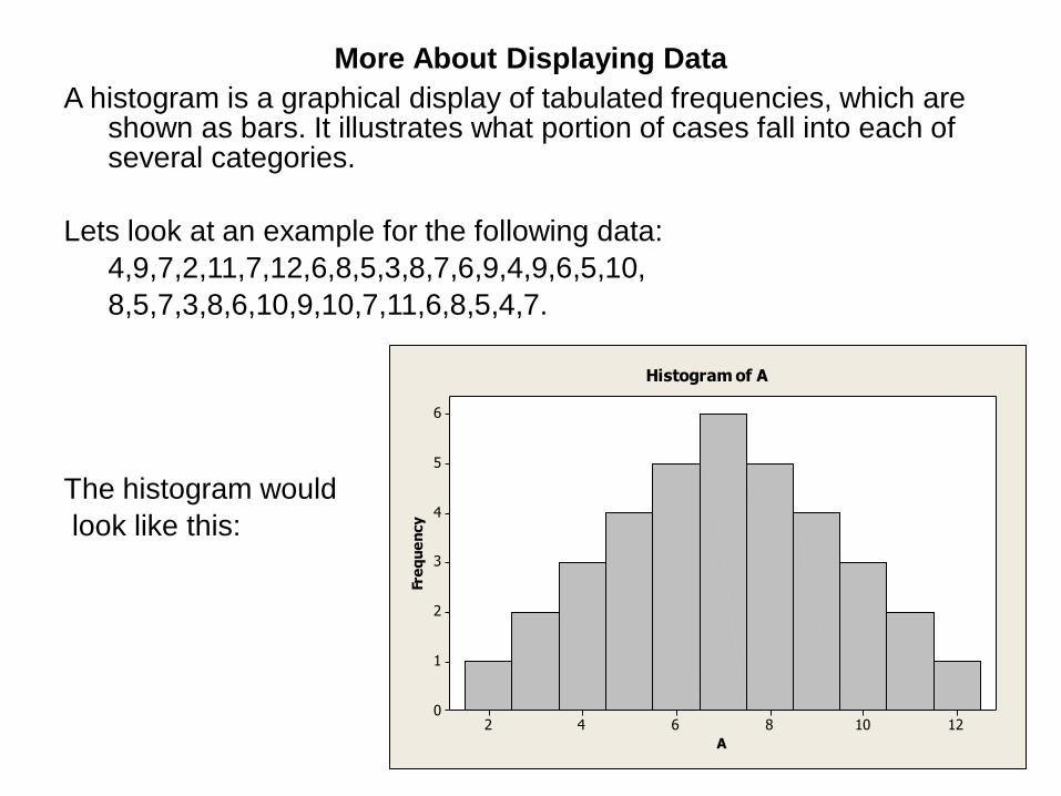
More About Displaying Data
A histogram is a graphical display of tabulated frequencies, which are shown as bars. It illustrates what portion of cases fall into each of several categories.
Lets look at an example for the following data:
4,9,7,2,11,7,12,6,8,5,3,8,7,6,9,4,9,6,5,10,
8,5,7,3,8,6,10,9,10,7,11,6,8,5,4,7.
The histogram would
look like this:
12108642
6
5
4
3
2
1
0
A
Fre
qu
en
cy
Histogram of A
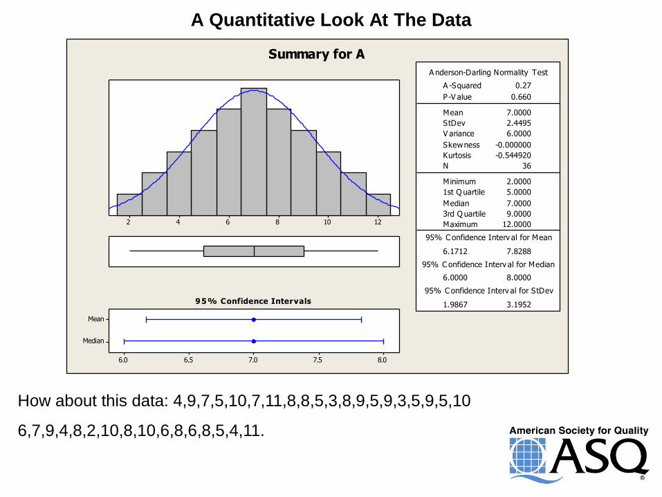
A Quantitative Look At The Data
12108642
Median
Mean
8.07.57.06.56.0
1st Q uartile 5.0000
Median 7.0000
3rd Q uartile 9.0000
Maximum 12.0000
6.1712 7.8288
6.0000 8.0000
1.9867 3.1952
A -Squared 0.27
P-V alue 0.660
Mean 7.0000
StDev 2.4495
V ariance 6.0000
Skewness -0.000000
Kurtosis -0.544920
N 36
Minimum 2.0000
A nderson-Darling Normality Test
95% C onfidence Interv al for Mean
95% C onfidence Interv al for Median
95% C onfidence Interv al for StDev
95% Confidence Intervals
Summary for A
How about this data: 4,9,7,5,10,7,11,8,8,5,3,8,9,5,9,3,5,9,5,10
6,7,9,4,8,2,10,8,10,6,8,6,8,5,4,11.
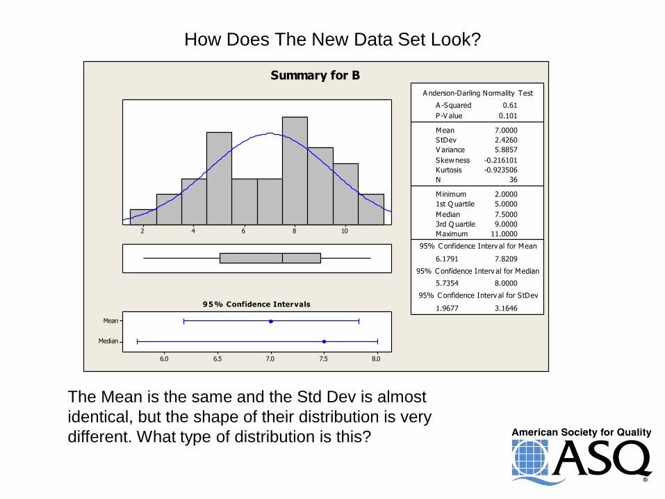
How Does The New Data Set Look?
108642
Median
Mean
8.07.57.06.56.0
1st Q uartile 5.0000
Median 7.5000
3rd Q uartile 9.0000
Maximum 11.0000
6.1791 7.8209
5.7354 8.0000
1.9677 3.1646
A -Squared 0.61
P-V alue 0.101
Mean 7.0000
StDev 2.4260
V ariance 5.8857
Skewness -0.216101
Kurtosis -0.923506
N 36
Minimum 2.0000
A nderson-Darling Normality Test
95% C onfidence Interv al for Mean
95% C onfidence Interv al for Median
95% C onfidence Interv al for StDev
95% Confidence Intervals
Summary for B
The Mean is the same and the Std Dev is almost
identical, but the shape of their distribution is very
different. What type of distribution is this?

Distributions
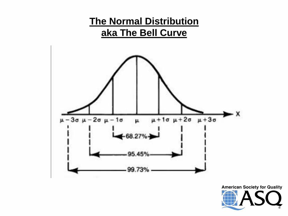
The Normal Distribution
aka The Bell Curve
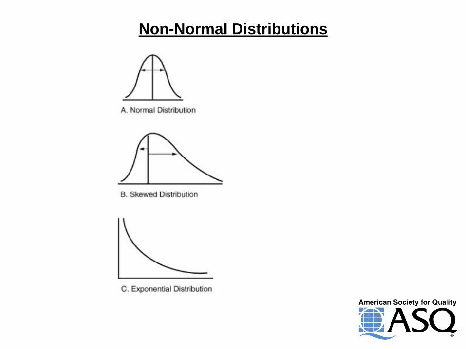
Non-Normal Distributions
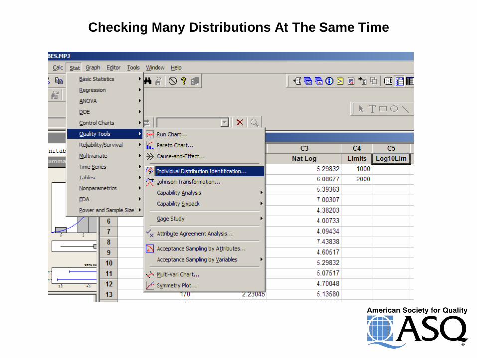
Checking Many Distributions At The Same Time
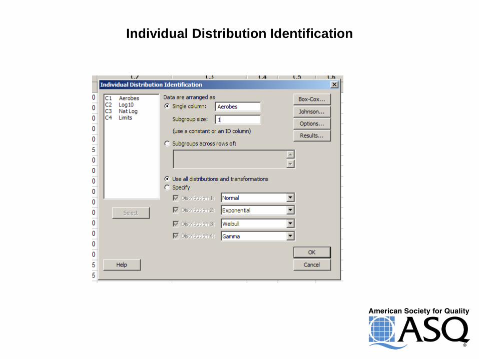
Individual Distribution Identification
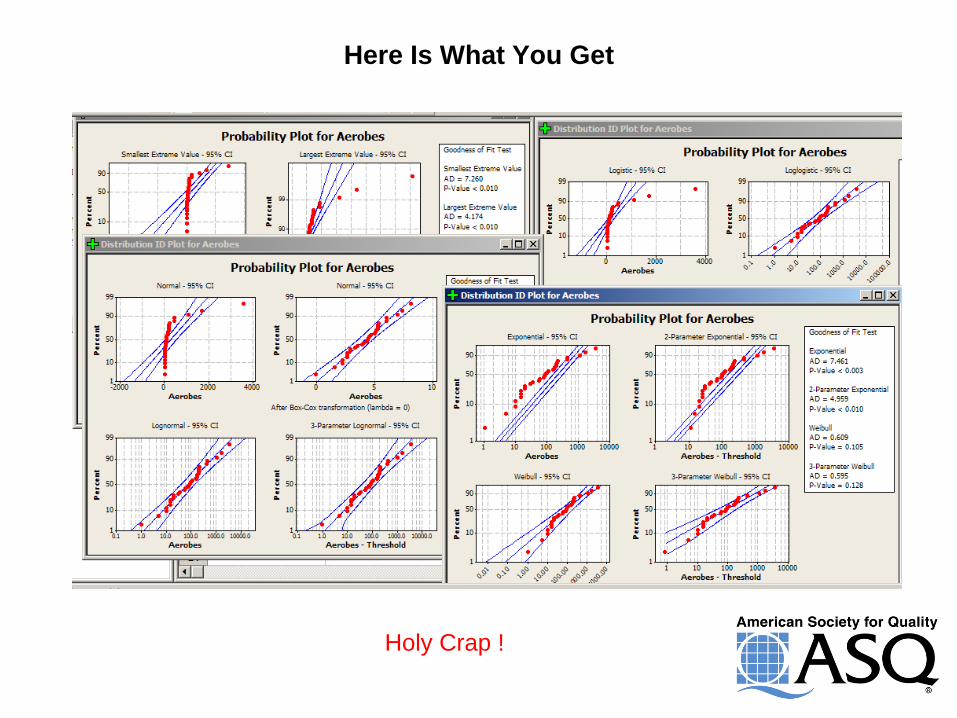
Here Is What You Get
Holy Crap !

Transformation
18
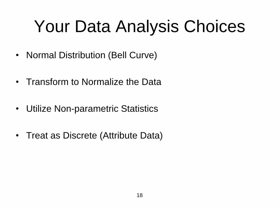
Your Data Analysis Choices
• Normal Distribution (Bell Curve)
• Transform to Normalize the Data
• Utilize Non-parametric Statistics
• Treat as Discrete (Attribute Data)
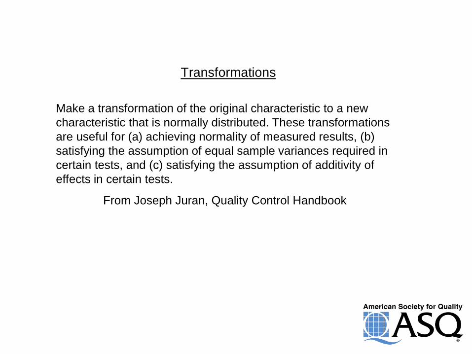
Transformations
Make a transformation of the original characteristic to a new
characteristic that is normally distributed. These transformations
are useful for (a) achieving normality of measured results, (b)
satisfying the assumption of equal sample variances required in
certain tests, and (c) satisfying the assumption of additivity of
effects in certain tests.
From Joseph Juran, Quality Control Handbook
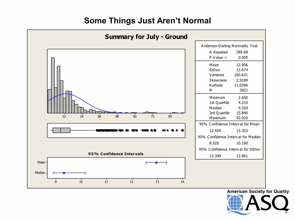
Some Things Just Aren’t Normal
84726048362412
Median
Mean
14131211109
A nderson-Darling Normality Test
V ariance 160.621
Skewness 2.9189
Kurtosis 11.0296
N 3921
Minimum 2.650
A -Squared
1st Q uartile 4.210
Median 9.320
3rd Q uartile 15.840
Maximum 92.020
95% C onfidence Interv al for Mean
12.559
285.69
13.353
95% C onfidence Interv al for Median
8.920 10.160
95% C onfidence Interv al for StDev
12.399 12.961
P-V alue < 0.005
Mean 12.956
StDev 12.674
95% Confidence Intervals
Summary for July - Ground
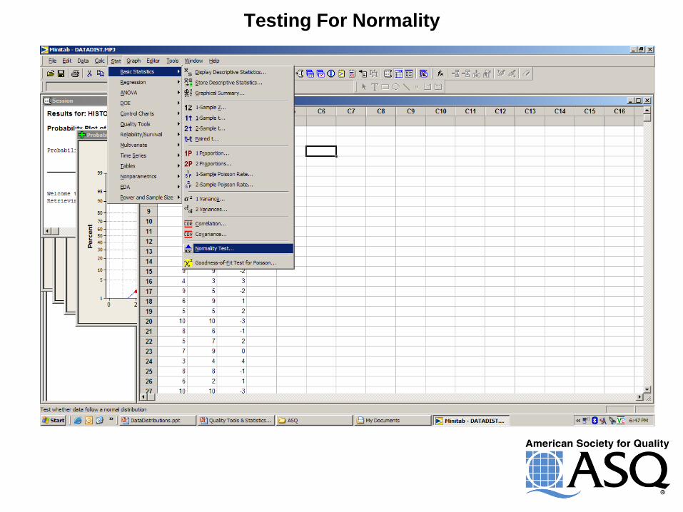
Testing For Normality
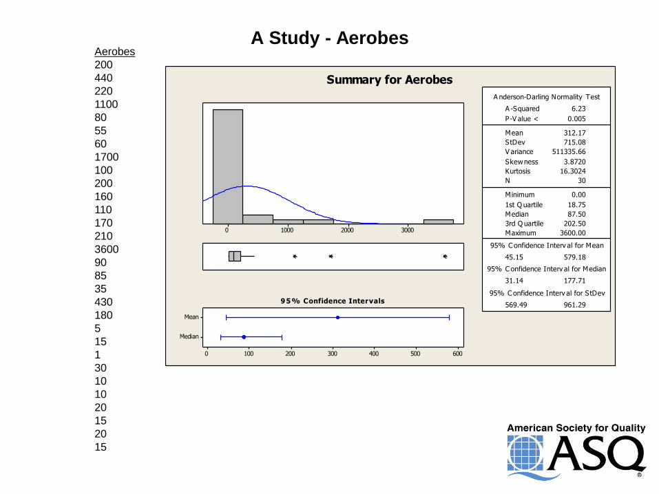
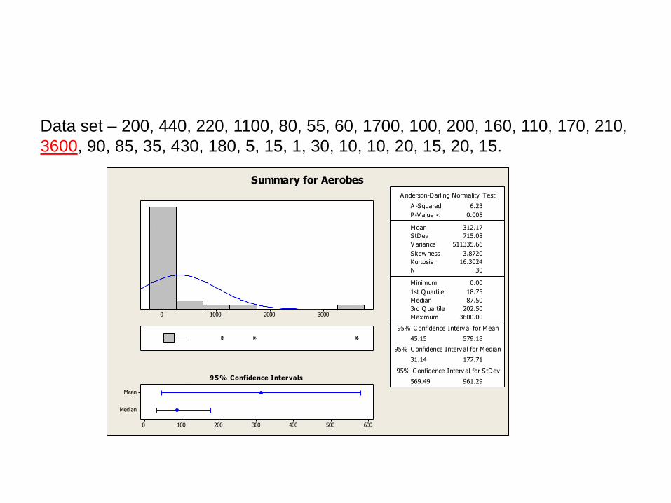
A Study - Aerobes
3000200010000
Median
Mean
6005004003002001000
1st Q uartile 18.75
Median 87.50
3rd Q uartile 202.50
Maximum 3600.00
45.15 579.18
31.14 177.71
569.49 961.29
A -Squared 6.23
P-V alue < 0.005
Mean 312.17
StDev 715.08
V ariance 511335.66
Skewness 3.8720
Kurtosis 16.3024
N 30
Minimum 0.00
A nderson-Darling Normality Test
95% C onfidence Interv al for Mean
95% C onfidence Interv al for Median
95% C onfidence Interv al for StDev95% Confidence Intervals
Summary for Aerobes
Aerobes
200
440
220
1100
80
55
60
1700
100
200
160
110
170
210
3600
90
85
35
430
180
5
15
1
30
10
10
20
15
20
15
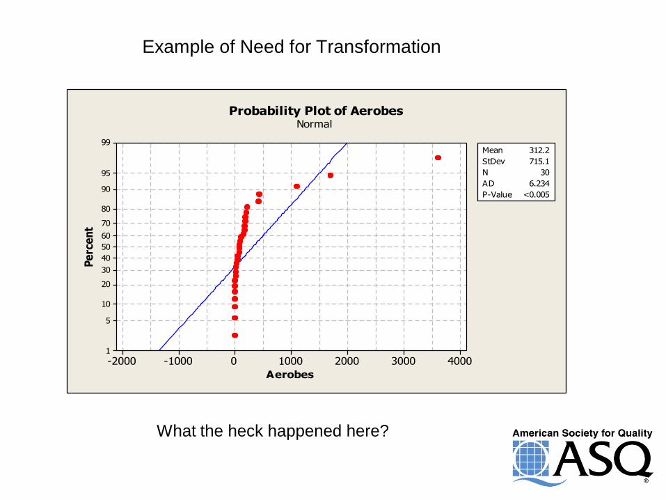
Example of Need for Transformation
40003000200010000-1000-2000
99
95
90
80
70
60
50
40
30
20
10
5
1
Aerobes
Pe
rce
nt
Mean 312.2
StDev 715.1
N 30
AD 6.234
P-Value <0.005
Probability Plot of AerobesNormal
Example of Need What the heck happened here?
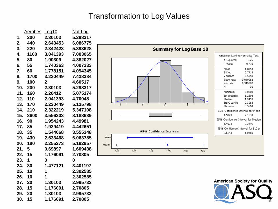
Transformation to Log Values
Aerobes Log10 Nat Log
1. 200 2.30103 5.298317
2. 440 2.643453 6.086775
3. 220 2.342423 5.393628
4. 1100 3.041393 7.003065
5. 80 1.90309 4.382027
6. 55 1.740363 4.007333
7. 60 1.778151 4.094345
8. 1700 3.230449 7.438384
9. 100 2 4.60517
10. 200 2.30103 5.298317
11. 160 2.20412 5.075174
12. 110 2.041393 4.70048
13. 170 2.230449 5.135798
14. 210 2.322219 5.347108
15. 3600 3.556303 8.188689
16. 90 1.954243 4.49981
17. 85 1.929419 4.442651
18. 35 1.544068 3.555348
19. 430 2.633468 6.063785
20. 180 2.255273 5.192957
21. 5 0.69897 1.609438
22. 15 1.176091 2.70805
23. 1 0 0
24. 30 1.477121 3.401197
25. 10 1 2.302585
26. 10 1 2.302585
27. 20 1.30103 2.995732
28. 15 1.176091 2.70805
29. 20 1.30103 2.995732
30. 15 1.176091 2.70805
3210
Median
Mean
2.252.101.951.801.651.50
1st Q uartile 1.2698
Median 1.9418
3rd Q uartile 2.3063
Maximum 3.5563
1.5873 2.1633
1.4924 2.2496
0.6143 1.0369
A -Squared 0.25
P-V alue 0.710
Mean 1.8753
StDev 0.7713
V ariance 0.5950
Skewness -0.069983
Kurtosis 0.319587
N 30
Minimum 0.0000
A nderson-Darling Normality Test
95% C onfidence Interv al for Mean
95% C onfidence Interv al for Median
95% C onfidence Interv al for StDev95% Confidence Intervals
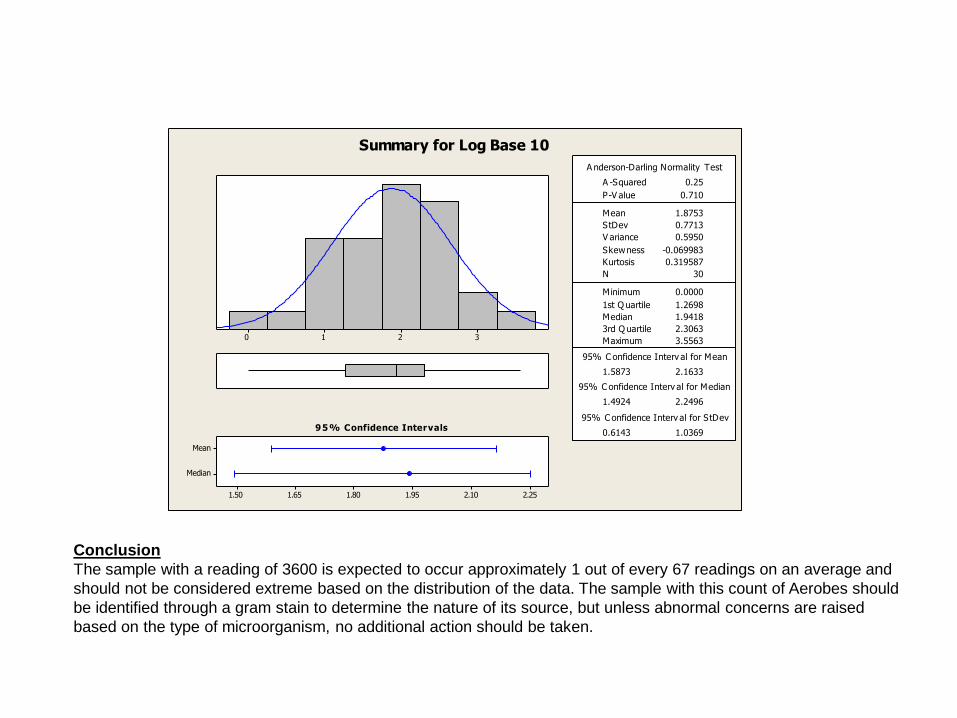
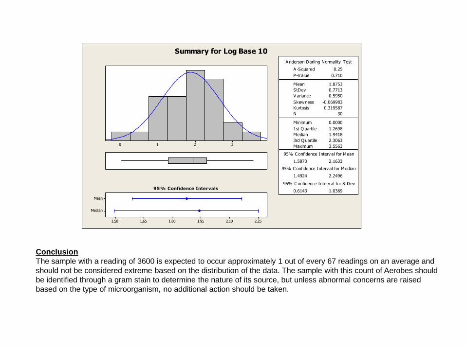
Summary for Log Base 10
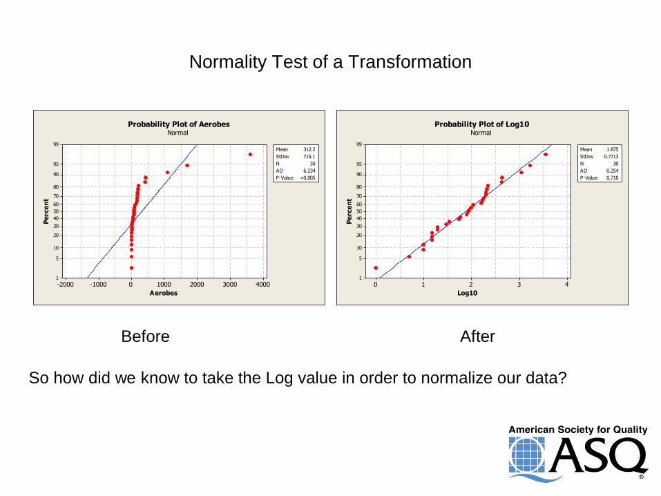
Normality Test of a Transformation
40003000200010000-1000-2000
99
95
90
80
70
60
50
40
30
20
10
5
1
Aerobes
Pe
rce
nt
Mean 312.2
StDev 715.1
N 30
AD 6.234
P-Value <0.005
Probability Plot of AerobesNormal
43210
99
95
90
80
70
60
50
40
30
20
10
5
1
Log10
Pe
rce
nt
Mean 1.875
StDev 0.7713
N 30
AD 0.254
P-Value 0.710
Probability Plot of Log10Normal
Before After
So how did we know to take the Log value in order to normalize our data?
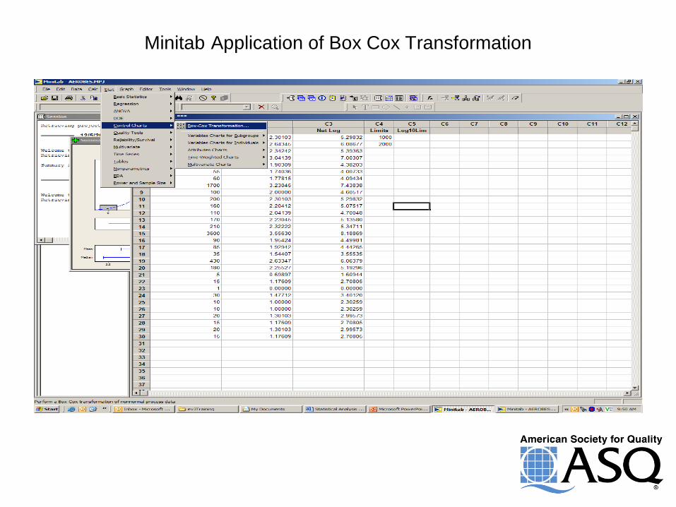
Minitab Application of Box Cox Transformation
Box Cox Transformation
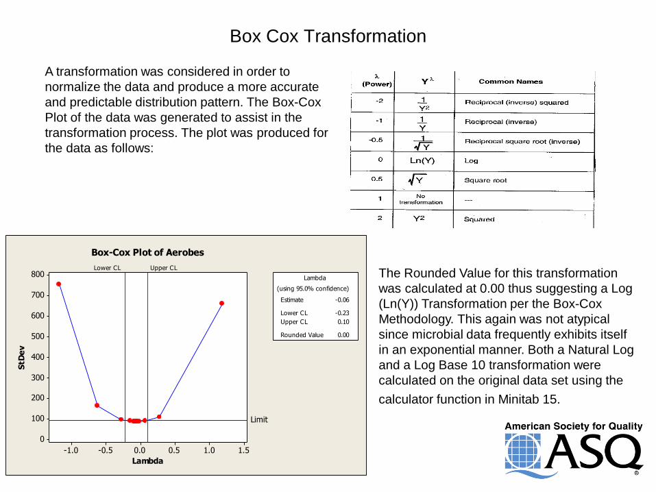
A transformation was considered in order to
normalize the data and produce a more accurate
and predictable distribution pattern. The Box-Cox
Plot of the data was generated to assist in the
transformation process. The plot was produced for
the data as follows:
1.51.00.50.0-0.5-1.0
800
700
600
500
400
300
200
100
0
Lambda
StD
ev
Lower CL Upper CL
Limit
Estimate -0.06
Lower CL -0.23
Upper CL 0.10
Rounded Value 0.00
(using 95.0% confidence)
Lambda
Box-Cox Plot of Aerobes
The Rounded Value for this transformation
was calculated at 0.00 thus suggesting a Log
(Ln(Y)) Transformation per the Box-Cox
Methodology. This again was not atypical
since microbial data frequently exhibits itself
in an exponential manner. Both a Natural Log
and a Log Base 10 transformation were
calculated on the original data set using the
calculator function in Minitab 15.
Outlier or Not?
Data set – 200, 440, 220, 1100, 80, 55, 60, 1700, 100, 200, 160, 110, 170, 210,
3600, 90, 85, 35, 430, 180, 5, 15, 1, 30, 10, 10, 20, 15, 20, 15.
3000200010000
Median
Mean
6005004003002001000
1st Q uartile 18.75
Median 87.50
3rd Q uartile 202.50
Maximum 3600.00
45.15 579.18
31.14 177.71
569.49 961.29
A -Squared 6.23
P-V alue < 0.005
Mean 312.17
StDev 715.08
V ariance 511335.66
Skewness 3.8720
Kurtosis 16.3024
N 30
Minimum 0.00
A nderson-Darling Normality Test
95% C onfidence Interv al for Mean
95% C onfidence Interv al for Median
95% C onfidence Interv al for StDev95% Confidence Intervals
Summary for Aerobes
Try a transformation
3210
Median
Mean
2.252.101.951.801.651.50
1st Q uartile 1.2698
Median 1.9418
3rd Q uartile 2.3063
Maximum 3.5563
1.5873 2.1633
1.4924 2.2496
0.6143 1.0369
A -Squared 0.25
P-V alue 0.710
Mean 1.8753
StDev 0.7713
V ariance 0.5950
Skewness -0.069983
Kurtosis 0.319587
N 30
Minimum 0.0000
A nderson-Darling Normality Test
95% C onfidence Interv al for Mean
95% C onfidence Interv al for Median
95% C onfidence Interv al for StDev95% Confidence Intervals
Summary for Log Base 10
Conclusion
The sample with a reading of 3600 is expected to occur approximately 1 out of every 67 readings on an average and
should not be considered extreme based on the distribution of the data. The sample with this count of Aerobes should
be identified through a gram stain to determine the nature of its source, but unless abnormal concerns are raised
based on the type of microorganism, no additional action should be taken.
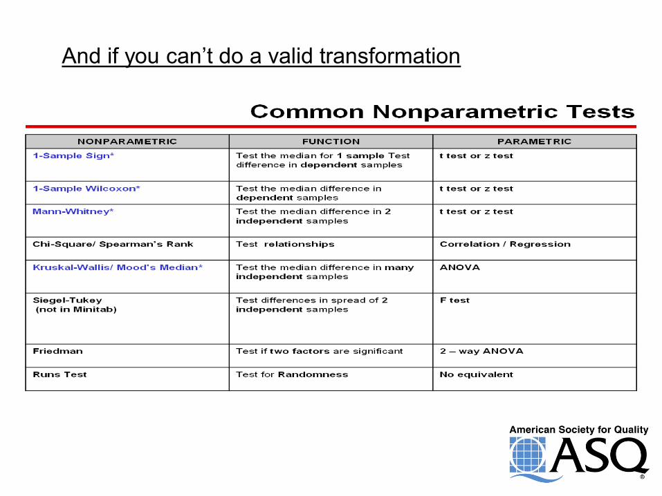
And if you can’t do a valid transformation
Outliers
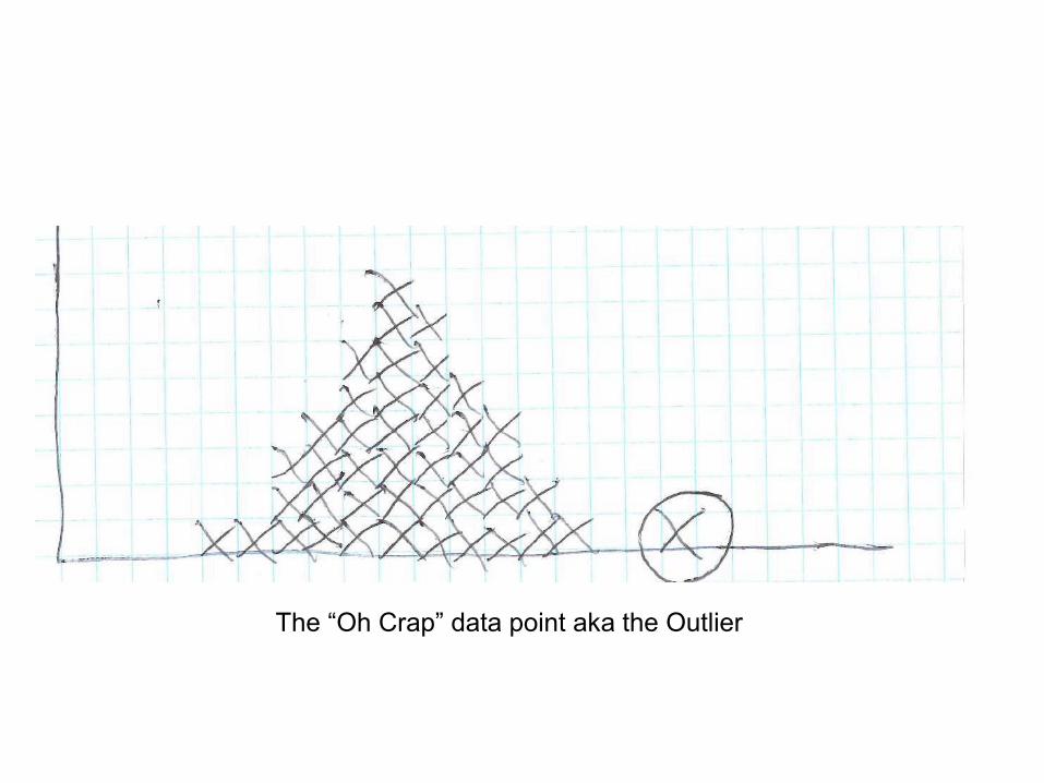
That Nasty Data Point
The “Oh Crap” data point aka the Outlier
What are Outliers?
An outlier is an observation point that is distant
from other observations.
An outlier may be due to variability in the
measurement or it may indicate experimental
error: the latter are sometimes excluded from the
data set.
An outlier may be caused by a defective unit or a
problem in the process.
ISO 16269 defines it as “member of a small subset
of observations that appears to be inconsistent
with the remainder of a given sample."
Basic Understanding of Outliers There is no rigid mathematical definition of what
constitutes an outlier; determining whether or not
an observation is an outlier is ultimately a
subjective exercise.
Every effort must be made to determine what is
causing the outlier to exist. Testing, equipment,
operator error, materials, etc. all must be reviewed
and assessment made.
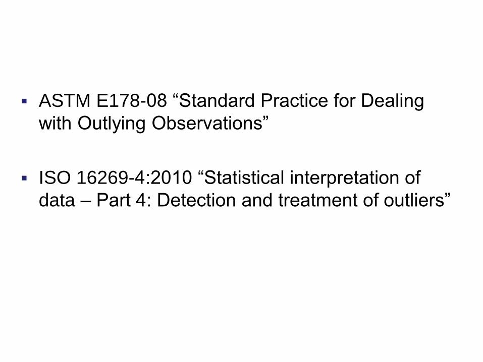
Standards Relating to Outliers
ASTM E178-08 “Standard Practice for Dealing
with Outlying Observations”
ISO 16269-4:2010 “Statistical interpretation of
data – Part 4: Detection and treatment of outliers”
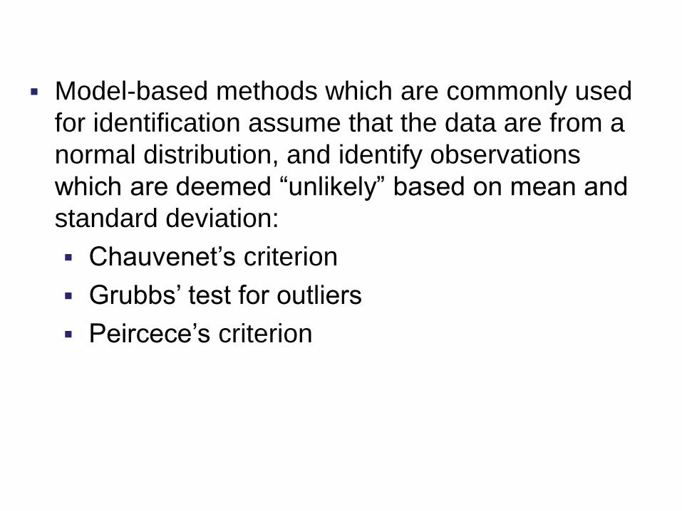
Testing for outliers Model-based methods which are commonly used
for identification assume that the data are from a
normal distribution, and identify observations
which are deemed “unlikely” based on mean and
standard deviation:
Chauvenet’s criterion
Grubbs’ test for outliers
Peircece’s criterion
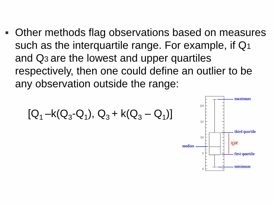
Testing for outliers
[Q1 –k(Q3-Q1), Q3 + k(Q3 – Q1)]
Other methods flag observations based on measures
such as the interquartile range. For example, if Q1
and Q3 are the lowest and upper quartiles
respectively, then one could define an outlier to be
any observation outside the range:
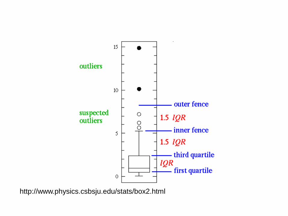
The Box Plot
http://www.physics.csbsju.edu/stats/box2.html
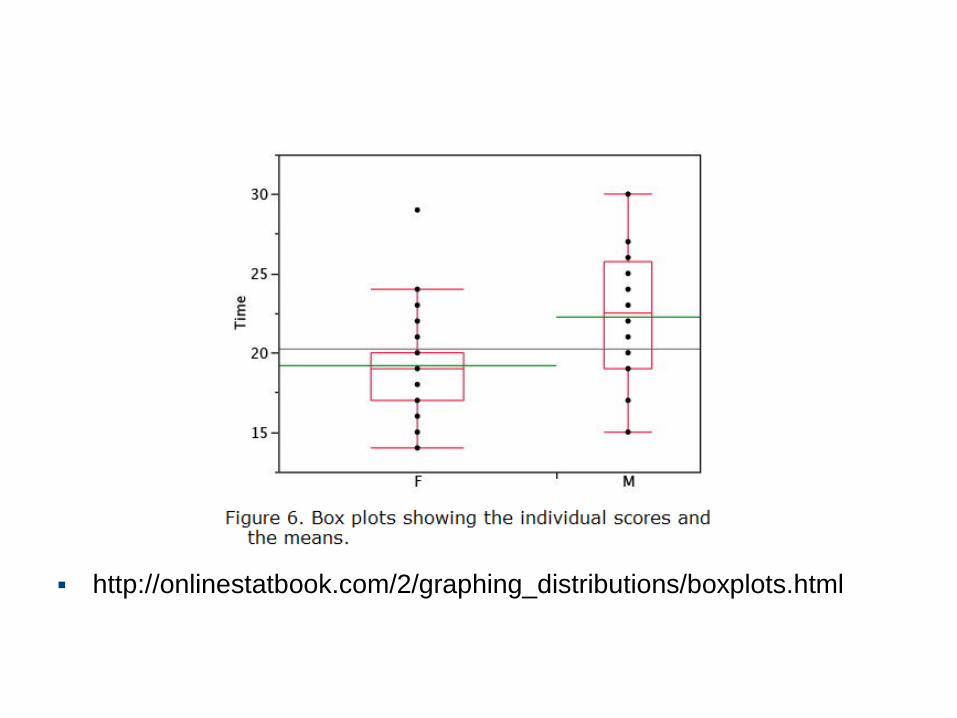
The Box Plot – an example
http://onlinestatbook.com/2/graphing_distributions/boxplots.html
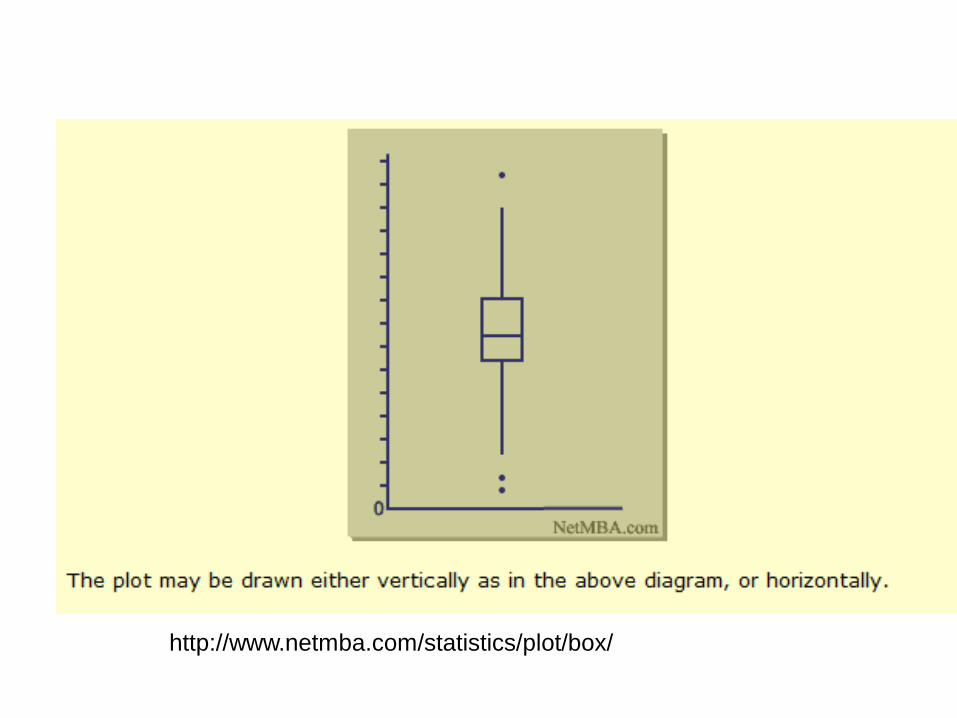
The Box Plot – an example
http://www.netmba.com/statistics/plot/box/
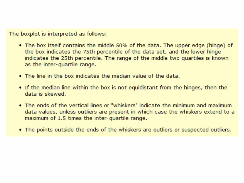
Interpreting the Box Plot
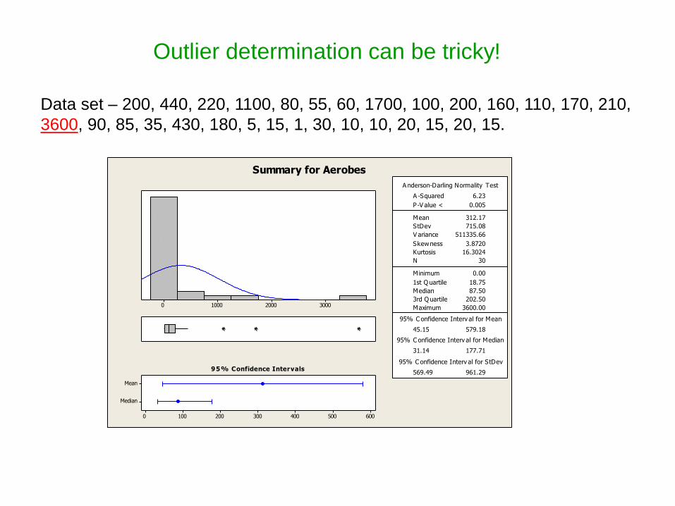
Data set – 200, 440, 220, 1100, 80, 55, 60, 1700, 100, 200, 160, 110, 170, 210,
3600, 90, 85, 35, 430, 180, 5, 15, 1, 30, 10, 10, 20, 15, 20, 15.
3000200010000
Median
Mean
6005004003002001000
1st Q uartile 18.75
Median 87.50
3rd Q uartile 202.50
Maximum 3600.00
45.15 579.18
31.14 177.71
569.49 961.29
A -Squared 6.23
P-V alue < 0.005
Mean 312.17
StDev 715.08
V ariance 511335.66
Skewness 3.8720
Kurtosis 16.3024
N 30
Minimum 0.00
A nderson-Darling Normality Test
95% C onfidence Interv al for Mean
95% C onfidence Interv al for Median
95% C onfidence Interv al for StDev95% Confidence Intervals
Summary for Aerobes
Outlier determination can be tricky!
Try a transformation
3210
Median
Mean
2.252.101.951.801.651.50
1st Q uartile 1.2698
Median 1.9418
3rd Q uartile 2.3063
Maximum 3.5563
1.5873 2.1633
1.4924 2.2496
0.6143 1.0369
A -Squared 0.25
P-V alue 0.710
Mean 1.8753
StDev 0.7713
V ariance 0.5950
Skewness -0.069983
Kurtosis 0.319587
N 30
Minimum 0.0000
A nderson-Darling Normality Test
95% C onfidence Interv al for Mean
95% C onfidence Interv al for Median
95% C onfidence Interv al for StDev95% Confidence Intervals
Summary for Log Base 10
Conclusion
The sample with a reading of 3600 is expected to occur approximately 1 out of every 67 readings on an average and
should not be considered extreme based on the distribution of the data. The sample with this count of Aerobes should
be identified through a gram stain to determine the nature of its source, but unless abnormal concerns are raised
based on the type of microorganism, no additional action should be taken.
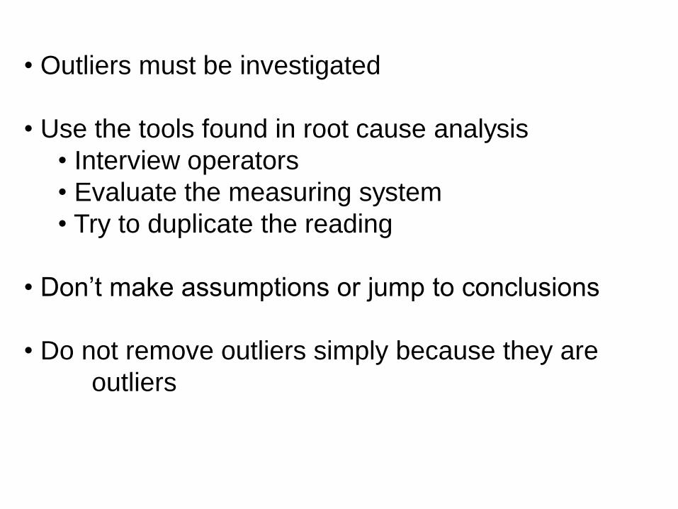
What to do with outliers
• Outliers must be investigated
• Use the tools found in root cause analysis
• Interview operators
• Evaluate the measuring system
• Try to duplicate the reading
• Don’t make assumptions or jump to conclusions
• Do not remove outliers simply because they are
outliers
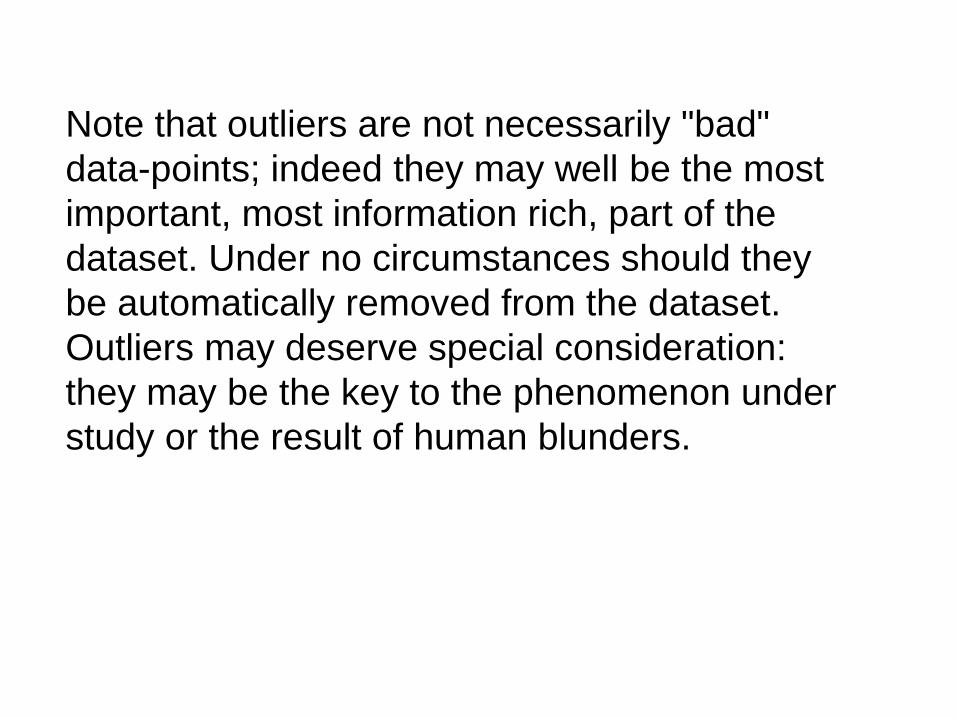
The Importance of Outliers
Note that outliers are not necessarily "bad"
data-points; indeed they may well be the most
important, most information rich, part of the
dataset. Under no circumstances should they
be automatically removed from the dataset.
Outliers may deserve special consideration:
they may be the key to the phenomenon under
study or the result of human blunders.

Control Charts
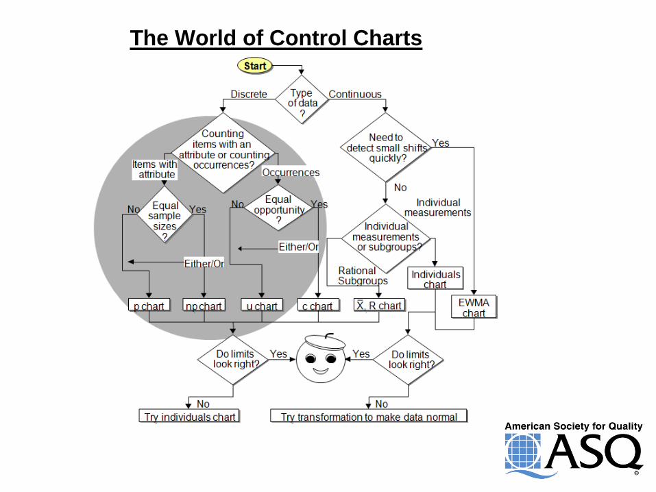
The World of Control Charts
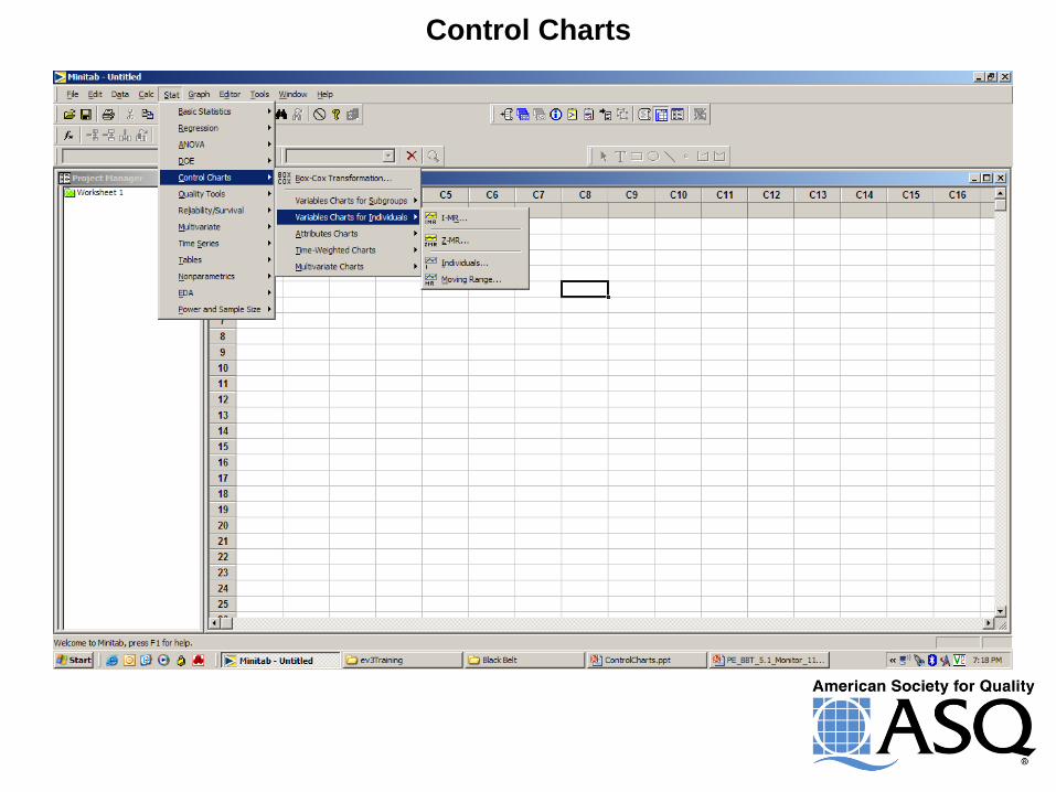
Control Charts
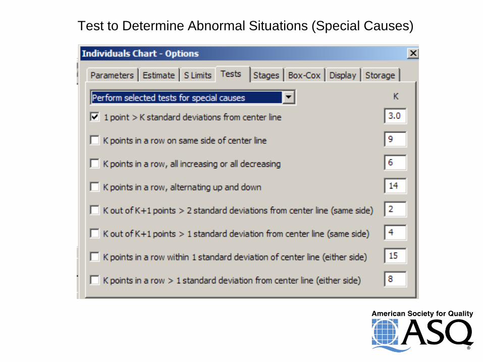
Test to Determine Abnormal Situations (Special Causes)
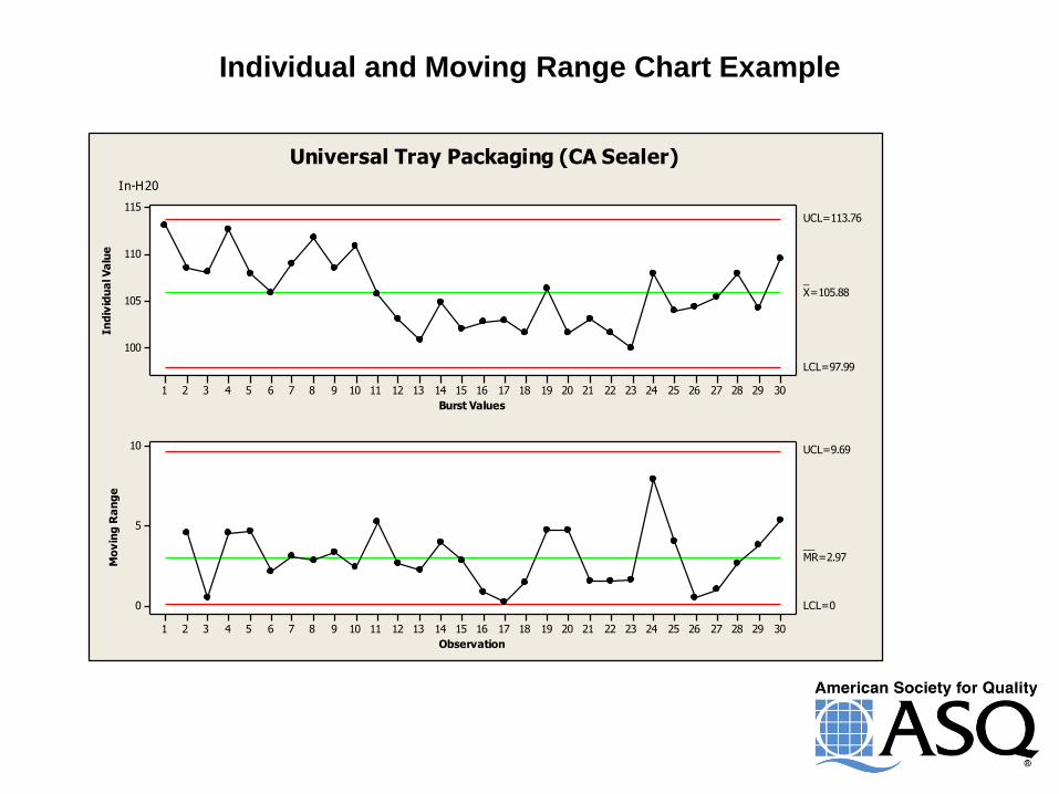
Individual and Moving Range Chart Example
Burst Values
In
div
idu
al V
alu
e
302928272625242322212019181716151413121110987654321
115
110
105
100
_X=105.88
UCL=113.76
LCL=97.99
Observation
Mo
vin
g R
an
ge
302928272625242322212019181716151413121110987654321
10
5
0
__MR=2.97
UCL=9.69
LCL=0
Universal Tray Packaging (CA Sealer)
In-H20
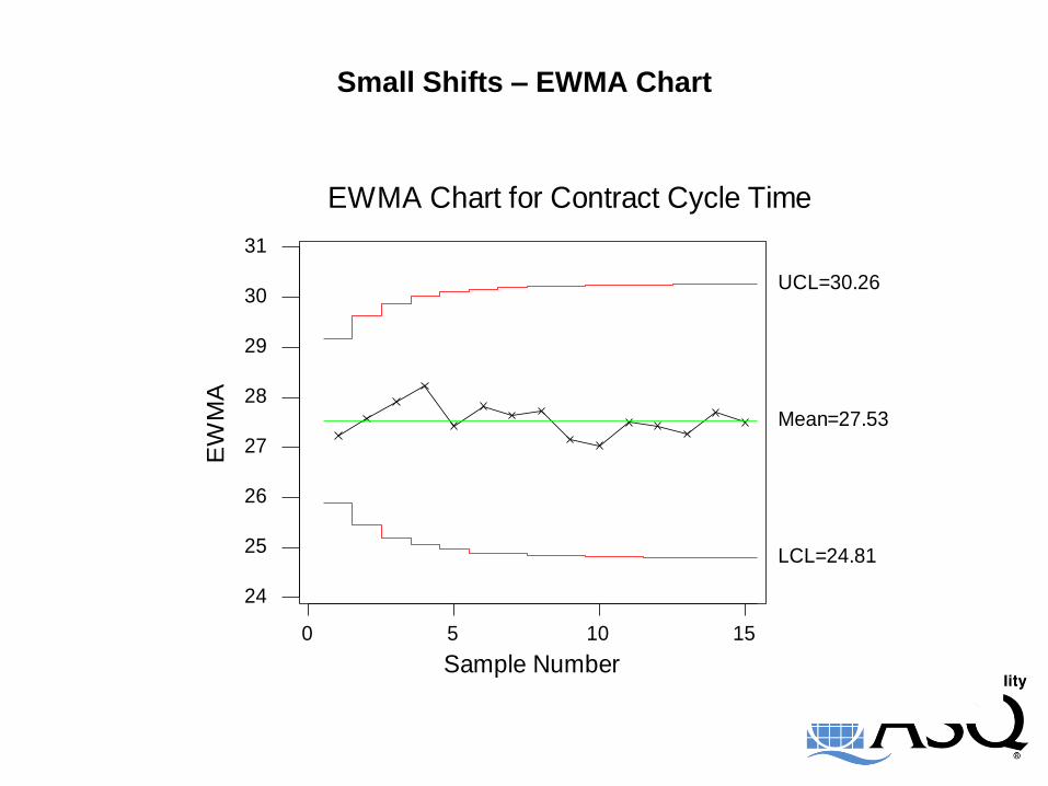
Small Shifts – EWMA Chart
151050
31
30
29
28
27
26
25
24
Sample Number
EW
MA
EWMA Chart for Contract Cycle Time
Mean=27.53
UCL=30.26
LCL=24.81
20.99
20.32
16.95
28.22
15.61
25.96
17.21
22.05
19.10
18.31
14.39
27.43
17.77
21.02
19.85
16.46
24.53
24.95
21.29
22.98
20.91
23.23
19.74
18.21
20.83
21.46
16.00
21.17
18.32
18.63
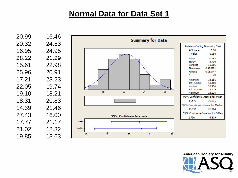
Normal Data for Data Set 1
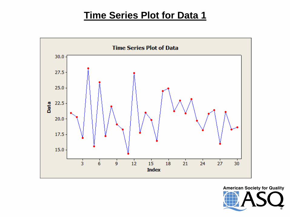
Time Series Plot for Data 1
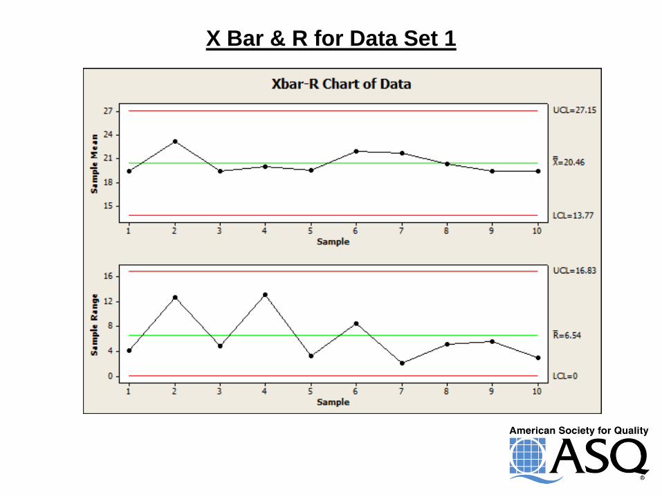
X Bar & R for Data Set 1
15.61
19.85
16.46
19.10
14.39
18.31
17.77
16.00
18.63
17.21
20.32
16.95
19.74
18.21
20.83
24.53
18.32
21.17
20.99
25.96
22.05
28.22
21.02
24.95
21.29
27.43
22.98
20.91
23.23
21.46
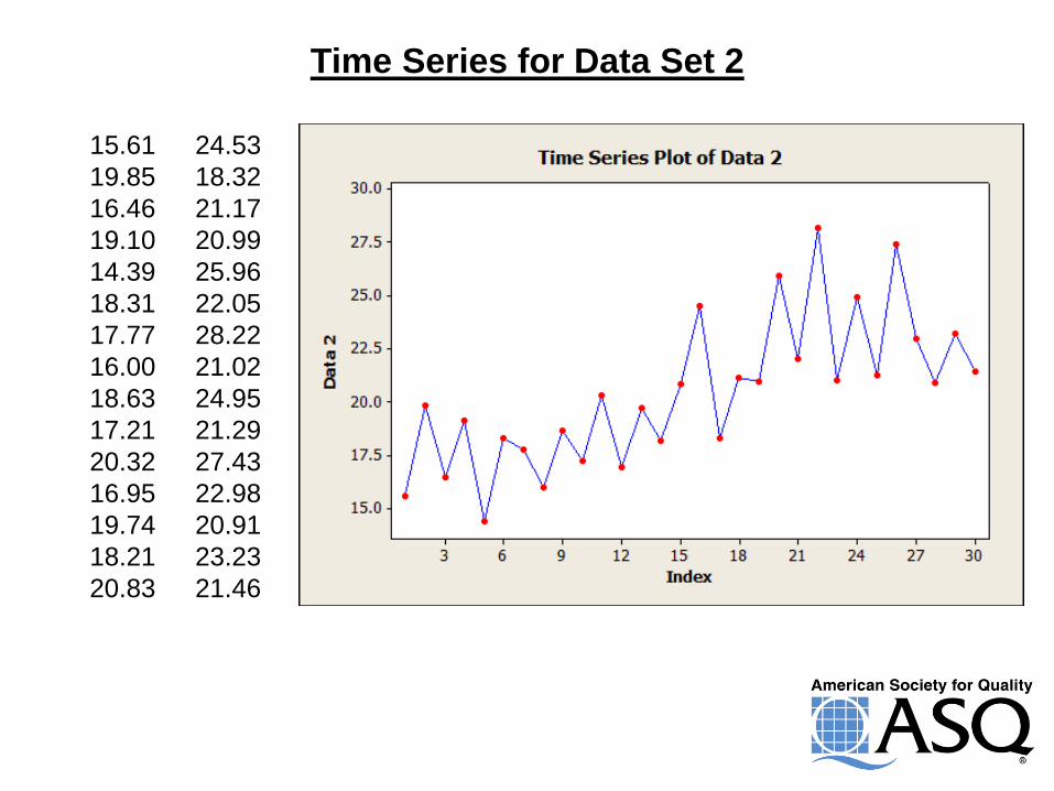
Time Series for Data Set 2
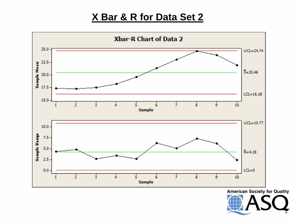
X Bar & R for Data Set 2
16.00
14.39
15.61
20.99
20.32
20.91
16.46
16.95
17.21
27.43
28.22
25.96
21.02
21.29
21.46
24.53
24.95
23.23
18.32
18.63
18.31
22.05
22.98
21.17
17.77
18.21
19.10
19.85
19.74
20.83
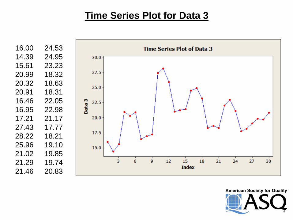
Time Series Plot for Data 3
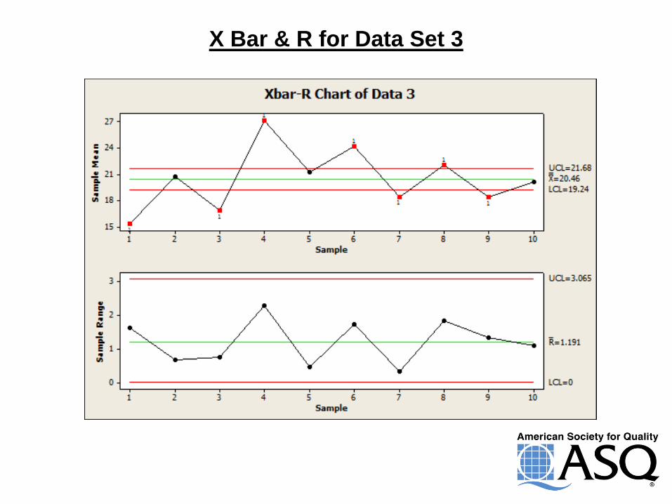
X Bar & R for Data Set 3
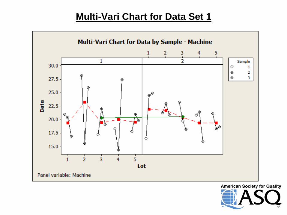
Multi-Vari Chart for Data Set 1
Multi-Vari Chart for Data Set 2
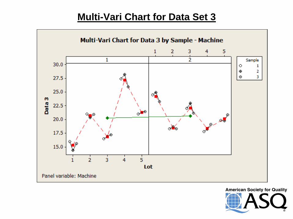
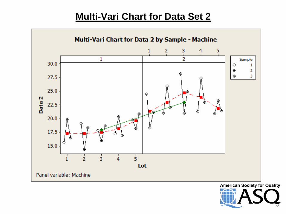
Multi-Vari Chart for Data Set 3
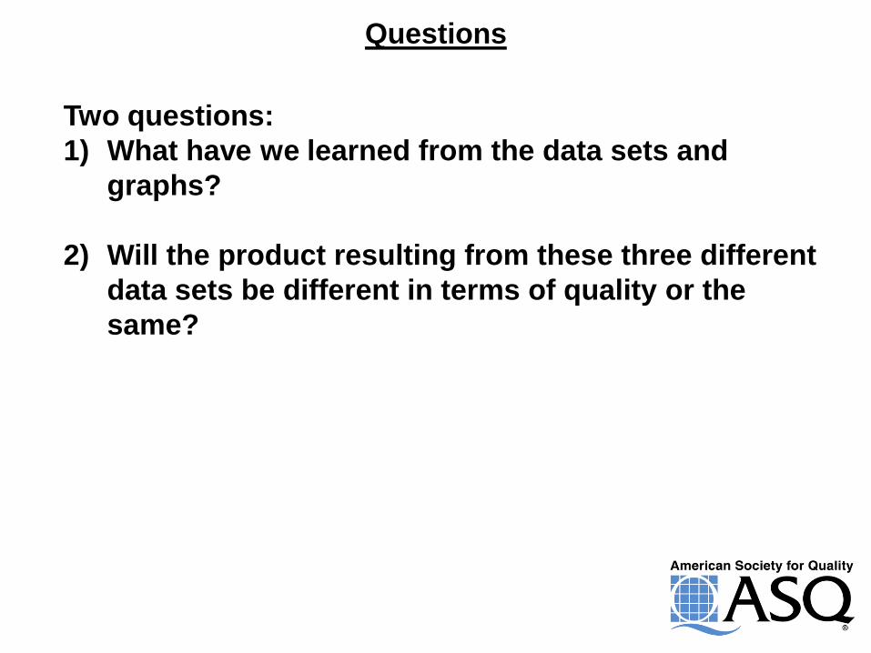
Questions
Two questions:
1) What have we learned from the data sets and
graphs?
2) Will the product resulting from these three different
data sets be different in terms of quality or the
same?
Hypothesis Testing
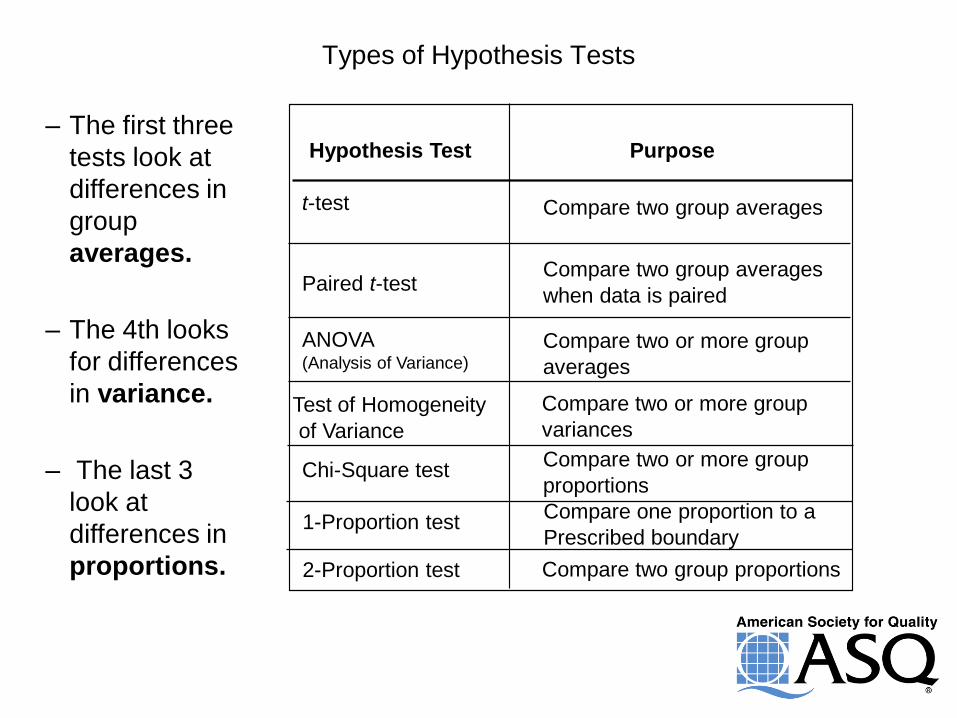
Types of Hypothesis Tests
Hypothesis Test Purpose
t -test
Paired t -test
ANOVA (Analysis of Variance)
Chi-Square test
Compare two group averages
Compare two group averages
when data is paired
Compare two or more group
averages
Compare two or more group
proportions
Compare two or more group
variances Test of Homogeneity
of Variance
1-Proportion test Compare one proportion to a
Prescribed boundary
2-Proportion test Compare two group proportions
– The first three
tests look at
differences in
group
averages.
– The 4th looks
for differences
in variance.
– The last 3
look at
differences in
proportions.
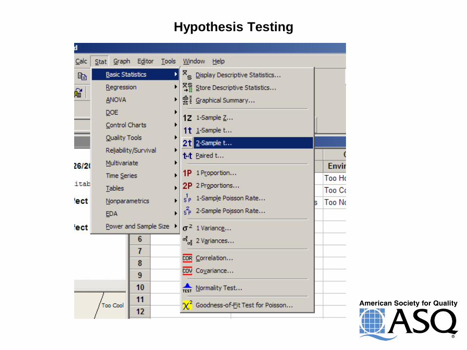
Hypothesis Testing
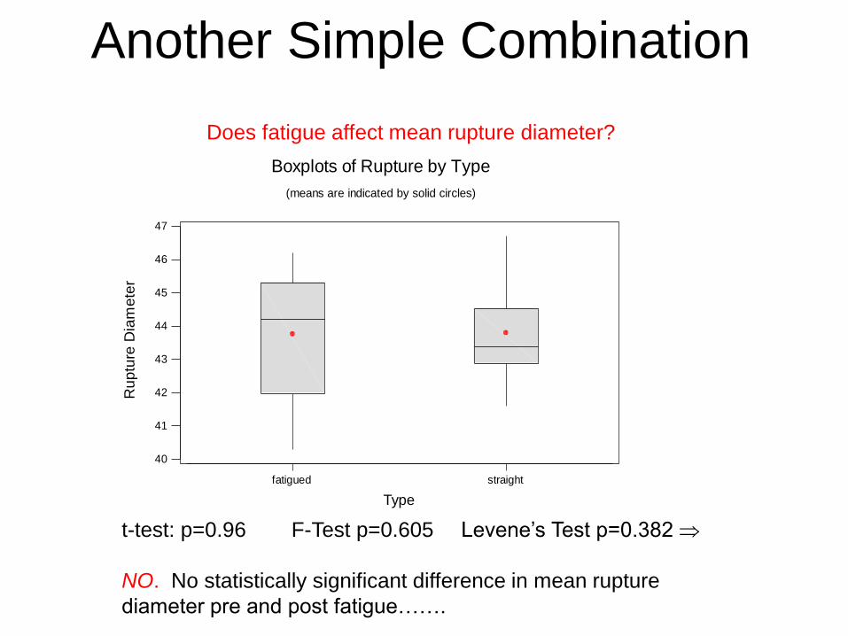
Another Simple Combination
fatigued straight
40
41
42
43
44
45
46
47
Type
Ru
ptu
re D
iam
ete
r
Boxplots of Rupture by Type
(means are indicated by solid circles)
t-test: p=0.96 F-Test p=0.605 Levene’s Test p=0.382
NO. No statistically significant difference in mean rupture
diameter pre and post fatigue…….
Does fatigue affect mean rupture diameter?
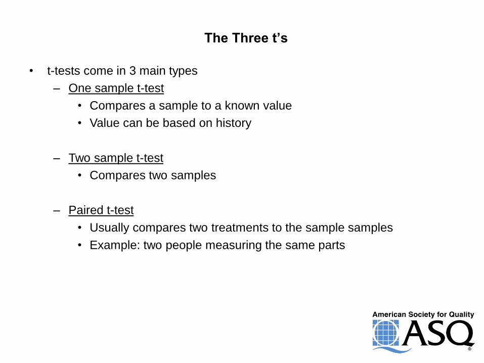
The Three t’s
• t-tests come in 3 main types
– One sample t-test
• Compares a sample to a known value
• Value can be based on history
– Two sample t-test
• Compares two samples
– Paired t-test
• Usually compares two treatments to the sample samples
• Example: two people measuring the same parts
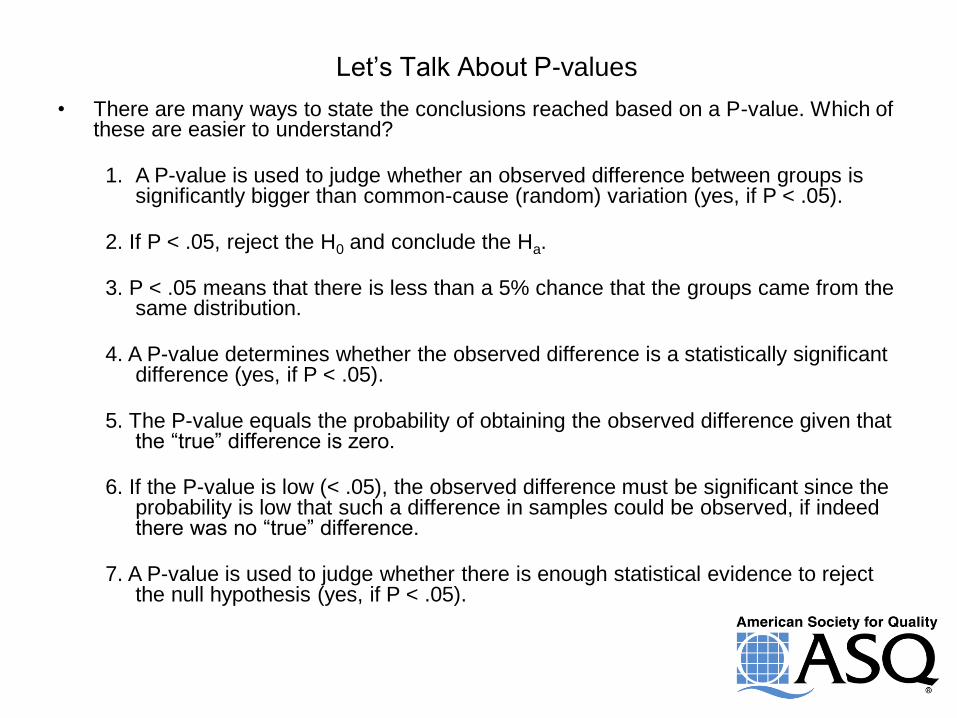
Let’s Talk About P-values
• There are many ways to state the conclusions reached based on a P-value. Which of these are easier to understand?
1. A P-value is used to judge whether an observed difference between groups is
significantly bigger than common-cause (random) variation (yes, if P < .05). 2. If P < .05, reject the H0 and conclude the Ha. 3. P < .05 means that there is less than a 5% chance that the groups came from the
same distribution. 4. A P-value determines whether the observed difference is a statistically significant
difference (yes, if P < .05). 5. The P-value equals the probability of obtaining the observed difference given that
the “true” difference is zero. 6. If the P-value is low (< .05), the observed difference must be significant since the
probability is low that such a difference in samples could be observed, if indeed there was no “true” difference.
7. A P-value is used to judge whether there is enough statistical evidence to reject
the null hypothesis (yes, if P < .05).
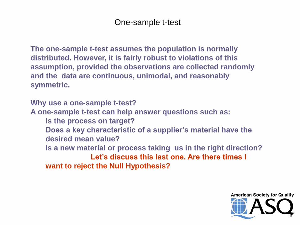
One-sample t-test
The one-sample t-test assumes the population is normally
distributed. However, it is fairly robust to violations of this
assumption, provided the observations are collected randomly
and the data are continuous, unimodal, and reasonably
symmetric.
Why use a one-sample t-test?
A one-sample t-test can help answer questions such as:
Is the process on target?
Does a key characteristic of a supplier’s material have the
desired mean value?
Is a new material or process taking us in the right direction?
Let’s discuss this last one. Are there times I
want to reject the Null Hypothesis?
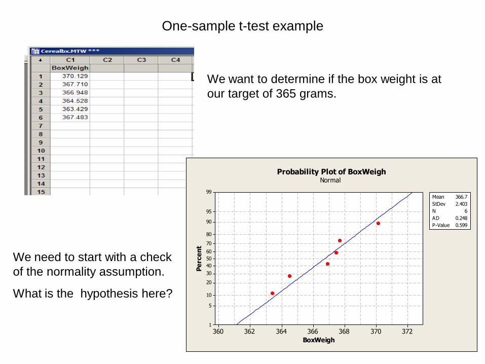
One-sample t-test example
We want to determine if the box weight is at
our target of 365 grams.
372370368366364362360
99
95
90
80
70
60
50
40
30
20
10
5
1
BoxWeigh
Pe
rce
nt
Mean 366.7
StDev 2.403
N 6
AD 0.248
P-Value 0.599
Probability Plot of BoxWeighNormal
We need to start with a check
of the normality assumption.
What is the hypothesis here?
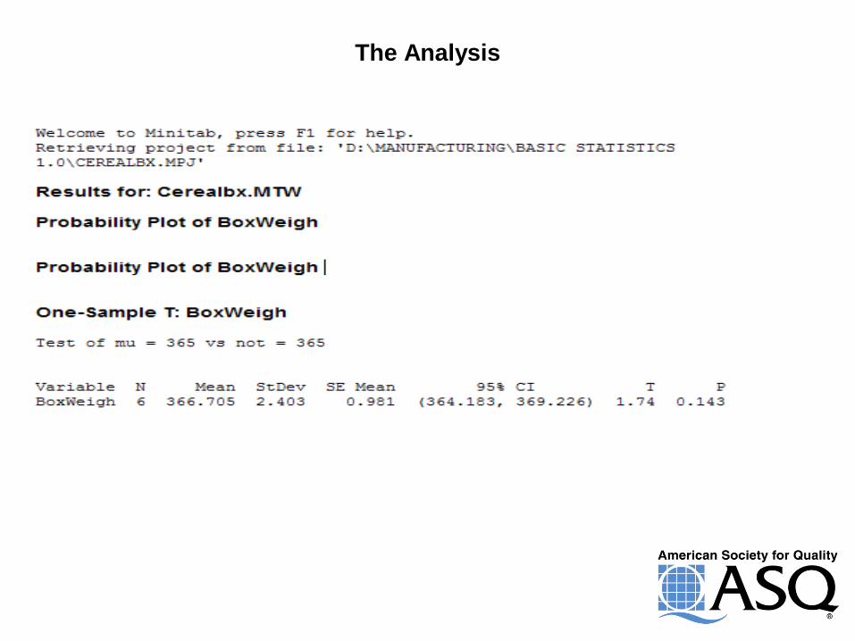
The Analysis
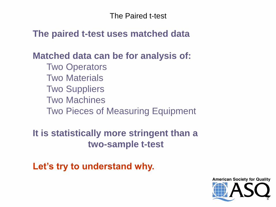
The Paired t-test
The paired t-test uses matched data
Matched data can be for analysis of:
Two Operators
Two Materials
Two Suppliers
Two Machines
Two Pieces of Measuring Equipment
It is statistically more stringent than a
two-sample t-test
Let’s try to understand why.
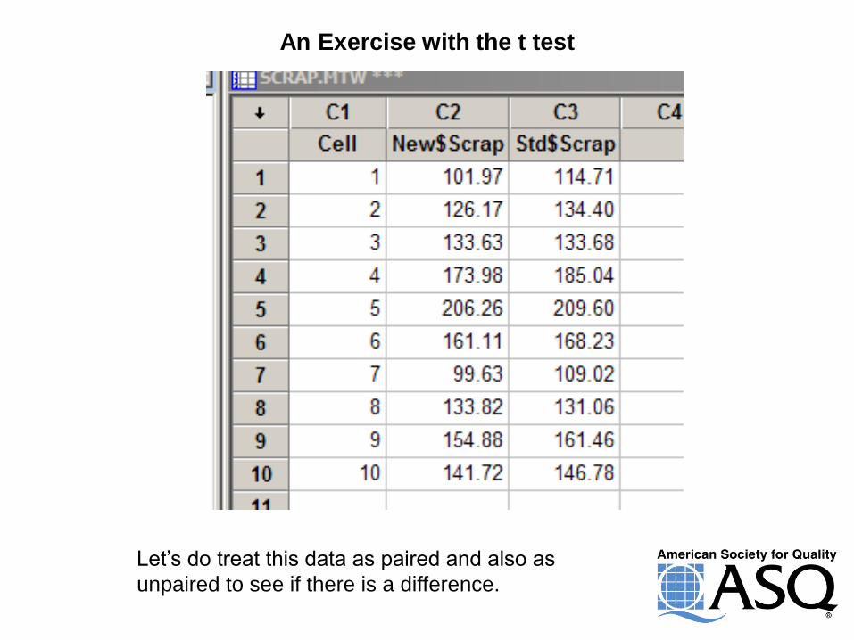
An Exercise with the t test
Let’s do treat this data as paired and also as
unpaired to see if there is a difference.
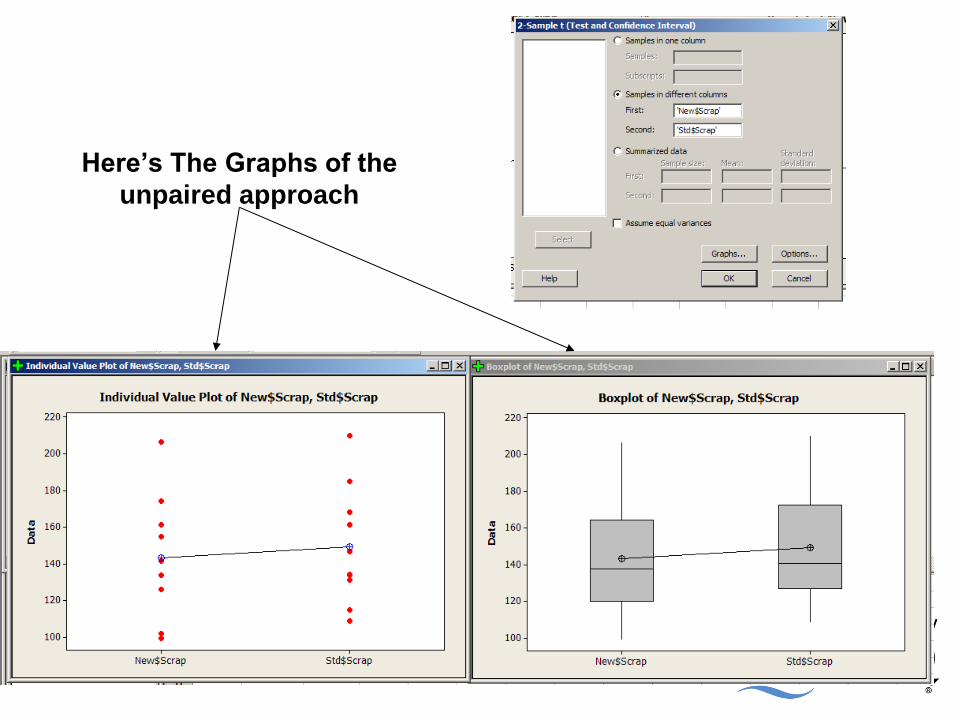
Here’s The Graphs of the
unpaired approach
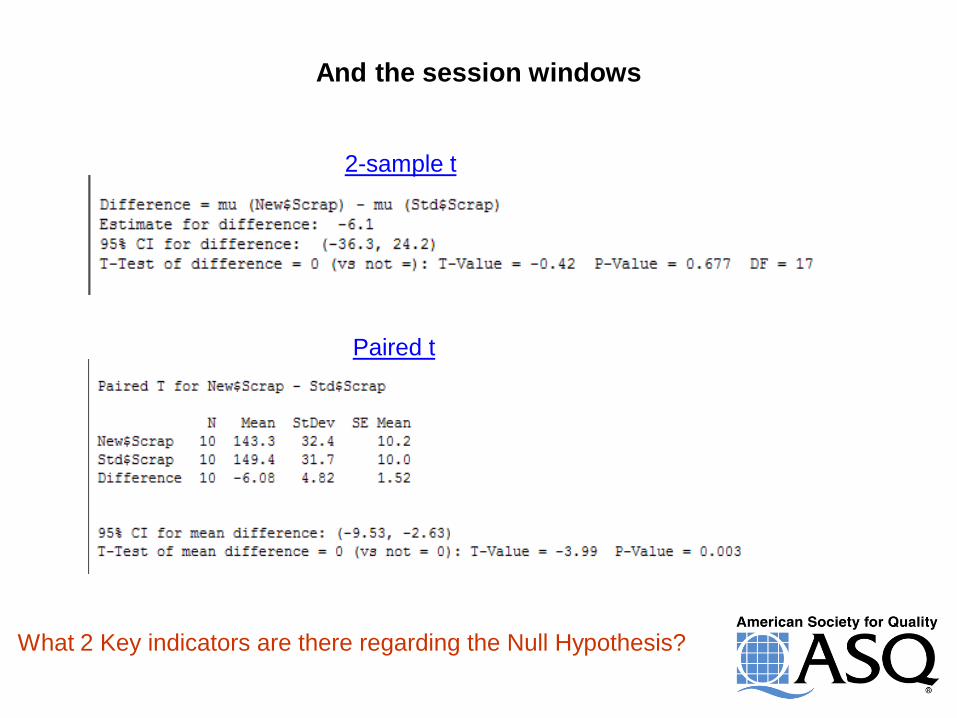
And the session windows
2-sample t
Paired t
What 2 Key indicators are there regarding the Null Hypothesis?
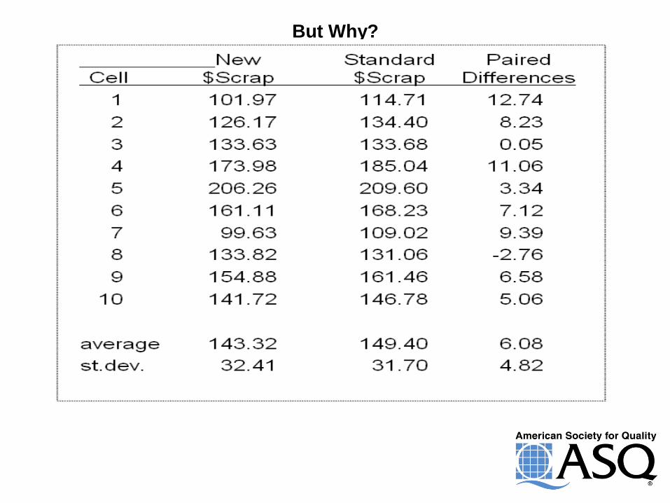
But Why?
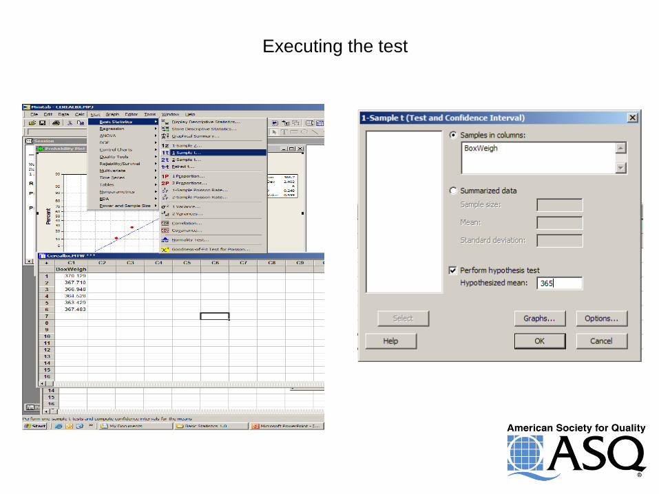
Executing the test
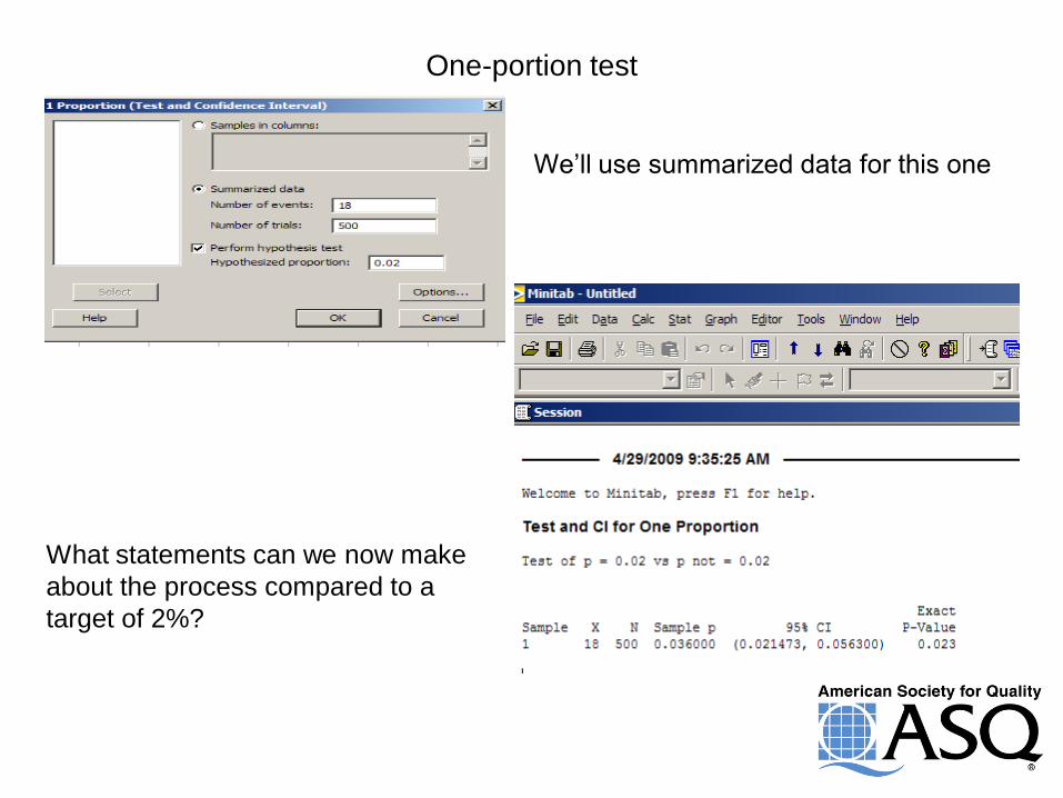
One-portion test
We’ll use summarized data for this one
What statements can we now make
about the process compared to a
target of 2%?
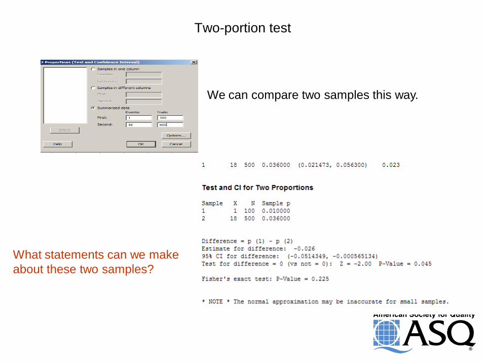
Two-portion test
We can compare two samples this way.
What statements can we make
about these two samples?

Process Capability
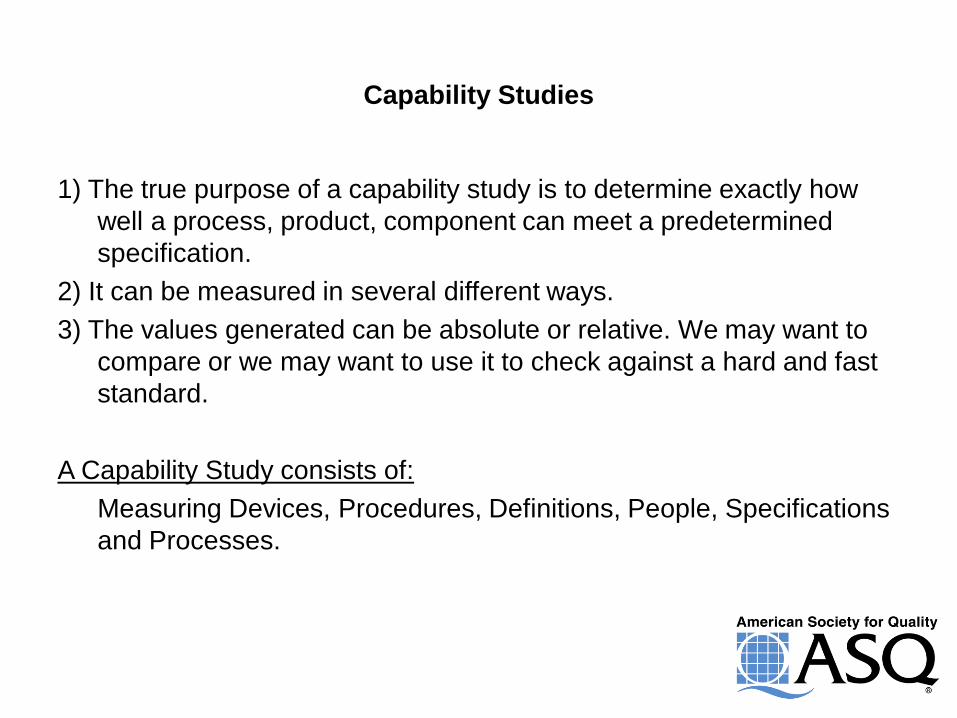
Capability Studies
1) The true purpose of a capability study is to determine exactly how
well a process, product, component can meet a predetermined
specification.
2) It can be measured in several different ways.
3) The values generated can be absolute or relative. We may want to
compare or we may want to use it to check against a hard and fast
standard.
A Capability Study consists of:
Measuring Devices, Procedures, Definitions, People, Specifications
and Processes.
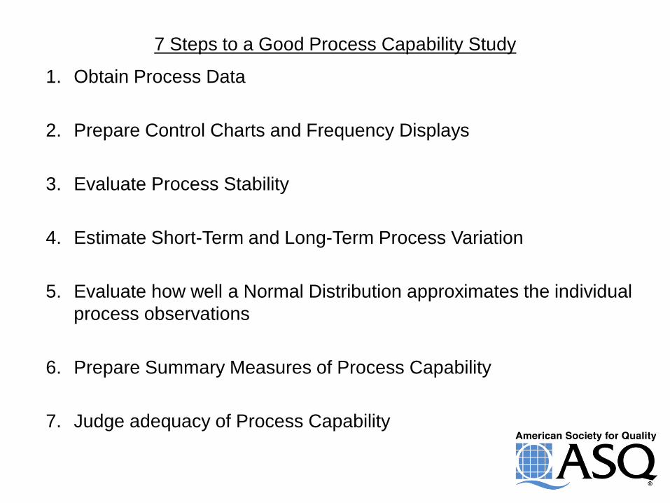
7 Steps to a Good Process Capability Study
1. Obtain Process Data
2. Prepare Control Charts and Frequency Displays
3. Evaluate Process Stability
4. Estimate Short-Term and Long-Term Process Variation
5. Evaluate how well a Normal Distribution approximates the individual
process observations
6. Prepare Summary Measures of Process Capability
7. Judge adequacy of Process Capability
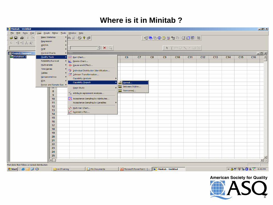
Where is it in Minitab ?
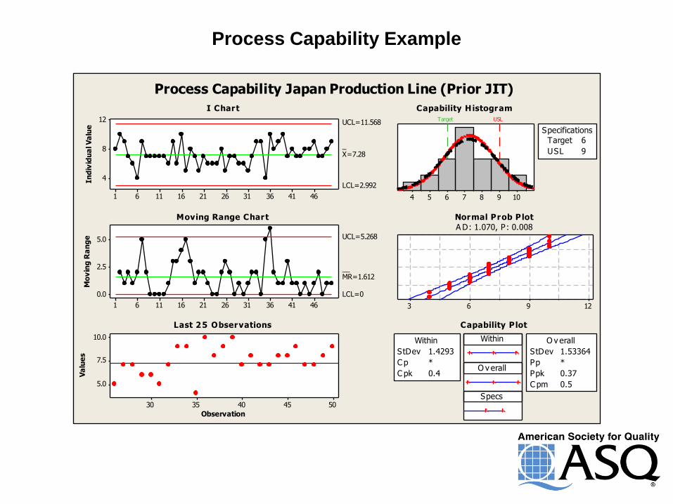
Process Capability Example
In
div
idu
al V
alu
e
464136312621161161
12
8
4
_X=7.28
UCL=11.568
LCL=2.992
Mo
vin
g R
an
ge
464136312621161161
5.0
2.5
0.0
__MR=1.612
UCL=5.268
LCL=0
Observation
Va
lue
s
5045403530
10.0
7.5
5.0
10987654
Target USL
Specifications
Target 6
USL 9
12963
Within
O v erall
Specs
Within
StDev 1.4293
C p *
C pk 0.4
O v erall
StDev 1.53364
Pp *
Ppk 0.37
C pm 0.5
Process Capability Japan Production Line (Prior JIT)
I Chart
Moving Range Chart
Last 25 Observations
Capability Histogram
Normal Prob Plot
A D: 1.070, P: 0.008
Capability Plot
252321191715131197531
12
10
8
In
div
idu
al V
alu
e
_X=10.090
UCL=11.751
LCL=8.428
252321191715131197531
2
1
0
Mo
vin
g R
an
ge
__MR=0.625
UCL=2.041
LCL=0
252015105
11
10
9
Observation
Va
lue
s
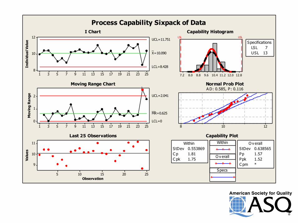
12.812.011.210.49.68.88.07.2
LSL USL
LSL 7
USL 13
Specifications
12108
Within
O v erall
Specs
StDev 0.553869
C p 1.81
C pk 1.75
Within
StDev 0.638565
Pp 1.57
Ppk 1.52
C pm *
O v erall
1
Process Capability Sixpack of Data
I Chart
Moving Range Chart
Last 25 Observations
Capability Histogram
Normal Prob PlotA D: 0.585, P: 0.116
Capability Plot
1.71.61.51.41.31.21.11.0
LSL
Process Data
Sample N 30
StDev (Within) 0.102409
StDev (O v erall) 0.116869
LSL 1
Target *
USL *
Sample Mean 1.456
Potential (Within) C apability
O v erall C apability
Pp *
PPL 1.30
PPU *
Ppk 1.30
C pm
C p
*
*
C PL 1.48
C PU *
C pk 1.48
O bserv ed Performance
PPM < LSL 0.00
PPM > USL *
PPM Total 0.00
Exp. Within Performance
PPM < LSL 4.24
PPM > USL *
PPM Total 4.24
Exp. O v erall Performance
PPM < LSL 47.74
PPM > USL *
PPM Total 47.74
Within
Overall
Tray Packaging (CA Sealer)
1.61.51.41.31.21.11.0
LSL
Process Data
Sample N 30
StDev (Within) 0.122402
StDev (O v erall) 0.118747
LSL 1
Target *
USL *
Sample Mean 1.31623
Potential (Within) C apability
O v erall C apability
Pp *
PPL 0.89
PPU *
Ppk 0.89
C pm
C p
*
*
C PL 0.86
C PU *
C pk 0.86
O bserv ed Performance
PPM < LSL 0.00
PPM > USL *
PPM Total 0.00
Exp. Within Performance
PPM < LSL 4889.14
PPM > USL *
PPM Total 4889.14
Exp. O v erall Performance
PPM < LSL 3871.52
PPM > USL *
PPM Total 3871.52
Within
Overall
Tray Packaging (Juarez Sealer)
How About Using Process Capability
for Comparative Purposes?


Uncle Larry’s
a Cool Dude!
Thank You For Your Time and Attention !
Uncle Larry