Embed Size (px)
Citation preview

Copyr i g ht © 2014, SAS Ins t i tu t e Inc . A l l r ights reser ve d .
SAS®
VISUAL ANALYTICS
AN OVERVIEW OF POWERFUL DISCOVERY, ANALYSIS AND REPORTING

Copyr i g ht © 2014, SAS Ins t i tu t e Inc . A l l r ights reser ve d .
WELCOME TO SAS®
VISUAL ANALYTICS
SAS Visual Analytics is a high-performance, in-memory solution for
exploring massive amounts of data very quickly. It enables you to spot
patterns, identify opportunities for further analysis and convey visual
results via Web reports or a mobile platform such as iPad® or Android-
based tablets.
This presentation is a very brief overview of the many features and
capabilities of SAS Visual Analytics. It is meant to get you started
quickly, with a relatively modest data set example (only 1.4 million
rows). For more in-depth information, you can consult the online User
Guide, available via the Help menu, or go to the website at
http://www.sas.com/technologies/bi/visual-analytics.html.

Copyr i g ht © 2014, SAS Ins t i tu t e Inc . A l l r ights reser ve d .
CONTENT
• Overview of the Data
• Getting Started
• Bar Charts
• Hierarchies
• Filters
• Calculations
• Geographies
• Cross Tabs
• Forecasting and Simulation
• Decision Trees
• Treemaps
• Heatmaps
• Correlations & Regressions
• Network Diagrams
• Box Plots & Statistics
• Bubble Plots With Time Animation
• Text Analytics
• Sankey Diagrams
• Report Design & Distribution
• Data Dictionary

Copyr i g ht © 2014, SAS Ins t i tu t e Inc . A l l r ights reser ve d .
OVERVIEW OF THE DATA
Insight Toy Company is an organization that produces and sells toys to
resellers (“vendors”). The data is made up of 34 years of Sales information,
covering 128 cities across the world.
For each row of data (transaction) we have:
Information on the items sold (product brand, line, make, style, SKU)
The sale value (“order total”) and various related costs (distribution, marketing, product)
Information on the sales representative (rating, sales target, actual to date, etc.)
Geographic information (on the vendors as well as the selling facility)
Information on the vendors (rating, satisfaction, distance to nearest facility)
Text Notes taken at the moment of the order taking, based on conversation with the vendor.
The data source is made up of 1.4 million rows and 60+ columns
NOTE: a complete data dictionary is available at the end of this document

Copyr i g ht © 2014, SAS Ins t i tu t e Inc . A l l r ights reser ve d .
GETTING STARTED IN SAS®
VISUAL ANALYTICS – THE ESSENTIALS
For more information, please consult the SAS Visual Analytics User Guide, available under the Help menu.
The toolbar enables you to select
your visual explorations and
visualizations.
The data pane lists
the available
categories and
measures in your
selected data.
The right pane contains
tabs that enable you to
change the properties of
your visualizations, filter
the data and create and
view comments.
The workspace displays your visualizations
To start a new visualization on a blank workspace, simply minimize the current visualization.
These icons will remain grey unless you are working in
SAS® Visual Statistics. For more information, visit
www.sas.com/visualstatistics
Copyr i g ht © 2014, SAS Ins t i tu t e Inc . A l l r ights reser ve d .
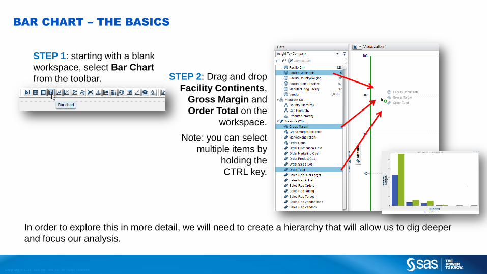
BAR CHART – THE BASICS
STEP 1: starting with a blank
workspace, select Bar Chart
from the toolbar. STEP 2: Drag and drop
Facility Continents,
Gross Margin and
Order Total on the
workspace.
Note: you can select
multiple items by
holding the
CTRL key.
In order to explore this in more detail, we will need to create a hierarchy that will allow us to dig deeper
and focus our analysis.

Copyr i g ht © 2014, SAS Ins t i tu t e Inc . A l l r ights reser ve d .
BAR CHART – ADD A HIERARCHY
STEP 1: From the Data
tab, select New
Hierarchy.
STEP 2: Name it Facility Hierarchy.
Select Facility Continents, Facility Country/Region,
Facility City and Facility (in that order). Click OK.
Let’s add more “investigative” functionality to this bar chart by creating a drill-down path.

Copyr i g ht © 2014, SAS Ins t i tu t e Inc . A l l r ights reser ve d .
USING A HIERARCHY
Drag the new Facility Hierarchy
from the Data Pane and drop it
on Facility Continents.
The new hierarchy has replaced
the single-level Facility Continent
element . Notice that the
appearance of the chart does not
change, but a “breadcrumb trail”
appears in the upper left of the
chart.
Double-click on North America
(‘NA’) to explore further.
You can also click on the label
“NA” at the bottom of the chart.

Copyr i g ht © 2014, SAS Ins t i tu t e Inc . A l l r ights reser ve d .
EXPLORING A HIERARCHY
From this graph, it is clear that
the US has a much higher Order
Total and Gross Margin.
Notice the breadcrumb trail
highlighted in the upper left.
You can continue to drill-down
and gain even more insight.
Double-click on US to get to city
level details.

Copyr i g ht © 2014, SAS Ins t i tu t e Inc . A l l r ights reser ve d .
CREATING A HIERARCHY - RECAP
The Hierarchy was created on the fly,
without the need to ask our IT
department to create a special data
structure, and is IMMEDIATELY
applicable to all your data, usable for
explorations and reports.
Further, you can easily edit the hierarchy
to drill down, from Facilities, to Products,
Units, Sales Representatives, etc.
Return to Table of Content
Copyr i g ht © 2014, SAS Ins t i tu t e Inc . A l l r ights reser ve d .
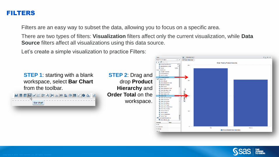
FILTERS
Filters are an easy way to subset the data, allowing you to focus on a specific area.
There are two types of filters: Visualization filters affect only the current visualization, while Data
Source filters affect all visualizations using this data source.
Let’s create a simple visualization to practice Filters:
STEP 1: starting with a blank
workspace, select Bar Chart
from the toolbar.
STEP 2: Drag and
drop Product
Hierarchy and
Order Total on the
workspace.

Copyr i g ht © 2014, SAS Ins t i tu t e Inc . A l l r ights reser ve d .
FILTERS - BASICS
Let’s focus on 2012 and 2013 only.
STEP 1: Drag and drop the Transaction Year field to the filter
tab. Put it in the Visualization section.
STEP 2: simply drag the left arrow
to subset the data to 2012 – 2013
only.
Notice how SAS Visual Analytics
automatically lets us know the general
distribution of the data?

Copyr i g ht © 2014, SAS Ins t i tu t e Inc . A l l r ights reser ve d .
FILTERS – SELECT AND INCLUDE
Let’s look at all various Product Make in our Game Product line, except Puzzle 3d and Card Games.
STEP 1: Drill into Toy and then Game. You can
select specific items in your visualization (holding the
CTRL key), or you can use the mouse to lasso
around multiple items. Let’s CTRL-select Puzzle 3d
and Card Game.
STEP 2: Now right-click and
select Exclude Selection.
A new filter
is added

Copyr i g ht © 2014, SAS Ins t i tu t e Inc . A l l r ights reser ve d .
FILTERS - ADVANCED
Filters behave differently
depending if they are for a
numerical measure or a
category.
Every time you apply filters, SAS Visual
Analytics tells you how much of the
data you are looking at.
Options allow you to edit a filter, to
refine it even more with various
conditions and operators, and to make
it as sophisticated as you need. You
can also copy filters to other
visualizations.
Return to Table of Content

Copyr i g ht © 2014, SAS Ins t i tu t e Inc . A l l r ights reser ve d .
CALCULATIONS
SAS Visual Analytics allows you to create on-the-fly calculations of all your data.
There are two types of calculations:
1. Calculated Items are applied to every row of data. The results
will be aggregated like any other data.
2. Aggregated Measures will be calculated after all data has been
aggregated for any visualization. This is usually best for ratios.
Copyr i g ht © 2014, SAS Ins t i tu t e Inc . A l l r ights reser ve d .
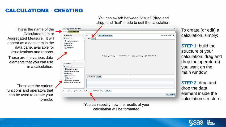
CALCULATIONS - CREATING
This is the name of the
Calculated Item or
Aggregated Measure. It will
appear as a data item in the
data pane, available for
visualizations and reports.
These are the various data
elements that you can use
in a calculation.
These are the various
functions and operators that
can be used to create your
formula.
You can specify how the results of your
calculation will be formatted.
To create (or edit) a
calculation, simply:
STEP 1: build the
structure of your
calculation: drag and
drop the operator(s)
you want on the
main window.
STEP 2: drag and
drop the data
element inside the
calculation structure.
You can switch between “visual” (drag and
drop) and “text” mode to edit the calculation.

Copyr i g ht © 2014, SAS Ins t i tu t e Inc . A l l r ights reser ve d .
CALCULATIONS – EDITING
A few calculations have already been created for you in the
Insight Toy First Exploration. Among them, Gross Margin,
which is a row-level Calculated Item, and Gross Margin Ratio,
which is a post-aggregation Measure.
To view how these calculations were created or modify them,
simply select one, right-click and select “Edit…”.
Note that it is possible to use the result of a Calculated Item in
another calculation, but it is not possible to use the result of a
an Aggregated Measure calculation in a Calculated Item or
another Aggregated Measure.

Copyr i g ht © 2014, SAS Ins t i tu t e Inc . A l l r ights reser ve d .
QUICK CALCULATIONS – DERIVED ITEMS
A quick way to create calculations is to right-click on the measure and create a derived item. Derived
data items are aggregated measures that perform calculations for your data.
You can create Distinct Counts on Category Items (for example, to display the number of cities
where each product line is sold).
You can create a Percent of Total, or multiple types of time-derived calculations such as Year-To-
Date, Difference From Previous Period, etc.
As with any calculations, you can view and edit these calculations after they are created.
Return to Table of Content
Copyr i g ht © 2014, SAS Ins t i tu t e Inc . A l l r ights reser ve d .
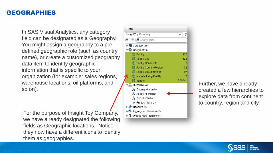
GEOGRAPHIES
In SAS Visual Analytics, any category
field can be designated as a Geography.
You might assign a geography to a pre-
defined geographic role (such as country
name), or create a customized geography
data item to identify geographic
information that is specific to your
organization (for example: sales regions,
warehouse locations, oil platforms, and
so on).
For the purpose of Insight Toy Company,
we have already designated the following
fields as Geographic locations. Notice
they now have a different icons to identify
them as geographies.
Further, we have already
created a few hierarchies to
explore data from continent
to country, region and city.

Copyr i g ht © 2014, SAS Ins t i tu t e Inc . A l l r ights reser ve d .
ANALYZING GEOGRAPHIES
If you have any visualization opened, minimize it and start from a blank workspace.
Select Geo Hierarchy and hold the CTRL key to select Order Total.
Simply drag and drop them on the workspace. Because the category selected has been pre-defined as
a geography item, SAS Visual Analytics will automatically offer us a Map visual.

Copyr i g ht © 2014, SAS Ins t i tu t e Inc . A l l r ights reser ve d .
ANALYZING GEOGRAPHIES
Since you used a hierarchy, you can drill down on it: double-click on the NA bubble and then on the US
bubble.
You can also add another measure. In this case here, by dragging and dropping Gross Margin Ratio,
you are able to see revenue of each region (the size of the bubbles) as well as their relative Gross Margin
contribution (the color of the bubbles).
Insight: Notice that most revenue (bubble size)
seems to be coming more from the East than
West side of the country. Gross margin (bubble
color) seems to be concentrated in the mid South
and North East of the country.

Copyr i g ht © 2014, SAS Ins t i tu t e Inc . A l l r ights reser ve d .
A DIFFERENT WAY TO LOOK AT GEOGRAPHIES
If your geographic category has been
determined based on pre-defined names,
instead of latitudes and longitudes, you can
choose to display the result using Regions
instead of Bubbles.
You can also select Coordinates.
Coordinates are very useful to represent
MANY points.
Return to Table of Content

Copyr i g ht © 2014, SAS Ins t i tu t e Inc . A l l r ights reser ve d .
CROSSTAB – GETTING STARTED
This creates a blank Crosstab palette.
Notice the Roles tab on the right. Each element can have
multiple categories or measures.
A crosstab shows the intersections of category values and measure values.
STEP 1: starting with a blank
workspace, select Crosstab from
the toolbar.

Copyr i g ht © 2014, SAS Ins t i tu t e Inc . A l l r ights reser ve d .
CROSSTAB – GETTING STARTED
From the Data tab, select
Facility Country/Region
and drop it on the
Columns box.
Select Product Line and
drop it on the Rows box.
Select Order Sales Cost
and drop it on the
Measures box.
Now you have a Crosstab that shows aggregated Order Sales Cost
for each Product Line by Facility Country/Region.
Copyr i g ht © 2014, SAS Ins t i tu t e Inc . A l l r ights reser ve d .
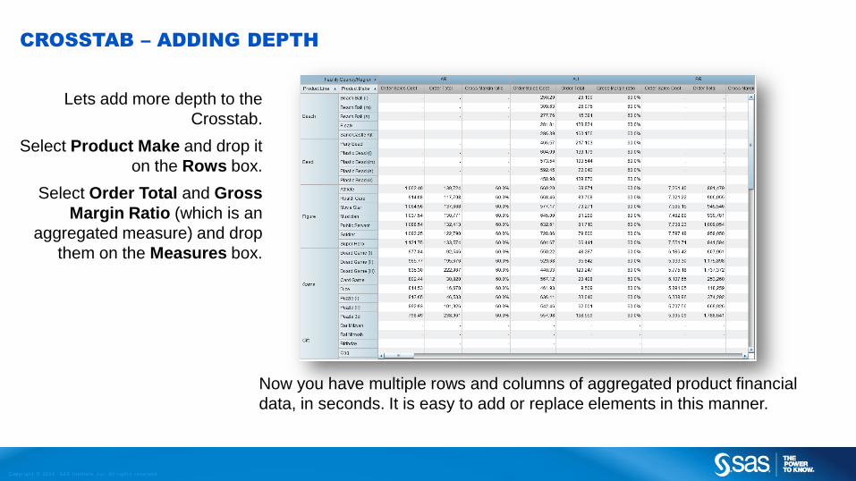
CROSSTAB – ADDING DEPTH
Lets add more depth to the
Crosstab.
Select Product Make and drop it
on the Rows box.
Select Order Total and Gross
Margin Ratio (which is an
aggregated measure) and drop
them on the Measures box.
Now you have multiple rows and columns of aggregated product financial
data, in seconds. It is easy to add or replace elements in this manner.

Copyr i g ht © 2014, SAS Ins t i tu t e Inc . A l l r ights reser ve d .
CROSSTAB – DRILL DOWN WITH HIERARCHIES
Lets create a new crosstab.
Simply minimize the one you
were working with, and start a
new one.
This time, select Geo
Hierarchy as your Columns,
and Product Hierarchy as
your Rows.
Select Order Total as your
Measure.
Notice how, because we are now using Hierarchies, we can drill down or
expand on any row or column? You can read more about hierarchies here.

Copyr i g ht © 2014, SAS Ins t i tu t e Inc . A l l r ights reser ve d .
CROSSTAB – CREATING TOTALS
Select the Properties tab on
the right pane.
You can turn on Column
subtotals and totals
You can turn on Row
subtotals and totals.
You place these before or
after the corresponding data
item.
You can also rename the
Visualization to something
more meaningful than the
default “Visualization 1”.
Return to Table of Content

Copyr i g ht © 2014, SAS Ins t i tu t e Inc . A l l r ights reser ve d .
FORECAST – GETTING STARTED
STEP 1: starting with a blank workspace, select Line Chart from the toolbar.
STEP 2: From the Data tab, select
Transaction Month and Year and Sales
Rep Actual and drag them over the
workspace.
IMPORTANT: your line chart needs to be based
on a valid TIME SERIES, otherwise you will not
be able to use it for a forecast. A valid time series
can be identified by these icons:
Copyr i g ht © 2014, SAS Ins t i tu t e Inc . A l l r ights reser ve d .
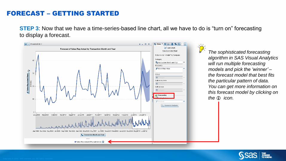
FORECAST – GETTING STARTED
STEP 3: Now that we have a time-series-based line chart, all we have to do is “turn on” forecasting
to display a forecast.
The sophisticated forecasting
algorithm in SAS Visual Analytics
will run multiple forecasting
models and pick the ‘winner’ –
the forecast model that best fits
the particular pattern of data.
You can get more information on
this forecast model by clicking on
the icon.

Copyr i g ht © 2014, SAS Ins t i tu t e Inc . A l l r ights reser ve d .
FORECAST – INCREASING FORECAST PERIODS
You can increase
the periods
forecasted by
changing the
duration in the
Properties tab.
Change it to 18
months and click on
the checkbox.

Copyr i g ht © 2014, SAS Ins t i tu t e Inc . A l l r ights reser ve d .
FORECAST – REFINING AND ADDING SIMULATION
We can improve the
accuracy of our
forecast by adding
measures that we
believe should have
an influence on the
revenue.
Select Order
Marketing Cost,
Sales Rep Orders,
Sales Rep Rating,
Sales Rep Target,
and Vendor
Distance and drag
them over in the
“Underlying
Factors” box.
Copyr i g ht © 2014, SAS Ins t i tu t e Inc . A l l r ights reser ve d .
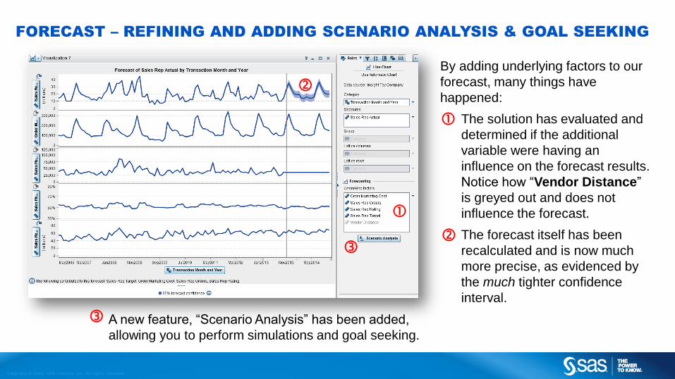
FORECAST – REFINING AND ADDING SCENARIO ANALYSIS & GOAL SEEKING
By adding underlying factors to our
forecast, many things have
happened:
The solution has evaluated and
determined if the additional
variable were having an
influence on the forecast results.
Notice how “Vendor Distance”
is greyed out and does not
influence the forecast.
The forecast itself has been
recalculated and is now much
more precise, as evidenced by
the much tighter confidence
interval.
A new feature, “Scenario Analysis” has been added,
allowing you to perform simulations and goal seeking.

Copyr i g ht © 2014, SAS Ins t i tu t e Inc . A l l r ights reser ve d .
FORECAST – SCENARIO ANALYSIS
If you click on the “Scenario
Analysis” button in the Roles tab,
you can now change the future
values of the Underlying Factors
and see the impact on the Forecast.
Use the mouse to change a value,
or right-click and use the dialog box
to change multiple values.
Remember to click on Apply to save
your changes.

Copyr i g ht © 2014, SAS Ins t i tu t e Inc . A l l r ights reser ve d .
FORECAST – GOAL SEEKING
With Goal Seeking, you change the value of the Target, and Visual Analytics will optimize the values of the
underlying factors to arrive at your desired target.
You can decide to work with all the underlying factors, or just some of them, and also you can set
boundaries, so your underlying factors will make sense from a business point of view (for example to avoid
ending up with negative headcounts).
STEP 2: Right-click on your target variable, and set the
desired goal. Remember to click on OK then Apply.
STEP 1: Select which underlying factors will be affected in
your goal seeking exercise, and set boundaries for them.

Copyr i g ht © 2014, SAS Ins t i tu t e Inc . A l l r ights reser ve d .
FORECAST – SCENARIO ANALYSIS & GOAL SEEKING RESULTS
If you click the Table View button,
you will see the values that have
changed (in bold) as a result of your
scenario simulation or goal seeking
exercise.

Copyr i g ht © 2014, SAS Ins t i tu t e Inc . A l l r ights reser ve d .
FORECAST – SCENARIO ANALYSIS & GOAL SEEKING RESULTS
If you hover over the upper right
corner of your visualization, you will
see you can “Show Details”.
If you select the Results tab, you can
see the underlying data supporting
this forecast.
You can right-click and select
“Export Data” to obtain a csv file of
the current data supporting this
forecast.
If you select the Analysis tab, more
explanation will be given on
forecasting, as well as the algorithm
that was used.
Return to Table of Content

Copyr i g ht © 2014, SAS Ins t i tu t e Inc . A l l r ights reser ve d .
DECISION TREES – GETTING STARTED
STEP 1: starting with a blank workspace, select Decision Tree from the toolbar.
Decision Trees, also known as classification or regression trees, can be used as a prediction process,
to explain the behavior of, or as a grouping/segmentation method for your data.
STEP 2: There are four different
growth strategies you can utilize
when building a decision tree. For the
purpose of this example let’s choose
Basic from the Properties tab.

Copyr i g ht © 2014, SAS Ins t i tu t e Inc . A l l r ights reser ve d .
DECISION TREES – GETTING STARTED
STEP 3: For this exercise, we want to
better understand what drives our
Vendor Satisfaction. Select it from
the Data tab and drag it on the
Workspace.

Copyr i g ht © 2014, SAS Ins t i tu t e Inc . A l l r ights reser ve d .
DECISION TREES – GETTING STARTED
Immediately, the solution returns a histogram representing the
distribution of Vendor Satisfaction.
If we had started our analysis with a Category instead of a
numerical measure, we’d have a bar chart to represent our
population.
STEP 3: Select a few variables that
you believe should have an impact on
Vendor Satisfaction. Select the
Vendor Loyalty Program category,
and the measures Vendor Distance,
Market Penetration, and Sales Rep
Rating and drag them on the
workspace.
Note: you can select multiple items by
holding the CTRL key.

Copyr i g ht © 2014, SAS Ins t i tu t e Inc . A l l r ights reser ve d .
DECISION TREES – NAVIGATING AND EXPLORING
Hovering in the upper right corner of
the visualization, you can select
Show Overview to open a special
Overview window that will allow you
to zoom on sections of the Tree.
Our Tree here indicates that Sales
Rep Rating seems to be the best
explanatory variable to explain
Vendor Satisfaction. Not only that,
but it tells us the best breaking point,
when our sales representatives are
rated 60% or better.

Copyr i g ht © 2014, SAS Ins t i tu t e Inc . A l l r ights reser ve d .
DECISION TREES – NAVIGATING AND EXPLORING
Below our tree is an icicle plot of the nodes.
Select and mouse over the smallest section on
the bottom. When you select this section it will
highlight the path through the decision tree.
Moussing over the section will bring up the
predictors of that node and some general
statistics of the Vendor Satisfaction values.

Copyr i g ht © 2014, SAS Ins t i tu t e Inc . A l l r ights reser ve d .
DECISION TREES – NAVIGATING AND EXPLORING
To zoom into that node on the decision tree, right click on that same section and
choose Show in Tree. We can now see the histogram for that node.

Copyr i g ht © 2014, SAS Ins t i tu t e Inc . A l l r ights reser ve d .
DECISION TREES – FURTHER EXPLORATIONS
Return to Table of Content
You can select
any segment of
the tree and right-
click to Create
Visualization
From Node.
A new
visualization will
be open with a
filter that subsets
your data
accordingly.
There is an add-on to SAS Visual Analytics that allows you to generate numerous segmented
models in parallel and on–the-fly. Visit www.sas.com/visualstatistics to try it now!

Copyr i g ht © 2014, SAS Ins t i tu t e Inc . A l l r ights reser ve d .
TREEMAPS – GETTING STARTED
STEP 1: starting with a blank
workspace, select Treemap
from the toolbar.
STEP 2: Drag and drop Product Hierarchy on the
Treemap workspace.

Copyr i g ht © 2014, SAS Ins t i tu t e Inc . A l l r ights reser ve d .
TREEMAPS – GETTING STARTED
This gives you a Treemap of the highest
level of the hierarchy (Product Brands) and
defaults to the frequency (i.e. how many
rows of data) for each product brand.
In order to get a more insightful chart, you need to
add measures from the Data pane.
For this exercise, drag and drop Order Total (for
Size) and Gross Margin Ratio (for Color).

Copyr i g ht © 2014, SAS Ins t i tu t e Inc . A l l r ights reser ve d .
EXPLORING TREEMAPS
Since you started with a
Hierarchy, you can simply drill-
down on any rectangles by
double-clicking on it.
Notice as well the breadcrumb at
the top that indicates where you
currently are exploring in the
hierarchy tree.
Now you can quickly see which
product groups have the best relative
gross margin (in blue) compared to
other groups that have the same level
of revenues (size of the rectangle).

Copyr i g ht © 2014, SAS Ins t i tu t e Inc . A l l r ights reser ve d .
TREEMAPS – MORE EXPLORATION
Using the mouse as a lasso to highlight multiple boxes, or by holding the CTRL key, you can select
multiple boxes, and, using a right-click menu, include (or exclude) them from your selection, in effect
creating a filter.
Return to Table of Content
Copyr i g ht © 2014, SAS Ins t i tu t e Inc . A l l r ights reser ve d .
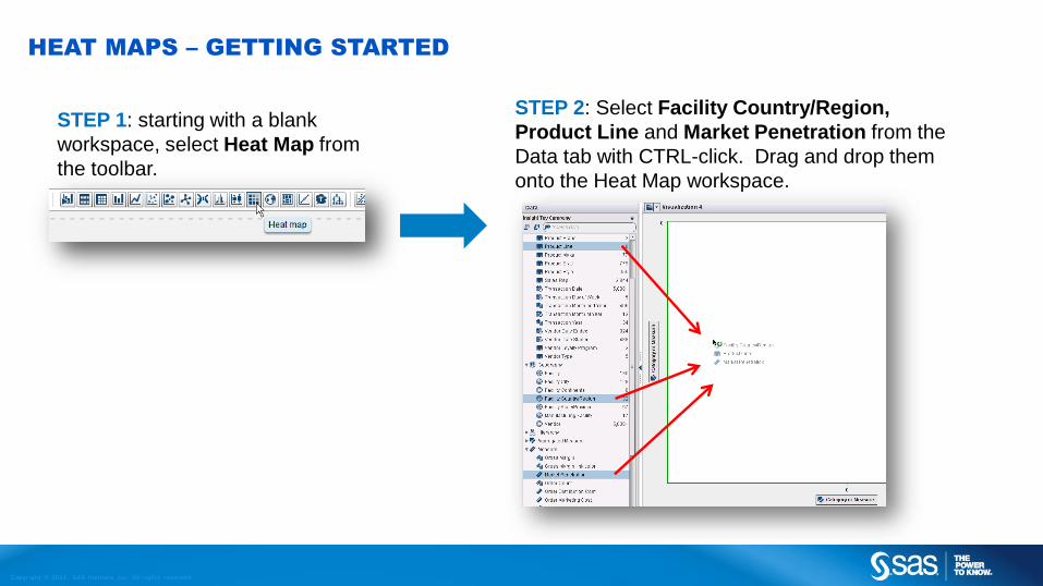
HEAT MAPS – GETTING STARTED
STEP 1: starting with a blank
workspace, select Heat Map from
the toolbar.
STEP 2: Select Facility Country/Region,
Product Line and Market Penetration from the
Data tab with CTRL-click. Drag and drop them
onto the Heat Map workspace.

Copyr i g ht © 2014, SAS Ins t i tu t e Inc . A l l r ights reser ve d .
HEAT MAPS – GETTING STARTED
You now have a Heat Map of Market
Penetration by Facility Country/Region
and Product Line.
It seems that market penetration varies
widely by product line (y-axis), but is fairly
consistent by country (x-axis).
Lets change the presentation somewhat
to get a better sense of this.
If things are not exactly displayed as
you would like them, you can always
re-organize them in the Roles tab.

Copyr i g ht © 2014, SAS Ins t i tu t e Inc . A l l r ights reser ve d .
HEAT MAPS – ANOTHER PERSPECTIVE
Lets get a different view of this
relationship.
On the Roles tab, drag Product Line
from the Y axis element and drop it on
the X axis element. In effect, swapping
Product Line and Facility
Country/Region.
Notice how the map has drastically changed?
Now we see the same information, but from a different,
potentially more meaningful perspective. We can see
much consistency in terms of market penetration for
each country.

Copyr i g ht © 2014, SAS Ins t i tu t e Inc . A l l r ights reser ve d .
HEAT MAPS – IDENTIFYING PROBLEM AREAS
Let’s dig a bit deeper. Select Product
Make from the Data pane and drag and
drop it over Product Line.
Now we have the same data,
but at the Product Make level.

Copyr i g ht © 2014, SAS Ins t i tu t e Inc . A l l r ights reser ve d .
HEAT MAPS – IDENTIFYING PROBLEM AREAS
Working with the Y axis
scroll bar, you can
‘zoom out’, and identify
each Product Make
individually.

Copyr i g ht © 2014, SAS Ins t i tu t e Inc . A l l r ights reser ve d .
HEAT MAPS – DRILLING DEEPER
You can either click and hold the CTRL key or “Lasso”
these areas with the mouse by holding the button and
selecting the areas to be explored.
Then, press the right mouse button to get the menu and
select Include Only Selection.
Notice the new filter in the Filters tab?
We are now using only a fraction of the
original data.
We can single out areas with the lowest Market Penetration.
Return to Table of Content

Copyr i g ht © 2014, SAS Ins t i tu t e Inc . A l l r ights reser ve d .
CORRELATIONS – GETTING STARTED
STEP 2: Click the first
measure
(Gross Margin), hold the
SHIFT key and select the last
measure. This should select
all measure as shown in the
screenshot.
Drag them on the Correlation
workspace.
STEP 1: starting with a blank workspace,
select Correlation Matrix from the toolbar.

Copyr i g ht © 2014, SAS Ins t i tu t e Inc . A l l r ights reser ve d .
CORRELATION MATRIX
Notice the intersection
Vendor Satisfaction and
Sales Rep Rating. It has
a strong relationship of
0.973 (“1” being the
strongest possible
correlation).
This implies they share a
strong relationship.
Double Click this
intersection to explore it
further.

Copyr i g ht © 2014, SAS Ins t i tu t e Inc . A l l r ights reser ve d .
CORRELATION & REGRESSION
There is a strong relationship between
Vendor Satisfaction and Sales Rep
Rating. The color is represented as
transaction frequency.
Next, drag Gross Margin from the data pane to
the Visual pane. This will overlay Gross Margin
as the color instead of frequency.

Copyr i g ht © 2014, SAS Ins t i tu t e Inc . A l l r ights reser ve d .
CORRELATION WITH GROSS MARGIN
As Vendor Satisfaction is
increasing, so is Sales Rep
Rating. This makes sense and
is good information.
Notice however that some
unsatisfied vendors, serviced
by some of our lesser rated
sales representatives (bottom
left), are also making us money
(Gross Margins in blue).
Interesting as well. We’ll need
to investigate.

Copyr i g ht © 2014, SAS Ins t i tu t e Inc . A l l r ights reser ve d .
CORRELATIONS - INVESTIGATING
Using the mouse as a lasso,
highlight the blue bins in the
bottom left, as shown in the
screenshot. Right click on the
highlighted transactions and
select Include Only Selection.
This will create an instant filter on
our data.

Copyr i g ht © 2014, SAS Ins t i tu t e Inc . A l l r ights reser ve d .
SATISFIED AND PROFITABLE CUSTOMERS… BUY WHICH PRODUCT?
It looks like the highest gross margins come
from sales reps with a rating right around
40%. Let’s find out which products are
associated with these gross margins to see if
those have an effect as well.
Drag Product Line into the pane and replace Sales
Rep Rating with Product Line.

Copyr i g ht © 2014, SAS Ins t i tu t e Inc . A l l r ights reser ve d .
GROSS MARGIN RATIO – STAR PRODUCTS
Click the Bar Chart icon in the toolbar.
The visualization will change to a Bar Chart.
From this map, it is very clear that our highest
gross margins come from the Figure and
Game product lines.
Drag Order Total over Vendor Satisfaction.
The Figure and Game product lines not only
have the highest gross margins, but the highest
sales as well. Good to know.
Return to Table of Content

Copyr i g ht © 2014, SAS Ins t i tu t e Inc . A l l r ights reser ve d .
NETWORK DIAGRAMS – GETTING STARTED
Network Diagrams are about showing relationships and their structure.
Flow can be shown with a direction (arrow).
Most business operations have some form of network: Supply chains, Import/export, Debt and
loans, Twitter influencer analysis, transportation routes, etc. In fact, any hierarchy can be
represented as a network.
SAS Visual Analytics supports two types of Networks: hierarchy-based, and ungrouped.
Ungrouped networks require two data items: a Source and a Target. The target has to be a subset
of the Source. Examples of this type of Network are:
Employees and their managers (because all managers are also employees)
Intercompany transactions (subsidiary to subsidiary)
Transportation origin and destination cities
Sports team playing against each other
In this Insight Toy example, we will be working with a hierarchical network.

Copyr i g ht © 2014, SAS Ins t i tu t e Inc . A l l r ights reser ve d .
NETWORK DIAGRAMS – GETTING STARTED
STEP 1: starting with a blank workspace,
select Network Diagram from the toolbar.
STEP 2: From the Roles tab, select the
Hierarchical Network Type.
STEP 3: From the Data Pane, select and
drag Product Hierarchy onto the
workspace.

Copyr i g ht © 2014, SAS Ins t i tu t e Inc . A l l r ights reser ve d .
NETWORK DIAGRAMS – REFINING THE VISUAL
STEP 4: Select:
Order Total the Node size;
Order Count for the node color;
Gross margin for the Link width; and
Gross Margin link color for the Link color.
From here you can drill down and explore on any level.
You can also modify many things on the Properties tab.
STEP 5: On the
Properties tab,
select “Show
labels” and vary the
Node Spacing to
your liking. You can
also change the
Link Color if you
wish.

Copyr i g ht © 2014, SAS Ins t i tu t e Inc . A l l r ights reser ve d .
NETWORK DIAGRAMS – THE ART OF THE POSSIBLE
Network Diagrams are highly dependent on the type of data available.
Here are some additional examples of network diagrams based on other sources of data:
Airline source
and target destinations
Twitter feed
Analysis
Transportation Route
Manufacturing
Supply Chain
Return to Table of Content

Copyr i g ht © 2014, SAS Ins t i tu t e Inc . A l l r ights reser ve d .
BOX PLOTS
Box Plots are a very powerful way to derive multiple statistics about your data. A box plot
represents the distribution of data values by using rectangular box and lines called whiskers.
Outliers
Maximum Value
Q3 (75th percentile)
Median
Mean
Q1 (25th percentile)
Minimum Value
Basically, this means that half of
your data ends up in this range for
the particular measure you are
looking at.

Copyr i g ht © 2014, SAS Ins t i tu t e Inc . A l l r ights reser ve d .
BOX PLOTS – GETTING STARTED
Step 2: Drag and drop one measure and one
category over the workspace. In this example, we
have selected to look at the distribution of the
Vendor Distance (measure), per Facility City
(geography).
Notice how we can immediately see the average
distance that vendors are from our stores. The
majority seem fairly close to our stores, but there
are definitely a few far away.
Step 1: Minimize any open visualizations, to start with a blank workspace.
Select Box Plot from the toolbar.

Copyr i g ht © 2014, SAS Ins t i tu t e Inc . A l l r ights reser ve d .
BOX PLOTS - REFINEMENT
Here is another example: You can
immediately see the Order Marketing
Cost by Product Line. You can see
that the “Plush” and “Thrift” products
have the lowest marketing costs, and
that the “Promo” products have the
widest distribution of marketing costs.
By further refining this visualization
with filters, you will be able to quickly
focus on any region, facility or sale
representative in order to investigate at
a more detailed level.
Return to Table of Content

Copyr i g ht © 2014, SAS Ins t i tu t e Inc . A l l r ights reser ve d .
BUBBLE PLOTS – GETTING STARTED
STEP 1: starting with a blank
workspace, select Bubble
Plot from the toolbar.
Please note that the Bubble Plot visualization is one
of the more complex ones, as evidenced by the
various field roles available.

Copyr i g ht © 2014, SAS Ins t i tu t e Inc . A l l r ights reser ve d .
BUBBLE PLOTS – GETTING STARTED
STEP 2: Assign a GROUP.
The Group is important
because it dictates how
many elements can be
displayed on the screen at
one time. Here, we will drag
and drop Product
Hierarchy as our group.

Copyr i g ht © 2014, SAS Ins t i tu t e Inc . A l l r ights reser ve d .
BUBBLE PLOTS – GETTING STARTED
STEP 3: Now you can assign the rest of
your data elements. For this visualization,
you will assign:
Sales Rep Rating for the X Axis
Vendor Satisfaction for the Y Axis
Order Total for the Bubble Size.

Copyr i g ht © 2014, SAS Ins t i tu t e Inc . A l l r ights reser ve d .
BUBBLE PLOTS – EXPLORING
Since you chose a Hierarchy as your Group, you
will be able to drill-down to further explore your
visualization by double-clicking on the bubbles.
Notice the bread crumb trail that expands
indicating your drill-down path.
Also note that clearly, the better a sales representative is rated, the more his/her vendors seem satisfied. However, this
seems independent of the actual sales revenue (the size of the bubble).

Copyr i g ht © 2014, SAS Ins t i tu t e Inc . A l l r ights reser ve d .
BUBBLE PLOTS – REFINING
Using your mouse as a lasso, you
can select a few bubbles, Right-
Click and select Include Only
Selection, to create a filter on-the-
fly, and focus on just those items.
See the Filters section for more info
on filters.

Copyr i g ht © 2014, SAS Ins t i tu t e Inc . A l l r ights reser ve d .
BUBBLE PLOTS – TIME ANIMATION
Now, wouldn’t it be interesting
to see how that visualization
evolves over time?
You can simply select
Transaction Year and drag
and drop it in the Animation
role.
Now you will be able to play
the bubble plot, and see how
things evolve over time.
Return to Table of Content

Copyr i g ht © 2014, SAS Ins t i tu t e Inc . A l l r ights reser ve d .
TEXT ANALYTICS – SIMPLE AND COMPLEX WORD CLOUDS
SAS Visual Analytics can do two types of word clouds:
Simple word clouds using a category value; or
More sophisticated word clouds that leverage SAS Text Analytics. Word
clouds that use text analytics analyze each value in a data item as a text
document that can contain multiple words. Words that often appear together
in the document collection are identified as topics. SAS Text Analytics also
allows you to perform Sentiment Analysis on the text.

Copyr i g ht © 2014, SAS Ins t i tu t e Inc . A l l r ights reser ve d .
TEXT ANALYTICS – GETTING STARTED
For this exercise, we will change exploration and with it the underlying data. This new
data actually contains free form text that we will explore using SAS Text Analytics.
STEP 1: From the Explorer interface, select File > Open.
STEP 2: If you are asked to save your exploration,
select “Don’t’ Save”

Copyr i g ht © 2014, SAS Ins t i tu t e Inc . A l l r ights reser ve d .
TEXT ANALYTICS – GETTING STARTED / ACCESSING NEW DATA
STEP 3: In the OPEN dialog window, navigate to
SAS Folders > Shared data > DemoData > Insight Toy Trial > Exploration and Reports
And then select Insight Toy Text Exploration
and click OPEN.
This will open a pre-defined exploration,
and will also point you to another data set.
This new data contains specific customer
comments for the Bead product line,
from January to October of 2013.

Copyr i g ht © 2014, SAS Ins t i tu t e Inc . A l l r ights reser ve d .
TEXT ANALYTICS – SIMPLE WORD CLOUDS
STEP 1: starting with a blank workspace, select Word Cloud from the toolbar.
STEP 2: From the Roles tab, select Using Category Values.
STEP 3: Drag and Drop a category item.
Here we selected Product Style.

Copyr i g ht © 2014, SAS Ins t i tu t e Inc . A l l r ights reser ve d .
TEXT ANALYTICS – SIMPLE WORD CLOUDS
The result shows the relative size of each Product Style,
representing the frequency of our transactions. For example, we
see we sell much more Orange Mixed than we do Gold 8mm.
STEP 4: Select and Drag and Drop Gross
Margin and Order Total on the
workspace. The Visualization is now very
different: the size of the Font representing
Gross Margin contribution of each Product
make, while the color represents the
Revenues generated.

Copyr i g ht © 2014, SAS Ins t i tu t e Inc . A l l r ights reser ve d .
TEXT ANALYTICS – LEVERAGING ADVANCED SAS®
TEXT ANALYTICS
STEP 1: starting with a blank workspace, select Word Cloud from the toolbar.
STEP 2: From the Roles tab, select Using Text Analytics.
To leverage text analytics, we have pre-defined two settings in the data:
1. A data item (Order) has been identified as the “unique row identifier”; and
2. A category (Order Note) has been identified as a “document collection”.
This is the data item that will be analyzed.
STEP 3: Back in the Roles tab, click on the little down arrow for
Document Collection, and pick the only choice available: Order Note.
Visual Analytics will analyze the content of that data, identify topics
(words that often appear together), and represent the most relevant
terms for each topic by varying the size of the terms.

Copyr i g ht © 2014, SAS Ins t i tu t e Inc . A l l r ights reser ve d .
TEXT ANALYTICS – LEVERAGING ADVANCED SAS®
TEXT ANALYTICS
Terms that we identify as “red flags”
(eg. “unhappy”) can be focused on by
simply clicking on them, which will
display at the bottom all the Documents
that have these terms.
Many sets of topics have been identified in this
data. You can explore the analysis by selecting
various topics.

Copyr i g ht © 2014, SAS Ins t i tu t e Inc . A l l r ights reser ve d .
TEXT ANALYTICS – LEVERAGING ADVANCED SAS®
TEXT ANALYTICS
Return to Table of Content
In the Properties tab, you can select “Analyze document sentiment”. SAS Visual
Analytics will evaluate the sentiment of the content, for each topic as well as each
individual entry.

Copyr i g ht © 2014, SAS Ins t i tu t e Inc . A l l r ights reser ve d .
SANKEY DIAGRAMS – PATH ANALYSIS
Sankey diagrams are a very powerful visualization technique to analyze
various data paths. They can be leveraged to analyze web visits (our example
in the next pages), or to explore customer journey or resource consumption (for
example, “where did my budget go?”, or “which vehicles consume the
most gas?”). In order to support this kind of analysis, a data source must be
structured in a very particular way: each row must contain an event descriptor,
a sequence order (usually a timestamp or date, but can be any number) and a
transaction identifier.

Copyr i g ht © 2014, SAS Ins t i tu t e Inc . A l l r ights reser ve d .
SANKEY DIAGRAMS – GETTING STARTED
For this exercise, we will change exploration and with it the underlying data. Data for a
Sankey diagram has to be structured in a very specific format.
STEP 2: If you are asked to save
your exploration,
select “Don’t’ Save”
STEP 1: From the Explorer
interface, select File > Open.

Copyr i g ht © 2014, SAS Ins t i tu t e Inc . A l l r ights reser ve d .
SANKEY DIAGRAMS – GETTING STARTED / ACCESSING NEW DATA
STEP 3: In the OPEN dialog window, navigate to
SAS Folders > Shared data > DemoData > Insight Toy Trial > Exploration and Reports
And then select Web Site Analysis
and click OPEN.
This will open a pre-defined exploration,
and will also point you to another data set.
This new data contains a very simple example
of web site visitors.

Copyr i g ht © 2014, SAS Ins t i tu t e Inc . A l l r ights reser ve d .
SANKEY DIAGRAMS – WEB PATH ANALYSIS
In this visualization, we see on
the left that we have 4 entry
points to our website. And the
most popular one obviously is
the “Welcome” page, followed
by our “Search” page. Notice
that one third, 5 out of 15
visitors, immediately drop off
and do not go further on our
website. This might mean we
did a very good job with our
Welcome page, and people
found the info they were looking
for right then and there, or it
might mean we need to create
more incentive for them to stick
around…

Copyr i g ht © 2014, SAS Ins t i tu t e Inc . A l l r ights reser ve d .
SANKEY DIAGRAMS – WEB PATH ANALYSIS
Out of the 10 web visitors that do
stick around, half of them
immediately go to our “Deals”
page. Which is great! It has a
good ‘draw’. But then, 4 out of 5
drop off… and 1 out of 5 buys
something.
By navigating the diagram, we
can find the various paths that
our visitors follow to finally buy
something from our website.
This will in turn help us fine tune
and enhance our web
experience, to eventually drive
more sales.

Copyr i g ht © 2014, SAS Ins t i tu t e Inc . A l l r ights reser ve d .
SANKEY DIAGRAMS – WEB PATH ANALYSIS – GOING FURTHER…
From this point, you can select any
paths, or any node, right-click, and
create a new visualization that
contains only the data specific to
the characteristics you are looking
for. In our case here, if we had
more information in this data set,
we could find the list of users
associated with a selected path or
event, and then use SAS Visual
Analytics to find what they have in
common – say, most are males
browsing the web during work
hours.
Return to Table of Content

Copyr i g ht © 2014, SAS Ins t i tu t e Inc . A l l r ights reser ve d .
VISUAL STATISTICS – MORE ADVANCED ANALYTICS
SAS® Visual Statistics helps you explore data and quickly build and refine predictive models so you can
zero in on the right answers to your biggest business questions.
There are 5 Icons to the left of the toolbar
that represent SAS ® Visual Statistics’
more advanced analytic functions:
Linear Regression
Logistic Regression
Generalized Linear Model
Cluster
Model Comparison
For further information please refer to:
www.sas.com/visualstatistics
Copyr i g ht © 2014, SAS Ins t i tu t e Inc . A l l r ights reser ve d .
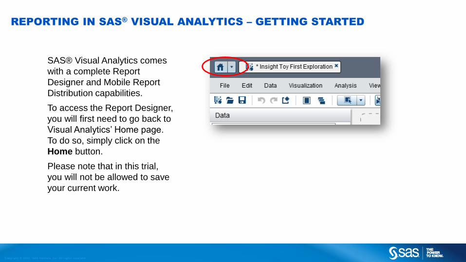
REPORTING IN SAS®
VISUAL ANALYTICS – GETTING STARTED
SAS® Visual Analytics comes
with a complete Report
Designer and Mobile Report
Distribution capabilities.
To access the Report Designer,
you will first need to go back to
Visual Analytics’ Home page.
To do so, simply click on the
Home button.
Please note that in this trial,
you will not be allowed to save
your current work.

Copyr i g ht © 2014, SAS Ins t i tu t e Inc . A l l r ights reser ve d .
REPORTING IN SAS®
VISUAL ANALYTICS – THE HOME PAGE
This is your Home page.
From here, you can access
Explorations, Reports,
Prepare your data, manage
analytical models in SAS
Visual Statistics and manage
your servers. Note that in this
trial, you can only access
Explorations and Reports.
Links can be
customized
for your
organization’s
needs.
Any recent content you
have been working on,
or Favorites you would
like to have, would show
up here.

Copyr i g ht © 2014, SAS Ins t i tu t e Inc . A l l r ights reser ve d .
REPORTING IN SAS®
VISUAL ANALYTICS – OPEN SAMPLE REPORT
To open the Sample report for
insight Toy, from the home
page, click on the open folder
on the upper left corner.
Navigate to SAS Folders >
Shared Data > DemoData >
Insight Toy Trial > Explorations
and Reports and select the
Insight Toy Sample Report.
Then click on EDIT to open
the report Designer.

Copyr i g ht © 2014, SAS Ins t i tu t e Inc . A l l r ights reser ve d .
REPORTING IN SAS®
VISUAL ANALYTICS – THE ESSENTIALS
For more information, please consult the SAS Visual Analytics User Guide, available under the Help menu.
The interface for creating, editing and publishing reports is very similar to the Data Exploration
interface, with a few differences…
The right pane contains
tabs that enable you to
change the properties of
your visualizations, filter the
data and apply display
rules.
The workspace allows for interaction
between different objects.
The Objects tab lists the
various types of Tables,
Graphs, Gauges,
Controls and Containers
for your report.
As before, the Data tab
lists the available
categories and
measures in your
selected data sources.

Copyr i g ht © 2014, SAS Ins t i tu t e Inc . A l l r ights reser ve d .
REPORTING IN SAS®
VISUAL ANALYTICS – CREATING A NEW SECTION
Let’s create a new section by clicking on the + sign at the top.
For the purpose of this exercise, we’ll show you how to recreate the Sales Overview page.
Reports in SAS Visual Analytics are made
of sections (see the three tabs at the top)
and each section is made up of tiles.
In this section, we have 3 tiles: a pie chart,
a line plot, and a treemap.
On the top right, we also have two pull-
downs that allow the user to subset the
data (in this case, we’re looking at 2011
and at Europe).

Copyr i g ht © 2014, SAS Ins t i tu t e Inc . A l l r ights reser ve d .
REPORTING IN SAS®
VISUAL ANALYTICS – EDITING A NEW SECTION
STEP 1: From the Objects tab, drag and Drop a
Drop-Down list control in the top part to create a
section prompt.
STEP 2: From the Data tab, drag and Drop
Facility Continents on the section Drop-Down list.

Copyr i g ht © 2014, SAS Ins t i tu t e Inc . A l l r ights reser ve d .
REPORTING IN SAS®
VISUAL ANALYTICS – EDITING A NEW SECTION
STEP 1: Add another Drop-Down List control to
the report.
STEP 2: From the Data tab, drag and Drop
Transaction Year on the section Drop-Down list.

Copyr i g ht © 2014, SAS Ins t i tu t e Inc . A l l r ights reser ve d .
REPORTING IN SAS®
VISUAL ANALYTICS – ADDING A PIE CHART
STEP 1: From the Objects tab, drag and Drop a
Pie Chart graph object on the report section. STEP 2: From the Data tab, drag and Drop Order
Total on the pie chart and assign it as a Measure,
and then drag and drop Facility Country/Region
as your category.

Copyr i g ht © 2014, SAS Ins t i tu t e Inc . A l l r ights reser ve d .
REPORTING IN SAS®
VISUAL ANALYTICS – LIVE ON BIG DATA
Before we keep going, let’s review what we just did. What you see below, that literally took us seconds to
create, is a LIVE report, on big data, ready to be consumed. There is no need to “run” the report, to pre-
summarize it, etc. You could save this now and it would be accessible to anyone who has authorization on
your system to view reports, or through mobile tablets as well. No matter if it is on ‘just’ a few thousands
rows of data, or hundreds of millions!
Now lets keep going…

Copyr i g ht © 2014, SAS Ins t i tu t e Inc . A l l r ights reser ve d .
REPORTING IN SAS®
VISUAL ANALYTICS – ADDING A LINE CHART
STEP 1: From the Objects tab, drag and Drop a
Time Series Plot graph object on the RIGHT side
of the report section. STEP 2: From the Data tab, drag and Drop Order
Total and Gross Margin to the Time Series Plot.
Assign both as a New Measure.

Copyr i g ht © 2014, SAS Ins t i tu t e Inc . A l l r ights reser ve d .
REPORTING IN SAS®
VISUAL ANALYTICS – ADDING A LINE CHART
STEP 3: From the Data tab, drag and Drop Transaction Month and Year as the Time Axis
over the Time Series Plot.
STEP 4: Make sure the Time
Series plot is selected, and
from the Properties tab, set
the Binning Interval to “Use
Format”, so only monthly data
gets displayed.

Copyr i g ht © 2014, SAS Ins t i tu t e Inc . A l l r ights reser ve d .
REPORTING IN SAS®
VISUAL ANALYTICS – ADDING A TREEMAP
STEP 1: From the Objects tab, drag and Drop a
Treemap Graph object at the bottom of this report
section.
Note: you can always re-arrange the
tiles afterwards if you prefer.
STEP 2: From the Data tab, drag and Drop the
category Product Line over the Treemap. Then,
Drag and Drop the measure Order Total as the
New Size, and the Aggregated Measure Gross
Margin Ratio as the New Color.

Copyr i g ht © 2014, SAS Ins t i tu t e Inc . A l l r ights reser ve d .
REPORTING IN SAS®
VISUAL ANALYTICS – CREATING INTERACTION
STEP 1: To create an interaction between your
various Tiles, click on the View menu and
select Show Interactions. STEP 2: From the Pie Chart, Drag and Drop to
the Time Series Plot and then to the Treemap
tiles.
When you’re done, go back to the layout view
by clicking on Close button.

Copyr i g ht © 2014, SAS Ins t i tu t e Inc . A l l r ights reser ve d .
REPORTING IN SAS®
VISUAL ANALYTICS – WORKING WITH THE REPORT
You’re almost done! Your report
section is now fully functional. Try
changing the pull down values,
and also click on one section of
the pie chart. See what happens.
Now all that’s left to do is to refine
the look of the Report Section...

Copyr i g ht © 2014, SAS Ins t i tu t e Inc . A l l r ights reser ve d .
REPORTING IN SAS®
VISUAL ANALYTICS – FINALIZING THE REPORT
The Properties
and Styles tab
on the right
allows you to
change many
parameters to
improve the
look of the
various tiles.
The Display Rules
tab is used to
assign intervals
when working with
KPI gauges, or to
assign a specific
color to a data
segment (such as
product line ‘xyz’).
These can also be
leveraged in the
Alerts tab.

Copyr i g ht © 2014, SAS Ins t i tu t e Inc . A l l r ights reser ve d .
Here are two more sections of the same sample report.
You can have a ‘Button Bar’ Across the top. The
user can simply pick a Product line, and the report
automatically adjusts.
Return to Table of Content
REPORTING IN SAS®
VISUAL ANALYTICS – VIEW REPORTS
The midsection is a “stack container” which is
actually 4 different objects… users can pick the
visualization they prefer.
Here we are looking at our average vendors
satisfaction & rating score per region
effectiveness by regions. We also see the sales
representative targets for each country.
Copyr i g ht © 2014, SAS Ins t i tu t e Inc . A l l r ights reser ve d . www.SAS.com
EXPLORE!

Copyr i g ht © 2014, SAS Ins t i tu t e Inc . A l l r ights reser ve d .
INSIGHT TOY COMPANY – DATA DICTIONARY PAGE 1 OF 3
Field Type Description
Facility Country/
Region CodeCategory 2-letter unique code for each country
Facility Date Closed Category/Date If a facility were ever to be closed. None are in this dataset.
Facility Date Opened Category/Date Date the manufacturing facility was opened. Varies from 1980 to 2010.
Manufacturing Batch Category Manufacturing batch corresponding to each transaction. All unique – one per row.
Manufacturing Batch SKU Category Stock Keeping Unit of various Manufacturing Batches.
Order noteCategory/
Document Collection
Free form text – notes taken at the moment the vendor ordered items. This will be used in Text Analytics and is in a separate
data set.
Product Brand Category 2 brands of products: Novelty and Toys.
Product Line Category 8 lines of products, falling in the two product brands.
Product Make Category 77 product make, falling into the 8 product lines.
Product SKU Category 779 product SKUs produced, falling into the various product styles.
Product Style Category 355 product styles, falling into the various product makes.
Sales Rep Category Identification of the sales representative who made the sale.
Transaction date Category/Date Date of the sale.
Transaction Day Of Week Category/Date Day of the week of the sale.
Transaction Month and
YearCategory/Date Day and Month of the sale.
Transaction Month of year Category/Date Month of the sale
Transaction year Category/Date Year of the sale

Copyr i g ht © 2014, SAS Ins t i tu t e Inc . A l l r ights reser ve d .
INSIGHT TOY COMPANY – DATA DICTIONARY PAGE 2 OF 3
Field Type Description
Vendor Date Ended Category/Date When the vendor stopped doing business with us
Vendor Date Started Category/Date When the vendor started doing business with us
Vendor Loyalty Program Category Binary field (Y/N) representing whether or not this vendor is in our loyalty program.
Vendor Type Measure (Category) Numerical category. 5 types of vendors: (1) Convenience store, (2) Discount store, (3) Department store, (4) Kiosk or (5) Other.
Facility Geography Unique identifier of the selling facility
Facility City Geography City where the selling facility is located
Facility Continents Geography Continent where the selling facility is located
Facility Country/Region Geography Country where the selling facility is located
Facility State/Province Geography State or Province where the selling facility is located
Manufacturing Facility Geography Identifier and location of the manufacturing facility
Vendor Geography Identifier and location of the vendor (customer)
Country Hierarchy Hierarchy A custom hierarchy made up of Facility City, State, Country
Geo Hierarchy Hierarchy A custom hierarchy made up of Facility City, State, Country, Continent
Product Hierarchy Hierarchy A custom hierarchy made up of Product SKU, Style, Make, Line and Brand
Gross Margin Ratio Aggregated Measure Sum of Gross Margins divided by Sum of Sales (‘Order Total’)
Gross Margin Measure (calculated) Gross Margin for each sale = ‘Order Total’ – ‘Order product Cost’
Gross Margin link color Measure (calculated) A duplicate of Gross margin to be used to drive the color of certain visualizations.

Copyr i g ht © 2014, SAS Ins t i tu t e Inc . A l l r ights reser ve d .
INSIGHT TOY COMPANY – DATA DICTIONARY PAGE 3 OF 3
Field Type Description
Market Penetration Measure For each transaction, the corresponding % of market share in that particular region at that time.
Order Count Measure (calculated) Count of the number of distinct Orders – based on field Order.
Order Distribution Cost Measure Distribution cost associated with that transaction
Order Marketing Cost Measure Marketing cost assigned to that transaction (through an activity-based costing exercise)
Order Product Cost Measure Direct manufacturing costs associated with that transaction. Included I the calculation of gross Margin.
Order Sales Cost Measure Sales-related costs assigned to that transaction (through an activity-based costing exercise)
Order Total Measure Revenue from that sale.
Sales Rep % of Target Measure A ratio of Sales Rep Actual sales divided by Sales Rep target. Calculated DAILY
Sales Rep Actual MeasureCumulative DAILY sales for each sales representative. This value should not be summed across the transactions (since it has
already been aggregated).
Sales Rep Target MeasureDaily sales Target (goal) for each sales representative. This value should not be summed across the transactions (since it has
already been aggregated).
Sales Rep Vendor Base MeasurePotential revenue (funnel) from all the vendors (customers) assigned to a sales representative. This value should not be summed
across the transactions (since it has already been aggregated).
Sales Rep Vendors MeasureNumber of customers (vendors) assigned to a sales representative. This value should not be summed across the transactions
(since it has already been aggregated).
Vendor Distance Measure Distance from the vendor location to our selling facility.
Vendor Rating Measure Subjective evaluation, from 0% to 100%, representing the potential value of a customer (vendor) for insight Toy.
Vendor Satisfaction Measure Satisfaction of the customer (vendor) based on a marketing survey. From 0% to 100%.
Return to Table of Content