Embed Size (px)
Citation preview


i VERIZON ENTERPRISE SOLUTIONS
2015 DBIR Contributors(See Appendix C for a detailed list.)

2015 DATA BREACH INVESTIGATIONS REPORT ii

iii VERIZON ENTERPRISE SOLUTIONS
CONTENTS
Introduction ............................................................................................................................................................................. 1Victim Demographics .......................................................................................................................................................... 2Breach Trends: Looking Back Before Diving Ahead............................................................................................... 4Before and Beyond the Breach ........................................................................................................................................ 7Indicators of Compromise: “Sharing Is Cyber-Caring” ........................................................................................ 8Phishing: “Attn: Sir/Madam” ...........................................................................................................................................12Vulnerabilities: “Do We Need Those Stinking Patches?”...................................................................................15Mobile: “I Got 99 Problems and Mobile Malware Isn’t Even 1% of Them” .................................................18Malware: “Volume, Velocity, and Variation” ............................................................................................................21Industry Profiles: “Raising the Stakes With Some Takes on NAICS” ...........................................................24Impact: “In the Beginning, There Was Record Count” ........................................................................................ 27Incident Classification Patterns ..................................................................................................................................31
Point-of-Sale Intrusions ....................................................................................................................................... 35Payment Card Skimmers ...................................................................................................................................... 37Crimeware .................................................................................................................................................................... 39Web App Attacks .......................................................................................................................................................41Denial-of-Service Attacks ....................................................................................................................................43Physical Theft/Loss .................................................................................................................................................45Insider Misuse ............................................................................................................................................................ 46Miscellaneous Errors ...............................................................................................................................................49Cyber-Espionage ...................................................................................................................................................... 52
Wrap-Up ................................................................................................................................................................................. 55Appendix A: Year in Review ........................................................................................................................................... 57Appendix B: Methodology ...............................................................................................................................................59Appendix C: Contributing Organizations .................................................................................................................61Appendix D: The Internet of Things ........................................................................................................................... 62
QUESTIONS? COMMENTS? BRILLIANT IDEAS?We want to hear them. Drop us a line at [email protected], find us on Linkedin, or tweet @VZdbir with the hashtag #dbir.

2015 DATA BREACH INVESTIGATIONS REPORT 1
Welcome (and welcome back), friends, to our annual showcase of security breaches. We’re so glad you could attend; come inside, come inside. The year 2014 saw the term “data breach” become part of the broader public vernacular with The New York Times devoting more than 700 articles related to data beaches, versus fewer than 125 the previous year.2 It was the year major vulnerabilities received logos (collect them all!) and needed PR IR firms to manage their legions of “fans.” And it was the year when so many high-profile organizations met with the nigh inevitability of “the breach” that “cyber” was front and center at the boardroom level. The real sign of the times, however, was that our moms started asking, “Is that what you do, dear?” and seemed to finally get what we do for a living.
The 2015 Data Breach Investigations Report (DBiR) continues the tradition of change with additions that we hope will help paint the clearest picture yet of the threats, vulnerabilities, and actions that lead to security incidents, as well as how they impact organizations suffering them. in the new “Before and Beyond the Breach” section, our security data scientists analyzed (literally) dozens of terabytes of data from partners new and old, making this one of the most collaborative, data-driven information security (infoSec) reports in existence. if you’re accustomed to reading the DBiR mainly for the headliners and one-liners, you might need to coffee up and put your thinking cap on for this one. But it’ll be worth it; we promise. Fret not, “incident Pattern” aficionados—the nefarious nine are back, but they have slimmed down a bit, as you’ll see when you get to that section.
Speaking of partners, the DBiR would not be possible without our 70 contributing organizations. We continue to have a healthy mix of service providers, iR/forensic firms, international Computer Security information Response Teams (CSiRTs), and government agencies, but have added multiple partners from security industry verticals to take a look at a broad spectrum of real-world data. Their willingness to share data and actionable insight has made our report a hallmark of success in information sharing. For that, each of them3 has our respect and gratitude.
if you’re curious about what, how, and why we did what you see before you, flip to Appendix B, where we discuss sample bias, methodology, and other details of the research efforts making up the report. To further encourage readers to try this at home, we’ve included a “Where can i learn more?” component to each relevant section, which should help you start or grow your own data-driven security practices.4
1 These numbers are based on the total data in the 2015 DBiR complete corpus. Read more about our methodology in (of all places) the Methodology appendix.
2 Search terms “data AND breach” for calendar years 2013 and 2014 at www.nytimes.com/content/help/search/search/search.html. Fun fact: Taylor Swift only saw around 400 NYT articles for 2014.
3 Full list of partners and contributors in Appendix C.4 One final note before we dive into the breaches: The DBiR team wished to mark the passing of Leonard Nimoy, as that event came
during the creation of this report. We will all miss his humor, talent, and inspiration.
INTRODUCTION
70CONTRIBUTING ORGANIZATIONS
79,790 SECURITY INCIDENTS
2,122 CONFIRMED DATA BREACHES
61 COUNTRIES REPRESENTED1

2 VERIZON ENTERPRISE SOLUTIONS
There’s probably a decent correlation between the population of people who read movie credits and those who read the demographics section in a report. You might linger to be reminded of that actress’s name who was also in that movie you liked years back or see the bloopers at the end of a Jackie Chan film, but otherwise it’s a scramble for the door before the parking lot gets slammed.
We, however, believe demographics are rather important. How else would you know if the findings are generally representative, if they’re relevant to your organization, and whether any animals were harmed during the making of this report? (There weren’t, but we definitely killed some brain cells as a team.) Such questions are important to proper interpretation and application of everything else that follows.
Last year’s DBiR covered incidents affecting organizations in 95 countries; the updated tally for the 2015 report is 61. This obviously means that 34 countries got secured over the last year; great job, everyone. in truth, we don’t know what’s going on there—we have more contributors and more incidents than ever before. in terms of volume, two-thirds of incidents occurred in the U.S., but that’s more reflective of our contributor base (which continues to expand geographically) than a measure of relative threat/vulnerability.
VICTIM DEMOGRAPHICS
Figure 1.Countries represented in combined caseload
The top three industries affected are the same as previous years: Public, Information, and Financial Services.
2015 DATA BREACH INVESTIGATIONS REPORT 3
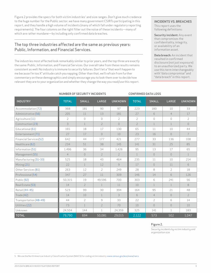
Figure 2 provides the specs for both victim industries5 and size ranges. Don’t give much credence to the huge number for the Public sector; we have many government CSiRTs participating in this report, and they handle a high volume of incidents (many of which fall under regulatory reporting requirements). The four columns on the right filter out the noise of these incidents—many of which are rather mundane—by including only confirmed data breaches.
The top three industries affected are the same as previous years: Public, Information, and Financial Services.
The industries most affected look remarkably similar to prior years, and the top three are exactly the same: Public, information, and Financial Services. Our overall take from these results remains consistent as well: No industry is immune to security failures. Don’t let a “that won’t happen to me because i’m too X” attitude catch you napping. Other than that, we’ll refrain from further commentary on these demographics and simply encourage you to look them over to decide how relevant they are to your organization and whether they change the way you read/use this report.
NUMBER OF SECURITY INCIDENTS CONFIRMED DATA LOSS
INDUSTRY TOTAL SMALL LARGE UNKNOWN TOTAL SMALL LARGE UNKNOWN
Accommodation (72) 368 181 90 97 223 180 10 33
Administrative (56) 205 11 13 181 27 6 4 17
Agriculture (11) 2 0 0 2 2 0 0 2
Construction (23) 3 1 2 0 2 1 1 0
Educational (61) 165 18 17 130 65 11 10 44
Entertainment (71) 27 17 0 10 23 16 0 7
Financial Services(52) 642 44 177 421 277 33 136 108
Healthcare (62) 234 51 38 145 141 31 25 85
information (51) 1,496 36 34 1,426 95 13 17 65
Management (55) 4 0 2 2 1 0 0 1
Manufacturing (31–33) 525 18 43 464 235 11 10 214
Mining (21) 22 1 12 9 17 0 11 6
Other Services (81) 263 12 2 249 28 8 2 18
Professional (54) 347 27 11 309 146 14 6 126
Public (92) 50,315 19 49,596 700 303 6 241 56
Real Estate (53) 14 2 1 11 10 1 1 8
Retail (44–45) 523 99 30 394 164 95 21 48
Trade (42) 14 10 1 3 6 4 0 2
Transportation (48–49) 44 2 9 33 22 2 6 14
Utilities (22) 73 1 2 70 10 0 0 10
Unknown 24,504 144 1 24,359 325 141 1 183
TOTAL 79,790 694 50,081 29,015 2,122 573 502 1,047
5 We use the North American industry Classification System (NAiCS) for coding victim industry. www.census.gov/eos/www/naics
INCIDENTS VS. BREACHESThis report uses the following definitions:
Security incident: Any event that compromises the confidentiality, integrity, or availability of an information asset.
Data breach: An incident that resulted in confirmed disclosure (not just exposure) to an unauthorized party. We use this term interchangeably with “data compromise” and “data breach” in this report.
Figure 2.Security incidents by victim industry and organization size
4 VERIZON ENTERPRISE SOLUTIONS
This is an annual report, and as such, it traditionally focuses on interesting developments over the previous year. Some aspects of the threat space change that quickly, but others undulate and evolve over a longer period of time. We don’t want to lose sight of either the forest or the trees, so before delving into updates on each incident pattern, let’s take a look at some of the longer-term trends and high-level findings from this year’s data.
THREAT ACTORS
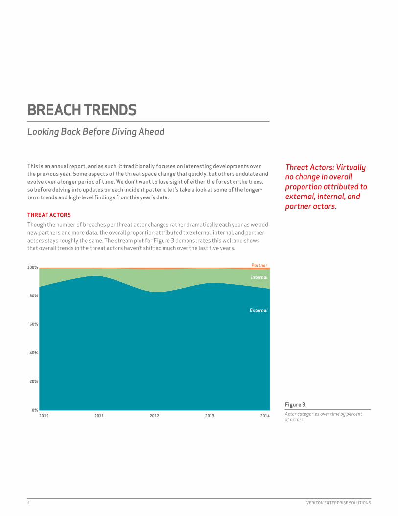
Though the number of breaches per threat actor changes rather dramatically each year as we add new partners and more data, the overall proportion attributed to external, internal, and partner actors stays roughly the same. The stream plot for Figure 3 demonstrates this well and shows that overall trends in the threat actors haven’t shifted much over the last five years.
BREACH TRENDSLooking Back Before Diving Ahead
Figure 3. Actor categories over time by percent of actors
2010 2011 2012 2013 20140%
20%
40%
60%
80%
100% Partner
Internal
External
Threat Actors: Virtually no change in overall proportion attributed to external, internal, and partner actors.

2015 DATA BREACH INVESTIGATIONS REPORT 5
One of the most interesting changes in the threat actor category came to light when we started looking deeper into compound attacks (those with multiple motives). Last year, we added a motive to the Vocabulary for Event Recording and incident Sharing (VERiS) called “secondary” to better track these. We use it in combination with a primary motive to indicate that the victim was targeted as a way to advance a different attack against another victim. Strategic web compromises are a good example. in these campaigns, a website is hacked to serve up malware to visitors in hopes that the actor’s true target will become infected. The actors have no real interest in the owner of the website other than using the owner to further the real attack. in this year’s data set, we found that nearly 70% of the attacks where a motive for the attack is known include a secondary victim. The majority of these were not from espionage campaigns (thankfully), but from opportunistically compromised servers used to participate in denial-of-service (DoS) attacks, host malware, or be repurposed for a phishing site.
In 70% of the attacks where we know the motive for the attack, there’s a secondary victim.
THREAT ACTIONS
instead of hitting you with a list of all the threat actions seen this year, we thought we would pare it down to the big movers. Back in 2010, malware was all about the keylogger, and we saw very few examples of phishing or RAM-scraping malware being used. Fast forward to today, and RAM scraping has grown up in a big way. This type of malware was present in some of the most high-profile retail data breaches of the year, and several new families of RAM scrapers aimed at point-of-sale (POS) systems were discovered in 2014.
Phishing has also been on the rise since 2011, although the rate of growth has slowed in the last year. Meanwhile, venerable old keylogger malware has been in decline, having only been observed in about 5% of the breaches recorded in this year’s sample.
Figure 4. Significant threat actions over time by percent
2010 2011 2012 2013 20140%
20%
40%
60%
80%
100%
Credentials
RAM Scraper
Phishing
Spyware/Keylogger
RAM scraping has grown in a big way. This type of malware was present in some of the most high-profile retail breaches.
6 VERIZON ENTERPRISE SOLUTIONS
BREACH DISCOVERY
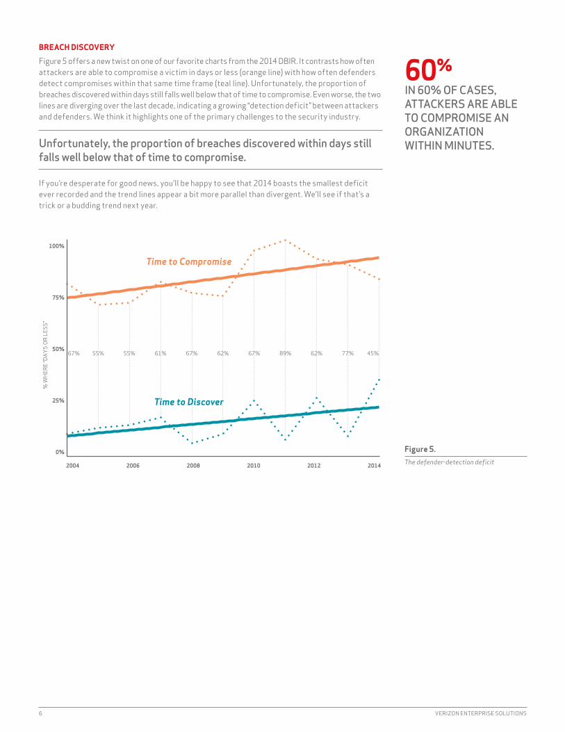
Figure 5 offers a new twist on one of our favorite charts from the 2014 DBiR. it contrasts how often attackers are able to compromise a victim in days or less (orange line) with how often defenders detect compromises within that same time frame (teal line). Unfortunately, the proportion of breaches discovered within days still falls well below that of time to compromise. Even worse, the two lines are diverging over the last decade, indicating a growing “detection deficit” between attackers and defenders. We think it highlights one of the primary challenges to the security industry.
Unfortunately, the proportion of breaches discovered within days still falls well below that of time to compromise.
if you’re desperate for good news, you’ll be happy to see that 2014 boasts the smallest deficit ever recorded and the trend lines appear a bit more parallel than divergent. We’ll see if that’s a trick or a budding trend next year.
67% 55% 55% 61% 67% 62% 67% 89% 62% 77% 45%
2004 2006 2008 2010 2012 2014
0%
25%
50%
75%
100%
% W
HERE
“DAY
S OR
LES
S”
Time to Compromise
Time to Discover
Figure 5. The defender-detection deficit
60%IN 60% OF CASES, ATTACKERS ARE ABLE TO COMPROMISE AN ORGANIZATION WITHIN MINUTES.

2015 DATA BREACH INVESTIGATIONS REPORT 7
It should be obvious by now that the DBIR crew doesn’t put much stock in maintaining the status quo. We don’t get very excited about just updating numbers and cranking out text. This project affords us a unique opportunity to explore amazing data provided by great companies, agencies, and organizations around the world, and we’re not keen on squandering that. We want to learn everything we can and then share our findings in the hope that it leads to better security awareness, understanding, and practice for us all.
We dedicated more effort to exploring other areas that fall outside the traditional VERIS data points.
Thus, after reviewing the data gathered for this report, we all agreed we’d be wasting a great opportunity if we merely updated findings for the nine incident patterns introduced last year. We just didn’t find many new “Aha!” discoveries to share with regard to those patterns, and so we decided to trim them down and dedicate more effort to exploring other areas of the data. That search led us to go “before and beyond” the breach to study things that relate to incidents in some way, but fall outside the traditional VERiS data points that drive the pattern-based analysis. The result is a collection of independent episodes rather than one long movie. So pop some popcorn, get comfy, and binge-watch this season’s adventures.
CUE '80s TV-SHOW THEME MUSIC.
Episode 1: indicators of Compromise: “Sharing is Cyber-Caring”Episode 2: Phishing: “Attn: Sir/Madam”Episode 3: Vulnerabilities: “Do We Need Those Stinking Patches?”Episode 4: Mobile: “i’ve Got 99 Problems, and Mobile Malware isn’t Even 1% of Them”Episode 5: Malware: “Volume, Velocity, and Variation”Episode 6: industry Profiles: “Raising the Stakes with Some Takes on NAiCS”Episode 7: impact: “in the Beginning, There Was Record Count”Episode 8: “internet of Things” (See Appendix D)
BEFORE AND BEYOND THE BREACH
We looked at new data that relates to breach events, but goes beyond traditional incident reporting.
8 VERIZON ENTERPRISE SOLUTIONS
Threat intelligence indicators have become the new brass rings on the cybersecurity merry-go-round. These precious trinkets of compromise gain increasing status as more organizations and governments jump on the sharing bandwagon. We thought we would be remiss in our duties if we did not provide some analysis of “threat sharing” and/or “indicators of compromise” (IOC) to you, our valued DBIR readers. We’ll start with a bit of research performed by a new contributor to the DBIR, Niddel.
GOTTA CATCH ’EM ALL
For the past 18 months, Niddel has been collecting and analyzing open-source feeds of iP addresses and domain name indicators. Their goal was to evaluate a diverse array of indicators and understand how these sources of information can be leveraged to provide defenders with an asymmetrical advantage they so desperately lack. One of the most important experiments conducted was to determine the overlap between these feeds and whether or not there were any “special snowflakes” to be found.
Niddell combined six months of daily updates from 54 different sources of iP addresses and domain names tagged as malicious by their feed aggregators. The company then performed a cumulative aggregation, meaning that if ever two different feeds were to mention the same indicator throughout the six-month experimental period, they would be considered to be in overlap on this specific indicator. To add some context to the indicator feeds being gathered, Niddel separated them in two large groups:
• Inbound feeds that provide information on sources of scanning activity and spam/phishing e-mail.
• Outbound feeds that provide information on destinations that either serve exploit kits, malware binaries, or even locations of command and control servers.
The results can be seen in Figure 6 (next page). We only see significant overlap on the inbound feeds, which can be found on the bottom left corner of the chart. Why? Two possible answers are:
1. Most of these feeds are actually drawing their aggregated feeds from the same honeypot sources.
2. Most of the attack sources are so nontargeted that they cover the entire internet address space and trigger all the different honeypots.
Given the limited use of those inbound feeds on day-to-day security operations (everyone gets probed and scanned all the time), there is an interesting pattern that appears when you are looking at the results from the outbound feeds. Although everyone is also subjected to the same threats, the overlap in what is reported on those feeds is surprisingly small, even with a “long exposure photograph” of six months’ time.
INDICATORS OF COMPROMISESharing Is Cyber-Caring
Threat intelligence indicators are the new brass rings of cybersecurity. But is this threat sharing helpful?

2015 DATA BREACH INVESTIGATIONS REPORT 9
When biologists want to measure the population of fish in a lake, they use a very simple statistical trick to avoid counting every single fish in there. They will gather, say, 100 fish from the lake and tag them, then promptly release them back to their natural habitat. Later, after they have given the poor animals some time to recover from the trauma, they will gather samples of fish from different parts of the lake. The percentage of tagged fish on each of the different parts of the lake can be used to create a statistical measure of what percentage of fish on the lake are our original 100 tagged scaly heroes, thus estimating the total population on the lake.
Sadly, when you look at our malicious fish, as illustrated on Figure 7 (next page), the percentage of indicators that are unique to only one feed over our six-month period is north of 97% for the feeds that we have sampled. And that includes the much more overlapping inbound feeds. That means that our “malicious fish samplers” are only encountering less then 3% of overlap across all of them.6
it is hard to draw a positive conclusion from these metrics, and it seems to suggest that if threat intelligence indicators were really able to help an enterprise defense strategy, one would need to have access to all of the feeds from all of the providers to be able to get the “best” possible coverage. This would be a herculean task for any organization, and given the results of our analysis, the result would still be incomplete intelligence. There is a need for companies to be able to apply their threat intelligence to their environment in smarter ways so that even if we cannot see inside the whole lake, we can forecast which parts of it are more likely to have a lot of fish we still haven’t caught.
6 This is corroborated by a recent CMU study: Metcalf, L., Spring, J. M., Blacklist Ecosystem Analysis Update 2014. http://resources.sei.cmu.edu/asset_files/WhitePaper/2015_019_001_428614.pdf
Although everyone is subjected to the same threats, the overlap in what is reported on outbound feeds is surprisingly small.
INBO
UND
OUTB
OUND
INBOUND OUTBOUND
Figure 6.Comparison of overlap within indicator feeds

10 VERIZON ENTERPRISE SOLUTIONS
WHAT EXACTLY ARE WE SHARING?
in response to all the buzz, many different companies, platforms, tools, schemas, and methods have arisen to facilitate the sharing of threat intelligence. One of our new contributors, ThreatConnect, is one such example and was kind enough to connect us with some intel on intel sharing. Using high-level data across 15 intel-sharing communities within ThreatConnect (some comprising distinct verticals, others a combination of regional or threat-focused participants), we aimed to gain insight into the types and level of data sharing and how these dynamics may differ across groups.
COMMUNITY IP ADDRESSES
E-MAIL ADDRESSES FILES HOSTS URLS
Common Community 35.9% 1.0% 23.3% 33.0% 6.8%
Event-Based Community #1 77.4% 0.1% 2.5% 19.5% 0.5%
industry Community #1 16.5% 32.3% 6.3% 43.0% 1.9%
industry Community #2 47.1% 4.4% 10.3% 29.4% 8.8%
industry Community #3 8.3% 0.3% 1.2% 87.5% 2.7%
industry Community #4 25.2% 2.4% 9.0% 58.6% 4.8%
industry Community #5 50.9% 0.7% 1.3% 22.8% 24.4%
industry Community #6 66.4% 0.6% 14.0% 13.8% 5.2%
industry Community #7 59.1% 0.5% 1.4% 23.5% 15.5%
industry Community #8 39.6% 3.0% 7.7% 36.9% 12.8%
industry Community #9 51.5% 2.6% 12.6% 23.8% 9.5%
Regional Threat Community #1 49.2% 0.3%i 4.5% 42.6% 3.4%
Regional Threat Community #2 50.0% 1.1% 4.5% 30.8% 13.6%
Subscriber Community 45.4% 1.2% 18.4% 24.4% 10.6%
Threat-Based Community #1 50.3% 1.1% 11.0% 24.3% 13.3%
Of course, the volume of indicators shared overall may be dependent on a number of factors ranging from frequency of activity, fidelity and availability of attack information, and available resources to produce such information. But aside from the idiosyncrasies of producers and consumers, the variety of shared threat information may boil down to organizational maturity and projected longevity of specific threats.
YOU HERD IT HERE FIRST.
ideally, sharing intelligence should lead to a form of “herd alertness,” similar to the way plains animals warn each other when predators are nearby. This would seem to require that intelligence must be shared at a faster rate than the spread of attack in order to successfully warn the rest of the community. “How fast is that?” you might ask, and it’s a great question.
To look into this, we brought in another contributor, RiskAnalytics, that supplies network “shunning” services as part of AiG’s CyberEdge cyberinsurance policies. The company leverages the most-commonly shared threat indicators (iPs, domains, URLs) to monitor and distribute attack data across its client base,7 which provides a good foundation for the question at hand.
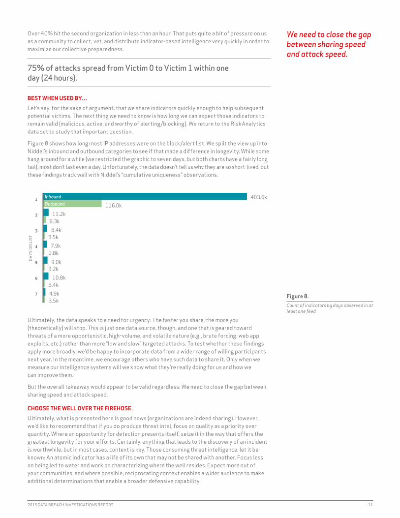
Figure 7, based on attacks observed by RiskAnalytics during 2014, displays some pretty interesting and challenging results. 75% of attacks spread from Victim 0 to Victim 1 within one day (24 hours).
7 We have aggregated the results but are not disclosing the population size. You can always ask RiskAnalytics how big its client base is.
Figure 7.Frequency of indicator types by sharing community
Organizations would need access to all threat intelligence indicators in order for the information to be helpful—a herculean task.
2015 DATA BREACH INVESTIGATIONS REPORT 11
Over 40% hit the second organization in less than an hour. That puts quite a bit of pressure on us as a community to collect, vet, and distribute indicator-based intelligence very quickly in order to maximize our collective preparedness.
75% of attacks spread from Victim 0 to Victim 1 within one day (24 hours).
BEST WHEN USED BY…
Let’s say, for the sake of argument, that we share indicators quickly enough to help subsequent potential victims. The next thing we need to know is how long we can expect those indicators to remain valid (malicious, active, and worthy of alerting/blocking). We return to the RiskAnalytics data set to study that important question.
Figure 8 shows how long most iP addresses were on the block/alert list. We split the view up into Niddel’s inbound and outbound categories to see if that made a difference in longevity. While some hang around for a while (we restricted the graphic to seven days, but both charts have a fairly long tail), most don’t last even a day. Unfortunately, the data doesn’t tell us why they are so short-lived, but these findings track well with Niddel’s “cumulative uniqueness” observations.
Ultimately, the data speaks to a need for urgency: The faster you share, the more you (theoretically) will stop. This is just one data source, though, and one that is geared toward threats of a more opportunistic, high-volume, and volatile nature (e.g., brute forcing, web app exploits, etc.) rather than more “low and slow” targeted attacks. To test whether these findings apply more broadly, we’d be happy to incorporate data from a wider range of willing participants next year. in the meantime, we encourage others who have such data to share it. Only when we measure our intelligence systems will we know what they’re really doing for us and how we can improve them.
But the overall takeaway would appear to be valid regardless: We need to close the gap between sharing speed and attack speed.
CHOOSE THE WELL OVER THE FIREHOSE.
Ultimately, what is presented here is good news (organizations are indeed sharing). However, we’d like to recommend that if you do produce threat intel, focus on quality as a priority over quantity. Where an opportunity for detection presents itself, seize it in the way that offers the greatest longevity for your efforts. Certainly, anything that leads to the discovery of an incident is worthwhile, but in most cases, context is key. Those consuming threat intelligence, let it be known: An atomic indicator has a life of its own that may not be shared with another. Focus less on being led to water and work on characterizing where the well resides. Expect more out of your communities, and where possible, reciprocating context enables a wider audience to make additional determinations that enable a broader defensive capability.
3.5k4.9k3.4k
10.8k3.2k
9.0k2.8k
7.9k3.5k
8.4k6.3k
11.2k
1
2
3
4
5
6
7
DAYS
ON
LIST
116.0k403.6kInbound
Outbound
Figure 8.Count of indicators by days observed in at least one feed
We need to close the gap between sharing speed and attack speed.

12 VERIZON ENTERPRISE SOLUTIONS
23%OF RECIPIENTS NOW OPEN PHISHING MESSAGES AND 11% CLICK ON ATTACHMENTS.
Social engineering has a long and rich tradition outside of computer/network security, and the act of tricking an end user via e-mail has been around since AOL installation CDs were in vogue. Do you remember the “free cup holder” prank? Someone sending you an attachment that opened your CD-ROM drive was cute at the time, but a premonition of more malicious acts to come.
The first “phishing” campaigns typically involved an e-mail that appeared to be coming from a bank convincing users they needed to change their passwords or provide some piece of information, like, NOW. A fake web page and users’ willingness to fix the nonexistent problem led to account takeovers and fraudulent transactions.
Phishing campaigns have evolved in recent years to incorporate installation of malware as the second stage of the attack. Lessons not learned from the silly pranks of yesteryear and the all-but-mandatory requirement to have e-mail services open for all users has made phishing a favorite tactic of state-sponsored threat actors and criminal organizations, all with the intent to gain an initial foothold into a network.
in the 2013 DBiR, phishing was associated with over 95% of incidents attributed to state-sponsored actors, and for two years running, more than two-thirds of incidents that comprise the Cyber-Espionage pattern have featured phishing. The user interaction is not about eliciting information, but for attackers to establish persistence on user devices, set up camp, and continue their stealthy march inside the network.
For two years, more than two-thirds of incidents that comprise the Cyber-Espionage pattern have featured phishing.
Financial motivation is also still alive and well in phishing attacks. The “old” method of duping people into providing their personal identification numbers or bank information is still around, but the targets are largely individuals versus organizations. Phishing with the intent of device compromise is certainly present, and there were hundreds of incidents in the Crimeware section that included phishing in the event chain. Regardless of motive, the next section will show that good things will come to those who bait.8
8 if you think you have any better phishing puns, let minnow.
PHISHINGAttn: Sir/Madam
2015 DATA BREACH INVESTIGATIONS REPORT 13
ONE PHISH, TWO PHISH
in previous years, we saw phishing messages come and go and reported that the overall effectiveness of phishing campaigns was between 10 and 20%. This year, we noted that some of these stats went higher, with 23% of recipients now opening phishing messages and 11% clicking on attachments. Some stats were lower, though with a slight decline in users actually going to phishing sites and giving up passwords.
Now, these messages are rarely sent in isolation—with some arriving faster than others. Many are sent as part of a slow and steady campaign.9 The numbers again show that a campaign of just 10 e-mails yields a greater than 90% chance that at least one person will become the criminal’s prey, and it’s bag it, tag it, sell it to the butcher (or phishmonger) in the store.
How long does an attacker have to wait to get that foot in the door? We aggregated the results of over 150,000 e-mails sent as part of sanctioned tests by two of our security awareness partners and measured how much time had passed from when the message was sent to when the recipient opened it, and if they were influenced to click or provide data (where the real damage is done). The data showed that nearly 50% of users open e-mails and click on phishing links within the first hour.
The reality is that you don't have time on your side when it comes to detecting and reacting to phishing events.
How long do you suppose you have until the first message in the campaign is clicked? Not long at all, with the median time-to-first-click coming in at one minute, 22 seconds across all campaigns.With users taking the bait this quickly, the hard reality is that you don’t have time on your side when it comes to detecting and reacting to phishing events.
THERE ARE PLENTY OF PHISH IN THE SEA.
We looked at organization demographics to see if one department or user group was more likely than another to fall victim to phishing attacks. Departments such as Communications, Legal, and Customer Service were far more likely to actually open an e-mail than all other departments. Then again, opening e-mail is a central, often mandatory, component of their jobs.
When we studied how many people actually clicked a link after they opened the e-mail, we found a great deal of overlap in the confidence intervals for each department… which is a fancy way of saying that we can’t say there’s a statistical difference between these departments.
9 Unless we’re talking about a very targeted spear-phishing campaign.10 http://apwg.org/resources/apwg-reports
50%NEARLY 50% OPEN E-MAILS AND CLICK ON PHISHING LINKS WITHIN THE FIRST HOUR.
Figure 9.APWG site and domains per month since 2012
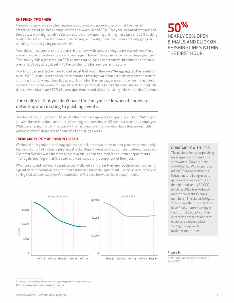
DOING MORE WITH LESSThe payload for these phishing messages has to come from somewhere. Data from the Anti-Phishing Working Group (APWG)10 suggests that the infrastructure being used is quite extensive (over 9,000 domains and nearly 50,000 phishing URLs tracked each month across the Group's members). The charts in Figure 9 also show that the attackers have finally learned a thing or two from the bounty of their enterprise breaches and may even have adopted a Lean Six Sigma approach to optimize operations.
UNIQUE DOMAINS UNIQUE SITES
0
5,000
10,000
15,000
0
20,000
40,000
60,000
MAY 12 NOV 12 MAY 13 NOV 13 MAY 14 MAY 12 NOV 12 MAY 13 NOV 13 MAY 14
COUN
T

14 VERIZON ENTERPRISE SOLUTIONS
So what do we do about this? Hire only robots? Bring back command-line mail? There is obviously no one-shot antidote for the problem at hand. The general areas of focus are three-fold:
• Better e-mail filtering before messages arrive in user in-boxes• Developing and executing an engaging and thorough security awareness program • improved detection and response capabilities
Taking measures to block, filter, and alert on phishing e-mails at the gateway is preferred, but no technological defense is perfect, which leads us straight to… people.
There is some hope in this data in that three-quarters of e-mails are not opened or interacted with. We wondered if there was a way to bump that number up (e.g., by giving users a quick way to flag potential phishes and become a detective control), so we asked Ellen Powers, The MiTRE Corporation’s information Security Awareness Program Manager, about the effectiveness of making users part of the active defense against phishing. She noted that “MiTRE employees, our human sensor network, detect 10% of advanced cyber attacks that reach employee e-mail in-boxes.”
Lance Spitzner, Training Director for the SANS Securing The Human program, echoes Ellen’s sentiments, noting that “one of the most effective ways you can minimize the phishing threat is through effective awareness and training. Not only can you reduce the number of people that fall victim to (potentially) less than 5%, you create a network of human sensors that are more effective at detecting phishing attacks than almost any technology.”
"One of the most effective ways you can minimize the phishing threat is through awareness and training."
—Lance Spitzner, Training Director, SANS Securing The Human

2015 DATA BREACH INVESTIGATIONS REPORT 15
Of all the risk factors in the InfoSec domain, vulnerabilities are probably the most discussed, tracked, and assessed over the last 20 years. But how well do we really understand them? Their link to security incidents is clear enough after the fact, but what can we do before the breach to improve vulnerability management programs? These are the questions on our minds as we enter this section, and Risk I/O was kind enough to join us in the search for answers.
Risk i/O started aggregating vulnerability exploit data from its threat feed partners in late 2013. The data set spans 200 million+ successful exploitations across 500+ common vulnerabilities and exposures (CVEs)11 from over 20,000 enterprises in more than 150 countries. Risk i/O does this by correlating SiEM logs, analyzing them for exploit signatures, and pairing those with vulnerability scans of the same environments to create an aggregated picture of exploited vulnerabilities over time. We focused on mining the patterns in the successful exploits to see if we could figure out ways to prioritize remediation and patching efforts for known vulnerabilities.
‘SPLOITIN TO THE OLDIES
in the inaugural DBiR (vintage 2008), we made the following observation: For the overwhelming majority of attacks exploiting known vulnerabilities, the patch had been available for months prior to the breach [and 71% >1 year]. This strongly suggests that a patch deployment strategy focusing on coverage and consistency is far more effective at preventing data breaches than “fire drills” attempting to patch particular systems as soon as patches are released.
We decided to see if the recent and broader exploit data set still backed up that statement. We found that 99.9% of the exploited vulnerabilities had been compromised more than a year after the associated CVE was published. Our next step was to focus in on the CVEs and look at the age of CVEs exploited in 2014. Figure 10 arranges these CVEs according to their publication date and gives a count of CVEs for each year. Apparently, hackers really do still party like it’s 1999. The tally of really old CVEs suggests that any vulnerability management program should include broad coverage of the “oldies but goodies.” Just because a CVE gets old doesn’t mean it goes out of style with the exploit crowd. And that means that hanging on to that vintage patch collection makes a lot of sense.
11 Common Vulnerabilities and Exposures (CVE) is “a dictionary of publicly known information security vulnerabilities and exposures.”—http://cve.mitre.org
VULNERABILITIESDo We Need Those Stinking Patches?
99.9%OF THE EXPLOITED VULNERABILITIES WERE COMPROMISED MORE THAN A YEAR AFTER THE CVE WAS PUBLISHED.
10
30
50
70
90
’99 ’00 ’01 ’02 ’03 ’04 ’05 ’06 ’07 ’08 ’09 ’10 ’11 ’12 ’13 ’14YEAR CVE WAS PUBLISHEDNU
MBE
R OF
PUB
LISH
ED C
VE’S
EXP
LOIT
ED
Figure 10. Count of exploited CVEs in 2014 by CVE publish date

16 VERIZON ENTERPRISE SOLUTIONS
NOT ALL CVES ARE CREATED EQUAL.
if we look at the frequency of exploitation in Figure 11, we see a much different picture than what’s shown by the raw vulnerability count of Figure 12. Ten CVEs account for almost 97% of the exploits observed in 2014. While that’s a pretty amazing statistic, don’t be lulled into thinking you’ve found an easy way out of the vulnerability remediation rodeo. Prioritization will definitely help from a risk-cutting perspective, but beyond the top 10 are 7 million other exploited vulnerabilities that may need to be ridden down. And therein, of course, lies the challenge; once the “mega-vulns” are roped in (assuming you could identify them ahead of time), how do you approach addressing the rest of the horde in an orderly, comprehensive, and continuous manner over time?
FROM PUB TO PWN
if Figure 11—along with our statement above from 2008—advocates the turtle method of vulnerability management (slow and steady wins the race), then Figure 12 prefers the hare’s approach. And in this version of the parable, it might just be the hare that’s teaching us the lesson.
Half of the CVEs exploited in 2014 fell within two weeks. What’s more, the actual time lines in this particular data set are likely underestimated due to the inherent lag between initial attack and detection readiness (generation, deployment, and correlation of exploits/signatures). These results undeniably create a sense of urgency to address publicly announced critical vulnerabilities in a timely (and comprehensive) manner. They do, however, beg the question: What constitutes a “critical vulnerability,” and how do we make that determination?
WHAT’S IN A SCORE, THAT WHICH WE ALL COMPOSE?
The industry standard for rating the criticality of vulnerabilities is CVSS,12 which incorporates factors related to exploitability and impact into an overall base score. Figure 13 (next page)displays the CVSS scores for three different groupings of CVEs: all CVEs analyzed (top), all CVEs exploited in 2014 (middle), and CVEs exploited within one month of publication (bottom). The idea is to determine which CVSS factors (if any) pop out and thus might serve as a type of early warning system for vulnerabilities that need quick remediation due to high likelihood of exploitation.
12 The Common Vulnerability Scoring System (CVSS) is designed to provide an open and standardized method for rating iT vulnerabilities.
0%
20%
40%
60%
80%
100%
CVE−1999−0517
CVE−2001−0540
CVE−2002−0012
CVE−2002−0013
CVE−2014−3566
CVE−2012−0152
CVE−2001−0680
CVE−2002−1054
CVE−2002−1931
CVE−2002−1932
TOP 10 CVE'S EXPLOITED
PERC
ENT
OF E
XPLO
ITED
CVE
'S
Figure 11.Cumulative percentage of exploited vulnerabilities by top 10 CVEs
About half of the CVEs exploited in 2014 went from publish to pwn in less than a month.
0%
20%
40%
60%
80%
100%
0 4 8 12 16 20 24 28 32 36 40 44 48WEEK EXPLOIT OCCURED AFTER CVE PUBLISH DATE
PROP
ORTI
ON O
F CV
E’S
EXPL
OITE
D
Figure 12.Cumulative percentage of exploited vulnerabilities by week(s) from CVE publish dates

2015 DATA BREACH INVESTIGATIONS REPORT 17
None of the exploitability factors appear much different across the groups; it seems that just about all CVEs have a network access vector and require no authentication, so those won’t be good predictors. The impact factors get interesting; the proportion of CVEs with a “complete” rating for C-i-A13 rises rather dramatically as we move from all CVEs to quickly exploited CVEs. The base score is really just a composite of the other two factors, but it’s still worth noting that most of those exploited within a month post a score of nine or ten. We performed some statistical significance tests and found some extremely low p-values, signifying that those differences are meaningful rather than random variation. Even so, we agree with RiSK i/O’s finding that a CVE being added to Metasploit is probably the single most reliable predictor of exploitation in the wild.14
Outside the CVSS score, there is one other attribute of a “critical” vulnerability to bring up, and this is a purely subjective observation. if a vulnerability gets a cool name in the media, it probably falls into this “critical vulnerability” label.15 As an example, in 2014, Heartbleed, POODLE, Schannel, and Sandworm were all observed being exploited within a month of CVE publication date.
in closing, we want to restate that the lesson here isn’t “Which of these should i patch?” Figure 13 demonstrates the need for all those stinking patches on all your stinking systems. The real decision is whether a given vulnerability should be patched more quickly than your normal cycle or if it can just be pushed with the rest. We hope this section provides some support for that decision, as well as some encouragement for more data sharing and more analysis.
13 As all good CiSSPs know, that’s Confidentiality, integrity, and Availability.14 www.risk.io/resources/fix-what-matters-presentation15 As this section was penned, the “Freak” vulnerability in SSL/TLS was disclosed. http://freakattack.com
Figure 13.CVSS attributes across classes of CVEs
EXPLOITABILITY IMPACT CVSS BASE SCORE
50%
100%
50%
100%
50%
100%
ALL CVEs (n= 67,567)
Loca
l
Adj
acen
t
Net
wor
k
Low
Med
ium
Hig
h
Non
e
Sing
le
Mul
tipl
e
Com
plet
e
Part
ial
Non
e
Com
plet
e
Part
ial
Non
e
Com
plet
e
Part
ial
Non
e 1 2 3 4 5 6 7 8 9 10
JUST EXPLOITED (n=792)
CRITICAL (exploited within one month of publication; n=24)
Acc
ess
Vec
tor
Acc
ess
Com
plex
ity
Aut
hent
icat
ion
Con
fide
ntia
lity
Inte
grit
y
Ava
ilabi
lity
NUM
BER
OF C
VE’s
A CVE being added to Metaspoit is probably the single most reliable predictor of exploitation in the wild.
18 VERIZON ENTERPRISE SOLUTIONS
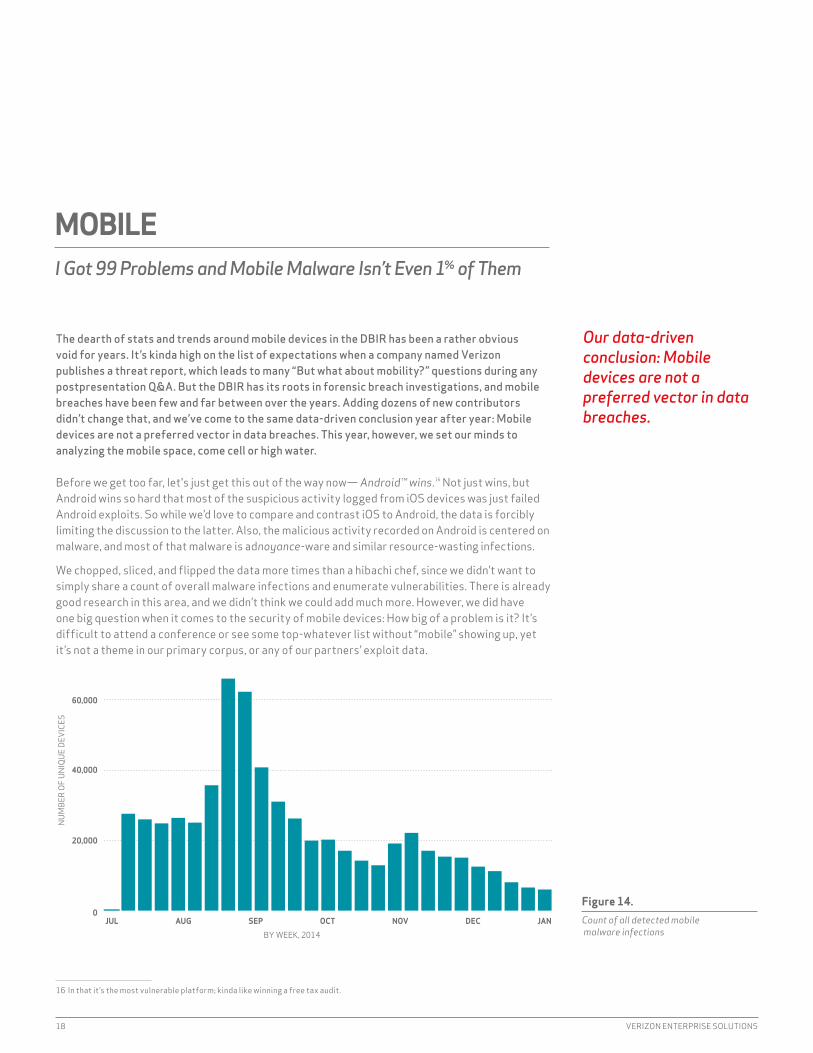
The dearth of stats and trends around mobile devices in the DBIR has been a rather obvious void for years. It’s kinda high on the list of expectations when a company named Verizon publishes a threat report, which leads to many “But what about mobility?” questions during any postpresentation Q&A. But the DBIR has its roots in forensic breach investigations, and mobile breaches have been few and far between over the years. Adding dozens of new contributors didn’t change that, and we’ve come to the same data-driven conclusion year after year: Mobile devices are not a preferred vector in data breaches. This year, however, we set our minds to analyzing the mobile space, come cell or high water.
Before we get too far, let's just get this out of the way now— Android™ wins.16 Not just wins, but Android wins so hard that most of the suspicious activity logged from iOS devices was just failed Android exploits. So while we’d love to compare and contrast iOS to Android, the data is forcibly limiting the discussion to the latter. Also, the malicious activity recorded on Android is centered on malware, and most of that malware is adnoyance-ware and similar resource-wasting infections.
We chopped, sliced, and flipped the data more times than a hibachi chef, since we didn’t want to simply share a count of overall malware infections and enumerate vulnerabilities. There is already good research in this area, and we didn’t think we could add much more. However, we did have one big question when it comes to the security of mobile devices: How big of a problem is it? it’s difficult to attend a conference or see some top-whatever list without “mobile” showing up, yet it’s not a theme in our primary corpus, or any of our partners’ exploit data.
16 in that it’s the most vulnerable platform; kinda like winning a free tax audit.
MOBILEI Got 99 Problems and Mobile Malware Isn’t Even 1% of Them
Figure 14. Count of all detected mobile malware infections
0
20,000
40,000
60,000
JUL AUG SEP OCT NOV DEC JAN
BY WEEK, 2014
NUM
BER
OF U
NIQU
E DE
VICE
S
Our data-driven conclusion: Mobile devices are not a preferred vector in data breaches.
2015 DATA BREACH INVESTIGATIONS REPORT 19
To finally try to get an answer, we took our big question to our brethren over at Verizon Wireless in hopes of getting data to supply an answer. They came through with a lot of data. With our first pass through the data, we found hundreds of thousands of (Android) malware infections, most fitting squarely in the adnoyance-ware category. in our second through eighteenth passes, we turned the data inside out but ended up just coming back to the malware. Finally, we stripped away the “low- grade” malware and found that the count of compromised devices was truly negligible. The benefit of working with an internal team is that we knew how many devices were being monitored. An average of 0.03% of smartphones per week—out of tens of millions of mobile devices on the Verizon network—were infected with “higher-grade” malicious code. This is an even tinier fraction than the overall 0.68% infection rate (of all types of unwanted software) from Kindsight Security Labs’ biannual report.17
17 www.alcatel-lucent.com/solutions/malware-reports18 For more information, please visit: www2.fireeye.com/WEB-2015RPTMobileThreatAssessment.html19 FireEye has counted 1,400 EnPublic apps in the wild to date, but that number is growing every week.
A BIRD’S “FIREEYE” VIEW OF MOBILE MALICIOUSNESSWe asked one of our contributors—FireEye—to give us its view of the vulnerabilities it catches in various mobile platforms and applications. FireEye noted that two main platforms dominate the mobile market today: Google’s Android and Apple’s iOS. FireEye researchers analyzed more than 7 million mobile apps on both platforms from January to October 2014.18
ANDROID• 96% of mobile malware was targeted at the Android platform (which tracks well with
our active malware findings in this report).• More than 5 billion downloaded Android apps are vulnerable to remote attacks. One
significant vulnerability is known as JavaScript-Binding-Over-HTTP (JBOH), which enables an attacker to execute code remotely on Android devices that have affected apps.
IOSEnPublic apps bypass Apple’s strict review process by hijacking a process normally used to install custom enterprise apps and used for beta testing. We also found that 80% of EnPublic apps19 invoke risky private APis that are also in violation of Apple’s Developer guidelines. in the wrong hands, these APis threaten user privacy and introduce many vulnerabilities.
ADWAREAdware is software that delivers ads to make money. While adware is not in itself harmful, it often aggressively collects personal information from the mobile device it’s installed on, including name, birth date, location, serial number, contacts, and browser bookmarks. Often, this data is collected without users’ consent. in our review, we examined ad libraries in Android apps. Adware is an increasingly popular option for app publishers, growing from almost 300,000 apps in 2013 to more than 410,000 in the first three quarters of 2014 alone.
Figure 15. Count of non-adnoyance mobile malware infections
0.03%OUT OF TENS OF MILLIONS OF MOBILE DEVICES, THE NUMBER OF ONES INFECTED WITH TRULY MALICIOUS EXPLOITS WAS NEGLIGIBLE.
0
50
100
150
JUL AUG SEP OCT NOV DEC JANBY WEEK, 2014
NUM
BER
OF U
NIQU
E DE
VICE
S

20 VERIZON ENTERPRISE SOLUTIONS
MOBILE ENIM CONFIDUNT IN (ALIQUANTO)20
Mobile devices are not a theme in our breach data, nor are they a theme in our partners’ breach and security data. We feel safe saying that while a major carrier is looking for and monitoring the security of mobile devices on its network, data breaches involving mobile devices should not be in any top-whatever list. This report is filled with thousands of stories of data loss—as it has been for years—and rarely do those stories include a smartphone.
We are not saying that we can ignore mobile devices; far from it. Mobile devices have clearly demonstrated their ability to be vulnerable. What we are saying is that we know the threat actors are already using a variety of other methods to break into our systems, and we should prioritize our resources to focus on the methods that they’re using now.
When it comes to mobile devices on your network, the best advice we have is to strive first for visibility and second for control. Visibility enables awareness, which will come in handy when the current landscape starts to shift. Control should put you into a position to react quickly.
20 “in Mobile We Trust (Somewhat)”
THAT NEW MALWARE SMELL
A quick look at the types of malware being used shows they are overwhelmingly opportunistic and relatively short-lived. Even though we looked at data just over a six-month period, 95% of the malware types showed up for less than a month, while four out of five didn’t last beyond a week. This could be from the malware piggybacking on the short-lived popularity of legit games and apps, or perhaps it’s a direct reflection of the great job we’re doing in the security industry shutting down malicious behavior… or perhaps just the first one.
95%OF MALWARE TYPES SHOWED UP FOR LESS THAN A MONTH, AND FOUR OF FIVE DIDN'T LAST BEYOND A WEEK.
0%
10%
20%
30%
40%
1 2 3 4 5 6 7 8 9 10 11 12 13 14 15 16 17 18 19 20
DAYS OBSERVED OVER 6 MONTHS
PERC
ENT
OF M
ALW
ARE
Figure 16. Short-lived malware: Percentage of malware by days observed over six-month period
2015 DATA BREACH INVESTIGATIONS REPORT 21
Malware. Malware is what bwings us together today. This year, data from FireEye, Palo Alto Networks, LastLine, and Fortinet gave us a unique opportunity to peer into the malevolent machinations of criminals across nearly 10,000 organizations—large and small—in every industry vertical over the course of calendar year 2014.21 In previous years, we were only able to show how malware contributed to confirmed security incidents. This year, we drank straight from the firehose of breaches that might have been. Staring into this malicious abyss renewed our admiration and respect for those responsible for defending their organizations, and we hope our overview of the volume, velocity, and variation of malware will first inform, and then inspire you to take your security operations crew out for a round of drinks.
FAST AND FURIOUS? THINK AGAIN.
Before we get down into the weeds, we’ll give you a number to discuss around the water cooler: Looking at just the total number of malware events (around 170 million) across all organizations, we can perform some egregiously simple math to determine that five malware events occur every second.22
As we said, that’s simple math, and arriving at the actual malware threat-event frequency for any given organization is nowhere near as cut and dried. To get a more precise handle on this, we looked at the likelihood of an organization having a malware event on any given day. it may be difficult to believe, but not every organization experiences one of those every day.23 Our analyses of the data showed that half the organizations experienced 35 or fewer days of caught malware events during an entire calendar year. Keep in mind, by the time it hits these appliances, controls like firewalls, intrusion detection systems (iDS)/intrusion prevention systems (iPS), spam filters, etc., will have already reduced the raw stream of malware. Speaking of these devices, when malware events are seen and caught by them, it’s more likely to be dozens (or fewer) than hundreds or thousands.
Half of organizations discovered malware events during 35 or fewer days in 2014.
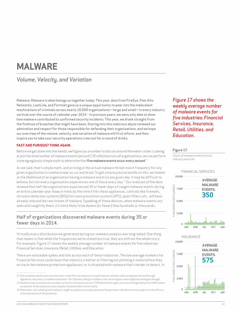
Virtually every distribution we generated during our malware analysis was long-tailed. One thing that means is that while the frequencies we’ve stated are true, they are still not the whole story. For example, Figure 17 shows the weekly average number of malware events for five industries: Financial Services, insurance, Retail, Utilities, and Education.
There are noticeable spikes and lulls across each of these industries. The low average numbers for Financial Services could mean that industry is better at filtering out phishing e-mails before they arrive at the malware protection appliances, or is attacked with malware that’s harder to detect. in
21 One caveat we need to clear up at the start is that this is all analysis on caught malware, whether said snaring is performed through signatures, heuristics, or sandbox evaluation. The “Outside Looking In” sidebar in this section gives some insight into what gets through.
22 Nowhere near as impressive a number as the fact that every second, 75 McDonald’s burgers are consumed (globally) and 5,000 tweets are posted. Kinda makes you want to grab a salad and ditch social media.
23 Remember, we’re dealing with malware caught by appliances usually placed at the perimeter. We did not have insight into the efficacy of the placement of these devices.
MALWAREVolume, Velocity, and Variation
Figure 17. Count of malware events across industry verticals
Figure 17 shows the weekly average number of malware events for five industries: Financial Services, Insurance, Retail, Utilities, and Education.
2,500
5,000
7,500
10,000
0
2,500
5,000
7,500
10,000
AVERAGEMALWAREEVENTS:
350
FINANCIAL SERVICES
JAN APR JUL OCT JAN
JAN APR JUL OCT JAN
INSURANCE
AVERAGEMALWAREEVENTS:
575
# M
ALW
ARE
EVEN
TS (/
WEE
K)#
MAL
WAR
E EV
ENTS
(/W
EEK)
0

22 VERIZON ENTERPRISE SOLUTIONS
contrast, the prolific amount of malware hitting education institutions could be the byproduct of less-strict policies and controls, or a sign that Education users are easy pickings for high-volume opportunistic threats.
One other thing it means is that just because you haven’t seen similar spikes doesn’t mean you won’t. Make sure incident response plans include measures to handle a malware flood as well as a trickle.
The takeaway here is that while we’ve provided a baseline view of malware threat-event frequency, you should be capturing this data in your own environment, using it to understand how this overview compares to your own organization, and analyzing how your organization’s own view changes over time.
YOU’RE ABSOLUTELY UNIQUE. JUST LIKE EVERYONE ELSE.
With volume and velocity out of the way, it’s time to turn our attention to the amount of variation (or uniqueness) across malware picked up by our contributors. Consistent with some other recent vendor reports, we found that 70 to 90% (depending on the source and organization) of malware samples are unique to a single organization.
We use “unique” here from a signature/hash perspective; when compared byte-to-byte with all other known malware, there’s no exact match. That’s not to say that what the malware does is also distinct. Criminals haven’t been blind to the signature- and hash-matching techniques used by anti-virus (AV) products to detect malware. in response, they use many techniques that introduce simple modifications into the code so that the hash is unique, yet it exhibits the same desired behavior. The result is often millions of “different” samples of the “same” malicious program.
This is more than just the malware analyst form of omphaloskepsis (look it up). it has real-world consequences, which basically boil down to “AV is dead.” Except it’s not really. Various forms of AV, from gateway to host, are still alive and quarantining nasty stuff every day. “Signatures alone are dead” is a much more appropriate mantra that reinforces the need for smarter and adaptive approaches to combating today’s highly varied malware.
There’s another lesson here worth stating: Receiving a never-before-seen piece of malware doesn’t mean it was an “advanced” or “targeted” attack. it’s kinda cool to think they handcrafted a highly custom program just for you, but it’s just not true. Get over it and get ready for it. Special snowflakes fall on every backyard.
24 The 2005 analyses mostly came from data in the WildList, an effort started by Joe Wells and Sarah Gordon to maintain a list of malicious binaries that are active “in the field” for use by researchers and defenders. if that wave of nostalgia hit you as hard as it did us, you may be surprised and pleased to learn that the project is still active: www.wildlist.org/CurrentList.txt.
25 Where the actual family name could be discerned. Attribution is further made difficult due to the nonstandard signature naming conventions between vendors and the fact that some vendors, like FireEye, are able to catch malicious code behaviorally but are not always able to classify them precisely. Perhaps y’all could at least standardize on/a.SEParator and field-order pattern before next year’s report?
TAKE A WALK ON THE WILDLIST24
We managed to borrow a Wayback machine to take a trip to 4 B.D. (before DBiR) to pluck some research wisdom from one of our elder researchers. Specifically, we wanted to compare one of his findings from yesteryear against the current malware climate to see how much (or little) has changed.
The observation was that back in 2005, “just seven families represented about 70% of all malcode activity.” (For those interested, those were Mytob, Netsky, Zafi, Sober, Lovgate, Mydoom, and Bagle.) Fast-forward to 2014, and our analysis of the data from our network malware defense partners suggests that should be updated to read, “20 families represented about 70% of all malware activity.”25 (Today’s sinister seven are zbot, rerdom, zeroaccess, andromeda, expiro, asprox, gamaru, and sality.)
The key differences between the malcode of 2005 and malware of 2014 are that the older viruses were noisy e-mail worms with varying backdoor capabilities, whereas the common components of the 2014 top seven involve stealthy command-and-control botnet membership, credential theft, and some form of fraud (clickfraud or bitcoin mining). Alas, those were simpler times back in 2005.
70–90%OF MALWARE SAMPLES ARE UNIQUE TO AN ORGANIZATION.
2,500
5,000
7,500
10,000
# M
ALW
ARE
EVEN
TS (/
WEE
K)
0
2,500
5,000
7,500
10,000
2,500
5,000
7,500
10,000
# M
ALW
ARE
EVEN
TS (/
WEE
K)#
MAL
WAR
E EV
ENTS
(/W
EEK)
0
0
RETAIL
AVERAGEMALWAREEVENTS:
801
ENERGY/UTILITIES
AVERAGEMALWAREEVENTS:
772
EDUCATION
AVERAGEMALWAREEVENTS:
2,332
JAN APR JUL OCT JAN
JAN APR JUL OCT JAN
JAN APR JUL OCT JAN

2015 DATA BREACH INVESTIGATIONS REPORT 23
OUTSIDE LOOKING INThis “Before and Beyond the Breach” section paints a picture of the volume, velocity, and variation of malware by looking at the problem from within organizations. Thanks to a new DBiR participant—BitSight—we can also take a look at the view from the outside. BitSight uses publicly accessible indicators of compromise to create a rating that measures the “security hygiene” of an organization.26 Specifically, we combed through BitSight’s botnet index (which is one component of the overall BitSight rating) to get a feel for how frequently organizations are seen communicating with malicious nodes.
An organization’s BitSight rating (and the components that make up that rating) will take a hit each time BitSight’s monitoring infrastructure sees a beacon attempt from the iP space allocated to the company. We took the average number of botnet triggers in 2014 (for each company), then built a distribution across all organizations within an industry and compared those distributions across all industries. Figure 1827 shows a stark contrast between five industries we’ve highlighted, which should be familiar from elsewhere in this section: Financial Services, insurance, Retail, Utilities, and Education.
(NOTE: BitSight refers to the time of first trigger to the time the beaconing stops as “Time to Fix” vs. “Beacon Days.”)
Financial institutions are not immune to successful malware deployments, but most of them have relatively few (and other analyses of the BitSight data show that financial institutions detect and generally clean up infections pretty quickly). This compares nicely with threat-event data in Figure 18.
insurance and Retail organizations begin to show more diversity—hence, more infections—with the situation getting worse as we move to Utilities. Ultimately, the “leader” in near-pervasive infections across the majority of underlying organizations is Education. This should come as no surprise, given the regular influx of unmanaged devices as hordes of innocent youth invade our halls of higher learning. Toga! Toga!
26 Read the BitSight insights reports for more information on their methodology: www.bitsighttech.com/resources/topic/bitsight-insights
27 Note the log scale on the x-axis and free scales on the y-axis.
0.00
0.25
0.50
0.75
1.00
1.25
FINANCIAL SERVICES
1 3 7 20 55
INSURANCE
1 3 7 20 55
RETAIL
1 3 7 20 55
UTILITIES
1 3 7 20 55
EDUCATION
1 3 7 20 55
“TIME TO FIX” WITHIN INDUSTRY ORGS
DENS
ITY
Figure 18. Distribution of “Time to Fix” by industry vertical

24 VERIZON ENTERPRISE SOLUTIONS
Figure 19 from the 2014 DBIR presented the frequency of incident patterns across the various industry verticals. The major takeaway was that different industries exhibit substantially different threat profiles and therefore cannot possibly have the same remediation priorities. That may be a rather “no duh” finding, but keep in mind most security standards treat all requirements as equal stepping stones on a path to 100% compliance. Past reports have emphasized that with security, there is no ”one size fits all” approach. It is our fervent hope that that data sowed some seeds of change, and this year we’d like to help grow that crop a bit more.
Whereas last year’s report asked “Do all organizations share similar threat profiles?”, we now want to explore what we believe to be a much better question: “Which industries exhibit similar threat profiles?” Just as our nine patterns helped to simplify a complex issue last year, we believe that answering this question can help clarify the “so what?” question for different verticals. Figure 19 measures and provides, at least in part, the answer to that question.28
28 To look up the three-digit NAiCS codes, visit: www.census.gov/eos/www/naics/index.html
INDUSTRY PROFILESRaising the Stakes with Some Takes on NAICS
With security, there is no “one size fits all” approach.
211
213
221
311
315
324
325
333
334
335
336
339 423
424
441
443
444
445
446 447
448
451452453454
481
483
485
486
491511
512
515
517 518
519
521
522
523
524525
531
532
541
551
561611621
622623624711713
721
722
812813
814
921
922923
926
928
¬ Accommodation
¬ Administrative
¬ Educational
¬ Entertainment
¬ Financial Services
¬ Healthcare
¬ Information
¬ Management
¬ Manufacturing
¬ Mining
¬ Other Services
¬ Professional
¬ Public
¬ Real Estate
¬ Retail
¬ Trade
¬ Transportation
¬ Utilities
Figure 19. Clustering on breach data across industries

2015 DATA BREACH INVESTIGATIONS REPORT 25
Although we realize that at first glance it may look like a drunken astronomer’s attempt at describing a faraway galaxy, once correctly deciphered, Figure 19 is actually a godsend of interesting observations. So, to provide you with the much-needed Rosetta Stone: Each dot represents an industry “subsector” (we chose to use the three-digit NAiCS codes—rather than the first two only—to illustrate more specificity in industry groupings). The size of the dot relates to the number of incidents recorded for that subsector over the last three years (larger = more). The distance between the dots shows how incidents in one subsector compare to that of another. if dots are close together, it means incidents in those subsectors share similar VERiS characteristics such as threat actors, actions, compromised assets, etc. if far away, it means the opposite. in other words, subsectors with similar threat profiles appear closer together. is that clear as mud now? Good! With that out of the way, let’s see what method we can draw from the madness.
SOME OF THESE THINGS ARE NOT LIKE THE OTHERS.
Some of these things just don’t belong. Can you tell which things are not like the others before we finish this section?
As you can see, most subsectors appear to be more or less playing along, but several others are busy doing their own thing. Put another way, some subsectors experience very different threats than those faced by the majority. That’s interesting on two different levels:
• One, it’s a bit surprising that we see any semblance of “a majority” at all. However, this has more to do with the wide panorama necessitated by the fringe minority. Zooming in enough to exclude the outlier subsectors shows a much more even spread.
• Two, it begs the question, “What is it about these fringe subsectors that makes their threat profiles so extraordinary?” A closer look at the three most distant outliers—pipeline transportation (486), oil and gas extraction (211), and support activities for mining (213)—reveals a very interesting connection: Namely, they form part of the energy supply chain.
IT’S MORE OF A FONDUE THAN A SALAD.
The U.S. is traditionally described as a homogenous “melting pot” of cultures, but some suggest it’s more like a salad bowl where individual cultures mix together while retaining their own unique aspects. it’s interesting to apply this motif to Figure 19.
There are a few closely grouped subsectors (e.g., the 44x retailers on the upper side of the main pack), but by and large, the colors/numbers intermingle in melting-pot fashion. And that’s a rather important discovery. it means that many subsectors in different industries actually share a closer threat profile than do subsectors in the same overall industry.
Many subsectors in different industries actually share a closer threat profile than do subsectors in the same overall industry.
For instance, see the bottom of the figure where Monetary Authorities-Central Bank (financial and insurance industry (521) falls between two subsectors in the manufacturing industry (32). in other words, each of the manufacturing subsectors have more in common with central banks than they do with each other. You know, sort of like the majority of us have more in common with our friends than we do our families.
I CAN’T BELIEVE THOSE TWO ARE DATING.
Similar to but separate from observation two is that some subsector neighbors seem as though they were bad matches on Tinder. For instance, why are general merchandise stores (452) right on top of data processing, hosting, and related services (518)? if i had a dollar for every time someone said, “i bet this data center sees the same attacks as my local mall,” i’d still be broke. There’s been some dirty laundry aired about athletes of late, but spectator sports (711) and laundry services (812)? Seriously? Also, what’s the deal with executive, legislative, and other general government support (921) overlapping with amusement, gambling, and recreation industries (713)? Wait—never mind; don’t answer that.
The fact that these “close cousins” may seem like strange bedfellows highlights the need for more thoughtful and thorough research into risk profiles across various types of organizations. Maybe
Incidents in many industry subsectors share similar VERIS characteristics such as threat actors, actions, compromised assets, etc.

26 VERIZON ENTERPRISE SOLUTIONS
we don’t understand the motives of our adversaries as well as we think we do. Maybe cyber risk has more to do with business models or organizational structure or company policies than which high-level industry category one falls under. We definitely have some more work to do to peel back the covers on this topic.
WE NEED MORE CROSS-SECTOR SHARING. WHY DOES EVERYBODY WANT TO KEEP IT LIKE THE KAISER?
Likewise, information sharing, compliance, and regulatory standards imposed on an industry level may not be the best approach. Perhaps regulating common “risk activities” is the better route (e.g., how the Payment Card industry Data Security Standard applies to all those who process, store, or transfer payments rather than any one particular industry). Maybe it’s some other way/means/criterion we haven’t thought of yet. But it’s clear that before we begin creating and enforcing a bunch of “cyber regulations” in the wake of the “cyber craziness” that was 2014, we need to better understand the true effects and efficacies of such actions.
It follows that our standard practice of organizing information-sharing groups and activities according to broad industries is less than optimal. It might even be counterproductive.
Given the above, it follows that our standard practice of organizing information-sharing groups and activities according to broad industries is less than optimal. it might even be counterproductive. is this a case where our biases and faulty assumptions are blinding us? (Say it ain’t so!) With all the focus, innovation, and regulation around cyber info/intel sharing these days, this is something we really need to consider and investigate further.
Information sharing, compliance, and regulatory standards imposed on an industry level may not be the best approach.

2015 DATA BREACH INVESTIGATIONS REPORT 27
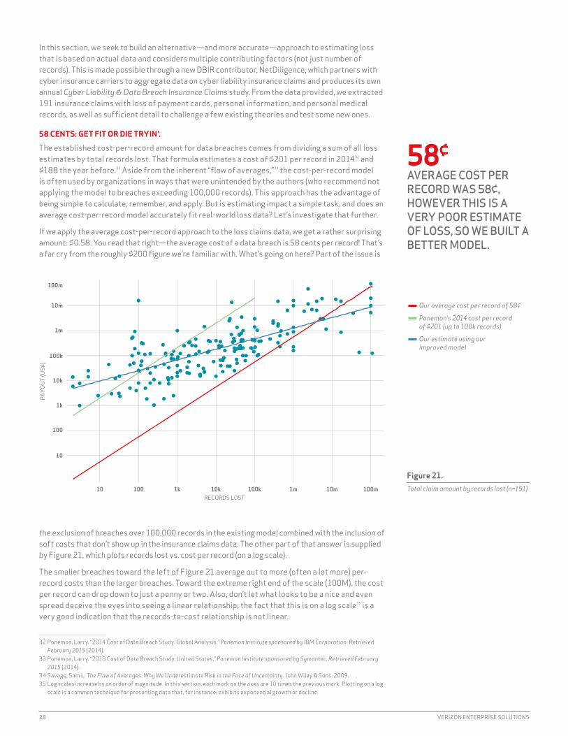
if we had $201 for every time someone asked us, “Do you have data on the cost of breaches?”, we’d have $128,037.29 For the past seven years, we’ve had to answer that question with an apologetic “No,” while doing our best to explain why.30 But not this time; we’re absolutely ecstatic to offer an anticipatory “Yes!” to that question in this long-overdue section. it took us eight years to get here, but “better eight than never,” right?
That we always get the impact question is completely understandable. When budgeting and operating an infoSec program, accurately assessing what’s likely to happen and how much it’ll cost are both critically important. A lack of reliable estimates leads to a creative environment for decision making,31 where underspending, overspending, and useless spending invariably result. Regrettably, there is a large and glaring gap in the security industry when it comes to quantifying losses. To fill that gap, organizations typically use qualitative methods of rating loss or something like the cost-per-record estimate promoted in the “Cost of Data Breach Study” from surveys conducted by the Ponemon institute.
29 Assuming that’s the average cost per question.30 Short answer: Our forensic investigators aren’t paid to quantify losses and none of the other DBiR contributors has ever provided
loss data outside of payment card fraud totals.31 Calibrated magic risk-ball says: “Buy DLP”
IMPACTIn the Beginning, There Was Record Count
Figure 20. Cost-per-record by records lost (n=191)
Our approach to estimating loss is based on actual data and considers multiple contributing factors—not just number of records.
0.01
0.10
1
10
100
1k
10k
100k
10 100 1k 10k 100k 1m 10m 100m
RECORDS LOST
COST
−PER
−REC
ORD
(US$
)
28 VERIZON ENTERPRISE SOLUTIONS
in this section, we seek to build an alternative—and more accurate—approach to estimating loss that is based on actual data and considers multiple contributing factors (not just number of records). This is made possible through a new DBiR contributor, NetDiligence, which partners with cyber insurance carriers to aggregate data on cyber liability insurance claims and produces its own annual Cyber Liability & Data Breach Insurance Claims study. From the data provided, we extracted 191 insurance claims with loss of payment cards, personal information, and personal medical records, as well as sufficient detail to challenge a few existing theories and test some new ones.
58 CENTS: GET FIT OR DIE TRYIN’.
The established cost-per-record amount for data breaches comes from dividing a sum of all loss estimates by total records lost. That formula estimates a cost of $201 per record in 201432 and $188 the year before.33 Aside from the inherent “flaw of averages,”34 the cost-per-record model is often used by organizations in ways that were unintended by the authors (who recommend not applying the model to breaches exceeding 100,000 records). This approach has the advantage of being simple to calculate, remember, and apply. But is estimating impact a simple task, and does an average cost-per-record model accurately fit real-world loss data? Let’s investigate that further.
if we apply the average cost-per-record approach to the loss claims data, we get a rather surprising amount: $0.58. You read that right—the average cost of a data breach is 58 cents per record! That’s a far cry from the roughly $200 figure we’re familiar with. What’s going on here? Part of the issue is
the exclusion of breaches over 100,000 records in the existing model combined with the inclusion of soft costs that don’t show up in the insurance claims data. The other part of that answer is supplied by Figure 21, which plots records lost vs. cost per record (on a log scale).
The smaller breaches toward the left of Figure 21 average out to more (often a lot more) per-record costs than the larger breaches. Toward the extreme right end of the scale (100M), the cost per record can drop down to just a penny or two. Also, don’t let what looks to be a nice and even spread deceive the eyes into seeing a linear relationship; the fact that this is on a log scale35 is a very good indication that the records-to-cost relationship is not linear.
32 Ponemon, Larry. “2014 Cost of Data Breach Study: Global Analysis.” Ponemon Institute sponsored by IBM Corporation. Retrieved February 2015 (2014).
33 Ponemon, Larry. “2013 Cost of Data Breach Study: United States.” Ponemon Institute sponsored by Symantec. Retrieved February 2015 (2014).
34 Savage, Sam L. The Flaw of Averages: Why We Underestimate Risk in the Face of Uncertainty. John Wiley & Sons, 2009.35 Log scales increase by an order of magnitude. in this section, each mark on the axes are 10 times the previous mark. Plotting on a log
scale is a common technique for presenting data that, for instance, exhibits exponential growth or decline.
Figure 21. Total claim amount by records lost (n=191)
58¢AVERAGE COST PER RECORD WAS 58¢, HOWEVER THIS IS A VERY POOR ESTIMATE OF LOSS, SO WE BUILT A BETTER MODEL.
10
100
1k
10k
100k
1m
10m
100m
10 100 1k 10k 100k 1m 10m 100mRECORDS LOST
PAYO
UT (U
S$)
¬ Our average cost per record of 58¢
¬ Ponemon’s 2014 cost per record of $201 (up to 100k records)
¬ Our estimate using our improved model

2015 DATA BREACH INVESTIGATIONS REPORT 29
Sure enough, another log-scale plot of records lost to total cost in Figure 22 (not per-record cost as in Figure 21) shows a rather clear relationship. For funsies, we threw on a red line for the $0.58-per-record model derived from this data, a green line for the $201 per record put forth by Ponemon, and a blue line that represents a log-log regression model36 that achieved the best fit to the data. it’s apparent that the green and red models will vastly underestimate smaller breaches and overestimate the megabreaches. NetDiligence captured our sentiments about such an approach perfectly when it said, “insurers should not feel comfortable estimating potential losses using any standard cost-per-record figure,” and we couldn’t agree more. Both the $0.58 and $201 cost-per-record models (red and green lines) create very poor estimators, while the log-log model (blue) follows the nonlinear behavior of the data.
RECORDS TELL ONLY HALF THE STORY.
Developing a “better” model is one thing, but the real question is whether it’s a good model. Who wants a weak model that spits out a number that is all but guaranteed to be wrong? For that, you can just use a pair of D20 risk dice. There are two main aspects to the goodness of a model: 1) how well it fits the data, and 2) how precise its predictions will be. Stats nerds measure the first aspect using the coefficient of determination (or R2), which calculates the percentage of stuff going on in this data (or variance for the initiated) that is explained by the model. A low R2 tells us there’s a lot happening that the model isn’t capturing, while a high R2 indicates a good fit.
The R2 value of our better model (the teal line in Figure 22) is 0.537, meaning it only describes about half of the total variance in the data. Said differently, there’s a lot of stuff contributing to the cost of breaches besides the number of records lost. Said even differently-er, records tell us only half the story when it comes to impact. Unfortunately, our buddy R2 can’t tell us exactly what those secret factors are. Perhaps having a robust incident-response plan helps, or keeping lawyers on retainer, or prenegotiated contracts for customer notification and credit monitoring, or perhaps reading the DBiR religiously would help. All we can do is speculate, because whatever it is, we just know it isn’t in the claims data (though our money is on DBiR reading).
The forecasted average loss for a breach of 1,000 records is between $52,000 and $87,000.
Since our glass of model strength is only half full, the precision of the model will suffer a bit. This means we need broad ranges to express our confidence in the output. On top of that, our uncertainty increases exponentially as the breach gets larger. For example, with the new model, the average loss for a breach of 1,000 records is forecast to be between $52,000 and $87,000, with 95% confidence. Compare that to a breach affecting 10 million records where the average loss is forecasted to be between $2.1 million and $5.2 million (note that these are average losses,
36 Look for more details behind this model in the coming year.
Figure 22. Expected average loss by records lost
Our new breach-cost model accounts for the uncertainty as record volume increases.
0
5,000,000
10,000,000
15,000,000
10m 50m 100mNUMBER OF RECORDS
EXPE
CTED
LOS
S (U
S$) SHADED REGION REPRESENTS
THE ESTIMATED AVERAGE LOSS WITH 95% CONFIDENCE

30 VERIZON ENTERPRISE SOLUTIONS
not single event losses; see below). Figure 22 gives a visual representation of the model and accuracy. The teal line is the single-point estimate, and the shaded area is our confidence around the average loss. As the record count increases, the overall prediction accuracy decreases and the shaded confidence interval widens to account for the growing uncertainty. Say what you like about the tenets of wide-confidence intervals, dude; at least it’s an ethos.
IT’S ALL ABOUT THAT BASE (NO. RECORDS).
So what else matters besides the base record count when it comes to breaches? To help answer that, we converted the claims data set into VERiS format to test things like whether insiders caused more loss than outsiders and if lost devices led to higher impact than network intrusions. After countless permutations, we found many significant loss factors, but every single one of those fell away when we controlled for record count. What this means is that every technical aspect of a breach only mattered insomuch as it was associated with more or less records lost, and therefore more or less total cost. As an example, larger organizations post higher losses per breach, but further investigation reveals the simple truth that they just typically lost more records than smaller organizations, and thus had higher overall cost. Breaches with equivalent record loss had similar total cost, independent of organizational size. This theme played through every aspect of data breaches that we analyzed. in other words, everything kept pointing to records and that technical efforts to minimize the cost of breaches should focus on preventing or minimizing compromised records.
Keep in mind that we’re not saying record count is all that matters; we’ve already demonstrated that it accounts for half of the story. But it’s all that seems to matter among the data points we have at our disposal. What we’ve learned here is that while we can create a better model than cost per records, it could be improved further by collecting more and different data, rather than specifics about the breach, to make better models.
LET IT GO, LET IT GO.
The cold (cost-per-record) figure never bothered us anyway, but we think it’s time to turn away and slam the door. To that end, we wrap up this section with a handy lookup table that includes a record count and the single-point prediction that you can use for “just give me a number” requests (the expected column in the middle). The rest of the columns show 95% confidence intervals, first for the average loss and predicted loss. The average loss should contain the mean loss (if there were multiple incidents). The predicted loss shows the (rather large) estimated range we should expect from any single event.
RECORDS PREDICTION (LOWER)
AVERAGE (LOWER)
EXPECTED AVERAGE (UPPER)
PREDICTION (UPPER)
100 $1,170 $18,120 $25,450 $35,730 $555,660
1,000 $3,110 $52,260 $67,480 $87,140 $1,461,730
10,000 $8,280 $143,360 $178,960 $223,400 $3,866,400
100,000 $21,900 $366,500 $474,600 $614,600 $10,283,200
1,000,000 $57,600 $892,400 $1,258,670 $1,775,350 $27,500,090
10,000,000 $150,700 $2,125,900 $3,338,020 $5,241,300 $73,943,950
100,000,000 $392,000 $5,016,200 $8,852,540 $15,622,700 $199,895,100
The table should be easy to read. if you’re an optimist, steer to the left. FUDmongers should veer to the right. However, looking at this table with its wide ranges, there is definitely some opportunity for improving the estimate of loss from breaches. But at least we have improved on the oversimplified cost-per-record approach, and we’ve discovered that technical efforts should focus on preventing or minimizing compromised records.
Figure 23. Ranges of expected loss by number of records
Larger organizations have higher losses per breach, but they typically lose more records and have higher overall costs.

2015 DATA BREACH INVESTIGATIONS REPORT 31
During the production of the 2013 DBIR we had the crazy idea that there must be a way to reduce the majority of attacks into a handful of attack patterns and proved out our theory with great success in the 2014 DBIR. We used the same hierarchical clustering technique on the 2015 corpus and—lo and behold—it worked again (data science FTW!).
The headliner from the 2014 DBiR was 92% of all 100,000+ incidents collected over the last 10 years fell into nine basic patterns. Thankfully, that finding held true this past year as well (96%), so we avoid getting egg on our face. Yay.
While the threats against us may “seem” innumerable, infinitely varied, and ever-changing, the reality is they aren’t.
This is nifty from a data-wonk perspective, but the real power of that statistic lies in what it means for security risk management. it suggests that, while the threats against us may seem innumerable, infinitely varied, and ever-changing, the reality is they aren’t. This certainly doesn’t diminish the significant challenges faced by defenders, but it does imply a threat space that is finite, understandable, and at least somewhat measurable. if that is indeed the case—and 11 years of data is a pretty strong baseline—then threats may just be more manageable than some of the we-should-all-just-give-up-now-because-our-adversaries-are-superhuman crowd likes to promote.
INCIDENT CLASSIFICATION PATTERNS
Figure 24. Frequency of incident classification patterns across security incidents
0.1%
0.7%
0.8%
3.9%
4.1%
15.3%
20.6%
25.1%
29.4%
PAYMENT CARD SKIMMERS
POS INTRUSIONS
CYBER-ESPIONAGE
DENIAL OF SERVICE
WEB APP ATTACKS
PHYSICAL THEFT/LOSS
INSIDER MISUSE
CRIMEWARE
MISCELLANEOUS ERRORS
96%WHILE WE SAW MANY CHANGES IN THE THREAT LANDSCAPE IN THE LAST 12 MONTHS, THESE PATTERNS STILL COVERED THE VAST MAJORITY OF INCIDENTS (96%).

32 VERIZON ENTERPRISE SOLUTIONS
There are a few interesting things to note about the breakdown of incident patterns. Let’s start with Figure 24, which addresses all security incidents reported for 2014. it may not be obvious at first glance, but the common denominator across the top four patterns—accounting for nearly 90% of all incidents—is people. Whether it’s goofing up, getting infected, behaving badly, or losing stuff, most incidents fall in the PEBKAC and iD-10T über-patterns. At this point, take your index finger, place it on your chest, and repeat “i am the problem,” as long as it takes to believe it. Good—the first step to recovery is admitting the problem.
With that uncomfortable intervention out of the way, let’s hurriedly shift conversation to Figure 25, which focuses on confirmed data breaches. it doesn’t remove the user aspect entirely, but it does allow us to point the finger in a different direction.37 POS breaches jump up to the pole position, which shouldn’t be too much of a shocker given the headlines in 2014. Crimeware is still #2, but notice the difference in volume between figures 24 and 25: it essentially contrasts the stuff that makes your mom’s machine run like an 80386 versus the more malicious kits designed to pilfer data. The fact that Cyber-Espionage ranks higher than misuse and Web App Attacks is rather surprising. it’s hard to discern from the data if that’s due to legitimate trends, contributor foci, low-fidelity data, or a mix of all the above (probably the latter).
Did payment card skimmers and POS attacks go extinct in 2012? Nope. We just tripled contributors that year and brought in a large volume of new threats.
Showing Figure 25 is risky because it may cause more confusion than valid conclusions, but what the heck—we live on the edge. Although we’d like it to purely reflect changes in the external threat environment over the years, it more realistically reflects changes to our data set caused by a rapidly expanding base of contributors. Did Payment Card Skimmers and Point-of-Sale intrusions really go extinct in 2012? Nope. We just tripled contributors that year and brought in a large volume of new/different threats (e.g., Miscellaneous Errors). Given that kind of volatility in the data set, it’s amazing that some, like insider Misuse and Web App Attacks, remain quite stable over time. Figure 26 gives a breach-centric view of this same concept.
37 For now, ignore the fact that most of these breaches still involve some kind of indirect error or omission.
Figure 25. Frequency of incident classification patterns with confirmed data breaches (n=1,598)
0.1%
3.1%
3.3%
8.1%
9.4%
10.6%
18%
18.8%
28.5%
DENIAL OF SERVICE
PAYMENT CARD SKIMMERS
PHYSICAL THEFT/LOSS
MISCELLANEOUS ERRORS
WEB APP ATTACKS
INSIDER MISUSE
CYBER-ESPIONAGE
CRIMEWARE
POS INTRUSIONS
A lot of threat patterns didn’t reveal major trend changes. For this reason, some may wish to refer back to the 2014 DBIR for a primer on incident patterns.

2015 DATA BREACH INVESTIGATIONS REPORT 33
So, take whatever you can from Figures 25 and 26, but don’t say we didn’t warn you about the dangers of building your five-year risk projections around them. View them more like puzzles that we’re piecing together over time.
Figure 27 delivers another twist on incident pattern prevalence by adding in the threat actor element. The connection between state-affiliated groups and espionage earns the Captain Obvious award, but we thought the other pairings were worth showing.
We gave our data visualization experts the challenge of making an even more information-dense version of Figure 19 from last year’s report. Figure 28, on the next page, is what they came up with. Not only does it show the frequency of breaches and distributed denial-of-service (DDoS) patterns across industries, but also a three-year trend via the bar charts in the background. To use Figure 29, identify your industry in the right-hand column. Refer to the NAiCS website38 if you’re unsure where
38 www.census.gov/cgi-bin/sssd/naics/naicsrch?chart=2012
Figure 27. Count of incident classification patterns over time with confirmed data breaches
¬ Insider Misuse: 129
¬ POS Intrusions: 419
¬ Cyber-Espionage: 290
¬ Payment Card Skimmers: 108
¬ Web App Attacks: 458
¬ Physical Theft/Loss 35
¬ Crimeware: 287
¬ Miscellaneous Errors: 11
2006 2007 2008 2009 2010 2011 2012 2013 2014
Figure 26. Frequency of incident classification patterns over time across security incidents
2006 2007 2008 2009 2010 2011 2012 2013 20140
0.2
0.4
0.6
0.8
1 ¬ Web App Attacks
¬ Insider Misuse
¬ POS Intrusions
¬ Payment Card Skimmers
¬ Miscellaneous Errors
¬ Physical Teft/Loss
¬ Denial-of-Service
¬ Cyber-Espionage
¬ Crimeware

34 VERIZON ENTERPRISE SOLUTIONS
your organization fits. The percentages are relative to each industry. For example, POS attacks represent 91% of all Accommodation breaches. The coloring should help you quickly identify hot spots for your industry and/or discern differing threat profiles across multiple industries.
Repeat readers will find this year’s incident pattern sections quite a bit shorter than last year. Besides making room for the “Before and Beyond the Breach” segment, there are two main reasons for this tact: 1) a lot of the data lacked the details necessary to dig deep enough to strike new gold, and 2) a lot of the threat patterns didn’t reveal major trend changes. Honestly, how much can the underlying forces of Physical Theft/Loss change in a year’s time?
For this reason, some may wish to refer back to the 2014 DBiR for a primer on the incident patterns. in the following sections, we aim to highlight new, interesting, insightful, and instructive nuggets of wisdom rather than restate the basics. it’s our hope that this to-the-point approach strikes a good and useful balance.39
39 if you want to see how well your own organization fares with these stats or if you want to get more insight into the patterns, take a look at the Splunk app for DBiR, at https://splunkbase.splunk.com/.
Figure 29. Frequency of data disclosures by incident patterns and victim industry
Figure 28. Frequency of data breaches by incident patterns and threat actor
CRIMEWARECYBER−
ESPIONAGEDENIAL OF
SERVICELOST AND
STOLEN ASSETSMISCELLANEOUS
ERRORSPAYMENT
CARD SKIMMERSPOINT OF
SALEPRIVILEGE
MISUSEWEB
APPLICATIONS
3%
73%
41%
5%
97%
3%
31%
5% 18% 2% 6%
6%
1% 3%
61%
20%
3%
22%
ACTIVIST
ORGANIZEDCRIME
STATE−AFFILIATED
UNAFFILIATED
1%
32%
36%
1%
14%
34%
25%
51%
11%
9%
15%
4%
37%
60%
14%
8%
52%
5%
1%
11%
2%
16%
2%
25%
2%
3%
2%
27%
26%
13%
7%
32%
5%
17%
10%
23%
14%
7%
10%
91%
73%
12%
8%
5%
70%
5%
45%
9%
7%
11%
26%
7%
4%
79%
33%
4%
11%
3%
1%
18%
9%
7%
31%
9%
35%
1%
8%
4%
6%
5%
ACCOMMODATION
ADMINISTRATIVE
EDUCATIONAL
ENTERTAINMENT
FINANCIAL SERVICES
HEALTHCARE
INFORMATION
MANUFACTURING
MINING
OTHER SERVICES
PROFESSIONAL
PUBLIC
RETAIL
CRIMEWARECYBER−
ESPIONAGEDENIAL OF
SERVICELOST AND
STOLEN ASSETSMISCELLANEOUS
ERRORSPAYMENT
CARD SKIMMERSPOINT OF
SALEPRIVILEGE
MISUSEWEB
APPLICATIONS

2015 DATA BREACH INVESTIGATIONS REPORT 35
POINT-OF-SALE INTRUSIONS
PAYMENT CARD SKiMMERS
CRiMEWARE WEB APP ATTACKS
DENiAL-OF- SERViCE ATTACKS
PHYSiCAL THEFT/LOSS
iNSiDER MiSUSE
MiSCELLANEOUSERRORS
CYBER ESPiONAGE
We debated at length40 whether to rename this pattern to “The POS Paradox” or keep it at just plain ol’ “Point-of-Sale Intrusions.” You can see where we ended up, but you might want to pop some more popcorn as we take you on a walk through memory lane to see where POS incidents have been and where they are today.
When POS breaches were at their peak (back in the 2011 and 2012 DBiRs), there was little buzz about them in information security circles. We suspect that’s because those breaches generally involved small businesses and low-dollar amounts. in truth, it seemed a bit strange to us to make a big deal out of 43 pwnd PANs from “Major Carl’s italian Eats” too, especially given the jackpot hauls of just a few years earlier.
After the dust settled from prosecutions of perpetrators involved in the mega-breaches in the 2005–2009 time frame, we were beginning to think that massive payment card plunders were becoming a bit passé—with smaller, opportunistic POS intrusions becoming commonplace. The fruitful combination of internet-facing POS devices and default passwords made compromise trivial for attackers, and the smaller amounts of compromised data mixed with the lack of logging (or any controls, really) limited the likelihood of getting caught.
Then Q4 of 2013 happened, crushing the idea that high-profile, headline-grabbing, payment card breaches had been put out to pasture, with Code Red, SQL Slammer, and phone phreaking. The evolution of attacks against POS systems continued in 2014 with large organizations suffering breaches alongside the small retailers and restaurants that had been the cash cows for years. Despite the actors and actions being the same for the majority of breaches, the impacts to large and small organization POS breaches are far from identical, as seen in Figure 30.
40 Yep, we did. That’s how we roll. But, we’re really fun at parties. Honest.
POINT-OF-SALE INTRUSIONS
Figure 30. Compromised payment card records from assets by organizational size (small is less than 1,000 employees) over time
2013 2014 20152009 2010 2011 2012
POS (Small)
POS (Large)
Everything Else (Small)
Everything Else (Large)
Databases (Small)
Databases (Large)
Most affected industries: Accommodation, Entertainment, and Retail

36 VERIZON ENTERPRISE SOLUTIONS
There has been a definite evolution in POS attacks from simple storage scraping to active RAM skimming across all breach types. We can, however, see distinct differences between large and small organizations in the methods used to gain access to the POS devices. For small orgs, the POS device is directly targeted, normally by guessing or brute-forcing41 the passwords. Larger breaches tend to be a multi-step attack with some secondary system being breached before attacking the POS system.42
In 2014, the evolution of attacks against POS systems continued, with large organizations suffering breaches alongside the small retailers and restaurants.
Criminal innovation is not limited to the Payment Card Skimmers pattern.43 Last year, there were several instances where vendors providing POS services were the source of the compromise. Some vendors had keyloggers installed via successful phishing campaigns or network penetrations. All breached POS vendors ended up with their remote access credentials compromised, inviting attackers into customer environments where the card harvesting began.
We also noticed a trend in a shift from a reliance on default credentials to the capture and use of stolen credentials. These are also not mere opportunistic attacks. Many incidents involved direct social engineering of store employees (often via a simple phone call) in order to trick them into providing the password needed for remote access to the POS.
Attacks on POS systems are not new, and they are relevant to organizations big and small that are swiping cards to collect revenue. The attack methods are becoming more varied, even against small businesses. This is an indication that the threat actors are able to adapt, when necessary, to satisfy their motives (and greed will not be trending down any time soon).
HOW DO I LEARN MORE?
Find out what monitoring options are available for your POS environment (if any) and start using them. Your level of diligence must match the increased level of sophistication and patience being demonstrated by the hackers.
While we have tried to refrain from best practices advice this year, there’s no getting around the fact that credentials are literally the keys to the digital kingdom. if possible, improve them with a second factor such as a hardware token or mobile app and monitor login activity with an eye out for unusual patterns.
41 396 incidents in the DBiR corpus.42 This is eerily similar to cases in the Cyber-Espionage pattern.43 At least some enterprises, albeit criminal ones, are using Six Sigma effectively.
Larger breaches tend to be a multi-step attack with some secondary system being breached before attacking the POS system.
POINT-OF-SALE INTRUSIONS
PAYMENT CARD SKiMMERS
CRiMEWARE WEB APP ATTACKS
DENiAL-OF- SERViCE ATTACKS
PHYSiCAL THEFT/LOSS
iNSiDER MiSUSE
MiSCELLANEOUSERRORS
CYBER ESPiONAGE

2015 DATA BREACH INVESTIGATIONS REPORT 37
Long-time readers of the DBIR can no doubt recite the core elements of this pattern by chapter and verse: Eastern European actors target U.S. victims through skimming devices on ATMs and gas pumps.44
Unsurprisingly, little has changed. So little, in fact that that we’ll ask you to keep last year’s section open to pages 35 and 36 while we hone in on one bit of good news in the 2015 data set: in instances where law enforcement can determine the start of a skimming attack, detection times are definitely getting better, shifting from months and weeks to hours and days.
One bit of good news. Detection times are definitely getting better, shifting from months and weeks to hours and days.
OUT OF SIGHT, OUT OF CASH?
The stories in this pattern may read like ancient sagas, but the actors continue to innovate. Previous DBiRs document the use of locally mounted pinhole cameras and remote cameras (both designed to obtain the coveted PiN) and the use of remote stripe-data collection via Bluetooth® or cellular devices. This year’s improvements include the use of ridiculously thin and translucent skimmers that fit inside the card reader slot as well as direct tapping of the device electronics to capture the data with nary a trace of visibility. Gone (mostly) are the days of the quick tug to test for the presence of these devices. Still, all it really takes to thwart certain classes of these card-present cybercrime advancements is shielding the video capture component with your hand; and—remember—be as creative as you like when doing so.
44 2014 DBiR, Pattern Chapter 6, Paragraph 1, Verse 1
PAYMENT CARD SKIMMERS
Figure 31. Time to discovery within Payment Card Skimmers pattern (n=22)
36.4%
27.3%
4.5%
9.1%
0%
4.5%
18.2%
0%
SECONDS MINUTES HOURS DAYS WEEKS MONTHS YEARS NEVER
Most affected industries: Financial Services and Retail
POiNT-OF-SALE iNTRUSiONS
PAYMENT CARD SKIMMERS
CRiMEWARE WEB APP ATTACKS
DENiAL-OF- SERViCE ATTACKS
PHYSiCAL THEFT/LOSS
iNSiDER MiSUSE
MiSCELLANEOUSERRORS
CYBER ESPiONAGE
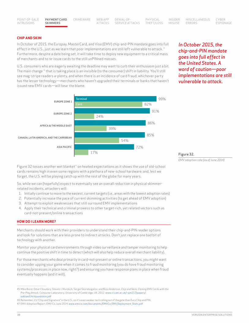
38 VERIZON ENTERPRISE SOLUTIONS
CHIP AND SKIM
in October of 2015, the Europay, MasterCard, and Visa (EMV) chip-and-PiN mandate goes into full effect in the U.S., just as we learn that poor implementations are still left vulnerable to attack.45 Furthermore, despite a date being set, it will take time to deploy new equipment to a critical mass of merchants and to re-issue cards to the still unPiNned masses.
U.S. consumers who are eagerly awaiting the deadline may want to curb their enthusiasm just a bit. The main change 46 that is taking place is an invisible (to the consumer) shift in liability. You’ll still see mag-stripe readers a-plenty, and when there is an incidence of card fraud, whichever party has the lesser technology—merchants who haven’t upgraded their terminals or banks that haven’t issued new EMV cards—will bear the blame.
Figure 32 tosses another wet blanket47 on heated expectations as it shows the use of old-school cards remains high in even some regions with a plethora of new-school hardware; and, lest we forget, the U.S. will be playing catch up with the rest of the globe for many years.
So, while we can (hopefully) expect to eventually see an overall reduction in physical skimmer-related incidents, attackers will:
1. initially continue to move to the easiest, current targets (i.e., areas with the lowest adoption rates)2. Potentially increase the pace of current skimming activities (to get ahead of EMV adoption)3. Attempt to exploit weaknesses that still surround EMV implementations4. Apply their technical and criminal prowess to other target-rich, yet related vectors such as
card-not-present/online transactions
HOW DO I LEARN MORE?
Merchants should work with their providers to understand their chip-and-PiN reader options and look for solutions that are less prone to indirect attacks. Don’t just replace one bad bit of technology with another.
Monitor your physical card environments through video surveillance and tamper monitoring to help continue the positive shift in time to detect (which will also help reduce overall merchant liability).
For those merchants who deal primarily in card-not-present or online transactions, you might want to consider upping your game when it comes to fraud monitoring (you do have fraud monitoring systems/processes in place now, right?) and ensuring you have response plans in place when fraud eventually happens (and it will).
45 Mike Bond, Omar Choudary, Steven J. Murdoch, Sergei Skorobogatov, and Ross Anderson, Chip and Skim: Cloning EMV Cards with the Pre-Play Attack, Computer Laboratory, University of Cambridge, UK, 2012. www.cl.cam.ac.uk/~sjm217/papers/oakland14chipandskim.pdf
46 Remember, it’s “Chip and Signature” in the U.S., so it’s even weaker tech rolling out of the gate than Euro Chip and PiN.47 EMV Adoption Report, EMV Co, June 2014. www.emvco.com/documents/EMVCo_EMV_Deployment_Stats.pdf
Figure 32. EMV adoption rate (as of June 2014)
72%17%
85%54%
86%39%
91%24%
99%82%
ASIA PACIFIC
CANADA, LATIN AMERICA, AND THE CARRIBEAN
AFRICA & THE MIDDLE EAST
EUROPE ZONE 2
EUROPE ZONE 1TerminalCard
In October 2015, the chip-and-PIN mandate goes into full effect in the United States. A word of caution—poor implementations are still vulnerable to attack.
POiNT-OF-SALE iNTRUSiONS
PAYMENT CARD SKIMMERS
CRiMEWARE WEB APP ATTACKS
DENiAL-OF- SERViCE ATTACKS
PHYSiCAL THEFT/LOSS
iNSiDER MiSUSE
MiSCELLANEOUSERRORS
CYBER ESPiONAGE

2015 DATA BREACH INVESTIGATIONS REPORT 39
To tag something solely as a malware incident is a common over-generalization and, as we as all know, all generalizations are false. Malware is part of the event chain in virtually every security incident (it’s difficult to get a computer virus onto paper records in a box of file folders, though we suspect Hollywood will find some way to do that soon).
Once these malevolent bytes invade a system, they surreptitiously usurp existing functionality and start performing actions of their own design. We see common one-two mal-punches in a few places, from maintaining persistence and staging advanced attacks (ref: Cyber-Espionage pattern) to capturing and exfiltrating data (ref: Point-of-Sale intrusions pattern). This catch-all Crimeware pattern represents malware infections within organizations that are not associated with more specialized classification patterns such as Cyber-Espionage or Point-of-Sale intrusions.
Crimeware represents malware infections within organizations that are not associated with more specialized classification patterns.
Like speeches by a politician, Crimeware incidents in our corpus are large in number and short on details, as these everyday incidents are less likely to receive a full forensic investigation or rise to the level of law enforcement involvement. They are also predominantly opportunistic and financially motivated in nature.
CRIMEWARE
Most affected industries: Public, Information, and Retail
0.6%
0.7%
1.5%
3.3%
4.9%
8.8%
9.5%
10.3%
65.4%
84.4%
CAPTURE STORED DATA
CLIENT−SIDE ATTACK
ROOTKIT
EXPORT DATA
RANSOMWARE
DOWNLOADER
SPYWARE/KEYLOGGER
BACKDOOR
DOS
C2
Figure 33. Variety of malware within Crimeware pattern (n=2,545)
POiNT-OF-SALE iNTRUSiONS
PAYMENT CARD SKiMMERS
CRIMEWARE WEB APP ATTACKS
DENiAL-OF- SERViCE ATTACKS
PHYSiCAL THEFT/LOSS
iNSiDER MiSUSE
MiSCELLANEOUSERRORS
CYBER ESPiONAGE

40 VERIZON ENTERPRISE SOLUTIONS
Not much changed in the way of details for the Crimeware pattern since its debut last year, but there were some notable differences worth a mention. First, malware used to launch DoS attacks jumped from #8 to #2 in threat action variety, with command-and-control (C2) continuing to defend its lead position. This isn’t surprising, as the rest of the malware threat actions rely on a robust command and control structure to function. (NOTE: There’s more on DoS in the Denial-of-Service Attacks pattern section).
When there is confirmed data breaches, bank records and credentials traded places for the top spot, though we suspect credentials may be under-represented given that it’s common practice for criminals to use keyloggers to steal credentials, which are ultimately used to gain banking information. One last item of interest here is that trade secrets were compromised in several cases in this pattern, even without espionage as the motive (they would have been in the Cyber- Espionage pattern and not here), which shows that even onesie-twosie malware can put very sensitive corporate data at risk.
HOW DO I LEARN MORE?
Our "Before and Beyond the Breach" featurette on malware confirms the volume and variety findings in this pattern on the threat side of the equation and also demonstrates that tools are available to enable organizations to do a relatively good job at discovering crimeware incidents. Quantifying the malware incident details is another matter.
We suggest not only capturing and tracking your own malware incidents (i.e., COUNT ALL THE THiNGS!) but also spending the time necessary to get into the weeds to uncover what actions malicious programs were intent on carrying out in your environment.
if you’re relegating the task of handling this run-of-the-mill malcode solely to your help desk in a set-it-and-forget-it process, we suggest you rethink that strategy, as you may be able to learn more from these incidents than you think.
Figure 34. Variety of data compromised within Crimeware (n=223)
Malware used to launch DoS attacks jumped from #8 to #2 in threat action variety, while command and control remains at #1.
6.7%
6.7%
7.2%
8.1%
13%
17.9%
18.4%
18.4%
29.6%
59.6%
SECRETS
SOURCE CODE
PAYMENT
SYSTEM
COPYRIGHTED
INTERNAL
CLASSIFIED
PERSONAL
CREDENTIALS
BANK
POiNT-OF-SALE iNTRUSiONS
PAYMENT CARD SKiMMERS
CRIMEWARE WEB APP ATTACKS
DENiAL-OF- SERViCE ATTACKS
PHYSiCAL THEFT/LOSS
iNSiDER MiSUSE
MiSCELLANEOUSERRORS
CYBER ESPiONAGE

2015 DATA BREACH INVESTIGATIONS REPORT 41
Aristotle once said that the avarice of mankind is insatiable. This philosophical insight is no less true for cybercriminals, since we can only assume that they were so distressed by last year’s DBIR findings (TLDR: ideology > greed) that this year, organized crime became the most frequently seen threat actor for Web App Attacks, with financial gain being the most common of the primary motives for attacking.
This year, organized crime became the most frequently seen threat actor for Web App Attacks.
A long time ago in a DBiR far, far away, we began to see high-profile instances of hackers targeting web servers just to set up an attack on a different target, a tactic known as a Strategic Web Compromise. We began to track this type of attack last year (so, it shows up in this year’s data) and we’re seeing that secondary attacks make up nearly two-thirds of Web App Attacks. Virtually every attack in this data set (98%) was opportunistic in nature, all aimed at easy marks. information, Financial Services, and Public entities dominate the victim demographics, but only a few industries fully escaped the attention of these criminal empires.
WEB APP ATTACKS
Figure 35. Variety of hacking actions within Web App Attacks pattern (n=205)
1.5%
2%
3.4%
6.3%
6.8%
8.3%
8.3%
19%
40.5%
50.7%
OS COMMANDING
FORCED BROWSING
PATH TRAVERSAL
XSS
BRUTE FORCE
ABUSE OF FUNCTIONALITY
RFI
SQLI
USE OF BACKDOOR OR C2
USE OF STOLEN CREDS
Most affected industries: Information, Financial Services, and Public
POiNT-OF-SALE iNTRUSiONS
PAYMENT CARD SKiMMERS
CRiMEWARE WEB APP ATTACKS
DENiAL-OF- SERViCE ATTACKS
PHYSiCAL THEFT/LOSS
iNSiDER MiSUSE
MiSCELLANEOUSERRORS
CYBER ESPiONAGE
42 VERIZON ENTERPRISE SOLUTIONS
One interesting sub-pattern distinguishes Financial Services from the rest. End-user devices were a factor in 82% of incidents and nearly a tenth of them involve some human element (phishing/social). A look through the details of these incidents shows a common sequence of “phish customer ≥ get credentials ≥ abuse web application ≥ empty bank/bitcoin account.”
Pulling back from a single industry view, we find that most of the attacks make use of stolen credentials, which is a story we’ve been telling since 1 A.D.48 Over 95% of these incidents involve harvesting creds from customer devices, then logging into web applications with them.
Cross-site scripting and SQL injection (SQLi) haven’t disappeared from the list but still seem less favored than simply using actual credentials. Unfortunately, the specific incidents are scant on details, but with so many credential lists available for sale or already in the wild, why should a criminal actually earn his/her keep through SQLi when a simple login will suffice?
HOW DO I LEARN MORE?
if you have a web presence (e-commerce or otherwise) you should be tracking user behavior and using some form of fraud detection to get an early warning on suspicious behavior. Load balancer logs, web application logs, and database transaction logs can all help identify malicious activity before your last bit of sensitive data is fully exfiltrated.
Get a complete inventory of every component of your web presence (honestly, it’s not that hard) and ensure they are all in a regular patch cycle. Three-quarters of web app compromises are opportunistic, so this falls squarely under “the cost of doing business.”
To combat Web App Attacks head-on, we recommend strengthening authentication. The use of two-factor authentication for web applications—even by customers—will go a long way toward keeping your organization from being used and abused.
48 Annum DBiR
95%OF THESE INCIDENTS INVOLVE HARVESTING CREDENTIALS STOLEN FROM CUSTOMER DEVICES, THEN LOGGING INTO WEB APPLICATIONS WITH THEM.
POiNT-OF-SALE iNTRUSiONS
PAYMENT CARD SKiMMERS
CRiMEWARE WEB APP ATTACKS
DENiAL-OF- SERViCE ATTACKS
PHYSiCAL THEFT/LOSS
iNSiDER MiSUSE
MiSCELLANEOUSERRORS
CYBER ESPiONAGE
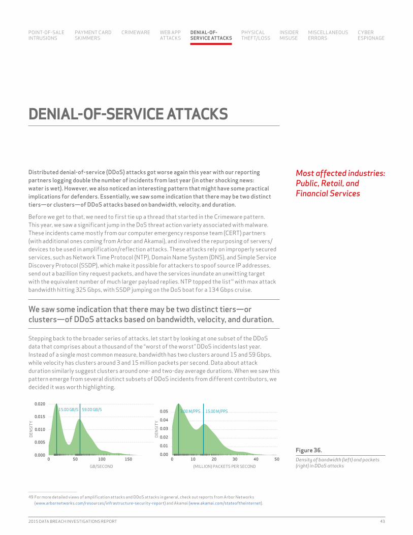
2015 DATA BREACH INVESTIGATIONS REPORT 43
Distributed denial-of-service (DDoS) attacks got worse again this year with our reporting partners logging double the number of incidents from last year (in other shocking news: water is wet). However, we also noticed an interesting pattern that might have some practical implications for defenders. Essentially, we saw some indication that there may be two distinct tiers—or clusters—of DDoS attacks based on bandwidth, velocity, and duration.
Before we get to that, we need to first tie up a thread that started in the Crimeware pattern. This year, we saw a significant jump in the DoS threat action variety associated with malware. These incidents came mostly from our computer emergency response team (CERT) partners (with additional ones coming from Arbor and Akamai), and involved the repurposing of servers/devices to be used in amplification/reflection attacks. These attacks rely on improperly secured services, such as Network Time Protocol (NTP), Domain Name System (DNS), and Simple Service Discovery Protocol (SSDP), which make it possible for attackers to spoof source iP addresses, send out a bazillion tiny request packets, and have the services inundate an unwitting target with the equivalent number of much larger payload replies. NTP topped the list49 with max attack bandwidth hitting 325 Gbps, with SSDP jumping on the DoS boat for a 134 Gbps cruise.
We saw some indication that there may be two distinct tiers—or clusters—of DDoS attacks based on bandwidth, velocity, and duration.
Stepping back to the broader series of attacks, let start by looking at one subset of the DDoS data that comprises about a thousand of the “worst of the worst” DDoS incidents last year. instead of a single most common measure, bandwidth has two clusters around 15 and 59 Gbps, while velocity has clusters around 3 and 15 million packets per second. Data about attack duration similarly suggest clusters around one- and two-day average durations. When we saw this pattern emerge from several distinct subsets of DDoS incidents from different contributors, we decided it was worth highlighting.
49 For more detailed views of amplification attacks and DDoS attacks in general, check out reports from Arbor Networks (www.arbornetworks.com/resources/infrastructure-security-report) and Akamai (www.akamai.com/stateoftheinternet).
DENIAL-OF-SERVICE ATTACKS
Most affected industries: Public, Retail, and Financial Services
15.00 GB/S 59.00 GB/S
0.000
0.005
0.010
0.015
0.020
0 50 100 150
GB/SECOND
DENS
ITY
3.00 M/PPS 15.00 M/PPS
0.00
0.01
0.02
0.03
0.04
0.05
0 10 20 30 40 50
(MILLION) PACKETS PER SECOND
DENS
ITY
Figure 36. Density of bandwidth (left) and packets (right) in DDoS attacks
POiNT-OF-SALE iNTRUSiONS
PAYMENT CARD SKiMMERS
CRiMEWARE WEB APP ATTACKS
DENIAL-OF- SERVICE ATTACKS
PHYSiCAL THEFT/LOSS
iNSiDER MiSUSE
MiSCELLANEOUSERRORS
CYBER ESPiONAGE

44 VERIZON ENTERPRISE SOLUTIONS
The data geeks inside us want to hold this up first as an area worth further research. What is actually going on here? Are we seeing two tiers of DDoS actors, maybe ideologically motivated and criminal? Or, are we seeing two tiers of DDoS-for-hire criminal product tiers? We’ll need better data, especially around actors, to support any solid conclusions.
HOW DO I LEARN MORE?
Last year, it was hard to give much advice about DDoS beyond just saying “plan ahead.” We hope this data might bring additional solid numbers to those planning conversations. Even without full knowledge of the underlying details of the criminal machinations, we think there are also some practical takeaways. We’ll begin with service providers, a term that includes anyone who runs their own UDP-based services and even those with home routers: Secure your services (which means knowing where your services are and how they’re configured). Block access to known botnet C2 servers50 and patch your systems to help stop malware from turning your nodes into hapless automatons of doom. For larger providers, anti-spoofing filters at the internet edge can also help prevent reflection/amplification techniques.
To understand how your organization would react to a DDoS attack, conduct regular drills/exercises to see where you need to shore up processes and, perhaps, add technology or external mitigation services to help maintain or restore services. This year’s data also has us wondering whether it means there might be room for less expensive, medium-sized mitigations that would protect against many if not all DDoS attacks.51
Finally, we want to point out that there are still significant differences in which victims are affected by DDoS incidents, so check out Figure 37 to see how prevalent they really are in your industry.
INDUSTRY TOTAL SMALL LARGE UNKNOWN
Accomodation (72) 140 0 80 60Administrative (56) 164 0 1 163Agriculture (11) 0 0 0 0Construction (23) 0 0 0 0Educational (61) 10 0 0 10Entertainment (71) 1 0 0 1Financial Services (52) 184 1 17 166Healthcare (62) 17 3 1 13information (51) 72 16 8 48Management (55) 2 0 1 1Manufacturing (31–33) 157 2 22 133Mining (21) 3 0 0 3Other Services (81) 11 3 0 8Professional (54) 161 4 1 156Public (92) 435 0 245 190Real Estate (53) 0 0 0 0Retail (44–45) 207 1 3 203Trade (42) 6 6 0 0Transportation (48–49) 3 0 0 3Utilities (22) 2 0 0 2Unknown 860 0 0 860TOTAL 2435 36 379 2020
50 And, the good news from our "Beyond the Breach" section is that you’ve got a plethora of “indicators of compromise” lists to choose from.51 Contact your security department if DDoS attacks last longer than four hours and ask your service provider which DDoS mitigation
may be right for you.
Figure 37. Number of DDoS attacks by victim industry and organization size (small is < 1,000 employees)
A message for service providers: Secure your services. Block access to known botnet C2 servers and patch your systems.
POiNT-OF-SALE iNTRUSiONS
PAYMENT CARD SKiMMERS
CRiMEWARE WEB APP ATTACKS
DENIAL-OF- SERVICE ATTACKS
PHYSiCAL THEFT/LOSS
iNSiDER MiSUSE
MiSCELLANEOUSERRORS
CYBER ESPiONAGE

2015 DATA BREACH INVESTIGATIONS REPORT 45
Most affected industries: Public, Healthcare, and Financial Services
We were almost at a loss for words for this section and, if you were hoping this would finally be the year for a spike in stolen mainframes, we’re afraid we must let you down (again). As was the case with our previous reports, people are people; so, why should it be that we expect perfection when it comes to the physical security of their corporate devices? Also (predictably), folks still steal things.
The data is heavily biased towards U.S. industries (99.8%) that operate under mandatory disclosure regulations, with the Public sector dominating the field. (Healthcare was also well represented.) Despite valiant efforts by our crack team, all the king’s data scientists couldn’t find a chart or data visualization to put together that was actionable to you, our beloved readers and defenders. in the end, every industry loses things, and almost all theft was opportunistic in nature.
Like last year, most of the theft occurred within the victim’s work area—55% of incidents.
There are no new tactics being used by the adversaries in this pattern to steal equipment. Like last year, most of the theft occurred within the victim’s work area (55% of incidents), but employee-owned vehicles (22% of incidents) are also a common location for thefts to occur.
While we are not spending a significant amount of prime DBiR real estate discussing this further, this pattern is not to be taken lightly. The impact to an organization can be significant (if not equal to other data-loss events), depending on the sensitivity of the data resident on the asset(s) involved and the controls that have and have not been implemented to protect the confidentiality52 of and recoverability of the data.
HOW CAN I LEARN MORE?
Work with your procurement department to know who has what, and track the volume and variety of devices lost each week/month to see if there’s a pattern of behavior you need to identify and prepare for. Make it super easy for folks to report lost or stolen devices, perhaps going so far as to incentivize your workforce to report all incidents within a certain number of hours (15% of incidents in this category still take days to discover).
Full-disk encryption, locking down USB ports, password protection, and the ability to remote wipe continue to be the recommended countermeasures, as it’s much better to be ahead of these incidents than be behind the eight-ball.53 Protecting the data and documenting the steps you have taken to do so is likely the best you can do to avoid a painful post-incident series of events.
52 A quick and dirty text analysis of the public incidents that contributed to the VERiS Community Database portion of this data showed that unencrypted devices are still a big issue. “Unencrypted,” “not encrypted,” and “without encryption” were present in the OSiNT four times more than “was encrypted,” “encrypted passwords,” and similar phrases.
53 “Should i encrypt my laptops and thumb drives?” Calibrated magic risk-ball says: “Without a doubt.”
PHYSICAL THEFT/LOSS
15%OF INCIDENTS STILL TAKE DAYS TO DISCOVER. INCENTIVIZE YOUR WORKFORCE TO REPORT ALL INCIDENTS WITHIN A CERTAIN NUMBER OF HOURS.
POiNT-OF-SALE iNTRUSiONS
PAYMENT CARD SKiMMERS
CRiMEWARE WEB APP ATTACKS
DENiAL-OF- SERViCE ATTACKS
PHYSICAL THEFT/LOSS
iNSiDER MiSUSE
MiSCELLANEOUSERRORS
CYBER ESPiONAGE

46 VERIZON ENTERPRISE SOLUTIONS
There you are, sipping Mai Tais on the beach, enjoying a well-deserved respite after installing all those shiny, new, advanced threat-mitigation devices at your perimeter, confident in your ability to detect those pesky and insidious external attackers bent on stealing your corporate secrets. You fire up your BlackBerry® 54 only to be met with an e-mail subject line from a vendor that sends shivers down your back: “What are you doing to combat the insider threat?!” Looks like it’s time to get off the beach chair and back to work.
The insider Misuse pattern shines a light on those in whom an organization has already placed trust—they are inside the perimeter defenses and given access to sensitive and valuable data, with the expectation that they will use it only for the intended purpose. Sadly, that’s not always the way things work.
As with prior years, the top action (55% of incidents) was privilege abuse—which is the defining characteristic of the internal actor breach. We see individuals abusing the access they have been entrusted with by their organization in virtually every industry. And it’s all about grabbing some easy Benjamins for these mendacious malefactors, with financial gain and convenience being the primary motivators (40% of incidents), whether they plan to monetize stolen data by selling it to others (such as with financial data) or by directly competing with their former employer. Coming in a not-so-distant second is the motive of convenience (basically using an unapproved work-around to speed things up or make it easier for the end user), and while this is not something that is intended to harm the organization, it certainly often has the same result.
This year, we saw more incidents involving the end user than ever before. And check this out: Since 2011, cashiers have topped the actor charts for misuse, but no longer. This is disconcerting news, considering how many regular end users make up the population of any given organization.
54 Because security never takes a vacation.
INSIDER MISUSE
Figure 38. Variety of internal actor within Insider Misuse pattern (n=125)
0.8%1.6%
4%5.6%
6.4%8%
10.4%
11.2%16.8%
37.6%
HELP DESK
SYSTEM ADMIN
CALL CENTER
DEVELOPER
MANAGER
OTHER
EXECUTIVE
FINANCE
CASHIER
END USER
Most affected industries: Public, Healthcare, and Financial Services
POiNT-OF-SALE iNTRUSiONS
PAYMENT CARD SKiMMERS
CRiMEWARE WEB APP ATTACKS
DENiAL-OF- SERViCE ATTACKS
PHYSiCAL THEFT/LOSS
INSIDER MISUSE
MiSCELLANEOUSERRORS
CYBER ESPiONAGE
2015 DATA BREACH INVESTIGATIONS REPORT 47
Finally, you know all those SOX, PCi, and internal audit-mandated controls that seem to single out the dastardly system administrator? Well, either all of those controls are doing their job and working perfectly, or you might want to consider rebalancing where you’re focusing your potentially outdated control frameworks.
HOW CAN I LEARN MORE?
Catching insider abuse is not easy. You need to have a good handle on all the dependencies (iT and otherwise) in your critical processes. Begin by identifying those core areas and then look for activities to track or places where you need to insert additional auditing and fraud-detection capabilities, so you can get ahead of the attackers.
in many of the incidents we reviewed, the insider abuse was discovered during forensic examination of user devices after individuals left a company. Setting up a similar process in your organization can at least tell you what happened. Though it might be too late at that point for damage control, you may be able to apply some lessons learned to shore up gaps in your processes.
in cases where the data has been taken by trusted insiders, two of our partners—Mishcon de Reya and Winston & Strawn—have some additional recommendations on what has worked in practice for remedies, both in the E.U. and in the U.S.
USING DATA SCIENCE TO TRUST BUT VERIFY
Detecting misuse is also one area where the application of modern data-science practices may shine, according to Stephan Jou, CTO of interset. All you need is data, features, and math.
Users leave footprints wherever they go on the network, and their activities are—or can be—captured in a myriad of logs. The key is to collect and collate these data sources into a place where they can be analyzed.
Once you have the data you need, analysis is performed using inferred or computed elements of the data known as features. Some potential features include:
• Volume or amount of content transfer, such as e-mail attachments or uploads• Resource access patterns, such as logins or data repository touches• Time-based activity patterns, such as daily and weekly habits• indications of job contribution, such as the amount of source code checked in by
developers• Time spent in activities indicative of job satisfaction or discontent
The process of selecting and engineering features is the most critical step in building a data science–based solution. Good features with the simplest model will always trump the fanciest math that only has access to poor ones.
Once you have developed solid features, you can generate probabilistic models; compute intelligent thresholds (by user or user groups); and correlate, corroborate, and aggregate “risky” events at scale with higher degrees of confidence than simple Boolean (yes/no) alert correlation.
By focusing on the attributes and behaviors of these entities (e.g., your users and resources) instead of coarse, simplistic threshold anomalies, you can compute risk scores down to the user- or system-level rather than getting lost in a sea of event data, and narrow the gap between insider abuse and successful detection.
For example, most developers on the same project have resource-access patterns that include the same code repositories. Looked at as a whole, this forms clusters of access. When a developer accesses a repository outside of his cluster, it creates a long, obvious relationship that probably wouldn’t occur normally. When the developer then transfers an unusual volume of data at an unlikely time, interset uses machine learning to infer that she was up to no good, even though any one of the indicators on its own could have been a false positive.
55%THE TOP ACTION WAS PRIVILEGE ABUSE—AT 55% OF INCIDENTS—WHERE INTERNAL ACTORS ABUSE THE ACCESS THEY HAVE BEEN ENTRUSTED WITH.
POiNT-OF-SALE iNTRUSiONS
PAYMENT CARD SKiMMERS
CRiMEWARE WEB APP ATTACKS
DENiAL-OF- SERViCE ATTACKS
PHYSiCAL THEFT/LOSS
INSIDER MISUSE
MiSCELLANEOUSERRORS
CYBER ESPiONAGE
48 VERIZON ENTERPRISE SOLUTIONS
REMEDIES FOR INSIDER DATA THEFT
A company’s competitive edge in the market often derives from the quality of its confidential and proprietary information.
in England, there are extremely powerful civil injunctions available that allow the aggrieved party, without prior notice to the alleged data thief (similar to a search warrant in a criminal law context), to search a defendant’s premises for hard-copy evidence and take copies of all of their electronic devices on the relevant premises, including computers, phones, all e-mail accounts (web or otherwise), clouds, and any other devices and data-holding platforms.
The injunctions also require deletion of the relevant stolen material after the devices have been copied under the court order. They also provide for the non-use of the relevant data so that even if the defendant fails in the deletion process, they are not allowed to use the stolen data. if they do, they are in breach of the court order. Any breach of these types of court orders can lead to a finding of contempt of court and consequently fines and imprisonment. Mishcon de Reya has imprisoned several defendants for failure to comply with our orders.
in all of the cases we have run using these nuclear remedies, we have essentially won the case (either by settlement or trial) and retrieved the stolen data. And if the other side had the capacity to pay the legal costs of the case, then those costs were paid in full or in part.
Similar remedies are available in British Commonwealth counties such as Australia, Canada, Hong Kong, South Africa, and New Zealand. Certain E.U. countries also have similar remedies, but mainly in an iP context. These remedies are not available in the United States and are solely the domain of the law enforcement organizations.
in the U.S., there are two options:1. The Temporary Restraining Order (TRO)—which is expensive and time consuming—
ultimately may lead to the recovery of data. Due to the nature of the discovery process, this could actually further expose the data. Even in the case of a settlement or disposition, the recovery of the data may not happen unless the settlement has outlined procedures to inspect computers, recover data, etc.
2. The cooperative/demand letter. Winston & Strawn has experienced 100% cooperation in these instances. Although this option tends to be used in less-egregious cases, it has often resulted in a greater chance of recovering the data than a TRO. it is also a much faster and less expensive option.
Many practitioners do not use these tools, as they are technically challenging and can have adverse consequences if improperly obtained. But when properly executed, they are effective ways for victims of internal (and external) data theft to fight back by retrieving stolen confidential information, and most importantly, protecting their businesses before sustaining significant financial loss—even though any one of the indicators on its own could have been a false positive.
POiNT-OF-SALE iNTRUSiONS
PAYMENT CARD SKiMMERS
CRiMEWARE WEB APP ATTACKS
DENiAL-OF- SERViCE ATTACKS
PHYSiCAL THEFT/LOSS
INSIDER MISUSE
MiSCELLANEOUSERRORS
CYBER ESPiONAGE

2015 DATA BREACH INVESTIGATIONS REPORT 49
Stephen Dedalus, a character in James Joyce’s Ulysses, says, “Mistakes are the portals of discovery.” In the case of the DBIR, they are also the gateways to breaches. The globe spins, people continue to make mistakes, and organizations suffer losses across the C-I-A triad as a result. While the industries represented in this year’s data set mirror prior reports—largely due to disclosure regulations for Public and Healthcare (just like the Physical Theft/Loss pattern)—a new incident type has clawed its way into the top 10 error varieties. We’ll take a closer look at that one in a bit.
As with years past, errors made by internal staff, especially system administrators who were the prime actors in over 60% of incidents, represent a significant volume of breaches and records, even with our strict definition of what an “error” is.55 if we strip away all the fancy VERiS terminology, there are three main, traditional categories of Error incidents:
“D'oh!” Sensitive information reaching incorrect recipients 30% of incidents“My bad!” Publishing nonpublic data to public web servers 17% of incidents“Oops!” insecure disposal of personal and medical data 12% of incidents
55 We define Miscellaneous Error within the VERiS framework as an action that directly leads to attribute loss. This conservative approach prevents general bad security practices being labeled as error and focuses on causal events. To keep this pattern uncluttered, we continue to give Physical Theft/Loss its own pattern.
MISCELLANEOUS ERRORS
Figure 39. Variety of errors (n=193)
0.5%
1%
1.6%
2.6%
2.6%
3.6%
11.9%
17.1%
29.5%
30.6%
OMISSION
DATA ENTRY ERROR
PHYSICAL ACCIDENTS
MALFUNCTION
PROGRAMMING ERROR
MISCONFIGURATION
DISPOSAL ERROR
PUBLISHING ERROR
CAPACITY SHORTAGE
MISDELIVERY
Most affected industries: Public, Information, and Healthcare
POiNT-OF-SALE iNTRUSiONS
PAYMENT CARD SKiMMERS
CRiMEWARE WEB APP ATTACKS
DENiAL-OF- SERViCE ATTACKS
PHYSiCAL THEFT/LOSS
iNSiDER MiSUSE
MISCELLANEOUS ERRORS
CYBER ESPiONAGE

50 VERIZON ENTERPRISE SOLUTIONS
As with last year, due to government reporting requirements, the number of Public sector breaches dwarfed all other data by an order of magnitude, and in the interest of trying to tease out useful information to the broader set of industries, we removed the Public data from the corpus for the rest of this analysis. Suffice it to say that government agencies send out heaps of mailings that many times take a wrong turn at Albuquerque.
With the chaff filtered out, the new incident pattern we alluded to earlier made it into the top 10 this year. One-quarter of the errors last year were capacity planning issues. How is this a VERiSizable error, you ask? Say you’re the system administrator for a soon-to-be released online multiplayer video game. Your company sold 10 million pre-orders, but requisitioned your five online game servers at the local flea market. The chances of them holding up to the demand are, well, not good. Service interruptions or performance degradation when infrastructure designed for a normal day receives exponentially more traffic is not a surprising outcome.
Another example is what we’re calling the Law of Unintended Content Popularity. The Hacker News/Reddit/Fark/Slashdot effect has been around for a long time, and availability losses due to self-inflicted DoS or overloads of legitimate page visits are the end result.
THE DANGERS OF FTP SERVERS
According to One World Labs (OWL), an enterprise security assessment and consulting firm, their team of threat intelligence analysts encounter publicly accessible FTP servers on a daily basis. As part of the company’s Deep Web research process, which maps their clients’ digital and online footprint, OWL analysts are “tripping over” company and individual FTP sites requiring no authentication. Even worse, many of these sites contain large volumes of intellectual property and personally identifiable information (Pii). OWL considers unsecured FTP servers one of the greatest risks to company and individual data integrity.
Depending on the FTP servers' configuration, most can be accessed by web browsers, which makes them a flexible and attractive vehicle for companies and individuals to remotely access documents. Companies and individuals use FTP servers for a variety of reasons. Some companies use FTP servers to share project documents between team members working at different client locations. Users frequently use FTP servers to back up home computers, and often unbeknownst to their employers, their work computers as well.
Examples of material found on a regular basis by OWL analysts in the course of their normal duties include:
• Usernames and passwords for various accounts and enterprise hardware• Company documents marked “Proprietary” or “Confidential”• Proprietary software files• Partnering agreements• individual tax documents• individual medical records• individual military service records
OWL emphasizes the ease with which all of this data can be located. in many cases, a simple Google® search can reveal millions of results from unsecured FTP servers. They note that most of these issues could be remediated by the FTP owner simply requiring a username and password to access the server and by disabling the anonymous login feature.
The inherent difficulty for OWL when finding this extremely sensitive material is the lack of a defined and trusted process to notify the affected party, with whom there may be no previously existing relationship. Past attempts to warn companies and individuals of their data exposure were often met with skepticism, and in some cases, hostility. OWL underscores the need for the information security industry to establish a process to educate and warn parties of the dangers of unsecured FTP servers.
60%OF INCIDENTS WERE ATTRIBUTED TO ERRORS MADE BY SYSTEM ADMINISTRATORS—PRIME ACTORS RESPONSIBLE FOR A SIGNIFICANT VOLUME OF BREACHES AND RECORDS.
POiNT-OF-SALE iNTRUSiONS
PAYMENT CARD SKiMMERS
CRiMEWARE WEB APP ATTACKS
DENiAL-OF- SERViCE ATTACKS
PHYSiCAL THEFT/LOSS
iNSiDER MiSUSE
MISCELLANEOUS ERRORS
CYBER ESPiONAGE
2015 DATA BREACH INVESTIGATIONS REPORT 51
HOW DO I LEARN MORE?
Track all the VERiS error-variety action incidents in your organization and manage to the resulting error-rate metric. Understand where goofs, gaffes, fat fingers, etc., can affect sensitive data. Track how often incidents related to human error occur. Measure effectiveness of current and future controls, and establish an acceptable level of risk you are willing to live with, because human fallacy is with us to stay.
Finally, learn from your mistakes. Was the root cause a combination of autocomplete in the “To:” field and similarly named e-mail aliases? Did the staff member not have the understanding that loan applications don’t go in the regular trash? Was the process to publish updates to the web server built by Rube Goldberg and prone to misconfiguration? Those answers to your real-world events will guide your specific countermeasures better than an industry report can.
According to mock attack data provided by Wombat Security, 35% of end users are vulnerable to USB-initiated attacks. This susceptibility was collected across numerous industries such as Energy, Chemical, information, Consulting, Services, and Distribution.
POiNT-OF-SALE iNTRUSiONS
PAYMENT CARD SKiMMERS
CRiMEWARE WEB APP ATTACKS
DENiAL-OF- SERViCE ATTACKS
PHYSiCAL THEFT/LOSS
iNSiDER MiSUSE
MISCELLANEOUS ERRORS
CYBER ESPiONAGE

52 VERIZON ENTERPRISE SOLUTIONS
Each year, the crack DBIR team digs through thousands upon thousands of incidents. Some categories, like Error or Skimmers, can be as exciting as watching paint dry. Others, like those in the Cyber-Espionage pattern, have the allure of a Super Bowl extravaganza; this past year, we even had the Left Shark of attribution to keep us amused and entertained.
While it was fun watching the fireworks, blog posts, and coping mechanisms fly by, looking at the 548 incidents in this pattern left us all wanting for a bit more, especially since two-thirds of them had no attacker attribution information whatsoever. Rather than take the easy way out and blame China, North Korea, or the NSA by default, we decided to see what the data could tell us about the other, known aspects of these breaches.
Two-thirds of the incidents in this pattern had no attacker-attribution information whatsoever.
First, we have to level-set a bit. We know it’s fun to repeat the mantra that nobody is immune from being a target of Cyber-Espionage. And while it’s true most industries make an appearance in the role of victim, not all victims are created equal. Figure 40 shows a heavy slant towards Manufacturing,
CYBER-ESPIONAGE
Figure 40. Top 10 espionage-targeted industries (n=460)
0.7%
0.8%
1.3%
1.7%
1.8%
3.9%
6.2%
13.3%
20.2%
27.4%
HEALTHCARE
FINANCIAL SERVICES
REAL ESTATE
EDUCATIONAL
TRANSPORTATION
UTILITIES
INFORMATION
PROFESSIONAL
PUBLIC
MANUFACTURING
Most affected industries: Manufacturing, Public, and Professional
POiNT-OF-SALE iNTRUSiONS
PAYMENT CARD SKiMMERS
CRiMEWARE WEB APP ATTACKS
DENiAL-OF- SERViCE ATTACKS
PHYSiCAL THEFT/LOSS
iNSiDER MiSUSE
MiSCELLANEOUSERRORS
CYBER ESPIONAGE

2015 DATA BREACH INVESTIGATIONS REPORT 53
Government, and information Services. The usual heavy-hitters (or maybe the heavy hit), such as Financial Services and Retail, are barely a blip on the radar. For those industries, priority should be given to other patterns of attacks and Figure 41 should be the guide.
incidents within the pattern of Cyber-Espionage can be described at a high level relatively easily: Social attacks (typically phishing) are often the calling card with Swiss Army knife–caliber malware delivered as the housewarming present. But if we dig down a little deeper, there’s a rather impressive and rich diversity in the details. For example, the vector of malware installation is mostly through phishing, but was split between either attachments or links, and malware installed through web drive-by has made a stronger than normal appearance this year.
Figure 41. Vector of malware installation (n=361)
Figure 42. Variety of data compromised within Espionage (n=457)
0.3%
1.9%
2.2%
2.8%
3.6%
16.6%
37.4%
39.9%
NETWORK PROPAGATION
REMOTE INJECTION
WEB DOWNLOAD
DOWNLOAD BY MALWARE
DIRECT INSTALL
WEB DRIVE−BY
E-MAIL LINK
E-MAIL ATTACHMENT
0.2%
0.4%
0.4%
0.7%
2.4%
2.6%
6.6%
8.5%
11.4%
85.8%
DIGITAL CERTIFICATE
COPYRIGHTED
PAYMENT
BANK
CLASSIFIED
PERSONAL
SYSTEM
INTERNAL
CREDENTIALS
SECRETS
POiNT-OF-SALE iNTRUSiONS
PAYMENT CARD SKiMMERS
CRiMEWARE WEB APP ATTACKS
DENiAL-OF- SERViCE ATTACKS
PHYSiCAL THEFT/LOSS
iNSiDER MiSUSE
MiSCELLANEOUSERRORS
CYBER ESPIONAGE

54 VERIZON ENTERPRISE SOLUTIONS
The variety of data taken provides some explanation for the diversity. Secrets, credentials, internal, and system data are taken, whereas in other patterns the primary goals were personal information, Health records, and banking data. it seems these modern-day cyber Slugworths are more concerned with the secret formula behind the Everlasting Gobstopper than they are your Twitter password.
HOW DO I LEARN MORE?
Before we point you in the direction of data you should be collecting and analyzing, the reality is that if a determined, state-sponsored adversary wants your data, they’re going to get it unless another state-sponsored entity helps you defend it.
Having said that, if you’ve got your own Gobstoppers to protect, start collecting data. Now. Seriously. Put this report down and go set up your syslog servers. We’ll wait.
You back? Good. Now, specifically, start amassing e-mail transaction logs (in general), records of attachments, and records of links in e-mails. Log all DNS web-proxy requests and invest in solutions that will help you ingest and analyze this data both on the fly and forensically. Even if you don’t manage to detect or deter these adversaries, you will at least have a much easier time figuring out what they did after the fact.
Log all DNS requests and log all web-proxy requests, and invest in solutions that will help you ingest and analyze this data.
POiNT-OF-SALE iNTRUSiONS
PAYMENT CARD SKiMMERS
CRiMEWARE WEB APP ATTACKS
DENiAL-OF- SERViCE ATTACKS
PHYSiCAL THEFT/LOSS
iNSiDER MiSUSE
MiSCELLANEOUSERRORS
CYBER ESPIONAGE
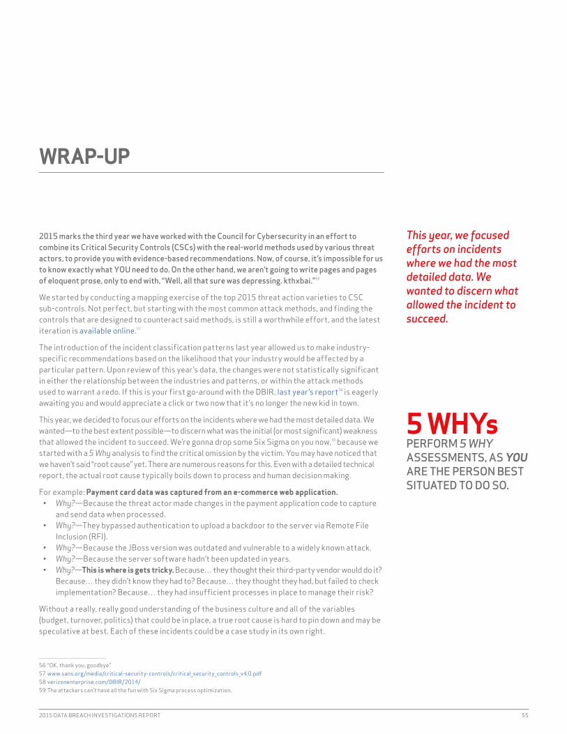
2015 DATA BREACH INVESTIGATIONS REPORT 55
2015 marks the third year we have worked with the Council for Cybersecurity in an effort to combine its Critical Security Controls (CSCs) with the real-world methods used by various threat actors, to provide you with evidence-based recommendations. Now, of course, it’s impossible for us to know exactly what YOU need to do. On the other hand, we aren’t going to write pages and pages of eloquent prose, only to end with, “Well, all that sure was depressing. kthxbai.”56
We started by conducting a mapping exercise of the top 2015 threat action varieties to CSC sub-controls. Not perfect, but starting with the most common attack methods, and finding the controls that are designed to counteract said methods, is still a worthwhile effort, and the latest iteration is available online.57
The introduction of the incident classification patterns last year allowed us to make industry-specific recommendations based on the likelihood that your industry would be affected by a particular pattern. Upon review of this year’s data, the changes were not statistically significant in either the relationship between the industries and patterns, or within the attack methods used to warrant a redo. if this is your first go-around with the DBiR, last year’s report58 is eagerly awaiting you and would appreciate a click or two now that it’s no longer the new kid in town.
This year, we decided to focus our efforts on the incidents where we had the most detailed data. We wanted—to the best extent possible—to discern what was the initial (or most significant) weakness that allowed the incident to succeed. We’re gonna drop some Six Sigma on you now,59 because we started with a 5 Why analysis to find the critical omission by the victim. You may have noticed that we haven’t said “root cause” yet. There are numerous reasons for this. Even with a detailed technical report, the actual root cause typically boils down to process and human decision making.
For example: Payment card data was captured from an e-commerce web application.• Why?—Because the threat actor made changes in the payment application code to capture
and send data when processed.• Why?—They bypassed authentication to upload a backdoor to the server via Remote File
inclusion (RFi).• Why?—Because the JBoss version was outdated and vulnerable to a widely known attack.• Why?—Because the server software hadn’t been updated in years.• Why?—This is where is gets tricky. Because… they thought their third-party vendor would do it?
Because… they didn’t know they had to? Because… they thought they had, but failed to check implementation? Because… they had insufficient processes in place to manage their risk?
Without a really, really good understanding of the business culture and all of the variables (budget, turnover, politics) that could be in place, a true root cause is hard to pin down and may be speculative at best. Each of these incidents could be a case study in its own right.
56 “OK, thank you, goodbye”57 www.sans.org/media/critical-security-controls/critical_security_controls_v4.0.pdf58 verizonenterprise.com/DBiR/2014/59 The attackers can’t have all the fun with Six Sigma process optimization.
WRAP-UP
This year, we focused efforts on incidents where we had the most detailed data. We wanted to discern what allowed the incident to succeed.
5 WHYsPERFORM 5 WHY ASSESSMENTS, AS YOU ARE THE PERSON BEST SITUATED TO DO SO.
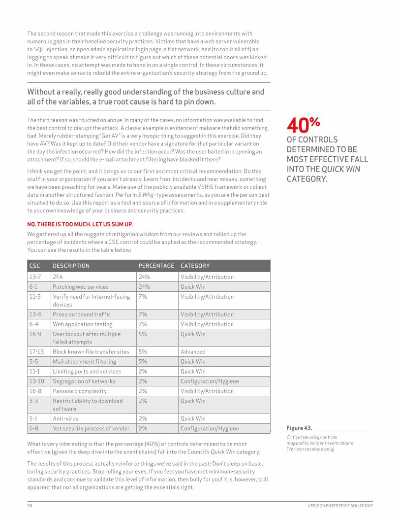
56 VERIZON ENTERPRISE SOLUTIONS
The second reason that made this exercise a challenge was running into environments with numerous gaps in their baseline security practices. Victims that have a web server vulnerable to SQL injection, an open admin application login page, a flat network, and (to top it all off) no logging to speak of make it very difficult to figure out which of these potential doors was kicked in. in these cases, no attempt was made to hone in on a single control. in these circumstances, it might even make sense to rebuild the entire organization’s security strategy from the ground up.
Without a really, really good understanding of the business culture and all of the variables, a true root cause is hard to pin down.
The third reason was touched on above. in many of the cases, no information was available to find the best control to disrupt the attack. A classic example is evidence of malware that did something bad. Merely rubber-stamping “Get AV” is a very myopic thing to suggest in this exercise. Did they have AV? Was it kept up to date? Did their vendor have a signature for that particular variant on the day the infection occurred? How did the infection occur? Was the user baited into opening an attachment? if so, should the e-mail attachment filtering have blocked it there?
i think you get the point, and it brings us to our first and most critical recommendation. Do this stuff in your organization if you aren’t already. Learn from incidents and near misses, something we have been preaching for years. Make use of the publicly available VERiS framework or collect data in another structured fashion. Perform 5 Why–type assessments, as you are the person best situated to do so. Use this report as a tool and source of information and in a supplementary role to your own knowledge of your business and security practices.
NO. THERE IS TOO MUCH. LET US SUM UP.
We gathered up all the nuggets of mitigation wisdom from our reviews and tallied up the percentage of incidents where a CSC control could be applied as the recommended strategy. You can see the results in the table below:
CSC DESCRIPTION PERCENTAGE CATEGORY
13-7 2FA 24% Visibility/Attribution6-1 Patching web services 24% Quick Win11-5 Verify need for internet-facing
devices7% Visibility/Attribution
13-6 Proxy outbound traffic 7% Visibility/Attribution6-4 Web application testing 7% Visibility/Attribution16-9 User lockout after multiple
failed attempts5% Quick Win
17-13 Block known file transfer sites 5% Advanced5-5 Mail attachment filtering 5% Quick Win11-1 Limiting ports and services 2% Quick Win13-10 Segregation of networks 2% Configuration/Hygiene16-8 Password complexity 2% Visibility/Attribution3-3 Restrict ability to download
software2% Quick Win
5-1 Anti-virus 2% Quick Win6-8 Vet security process of vendor 2% Configuration/Hygiene
What is very interesting is that the percentage (40%) of controls determined to be most effective (given the deep dive into the event chains) fall into the Council’s Quick Win category.
The results of this process actually reinforce things we’ve said in the past: Don’t sleep on basic, boring security practices. Stop rolling your eyes. if you feel you have met minimum-security standards and continue to validate this level of information, then bully for you! it is, however, still apparent that not all organizations are getting the essentials right.
Figure 43. Critical security controls mapped to incident event chains (Verizon caseload only)
40%OF CONTROLS DETERMINED TO BE MOST EFFECTIVE FALL INTO THE QUICK WIN CATEGORY.
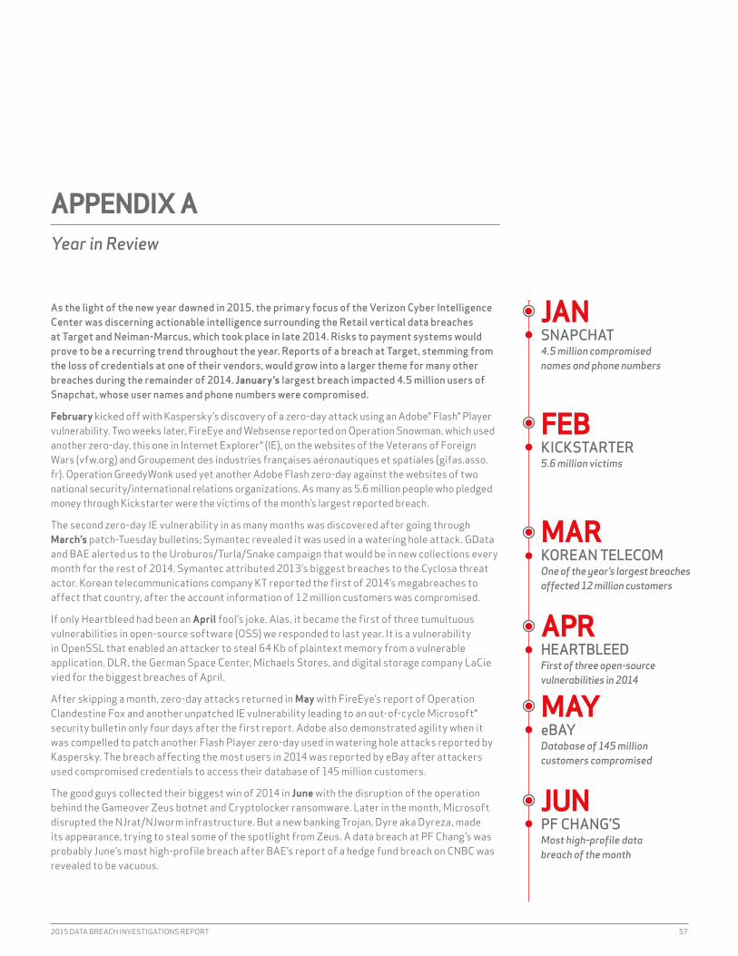
2015 DATA BREACH INVESTIGATIONS REPORT 57
As the light of the new year dawned in 2015, the primary focus of the Verizon Cyber Intelligence Center was discerning actionable intelligence surrounding the Retail vertical data breaches at Target and Neiman-Marcus, which took place in late 2014. Risks to payment systems would prove to be a recurring trend throughout the year. Reports of a breach at Target, stemming from the loss of credentials at one of their vendors, would grow into a larger theme for many other breaches during the remainder of 2014. January’s largest breach impacted 4.5 million users of Snapchat, whose user names and phone numbers were compromised.
February kicked off with Kaspersky’s discovery of a zero-day attack using an Adobe® Flash® Player vulnerability. Two weeks later, FireEye and Websense reported on Operation Snowman, which used another zero-day, this one in internet Explorer® (iE), on the websites of the Veterans of Foreign Wars (vfw.org) and Groupement des industries françaises aéronautiques et spatiales (gifas.asso.fr). Operation GreedyWonk used yet another Adobe Flash zero-day against the websites of two national security/international relations organizations. As many as 5.6 million people who pledged money through Kickstarter were the victims of the month’s largest reported breach.
The second zero-day iE vulnerability in as many months was discovered after going through March’s patch-Tuesday bulletins; Symantec revealed it was used in a watering hole attack. GData and BAE alerted us to the Uroburos/Turla/Snake campaign that would be in new collections every month for the rest of 2014. Symantec attributed 2013’s biggest breaches to the Cyclosa threat actor. Korean telecommunications company KT reported the first of 2014’s megabreaches to affect that country, after the account information of 12 million customers was compromised.
if only Heartbleed had been an April fool’s joke. Alas, it became the first of three tumultuous vulnerabilities in open-source software (OSS) we responded to last year. it is a vulnerability in OpenSSL that enabled an attacker to steal 64 Kb of plaintext memory from a vulnerable application. DLR, the German Space Center, Michaels Stores, and digital storage company LaCie vied for the biggest breaches of April.
After skipping a month, zero-day attacks returned in May with FireEye’s report of Operation Clandestine Fox and another unpatched iE vulnerability leading to an out-of-cycle Microsoft® security bulletin only four days after the first report. Adobe also demonstrated agility when it was compelled to patch another Flash Player zero-day used in watering hole attacks reported by Kaspersky. The breach affecting the most users in 2014 was reported by eBay after attackers used compromised credentials to access their database of 145 million customers.
The good guys collected their biggest win of 2014 in June with the disruption of the operation behind the Gameover Zeus botnet and Cryptolocker ransomware. Later in the month, Microsoft disrupted the NJrat/NJworm infrastructure. But a new banking Trojan, Dyre aka Dyreza, made its appearance, trying to steal some of the spotlight from Zeus. A data breach at PF Chang’s was probably June’s most high-profile breach after BAE’s report of a hedge fund breach on CNBC was revealed to be vacuous.
APPENDIX AYear in Review
JANSNAPCHAT4.5 million compromised names and phone numbers
FEBKICKSTARTER5.6 million victims
MARKOREAN TELECOMOne of the year’s largest breaches affected 12 million customers
APRHEARTBLEEDFirst of three open-source vulnerabilities in 2014
MAYeBAYDatabase of 145 million customers compromised
JUNPF CHANG’SMost high-profile data breach of the month

58 VERIZON ENTERPRISE SOLUTIONS
in July, the Cyber intelligence Center collected a bounty of detailed reports on sophisticated threat actors and their attacks. Attacks on the Energy vertical by “Energetic Bear” were reported by F-Secure, Symantec, CrowdStrike, RSA, FireEye, and Palo Alto Networks. “Pitty Tiger” was outed by Airbus and McAfee. SWiTCH.ch and Trend Micro reported Operation Emmental, a complex attack on 34 banks using spear phishing and malware to defeat SMS-based two-factor authentication. Samsung suffered a US$38 million loss from physical risks when a plant in Brazil was robbed. Australian e-tailer Catch of the Day revealed the other large breach in July, but offered no explanation as to why it was reporting a Pii/PFi breach that occurred in 2011.
Early in August, we learned of Backoff POS malware that uses brute-force attacks on remote access to payment systems. Cybervor, a small Russian crew’s collection of 1.2 billion compromised credentials, seemed almost too fantastic to take seriously until it was tied to one of the year’s most high-profile data breaches. Three significant beaches were reported in August: UPS announced a POS malware breach at 51 of its stores, followed by unfounded speculation Backoff was the cause. Community Health Systems disclosed a data breach involving the Pii, but not PHi or PFi of 4.5 million patients. And JP Morgan Chase reported it was responding to a data breach that we later learned was discovered after following Cybervor bread crumbs.
September kicked off with the breach of hundreds of celebrity iCloud® accounts after their credentials were compromised. The Shellshock bug in Bash was 2014’s second tumultuous OSS vulnerability event, quickly eclipsing Heartbleed due to many more successful attacks. The next high-profile breach report was caused by POS malware at Home Depot, affecting 56 million of its customers.
Zero-day attacks returned with a vengeance in October when Quedagh or Sandworm spun off from BlackEnergy, attacking a new Windows® OLE vulnerability, and then CrowdStrike added a new Kernel Mode driver attack distributing PlugX RAT. Adobe patched Flash Player, but the notice that attacks were in the wild was delayed until November. October occasioned the third huge OSS bug, POODLE, but we assessed that it was more smoke than spark. A gap in strong authentication and compromised credentials was identified as the causes for the JP Morgan data breach. The most high-profile breach was of unclassified White House networks, attributed to Russian threat actors.
Flaws in Microsoft crypto implementations were the subject of many collections in November after the Patch Tuesday SChannel security bulletin and an out-of-cycle bulletin for Kerberos that could not have come at a worse time for the Retail vertical; contrary to popular predictions, neither emerged as another Heartbleed. Adobe patched a Flash Player zero-day discovered in the Angler exploit kit, along with one of last month’s zero-days. it seemed like intelligence about the Regin espionage platform would bring the month to a close, until the data breach at Sony Pictures Entertainment (SPE) rocketed to the top of the list of high-profile data breaches.
Adobe updated Flash for the fifth zero-day of the year. Another Cyber-Espionage campaign, “inception Framework,” was reported by Blue Coat and Kaspersky. December 2014 in the Cyber intelligence Center was very similar to December 2013—just swap in SPE for Target. We were intensely focused on processing everything SPE-related to discern some actionable intelligence. Trend Micro tied malware used to attack the Korea Hydro and Nuclear Power Co. to the SPE breach. So raise a glass to turnings of the season—like last year, 2014 ended with focus around a high-profile breach.
JULENERGETIC BEARCyberspying operation targeted the energy industry
AUGCYBERVOR1.2 billion compromised credentials
SEPiCLOUDCelebrity accounts hacked
OCTSANDWORMAttacked a Windows vulnerability
NOVSONY PICTURES ENTERTAINMENTHighest-profile hack of the year
DECINCEPTION FRAMEWORKCyber-Espionage attack targeted the public sector

2015 DATA BREACH INVESTIGATIONS REPORT 59
Based on feedback, one of the things readers value most about this report is the level of rigor and integrity we employ when collecting, analyzing, and presenting data. Knowing our readership cares about such things and consumes this information with a keen eye helps keep us honest. Detailing our methods is an important part of that honesty.
Our overall methodology remains intact and largely unchanged from previous years. With 70 organizations contributing data this year, there is no single means used to collect and record the data. instead, we employed different methods to gather and aggregate the data produced by a range of approaches by our contributors.
Once collected, all incidents included in this report were individually reviewed and converted (if necessary) into the VERiS framework to create a common, anonymous aggregate data set. But the collection method and conversion techniques differed between contributors. in general, three basic methods (expounded below) were used to accomplish this:
1. Direct recording by Verizon using VERiS 2. Direct recording by contributors using VERiS 3. Recoding using VERiS from a contributor’s existing schema
All contributors received instruction to omit any information that might identify organizations or individuals involved, since such details are not necessary to create the DBiR.
Sharing and publishing incident information isn’t easy, and we applaud the willingness and work of all the contributors to make this report possible. We sincerely appreciate it.
VERIZON’S DATA COLLECTION METHODOLOGY
The underlying methodology we used is unchanged from previous years. All results are based on first-hand evidence collected during paid external forensic investigations and related intelligence operations we conducted from 2004 through 2014. The 2014 caseload is the primary analytical focus of the report, but the entire range of data is referenced throughout. Once an investigation is completed, our analysts use case evidence, reports, and interviews to create a VERiS record of the incident(s). The record is then reviewed and validated by other members of the team to help ensure we’re working with reliable and consistent data.
METHODOLOGY FOR CONTRIBUTING USING VERIS
Contributors using this method provided incident data to our team in VERiS format. For instance, agents of the U.S. Secret Service (USSS) used an internal VERiS-based application to record pertinent case details. Several other organizations recorded incidents directly into an application
60 http://veriscommunity.net/61 http://github.com/vz-risk/veris
APPENDIX BMethodology
A BRIEF PRIMER/REFRESHER ON VERIS VERiS is designed to provide a common language for describing security incidents in a structured and repeatable manner. it takes the narrative of “who did what to what (or whom) with what result” and translates it into the kind of data you see in this report. Because we hope to facilitate the tracking and sharing of security incidents, we released VERiS for free public use. Get additional information on the VERiS community site;59 the full schema is available on GitHub.60 Both are good companion references to this report for understanding terminology and context.

60 VERIZON ENTERPRISE SOLUTIONS
we created specifically for this purpose. For a few contributors, we captured the necessary data points via interviews and requested follow-up information as necessary. Whatever the exact process of recording data, these contributors used investigative notes, reports provided by the victim or other forensic firms, and their own experience gained in handling the incident.
METHODOLOGY FOR INCIDENT CONTRIBUTORS NOT USING VERIS
Some contributors already collect and store incident data using their own framework. A good example of this is the CERT insider Threat Database compiled by the CERT insider Threat Center at the Carnegie Mellon University Software Engineering institute. For this and other similar data sources, we created a translation between the original schema and VERiS, and then recoded incidents into valid VERiS records for import into the aggregate data set. We worked with contributors to resolve any ambiguities or other challenges to data quality during this translation and validation process.
SECURITY INCIDENTS VERSUS DATA BREACHES
The DBiR has traditionally focused exclusively on security events resulting in confirmed data disclosure rather than the broader spectrum of all security incidents. in the 2013 DBiR, we deviated from that tradition slightly by collecting and referencing a large number of confirmed security incidents. The 2014 DBiR captured additional incident types, such as denial-of-service attacks, compromises of systems without data loss, and a very large bucket of incidents where data loss was just simply unknown. The 2015 DBiR incident and breach collection processes had no substantial changes from the 2014 DBiR. While we think this change is for the better (and we hope you do too), it does mean our report on data breaches will include more than data breaches.
NON-INCIDENT DATA
The 2015 DBiR includes sections that required the analysis of data that did not fit into our usual categories of “incident” or “breach.” For each, we aligned data elements to the VERiS framework (where appropriate) and validated our assumptions and approaches with each of the respective contributing partners throughout the analysis process. The analyses were performed using reproducible research methodologies, and multiple team members validated all results.
COMPLETENESS AND COMPLEXITY
Since each partner records incident or breach data for different purposes, not all VERiS enumerations are present for each record. The fewer the enumerations, the more difficult it is to use the records in any meaningful way (besides raw, generic, and unhelpful “counts of unknowns”) in analyses. We employed an automated selection framework that separated out low-quality incidents (think “nearly every enumeration set to ‘Unknown’”) from those that would support more informed analyses. The algorithm we used assigned a score to each record based on two main criteria: “completeness” (i.e., “was each core section—actor, action, assets, attribute, victim, timeline, discovery method, and targeted—filled out”) and “complexity” (i.e., “how well was each section populated”). The result is more meaningful, descriptive, and actionable findings. Any deviation from this strategy is documented if and when it occurred.
A WORD ON SAMPLE BIAS
We would like to reiterate that we make no claim that the findings of this report are representative of all data breaches in all organizations at all times. Even though the combined records from all our partners more closely reflect reality than any of them in isolation, it is still a sample. And although we believe many of the findings presented in this report to be appropriate for generalization (and our confidence in this grows as we gather more data and compare it to that of others), bias undoubtedly exists. Unfortunately, we cannot measure exactly how much bias exists (i.e., in order to give a precise margin of error). We have no way of knowing what proportion of all data breaches are represented because we have no way of knowing the total number of data breaches across all organizations in 2014. Many breaches go unreported (though our sample does contain many of those). Many more are as yet unknown by the victim (and thereby unknown to us).
While we believe many of the findings presented in this report to be appropriate, generalization, bias, and methodological flaws undoubtedly exist. However, with 70 contributing organizations this year, we’re aggregating across the different collection methods, priorities, and goals of our partners. We hope this aggregation will help minimize the influence of any individual shortcomings in each of the samples, and the whole of this research will be greater than the sum of its parts.
Denial-of-service attacks, system compromises, and other incidents: Our report on data breaches now includes more than data breaches.
Many breaches go unreported. Many more are as yet unknown by the victim (and thereby unknown to us).
2015 DATA BREACH INVESTIGATIONS REPORT 61
APPENDIX CContributing Organizations
ACE GroupAkamai TechnologiesAnti-Phishing Working Group (APWG)Arbor NetworksAsTech ConsultingAustralian Federal Police (AFP)BitSightCenter for internet SecurityCentre for Cyber Security, DenmarkCentripetal Networks, inc.CERT insider Threat CenterCERT Polska/NASKCERT-EU European UnionChamplain College’s Senator Patrick Leahy Center for Digital investigationComputer Emergency Response Team of Ukraine (CERT-UA)Computer incident Response Center Luxembourg (CiRCL), National CERT, LuxembourgCouncil on CyberSecurityCrowdStrikeCybercrime Central Unit of the Guardia Civil (Spain)CyberSecurity Malaysia, an agency under the Ministry of Science, Technology and innovation (MOSTi)Defense Security Service (DSS)Deloitte and Touche LLPDutch Police: National High Tech Crime Unit (NHTCU)EMC Critical incident Response Center (CiRC)FireEyeFortinetG-C Partners, LLCGuidance SoftwareiCSA Labsidentity Theft Resource Centerindustrial Control Systems Cyber Emergency Response Team (iCS-CERT)interset (formerly FileTrek)irish Reporting and information Security Service (iRiSS-CERT)Japan Computer Emergency Response Team (JP-CERT)
Kaspersky LabLares ConsultingLastlineMalicious StreamsMcAfeeMishcon de ReyaMiTREMWR infoSecurityNational Cybersecurity and Communications integration Center (NCCiC)NetDiligenceNiddelOne World LabsPalo Alto NetworksPolicia Metropolitana, Ciudad de Buenos Aires, ArgentinaQualysRecorded FutureResearch and Education Networking information Sharing and Analysis Center (REN-iSAC)RiskAnalyticsRisk i/OS21secSANS Securing the HumanSplunkThreatConnectThreatSimTripwireUnited Kingdom Computer Emergency Response Team (UK-CERT)U.S. Computer Emergency Readiness Team (US-CERT)U.S. Secret ServiceVerizon Cyber intelligence CenterVerizon DoS DefenseVCDB ProjectVerizon WirelessVerizon RiSK TeamWhiteHat SecurityWinston & StrawnWombat Security Technologies

62 VERIZON ENTERPRISE SOLUTIONS
Despite the rhetoric in the news about Internet of Things (IoT) device security, no widely known IoT device breaches have hit the popular media. Most of the breach examples in the news have been proofs of concept. After filtering out the hype and hypotheticals, there were few incidents and little data disclosure to report for 2014.62
The challenge then becomes how to write about ioT security in a data-driven report without significant ioT incident data to work with. The answer is, of course, “cautiously.” As you might have noticed, we like to avoid making bold, opinion-driven predictions. So rather than prognosticate that ioT breaches will cause widespread panic in 2015, we’ll just focus on expert projections—supported by data—about the growth of the industry, some of the nuances in ioT development and administration, and potential motives for adversaries to start targeting these devices in the future.
The industry anticipates exponential growth over the next five years. Verizon experts predict that there will be over 5 billion ioT devices by the end of this decade.63
*(Content contributed by intel Security and Verizon Enterprise Solutions)62 if you know of some and you’re holding out, you’ve got our coordinates: [email protected] State of the Market: The internet of Things 2015, verizonenterprise.com/state-of-the-market-internet-of-things/
APPENDIX DThe Internet of Things*
1
3
2
4
5
2001
1.2B
5.4B
2014 2020
BILL
IONS
28%
YEAR-OVER-YEARGROWTH
Figure 44. B2B Internet of Things connections, 2011 to 2020 (forecast)
5 BILLIONVERIZON EXPERTS PREDICT THAT THERE WILL BE OVER 5 BILLION IoT DEVICES BY THE END OF THIS DECADE.
State of the Market: The Internet of Things 2015 report
2015 DATA BREACH INVESTIGATIONS REPORT 63
This chart doesn’t say there will be 5 billion internet-visible devices, or that all of them will be sending sensitive information or possibly affect critical infrastructure assets that cannot suffer availability issues. The devices that make up the internet of Things vary in complexity and function. What the chart does convey is that ioT/machine-to-machine (M2M) will be even more ubiquitous in the coming years.
Many of the devices that help comprise the ioT are, and will be, simple unitaskers (i.e., there will be no “Service Pack 1” for your internet-enabled lawn sprinklers). When developing ioT devices aimed at millions of consumers, cost is particularly important. Every additional bit of main memory or flash storage adds cost. Additional processing power adds cost. Software to protect the device adds cost. it is fruitless to expect security will have the same priority from developers in a rapidly expanding market where time-to-market is so critical as to not get left behind. How does a developer include SSL (or TLS) encryption on an 8-bit microcontroller that is simply turning lights on and off? How does a system admin push patches or firmware updates? Does it even need to?
Real-world attacks against more complex implementations, while attributed to sophisticated threat actors, have not required sophisticated techniques. internet-visible login pages combined with default passwords have been responsible for several compromises, two of which involved public utilities.64, 65 To be fair, not all attacks against connected devices have been typical in nature. Alternate attack methods against connected devices using RF and GSM connectivity have been realized both in real-world situations66 and in research studies.67 Good-bye Slim Jim,68 hello fake GSM network!
64 www.tripwire.com/state-of-security/incident-detection/dhs-confirms-u-s-public-utilitys-control-system-was-hacked/65 www.networkworld.com/article/2844283/microsoft-subnet/peeping-into-73-000-unsecured-security-cameras-thanks-to-
default-passwords.html66 The real-word example did require access to the car’s diagnostic port: www.dailymail.co.uk/news/article-2699733/
Unfashionable-effective-Police-tell-luxury-car-owners-traditional-steering-clamps-best-way-beat-modern-thieves.html67 www.heise.de/ct/artikel/Beemer-Open-Thyself-Security-vulnerabilities-in-BMW-s-ConnectedDrive-2540957.html68 www.amazon.com/Lockout-Opener-Unlock-Universal-Access/dp/B00LGB68OY
IoT DEVICE PRIVACY
ioT data privacy, especially privacy related to Pii, is a special challenge in this new market. it is essential to provide privacy protection among all the components in the ioT ecosystem.
These ecosystems can be broken down into several categories based on their sophistication and data manipulation complexity. Level 3 devices are essentially sensor systems capable of relaying measured values to aggregating and two-way-communicating Level 2 devices. Level 1 devices are fully equipped internetworked devices capable of computation and sophisticated communication and application delivery.
Following are guiding requirements for an ioT ecosystem that delivers data privacy:
Purpose—Only data that is absolutely necessary should be gathered. When in doubt, err on the side of not collecting. Level 3 devices should be limited to sensing and relaying capabilities.
Consent/Access—Fine-grained consent and access control rules should be built in. Data should not be transferred to third parties for other purposes without explicit approval. Each piece of information should be annotated with its purpose and who has accessed it. Any accessible Level 1 device should allow for a view listing piecewise information collected and its intended usage.
Anonymization—All data should be transferred and retained in an encrypted and anonymized form. This helps ensure that unauthorized people or systems do not gain access to users’ Pii and that data breaches do not result in the leakage of Pii.
Separation—Strict separation of data should be maintained both in household and enterprise data repositories, except when information is aggregated for trend analysis in an anonymized manner.
Safeguards—Level 3 devices should be limited to sensing and relaying capability, and Level 2 and Level 1 devices, including the intercommunication channels, should be highly secure systems.
It is fruitless to expect security will have the same priority from developers where time-to-market is so critical.

64 VERIZON ENTERPRISE SOLUTIONS
As stated before, we are not going to back any wild predictions for the rest of 2015 and beyond, but there are several things that would not surprise us if they were to occur:
• increased privacy-related research and exploits related to the identification of users based on the wearable and medical ioT devices that accompany individuals as they are moving about
• ioT device-originated breaches that establish a beachhead into the broader connected network• Emergence of more tools like Shodan69 to detect and exploit vulnerabilities and weaknesses
in ioT device security
When jumping on the ioT bandwagon, perform threat modeling and attack graph exercises to determine who your most likely adversary is, what their motives may be (financial vs. espionage vs. ideology, etc.), and where the most vulnerable components in your ioT services are. Determine where the sensitive data ultimately resides in the ecosystem; it may be on very “un-ioT” devices such as cloud-based databases or Hadoop70 clusters. Ensure focus on internet-visible components. With no incident data to drive decision making, understanding the typical methods used by your adversary and how they map to the data flow in your ioT implementation is a good start.
69 www.shodan.io/70 You know we had to say Hadoop at least once in the report. Might as well get “Big Data” out of the way here, too.
QUESTIONS? COMMENTS? BRILLIANT IDEAS?We want to hear them. Drop us a line at [email protected], find us on Linkedin, or tweet @VZdbir with the hashtag #dbir.

ABOUT THE COVER
The visualization on the cover is based on breach impact data and analysis performed by Verizon. Each line represents an estimate of the distribution of financial loss. The amount of financial loss is represented along the x-axis (horizontal)—as the line moves to the right, it represents more financial loss. The height of the line represents the density, so taller areas represent more loss events across those points in the distribution. The financial loss is estimated using the model discussed in the impact section in this report. The lines are extended in both directions for visual effect. The industries are ordered based on distribution height for visual effect (taller distributions are towards the top). The data to estimate the loss is pulled from the past 11 years where both the industry and amount of compromised records were recorded and unique, resulting in 826 confirmed data breaches being represented in the visualization.
verizonenterprise.com © 2015 Verizon. All Rights Reserved. The Verizon name and logo and all other names, logos, and slogans identifying Verizon’s products and services are trademarks and service marks or registered trademarks and service marks of Verizon Trademark Services LLC or its affiliates in the United States and/or other countries. All other trademarks and service marks are the property of their respective owners. WP16368 4/15