Embed Size (px)
Citation preview
Regression may be the most widely used Statistics method. It is used every daythroughout the world to predict customer loyalty, numbers of admissions at hospitals, sales of automobiles, and many other things. Because regres-
sion is so widely used, it’s also widely abused and misinterpreted. This chapterpresents examples of regressions in which things are not quite as simple as theymay have seemed at first, and shows how you can still use regression to discoverwhat the data have to say.
Getting the “Bends”: When the Residuals Aren’t Straight
No regression analysis is complete without a display of the residuals to check thatthe linear model is reasonable. Because the residuals are what is “left over” afterthe model describes the relationship, they often reveal subtleties that were notclear from a plot of the original data. Sometimes these are additional details thathelp confirm or refine our understanding. Sometimes they reveal violations of theregression conditions that require our attention.
The fundamental assumption in working with a linear model is that the rela-tionship you are modeling is, in fact, linear. That sounds obvious, but when youfit a regression, you can’t take it for granted. Often it’s hard to tell from the scat-terplot you looked at before you fit the regression model. Sometimes you can’t seea bend in the relationship until you plot the residuals.
Jessica Meir and Paul Ponganis study emperor penguins at the Scripps Insti-tution of Oceanography’s Center for Marine Biotechnology and Biomedicine atthe University of California at San Diego. Says Jessica:
Emperor penguins are the most accomplished divers among birds, making routine dives
of 5–12 minutes, with the longest recorded dive over 27 minutes. These birds can also
dive to depths of over 500 meters! Since air-breathing animals like penguins must hold
their breath while submerged, the duration of any given dive depends on how much oxy-
gen is in the bird’s body at the beginning of the dive, how quickly that oxygen gets used,
201
CHAPTER
9Regression Wisdom
Activity: Construct a Plotwith a Given Slope. How’s yourfeel for regression lines? Can youmake a scatterplot that has aspecified slope?
We can’t know whether theLinearity Assumption is true,but we can see if it’s plausibleby checking the StraightEnough Condition.
202 CHAPTER 9 Regression Wisdom
and the lowest level of oxygen the bird can tolerate. The rate of oxygen
depletion is primarily determined by the penguin’s heart rate. Conse-
quently, studies of heart rates during dives can help us understand how
these animals regulate their oxygen consumption in order to make such
impressive dives.
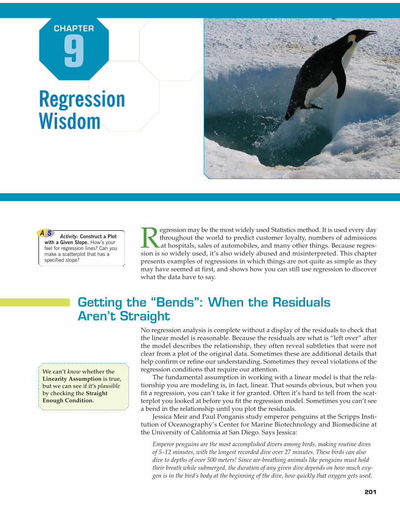
The researchers equip emperor penguins with devices thatrecord their heart rates during dives. Here’s a scatterplot of theDive Heart Rate (beats per minute) and the Duration (minutes) ofdives by these high-tech penguins.
The scatterplot looks fairly linear with a moderately strongnegative association . The linear regression equation
says that for longer dives, the average Dive Heart Rate is lower byabout 5.47 beats per dive minute, starting from a value of 96.9beats per minute.
The scatterplot of the residuals against Duration holds a sur-prise. The Linearity Assumption says we should not see a pattern,but instead there’s a bend, starting high on the left, dropping downin the middle of the plot, and rising again at the right. Graphs ofresiduals often reveal patterns such as this that were easy to missin the original scatterplot.
Now looking back at the original scatterplot, you may see thatthe scatter of points isn’t really straight. There’s a slight bend tothat plot, but the bend is much easier to see in the residuals. Eventhough it means rechecking the Straight Enough Condition afteryou find the regression, it’s always a good idea to check your scat-terplot of the residuals for bends that you might have overlookedin the original scatterplot.
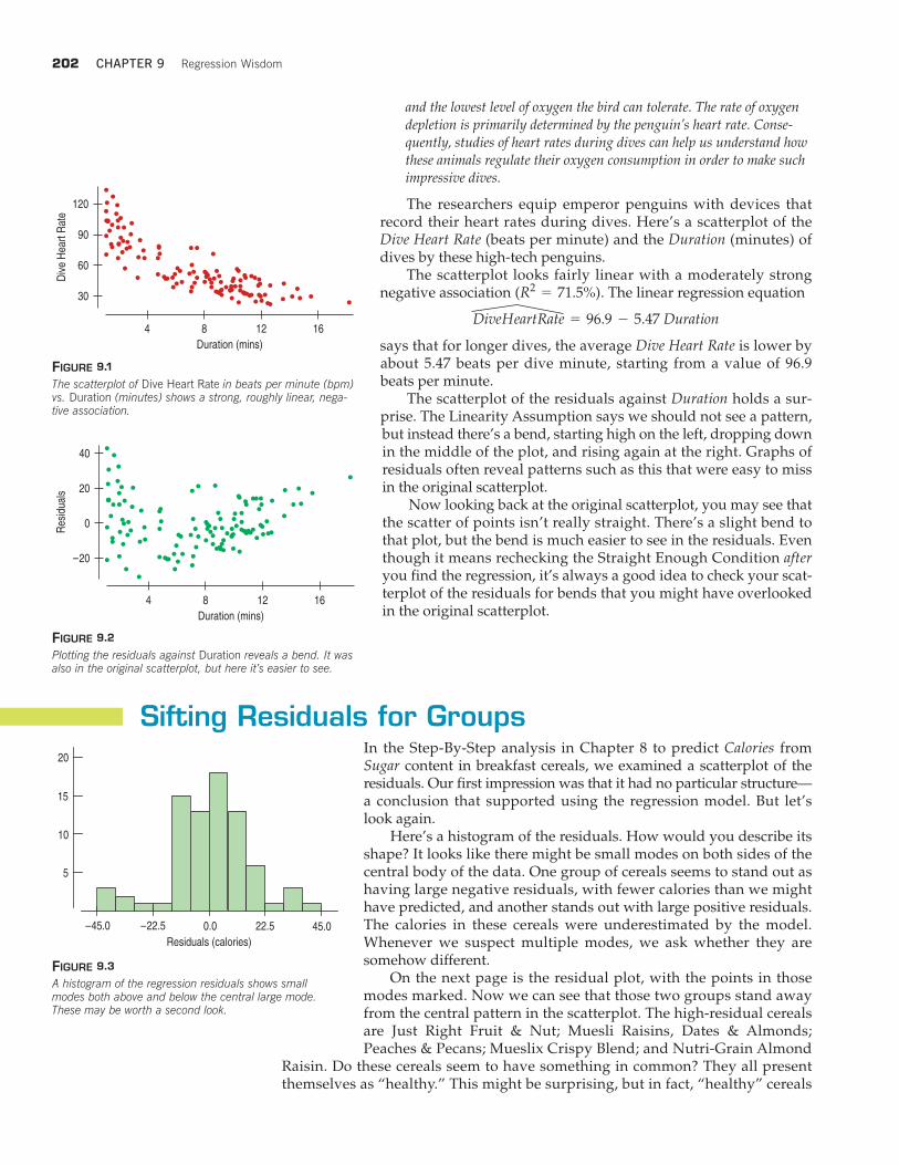
Sifting Residuals for GroupsIn the Step-By-Step analysis in Chapter 8 to predict Calories fromSugar content in breakfast cereals, we examined a scatterplot of theresiduals. Our first impression was that it had no particular structure—a conclusion that supported using the regression model. But let’slook again.
Here’s a histogram of the residuals. How would you describe itsshape? It looks like there might be small modes on both sides of thecentral body of the data. One group of cereals seems to stand out ashaving large negative residuals, with fewer calories than we mighthave predicted, and another stands out with large positive residuals.The calories in these cereals were underestimated by the model.Whenever we suspect multiple modes, we ask whether they aresomehow different.
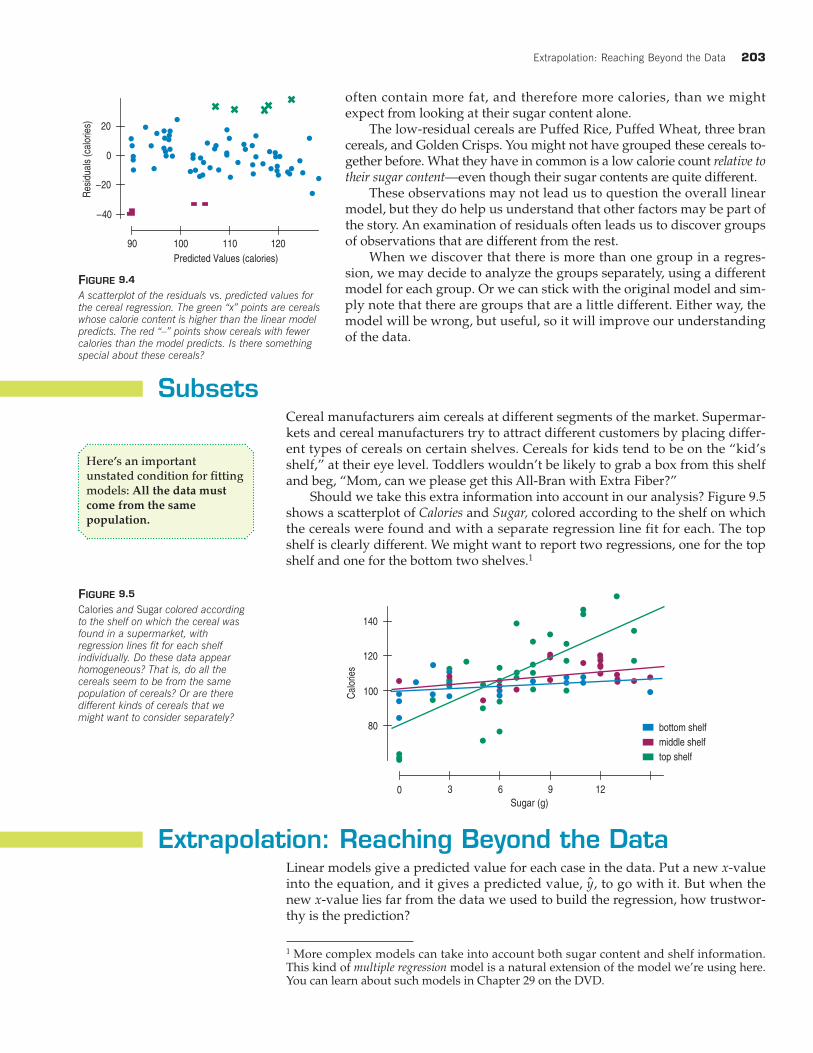
On the next page is the residual plot, with the points in thosemodes marked. Now we can see that those two groups stand awayfrom the central pattern in the scatterplot. The high-residual cerealsare Just Right Fruit & Nut; Muesli Raisins, Dates & Almonds;Peaches & Pecans; Mueslix Crispy Blend; and Nutri-Grain Almond
Raisin. Do these cereals seem to have something in common? They all presentthemselves as “healthy.” This might be surprising, but in fact, “healthy” cereals
DiveHeartRate = 96.9 - 5.47 Duration
(R2= 71.5%)
FIGURE 9.1
The scatterplot of Dive Heart Rate in beats per minute (bpm)vs. Duration (minutes) shows a strong, roughly linear, nega-tive association.
120
90
60
30
Div
e H
eart
Rat
e
1284 16
Duration (mins)
40
20
0
–20
Res
idua
ls
1284 16
Duration (mins)
FIGURE 9.2
Plotting the residuals against Duration reveals a bend. It wasalso in the original scatterplot, but here it’s easier to see.
–22.5 0.0 22.5 45.0
5
10
15
20
Residuals (calories)
–45.0
FIGURE 9.3
A histogram of the regression residuals shows smallmodes both above and below the central large mode.These may be worth a second look.
Extrapolation: Reaching Beyond the Data 203
often contain more fat, and therefore more calories, than we mightexpect from looking at their sugar content alone.
The low-residual cereals are Puffed Rice, Puffed Wheat, three brancereals, and Golden Crisps. You might not have grouped these cereals to-gether before. What they have in common is a low calorie count relative totheir sugar content—even though their sugar contents are quite different.
These observations may not lead us to question the overall linearmodel, but they do help us understand that other factors may be part ofthe story. An examination of residuals often leads us to discover groupsof observations that are different from the rest.
When we discover that there is more than one group in a regres-sion, we may decide to analyze the groups separately, using a differentmodel for each group. Or we can stick with the original model and sim-ply note that there are groups that are a little different. Either way, themodel will be wrong, but useful, so it will improve our understandingof the data.
SubsetsCereal manufacturers aim cereals at different segments of the market. Supermar-kets and cereal manufacturers try to attract different customers by placing differ-ent types of cereals on certain shelves. Cereals for kids tend to be on the “kid’sshelf,” at their eye level. Toddlers wouldn’t be likely to grab a box from this shelfand beg, “Mom, can we please get this All-Bran with Extra Fiber?”
Should we take this extra information into account in our analysis? Figure 9.5shows a scatterplot of Calories and Sugar, colored according to the shelf on whichthe cereals were found and with a separate regression line fit for each. The topshelf is clearly different. We might want to report two regressions, one for the topshelf and one for the bottom two shelves.1
–40
–20
0
20
90 100 110 120
Predicted Values (calories)
Res
iduals
(ca
lorie
s)
FIGURE 9.4
A scatterplot of the residuals vs. predicted values forthe cereal regression. The green “x” points are cerealswhose calorie content is higher than the linear modelpredicts. The red “–” points show cereals with fewercalories than the model predicts. Is there somethingspecial about these cereals?
Here’s an importantunstated condition for fittingmodels: All the data mustcome from the samepopulation.
80
100
120
140
0 3 6 9 12
bottom shelf
middle shelf
top shelf
Calo
ries
Sugar (g)
FIGURE 9.5
Calories and Sugar colored accordingto the shelf on which the cereal wasfound in a supermarket, with regression lines fit for each shelf individually. Do these data appear homogeneous? That is, do all the cereals seem to be from the samepopulation of cereals? Or are there different kinds of cereals that we might want to consider separately?
Extrapolation: Reaching Beyond the DataLinear models give a predicted value for each case in the data. Put a new x-valueinto the equation, and it gives a predicted value, , to go with it. But when thenew x-value lies far from the data we used to build the regression, how trustwor-thy is the prediction?
yN
1 More complex models can take into account both sugar content and shelf information.This kind of multiple regression model is a natural extension of the model we’re using here.You can learn about such models in Chapter 29 on the DVD.
204 CHAPTER 9 Regression Wisdom
The simple answer is that the farther the new x-value is from , the less trustwe should place in the predicted value. Once we venture into new x territory,such a prediction is called an extrapolation. Extrapolations are dubious becausethey require the very questionable assumption that nothing about the relationshipbetween x and y changes even at extreme values of x and beyond.
Extrapolations can get us into deep trouble. When the x-variable is Time, ex-trapolation becomes an attempt to peer into the future. People have always wantedto see into the future, and it doesn’t take a crystal ball to foresee that they alwayswill. In the past, seers, oracles, and wizards were called on to predict the future.Today mediums, fortune-tellers, and Tarot card readers still find many customers.
x
“Prediction is difficult,especially about the future.”
—Niels Bohr, Danish physicist
FOXTROT © 2002 Bill Amend. Reprinted with permission of UNIVERSAL PRESS SYNDICATE. All rights reserved.
Those with a more scientific outlook may use a linear model as their digitalcrystal ball. Linear models are based on the x-values of the data at hand and can-not be trusted beyond that span. Some physical phenomena do exhibit a kind of“inertia” that allows us to guess that current systematic behavior will continue,but regularity can’t be counted on in phenomena such as stock prices, sales fig-ures, hurricane tracks, or public opinion.
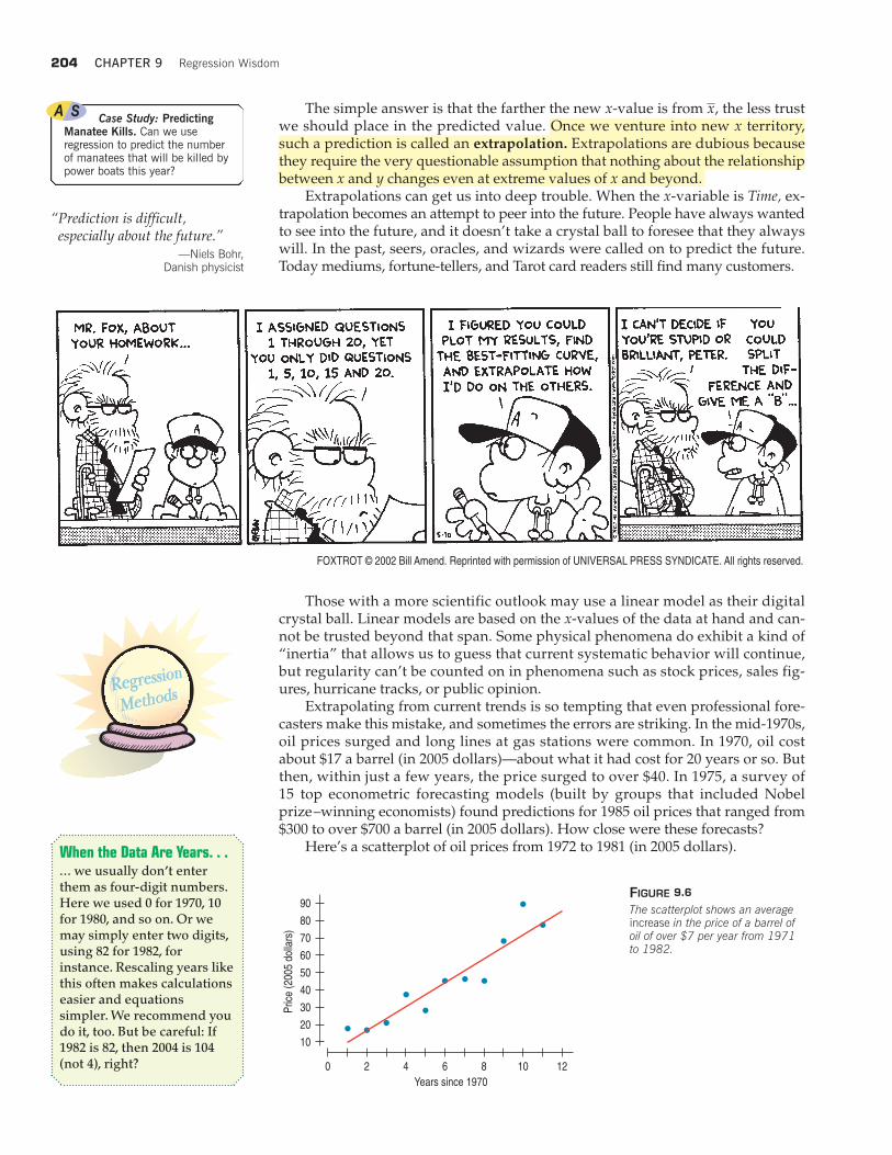
Extrapolating from current trends is so tempting that even professional fore-casters make this mistake, and sometimes the errors are striking. In the mid-1970s,oil prices surged and long lines at gas stations were common. In 1970, oil costabout $17 a barrel (in 2005 dollars)—about what it had cost for 20 years or so. Butthen, within just a few years, the price surged to over $40. In 1975, a survey of15 top econometric forecasting models (built by groups that included Nobelprize–winning economists) found predictions for 1985 oil prices that ranged from$300 to over $700 a barrel (in 2005 dollars). How close were these forecasts?
Here’s a scatterplot of oil prices from 1972 to 1981 (in 2005 dollars).
90
80
70
60
50
40
30
20
10
Pric
e (2
005
dolla
rs)
4 6 8 1020 12
Years since 1970
FIGURE 9.6
The scatterplot shows an averageincrease in the price of a barrel ofoil of over $7 per year from 1971to 1982.
When the Data Are Years. . .... we usually don’t enterthem as four-digit numbers.Here we used 0 for 1970, 10for 1980, and so on. Or wemay simply enter two digits,using 82 for 1982, forinstance. Rescaling years likethis often makes calculationseasier and equationssimpler. We recommend youdo it, too. But be careful: If1982 is 82, then 2004 is 104(not 4), right?
Case Study: PredictingManatee Kills. Can we useregression to predict the numberof manatees that will be killed bypower boats this year?
Outliers, Leverage, and Influence 205
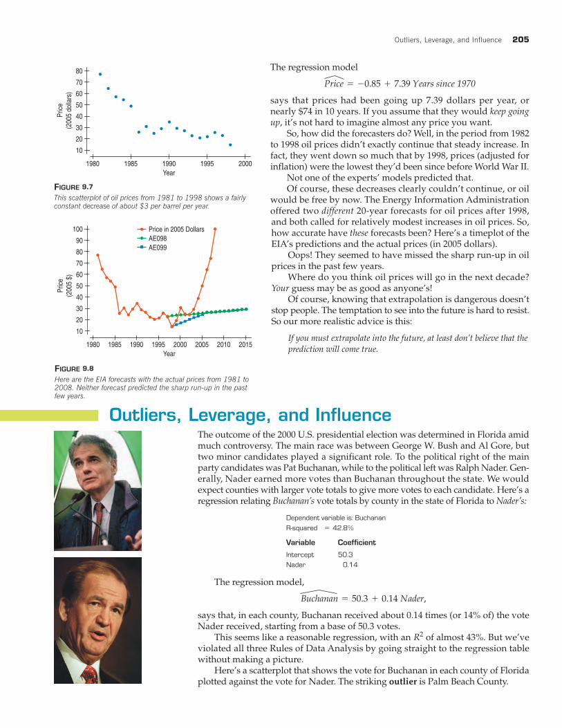
The regression model
says that prices had been going up 7.39 dollars per year, ornearly $74 in 10 years. If you assume that they would keep goingup, it’s not hard to imagine almost any price you want.
So, how did the forecasters do? Well, in the period from 1982to 1998 oil prices didn’t exactly continue that steady increase. Infact, they went down so much that by 1998, prices (adjusted forinflation) were the lowest they’d been since before World War II.
Not one of the experts’ models predicted that.Of course, these decreases clearly couldn’t continue, or oil
would be free by now. The Energy Information Administrationoffered two different 20-year forecasts for oil prices after 1998,and both called for relatively modest increases in oil prices. So,how accurate have these forecasts been? Here’s a timeplot of theEIA’s predictions and the actual prices (in 2005 dollars).
Oops! They seemed to have missed the sharp run-up in oilprices in the past few years.
Where do you think oil prices will go in the next decade?Your guess may be as good as anyone’s!
Of course, knowing that extrapolation is dangerous doesn’tstop people. The temptation to see into the future is hard to resist.So our more realistic advice is this:
If you must extrapolate into the future, at least don’t believe that the
prediction will come true.
Outliers, Leverage, and InfluenceThe outcome of the 2000 U.S. presidential election was determined in Florida amidmuch controversy. The main race was between George W. Bush and Al Gore, buttwo minor candidates played a significant role. To the political right of the mainparty candidates was Pat Buchanan, while to the political left was Ralph Nader. Gen-erally, Nader earned more votes than Buchanan throughout the state. We wouldexpect counties with larger vote totals to give more votes to each candidate. Here’s aregression relating Buchanan’s vote totals by county in the state of Florida to Nader’s:
Price = -0.85 + 7.39 Years since 1970
10
20
30
40
50
60
70
80
1980 1985 1990 1995 2000Year
Pric
e(2
005
dolla
rs)
FIGURE 9.7
This scatterplot of oil prices from 1981 to 1998 shows a fairlyconstant decrease of about $3 per barrel per year.
10
20
30
40
50
60
70
80
90
100
1980 1985 1990 1995 2000 2005 20152010Year
Pric
e(2
005
$)
Price in 2005 DollarsAE098
AE099
FIGURE 9.8
Here are the EIA forecasts with the actual prices from 1981 to2008. Neither forecast predicted the sharp run-up in the pastfew years.
5
Variable Coefficient
The regression model,
says that, in each county, Buchanan received about 0.14 times (or 14% of) the voteNader received, starting from a base of 50.3 votes.
This seems like a reasonable regression, with an of almost 43%. But we’veviolated all three Rules of Data Analysis by going straight to the regression tablewithout making a picture.
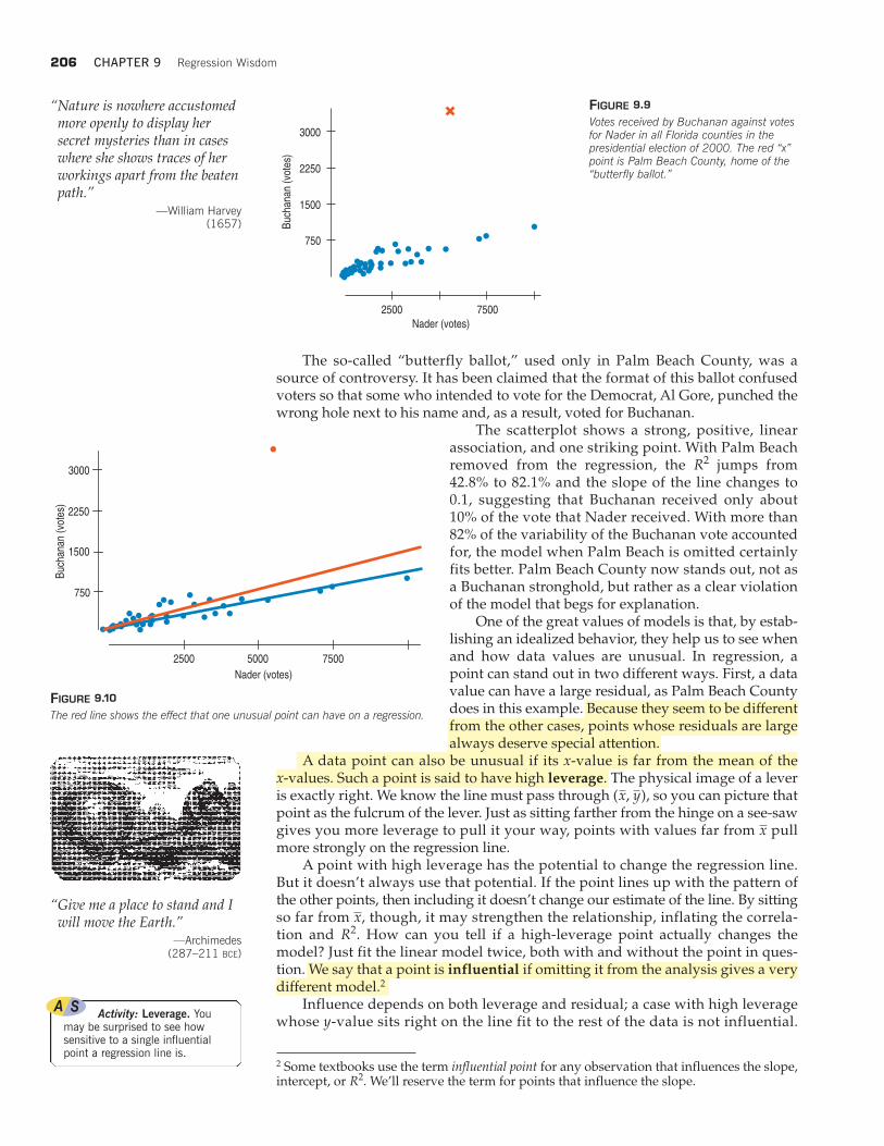
Here’s a scatterplot that shows the vote for Buchanan in each county of Floridaplotted against the vote for Nader. The striking outlier is Palm Beach County.
R2
Buchanan = 50.3 + 0.14 Nader,
206 CHAPTER 9 Regression Wisdom
The so-called “butterfly ballot,” used only in Palm Beach County, was asource of controversy. It has been claimed that the format of this ballot confusedvoters so that some who intended to vote for the Democrat, Al Gore, punched thewrong hole next to his name and, as a result, voted for Buchanan.
The scatterplot shows a strong, positive, linearassociation, and one striking point. With Palm Beachremoved from the regression, the jumps from42.8% to 82.1% and the slope of the line changes to0.1, suggesting that Buchanan received only about10% of the vote that Nader received. With more than82% of the variability of the Buchanan vote accountedfor, the model when Palm Beach is omitted certainlyfits better. Palm Beach County now stands out, not asa Buchanan stronghold, but rather as a clear violationof the model that begs for explanation.
One of the great values of models is that, by estab-lishing an idealized behavior, they help us to see whenand how data values are unusual. In regression, apoint can stand out in two different ways. First, a datavalue can have a large residual, as Palm Beach Countydoes in this example. Because they seem to be differentfrom the other cases, points whose residuals are largealways deserve special attention.
A data point can also be unusual if its x-value is far from the mean of the x-values. Such a point is said to have high leverage. The physical image of a leveris exactly right. We know the line must pass through , so you can picture thatpoint as the fulcrum of the lever. Just as sitting farther from the hinge on a see-sawgives you more leverage to pull it your way, points with values far from pullmore strongly on the regression line.
A point with high leverage has the potential to change the regression line.But it doesn’t always use that potential. If the point lines up with the pattern ofthe other points, then including it doesn’t change our estimate of the line. By sittingso far from , though, it may strengthen the relationship, inflating the correla-tion and . How can you tell if a high-leverage point actually changes themodel? Just fit the linear model twice, both with and without the point in ques-tion. We say that a point is influential if omitting it from the analysis gives a verydifferent model.2
Influence depends on both leverage and residual; a case with high leveragewhose y-value sits right on the line fit to the rest of the data is not influential.
R2x
x
(x, y)
R2
750
1500
2250
3000
2500 7500
Buch
ana
n (v
otes
)
Nader (votes)
FIGURE 9.9
Votes received by Buchanan against votesfor Nader in all Florida counties in thepresidential election of 2000. The red “x”point is Palm Beach County, home of the“butterfly ballot.”
“Nature is nowhere accustomedmore openly to display hersecret mysteries than in caseswhere she shows traces of herworkings apart from the beatenpath.”
—William Harvey(1657)
750
1500
2250
3000
2500 5000 7500
Nader (votes)
Buch
ana
n (v
otes
)
FIGURE 9.10
The red line shows the effect that one unusual point can have on a regression.
“Give me a place to stand and Iwill move the Earth.”
—Archimedes (287–211 BCE)
Activity: Leverage. Youmay be surprised to see howsensitive to a single influentialpoint a regression line is.
2 Some textbooks use the term influential point for any observation that influences the slope,intercept, or We’ll reserve the term for points that influence the slope.R2.
Outliers, Leverage, and Influence 207
Removing that case won’t change the slope, even if it does affect . A case withmodest leverage but a very large residual (such as Palm Beach County) can beinfluential. Of course, if a point has enough leverage, it can pull the line right toit. Then it’s highly influential, but its residual is small. The only way to be sureis to fit both regressions.
Unusual points in a regression often tell us more about the data and the modelthan any other points. We face a challenge: The best way to identify unusual pointsis against the background of a model, but good models are free of the influence ofunusual points. (That insight’s at least 400 years old. See the sidebar.) Don’t give into the temptation to simply delete points that don’t fit the line. You can take pointsout and discuss what the model looks like with and without them, but arbitrarilydeleting points can give a false sense of how well the model fits the data. Your goalshould be understanding the data, not making as big as you can.
In 2000, George W. Bush won Florida (and thus the presidency) by only a fewhundred votes, so Palm Beach County’s residual is big enough to be meaningful.It’s the rare unusual point that determines a presidency, but all are worth examin-ing and trying to understand.
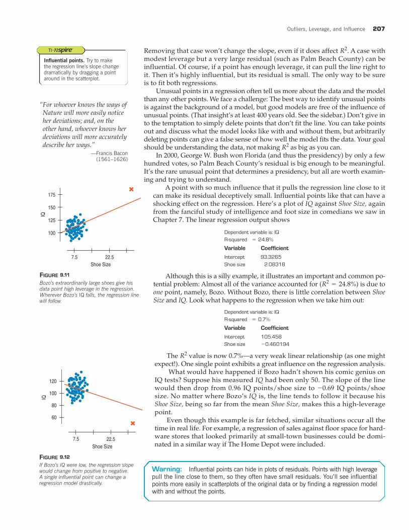
A point with so much influence that it pulls the regression line close to itcan make its residual deceptively small. Influential points like that can have ashocking effect on the regression. Here’s a plot of IQ against Shoe Size, againfrom the fanciful study of intelligence and foot size in comedians we saw inChapter 7. The linear regression output shows
5
Variable Coefficient
Although this is a silly example, it illustrates an important and common po-tential problem: Almost all of the variance accounted for is due toone point, namely, Bozo. Without Bozo, there is little correlation between ShoeSize and IQ. Look what happens to the regression when we take him out:
5
Variable Coefficient
The value is now 0.7%—a very weak linear relationship (as one mightexpect!). One single point exhibits a great influence on the regression analysis.
What would have happened if Bozo hadn’t shown his comic genius onIQ tests? Suppose his measured IQ had been only 50. The slope of the linewould then drop from 0.96 IQ points/shoe size to IQ points/shoesize. No matter where Bozo’s IQ is, the line tends to follow it because hisShoe Size, being so far from the mean Shoe Size, makes this a high-leveragepoint.
Even though this example is far fetched, similar situations occur all thetime in real life. For example, a regression of sales against floor space for hard-ware stores that looked primarily at small-town businesses could be domi-nated in a similar way if The Home Depot were included.
-0.69
R2
-
(R2= 24.8%)
R2
R2
100
125
150
175
IQ
7.5 22.5
Shoe Size
FIGURE 9.11
Bozo’s extraordinarily large shoes give hisdata point high leverage in the regression.Wherever Bozo’s IQ falls, the regression linewill follow.
60
80
100
120
7.5 22.5
Shoe Size
IQ
FIGURE 9.12
If Bozo’s IQ were low, the regression slopewould change from positive to negative. A single influential point can change a regression model drastically.
Warning: Influential points can hide in plots of residuals. Points with high leverage
pull the line close to them, so they often have small residuals. You’ll see influential
points more easily in scatterplots of the original data or by finding a regression model
with and without the points.
“For whoever knows the ways ofNature will more easily noticeher deviations; and, on theother hand, whoever knows herdeviations will more accuratelydescribe her ways.”
—Francis Bacon(1561–1626)
Influential points. Try to makethe regression line’s slope changedramatically by dragging a pointaround in the scatterplot.
208 CHAPTER 9 Regression Wisdom
4
6
8
10
12
y
2 4 86 10x
5
0
10
15
20
25
50 10 15 20x
y
20
15
10
5
0
–5
–10
–15
–20
y151050 20
x
Lurking Variables and CausationIn Chapter 7, we tried to make it clear that no matter how strong the correlation isbetween two variables, there’s no simple way to show that one variable causes theother. Putting a regression line through a cloud of points just increases the tempta-tion to think and to say that the x-variable causes the y-variable. Just to make sure,let’s repeat the point again: No matter how strong the association, no matter howlarge the value, no matter how straight the line, there is no way to conclude froma regression alone that one variable causes the other. There’s always the possibilitythat some third variable is driving both of the variables you have observed. Withobservational data, as opposed to data from a designed experiment, there is no wayto be sure that a lurking variable is not the cause of any apparent association.
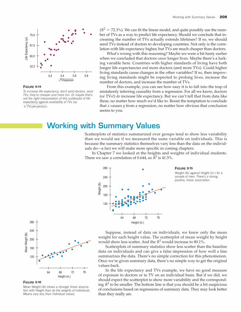
Here’s an example: The scatterplot shows the Life Expectancy (average ofmen and women, in years) for each of 41 countries of the world, plottedagainst the square root of the number of Doctors per person in the country.(The square root is here to make the relationship satisfy the Straight EnoughCondition, as we saw back in Chapter 7.)
The strong positive association seems to confirm our expec-tation that more Doctors per person improves healthcare, leading to longerlifetimes and a greater Life Expectancy. The strength of the association wouldseem to argue that we should send more doctors to developing countries to in-crease life expectancy.
That conclusion is about the consequences of a change. Would sendingmore doctors increase life expectancy? Specifically, do doctors cause greaterlife expectancy? Perhaps, but these are observed data, so there may be anotherexplanation for the association.
On the next page, the similar-looking scatterplot’s x-variable is the squareroot of the number of Televisions per person in each country. The positive associ-ation in this scatterplot is even stronger than the association in the previous plot
1R2= 62.4%2
R2
One common way tointerpret a regression slopeis to say that “a change of 1 unit in x results in a changeof units in y.” This way ofsaying things encouragescausal thinking. Beware.
b1
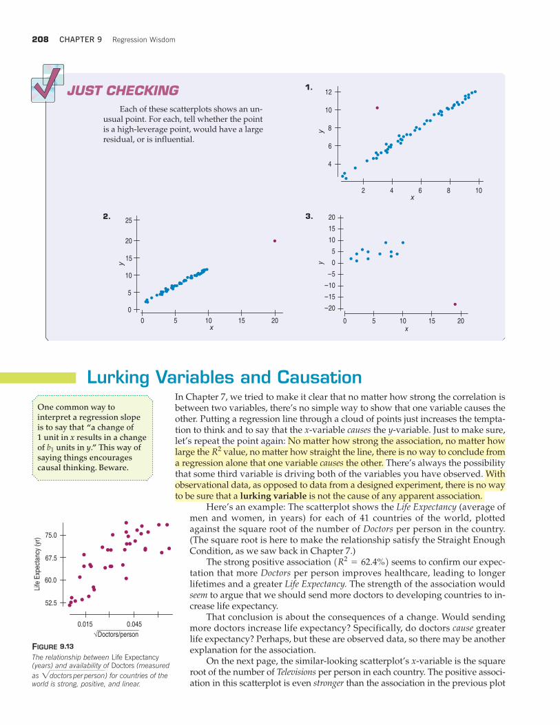
JUST CHECKING
Each of these scatterplots shows an un-usual point. For each, tell whether the pointis a high-leverage point, would have a largeresidual, or is influential.
52.5
60.0
67.5
75.0
0.015 0.045
Life
Exp
ecta
ncy
(yr)
Doctors/person√
FIGURE 9.13
The relationship between Life Expectancy(years) and availability of Doctors (measured
as ) for countries of the world is strong, positive, and linear.2doctors per person
1.
2. 3.
Working with Summary Values 209
We can fit the linear model, and quite possibly use the num-ber of TVs as a way to predict life expectancy. Should we conclude that in-creasing the number of TVs actually extends lifetimes? If so, we shouldsend TVs instead of doctors to developing countries. Not only is the corre-lation with life expectancy higher, but TVs are much cheaper than doctors.
What’s wrong with this reasoning? Maybe we were a bit hasty earlierwhen we concluded that doctors cause longer lives. Maybe there’s a lurk-ing variable here. Countries with higher standards of living have bothlonger life expectancies and more doctors (and more TVs). Could higherliving standards cause changes in the other variables? If so, then improv-ing living standards might be expected to prolong lives, increase thenumber of doctors, and increase the number of TVs.
From this example, you can see how easy it is to fall into the trap ofmistakenly inferring causality from a regression. For all we know, doctors(or TVs!) do increase life expectancy. But we can’t tell that from data likethese, no matter how much we’d like to. Resist the temptation to concludethat x causes y from a regression, no matter how obvious that conclusionseems to you.
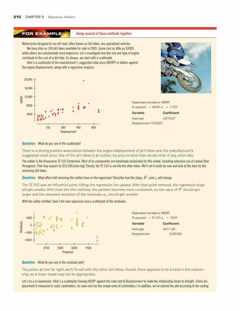
Working with Summary ValuesScatterplots of statistics summarized over groups tend to show less variabilitythan we would see if we measured the same variable on individuals. This is because the summary statistics themselves vary less than the data on the individ-uals do—a fact we will make more specific in coming chapters.
In Chapter 7 we looked at the heights and weights of individual students.There we saw a correlation of 0.644, so is 41.5%.R2
(R2= 72.3%).
52.5
60.0
67.5
75.0
0.2 0.4 0.6 0.8
Life
Exp
ecta
ncy
(yr)
TVs/person√
FIGURE 9.14
To increase life expectancy, don’t send doctors, sendTVs; they’re cheaper and more fun. Or maybe that’snot the right interpretation of this scatterplot of lifeexpectancy against availability of TVs (as
).2TVs per person
Wei
ght (
lb)
Height (in.)
120
160
200
240
280
64 68 72 76
FIGURE 9.15
Weight (lb) against Height (in.) for asample of men. There’s a strong, positive, linear association.
Suppose, instead of data on individuals, we knew only the meanweight for each height value. The scatterplot of mean weight by heightwould show less scatter. And the would increase to 80.1%.
Scatterplots of summary statistics show less scatter than the baselinedata on individuals and can give a false impression of how well a linesummarizes the data. There’s no simple correction for this phenomenon.Once we’re given summary data, there’s no simple way to get the originalvalues back.
In the life expectancy and TVs example, we have no good measure of exposure to doctors or to TV on an individual basis. But if we did, weshould expect the scatterplot to show more variability and the correspond-ing to be smaller. The bottom line is that you should be a bit suspiciousof conclusions based on regressions of summary data. They may look betterthan they really are.
R2
R2
120
160
200
240
280
64 68 72 76
Mea
n W
eigh
t (lb
)
Height (in.)
FIGURE 9.16
Mean Weight (lb) shows a stronger linear associa-tion with Height than do the weights of individuals.Means vary less than individual values.
210 CHAPTER 9 Regression Wisdom
Using several of these methods togetherFOR EXAMPLE
Motorcycles designed to run off-road, often known as dirt bikes, are specialized vehicles.
We have data on 104 dirt bikes available for sale in 2005. Some cost as little as $3000,
while others are substantially more expensive. Let’s investigate how the size and type of engine
contribute to the cost of a dirt bike. As always, we start with a scatterplot.
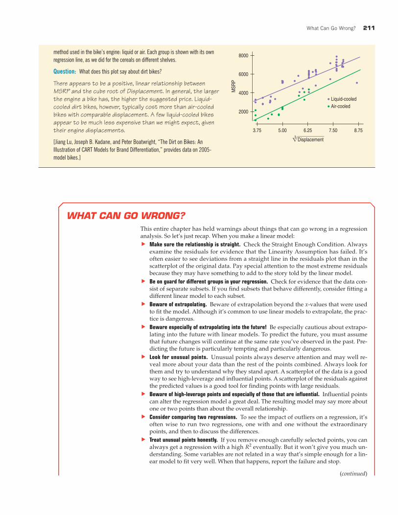
Here’s a scatterplot of the manufacturer’s suggested retail price (MSRP) in dollars against
the engine Displacement, along with a regression analysis:
20,000
16,000
12,000
8000
4000
MS
RP
450300150 600
Displacement
Variable Coefficient
- = =
Question: What do you see in the scatterplot?
There is a strong positive association between the engine displacement of dirt bikes and the manufacturer’ssuggested retail price. One of the dirt bikes is an outlier; its price is more than double that of any other bike.
The outlier is the Husqvarna TE 510 Centennial. Most of its components are handmade exclusively for this model, including extensive use of carbon fiber
throughout. That may explain its $19,500 price tag! Clearly, the TE 510 is not like the other bikes. We’ll set it aside for now and look at the data for the
remaining dirt bikes.
Question: What effect will removing this outlier have on the regression? Describe how the slope, , and will change.
The TE 510 was an influential point, tilting the regression line upward. With that point removed, the regression slopewill get smaller. With that dirt bike omitted, the pattern becomes more consistent, so the value of should getlarger and the standard deviation of the residuals, , should get smaller.
With the outlier omitted, here’s the new regression and a scatterplot of the residuals:
se
R2
seR2
1500
0
–1500
–3000
Res
idua
ls
625050003750 7500
Predicted
Variable Coefficient
- = =
Question: What do you see in the residuals plot?
The points at the far right don’t fit well with the other dirt bikes. Overall, there appears to be a bend in the relation-ship, so a linear model may not be appropriate.
Let’s try a re-expression. Here’s a scatterplot showing MSRP against the cube root of Displacement to make the relationship closer to straight. (Since dis-
placement is measured in cubic centimeters, its cube root has the simple units of centimeters.) In addition, we’ve colored the plot according to the cooling
What Can Go Wrong? 211
method used in the bike’s engine: liquid or air. Each group is shown with its own
regression line, as we did for the cereals on different shelves.
Question: What does this plot say about dirt bikes?
There appears to be a positive, linear relationship betweenMSRP and the cube root of Displacement. In general, the largerthe engine a bike has, the higher the suggested price. Liquid-cooled dirt bikes, however, typically cost more than air-cooledbikes with comparable displacement. A few liquid-cooled bikesappear to be much less expensive than we might expect, giventheir engine displacements.
[Jiang Lu, Joseph B. Kadane, and Peter Boatwright, “The Dirt on Bikes: An
Illustration of CART Models for Brand Differentiation,” provides data on 2005-
model bikes.]
WHAT CAN GO WRONG?
This entire chapter has held warnings about things that can go wrong in a regressionanalysis. So let’s just recap. When you make a linear model:
u Make sure the relationship is straight. Check the Straight Enough Condition. Alwaysexamine the residuals for evidence that the Linearity Assumption has failed. It’soften easier to see deviations from a straight line in the residuals plot than in thescatterplot of the original data. Pay special attention to the most extreme residualsbecause they may have something to add to the story told by the linear model.
u Be on guard for different groups in your regression. Check for evidence that the data con-sist of separate subsets. If you find subsets that behave differently, consider fitting adifferent linear model to each subset.
u Beware of extrapolating. Beware of extrapolation beyond the x-values that were usedto fit the model. Although it’s common to use linear models to extrapolate, the prac-tice is dangerous.
u Beware especially of extrapolating into the future! Be especially cautious about extrapo-lating into the future with linear models. To predict the future, you must assumethat future changes will continue at the same rate you’ve observed in the past. Pre-dicting the future is particularly tempting and particularly dangerous.
u Look for unusual points. Unusual points always deserve attention and may well re-veal more about your data than the rest of the points combined. Always look forthem and try to understand why they stand apart. A scatterplot of the data is a goodway to see high-leverage and influential points. A scatterplot of the residuals againstthe predicted values is a good tool for finding points with large residuals.
u Beware of high-leverage points and especially of those that are influential. Influential pointscan alter the regression model a great deal. The resulting model may say more aboutone or two points than about the overall relationship.
u Consider comparing two regressions. To see the impact of outliers on a regression, it’soften wise to run two regressions, one with and one without the extraordinarypoints, and then to discuss the differences.
u Treat unusual points honestly. If you remove enough carefully selected points, you canalways get a regression with a high eventually. But it won’t give you much un-derstanding. Some variables are not related in a way that’s simple enough for a lin-ear model to fit very well. When that happens, report the failure and stop.
R2
(continued)
8000
6000
4000
2000
MSR
P
6.255.003.75 7.50
Liquid-cooled
8.75
Displacement3
Air-cooled

212 CHAPTER 9 Regression Wisdom
u Beware of lurking variables. Think about lurking variables before interpreting a linearmodel. It’s particularly tempting to explain a strong regression by thinking that thex-variable causes the y-variable. A linear model alone can never demonstrate suchcausation, in part because it cannot eliminate the chance that a lurking variable hascaused the variation in both x and y.
u Watch out when dealing with data that are summaries. Be cautious in working with datavalues that are themselves summaries, such as means or medians. Such statistics areless variable than the data on which they are based, so they tend to inflate the im-pression of the strength of a relationship.
WHAT HAVE WE LEARNED?
We’ve learned that there are many ways in which a data set may be unsuitable for a regression
analysis.
u Watch out for more than one group hiding in your regression analysis. If you find subsets of the
data that behave differently, consider fitting a different regression model to each subset.
u The Straight Enough Condition says that the relationship should be reasonably straight to fit a
regression. Somewhat paradoxically, sometimes it’s easier to see that the relationship is not
straight after fitting the regression by examining the residuals. The same is true of outliers.
u The Outlier Condition actually means two things: Points with large residuals or high leverage
(especially both) can influence the regression model significantly. It’s a good idea to perform the
regression analysis with and without such points to see their impact.
And we’ve learned that even a good regression doesn’t mean we should believe that the model says
more than it really does.
u Extrapolation far from can lead to silly and useless predictions.
u Even an near 100% doesn’t indicate that x causes y (or the other way around). Watch out for
lurking variables that may affect both x and y.
u Be careful when you interpret regressions based on summaries of the data sets. These regres-
sions tend to look stronger than the regression based on all the individual data.
Terms
Extrapolation 203. Although linear models provide an easy way to predict values of y for a given value of x, it
is unsafe to predict for values of x far from the ones used to find the linear model equation. Such
extrapolation may pretend to see into the future, but the predictions should not be trusted.
R2
x
CONNECTIONSWe are always alert to things that can go wrong if we use statistics without thinking carefully. Regres-sion opens new vistas of potential problems. But each one relates to issues we’ve thought about before.
It is always important that our data be from a single homogeneous group and not made up ofdisparate groups. We looked for multiple modes in single variables. Now we check scatterplots forevidence of subgroups in our data. As with modes, it’s often best to split the data and analyze thegroups separately.
Our concern with unusual points and their potential influence also harks back to our earlier con-cern with outliers in histograms and boxplots—and for many of the same reasons. As we’ve seenhere, regression offers such points new scope for mischief.
The risks of interpreting linear models as causal or predictive arose in Chapters 7 and 8. Andthey’re important enough to mention again in later chapters.

Regression Diagnosis on the Computer 213
Outlier 205. Any data point that stands away from the others can be called an outlier. In regression, out-
liers can be extraordinary in two ways: by having a large residual or by having high leverage.
Leverage 206. Data points whose x-values are far from the mean of x are said to exert leverage on a linear
model. High-leverage points pull the line close to them, and so they can have a large effect on the
line, sometimes completely determining the slope and intercept. With high enough leverage, their
residuals can be deceptively small.
Influential point 206. If omitting a point from the data results in a very different regression model, then that point is
called an influential point.
Lurking variable 208. A variable that is not explicitly part of a model but affects the way the variables in the model
appear to be related is called a lurking variable. Because we can never be certain that observational
data are not hiding a lurking variable that influences both x and y, it is never safe to conclude that a
linear model demonstrates a causal relationship, no matter how strong the linear association.
Skills
u Understand that we cannot fit linear models or use linear regression if the underlying relation-
ship between the variables is not itself linear.
u Understand that data used to find a model must be homogeneous. Look for subgroups in data
before you find a regression, and analyze each separately.
u Know the danger of extrapolating beyond the range of the x-values used to find the linear model,
especially when the extrapolation tries to predict into the future.
u Understand that points can be unusual by having a large residual or by having high leverage.
u Understand that an influential point can change the slope and intercept of the regression line.
u Look for lurking variables whenever you consider the association between two variables. Under-
stand that a strong association does not mean that the variables are causally related.
u Know how to display residuals from a linear model by making a scatterplot of residuals against
predicted values or against the x-variable, and know what patterns to look for in the picture.
u Know how to look for high-leverage and influential points by examining a scatterplot of the data
and how to look for points with large residuals by examining a scatterplot of the residuals against
the predicted values or against the x-variable. Understand how fitting a regression line with and
without influential points can add to your understanding of the regression model.
u Know how to look for high-leverage points by examining the distribution of the x-values or by
recognizing them in a scatterplot of the data, and understand how they can affect a linear model.
u Include diagnostic information such as plots of residuals and leverages as part of your report of a
regression.
u Report any high-leverage points.
u Report any outliers. Consider reporting analyses with and without outliers, to assess their influ-
ence on the regression.
u Include appropriate cautions about extrapolation when reporting predictions from a linear model.
u Discuss possible lurking variables.
REGRESSION DIAGNOSIS ON THE COMPUTER
Most statistics technology offers simple ways to check whether your data satisfy the conditions for regression.We have already seen that these programs can make a simple scatterplot. They can also help us check theconditions by plotting residuals.