Embed Size (px)
Citation preview

Information Visualization
Reading Visualization Papers
Dr. David Koop
D. Koop, CSCI 628, Fall 2021

Animated Transitions
2
[M. Bostock]D. Koop, CSCI 628, Fall 2021

Animated Transitions
2
[M. Bostock]D. Koop, CSCI 628, Fall 2021

Composite Visualization Techniques
3
[W. Javed and N. Elmqvist, 2012]D. Koop, CSCI 628, Fall 2021
Technique Visualization A Visualization B Spatial Relation Data Relation
ComVis [24] (Figure 2) any any juxtapose noneImprovise [39] (Figure 3) any any juxtapose noneJigsaw [36] any any juxtapose noneSnap-Together [30] any any juxtapose nonesemantic substrates [34] (Figure 4) node-link node-link juxtapose item-itemVisLink [11] (Figure 5) radial graph node-link juxtapose item-itemNapoleon’s March on Moscow [37] time line view area visualization juxtapose item-itemMapgets [38] (Figure 6) map text superimpose item-itemGeoSpace [22] (Figure 7) map bar graph superimpose item-item3D GIS [8] map glyphs superimpose item-itemScatter Plots in Parallel Coordinates [45] (Figure 8) parallel coordinate scatterplot overload item-dimensionGraph links on treemaps [14] (Figure 9) treemap node-link overload item-itemSparkClouds [21] tag cloud line graph overload item-itemZAME [13] (Figure 10) matrix glyphs nested item-groupNodeTrix [17] (Figure 11) node-link matrix nested item-groupTimeMatrix [44] matrix glyphs nested item-groupGPUVis [25] Scatterplot glyphs nested item-group
Table 1: Classification of common composite visualization techniques using our design space.
(a) Juxtaposed views. (b) Integrated views. (c) Superimposed views. (d) Overloaded views. (e) Nested views.
Figure 12: Example of composing a scatterplot and bar graph using different methods.
datasets in the same space and using different visualizations, butalso highlights the relational linking between the two datasets.
Nested views provide an efficient approach to link each of thedata values, visualized through the host visualization, to its relateddataset, visualized through client visualizations. This is achievedby nesting clients inside the visual marks in the host.
• Benefits: Very compact representation, easy correlation.• Drawbacks: Limited space for the client visualizations, clut-
ter is high, and visual design dependencies are high.• Applications: Again, situations that call for augmenting a
particular visual representation with additional mapping.
Figure 12(e) shows an example composition of scatterplot andbar graph visualizations based on this design patter. In the figure,the scatterplot visualization is acting as a host and bar graph visu-alizations are nested inside its visual marks.
There is probably not a clear winner among different design pat-terns while designing an information visualization tool. The correctchoice of design pattern to use for a particular implementation de-pends on different conditions, such as the available view space, userknowledge, and the complexity of the underlying dataset. Ideallyspeaking, designers should be able to combine any existing visual-izations to generate a composite visualization view.
8.2 Delimitations
While our above CVV design patterns are general in nature, theyare based solely on the spatial layout of component visualizations.However, it is possible to envision other ways to combine two ormore visualizations, for example using interaction or animation.One such example is the use of interactive hyperlinking [6, 43] (orwormholing) to navigate between different visualization views.
8.3 Discussion
There are several direct benefits to structuring the design space ofcomposite visualization views in this manner. Classifying existingtechniques into patterns not only helps in understanding these tech-niques, but also in evaluating their strengths and weaknesses.
However, the design patterns presented in this paper are all basedon evidence from the literature of how existing visualization toolsand techniques use composite views. Therefore, our frameworkis inherently limited to current designs, and more descriptive thangenerative in nature. Furthermore, this list of patterns is not neces-sarily exhaustive, and we certainly foresee additional design pat-terns for composite views to emerge with progress in informa-tion visualization. It is also not always straightforward to sepa-rate what is a composite visualization and what is an “atomic” (orcomponent) visualization, particularly when the compositions onthe visual structures—which is the case for overloaded and nestedviews—as opposed to merely on the views. Our approach in theabove text has been to treat as components any technique has beenpresented in the literature as a standalone technique.
9 CONCLUSION
We have proposed a novel framework for specifying, designing, andevaluating compositions of multiple visualizations in the same vi-sual space that we call composite visualization views. The benefitof the framework is not only to provide a way to unify a large col-lection of existing work where visual representations are combinedin various ways, but also to suggest new combinations of visualrepresentations that may significantly advance the state of the art.
REFERENCES
[1] C. Ahlberg and B. Shneiderman. Visual information seeking: Tightcoupling of dynamic query filters with starfield displays. In Proceed-
Technique Visualization A Visualization B Spatial Relation Data Relation
ComVis [24] (Figure 2) any any juxtapose noneImprovise [39] (Figure 3) any any juxtapose noneJigsaw [36] any any juxtapose noneSnap-Together [30] any any juxtapose nonesemantic substrates [34] (Figure 4) node-link node-link juxtapose item-itemVisLink [11] (Figure 5) radial graph node-link juxtapose item-itemNapoleon’s March on Moscow [37] time line view area visualization juxtapose item-itemMapgets [38] (Figure 6) map text superimpose item-itemGeoSpace [22] (Figure 7) map bar graph superimpose item-item3D GIS [8] map glyphs superimpose item-itemScatter Plots in Parallel Coordinates [45] (Figure 8) parallel coordinate scatterplot overload item-dimensionGraph links on treemaps [14] (Figure 9) treemap node-link overload item-itemSparkClouds [21] tag cloud line graph overload item-itemZAME [13] (Figure 10) matrix glyphs nested item-groupNodeTrix [17] (Figure 11) node-link matrix nested item-groupTimeMatrix [44] matrix glyphs nested item-groupGPUVis [25] Scatterplot glyphs nested item-group
Table 1: Classification of common composite visualization techniques using our design space.
(a) Juxtaposed views. (b) Integrated views. (c) Superimposed views.1 2 3 4 5 6 7 8a b c d e f g h
(d) Overloaded views. (e) Nested views.
Figure 12: Example of composing a scatterplot and bar graph using different methods.
datasets in the same space and using different visualizations, butalso highlights the relational linking between the two datasets.
Nested views provide an efficient approach to link each of thedata values, visualized through the host visualization, to its relateddataset, visualized through client visualizations. This is achievedby nesting clients inside the visual marks in the host.
• Benefits: Very compact representation, easy correlation.• Drawbacks: Limited space for the client visualizations, clut-
ter is high, and visual design dependencies are high.• Applications: Again, situations that call for augmenting a
particular visual representation with additional mapping.
Figure 12(e) shows an example composition of scatterplot andbar graph visualizations based on this design patter. In the figure,the scatterplot visualization is acting as a host and bar graph visu-alizations are nested inside its visual marks.
There is probably not a clear winner among different design pat-terns while designing an information visualization tool. The correctchoice of design pattern to use for a particular implementation de-pends on different conditions, such as the available view space, userknowledge, and the complexity of the underlying dataset. Ideallyspeaking, designers should be able to combine any existing visual-izations to generate a composite visualization view.
8.2 Delimitations
While our above CVV design patterns are general in nature, theyare based solely on the spatial layout of component visualizations.However, it is possible to envision other ways to combine two ormore visualizations, for example using interaction or animation.One such example is the use of interactive hyperlinking [6, 43] (orwormholing) to navigate between different visualization views.
8.3 Discussion
There are several direct benefits to structuring the design space ofcomposite visualization views in this manner. Classifying existingtechniques into patterns not only helps in understanding these tech-niques, but also in evaluating their strengths and weaknesses.
However, the design patterns presented in this paper are all basedon evidence from the literature of how existing visualization toolsand techniques use composite views. Therefore, our frameworkis inherently limited to current designs, and more descriptive thangenerative in nature. Furthermore, this list of patterns is not neces-sarily exhaustive, and we certainly foresee additional design pat-terns for composite views to emerge with progress in informa-tion visualization. It is also not always straightforward to sepa-rate what is a composite visualization and what is an “atomic” (orcomponent) visualization, particularly when the compositions onthe visual structures—which is the case for overloaded and nestedviews—as opposed to merely on the views. Our approach in theabove text has been to treat as components any technique has beenpresented in the literature as a standalone technique.
9 CONCLUSION
We have proposed a novel framework for specifying, designing, andevaluating compositions of multiple visualizations in the same vi-sual space that we call composite visualization views. The benefitof the framework is not only to provide a way to unify a large col-lection of existing work where visual representations are combinedin various ways, but also to suggest new combinations of visualrepresentations that may significantly advance the state of the art.
REFERENCES
[1] C. Ahlberg and B. Shneiderman. Visual information seeking: Tightcoupling of dynamic query filters with starfield displays. In Proceed-

Integration
4
[Napoleon's March to Moscow, C. J. Minard, 1869]D. Koop, CSCI 628, Fall 2021

Brushing
5
[M. Bostock]D. Koop, CSCI 628, Fall 2021

Search All NYTimes.com
FACEBOOK TWITTER GOOGLE+ EMAIL SHARE
Restaurant locations are derived from the New York City Department of Health and Mental Hygiene database. Due to the limitations of the Health Department’s database, some restaurants couldnot be placed.
By JEREMY WHITE
Source: New York City Department of Health and Mental Hygiene
© 2013 The New York Times Company Site Map Privacy Your Ad Choices Advertise Terms of Sale Terms of Service Work With Us RSS Help Contact Us Site Feedback
New York Health Department Restaurant Ratings MapThe New York City Department of Health and Mental Hygiene performs unannounced sanitary inspections of every restaurant at least once per year.Violation points result in a letter grade, which can be explored in the map below, along with violation descriptions. The information on this map will beupdated every two weeks. For menus and reviews by New York Times critics, visit our restaurants guide. Related Article »
HOME PAGE TODAY'S PAPER VIDEO MOST POPULAR
Dining & WineWORLD U.S. N.Y. / REGION BUSINESS TECHNOLOGY SCIENCE HEALTH SPORTS OPINION ARTS STYLE TRAVEL JOBS REAL ESTATE AUTOS
FASHION & STYLE DINING & WINE HOME & GARDEN WEDDINGS/CELEBRATIONS T MAGAZINESafari Power SaverClick to Start Flash Plug-in
Gracie's CafeGrade Grade pendingViolation points 27Click for details
Gracie's CafeGrade Grade pendingViolation points 27Click for details
Chicken Indian Pizza Improper chemicals14+ points
Name of restaurant All grades All violations All cuisines
FIND A RESTAURANT FIND A LOCATION FILTER
Log In Register Now HelpU.S. Edition
Filtering using Widgets
6
[J. White, New York Times]D. Koop, CSCI 628, Fall 2021
Dimensionality Reduction: PCA
7
[Principle Component Analysis Explained, Explained Visually, V. Powell & L. Lehe, 2015]D. Koop, CSCI 628, Fall 2021
375
57
245
1472
105
54
193
147
1102
720
253
685
488
198
360
1374
156
135
47
267
1494
66
41
209
93
674
1033
143
586
355
187
334
1506
139
458
53
242
1462
103
62
184
122
957
566
171
750
418
220
337
1572
147
475
73
227
1582
103
64
235
160
1137
874
265
803
570
203
365
1256
175
England N Ireland Scotland Wales
Alcoholic drinks
Beverages
Carcase meat
Cereals
Cheese
Confectionery
Fats and oils
Fish
Fresh fruit
Fresh potatoes
Fresh Veg
Other meat
Other Veg
Processed potatoes
Processed Veg
Soft drinks
Sugars
Email address
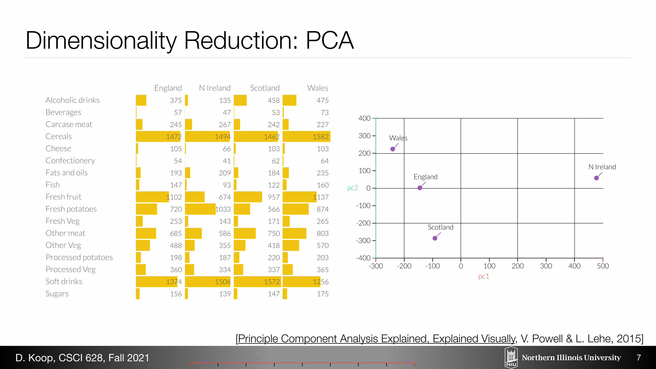
Here's the plot of the data along the first principal component. Already we can see something is different about Northern Ireland.
-300 -200 -100 0 100 200 300 400 500pc1
EnglandWales Scotland N Ireland
Now, see the first and second principal components, we see Northern Ireland a major outlier. Once we go back and look at the datain the table, this makes sense: the Northern Irish eat way more grams of fresh potatoes and way fewer of fresh fruits, cheese, fishand alcoholic drinks. It's a good sign that structure we've visualized reflects a big fact of real-world geography: Northern Ireland isthe only of the four countries not on the island of Great Britain. (If you're confused about the differences among England, the UKand Great Britain, see: this video.)
-300 -200 -100 0 100 200 300 400 500-400
-300
-200
-100
0
100
200
300
400
pc1
pc2
England
Wales
Scotland
N Ireland
For more explanations, visit the Explained Visually project homepage.
Or subscribe to our mailing list.
Subscribe
375
57
245
1472
105
54
193
147
1102
720
253
685
488
198
360
1374
156
135
47
267
1494
66
41
209
93
674
1033
143
586
355
187
334
1506
139
458
53
242
1462
103
62
184
122
957
566
171
750
418
220
337
1572
147
475
73
227
1582
103
64
235
160
1137
874
265
803
570
203
365
1256
175
England N Ireland Scotland Wales
Alcoholic drinks
Beverages
Carcase meat
Cereals
Cheese
Confectionery
Fats and oils
Fish
Fresh fruit
Fresh potatoes
Fresh Veg
Other meat
Other Veg
Processed potatoes
Processed Veg
Soft drinks
Sugars
Email address
Here's the plot of the data along the first principal component. Already we can see something is different about Northern Ireland.
-300 -200 -100 0 100 200 300 400 500pc1
EnglandWales Scotland N Ireland
Now, see the first and second principal components, we see Northern Ireland a major outlier. Once we go back and look at the datain the table, this makes sense: the Northern Irish eat way more grams of fresh potatoes and way fewer of fresh fruits, cheese, fishand alcoholic drinks. It's a good sign that structure we've visualized reflects a big fact of real-world geography: Northern Ireland isthe only of the four countries not on the island of Great Britain. (If you're confused about the differences among England, the UKand Great Britain, see: this video.)
-300 -200 -100 0 100 200 300 400 500-400
-300
-200
-100
0
100
200
300
400
pc1
pc2
England
Wales
Scotland
N Ireland
For more explanations, visit the Explained Visually project homepage.
Or subscribe to our mailing list.
Subscribe

20
15
10
5
0
Weight Class (lbs)
Aggregation: Histograms• Very similar to bar charts • Often shown without space between
(continuity) • Choice of number of bins - Important! - Viewers may infer different trends based on
the layout
8
[Munzner (ill. Maguire), 2014]D. Koop, CSCI 628, Fall 2021

Focus+Context
9
[M. Bostock]D. Koop, CSCI 628, Fall 2021

Focus+Context
9
[M. Bostock]D. Koop, CSCI 628, Fall 2021

Visualization Research• General Goals: "New visual displays, control panels, features, and workflows
that improve the capabilities of users." • Perceptual and Cognitive Theories: help accomplish goals, guide design, aid
in development of new tools." • Evaluation Methods: - Quantitative and Qualitative - Validate hypotheses, refine theories.
10
[B. Shneiderman, 2019]D. Koop, CSCI 628, Fall 2021

Areas of Visualization Research• Tools that make it easier to create visualizations • New encodings • Knowledge from controlled studies of visualization effectiveness • Visualization-based communication • Studies of visualization use in the world (Design Studies) • Formal theories of visualization • + Applications •
11
[J. Hullman, 2018]D. Koop, CSCI 628, Fall 2021

New Encodings• Determine what cannot currently be done • Think about how new designs can show new, interesting patterns
12
[[J. Hullman, 2018], Image: [Wattenberg & Viegas, 2007] D. Koop, CSCI 628, Fall 2021
on Many Eyes, for instance, we would not have guessed at the popularity of religious analyses. Given the broad demand for text visualizations, however, it seems like a fruitful area of study.
ACKNOWLEDGEMENTS The authors thank Frank van Ham, Jesse Kriss, Matt McKeon, Lee Byron, and Eric Gilbert for helpful suggestions. In addition, we are grateful to the users of Many Eyes for their creativity and willingness to provide feedback on an experimental visualization technique.
Fig 10: Word Tree showing all occurrences of “I have a dream” in Martin Luther King’s historical speech.
Fig 9. Word tree of the King James Bible showing all occurrences of “love the.”

Evaluating the Impact of Binning 2D Scalar FieldsLace Padilla, P. Samuel Quinan, Miriah Meyer, and Sarah H. Creem-Regehr
Fig. 1: Experimental stimuli for five binning conditions: A. Continuous, B. 10m binning, C. 20m binning, D. 30m binning, E. 40mbinning
Abstract— The expressiveness principle for visualization design asserts that a visualization should encode all of the available data,and only the available data, implying that continuous data types should be visualized with a continuous encoding channel. And yet,in many domains binning continuous data is not only pervasive, but it is accepted as standard practice. Prior work provides no clearguidance for when encoding continuous data continuously is preferable to employing binning techniques or how this choice affectsdata interpretation and decision making. In this paper, we present a study aimed at better understanding the conditions in whichthe expressiveness principle can or should be violated for visualizing continuous data. We provided participants with visualizationsemploying either continuous or binned greyscale encodings of geospatial elevation data and compared participants’ ability to completea wide variety of tasks. For various tasks, the results indicate significant differences in decision making, confidence in responses, andtask completion time between continuous and binned encodings of the data. In general, participants with continuous encodings werefaster to complete many of the tasks, but never outperformed those with binned encodings, while performance accuracy with binnedencodings was superior to continuous encodings in some tasks. These findings suggest that strict adherence to the expressivenessprinciple is not always advisable. We discuss both the implications and limitations of our results and outline various avenues forpotential work needed to further improve guidelines for using continuous versus binned encodings for continuous data types.
Index Terms—Geographic/Geospatial Visualization, Qualitative Evaluation, Color Perception, Perceptual Cognition
1 INTRODUCTION
A foundational design principle in visualization is the expressivenessprinciple, which states that a visual encoding should express all of therelationships in the data, and only the relationships in the data [24, 35].For a continuous data type, this implies that a continuous encodingchannel is a good choice. In practice, however, domains such as car-
• L. Padilla is with the University of Utah Department of Psychology.E-mail: [email protected]
• S. Quinan and M. Meyer are with the University of Utah School ofComputing. E-mail: psq,[email protected].
• S. Creem-Regehr is with the University of Utah Department of Psychology.E-mail: [email protected].
Manuscript received xx xxx. 201x; accepted xx xxx. 201x. Date ofPublication xx xxx. 201x; date of current version xx xxx. 201x.For information on obtaining reprints of this article, please sende-mail to: [email protected] Object Identifier: xx.xxxx/TVCG.201x.xxxxxxx/
tography [43] and meteorology [36] have strong conventions that visu-alize continuous data with a discrete encoding. These domains rely onvisual channels, such as color and saturation to encode a continuousfunction defined over two-dimensional space, known as a 2D scalarfield. They commonly do so by employing discrete colormaps or con-tour lines, also called isarithmic maps [43].
Existing literature provides little guidance about encoding contin-uous, 2D scalar fields with binned colormaps, or how this design de-cision affects data interpretation and decision making. Research intoproperties of colormaps for encoding continuous data types has largelyfocused on continuous colormaps [2, 28, 38, 48]. This line of researchprovides guidance on how to capture properties of the data, such asdivergence around a center point [48] or emphasis on one end of thedata range [2]. These papers go so far as proposing correspondingbinned colormaps, but do not make claims, or even discuss, their ef-ficacy for continuous data. Work on transfer function design has alsoproposed methods for binning colors, but with a focus on volumetricscalar fields, with the underlying goal of classifying materials or fea-tures [12], as opposed to directly understanding the continuous nature
Knowledge from studies of visualization effectiveness
13
Evaluating the Impact of Binning 2D Scalar FieldsLace Padilla, P. Samuel Quinan, Miriah Meyer, and Sarah H. Creem-Regehr
Fig. 1: Experimental stimuli for five binning conditions: A. Continuous, B. 10m binning, C. 20m binning, D. 30m binning, E. 40mbinning
Abstract— The expressiveness principle for visualization design asserts that a visualization should encode all of the available data,and only the available data, implying that continuous data types should be visualized with a continuous encoding channel. And yet,in many domains binning continuous data is not only pervasive, but it is accepted as standard practice. Prior work provides no clearguidance for when encoding continuous data continuously is preferable to employing binning techniques or how this choice affectsdata interpretation and decision making. In this paper, we present a study aimed at better understanding the conditions in whichthe expressiveness principle can or should be violated for visualizing continuous data. We provided participants with visualizationsemploying either continuous or binned greyscale encodings of geospatial elevation data and compared participants’ ability to completea wide variety of tasks. For various tasks, the results indicate significant differences in decision making, confidence in responses, andtask completion time between continuous and binned encodings of the data. In general, participants with continuous encodings werefaster to complete many of the tasks, but never outperformed those with binned encodings, while performance accuracy with binnedencodings was superior to continuous encodings in some tasks. These findings suggest that strict adherence to the expressivenessprinciple is not always advisable. We discuss both the implications and limitations of our results and outline various avenues forpotential work needed to further improve guidelines for using continuous versus binned encodings for continuous data types.
Index Terms—Geographic/Geospatial Visualization, Qualitative Evaluation, Color Perception, Perceptual Cognition
1 INTRODUCTION
A foundational design principle in visualization is the expressivenessprinciple, which states that a visual encoding should express all of therelationships in the data, and only the relationships in the data [24, 35].For a continuous data type, this implies that a continuous encodingchannel is a good choice. In practice, however, domains such as car-
• L. Padilla is with the University of Utah Department of Psychology.E-mail: [email protected]
• S. Quinan and M. Meyer are with the University of Utah School ofComputing. E-mail: psq,[email protected].
• S. Creem-Regehr is with the University of Utah Department of Psychology.E-mail: [email protected].
Manuscript received xx xxx. 201x; accepted xx xxx. 201x. Date ofPublication xx xxx. 201x; date of current version xx xxx. 201x.For information on obtaining reprints of this article, please sende-mail to: [email protected] Object Identifier: xx.xxxx/TVCG.201x.xxxxxxx/
tography [43] and meteorology [36] have strong conventions that visu-alize continuous data with a discrete encoding. These domains rely onvisual channels, such as color and saturation to encode a continuousfunction defined over two-dimensional space, known as a 2D scalarfield. They commonly do so by employing discrete colormaps or con-tour lines, also called isarithmic maps [43].
Existing literature provides little guidance about encoding contin-uous, 2D scalar fields with binned colormaps, or how this design de-cision affects data interpretation and decision making. Research intoproperties of colormaps for encoding continuous data types has largelyfocused on continuous colormaps [2, 28, 38, 48]. This line of researchprovides guidance on how to capture properties of the data, such asdivergence around a center point [48] or emphasis on one end of thedata range [2]. These papers go so far as proposing correspondingbinned colormaps, but do not make claims, or even discuss, their ef-ficacy for continuous data. Work on transfer function design has alsoproposed methods for binning colors, but with a focus on volumetricscalar fields, with the underlying goal of classifying materials or fea-tures [12], as opposed to directly understanding the continuous nature
[Padilla et al., 2017]D. Koop, CSCI 628, Fall 2021
What should Visualization Research be about?• "[V]isualization is a method for contextualizing data, enabling people to apply
their prior experiences and perceptual and cognitive abilities to draw conclusions about phenomena in the real world" — J. Hullman
• Perception and cognition • Not only that Vis A is better than Vis B, but why
14
[J. Hullman, 2018]D. Koop, CSCI 628, Fall 2021

Visualization Research Boundaries?• Interactive illustration • Satellite imagery • Sketching and analogical reasoning • Understanding aesthetics independent of analytical utility • Tables • Uncertainty Vis: Worse than Nothing?
15
[J. Hullman, 2018]D. Koop, CSCI 628, Fall 2021

Topics for the Remainder of the Semester
16D. Koop, CSCI 628, Fall 2021

Progress Reports• Focus Area • Problem Statement • Ideas
17D. Koop, CSCI 628, Fall 2021

18
Reading Visualization Papers
D. Koop, CSCI 628, Fall 2021

Reading Visualization Papers• To understand an area, need to see what has already been done • Sometimes requires reading tens if not hundreds of papers • Cannot remember all of the details! • "By 'read' we mean extracting the essential, most important information from
a (previously) published scientific conference or journal paper." [R. S. Laramee, 2009]
• Goal: Read research papers for a literature review - Can be used to write a survey paper
19
[R. S. Laramee, 2009]D. Koop, CSCI 628, Fall 2021

Concept vs. Implementation• Concept is the idea, more abstract - Example: Writing utensil
• Implementation is the realization of a concept, a concept brought into reality - Example: Pencil - Many other examples: pen, marker - Many different implementations
20
[R. S. Laramee, 2009]D. Koop, CSCI 628, Fall 2021
Important Pieces to Extract from a Vis Paper• Concept: what is the main goal/idea? • Implementation: how is this realized? • Related Work: what previous work does this build on or relate to? • Data Characteristics: what is the type of data (items & attributes)? • Visualization Techniques: what classes of techniques are used? • Application Domain: where can this research be applied?
21
[R. S. Laramee, 2009]D. Koop, CSCI 628, Fall 2021