Embed Size (px)
Citation preview
QuestVis and MDSteer: The Visualization of
High-Dimensional Environmental Sustainability Data
by
Matt Williams
B.Ed., University of British Columbia, 1998;
Hon.B.Math., University of Waterloo, 1994
A THESIS SUBMITTED IN PARTIAL FULFILLMENT OF
THE REQUIREMENTS FOR THE DEGREE OF
Master of Science
in
THE FACULTY OF GRADUATE STUDIES
(Department of Computer Science)
We accept this thesis as conformingto the required standard
The University of British Columbia
July 2004
c© Matt Williams, 2004
Abstract
The visualization of large high-dimensional datasets is an active topic within the
research area of information visualization (infovis), a research area that studies the
visual representations of complex abstract datasets. My thesis presents two infovis
systems that were motivated by the desire to explore a 294-dimensional environmen-
tal sustainability dataset. Our collaborators developed the environmental dataset
from expert knowledge on ecological, economical, and social systems which were
used to model future scenarios consisting of 294 measures of environmental sustain-
ability such as urban population, water supply levels, or tonnes of waste. Since
these complex systems and large datasets are difficult for a non-expert user to com-
prehend, we developed QuestVis, a tool that applies infovis theories and techniques
to improve the comprehensibility during exploration of the environmental dataset.
The tool consists of three components: the input panel, the Multiscale Dimension
Visualizer (MDV), and the Scenario Space Explorer (SSE). The MDV presents up to
ten 294-dimensional future scenarios simultaneously on the screen to enable users
to get a quick overview of the data. The simultaneous presentation also enables
users to compare multiple future scenarios side-by-side. The SSE presents the space
of all 120 000 future scenarios in an interactive two-dimensional layout which pro-
vides the user an overview of the possibilities. The SSE is tightly coupled with
the MDV to provide context to the specific future scenarios that are presented in
the MDV. These tightly linked components together provide an overview+details
framework within which users can effectively explore the dataset and immediately
see the consequences of their choices.
The creation of the dimensionality reduced overview in QuestVis led to a
second research direction. We realized that current implementations of Multidi-
mensional Scaling (MDS), a technique that attempts to best represent data point
similarity in a low-dimensional embedding, are not suited for many of today’s large-
scale datasets. This realization motivated us to develop MDSteer, a steerable MDS
computation engine and visualization tool that progressively computes an MDS
layout and handles datasets of over one million points. Our technique employs hi-
erarchical data structures and progressive layouts that allow the user to steer the
computation of the algorithm to the interesting areas of the dataset. The algorithm
ii

iteratively alternates between a layout stage in which a sub-selection of points are
added to the set of active points affected by the MDS iteration, and a binning stage
which increases the depth of the bin hierarchy and organizes the currently unplaced
points into separate spatial regions. This binning strategy allows the user to se-
lect onscreen regions of the layout to focus the MDS computation into the areas
of the dataset that are assigned to the selected bins. We show both real and com-
mon synthetic benchmark datasets with dimensionalities ranging from 3 to 300 and
cardinalities of over one million points.
iii

Contents
Abstract ii
Contents iv
List of Tables vi
List of Figures vii
Acknowledgements viii
1 Introduction 11.1 Information Visualization Background . . . . . . . . . . . . . . . . . 2
1.1.1 Overview+Details . . . . . . . . . . . . . . . . . . . . . . . . 31.1.2 High Dimensionality . . . . . . . . . . . . . . . . . . . . . . . 31.1.3 Visual Encoding . . . . . . . . . . . . . . . . . . . . . . . . . 4
1.2 Overview of Research . . . . . . . . . . . . . . . . . . . . . . . . . . 41.3 Contributions . . . . . . . . . . . . . . . . . . . . . . . . . . . . . . . 51.4 Thesis Organization . . . . . . . . . . . . . . . . . . . . . . . . . . . 6
2 Related Work 72.1 High Dimensionality . . . . . . . . . . . . . . . . . . . . . . . . . . . 7
2.1.1 Dimensionality Reduction . . . . . . . . . . . . . . . . . . . . 82.1.2 Explicitly High-Dimensional Visualizations . . . . . . . . . . 11
2.2 Interaction . . . . . . . . . . . . . . . . . . . . . . . . . . . . . . . . 132.3 Aggregation . . . . . . . . . . . . . . . . . . . . . . . . . . . . . . . . 14
3 QuestVis 163.1 Future Scenario Modelling . . . . . . . . . . . . . . . . . . . . . . . . 173.2 The Quest Usage Model . . . . . . . . . . . . . . . . . . . . . . . . . 173.3 QuestVis Design . . . . . . . . . . . . . . . . . . . . . . . . . . . . . 18
3.3.1 Quest Limitations . . . . . . . . . . . . . . . . . . . . . . . . 183.3.2 QuestVis Design Goals . . . . . . . . . . . . . . . . . . . . . . 223.3.3 Database Architecture . . . . . . . . . . . . . . . . . . . . . . 23
3.4 Multiscale Dimension Vizualizer (MDV) . . . . . . . . . . . . . . . . 243.4.1 Colour Encoding . . . . . . . . . . . . . . . . . . . . . . . . . 243.4.2 Aggregation . . . . . . . . . . . . . . . . . . . . . . . . . . . . 26
iv

3.4.3 Detailed Output . . . . . . . . . . . . . . . . . . . . . . . . . 283.5 Input Choices . . . . . . . . . . . . . . . . . . . . . . . . . . . . . . . 28
3.5.1 Coupling Input Choices with Output Indicators . . . . . . . . 293.6 Scenario Space Explorer (SSE) . . . . . . . . . . . . . . . . . . . . . 31
3.6.1 Colourization . . . . . . . . . . . . . . . . . . . . . . . . . . . 333.6.2 Trail . . . . . . . . . . . . . . . . . . . . . . . . . . . . . . . . 333.6.3 Filtering . . . . . . . . . . . . . . . . . . . . . . . . . . . . . . 34
3.7 The QuestVis Usage Model . . . . . . . . . . . . . . . . . . . . . . . 353.8 Implementaion . . . . . . . . . . . . . . . . . . . . . . . . . . . . . . 37
4 MDSteer 384.1 Steerable, Progressive MDS . . . . . . . . . . . . . . . . . . . . . . . 39
4.1.1 Algorithm . . . . . . . . . . . . . . . . . . . . . . . . . . . . . 404.1.2 Bins . . . . . . . . . . . . . . . . . . . . . . . . . . . . . . . . 414.1.3 Termination Conditions . . . . . . . . . . . . . . . . . . . . . 45
4.2 Results . . . . . . . . . . . . . . . . . . . . . . . . . . . . . . . . . . . 464.2.1 Timing . . . . . . . . . . . . . . . . . . . . . . . . . . . . . . 474.2.2 Stress . . . . . . . . . . . . . . . . . . . . . . . . . . . . . . . 484.2.3 Visual Quality . . . . . . . . . . . . . . . . . . . . . . . . . . 49
5 Discussion and Future Work 545.1 QuestVis . . . . . . . . . . . . . . . . . . . . . . . . . . . . . . . . . 54
5.1.1 Future Work . . . . . . . . . . . . . . . . . . . . . . . . . . . 565.2 MDSteer . . . . . . . . . . . . . . . . . . . . . . . . . . . . . . . . . . 59
5.2.1 Future Work . . . . . . . . . . . . . . . . . . . . . . . . . . . 605.3 Conclusions . . . . . . . . . . . . . . . . . . . . . . . . . . . . . . . . 62
Bibliography 63
v

List of Tables
3.1 Quest Limitations . . . . . . . . . . . . . . . . . . . . . . . . . . . . 22
vi

List of Figures
2.1 Multidimensional Scaling. . . . . . . . . . . . . . . . . . . . . . . . . 92.2 Parallel Coordinates. . . . . . . . . . . . . . . . . . . . . . . . . . . . 12
3.1 The Quest input stage. . . . . . . . . . . . . . . . . . . . . . . . . . . 193.2 The Quest output stage. . . . . . . . . . . . . . . . . . . . . . . . . . 203.3 The Quest output overview. . . . . . . . . . . . . . . . . . . . . . . . 213.4 Multiscale Dimension Visualizer (MDV). . . . . . . . . . . . . . . . . 253.5 Multiscale views of chosen environmental futures. . . . . . . . . . . . 273.6 Comparing future scenarios. . . . . . . . . . . . . . . . . . . . . . . . 273.7 Detailed output. . . . . . . . . . . . . . . . . . . . . . . . . . . . . . 293.8 Input choices. . . . . . . . . . . . . . . . . . . . . . . . . . . . . . . . 303.9 Scenario Space Explorer (SSE). . . . . . . . . . . . . . . . . . . . . . 323.10 Trail of selected future scenarios. . . . . . . . . . . . . . . . . . . . . 343.11 Filtering the scenario space. . . . . . . . . . . . . . . . . . . . . . . . 353.12 The three components of QuestVis. . . . . . . . . . . . . . . . . . . . 36
4.1 MDSteer. . . . . . . . . . . . . . . . . . . . . . . . . . . . . . . . . . 414.2 Results: time. . . . . . . . . . . . . . . . . . . . . . . . . . . . . . . . 494.3 Results: layout stress. . . . . . . . . . . . . . . . . . . . . . . . . . . 504.4 Visual quality: S dataset . . . . . . . . . . . . . . . . . . . . . . . . . 514.5 Visual quality: environmental dataset. . . . . . . . . . . . . . . . . . 524.6 Steerable progressive layout. . . . . . . . . . . . . . . . . . . . . . . . 53
5.1 Labelling of the scenario space. . . . . . . . . . . . . . . . . . . . . . 57
vii

Acknowledgements
I would like to thank my supervisor, Tamara Munzner, for her support and guidance.Her creative insights and tireless schedule have both challenged and motivated methroughout the last two years. I would also like to thank Nando de Freitas for histime and contributions as the second reader.
I would also like to thank all the great people I met here in Computer Scienceat UBC. In particular my office mates, Leah Findlater, Karyn Moffatt, Dana Sharonwho provided me endless support, both emotionally and academically. I would alsolike to thank James Slack and Kristian Hildebrand who helped me through manytechnical and intellectual road blocks.
My mentor Maria Klawe was directly responsible for my great experienceat UBC computer science, as she both suggested, and inspired me to accept thechallenge. Her enthusiasm, commitment, and caring shown in improving the life ofothers always will inspire me to try to do likewise.
I thank our collaborators at the University of British Columbia’s SustainableDevelopment Research Initiative, Georgia Basin Futures Project, and Envision Sus-tainability Tools for their support and dataset. Specifically I would like to mentionMike Walsh, Dave Biggs, Jeff Carmichael, John Robinson, and Sonia Talwar fortheir valuable and generous contributions to my project. I also thank Luc Girardinof Macrofocus for the multiple-cardinality S dataset. I appreciate many productivediscussions on dimensionality reduction with Katherine St. John, and the techni-cal writing contributions of Ciaran Llachlan Leavitt. This work was funded by theGEOIDE NCE.
Finally, I would like to thank my friends and family who give me happiness.In particular, I would like to thank Jessica Zallen for her caring and understand-ing, and my family members, Betty, Jake, and Chris Williams, for their love andencouragement throughout my whole life.
Matt Williams
The University of British Columbia
July 2004
viii
Chapter 1
Introduction
Our information visualization (infovis) research group was presented with
the challenge of improving the comprehensibility and interaction of Quest, an en-
vironmental sustainability tool. Infovis is a research area that studies the visual
representation and interaction of complex non-spatial datasets in an attempt to im-
prove user comprehension of the data by offloading cognitive load to useful graphical
visualizations. The visualization of large-scale, high-dimensional datasets is a par-
ticularly active area of research within infovis as these datasets are typically difficult
for people to comprehend and for systems to represent graphically. The infovis com-
munity commonly employs the design study method as part of its research repertoire.
An infovis design study explores and applies infovis techniques to solve real-world
problems within a particular domain. Infovis design studies have proven successful
in such areas as biology [37], software engineering mining [49], architecture [23], and
linguistics [36]. For the design study I present here, my supervisor Tamara Mun-
zner and I worked with collaborators in the area of environmental sustainability
to develop and apply infovis techniques that help understand and interact with an
environmental dataset of 120 000 points and 294 dimensions.
1
Prior to our research, our collaborators at Envision Sustainability Tools and
the Sustainability Development Research Initiative (SDRI) developed the Quest
environmental sustainability tool. Quest allows users to choose and analyze envi-
ronmental future scenarios. An environmental future scenario is defined here as
a set of future measures of environmental sustainability such as carbon monoxide
emissions, or water use. The particular future scenario that is presented by Quest is
dependent on a sequence of present-day regional planning decisions that are chosen
by the users. These policy choices are used by the system to calculate the future
values for the sustainability indicators. Comprehending the consequences of user
inputs and the meaning of the output indicators is a difficult task for the novice
user. Building on infovis theories and techniques, we implemented an alternative
system in an attempt to convey this information in a more comprehensible manner.
Our research began with an extensive analysis of the Quest tool so that we
could identify its limitations and conceive alternative designs. We conceived an
interface that offered users a learning experience through exploration. Specifically,
our goal was to provide the user an interface that allowed for discovery of higher
level interactions or of trends that exist within the dataset through fluid visual
navigation.
1.1 Information Visualization Background
We developed the QuestVis system in an attempt to achieve our goal of fluid
exploration of the large environmental dataset. Our design choices for QuestVis
were heavily influenced by several research threads within the infovis research area.
These threads are introduced below.
2
1.1.1 Overview+Details
The presentation of large datasets is a difficult task given the limited screen size
and resolution offered in today’s computer systems. The limited screen real-estate
means that detailed displays of information can only offer a view into a small subset
of the data at any one time. Navigating multiple detailed views does not provide
the user a context within which to comprehend and explore the dataset. The com-
mon infovis approach to solve the limited screen real-estate problem is summarized
by Shneiderman’s Visual Information Seeking Mantra, “overview first, zoom and
filter, details on demand” [43]. This overview+details theme heavily influenced the
conception and design of the work presented here.
1.1.2 High Dimensionality
The curse of high dimensionality, a term first introduced by Bellman over 40 years
ago [13], now generally refers to any problems that occur as dimensionality grows.
In infovis, it has come to refer to the difficulty in representing and comprehending
the ever increasing dimensionality in datasets of today. We reviewed, applied, and
extended various techniques that have been developed to aid the investigation of
high-dimensional datasets.
Dimensionality Reduction
One approach of handling the high-dimensionality problem, referred to as dimen-
sionality reduction, is to methodically reduce the number of dimensions down to
two or three dimensions and then present the data in this reduced space. Multi-
dimensional Scaling (MDS) is an approach that maps the high-dimensional data
points down to a lower dimensional embedding while attempting to best preserve
3
inter-point distances. Our Scenario Space Explorer (SSE) component, described in
Section 3.6, presents a low layout of the Quest data created using MDS.
While attempting the use of several dimensionality reduction techniques with
the environmental dataset, we found that existing tools and techniques did not
scale well to large high-dimensional datasets. This problem led us in a second
research direction; the development of the steerable MDS technique that we present
in Chapter 4.
1.1.3 Visual Encoding
When visually presenting data, there is an explicit or implicit mapping between the
graphical elements of the visualization and the data elements of the dataset. The
choice of this mapping is referred to as the visual encoding strategy. Graphical
elements such as size, shape, texture, hue, saturation, and brightness have all been
used to encode data. Proposed taxonomies of encoding schemes suggest that the
efficacy of an encoding scheme is dependent on the task [18, 31]. In particular,
research suggests that efficacy of the encoding strategy depends on the type of
data [16, 31]. Within the colour dimensions of hue, saturation and brightness,
Brewer [16] suggests that while hue is good at representing nominal values, its lack
of inherent order does not lend itself to encode ordinal or quantitative data; however,
people do perceive saturation and brightness as having an inherent order, and thus
represents quantitative data well. Cognizant of these considerations, we employed
the diverging colour scale in QuestVis that is described in Section 3.6.1.
1.2 Overview of Research
My work as a Master’s student began with the task of improving the comprehen-
sibility of the Quest interface. Once the extensive analysis of Quest and related
4
research was complete, we began the development of QuestVis, our alternative to
Quest. We started the work by reversing the usage model of the original Quest
interface. Rather than making decisions that are used to select a future, we wanted
QuestVis to begin by showing the users a future scenario and allow them to adapt
it. The majority of our research was focused on how we could best present the large
number of output factors so as to support user exploration and understanding. This
included work on visual encoding strategies, dimensionality reduction of the output
space, and improving interactivity through increased coupling of inputs and outputs.
The result was the three-component QuestVis system that is described in detail in
Chapter 3.
While investigating the use of dimensionality reduction techniques we found
that none of the available tools scaled well to extremely large datasets where both
dimensionality and cardinality of the dataset were high, for example, more than 200
dimensions or more than 200 000 points . We took this as an opportunity to begin a
second direction in my Master’s research; the investigation of large dataset dimen-
sionality reduction. We developed a technique and its corresponding system, named
MDSteer, that allows a user to steer the computational resources of the MDS to the
areas of the dataset of most interest to the user. This technique progressively com-
putes the MDS on more and more points allowing the user to get an overview of the
dataset before deciding to focus the computation or possibly stop the computation
altogether.
1.3 Contributions
We developed two systems as part of my thesis research, QuestVis and MDSteer.
QuestVis is a system designed for effective exploration of a large high-dimensional
environmental dataset of future scenarios. The QuestVis system consists of three
5
tightly linked visual components. Two of the components should be easily general-
izable to other high-dimensional datasets:
• Multiscale Dimension Viewer (MDV): a novel visual encoding and interac-
tion technique for the representation of high-dimensional, multiscale data.
Although originally designed to support the presentation of a collection of
sustainability indicators, the technique can be applied to other multiscale
datasets.
• Scenario Space Explorer (SSE): a highly interactive layout of a dimensionally
reduced space.
The MDSteer system exhibits the first steerable dimensionality reduction
algorithm. This system and technique allows users to explore datasets of sizes not
possible with previous systems.
1.4 Thesis Organization
Chapter 2 surveys the work related to the dimensionality reduction, high dimen-
sional visualization, interaction, and aggregation techniques that we applied to
QuestVis and MDSteer. Chapter 3 describes the QuestVis tool and the necessary
background in sustainability future modelling. Chapter 4 describes the MDSteer
tool and algorithms. This chapter was based on a paper describing the MDSteer
system [51]. Chapter 5 discusses the research and contributions of each of these
projects.
6
Chapter 2
Related Work
In this chapter we review the literature relevant to our research.
InfoVis research has led to the development of multiple high-dimensional
data exploration tools. Some tools, such as Polaris [45], DataSplash [53], Spotfire [3],
XmdvTool [50], and Xgobi [46] are generic database tools that attempt to provide
a visualization environment for any given dataset, while others such as Rivet [15]
and VisCraft [24] are developed to be applied to a particular domain. Our research
into the development of QuestVis falls into the second class of systems, as it was
specifically designed to support the Quest database for future scenario exploration,
although, we believe that much of this research could be generalized and applied to
other domains.
2.1 High Dimensionality
Our biggest challenge throughout the project was the high dimensionality of our
data. Previous visual solutions to the presentation of high-dimensional data can
be categorized into two general types. Some, referred to as dimensionality reduc-
tion techniques, attempt to reduce the data down to a low dimensional embedding
that tries to best represent the high-dimensional data. Others, which we refer to
7
as explicitly high-dimensional visualizations, attempt to represent the data in its
original high-dimensional space using creative views and encoding strategies. Be-
low, we describe relevant research in both categories beginning with past work on
dimensionality reduction.
2.1.1 Dimensionality Reduction
Dimensionality reduction techniques attempt to overcome high dimensionality by
methodically reducing the dataset into a low-dimensional embedding. When at-
tempting to visualize a high-dimensional dataset, Multidimensional scaling and Ko-
honen’s Self Organizing Maps have commonly been employed.
Multidimensional Scaling
One method for dimensionality reduction in particular, referred to as multidimen-
sional scaling (MDS), attempts to create a low dimensional layout of the data so
that the distance between points in the layout best represents the distance be-
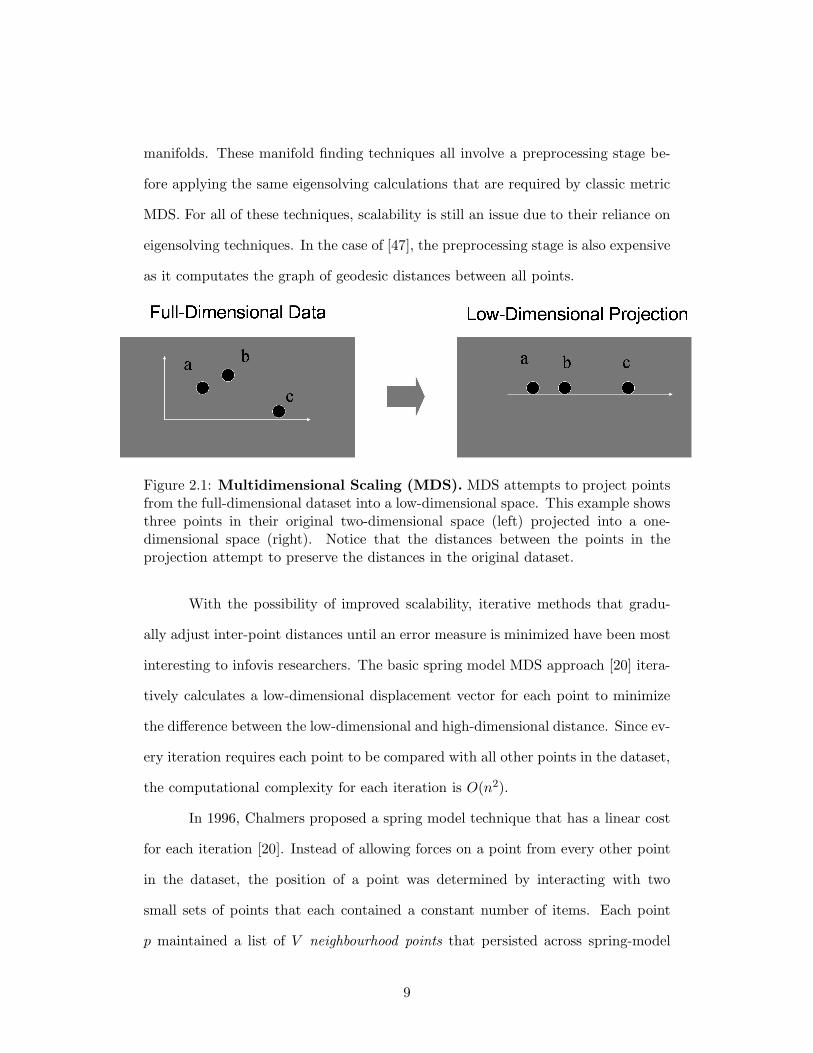
tween the points in the higher dimensional data. Figure 2.1 illustrates the MDS
approach on a simple two-dimensional to one-dimensional projection. Such low-
dimensional representations have been created using a variety of methods. Classic
metric MDS begins by creating a distance matrix between all points using a pre-
defined metric [14]. The eigenvectors are found for the matrix and are used to
create the orthogonal low-dimensional basis vectors for a subspace that preserves
the highest amount of variance. This eigensolving approach does not scale well to
large datasets and is limited to finding a linear subspace. Since the matrices in
the eigensolving computation are usually dense, the computational cost of solving
the eigen-problem is O(n3). Other non-linear approaches such as ISOMAP [47],
LLE [42], and Laplacian Eigenmaps [12] have recently been developed that can pro-
duce more meaningful embeddings if the original dataset contains low dimensional
8
manifolds. These manifold finding techniques all involve a preprocessing stage be-
fore applying the same eigensolving calculations that are required by classic metric
MDS. For all of these techniques, scalability is still an issue due to their reliance on
eigensolving techniques. In the case of [47], the preprocessing stage is also expensive
as it computates the graph of geodesic distances between all points.
Figure 2.1: Multidimensional Scaling (MDS). MDS attempts to project pointsfrom the full-dimensional dataset into a low-dimensional space. This example showsthree points in their original two-dimensional space (left) projected into a one-dimensional space (right). Notice that the distances between the points in theprojection attempt to preserve the distances in the original dataset.
With the possibility of improved scalability, iterative methods that gradu-
ally adjust inter-point distances until an error measure is minimized have been most
interesting to infovis researchers. The basic spring model MDS approach [20] itera-
tively calculates a low-dimensional displacement vector for each point to minimize
the difference between the low-dimensional and high-dimensional distance. Since ev-
ery iteration requires each point to be compared with all other points in the dataset,
the computational complexity for each iteration is O(n2).
In 1996, Chalmers proposed a spring model technique that has a linear cost
for each iteration [20]. Instead of allowing forces on a point from every other point
in the dataset, the position of a point was determined by interacting with two
small sets of points that each contained a constant number of items. Each point
p maintained a list of V neighbourhood points that persisted across spring-model
9

iterations, and S randomly sampled points that were resampled at each iteration.
At the beginning, the neighbourhood was populated randomly from all points in
the dataset. The neighbourhood quality improved over iterations because a new
random sample would force out the most distant neighbourhood point, if it were
closer. Although the per-iteration cost was linear in n, the total number of iterations
required for this approach depended on the dataset size, so overall cost of this
approach was O(n2). The paper reports good results with V = 10 and S = 5, and
the implementation of this algorithm as distributed in the HIVE system [41] uses
V = 6 and S = 3. We use the latter.
In 2002, Morrison improved on this result with an efficient three-step ap-
proach: a initial base layout, interpolation, and final refinement layout [34]. The
Chalmers [20] algorithm was used to lay out an initial√
n sample of points. That
initial layout was followed by an interpolation stage that used the location of the
sample points to find a good initial position for all remaining unplaced points. The
final stage ran several MDS iterations on the entire dataset, refining the approximate
initial placements into better final positions. The interpolation stage was the most
expensive, with a O(n ∗ √n) cost, since it compared each of the n − √
n unplaced
points with the√
n placed points in order to find the initial layout location for those
unplaced points. In 2003 Morrison [33, 35] improved the performance of computing
starting spots for unplaced points by applying an efficient nearest-neighbour search
technique at the interpolation stage.
After evaluating the techniques and systems, we chose to use the Morrison
2002 approach to lay out our Quest future scenario data as it was both available and
scalable to large high-dimensional datasets such as ours. Although the results from
applying the Morrison 2002 approach were successful and we integrated them in the
QuestVis scenario space visualization, the layout took over two hours to complete.
We noted the lack of scalability of the available MDS techniques to larger datasets
10
and began a second thread of research described in Chapter 4. This research led
to the development of MDSteer, an MDS technique that allows users to steer the
MDS computation to areas of the dataset that they are most interested in. The
work of Basalaj on incremental MDS [6, 7] is perhaps the most similar to our work
on MDSteer. While they ignore local detail to focus on overall shape, we take the
opposite approach, instead encouraging people to build up local detail in areas of
interest. Basalaj has one of the very few systems that handles large datasets of over
100,000 nodes.
Kohonen’s Self Organizing Maps
Another popular dimensionality reduction technique often used in visualization sys-
tem are Kohonen’s Self Organizing Maps (SOM) [26]. SOM is an unsupervised
neural network learning technique that maps data to regions of a two-dimensional
rectangular grid. Points in the high-dimensional dataset are placed into nodes on the
two-dimensional grid that become tuned to patterns in the dataset to best represent
high-dimensional similarity. Although SOMs have produced successful layouts [28],
this method scales exponentially with dataset size and there is no guarantee that
the algorithm converges.
2.1.2 Explicitly High-Dimensional Visualizations
Instead of attempting to restructure the data for lower dimensional viewing, other
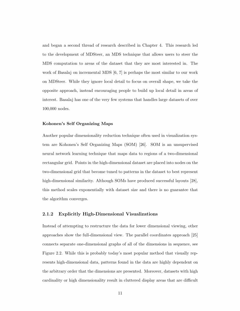
approaches show the full-dimensional view. The parallel coordinates approach [25]
connects separate one-dimensional graphs of all of the dimensions in sequence, see
Figure 2.2. While this is probably today’s most popular method that visually rep-
resents high-dimensional data, patterns found in the data are highly dependent on
the arbitrary order that the dimensions are presented. Moreover, datasets with high
cardinality or high dimensionality result in cluttered display areas that are difficult
11
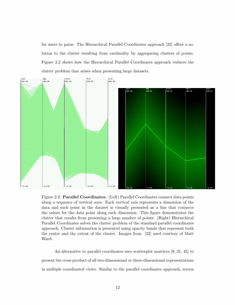
for users to parse. The Hierarchical Parallel Coordinates approach [22] offers a so-
lution to the clutter resulting from cardinality by aggregating clusters of points.
Figure 2.2 shows how the Hierarchical Parallel Coordinates approach reduces the
clutter problem that arises when presenting large datasets.
Figure 2.2: Parallel Coordinates. (Left) Parallel Coordinates connect data pointsalong a sequence of vertical axes. Each vertical axis represents a dimension of thedata and each point in the dataset is visually presented as a line that connectsthe values for the data point along each dimension. This figure demonstrates theclutter that results from presenting a large number of points. (Right) HierarchicalParallel Coordinates solves the clutter problem of the standard parallel coordinatesapproach. Cluster information is presented using opacity bands that represent boththe centre and the extent of the cluster. Images from [22] used courtesy of MattWard.
An alternative to parallel coordinates uses scatterplot matrices [9, 21, 45] to
present the cross product of all two-dimensional or three-dimensional representations
in multiple coordinated views. Similar to the parallel coordinates approach, screen
12
clutter is again a problem when dimensionality is high. Even with ten dimensions,
45 two-dimensional or 36 three-dimensional scatterplots are required to show all of
the dimension combinations.
Since existing explicitly high-dimensional visualizations do not scale to the
number of dimensions that we tackle with the QuestVis system, we developed a
linked component approach to viewing the high-dimensional data. One compo-
nent provides an overview of the dataset using a dimensionally reduced layout, as
described in Section 3.6, while a closely coupled second component presents the
details of up to ten high-dimensional data points, as described in Section 3.4.
2.2 Interaction
Our QuestVis interface consists of three components, a set of sliders that can be
used to register user input, the overview Scenario Space Explorer (SSE) visualiza-
tion and the Multiscale Dimension Visualizer (MDV). The integration of these three
components to allow seamless interaction and navigation was informed by past work
on tightly coupled systems [1, 38, 52]. Linked highlighting was first introduced as
“brushing scatterplots” by Becker and Cleveland [8]. This work displayed multiple
scatterplot views of the same data and allowed the users to select data points from
one view to highlight them in any of the other plots. Such tight coupling of inter-
face components incorporates the idea of “output-is-input” [1] where the difference
between an input and an output becomes indistinguishable. For example, in their
Film Finder system Ahlberg and Shneiderman [1], offered a scatter plot of movies
to the left of sliders that that are used to populate the scatterplot. When the sliders
are adjusted, the scatterplot is immediately updated. If a subset of the scatterplot
is selected, the dynamic queries are adjusted to show only the ranges that are in-
cluded in the items on the scatterplot. Both the scatterplot and the sliders take
13
input and provide output information. All of our components in QuestVis also have
this attribute. To support this design, North and Shneiderman [38] offered empirical
studies that suggested users were more effective when using linked views.
The sliders described above from the Film Finder system are a form of dy-
namic queries. Ahlberg and Shneiderman [2] coined the term dynamic queries to
refer to a data query technique that allows users to graphically view and adjust
the query and the result with immediate feedback. Rather than composing com-
plex database queries, simple mouse gestures with sliders were used to query the
database. We apply these techniques in our interface to help the user reduce the
clutter in the SSE representation discussed in Section 3.6.
The design choice of presenting our data in multiple linked visualizations
is supported by Baldenado and Kuchinsky’s guidelines on when to use multiple
views [5], which suggest that multiple views can provide insight into large complex
datasets. In a design approach similar to ours, Wills [52] summarized the interaction
techniques proposed by the infovis community and exemplified their advantages in
the EDV system.
2.3 Aggregation
Semantic zoom, first offered in Pad [40] and then later extended in Pad++ [11] and
Jazz [10], refers to the ability to smoothly change the visual representation as the
user changes the level of magnification of the view. In multiscale systems that offer
semantic zoom, as the the user navigates the display, the representation gradually
is altered so that the display is coherent at all times. City map visualizations
exemplify the need for semantic zoom. When fully zoomed in to a small portion
of the map, users might be interested in details such as street names whereas in a
zoomed out overview of the map, street names would clutter the map and render it
14
illegible. The key insight offered by semantic zoom research is that the efficacy of the
visual representation is dependent on the level of magnification. Both Polaris [45]
and DataSplash [53] implement semantic zoom techniques to improve navigation
for relational data. Most recently, Stolte et al. [44] expanded the idea of changing
the visual representation for multiscale systems to include the ability to change the
level of aggregation of the data. This insight enables the visual representation to
be dependent on both the magnification level and the data aggregation level; two
independent but complimentary dimensions. For example, if monthly, quarterly,
and yearly financial data are all available to a system then the user could be allowed
to zoom in and out of this level of data aggregation. Such a change in data scale
might also affect the semantic zoom level that the system uses to visually encode
the data. In our QuestVis system, although our encoding remains consistent, our
interface allows the user to change the data aggregation level during exploration.
15
Chapter 3
QuestVis
Most people have a vision of the future they desire. A desired future might have
low unemployment, or less traffic, or clean air, or maybe all of the above. However,
people are often unaware of how the interplay between regional policy choices made
in the present could either bring about or prevent desired aspects of these futures.
Future modelling tools such as QuestVis, the system I present here, and Quest [19],
its predecessor, enable people to become more informed about the effect that present-
day regional policy choices will have on possible future scenarios. Although these
tools are often used by novice users, the computational models that support these
systems are informed by expert understanding of ecological, social and economic
systems. The complexity of the computational models that underlie these tools,
combined with the lack of experience of the user, makes comprehension and usability
a major concern when implementing these tools. Our research task for the QuestVis
design study was to improve the comprehensibility of the Quest future scenario
modelling tool and its data.
16
3.1 Future Scenario Modelling
Future scenario modelling refers to the process of computing future values for var-
ious sustainability indicators, such as carbon monoxide emissions, given inputs for
present-day regional policy decisions. The ability to provide a look into possible en-
vironmental future scenarios can support regional planning policy decision making.
More specifically, future modelling tools are used to improve community input into
regional planning decisions by allowing the community to view the impact of various
policies on the environment. In a case study conducted on Bowen Island, members
of the community that used decision support tools such as Quest increased their
understanding about issues such as the interplay between water supply and land
use [17]. Future scenario modelling may also be beneficial in an educational en-
vironment as evidence suggests that interactive decision tools can be pedagogically
effective [32]. Using Quest, students can learn about environmental sustainability
through exploration of policy decision consequences.
3.2 The Quest Usage Model
In a session with Quest, the predecessor of our QuestVis system, users work through
three sequential steps: the input stage (regional policy decision making), the model
computation stage, and the output stage (future scenario analysis). The input stage
involves the selection of a sequence of up to 49 input decisions. For example, when
users are faced with their policy on waste reduction, they can choose one of five levels
of waste reduction. The choices fall between a maximum of “significant reduction” to
the minimum of “same as now.” The users respond to a sequence of such decisions
with the help of a facilitator who informs the users of the consequences of their
decision making. Once all input decisions are made, Quest computes the models.
This computation takes approximately two minutes to complete and once the models
17
are computed, Quest presents the users with an overview radial chart intended to
simplify the 294 output indicators of the chosen future. Curious users can then select
any of the other 88 more detailed views of the outputs to further investigate their
chosen future scenario. Figure 3.1 shows Quest in action during the input decision
stage and Figure 3.2 shows the various output views that are used to analyze the
chosen future scenario. The process of choosing the input decisions, computing the
future, and analyzing a single chosen future scenario typically takes over an hour
and requires the aid of an expert facilitator. After selecting and analyzing a future
scenario, users can repeat the process to chose a different future scenario. In its
most recent version the Quest models allow 49 input choices and produce values for
294 sustainability outputs.
3.3 QuestVis Design
This section describes the QuestVis design process. I begin by describing the limi-
tations of the Quest system, follow with the goals that these limitations motivated,
and finish by describing the components of the QuestVis system in detail.
3.3.1 Quest Limitations
Our research began with a detailed problem analysis of the Quest system in which
several limitations emerged, summarized in Table 3.1. The lack of responsiveness
of the system was our foremost concern. It was our belief that the amount of time
and navigation required between the input decision stage and the future scenario
analysis detracted from users’ ability to comprehend input decision consequences.
Quest’s lack of responsiveness is further confounded by its cumbersome input
capabilities. The input panel on the left lists all of the categories of the input choices
but requires the user navigate to the specialized windows for each menu choice
18
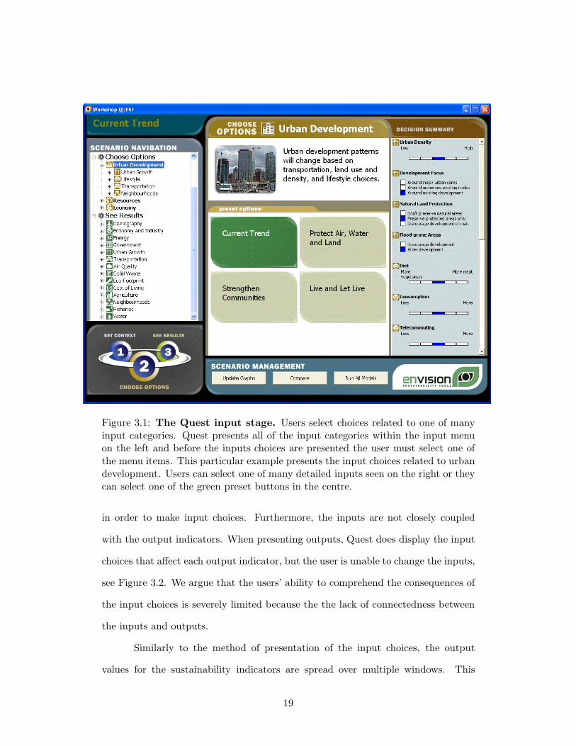
Figure 3.1: The Quest input stage. Users select choices related to one of manyinput categories. Quest presents all of the input categories within the input menuon the left and before the inputs choices are presented the user must select one ofthe menu items. This particular example presents the input choices related to urbandevelopment. Users can select one of many detailed inputs seen on the right or theycan select one of the green preset buttons in the centre.
in order to make input choices. Furthermore, the inputs are not closely coupled
with the output indicators. When presenting outputs, Quest does display the input
choices that affect each output indicator, but the user is unable to change the inputs,
see Figure 3.2. We argue that the users’ ability to comprehend the consequences of
the input choices is severely limited because the the lack of connectedness between
the inputs and outputs.
Similarly to the method of presentation of the input choices, the output
values for the sustainability indicators are spread over multiple windows. This
19
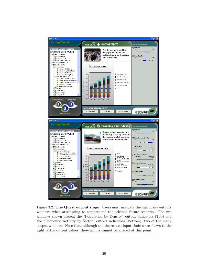
Figure 3.2: The Quest output stage. Users must navigate through many outputswindows when attempting to comprehend the selected future scenario. The twowindows shown present the “Population by Density” output indicators (Top) andthe “Economic Activity by Sector” output indicators (Bottom), two of the manyoutput windows. Note that, although the the related input choices are shown to theright of the output values, these inputs cannot be altered at this point.
20
approach impacts comprehension because full understanding of a scenario requires
the navigation and memorization of the sparse information presented over multiple
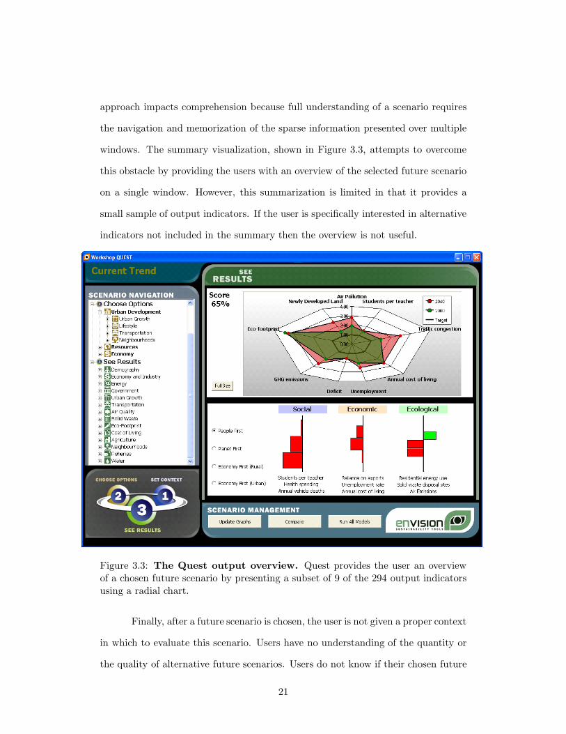
windows. The summary visualization, shown in Figure 3.3, attempts to overcome
this obstacle by providing the users with an overview of the selected future scenario
on a single window. However, this summarization is limited in that it provides a
small sample of output indicators. If the user is specifically interested in alternative
indicators not included in the summary then the overview is not useful.
Figure 3.3: The Quest output overview. Quest provides the user an overviewof a chosen future scenario by presenting a subset of 9 of the 294 output indicatorsusing a radial chart.
Finally, after a future scenario is chosen, the user is not given a proper context
in which to evaluate this scenario. Users have no understanding of the quantity or
the quality of alternative future scenarios. Users do not know if their chosen future
21

scenario is better than other possible future scenarios with respect to the indicators
that they are interested in. For example, when analyzing a future scenario, users
may want to know if other futures have better values for the air quality indicators.
Quest has no method for offering this information. Quest also has no method to
compare future scenarios side-by-side. This lack of context limits the users’ ability
to comprehend whether their chosen futures are actually desirable.
Limitation Goal
• sparse information density of in-put and output windows
• inputs presented but not active
• output summary is sampled notaggregated
• cumbersome navigation
• improve the comprehension ofthe outputs from a single futurescenario
• no method of comparing mul-tiple chosen futures with eachother
• improve the comparison be-tween several scenarios
• no context to understand thespace of possible future scenar-ios
• improve the exploration andcomprehension of the space of allscenarios
Table 3.1: Limitations of the Quest environment and the corresponding goals.
3.3.2 QuestVis Design Goals
As outlined in Table 3.1, we were able to summarize the limitations to motivate
three general goals. First, we needed to improve the comprehension of the outputs
22
from a single scenario. Second, we needed to improve the comparison between
several scenarios. Finally, we needed to improve the exploration and comprehension
of the space of all future scenarios.
Our extensive analysis of Quest led to envisioning and implementing a more
effective tool. I begin by outlining the architecture of the system and then describe
each of the components in detail. The chapter concludes with a description of the
QuestVis user model.
3.3.3 Database Architecture
In Quest, the slow and non-engaging experience is a consequence of the model
computation stage that detaches the input stage from the output stage. We felt
that a more responsive usage model would both improve the engagement of the
users and help us attain our design goals. As such, we turned the model around by
immediately providing a future scenario to the users and allowing them to adapt
the future scenario to their desires with real-time response, that is, without having
to await a computation stage. To enable immediate response, we chose to adapt
the system architecture to include a database of pre-computed scenarios. With
the inclusion of the database, the model computation stage is removed, the set of
inputs is now simply used as a key into the database of future scenarios. After
we identified the need for the database, it was created by our research partners at
Envision Sustainability Tools by running the model computations in batch mode,
while systematically adjusting the input values to cover all possible combinations.
The database architecture was not feasible with the full set of Quest’s input
choices. With all 49 input decisions offering at least four choices, the total number
of future scenarios would be in the order of 1030. We identified the need to reduce
the number of input decisions to enable this new database architecture. Based on
a deep knowledge of the models, our research partners at SDRI and Envision were
23
able to provide a list of 11 of the most influential input decisions that should be
included in the database computations. Ten of these inputs allowed three possible
choices and one input with two choices. This resulted in a total of 118098 (310 ∗ 21)
future scenarios, a manageable size.
By reducing the input choices and pre-computing the future scenarios, QuestVis
provides real-time interaction speeds even with 118098 available future scenarios.
However, the number of sustainability indicators, the dimensionality, was also an
issue when trying to convey the results to users. It was unreasonable to expect
an inexperienced user to attempt to discern 294 sustainability measures for each
future scenario chosen. To enable more simplified views of the sustainability data,
we identified the need to further restructure the data to support multiple levels of
aggregation. It was our intention that the aggregated levels of the data would be
used to provide a comprehensible summary of the future scenarios. Further consul-
tations with the model designers at SDRI and Envision resulted in the production of
a fully hierarchical set of sustainability dimensions. The next section describes how
this structure is exploited in the output visualization of chosen future scenarios.
3.4 Multiscale Dimension Vizualizer (MDV)
The Multiscale Dimension Visualizer (MDV) presents all of the output indicators
for the currently chosen future scenario on the screen simultaneously. The following
describes the features of the MDV.
3.4.1 Colour Encoding
As mentioned above, one of the three goals of our study was to improve compre-
hensibility of the chosen future scenario. In Quest, the user must navigate through
many pages of output graphs to view all of the outputs, see Figure 3.2. To compre-
24
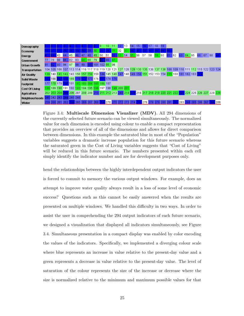
Figure 3.4: Multiscale Dimension Visualizer (MDV). All 294 dimensions ofthe currently selected future scenario can be viewed simultaneously. The normalizedvalue for each dimension is encoded using colour to enable a compact representationthat provides an overview of all of the dimensions and allows for direct comparisonbetween dimensions. In this example the saturated blue in most of the “Population”variables suggests a dramatic increase population for this future scenario whereasthe saturated green in the Cost of Living variables suggests that “Cost of Living”will be reduced in this future scenario. The numbers presented within each cellsimply identify the indicator number and are for development purposes only.
hend the relationships between the highly interdependent output indicators the user
is forced to commit to memory the various output windows. For example, does an
attempt to improve water quality always result in a loss of some level of economic
success? Questions such as this cannot be easily answered when the results are
presented on multiple windows. We handled this difficulty in two ways. In order to
assist the user in comprehending the 294 output indicators of each future scenario,
we designed a visualization that displayed all indicators simultaneously, see Figure
3.4. Simultaneous presentation in a compact display was enabled by color encoding
the values of the indicators. Specifically, we implemented a diverging colour scale
where blue represents an increase in value relative to the present-day value and a
green represents a decrease in value relative to the present-day value. The level of
saturation of the colour represents the size of the increase or decrease where the
size is normalized relative to the minimum and maximum possible values for that
25
particular indicator across all future scenarios. For example, a fully saturated blue
would represent the maximum increase for a value across all pre-computed future
scenarios in the database, whereas the colour white represents a value equal to the
present-day value and a fully saturated green represents the maximum decrease in
value. This colour encoding scheme offers the user a quick overview impression of
the future scenario that is easy to understand and allows for comparisons between
values within a scenario as well as between multiple future scenarios. Since most
users do not have a concept of what range of values are to be expected, the nor-
malization to the present-day scenario also gives the user a context in which to
understand the significance of the value.
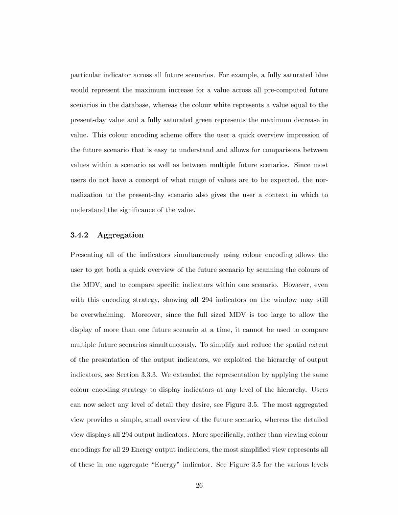
3.4.2 Aggregation
Presenting all of the indicators simultaneously using colour encoding allows the
user to get both a quick overview of the future scenario by scanning the colours of
the MDV, and to compare specific indicators within one scenario. However, even
with this encoding strategy, showing all 294 indicators on the window may still
be overwhelming. Moreover, since the full sized MDV is too large to allow the
display of more than one future scenario at a time, it cannot be used to compare
multiple future scenarios simultaneously. To simplify and reduce the spatial extent
of the presentation of the output indicators, we exploited the hierarchy of output
indicators, see Section 3.3.3. We extended the representation by applying the same
colour encoding strategy to display indicators at any level of the hierarchy. Users
can now select any level of detail they desire, see Figure 3.5. The most aggregated
view provides a simple, small overview of the future scenario, whereas the detailed
view displays all 294 output indicators. More specifically, rather than viewing colour
encodings for all 29 Energy output indicators, the most simplified view represents all
of these in one aggregate “Energy” indicator. See Figure 3.5 for the various levels
26
of aggregation available in the current implementation. The smaller footprint
Figure 3.5: Multiscale views of chosen environmental futures. The threelevels of aggregation offered by the current implementation of the interface. Theuser can choose the simplified representation for an quick overview representationor, if interested, drill down to see the details for particular output indicators.
Figure 3.6: Comparing future scenarios. Using the more simplified view, theuser can compare multiple scenarios side-by-side. In this example, the user is com-paring three different future scenarios. Note that the “Cost Of Living” aggregateindicator is different for each future scenario.
27

of the simplified view of a future scenario enables the simultaneous display and
comparison of multiple future scenarios. The most aggregated level presents all of
the high level category values, such as economy, transportation, or water, for each
future scenario in a single column enabling a side-by-side comparison between each
future scenario for each category. Figure 3.6 illustrates a comparison between three
future scenarios. Notice, in this figure, when comparing across the three future
scenarios, the differences in the values for the “Cost of Living” and “Footprint”
indicators are apparent.
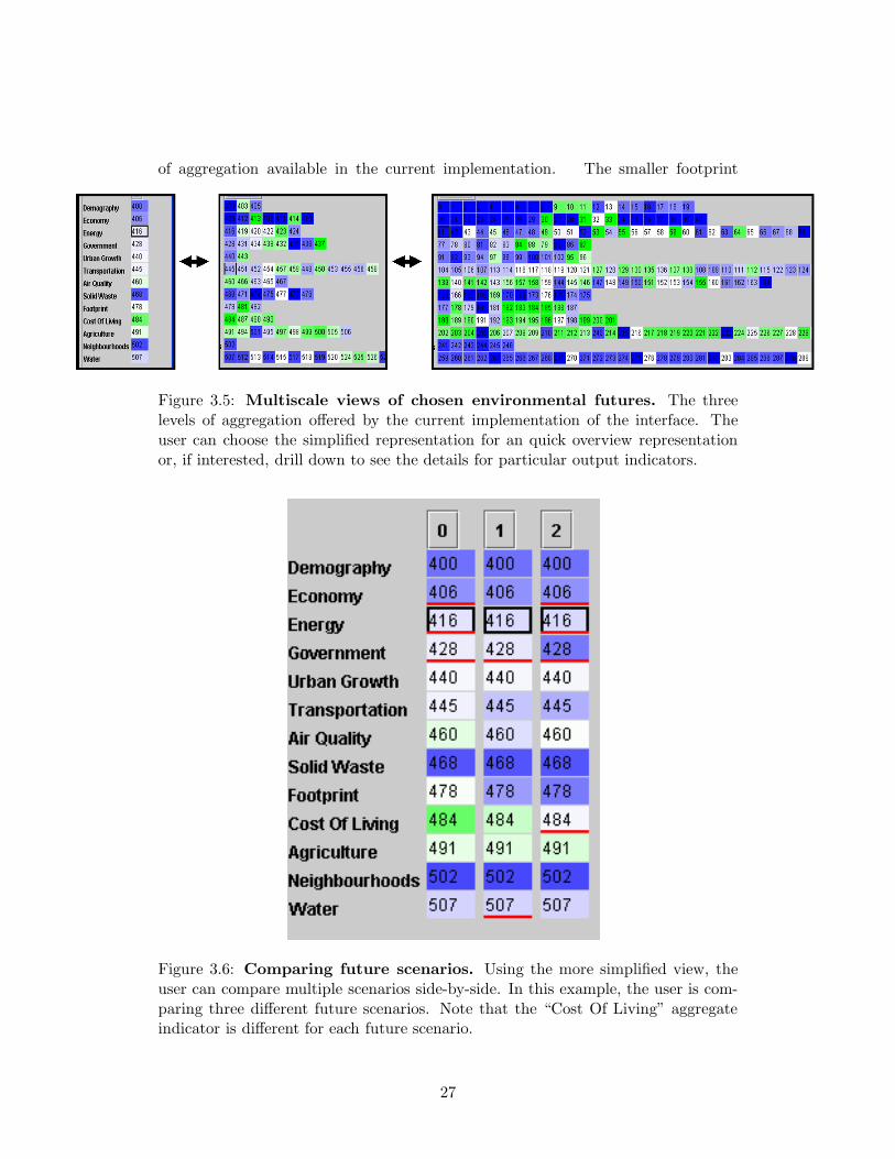
3.4.3 Detailed Output
The compact representation of output indicators in the MDV allows the user to
explore multiple future scenarios in seconds, with the choice of various levels of
summarization. Although colour encoding easily allows users to perceive an increase
or decrease in value, colour encoding is neither precise nor accurate enough for users
if they want to drill-down to see the actual values for specific output indicators.
To enable a comprehensive analysis of a particular future scenario, we provide a
detailed bar-graph component that presents the value information for specifically
selected output indicators. Figure 3.7 shows the detailed output for the population
indicators. It is this view that allows users to attain comprehensive understanding
of the future that they selected.
3.5 Input Choices
The Quest interface presents the menu with all of the input choices on the left hand
side of the screen during the input stage, see Figures 3.1. To make an input choice,
users select an item from the list to navigate to the screen that presents the input
choices. The choices are also shown during the future scenario analysis stage but
28
Figure 3.7: Detailed output. The user has drilled down to get the details of the“Population by Age” indicator.
they are not active; that is, they cannot be adjusted, see Figure 3.2. If the users want
to make alternative choices they must go back to the input stage and start again. In
QuestVis, we implemented an input choice component that displays all of the input
choices on the screen simultaneously, see Figures 3.8 and 3.12. Users are able to
view the choices throughout the exploration of multiple future scenarios; Moreover,
the choices are active; at any point during exploration, users can adjust the values
and see the impact immediately on the colours of the MDV output indicators.
3.5.1 Coupling Input Choices with Output Indicators
The real-time response improves exploration significantly since users can now view
the effects of policy decisions in seconds. However, understanding the impact of
policy decisions on sustainability indicators is a complex problem. In Quest, users
need guidance from a facilitator to explain the environmental consequences of their
29
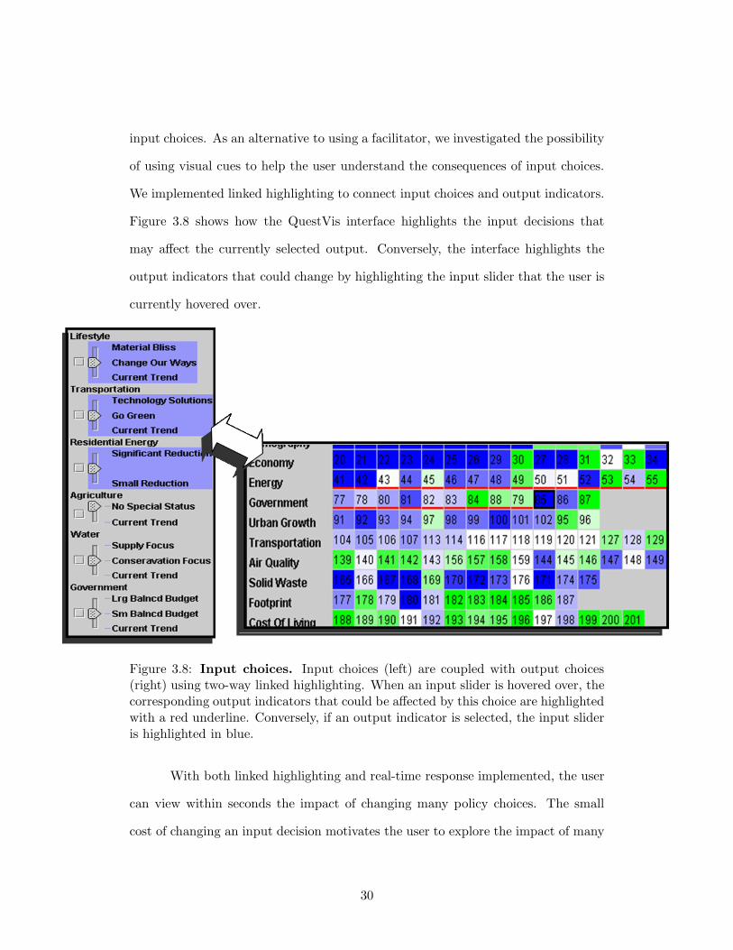
input choices. As an alternative to using a facilitator, we investigated the possibility
of using visual cues to help the user understand the consequences of input choices.
We implemented linked highlighting to connect input choices and output indicators.
Figure 3.8 shows how the QuestVis interface highlights the input decisions that
may affect the currently selected output. Conversely, the interface highlights the
output indicators that could change by highlighting the input slider that the user is
currently hovered over.
Figure 3.8: Input choices. Input choices (left) are coupled with output choices(right) using two-way linked highlighting. When an input slider is hovered over, thecorresponding output indicators that could be affected by this choice are highlightedwith a red underline. Conversely, if an output indicator is selected, the input slideris highlighted in blue.
With both linked highlighting and real-time response implemented, the user
can view within seconds the impact of changing many policy choices. The small
cost of changing an input decision motivates the user to explore the impact of many
30
individual policy changes on the various dimensions of sustainability modelled in
QuestVis.
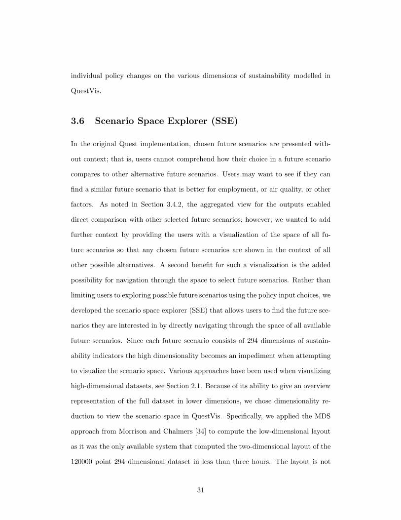
3.6 Scenario Space Explorer (SSE)
In the original Quest implementation, chosen future scenarios are presented with-
out context; that is, users cannot comprehend how their choice in a future scenario
compares to other alternative future scenarios. Users may want to see if they can
find a similar future scenario that is better for employment, or air quality, or other
factors. As noted in Section 3.4.2, the aggregated view for the outputs enabled
direct comparison with other selected future scenarios; however, we wanted to add
further context by providing the users with a visualization of the space of all fu-
ture scenarios so that any chosen future scenarios are shown in the context of all
other possible alternatives. A second benefit for such a visualization is the added
possibility for navigation through the space to select future scenarios. Rather than
limiting users to exploring possible future scenarios using the policy input choices, we
developed the scenario space explorer (SSE) that allows users to find the future sce-
narios they are interested in by directly navigating through the space of all available
future scenarios. Since each future scenario consists of 294 dimensions of sustain-
ability indicators the high dimensionality becomes an impediment when attempting
to visualize the scenario space. Various approaches have been used when visualizing
high-dimensional datasets, see Section 2.1. Because of its ability to give an overview
representation of the full dataset in lower dimensions, we chose dimensionality re-
duction to view the scenario space in QuestVis. Specifically, we applied the MDS
approach from Morrison and Chalmers [34] to compute the low-dimensional layout
as it was the only available system that computed the two-dimensional layout of the
120000 point 294 dimensional dataset in less than three hours. The layout is not
31
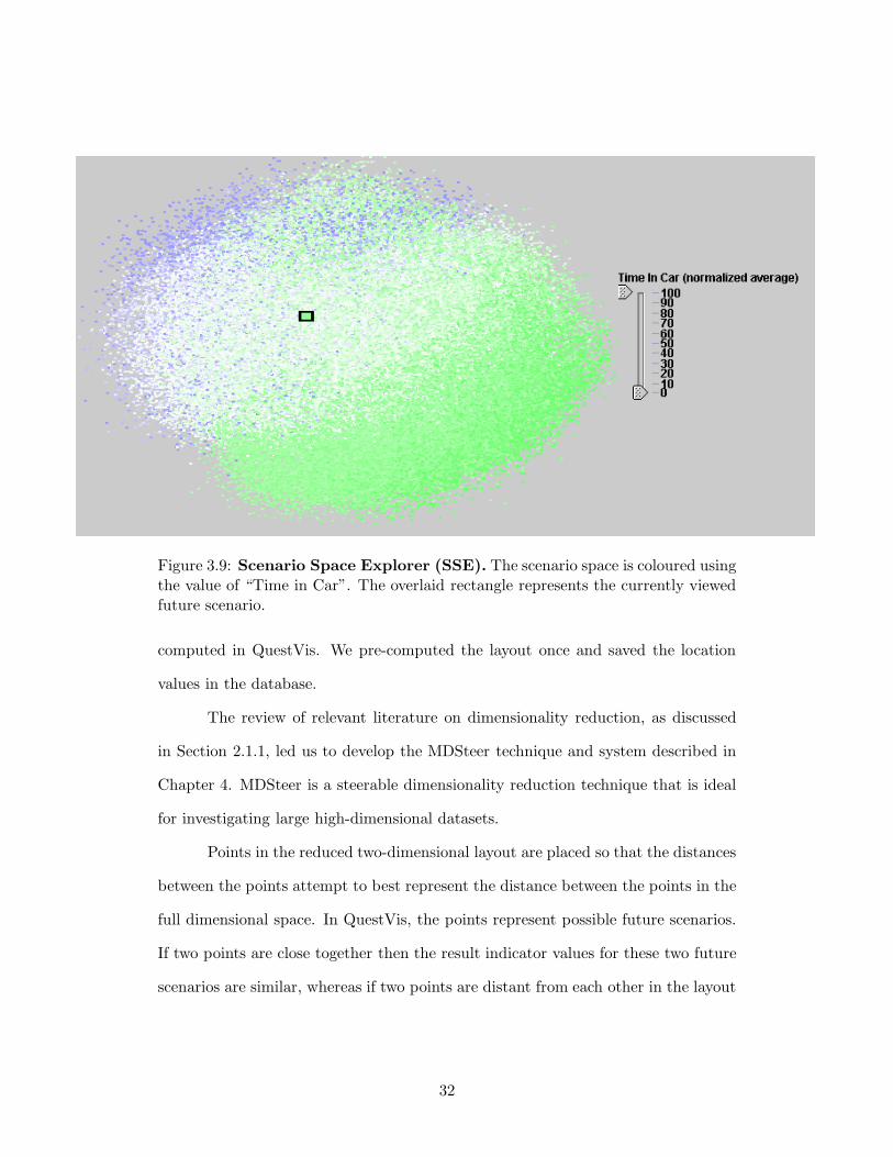
Figure 3.9: Scenario Space Explorer (SSE). The scenario space is coloured usingthe value of “Time in Car”. The overlaid rectangle represents the currently viewedfuture scenario.
computed in QuestVis. We pre-computed the layout once and saved the location
values in the database.
The review of relevant literature on dimensionality reduction, as discussed
in Section 2.1.1, led us to develop the MDSteer technique and system described in
Chapter 4. MDSteer is a steerable dimensionality reduction technique that is ideal
for investigating large high-dimensional datasets.
Points in the reduced two-dimensional layout are placed so that the distances
between the points attempt to best represent the distance between the points in the
full dimensional space. In QuestVis, the points represent possible future scenarios.
If two points are close together then the result indicator values for these two future
scenarios are similar, whereas if two points are distant from each other in the layout
32

then they have dissimilar values. As shown in Figure 3.9 the points in the scenario
space layout are fairly evenly distributed in the shape of an oval.
3.6.1 Colourization
The user determines the colourization of the points in the SSE by selecting dimen-
sions in the MDV. That is, the data points in the layout are colourized by the
normalized colour value of each future scenario for the currently selected result in-
dicator. For example, Figure 3.9 shows the scenario space where the colour of each
of the 120 000 future scenarios is determined by the value of the “Industrial Energy
Use” indicator. This technique places the users’ selected future scenario within the
context of other available future scenarios. Moreover, it allows the user to colourize
the context with any of the output dimensions. This enables the user to system-
atically choose alternative future scenarios based on the presently selected output
dimension. For example, during an exploration with QuestVis, users may search for
an alternative future that has a greater water supply by selecting a water supply
indicator. By noting the future scenarios that are coloured blue in the SSE, users
can find all alternative futures that have an increase in water supply.
3.6.2 Trail
Since the new interface design offers the ability to select hundreds of different future
scenarios within minutes, techniques were also required to allow the user to keep
track of previously viewed scenarios. To this end, we provided visual markers that
identify the previously viewed future scenarios on the scenario space layout, see
Figure 3.10. The large rectangle in the path represents the currently viewed future
scenario and the other dots in the trail represents the previously viewed future
scenarios. The trail of selected future scenarios is connected using gray lines that
gradually get lighter as the trail gets further from the most recently selected future
33
scenario, thus providing a visual cue as to the recency of the previously selected
future scenarios.
Figure 3.10: Trail of selected future scenarios. The scenario space is colouredusing the value of “Industrial Energy Use”. The overlaid trail figure represents thetrail of previously viewed future scenarios.
3.6.3 Filtering
Although presenting all 120 000 future scenarios offers a valuable overview of the
output parameter space, the concern arose that there are too many points to offer
any local detail. Moreover, since screen real-estate is limited, many points occlude
other points that are in nearby or identical screen coordinates. In an attempt to
overcome the difficulty in presenting the overwhelming number of future scenarios
in the scenario space representation we implemented a dynamic query technique, as
described in Section 2.2, that allows users to filter the number of points shown in the
34
scenario space. Specifically, the user can manipulate sliders to limit the number of
future scenarios shown based on the value of the currently selected output dimension.
Figure 3.11 shows the results of such a dynamic query on the scenario space. In this
example, the user selected the “Georgia Basin Domestic Water Use” indicator and
then set the sliders to show only the future scenarios that have the most increase in
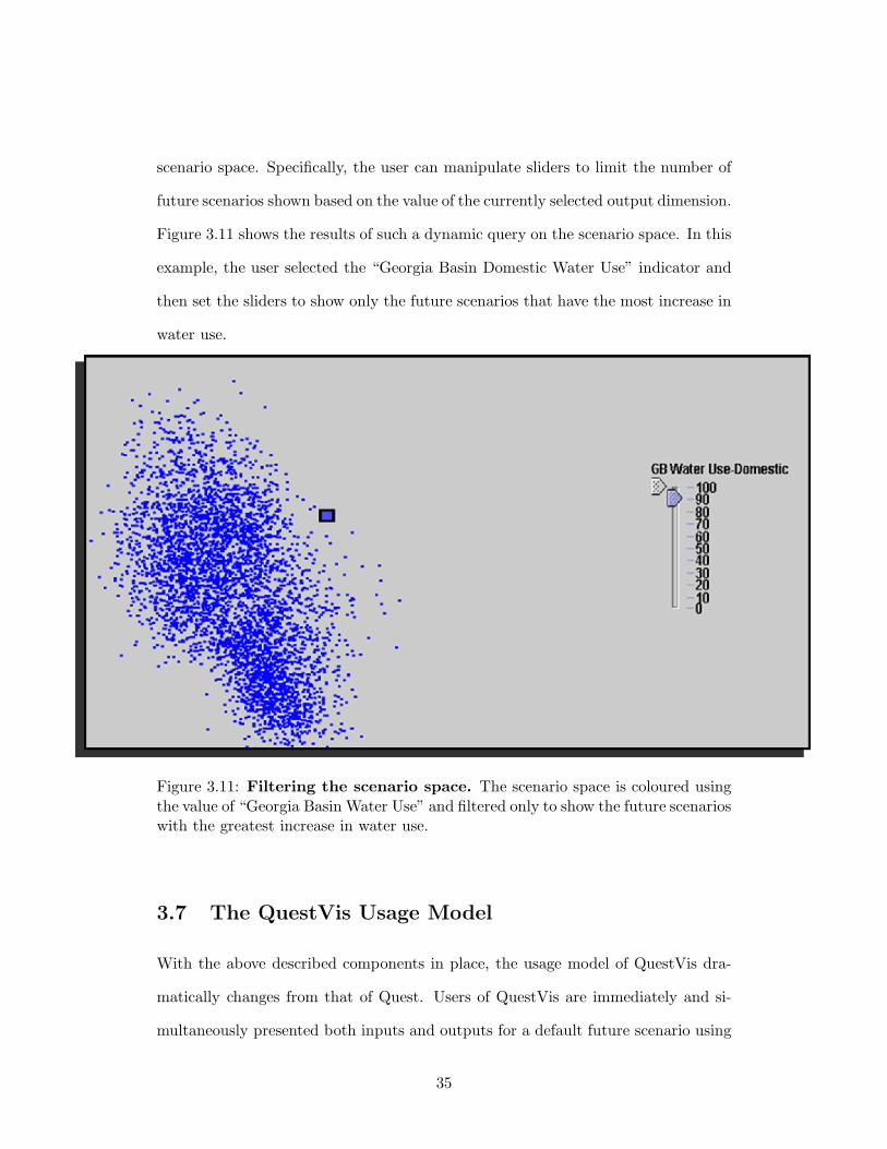
water use.
Figure 3.11: Filtering the scenario space. The scenario space is coloured usingthe value of “Georgia Basin Water Use” and filtered only to show the future scenarioswith the greatest increase in water use.
3.7 The QuestVis Usage Model
With the above described components in place, the usage model of QuestVis dra-
matically changes from that of Quest. Users of QuestVis are immediately and si-
multaneously presented both inputs and outputs for a default future scenario using
35
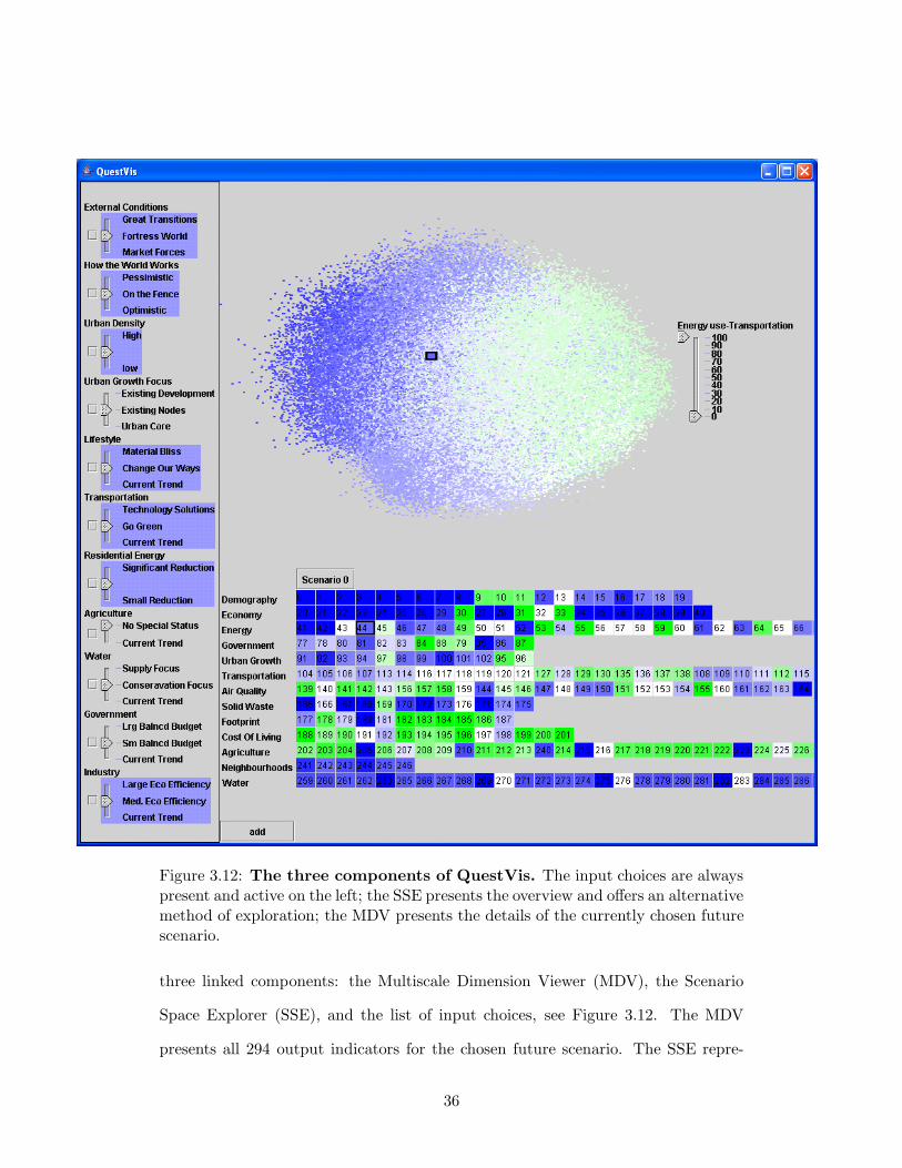
Figure 3.12: The three components of QuestVis. The input choices are alwayspresent and active on the left; the SSE presents the overview and offers an alternativemethod of exploration; the MDV presents the details of the currently chosen futurescenario.
three linked components: the Multiscale Dimension Viewer (MDV), the Scenario
Space Explorer (SSE), and the list of input choices, see Figure 3.12. The MDV
presents all 294 output indicators for the chosen future scenario. The SSE repre-
36
sents the space of all available future scenarios and highlights the history of future
scenarios that have been selected during the current session. The active display of
input choices shows the choices that led to the presently chosen future scenario and
can be used to interactively adjust any of the choices. All of these components are
tightly linked and interactive so that changes in one component are represented in
the others. With these tools at hand, users may now alter input choices one at
a time and immediately see the consequences of these decisions in the MDV and
SSE. Furthermore, since the SSE places each chosen future scenario on a map of
the space of all scenarios, users are given a context to compare the quality of the
chosen scenario against other possibilities. When interested in one particular future
scenario the user can drill down to view a detailed graph specific output indicators.
3.8 Implementaion
QuestVis was developed using the Java2 SDK 1.4.2 and can run on any platform
containing the Java2 Runtime Environment 1.4.2. The database of pre-computed fu-
tures is stored and served to QuestVis using the MySQL 4.0.15 open source database.
The MySQL Connector/J implementation of the Sun’s JDBC 3.0 API was used to
access the database from within QuestVis. The JFreeChart library of graphing and
charting classes was used to create the MDV’s detailed bar graphs.
37
Chapter 4
MDSteer
Dimensionality reduction techniques allow a dataset of high-dimensional points to be
explored by projection into low-dimensional spaces such as the 2D plane or 3D space.
Multidimensional scaling, or MDS, has been one of the most popular approaches to
reducing dimensionality since its introduction by Torgerson into the psychological
literature fifty years ago [48] as a way to represent perceived similarities between
a pair of stimuli. MDS is a technique where the ratio of differences between inter-
point distances in the original high-dimensional space and in the projected low-
dimensional space are minimized.
Dimensionality reduction techniques have been published in many fields:
psychology [29, 48], cartography [27], machine learning [42, 47], and information
visualization [4, 20, 33, 34, 35]. Error minimization requires many computationally
expensive high-dimensional distance or matrix computations, and the challenge is
reducing the cost and number of these calculations. Torgerson’s early approach had
a cost of O(n3), where n is the number of points in the dataset [48]. Methods with an
O(n2) cost that can handle thousands of points have become common [4, 20, 29, 30].
Recently, a subquadratic algorithm was proposed by Morrison that could lay out
thousands of points in minutes [33, 34, 35].
38
Despite the extensive previous work, there is a gap in the literature: no cur-
rently available algorithm or system allows interactive exploration of high-dimensional
datasets with both a large number of dimensions and a large number of points. Al-
though Morrison does handle hundreds of thousands of points in minutes [33, 34],
that is only true when the number of dimensions is low. On our real-world dataset
of 120,000 nodes and 294 dimensions, the HIVE system [41] took over two hours to
compute the layout.
We present MDSteer, a steerable system that allows the user to progressively
guide the MDS layout process so that exploration of huge datasets can begin im-
mediately after startup. The user can interactively select local regions of interest,
and then most of the available computational resources are spent on refining this
selected area of interest. Users can immediately begin exploring datasets of over one
million nodes. The overall dataset structure is apparent in a few seconds, providing
an overview that helps users find potentially interesting areas in the projection. Af-
ter interactive drill-down to a small local area, computational resources are steered
to that location to quickly fill in that area. Again, even for datasets of over one
million points, these small local areas can be fully populated within minutes. Our
system handles datasets with dimensionality of several hundred and cardinality of
over one million.
The ability to immediately explore and steer computational resources to
regions of interest allows investigation of datasets an order of magnitude larger than
previous work.
4.1 Steerable, Progressive MDS
The two techniques we use to introduce steerability into MDS are progressive lay-
out of points and hierarchical binning. Steering allows computational power to be
39
focused where it is needed to support exploration in parallel with continuing the
layout process.
4.1.1 Algorithm
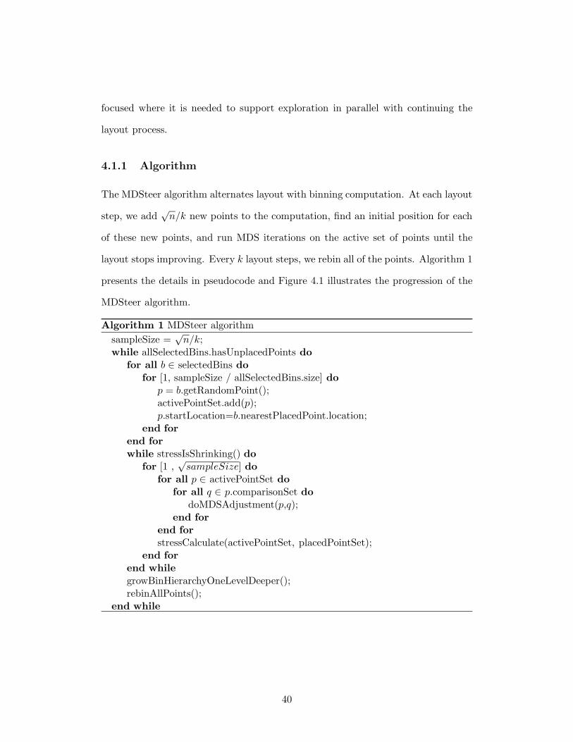
The MDSteer algorithm alternates layout with binning computation. At each layout
step, we add√
n/k new points to the computation, find an initial position for each
of these new points, and run MDS iterations on the active set of points until the
layout stops improving. Every k layout steps, we rebin all of the points. Algorithm 1
presents the details in pseudocode and Figure 4.1 illustrates the progression of the
MDSteer algorithm.
Algorithm 1 MDSteer algorithm
sampleSize =√
n/k;while allSelectedBins.hasUnplacedPoints do
for all b ∈ selectedBins dofor [1, sampleSize / allSelectedBins.size] do
p = b.getRandomPoint();activePointSet.add(p);p.startLocation=b.nearestPlacedPoint.location;
end forend forwhile stressIsShrinking() do
for [1 ,√
sampleSize] dofor all p ∈ activePointSet do
for all q ∈ p.comparisonSet dodoMDSAdjustment(p,q);
end forend forstressCalculate(activePointSet, placedPointSet);
end forend whilegrowBinHierarchyOneLevelDeeper();rebinAllPoints();
end while
40
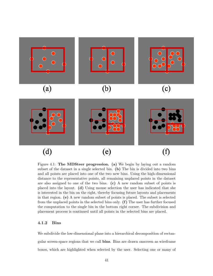
Figure 4.1: The MDSteer progression. (a) We begin by laying out a randomsubset of the dataset in a single selected bin. (b) The bin is divided into two binsand all points are placed into one of the two new bins. Using the high-dimensionaldistance to the representative points, all remaining unplaced points in the datasetare also assigned to one of the two bins. (c) A new random subset of points isplaced into the layout. (d) Using mouse selection the user has indicated that sheis interested in the bin on the right, thereby focusing future layouts and placementsin that region. (e) A new random subset of points is placed. The subset is selectedfrom the unplaced points in the selected bins only. (f) The user has further focusedthe computation to the single bin in the bottom right corner. The subdivision andplacement process is continued until all points in the selected bins are placed.
4.1.2 Bins
We subdivide the low-dimensional plane into a hierarchical decomposition of rectan-
gular screen-space regions that we call bins. Bins are drawn onscreen as wireframe
boxes, which are highlighted when selected by the user. Selecting one or many of
41
these regions causes the available computational resources to be focused on “filling
in” those bins; that is, laying out the higher-dimensional points that are likely to
be projected to that region of the lower-dimensional plane. The hierarchy of bins
guides the MDS layout at several levels. First, we restrict the amount of work we do
at each MDS iteration by allowing only the selected bins to have active points that
move around. Second, the set of new points to activate is chosen only from selected
bins. Third, bin membership is used to efficiently find starting positions for those
new points that have just become active.
We start the computation with only a single bin which contains all the points.
That initial bin is both the root of the bin hierarchy and the singleton leaf. At
every rebinning pass, we increase the maximum depth of the bin hierarchy by one,
subdividing each current leaf bin into two new child bins, so that the former leaf is
now an interior node and the new children are now the leaves. The leaf subdivision
is subject to a validity constraint that we explain below. After subdivision, the new
bins subtend a smaller region of the plane.
Steering With Bins Bins serve as a mechanism for the user to select a subset
of the data as the target of the available computational resources. Every point in
the dataset is assigned to some bin. We categorize points into one of three states:
unplaced, active, and placed. Unplaced points are not drawn, nor do they affect any
MDS iteration, and all points are unplaced at the beginning of the computation. At
each layout step we convert a set of s new points from unplaced to active, where
s =√
n/k, n is the total number of points in the dataset and k is a tuneable
parameter. We draw our samples evenly from all active bins.
When we activate unplaced points, we need to find their initial locations
in the plane before placements can be iteratively refined. We use the positions of
the placed points as initial locations in the plane for the new points. Using these
42
existing placements allows the new points to benefit from the previous computation.
We can find the initial placement efficiently by using the binning to narrow down
the possibilities: we check the distance from our target point to all placed or active
points in the bin, and pick the closest high-dimensional neighbour in the bin.
The heart of the layout computation is the inner loop where multiple iter-
ations of the spring-force MDS algorithm [20] are run, and only active points are
the targets of this computation. Thus, they are the only points that visibly move
around as their projection onto the plane changes. We check every√
sampleSize
iterations to see if the layout is still improving, and terminate the layout step when
progress is no longer being made. The inner loop termination criteria are discussed
in more detail in Section 4.1.3.
When a bin is unselected, all the active points are placed; their positions are
fixed and do not move around during successive MDS iterations. However, these
placed points can affect movement of other active points during the MDS iterations
because they are potential candidates for the random sample set. Both placed and
active points are always visible to the user.
Increasing Bin Hierarchy Depth After k layout steps where a total of√
n new
points have been laid out, we need to increase the bin hierarchy depth by one, then
rebin all points. We first describe how to grow the hierarchy.
We do not store points at any interior node of the bin tree, only the leaves.
Projected points may move outside the spatial boundary of their previous leaf bin
during layout. We need to reassign these points so that they belong to the bins in
which they lie before subdividing the current set of leaf bins to create the next layer
of the bin hierarchy. We check the active set of points to see if any are out of bounds.
For each such point that we find, we traverse upwards in the tree to find the first
ancestor node that can spatially contain it. When we perform a top-down traversal
43
of the tree in order to subdivide bins, then we also push these out-of-bounds points
back down to the correct bin at the leaves.
We do not always subdivide a leaf bin. For subdivision to occur, a bin
must have some minimum number of active points, and it must contain at least one
unplaced point. We use the minimum threshold of 10, which we found empirically.
We alternate subdividing bins in the vertical and horizontal directions at
each rebinning pass. To subdivide a bin, we find the placed or active points with
minimum and maximum values in whichever direction we are currently using, and
place the new dividing line halfway between these to create two new child bins. The
minimum and maximum points we just found are each attached to the child bin in
which they now fall, and we call these points the representative points and use
them for the high-dimensional distance computations described below for rebinning
points. These representative points can change from pass to pass, which gives rise
to the irregular subdivision we see in Figure 4.6. The average number of items per
bin decreases over the course of the progressive layout: after r rebinning passes, the
average binsize is (r ∗√
n)/2r.
When a selected bin is subdivided, both of its new child bins are selected.
When the program starts, the single existing bin is selected. If the user never makes
a steering choice by explicitly changing the selection state, then the computational
resources are equally divided between all areas of the screen and our algorithm would
simply do a progressive layout.
Rebinning Points Rebinning points is done immediately after subdividing a par-
ent bin into two child bins, so for each point currently assigned to the parent bin
the only choice to make is which of the two child bins to pick. The decision is easy
for active and placed points because they already have projected 2D coordinates
in the plane. We need only check a single coordinate, whichever direction is the
44

current active one, to find on which side of the dividing line the point currently lies.
Assigning the unplaced points requires more computation. For each unplaced point,
we compute the high-dimensional distances between it and the representative point
for each child bin. We assign the point to the bin that has the closer representative.
The cost of each rebinning step is linear: 2 ∗C ∗n, where C is the high-dimensional
distance computation cost and n is the total number of points in the dataset. This
computation takes only a small fraction of the total time budget for a pass, but it
is a cost that increases with the dimensionality of the dataset.
4.1.3 Termination Conditions
The inner loop of our system does the actual multi-dimensional scaling computations
where we attempt to minimize the error, or stress. We use the popular Kruskal
Stress-1 stress function [29]:
Stress =
∑i<j(dij − pij)
2
∑i<j p2
ij
where dij is the Euclidean distance between two points in high-dimensional
space, and pij is the distance in the low dimensional projection.
In MDSteer, the termination condition that deems the points to be well laid-
out is based on stress measurements. We only measure the stress for the active
point set, not all placed points. If the number of active points is greater than 100,
then the measure is computed from a random sample of 100 of those active points.
If s objects are currently active, we measure the stress every√
s iterations
of the spring model force calculations. When this value decreases, progress is being
made. When this value fails to shrink for two consecutive calculations, we terminate
the inner iteration loop.
Our current termination criterion is one of many possibilities. We could sim-
ply run the computation for a globally fixed number of iterations, or use the active
45
point set size to set the number of iterations. The benefit of the change would be to
eliminate the overhead of stress computation, but then we risk either undershooting
the amount of work and ending up with more total error, or overshooting and adding
overhead by doing many iterations that do not improve the layout. We could also
use a value that is calculated as part of the MDS iterations, such as velocity [34].
4.2 Results
MDSteer was implemented in Java and is based on the open-source HIVE spring-
model MDS software infrastructure distributed by Ross and Chalmers [41]. We
analyze both the running time and the layout error, known as stress, for our method.
All performance figures are for a dual processor, 3.0GHz Xeon with hyperthreading,
4.0GB of main memory, and an nVidia Quadro4 980 XGL graphics card. We used
the Windows XP Professional operating system and Java 1.4.2-b28 (HotSpot) with
a 1.5GB heap.
We show two datasets of differing cardinality and dimensionality. We use
the standard dimensionality 3 S-shaped synthetic benchmark sampled at different
densities: our benchmarks are performed on cardinalities of 2,000; 5,000; 50,000;
200,000 and 1,000,000 points. Figure 4.6 shows the S at cardinality 200,000. The
second dataset, with dimensionality 294 is a real dataset from our collaborators, as
described in Chapter 3. In fact, the work presented here was motivated by the desire
to explore this dataset and the lack of tools with which to do so. In this dataset,
each point represents a modelled scenario of a possible future, where each dimension
is a particular measure of environmental sustainability. For instance, dimensions
include water quality, air quality as measured by carbon dioxide emissions, solid
waste generated per capita, and so on. We show the 40,000 point cardinality version
46
of this dataset in Figure 4.6, and benchmark comparisons for the 5000, 40 000, and
120 000 point versions.
In all cases, MDSteer provided a reasonable overview of what would become
the final layout within a few seconds of startup, so that users could make informed
decisions about how to steer the system and focus future computation time. The
overview can always be generated quickly because only a small number of points
need to be laid out. In fact, this overview is exactly what would also be generated
by the Morrison algorithm, because our initial layout step corresponds to its first
stage. For all subsequent layout steps, our system provides unprecedented power to
users.
4.2.1 Timing
The time to place all points in the input dataset is not the right metric for judging
a steerable system. The steering controls for MDSteer allow users to select which
planar regions to fill in, so a measure of interest is the time required for it to fully
populate one of those regions. Specifically, these timings show the result of steadily
selecting a single new child bin soon after every subdivision. We show average times
over three runs. Figure 4.2 shows the benefits of steerability, where we compare the
time required to place the points that fall into a region with the time required to
place all points in the whole dataset.
In a typical interactive exploration session the usage pattern would be much
more dynamic and fluid, with frequent changes of selected bins. Users would often
change selections before placement was complete in a region, and they might also
select a larger number of bins than the single bin we use in this computation. The
timing numbers here are intended to give an impression of how steerability opens up
new possibilities for exploring huge datasets, and also to show that the overhead of
47
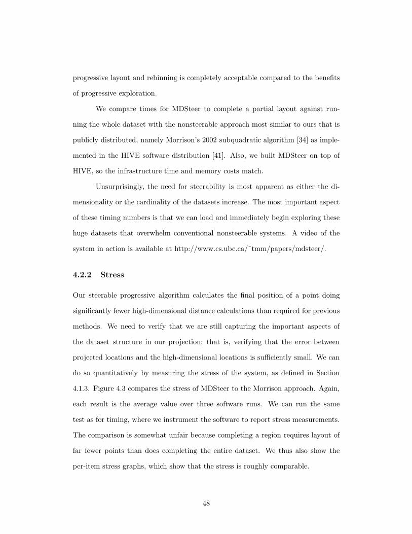
progressive layout and rebinning is completely acceptable compared to the benefits
of progressive exploration.
We compare times for MDSteer to complete a partial layout against run-
ning the whole dataset with the nonsteerable approach most similar to ours that is
publicly distributed, namely Morrison’s 2002 subquadratic algorithm [34] as imple-
mented in the HIVE software distribution [41]. Also, we built MDSteer on top of
HIVE, so the infrastructure time and memory costs match.
Unsurprisingly, the need for steerability is most apparent as either the di-
mensionality or the cardinality of the datasets increase. The most important aspect
of these timing numbers is that we can load and immediately begin exploring these
huge datasets that overwhelm conventional nonsteerable systems. A video of the
system in action is available at http://www.cs.ubc.ca/˜tmm/papers/mdsteer/.
4.2.2 Stress
Our steerable progressive algorithm calculates the final position of a point doing
significantly fewer high-dimensional distance calculations than required for previous
methods. We need to verify that we are still capturing the important aspects of
the dataset structure in our projection; that is, verifying that the error between
projected locations and the high-dimensional locations is sufficiently small. We can
do so quantitatively by measuring the stress of the system, as defined in Section
4.1.3. Figure 4.3 compares the stress of MDSteer to the Morrison approach. Again,
each result is the average value over three software runs. We can run the same
test as for timing, where we instrument the software to report stress measurements.
The comparison is somewhat unfair because completing a region requires layout of
far fewer points than does completing the entire dataset. We thus also show the
per-item stress graphs, which show that the stress is roughly comparable.
48
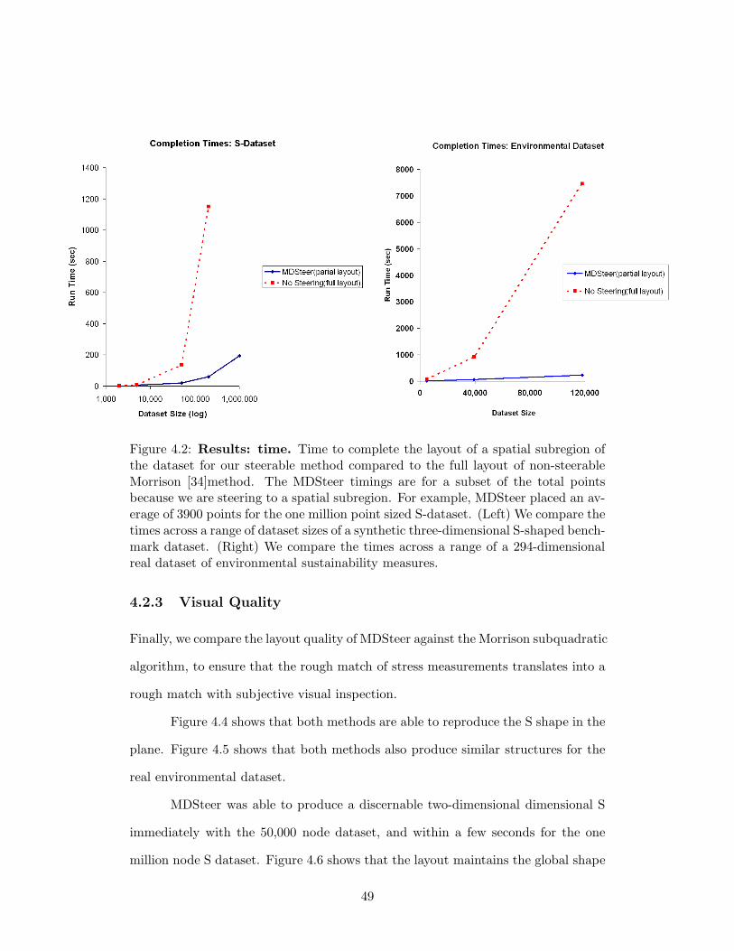
Figure 4.2: Results: time. Time to complete the layout of a spatial subregion ofthe dataset for our steerable method compared to the full layout of non-steerableMorrison [34]method. The MDSteer timings are for a subset of the total pointsbecause we are steering to a spatial subregion. For example, MDSteer placed an av-erage of 3900 points for the one million point sized S-dataset. (Left) We compare thetimes across a range of dataset sizes of a synthetic three-dimensional S-shaped bench-mark dataset. (Right) We compare the times across a range of a 294-dimensionalreal dataset of environmental sustainability measures.
4.2.3 Visual Quality
Finally, we compare the layout quality of MDSteer against the Morrison subquadratic
algorithm, to ensure that the rough match of stress measurements translates into a
rough match with subjective visual inspection.
Figure 4.4 shows that both methods are able to reproduce the S shape in the
plane. Figure 4.5 shows that both methods also produce similar structures for the
real environmental dataset.
MDSteer was able to produce a discernable two-dimensional dimensional S
immediately with the 50,000 node dataset, and within a few seconds for the one
million node S dataset. Figure 4.6 shows that the layout maintains the global shape
49
Figure 4.3: Results: layout stress. (Top Left) We compare the stress acrossa range of dataset sizes of a synthetic three-dimensional S-Shaped dataset. (TopRight) We compare the stress across a range of a 294-dimensional real dataset ofenvironmental sustainability measures. (Bottom Left, Bottom Right) We plot thelayout stress for the actual number of points placed, rather than the dataset size.These two quantities are disjoint with our scalable methods.
50

of the projection while filling in the different regions of the place that were selected
by the user.
Figure 4.4: Visual Quality: S dataset. (Left) We show the 50,000 point S-shaped benchmark dataset laid out with the Morrison [34] algorithm, taken after afull layout computation that takes 150 seconds. (Right) We show a partially placedversion of the same dataset after steering with MDSteer for roughly 20 seconds. Wesee the same large-scale structure, and the local region on the lower right where wehave focused computational resources is completely filled in.
51
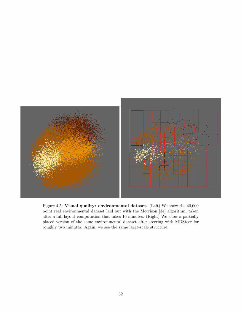
Figure 4.5: Visual quality: environmental dataset. (Left) We show the 40,000point real environmental dataset laid out with the Morrison [34] algorithm, takenafter a full layout computation that takes 16 minutes. (Right) We show a partiallyplaced version of the same environmental dataset after steering with MDSteer forroughly two minutes. Again, we see the same large-scale structure.
52
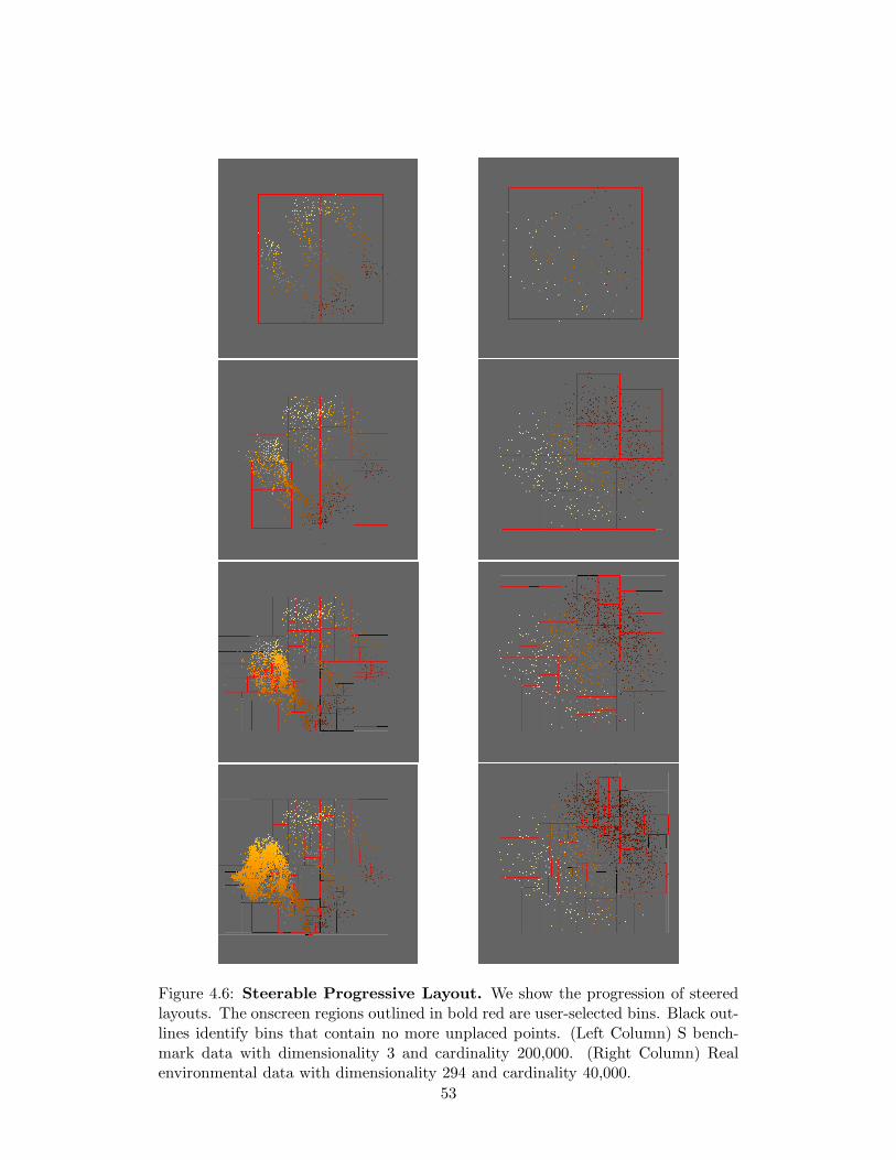
Figure 4.6: Steerable Progressive Layout. We show the progression of steeredlayouts. The onscreen regions outlined in bold red are user-selected bins. Black out-lines identify bins that contain no more unplaced points. (Left Column) S bench-mark data with dimensionality 3 and cardinality 200,000. (Right Column) Realenvironmental data with dimensionality 294 and cardinality 40,000.
53
Chapter 5
Discussion and Future Work
5.1 QuestVis
The QuestVis interface was guided by information visualization principles and our
original three design goals: improved comprehension of chosen future scenarios,
improved ability to compare across multiple future scenarios, and improved ability
to comprehend and explore the space of all future scenarios. Below, we evaluate the
new interface in relation to our design goals.
Goal: Improved Comprehension of Chosen Future Scenario
Each future scenario contains 294 output indicators that are interrelated. In the
previous version of Quest, these indicators are presented in detail over multiple
screens of information which makes it difficult to get an overview understanding
of the data. Presenting the data across multiple screens also makes it difficult
to analyze the relationship between indicators of the same scenario. The MDV
component we developed to present the chosen future scenario supports this goal
as it presents all 294 results simultaneously. The simultaneous presentation of all
the result indicators using colour provides the user an immediate impression of
the chosen future scenario. For example, if the the majority of the indicators have
54

decreased relative to the present-day values, then the MDV presentation will appear
blue at first glance, and alternatively, if the majority of the indicators have increased,
then the MDV will appear green.
After the first iteration of the development of this future scenario visualiza-
tion it was realized that presenting all result indicators simultaneously may, at times,
provide too much detail. In certain circumstances, users may prefer overview indica-
tors that represent an aggregate value for a group of similar indicators. For example,
all air quality indicators could be represented by a single aggregate “air quality” in-
dicator. The hierarchical categorization of inputs and the roll-up and drill-down
mechanisms were implemented to enable overview representations of each future.
By allowing users to select the level of aggregation, we provide the overview+details
framework that is advocated by many infovis researchers [43]. This representation
allows users the ability to explore using the aggregated overview indicators while
still offering the ability to drill-down to the details of the future scenarios that are
of most interest.
Goal: Improved Comparison of Multiple Scenarios
When making policy decisions it is imperative that users understand how changes in
policy affect the future. Two qualities of the previous Quest interface made such an
understanding virtually impossible. The first is that the decision making stage and
the analysis stage were separated, thereby not allowing users to change the policy
decisions on the fly. The second is the lack of the ability to present result indicators
for more than one future scenario at one time. Our interface tackles both of these
issues by presenting, on screen, the policy choices and the result indicators for up
to ten future scenarios at a time. Moreover, the results for the same indicators are
presented in the same row to enable ease of comparison.
55
Goal: Improved Exploration of the Space of All Scenarios
When using Quest to choose a future, the novice user does not know what futures
are possible and does not know how the values of result indicators might compare
to the present day or to the maximum possible values. We wanted to provide the
users with visualizations that would guide their interactions. The scenario space
visualization provides a representation of all available scenarios that are linked to
the chosen future scenario visualization. This improves the users’ ability to explore
the scenario space as it shows how the currently viewed scenario sits in relation to
all other available scenarios. The choice of colour encoding of the result indicators
also helps provide context. Specifically, all result indicator values are presented
in relation to the present-day value and normalized in relation to the minimum
and maximum value in all available scenarios. With this representation the user is
quickly able to gain a sense of how the future value compares with the present-day
value and how it sits in relation to other available scenarios.
Exploration was also improved through the tight coupling of inputs with
outputs. The relationships between the input choices and output indicators are
overwhelming and can lead novice users to make uninformed and, or ineffective
choices. Using linked highlighting, as described in Section 3.5.1, QuestVis informs
the user of the relationships between the inputs and the outputs before choices are
made. The visual connection between inputs and outputs serves to both educate
the user and to improve the efficiency of the interaction.
5.1.1 Future Work
There are several directions we would like to continue our research with QuestVis,
most of which focus on the scenario space visualization. Labelling the scenario
space is our highest priority, as it should provide a better context for the user,
56
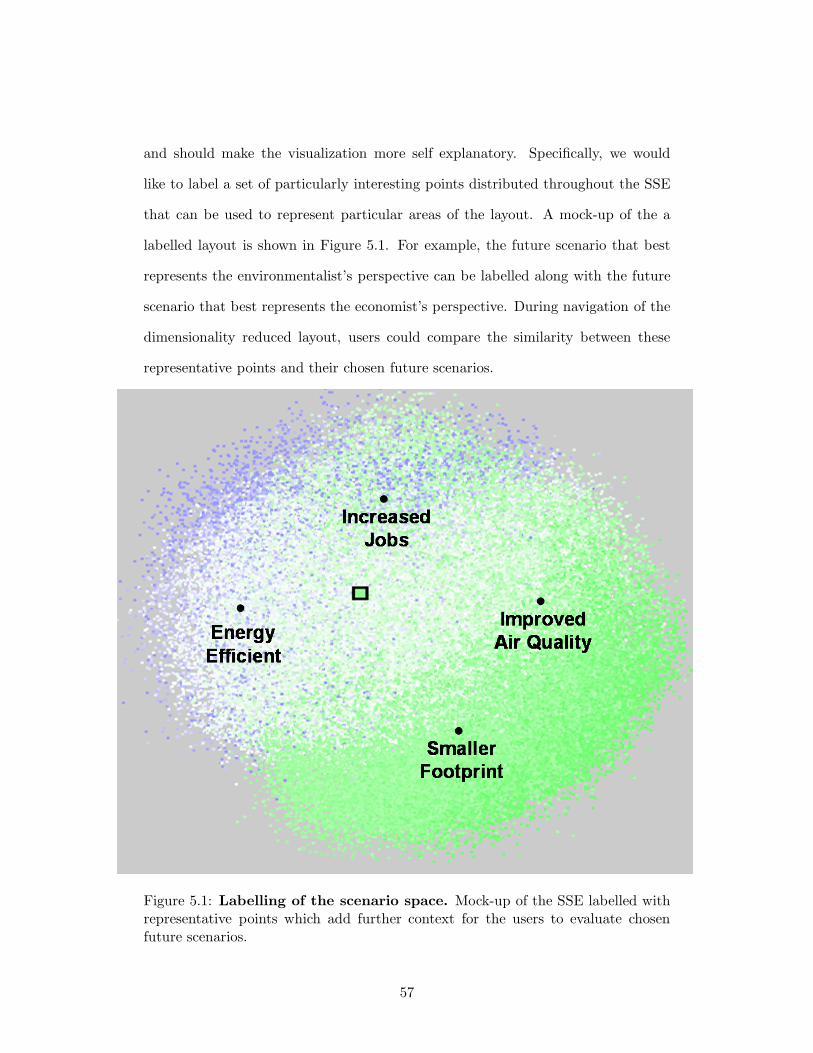
and should make the visualization more self explanatory. Specifically, we would
like to label a set of particularly interesting points distributed throughout the SSE
that can be used to represent particular areas of the layout. A mock-up of the a
labelled layout is shown in Figure 5.1. For example, the future scenario that best
represents the environmentalist’s perspective can be labelled along with the future
scenario that best represents the economist’s perspective. During navigation of the
dimensionality reduced layout, users could compare the similarity between these
representative points and their chosen future scenarios.
Figure 5.1: Labelling of the scenario space. Mock-up of the SSE labelled withrepresentative points which add further context for the users to evaluate chosenfuture scenarios.
57
Navigation through the available futures can also be improved with an added
history of viewed futures and the ability for the user to label and to save chosen
futures. We would also like to offer additional mechanisms to navigate through, or
alter, the scenario space layout. After the user has explored a number of futures with
standard features such as pan, and zoom, we would like QuestVis to provide statistics
that summarized the previously chosen future scenarios. For example, it would be
useful to be able to compare all of the previously chosen future scenarios along a
particular indicators like “Carbon Monoxide Emmisions” or “Time in Traffic.”
We would like to see if we can employ user interaction information to guide
future MDS layouts. Such modification of the MDS layout may now be possible
using MDSteer, our steerable MDS technique, see Chapter 4. Since previous tech-
niques focused on laying out the full dataset, laying out large datasets such as the
Quest dataset would take hours before alternative layouts could be completed. Our
MDSteer can layout sections of interest in the dataset in seconds and may provide
the answer to offering the user the ability to adapt the MDS layout.
We would like to investigate the possibility of using the diverging colour
scheme to represent the positive or negative impact on sustainability, or the good-
ness, of the indicator value, versus that of the current implementation that uses
colour to represent the positive or negative sign of the normalized value. Such an
approach would be beneficial to users during exploration because the colour of the
overview would provide an immediate impression of the goodness of the future sce-
nario; however, there is no universally accepted way to evaluate the goodness of the
sustainability indicator values and it is important for the tool to remain objective.
In other words, there is a tension between providing users an impression of the good-
ness of indicator values and not being overly judgemental. One possible solution is
to allow the user to subjectively tune the system to judge the goodness of the values.
58
Finally, an empirical evaluation of our interface would support the claims of
increased comprehension and more effective iteraction made within this thesis. This
evaluation should include a comparison of our interface with other alternatives on its
ability to impart both low-level information such as future sustainability indicator
values, such as carbon monoxide level, as well as higher-level information such as
an improved understanding of environmental sustainability.
5.2 MDSteer
MDSteer is the first steerable dimensinality reduction technique. Steerability sup-
ports exploration of huge datasets. Often users do not need to see the placement
of every point in order to carry out tasks of interest. Currently, people do not even
attempt to carry out dimensionality reduction on huge datasets because the time it
would take to lay out one million points is a huge barrier to exploration. By allow-
ing users to immediately begin looking at the data, and to direct the computational
resources to interactively-discovered areas that look promising, they may be able to
answer their questions about the data long before all points have been placed. The
ability to quickly see that a dataset is not promising would allow a user to aban-
don an unproductive direction, and immediately move on to check another that has
the potential to be more informative. Without steerability, those judgements might
require a turnaround time of hours or days rather than minutes. Another possible
advantage is that the user spends the time while waiting for the system to finish
layout engaged in productive exploration rather than waiting impatiently to start
work.
The standard argument for computational steering is that human insight
can help with many tasks where automatic algorithms are inadequate to fully solve
59
the problem [39]. Visualization systems are deployed in those exact circumstances;
where humans do need to have insight into the structure of a complex dataset.
We emphasize again that the critical contribution of our work is bringing
steerability to MDS. Our algorithm does not complete a full layout using less time
or memory than with previous approaches. In fact, our algorithm is based on, and
takes time comparable to, the original Chalmers approach [20] that is notably slower
than the more recent algorithms offered by Morrison [33, 34]. Rather, the benefit
of our approach is that it enables the interactive investigation of datasets with both
high cardinality and high dimensionality. We also do not claim to reduce the amount
of memory required to do the computation.
We also distinguish steerability from visible change. Many MDS systems
allow users to see the projected points move around the plane as the layout is
refined, for instance the TreeComp system of Amenta and Klingner [4]. Although
users may both enjoy and benefit from seeing this real-time motion that shows
them the progress of the algorithm, the only control they have is whether to stop or
continue the system. The ability to control the allocation of computational resources
through true steering provides far more power to users.
5.2.1 Future Work
In future work we would like to take more advantage of the interactive nature of our
algorithm. We believe that the user-selected regions can be used as a cue to highlight
local structure. It may be possible to use the selections to modify the weight that is
given to specific points during computations. For example, we would like to explore
whether giving weight, in the MDS computations, to user selected points will give a
more intuitive layouts. Similarly, we would like to explore weighting the dimensions
that have a high variance in the user selected points. We conjecture that giving
60
weight to points and dimensions that the user finds interesting should, as a result,
emphasize the structure in the dataset that the user is most concerned with.
Currently when the system places all points in the selected bins, it falls idle
until the user changes the selection. We would like to add an “auto-run” mode, so
that the system would automatically change the selection to start work on a nearby
area if there is no more work to do in the current bins. If left unattended such a
system would eventually place the entire dataset.
We would like to implement Morrison’s 2003 nearest neighbour finding tech-
nique [33] to improve the efficiency of our starting location algorithm. It would
be interesting to explore further whether we could provide faster or more accurate
layout by changing the selection criteria for the neighbourhood and random sample
sets used in the inner loop of MDS iteration, exploiting the known structure of our
hierarchical bins instead of using purely random selection.
We are also intrigued by the challenge of creating a fully progressive algo-
rithm. In the present implementation, rebinning is a global pass, which is acceptable
because its cost is still overshadowed by the MDS iteration cost. However, this sort
of global computation will eventually form a limit to scaling datasets of large car-
dinality or dimensionality, so progressive binning would be a good match with the
current progressive layout. We would then have an approach limited only by system
memory constraints, and that might scale far past our current million-node limit.
Finally, other MDS extensions [42, 47] have been shown to find more intuitive
layouts by seeking out low-dimensional manifolds in high-dimensional data. All
implementations of manifold-finding techniques that we have discovered use the
eigensolving approach rather than the iterative spring model approach. We would
like to develop a scalable, iterative, manifold-finding algorithm.
61
5.3 Conclusions
We developed QuestVis, a visual interface for exploring modelled future scenarios.
By developing and applying various infovis techniques, we provided the inexperi-
enced user with data-driven visualizations that help inform and guide the user in
her exploration with the tool. Each future is organized hierarchically, so that the
user can view a simple aggregated output and can drill down to receive the most
detailed information offered by the dataset. By using the dimensionality reduction
technique known as spring model MDS, we developed the SSE component that pro-
vides the user an overview of the space of all futures which not only informs the
user of the possibilities, but also provides a context for effective exploration. The
MDV component allows the user to examine both the overview and the details of
the chosen future scenarios through effective colour encoding.
Our literature review of dimensionality reduction techniques found a lack of
systems and techniques that scaled to the size of dataset we were interested in for
our QuestVis project. To fill this gap, we developed MDSteer, a system for steerable
and progressive multidimensional scaling that allows users to interactively explore
huge datasets. Steering allows computational power to be focused where it is needed
to support exploration in parallel with continuing the layout process. We subdivide
the low-dimensional plane where our high-dimensional points are projected into a
hierarchical decomposition of rectangular screen-space regions. The user can in-
teractively select regions of interest, and then most of the available computational
resources are spent on refining this region. These small local areas can quickly be
fully populated with the dataset points that project to the selected region of the
plane. Our system handles datasets with a dimensionality of up to several hundred,
and cardinalities of over one million.
62

Bibliography
[1] C. Ahlberg and B. Shneiderman. Visual information seeking: Tight coupling
of dynamic query filters with starfield displays. In Proc. of ACM Conference
on Human Factors in Computing Systems, pages 313–317. ACM Press, 1994.
[2] C. Ahlberg, C. Williamson, and B. Shneiderman. Dynamic queries for in-
formation exploration: an implementation and evaluation. In Proc. SIGCHI
Conference on Human Factors in Computing Systems, pages 619–626, 1992.
[3] C. Ahlberg and E. Wistrand. IVEE: an information visualization and explo-
ration environment. In Proc. IEEE Symposium on Information Visualization,
pages 66–73. IEEE Computer Society, 1995.
[4] N. Amenta and J. Klingner. Visualizing sets of evolutionary trees. In Proc.
IEEE Symposium on Information Visualization, pages 71–74, 2002.
[5] M. Q. W. Baldonado, A. Woodruff, and A. Kuchinsky. Guidelines for using
multiple views in information visualization. In Advanced Visual Interfaces,
pages 110–119, 2000.
[6] W. Basalaj. Incremental multidimensional scaling method for database visual-
ization. In Proc. Visual Data Exploration and Analysis VI, SPIE, volume 3643,
pages 149–158, 1999.
63

[7] W. Basalaj. Proximity visualization of abstract data. Technical Report 509,
University of Cambridge Computer Laboratory, January 2001.
[8] R. A. Becker and W. S. Cleveland. Brushing scatterplots. Technometrics,
29(2):127–142, 1987.
[9] R. A. Becker, W. S. Cleveland, and M.-J. Shyu. The visual design and control
of trellis display. Journal of Computational and Graphical Statistics, 5(2):123–
155, 1996.
[10] B. Bederson, J. Meyer, and L. Good. Jazz: An extensible zoomable user in-
terface graphics toolkit in Java. In Proc. ACM Symposium on User Interface
Software and Technology, pages 171–180. ACM Press, 2000.
[11] B. B. Bederson and J. D. Hollan. Pad++: A zooming graphical interface for ex-
ploring alternate interface physics. In Proc. User Interface Software Technology
(UIST 1994), pages 17–26, 1994.
[12] M. Belkin and P. Niyogi. Laplacian eigenmaps for dimensionality reduction and
data representation. Neural Computation, 15(6):1373–1396, 2003.
[13] R. E. Bellman. Adaptive Control Processes: A Guided Tour. Princeton Uni-
versity Press, New Jersey, 1961.
[14] I. Borg and P. J. F. Groenen. Modern Multidimensional Scaling Theory and
Applications. Springer-Verlag, New York, 1997.
[15] R. Bosch, C. Stolte, D. Tang, J. Gerth, M. Rosenblum, and P. Hanrahan. Rivet:
A flexible environment for computer systems visualization. Computer Graphics,
34(1):68–73, 2000.
[16] C. A. Brewer. Color use guidelines for data representation. In Proc. Section on
Statistical Graphics, American Statistical Association, pages 55–60, 1999.
64
[17] D. C. Campbell and J. Salter. The digital workshop: Exploring the effec-
tiveness of interactive visualisations and real-time data analysis in enhancing
participation in planning processes. Report submitted to Forestry Innovation
Investment Forestry Research Programme, Deliverable #5. Collaborative for
Advanced Landscape Planning, University of British Columbia, 2004.
[18] S. K. Card and J. Mackinlay. The structure of the information visualization
design space. In Proc. IEEE Symposium on Information Visualization, pages
92–99, 1997.
[19] J. Carmichael, J. Tansey, and J Robinson. An integrated assessment modeling
tool: Georgia basin quest. Global Environmental Change, 14(2):171–183, 2004.
[20] M. Chalmers. A linear iteration time layout algorithm for visualising high
dimensional data. In Proc. IEEE Visualization, pages 127–132, 1996.
[21] W. S. Cleveland. The Elements of Graphing Data. Wadsworth Publishing
Company, 1985.
[22] Y. Fua, M. O. Ward, and E. A. Rundensteiner. Hierarchical parallel coordinates
for exploration of large datasets. In Proc. IEEE Visualization, pages 43–50.
IEEE Computer Society Press, 1999.
[23] D. C. Glaser, R. Tan, J. Canny, and E. Y. Do. Developing architectural lighting
representations. In Proc. IEEE Symposium on Information Visualization, pages
227–232, 2002.
[24] A. Goel, C. Baker, C. A. Shaffer, B. Grossman, R. T. Haftka, W. H. Mason,
and L. T. Watson. VizCraft: A multidimensional visualization tool for air-
craft configuration design. In Proc. IEEE Visualization, pages 425–428, San
Francisco, 1999.
65
[25] A. Inselberg and B. Dimsdale. Parallel Coordinates: A tool for visualizing
multi-dimensional geometry. In Proc. IEEE Visualization, pages 361–378. IEEE
Computer Society Press, 1990.
[26] T. Kohonen. The Self-Organizing Map. In Proc. IEEE, pages 1464–1480, 1990.
[27] T. Kohonen. Self-Organizing Maps. Springer-Verlag, 1995.
[28] T. Kohonen, S. Kaski, K. Lagus, J. Salojrvi, J. Honkela, V. Paatero, and
A. Saarela. Self organization of a massive document collection. IEEE Transac-
tions on Neural Networks, Special Issue on Neural Networks for Data Mining
and Knowledge Discovery, 11(3):574–585, 2000.
[29] J. B. Kruskal. Multidimensional scaling by optimizing goodness of fit to a
nonmetric hypothesis. Psychometrika, 29(1):1–27, 1964.
[30] J. X. Li. Visualization of high dimensional data with relational perspective
map. Information Visualization, 3(1):49–59, 2004.
[31] J. Mackinlay. Automating the design of graphical presentations of relational
information. ACM Transactions on Graphics, 5(2):110–141, 1986.
[32] R. Moreno, R. E. Mayer, H. A. Spires, and J. C. Lester. The case for social
agency in computer-based teaching: do students learn more deeply when they
interact with animated pedagogical agents? Cognition and Instruction, 19:177–
213, 2001.
[33] A. Morrison and M. Chalmers. Improving hybrid MDS with pivot-based search-
ing. In Proc. IEEE Symposium on Information Visualization, pages 85–90,
2003.
66
[34] A. Morrison, G. Ross, and M. Chalmers. A hybrid layout algorithm for sub-
quadratic multidimensional scaling. In Proc. IEEE Symposium on Information
Visualization, pages 152–158, 2002.
[35] A. Morrison, G. Ross, and M. Chalmers. Fast multidimensional scaling through
sampling, springs and interpolation. Information Visualization, 2(1):68–77,
2003.
[36] T. Munzner. Interactive Visualization of Large Graphs and Networks. PhD
thesis, 2000.
[37] T. Munzner, F. Guimbretiere, S. Tasiran, L. Zhang, and Y. Zhou. TreeJuxta-
poser: Scalable tree comparison using focus+context with guaranteed visibility.
Transactions on Graphics (SIGGRAPH 2003), 22(3):453–462, July 2003.
[38] C. North and B. Shneiderman. Snap-together Visualization: A user interface
for coordinating visualizations via relational schemata. In Proc. Working Con-
ference on Advanced Visual Interfaces, pages 128–135. ACM Press, 2000.
[39] S.G. Parker and C.R. Johnson. SCIRun: A scientific programming environment
for computational steering. In Proc. Supercomputing, pages 1419–1439.
[40] K. Perlin and D. Fox. Pad: An alternative approach to the computer interface.
In Proc. Computer Graphics and Interactive Techniques (SIGGRAPH 1993),
pages 57–64. ACM Press, 1993.
[41] G. Ross and M. Chalmers. A visual workspace for hybrid multidimensional
scaling algorithms. In Proc. IEEE Symposium on Information Visualization,
pages 91–96, 2003.
[42] S. T. Roweis and L. K. Saul. Nonlinear dimensionality reduction by locally
linear embedding. Science, 290, Dec 22 2000.
67
[43] B. Shneiderman. The eyes have it: A task by data type taxonomy for infor-
mation visualizations. In Proc. IEEE Symposium on Visual Languages, pages
336–343. IEEE Computer Society, 1996.
[44] C. Stolte, D. Tang, and P. Hanrahan. Multiscale visualization using data cubes.
In Proc. IEEE Symposium on Information Visualization, pages 7–15, 2002.
[45] C. Stolte, D. Tang, and P. Hanrahan. Polaris: A system for query, analysis,
and visualization of multidimensional relational databases. IEEE Transactions
on Visualization and Computer Graphics, 8(1):52–65, 2002.
[46] D. Swayne and D. Cook. Xgobi: Interactive dynamic data visualization in the
X window system. Journal of Computational and Graphical Statistics, pages
113–130, 1998.
[47] J. B. Tenenbaum, V. de Silva, and J. C. Langford. A global geometric frame-
work for nonlinear dimensionality reduction. Science, 290(5500):2319–2323,
Dec 22 2000.
[48] W. S. Torgerson. Multidimensional scaling: I. theory and method. Psychome-
trika, 17:401–419, 1952.
[49] F. van Ham. Using multilevel call matrices in large software projects. In Proc.
IEEE Symposium on Information Visualization, pages 227–232, 2002.
[50] M. O. Ward. XmdvTool: Integrating multiple methods for visualizing multi-
variate data. In Proc. IEEE Visualization, pages 326–333, 1994.
[51] M. Williams and T. Munzner. MDSteer: Steerable, progressive multidimen-
sional scaling. In Proc. IEEE Symposium on Information Visualization, 2004.
To appear.
68

[52] G. Wills. Visual Exploration of Large Structured Datasets. New Techniques and
Trends in Statistics. IOS Press, USA, 1995.
[53] A. Woodruff, C. Olston, A. Aiken, M. Chu, V. Ercegovac, M. Lin, M. Spald-
ing, and M. Stonebraker. DataSplash: A direct manipulation environment for
programming semantic zoom visualizations of tabular data. Journal of Visual
Languages and Computing, 12(5):551–571, 2001.
69