Embed Size (px)
Citation preview
Question 2
How effective is the combination
of your main product and ancillary
texts?
Introduction
• For this question, I must look at the extent to which my print work and video combined to establish a clear house style.
• I also need to be able to look at my main product and ancillary texts objectively and evaluate what I think was done well and what changes could have possibly improved the way in which my various media texts compliment each other.
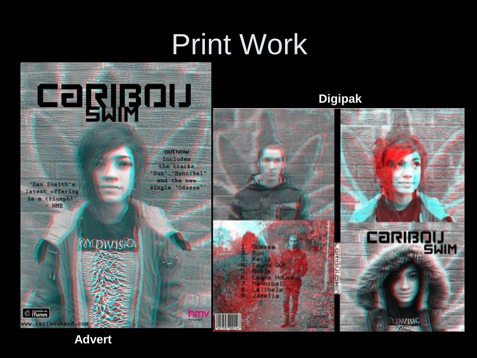
Print Work
Advert
Digipak
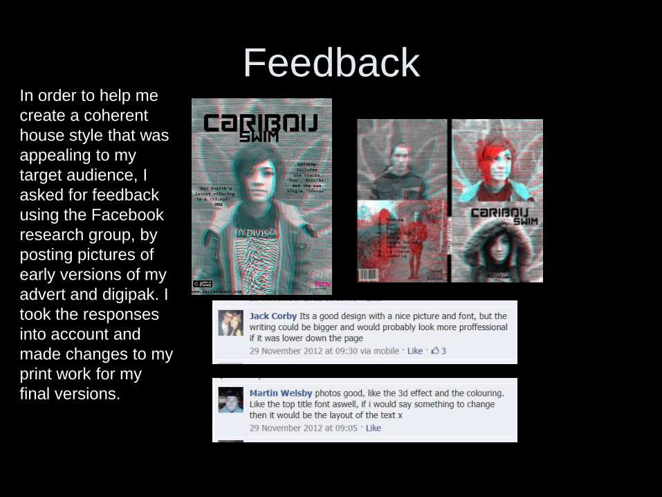
FeedbackIn order to help me
create a coherent
house style that was
appealing to my
target audience, I
asked for feedback
using the Facebook
research group, by
posting pictures of
early versions of my
advert and digipak. I
took the responses
into account and
made changes to my
print work for my
final versions.
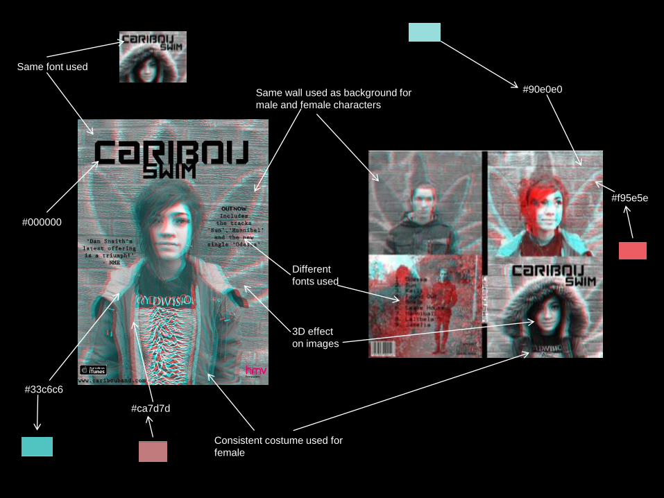
Consistent costume used for
female
Same wall used as background for
male and female characters
Same font used
Different
fonts used
3D effect
on images
#000000
#33c6c6
#90e0e0
#f95e5e
#ca7d7d
Did I achieve a coherent house
style in my print work?Overall, I was pleased with the appearance of my print work and felt that the combinatin of the digipak
and advert worked well together. I maintained the ‘anaglyph’ (3D red/ green separatation) effect throughout my print production as can be seen by looking at all of the photographs used. I also ensured that I photographed both my male and female models in front of the same background. I also tried, as much as possible, to get my male model to mimick the sort of facial expression that I had gotten my female model to put on for the photographs in order to eminate a clear mood of a feeling of youthful disillusionment with life. I also used the same font entitled ‘Loaded’ which I located on the website www.dafont.com for the header of my advert and digipak front cover. However, I was not consistent with the fonts I used for the rest of the text across my two print production pieces which I now feel I should have kept to the same font in order to maintain my house style.
Although I used the same sort of effect across the advert and digipak, I neglected to ensure that I set the levels of red vs. the levels of green and blue in each image exactly the same across all of my work. I also used certain effects on Photoshop on some images but not on others as I did not keep a clear enough record of the ways I’d manipulated each image and therefore could not always remember how to get my edited photographs perfectly matching. This is why the front cover of my digipak appears to be a slightly sharper image than the one used for my advert. The fact that I used two different photographs and layered them on top of eachother, then changed one to all red tones and the other to all green and blue tones, for the top right and bottom left sections of my digipak, rather than doing the same but using the same image duplicated and layered, with a slight gap in between (as I did for all the other sections of the print work) means that it can clearly be seen that a slightly different effect is achieved. I did not realise how noticable the difference here would be duringn the planning phase and so by the time I had produced my print work there was little I could do about this.
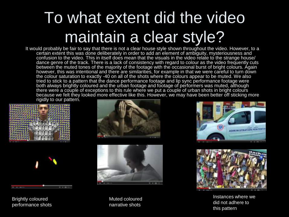
To what extent did the video
maintain a clear style?It would probably be fair to say that there is not a clear house style shown throughout the video. However, to a
certain extent this was done deliberately in order to add an element of ambiguity, mysteriousness and confusion to the video. This in itself does mean that the visuals in the video relate to the strange house/ dance genre of the track. There is a lack of consistency with regard to colour as the video frequently cuts between the muted tones of the majority of the footage with the occasional burst of bright colours. Again however, this was intentional and there are similarities, for example in that we were careful to turn down the colour saturation to exactly -40 on all of the shots where the colours appear to be muted. We also tried to stick to a pattern that the dance performance footage and lip sync performance footage were both always brightly coloured and the urban footage and footage of performers was muted, although there were a couple of exceptions to this rule where we put a couple of urban shots in bright colours because we felt they looked more effective like this. However, we may have been better off sticking more rigidly to our pattern.
Brightly coloured
performance shots
Muted coloured
narrative shots
Instances where we
did not adhere to
this pattern
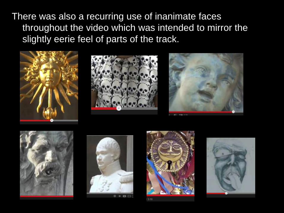
There was also a recurring use of inanimate faces
throughout the video which was intended to mirror the
slightly eerie feel of parts of the track.
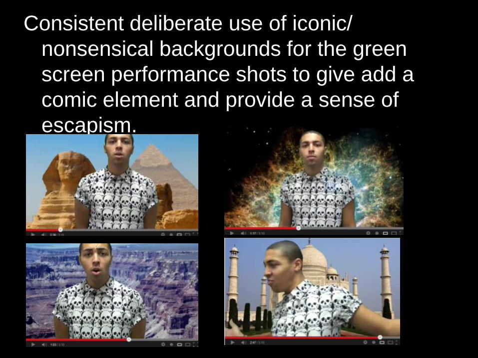
Consistent deliberate use of iconic/
nonsensical backgrounds for the green
screen performance shots to give add a
comic element and provide a sense of
escapism.
Video combined with print work
I felt that the video and print work actually
worked extremely well together and did
create a reasonably consistent house
style. Although the strangeness of the
video made it difficult at times to establish
links with the print production, there are a
number of clear similarities between the
two.
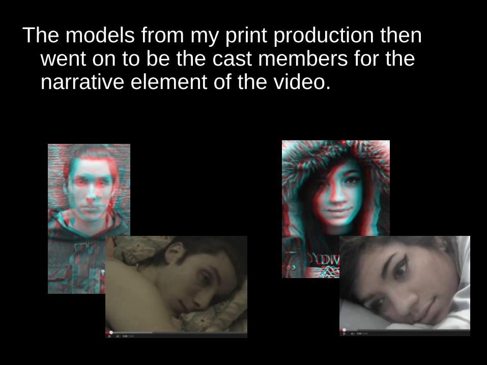
The models from my print production then went on to be the cast members for the narrative element of the video.
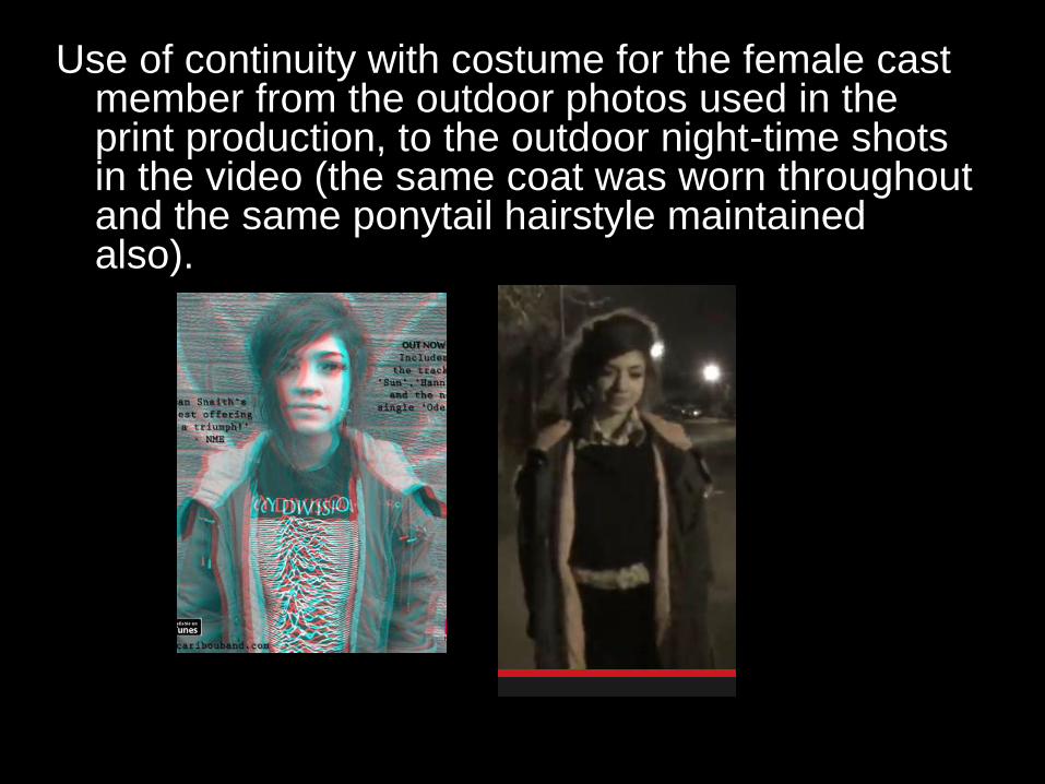
Use of continuity with costume for the female cast member from the outdoor photos used in the print production, to the outdoor night-time shots in the video (the same coat was worn throughout and the same ponytail hairstyle maintained also).
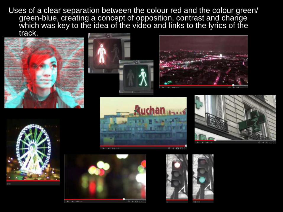
Uses of a clear separation between the colour red and the colour green/ green-blue, creating a concept of opposition, contrast and change which was key to the idea of the video and links to the lyrics of the track.
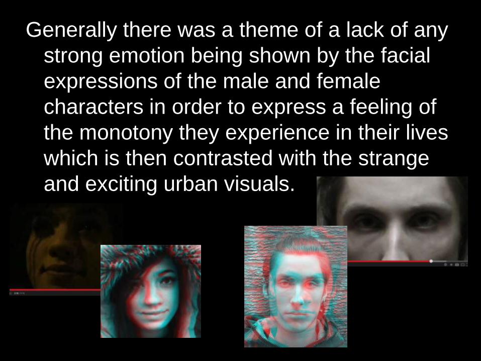
Generally there was a theme of a lack of any
strong emotion being shown by the facial
expressions of the male and female
characters in order to express a feeling of
the monotony they experience in their lives
which is then contrasted with the strange
and exciting urban visuals.
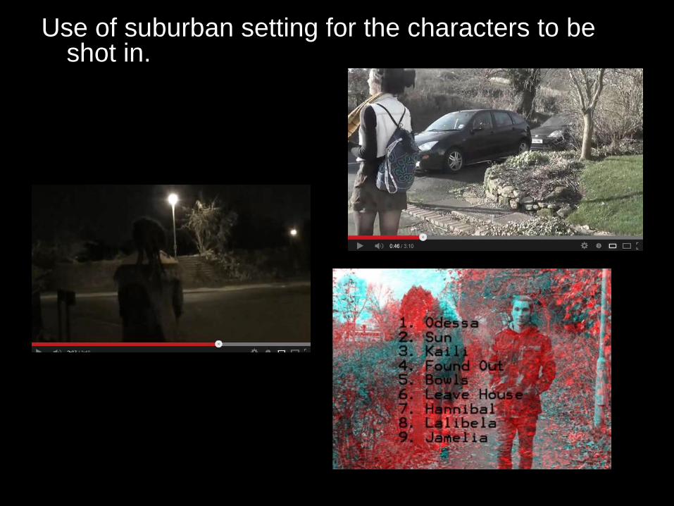
Use of suburban setting for the characters to be shot in.
Overall I think I have demonstrated a number of
examples of how my music video and ancillary
texts combine to make a coherent media package.
I feel I have been objective during this evaluation
process and although as a whole, I felt pleased
with the work I produced there are a few aspects
where I think I could have improved on what I did
in order to create more similarities between my
print work and my video in order to show clear
branding and coherence.